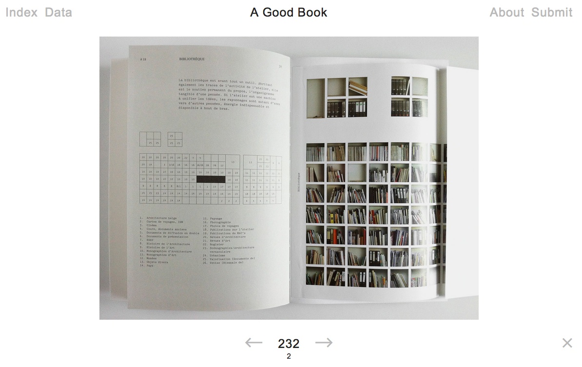
A hard question? A trick question? Yes and no. Since 2011, Bernd Kuchenbeiser, the Munich-based book designer, has been attempting an answer. He began by posting entries to a database on Twitter. With the demise of Twitter’s gallery function, Kuchenbeiser migrated the diary-like collection of photos and comments to A Good Book site with help from Simon Zirkunow. Below is a screenshot of part of the 232nd entry.
Screenshot of Méthodes, cover designed by Manuela Dechamps Otamendi, Entry #232 in A Good Book.
Until recently, the entries were Kuchenbeiser’s alone. The entries started on a daily basis, but as with many diary projects, the execution flagged. With 349 entries of his own (plus 3 from friends), he is now inviting entries from far and wide. Notice “Submit” in the upper righthand corner of the screenshot. Behind it lie the instructions and requirements for submission. Kuchenbeiser’s own entries are often brief, but his choices and comments are interesting because Kuchenbeiser and his oeuvre are interesting. See Michael Cina’s interview with him in The New Graphic(15 August 2011). For this venture to reward constant revisiting beyond that interest, however, Kuchenbeiser wisely holds potential contributors to the following standard:
Here’s what you need in order to submit a book:
– A short description of your book or the aspect that makes it ‘good’. From 140 characters to a maximum of 560, including spaces.
– The bibliographic details: author, title, year of publication, publisher, designer (if known). A questionnaire is already set up within the email that opens when you click ‘Submit now’.
– One to five photos of your book (at least 1400 pixels wide for landscape format and 1200 pixels high for portrait format).
Think of Pinterest or Flickr with serious feeling and intellectual rigor behind them. Kuchenbeiser’s design work and his own words exude that feeling:
Books have personalities. They can be our companions and friends. A good book doesn’t deserve to languish on a bookshelf; it wants to be opened, read, savoured, displayed, recommended. That’s why this website exists.
…
This site is like a message in a bottle hoping to be discovered. It will work only if it manages to generate communication.
The London Centre for Book Arts must have picked up the bottle from one of the Thames overswellings last week and placed a notice on its home page about the website. Although Kuchenbeiser does not promote it as such, if A Good Book thrives, it could generate a rich database worth semantic analysis for the book art and book arts community. All materials on A Good Book are being made available for noncommercial and educational use only.
“Previously on …” Say the phrase and most listeners’ brains switch to a favorite channel and television series. It is part of our vernacular. It instantly evokes a compound state of remembering and anticipating.
Myriapod Productions embodies that state of mind in its animated alphabet-book film series Mysteries of Vernacular. Each book for each letter is an old yellowed or gray hardback whose pages turn by themselves to reveal silhouette figures that glide across the pages, accordioned illustrations from other works or carvings reminiscent of the book sculptures of Doug Beube, Brian Dettmer and Odires Mlászho – with each vernacular word and definition emerging from an old library card pocket or from beneath a flap or cutout on the page.
The treatment of the letter Wis particularly apropos to this compound artwork. W is for “window”, which we are informed by Graham James (the narrator) is an example of the Old Norse technique of word invention called kenning. Kenning is the joining of two things (or rather two words for two different things) to designate a third thing: such as whale + road = whale-road = sea. Window is originally an Old Norse kenning word: windauga = vind (wind) + auga (eye). The book in the animation is Mikhail Sholokhov‘s The Don Flows Home to the Sea, a Nobel-prize-winning window on the life of the Don Cossacks during the Russian Revolution.
The book for the letter A (for “assassin”) is Karl Menninger‘s Love against Hate, whose theme of love’s shaping our instinctual aggressiveness suggests an ironic bent and wry, punning sense of humor in Jessica Oreck and her Myriapod team. The letter C for “clue” traces back to the ball of yarn (clew) that Ariadne gave Theseus to help him find his way out of the maze after killing the Minotaur, which is explained with an animation of George Bernard Shaw‘s The Intelligent Woman’s Guide to Socialism and Capitalism. C is also for “clever”.
D for “dynamite” plays out on the pages of A Number of Things, a satiric novel of Irish and British manners by Honor (Lilbush Wingfield) Tracy. Tracy became the fuse to a stick of dynamite planted by Bevis Hillier in his rival A.N. Wilson‘s biography of Sir John Betjeman. Hillier concocted a letter from Betjeman purporting to reveal an affair between Tracy and the Oxford don. Not only was the letter a hoax, but Hillier embedded an acrostic that spelled out “A N Wilson is a shit”.
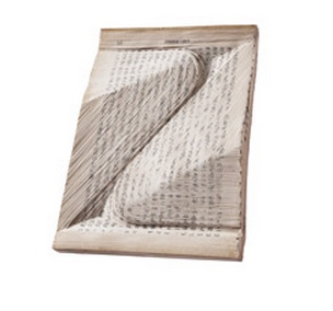
Of course, X for “x-ray” is illuminated with George Iles‘ Little Masterpieces of Science, and naturally, Z for “zero” is accounted for with Teach Yourself Calculus. But this soupçon of humor runs out with H (what has “hearse” to do with Bernard Jaffe‘s story of chemistry?) and G (what has “gorgeous” to do with James Russell Lowell?) and F (what has “fizzle” to do with Mark Twain‘s Life on the Mississippi, although one can imagine his delight with the word’s etymological kinship with flatulence?).
Each letter, definition, chapter, volume, episode (?) of Mysteries of Vernacular elicits affection for, if not outright love of, words and language. Perhaps that is not just down to Oreck’s and team’s skill, humor and cleverness. After all, for most of us, the alphabet-book is our childhood entrée not only to letters and words but any aspect of the internal and external world we fancy. Just for ages 3-5, our bookstores and libraries have the ABCs of Asthma, Bible Verse, Colors, Dinosaurs, Engineering, Feelings, Golf, Halloween, Ice Cream, Jobs, Kangaroos, Love, Math Riddles, Nature, Origami, Pigs, Questions, Rocks, Sounds, Touch, Under the Sea, Vanishing (endangered species), Wildlife, Yoga and Zoos. And for the more app-minded, there is also Moonbot Studio‘s contribution to the ABCs: The Numberlys.
Screenshot from The Numberlys William Joyce, Moonbot Studios, 2012
Myriapod starts with the advantage of this long, long “previously on …” in our hearts and minds. In exploiting its advantage, Mysteries of Vernacular takes us on a gentle rootle round the attic and cellar of our language and social history. The tradition of the abecedary and the disciplines of history and etymology offer a natural canvas on which Myriapod’s animation projects numerous techniques of book art. The intaglio carving reminds us not only of Beube, Dettmer and Mlászho but more so of Nerhol (the collaboration persona of Ryuta Iida and Yoshihisa Tanaka) and the work entitled Oratorical Type.
Oratorical Type by Nerhol (Ryuta Iida and Yoshihisa Tanaka)Oratorical Type by Nerhol (Ryuta Iida and Yoshihisa Tanaka)
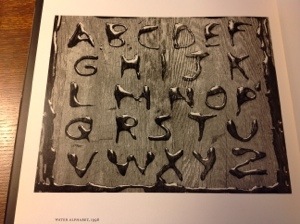
The Mysteries’ wooden desktop framing recalls Abelardo Morell‘s A Book of Books.
Water Alphabet, 1998 Abelardo Morell
The animated book folds are enchanting (although they might have but do not aspire to the level of origami achieved by artists and craftworkers like Heather Eddy).
The Alphabet Tutorial Heather Eddy, 2013little letters Heather Eddy, 2013
More extensively used and in keeping with the more two-dimensional feel of Mysteries is the technique of papercutting (as distinct from carving) on display with the letter W. The technique dates to the Tang Dynasty (618 -906 AD) but, in this context, harks back more recently to Victorian silhouette artistry.
Victorian Silhouette Abecedary
The series of 26 episodes so rich in content and technique is addictive. You will find yourself, as with any well-done abecedary, wishing for more letters in the alphabet. Although there is a vast vocabulary of other vernacular awaiting treatment, at a production cost of $80,000 per episode, it is likely those words will wait a long time. So we are left with having to remember our anticipation. Not all anticipation is more often enjoyed in itself rather than its resolution. You have 26 windows of opportunity to learn in Mysteries of Vernacular.
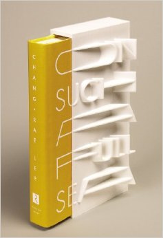
On Such a Full Sea Chang-rae Lee credit: Riverhead Books
“This limited, numbered edition of Chang-rae Lee’s On Such a Full Sea will be available on January 7th, 2014. Riverhead art director Helen Yentus and members of the MakerBot team designed the slipcase, and 200 of them will be made with the MakerBot® Replicator® 2 Desktop 3D Printer with MakerBot PLA filament, a bioplastic made of corn, fabricated by MakerBot in Brooklyn, New York. Each copy is signed and numbered by the author.” From www.riverheadbooks.com Is this the first 3D-printed slipcase? Yea or nay, this effort is clever. As the book slips from its case, the words of the title on the slipcase are completed. The design will surely make purchasers give “pride of space” to this book on their bookshelves and renewed sense to the word “outstanding”.
Additional cover design and art direction by Helen Yentus can be viewed here.
“MakerBot Creates First-of-Its-Kind 3D Printed Hardcover Book Slipcase for Award—Winning and New York Times—Bestselling Author Chang-rae Lee”, press release, 10 December 2013, accessed 5 January 2014: http://investors.stratasys.com/releasedetail.cfm?releaseid=812980
English: Comparative Bauer Bodoni versus Bodoni Català: Comparativa Bauer Bodoni vs Bodoni (Photo credit: Wikipedia)
This year marks the 200th anniversary of the passing of a great contributor to the linked histories of the book and typography: Giambattista Bodoni (1740-1813). Bodoni among others such as Fournier and Didot established the “Modern” fonts, typefaces characterized by the extreme contrast of their thick and thin strokes, delicate and sharp serifs and a chilly sparkling engraving-like quality heightened by generous leading and made possible by improvements in 18th and 19th century typecasting and manufacture of ink and paper. Bodoni planned and formed the royal printing house for the Duke of Parma in the Palazzo della Pilotta, where the Museo Bodoniano resides today. Associated with Pope Sixtus V, Carlos III of Spain and the Duke of Parma, Bodoni became one of the most celebrated printers in Europe.
View of Palazzo della Pilotta. (Photo credit: Wikipedia)
Although Bodoni’s fame in his lifetime was of a piece with that of the Romantic figures Chopin, Liszt, Byron, Goethe and Shelley, his output was Neoclassical with editions of Homer, Catullus, Virgil, Horace and the English poets Thomas Gray and James Thomson. His two-volume Manuale Tipografico (1788, 1818) is a meticulous monument of typographic art with more than 14 sets of roman and italic typefaces, a wide selection of decorative designs and symbols and alphabets from the Greek, Hebrew, Russian, Arabic, Phoenician, Armenian, Coptic, and Tibetan languages. The 1818 two-volume edition can be viewed online at the Bibiloteca Bodoni.
Portrait of Bodoni (c. 1805-1806), by Giuseppe Lucatelli. Museo Glauco Lombardi. (Photo credit: Wikipedia)
This flowering of typography and design – reflective of the age and technical developments of book printing – prompts a thought toward the impact of today’s technology – screen display, ereaders, XML and HTML, cascading style sheets, etc. – not only on type and design but their purpose as well.
“The type and pages beg to be admired – that is looked at – which is well and good, except that looking and reading are quite different, actually contradictory, acts…. To look at things, we either disengage and let them flow by on their own or we stop them in their tracks. To look we hold our breath or (in the worst of cases) pant. To read we breathe.” So say Warren Chappell and Robert Bringhurst in their critical comments on Bodoni and the Moderns. (A Short History of the Printed Word, pp. 173-74; 1970,1999.)
Perhaps we are still in the age of e-incunabula and have not reached the point where type and design on the screen beg to be admired. The improvements delivered by Readmill and Readability have been welcome for their contribution to ease of reading. It may be perverse to wish for developments that may interfere as Chappell and Bringhurst assert the Modern faces interfere with reading. But that assumes that they are right in their hieratic statement “To read we breathe.” Might it be as legitimate to assert “To read we click. To read we link. To read we dim or brighten. To read we tilt from portrait to landscape causing the page to reflow.”?
Will High Definition play the role that improved paper surfaces played to allow those thinner strokes and delicate serifs in the 18th and 19th centuries? And if it does, what on-screen design, comparable to Bodoni’s increased leading, will perform the same heightening effect for new faces and design that beg to be admired?
Bodoni Ornaments (Photo credit: Bene*)
For more on the subject of Bodoni, see “Biblioteca Bodoni Launched on Bicentennial Anniversary of Giambattista Bodoni’s Death” by Yves Peters, The Font Feed, 11 December 2013.
If the pen can be mightier than the sword, can a bookmark be mightier than Amazon? Bow Software Ltd in the UK thinks so. Using NFC technology, Charlotte Quickenden’s firm has committed “digital metonymy”: a bookmark that delivers the book.
A PhysiDigi Bookmark is a physical form which acts as a digital trigger to download an ebook. A PhysiDigi Bookmark has value, the value of the ebook that it opens for you to read. Therefore if you want to buy it, you purchase the ebook just as you would any other book by exchanging money with the vendor be that bookshop, venue or exhibition. The ebook is then yours. You own it, this is not an ebook lease controlled by DRM. If it’s a good ebook you can lend it, or, if it was a present you can wrap it and gift it. This physical digital thing is tactile, it has visual appeal, and through the act of acquiring it you will naturally have a closer connection to it than a box that you tapped ‘install’. Charlotte Quickenden, MD, Bow Software Ltd., via Bookshops of the Future: Where Physical and Digital Co-exist.
NFC (Near Field Communication) is the wireless transmission of data from a hardware device to another physical object within 10 centimeters of the device. Both must have embedded NFC chips and antennas. Quickenden hopes that her bookmarks with embedded NFC chips and antennas will level the playing field for bookstores, which for some publishers have fallen to less than 10% as a source of sales. Listen to Quickenden describe the PhysiDigi bookmark and watch it in action.
rankfurt and its book fair continues, so here is a celebration of type and the book. The initial “F” comes from Boekwetenschap en Handschriftenkunde Amsterdam, wherePaul Dijstelberge and others have posted over 30,000 photos of initials, ornaments and type in cooperation with the Special Collections, Amsterdam; the Royal Library, The Hague; and the Archive at Alkmaar.
Much has been made in recent years about the emergence of the ebook and the ‘death’ of the printed book. Such discussions are fashionable and fruitless. As long as people read, the shape or form of the book is irrelevant. In fact, the ebook may well be a blessing in disguise for those who passionately defend the printed book. Photography did not kill off portrait painting as it was once feared; neither will the ebook refer the printed text to the dustbin of history.
Photography may not have killed off portaiture, but digital photography did kill off Eastman Kodak. Which entities ebooks will see off will be debated until the event. The shape or form of extended narrative and discourse, however, is surely not irrelevant. The Fantastic Flying Books of Mr. Morris Lessmore and the walk-in book exhibition Memory Palace at the Victoria & Albert Museum are recent evidence. While more evidence may be adduced, do we need it to know that shape and form matter, or that we gather each year in Frankfurt to celebrate reading and its shape and form?
Image by markhillary Window display at Harvey Nichols in London via Book man | Books Images.
Giuseppe Arcimboldo’s portraits commissioned by the court of Rudolph II are his main claim to fame. Take some time with Jonathan Jones’ superb article on Arcimboldo and the 2008 exhibition devoted to his work at Vienna’s Kunsthistoriches Museum.
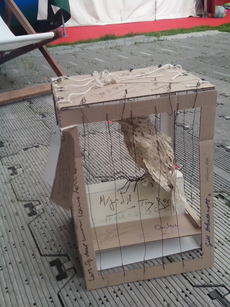
Paul St John Mackintosh posted some intriguing sleuth work at Teleread this month, occasioned by the Edinburgh International Book Festival. The work—and identity—of the MBAE (Mystery Book Artist of Edinburgh) has been a recurrent theme throughout the Festival. She has delivered works specifically for the Festival, which are part of her “Free to Fly” campaign (see @_freetofly_). One of them has attracted the autographs of some of the celebrated authors in attendance.
On his way back to his digs in Edinburgh, Mackintosh says,
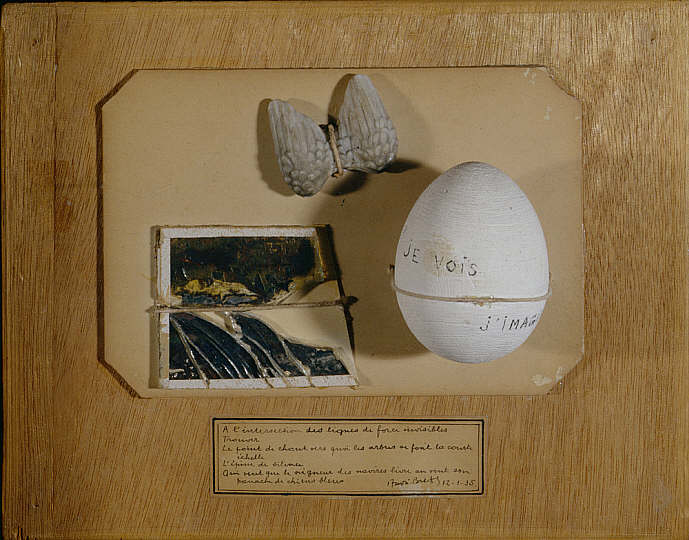
I stopped off at the Scottish National Gallery of Modern Art to see their fascinating “Witches and Wicked Bodies” exhibition. In their permanent collection is this work by André Breton, entitled Poème Objet (Poem-Object):
Poème Objet, André Breton
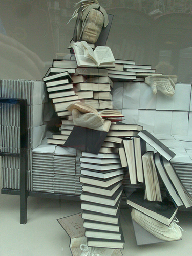
Mackintosh notes several other distinctive works in the Scottish National Gallery of Modern Art that find echoes in the works left by the MBAE in various places around Edinburgh such as the Leith Library and the Scottish Poetry Library. Edinburgh’s mystery book sculptures even have their own Wikipedia page.
MBAE’s “Free to Fly” campaign, run appropriately from her Twitter account, came to a close on the 21st of August, but as she writes in her farewell,
Berggren says he never believed that single-purpose devices like the original Kindle would become widespread, a prediction that seems to be playing out. But he did believe that multi-purpose tablets like the iPad would become most people’s primary e-reading devices, not phones. According to Readmill’s data, however, phones are not only the most popular e-reading device, they’re the best at keeping readers engaged, too.
“It is not only that they are spending more time reading the books because the screen is smaller. Even taking into account screen size, smartphone users read more often, they finish more books in general, they start more books, they share more quotes, and they write more comments,” says Berggren. “This paints a very clear picture that the people that are most engaged with their books are the people who read on their phones.”


, by Giuseppe...")