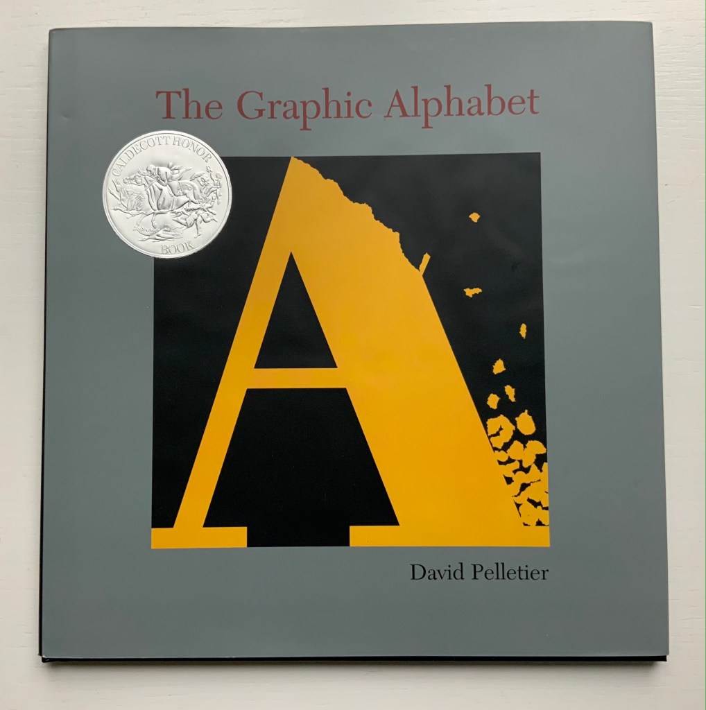
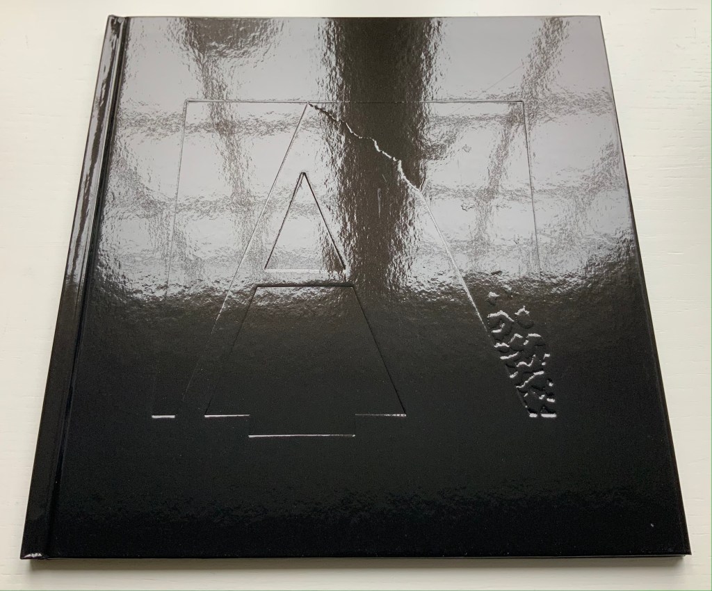
The Graphic Alphabet (1996) David Pelletier Paper on board, embossed with the letter A, casebound, sewn and glued. H255 x W250 mm, 32 pages. Acquired from Amazon, 24 August 2021. Photos of the work: Books On Books Collection.
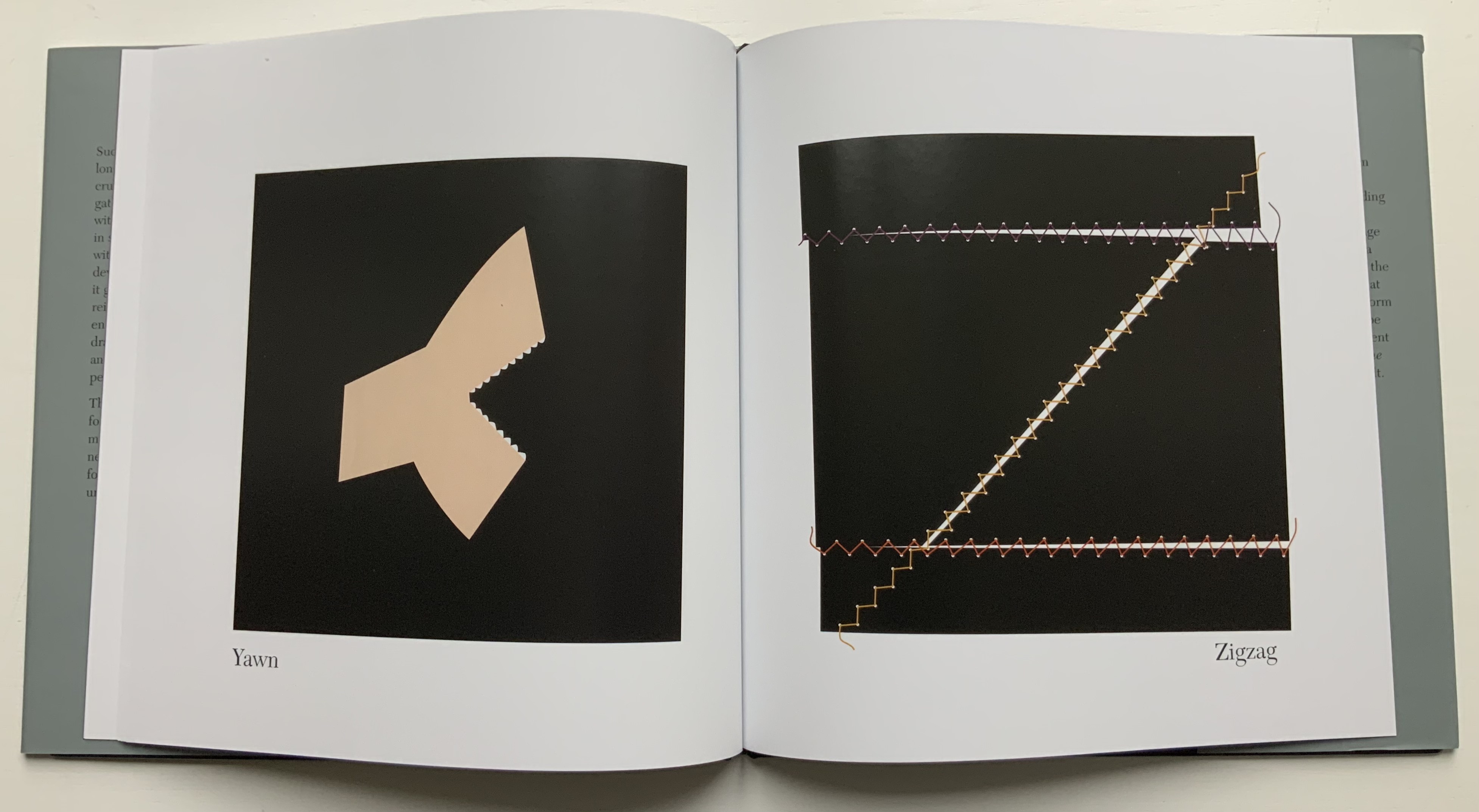
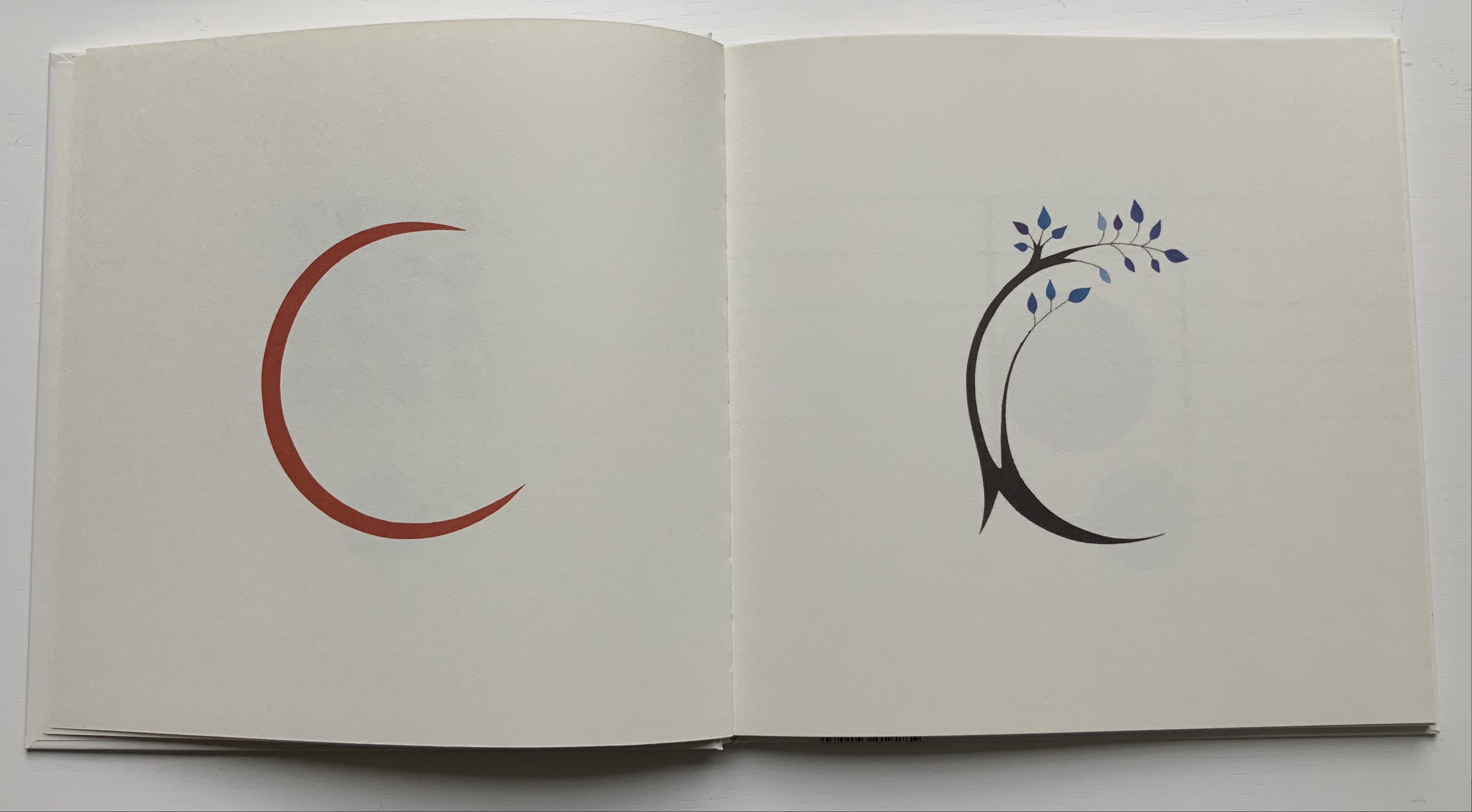
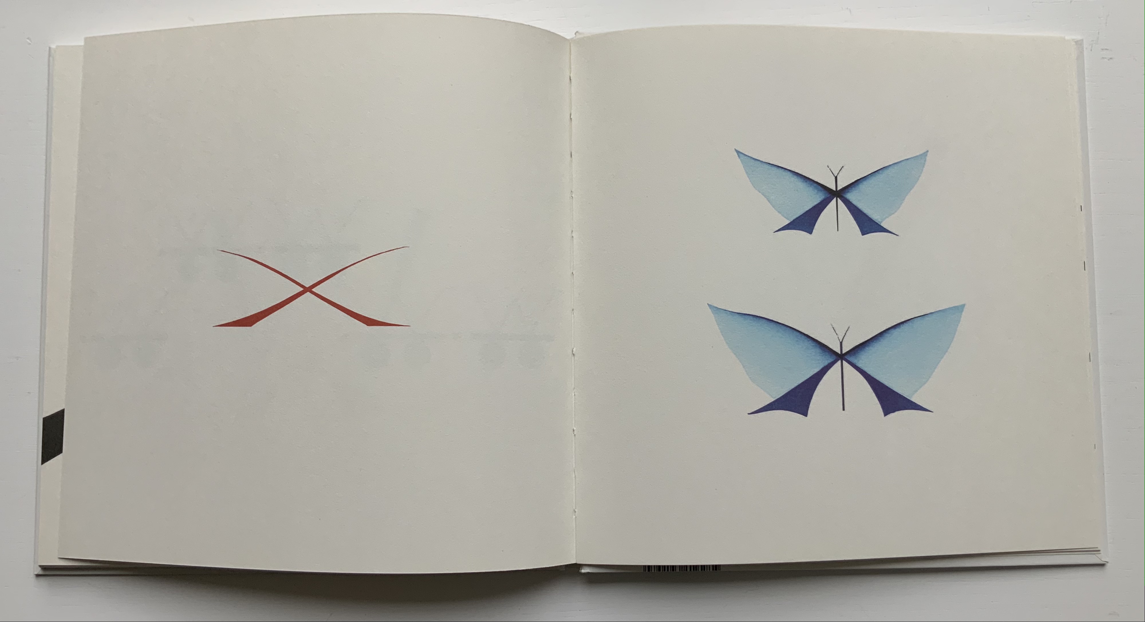
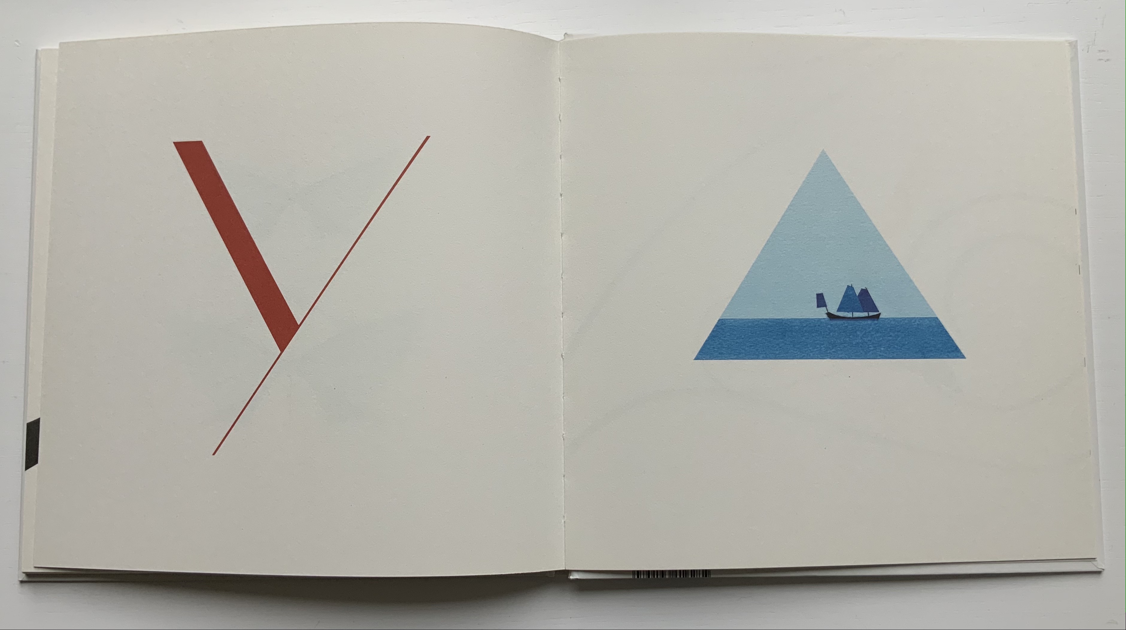
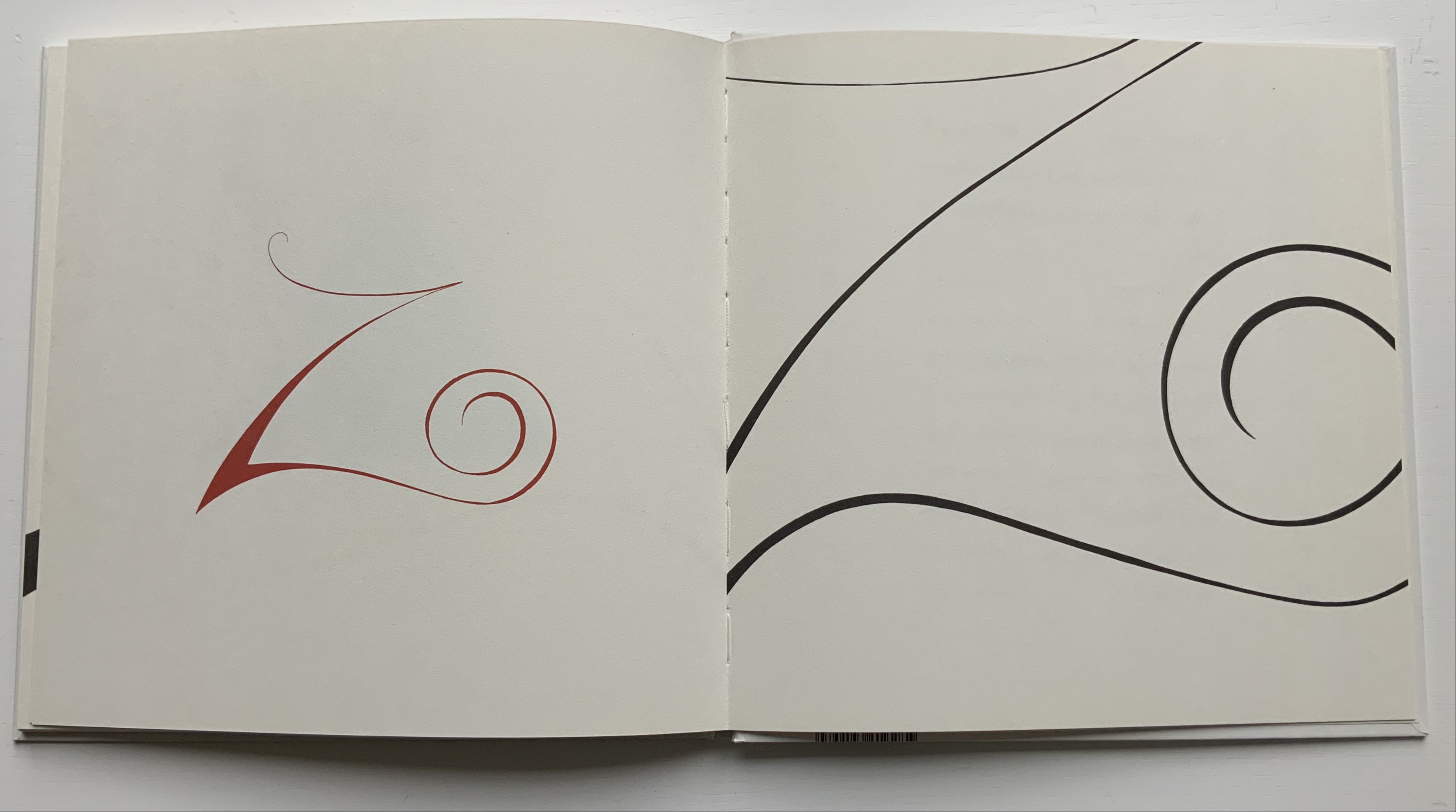
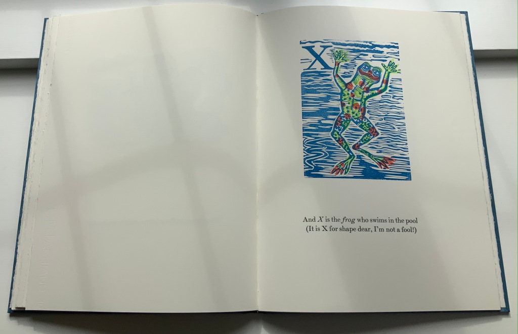
David Pelletier’s 1996 Caldecott Honor Book follows in the footsteps (the tumbles?) of Suse MacDonald’s Alphabatics (1986) another Caldecott Honor Book. The difference between them is a fine one depending in part on the reader’s age — or the collector’s eye. Both push the reader’s visual imagination. Both provide the words to be associated with the letter and image. MacDonald has shapes and images that turn into letters, where Pelletier has letters than turn into images (A), images whose shapes hint at letters and enact words (B and Y), letters found in images (W and X) and letters made from shapes on the page and the enacted word (Z). In a sense, Pelletier keeps the reader jumping more than does MacDonald. He crisscrosses several of the subgenres of alphabet books: wordplay and visual puns, hidden letters, conceptualism and abstraction.
One can see an affinity with Claire Van Vliet’s Tumbling Blocks for Pris and Bruce (1996) and Scott McCarney’s AlphaBooks (1981-2015), which underscores the cross-currents of alphabet books and artists’ books.
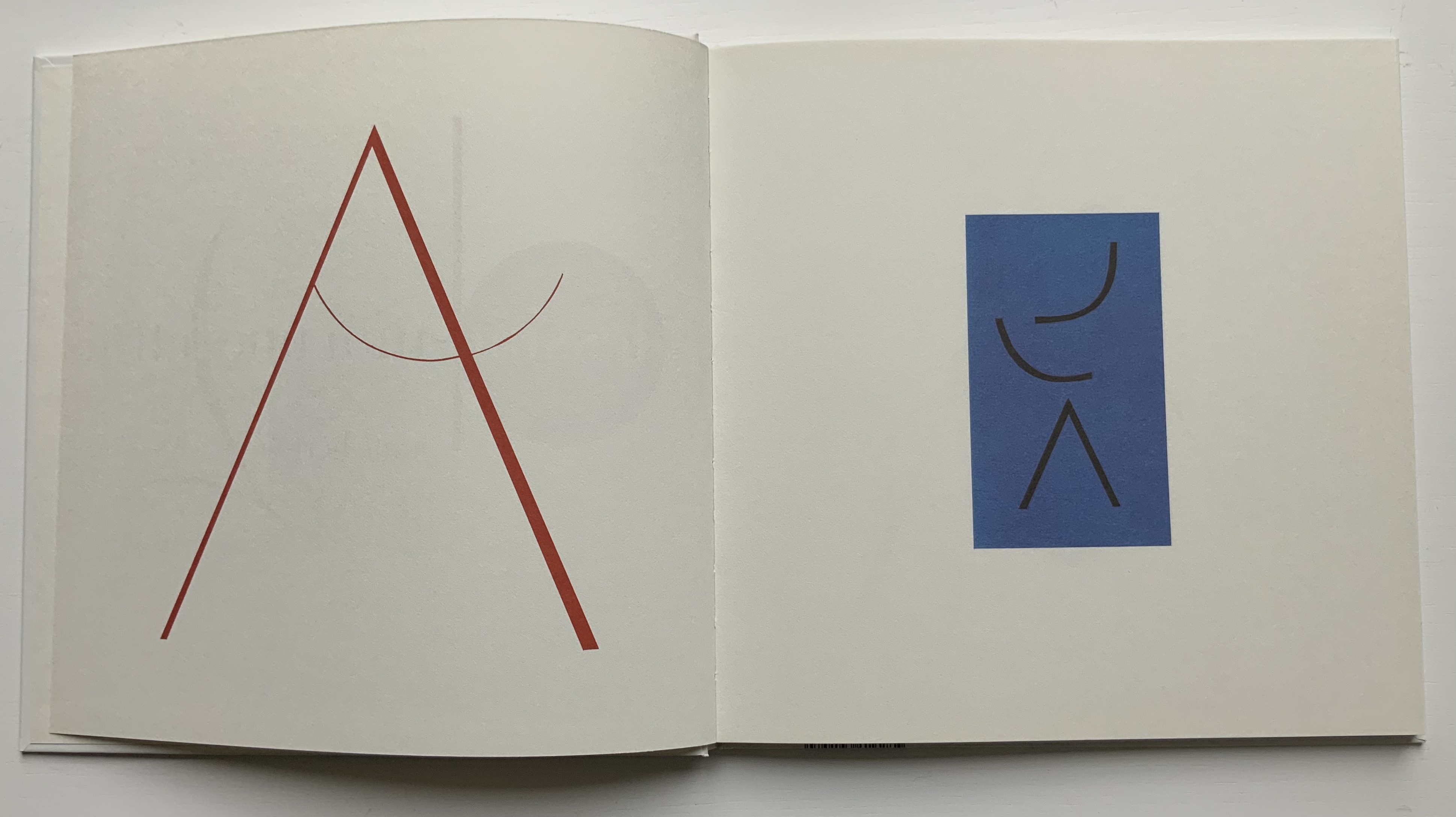
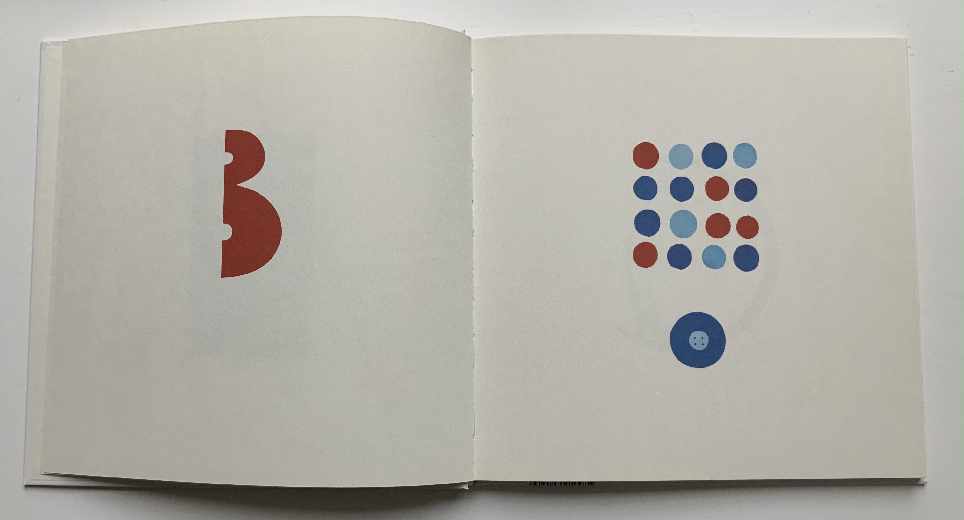
Dessine-moi une lettre (2004) Anne Bertier Casebound, sewn. H258 x W258 mm, 56 pages. Acquired from Amazon, 17 August 2021. Photos of the work: Books On Books Collection.
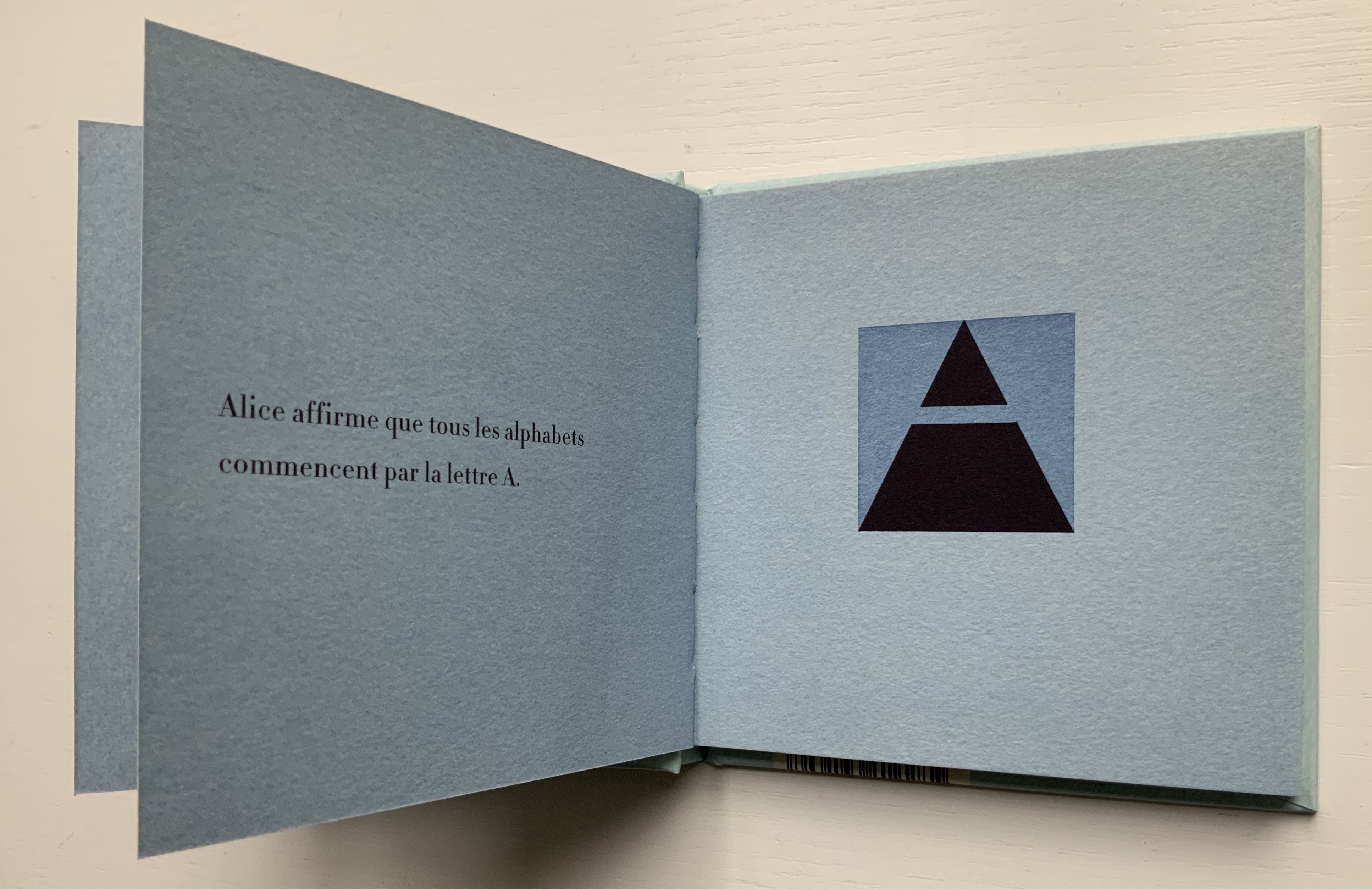
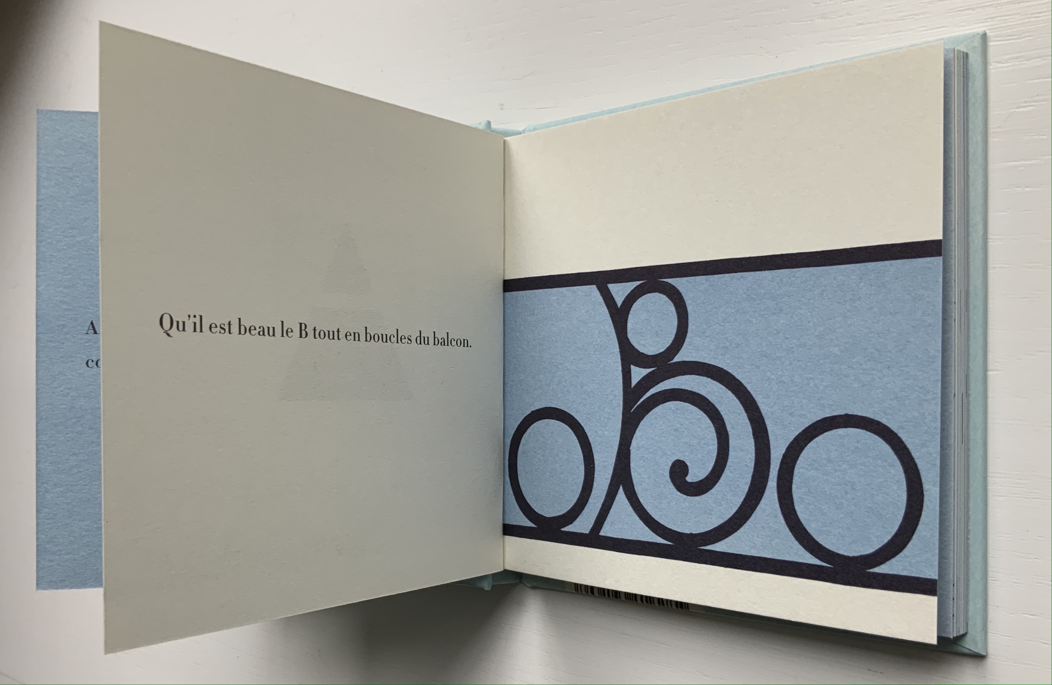
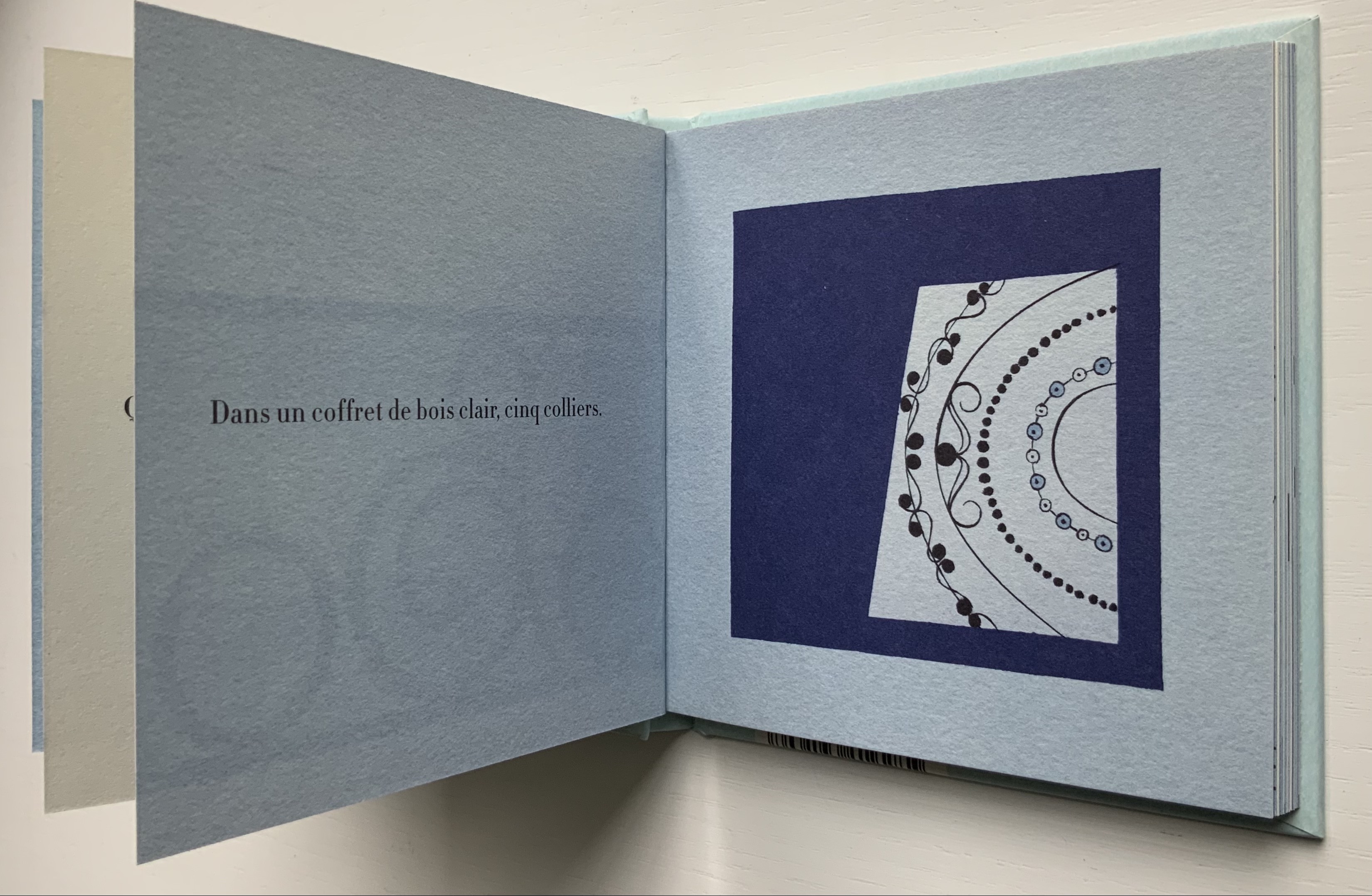
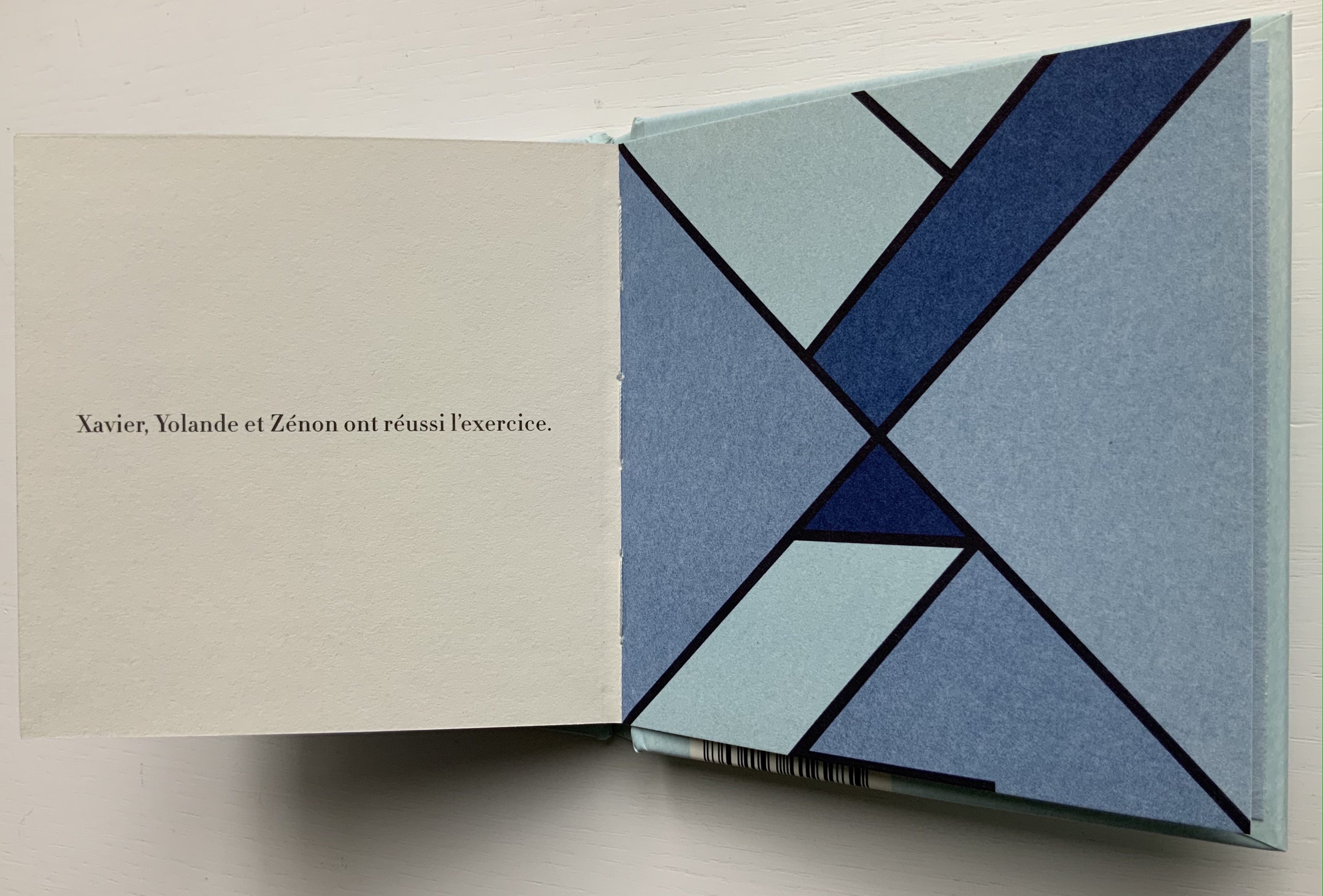
Anne Bertier’s three alphabet books cross sub-genres of the ABCs with distinctive style and educational challenge. While the answers to the visual puzzles are offered at the end of the first and last books, considerable pleasure is missed by giving up too quickly. For the English speaker learning French, there’s the added pleasure of cementing a familiar word with Bertier’s images and discovering a new word that will also stick because of them.
Rêve-moi une lettre (2005)
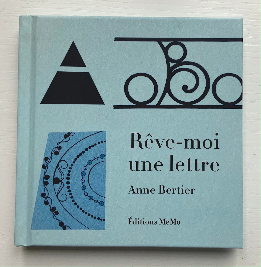
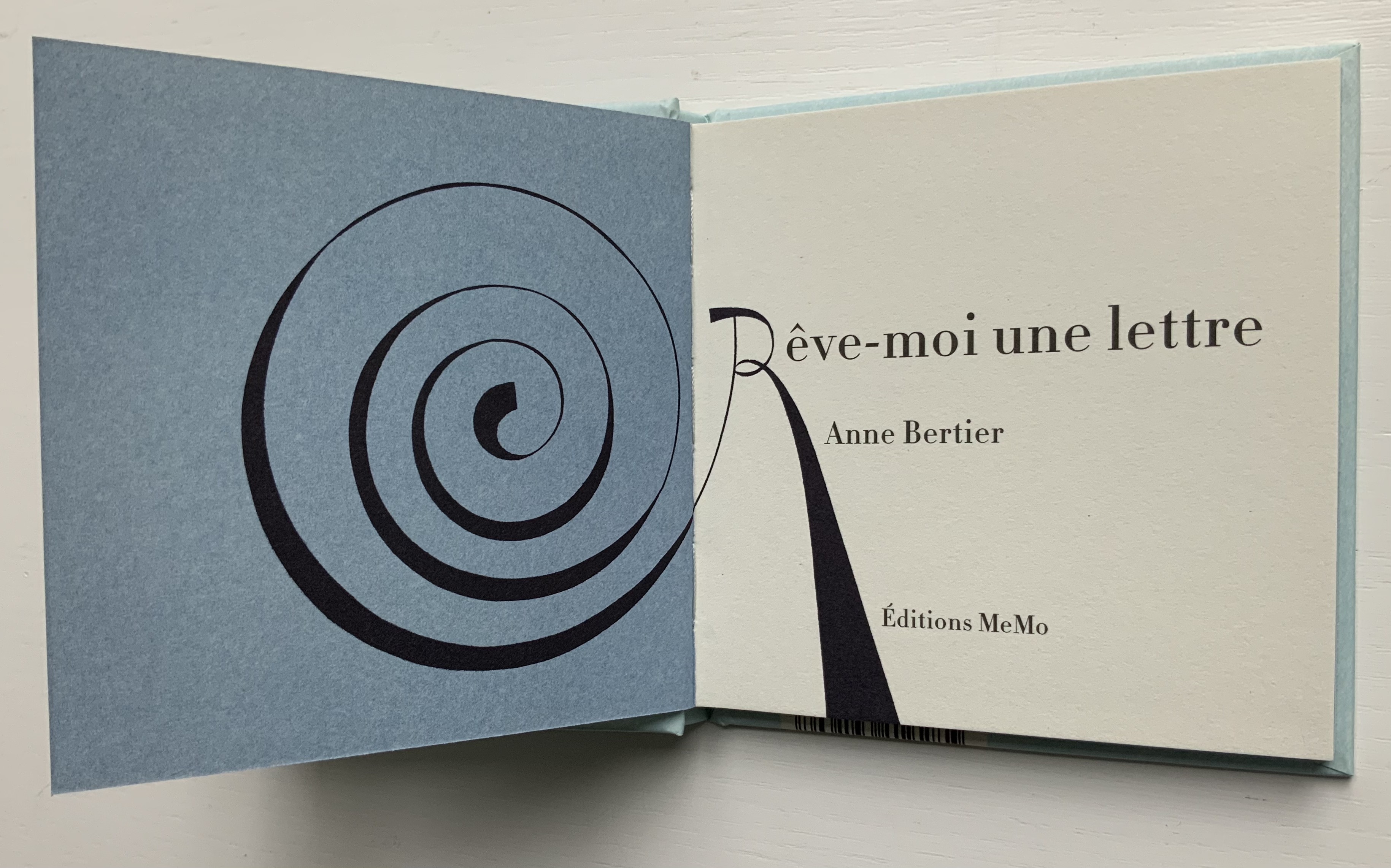
Rêve-moi une lettre (2005) Anne Bertier Casebound, sewn. H135 x W132 mm, 52 pages. Acquired from Amazon, 30 August 2021. Photos of the work: Books On Books Collection.
Here is the French version of the alliterative alphabet. Its opening with Alice suggests an underlying literary motif, but more likely at play is the association of the book’s title (“dream me a letter”) with Alice’s dreaming of Wonderland.
Construis-moi une lettre (2008)
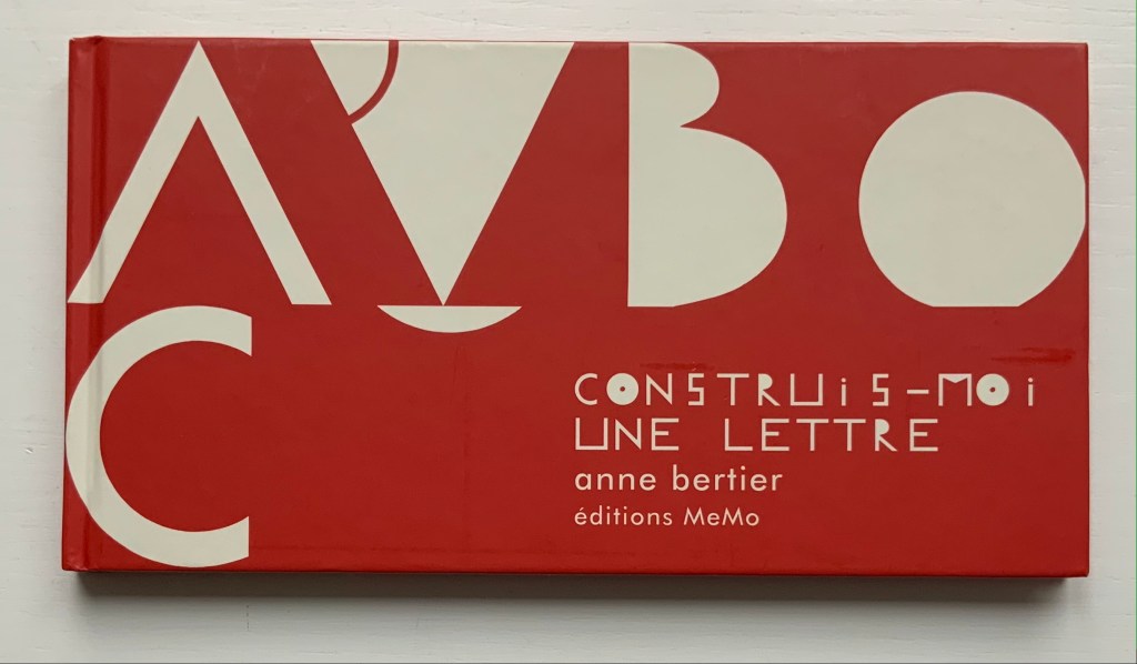
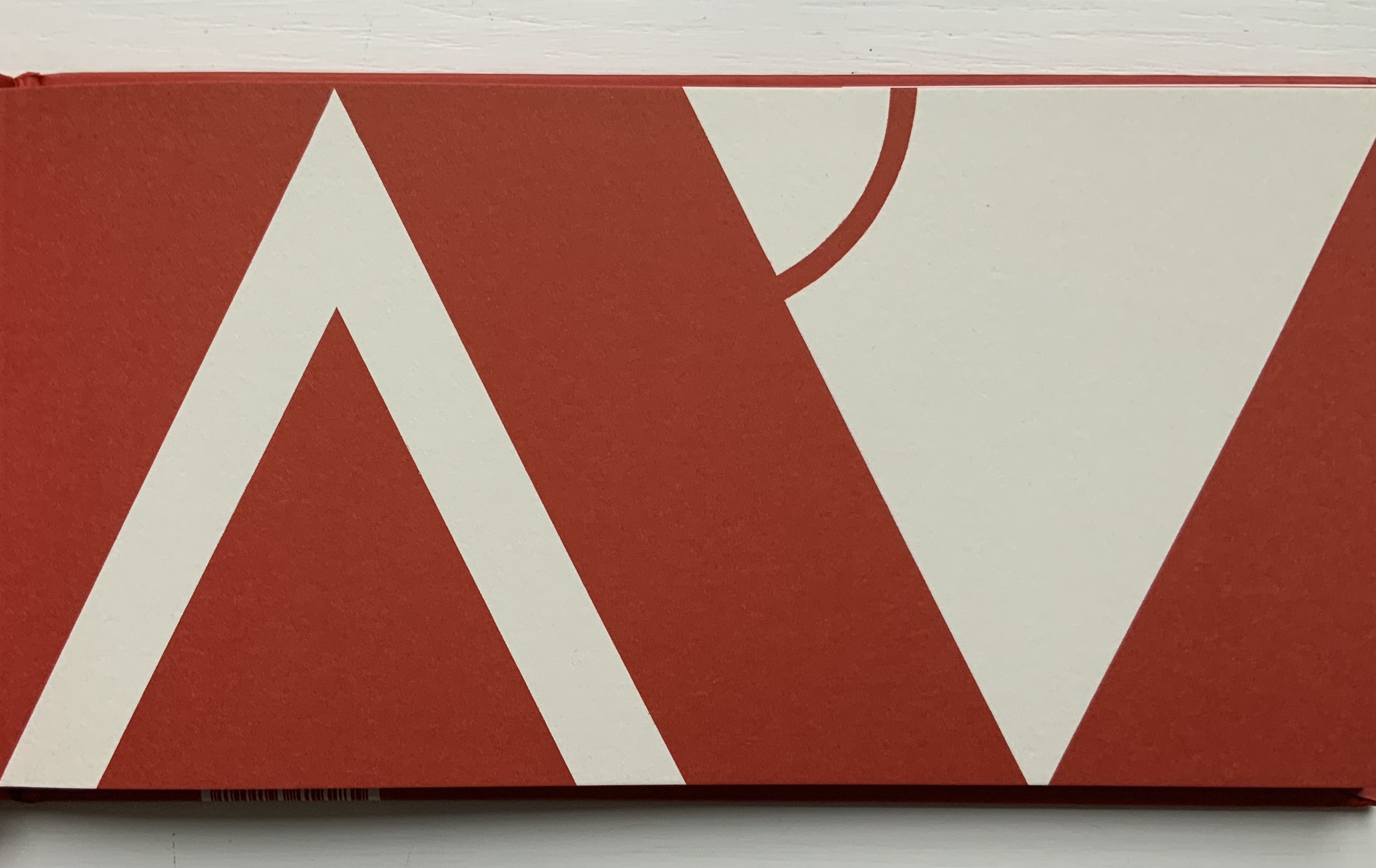
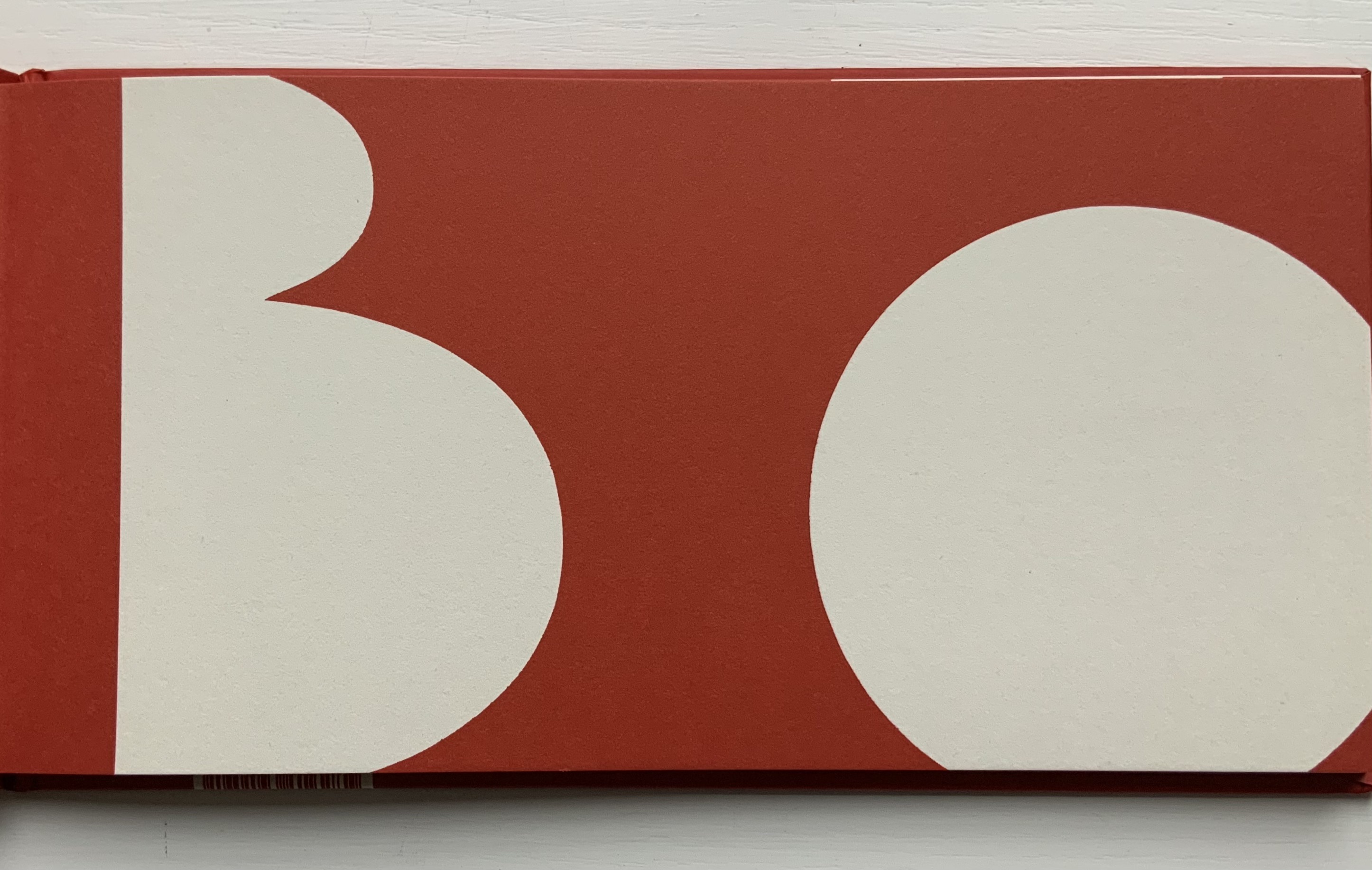
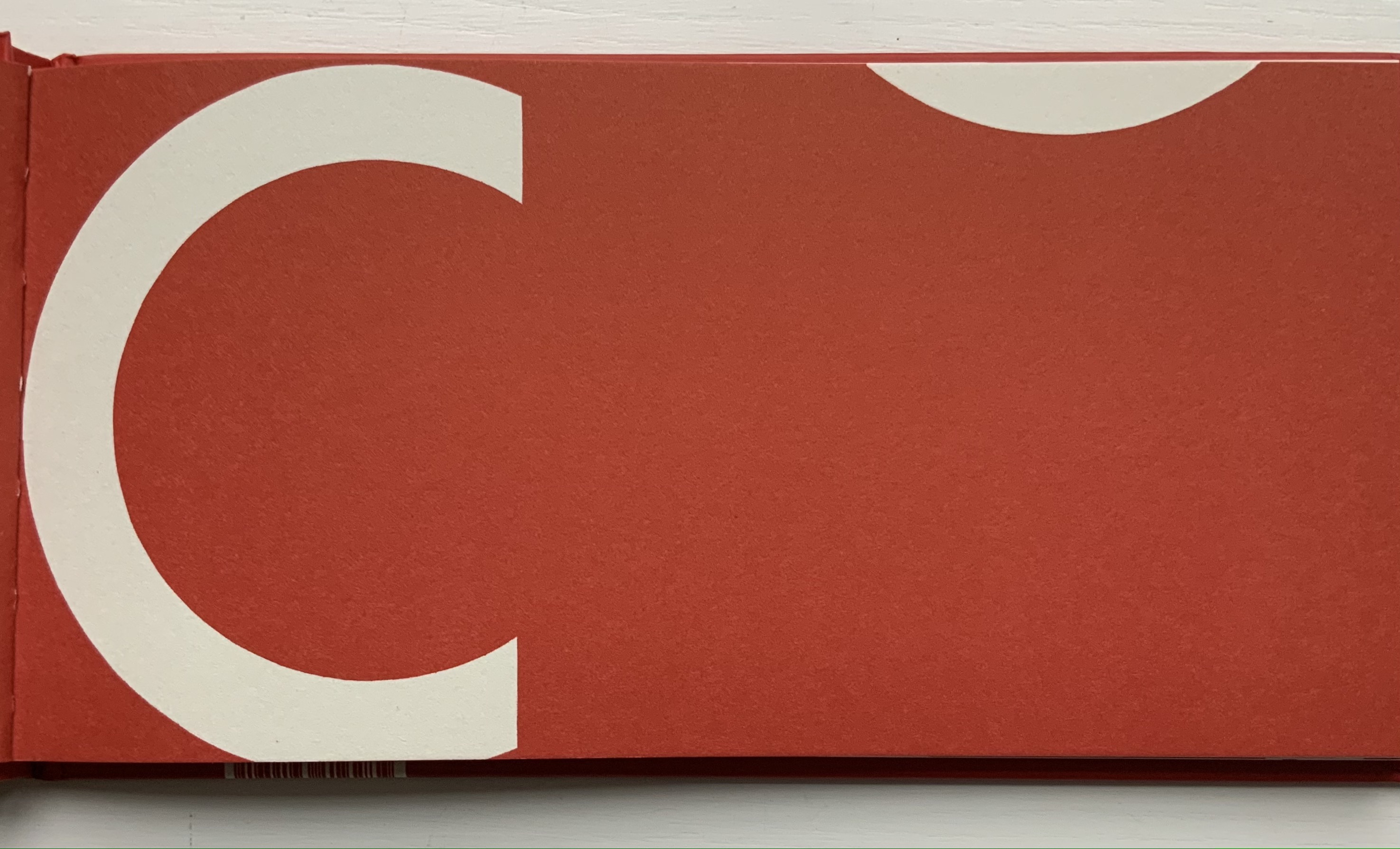
Construis-moi une lettre (2008) Anne Bertier Casebound, sewn. H135 x W256 mm, 56 pages. Acquired from Amazon, 17 August 2021. Photos of the work: Books On Books Collection.
The English alphabet’s “go to” for the letter A does not work for the French pomme, but from the similarity between the image here and that in Dessine-moi un lettre, there seems to be one, too, for the French alphabet. With the cognate word in French and English, the letter B is too easy. But C is for ?
With the overlap between design, art and children’s education, Bertier’s numerous large-scale exhibitions in China, Italy, Japan, Korea as well as France come as no surprise. Think of Dik Bruna, Eleonora Cumer, Katsumi Komagata or Bruno Munari.
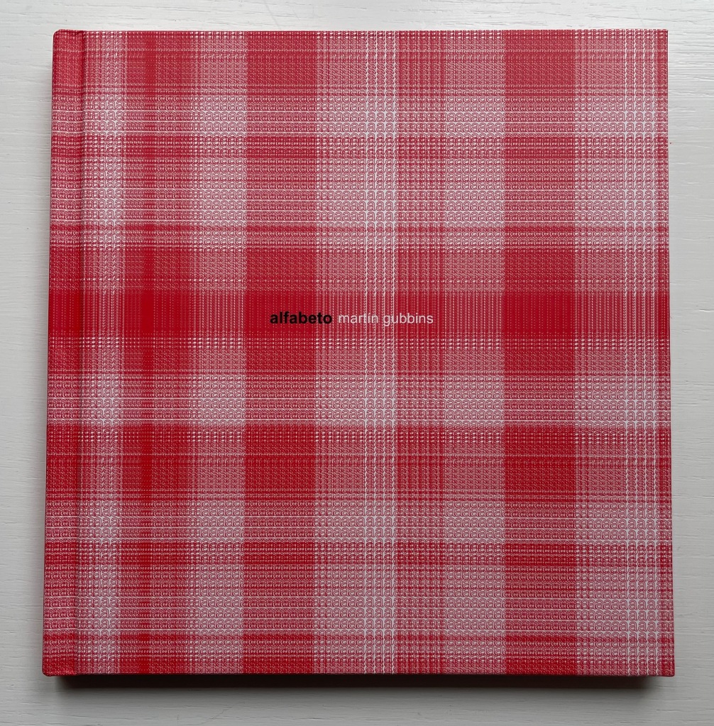
Alfabeto (2017) Martín Gubbins Hardback. 180 x 180 mm. 60 pages. Acquired from Naranja Publicaciones, 28 July 2022. Photos: Books On Books Collection.
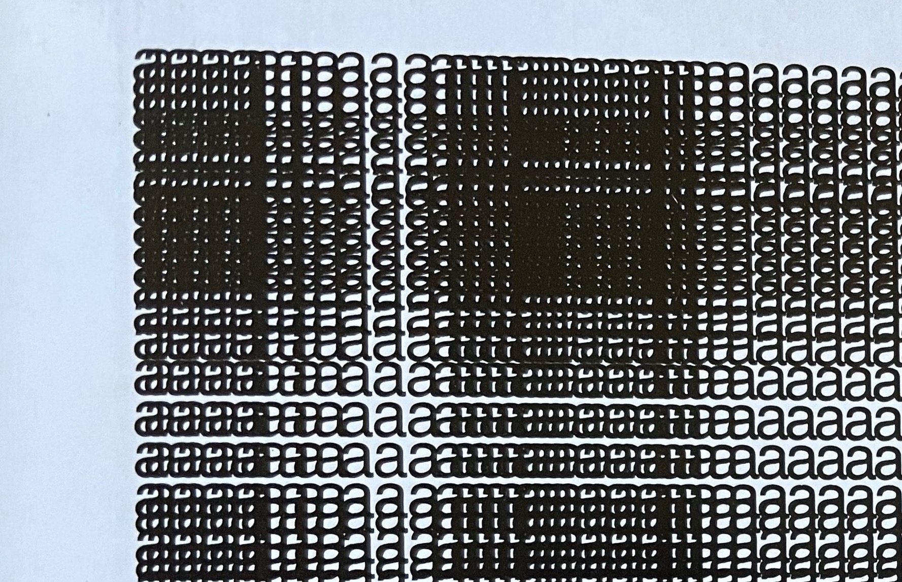
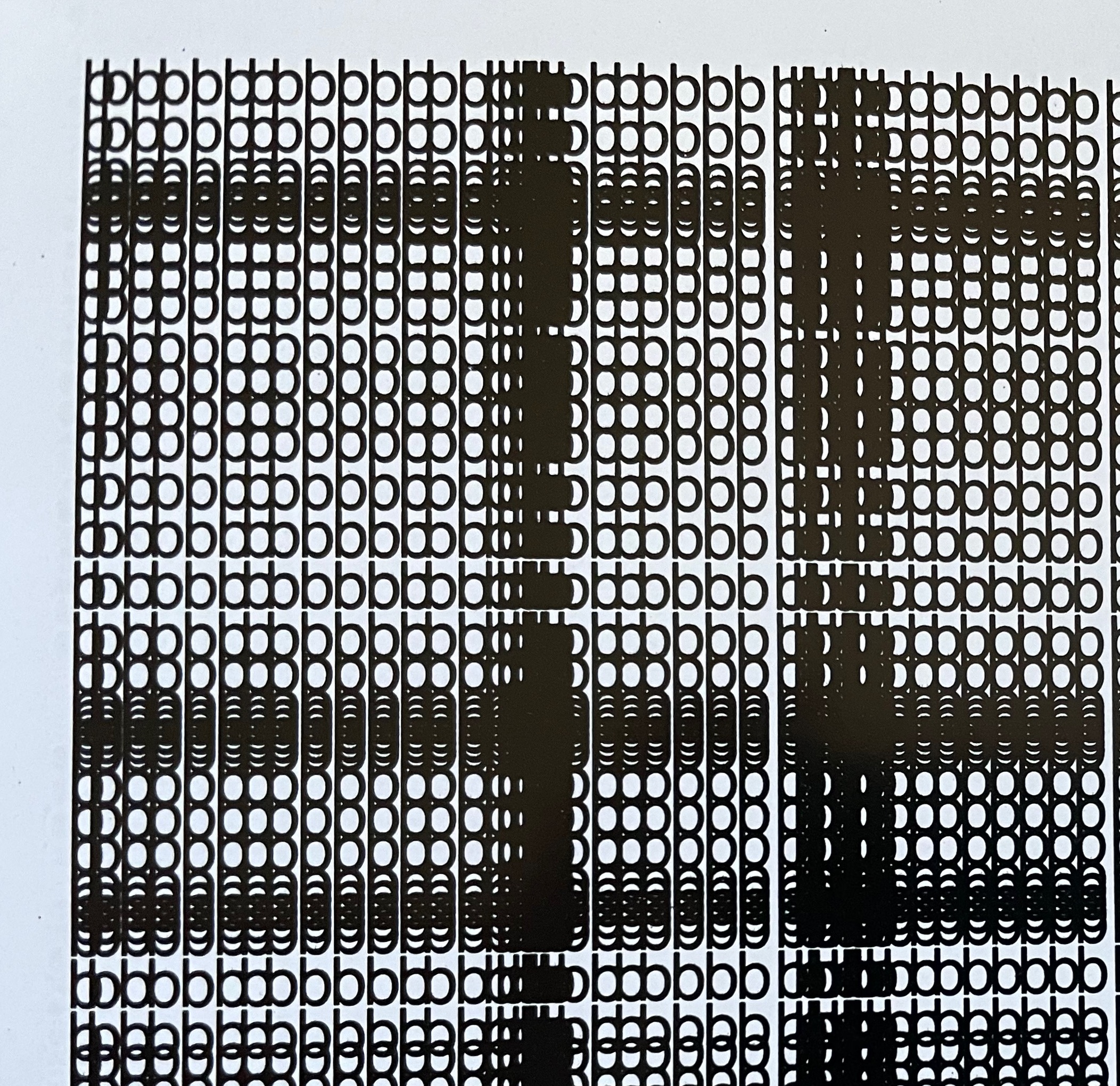
Each letter of the Spanish alphabet is printed in sans serif across a full page to create a grid-like or plaid-like pattern. All letters are printed once in black on white paper and twice in white on black paper; with sheets facing one another. For the English-speaking reader, that’s a bonus of two pages for the ñ.
Held at normal reading length, the double-page spreads do have a plaid effect, but inspected closely, the effect becomes that of wire mesh from which the letters leap out from the less tightly woven spots.
Unsurprisingly the plaids are as distinct from, and similar to, one another as letter shapes are. Sometimes, as with the letter b, an illusion of three dimensionality takes hold.
The most surprising — though they should not be — are the letters i and l. With no crossbar, bowl or curve, they cannot create a plaid pattern. Rather, their black on white, white on black patterns look like barcodes.
Gubbins One of the founding members of the Foro de Escritores (www.fde.cl) Chilean version of Bob Cobbing’s Writers Forum in London, and noted figure in the avant-garde poetry scene in Latin America. Gubbins has collaborated with the American poet and artist John M. Bennett, in whose honor
Some visual artists call this kind of work a “tapuscript“. Some throw it together under the heading of language art or concrete or visual poetry. Karl Kempton prefers the term “visual text art” over any other. Conceding the term to cover the broad genre, works like Alfabeto that cover the entire alphabet in sequence — or even play with its sequence — might deserve the sub generic term “visual alphabet art”. Kempton himself, Roberto de Vicq de Cumptich, Raffaella della Olga, Sharon Werner & Sharon Forss — as well as many of the artists in Victoria Bean and Chris McCabe’s anthology and those in Philip Davenport’s — surely provide a sufficient number of examples.
Making a lasting contribution to those traditions must be as difficult for children’s book artists and authors as blowing big blue bubbles is for baby buffaloes.
Webb, Poul. 2017-“Alphabet Books — Parts 1-8” on Art & Artists. Google has designated this site “A Blog of Note”, well deserved for its historical breadth in examples, clarity of images and insight.
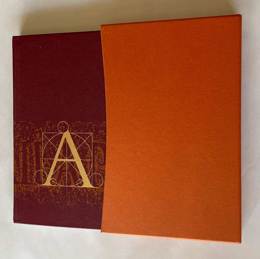
A is for Ox: A Short History of the Alphabet (2006) Lyn Davies Casebound, doublures matching slipcase. Slipcase: H205 x W133 mm. Book: H197 x W128 mm. 128 pages. Acquired from The Old Bakehouse, 13 July 2021. Photos: Books On Books Collection.
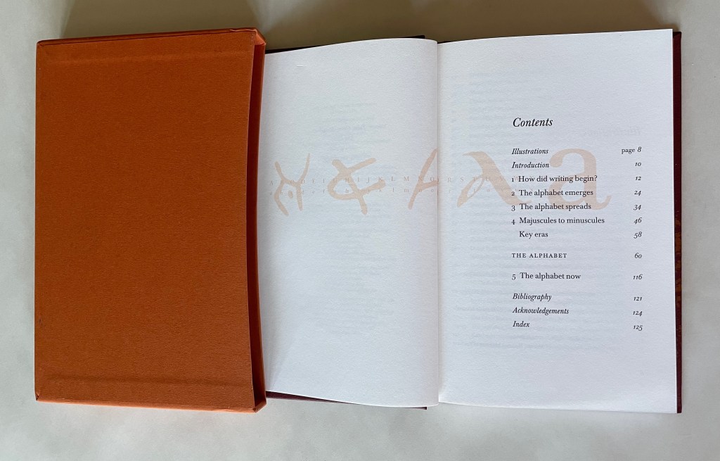
There are numerous histories of the alphabet. Some are even titled the same as Lyn Davies’ A is for Ox. Several books take the letter-by-letter approach that Davies does in the second half of his book. Only one of them falls in the category of fine press book or artist’s book, and that is Richard J. Hoffman’s miniature production of the bookseller Otto Ege’s text. Benefitting from the advice of Stephen Fischer and the infrastructure of The Folio Society, Davies has secured more of a place for A is for Ox than that distinction.
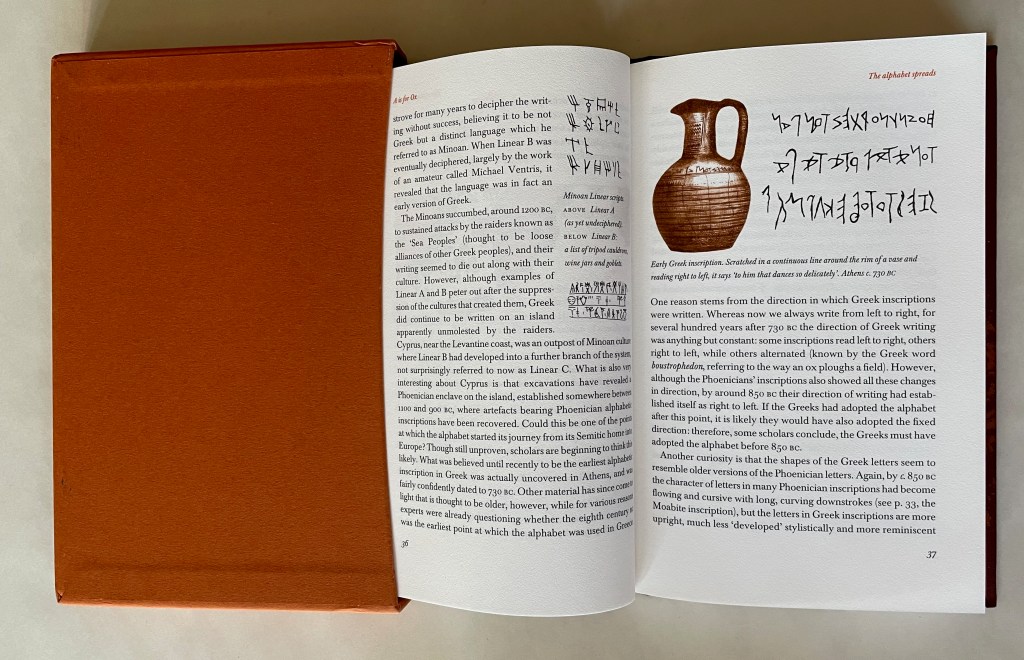
One distinction is the handling of two colors across the design of the book. Davies knows book design. The burnt umber or terra cotta color is used to great effect. Chapter subtitles, section heads and running heads stand out but do not overbear. In the second half of the book, the color turns each letter of the alphabet in its section into a subdued illuminated letter. Another distinction follows on from this: the handling of images in the first half of the book. By printing in black and white the full inscriptions on stone, clay and pottery depicted in photographs, Davies enhances the experience of those images, and somehow the tinting of the images makes it easier to match the markings with the print.
Despite its brevity, A is for Ox conveys just as much as many lengthier works. Somehow with Davies in ten pages it is easier to “peg” waw as the antecedent sound for the letters F, U, V, W and Y than it is in the lengthier works. In its “A is for …” organization of its second half, the book injects some lightness without descending into silliness, leaving the latter to the children’s books and some of the comedy-prone trade books.
The Ottakar’s 2004 and Folio Society 2006 editions are out of print, which is a shame for ordering in bulk for short courses on the history of the alphabet and writing. Fortunately both are available at more-than-reasonable prices on the used book market.
Clodd, Edward. 1913. The Story of the Alphabet. London: Hodder and Stoughton. 1913. Superseded by several later works, but is freely available online with line illustrations and some black and white photos.
Diringer, David, and Reinhold Regensburger. 1968. The alphabet: a key to the history of mankind. London: Hutchinson. A standard, beginning to be challenged by late 20th and early 21st century archaeological findings and palaeographical studies.
Thompson, Tommy. 1952. The ABC of our alphabet. London: Studio Publications. Not a fine press publication, but its layout, illustrations and use of two colors bear comparison with the Davies book. It too is out of print and unfortunately more rare.
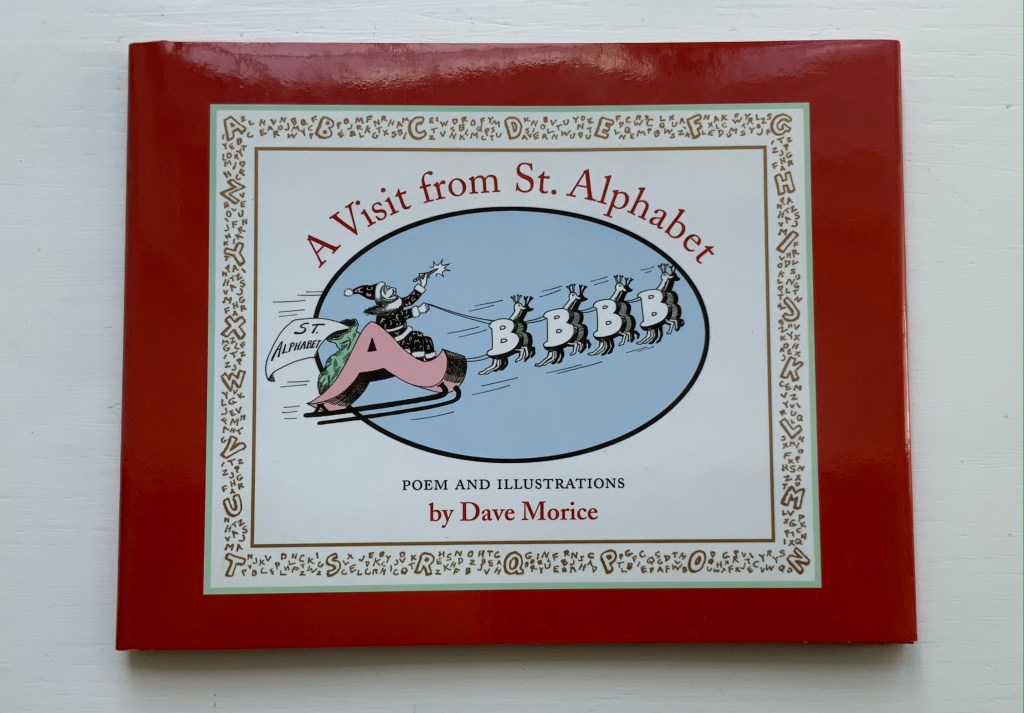
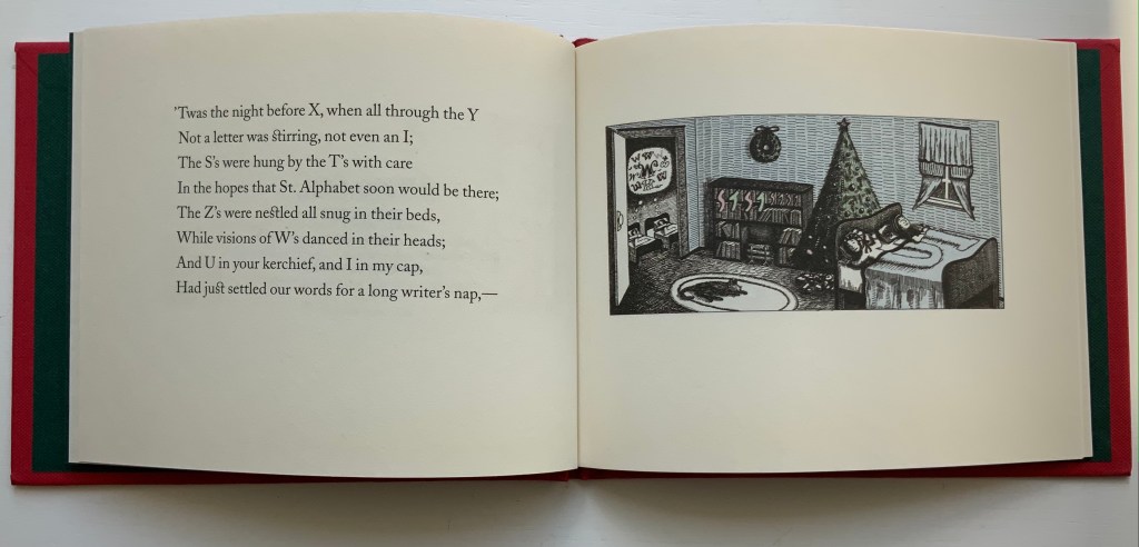
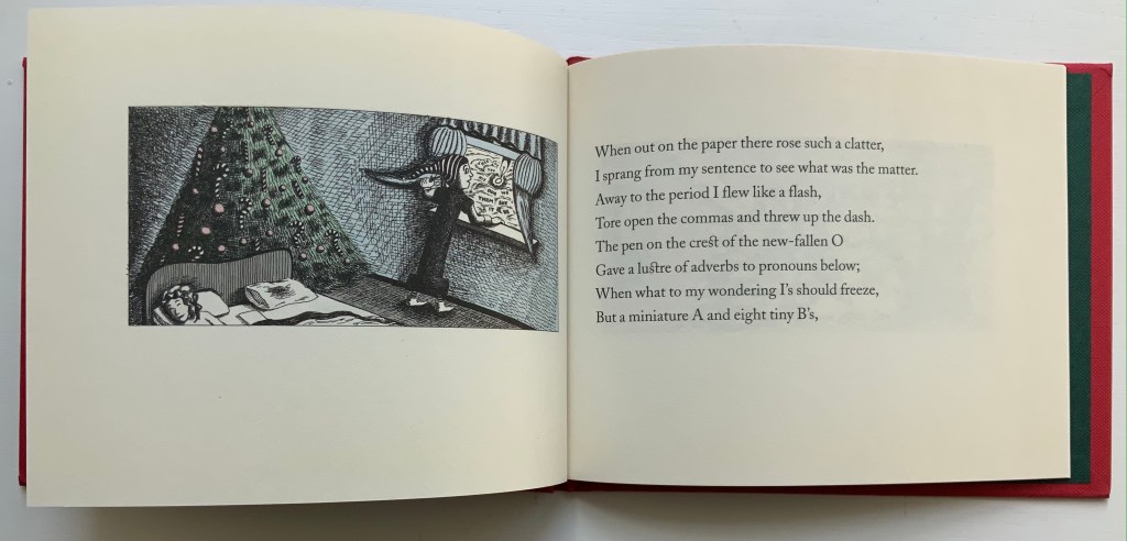
A Visit from St. Alphabet (2005) Dave Morice Casebound, H130 x 170 mm. 24 pages unnumbered. Acquired from The Book Depository, 27 August 2021. Photos of the work: Books On Books Collection. Displayed with permission of the publisher Coffee House Press.
In the Books On Books Collection, Dave Morice’s spoof of Clement Moore’s 1822 A Visit from St Nicholas (better known as ‘Twas the night before Christmas) serves several purposes.
First of all, in a collection that has alphabet books and alphabet-related artists’ books as one of its focal points, work by the artist also known as Dr. Alphabet must be included.
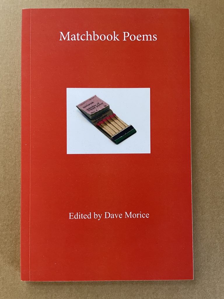
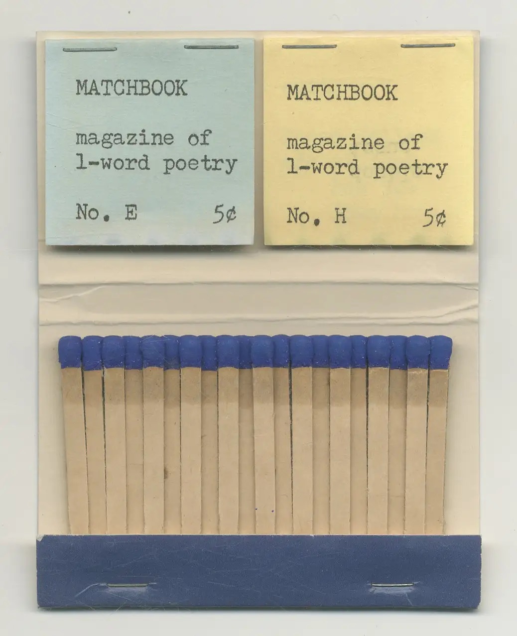
Second, Morice is like the definition of book art: he shifts about. He has been the perpetrator of the Joyce Holland literary hoax. Minimalist poet and performance artist Joyce Holland became the publisher of the Matchbook series — one-word poems on one-inch squares of paper bound in matchbook covers — and became famous enough to appear on the Tom Snyder Tomorrow show (Morice and his girlfriend P.J Casteel stood in). With his poetry performance pieces written on scrolls that were stretched the length of a football field and created during half-time, he rivaled Christo and Jean Claude. As publisher of 17 issues of Poetry Comics, he could be said to be the inventor of the comic artist’s book.
Third, Morice’s alphabet book (artist’s book?) demonstrates by letter, wordplay, narrative and image the nature of the alphabet and its elemental inspiration for artists of the book.
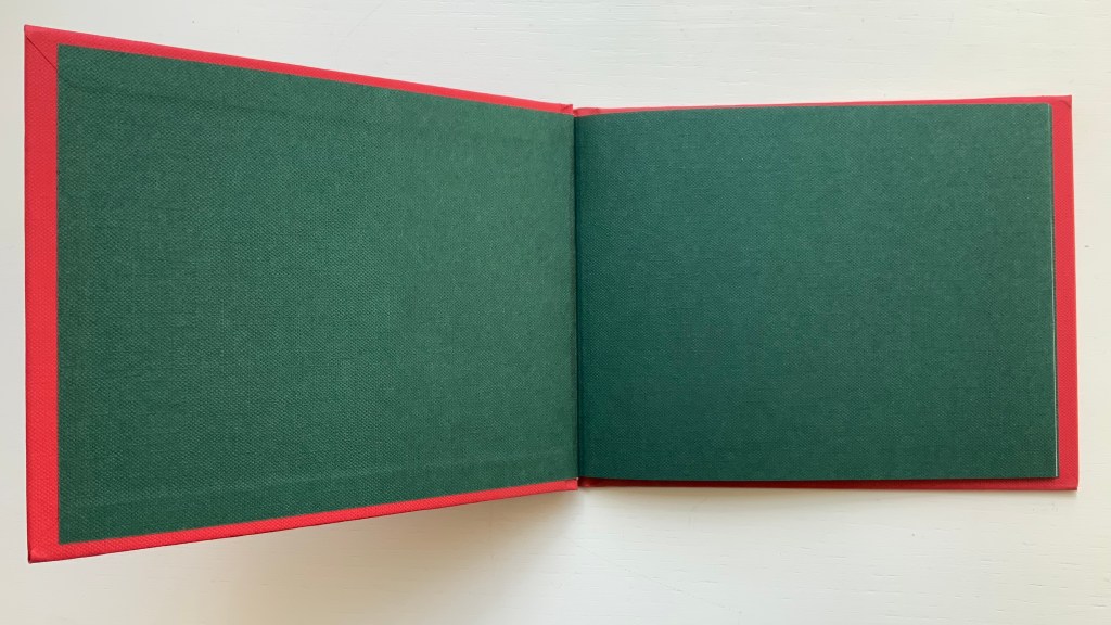
Fourth, Morice’s book first appeared in 1980 as a limited letterpress sewn pamphlet published by Allan and Cinda Kornblum’s Toothpaste Press. In the late 1960s, they had studied typography and printing under Harry Duncan at the University of Iowa, then set up their publishing house in 1970. Poetry dominated the list, with output from Robert Bly, Robert Creeley, Anselm Hollo, Antonio Machado (translated by Bly), Alice Notley, Carl Rakowski and Anne Waldman. This edition comes from Coffee House Press, founded in 1984 as the nonprofit successor to Toothpaste Press. Although no longer a product of letterpress printing but in a nod toward its predecessor, the book boasts case binding with red cloth over board and dark green textured pastedowns and endleaves (doublures). And this at a time when the doom of the printed book was being regularly forecast. This hints, at least, at the proposition celebrated by the collection that book art forecasts the history of the book.
Fifth and finally, as of publication of this entry, there are only 140 shopping days for book art until Christmas.
Matchbook Poems (2020)
Matchbook Poems (2020) David Morice Perfect bound paperback. H203 x W127 mm. 120 pages. Acquired 5 August 2022. Photos: Books On Books Collection.
An anthology published by Richard Kostelanetz’s Archae Editions, Matchbook Poems may have become a rare book due to a contretemps with Amazon. So the corporate on-demand publishing machine undermines an effort to celebrate one of many quirky non-traditionalist efforts of mail art and book art? On demand but rare. It is an irony at which the comic mind of Dr. Alphabet is more likely bemused than outraged.
A set of the original issues of the one-word poetry magazine reside in the University of Iowa’s special collections, and individual copies are held at Harvard and Yale. Single issues become available from time to time. It’s archaelogically satisfying to think those originals and this copy of Matchbook Poems will outlast Amazon.
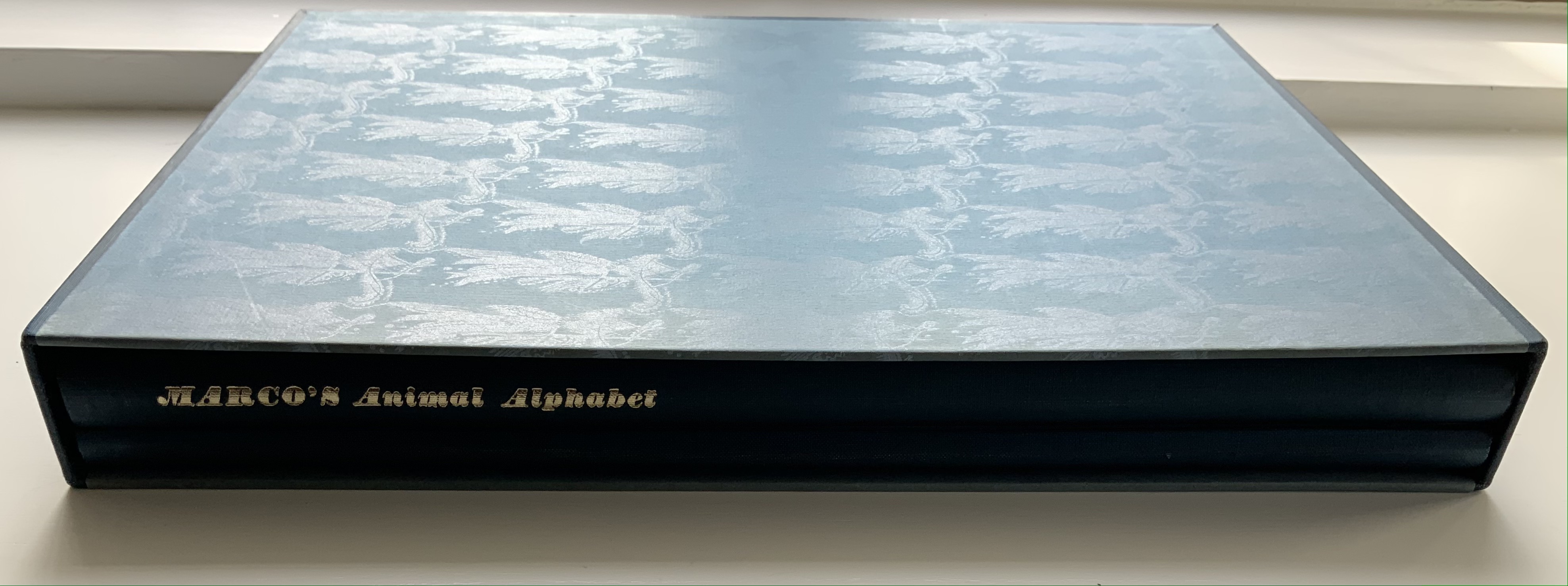
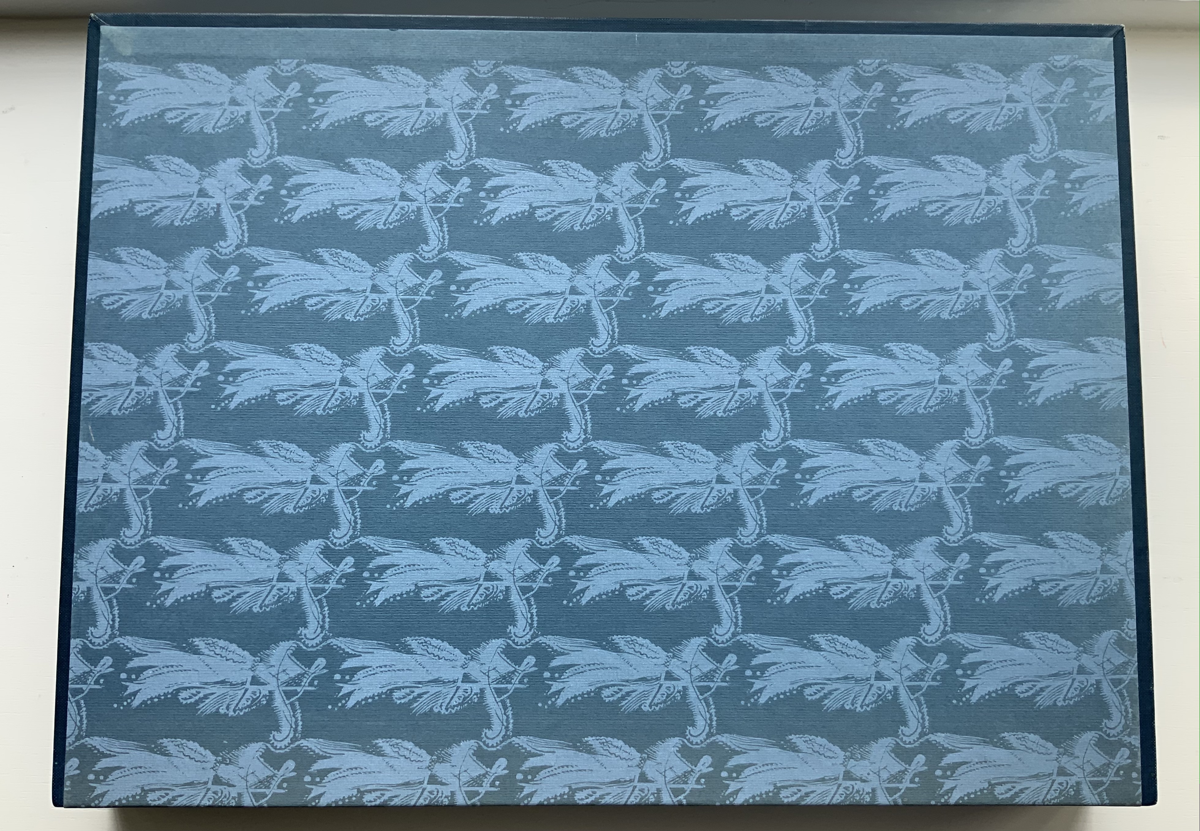
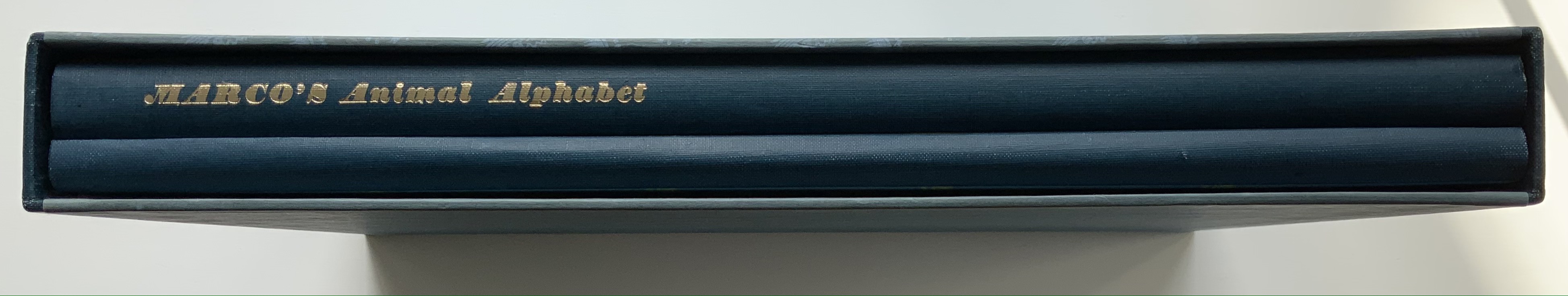
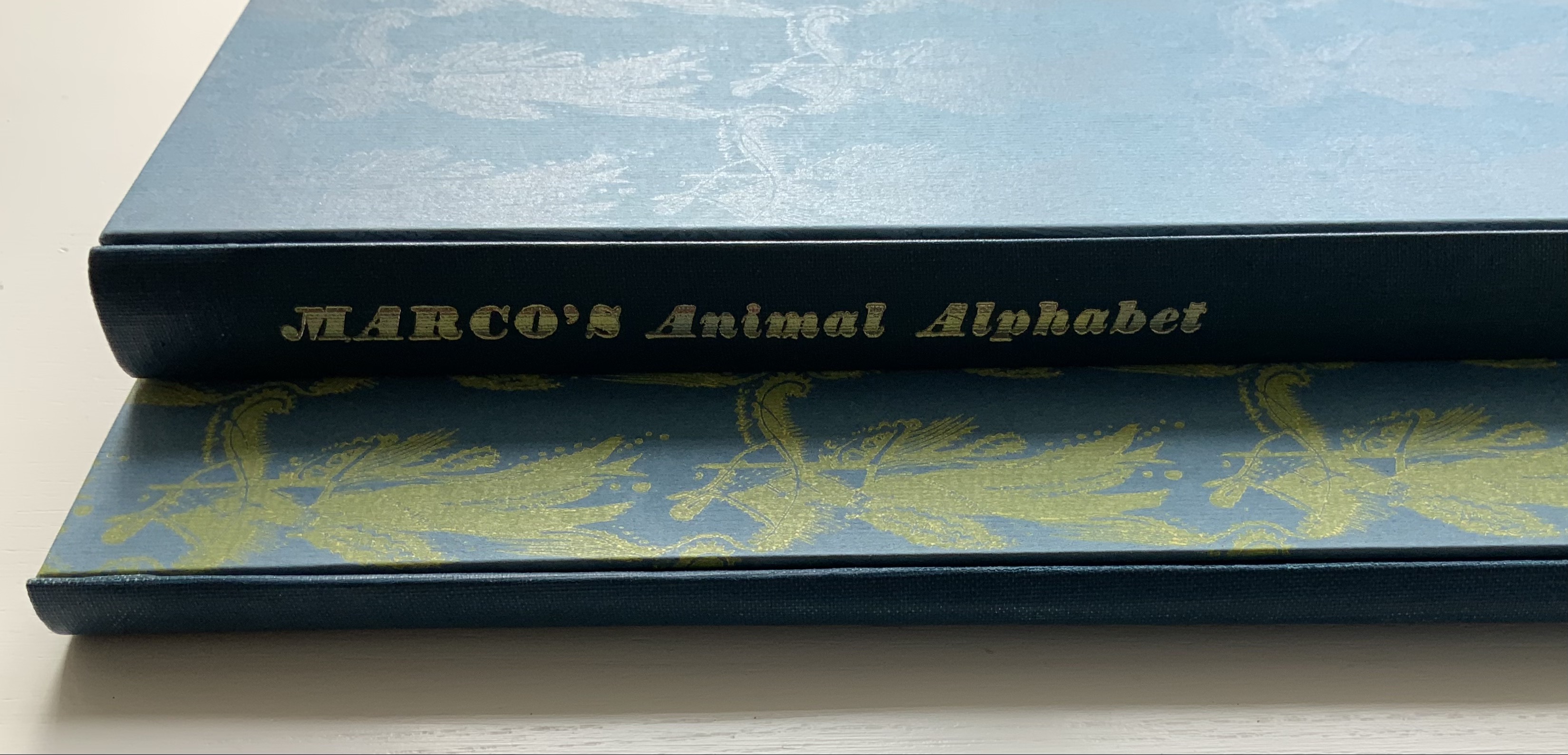
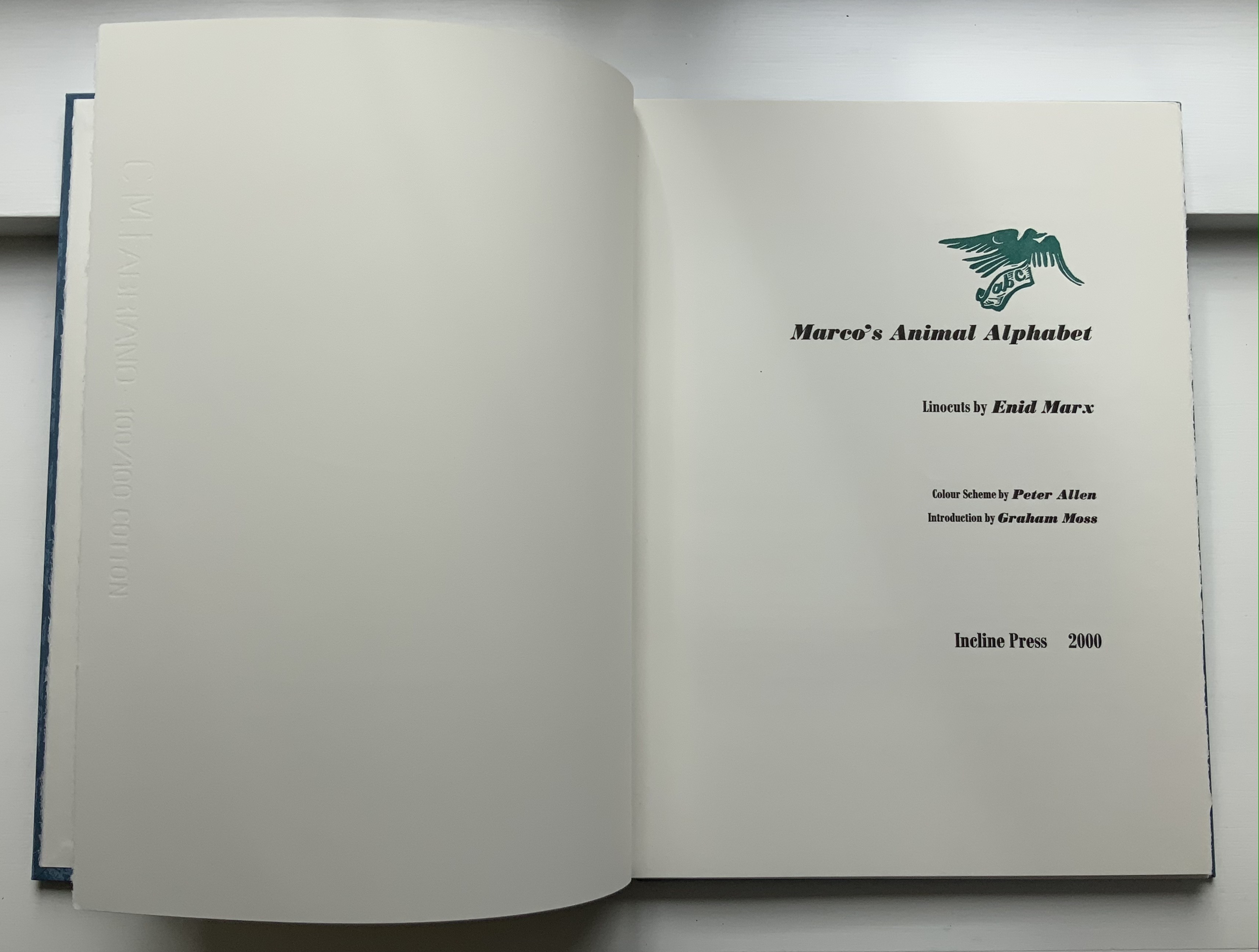
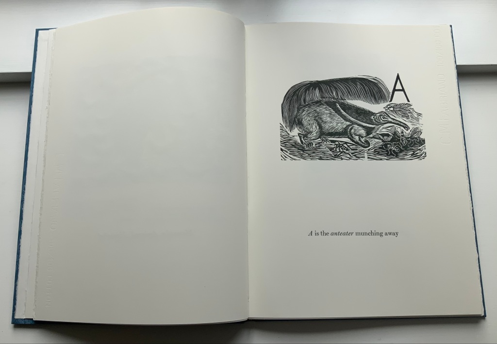
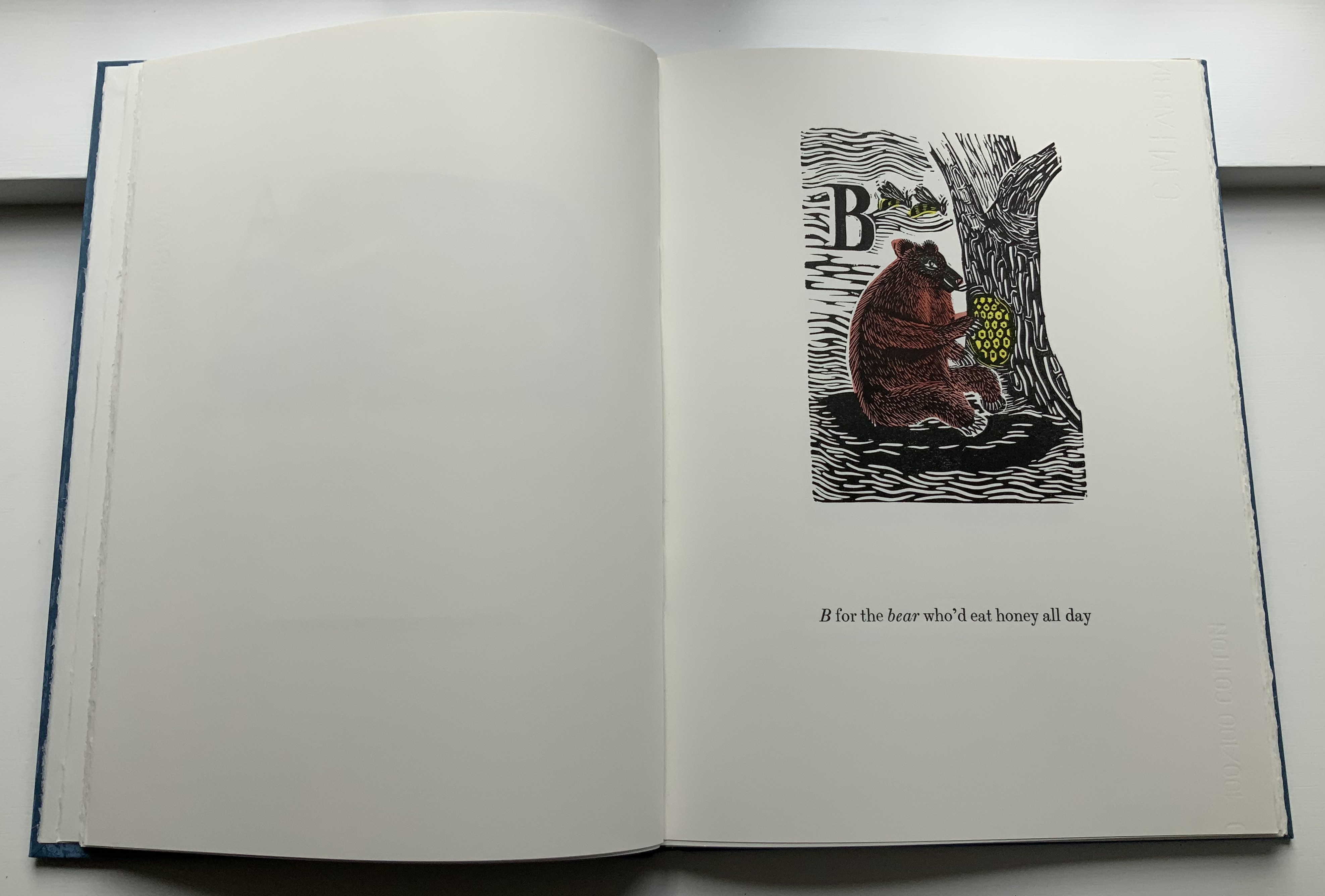
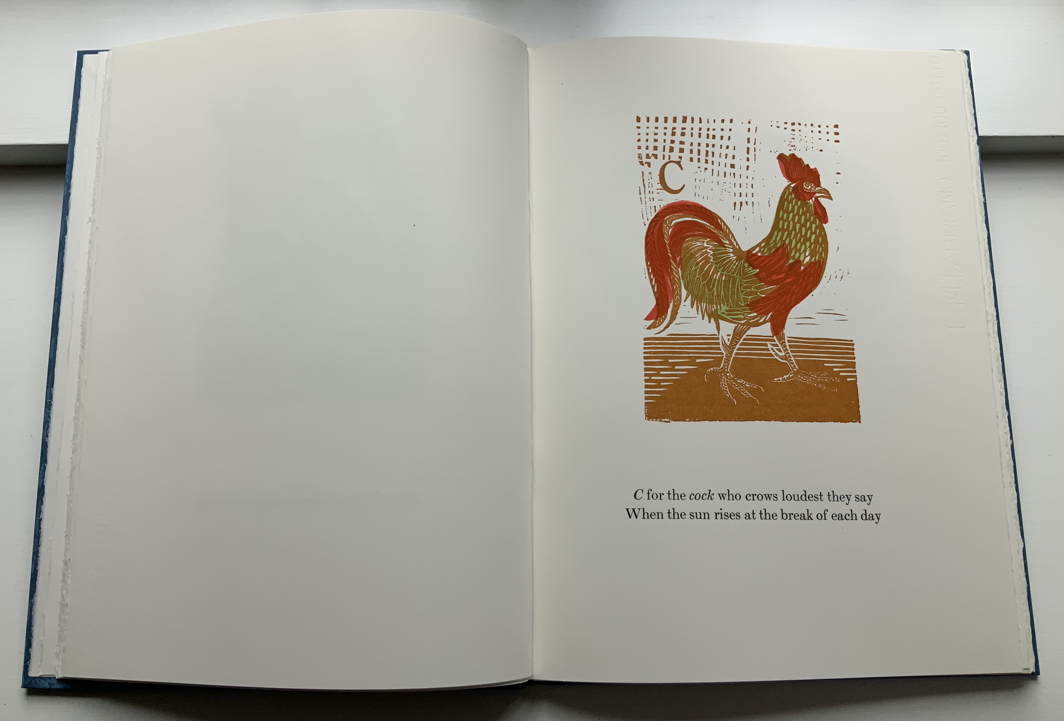
Marco’s Animal Alphabet (2000) Enid Marx Color scheme and pochoir by Peter Allen (École de l’Image, Epinal) Case bound, leather spine and patterned papers on board, Fabriano doublures, 64 pages. Portfolio edition of 15, of which this is #2. Acquired from Forum Auctions, 16 December 2021. Photos: Books On Books Collection.
Marco’s running verse is set in 24pt Scotch types, roman and italic. The rest of the book uses Bodoni, including the variations on the title page. The paper is 200 gsm Fabriano Artistico, 100% cotton fibres and acid-free. The patterned paper of the binding has been reconstructed for this book from a small sample. Enid Marx designed the original, and it was sold through The Little Gallery in London during the 1930s. Enid Marx was keen to have this book published for her great great nieces and nephews. A further 160 copies have been made for sale. Fifteen of these have an additional portfolio of black prints and were bound by Stephen Conway. Printing was completed in September 2000. This is copy number 2. –Colophon.
For the reader not in the know, the introduction by Graham Moss (Incline Press) explains that “Marco” was the nickname assigned to Enid Marx during her studies at the Royal College of Art, but more than that, Moss provides a warm sense of collaborating with Enid Marx (for example, A Bonnet Full of Nursery Rhymes) in life. Although this is a posthumous edition of this alphabet, Moss had the advantage of an earlier false start on it with Marx and of her insights on the idea of applying pochoir to this first formal edition (ultimately provided by Peter Allen).
It is a toss-up for which is the greater pleasure: the lines and shapes in Marco’s linocuts or the design and production by Graham Moss. Which confirms his conclusion that the posthumous collaboration is “a happy and successful one”.
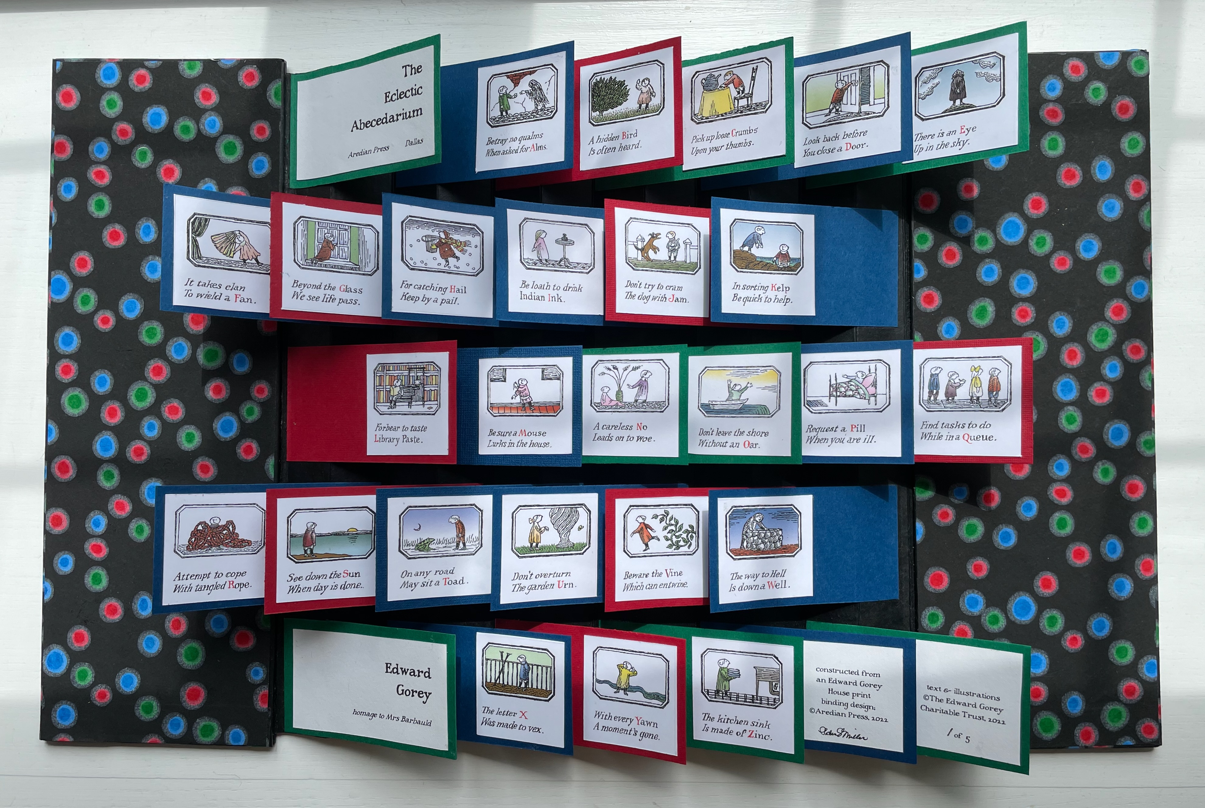
The Eclectic Abecedarium by Edward Gorey (2022) Patrice Miller Flagbook. Closed: H305 x W107 mm. Open: W495 mm. Edition of 5, of which this is #1. Acquired from Aredian Press, 17 July 2022. Photos: Books On Books Collection.
Patrice Miller’s flag book uses the text and color illustrations cut from The Edward Gorey House’s poster version of Gorey’s first alphabet book, The Eclectic Abecedarium (1983). Miller has mounted the text to red, blue, or green textured cardstock, which, in turn, is affixed to a red lotka-backed accordion. Black background yuzen paper with dots of bright blue, red, and green cover the boards.
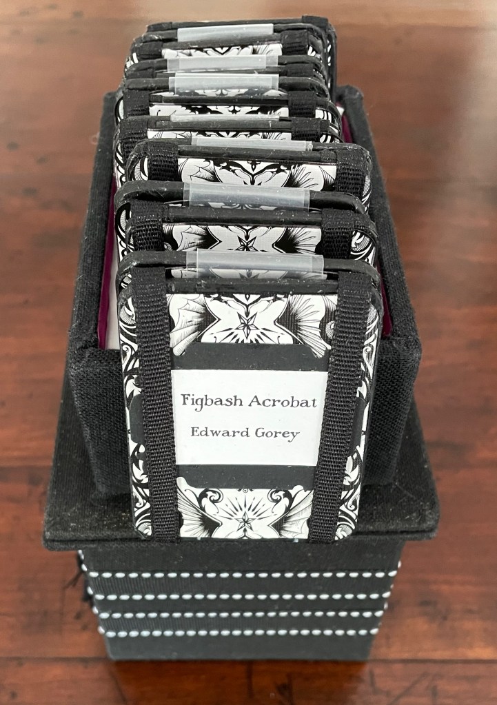
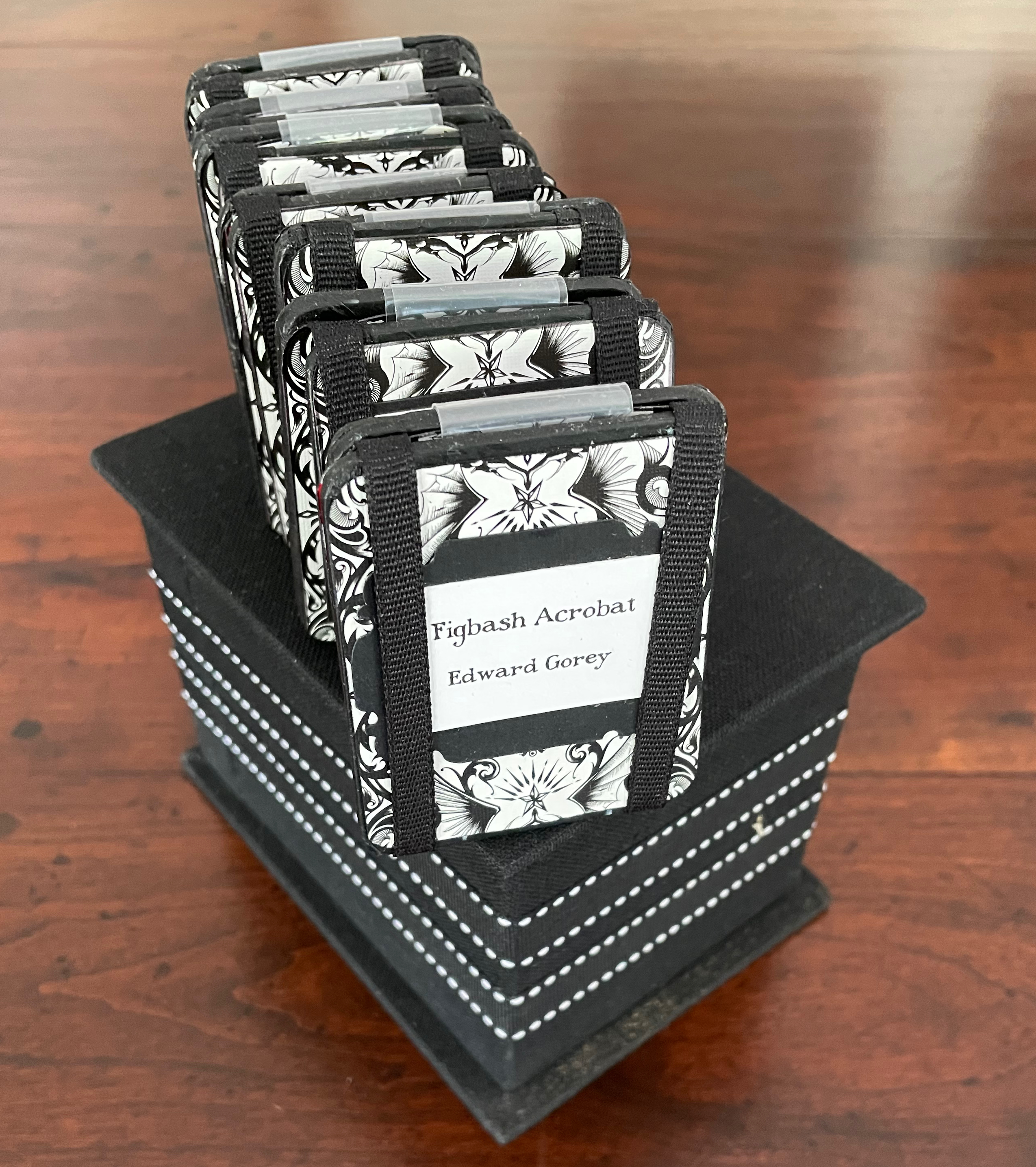
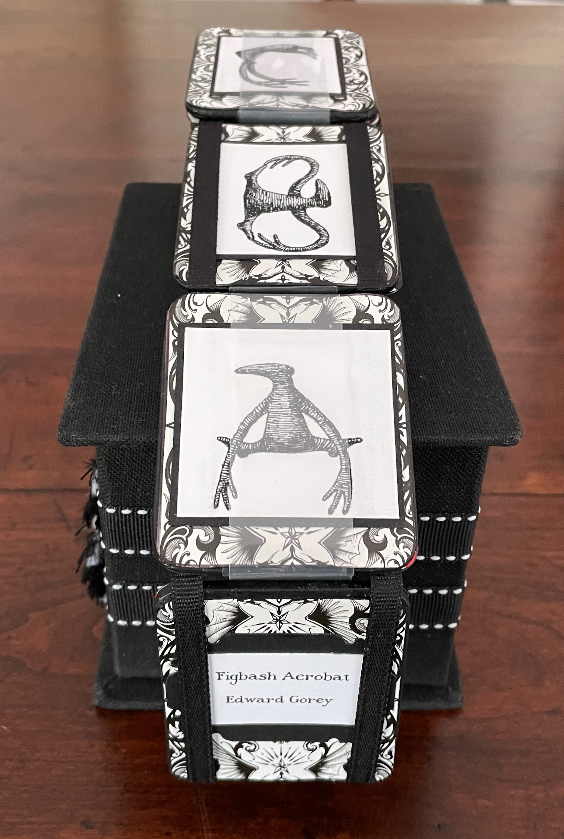
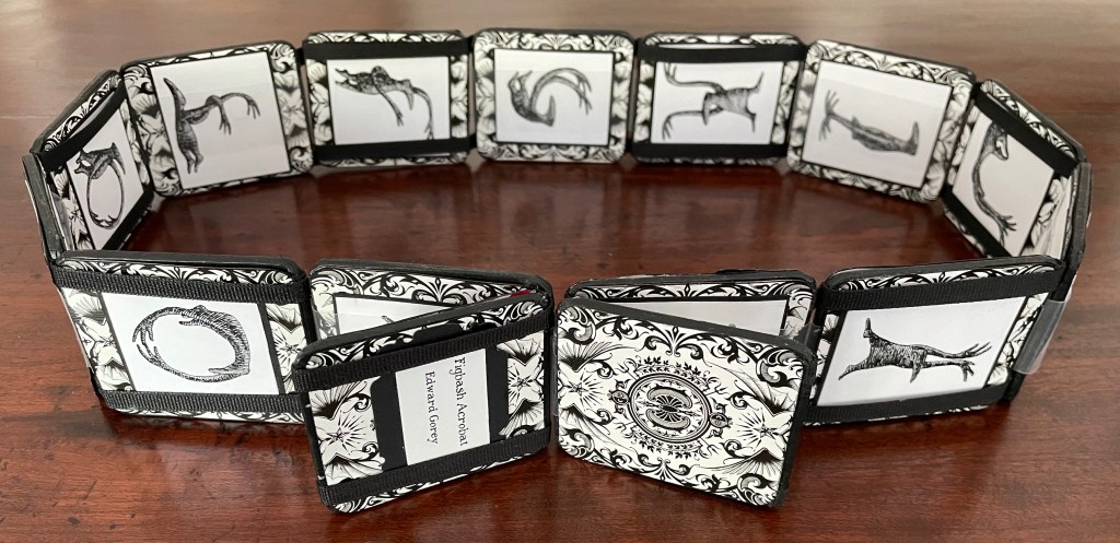
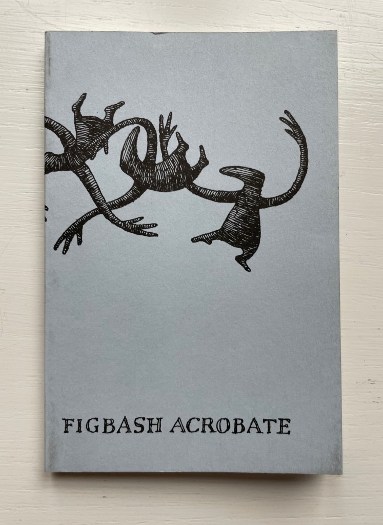
Figbash Acrobate by Edward Gorey (2023)
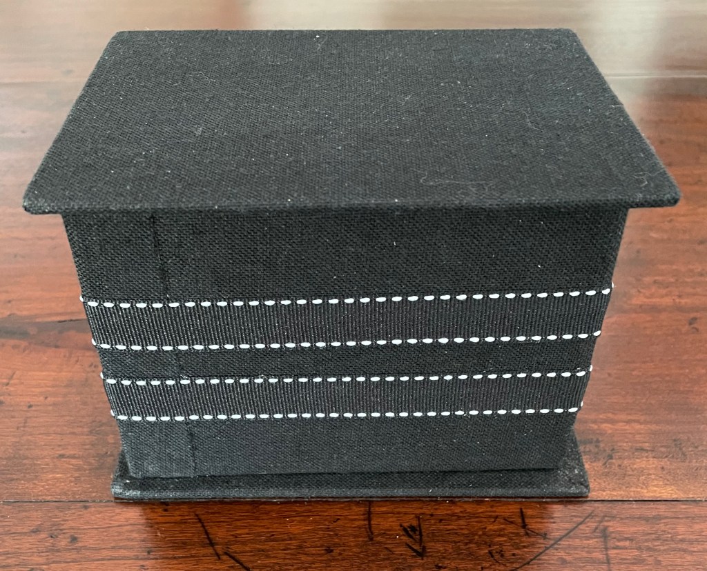
Figbash Acrobateby Edward Gorey (2023) Patrice Miller Jacob’s ladder. Box: H98 x W141 x D106. Ladder closed: H65 x W55 mm. Ladder: open H1025 mm. Acquired from Patrice Miller, 5 April 2023. Photos: Books On Books Collection.
Gorey’s Figbash Acrobate in Jacob’s Ladder format. Video courtesy of Patrice Miller.
Although commissioned, the flag book and Jacob’s ladder make up part of a larger undertaking by Miller: “The Edward Gorey Binding Project”. Miller writes:
Fascinated with the works of Edward Gorey since high school, my binding efforts led me to embark on the challenge of rebinding (or binding) all 100+ titles authored by him, with the occasional distraction of books featuring his illustrations only. … A selection of the books have been displayed at the Edward Gorey House, Yarmouth Port, Massachusetts.
So far the project has yielded fan, star, accordion/stub, tufted red cotton velvet with covered buttons, flat-back, ribbon band, Green Thai alligator-pattern textured paper and goat skin, black lokta overlaid with ogura lace paper, calfskin and blue and green feathers from the binder’s parrot Django, silk-screened Indian cotton rag paper, sheer paper imbedded with irregular black yarn circles overlays, and vintage gold brocade bookcloth bindings. Another four to five years should see the job done!
Aredian Press works have received Distinguished Book Awards from the Miniature Book Society.
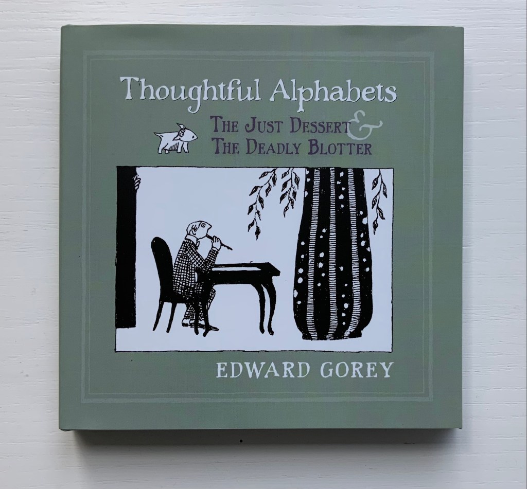
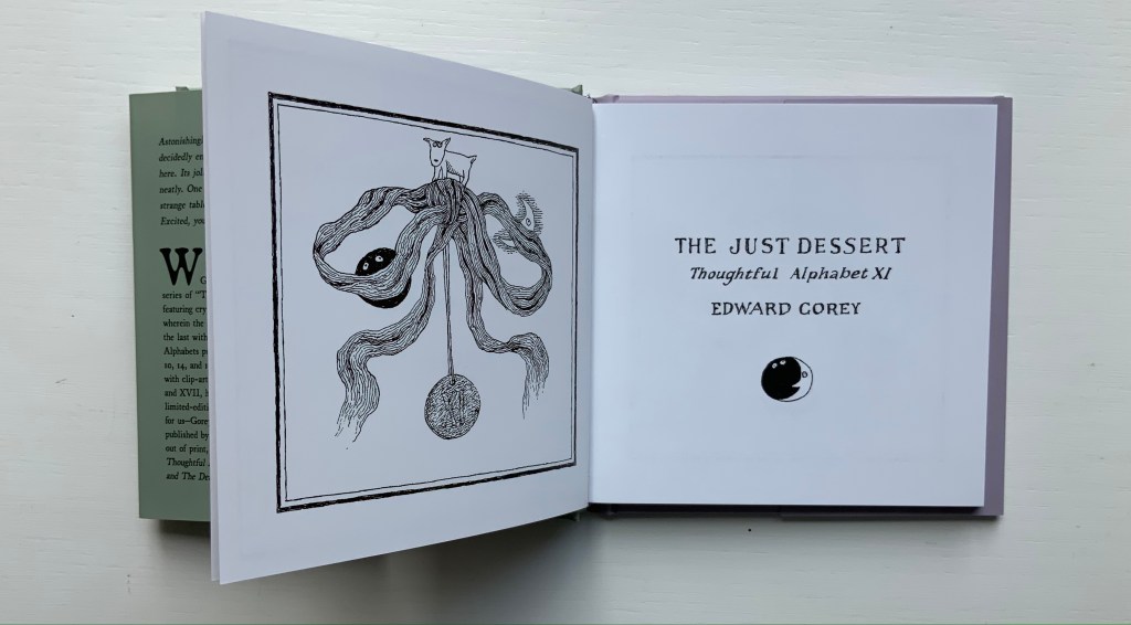
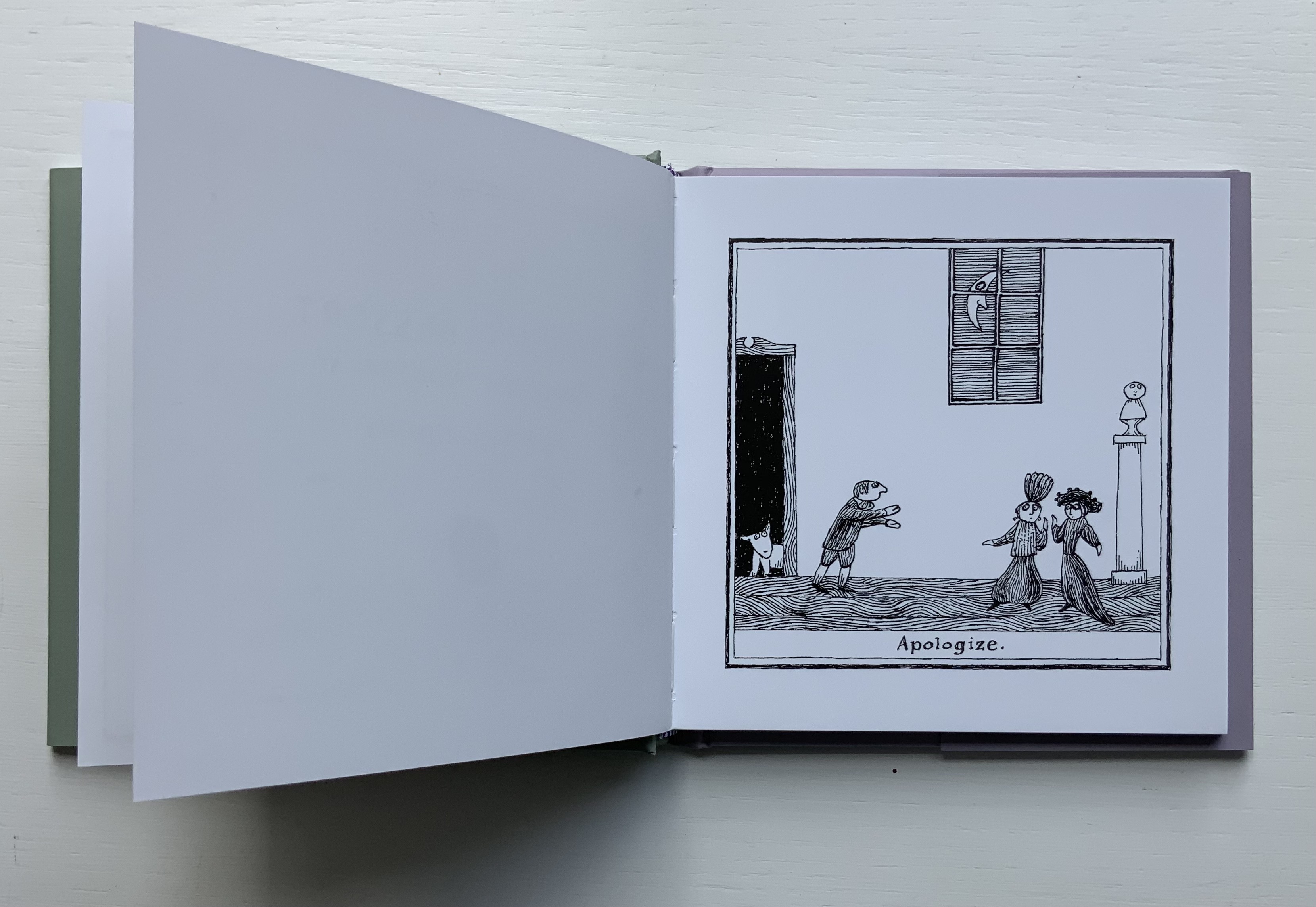
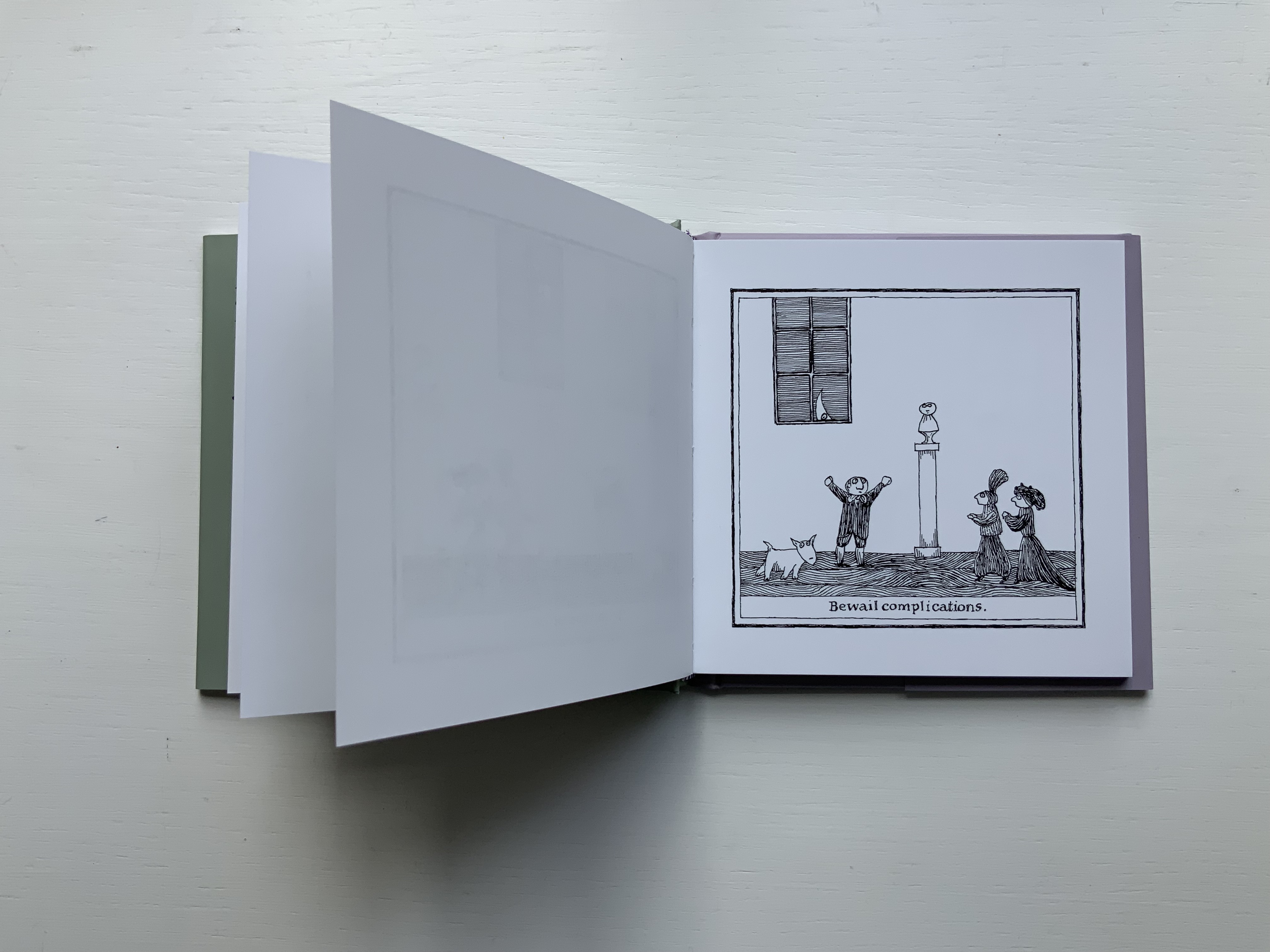
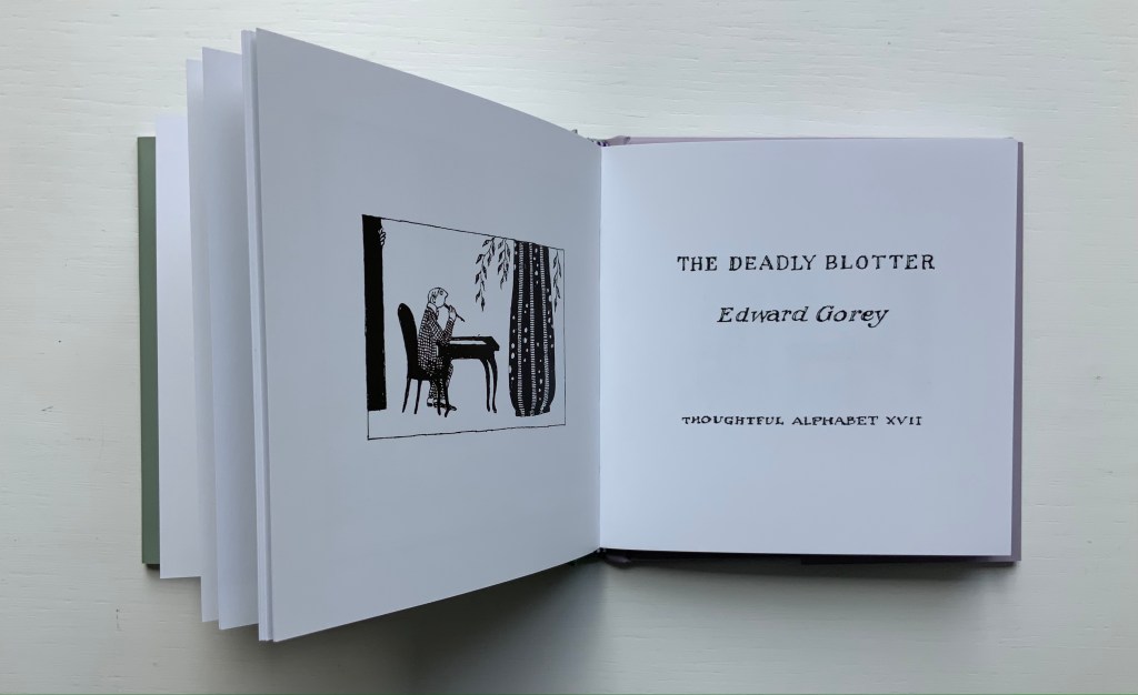
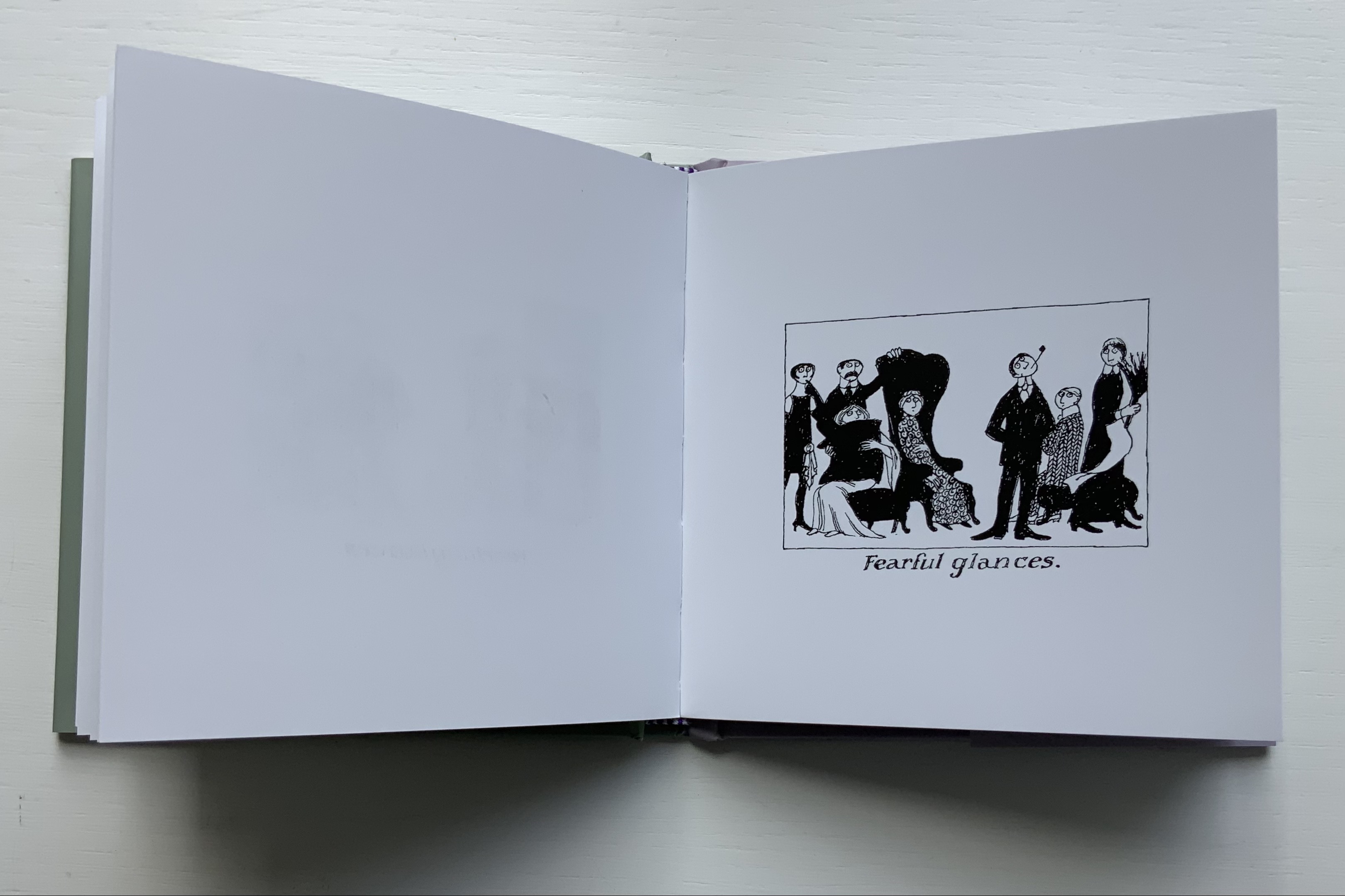
No serious collection of alphabet books or alphabet-related artists’ books can be complete without some representative of Edward Gorey’s work. This volume brings together Thoughtful Alphabets XI and XVII, two detective stories in which the plots must be deduced from pithy alphabetized directions or alphabetized descriptions underlying static black-and-white cartoon tableaus.
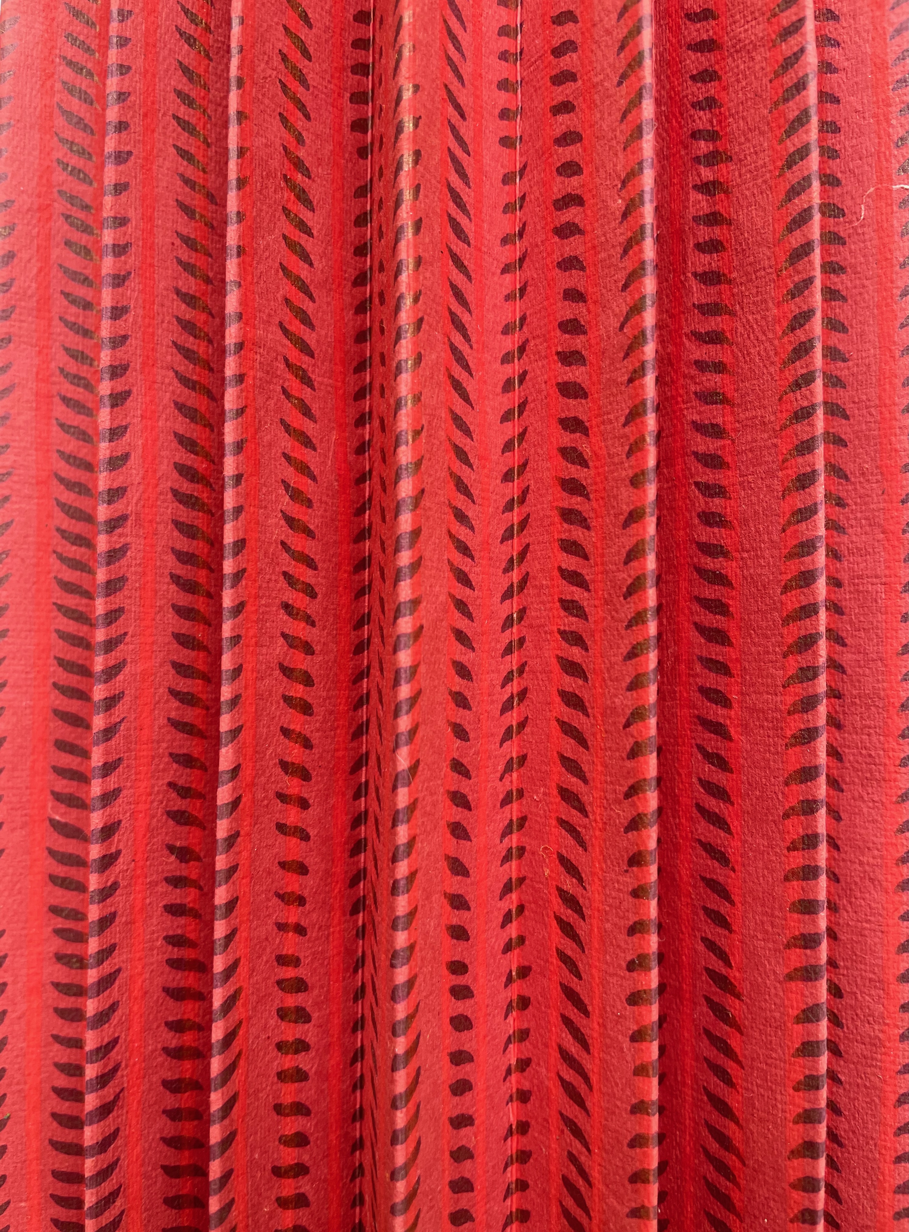
Figbash Acrobate (1994) Ædwyrd Goré (Edward Gorey) Softcover. H113 x W75 mm. 40 folios. First edition, 500 numbered copies, of which this is #11. Acquired on eBay, 20 August 2022. Photos: Books On Books Collection.
Just two representatives — even if one of them is two for one — seems hardly adequate though for a serious collection. Surely another is needed to qualify. Or perhaps some variants in homage? To judge for yourself, click
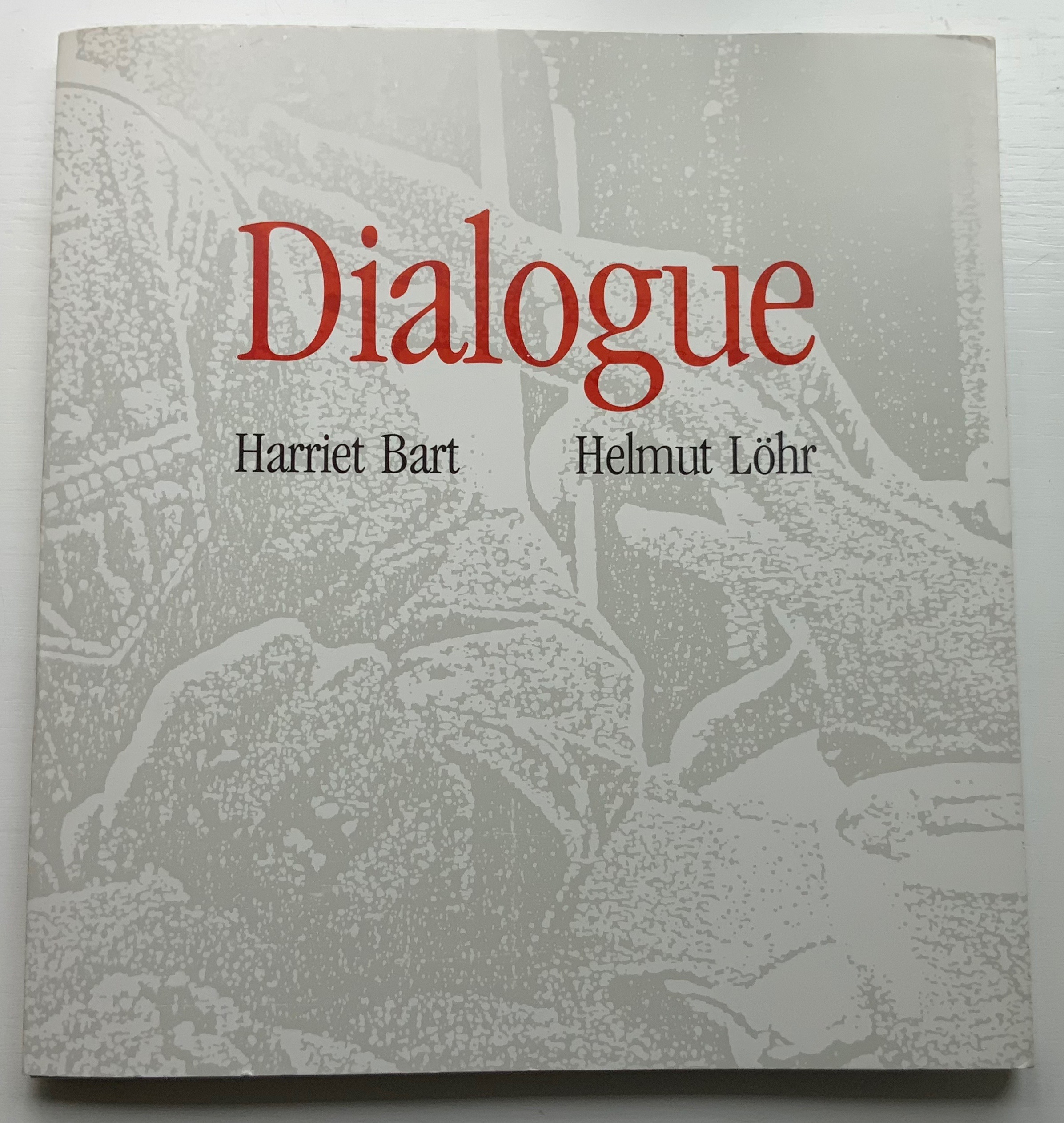
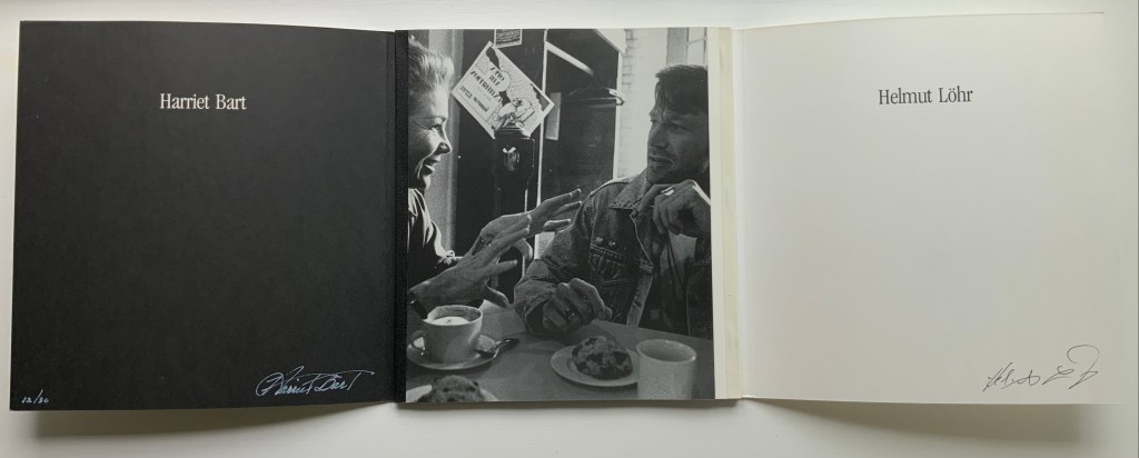
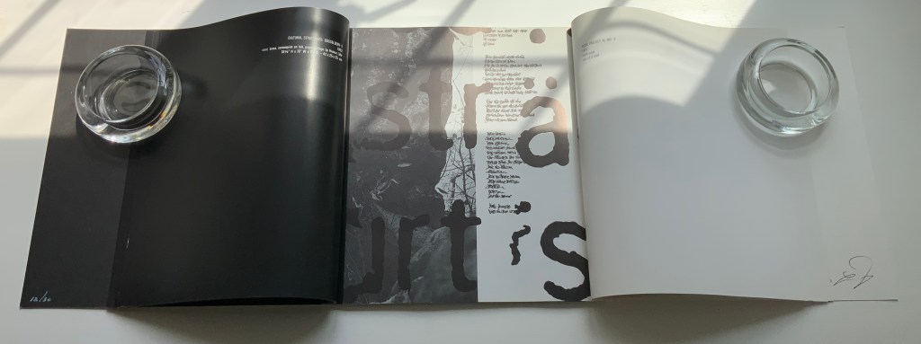
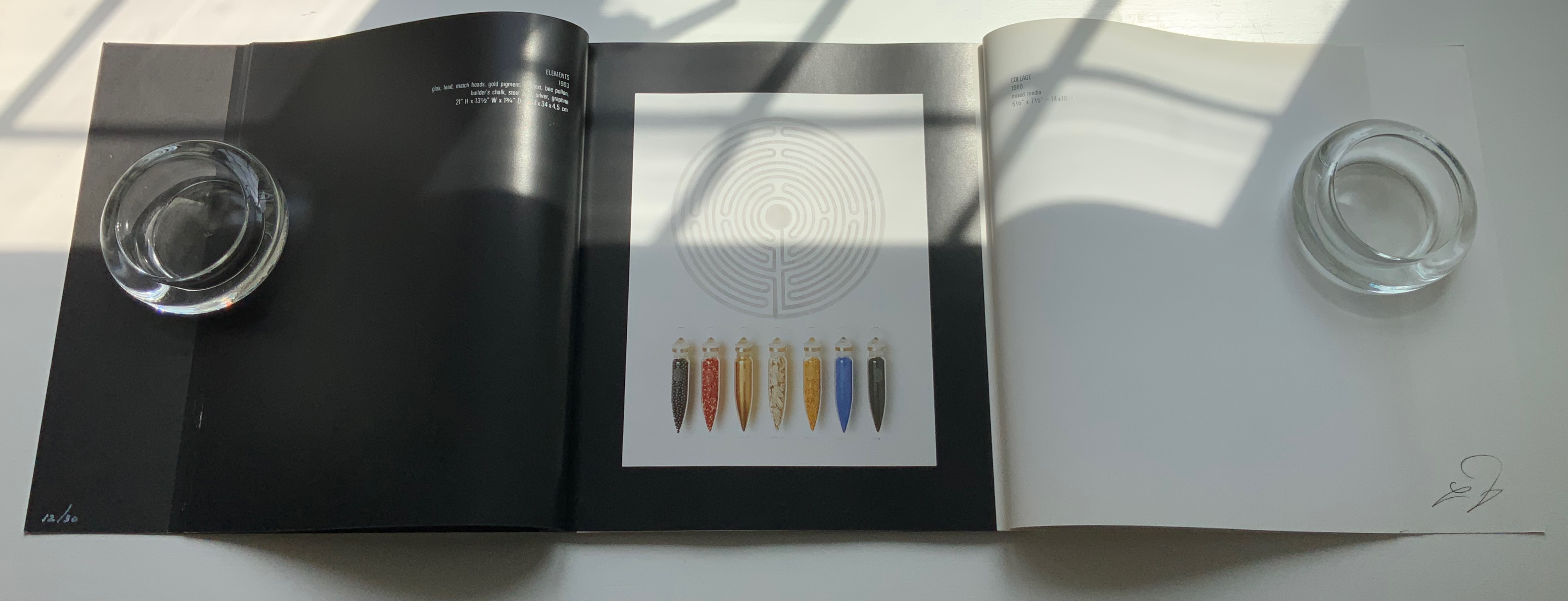
Dialogue: Alchemy of the Word(1993) Harriet Bart and Helmut Löhr French-fold card-covered, gatefold book: H260 x W243 mm, 56 pages. Includes altered book and collage print. Edition of 30, of which this is #12. Acquired from Harriet Bart, 3 June 2022. Photos: Books On Books Collection.
From the Foreword:
Art is a universal language – drawing together people of all regions, races, ages, and socioeconomic levels. Dolly Fiterman Fine Arts is pleased to premier the work of Harriet Bart and Helmut Lohr. Harriet Bart lives in Minneapolis, Minnesota, USA. Helmut Lohr is based in Dusseldorf, Germany but lives for several months of the year in the United States… The French poet Stephane Mallarmé said that everything was made to end up in a book. Sculpture, collage, and photography by artists Harriet Bart and Helmut Lohr explore the alchemy of the word, the iconography of the text, the labyrinth of the book, the book as poetic object. Bart and Lohr met in New York in 1990 when they were presenting their work at the same exhibition. Drawn to each other’s work they began a dialogue about their concepts and philosophies of art and life. The conversations continued as they exchanged visits and ideas in Minneapolis, New York, and Dusseldorf. Dialogue: Alchemy of the Word is a visual presentation of their dialogue.
Befitting this book’s title, the binding is not dos-à-dos but rather vis-à-vis or face to face. When the French fold cover parts left and right, the black binding tape on the left and white on the right appear with the photo of the two artists in discussion over coffee and pastry. The interleaving gatefold design enacts a dialogue of pictured artworks and, in doing so, becomes a work of book art itself. How appropriate for Harriet Bart and the late Helmut Löhr, both of whom count artists’ books among their multimedia output.
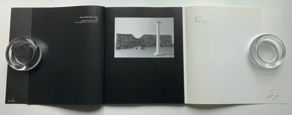
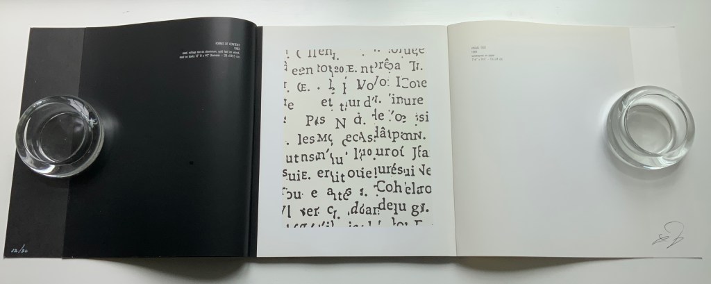
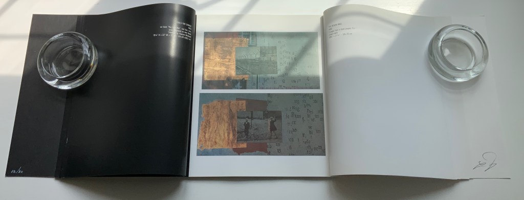
After the foreword, Harriet Bart has the opening gambit on the verso in white type on a black background. That column in the foreground of Fading Memories/Timeless Truths (1990) almost suggests a chess move …
to which Löhr responds with his Visual Text (1989), black on white. The back and forth continues
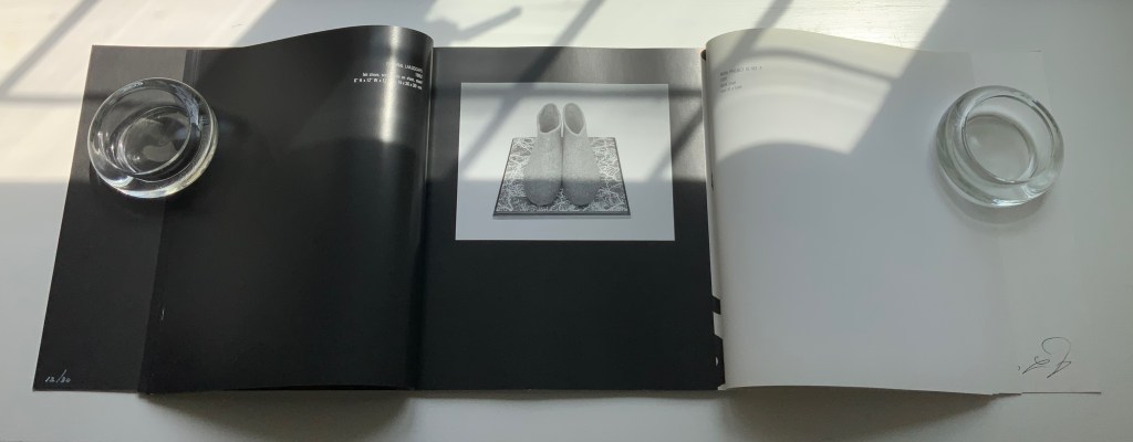
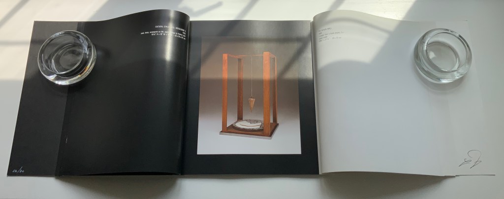
An altered-book sculpture from Bart and one of Löhr’s collage prints accompany the deluxe edition.
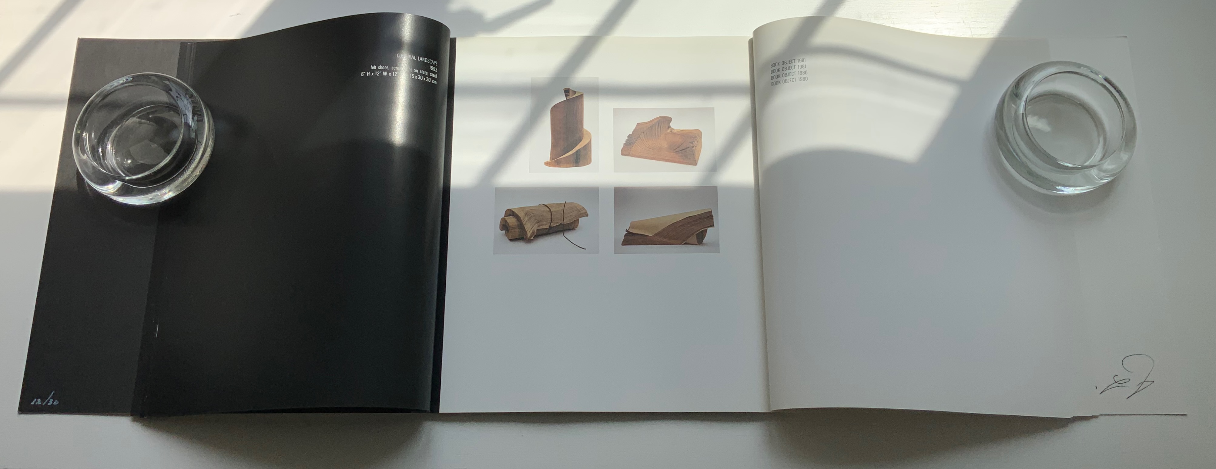
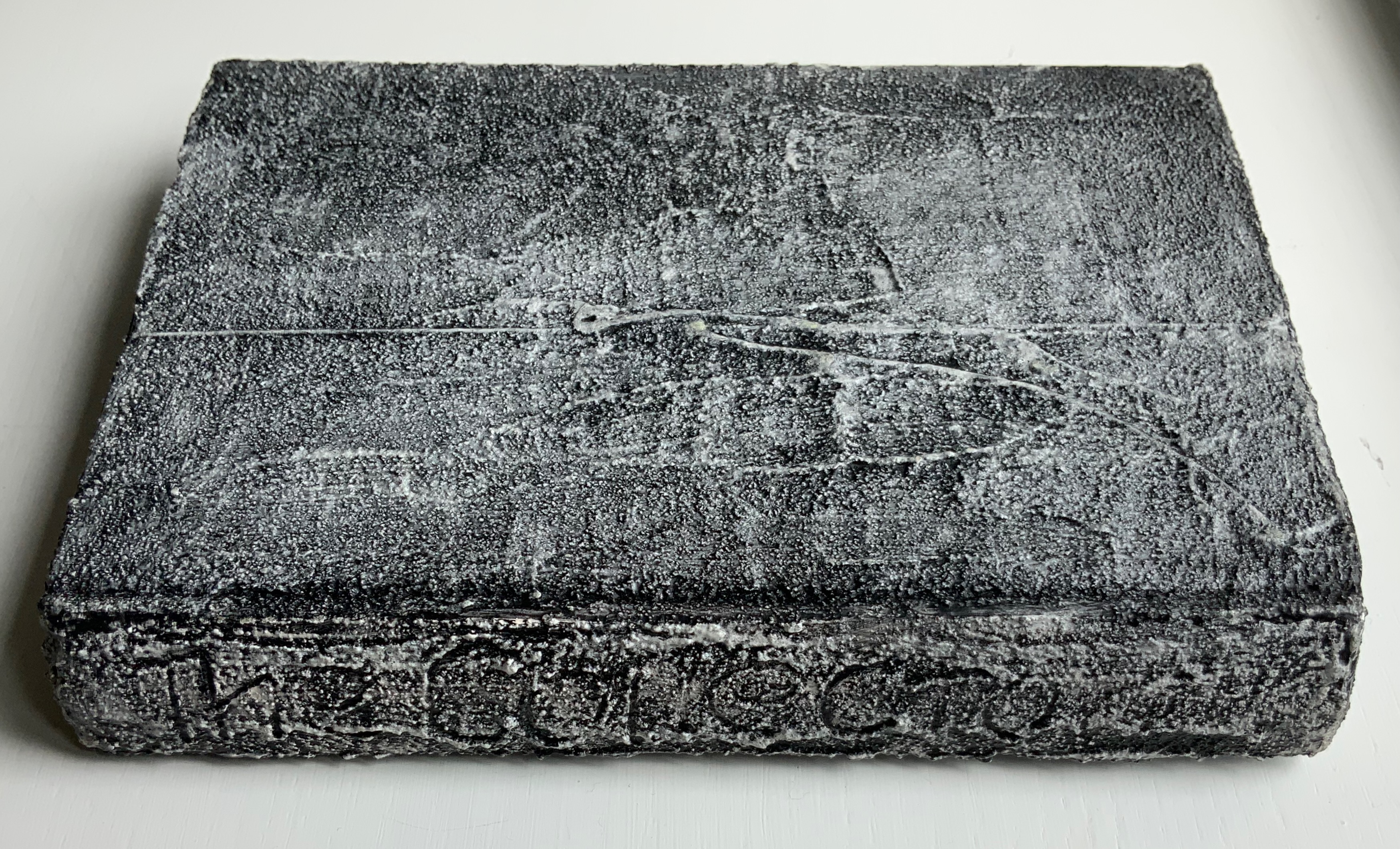
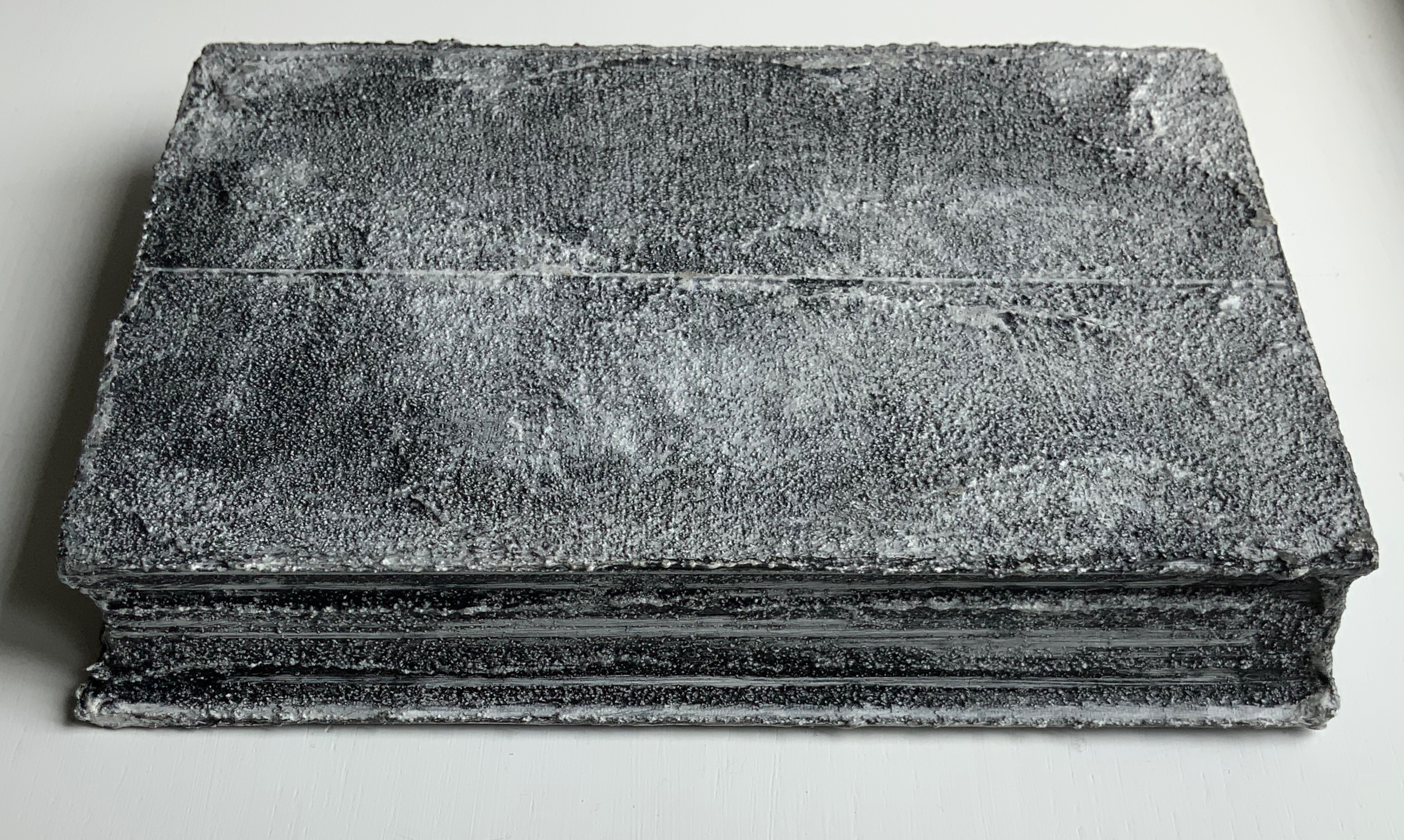
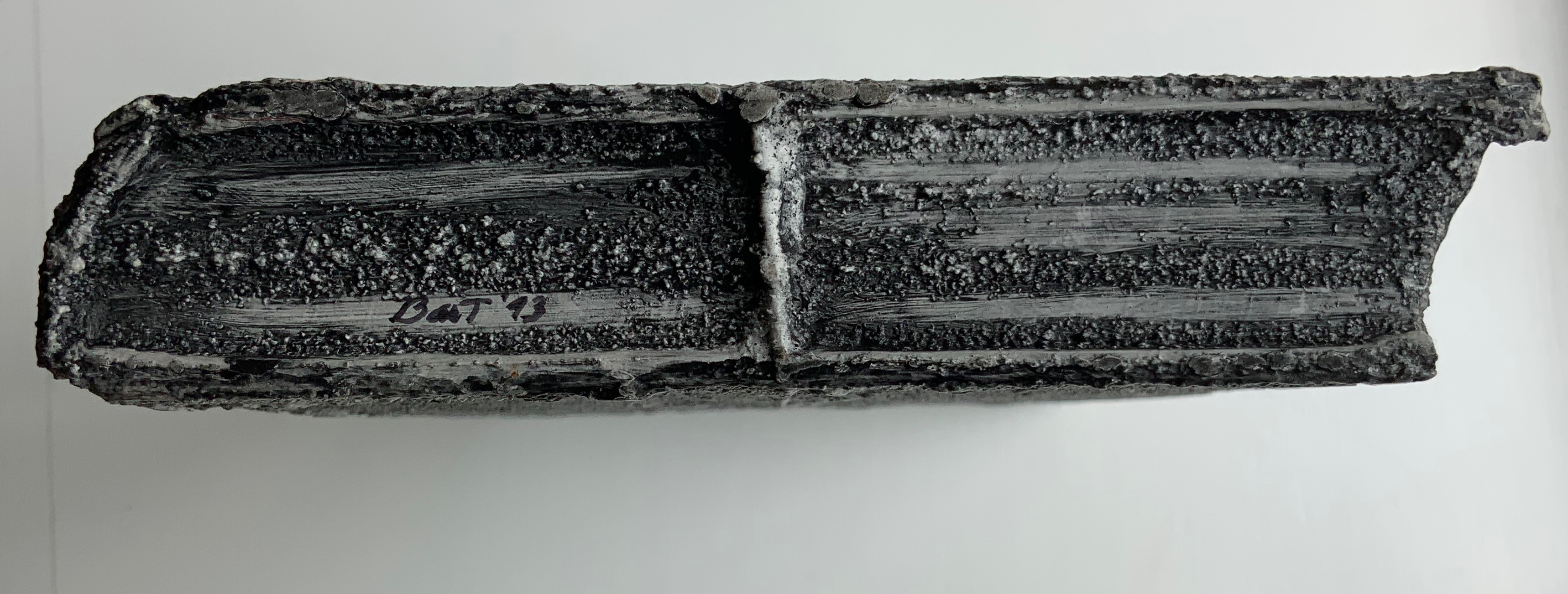
The sculpture echoes Bart’s Bound History (1992), whose photo appears in the dialogue and is answered by the photo of Löhr’s Book Object (1981).
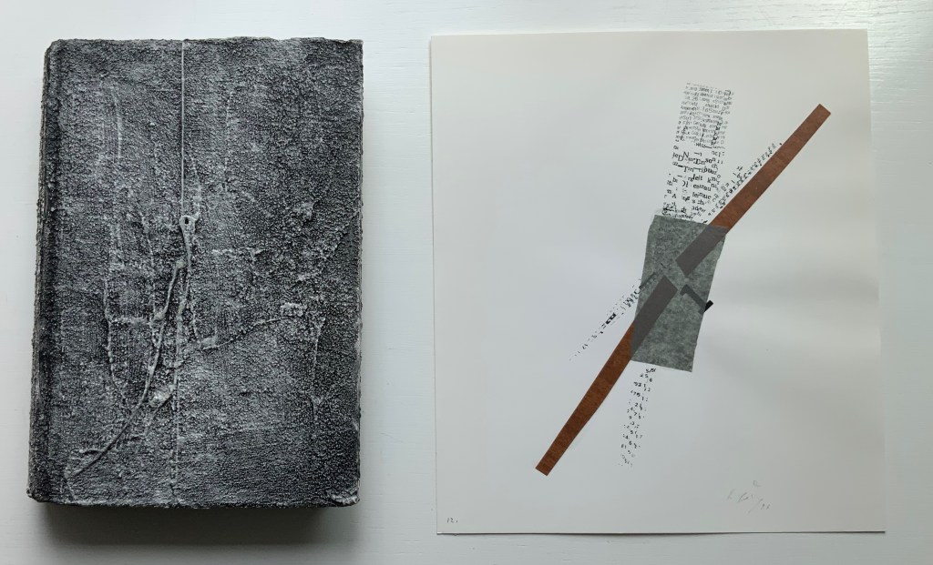
Detail views of the altered book.
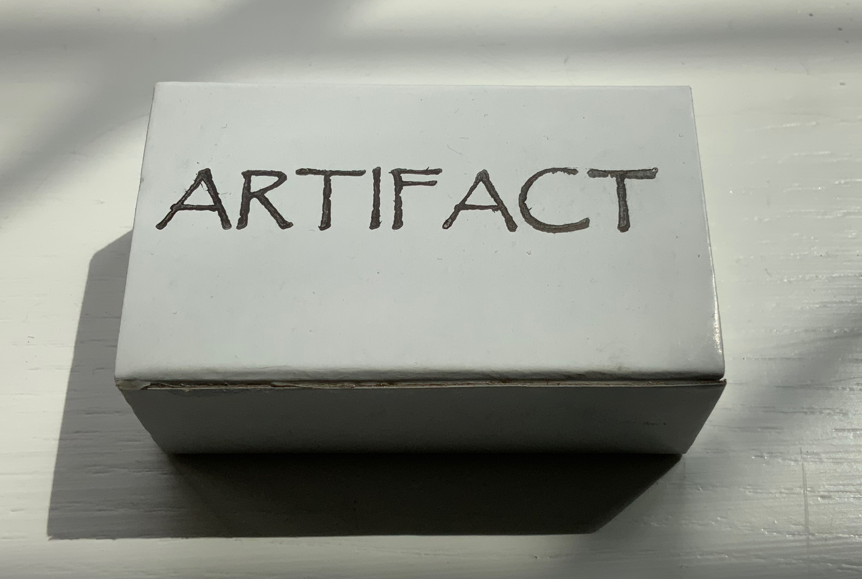
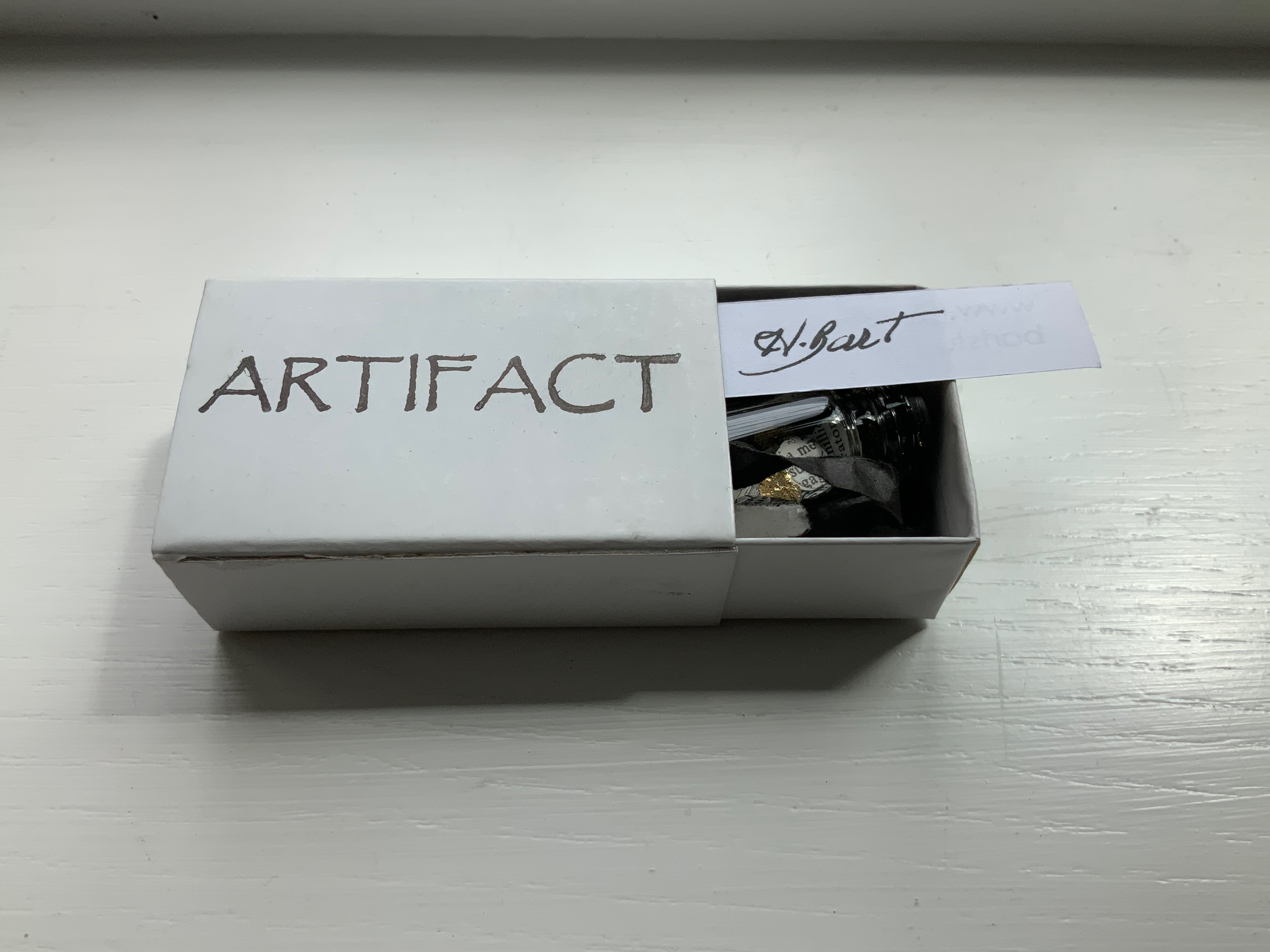
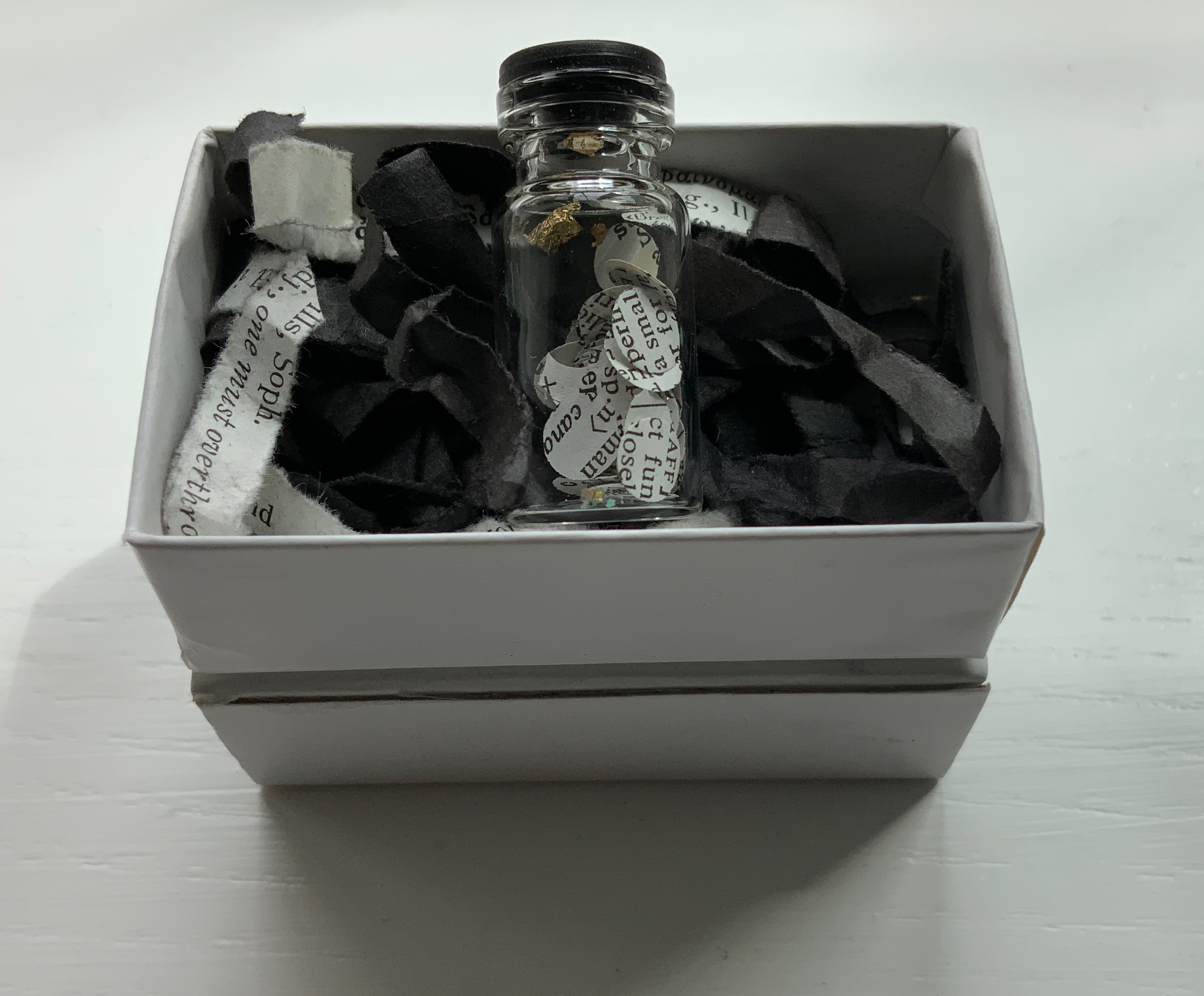
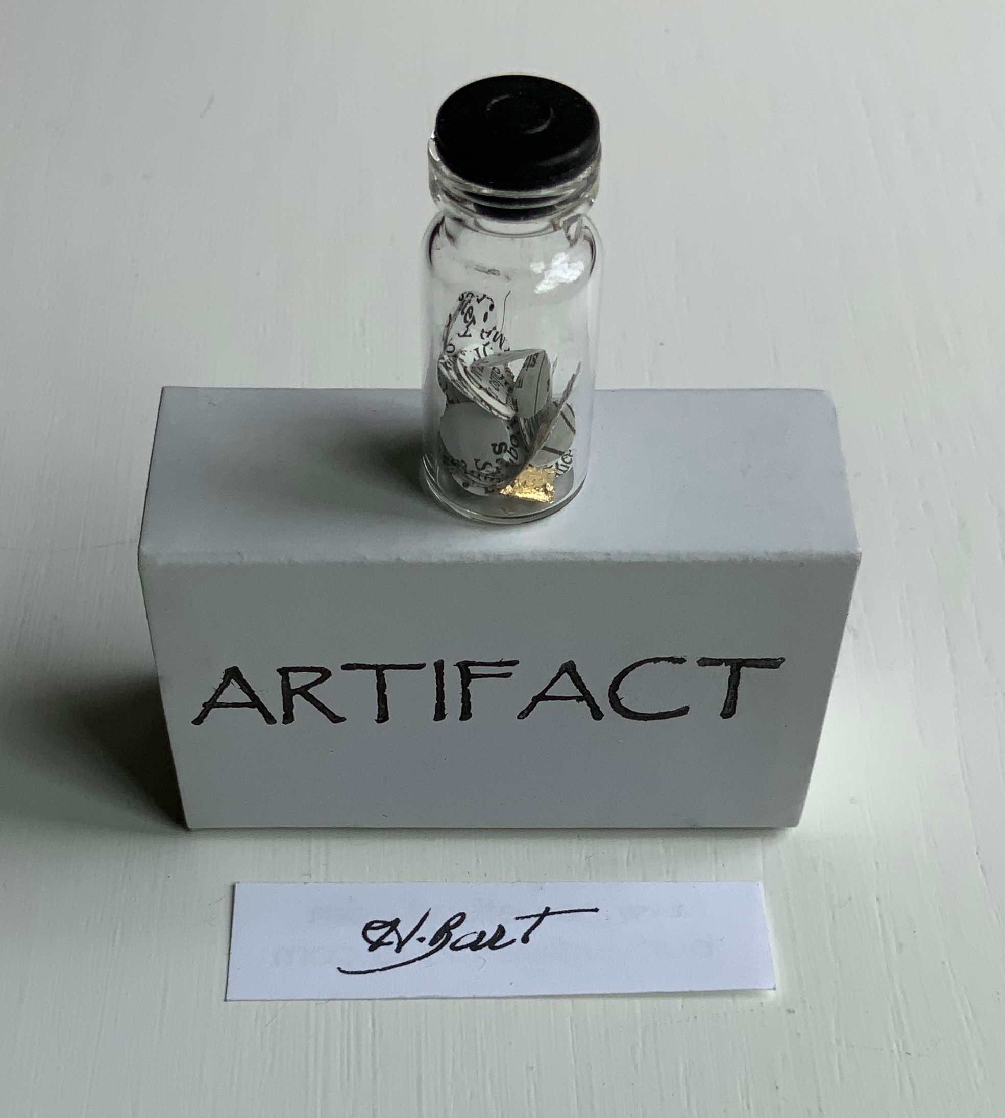
Artifact (2022)
Artifact (2022) Harriet Bart Matchbox enclosing black-capped bottle of fragments of gold leaf, paper disks hole-punched from a reference work, resting on shreds from a dictionary and black tissue paper. Box: H40 x W63 x D24 mm. Bottle: H35 x D9 mm. Acquired from the artist, 12 April 2022. Photos: Books On Books Collection.
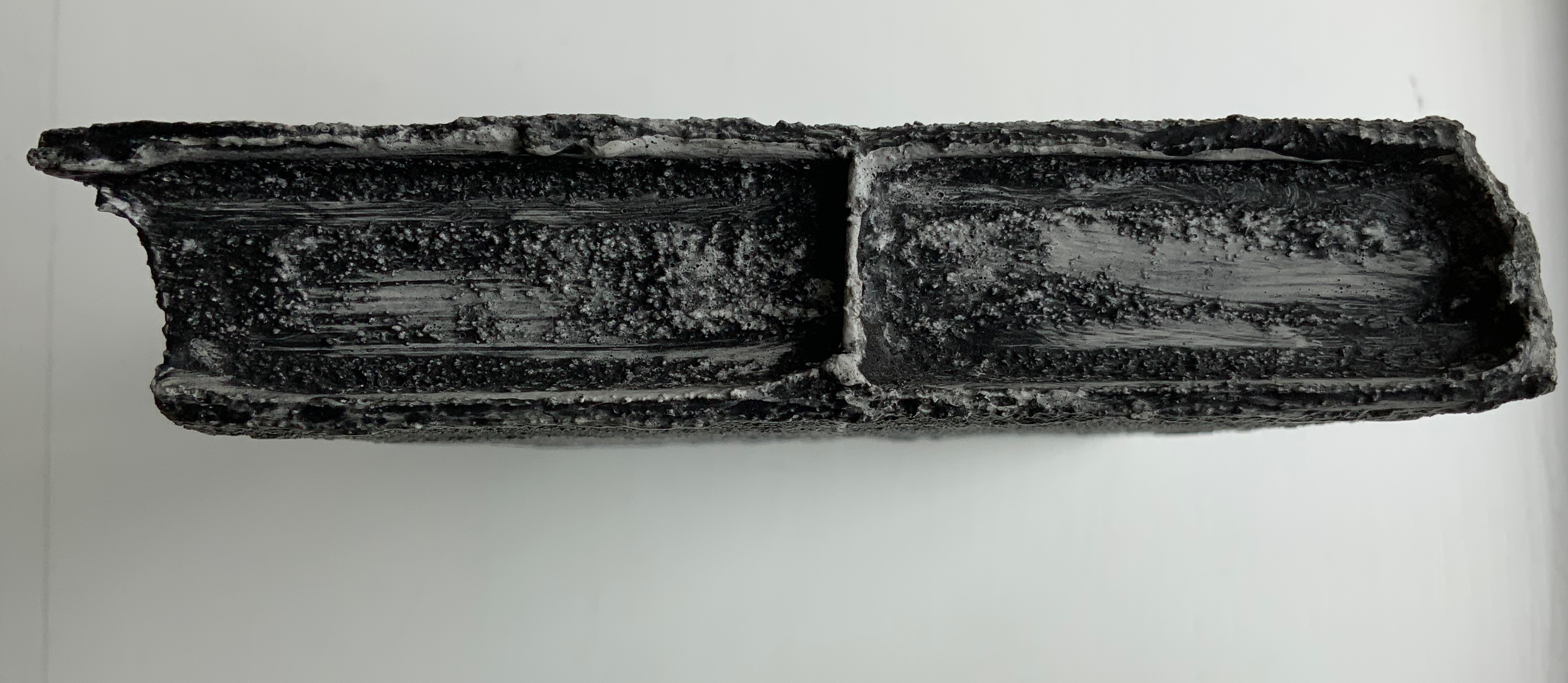
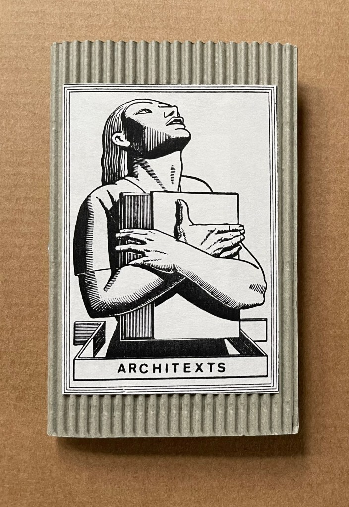
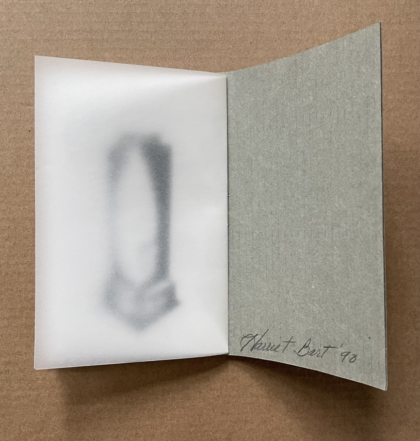
Architext (1990)
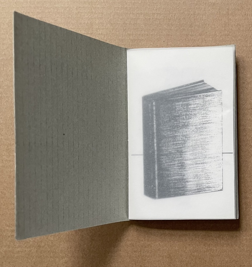
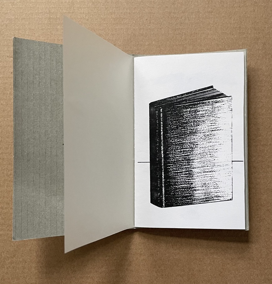
Architext (1990) Harriet Bart Booklet, saddle stitch, single-staple, corrugated cardboard with title pastedown. H112 x W72 mm. [8] pages. Photocopy of larger charcoal drawings. Acquired from the artist, 3 June 2022. Photos: Books On Books Collection.
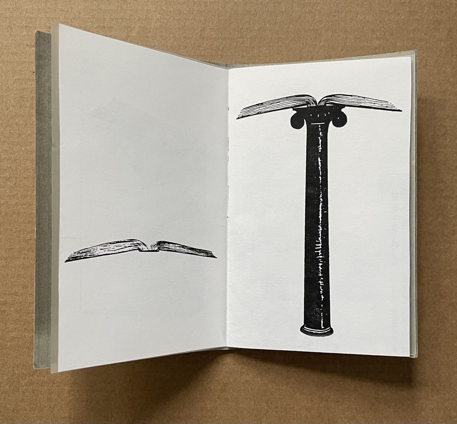
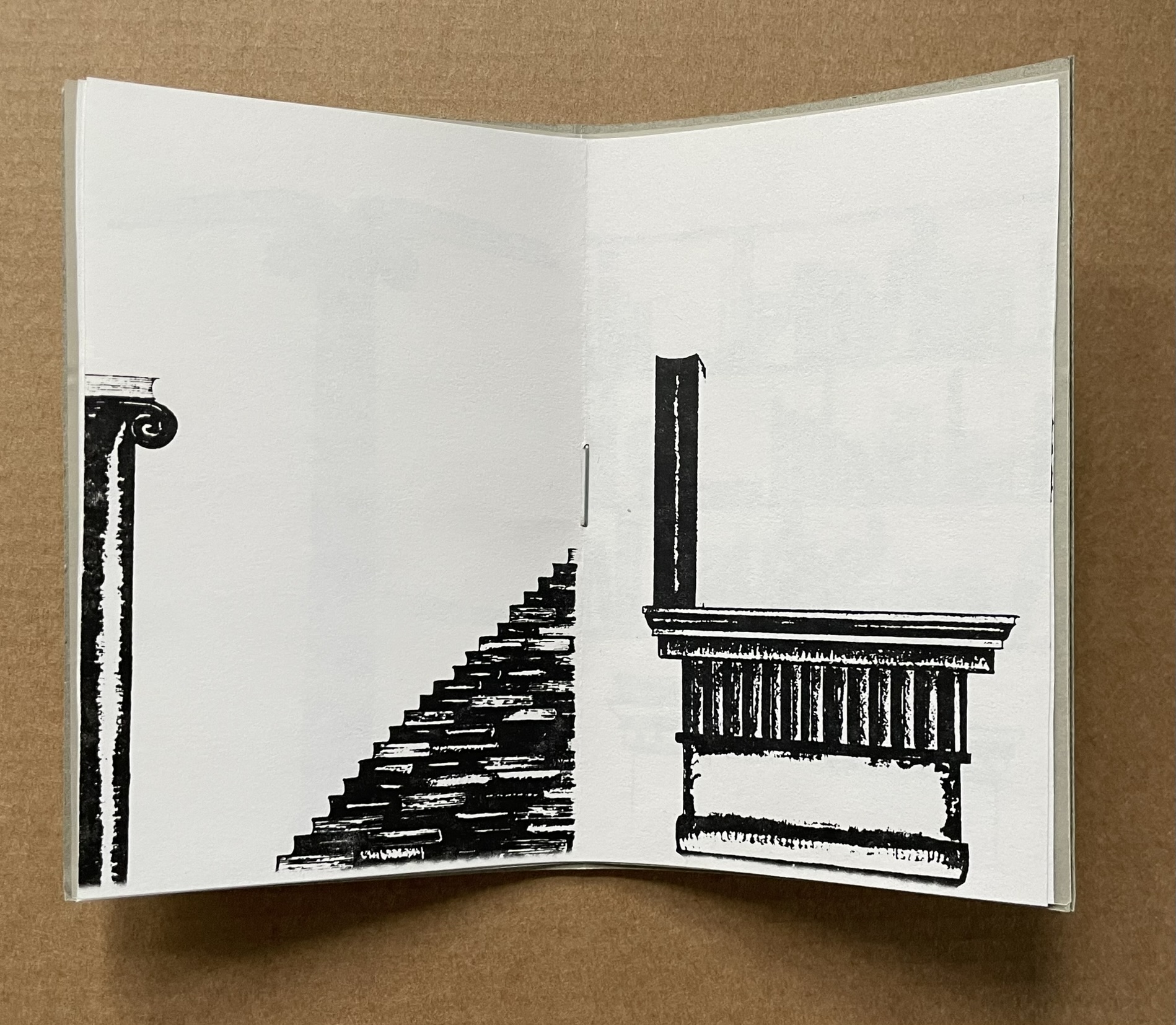
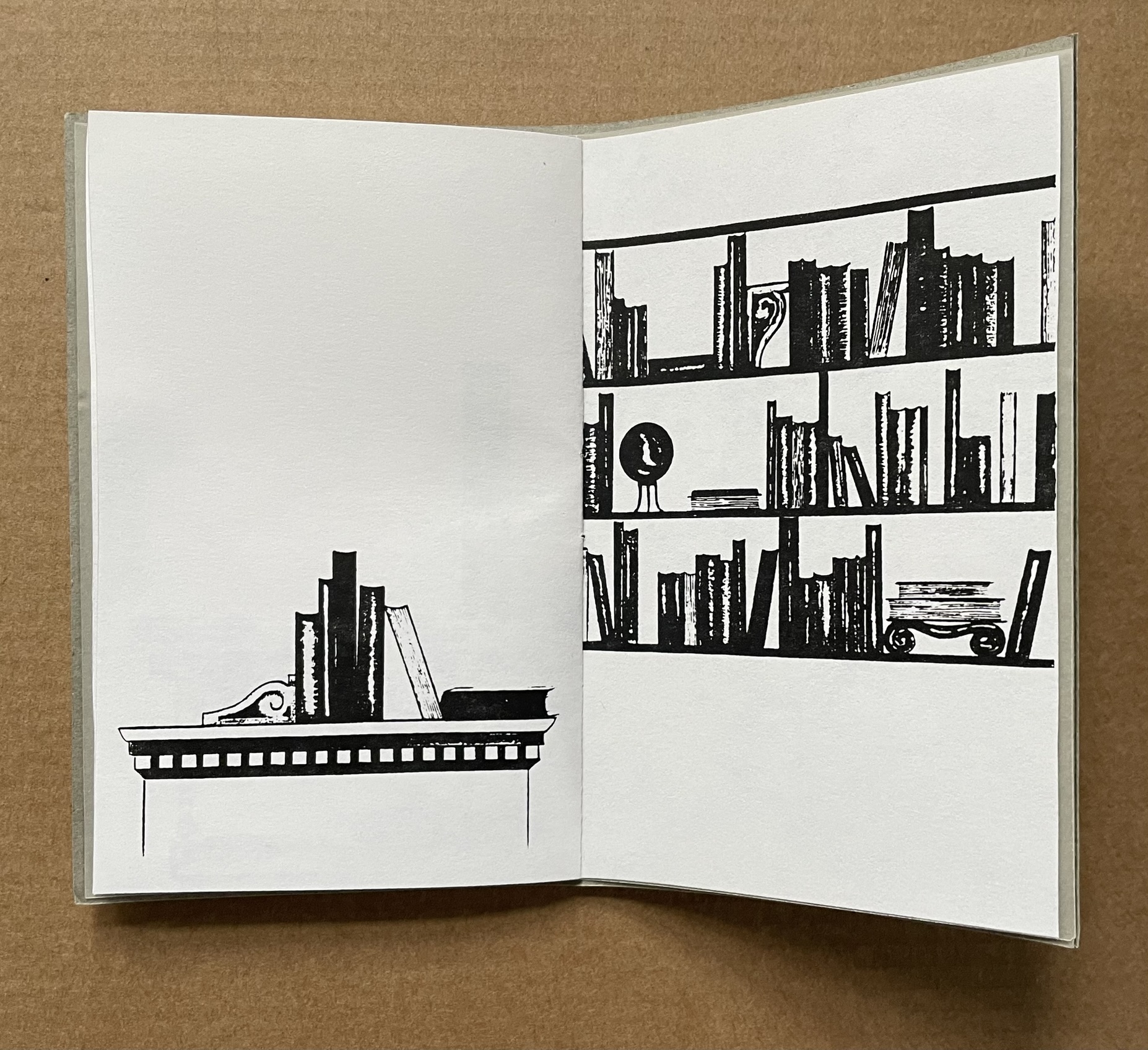
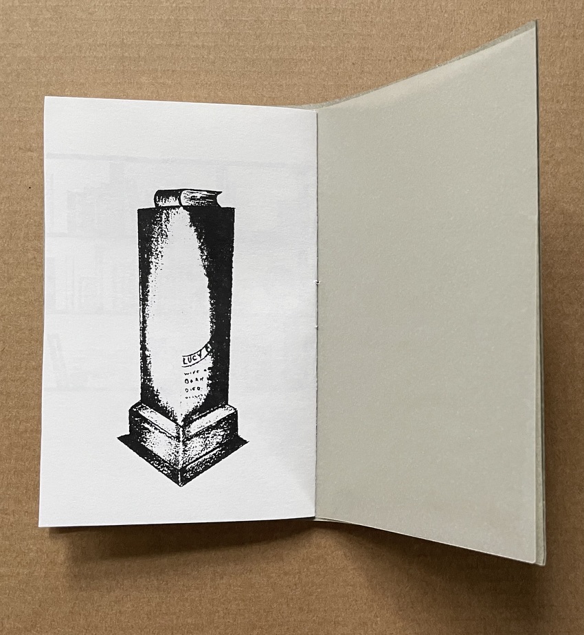
The Architext‘s content makes its title and the work an oxymoron. As a wordless narrative, it has no text, and the “text” as book shifts between presenting as architectural features (capstone, stairs, etc.) and requiring architectural features to be presented. Artifact and Architext can both be found in the following booklet published for an exhibition at the Walker Art Center in Minneapolis, 15 December 2010 – 15 February 2011.
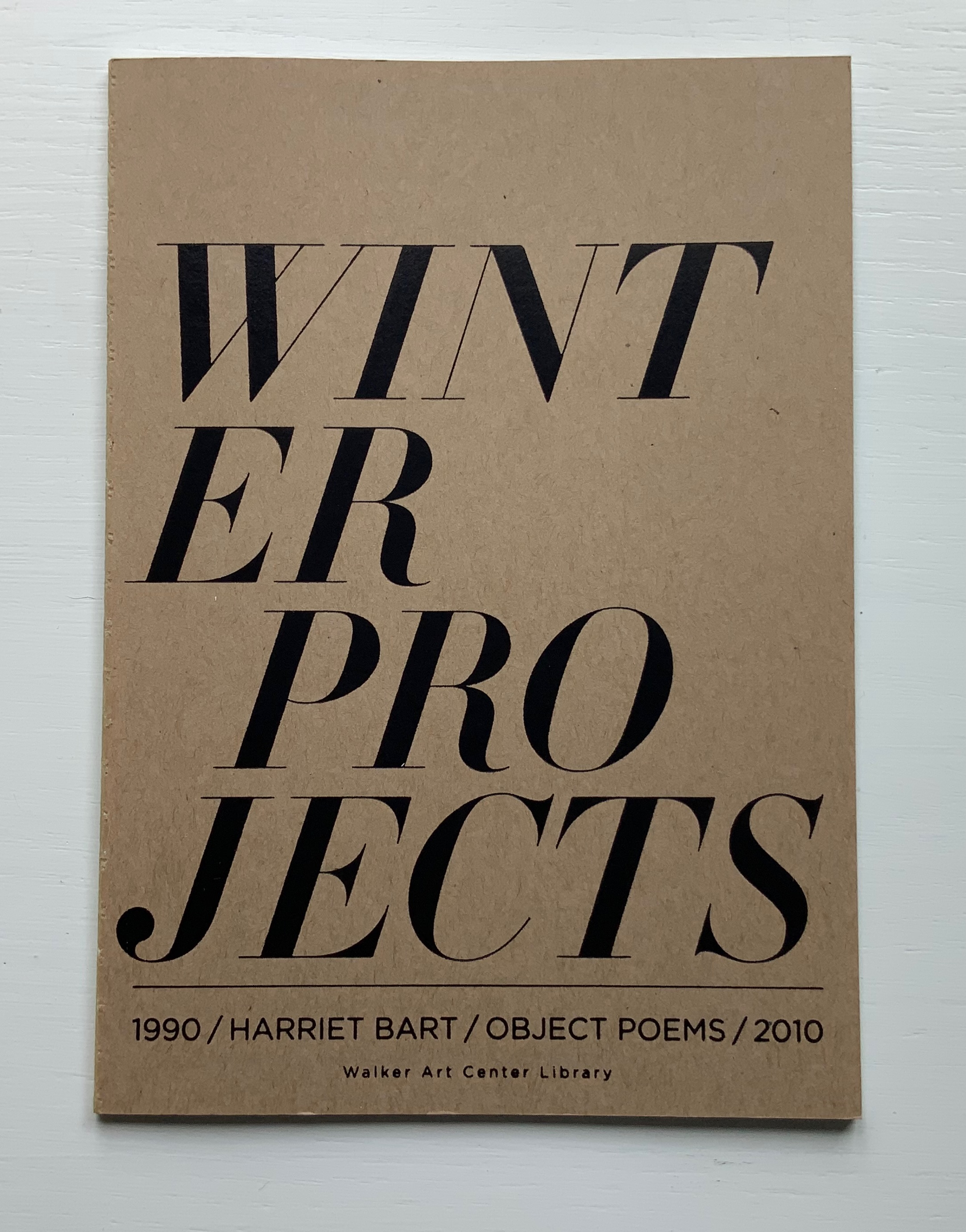
Winter Projects (2010)
Winter Projects: 1990 object poems 2010 (2010) Harriet Bart Open spine glue binding. H178 x W128, 36 pages. Published by the Walker Art Center Library, Minneapolis, MN. Acquired from the artist, 3 June 2022. Photos of the work: Books On Books Collection.
From the Foreword:
Every December for the past twenty years, the artist Harriet Bart, creator of the winter projects, has been making and sending multiples. These multiples echo her larger unfinished works. There are similarities, particularly in her use of repurposed materials, felt, shells, gold leaf, texts on paper, cords, and small boxes. These multiples serve as a holiday greeting for sixty or more friends and colleagues … The artist calls these multiples Visual Objects/Poems.
Harriet Bart (2003)
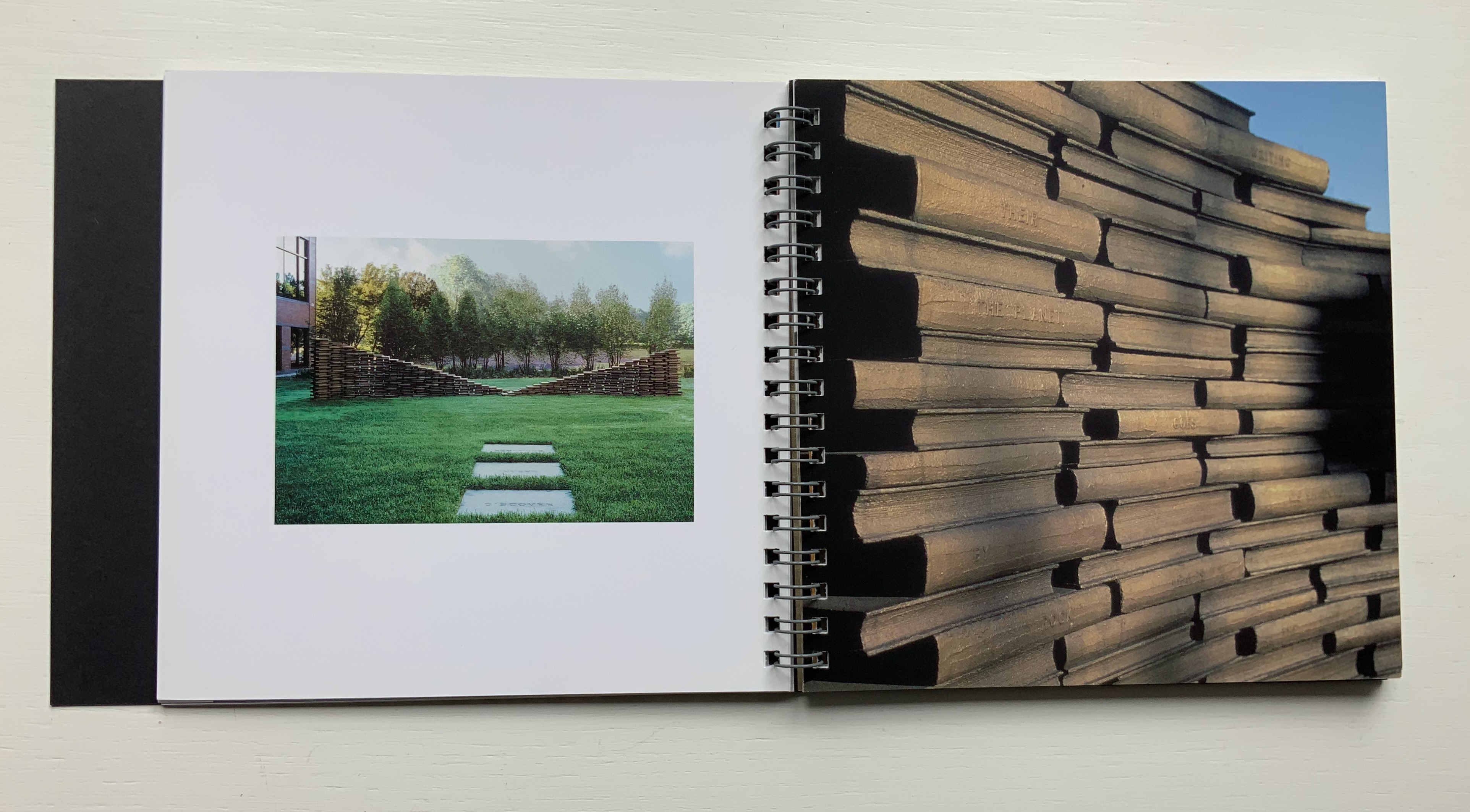
Harriet Bart (n.d.) Harriet Bart Rik Sferra, photos Trifold, spiral bound. H152 x W162 mm, 54 pages. Acquired from the artist, 3 June 2022. Photos of the work: Books On Books Collection.
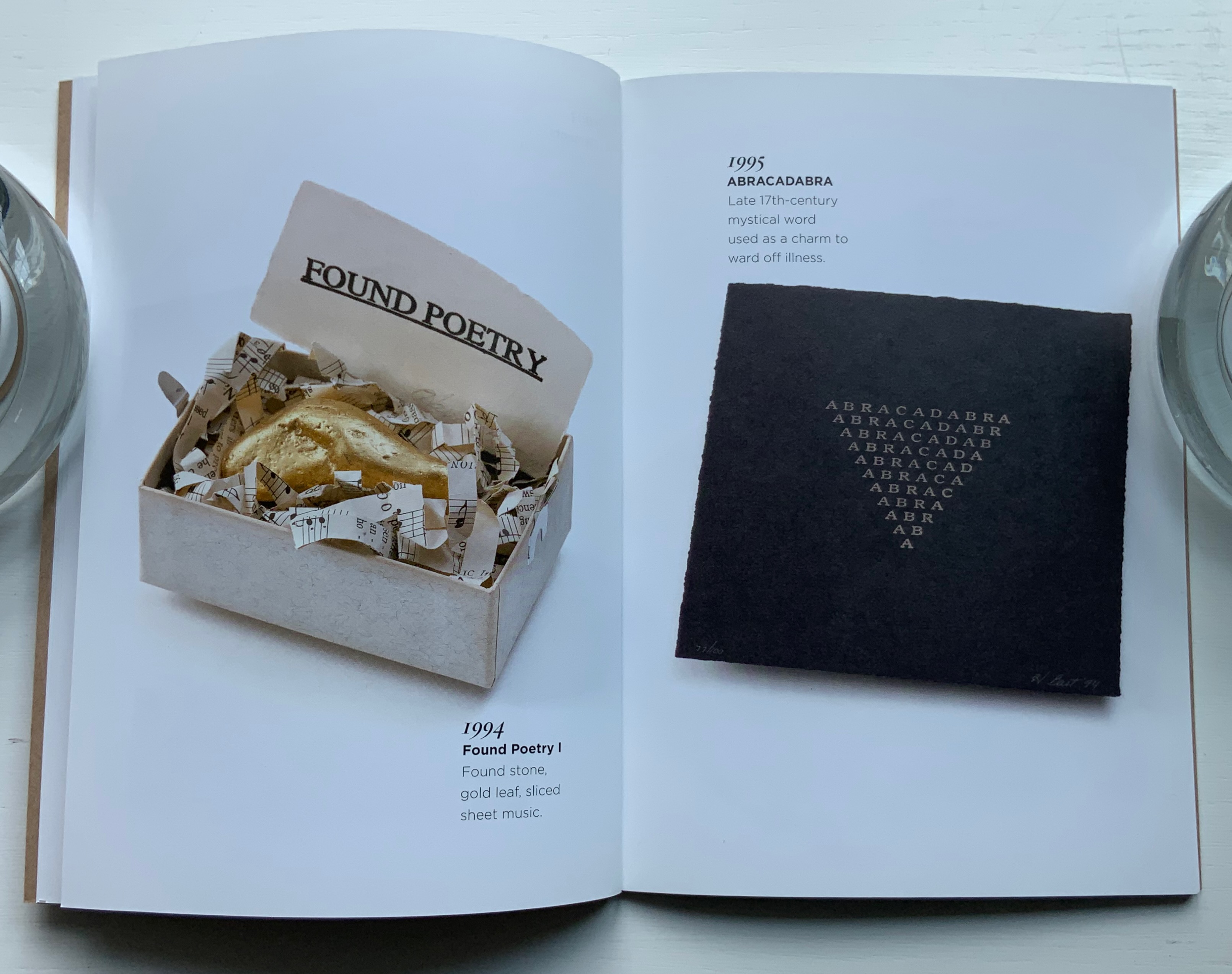
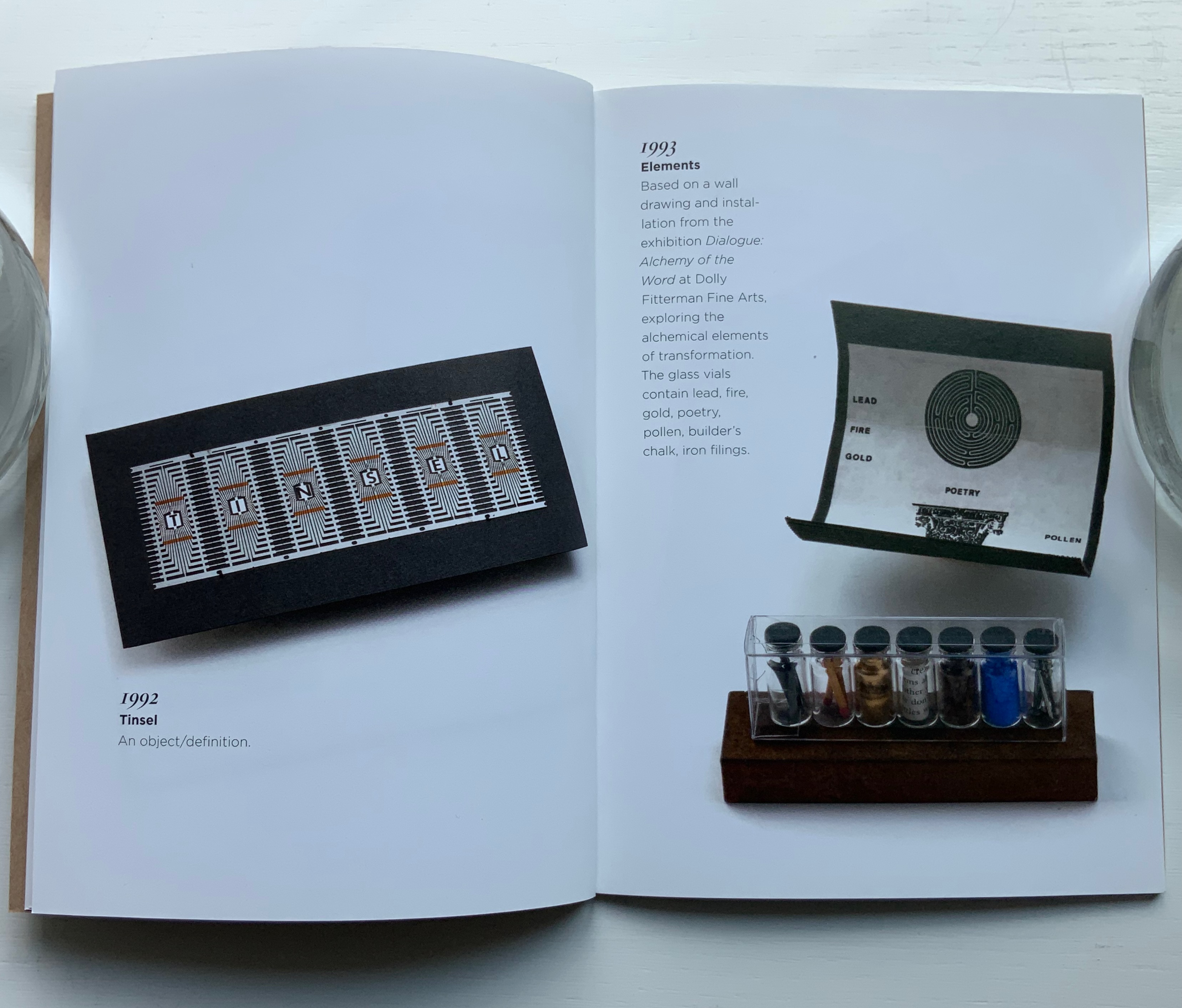
Published in conjunction with Bart’s book exhibition at the Driscoll Babcock Gallery in New York, this booklet, printed full color on high gloss paper, divides into three parts: commissions, installations and objects/books. It presents detailed views and spreads of each, but as they are not captioned or dated, this is more a photobook than catalogue. It demonstrates the artist’s breadth from the large-scale to the delicate from Double Ode (1995), a work commissioned by Doubleday Book & Music Clubs, Inc., to Tear Vials (2012), which look like containers for the tears of Elizabeth Bishop’s “Man-Moth“, who, if carefully watched, will hand over his only possession, a tear “cool as from underground springs and pure enough to drink”.
Double Ode (1995) and Tear Vials (2012?).
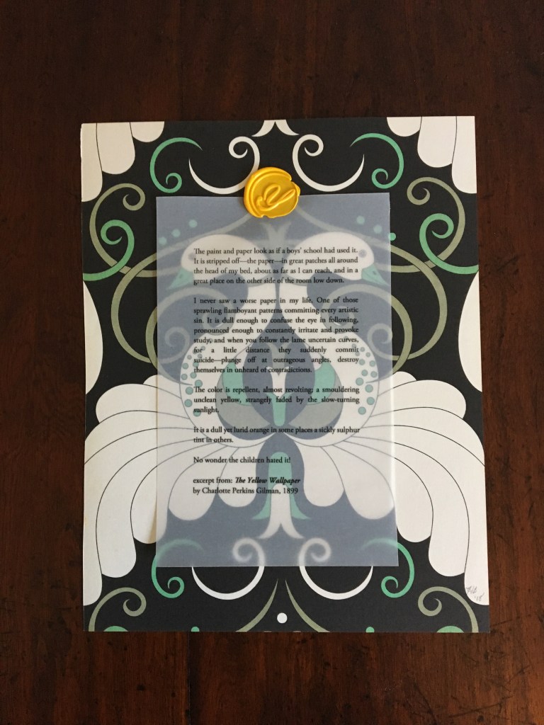
The Yellow Wall Paper (2018)
The Yellow Wallpaper (2018) Harriet Bart Print, collage. H245 x W190 mm, single sheet. Acquired from the artist, 4 July 2018. Photos: Books On Books Collection.
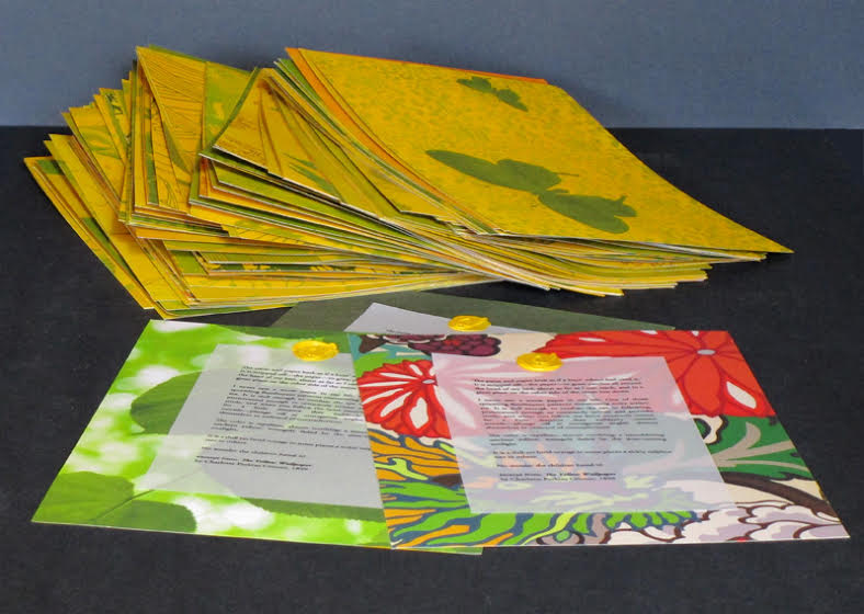
The Yellow Wallpaper captures two other aspects of Bart’s work. The title refers to Charlotte Perkins Gilman’s canonic short-story/novella. Like many artists of the book, Bart often springboards from a literary figure’s work. Here, it is an excerpt from Gilman’s story printed on translucent paper and wax-stamped to one side of a page taken from Charlotte Abrahams’ Wallpaper: A Collection of Modern Prints. The reverse side of the print is painted in cadmium yellow. At the exhibition where the work was displayed, Bart gave it away.
Which brings us to the second aspect of Bart’s work: her curatorial, collaborative activity. With Jon Neuse, she organized the exhibition, entitled “Wallpaper: an altered book experiment” at the Traffic Zone Center for Visual Art Mission, 50 Third Avenue North, Minneapolis, 2 July through 10 August 2018. Each artist exhibiting had been given a copy of Abrahams’ compendium and challenged to generate a work of art. Included were Scott Helmes, Vesna Kittelson, Joyce Lyon, Chip Schilling, Jody Williams, Karen Wirth, Sarita Zalehaand, last and out of alphabetical order but not least, Doug Beube, who also photographed Bart’s Double Ode installation in 1995.
Further Reading
Chen, Julie. 2013. 500 Handmade Books. Volume 2. New York: Lark. P. 46 (Plumb Bob).