Why should an obscure poem like Stéphane Mallarmé’s groundbreaking Un Coup de Dés Jamais N’Abolira le Hasard: Poème (1897) have become the cornerstone of an art-industrial complex of literary, critical and artistic responses ranging from essays, books, edited collections, countless editions, and appropriations in the form of fine press livres d’artiste, book art and sculptures, films and theater, ballets and fado, musical compositions, digital programs and installations, and even pavement art?
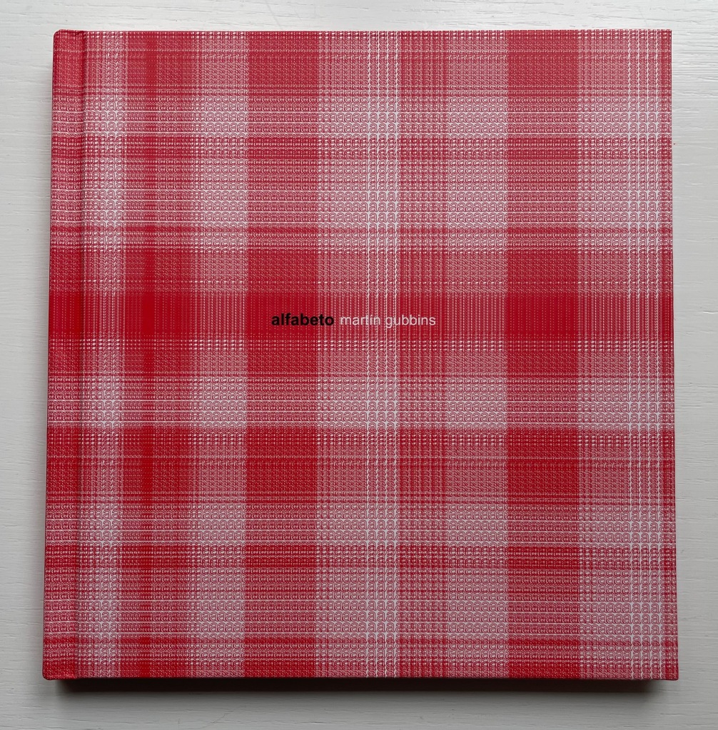
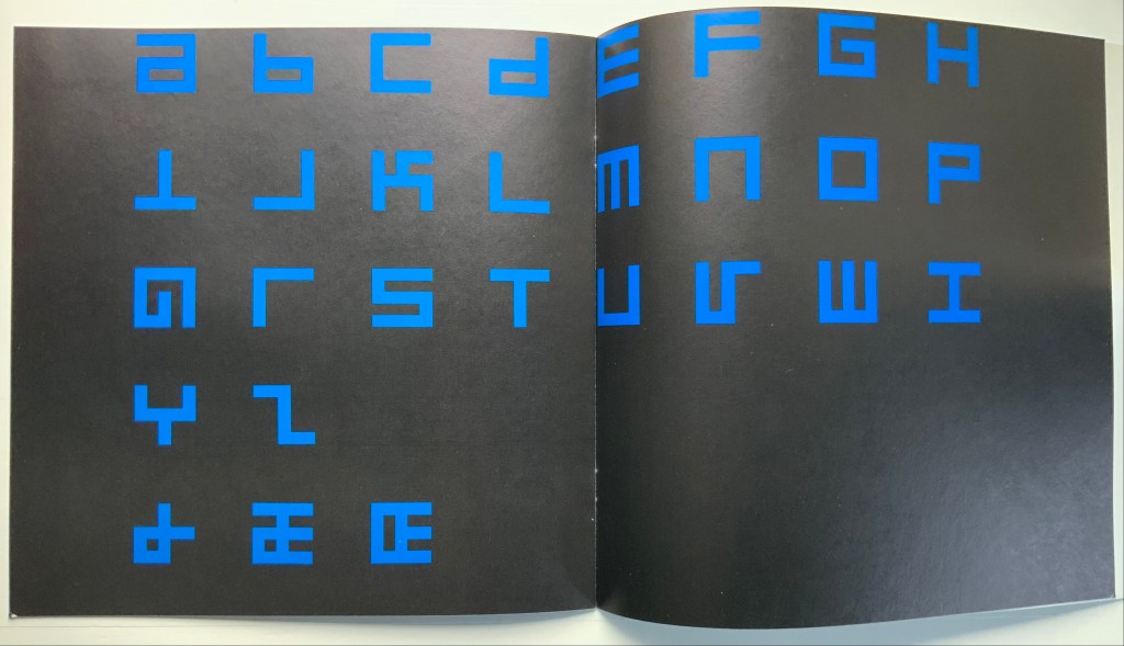
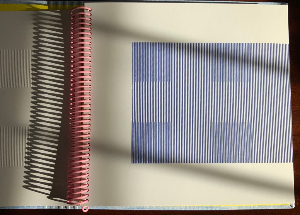
Alfabeto (2017) Martín Gubbins Hardback. 180 x 180 mm. 60 pages. Acquired from Naranja Publicaciones, 28 July 2022. Photos: Books On Books Collection.
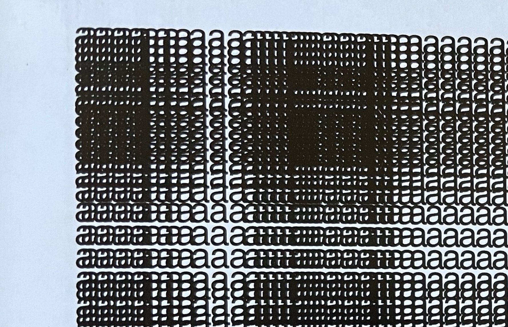
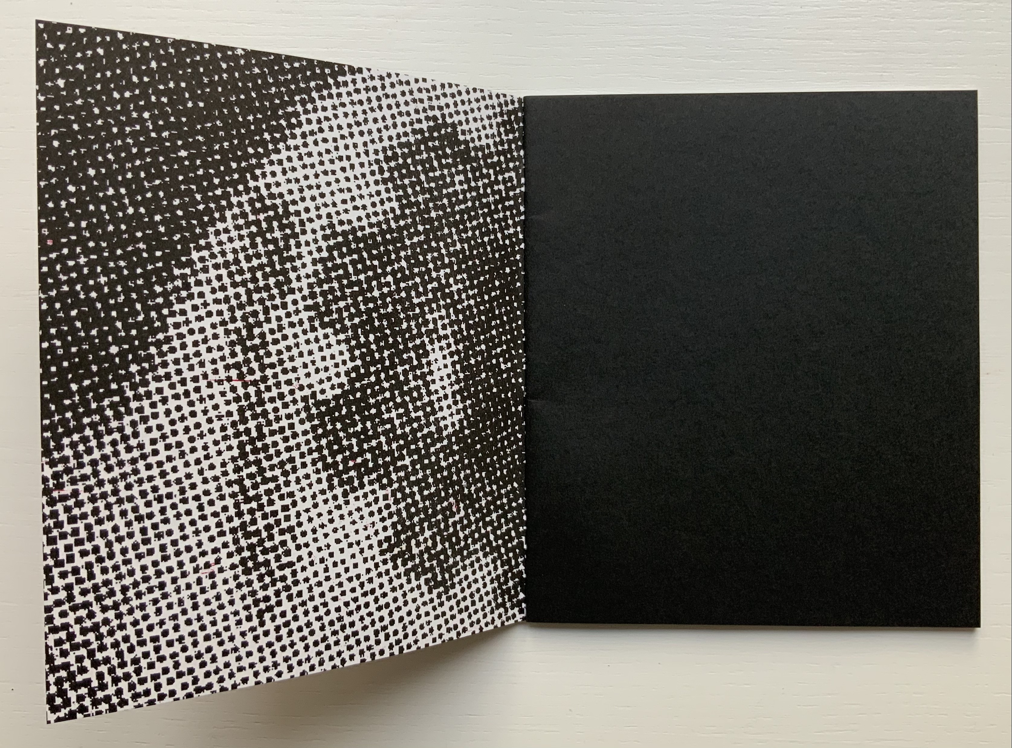
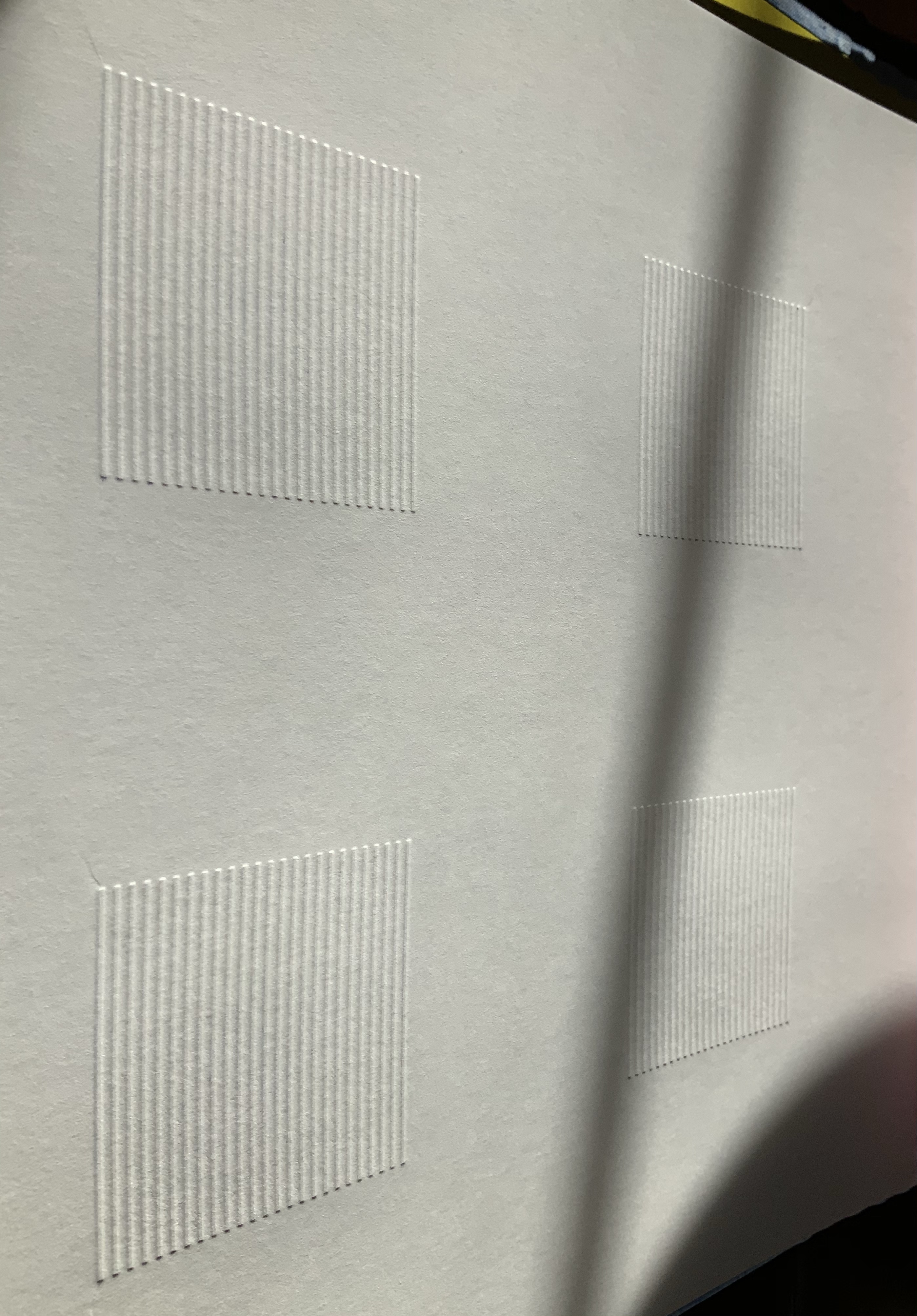
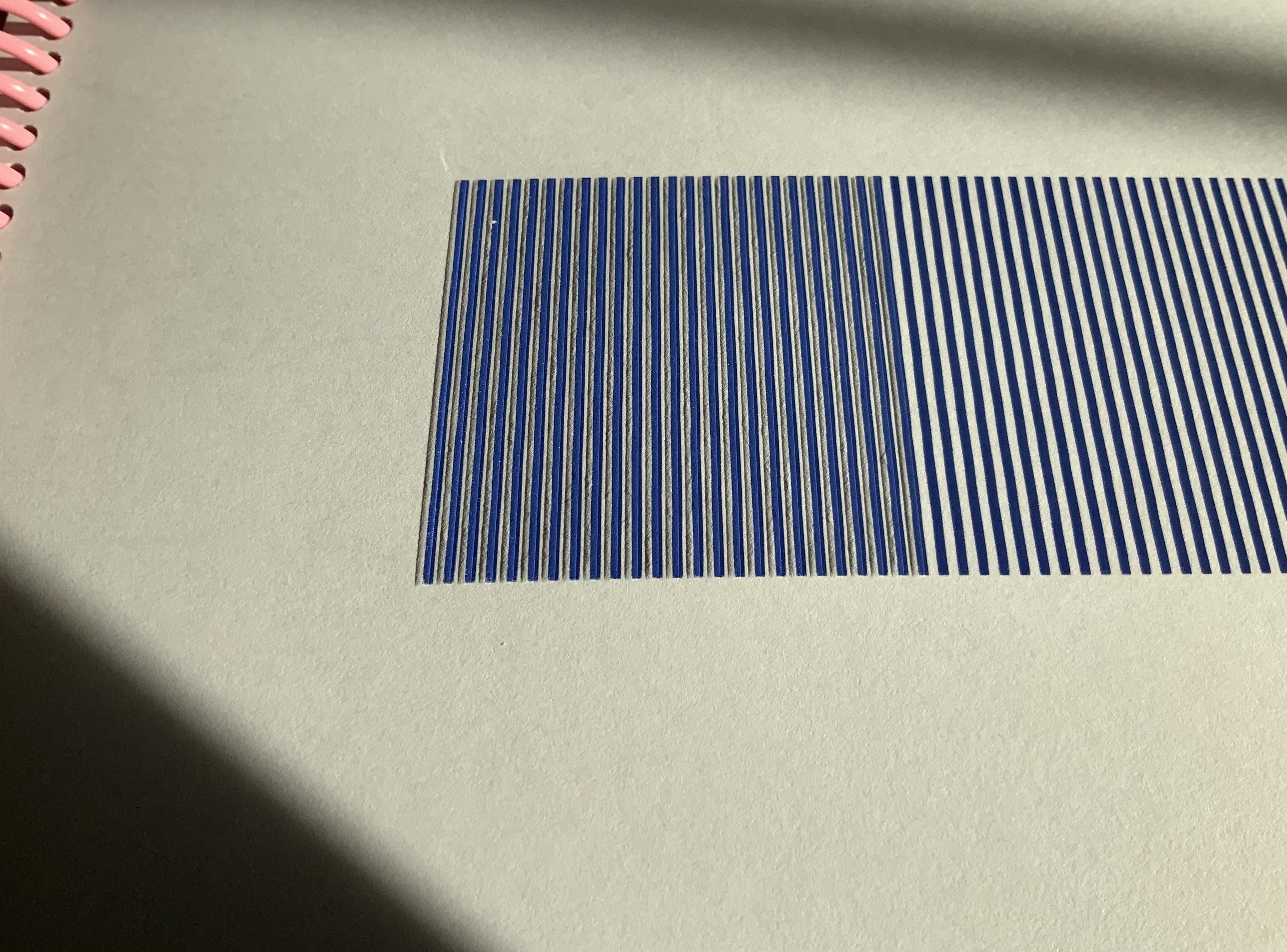
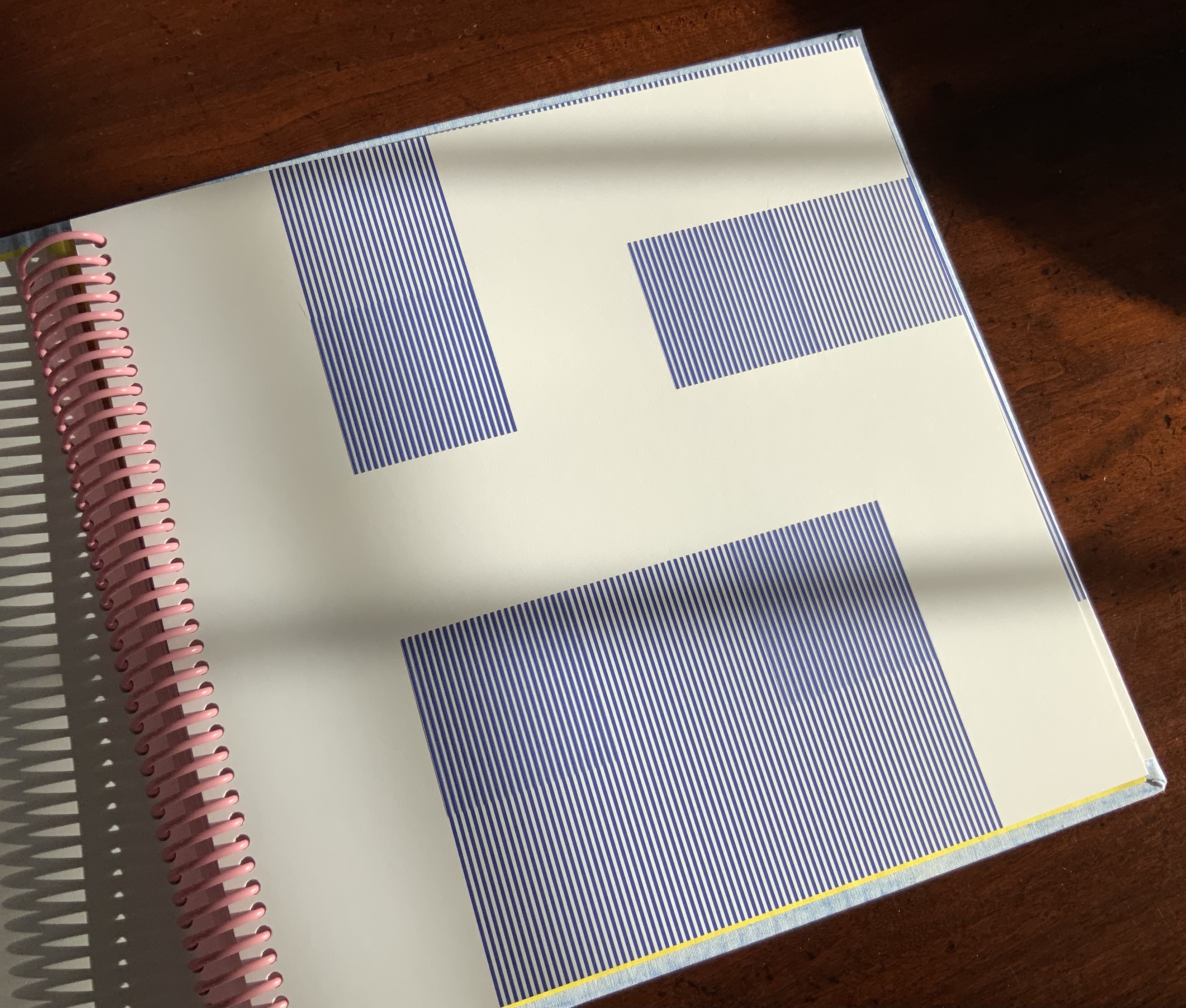
Each letter of the Spanish alphabet is printed in sans serif across a full page to create a grid-like or plaid-like pattern. All letters are printed once in black on white paper and twice in white on black paper; with sheets facing one another. For the English-speaking reader, that’s a bonus of two pages for the ñ.
Held at normal reading length, the double-page spreads do have a plaid effect, but inspected closely, the effect becomes that of wire mesh from which the letters leap out from the less tightly woven spots.
Unsurprisingly the plaids are as distinct from, and similar to, one another as letter shapes are. Sometimes, as with the letter b, an illusion of three dimensionality takes hold.
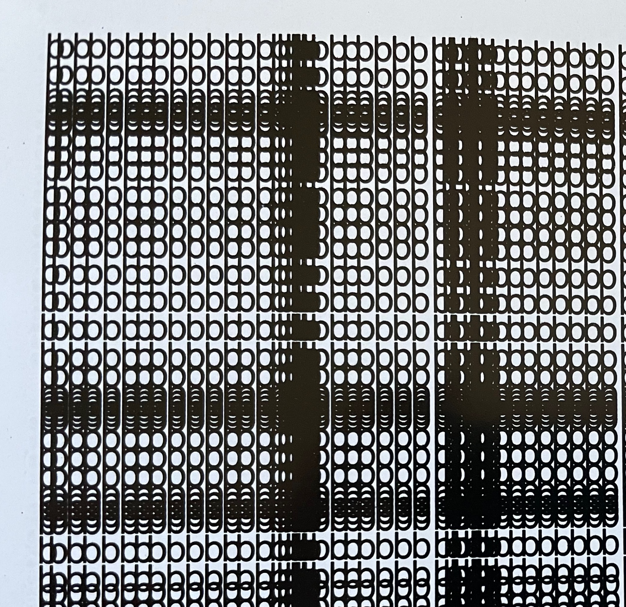
The most surprising — though they should not be — are the letters i and l. With no crossbar, bowl or curve, they cannot create a plaid pattern. Rather, their black on white, white on black patterns look like barcodes.
Gubbins One of the founding members of the Foro de Escritores (www.fde.cl) Chilean version of Bob Cobbing’s Writers Forum in London, and noted figure in the avant-garde poetry scene in Latin America. Gubbins has collaborated with the American poet and artist John M. Bennett, in whose honor
Some visual artists call this kind of work a “tapuscript“. Some throw it together under the heading of language art or concrete or visual poetry. Karl Kempton prefers the term “visual text art” over any other. Conceding the term to cover the broad genre, works like Alfabeto that cover the entire alphabet in sequence — or even play with its sequence — might deserve the sub generic term “visual alphabet art”. Kempton himself, Roberto de Vicq de Cumptich, Raffaella della Olga, Sharon Werner & Sharon Forss — as well as many of the artists in Victoria Bean and Chris McCabe’s anthology and those in Philip Davenport’s — surely provide a sufficient number of examples.
Bernadette O’Toole follows in a long line of distinguished “serial hommageurs”: Ian Wallace, Jérémie Bennequin, Marcel Broodthaers, Kathy Bruce, Marine Hugonnier, Jorge Méndez Blake, Alastair Noble, Michalis Pichler, Raffaella della Olga and Joëlle Tuerlinckx. Like many of them, she extends her work across multiple media. Like all of them, she is driven by the metaphysics and motifs expressed in Un Coup de Dés.
Variant Sail (2015); As If (2016)
Variant Sail (2015) and As If(2016) Bernadette O’Toole Presentation box. H240 x W172 mm. Acquired from the artist, 1 April 2022. Photos: Books On Books Collection. Displayed with permission of the artist.
Bernadette O’Toole’s two small booklets first appeared in Sharon Kivland’s MA Bibliothèque and are now out of print. The presentation case in which they arrived conveys her recurrent practice or technique of recontextualizing. A copy or copies from an edition may be re-presented so as to create a new work or works. Variant Sail and As If constitute a case in point.
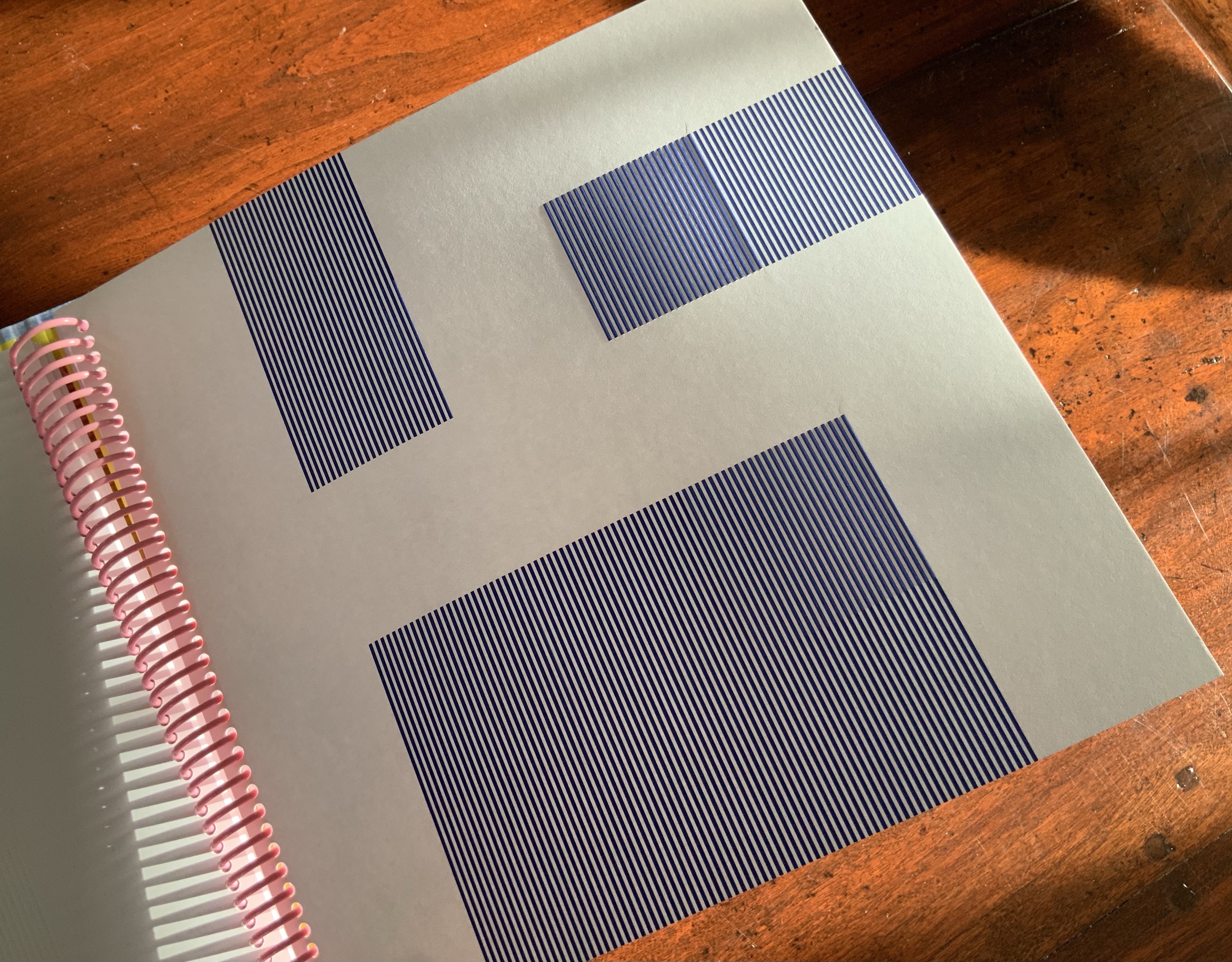
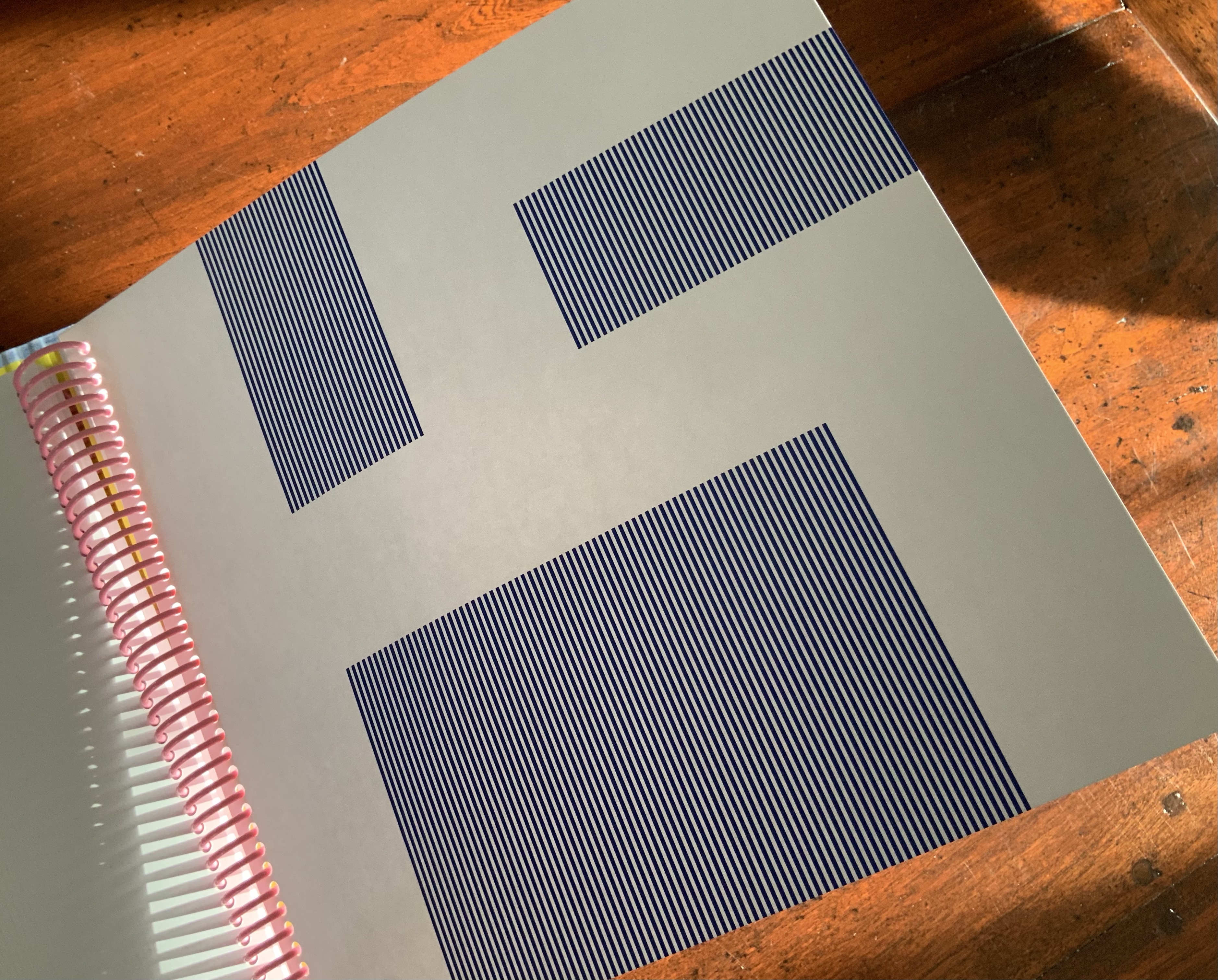
Variant Sail (2015)
Variant Sail (2015) Bernadette O’Toole Booklet, two-staple saddle-stitch. H190 x W130 mm, 24 pages. Edition of 25, of which this is #6. Photos: Courtesy of Bernadette O’Toole. Books On Books Collection. Displayed with permission of artist.
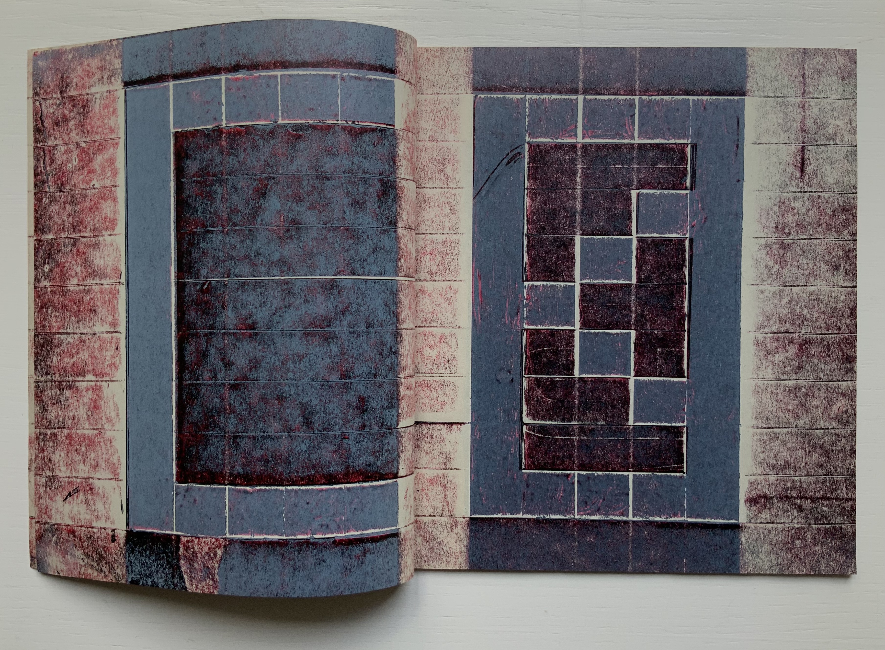
The booklet Variant Sail contains reproductions of twelve digital prints (H38 x W57 cm). The prints were created by scanning and digitally manipulating each of the double-page spreads of Un Coup de Dés in Photoshop, producing twelve variants with each one foregrounding the gutter in a different way. The manipulation has made Mallarmé’s text faintly detectable but indecipherable and rendered the double-page spreads as entire blancs — variants, as it were, of the white spaces (les blancs) to which Mallarmé refers in his poem’s preface.
[From the NRF/Gallimard 1914 edition]
The ‘blanks’ indeed take on importance, at first glance; the versification demands them, as a surrounding silence, to the extent that a fragment, lyrical or of a few beats, occupies, in its midst, a third of the space of paper: I do not transgress the measure, only disperse it. The paper intervenes each time as an image, of itself, ends or begins once more, accepting a succession of others, and, since, as ever, it does nothing, of regular sonorous lines or verse – rather prismatic subdivisions of the Idea, the instant they appear, and as long as they last, in some precise intellectual performance, that is in variable positions, nearer to or further from the implicit guiding thread, because of the verisimilitude the text imposes.
From Mallarmé’s marked-up proofs for his planned deluxe edition, we know that he viewed the double-page spread, not the single page, as the poem’s primary structural unit. Each of O’Toole’s blank double-page spreads can be seen as a voile alternative (“variant sail”), a phrase appearing on the NRF/Gallimard edition’s second double-page spread. With a different foregrounding of the gutter in each of her double-page spreads, O’Toole underscores both the variance within her Variant Sail and the important constancy of the double-page spread in the poem to which she is paying homage.
A bit more esoterically, the double-page spread suggests the quantity 2, an allusion to the result of thrown dice, their two faces up. It may also allude to the poem’s revolutionary versification, challenging French poetry’s Alexandrine, the traditional measure of 12 syllables usually divided into two hemistichs. It seem no accident that O’Toole has chosen a pattern of two-word titles for her booklets.
As If (2016)
As If (2016) Bernadette O’Toole Booklet, two-staple saddle stitch. H205 x W140 mm, 16 pages. Edition of 25, of which this is #6. Photo: Courtesy of Bernadette O’Toole; Books On Books Collection. Displayed with permission of artist.
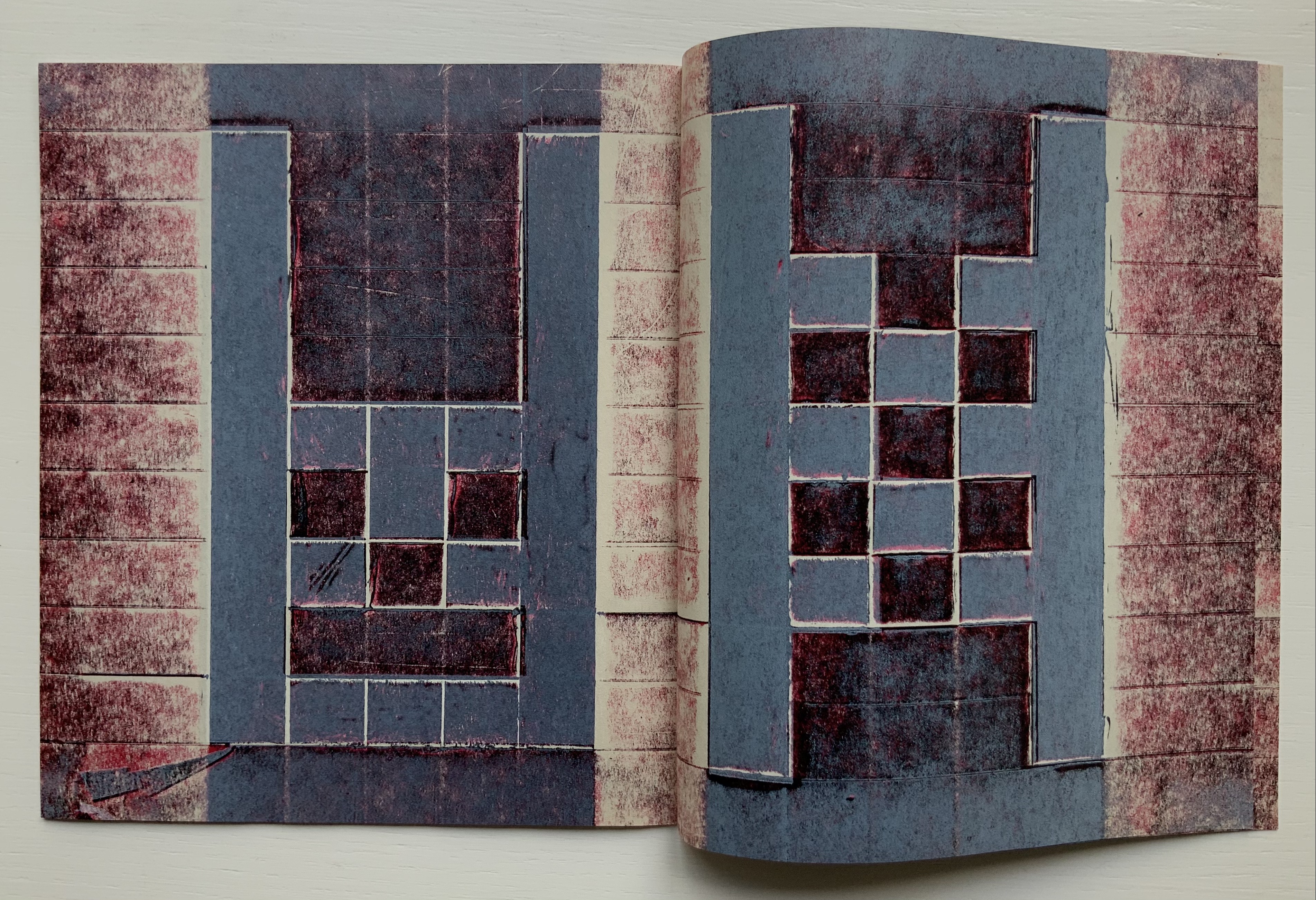
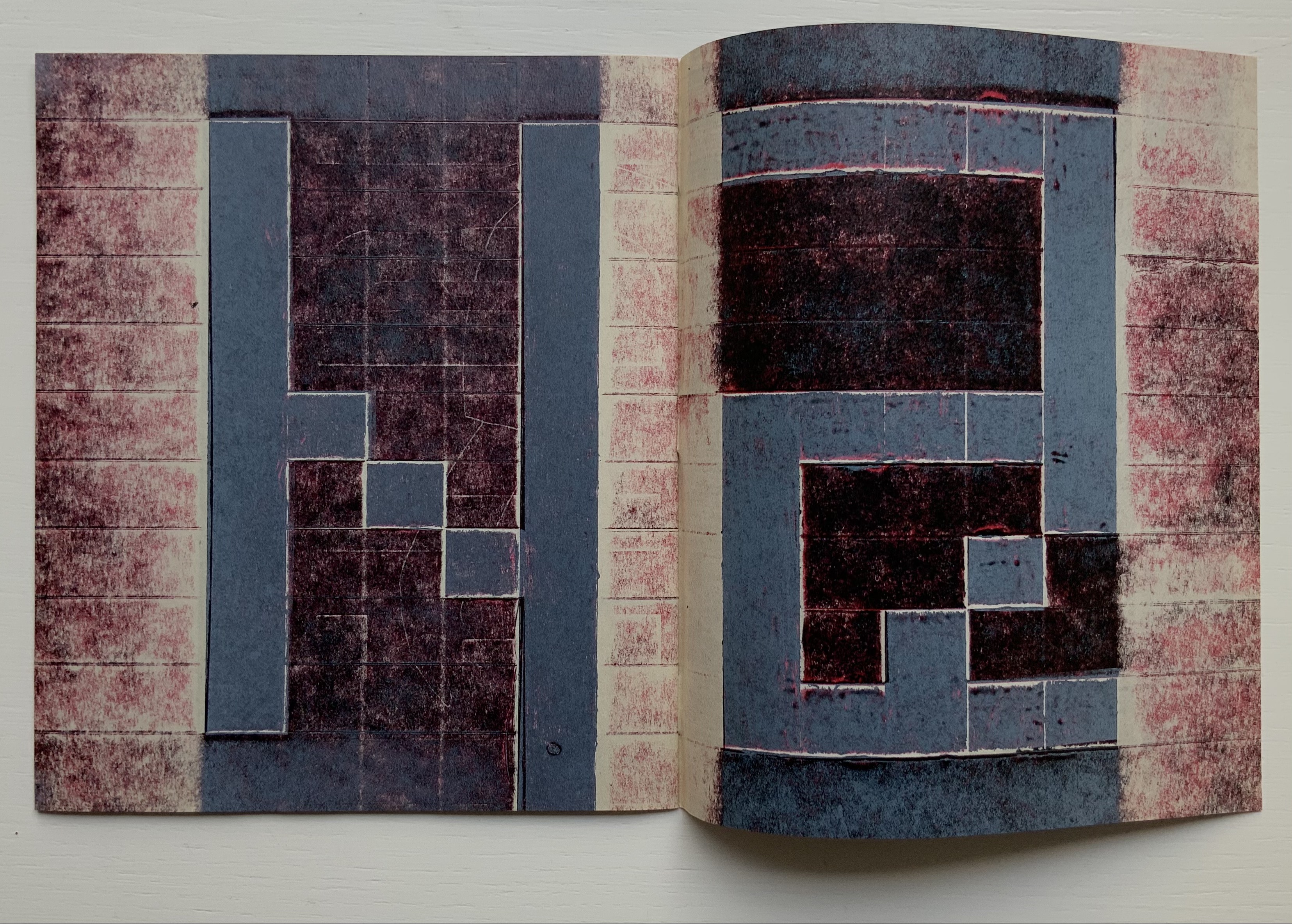
The prints for Variant Sail in turn inspired paintings (same dimensions) that are reproduced in the second booklet As If, which takes its two-word title from the poem’s central double-page spread, the one beginning and ending COMME SI (“as if”). Mallarmé’s words are no longer detectable. What is detectable instead is each brushstroke on the painted surfaces. It is as if the work As If appropriates the work Variant Sail, just as Variant Sail appropriates Un Coup de Dés.
“Appropriation” may not be the right characterization. Re-contextualizing, re-purposing or re-cycling perhaps. Consider where O’Toole goes next with these two other works not in the Books On Books Collection at the moment.
Variant Sail II (2016)
For Variant Sail (II), O’Toole incorporates an inventive sculptural work that she calls a “gesture”. In a black presentation box, a translation of Un Coup de Dés rests beside a small painted gesture, oil on plaster. Here is her description of the process by which a gesture is created:
The process of making the work involved tracing my brush-stroke into a bed of clay, pushing into the surface which proved resistant at first. Plaster was poured into the indent, casting the absent gesture [brush-mark]. Once the form had set, I separated it from the bed of clay and took hold of the object. The absent gesture [brush-mark] had become embodied. The form was simultaneously liberated from the mould, and from the limitation of the painting surface. It was cast out, recalling the Japanese practice known as, ‘flung-ink’, which Norman Bryson observes is ‘thrown’ as one throws dice. — [Interview with Josie Jenkins, 22 November 2020]
Variant Sail II has appropriated, re-cycled, re-purposed or re-contextualized the works Variant SailandAs If in several ways — by transforming the surface brushstroke into a three-dimensional object, by juxtaposing those two works (through the gesture) with the translation
A Rare State (2018)
A Rare State consists of 12 booklets (H38 x W57 cm), each with its own cover and title. Each encloses 12 loose interchangeable folios. Each captures images from different performative readings (by the artist) of Un Coup de Dés or fromanimated patterns of marks and numbers appearing and disappearing. Some of the patterns occupy the positions of Mallarmé’s text on his double-page spreads. Others appear in sequences of 1-6 within a square or diamond suggesting the face of a die.
A Rare State expands on the idea of a numerical or mathematical principle at play — be it 1-6 on the face of a die, the 12 syllables of the Alexandrine that the poem explodes, the 2 of the double-page spread, or the 4 triangles constituting the face of a die across the double-page spread. This expansion is also an expansion of O’Toole’s technique of appropriation, re-cycling, re-purposing or re-contextualizing to create new artwork. It is as if her every thought emits a throw of the dice.
Cohn, Robert G. 1966. Mallarme’s Masterwork: New Findings. The Hague: Mouton. Contains the photographs that inspired Neil Crawford’s typographic translation.
Cohn, Robert Greer. 1965.Toward the poems of Mallarmé. Berkeley: University of California Press. See in particular for his analysis of the relationship between Un Coup de Dé and the sonnet À la Nue Accablante Tu (pp. 229-36).
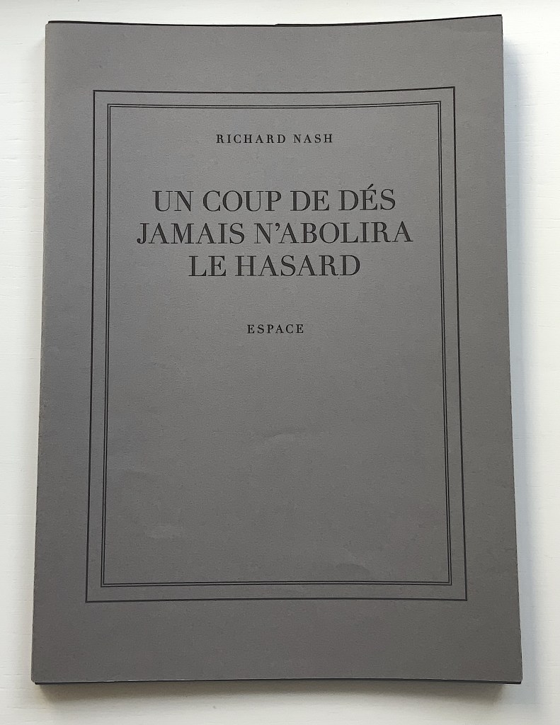
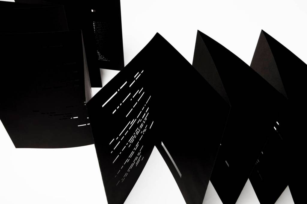
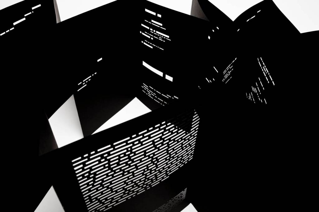
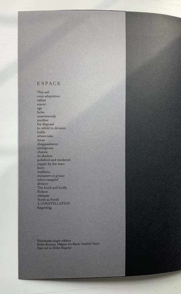
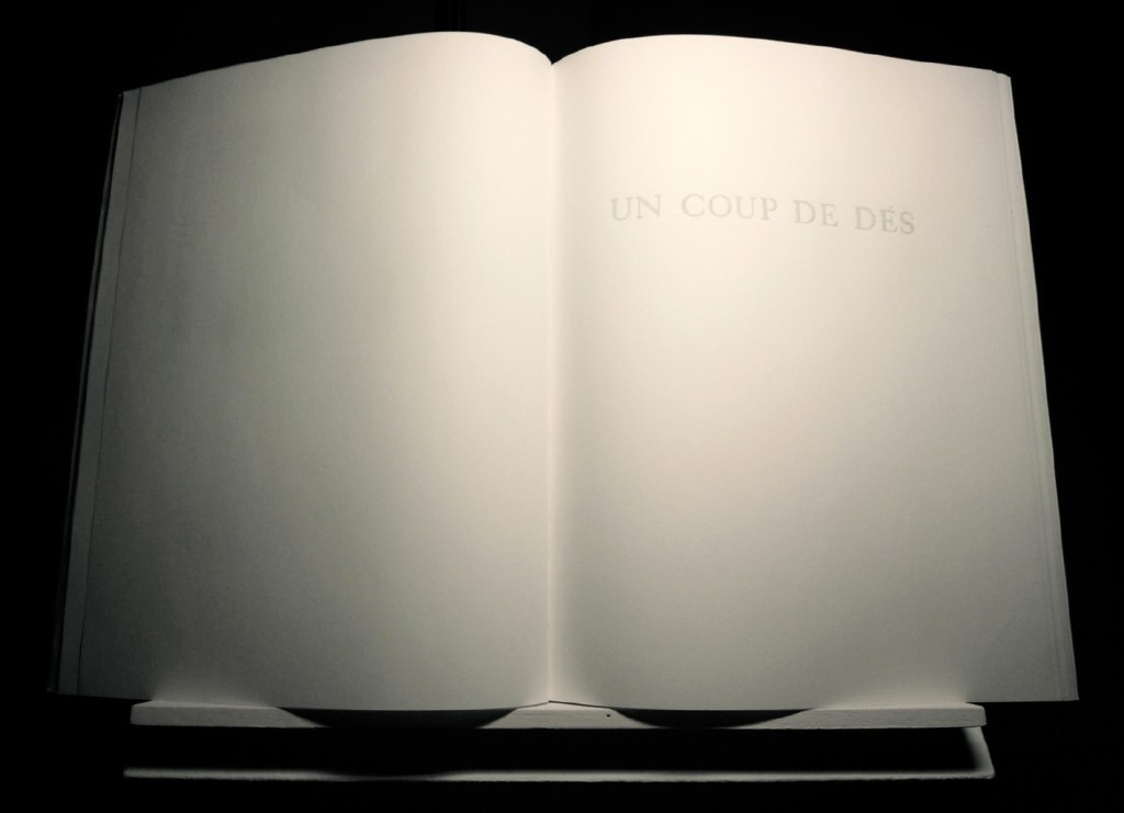
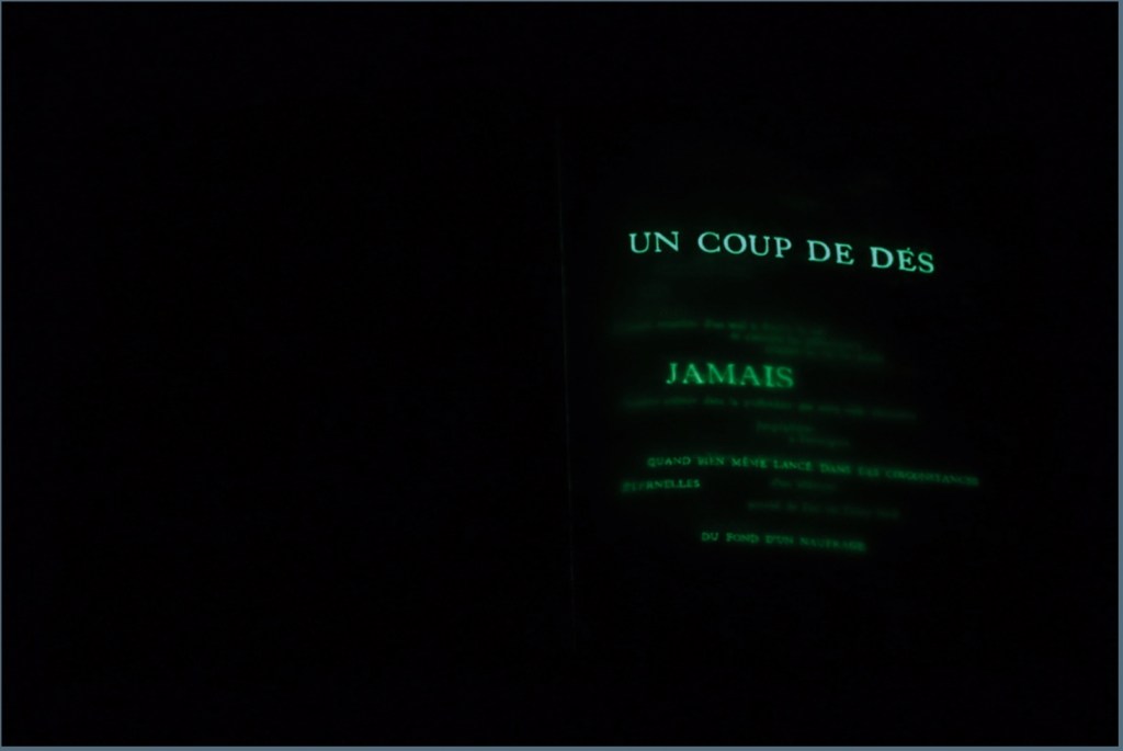
UN COUP DE DÉS JAMAIS N’ABOLIRA LE HASARD — ESPACE (2012)
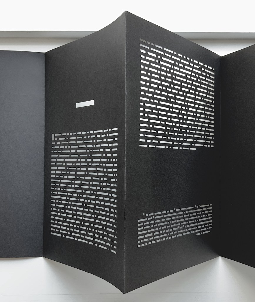
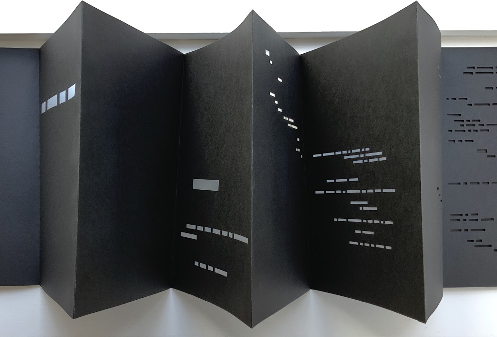
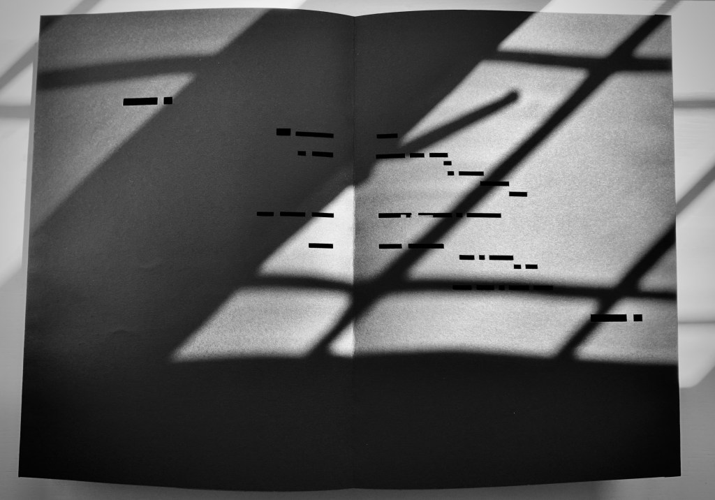
UN COUP DE DÉS JAMAIS N’ABOLIRA LE HASARD — ESPACE (2012) Richard Nash Hand-cut concertina with inkjet printed turn-in cover. Closed: H286 x W204 mm; Open: W 11.2m. Unique. Acquired from the artist for donation to the Bodleian Library, 2 April 2022. Photos: Courtesy of Richard Nash; Books On Books Collection. Permission to display from the artist.
Credit goes to Rafaella della Olga’s Constellation (2009) for being the first homage to Un Coup de Dés to remind us that constellations appear against the blackness of space, not the whiteness of paper. But the first to apply this reminder in 180gsm Jet Black Canford paper to a double homage to Mallarmé’s poem and Marcel Broodthaers‘ version is Richard Nash’s Un Coup de Dés Jamais N’Abolira le Hasard — Espace(2012).
The preface
The opening pages
COMME SI … COMME SI spread
Additional photos courtesy of Richard Nash.
On the flyleaf, Nash has added his own verse entitled “Espace”, which set in Didot Regular is equally a typographic and poetic . Espace has a monumentality to it that encourages imagining it at a larger scale in different material; for example, a sculpture of cut steel painted black, installed along a seaside strand and backlit at night. In that evocative physical characteristic, Nash’s homage evokes the oracular and vatic tone of
RIEN / N’AURA EU LIEU / QUE LE LIEU / EXCEPTÉ / PEUT-ÊTRE / UNE CONSTELLATION (“Nothing will have taken place but the place except perhaps a constellation”)
and
Toute pensée émet un Coup de Dés (“All thought emits a throw of the dice”).
On Innards (2015)
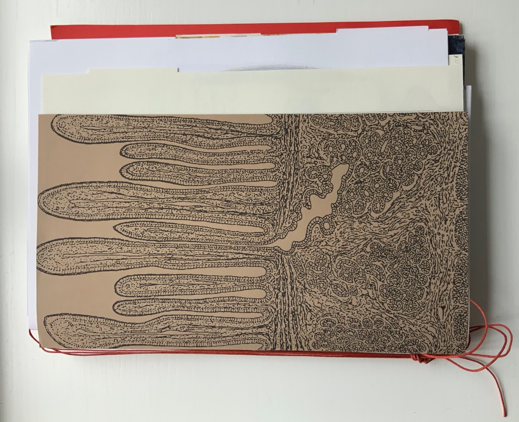
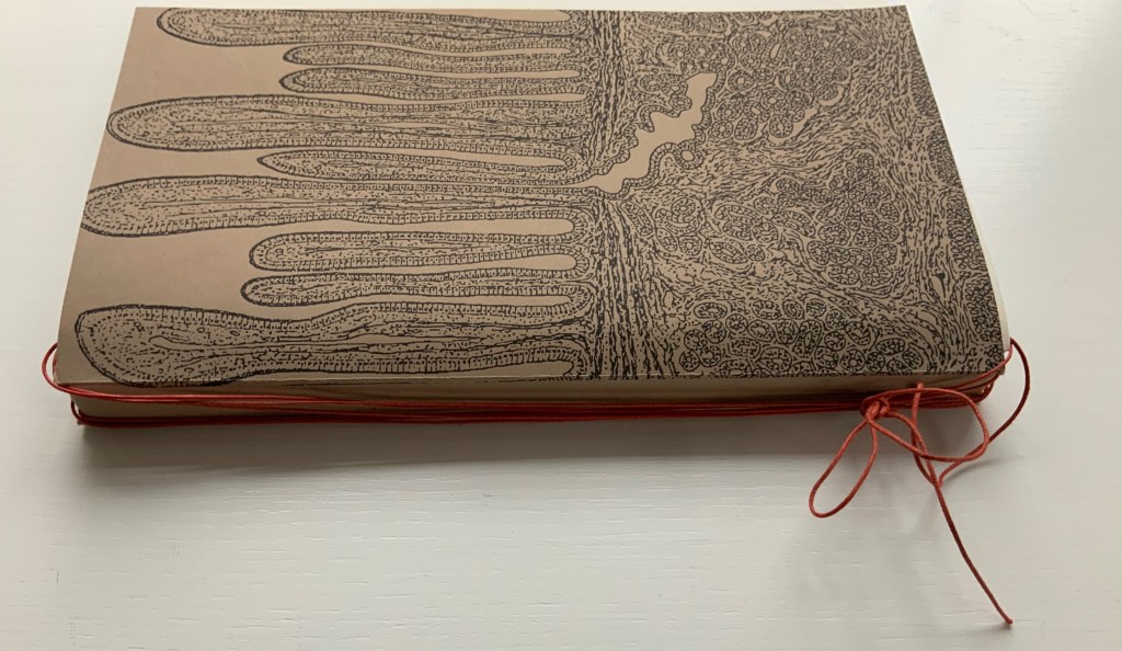
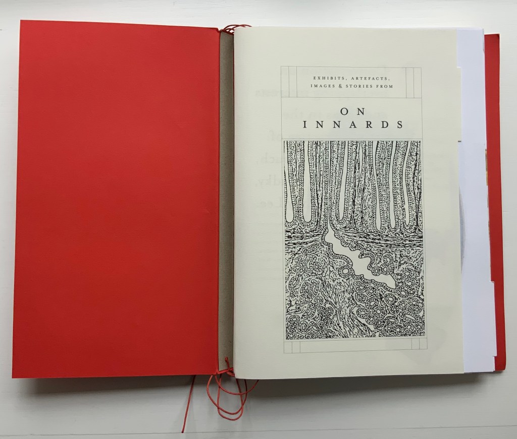
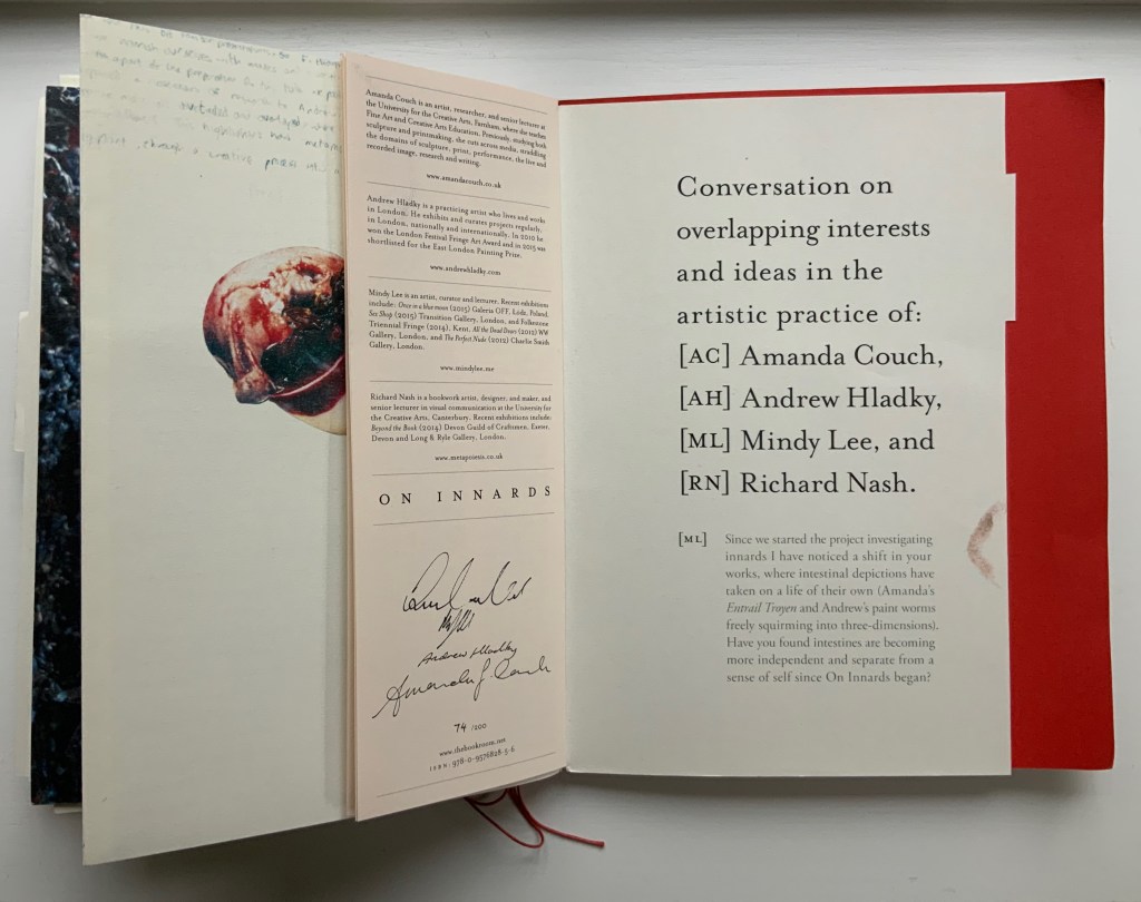
On Innards (2015) Amanda Couch, Mindy Lee, Andrew Hladky and Richard Nash Limited edition publication individually stamped and numbered, digitally printed and cut, folded, bound and finished by hand. H260 x W205 mm, 200 pages of various intersecting formats and custom binding. Limited edition of 200, of which this is #74. Acquired from Richard Nash, 2 April 2022. Photos: Courtesy of Richard Nash; Books On Books Collection. Permission to display from Richard Nash.
On Innards began as a multidisciplinary project to explore how the way we think of guts and digestion has changed, how that might drive the creative process, and how it affects our sense of self. Book art and the human body (interior and exterior) are no strangers. Carolee Schneemann’s Parts of a Body House Book (1972/2020), Ron King’s Turn Over Darling (1994) and Matisse’s Model (1996), Joyce Cutler Shaw’s The Anatomy Lesson: Unveiling the Fasciculus Medicinae (2004) and Casey Gardner’s Body of Inquiry: A Triptych Opening to a Corporeal Codex (2011) among others come to mind. On Innards introduces a very different level of intimacy though — one not for the squeamish or scatologically averse.
Artists Amanda Couch, Mindy Lee and Andrew Hladky initiated the the project and presented initial results in a panel held at the interdisciplinary conference “Body Horror” in Athens, in 2013. Subsequently, Richard Nash joined the project to curate an exhibition and event in 2014, which included text by Carlo Comanducci, Giskin Day, Dr. Simon Gabe, Nathaniel Storey, and Jamie Sutcliffe; performance by Kerry Gallagher; and illustration by Jenny Pengilly. Drawing together the output and record of the project, Nash created this hybrid research journal and artists’ book, launched at the Whitechapel London Art Book Fair in 2015.
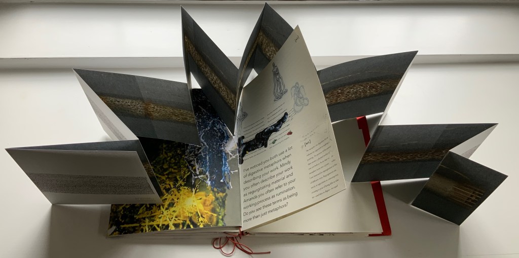
Like Espace, this work displays Nash’s sculptural approach to text, graphics, ideas and the book as raw material for an artistic creation. The bookwork interweaves, concertinas, folds out, pops up, gate-folds, roll-folds and unwinds. Used to reveal reflections on the project, recalled events, artefacts, images, and stories from the conference, these various “book innards” become an embodiment of digestion. It also somewhat resembles an expandable file folder, its contents secured by a long looping slip-knotted red thread sewn through a heavy card spine pasted to red endpapers that are pasted to brown cover papers. Despite the resemblance to a landscape portfolio, the contents proceed in portrait codex fashion with the tabbed half-title “page” below. The half-title, however, is the first panel of a double-sided accordion that extends from that tabbed half-title page all the way to the last (also tabbed) page of the book (also below). When the half-title turns, it reveals a description of the contents (also below) printed on the double-sided accordion.
Landscape view of the spine and external thread binding.
Portfolio view of endpaper and half-title page. Note the glimpse in the center of the spine’s interior.
Left: The verso page or panel gives a description of the contents of the double-sided accordion. Right: last panel of the double-sided accordion.
The valleys of the double-sided accordion hold the various other parts of the book, some of which are secured in their valleys by the red thread’s looping over and down their centers, and some of which are secured by being folded around or over the thread-secured parts. The dimensions of those parts vary, and other parts lie loose. This can lead to the guts of the book spilling out, surely not an accident! Nor is it necessarily a bad thing, for reading the other side of the accordion requires removing all of the contents from the binding.
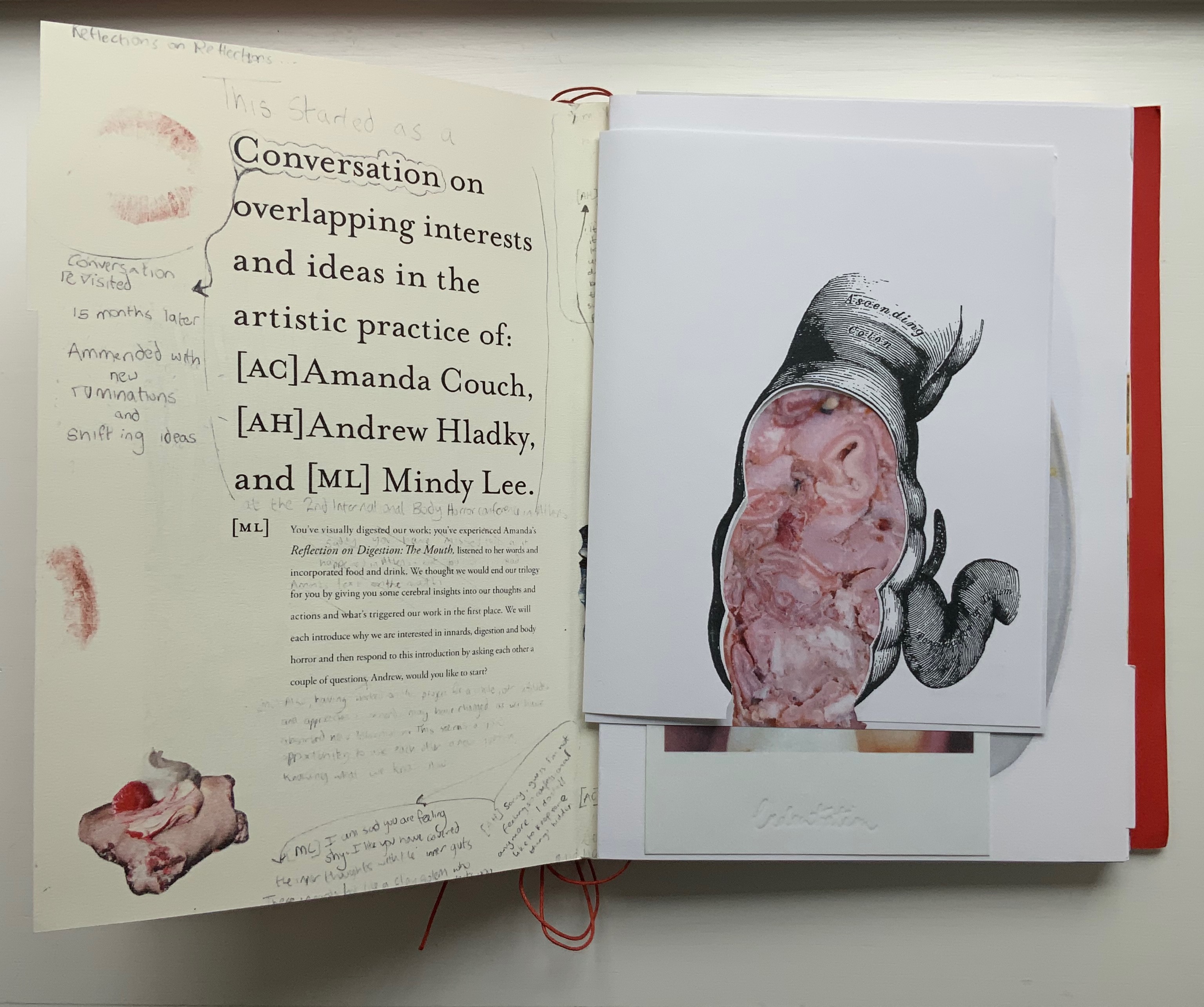
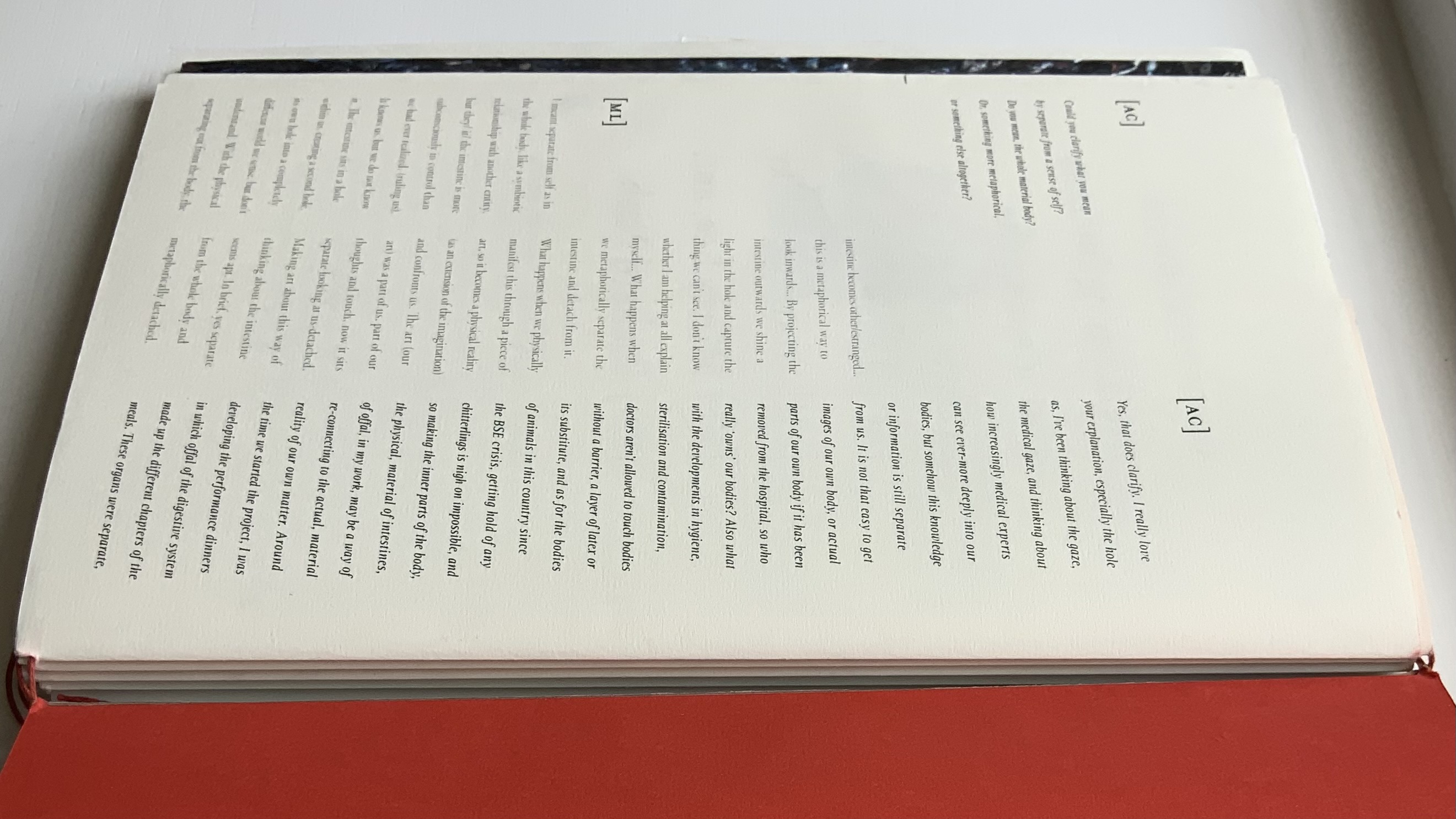
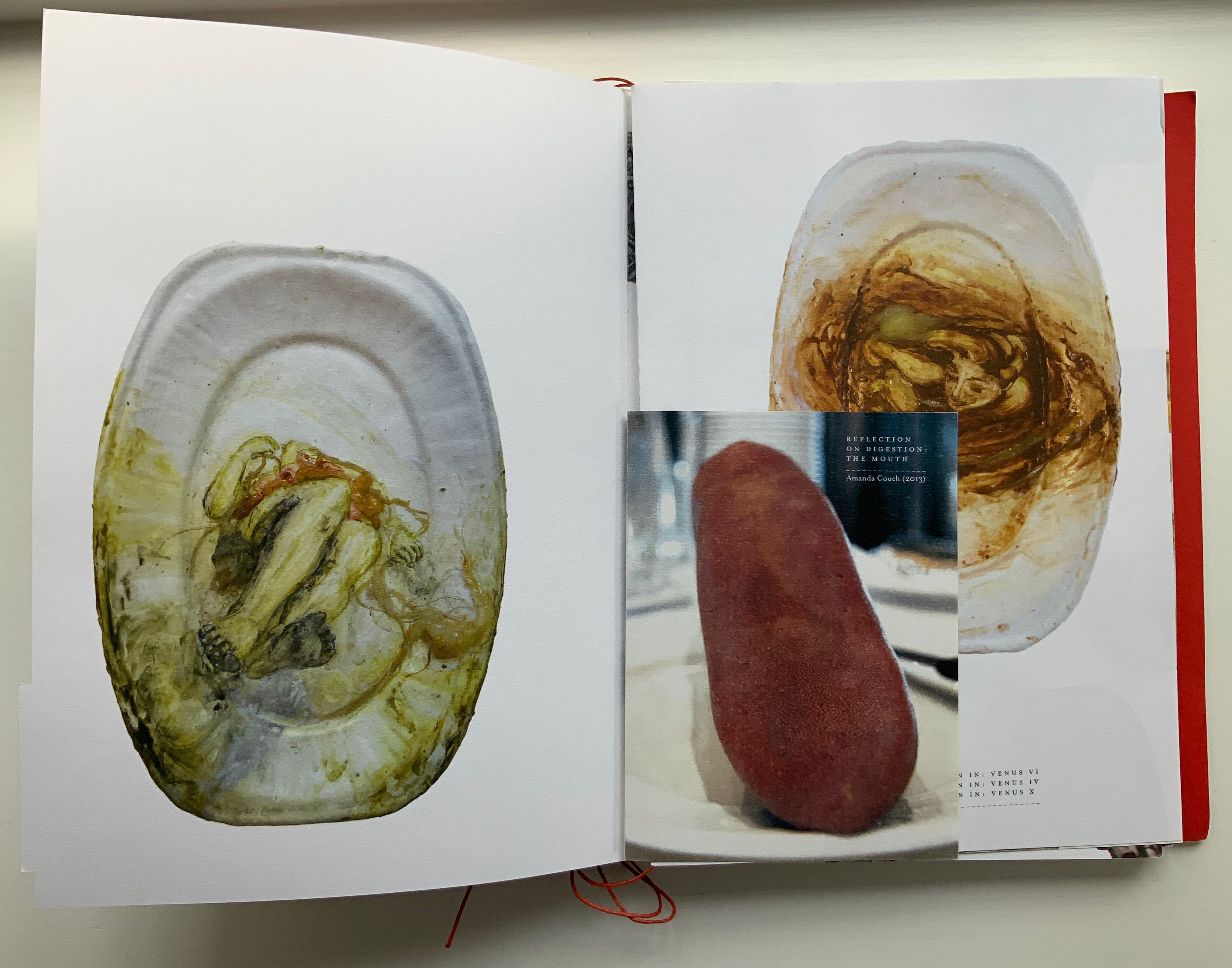
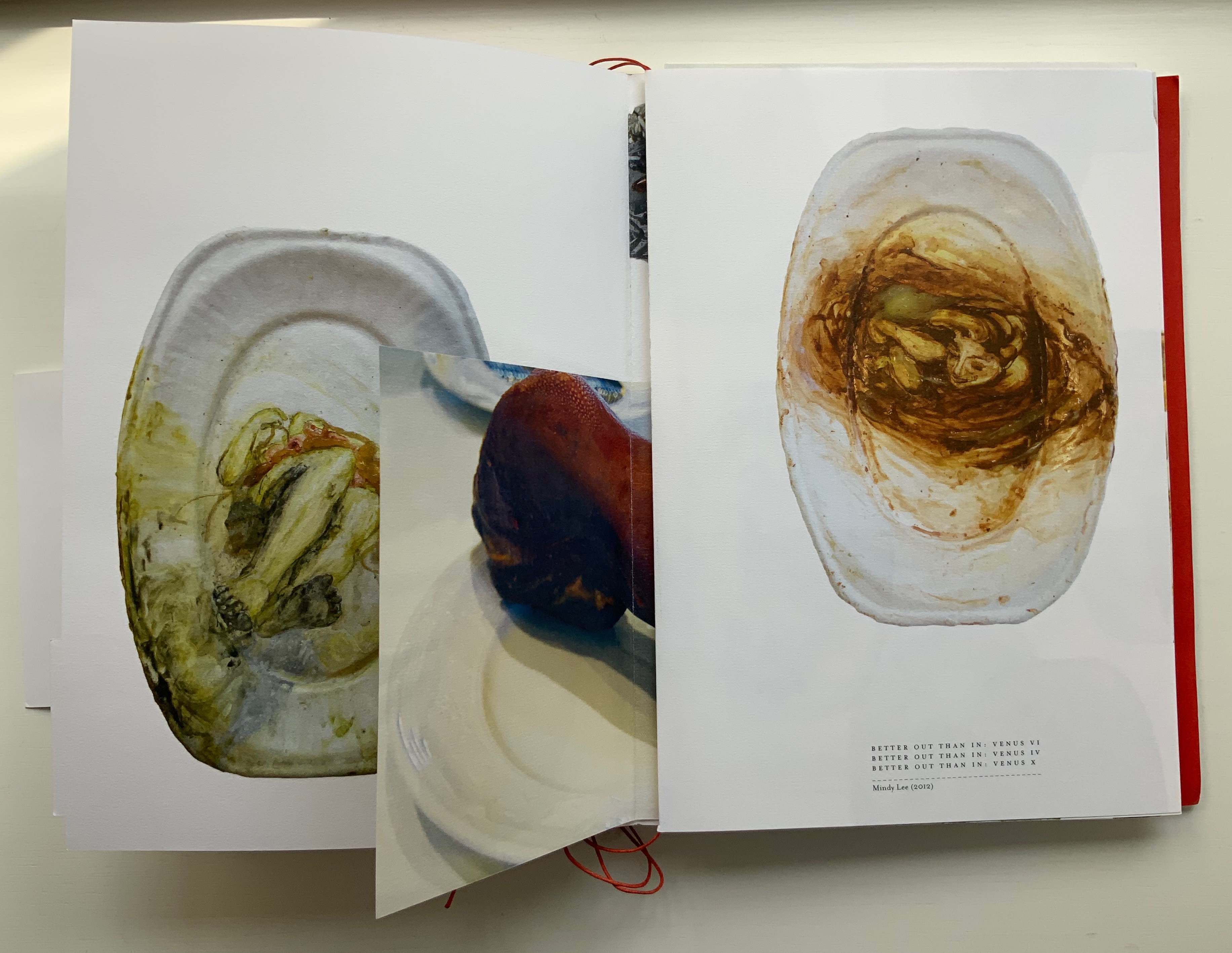
The first interleaved artefacts and images come from Amanda Couch and Mindy Lee. Couch’s first item is a passe-partout construction displaying at the start “Organ-Offal Caecum Andouillette” (2015) and at the end “Organ-Offal Stomach-Tripe” (2015). The passe-partouts combine black-and-white photos of anatomical engravings with color photos of the gut (see above), and between them is a photo of an annotated recipe for beginner’s tripe or chitterlings. Her second item (see below) is a pamphlet entitled “Reflection on Digestion: The Mouth” (2013), recounting and illustrating a presentation/performance/tasting of a serving of tongue that Couch gave during the “Body Horror” conference.
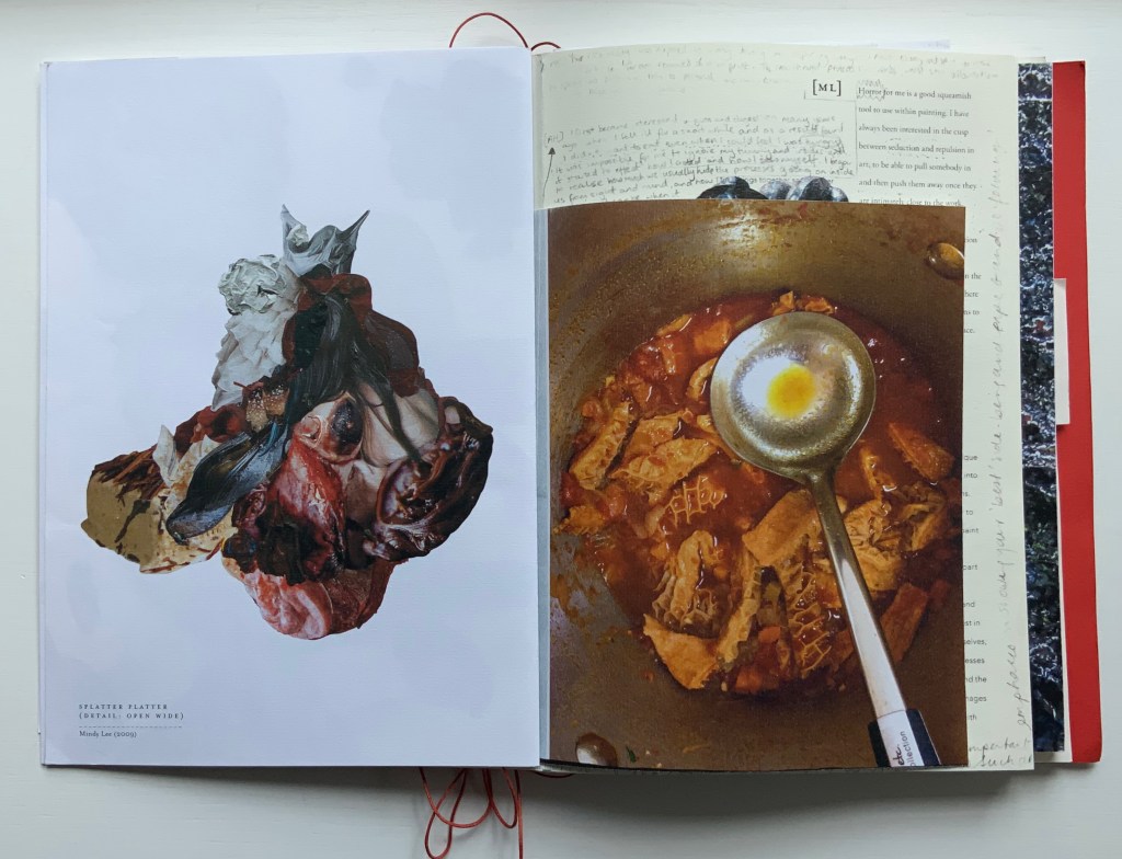
Lee’s contributions appear (also below) on the larger pages embraced by and interleaved with Couch’s two items. The images display photographs of works entitled Better Out than In: Venus VI, IV & X (2012) and Splatter Platter (2009). In Better Out, Lee’s “canvasses” are paper plates, but the perspective from which Venus is perceived suggests the underside of a closed, soiled toilet seat.
Couch’s “Reflection on Digestion” pamphlet interleaved with photos of Lee’s Better Out than In series.
Detail from photo of Lee’s Splatter-Platter; enclosing page from Couch’s annotated and illustrated recipe for tripe.
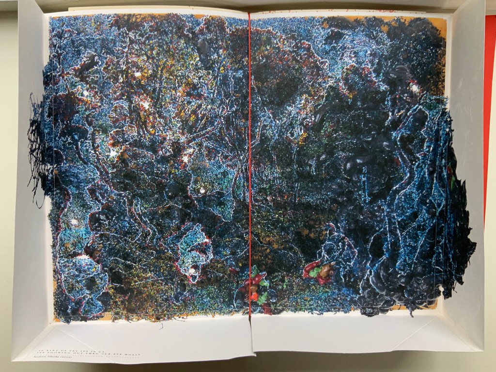
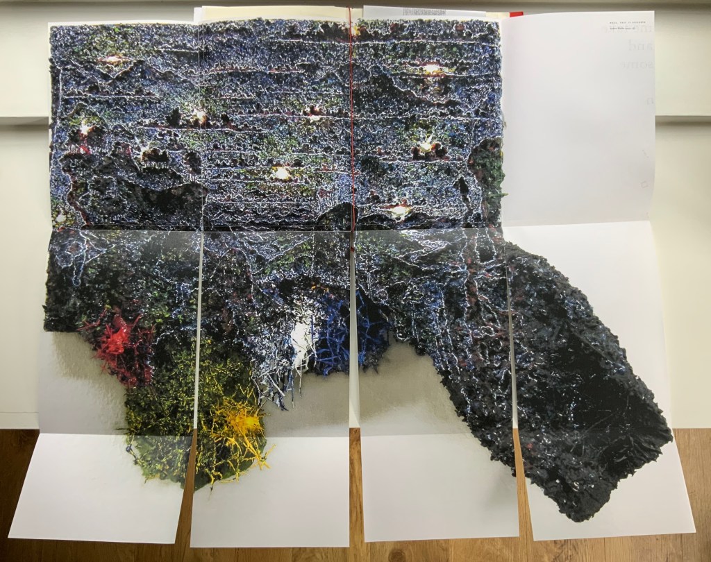
Andrew Hladky’s contributions are prints of three-dimensional works made of oil and bamboo sticks on wood panels ranging from 3 inches to 10 inches in depth. To capture this, On Innards delivers the print of It ain’t us yet its in us. Its looking out thru our eye hoals (2015) as a pop-up box (see below), and the prints of Well, This is Goodbye (2007-15) and The Clearing (2011-14) are cut and folded such that they spill out well beyond the trim size of the portfolio (also below).
Hladky’s It ain’t us yet its in us. Its looking out thru our eye hoals (original work 12 x 18 x 10 inches). The other side of this box also bears a print of a detail view of the work.
Haldky’s Well, This is Goodbye (original work 8.5 x 10.5 x 3 inches)
Hladky’s The Clearing unfolded (original work 61.5 x 43.5 x 6.5 inches), with Giskin Day’s “End Notes” interleaved.
As mentioned, some works are loose inserts, but some of the loose inserts are folded over a panel of the core double-sided accordion. Nash uses that structural feature to emphasize one of the hallmarks of book art: self-reflexivity. Below, straddling a mountain fold in the core double-sided accordion is another double-sided accordion. On one side, there is a photo of Couch’s Entrail Troyen (2014), a three-dimensional tube knitted from leftover cured saucisson sec shredded into ribbon-like thread. The title is derived from the French sausage Andouillette de Troyes, which harks back to the pamphlet “Reflection on Digestion: The Mouth” (2013) and its andouillette and chitterlings.
In case the reader misses the connection to the earlier item, the other side of this double-sided accordion presents a condensed photo of Couch’s nine-meter long accordion book entitled Reflection on Digestion (2012), a continuous line of handwriting looping back and coiling like the villi of intestines (see the cover of On Innards), relief printed from photo polymer plates on 410 gsm white Somerset satin paper. Couch uses this work in her reading performances of the same name. (Did I mention self-reflexivity?)
Loose double-sided accordion fold item displaying Couch’s Entrail Troyen on one side and Reflection on Digestion on the other.
Continued commentary on and illustration of this addition to the Books On Books Collection would be to regurgitate the whole work, which is certainly the opposite direction the work takes and which would be unfair to the work’s artists and contributors. After all, On Innards is a limited edition, and as many copies as possible should be ingested by as many institutions possible that are intent on improving their clientele’s digestion of book art.
Signature page concluding the “bibliographical” brochure summarizing the project, sponsors, conference, Blyth Gallery event and the artists’ book in hand, providing its colophon and listing sources and works displayed; penultimate page of the core double-sided accordion.
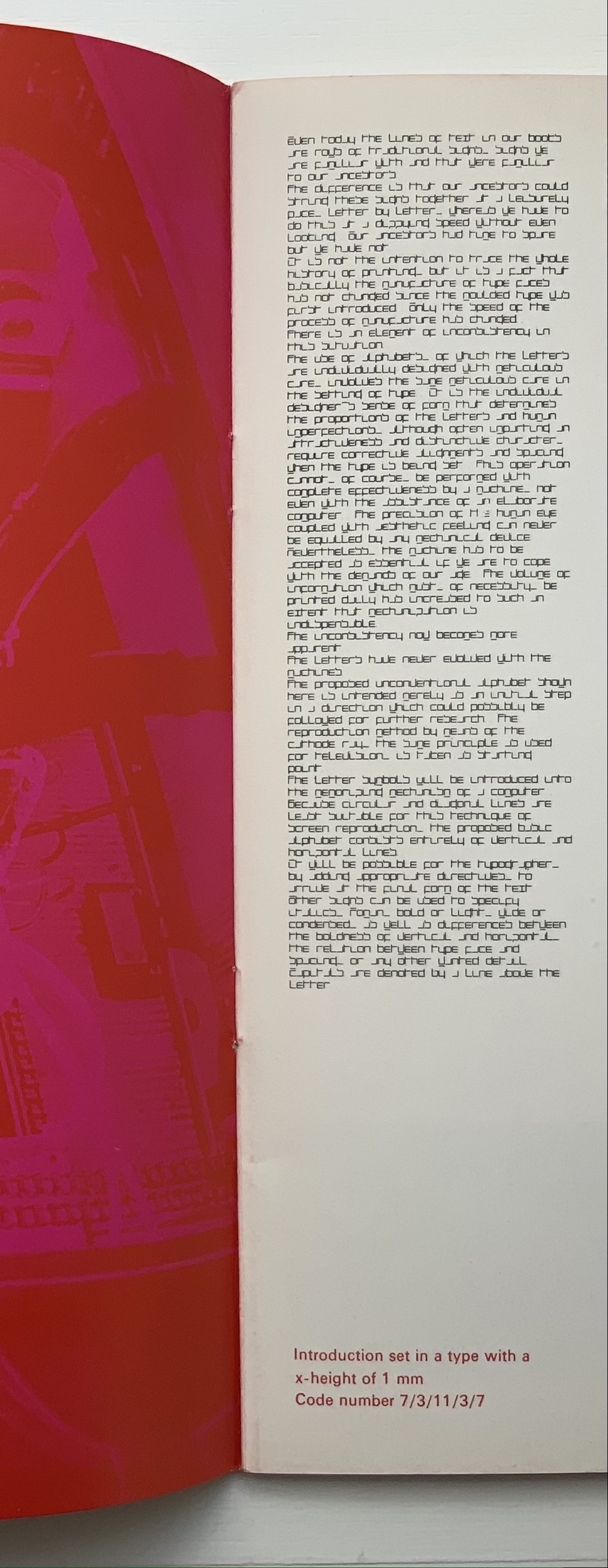
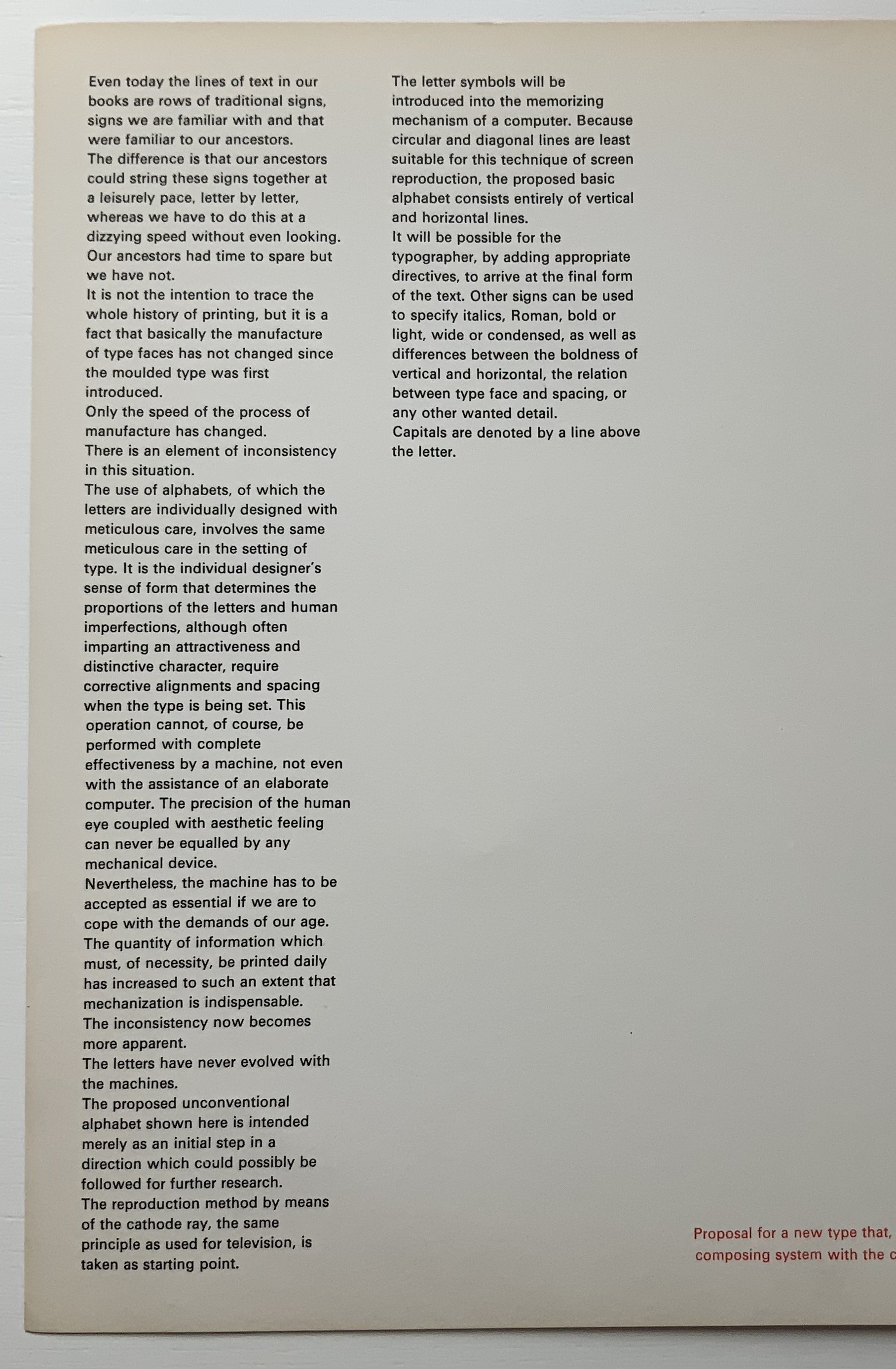
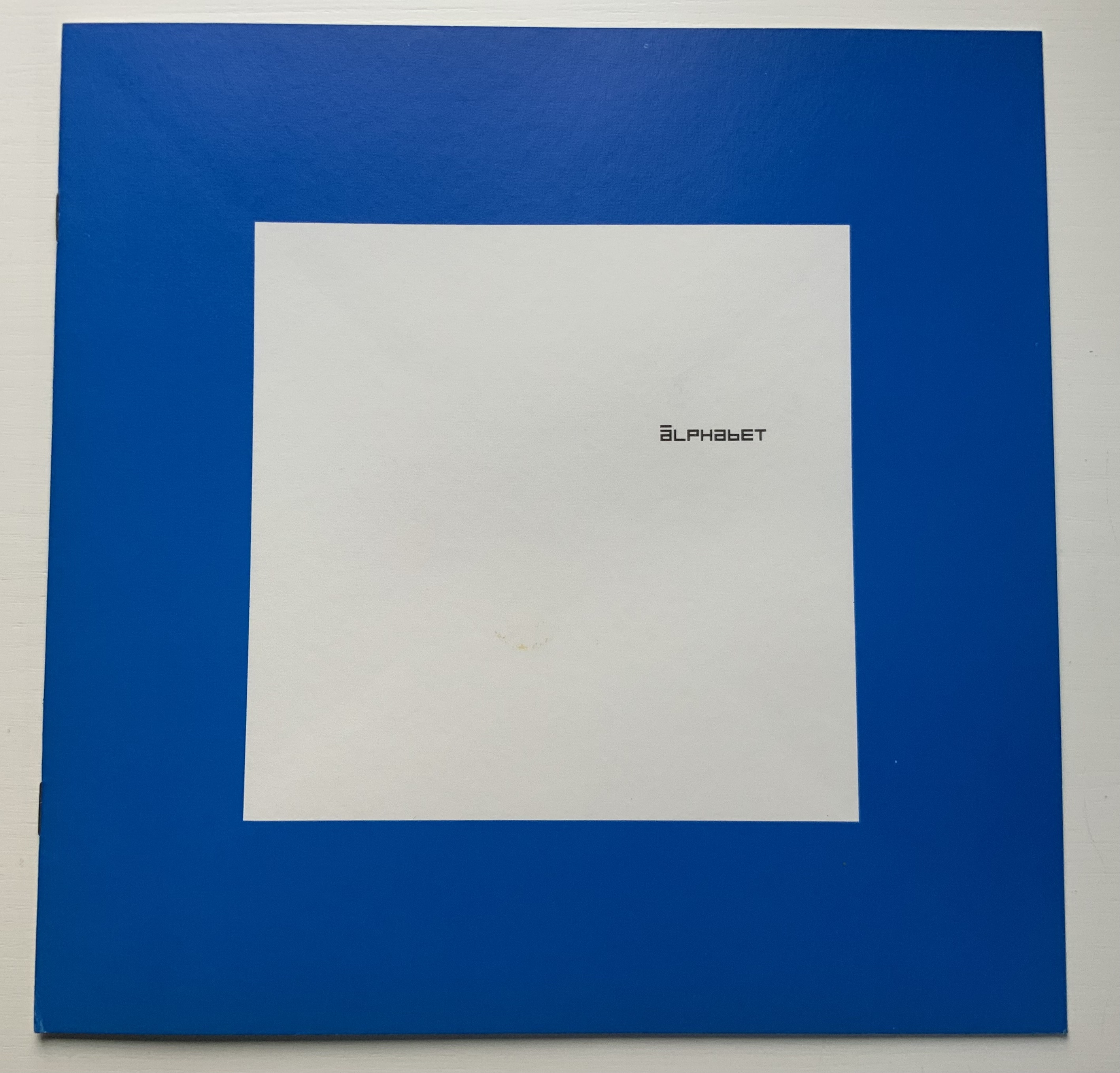
Shocked by the very low resolution output of electronic type-setting machines and sparked by the challenge to define a type that, more than traditional types, would be suited for the speed of machine output (particularly composing systems with CRT — cathode-ray tubes) and still be readable by humans, Crouwel came up with the New Alphabet.
On the left, Crouwel’s introduction in New Alphabet; on the right, in Univers.
A double-page spread (not shown) explains the variables and rules for coding and resizing the letters. Clearly, from the side-by-side view of Crouwel’s introduction (above), humans would need to learn some new conventions (e.g., majuscules are designated by bars over miniscules) for the font to be readable. Some letters, such as “a” (below), would require recognition of an utterly different shape. Despite — or because of — that, the font appealed to album and magazine cover designers in the digital ’80s.
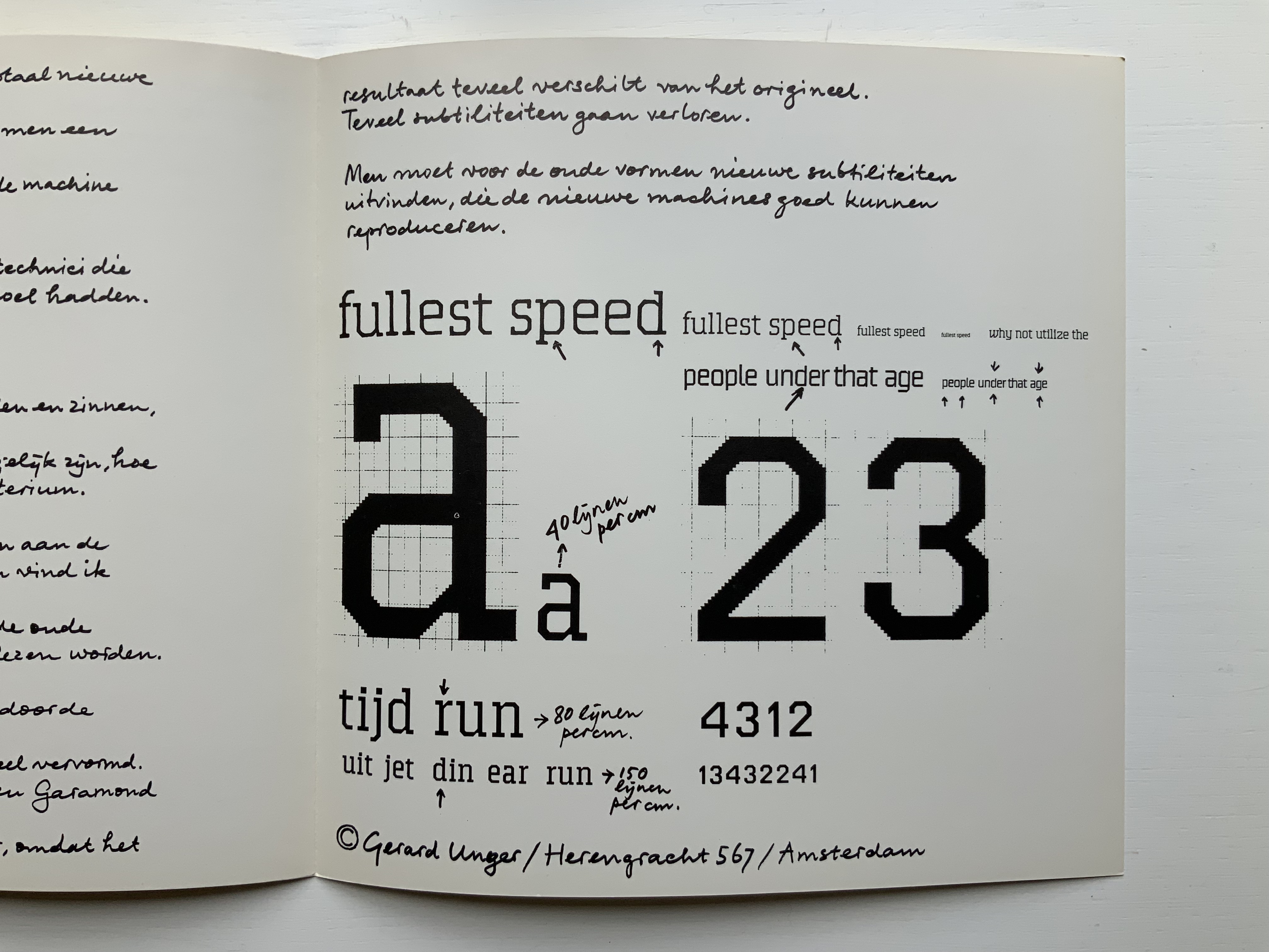
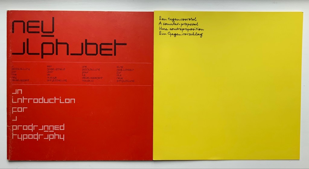
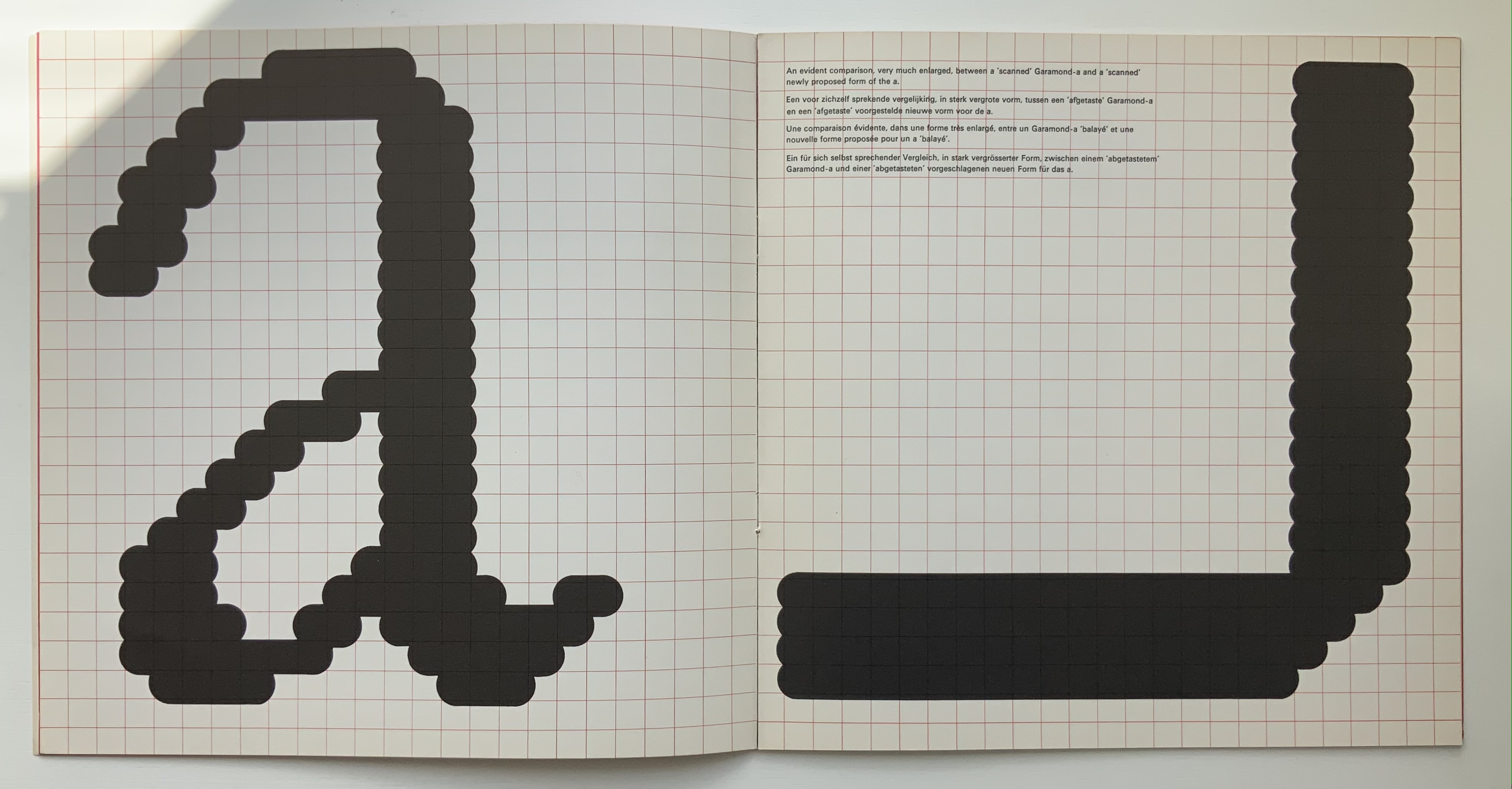
Disturbed by letting machines take precedence over the human eye, Gerard Unger, one of Crouwel’s colleagues, submitted a “counter proposal” — tellingly in handwriting. Juxtaposition of their lowercase “a’s” with Geofroy Tory’s majestic majuscules offers a counter-counter historic perspective on the art of the alphabet.
A few months after Pieter Brattinga issued Wim Crouwel‘s New Alphabet (below left), he followed up with this single-fold riposte from Gerard Unger, invited in fact by Crouwel.
Left: Crouwel. Right: Unger.
Unger urges designing or teaching machines to accommodate “human-readable” letterforms rather than inventing new fonts for machines. Given advances in digital type and artificial intelligence, Unger’s point may have been prescient, but there is still something to be said for the artistic stimulus of machine constraints.
Brattinga extended the dialogue later to include Timothy Epps and Christopher Evans in 1970. If, as it did, the Epps/Evans alphabet led to LINE UP by Raffaella della Olga and Three Star Press, what other works of art have benefited from similar alphabetic and typographical dialogues?
Alphabet (1970), Timothy Epps and Christopher Evans; LINE UP (2020) Raffaella della Olga
Jeffrey Morin and Steven Ferlauto‘s Sacred Space (2003) has its roots in Ferlauto’s historical research into Roman capitals. Jennifer Farrell‘s The Well-Travelled Ampersand (2019) has its roots in the letterform and design thinking of Adrian Frutiger, Frederic Goudy, Dard Hunter, Edward Johnston and Russell Maret, among several others. Inclusion of source material like that by Crouwel, Epps and Evans, and Unger in the Collection offers paths to increased appreciation of those works of art inspired by them. Something for the future history of book art.
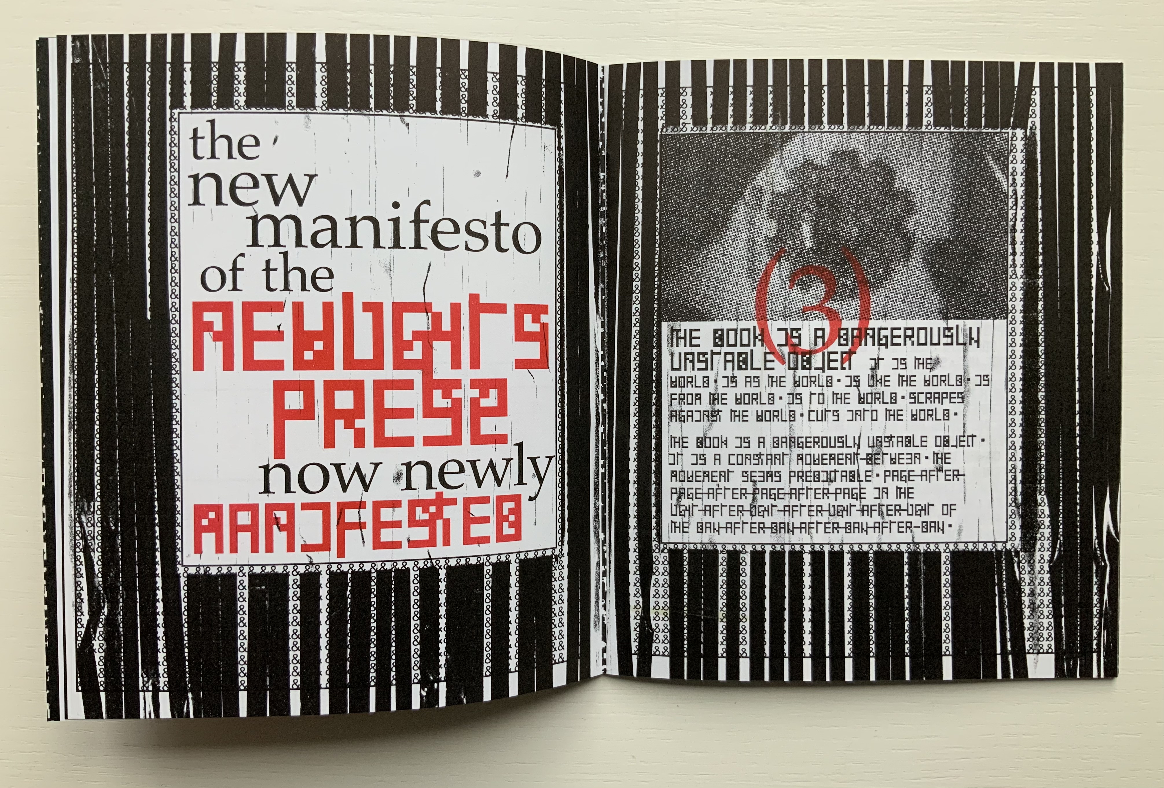
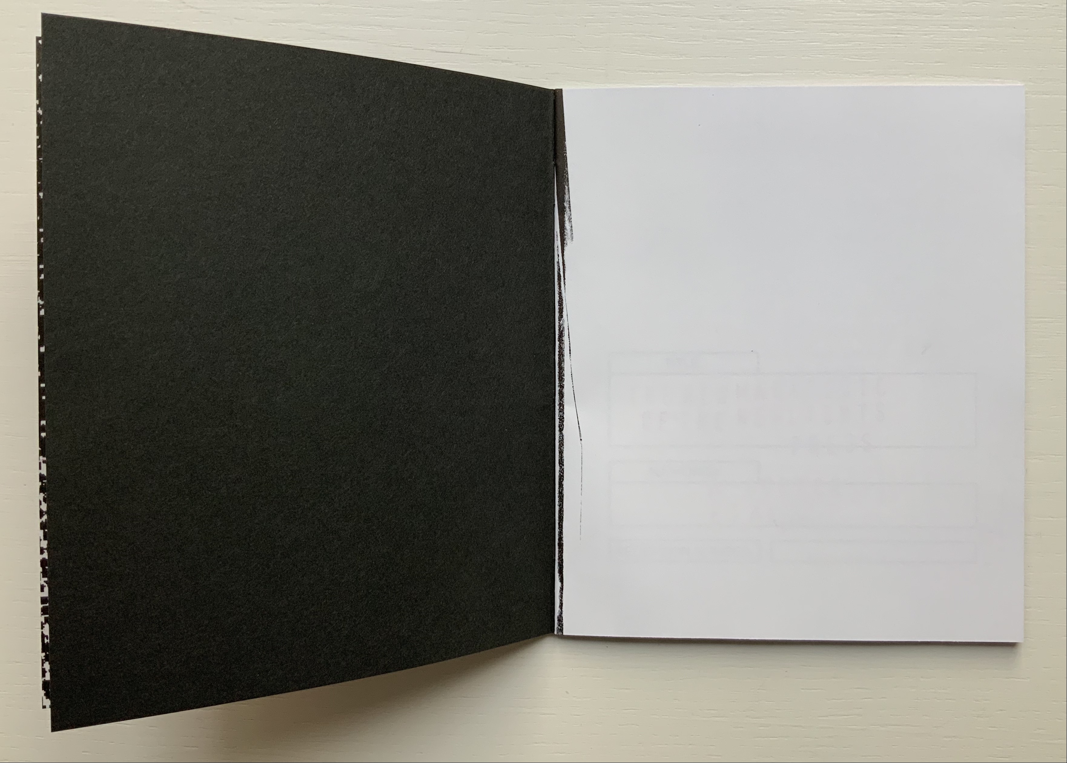
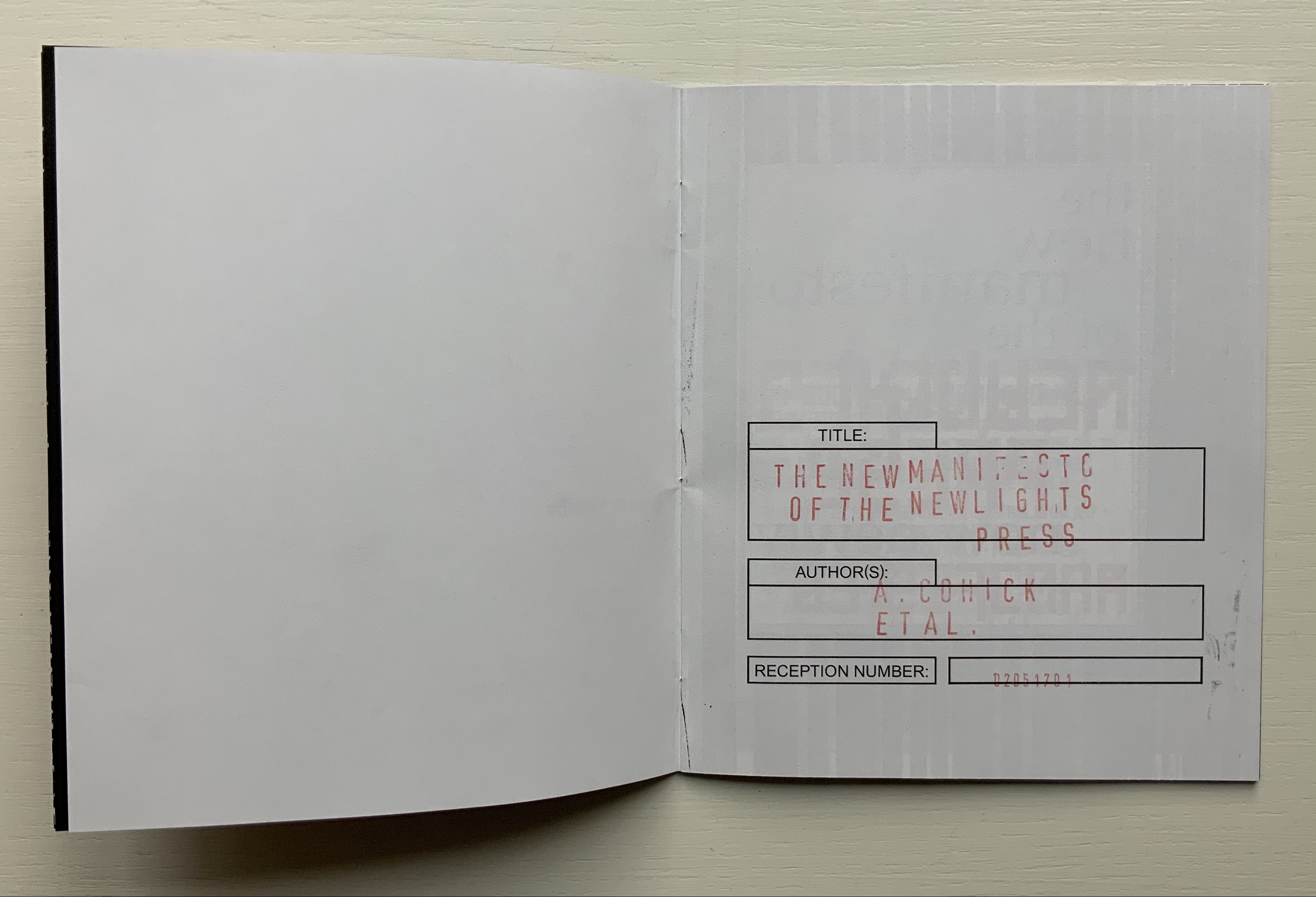
The New Manifesto of the NewLights Press (third iteration) (2017)
The New Manifesto of the NewLights Press (third iteration) (2017) Aaron Cohick Booklet, saddle-stapled, risograph, letterpress/collagraph, and hand painting. H165.1 x W139.7 mm (closed), 20 pages. #000611, unlimited, iterative edition. Acquired from New Lights Press, 11 December 2020. Photos: Books On Books Collection. Displayed with permission of the artist.
The New Manifesto of the NewLights Press (third iteration) has multiple starting points. Even in its first iteration, we have
The book is a dangerously unstable object, always between, continuously opening. It is interstitial, occupying many planes at once.
Digital technology has killed the book, finally.
The book is an impossible thing — comprised entirely of edges and full of holes. It moves. It happens in between.
Readers move through authors and books. Books move through readers and authors. Authors move through books and readers. They exist between each other’s pages. They only exist in between.
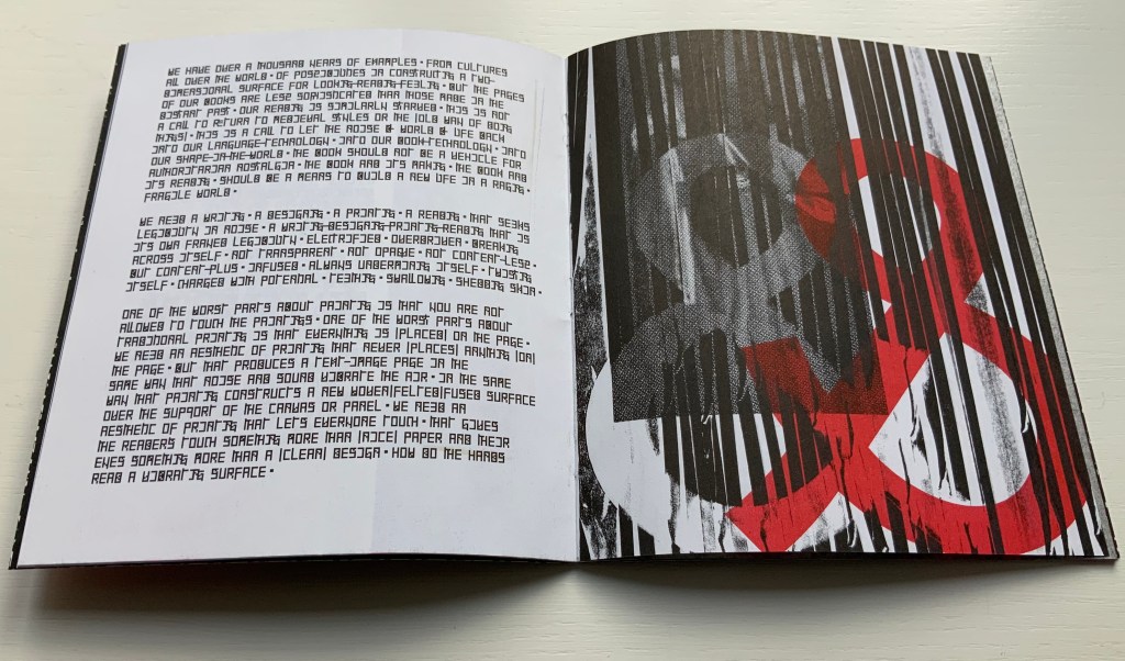
The form of the book, the history of the book, and the processes involved in its production provide a foundation for rethinking and re-evaluating the dominant discourse(s) of contemporary art.
The book … exemplifies a model that expands beyond form and content…. It is a field, whose axis points [form, content, production and reception] are always held in tension. In this model a piece or practice is a “zone of activity.”
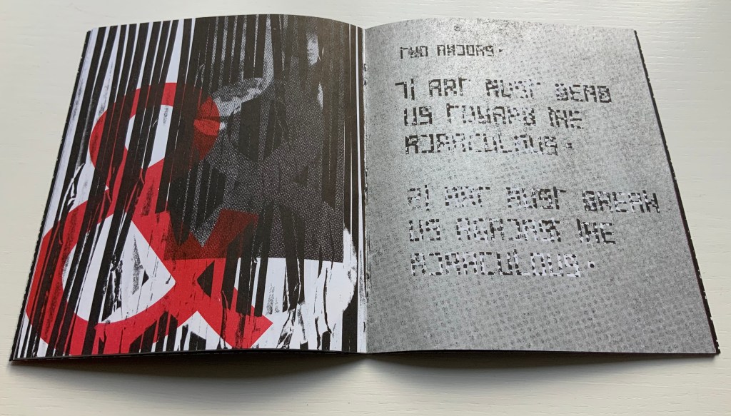
Moreover, there are ten refinements on these starting points, touching on Julia Kristeva’s “intertextuality”, Roland Barthes’ “death of the author”, Michel Foucault’s “death of the book” and much more in the same vein. Each iteration even has diagram and footnotes, underscoring the academic nature of the starting points.
By its third iteration, The New Manifesto‘s words been further refined as a combination of announcement, exposition, lyric and prayer. It soars beyond literary theories and finds birds of a closer feather among Ulises Carrión and Michalis Pichler.
The book is a dangerously unstable object // It is a series of edges // Once clustered and knotted // Now open and spreading // Now cutting and bending // Mostly // The book betrays // Mostly // The book howls // The book falls apart in the face of our anguish // In the face of our quiet // In the silence of our slipping // Mostly // It will also always be something else // That we did not // Can not yet // See // The book is a remarkable technology // It is a shimmering substance // It is a noise of the hands and thought // The book is perhaps now a dead thing // In the hands of the dead // So be it // We never mattered much anyway // Beyond our capacity to consume // Our capacity to labor // We are fuel // So be it // We remain in the dark // With these books // The original autonomous window technology that is us looking through // At // In // Against // With care // The book returns our labor to us //
If a new edition of Publishing Manifestos is ever issued, Cohick’s hortatory words should be considered. The words, however, cannot be considered alone. Over the three iterations, The New Manifesto — the only one in the collection and, therefore, the only one tangible for the visitor — has “participated more & more in the world of visual art”. Cohick’s use of the collagraphic technique increases. It adds painterliness to the booklets as well as a sense of depth and spatial play within the page, across the gutter and from recto to verso pages. In a series of online essays for the College Book Art Association, Cohick confirms the pleasure and intent here:
Collagraph is a well-known technique and is usually taught as part of introductory letterpress courses. It has an immediacy and fidelity that is very exciting—you can stick a leaf or other flat object to a block, print it, and get a decent image of that object. Unfortunately it usually stops there. Those flat objects are hard to push beyond that initial single-color print. Linoleum, photopolymer, wood and metal type, and to some extent woodcut are all made to be “neutral” printing surfaces—flat and smooth. Trying to get collagraph to be flat and smooth begs the question: why use collagraph at all? In collagraph the material that makes the plate is not neutral—the material is exactly the point. That embrace of material and its many, varied effects and marks is what moves collagraph closer to the direct markmaking of drawing/painting. It makes all of those “unacceptable” (or abject?) marks readily available. Relief collagraph printed with letterpress equipment can be a method of painting or drawing in multiple, with control as good as—if not better than, but also different from—the hand. “You’re doing it all wrong (Part 2)“
From the first iteration of the manifesto, black & white details of Jan Van Eyck’s The Arnolfini Marriage appear and are manipulated on the cover and throughout. Although they recede in the second iteration, they move strikingly to the fore in the third. Constantly alongside the Arnolfini details has been the ampersand, enlarged, reversed, in different colors, and present — almost ornamentally — within the text line. The increased visuality of the third iteration announces itself on the booklet’s cover and inside with the grainy enlarged detail of the mirror from The Arnolfini Marriage. What do the Arnolfini details signify? Although Van Eyck’s original itself is straightforwardly representational, its meanings are not always any clearer than that of its use in Cohick’s collage. With his slices of black (“a series of edges”) obscuring the image of the groom, perhaps Cohick is compounding obscurities to present “something else // That we did not // Can not yet // See”.
And what about the large overlapping ampersands in red and gray, systematically reversed and alternating in color? Are they emphasizing the “and so on and so on” of tradition in Cohick’s painterly printing technique? Are they alluding to the joining of hands in the marriage? Are they alluding to, and performing, a marriage of the book and visual art? On a verso page in the manifesto’s first iteration, he writes, “The form of the book, the history of the book, and the processes involved in its production provide a foundation for rethinking and re-evaluating the dominant discourse(s) of contemporary art.” On the facing recto page, the Arnolfini bride in reverse from the original extends her hand to a reversed ampersand.
In perhaps the most important enhancement of the third iteration’s visuality, Cohick’s full-blown typographic redesign of the alphabet occupies the visual foreground, middle ground and background. It is as if Cohick sets out to demonstrate Mallarmé’s proposition that the book is the “total expansion of the letter”. The first iteration’s completely legible Palatino, Arial and Placard Condensed typefaces used in the text line have yielded to what Cohick calls a “dislegible” font, which he often reverses, lays out as occasional “running sides” rather than “running heads”, and subjects increasingly to collagraphic layering. In his “You’re doing it all wrong” series, Cohick explains:
If “legible” and “illegible” are binary opposites, then the term “dislegible” is about looking at the space between those two poles. Dislegibility displaces, dislocates, deforms, and/or disrupts the process of reading, with the ultimate goal of making that process of reading (dis)legible to the reader. The dislegible can be read, but it resists closure or certainty. “You’re doing it all wrong (Part 1)“
Also contributing to dislegibility is the reversal of images, the ampersand and letters. More than that, the reversal reminds us of what is involved in letterpress production — the inked relief surface and its reversed image or letter to be transferred to paper. Always in tension with form, content and reception, production makes up the open field from which the artist’s book emerges. The third iteration exudes production’s physicality. A black saturated endleaf bleeds over onto a stark white sheet that faces a stamped title page, intensifying a feel of mechanical working. Letterforms behave as so much raw material — as if they were oil, acrylic, brick or mortar — to be re-seen from different angles, noted for more than one function and their text read for more than one meaning.
According to Cohick, “For art to thrive, form and content must be in a dynamic relationship… It must contain enough disruptions, ambiguities, and peculiarities to resist the deadly state of stable signification.” The iterations of The New Manifesto enact that statement.
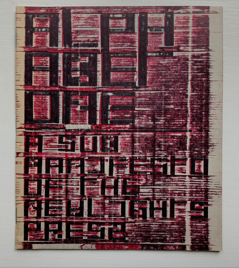
Alphabet One: A Submanifesto of the NewLights Press (2017)
Alphabet One: A Submanifesto of the NewLights Press (2017) Aaron Cohick Booklet, center-stapled. Letterpress printed from woven collagraph blocks on newsprint. H165 x W140 mm, 28 pages. Acquired from the artist, 11 December 2020. Edition of 250, unnumbered. Photos: Books On Books Collection, displayed with permission of the artist.
Alphabet One, “companion book to the third iteration of The New Manifesto of the NewLights Press”, presents Cohick’s “complete ‘noise’ alphabet, in order, in condensed and full form”. In The New Manifesto, Cohick has described the book as “a noise of the hands and thought”. Well then, being a book, Alphabet One demonstrates that the manifesto is the alphabet, and the alphabet is the manifesto, and “woven collagraph blocks” could hardly be less “a noise of hands and thought”. Lest those inferences seem strained, continue reading the passage Cohick reproduces from The New Manifesto immediately after the reference to the “complete ‘noise’ alphabet”:
This is not a utopian program // This is not an alphabet for saving the world // Such a thing is a dangerous lie // This is one possibility // Not a tool // But a movement-between // An object-between // A growing // Changing thing // Meant to do just that // It is about attention and its revitalization // It is about structure and our being in it //
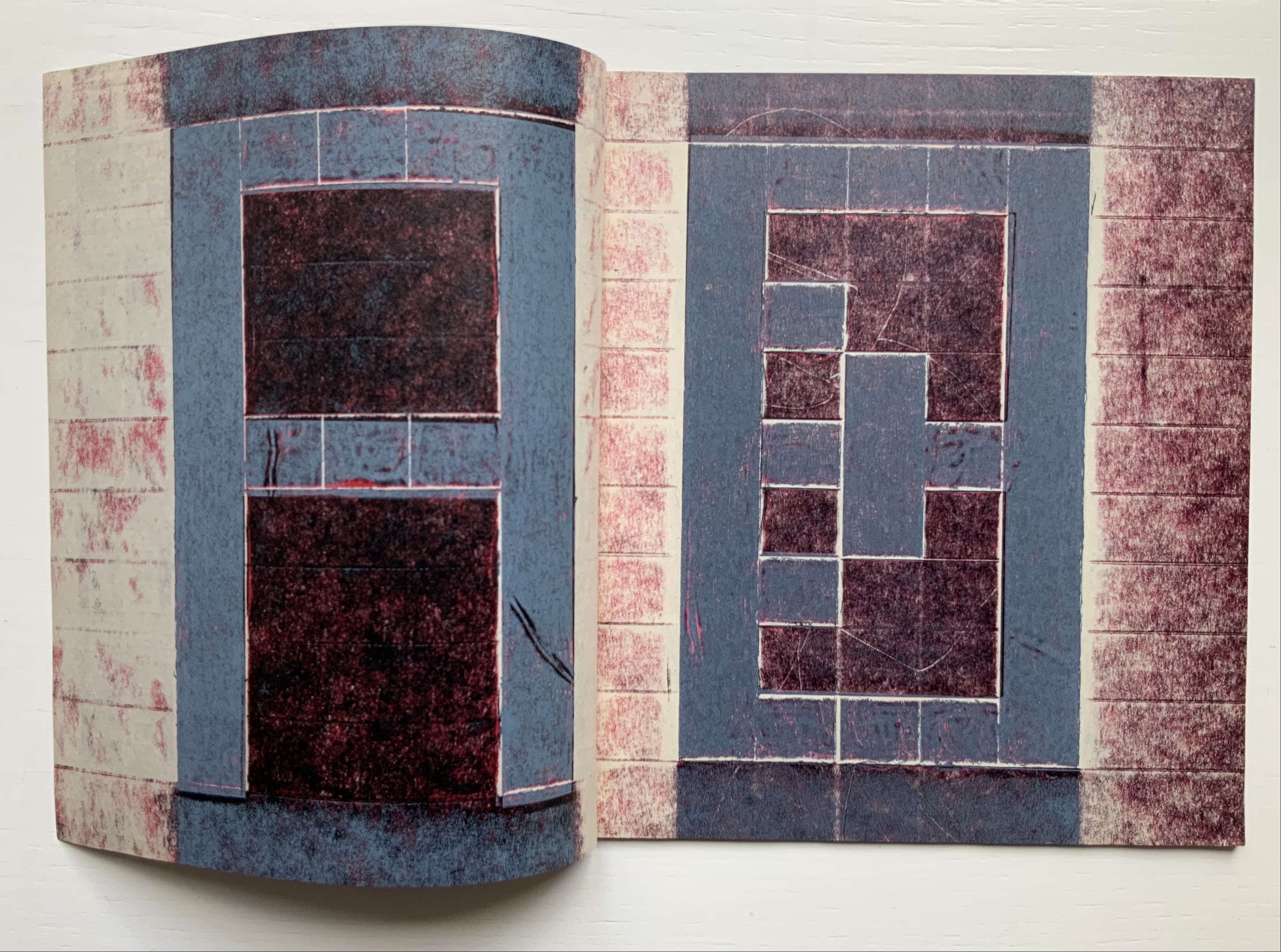
A, B, C, D. Photos: Books On Books Collection.
W, X, Y, Z. Photos: Books On Books Collection.
It cannot be an accident that the “noise” alphabet’s letterforms arise from varyingly shaded bricks: rose, gray, reddish gray and reddish black. To left and right of each letter, the rose color dominates. A reddish gray bar tops and tails each letter. The color gray forms the “strokes” of each letter. Reddish black fills the counters. Extracting the signal from the noise of the alphabet or books does not come easily. This is intentional. Just as The New Manifesto says,
With these books // The original autonomous window technology that is us looking through // At // In // Against // With care //The book returns our labor to us //
Days Open Air (2016)
Days Open Air(2016) Aaron Cohick Booklet, center-stapled, H203 x W152, 12 pages. Edition of 100, of which this is #40. Acquired from the artist, 11 December 2020. Photos: Books On Books Collection, displayed with artist’s permission.
Days Open Air is one of those books returning our labor to us that The New Manifesto announces. Cohick call it “an artists’ book/poem thing … an experiment: with our new Risograph, with the alphabet, with writing, with random numbers, and with noise.” Letterforms stretch. Words run sideways, they break in the middle across lines, even across pages.
Look-See (REAED) (2014)
Look-See (REAED) (2014) Aaron Cohick Print. H300 x W456 mm. Photos: Books On Books Collection, displayed with artist’s permission.
More evocative of barcode stripes than bricks, the letterform strokes in this poem-print-poster stretch even more than in Days Open Air. Printed on a Vandercook 219 from vinyl and gesso collagraph blocks, the letterforms challenge us to “look” and “see”. An angle at the top right, two angles midway on the right and two counters condensed to small squares suffice to define the first letter — R. The letters E and A are more efficient, requiring only the placement of two counters each. Note how the textural effect of the gesso and letterpress printed collagraph on chipboard joins The New Manifesto‘s celebration of the physicality and noise of production.
In Cohick’s world, the book and art make, and should be perceived as, a “strange” continuity. His vision and embrace of the collagraph suggest a 21st century version of William Blake. He names his nearer contemporaries as Ken Campbell, Walter Hamady, Amos P. Kennedy, Jr., Karen Kunc, Emily McVarish, Dieter Roth and Nancy Spero. In the Books On Books Collection, those far and near can also be found in Eleonora Cumer, Raffaella della Olga and Geofroy Tory.
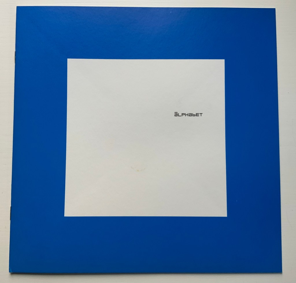
Alphabet (1970) Timothy Epps and Christopher Evans Booklet. 250 x 250 mm, 16 pages. Acquired from Antiquariaat Frans Melk, 23 November 2020. Photos: Books On Books Collection.
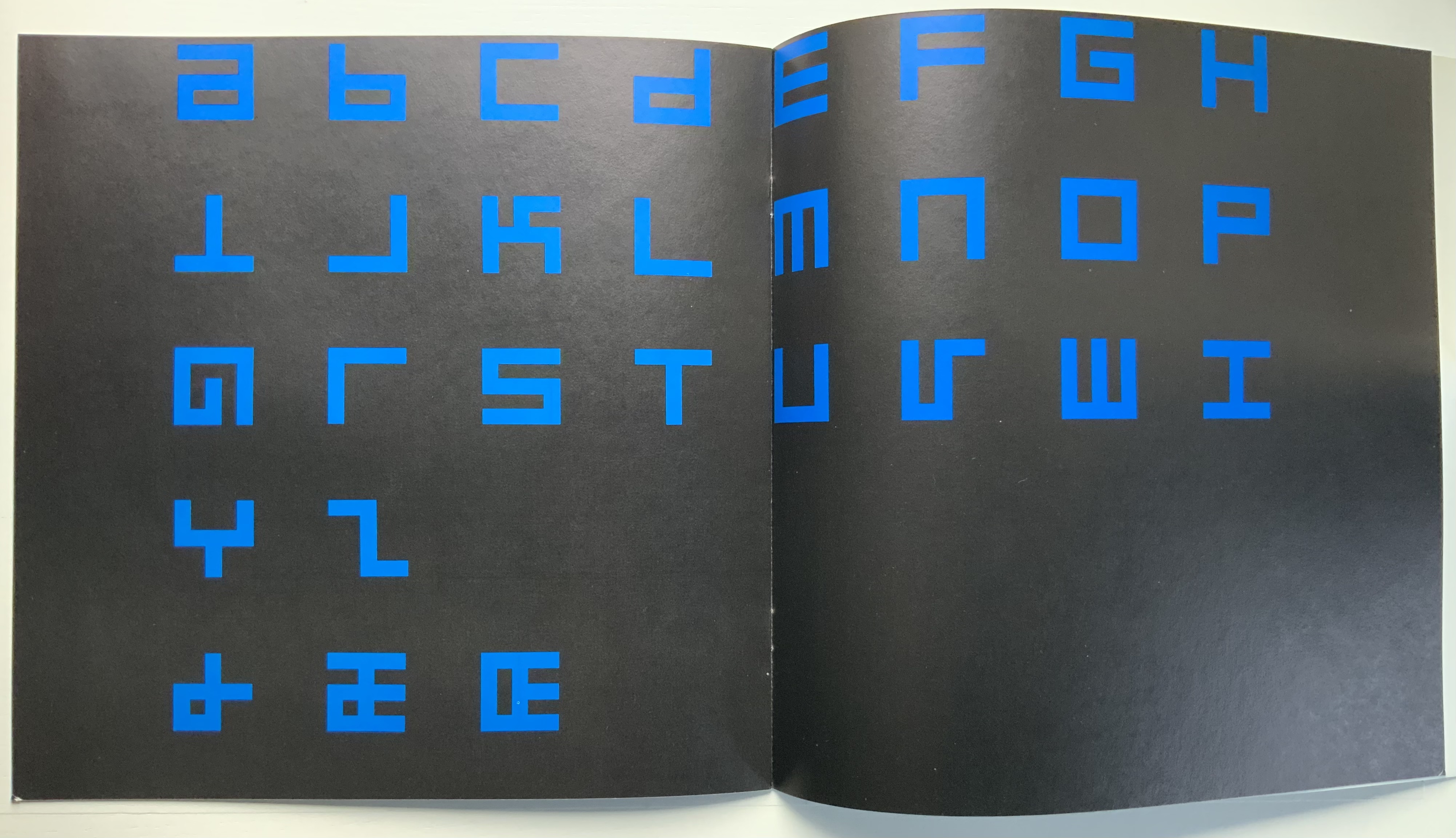
This is the alphabet that inspired Raffaella della Olga’s LINE UP (2020), also in this collection. At the UK’s National Physical Laboratory, Epps and Evans created their alphabet in 1969 in response to the challenge to overcome machine-readable typefaces’ human-unreadability. Perhaps because it was the second of three responses to Wim Crouwel‘s New Alphabet (1967), published in the Kwadraatblad/Quadrat-prints series, the Dutch graphic designer and series editor, Pieter Brattinga, snatched it up for publication in his series of experiments in printing ranging over the fields of graphic design, the plastic arts, literature, architecture and music. This particular issue was designed by John Stegmeijer at Total Design.
While the bright blue (above left) stands out strikingly against the black background, the booklet appropriately makes the human eye strain to see the letters darkly printed against the black. Would a scanner pick them up? Does the similar elusive effect created by debossed printing in della Olga’s collaboration with Three Star Press allude to this as well? What would that ingenuity create if applied to Crouwel’s New Alphabet or to Gerard Unger‘s A Counter-Proposal (the first response to Crouwel’s booklet) or Anthon Beeke‘s Alphabet (the third and strangest response — letters composed of naked women)?
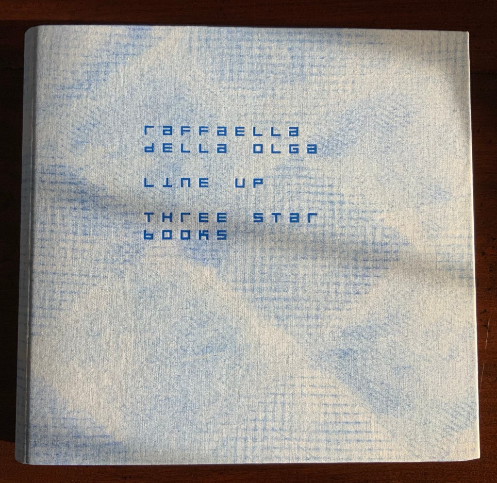
LINE UP (2020) Raffaella della Olga Cloth on board with spiral binding of 28 card folios. H270 x W290 mm (closed). Edition of twenty-six, of which this is #8. Acquired from Three Star Books, 4 November 2020. Photo: Books On Books Collection, displayed with the artist’s permission.
Formerly a lawyer, Raffaella della Olga turned from the manipulation of legal text to the artistry of the letter and its “total expansion” — the book — as well as its manifestation in light and textiles. Her chief tool of art is a set of customized typewriters. The output she calls “tapuscripts”. Most of her works are unique pieces, each entitled with the emblematic letter T followed by the ordinal number of its creation — up to T28 as of this writing.
The limited edition of LINE UP offered an unusual opportunity to add to the Books On Books collection a work that resonates with its subset of abecedaries and one by an artist who shares a deep interest in another theme in the collection: Un coup de Dés jamais n’abolira le Hasard. Since 2009, she has created bookworks that reveal an artist’s and careful reader’s appreciation of the poem.
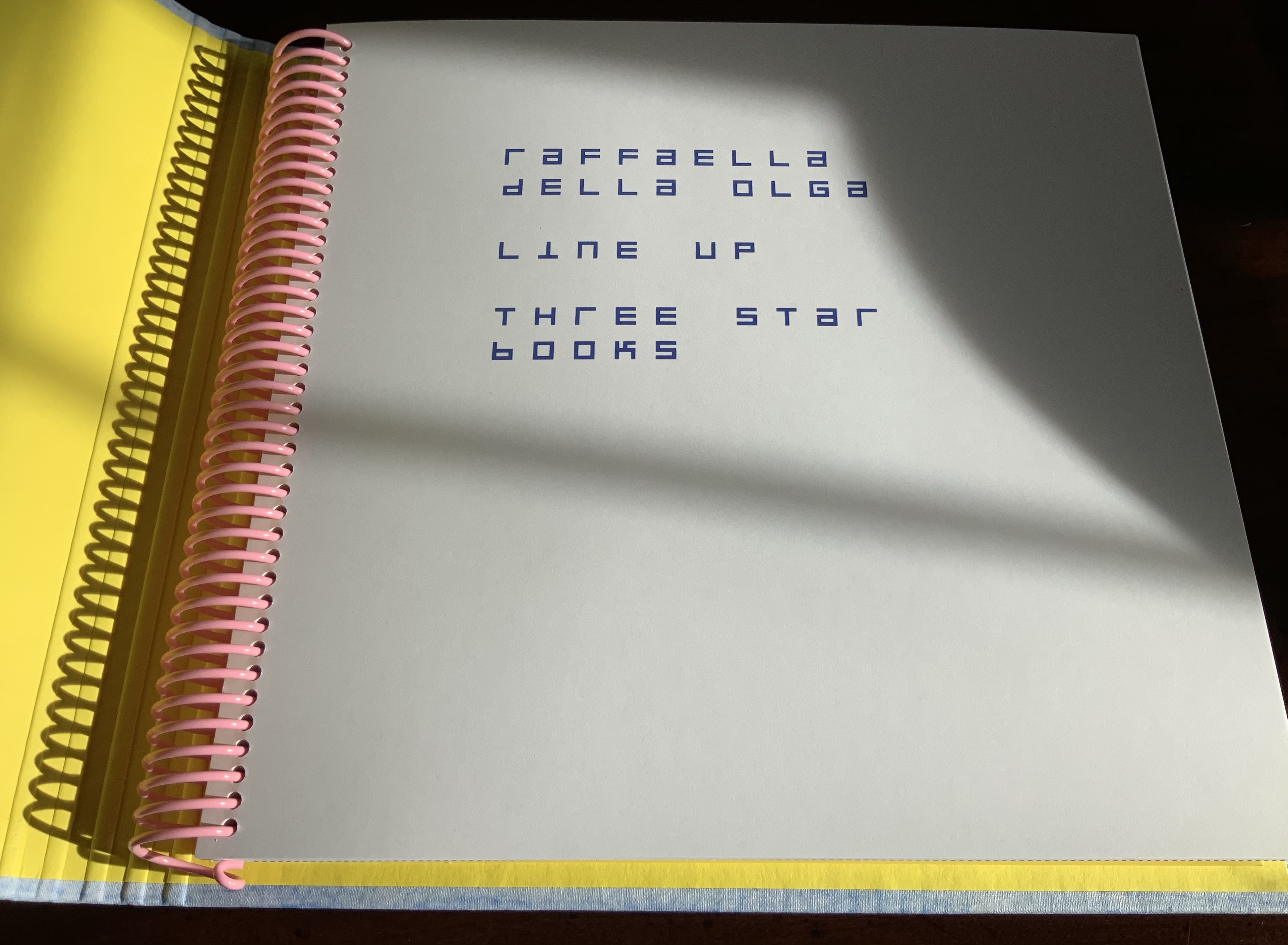
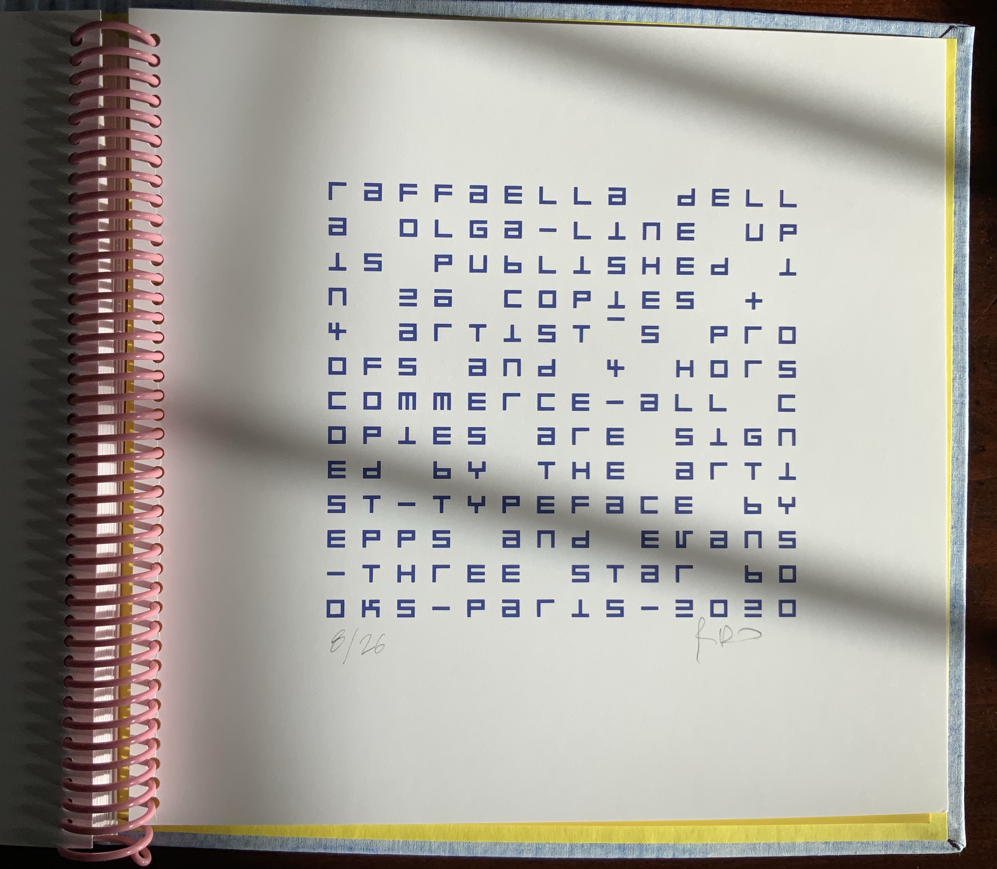
Title page and colophon from LINE UP. Photos: Books On Books Collection, displayed with the artist’s permission.
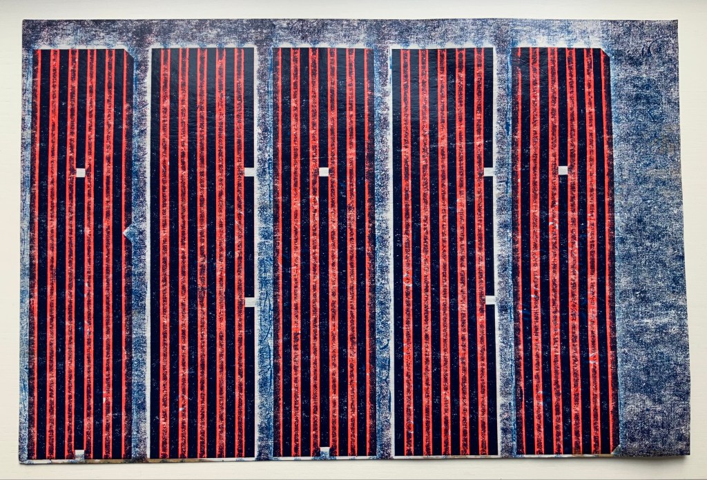
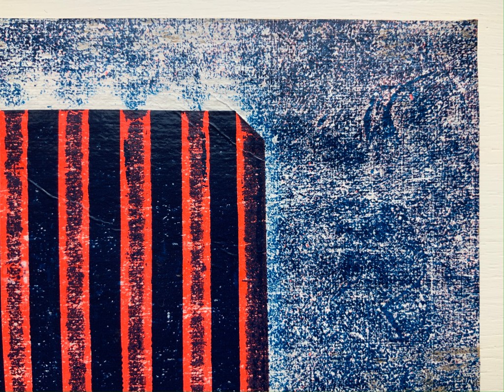
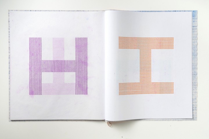
LINE UP is very much a collaborative work between Raffaella della Olga and Three Star Books, founded in 2007 by Christophe Boutin and Mélanie Scarciglia with Cornelia Lauf (2007-2015). The edition consists of twenty-six spiral-bound copies, each with a unique cover produced by rubbings on canvas and differently colored. The title page and colophon take up two of the card folios in the volume, which leaves twenty-six for the printed content. Blocks of vertical blue lines turn the pages into letters based on the Epps-Evans alphabet, designed in the 1960s with only horizontal and vertical strokes in an attempt at machine readability.
Alphabet (1970) Timothy Epps and Dr. Christopher Evans Hilversum: de Jong & Co., 1970. Photos: Books On Books Collection.
Discerning the letters in LINE UP feels sometimes like squinting one’s way through an optical illusion. The eye is bewitched by a color-shifting, almost stroboscopic effect created by four squares of embossed lines printed from the reverse side, always in the same position. Della Olga credits Christophe Boutin (Three Star Press) with introducing this effect.
The letters “a”, “b” and “c”.
Left: The four embossed squares seen from the verso. Right: The color shift between the embossed and flat squares.
The letter “k” at different angles of light.
The first of della Olga’s works reflecting the influence of Mallarmé’s poem was Un Coup De Dés Jamais N’abolira Le Hasard – Constellation (2009), which was shown in the Gulbenkian’s “Pliure” exhibition in Paris in 2015. In a darkened room with an attendant turning the pages, the poem’s words, painted in phosphorescent powder, flickered into existence.
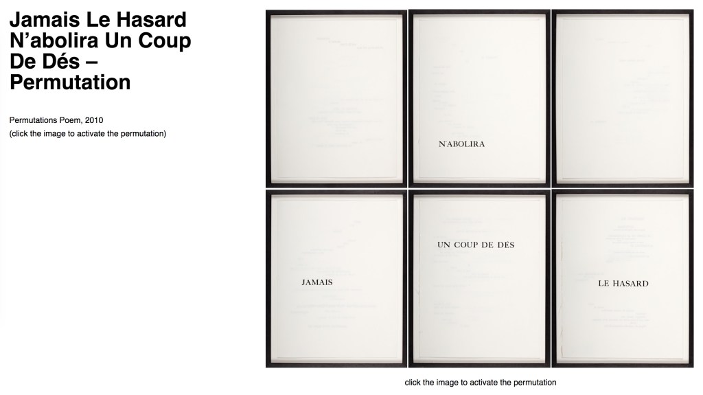
A year later came this rendition: Jamais Le Hasard N’abolira Un Coup De Dés – Permutation (2010). Although the link goes to an online presentation, the work is analogue and unique. In correspondence (9 December 2020), Della Olga writes, “I took apart the book the Gallimard edition as a whole, without the paratext. I folded the double pages and deleted with white paint the part of the poem that appear.” A close look at the framed pages reveals the faint shadows of the painted-over text. On the wall, the permutation arises in the changeable order of hanging, which the online algorithm permits the viewer to perform.
Her most recent homage to Mallarmé’s poem is Un Coup de Dés – Trame (2018). Like Constellation with its reference to and enacting of the poem’s constellation metaphor, and like Permutation with its reference to and enacting of chance, Trame well reflects della Olga’s penetration of the poem and transformation of it into artwork that stands strongly on its own and in comparison with other works of homage by Marcel Broodthaers, Michalis Pichler and Cerith Wyn Evans.
The word trame is le mot juste in its application to the work and its referent. Its meanings — frame, woof, weft and weaving — shift across the work’s technique and material and evoke the poem’s typographical weaving as a framework with which to realize the “total expansion of the letter”.
Here’s hoping for further expansion into limited editions.
Epps, Timothy, and Christopher Evans. 1970. Alphabet (Typeface … designed by Timothy Epps in collaboration with Dr. Christopher Evans). Hilversum: Steendrukkerij de Jong & Co.
Spencer, Herbert, and Colin Forbes. New Alphabets A to Z (New York: Watson-Guptill Publications, 1974). Source of the artist’s first encounter with the Epps-Evans alphabet. (Correspondence with Books On Books, 6 December 2020)
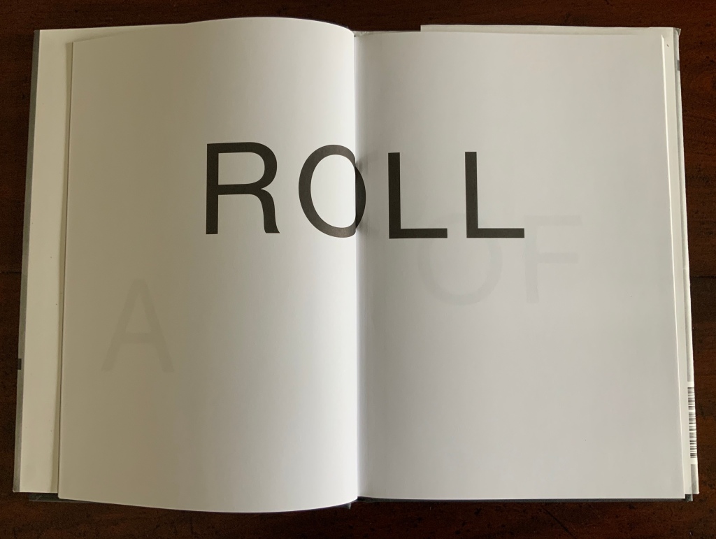
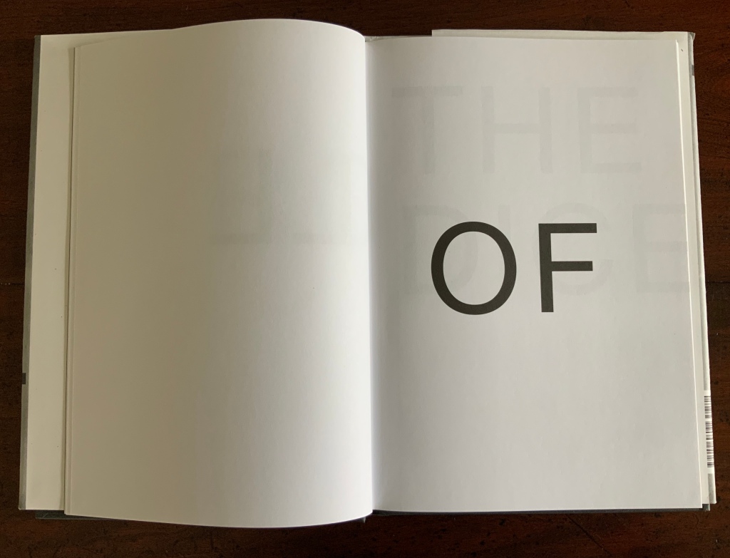
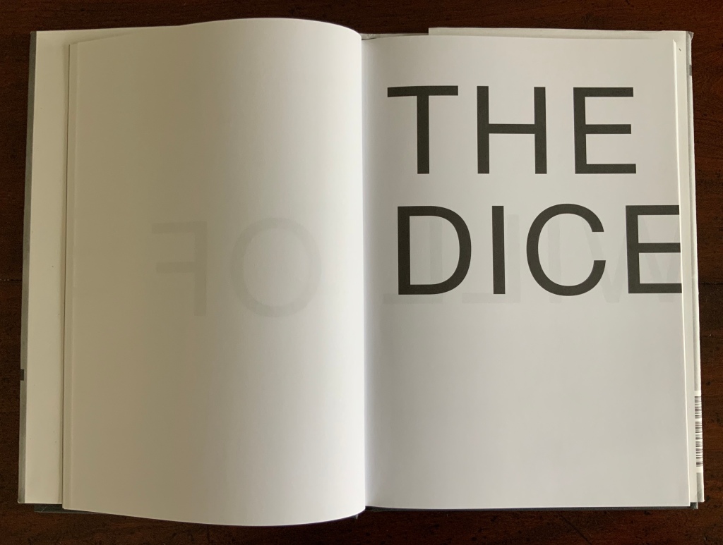
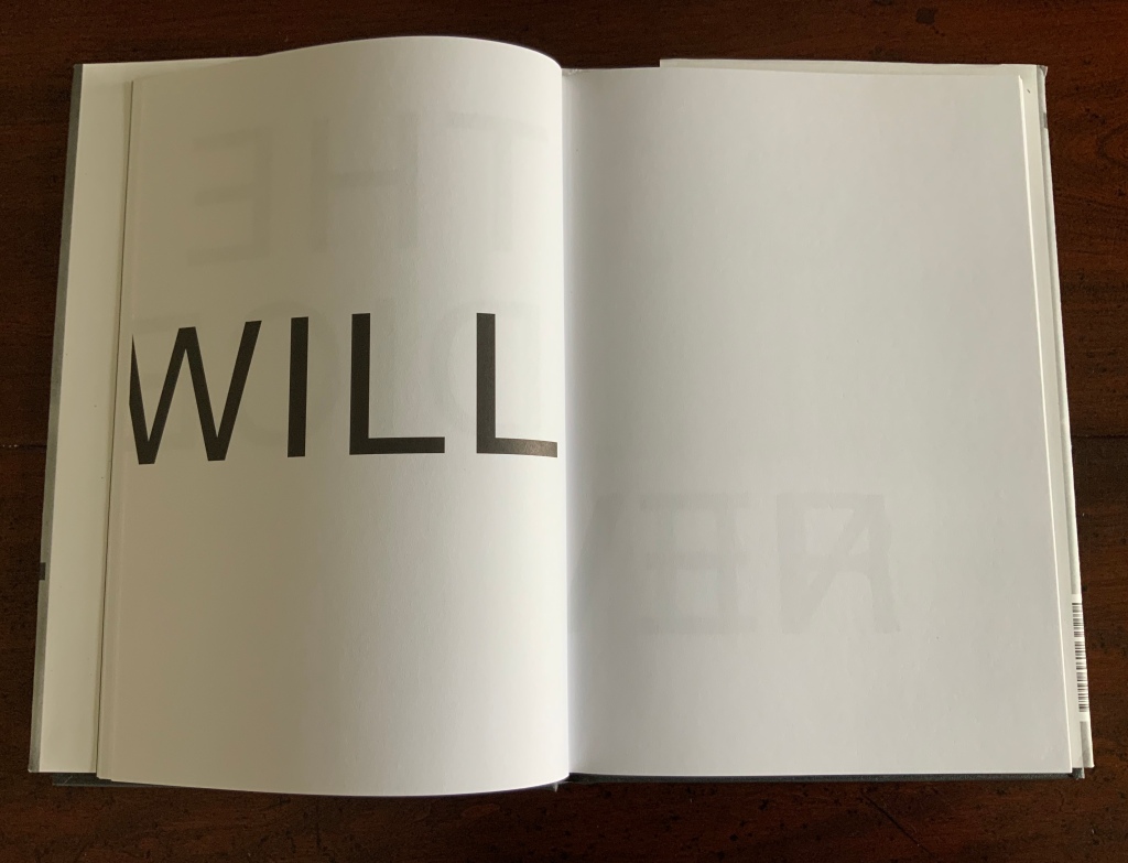
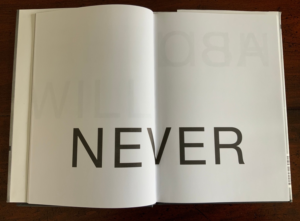
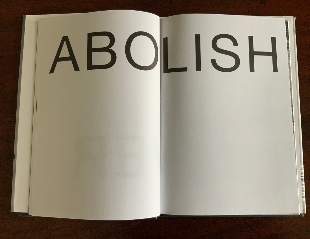
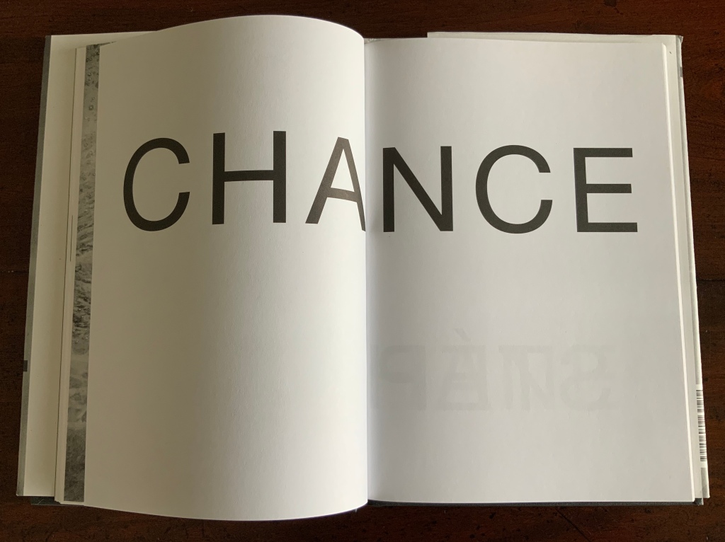
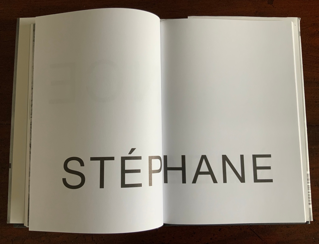
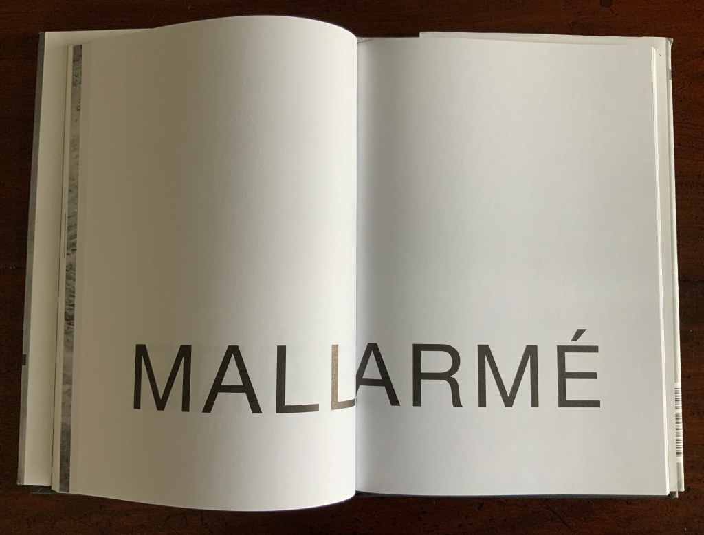
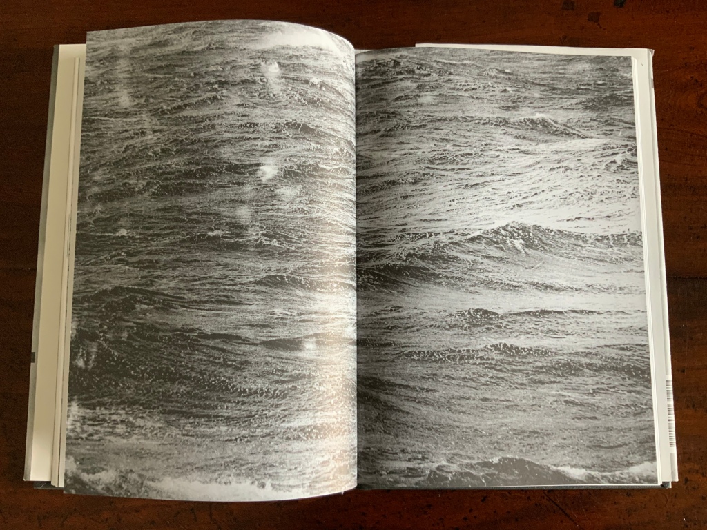
Jeff Clark has designed this book for a dramatic entrance: eleven double-page spreads presenting in large type the English title (interrupted with a full-bleed double-page spread of random-light burst-mode photographs of black-and-white laserprints) followed by Mallarmé’s name in equally large type. The words in all caps Helvetica type bounce across the pages like dice, or rise and fall like waves.
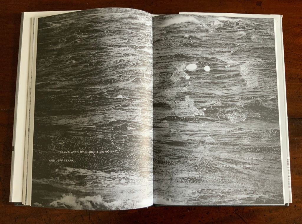
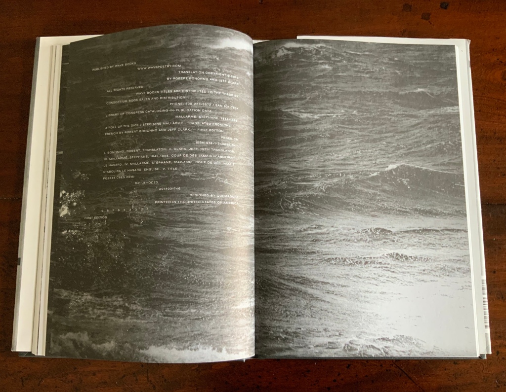
Three more double-page spreads of an ominously darkening sea display the translator’s and designer’s names and the copyright page printed in reverse.
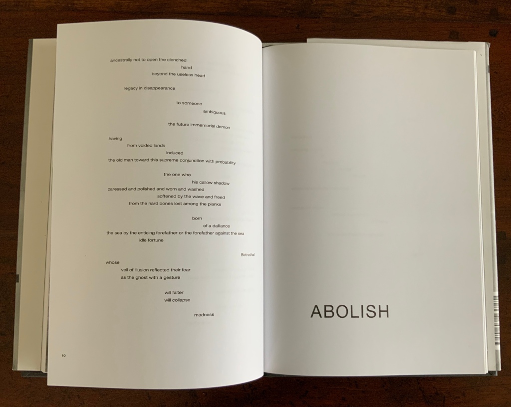
And then the poem begins. Both the English and French versions of the preface and poem occur without interruption by images (as Mallarmé would have wished) and in the layout implied by Mallarmé’s mark up of proofs before his death. Their relatively plain sailing, contrasted with the book’s dramatic opening, actually draws attention to the disruptive and groundbreaking nature of the poem’s intended layout and variations in typography.
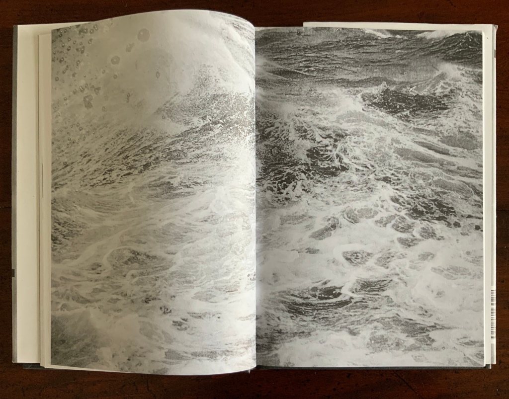
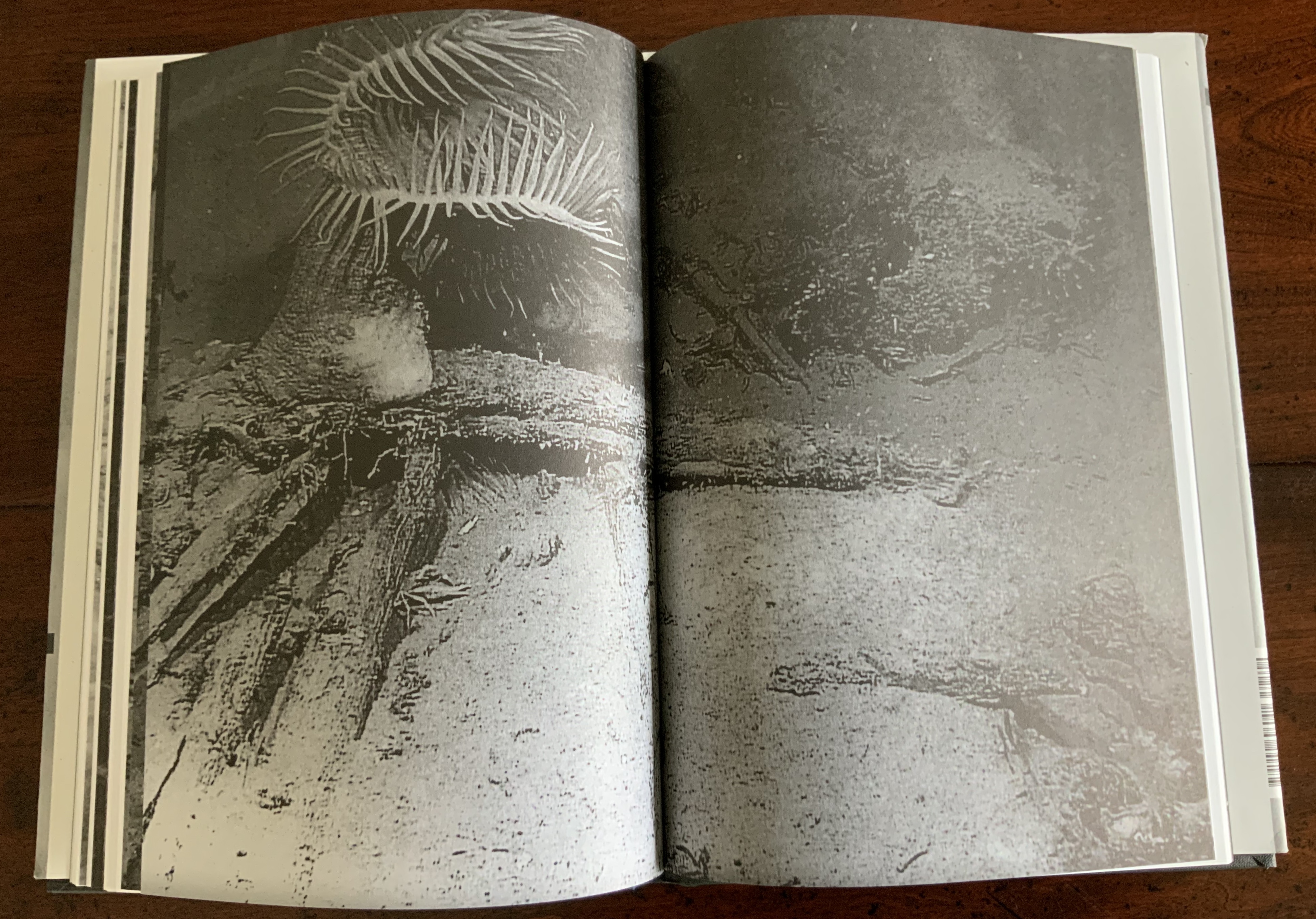
The dramatic opening of double-page spreads returns at the end of the English version. Four spreads of undulating photographs of the seabed separate it from the French version. The spreads begin with a blow-up shot of seaweed or coracle and encrusted wreckage, then back off to a slightly longer shot in the next two spreads and return to a blow-up in the fourth spread. Although these are stills, their manipulation over the pages conveys a sense of underwater movement.
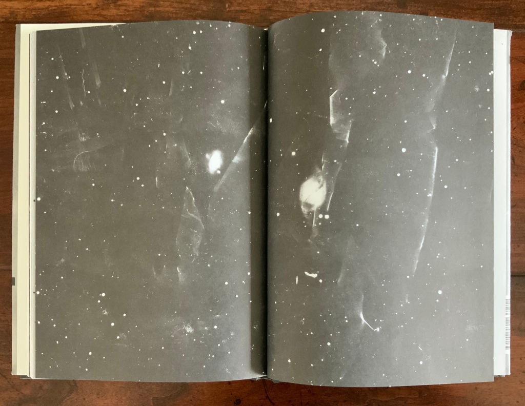
Four more double-page spreads conclude the book with photographs so blown-up and darkening that they leave the reader/viewer wondering if the phosphorescent underwater world has metamorphosed into a constellation.
The design work is carefully considered and meaningful. In choice of type, the English version’s sans serif type, Helvetica, contrasts with and complements the French version’s serif type, Didot, Mallarmé’s preferred font. Although in the Helvetica family the roman font does not contrast with its italic font as much as those fonts contrast in the Didot family, the Helvetica “places” Bononno’s and Clark’s work as a contemporary translation that complements its original.
The handling of the images is deeply subtle — not merely in their thematic affinity with the imagery and thrust of the poem, but also in their technique. They are random-light, burst-mode photographs of laser-printed photographs, a meta-technique that echoes the poem’s metaphysical struggle with meaning’s and thought’s being at a chance-driven remove from language. In commenting on Raffaella della Olga‘s phosphorescent light installation of the poem, the critic Raimundas Malašauskas makes a comment that is also apropos of these photographic images and technique:
Conversations about light often end up in conversations about time because light is far from ageless. Two reasons compliment [sic] each other: first, the emission of photons starts at one point in time and finishes at another one. Second, the scope of light brings an unforeseen scale of time if one has chosen to read this evocation under the light of stars. Just imagine it (when hopefully no one sees you.)
Malašauskas’ comments should be read in full to appreciate how important the theme of temporal perspective is for della Olga’s work. In his poem, Mallarmé evokes a temporal perspective through numerous images, not least of which is the constellation, and links that perspective to chance and the space (gap or abyss) between word (mark or utterance) and meaning. Likewise, in the privacy of this book, the chance-driven burst-mode images of images shift perspective from surface to depth to the microscopic — and out to the stars — placing the viewer in that solitary place where “no one sees you” to imagine macro- and micro-scopic vastness and relate them to this poem that proclaims across its last two double-page spreads:
Stark, Trevor. Total Expansion of the Letter (Cambridge, MA: MIT Press, 2020). Reviewed here. For a clear exploration of Mallarmé’s themes of chance, temporal perspective, thought and language.