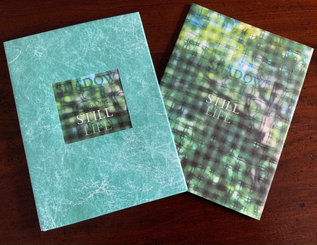
Marlene MacCallum achieves distinctive results by painting with photography and sculpting with book structure in her artist’s books. Her painting with photography has involved not only collage work but pinhole cameras, digital cameras, digital layering and masking as well as a variety of transfer processes — digital and analogue photogravure, lithography, digital pigment printing, and digital inkjet printing. Sculpting with book structure mainly includes varying the binding as in the accordion with fold-out of Obvert (1997), the tunnel book structure of Do Not Enter (1998), the gatefold of Domestic Arcana (1999), the tile format fold-outs of pink story (2004-05), the accordion of Quadrifid (2009), the dos-à-dos of Glaze: Reveal and Veiled (2013), and the Miura fold of Rise (2020). It also includes altering books as in Withdrawn (2010) and varying the substrate as in the lace paper, Moriki, double matte Mylar, Lanaquarelle, and embossed leather of Townsite House (2006) and the etched copperplate and Tyvek of Trompe l’Oreille (2011).
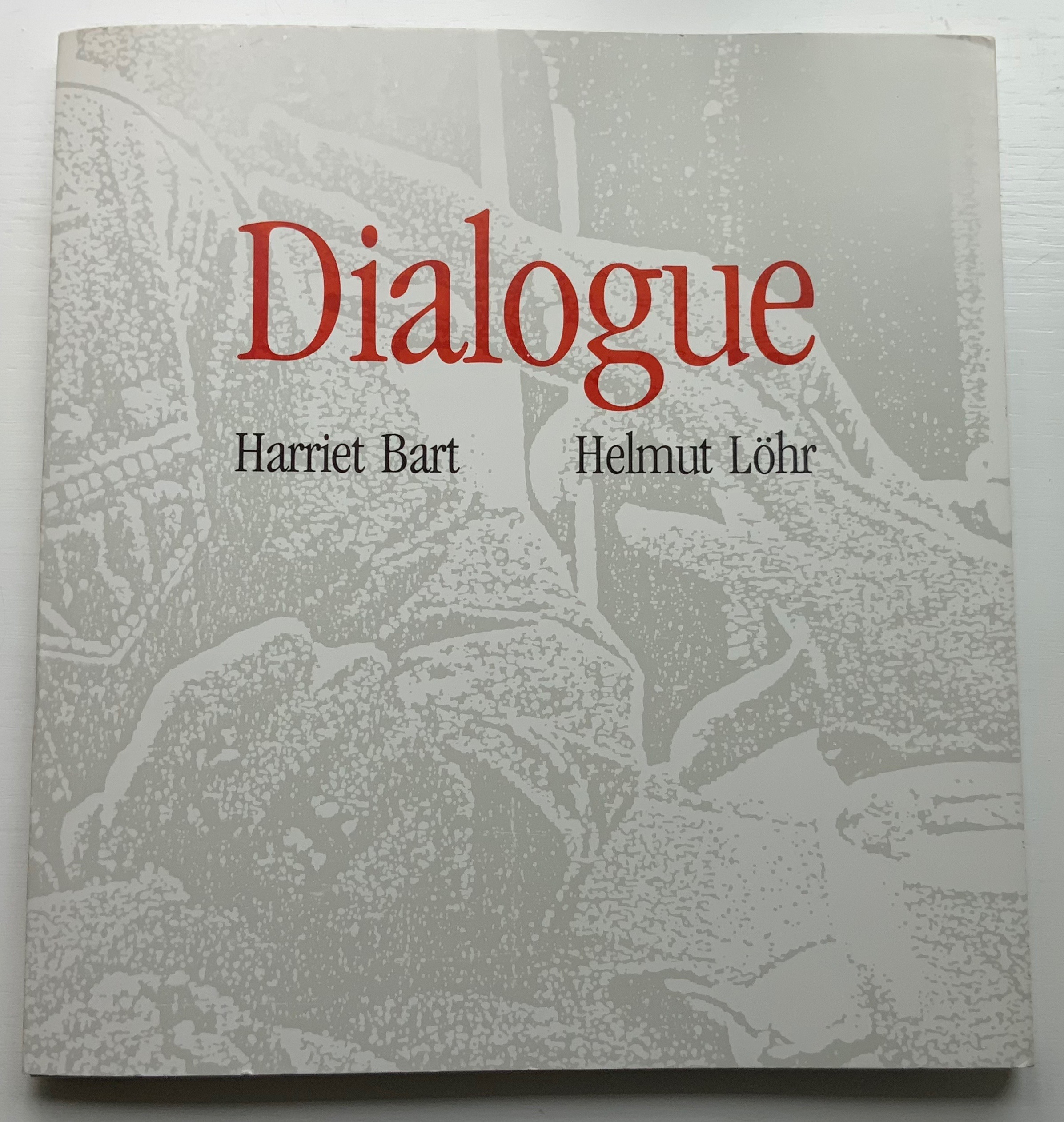
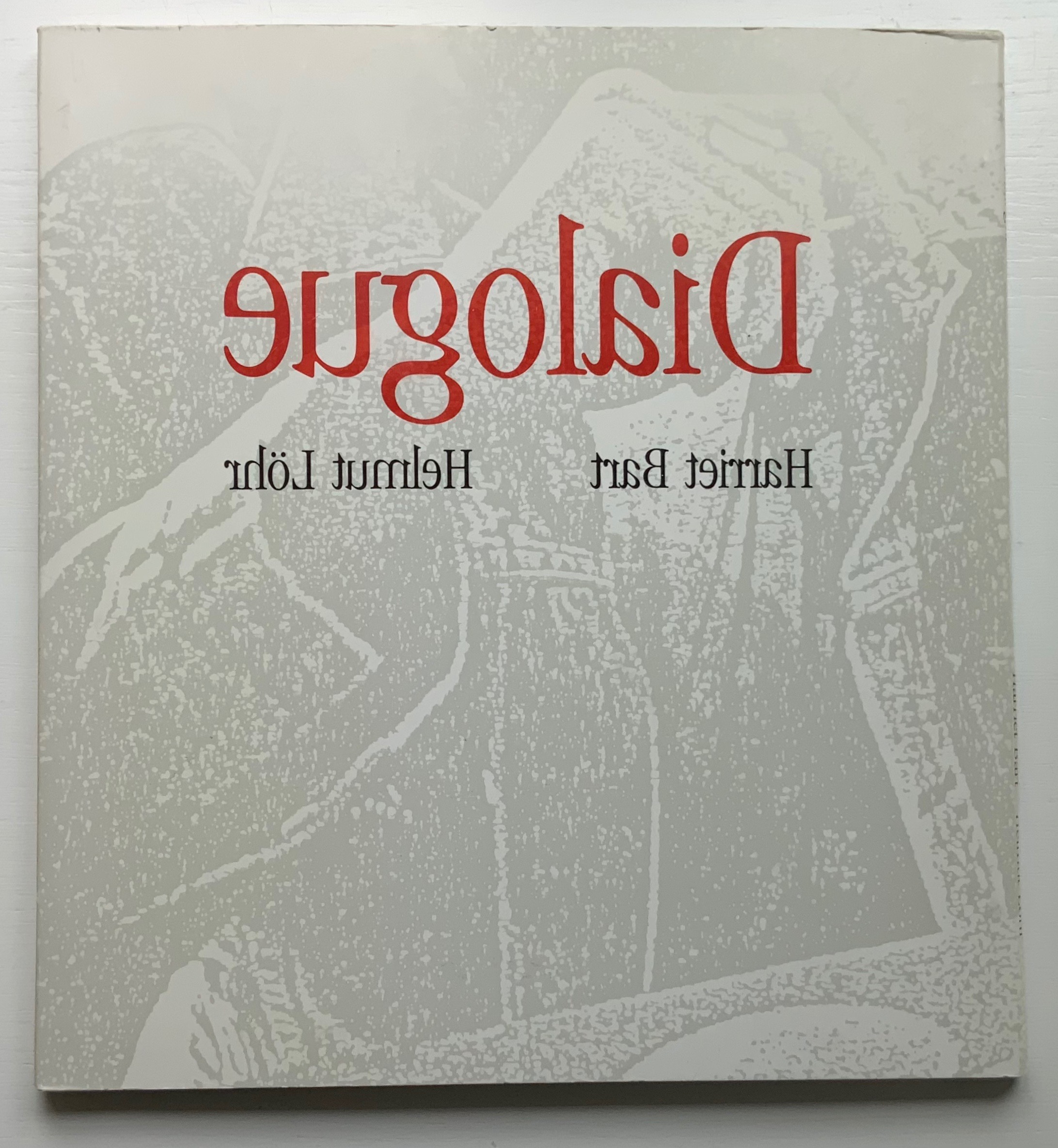
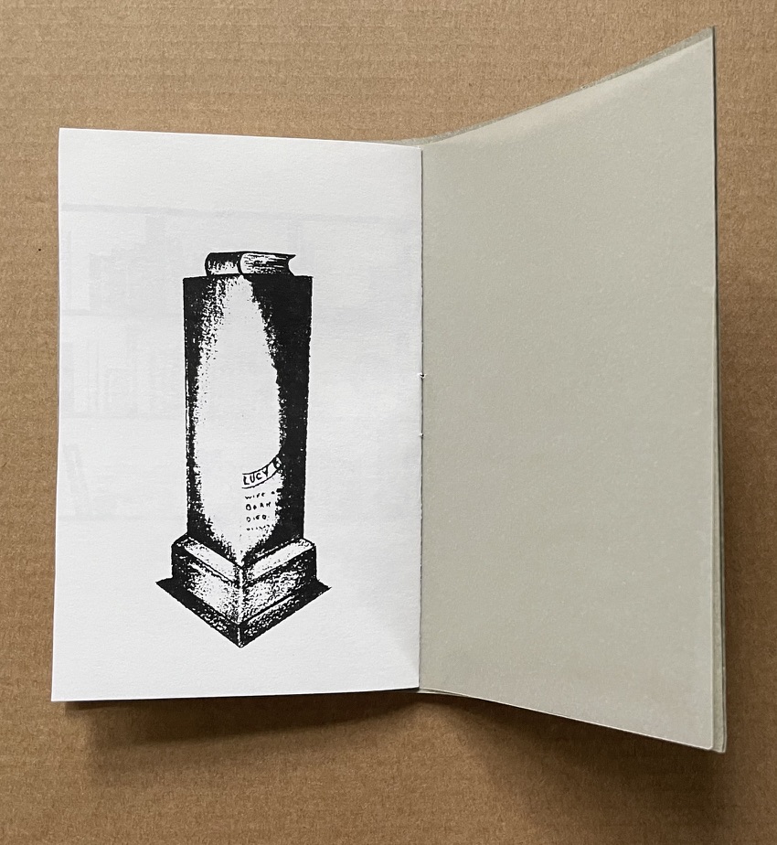
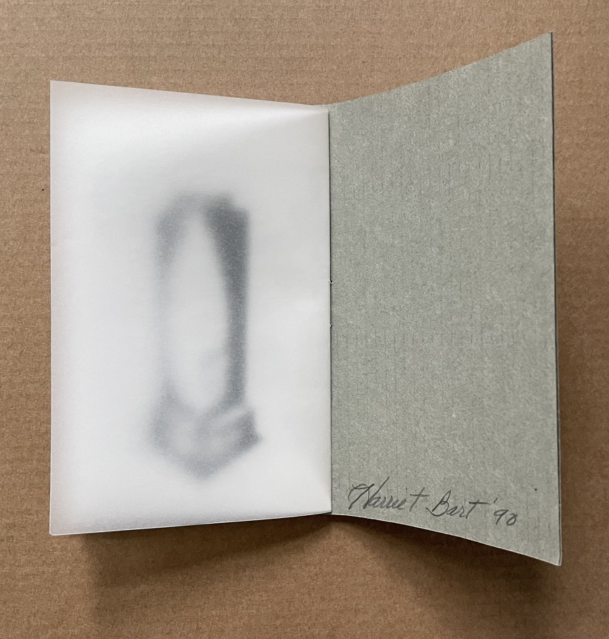
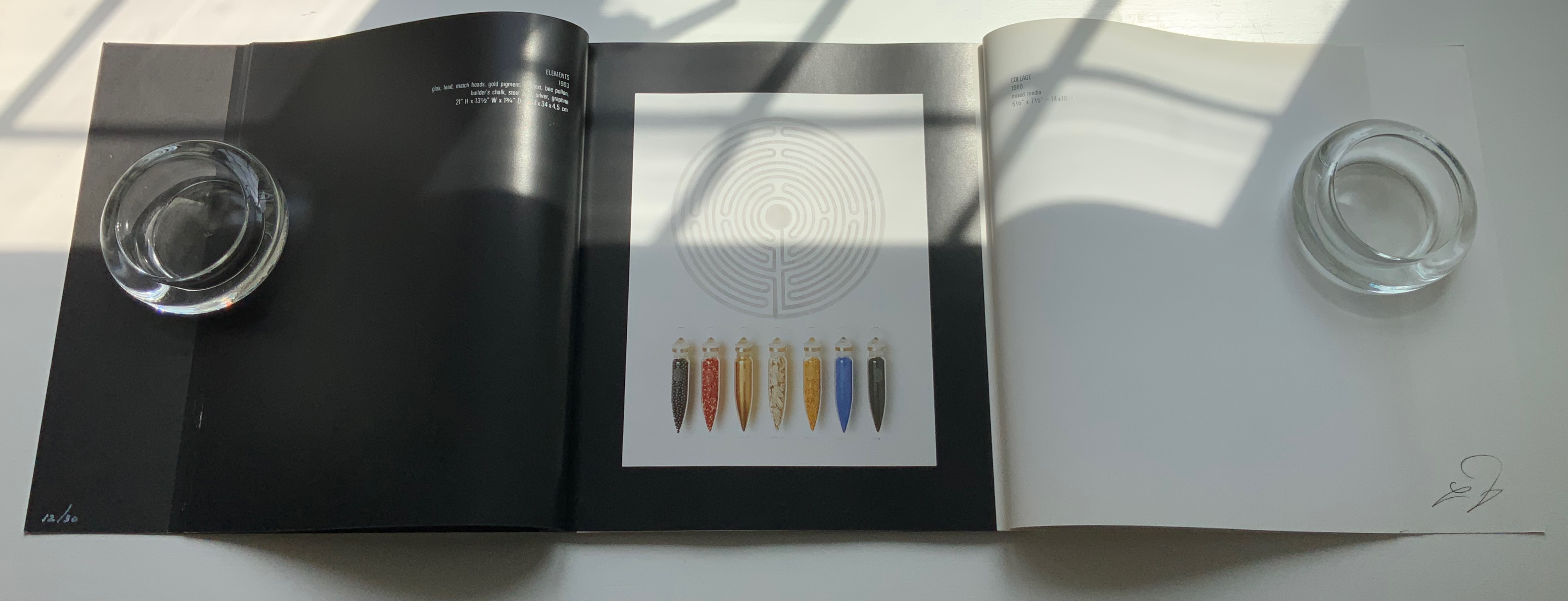
Dialogue: Alchemy of the Word(1993) Harriet Bart and Helmut Löhr French-fold card-covered, gatefold book: H260 x W243 mm, 56 pages. Includes altered book and collage print. Edition of 30, of which this is #12. Acquired from Harriet Bart, 3 June 2022. Photos: Books On Books Collection.
From the Foreword:
Art is a universal language – drawing together people of all regions, races, ages, and socioeconomic levels. Dolly Fiterman Fine Arts is pleased to premier the work of Harriet Bart and Helmut Lohr. Harriet Bart lives in Minneapolis, Minnesota, USA. Helmut Lohr is based in Dusseldorf, Germany but lives for several months of the year in the United States… The French poet Stephane Mallarmé said that everything was made to end up in a book. Sculpture, collage, and photography by artists Harriet Bart and Helmut Lohr explore the alchemy of the word, the iconography of the text, the labyrinth of the book, the book as poetic object. Bart and Lohr met in New York in 1990 when they were presenting their work at the same exhibition. Drawn to each other’s work they began a dialogue about their concepts and philosophies of art and life. The conversations continued as they exchanged visits and ideas in Minneapolis, New York, and Dusseldorf. Dialogue: Alchemy of the Word is a visual presentation of their dialogue.
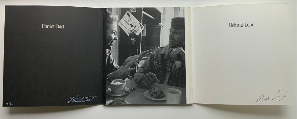
Befitting this book’s title, the binding is not dos-à-dos but rather vis-à-vis or face to face. When the French fold cover parts left and right, the black binding tape on the left and white on the right appear with the photo of the two artists in discussion over coffee and pastry. The interleaving gatefold design enacts a dialogue of pictured artworks and, in doing so, becomes a work of book art itself. How appropriate for Harriet Bart and the late Helmut Löhr, both of whom count artists’ books among their multimedia output.
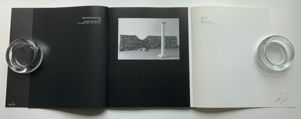
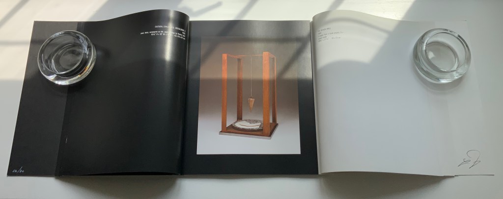
After the foreword, Harriet Bart has the opening gambit on the verso in white type on a black background. That column in the foreground of Fading Memories/Timeless Truths (1990) almost suggests a chess move …
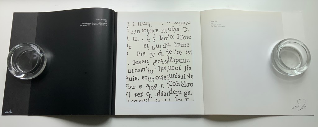
to which Löhr responds with his Visual Text (1989), black on white. The back and forth continues
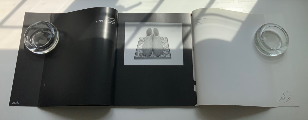
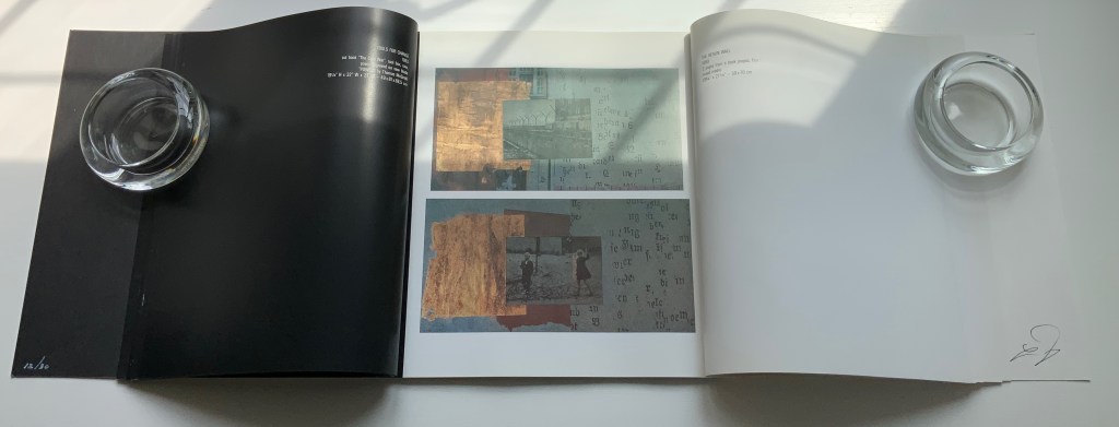
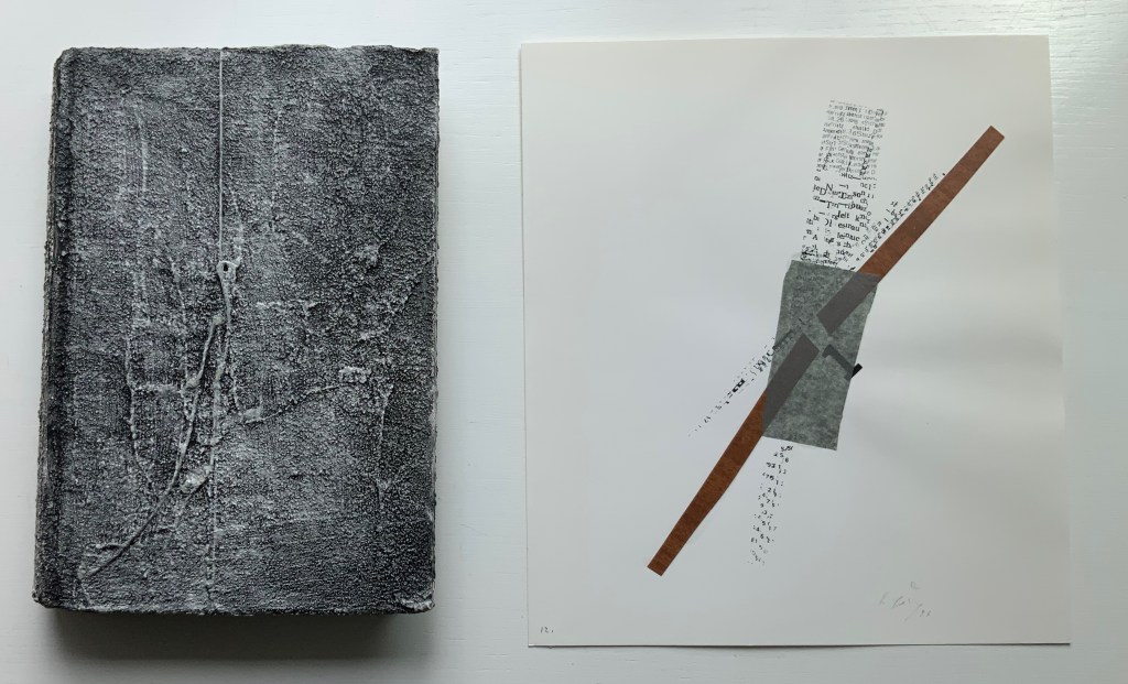
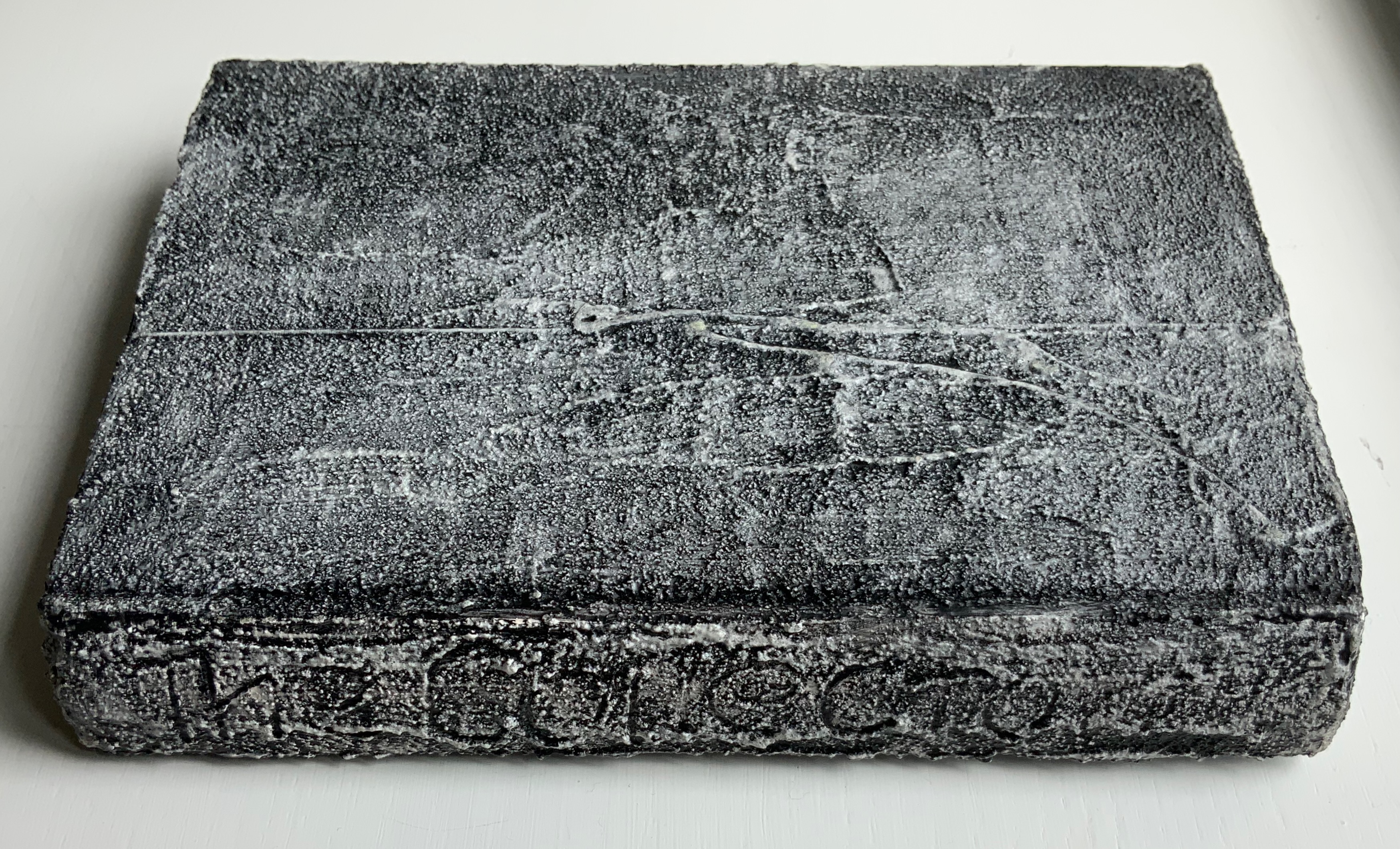
An altered-book sculpture from Bart and one of Löhr’s collage prints accompany the deluxe edition.
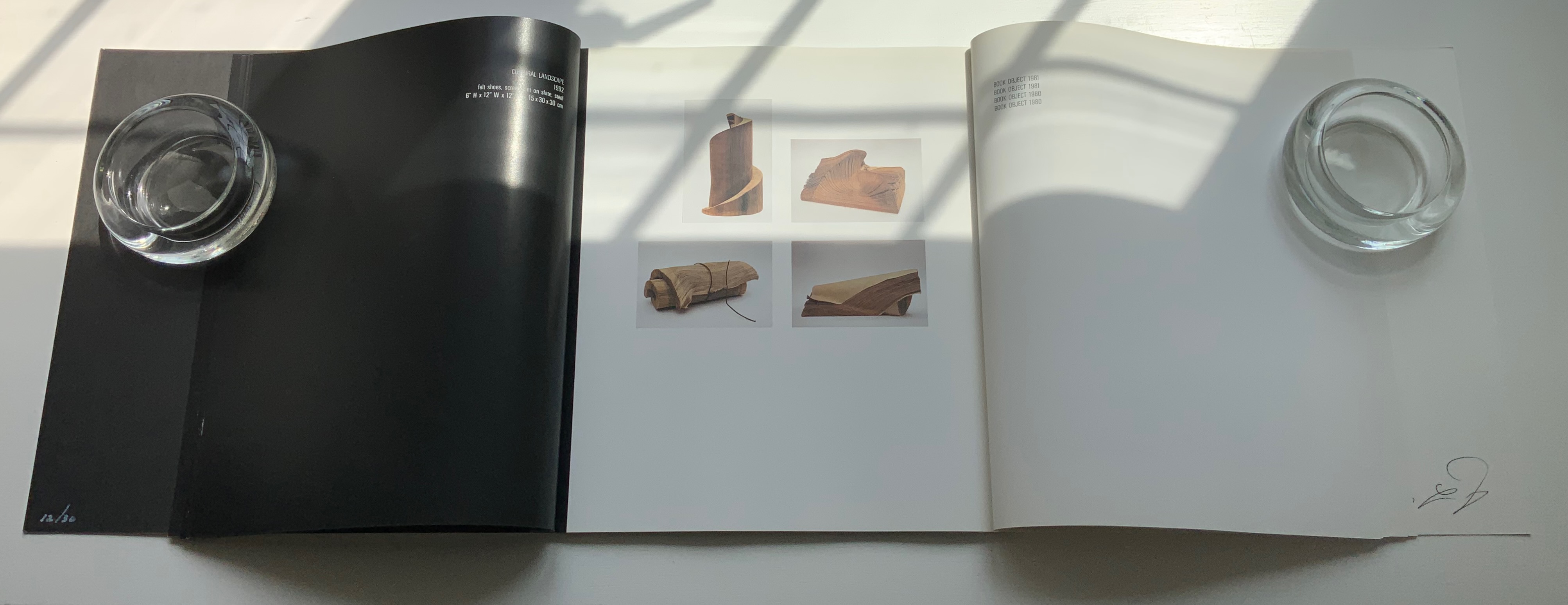
The sculpture echoes Bart’s Bound History (1992), whose photo appears in the dialogue and is answered by the photo of Löhr’s Book Object (1981).
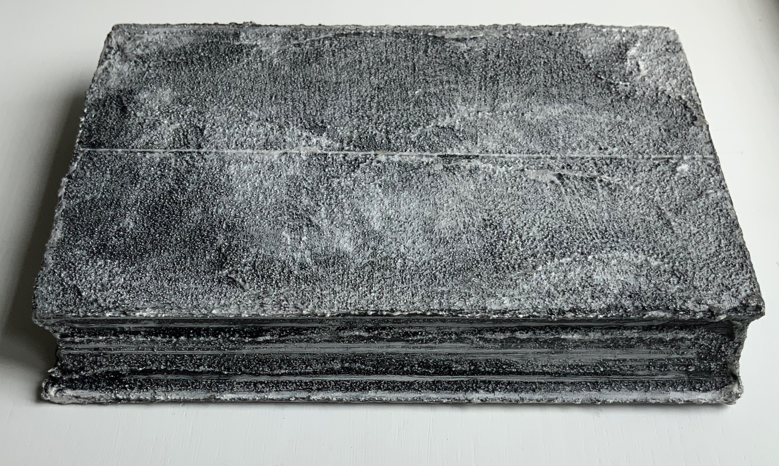
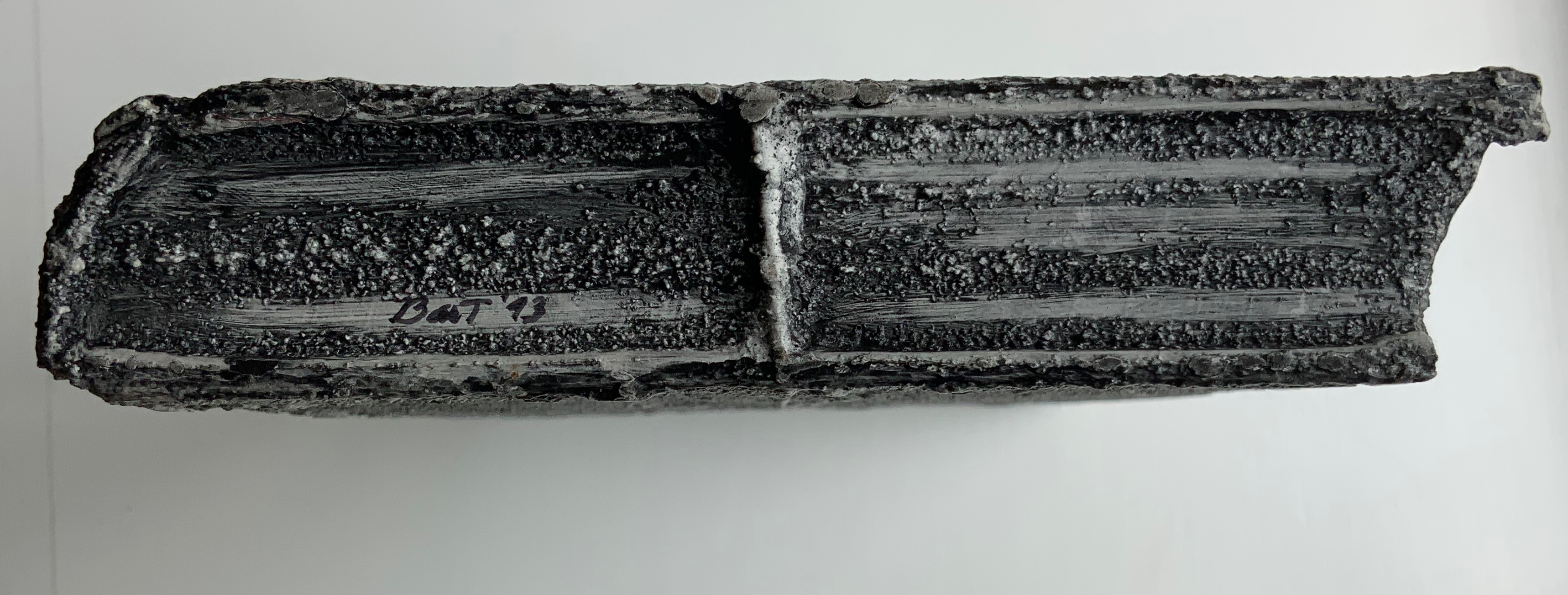
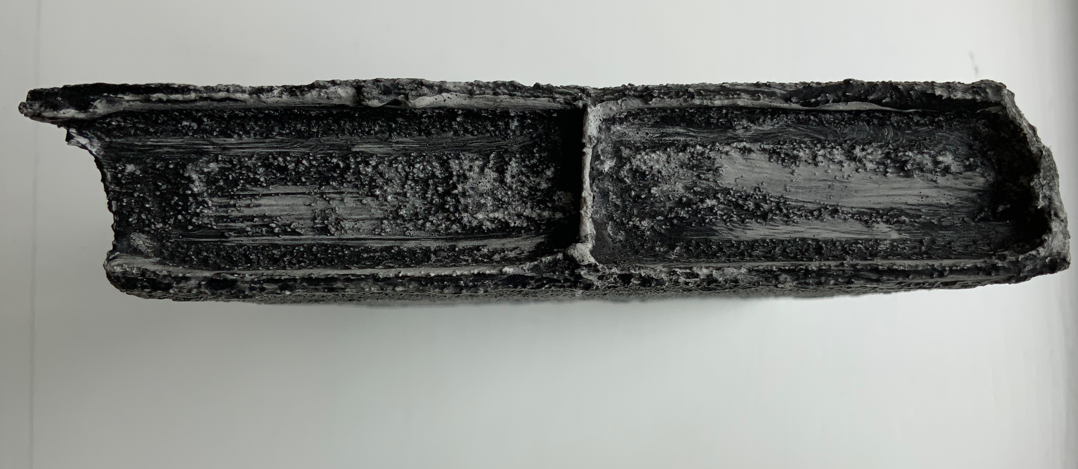
Detail views of the altered book.
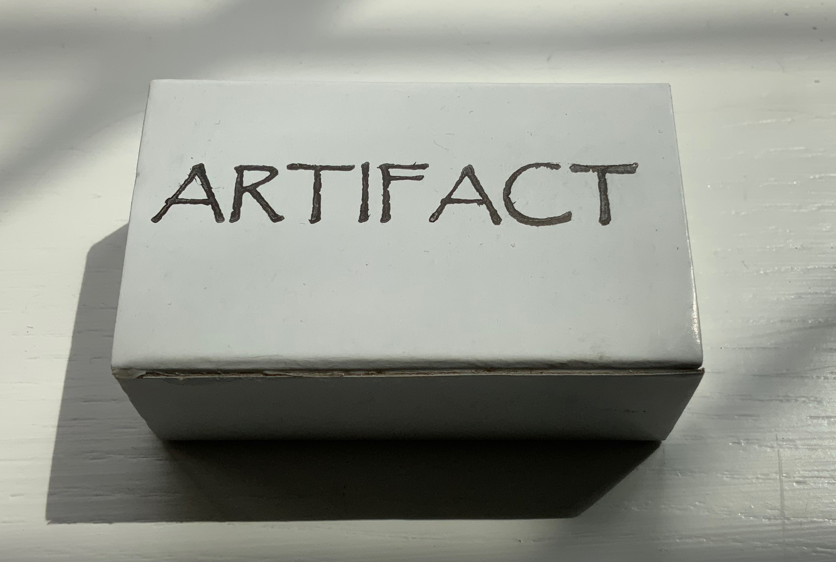
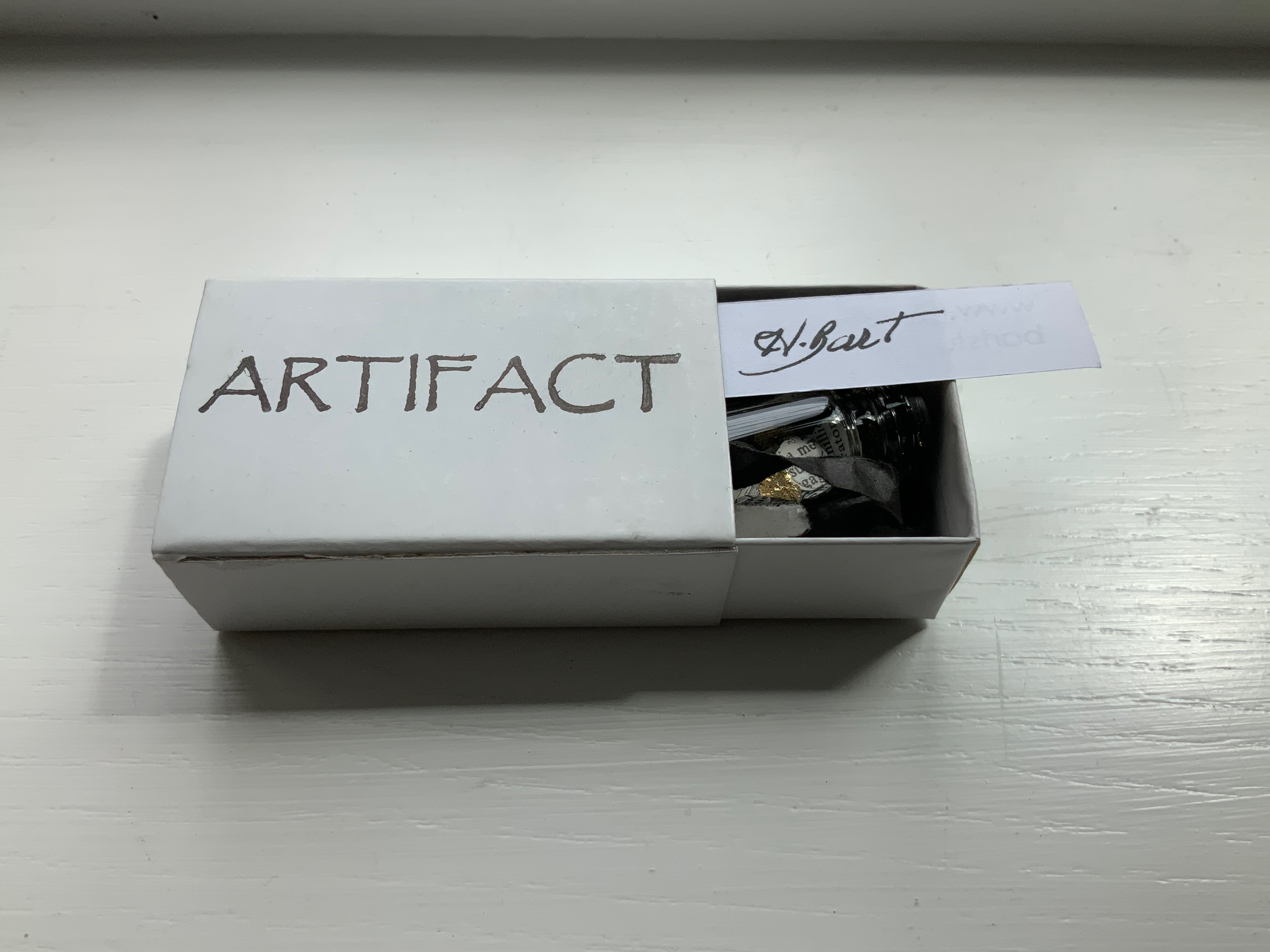
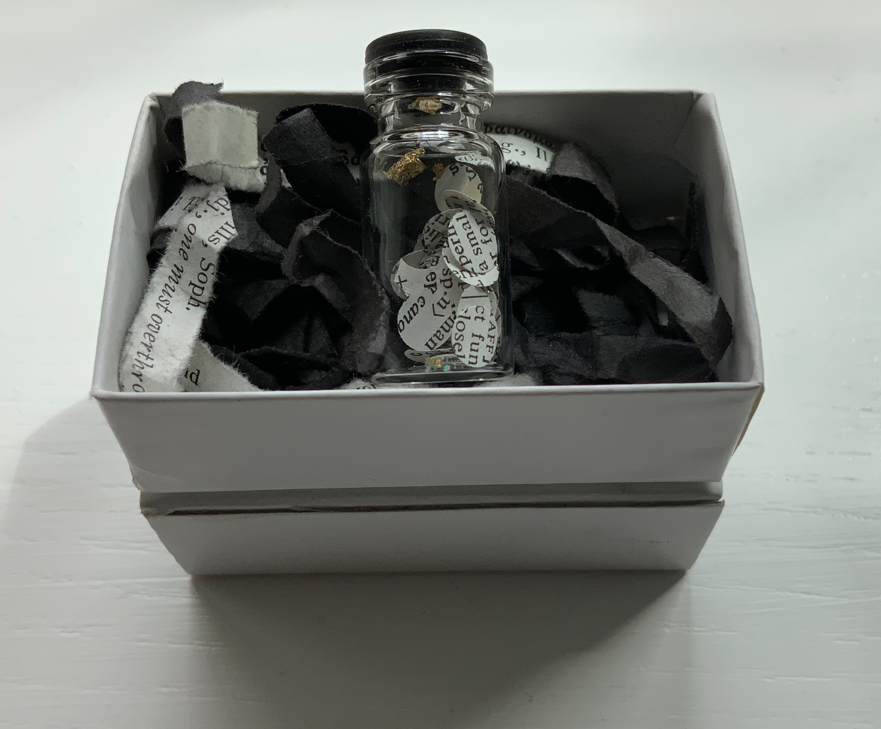
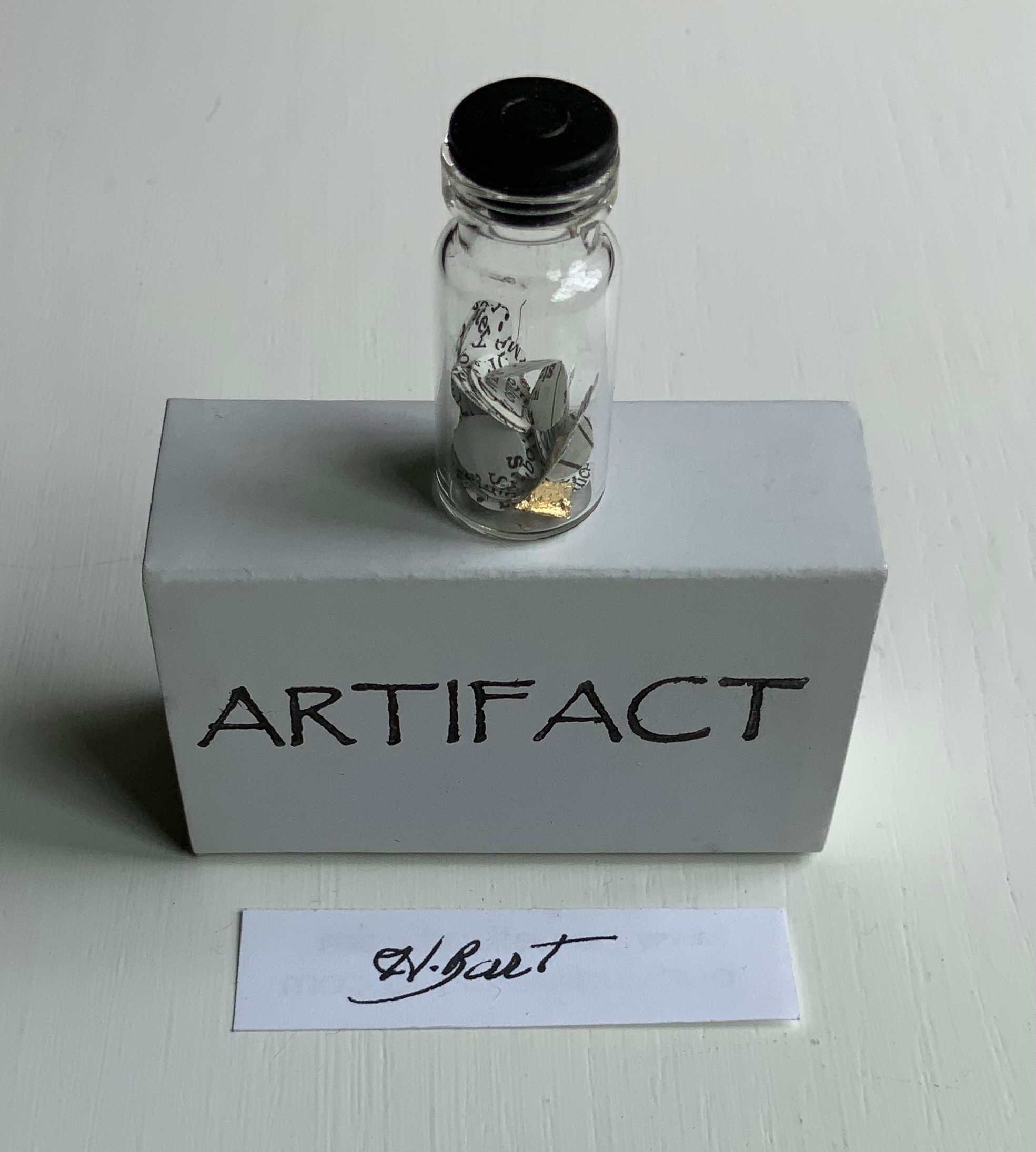
Artifact (2022)
Artifact (2022) Harriet Bart Matchbox enclosing black-capped bottle of fragments of gold leaf, paper disks hole-punched from a reference work, resting on shreds from a dictionary and black tissue paper. Box: H40 x W63 x D24 mm. Bottle: H35 x D9 mm. Acquired from the artist, 12 April 2022. Photos: Books On Books Collection.
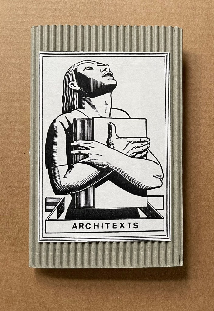
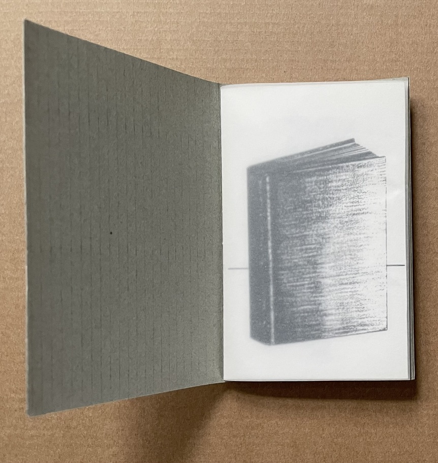
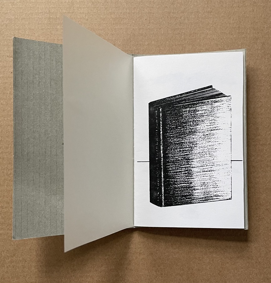
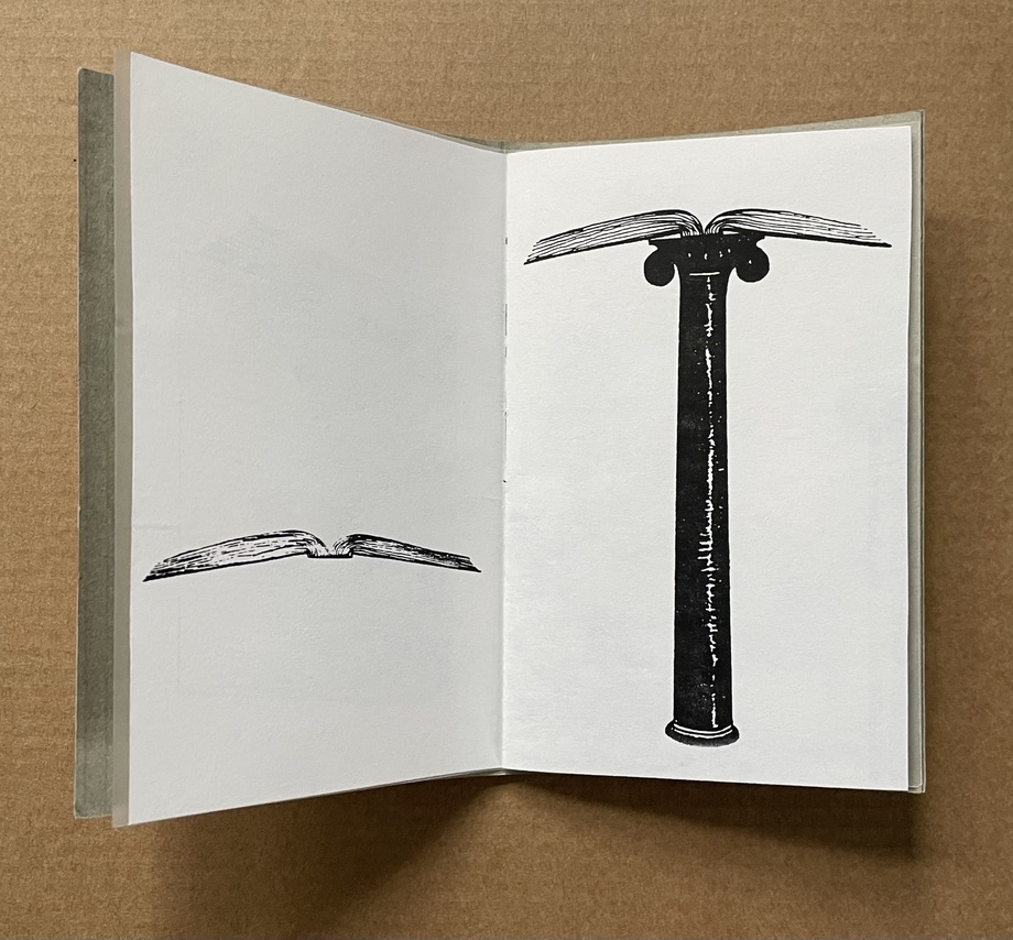
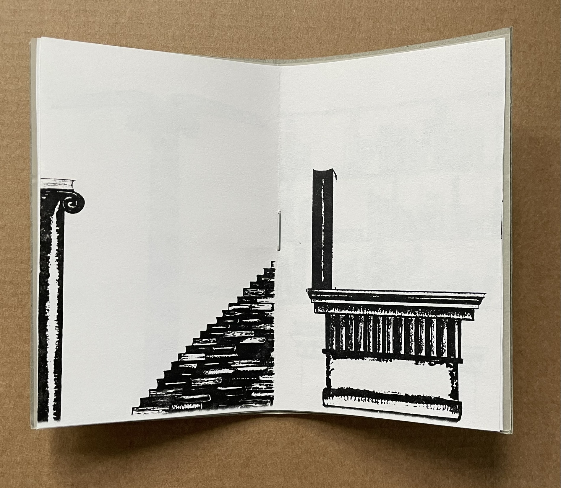
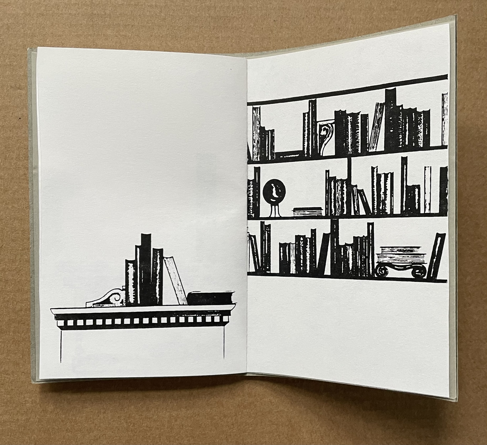
Architext (1990)
Architext (1990) Harriet Bart Booklet, saddle stitch, single-staple, corrugated cardboard with title pastedown. H112 x W72 mm. [8] pages. Photocopy of larger charcoal drawings. Acquired from the artist, 3 June 2022. Photos: Books On Books Collection.
The Architext‘s content makes its title and the work an oxymoron. As a wordless narrative, it has no text, and the “text” as book shifts between presenting as architectural features (capstone, stairs, etc.) and requiring architectural features to be presented. Artifact and Architext can both be found in the following booklet published for an exhibition at the Walker Art Center in Minneapolis, 15 December 2010 – 15 February 2011.
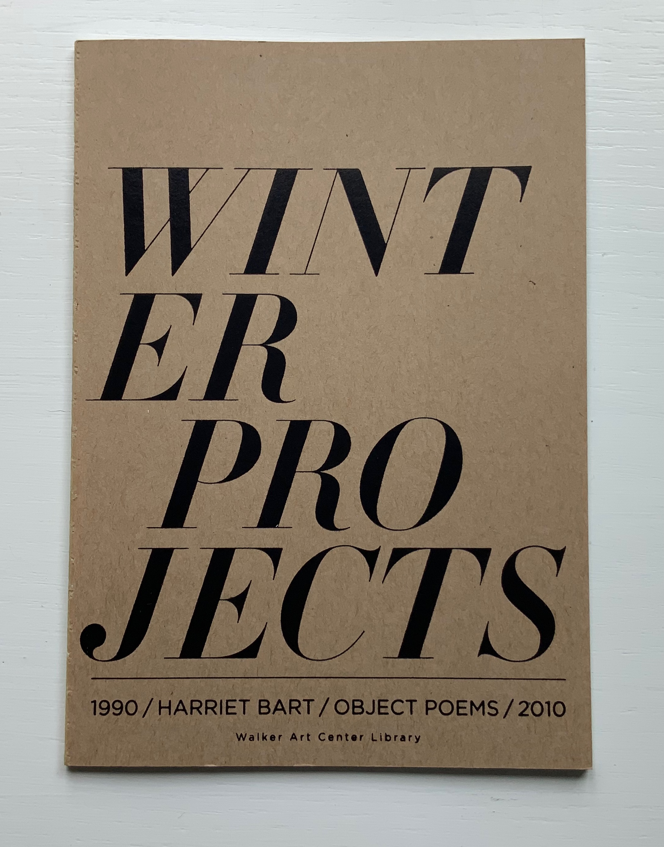
Winter Projects (2010)
Winter Projects: 1990 object poems 2010 (2010) Harriet Bart Open spine glue binding. H178 x W128, 36 pages. Published by the Walker Art Center Library, Minneapolis, MN. Acquired from the artist, 3 June 2022. Photos of the work: Books On Books Collection.
From the Foreword:
Every December for the past twenty years, the artist Harriet Bart, creator of the winter projects, has been making and sending multiples. These multiples echo her larger unfinished works. There are similarities, particularly in her use of repurposed materials, felt, shells, gold leaf, texts on paper, cords, and small boxes. These multiples serve as a holiday greeting for sixty or more friends and colleagues … The artist calls these multiples Visual Objects/Poems.
Harriet Bart (2003)
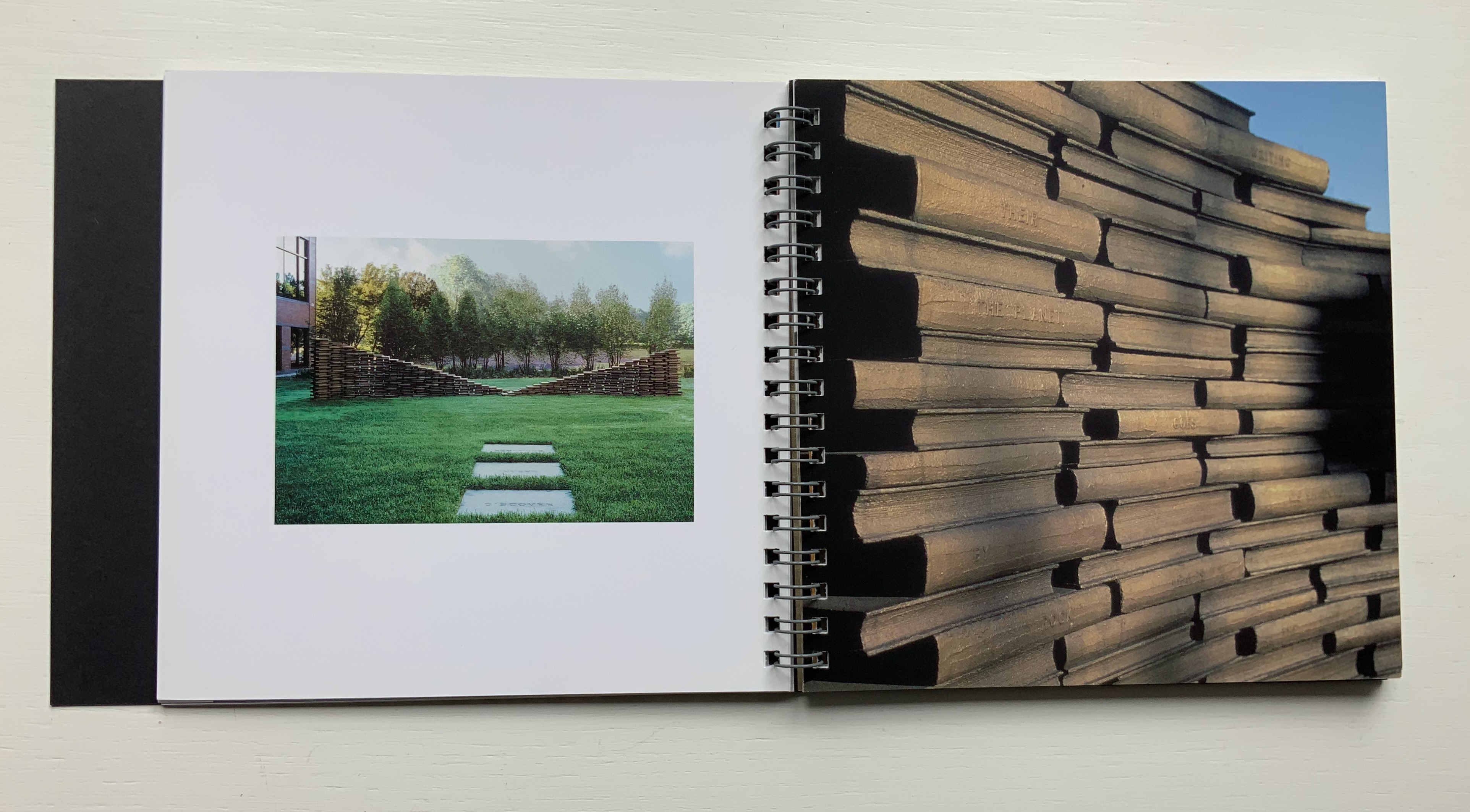
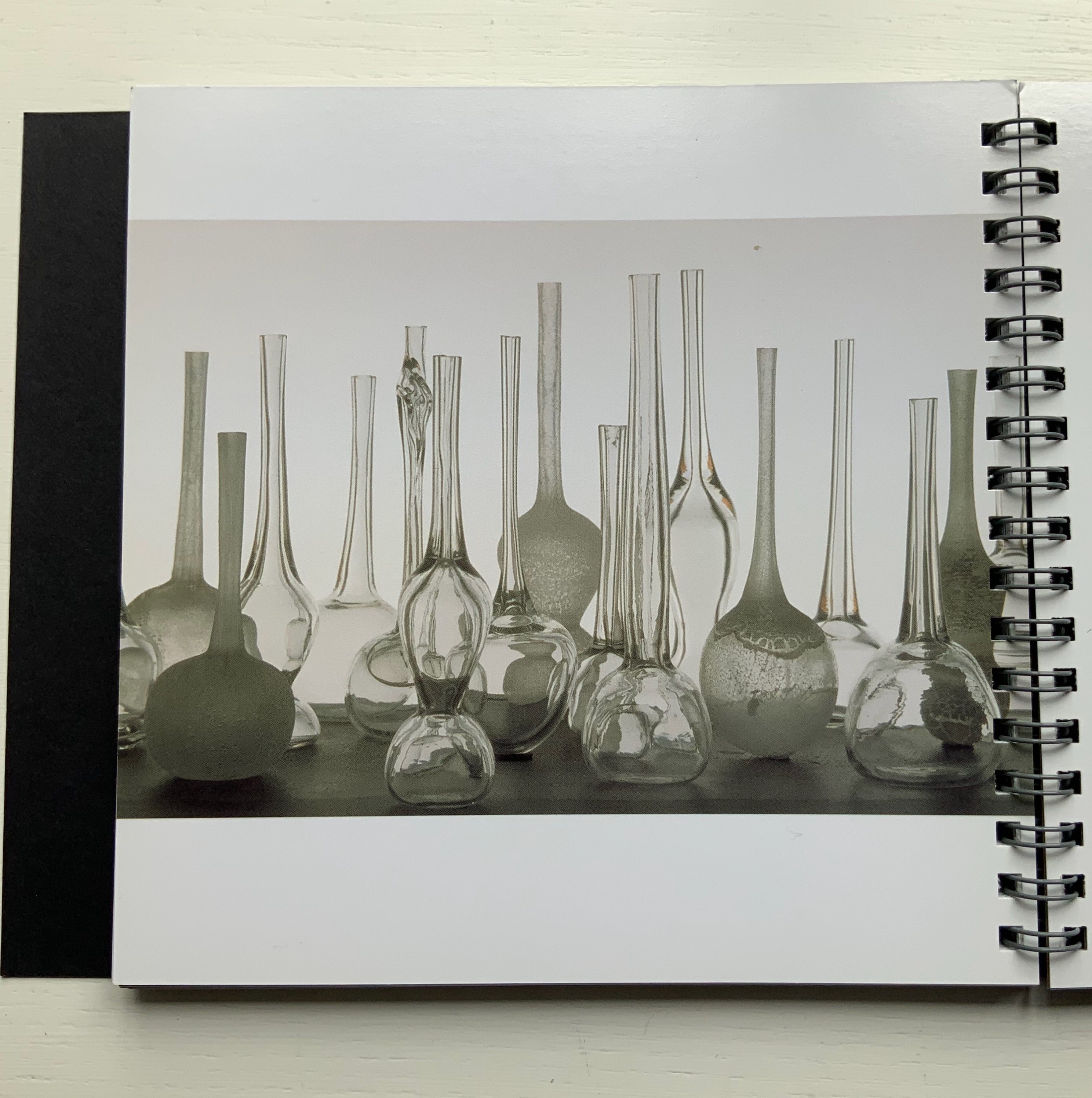
Harriet Bart (n.d.) Harriet Bart Rik Sferra, photos Trifold, spiral bound. H152 x W162 mm, 54 pages. Acquired from the artist, 3 June 2022. Photos of the work: Books On Books Collection.
Published in conjunction with Bart’s book exhibition at the Driscoll Babcock Gallery in New York, this booklet, printed full color on high gloss paper, divides into three parts: commissions, installations and objects/books. It presents detailed views and spreads of each, but as they are not captioned or dated, this is more a photobook than catalogue. It demonstrates the artist’s breadth from the large-scale to the delicate from Double Ode (1995), a work commissioned by Doubleday Book & Music Clubs, Inc., to Tear Vials (2012), which look like containers for the tears of Elizabeth Bishop’s “Man-Moth“, who, if carefully watched, will hand over his only possession, a tear “cool as from underground springs and pure enough to drink”.
Double Ode (1995) and Tear Vials (2012?).
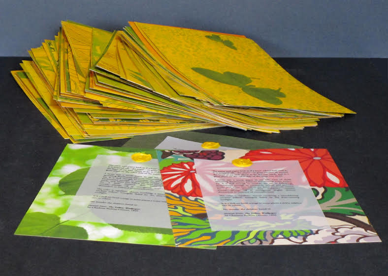
The Yellow Wall Paper (2018)
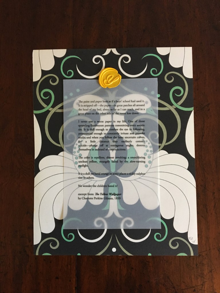
The Yellow Wallpaper (2018) Harriet Bart Print, collage. H245 x W190 mm, single sheet. Acquired from the artist, 4 July 2018. Photos: Books On Books Collection.
The Yellow Wallpaper captures two other aspects of Bart’s work. The title refers to Charlotte Perkins Gilman’s canonic short-story/novella. Like many artists of the book, Bart often springboards from a literary figure’s work. Here, it is an excerpt from Gilman’s story printed on translucent paper and wax-stamped to one side of a page taken from Charlotte Abrahams’ Wallpaper: A Collection of Modern Prints. The reverse side of the print is painted in cadmium yellow. At the exhibition where the work was displayed, Bart gave it away.
Which brings us to the second aspect of Bart’s work: her curatorial, collaborative activity. With Jon Neuse, she organized the exhibition, entitled “Wallpaper: an altered book experiment” at the Traffic Zone Center for Visual Art Mission, 50 Third Avenue North, Minneapolis, 2 July through 10 August 2018. Each artist exhibiting had been given a copy of Abrahams’ compendium and challenged to generate a work of art. Included were Scott Helmes, Vesna Kittelson, Joyce Lyon, Chip Schilling, Jody Williams, Karen Wirth, Sarita Zalehaand, last and out of alphabetical order but not least, Doug Beube, who also photographed Bart’s Double Ode installation in 1995.
Further Reading
Chen, Julie. 2013. 500 Handmade Books. Volume 2. New York: Lark. P. 46 (Plumb Bob).
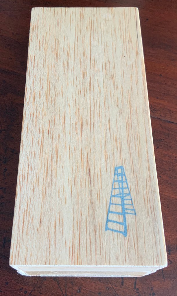
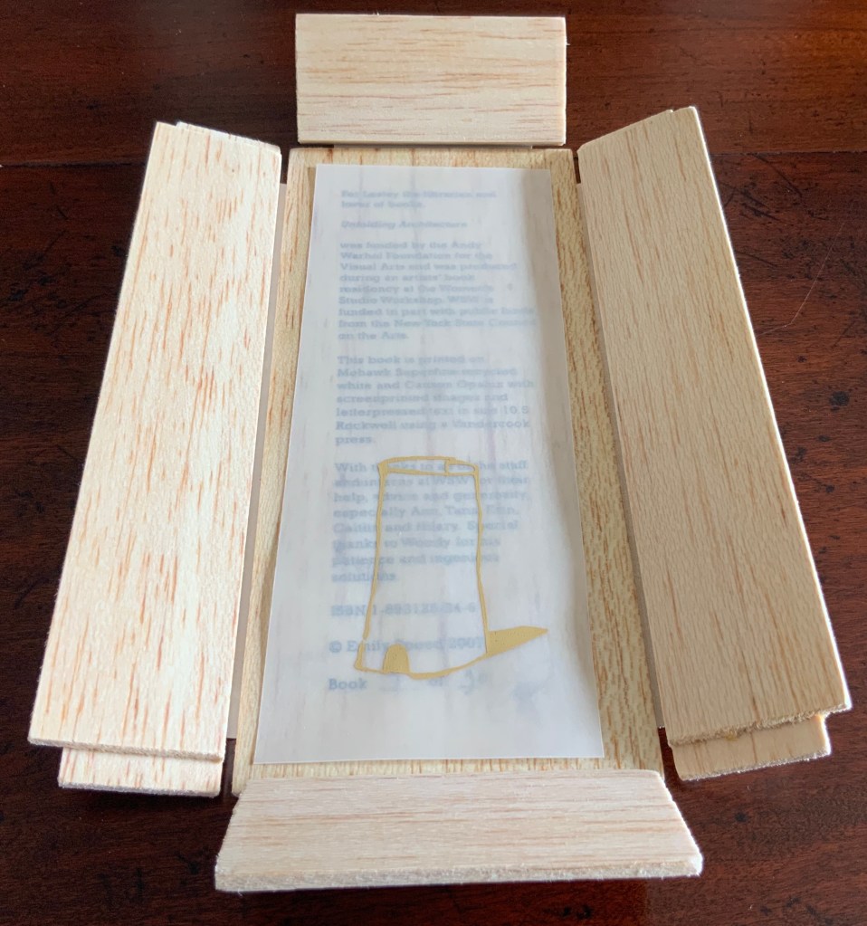
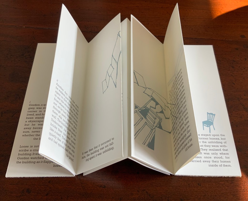
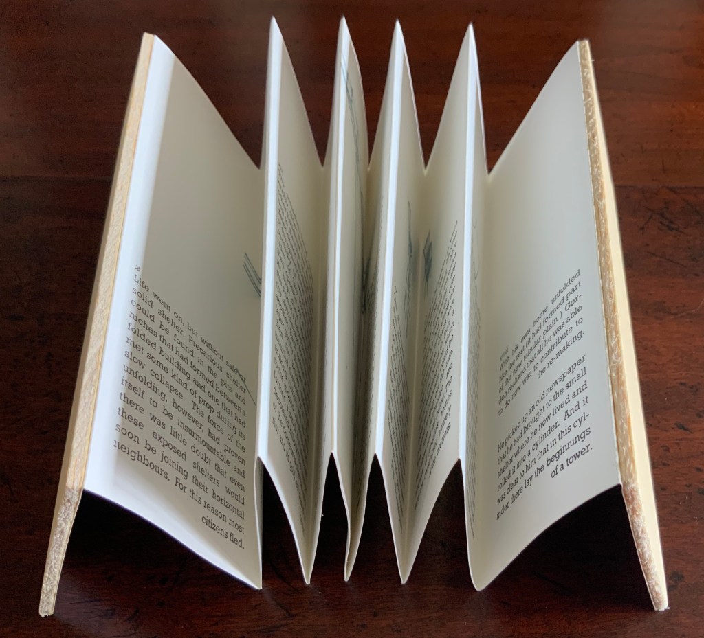
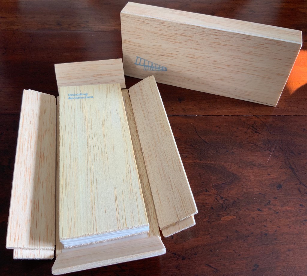
For a collection following architecturally themed book art, Emily Speed’s Unfolding Architecture (2007) is essential. The video above shows how the box’s opening and the title revealed hint at the substance of this work. What cannot be sensed from the video is how the feather weight of the box and balsa-bound book of Mohawk Superfine resonate with the unbearable lightness of being that the main character Gordon experiences as he witnesses his city structure unfold across the twenty-two panels of his story. Here is Elaine Speight and Charles Quick on the work and Gordon:
The diversity of experience enabled by the fold is made explicit in Speed’s Unfolding Architecture (2007) …, an accordion-folded book that recounts the tale of Gordon, a city dweller who witnesses the collapse of public buildings and, ultimately, his own home as the urban fabric begins to unfold around him. Housed in a balsa wood box that, somewhat alarmingly, unfolds upon opening, the fragility of the folded sheet provokes something of the protagonist’s anxiety about the undoing of his city. Yet, … the act of unfolding also produces “an open plain full of possibility” (Speed 2019). As Gordon asserts, unfolding is not the same as falling apart, and the artist’s book suggests that hope and potential may be achieved through the dismantling of existing structures.
The silk-screening adds texture and a just perceptible raised depth to the varying textures of the wood and the Canson Opalux slip that protects the colophon in the bottom of the box. Depth and varying texture repeat themselves in the accordion’s folds and paper attached to wooden covers that seem light as paper.
Gordon’s story ends with paper — an old, rolled up newspaper that reminds him of a tower (an image that appears on the colophon’s cover slip). It is a reminder that comes to him in his recognition that, in the end, “all he was able to do now was to contribute to the re-making” of his flattened world. The newspaper reminds me of the newsprint typo “manmoth” for “mammoth” that inspired Elizabeth Bishop to invent her poem “The Man-Moth”. The Man-Moth and Gordon share a surreality and a hope that resides in the imagination — that solitary tear, the man-moth’s only possession, that slipping from his eyelid, he will palm and swallow if you’re not watching …
… However, if you watch, he’ll hand it over, cool as from underground springs and pure enough to drink.
The fusion of title, metaphor, narrative, image, technique of silk-screening, letterpress, texture of paper and wood, the workings of the accordion and box enclosure — all — with one another makes Unfolding Architecture as satisfying as the Man-Moth’s tear.
Unfolding Architecture(2007) Emily Speed Double-sided accordion book, attached to balsa wood covers, housed in a hinged, covered box of balsa wood. Book – H190 x W70 x D18 mm (closed), H190 x ~W2280 (open); Box – H203 x W88 x D63 mm; 24 panels, including cover panels. Edition of 90, of which this is #7. Acquired from the artist, 24 October 2020.
Further Reading
Architecture“, Bookmarking Book Art, 12 November 2018.
“Emily Speed“, The Aesthetic Trust, 30 January 2012. Accessed 24 October 2020.
Petz, Yuka. 20 June 2024. “Spaces We Knew“. Artists’ Books Unshelved. Bainbridge Island Museum of Art. Video presentation of Unfolding Architecture.
For 2014-15, the New England Guild of Book Workers have organized a traveling exhibition: Geographies: New England Book Work, its itinerary covering each of the 6 New England states. Last year, the Rhode Island School of Design (RISD), the Wishcamper Center at the University of Southern Maine and the Bailey Howe Library at the University of Vermont hosted it. This year, the show has appeared at Williams College Library and is scheduled for Dartmouth College Library and the Creative Arts Workshop in New Haven, CT. Criss-crossing geographical boundaries as well as those of book art and the book arts, Geographies calls to mind the last line of Elizabeth Bishop’s “The Map“:
More delicate than the historians’ are the map-makers’ colors.
Or, in this case:
More delicate than the historians’ are the [book-artists’] colors.
Although born in Nova Scotia, Elizabeth Bishop grew up as a New Englander in Massachusetts with her paternal grandparents. As a far-traveller and visual artist as well as poet, she would have enjoyed this exhibition and found it fitting if it had included a broadside of “The Map”.
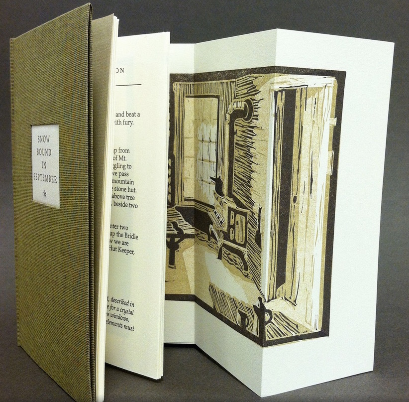
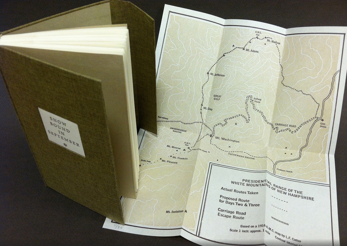
Nevertheless, what a range of “colors” from all the New England states and beyond – from historic to modern, from fine and design bindings to traditional and creative bookbinding, from artist books to calligraphic manuscripts, from masters to apprentices and from object to narrative. The latter finds a wintry exemplar in Snow Bound in September: A Re-Imagining by Laurie Whitehill Chong, retired Special Collections librarian and curator of Artists’ Books at RISD.
The artist made this book the same size as her grandfather’s Appalachian Mountain Club hiking guide. Snow Bound is an invented ancestral narrative, in which the artist uses a surviving photograph and her grandfather’s notes about being stranded with his wife for five days on Mount Washington by a hurricane-driven snowstorm in September 1915 to re-imagine the ordeal from her grandmother’s perspective. Note the slotted front cover into which the flap extending from the back cover fits to keep the book closed, snug against the elements.
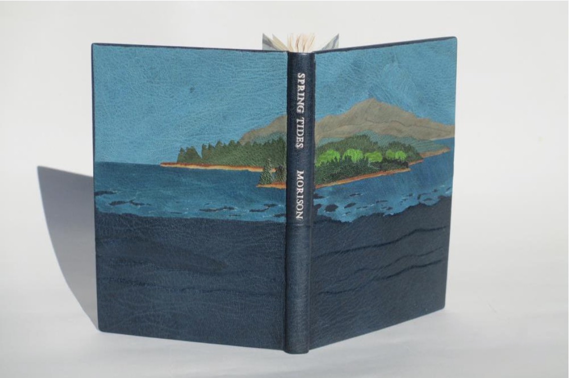
Julie B. Stackpole’s creative re-binding of Samuel Eliot Morison’s Spring Tides takes us from the New England mountains to the shore as can be seen from the layered binding.
Spring Tides by Samuel Eliot Morison Boston: Houghton-Mifflin Co., 1965. Julia B. Stackpole, Design binding 21.8 x1 5.0 x 1.6 cm January 2014
In Stackpole’s words:
The traditional tight-joint binding is covered in navy blue Niger goatskin with waves in the lower parts created by paring before covering. Cut-outs in the onlays of the lighter blue leather of the water help it transition from the dark of the navy to the sky’s azure. Onlays of other leathers create the forested landscape of the shoreline and hills. These blues were chosen because the only blue leather in a large enough piece to cover the whole binding was the dark navy, while I only had scraps of the water and sky’s blue. The endpapers are a Cockerell marbled paper over-painted with blue, with leather hinges.
Pictures of the works in the catalog (and others not) can also be found at the Williams College Flickr site (for now). I say “for now” because they will be pushed downstream inevitably in the way of today’s digital flow. They may even disappear; although as Matthew Kirschenbaum has explained in Mechanisms, something digitally forensic will remain. That boundary of the tangible and the digital, the haptic and the virtual, is only lightly but evocatively touched in this collection.
When Julia Stackpole writes in the online catalog about that Cockerell marbled paper that it “felt to me like the waves and the shoals and ledges of Maine waters”, you long to lay hands on the Spring Tide. Anne McClain’s Place includes photographs taken digitally of places on Maine’s midcoast that have been special to her her “entire life and will continue to be a constant as other things change and move on”. What is captured digitally is reproduced physically to fix those places that will “continue to be a constant”. But places do change.
Anne McClain, Place Drum Leaf Binding 19 x 15 x 1.8 cm February 2014
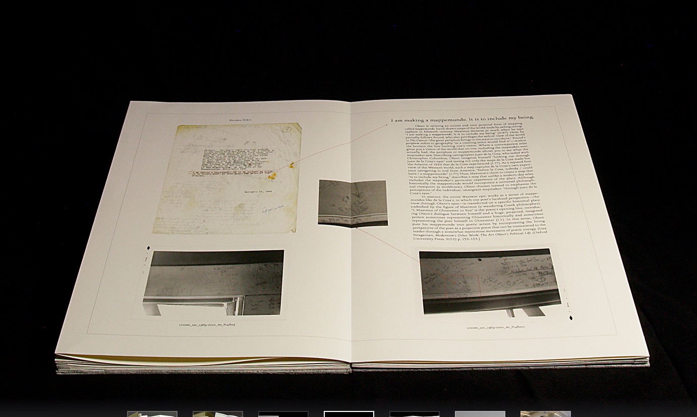
Rutherford Witthus’ contribution touches the boundary between the digital and physical most directly. His artist’s book is entitled 28 Fort Square: What Charles Olson wrote on the window casings of his apartment in Gloucester, Massachusetts, of which there are eleven copies.
Rutherford Witthus, 28 Fort Square: What Charles Olson wrote on the window casings of his apartment in Gloucester, Massachusetts, 2014
In these 11 copies, Witthus digitally reconstructs the windows of Charles Olson’s apartment at 28 Fort Square where he wrote his main work, The Maximus Poems, and covered the window casings with meteorological data. The artist book “presents for the first time all of the images of the window casings”.
Rutherford Witthus 28 Fort Square: What Charles Olson wrote on the window casings of his apartment in Gloucester, Massachusetts Artist book 42 x 28 x 2.5 cm 2014 Edition of 11
Athena Moore, chapter secretary of The New England Guild of Bookworkers, produced the catalog for this itinerant exhibition organized by Stephanie Wolff, Exhibitions Coordinator and Todd Pattison, Chapter Chair. If you have the chance to see the exhibition in its next venue, take it.
Just as Elizabeth Bishop questioned the depiction of the boundary between land and water on her map – “Shadows or are they shallows at its edges …”, you will find the juxtaposition of these works reminds you that the boundary between book art and the book arts can be shadowy or shallow indeed.