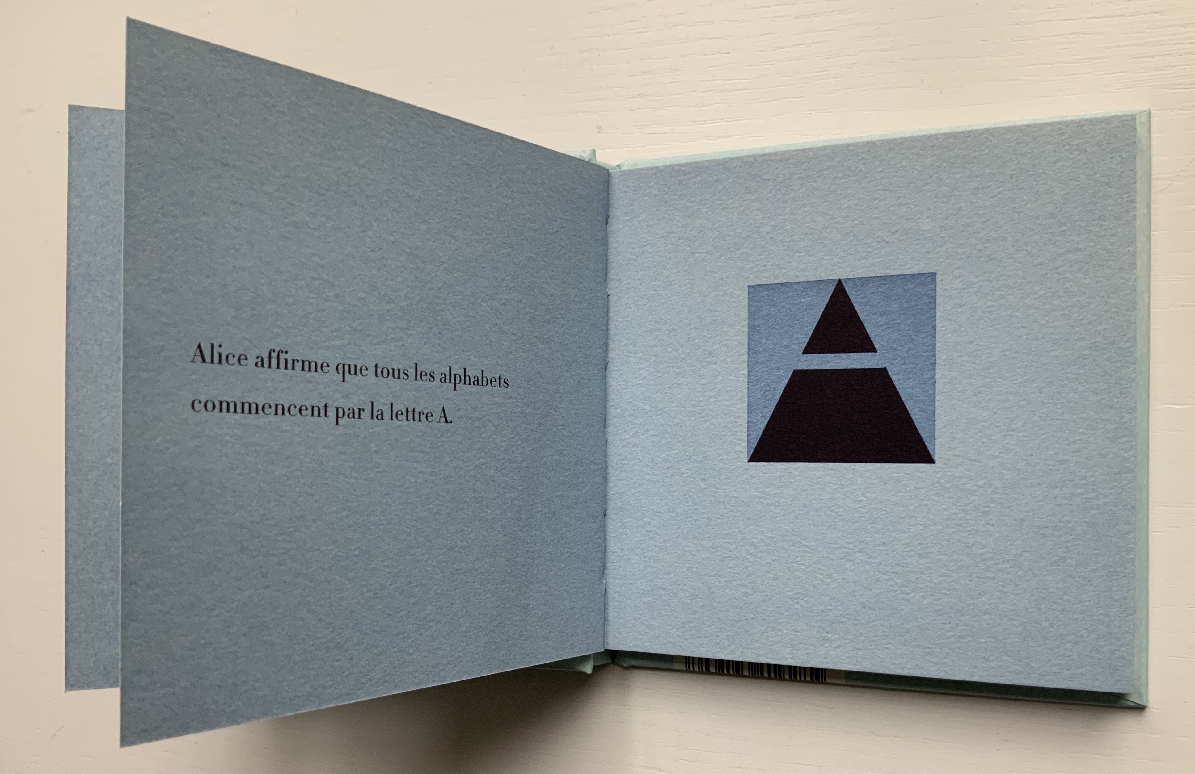
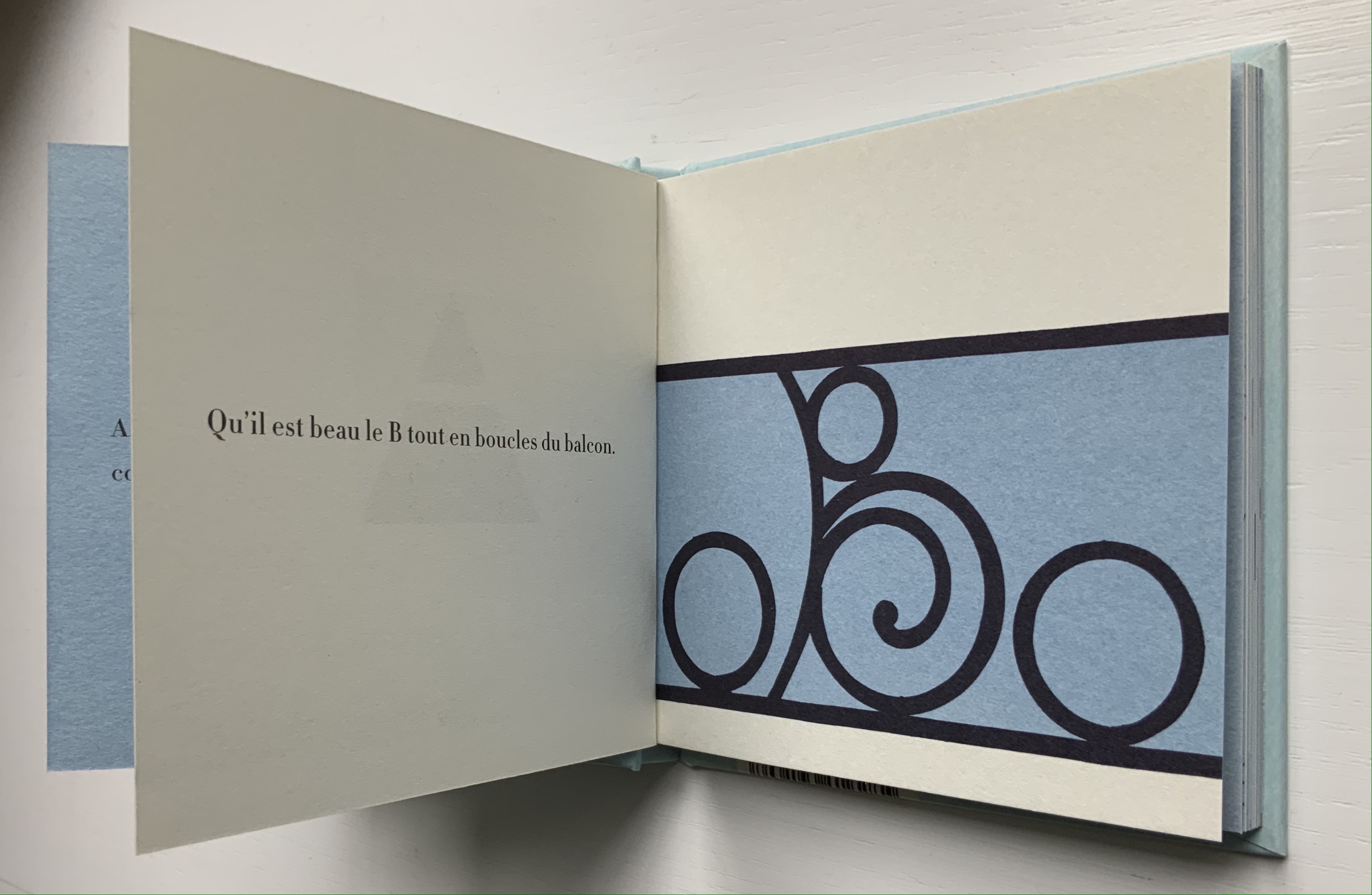
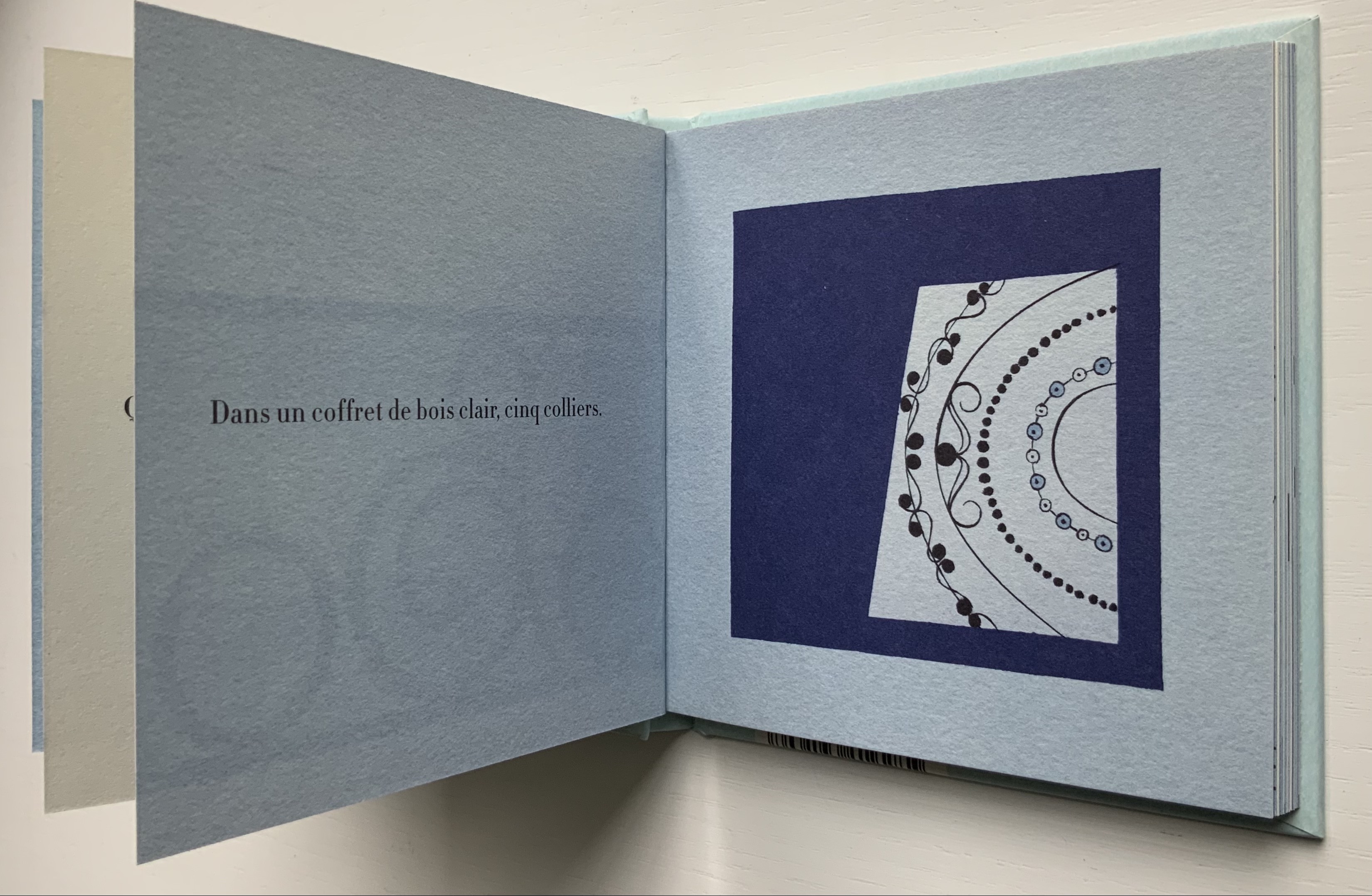
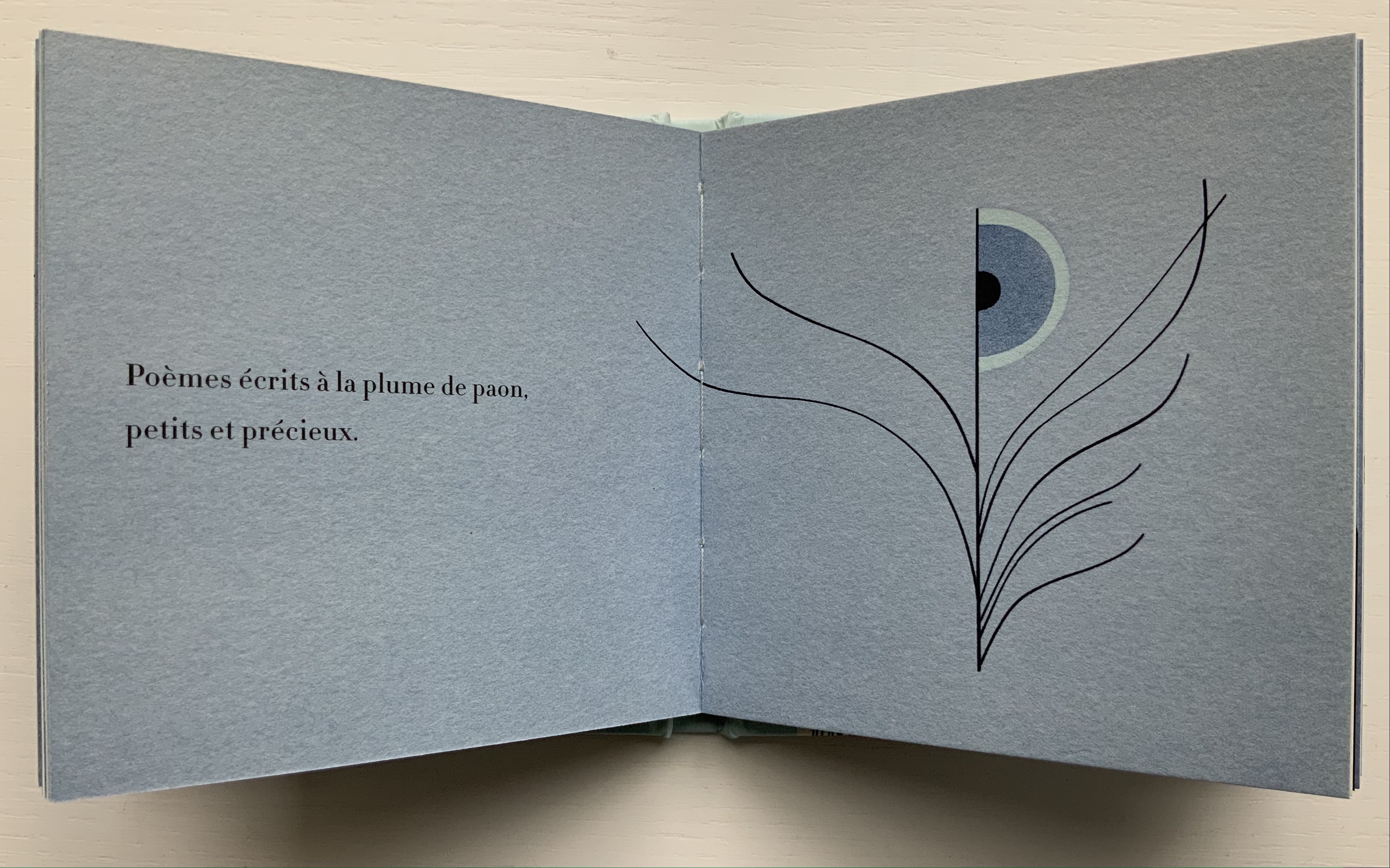
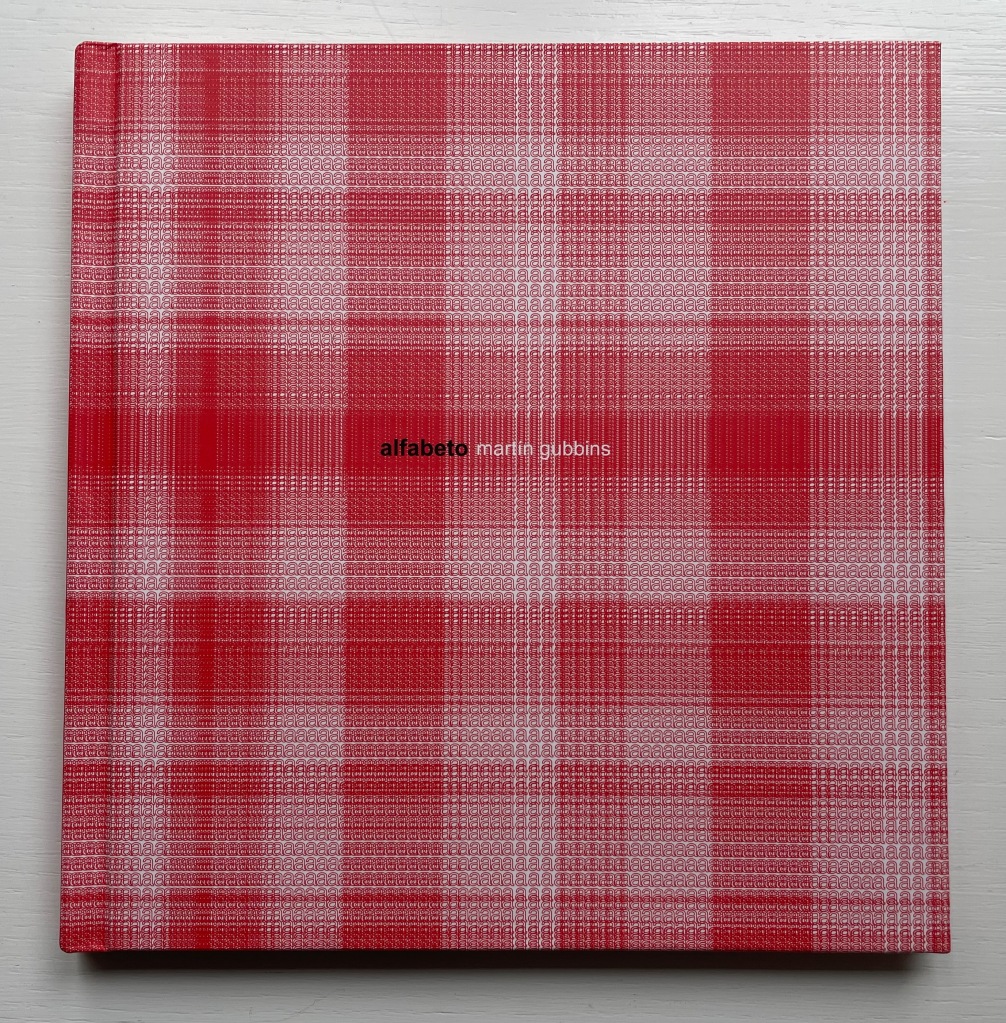
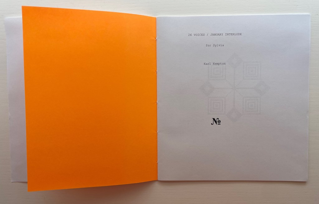
26 Voices / January Interlude (2020)
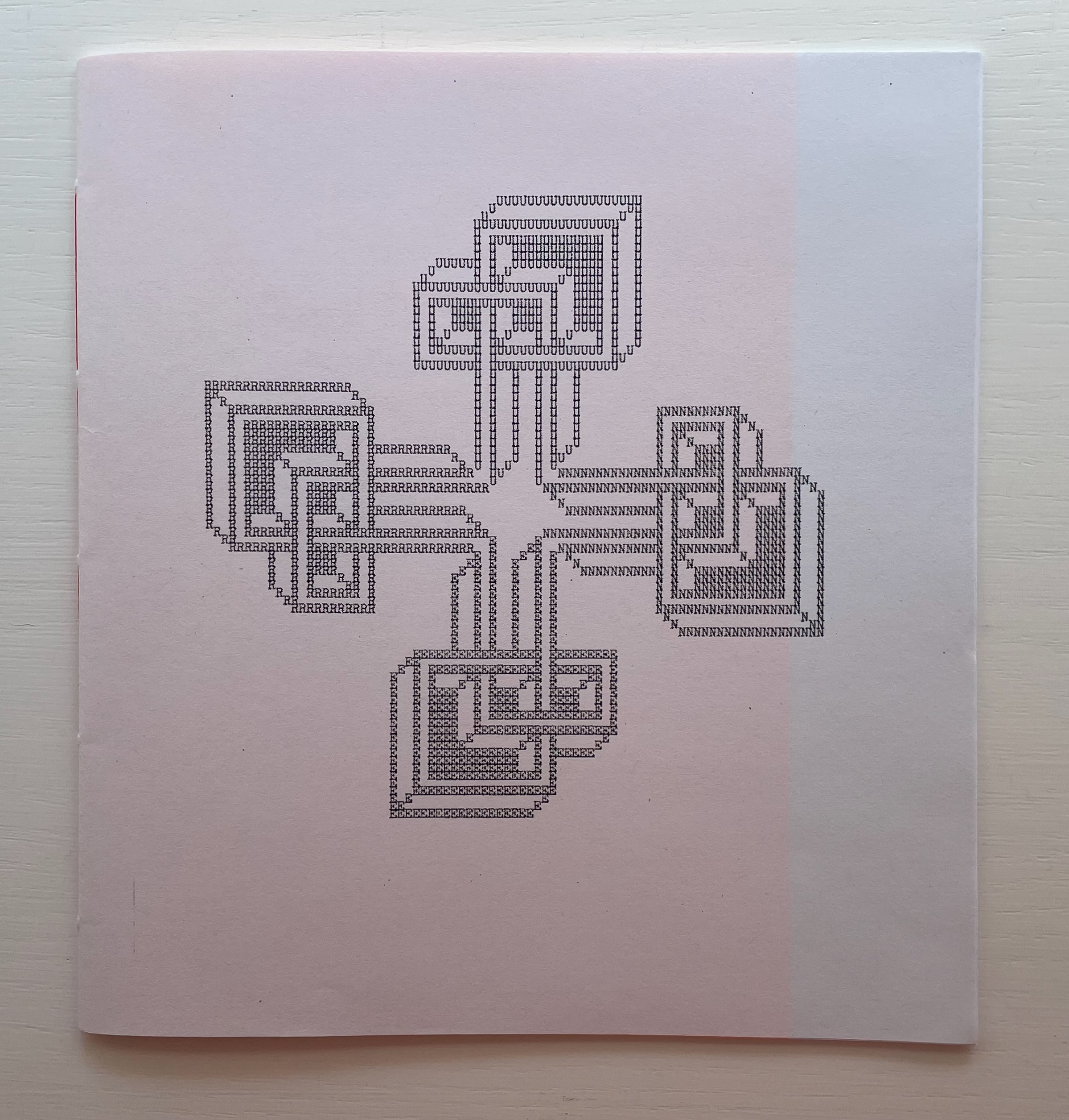
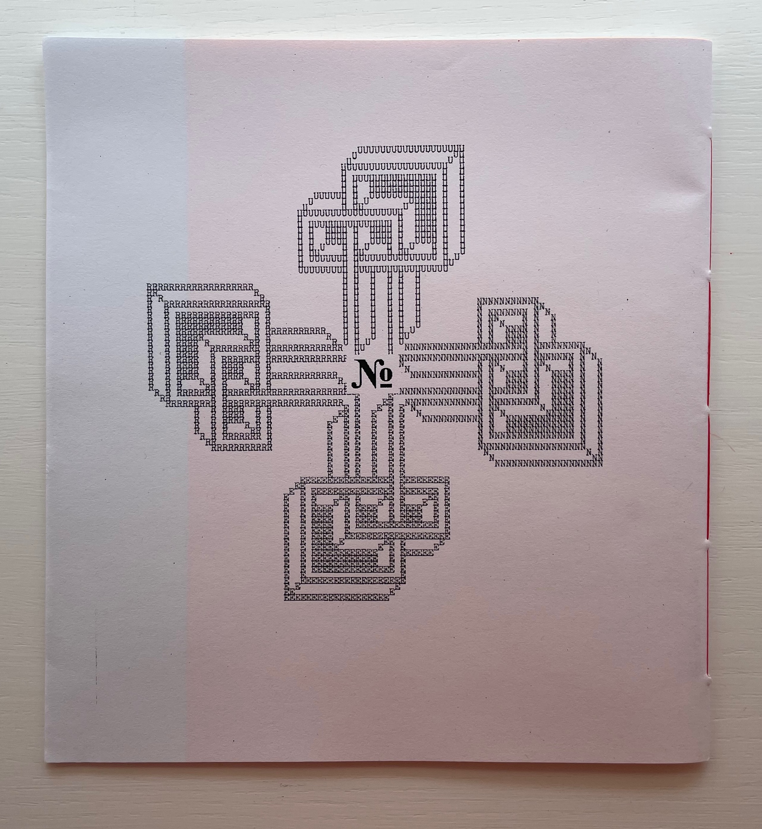
Front cover / Back cover
26 Voices / January Interlude (2020)
Karl Kempton
Sewn booklet. H190 x W177 mm. 28 pages. Edition of 60 unnumbered. Acquired from Derek Beaulieu, 4 January 2021.
Photos of the work: Books On Books Collection. Displayed with permission of the artist.
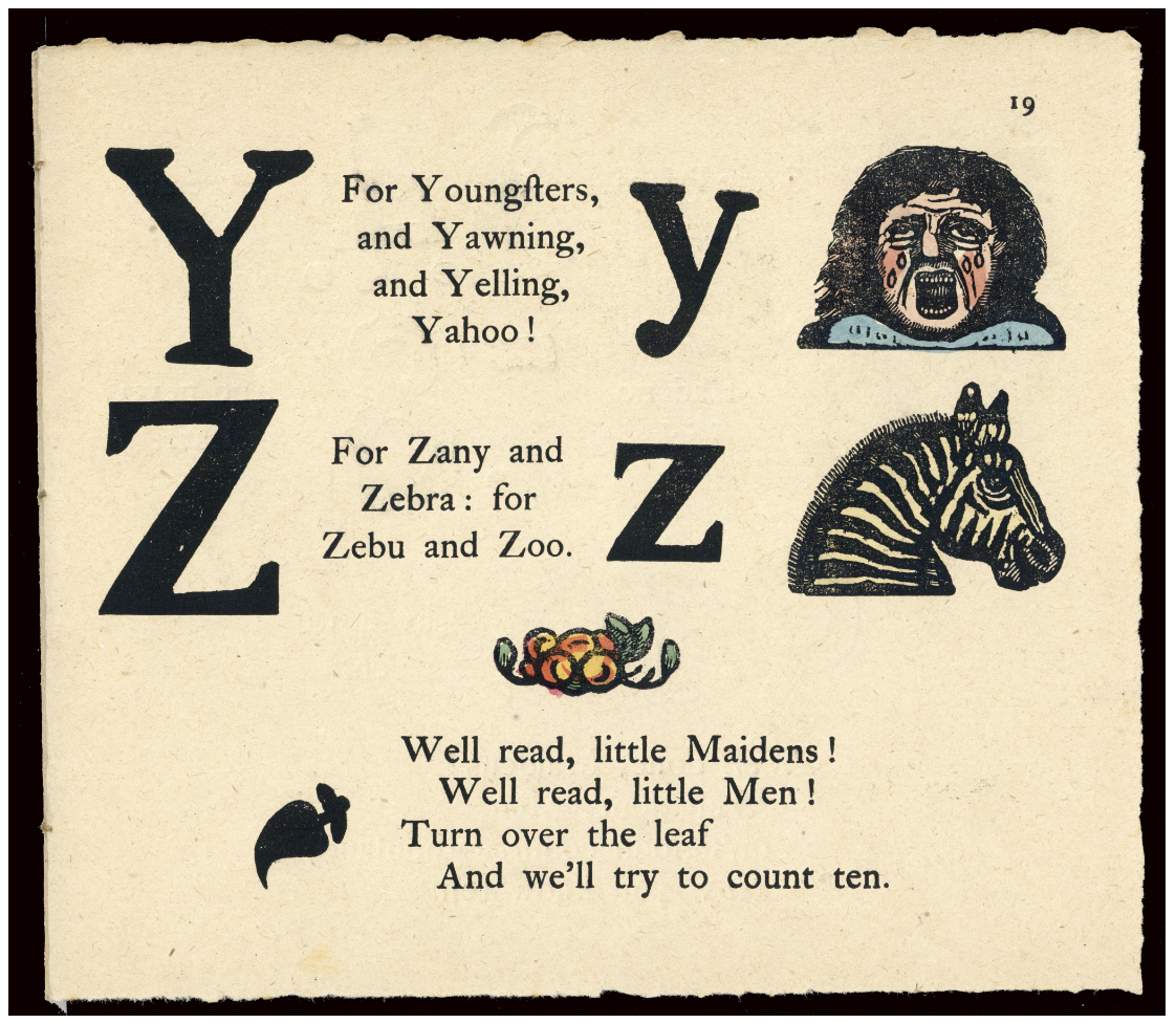
Derek Beaulieu deserves a vote of thanks for bringing this work back into print, even if for a limited edition. 26 Voices / January Interlude first appeared under the title Rune 2: 26 voices/ january interlude as number 10 in Robert Caldwell’s Typewriter series, published by Bird in the Bush Press (1980). In the Acknowledgements, Kempton writes that the series “was composed in January, 1978 in 28 days. After the letter K the flow stopped until a dream of L’s form arrived unblocking the flow”.
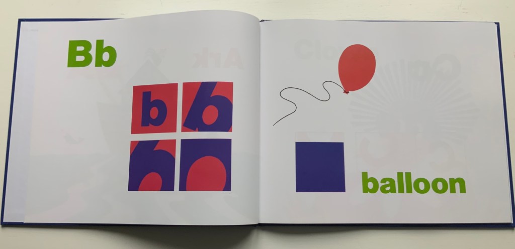
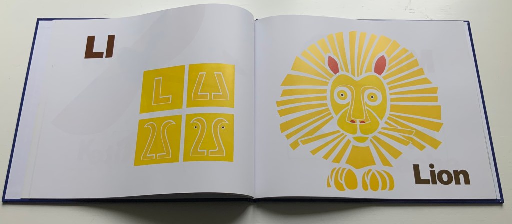
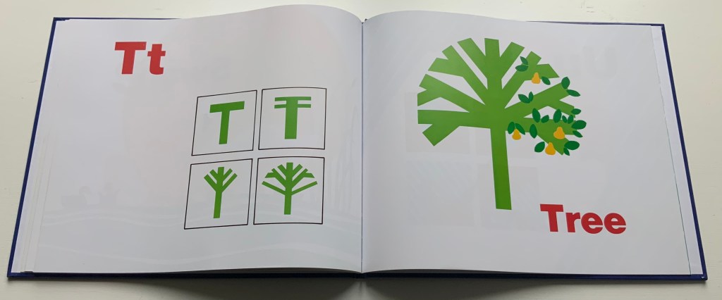
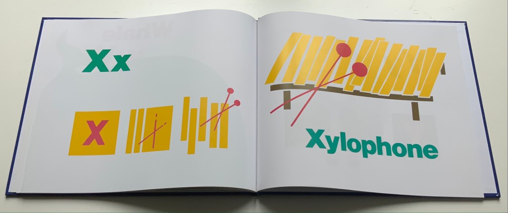
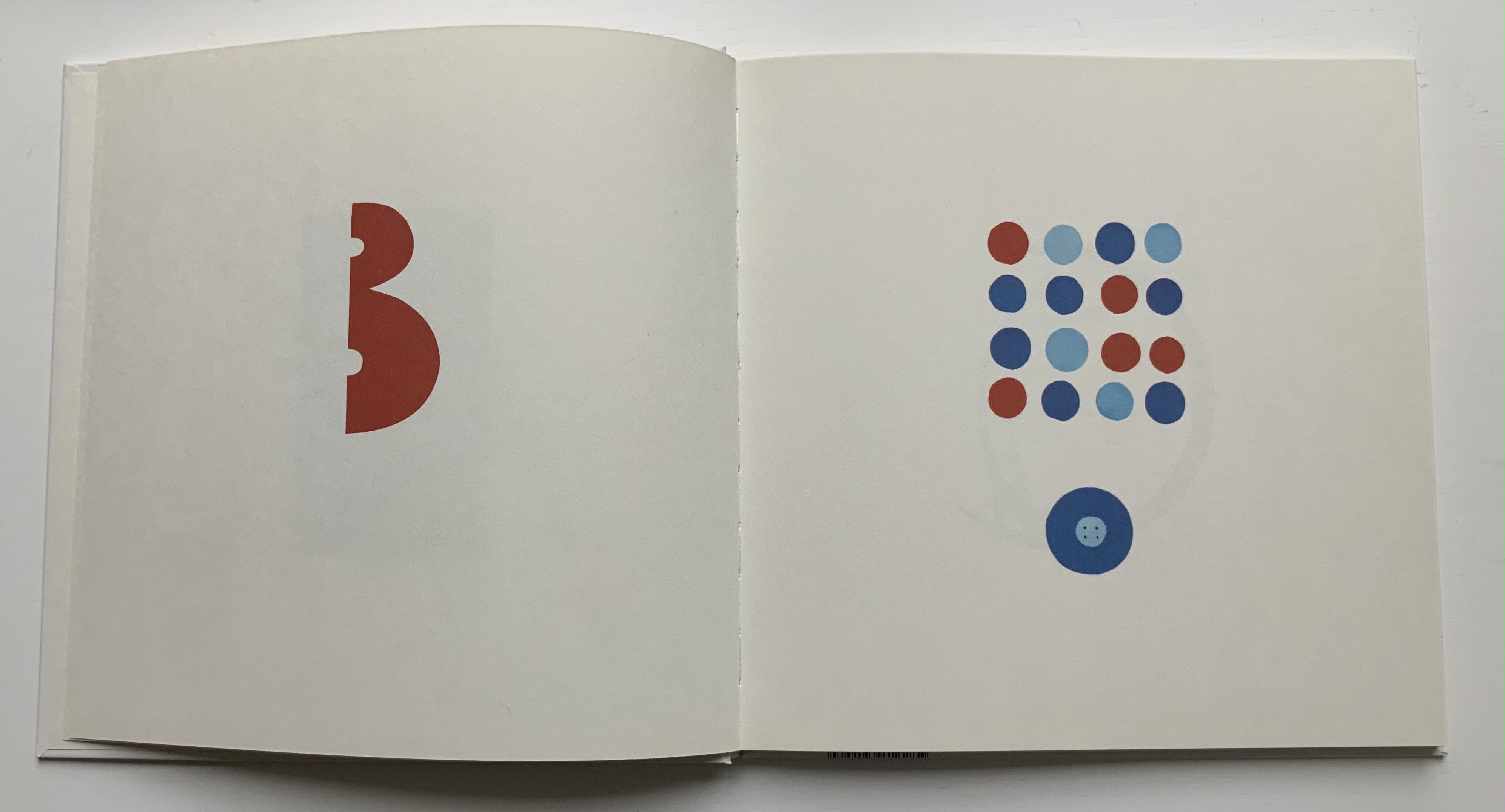
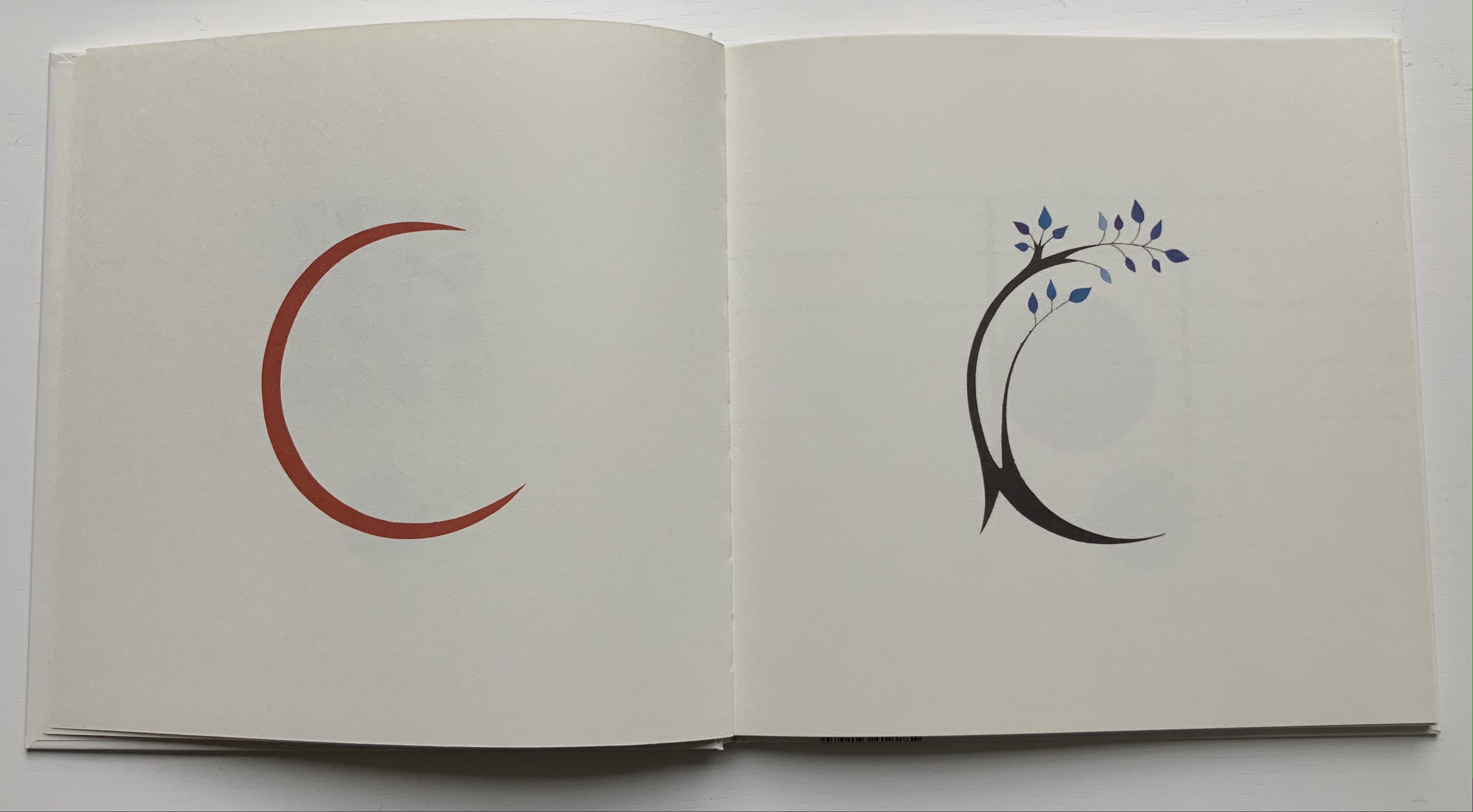
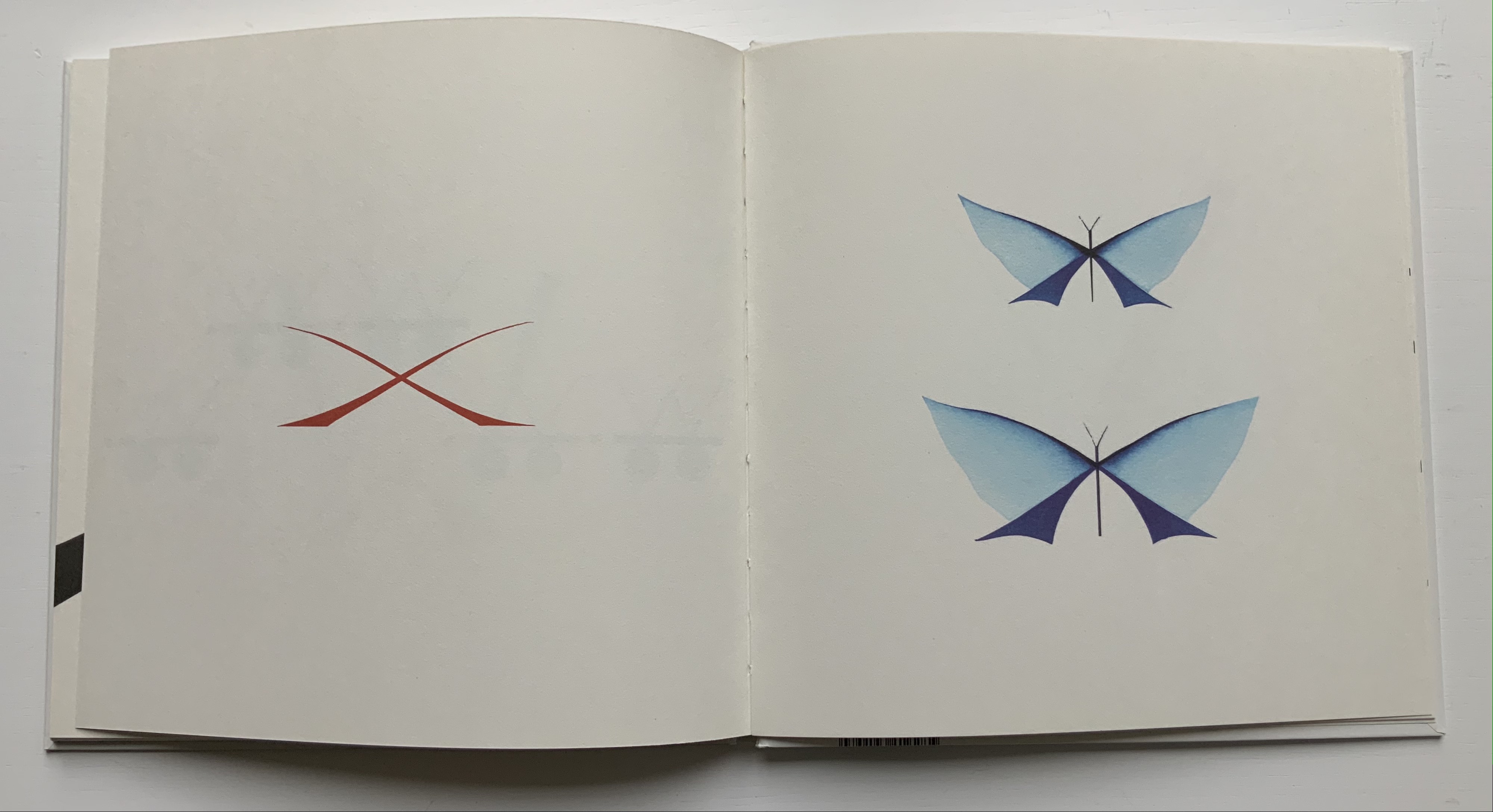
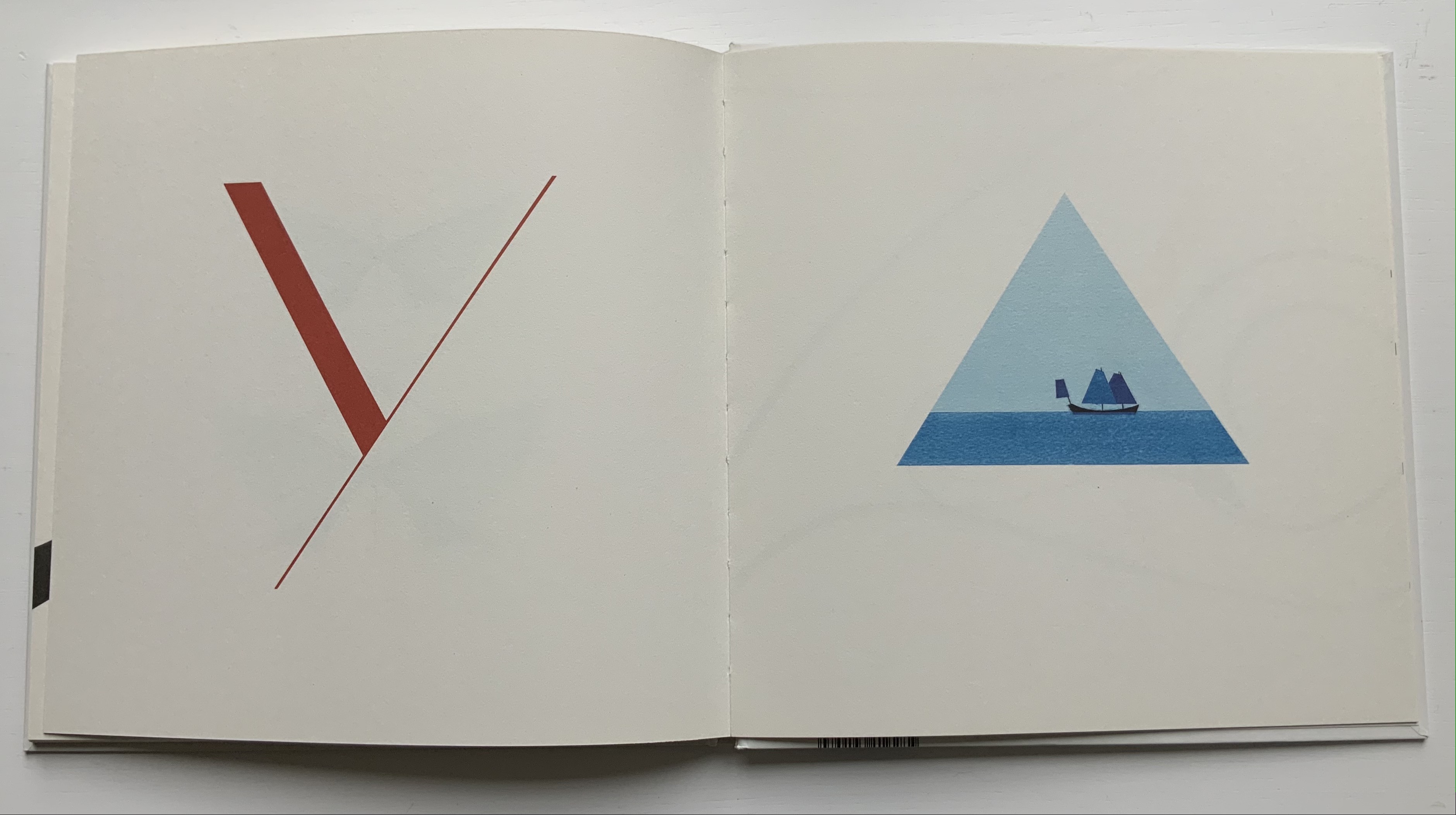
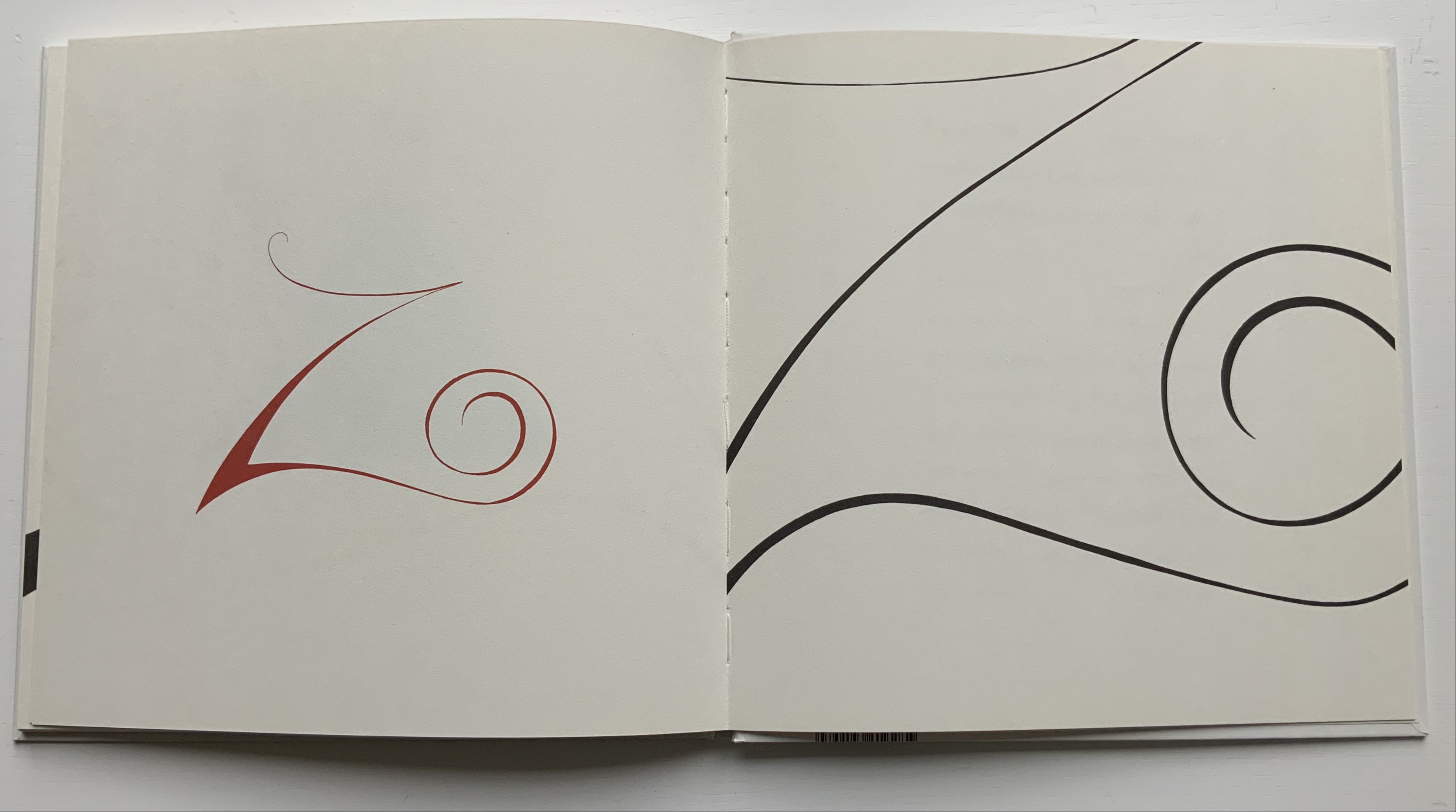
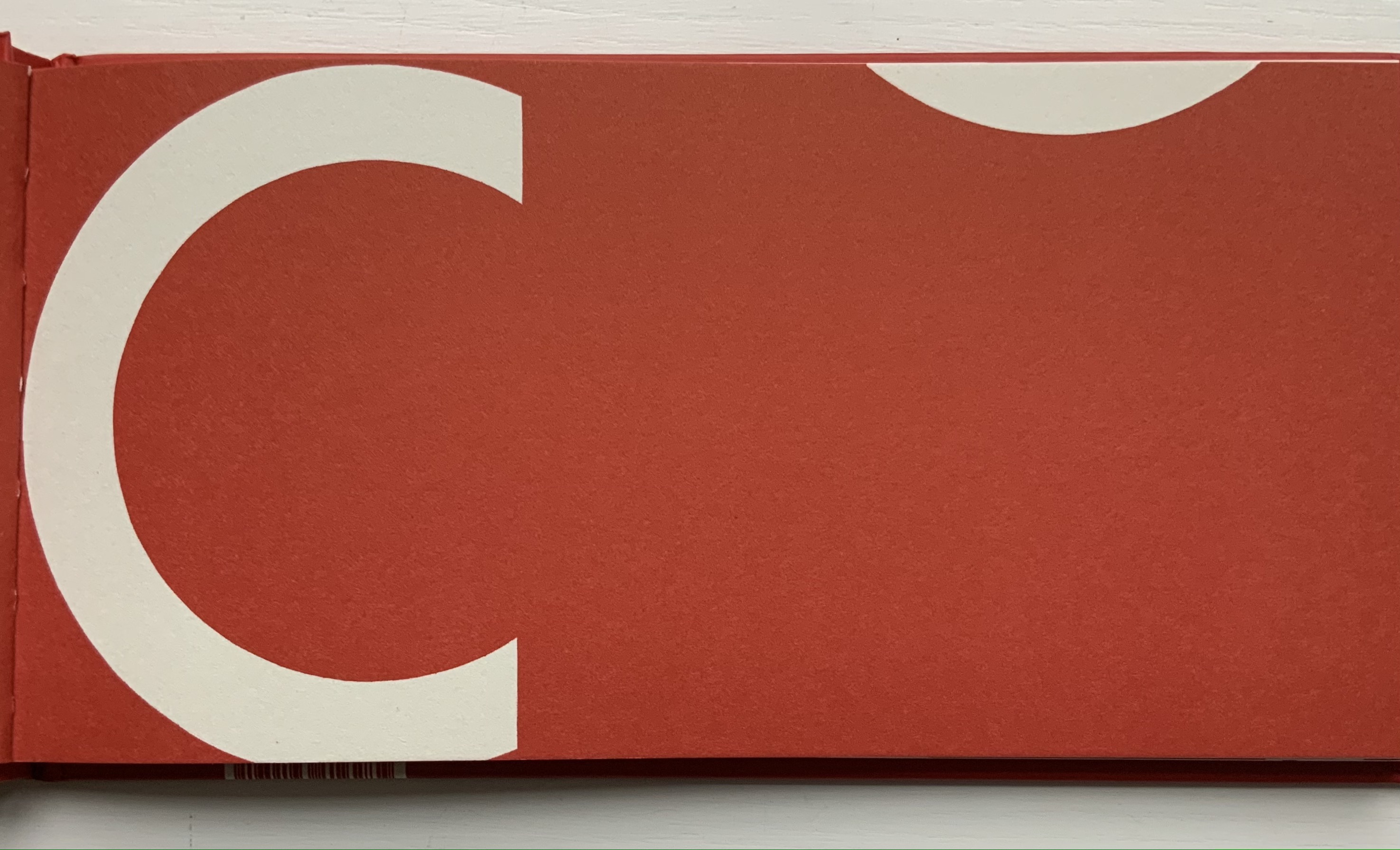
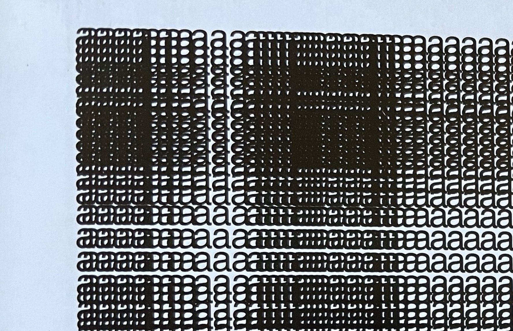
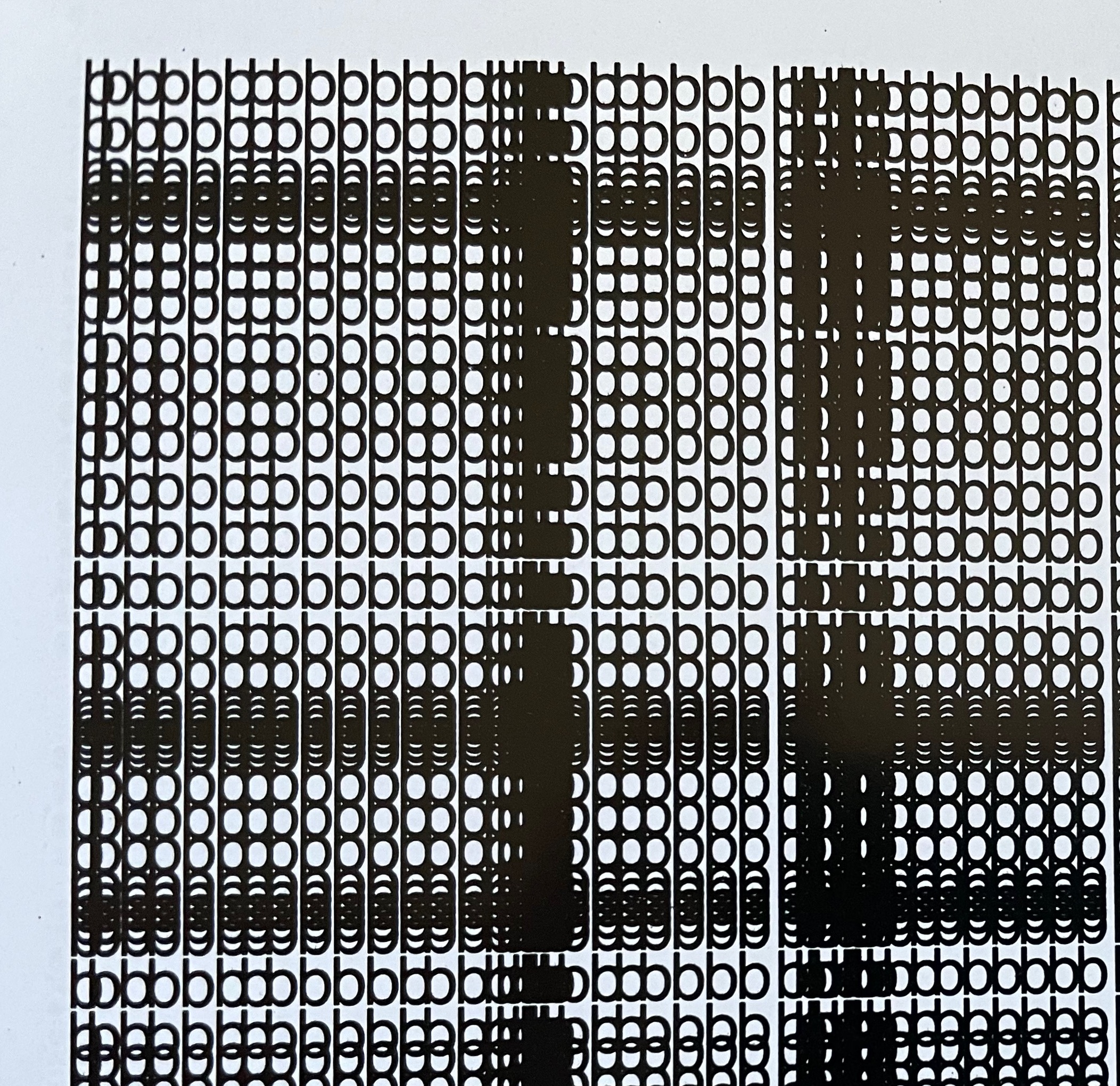
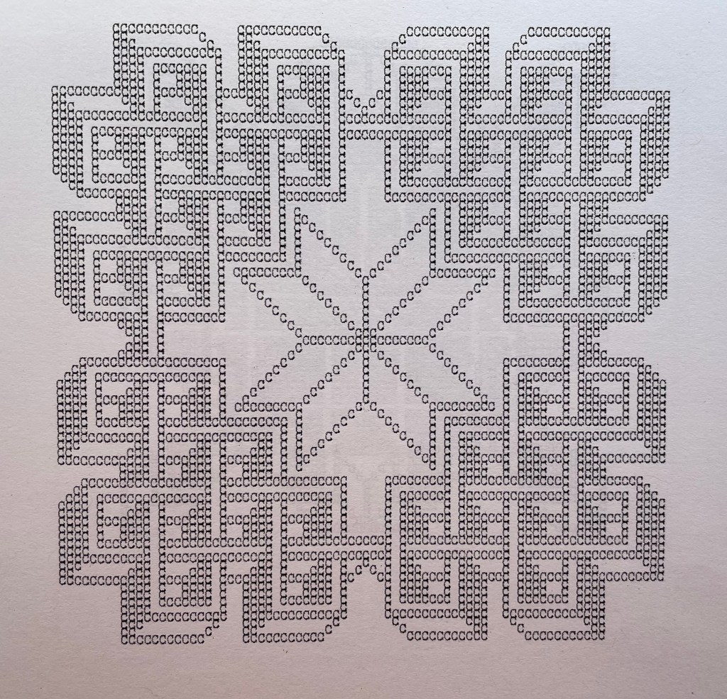
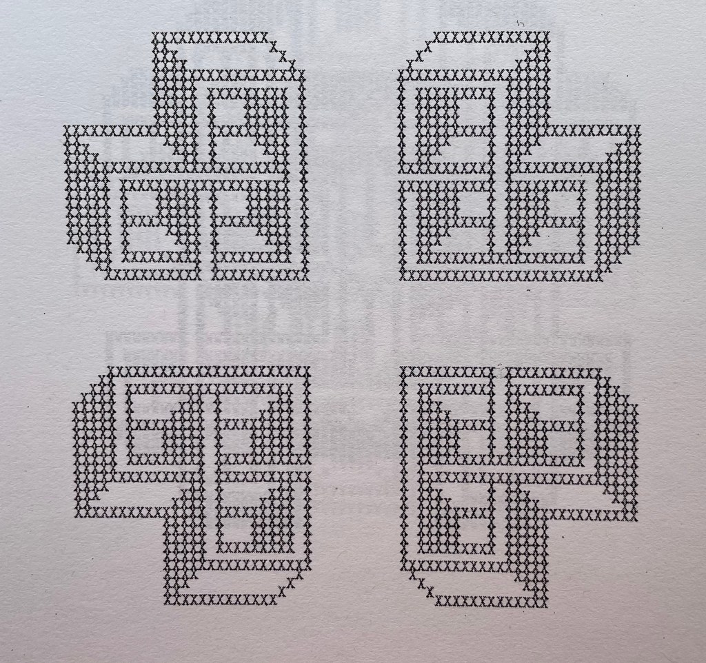
The series of patterns, each made from an upper case letter of the alphabet typed over and over, range in appearance — some like Amish quilts, some like Byzantine rugs, some like Celtic knots, but like snowflakes, no two alike. Given how some pairs of letters are mirror images of each other (bd, pq) or inverse (bp, dq), you would expect some close affinity in their two patterns, but no. No pairs of those patterns look at all alike. You would also be mistaken to expect a pattern to reflect the letter that constitutes it. Instead, you find one pattern resembling the letter X, but it is made of letter U’s. There are naturally some similarities between patterns at the broadest level — E and N, L and M or R and S — but these have little to do with the letters themselves, and the similarity recedes as details come to the fore or falls into the background with illusory three dimensionality. The shapes are not rune like, but individually and sequentially, they have the associative dream-like qualities of runes.

A close up
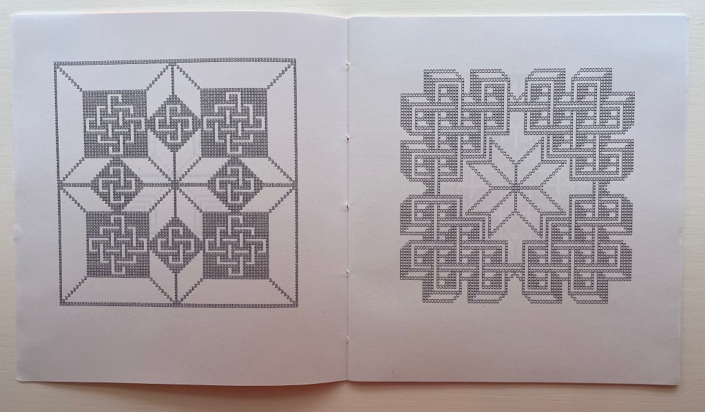
Double-page spread B&C
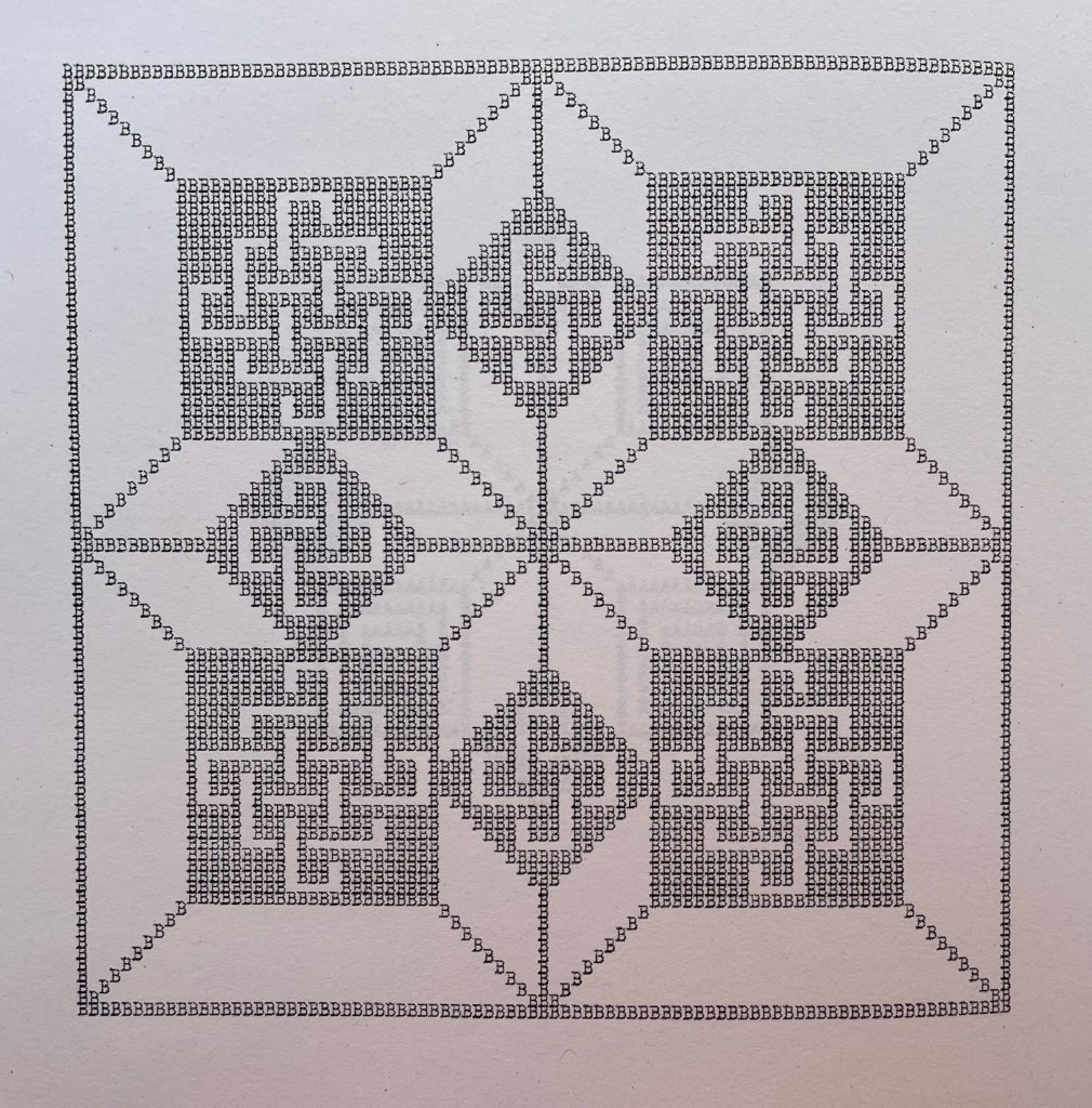
B close up
C close up
Center double-page spread N&O
Double-page spread X&Y
X close up
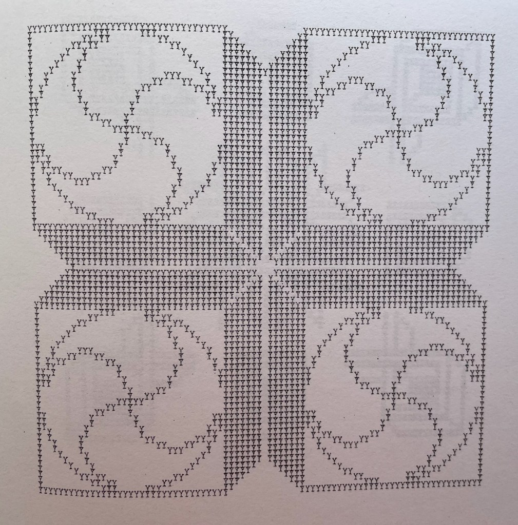
Y close up
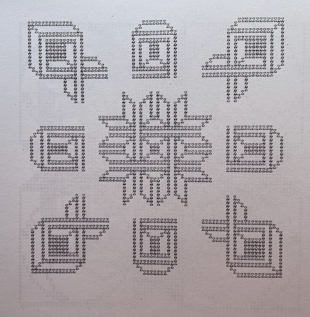
Z close up
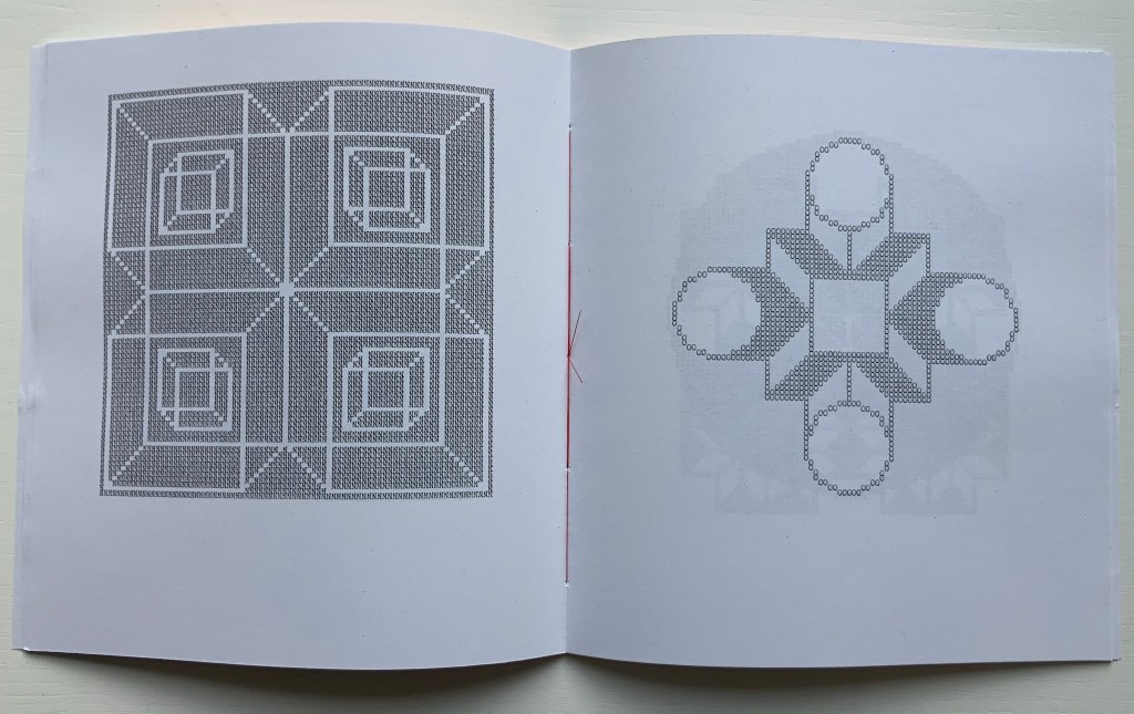
Actual runes appear in the following work, similarly in black and white and with similarly illusory three dimensionality. Not technically in the Books On Books Collection, playground (2013-14) can be found online. Surprisingly, it has not been in print.
playground (2013-14)
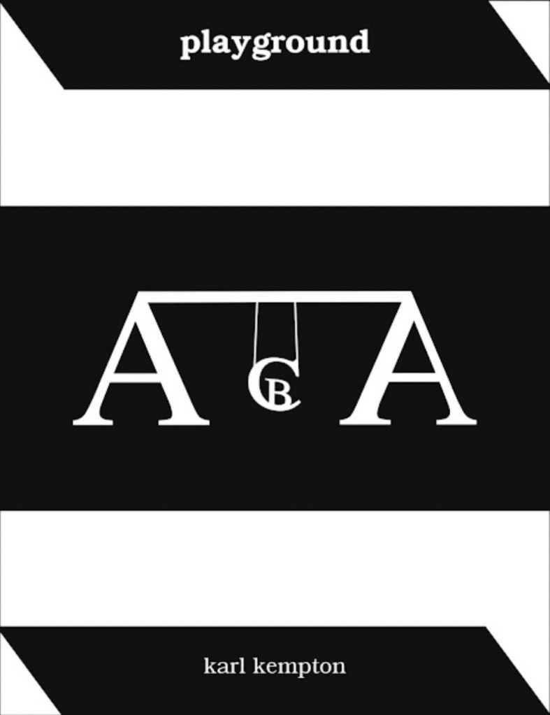
playground (2013-14)
karl kempton
Online, 78 pages (screens). Accessed 7 August 2022.
Screenshots reproduced with permission.
What an opportunity for collaborators to join with Kempton to produce playground in different editions varying in color (black and white, red and white, green and white, blue and white, etc.), in paper (handmade, watercolor, washi, high gloss, matte, etc.) and in binding (accordion, stab binding, case bound, scroll, etc.). Perhaps such an extravaganza is not in keeping with Kempton’s style and approach over the years, but this playground is such an invitation to play.
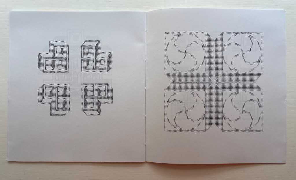
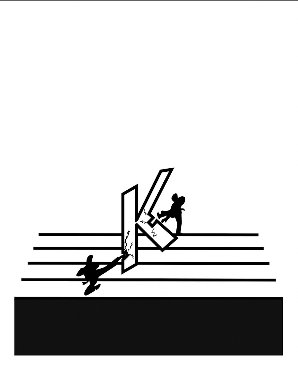
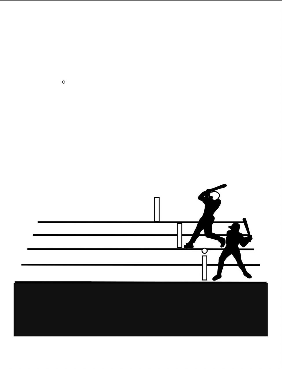
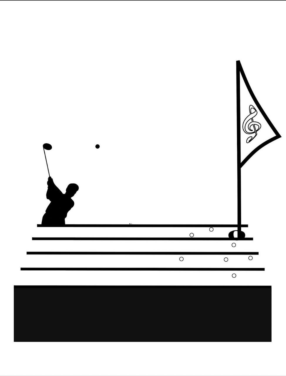
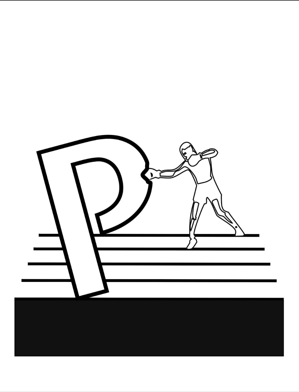
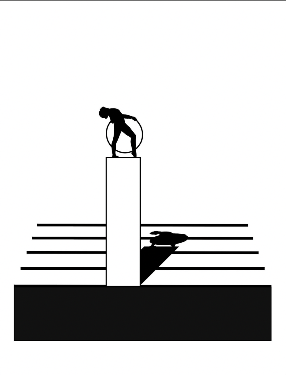
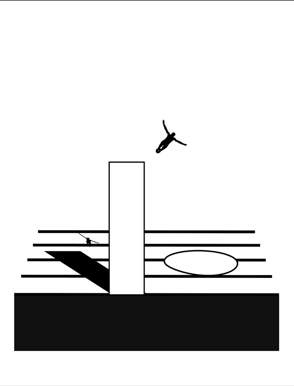
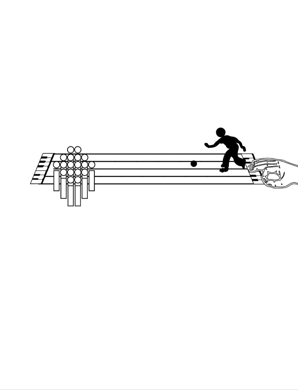
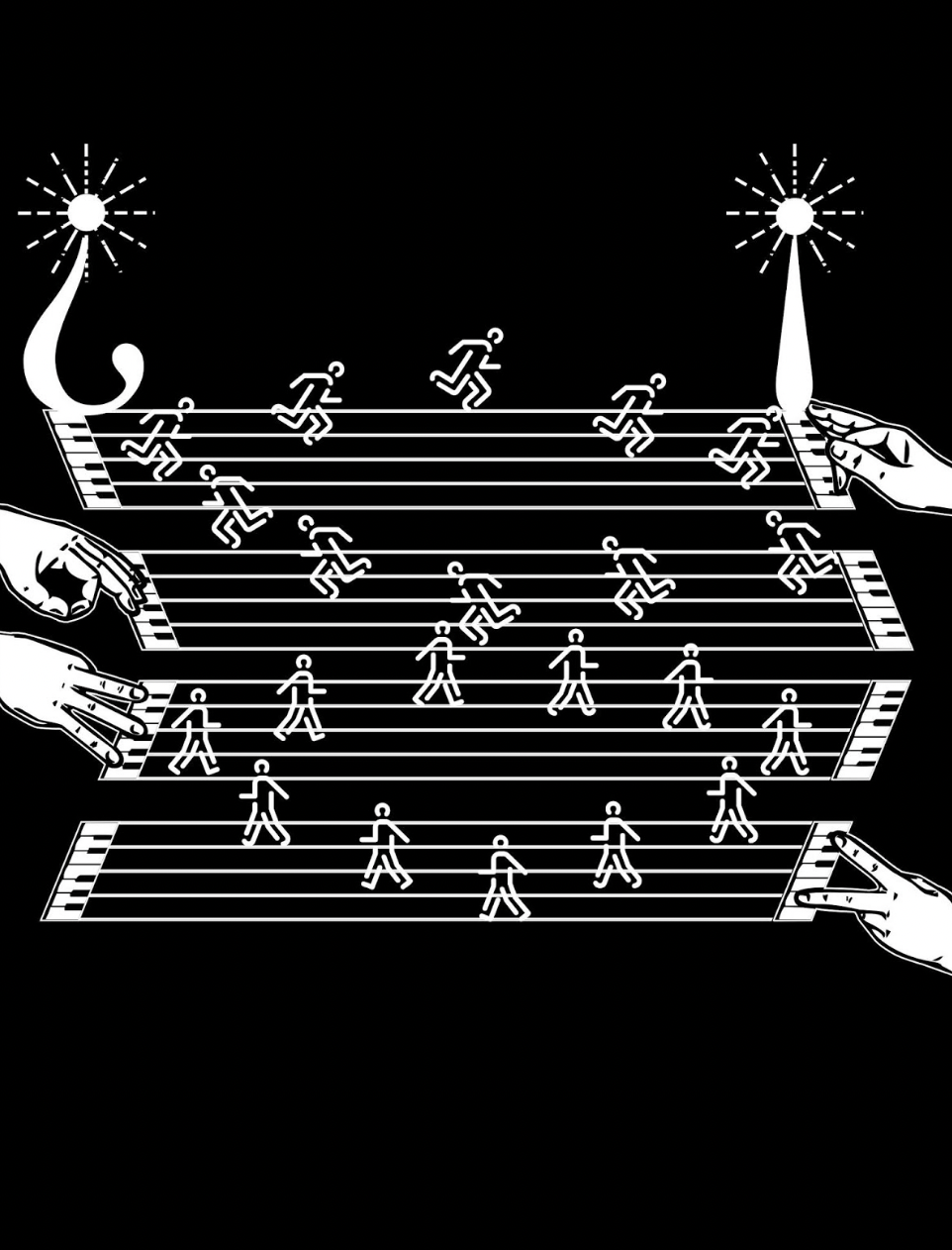
Games and sports are depicted together with letters and punctuation marks on platforms made of the musical staff or stave, all of which offer Kempton multiple means of metaphor. FIrst, inked martial arts figures break a K of karate boards. Then, a baseball player bats the dot of a lowercase i into the air. A basketball player jumps and aims at a basket formed of a half note. A golfer chips toward a half-note hole flagged with a pennant bearing the treble clef G. A boxer punches the bowl of a large P.
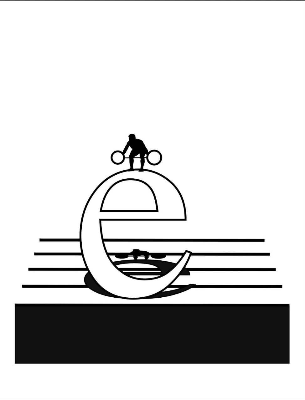
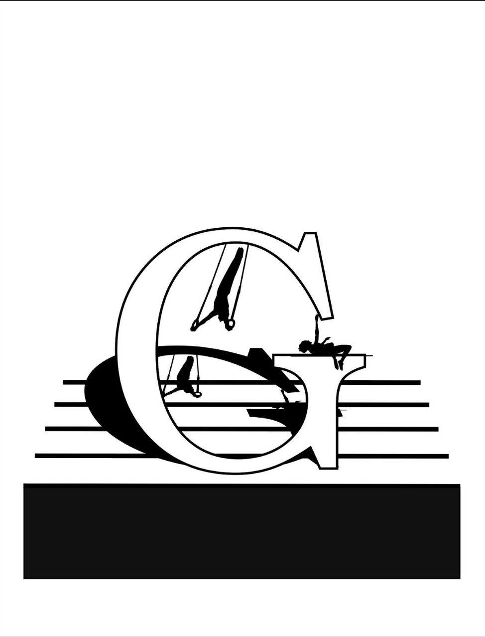
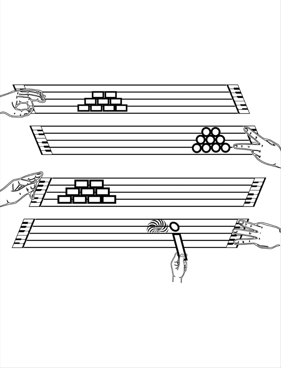
The images become more worked as the book proceeds. A weightlifter atop a lowercase e lifts a set of weights composed of the umlaut above the e, and the shadow of the image is cast across the stave lines behind the letter. Shadows of gymnasts appear behind an uppercase G, lowercase o and lowercase i.
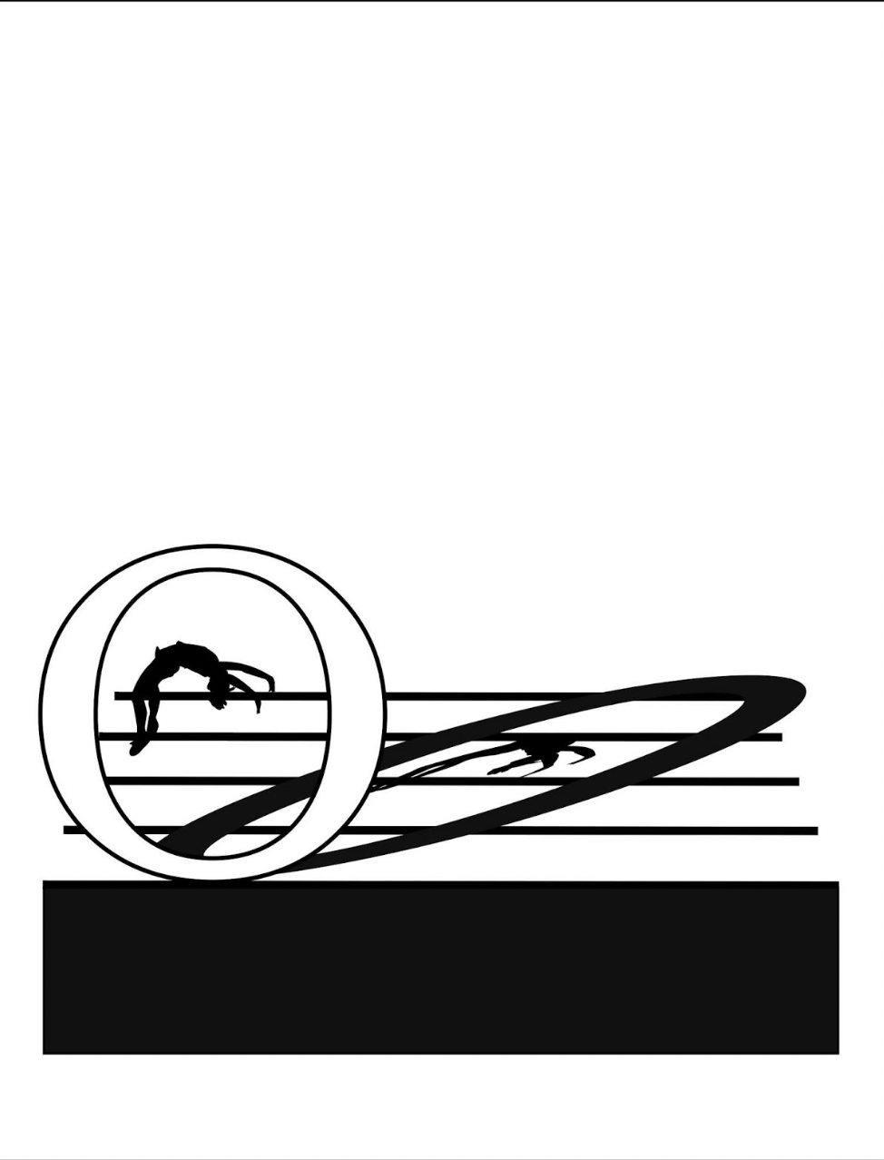
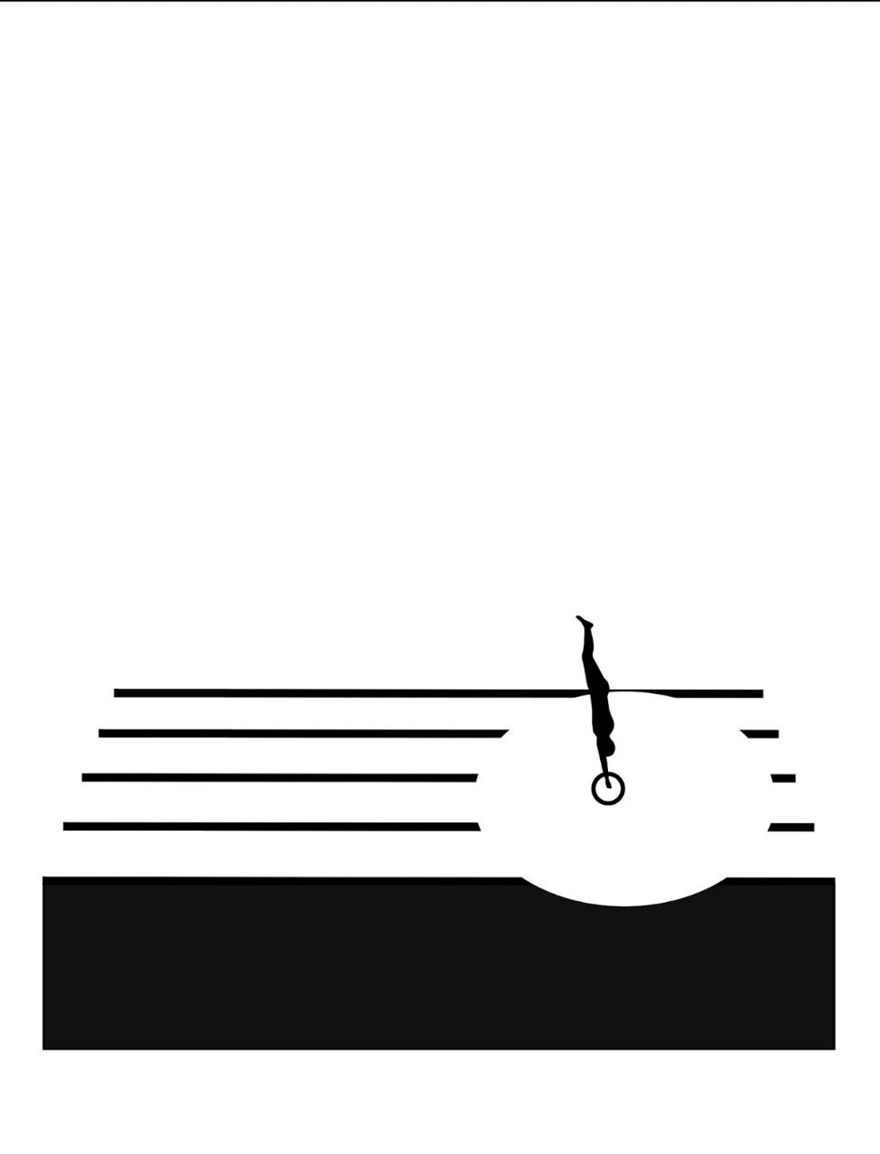
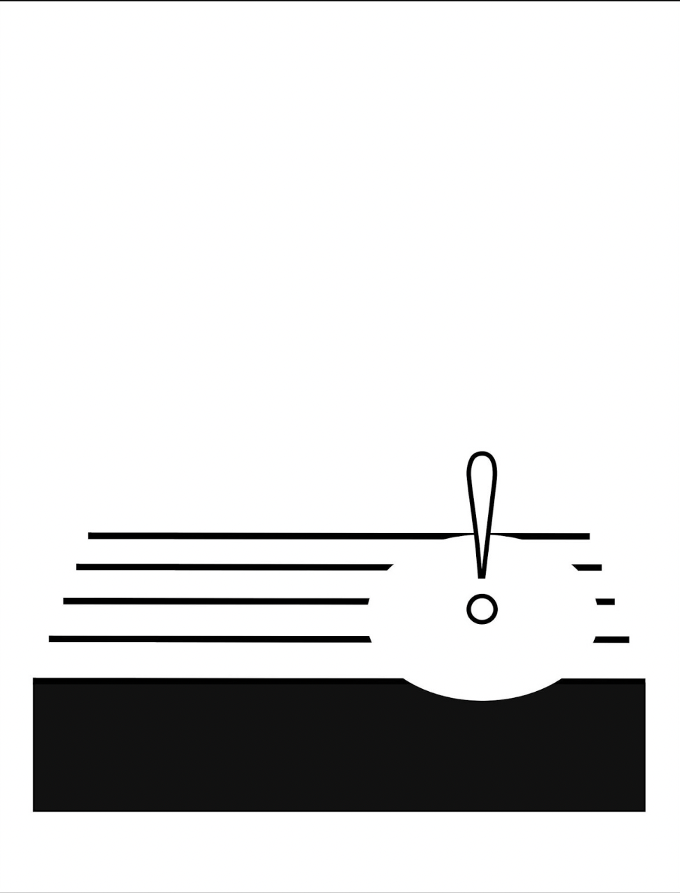
Animation sequences occur, such as the platform diver leaping from the body of a lowercase i and creating an exclamation-point splash in a pool formed by a circle that widens across the stave as the diver submerges.
Around the same time of playground‘s inception, this combination of letters and musical notation found expression among other artists: for example, Jim Avignon & Anja Lutz in Neoangin: Das musikalische ABC (2014) and Bernard Heidsieck in Abécédaire n° 6 clef de sol : été 2007 (2015). Metaphorically linking textual expression, if not individual letters of the alphabet, with musical scores goes back at least as far as Stéphane Mallarmé’s Un Coup de Dés Jamais N’Abolira le Hasard (1897) and carries forward into explicit linkage by Michalis Pichler (2009) and Rainier Lericolais (2009) in their works of homage to Un Coup de Dés.
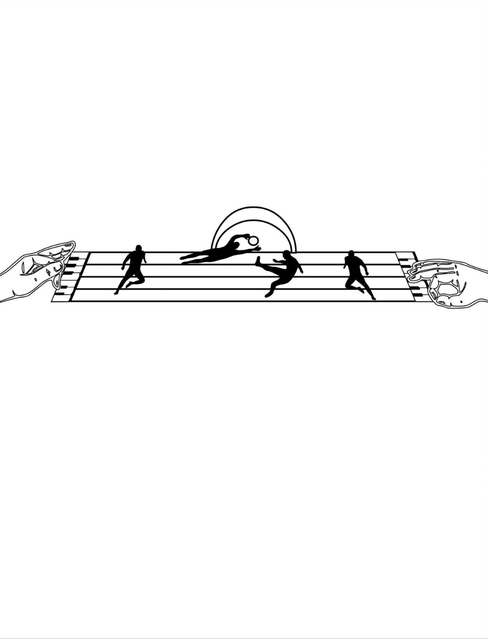
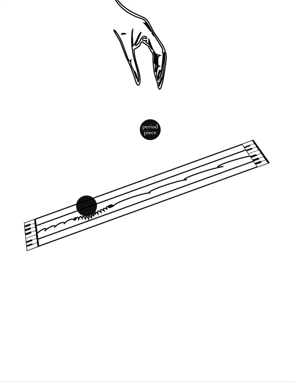
To return to Kempton’s playground, an interlude occurs to associate the alphabet with magnetism, then breaks off to return to the games motif, this time in the form of winter sports. The musical notation motif is still there, but Kempton modifies it with a piano keyboard at both ends of the stave and with manicules fingering the keyboards at both ends while articulating a variation on sign language. Musically and metaphorically, matters become more complex with the introduction of two pairs of staves, pyramids of squares and circles and one manicule using the lowercase i to bring back the magnetism interlude.
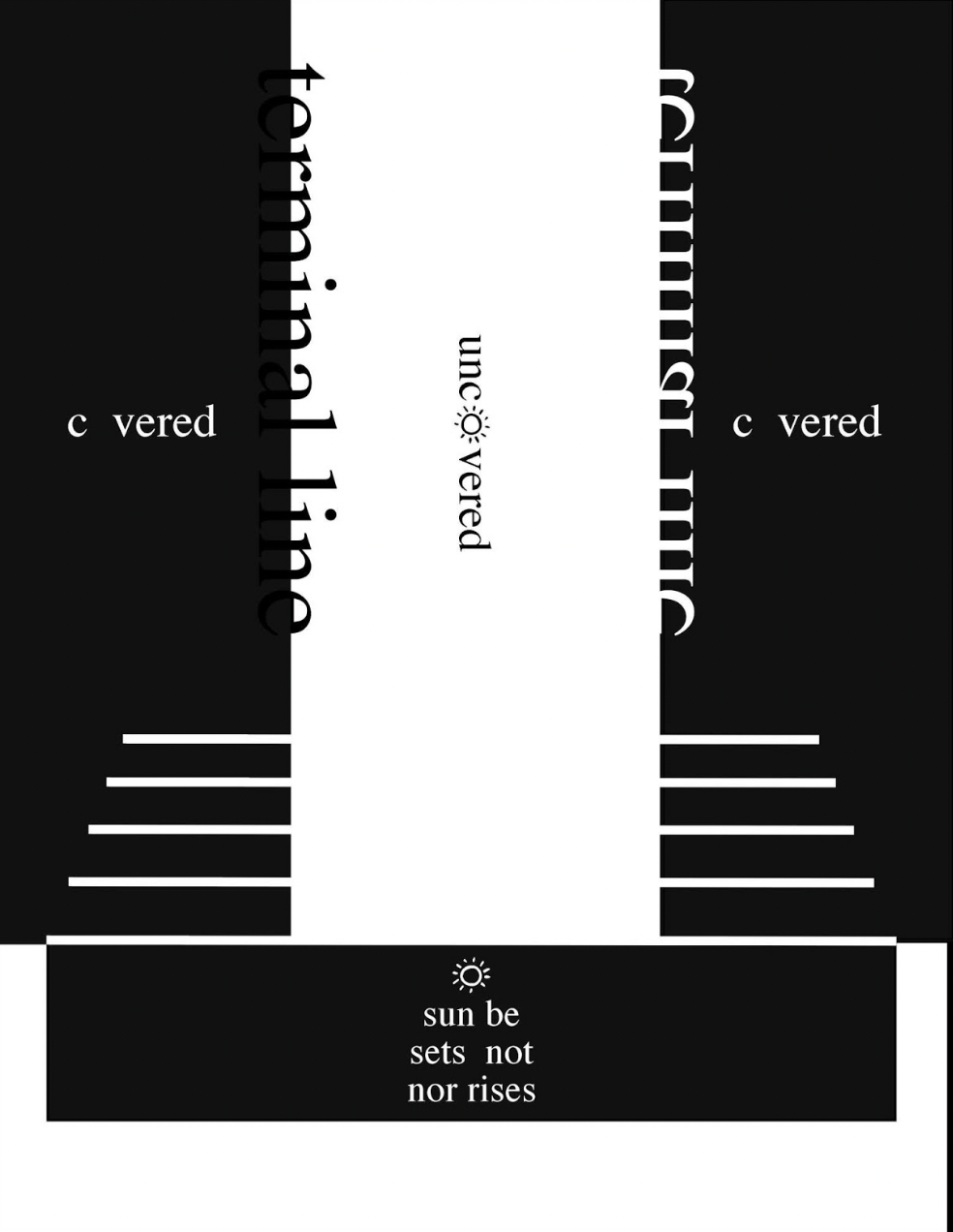
From here on, additional motifs are developed, and words and phrases appear: a physics experiment punningly labeled “period piece”, a night game lit by inverted question and exclamation marks, and juxtaposed opposites (“covered/uncovered” and “sunrise/sunset”).
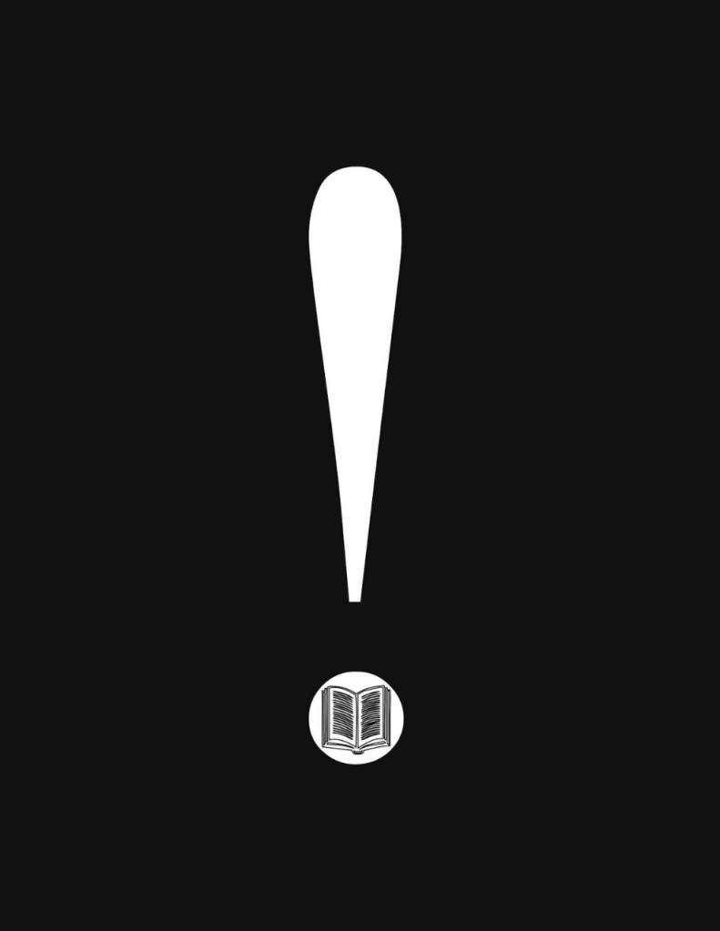
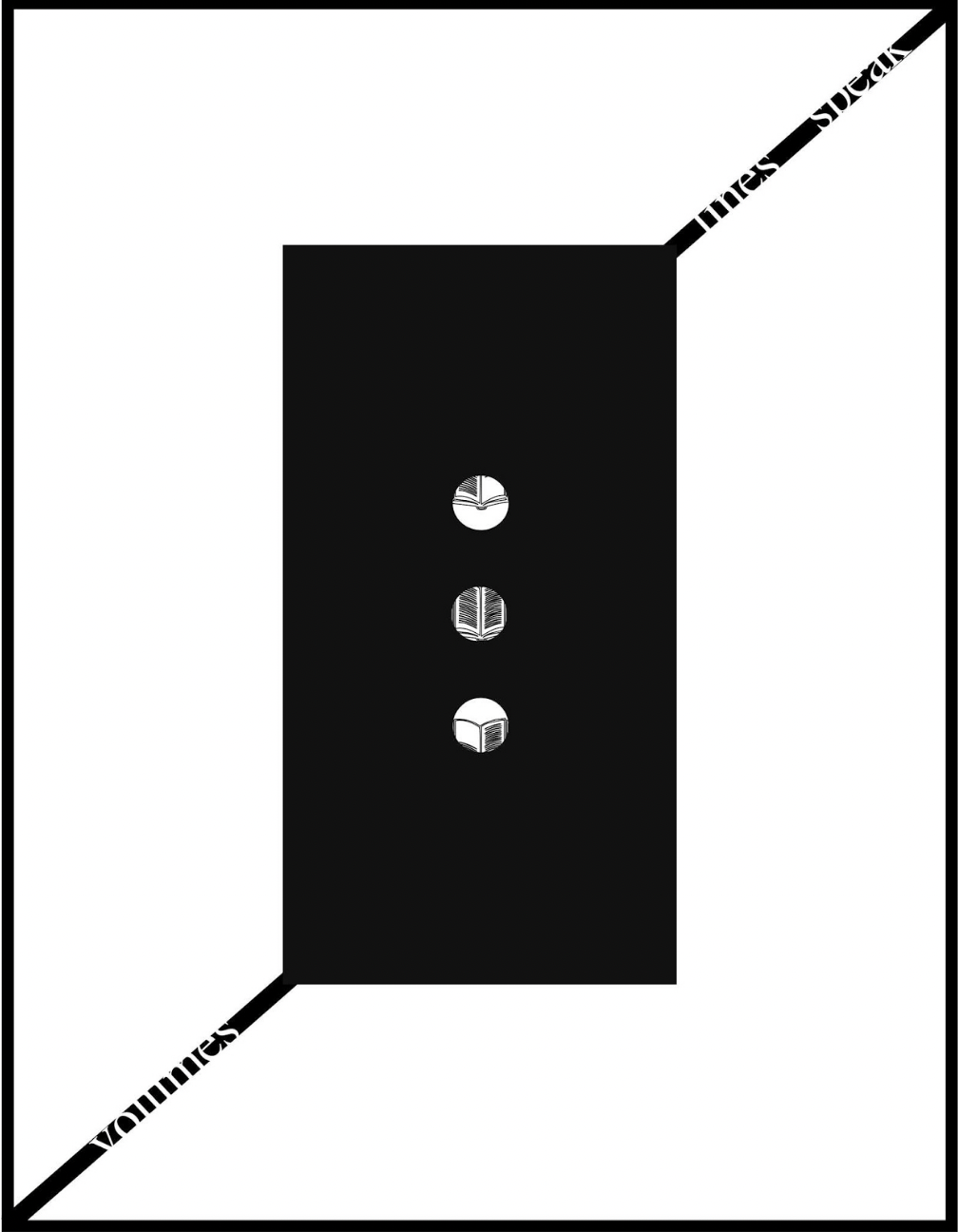
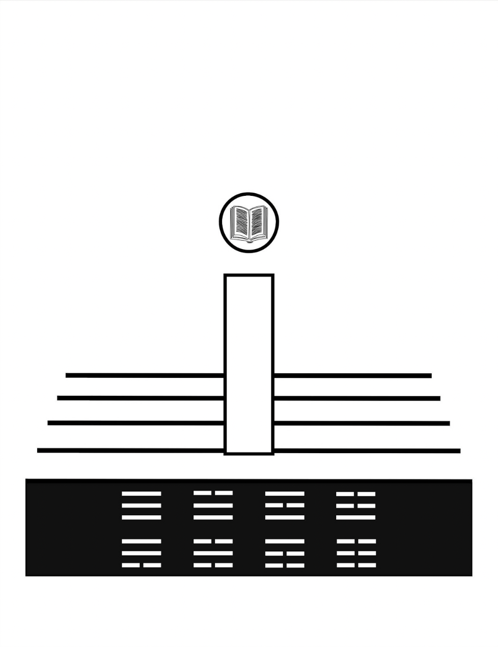
All these motifs, textual and visual puns, and images seem concerned with the development of symbols for interpreting the world and communicating that interpretation. With the appearance on black background of an exclamation mark with an open book inside its point, then a pair of rectangles each suspended by the sentence “volumes lines speak / lines speak volumes”, an animated sequence begins an extended narrative drawing everything together.
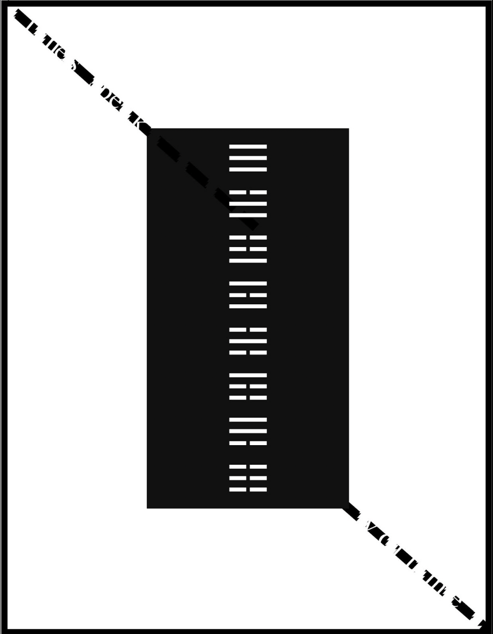
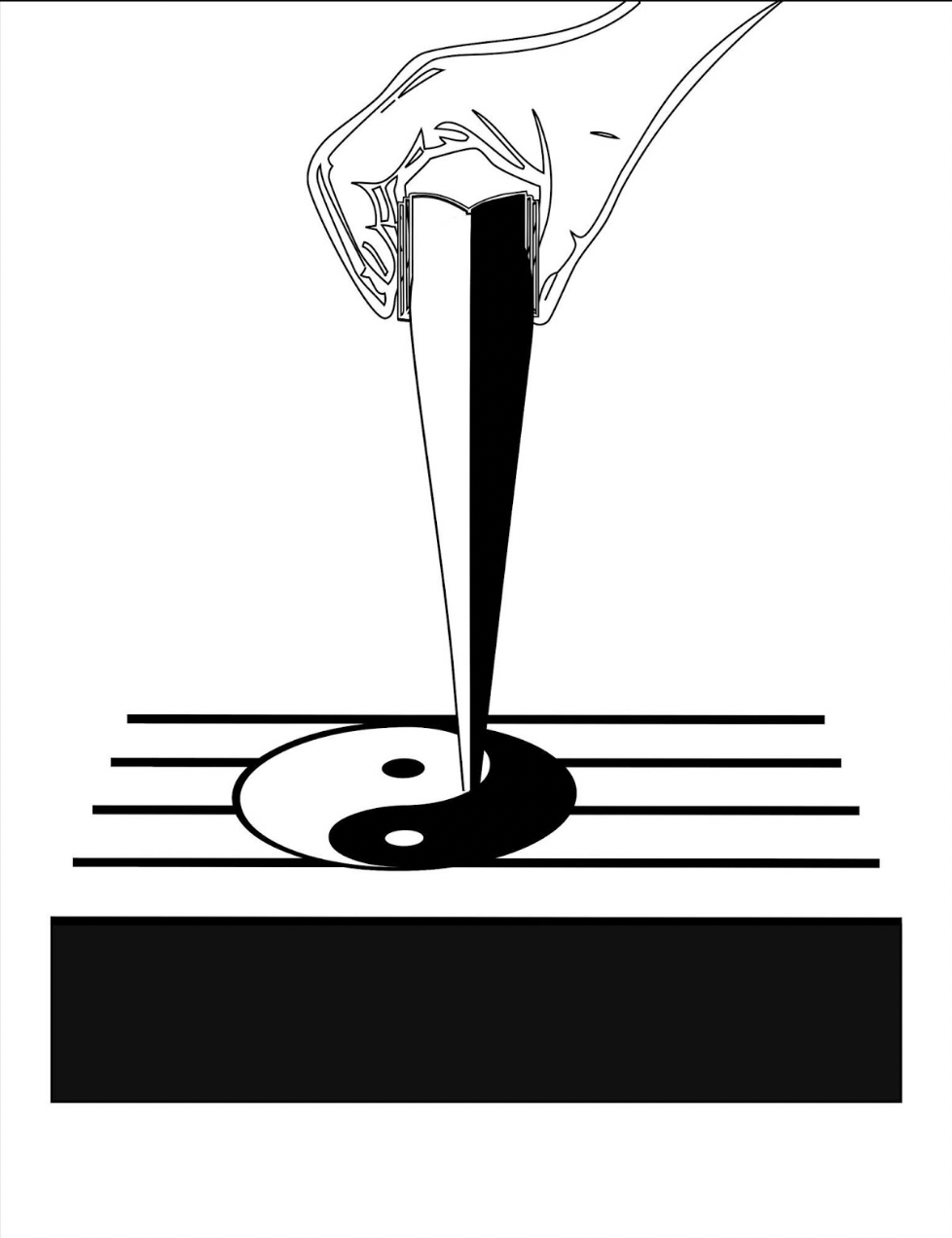
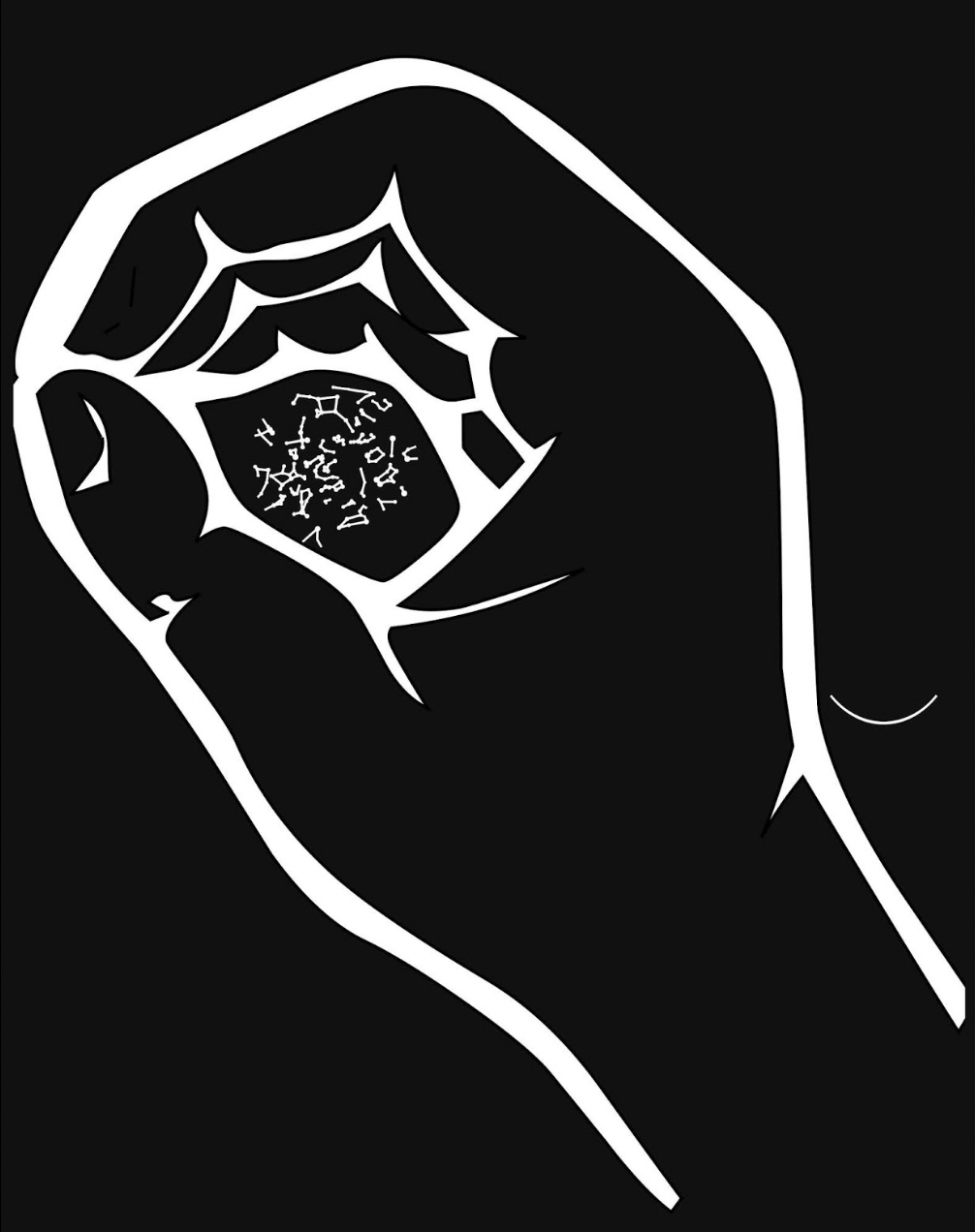
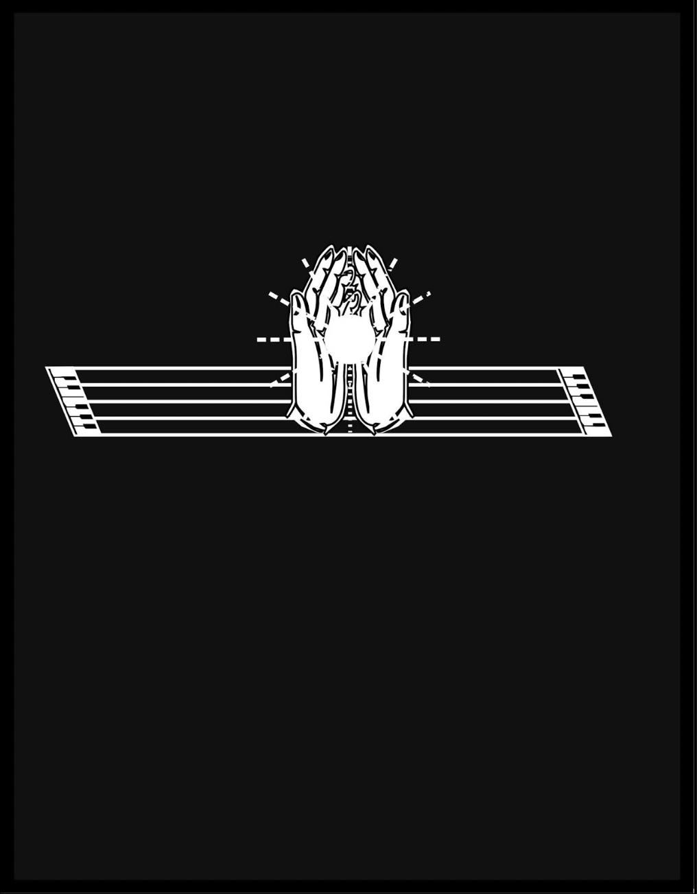
After the descending hand squeezes out the yin yang symbol onto the stave from the image of an open book, Kempton joins this theme of interconnected opposite forces with the development of language, which is where the runes come in, held in an unclosed fist. Eventually the book concludes with an open pair of hands, centered on reversed-out stave/keyboards and holding a point of light radiant against the blackness.
Further Reading
“Abecedaries I (in progress)“. Books On Books Collection.
“Jeremy Adler“. 29 October 2022. Books On Books Collection.
“Jim Avignon & Anja Lutz“. 29 October 2022. Books On Books Collection.
“Bernard Heidsieck“. 29 October 2022. Books On Books Collection.
Kempton, Karl. 2018. A History of Visual Text Arts. Berlin: Apple Pie Editions. Accessed 15 December 2020.