Books On Books Collection – Tommy Thompson

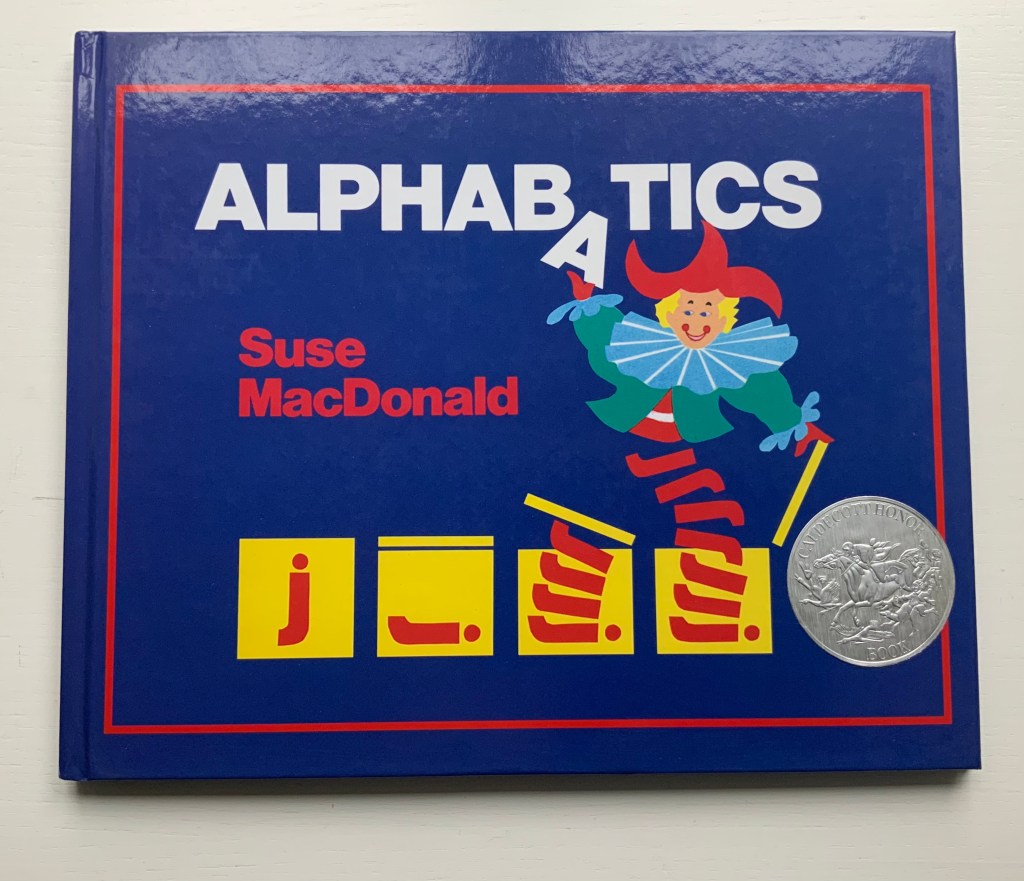
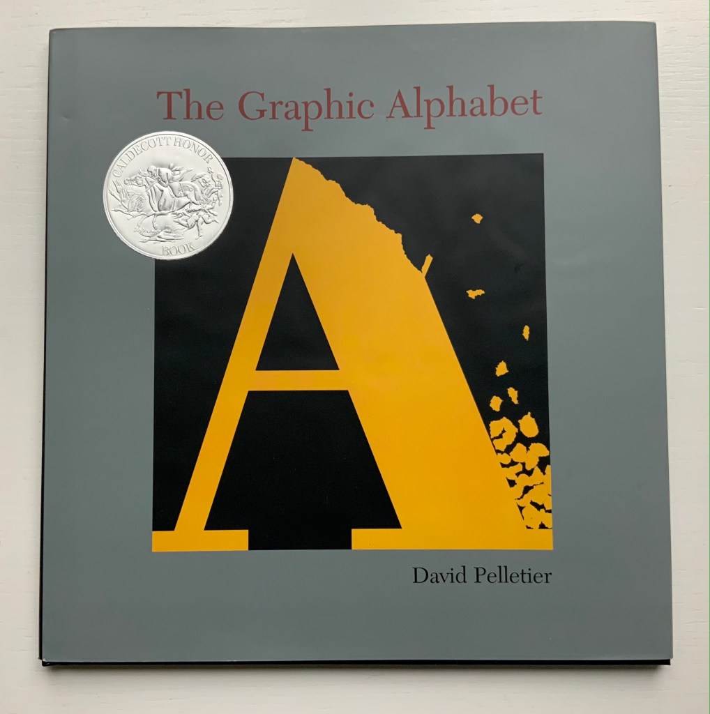
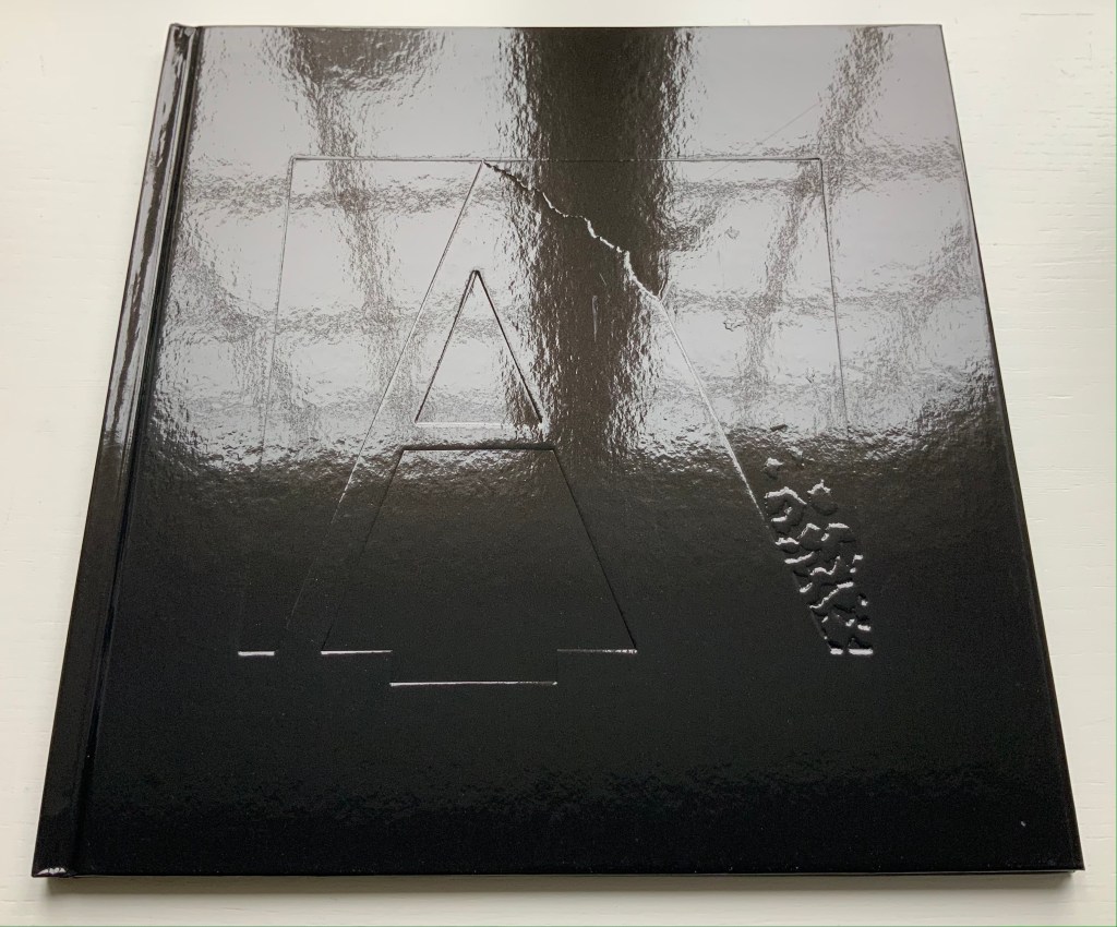
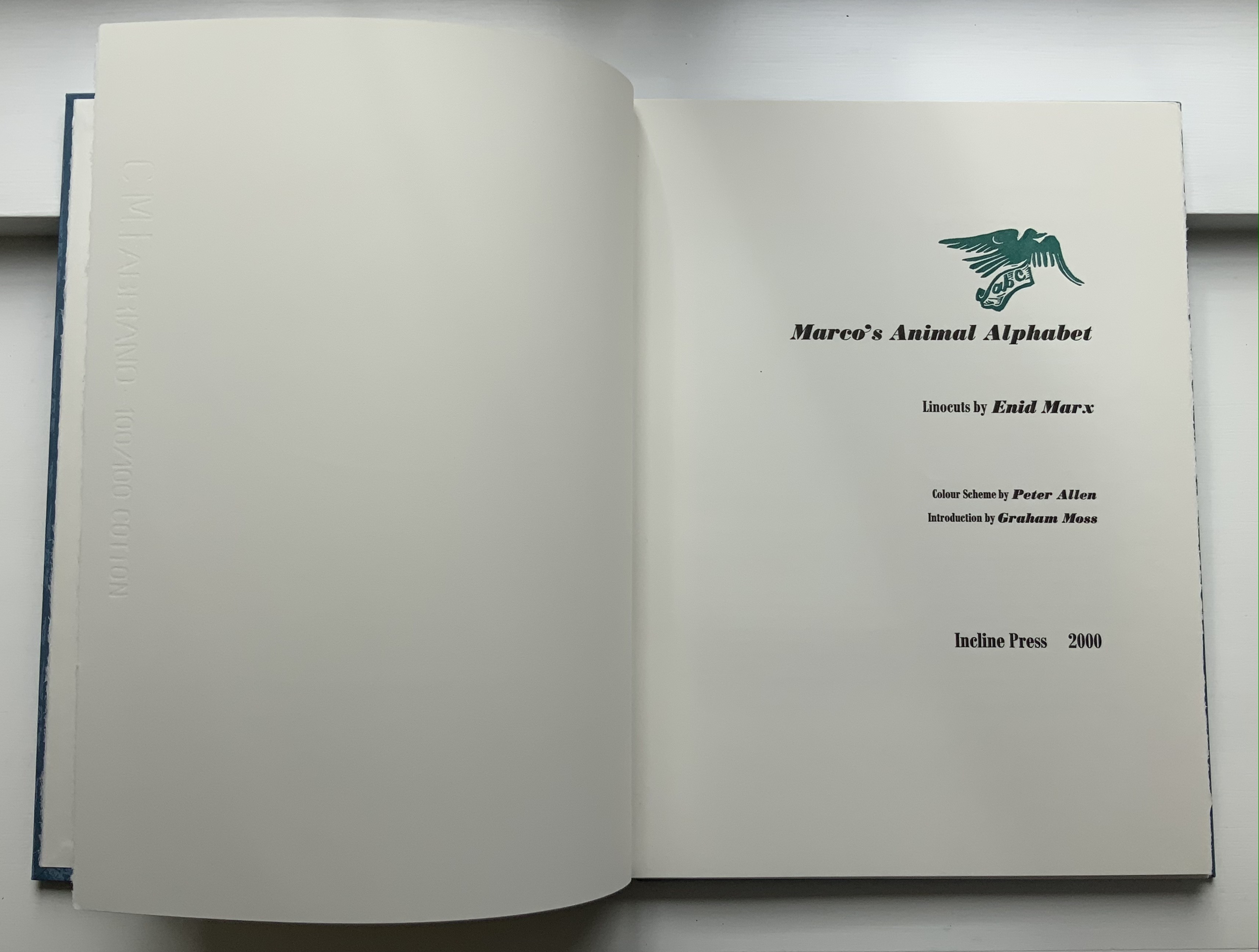
The ABC of Our Alphabet (1952)

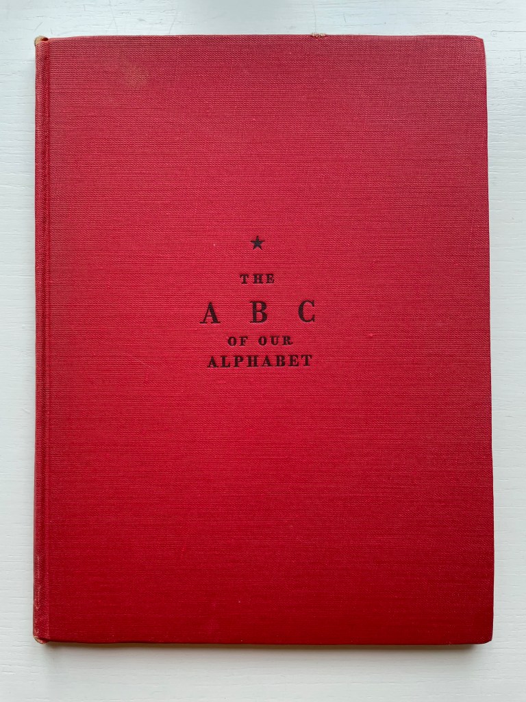
The ABC of Our Alphabet: A primer of the lineal history of our present-day letters (1952)
Tommy Thompson
Casebound with doublures showing map of locations of alphabet development.
Acquired from St Luke’s Hospice, Sheffield, 6 August 2022. Photos: Books On Books Collection.

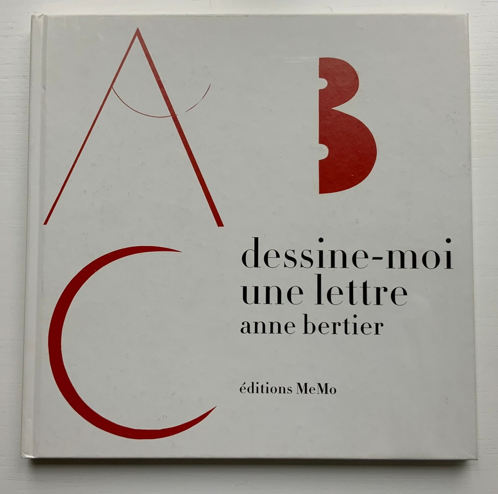
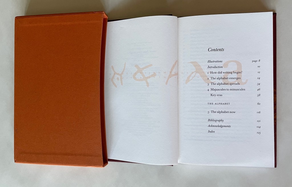
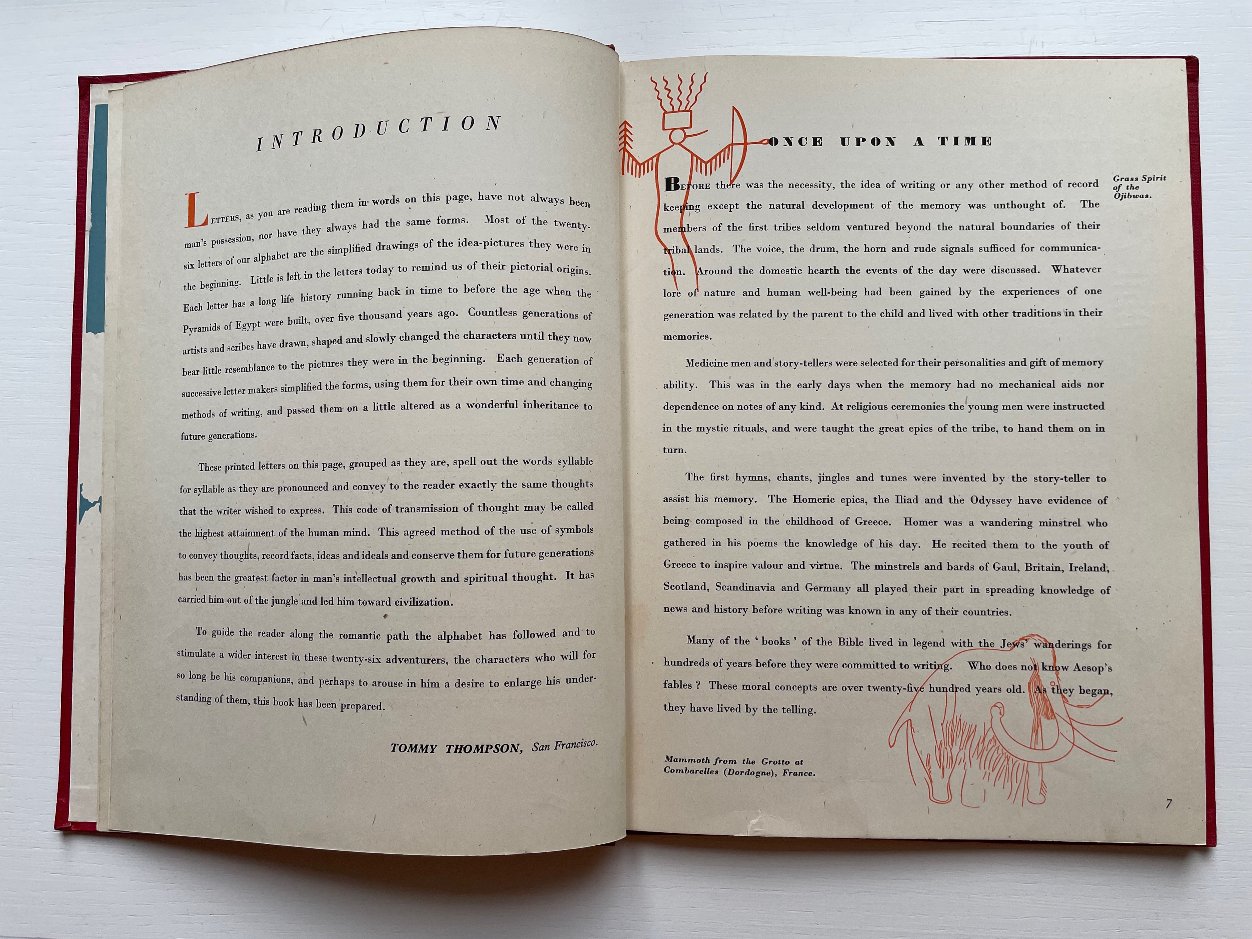
First appearing in 1942, Samuel Winfield (Tommy) Thompson’s somewhat forgotten children’s introduction to the history of the alphabet occupies an interesting position in that line of work that includes Oscar Ogg’s The 26 Letters (1964), Tiphaine Samoyault’s Alphabetical Order (1998), Renzo Rossi’s The Revolution of the Alphabet (2009) and Don Robb’s Ox, House, Stick (2010). For a collector of children’s alphabet books and alphabet-related artists’ books, the decision whether to acquire it balances on its interior design and content.

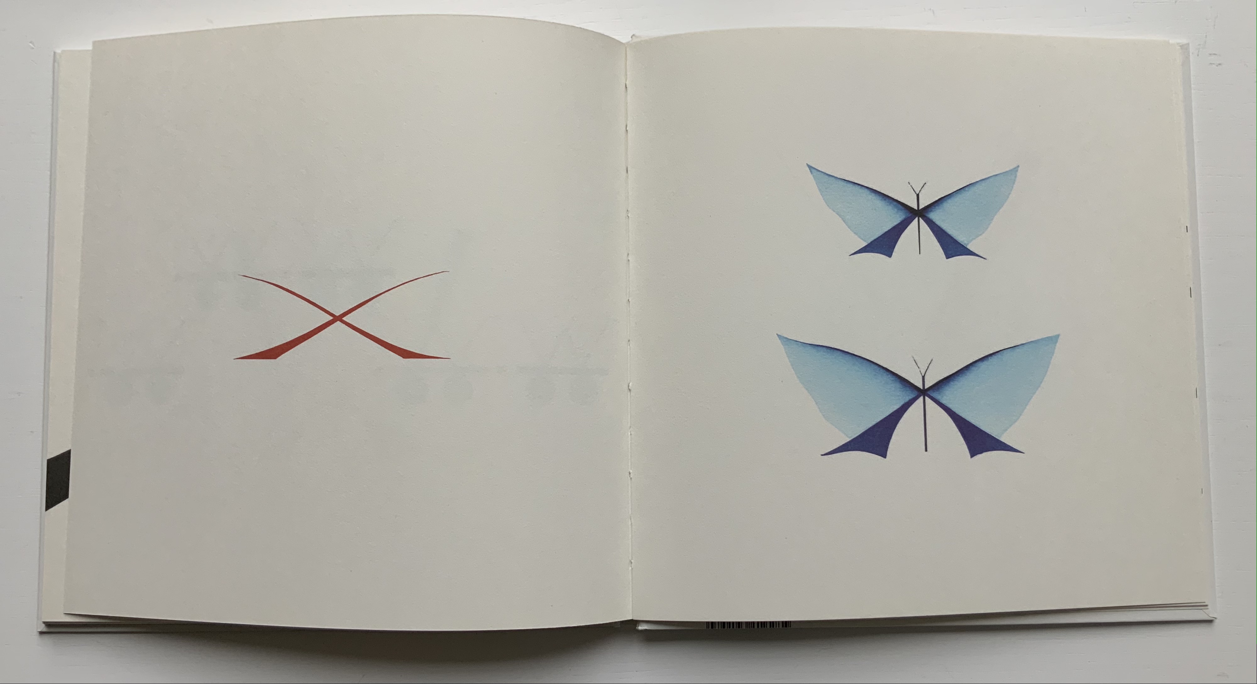
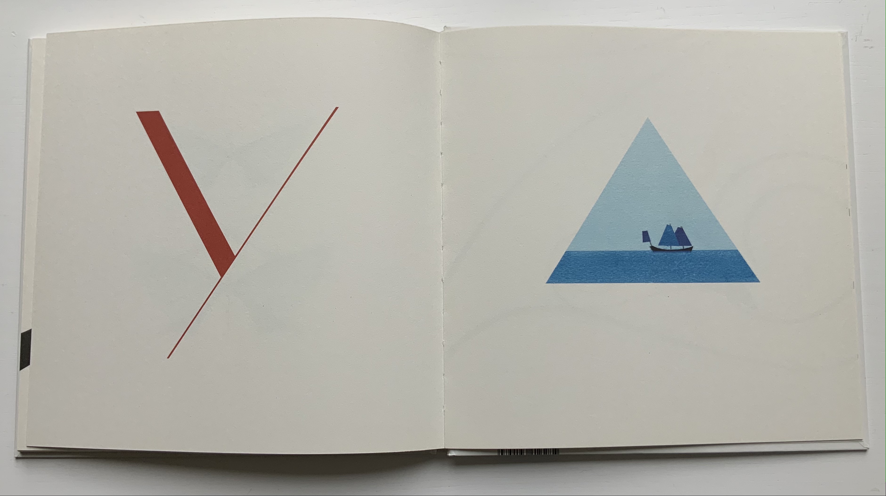
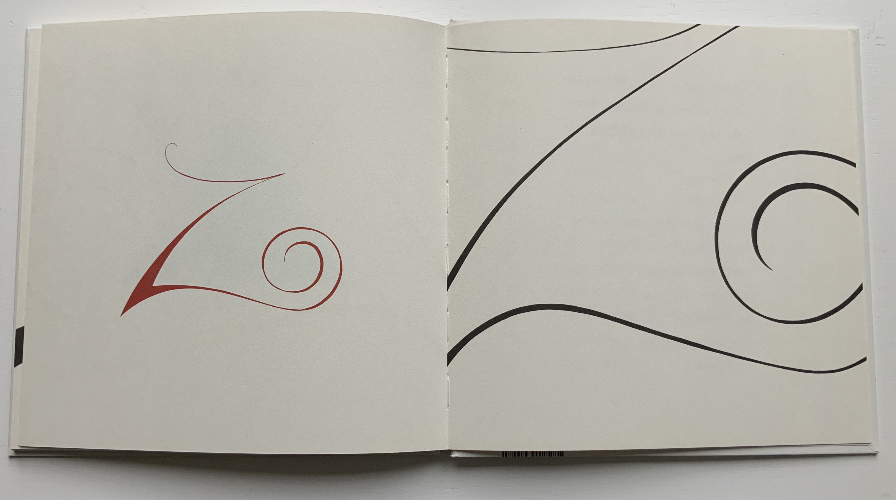
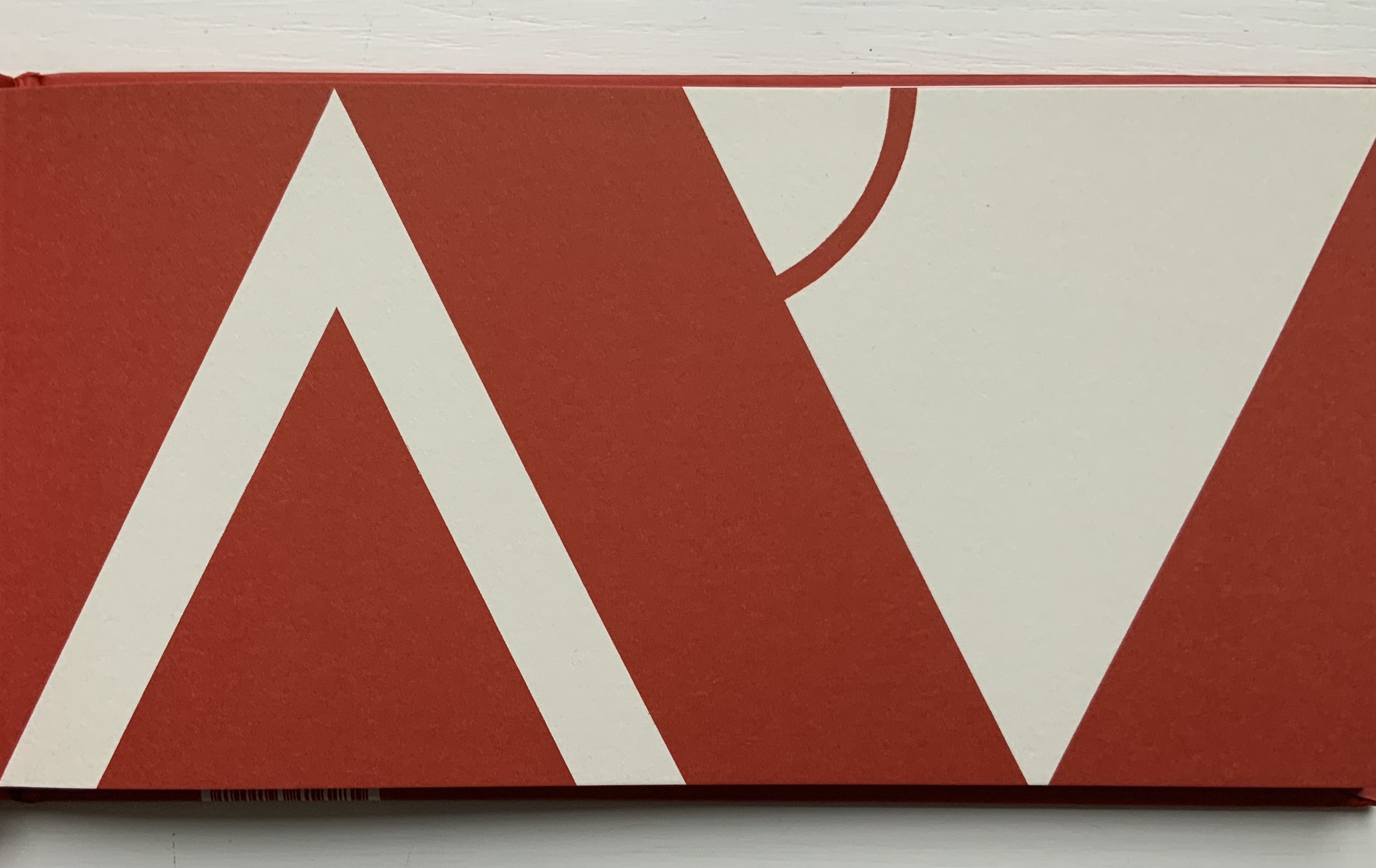
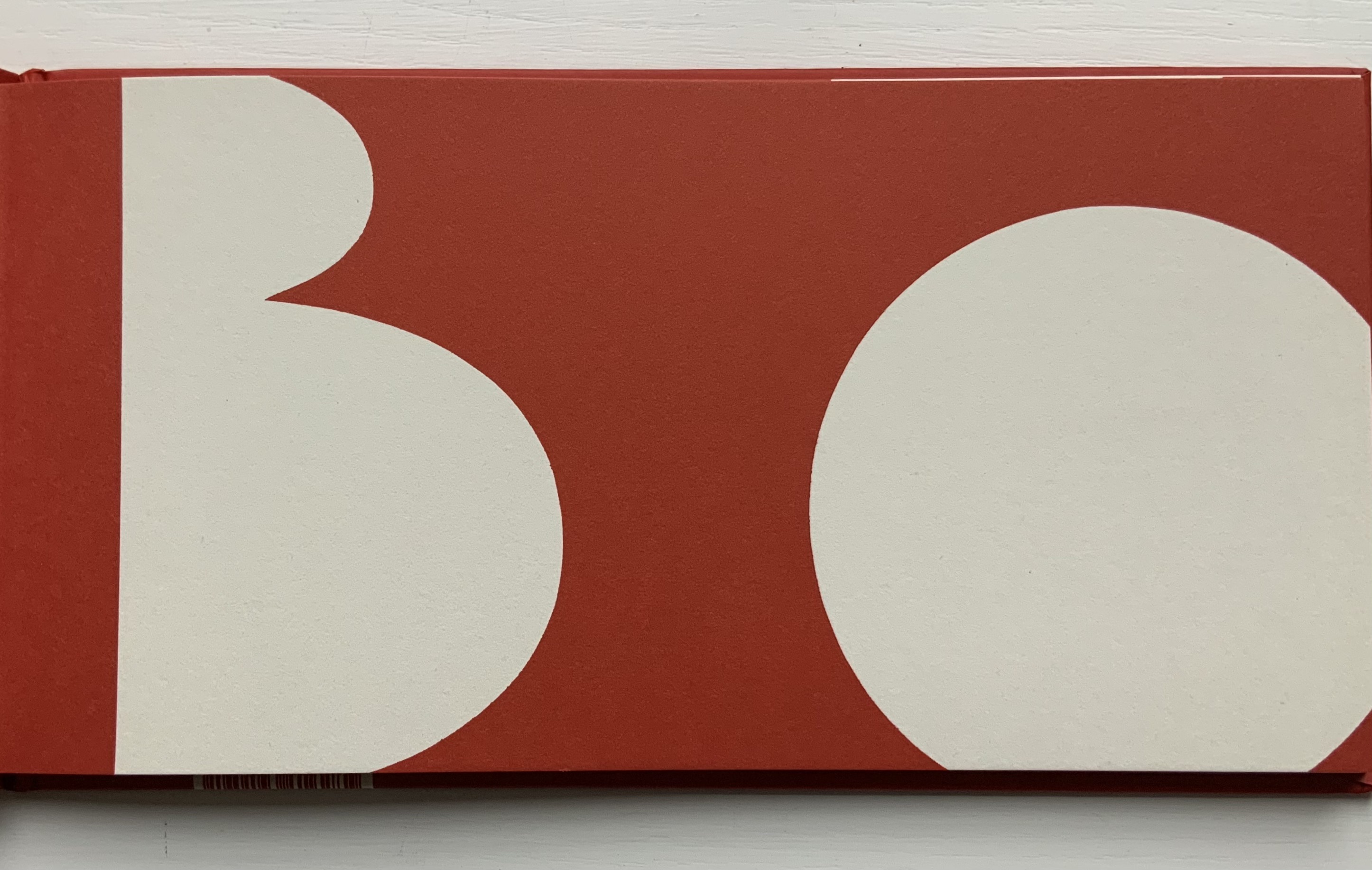
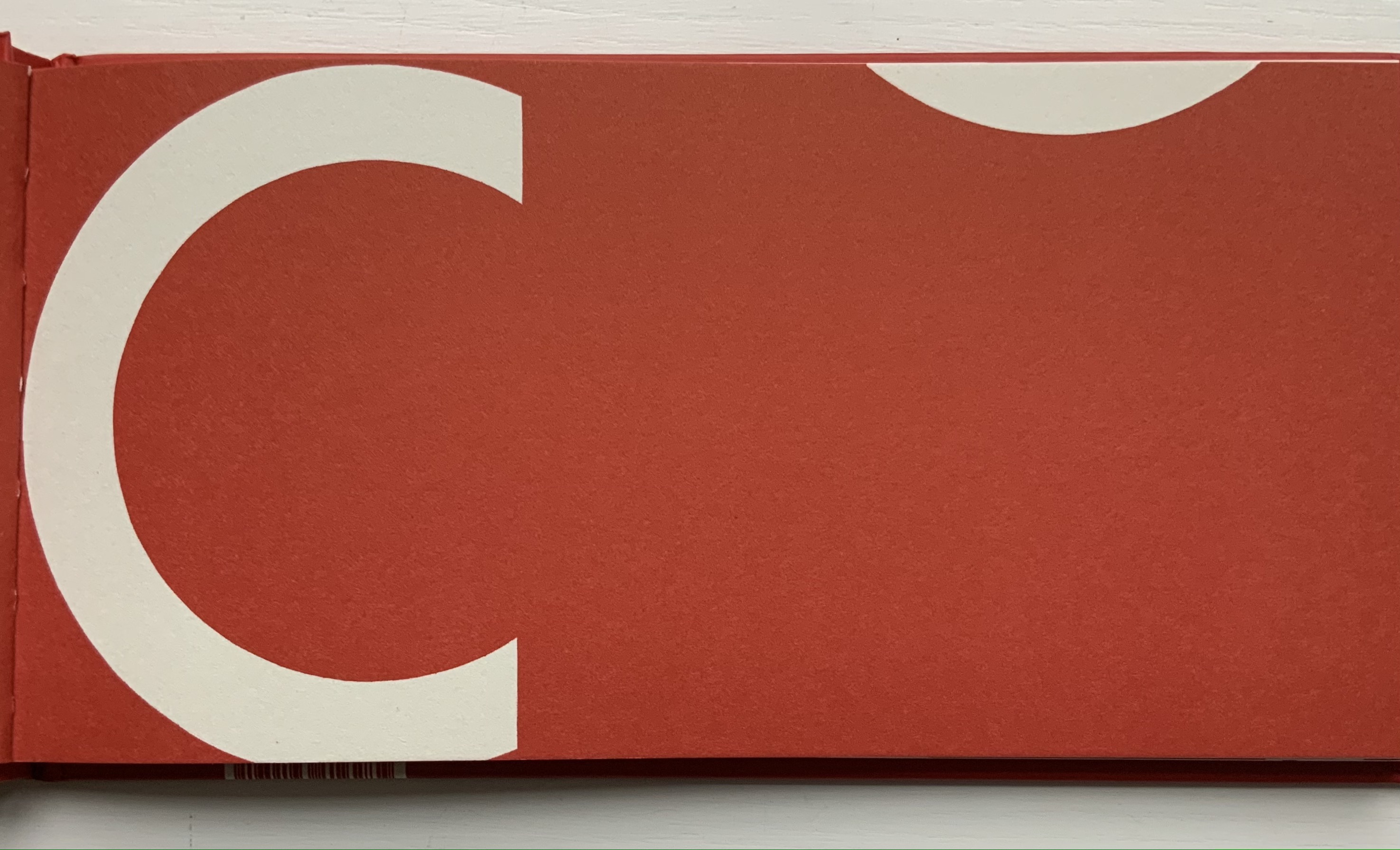
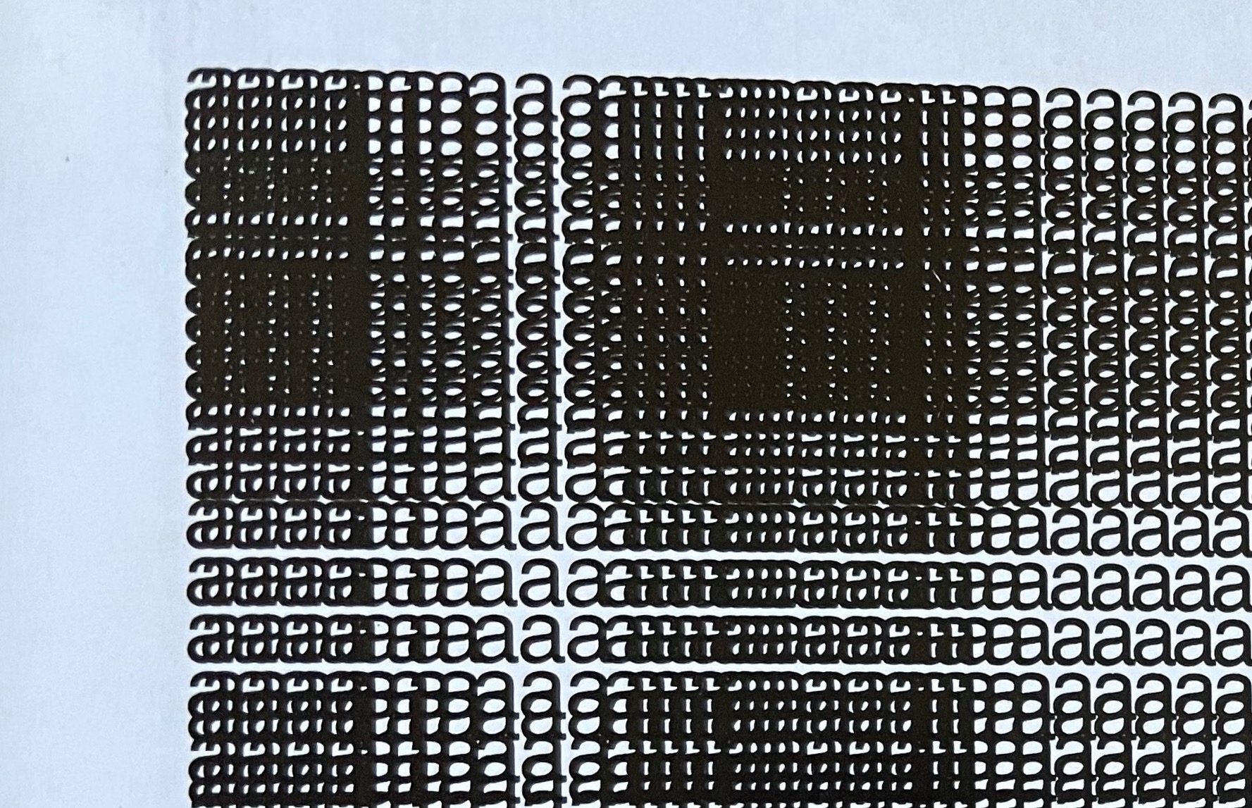
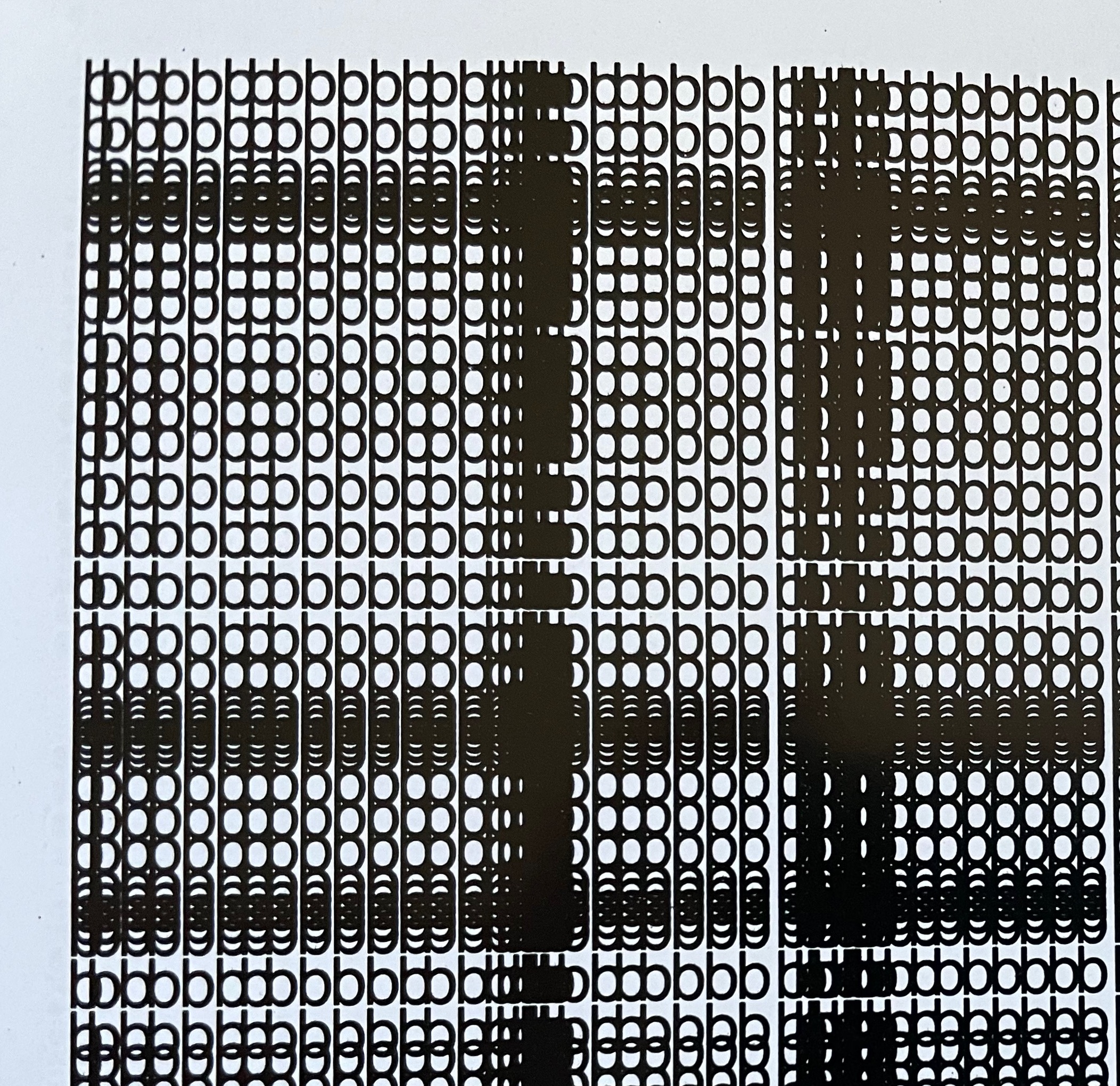
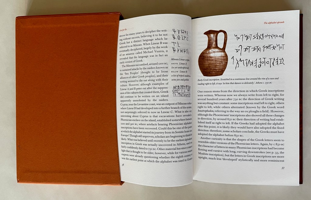
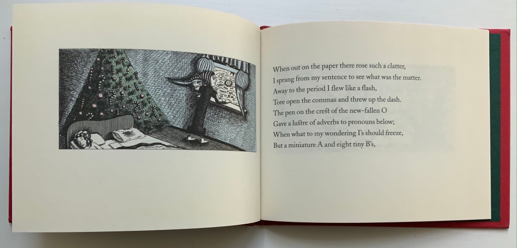
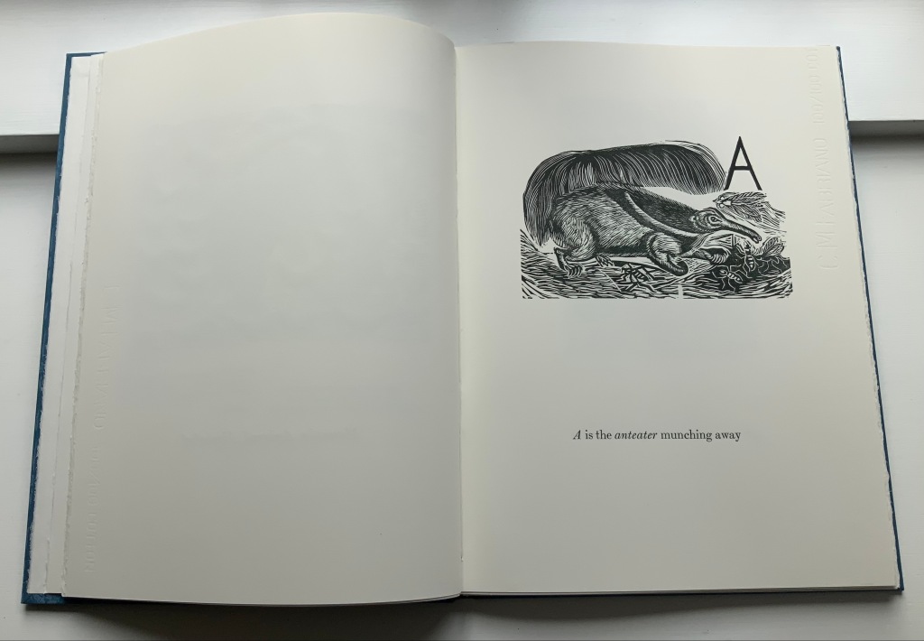
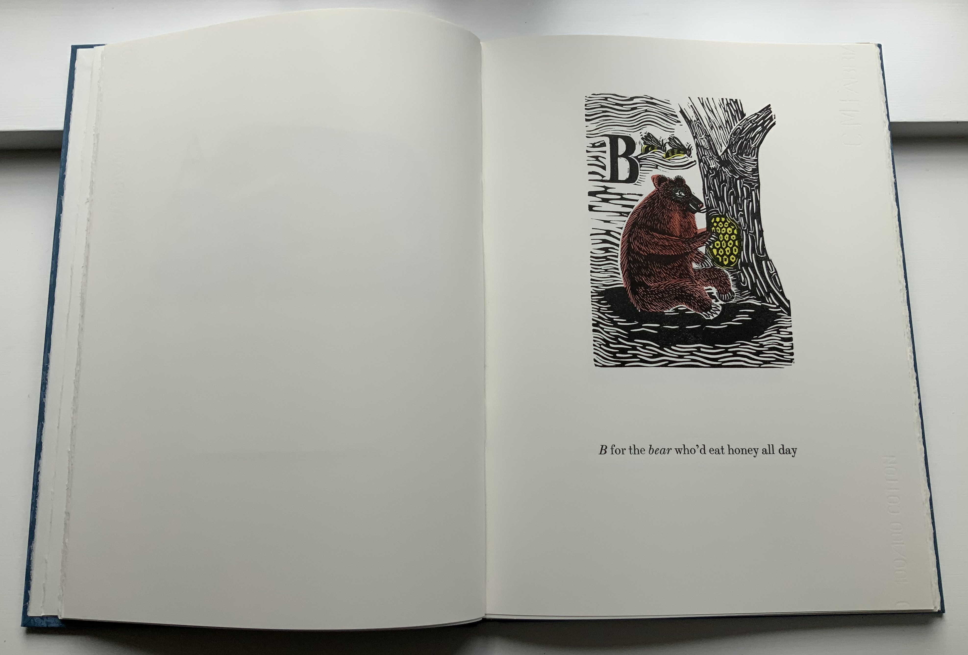
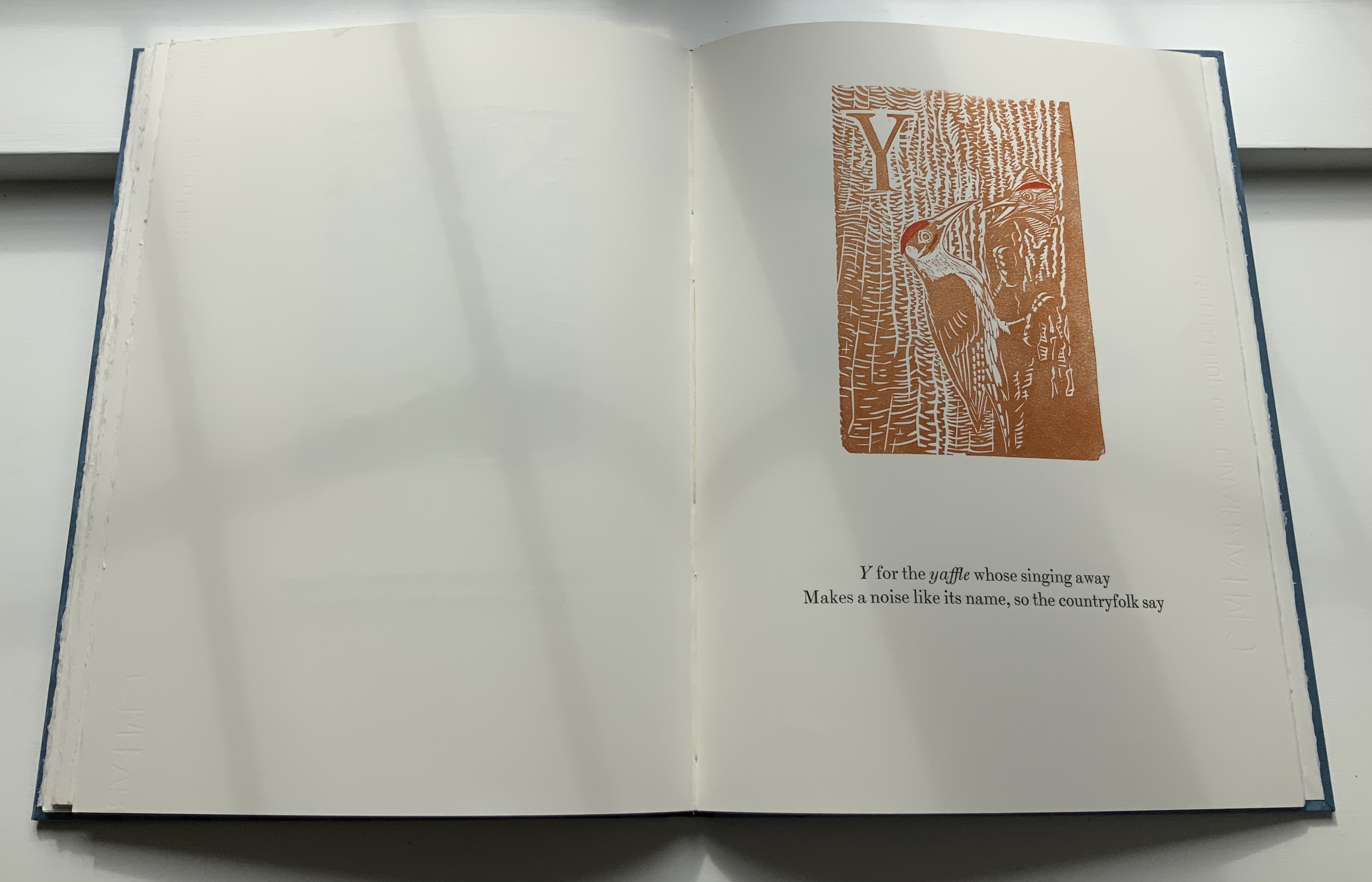
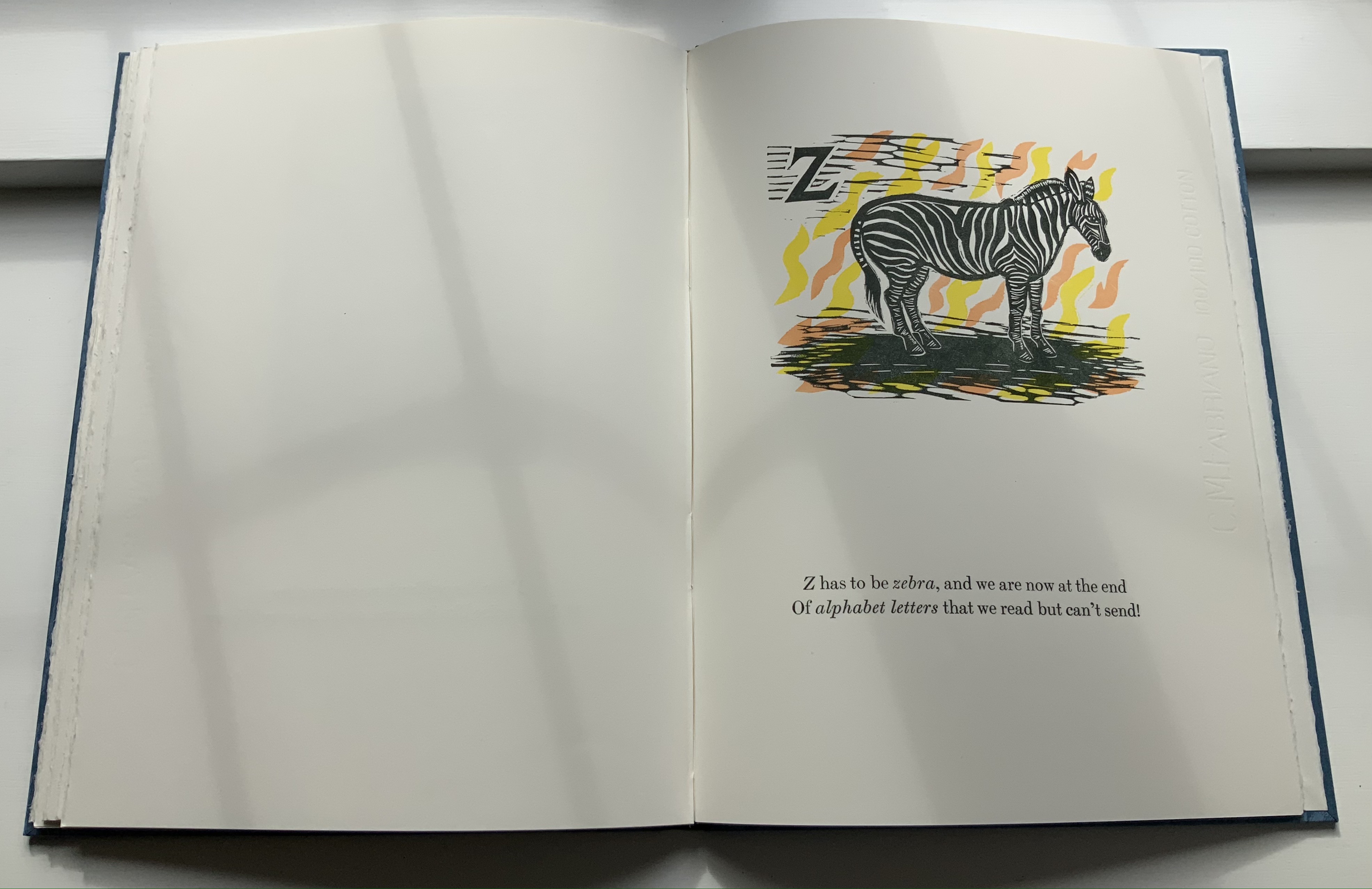
With its overlay of second-color illustrations on the text, Thompson’s book makes for an interesting forerunner to Lyn Davies’ fine press A is for Ox. Thompson falls prey to instances of illegibility from the technique, but both enjoy instances of brilliant juxtaposition of word and redrawn images.

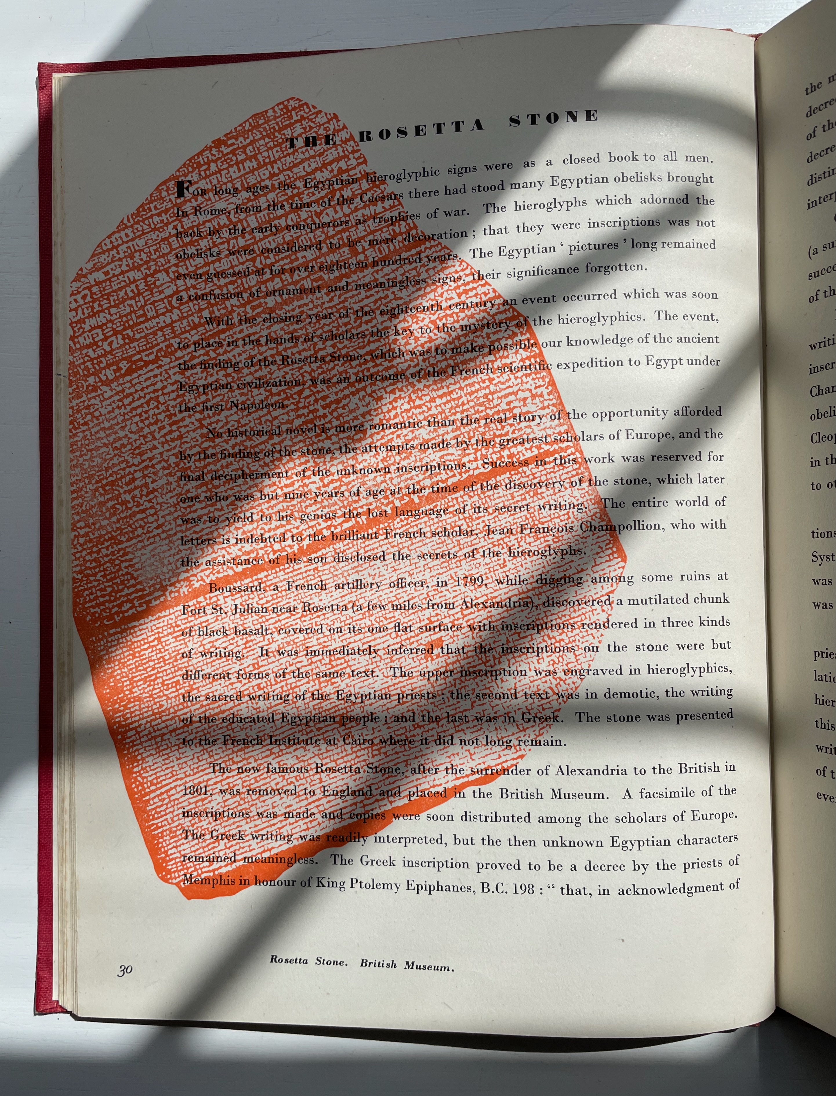
Two-color illustration overlaying text. Right: Davies. Left: Thompson.

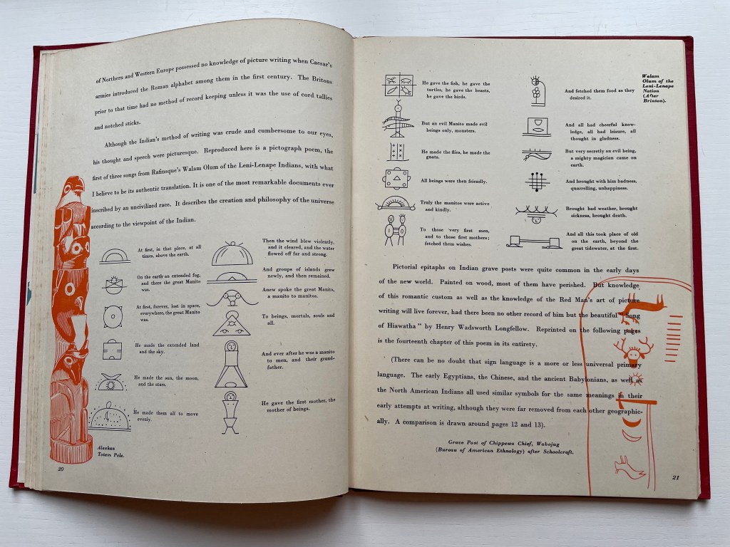
Among the primers of alphabet history, Thompson’s also stands out for the attention it gives to North American Indian pictorial writing. Rather than the usual Eurocentric sources, the Leni-Lenape, Dakota and Sioux Nations provide the bulk of examples of the method. The enlightened perspective, however, is undercut by a strain of cultural and historical supremacy apparent in several passages and, in particular, the perpetuation of the Walum Olum hoax and inclusion of a chapter from Longfellow’s Song of Hiawatha to stand in for the absence of any similar memorialization of painted grave posts. Although Thompson is point blank on how “the invasion of the white man” prevented the growth and development of this method of writing, consider this passage describing the Leni-Lenape Penn Treaty of 1682 that was woven with perforated shell beads (wampum):

The figures of a white man and an Indian are woven in the belt, clasping hands in a true gesture of friendship. The white man is portrayed wearing a hat, as the Indian always drew the symbol of the white man. This treaty of peace was never broken or forgotten.

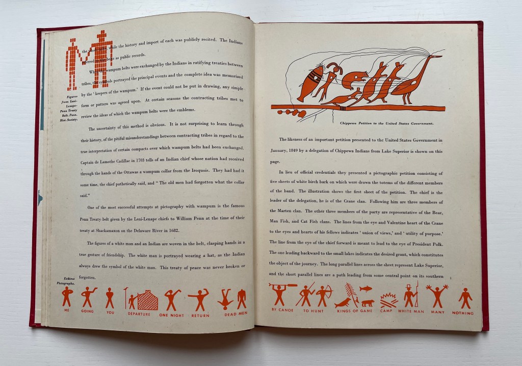
Except that, in the 1860s, most of the Leni-Lenape Nation was forcibly displaced to Oklahoma.

It was not until the 1990s that the so-called Leni-Lenape cosmographical poems of Walum Olum were proven to be fake, but suspicions were strong in the 1930s. All this is compounded as the book laments the ephemerality of the “Walum Olum poems” and the custom of pictorial grave posts:

Pictorial epitaphs on Indian grave posts were quite common in the early days of the new world. But knowledge of this romantic custom as well as the knowledge of the Red Man’s art of picture writing will live forever, had there been no other record of him but the beautiful “Song of Hiawatha” by Henry Wadsworth Longfellow.

Thompson’s design skills and his side note of claim to fame as reportedly the first recipient of royalties for typeface design (Thompson Quill Script) nudged the balance toward acquisition. Maybe perversely the annoying cultural dissonance also nudged the balance in that direction. The book’s presence provides the opportunity to compare it line for line with the other primers and look harder for the signs of the cultural blinkers we are wearing now. Also, with authentic pictorial cosmography available from the Navajo (Diné) Nation and with new archaeological finds from the Middle East (see below for both), perhaps it is time for a new primer against which to compare Thompson and the rest.

Further Reading

Abecedaries I (in progress)“. Books On Books Collection.

Lyn Davies“. 7 August 2022. Books On Books Collection.

Grant, Richard. September 2021. “In the Land of the Ancient Ones“. Smithsonian Magazine. Accessed 20 August 2022.

A review of the film Canyon del Muerto about one of the first female archaeologists, Ann Axtell Morris. What has this to do with Thompson’s book? An ironic coincidence. Morris worked for the archaeologist Sylvanus G. Morley on his Yucatán expedition. Thompson cites Morley in his bibliography. With her husband, fellow archaeologist Earl Morris, and their Navajo team, Ann Morris went on to open the Canyon del Muerto to the discoveries that led to insights into the Ancestral Puebloans, the source of Navajo cosmography. Other than papers coauthored with Earl, Ann’s accounts could only find outlet as juvenile publications. While Sylvanus and Earl may have been the combined inspiration for Indiana Jones, Ann offers the status of artist, first female archaeologist and subject of a current movie as a role model to celebrate with a sidebar in a new history of writing.

Morris, Ann Axtell. 1931. Digging in Yucatan: Archaeological Explorations in 1924. Garden City, NY: Doubleday, Doran & Co.

_______________. 1934. Digging in the Southwest. Garden City, NY: Doubleday, Doran & Co.

Naveh, Joseph. 1975. Origins of the alphabet. London: Cassell.

Oestreicher, David M. 1994. Unmasking the Walum Olum: A 19th-century Hoax. South Orange, N.J.: Archaeological Society of New Jersey.

Ogg, Oscar. 1964. The 26 Letters. New York: T.Y. Crowell.

Robb, Don, and Anne Smith. 2010. Ox, House, Stick: The History of our Alphabet. Watertown, MA: Charlesbridge.

Rossi, Renzo. 2009. The revolution of the alphabet. New York: Marshall Cavendish Benchmark.

Sacks, David. 2003. Language visible unraveling the mystery of the alphabet from A to Z. New York: Broadway Books.

Samoyault, Tiphaine. 1998. Alphabetical Order: How the Alphabet Began. New York: Viking.

Shaw, Gary. 15 April 2021. “Ancient ABCs: The alphabet’s ‘missing link’ discovered in Israel“. The Art Newspaper.

Books On Books Collection – Felice Feliciano

Alphabetum Romanum (c. 1460)

Alphabetum Romanum: The Letterforms of Felice Feliciano
Felice Feliciano (c. 1460)
Jason Dewinetz, drafting/printing (2010) and Mark Cockram, bookbinding (2022)
Boxed and casebound, sewn. Box: 222 x 172 x 30 mm. Book: 202 x 155 mm. 82 pages. Sheets acquired from designer/publisher. Binding acquired from designer book binder.
Photos: Books On Books Collection.

One of the pleasures of collecting alphabet-related works and living close to Oxford University is the opportunity to place new work next to older ones. An added pleasure in this case is seeing a new work made newer by a designer bookbinder.

As the foreword and afterword to this work explain, Jason Dewinetz’s redrawing of Felice Feliciano’s letterforms (c. 1460) was in fact prompted by two 20th century responses to Feliciano’s original: the first being Giovanni Mardersteig’s edition in 1960 at Editiones Officinae Bodoni and the second, also overseen by Mardersteig, being the facsimile edition issued by Jaca Book Codici over 1985-87 and separately by Belser Verlag in 1985. The Bodleian Library has both the Officinae Bodoni and Belser editions. An opportunity too good to miss and one worth sharing.

Left: Dewinetz edition. Center: Feliciano’s original in the Vatican facsimile. Right: Officinae Bodoni edition. Photo: Books On Books.

Dewinetz does not reproduce Feliciano’s commentary. His aim is to focus attention entirely on the letters. Although he has restricted his re-presentation of the letters to the recto page (whereas in Feliciano’s original, the letters after A occupy the verso and recto), he is too clever a designer not to find a way to capture the one instance in which Feliciano’s letter drawing and double-page spread interact entertainingly.

For the opening of Paul F. Gehl’s foreword, Dewinetz captures the dramatic flourish of Feliciano’s Q,
whose tail crosses the double-page spread in his original. See below. Photos: Books On Books.

From the Vatican facsimile, Feliciano’s double-page spread with Q and S. Photo: Books On Books.

What happened to the letter R? Feliciano must have felt the need to give it its own double-page spread to show off a variation in coloring and tails. Like Mardersteig, Dewinetz gives the Rs each their own page. Unlike Mardersteig (and Feliciano), he places the Rs in correct alphabetical order.

Feliciano’s letter Rs from the Vatican facsimile. Photo: Books On Books.

Dewinetz’s re-drawing Q,R,R,S. Photo: Books On Books Collection.

Mardersteig follows Feliciano’s disrupted alphabetical order, but for Q and S to keep to a design that places each letter on a recto page facing a schematic drawing on the verso, Mardersteig has to forego the center-crossing tail of the Q and place S on a separate insert leaf.

Mardersteig’s QSRR sequence in the Ediciones Officinae Bodoni edition. Photo: Books On Books.

As a designer bookbinder, Mark Cockram has a deft eye and touch as he looks for and executes the designs inspired by the text. He could not resist Dewinetz’s cropped Q from the foreword by Paul F. Gehl. Taking his Q (as it were) however from the Goudy display font, he gives it a deserved prominence, stamped in black, on the double-trayed box’s spine. The choice of a different font reminds me of Eric Gill’s quip: “letter designing is still an occupation worthy of the enthusiasm of rational beings, and, though a Q which were all queue & no Q would be ‘past a joke’, it is difficult to say exactly where a tail should end”.

Left photo: Courtesy of Mark Cockram. Right photo: Books On Books Collection.

Apparently it was a tail of which Cockram could not let go. Further echoing Dewinetz’s cropping, truncated letter forms peek through the Palimpsest Parchment with which the book itself is bound (flat back). They are laserprinted on hand colored papers, colors inspired by those used in the book. Cockram also echoes the book’s color “ghosting” on the box by layering blank strips of hand colored papers beneath the cloth during the making process. The color-echoes between box and book continue with the box’s interior.

Photos: Books On Books Collection.

The handsome bindings of the Vatican facsimile and Mardersteig edition have stood up to their library existence. In muted tones and gilt, they speak to the design esthetics of a different era.

Vatican facsimile binding

Officinae Bodoni edition binding

When the Dewinetz/Cockram edition joins the Vatican facsimile and Officinae Bodoni edition at the Bodleian, students of lettering, type design, bookmaking and bookbinding and their history will have a feast of an opportunity to compare and contrast.

Further Reading

Abecedaries I (in progress)“. Books On Books Collection.

Gill, Eric. 1931. An essay on typography. London: Sheed & Ward.

Feliciano, Felice, & Mardersteig, Giovanni. 1985. Alphabetum romanum: Vat. Lat. 6852 : Aus der Bibliotheca Apostolica Vaticana (Codices e Vaticanis selecti ; v. 70). Zürich: Belser Verlag.

Feliciano, Felice, Mardersteig, G., & Ferrari, O. 1960. Alphabetum Romanum (Ital. ed.] ed., Biblioteca apostolica vaticana. Mss. (Cod. Vat. 6852)). Verona: Officinae Bodoni.

Books On Books Collection – Suse MacDonald

Alphabatics (1986)

Alphabatics (1986)
Suse MacDonald
Paper on board, casebound sewn. H236 x 285 mm, 56 pages. Acquired from Book Depository, 10 September 2021.
Photos: Books On Books Collection.

While Suse MacDonald’s Alphabatics can find its ancestor in Bruno Munari’s ABC Con Fantasia (1960), it also finds some clever descendants in Nicolas McDowall’s A Bodoni Charade (1995), David Pelletier’s The Graphic Alphabet (1996) and Anne Bertier’s Construis-moi une lettre (2008).

As the letters are put through their acrobatic paces in three to four steps on the verso page to become the image on the right, the book gently pushes the left-to-right reading direction. Mahmoud Tammam has created animals composed of their names in Arabic script. It would be interesting to see a right-to-left Arabic version (Alefbatics?) of Alphabatics.

Further Reading

Abecedaries I (in progress)“. Books On Books Collection.

Anne Bertier“. 10 August 2022. Books On Books Collection.

Lisa Campbell Ernst“. 12 December 2022. Books On Books Collection.

Nicolas McDowall“. 12 December 2022. Books On Books Collection.

Bruno Munari“. 19 August 2021. Books On Books Collection.

Dave Pelletier“. 10 August 2022. Books On Books Collection.

Laura Vaccaro Seeger“. 12 December 2022. Books On Books Collection.

Books On Books Collection – David Pelletier

The Graphic Alphabet (1996)

The Graphic Alphabet (1996)
David Pelletier
Paper on board, embossed with the letter A, casebound, sewn and glued. H255 x W250 mm, 32 pages. Acquired from Amazon, 24 August 2021.
Photos of the work: Books On Books Collection.

David Pelletier’s 1996 Caldecott Honor Book follows in the footsteps (the tumbles?) of Suse MacDonald’s Alphabatics (1986) another Caldecott Honor Book. The difference between them is a fine one depending in part on the reader’s age — or the collector’s eye. Both push the reader’s visual imagination. Both provide the words to be associated with the letter and image. MacDonald has shapes and images that turn into letters, where Pelletier has letters than turn into images (A), images whose shapes hint at letters and enact words (B and Y), letters found in images (W and X) and letters made from shapes on the page and the enacted word (Z). In a sense, Pelletier keeps the reader jumping more than does MacDonald. He crisscrosses several of the subgenres of alphabet books: wordplay and visual puns, hidden letters, conceptualism and abstraction.

One can see an affinity with Claire Van Vliet’s Tumbling Blocks for Pris and Bruce (1996) and Scott McCarney’s AlphaBooks (1981-2015), which underscores the cross-currents of alphabet books and artists’ books.

Further Reading

Abecedaries I (in progress)“. Books On Books Collection.

Anne Bertier“. 10 August 2022. Books On Books Collection.

Robert Cottingham“. 30 November 2021. Books On Books Collection. Found letters.

Lisa Campbell Ernst“. 12 December 2022. Books On Books Collection.

Stephen Johnson“. 30 November 2021. Books On Books Collection. Found letters.

Scott McCarney” 26 February 2020. Books On Books Collection. Artist’s books.

Nicolas McDowall“. 12 December 2022. Books On Books Collection.

Bruno Munari“. 19 August 2021. Books On Books Collection.

Dave Pelletier“. 10 August 2022. Books On Books Collection.

Laura Vaccaro Seeger“. 12 December 2022. Books On Books Collection.

Claire Van Vliet“. 3 July 2022. Books On Books Collection. Artist’s book.

Books On Books Collection – Anne Bertier

Dessine-moi une lettre (2004)

Dessine-moi une lettre (2004)
Anne Bertier
Casebound, sewn. H258 x W258 mm, 56 pages. Acquired from Amazon, 17 August 2021.
Photos of the work: Books On Books Collection.

Anne Bertier’s three alphabet books cross sub-genres of the ABCs with distinctive style and educational challenge. While the answers to the visual puzzles are offered at the end of the first and last books, considerable pleasure is missed by giving up too quickly. For the English speaker learning French, there’s the added pleasure of cementing a familiar word with Bertier’s images and discovering a new word that will also stick because of them.

Rêve-moi une lettre (2005)

Rêve-moi une lettre (2005)
Anne Bertier
Casebound, sewn. H135 x W132 mm, 52 pages. Acquired from Amazon, 30 August 2021.
Photos of the work: Books On Books Collection.

Here is the French version of the alliterative alphabet. Its opening with Alice suggests an underlying literary motif, but more likely at play is the association of the book’s title (“dream me a letter”) with Alice’s dreaming of Wonderland.

Construis-moi une lettre (2008)

Construis-moi une lettre (2008)
Anne Bertier
Casebound, sewn. H135 x W256 mm, 56 pages. Acquired from Amazon, 17 August 2021.
Photos of the work: Books On Books Collection.

The English alphabet’s “go to” for the letter A does not work for the French pomme, but from the similarity between the image here and that in Dessine-moi un lettre, there seems to be one, too, for the French alphabet. With the cognate word in French and English, the letter B is too easy. But C is for ?

With the overlap between design, art and children’s education, Bertier’s numerous large-scale exhibitions in China, Italy, Japan, Korea as well as France come as no surprise. Think of Dik Bruna, Eleonora Cumer, Katsumi Komagata or Bruno Munari.

Further Reading

Abecedaries I (in progress)“. Books On Books Collection.

Eleonora Cumer”. 6 September 2019. Books On Books Collection.

Lisa Campbell Ernst“. 12 December 2022. Books On Books Collection.

Katsumi Komagata“. 22 March 2020. Books On Books Collection.

Suse MacDonald“. 10 August 2022. Books On Books Collection

Nicolas McDowall“. 12 December 2022. Books On Books Collection.

Bruno Munari“. 19 August 2021. Books On Books Collection.

Dave Pelletier“. 10 August 2022. Books On Books Collection.

Books On Books Collection – Martín Gubbins

Alfabeto (2017)

Alfabeto (2017)
Martín Gubbins
Hardback. 180 x 180 mm. 60 pages. Acquired from Naranja Publicaciones, 28 July 2022.
Photos: Books On Books Collection.

Each letter of the Spanish alphabet is printed in sans serif across a full page to create a grid-like or plaid-like pattern. All letters are printed once in black on white paper and twice in white on black paper; with sheets facing one another. For the English-speaking reader, that’s a bonus of two pages for the ñ.

Held at normal reading length, the double-page spreads do have a plaid effect, but inspected closely, the effect becomes that of wire mesh from which the letters leap out from the less tightly woven spots.

Unsurprisingly the plaids are as distinct from, and similar to, one another as letter shapes are. Sometimes, as with the letter b, an illusion of three dimensionality takes hold.

The most surprising — though they should not be — are the letters i and l. With no crossbar, bowl or curve, they cannot create a plaid pattern. Rather, their black on white, white on black patterns look like barcodes.

Gubbins One of the founding members of the Foro de Escritores (www.fde.cl) Chilean version of Bob Cobbing’s Writers Forum in London, and noted figure in the avant-garde poetry scene in Latin America. Gubbins has collaborated with the American poet and artist John M. Bennett, in whose honor

Some visual artists call this kind of work a “tapuscript“. Some throw it together under the heading of language art or concrete or visual poetry. Karl Kempton prefers the term “visual text art” over any other. Conceding the term to cover the broad genre, works like Alfabeto that cover the entire alphabet in sequence — or even play with its sequence — might deserve the sub generic term “visual alphabet art”. Kempton himself, Roberto de Vicq de Cumptich, Raffaella della Olga, Sharon Werner & Sharon Forss — as well as many of the artists in Victoria Bean and Chris McCabe’s anthology and those in Philip Davenport’s — surely provide a sufficient number of examples.

Further Reading

Bean, Victoria, and Chris McCabe. 2016. The new concrete: visual poetry in the 21st century. London: Hayward Publishing.

Davenport, Philip. 2013. The dark would: anthology of language art. Manchester-Berlin: Apple Pie Editions.

Kempton, Karl. 2018. A History of Visual Text Art. Manchester-Berlin: Apple Pie Editions. Accessed 15 December 2020.

Olga, Raffaella della“. Books On Books Collection. For “tapuscript”.

Books On Books Collection – Anushka Ravishankar & Christiane Pieper

Alphabets are Amazing Animals (2003)

Alphabets are Amazing Animals (2003)
Anushka Ravishankar (text) & Christiane Pieper (illustrations)
Casebound, paper on board. 220 x 220 mm. 56 pages unnumbered. Acquired from Sauliusst, 9 July 2021.
Photos: Books On Books Collection. With permission of the publisher: Photographs of the book titled Alphabets Are Amazing Animals by Anushka Ravishankar and Christiane Pieper. Copyright © Tara Books Pvt Ltd, Chennai, India. tarabooks.com

Alliterative alphabet books and animal alphabet books both have long and geographically wide traditions. In 1820, the London publisher J. Harris and Son at the corner of St. Paul’s Church-Yard published Peter Piper’s practical principles of plain and perfect pronunciation : to which is added, a collection of moral and entertaining conundrums. In 1840, the Turin publisher Alessandro Fontana published Piccolo alfabeto di storia naturale pei fanciulli.

And likewise — together — alliterative animal alphabet books (and even a few alliterative animal artists’ books) crowd the field, for example, Graeme Base’s Animalia (1986), Kay Vincent’s Animal Alphabet (2015) and Michael Kuch’s An Alliterative Abecedarium of Anthropomorphic Animals (2011).

Making a lasting contribution to those traditions must be as difficult for children’s book artists and authors as blowing big blue bubbles is for baby buffaloes.

Further Reading

Abecedaries I (in progress)“. Books On Books Collection.

Webb, Poul. 2017-“Alphabet Books — Parts 1-8” on Art & Artists. Google has designated this site “A Blog of Note”, well deserved for its historical breadth in examples, clarity of images and insight.

Books On Books Collection – Lyn Davies

A is for Ox (2006)

A is for Ox: A Short History of the Alphabet (2006)
Lyn Davies
Casebound, doublures matching slipcase. Slipcase: H205 x W133 mm. Book: H197 x W128 mm. 128 pages. Acquired from The Old Bakehouse, 13 July 2021.
Photos: Books On Books Collection.

There are numerous histories of the alphabet. Some are even titled the same as Lyn Davies’ A is for Ox. Several books take the letter-by-letter approach that Davies does in the second half of his book. Only one of them falls in the category of fine press book or artist’s book, and that is Richard J. Hoffman’s miniature production of the bookseller Otto Ege’s text. Benefitting from the advice of Stephen Fischer and the infrastructure of The Folio Society, Davies has secured more of a place for A is for Ox than that distinction.

One distinction is the handling of two colors across the design of the book. Davies knows book design. The burnt umber or terra cotta color is used to great effect. Chapter subtitles, section heads and running heads stand out but do not overbear. In the second half of the book, the color turns each letter of the alphabet in its section into a subdued illuminated letter. Another distinction follows on from this: the handling of images in the first half of the book. By printing in black and white the full inscriptions on stone, clay and pottery depicted in photographs, Davies enhances the experience of those images, and somehow the tinting of the images makes it easier to match the markings with the print.

Despite its brevity, A is for Ox conveys just as much as many lengthier works. Somehow with Davies in ten pages it is easier to “peg” waw as the antecedent sound for the letters F, U, V, W and Y than it is in the lengthier works. In its “A is for …” organization of its second half, the book injects some lightness without descending into silliness, leaving the latter to the children’s books and some of the comedy-prone trade books.

The Ottakar’s 2004 and Folio Society 2006 editions are out of print, which is a shame for ordering in bulk for short courses on the history of the alphabet and writing. Fortunately both are available at more-than-reasonable prices on the used book market.

Further Reading

Abecedaries I (in progress)“. Books On Books Collection.

Clodd, Edward. 1913. The Story of the Alphabet. London: Hodder and Stoughton. 1913. Superseded by several later works, but is freely available online with line illustrations and some black and white photos.

Diringer, David, and Reinhold Regensburger. 1968. The alphabet: a key to the history of mankind. London: Hutchinson. A standard, beginning to be challenged by late 20th and early 21st century archaeological findings and palaeographical studies.

Drucker, Johanna. 1999. The alphabetic labyrinth: the letters in history and imagination. New York, N.Y.: Thames and Hudson.

Ege, Otto. 1921/1998. The Story of the Alphabet, Its Evolution and Development… Embellished Typographically with Printer’s Flowers Arranged by Richard J. Hoffman. Van Nuys, CA: Richard J. Hoffman. A miniature. The type ornaments chosen by Hoffman are arranged chronologically by designer (Garamond, Granjon, Rogers) and printed in color.

Firmage, Richard A. 2001. The alphabet. London: Bloomsbury.

Fischer, Steven Roger. 2008. A history of writing. London: Reaktion Books.

Goldman, David. 1994. A is for ox: the story of the alphabet. New York: Silver Moon Press. Children’s book.

Jackson, Donald. 1997. The story of writing. Monmouth, England: Calligraphy Centre.

Pflughaupt, Laurent. 2008. Letter by letter: an alphabetical miscellany. New York: Princeton Architectural Press.

Robb, Don, and Anne Smith. 2010. Ox, house, stick: the history of our alphabet. Watertown, MA: Charlesbridge. Children’s book.

Robinson, Andrew. 1995. The story of writing. London: Thames and Hudson.

Rosen, Michael. 2014. Alphabetical: how every letter tells a story. London: John Murray.

Sacks, David. 2003. Language visible unraveling the mystery of the alphabet from A to Z. New York: Broadway Books.

Samoyault, Tiphaine. 1996, 1998 trans. Alphabetical order: how the alphabet began. New York: Viking. Children’s book.

Thompson, Tommy. 1952. The ABC of our alphabet. London: Studio Publications. Not a fine press publication, but its layout, illustrations and use of two colors bear comparison with the Davies book. It too is out of print and unfortunately more rare.

Books On Books Collection – Dave Morice

A Visit from St. Alphabet (2005)

A Visit from St. Alphabet (2005)
Dave Morice
Casebound, H130 x 170 mm. 24 pages unnumbered. Acquired from The Book Depository, 27 August 2021.
Photos of the work: Books On Books Collection. Displayed with permission of the publisher Coffee House Press.

In the Books On Books Collection, Dave Morice’s spoof of Clement Moore’s 1822 A Visit from St Nicholas (better known as ‘Twas the night before Christmas) serves several purposes.

First of all, in a collection that has alphabet books and alphabet-related artists’ books as one of its focal points, work by the artist also known as Dr. Alphabet must be included.

Second, Morice is like the definition of book art: he shifts about. He has been the perpetrator of the Joyce Holland literary hoax. Minimalist poet and performance artist Joyce Holland became the publisher of the Matchbook series — one-word poems on one-inch squares of paper bound in matchbook covers — and became famous enough to appear on the Tom Snyder Tomorrow show (Morice and his girlfriend P.J Casteel stood in). With his poetry performance pieces written on scrolls that were stretched the length of a football field and created during half-time, he rivaled Christo and Jean Claude. As publisher of 17 issues of Poetry Comics, he could be said to be the inventor of the comic artist’s book.

Third, Morice’s alphabet book (artist’s book?) demonstrates by letter, wordplay, narrative and image the nature of the alphabet and its elemental inspiration for artists of the book.

Fourth, Morice’s book first appeared in 1980 as a limited letterpress sewn pamphlet published by Allan and Cinda Kornblum’s Toothpaste Press. In the late 1960s, they had studied typography and printing under Harry Duncan at the University of Iowa, then set up their publishing house in 1970. Poetry dominated the list, with output from Robert Bly, Robert Creeley, Anselm Hollo, Antonio Machado (translated by Bly), Alice Notley, Carl Rakowski and Anne Waldman. This edition comes from Coffee House Press, founded in 1984 as the nonprofit successor to Toothpaste Press. Although no longer a product of letterpress printing but in a nod toward its predecessor, the book boasts case binding with red cloth over board and dark green textured pastedowns and endleaves (doublures). And this at a time when the doom of the printed book was being regularly forecast. This hints, at least, at the proposition celebrated by the collection that book art forecasts the history of the book.

Fifth and finally, as of publication of this entry, there are only 140 shopping days for book art until Christmas.

Matchbook Poems (2020)

Matchbook Poems (2020)
David Morice
Perfect bound paperback. H203 x W127 mm. 120 pages. Acquired 5 August 2022.
Photos: Books On Books Collection.

An anthology published by Richard Kostelanetz’s Archae Editions, Matchbook Poems may have become a rare book due to a contretemps with Amazon. So the corporate on-demand publishing machine undermines an effort to celebrate one of many quirky non-traditionalist efforts of mail art and book art? On demand but rare. It is an irony at which the comic mind of Dr. Alphabet is more likely bemused than outraged.

A set of the original issues of the one-word poetry magazine reside in the University of Iowa’s special collections, and individual copies are held at Harvard and Yale. Single issues become available from time to time. It’s archaelogically satisfying to think those originals and this copy of Matchbook Poems will outlast Amazon.

Images from Between the Covers and Artists’ Books and Multiples

Further Reading

Abecedaries I (in progress)“. Books On Books Collection.

Kirch, Claire. 23 November 2014. “Coffee House Founding Publisher Allan Kornblum Dies“. Publisher’s Weekly.

Morice, Dave. 1982. Poetry comics!: a cartooniverse of poems. New York: Simon and Schuster.

Morice, Dave. 1995. The adventures of Dr. Alphabet: 104 unusual ways to write poetry in the classroom and the community. New York: Teachers & Writers Collaborative.

Peterson, Mary. 1982. “Toothpaste Press“. The North American Review267(4), 70–72.

Books On Books Collection – Enid Marx (I)

Marco’s Animal Alphabet (2000)

Marco’s Animal Alphabet (2000)
Enid Marx
Color scheme and pochoir by Peter Allen (École de l’Image, Epinal)
Case bound, leather spine and patterned papers on board, Fabriano doublures, 64 pages. Portfolio edition of 15, of which this is #2. Acquired from Forum Auctions, 16 December 2021.
Photos: Books On Books Collection.

Marco’s running verse is set in 24pt Scotch types, roman and italic. The rest of the book uses Bodoni, including the variations on the title page. The paper is 200 gsm Fabriano Artistico, 100% cotton fibres and acid-free. The patterned paper of the binding has been reconstructed for this book from a small sample. Enid Marx designed the original, and it was sold through The Little Gallery in London during the 1930s. Enid Marx was keen to have this book published for her great great nieces and nephews. A further 160 copies have been made for sale. Fifteen of these have an additional portfolio of black prints and were bound by Stephen Conway. Printing was completed in September 2000. This is copy number 2. –Colophon.

For the reader not in the know, the introduction by Graham Moss (Incline Press) explains that “Marco” was the nickname assigned to Enid Marx during her studies at the Royal College of Art, but more than that, Moss provides a warm sense of collaborating with Enid Marx (for example, A Bonnet Full of Nursery Rhymes) in life. Although this is a posthumous edition of this alphabet, Moss had the advantage of an earlier false start on it with Marx and of her insights on the idea of applying pochoir to this first formal edition (ultimately provided by Peter Allen).

It is a toss-up for which is the greater pleasure: the lines and shapes in Marco’s linocuts or the design and production by Graham Moss. Which confirms his conclusion that the posthumous collaboration is “a happy and successful one”.

Further Reading

Abecedaries I (in progress)“. Books On Books Collection.

Fisher, Jennie. 14 October 2020. “Enid Marx: A Design Legacy“. Pallant House Gallery. Accessed 1 August 2022.

Marx, Enid, and Douglas Cleverdon. 1985. An ABC of birds & beasts. London: Douglas Cleverdon. (As a collector, Cleverdon was an important bridge between calligraphy and typographic design artists. See also Eric Gill’s A book of alphabets for Douglas Cleverdon drawn by Eric Gill. 1987.)

Marx, Enid. 1997. Some birds and beasts and their feasts: an alphabet of wood engravings made by Enid Marx. Oldham: Incline Press.

Powers, Alan. 18 July 2018. “Why the textile designer Enid Marx matters today“. Crafts Council. First appeared in Crafts magazine. Accessed 1 August 2022.