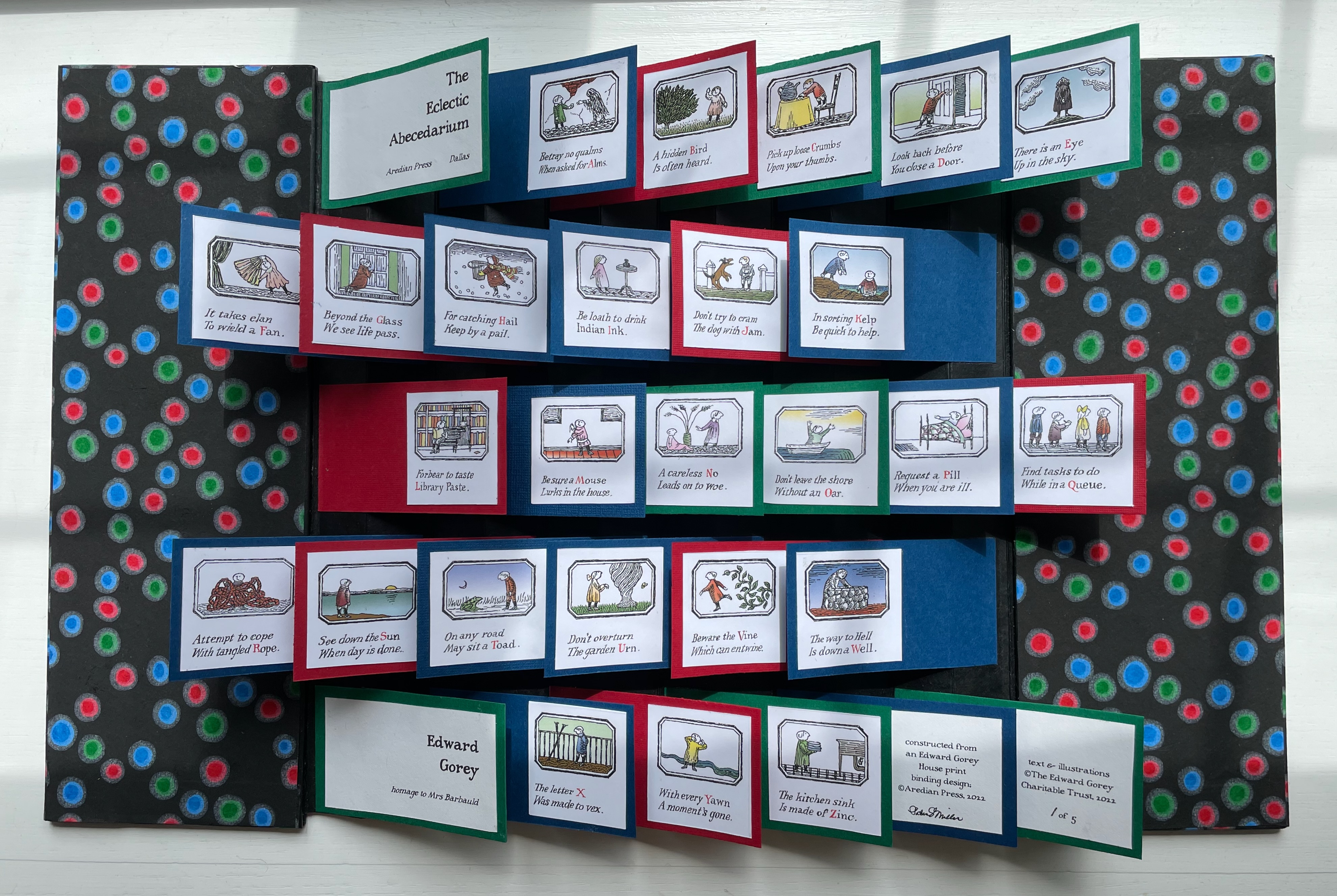
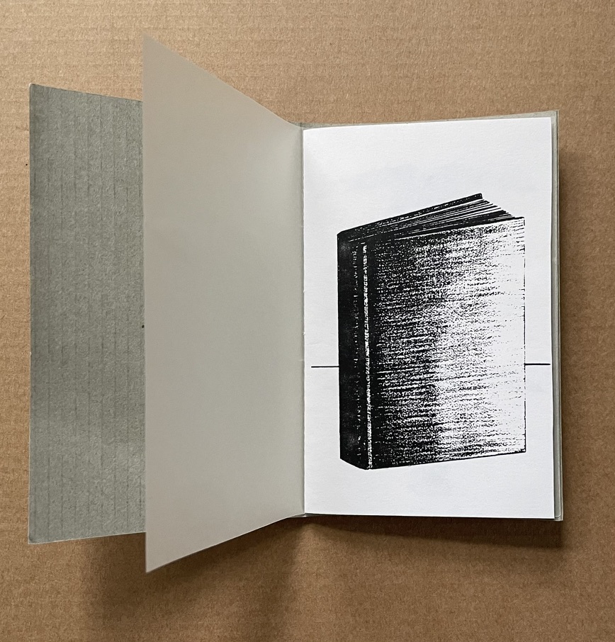
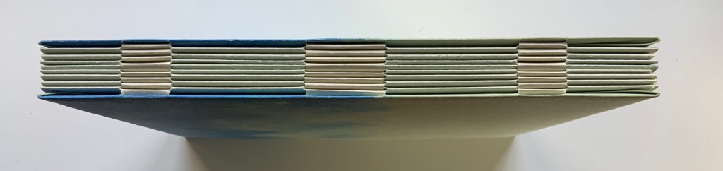
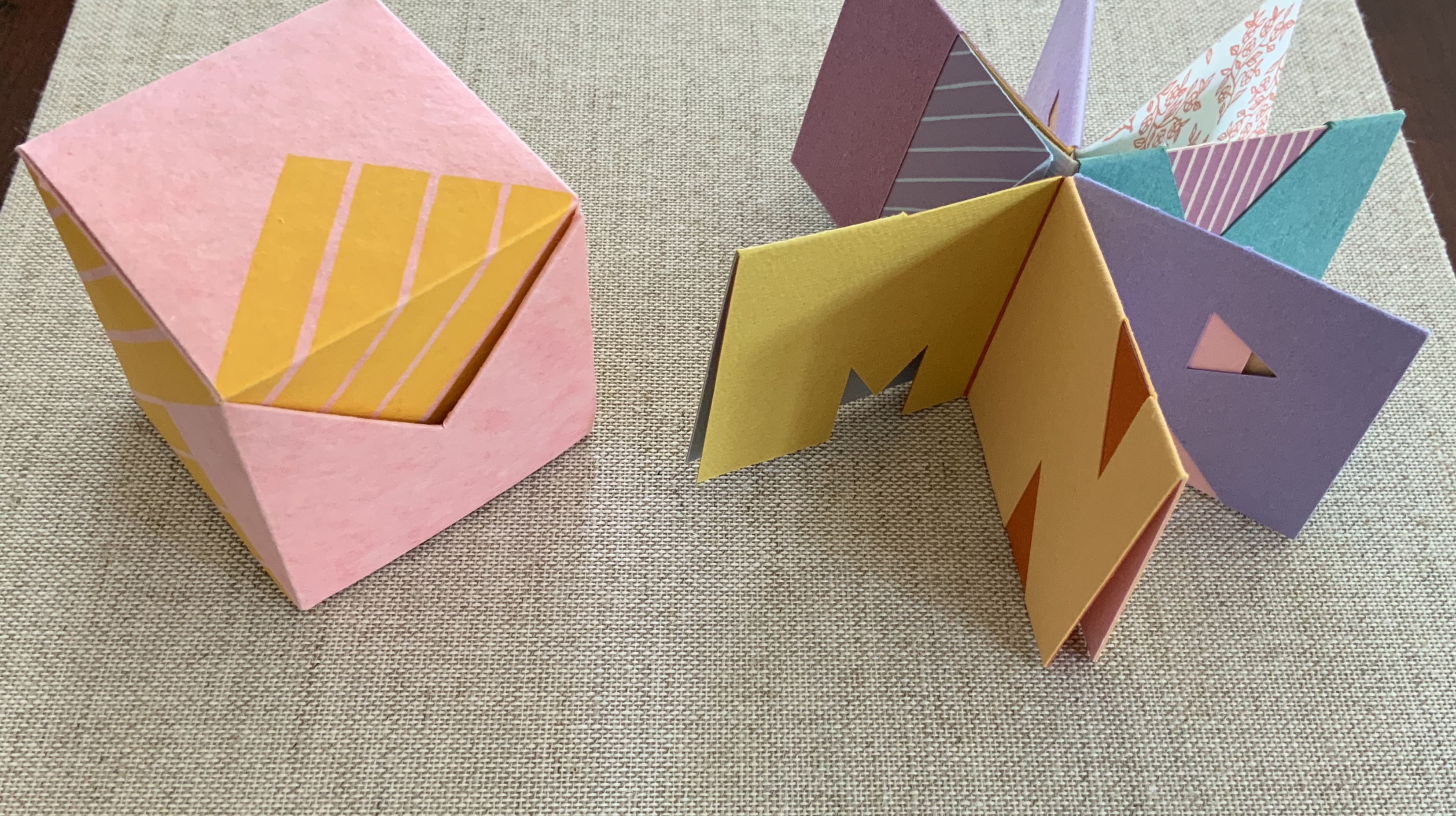
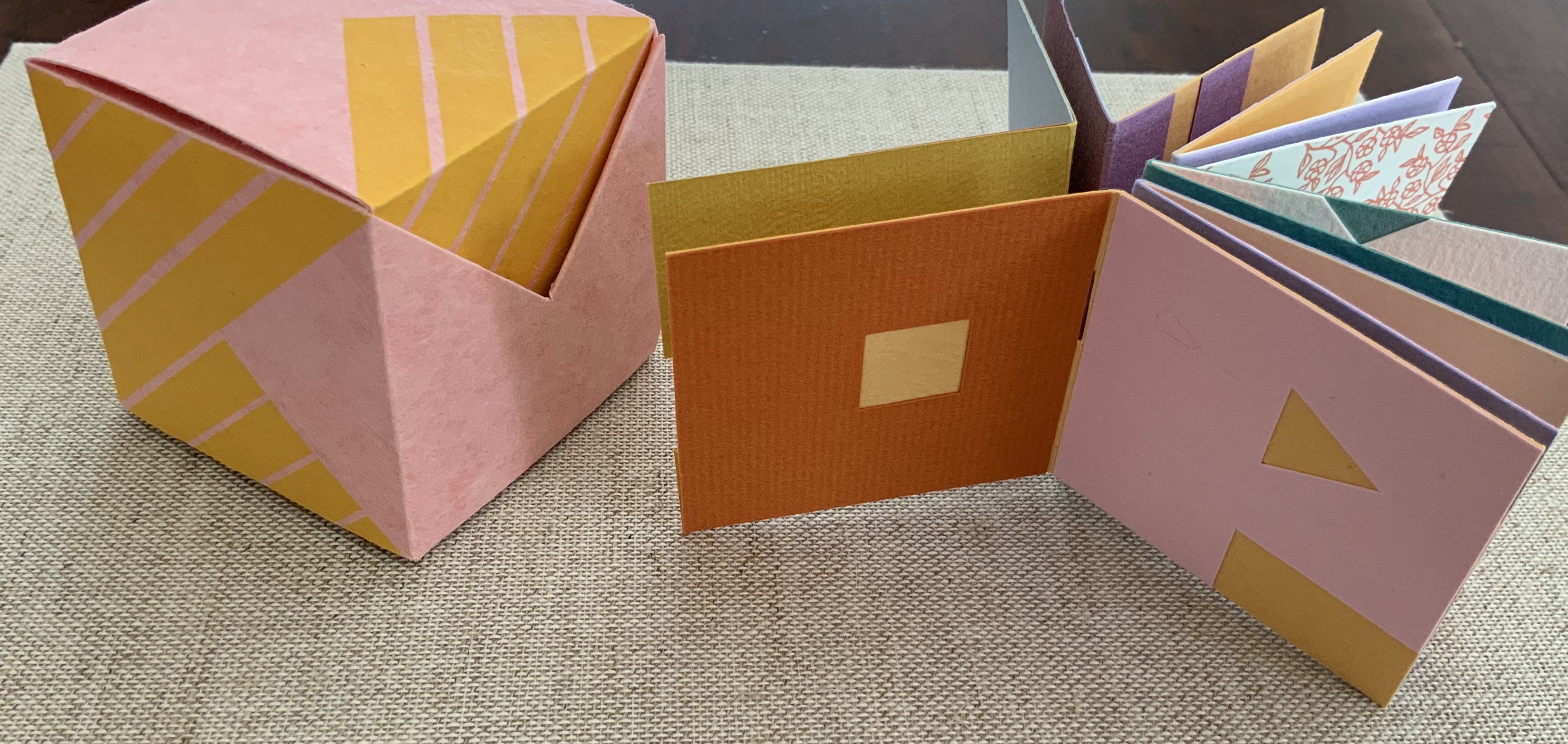
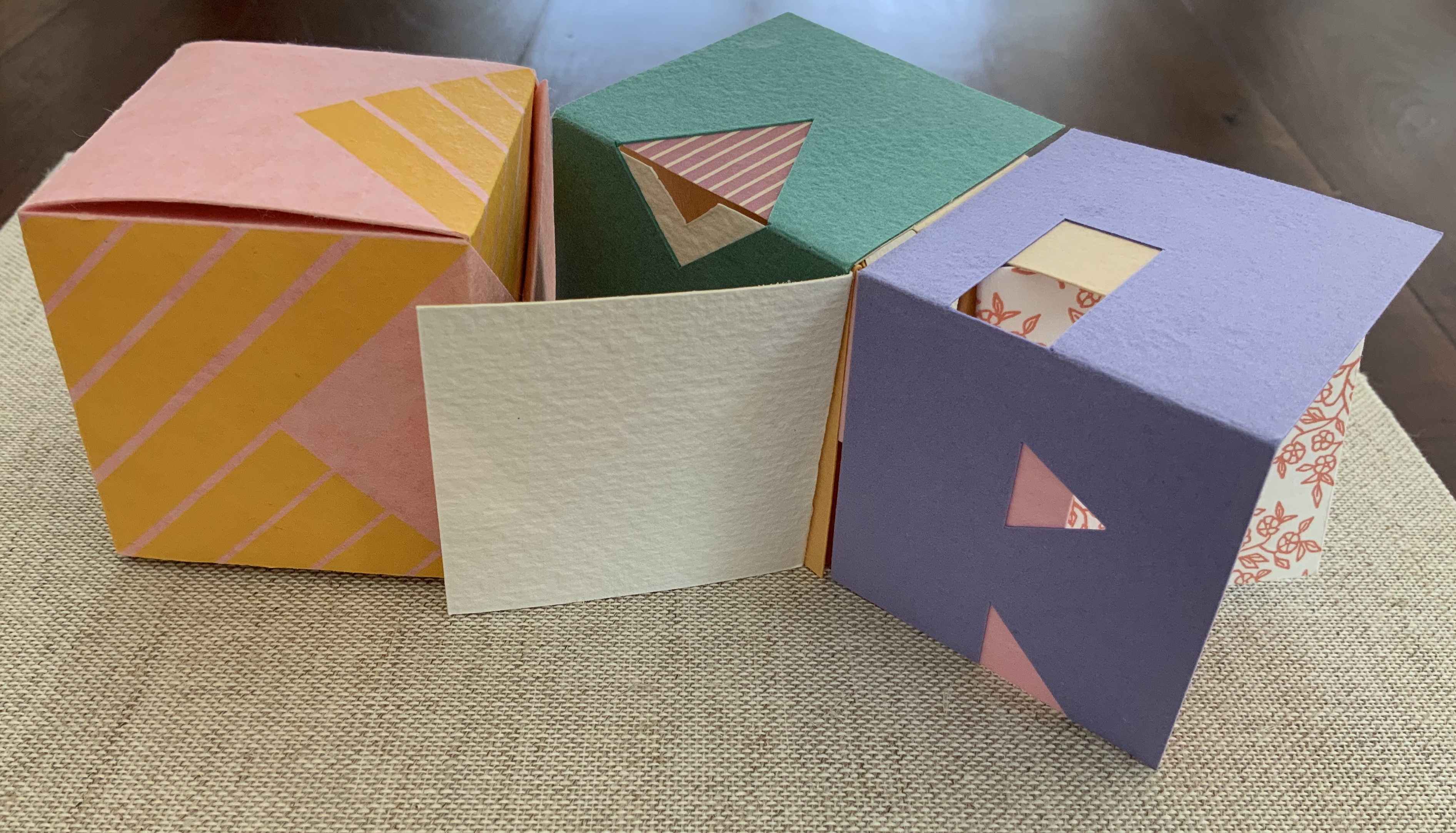
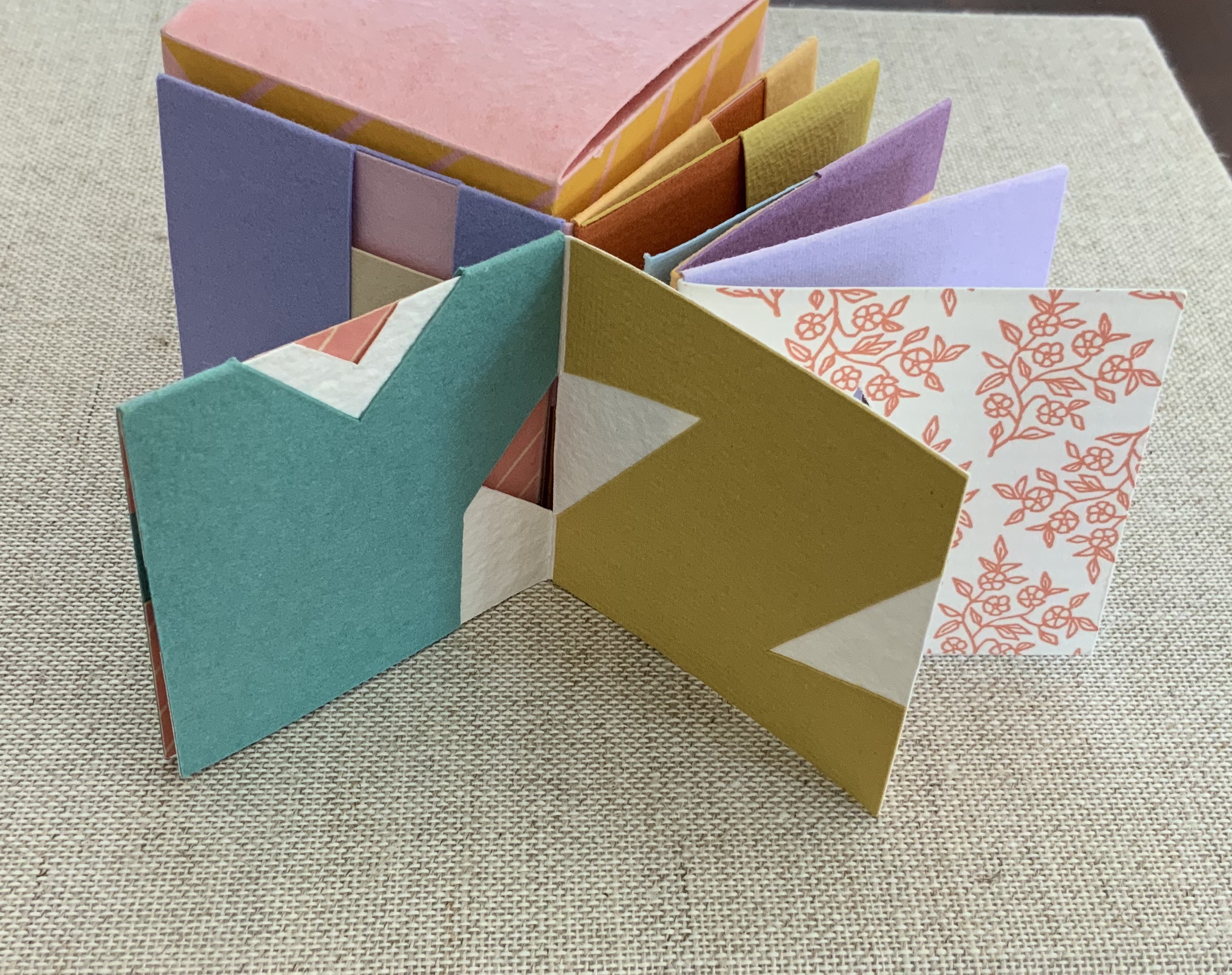
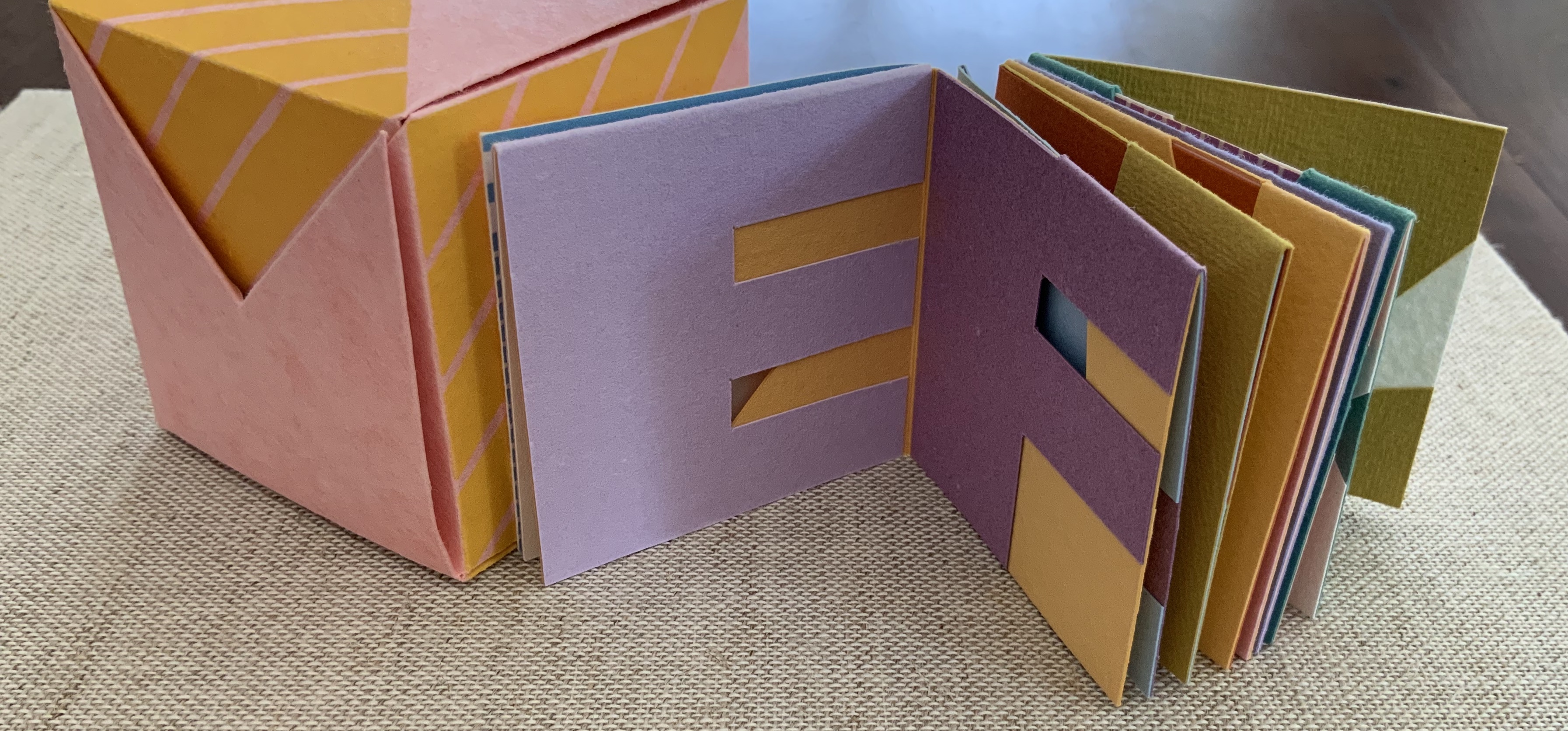
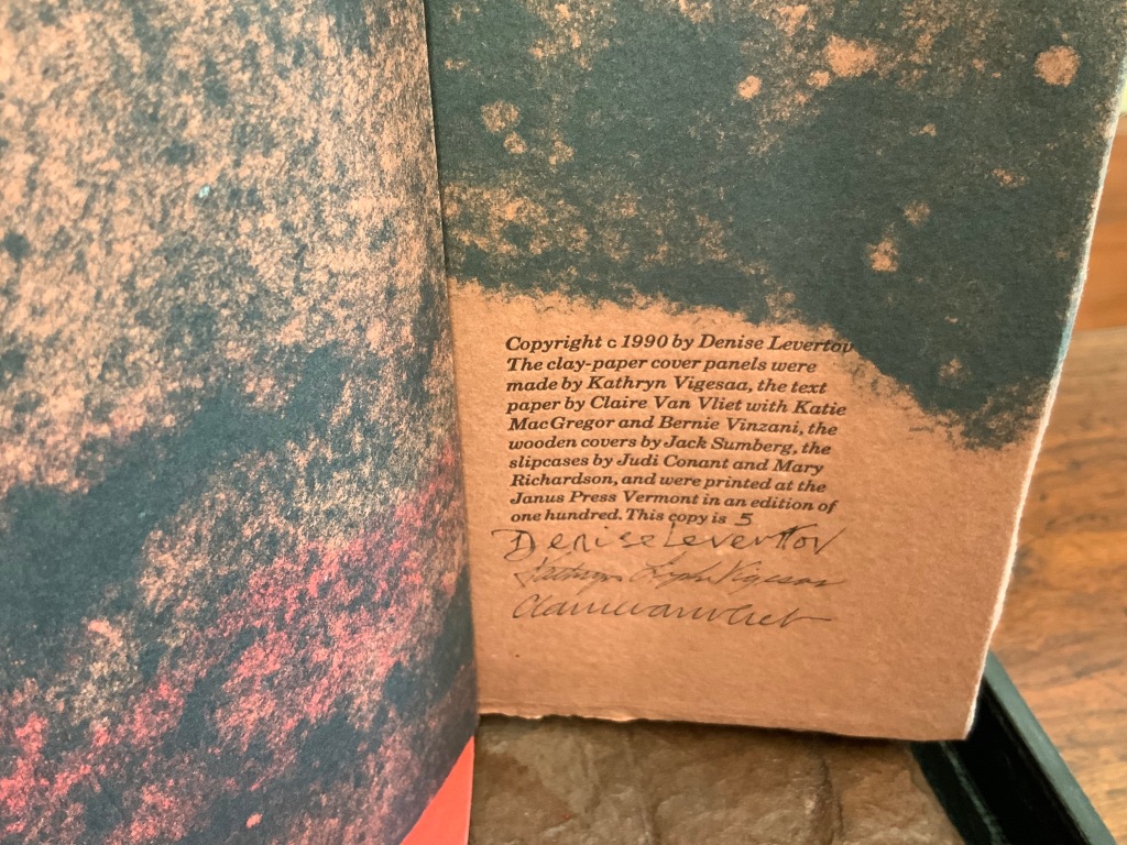
The Eclectic Abecedarium by Edward Gorey (2022) Patrice Miller Flagbook. Closed: H305 x W107 mm. Open: W495 mm. Edition of 5, of which this is #1. Acquired from Aredian Press, 17 July 2022. Photos: Books On Books Collection.
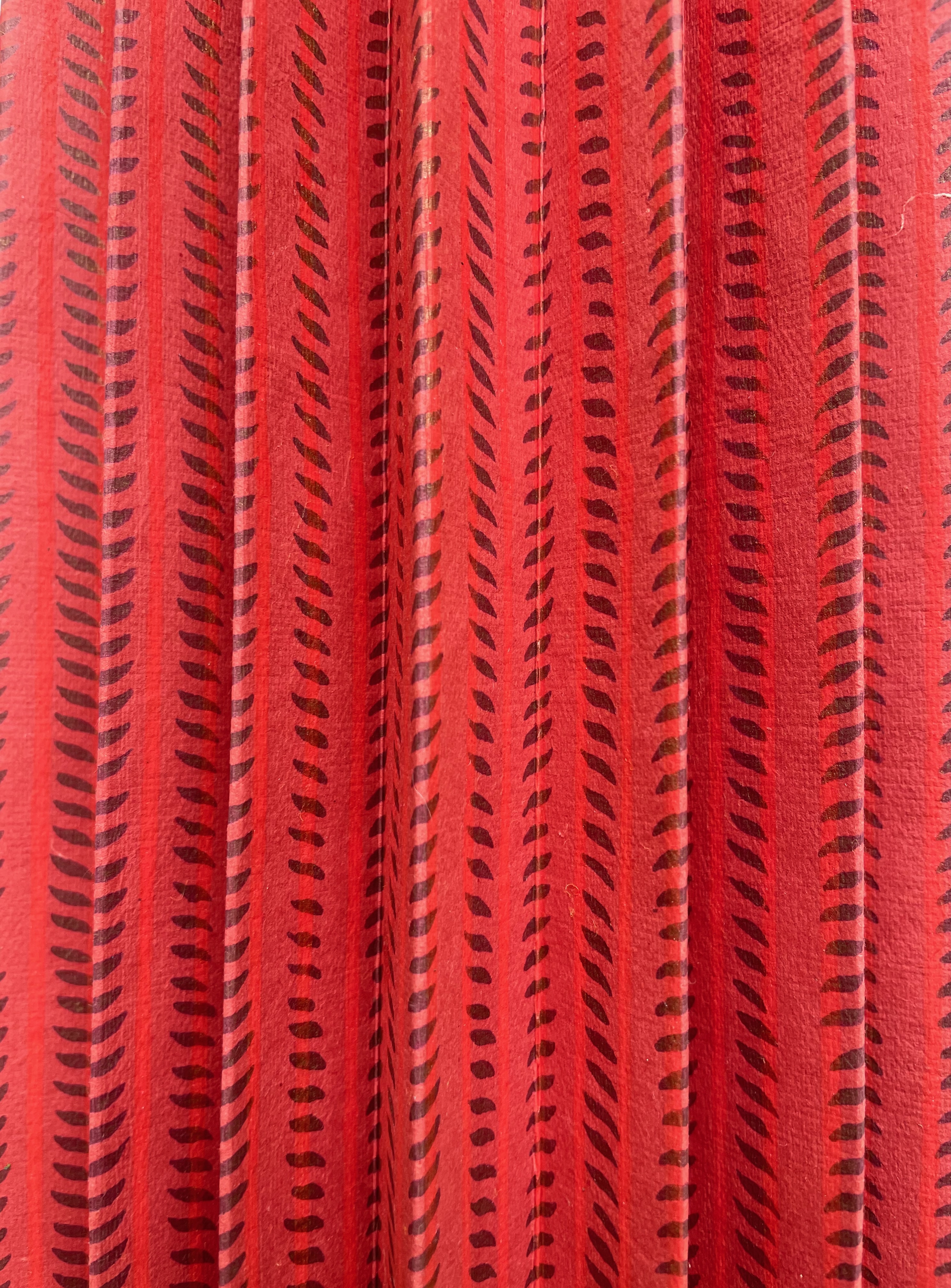
Patrice Miller’s flag book uses the text and color illustrations cut from The Edward Gorey House’s poster version of Gorey’s first alphabet book, The Eclectic Abecedarium (1983). Miller has mounted the text to red, blue, or green textured cardstock, which, in turn, is affixed to a red lotka-backed accordion. Black background yuzen paper with dots of bright blue, red, and green cover the boards.
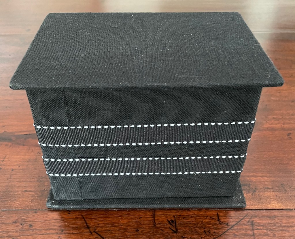
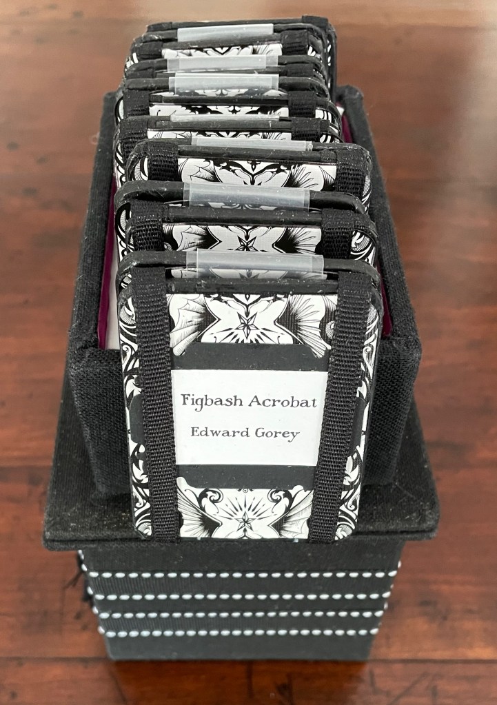
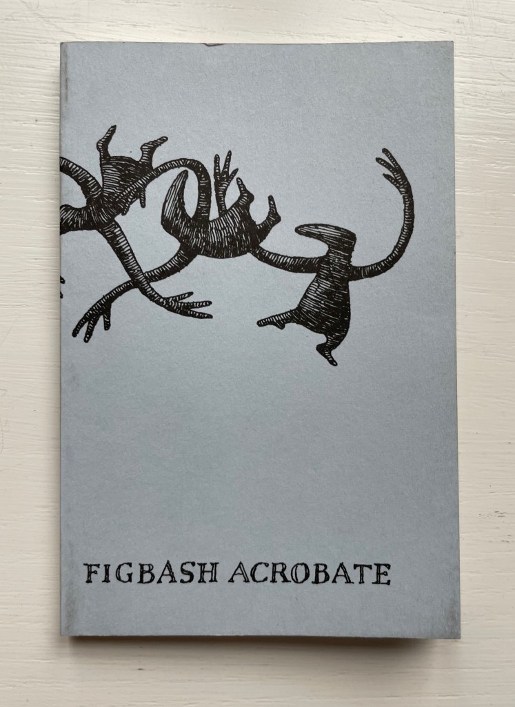
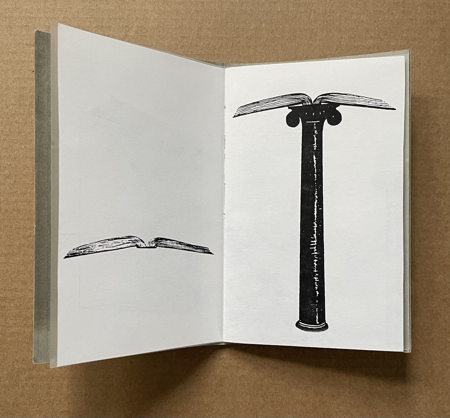
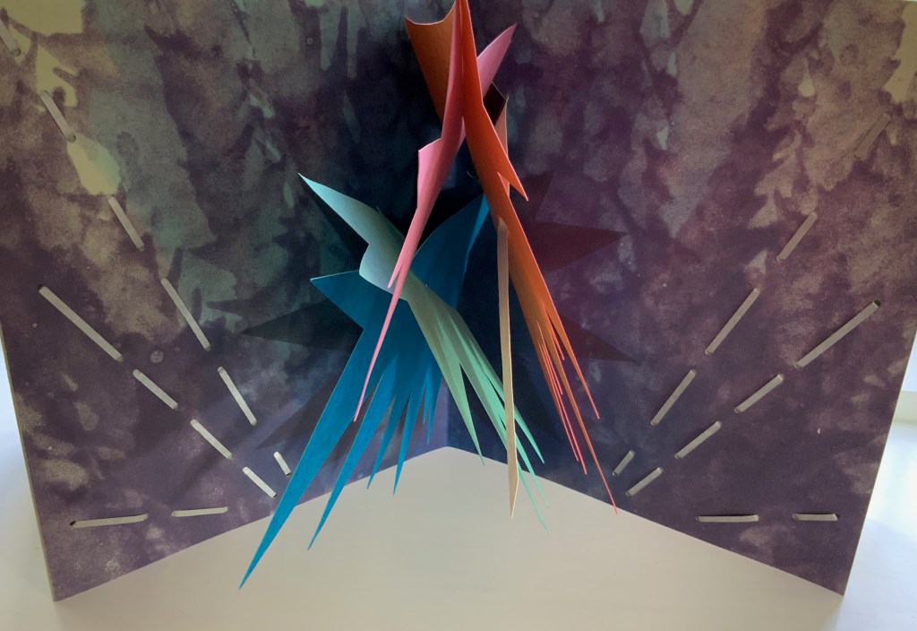
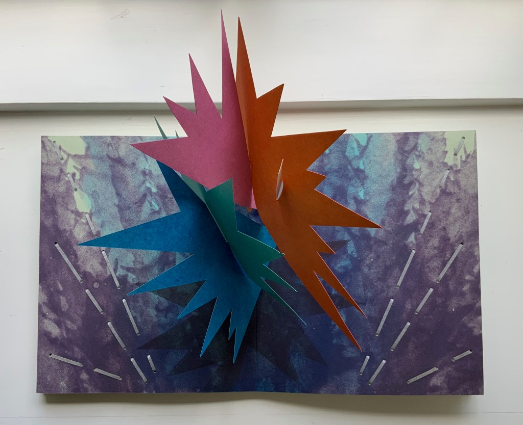
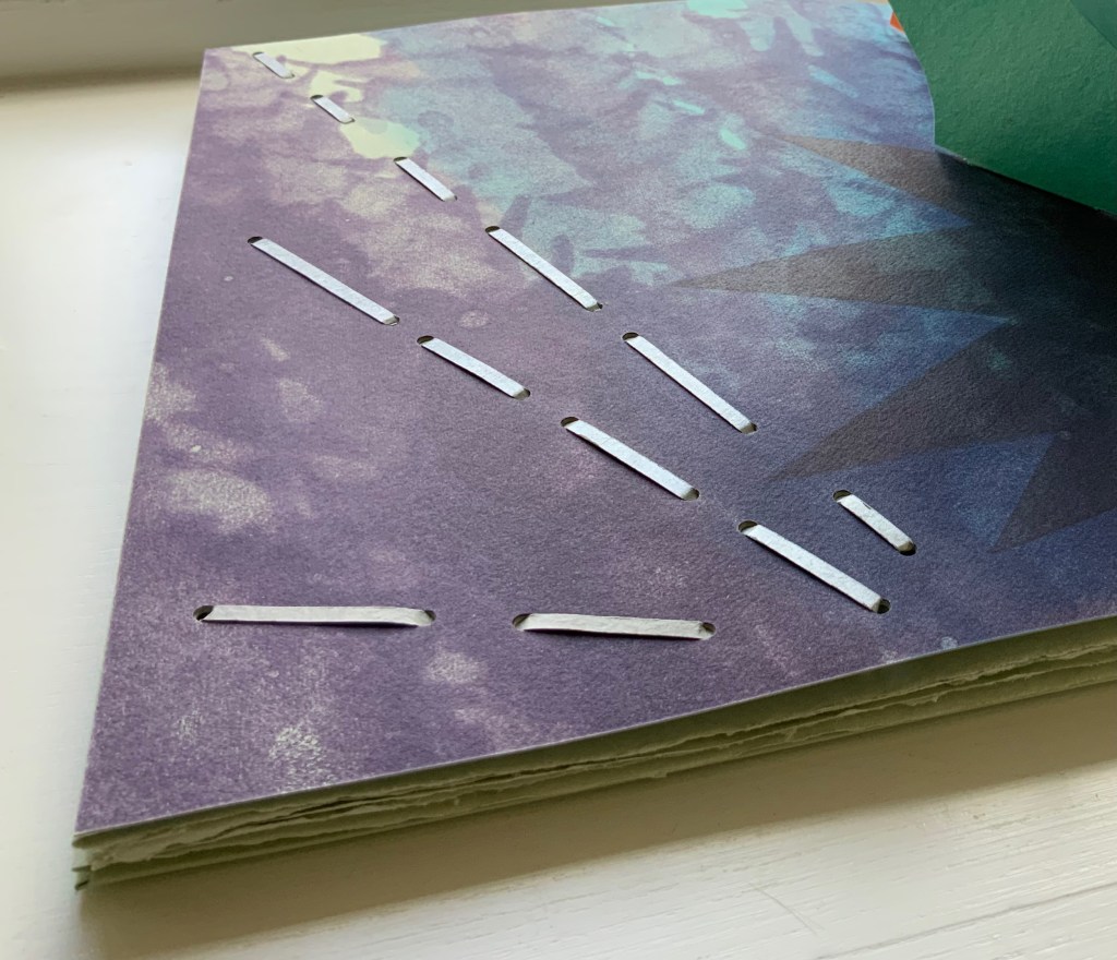
Figbash Acrobate by Edward Gorey (2023)
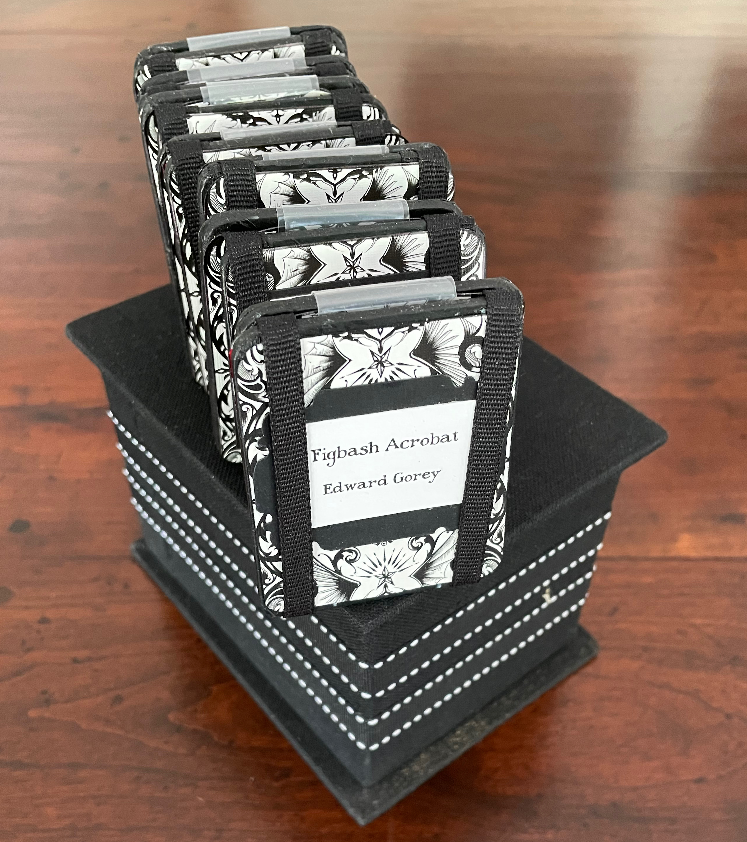
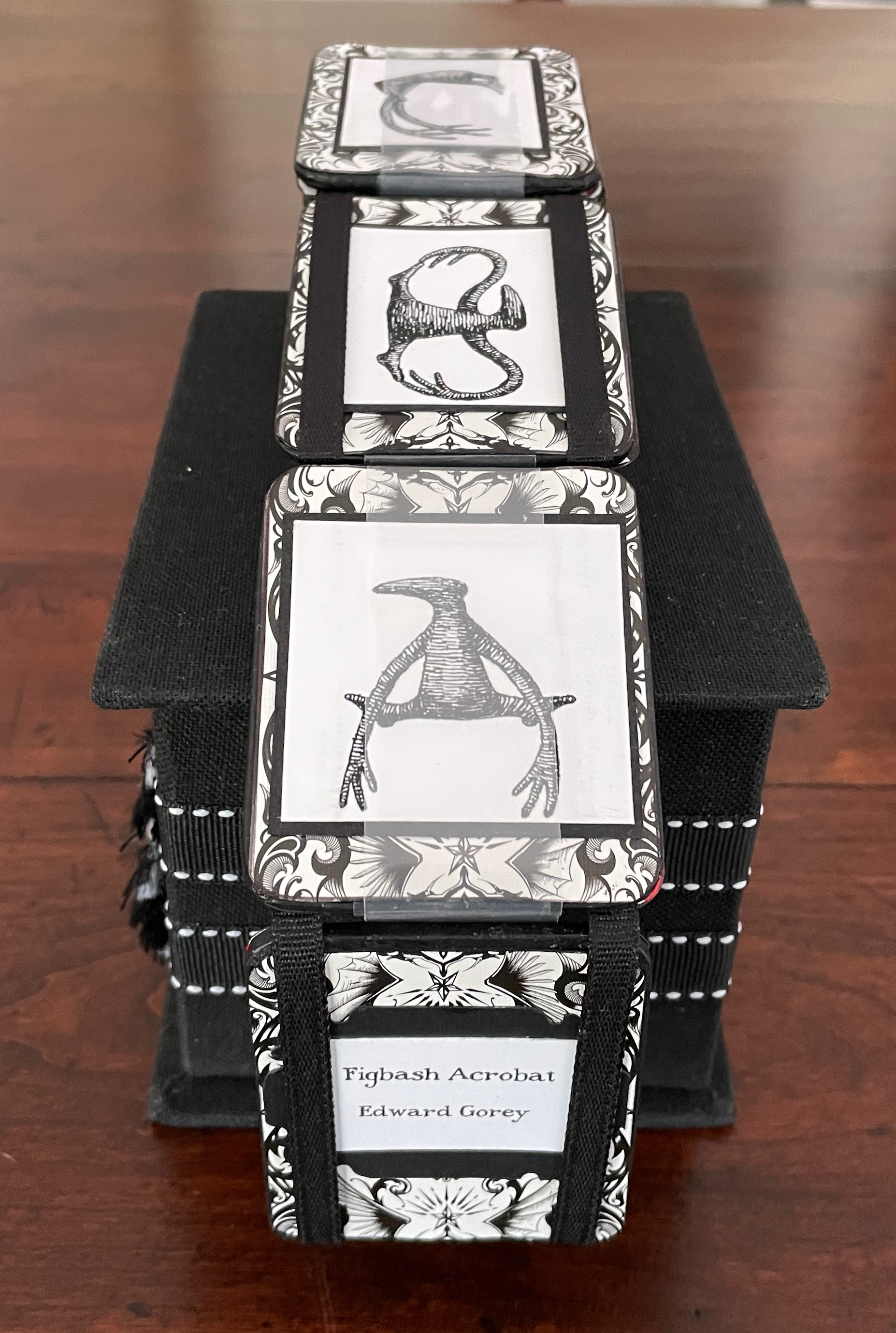
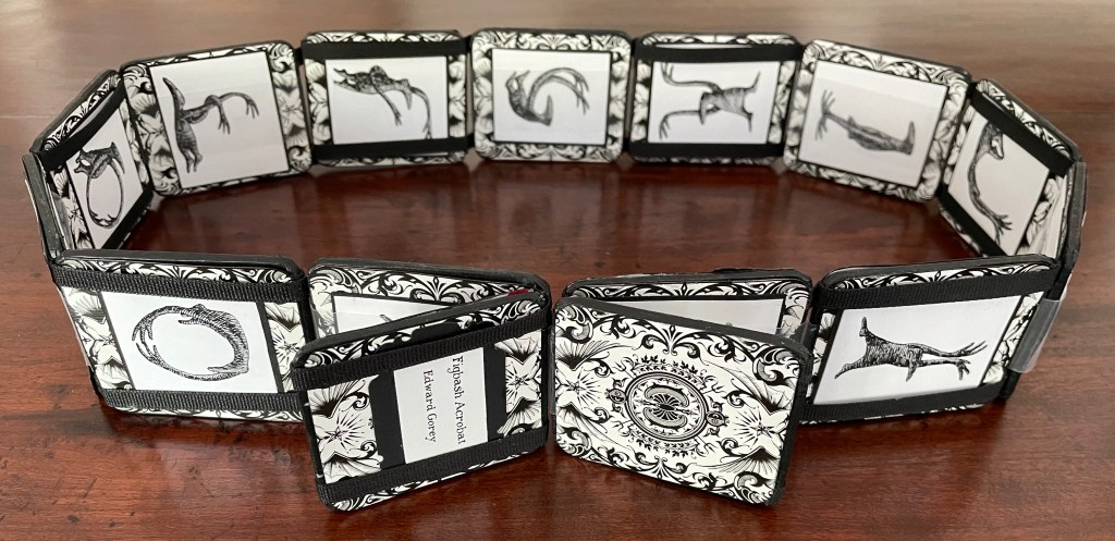
Figbash Acrobateby Edward Gorey (2023) Patrice Miller Jacob’s ladder. Box: H98 x W141 x D106. Ladder closed: H65 x W55 mm. Ladder: open H1025 mm. Acquired from Patrice Miller, 5 April 2023. Photos: Books On Books Collection.
Gorey’s Figbash Acrobate in Jacob’s Ladder format. Video courtesy of Patrice Miller.
Although commissioned, the flag book and Jacob’s ladder make up part of a larger undertaking by Miller: “The Edward Gorey Binding Project”. Miller writes:
Fascinated with the works of Edward Gorey since high school, my binding efforts led me to embark on the challenge of rebinding (or binding) all 100+ titles authored by him, with the occasional distraction of books featuring his illustrations only. … A selection of the books have been displayed at the Edward Gorey House, Yarmouth Port, Massachusetts.
So far the project has yielded fan, star, accordion/stub, tufted red cotton velvet with covered buttons, flat-back, ribbon band, Green Thai alligator-pattern textured paper and goat skin, black lokta overlaid with ogura lace paper, calfskin and blue and green feathers from the binder’s parrot Django, silk-screened Indian cotton rag paper, sheer paper imbedded with irregular black yarn circles overlays, and vintage gold brocade bookcloth bindings. Another four to five years should see the job done!
Aredian Press works have received Distinguished Book Awards from the Miniature Book Society.
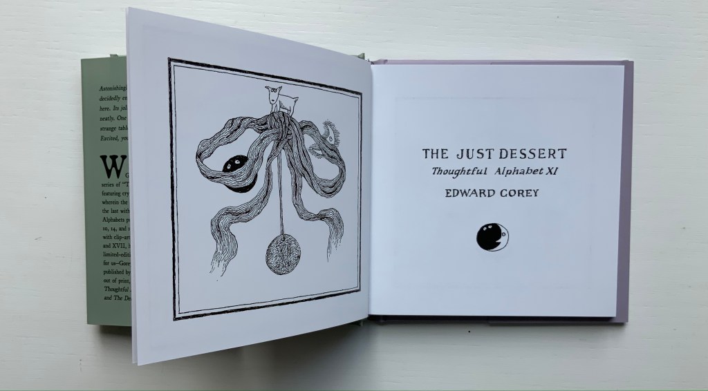
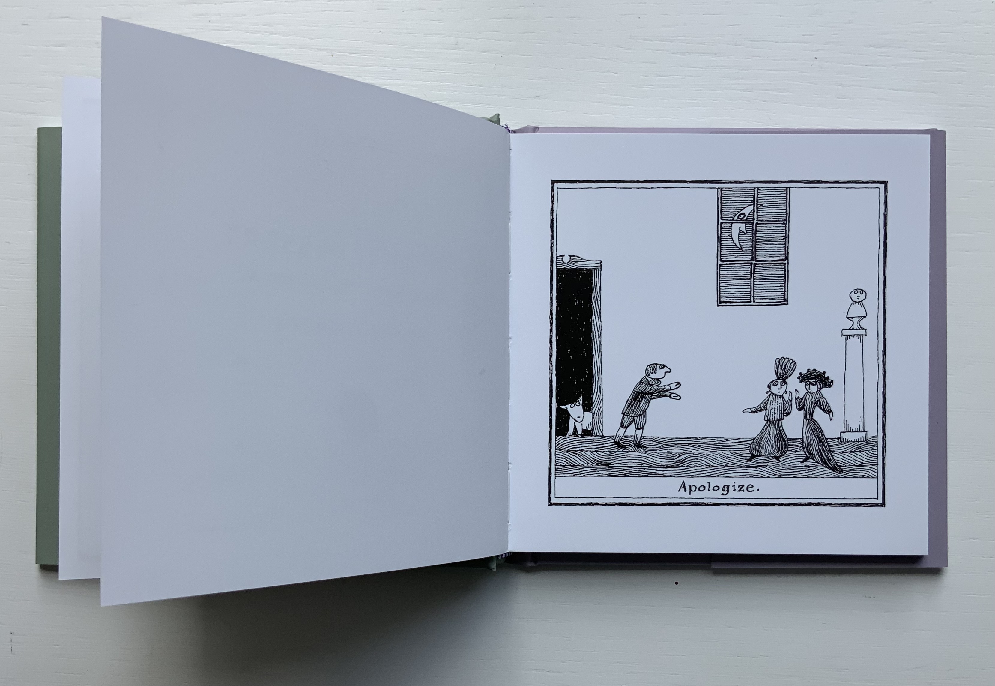
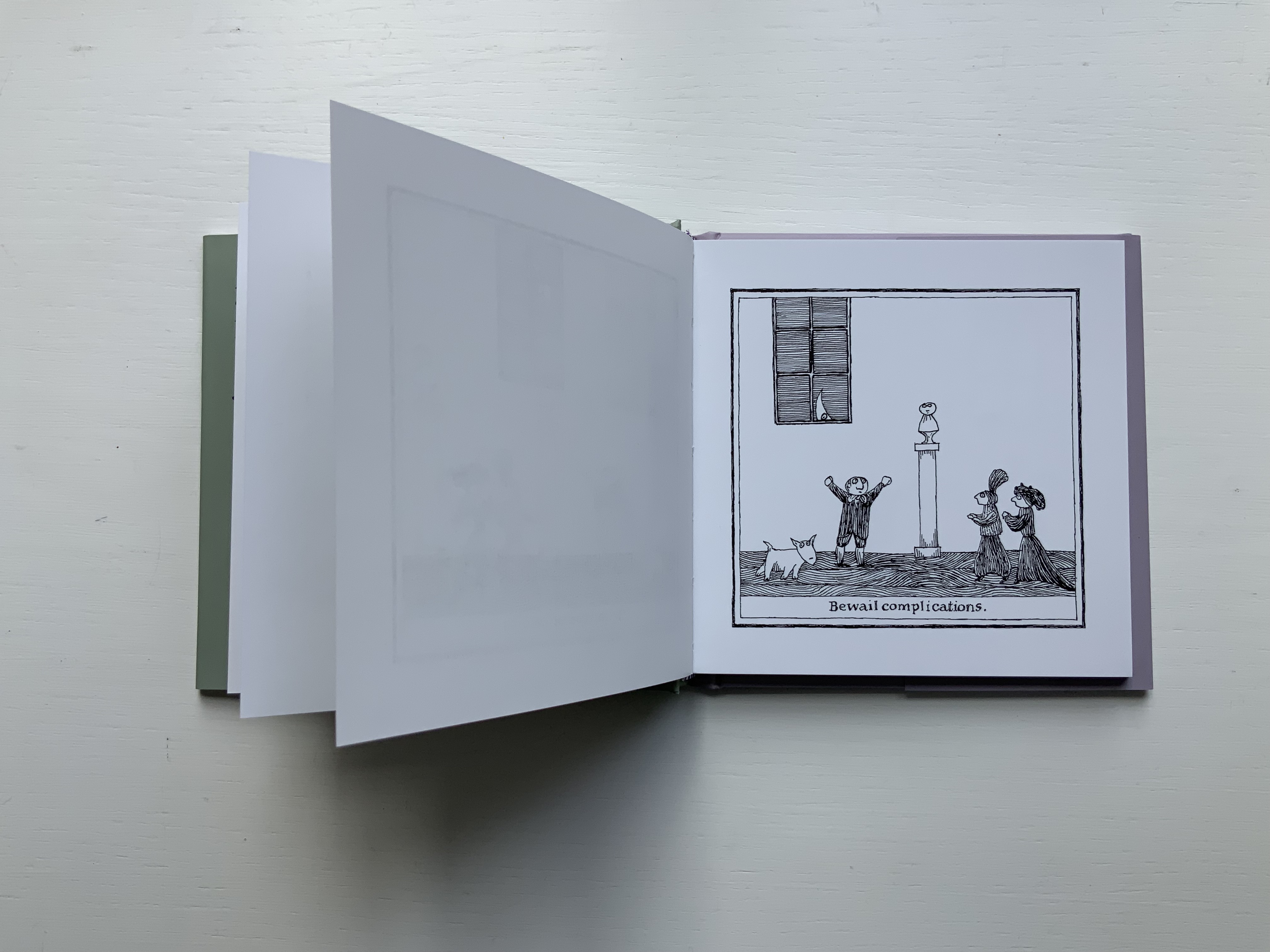
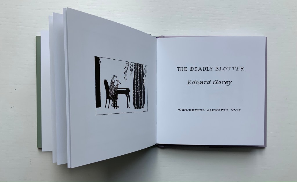
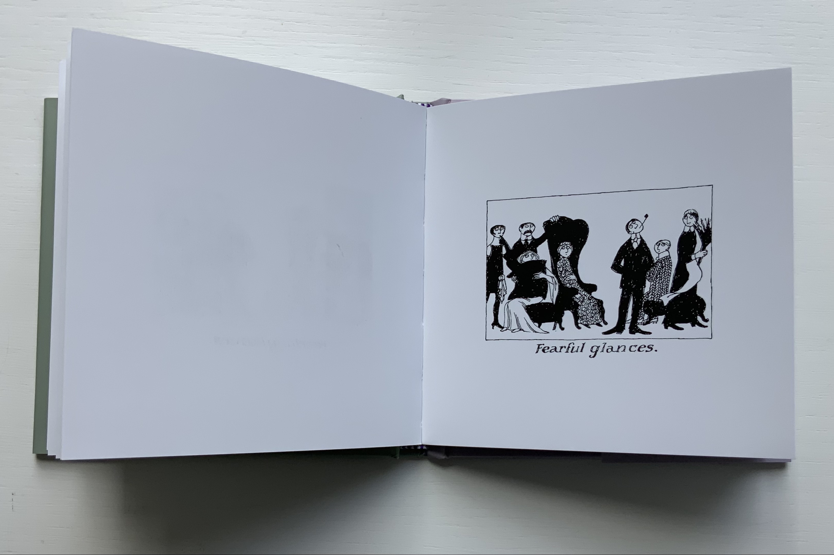
No serious collection of alphabet books or alphabet-related artists’ books can be complete without some representative of Edward Gorey’s work. This volume brings together Thoughtful Alphabets XI and XVII, two detective stories in which the plots must be deduced from pithy alphabetized directions or alphabetized descriptions underlying static black-and-white cartoon tableaus.
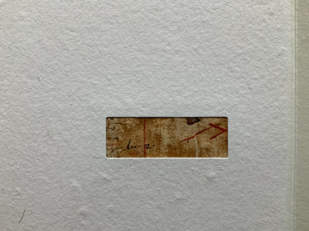
Figbash Acrobate (1994) Ædwyrd Goré (Edward Gorey) Softcover. H113 x W75 mm. 40 folios. First edition, 500 numbered copies, of which this is #11. Acquired on eBay, 20 August 2022. Photos: Books On Books Collection.
Just two representatives — even if one of them is two for one — seems hardly adequate though for a serious collection. Surely another is needed to qualify. Or perhaps some variants in homage? To judge for yourself, click
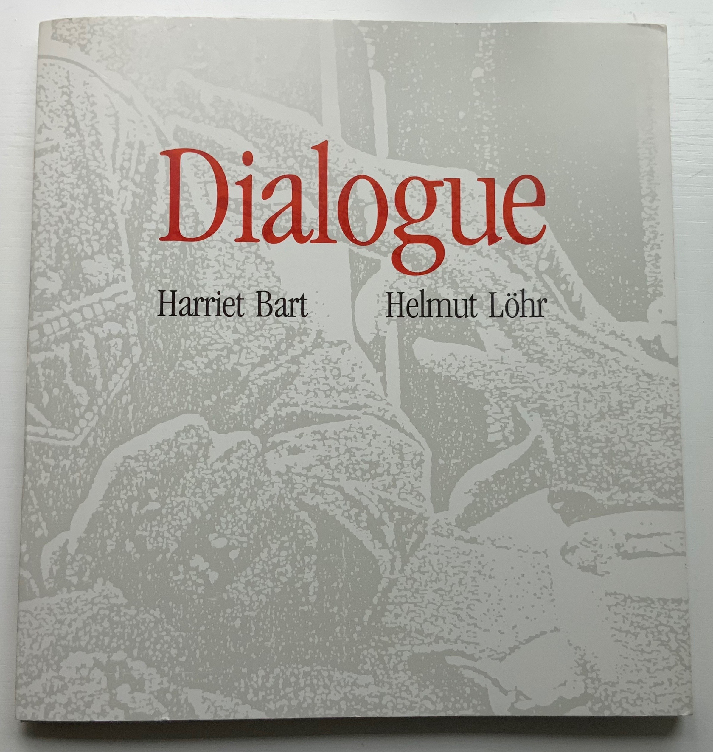
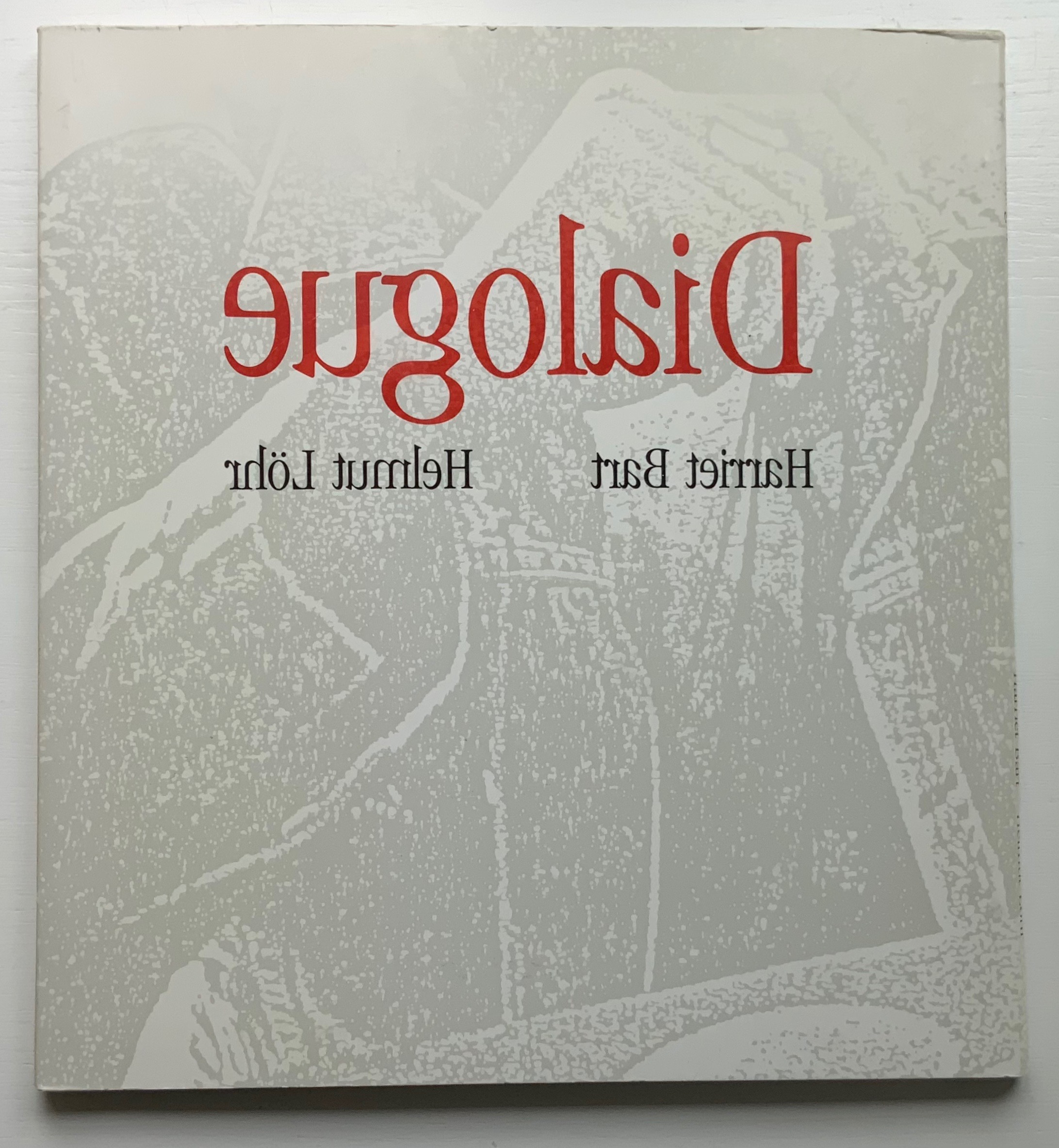
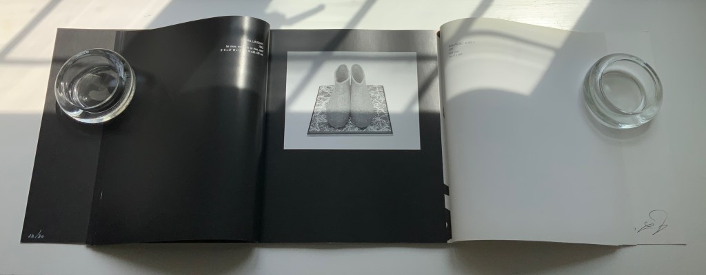
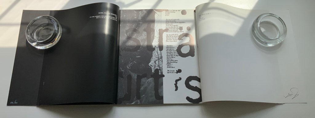
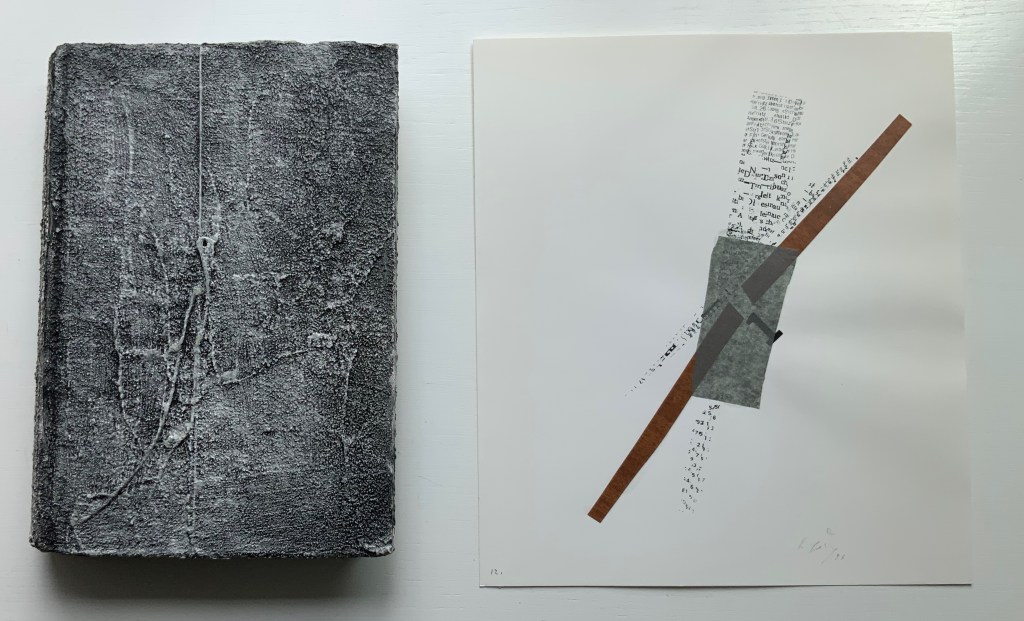
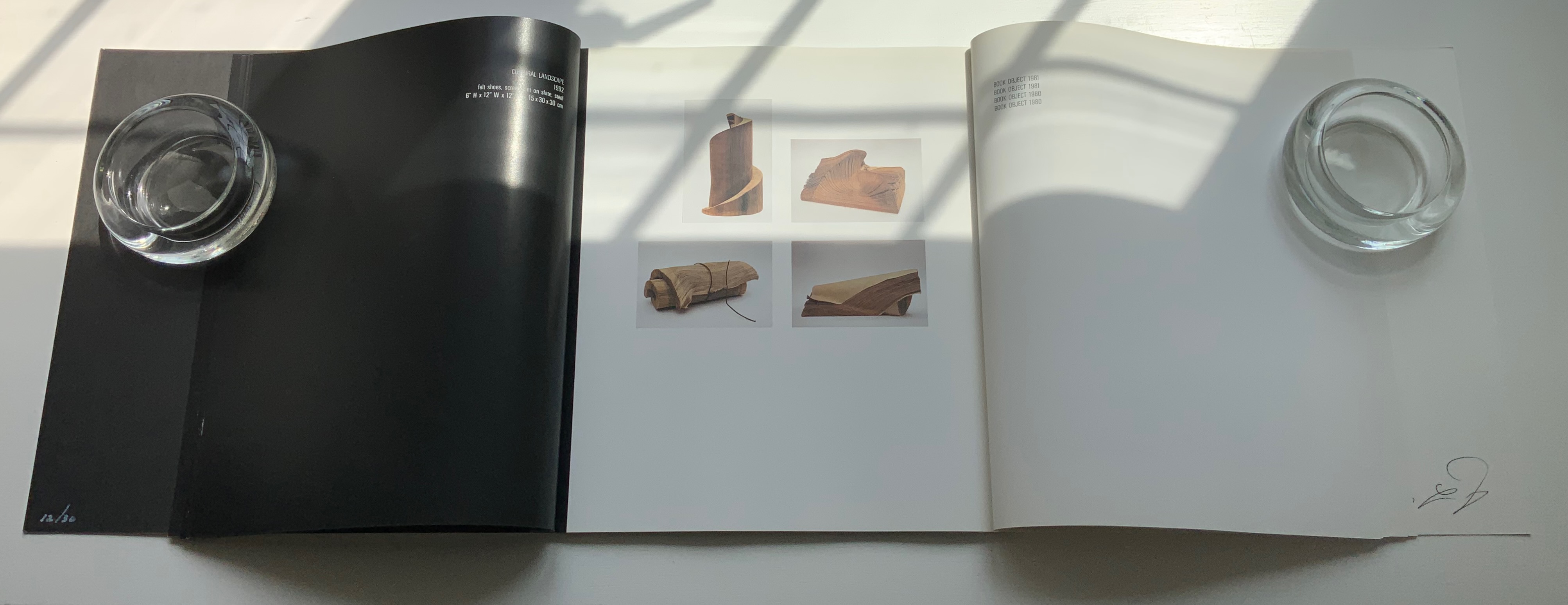
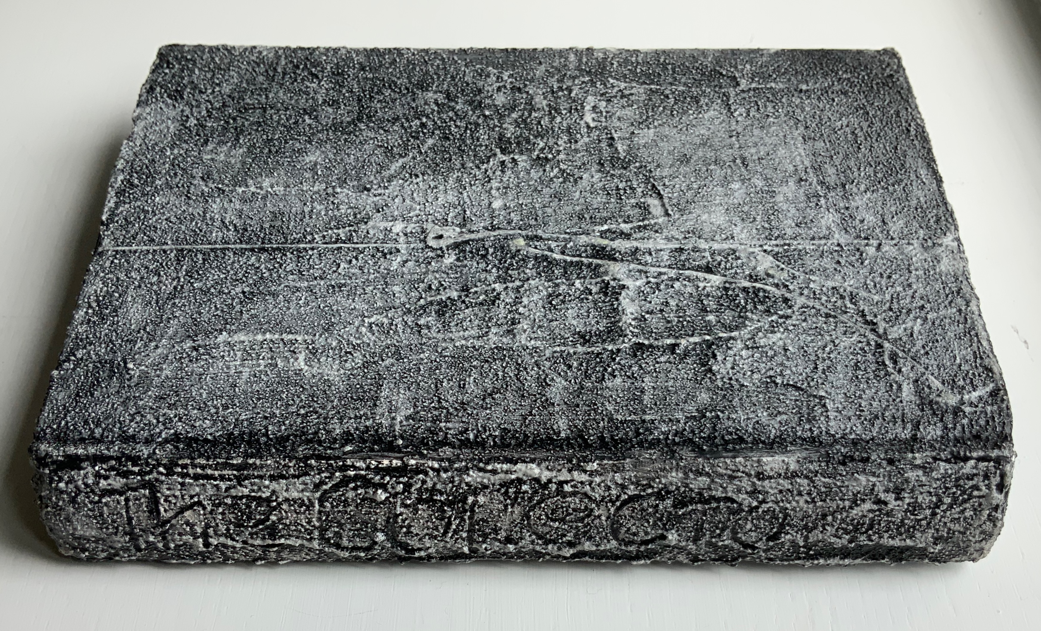
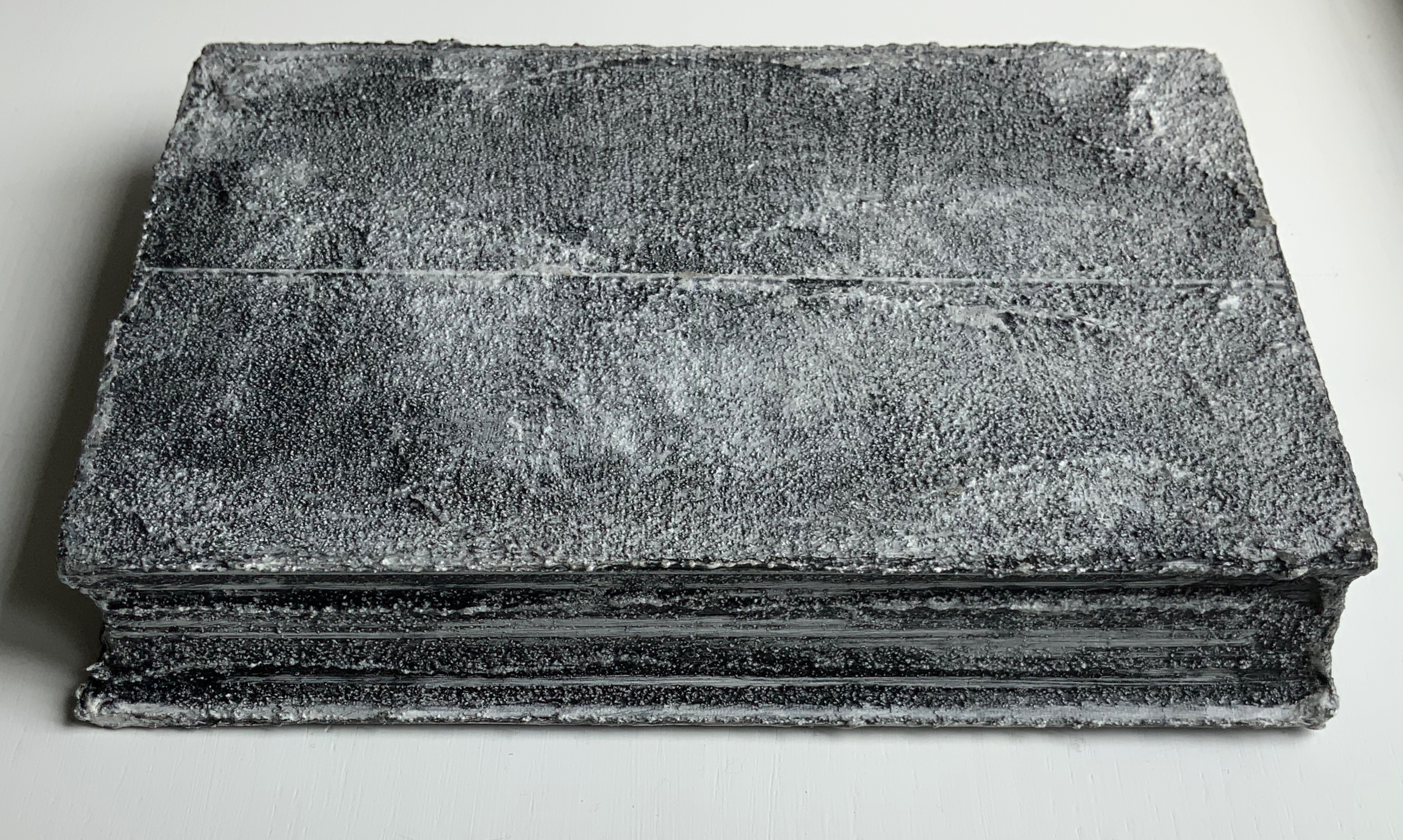
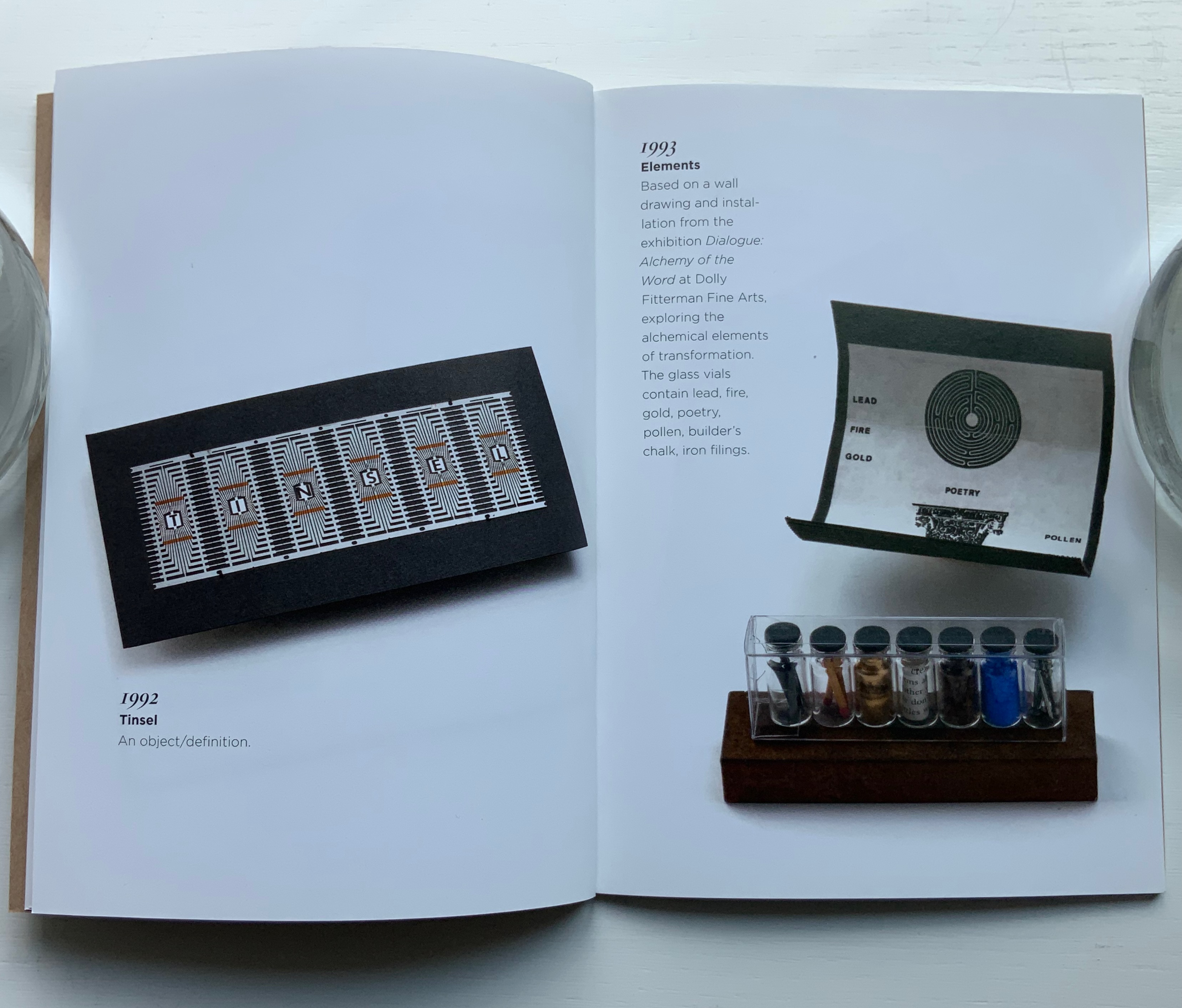
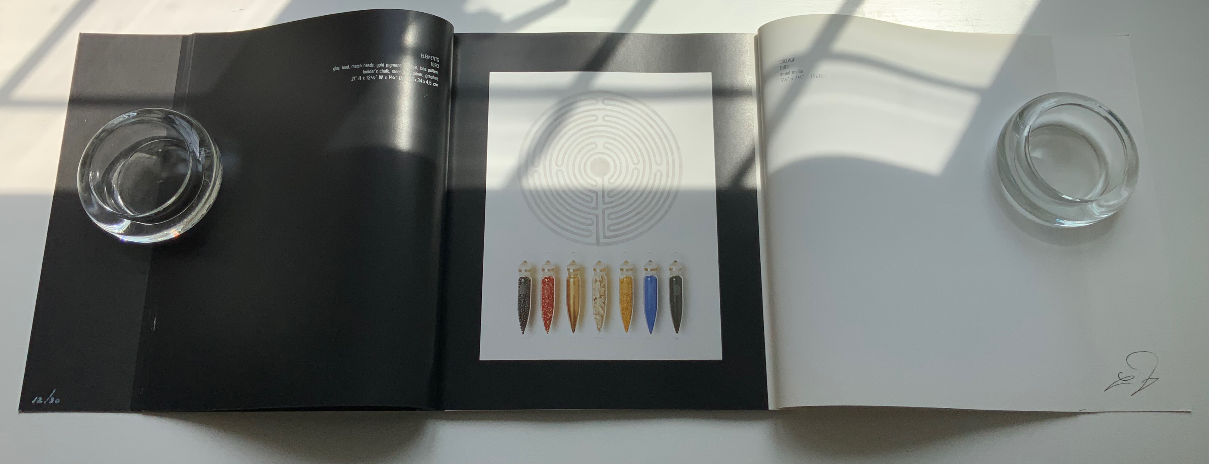
Dialogue: Alchemy of the Word(1993) Harriet Bart and Helmut Löhr French-fold card-covered, gatefold book: H260 x W243 mm, 56 pages. Includes altered book and collage print. Edition of 30, of which this is #12. Acquired from Harriet Bart, 3 June 2022. Photos: Books On Books Collection.
From the Foreword:
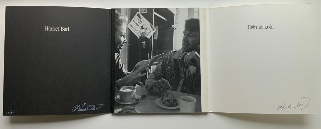
Art is a universal language – drawing together people of all regions, races, ages, and socioeconomic levels. Dolly Fiterman Fine Arts is pleased to premier the work of Harriet Bart and Helmut Lohr. Harriet Bart lives in Minneapolis, Minnesota, USA. Helmut Lohr is based in Dusseldorf, Germany but lives for several months of the year in the United States… The French poet Stephane Mallarmé said that everything was made to end up in a book. Sculpture, collage, and photography by artists Harriet Bart and Helmut Lohr explore the alchemy of the word, the iconography of the text, the labyrinth of the book, the book as poetic object. Bart and Lohr met in New York in 1990 when they were presenting their work at the same exhibition. Drawn to each other’s work they began a dialogue about their concepts and philosophies of art and life. The conversations continued as they exchanged visits and ideas in Minneapolis, New York, and Dusseldorf. Dialogue: Alchemy of the Word is a visual presentation of their dialogue.
Befitting this book’s title, the binding is not dos-à-dos but rather vis-à-vis or face to face. When the French fold cover parts left and right, the black binding tape on the left and white on the right appear with the photo of the two artists in discussion over coffee and pastry. The interleaving gatefold design enacts a dialogue of pictured artworks and, in doing so, becomes a work of book art itself. How appropriate for Harriet Bart and the late Helmut Löhr, both of whom count artists’ books among their multimedia output.
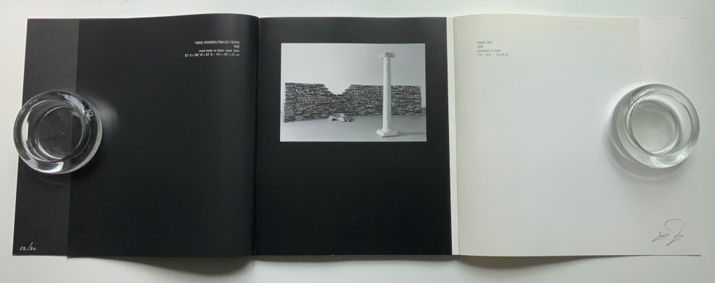
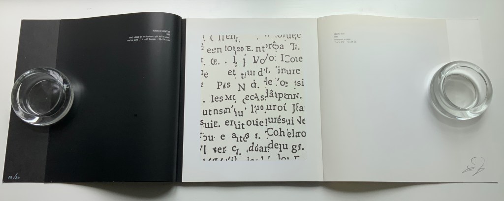
After the foreword, Harriet Bart has the opening gambit on the verso in white type on a black background. That column in the foreground of Fading Memories/Timeless Truths (1990) almost suggests a chess move …
to which Löhr responds with his Visual Text (1989), black on white. The back and forth continues
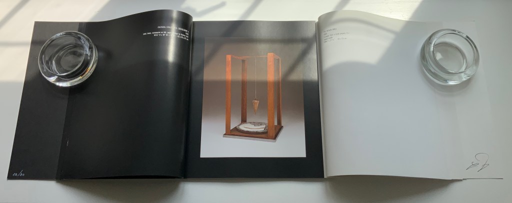
An altered-book sculpture from Bart and one of Löhr’s collage prints accompany the deluxe edition.
The sculpture echoes Bart’s Bound History (1992), whose photo appears in the dialogue and is answered by the photo of Löhr’s Book Object (1981).
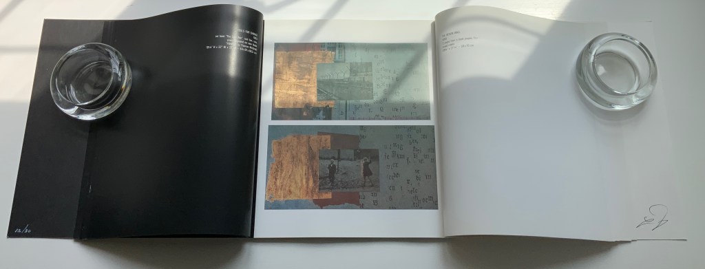
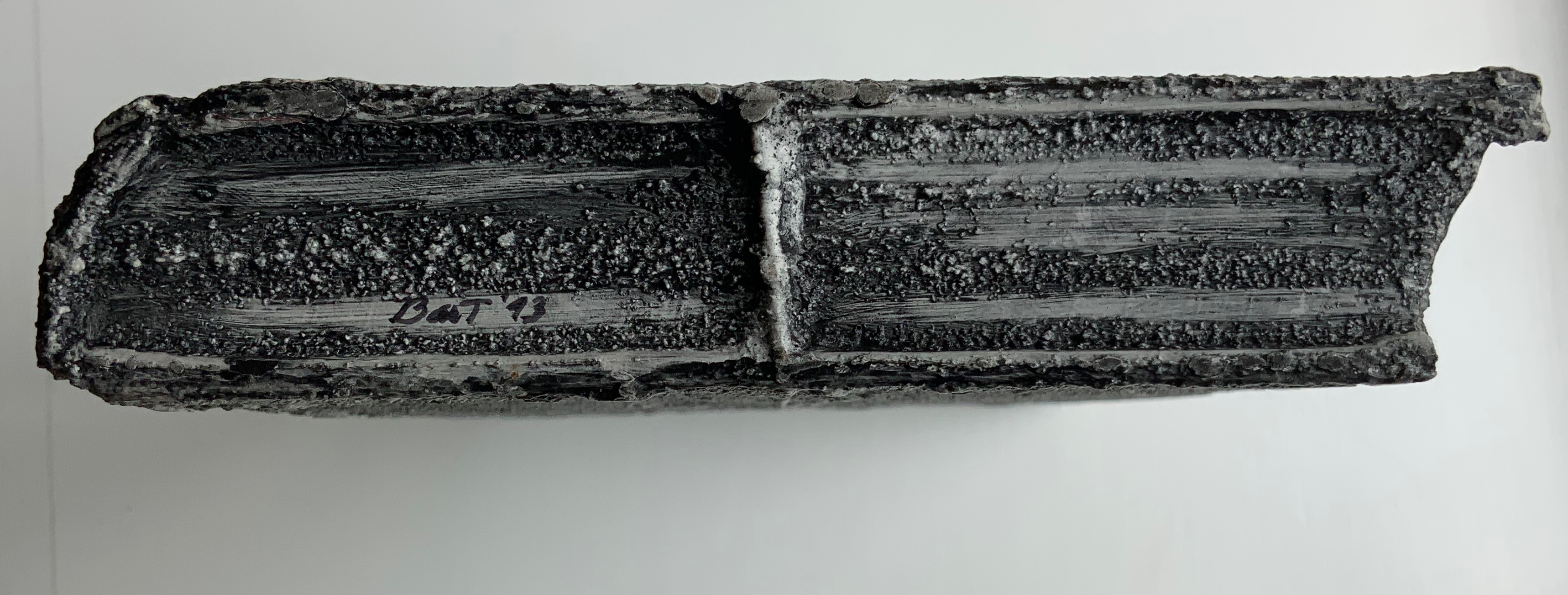
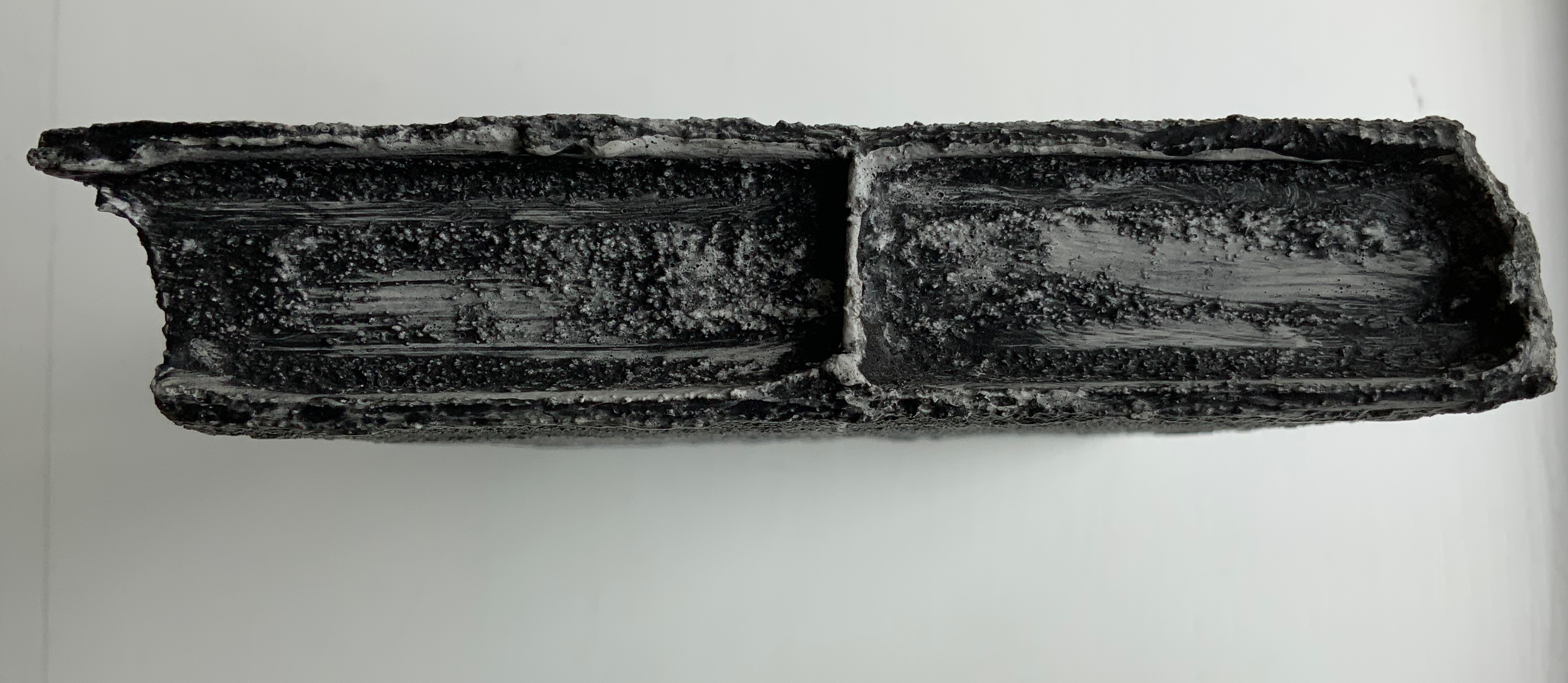
Detail views of the altered book.
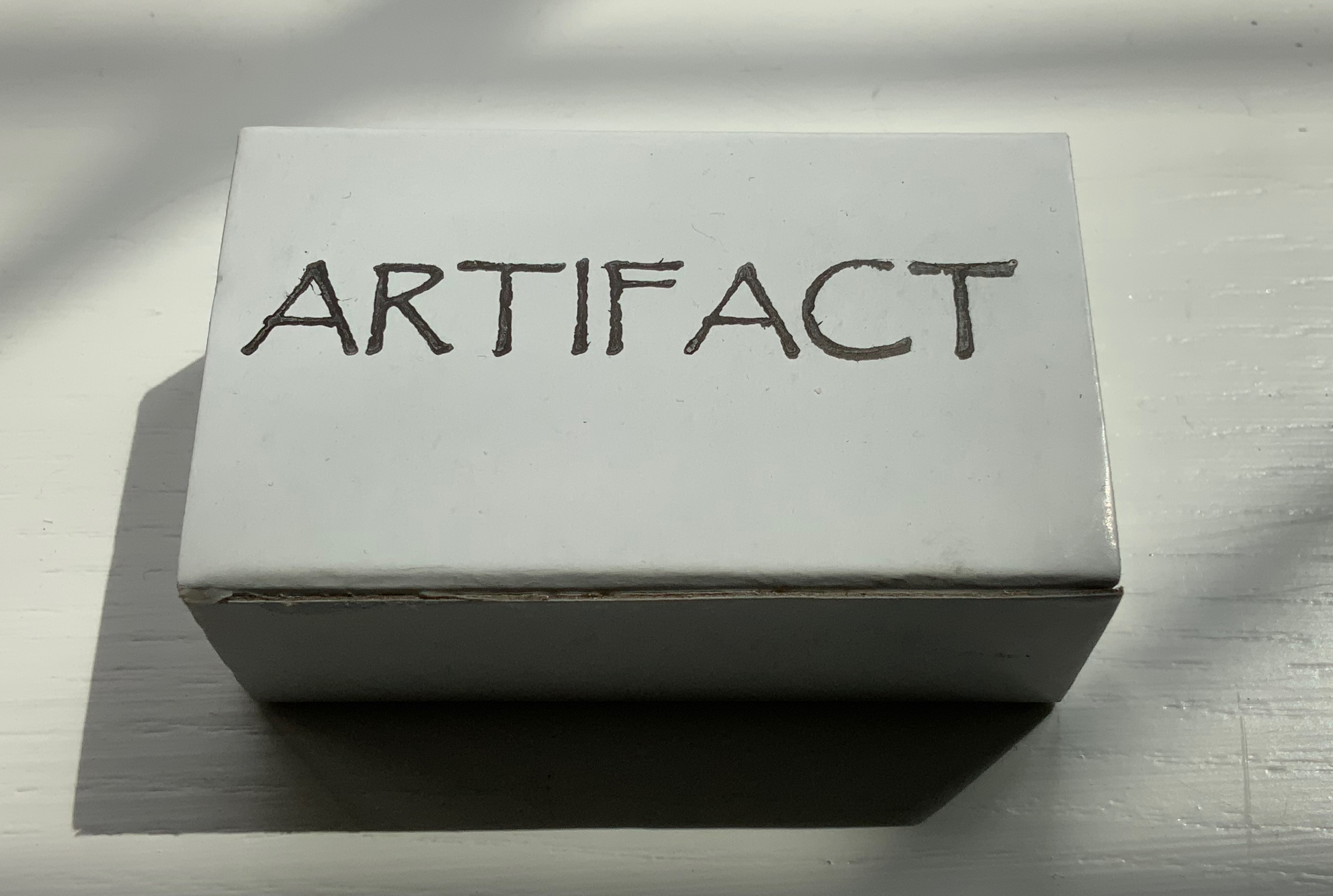
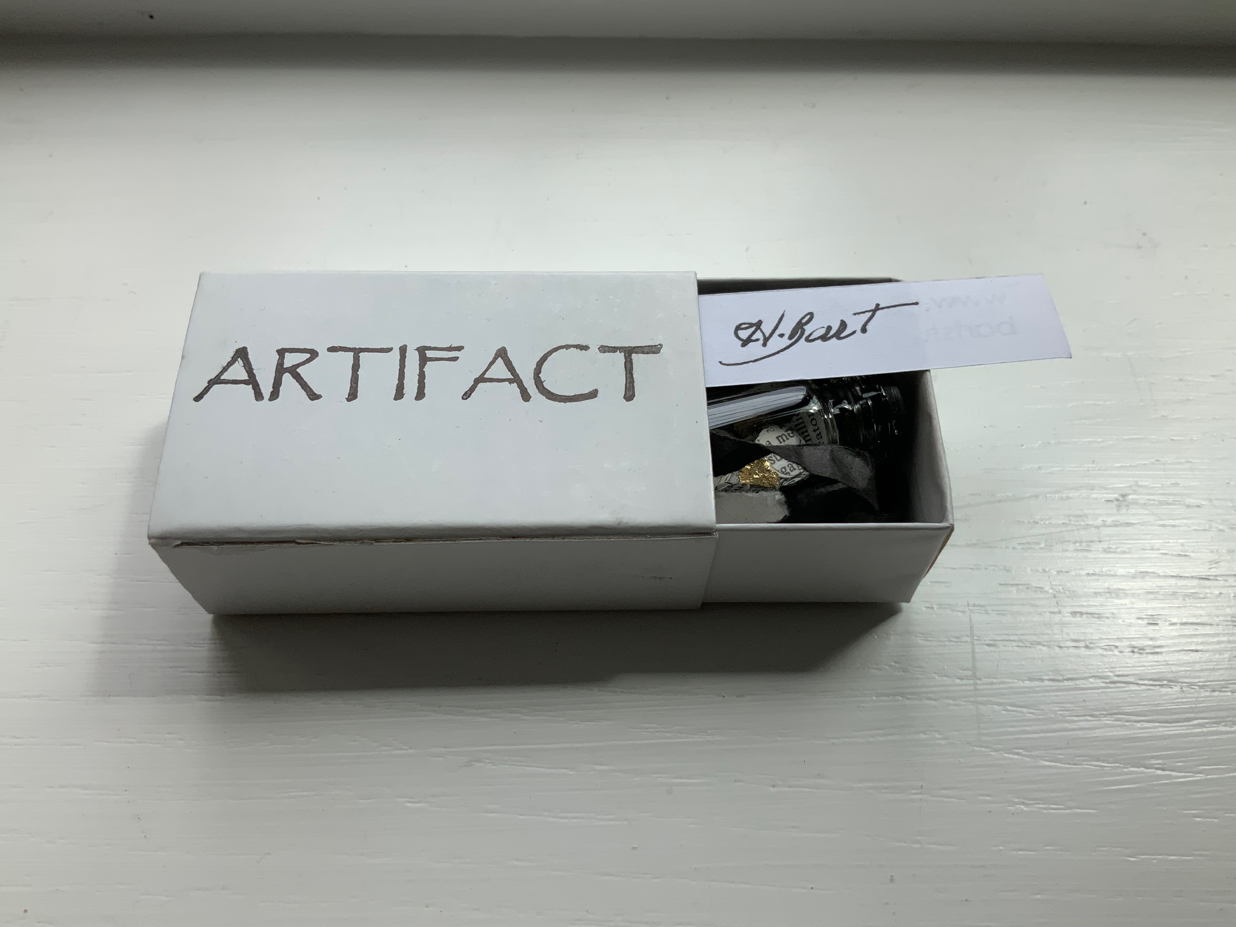
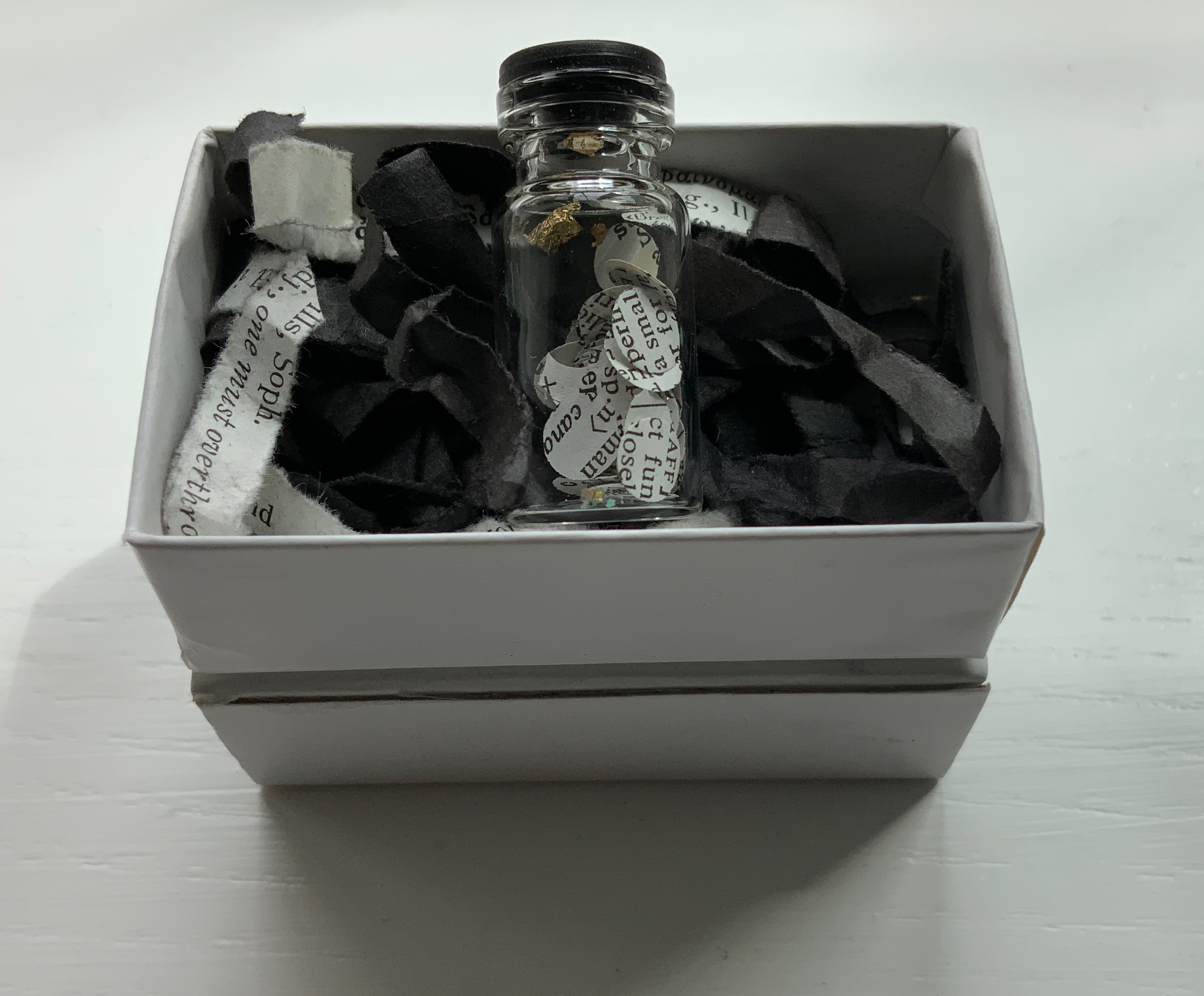
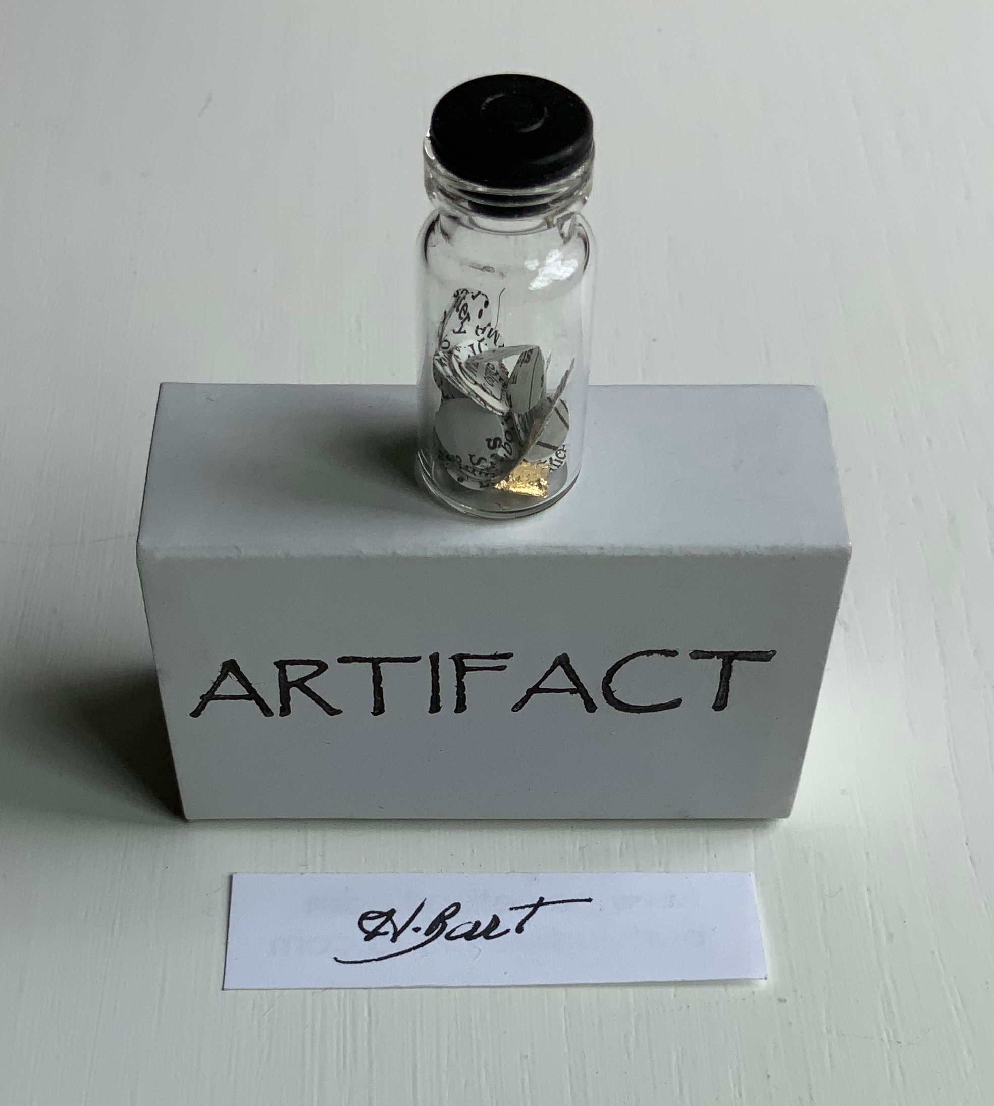
Artifact (2022)
Artifact (2022) Harriet Bart Matchbox enclosing black-capped bottle of fragments of gold leaf, paper disks hole-punched from a reference work, resting on shreds from a dictionary and black tissue paper. Box: H40 x W63 x D24 mm. Bottle: H35 x D9 mm. Acquired from the artist, 12 April 2022. Photos: Books On Books Collection.
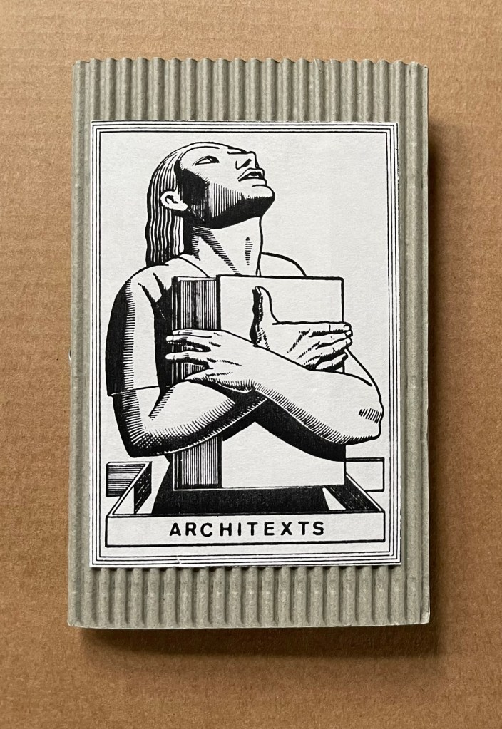
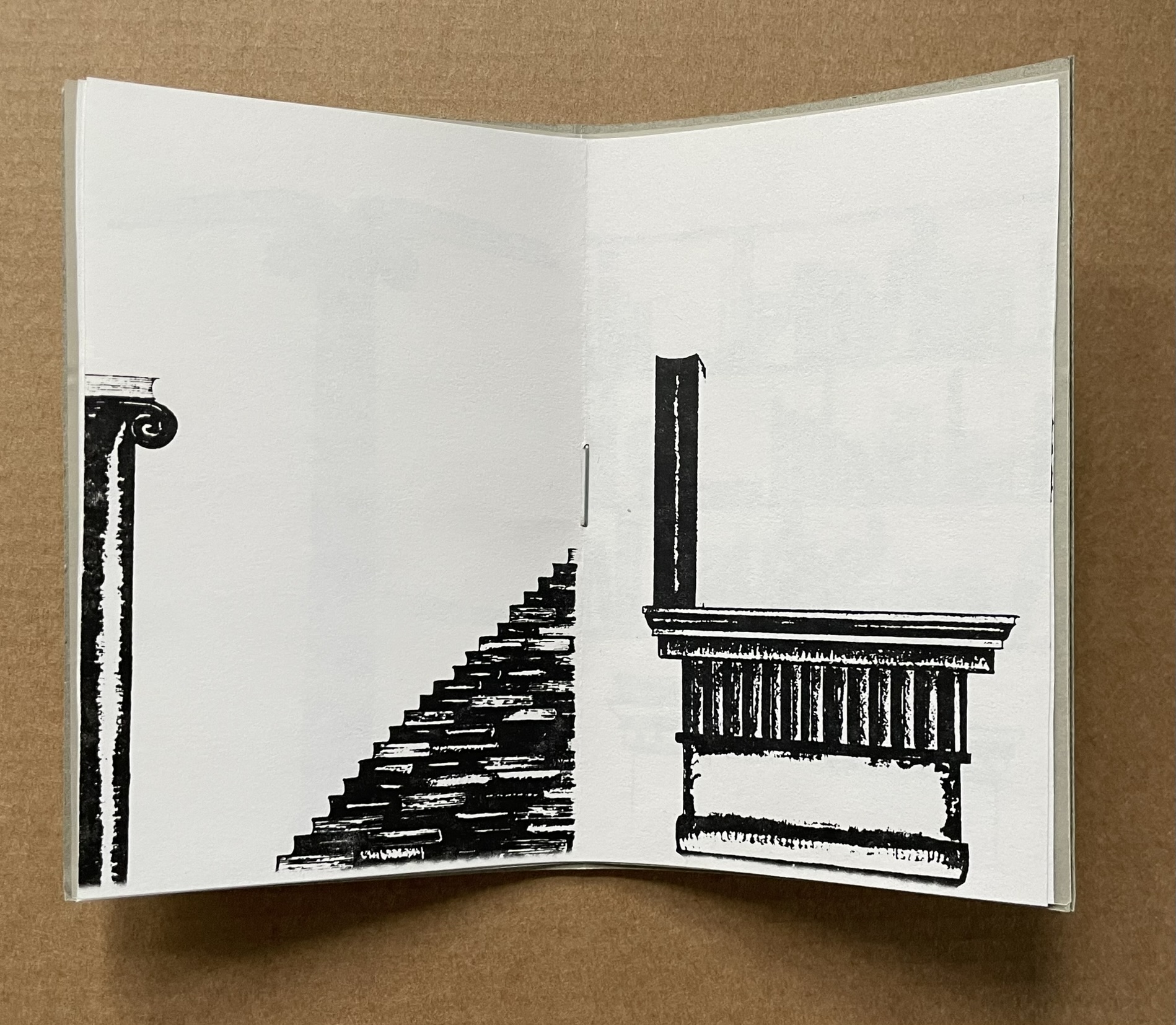
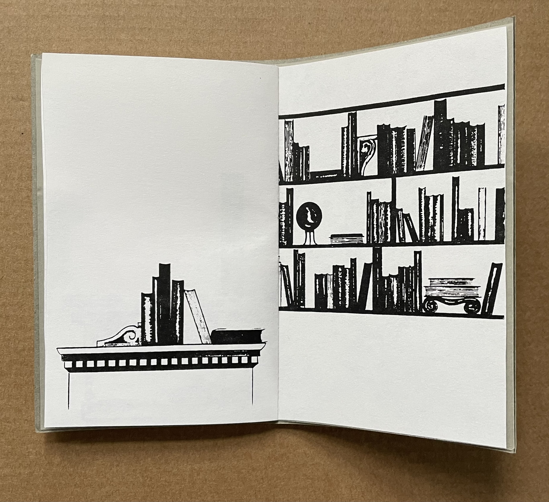
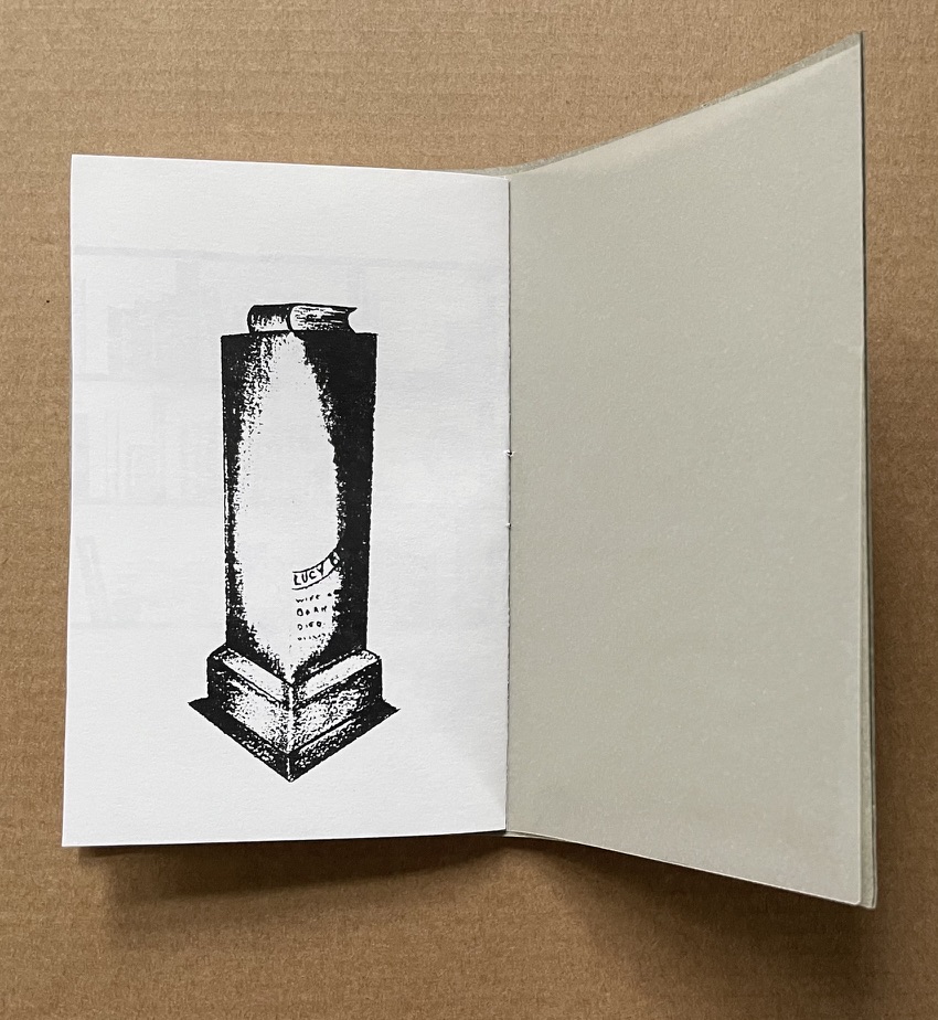
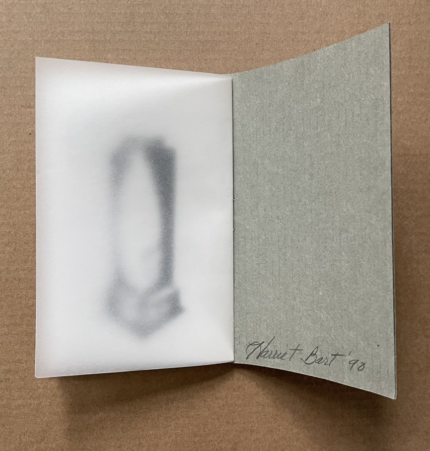
Architext (1990)
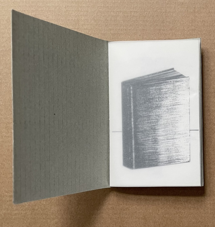
Architext (1990) Harriet Bart Booklet, saddle stitch, single-staple, corrugated cardboard with title pastedown. H112 x W72 mm. [8] pages. Photocopy of larger charcoal drawings. Acquired from the artist, 3 June 2022. Photos: Books On Books Collection.
The Architext‘s content makes its title and the work an oxymoron. As a wordless narrative, it has no text, and the “text” as book shifts between presenting as architectural features (capstone, stairs, etc.) and requiring architectural features to be presented. Artifact and Architext can both be found in the following booklet published for an exhibition at the Walker Art Center in Minneapolis, 15 December 2010 – 15 February 2011.
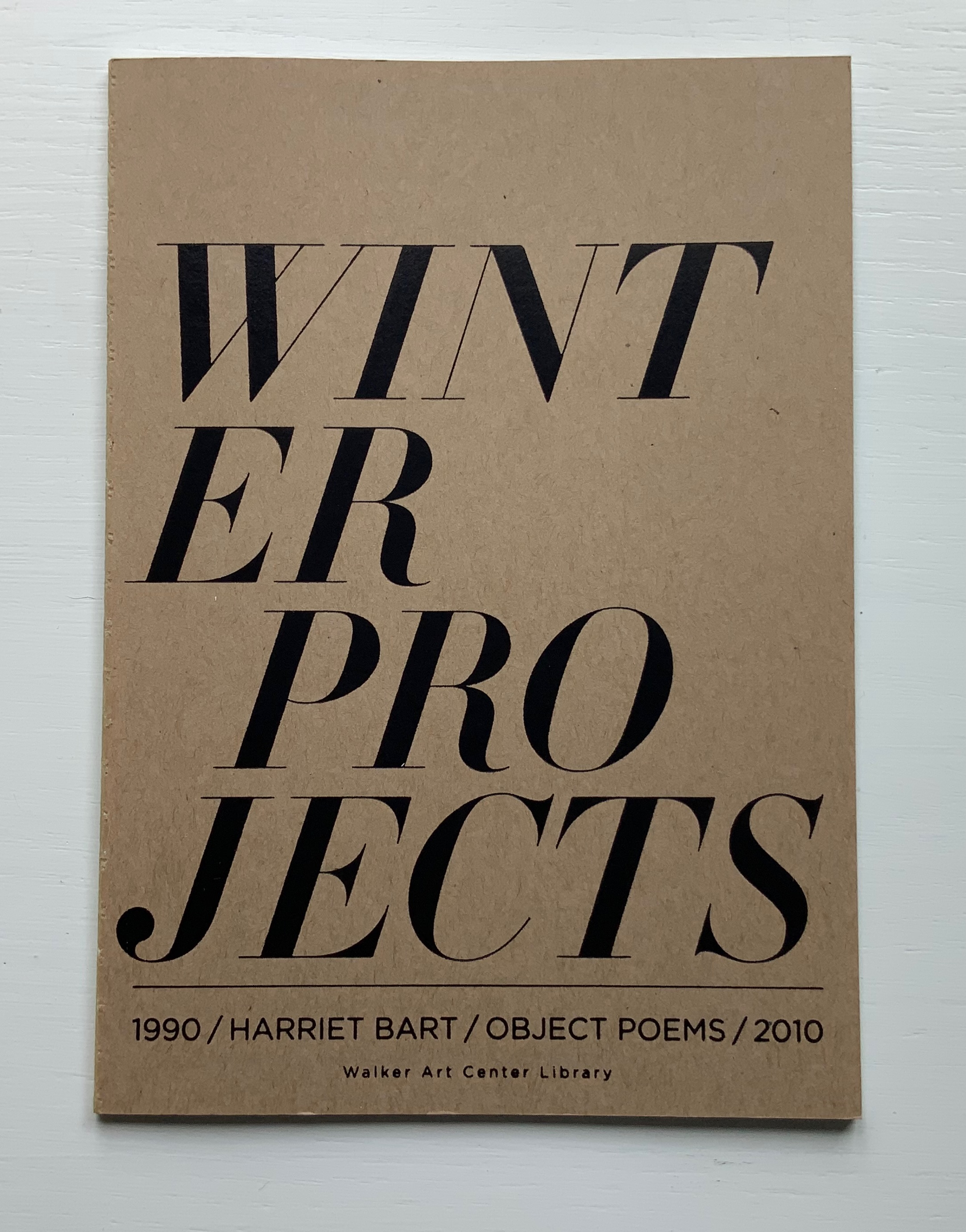
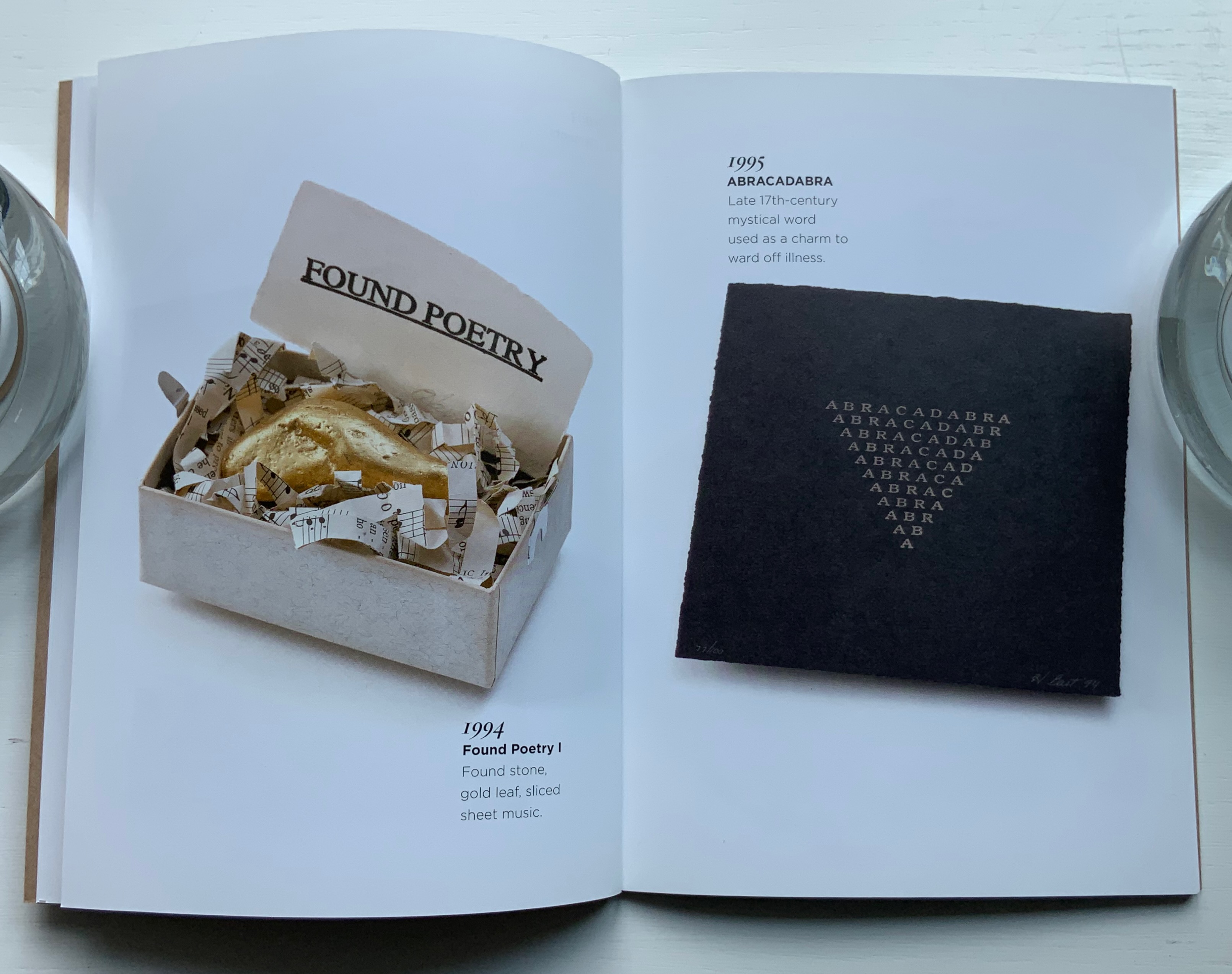
Winter Projects (2010)
Winter Projects: 1990 object poems 2010 (2010) Harriet Bart Open spine glue binding. H178 x W128, 36 pages. Published by the Walker Art Center Library, Minneapolis, MN. Acquired from the artist, 3 June 2022. Photos of the work: Books On Books Collection.
From the Foreword:
Every December for the past twenty years, the artist Harriet Bart, creator of the winter projects, has been making and sending multiples. These multiples echo her larger unfinished works. There are similarities, particularly in her use of repurposed materials, felt, shells, gold leaf, texts on paper, cords, and small boxes. These multiples serve as a holiday greeting for sixty or more friends and colleagues … The artist calls these multiples Visual Objects/Poems.
Harriet Bart (2003)
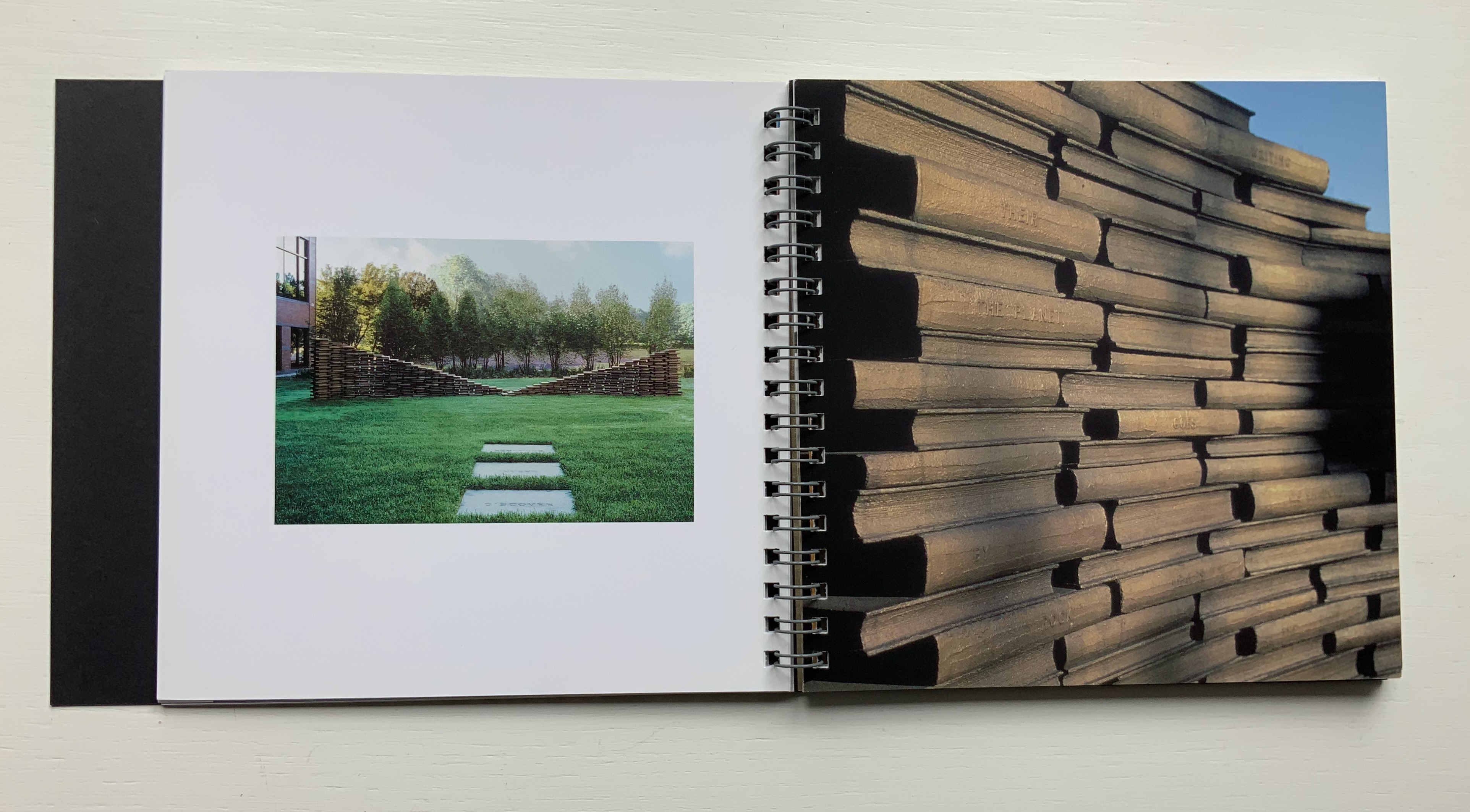
Harriet Bart (n.d.) Harriet Bart Rik Sferra, photos Trifold, spiral bound. H152 x W162 mm, 54 pages. Acquired from the artist, 3 June 2022. Photos of the work: Books On Books Collection.
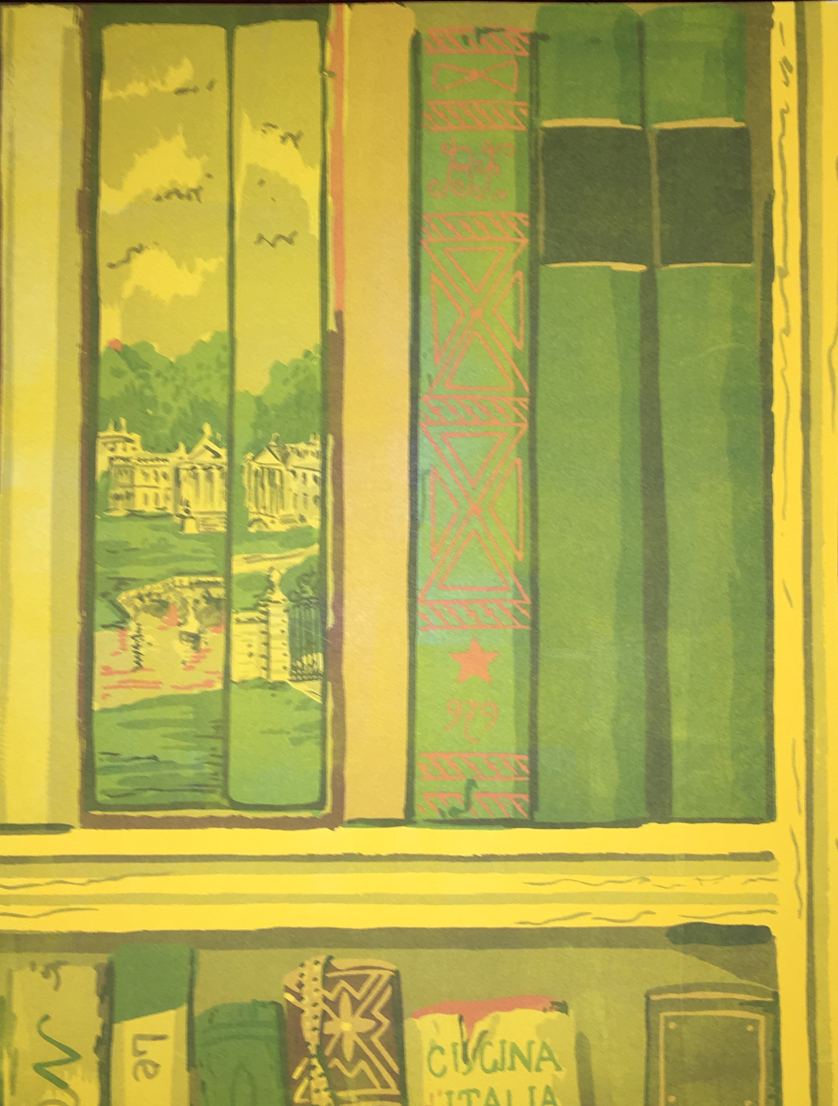
Published in conjunction with Bart’s book exhibition at the Driscoll Babcock Gallery in New York, this booklet, printed full color on high gloss paper, divides into three parts: commissions, installations and objects/books. It presents detailed views and spreads of each, but as they are not captioned or dated, this is more a photobook than catalogue. It demonstrates the artist’s breadth from the large-scale to the delicate from Double Ode (1995), a work commissioned by Doubleday Book & Music Clubs, Inc., to Tear Vials (2012), which look like containers for the tears of Elizabeth Bishop’s “Man-Moth“, who, if carefully watched, will hand over his only possession, a tear “cool as from underground springs and pure enough to drink”.
Double Ode (1995) and Tear Vials (2012?).
The Yellow Wall Paper (2018)
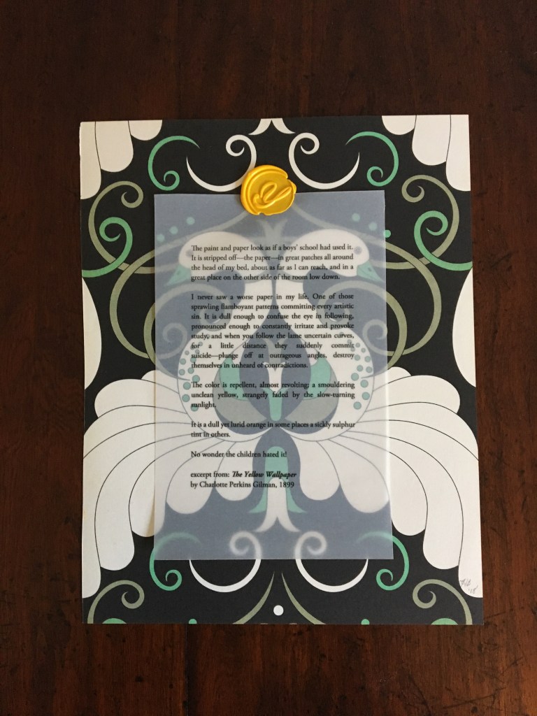
The Yellow Wallpaper (2018) Harriet Bart Print, collage. H245 x W190 mm, single sheet. Acquired from the artist, 4 July 2018. Photos: Books On Books Collection.
The Yellow Wallpaper captures two other aspects of Bart’s work. The title refers to Charlotte Perkins Gilman’s canonic short-story/novella. Like many artists of the book, Bart often springboards from a literary figure’s work. Here, it is an excerpt from Gilman’s story printed on translucent paper and wax-stamped to one side of a page taken from Charlotte Abrahams’ Wallpaper: A Collection of Modern Prints. The reverse side of the print is painted in cadmium yellow. At the exhibition where the work was displayed, Bart gave it away.
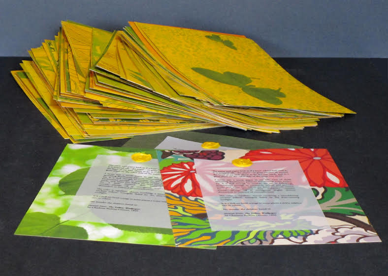
Which brings us to the second aspect of Bart’s work: her curatorial, collaborative activity. With Jon Neuse, she organized the exhibition, entitled “Wallpaper: an altered book experiment” at the Traffic Zone Center for Visual Art Mission, 50 Third Avenue North, Minneapolis, 2 July through 10 August 2018. Each artist exhibiting had been given a copy of Abrahams’ compendium and challenged to generate a work of art. Included were Scott Helmes, Vesna Kittelson, Joyce Lyon, Chip Schilling, Jody Williams, Karen Wirth, Sarita Zalehaand, last and out of alphabetical order but not least, Doug Beube, who also photographed Bart’s Double Ode installation in 1995.
Further Reading
Chen, Julie. 2013. 500 Handmade Books. Volume 2. New York: Lark. P. 46 (Plumb Bob).
In Memoriam+ (2021) Alastair Noble Booklet thread-bound to HMP boards, cover with cutout. H210 x W205 mm, 12 pages. Edition of 22, of which this is #4. Acquired from the artist, 25 April 2021. Photos of the work: Books On Books Collection. Displayed with permission of the artist.
This work pays tribute to Ian Hamilton Finlay, whose Little Sparta, a garden across seven acres in Scotland, that expresses an artistic vision through typography, sculpture, installations and nature. Noble writes about the origins of his tribute:
I first visited Little Sparta twenty years ago and then again last year in July out of lockdown. Thereafter, coincidentally I found a brick buried in my garden with the work “Temple” embossed on it. Consequently this became the catalyst for a little homage in form of small installation in my garden that used the brick as a foundation to an arch made from white marble fragments that suggests the Portara for Apollo’s Temple Naxos. This installation became the stimulus for this small artist’s book completed during lockdown in my studio in Liverpool, UK. — Entry in Book Arts Newsletter, No. 138 March – mid-April 2021, p. 43.
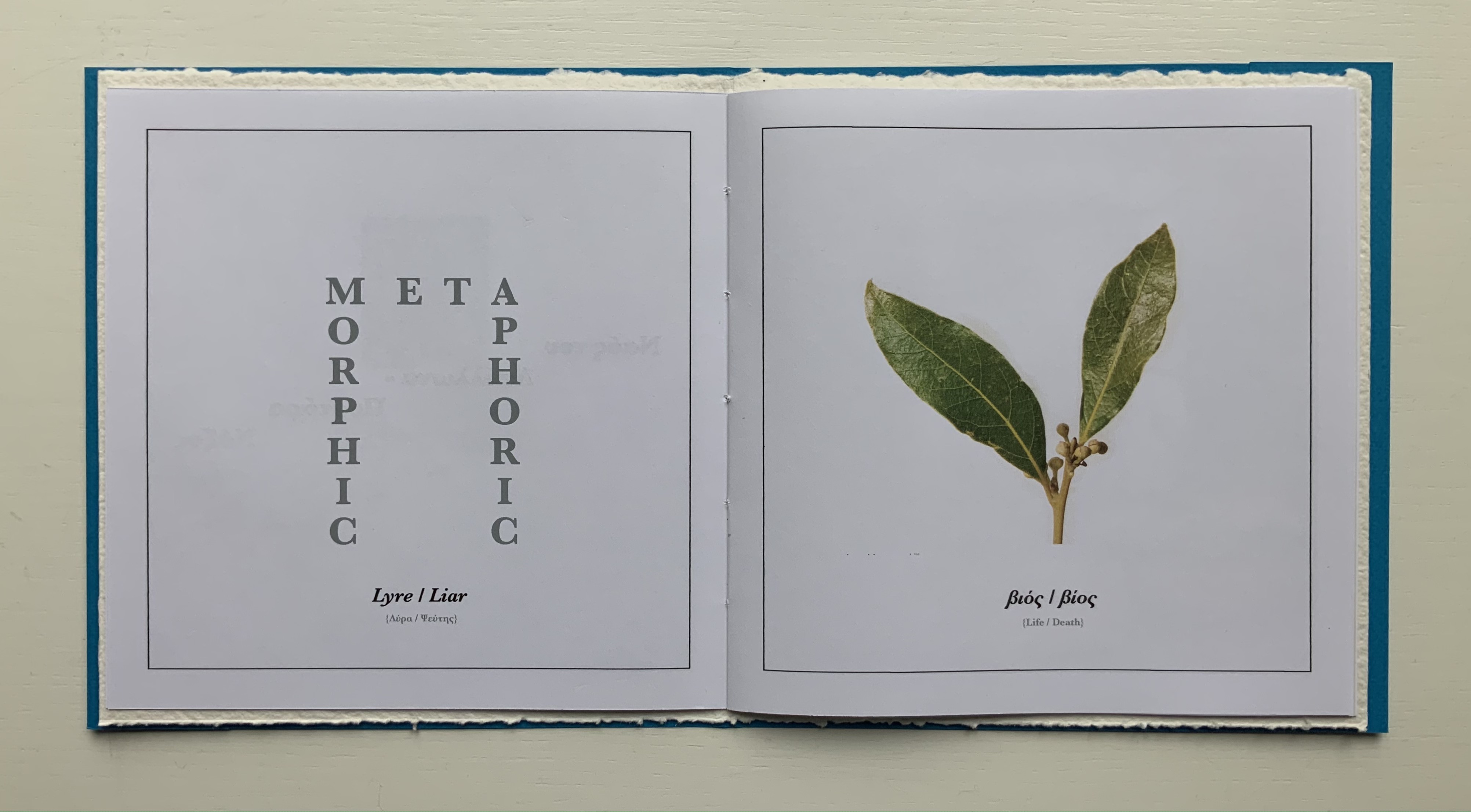
Noble has expanded and intensified his small garden homage into a slender and rich work of book art. The sculpted structure of it — how the cover, pages, images and text work with each other — rhymes with Finlay’s art, Greek mythology and Nature. Noble’s choice of the portal to Apollo’s Temple to link the found brick and arch of marble fragments to Little Sparta and Finlay’s art finds one of its echoes in the cover’s cutout and the marble-white textured board behind it. Another echo lies in the words “metamorphosis” and “metaphoric” laid out to form an arch on the page below. And just as sonic echoes overlap one another, the words and image themselves echo across the double-page spread with the laurel leaf emblem of Daphne’s transformation to escape the pursuit of the lyre-bearing sun god and mythic patron of poets laureate.
Other overlapping echoes arise from the Greek and English word pairs on the double-page spread below. The presence of the Greek words obviously chime with Apollo’s Temple, but the presence of the English chimes more deeply with the word “metamorphic”. What is a translation if not a metamorphosis? And the rhyming of “lyre” and “liar” chimes even more deeply with “metaphoric”. What is a metaphor if not like a lyre and liar at the same time that tells us Daphne’s death is her translation into life as a tree?
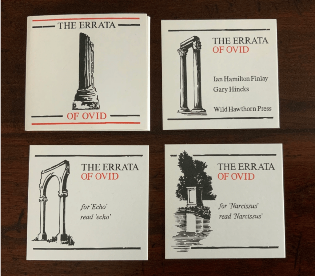
Noble’s use of “meta” for his arch’s lintel also echoes Finlay’s aphoristic concrete poetry, a good example of which is The Errata of Ovid.
The Errata of Ovid (1983/4) Ian Hamilton Finlay, Gary Hincks Miniature portfolio. H76 x W80 mm. Offset printed in red and black, eight loose cards enclosed in a flap folder. Typeset in Bruce Old Style(?); illustrations by Gary Hincks; card stock unknown. Acquired from Woburn Books, 31 October 2019. Photos: Books On Books Collection
Beyond the tribute of image/word-play, Noble’s artist’s book strikes a performative echo with the history of Finlay and Hincks’ artists’ book. A few years after the publication of The Errata of Ovid, Finlay drew up ”Six Proposals for the Improvement of Stockwood Park Nurseries in the Borough of Luton”, which included a caprice with a wall and plaques. The wall in Stockwood Park stands today, presenting the text of The Errata of Ovid engraved in eight stone plaques (minus the colophon but with the addition of “For ‘Adonis’ read ’Anemone’”). So Noble’s artist’s book followed his garden installation whereas Finlay’s garden installation followed his artist’s book. If only for perfection of that echo, one might wish Finlay’s installation be transported to Little Sparta and let Luton be satisfied with its airport!
Thresholds (2020)
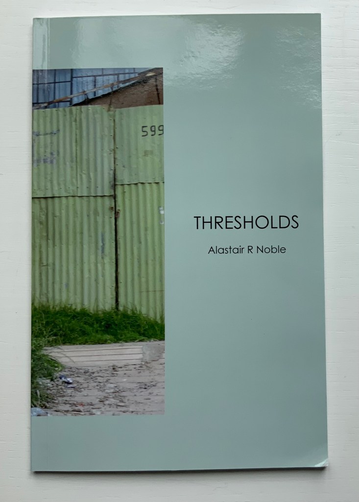
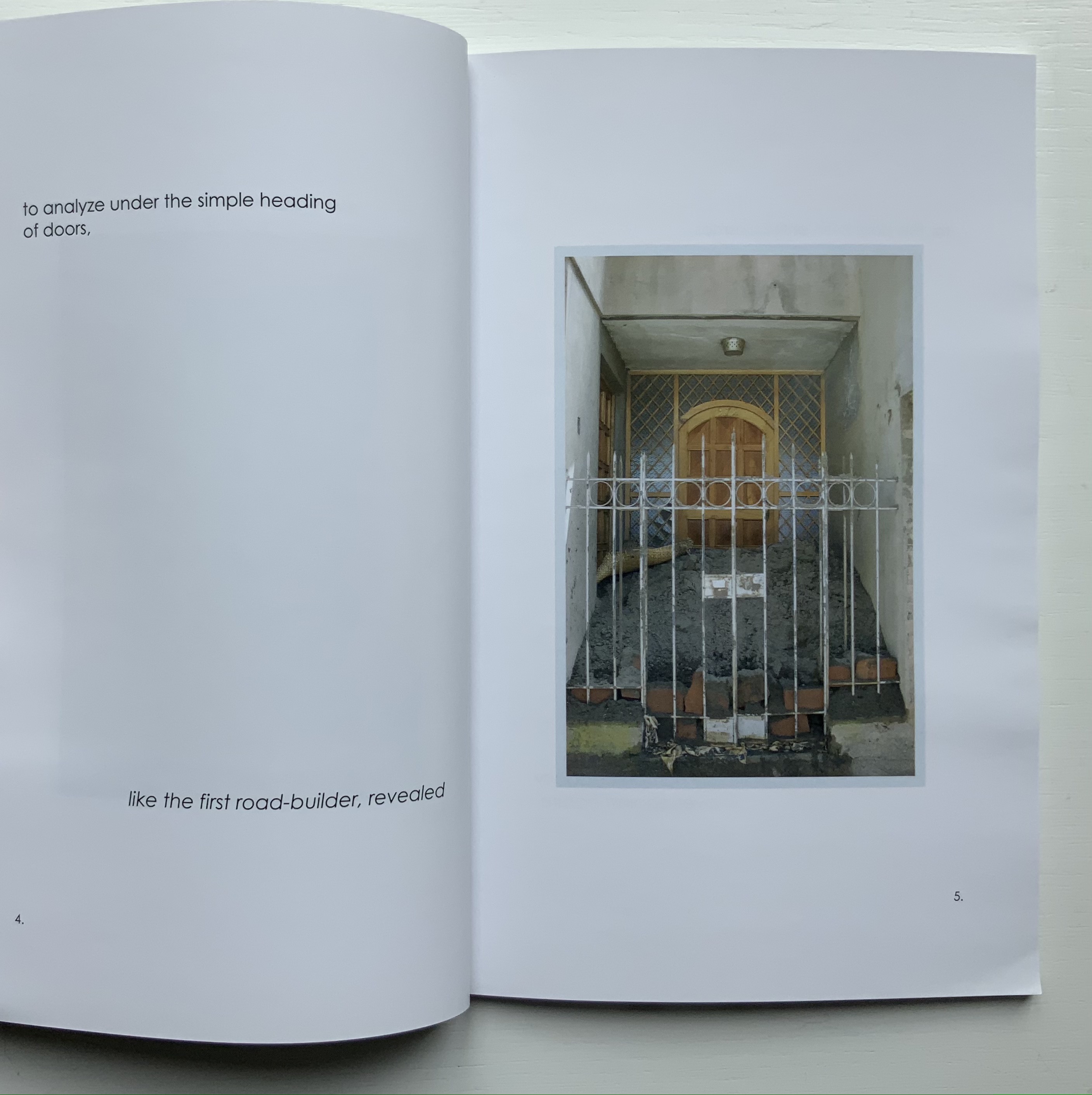
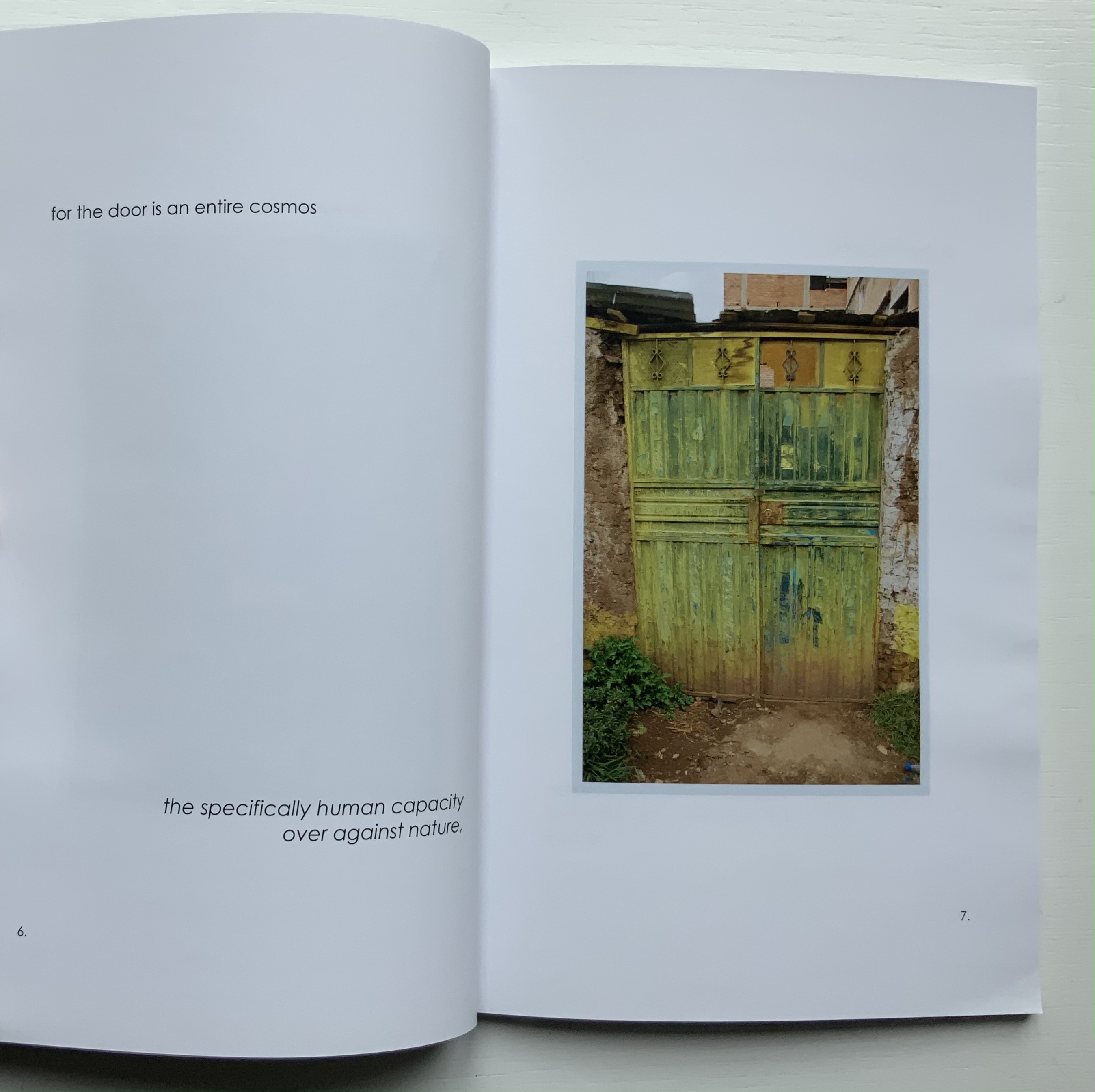
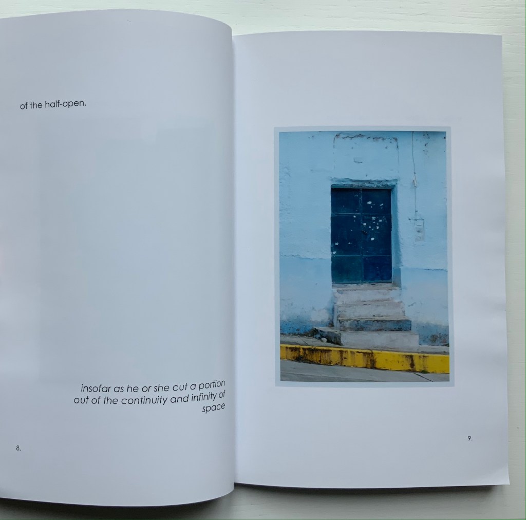
Thresholds: Doors, Gates & Barriers Puno Peru (2020) Alastair Noble Perfect bound paperback. H215 x 140 mm, 48 pages. Acquired from the artist, 11 May 2021. Photos of the work: Books On Books Collection.
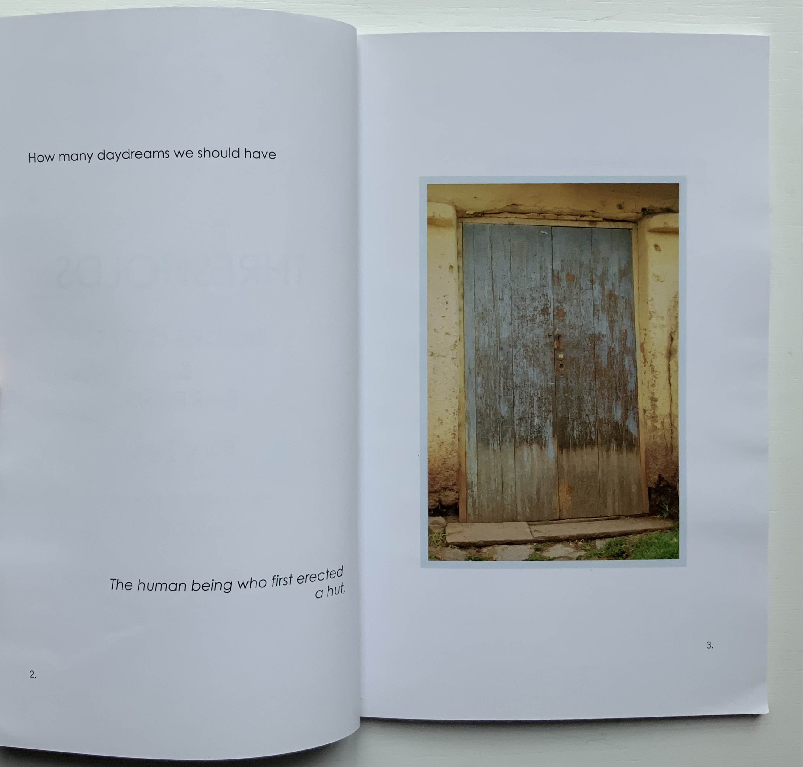
Like In Memoriam+, this work has its roots in location and a portal metaphor. While also employing juxtaposition of text and images as a structural device, it relies on images of a category of sought readymades (doors, gates and barriers) rather than a found object (like the garden brick on which the artist builds his arch) for a structuring device that is simultaneously material and metaphor.
The way Noble uses his sources of text (Gaston Bachelard’s The Poetics of Space, Martin Heidegger’s “Building Dwelling Thinking” and Georg Simmel’s Bridge and Door) causes the reader/viewer to contribute to structure and metaphor. The first sentence of Bachelard’s excerpt begins “How many daydreams” and starts at the top of page 2; Heidegger’s beginning “The threshold” starts in the middle of page 26; and Simmel’s beginning “The human being” starts at the bottom of the page 2. Bachelard’s first sentence ends on page 8, Heidegger’s on page 28, and Simmel’s on page 12. Unless one has the mind of a symphonic composer or connoisseur, it is impossible to attend to all three excerpts simultaneously and turn the pages in one sequence. Instead, it is necessary to turn the pages back and forth along three tracks to absorb the excerpts, and the metaphoric effect is to open and close those doors, gates and barriers repeatedly, which is …
… what Noble’s very last page implies.
But finally, over the course of multiple readings/viewings, the linear photographic sequence on the recto pages seems to shift. Each image takes on a different aspect depending on the excerpt being followed. Combined with the back and forth page-turning, this shifting and break in the linear photographic sequence leaves the reader/viewer with the simulation of walking around, up and down and through Puno and its doors, gates and barriers.
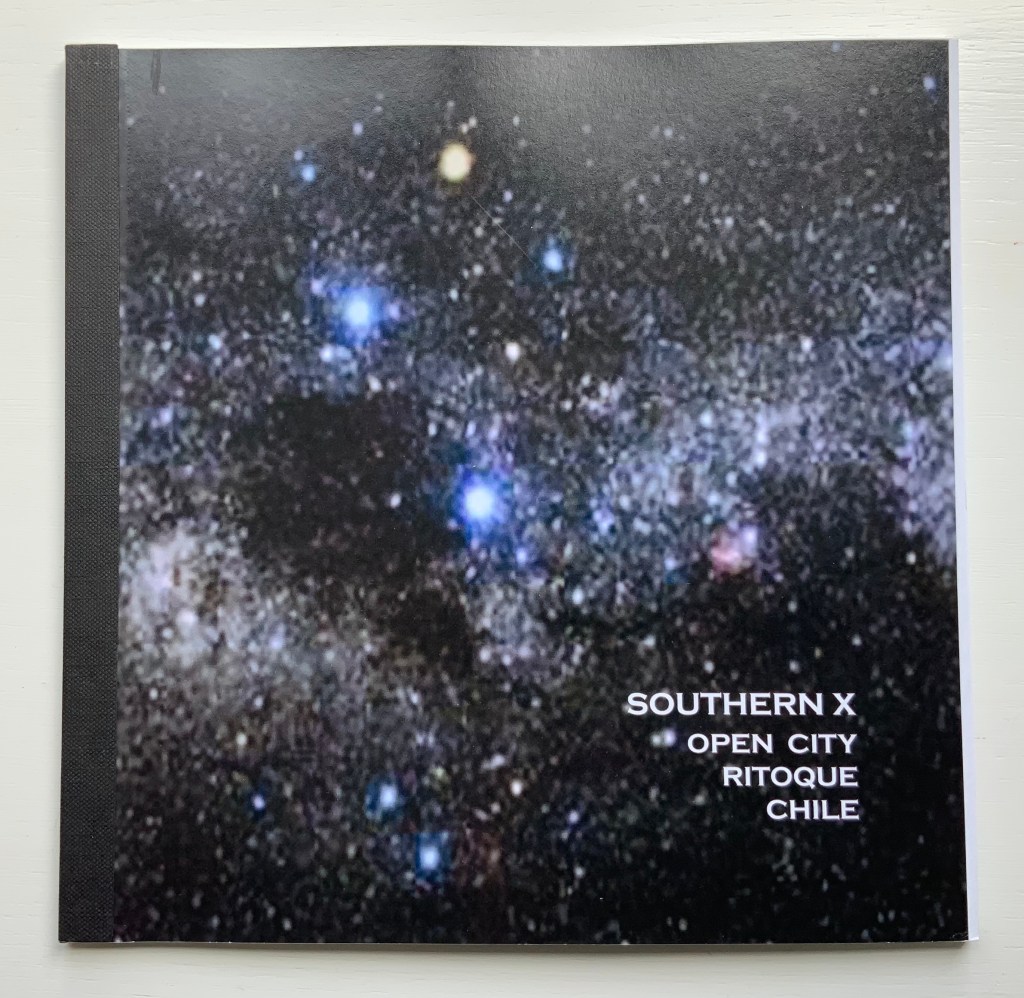
Southern X 2006 : Open City, Ritoque Chile (2006)
Southern X 2006 : Open City, Ritoque Chile (2006) Alastair Noble Perfect bound paperback, spine taped. H215 x W218 mm, 32 pages. Acquired from Specific Object, 2 May 2021. Photos of the work: Books On Books Collection.
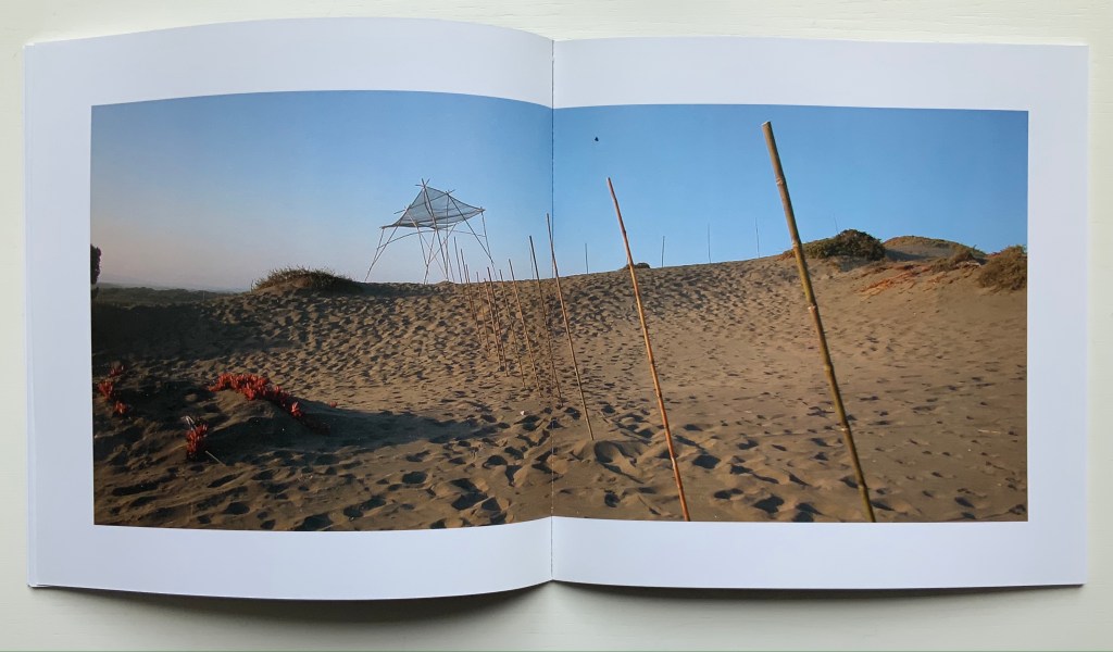
Like Thresholds, this work, too, has its roots in location, but more akin to In Memoriam+, it draws on poetry, installation and performance. Open City is a utopian site affiliated with the School of Architecture of the Catholic University of Valparaíso. Accommodations and buildings have arisen by collective collaboration. There is no plan. One of the traditions associated with construction on the site is the reading of excerpts from the book Amereida (1967), a collective epic poem, which the school describes as “a poetic vision of the American continent”.
Reading the text takes us into the permanent question about being American from the recognition of the appearance of America seen as a discovery or gift. From the first page of the poem, the encounter with the unknown opens the possibility to begin to think of the new world as a gift, a gift. Its main sign: the Southern Cross, the light that goes up the horizon and guides in the north. — “Amereida“
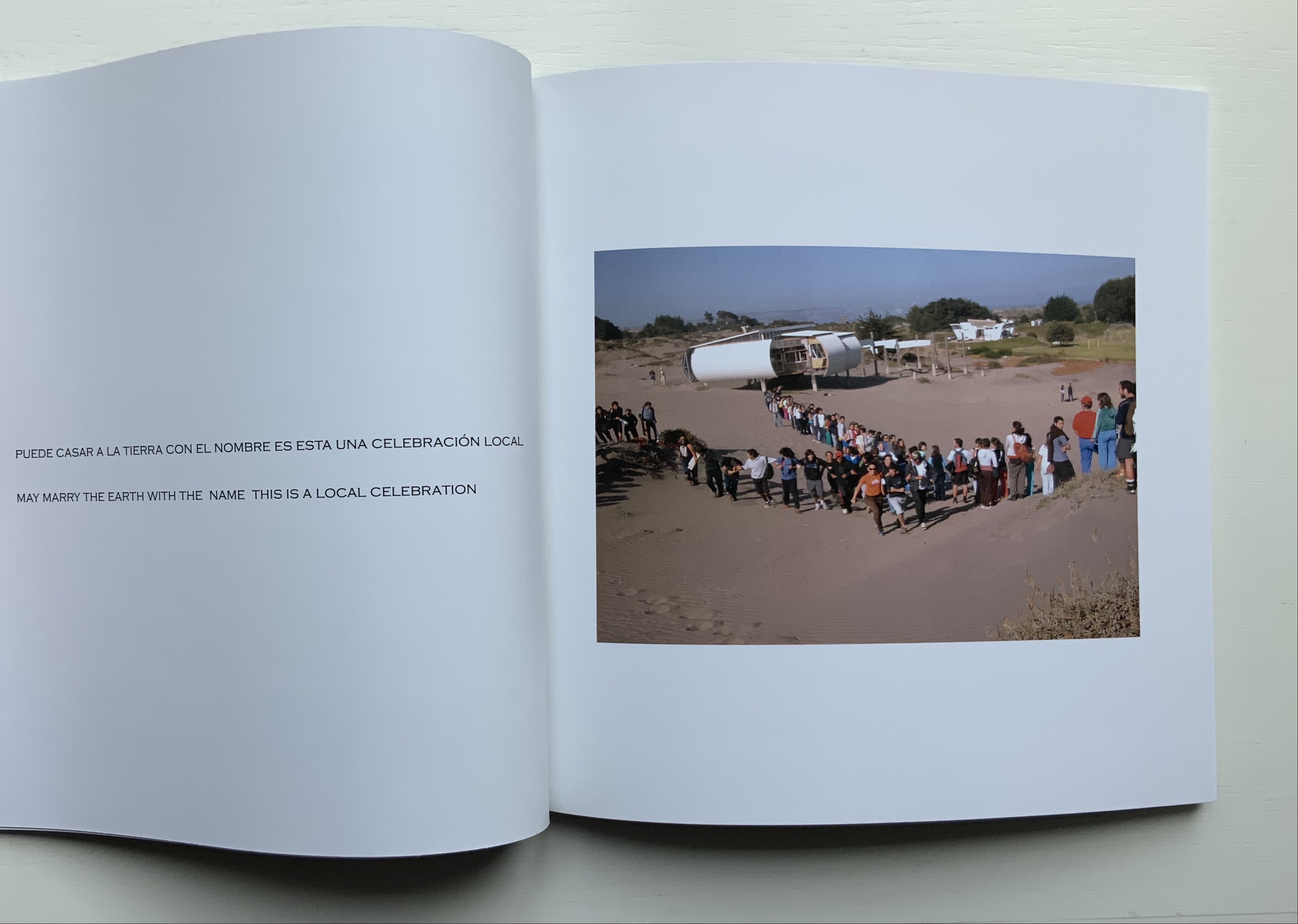
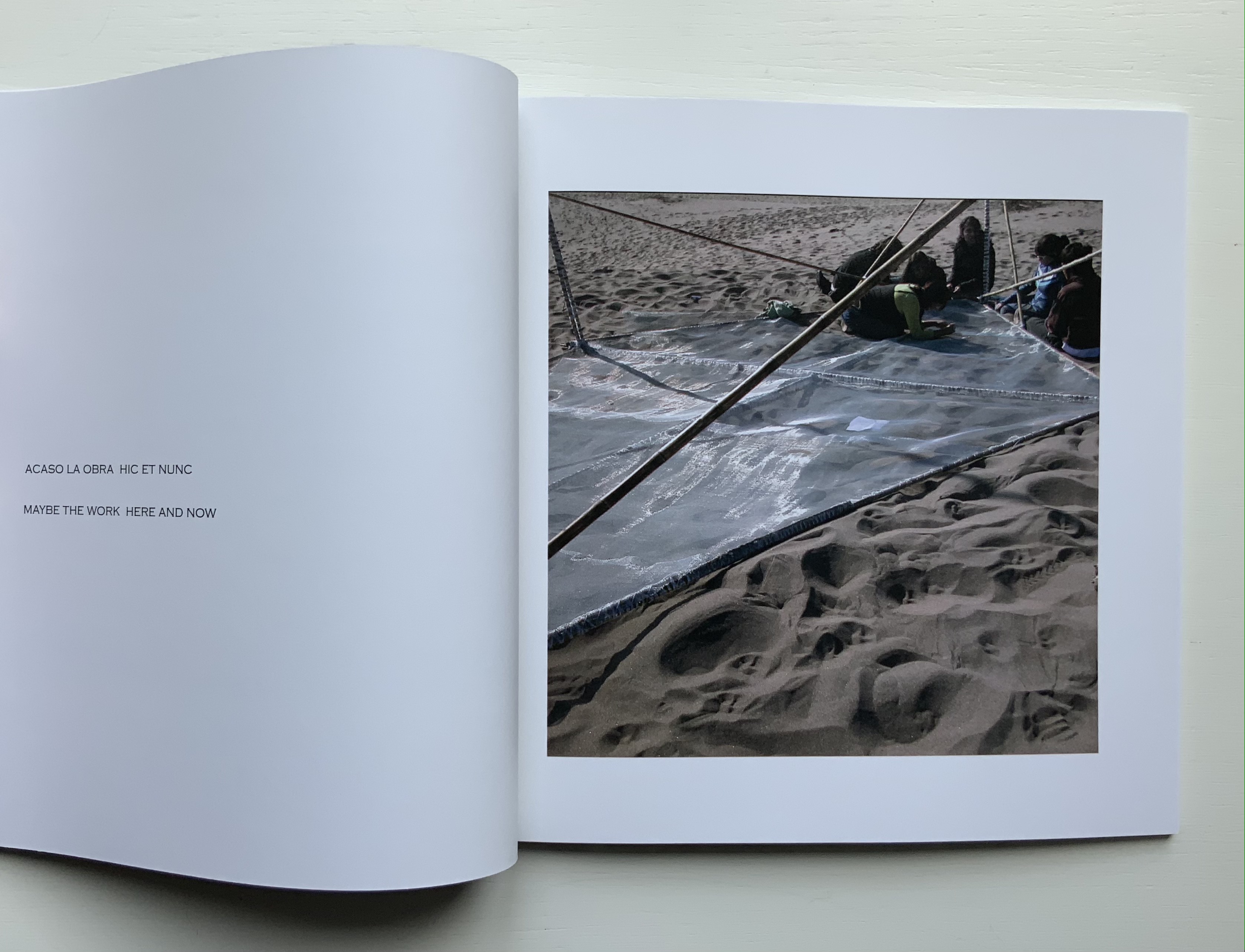
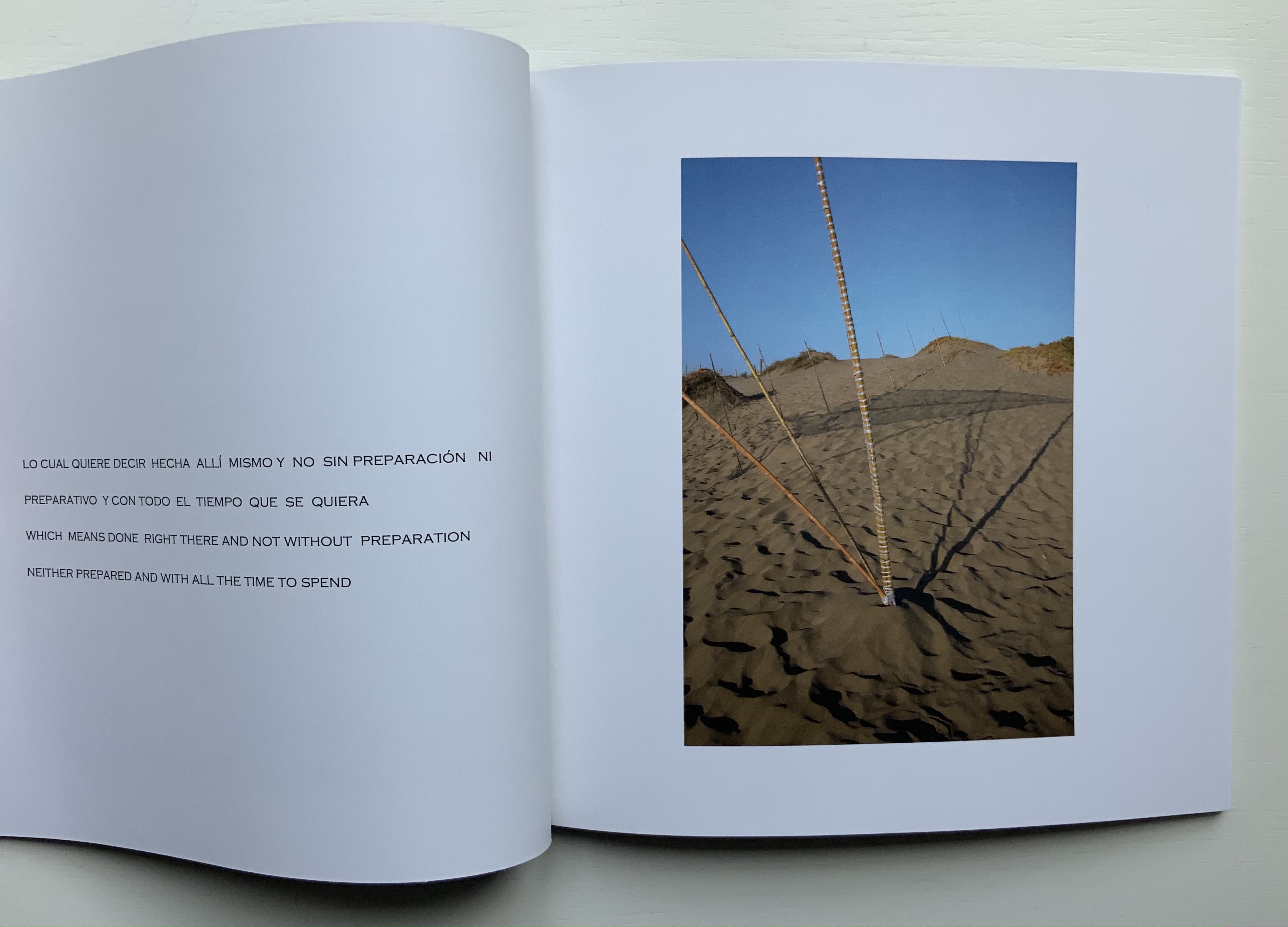
Inspired by the Amereida during a sabbatical visit to the school and Open City, Noble proposed an installation: Southern X 2006. Given that the Amereida takes the Southern Cross for its main sign and that this sign appears across the night sky in the shape of a kite, Noble’s direction for his installation sculpture was set before he began.
The actual sculpture is but a piece of a larger collective artwork consisting of Manuel F. Sanfuentes Vio’s reading from the Amereida, the students’ procession in the shape of the Southern Cross to the site selected by Noble, the collective construction of the kite, the planting of poles and the placement of the kite on them — and of course this book that photographically documents the performance of the installation and textually presents the read passages of the Amereida.
Foldings (1998)
Ephemera for Foldings (1998) Kathy Bruce and Alastair Noble. Poster and staging sketches. Photo: Books On Books Collection.
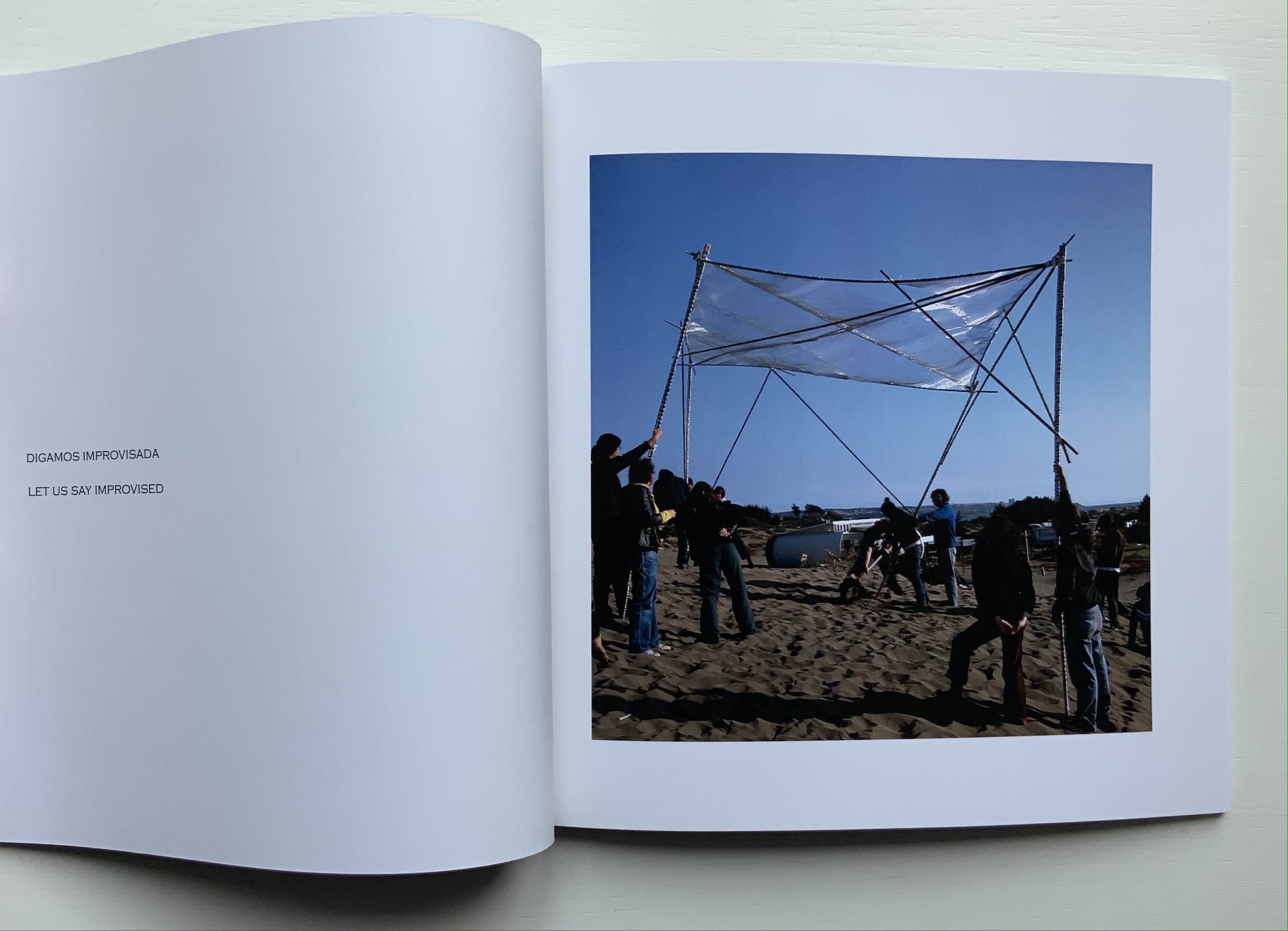
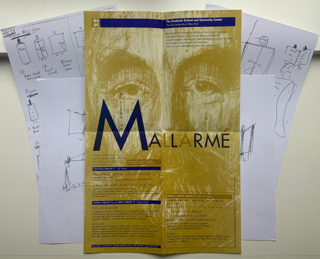
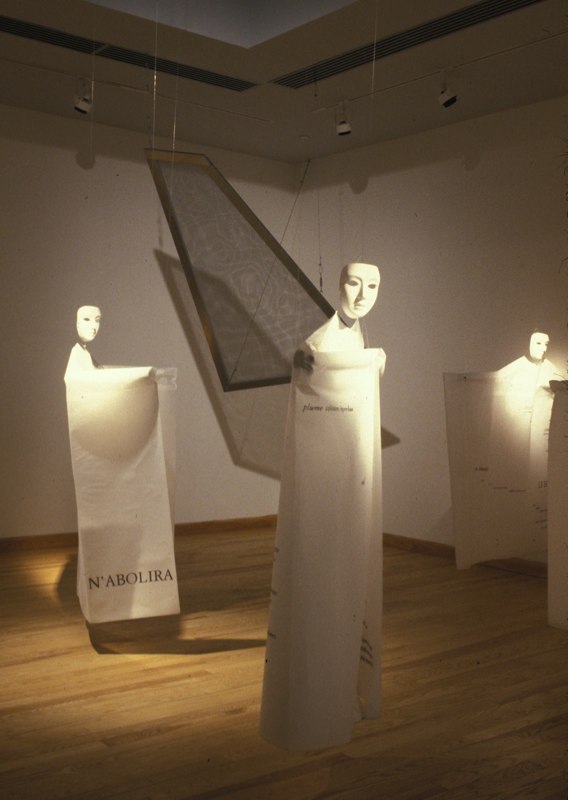
With Foldings, Noble joined forces with Kathy Bruce, his wife. Six masked dancers wear costumes that are in effect human-size folios across which the pages of Un Coup de Dés have been printed front and back in French. As a prerecorded English translation is read by numerous voices corresponding to the changing fonts, the dancers rotate and display the lines being read. A performance was given as part of the exhibition A Painter’s Poet, held at the Leubsborf Art Gallery (Hunter College). This fell under the aegis of the Millennium Mallarmé celebrations in New York, the poster for which can be seen above overlaying the staging sketches for the performance. Later, as part of an installation under the title Navigating the Abyss (Brookdale Community College, Lincroft, New Jersey), the costumes were suspended from the ceiling along with a framed screen mesh reminiscent of Noble’s As if / As If (see above).
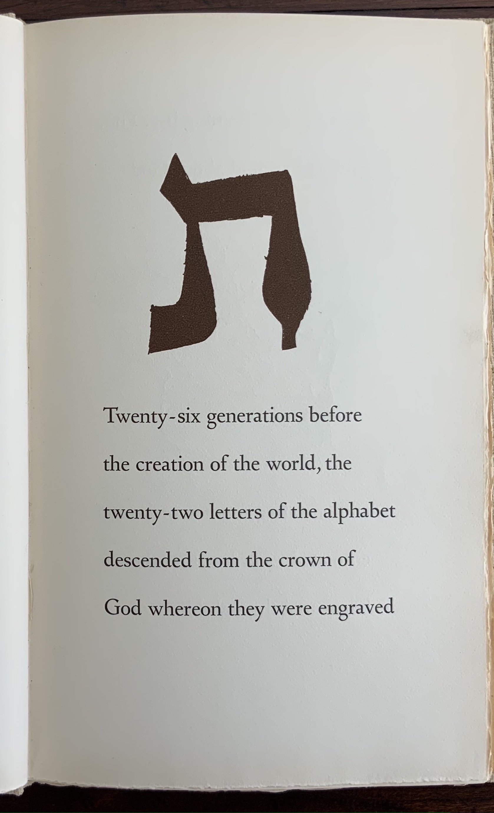
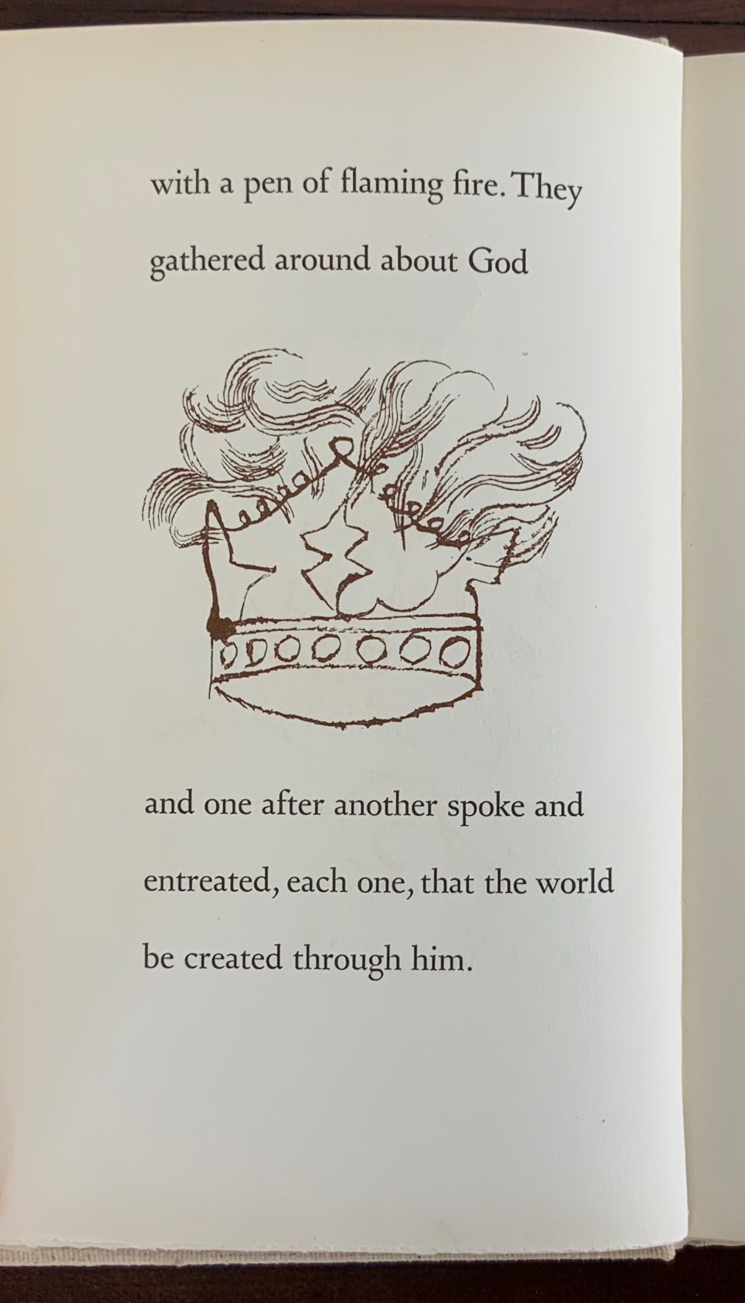
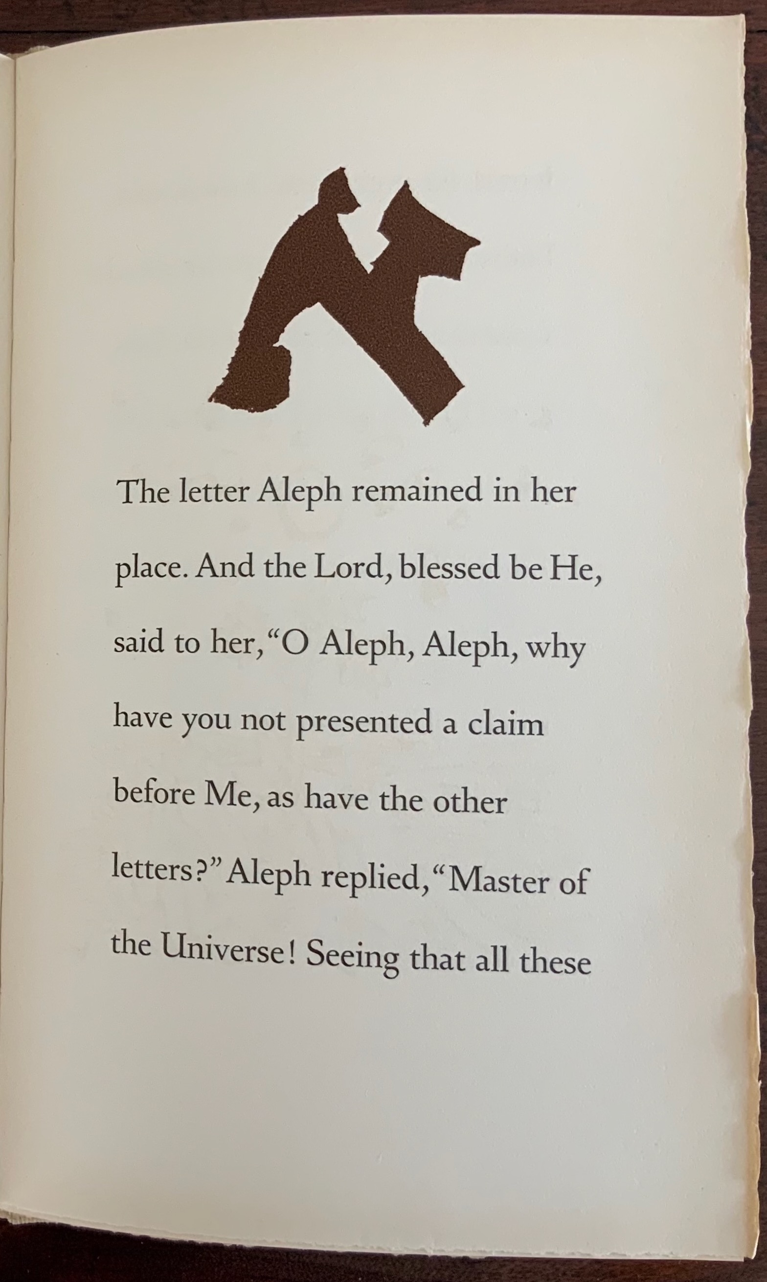
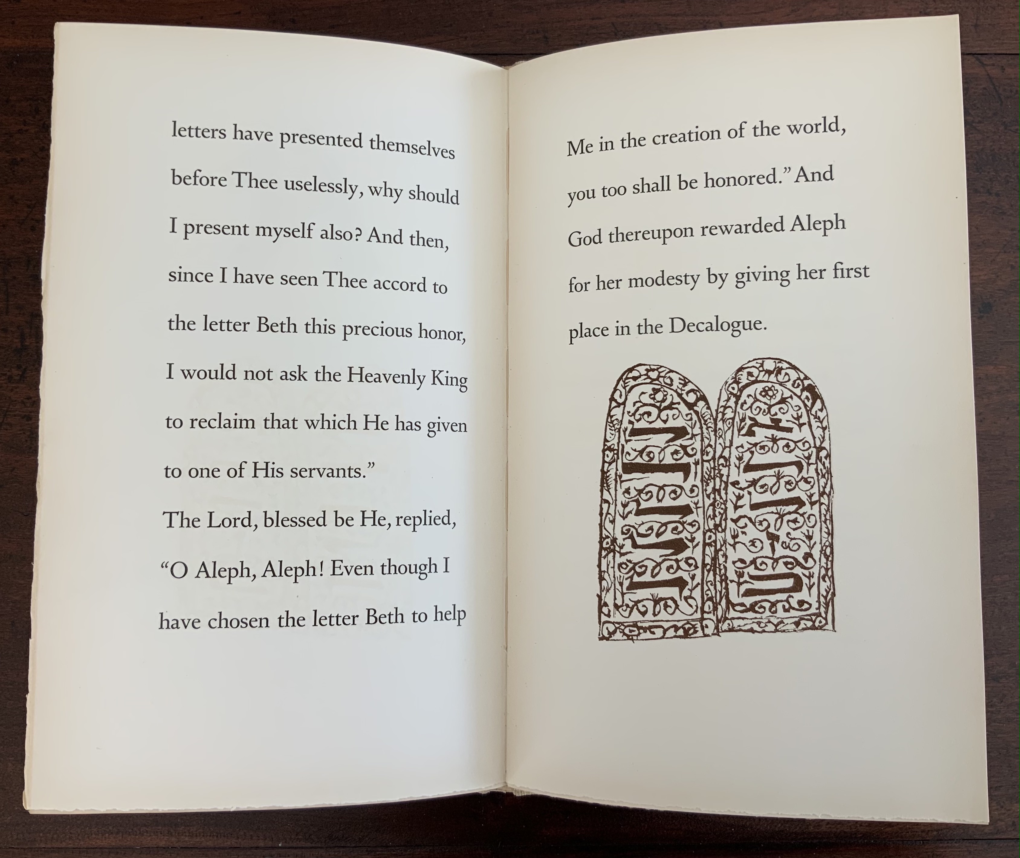
The Alphabet of Creation: An ancient legend from the Zohar(1954) Ben Shahn Hardcover, tan linen boards with red and gold decorations on cover and spine labels. H275 x 170 mm, 48 pages. Edition of 550, of which this is #497. Acquired from Midway Used and Rare Books, 7 August 2021. Photos: Books On Books Collection.
Why does the alphabet begin with the letter A? There is the theory that alef‘s association in the Phoenician alphabet with the ox suggests a “needs-based” reason: food first, then shelter (B being beth meaning house). The rationale from the Zohar, however, is more entertaining and suited to the artistry of Ben Shahn.
After all of the other letters have had their say and presented their arguments, the letter A, aleph, remains:
Shahn’s artist’s book provides an example of the affinity of book art with the alphabet. The list of artists’ books and abecedaries under Further Reading offers a variety of other examples, but the reasons for that affinity may be just as mystical or speculative as the answer to the question: Why should the alphabet start with the letter A? Or, for that matter, end with the letter Z?
Drucker, Johanna. 1995. The alphabetic labyrinth the letters in history and imagination. London: Thames and Hudson. An exploration of extraordinary breadth and depth: the mythical, anthropological, archaeological, art historical, calligraphical, geographical, kabbalistic, linguistic, philosophical, religious and typographical aspects of the alphabetic labyrinth are covered in style and extensively illustrated.
Ferlauto, S., and J. Morin. 2000. The sacred abecedarium. Stevens Point, WI: SailorBOYpress. A more typographical and secular perspective to compare with Shahn’s.
Flanders, Judith. 2020. A Place For Everything: the curious history of alphabetical order. New York: Basic Books. Curious that it does not address this Hebrew parable or the needs-based theories about the origin and ordering of the alphabet; otherwise wide-ranging and informative.
Thompson, Tommy. 1952. The ABC of our alphabet. London: Studio Publications. An entertaining use of the margins and overlays on the text page to illustrate the evolution of the alphabet. Deserves a reprint.
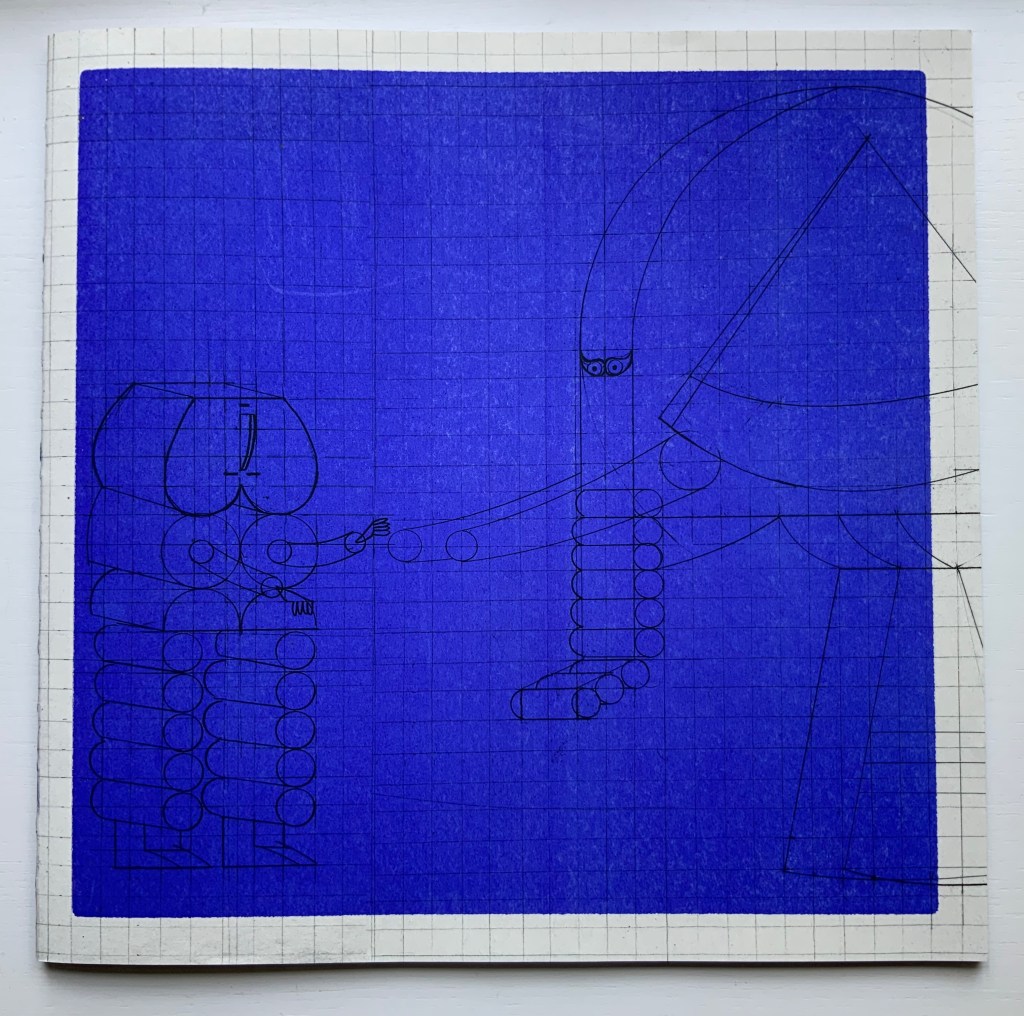
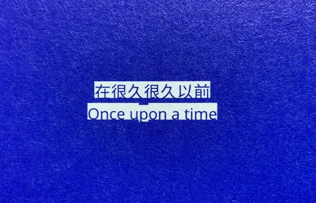
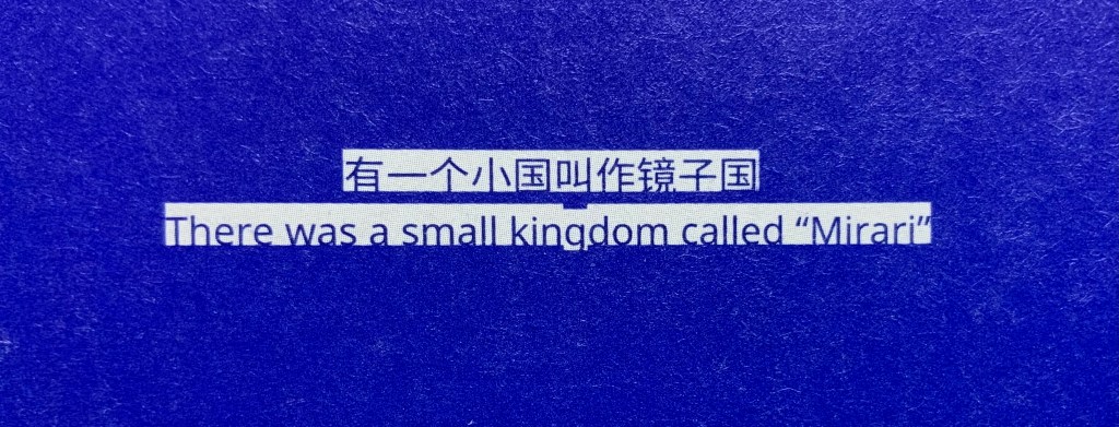
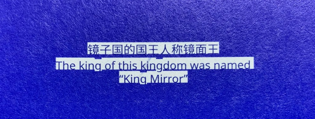
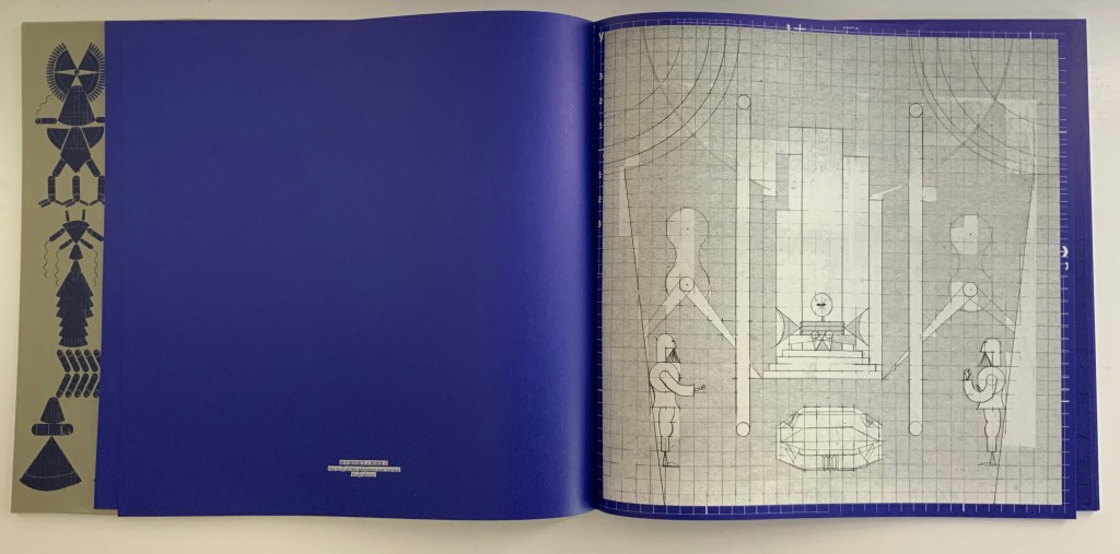
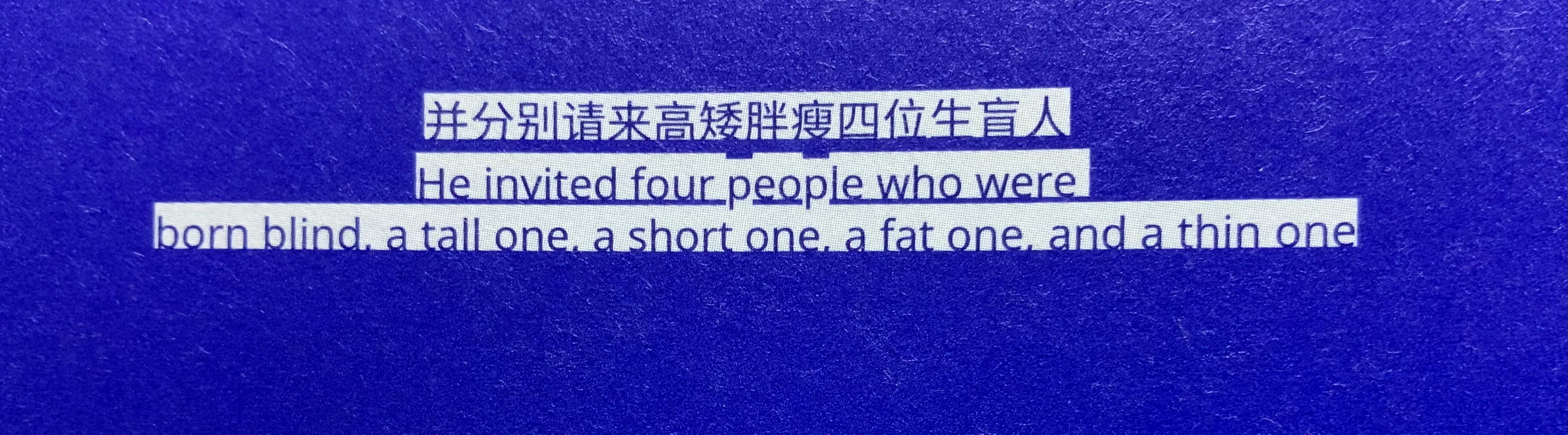
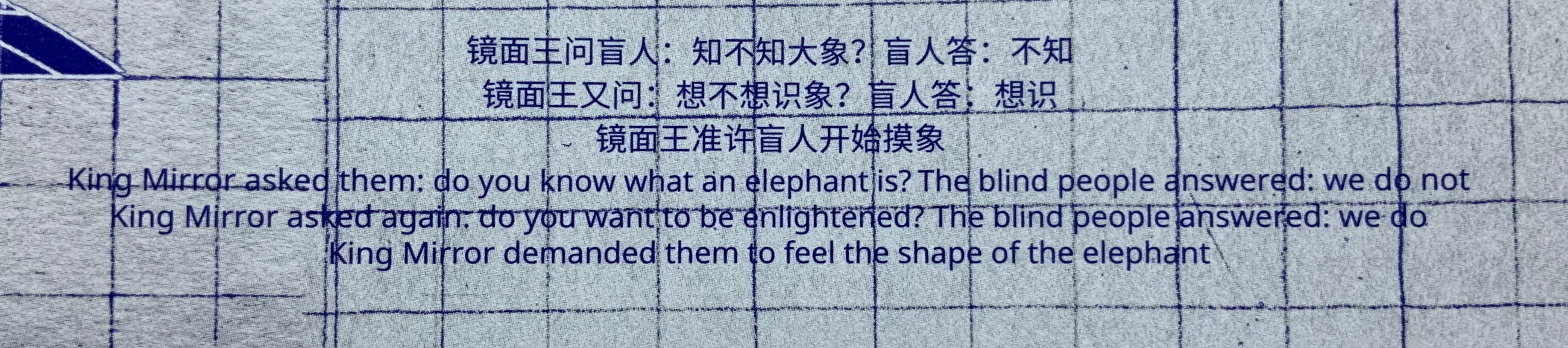
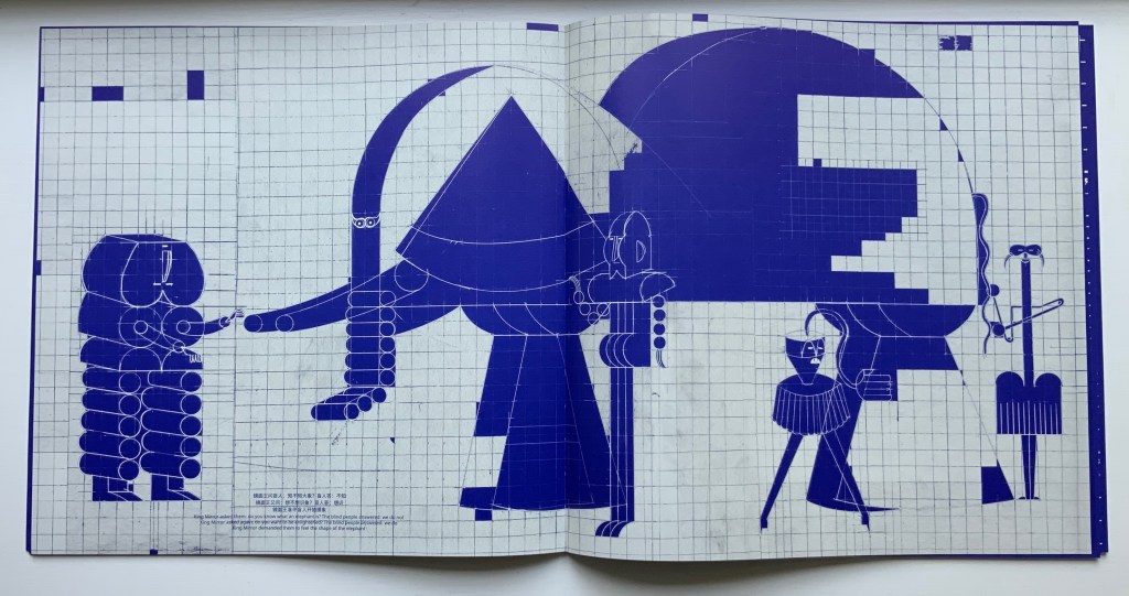
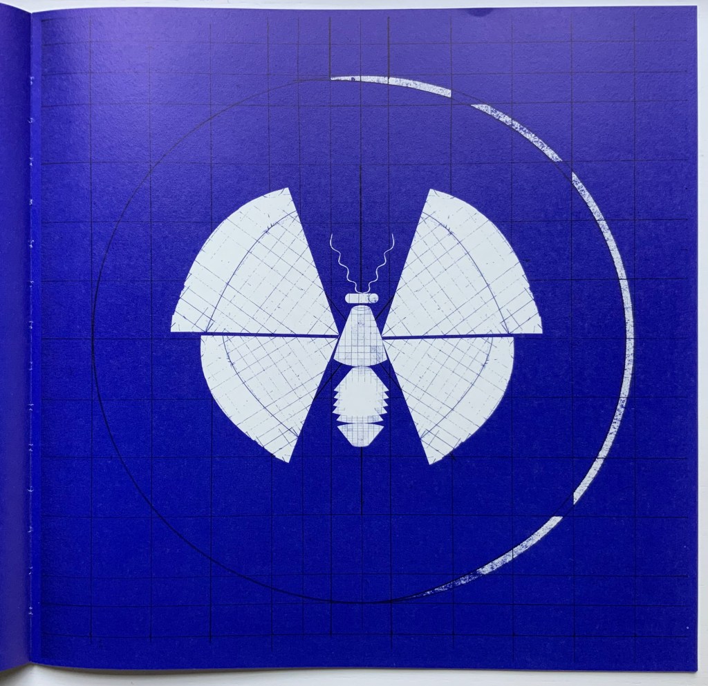
The Blind Men and the Elephant (2019) Xiao Long Hua Sleeved paperback, exposed sewn spine. Sleeve: 305 x 305 mm. Book: H303 x W305 mm. 52 pages. Edition of 500, of which this is #178. Acquired from Northing, 18 May 2022. Photos: Books On Books Collection.
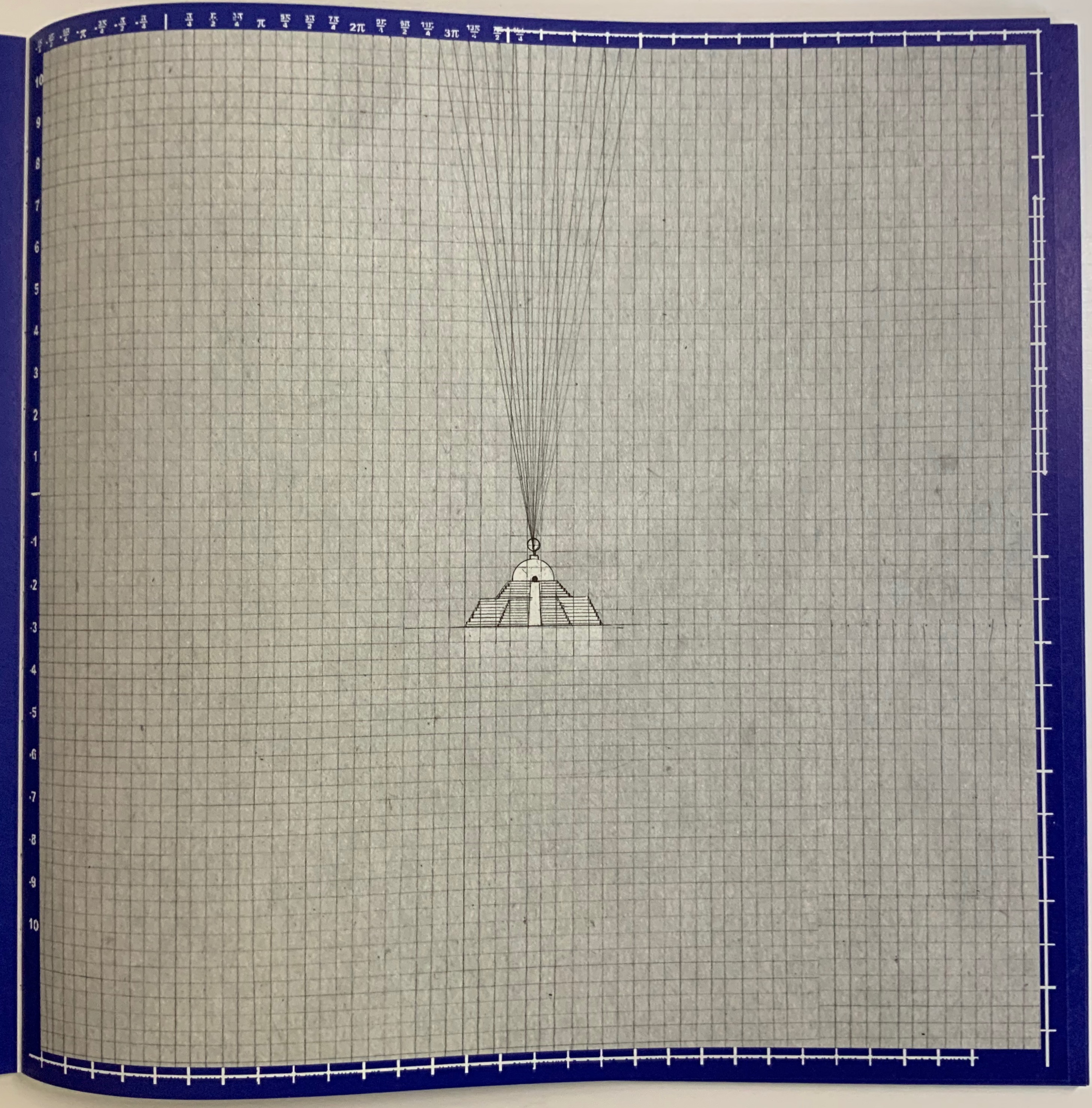
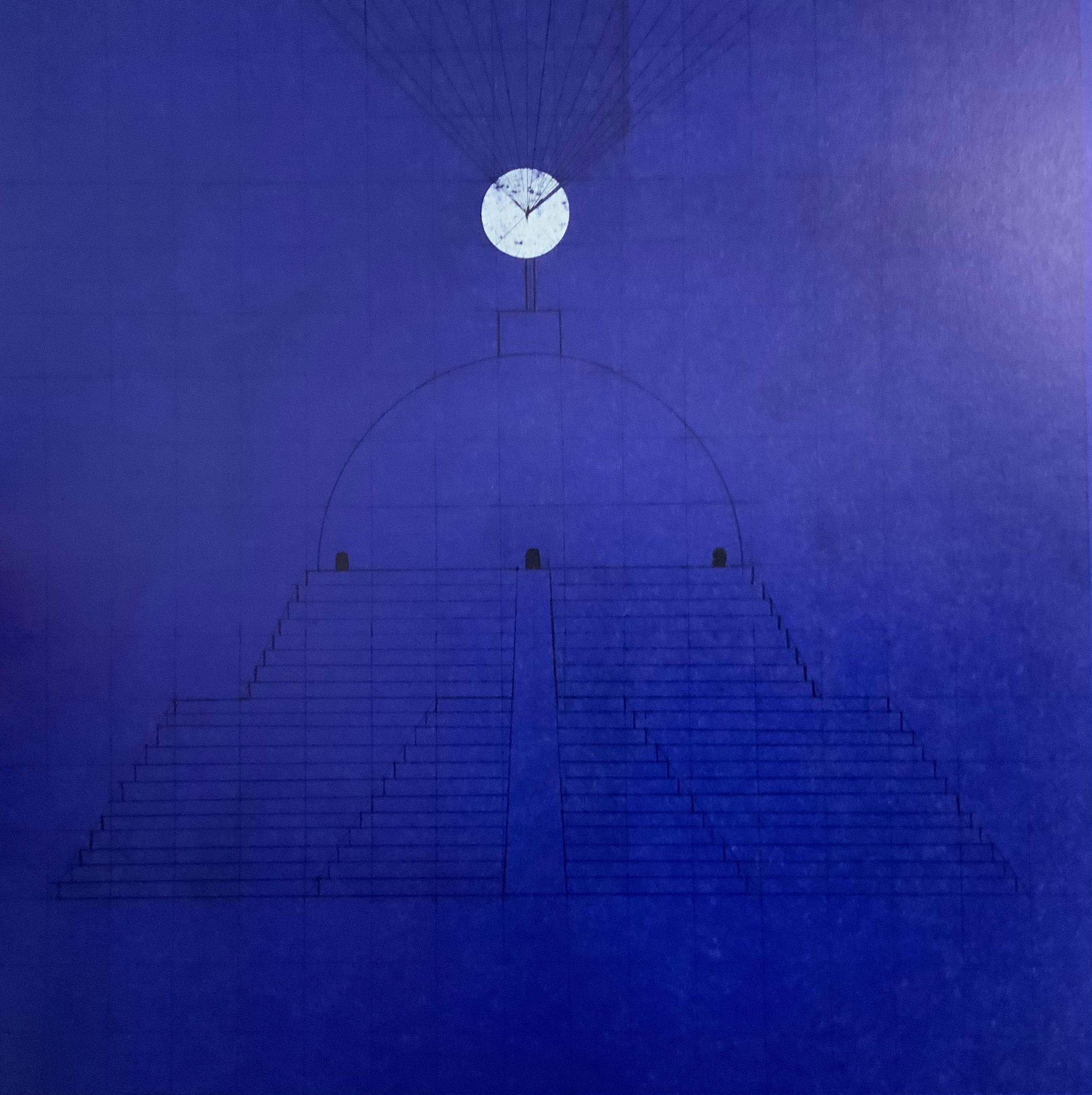
Working with binding designer Zhong Yu and tbook designer Lu Min of the “One and One Half Atelier”, Shanghai-based Xiao Long Hua has found a sympathetic outlet and form for his creative vision. His first work with them is The Blind Men and the Elephant, a variation on the parable in the Buddhist sutra Tittha Sutta. It takes place in the kingdom “Mirari”, ruled by King Mirror.
Selection from One and One Half Atelier. Photos: Books On Books Collection.
As in the more traditional version, the blind men report the elephant to be of different shapes, but in this version, those shapes reflect those of the blind men themselves. Throughout the book, a blueprint grid in the background of the dark blue and light gray page serves to emphasize the geometric shapes of the characters and images and to reflect, with its reductiveness, each blind man’s rigid view of the elephant’s nature. And up to this point of the blind men’s report, the grid has been bounded intermittently by coordinate markers, some numerical, some in letters and some in Chinese characters.
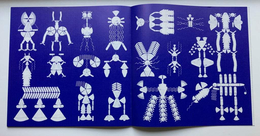
Xiao Long Hua places the different shapes the blind men perceive into the mind of the king, where they become a butterfly and then transform endlessly and kaleidoscopically into other figures represented across a series of pages printed dark blue. This variation on the theme comes from the Miao (Hmong) creation song Butterfly Mother or Mother Butterfly.
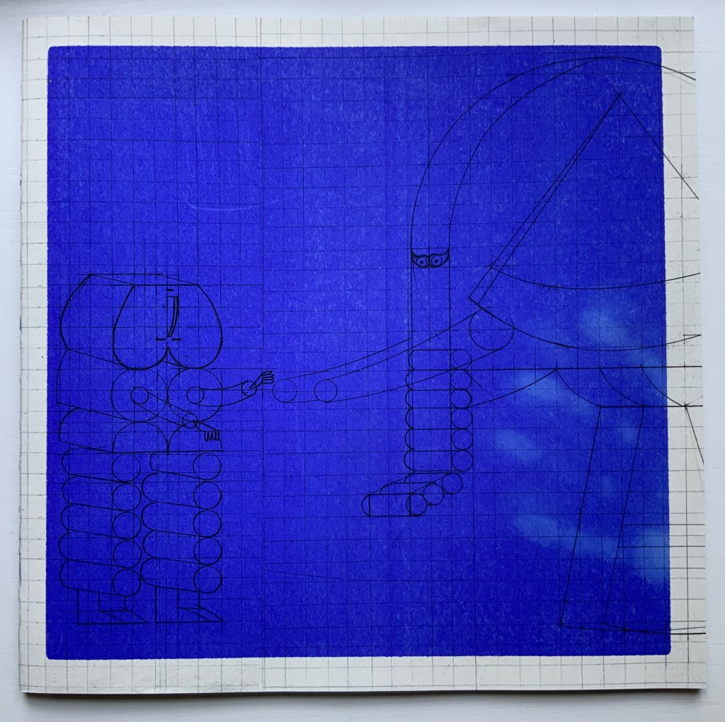
The final colorless two pages consist of cut-outs inviting the readers’ hands to create more strange figures along with the king’s mind. This element of touch recurs on the cover, which on closing the reader will find is covered in fingerprints. The cover’s ink is thermochromatic, fading away under the warmth of touch, returning as it cools and waiting for our next blind touch.
Selection from One and One Half Atelier edition. Photos: Books On Books Collection.
The publishing house Qianxun Neverend has issued a shorter trade edition of The Blind Men and the Elephant. Although a thermochromatic cover proved to be too expensive, an equally interesting design feature animates the cover’s image of the butterfly transforming into the multiple figures in the king’s mind.
Prior to The Blind Men and the Elephant, Xiao Long Hua engaged primarily in illustrations, scroll painting, installation works and sculpture, some of which can be seen on his Tumblr blog. For his latest work with the One and One Half Atelier, The Great Migration, the Atelier’s site announced a multimedia installation. A comment about this work sheds light on The Blind Men and the Elephant as well; he writes, “…I want to paint a magnificent picture of the Great Migration to express those spaces and memories that are fading away, I try to blur the forms between people, animals and objects. “
Other works in the Books On Books Collection to compare with The Blind Men and the Elephant include
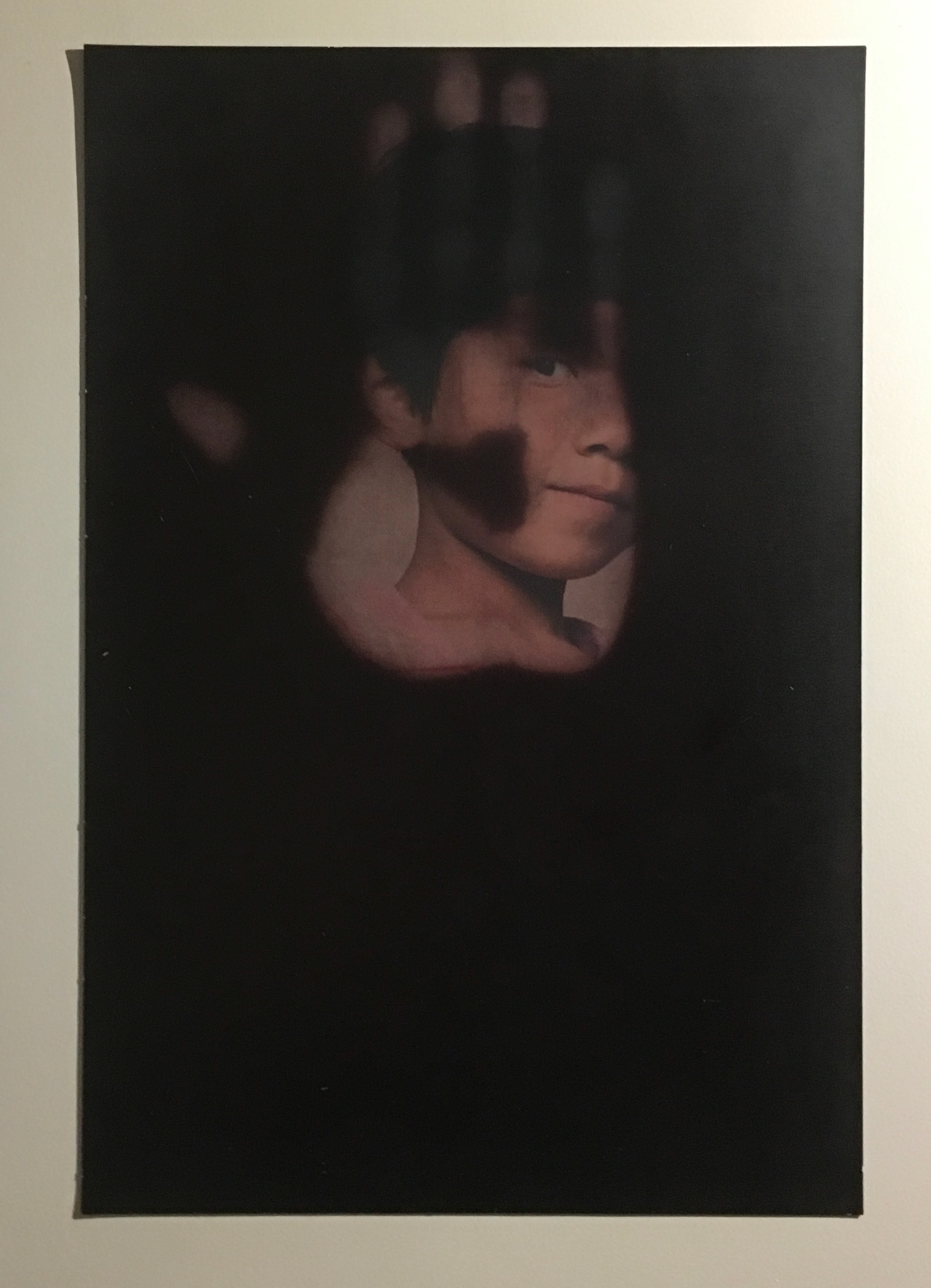
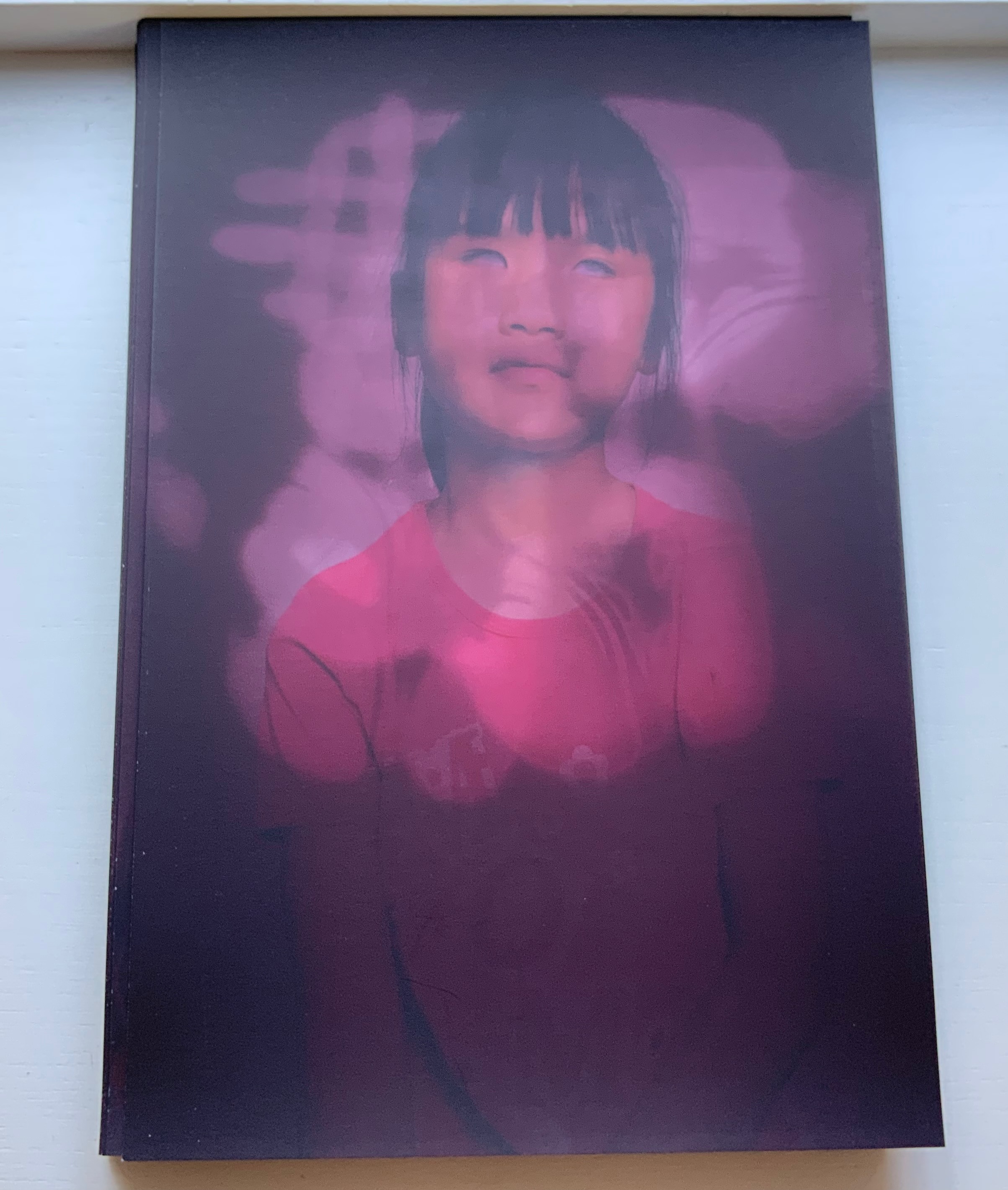
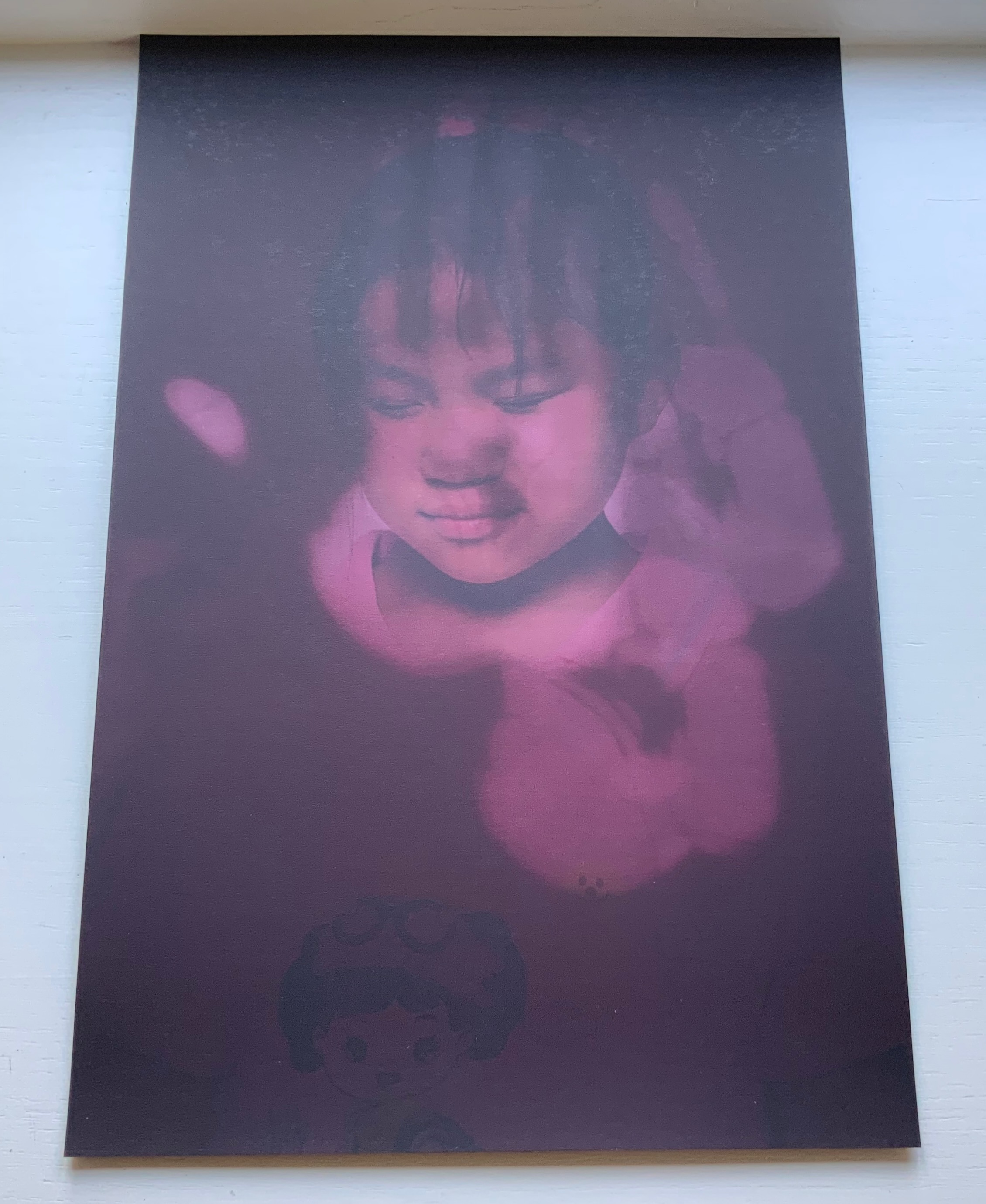
Like a Pearl in My Hand(2016) Carina Hesper Boxed folios. Box: H388 x W278 x D35. Folios: H330 x W220, 32 loose folios. Edition of 250, of which this is #221. Acquired from the artist, 19 December 2021. Photos of the work: Books On Books Collection.
Carina Hesper’s Like a Pearl in my Hand came to the collection after its appearance in the exhibition “The Art of Reading”, 18 November 2017 to 4 March 2018, at the Meermanno Museum in The Hague, Netherlands. It was an exhibition whose curator insisted that none of the works could be under glass. They had to be touchable. Like a Pearl in my Hand is a boxed set of 32 photographic portraits, each coated in black thermochromatic ink. Only by touching the prints can you see the underlying portraits.
Photos: Books On Books Collection. Taken at the Meermanno Museum in 2017.
Each portait is of a child, congenitally blind, whom Carina Hesper met through the Bethnal China orphanage between 2012 and 2016. A folded sheet (8 unnumbered pages) includes two essays and the colophon for the work. In one essay, Bettine Vriesekoop provides background on Hesper’s visit to the orphanage Bethel China as well as social and historical observations about the position of the congenitally blind in China. In the other essay, Hannes Wallrafen, once a photographer, now blind, delivers a perceptive review of what he calls the “book with black pages on my lap”. Explaining his situation, he addresses his task by explaining “how the blind see” by touch, memory and imagination. For his review, he also has the advantage of an app, TapTapSee, which enables him to take photographs before and after touching each folio and listen to an automated description of each. A quick trial will reveal the app’s limitation vis-à-vis Like a Pearl in My Hand and underscore the poignancy of Wallrafen’s concluding comment:
For anyone who does not dare pick up the book or only gently touches the pages, this book remains what it seems at first sight: a collection of black pages.
The best artists’ books engage the reader/viewer in a multisensory experience. Even so, usually sight comes first and touch, second among the senses in the experience. Like a Pearl in My Hand challenges this by making the subject of the unsighted accessible to the sighted only through the warmth of touch.
Other works in the Books On Books Collection to compare with Like a Pearl in My Hand include
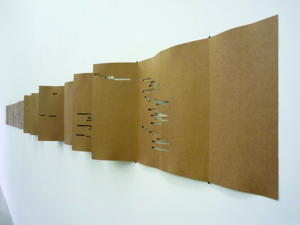
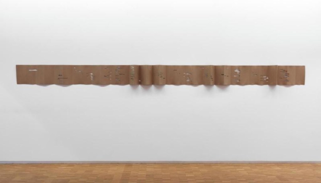
In 2009, Rainier Lericolais created one of the more unusual works of homage to Stéphane Mallarmé’s Un Coup de Dés Jamais N’Abolira le Hasard (1914). In Carton Perforé, the words and lines of Mallarmé’s poem take up their positions as perforations on a continuous paper roll used for a barrel organ or hurdy-gurdy.
For a multidisciplinary artist and musician, Lericolais’ choice of medium here is highly appropriate, as is the choice of Mallarmé’s poem for an artist in pursuit of “grasping the elusive“. The work is now in the permanent collection at the Musée national d’art moderne, Centre Pompidou.
In 2020, Lericolais revisited his visual barrel-organ homage to create a version that could be heard as well as seen. Under the Direct to Disk Éditions label, Lericolais published Carton Perforé as sheet music for piano along with a recording of it. Just as Broodthaers and other hommageurs signaled their homage by changing Mallarmé’s subtitle from Poème to Image, Sculpture, Musique, etc., Lericolais adds the subtitle Piano, paying homage to their tributes, Mallarmé’s poem and, humorously, his own earlier work. A performance of the piano version can be heard here.
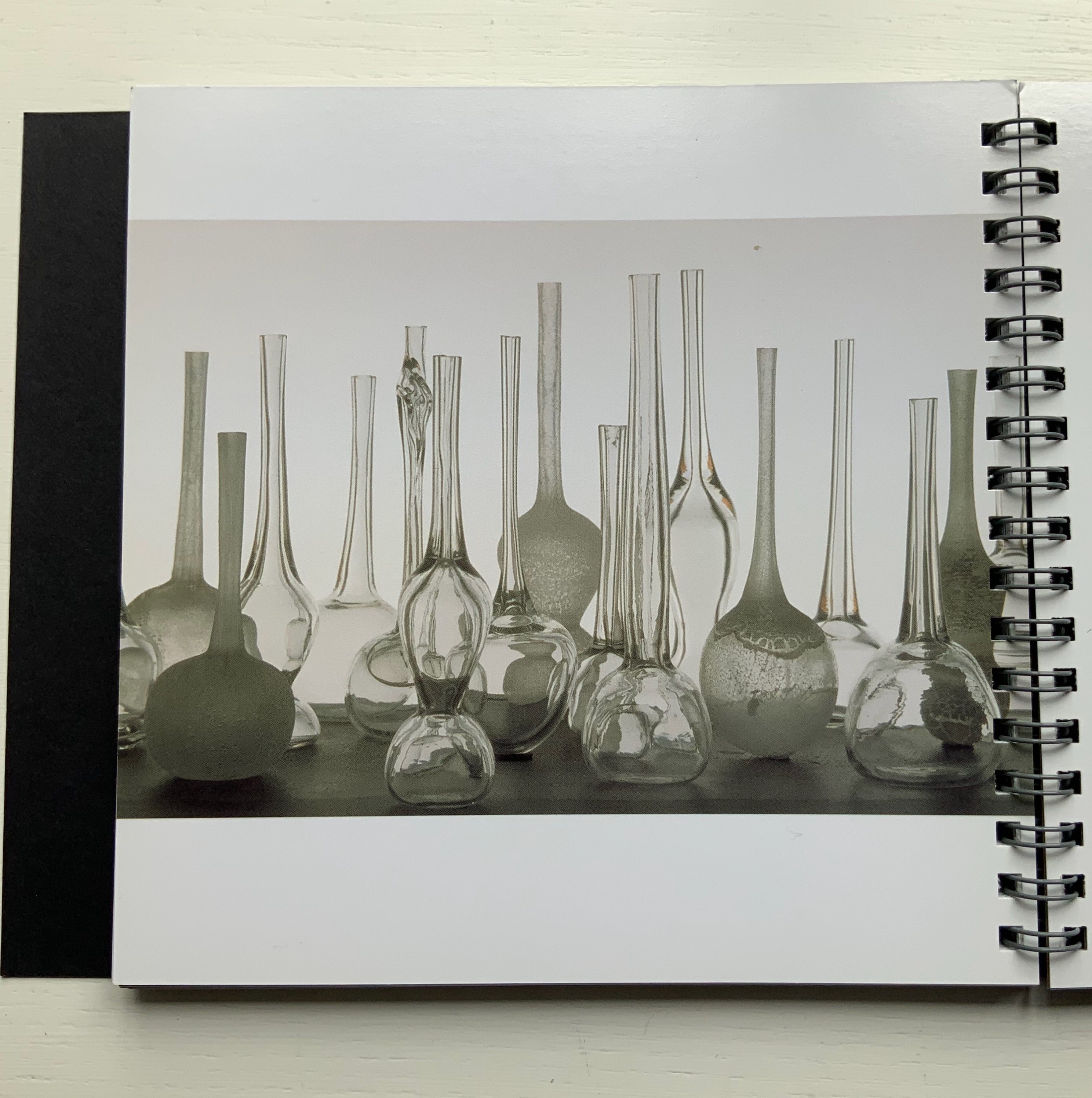
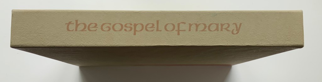
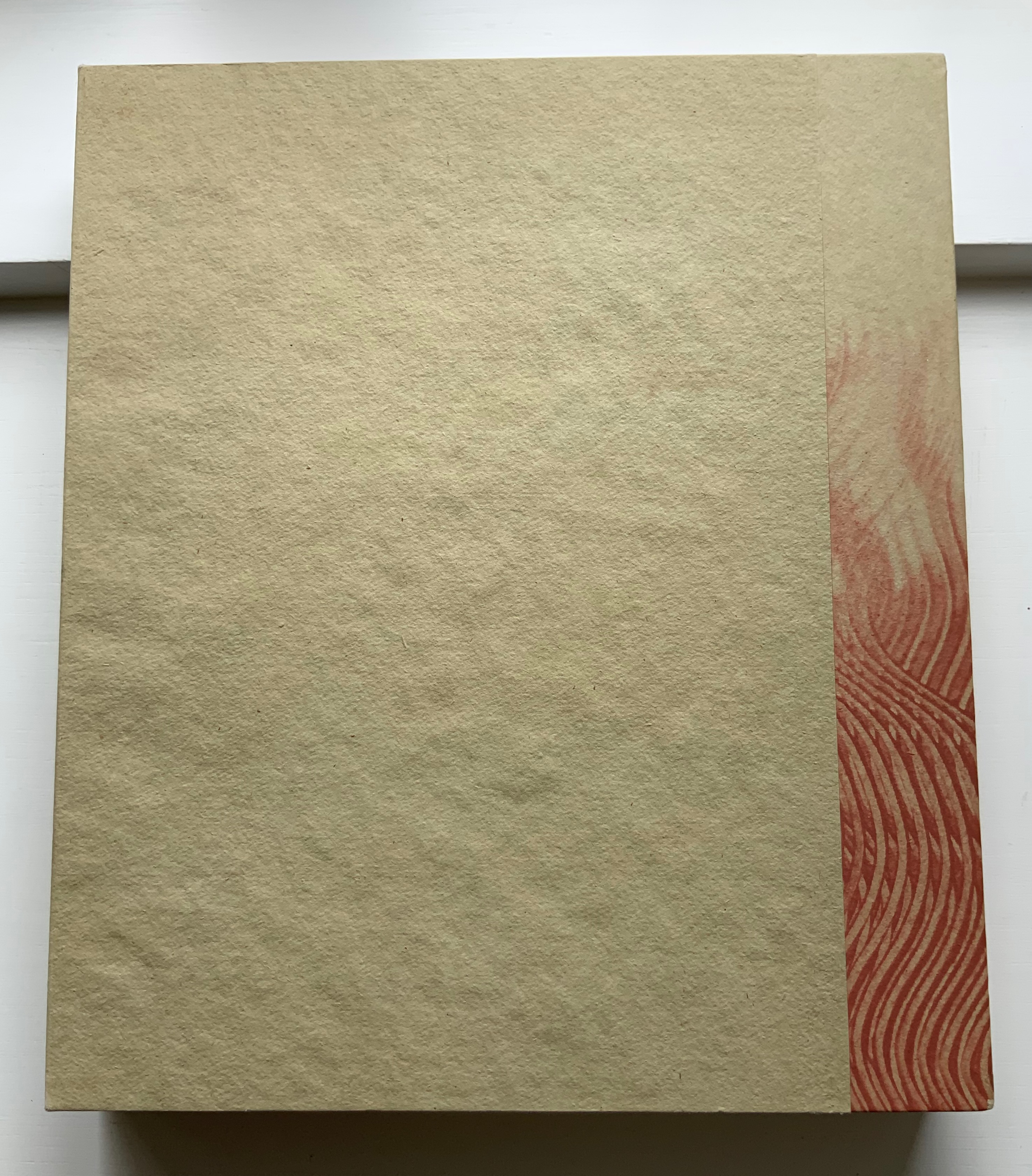
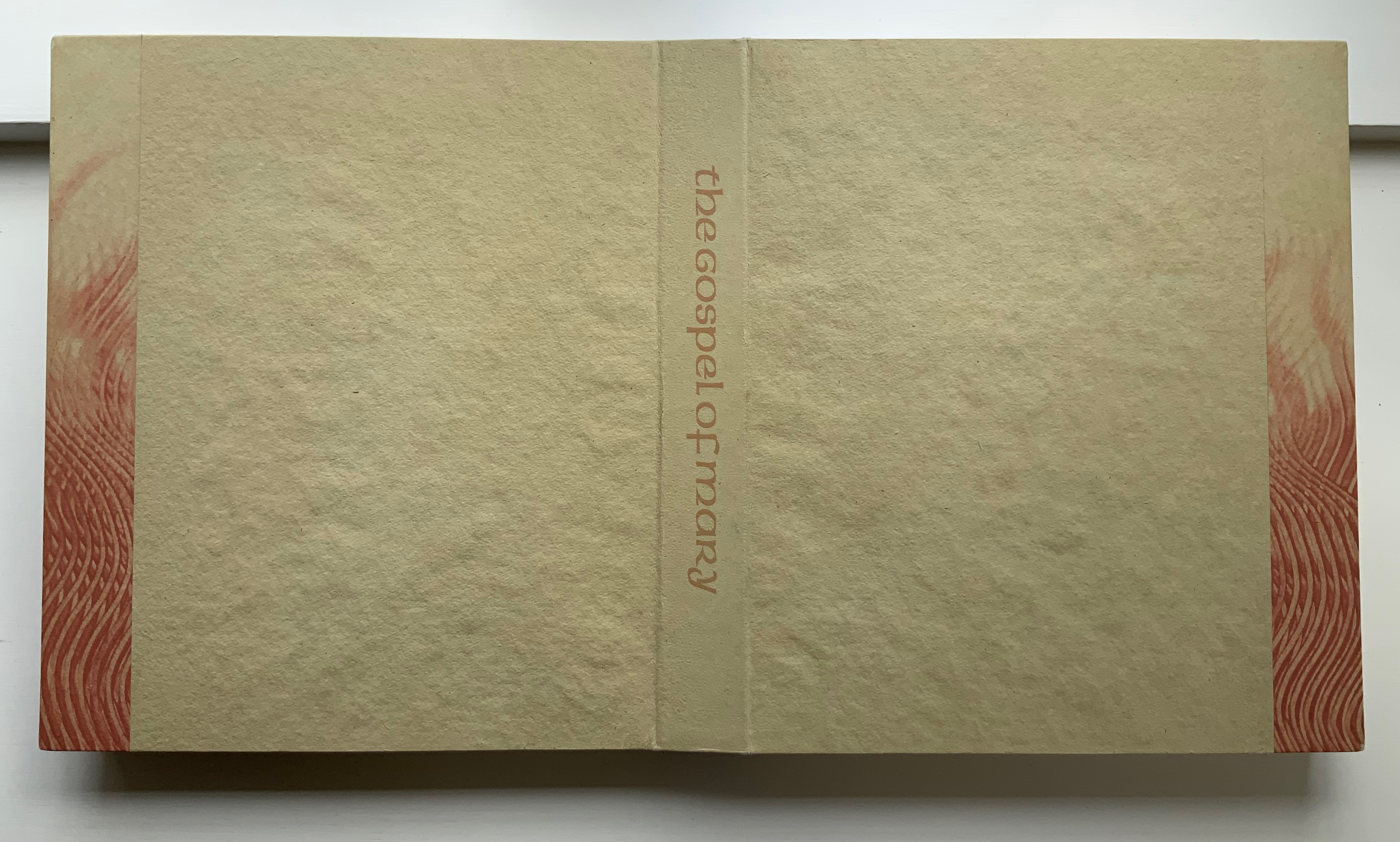
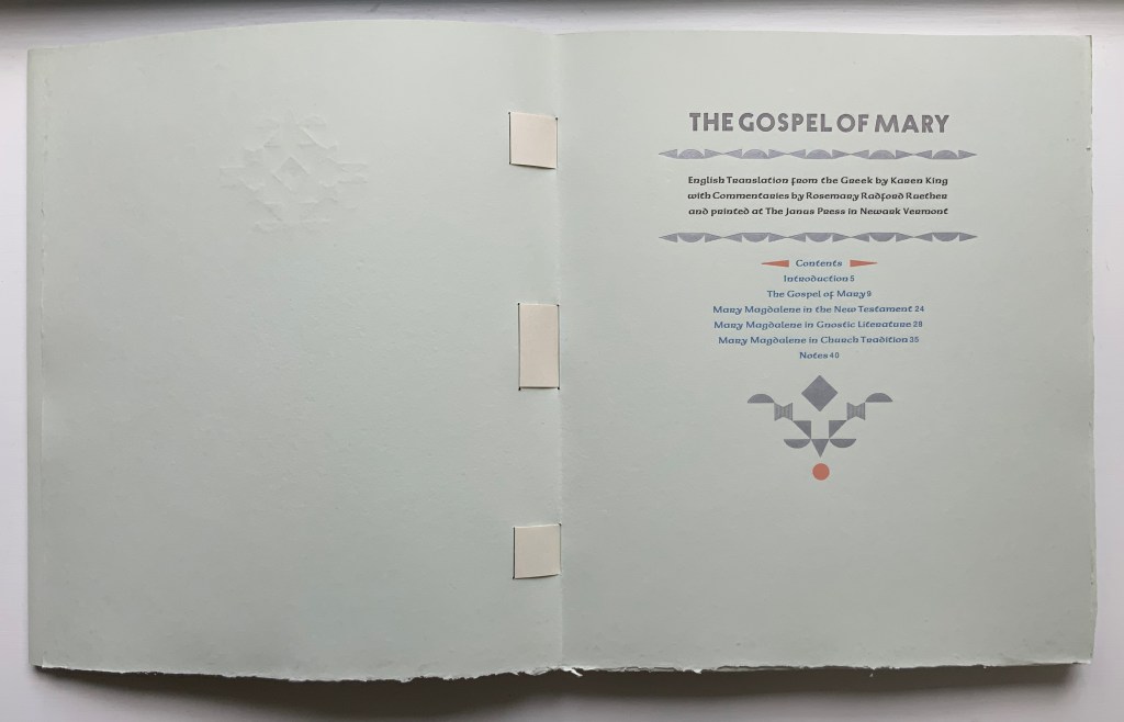
The Gospel of Mary (2006) Claire Van Vliet et al. Woven binding with Barcham Green Cairo paper, housed in De Wint paper-covered and lined birch trays. Box: H320 x W274 x D42 mm. Book: H292 x W250 x D28 mm, 44 pages, center pulp-painted pop-up. Edition of 150, of which this is #27. Acquired from Thomas Goldwasser Rare Books, 18 June 2022. Photos: Books On Books Collection.
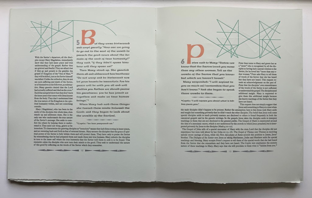
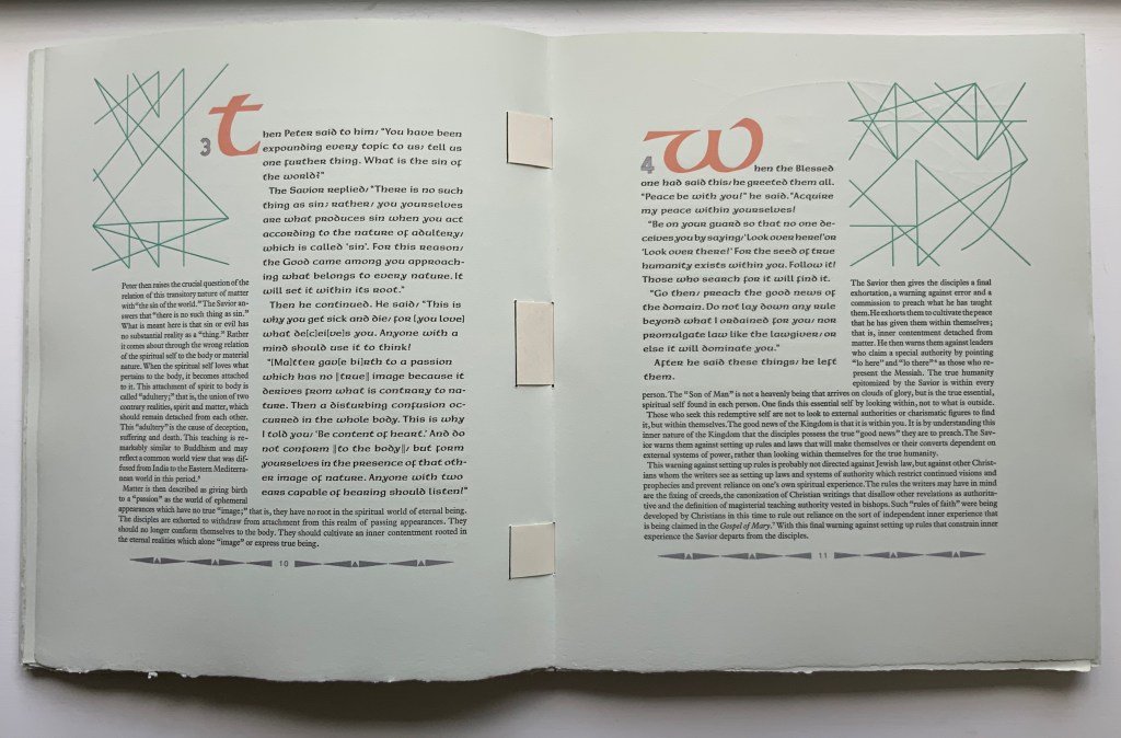
Like Woven and Interlocking Book Structures (2002), Tumblr Blocks (1996) and Batterers (1996) below, The Gospel of Mary is an outstanding work of collaboration. Its pulp painting, letterpress, woven binding and layout make this work an important addition to works by Claire Van Vliet in the Books On Books Collection. Van Vliet pulp painted the centerpiece and cover below with Katie MacGregor (Whiting, Maine), who also made the pop-up papers. Andrew Miller-Brown, the Janus Press workshop printer and founder of Plowboy Press, is credited and has signed this copy with Van Vliet. Audrey Holden, who has also signed this copy and worked on Tumbling Blocks, executed the binding. Rosemary Radford Ruether, feminist thelogian, provided the commentary on the text, both of which were typeset with the assistance of Ellen Dorn Levitt, whose collection of book arts projects and teaching materials now resides at the Maryland Institute College of Art.
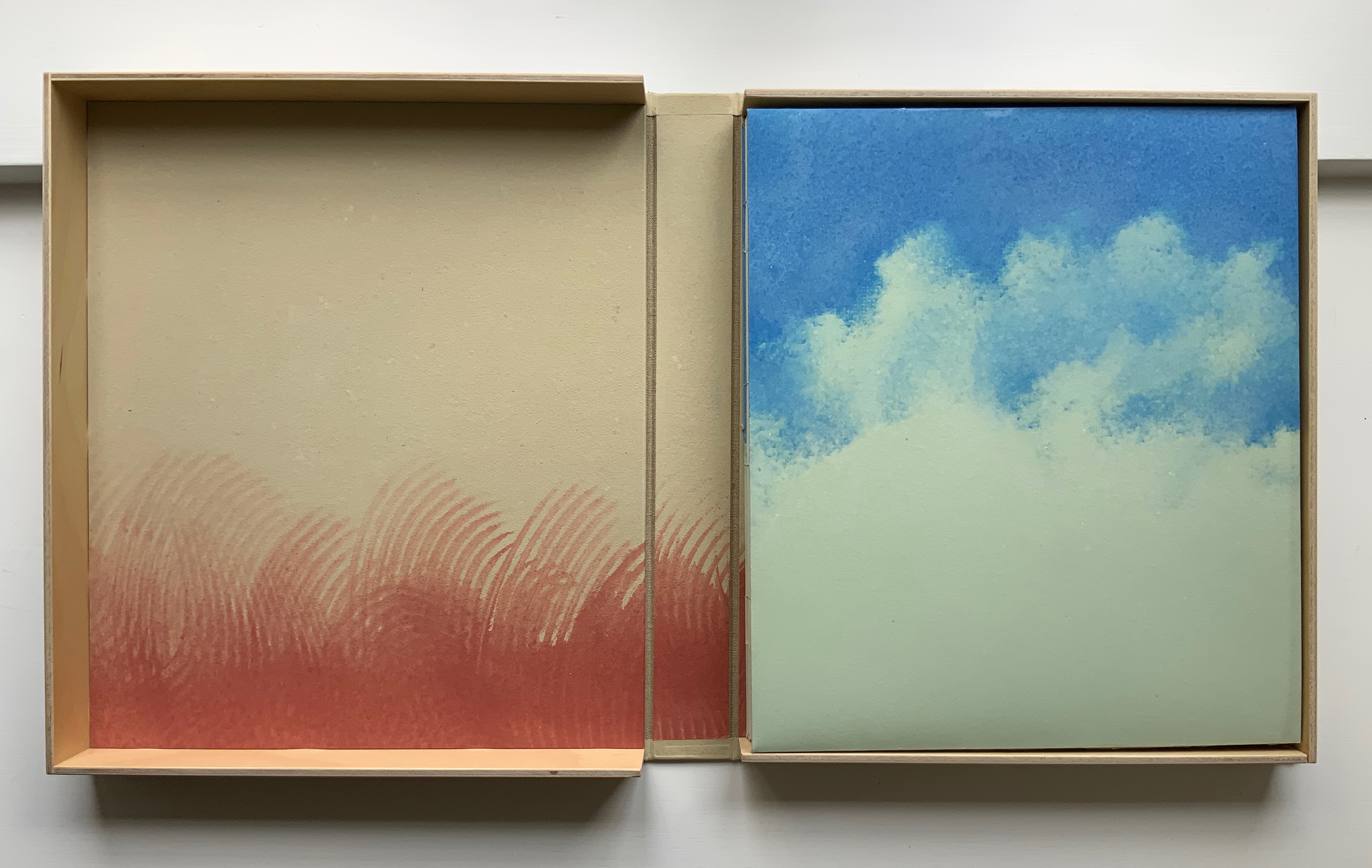
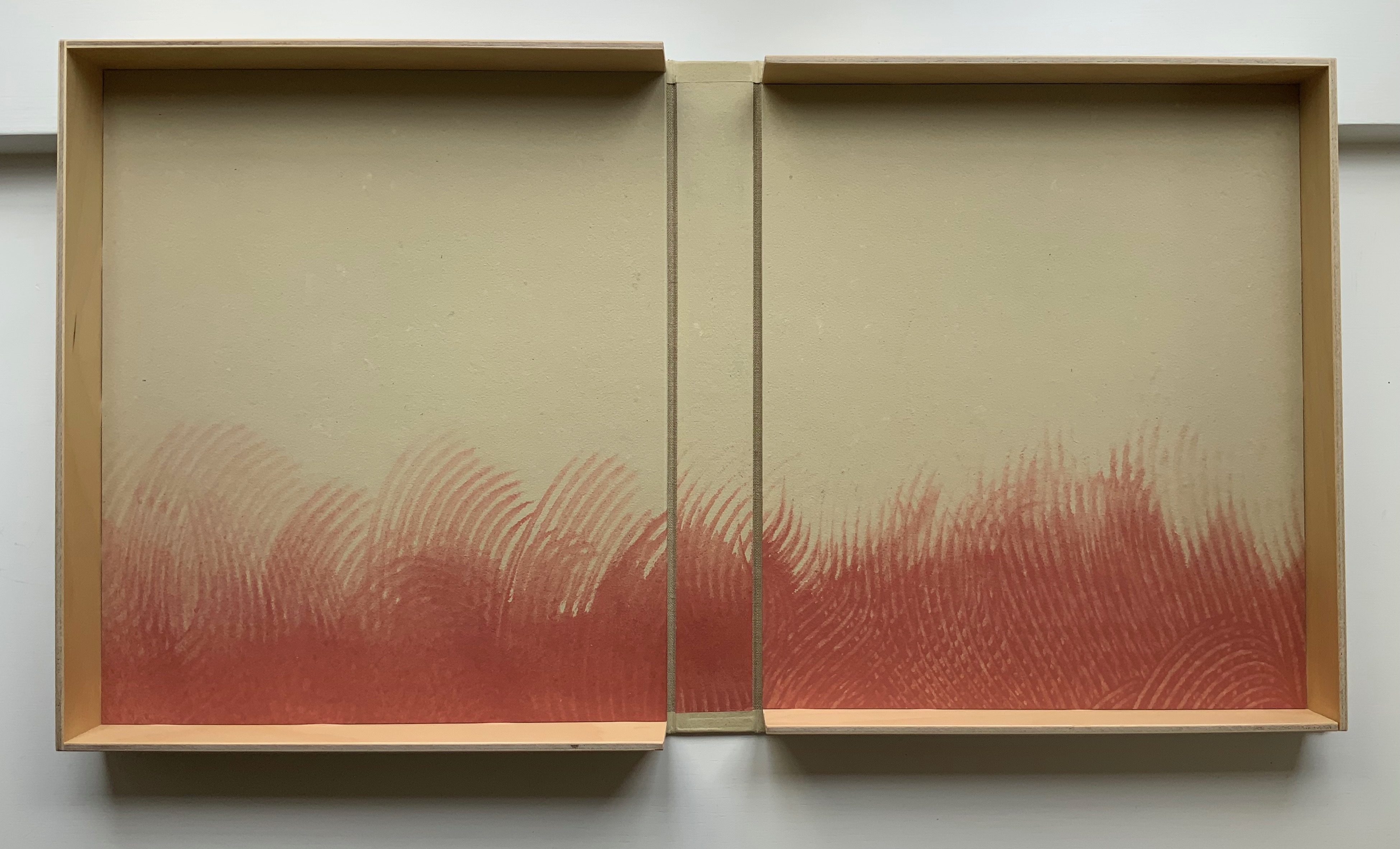
The four photos below provide views of the binding structure and also the layout in which the commentary embraces the gospel text.
Below, the five-part pulp-painted centerpiece and the silver paper ribbons woven into the double-page spread stand out against the more subtly pulp-painted background. The pop-up echoes the images on the Barcham Green Boxley paper used throughout for the text and commentary (see above).
The size of the work and the way that the printing, paper, pulp painting, layout of text and commentary, pop-up and binding complement one another echo the age of illuminated manuscripts and incunabula. It would make for a rewarding exhibition to juxtapose The Gospel of Mary with several of them.
Additional insights and process photographs can be found on pages 48, 49 and 74 of John Buchtel’s The Art of Paper (see below).
The entries below were previously published on 8 August 2019 and have been moved here.
Woven and Interlocking Book Structures (2002)
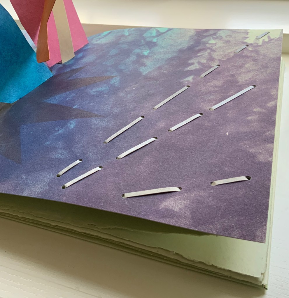
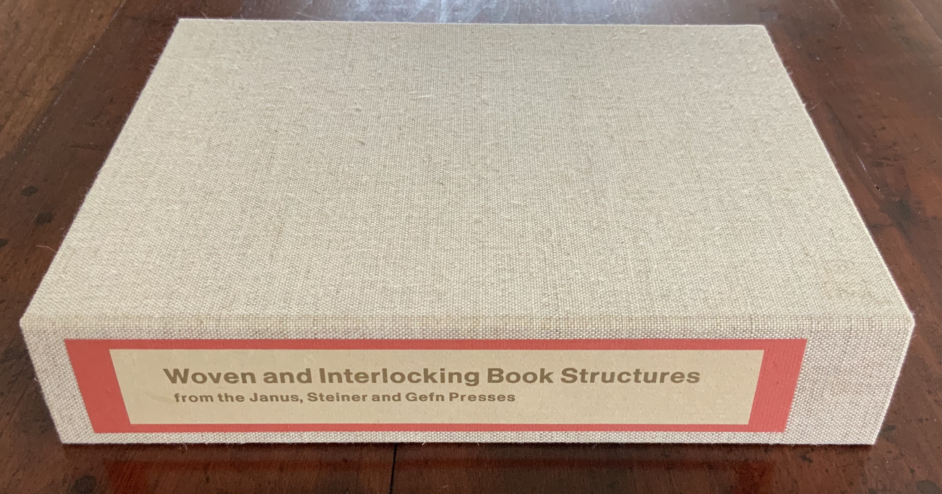
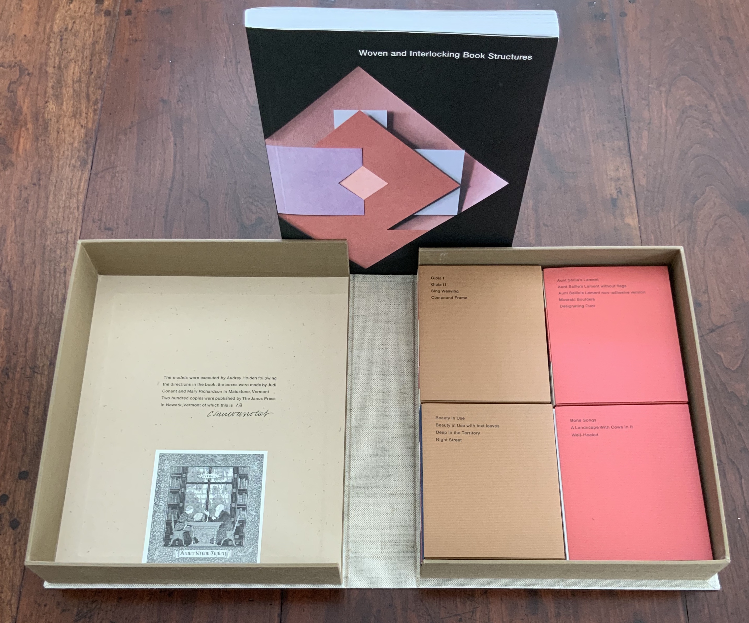
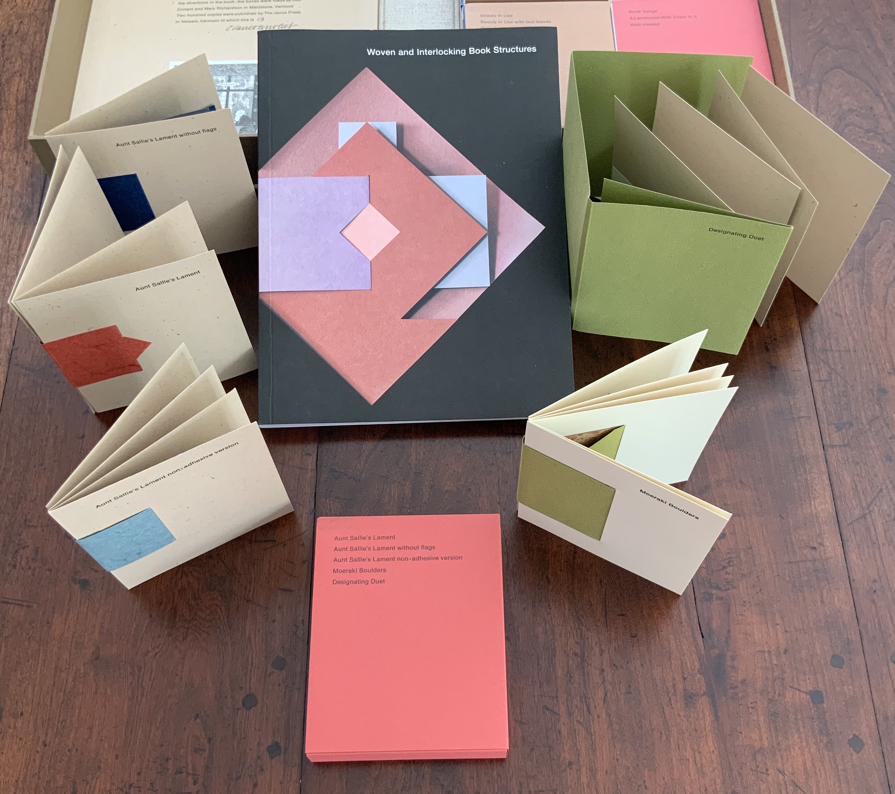
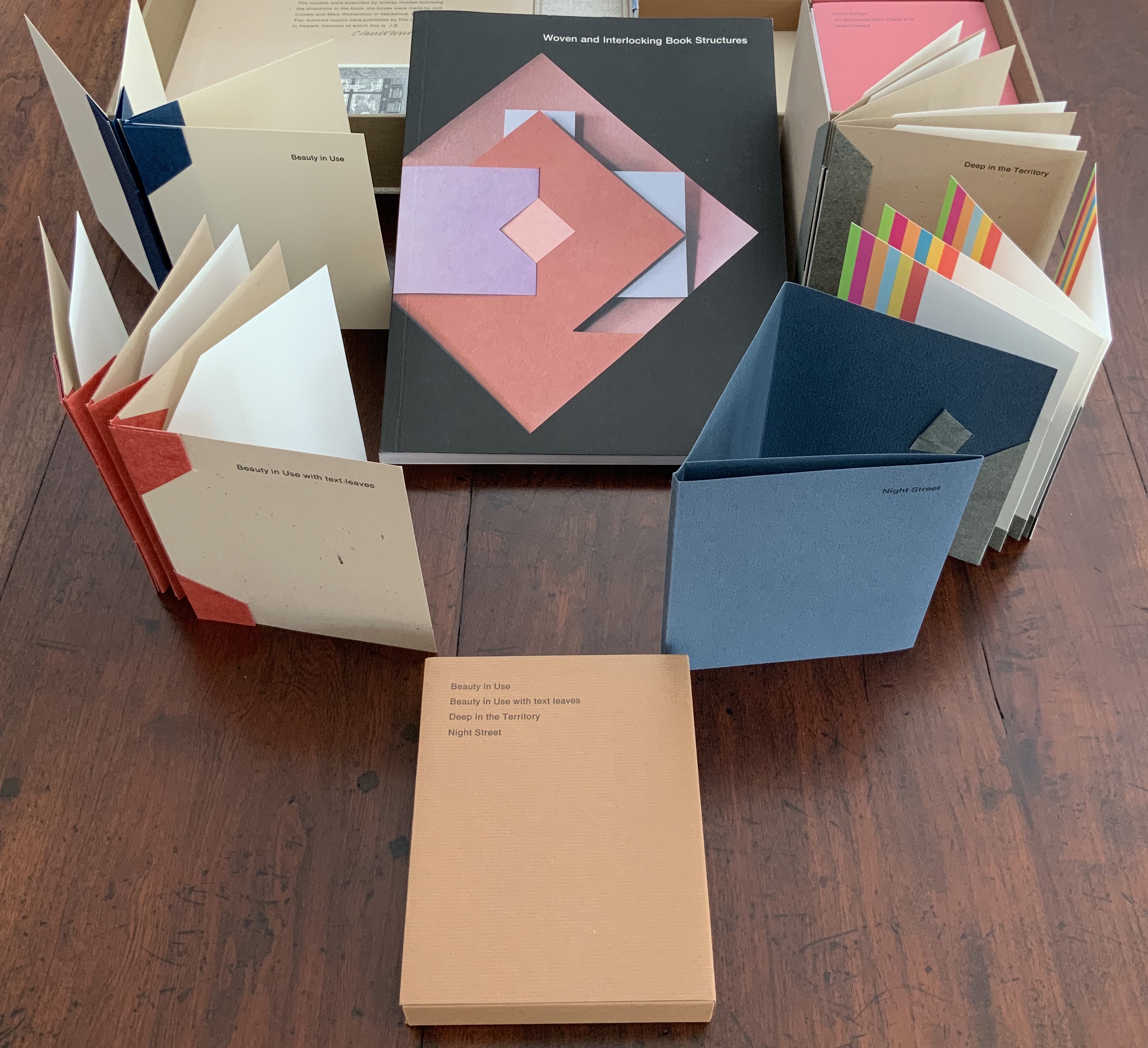
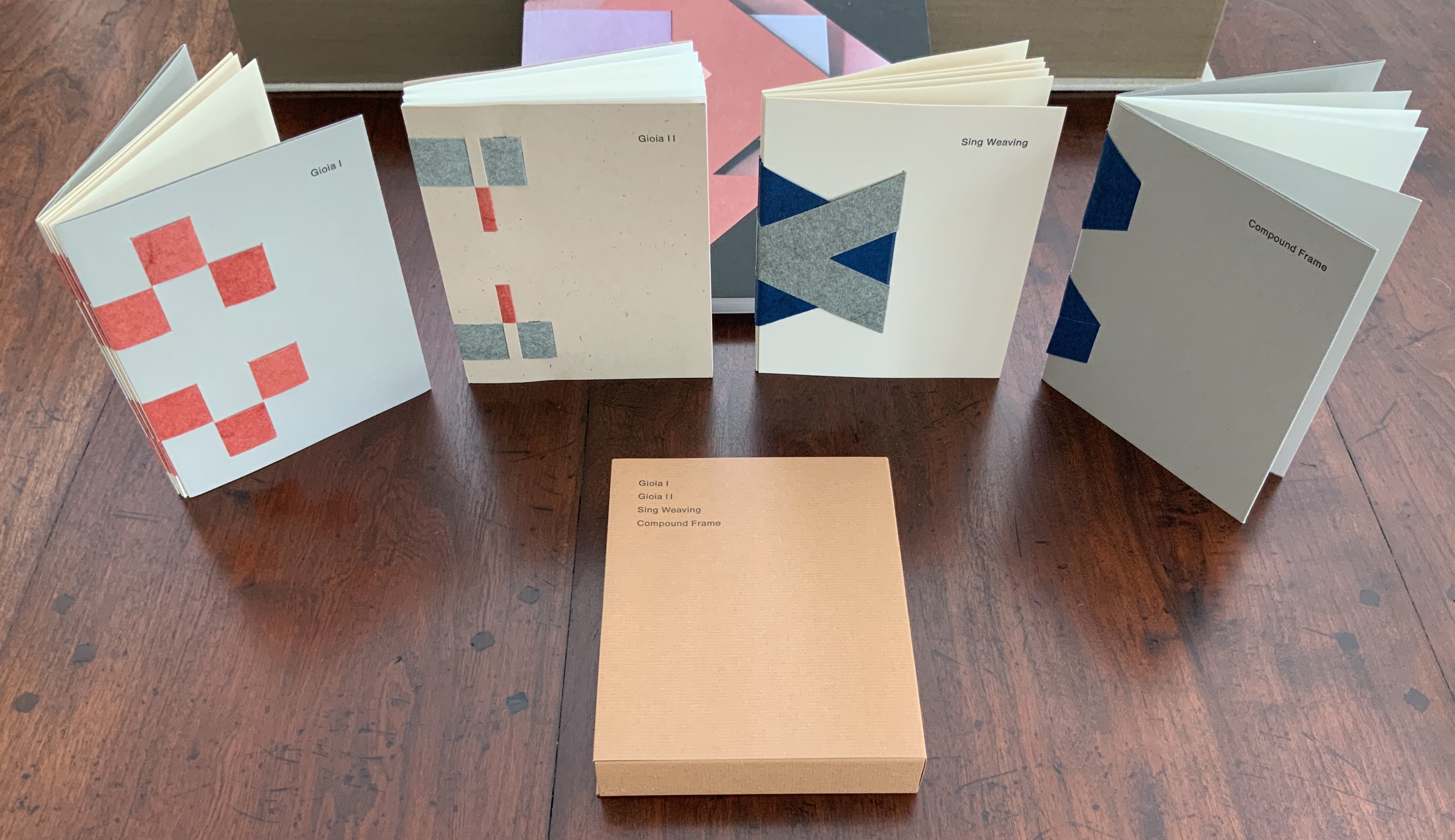
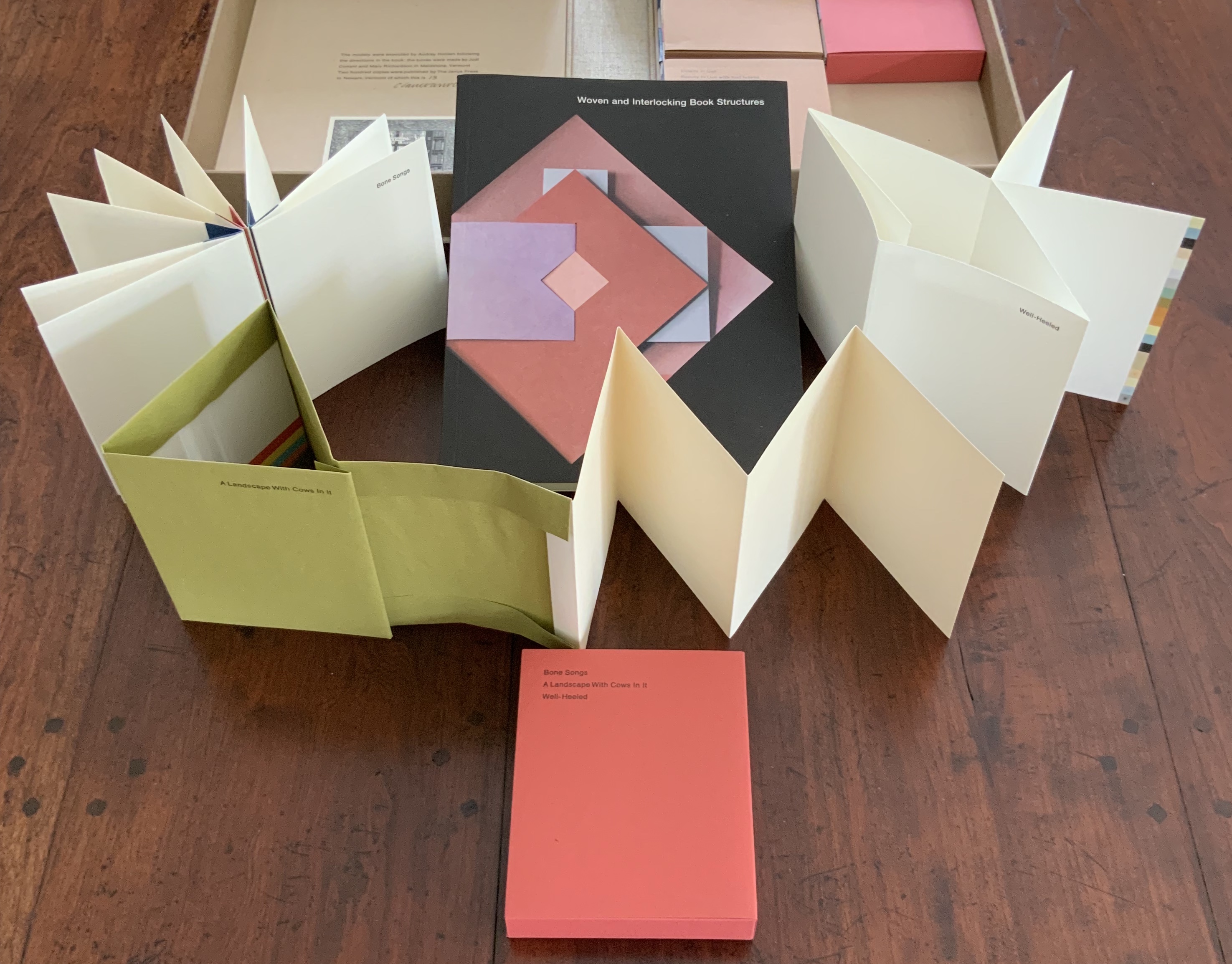
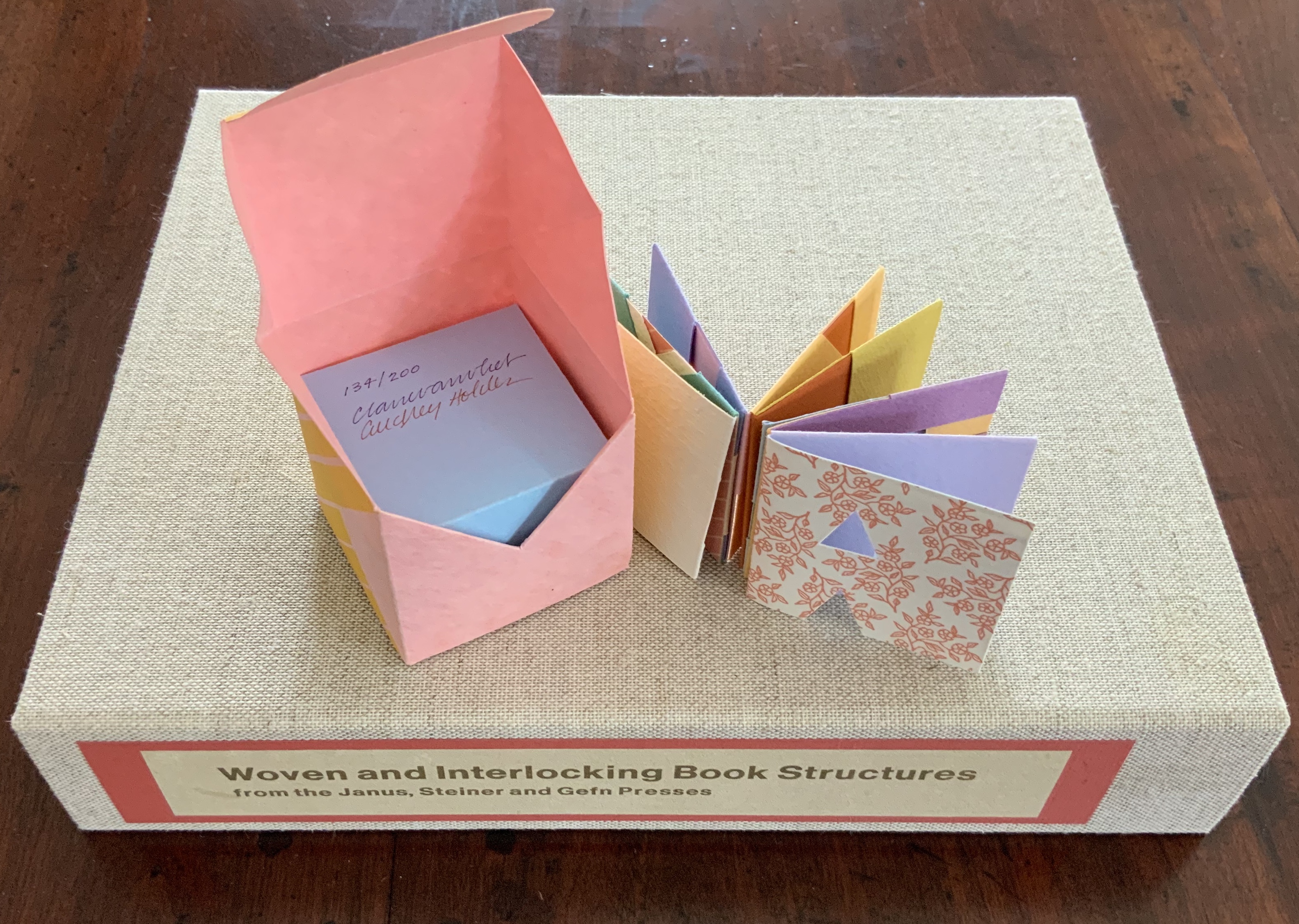
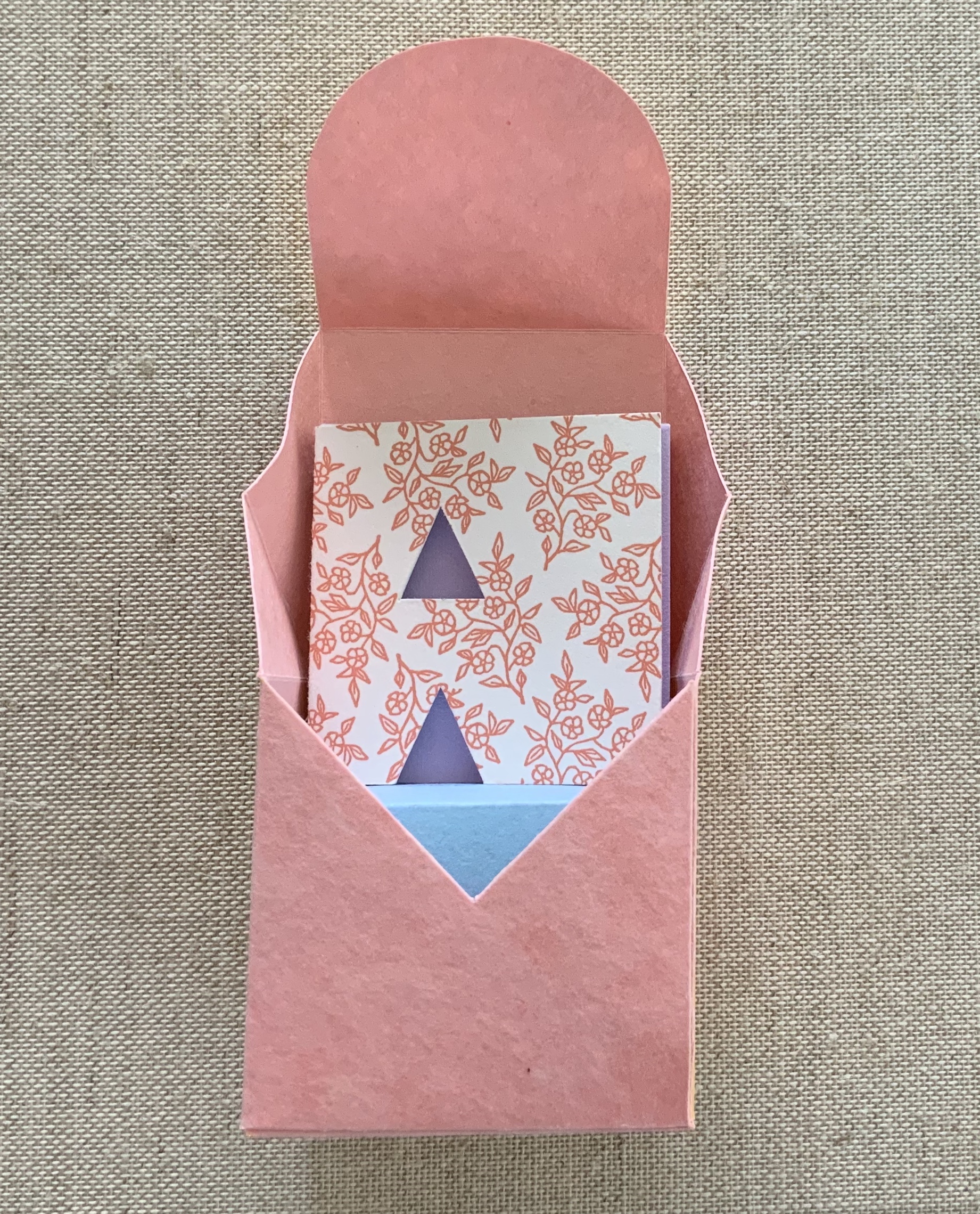
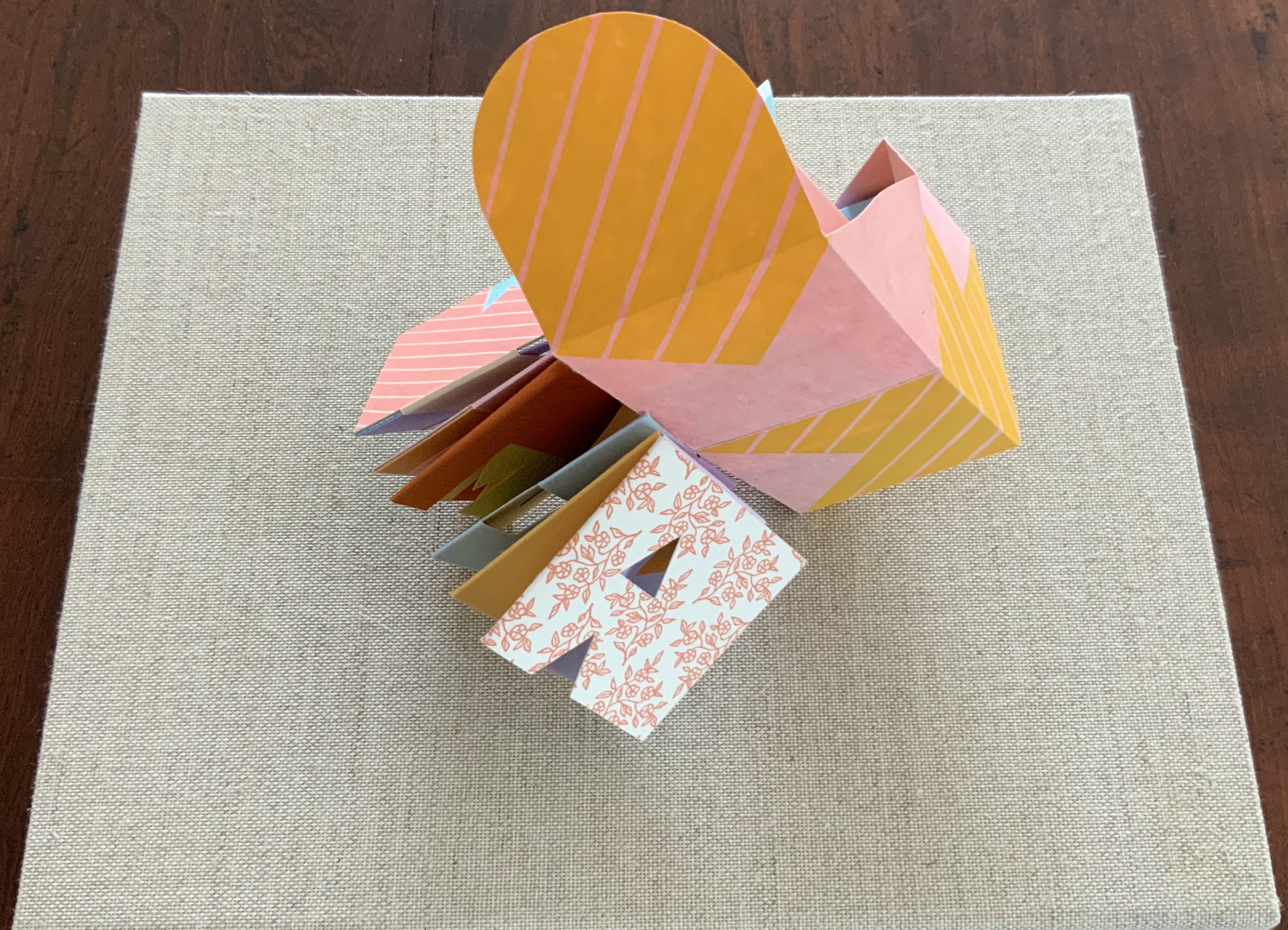
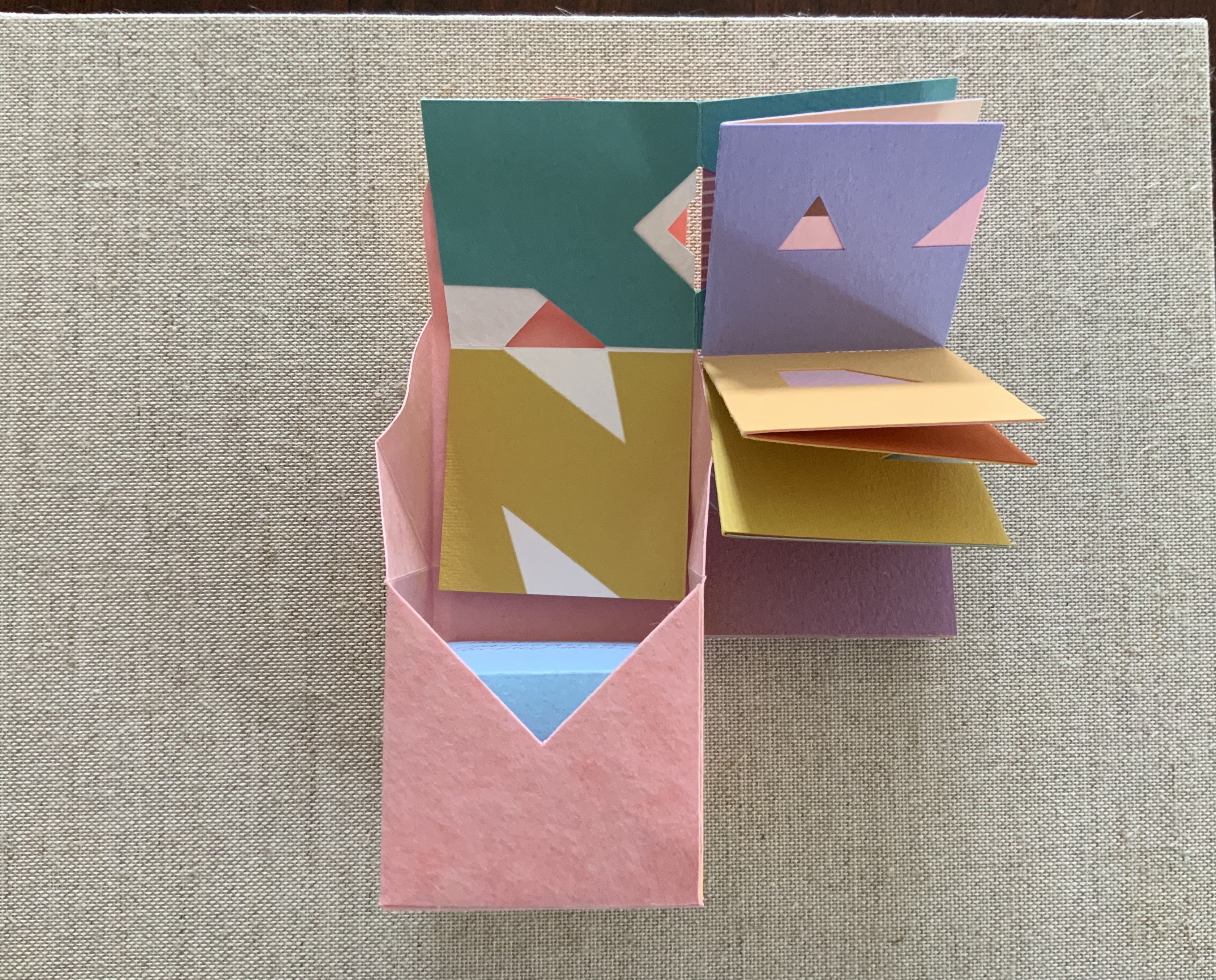
Woven and Interlocking Book Structures (2002) Claire Van Vliet and Elizabeth Steiner Four slipcases containing 16 book models are enclosed with the book in a cloth-covered clamshell box. Box: H282 x W226 x D55 mm. Slipcases: H128 x W104 mm. Book: H254 x W192 mm, 144 pages. Edition of 200, of which this is #13, signed by Claire Van Vliet. Acquired from James S. Jaffe Rare Books, 1 February 2015. Photos: Books On Books Collection.
The binding models and papers used for them are:
A — Aunt Sallie’s Lament; Aunt Sallie’s Lament without Flags; Aunt Sallie’s Lament non-adhesive version; Moeraki Boulders; Designating Duet. Papers used include Elephant Hide, Fabriano cover and Miliani Ingres, French’s recycled, Marblesmith, Bristol and Saunders laid.
B — Beauty in Use; Beauty in Use with text leaves; Deep in the Territory; Night Street. Papers used include Elephant Hide, French’s recycled, Bristol, Mohawk Superfine and Fabriano cover.
C — Gioia I; Gioia II; Sing Weaving; Compound Frame. Papers used include Elephant Hide, French’s recycled, Bristol, Mohawk Superfine, Linen Index, Neenah UV Columns and Marblesmith.
D — Bone Songs; A Landscape with Cows in It; Well-Heeled. Papers used include Elephant Hide, Mohawk Superfine, Arches laid, and Fabriano text and Miliani Ingres.
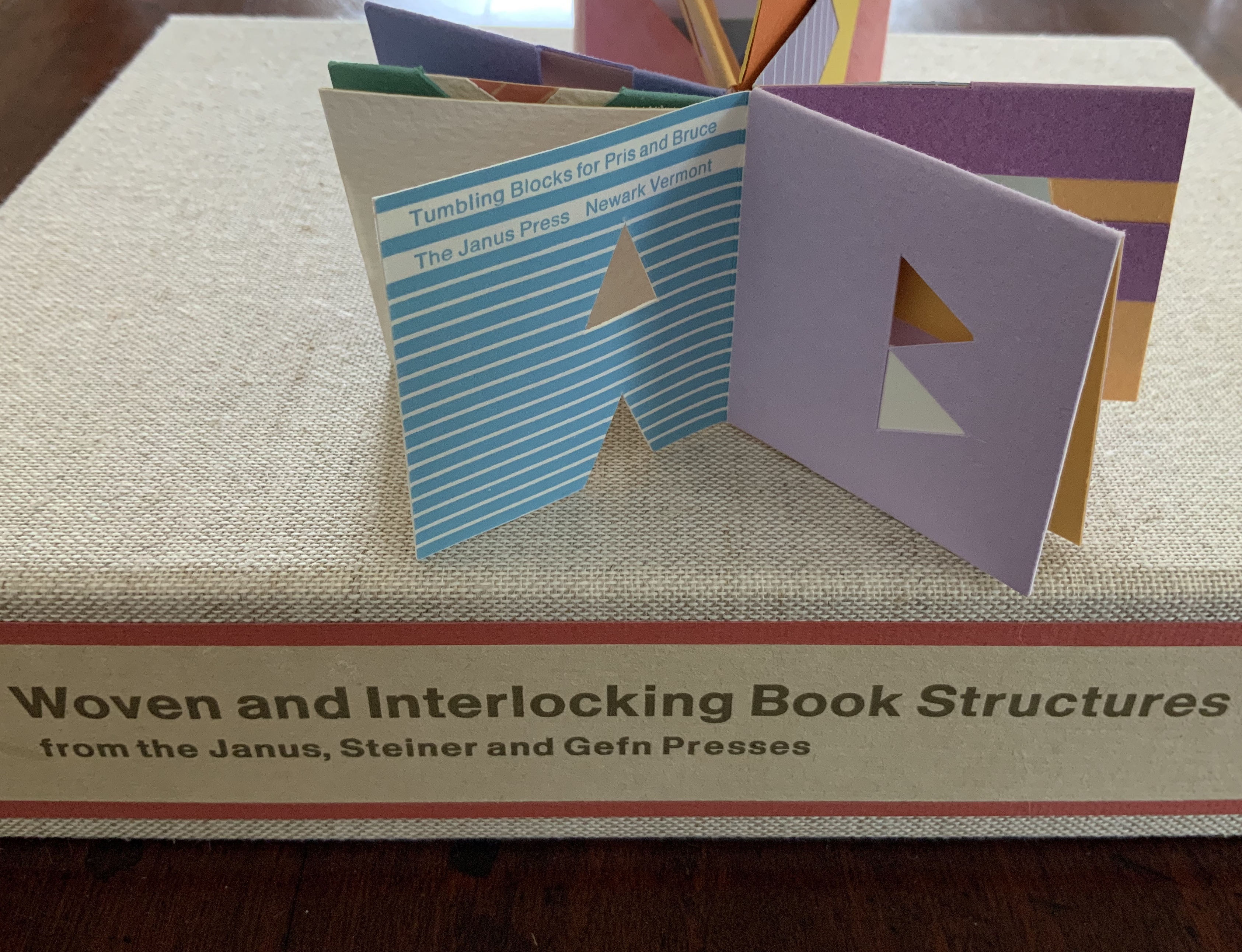
Tumbling Blocks for Pris and Bruce (1996)
Tumbling Blocks for Pris and Bruce (1996) Claire Van Vliet and Audrey Holden Paper cube issued in a non-adhesive paper box housed in a clear plastic box. 58 x 58 x 58 mm. Edition of 200, of which this is #134. Acquired from Abecedarian Gallery, 21 July 2019. Photos: Books On Books Collection.
Working with offcuts from Praise Basted In: A Friendship Quilt for Aunt Sallie (1995), Van Vliet and Audrey Holden cut pairs of letters of the alphabet and glued them back to back. These constitute the cube-book’s leaves, which are folded and glued to permit the book to open into a variety of shapes. Gently tossed from hand to hand, the book will resume its cube shape. “Pris and Bruce” are the Hubbards, Janus Press patrons.
Slipcase: H307 x W387 x D73 mm; Tray: H296 x W380 x D61 mm; Accordion: H270 x W356 x D33 (closed), H270 x W1115 mm (open). Edition of 500, of which this is #5, signed. Acquired from Van Vliet via Vamp & Tramp, 17 July 2020.
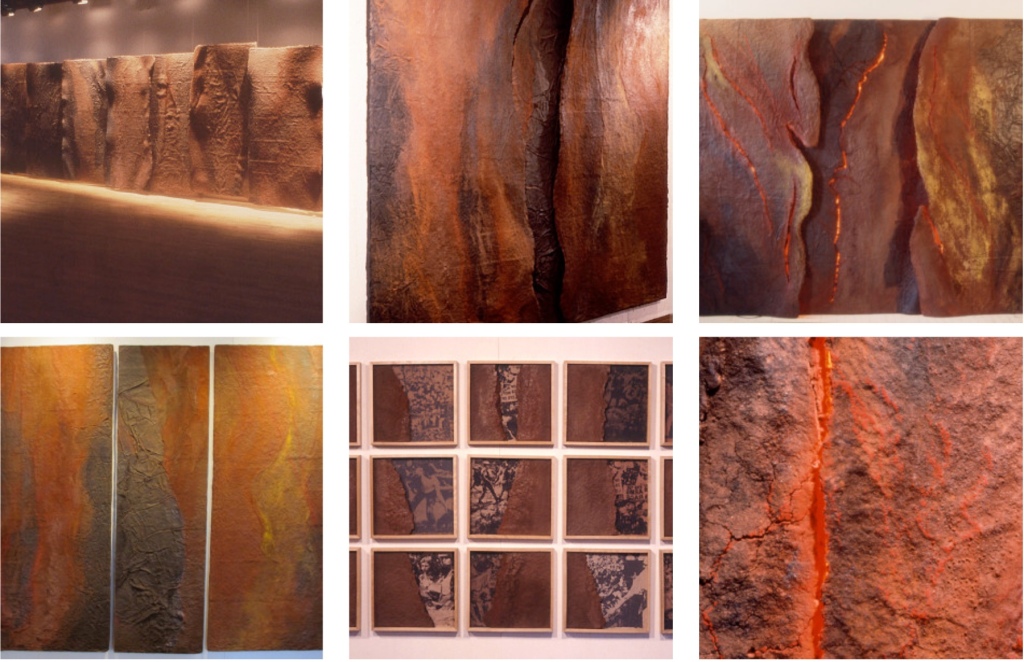
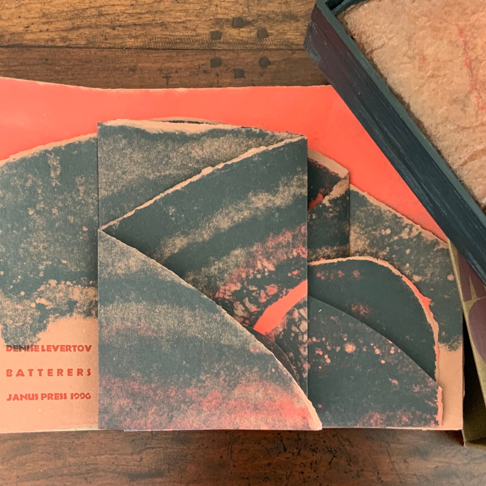
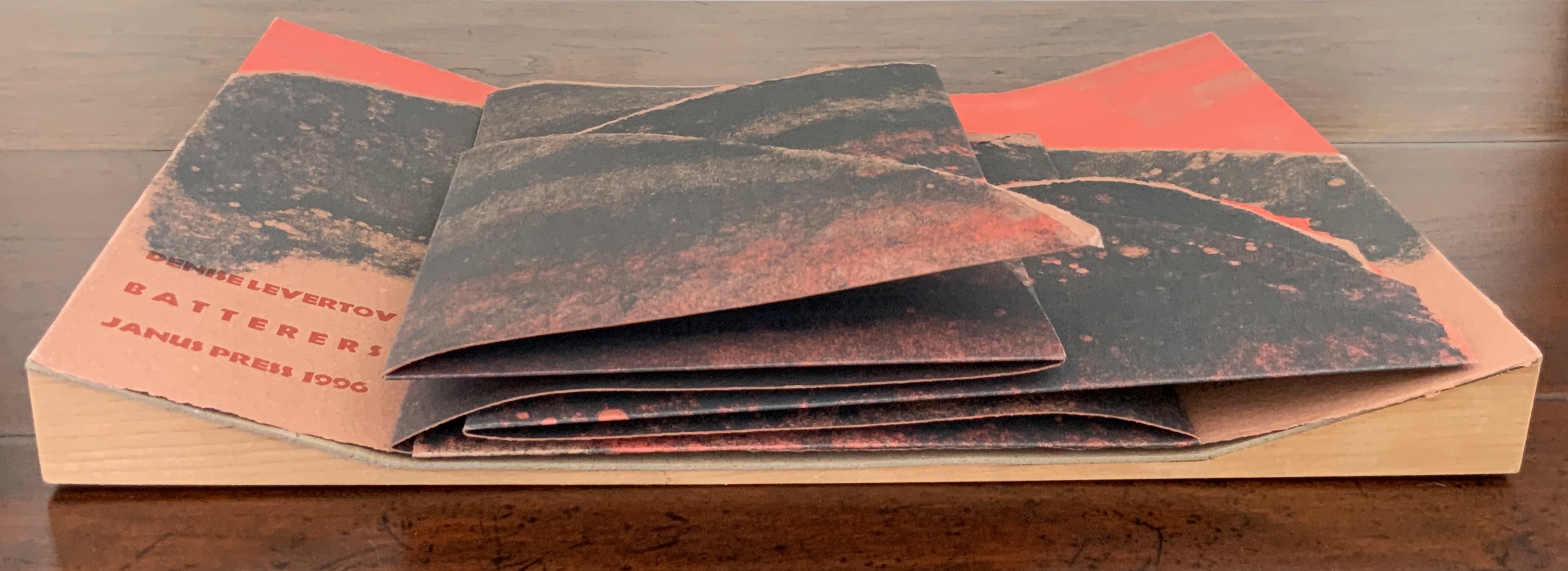
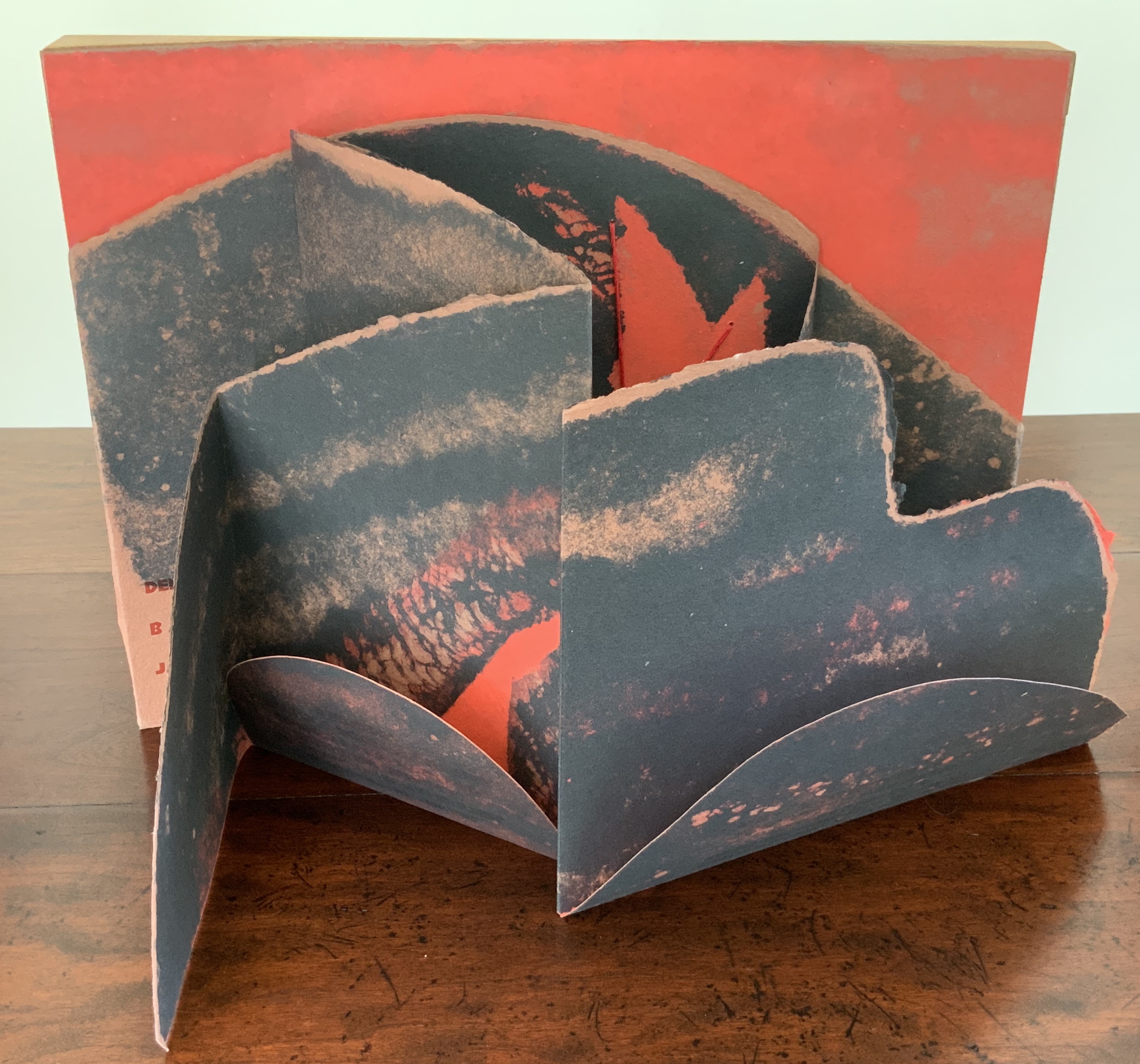
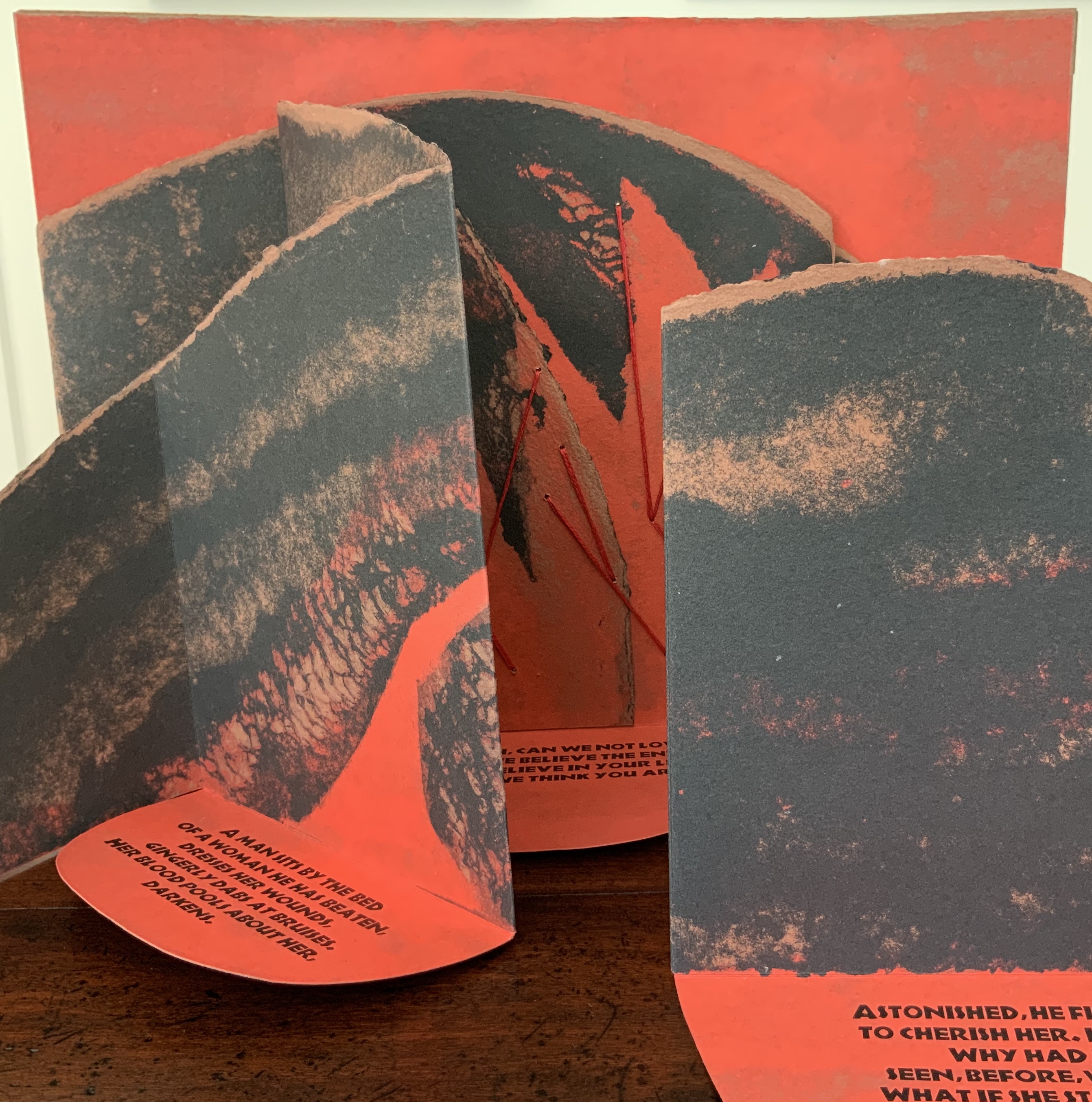
What is remarkable about this sculptural book is its fusion of collaborators’ efforts, of art forms, and of text, materials, techniques and structures.
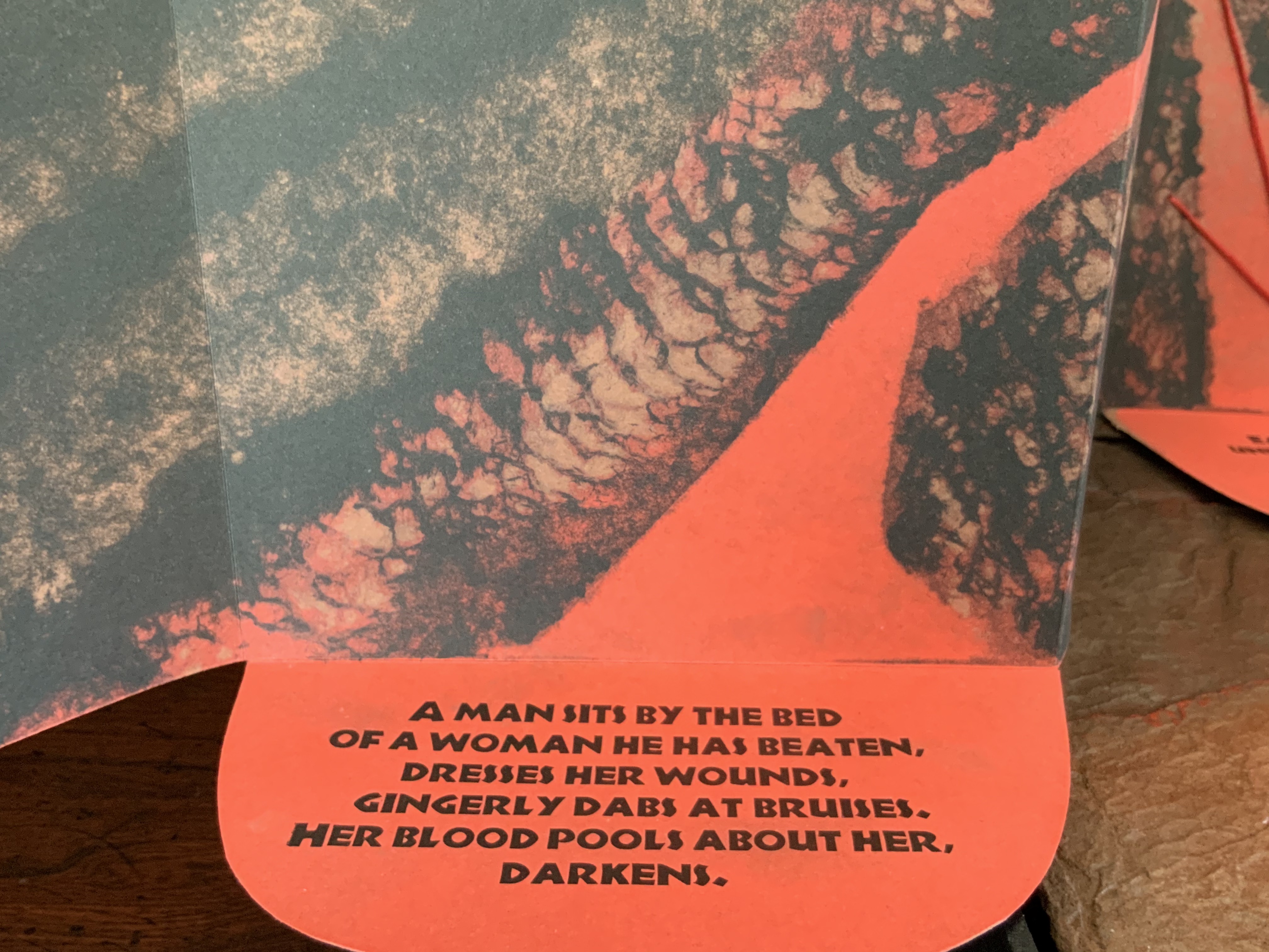
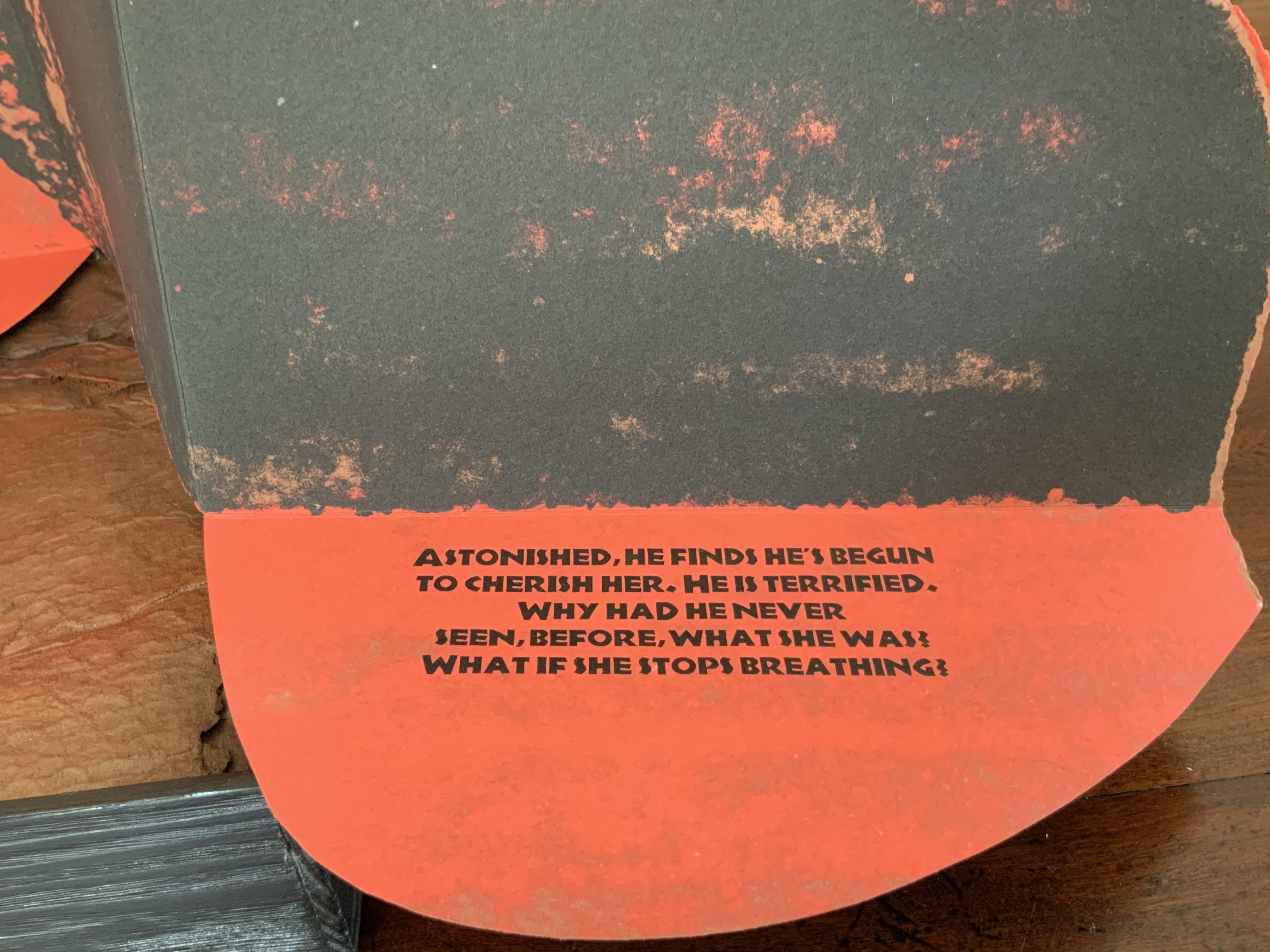
In the late 1980s, Claire Van Vliet and Kathryn Lipke (née Vigesaa) were seeking a collaborative project. After Van Vliet spotted Denise Levertov’s poem “Batterers” in the American Poetry Review (1990:6), they agreed that the poem, which enfolds our abuse of the earth within a metaphor of domestic abuse, was the appropriate text to join somehow with Lipke’s series of structural artworks called Earthskins.
Earthskins (1988-96)
Kathryn Lipke (Vigesaa)
Installation views of the works created from paper pulp, clay and pigments; some reaching 69 feet in length. Photos: Courtesy of the artist.
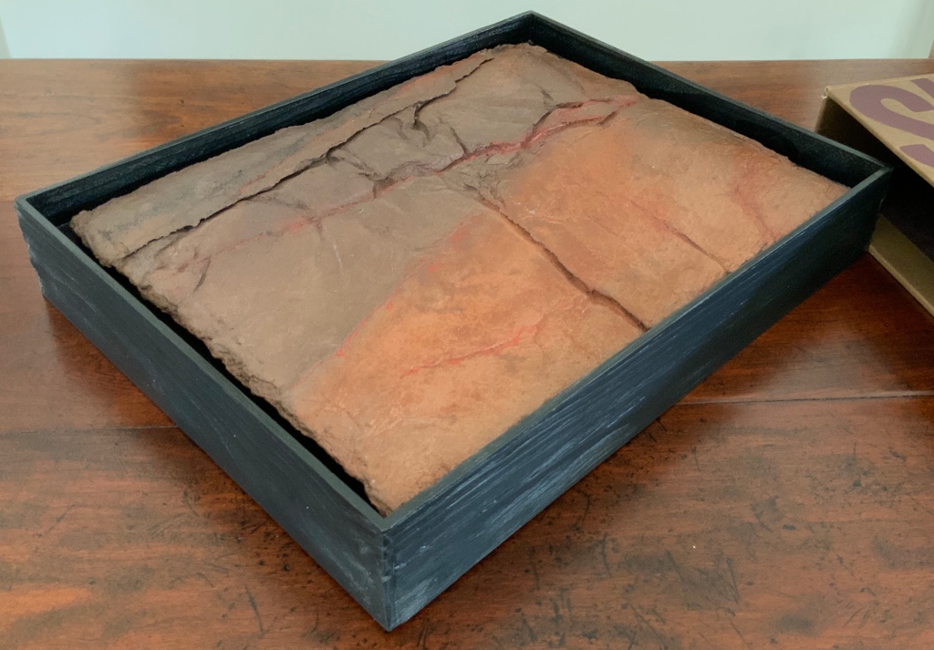
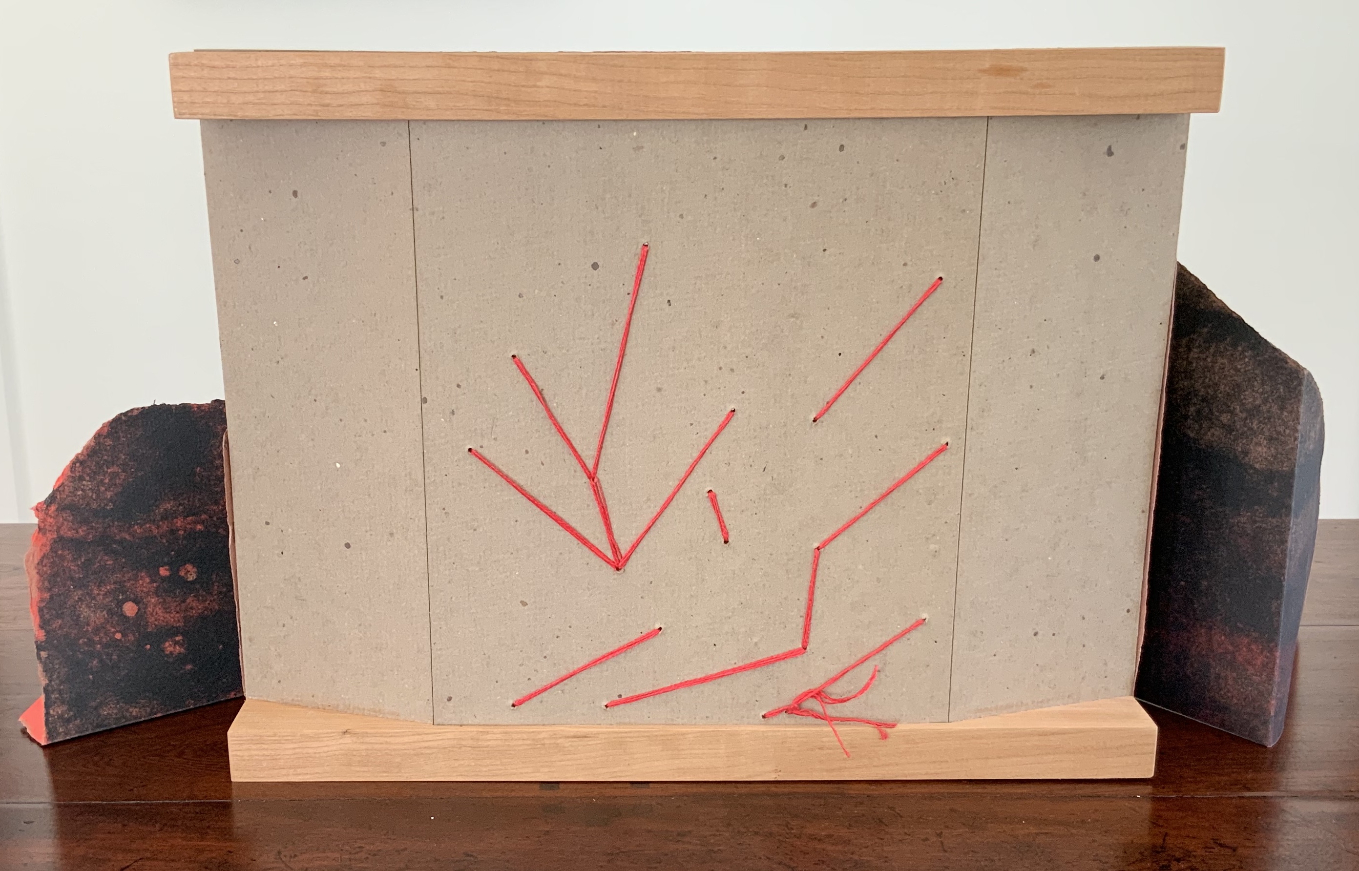
When letterpress printers consider the reproduction of a short poem, the broadside is the most common art form adopted. Van Vliet’s adoption of it is anything but common. Instead, she has orchestrated a combination of structures and art forms. From the maroon-printed, brown linen slipcase slides a tray made of tamarack wood to which Lipke’s vacuum-formed panel of clay mixed with paper is fixed. As the black tray is lifted, layers of multi-folded paper attached to a backing appear.
The top two layers are glued and sewn with multi-stranded red thread to the third and bottom layer, displaying the names of the author, work and Van Vliet’s press. The bottom layer is glued to a backing of three strong card panels tightly glued to two wood runners, sawn or routered into a slight U shape.
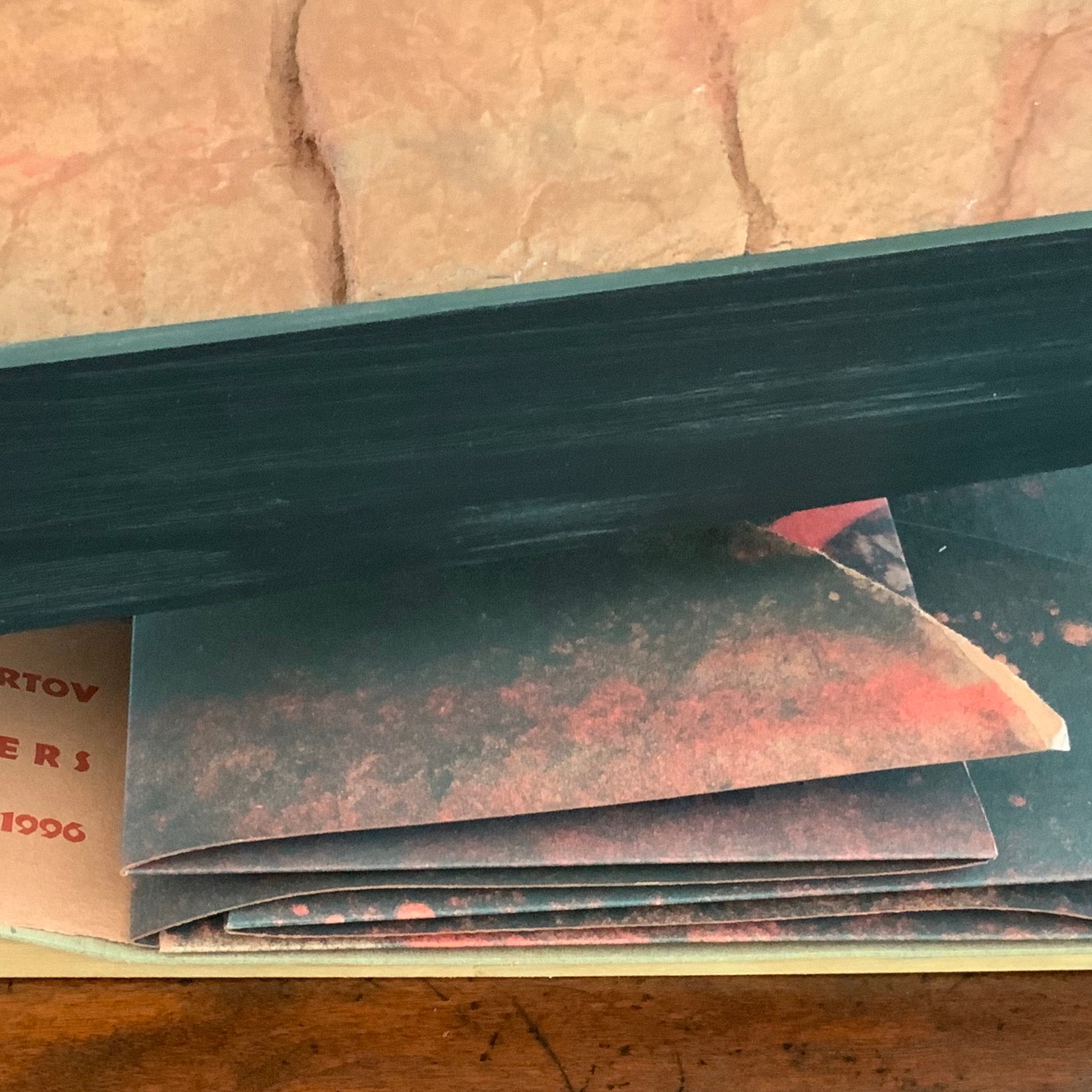
As the top layer is unfolded by pulling it apart, left and right, three tabs drop down to reveal Levertov’s poem.
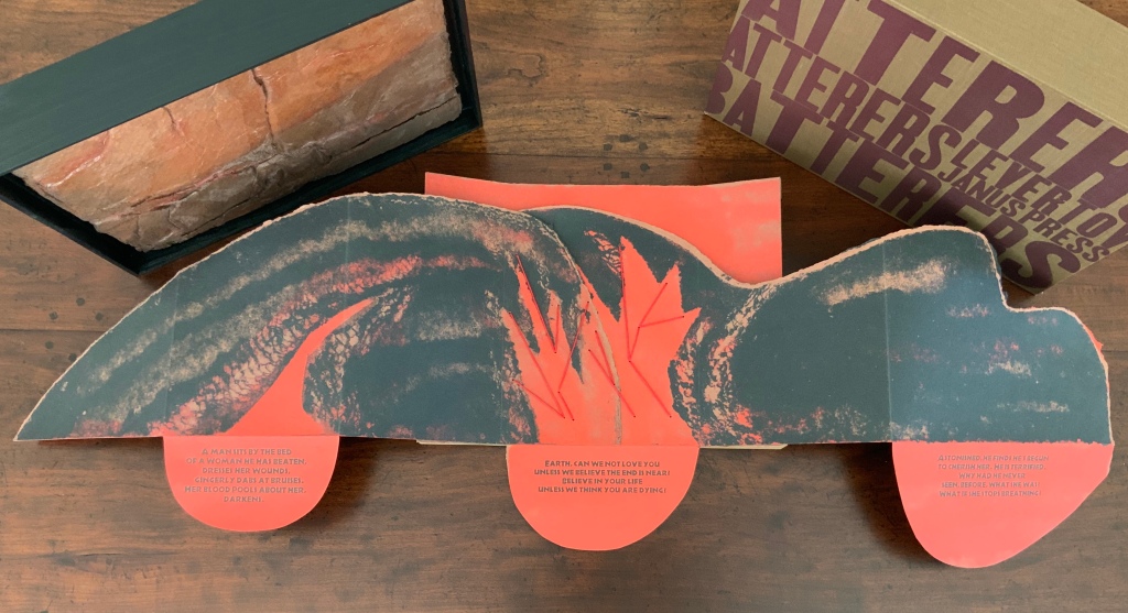
Van Vliet’s combination of structures and forms offers multiple orders in which to read the poem, which pleased Levertov because she liked the poem in both the stanzaic orders of 1-2-3 and 1-3-2 (correspondence with Kathryn Lipke and Claire Van Vliet, 20 July 2020). In a book-like way, the covering tray slides from its slipcover, the cover is removed, and the accordion pages unfold to be read left panel first, right panel second and center panel third, emphasizing the embedded and central metaphor.
Spread fully open, the structure assumes a single-sheet broadside form, and the “center” stanza moves from third to second in order. But there is a third order of reading, as it were. The broadside form “leans” into the art forms of print, painting and bas-relief sculpture. The text, images and design become a whole experience, an object to be taken in as a whole.
Photos: Books On Books Collection.
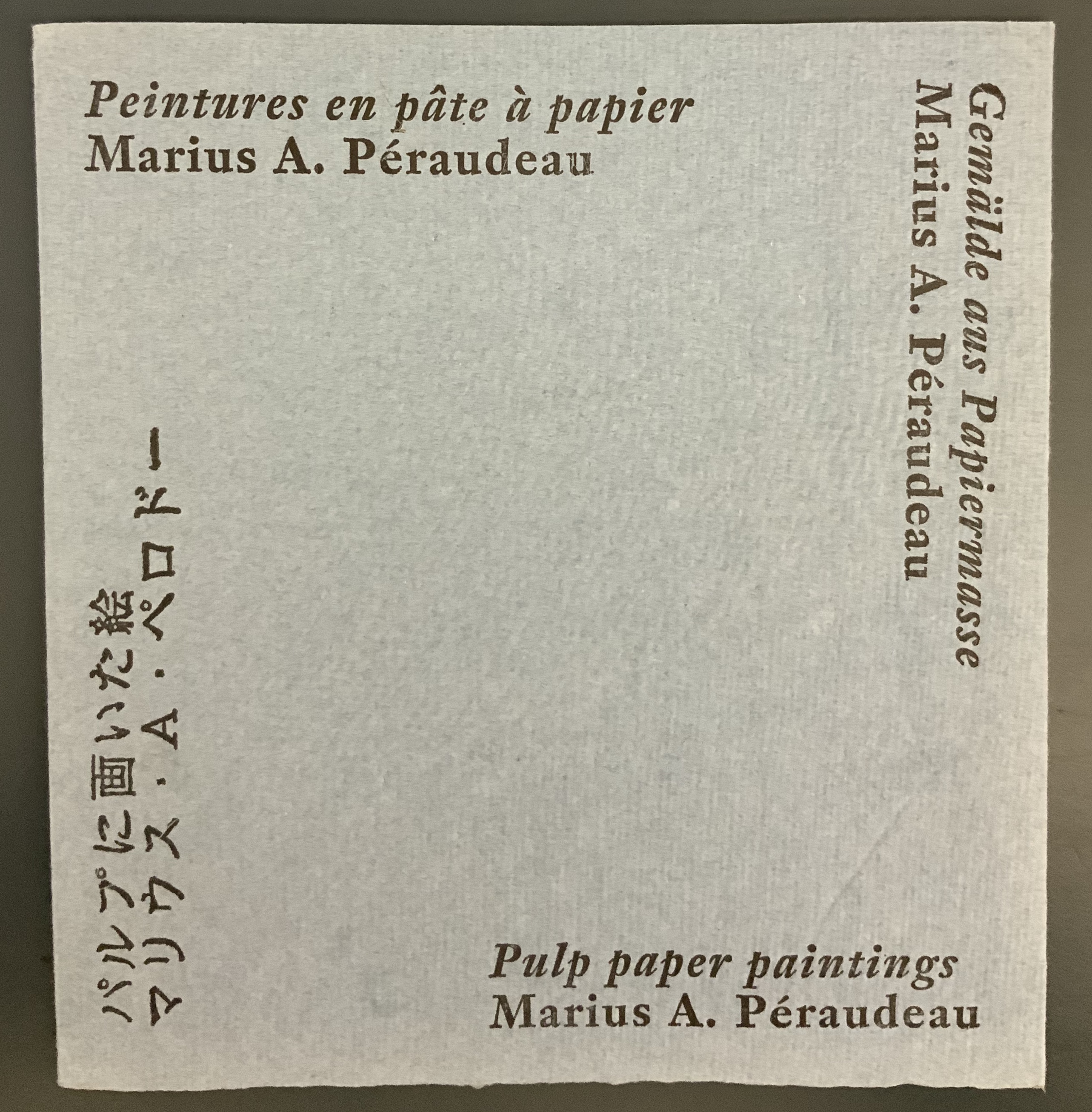
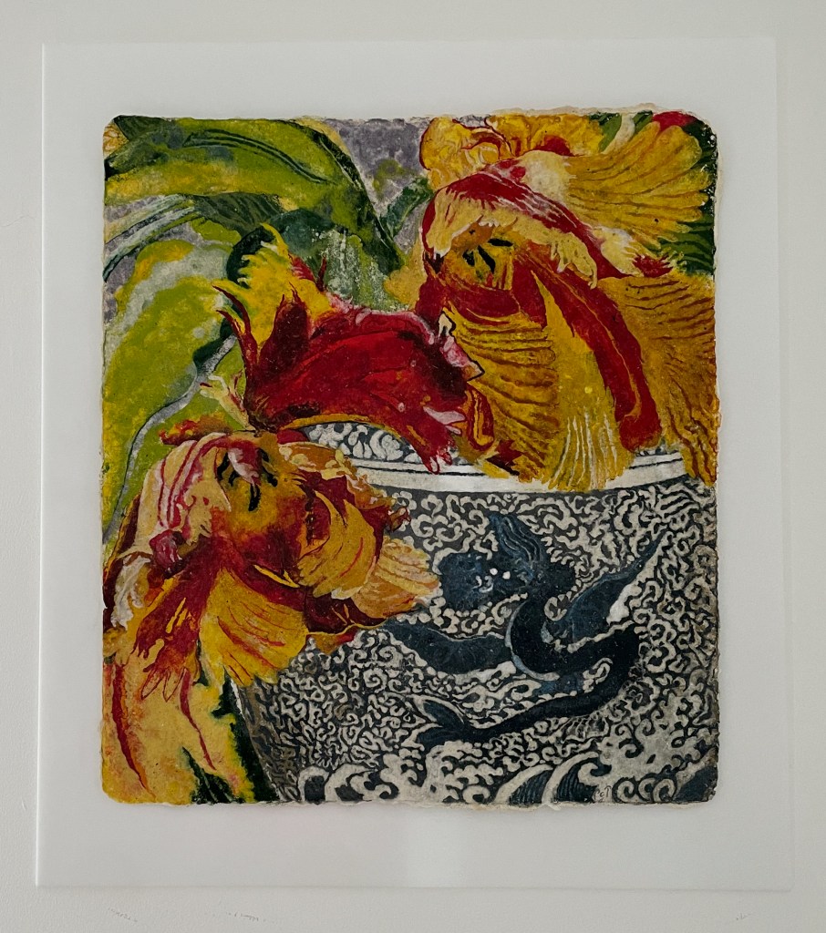
Not only in form does Batterers “lean” into the form of painting: the imagery and colors arise from the technique of pulp painting, a technique defined by the work of Marius Péraudeau in the mid-twentieth century. Pat Gentenaar’s still life Water Dragon in this collection provides another example of the technique.
Top: cover image of Marius Péraudeau: Pulp Paper Paintings (Paris: Ernst Maget, 1991). Photo taken at British Library: Books On Books. Bottom: Water Dragon 2011) Pat Gentenaar-Torley. Photo: Books On Books Collection.
In pulp painting, the paper is the painting. Assisted by Katie MacGregor and Bernie Vinzani in their paper studio in Whiting, Maine, Van Vliet poured different colors of paper pulp into prepared forms to create three sheets of paper on which to print and then collage into the image that suggests dual images: that of a volcano and that of a woman reclining on her side or face down. The fusion of shapes, the fusion of color and fiber in pulp painting, and the fusion of clay and pulp in the covering bas-relief (which can also be used as a stand for the broadside) fuse with the poem’s words and metaphor. Once this artwork has been experienced, reading the poem printed in a traditional book can never be the same.
Additional insights into The Batterers along with illustrations of the papermaking and painting process can be found in pages 43-45 of John Buchtel’s The Art of Paper (see below).
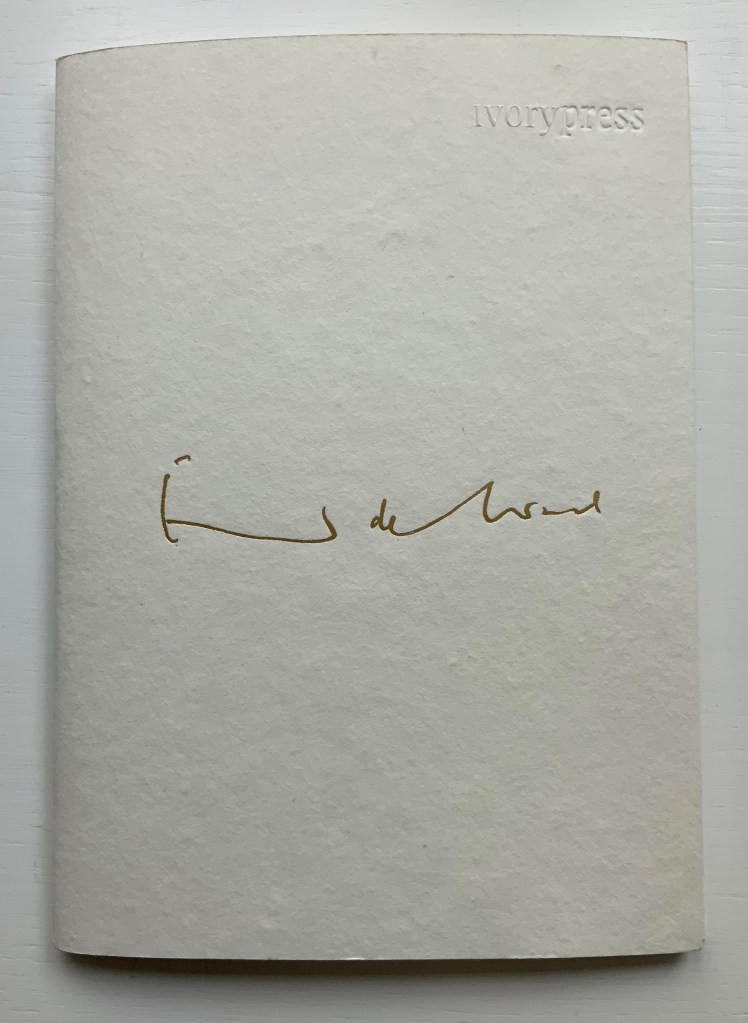
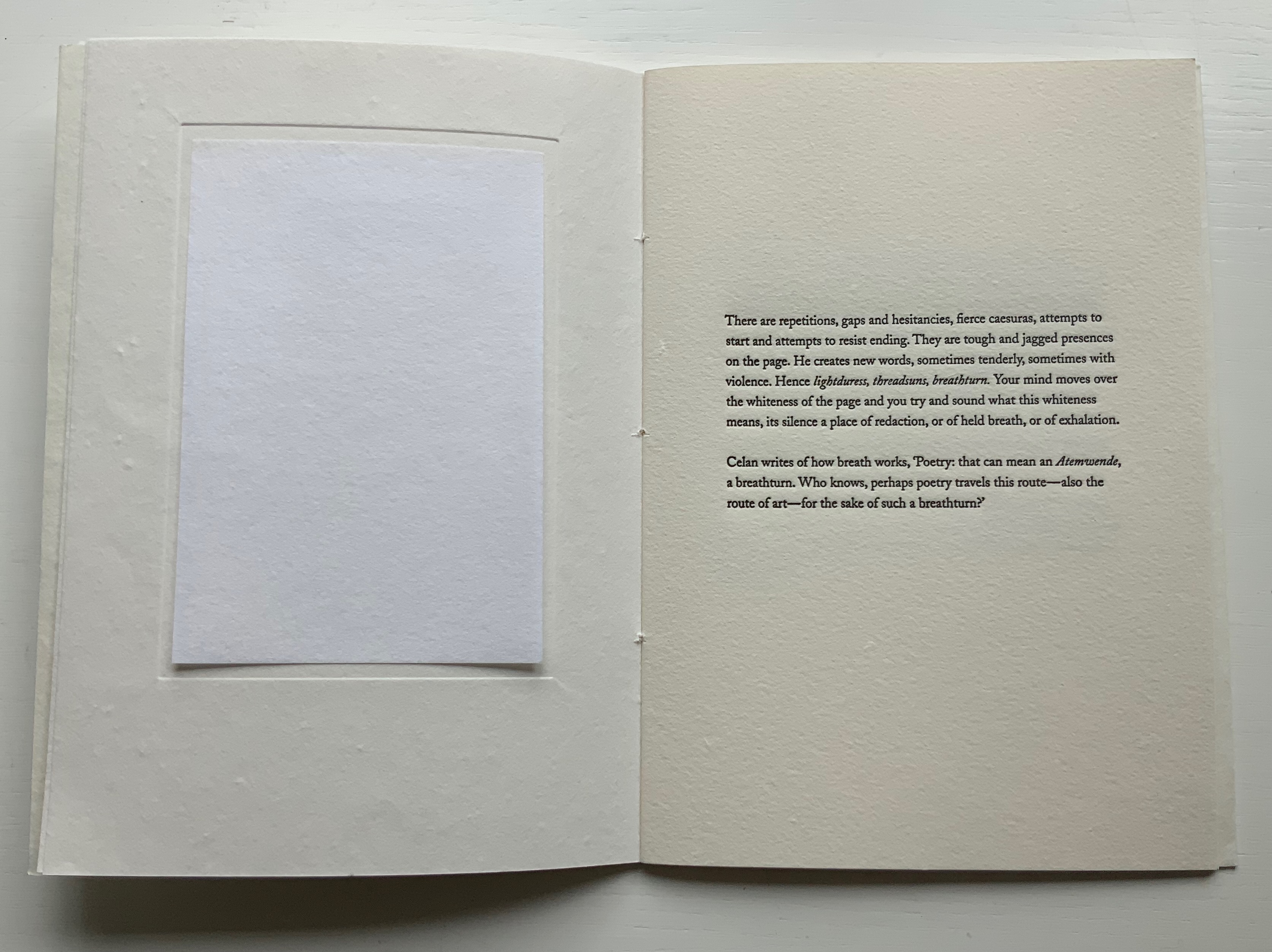
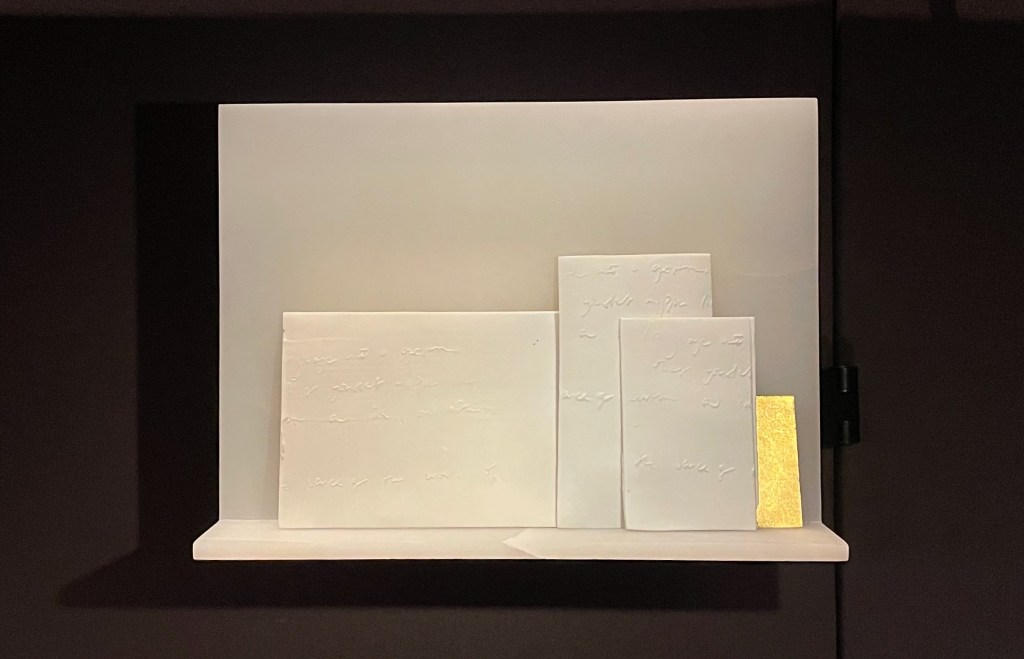
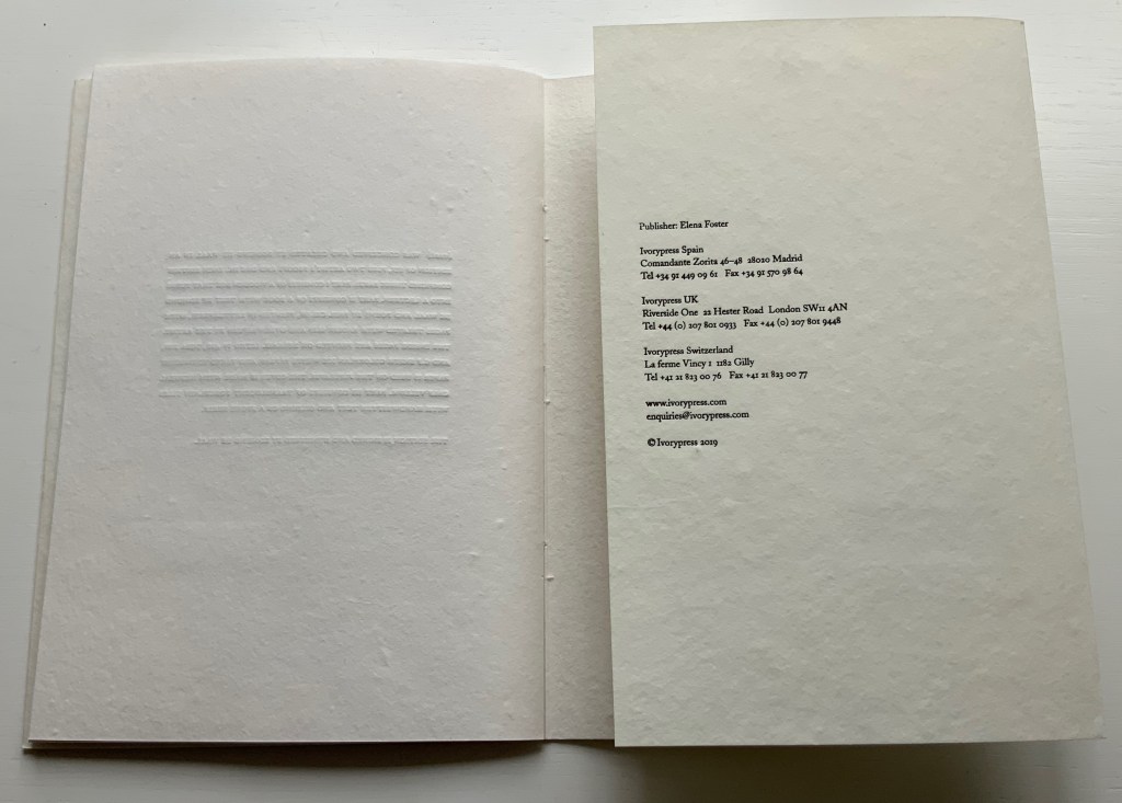
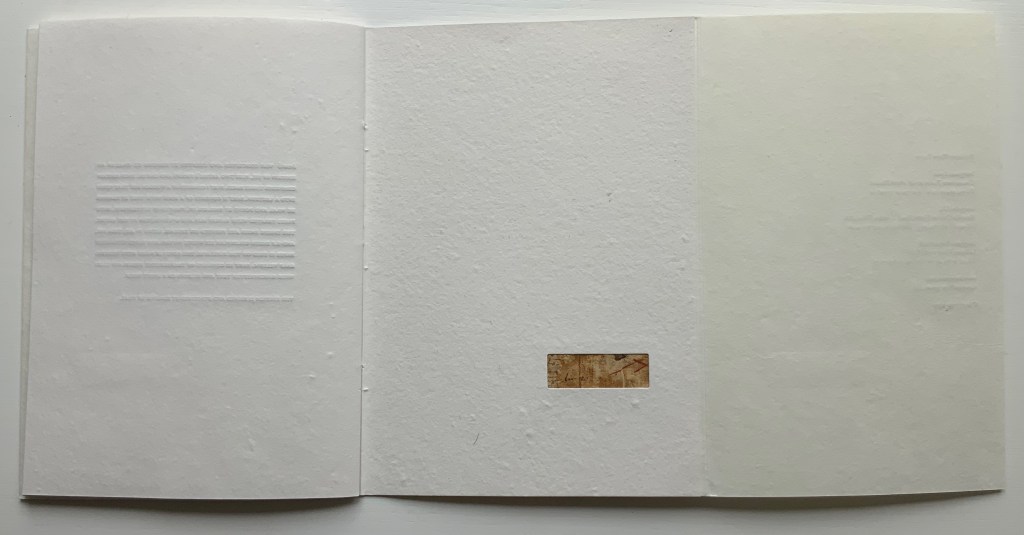
breath [prospectus](2019) Edmund de Waal Papercased sewn booklet. H214 x W152 mm, 16 pages. Acquired from Lady Elena Ochoa Foster, 28 June 2022, “Sensational Books” exhibition at the Bodleian Libraries. Photos of the work: Books On Books Collection.
In correspondence with Ivorypress in 2019, I first learned of Edmund de Waal’s artist’s book inspired by the later works of Paul Celan. With the help of Ivorypress, de Waal created breath as an artwork consisting of the artist’s book (in a limited edition of six), a series of vitrines, shelves and diptychs conceived as open books, and a reading room. His aim was to pay homage to the Romanian poet Paul Celan, in whose last books “there is more white page than word”, as de Waal puts it. The only way to have seen the book then would have been to fly to Madrid.
In a major surprise, a copy of the edition appeared at the formal opening of the exhibition “Sensational Books” at the Weston Library, part of the Bodleian Libraries (Oxford, 28 June 2022). Heightening the surprise was Edmund de Waal’s delivering a talk about the work to open the exhibition. And capping the surprise was Lady Elena Ochoa Foster’s kind gift of this eponymous booklet describing breath. Perhaps the surprise of a long anticipation’s being met, or de Waal’s impassioned talk, or the kindness of the gift created a susceptibility to the raw emotion on, in and beneath the whiteness of this work. But no, it is objectively there. De Waal’s booklet, photos from the exhibition and the Ivorypress videos further below help to understand from where the power of breath comes.
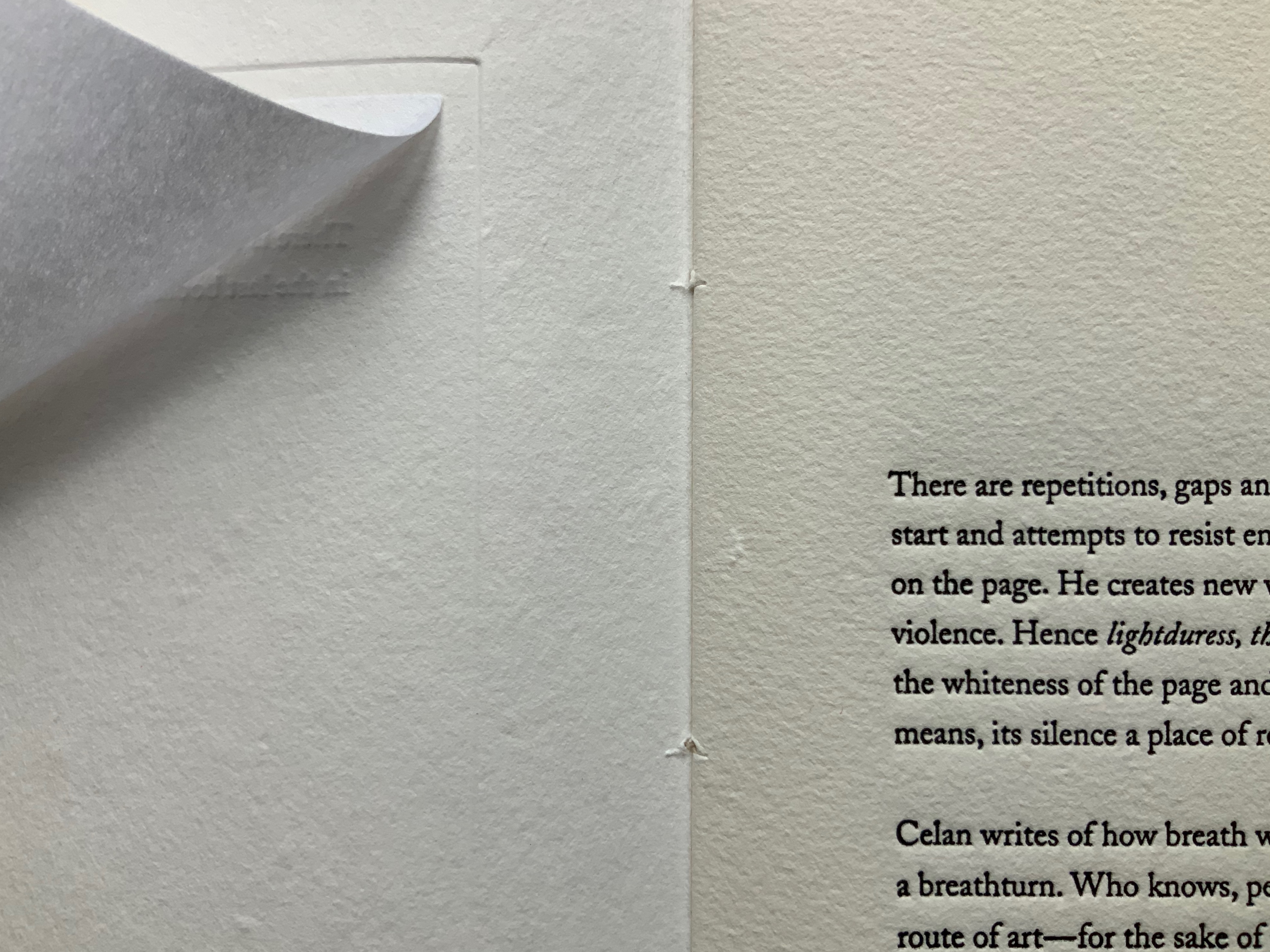
One of the booklet’s inserts is a square of white paper (perhaps the G.F. Smith Colorplan Ice White, one of the four different papers used in the artist’s book). Opposite the insert, de Waal writes, “Your mind moves over the whiteness of the page and you try and sound what this whiteness means, its silence a place of redaction, or of held breath, or of exhalation.” The close-up of the insert turned shows the paper’s degree of translucence that de Waal uses to great effect in his artist’s book as can be seen in the videos. The close-up also gives a view of the bite of the letterpress in the raised impression from the page before and the ink-filled depth on the facing page. This kind of material contrast recurs — bite and breath, white and black, lighter and heavier papers, rougher and smoother — in the larger work in so many ways.
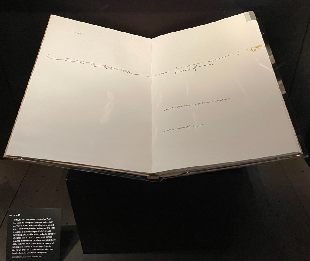
These visual, tactile and conceptual workings realize in small what the artist’s book accomplishes on a larger almost monumental scale. The artist’s book measures 453 x 673 x 43 mm and runs to 104 pages and is housed in a wooden box that converts to a lectern and provides storage for the translucent ceramic works on which Celan’s words are inscribed.
Another source of the larger work’s power is the porcelain slip that de Waal has brushed over parts of Celan’s poems to create a white surface on which he rewrites Celan’s words. Porcelain is de Waal’s tool. When asked what he does, he often puns in reply, “I throw pots”. The presence of porcelain slip in a work of such size, materiality and grounding in Celan’s poetry of coming to grips with the Shoah conjures a more somber pun on creativity and destruction. It establishes a paradoxical, metaphorical union of fragility, breakage and exhalation with strength, restoration and inhalation.
Showcased at “Sensational Books” exhibition, Weston Library, Oxford University. Photo: Books On Books, 8 July 2022.
Showcased at “Sensational Books” exhibition, Weston Library, Oxford University. Photo: Books On Books, 8 July 2022.
Just as the book, ceramics and lectern constitute another layer to the installation work, there are layers in the artist’s book itself, some of them hidden. The use of porcelain slip to cover Celan’s words has already been mentioned. Another layer lies in the binding, executed by Shepherds, Sangorski & Sutcliff. As was done in the early days of bookbinding, scraps of previously published material line the spine. For this purpose, De Waal collected scraps of medieval manuscripts previously used for binding. Binding within binding, centuries within centuries. By tucking away underneath the paper binding’s flap the only colored image in the booklet, an image that even looks like a scrap of illuminated manuscript, de Waal alludes to this practice.
While the scraps embedded in breath‘s binding are not materially perceptible, knowledge of it enriches the reader/viewer’s perception. Enriched perception enriches the work. As de Waal writes in the booklet and as we hear in the videos, “All books are palimpsests. As we read and reread, we re-create texts”. As readers/viewer responding to breath, each of us brings a layer to the palimpsest.
My response brings to the palimpsest another layering artist who celebrates Celan in works of book art: Anselm Kiefer. The juxtaposition provokes an intake of breath as it brings to mind Shulamith (1990) in homage to Celan’s “Todesfugue” (“Death Fugue”) or The Secret Life of Plants (2008) shown with a sound installation of Celan’s poetry and also sponsored by Ivorypress. So different from the whiteness of breath and its materiality of porcelain, wood, gold and paper, Shulamith is 64 pages made of lead, hair and ashes (1010 x 630 x 110 mm), and The Secret Life of Plants is 18 pages made of oil on lead over cardboard (1900 x 1400 x 200 mm). Both are dark and foreboding works. The artists themselves, too, differ in their roots. As told in The Hare with Amber Eyes (2010), de Waal’s family, the Viennese Ephrussis, were persecuted by the Nazis. Kiefer’s father was a soldier in the Wehrmacht, which we know from Kiefer’s infamous early works incorporating photos of him in his father’s uniform and giving the Nazi salute. Where de Waal evokes breath and whiteness, Kiefer evokes death and leadenness. Yet both fuse materiality and visual representation with text (whether explicit, implicit or hidden) to stand with Celan’s agony and creative spirit and achieve an originality, an independence that is nevertheless dependent on history.
De Waal, Edmund. 2021 “Breath“, In Paul Celan Today: A Companion, edited by Michael Eskin, Karen Leeder and Marko Pajević. Berlin, Boston: De Gruyter. 319-324.
Granero, Natalia, and Gunnar B. Kvaran. 2019. Anselm Kiefer: livres et xylographies: [catalogue de l’exposition, Montricher Fondation Jan Michalski pour l’écriture et la littérature du 8 février au 12 mai 2019 ; Oslo Astrup Fearnley Museet du 30 mai au 15 septembre 2019].