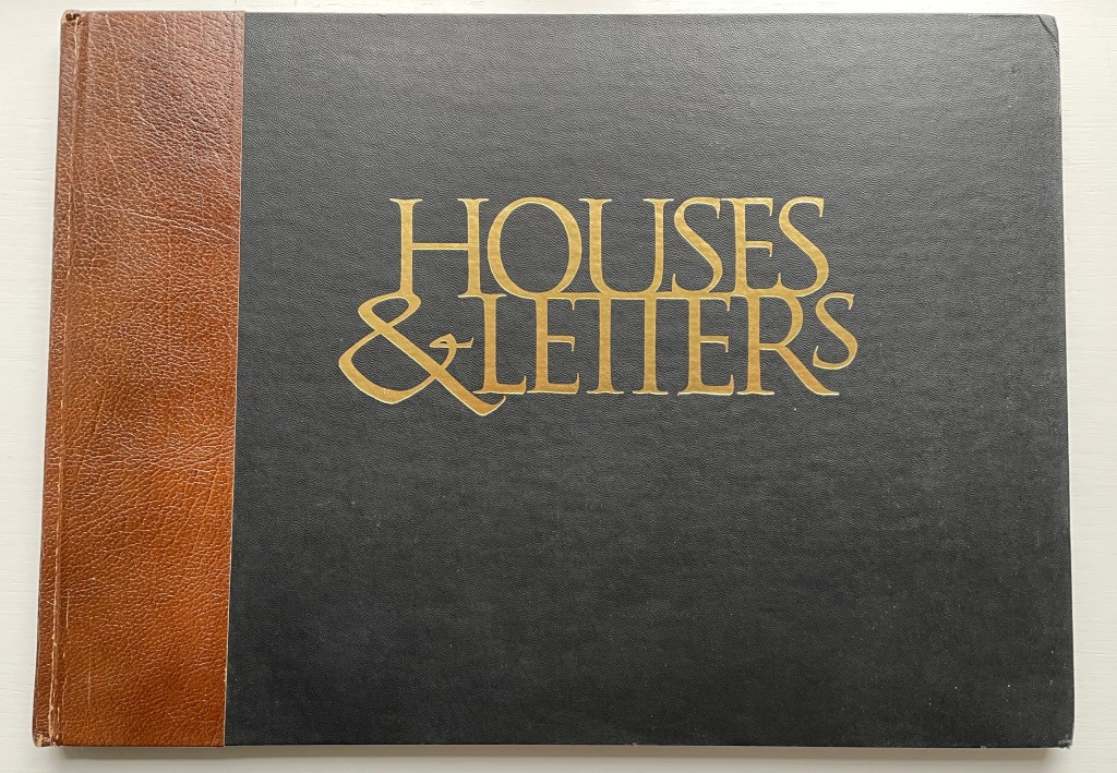
Architecture-inspired artists’ books and artists’ books inspired by alphabets make up two separate strands of the Books On Books Collection. Along with Sacred Space by Jeffrey Morin and Steven Ferlauto, Lanore Cady’s Houses & Letters is one of the rare works that weave them together, joining the beauty of form in architecture with the beauty of letterforms. With her calligraphy, verse and watercolors of Victorian structures of Humboldt County, California, Cady presents her audience with a history of the alphabet from the proto-Sinaitic to the Roman/Carolingian that ultimately argues for the historical preservation of the buildings depicted.
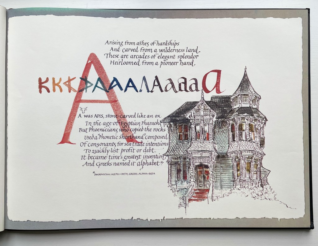
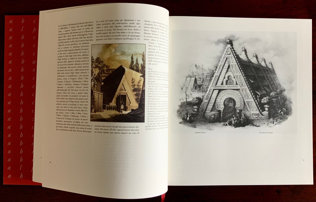
The house depicted with letter A is the “Graham House”. In notes at the end of the book, Cady provides this brief note about it:
Frank Graham came to Humboldt from the southeastern provinces of Canada and the Maine woods to become a giant in lumbering and other local industries. He was married to Martha Montgomery, direct descendant of the Lees of Virginia. Built at the end of Ninth Street in Arcata, California, in 1885, their house is one of the few landmarks that has remained unaltered since its construction. It boasts five different shingle shapes, hand-carved arches, embellished redwood burl and curly redwood.
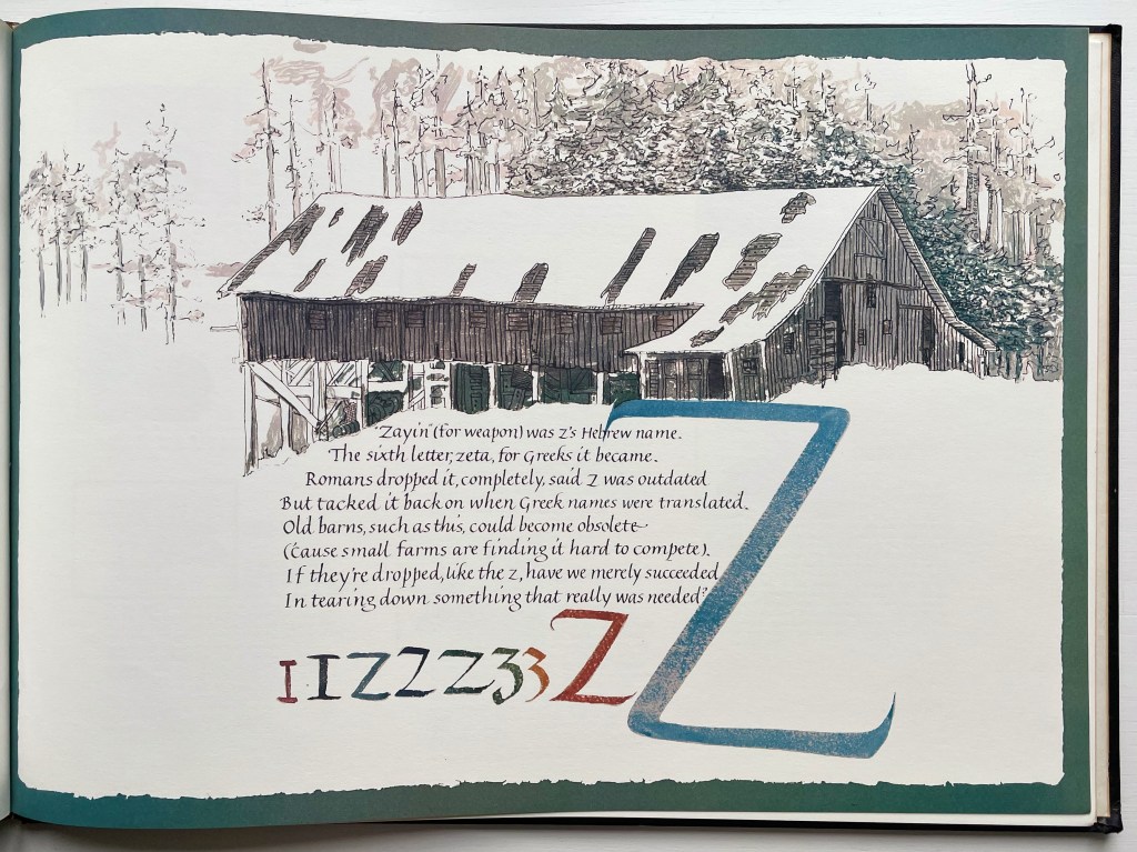
The structure accompanying the letter Z is “Robert’s Barn”:
This “Humboldt-type barn,” over 100 years old, is typical of the barns on fine ranches in this dairying-ranching country. It is on the Mel-May Ranch (so named for Melvin and May Roberts), Bayside Road, Arcata. Years ago it was “moved back” 125 feet away from the road.
Further Reading
“Lanore C. Cady“. 9 February 2011. Times-Standard. Humboldt County, California. Accessed 1 August 2022.
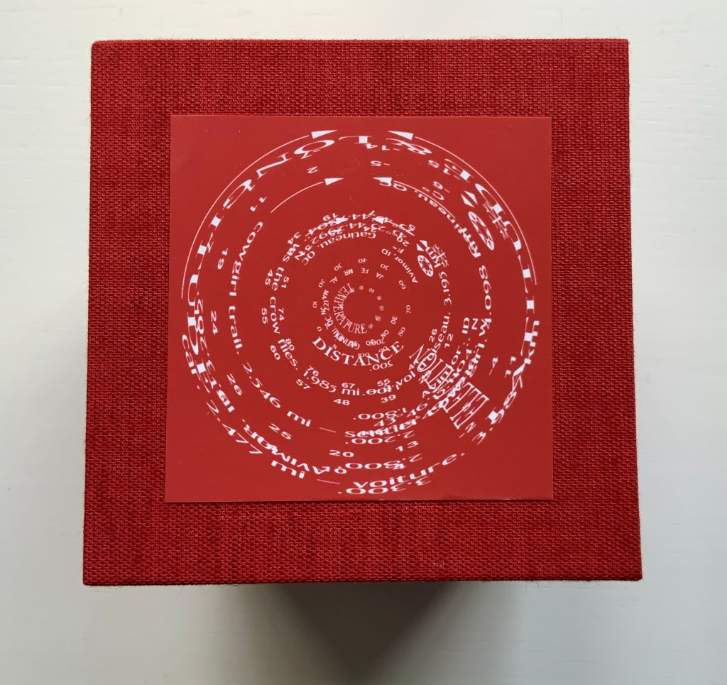
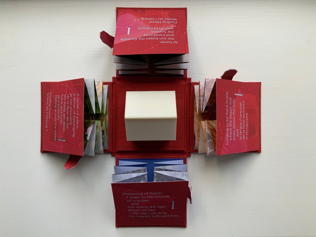
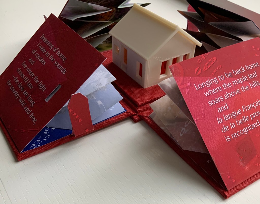
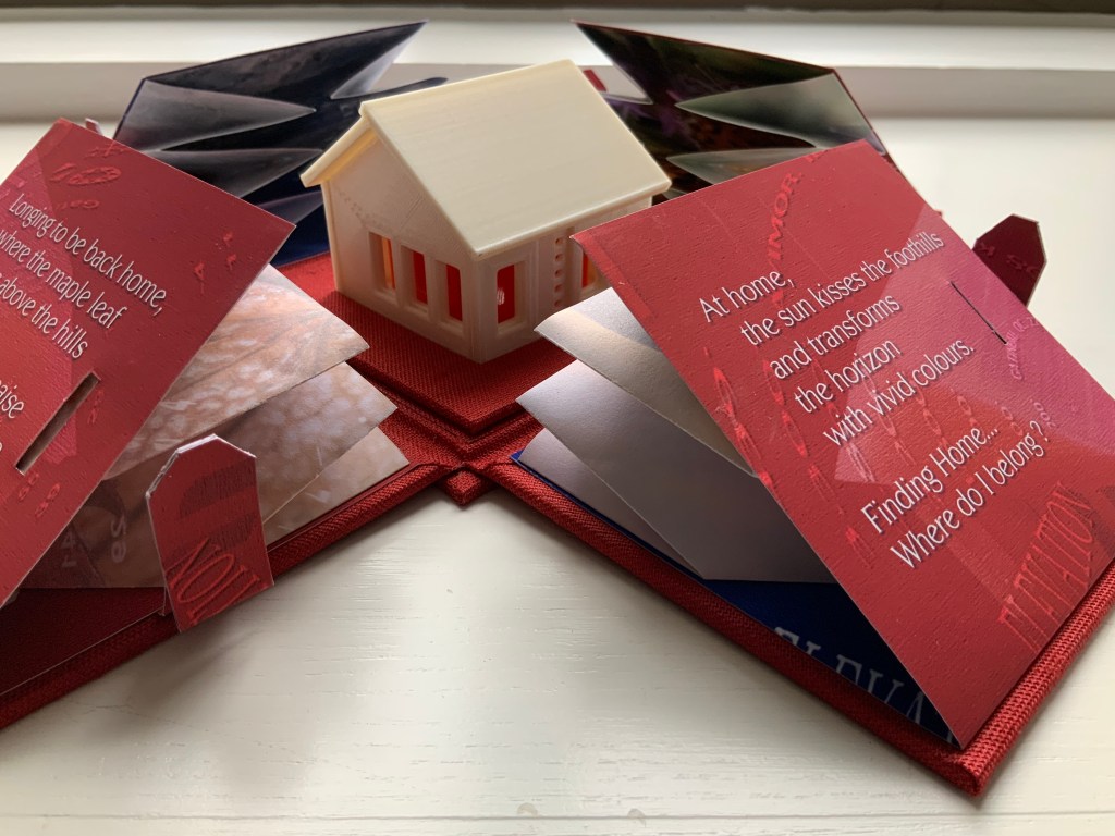
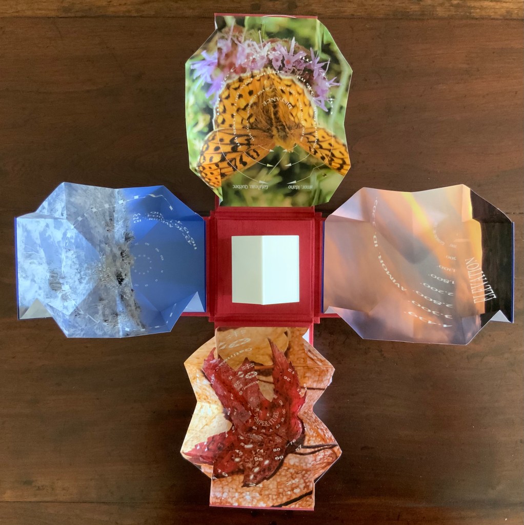
Finding Home (2019) Louise Levergneux Explosion box with cloth over board binding with inkjet printed images (H114 x W115 x D115 mm, closed); 4 Turkish map fold booklets (H95 x W95 mm, closed) inkjet-printed on Lasal paper, each attached to the interior of a box flap; 3D printed house. Third edition of 3 copies, of which this is #2. Acquired from the artist, 5 February 2021. Photos of the work: Books On Books Collection.
An explosion box, Turkish map fold, and small 3D-printed plastic house — the inventive combination reflects the many-featured domain of book art. That alone would warrant adding this work to the collection, but its union of material with content clinched the decision.
The work’s nomadic theme may have its roots in Levergneux’s various places of residence over time, but it also echoes her blog, entitled 1/2 Measure Studio, which began at the end of 2015 with her moving from a 20×12-foot studio into one measuring 10×10. The blog records indefatigable travels and visits with fellow book artists at all points of the compass to which Finding Home‘s four flaps might also allude — just as the small model might also allude to the half-measure studio.
Among the Turkish fold maps, the small house also conveys centrality and both a point of departure and one of arrival. The spirals and concentric circles within the open maps emphasize further the theme of seeking a center. But the work is not only about place. With all the maps open, we have a house surrounded by four blooms of color, which implies a still point in time among the shifting seasonal imagery.
There’s much about this work that recalls Gaston Bachelard’s The Poetics of Space (1969). There is, of course, the miniature house itself, for which Bachelard has entire chapters, but also in the maps, there is the butterfly recalling the chrysalis (pp. 85-86); the sun-kissed foothills, the recurrent theme of the horizon, distance and immensity (passim); the red maple leaf, the autumnal recollections (p. 179); and the prairie snowscape, the paean to snow (p.61); and the longitudinal and latitudinal references, recalling this passage:
Each one of us, then, should speak of his roads, his crossroads, his roadside benches; each one of us should make a surveyor’s map of his lost fields and meadows. Thoreau said that he had the map of his fields engraved in his soul. And Jean Wahl once wrote:
Le moutonnement des haies C’est en moi que je l’ai. Poème, p. 46(The frothing of the hedges I keep deep inside me.)
Thus we cover the universe with drawings we have lived (p. 33).
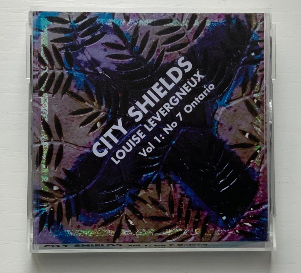
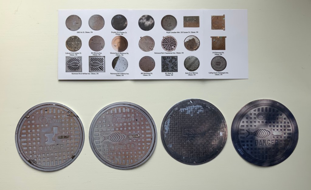
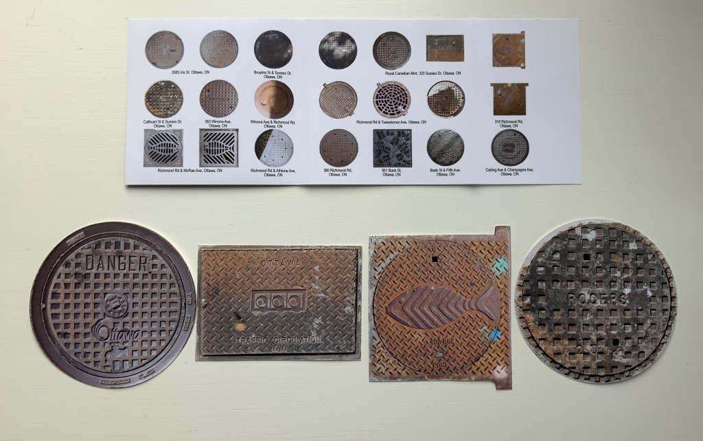
City Shields, Vol 1: No 7 Ontario (2017)
City Shields, Vol 1: No 7 Ontario (2017) Louise Levergneux Jewel case cover (H103 x W105 mm) with insert printed on Inkpress Matte paper holding 21 die-cut photos of manhole covers printed on Generations G-Chrome Lustre paper. Edition of 25 copies. Acquired from the artist, 5 February 2021. Photos of the work: Books On Books Collection.
Like Finding Home, this work is autobiographical, documenting Levergneux’s travels from 1999 to 2020, from Scotland, Canada and the US. As summarized on the insert for this one issue, the shapes and design of the actual manhole covers vary — as do their die-cut photos — some round, some square, rectangular, flanged. Small as they are, their colors and shadows nevertheless entice thoughts of miniature tunnels and drains lying beneath them and winding their way under whatever surface on which the manhole covers rest. City Shields‘ evocation of hidden space and their reminder to look down as well as up at city architecture create a strange and welcome fit with the architectural theme in the Books On Books Collection.
Levergneux celebrated the close of the City Shields project with a 20th Anniversary Edition, described here.
Further Reading
“Architecture“, Books On Books Collection, 12 November 2018.
“Guy Bigland“. 31 August 2023. Books On Books Collection. (See his Square Photographs of White Circle Paintings (2022) for comparison).
Bachelard, Gaston, Maria Jolas, Mark Z. Danielewski, and Richard Kearney. 2014 (1964). The Poetics of Space. New York: Penguin Books.
Chen, Julie. 2013. 500 Handmade Books. Volume 2. New York: Lark. P. 20 (see Will Karp’s 49 Masterpieces of Art (2011) for comparison).
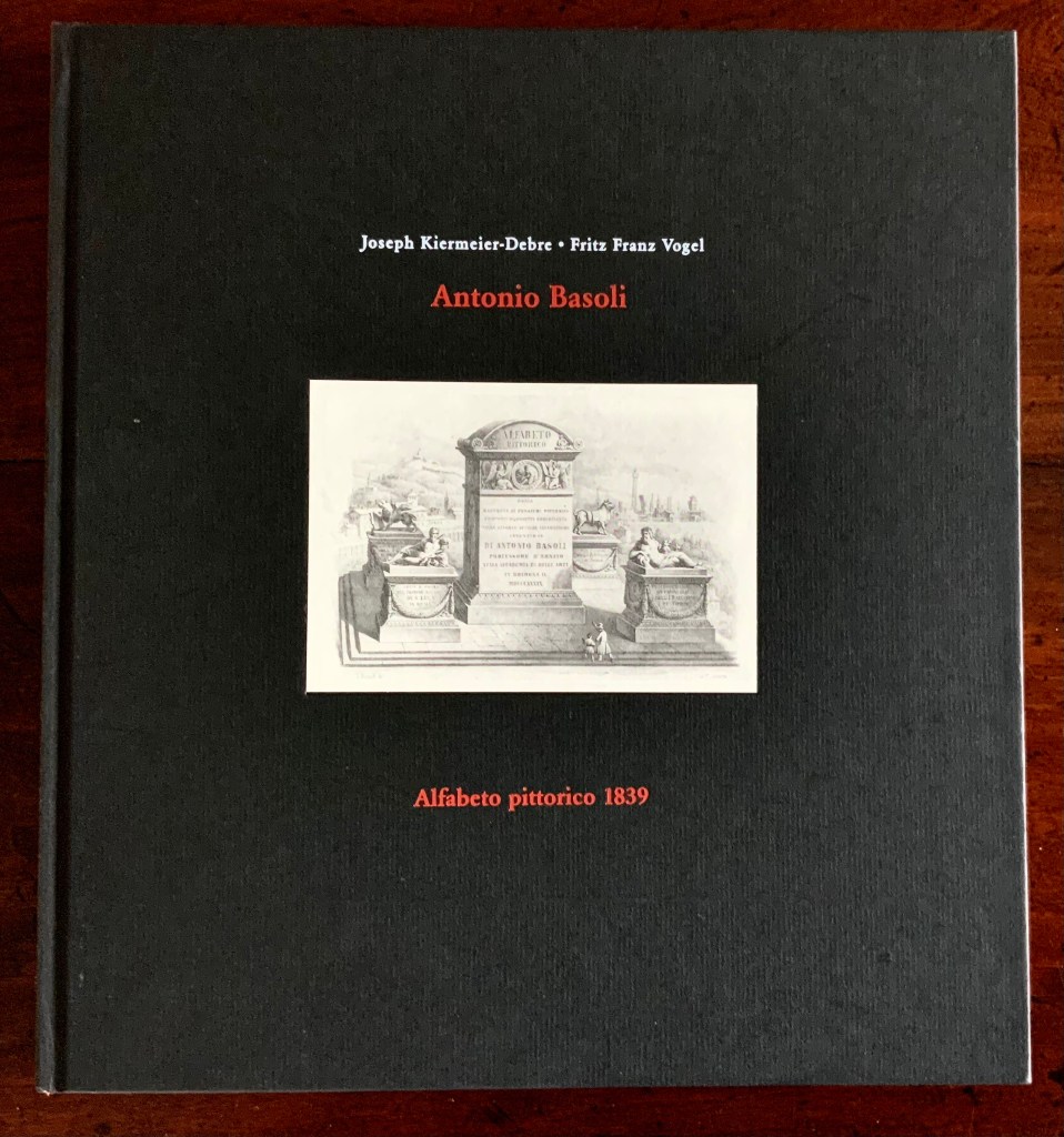
Alfabeto Pittorico, ossia raccolta di pensieri pittorici composti di oggetti comincianti dalle singole lettere alfabetiche (“Pictorial Alphabet, a collection of pictorial thoughts composed of objects beginning with the individual letters of the alphabet”) (1839/1998) Antonio Basoli Facsimile edition created by Joseph Kiermeier-Debre and Fritz Franz Vogel (1998) as part of the boxed set Alphabets Buchstaben Calligraphy, published by Ravensburger Buchverlag. H275 x W255 mm, 144 pages. Acquired from Antiquariat Terrahe & Oswald, 14 March 2021. Photos: Books On Books Collection.
The Ravensburger Alfabeto pittorico is like a “Black Forest Cake” — a lot of ingredients. The recipe starts with Antonio Basoli’s design of monuments based on letters of the alphabet and his original Italian and French descriptions. To this, the chefs Joseph Kiermeier-Debre and Fritz Franz Vogel add German and English translations. Then, alongside Basoli’s inventions, they place reduced versions of Antonio and Giovanni Battista de Pian’s contemporaneous alphabetical/architectural fantasies. And sprinkled throughout, providing comparative context to Basoli’s career in Bologna as a professionally and academically recognized scenographer, there are dozens of reduced versions of lithographs of opera settings by the more renowned scenographers associated with Vienna, Milan, Venice, Naples and Munich. It is entirely a pudding in the spirit of Basoli.
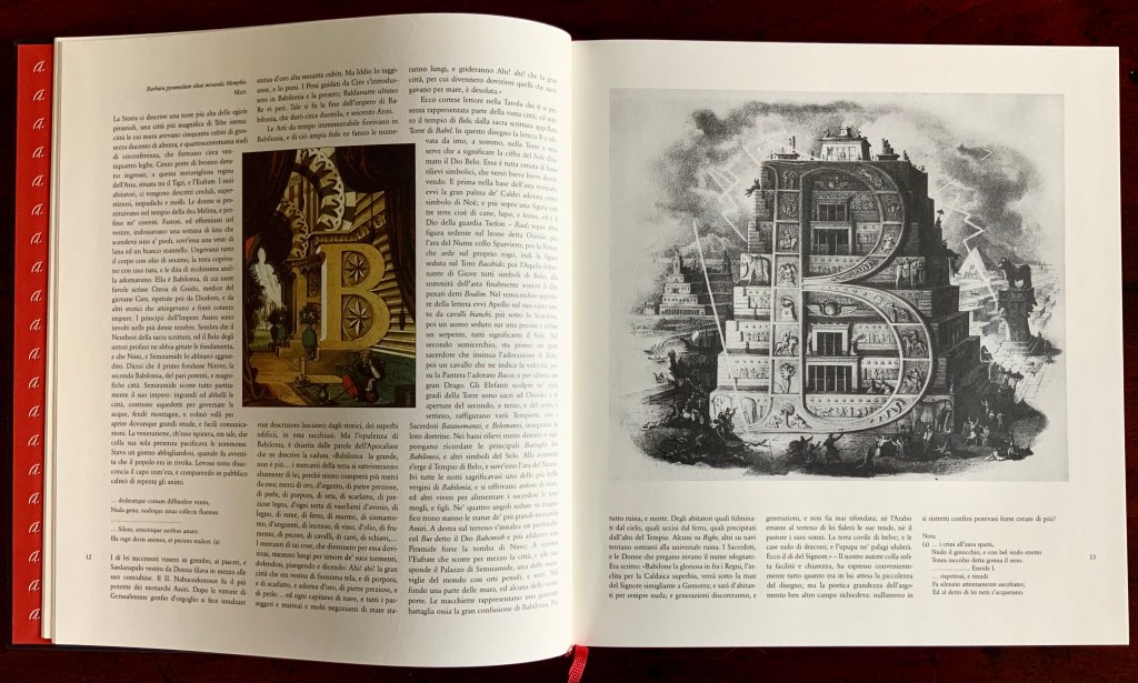
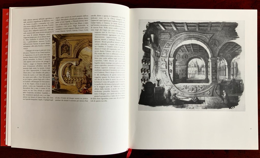
Basoli creates densely illustrated scenes based on each letter of the alphabet. For each view, his goal is to incorporate the letter structurally or ornamentally in a central building, which in the most successful attempts would begin with the letter. For instance, the large A-shaped building is an orangerie (as in arancia for oranges). B hints at the Tower of Babel and the destruction of the Babylonian empire. C stands for catafalque (or “crypt”) and the Capuchin monks attending to a burial.
Setting a further standard of success, the artist populates each scene with people, activities, objects and symbols that begin with the designated letter. Around the orangerie, agricultural attrezzi (“implements”) are strewn, stone aquile (“eagles”) perch on the building, alms are being distributed by a man in Arab dress, trees beginning with the letter A forest the background and pop up from pots, and the whole setting evokes Arabia according to the 19th-century perception of the region encompassing “Persia, Syria, Egypt and Ethiopia”.
As Kiermeier-Debre and Vogel point out in the preface and afterword, this scene and many others reflect the time’s preoccupation with the Orient and antiquity from the not-too-distant Napoleonic campaign in Egypt (1798-1801) that spawned the archaeological industry of Egyptology. They also reflect the scenography arising from a half century’s operas such as The Escape from the Seraglio(1782), The Caliph of Baghdad (1800), Abu Hassan (1811), Ciro in Babilonia (1812), L’Italiana in Algeri (1813), Il Turco in Italia (1814), Semiramis (1818), Maometto (1820) and Belsazar (1836). Drawing attention to the alphabetical scenes’ evidence of the wide range of Basoli’s cultural, historical, mythological and religious insights, Kiermeier-Debre and Vogel rightly conclude that the work is as much an encyclopedic pictorial dictionary as abecedary.
The author who provided the original commentary on Basoli’s scenes was G.C. Lossada, an art historian. He, too, notes Basoli’s erudition, but on the artistic success of each scene, he swings between acclamation and deprecation. Here is his concluding paragraph on the letter C:
Despite the fact that the shape of the letter C, the theme of this picture, does not lend itself to the main object that is depicted, and the larger part of the building actually lies outside of the initial, such that the whole design could well exist without it, despite all this the perspectives and proportions are so well thought out that this picture can be acclaimed as one of the best in the collection. P. 110.
Equally balanced in their appraisal of Basoli, Kiermeier-Debre and Vogel rank him behind his contemporary scenographers such as Karl Friedrich Schinkel but rate his alphabetical architecture over that of Giovanni Battista de Pian. The latter may be a matter of color and taste. Even reduced, Pian’s scenes draw the eye over Basoli’s, and if the criteria for ranking include a consistency in integrating concept, subject, technique and material, Pian’s letters strain less in their achievement. The letter C certainly takes the cake for Pian.
Basoli does, however, gain a point over Pian with his concluding ampersand. As Lossada remarks, in recapitulating the alphabet and images emblematic of each letter, Basoli’s “&” is entirely a scenic etcetera. The ampersand can be viewed online with the complete alphabet, thanks to the Civic Museum of the Risorgimento in Bologna and also RMR Productions (video, 7 June 2014; accessed 5 April 2021). Neither replicates the clarity of the Ravensburger reproductions.