Knot theory seems to be having a moment this year. In February 2025, there was the First International On-line Knot Theory Congress. Not to forget the regularly recurring Swiss Knots Conference (held in Geneva in June) and the 11th Sino-Russian Conference on Knot Theory (held in Suzhou, China in June-July). Or the “Danceability of Twisted Virtual Knots” produced by Nancy Scherich and danced by Sol Addison and Lila Snodgrass at the Math-Arts Conference in Eindhoven in July. And then in September the Scientific American and online media picked up two discoveries in knot theory — one by Mark Brittenham and Susan Hermiller and another by Dror Bar-Natan and Roland van der Veen.
Jeffrey Morin
Celebrating the 250th Anniversary of Steingruber’s “Architectural Alphabet”
What is it about artists’ books and architecture that they intersect so often? Architectural interiors and exteriors, ideas, themes, styles, landmark dwellings and edifices have found their metaphorical expression and embodiment in book art with such regularity that they make up a genre within the genre. Perhaps it is that, as Victor Hugo expresses it in Nôtre Dame de Paris (1831/1902),
… the human race has two books, two registers, two testaments: masonry and printing; the Bible of stone and the Bible of paper. … The past must be reread upon these pages of marble. This book, written by architecture, must be admired and perused incessantly; but the grandeur of the edifice which printing erects in its turn must not be denied. (Book V, Chapter 2, p. 187)
Or perhaps it is even more fundamental. As Hugo asserts in his posthumous The Alps and the Pyrenees (1890/1895):
All letters were signs at first, and all signs were images at first…. Human society, the world, man as a whole, is in the alphabet…. A is the roof, the gable with its cross-beam, the arch, arx; … Z is the lightning, it is God. (pp. 64-65)
Beneath the mysticism and pareidolia, Hugo is on to something. Maybe the affinity of books and architecture lies in the origin of the raw material of books — the alphabet — whose second letter comes from a mark signifying shelter or house.
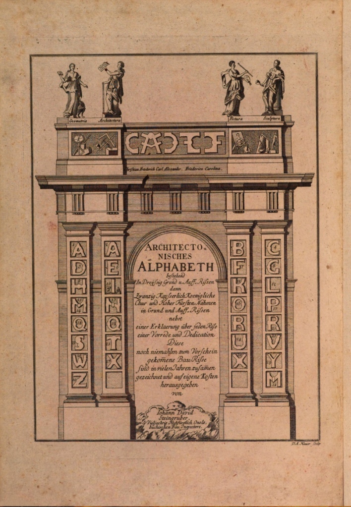
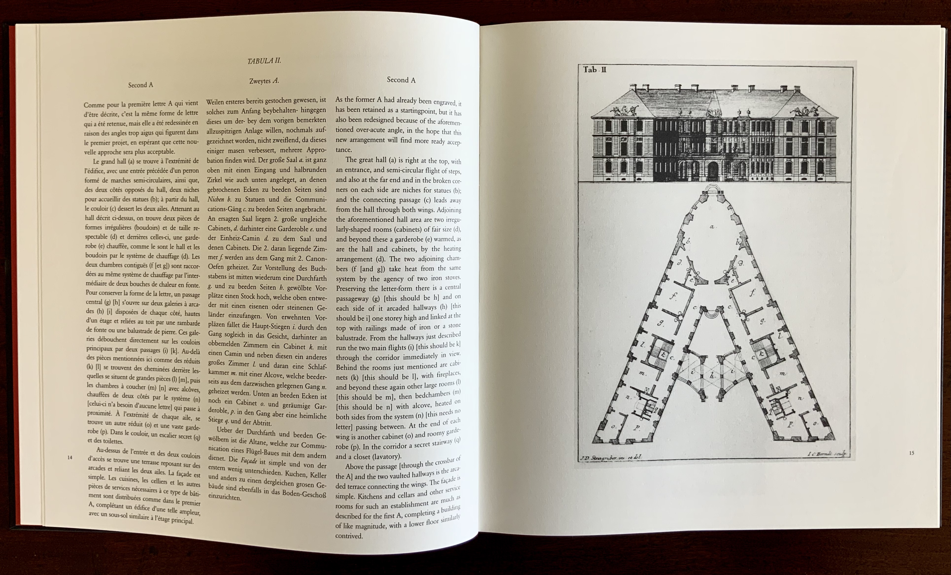
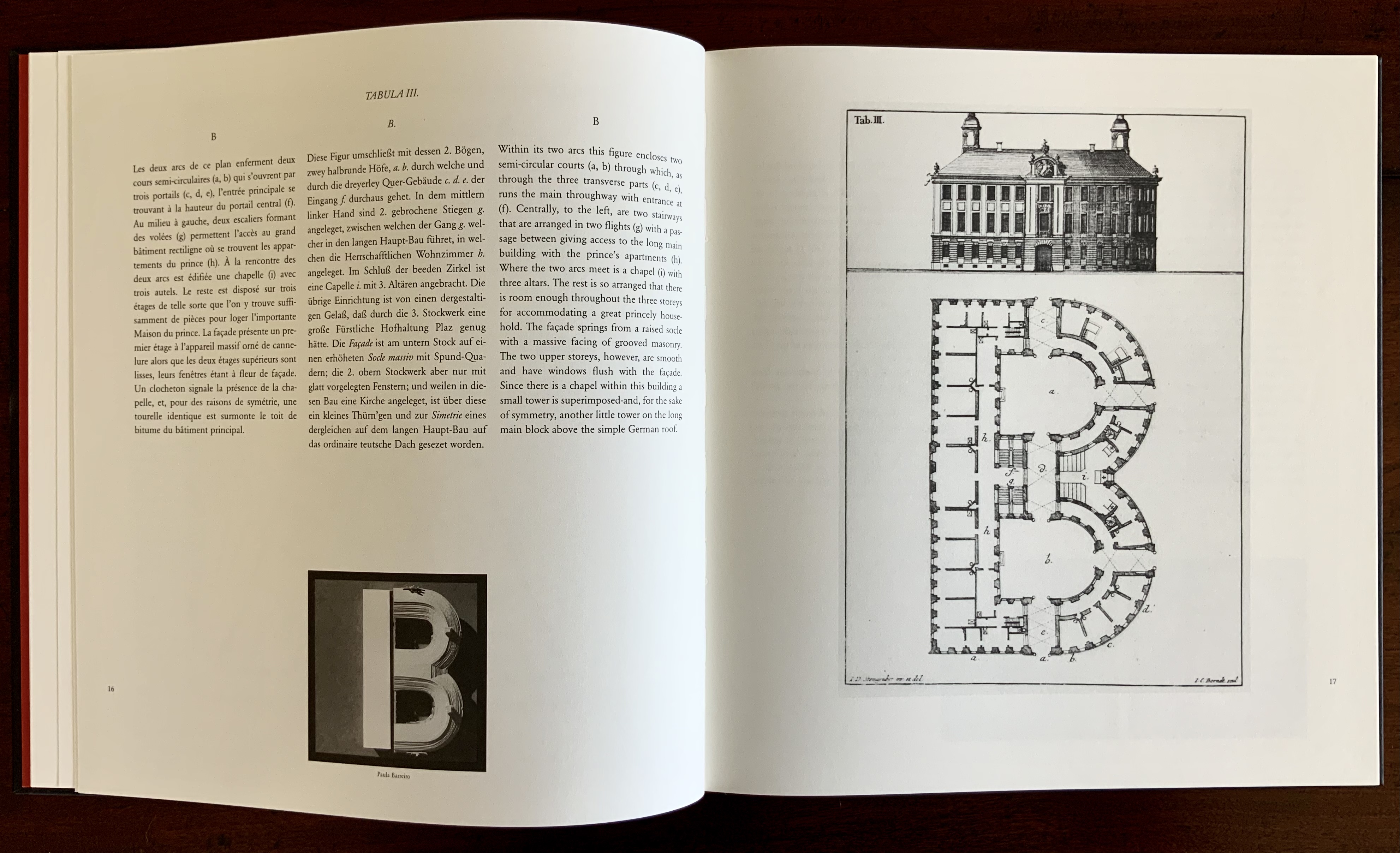
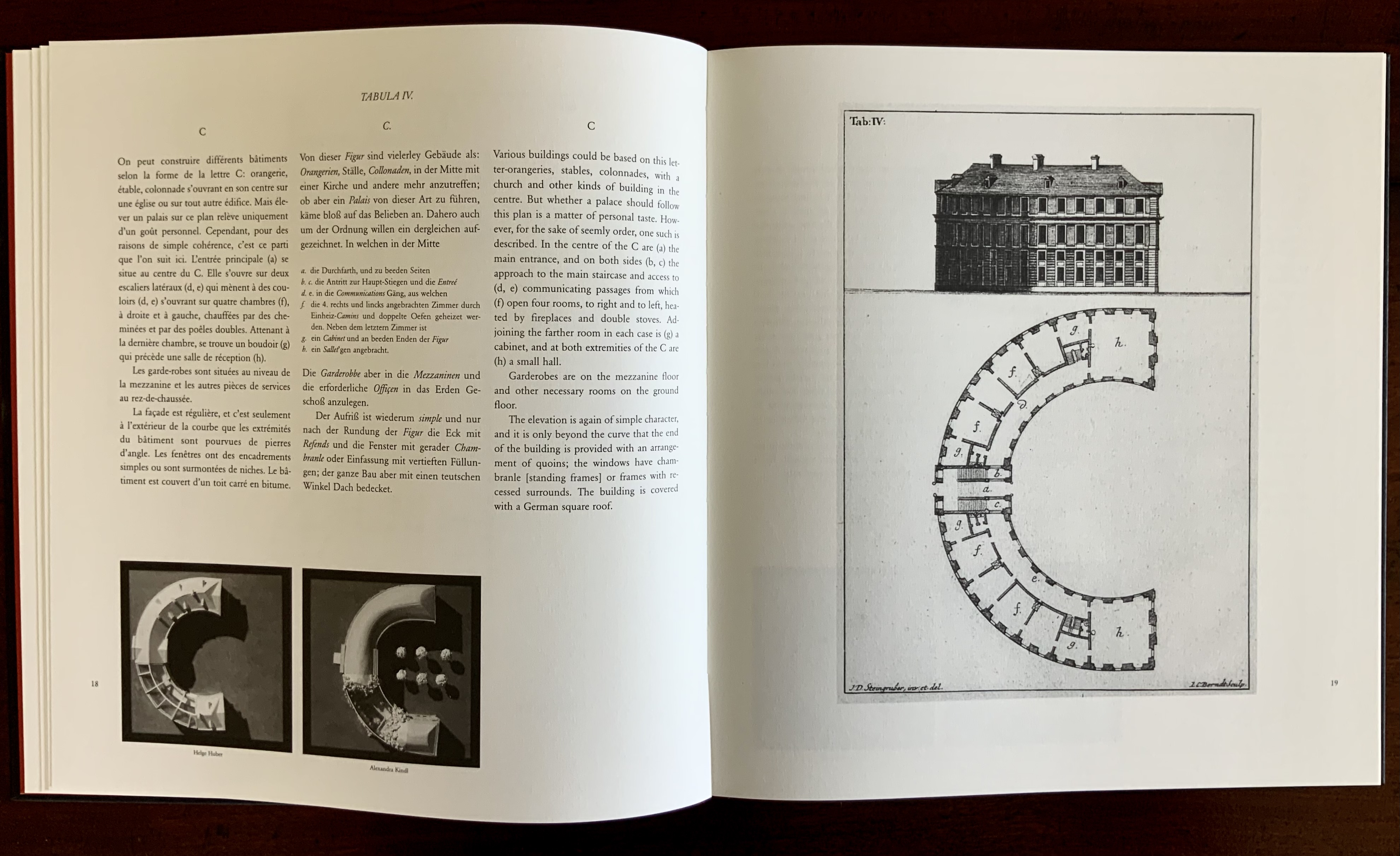
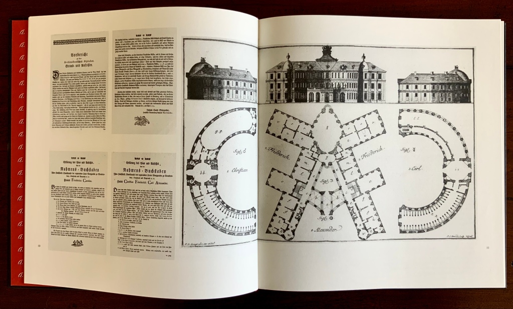
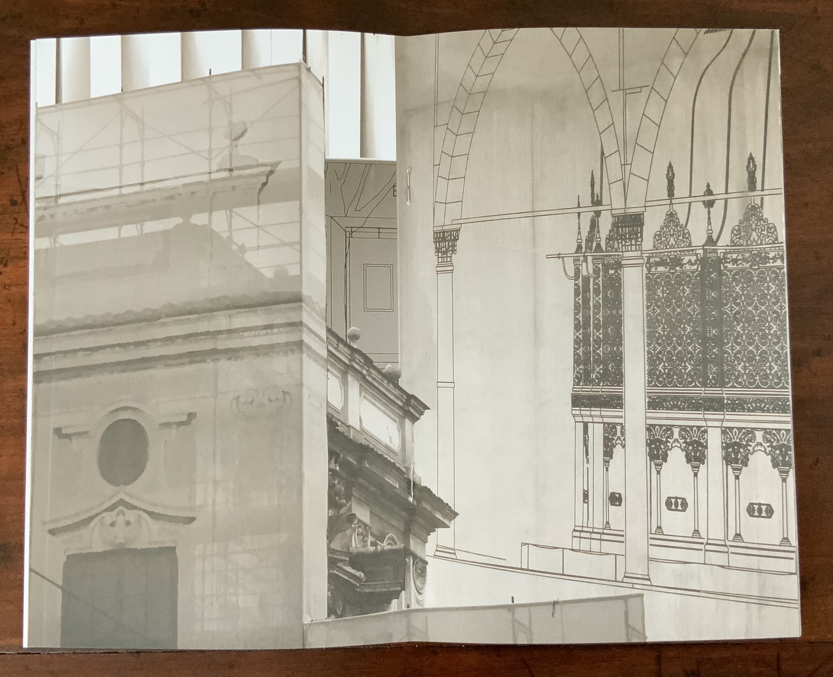
This wondering and wandering about the intersection of architecture and the artist’s book is prompted by the 250th anniversary of the publication of Johann David Steingruber’s Architectonisches Alphabeth(1773). This postcard-famous volume of print folios depicts architectural elevations and plans for residences in the shape of the letters of the alphabet. It is dedicated to Christian Friedrich Carl Alexander, Margrave of Brandenburg-Ansbach, not to be confused with the paying dedicatee of Bach’s Brandenburg Concertos, the Margrave of Brandenburg-Schwedt. By a baroque coincidence, however, the first Brandenburg concertos, the ones composed by Giuseppe Torelli and influencing Bach, are dedicated to the Margrave of Brandenburg-Ansbach, then George Friedrich II, Alexander’s great-uncle who employed Torelli as court composer. Unlike Bach, however, Torelli received no direct payment for his composition. Steingruber too had to be satisfied with his payment as an appointee (court and public surveyor, and later principal architect of the board of works).
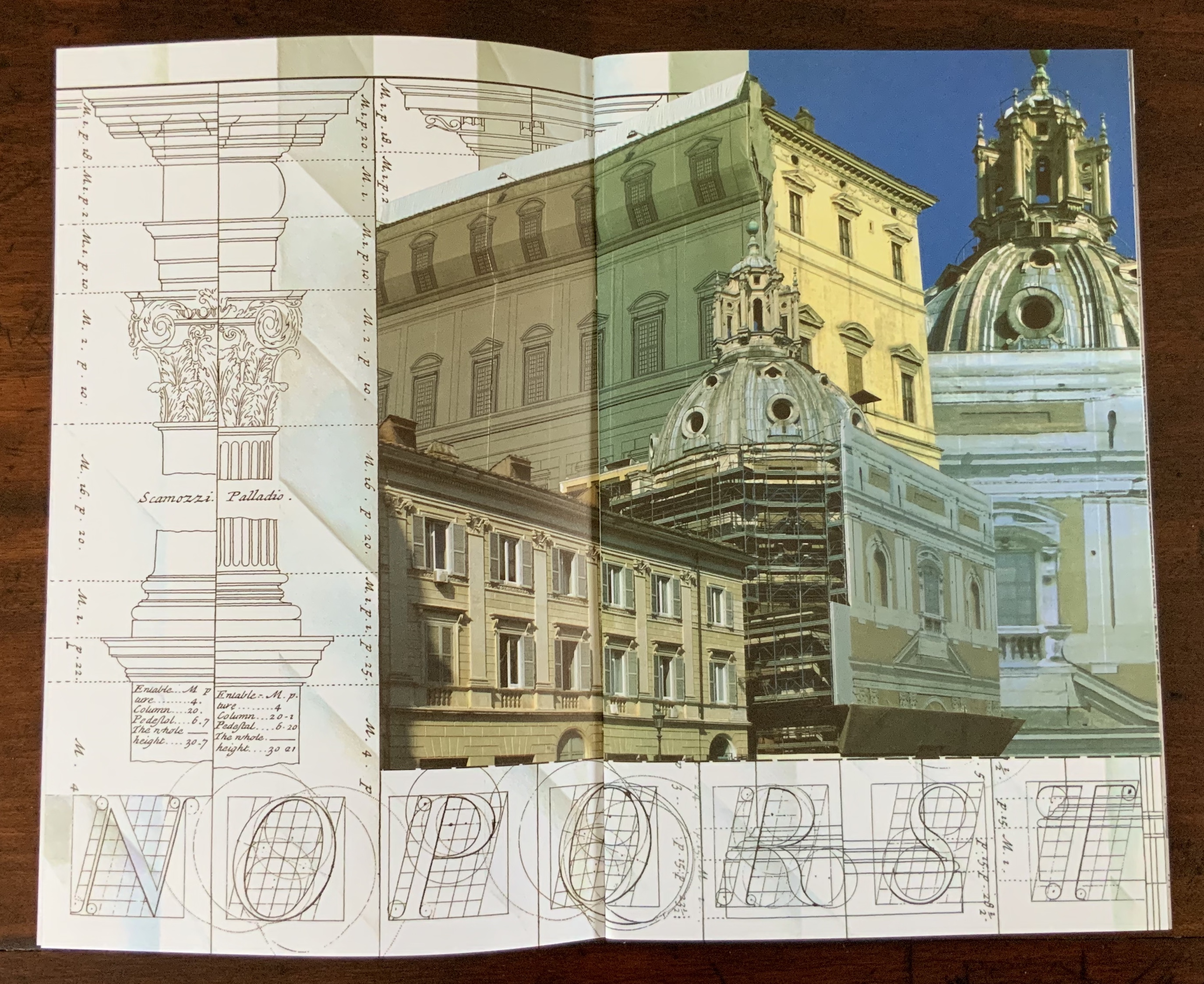
Steingruber may have felt he had good reason to be miffed. After all he had published the volume in installments at his own expense and made sure that the Margrave’s monogram (and that of Carolina Frederica, his wife) in building form appeared in the span above the roman arch on the title page. His elevations and plans draw attention to the heating, kitchen, toilet and servants’ arrangements as if conferring with a prospective client ready to commission one of these typographic palaces. Perhaps he was thinking, Who would not want a serif with a view? Or conduct guests on a tour of the bowl, capline, crossbar, stem, stroke and tail of the property? In a flourish that illustrates the intersection of book and architecture, the title page presents the title and subtitle inside an arch and serves double duty as a Table of Contents with thumbnail images of the letter-shaped buildings to come inscribed on the columns.
Munich, Bavarian State Library
To celebrate the Architectural Alphabet‘s 250th anniversary, this online essay/exhibition explores sixteen propositions about the affinity of architecture and artists’ books. Examples supporting each proposition include works from within and without the Books On Books Collection, and each example includes a link or links for additional views of the work. Every effort has been made to provide bibliographical (or webliographical?) links from WorldCat and the Internet Archive. The former will allow the reader to find local libraries that hold a copy of the exhibited work to be viewed in person; the latter will partly address the problem of broken links. Where broken links (or factual errors) do appear, readers are encouraged to alert the curator in the Comments section at the end of the essay/exhibition.
Proposition #1: The affinity of architecture and artists’ books lies in the alphabet.
Architectural alphabet (1773/1972)
Johann David Steingruber
Published by Merrion Press.
Architectonisches Alphabeth (1773/1995)
Prepared by Joseph Kiermeier-Debre and Fritz Franz Vogel for Ravensburger Verlag.
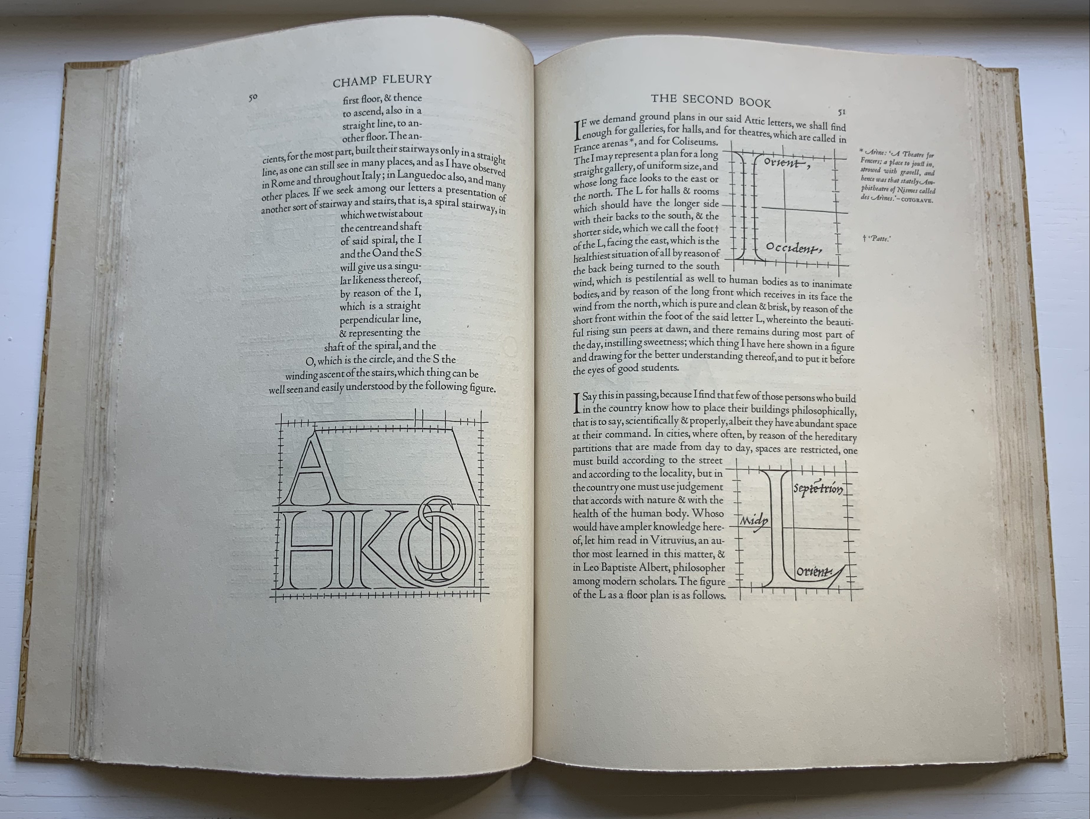
Of course the first exhibit would be Steingruber’s Architectural Alphabet, but related works — before and after, published or built — will clamor for admission: Geofroy Tory’s Champ Fleury (1529/1927/1998), Antonio Basoli’s Alfabeto Pittorico (1839/1998), Giovanni Battista de Pian’s Alphabetto Pittoresque (1842), and Daniel Libeskind’s Contemporary Jewish Museum (2000), whose form within the walls of a former power substation is composed of two Hebrew letters — the Yud and the Chet — which make up the word Chai (“Life”).


Left to right: Tory/Rogers, Basoli, Battista de Pian (Photos by Books On Books Collection), Libeskind (The Yud Gallery, Photo by Paul Dyer).
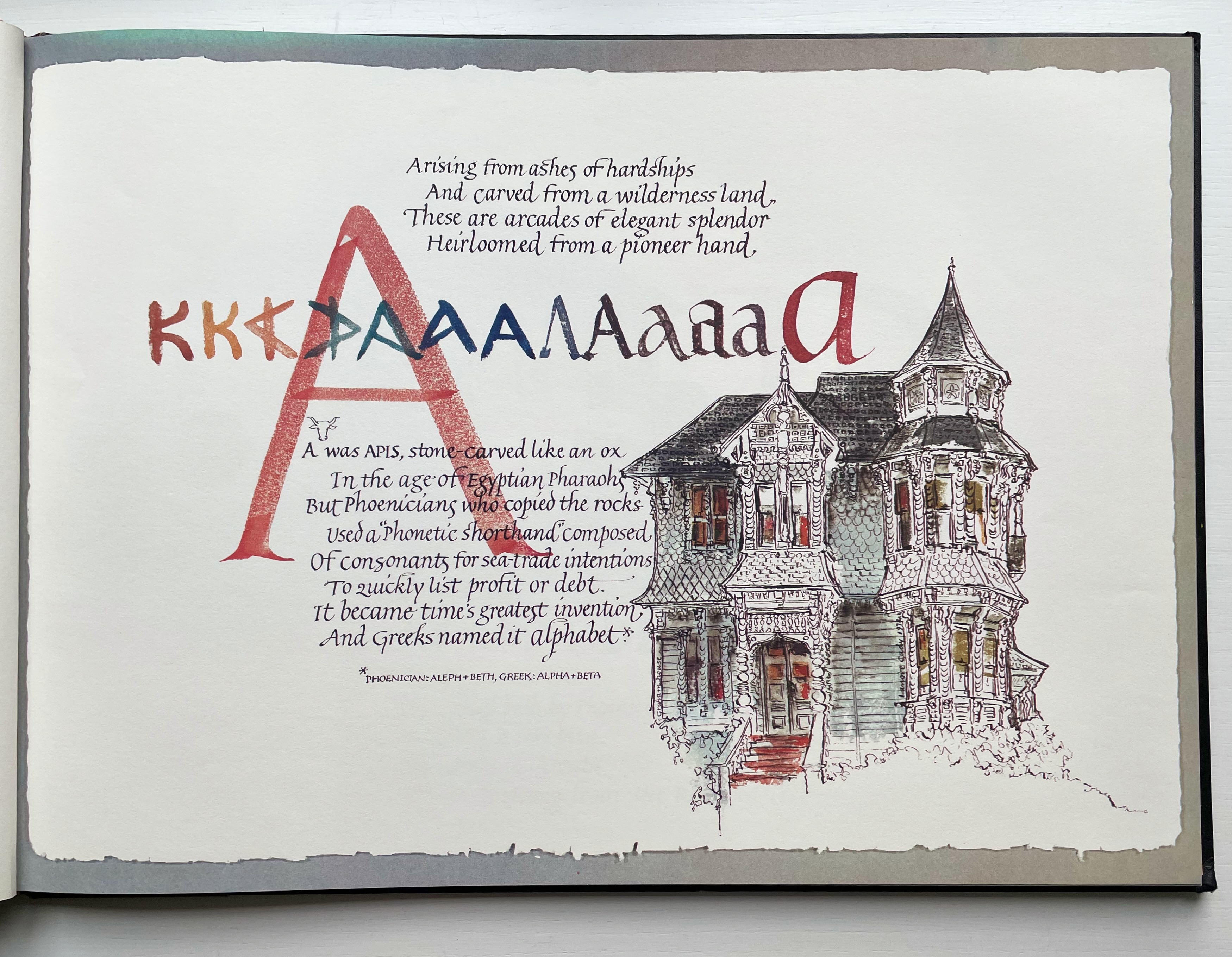
Lanore Cady’s Houses & Letters (1977) is another work supporting the proposition, in this case with calligraphy, watercolor and verse.

Houses & Letters: A Heritage in Architecture & Calligraphy (1977)
Lanore Cady
More than the novel inventions and historical associations above, though, the space within and around a letter, a building and the artist’s book suggests the real root of the affinity. As cultural historian Fiona MacCarthy put it: “‘the Italians knew by instinct what we are slowly grasping, that the meaning of the city is not so much a matter of the buildings as the spaces in between.’” To which John Ryder added: “‘This is exactly how typography works.’” (From David Esslemont’s Inside the Book, 2002). And it is exactly how book art works.
Proposition #2: The affinity of architecture and artists’ books lies in telling stories.
As Daniel Libeskind has said, “For me, a building is a medium to tell a story.” Emily Speed’s Unfolding Architecture (2007) tells the tale of Gordon, a city dweller who witnesses the collapse of public buildings and, ultimately, his own home as the urban fabric begins to unfold around him — a story replicated by the housing’s structure and the book’s accordion fold.
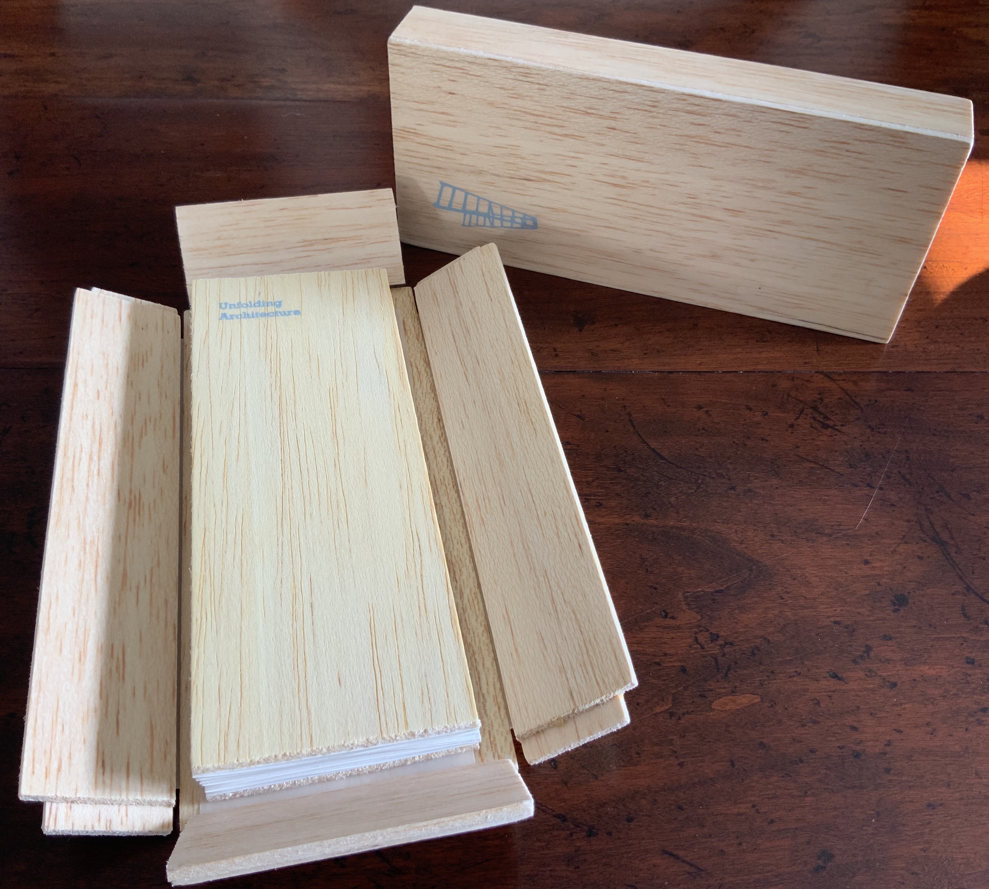
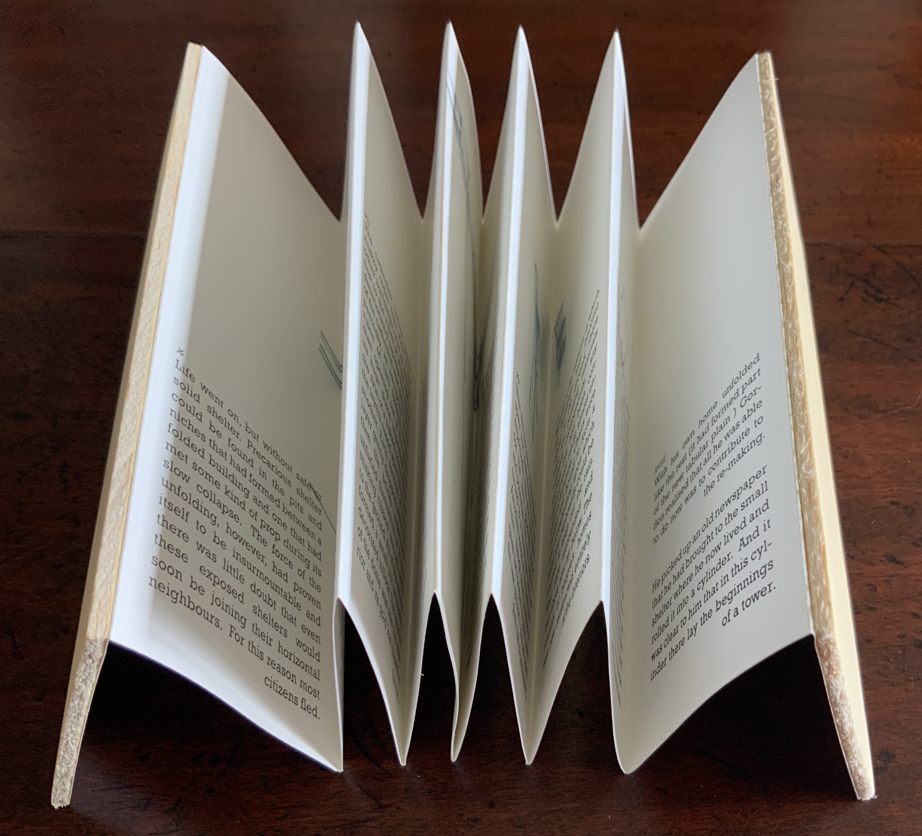
Unfolding Architecture (2007)
Emily Speed
But Ulises Carrión denied that books are about narrative. Instead they are about space and time, which leads to the next proposition.
Proposition #3: The affinity of architecture and artists’ books lies in space and time.
Olafur Eliasson’s Your House (2006) is a laser-cut model of his residence in Copenhagen at a scale of 1:85, which means that each page equates to a 220 mm section of the actual house. In the film Russian Ark (2003), Aleksandr Sokurov made cinematic history with his one continuous shot in 90 minutes, depicting a 17th century time traveller moving through different periods of history as he moves through the rooms of St. Petersburg’s Winter Palace. The film inspired Johan Hybschmann’s Book of Space (2009).
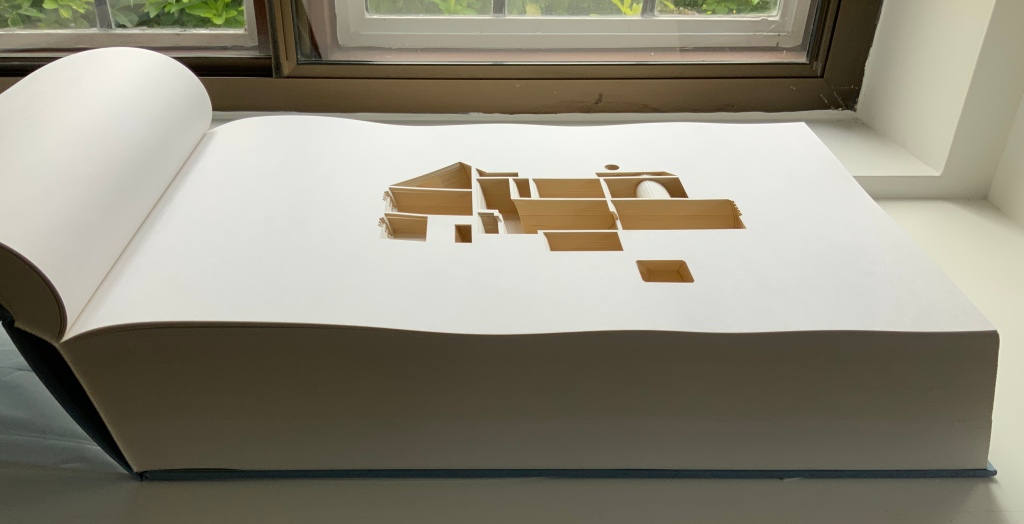
Your House (2006)
Olafur Eliasson
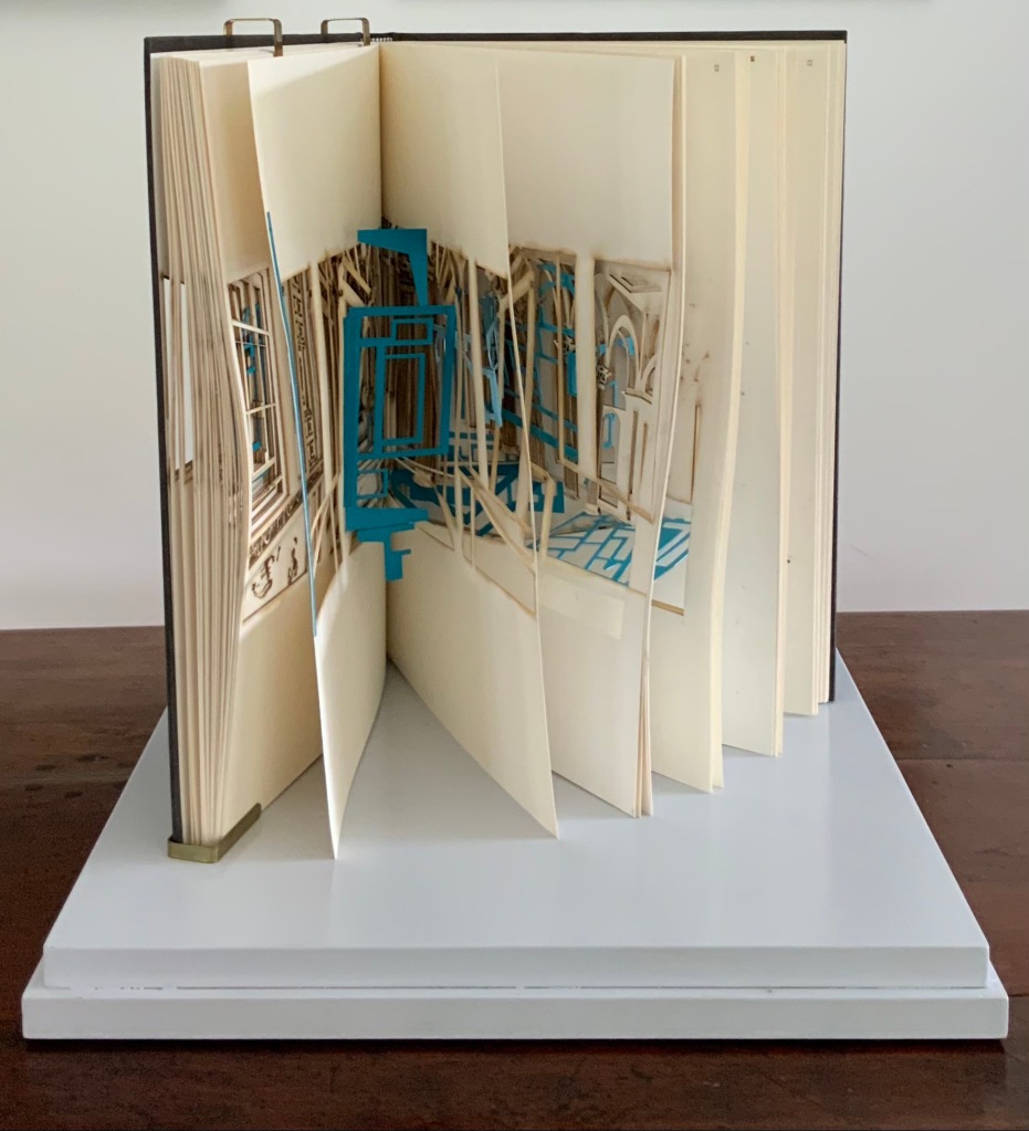
Book of Space (2009)
Johan Hybschmann
How do you read works like this? The size, weight and delicacy of Eliasson’s book and the fragility of Hybschmann’s book and its need for an armature to freeze-frame it defy a simple turning of pages. They must be turned slowly and carefully. Both works heed the task of the arts as posed by architect Juhani Pallasmaa for our age of speed: to defend the comprehensibility of time, its experiential plasticity, tactility and slowness (The Embodied Image, p. 78).
Proposition #4: The affinity of architecture and artists’ books lies in process.
A trained architect and book artist, Marian Macken articulates and illustrates in her book Binding Space why and how the artist’s book can serve as an important tool for design, documentation and critique of architecture. Macken’s perceptive descriptions show how to observe materiality and its functioning and understand how they contribute to the making of art.
Investigating bookness results in the book becoming a highly productive intervening medium with which one can imagine, investigate, analyze, represent and exhibit particular qualities — haptically, and with narrative and ambiguity — of a built environment and the design process. Through the book, we read spatial practice anew (p. 163).
Reading Macken’s book will sharpen the ability of any reader or viewer to appreciate book art, especially her Ise Jingū: Beginning Repeated. Ise Jingū is a Shinto shrine complex in the Mie Prefecture, Japan. “Once every 20 years, since … the seventh century, every fence and building is completely rebuilt on an identical adjoining site, a practice of transposition known as shikinen-zōkan” (Binding Space, p. 101). For Macken, this ritualistic rebuilding poses architecture as performative process rather than as inert object; it “manifests the replication of a beginning, of a process” (p. 100).

Ise Jingū: Beginning Repeated (2011)
Marian Macken
Macken’s artwork consists of 61 loose sheets with a watermarked image within each, the number reflecting the 61 iterations of the shrine up until the making of this work of book art. The watermark is a perspective image based on Yoshio Watanabe’s photograph of the Inner Shrine, taken in 1953 on the occasion of the 59th rebuilding. The contrast of the watermark in kozo and the movement of its placement from one sheet to the next entice reflection on the phenomenon of representation and the architectural process of shikinen-zōkan.
Proposition #5: The affinity of architecture and artists’ books lies in phenomenology.
Architects such as Alfredo Muñoz and his firm ABIBOO, Juhani Pallasmaa and Peter Zumthor are among those often associated with architectural phenomenology, concerned with perception psychology, focused on the primacy of sensory and experiential qualities. Norman Foster and phenomenology are not so often yoked, but 30 St Mary Axe: Diagrid (2009) and 30 St. Mary Axe: Cladding (2009)– Mandy Brannan’s treatments of his iconic London office tower (aka “the Gherkin”) that refocus the perception and experience of it — might prompt reconsideration.
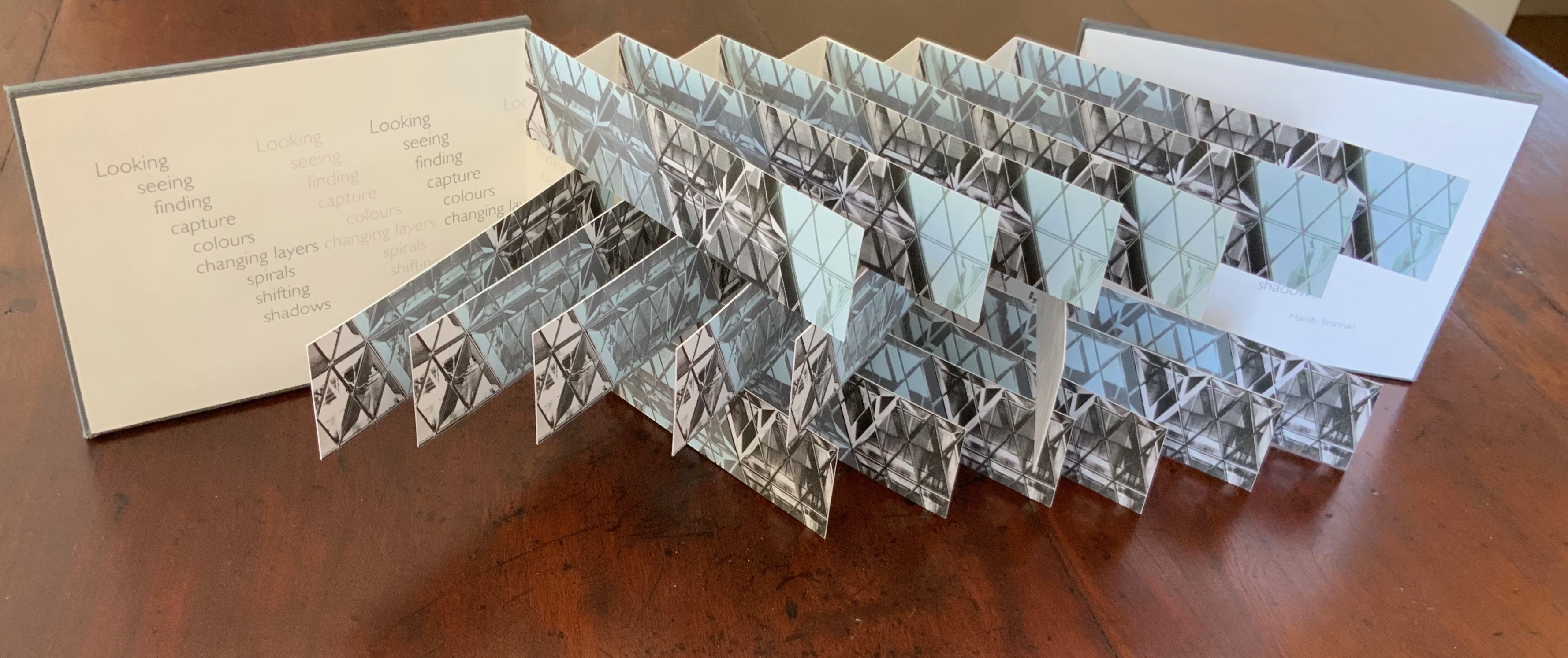
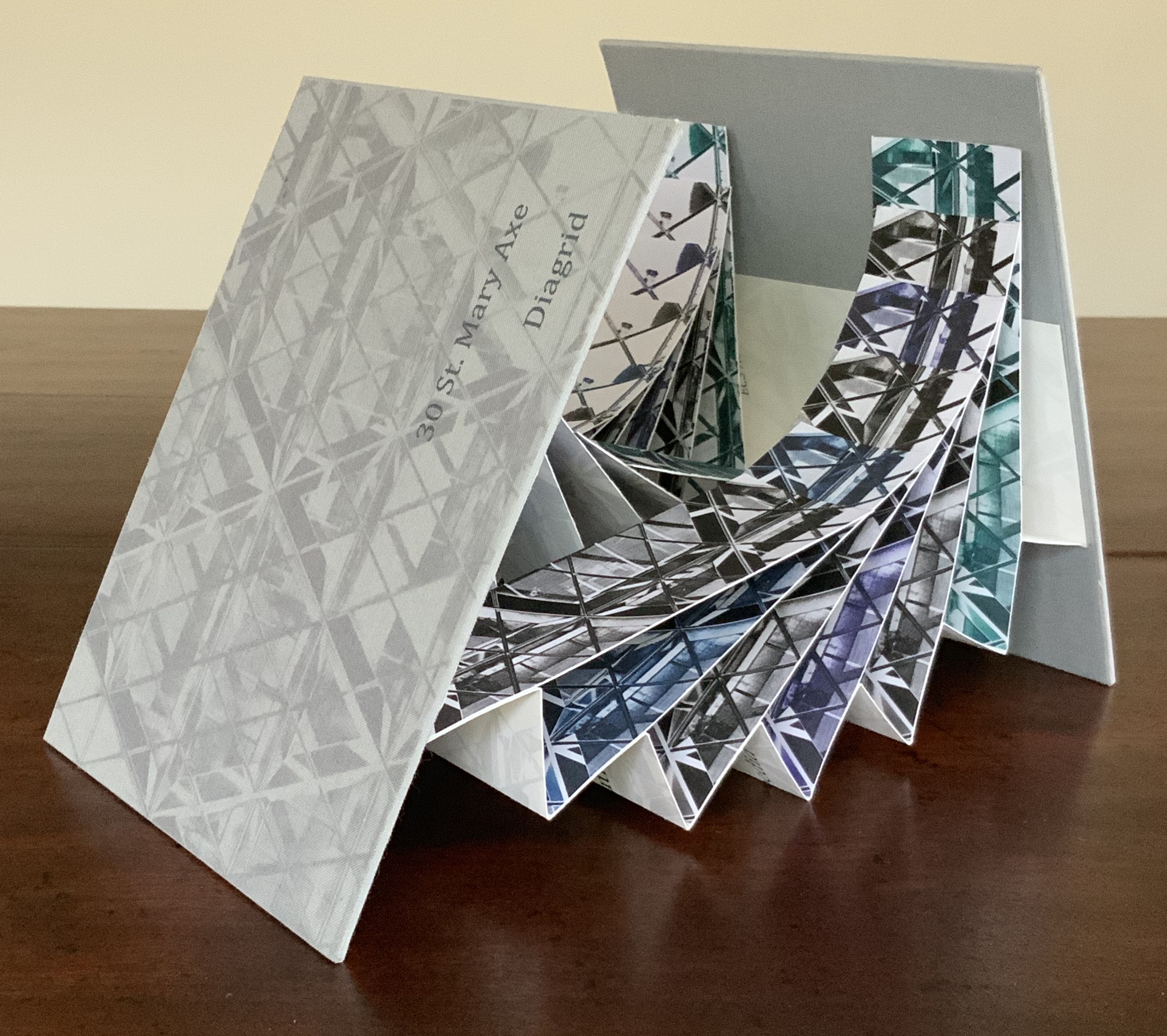
Top: 30 St Mary Axe: Cladding (2009). Bottom: 30 St Mary Axe: Diagrid (2009)
Mandy Brannan
Proposition #6: The affinity of architecture and artists’ books lies in geometry.
Sarah Bryant’s The Radiant Republic (2019) insightfully integrates Plato’s and Le Corbusier’s texts and ideas. The very physicality of the blond wood, linen cover, glass window, concrete representations of Platonic solids, embossed type and sewn papers could easily be a response to Juhani Pallasmaa’s comment: “The current overemphasis on the intellectual and conceptual dimensions of architecture contributes to the disappearance of its physical, sensual and embodied essence” (The Eyes of the Skin, p. 35).
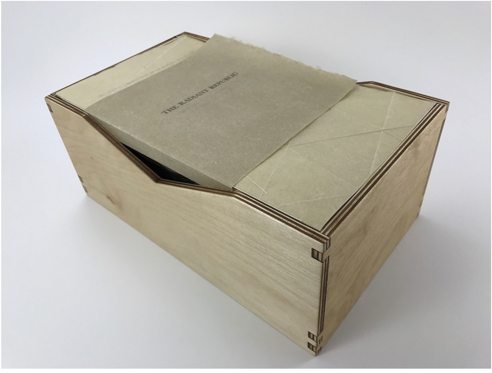
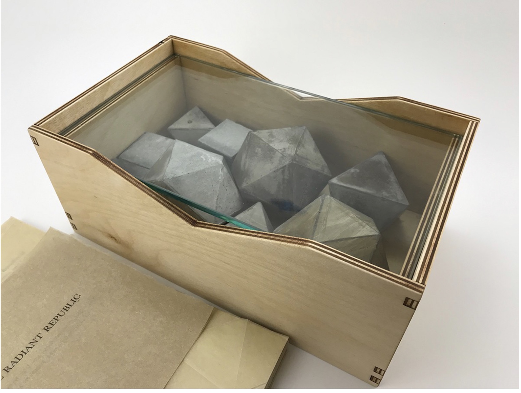

The Radiant Republic (2019)
Sarah Bryant
Proposition #7: The affinity of architecture and artists’ books lies in modelling.
Helen Malone’s Ten Books of Architecture (2017) takes a broad historical and, most important, haptic view of architecture from Vitruvius to Hadid. Each of the ten books is a bookwork that models its architectural subject.


Ten Books of Architecture (2017)
Helen Malone
Proposition #8: The affinity of architecture and artists’ books lies in folding.
At the end of the 20th century, architects like Peter Eisenman, Jeffrey Kipnis and Greg Lynn latched on to computer-aided design and Gilles Deleuze’s Le pli: Leibniz et le baroque (1988) / The Fold: Leibniz and the Baroque (1993). This led to real constructions such as Eisenman’s Rebstock Park in Frankfurt as well as to the seminal books Folding in Architecture (1993), edited by Lynn, and Folding Architecture 92003) by Sophia Vyzoviti.
Folded book pages rarely generate a work that rises above mere craft. Heather Hunter’s Observer Series: Architecture (2009) achieves the necessary height. It combines the altered book with an accordion book that incorporates a found poem composed of the words excised and folded outwards from the folded pages of The Observer’s Book of Architecture.

Observer Series: Architecture (2009)
Heather Hunter
Proposition #9: The affinity of architecture and artists’ books lies in light.
Marlene MacCallum’s Theme and Permutation (2012) is a response to the permutations and variations over time in five houses built to a common plan in Townsite area of Corner Brook, Newfoundland. MacCallum used digital tools to translate the original film source of eight different window images from the houses. A tritone image of a single Townsite window under translucent pages opens the book. As the pages turn, new window images appear and layer over each other, darkening up to the book’s mid-point. In the center spread, two text blocks appear speaking to the history, architectural permutations and economic shifts of the Townsite area. The tonality begins to lighten over the ensuing new combinations of window layers. A third text block of personal narrative is introduced, and a tritone image of one of the Townsite windows in its original condition concludes the work.


Theme and Permutation (2012)
Marlene MacCallum
Proposition #10: The affinity of architecture and artists’ books lies in perspective.
Cees Nagelkerke’s Piranesian Window (1996) resides in the Vedute Foundation’s collection of “spatial manuscripts”, invited works that must conform to the dimensions of the Gutenberg Bible. Piranesian Window‘s form and title capture multiple meanings of vedute (“views”). Views are things seen — which this spatial manuscript is. Views are prospects from which to see — which a window offers. Views are perspectives — for which Giambattista Piranesi’s etchings are famous. Views are thoughts held — which “Piranesian” implies (the work’s title could be that of a manuscript on art history and philosophy). Piranesi’s mid-eighteenth century etchings Vedute di Roma (“Views of Rome”) and Carceri d’invenzione (“Imaginary Prisons”) are the obvious sources of inspiration, but Nagelkerke provides an interview describing the dream source of the work:
– … Please, continue relating your dream …
– I wandered through vast ruins … along wrecked bridges … feeling remarkably at ease.
– How did you find the window in this windowless world?
– When a cool breeze wafted inside, I suddenly saw it. It showed a landscape, within the distance a city. There was complete tranquillity and harmony there, like in a painting by Piero della Francesca … I stood there for some considerable time and I became increasingly saddened, because I discovered that I was looking at something that had vanished forever.
– But how did you manage to take the window?
– I wanted to touch it … as a result, I immediately fell down. The gap left in the wall closed by itself … I picked it up and continued on my way, meeting people who spoke to me saying that I should leave the Carceri. I was taken to a gateway. No one looked at, or said anything about, the window… In the square where I found myself, there was an intense, chaotic commotion. The window still reflected something of the vast space I had left. The exterior showed traces of the wall in which it had been mounted. I looked through it and saw everyday life …
Piranesian Window (1996)
Cees Nagelkerke
Proposition #11: The affinity of architecture and artists’ books lies in archaeology.
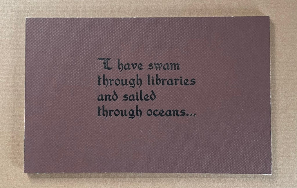
Mill: A journey around Cromford Mill, Derbyshire (2006) by Salt + Shaw (Paul Salt and Susan Shaw) is the result of the artists’ exploration of Cromford Mill in Derbyshire, the first water-powered, cotton-spinning mill developed by Richard Arkwright in 1771. Bound in a cover of recycled wooden library shelves, three plaster cast blocks and seven calico pocket pages containing hidden texts imply the hidden archaeological history to be found. The forensic-like casts are taken from interior surfaces, and the texts walk the reader step by step through each area of the mill.


Proposition #12: The affinity of architecture and artists’ books lies in assemblage and collage.
Based on an architectural installation at the Minnesota College for Art and Design and drawing on her photos of Ayvalik, Amsterdam, Florence, Istanbul, New York City, Rome, San Diego and Venice, Karen Wirth’s Paper Architecture (2017) certainly prompts a revisit to MoMA’s “Cut ’n’ Paste: From Architectural Assemblage to Collage City“, 10 July 2013 – 5 January 2015, to prove this proposition.
Paper Architecture (2017)
Karen Wirth
Proposition #13: The affinity of architecture and artists’ books lies in luxe.
Early theorists, critics and artists of book art expended great effort to exclude livres d’artiste and deluxe productions from the definition of a form of art that struggled to find a name: artist’s book, artists’ books, bookworks, book art, etc. The spectrum from objects of conspicuous consumption to democratic multiples characterizes both architecture and book art. Antoni Gaudí’s architectural efforts easily span that spectrum — from his Casa Milà to his tiles found underfoot in Barcelona’s Passeig de Gràcia. Under the guidance of Juan José Lahuerta (chief curator at the National Museum of Art of Catalonia), the publisher Artika produced Gaudí Up Close (2020), enclosed in a wooden case with marble sculpture finished in paint, cement powder and anti-graffiti varnishes and lined with Naturlinnen fabric.
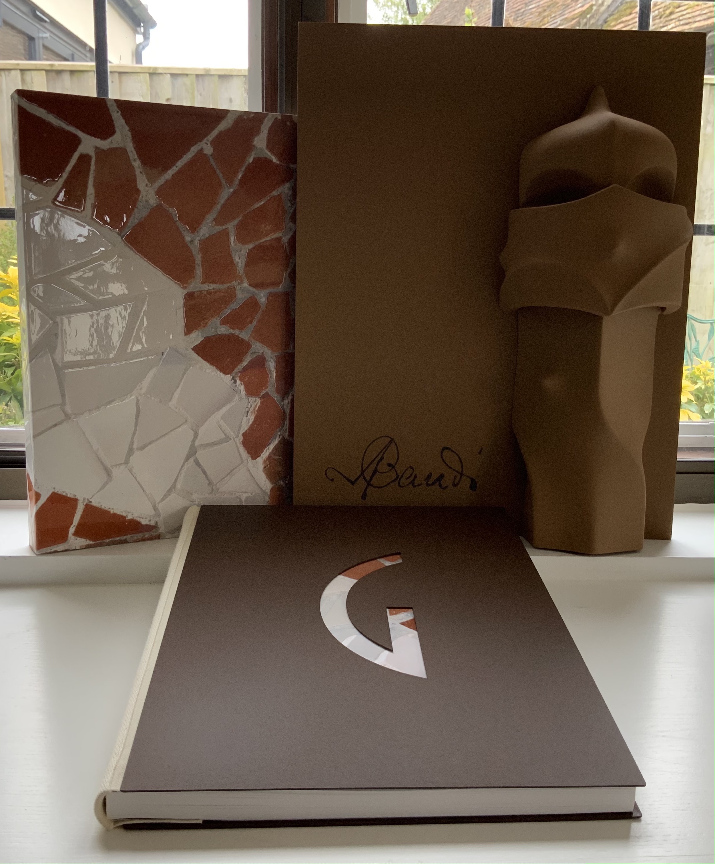
Gaudí Up Close (2020)
Published by Artika.
Photos: Books On Books Collection.
Proposition #14: The affinity of architecture and artists’ books lies in the memorial.
As you turn the corner into Judenplatz in Vienna, Rachel Whiteread’s great cube appears showing only the fore edge of book after book. As you hold J. Meejin Yoon’s small white brick of paper and turn its thick pages, a small pinhole appears on the page. Then two larger square holes emerge, one of which falls over the pinhole. Page after page, the two square holes repeat, creating two small dark wells in the field of white, until on the last page they take their place in the cut-out schematic footprint of the city blocks and buildings surrounding the Twin Towers. Whiteread’s Nameless Library (2000) and Yoon’s Absence (2004) surely underscore this proposition of memorial.
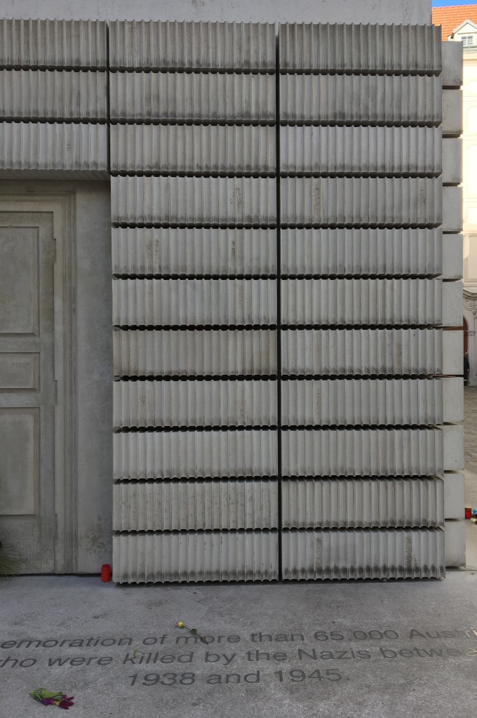
Nameless Library (2000)
Rachel Whiteread
Photo: Books On Books.
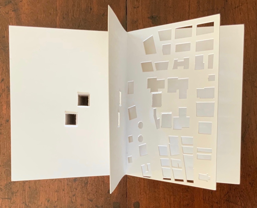
Absence (2004)
© J. Meejin Yoon
Proposition #15: The affinity of architecture and artists’ books lies in the sacred.
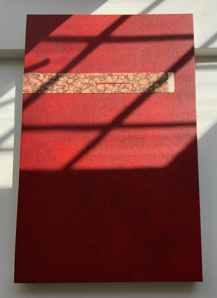
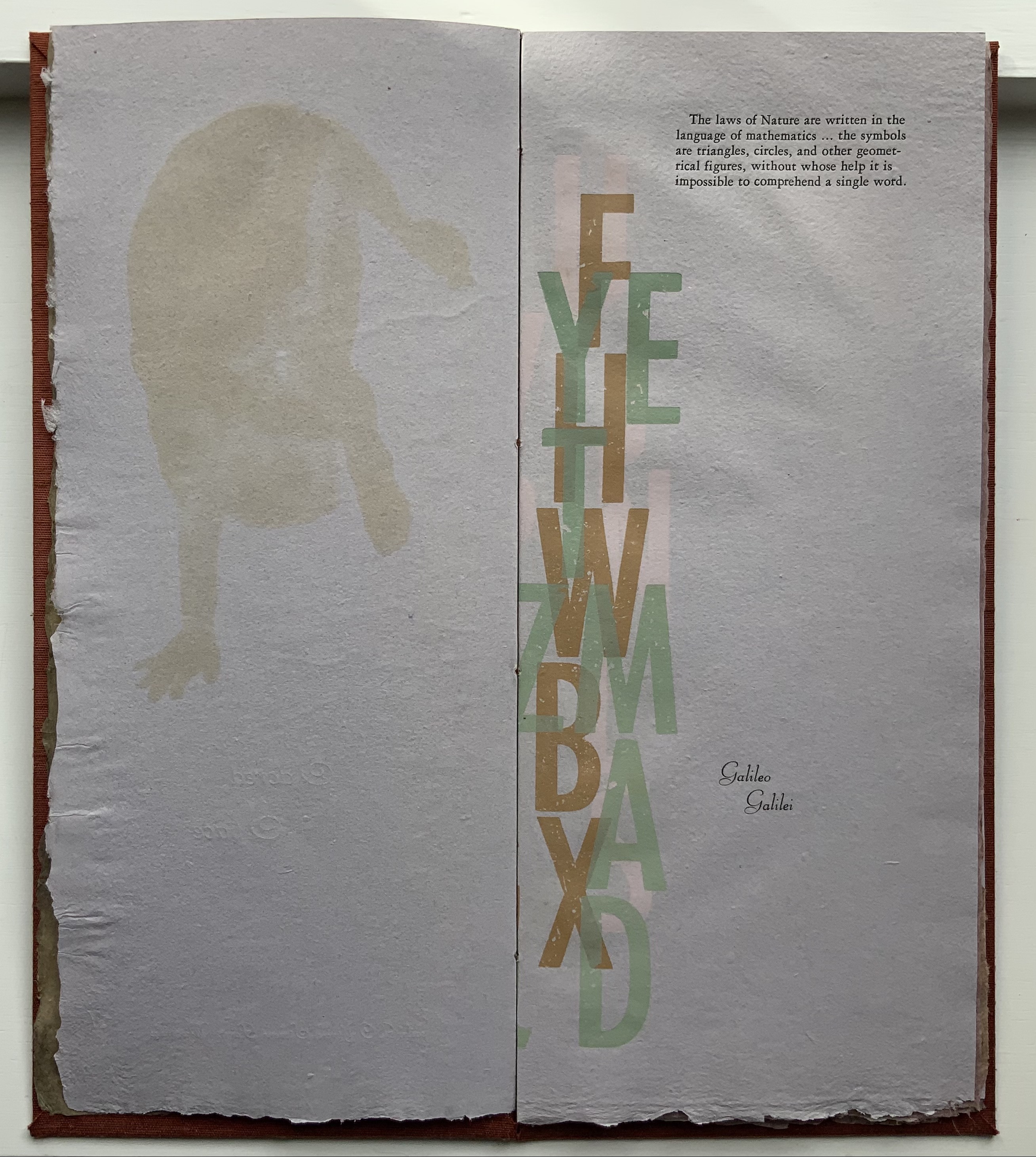
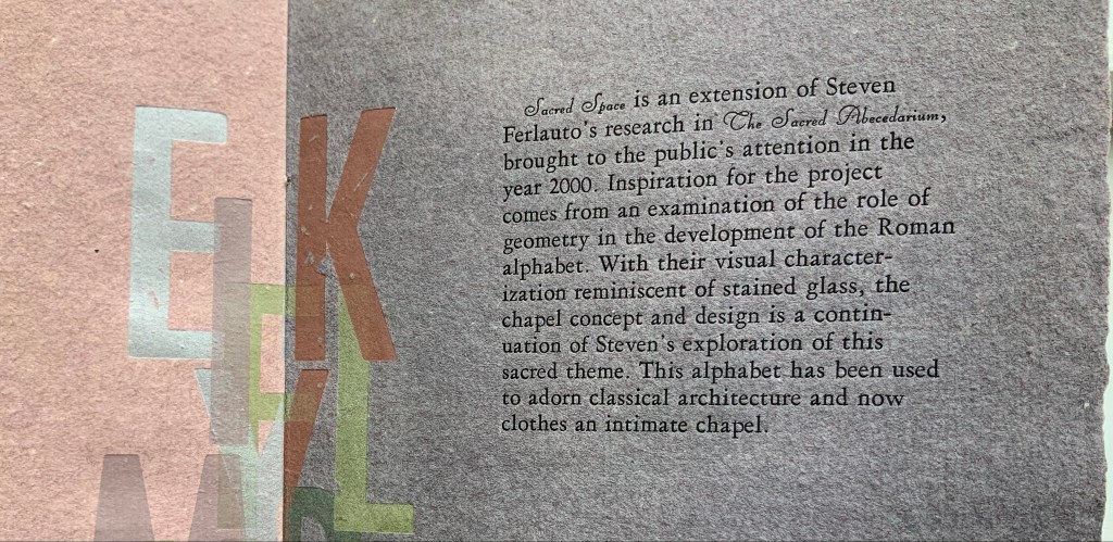
Jeffrey Morin and Steven Ferlauto’s Sacred Space (2003) is an intimate monument of book art. Made intimate by the content and texture of its book, made more intimate by the viewer’s having to construct the chapel. Made monumental by the echo of typographic history, made more monumental in Galileo Galilei’s echo from its floor: Mathematics is the alphabet with which God has created the universe.
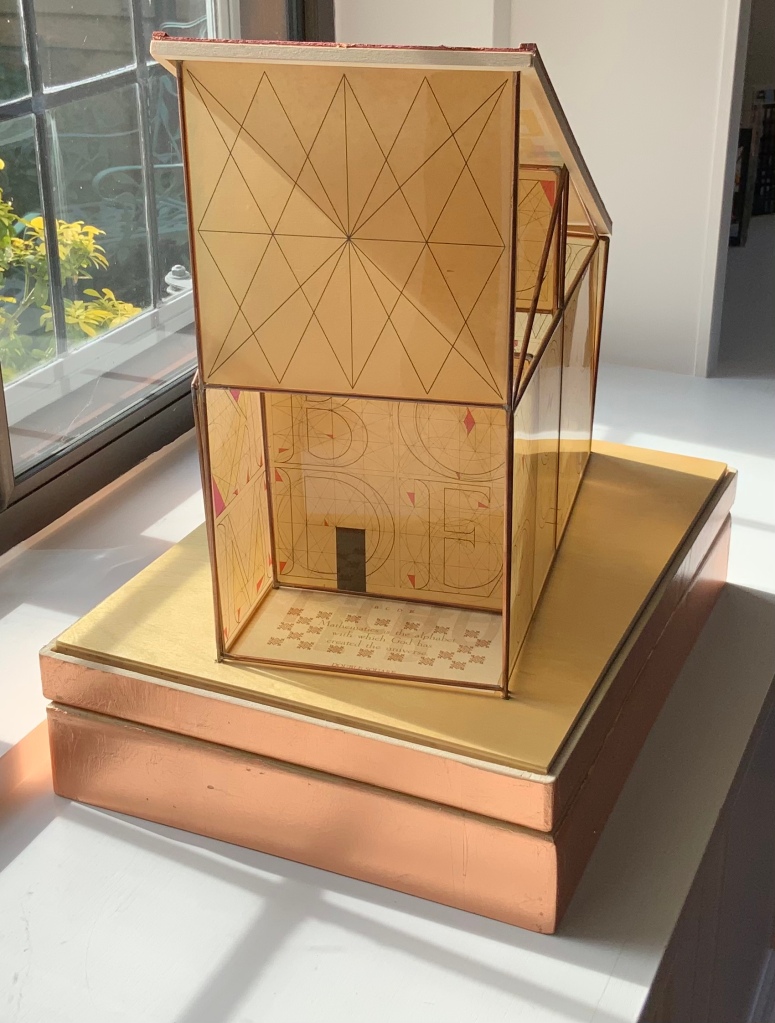
Sacred Space (2003)
Jeffrey Morin and Steven Ferlauto
Proposition #16: The affinity of architecture and artists’ books lies in collaboration.
In Victor Hugo’s Nôtre-Dame de Paris (1831), Archdeacon Claude Frollo points to the book in his hand and then to the cathedral and says, “This will kill that”. It is ironic that Hugo’s book (popularly known now by its English title The Hunchback of Nôtre-Dame) was written in large part to save the then-decaying cathedral (post-Revolution, it served as a warehouse), and it succeeded. It is also ironic that, while the fictional character’s metaphor has a point about the book’s permanence of replicability outlasting the building’s permanence of stone, it misses the collaborative foundations of both.
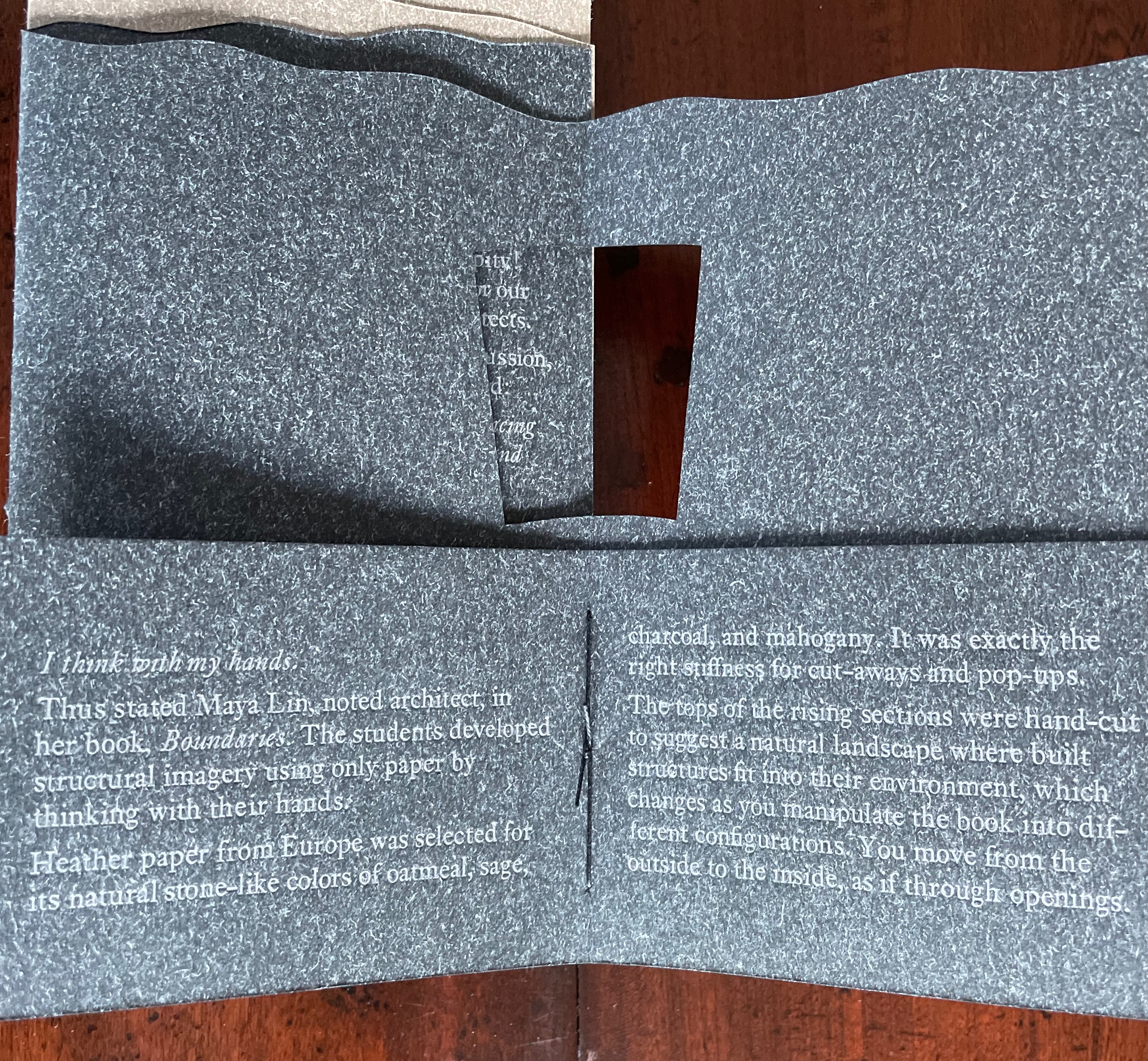
Created by ten students at Scripps College under the direction of Kitty Maryatt, Arch (2010) reminds us that the creation of a book — even a work of book art — is a collaborative effort.
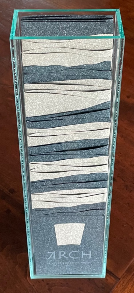
Arch (2010)
Kitty Maryatt, Jenny Karin Morrill, Ali Standish, Alycia Lang, Jennifer Wineke, Mandesha Marcus, Catherine Wang, Kathryn Hunt, Ilse Wogau, Jennifer Cohen, Winnie Ding
Photos: Books On Books Collection
Maryatt’s preface to Arch is entitled “Blueprint” and is brief enough to warrant citing in full:
Books are inherently architectonic. Studying architecture would naturally be profitable to students building their own books.
On January 17, 2010, just days before class was to start, the Los Angeles Times published a fascinating article on contemporary women architects, highlighting a striking building by Jeannie Gang.
Earlier this year, the brand-new President of Scripps College chose The Genius of Women as her inaugural theme. What serendipity! This gave us the perfect inspiration for our artist book: the genius of women architects.
After extensive research and class discussion, a mission statement for the book evolved:
Architecture, like books, is a delicate balancing act between stability and motion, interior and exterior, aesthetic values and structural practicalities.
Books, like building, are fundamentally inhabited spaces. They are incomplete without human interaction.
The first portals were built of post and lintel construction. A curved arch is more difficult: the keystone is needed at the apex to lock the other pieces into position. Building a book is a similarly difficult feat. — Professor Kitty Maryatt


Conclusion: The affinity of architecture and artists’ books lies in our attraction to the beauty of form.
No doubt the proximity of the need for shelter and the need for oral and written language have played some gravitational role of mutual attraction for architecture and books (and latterly artists’ books). But equally, both architecture and artists’ books speak to our attraction to the beauty of form. All of the examples above are re-offered here in support of this proposition. Look at them again.
“Architecture”, “art” and “the book” are all fluid concepts. So it should be no surprise that we arrive at the equally fluid similes: architecture is like book art, book art is like architecture.
An earlier version of this essay appeared in The Blue Notebook, Volume 16 No 2, Spring – Summer 2022.
Further Reading
“Architecture“. 12 November 2018. Bookmarking Book Art.
Carrión, Ulises. 1975. “The New Art of Making Books”. Reprinted in Lyons, Joan. 1993. Artist’s books: A Critical Anthology and Sourcebook. Rochester, NY: Visual Studies Workshop Press.
Côme, Tony. 2018. “The Typotectural Suites“, The Palace of Typographic Masonry. Accessed 5 April 2021.
Esslemont, David. 2002. Inside the Book. Cefn Mawr Newton Powys, Wales: Solmentes Press.
Goldberger, Paul. 2008. Counterpoint: Daniel Libeskind. Basel: Birkhäuser Verlag.
Hugo, Victor, and Jessie Haynes, trans. 1831 (1902). Nôtre Dame de Paris. New York: D. Appleton & Co.
Hugo, Victor, and Nathan Haskell Dole, trans. 1890 (1895). Victor Hugo’s Letters to His Wife and Others (The Alps and the Pyrenees). Boston, MA: Estes and Lauriat.
Lynn, Greg. 2004. Folding in Architecture Rev. ed. Chichester, West Sussex: Wiley-Academy. See for references to Mario Carpo, Gilles Deleuze and Peter Eisenman.
Macken, Marian. 2018. Binding Space: The Book as Spatial Practice. London: Taylor and Francis.
McEwen, Hugh. 12 January 2012. Polyglot Buildings. Issuu. Accessed 13 March 2021.
Niessen, Richard. 2018. The Palace of Typographic Masonry. Leipzig: Spector Books.
Pallasmaa, Juhani. 1996. The Eyes of the Skin. London: Academy Editions.
Pallasmaa, Juhani. 2009. The Thinking Hand. Chichester, UK: Wiley.
Pallasmaa, Juhani. 2011. The Embodied Image. Chichester, UK: Wiley.
Steingruber, Johann David. 1773 (1774). Architectonisches Alphabeth: bestehend in Dreysig … . Schwabach: Johann Gottlieb Mizler.
Tsimourdagkas, Chrysostomos. 2014. Typotecture: Histories, Theories and Digital Futures of Typographic Elements in Architectural Design. Doctoral dissertation, Royal College of Art, London. Accessed 13 March 2021.
Vyzoviti Sophia and BIS Publishers. 2016. Folding Architecture : Spatial Structural and Organizational Diagrams. 14th print ed. Amsterdam: BIS.
Williams, Elizabeth. 1989. “Architects Books: An Investigation in Binding and Building”, The Guild of Book Workers Journal. 27, 2: 21-31.
Books On Books Collection – Lanore Cady
Houses & Letters (1977)
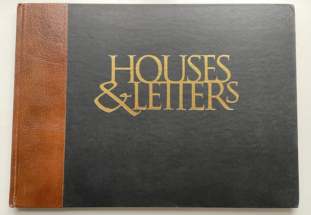
Houses & Letters: A Heritage in Architecture & Calligraphy (1977)
Lanore Cady
Casebound, one-eighth leather, cloth over boards, title gilt-stamped on front cover, doublures, sewn book block, endbands. H276 x W382 mm. 34 unnumbered leaves, printed on one side only. Acquired from Books of the Ages, 26 August 2022.
Photos: Books On Books Collection. Displayed with permission of the artist’s archive, Humboldt Arts Council, Morris Graves Museum of Art.
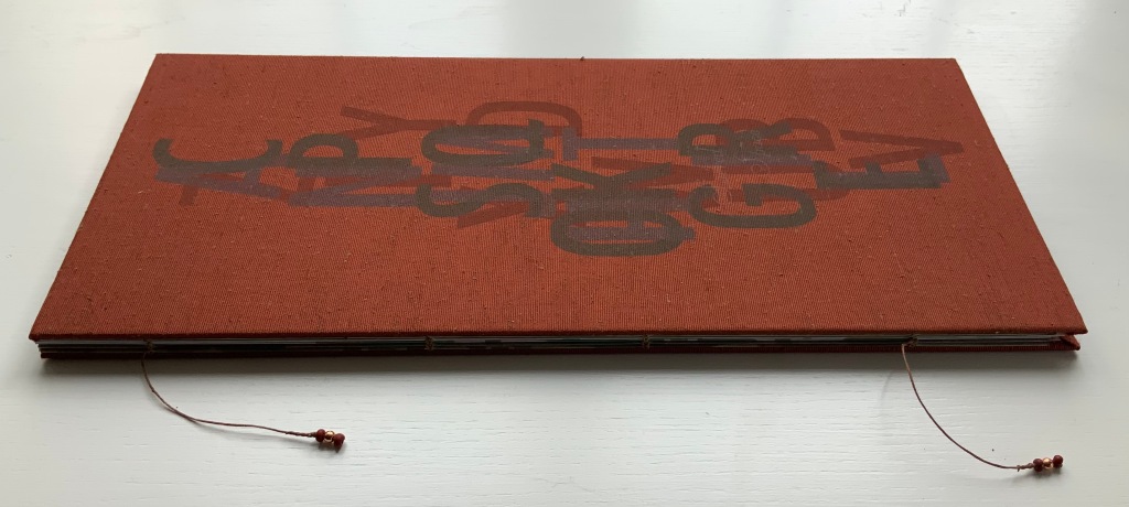
Architecture-inspired artists’ books and artists’ books inspired by alphabets make up two separate strands of the Books On Books Collection. Along with Sacred Space by Jeffrey Morin and Steven Ferlauto, Lanore Cady’s Houses & Letters is one of the rare works that weave them together, joining the beauty of form in architecture with the beauty of letterforms. With her calligraphy, verse and watercolors of Victorian structures of Humboldt County, California, Cady presents her audience with a history of the alphabet from the proto-Sinaitic to the Roman/Carolingian that ultimately argues for the historical preservation of the buildings depicted.

The house depicted with letter A is the “Graham House”. In notes at the end of the book, Cady provides this brief note about it:
Frank Graham came to Humboldt from the southeastern provinces of Canada and the Maine woods to become a giant in lumbering and other local industries. He was married to Martha Montgomery, direct descendant of the Lees of Virginia. Built at the end of Ninth Street in Arcata, California, in 1885, their house is one of the few landmarks that has remained unaltered since its construction. It boasts five different shingle shapes, hand-carved arches, embellished redwood burl and curly redwood.
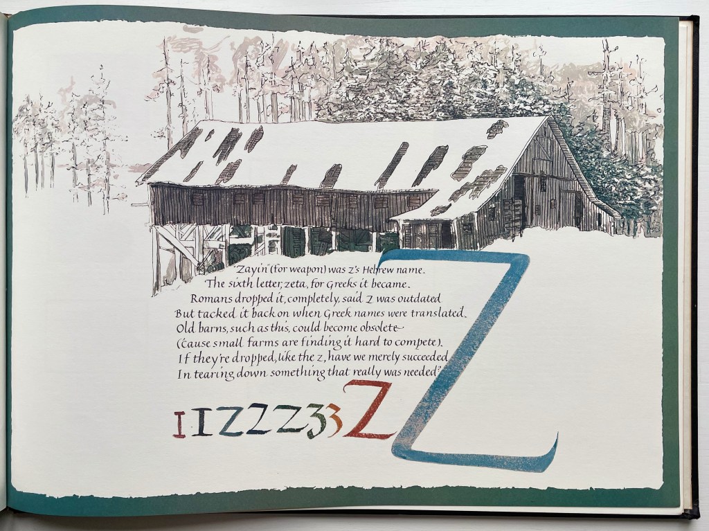
The structure accompanying the letter Z is “Robert’s Barn”:
This “Humboldt-type barn,” over 100 years old, is typical of the barns on fine ranches in this dairying-ranching country. It is on the Mel-May Ranch (so named for Melvin and May Roberts), Bayside Road, Arcata. Years ago it was “moved back” 125 feet away from the road.
Further Reading
“Lanore C. Cady“. 9 February 2011. Times-Standard. Humboldt County, California. Accessed 1 August 2022.
“Francesco Dondina“. 16 December 2022. Books On Books Collection.
“Jeffrey Morin & Steven Ferlauto“. 23 April 2021. Books On Books Collection.
“Paul Noble“. 23 April 2021. Books On Books Collection.
“Johann David Steingruber“. 23 April 2021. Books On Books Collection.
Macken, Marian. 2018. Binding Space: The Book as Spatial Practice. London: Taylor and Francis.
Niessen, Richard. 2018. The Palace of Typographic Masonry. Leipzig: Spector Books.
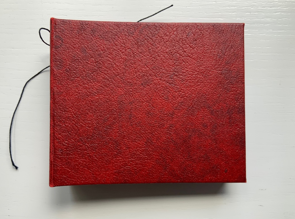
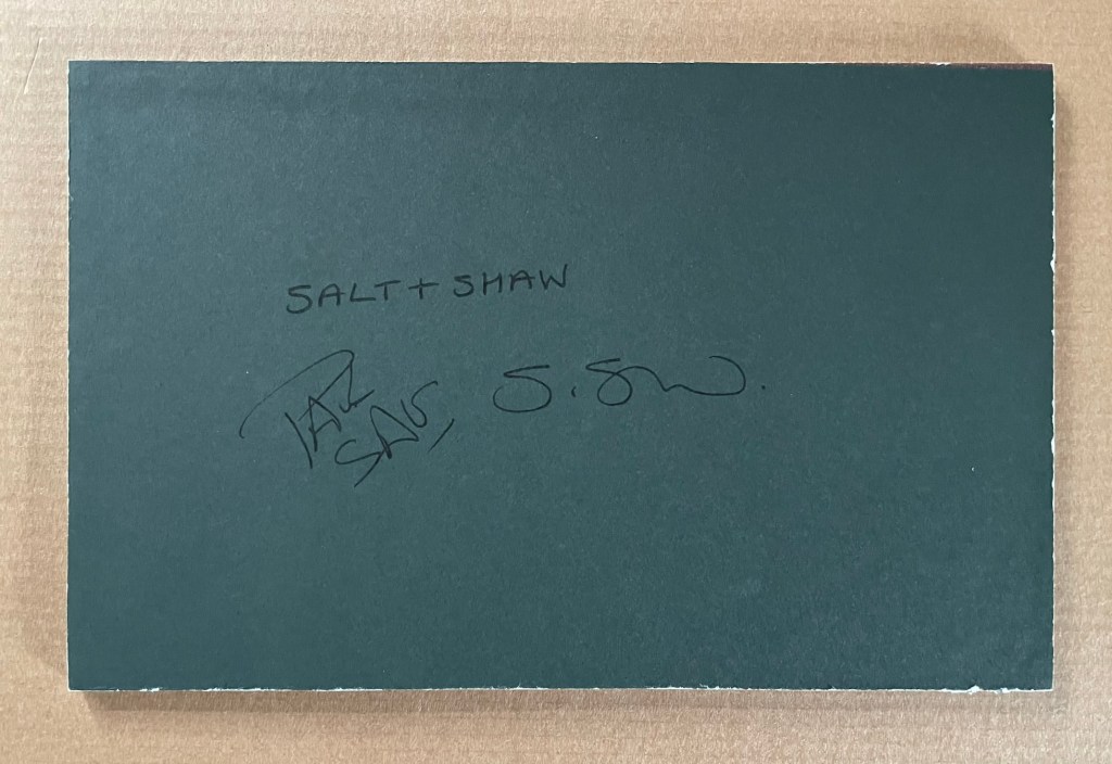
Books On Books Collection – Salt+Shaw
Paul Salt and Susan Shaw collaborate under the name Salt+Shaw. Individually and together, they present a wide range of book art. Much of it finds its most striking expressions in unusual bindings, sometimes to the extent that the binding absorbs the content — as is the case with a spent bullet in Forest Beach Garden.
FOREST GARDEN BEACH (2005)
FOREST GARDEN BEACH (2005)
Salt + Shaw
Hardcover. H90 x W110 x 30 mm. Edition of 15, of which this is #7. Acquired from the artist, 13 December 2021.
Photos: Books On Books Collection. Displayed with permission of the artist.
The book block between the covers here is not a book block of pages. The only text in Forest Garden Beach is found on the tag attached to the work. On one side is the title, artists’ names, date and edition. On the other are UK National Grid Reference coordinates for locations in Scotland, South Yorkshire and East Yorkshire. The coordinates’ suggestion of precision, however, run into visual, tactile and textual ambiguities. This book shape opens on something concealed. The red leather case binding holds and withholds.
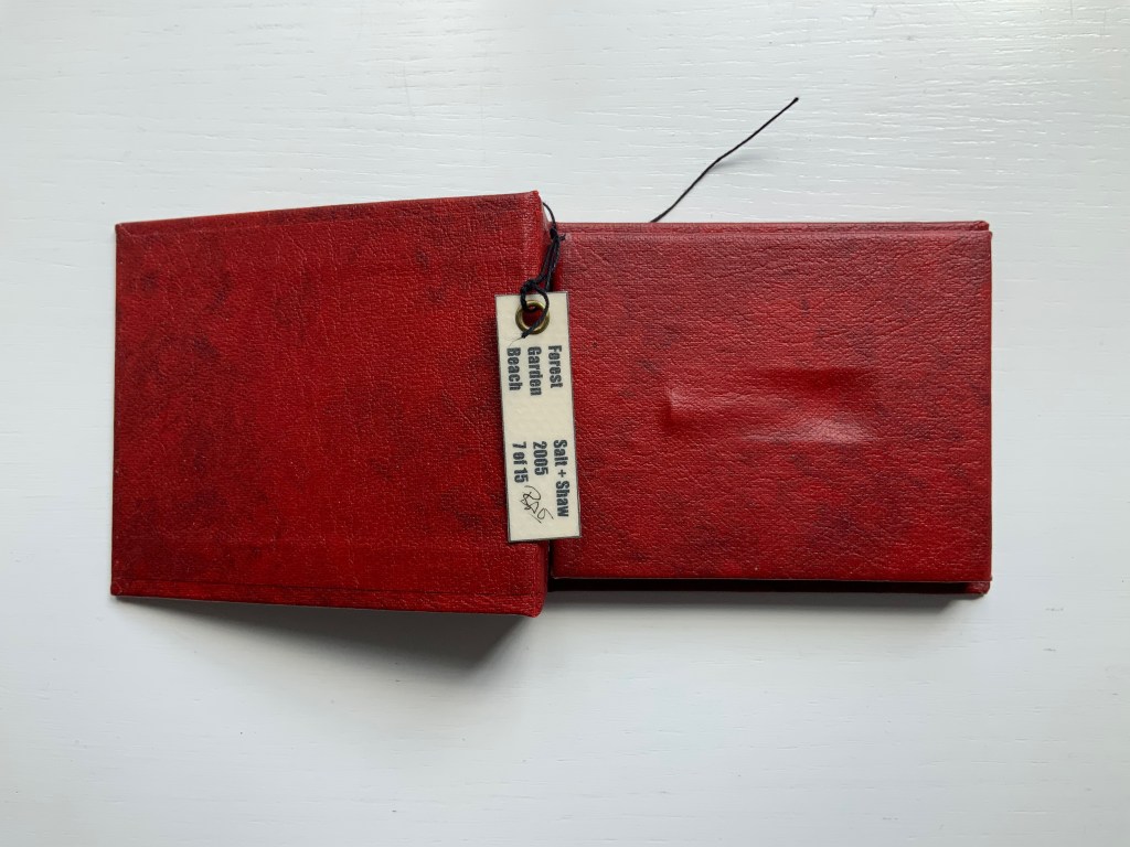
The shape seen and felt beneath it seems to be that of a bullet’s shell casing. There is an indentation, almost like a rifle chamber from which the casing is being ejected. According to the artists’ online description, it is a spent bullet “found in a forest, on a beach or in the garden”. But that is information apart, or evidence external to the work and its tag. Even if it were squeezed onto the tag somehow, the information leaves ambiguities: from which of the three locations did this single found object, now covered by leather, come; and why the precision of the coordinates if the source is uncertain?
Fusing location with the element(s) of the book form that they have chosen to exploit is another frequent characteristic of Salt+Shaw’s combined work. The next item is one of their most effective works of “local color”.
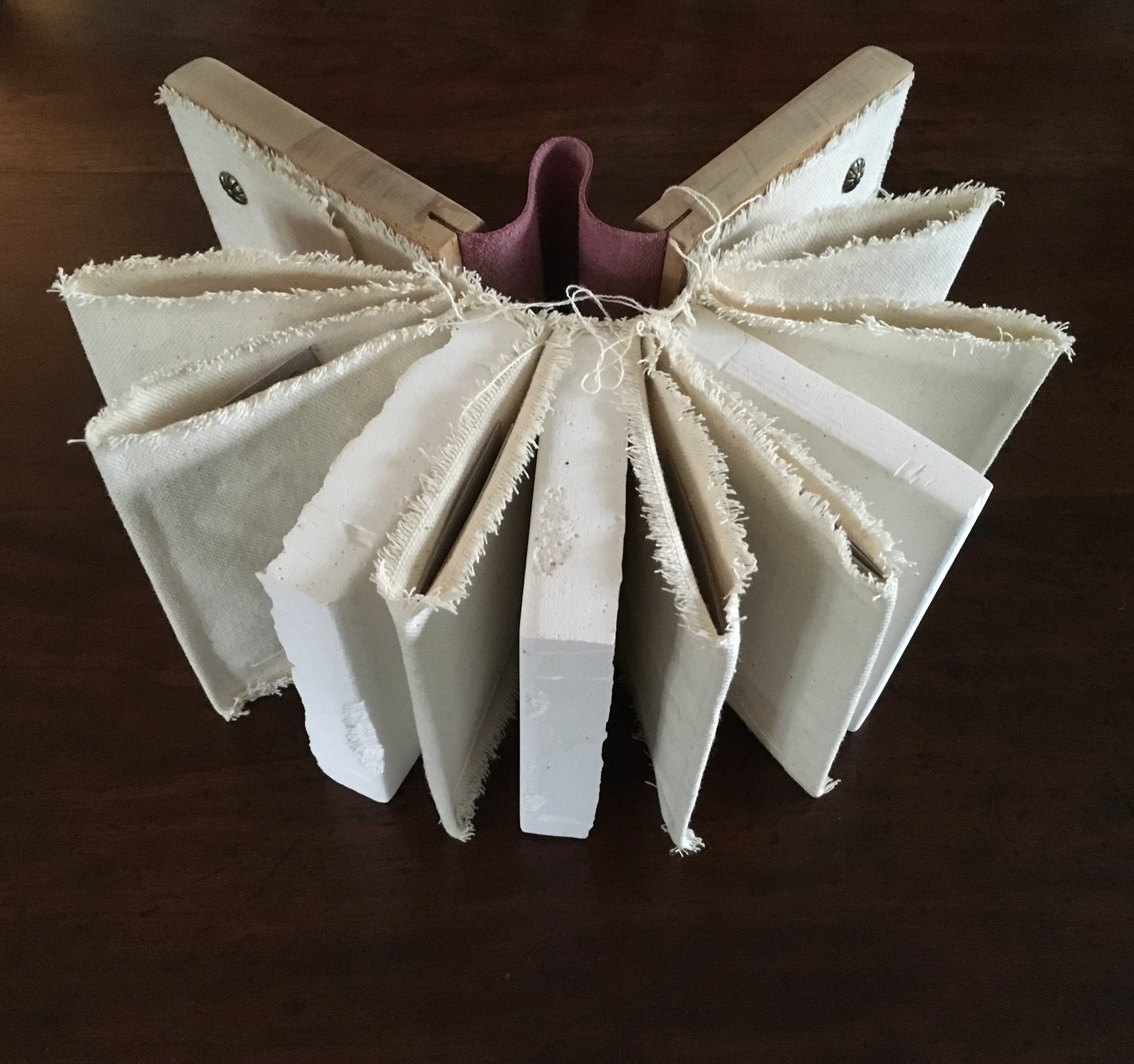
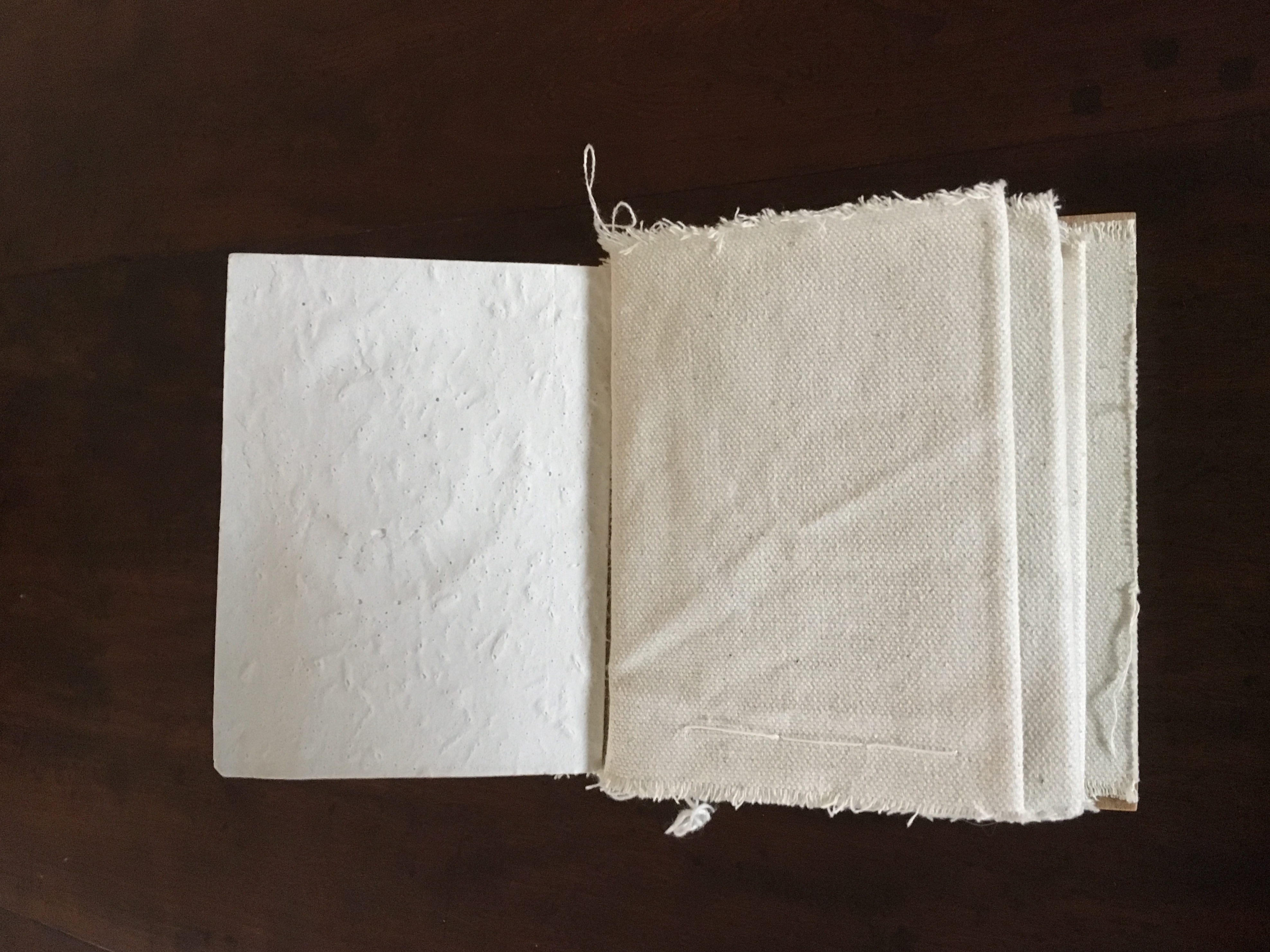
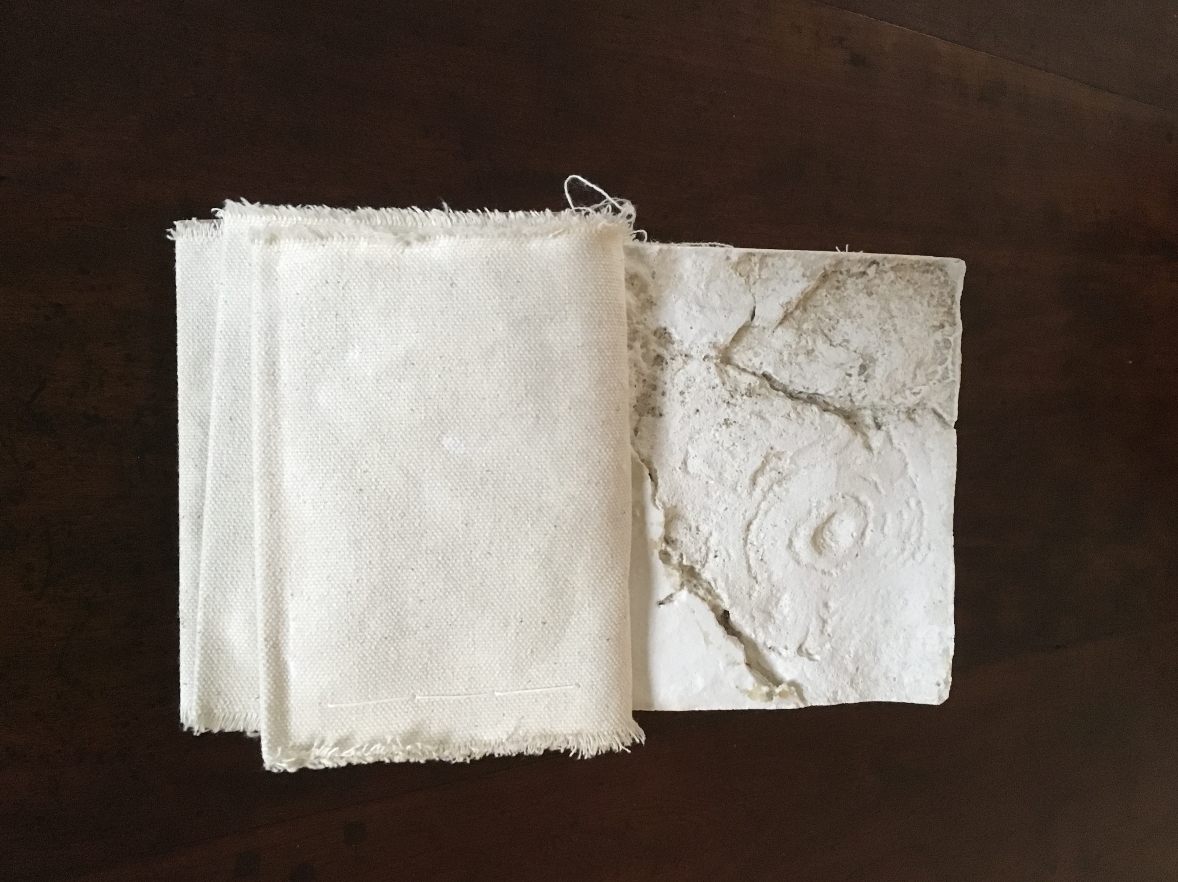
Mill (2006)
Mill (2006)
Salt+Shaw
Wood and leather binding, using discarded library shelves, canvas and upholstery nails. Plaster cast and canvas pages with individual pamphlet book text inserts printed on Canson paper. Casts made using water extracted in dehumidifying the building.
H143 x W114 mm closed, H143 x W310 mm open.
Edition of 24, of which this is #2. Acquired from the artists, 25 November 2018.

The work is a tactile exploration of the interior and exterior space of a corn mill in Cromford, built c.1780 to grind grain for workers at Arkwright’s cotton mill.A journey around Cromford Mill, Derbyshire.
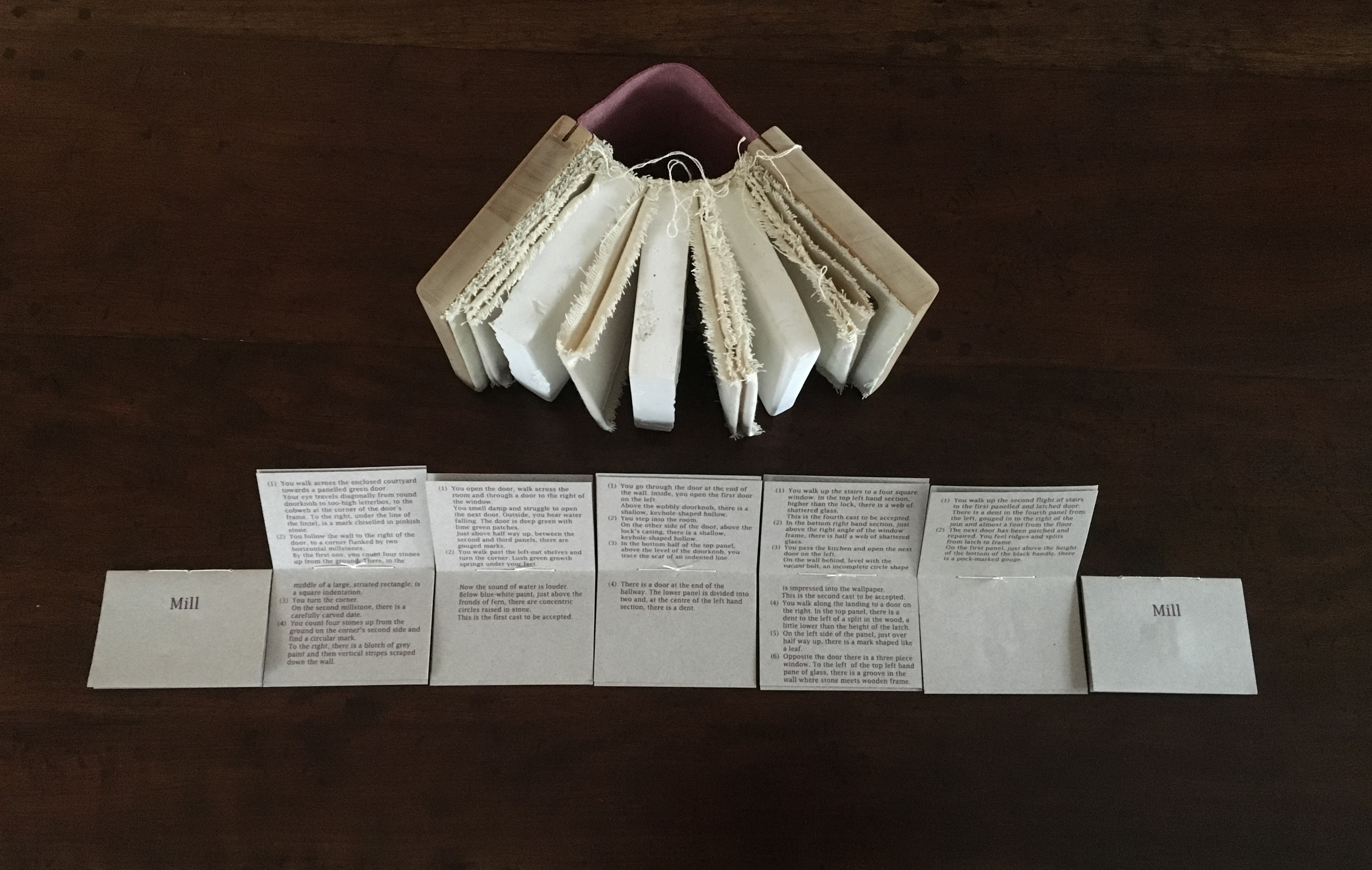

Mill is an investigation of the marks of passage, which have become part of the fabric of the space and reveal time, energy, endeavour and change:
(i) recording the interaction of the human body with the building
(ii) recording the impact of natural forces upon the built environment
(iii) locating the marks that reveal a momentary connection or repetitious action
(iv) examining clues and ephemera.
Silicone moulds were taken from marks of usage around the mill, including the spotwhere a door handle impressed upon a wall and the shape of a break in a pane of glass. Plaster casts were then produced, using water from a dehumidifier within the building to make the plaster. A text piece, contained within canvas pocket pages, creates a unique map of the mill and takes a journey through the building – both to experience the environment and locate the plaster casts. [Correspondence from the artists, 5 December 2018.]
Just as the spent object in Forest Garden Beach lies buried or hidden but still tangible beneath the cover of the work, the spent object of Mill is plain to the touch but only through plaster impressions of it. Where the text related to Forest Garden Beach plays a game with precision and ambiguity, the text of Mill plays a game of hide-and-seek or blind man’s bluff.
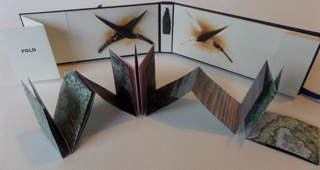
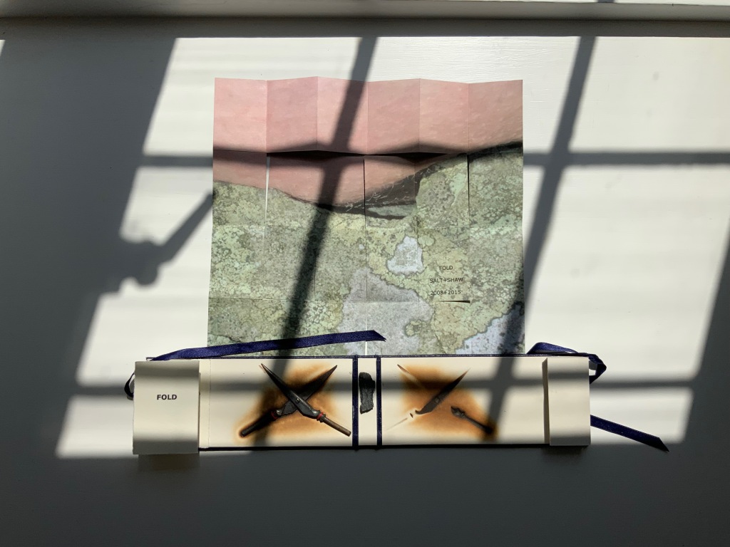
FOLD (2008-2015)
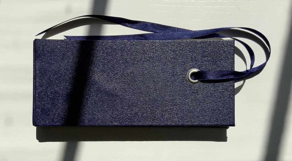
FOLD (2015)
Salt + Shaw
Cloth over board with eye-and-ribbon closing. H60 x W140 x D1.5 mm. Edition of 35, of which this is #19. Acquired from the artists, 13 December 2021.
Photos: Provided by the artists and Books On Books Collection. Displayed with artists’ permission.
The cloth-over-board binding opens to reveal a single-fold title page on the inside front cover and a small book tucked into a receptacle on the inside back cover. Bolted to the inside front cover, a found miniature pair of Sheffield scissors. Glued to the inside spine, a small rock. And imprinted on the inside back cover, a rust-transferred reverse image of the scissors.
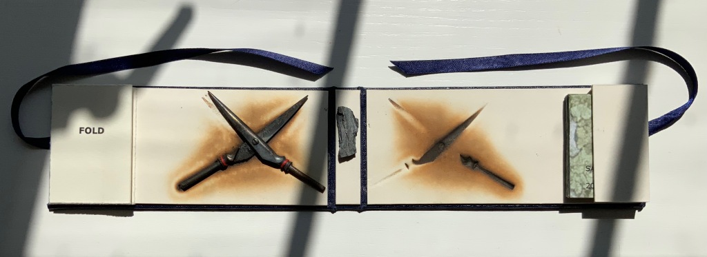
On removal and opening, the small book turns out to be a single sheet of paper in a “meander” fold.
On one side, it displays a close-up photograph of a beached whale’s skin lying in folds over rocks and shingle. On the other side is a close-up of human skin resting on a similar bed.
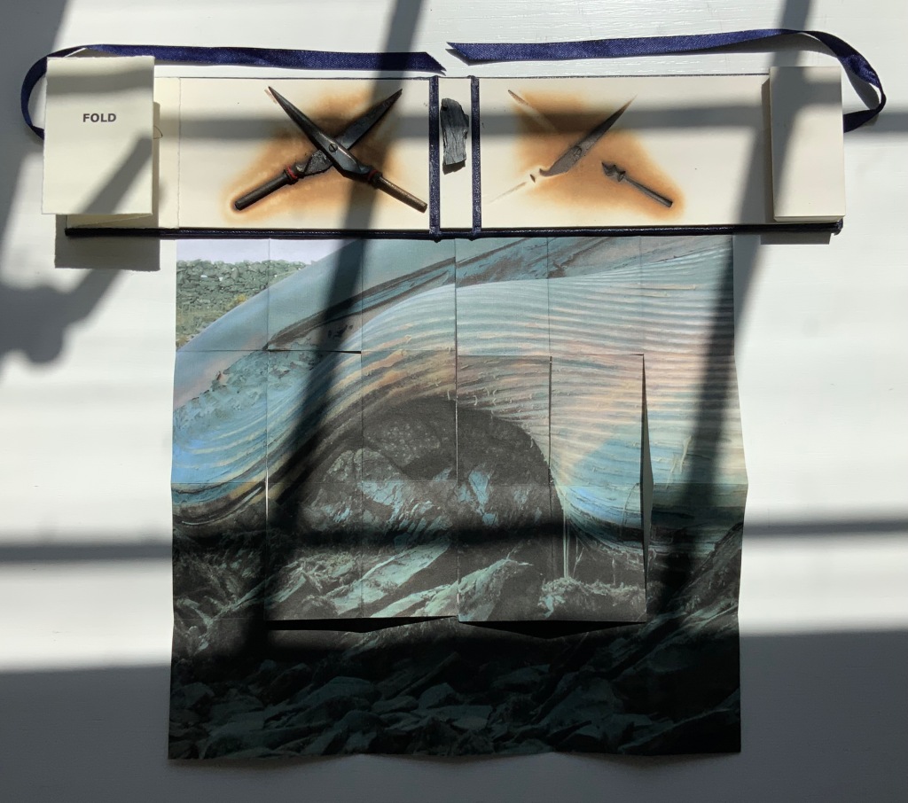
So here is a fourth option in the game of Rock-Paper-Scissors, but the game is one rather of Risk in which, whatever the craft, whatever the objects found and whatever the strategy played in rock-paper-scissors, the environment enfolds and binds.
This sort of implicit visual/verbal play becomes more explicit in the next work.
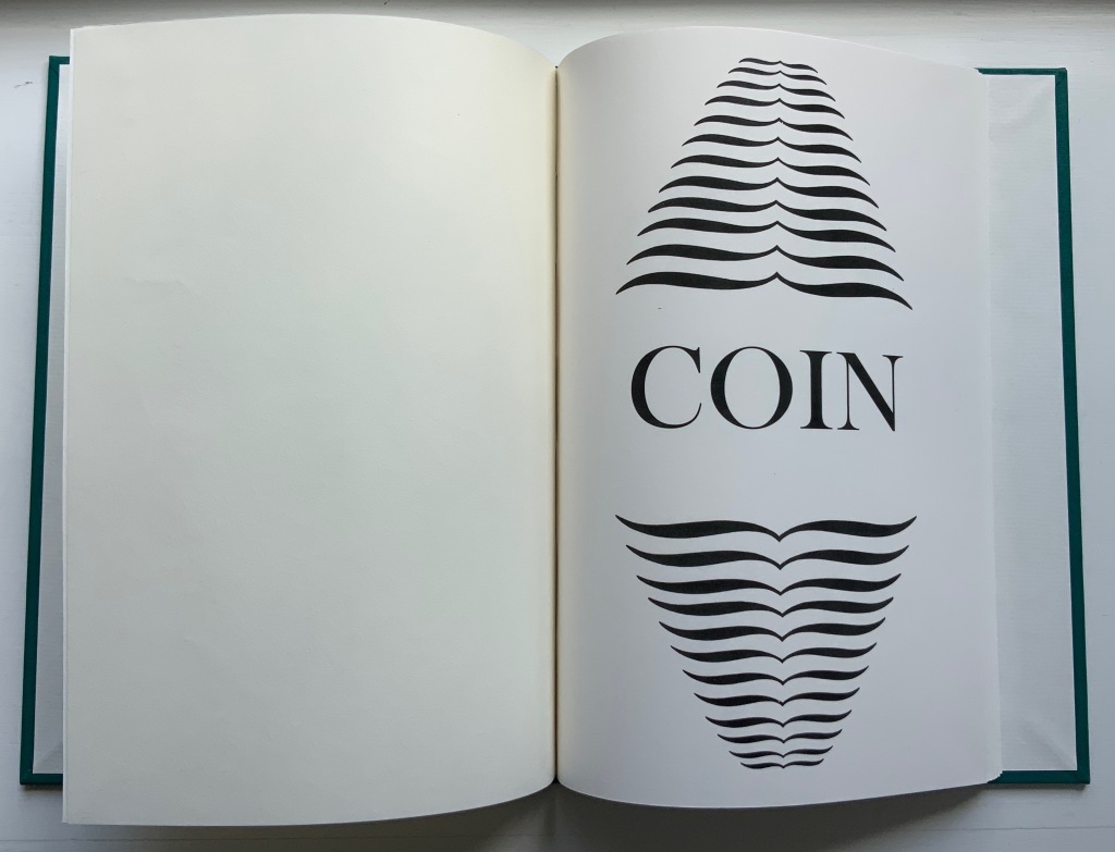
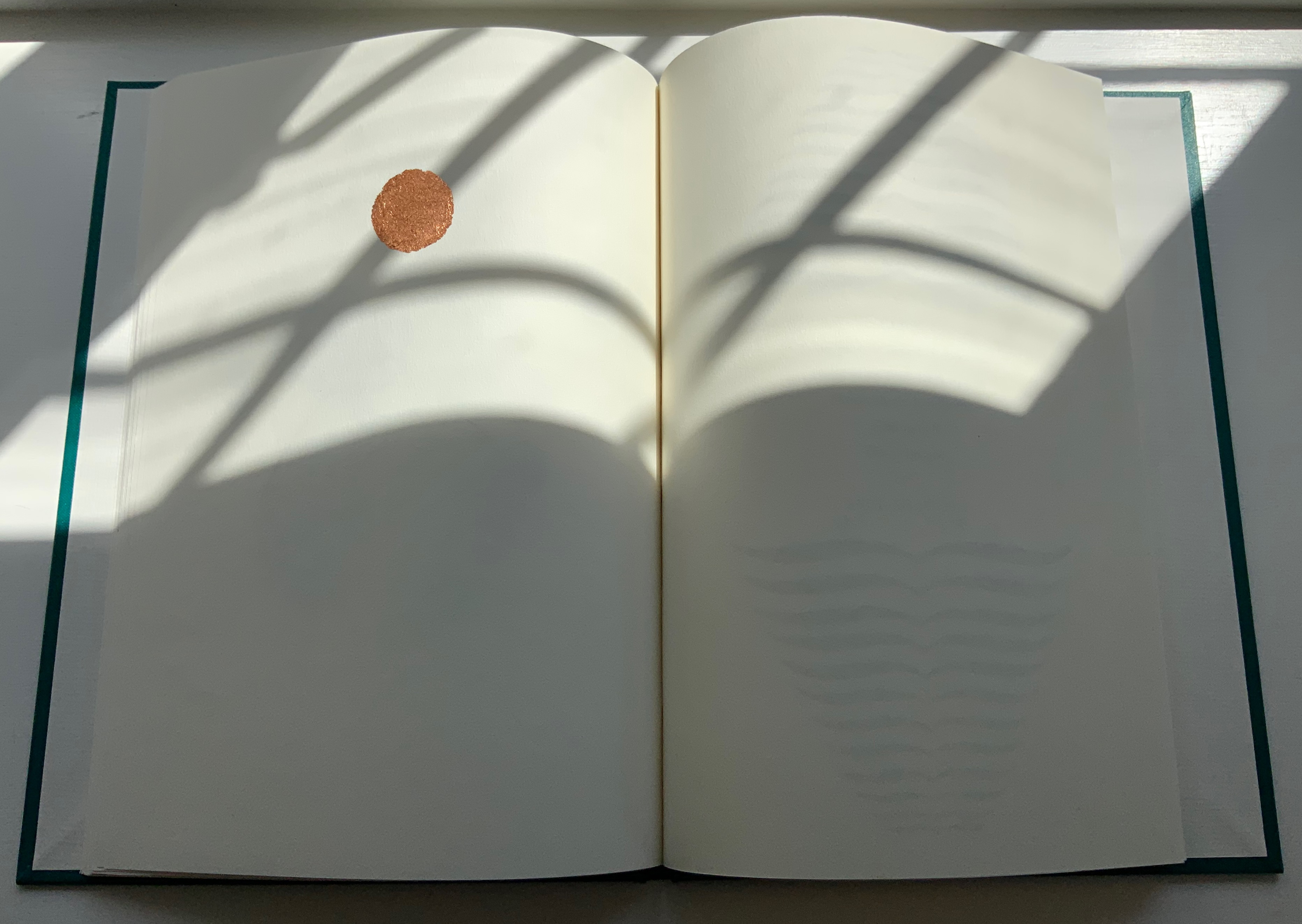
COIN (2017)
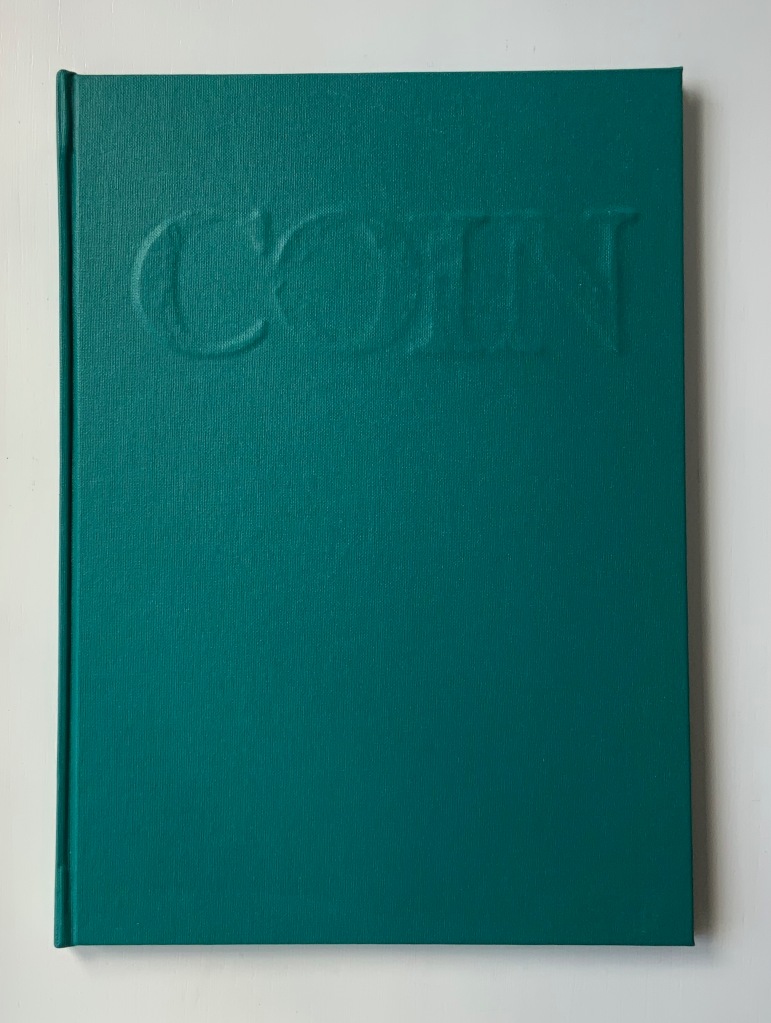
COIN (2017)
Salt + Shaw
Hardcover. H300 x W215 mm, 44 unnumbered pages. Edition of 9, of which this is #2. Acquired from the artists, 13 December 2021.
Photos: Books On Books Collection. Displayed with permission of the artists.
Faint handprints from nine individuals. Light imprints from an ampersand and a series of words all prefixed with “de”. A gradually disappearing profile of Queen Victoria. A hand-worn 1860-1894 penny coin fixed to a splatter of copper leaf. Along with the front cover’s embossed, eroded letters, this progression of letterpress and stencil work toward that coin echoes the archaeological aura of Forest Garden Beach, Mill and Fold, but through its progression, COIN enacts the strange movement through time that such found objects take.
The brackets on either side of the word on the title page might suggest a coin dropped in a pool of time, except that the brackets narrow rather than widen outwards. So, maybe the coin is rising through time. Or, look again at the title page and the coin on the last page, and maybe the brackets should be seen as “leaking” from the word just as the copper leaf can be seen as “leaking” from the coin.

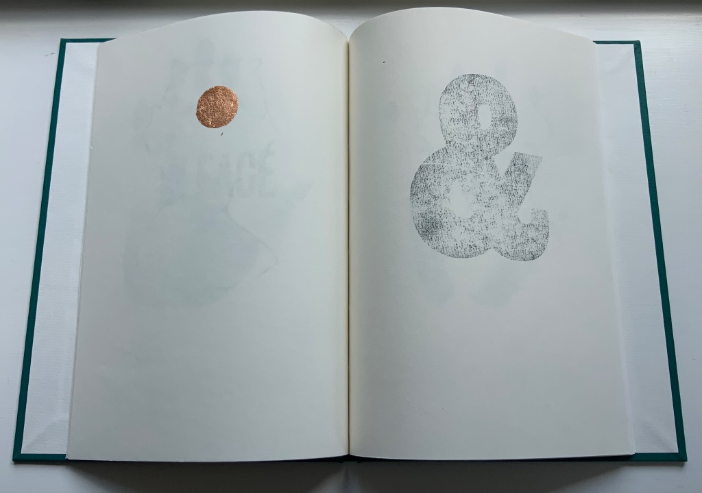
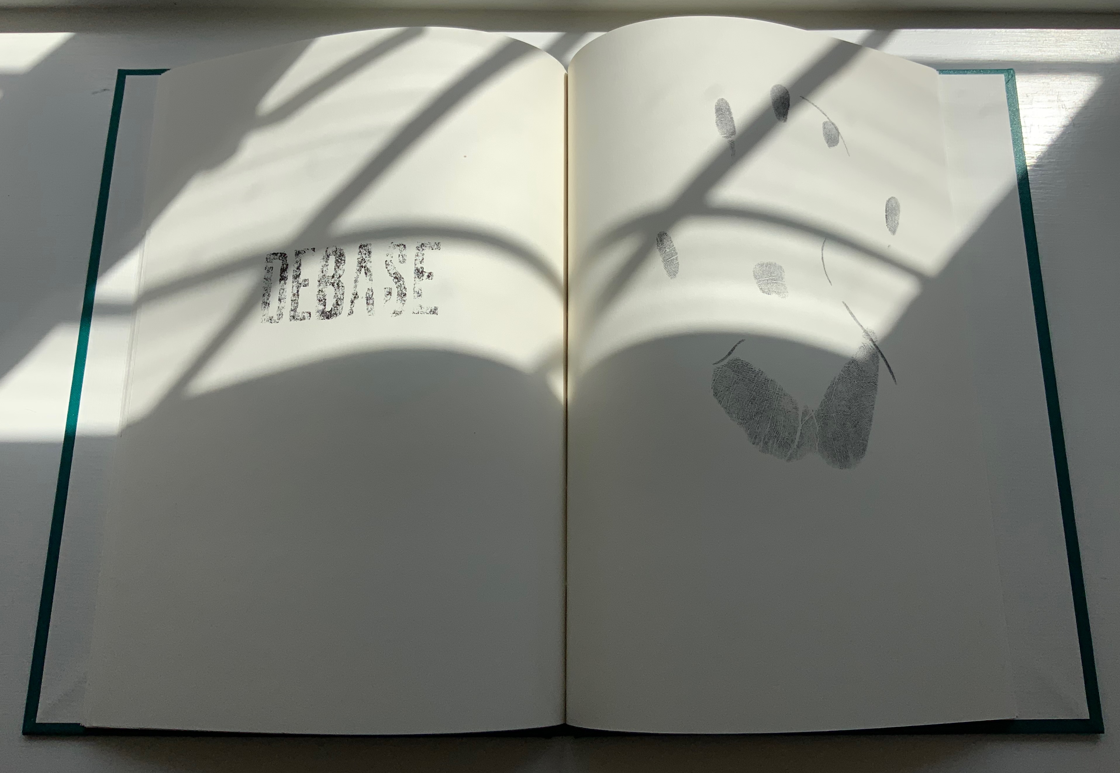
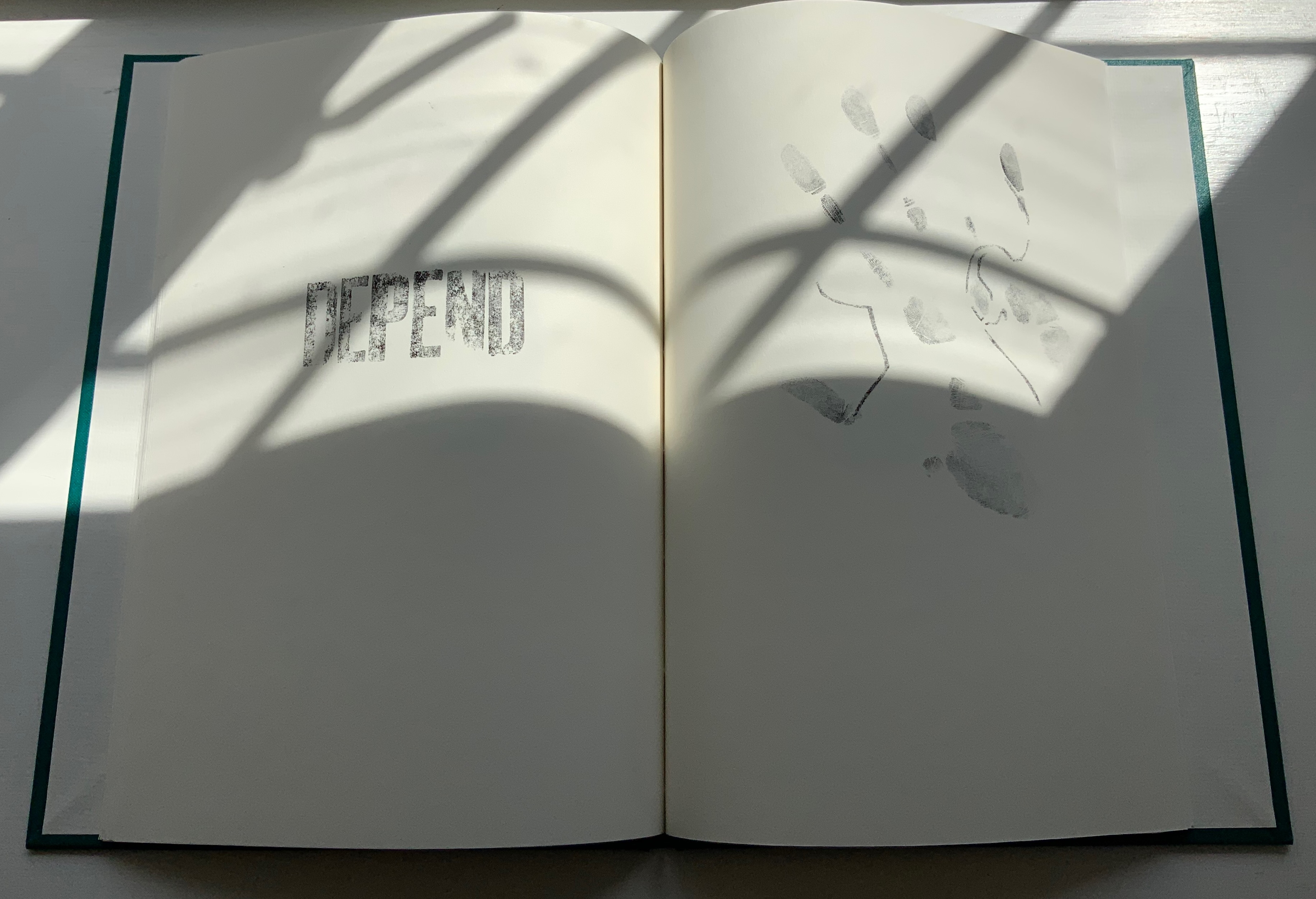
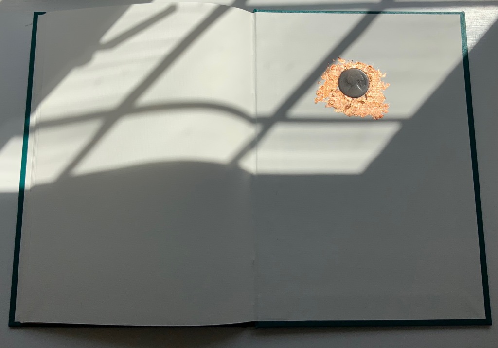
Like the tangible shell casing in Forest Garden Beach beneath the leather, the letters of the word “COIN” rise beneath the front cover cloth. Take another look at those letters, and it becomes clear that their forms beneath the cloth are eroded, just as the bullet is spent and just as the copper coin has been worn. The mix of “de” words and the handprints over the queen’s deteriorating profile add the kind of irony to be found in Shelley’s sonnet “Ozymandias“.
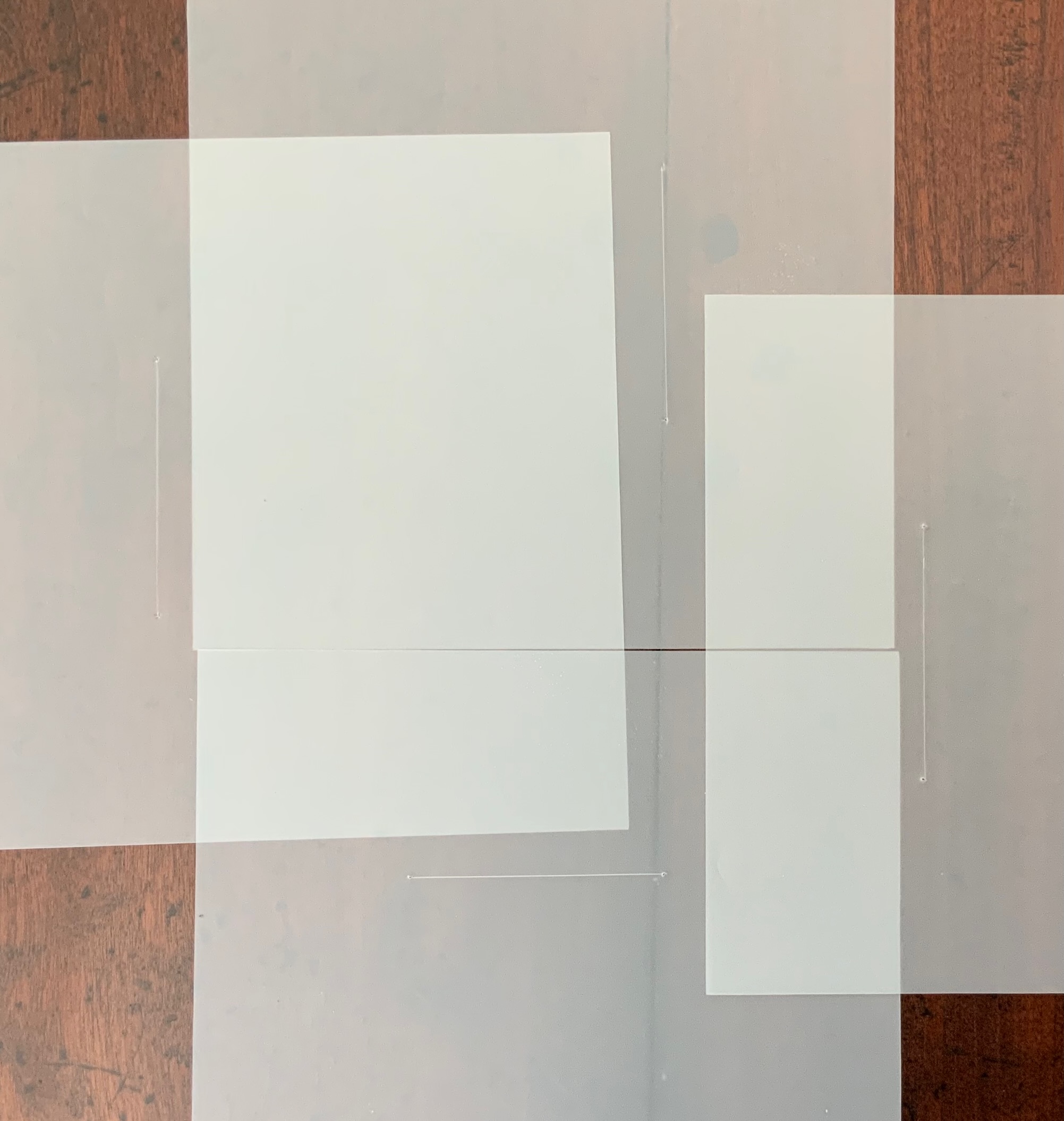
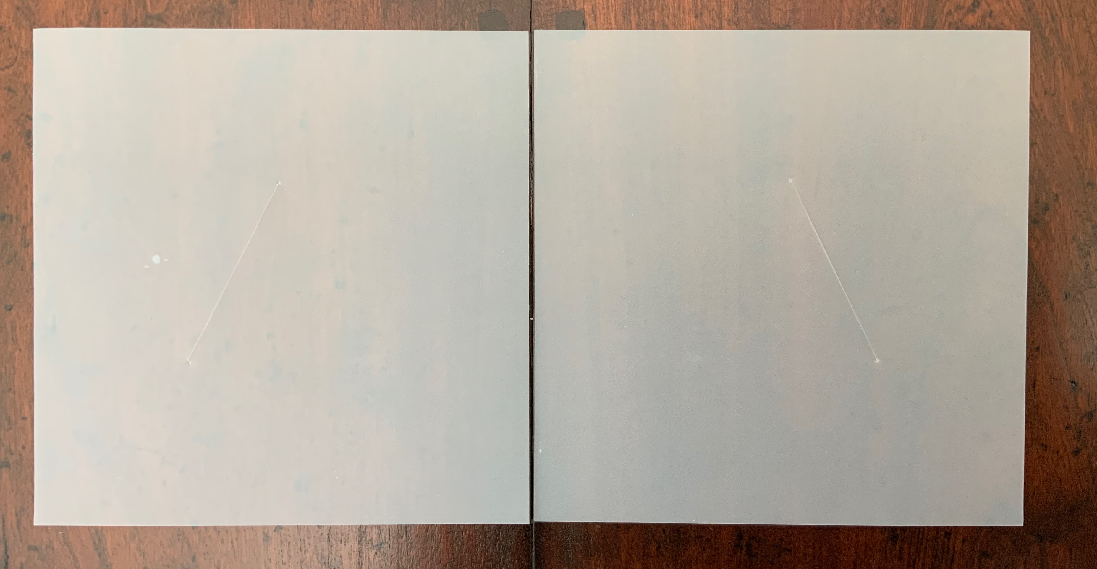
ITHACA (2015)
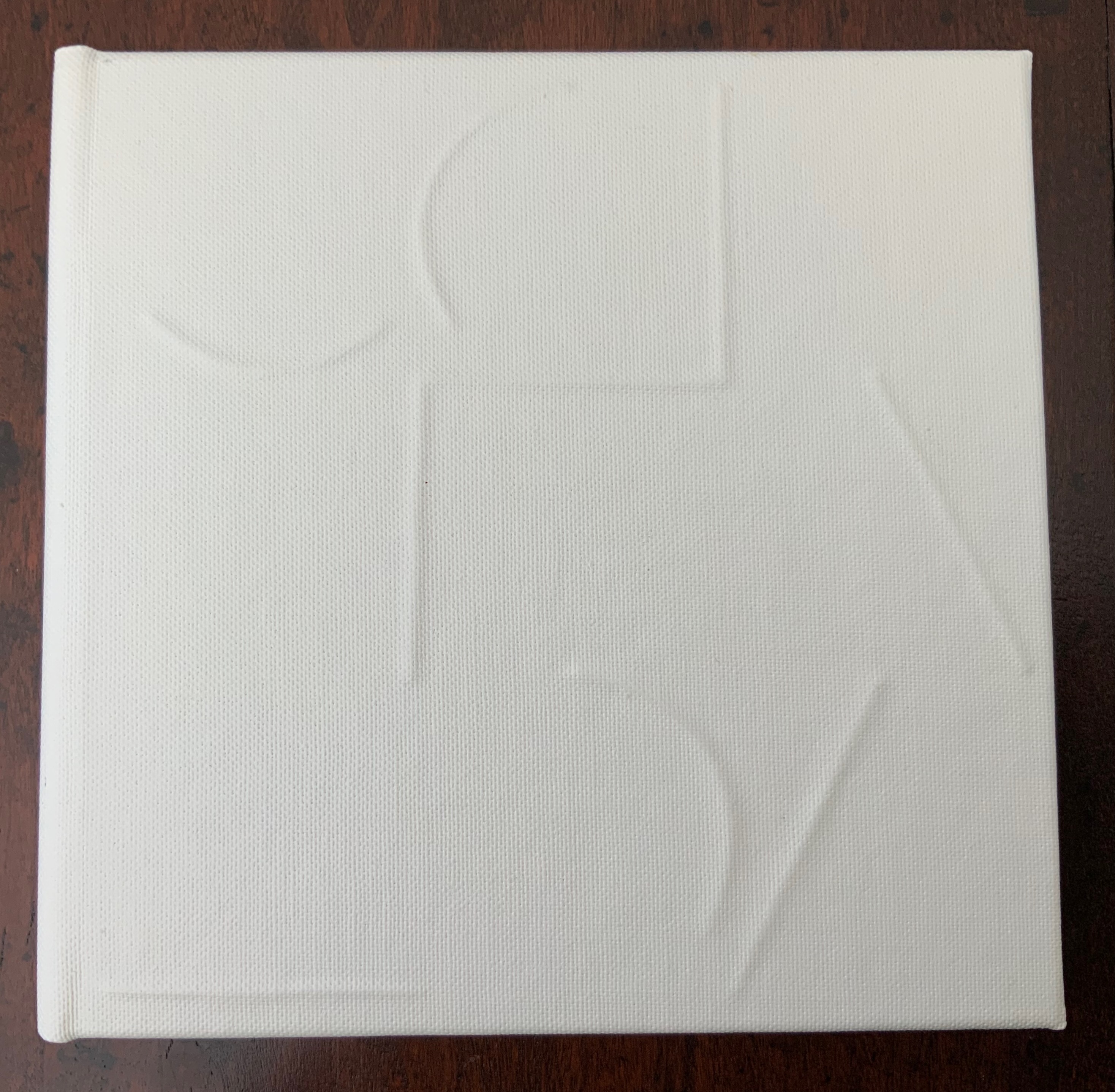
ITHACA (2015)
Salt + Shaw
Hardcover. 140 x 140 mm, 9 sheets of architectural tracing paper with hand-cut lines. Edition of 9, of which this is #7. Acquired from the artists, 13 December 2021.
Photos: Books On Books Collection. Displayed with permission of the artists.
Ithaca gives a few twists both to the theme of the present’s interaction with the past and to the artists’ affection for blind printing. As the colophon indicates, the first copy of the edition of nine was left on the island of Ithaca and performs the act of an offering, much as objects left as offerings to the gods. “Journeys” and the work’s title, of course, suggest the most famous of journeying heroes — Odysseus; however,
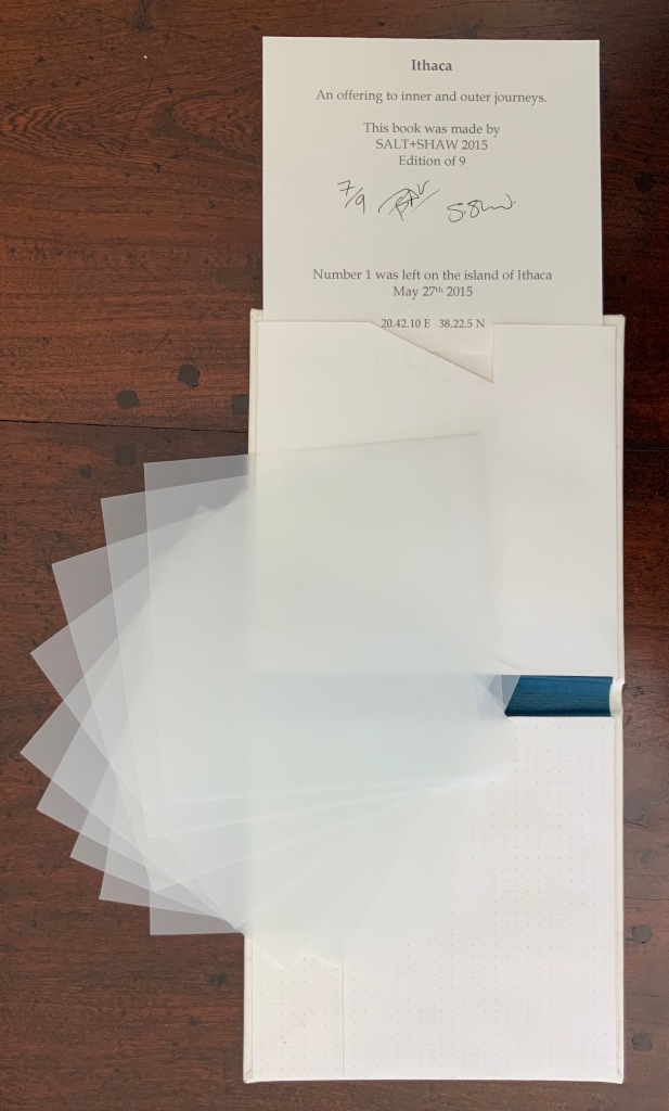
the journeys to which the offering is dedicated are “inner and outer”, suggesting an allusion beyond the hero. The nine translucent sheets of architecture paper bear cuts whose shapes are each replicated by an embossed printing on the back (or front) cover of the work. If the sheets are rightly arranged, they will replicate the image of the circle and triangle embedded in the square on the front (or back cover).
The combined images of square, circle and triangle and the reference to inner and outer journeys suggest associations with sacred geometry (reflected elsewhere in the Books On Books Collection: Bruno Munari’s compendia on the square, circle and triangle and Jeffrey Morin’s and Steven Ferlauto’s two works) and with Zen (also reflected elsewhere in the collection: Julie Johnstone’s works).
The playing with the sheets of paper — a kind of inner and outer journey itself — to which Ithaca invites us highlights a growing insistence on audience interaction in all the works so far and especially so in the next.
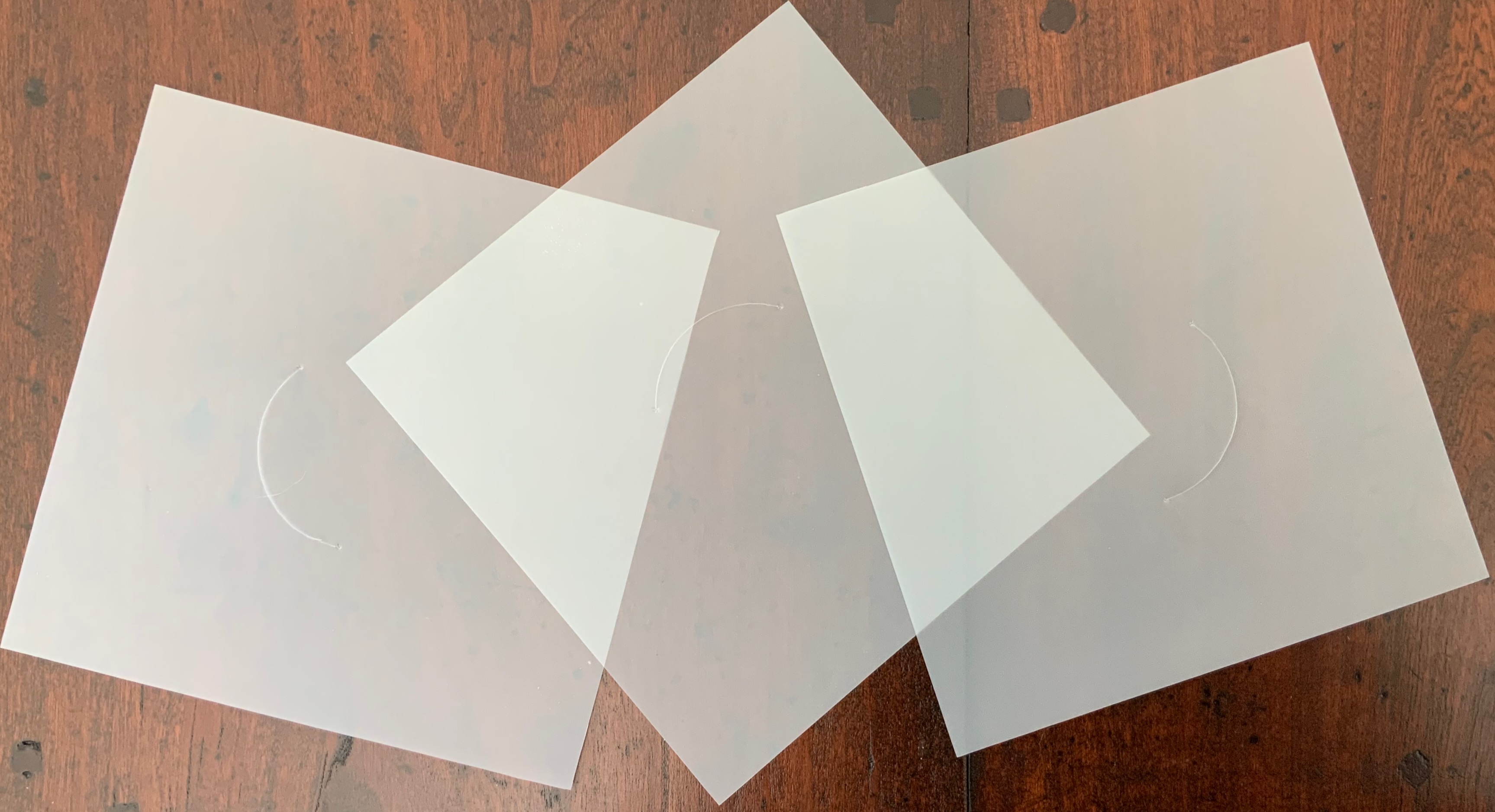
LIMINAL KEEPSAKE (2015)
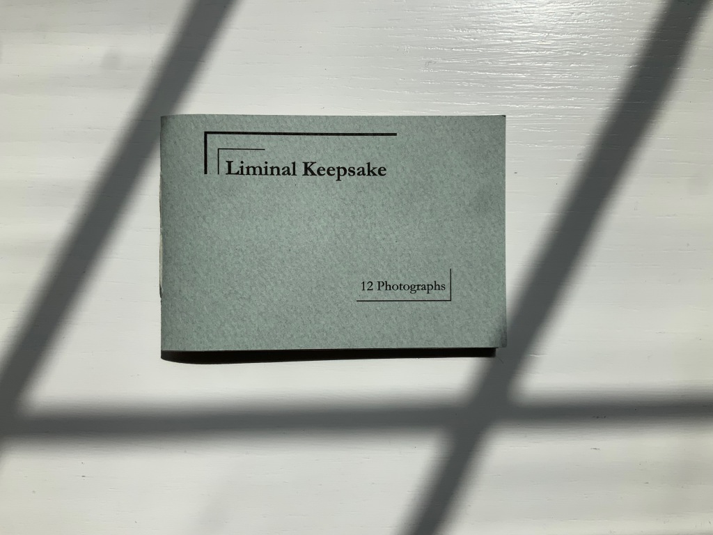
LIMINAL KEEPSAKE (2015)
Salt + Shaw
Pamphlet book. H70 x W105 mm, 12 unnumbered pages, half-sheet insert. Edition of 15, of which this is #11. Acquired from the artists, 13 December 2021.
Photos: Books On Books Collection. Displayed with permission of the artists.
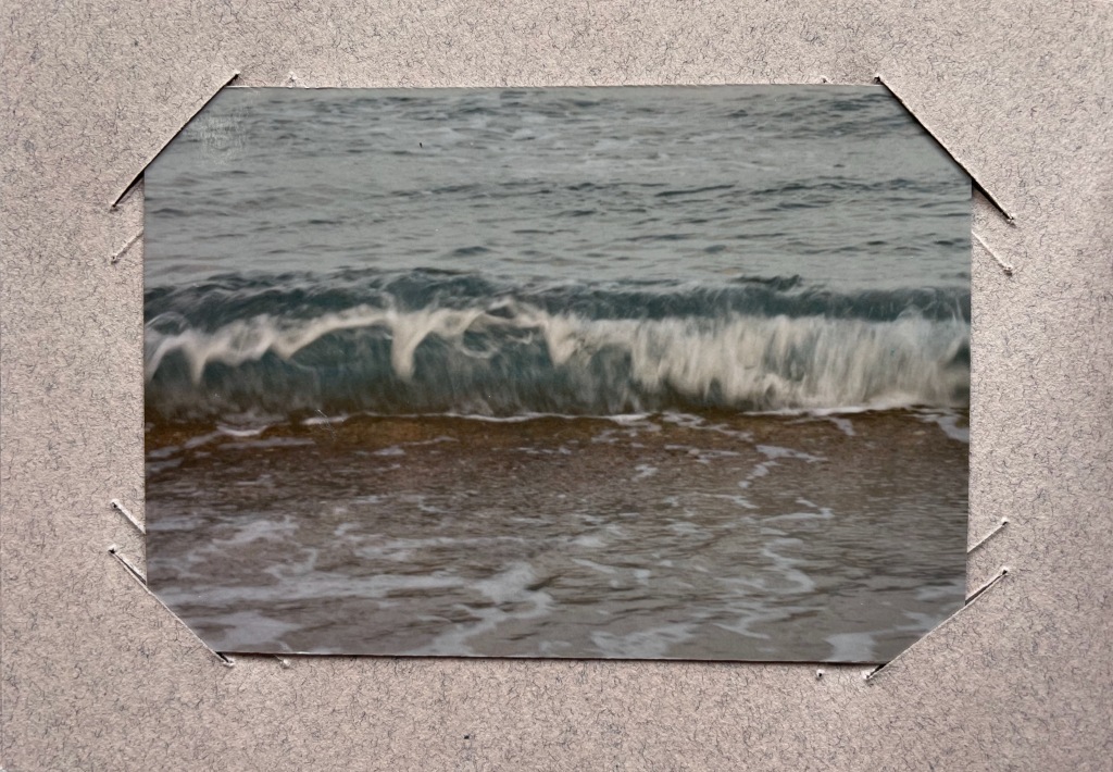
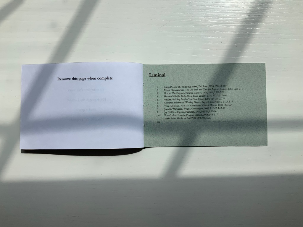
Liminal Keepsake realizes the sea:land allusion of Ithaca‘s title by presenting its audience with eleven photographs of sea and land meeting. The photos, unique to each copy in the edition, are held in hand-cut mounts. “Liminal” refers to “a space between” or “where edges meet”. The photos in Liminal Keepsake seem to be a collection of memories about where the edges of the sea and land meet.
But on the inside back cover is a list of references to literary works, each of which has a passage that aligns with the photo matching in the sequence. Here is another space between — the space between the images and the passages — a space into which any curious viewer is thrust. If the viewer expects to enjoy this work fully, the viewer has to seek out the passages in that list to see how the text matches the photo. Not that easy a task since each text is specific to a specific edition of the cited literary work. The For instance, the tenth photo in the sequence is aligned to a passage from Bram Stoker’s Dracula — specifically from page 85, line 17 of the 2003 Penguin edition. Fortunately, that edition can be easily found online. Here’s the passage (the 17th line is in bold):
… The day / was unusually fine till the afternoon, when some of the gossips / who frequent the East Cliff churchyard, and from that com- / manding eminence watch the wide sweep of sea visible to the / north and east, called attention to a sudden show of ‘mares’- / ‘tails’ high in the sky to the north-west. …
And here is the relevant photo in the collection’s copy of Liminal Keepsake.
So the viewer has to become researcher and reader to experience Liminal Keepsake fully, and the viewer/researcher/reader has to become something even more to finish Liminal Keepsake. Just as Ithaca invites its audience to arrange its translucent sheets to form the symbol on its cover, Liminal Keepsake invites its completion by the viewer/researcher/reader-cum-artist’s taking a photo of “the Liminal” and a bibliographical reference that echoes the photo.
In pondering completion of the work, would-be artists come across across other “spaces between” — the space between the visual and textual imaginations and the space between concept and execution. Apparently the artists took their photos, then found the texts to match. To hold an image in mind and be constantly on the lookout for matching text in whatever literary work happens to be in hand seems a tall order. To start the other way around — to have some sea:land text in hand and then seek a setting in which an appropriate image is likely to be found — looks easier to the more textual imagination. On top of this are the artist-manqué’s anxiety of crossing that space between concept and execution and the curator’s anxiety of sacrificing the object as-was and the aura of possibilities for perhaps a lesser object and one definitely without the aura of possibilities.
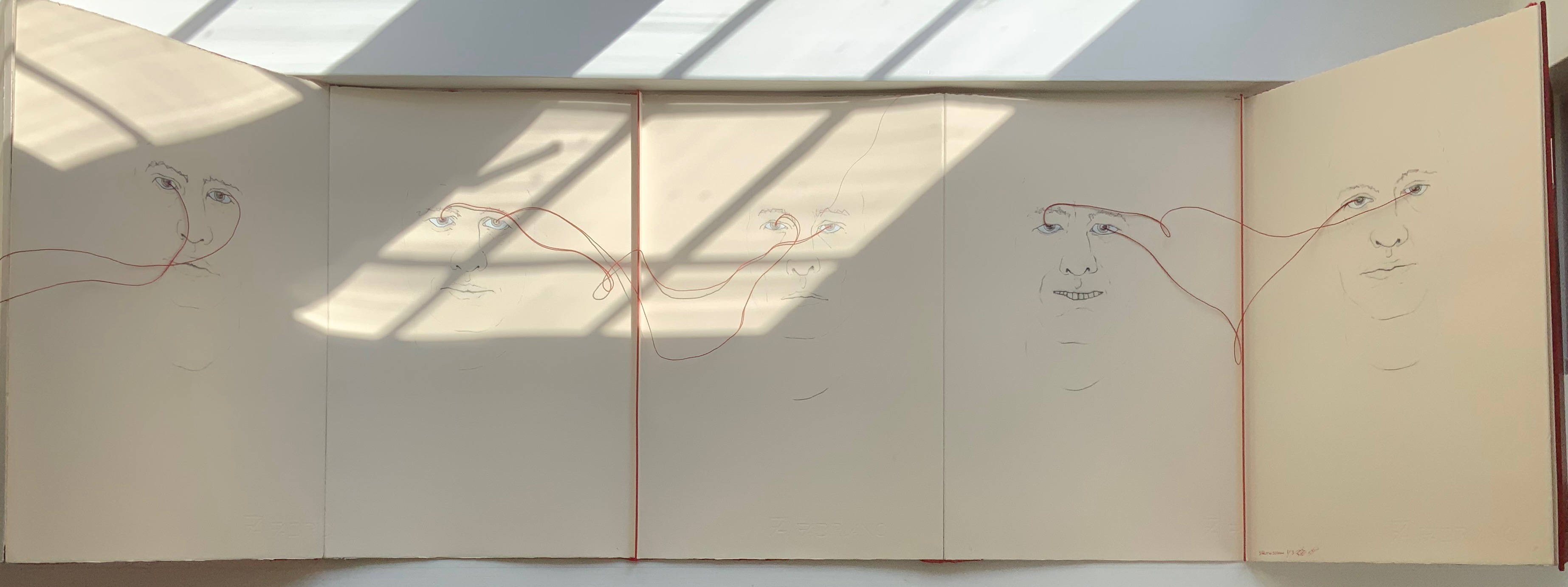
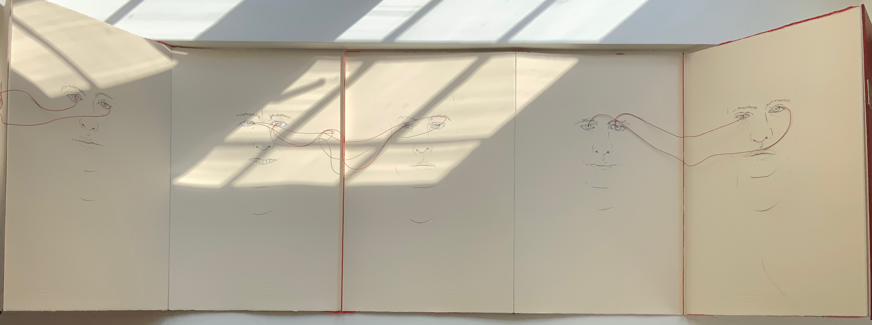
LOOK (2021)
LOOK (2021)
Salt + Shaw
Hardcover, double-sided concertina book. H350 x W230 mm, 10 unnumbered panels. Edition of 3, of which this is #1. Acquired from the artists, 13 December 2021.
Photos: Books On Books Collection. Displayed with permission of the artists.
The core features of two individuals’ faces head-on have been drawn on both sides of this concertina book — “core” meaning no delimitation by hair, ears or other details at the edges of the visages. The red thread connecting the pairs of eyes with one another draws attention back to the title: Is it an instruction for the viewer to look? Is it a noun referring to appearance, the look of the faces? Or to expression, the look in the faces? Is it a noun referring to an action occurring between the depicted faces — if only via the thread connecting the pairs of eyes? Only when the concertina is closed do the faces face one another. Yet the color red, echoed between the cover and thread, suggests an intensity connecting these looks, these gazes.
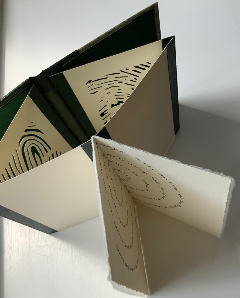
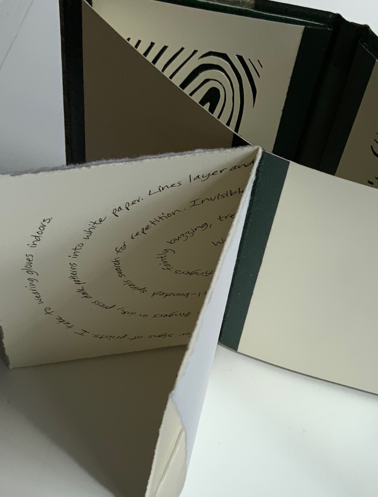
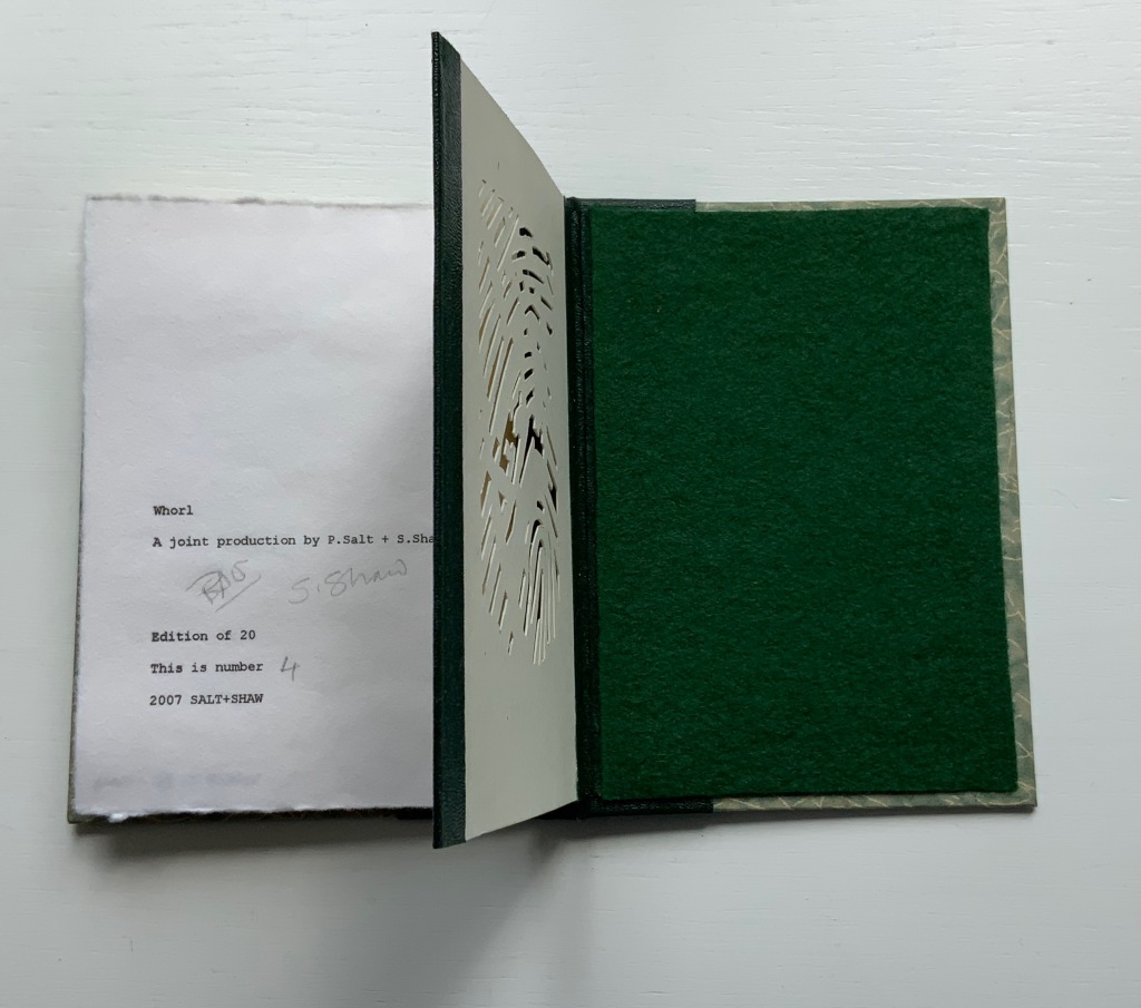
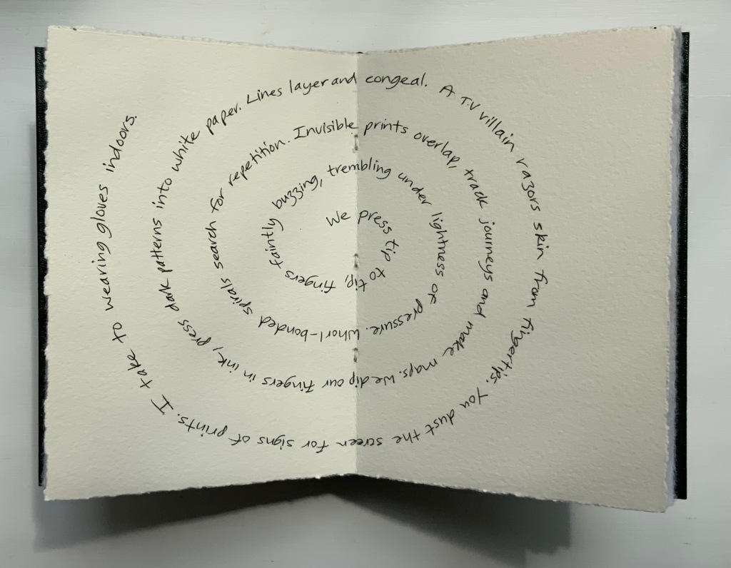
A more textual predecessor to Look is Whorl (2007).
WHORL (2007)
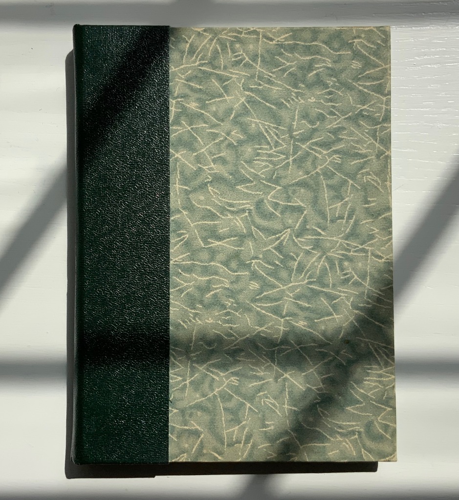
WHORL (2007)
Salt + Shaw
Hardcover, modified concertina and pamphlet book, H115 x W155 mm, 4 unnumbered panels, 2 unnumbered central sheets. Edition of 20, of which this is #4. Acquired from the artists, 13 December 2021.
Photos: Books On Books Collection. Displayed with permission of the artists.
Here is a rare instance of a poem’s metaphysicality being physically enacted by the surface and structure on which the poem is inscribed. On a double-page spread at the work’s center, a poem begins at the center of its spiral, or whorl, with the words “We press tip to tip fingers ….” Pull the double-page spread outwards away from the spine. Because the spread’s centerfold serves to bind four panels into a diamond shape, two hand-cut stencils of two different fingerprints approach (“tremblingly” as the poem describes) to touch one another when the double-page spread is pulled completely outwards and away from the spine. If this does not renind the reader of John Donne’s poetry, nothing will.
The following works are individual to Susan Shaw and Paul Salt, respectively. Shaw’s individual works also deliver complete textual works — short stories or a poem — that fuse with their containers.
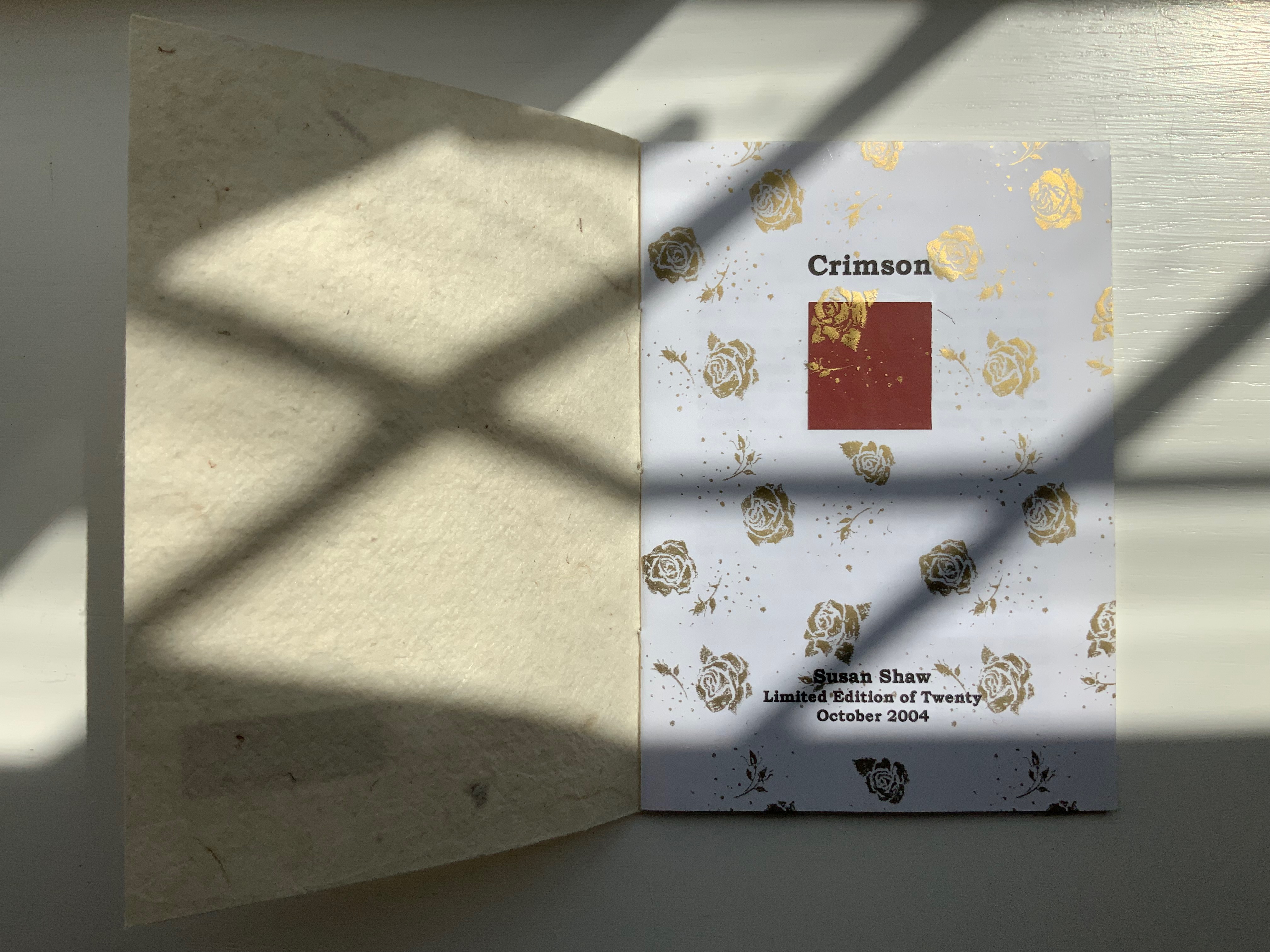
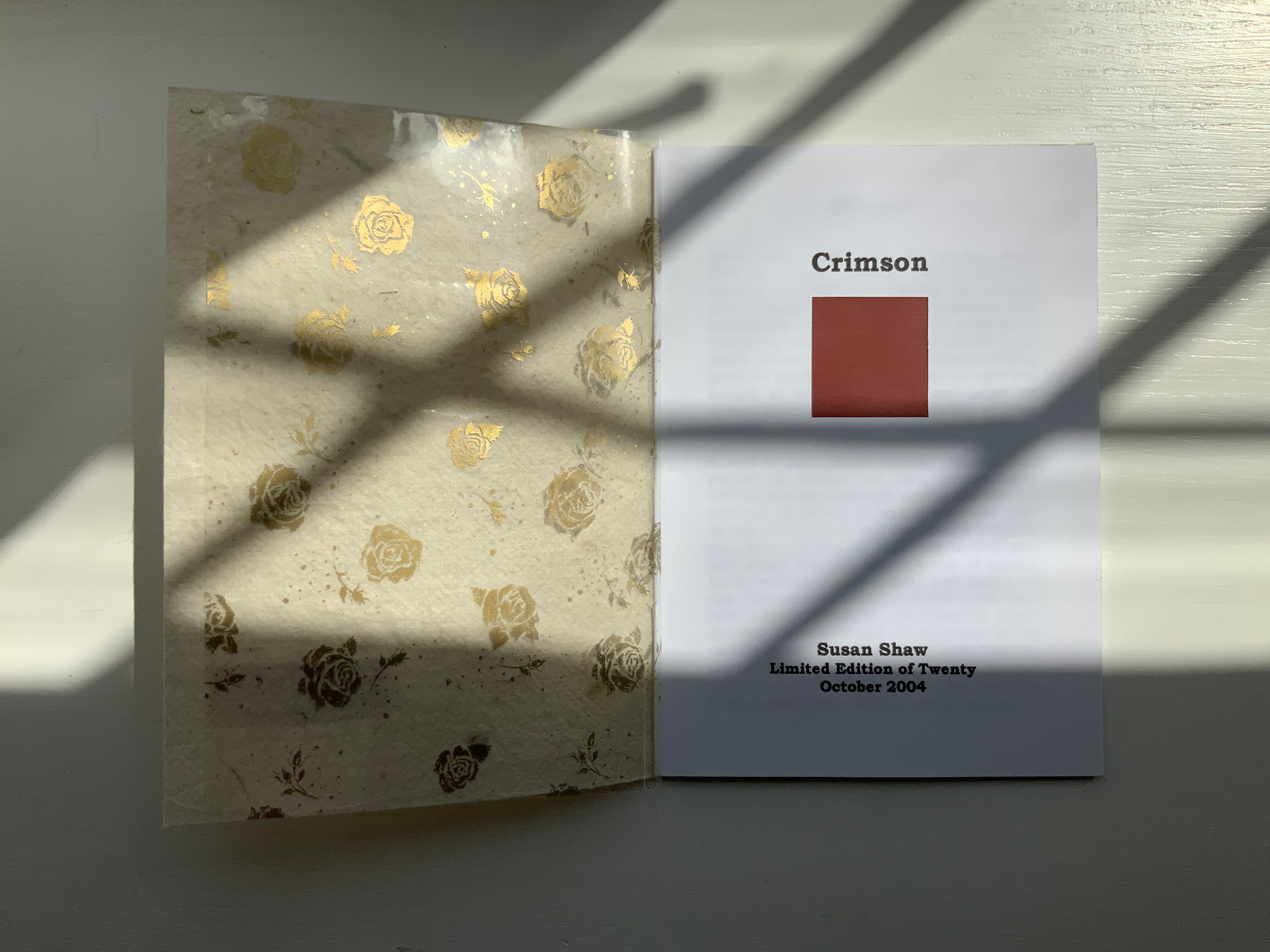
CRIMSON (2004)
Crimson (2004)
Susan Shaw
Hand-made paper cover. H155 x W110 mm, 8 unnumbered pages. Edition of 10, of which this is #2. Acquired from the artist, 13 December 2021.
Photos:Books On Books Collection. Displayed with permission of the artist.
The washed-out cover, pressed fallen leaf and faded title signal the conclusion of the short story Crimson, in which a couple seemingly argue incessantly about choice of colors, both indoors and out in their garden.
Shaw’s attraction to fiction narrative perspective flutters recurs in the next work, but its leporello structure and photos add a different otherworldly touch.
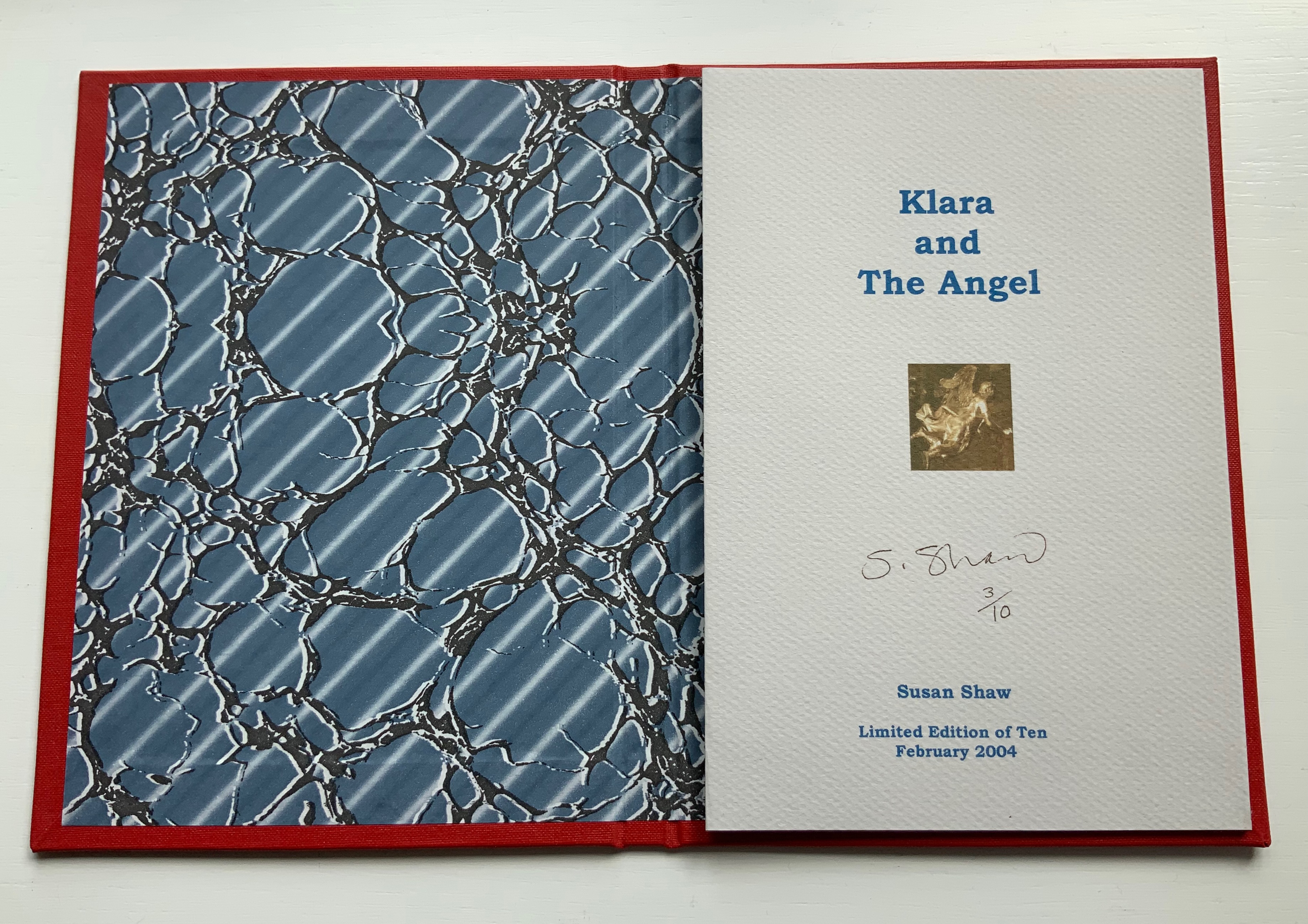
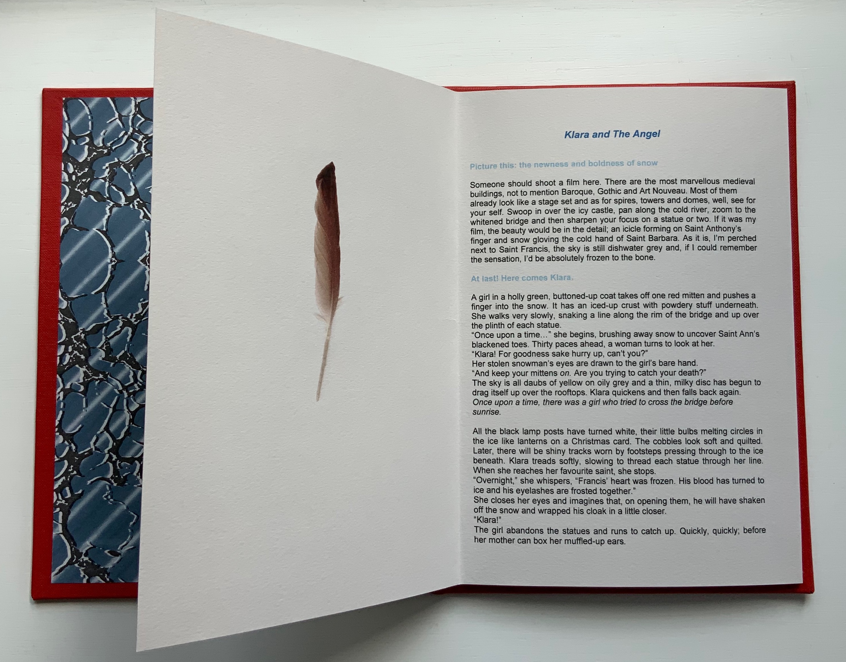
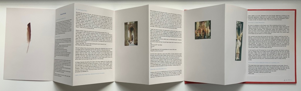
KLARA AND THE ANGEL (2004)
KLARA AND THE ANGEL (2004)
Susan Shaw
Hardcover, double-sided concertina book. H220 x W160 mm, 15 unnumbered panels. Edition of 10, of which this is #3. Acquired from the artists, 13 December 2021.
Photos: Books On Books Collection. Displayed with permission of the artists.
The story begins in a Prague cemetery covered in snow, to which the reader’s attention is directed by the narrator’s direct address in light blue type. As the type shifts into black, the narrator continues to address the reader, and with the reference to being perched on St. Francis’s shoulder, the narrator gives some of the game but then deflects with the introduction in blue of Klara’s arrival. As the leporello unfolds, so does Klara’s story and the narrator’s identity as the angel with whom Klara has an appointment.
Snow and evocative photos feature in the next work but with less drama.
SNOW DROPS FROM PETALS (2008)
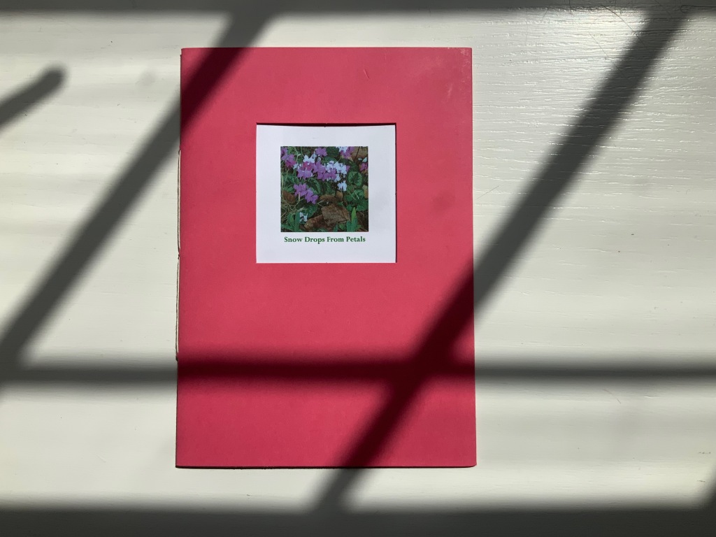
SNOW DROPS FROM PETALS (2008)
Susan Shaw
Pamphlet book. H150 x W105 mm, 12 unnumbered pages. Edition of 17, of which this is #4. Acquired from the artist, 13 December 2021.
Photos: Books On Books Collection. Displayed with permission of the artist.
The front cover wraps around to overlap the back cover, which is rather like the way in which words often play multiple roles in poems. Here, the subject snow and its verb drops coincide with the flower’s name and its two photos that appear later. The center of the work presents the entire haiku, but more interesting and curious, the haiku’s traditional structure (lines of 5, 7 and 5 syllables) breaks up into four segments (5, 6, 3, 3) to appear on verso pages facing a photo.
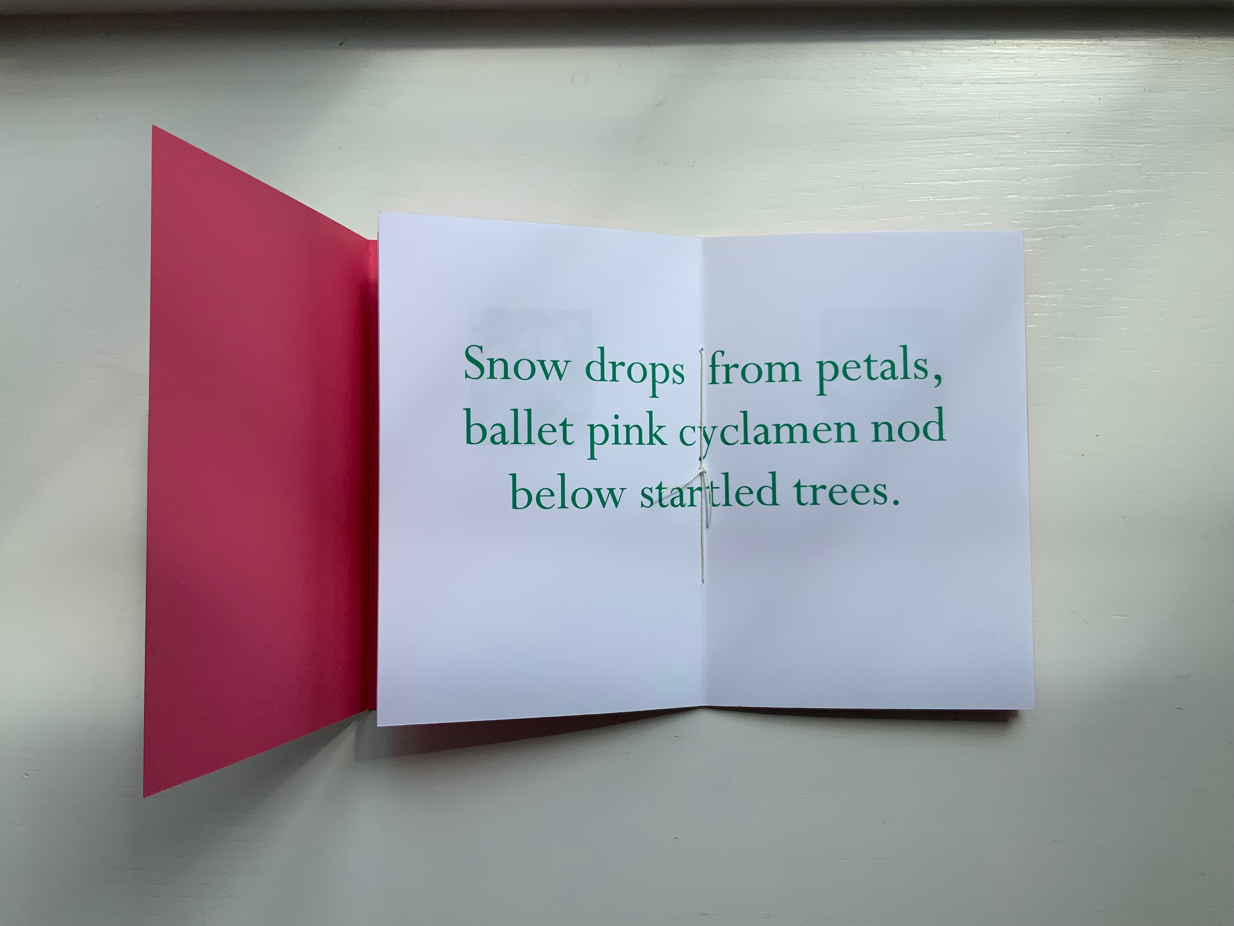
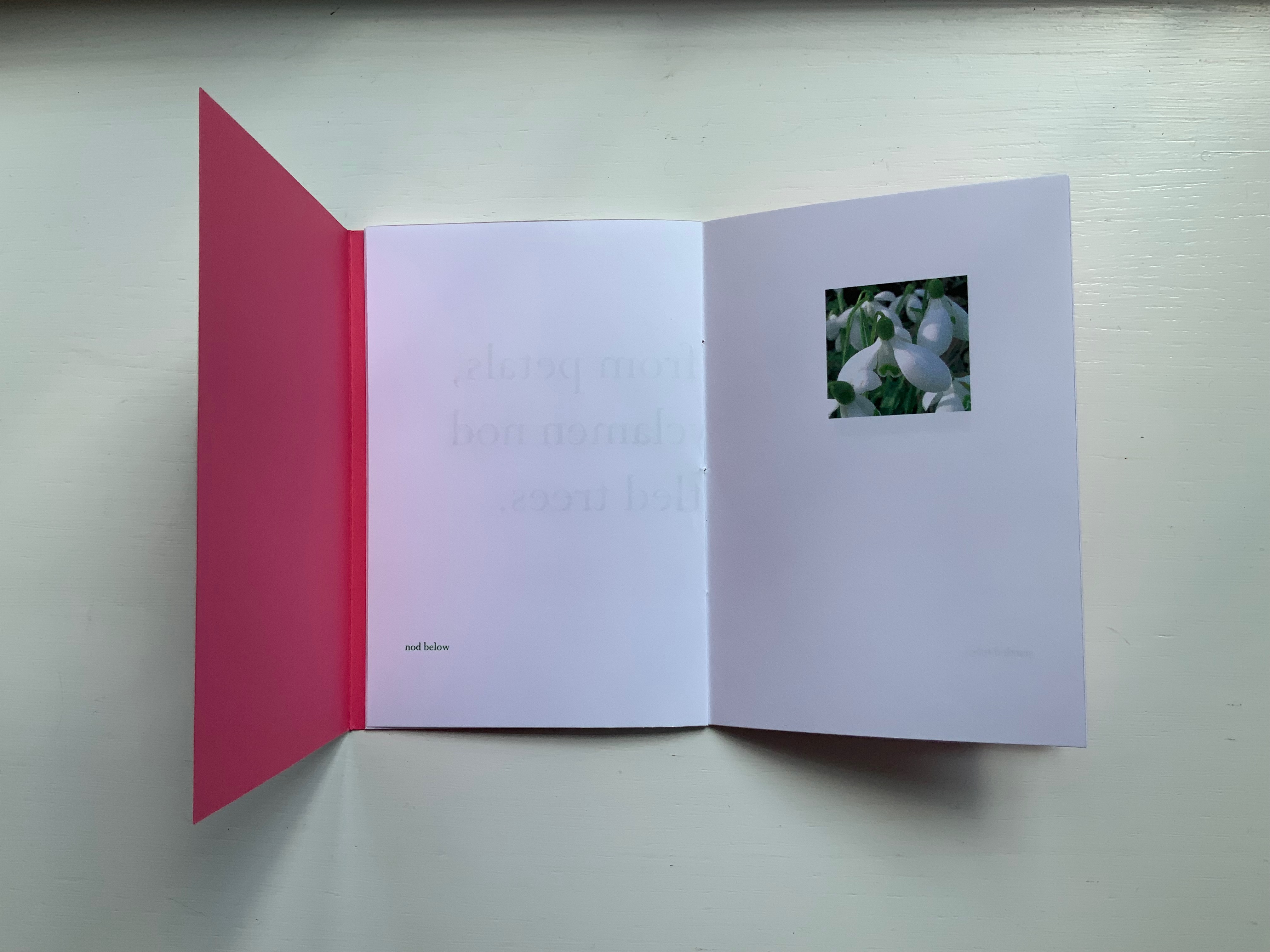
Daffodils face the first line. Snow drops face the words “ballet pink cyclamens”. More snow drops face the words “nod below”. A bee perched on a blossom faces the words “startled trees”. The effect is to send the reader back and forth across these spreads and page turns like a bee moving from flower to flower.
Paul Salt’s individual works in the collection take a more sculptural expression. Even though this next work is garden-inspired like Snow Drops, its physical presentation reflects the more sculptural garden that inspired it.
BROTHERS IN ARMS (2008)
BROTHERS IN ARMS (2008)
Paul Salt
Hardcover, folio. H300 x W220 mm close, W655 open. Edition of 24, of which this is #2. Acquired from the artist, 13 December 2021.
Photos: Books On Books Collection. Displayed with permission of the artist.
The garden in question here is the more severe but still playful Little Sparta, created by Ian Hamilton Finlay. On a visit there, Salt found a pair of wings at the base of one of the sculptures.
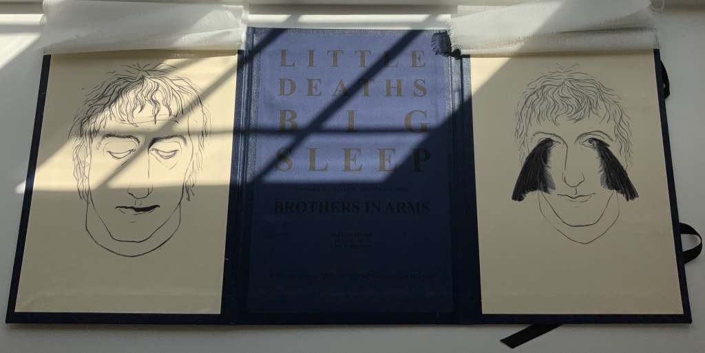
In its imagery and structure, the final work by Salt reflects the physicality and preoccupations found in many of the works above: especially Mill, Coin and Fold. Although it has less whimsy than Coin or Fold, its abrupt title recalls Ed Ruscha’s humorous rule of thumb for distinguishing between bad and good art: Bad art makes you say ‘Wow! Huh?’ Good art makes you say ‘Huh? Wow!’
What …? (2018)
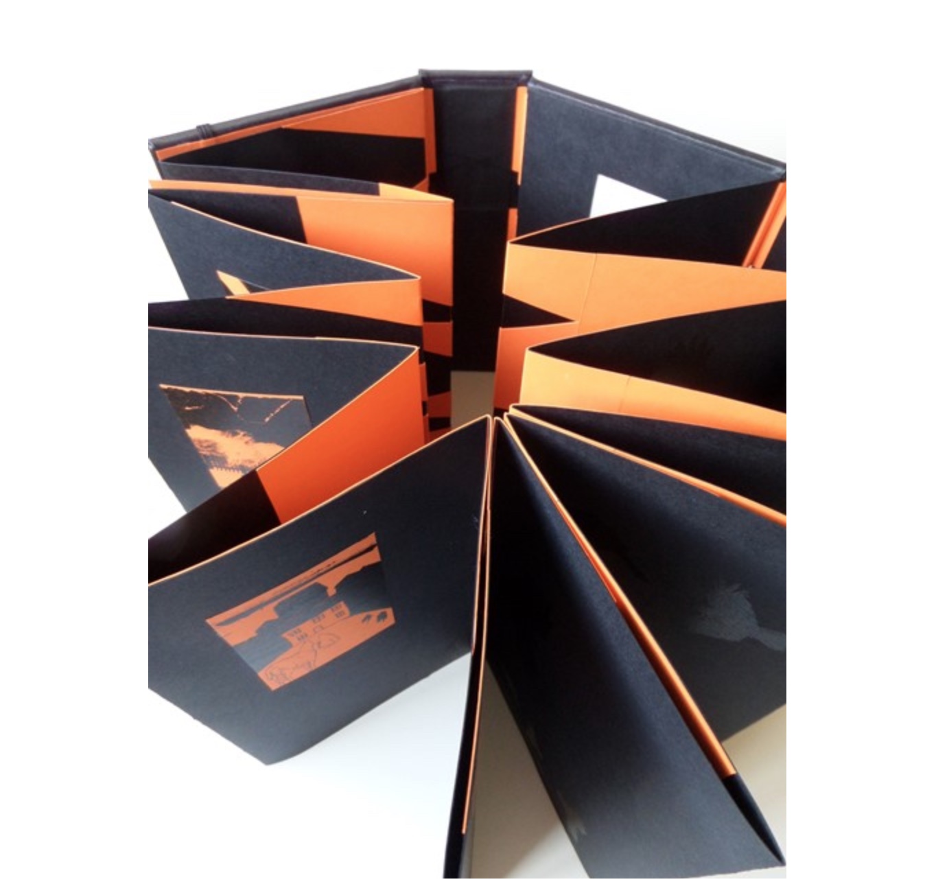
What …? (2018)
Salt+Shaw
Hardback, boxed-bound, black book cloth, concertina book with magnetised and elasticated fastening. Drawings and collages printed on black and orange Canson card. Letterpress. Hinges engineered in Canson card to create a spring in the turning of the pages.
H213 x W80 mm closed, H213 x W830 mm open
Edition of 5, of which this is #2. Acquired from the artists, 25 November 2018.
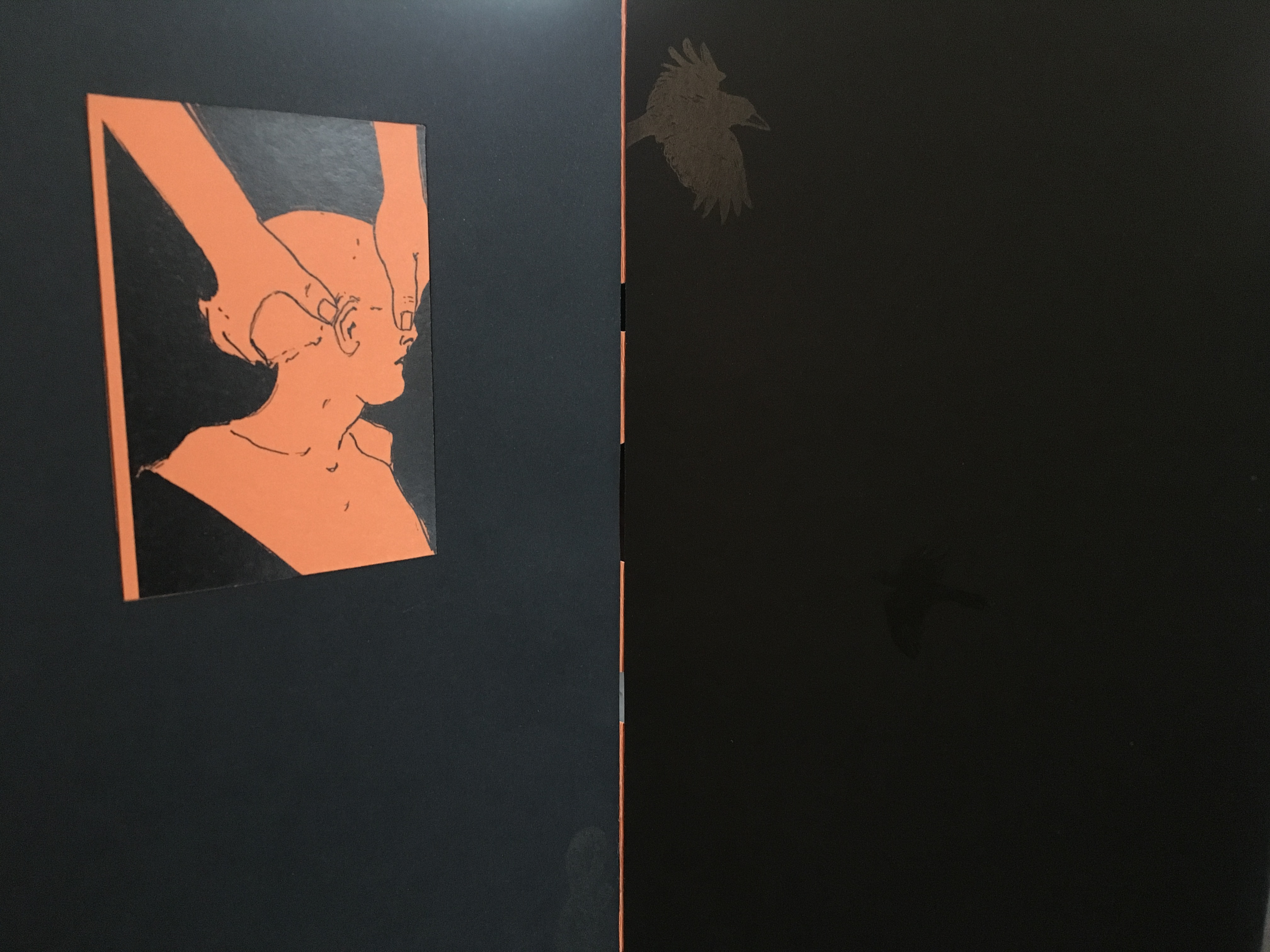
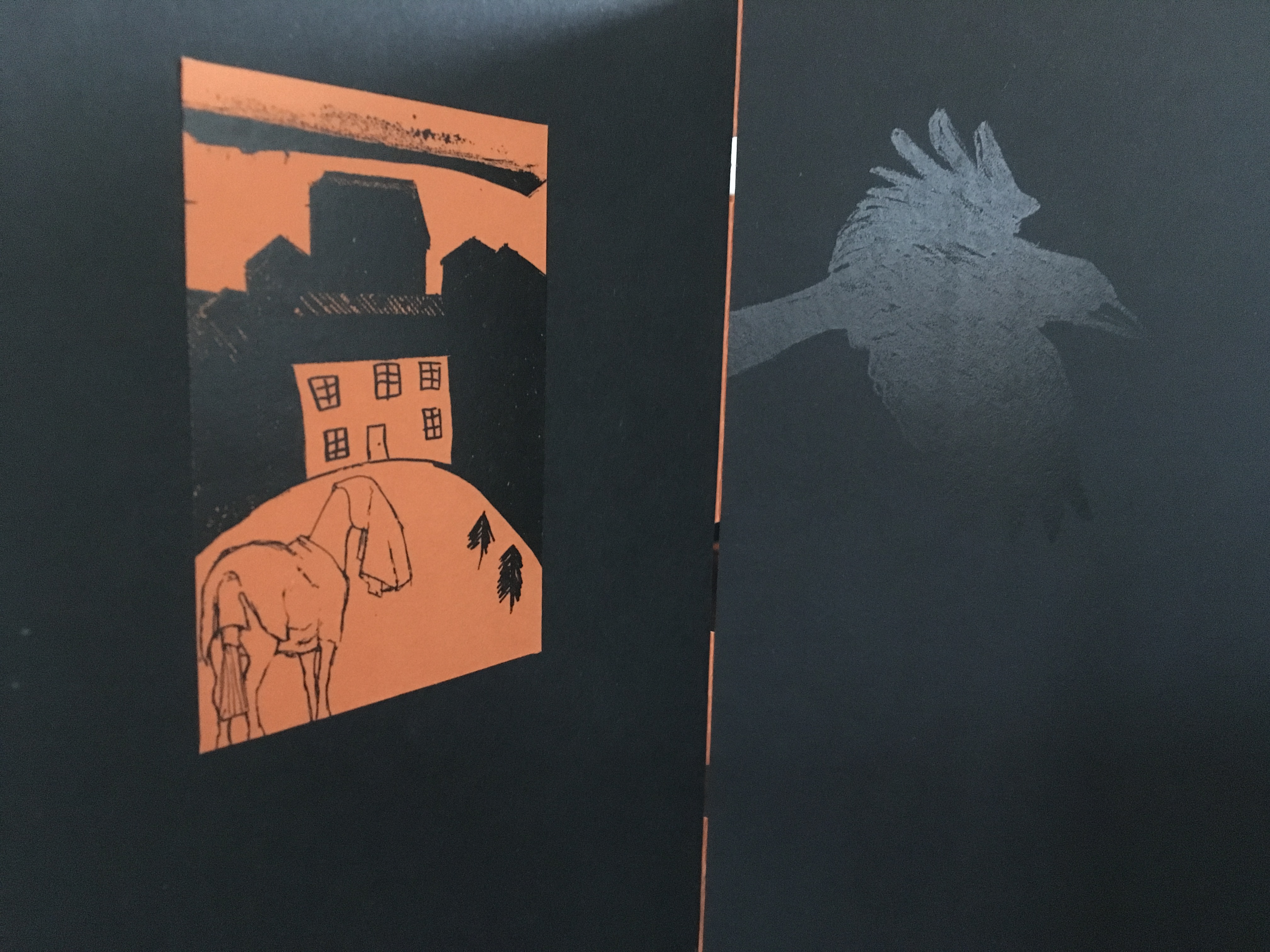
What? is a book about finding solutions, both in its construction and content. Made over a period of several years, from the first drawing to the final binding, it prefers to raise questions, rather than provide answers. Hence the title. The relationship between What? and viewer therefore depends upon response, perception and making connections. Clues could include: • William Blake • harbingers • manipulation • dislocation • loss • finding a way out • George Orwell. [Correspondence with artists, 5 December 2018.]
What? … Wow!
Further Reading
Sarah Bodman (University of Western England) has highlighted their work in a-n News with some outstanding photos:
“At the recent 21st International Contemporary Artists’ Book Fair in Leeds, they launched Ocean Bestiary, a unique book of strange and miraculous Medieval-inspired sea creatures that features a concertina construction, letterpress text, acrylic paint, gold foil, whale bone and a leather inlay.” Sarah Bodman, “Artists’ Books #28: Salt+Shaw, collaborative book makers“, a-n News, 6 March 2018.
Ephemera
Bookmarking Book Art – Nicholas Rougeux
Innovative combinations of color and geometry in artists’ books — think of Ursula Hochuli-Gamma’s 26 farbige Buchstaben (1986), Jeffrey Morin & Steven Ferlauto’s Sacred Space (2003), Sarah Bryant’s The Radiant Republic (2019) or Ana Paula Cordeiro’s Body of Evidence (2020) — make for a useful angle on which to focus in appreciating book art.
Nicholas Rougeux shows that it is also a useful inspiration for interactive digital art.
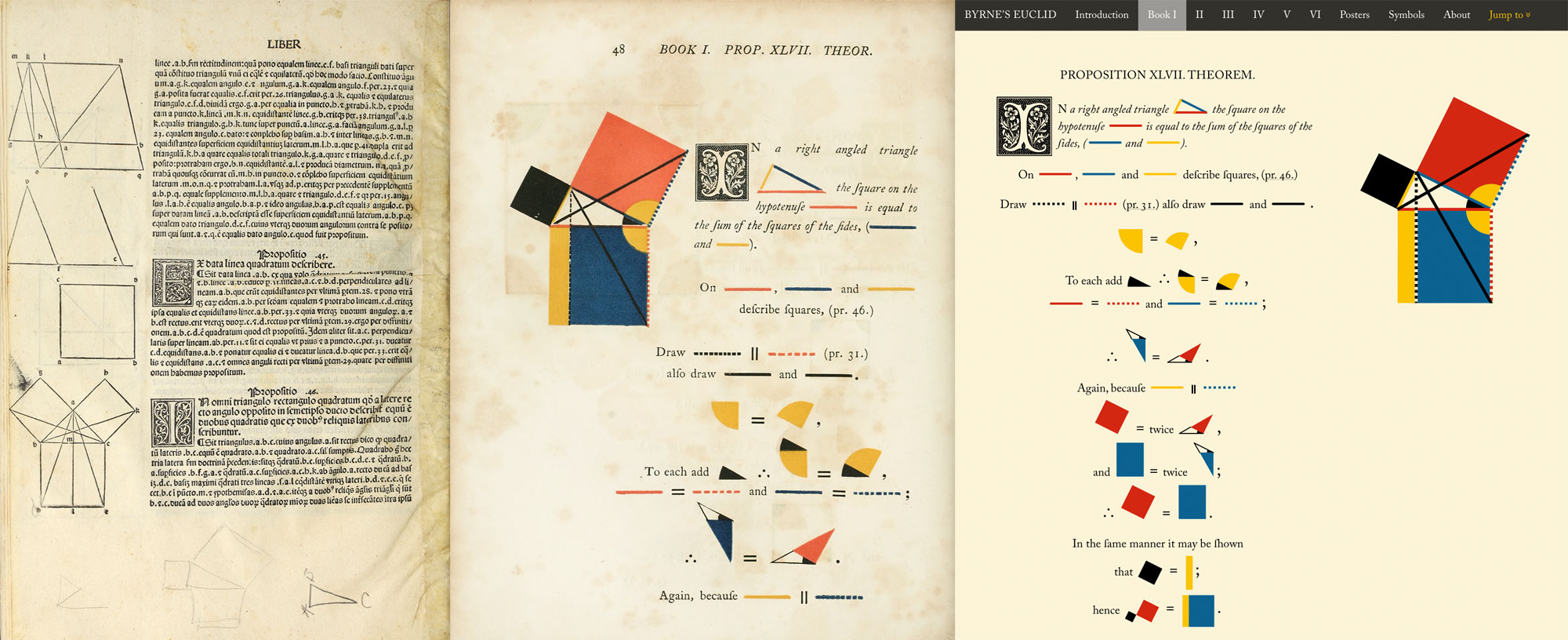
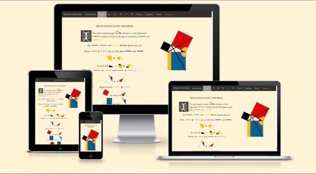
Byrne’s Euclid: The First Six Books of the Elements of Euclid with Coloured Diagrams and Symbols
and
Byrne’s Euclid: The First Six Books of the Elements of Euclid with Coloured Diagrams and Symbols – A reproduction of Oliver Byrne’s celebrated work from 1847 plus interactive diagrams, cross references, and posters designed by Nicholas Rougeux
All images © Nicholas Rougeux
Rougeux describes himself as a “data artist”, and his works might also be considered “found art” given such sources of data as Nicolas Bion’s treatise on mathematical instruments from 1709, Spencer Fullerton Baird’s Iconographic Encyclopædia of Science, Literature, and Art (1852) and John Southward’s A Dictionary of Typography and its Accessory Arts (1875). While the resulting works recall Ben Fry’s and Stefanie Posavec & Greg McInerny’s celebrations of Darwin’s On the Origin of Species, two different and more apropos, even if analogue, points of comparison are Edward R. Tufte’s Envisioning Information (1990) and Francisca Prieto’s Composition No. 1. The connection with Tufte is the more obvious, but Rougeux’s digital manipulation of antique works feels very much like Prieto’s manual folding of them.
Further Reading
Byrne Oliver and William Pickering. 1847. The First Six Books of the Elements of Euclid : In Which Coloured Diagrams and Symbols Are Used Instead of Letters. London: W. Pickering.
Byrne Oliver. 2022. The First Six Books of the Elements of Euclid. Cologne: Taschen.
KSCN. November 2022. “Euklids Elements: Visualization of the Month #5“. Kiel Science Communication Network. Accessed 18 November 2022.
Books On Books Collection – Gerard Unger
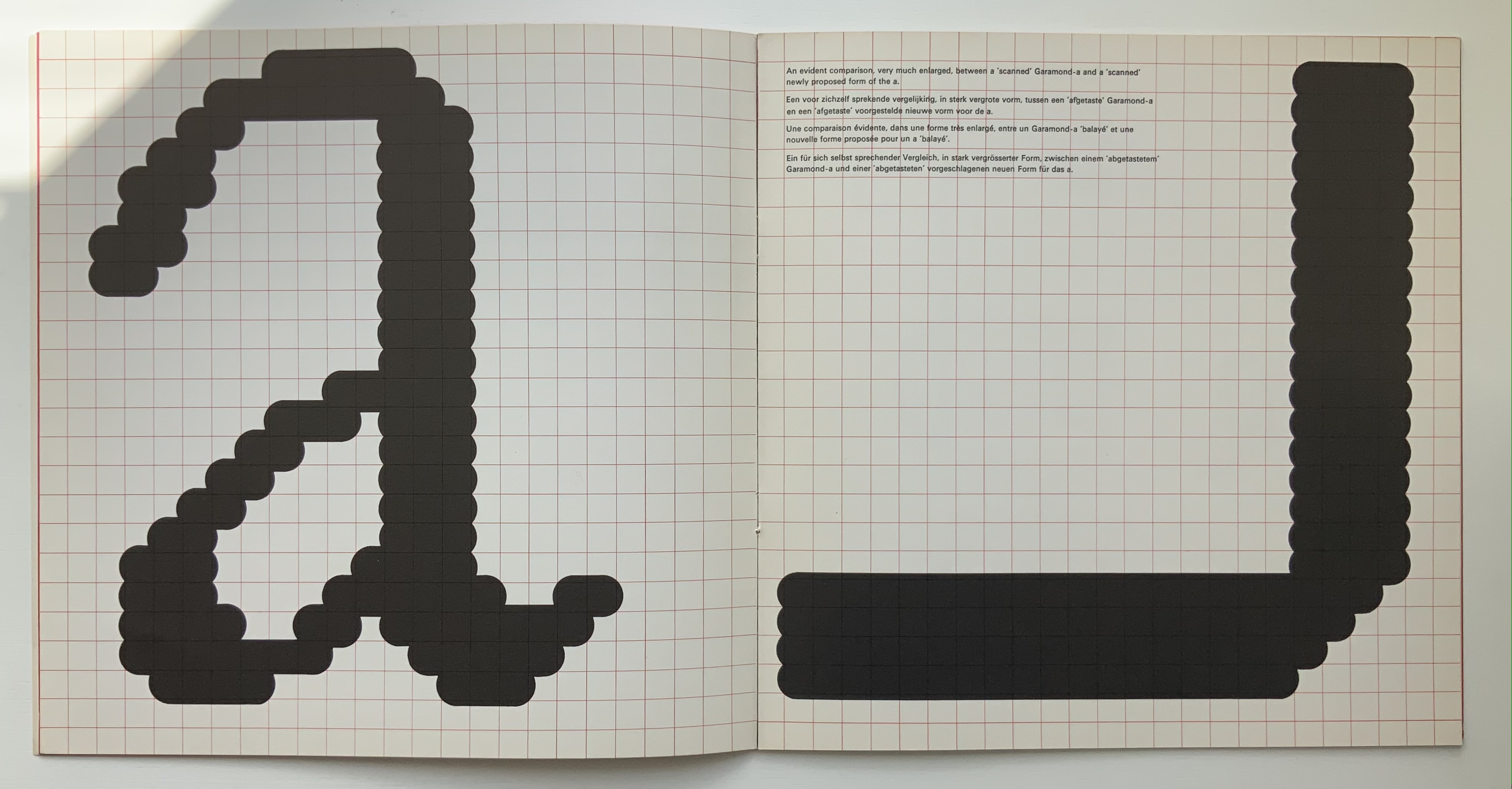
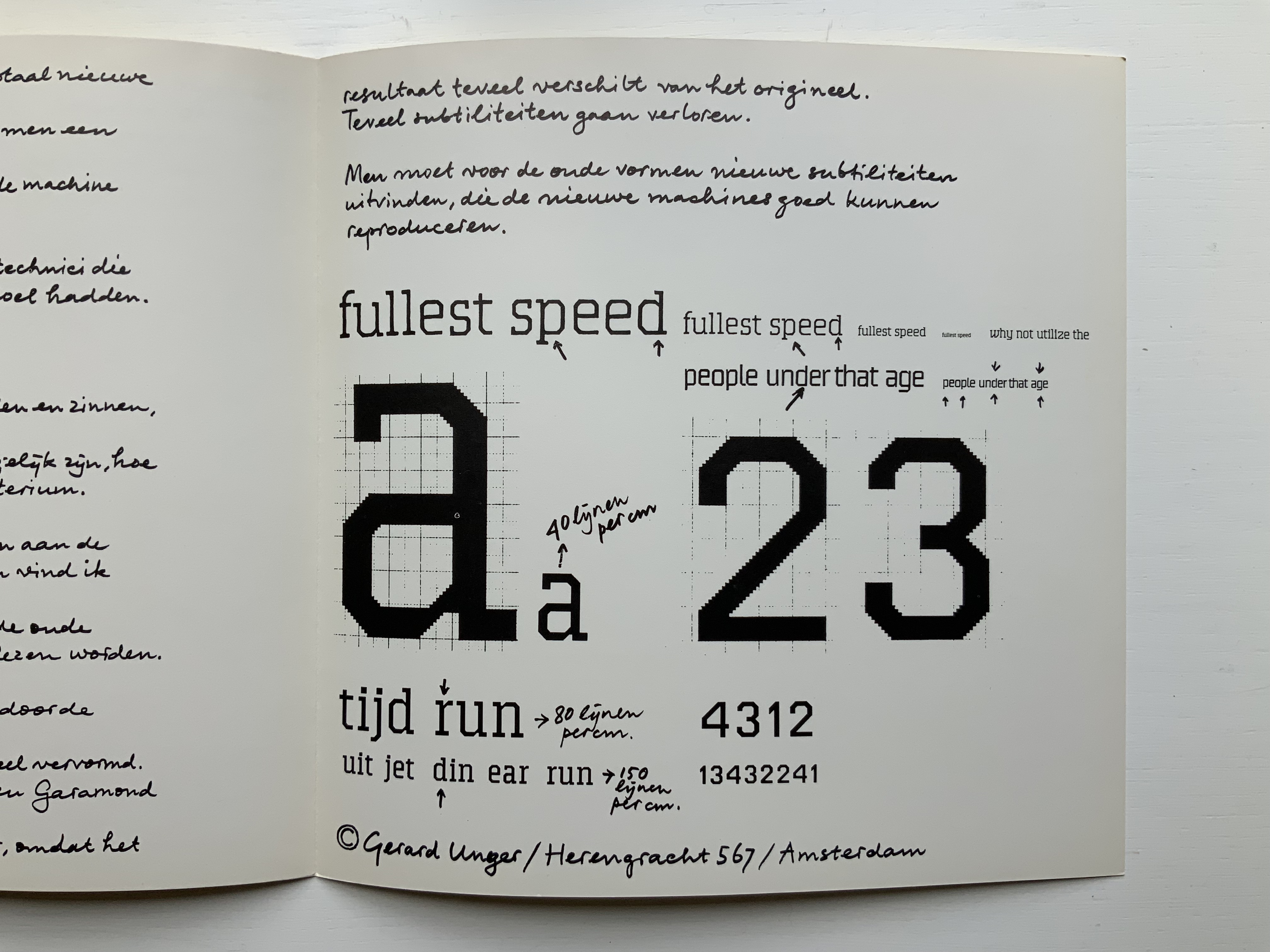
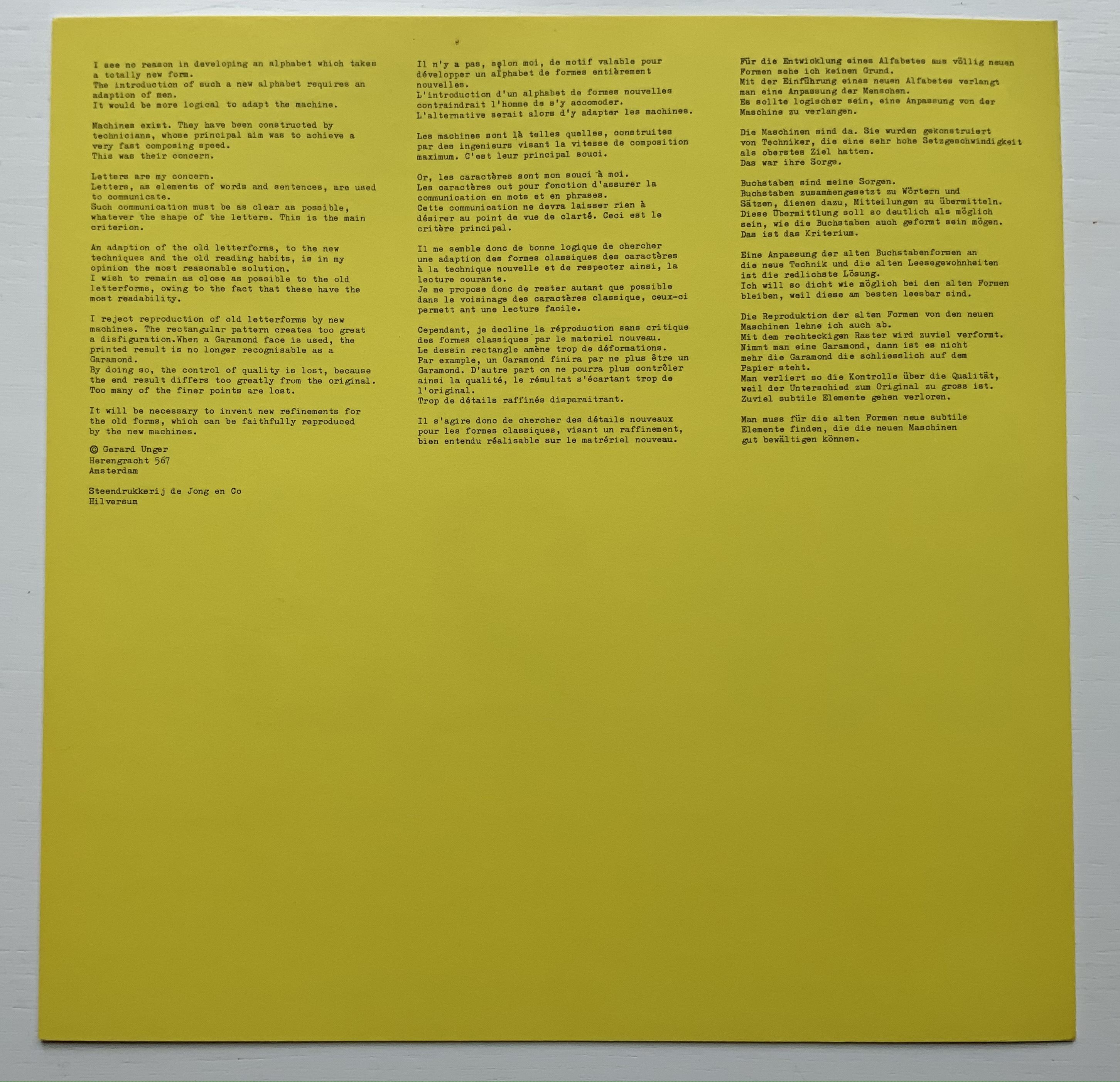
A Counter-proposal (1967)
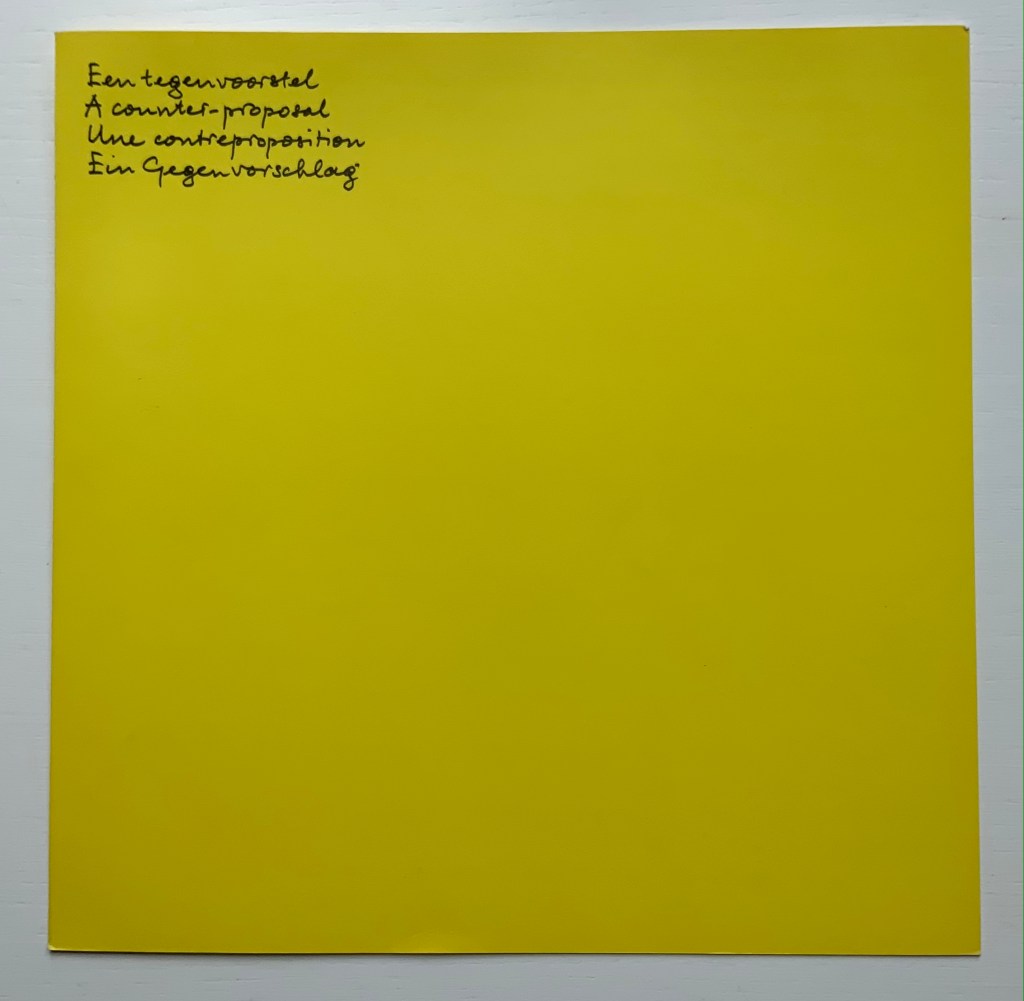
Een tegenvoorstel/A counter-proposal/Une contreproposition/Ein gegenvorschlag (1967)
Gerard Unger
Pamphlet. 250 x 250 mm, 4 pages. Acquired from Antiquariaat Frans Melk, 27 April 2021.
Photos: Books On Books Collection.
A few months after Pieter Brattinga issued Wim Crouwel‘s New Alphabet (below left), he followed up with this single-fold riposte from Gerard Unger, invited in fact by Crouwel.
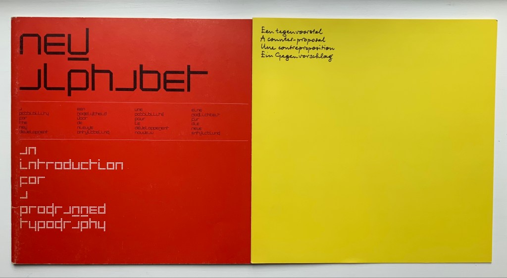
Left: Crouwel. Right: Unger.
Unger urges designing or teaching machines to accommodate “human-readable” letterforms rather than inventing new fonts for machines. Given advances in digital type and artificial intelligence, Unger’s point may have been prescient, but there is still something to be said for the artistic stimulus of machine constraints.
Brattinga extended the dialogue later to include Timothy Epps and Christopher Evans in 1970. If, as it did, the Epps/Evans alphabet led to LINE UP by Raffaella della Olga and Three Star Press, what other works of art have benefited from similar alphabetic and typographical dialogues?
Alphabet (1970), Timothy Epps and Christopher Evans; LINE UP (2020) Raffaella della Olga
Jeffrey Morin and Steven Ferlauto‘s Sacred Space (2003) has its roots in Ferlauto’s historical research into Roman capitals. Jennifer Farrell‘s The Well-Travelled Ampersand (2019) has its roots in the letterform and design thinking of Adrian Frutiger, Frederic Goudy, Dard Hunter, Edward Johnston and Russell Maret, among several others. Inclusion of source material like that by Crouwel, Epps and Evans, and Unger in the Collection offers paths to increased appreciation of those works of art inspired by them. Something for the future history of book art.
Further Reading
“Abecedaries I (in progress)“, Books On Books Collection, 31 March 2020.
“Wim Crouwel“, Books On Books Collection, 12 May 2021.
“Timothy Epps and Christopher Evans“, Books On Books Collection, 26 April 2021.
“Russell Maret“, Books On Books Collection, 20 September 2019.
“Jeffrey Morin and Steven Ferlauto“, Books On Books Collection, 23 April 2021.
“Raffaella della Olga“, Books On Books Collection, 8 December 2020.
“The Last Word on the Ampersand“, Books On Books Collection, 27 June 2020. See for Jennifer Farrell.
Olocco, Riccardo. “The inner consistency of Gerard Unger“, CAST: The science of type, its history and culture, 18 May 2017. Accessed 10 May 2021.
Perondi, Luciano. “‘The digital wave’ by Robin Kinross“, CAST: The science of type, its history and culture, 17 March 2020. Accessed 10 May 2021.
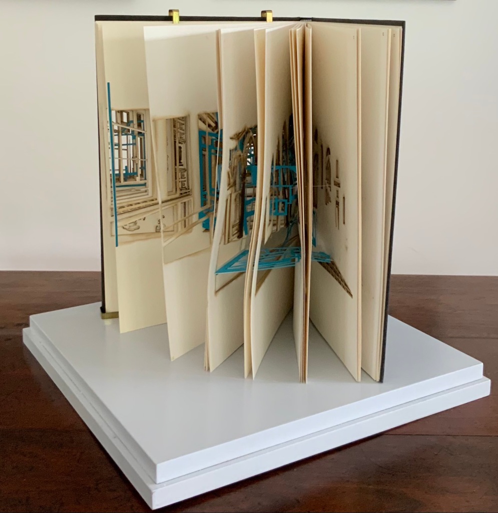
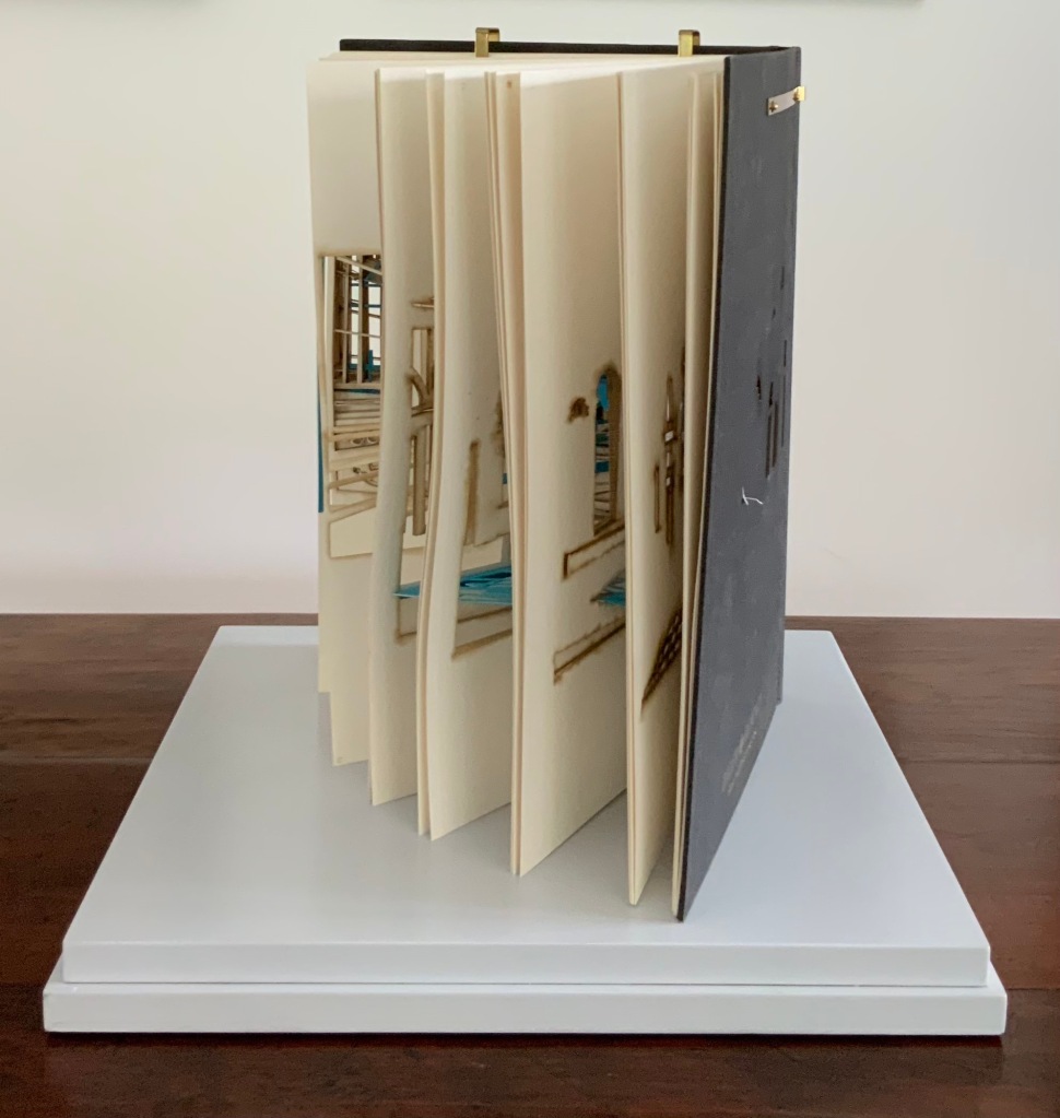
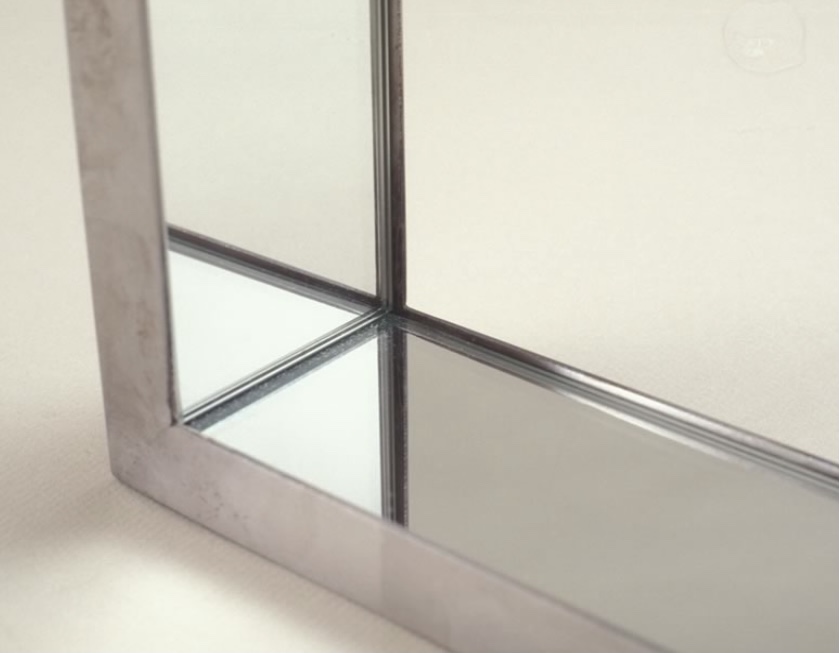
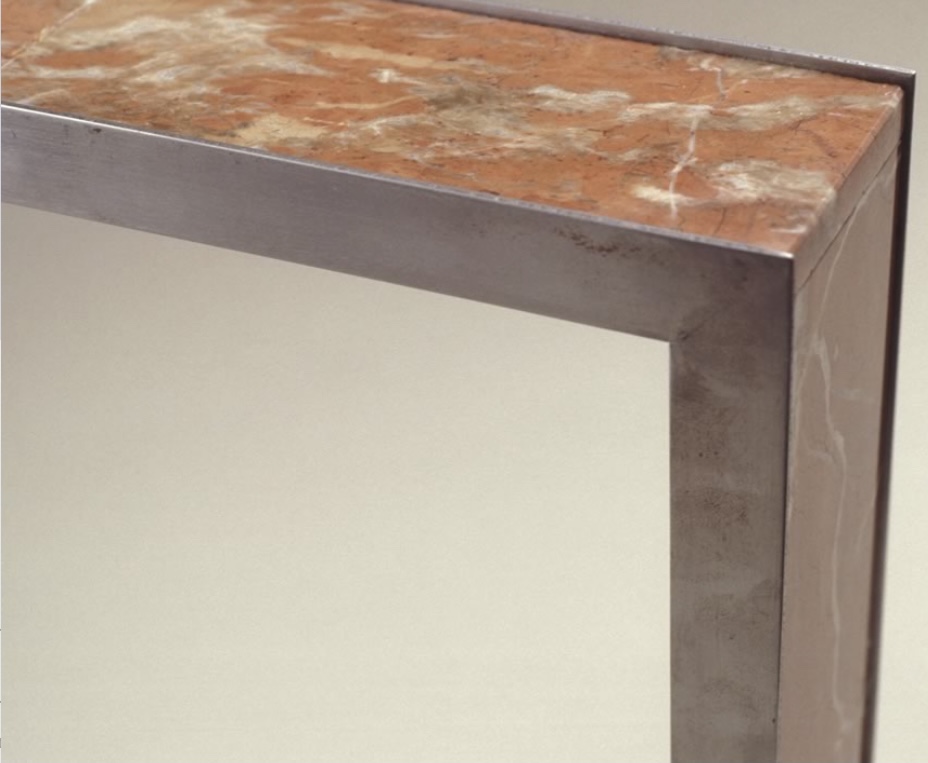
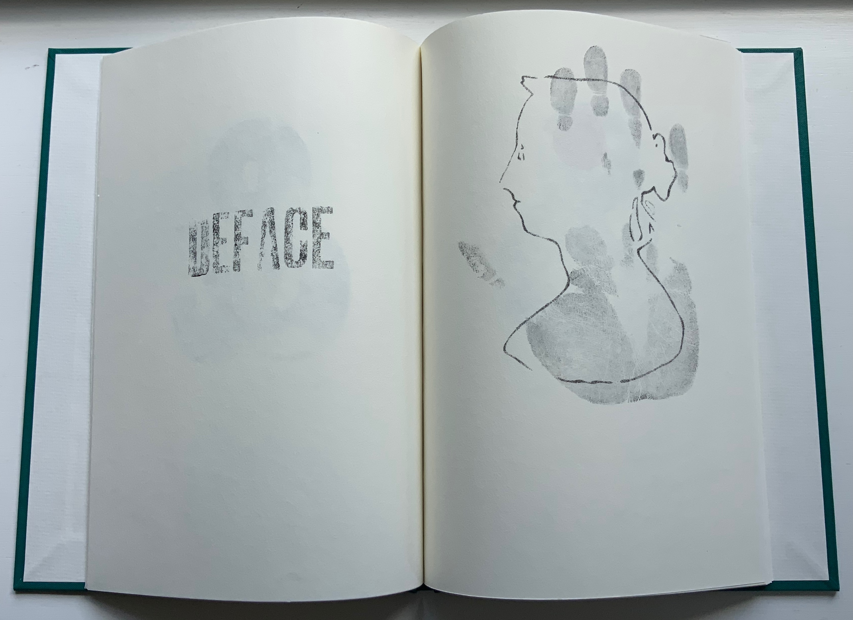
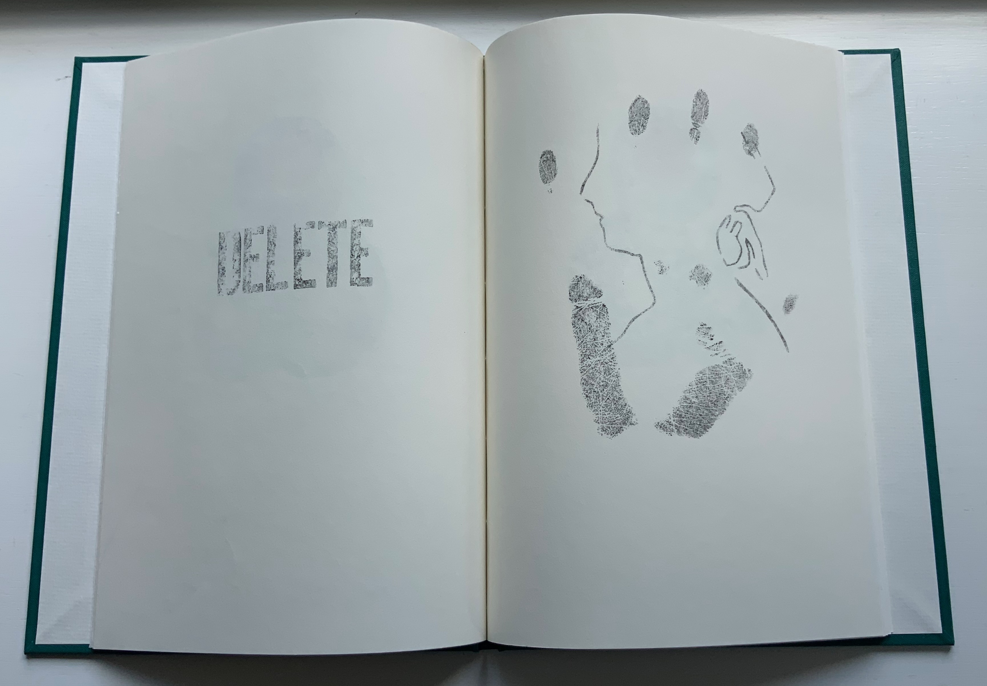
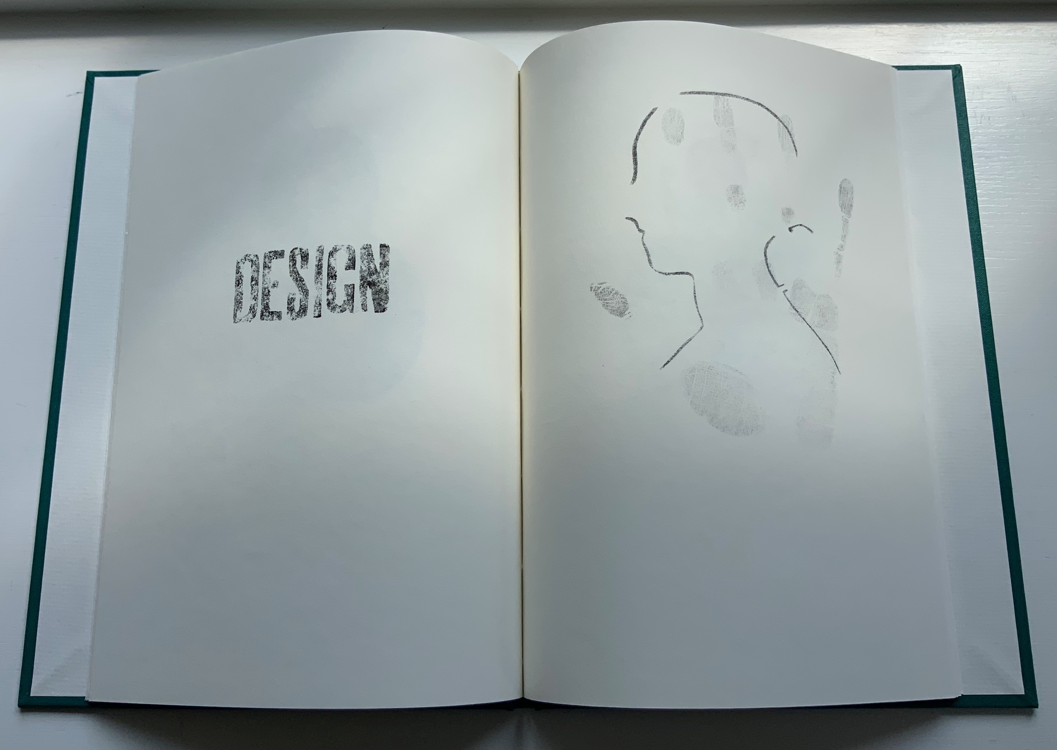
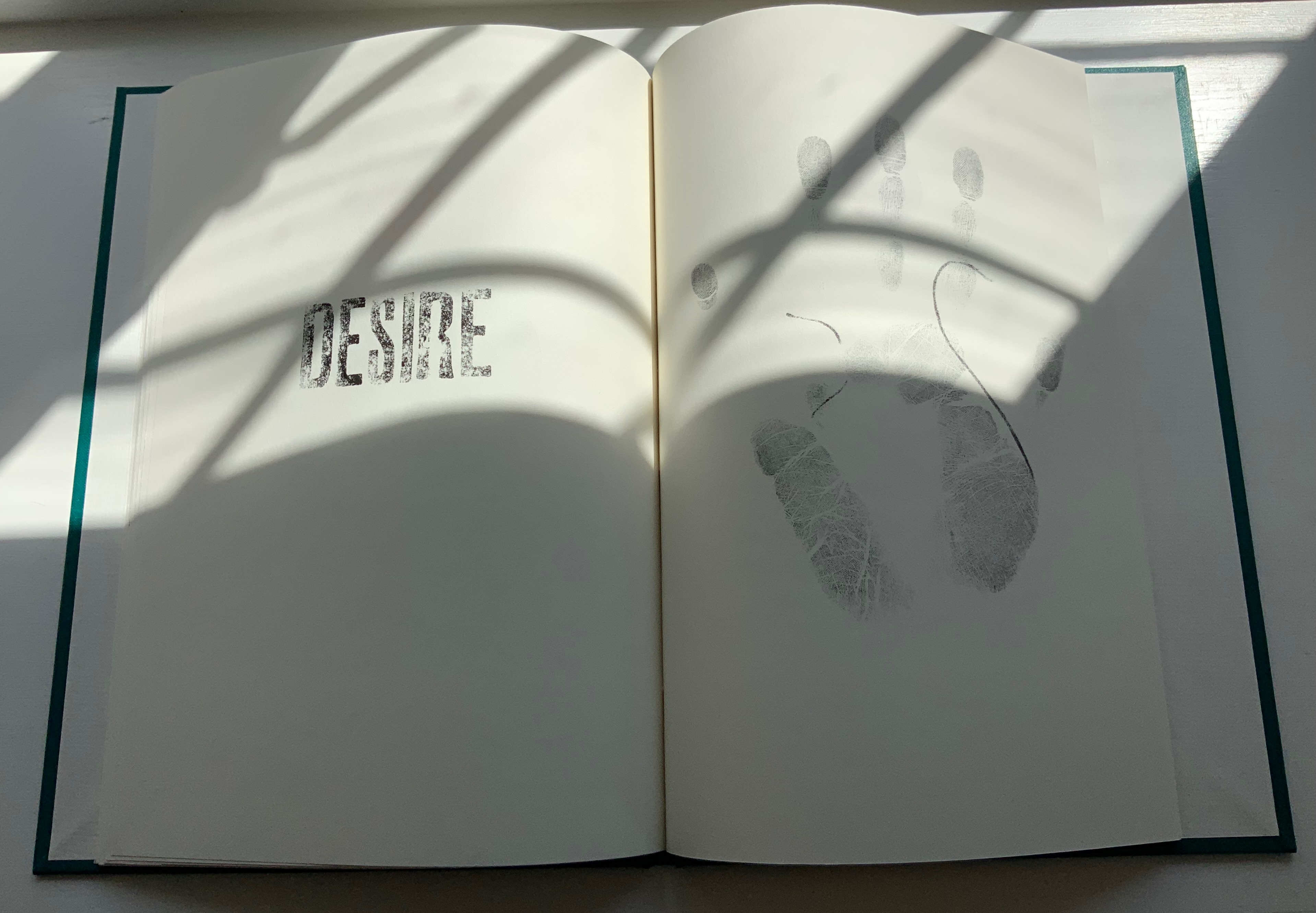
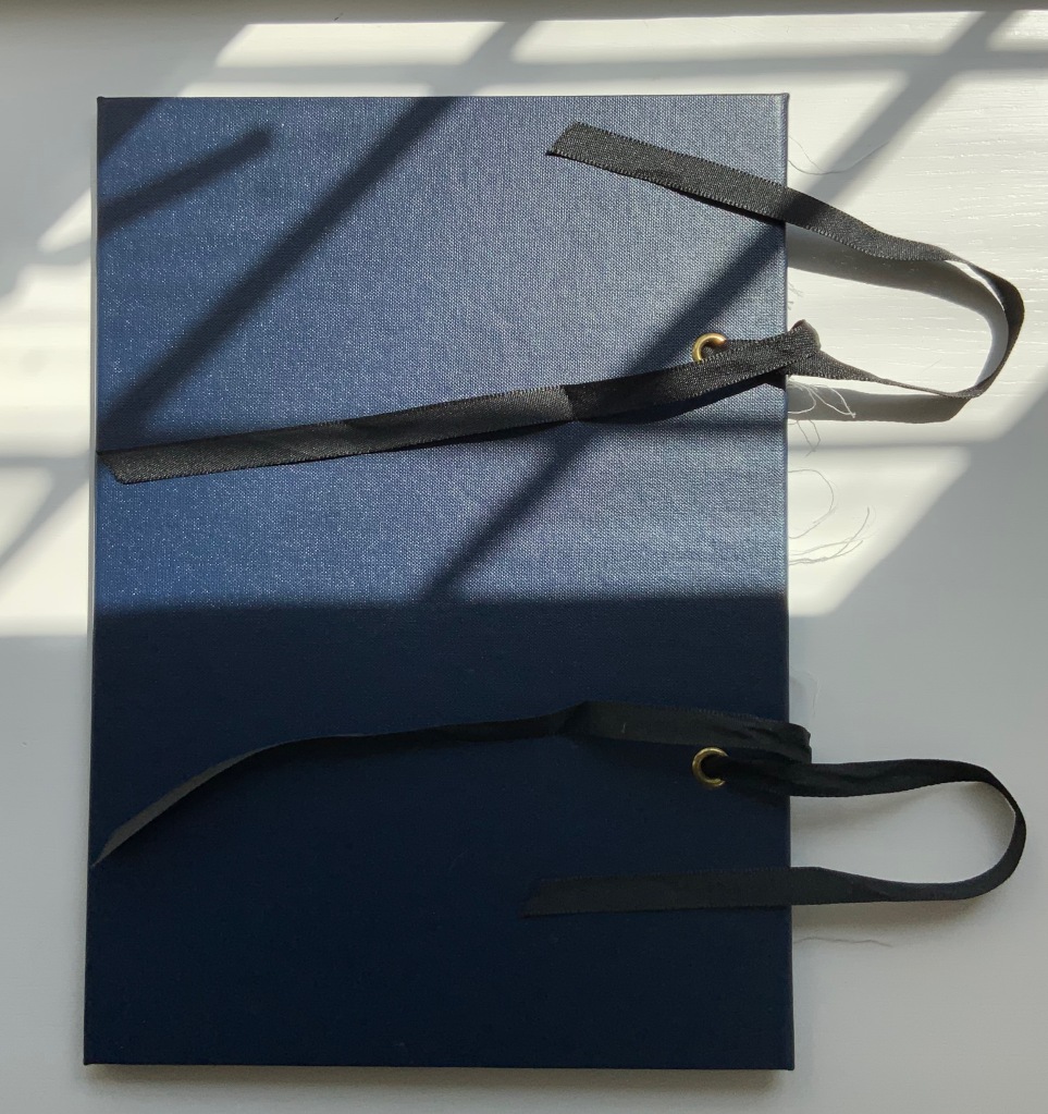
Books On Books Collection – Jeffrey Morin & Steven Ferlauto
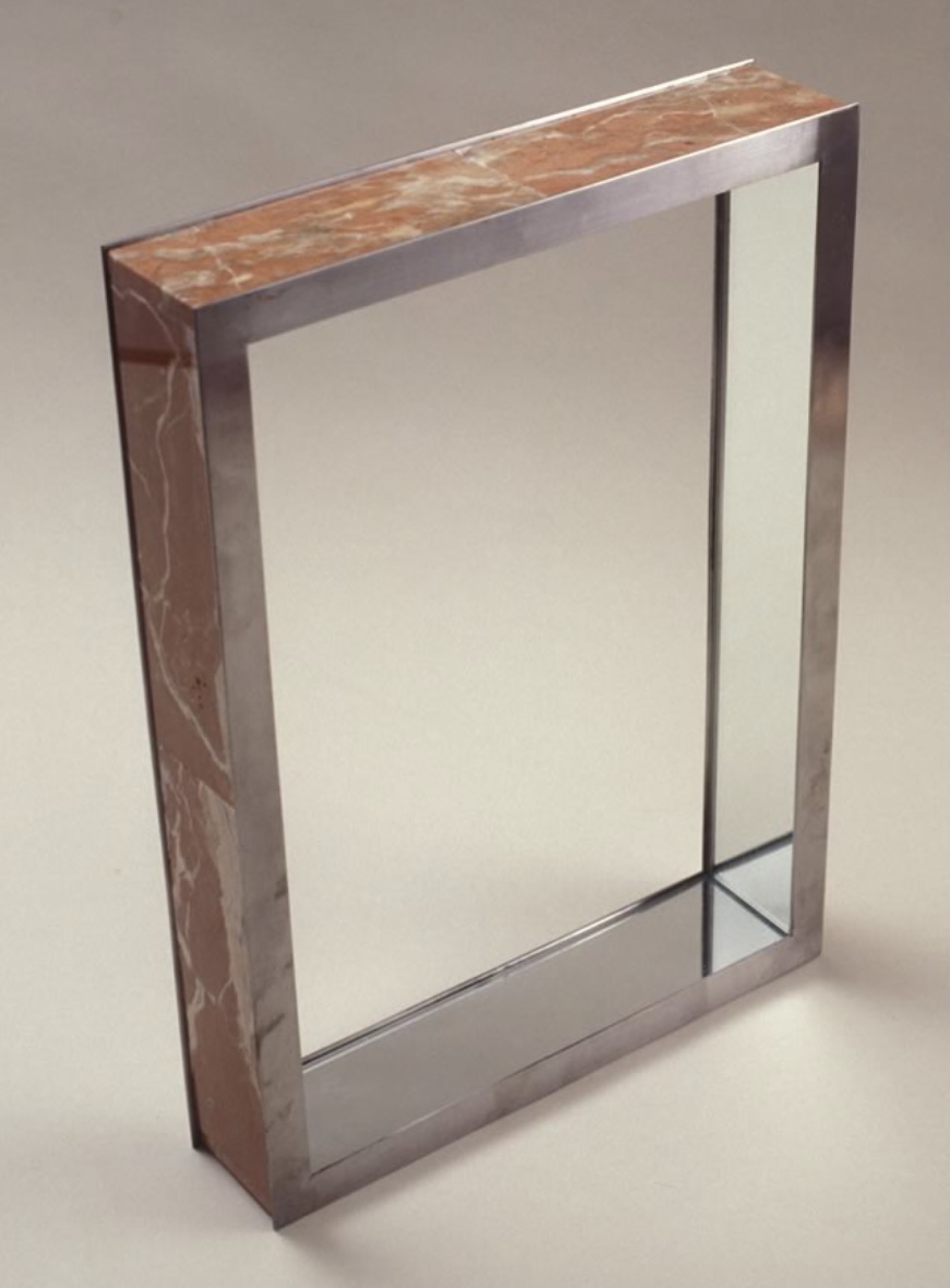
Sacred Space (2003)

Sacred Space (2003)
Jeffrey Morin and Steven Ferlauto
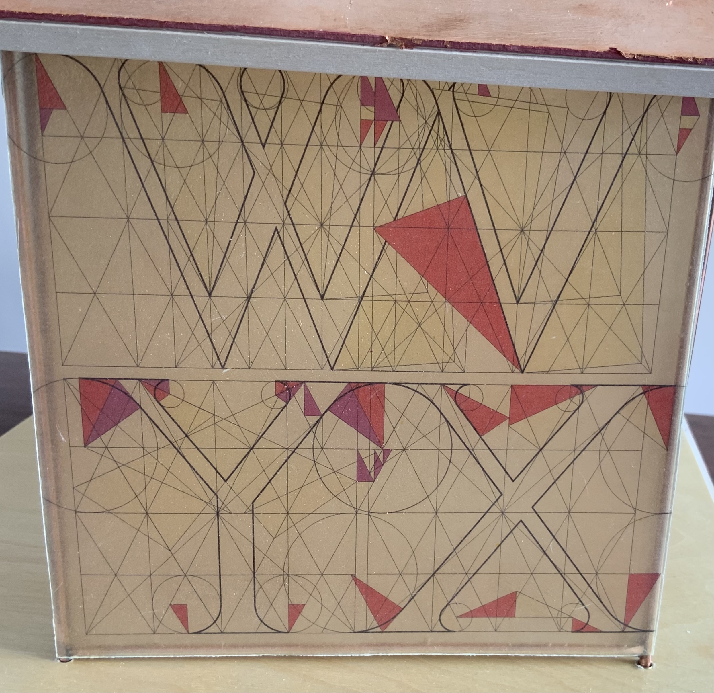
Book: Reduction linoleum prints with typographic illustrations using overprinting of letterforms; open spine sewn with brown cord binding; brown cloth-covered boards; title and design on front board; endpapers of handmade paper from Nepal. Book: 6 x 14.25″; 17 leaves.
Chapel kit: Six walls, roof, base. Walls: copper rod skeleton with Okawara rice paper skin covered with a casting resin. Book and kit housed in wooden box. Roof copper-leafed Davey board. Roof forms the tray in which the book rests. Base: Box lid becomes the base for the chapel. Brass holes in the base allow the rods to fit exactly. Print pattern on the base becomes the floor pattern. Box painted with copper leaf. Sculpture base 15.75 x 11.5″, height 12″.
Edition of 35, of which this is #23. Acquired from Vamp & Tramp, 7 February 2021.
Photos of the work: Books On Books Collection.
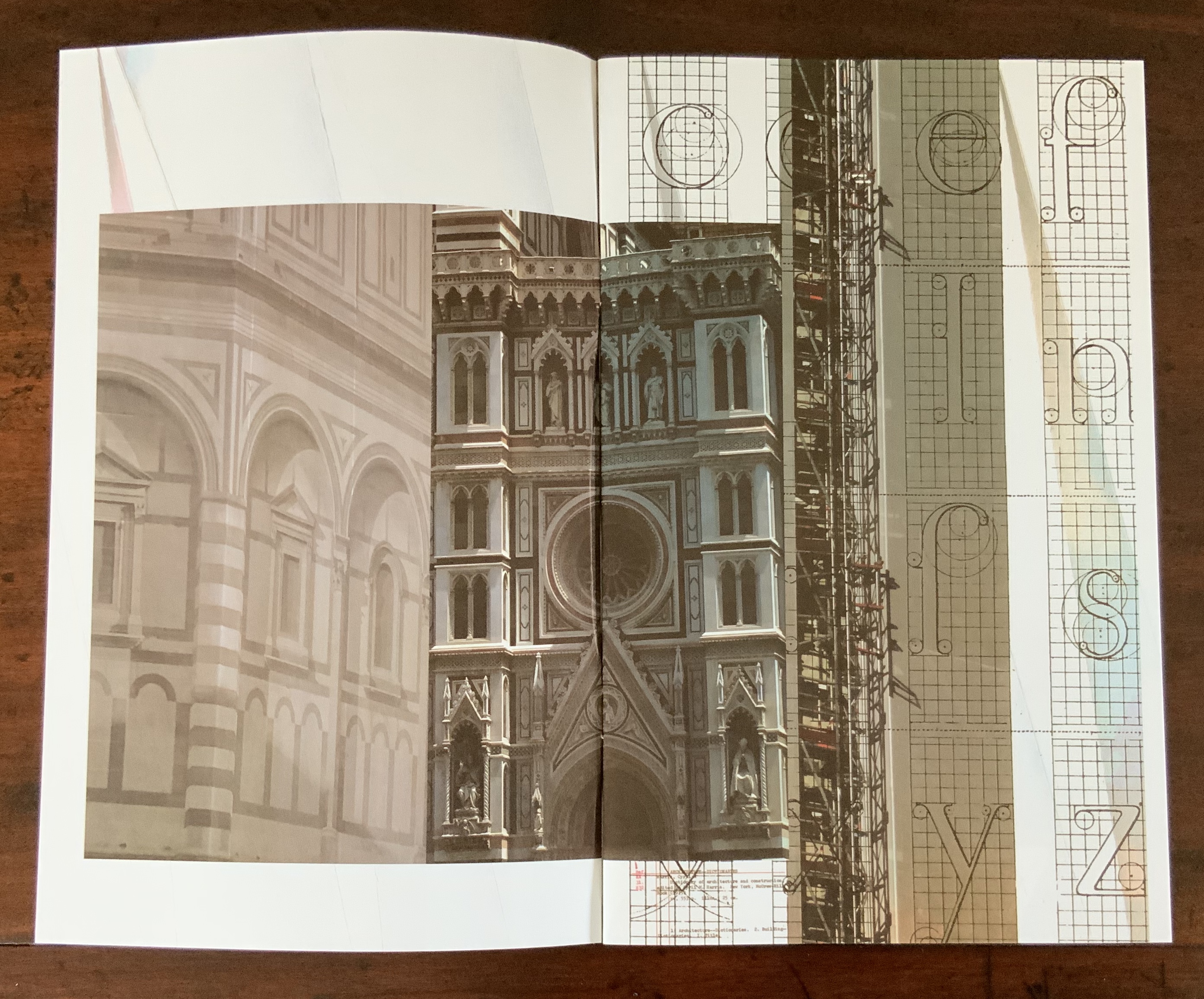
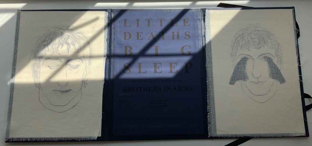
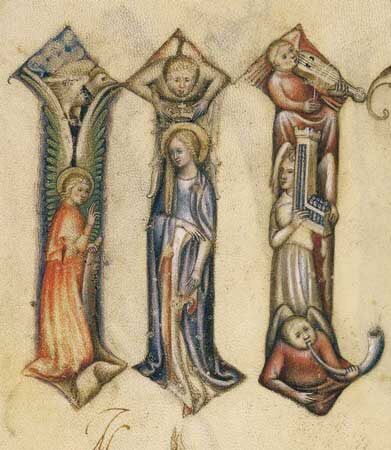
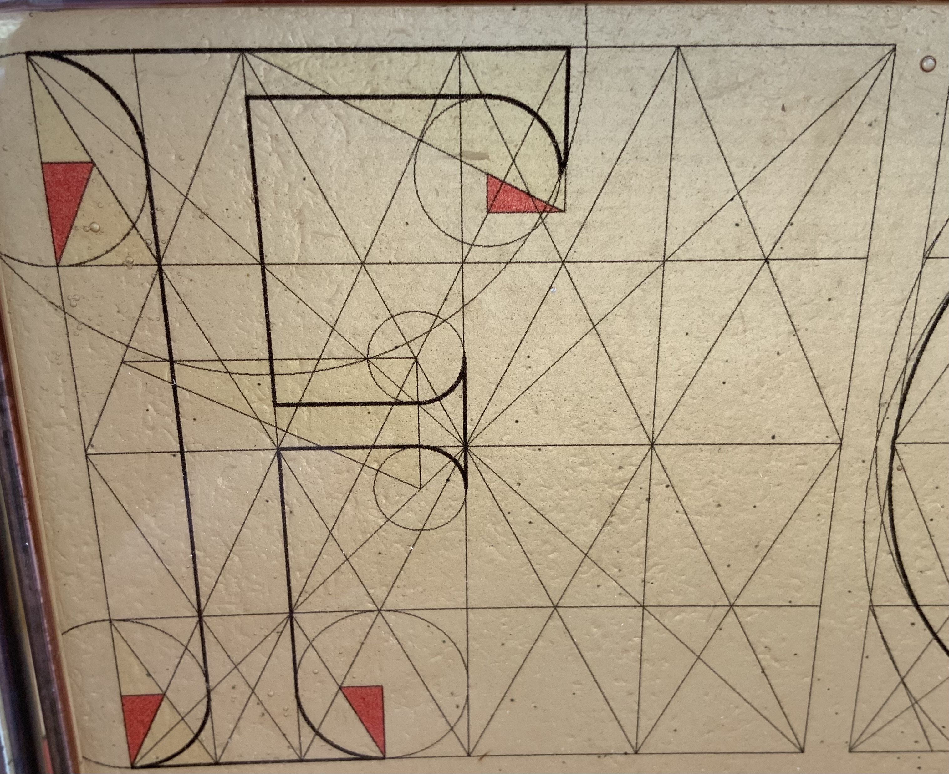
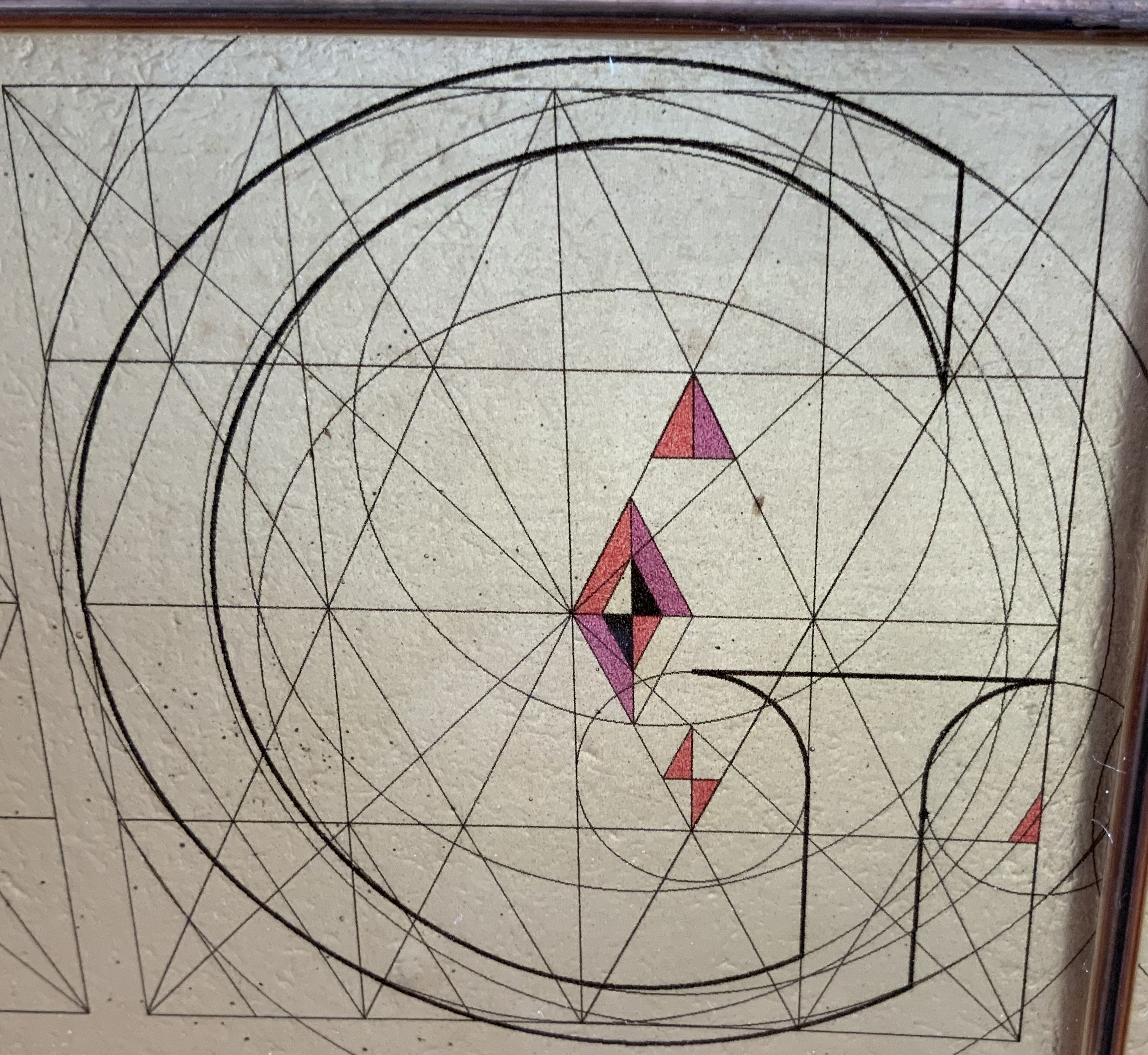
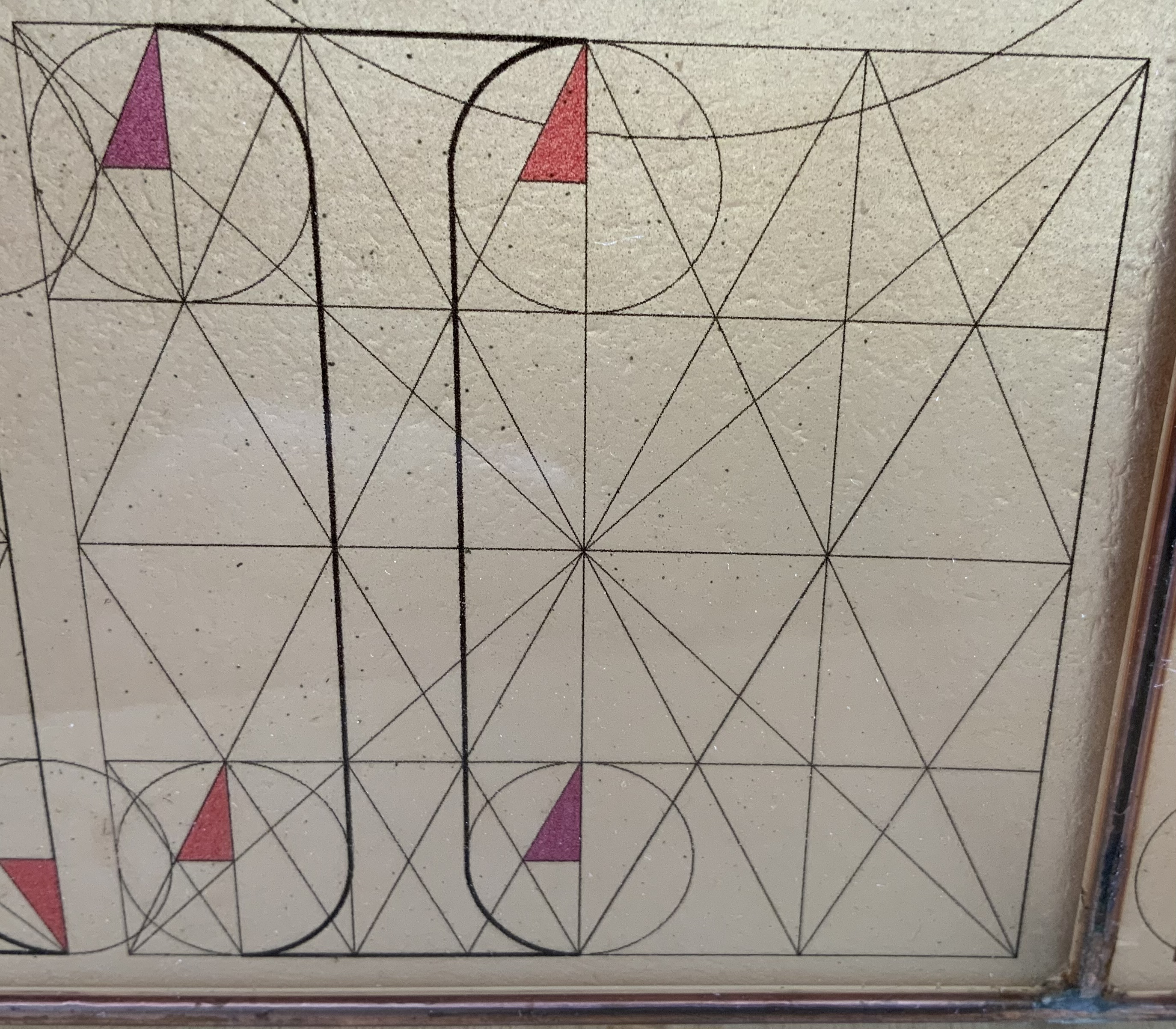
Jeffrey Morin calls Sacred Space an extension of Steven Ferlauto’s research into the role of geometry in the development of the Roman alphabet. As noted in Ferlauto’s site, this included the works by Fra Luca Pacioli (1509) and Geoffroy Tory(1529). Other works to consider include those by Giovannino de’ Grassi (1390-1405), Felice Feliciano (1463), Damianus Moyllus (1483), Hartmann Schedel (1498-1507), the Newberry Master (after 1498), Sigismondo Fanti (1514), Francesco Torniello (1517), Albrecht Dürer (1525) and Giovan Battisti Verini (1526). Morin and Ferlauto first displayed the artistic result of that research in The Sacred Abecedarium (1999).
Grassi 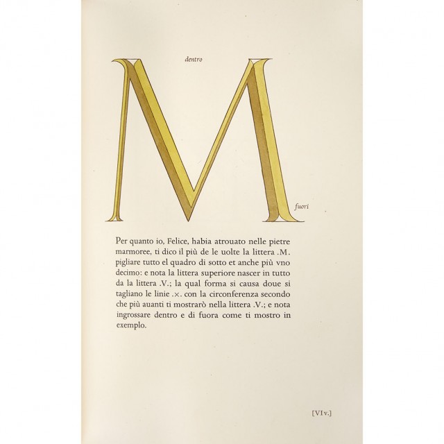
Feliciano 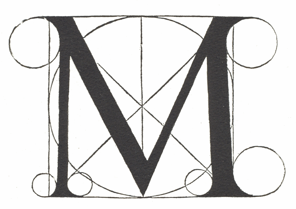
Pacioli 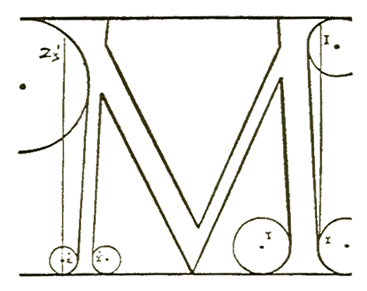
Torniello 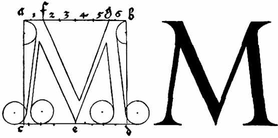
Dürer 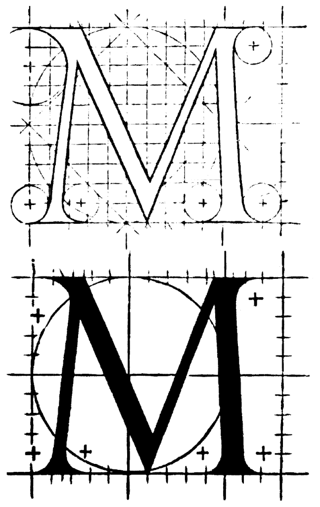
Tory


To access sources for each, click on the images above.
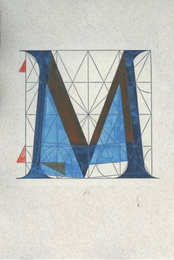
The Sacred Abecedarium (1999)
Steven Ferlauto & Jeffrey Morin
Photo: University of Wisconsin-Milwaukee, Special Collections. Displayed with permission of the artists.
To access the source, click here.
But Sacred Space is more than an extension. It is an intimate monument of book art. Made intimate by the content and texture of its book, made more intimate by the viewer’s having to construct the chapel. Made monumental by the echo of typographic history, made more monumental in Galileo Galilei’s echo from its floor: Mathematics is the alphabet with which God has created the universe.
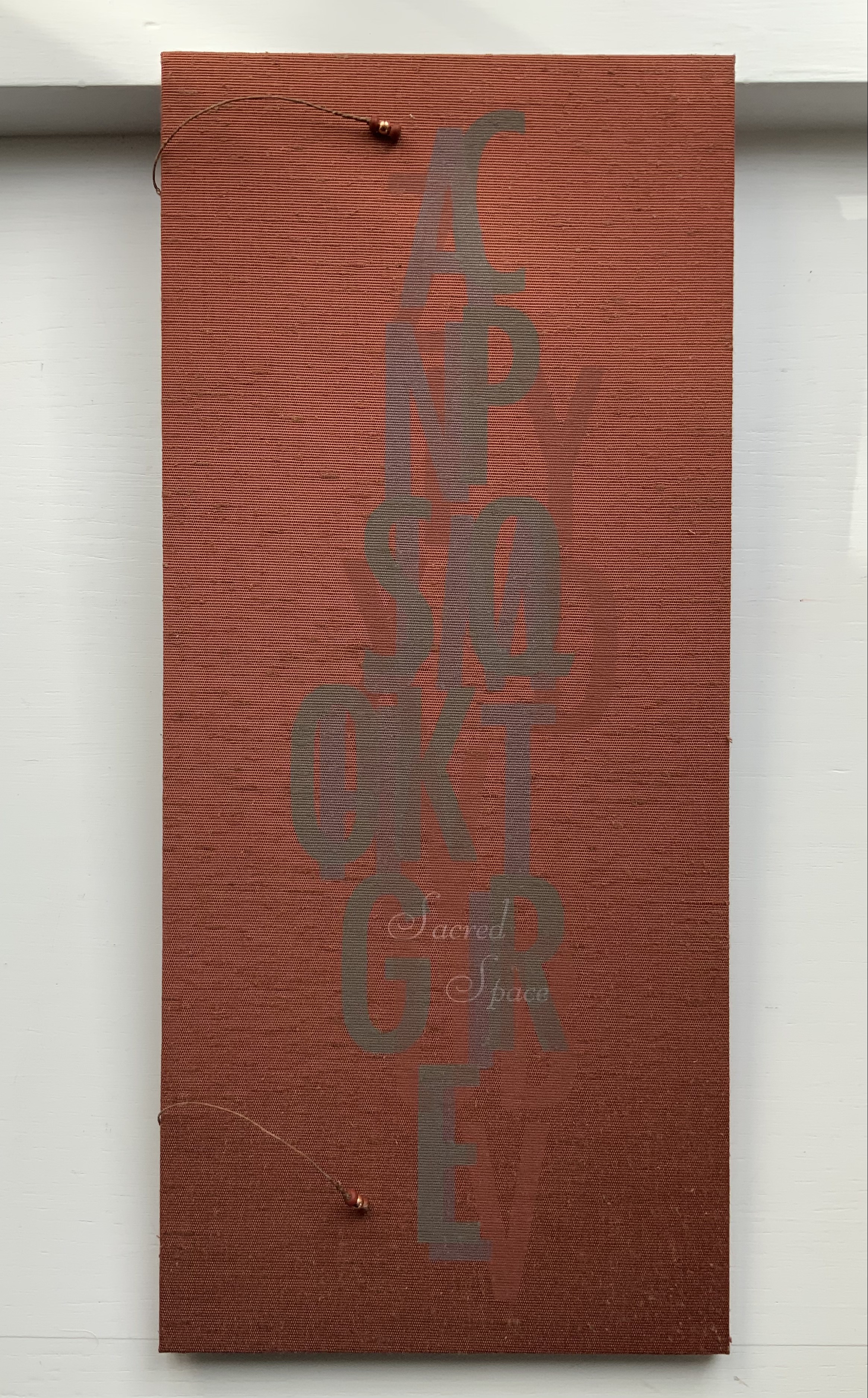

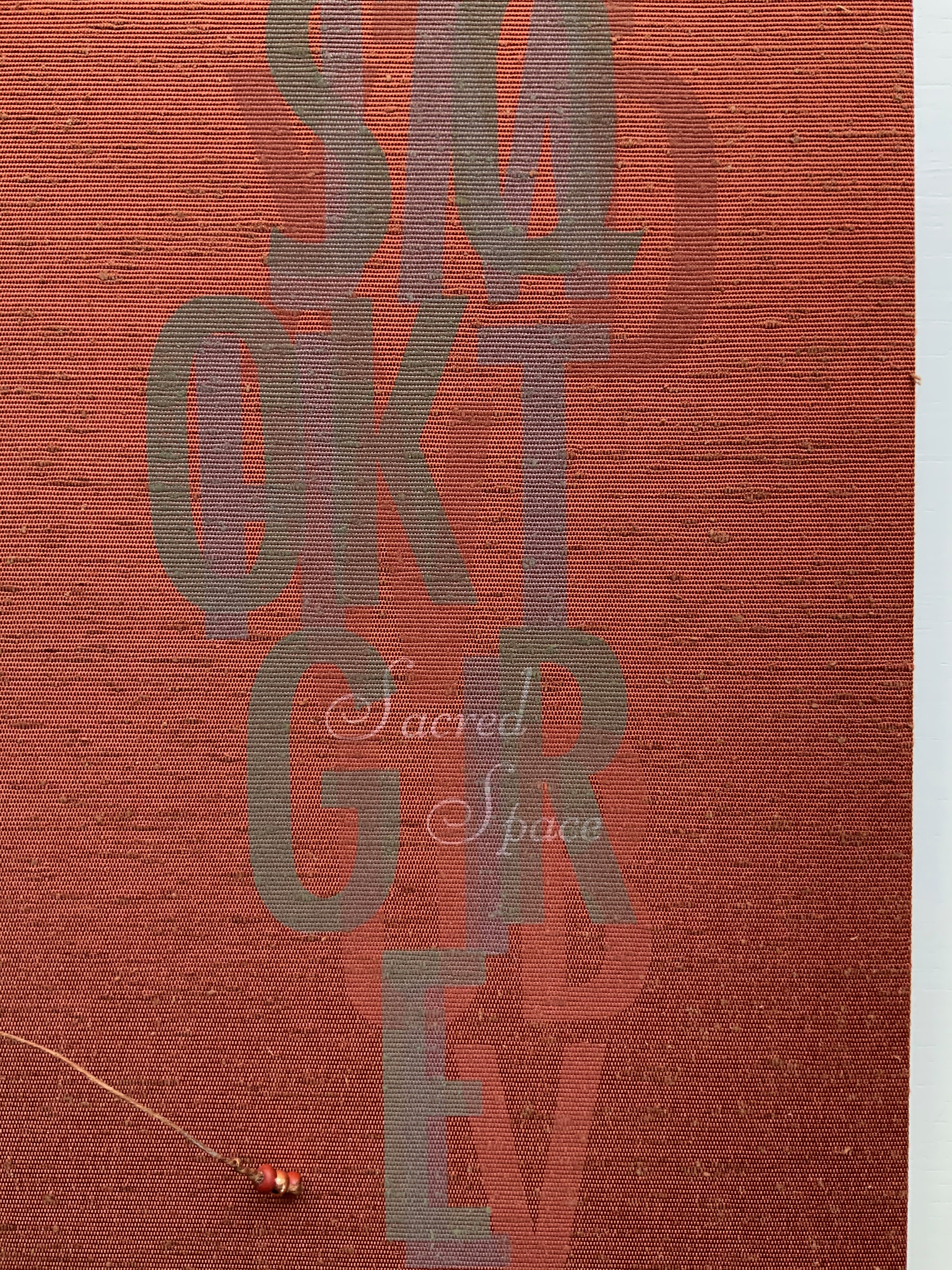
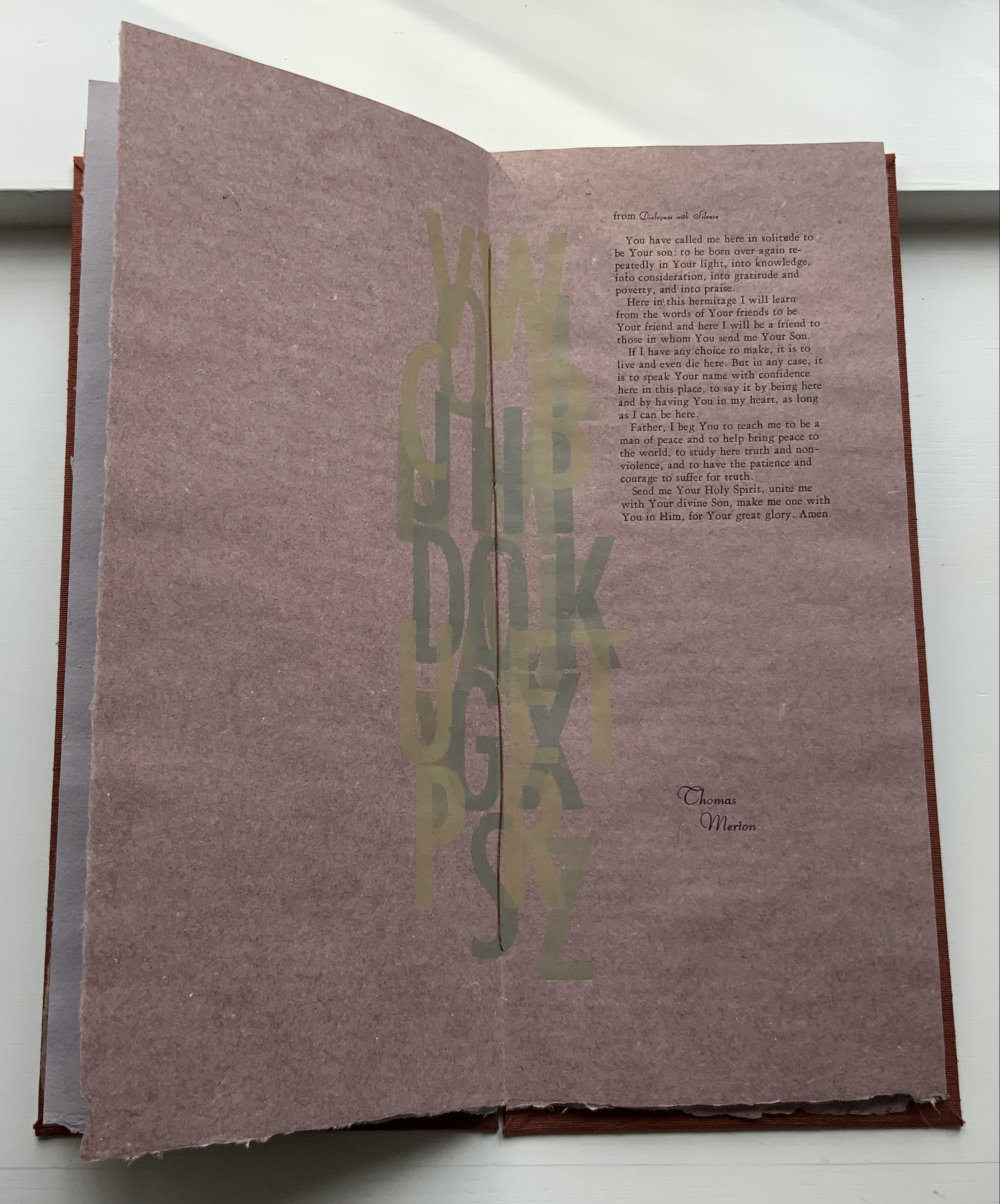
The book “attaches” to the structure in several ways. For its epigraph, the book uses Galilei’s actual words that led to those attributed to him and appearing on the floor of the chapel, and when stored away, the underside of the chapel’s roof serves as storage for the book. Following the epigraph in the book, three passages appear, sharing impressions of three different sacred spaces: William Bunce’s description of a plexiglas hunting shack on an island in a Canadian lake, Thomas Merton’s prayer on the hermitage in Kentucky, and Mother Maria Marthe‘s plan for her “shapel” in Lilies of the Field by William E. Barrett. Three very different sets of words create three very different settings on the common ground of oblong pages of papers made with Siberian iris leaf fiber at the Root River Mill in Wisconsin. Difference and commonality strike a recurring theme that links book and structure.
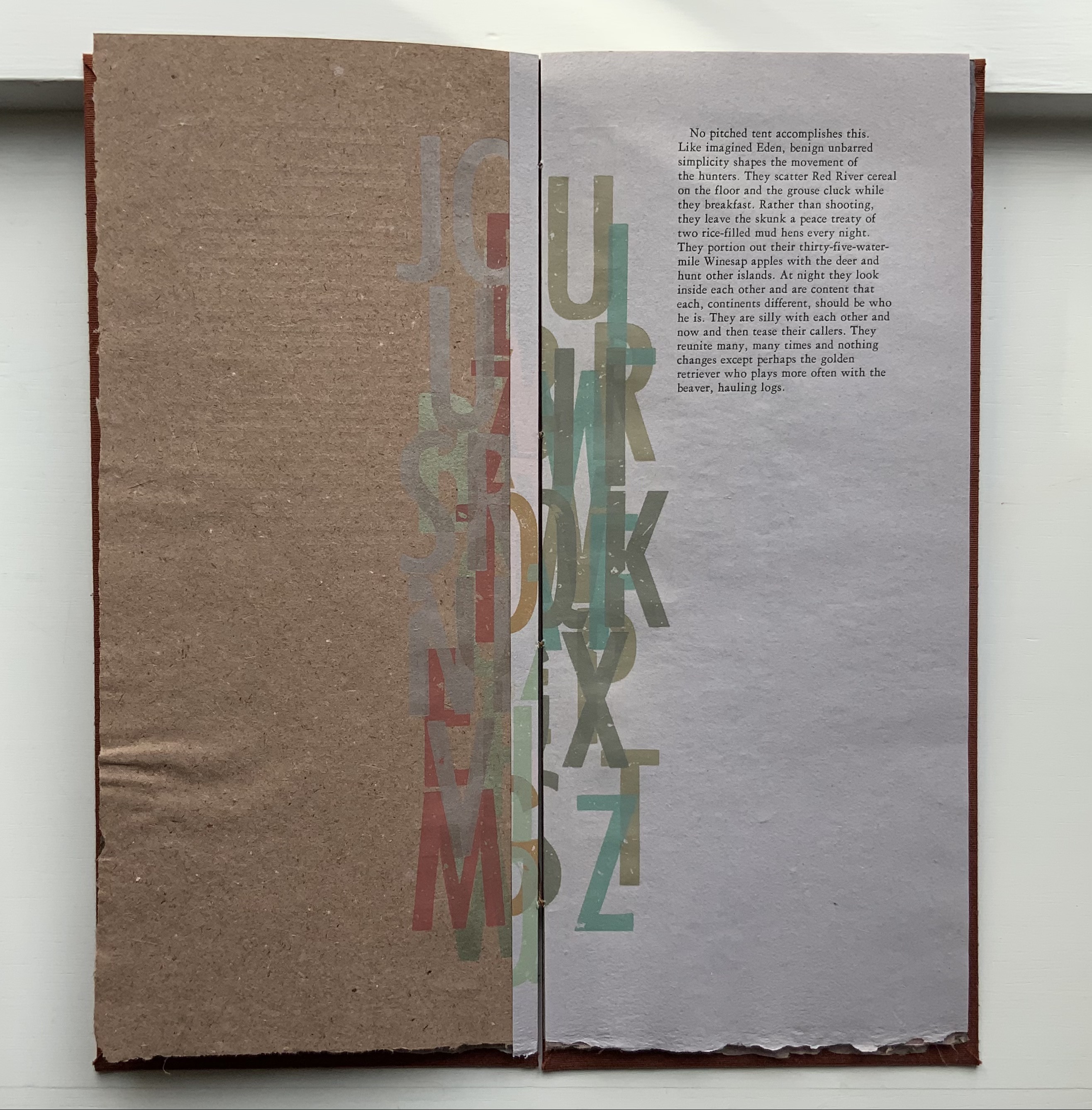
The book’s description of the shack’s sloping roof and its plexiglas walls echoes but contrasts with the chapel’s sloping roof and translucent panels. A shack (or “shapel”) may differ from a chapel and still have common physical features. The sans serif letters, linocut-printed and jumbled in the book’s gutter, echo but contrast with the serif letters, inkjet-printed and geometrically placed on the panels.
Okawara rice paper attached to the silver-soldered copper frame with epoxy resin created a shallow tray into which polymer coating was poured. In this process, the otherwise flimsy rice paper, which contrasts with the fibrous, opaque handmade paper of the book, assumes a stiff plasticity in common with the shack’s plexiglas and becomes the chapel walls set into brass-lined holes in the wooden base. The roofs may slope in common, but the chapel’s copper-leafed davey board roof contrasts with the shack’s clear one, down which birds skitter when trying to land. Despite its apparent metallic solidity, the chapel roof sits loosely on the front and rear panels, exerting a stabilizing pressure, whereas the shack’s plexiglas roof is fixed to a single roof beam.
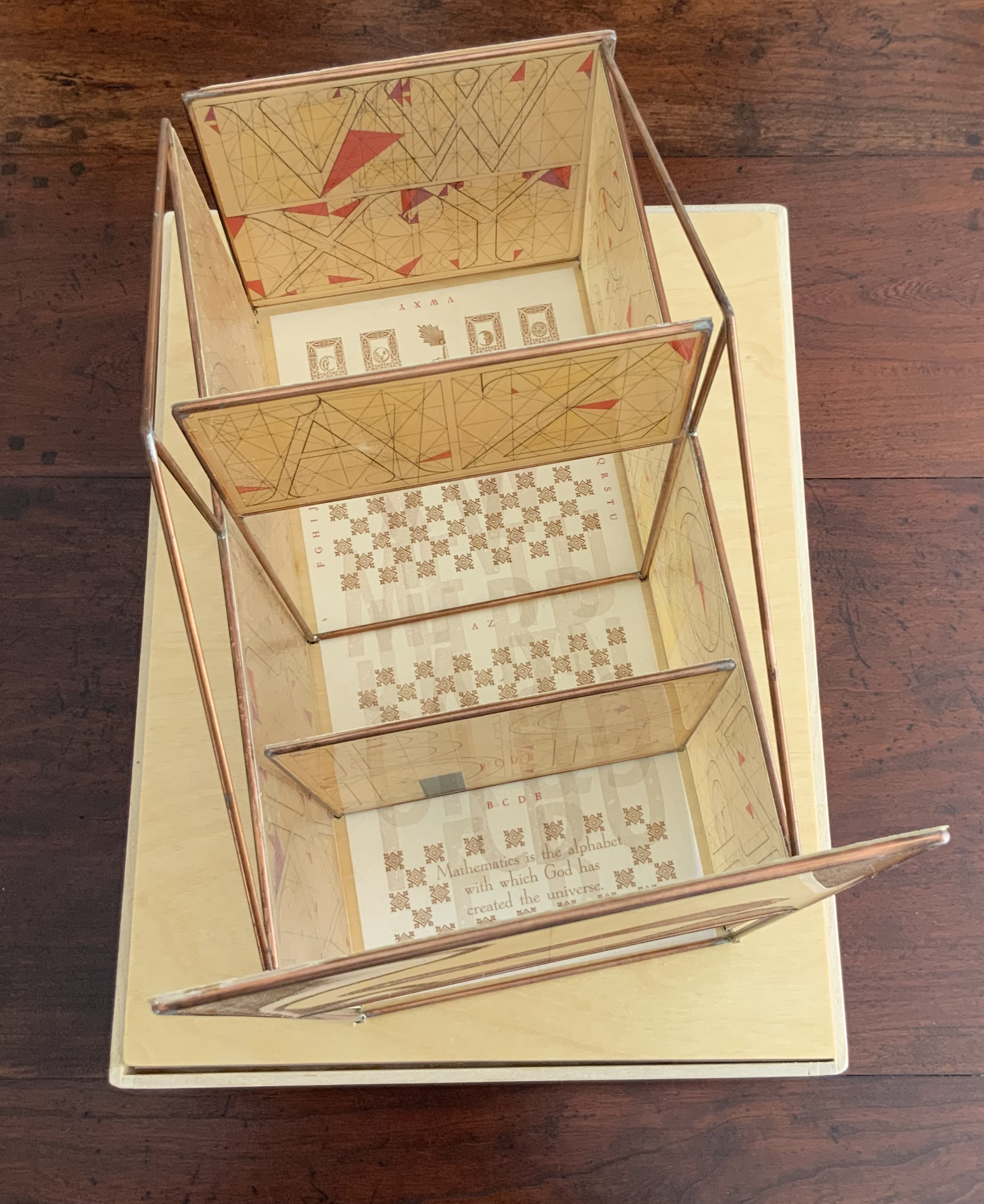
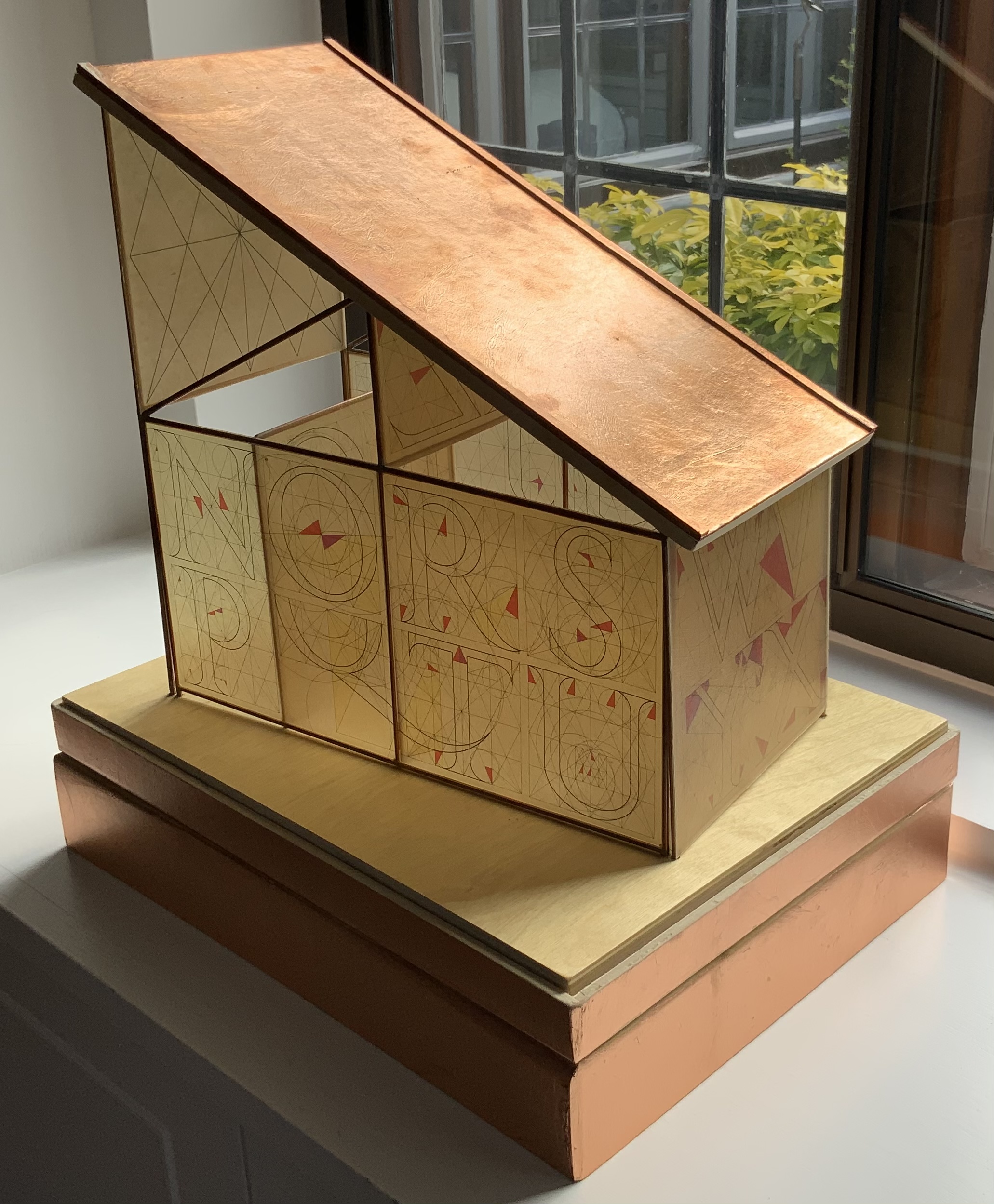
The chapel’s structure, its stained-glass-like walls, patterned floor and copper-leafing echo Thomas Merton’s prayer, which is sandwiched between the humorous hunters and Mother Maria Marthe, just as the structure is sandwiched between its shack-like roof and wooden platform. In its text and construction, Sacred Space seems to say sacred spaces occur in the spaces in between — even where letter meets surface.
Further Reading
“Abecedaries I (in progress)“, Books on Books Collection, 31 March 2020.
“Architecture“, Books on Books Collection, 12 November 2018.
“Federico Babina“, Books On Books Collection, 20 April 2021.
“Antonio Basoli“, Books On Books Collection, 20 April 2021.
“Antonio & Giovanni Battista de Pian“, Books On Books Collection, 20 April 2021.
“Richard Niessen“, Books On Books Collection, 20 April 2021.
“Paul Noble“, Books On Books Collection, 20 April 2021.
“Johann David Steingruber“, Books On Books Collection, 20 April 2021.
Barrett, William E. 1962/1985. Lilies of the field. New York: Warner Books.
Bunce, William. n.d. Description provided to Caren Heft (Root River Mill). “Sacred Space“, sailorBOYpress. Accessed 10 March 2021.
Chen, Julie. 2013. 500 Handmade Books. Volume 2. New York: Lark. Pp. 236 (14 Stations), 357 (Crossing the Tigris).
Dürer, Albrecht, and Walter L. Strauss. The Painter’s Manual : A Manual of Measurement of Lines, Areas, and Solids by Means of Compass and Ruler Assembled by Albrecht Dürer for the Use of All Lovers of Art with Appropriate Illustrations Arranged to Be Printed in the Year MDXXV. New York: Abaris, 1977. Print.
Feliciano, Felice, and Giovanni Mardersteig. Alphabetum Romanum. Engl. Ed.] ed. Verona: Editiones Officinae Bodoni, 1960. Print.
Grassi, Giovannino de’. 1390-1405/1961. Taccuino di disegni. [Bergamo]: Edizioni “Monumenta bergomensia”.
Gray, Nicolete. 2005. “The Newberry Alphabet and the revival of the Roman capital in fifteenth-century Italy”, Typography Papers. Vol. 6.
Looze, Laurence de. 2018. The Letter and the Cosmos: How the Alphabet Has Shaped the Western View of the World. Toronto: University of Toronto Press.
Macken, Marian. 2018. Binding Space: The Book as Spatial Practice. London and New York: Routledge.
McEwen, Hugh. Polyglot Buildings. 12 January 2012. Issuu. Accessed 13 March 2021.
Merton, Thomas, and Jonathan Montaldo. 2001. Dialogues with silence: prayers & drawings. San Francisco: HarperSanFrancisco.
Miller, Steve. 2008. 500 Handmade Books : Inspiring Interpretations of a Timeless Form. Edited by Suzanne J. E. Tourtillott. New York: Lark Crafts. P. 165 (Martyr, Mercury, & Rooster).
Pacioli, Luca, Antonio Capella, Leonardo, and Piero. 1509. Divina proportione opera a tutti glingegni perspicaci e curiosi necessaria oue ciascun studioso di philosophia, prospectiua pictura sculpura, architectura, musica, e altre mathematice, suauissima, sottile, e admirabile doctrina consequira, e delectarassi, cõ varie questione de secretissima scientia. M. Antonio Capella eruditiss. recensente. [Venetiis]: A. Paganius Paganinus characteribus elegantissimis accuratissime imprimebat.
Salamony, Sandra, and Peter and Donna Thomas. 2012. 1,000 Artists’ Books : Exploring the Book as Art. Minneapolis: Quarto Publishing Group USA. P. 51 (The Sacred Abecedarium).
Torniello, Francisco. 1517. Opera del modo de fare le littere maiuscole antique, con mesura de circino: & resone de penna. Composita per Francisco Torniello da Nouaria scriptore professo. Milano: Gotardo qual de libri e stampatore: dicto da Ponte. Ambrosiana Library.
Tory, Geoffroy. 1529. Champ fleury: au quel est contenu lart & science de la deue & vraye proportio[n] des lettres attiques, quo[n] dit autreme[n]t lettres antiques, & vulgairement lettres romaines proportionnees selon le corps & visage humain. [Paris]: A vendre a Paris sus Petit Pont a Lenseigne du Pot Casse par Maistre Geofroy Tory de Bourges … et par Giles Gourmont … en la Rue sainct Iaques a Lenseigne des Trois Coronnes.
Tsimourdagkas, Chrysostomos. 2014. Typotecture: Histories, Theories and Digital Futures of Typographic Elements in Architectural Design. Doctoral dissertation, Royal College of Art, London. Accessed 13 March 2021.
