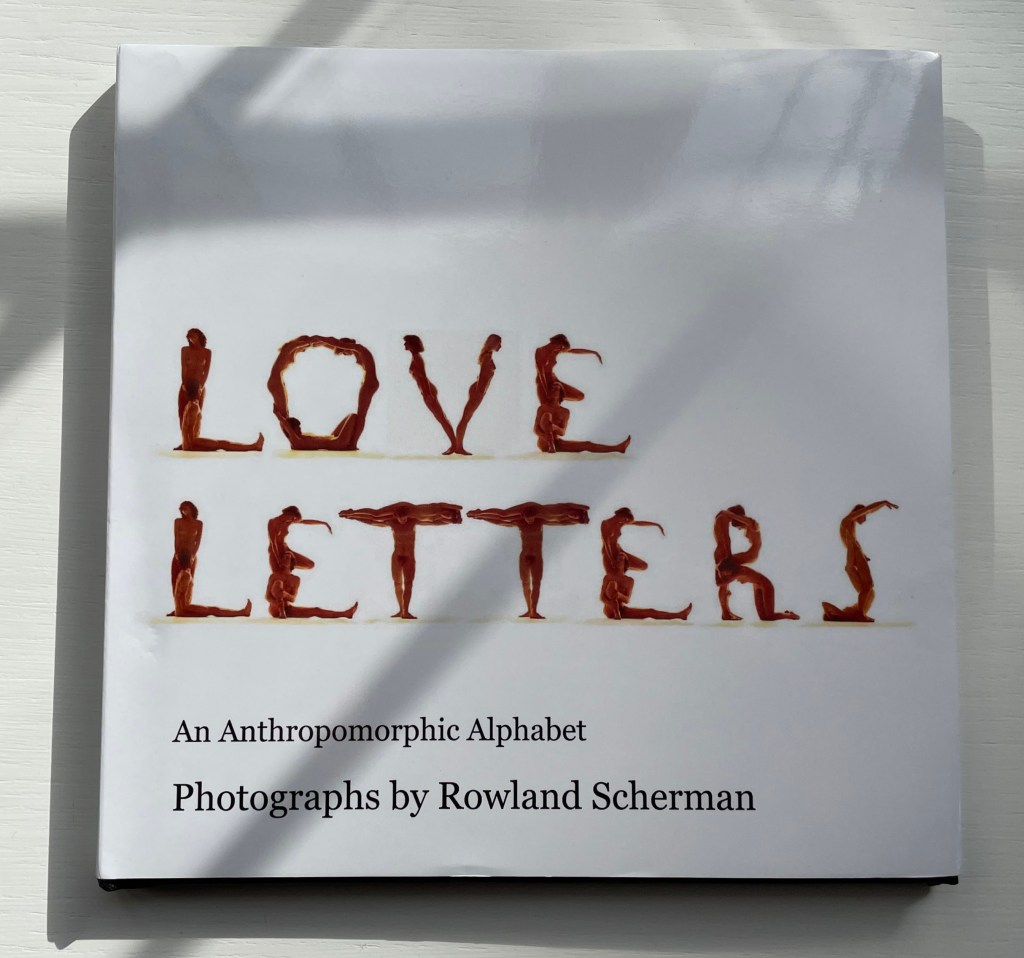
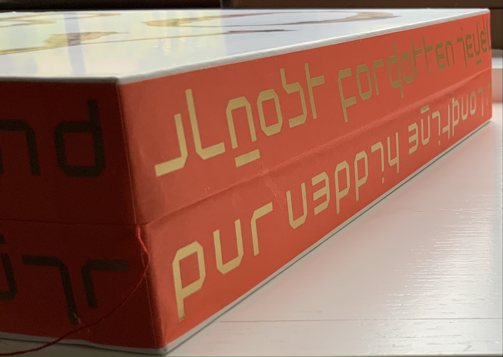
Love Letters: An Anthropomorphic Alphabet (2008) Rowland Scherman Casebound, doublures, perfect bound. H178 x W180 mm. 34 pages. Acquired from Rowland Scherman, 3 March 2023. Photos of the book: Books On Books Collection. Displayed with permission of Rowland Scherman.
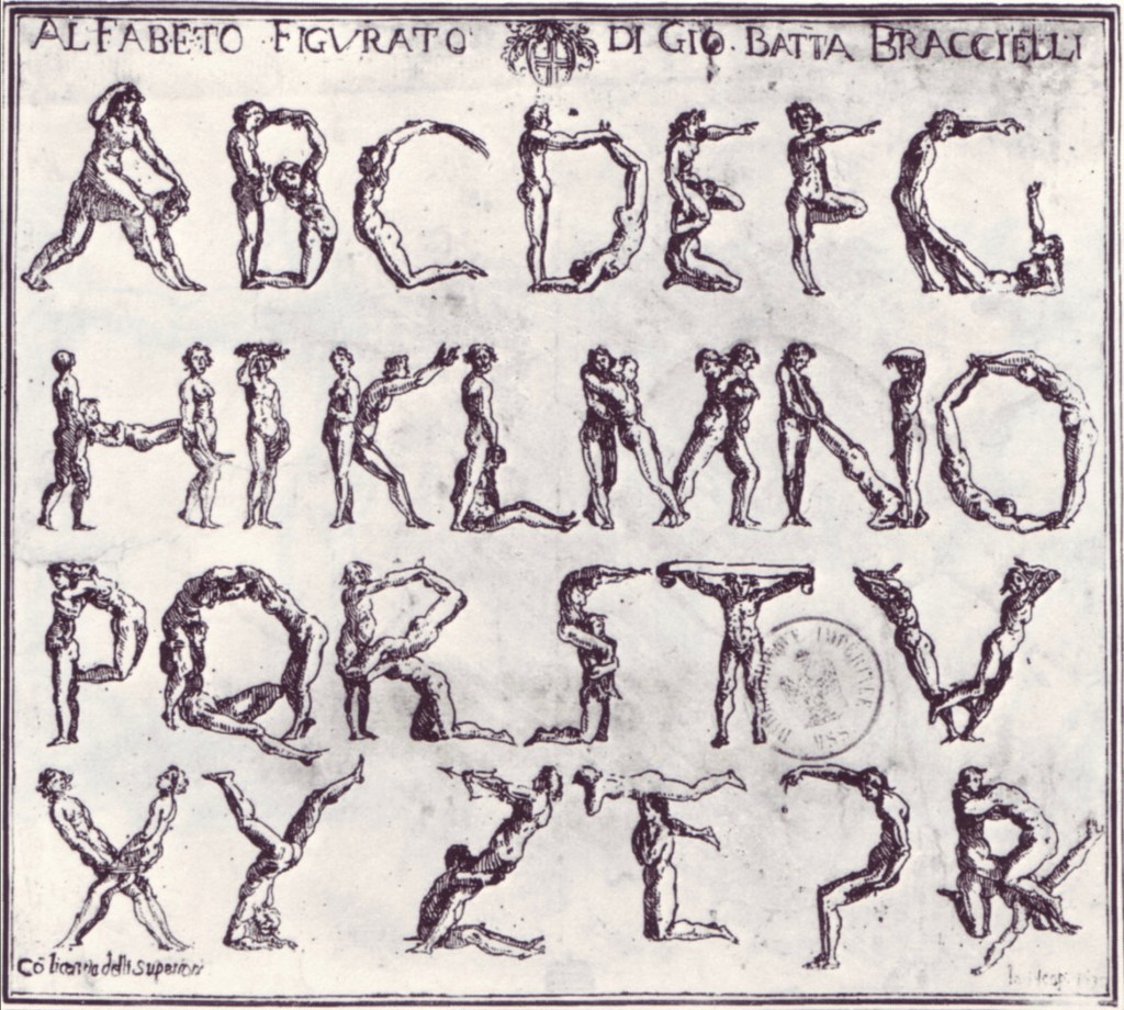
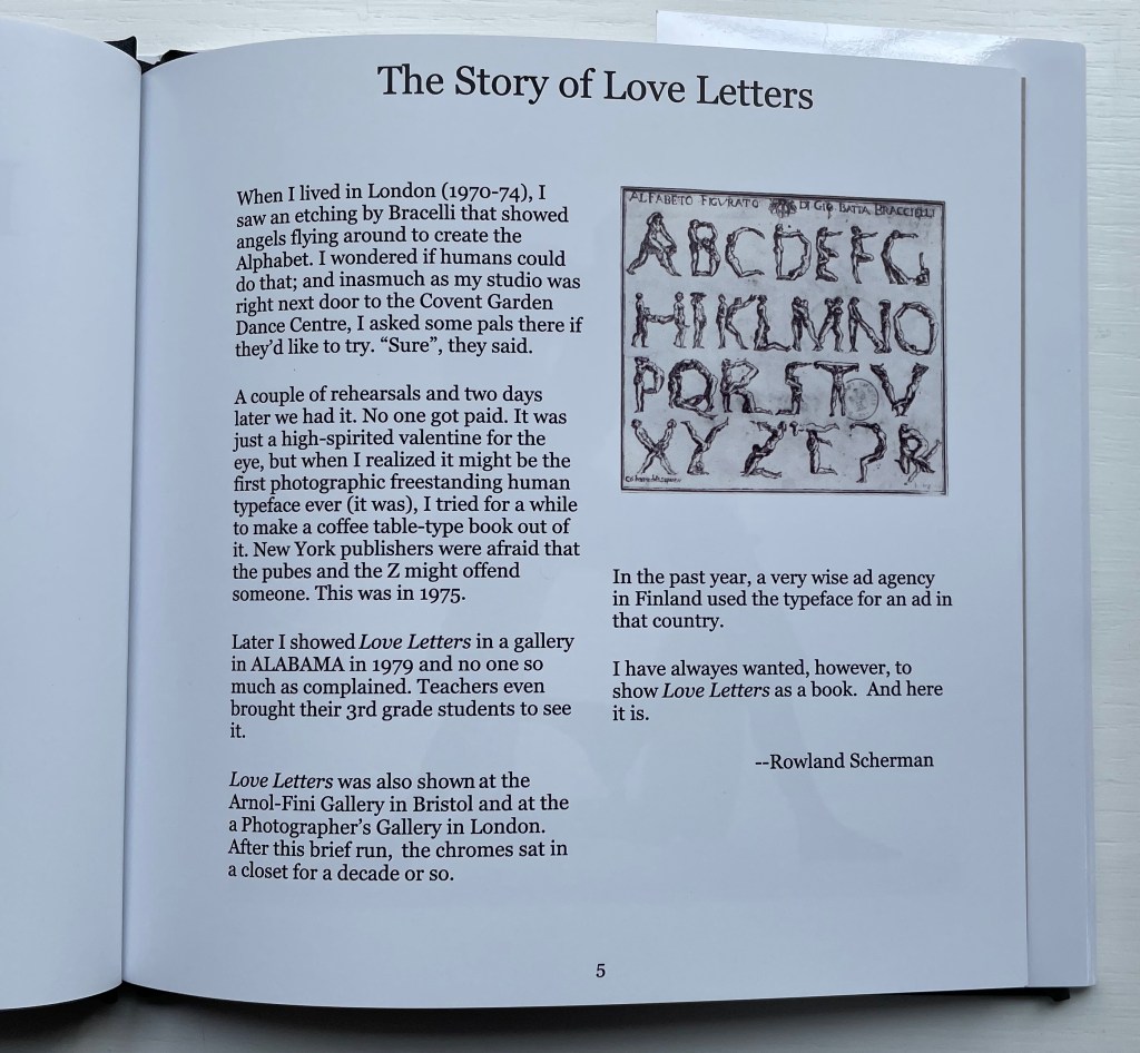
Giovanni Battista Bracelli’s “Alfabeto Figurato”, a single-sheet etching, occurred well after Carravagio’s presence there earlier in the century but well within the sphere of his ongoing influence. The print’s contortions of human bodies to display that most human of inventions — the alphabet — would probably have pulled a sneer of admiration from him. Maybe Bracelli had heard of the 5th-century comic playwright Kallias, who had his chorus dance (no doubt “cheek to cheek”) the shapes of the Ionian contenders for letterforms. In 1969, Anthon Beeke and Ed van der Elsken had their naked models arrange themselves into the alphabet on the studio floor and took photos from above. When Rowland Scherman saw Bracelli’s print on a London bus 340 years later, he wondered if human bodies could actually hold those poses or ones like them.
In the third decade of the 21st century, when book bannings and body shaming have reached new heights (or depths), Scherman’s “Story of Love Letters” might leave the reader wondering if we are now running headlong past Kallias and the 5th century into the pre-alphabetic world.
Dukes, Hunter. 27 April 2023. “Punctuation Personified (1824)“. The Public Domain Review. Not only could letters be formed with the human body, so could quotation marks and square brackets.
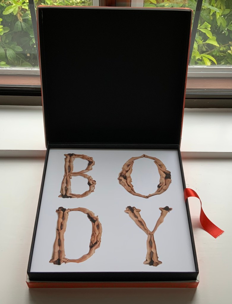
Beeke devised “The Body Alphabet” around 1968/69. It came in response to the “sexual revolution” of the 1960s and in reaction to functional typography. The designer Pieter Brattinga had published Wim Crouwel’s New Alphabet (1967) in the Kwadraatblad series and followed that up with Gerard Unger’s A Counter-proposal (1967) and Timothy Epps and Christopher Evans’ Alphabet (1970). Brattinga must have felt that “bad boy” Beeke’s tongue-in-cheek response modelled on Baskerville fit the bill as a final coda.
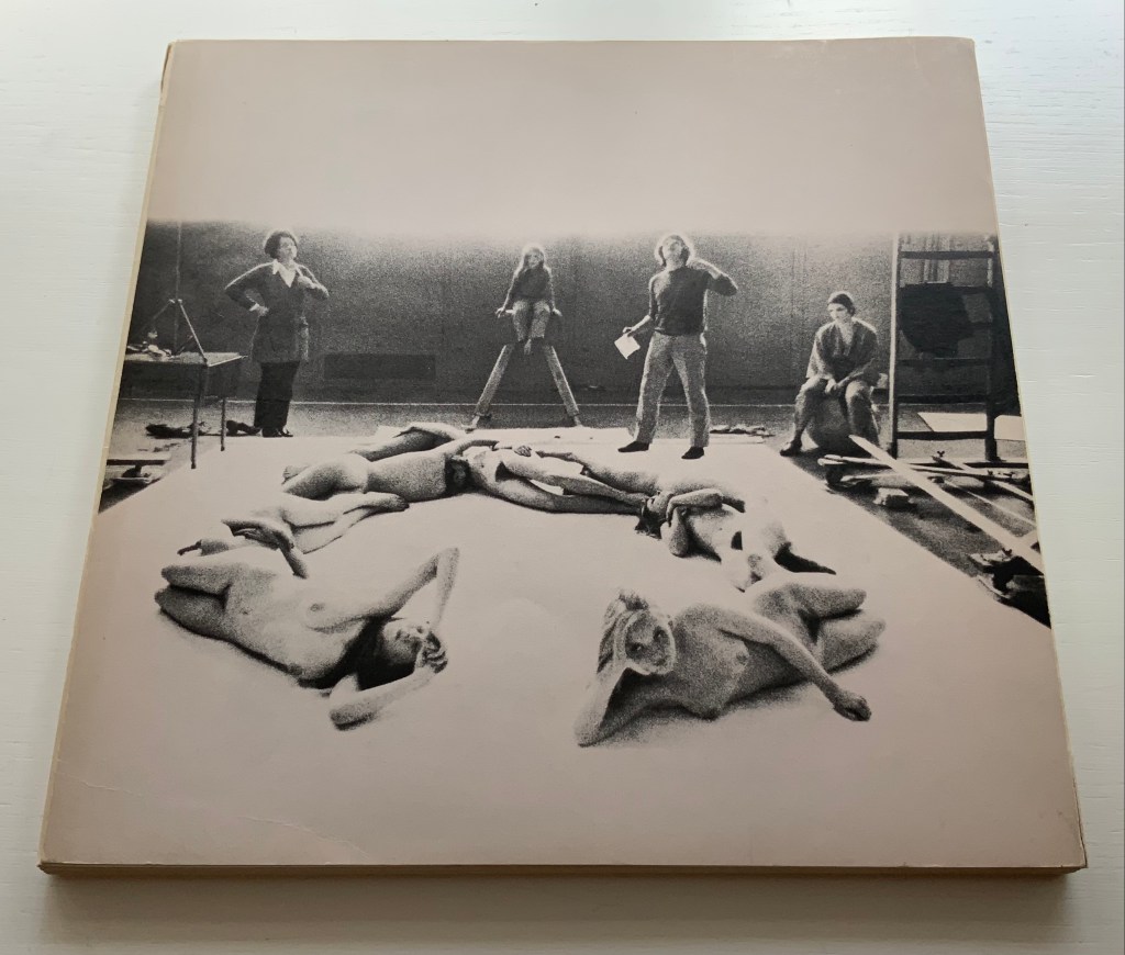
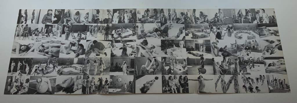
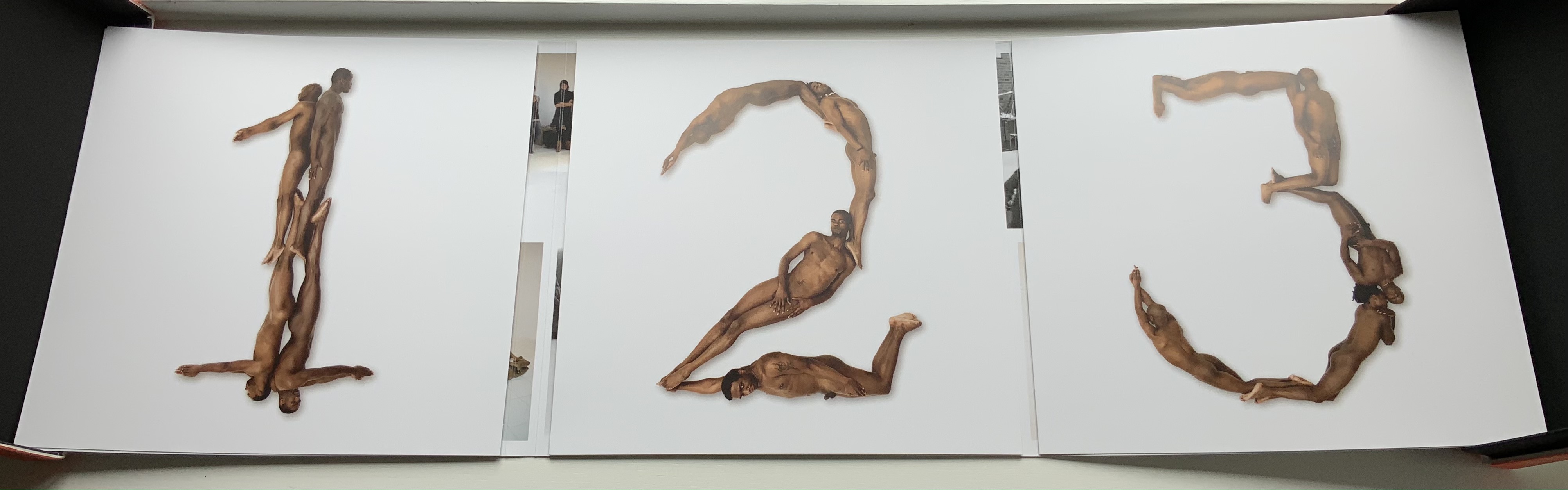
The portfolio’s cover has three panels that fold and overlap around the folios. The exterior is shown above. The interior below displays a spread of 55 small photographs from the photo shoot, showing the models standing around waiting to be directed into position for the relevant letter. Once the models were in place, the shot wad taken from above. Some letters like M required as many as 12 models.
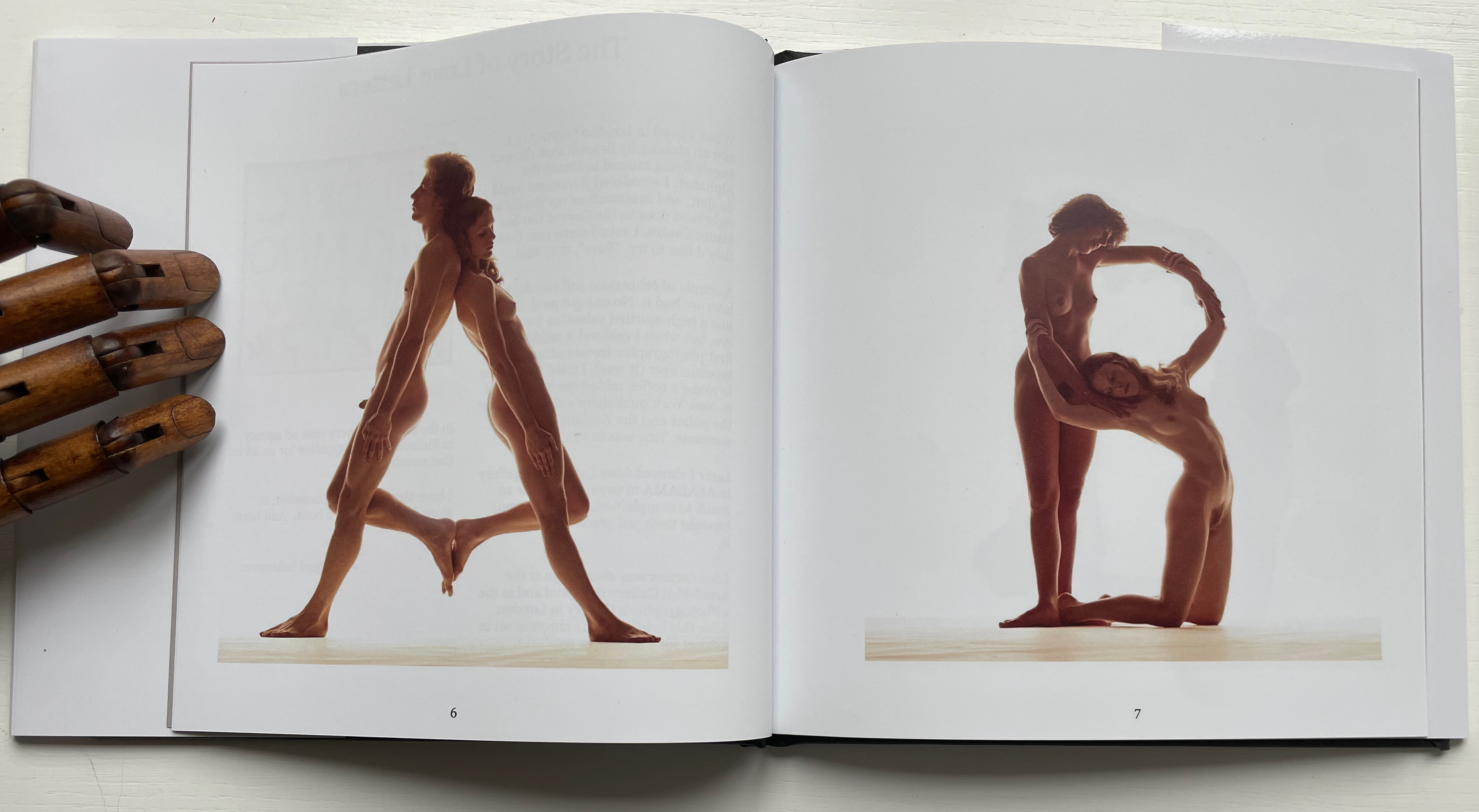
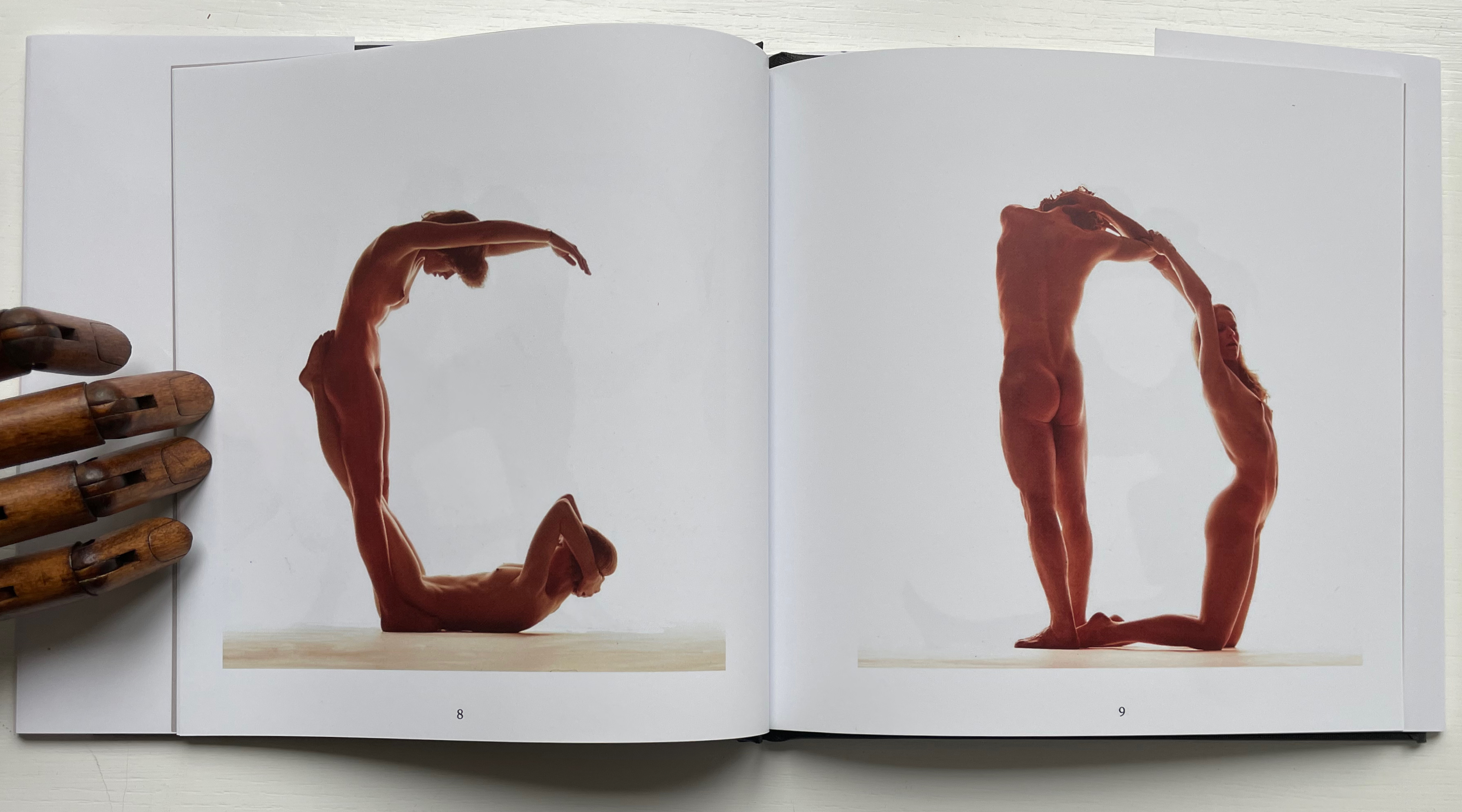
Baskerville may have been Beeke’s template, but the letters G and Q stray far from it. The serifs in the G’s lower right stroke are misdirected. The Q is too oval, and its swash is missing the left-hand stroke characteristic of all the Baskervilles. In fact, a hunt through Rookledge’s Classic International Typefinder for similar Q’s suggests Century as a closer template. Nevertheless, the intention is winning and a challenge to subsequent pursuers of the naked alphabet. And there have been a few, such as Olivia Brookes and Anastasia Mastrakouli as well as “digital” alphabetists such asAmandine Alessandra, Tien-mien Liao, Lucas Neumann andJosé ErnestoRodríguez.
“The Body Alphabet” shoot has the air of a live-model art class, and the result is not prurient or exploitative, even with the child to form the smallest points of punctuation (Tinelou van der Elsken, the daughter of Ed van der Elsken, is the model for the ‘comma type’ in the alphabet). Sexist? Non-diverse? For near-perfect balance, the Books On Books Collection should have an artist’s book or portfolio available from self-partnering Tomaso Binga (something like the self-portraiture in Living Writing), but Beeke, René Knip and Spinhex & Industrie Drukkerij have more than addressed the issues with the following remarkable work.
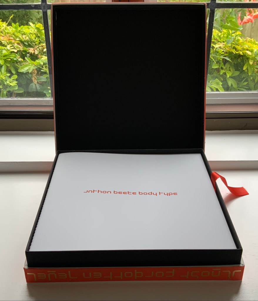
Designer René Knip and Spinhex & Industrie Drukkerij have preserved two important artifacts in typographic and design history and brought them to renewed artistic life. In a way, the collector gets to participate. Body Type arrives as a sealed time capsule requiring a razor to open it and let out the past. Inside are three glossy works lying atop a ribbon pull. The first work is a softcover book, its spine sewn with red thread to match the title on the front cover. Announcing the renaming of Beeke’s Alphabet (1969) as Body Type, it is cheekily set in Crouwel’s New Alphabet (1967) to which Beeke’s original “naked ladies alphabet” had responded. These are the two artifacts preserved, in Crouwel’s case, by use of his alphabet for the titles and section headings and, in Beeke’s case, by extension of his typeface and recreation of the photoshoot that originally realized it. Given their deaths at the end of the last decade (Beeke in 2018, Crouwel in 2019), Body Type provides a valuable juxtaposition of their reflections (Crouwel’s preface and Beeke’s essay).
In addition to his narration of the old and new shoots, Beeke shares an insight about an influence beyond the foil that was the New Alphabet. As Beeke puts it, “If Wim Crouwel pointed to the future, then I was going to perfect the past,….” What he found in the past was a Folies-Bergère-inspired alphabet by Erté (Romain Petrovitch Tirov).
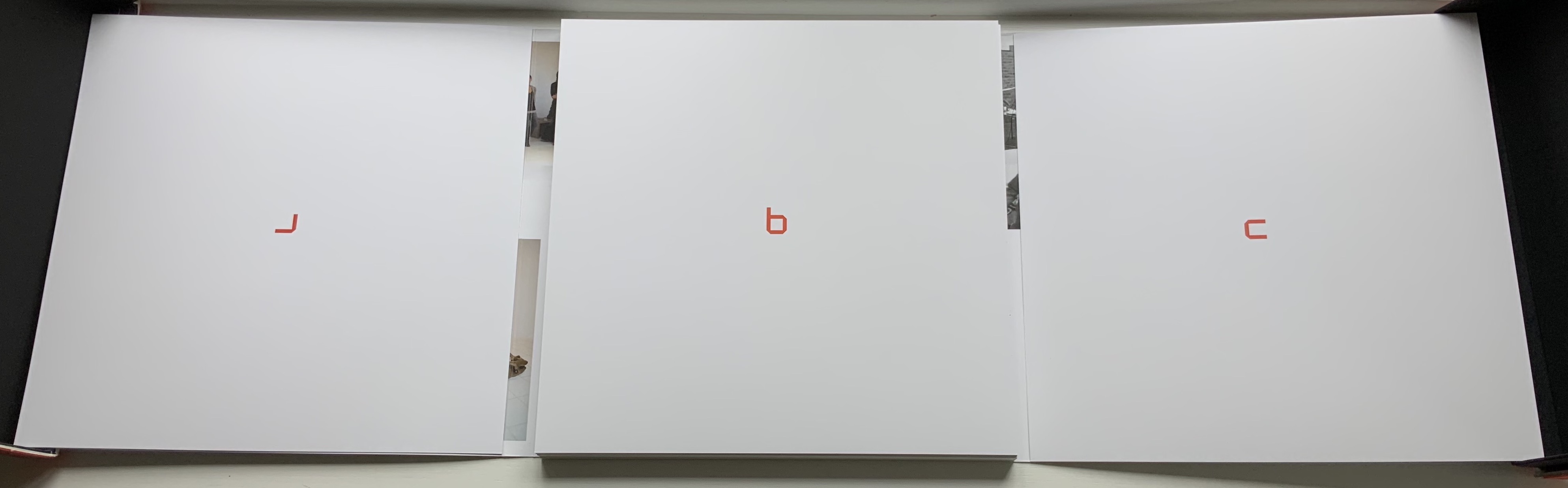
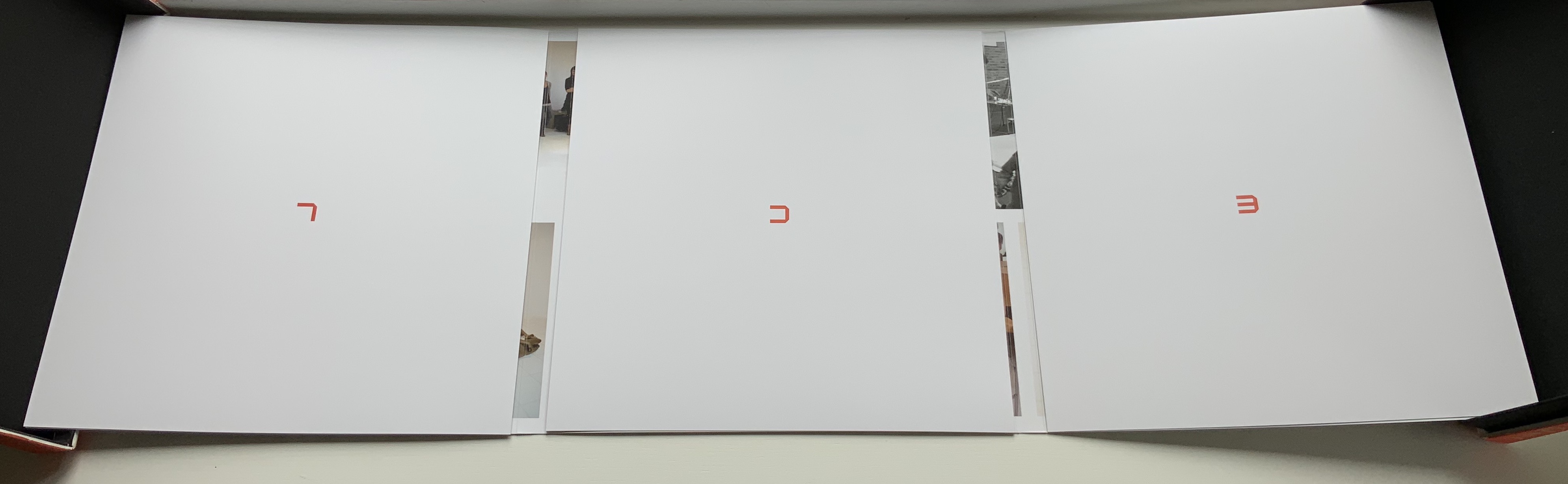
The second work in the box is a portfolio containing a full-color recreation of the original 1969 alphabet and punctuation marks with the addition of Naked Numbers. On the inner side of the portfolio’s wraparound, Ed van der Elsken’s black-and-white production shots sit side by side with the new color production shots. The full color folios themselves present on one side the character constructed with human bodies and on the other side the corresponding character from Crouwel’s New Alphabet.