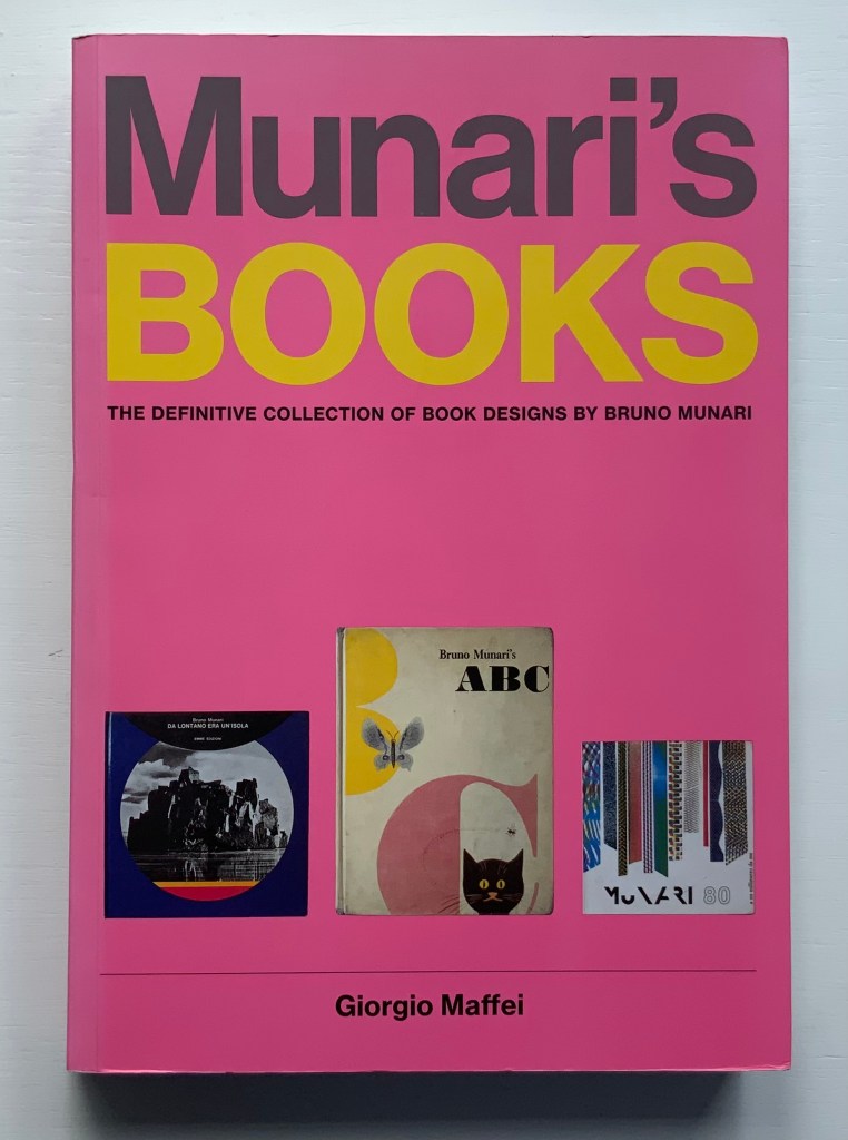
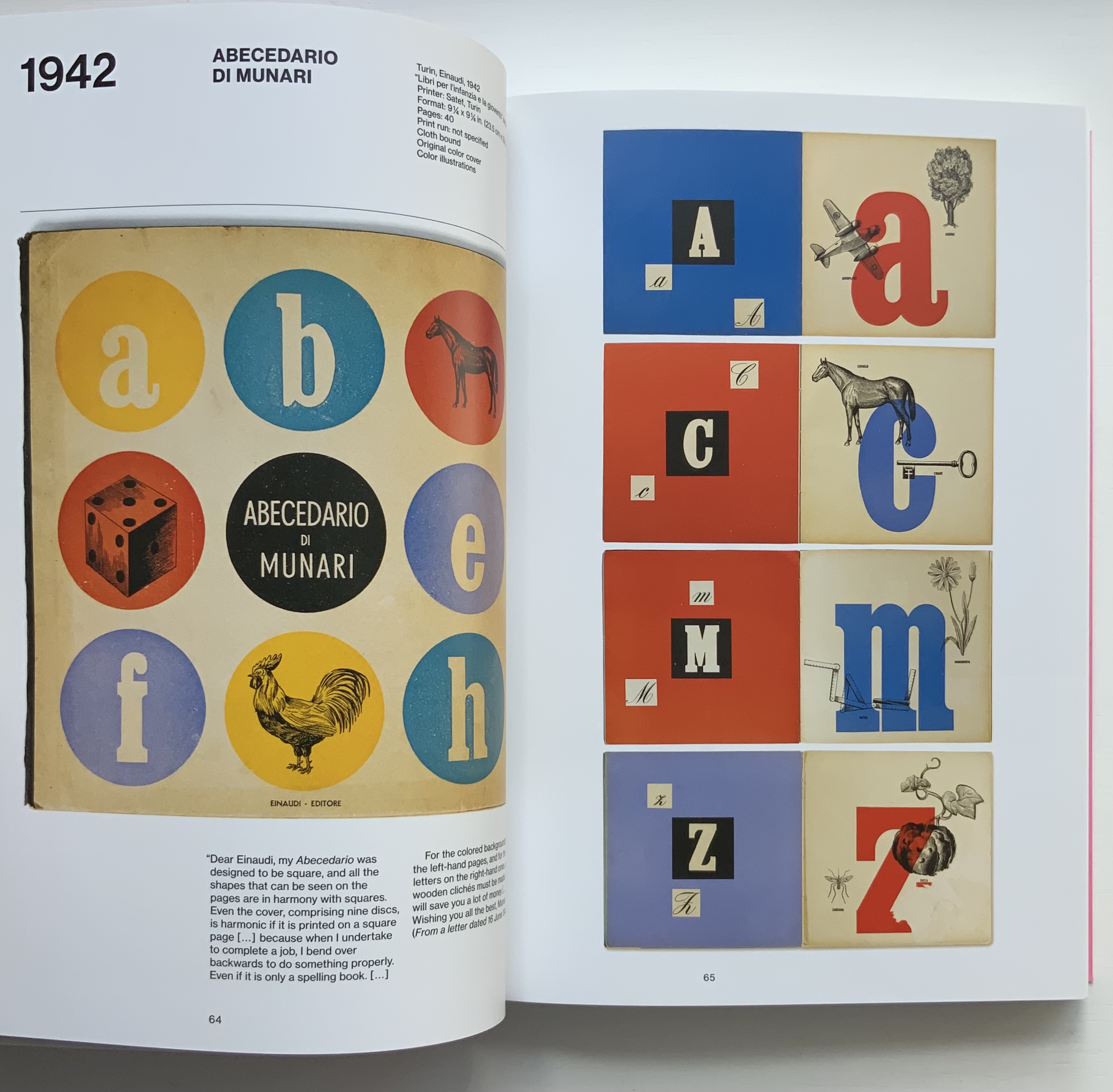
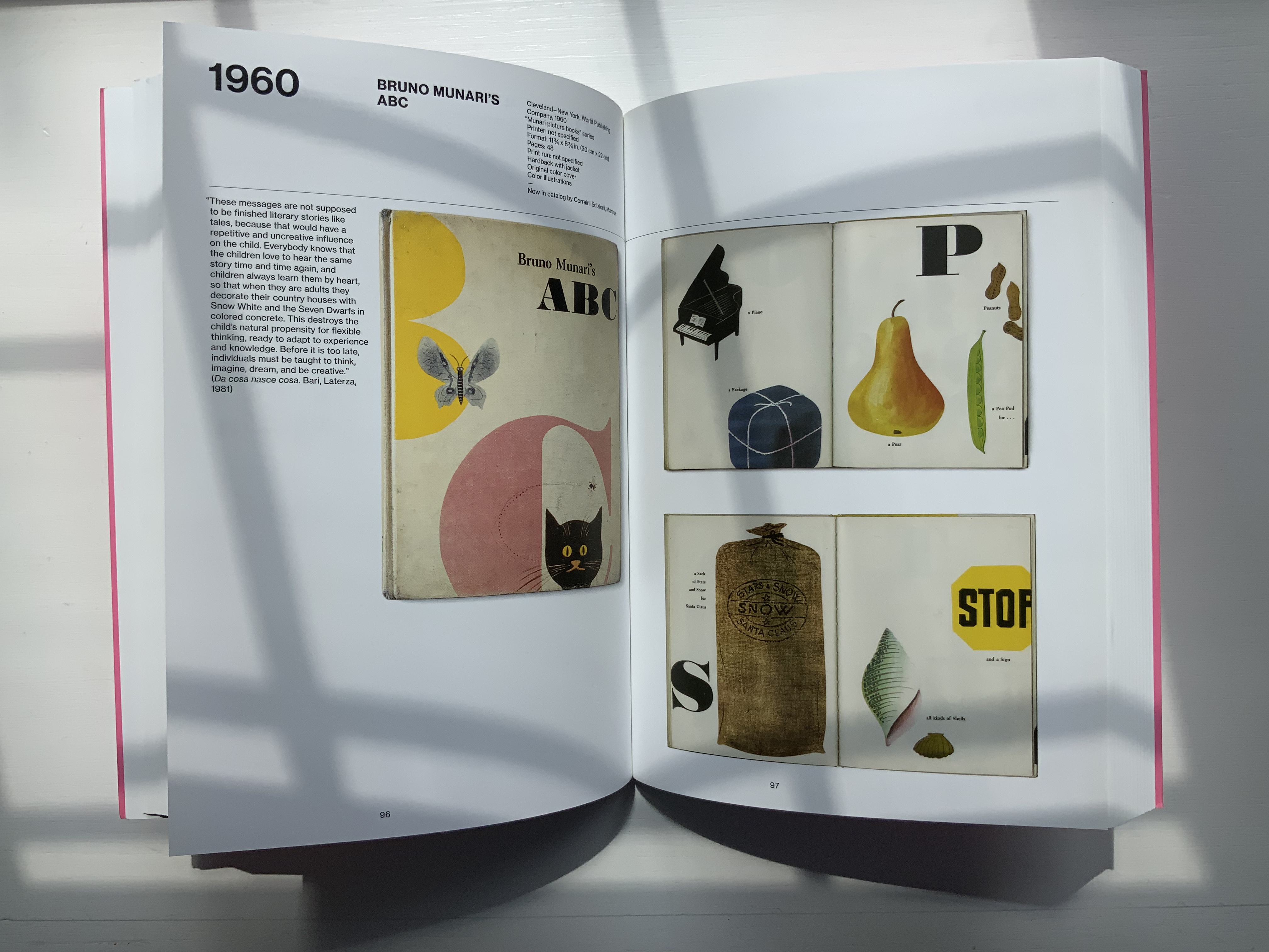
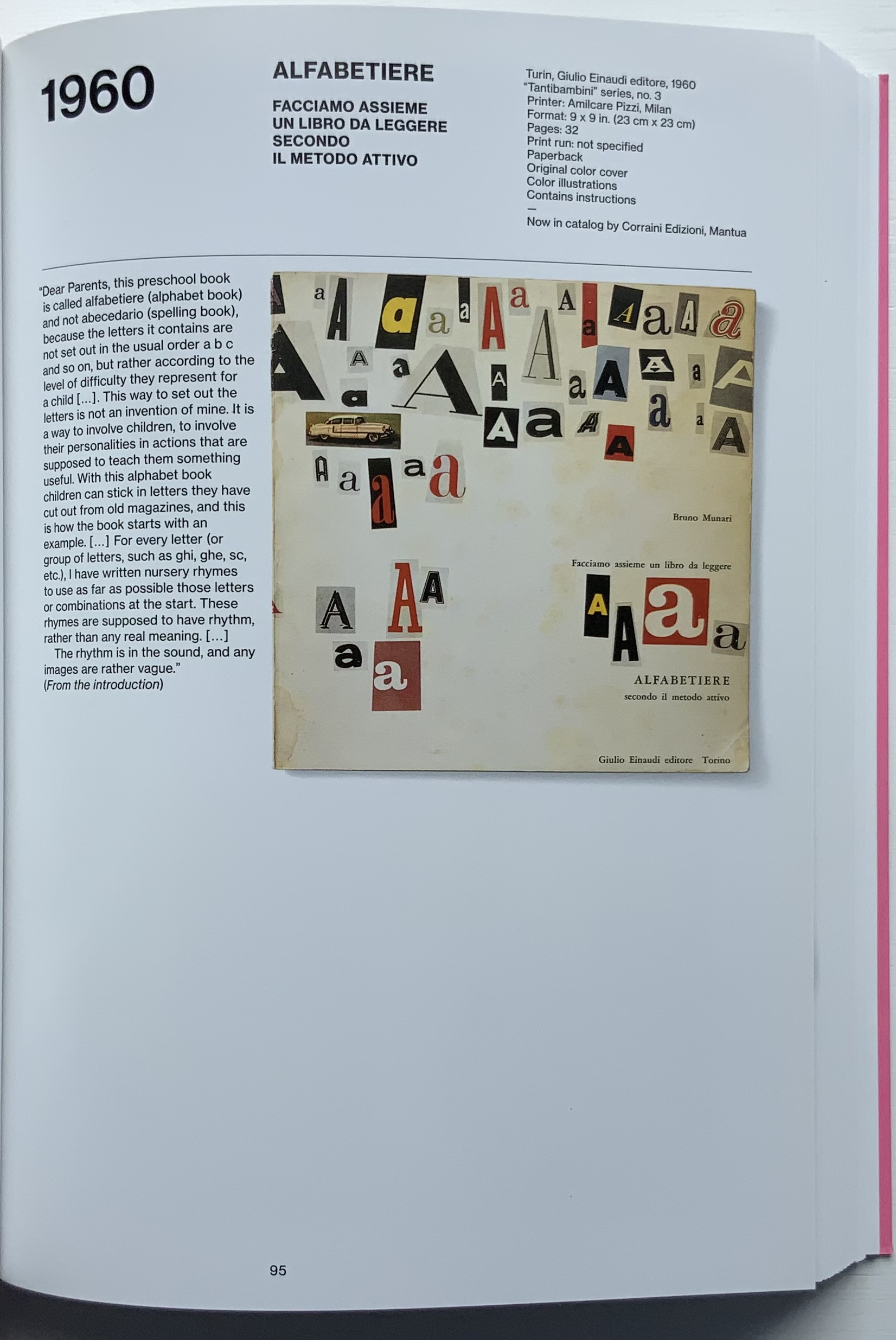
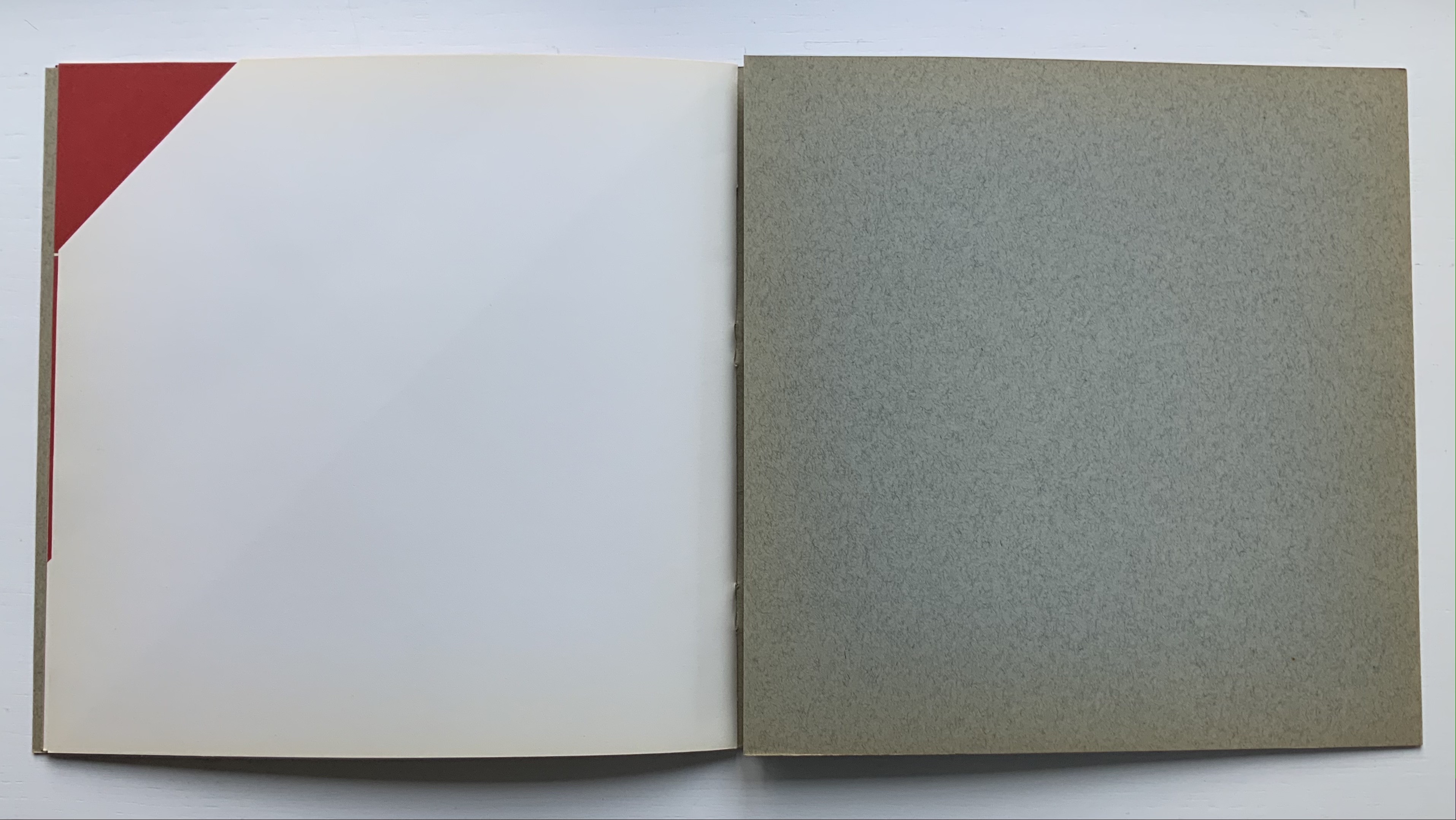
Books On Books Collection – Abe Kuipers

Letters (1971)

Image removed. Fair use not accepted.

Letters (1971)
Abe Kuipers
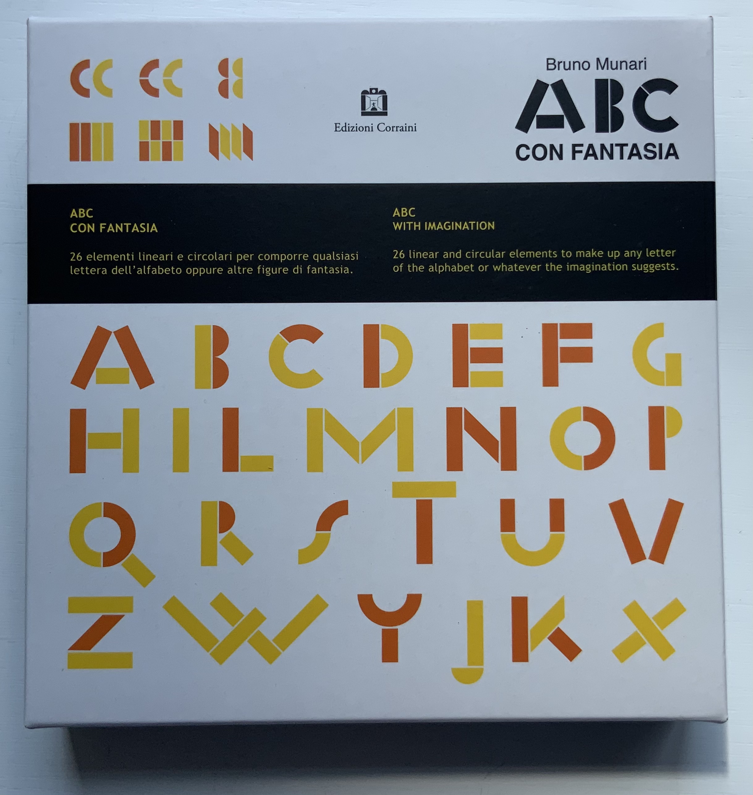
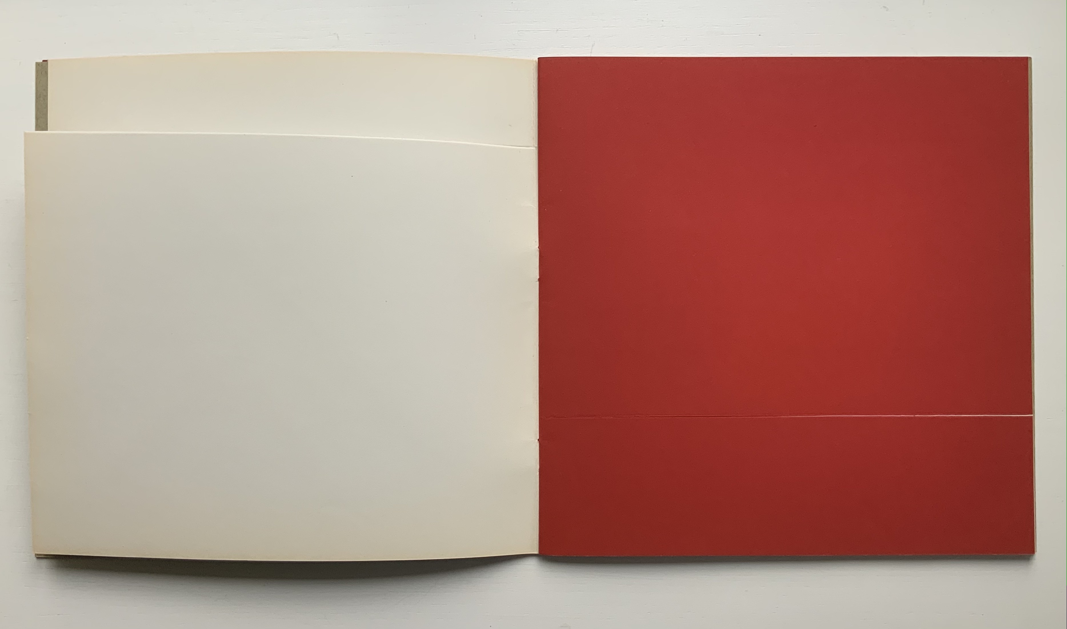
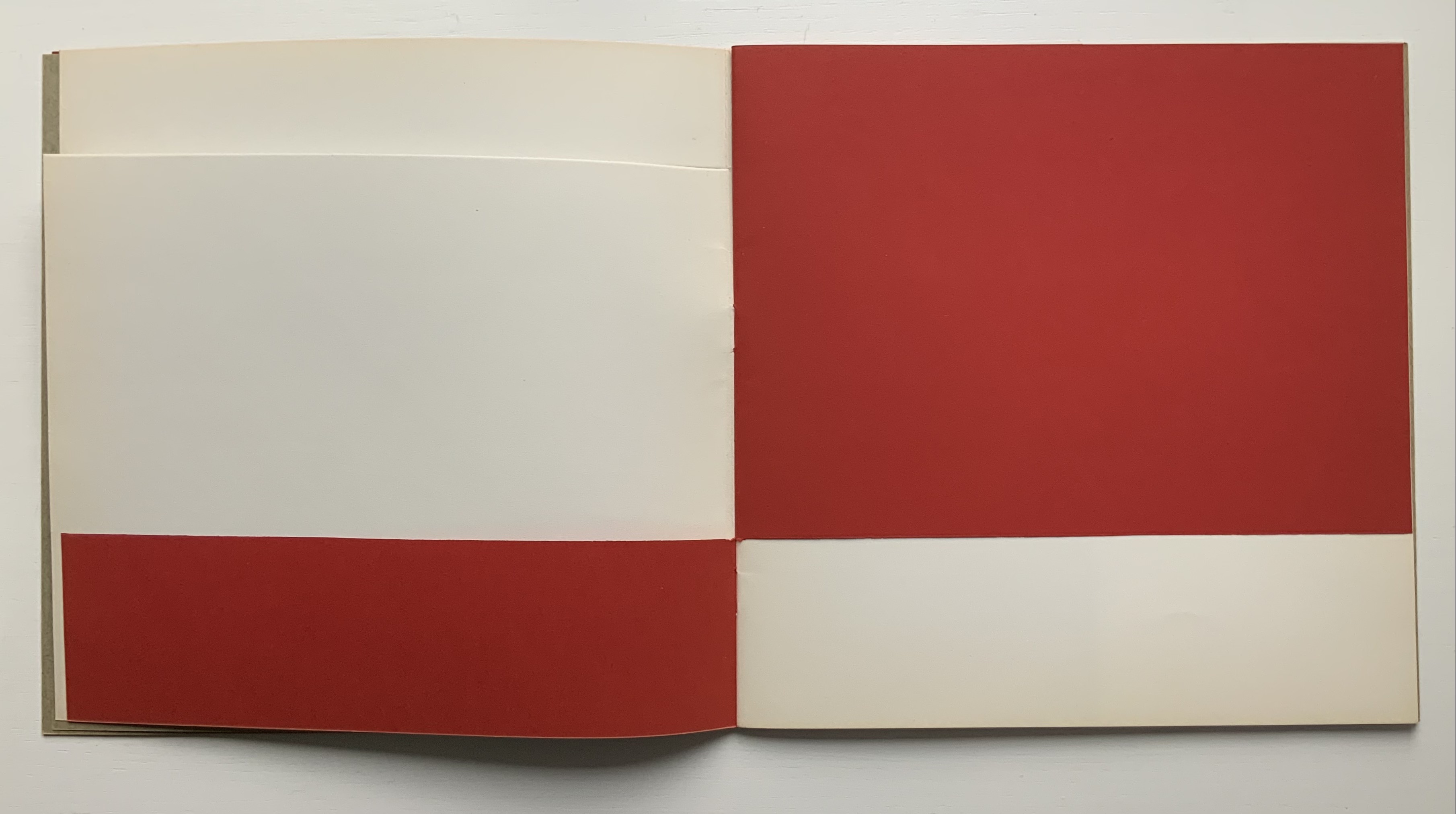
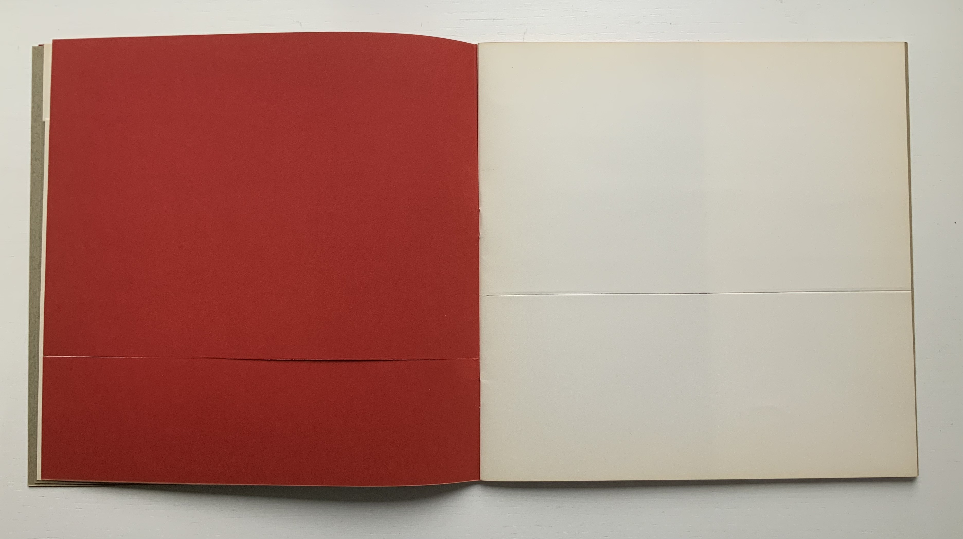
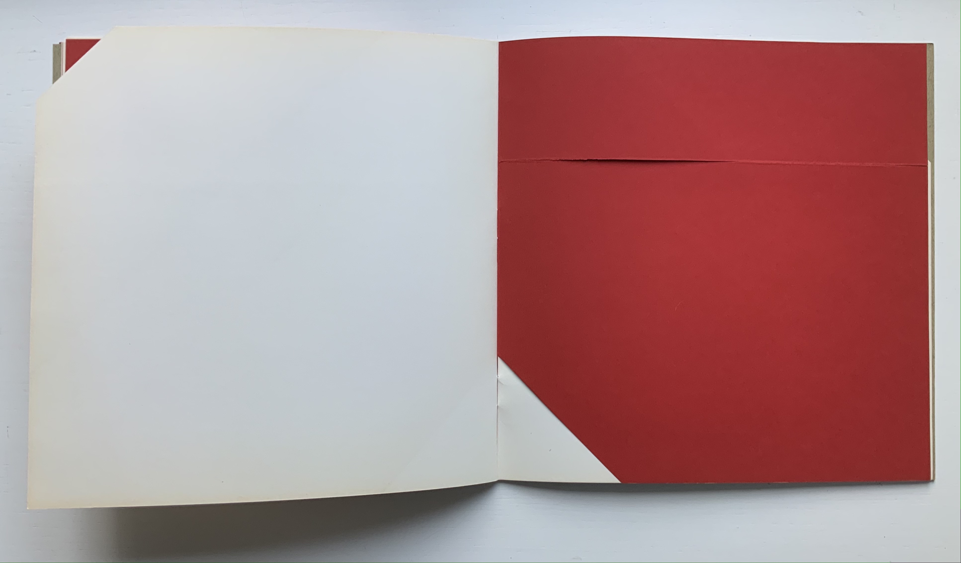
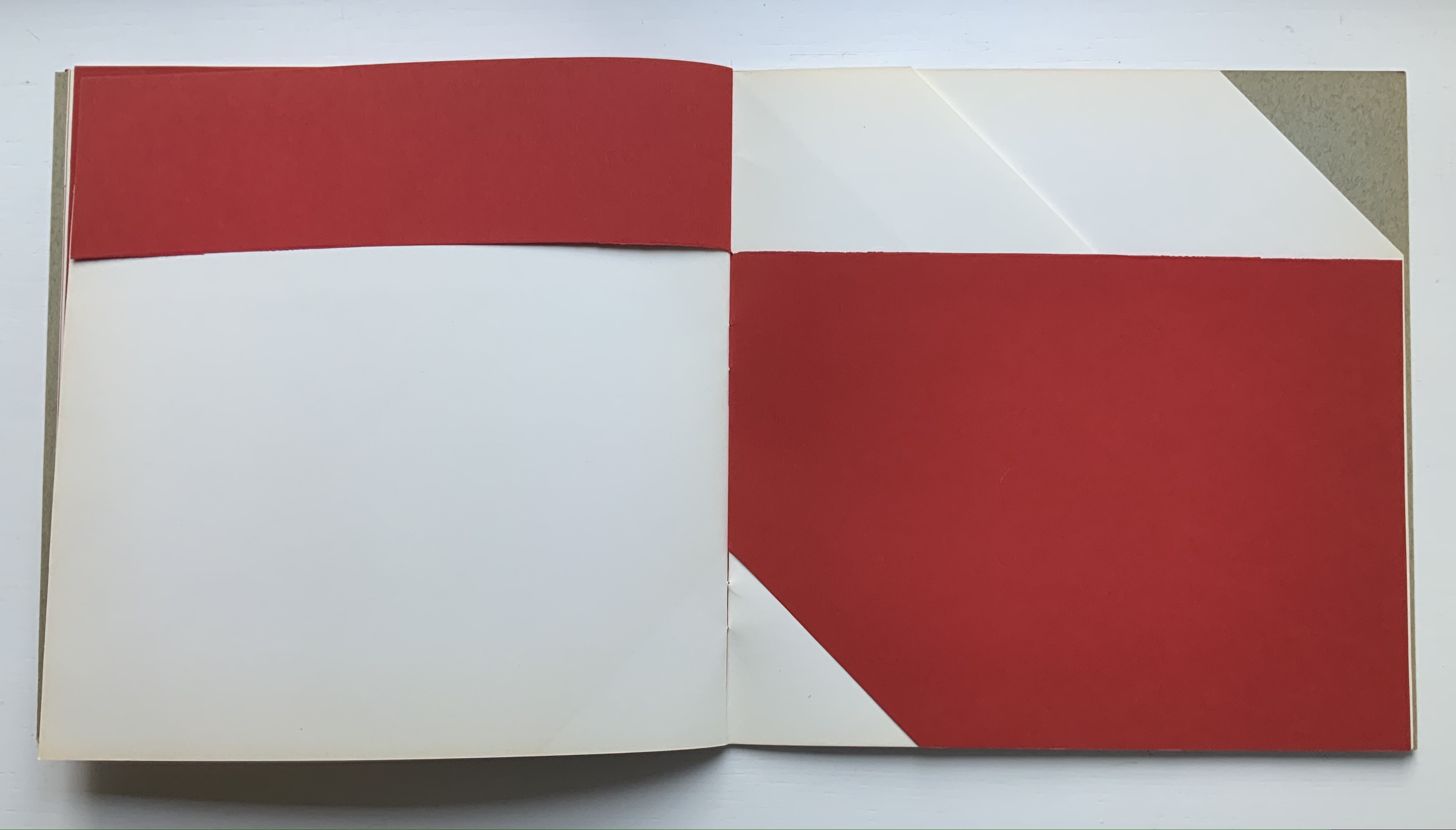
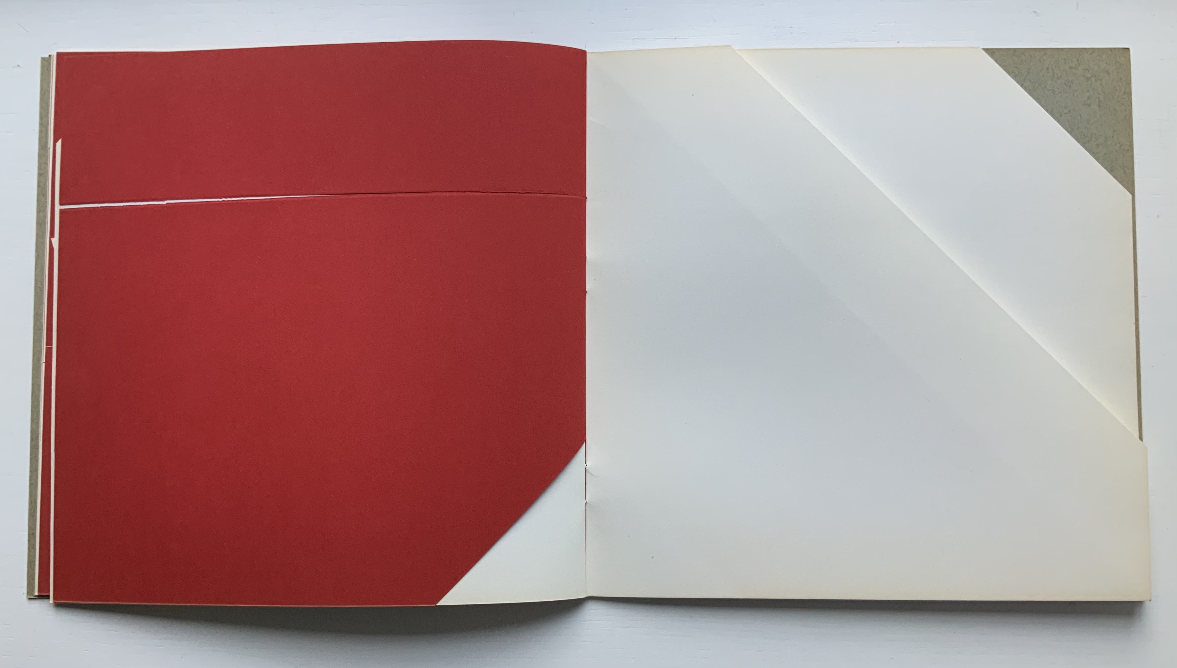
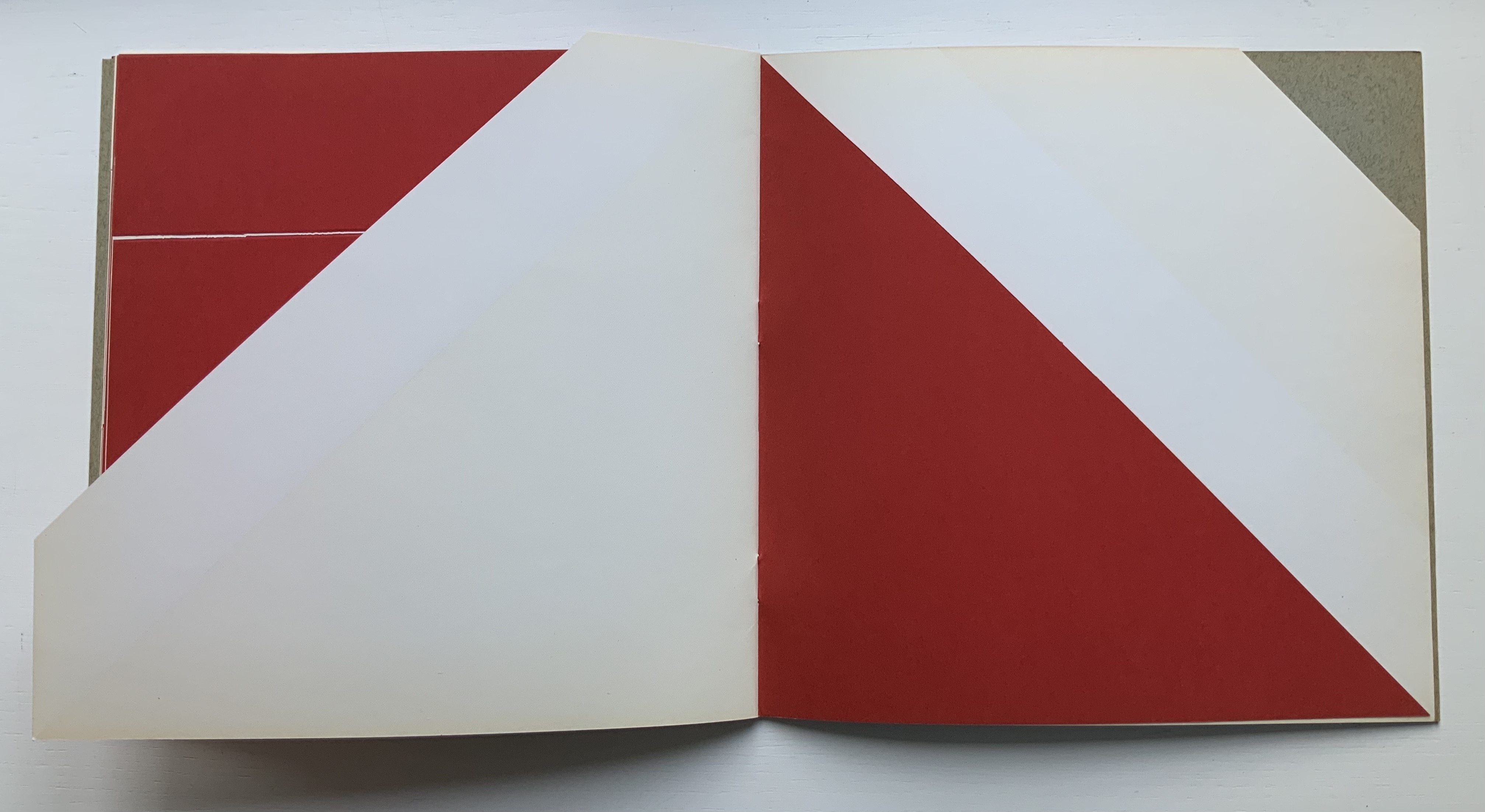
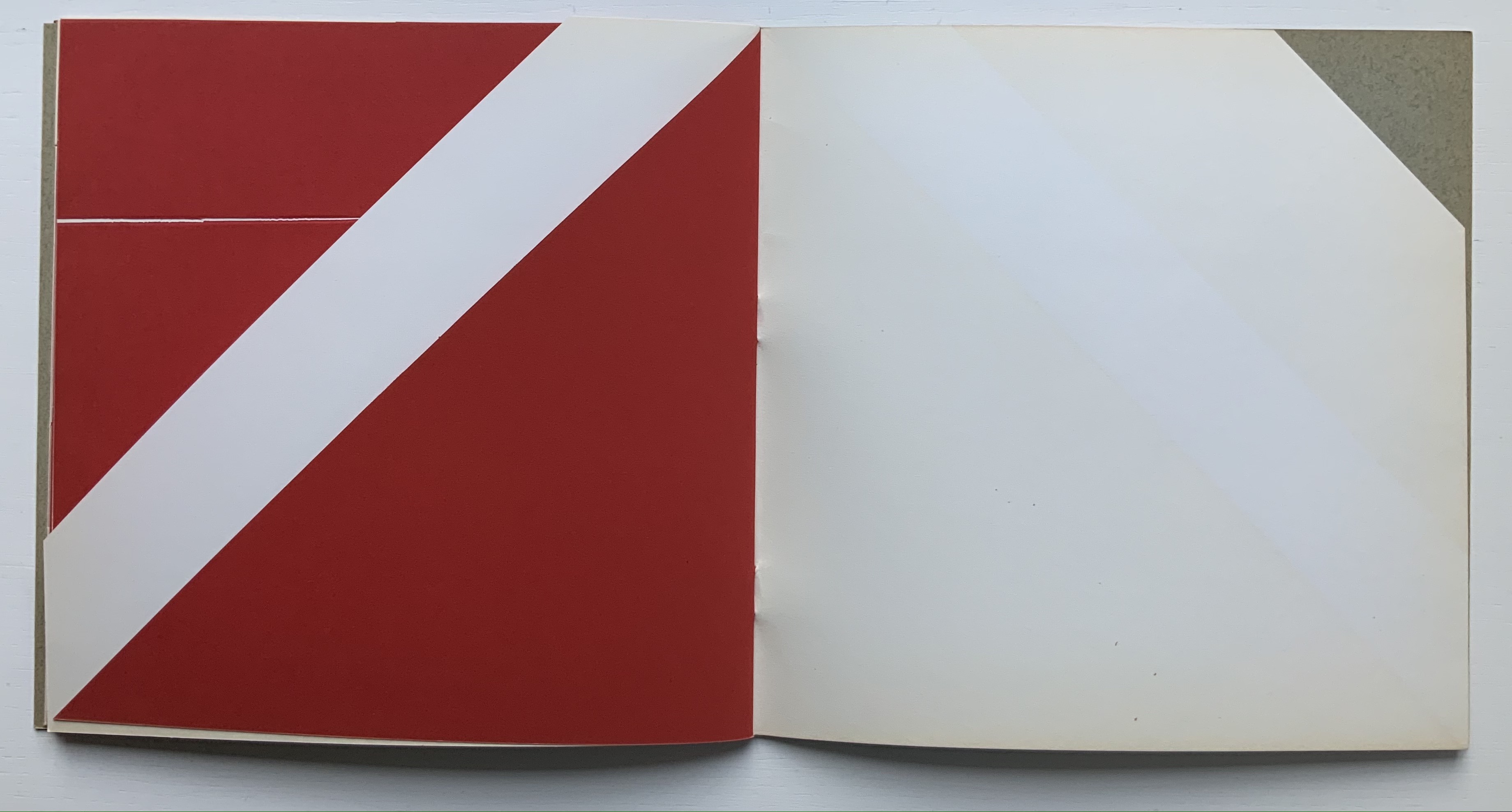
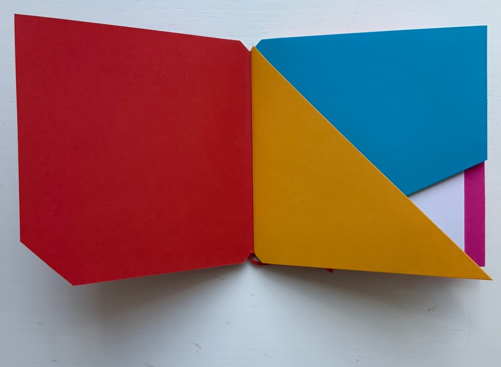
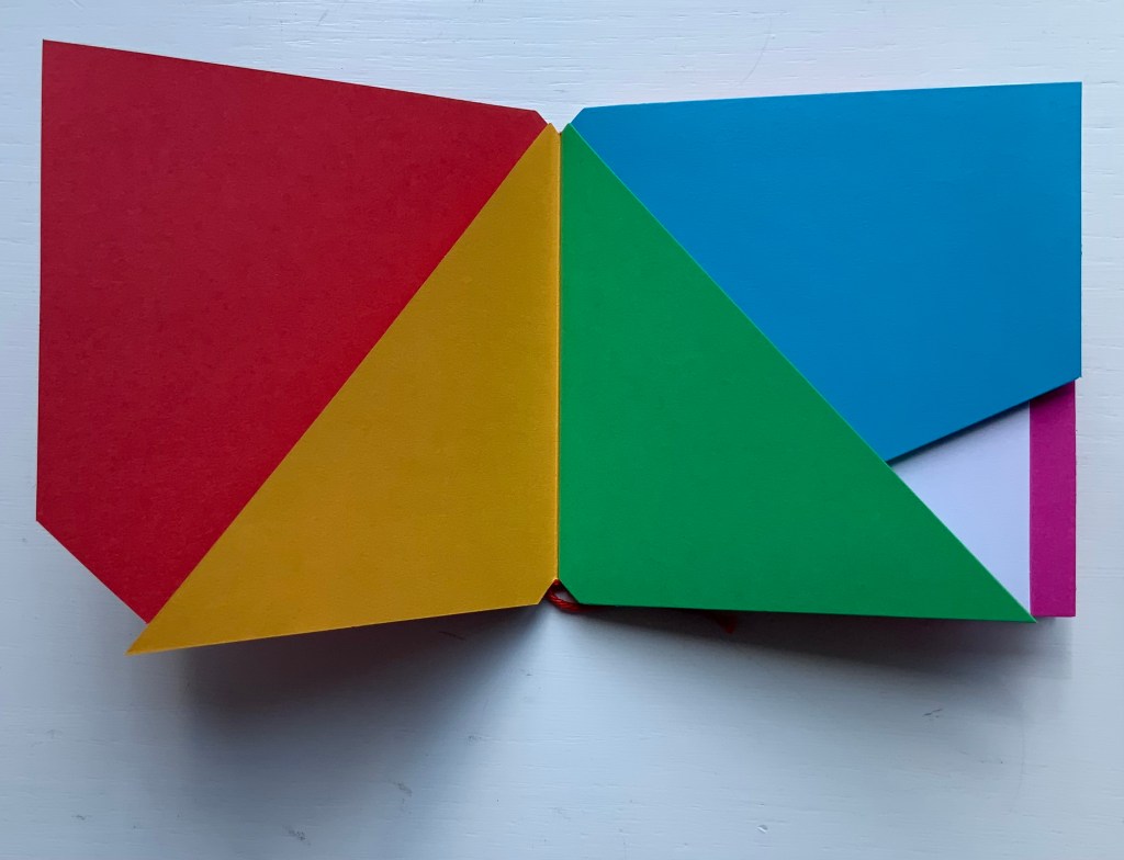
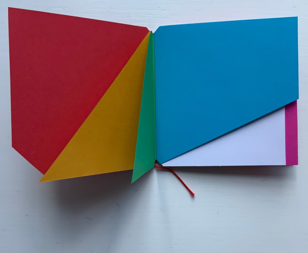
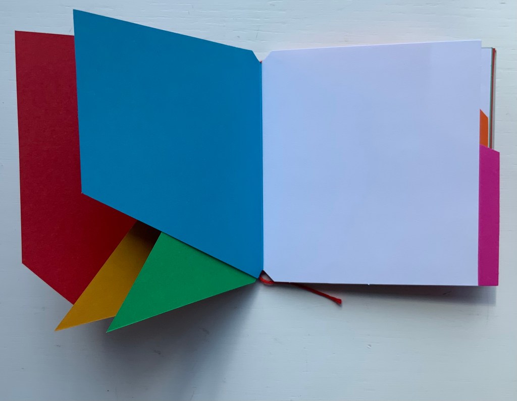
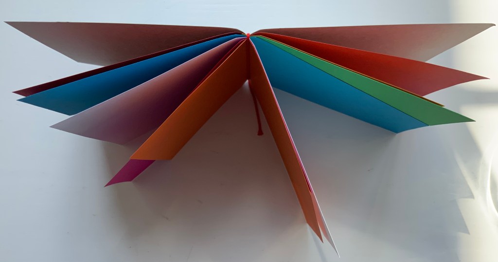
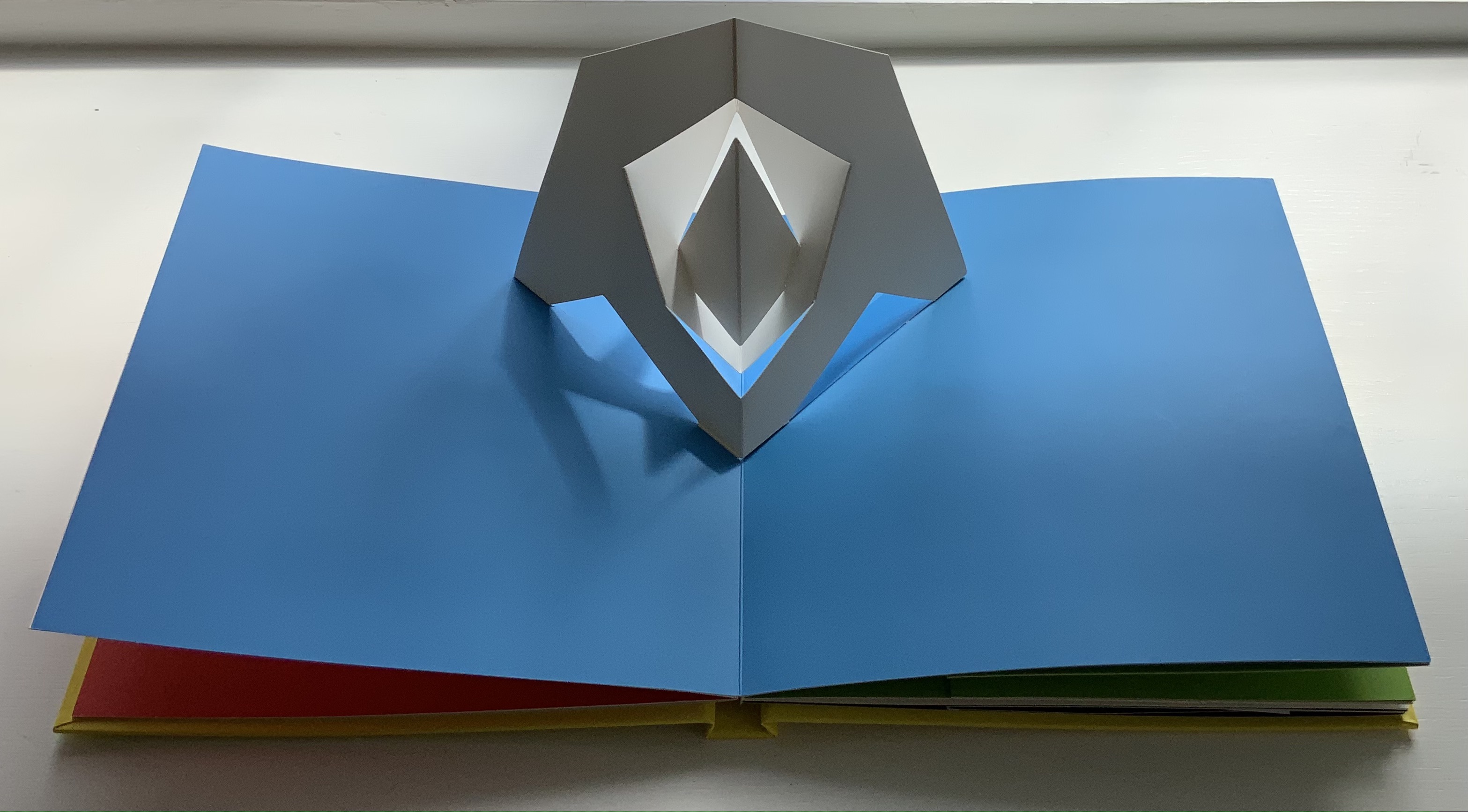
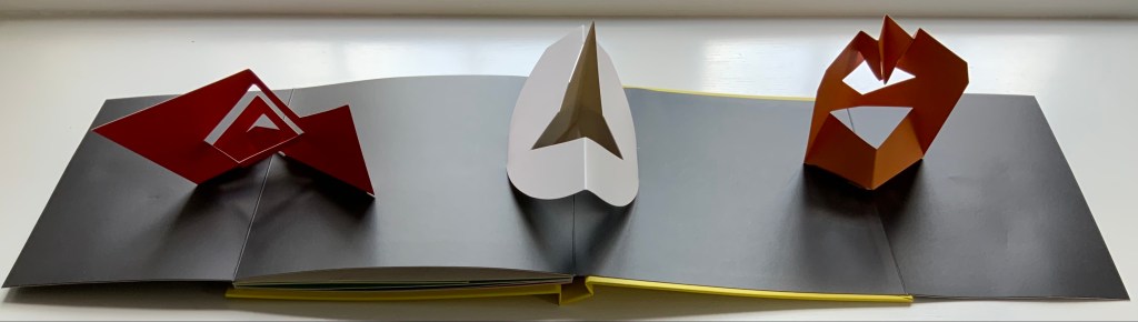
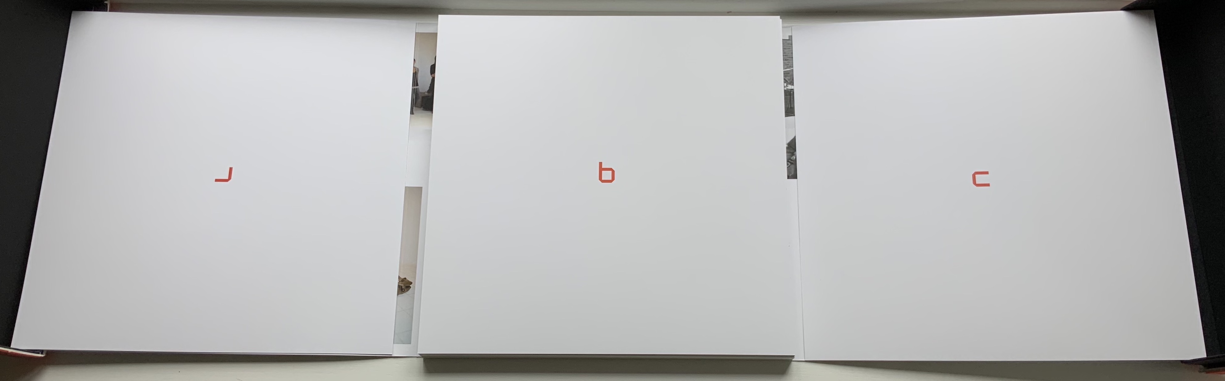
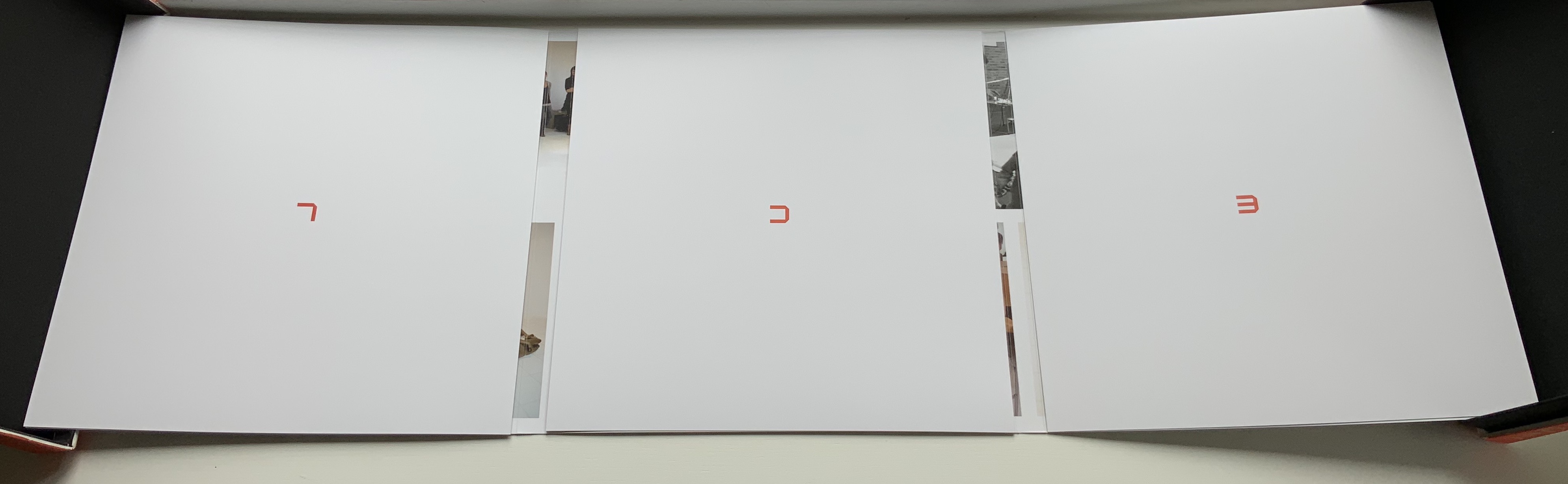
Self-covered set of folios. H257 x W190 closed, W380 open. 8 folios. Edition of 80. Acquired from Bubb Kuypers Auction, 22 November 2022.

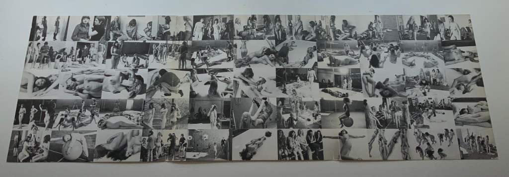
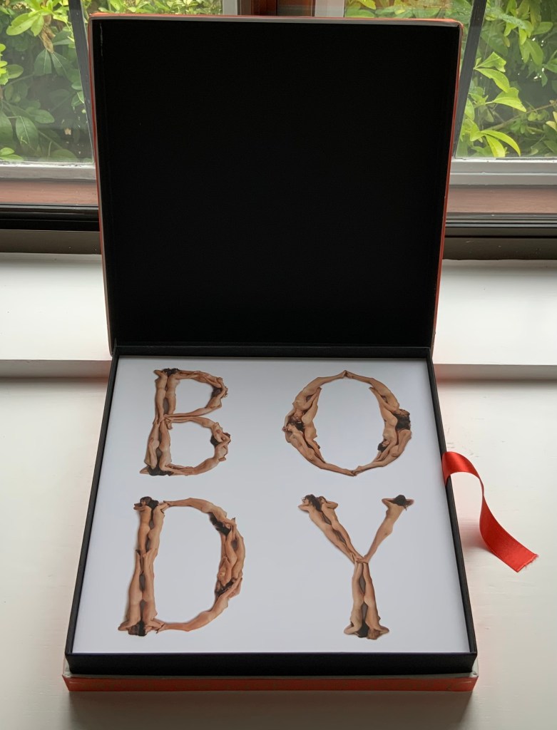
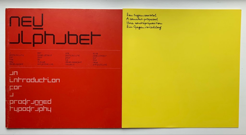
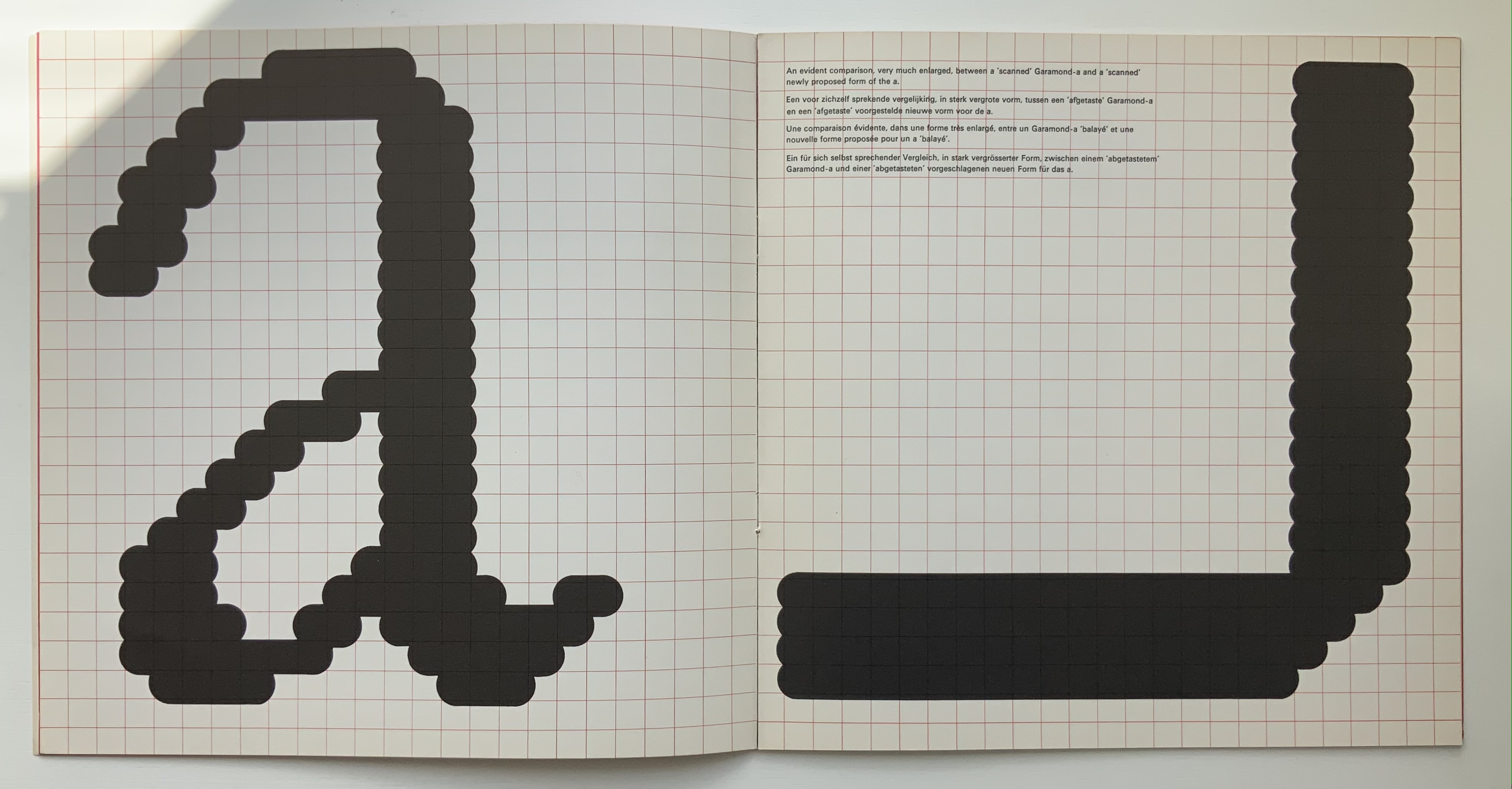
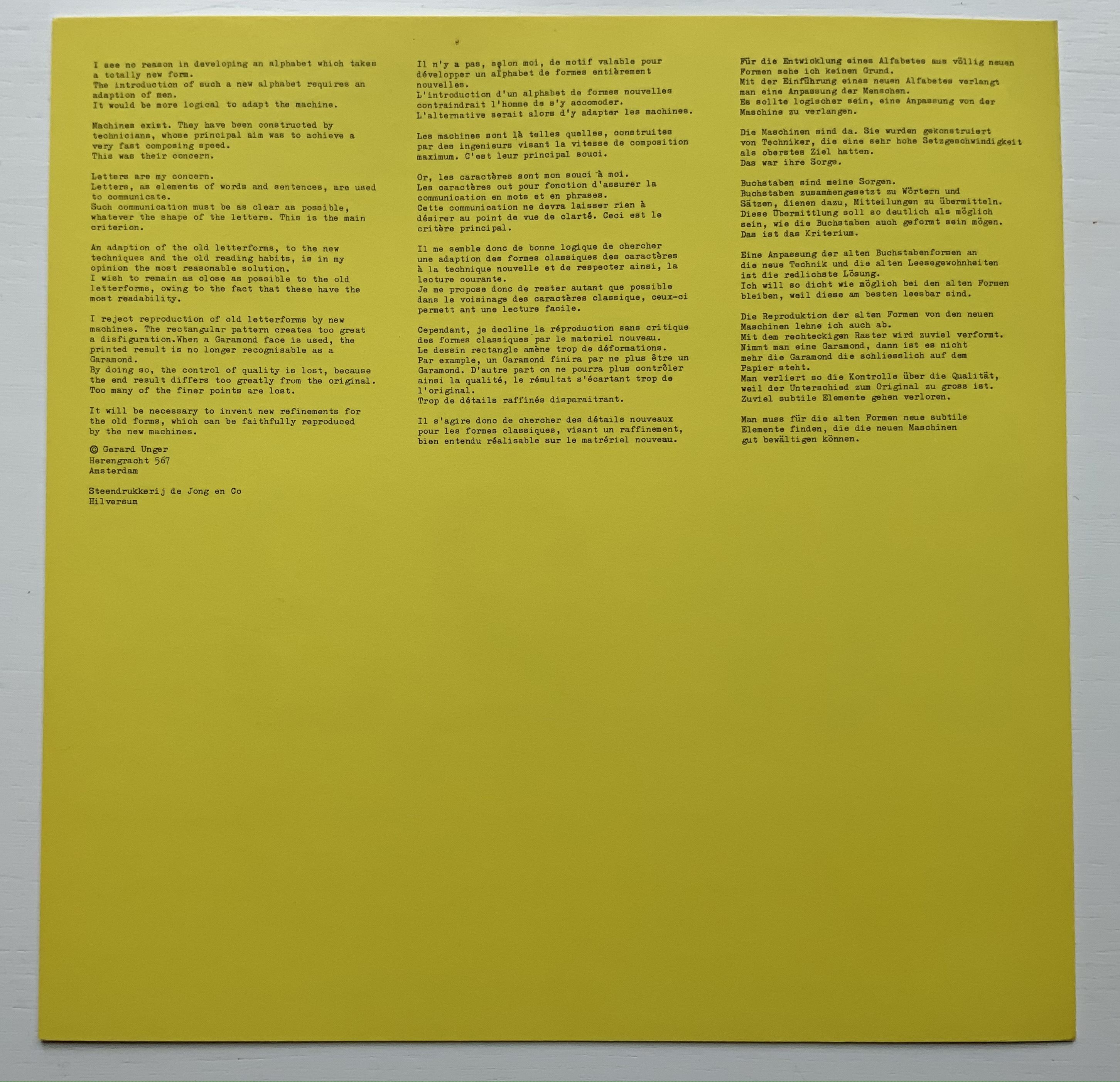
In the late 1960s and early ’70s, Pieter Brattinga‘s 250×250 mm Kwadraat Blad series championed the innovative typographic designs of Wim Crouwel, Gerard Unger, Timothy Epps and Christopher Evans. Theirs were radical explorations of the letterform. Even “bad boy” Anthon Beeke‘s cheeky Alphabet was based on the Baskerville typeface — at least as far as the nude female models could be posed to approximate it. At the same time, further north in The Netherlands, Abe Kuipers was pursuing a very different kind of offbeat presentation of the alphabet.

As far back as the ’40s and ’50s, Kuipers had been interested in the alphabet’s origins. In 1951, he had organized the Fifty Years of ABC for the Prinsenhof in Groningen and years later published a book based on it with Wolters-Noordhoff (Groningen). In 1971, drawing on that activity, he participated in the “Létteretét projekt”, aimed at educating the people of Groningen about letters and their origins. Like the enterprise and its manifestations, the name Létteretét is an offbeat construction. Office rooms in high rises were lit to form letters at night. A poster illustrating the origin of letters (and promoting his 1968 book) was posted on billboards, in shop windows and in schools and libraries.

Image removed. Fair use not accepted.

The bottom right corner panel reads:
this history of the letter was written and drawn by abe kuipers in may 1971. printed in silkscreen by De Ark
this print is part of the Létteretét project in Groningen.

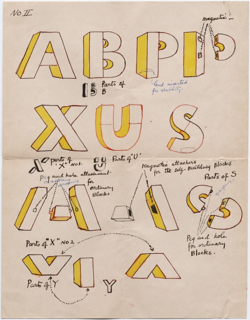
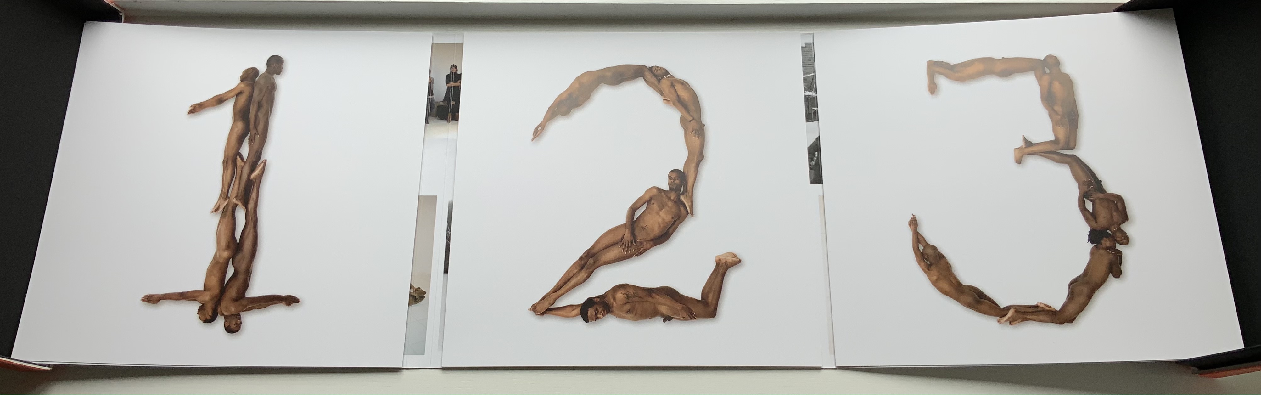
Kuipers reconfigured this poster into an artist’s book of 80 copies. Its bright colors, ad-like images, cartoonish drawings, photos, typewriter lettering and hand-scrawled text pull the ancestors of A, B, C and D (aleph, beth, gimel and daleth) into the present in folios folded in half and loosely held by a folio formed from the poster’s title panel. Articulating aleph into the face of a cow, a cartoon businessman re-enacts the ancient Semitic sound’s naming of the animal, which wears an inverted A bridle recalling the letter’s first discovered shape. The be-suited cartoon character alludes to paleographical theory that the alphabet had its roots in signs for accounting and inventories. The letter B receives similar treatment in the vacation postcard. The character in desert clothing says beth at the pair of pup tents forming the letter B on its side, the swimsuited man explains that “tent” equals “house”, which beth designated, and, having drawn the development of the sign into its modern form, the swimsuited woman articulates the letter. And so on for all the letters of the alphabet.

Certainly Kuipers knew that there were books and exhibitions for educating the general populace about the origins of the alphabet. He had been there and done that. But it is a wonderful proposition that art and design should confront the general populace with it and that they should be aware of it in everyday life.

Further Reading

Abecedaries I (in progress)“. Books On Books Collection.

Lyn Davies“. 7 August 2022. Books On Books Collection.

Timothy Donaldson“. 1 February 2023. Books On Books Collection.

Cari Ferraro“. 1 February 2023. Books On Books Collection.

Rudyard Kipling and Chloë Cheese“. Books On Books Collection. [In process]

James Rumford. 21 November 2022. Books On Books Collection.

Ben Shahn“. 20 July 2022. Books On Books Collection.

Tommy Thompson“. 21 August 2022. Books On Books Collection.

Bernal, Martin. 1990. Cadmean Letters : The Transmission of the Alphabet to the Aegean and Further West Before 1400 B.C. Winona Lake IN: Eisenbrauns.

Diringer, David, and Reinhold Regensburger. 1968. The alphabet: a key to the history of mankind. London: Hutchinson. A standard, beginning to be challenged by late 20th and early 21st century archaeological findings and palaeographical studies.

Drucker, Johanna. 1999. The alphabetic labyrinth: the letters in history and imagination. New York, N.Y.: Thames and Hudson.

Firmage, Richard A. 2001. The alphabet. London: Bloomsbury.

Fischer, Steven Roger. 2008. A history of writing. London: Reaktion Books.

Jackson, Donald. 1997. The story of writing. Monmouth, England: Calligraphy Centre.

Kuipers, Abe Johannes. 1968/1969. Opschrift Op Schrift. Groningen: Wolters-Noordhoff.

Moziani, Eliyahu. 1984. Torah of the Alphabet or How the Art of Writing Was Taught Under the Judges of Israel (1441-1025) : -The Original Short Course in Alphabetic Writing Conceived by Israel in Sinai. Herborn: Baalschem.

Pflughaupt, Laurent. 2008. Letter by letter: an alphabetical miscellany. New York: Princeton Architectural Press.

Robinson, Andrew. 1995. The story of writing. London: Thames and Hudson.

Rosen, Michael. 2014. Alphabetical: how every letter tells a story. London: John Murray.

Sacks, David. 2003. Language visible unraveling the mystery of the alphabet from A to Z. New York: Broadway Books.

Shaw, Gary. 15 April 2021. “Ancient ABCs: The alphabet’s ‘missing link’ discovered in Israel“. The Art Newspaper.

Van Genderen, Ans. 2022. “Abe Kuipers“. Dutch Graphic Roots. Eindhoven: [Z]OO producties. Accessed 20 November 2022. Also available in print from [Z]OO producties.

Books On Books Collection – Bruno Munari

Munari’s Books (2008/2015)

Munari’s Books (2008/2015)
Giorgio Maffei
Perfect bound book. H240 x W170, 286 pages. Acquired from Wordery, 25 June 2015.
Photos of the work: Books On Books Collection. Displayed with permission of  Corraini Edizioni. © Bruno Munari. All rights reserved to Maurizio Corraini s.r.l.

Giorgio Maffei’s 2008 definitive collection of book designs by Bruno Munari brings together two of Italy’s renowned book artists. Giorgio Maffei’s own work, his writing and gallery/bookshop (highlighted by his son Giulio Maffei’s extraordinary video catalogues Le vite dei libri) warrant a catalogue raisonné in their own right. The Italian edition published by Munari’s long-time publisher Maurizio Corraini was followed up in 2015 by this translation by Martin John Anderson and Thomas Marshall in 2015. For the Books On Books Collection, one of the great pleasures of Munari’s works is its attention to the alphabet, which this book documents.

Although not shown in Munari’s Books, an alphabet-related work that underscores Picasso’s calling Munari “our Leonardo” is ABC con fantasia (1973/2000). If we are to believe Fra Luca Pacioli, it was Leonardo da Vinci who inspired his “straight lines and curves” exposition for creating letters. Following in their footsteps, Munari provides the linear and curvilinear basics for the collector and offspring to join the game.

ABC con fantasia (2008)

ABC con fantasia (2008)
Bruno Munari
Boxed set of shapes. H x W Acquired from Corraini Edizioni, 4 August 2020.
Photos of the work: Books On Books Collection. Displayed with permission of  Corraini Edizioni. © Bruno Munari. All rights reserved to Maurizio Corraini s.r.l.

Another pleasure is how Munari’s works lead to other works in the collection. Just by preceding them in Pieter Brattinga’s Kwadraatblad/Quadrat-prints series, Munari’s An Unreadable Quadrat-Print (1953), below, conjures up Wim Crouwel‘s, Gerard Unger‘s, Timothy Epps and Christopher Evans‘, and Anthon Beeke‘s more alphabetical contributions.

Libro illeggibile bianco e rosso / An unreadable Quadrat-Print / Een onleesbaar kwadraat blad / Ein unlesbares Quadrat-Blatt (1953)

Libro illeggibile bianco e rosso/An unreadable Quadrat-Print/Een onleesbaar kwadraat blad/Ein unlesbares Quadrat-Blatt (1953)
Bruno Munari
Artist book. 250 x 250 mm + 1 wrapper (770 x 770 mm folded to 260 x 260 mm). Acquired from Antiquariaat A. Kok & ZN, 4 August 2021.
Photos of the work: Books On Books Collection. Displayed with permission of  Corraini Edizioni. © Bruno Munari. All rights reserved to Maurizio Corraini s.r.l.

Although there are no words on numbered pages that have to fall in the right order, An Unreadable Quadrat-Print still presents the author/printer/binder with a challenge in imposition. White and red alternate, which is easy enough, but to cut or not cut a folio on the left and right, how to cut it, how to place the differently cut folios in the right order to achieve the variation in images when the pages turn, how to ensure a sewable area down the center for each folio whether it has a horizontal cut extending into the spine or a diagonal one extending from some point along the spine — that is impressive. It speaks to the sculptural process and result in making books, as well as the sculptural process of reading them.

The following sequences — the book’s first five double-page spreads and then its last six — take a normal page-turning approach, always turning from the upper right corner of whatever shape/page is available. Note how, in the last six double-page spreads, the pages and shapes become more complex.

Libro illeggibile (1966), below left, calls to mind Katsumi Komagata’s A Cloud (2007), and the one in the middle foreshadows Eleonora Cumer’s subtle artistry with transparent paper in Circoscrivere lo spazio No. 3 (2021). While Munari’s rare works press modest budgets, some of it — in its simplicity and popular appeal — has led Corraini Edizioni to put it within easier reach. Numerous reissues of the 1984 Libro illeggibile MN 1 have pushed its price to €5. Short of the artist’s signature (which would likely obstruct the aesthetic intention), a copy from the latest 5000-copy print run will “perform” and deliver the same experiential value as one from the earliest run.

From Munari’s Books.

Libro illeggibile MN 1 (2006)

Libro illeggibile MN 1 (2006)
Bruno Munari
Booklet. H100 x W100 mm, 28 pages from 14 sheets cut in various shapes, notched at the center, bound with single loop of red thread over the notch and knotted at the foot of the spine. Acquired from Corraini Edizioni, 4 August 2020.
Photos of the work: Books On Books Collection. Displayed with permission of  Corraini Edizioni. © Bruno Munari. All rights reserved to Maurizio Corraini s.r.l.

Munari’s many series of illegible books tap into book artists’ longstanding and ongoing preoccupation with whether a book without words can communicate information, narrative, sensations or feelings through material, shape or color and their permutations. The colors, shape, feel and binding of Libro illeggibile MN 1 evoke simple and sophisticated pleasure in their juxtaposition and sequence. The unchanging straightness of the top edge and the anchoring red thread of the binding set off the changeability of shapes and colors.

The Square (1960), The Circle (1964) and The Triangle (1976)

Corraini Editions has also made Munari’s compendia The Square: Discovery of the Square (1960), The Circle: Discovery of the Circle (1964) and The Triangle: Discovery of the Triangle (1976) available in continuous reprints. The fourth printing from 2015 is shown below.

Le sculture da viaggio di Munari (2019)

Although not a book of Munari’s making, David A. Carter’s Le sculture da viaggio di Munari is one way of bringing the spirit of Munari’s “travel sculptures” into the collection. Carter’s homage carries the blessing of Corraini Edizioni, further justifying its inclusion.

Le sculture da viaggio di Munari (2019)
David A. Carter
Pop-up book. H210 x W210, 10 constructions over 5 spreads, 2 with fold-out leaves. Acquired from Corraini, 4 August 2020.
Photos of the work: Books On Books Collection. Displayed with permission of  Corraini Edizioni. © Bruno Munari. All rights reserved to Maurizio Corraini s.r.l.

Travel sculptures started off as small sculptures (some even pocket-sized) to carry with you, so you could take part of your own culture to an anonymous hotel room. Later they were turned into ‘travel sculptures’, five or six metres tall and made of steel. One of these was seen for a few months in Cesenatico, another one in Naples. Others are sleeping among huge trees in the Alto Adige region.’ This is how Italian designer Bruno Munari (1907-1998) described his ‘travel sculptures’, which in turn inspired American illustrator and designer David A. Carter for this pop-up book. –Corraini Edizioni website. Accessed 3 August 2021.

Munari’s travel sculptures also recall works in the collection like Cumer’s scultura da viaggio dipinta n.2 (2017), Komagata’sIchigu(2015) and, albeit less portable, Ioana Stoian’s Nous Sommes (2015).

Further Reading

Morison, Stanley, and Philip Hofer. 1933. Fra Luca de Pacioli of Borgo San Sepolcro: some consideration of his life and works. New York: Grolier Club.

Tanchis, Aldo. 1987. Bruno Munari : design as art. Cambridge, MA: MIT Press.

“Mina Loy”. 10 August 2019. Garadinervi : repertori. Accessed 8 February 2023.

Mina Loy, Alphabet, No II, n.d. [1941] [Mina Loy papers, Box 7, Folder 184, YCAL MSS 6. Yale University Library, Beinecke Rare Book and Manuscript Library, New Haven, CT]. Also in Margaret Konkol, “Prototyping Mina Loy’s alphabet, Feminist Modernist Studies, Volume 1, 2018, pp. 294-317 – Issue 3: Special Cluster: Feminist Modernist Digital Humanities.

Books On Books Collection – Anthon Beeke

Alphabet (1970)

Alphabet (1970)
Anthon Beeke, Geert Kooiman and Ed van der Elsken
Portfolio. Kwadraatblad series format, 250 x 250 mm, 30 folios. Acquired from Prentework, 26 May 2021.
Photos of the work: Books On Books Collection. Images of the production process: Nederlands Fotomuseum / © Ed van der Elsken. Images in individual folios: © Geert Kooiman. Copyright in the work: © Anthon Beeke Archive Foundation.

Beeke devised “The Body Alphabet” around 1968/69. It came in response to the “sexual revolution” of the 1960s and in reaction to functional typography. The designer Pieter Brattinga had published Wim Crouwel’s New Alphabet (1967) in the Kwadraatblad series and followed that up with Gerard Unger’s A Counter-proposal (1967) and Timothy Epps and Christopher Evans’ Alphabet (1970). Brattinga must have felt that “bad boy” Beeke’s tongue-in-cheek response modelled on Baskerville fit the bill as a final coda.

The portfolio’s cover has three panels that fold and overlap around the folios. The exterior is shown above. The interior below displays a spread of 55 small photographs from the photo shoot, showing the models standing around waiting to be directed into position for the relevant letter. Once the models were in place, the shot wad taken from above. Some letters like M required as many as 12 models.

Photo of interior of portfolio: Books On Books Collection. Images of the production process: Nederlands Fotomuseum / © Ed van der Elsken.

Baskerville may have been Beeke’s template, but the letters G and Q stray far from it. The serifs in the G’s lower right stroke are misdirected. The Q is too oval, and its swash is missing the left-hand stroke characteristic of all the Baskervilles. In fact, a hunt through Rookledge’s Classic International Typefinder for similar Q’s suggests Century as a closer template. Nevertheless, the intention is winning and a challenge to subsequent pursuers of the naked alphabet. And there have been a few, such as Olivia Brookes and Anastasia Mastrakouli as well as “digital” alphabetists such as Amandine Alessandra, Tien-mien Liao, Lucas Neumann and José Ernesto Rodríguez.

Photos of the work: Books On Books Collection. Images in individual folios: © Geert Kooiman. Copyright in the work: © Anthon Beeke Archive Foundation.

Photos of the work: Books On Books Collection. Images in individual folios: © Geert Kooiman. Copyright in the work: © Anthon Beeke Archive Foundation.

“The Body Alphabet” shoot has the air of a live-model art class, and the result is not prurient or exploitative, even with the child to form the smallest points of punctuation (Tinelou van der Elsken, the daughter of Ed van der Elsken, is the model for the ‘comma type’ in the alphabet). Sexist? Non-diverse? For near-perfect balance, the Books On Books Collection should have an artist’s book or portfolio available from self-partnering Tomaso Binga (something like the self-portraiture in Living Writing), but Beeke, René Knip and Spinhex & Industrie Drukkerij have more than addressed the issues with the following remarkable work.

Body Type (2011)

BODY TYPE (2011)
In “Body Type” and “Naked Numbers” © Anthon Beeke Archive Foundation. In the publication © Spinhex & Industrie Drukkerij/René Knip
Boxed book and two portfolios. Box: 318 x 318 mm. Booklet: 300 x 300 mm, 40 pages. Portfolio of “BODY TYPE”: 304 x 304 mm, 39 folios. Portfolio of “body type set”: 300 x 300 mm, 87 perforated sheets. Edition of 100, of which this is #69. Acquired from Boekhandel De Slegte, 22 June 2021.
Photos of the work: Books On Books Collection. Displayed with permissions.

Designer René Knip and Spinhex & Industrie Drukkerij have preserved two important artifacts in typographic and design history and brought them to renewed artistic life. In a way, the collector gets to participate. Body Type arrives as a sealed time capsule requiring a razor to open it and let out the past. Inside are three glossy works lying atop a ribbon pull. The first work is a softcover book, its spine sewn with red thread to match the title on the front cover. Announcing the renaming of Beeke’s Alphabet (1970) as Body Type, it is cheekily set in Crouwel’s New Alphabet (1967) to which Beeke’s original “naked ladies alphabet” had responded. These are the two artifacts preserved, in Crouwel’s case, by use of his alphabet for the titles and section headings and, in Beeke’s case, by extension of his typeface and recreation of the photoshoot that originally realized it. Given their deaths at the end of the last decade (Beeke in 2018, Crouwel in 2019), Body Type provides a valuable juxtaposition of their reflections (Crouwel’s preface and Beeke’s essay).

In addition to his narration of the old and new shoots, Beeke shares an insight about an influence beyond the foil that was the New Alphabet. As Beeke puts it, “If Wim Crouwel pointed to the future, then I was going to perfect the past,….” What he found in the past was a Folies-Bergère-inspired alphabet by Erté (Romain Petrovitch Tirov).

The second work in the box is a portfolio containing a full-color recreation of the original 1969 alphabet and punctuation marks with the addition of Naked Numbers. On the inner side of the portfolio’s wraparound, Ed van der Elsken’s black-and-white production shots sit side by side with the new color production shots. The full color folios themselves present on one side the character constructed with human bodies and on the other side the corresponding character from Crouwel’s New Alphabet.

Further Reading

Abecedaries I (in progress)“. 31 March 2020. Books On Books Collection.

Previously on …“. 5 February 2014. Books On Books Collection.

Steven Heller and Gail Anderson“. 8 May 2021. Books On Books Collection.

Brooke, Olivia, and Julian Deghy. N.d. Naked Alphabet. Website. Accessed 7 June 2021.

Devroye, Luc. N.d. “Anastasia Mastrakouli“. Type Design Information. Accessed 7 June 2021.

______________. N.d. “José Ernesto Rodríguez“. Type Design Information. Accessed 7 June 2021.

Erté. 1978. Erté graphics: five complete suites reproduced in full color – the seasons, the alphabet, the numerals, the aces, the precious stones. New York: Dover.

Gierstberg, Frits, Rik Suermondt, Tamara Berghmans, and Joost Grootens. 2012. Het Nederlandse Fotoboek: een thematische selectie, na 1945. Rotterdam: NAi Uitgevers.

Goetz, Sair. “Letterforms / Humanforms“. 11 June 2020. Letterform Archive. Accessed 7 June 2021.

Middendorp, Jan. 2004. Dutch Type. Rotterdam: 010 Publishers.

Miller, Meg. 2 October 2018. “Celebrating the Life of Anthon Beeke With a Look Back at His Naked Ladies Typeface“. AIGA Eye on Design. Accessed 12 June 2021.

Vasilevskaia, Dinara. 9 December 2013. “Body Type”. Designblog, Gerrit Rietveld Academy. Accessed 15 June 2021.

Books On Books Collection – Wim Crouwel

New Alphabet: an introduction for a programmed typography (1967)

New Alphabet: an introduction for a programmed typography (1967)
Wim Crouwel
Booklet, 250 x 250 mm, 20 pages. Acquired from 27 April 2021.
Photos: Books On Books Collection.

This publication by the Dutch graphic designer and series editor, Pieter Brattinga, in his Kwadraatblad/Quadrat-prints series inaugurated a subset of responses from Gerard Unger, Timothy Epps and Christopher Evans, and Anthon Beeke.

Shocked by the very low resolution output of electronic type-setting machines and sparked by the challenge to define a type that, more than traditional types, would be suited for the speed of machine output (particularly composing systems with CRT — cathode-ray tubes) and still be readable by humans, Crouwel came up with the New Alphabet.

On the left, Crouwel’s introduction in New Alphabet; on the right, in Univers.

A double-page spread (not shown) explains the variables and rules for coding and resizing the letters. Clearly, from the side-by-side view of Crouwel’s introduction (above), humans would need to learn some new conventions (e.g., majuscules are designated by bars over miniscules) for the font to be readable. Some letters, such as “a” (below), would require recognition of an utterly different shape. Despite — or because of — that, the font appealed to album and magazine cover designers in the digital ’80s.

Disturbed by letting machines take precedence over the human eye, Gerard Unger, one of Crouwel’s colleagues, submitted a “counter proposal” — tellingly in handwriting. Juxtaposition of their lowercase “a’s” with Geofroy Tory’s majestic majuscules offers a counter-counter historic perspective on the art of the alphabet.

Clockwise: Tory, Crouwel and Unger.

Further Reading

Abecedaries I (in progress)“, Books On Books Collection, 31 March 2020.

Wim Crouwel“, Iconofgraphics. n.d. Accessed 10 May 2021.

Timothy Epps and Christopher Evans“, Books On Books Collection, 26 April 2021.

Raffaella della Olga“, Books On Books Collection, 8 December 2020.

Gerard Unger“, Books On Books Collection, 12 May 2021.

Owens, Sarah. 2006. “Electrifying the Alphabet“, Eye, No. 62, Vol. 16. Accessed 25 April 2021.

Place, Michael and Nicola. “Striking The Eye: An Interview With Wim Crouwel“, Creative Review, 29 June 2007/20 September 2019. Accessed 10 May 2021.

Books On Books Collection – Gerard Unger

A Counter-proposal (1967)

Een tegenvoorstel/A counter-proposal/Une contreproposition/Ein gegenvorschlag (1967)
Gerard Unger
Pamphlet. 250 x 250 mm, 4 pages. Acquired from Antiquariaat Frans Melk, 27 April 2021.
Photos: Books On Books Collection.

A few months after Pieter Brattinga issued Wim Crouwel‘s New Alphabet (below left), he followed up with this single-fold riposte from Gerard Unger, invited in fact by Crouwel.

Left: Crouwel. Right: Unger.

Unger urges designing or teaching machines to accommodate “human-readable” letterforms rather than inventing new fonts for machines. Given advances in digital type and artificial intelligence, Unger’s point may have been prescient, but there is still something to be said for the artistic stimulus of machine constraints.

Brattinga extended the dialogue later to include Timothy Epps and Christopher Evans in 1970. If, as it did, the Epps/Evans alphabet led to LINE UP by Raffaella della Olga and Three Star Press, what other works of art have benefited from similar alphabetic and typographical dialogues?

Alphabet (1970), Timothy Epps and Christopher Evans; LINE UP (2020) Raffaella della Olga

Jeffrey Morin and Steven Ferlauto‘s Sacred Space (2003) has its roots in Ferlauto’s historical research into Roman capitals. Jennifer Farrell‘s The Well-Travelled Ampersand (2019) has its roots in the letterform and design thinking of Adrian Frutiger, Frederic Goudy, Dard Hunter, Edward Johnston and Russell Maret, among several others. Inclusion of source material like that by Crouwel, Epps and Evans, and Unger in the Collection offers paths to increased appreciation of those works of art inspired by them. Something for the future history of book art.

Further Reading

Abecedaries I (in progress)“, Books On Books Collection, 31 March 2020.

Wim Crouwel“, Books On Books Collection, 12 May 2021.

Timothy Epps and Christopher Evans“, Books On Books Collection, 26 April 2021.

Russell Maret“, Books On Books Collection, 20 September 2019.

Jeffrey Morin and Steven Ferlauto“, Books On Books Collection, 23 April 2021.

Raffaella della Olga“, Books On Books Collection, 8 December 2020.

The Last Word on the Ampersand“, Books On Books Collection, 27 June 2020. See for Jennifer Farrell.

Olocco, Riccardo. “The inner consistency of Gerard Unger“, CAST: The science of type, its history and culture, 18 May 2017. Accessed 10 May 2021.

Perondi, Luciano. “‘The digital wave’ by Robin Kinross“, CAST: The science of type, its history and culture, 17 March 2020. Accessed 10 May 2021.

Books On Books Collection – Timothy Epps and Christopher Evans

Alphabet (1970)

Alphabet (1970)
Timothy Epps and Christopher Evans
Booklet. 250 x 250 mm, 16 pages. Acquired from Antiquariaat Frans Melk, 23 November 2020. Photos: Books On Books Collection.

This is the alphabet that inspired Raffaella della Olga’s LINE UP (2020), also in this collection. At the UK’s National Physical Laboratory, Epps and Evans created their alphabet in 1969 in response to the challenge to overcome machine-readable typefaces’ human-unreadability. Perhaps because it was the second of three responses to Wim Crouwel‘s New Alphabet (1967), published in the Kwadraatblad/Quadrat-prints series, the Dutch graphic designer and series editor, Pieter Brattinga, snatched it up for publication in his series of experiments in printing ranging over the fields of graphic design, the plastic arts, literature, architecture and music. This particular issue was designed by John Stegmeijer at Total Design. 

While the bright blue (above left) stands out strikingly against the black background, the booklet appropriately makes the human eye strain to see the letters darkly printed against the black. Would a scanner pick them up? Does the similar elusive effect created by debossed printing in della Olga’s collaboration with Three Star Press allude to this as well? What would that ingenuity create if applied to Crouwel’s New Alphabet or to Gerard Unger‘s A Counter-Proposal (the first response to Crouwel’s booklet) or Anthon Beeke‘s Alphabet (the third and strangest response — letters composed of naked women)?

Further Reading

Abecedaries I (in progress)“, Books On Books Collection, 31 March 2020.

Raffaella della Olga“, Books On Books Collection, 8 December 2020.

Beeke, Anthon, Geert Kooiman, Anna Beeke, and Ed van der Elsken. 1970. Alphabet. Hilversum: Steendrukkerij de Jong & Co.

Crouwel, W.H. 1967. New alphabet: a possibility for the new development = een mogelijkheid voor de nieuwe ontwikkeling = une possibilité pour le développement nouveau = eine Möglichkeit für die neue Entwicklung : [proposal for a new type that, more than the traditional types, is suited for the composing system with the cathode-ray tube (CRT). Hilversum: Steendrukkerij De Jong & Co.

Owens, Sarah. 2006. “Electrifying the Alphabet“, Eye, No. 62, Vol. 16. Accessed 25 April.

Unger, Gerard. 1967. Een tegenvoorstel. A counter-proposal, etc. Hilversum: Steendrukkerij de Jong & Co.