Altered books as artists’ books present a seemingly endless variety.
Some may be the conversion of old books into just-legible new ones as in A Humument redacted with ink, paint, excision, and collage by Tom Phillips, Tree of Codes mechanically excised by Jonathan Safran Foer, or The Eaten Heart scalpeled into existence by Carolyn Thompson. They give us a new work to read page by page extracted page by page from the earlier work, which remains more or less (mainly less) present in our hands.
Others like Marcel Broodthaers’ page-by-page redactions of Mallarmé’s Un Coup de Dés by ink in one case and excision in another or Michalis Pichler’s similar reformatting and excision of the same poem in clear acrylic or Jérémie Bennequin’s page-by-page erasures of Proust’s Remembrance of Things Past give us artists’ books that make the altered books illegible but still accessible page by page.
Other altered books as artists’ books are mainly one-off spatial objects that can be taken in in one go — not necessarily in just a glance but in the look or gaze given to a sculpture or painting. The ground up and encased works in Literaturwurst by Dieter Roth. The sealed, painted, nailed, and “hairied” works of Barton Lidice Beneš. The torn works of Buzz Spector. The sandblasted works of Guy Laramée. The glued and carved works of Brian Dettmer. The bullet-hole-ridden Point Blank by Kendell Geers. The pun-packed moebius-sculpted Red Infinity #4 by Doug Beube. They give us artists’ books that make the altered books illegible and inaccessible as books.
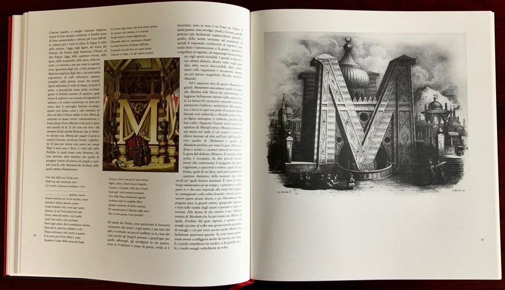
Top row: A, C and E from Alphabetto Latino Schizzato a Bena da Antonio de Pian, reproduced in Antonio Basoli:Alfabeto Pittorico 1839, edited by Joseph Kiermeier-Debre and Fritz Franz Vogel, published as part of the boxed set Alphabets Buchstaben Calligraphy by Ravensburger Buchverlag (1998). Hardback, sewn. H275 x W255 mm, 144 pages. Acquired from Antiquariat Terrahe & Oswald, 14 March 2021. Bottom row: A, C and E from Alphabetto Pittoresque (1842) by Giovanni Battista de Pian, reproduced in Ein Schmuckalphabet aus Wien“Alphabet Jewelry from Vienna” by Anton Durstmüller, published by Fachhochschule f. Druck (1973). Perfect bound with pages in Chinese fold. H245 x W220 mm, 72 pages. Acquired from Versandantiquariat K. Stellrecht, 22 March 2021. Photos: Books On Books Collection.
Father and son, Antonio de Pian (1784-1851) and Giovanni Battista de Pian (1813-57)) worked in Vienna during the 18th and 19th centuries. Born in Venice, Antonio came with his father to Vienna, where he became a court-appointed set designer and scene painter and was inducted by the Academy of Fine Arts in 1843. Giovanni Battista (or Jean Baptiste) was not as professionally or academically successful as his father, but his Alphabetto Pittoresqueportfolio outshines his father’s Alphabetto Latino Schizzato a Bena and rivals the earlier Alfabeto Pittorico by Antonio Basoli, the elder Pian’s Bolognese contemporary, who was also an accomplished scenographer as well as an internationally honored academic. All three artists’ portfolios are scarce, and as they represent the next link in the chain of complete architectural alphabets that began with Johann David Steingruber’s Architectonisches Alphabeth in 1773, it is fortunate that the facsimile works produced by Durstmüller and Kiermeier-Debre/Vogel are available and accessible.
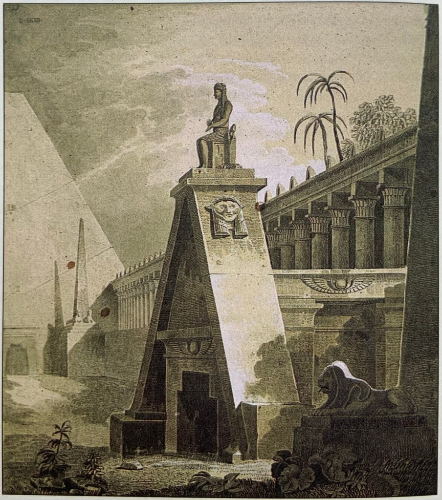
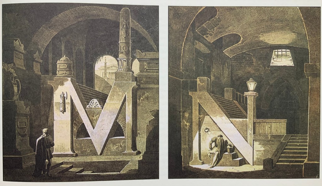
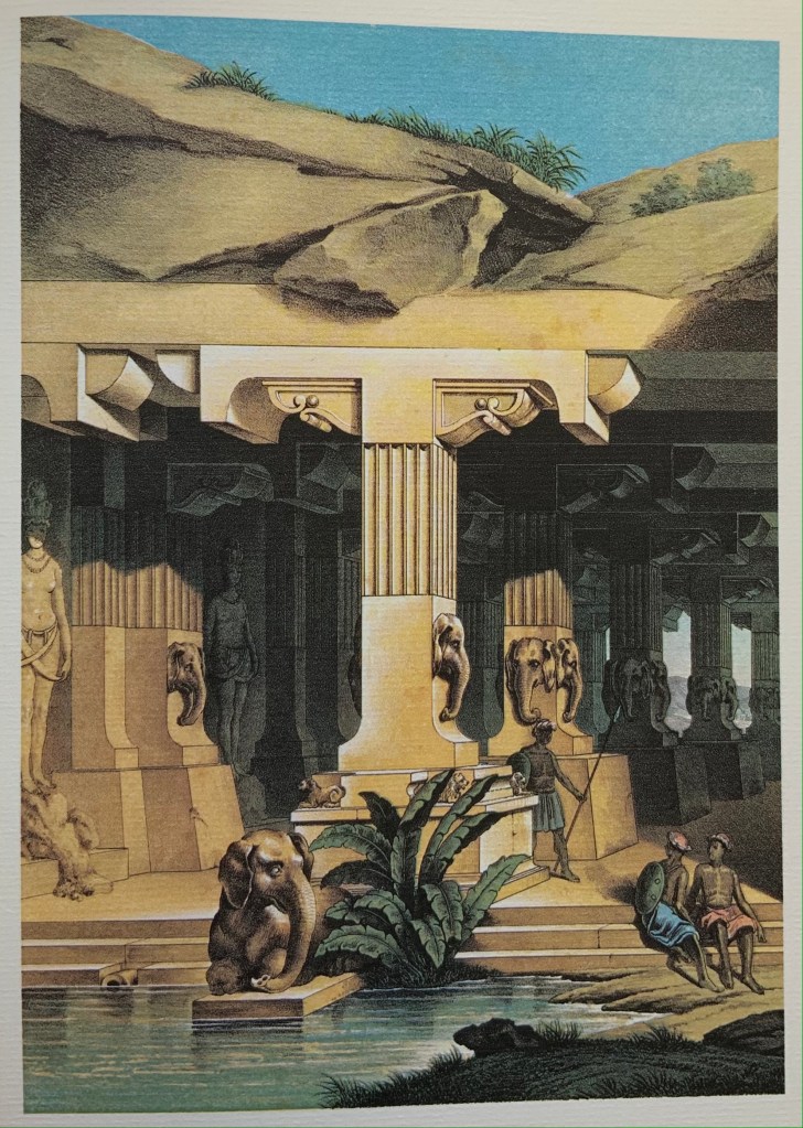
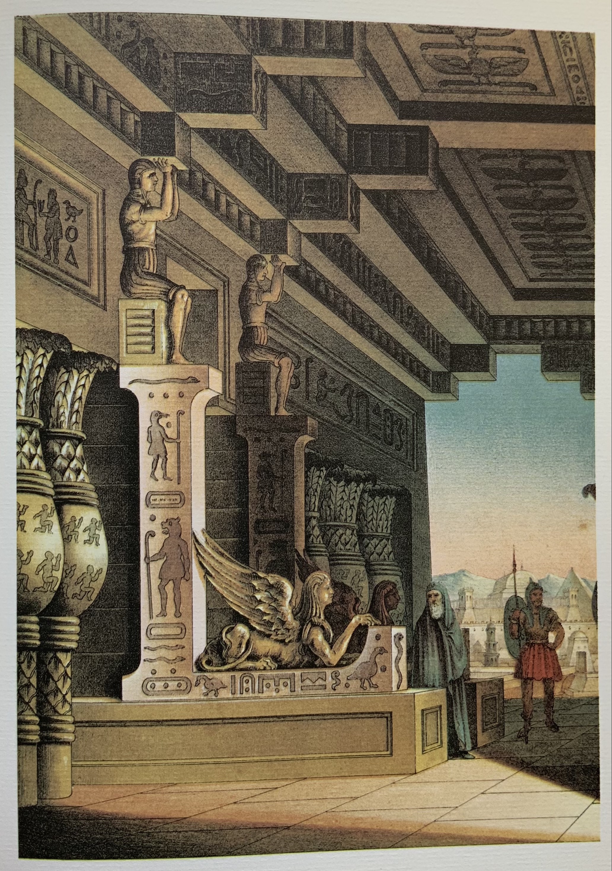
Antonio de Pian’s architectural alphabet portfolio is the rarest of the four. With its frontispiece/title page and twenty-two letters (B, D, J and W are missing), the only copy resides somewhere in Vienna. Fortunately, all of the twenty-two appear in the Basoli facsimile produced by Kiermeier-Debre/Vogel in 1998. The brown-tinted lithographs of the elder Pian’s portfolio echo not only the Basoli portfolio’s monochromatic character but also its emphases on Near or Middle Eastern or Oriental settings and on antiquity. As Kiermeier-Debre/Vogel point out, the dual emphasis was ushered in by Napoleon’s Egyptian campaign (1798-1801) and also showed itself in opera’s subject matter during Basoli’s and the Pians’ lifetimes. Twelve of Antonio’s scenes have settings in antiquity or the distant past, and seven in the Near or Middle East. Fifteen are based in Europe.
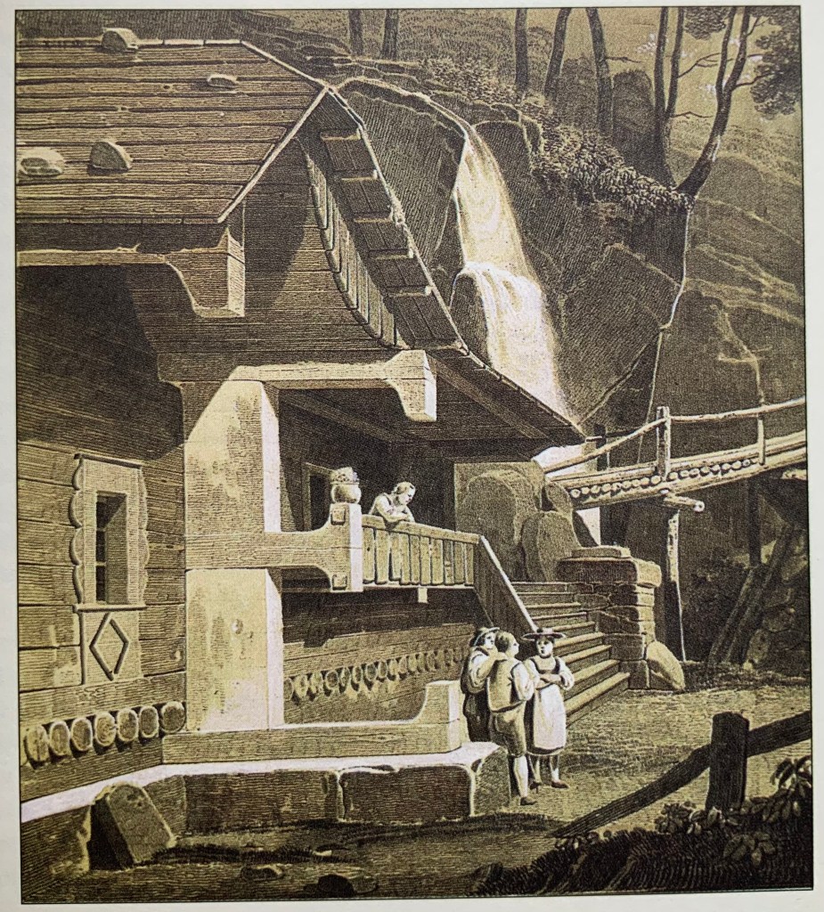
Letters M, N, O and P by Antonio de Pian
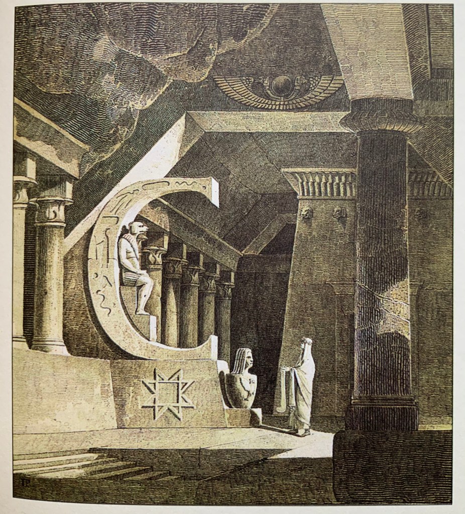
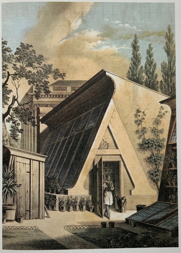
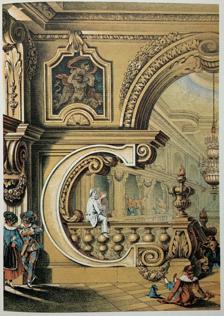
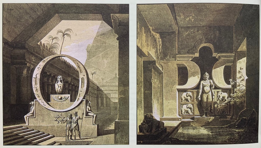
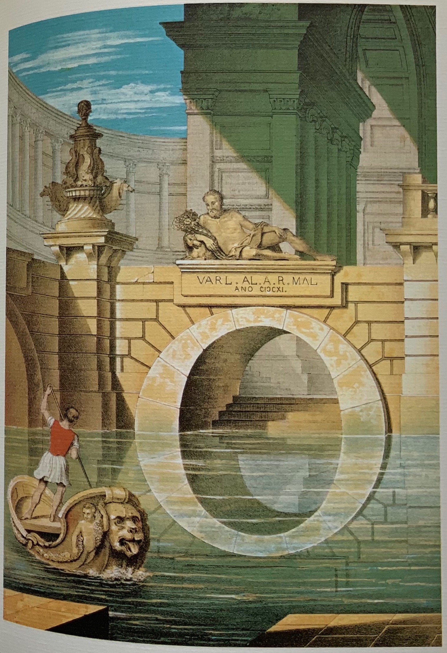
The original of Giovanni Battista’s portfolio is less rare, coming up for auction at five figures occasionally in the last few decades. It, too, appears in the Kiermeier-Dobre/Vogel’s Basoli volume but more prominently than his father’s. Anton Durstmüller’s earlier Ein Schmuckalphabet aus Wien/“Alphabet Jewelry from Vienna”(1973) showcases Giovanni’s portfolio. With its Chinese-fold leaves and laid paper, Durstmüller’s book matches and enhances the warmth and color of Giovanni’s invention and the chromolithographs by the Viennese lithographers Leopold Müller, Johann Höfelich, and M.R. Toma. Giovanni’s use of the arch’s reflection in the water to form the letter O, Pian places himself firmly in his father’s and Basoli’s company regardless of any lack of appointment or honors.
The Chinese fold of pages in the Durstmüller volume; the letter O by Giovanni Battista de Pian.
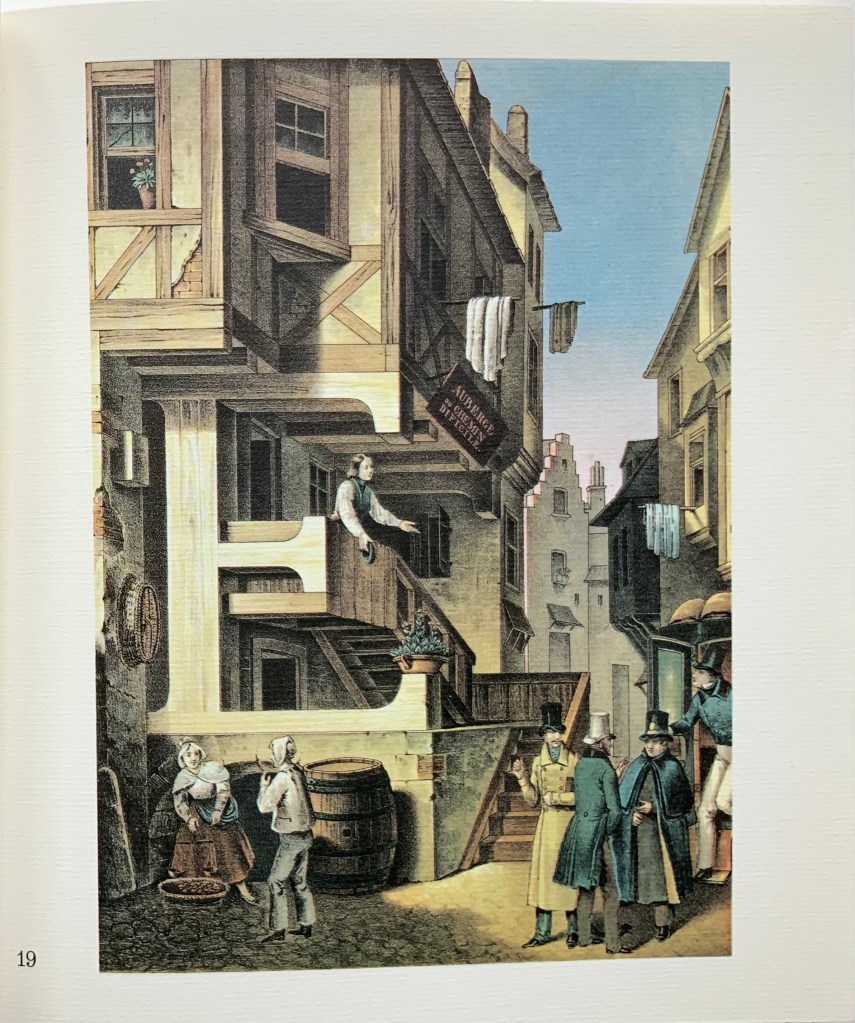
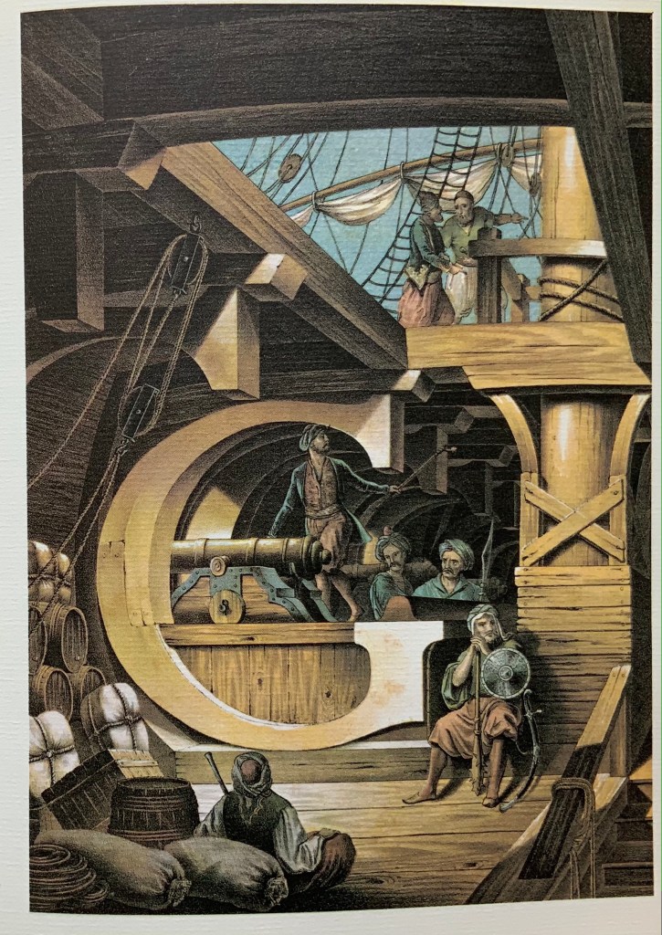
Sixteen of Giovanni’s scenes have European settings; eleven are Middle Eastern (he has an extra S). Of these, at least nine represent antiquity. From Basoli to the elder Pian and to the younger, there is the subtle shift in their scenes from the Classical to NeoClassical to Romantic styles, reflected in the diminishing emphasis on antiquity and growing emphasis on rustic European scenes. Typographically (or really calligraphically), the shift is less subtle. With almost every letter, Basoli used or tended toward a slab serif letter shape with blunt tips and sloping brackets. The Pians, however, leaned toward block serifs and sharply curving brackets, as seen in the letters A, C and E, above, and the letter M, below.
Kiermeier-Debre/Vogel’s side-by-side presentation of the letter M by Giovanni Battista de Pian and Antonio Basoli, respectively. Photo: Books On Books Collection.
Basoli’s serifs do not vary with the scene’s region, which might have created anomalies but somehow that does not happen. Only with certain letters do the Pians vary their letters with the region. At the top here, the serifs in the elder Pian’s letters C and E reflect their different regional settings. Below, his two S’s, however, fail on this score. The block serif S belongs more with the antique Roman scene; the nearly sans serif S belongs more with the antique Egyptian scene. The more exotic the setting from a Western perspective, the more the block serifs present difficulties — as in Giovanni’s letter G (the Turkish pirates below decks appear fed up with it) and letter T (the Africans depicted are certainly looking askance at the architecture) below.
Basoli’s and the Pians’ use of slab serif letter shapes reflects both their theatrical profession and the period’s infatuation with the shape in advertising in newspapers and on posters. Slab serifs were called Egyptian serifs, not that those letter shapes appear anywhere in Egyptian antiquity, but neither do the Keith Haring-like figures on the flanking columns in Giovanni’s L scene. See Further Reading for the story of slab serifs and their moniker.
For more on the operatic and theatrical context in which Basoli and the Pians worked, see the entry for Antonio Basoli in the Books On Books Collection.