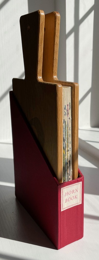
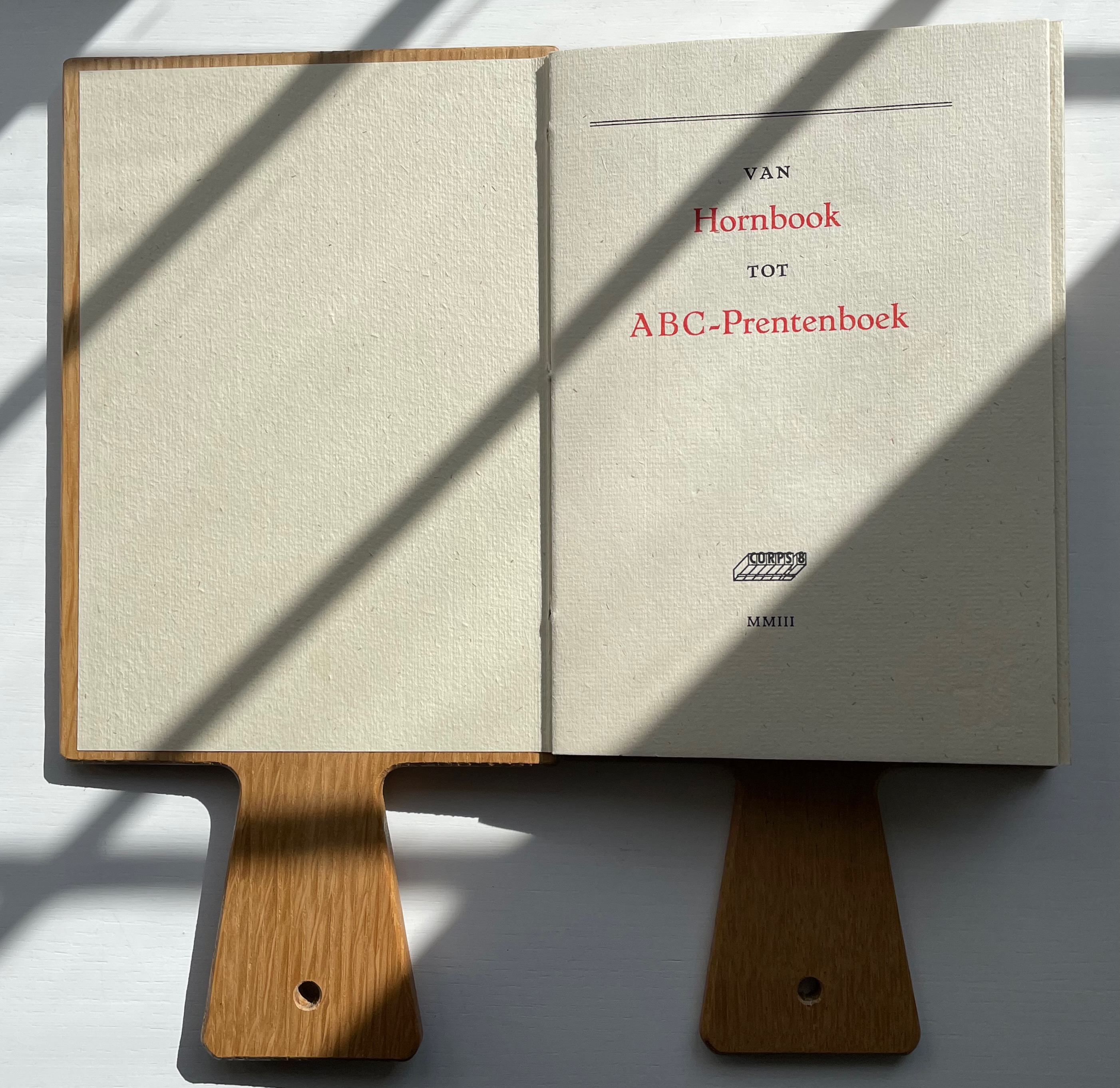
Van Hornbook tot ABC-Prentenboek (2003) Kees Baart, Dick Berendes, Henk Francino and Gerard Post van der Molen Double-sided leporello between two pamphlet-sewn booklets and bound between two oversized wooden hornbooks, held in an open cardboard box. H295 x W150 x D 30 mm. First booklet, 18 unnumbered pages; second booklet 8 pages; 52 panels. Edition of 135. Acquired from Fokas Holthuis, 13 September 2022. Photos: Books On Books Collection. Displayed with permission of the artists.
From Hornbook to ABC Picture Book was organized by four members of the Corps 8 collective. They issued it with the financial backing of the Zeeuwse Nederland Bibliotheek and under the auspices of Drukwerk in de Marge (Printing in the Margin), a foundation established in 1975 by likeminded amateur printers and publishers. Drukwerk in de Marge recalls The Typophiles, a similar group founded in the 1930s in New York that attracted great talents like Frederic Goudy, Bruce Rogers and Beatrice Warde. Like Drukwerk in de Marge, The Typophiles stimulated quirky publications. One of them — Diggings of Many Ampersandhogs (almost the last word on the ampersand) — resides in the Books On Books Collection and, until now, lacked an appropriate partner covering the preceding twenty-six characters of the alphabet.
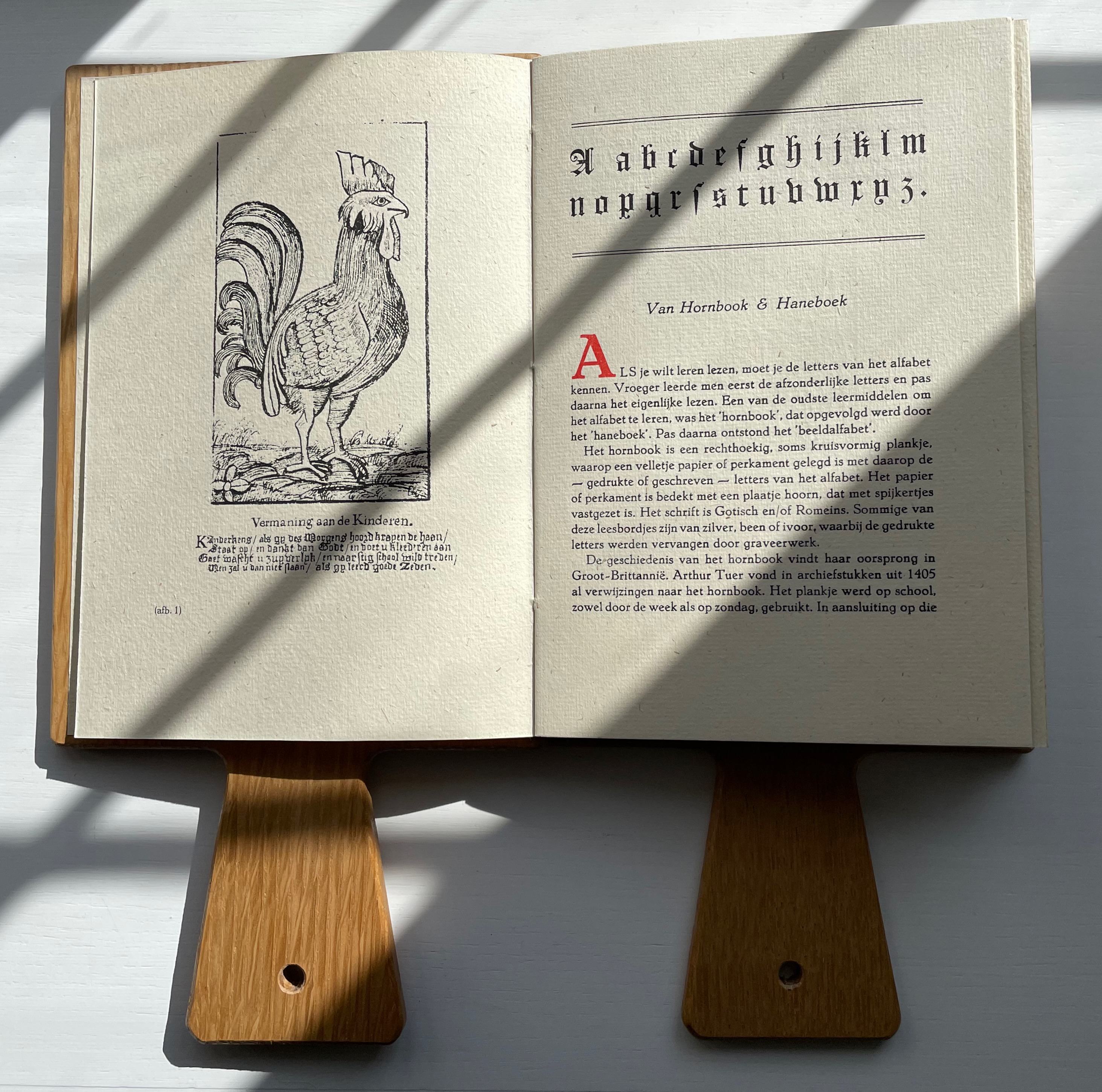
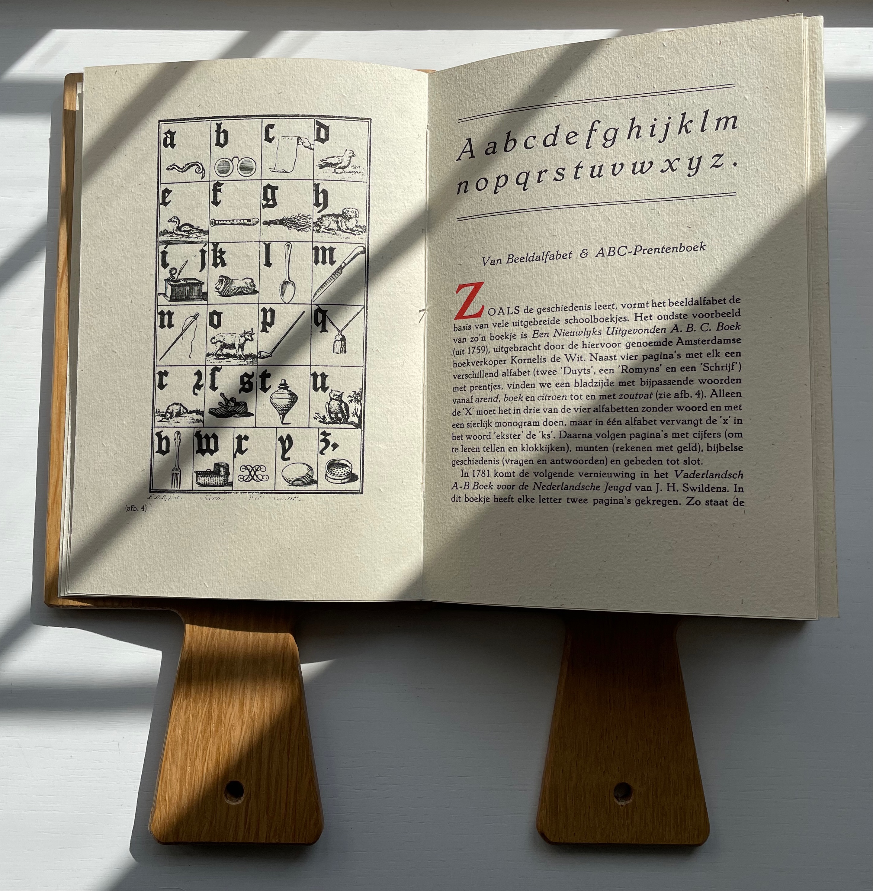
Van Hornbook includes four brief essays. Following in the footsteps of Andrew White Tuer’s History of the Horn-Book, the first two — “Van Hornbook & Haneboek” / “Of Hornbook & Handbook” and “Van Beeldalfabet & ABC-Prentenboek” / “Of Picture Alphabet & ABC Picture Book” –provide historical context for the format and its successors. Only four hornbooks have survived in the Netherlands, dating from the eighteenth century, so like Tuer, Van Hornbook‘s essayists rely on images from popular historical prints to show the hornbook’s appearance and handling. To the three hundred illustrations of History of the Horn-Book, the Nederlanders add this:
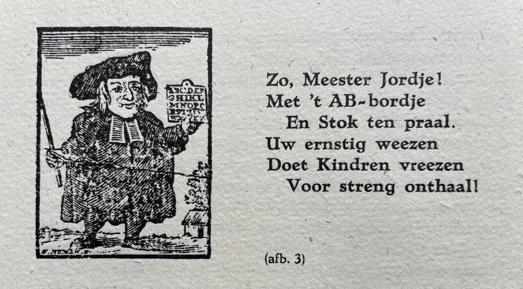
So, Master Jordje! With AB boardje And cane on high. Your earnest weening Leaves children keening As school draws nigh!
The print dates to 1785. The Dutch collective’s undertaking and their contributors’ offerings for the leporello are all the more notable for such a narrow historical margin on which to build.
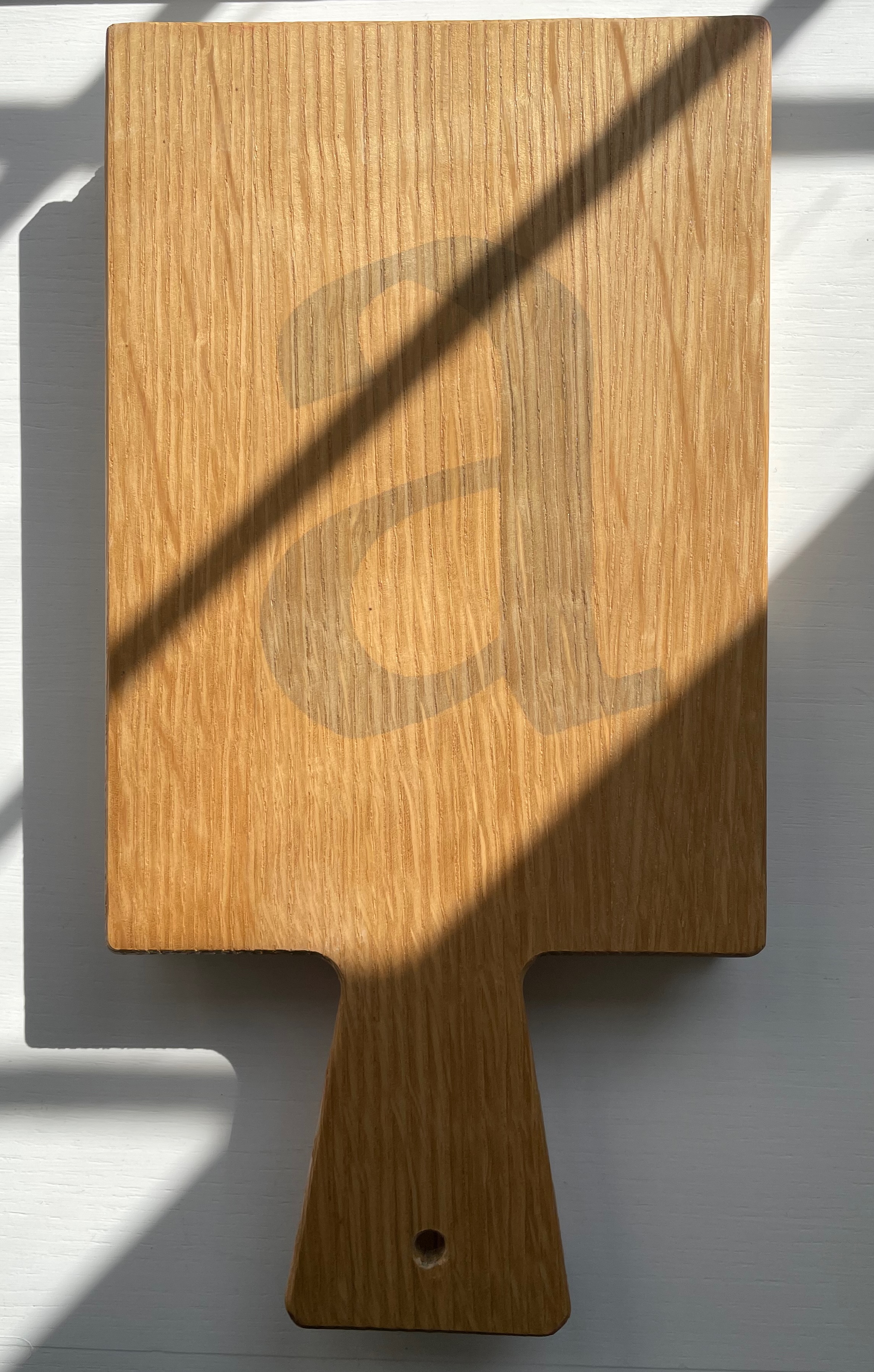
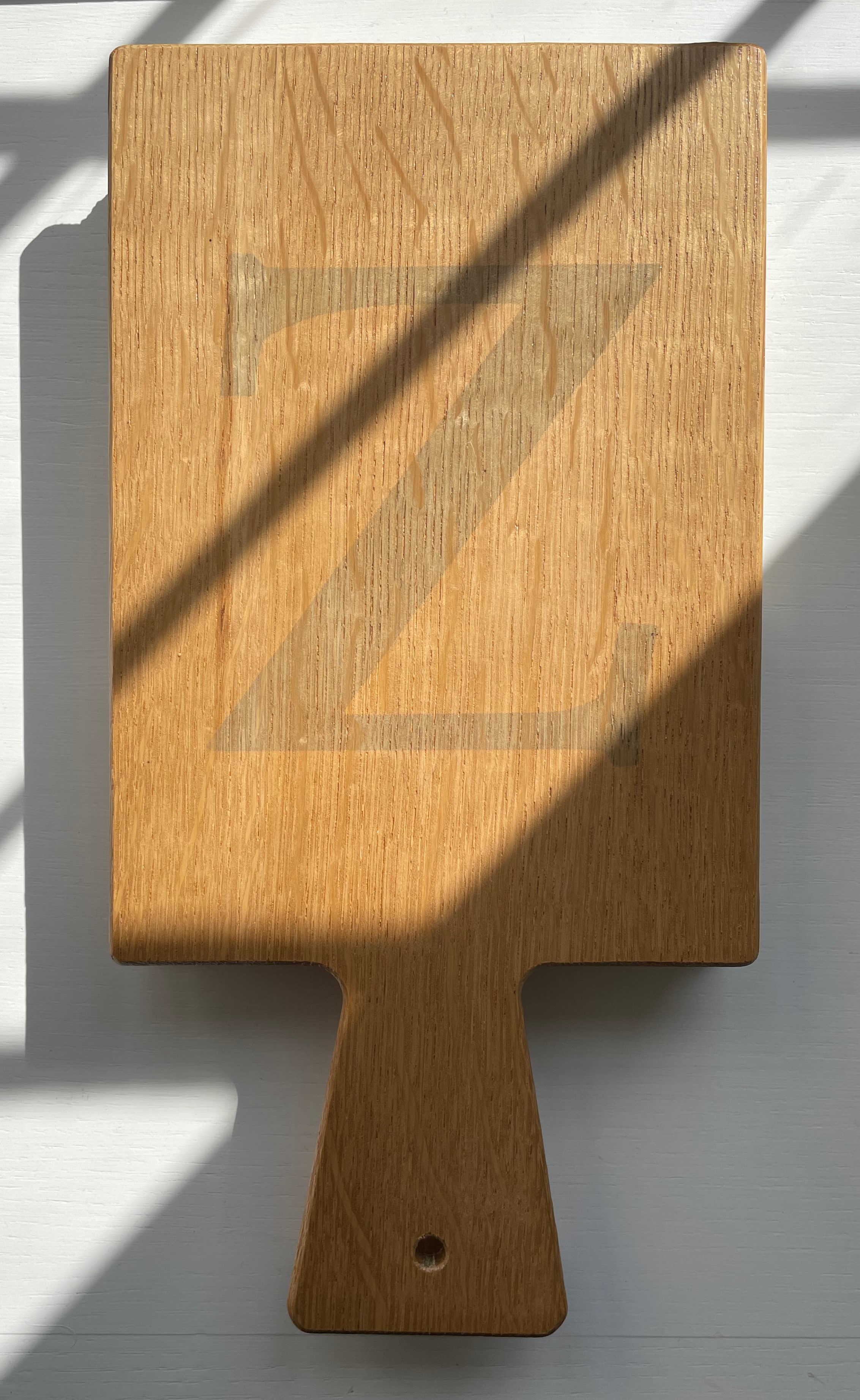
The work’s four editors have the last say with “Verantwoording” / “Explanation”, which is an extended run-up to the colophon. The leporello is printed on 180 gms Antik Gerippt Bütten by Hahnemühle, and the essays are on 130 gms. The heavier weight of the leporello’s panels must have been an open invitation for the contributors to show off. Aside from the constraint of print area, the “Hornbook preparation group” seems to have imposed only one other layout requirement: that each double-panel spread display the same horn-book shape on its left-hand panel. As the images below show, this was just the right touch of uniformity to spark rather than impede the contributors’ creativity and individuality.
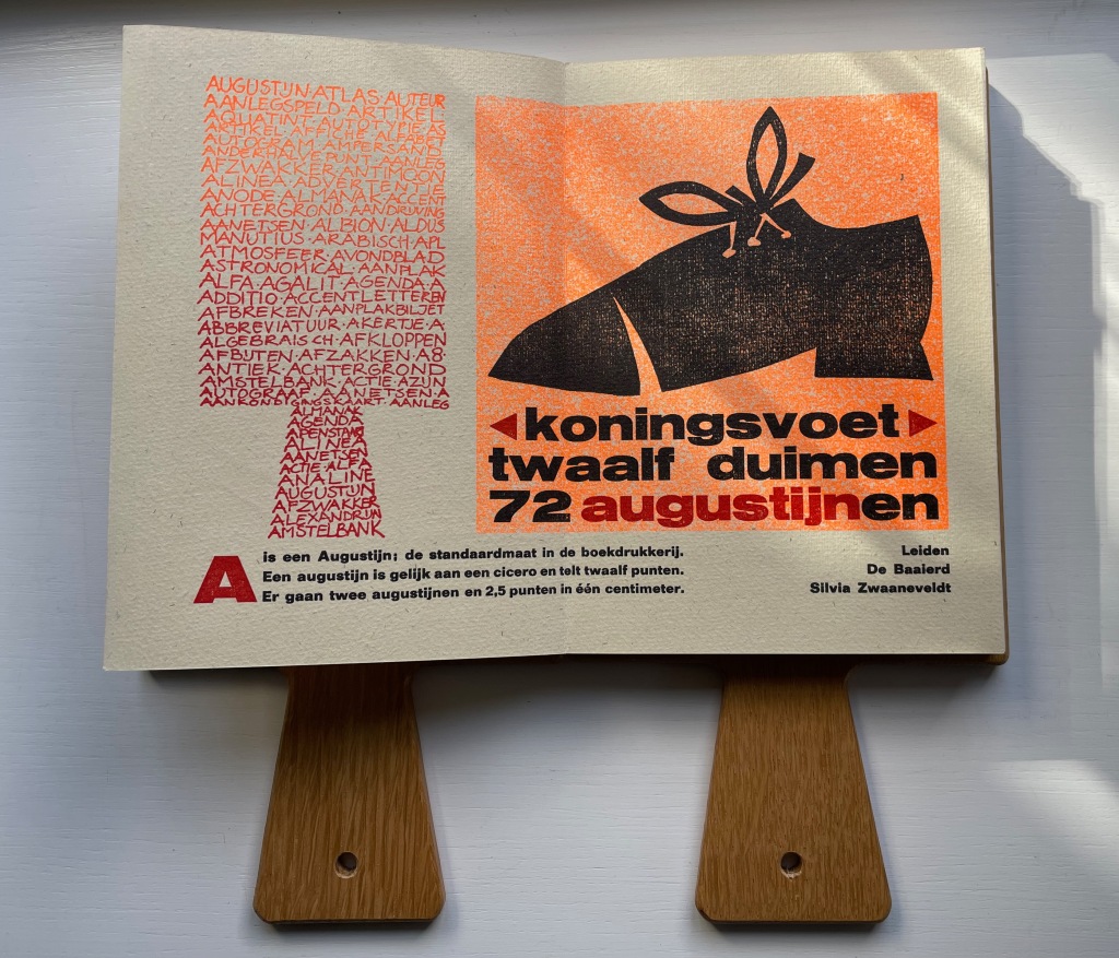
In English, the text beneath the two images here reads “A is an Augustin, the standard size in letterpress. An Augustin is equal to a cicero and has twelve points. Two Augustins and 2.5 points equal one centimeter.” Under the image of the shoe, Silvia Zwaaneveldt (De Baaierd, Leiden) converts into points the traditional measure for the “foot”: a foot would equal the size of the king’s foot, which eventually was standardized to twelve inches, which — to save us from chasing after Willem-Alexander or Charles III with a pica stick — is 72 Augustins.
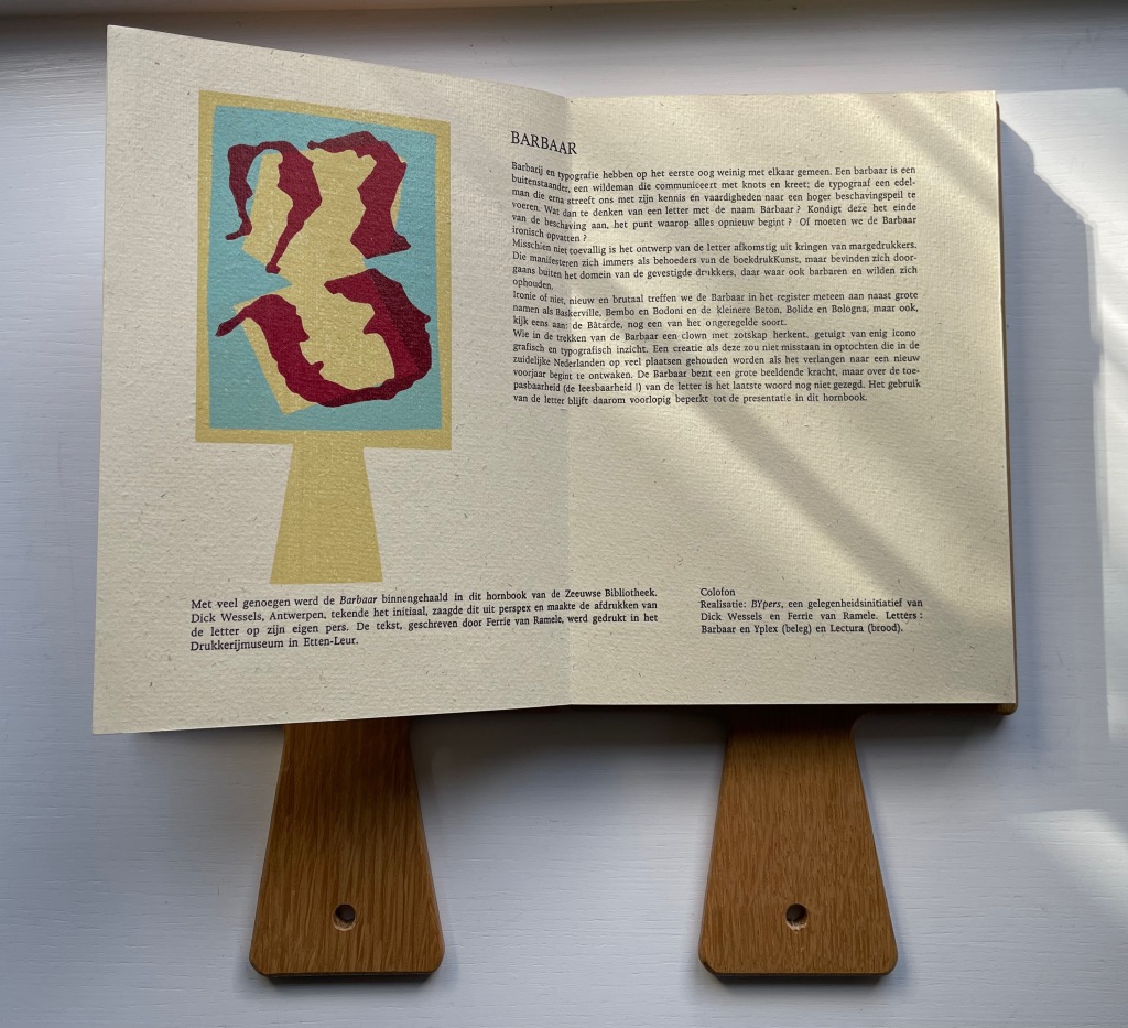
In their contribution for the letter B, Dick Wessels and Ferrie van Ramele invent a fictitious typeface Barbaar, named to allow them an extended joke about the outsider (or barbarian) status of Margedrukkers among traditional printers. If the Dutch reader misses the tongue-in-cheekiness of the entry, the colophon gives away the game:
Realisatie: BYpers, een gelegenheidsinitiatief van Dick Wessels en Ferrie van Ramele. Letters: Barbaar en Yplex (beleg) en Lectura (brood). / “Realization: BYpers, an occasional initiative of Dick Wessels and Ferrie van Ramble. Letters: Barbaar and Yplex (icing) and Lectura (cake).”
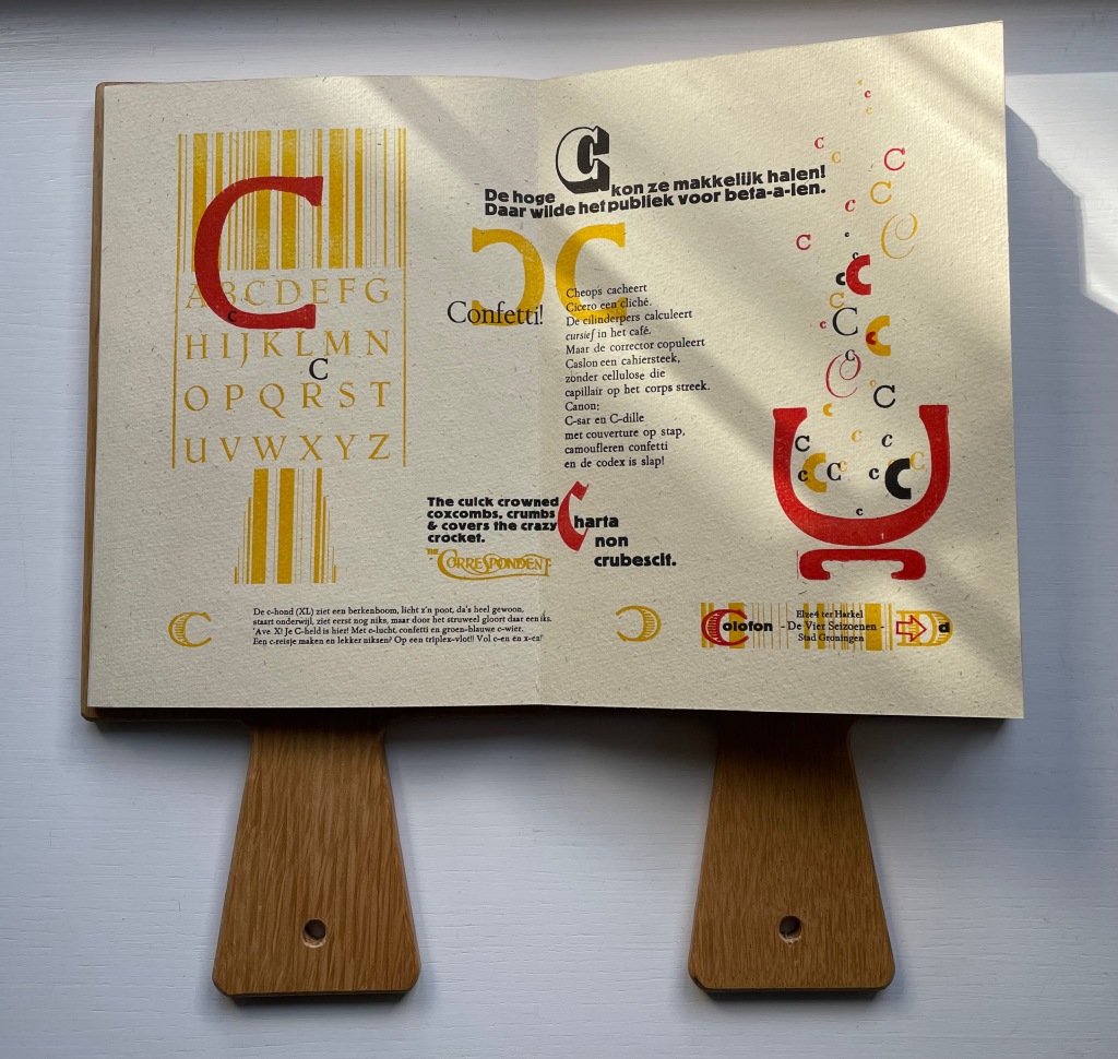
Elze ter Harkel (De Vier Seizoenen, Groningen) concocts two panels of verbal and visual puns on the letter C. The alliterative wordplay in the doggerel of “Confetti” is too Dutch and deliberately nonsensical for a satisfactory replica in English, but its reference to cellulose is a clue to the visual papermaking pun in the C’s bubbling up from the pulp vat next to it. Also referring to paper, the panels’ best pun hides in the last altered word of Cicero’s saying “Charta non erubescit“. This is usually translated as “Documents don’t blush”, meaning you can express opinions in print you might blush to express in person, but charta also means “paper”. With the “e” changed to a “c” in the last word, the Latin now means “crumble”. So, it’s “Paper doesn’t crumble”, which ought to make the winking punster blush a little.
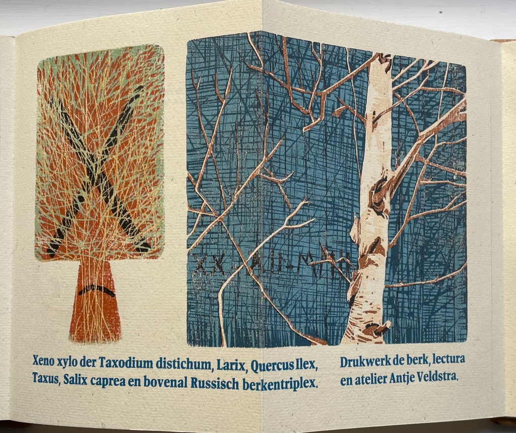
Antje Veldstra (Antje Veldstra Grafiek, Groningen) is an award-winning woodcut artist. Almost all of the X-words in her couplet are the Latin names for trees: Taxodium distichum (Bald Cypress), Larix (Larch), Quercus Ilex (Holm Oak), Taxus (Yew) and Salix caprea (Goat Willow). The first two words, however, — xeno and xylo — are prefixes. The first means “alien,” “strange” or “guest” as in xenophobia (“fear of foreigners”). The second means “wood” as in xylography (“the art of engraving on wood or of printing from woodblocks”). But what is so strange or alien about these trees? The clue is in the background (lower left) of the birch print. Those are runes, the ancient marks of mystery and secret language. The most easily distinguished are ᚷ (called Gebo, associated with gift and fortuitous outcome) and ᛖ (called Ehwaz, associated with horse and movement). In her craft, Veldstra, however, does not leave us with the ancients. The last entry — en bovenal Russisch berkentriplex — is Russian birch plywood, commonly used for engraving.
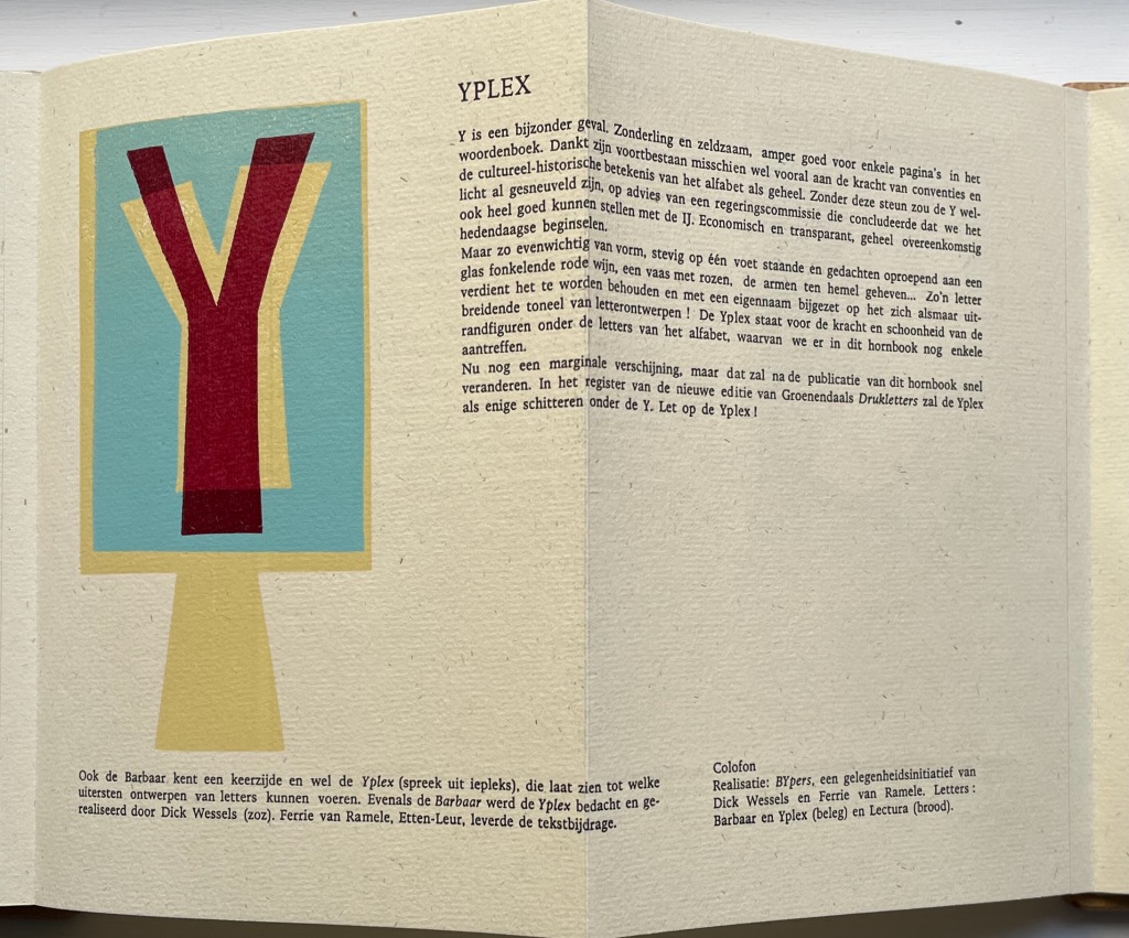
If there remains any doubt about the tone of the entry for B by Dick Wessels and Ferrie van Ramele, consider their entry for Y.
Y is a special case. Eccentric and rare, barely good for a few pages in the dictionary: it owes its survival perhaps mainly to the strength of conventions and the cultural-historical significance of the alphabet as a whole. Without this support, the Y might have already been killed off, on the advice of a government committee that concluded that we could very well make do with the IJ. Economical and transparent, entirely in keeping with contemporary principles.
But so balanced in form, standing firmly on one foot and evoking thoughts of a glass of sparkling red wine, a vase of roses, arms raised to heaven…. Such a letter deserves to be preserved and added with its own name to the ever-expanding stage of letter designs! The Yplex represents the strength and beauty of the marginal figures among the letters of the alphabet, a few of which we still find in this hornbook.
Although still a marginal appearance, that will soon change after the publication of this hornbook. In the register of the new edition of Groenendaal’s Printing Letters, the Yplex will be the only one shining under the Y. Stand by for the Yplex!”
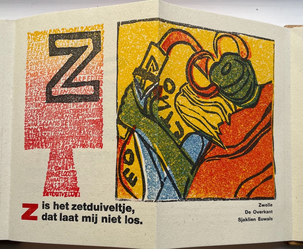
The last letter of the alphabet bedevils abecedarians in every language. Sjaklien Euwals settles on zetduiveltje: “typesetter’s or printer’s little devil”. Word for word in English, the caption reads “Z is the typesetter’s little devil that will not let me loose”. The image rules out the English expression “printer’s devil”, which refers to the printshop apprentice. Euwals’ little devil is the green and red gremlin who leans over her shoulder, grabs her wrist and makes her drop letters from her composing stick. In other words, the imp on whom to blame typographical errors. To capture Sjaklien Euwals’ humor in translation, we might have to go with “Z iz the typezetter’z gremlin that won’t let looze.”
Given the affinity between artists’ books and children’s books (particularly alphabet books), it is surprising how few works of book art pay homage to the form of the horn-book. Van Hornbook tot ABC-Prentenboek sets a high bar. Perhaps increased awareness of it will prime the pump for primers.
Further Reading/Viewing
“Elder Futhark“. Last edited 11 August 2022. Wikipedia. Accessed 27 October 2022.
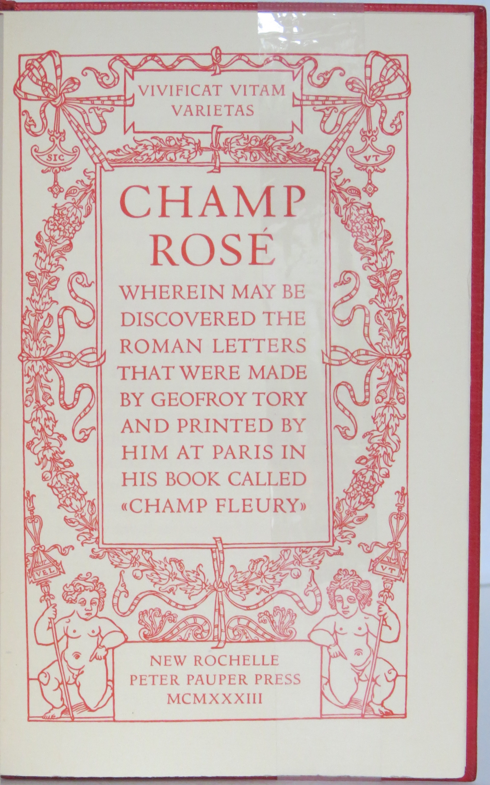
The art of the alphabet seems to be a rite of passage for graphic artists. Perhaps it is that art and the alphabet find common ground in the urge to make sense of the world. Perhaps it’s that the alphabet’s invention, development and artistic treatment present a rich tradition for artists to follow or challenge. Perhaps it’s that letterforms and the alphabet offer raw material, subject and organizing principle all in one. Semic or asemic. Calligraphic, typographic or even plastic. Representational or abstract. All are options. But most often, something bookish results. From Islam Aly’s 28 Letters(2013) to Ludwig Zeller’s Alphacollage (1979), a significant part of the Books On Books Collection is taken up with artists’ books based on the ABCs and letterforms. The Collection’s two facsimiles of Geofroy Tory’s Champ Fleury provide a useful historical backdrop that throws into relief several of the Collection’s works and their performance of this rite of passage.
It should be no surprise that Geofroy Tory de Bourges (c.1480-1533) serves up such an exemplar. In her Playful Letters, Erika Boeckler writes
An accomplished designer, typographer, printer, poet, author, translator, calligrapher, illustrator, woodcutter, and engraver, he received his education in Italy and ultimately settled in Paris, setting up a bookstore, writing his own works, running a press, and collaborating with or working for Simone de Colines, director of one of the most influential and experimental fine publishing houses of the time. Personally writing the text, designing the woodcuts, and cutting some of them, organizing the layout, perhaps even setting the type, Tory created Champ Fleury as what we might call today an artist’s book. (p. 29)
Tory straddles the letters of the late Middle Ages and Renaissance. Appointed by François I in 1530 as his printer, Tory operated on the Petit Pont under the sign of le Pot cassé (“the broken pot”) and was known for his workshop’s handwritten Book of Hours (1524). Rooted in the horae tradition reaching back to the 13th century, Tory’s Book of Hours is an early-to-mid-Renaissance version of its predecessors. As beautiful as his Book of Hours is, Champ Fleury (1529) became his best known work. Authored and designed by Tory, it was produced by hand typesetting and letterpress printing in Paris with Giles Gourmont. Printed less than 100 years after Gutenberg’s innovation, Champ Fleury represents the printed book toddling out of its incunabula period.
Book of Hours Geofroy Tory (1524) Bound in the 18th century, 113 leaves of vellum. Lessing J. Rosenwald Collection (Library of Congress). Accessed 30 May 2021.
According to Jeremy Norman’sHistory of Informationsite, the first separate printed title page appeared in 1463. Subject indices date back to the 13th century, originating at the University of Paris, and the first printed indices, to 1470. Champ Fleury‘s front matter boasts a title page, two prefaces to the reader, a statement of the King’s Privilege awarded for the book for ten years (a forerunner to the copyright page), a name index without location references and a subject index with folio references. Champ Fleury’s back matter consists of a colophon preceded by a lengthy appendix illustrating various forms of the alphabet (Hebrew, Greek, Latin, etc.).
Tory’s placement of the indices in the front matter rather than the back matter reflects the gradual development of the anatomy of the book towards the structure that would ultimately be codified in reference works like the Chicago Manual of Style. Paratextual elements like the title page, table of contents, page numbers, etc., did not spring up overnight. If, as Eric Havelock and others assert, society, the arts and culture are a superstructure erected on the foundation of the alphabet (see below), Champ Fleury and its “letterology” make for a particularly fitting exemplar of the book as an element of the superstructure arising from the alphabet.
Perhaps book artists sense this, which again leads to that alphabet art rite of passage and the elaborate variations on it. The illustration of various forms of the alphabet in the appendix also draws on another developing tradition: the typesetter/printer’s sample book advertising the firm’s fonts. Abecedaries and artist books have sprung from that tradition, too.
Tory was not the first to propose an art and science behind the letterforms of the alphabet. Predating his efforts were Giovanninno de’ Grassi (1390-1405), Felice Feliciano (1463), the Anonymous Chicagoensis and Anonymous Monachensis (1468?), Damianus Moyllus (1480), Fra Luca Pacioli (1509), Sigismondo Fanti (1514), Francesco Torniello (1517), Ludovico Arrighi (1522), Albrecht Dürer (1525) and Giovanni Battista Verini (1527). Leading up to Champ Fleury, these earlier efforts track the development of humanism. Arguably, Tory’s effort is a capstone, combining myth, allegory, metaphysics, geometry, linguistics, calligraphy, typography and cryptography.
Book One, concerned with the mythical origins of the French language, also addresses the fabled origins of the alphabet: the story of Jove, Io and Mercury behind the letters I and O and their claim to being the first letters and also the tale of Apollo’s accidental murder of Hyacinth explaining the letters A and Y and their similar claim. Two works in the Collection built on alphabet origin stories are Francisca Prieto’s Printed Matter series (2002-2008) William Joyce’s The Numberlys (2014), but many more follow in Champ Fleury’s art and science footsteps.
Tory’s late medieval/early Renaissance perspective gives way to 20th and 21st century poetics and phenomenology in most works of the Collection. Aaron Cohick’s The New Manifesto of the NewLights Press (third iteration) (2017) offers a good example. Another — closer to Tory’s moral and geometric perspective but of a more modern spirituality — is Jeffrey Morin and Steven Ferlauto’s Sacred Space (2003).
Compile all the abecedaries ever created and it would approximate the result of Adam and Eve’s task of naming all the creatures and things of the world. Leonard Baskin echoes that innocence in Hosie’s Alphabet(1972) with its words and animals supplied by his children. If Adam and Eve had had an alphabet, they might have been tempted into pareidolia, which is represented in the Collection by VUES/LUES: Un Abécédaire de Marion Bataille (2018) and Typographic Universe (2014) by Steven Heller and Gail Anderson. Heller and Anderson’s compendium extends to letters formed of natural and drawn objects from the real world, which Champ Fleury’s appendix foreshadows with its floral and fantastic alphabets.
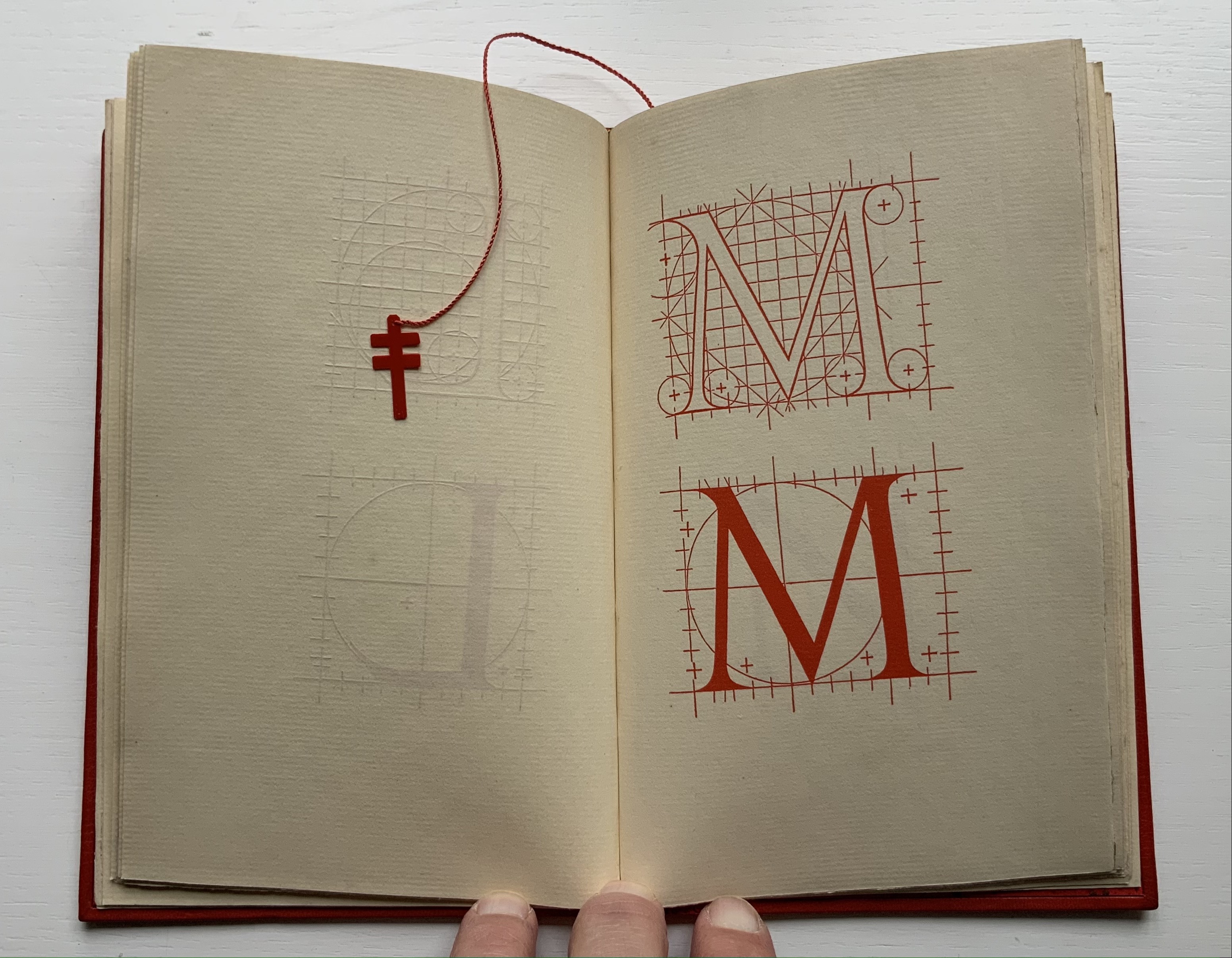
Of course, Tory’s work is not an abecedary. In Books Two and Three, it develops into a full-blown treatise on letterforms whose meaning and appearance are explained allegorically and driven by the compass, rule and geometry expressed within a 10x10x10 cell cube. It would overstate the case to call it “typographic design”. As drawn, Tory’s diagrams would serve poorly for cutting and forming punches or matrices (although it has been done). Nevertheless, his geometric approach foreshadows the grids and algorithms of Wim Crouwel’s New Alphabet (1967), Timothy Epps and Christopher Evans’ Alphabet(1970) and Ji Lee’s Univers Revolved: A Three-Dimensional Alphabet (2004).
Before the age of computers and algorithms, though, the artist and designer Bruce Rogers did bring typographic design to bear on Champ Fleury. The Grolier Club sponsored the printing of George B. Ives’ English translation. Rogers’ design “translates” Champ Fleury just as much as Ives does, perhaps more so. The Grolier Club edition is one of only ten books to be set completely in the Centaur typeface designed by Rogers.
Of course, the translation entails a complete resetting of the text, and Centaur naturally delivers crisper letters. Also, in redesigning with Centaur, Rogers alters the original’s layout and, therefore, the reader’s experience of it. Notice in the OAHK pages above and in the three double-page spreads below how Rogers changes Tory’s flow or jumpiness to something fixed or stately. Attention to the page and its layout offers book artists as well as book designers yet another creative avenue. For proof of that, compare the Collection’s entries for Angel, Baskin and de Cumptich.
Architecture is another of Tory’s well-developed analogies and explanations of the ancients’ thinking behind the letterforms. In his drawings below, he aligns the letters AHKOIS with the parts of a building and letters IL with floor plans. He connects the circularity of the Coliseum’s exterior and the ovalness of its arena with the proper shape of the letter O. In the Collection, the analogy reappears fantastically in Johann David Steingruber’s Architectural Alphabet (1773/1972), Antonio Basoli’s Alfabeto Pittorico (1839/1998) Antonio and Giovanni Battista de Pian’s efforts in 1839 and 1842.
The architectural analogy provides Tory with his segue from plane to solid geometry in aligning the shapes of letters with human anatomy and virtues. His three-dimensional analysis of letterforms also finds contemporary analogues in two of Pieter Brattinga’s Kwadraat Blad series: Crouwel’s, mentioned above, and Anthon Beeke’s Alphabet (1970). Tory’s three-dimensional letterforms foreshadow Crouwel’s investigation of units based on the assembly of organic cells and his later musings on a laser-generated four-dimensional typography (Elliman, 62). And it is hard to evoke anything more humanoid and three-dimensional — albeit far less analytical or prudish — than Beeke’s alphabet formed with naked female models. (Tory comments that in a correctly drawn A, the crossbar will virtuously cover the genitals of Vitruvian man inscribed in the 10×10 grid. Modesty seems to extend to H as well but not so much to O and K.)
The calligraphic impulse that underlies Champ Fleury‘s typographic representations shows itself clearest in the woodcuts for the Cadeaulx alphabet in the appendix. The Books On Books Collection has its share of calligraphic abecedaries such as Marie Angel’s An Animated Alphabet (1996) and Andrew Zega and Bernd Dam’s An Architectural Alphabet (2008) as well as more purely calligraphic alphabets such as Islam Aly’s, mentioned above, and Suzanne Moore’s A Blind Alphabet (1986) .
Two artists whose abecedaries blend the calligraphic and typographic are Robert de Vicq de Cumptich and Cathryn Miller. In de Cumptich’s Bembo’s Zoo (2000), letters and punctuation marks from the Bembo typeface form calligraphic animal shapes. Miller’s L is for Lettering(2011) joins up the alphabetic rite of passage, calligraphy and typography by allying each of her hand-drawn letters with the name of a typeface from “A is for Arial” to “Z is for Zapfino”.
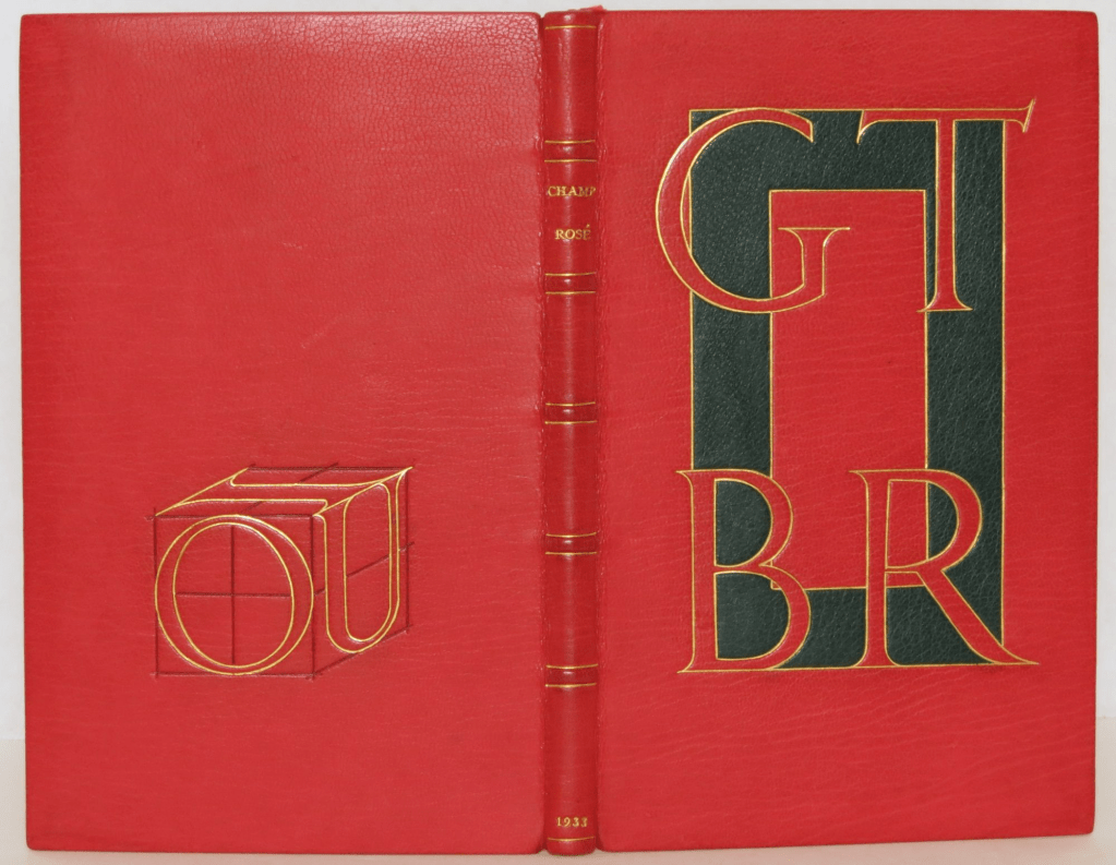
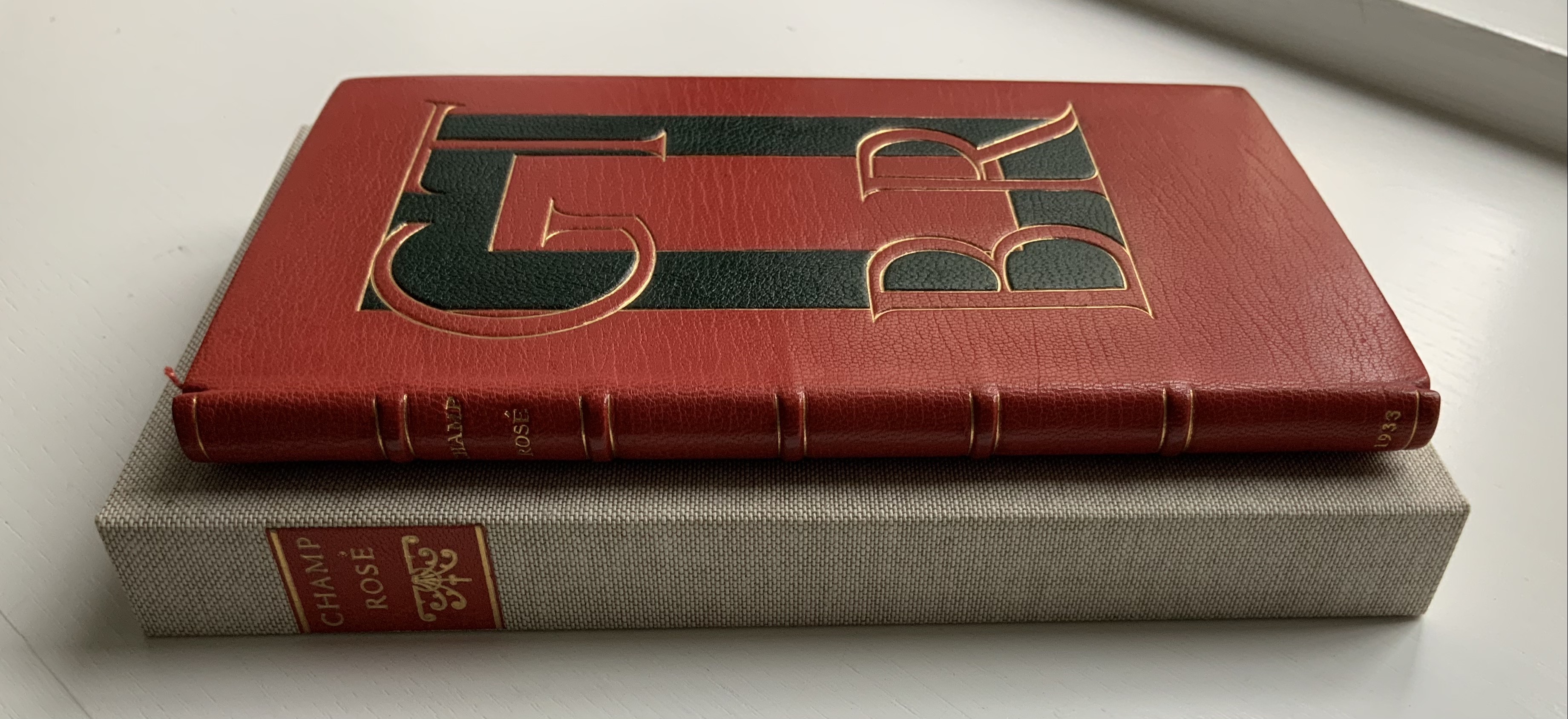
The last page of Tory’s illustration of additional alphabets is not the end of his work. The colophon plays that role. Curiously, Tory misses out the character that plays that role for the alphabet itself: the ampersand. “Curiously” because the character & appears throughout Champ Fleury — even at the end of the colophon’s fourth line in French — and it is after all the most flowery of the alphabet’s characters. Perhaps some book artist will follow Bruce Rogers’ example in his joking Depression-era homage to Tory on the back of Champ Rosé and create an homage to Tory and Rogers of three-dimensional ampersands.
Gelb, Ignace J. 1974. A Study of Writing. Chicago: University of Chicago Press.
Golec, Michael. 2015. “Champ Fleury in the Machine Age”, lecture at the School of Visual Arts, NYC. Uploaded 4 June 2015. Accessed 12 May 2021. Good slides and a comparative look at Tory’s original and Rogers’ resetting.
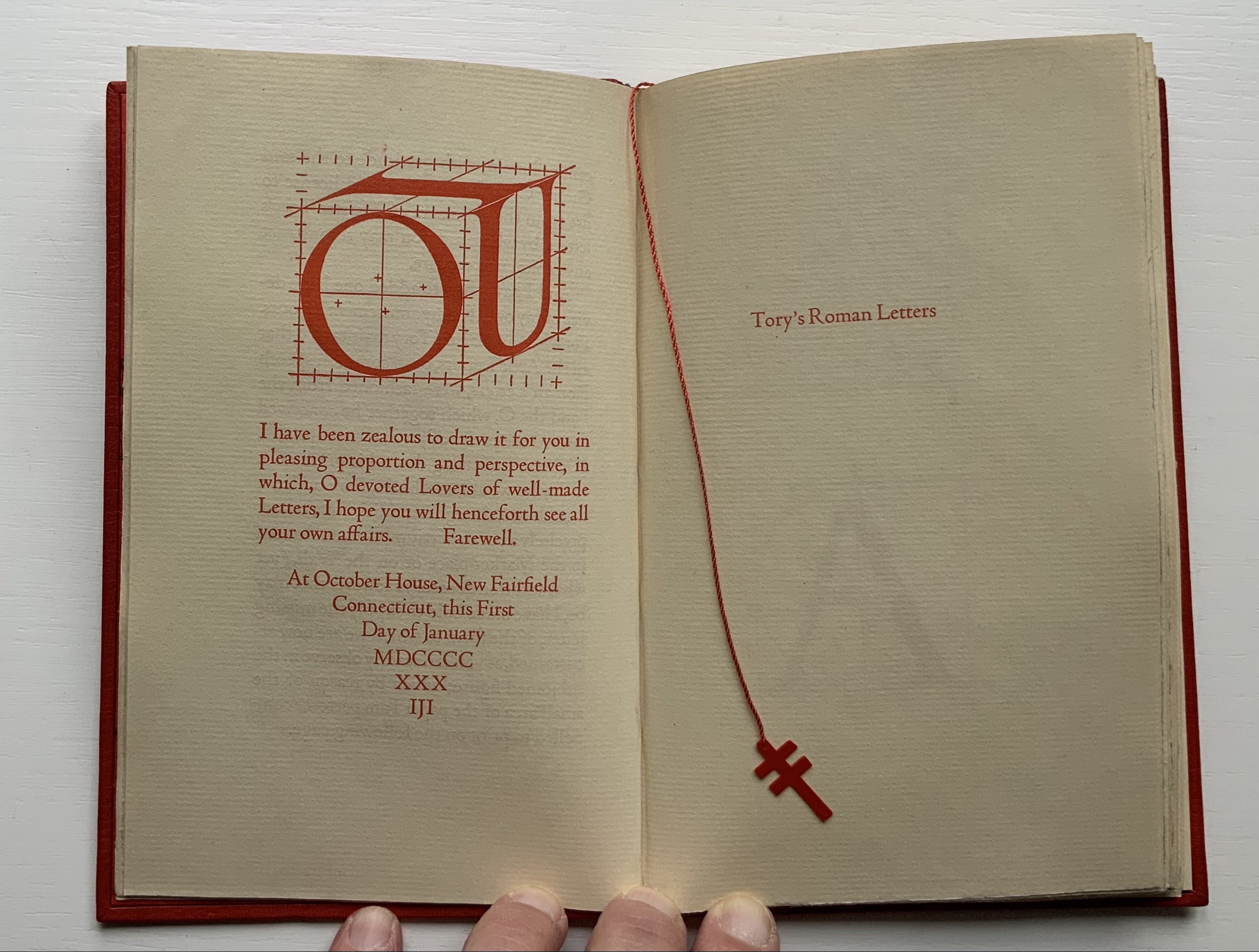
Rogers constructed the IOU device in a joking Depression-era homage to Tory. Referencing the mythological tale about Jupiter, Juno and poor IO who was turned into a cow, Tory maintained in Champ Fleury that all the Roman letters were fashioned from the “I” and the “O.” By placing Roger’s IOU on the back cover, binder Peter Geraty doubles Rogers’ pun on the debt to Tory’s “letterology”. Both Geraty and Rogers are acknowledging a debt to Tory as a book designer.
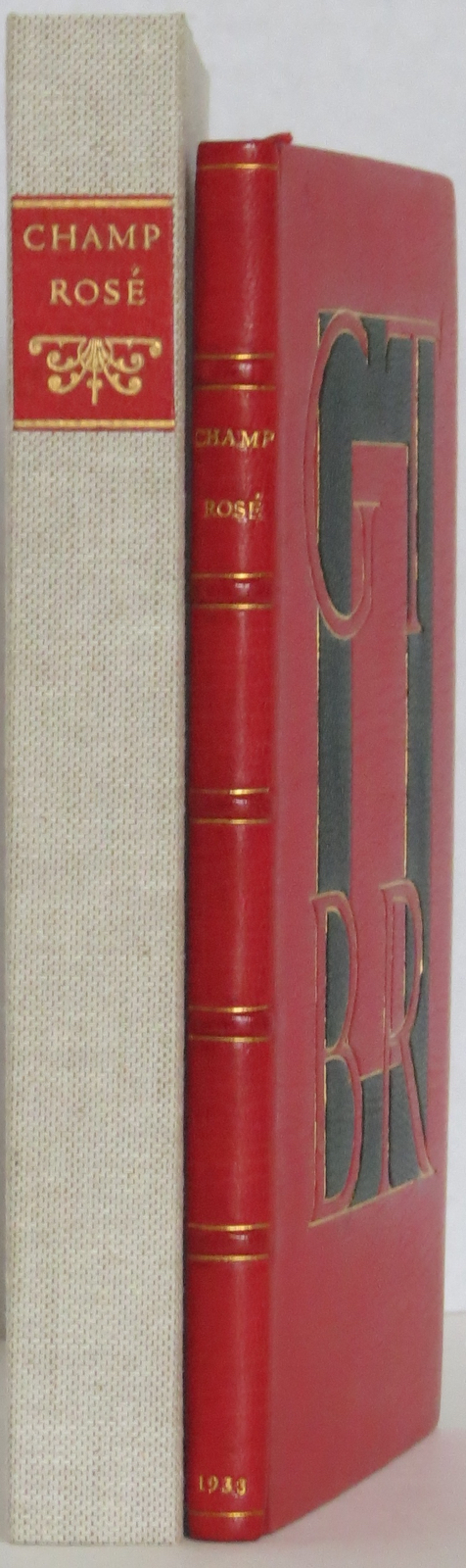
Adding to his joke, Rogers printed the whole of Champ Rosé in red, which Geraty follows. Rogers explained the red ink in his poor man’s Champ Fleury “as in these aforesaid days of hardship & depression much Book-Keeping is being written down in red…perhaps it would be better for Book-Selling too if Printing were done in that cheerful colour.…”
Geraty’s binding was part of the 1989 Guild of Book Workers exhibition.
Photos: The Veatchs.
Photos: Books On Books Collection.
The Books On Books Collection also holds a copy of George B. Ives translation of Champ Fleury, designed, typeset at printed by Rogers.