There is more to Timothy Mosely’s art than meets the eye or touch. It rises equally on an intellectual plane and a physical plane. It is the art of visual touch or haptic seeing.
ep’s (2018)
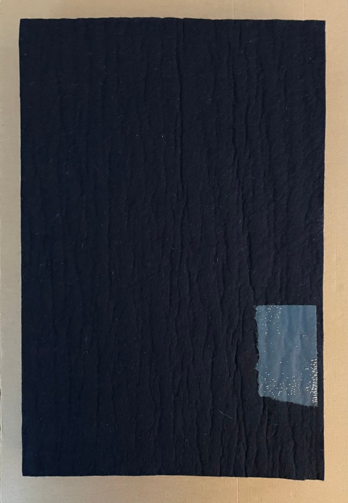
ep’s (2018)
the first book from the series of artists books ”representation by touch”
Timothy Mosely
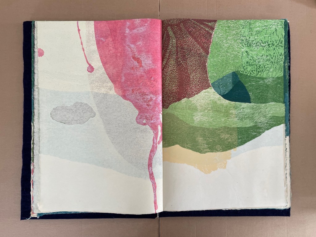
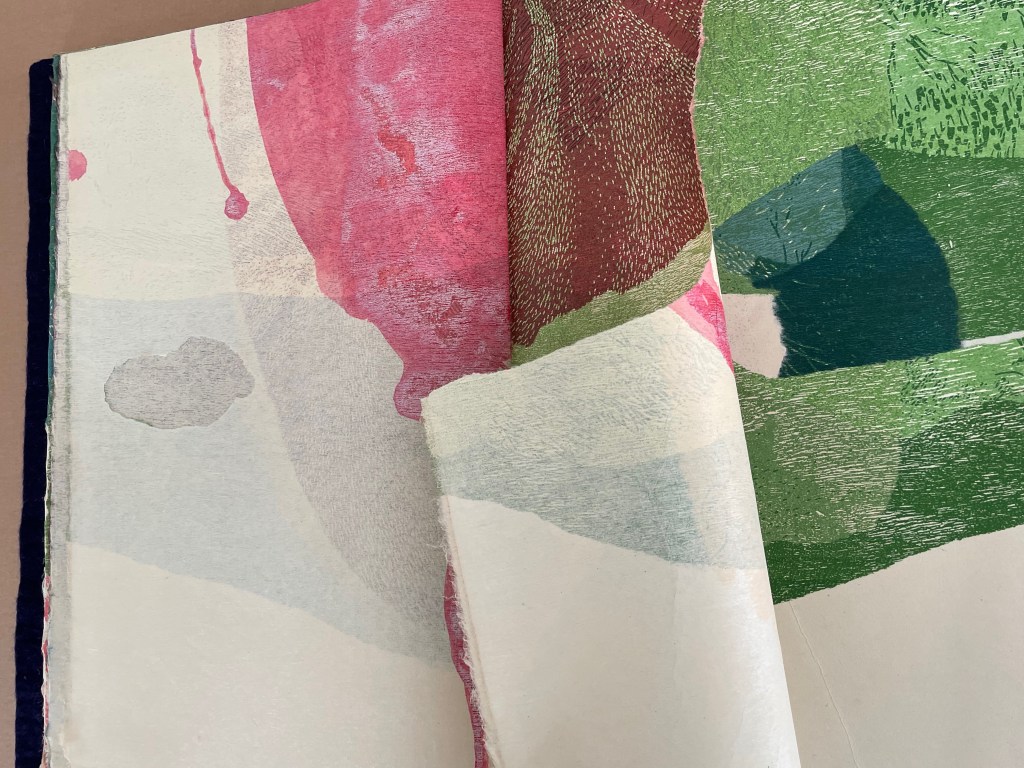
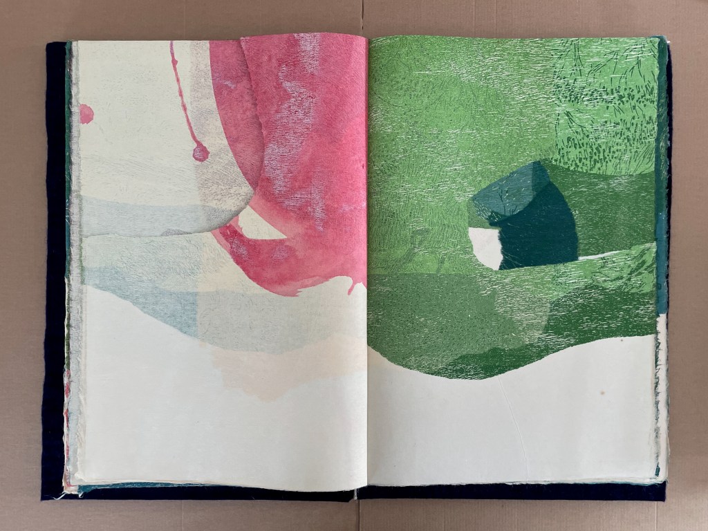
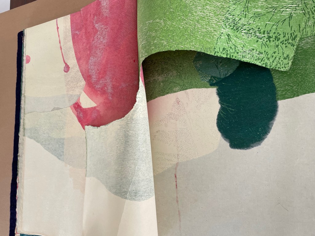
Casebound in felt with plywood backing, pulp printing and silkscreen on recycled cotton paper. H52o x W345 x D58 mm (closed), W693 (open).
7 interleaved folios: 4 folios of H438 x W608 mm, 2 folios of H220 x W310 mm, and 1 folio of H307 x W210 mm. Unique. Acquired from the artist, 31 October 2024.
Photos: Books On Books Collection.
ep’s (2018) is the first of four works in the series “representation by touch” that offers the results of Tim Mosely’s ongoing studio research into the relationship between touch and sight / the haptic and the optic. His drive to draw us into involving touch in our reception and evaluation of art has its roots in a long tradition of concern that Western society has become too ocularcentric for a whole-bodied appreciation of art. If the artist’s aim is to express how the world touches us (as Cézanne put it), a full appreciation of art requires all the senses.
That phrase “representation by touch” is too easily skated over. It requires unpacking. First, what appears to be concave or convex in the surface of some pages is only an appearance, the surface is flat though rough. Second, the rough texture of the surface is down to the handmade nature of the papermaking and pulp printing technique applied to it. Third, the images on the pages range between clear and vague resemblance to the objects that gave rise to them. For example, the image of the zero further below clearly comes from a three-dimensional cast of the numbers, whereas the linear images on the other pages vaguely resemble the twigs sprayed with fine pulp while resting on couched paper that is later pressed and dried. Mosely calls these results a “cast imprint”.

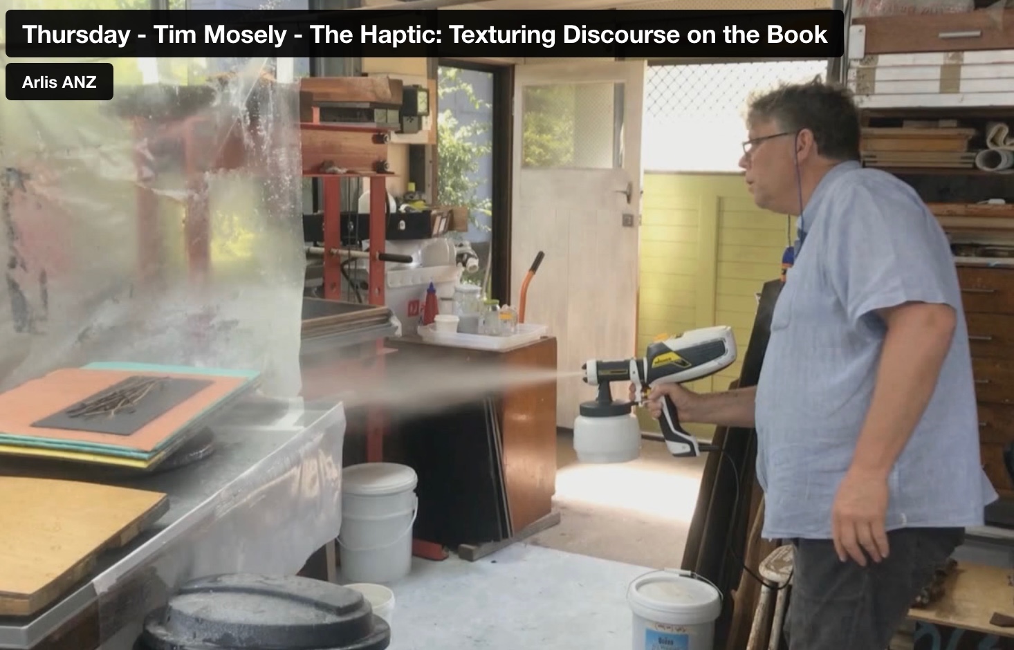
From the 11’37” mark. Tim Mosely, “The Haptic: Texturing Discourse on the Book“. Reimagining the material: artists books, printed matter, digital transformation, engagement. ARLIS-NZ Biennial Conference, 11-13 November 2020, Brisbane.
As the artist puts it, “These are representations achieved by touch, highlighted by touch, migrated across dimensions by touch; they are marks that compel readers to touch in an effort to recalibrate their vision, and marks that in the medium of the book invite the public’s touch” (Mosely, 2021, p. 31). The cast imprint involves a double materiality or hapticity. First, in the maker’s hands: the papermaking and image-making process fusing the three-dimensional attributes of texture, volume, and shape/contours of objects into the two dimensions of paper. Second, in the reader’s/viewer’s hands as the eye senses it may be being fooled: a lateral motion seeking texture, an enclosing motion seeking volume, and a tracing motion seeking shape and contour.
The title ep’s abbreviates the phrase “exploratory procedures”, coined by the cognitive psychologists Roberta Klatzky and Susan Lederman in 1987 to describe the six to seven hand movements the subjects in their experiments used to perceive and assess objects’ characteristics. The pulp printed text in ep’s come from the psychologists’ terms for those movements and characteristics.
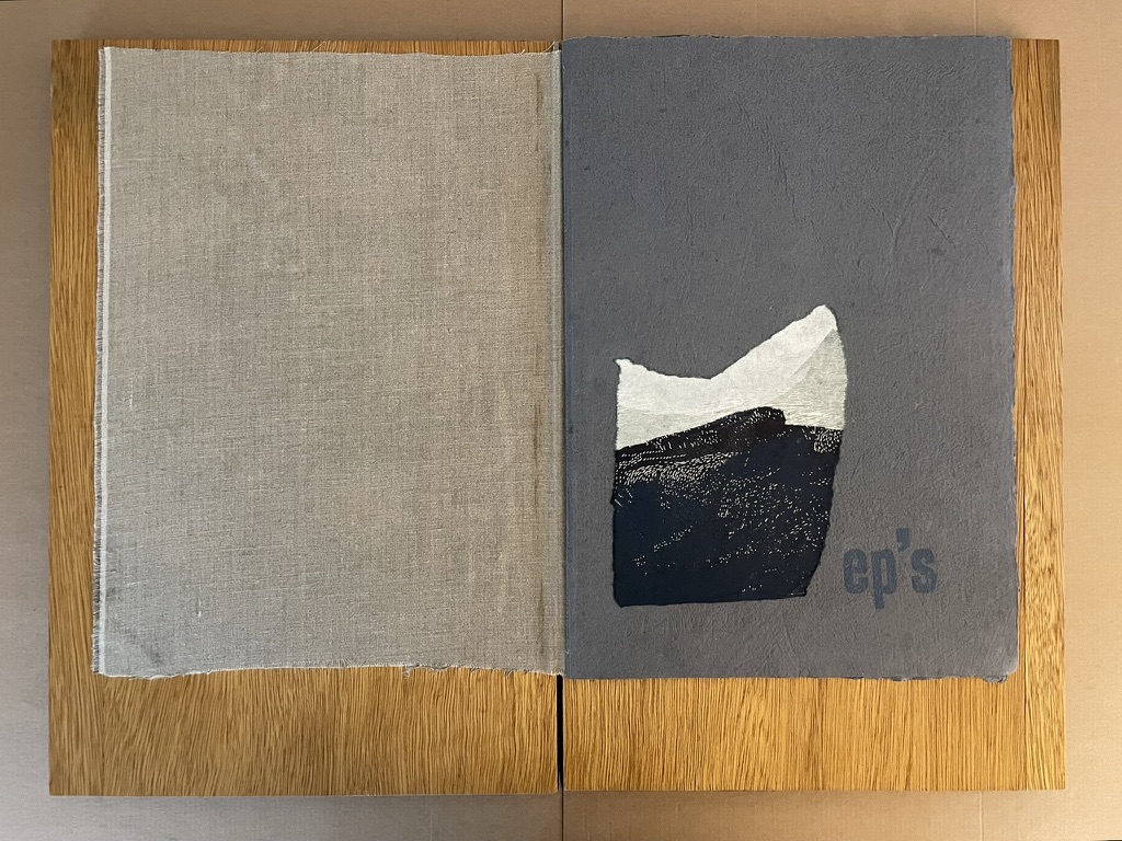
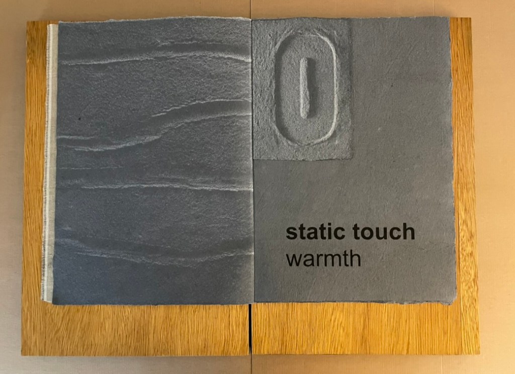
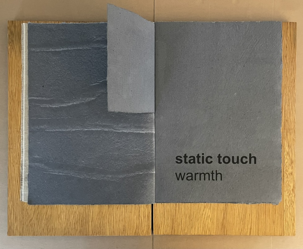
- Exploratory Procedure: Static contact
- Associated Property: Apparent temperature
- Behavior: The skin surface is held in contact with the object surface, without motion; typically a large surface (like the whole hand) is applied. This EP gives rise to heat flow between the skin and the object. — Klatzky and Reed (2009)
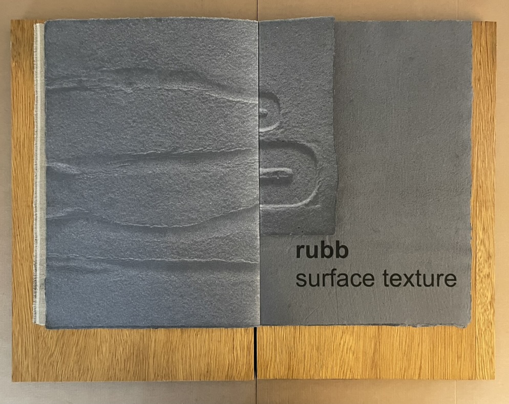
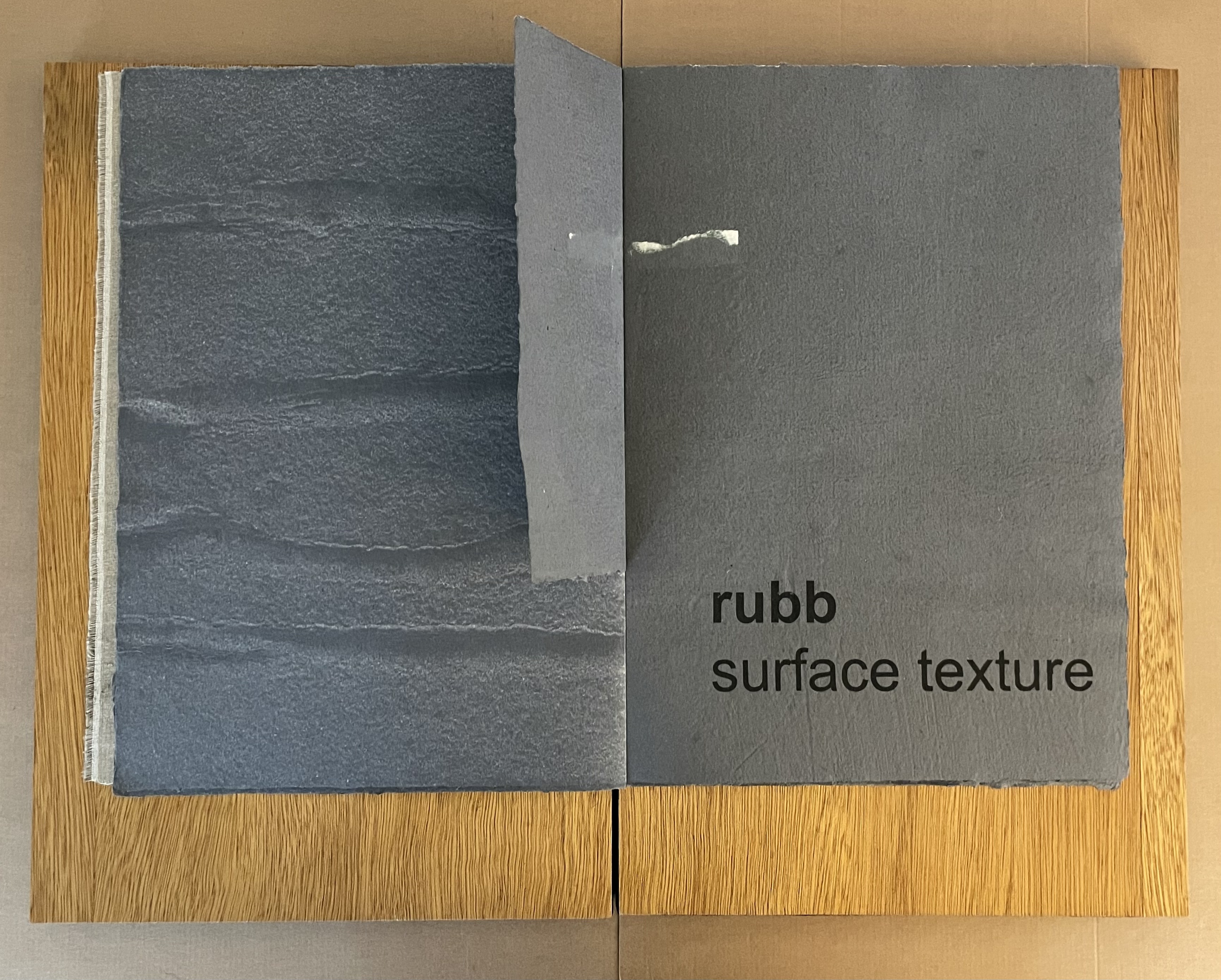
- Exploratory Procedure: Lateral motion
- Associated Property: Surface texture
- Behavior: The skin is passed laterally across a surface, producing shear force. — Klatzky and Reed (2009)
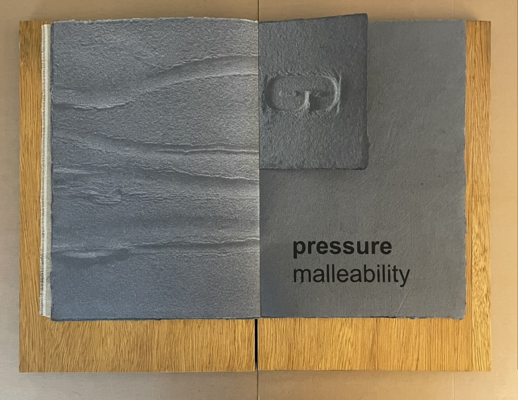
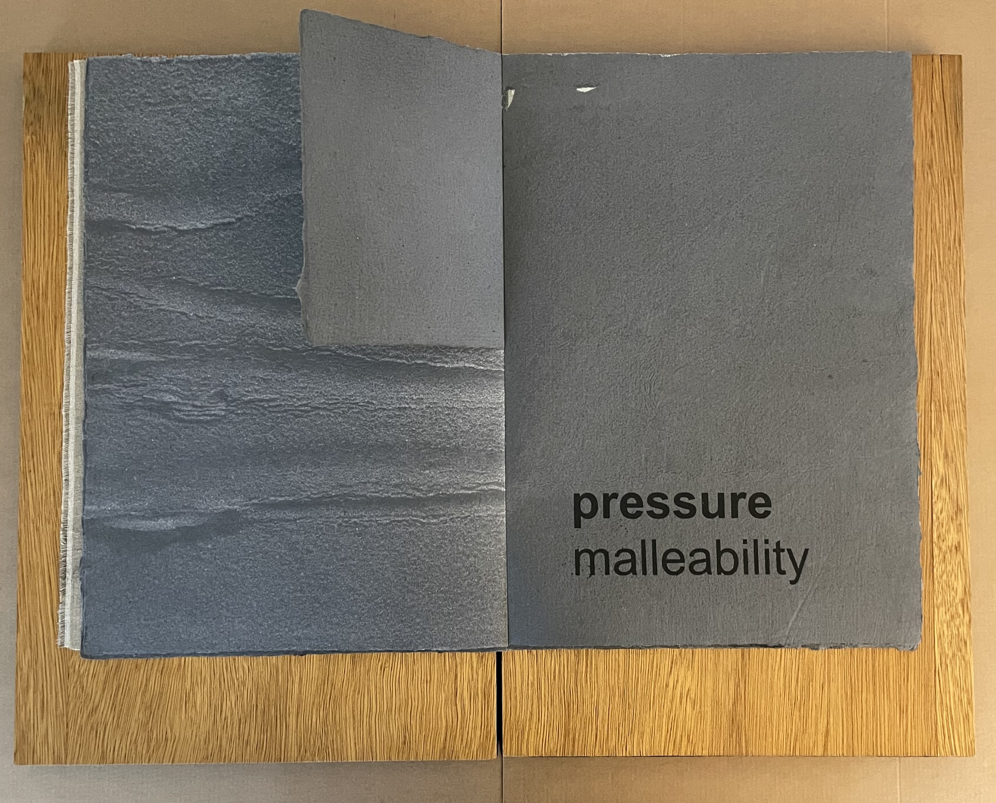
- Exploratory Procedure: Pressure
- Associated Property: Compliance or hardness
- Behavior: Force is exerted on the object against a resisting force; for example, by pressing into the surface, bending the object, or twisting. — Klatzky and Reed (2009)
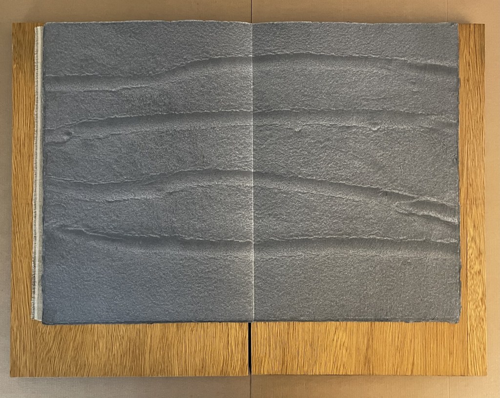
Center of the book.
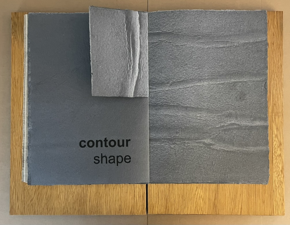
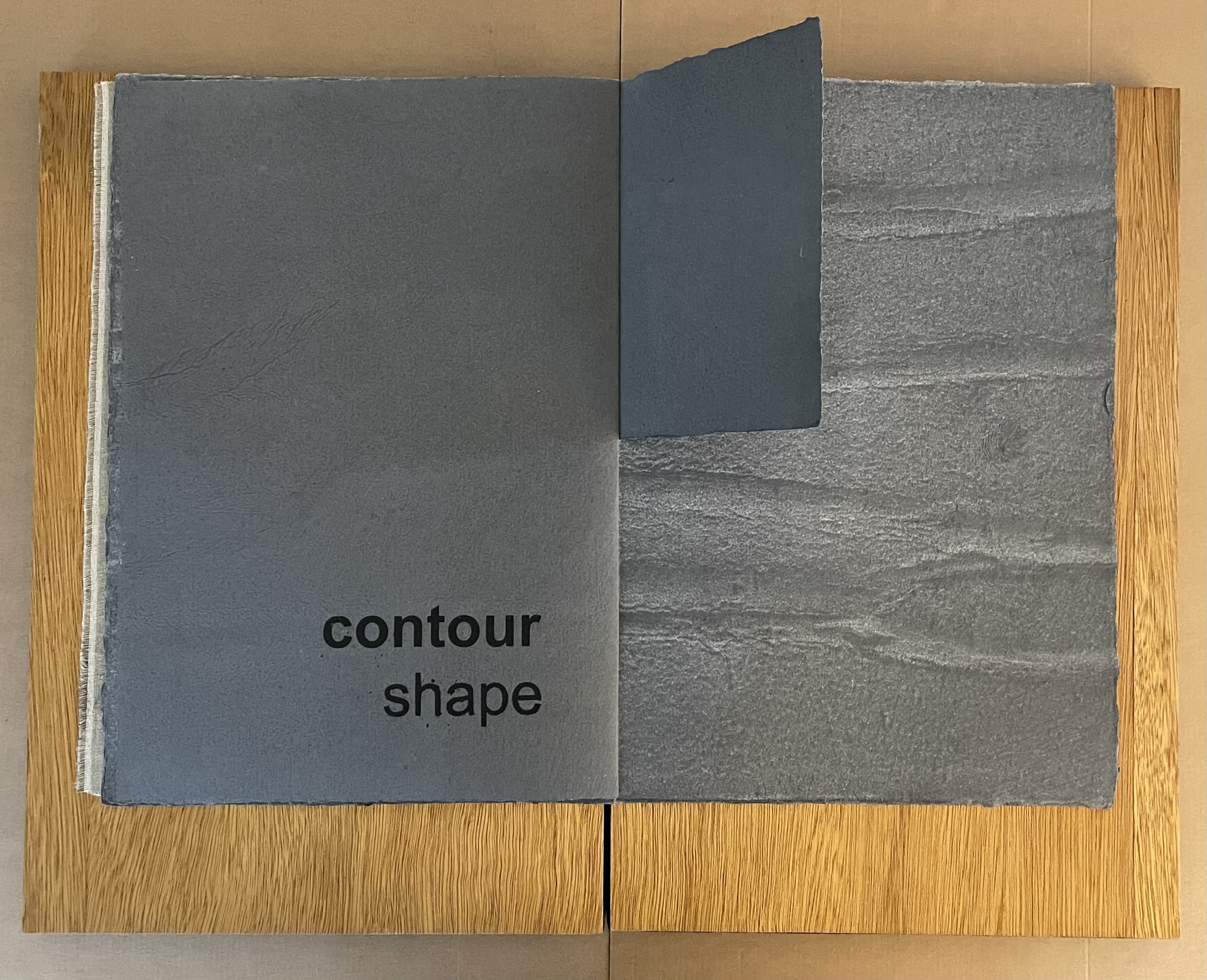
- Exploratory Procedure: Contour following
- Associated Property: Exact shape
- Behavior: Skin contact follows the gradient of the object’s surface or is maintained along edges when they are present. — Klatzky and Reed (2009)
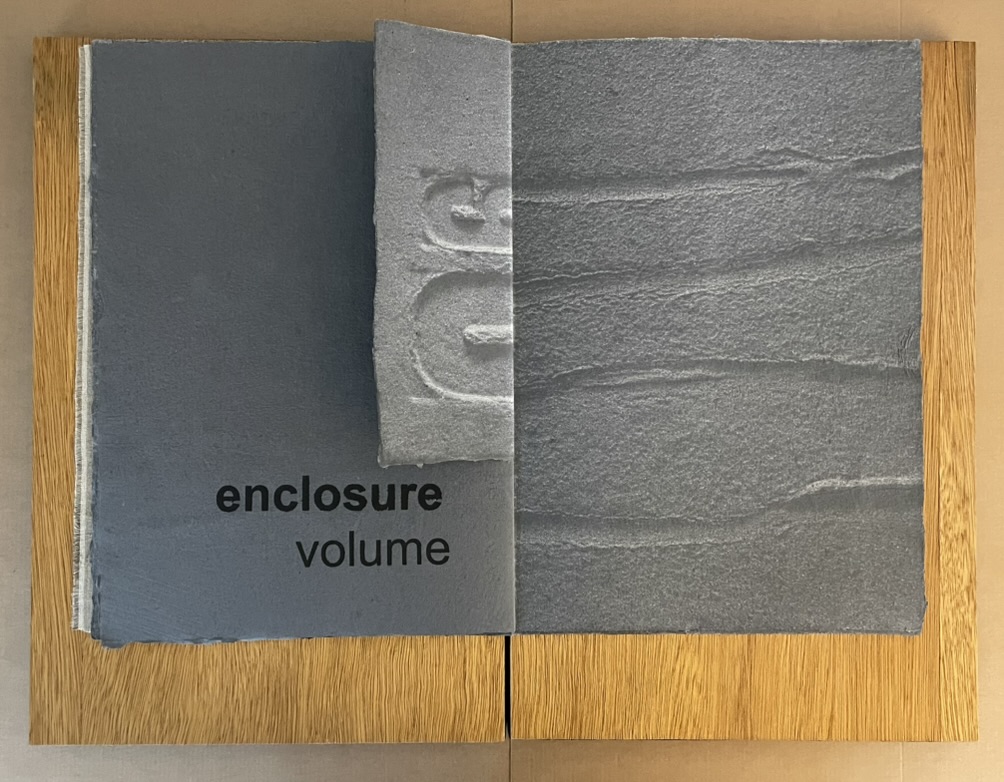
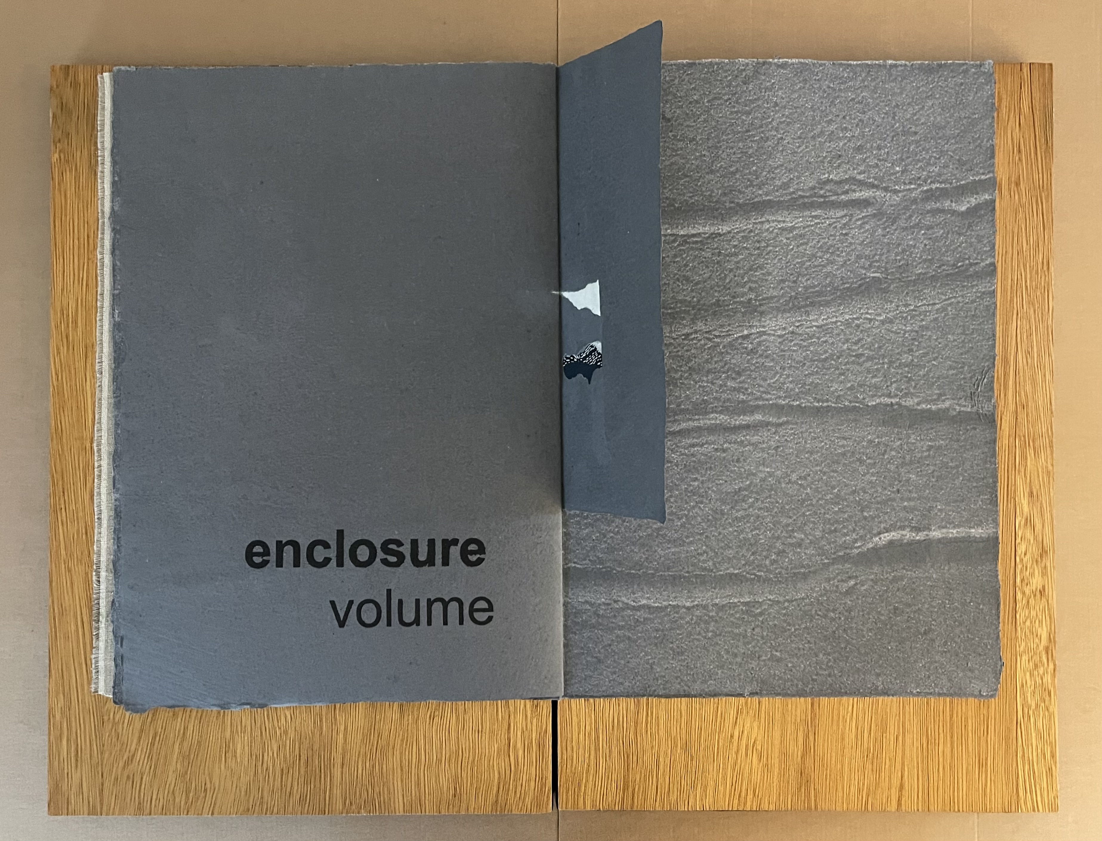
- Exploratory Procedure: Enclosure
- Associated Property: Volume; Global shape
- Behavior: The fingers (or other exploring effector) are molded closely to the object surface. — Klatzky and Reed (2009)
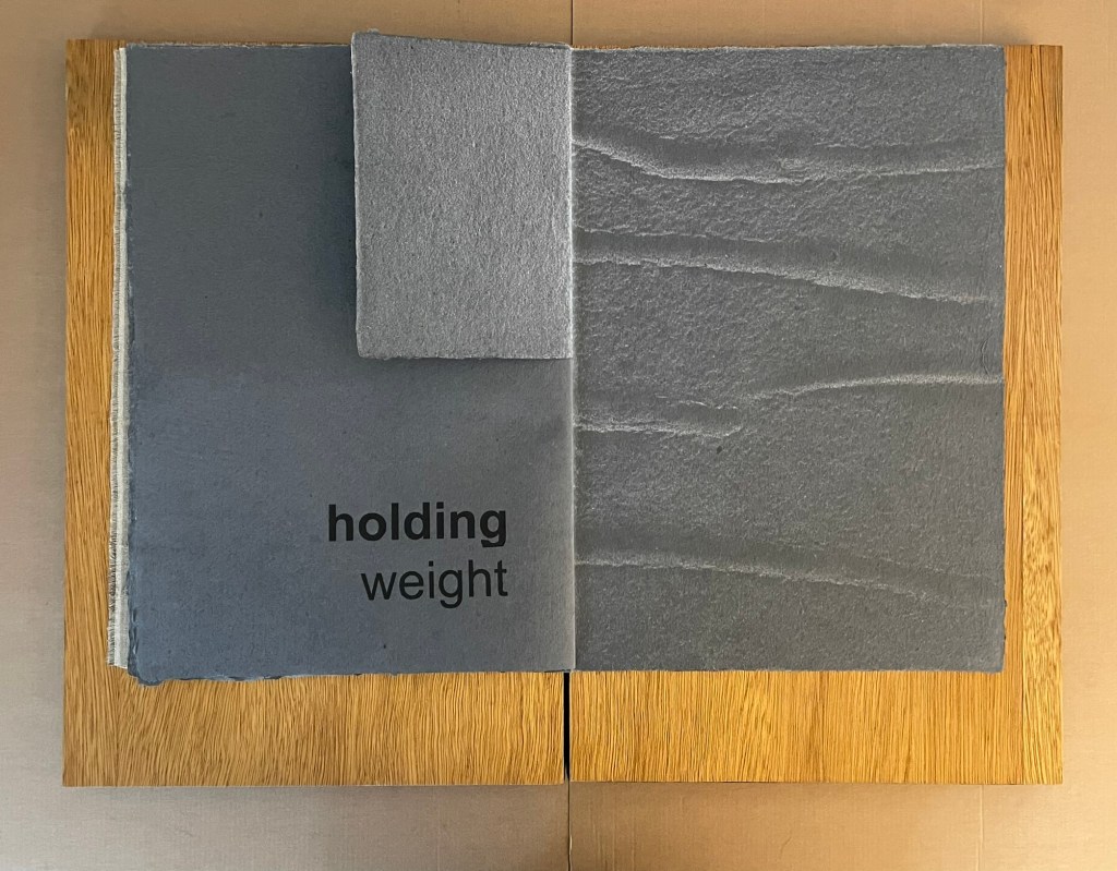
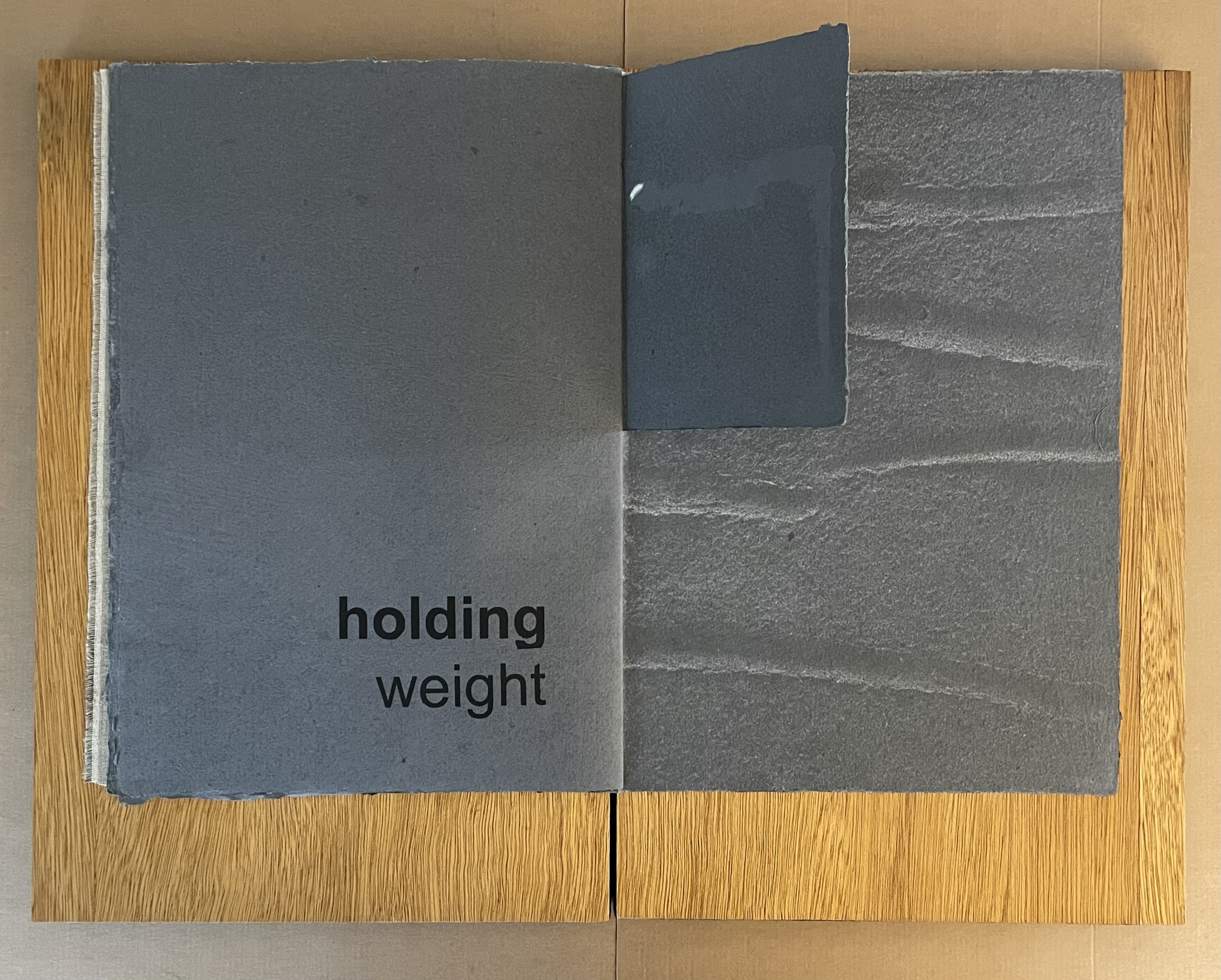
- Exploratory Procedure: Unsupported holding
- Associated Property: Weight
- Behavior: The object is held while the hand is not externally supported; typically this EP involves lifting, hefting or wielding the object. — Klatzky and Reed (2009)
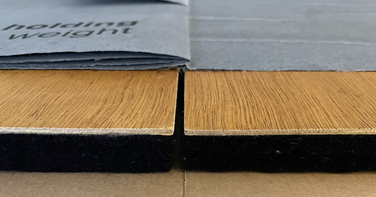
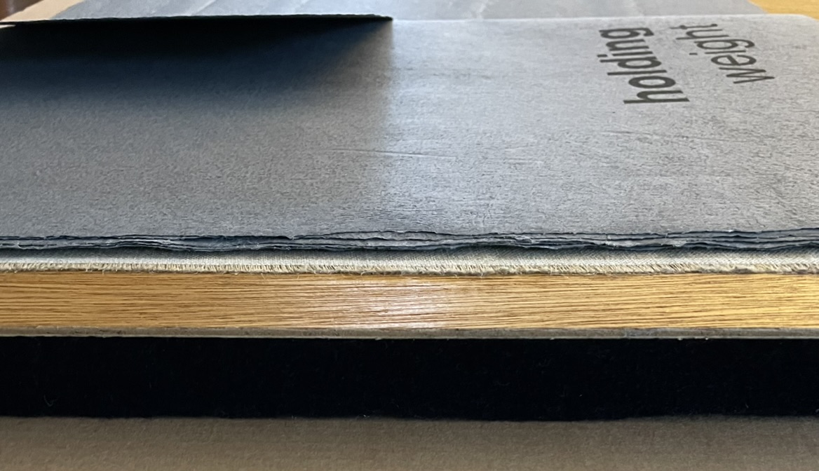
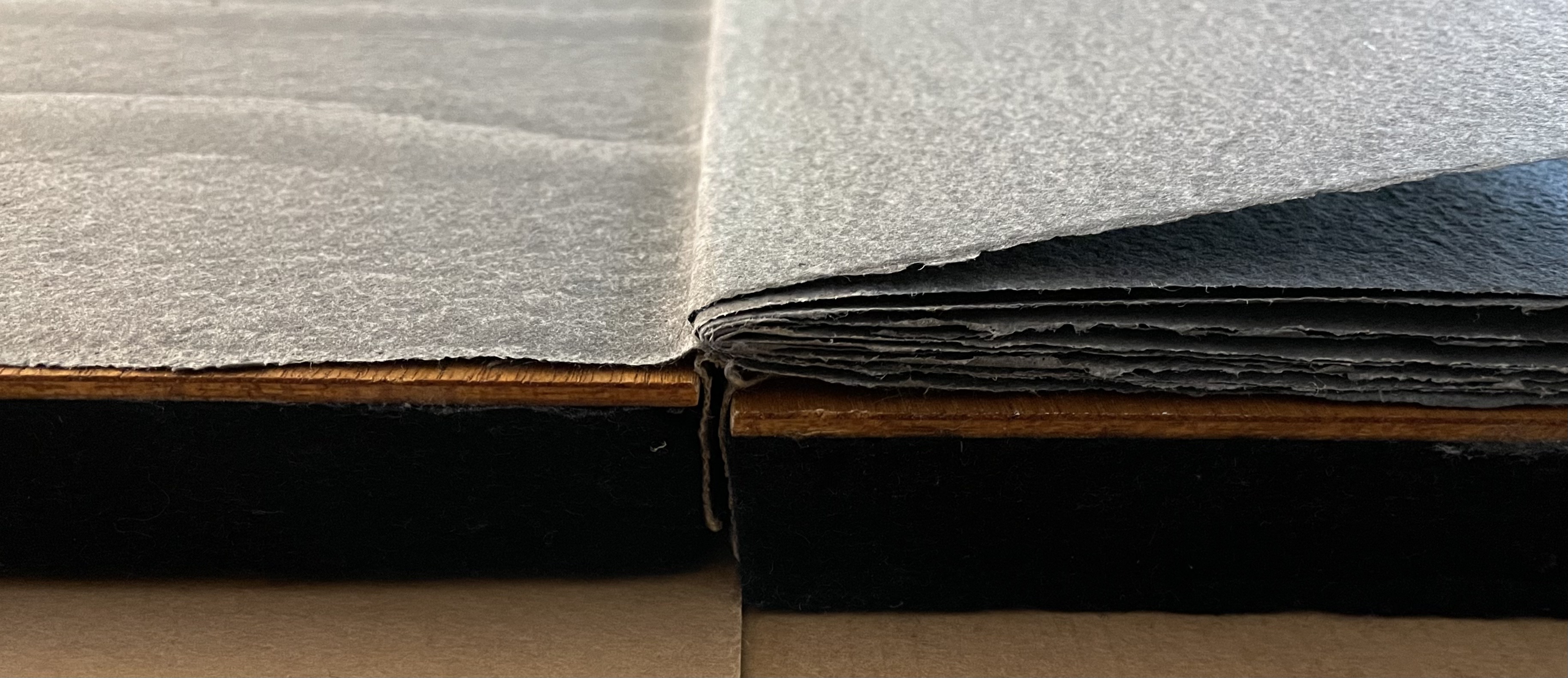
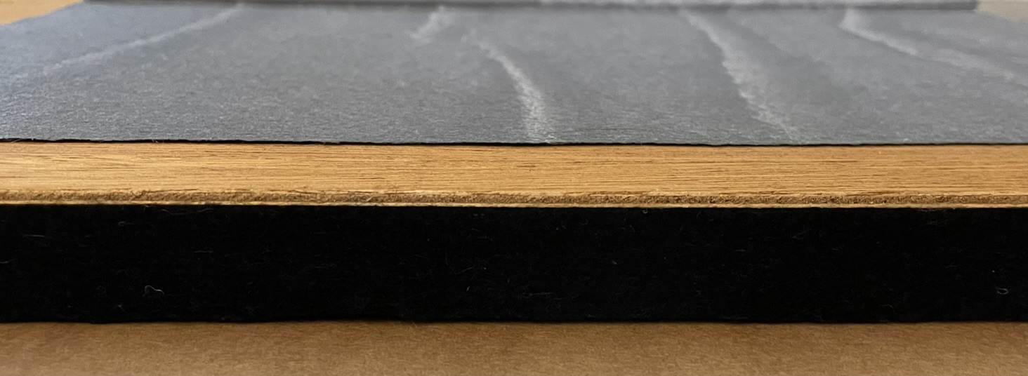
Detail: Bottom edge, left edge, top edge and right edge.
Curiously, the psychologists’ articles do not mention (at least according to a layman’s cursory review) an exploratory procedure and object property that Mosely’s book elicits and presents, respectively, numerous times. “Picking at and lifting” and “nudging and holding” would be the “ep’s” applied to the relief-printed fragment glued at one edge to the front cover.
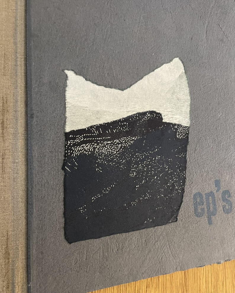
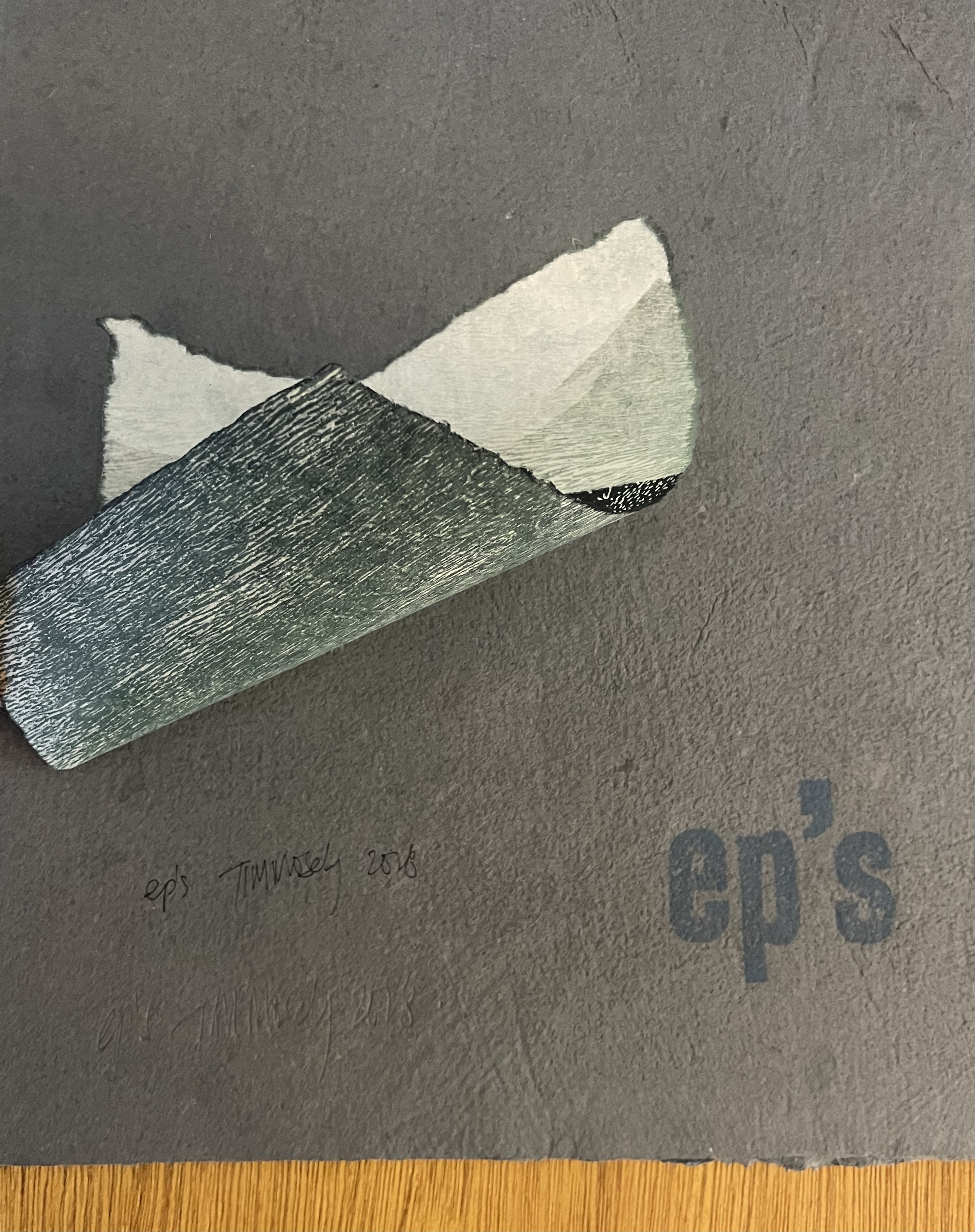
Variations on those “ep’s” occur with the smaller pulp printed leaves throughout the book. Once picked at, lifted, and turned, those leaves hold their position on their own or long enough for the camera shutter to capture their reverse side, so no holding is required. These are common actions for readers of moveable and constructible books. In touching the rainforest (2014) further below, Mosely demonstrates the latter. What other wonders might the psychologists classify if they were to hand their subjects Mosely’s artist’s books?
Grasping the Nettle (2020)
The second work in the series

Three booklets and accordion resting on the opened dustjacket.
Grasping the Nettle is the second work in the series called representation by touch. Along with the overlapping manipulation of papermaking and cast printing, Grasping the Nettle manipulates “the medium of the book”.

Image side of accordion structure.
Instead of a codex’s front cover to bear the work’s title, the overlapping wrapper with a slant cut performs that role before sliding into the protective slipcase. The accordion, loose alongside the three booklets, performs the role of colophon. Information that would otherwise appear in the colophon at the end of a book — the number of the copy, count of the edition, etc. — appears faintly on the cover side of the accordion. By offering a display backdrop to the three booklets, the accordion also performs in form and image its role of colophon: the final stroke for the three booklets whose imagery and text make up the core of Grasping the Nettle.
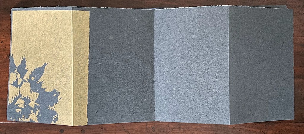
Cover side of accordion structure.

“Colophon”: Copy 6 of 8, title of work, artist’s signature, year of publication.
Mosely calls the other three booklets, though loose and individually sewn, signatures. None of a codex’s usual navigational signs — table of contents, part titles, page numbers, etc. — are present to indicate an order in which to read these three signatures. The reading order depends on the reader.
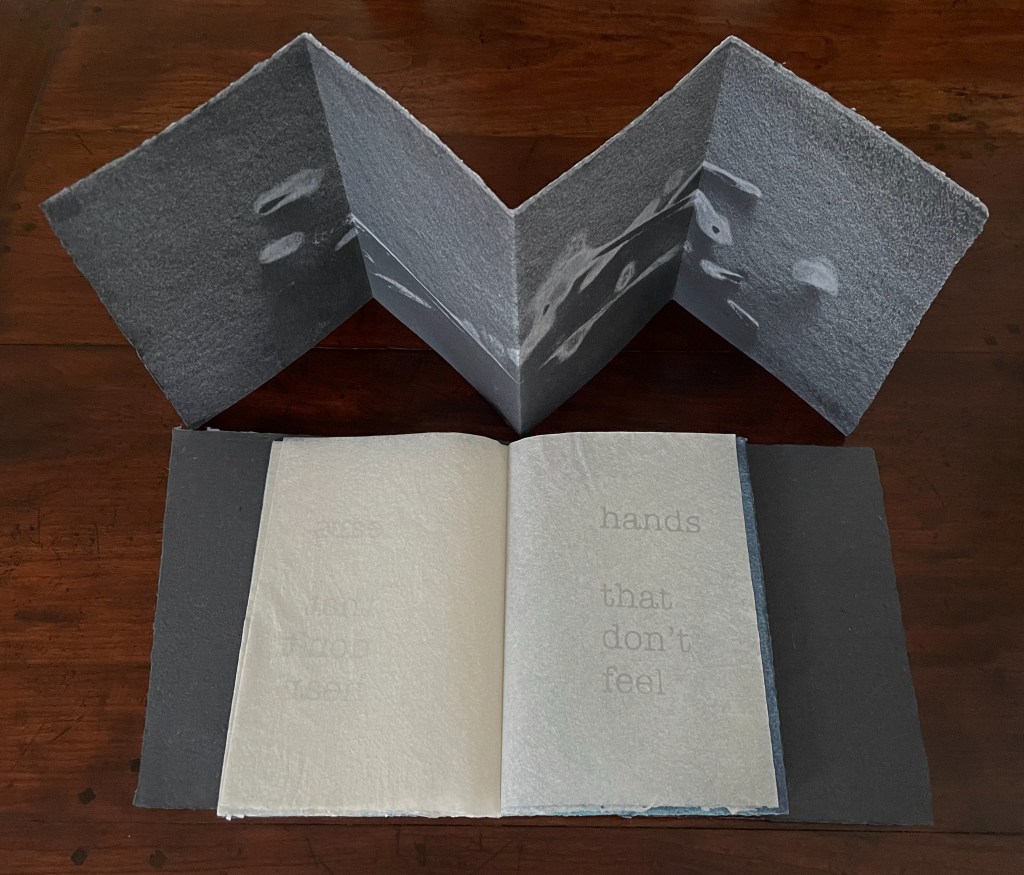
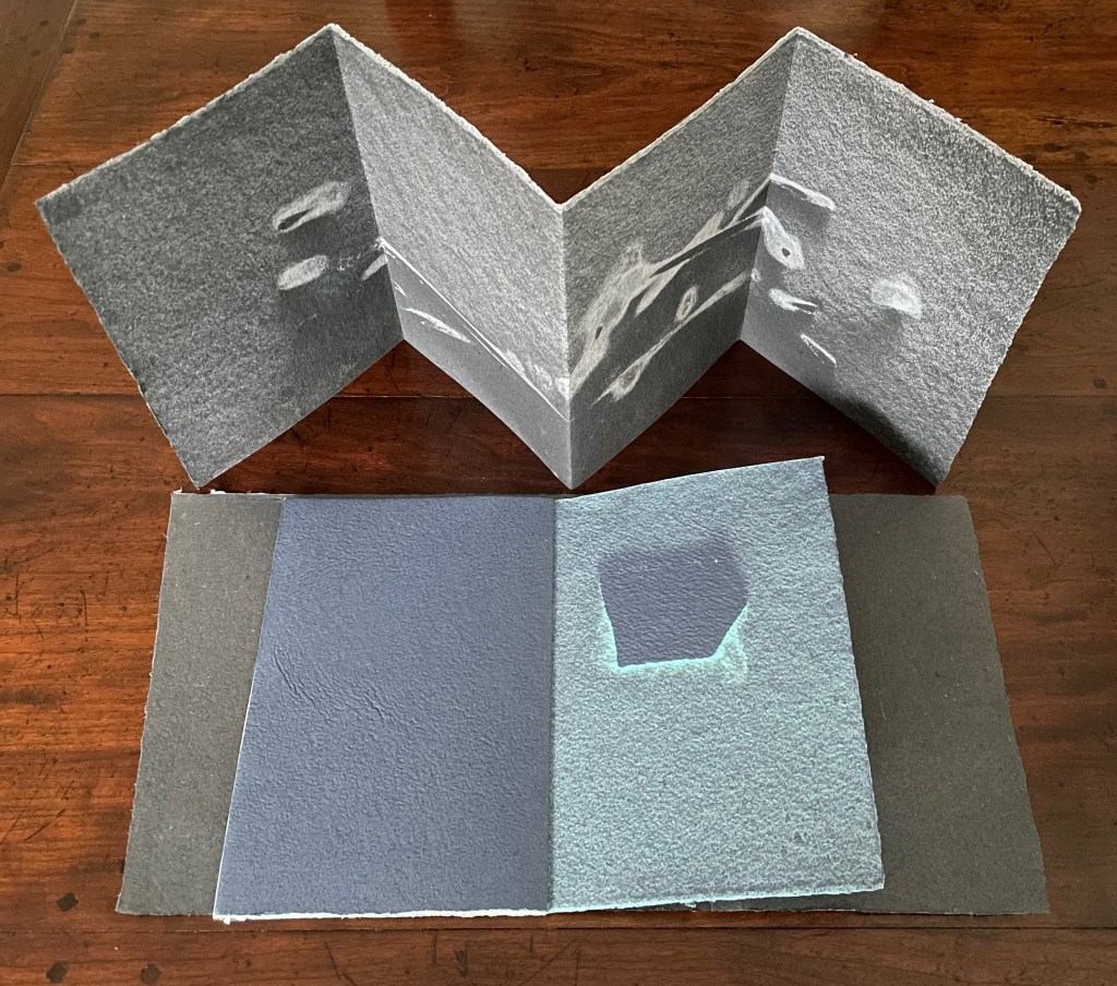
Just as the accordion’s imagery is drawn from twigs, the signatures’ imagery comes from other bushland detritus — a flat stone just under a cm thick for the blue booklet, a fragment of weathered branch for the striated markings in the black one, and twigs for the straight and curved lines in the maroon one. The booklets are loose alongside the accordion, but their text implies the possibility of some syllogism or some order — perhaps from the particular, physical and concrete to the general, emotional and abstract. The blue booklet’s text places sensory organs not performing their functions at the fore (“eyes that don’t see”). The black one’s text reverses sensual agency from sensory organs to their output (“tears that see”). The maroon one’s text consists of phrases describing states of unsuccessful perception (“an aesthetic distance”).


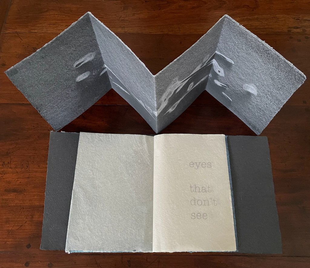
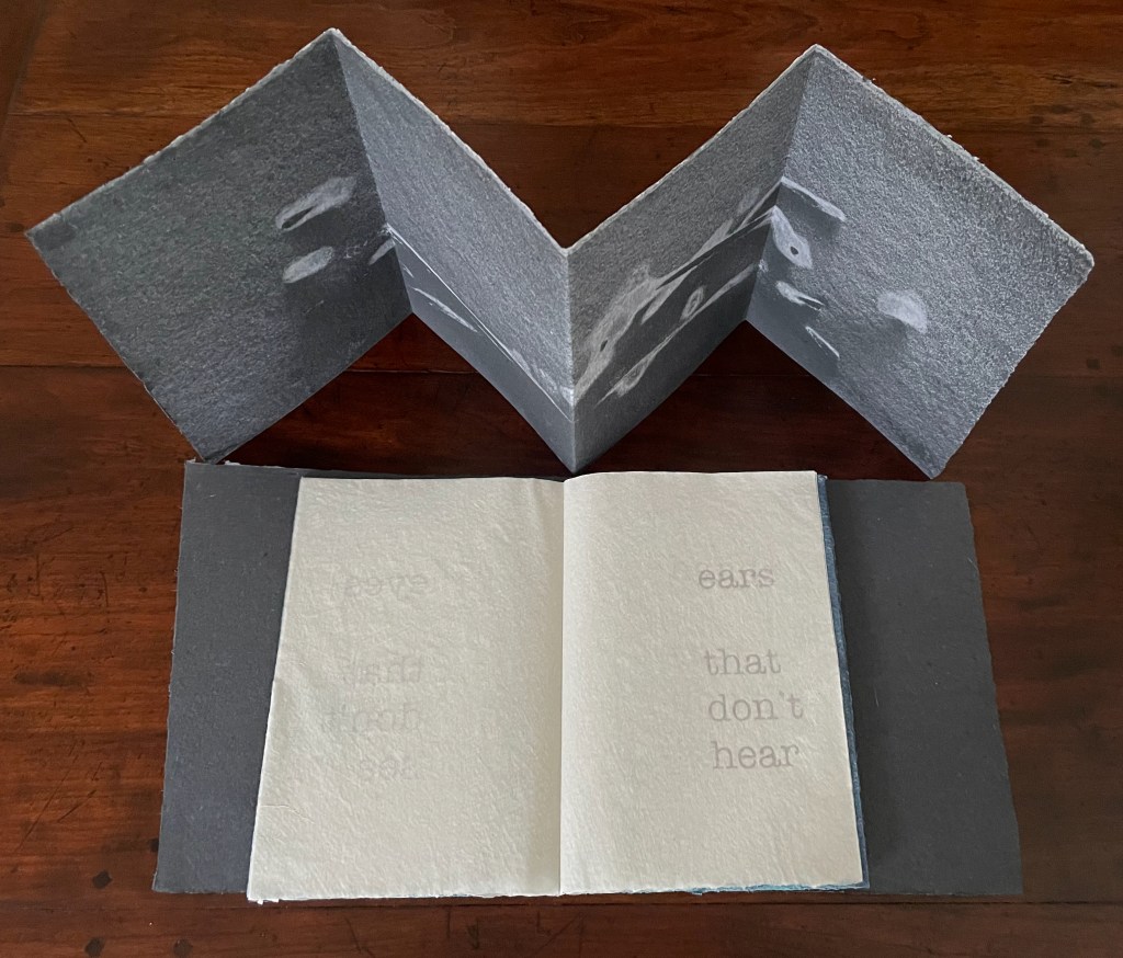
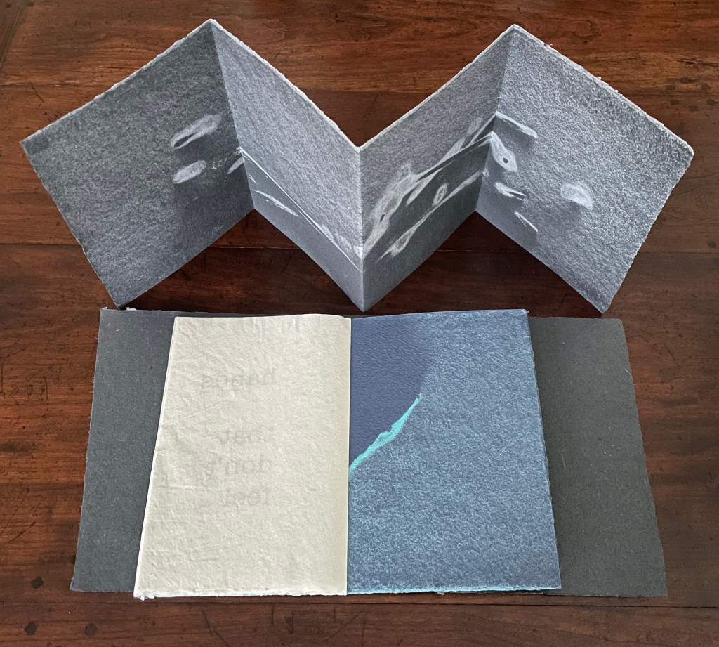
The blue booklet or signature: a flat stone laid atop couched paper and sprayed with fine pulp generates the images embracing the kozo pages pulp printed with text.
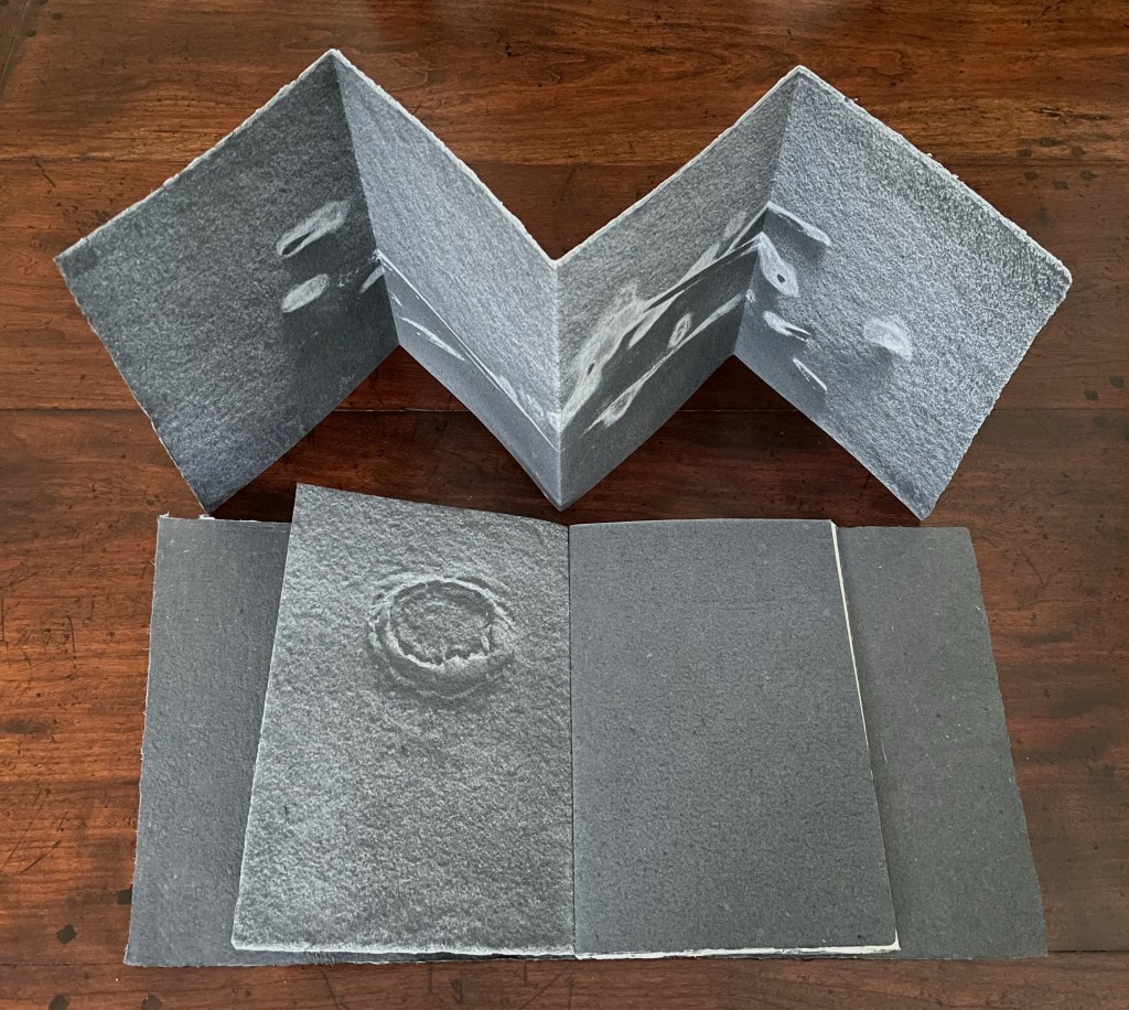

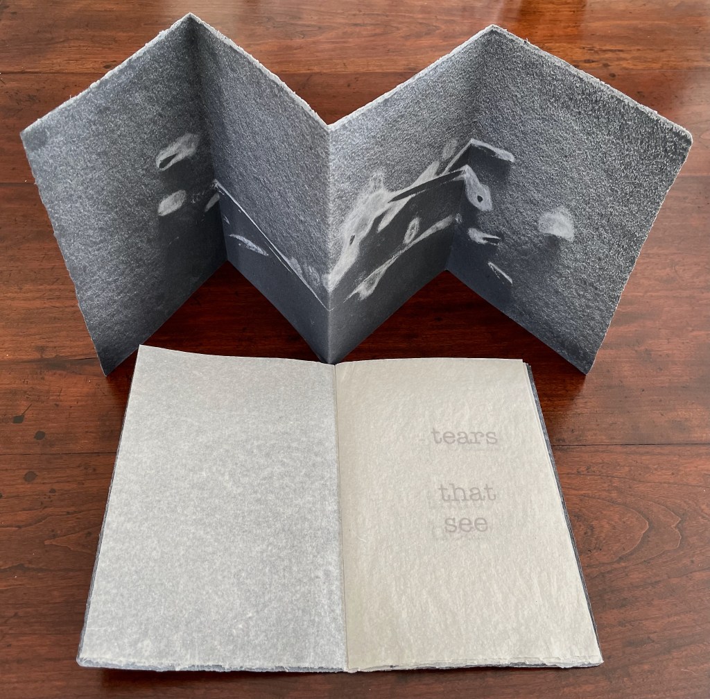
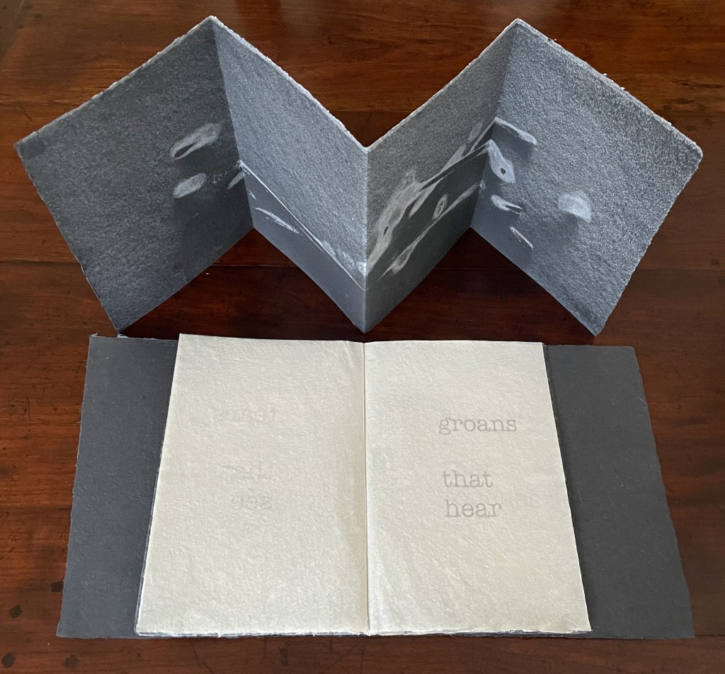
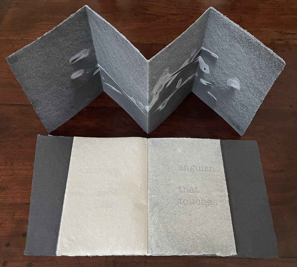

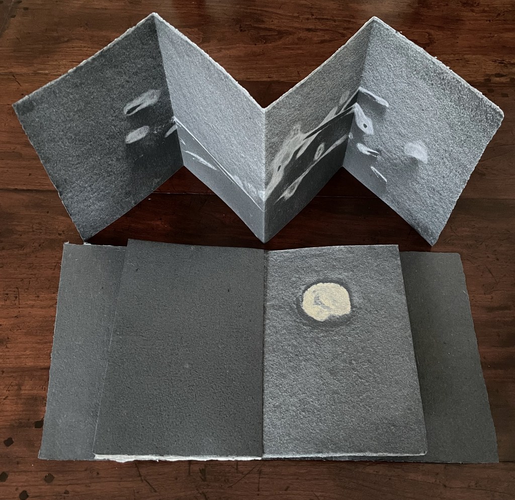
The black signature: a weathered branch generates the images surrounding the physical expressions of emotion that usurp perceptual functions. The circular image is formed from the notch left in a tree branch where a smaller branch had broken off.
To the lateral motion of the reader’s fingers seeking texture, their enclosing motion seeking volume, and their tracing motion seeking shape and contour, Mosely has added what perceptual psychologists call the “function test” (the motions of inserting and extracting), which is replicated in the haptic and visual discovery that the cast imprints on the handmade paper continue from left to right underneath kozo leaves bearing the text. The image-bearing leaves “embrace” the text-bearing leaves, or recalling that developmental stage in perception where the child recognizes the continued existence of an object briefly hidden then revealed, the text-bearing leaves “hide” the continuation of the image-bearing leaves. This exploitation of the codex structure calls attention to Grasping the Nettle‘s layers of hapticity by making the reader’s hands do more than turn pages in a predetermined order.


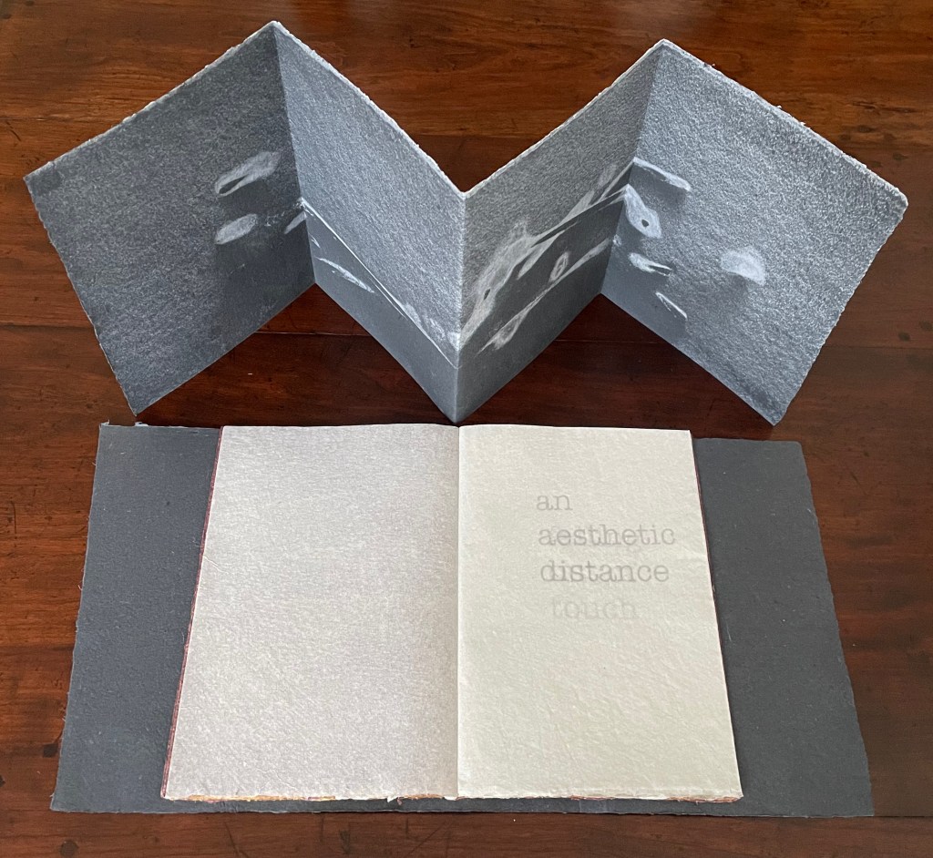

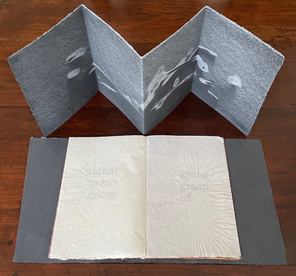


The maroon signature: twigs are used again but separated and sprayed with different colors of fine pulp for these images.
Grasping the Nettle could have challenged our overly ocularcentric world with cast imprints of man-made objects. Mosely’s choice to use detritus collected from ravines, scrubland and the beach, however, sharpens the challenge with an anxiety about losing touch with nature. As the artist puts it: “The pages have been in touch—direct contact—with the wilderness. The imprints move beyond mimetic reflection and, carrying with them the attributes of haptic explorative procedures, their ambiguity draws in the reader’s touch (of the wilderness)” (Mosely, 2021, p. 31).
I will become all that I need to become (2023)
I will become all that I need to become (2023)
the third book in the series of artist’s books ”representation by touch”
Timothy Mosely
Casebound sewn and taped signature between felt covers and a single wood board; handmade paper with pulp printing, relief printing, and letterpress. H450 x W150 x D50 mm. Variable edition of 3 and one artists proof book, of which this is #1. Acquired from the artist, 25 October 2024.
Photos: Books On Books Collection.
For an artist’s book to express the world, the book’s structure, its materials in all their surfaces, textures and colors, its signs, its apparatus, and the very idea of the book must deliver an “indivisible whole” that, as Merleau-Ponty says, defines for us the real.
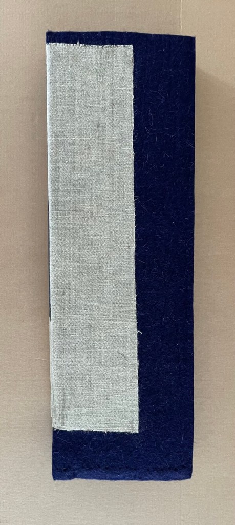
Timothy Mosely’s third book in the series ”representation by touch” does this, but like ep’s, not with the usual shape, thickness, and texture we expect from a book. A hopsack or burlap piece is glued over the felt covers and spine and carries a textless label of handmade paper along the spine. The tall shape and thick front and back covers challenge its codex structure. The texture of the felt and the veneer wood inside the back cover hint at the interior of a case or casket for some treasure.
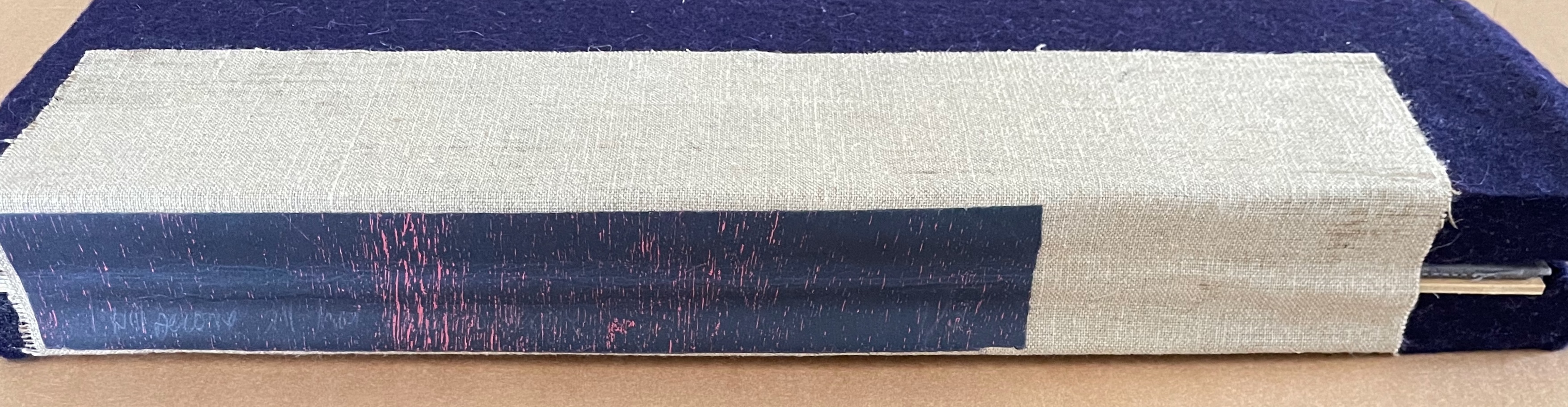
The signature inside is sewn to a tape fixed to the inside of the hopsack, which makes the work a modified casebound volume across which the signature almost lays flat. The signature consists of six leaves. The “visual text” of the book consists of four distinct fragments of bush detritus and two spots in the bush from which the detritus presumably came.
Below, the wooden hands hold the innermost gathered sheets together to show how the outermost sheet is pulp-printed on its inner side, displaying two pieces of bush detritus. The next sheet shows a spot in the bush, relief and letter-press printed on the interior, ; it’s pulp printed on its exterior. The third sheet is pulp printed on its interior, showing another two pieces of detritus; it’s relief and letter-press printed on its exterior. The fourth sheet is relief and letter-press printed on its interior, showing another spot in the bush; it’s pulp printed on its exterior. The remaining two sheets in the center are translucent, reduced in size, and appear to be watermark printed.
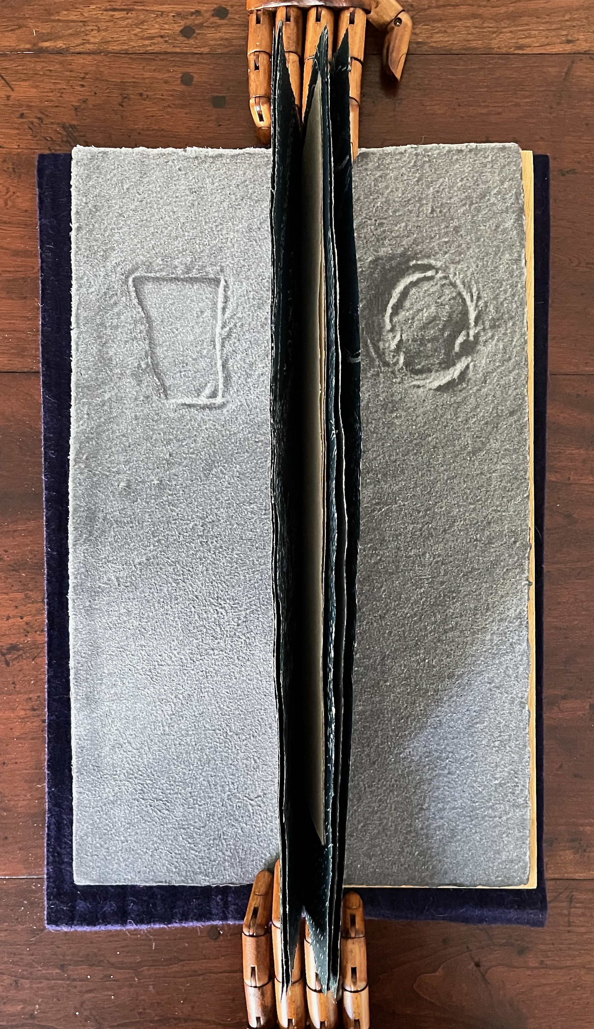
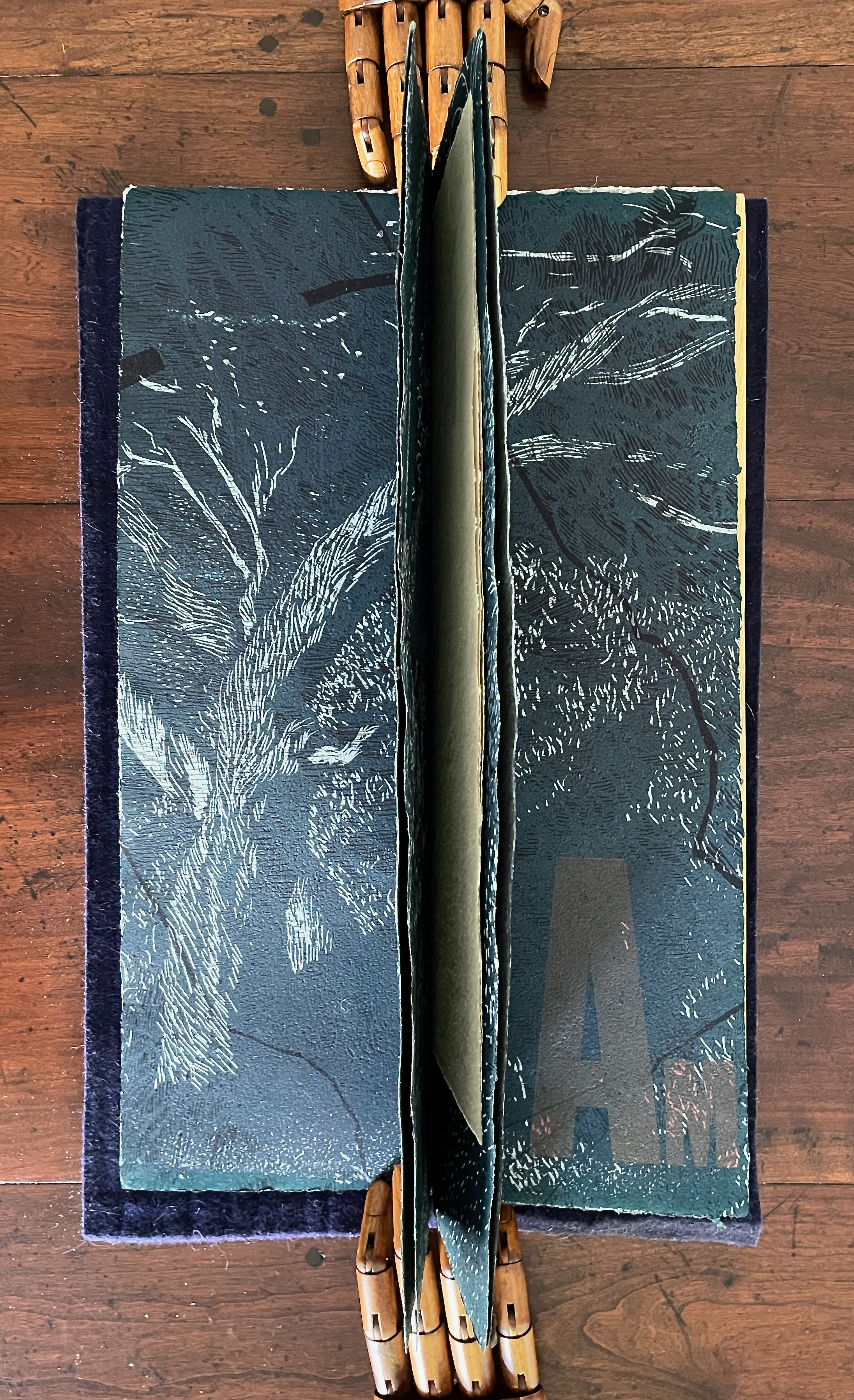
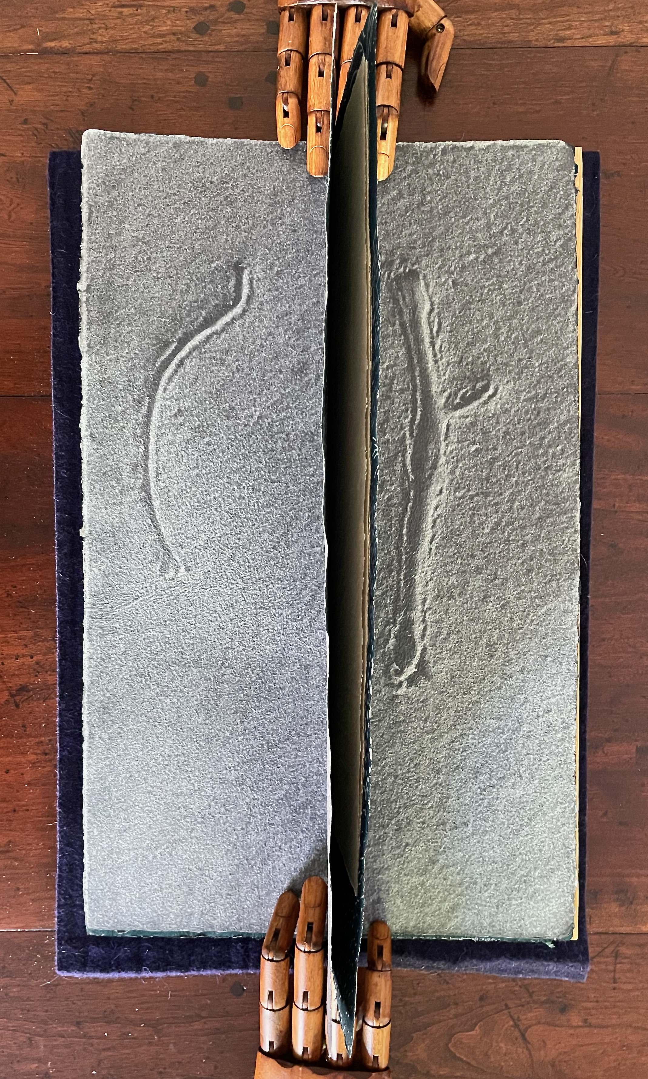
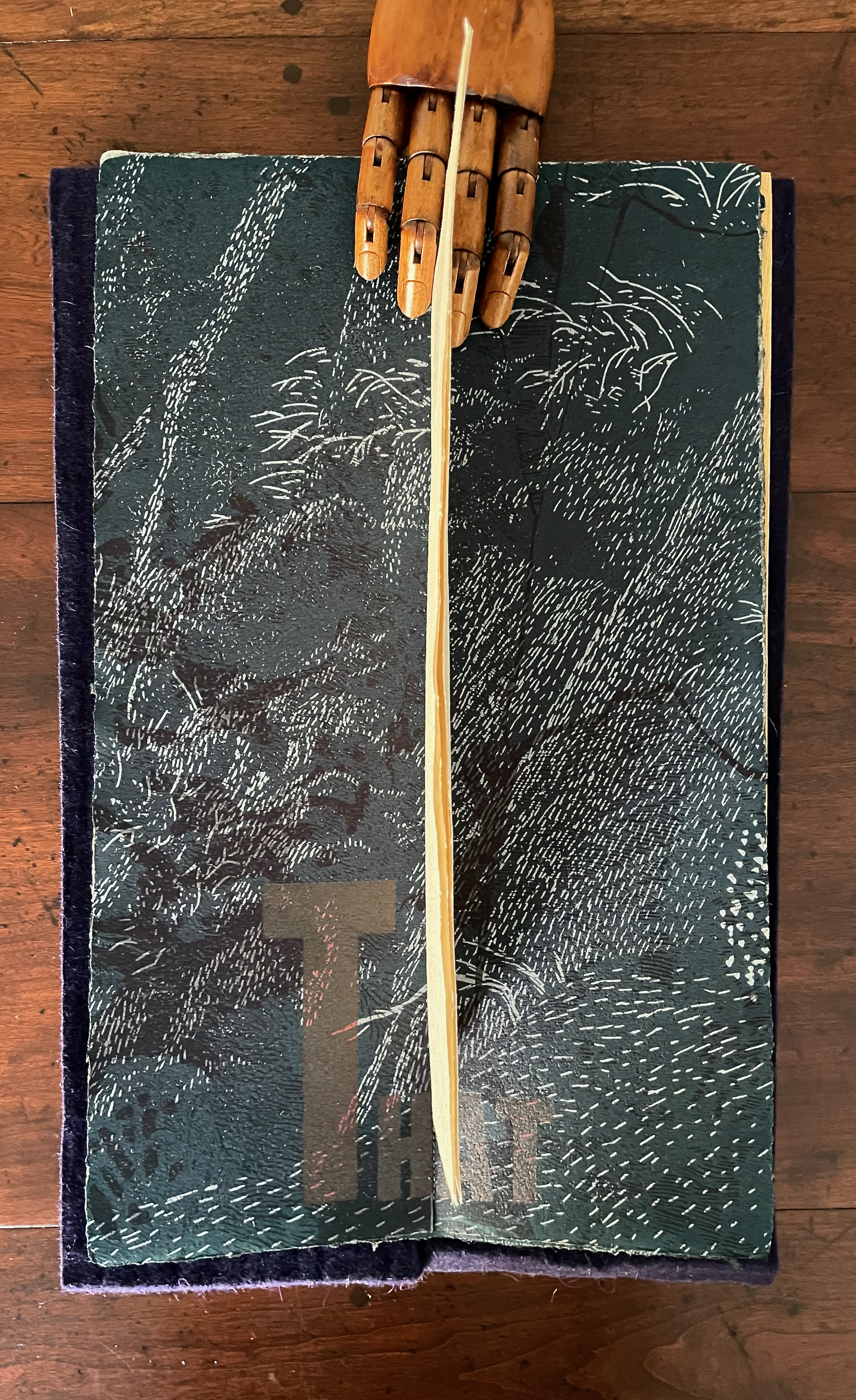
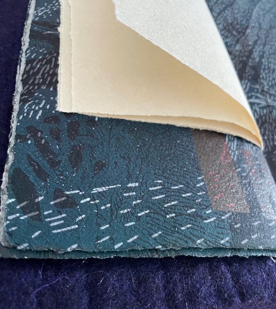
Sheet 1, Sheet 2, Sheet 3, and Sheet 4; Sheets 5 and 6 of translucent paper.
The book artist, however, is not presenting a portfolio of single-sheet prints. He uses them in a book imposition that creates a pattern or syntax with the visual text.
First, we have a pulp printed double-page spread showing what appear to be inversions of the first of the bush fragments. Urged to confirm the visual perception, our fingertips report a rough flat surface. The “representation by touch” lies with the pulp printing process. The process, of course, introduces pulp detritus of its own, so the “inversions” have slight differences beyond flipping the image. And again our fingers are urged to explore them.
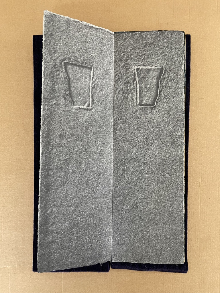
First double-page spread of pulp printing. Inversions of one of the bush fragments. Verso: Sheet 1. Recto: reverse of sheet 2.
Then we have a double-page spread of relief and letter press showing a composite spot in the bush; it is composite because the verso comes from sheet 2 and the recto comes from the reverse of sheet 3. The surface of the relief print is unevenly rough; that of the letters, evenly rough. The verbal “I AM” inserts both artist and viewer in a way different from the relief printing and pulp printing processes.
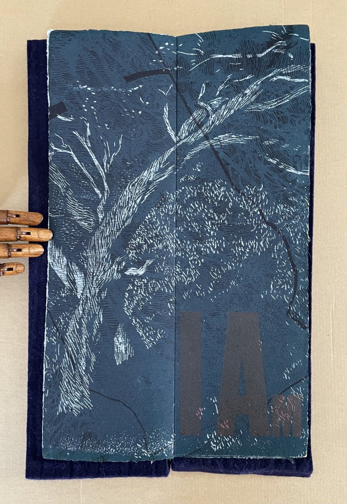
First spread of relief and letter press. Verso: Sheet 2 . Recto: reverse of sheet 3.
Then we have the second spread of pulp printing showing “inversions” of the second fragment of detritus. The eyes tell the hands that the artist must have picked up the fragment on the left, turned it over, and placed it on the right slightly below its position on the left. The evidence of human intervention in nature’s parenthesis can nudge us to consider the gap (or lack thereof) between nature and the artist’s representation by touch. The viewer has another gap (or lack thereof) to acknowledge: the overlapping perceptions of vision and touch.
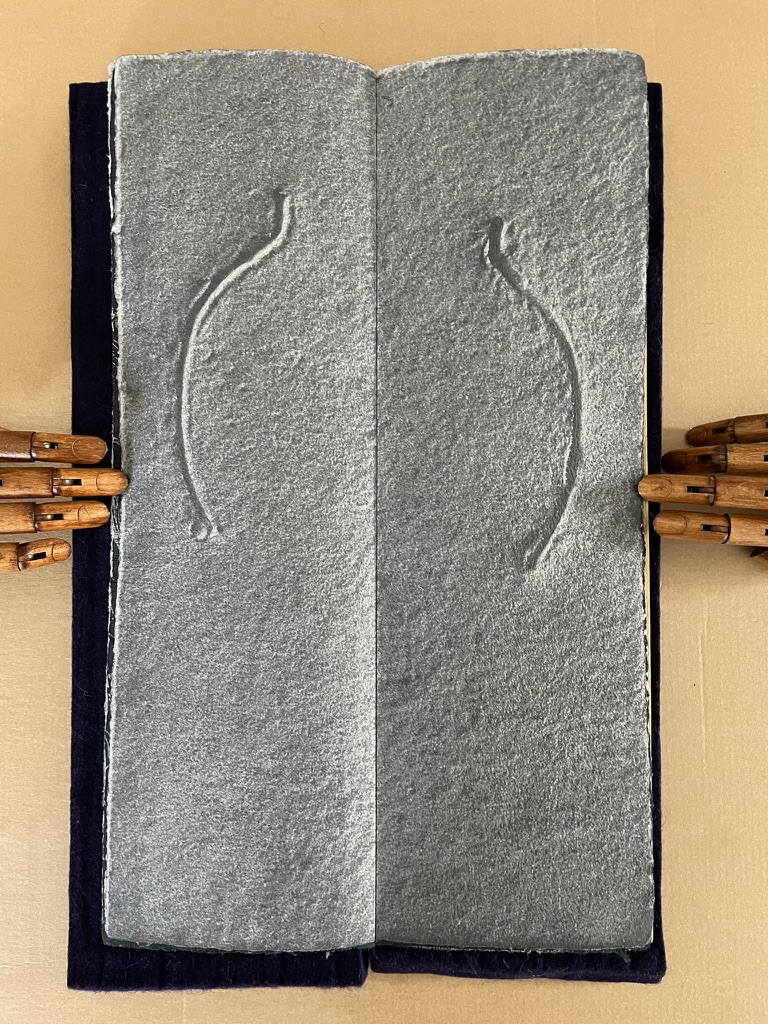
Second double-page spread of pulp printing. Sheet 3 and the reverse of sheet 4.
Then we have the innermost spread of relief and letter press printing on sheet 4. The middle word of the sentence “I AM THAT I AM” that runs through the book is split by the reduced-size sheets and their very different weight and texture. The reduced trim of the fifth and sixth sheets encourages attempts at seeing the full spread of the relief and letter press print. The eye can see the continuation of the print at the foot of the spread; the fingers pinch the lighter sheets together and flip them back and forth.
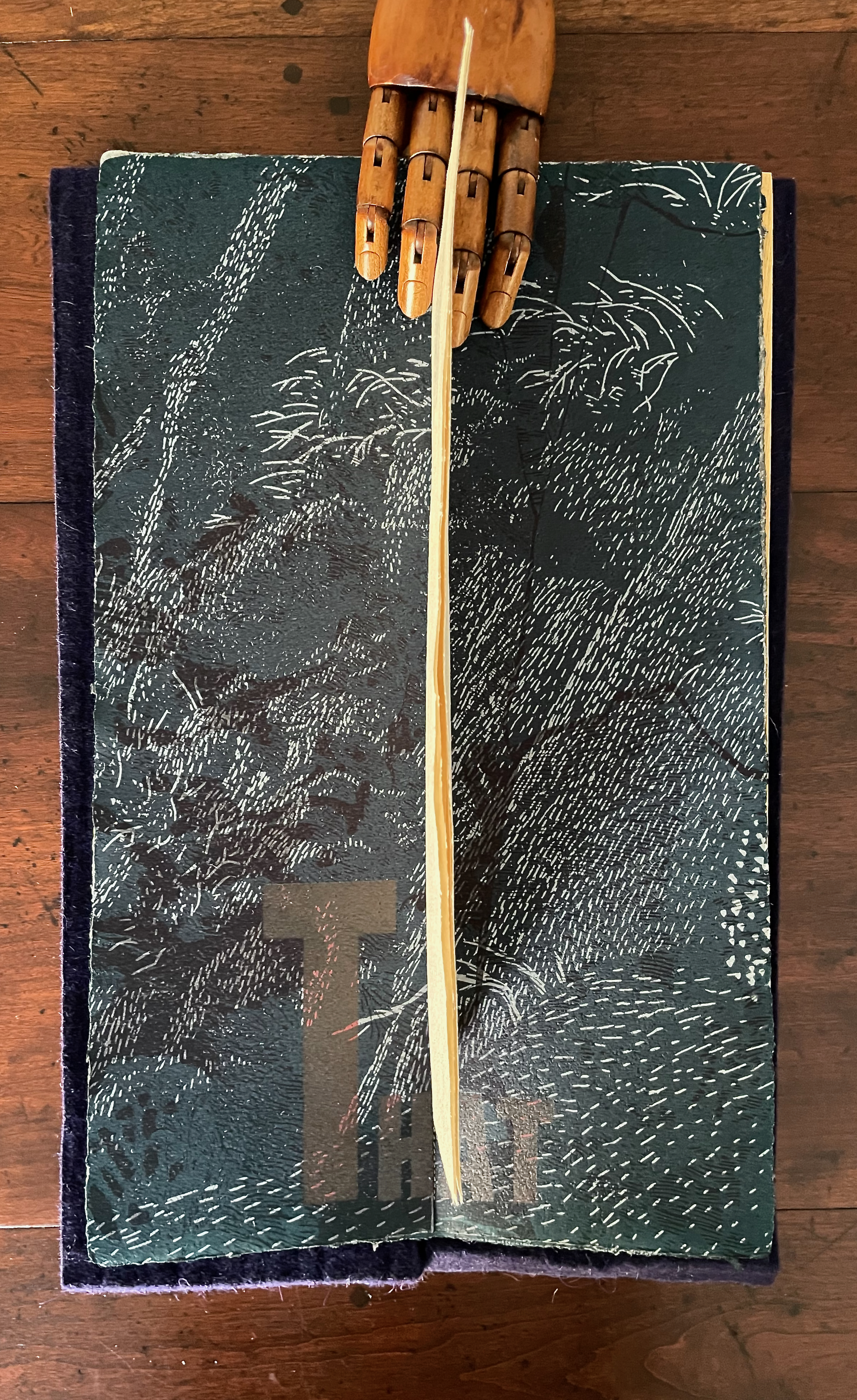
Second spread of relief and letter press. Verso and recto: Sheet 4, split by the reduced-size sheets.
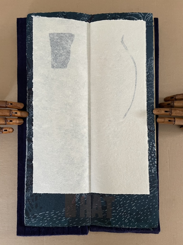
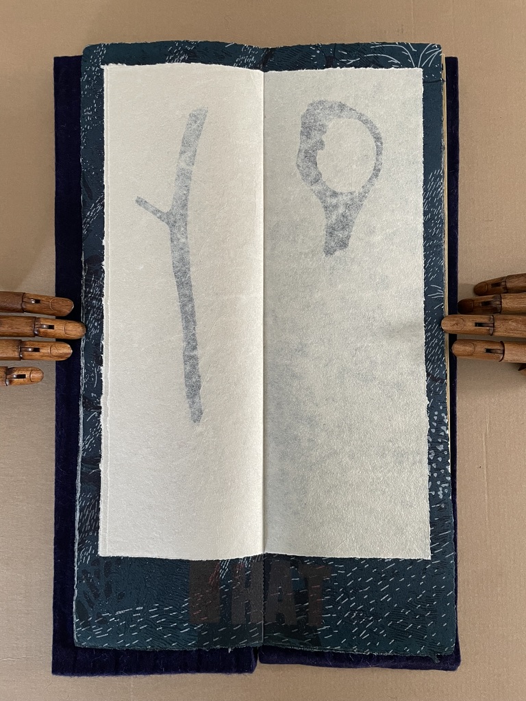
The two double-page spreads on reduced-size sheets.
The third spread of pulp printing shows the “inversions” of the third fragment of detritus. Again, as with the second fragment, the eyes tell the hands that the artist must have picked up the fragment on the left, turned it over, and placed it on the right.
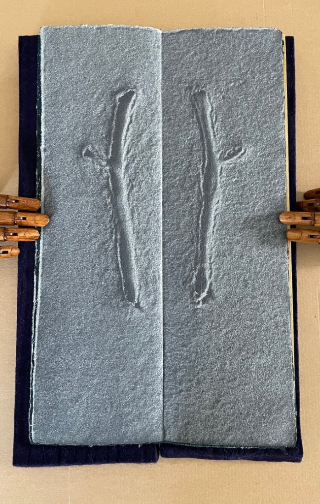
Third double-page spread of pulp printing. Verso: the reverse of sheet 2. Recto: sheet three.
Then comes the third spread of relief and letter press showing a composite spot in the bush; composite because the verso comes from the reverse of Sheet 3 and the recto comes from Sheet 2.
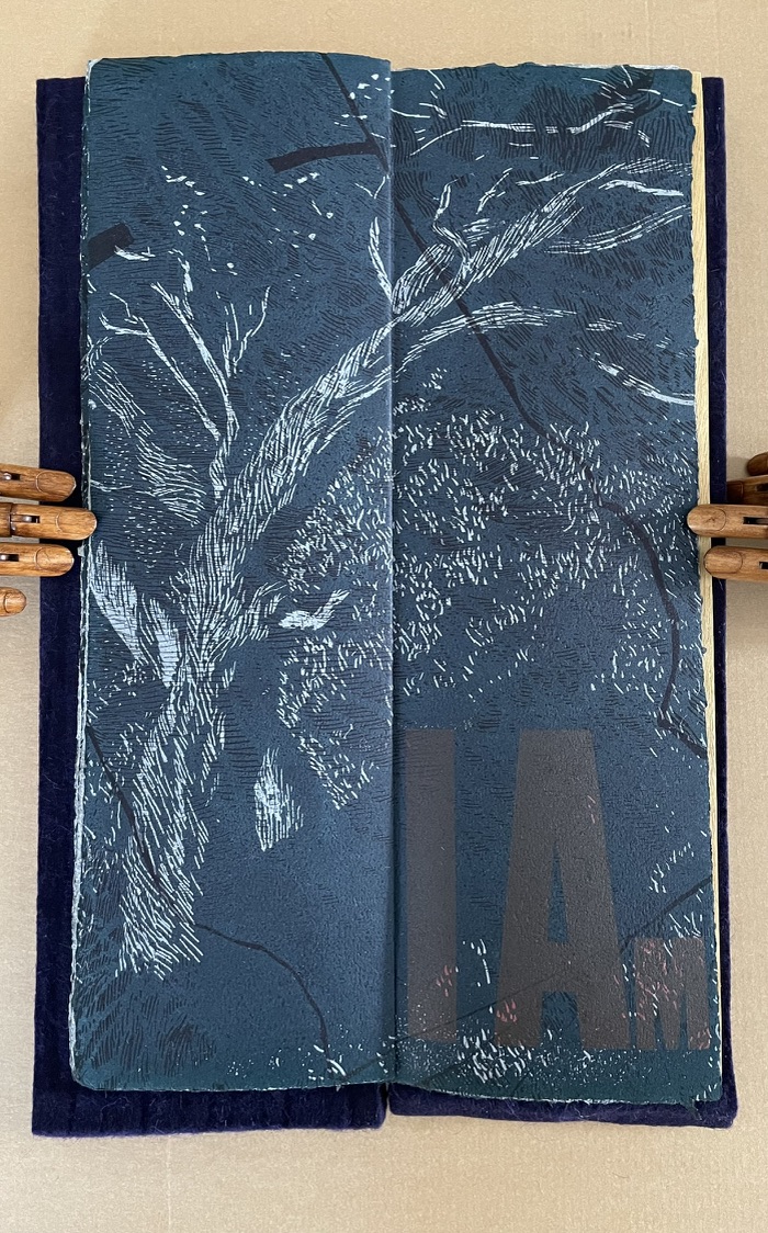
Third spread of relief and letter press. Verso: reverse of Sheet 3. Recto: Sheet 2.
And then comes the final spread of pulp printing showing the “inversions” of the last fragment of detritus. At the start, we had rectangular “cast imprints”; in the middle, two linear pairs; and at the end, circular ones. The human geometric eye may assert itself over nature, but the artist’s “representation by touch” reminds us of the “indivisible whole”.
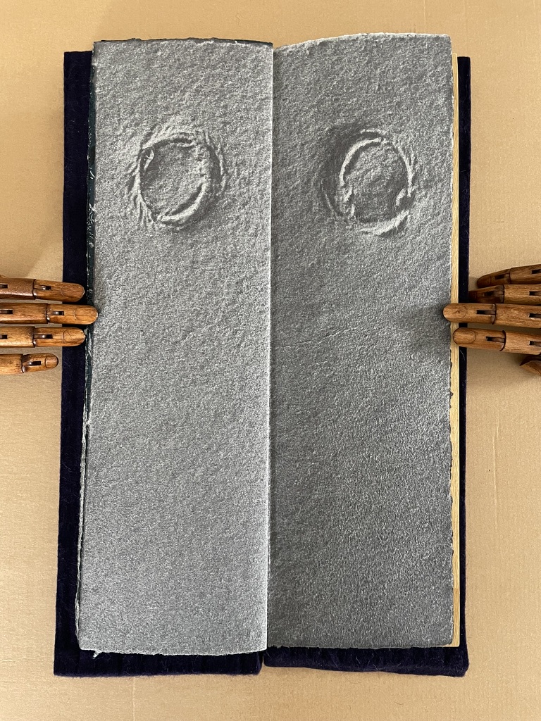
Fourth and final double-page spread of pulp printing. Verso: reverse of Sheet 2. Recto: Sheet 1.
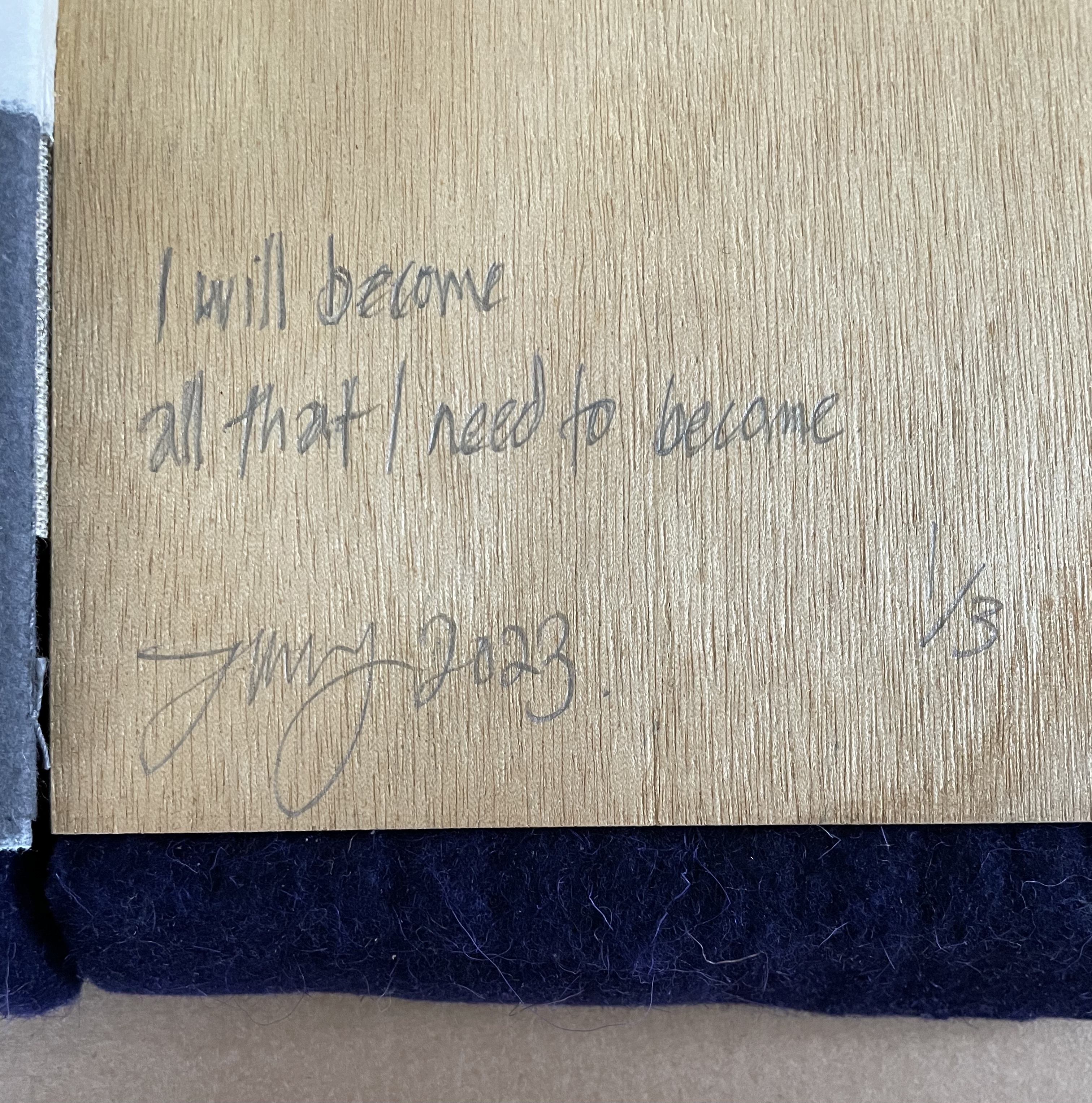
Overall, the pattern and rhythm give us at least three different tactile experiences and three different representations by touch. The surfaces of the pulp printed sides and the relief printed sides differ even if applied to same sheet, and the surface and heft of the translucent sheets feel completely differently from the others. As Mosely wants, our eyes entice touching and fingering the images. More difference in tactility extends to the felt covers, the burlap and paper on the spine, the plywood inside the back cover. We read this book as much with the “eyes of our skin”, as Juhani Pallasmaa phrases it, as with our eyes.
fragments of euclidean space suspended within the folds of smooth space (2023)
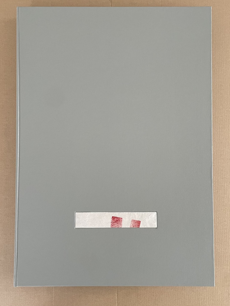
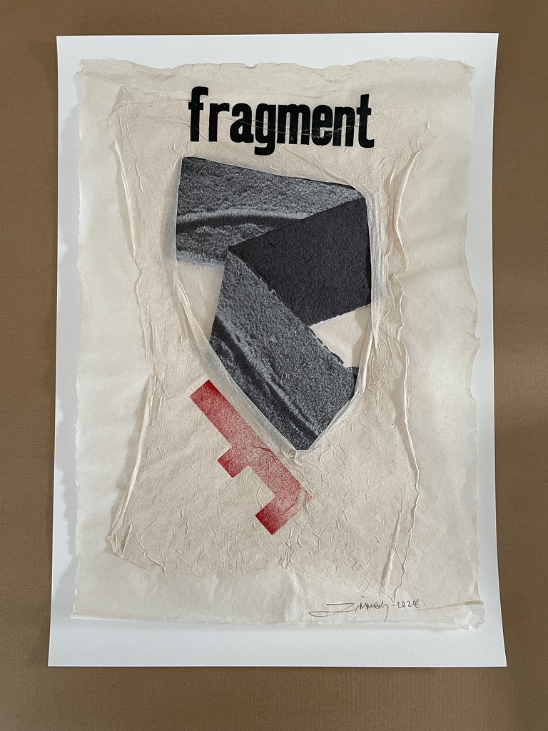
fragments of euclidean space suspended within the folds of smooth space (2023)
the fourth book in the series of artist’s books ”representation by touch”
Timothy Mosely
Cloth-covered box of 14 prints and one of the unique fragments. H440 x W320 x 30 mm. Edition of 8, of which this is F. Acquired from the artist, 17 October 2024.
Photos: Books On Books Collection.
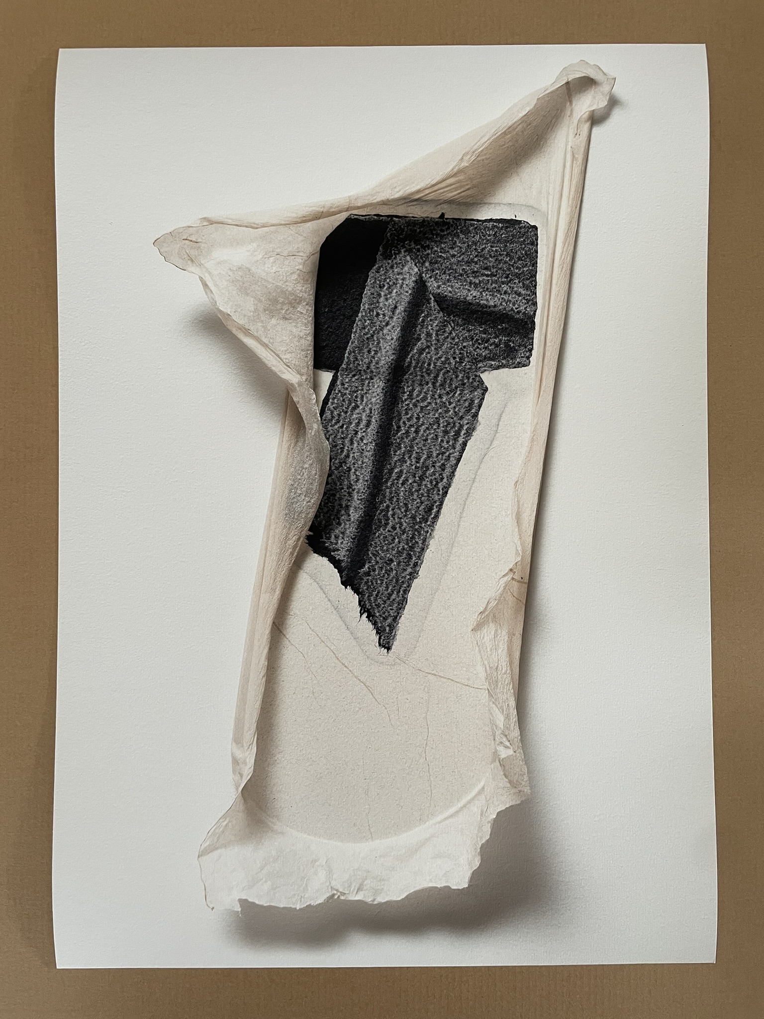
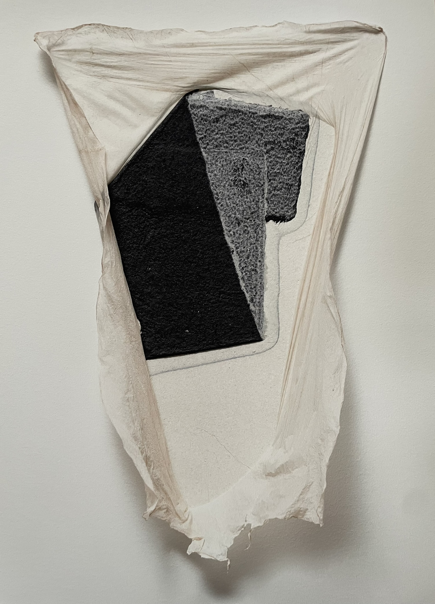
fragments (2023), the fourth in Timothy Mosely’s series of artist’s books “representation by touch”, is a folio box containing a title page, eight loose folios (high resolution digital prints), and an artist’s statement.
In the artist’s statement, Timothy Mosely writes, “At all points during the making of these ephemeral works touch has shaped and sustained them”. “Touch” is the critical word. The “ephemeral works” in the statement refer to the eight artworks on display in the eponymous exhibition at Grey Hand Press in Brisbane in December 2023.
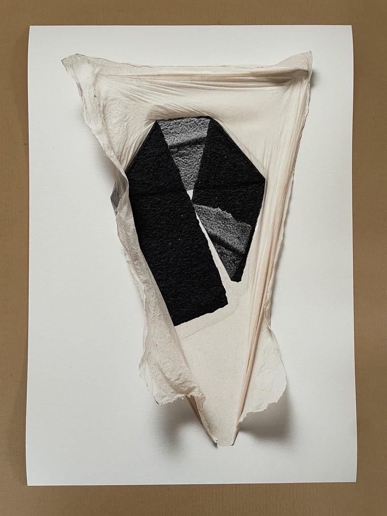
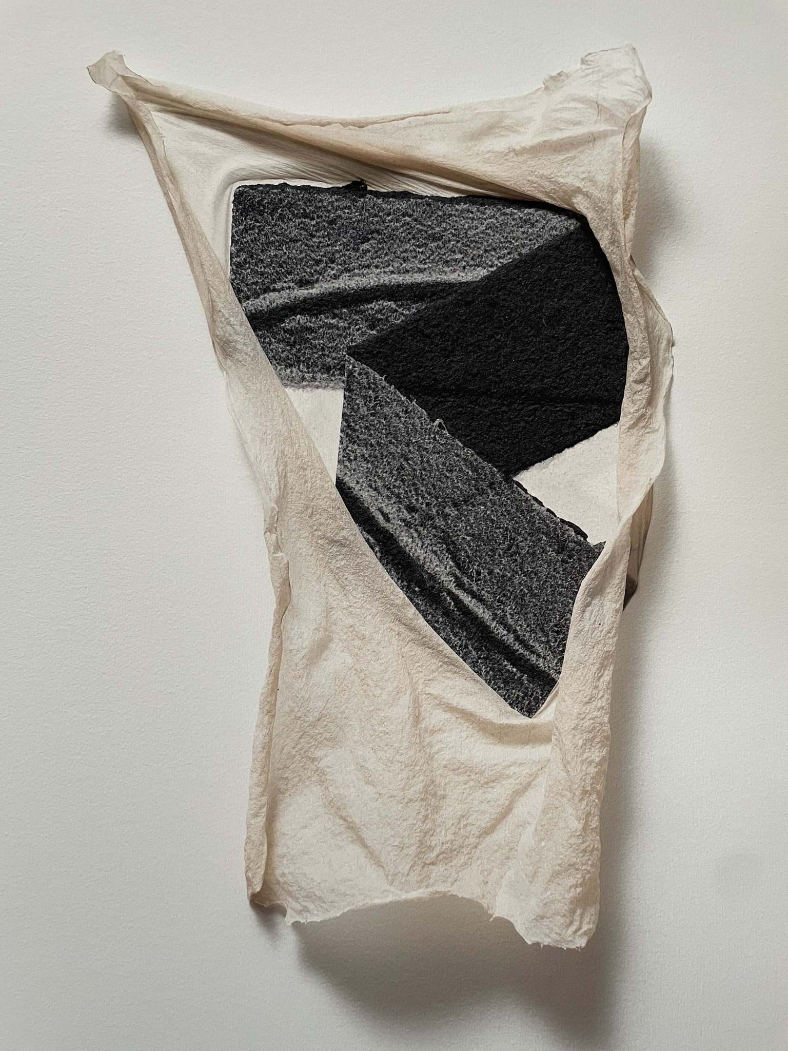
Each work consisted of a fragment of folded pulp-sprayed recycled cotton paper that had been wet-sheet-collaged onto over-beaten linen paper and then restraint-dried. In and on the cotton fragments, found wilderness objects had been imprinted and pulp printed prior to folding and collaging. Having been restraint-dried on prepared studio walls, each paper work took on a distinctive, dramatic shape because of the different points of touch among the linen, cotton, and wall surfaces. Linen and cotton papers have different drying properties. As the linen dried and shrank, its edges pulled away from the wall — “untouching” it, as Mosely says in his statement. Around the collage and where it touched the cotton, the linen paper remained in touch with the wall. After being photographed at high resolution in situ for the digital prints, and after the exhibition, the eight paper works were reworked into title pages by wet-sheet collage and letter press printing, one for each folio box.
This is art by way of materials science and engineering — and also philosophy.
Clearly, in making the paper works, human touch was involved, but that is not the direct touch that “shaped and sustained them”. Hanging on the gallery wall, each ephemeral paper work would have called out: look at what the materials have done in their touching and untouching. Is there a touch of the acheiropoieta to them — those religious icons not made by hands, like the shroud of Turin or Veronica’s veil? If so, what is being worshiped or adored? The abstract phenomenon of touch? The materials’ performance of the phenomenon?
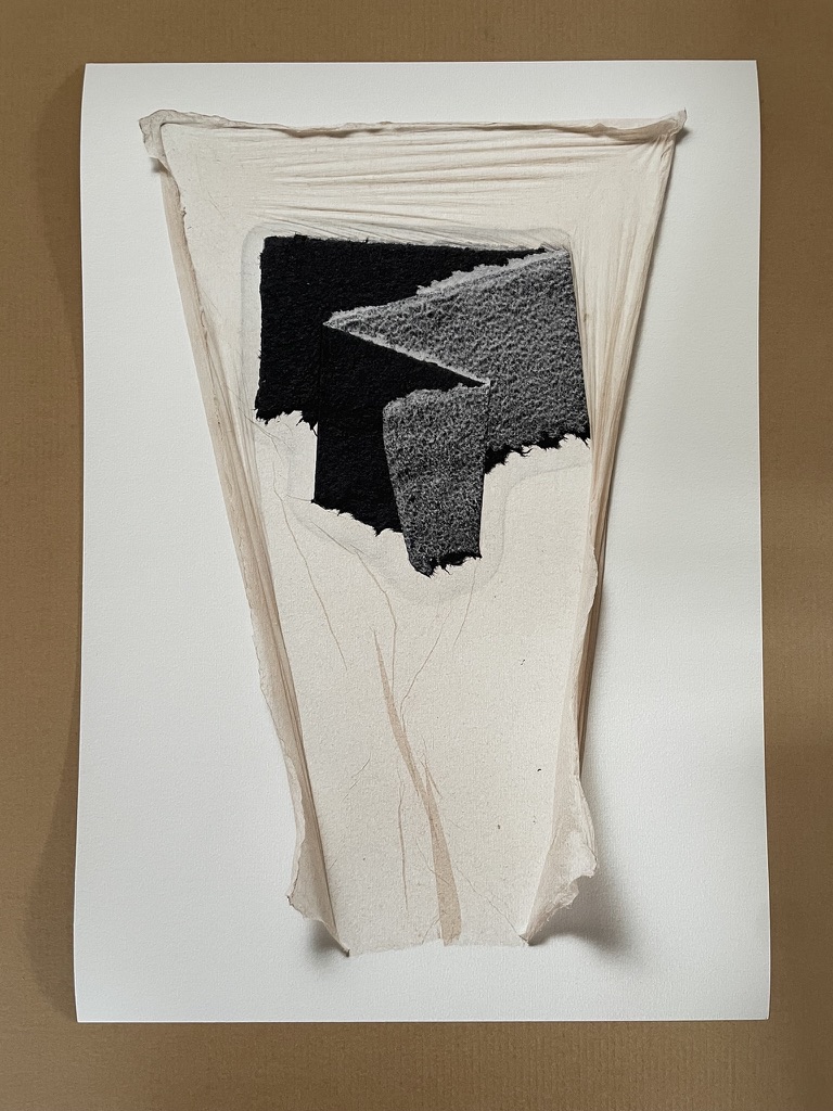
The “performers” could be considered as engaged in a long performance of touching and untouching. At the end of the performance, however, when the ephemeral performers disappear into the wet-sheet-collaged and letterpress printed title pages for the folio boxes, the artwork’s proposition leans away from “representation by mechanical touch” and leans toward “representation by human touch”. Of course, the leaning toward human touch began earlier, when the paper works were photographed in situ for production as digital prints. In addition to the engineering lean toward human touch, the prints deliver a perceptual lean. If we touch the prints, we know for sure that our eye has been fooled. Poring over the folios with eye and hand, we perceive a gap between the seen and felt in these print representations of the materials’ touching and untouching. We experience something in that gap. The haptic eye insists on perceiving solidity rather than flatness, feeling the textures represented rather than the substrate on which they are represented. The haptic eye drives human touch into the foreground. The materials’ touch may no longer be physically present as it was in the studio, but it remains in the background.
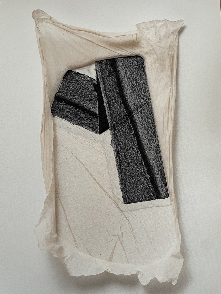
As Mosely notes in his artist’s statement, the Fragment project is informed by Gilles Deleuze and Félix Guattari’s A Thousand Plateaus (1987). The title of the exhibition — “fragments of euclidean space suspended within the folds of smooth space” — alludes to their concepts of “smooth space” and “striated space”, which may seem in opposition but are always intermingled. They form the basis of how we perceive and sense the world:
It seems to us that the Smooth is both the object of a close vision par excellence and the element of a haptic space (which may be as much visual or auditory as tactile). The Striated, on the contrary, relates to a more distant vision, and a more optical space — although the eye in turn is not the only organ to have this capacity. … The first aspect of the haptic, smooth space of close vision is that its orientations, landmarks, and linkages are in continuous variation; it operates step by step. Examples are the desert, steppe, ice, and sea, local spaces of pure connection. … Orientations are not constant but change according to temporary vegetation, occupations, and precipitation. … Striated space, on the contrary, is defined by the requirements of long-distance vision: constancy of orientation, invariance of distance through an interchange of inertial points of reference, interlinkage by immersion in an ambient milieu, constitution of a central perspective. It is less easy to evaluate the creative potentialities of striated space, and how it can simultaneously emerge from the smooth and give everything a whole new impetus (Deleuze & Guattari, p. 493).
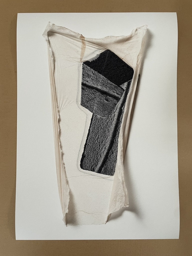
Our experience of Fragment (the folios) resonates with the philosophers’ description of smooth space as being “both the object of a close vision … and the element of a haptic space“. Our appreciation of Fragment (the paper works), which has to occur in their physical absence and distance from the folios, resonates with the philosophers’ description of striated space as “defined by the requirements of long-distance vision“.
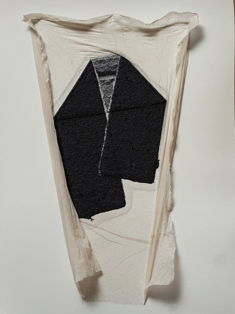
If there is an object of veneration at work in the strangely acheiropoietic paper works of Fragment, it is the phenomenal world that Deleuze, Guattari, and so many other philosophers strive to explain. In its exploration of “representation by touch”, Fragment (the folios) reminds us how mysteriously and sensuously the haptic eye captures that world. From that reminder, we should also remember to return to that other phenomenon addressed (or redressed) by Mosely’s series “representation by touch” and other works: the privileging of vision over touch.
Caveat and reminder: The four images above and the four below are jpeg images of digital photos of the the high resolution digital prints in the F copy from the edition of eight. The jpeg format involves a method of lossy compression for digital images.
Kanage Pholu Wanda (2014)
Kanage Pholu Wanda (2014)
From the Archipelago of Remnant Gardens suite of books
Timothy Mosely
Case bound with relief prints on rainforest plywood backed with felt, relief prints on awagami kozo torn and collaged. H52 x W68 cm (open). [44] pages. Variable edition of 11 (1 artist’s proof ) of which this is #9. Acquired from the artist, 17 October 2024.
Photos: Books On Books Collection.
Kanage pholu wanda (2014) is part of a multi-suite project called “Re/membering touch”. This rich, complex artist’s book is one of the three works making up “The Archipelago of Remnant Gardens” suite.
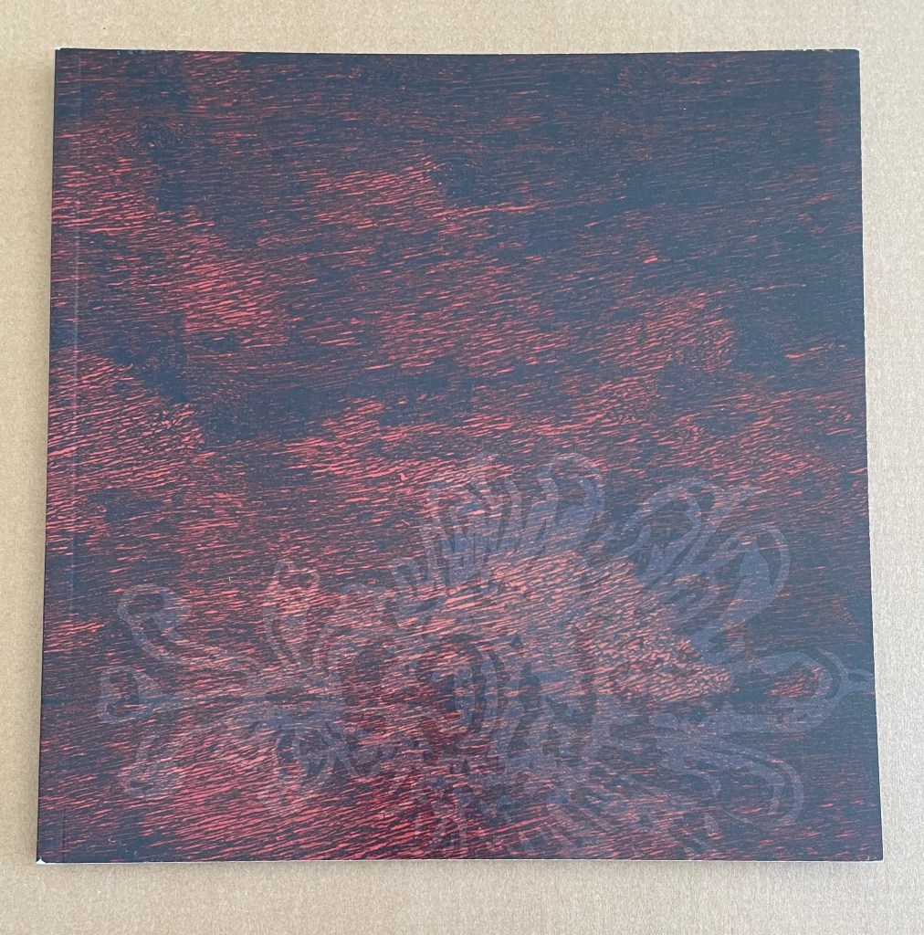
It is hard to better Paul van Capelleveen’s and Sarah Bodman’s appreciations of Kanage pholu wanda (2014). Thanks to them, we know how personally this work is a “re/membrance” by the artist, whose childhood in Papua New Guinea brought him in close touch with the Sa:mba:leke people.
A torn sheet of paper is sewn in at the upper part of the double page, and that round piece can be turned over separately from the rest. Then the viewer stares straight into a girl’s face. This is a portrait of Kanage pholu wanda, a Samberigi name with the meaning “girl of the bamboo creek.” Mosely knows her from his childhood; she is depicted in a photo with his family. His own Samberigi name is “boy of the bamboo creek.” Van Capelleveen, Materialia Lumina.
Sambaleke oral culture is full of stories told through visual language, and this series of Mosely’s books follows in the same tradition with no translation needed. But the visual is only part of the experience as Mosely’s books are steeped in touch, fully engaging the reader’s senses through haptic reception. For the Sambaleke people, touch is an essential part of life, a physical connection with the rainforest and each other – for example, holding someone’s hand when in conversation. Bodman, “The Secret Lives of Books“.
He expressly does not speak on behalf of the Sa:mba:leke people or his childhood friends. But he stands in a position that allows speaking; they often don’t, while their region is threatened by illegal logging, oil drilling, and mineral mining. Mosely feels obliged to speak. However, this communication does not occur with words; it happens with the means of the Sa:mba:leke-by touch. Van Capelleveen, Materialia Lumina.
Here is the sequence that Van Capelleveen describes.
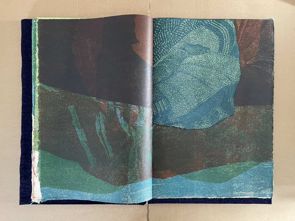
A torn sheet dividing the double-page spread.
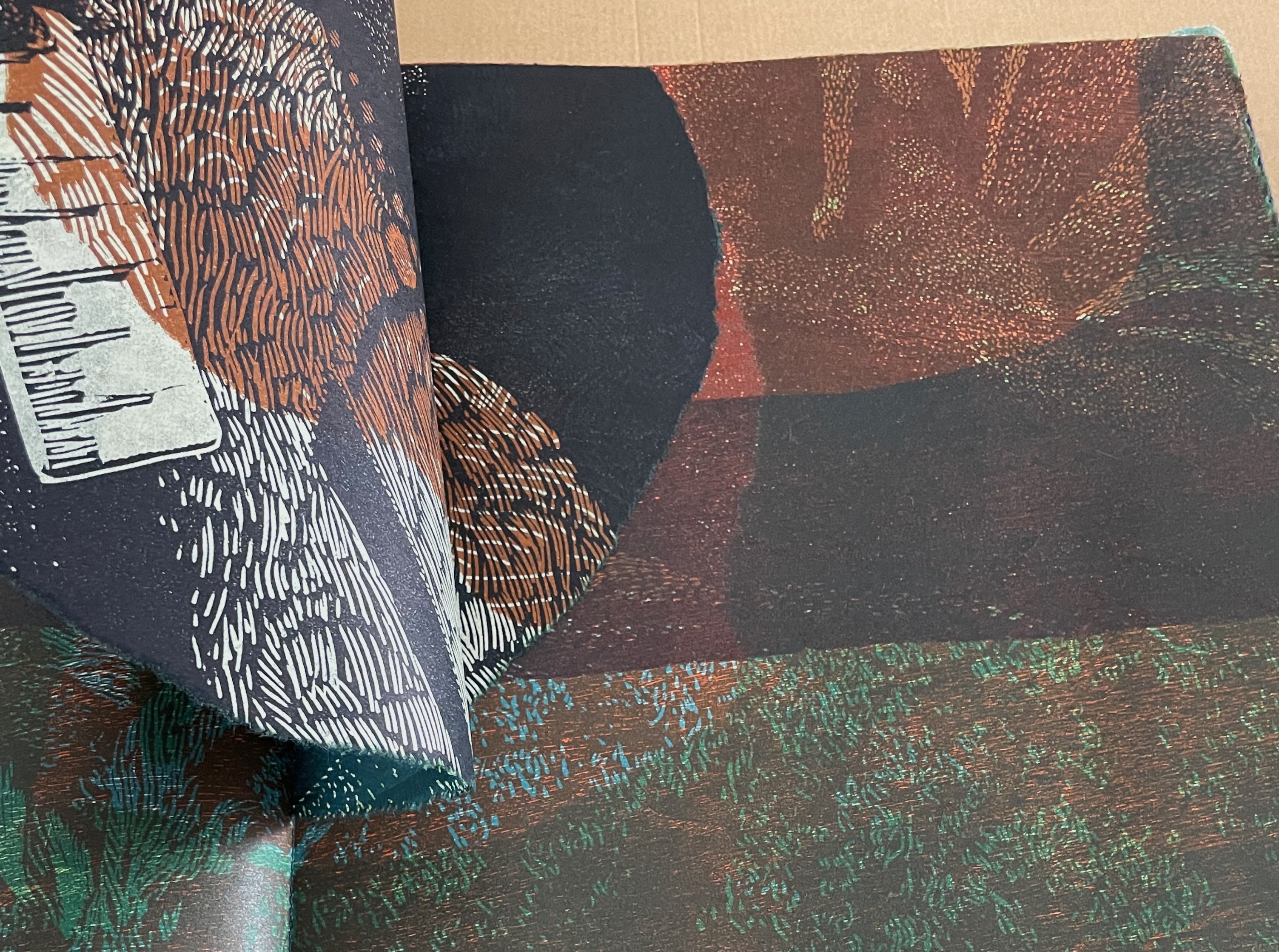
Turning the top half of the torn sheet from right to left.
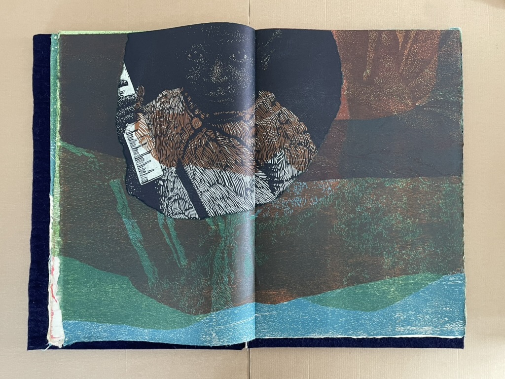
The portrait of Kanage pholu wanda (“girl of the bamboo creek”) emerges from the foliage above the creek.
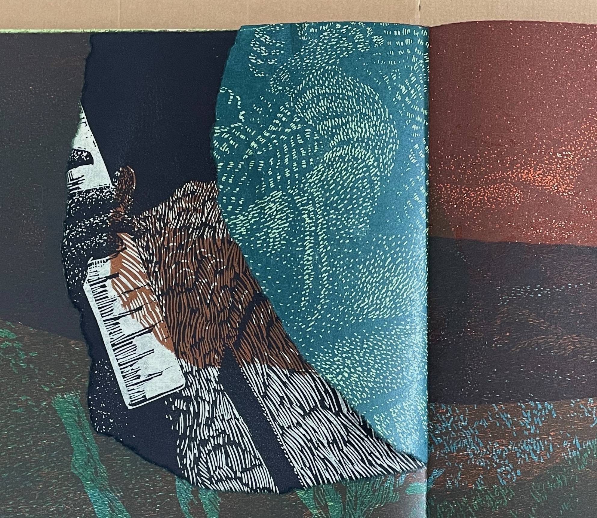
The portrait recedes into the rainforest as we turn the bottom leaf of the torn sheet from right to left.
In the sequence above, we find relief printing on both sides of the torn sheet, a frequent occurrence throughout the book even with the full-page bleeds. The sheet is so thin that its edge is difficult to feel or catch. With the uncut full sheets, the thinness and full-page bleeds combine to create deliberately “ambiguous edges”, as Mosely calls them in The Haptic Touch of Books by Artists (p.118). These edges insist on our touching the prints, feeling the paper — seeing each page with the eyes of our skin. The torn sheet sewn into the book adds an uneven thickness in the sequence that is echoed by thinness elsewhere in the book where segments have been torn out. Unlike the hidden portrait, some segments are reattached with glue sometimes on the reverse of the sheet, other times on the next recto page. With these full sheets, their fragility and fluctuating weight caused by the tears create the tactile sensation of brushing aside and pushing through the vegetation of the rainforest. Adding to the fluctuating weight and the surfaces’ texture, some sheets have received as much as five colors. The images and colors appearing through the torn holes converge with the images and colors of the full sheet in hand, contributing to our corporeal seeing.*
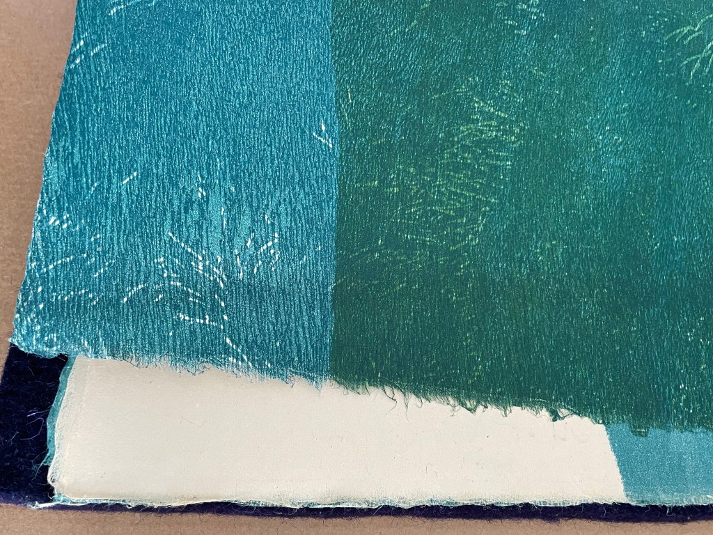
“ambiguous edges” (Mosely, 2014, p. 118).
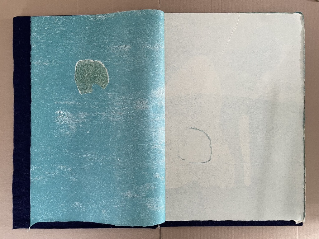
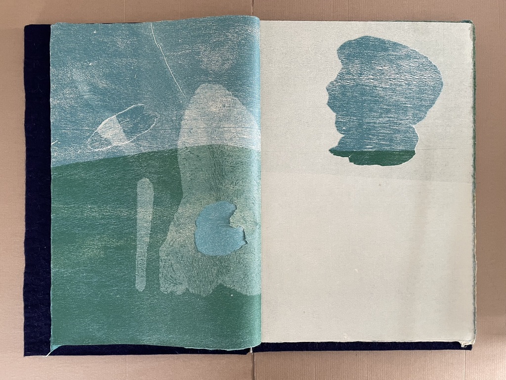
Fragment torn from the recto and glued to the verso; the previous recto page turned and showing the underlying verso’s blue.
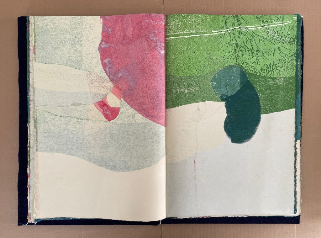
Full sheets’ fragility and fluctuation caused by the tears.
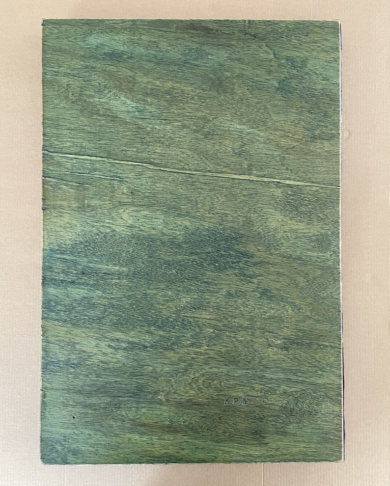
In I will become all that I need to become (2023), ep’s (2018), and The Book of Tears (2014), Mosely uses felt as covers over plywood. In Kanage pholu wanda, the plywood is significantly outermost. The wood covers and relief plates make a more direct connection with the rainforest for the reader. Mosely describes the wood used for both as luan plywood manufactured from rainforest timber (Mosely, 2014 p.106). So, in holding the book and touching the prints, the reader touches the rainforest.
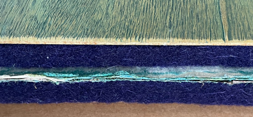
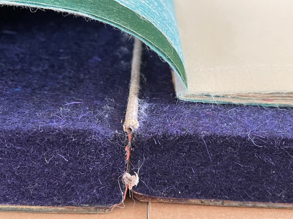
Close-up of fore edge (plywood cover, felt inside covers, and book block). Close-up of bottom edge (inner spine, felt inside covers, book block, plywood covers).
Mosely’s choice of this particular wood also relates to Deleuze and Guattari’s concepts of striated and smooth space that form the basis of how we perceive and sense the world. The natural grain of the rainforest tree correlates with smooth space; the straight and angular lines left by the manufacturing process correlate with striated space. Perhaps more than fragments of euclidean space suspended within the folds of smooth space (see above), Kanage pholu wanda demonstrates how these seemingly opposed concepts can intermingle. Deleuze and Guattari demur, “It is less easy to evaluate the creative potentialities of striated space, and how it can simultaneously emerge from the smooth and give everything a whole new impetus” (p. 493). In Kanage pholu wanda, Mosely more than evaluates “the creative potentialities of striated space” in luan plywood, he realizes it in the work, making it emerge on the cover, in the relief carvings, and in the relief prints. We will find the same again in touching rainforest (2014), the next work in the same suite (see below).
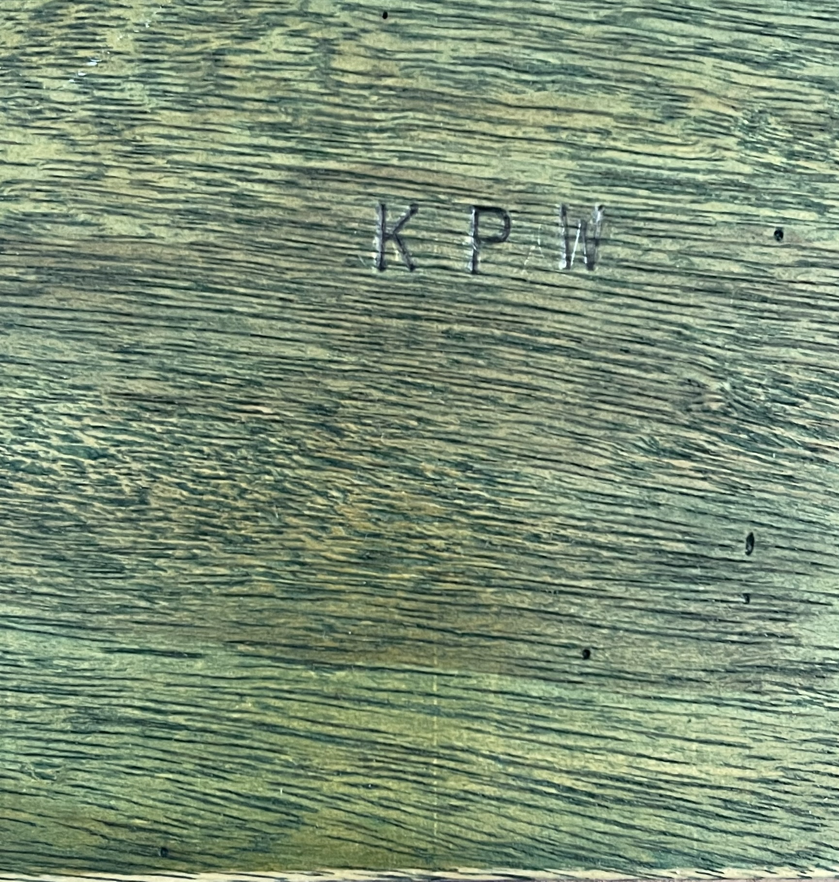
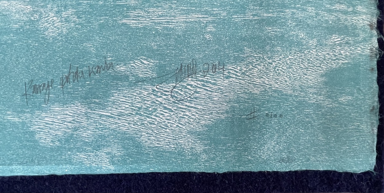
Initials of Kanage pholu wanda carved on front cover. Detail of final print of the book.
touching rainforest (2014)
touching rainforest (2014)
From the Archipelago of Remnant Gardens suite of books
Tim Mosely
Single segment casebound codex, burlap over rainforest plywood, relief prints from same plywood on awagami kozo, curved folding folio. H340 x W780 mm (open). Variable edition of 4 books, with one artist’s proof. Acquired from the artist, 25 October 2024.
Photos: Books On Books Collection.
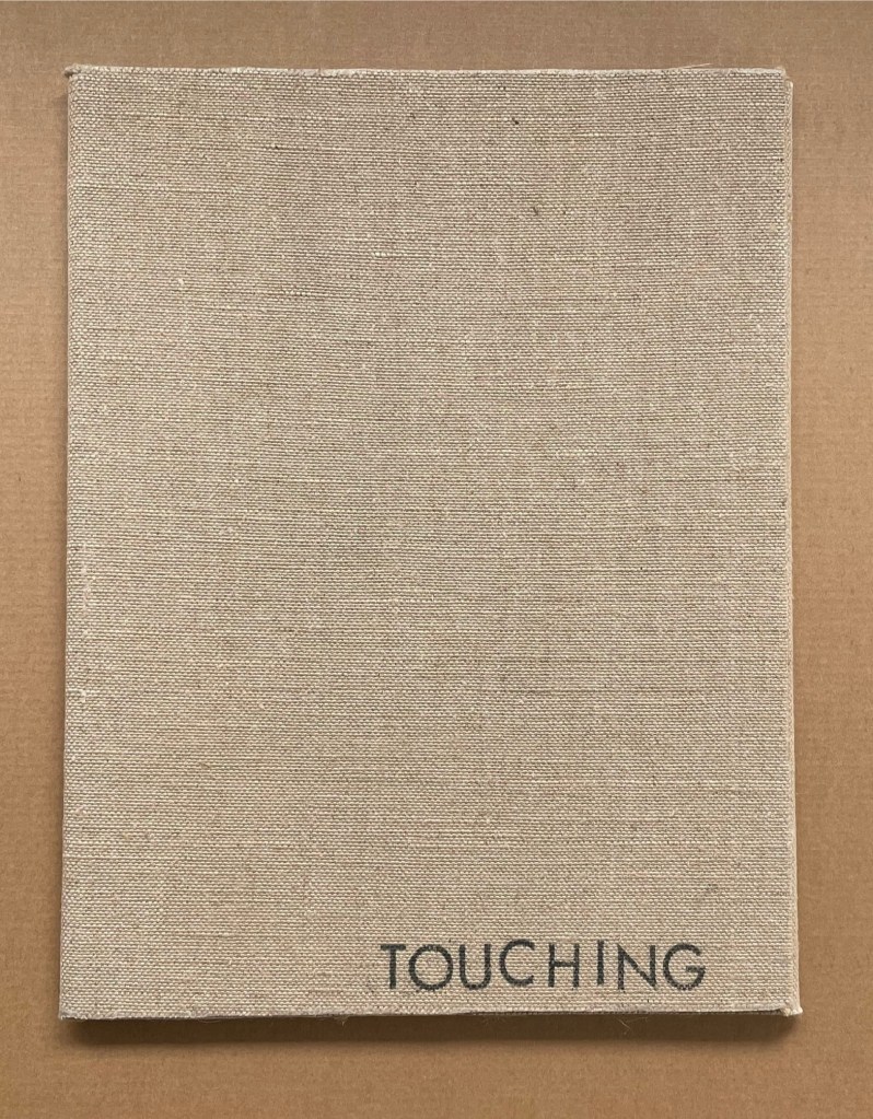
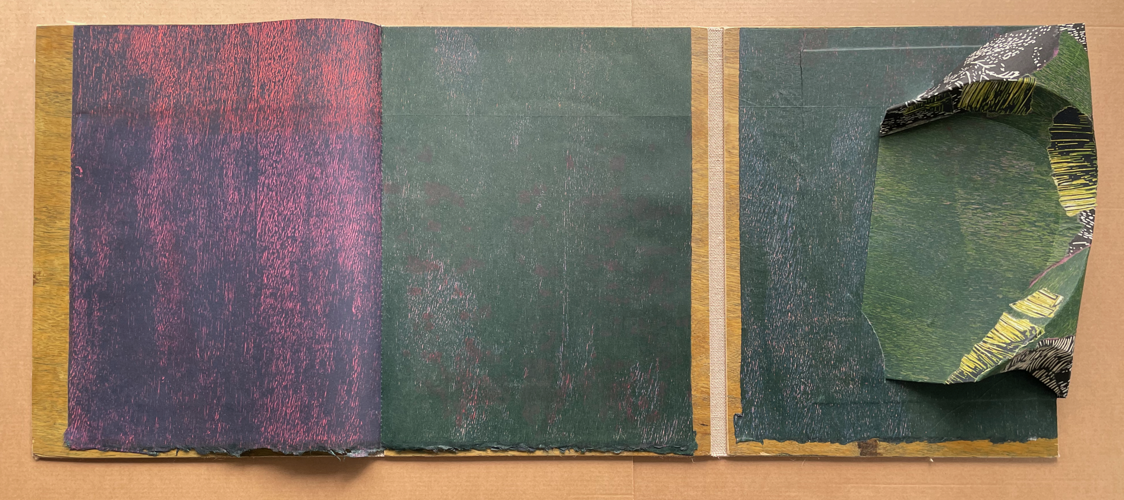
As the casebound artist’s book gradually opens into a triptych, its title is presented one word at a time, first nudging our attention to the burlap our fingers are TOUCHING and then to the RAINFOREST plywood whose grain we can see and feel on the left hand across from the burlap under the right hand.
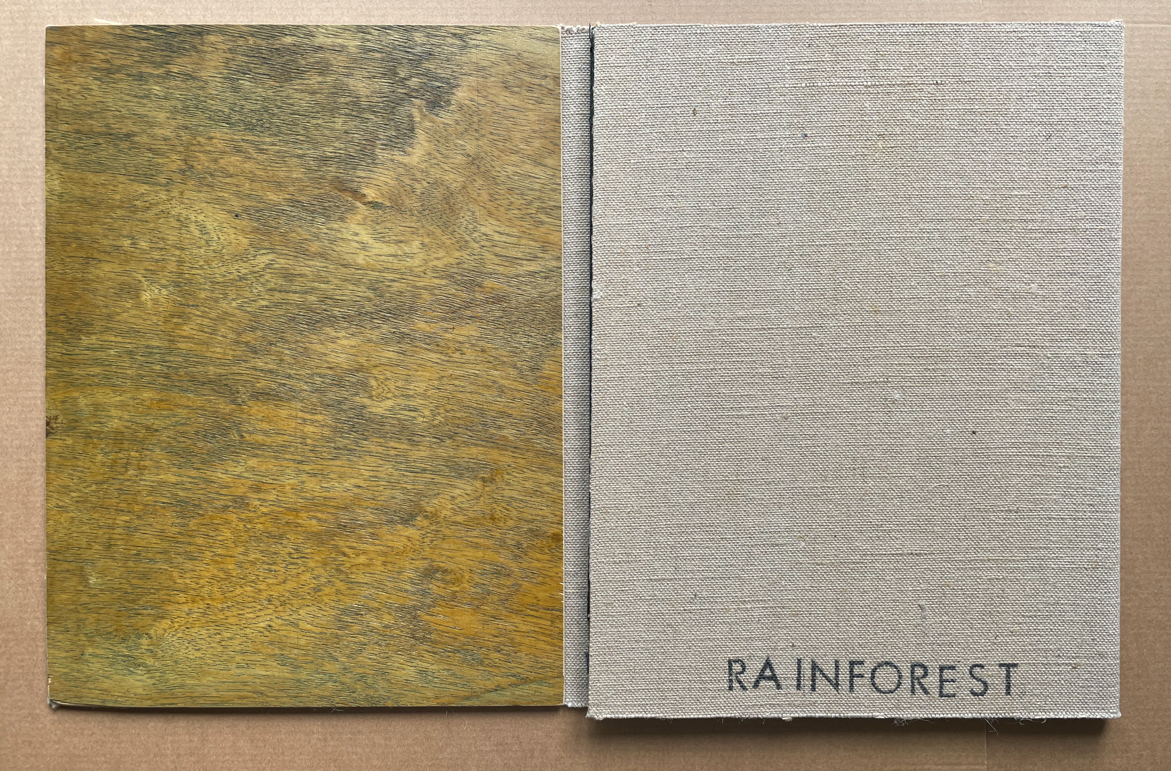
When we turn the burlap-covered RAINFOREST to the right, we see the plywood with its grain running horizontally, a print made from a rainforest plywood plate with the grain running vertically, and, in the third panel, another vertically grained plywood print on top of which is a thicker, stiffer printed folio.
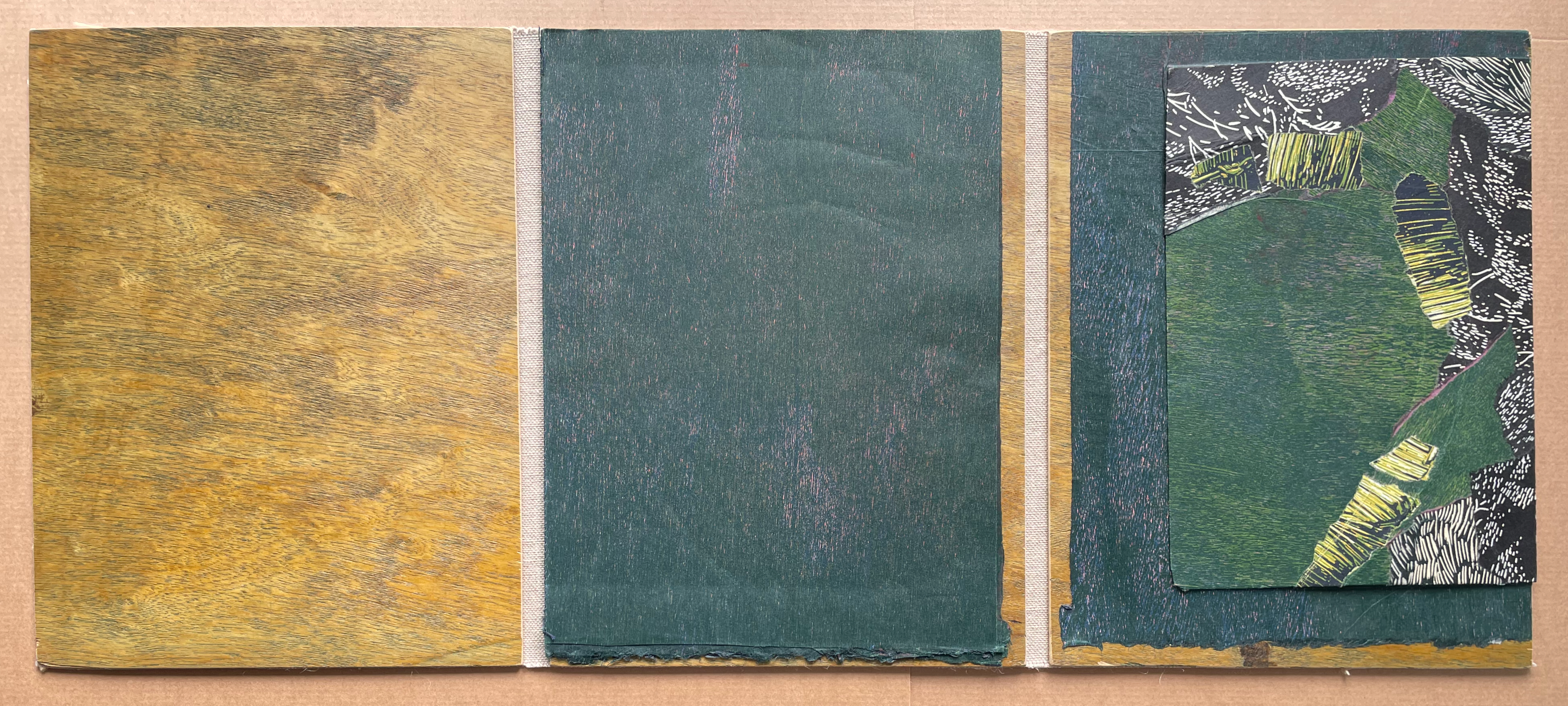
When we turn that stiffer printed folio, we find slots in the print below. The artist has filmed brief instructions on how to bow the folio, insert its corners into the slots, and turn it into a three-dimensional form. Notice how the grain of the print on the constructed folio runs the grain of the slotted print beneath.
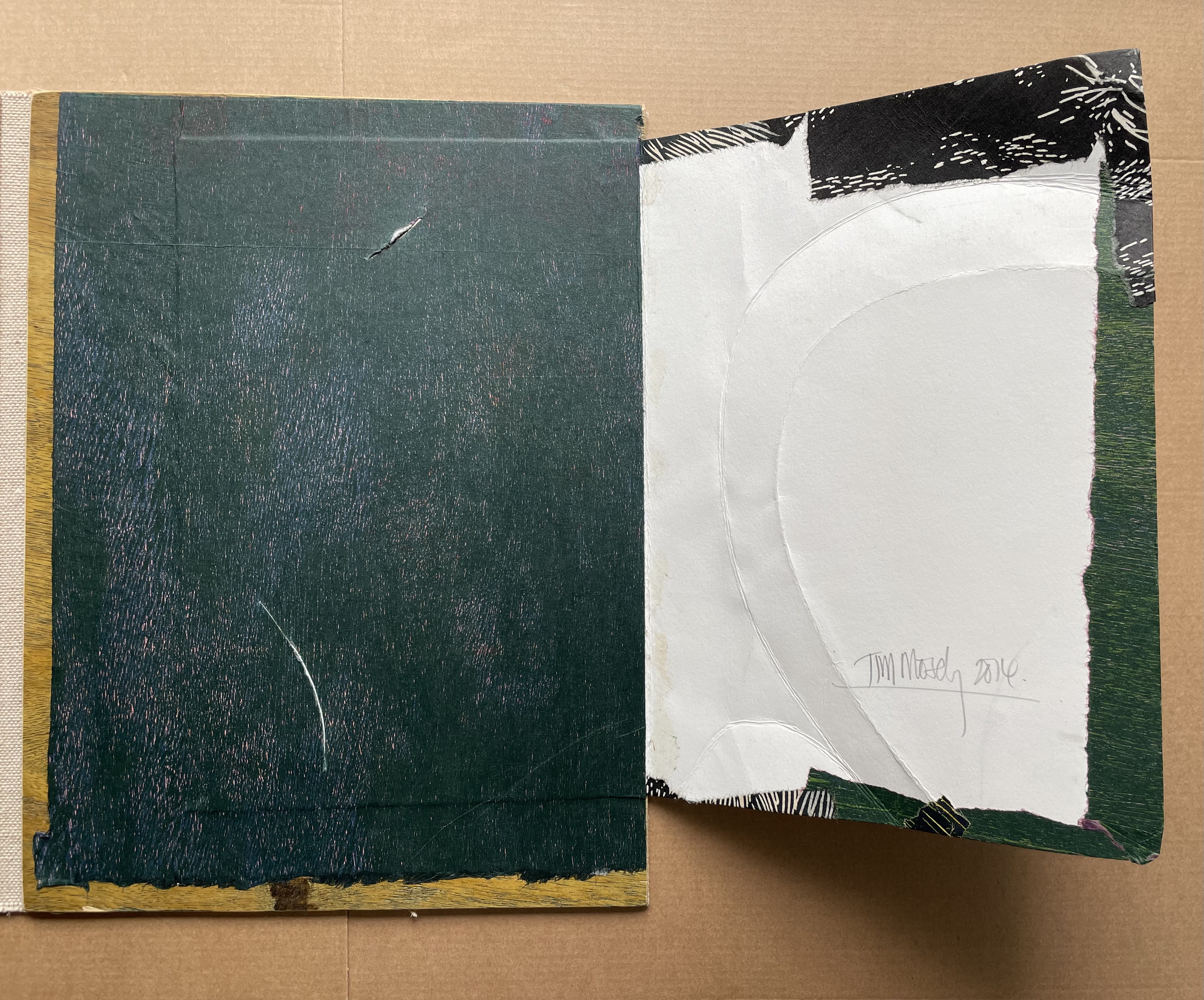
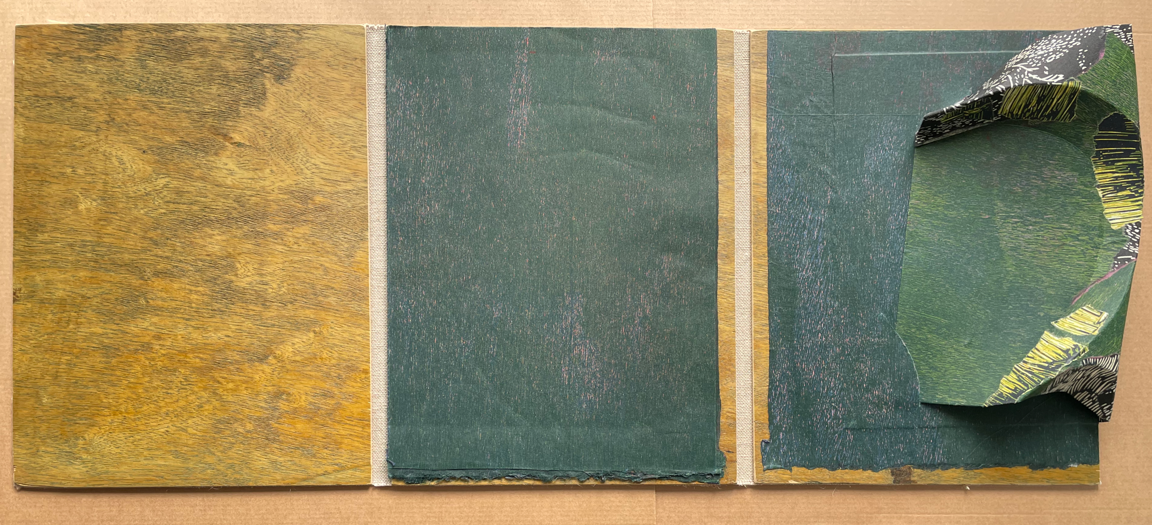
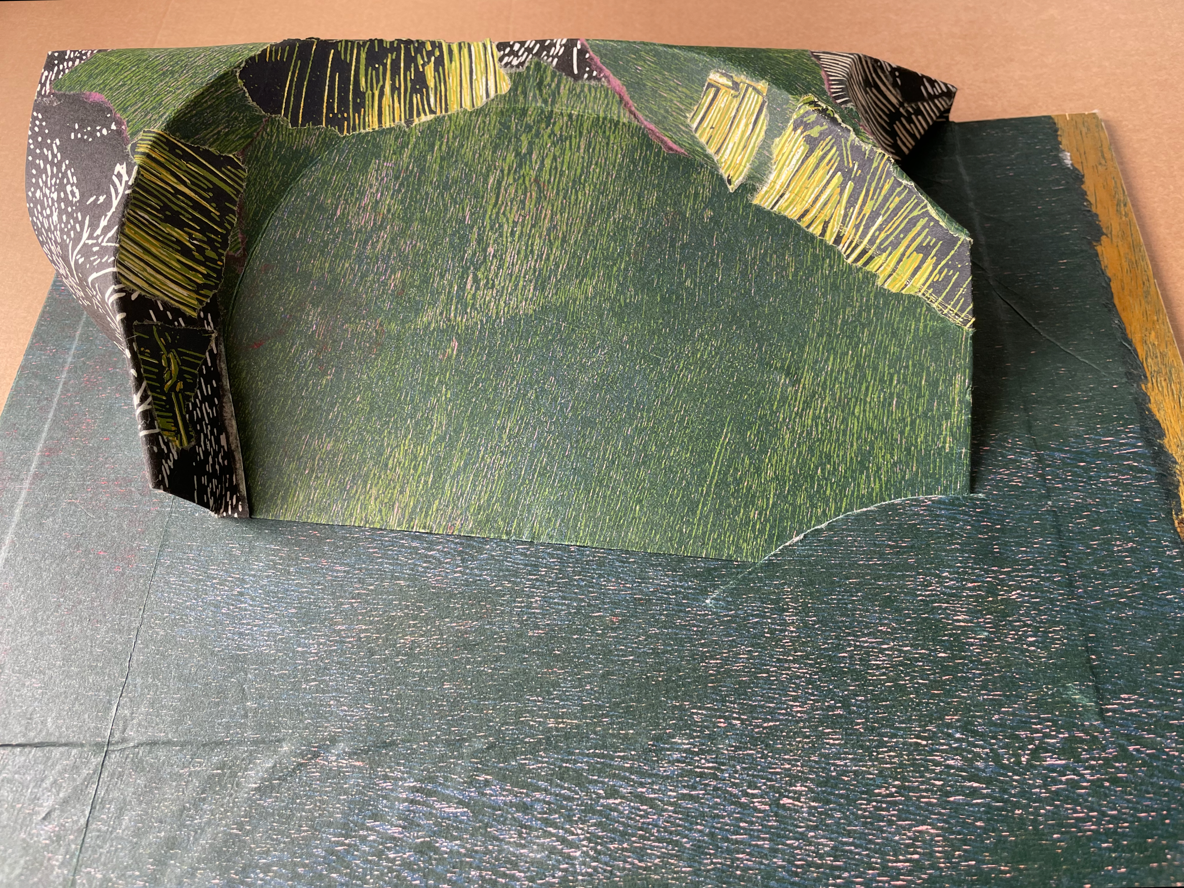
When the central panel’s leaf (relief printed on both sides) turns to the left, covering the plywood in the left hand panel, we realize that we have a folioed book in the first two panels that will complement and contrast with the static third panel.
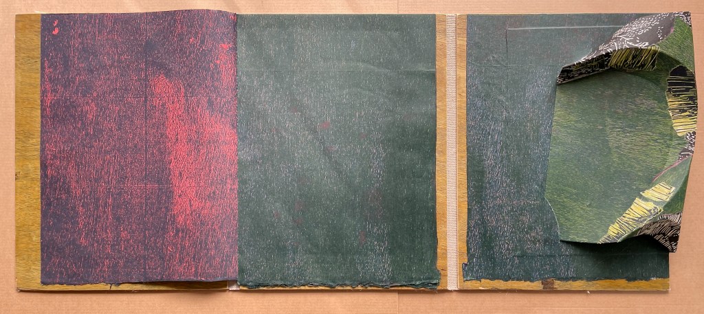
Another leaf in the central panel turns, and although the color contrast persists, the grain has changed.
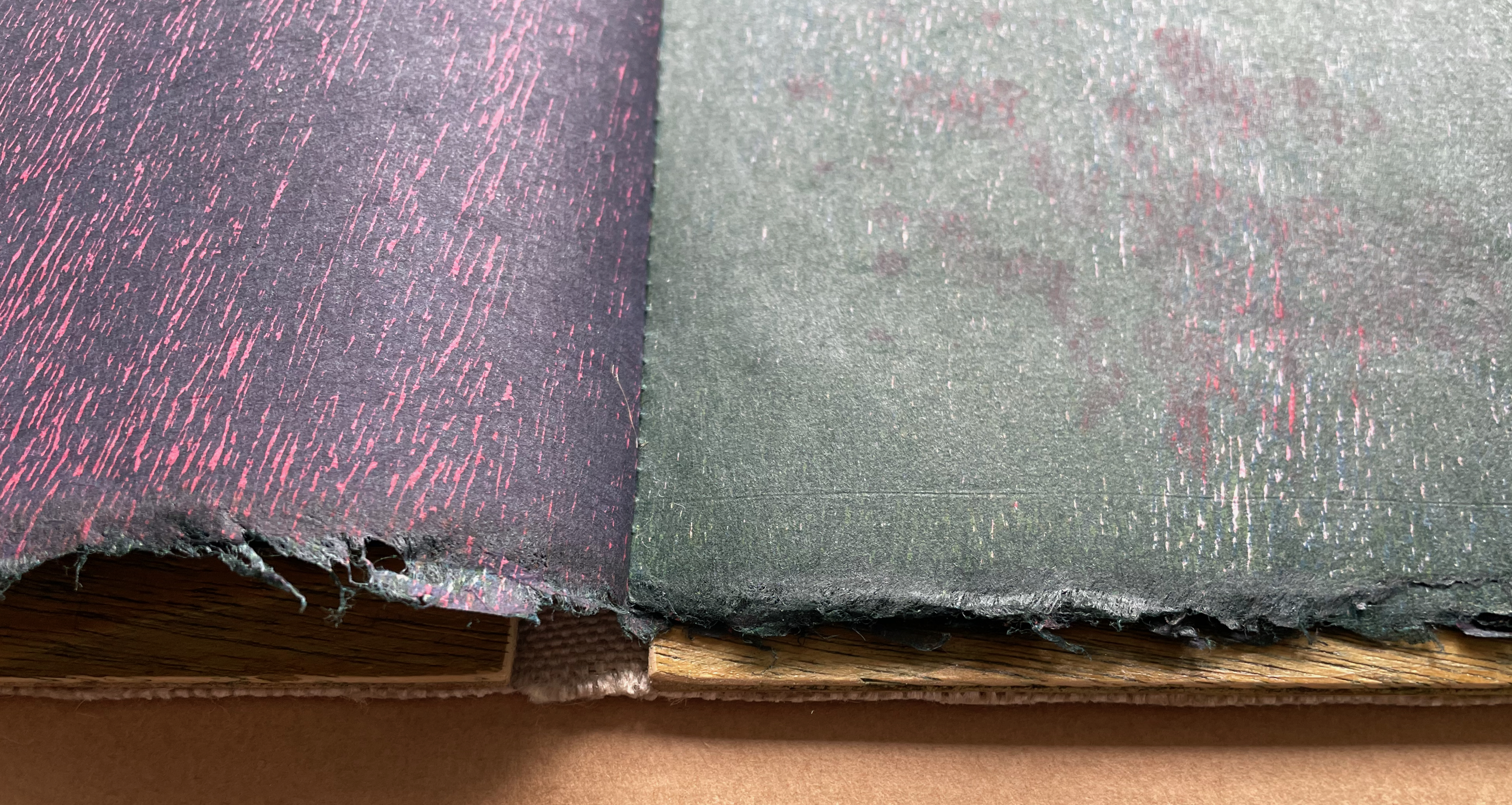
Detail of bottom edge and spine of the first two panels’ booklet. “Ambiguous edges”.
Another turn of the central panel’s leaf, and another change in the grain of the double-page spread.
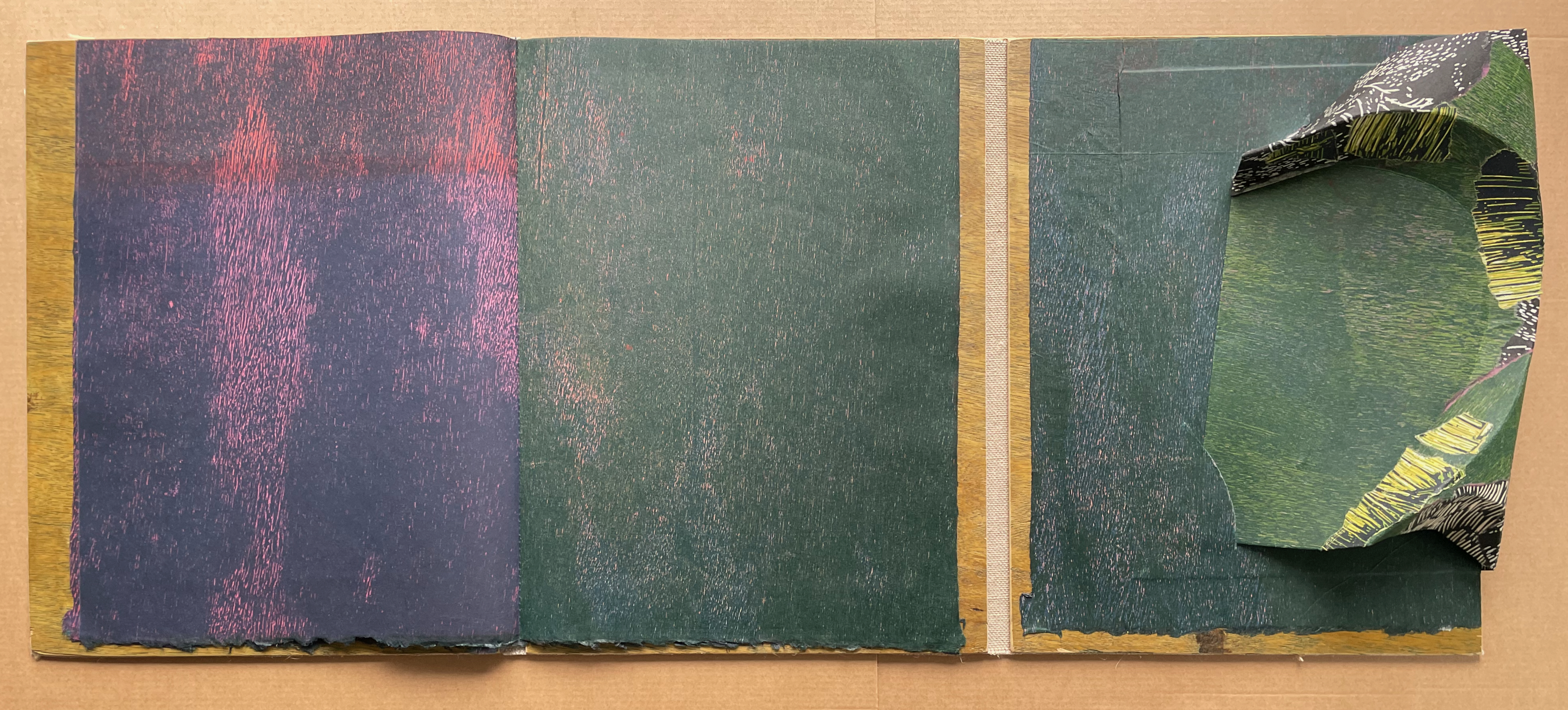
With this turn of the central leaf’s panel, we come to the center of the booklet, and the “double-page spread” turns out to be a single folio. Like I will become all that I need to become (see above), the booklet signature consists of double-sided relief prints (four folios in this case). With the turn of the central panel’s red recto, we can expect the earlier red/green double-page spread to reverse itself.
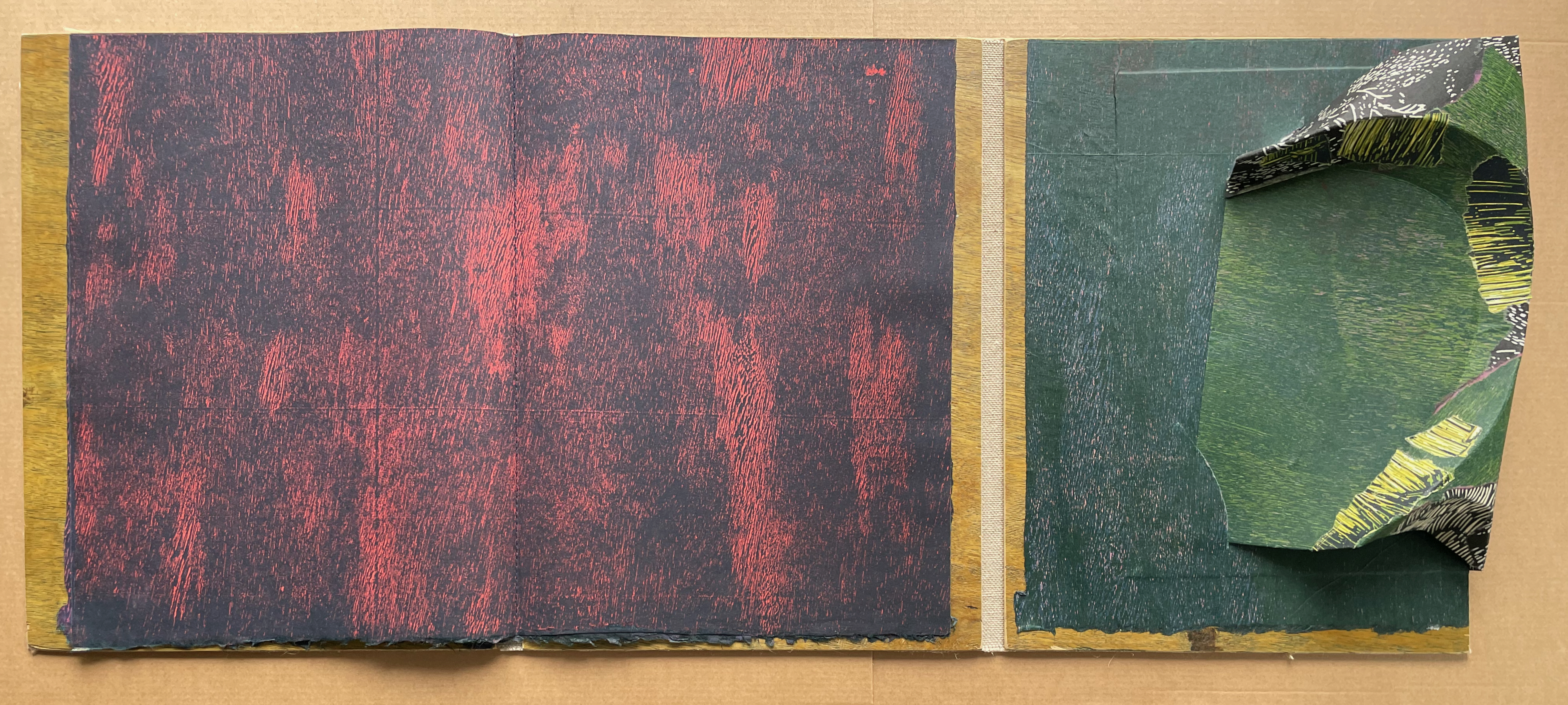
And it does. From here on the pattern will be green/red.
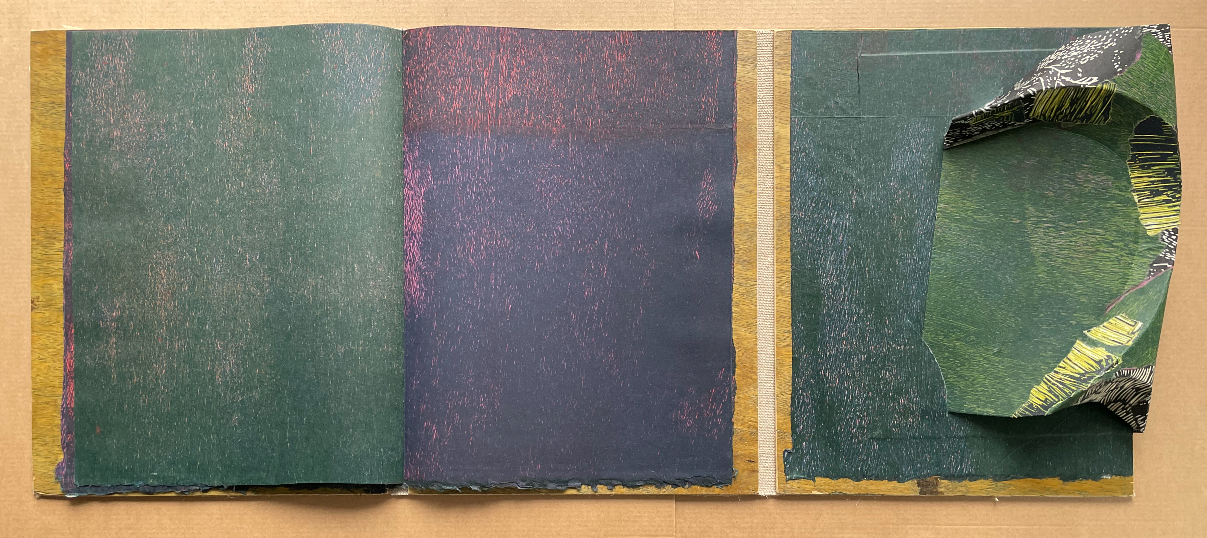
As in Kanage pholu wanda, the natural grain of the rainforest plywood contrasts with the straight and angular grid left by the manufacturing process, and yet they are intermingled.
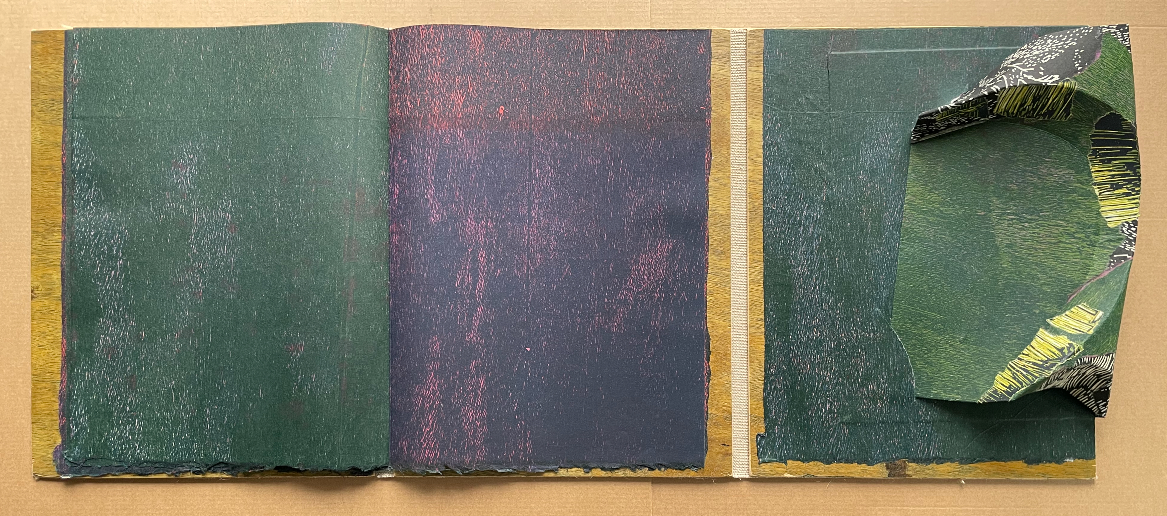
In the final spread, the central panel’s page (the right hand side of the outermost folio) is glued directly to the plywood panel.
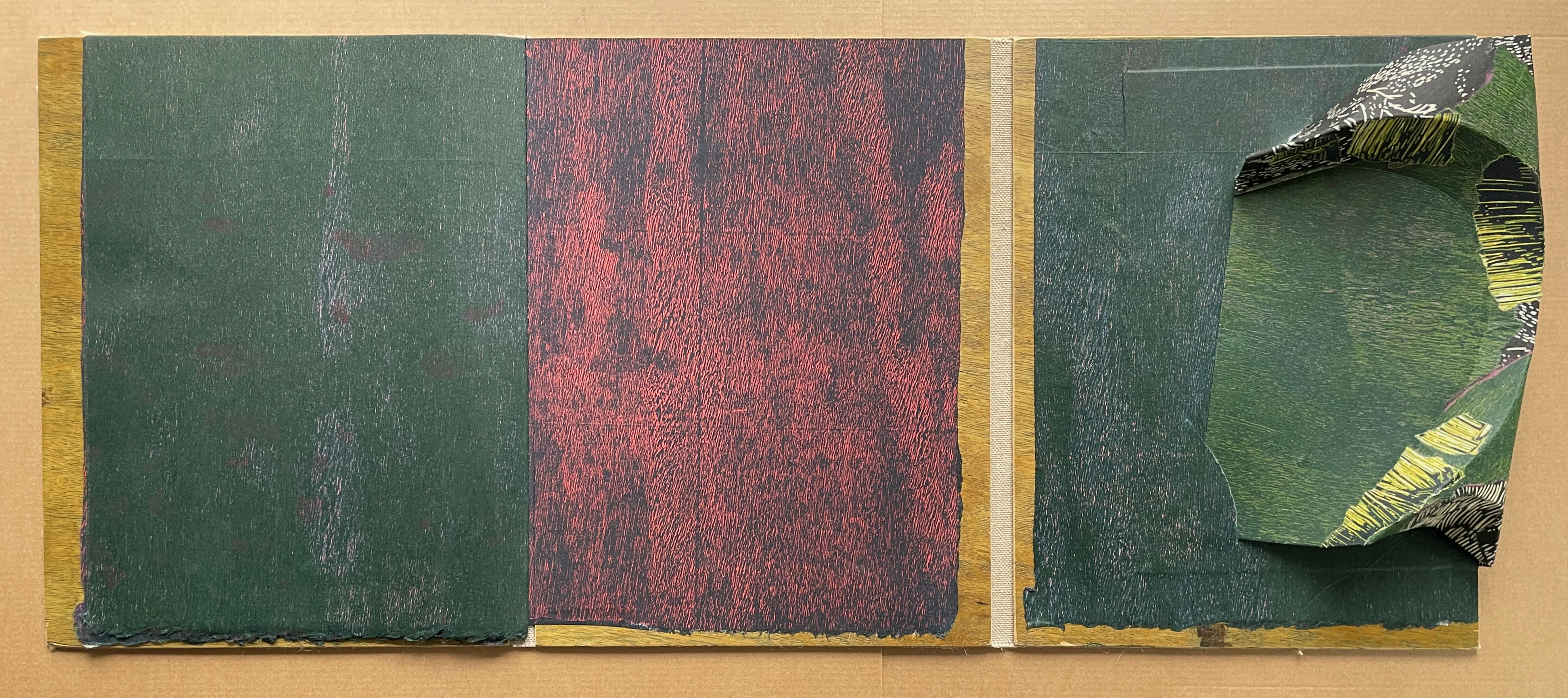
With the booklet’s abstract images contrasting with, yet echoing, the static organic representation that the reader is invited to make up, touching rainforest realizes “the creative potentialities of striated space” and shows “how it can simultaneously emerge from the smooth”. Just as important, it achieves two other indivisible unions: that of art touching the human and that of the human (TOUCHING) and nature (RAINFOREST).
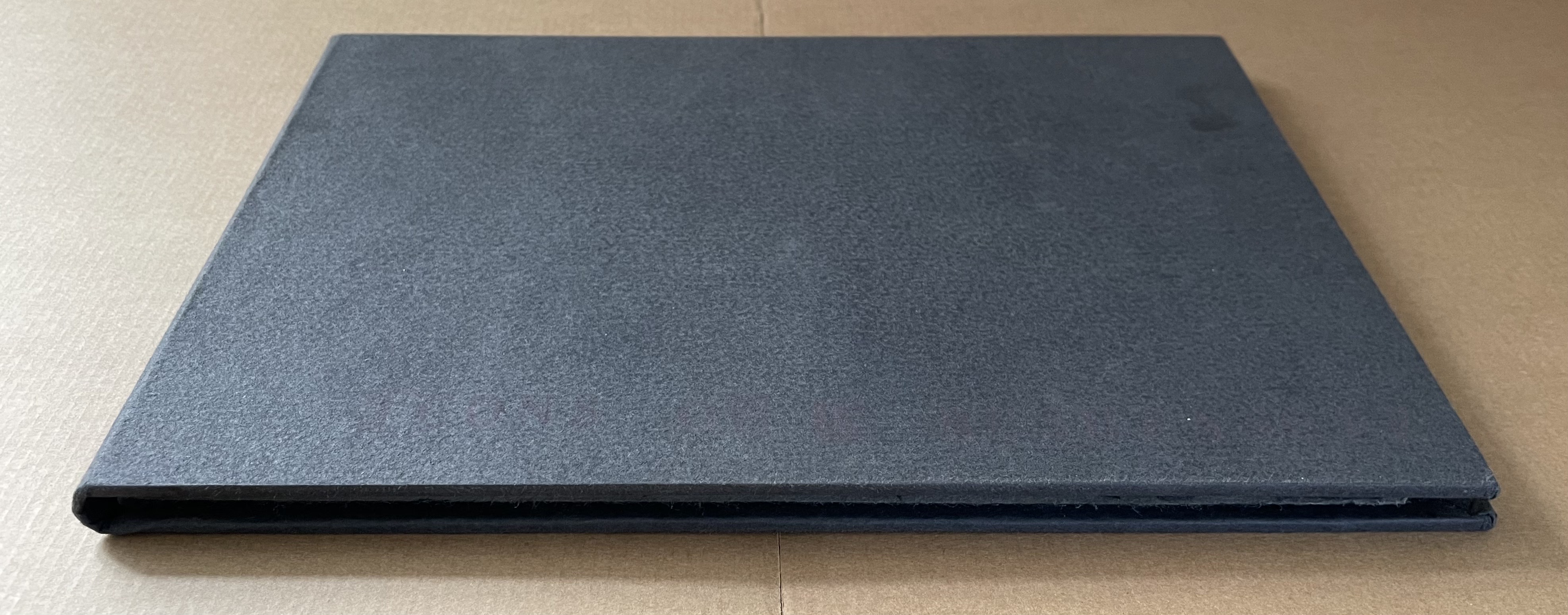
Icons of a Bush Ranger (2006)
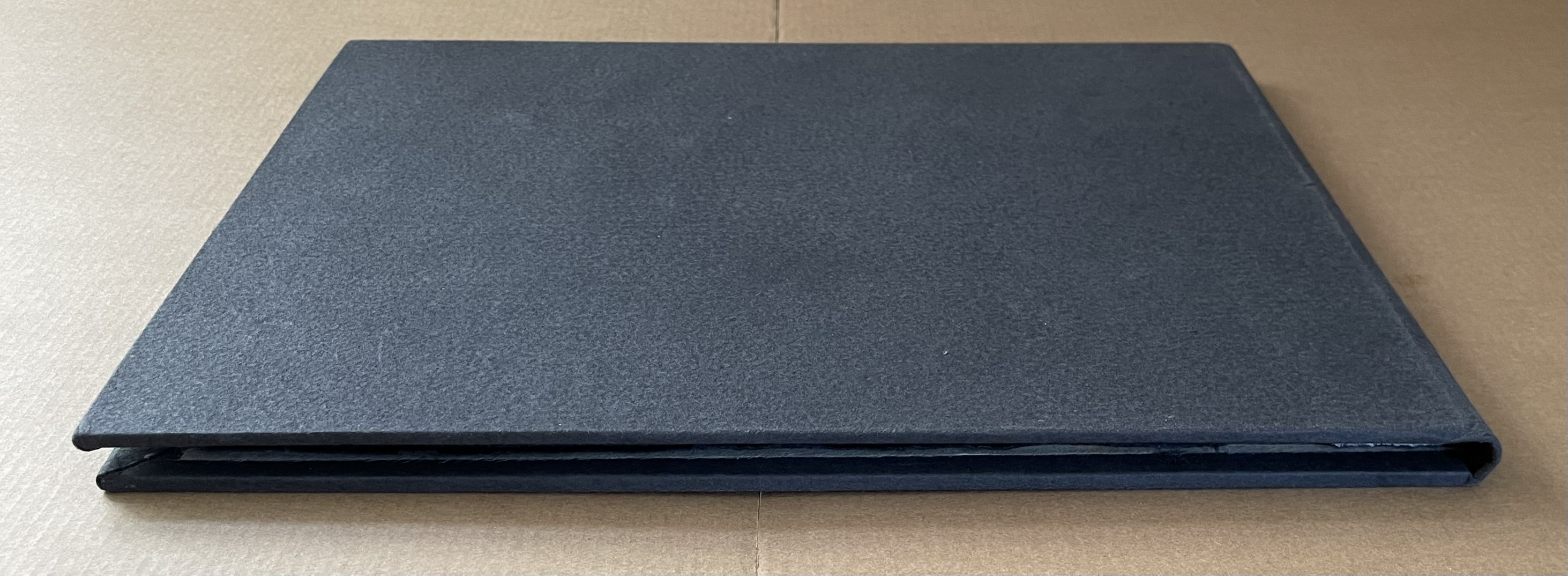
Icons of a Bush Ranger (2006)
Timothy Mosely
Casebound, cloth over boards, washi doublures, pulp printing on handmade black paper. H232 x W318 mm. [7] folios. Edition of 2 and artist’s proof, of which this is the proof. Acquired from the artist, 4 November 2024.
Photos: Books On Books Collection.
Edward “Ned” Kelly and his gang and the armor they made from stolen plough moulds are iconic in Australian history and folklore. Mosely made a trio of books called The Kelly Books in the same year as Icons. While the set consists of relief and rubber stamping on fabriano, Icons gives another example of the artist’s work with pulp painting. Centered on one side of each of seven oblong folios of black handmade paper, an image of the helmet the gang made famous is painted in white pulp. Again, as with I will become all that I need to become (2023), the artist has chosen a book structure rather than a portfolio to present the work. The seven folios have been gathered, folded once and sewn into a gray cloth-covered case with washi doublures. So, in each double-page spread, only half the central image appears until the seventh innermost folio.
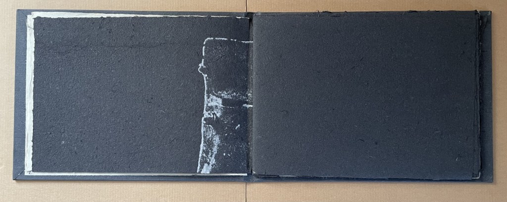
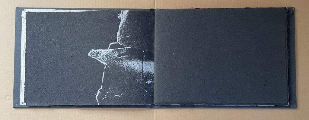
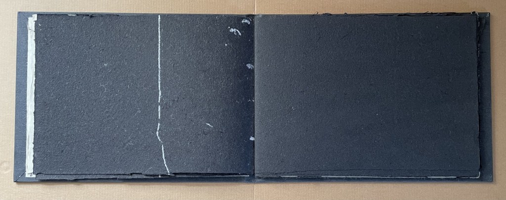
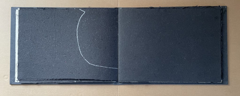
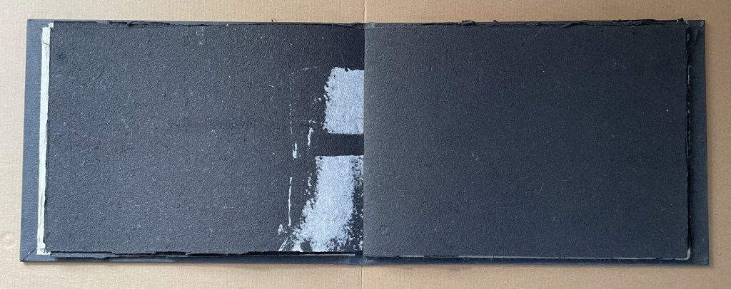
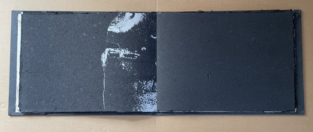
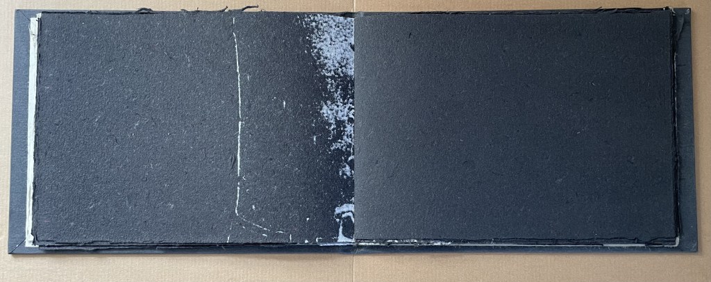
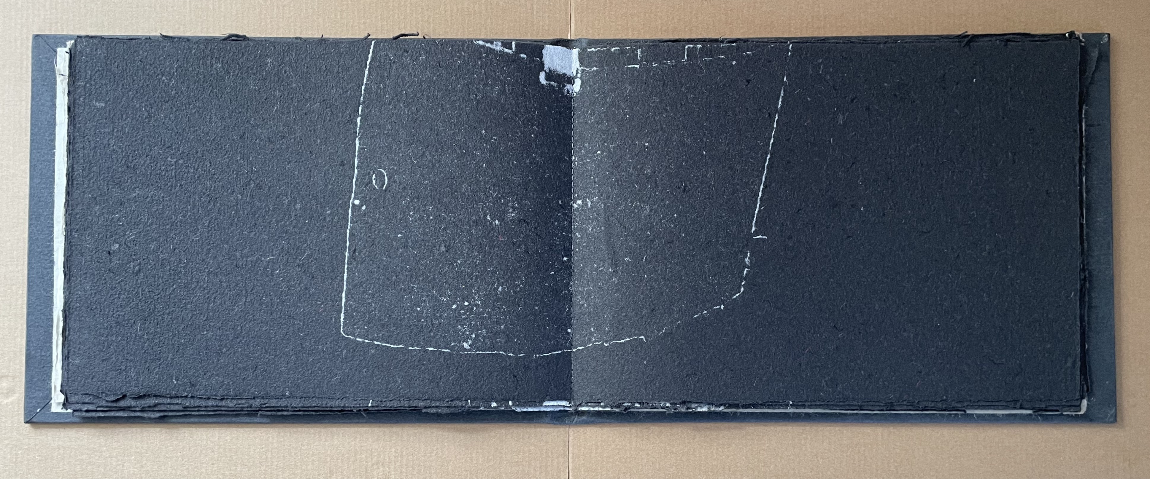
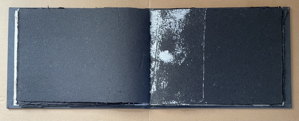
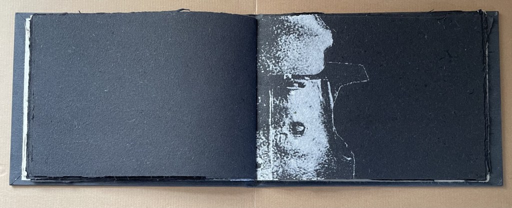
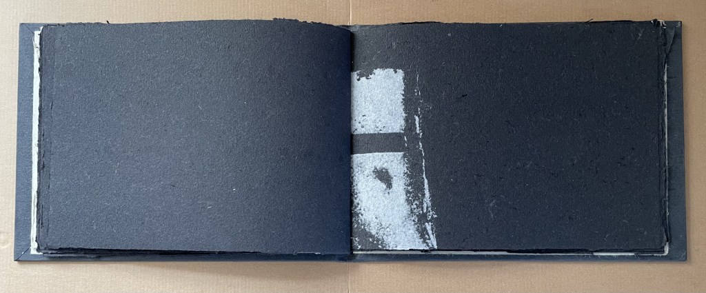
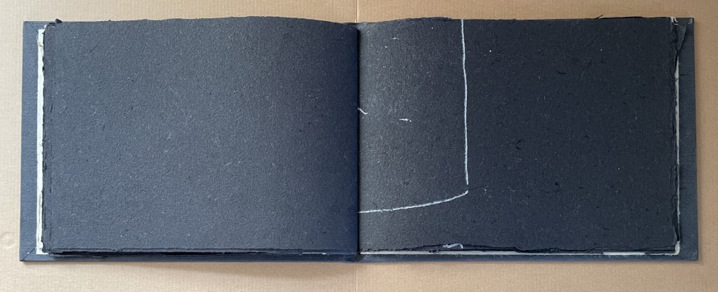
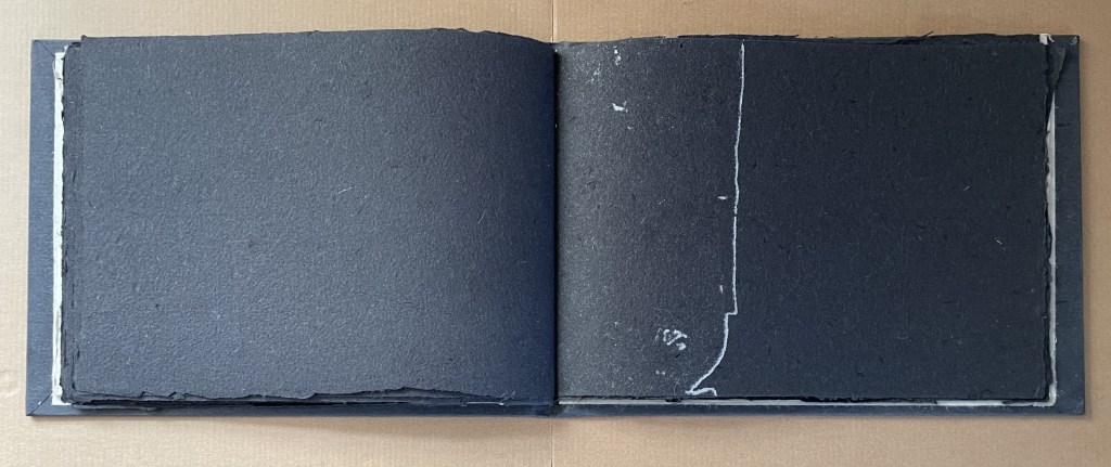
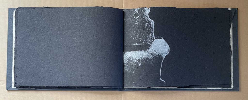
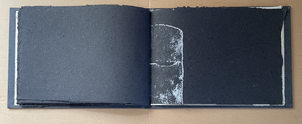
If we cheat and move through the book by pinching the centered folios together, we can almost sense the whole of each folio.
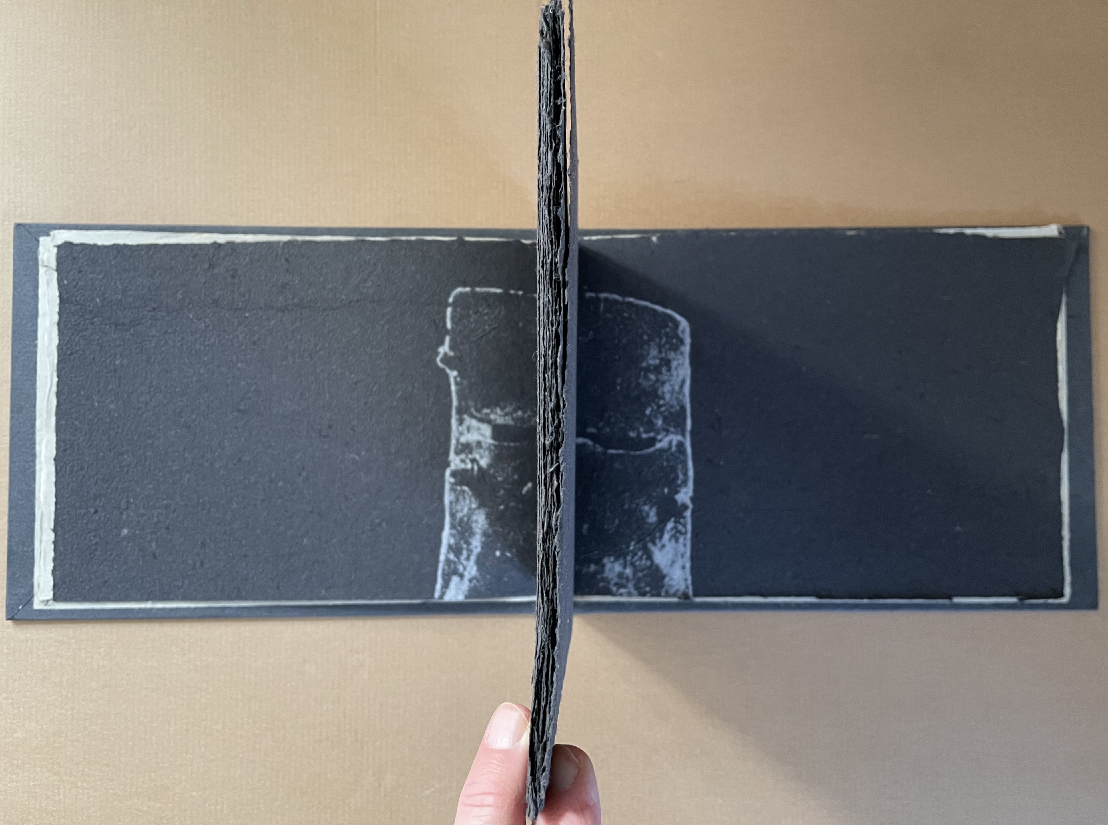
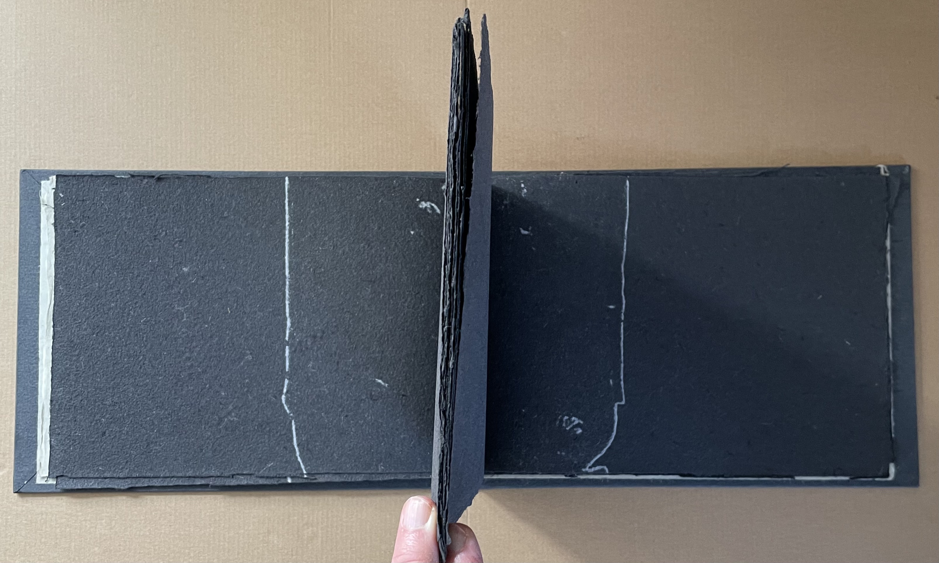
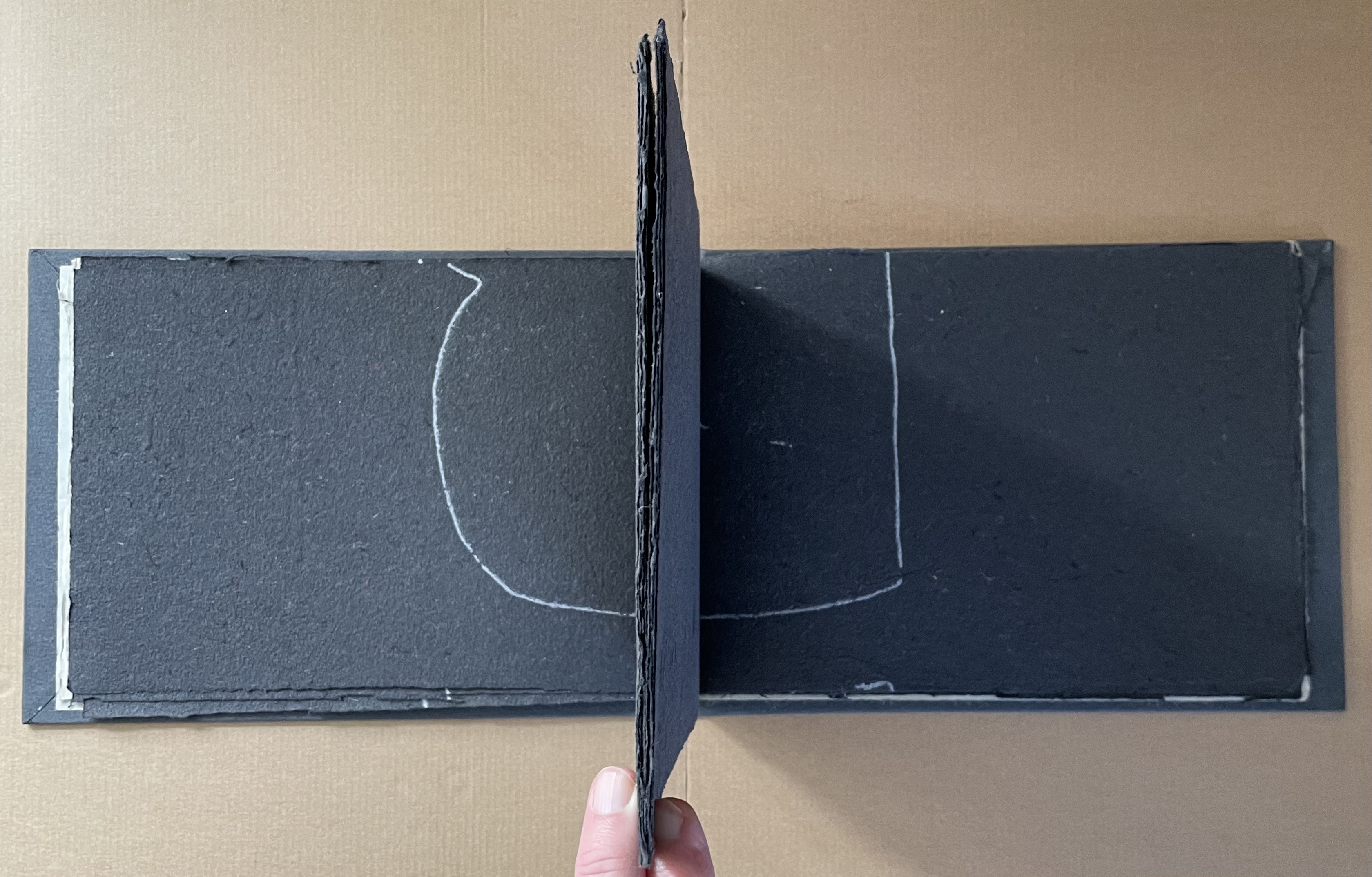
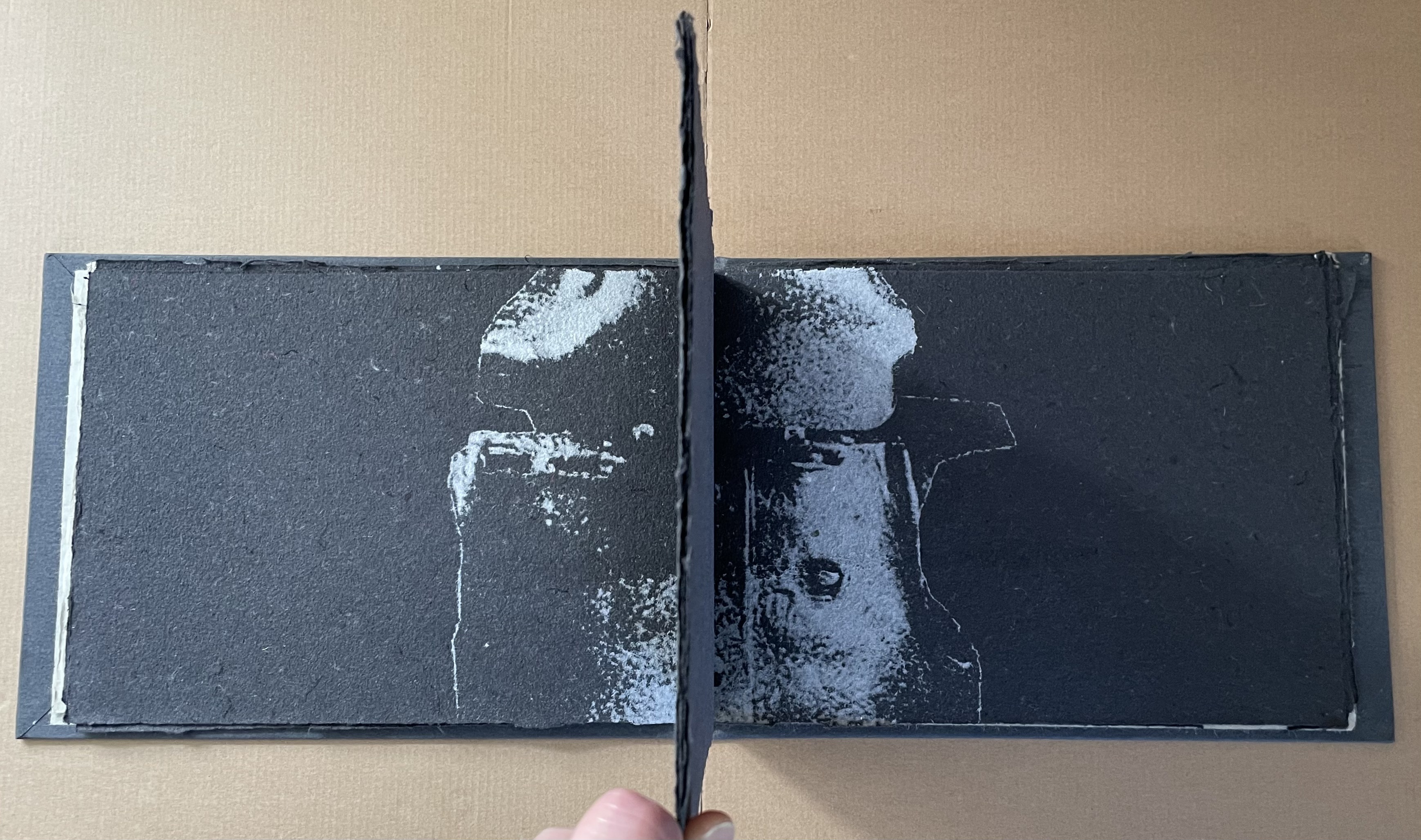
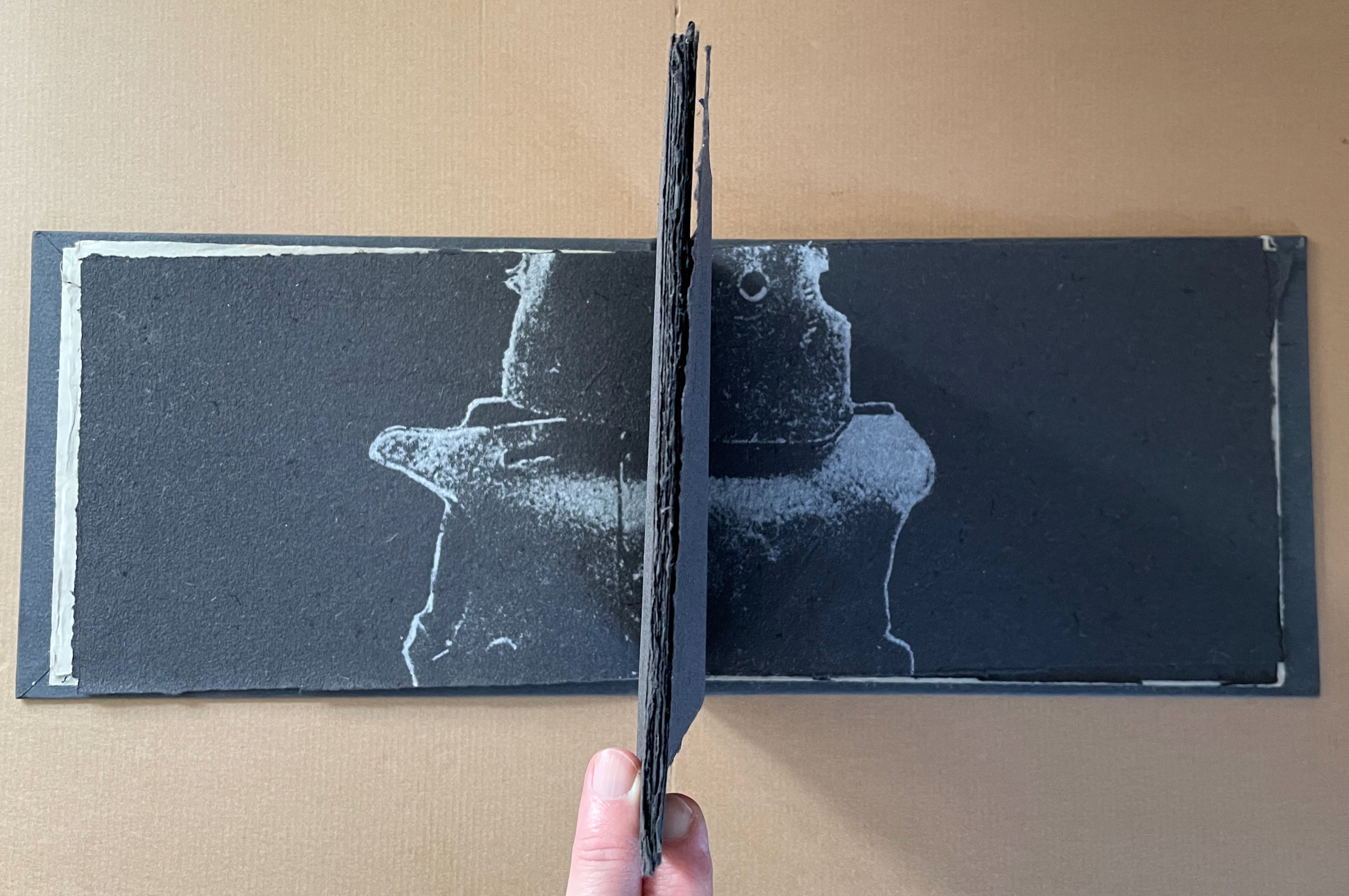
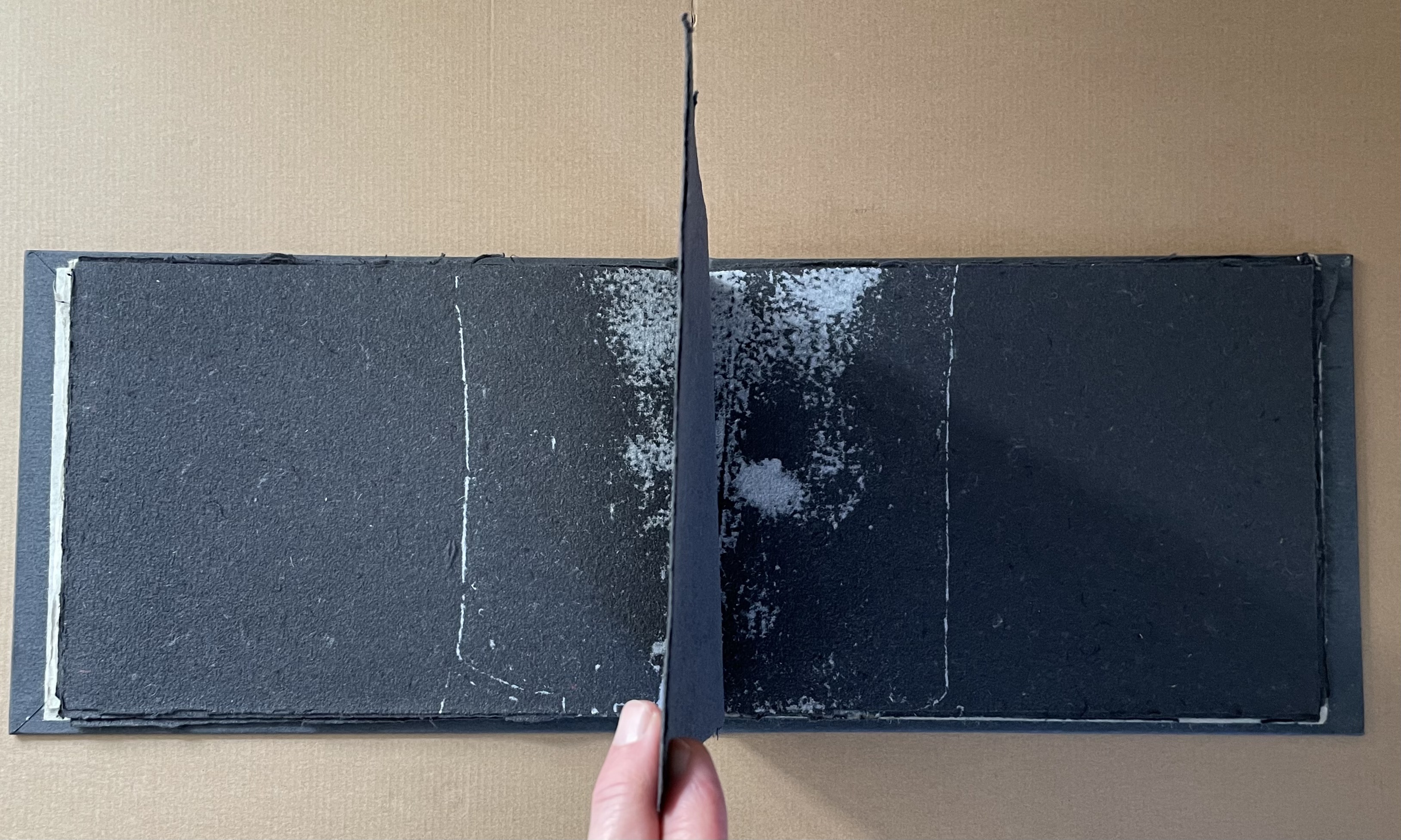
But is it cheating? Between the two halves of the book with their half-icon images, the innermost folio offers an unimpeded view of that icon, which seems to urge us on to piecing together the half-truths we see on either side of the innermost folio. Even when we have tried, though, the view is impeded, suggesting, contrary to the pulp painting, that the truth is not black or white. Or perhaps as Sarah Bodman suggests, the binary alludes to the Australian public’s being either for them or against Ned Kelly (Bodman, p. 7).
trumped up empathy (2016)
trumped up empathy (2017)
Tim Mosely, A.K. Milroy, and Brad Freeman
Pamphlet saddle stitched with staples. H153 x W125 mm. [16] pages including cover. Acquired with Journal of Artists’ Books No 41, 17 January 2024.
Photos: Books On Books Collection.
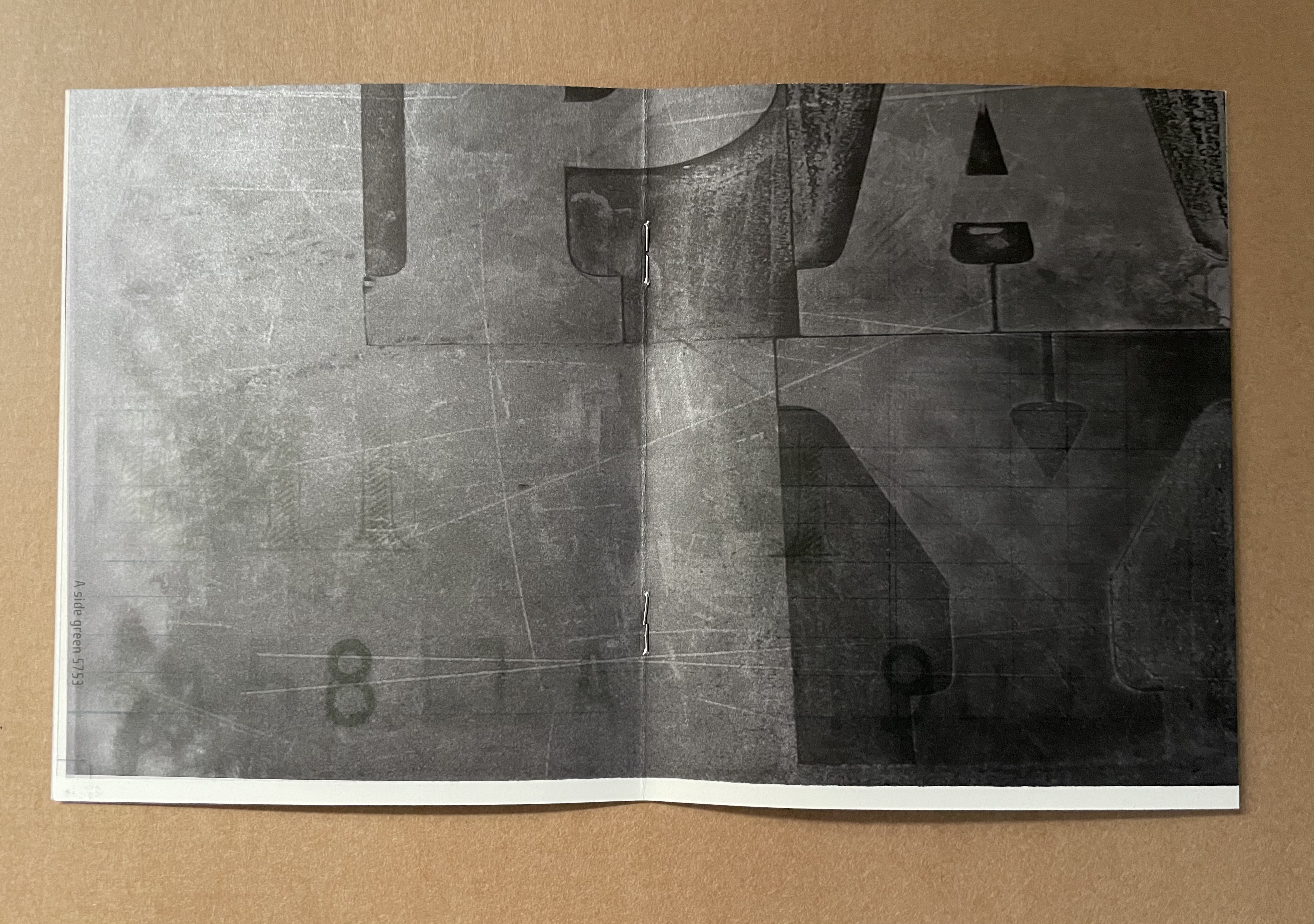
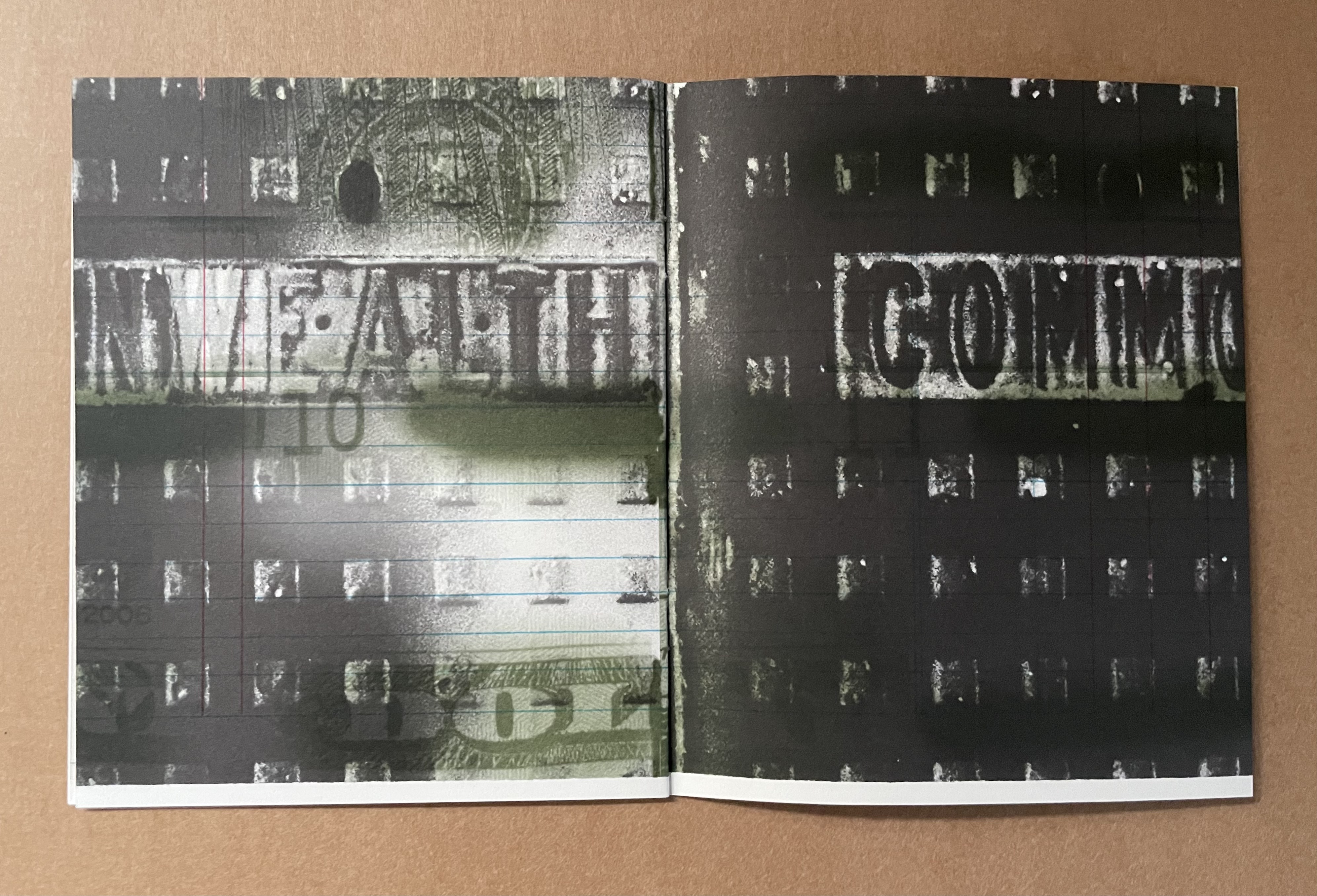
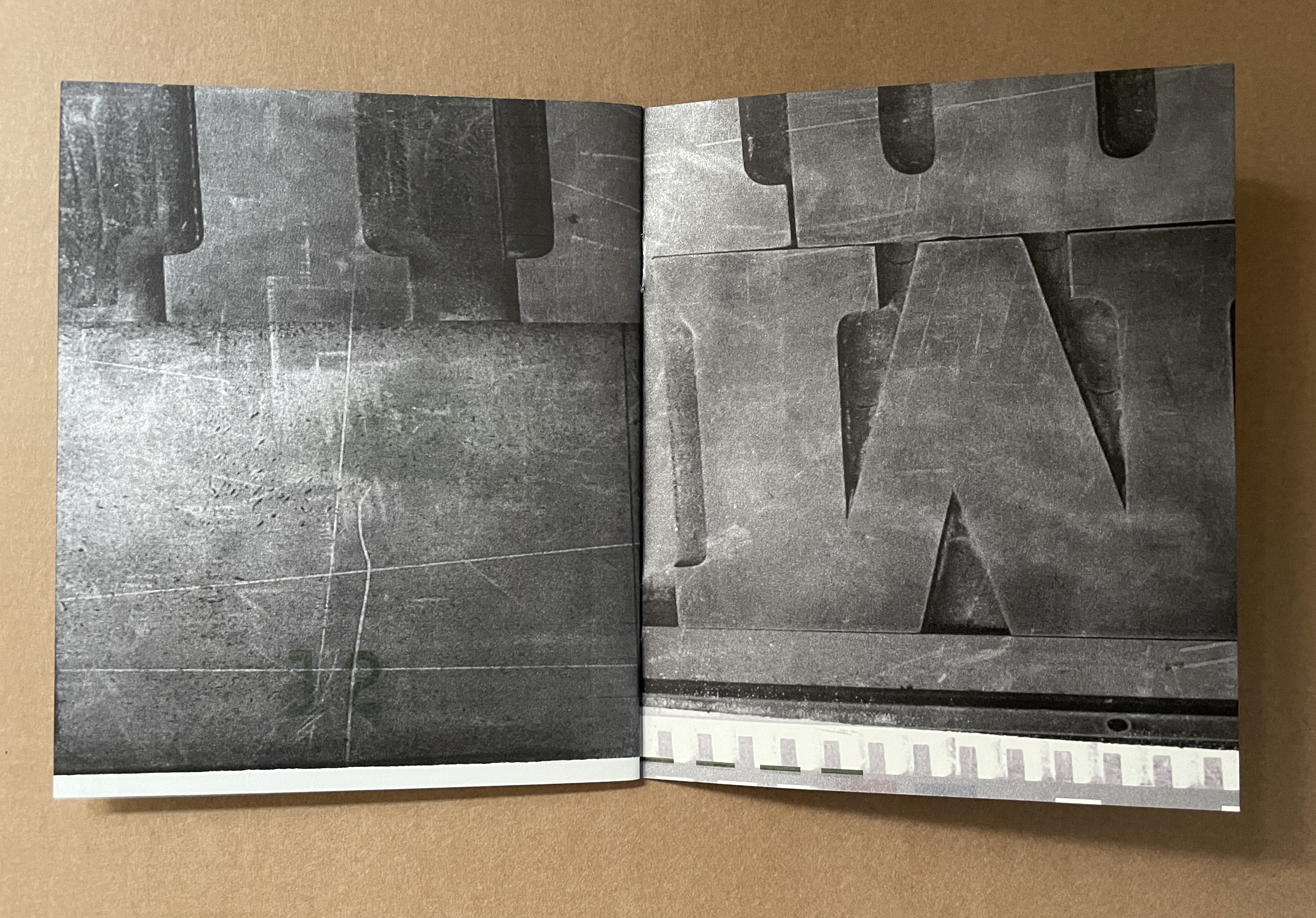
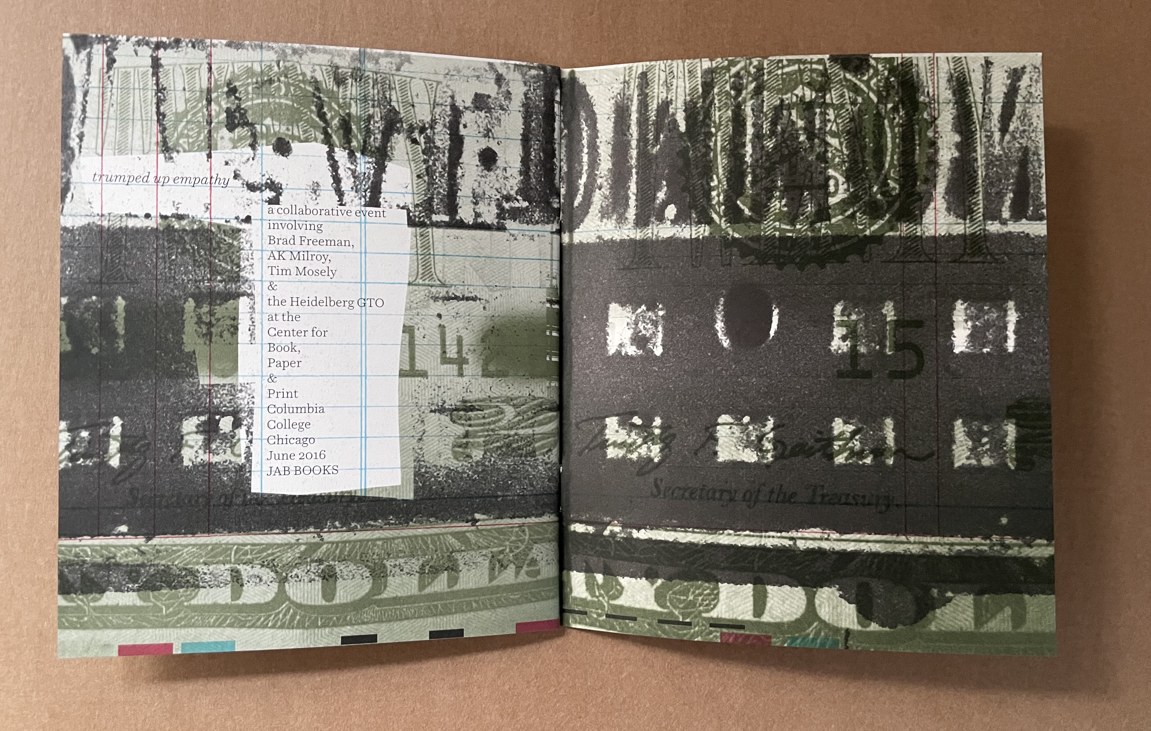
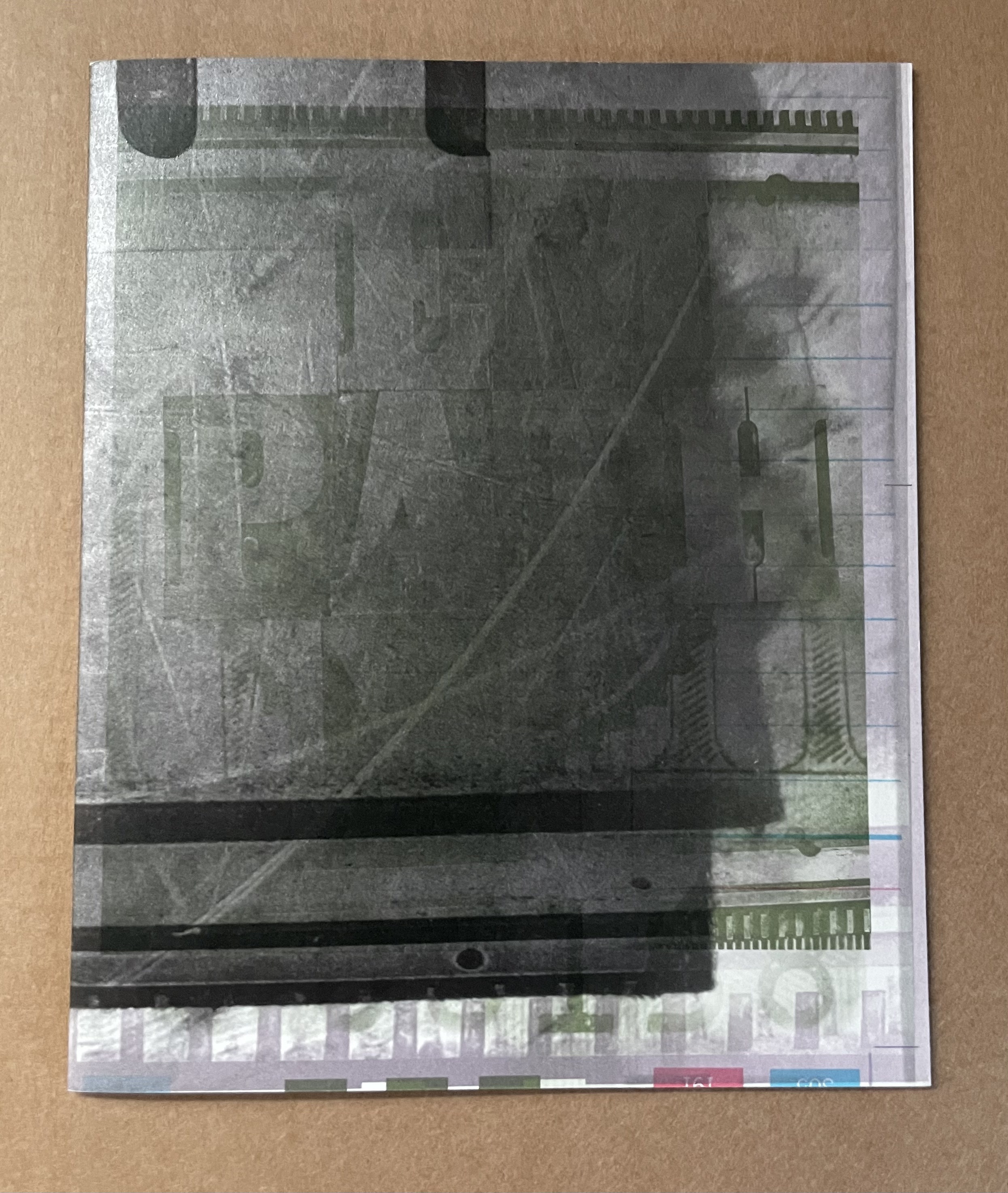
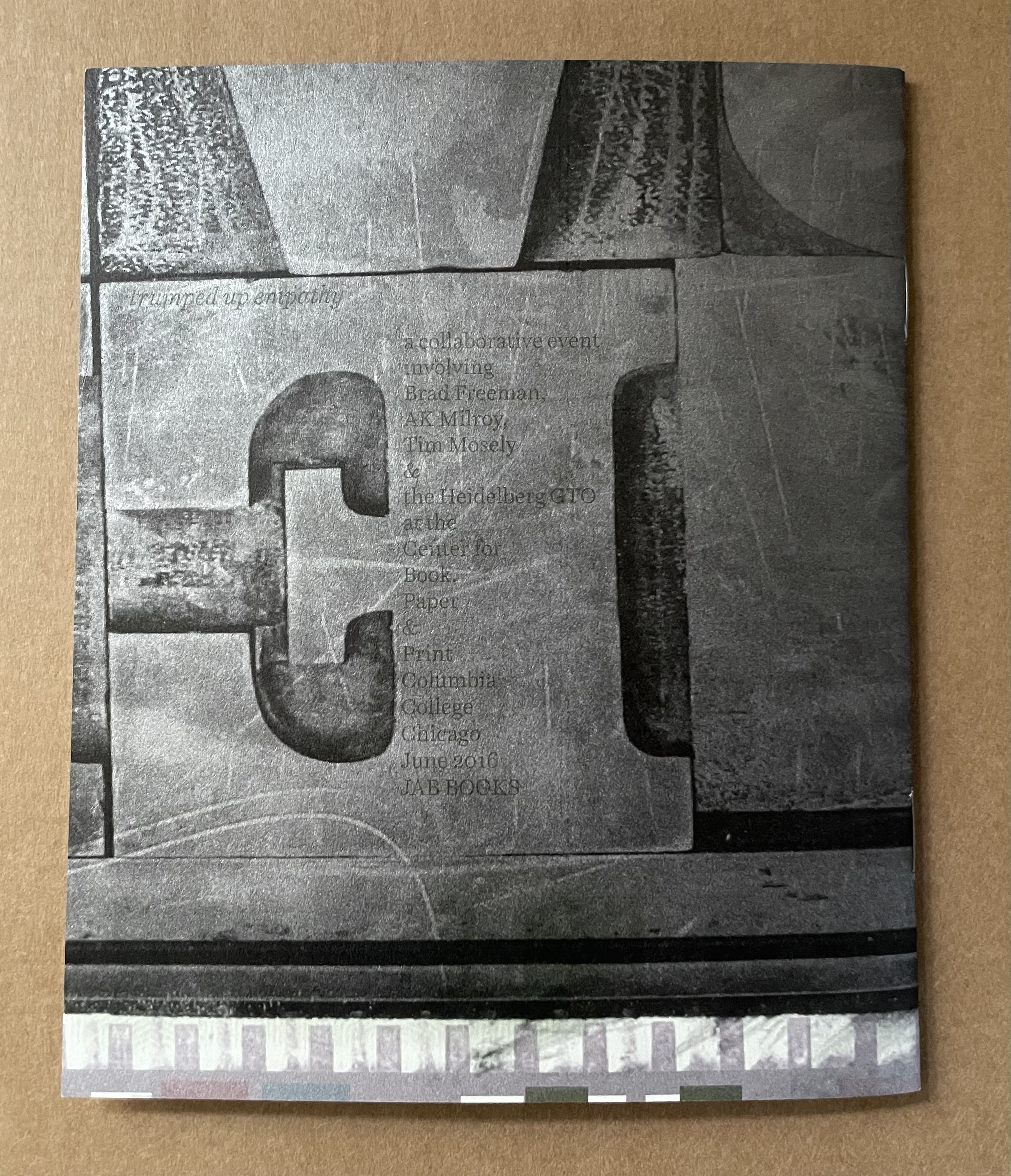
Here is another figure attracting binary public views. A collage of an oversized twenty dollar bill, type, type furniture, type punches (?), a dump truck, a parking sign, a Trump building’s facade. The smoky effect of collapse and ruins is in keeping with the 45th president’s depiction of the country in his inaugural speech, a telling expression of “trumped up empathy”.
pflight of the paper balloons (2006)
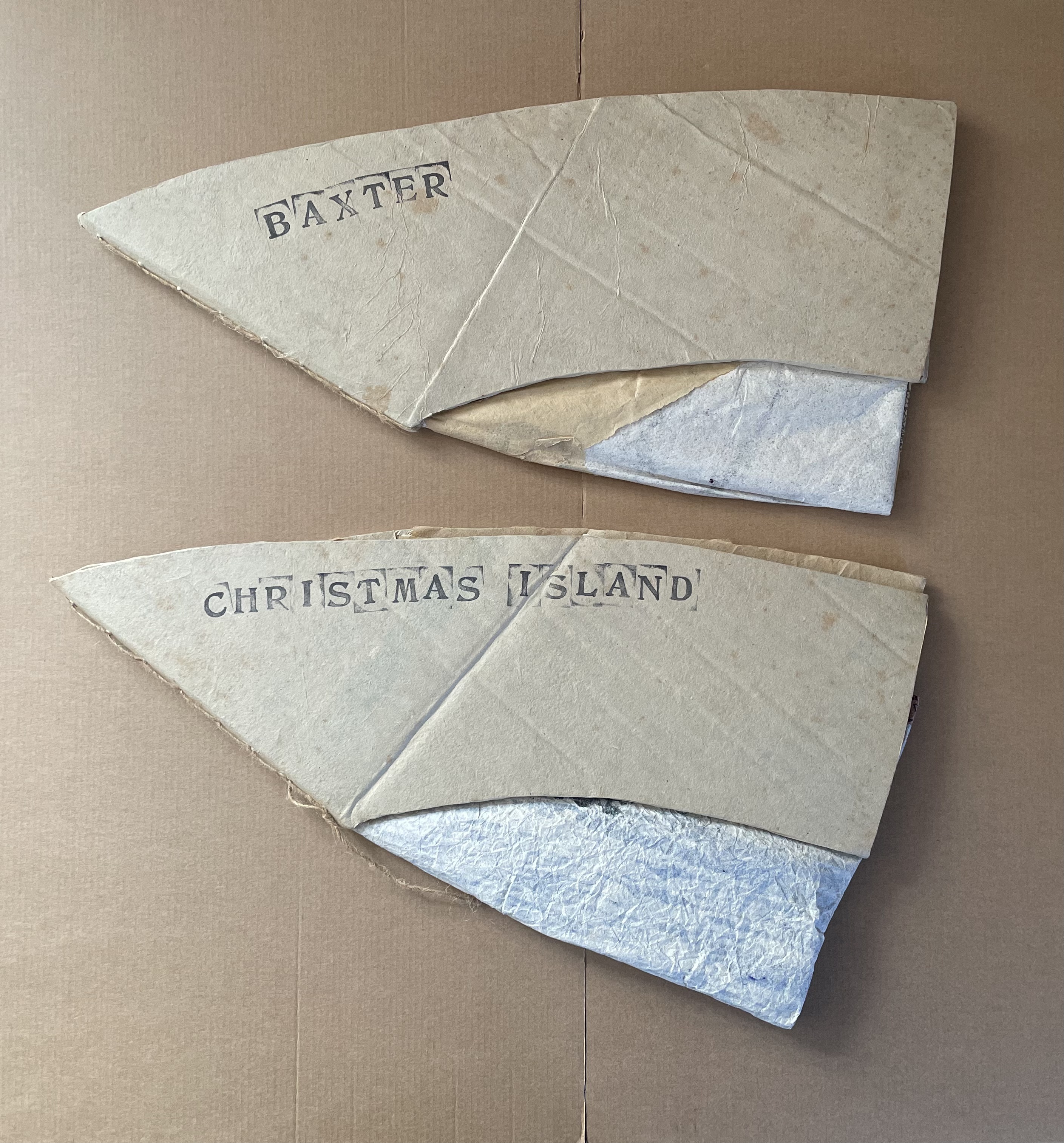
Baxter and Christmas Island
from the suite pflight of the paper balloons (2006)
Timothy Mosely
Paper balloon books. Baxter: H230 x W480 mm (closed). Christmas Island: H255 x W475 mm (closed). Unique. Acquired from the artist, 4 November 2024. Photos: Books On Books Collection.
The traditional Taiwanese paper hot-air balloons used for communication between mountain villages offered the seven artists coordinated by Tim Mosely for Codex Event 4 the ideal “metaphor for the deflated hopes of refugees held in Australian detention camps and a visual text objecting to the continued abusive treatment of ‘illegal’ refugees” (Mosely website). They produced a suite of paper balloon books, one for each of the thirteen islands that housed detention centers: Cocos Islands, Naru, Manus Island, Christmas Island, Perth, Darwin, Baxter, Port Augusta, Port Headland, Curtin, Woomera, Maribyrnong and Villawood. It was significant enough to have warranted inclusion in The Silent Scream edited by Monica Oppen and Peter Lyssiotis.
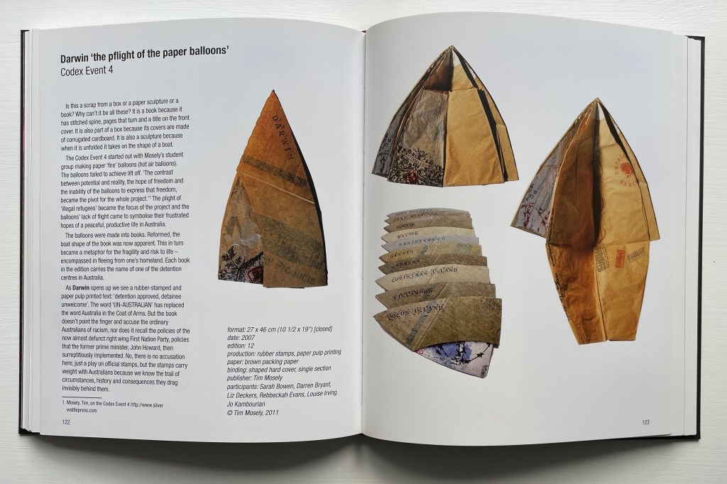
The Silent Scream: Political and Social Comment in Books by Artists : an Exhibition, 26th September-26th November 2011, Monash University Rare Books Library Within the Sir Louis Matheson Library. (2011)
Monica Oppen and Peter Lyssiotis (eds.)
By transforming their paper balloons into boat-shaped books, the artists (Sarah Bowen, Darren Bryant, Liz Deckers (?), Rebekaj Evans, Louise Irving, Joanna Kambourian and Mosely) multiplied their vehicles for crossing boundaries and protesting against holding citizenship “more significance than being a human being”.
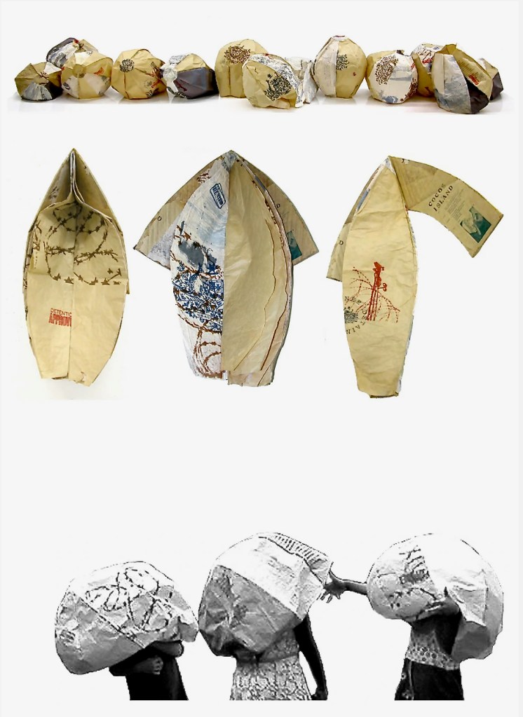
To construct the balloons the participants first made A1 sized sheets of paper from recycled paper and cardboard and used these to construct the balloons. The paper pulp was beaten for translucency and thin sheet formation and over 60 sheets of paper were made. Pulp printing was utilized to generate imagery and marks into the paper as it was made, and silk screening was used to apply further imagery to the paper. Text, found photographs, altered photos and images were all utilised in the work. Once the paper sheets were completed they were sorted into groups and cut up into segments (gores). From these segments sets of six were chosen that would then be glued together to form a paper balloon approximately 100cm in diameter. 13 balloons were constructed to reflect the 13 identifiable detention centres used by the Federal Australian Government in 2006 to “deal” with the illegal refugees. … we were able to bring the balloons and 12 people together at a beach. Without prior intent four of the participants were children directly related to the struggling new nation of East Timor. The most poignant images from this “installation” are of these children playing with the paper balloons. (Mosely, website)
The two balloons acquired from Tim Mosely represent the detention centers at Baxter and Christmas Island. When set upright on their cardboard covers and with the balloons inflated, the artist’s books look like boats under full sail.
Baxter
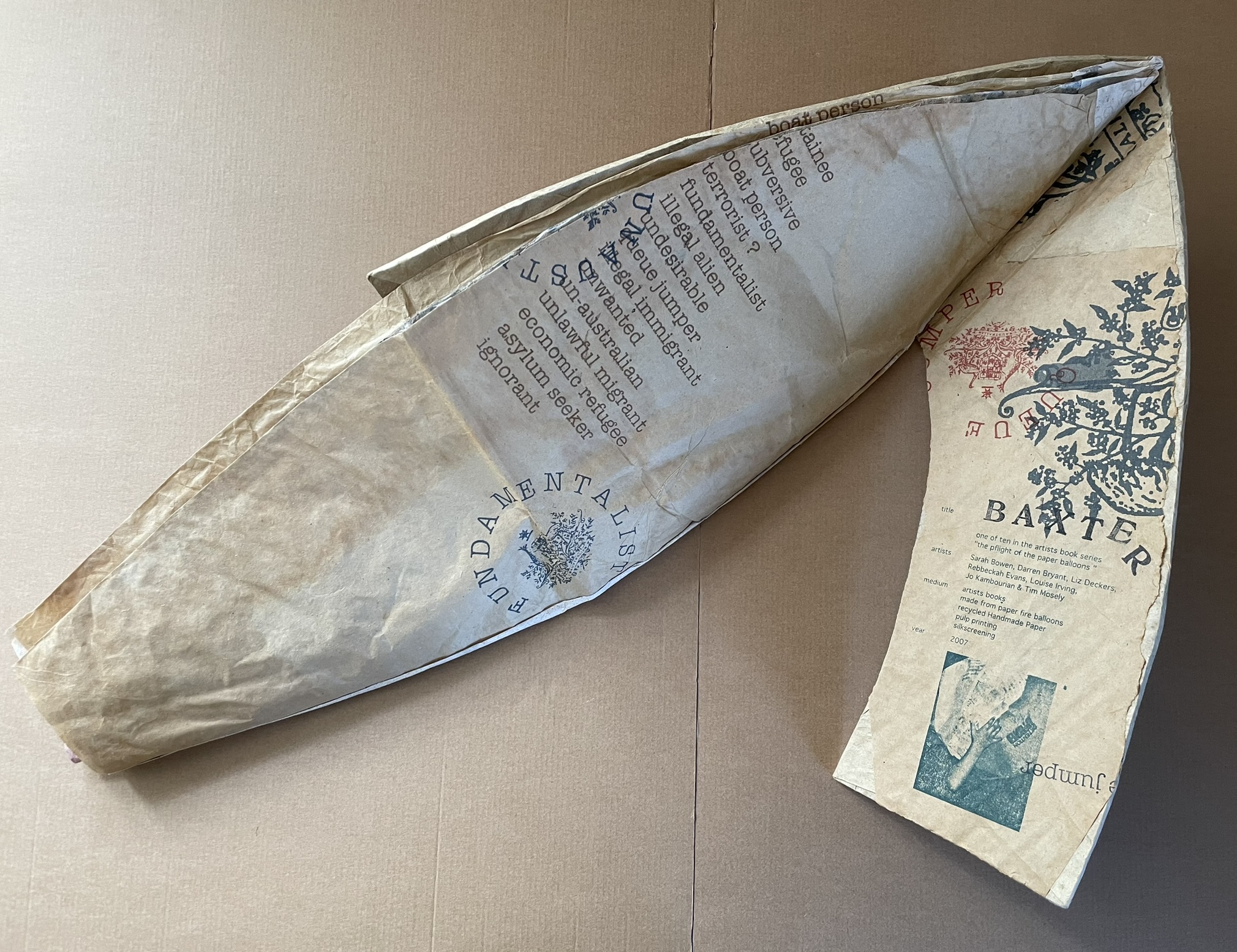
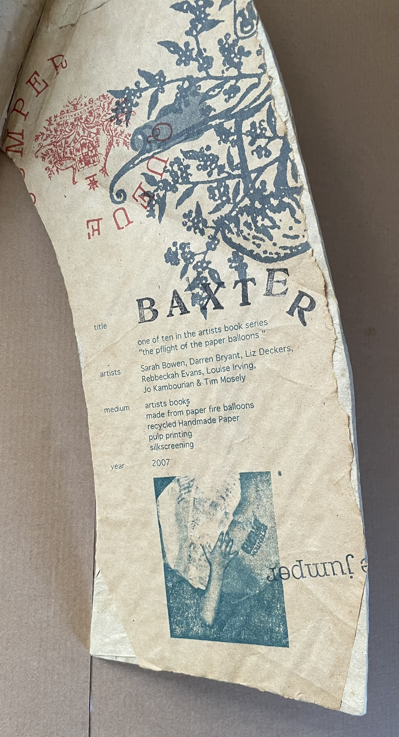
Cover open. Inside back cover “colophon”.
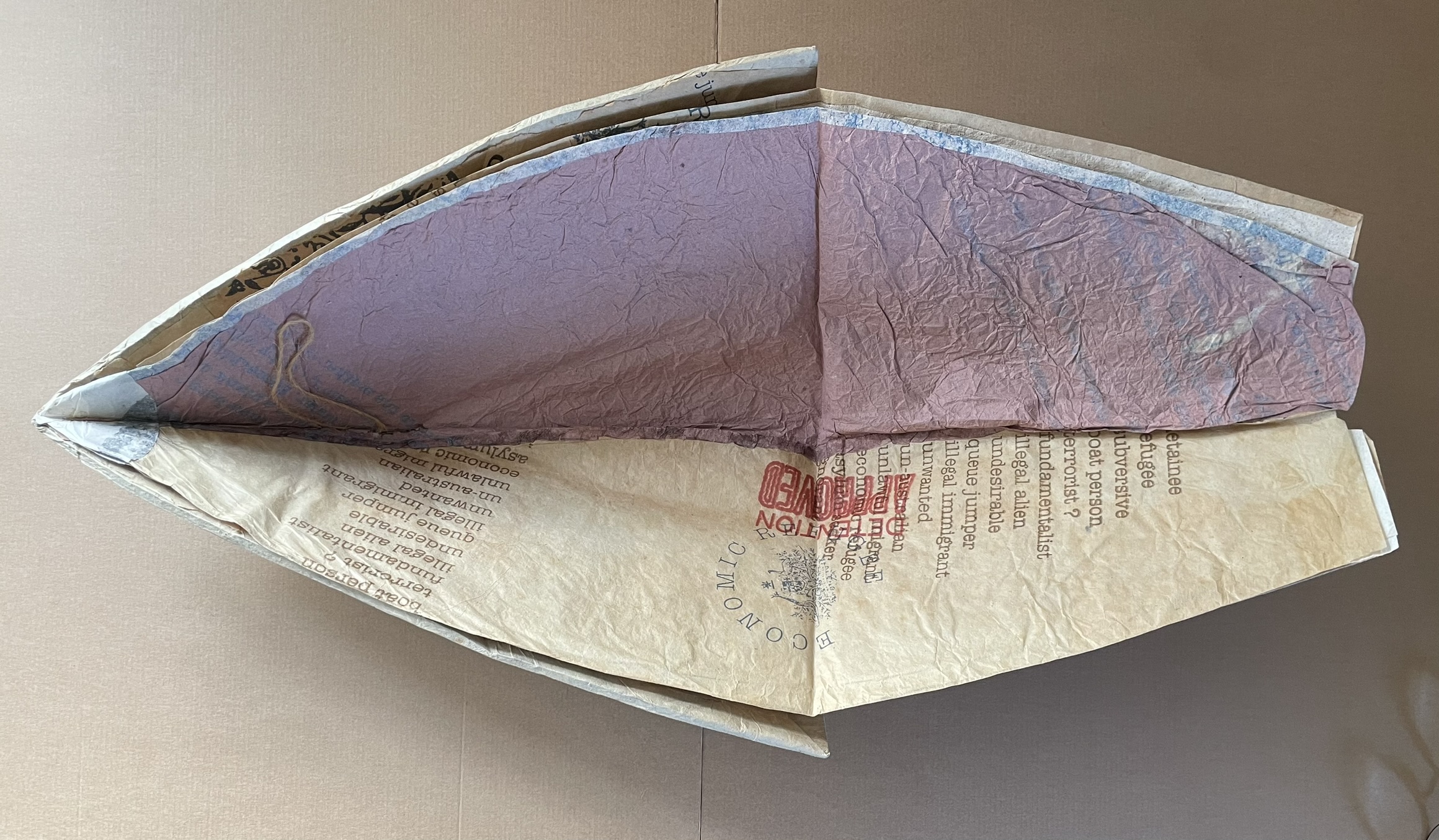
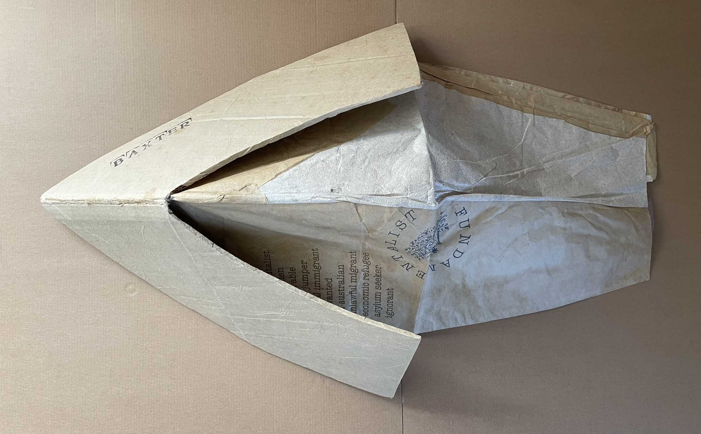
Views of boat shape with balloon closed: from top, from bottom.
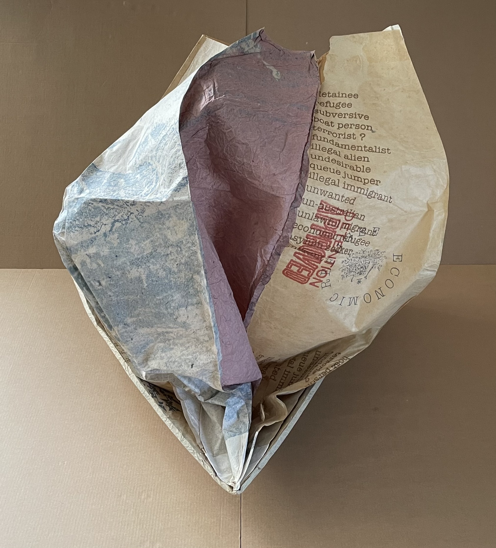
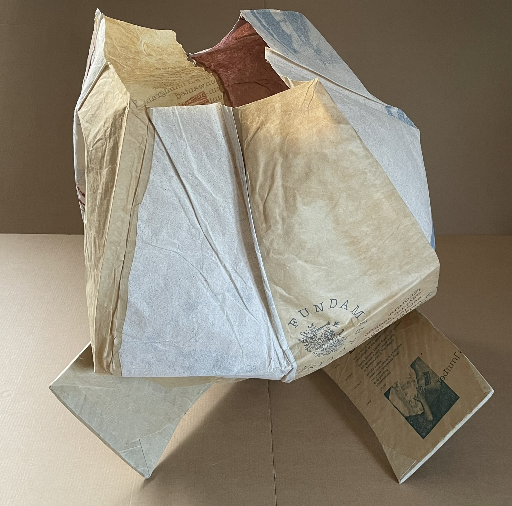
Views of boat with balloon inflated: front (“full sail”), rear.
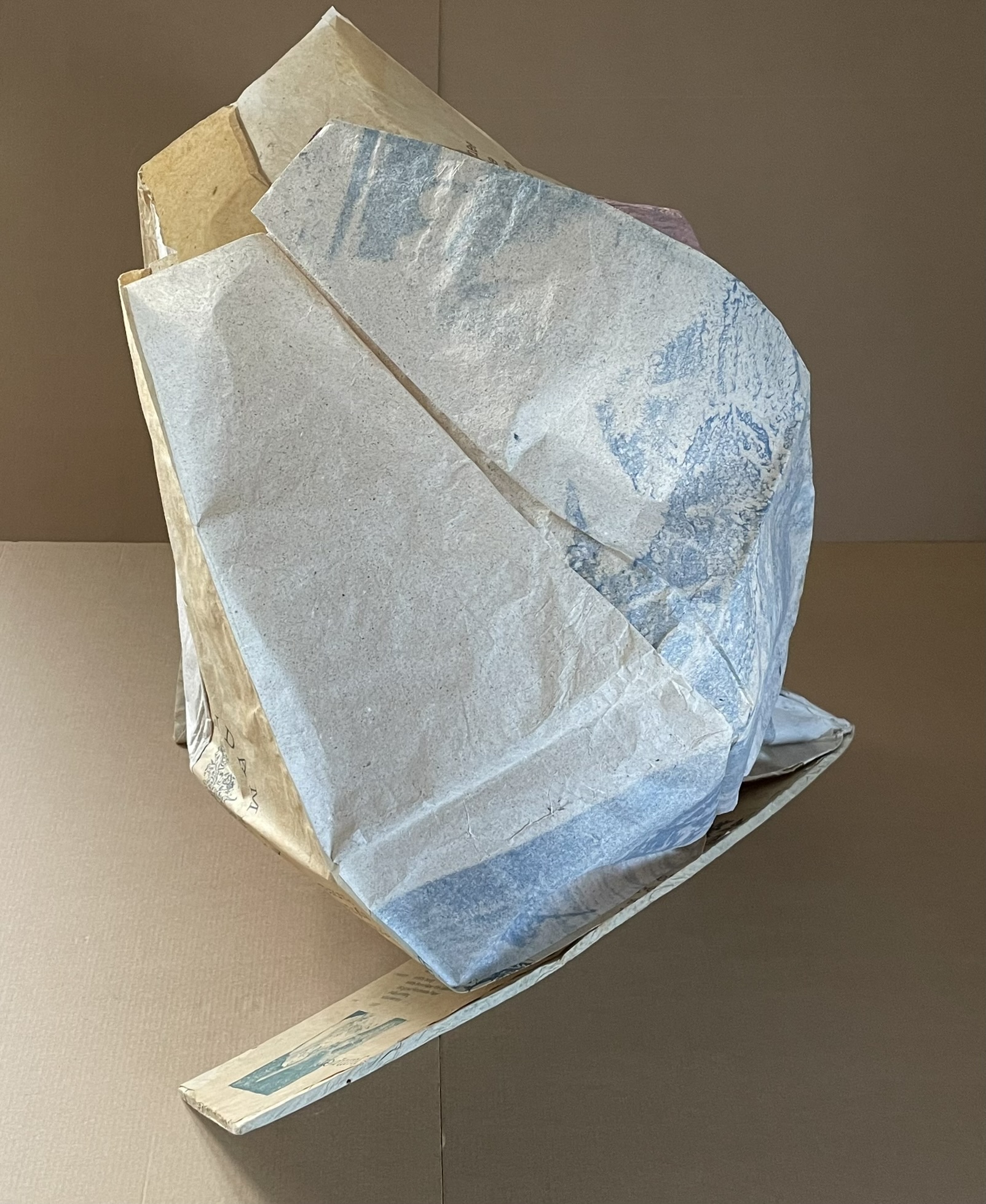
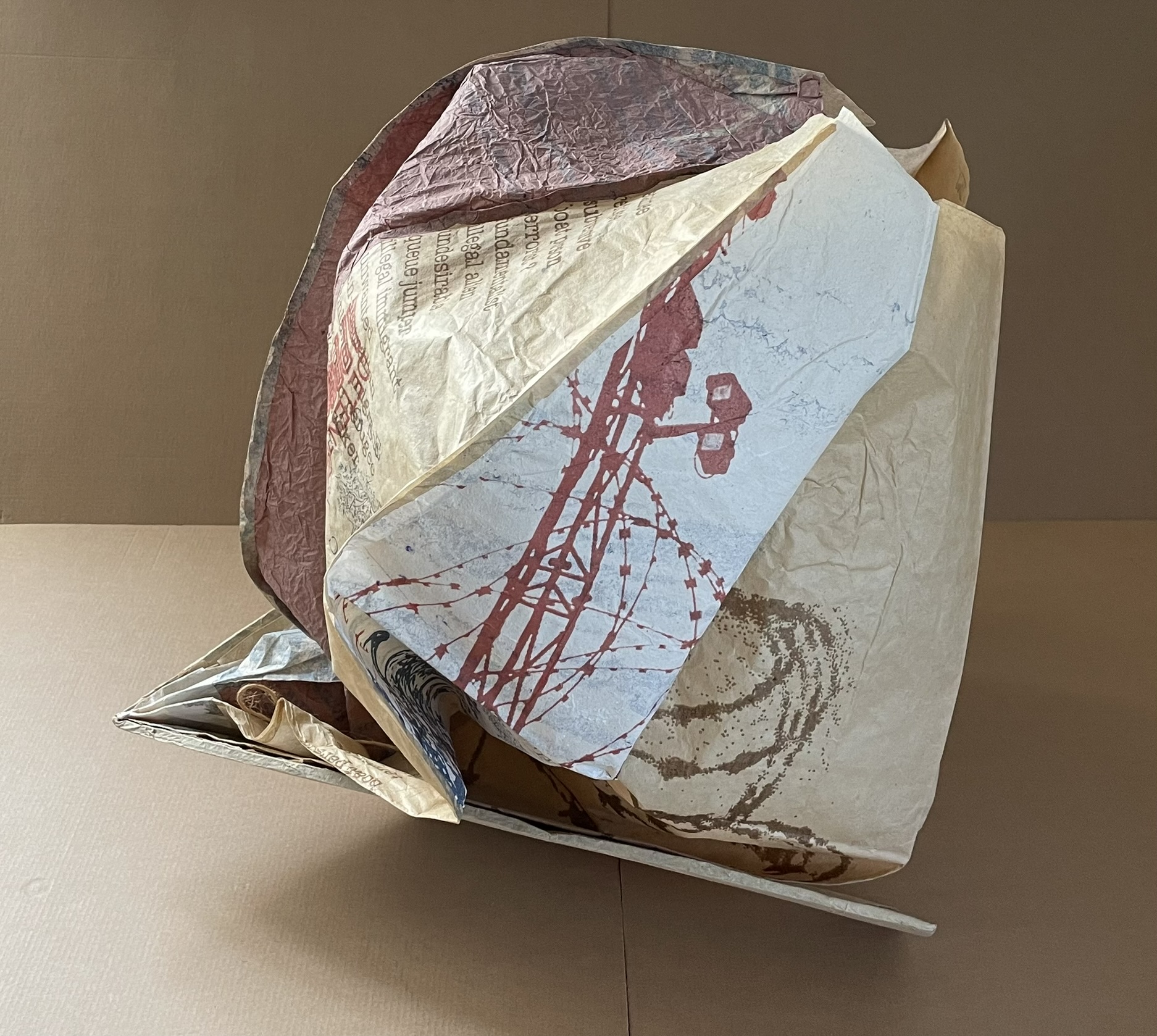
Side views.
Christmas Island
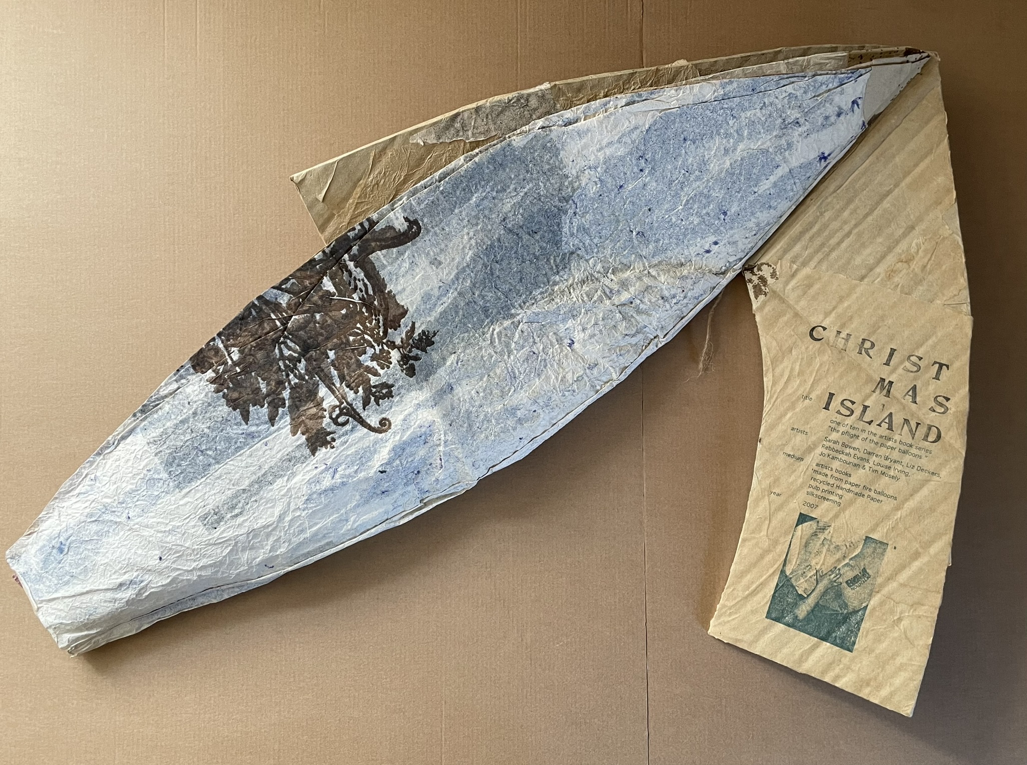
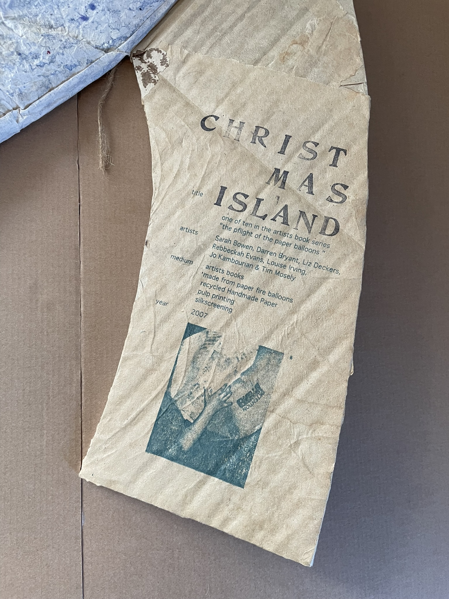
Cover open. Inside back cover “colophon”.
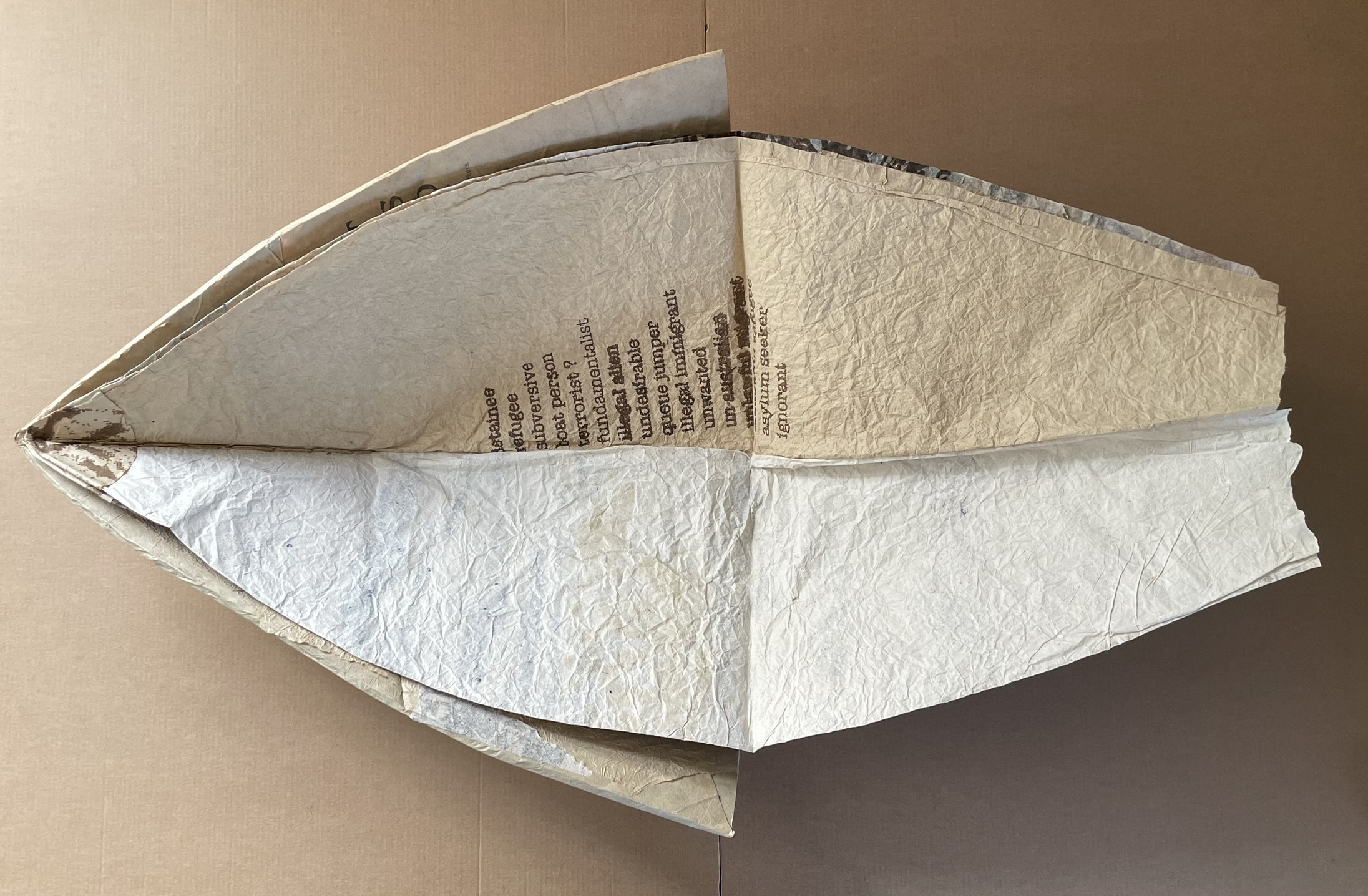
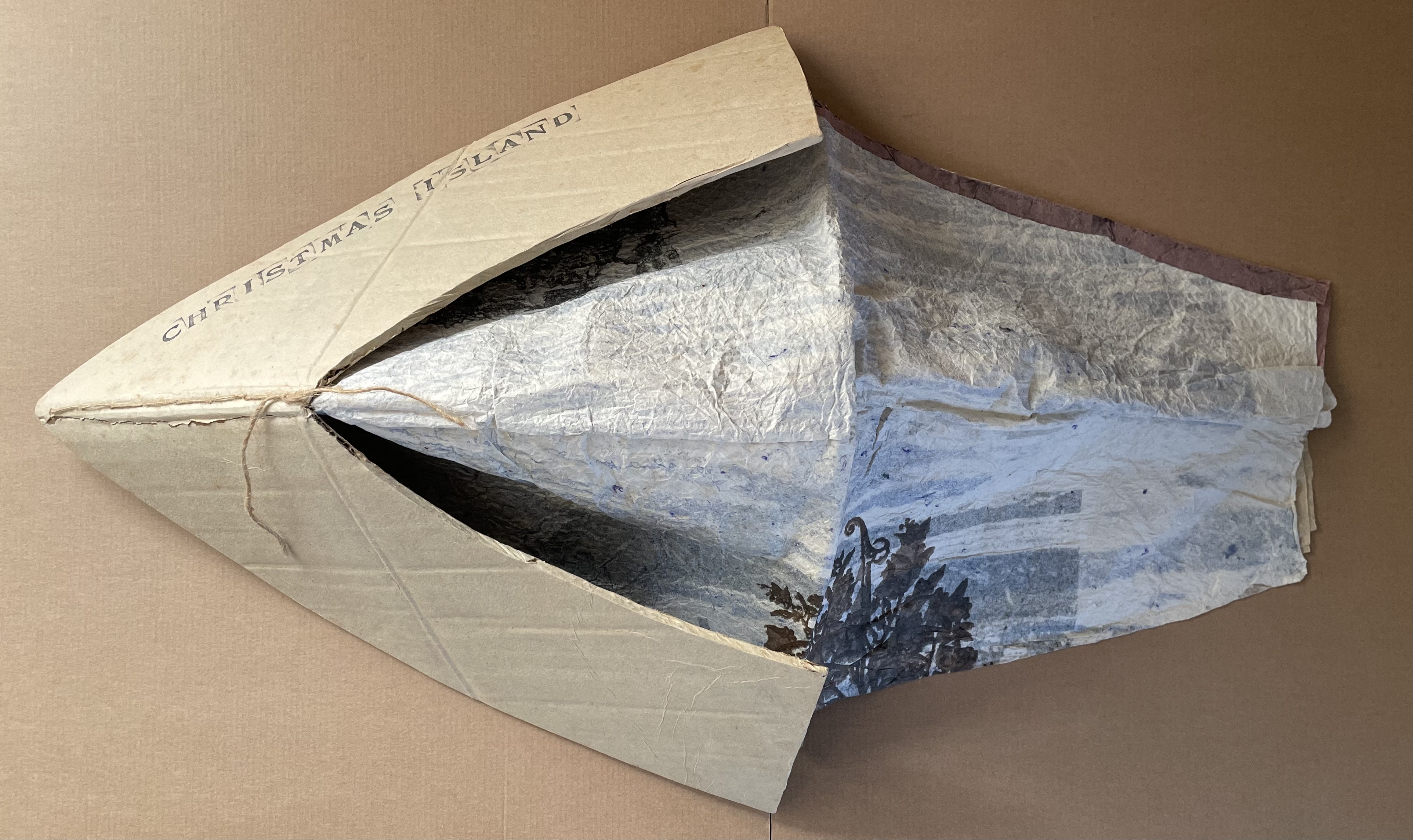
Views of boat shape with balloon closed: from top, from bottom.
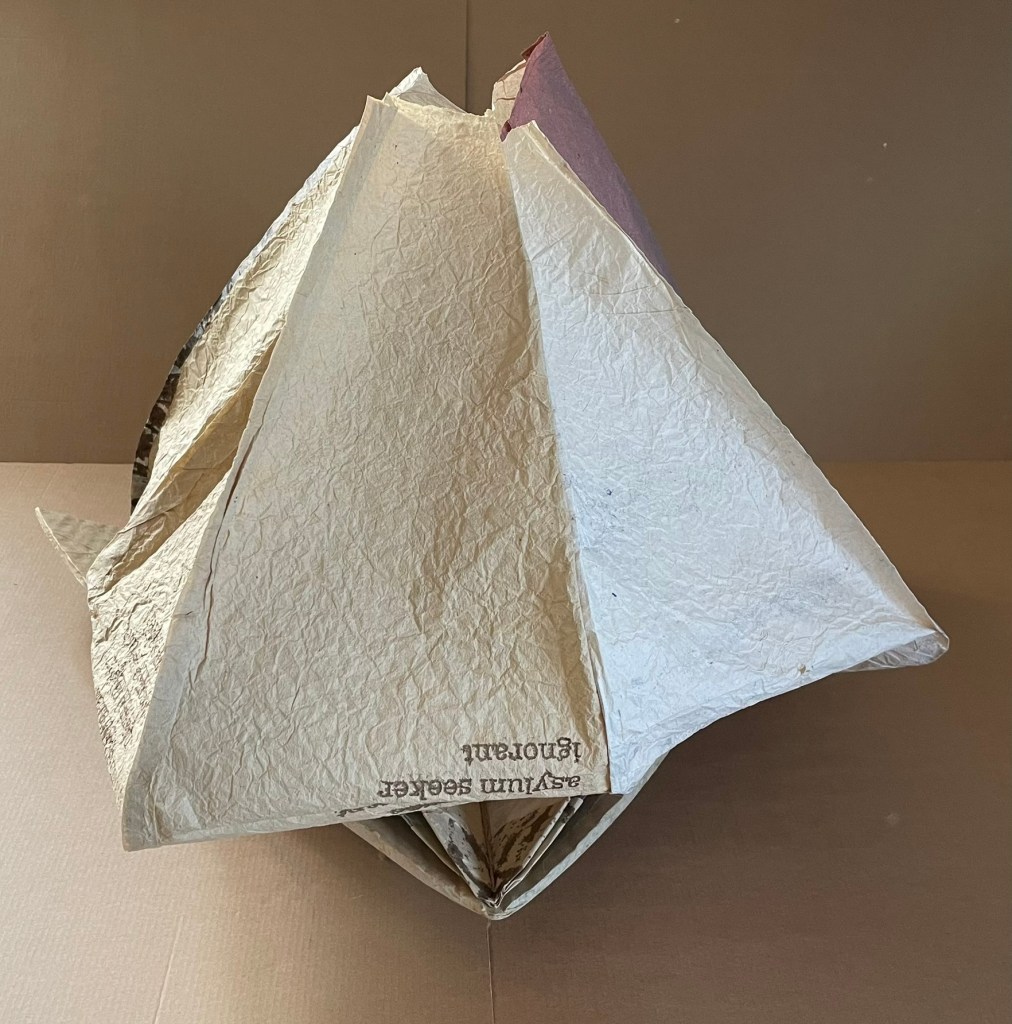
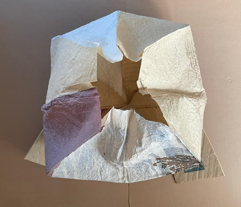
Views of boat with balloon inflated: front (“full sail”), rear.
Further Reading
“Timothy Mosely (I)“. Books On Books Collection.
Bodman, Sarah. 2013. “Black Books: The Use of Color in Artists’ Books“. Art in Print, 3(3), 4–10.
Bodman, Sarah. 2023. “The Secret Lives of Books“. UWE Repository.
Bodman, S. L. (2014) “Paradise lost: The compassionate and haptic nature of Tim Mosely’s Kanage pholu wanda”. Printmaking Today, 23.
*Boeckeler, Erika. 2011. “Building Meaning: The First Architectural Alphabet”, in Push Me, Pull You: Imaginative and Emotional Interaction in Late Medieval and Renaissance Art, edited by Sarah Blick and Laura Deborah Gelfand. Leiden, NL: Brill. The phrase “corporeal seeing” is taken from “models of corporeal seeing”, which is applied in the very different context of architectural alphabets (p. 176).
Deleuze, Gilles, and Guattari, Félix. Massumi, Brian (trans.). 1987. A Thousand Plateaus. Minneapolis, MN: University of Minnesota Press.
Derrida, Jacques, and Irizarry, Christine (trans). 2005. On Touching: Jean-Luc Nancy. Stanford: Stanford University Press. Pp. 124-25, citing Deleuze & Guattari, pp.543-44.
Derrida, Jacques. 1993. Memoirs of the Blind : The Self-Portrait and Other Ruins. Chicago: University of Chicago Press.
Hubert, Christian. 13 August 2019. “smooth/striated“. Christian Hubert Studio/Writings.
Klatzky, Roberta, Lederman, Susan, & Reed, Catherine L. 1987. There’s more to touch than meets the eye: The salience of object attributes for haptics with and without vision. Journal of Experimental Psychology: General, 116(4), 356–369.
Klatzky, Roberta, & Reed, Catherine L. 2009. “Haptic Exploration“. Scholarpedia, 4(8):7941.
Merleau-Ponty, Maurice. 1971. Sense and Non-Sense. 1st pbk. ed. Evanston, Ill.: Northwestern University Press. “We see the depth, the smoothness, the softness, the hardness of objects; Cézanne even claimed that we see their odor. If the painter is to express the world, the arrangement of his colors must carry with it this indivisible whole, or else his picture will only hint at things and will not give them in the imperious unity, the presence, the insurpassable plenitude which is for us the definition of the real.” — Merleau-Ponty, Sense and Non-Sense, p. 15. Paraphrase: If the book artist is to express the world, the arrangement of the elements of the book — its structure, its materials in all their surfaces, textures and colors, its signs, its apparatus, and very idea of the book — must deliver an “indivisible whole” that, Merleau-Ponty says, defines for us the real.
Mosely, Timothy (Guest Ed.). Spring – Summer 2026. The Blue Notebook 20:2. Essays and art from the abbe (artists books brisbane events) 2025 conference “Mapping Australia’s artists’ book histories: a group effort and Contemporary artists’ book practice “.
_________. Winter 2021. “Texturing artist’s book discourse“. The Blue Notebook. 16:1: 26-33.
__________. 2020. “The Haptic: Texturing Discourse on the Book“. Reimagining the material: artists books, printed matter, digital transformation, engagement. ARLIS-NZ Biennial Conference, 11-13 November 2020, Brisbane.
__________. 2015. “The material folio”. Artist’s Book Yearbook 2016-2017. Sarah Bodman, T. Peixoto, John Bently (eds). Bristol: Impact Press/Centre for Fine Print Research. Pp. 14-19.
__________. 2014. The Haptic Touch of Books by Artists. Brisbane, QLD: Griffith University.
Pallasmaa, Juhani. 1996. The Eyes of the Skin. London: Academy Editions.
Pallasmaa, Juhani. 2016. “Matter, Hapticity and Time Material Imagination and the Voice of Matter.” Building Material, no. 20: 171-89. Accessed February 8, 2021.
Plotnitsky, Arkady. 2003. “Algebras, Geometries and Topologies of the Fold: Deleuze, Derrida and Quasi- Mathematical Thinking (with Leibniz and Mallarmé)”, in Between Deleuze and Derrida. Eds. Paul Patton and John Protevi. New York, N.Y.: Continuum. Pp. 98-119.
Van Capelleveen, Paul. 2022. “Tim Mosely: Silverwattle Bookfoundry”, in Materialia Lumina : Contemporary Artists’ Books from the CODEX International Book Fair, edited by Paul van Capelleveen. Berkeley, CA: The Codex Foundation.

