Published by Impact Press at the Centre for Fine Print Research, UWE Bristol, this newsletter is an important tool, kept honed by Sarah Bodman. The link will take you to the June 2013 issue.
Design
Bookmark — Anniversary of The Imprint and Its Font

This year is the centenary of Gerard Meynell’s trade periodical The Imprint, which was the scene of Stanley Morison’s first appearance in print. How appropriate then that Morison’s book A Tally of Types tells the story of the journal’s founding and, equally important, how the historic font called Imprint Old Face came into being. The font’s importance is that “the design had been originated for mechanical composition. … the first design, not copied or stolen from the typefounders, to establish itself as a standard book-face.”(p.21) Ironically, Meynell and his colleagues intended for the font to be freely available to the trade, but eventually it came into the ownership of Monotype Imaging, where it can be obtained today under the OpenType family.
As the world of print morphs into its digital incarnation, we see the same impetus behind the new generation of typographers, the ones born digital, but we see varying degrees of adherence to the “type wants to be free” movement.
Related articles
Bookmarking Book Art – Franziska, a typeface
The Fine Press Book Association’s inaugural Student Type Design Competition sprang from the hope that by building bridges between printers and young type designers we might end up creating new material resources for the fine press community.
A PDF document called the Making of Franziska – a hybrid text-face between slab and serif is available for downloading. This document is quite well put together and provides a kind of tutorial on type design.
Related articles
- Interview with Michael Bierut – Typography, Modern Applications, and Timeless Communication Challenges (scholarlykitchen.sspnet.org)
- Type Love: Program (designworklife.com)
Books On Books Collection – Heather Hunter
Folded book pages rarely generate a work that rises above mere craft. Heather Hunter’s Observer Series: Architecture (2009) achieves the necessary height. It combines the altered book with an accordion book that incorporates a found poem composed of the words excised and folded outwards from the folded pages of The Observer’s Book of Architecture.
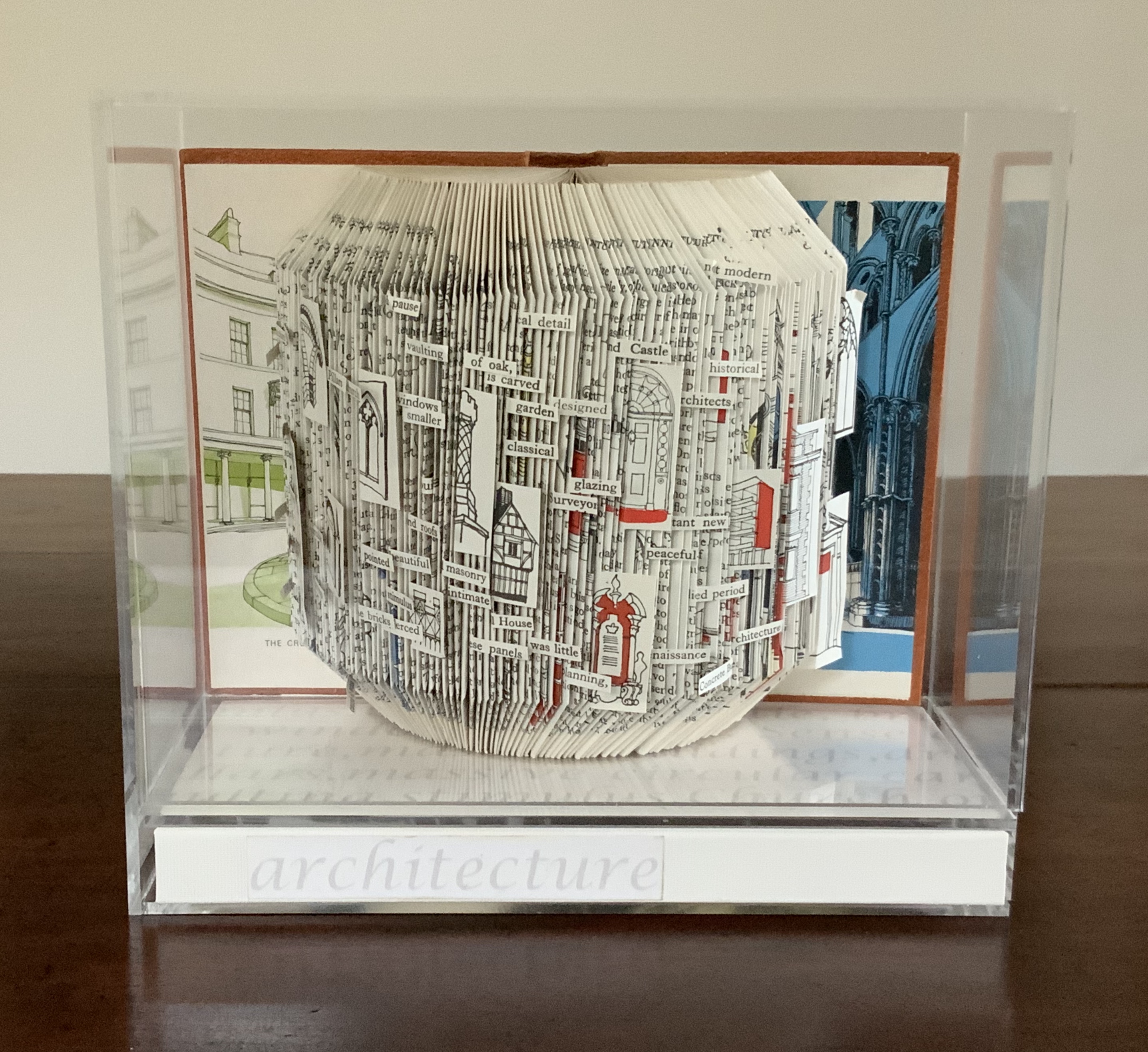
Observer Series: Architecture (2009)
Heather Hunter
Photo: Books On Books Collection
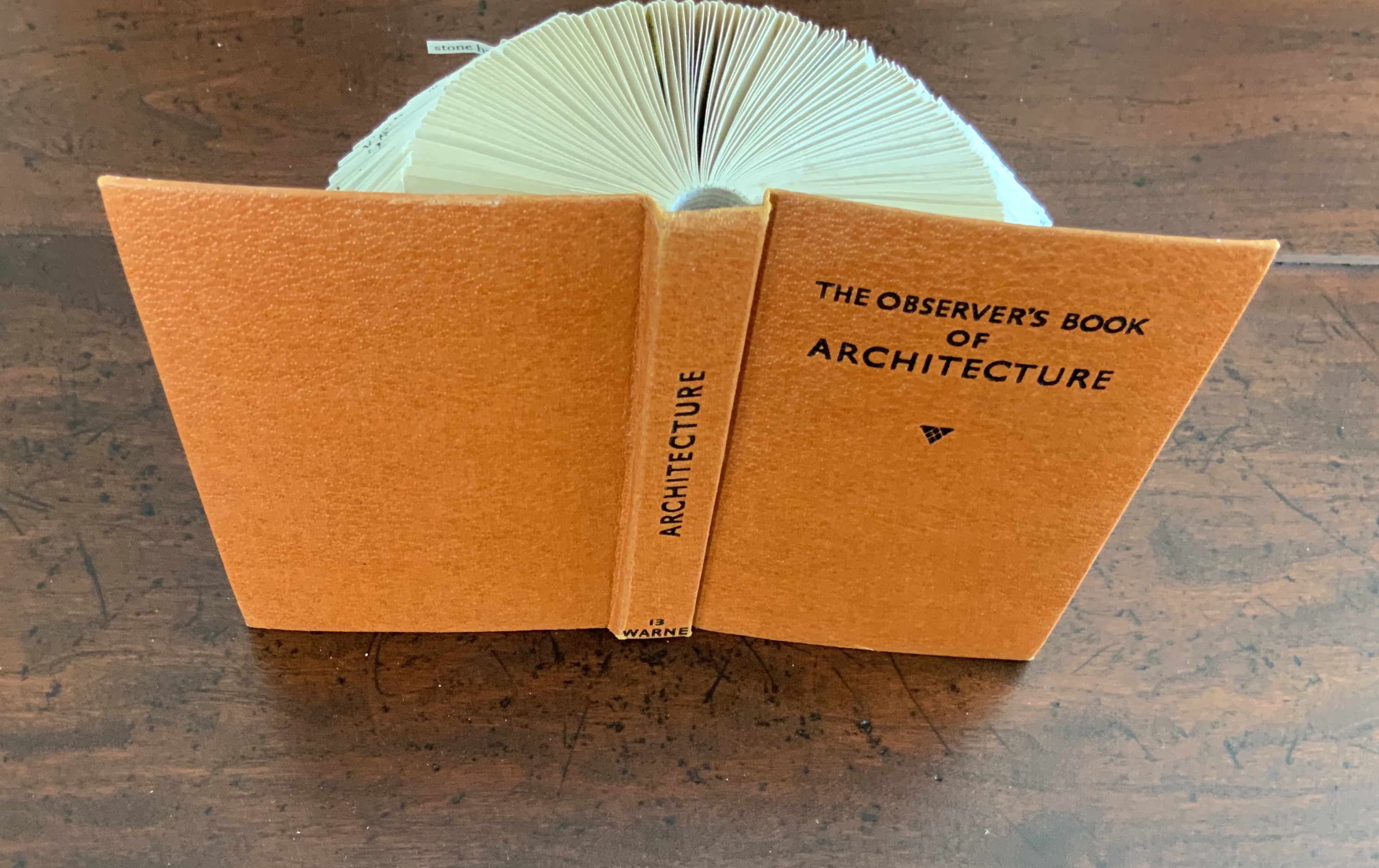
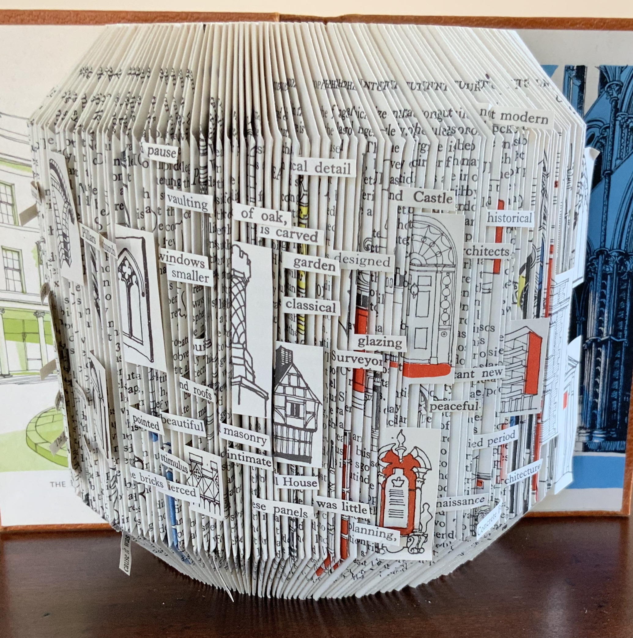

Photo: Books On Books Collection
The very fact of a found poem made of excised words that happen to fall at the folds shaping a column from a book on architecture chimes with the title of Bachelard’s The Poetics of Space.
Another work in the collection is Foldable Sculpture No. 1.
“Environmental memories,” not just of places but of cherished objects held in the hand, are Hunter’s chief inspiration, and the design of her bookworks is intended through touch, reading and exploration to evoke in the reader “unique feelings that become the reader’s own environmental memory.” Her artistic and literary influences and inspirations are an interesting blend of the 20th century Neo-Concrete and the 19th century Romantic movements. Links to illustrations of those sources of influence are embedded in the caption to Snowdrop.

Hunter has regularly exhibited and demonstrated her work at Turn End Studios in Haddenham, Buckinghamshire.
Bookmarking Book Art — Thomas Allen
Posted on March 9, 2013 by Thomas Allen
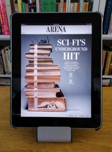
This image of Thomas Allen’s book art appears along with the story about fellow-North Carolinian Hugh Howey‘s self-published novel WOOL in the 7 March 2013 edition of The Wall Street Journal but only in the iPad App version. Go to SECTIONS, then ARENA.
Click on the image to the left to go to Allen’s website to see more of his work and find out how to purchase it. If you can find the Fall 2006 issue of Zoetrope: All Story, you can see more of Allen’s work, but click here to read Chip Kidd’s comments on Allen’s artistry.
Bookmarking — A Variable Redletter Day?
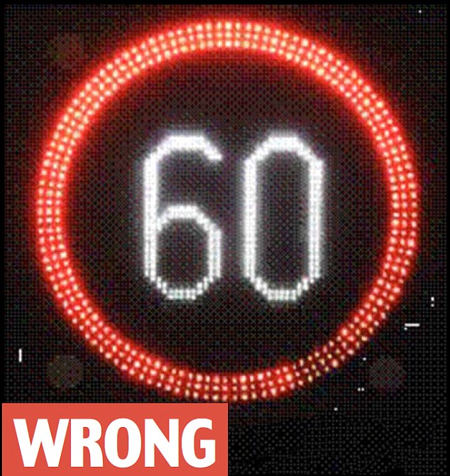
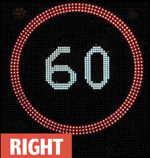
In a report possibly falling under the category “What the Font?” or simply “Sans Clue,” PoliceSpecials.com carried this story from the BBC today:
“Thousands of motorway speeding convictions could be overturned because the font used to display the numbers on some variable speed limit signs may not have complied with traffic regulations. The Crown Prosecution Service said the signs showed mph numbers taller and narrower than they should have been.”
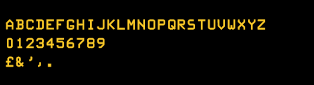
The typefaces mandated by the Department of Transport for traffic speed limit signs are Transport Medium, Transport Heavy and Motorway Permanent. The designers were Jock Kinneir and Margaret Calvert. Simon Garfield provides an amusing chapter in Just My Type on how their design came to be adopted. But the typeface in question on which the BBC has belatedly reported (see the Daily Mail for the original scoop last December) is this:
According to roadsuk.com (well, that is the URL, although a bit of blue in the letters “u” and “k” help to disambiguate the message), the font seems to be named (imaginative this) “Variable Message Sign.” But in the Daily Mail article, neither the “wrong” nor “right” signs illustrated seems to be in the Variable Message Sign typeface. So, what the font?
Another videomark — One for the history of book design
What do Chip Kidd and Hans Holbein have in common?
In The E-Book World, Are Book Covers A Dying Art? : NPR
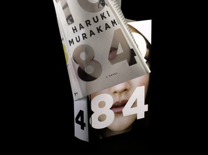
For the past 25 years, Chip Kidd has made a name for himself as a top book designer. His designs have helped transform books into visual icons.
With the disappearance of the dustjacket’s original function — to protect the binding of the book — is it imaginable that the book cover will no longer be needed as the book evolves?
Imaginable, yes. Likely, no. As long as the imagination of Chip Kidd and his like bring their passion to publishing.
The possiblility of building up the thumbnail cover across the pages/screens of the ebook or giving it a functional role in the narrative may mean we come to judge a cover by its book!
See on www.npr.org
