“Human society, the world, man as a whole, is in the alphabet.… The alphabet is a source.” — Victor Hugo.
“… the Book, the total expansion of the letter” — Stéphane Mallarmé
“I see new horizons approaching me and the hope of another alphabet.” Marcel Broodthaers
“There is indeed something magical about the look of the alphabet: it has to do with its infinite capacity to change shape and style, to express purpose and suggest mood, to be formal and informal, elegant and ugly, classical and romantic, delicate and robust.” — Mel Gooding
“… the letter is repeatedly a lens through which Western culture makes sense of itself and its world.” — Laurence de Looze
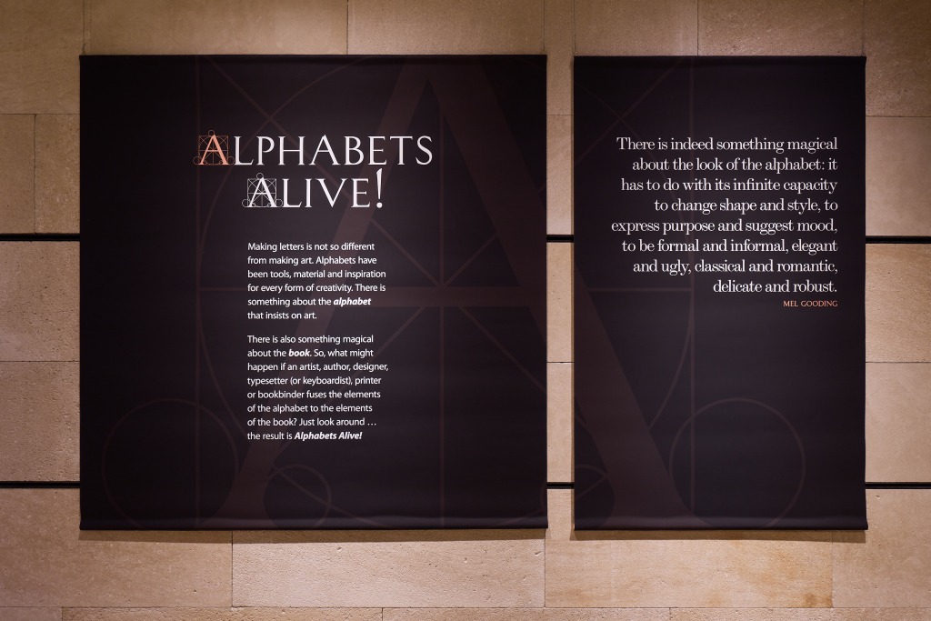
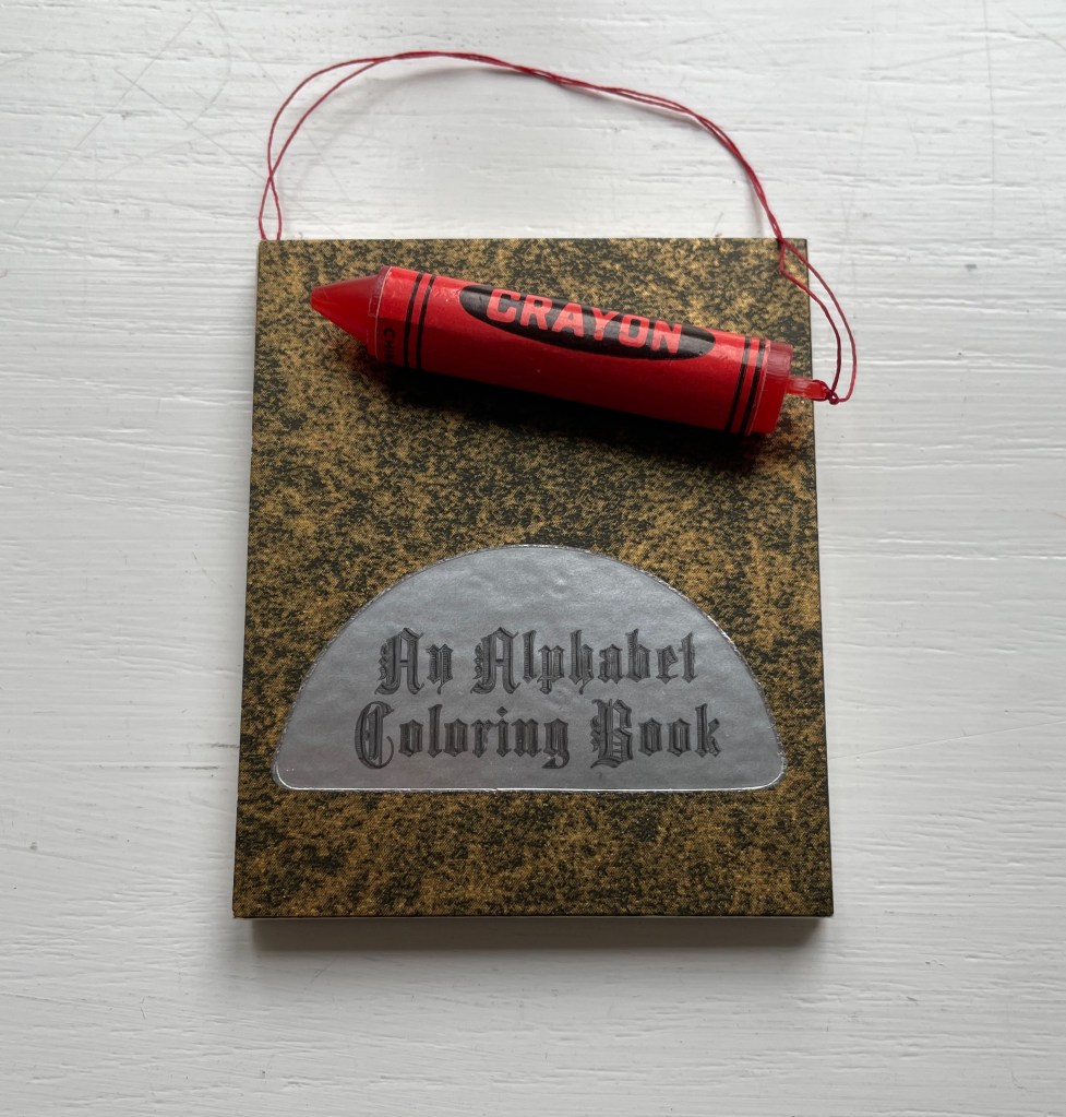
Photo: Ian Wallman
Introduction
What do alphabets and artists’ books have to do with one another?
Early on, alphabets and books cast their magical spells over us. Learning the alphabet is a childhood rite of passage for us. We play with letters on blocks and nesting boxes. Someone points and reads the letters to us. We mouth, chew and play with the books whose pages we learn are turned or devices whose screens we learn are swiped. We sing the alphabet song and memorize the letters. We learn to draw them and make sense of our world with those “shapes for sounds”. The alphabet taps the imagination in material and immaterial ways that are deep-rooted.
The magic of the alphabet flows into the magic of the book. Historians of the book know this. It is no accident that so many chroniclers of the history of the book begin with the ABCs. Why pay so much attention to the birth of the alphabet to get to the birth of the codex? Is it the professional historian’s habit –to begin at the beginning, to ask what were the causes of this or that event, invention or change? Or is it the habit of myth-making, of storytelling — the magic of “once upon a time” that leads to “once upon a time, there was an alphabet, and then along came books”? Mel Gooding’s explanation of what’s magical about the alphabet could equally apply to the book: it, too, has the “capacity to change shape and style, to express purpose and suggest mood, to be formal and informal, elegant and ugly, classical and romantic, delicate and robust.”
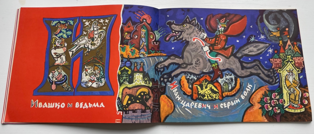
In general, children’s books and artists’ books have much in common. They both play with form and structure. They play with words and images, sometimes images without words and sometimes just shapes. Almost always an attention to all the senses. Perhaps the alphabet rite of passage inspires a later one. For many designers, typographers, printers and book artists, creating an alphabet book is a common rite of passage.
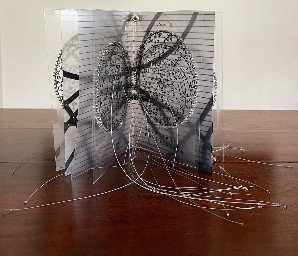
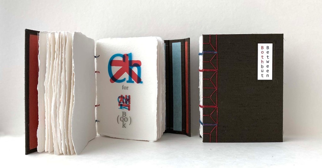
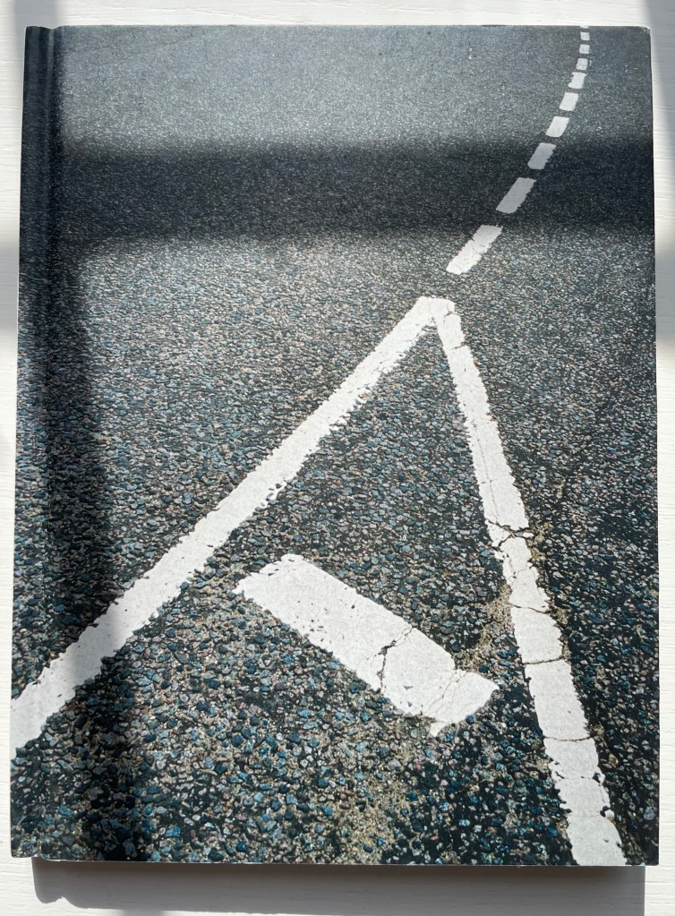
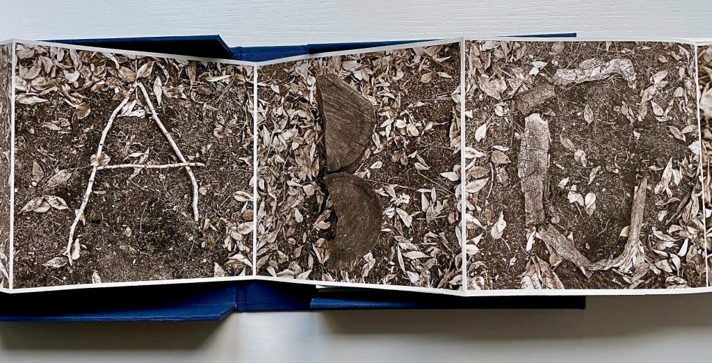
In particular, children’s alphabet books have even more in common with artists’ books. Both play with animals, bodies, colors, design (of letters, page and book), calligraphy, the Babel of languages and alphabet origin stories and more. Artists’ books inspired by the alphabet, or even just one letter of it, focus our senses and attention on more than the letter. They may focus our senses on the possible shapes the book as container can take. Or the elements and parts of the book (ink, paper, cover, binding, pages, margins and other blank spaces, preliminaries, chapters, running heads, etc.). Or the very idea of the book. The choice of cloth for a book’s cover may have its unconscious origin in touching a linen ABC primer. The use of thick laser-cut pages or highly tactile paper surfaces may be rooted in early childhood board books or “Pat the Bunny” books. The choice to use the accordion structure or scroll for an artist’s abecedary may lie in the linearity of the alphabet. Or the artist may be challenging that linearity with structures that echo the boxes of Joseph Cornell or the boîte-valise of Marcel Duchamp — or a bag of alphabet blocks.
With two such potent sources of magic on offer, how can the child in the book artist resist recreating the “once upon a time” when image and letter seemed to be one and the same thing? Only under certain circumstances does the play with letters and the book become art rather than the commonplace. Only when the artist, author, designer, typesetter (or keyboardist), printer and binder digs through the material aspects and conceptual aspects of the book right down to the letters of the alphabet, fusing the elements of the alphabet (or writing system) with the elements of the book, does the work sing (or at least hum) to us.
So here begins the journey from source to artists’ books where letters and characters turn into the world, the world turns into letters and characters, and alphabets come to life.
List of “Display Cases”
For the exhibition Alphabets Alive! — at Oxford University’s Weston Library from 18 July 2023 through 24 January 2024 — the Bodleian Libraries have brought together over 150 works — from medieval manuscripts to the AI-generated — all inspired by the alphabet and the book. Across the street from the Weston is the Old Bodleian Library, whose entrance the Proscholium houses an additional display case where works from Ron King, Kevin M. Steele and artists of the Movable Book Society point to the main exhibition.
Proscholium
Below, the “online display cases” of the exhibition are arranged alphabetically, concluding with a bibliography of the items consulted for the exhibition’s curation.
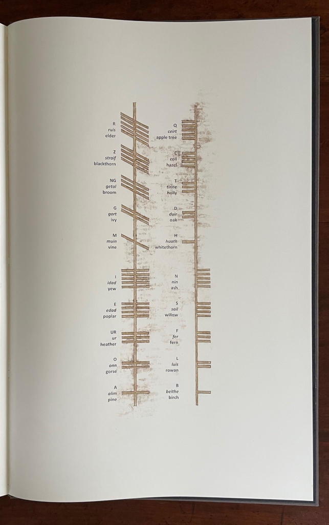
“A is for Ox” (Origins)
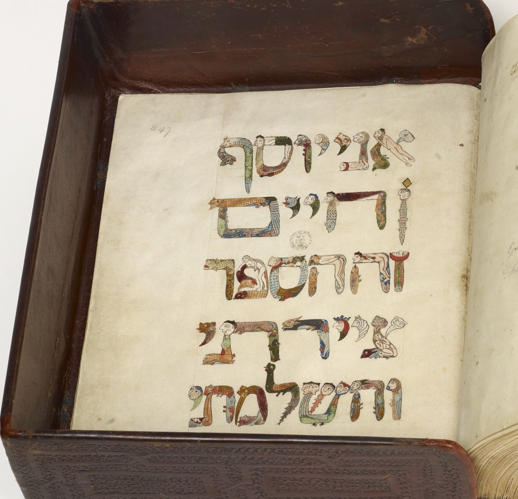
ABCs in Miniature
The ABCs of Form & Structure
Activism and Anti-racism
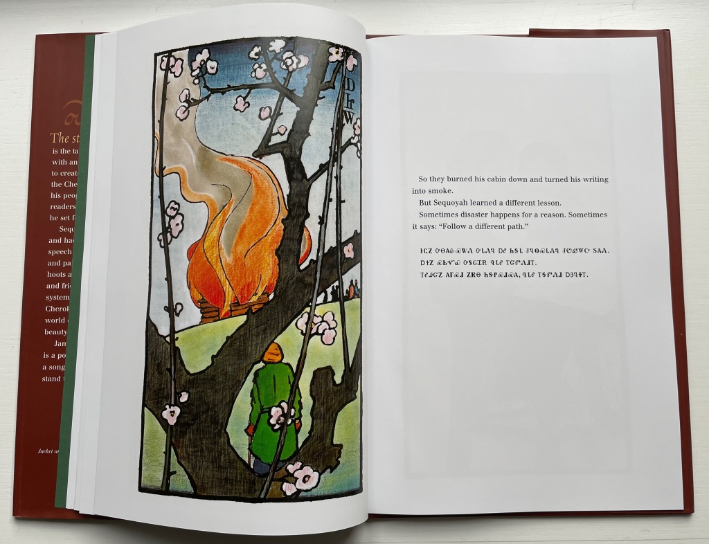
Adventures
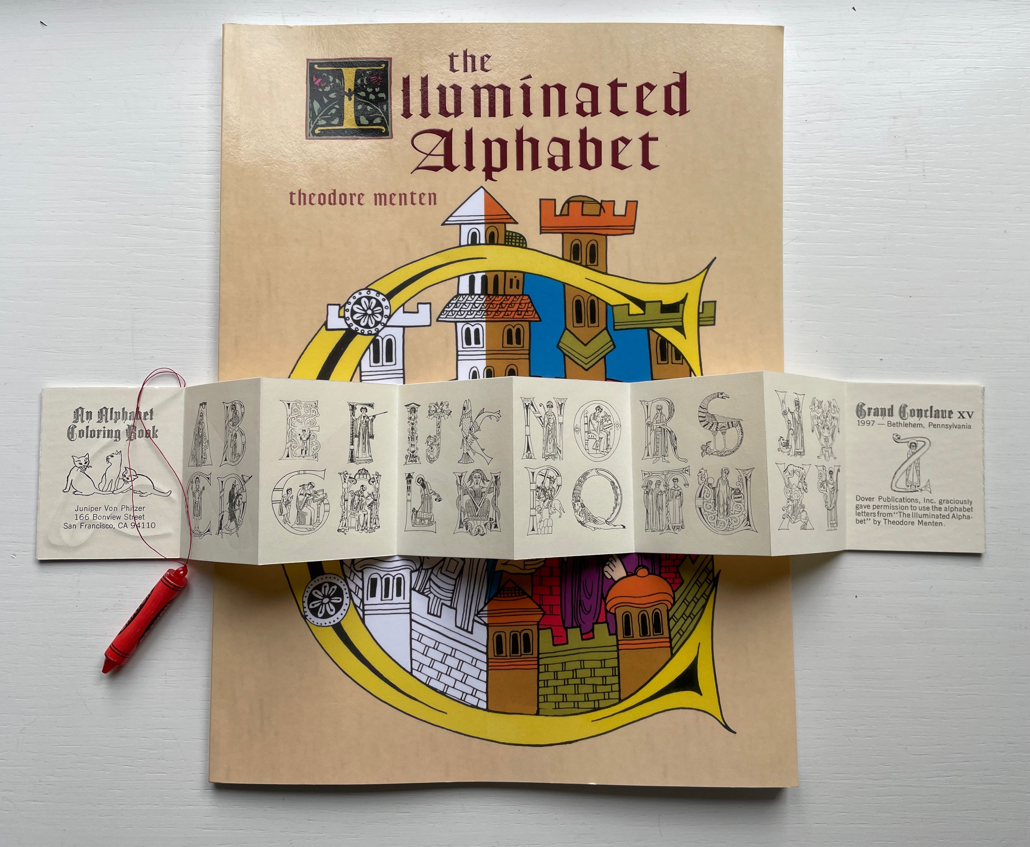
Alphabestiary: The Gehenna Alphabet
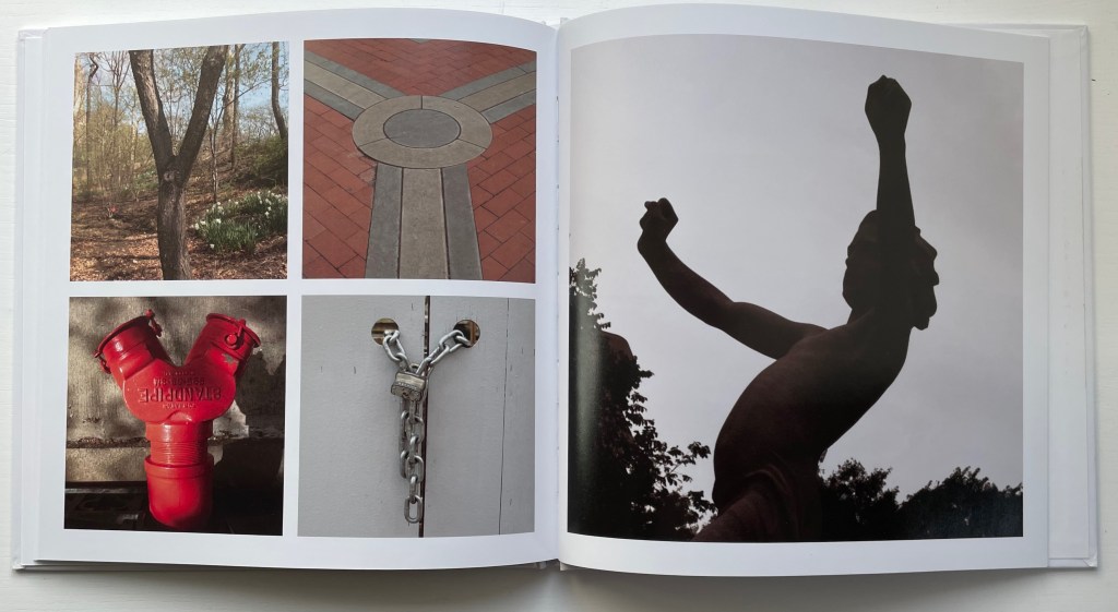
Alphabets All Around
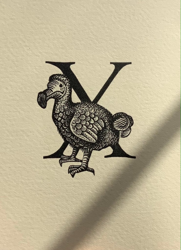
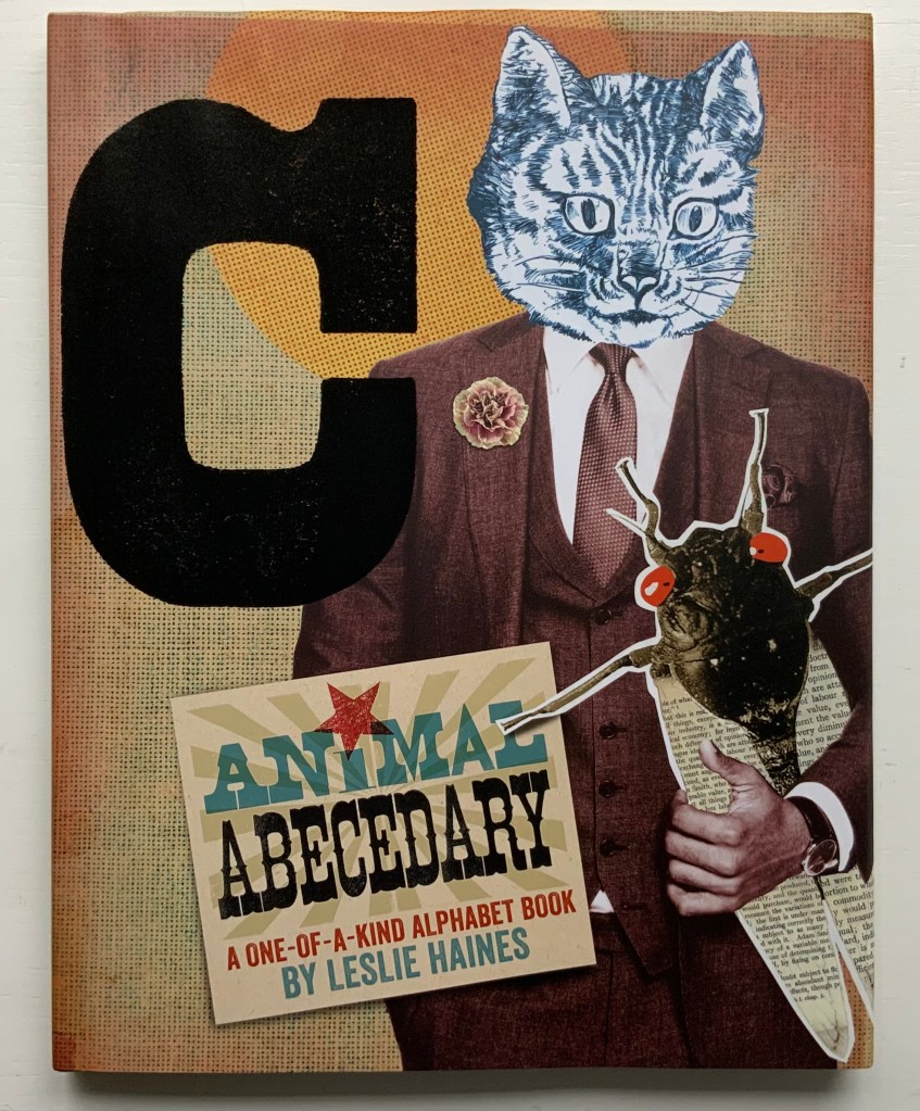
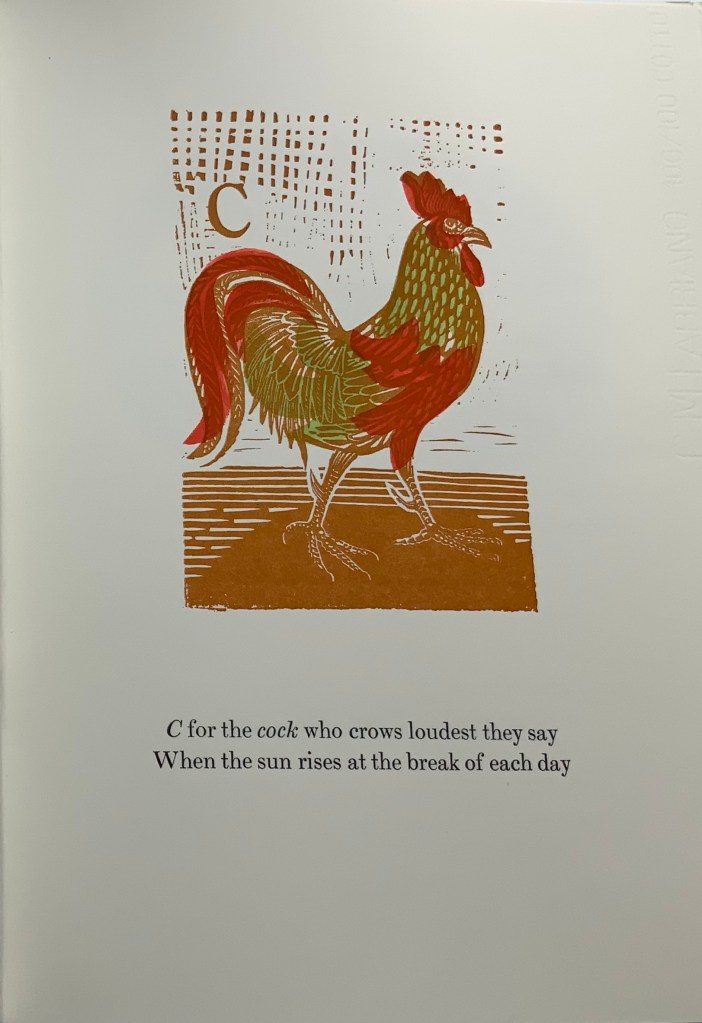
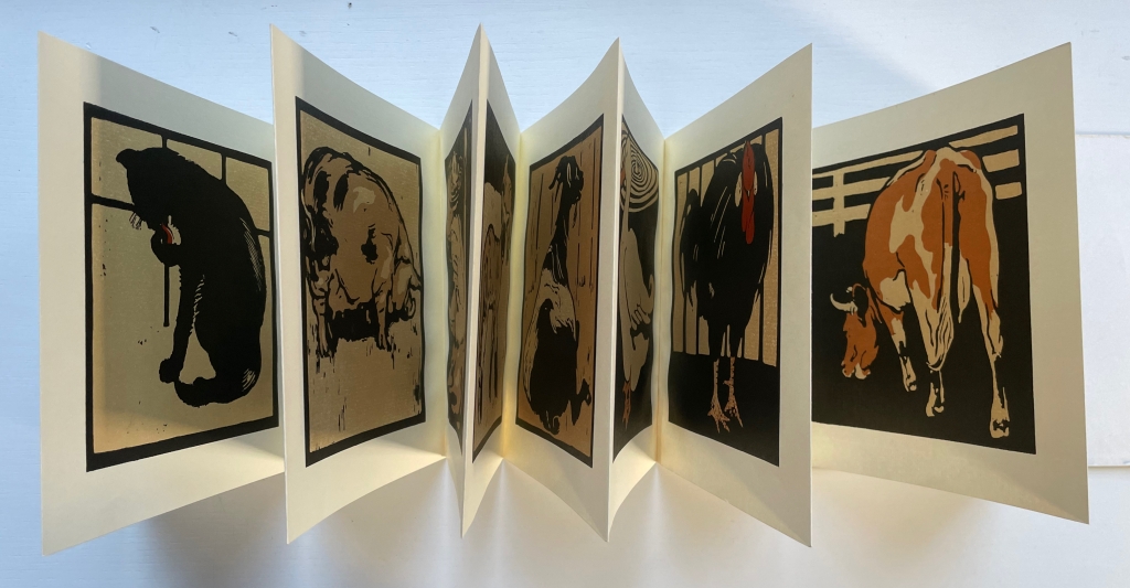
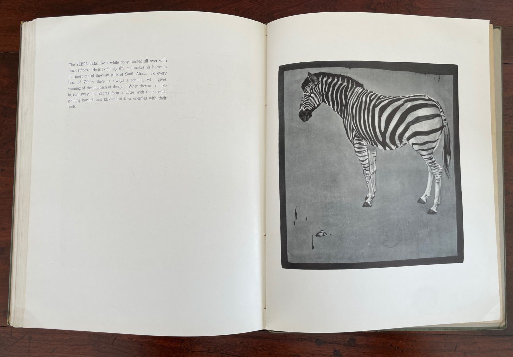
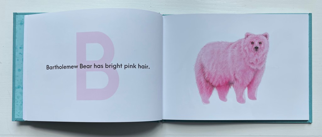
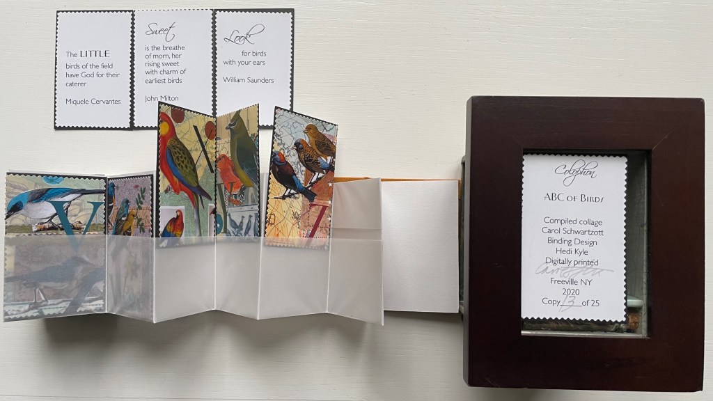
Animals
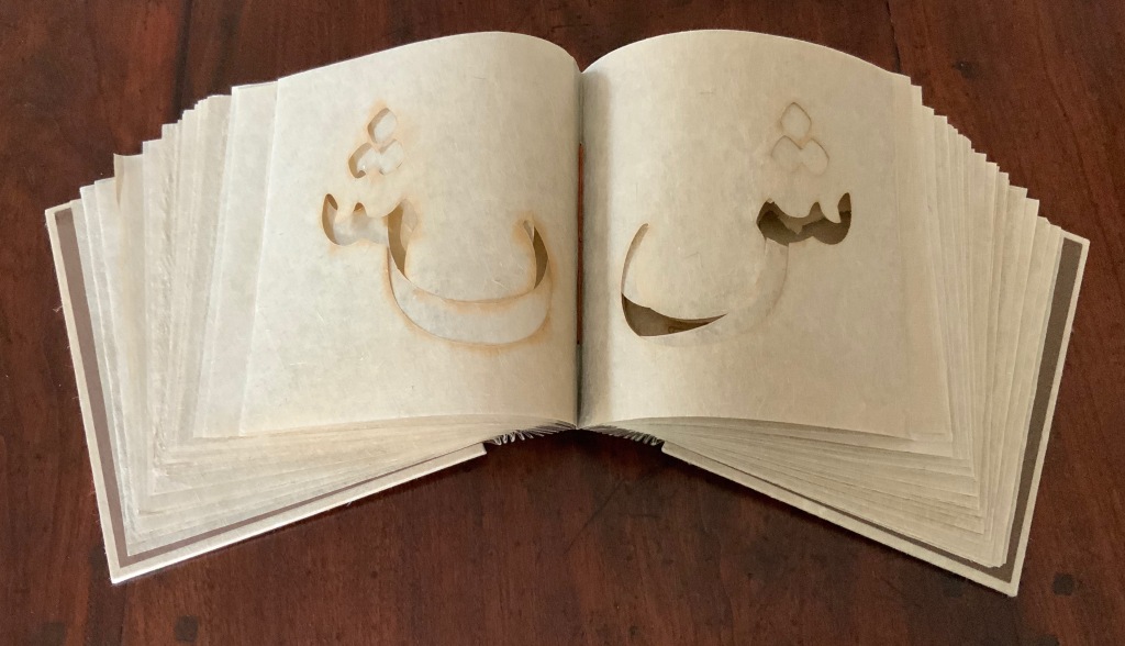
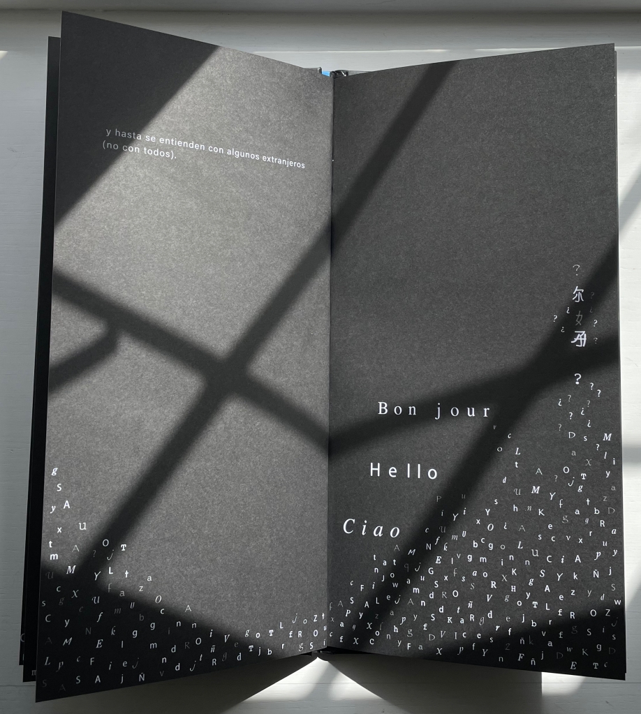
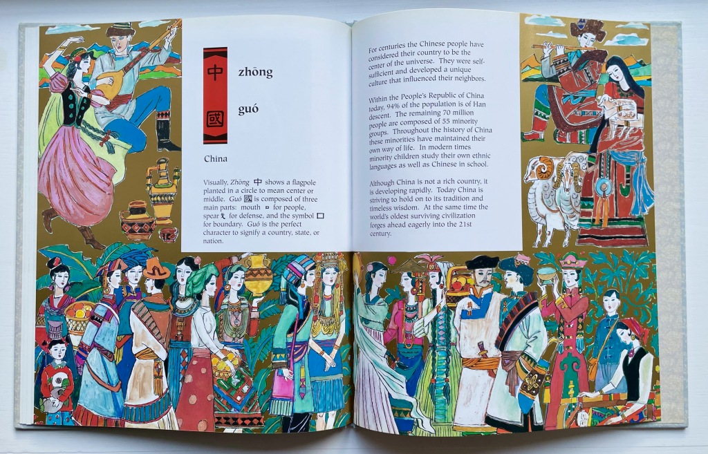
Babel
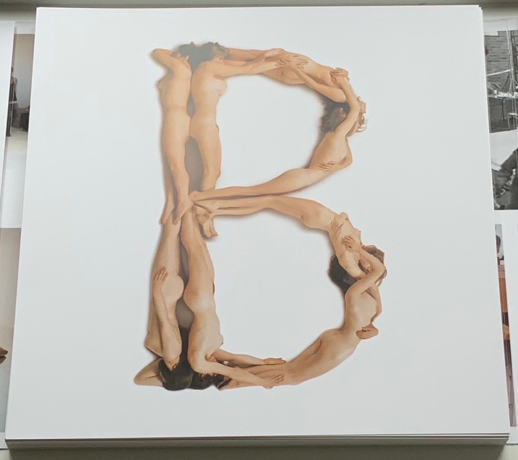
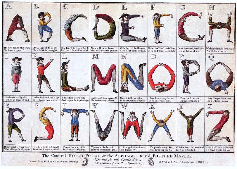
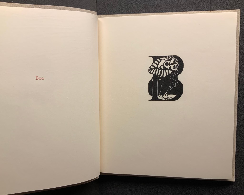
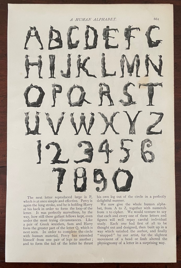
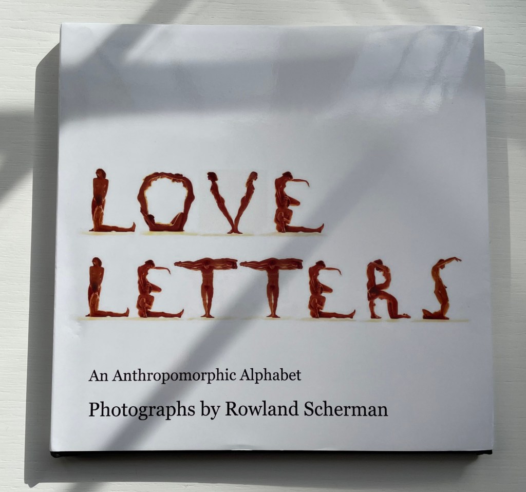
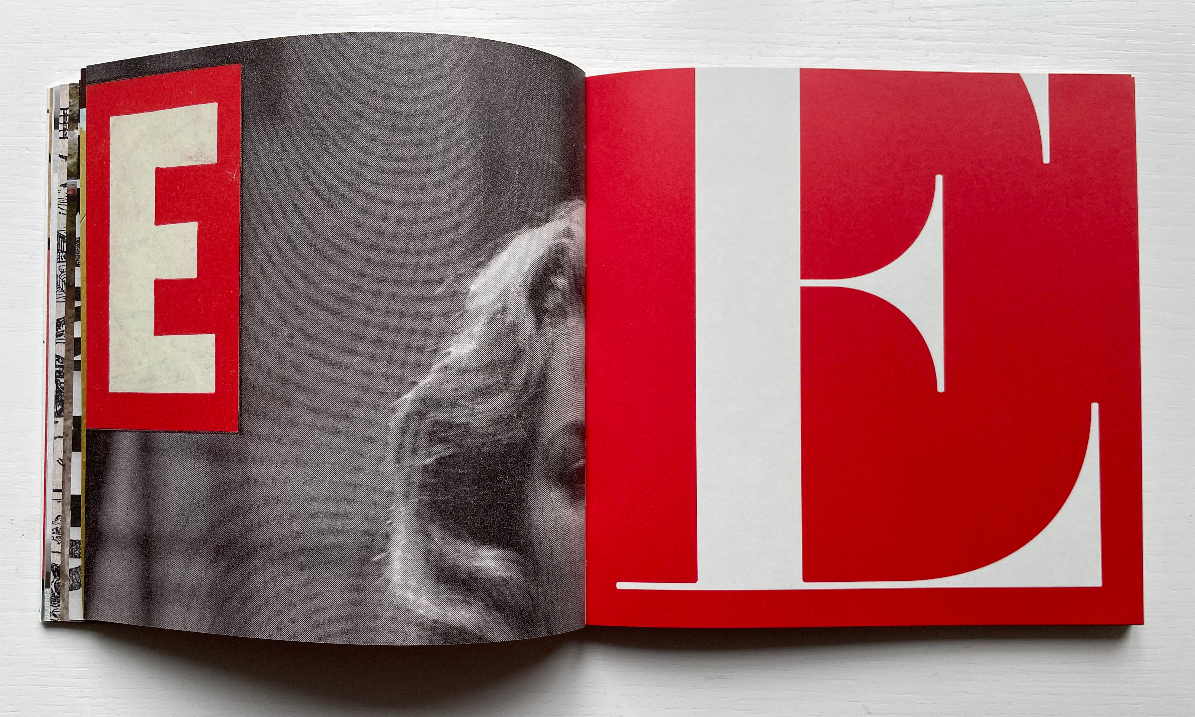
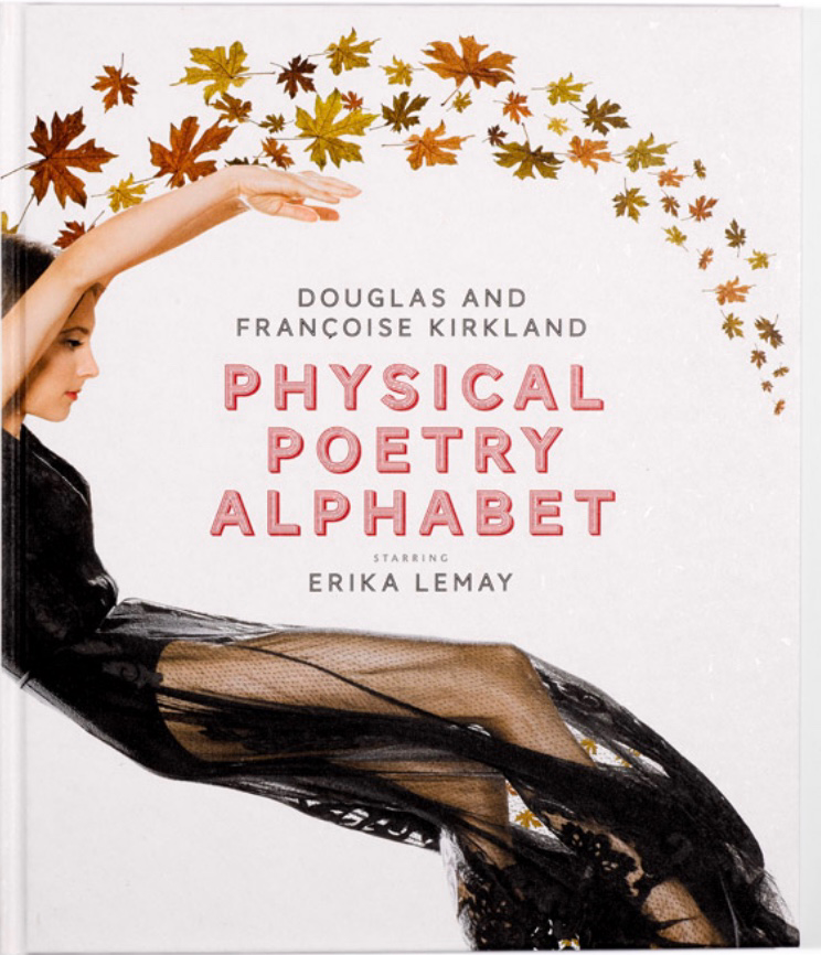
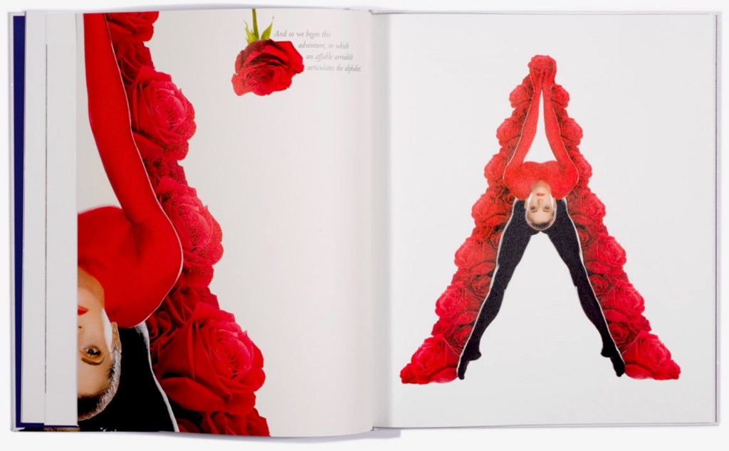
Body
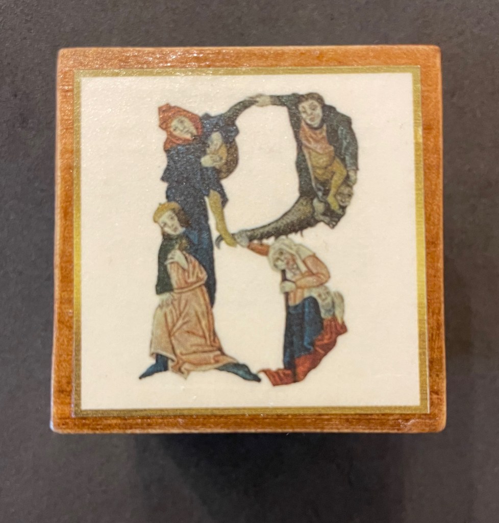
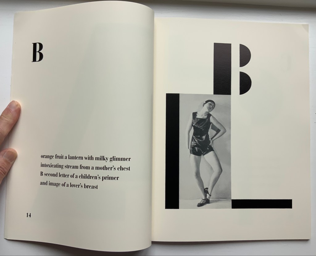
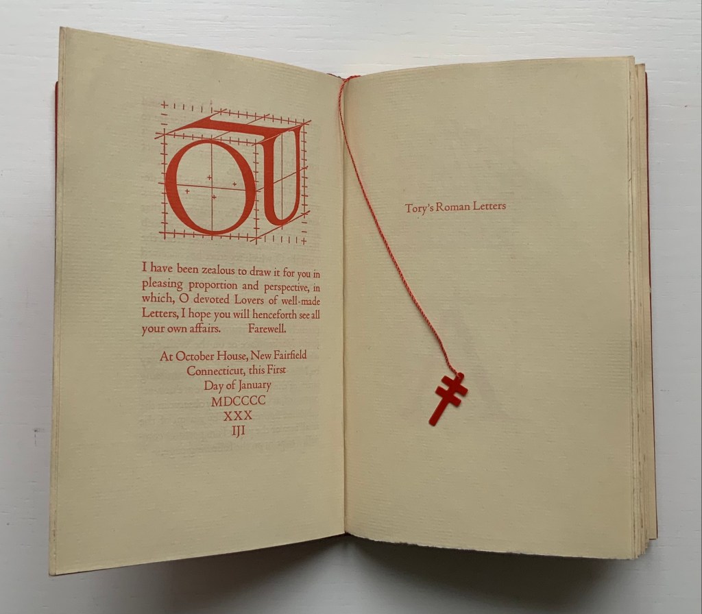
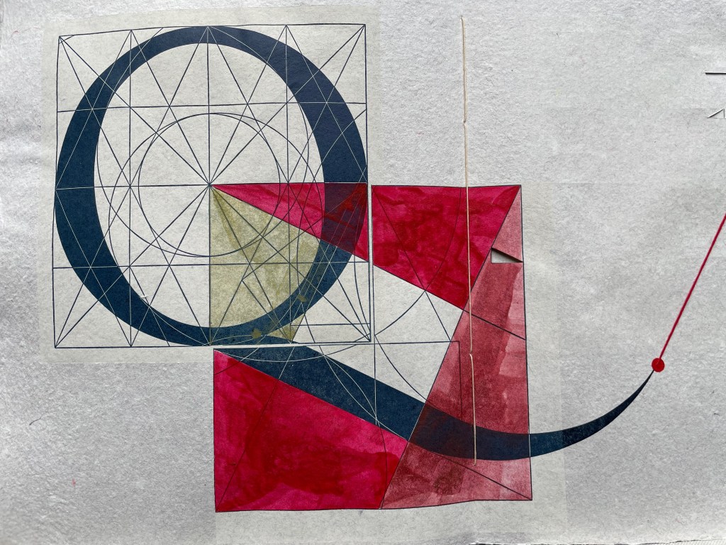
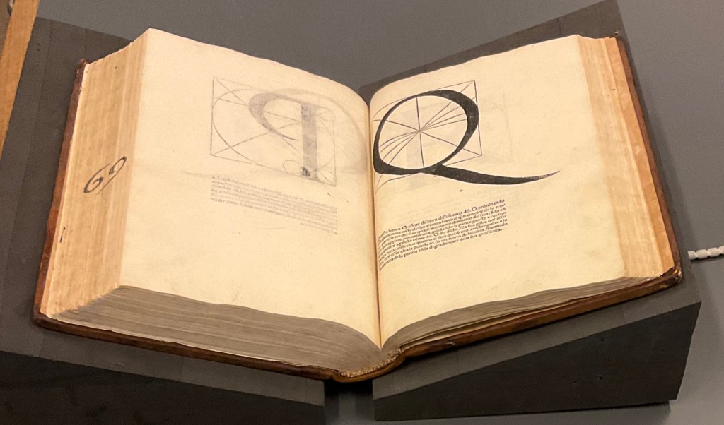
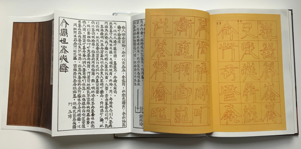
Calligraphy & Design
Color
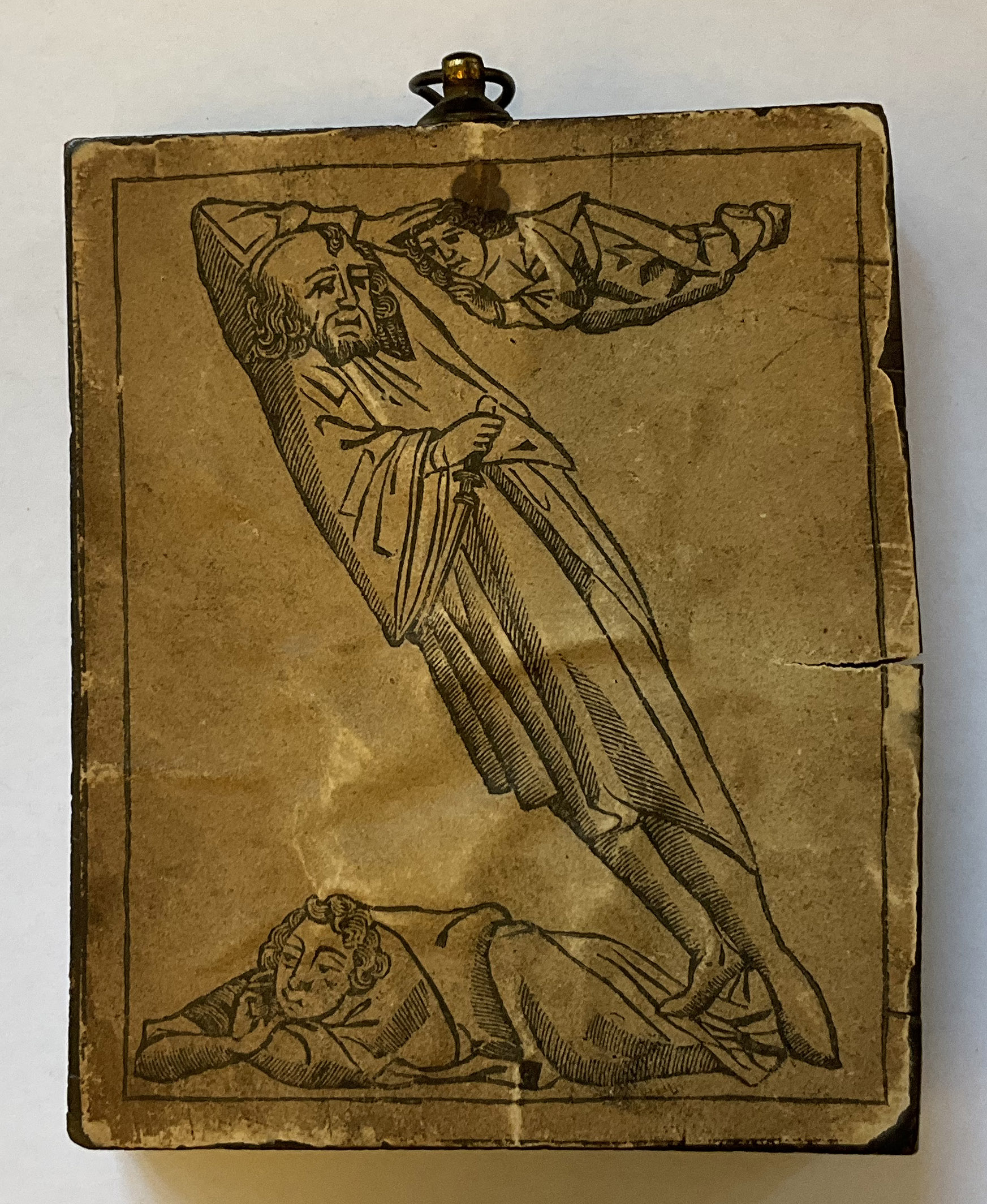
Criss-cross Row (Horn-books)
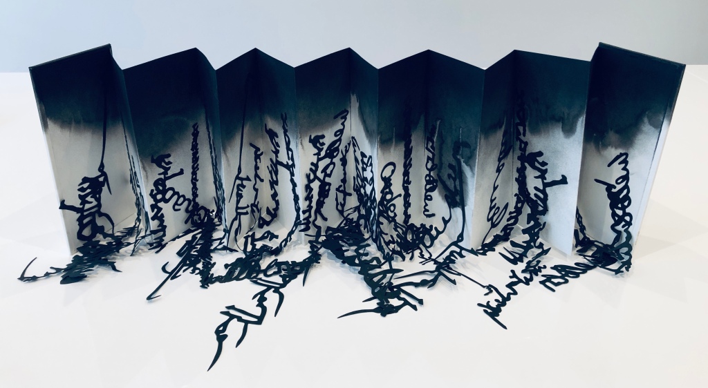
F is for Fold
TRAIANUS
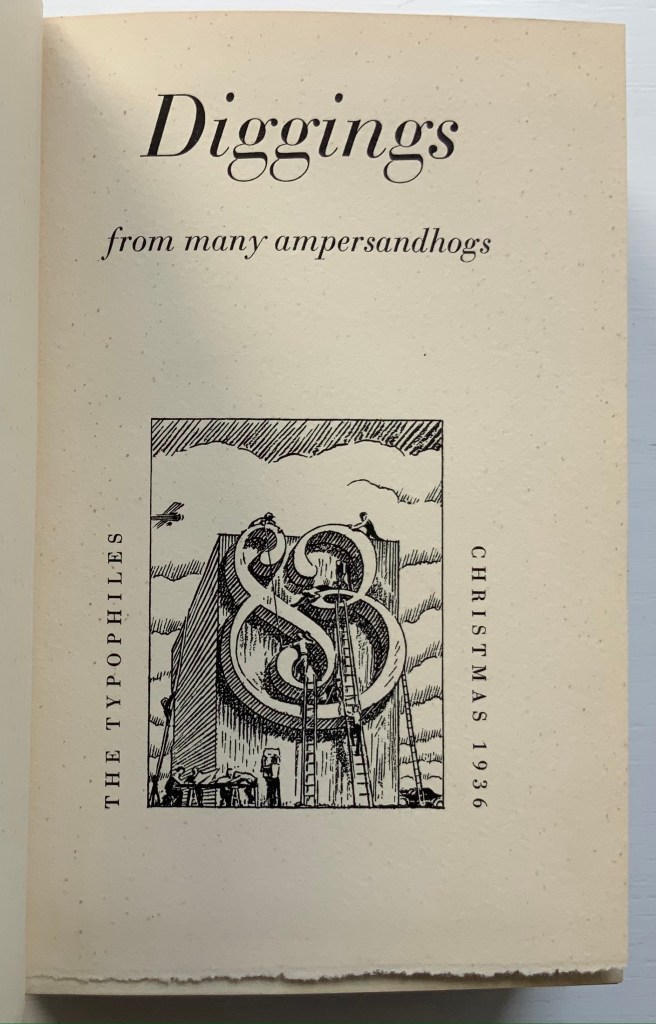
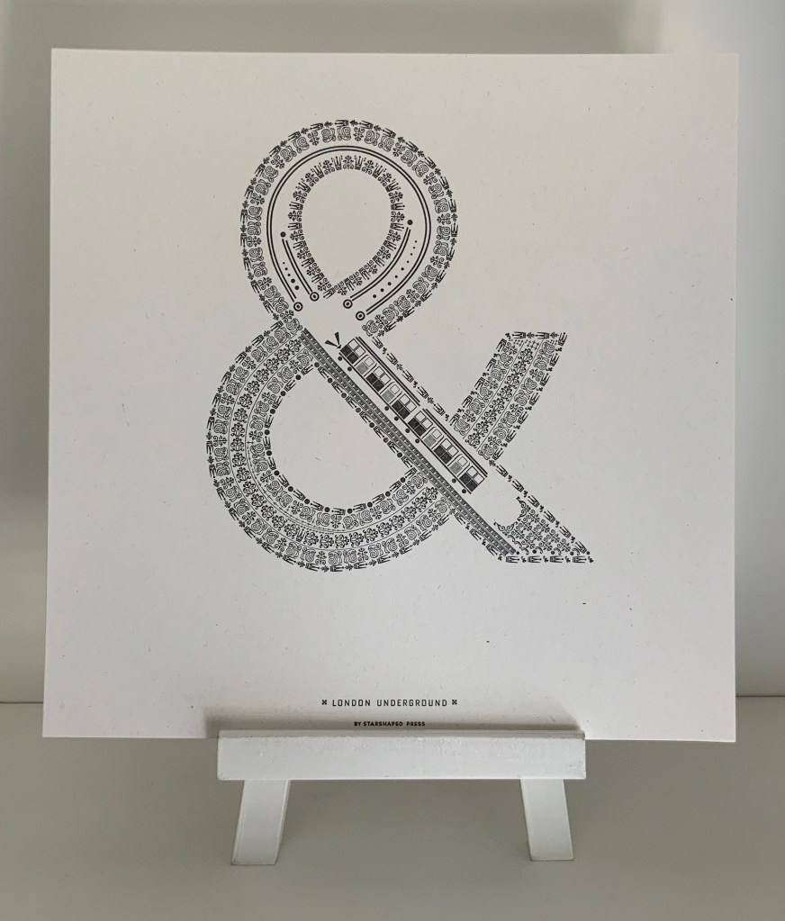
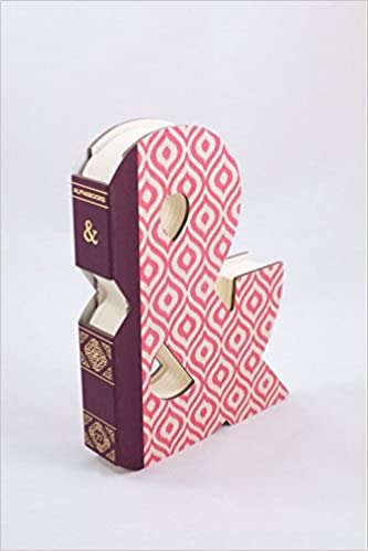
& is for Ampersand
Bibliography
The CuRiOuS Alphabet © 2023, Julie Shaw Lutts. Made by BOOM DEVS.
Ephemera from the exhibition

")