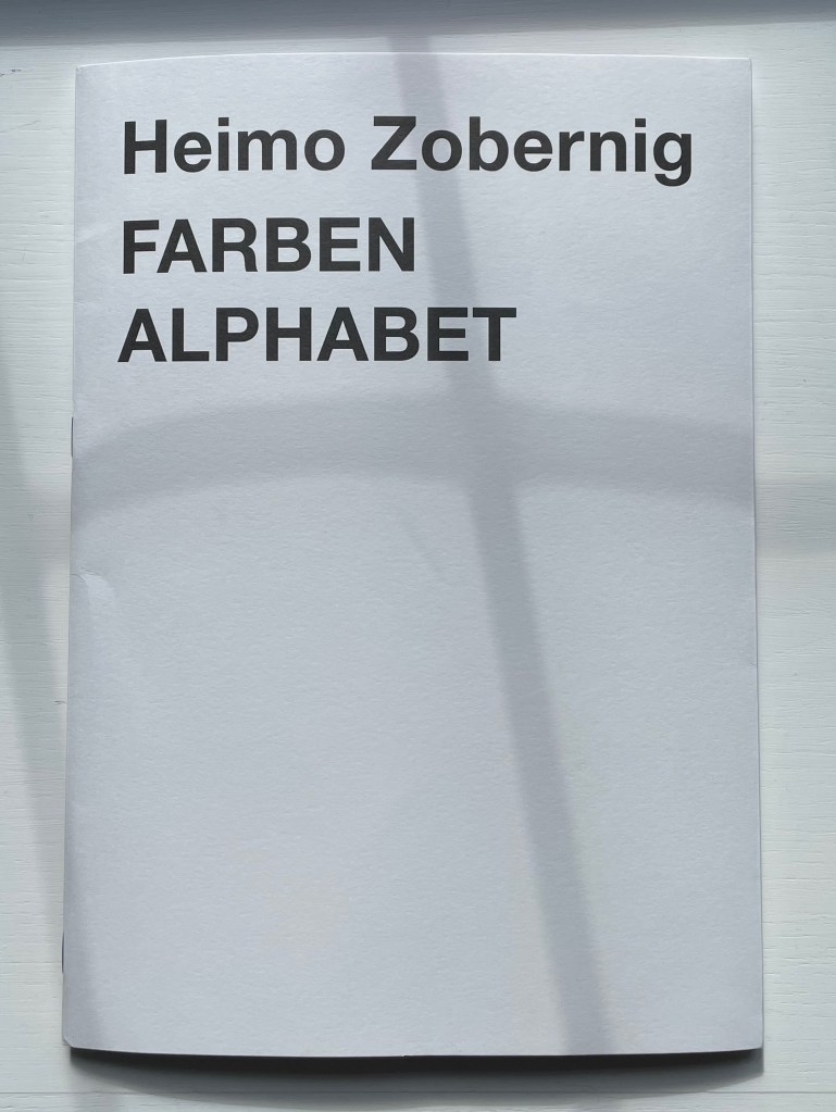
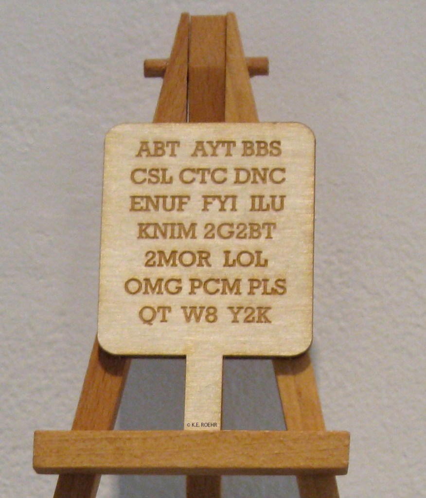
FARBEN ALPHABET (2018) Heimo Zobernig Paperback. H297 x W210 mm. 32 unnumbered pages in two signatures. Edition of 500, of which this is #427. Acquired from Les Presses du Reel, 18 September 2022. Photos: Books On Books Collection.
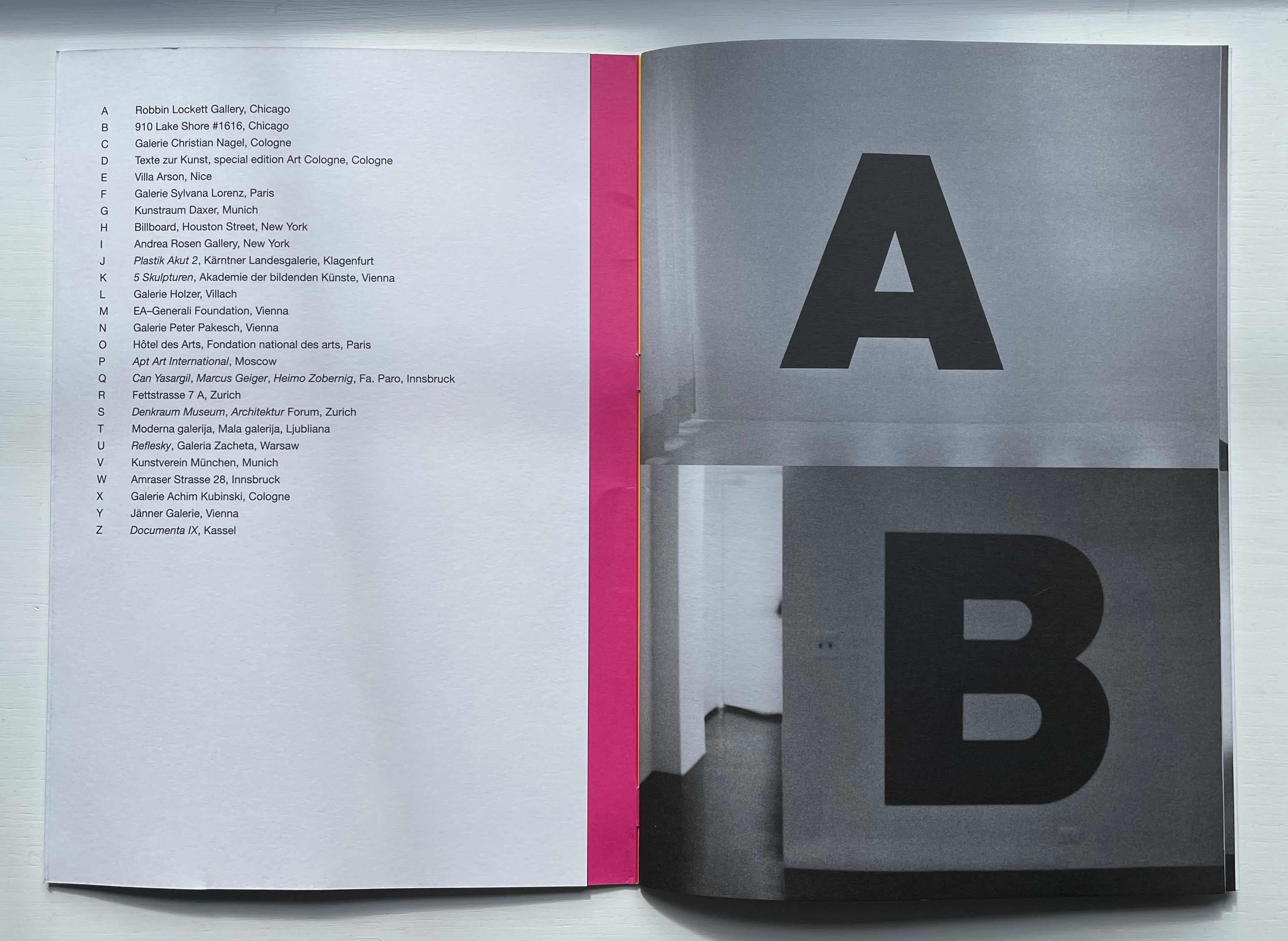
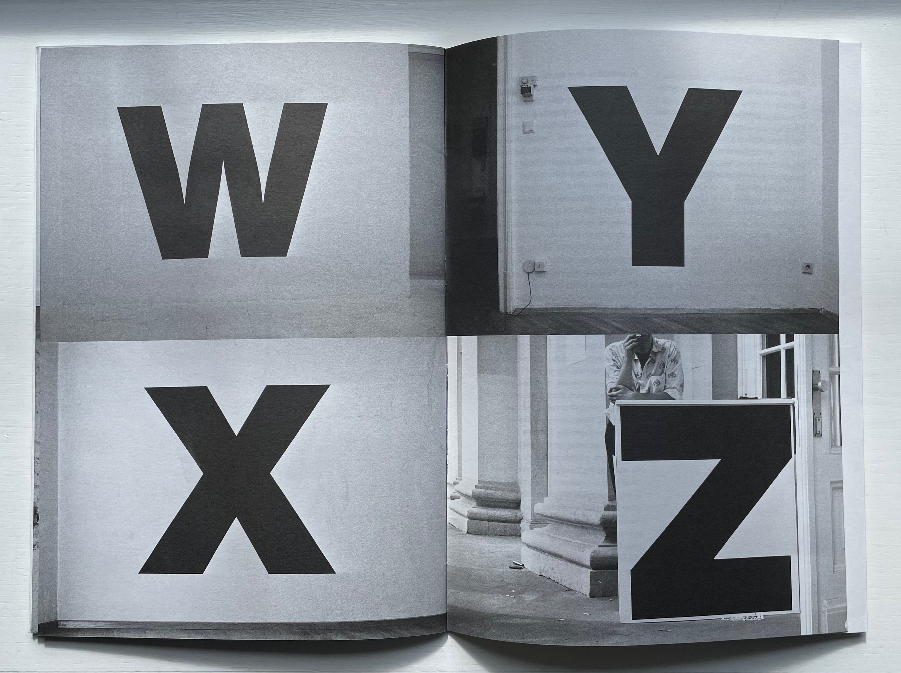
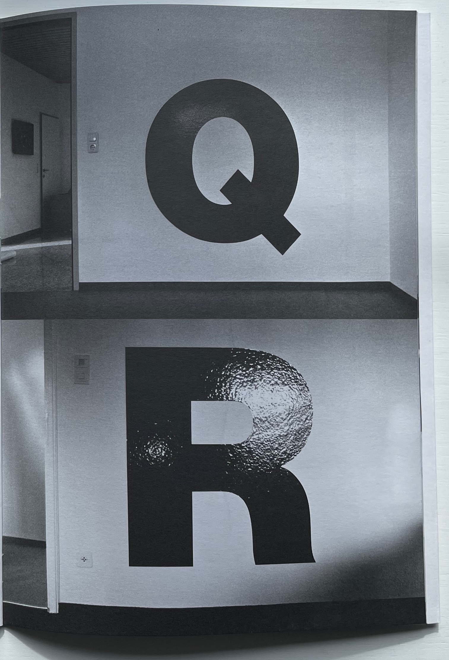
Starting with his first solo exhibit in the US, Heimo Zobernig placed a 115 cm high letter A in black adhesive vinyl foil on a wall near the entrance to the Robbin Locket Gallery in Chicago.
That was in 1990. By 1992 and twenty-five more exhibits later, he had accumulated a complete alphabet, the Z appearing on the ticket counter for Documenta IX in Kassel, Germany. The literary magazine Freibord (Vienna) published Zobernig’s photographic alphabetic record of his exhibitions in its centenary issue (1997). With Zobernig’s cover design, IF Publications (Barcelona) has produced Alphabet for the first time as an artist’s book. Here is the artist’s alphabet book as intervention over time. As the cover’s title and absence of color in these letters suggests, though, “But wait, there’s more”.
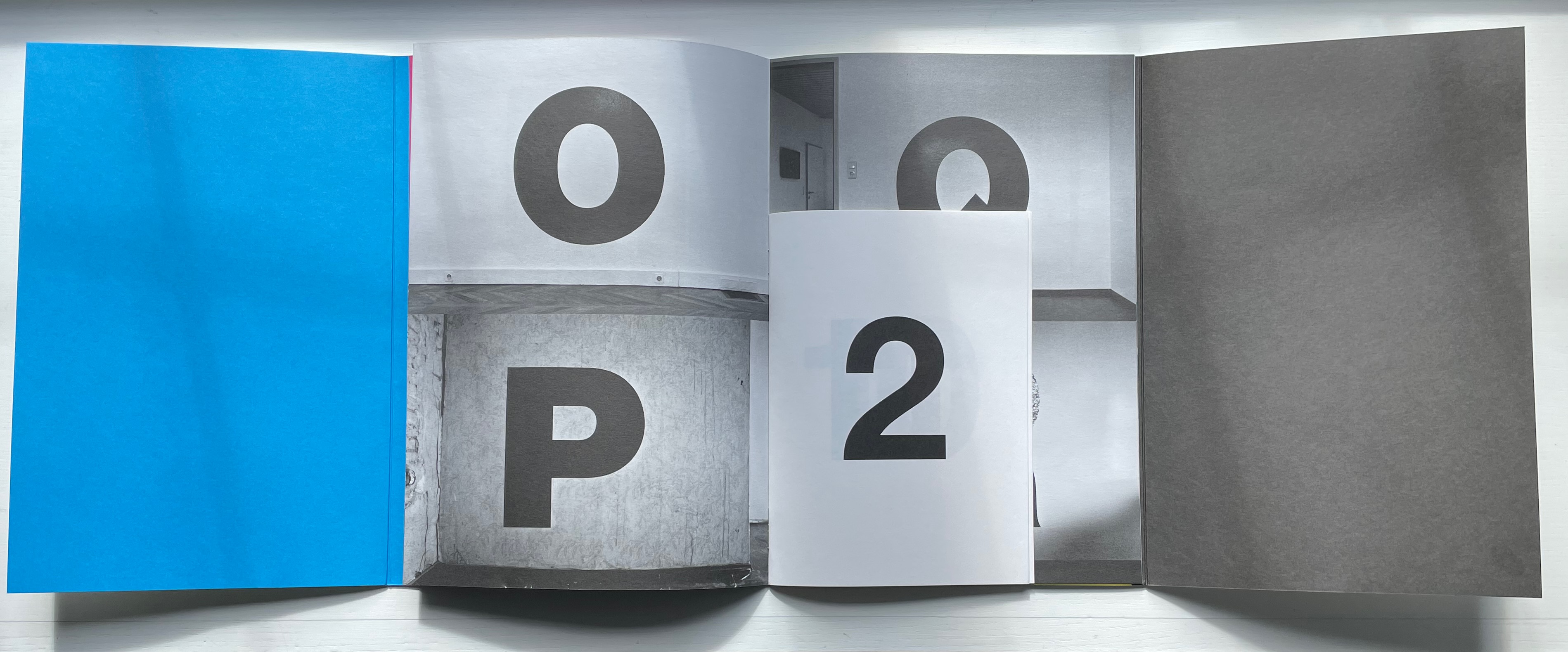
At the center of the photographed alphabet’s 16 pages measuring H297 x W210 mm, another 16-page signature measuring H210 x W150 appears, showing the numeral 2 in 220pt Helvetica on its cover, then the numerals 11 and 10 on the first double-page spread, then 3 and an upside-down 7 on the next spread. On the tenth unnumbered page, the word — FARBEN — appears. As if the numeric disorder were not puzzling enough, the numerals and letters are all in black despite the word FARBEN meaning “COLORS”. At the end of the book, Moritz Küng, the book’s editor, provides two crucial insights for untangling the puzzle.
First, that from the mid-1980s, Zobernig selected fifteen combinations of CMYK to define a palette from which he would not deviate until the early part of this century. Second, that the center signature self-referentially reflects on the principle of imposition (how sheets are printed and folded into signatures). Each number in the center brochure belongs to one of Zobernig’s fifteen CMYK combinations. From the top left of one side of the sheet to the bottom right of the other side of the sheet, Zobernig placed “right reading” numerical representations of these color combinations so that, when the sheet is folded and trimmed to form the booklet, the numbers and title appear in their strange orientation. This orientation that calls attention to the mechanics of the inside booklet’s creation results in the numeral 2 appearing on its cover, seemingly labelling the booklet within a booklet as the second of two volumes. Yet the cover of the outer booklet indicates that FARBEN comes first.
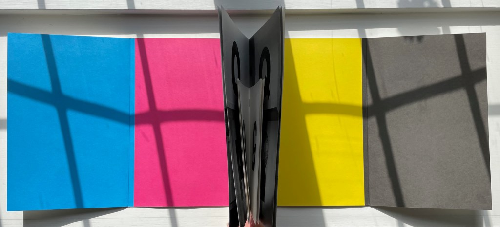
The seemingly contrary self-referencing abstraction does not end there. Or rather, if we stick with the cover of FARBEN ALPHABET with Küng’s clues in mind, it resolves itself. Just as Zobernig’s black and white alphabetic labels abstractly introduced his color-rich 1990-92 exhibitions, the other side of FARBEN ALPHABET’s black and white cover displays cyan, magenta, yellow and black panels, otherwise known as CMYK, the color alphabet from whose combinations Zobernig’s abstract expressionist art is created. Paradoxically, though, Zobernig’s FARBEN ALPHABET challenges such reductive labelling. Abstraction does not merely yield labels, he seems to suggest. It yields art through process and form — such as alphabetizing exhibitions to generate an artist’s alphabet book.
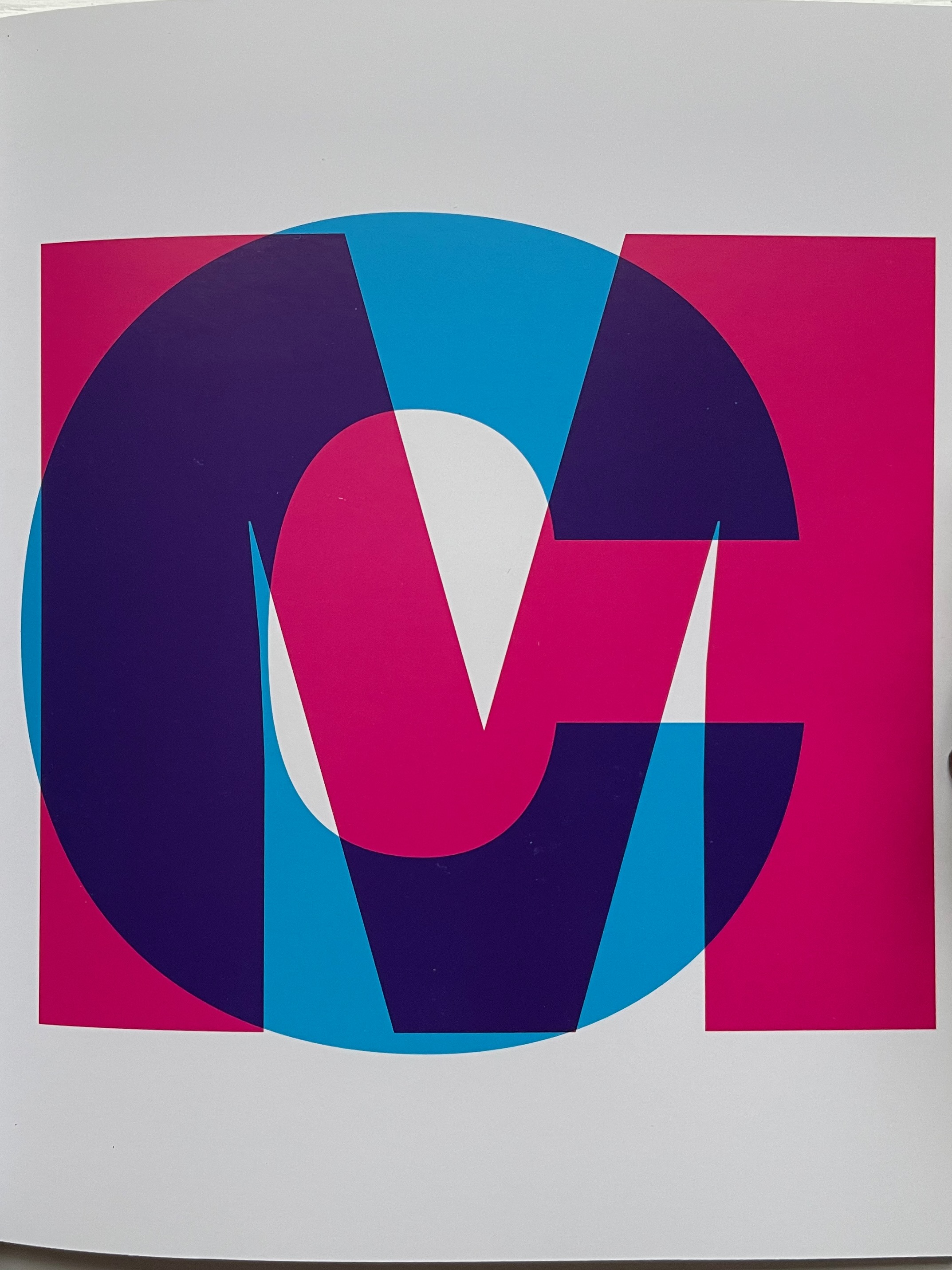
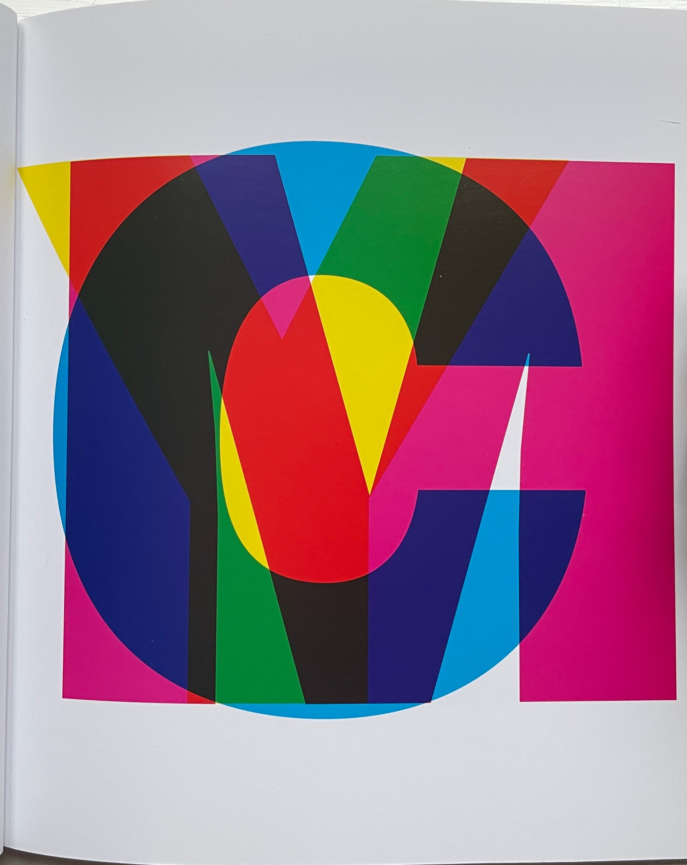
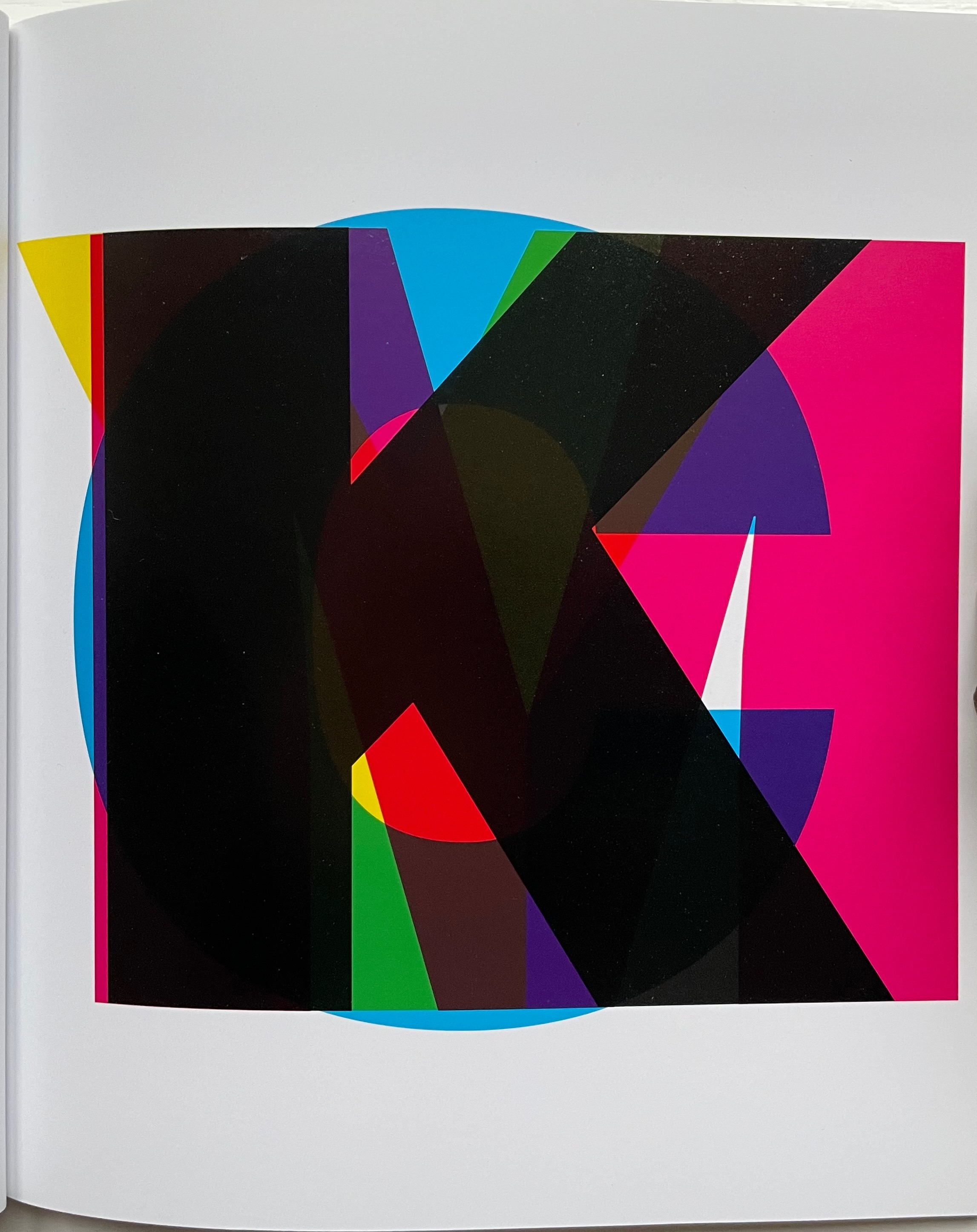
CMYK (2013)
CMYK (2013) Heimo Zobernig Perfect bound in glossy card, glossy text paper. H160 x W140 cm. 36 pages. Edition of 300, of which this is #214. Acquired from Pia Jardí, 26 October 2022. Photos: Books On Books Collection.
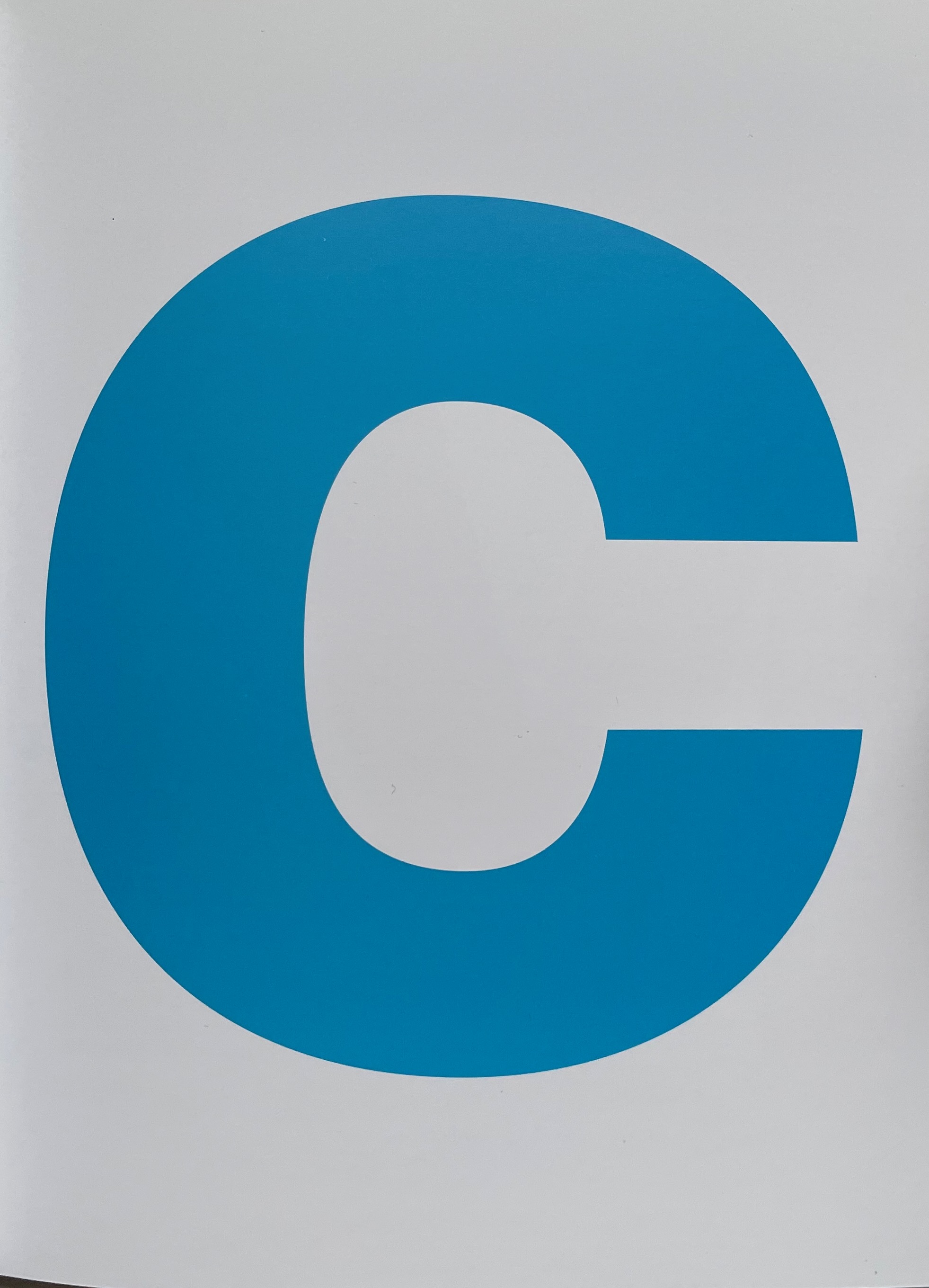
In the additive color model RGB, white includes all the primary colors — red, green and blue — of the light spectrum, and black is the absence of light. In the subtractive color model CMYK — cyan, magenta, yellow and key (black) — white is the absence of any ink leaving the natural color of the paper as the white background on which the combination of all the CMY inks yields black. What better cover for CMYK than pure white paper. Just as Farben Alphabet uses the A-Z alphabet and printing imposition to play with our expectations, this artist’s booklet uses the letters of the color model, the colored inks and the printing process to play with our expectations. C is overlapped by M, then CM is overlapped by Y, and, to yield the letter K, CMY are combined. From there, the booklet cycles through subtracting the letters in reverse, adding them back and so on.
This conceptual, process-driven artist’s booklet, arising from a multi-artist exhibition curated by Pia Jardí for the Open Structure Art Society (OSAS) in Budapest, makes for an interesting contrast with Amy Lapidow’s Spiralbet (1998), Karen Hanmer’s The Spectrum A to Z (2003), Annesas Appel’s Ruiten Alfabet (2006), Carol DuBosch’s Rainbow Alphabet Snowflake (2013) or Rebecca Bingham’s Rainbow (2018).
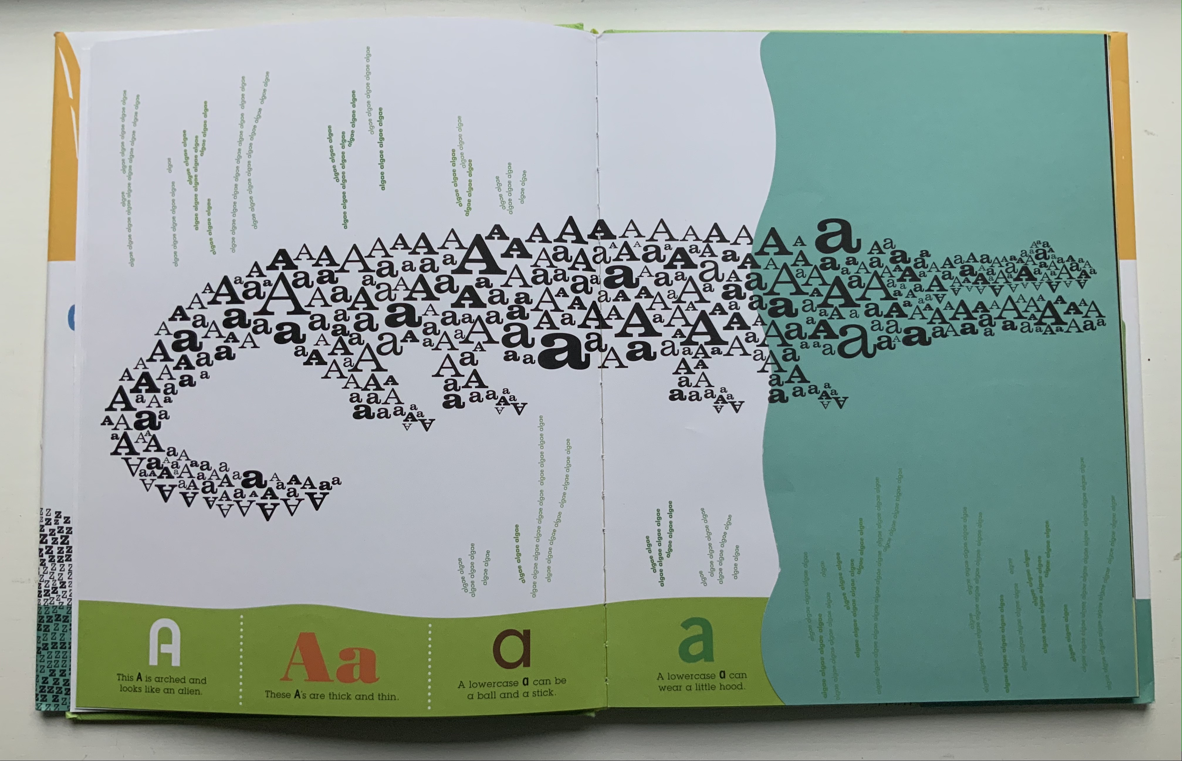
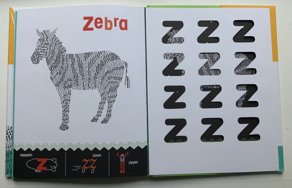
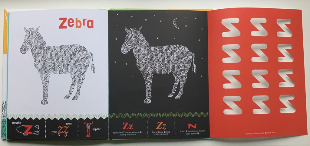
Alphabeasties and Other Amazing Types (2009) Sharon Werner & Sharon Forss Hardcover. H300 xW mm, 56 pages. Acquired from Golden Waves of Books, 7 August 2021. Photos: Books On Books Collection.
Unlike Roberto de Vicq de Cumptich’s Bembo’s Zoo (2000), this book relies on numerous type faces with which to create its alphabeasties, posed above the book’s illustratively shaped chiron that also provides the running information about “other amazing types”. Information is also conveyed from under flaps, through cutouts, across foldouts and by background images constructed of words.
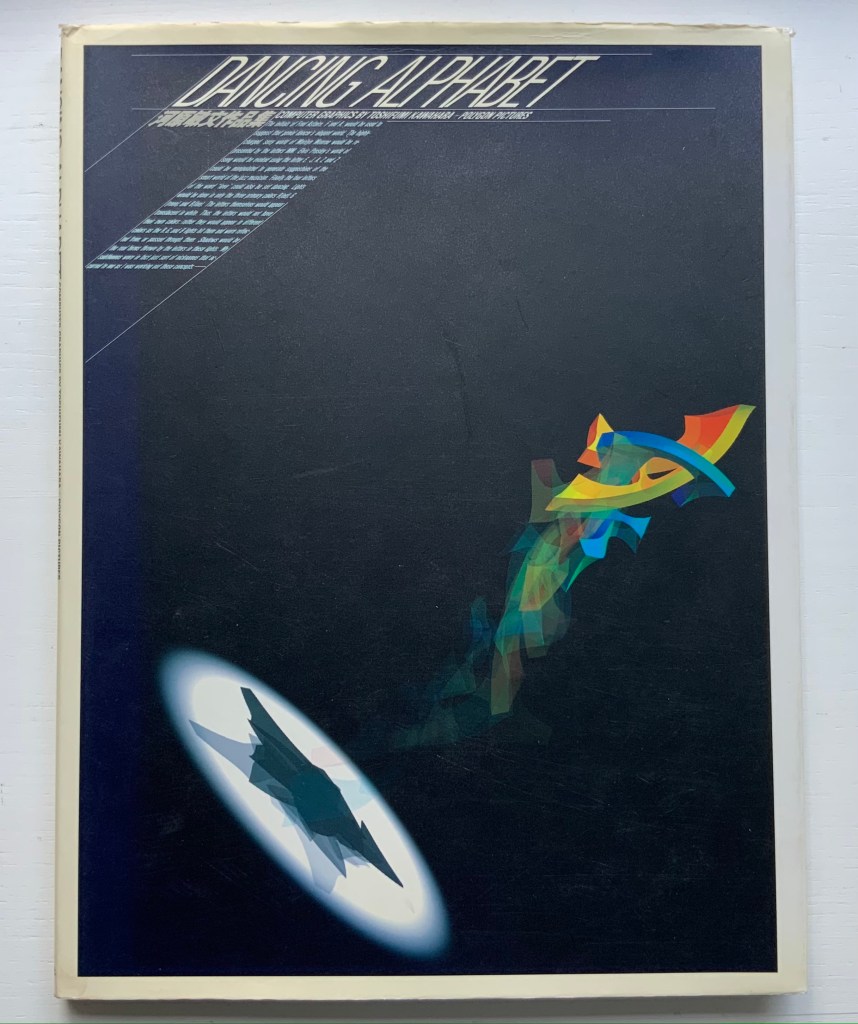
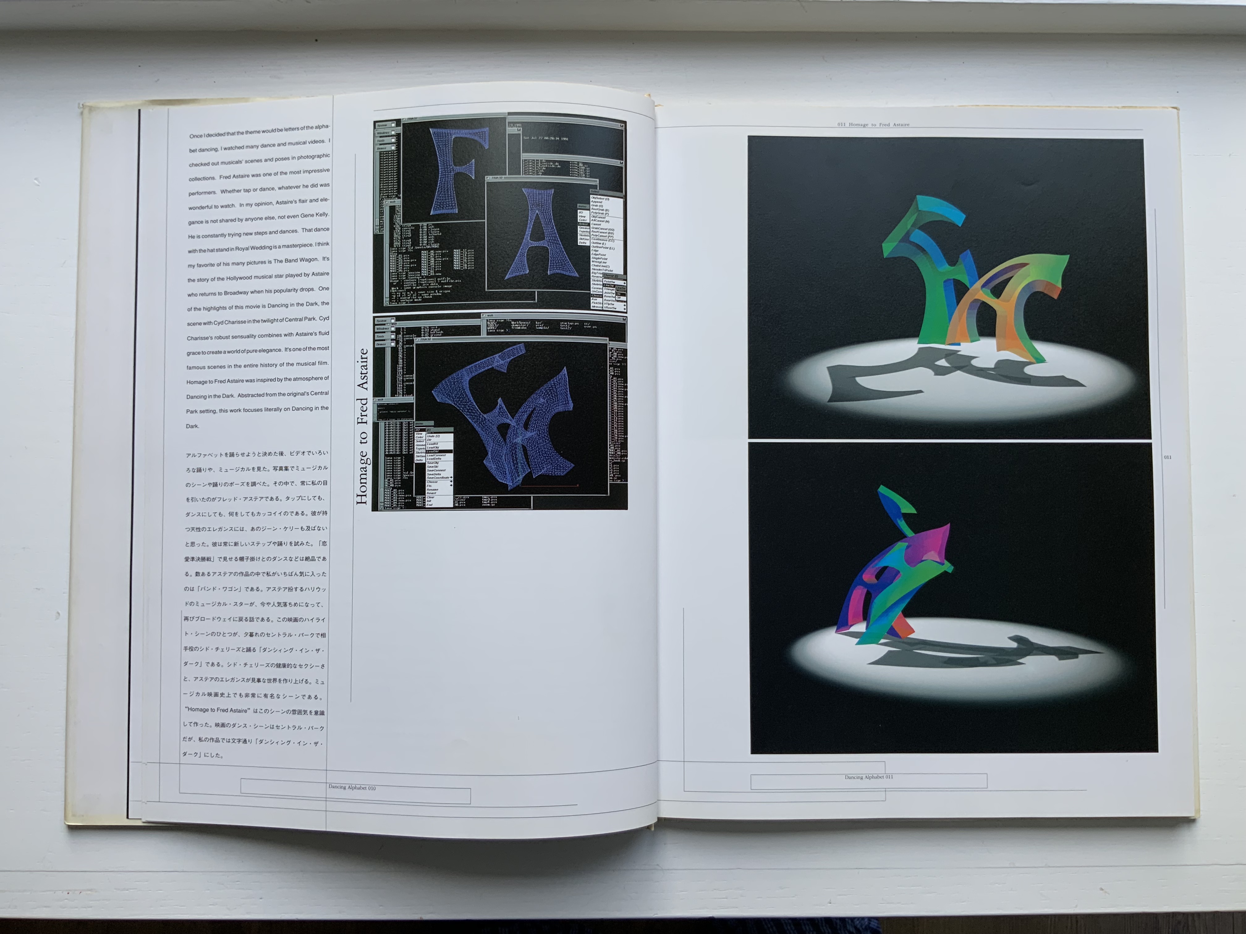
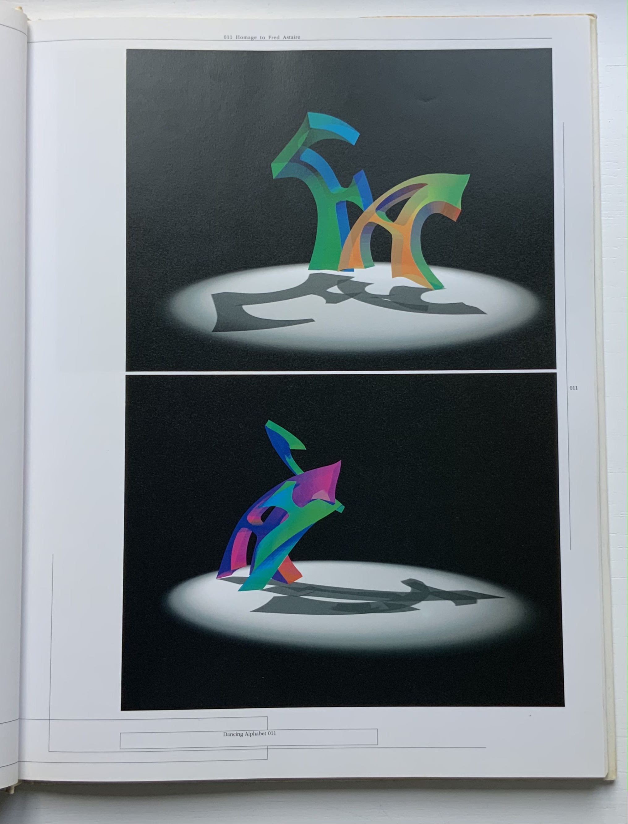
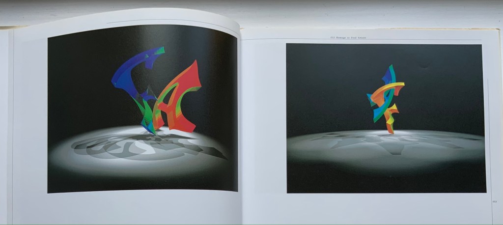
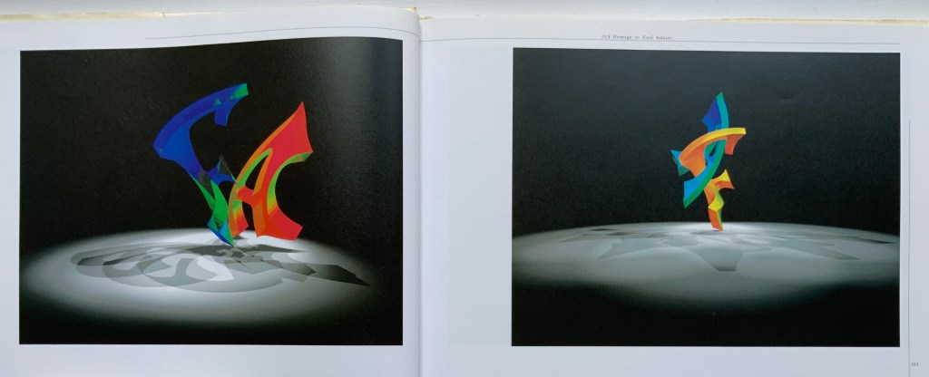
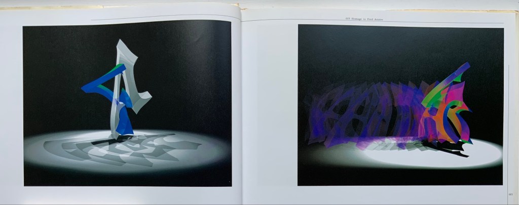
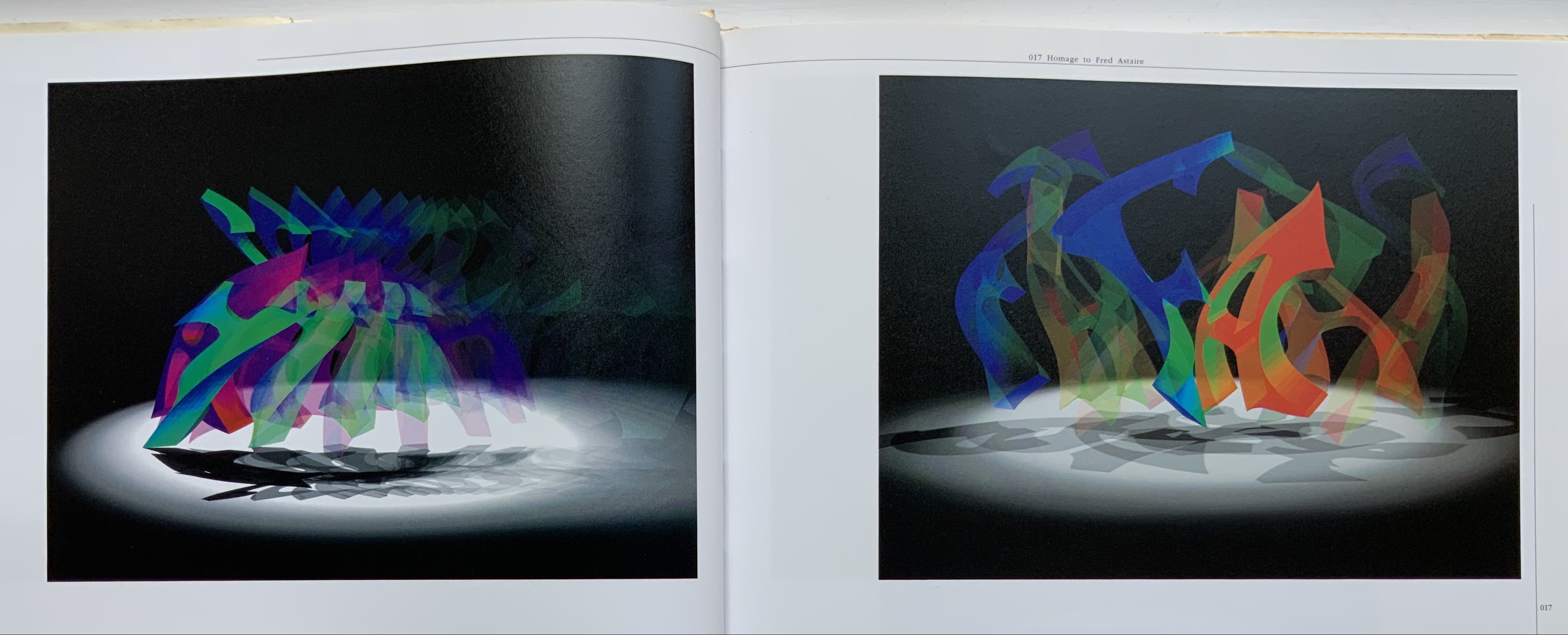
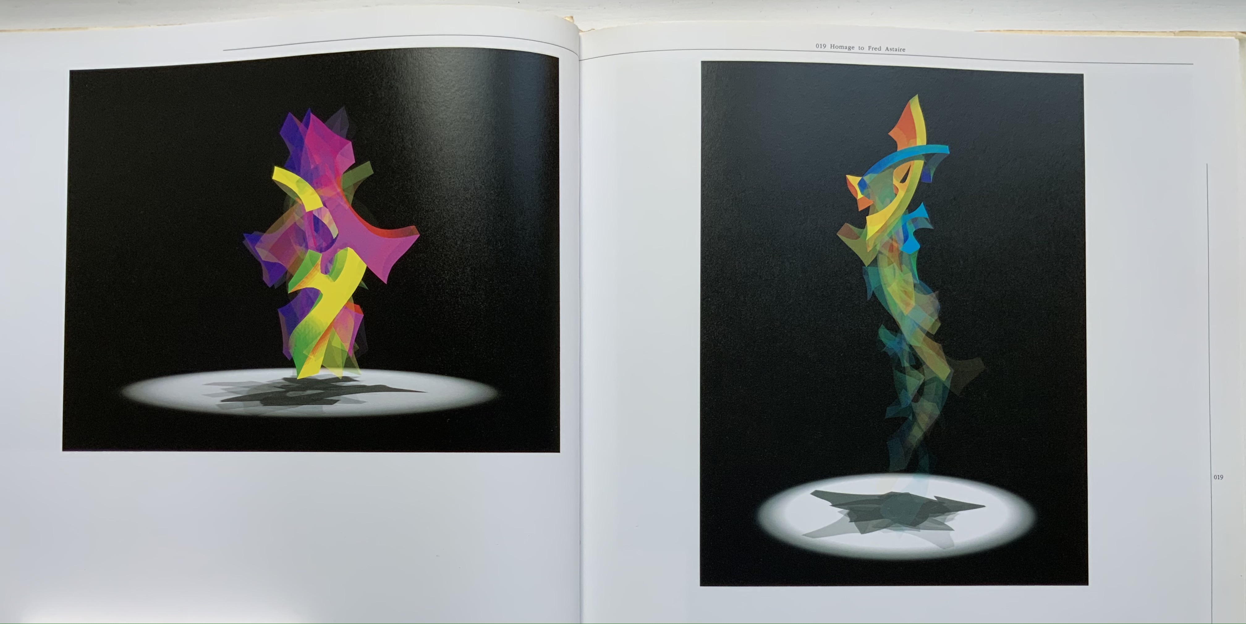
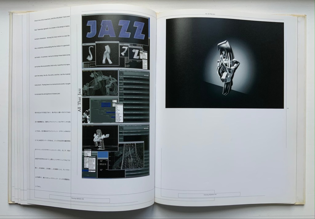
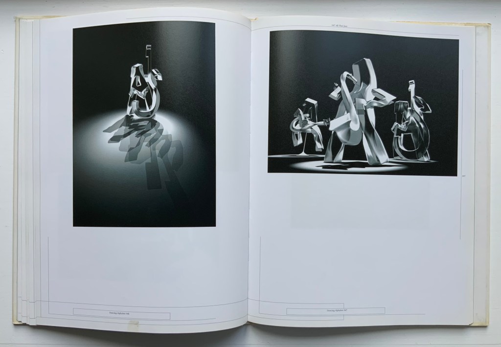
Dancing Alphabet (1991) Toshifumi Kawahara Hardback, casebound sewn. H307 x W236 mm, 96 pages. Acquired from Paper Cavalier, 27 July 2021. Photos: Books On Books Collection.
The tradition of the dancing alphabet goes back to the Greeks. In one of his plays, Kallias the 5th century Greek playwright had his characters each dance a letter of the Ionian alphabet. This may also be an early instance of product placement. At the time, there were a variety of Greek alphabets, and it was the Ionian that won out. The tradition (without the product placement) continued and, in this collection, is represented by Vítězslav Nezval’s Abeceda (1926), Marie Lancelin’s Gestes Alphabétiques (2014) as well as Toshifumi Kawahara’s Dancing Alphabet. Kawahara’s CG animation work contributed significantly to Polygon Pictures, which created the Emmy Award-winning animated series Transformers Prime and Star Wars: The Clone Wars. But this book’s presentation of Kawahara and team’s work on the “In Search of New Axis” series adds a colorful flavor to the dancing alphabet tradition.
Dancing Alphabet is not an artist’s book, but the notes and moves it adds to the collection may serve as a spark to the next artist looking to the alphabet and book art for inspiration — or the next scholar intrigued by the connections between the alphabet, music and dance.
“Karl Kempton“. 29 October 2022. Books On Books Collection.
Firmage, Richard A. 2001. The alphabet. London: Bloomsbury.
Gagné, Renaud. 2013. “Dancing Letters: The Alphabetic Tragedy of Kallias”. In Choral Mediations in Greek Tragedy, ed. R. Gagné and M. Hopman, Cambridge University Press 282-307.
Lawler, Lillian. April 1941. “The Dance of the Alphabet”. The Classical Outlook, 18: 7, pp. 69-71.
In the distance, along the green and rugged crests of the Jura, the yellow beds of dried torrents in all directions made Y’s.
Have you ever noticed what a picturesque letter Y is with its numberless significations?
A tree is a Y; the parting of two roads is a Y; the confluence of two rivers is a Y; an ass’s or ox’s head is a Y; a glass as it stands on its foot is a Y; a lily on its stem is a Y; a suppliant raising his hands to heaven is a Y. — Victor Hugo, “On the Road to Aix-les-Bains”, 24 September [18??]
Source Code (2019)
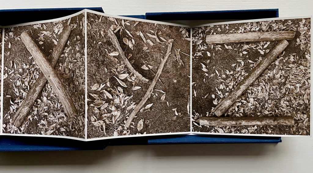
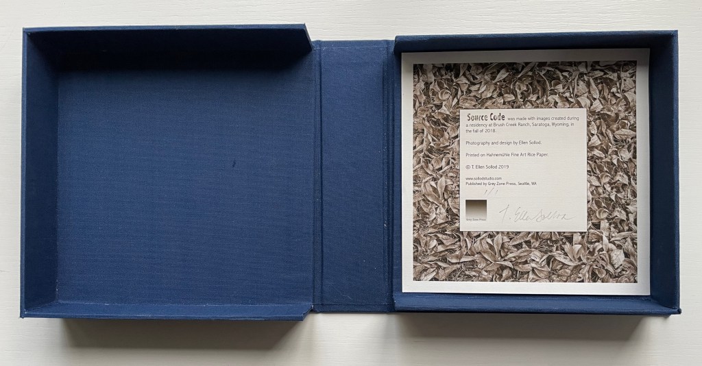
Source Code (2019) Ellen Sollod Cloth- covered clamshell box with image tipped on holds a leporello book with a loose colophon sheet laid in. Book: H5.5 x W5.5 x D1 inches closed; W154″ open. Unique edition. Acquired from Vamp&Tramp Booksellers, 7 October 2022. Photos: Courtesy of the artist; Books On Books Collection.
After finding the alphabet all around in nature, Hugo develops this Romantic notion further in his letter with which this entry began:
Human society, the world, man as a whole, is in the alphabet. …The alphabet is a source.
By gathering from nature the building blocks for the alphabet in her photographs taken while in residence at Brush Creek, Wyoming, Ellen Sollod inverts yet underscores Hugo’s notion. The source of Sollod’s alphabet is the natural environment. Artificially, nature is in this alphabet. Both are “source code”.
Referring to the twigs, logs and branches as “building blocks” also invert Hugo’s continued development of the notion in his letter:
A is the roof, the gable with its cross-beam, the arch, arx …
Below, however, the twigs are the A; the split log, the B; and the broken branches, the C. Nature provides the alphabet’s building blocks, but of course, the building is by human agency.
In the end, the source code requires human agency — whether to perceive it, build with it or perhaps preserve it.
Printed on Hahnemuhle Fine Art rice paper and laid in a cloth-covered clamshell box with an image tipped on top and inside, this sepia-tinged offering of source code may leave us feeling edgy in our admiration.
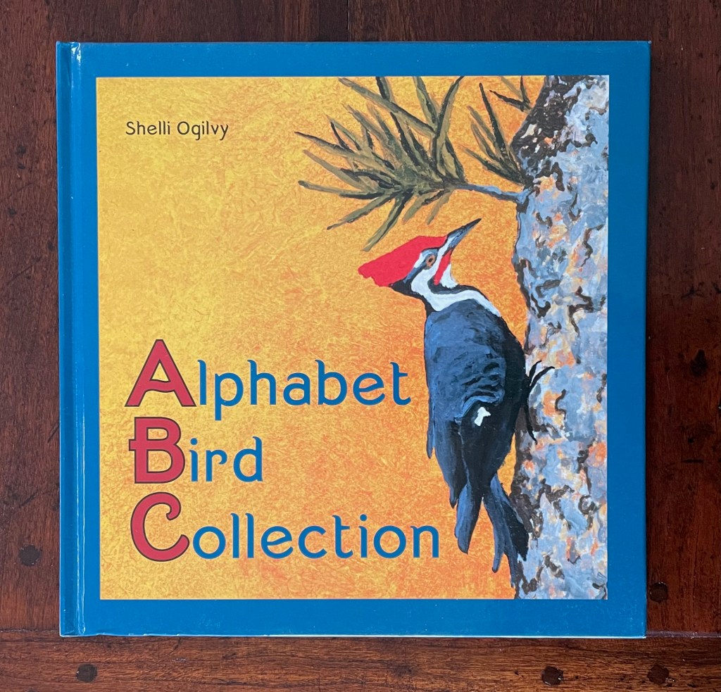
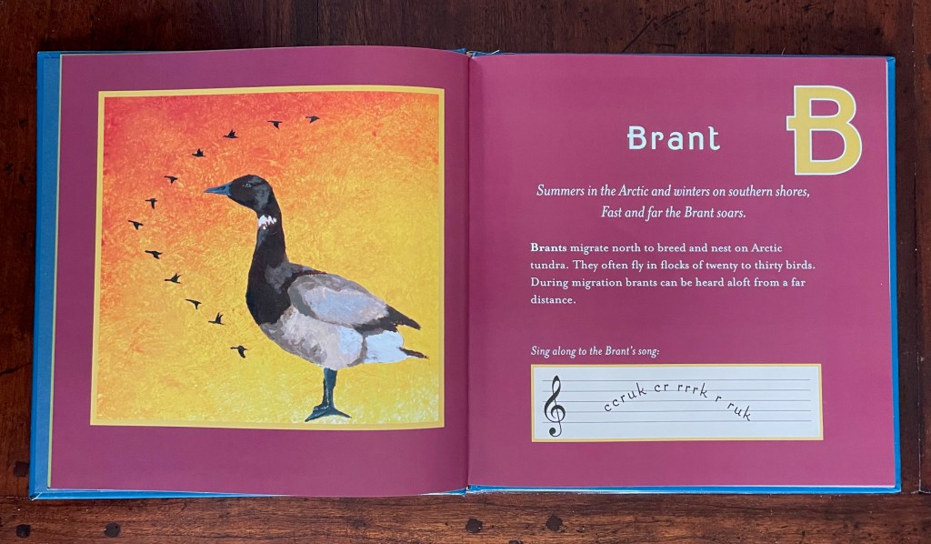
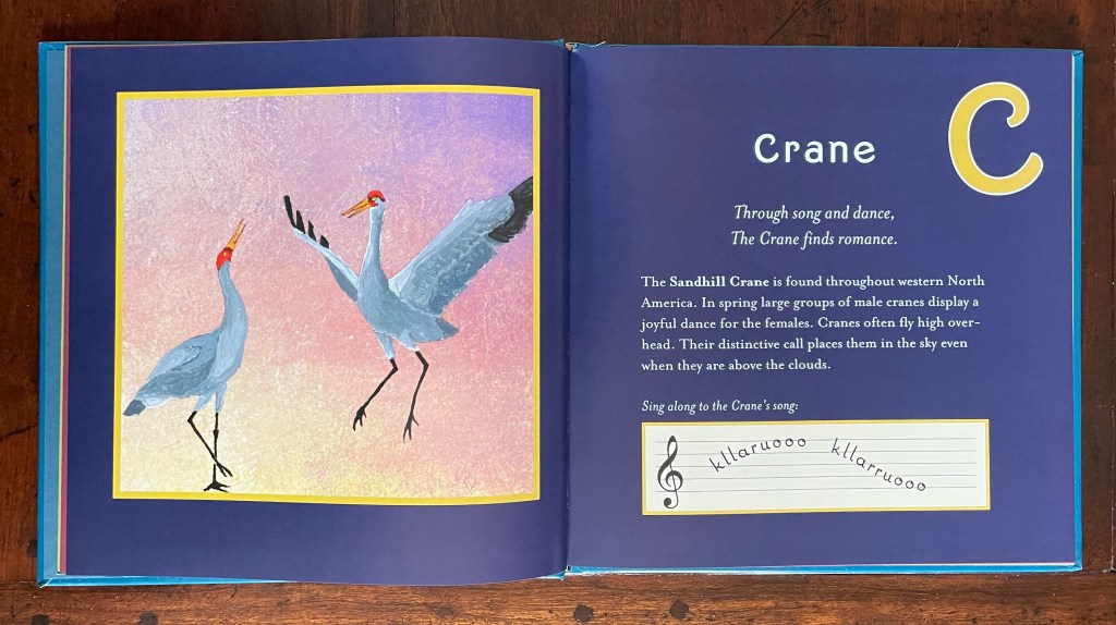
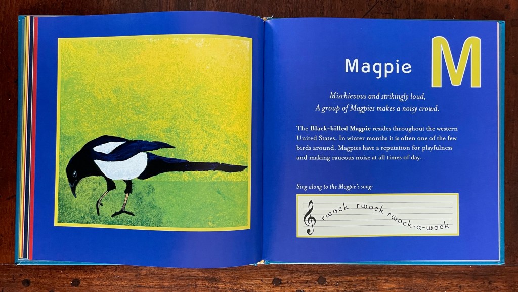
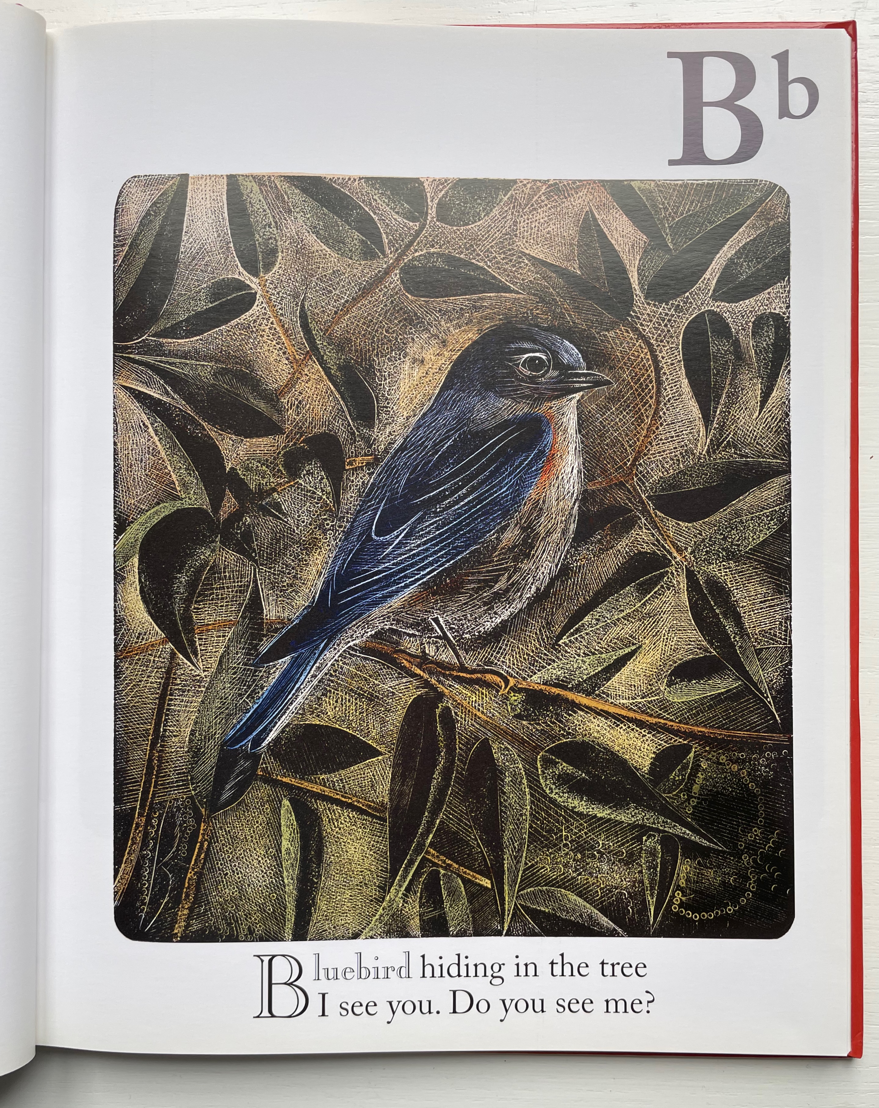
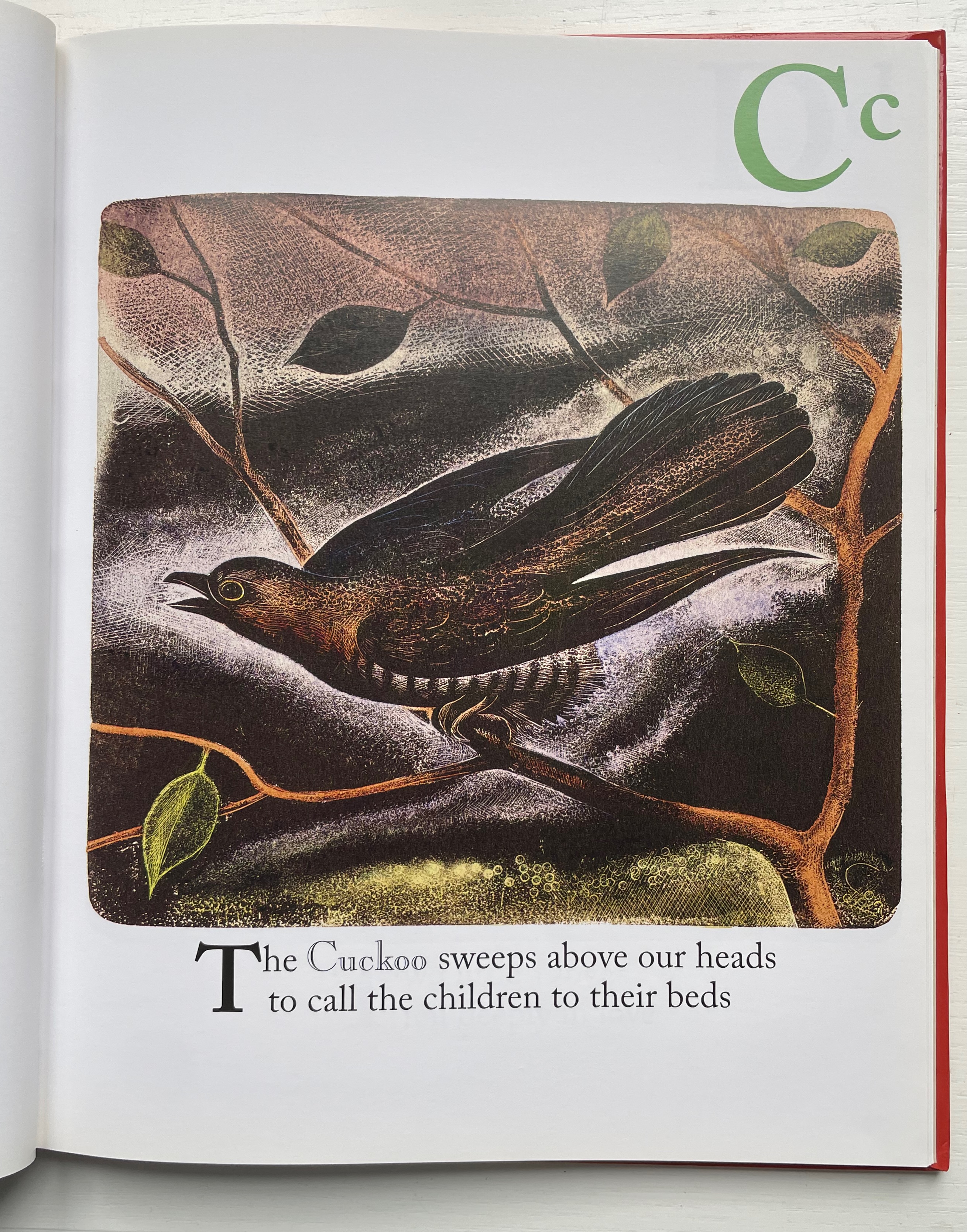
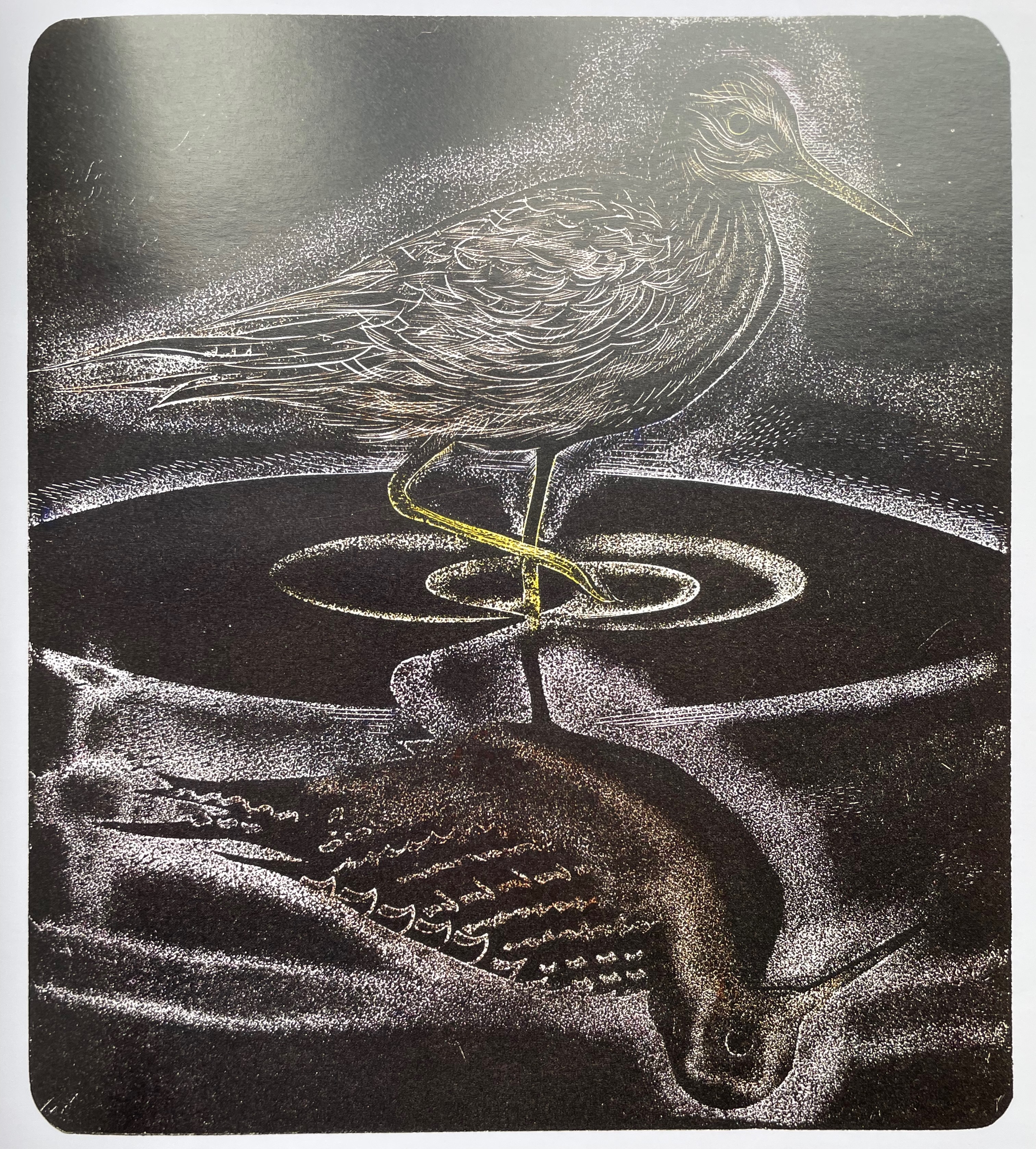
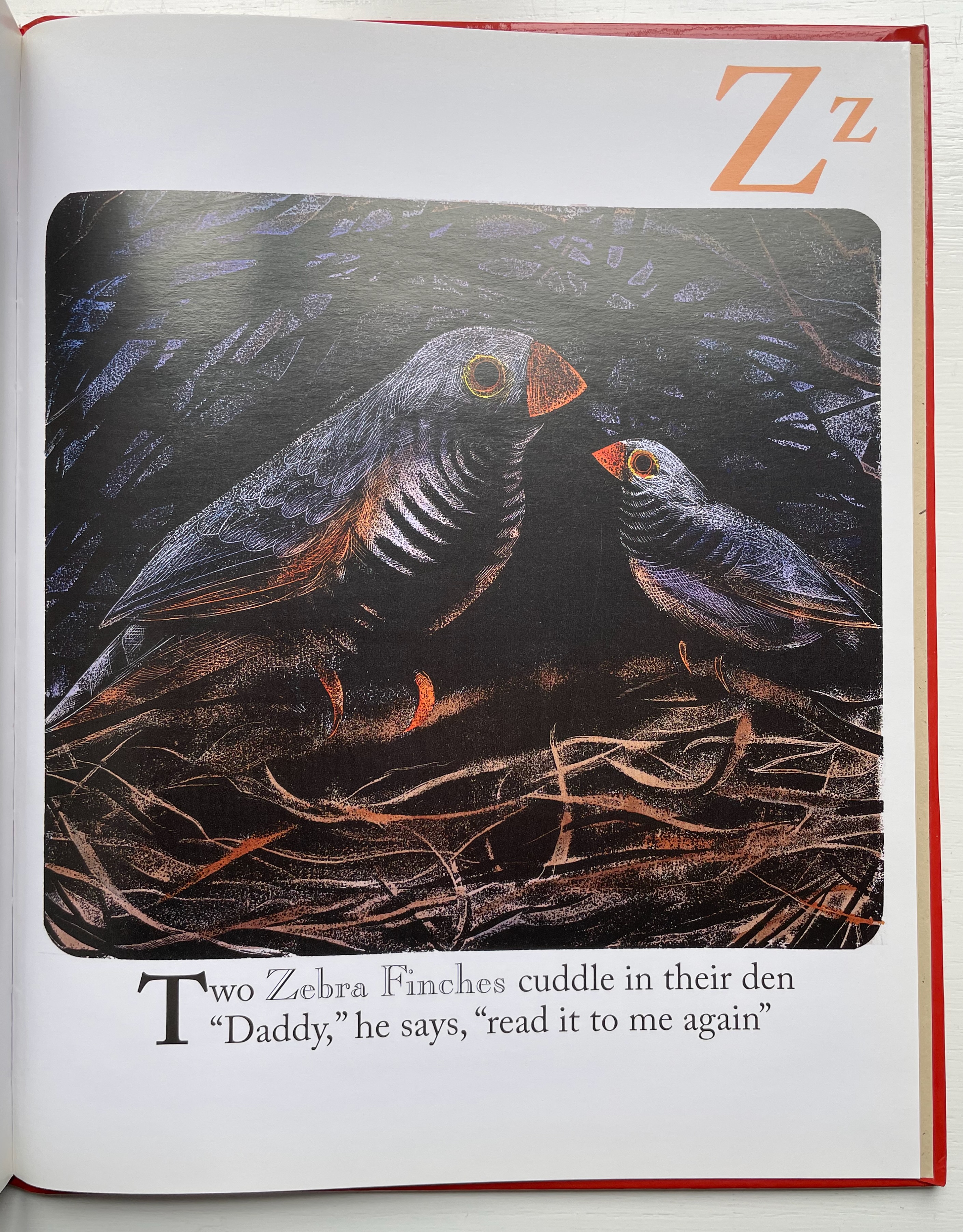
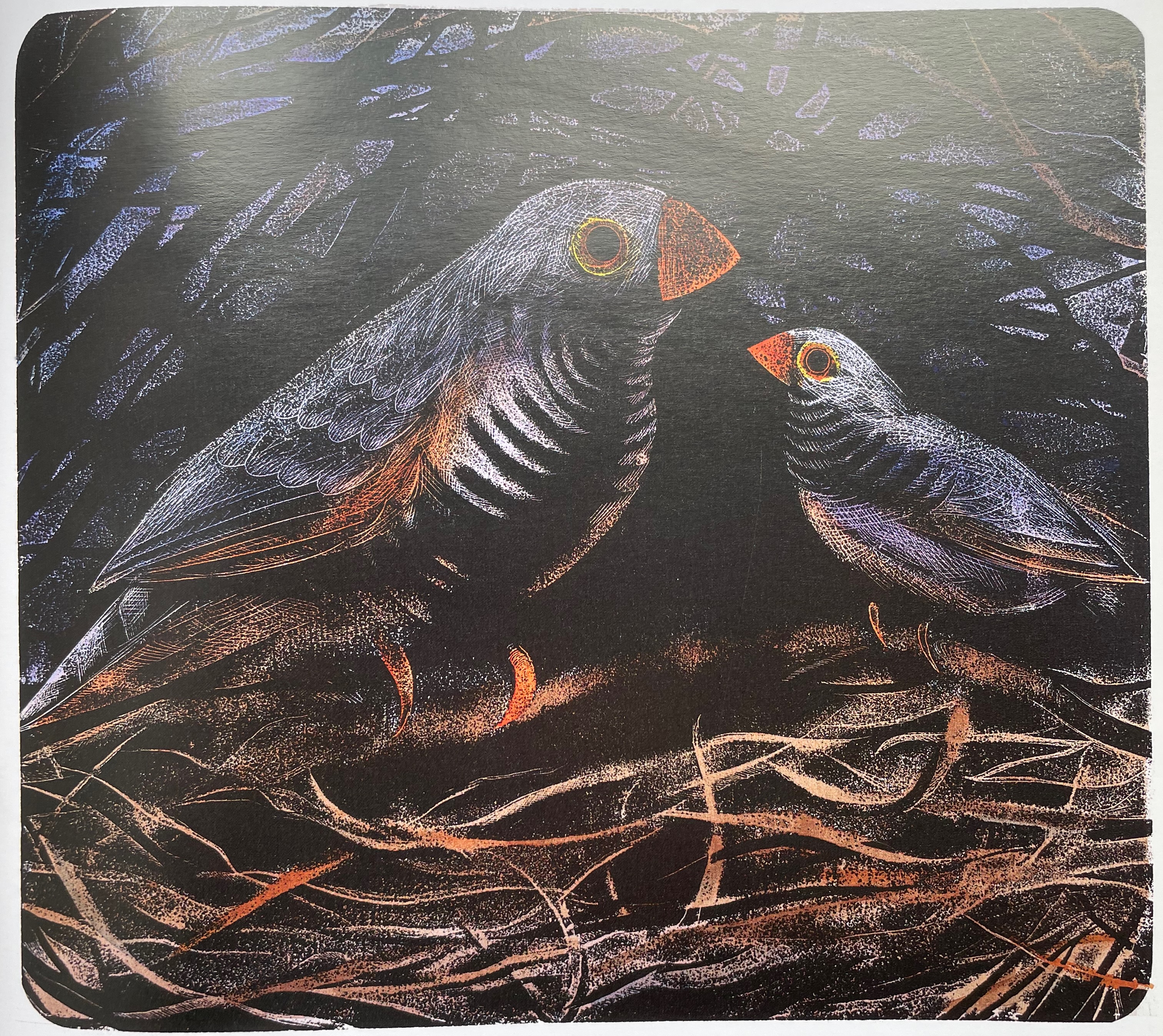
Alphabet Bird Collection (2009) Shelli Ogilvy Dustjacket, casebound paper over board, sewn, single-color doublures. H215 x W215 mm. 56 unnumbered pages. Acquired from Hay-on-Wye Booksellers, 16 December 2022. Photos: Books on Books Collection. Displayed with permission of the artist.
In Alphabet Bird Collection, each double-page spread features the letter of the alphabet, a bird representing it, a couplet followed by prose to describe the bird’s distinctive behavior and habitat, and, beneath, a musical staff with an attempt to represent a sample of each bird’s song or call. Unifying each double-page spread is its own full-bleed background color. The primary distinguishing feature of this abecedary, however, is Shelli Ogilvy’s artwork — original paintings of each bird. Ogilvy works primarily with acrylic on canvas or paper, sometimes combining mediums of chalk, ink, and spray paint into her work.
Instead of concluding with XYZ as with other abecedaries, this entry concludes with a favorite bird.
For another instance of magpie obsession, see Nick Wonham’s The Charm of Magpies (2018).
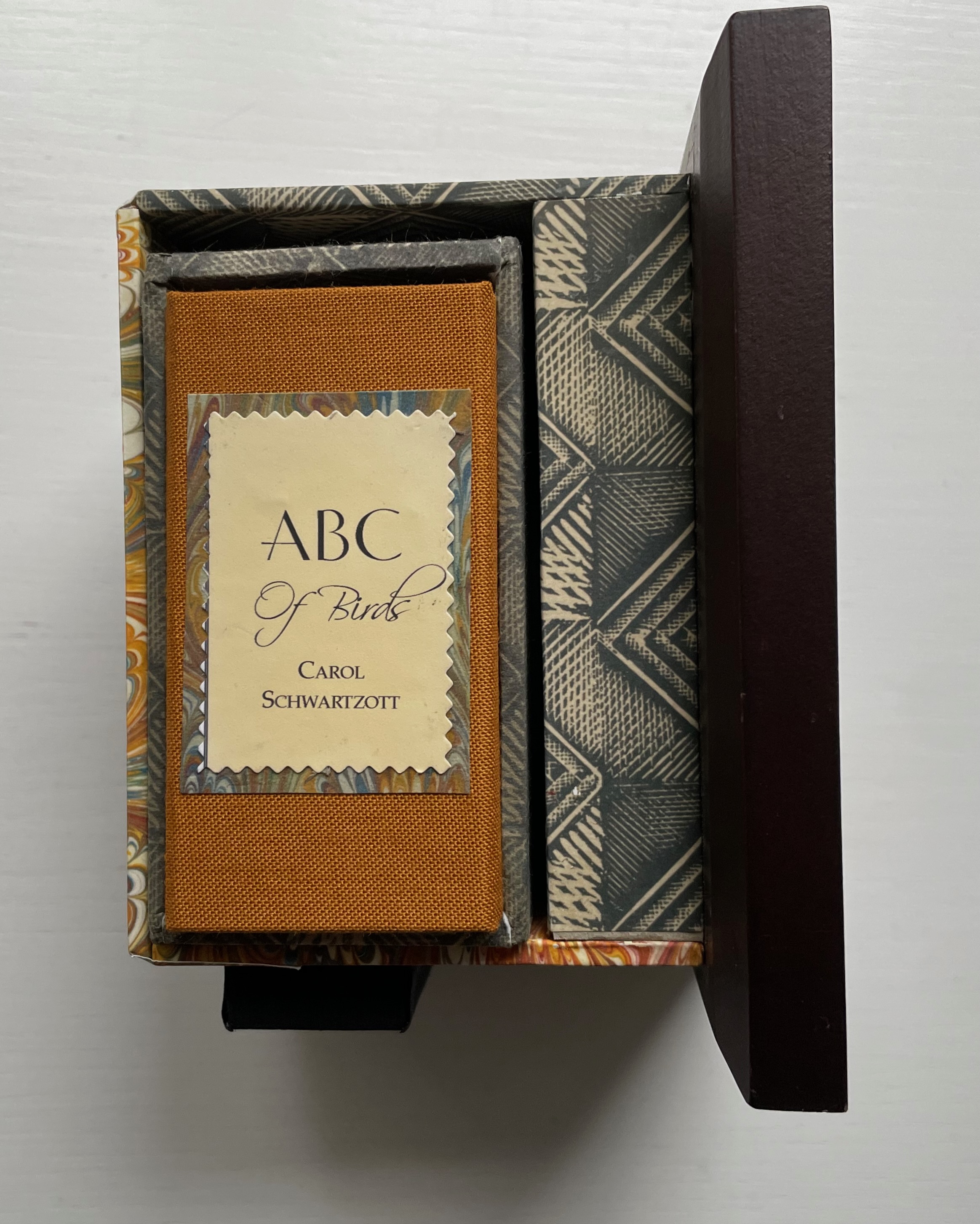
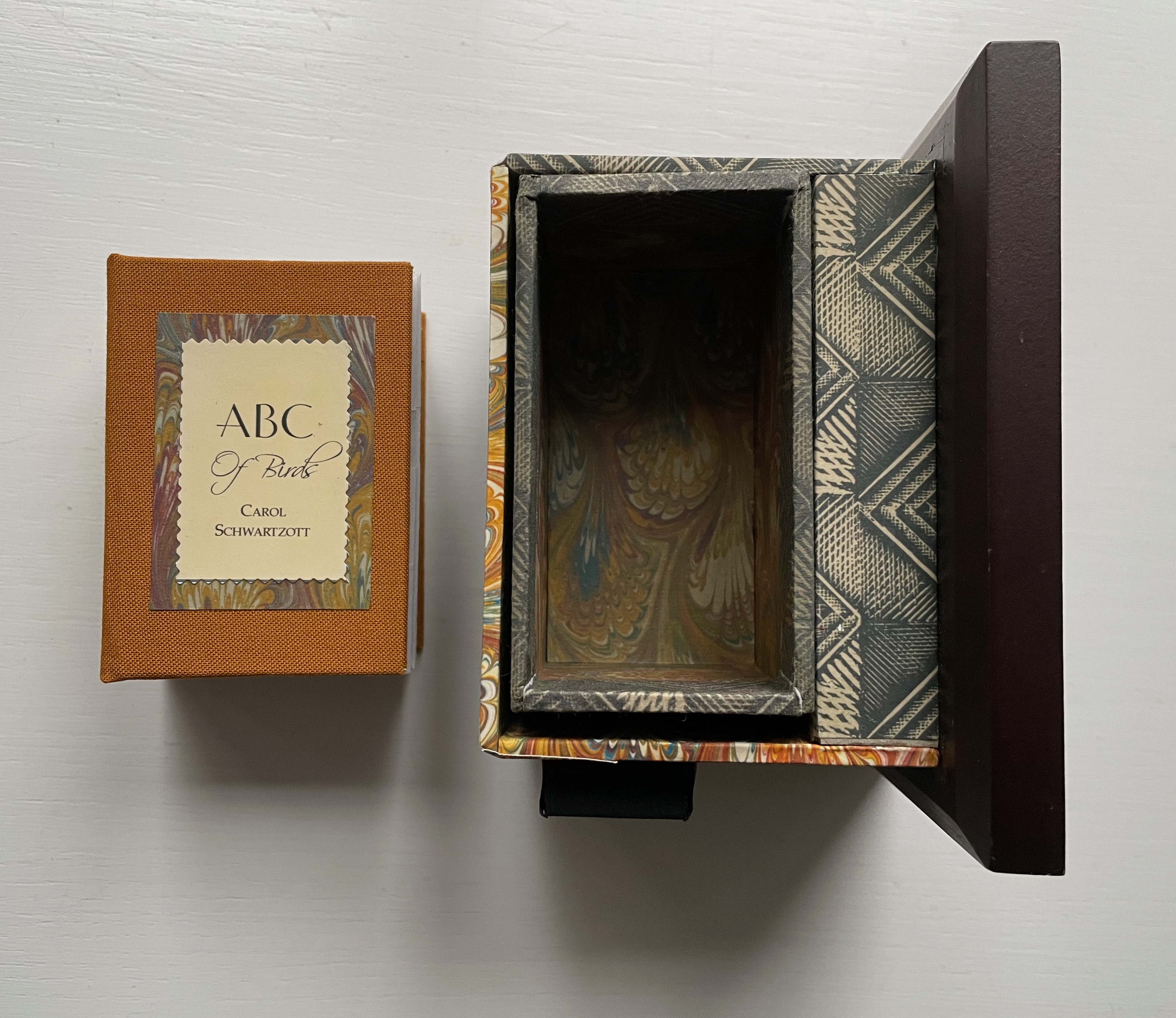
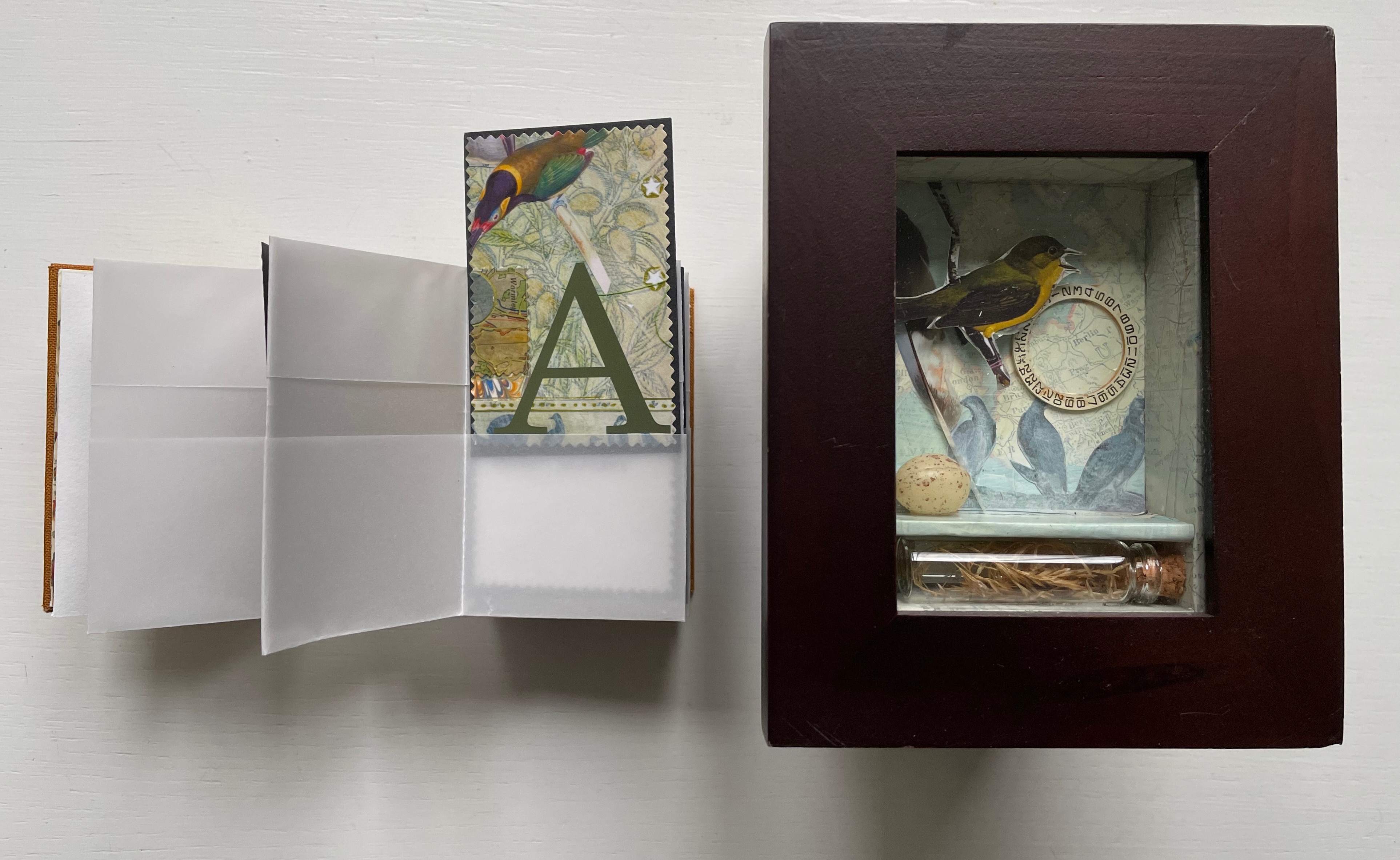
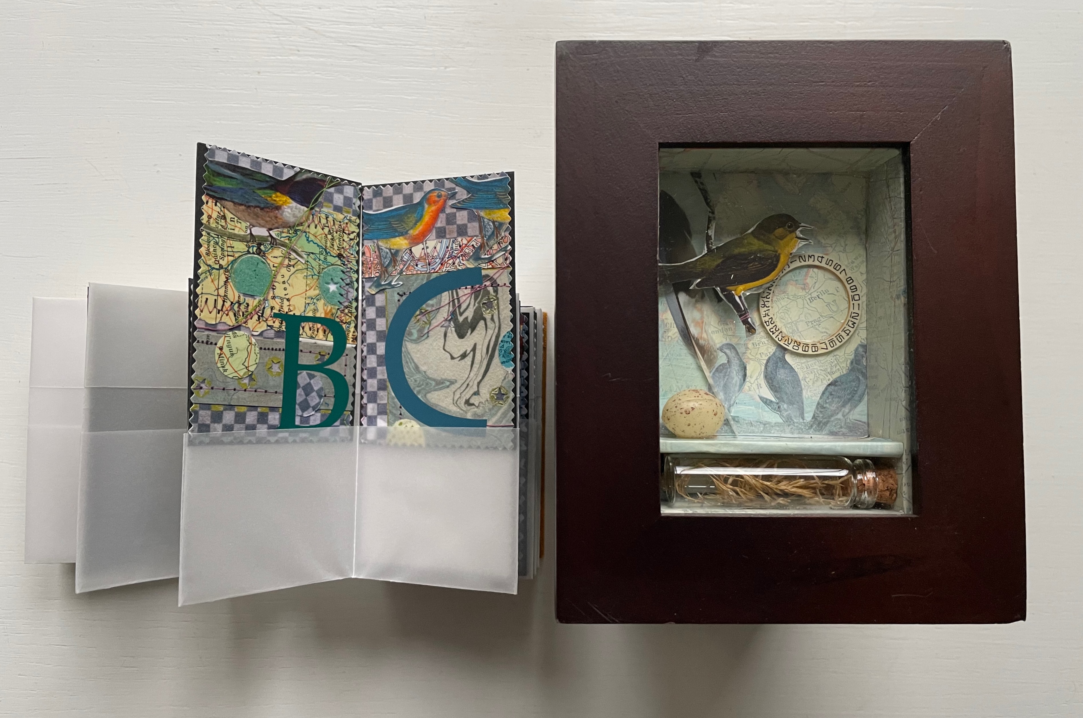
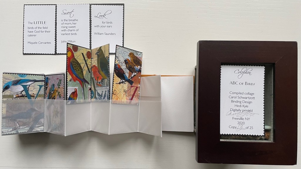
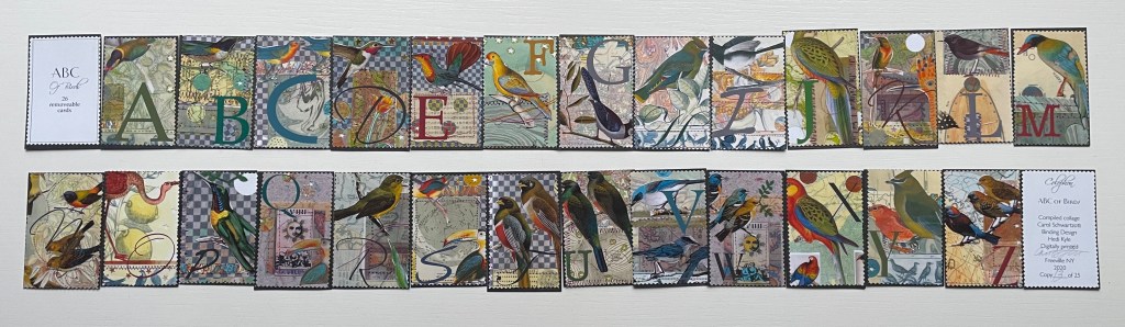
ABC of Birds (2020) Carol Schwartzott Cabinet of curiosity housing a miniature book in paste paper slipcase; double-sided leporello of transparent vellum pockets holding collaged cards. Book measures 2 x 3 x 1.5 inches. 28 pocket pages (collages, title page and colophon). Book in edition of 25, of which this is #13. “Cabinet of Curiosity” is one of five. Acquired from Vamp & Tramp, 4 January 2022. Photos: Books On Books Collection. Displayed with artist’s permission.
The cabinet of curosity recalls Joseph Cornell’s box constructions, and while the cards’ collages may extend that influence, they differ from it sufficiently in intensity of color (having been scanned for printing and “touched up” with pencils or over colored), incorporation of an abecedary and use of an unusual variant on the leporello to distinguish the work as Schwartzott’s. She writes:
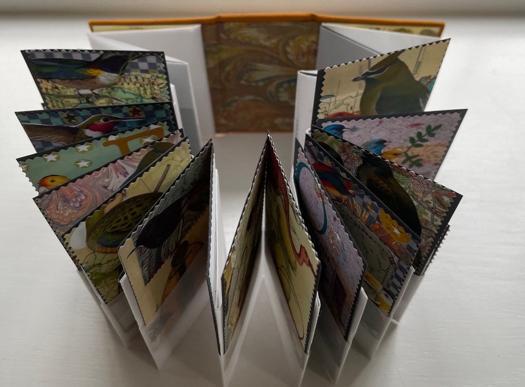
The collages themselves were done as original art, each 4 x 6″ centered on a larger sheet of Rives BFK. There are 26 of these. All are reduced to miniature format, and a graphic letter in an interesting font completes the image. Each of these little cards can be removed from the book.
The trimmed edges of the cards give them the appearance of oversized postage stamps, appropriate for the album-style binding and their removability for philatelic-like examination.
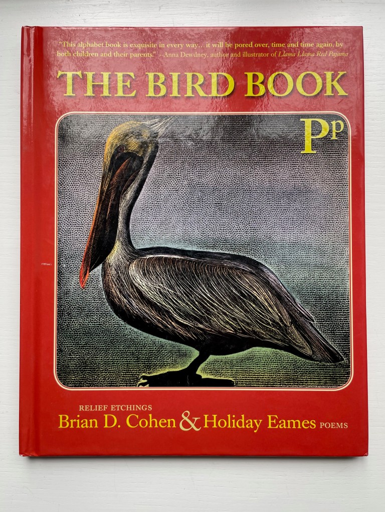
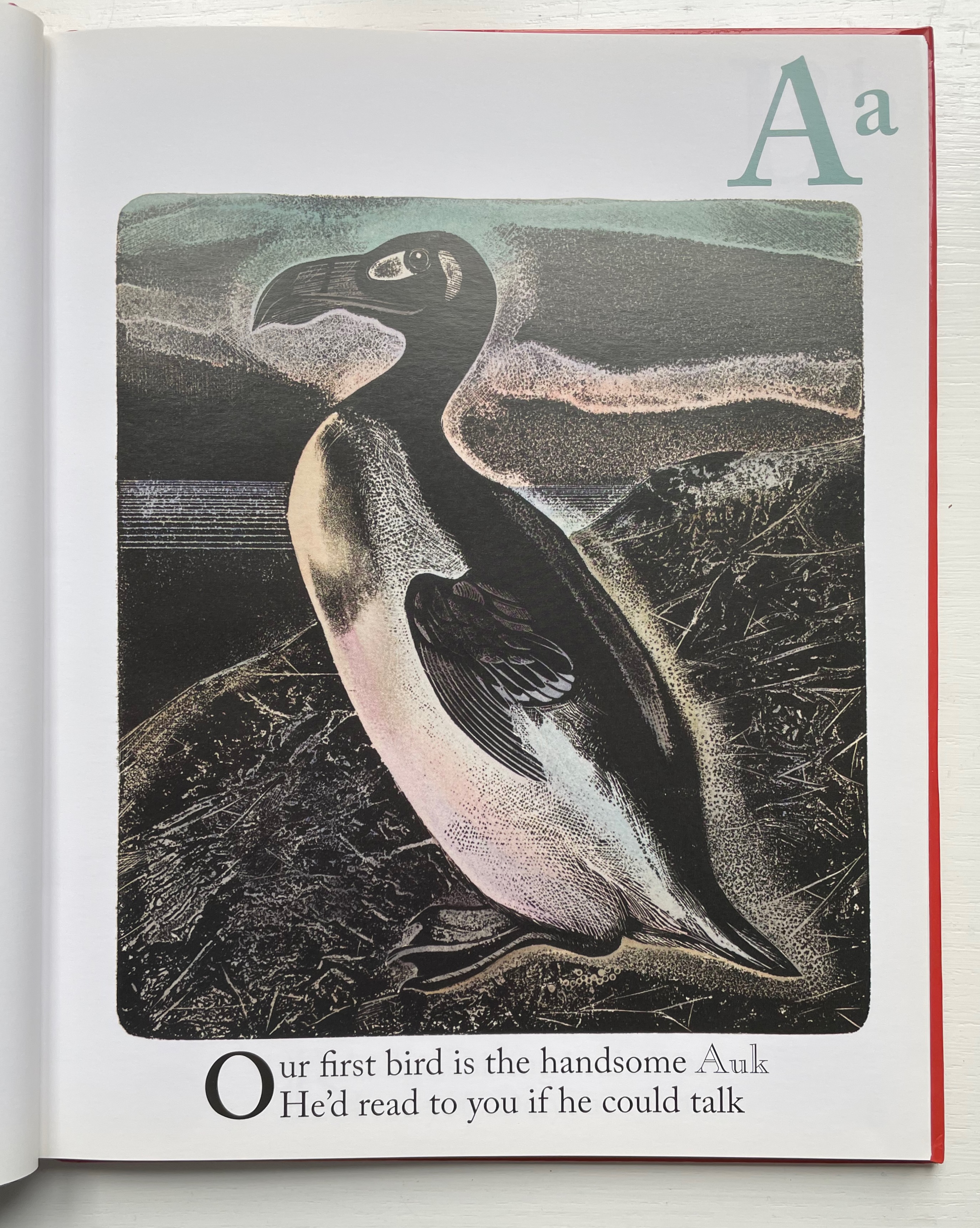
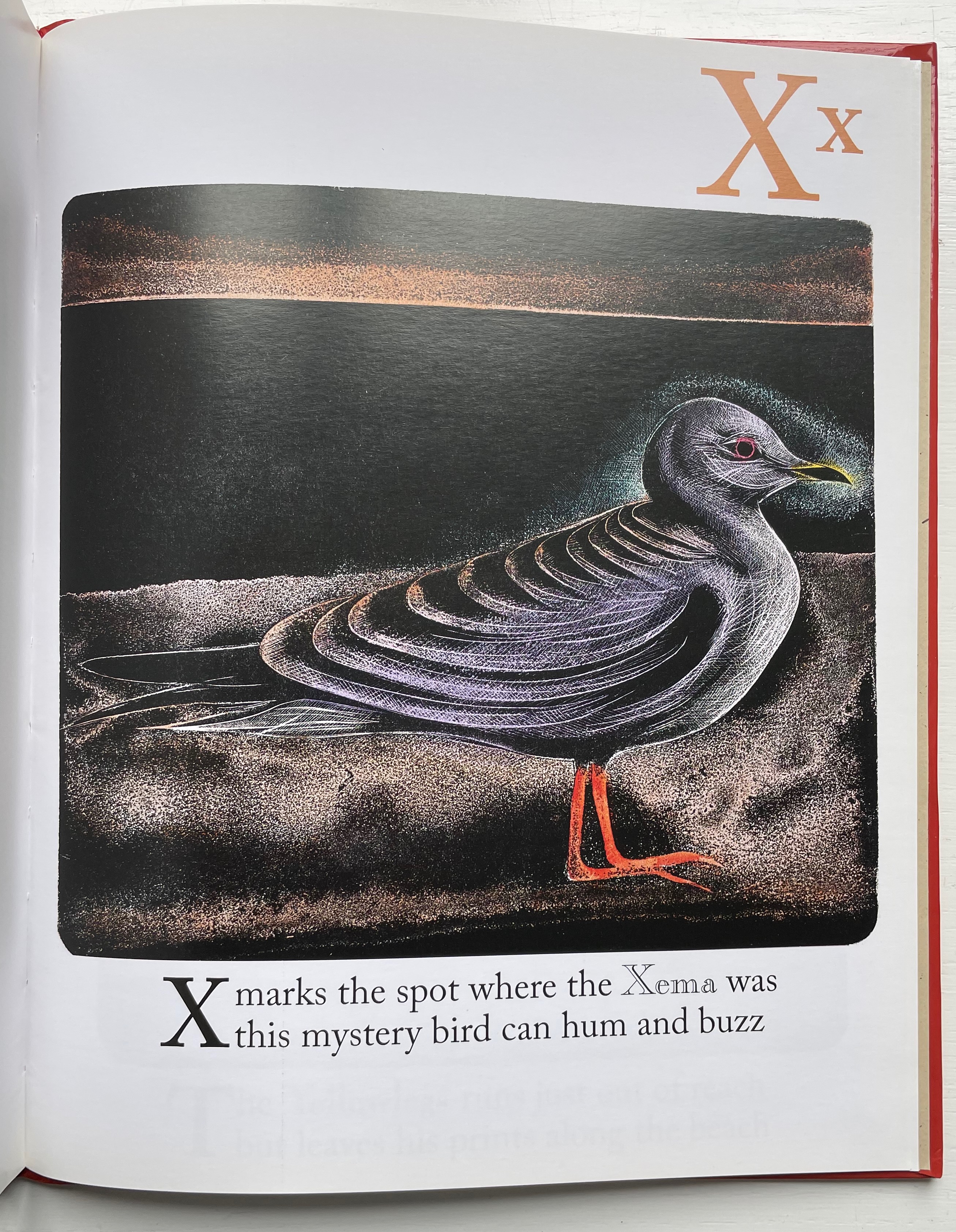
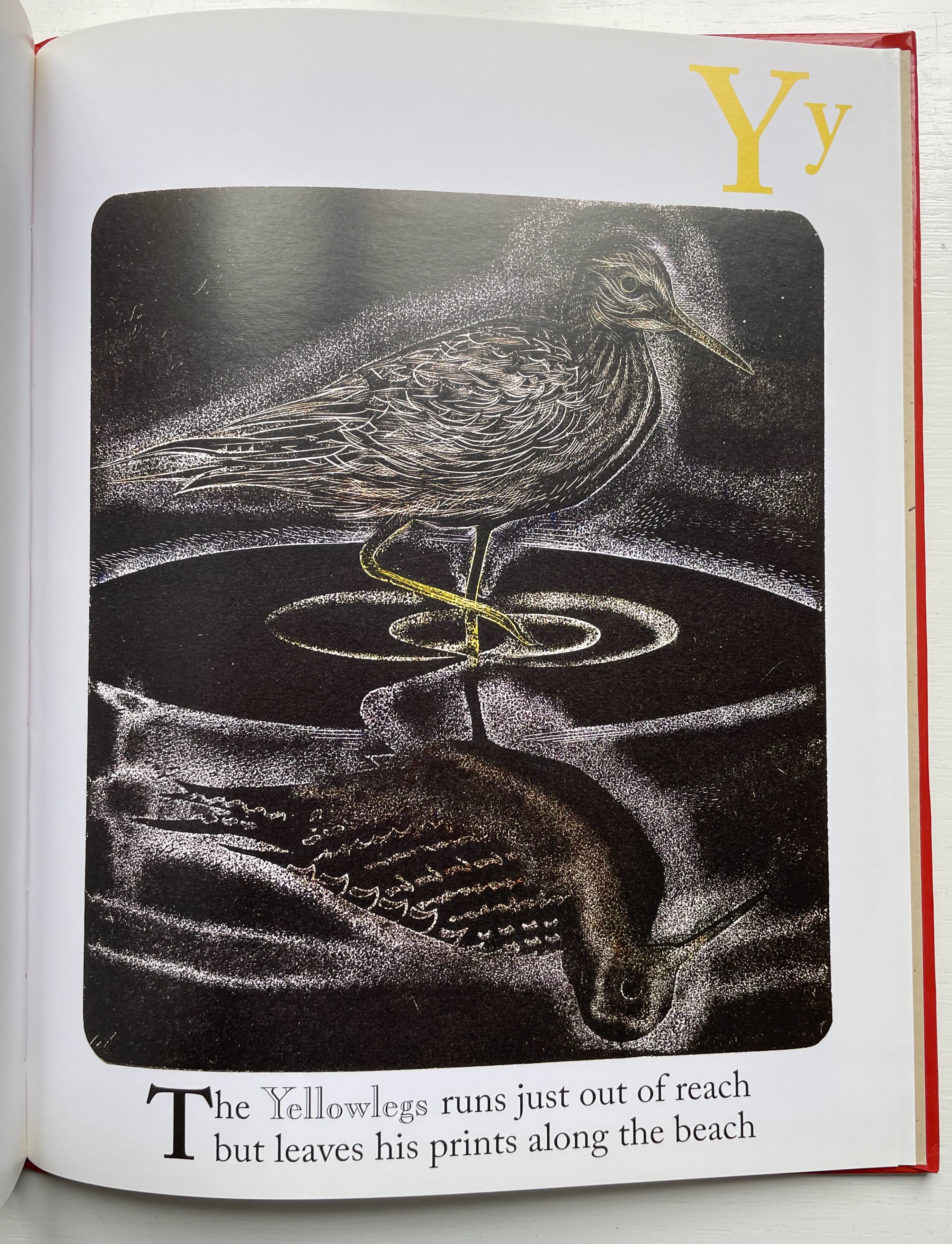
The Bird Book (2013) Brian D. Cohen & Holiday Eames Case bound hardback, paper over boards with doublures. H260 x W210 mm. 56 unnumbered pages. Acquired from The Saint Bookstore, 17 September 2022. Photos: Books On Books Collection. Displayed with the artist’s permission.
Brian Cohen’s inclusion of the following statement makes examining The Bird Book again and again a rewarding effort:
The printmaking technique … used for this book was originally developed by William Blake in 1788. The printing plates for the book were created with acids and engraving on metal (zinc) plates as in traditional etching techniques. The plates were then printed by carefully rolling a thin layer of ink over the surface of the plate, exactly the way a woodblock (relief print) is made. Because the technique combines both etching to create the plates and relief printing, it is termed relief etching. After printing, each individual sheet was hand-colored by brush with watercolor by the artist.
The artist has also encouraged close viewing of each relief etching by hiding its letter in the background, middle ground or foreground — or even the body of the bird.
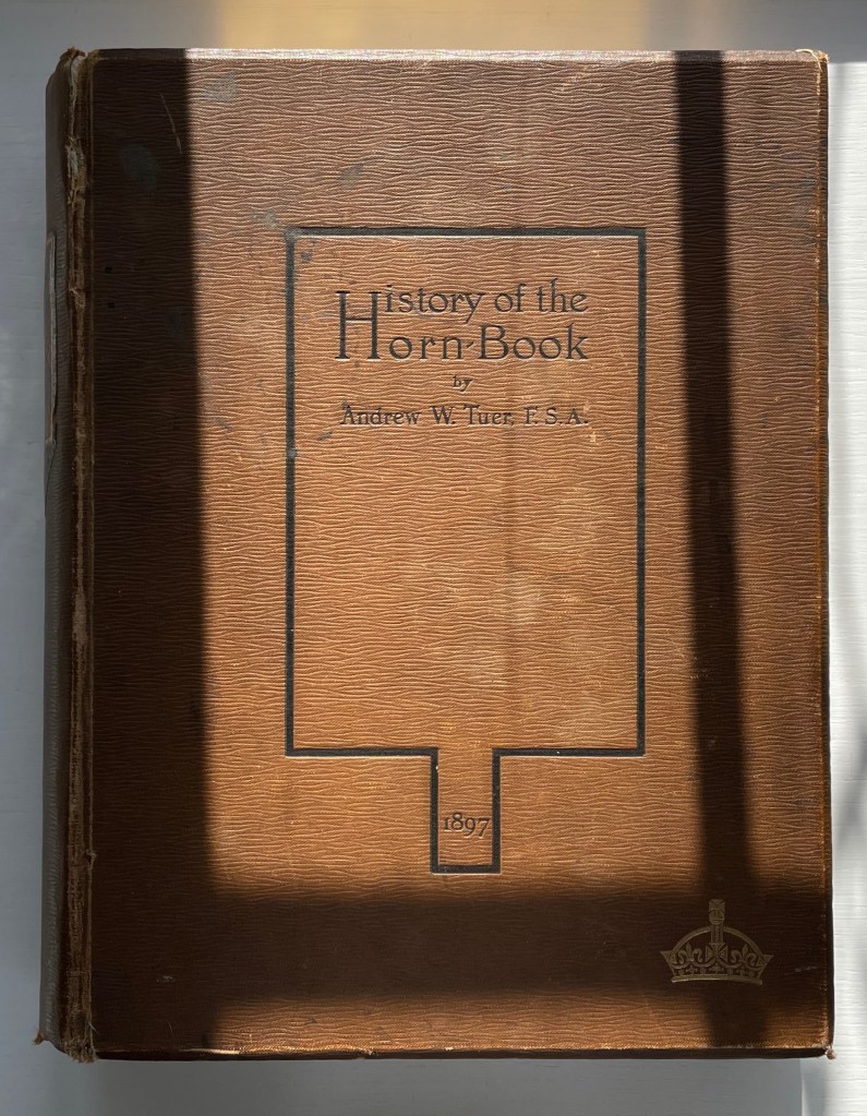
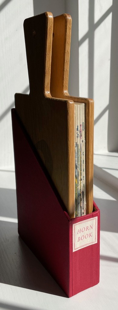
History of the Horn-Book (1897) Andrew White Tuer Casebound, sewn. H260 x W210 x D50 mm. 510 pages: 18 preliminary, 4 unnumbered leaves of plates (1 double, 2 foldout) and 300 illustrations. Acquired from Patrick Pollak, Antiquarian & Rare Books, 15 October 2021. Photos: Books On Books Collection.
Andrew White Tuer is the Herman Melville of the horn-book. Like Melville, Tuer had many interests. Just as the sea proved an abiding theme for Melville that drew all his interests together into Moby-Dick, so proved publishing and printing for Tuer. Within his abiding theme, Tuer’s white whale was the horn-book, and his pursuit yielded the History of the Horn-Book. Although Moby-Dick first appeared in three volumes and History of the Horn-Book appeared in two, Tuer out-Melvilles Melville in other ways. His monument outweighs Melville’s by 79 pages. Where Melville takes 14 pages to lay out “Etymologies & Extracts” on the whale, Tuer requires 20 pages of anecdotal citations to document the “Christ-cross-row” as the original name of the horn-book. Admittedly Melville traces his subject back to Genesis, albeit with some stretching, but Tuer traces the earliest record “of a real horn-book with horn and not a mere alphabetical table” back to an equally important date in the history of printing and publishing: 1450.
For 125 years, Tuer’s Historyof the Horn-Book has remained the standard work on this artifact for teaching children the alphabet.
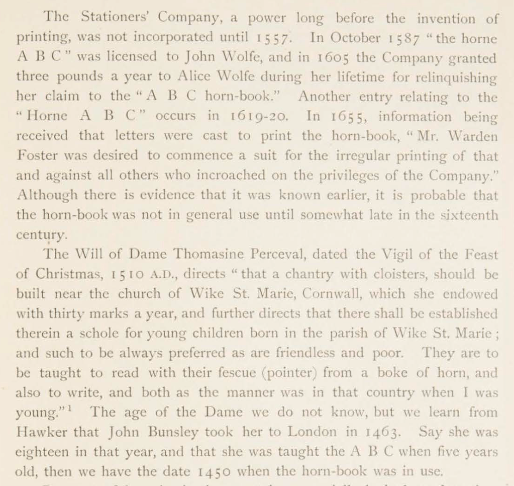
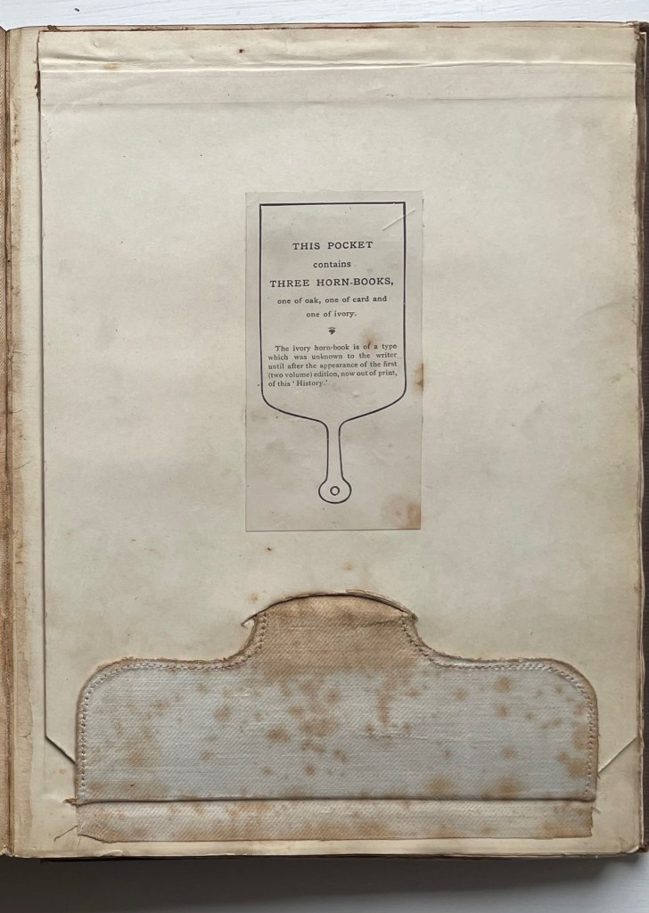
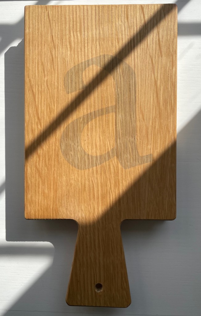
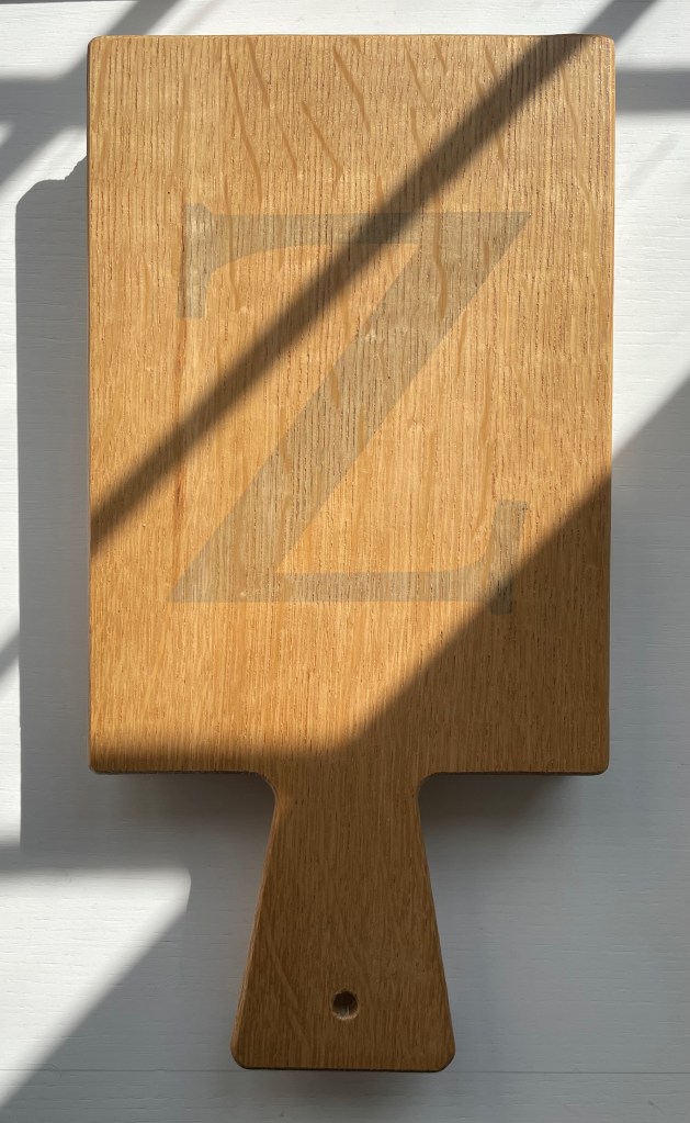
This single volume is the first trade edition of History of the Horn-Book, following a special edition in 1896 of two volumes containing seven reproductions of horn-books and battledores distributed across two compartments or pockets placed at the front of the volumes. In the single-volume edition, the compartment moved to the back, and the number of facsimile horn-books fell to three: one of oak, one of card and one of horn. Like the two-volume edition, the single volume has gilt on its top edge; the fore-edge is deckled.
After the special edition, Tuer added a section to this trade edition to announce further discoveries, including the ivory horn-book. Tuer must have been fond of this compartment feature; it shows up again in his compendium of humorous anecdotes taken from his trade journal (the Paper & Printing Trades Journal) and entitled Quads for Authors Editors & Devils (1884). The rear compartment of Quads contains a miniature version of the book.
Trade edition compartment closed
Fold out with the three facsimile horn-books from the compartment
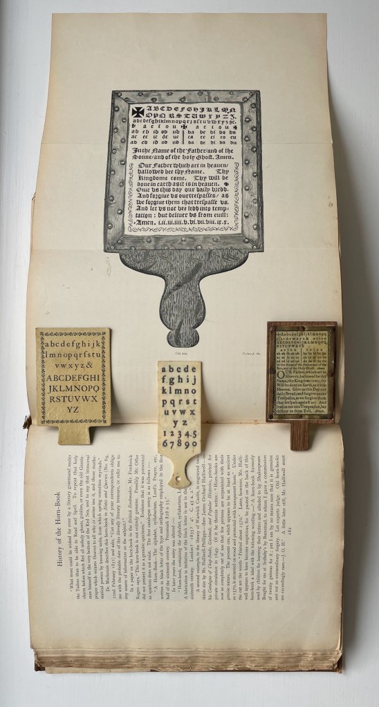
Tuer’s detail of research and analytical keenness go far to explain why History of the Horn-Book remains the standard work. If a trove of horn-books were to be discovered tomorrow, there would need to be extraordinary novelties in their composition, mechanics or material to warrant any attempt to displace this authority. Anyone making the attempt would require a foundation in printing history and practice that is hard to come by since the digital revolution. Consider Tuer’s knowledgeable comments on a silver horn-book alleged to have belonged to Queen Elizabeth I:
The history of horn-book is well in hand. As an educational device, it has been superseded by the battledore, building blocks, ABC books, television (Sesame Street), needlepoint samplers, wall hangings and rugs, toys and more toys and, of course, apps. But as an inspiration to book artists it still holds on. Among the book artists who have turned their hands, eyes and minds to the form are Helmut Andreas Paul (HAP) Grieshaber, Jan Paris, Daniel Essig, Kees Baart and his partners at Corps 8, and Karen Roehr.
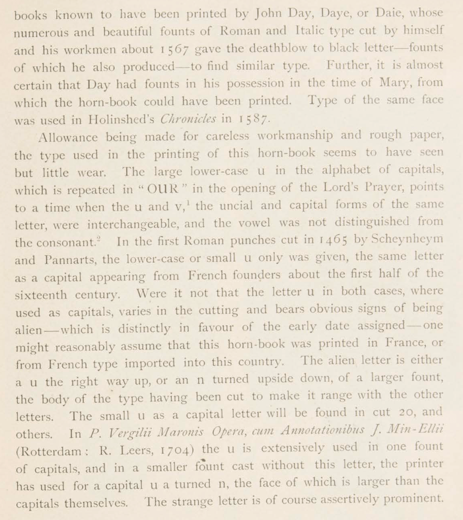
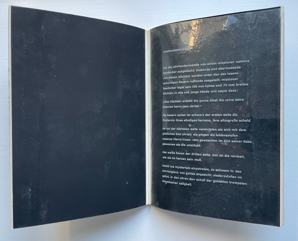
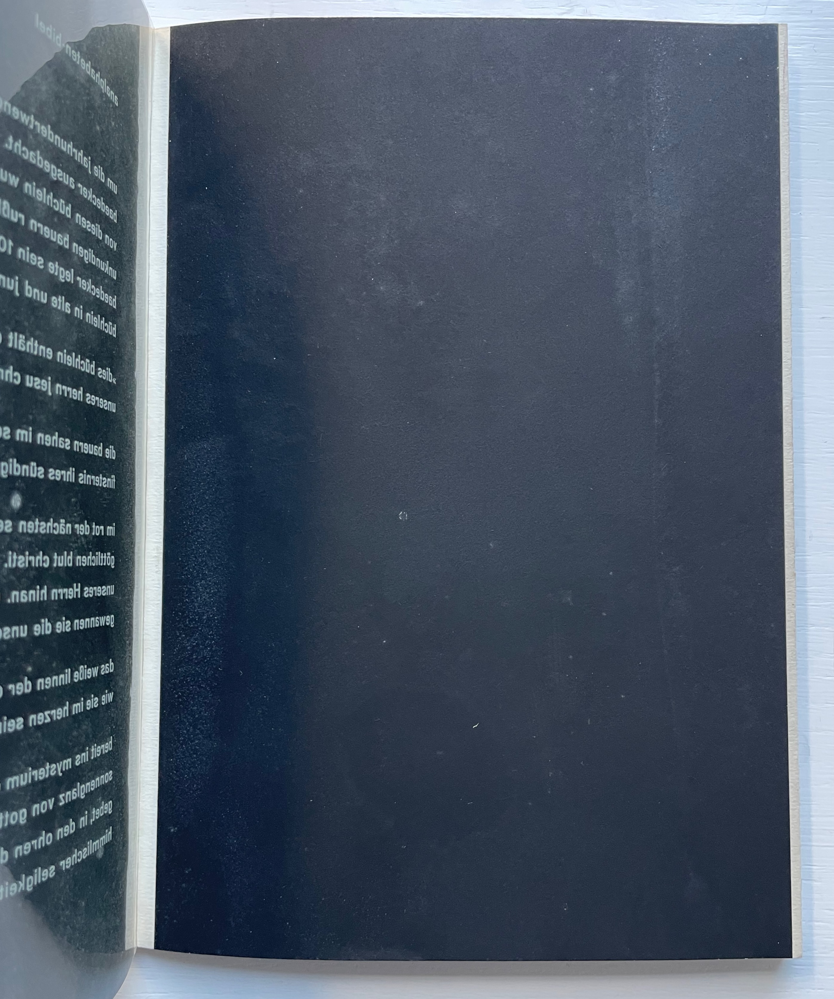
With its horn-book images on the front and back covers and a five-page piece entitled analphabeten-bibel (“the illiterates’ bible”), HAP Grieshaber’s small work of concrete poetry underlines the draw of the alphabet for book artists.
Poesia Typographica (1962) Helmut Andreas Paul (HAP) Grieshaber Paperback, perfect bound Chinese-fold folios, black endpapers. HxW. Edition of 1000. Acquired from Print Arkive, 22 October 2022. Photos: Books On Books Collection.
The white text on the clear acetate translates roughly as follows:
created around the turn of the century by a missionary named baedecker. thousands and thousands of these booklets were distributed among the illiterate peasantry of Russia. missionary baedecker put his 105 mm high and 75 mm wide booklet into old and young hands and said:
“this booklet contains the whole bible, the pure teaching of our jesus christ.”
the peasants saw in the black of the first page the darkness of their sinful hearts, their great guilt.
in the red of the next page, they united with the divine blood of christ. they followed the suffering steps of our lord. washed clean in the blood of his love, they won innocence:
the linen pasture of the third page, that is the purity that must be in the heart.
ready to enter into the mystery, to look into the sunshine of God’s face. to fall down in prayer, hearing the sound of the golden trumpets of heavenly bliss.
As the acetate page turns, the analphabetic Bible is revealed.
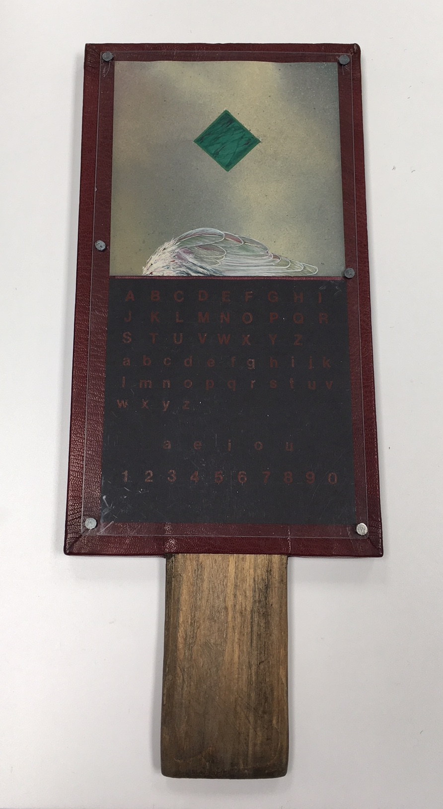
Although the horn-book by Jan Paris presents the usual uppercase and lowercase alphabets, the vowels and numbers as horn-books and battledores later came to do, it omits the Lord’s prayer, which these reading tools — early and late — preserved. In its place is a marbled green diamond shape hovering over a bird’s wing against a diffusely clouded background. Still though they may be, there is a tension between the abstract and natural things, contrarily positioned. The heavy abstraction floats or is falling. The thing that should be rising lies beneath, still and equally — although morbidly — detached. Letters, vowels and numbers, too, are certainly abstract. Until formed into words and concepts breathed into the air, they, too, lie still and detached on the horn-book’s surface.
Horn Book #2 (1983) Jan Paris Mixed media Photo: Courtesy of the artist.
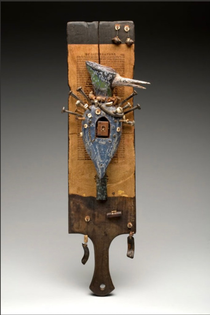
The horn-book form has become part of North Carolina artist Daniel Essig’s personal iconography. On his website, four variations can be found. The unique work below resides in Vanderbilt University’s Heard Library Special Collection. The range of materials and processes in Essig’s horn-book reflects the range of traditions, cultures and mythologies making up his eclectic iconography: miniature books, African bookbinding (contrasting with the horn-book), n’kisi nkondi (a Central African nail fetish), French literature (the unidentified collaged text), bird symbology, assemblage, carving, burning and painting. As totemic icon, Horn Book Fisher pushes the horn-book far beyond its primer function.
Horn Book Fisher (2008) Daniel Essig Carved and painted mahogany, burned cherry, mica, nails, handmade paper, found natural objects, 1800’s text papers, Ethiopian and Coptic bindings. 61 x 15 x 9 cm. Photo: Courtesy of the artist.
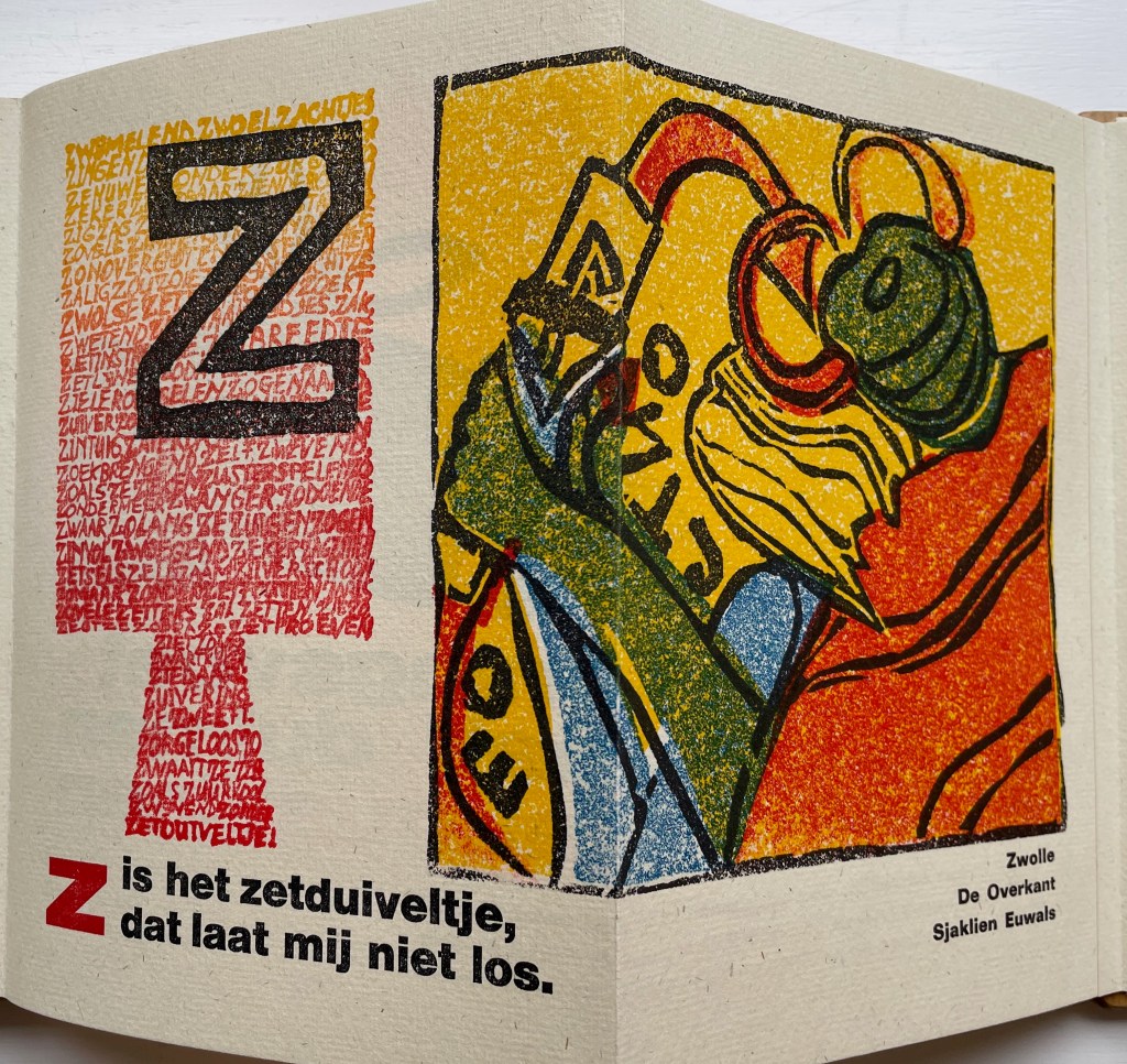
Corps 8 was a Dutch collective of private presses formed by Dick Berendes (Typografiek), Kees Baart (‘t Schuurtje, now deceased), Gerard Post van der Molen (De Ammoniet), Sjaklien Euwals (De Overkant), Dirk Engelen (Clio Pers), Thijs Weststrate (Without Roof), Silvia Zwaaneveldt (De Baaierd) and Henk Francino (De Pers Achter de Muren). Under the auspices of a larger collective Drukwerk in de Marge, founded in 1975, they created Van Hornbook tot ABC-Prentenboek (“From Hornbook to ABC Picture Book”). It is an exquisitely produced, informative and witty collaboration. More about it can be found here.
Van Hornbook tot ABC-Prentenboek (2003) Kees Baart, Dick Berendes, Henk Francino and Gerard Post van der Molen Double-sided leporello between two pamphlet-sewn booklets and bound between two oversized wooden hornbooks, held in an open cardboard box. H295 x W150 x D 30 mm. First booklet, 18 unnumbered pages; second booklet 8 pages; 52 panels. Edition of 135. Acquired from Fokas Holthuis, 13 September 2022. Photos: Books On Books Collection. Displayed with permission of the artists.
Karen Roehr’s Horn book for contemporary times is a miniature roughly the size of a small smartphone. Surely a Gen Z version with emoticons is not far behind on someone’s creative agenda.
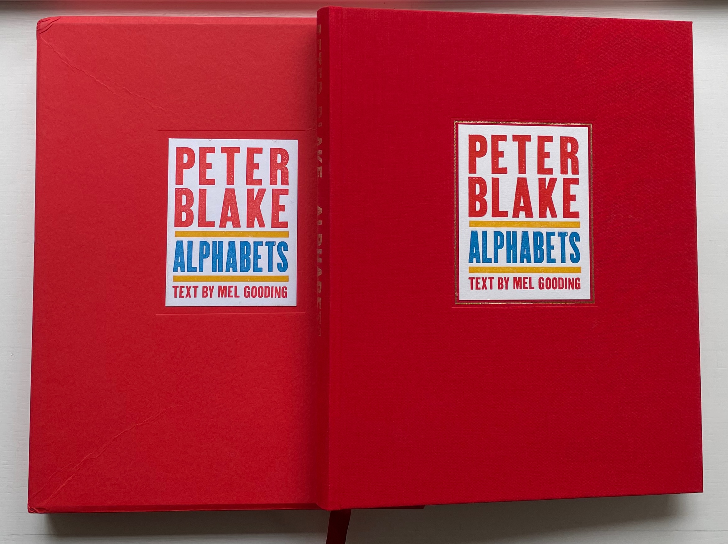
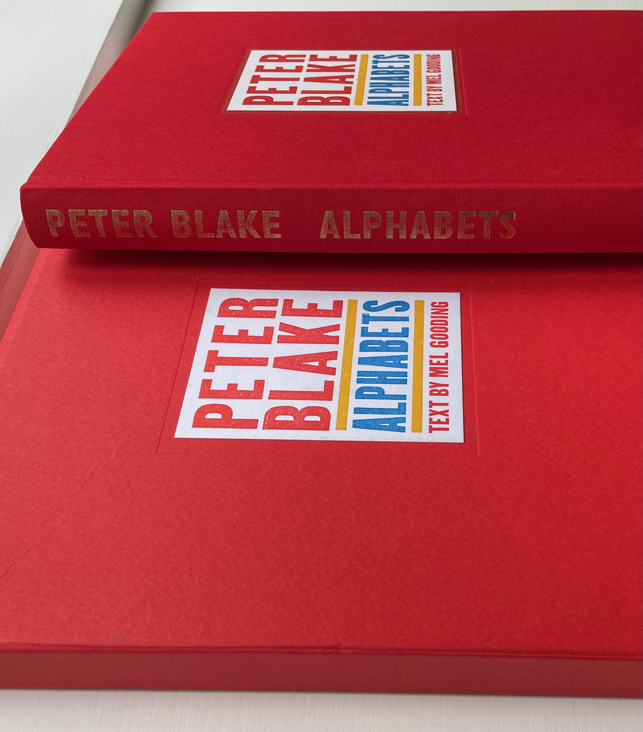
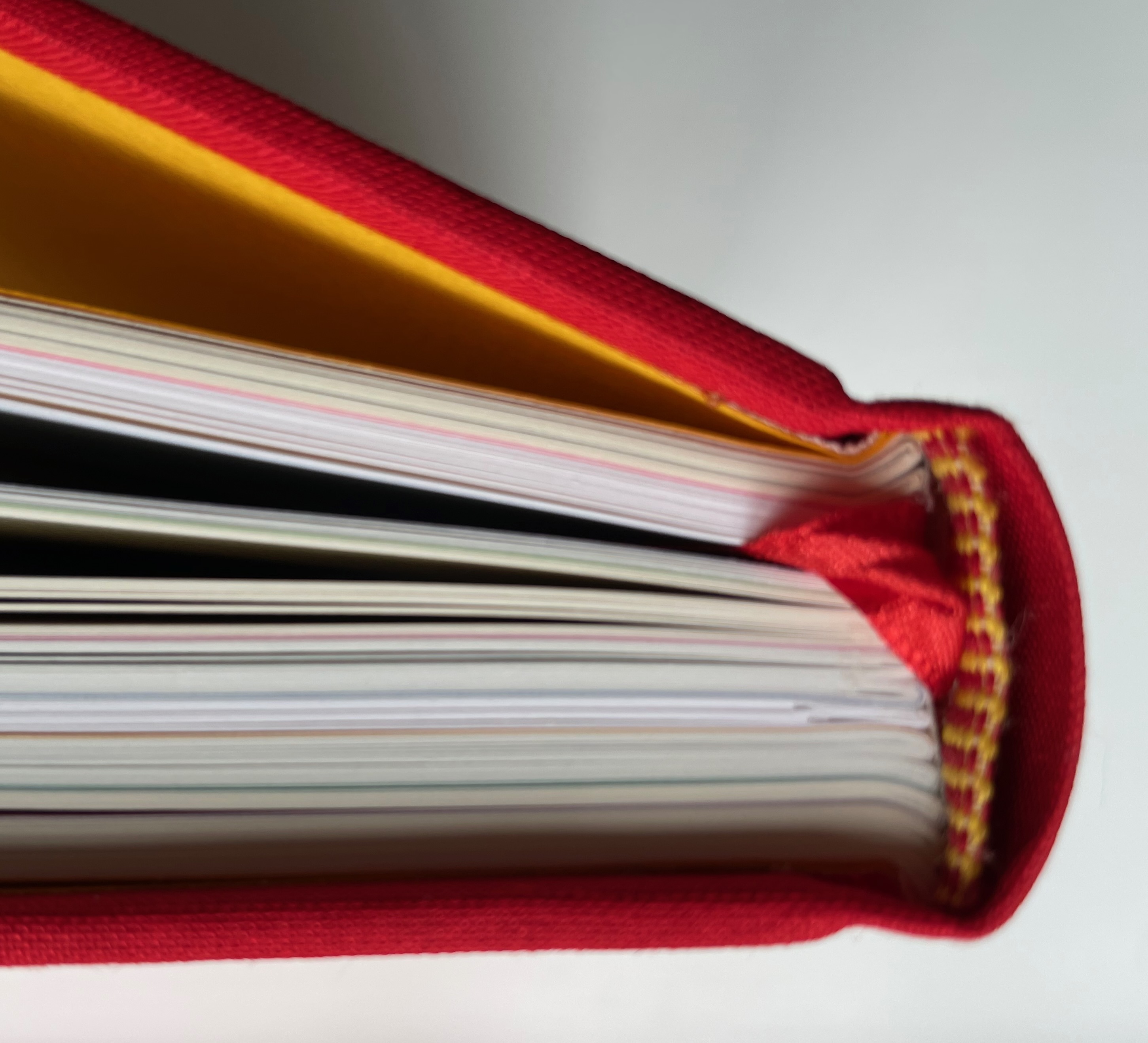
Peter Blake: Alphabets (2010) Peter Blake, Text by Mel Gooding Slipcased, cloth and casebound hardback with endbands matching red cloth and yellow doublures. H310 x W255 mm. 224 pages. Edition of 600, of which this is #471. Acquired from The Plantagenet King, 3 November 2022. Photos: Books on Books Collection. Displayed with permission of the artist.
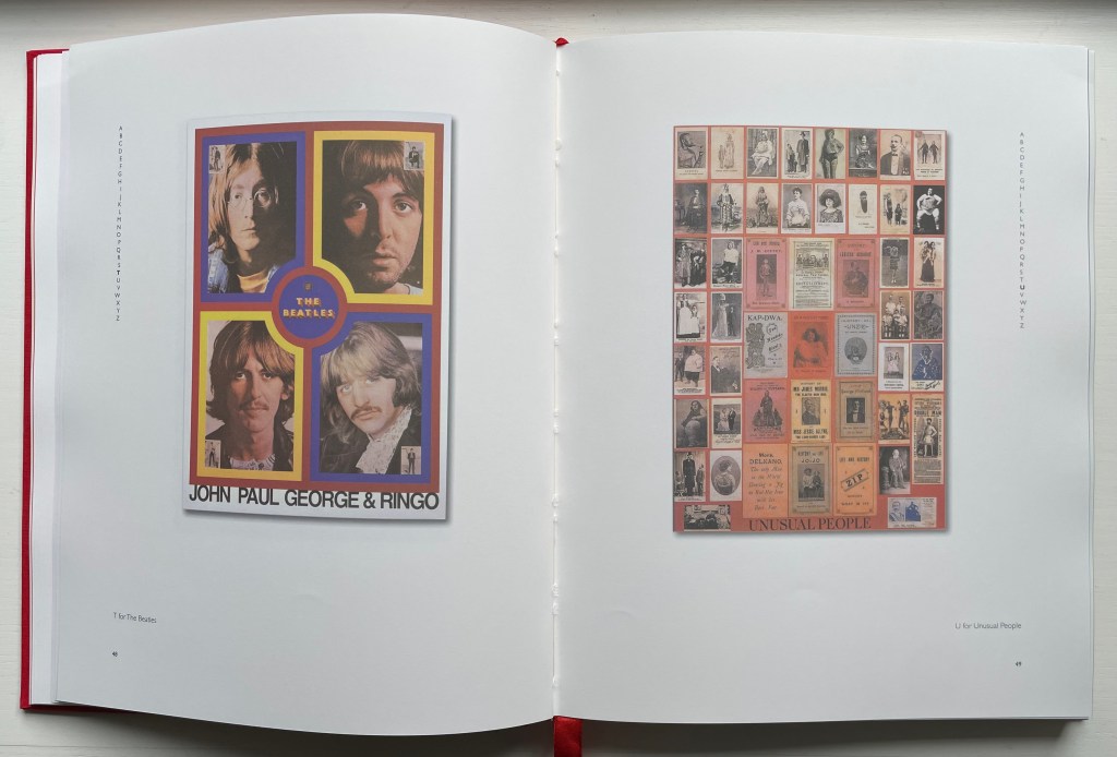
Peter Blake has made the alphabet itself a subject of so many of his print series and exhibitions that Peter Blake: Alphabets and the exhibition associated with it stand as a retrospective. Naturally it showcases his style and signature techniques. It also showcases an outward and inward appraising wit that leads to humorous juxtapositions like the poster of “T for The Beatles” with the collage of “U for Unusual People”. But most of all it proves the variety and unity that a creativity-stimulating constraint like the alphabet can yield. With Blake’s wide-ranging uses of the alphabet, Mel Gooding’s commentary and the volume’s elegant design and production, Peter Blake: Alphabets serves as both example and reference for alphabet-related artists’ books.
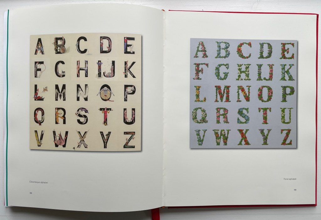
Found objects and collages have long made natural allies. Peter Blake: Alphabets demonstrates that finding objects can also lead to a passion for collecting, and in Blake’s hands, a collector’s passion becomes not only the subject of art but part of the artistic process, a tool and a technique. The book even has a section entitled “Found Alphabets” that showcases his collection of widely varied alphabet posters and unifies them with unified scale.
It is Mel Gooding who points out this unified scale in his introduction to the section. As co-author with Julian Rothenstein of Alphabets Et Other Signs (1993), ABZ (2003) and A2z : Alphabet & Signs (2018), Gooding could not have been better suited for introducing this volume and for interviewing Blake for the earlier An Alphabet (2007), which Gooding references. After his introduction on the alphabet in general and Blake’s alphabets, the volume divides into two parts: “The Alphabets” and “Collections”. In the first part, there are seven sections; in the second, six. For each section, Gooding provides introductory comments.
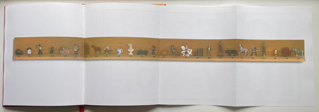
Gooding’s critical insights often go beyond Blake’s art as in the section entitled “Horizontal Alphabets” when he reminds us to be aware of the possible implications of the artist’s horizontal all-at-once display of the alphabet. This section also provides the opportunity for the artist, editor and book designer to collaborate and shine. As the foldout below allows, Blake’s alphabetic arrangement of objects can be seen all at once, but as Gooding points out, the horizontal presentation becomes a discursive terrain, a carnival, a procession of sculpted objects with individual shape, color and style. The viewer can find real or imagined relationships between and among them, perhaps more easily than if they were presented in a page-turning codex format. But the contrast to which Gooding draws attention is with the vertical presentation of individual letters, as in Alphabet No. 10, where attention is drawn more to the categorizing and ordering nature of the alphabet.
Although the work above is a limited edition, Peter Blake’s ABC (2009) is widely available commercially, and Peter Blake: About Collage (2000) is well-represented in libraries. The latter has the advantage of exploring Blake’s collecting and its relation to the technique of collage in a context that includes Joseph Cornell and Tracy Emin.
Seven works in the Books On Books Collection represent Warja Lavater’s art: Le Petit Chaperon Rouge (1965), a later tactile version of the same work (2008), Sketchbook: Le Non-obéissant (1968), Spectacle (1990), Ourasima (1991), Tanabata (1994), and Kaguyahime (1998). The French publisher Adrien Maeght was Lavater’s most consistent champion, publishing several of her leporello works, including a now rare boxed set.
Le Petit Chaperon Rouge (1965)
Le Petit Chaperon Rouge (1965) Warja Lavater Accordion book in perspex slipcase. Slipcase: H167 x W117 x D26 mm; Book: H160 x W113 x D20 mm, closed; W4.5 m, open. 40 panels. Acquired from Patrick Wainwright Rare Books, 22 June 2022. Photos: Books On Books Collection.
Abstract shapes stand in for the characters and settings in this retelling of Little Red Riding Hood’s journey through the forest to visit her grandmother. With the only text being that matching symbols to the cast of characters and settings, the tale is told wordlessly.
Knowing the story and having the cast to hand, the reader/viewer easily follows the shapes and colors into a new and artful experience of the folktale. But what if the shapes and colors cannot be seen?
Le Petit Chaperon Rouge (2008)
Le Petit Chaperon Rouge (2008) Warja Lavater and Myriam Colin Accordion book boxed in cloth-covered board box. Box: H190 x W130 x D75 mm; Book: H176 x W122 x D70 mm. closed; W4.3 m, open. 40 panels. Acquired from Les Doigts Qui Rêvent, 30 October 2022. Photos: Books On Books Collection. Displayed with permissions of Les Doigts Qui Rêvent.
Artist Myriam Colin and publisher Les Doigts Qui Rêvent (“Fingers that Dream”) addressed this question with print, Braille, cloths of different texture, leather, blind embossed shapes, plastic filaments and sewing.
Between the printed text and Braille-rendering for the cast of characters and settings, buttons of different cloths and different embossed shapes appear. In the opening scene, the red felt button for Little Red Riding Hood is of course smaller than the orange-brown broadcloth button for Mother, who stands before the raised rectangle for the house and looks over her daughter’s head at the forest of raised dots.
Later, the wolf’s belly becomes a large sewn pouch with the slit cut by the Hunter through which Grandma and Little Red Riding can be felt, ready to escape.
The brown leather button for the Hunter unites the felt Red Riding Hood, nubby-cloth Grandmother and broadcloth Mother in a clearing in the forest. A satisfactory conclusion for the sighted and visually impaired.
Update Lavater
Seven works in the Books On Books Collection represent Warja Lavater’s art: Le Petit Chaperon Rouge (1965), a later tactile version of the same work (2008), Sketchbook: Le Non-obéissant (1968), Spectacle (1990), Ourasima (1991), Tanabata (1994), and Kaguyahime (1998). The French publisher Adrien Maeght was Lavater’s most consistent champion, publishing several of her leporello works, including a now rare boxed set.
Sketchbook: Le Non-obéissant (1968)
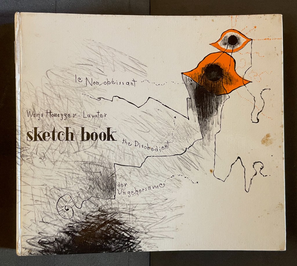
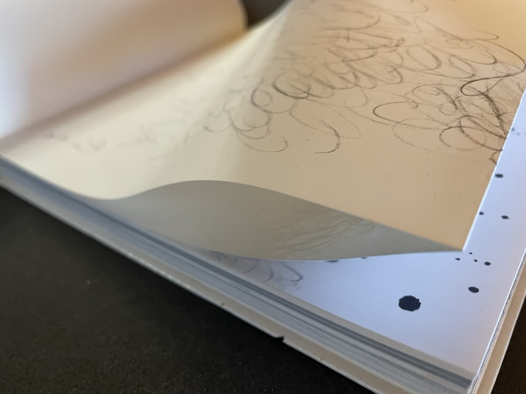
Sketchbook: Le Non-obéissant; The Disobedient (1968) Warja Lavater Casebound, printed gloss paper over boards, plain endpapers and fly leaves. H210 x W235 mm. [45] Chinese fold folios.Acquired from Ken Sanders Rare Books, 18 July 2024. Photos: Books On Books Collection.
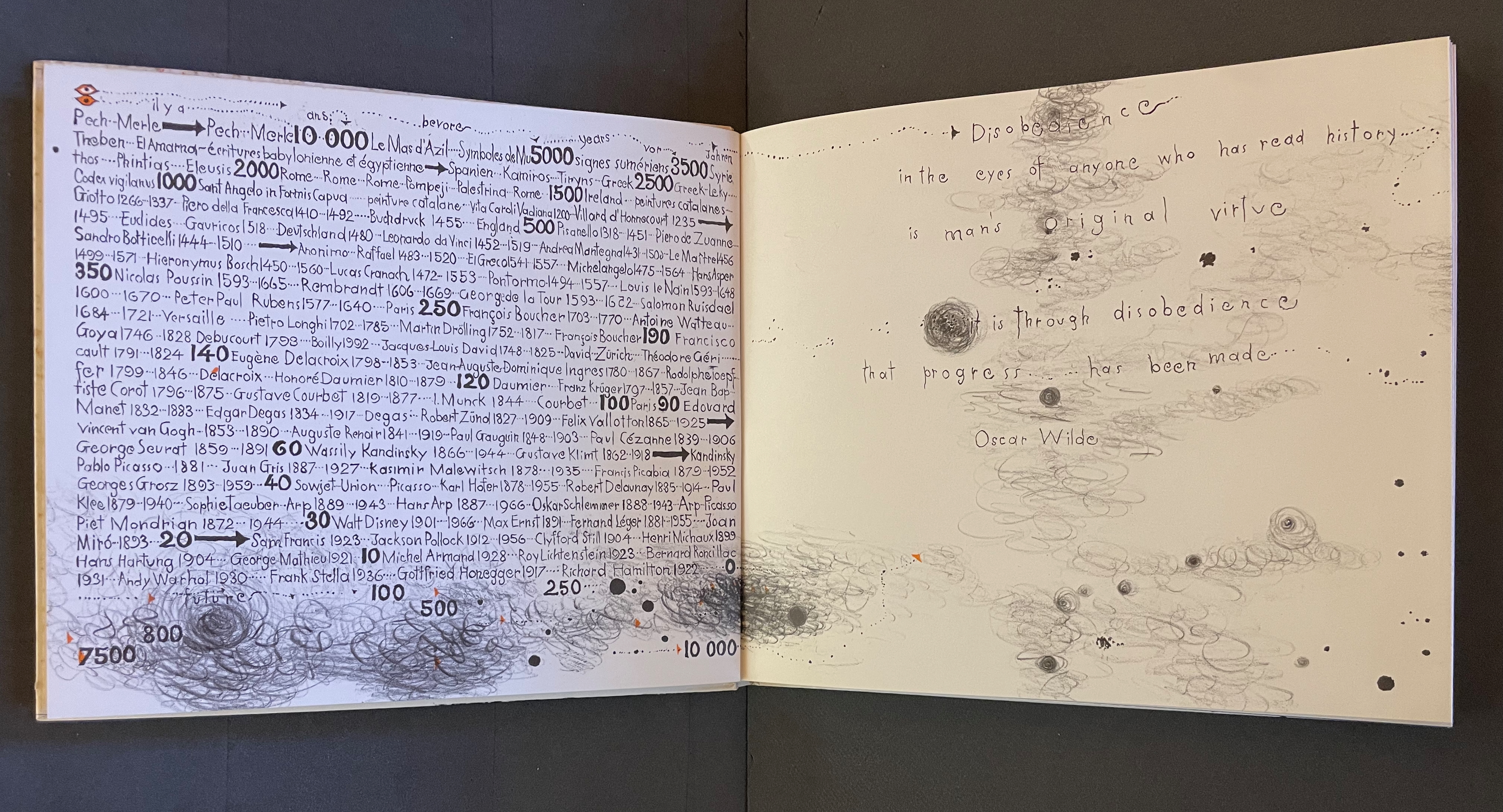
Warja Lavater’s Sketchbook opens with a page of pencil scrawling that wraps from the first side of a Chinese-fold folio, over the fold, and onto the folio’s other side, where a 10,000+ year timeline of artists appears in cramped handprint. The scribbling continues onto the next folio, embroidering Oscar Wilde’s aphorism
Disobedience in the eyes of anyone who has read history is man’s original virtue. It is through disobedience that progress has been made.
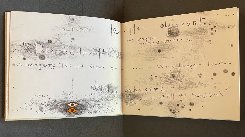
The scrawling runs over the fold of the folio and across a double-page spread to become the multilingual title page. Or rather the “subtitle becomes title page”. Look again at the cover. Wasn’t the title Sketchbook? Now it is Le Non-obéissant | The Disobedient | Der Ungehorsam, and it has acquired a new subtitle, and a strange one at that: Une Imagerie Racontée et dessinée par … |An Imagery Told and Drawn by … | Eine Imagerie Erzählt und Gezeichnet von Warja Lavater.
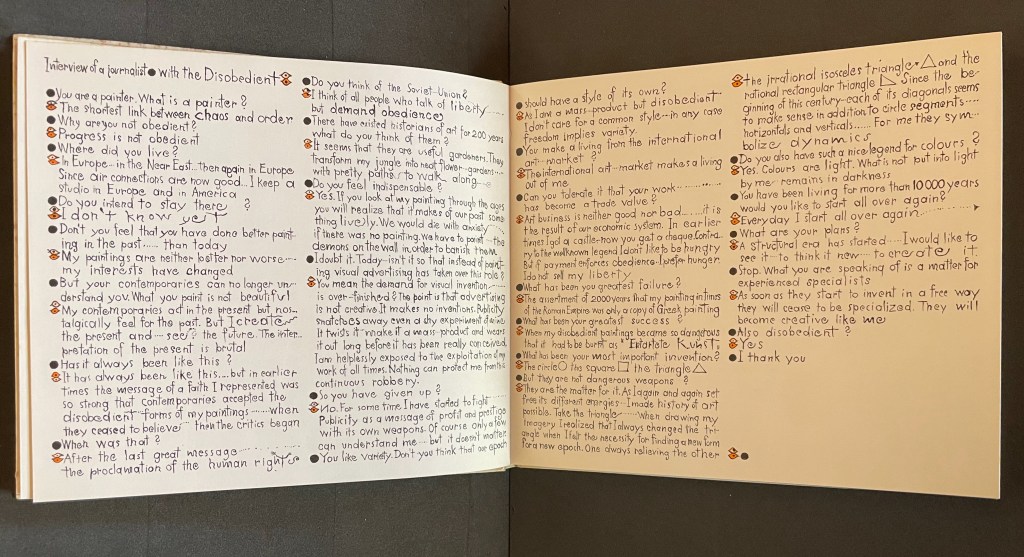
“An imagery told and drawn” captures well Lavater’s technique of abstract pictorial retelling of familiar fairy tales such as Little Red Riding Hood and Cinderella. Now, in this sketchbook, she uses it to create her own fairy tale of art history. As we are about the learn, the doodle labelled le peintre | the painter | der Maler on the left hand page above is the main character named “the Disobedient”. Reminiscent of Mel Brooks and Carl Reiner’s sketch “The 2000 Year Old Man”, the Disobedient, who has been around for almost 12,000 years, has some humorous and cantankerous answers to the interviewer’s questions about her experiences from cave art to Pop art.
“You make a living from this international art market?”
“The international art market makes a living out of me.”
Unlike the Key pages in her fairy tales identifying the images and markings, The Disobedient’s Key page is delivered in her voice. She explains that the eye with white around its iris stands for her “exterior eye with which I look” and the eye with orange around its iris stands for her “interior eye with which I think”. Her techniques or “means of my performance” might be squiggles, geometric objects or figurative drawings. The clearly defined black dots represent her contemporaries. Orange markings represent her emotions, her ferveur and Gefuhl. All the bold numbers mark the “years more or less gone by”. But the story begins in earnest in the dark of four black folios and a fifth in which the artist appears for the first time in history followed by her first work, a drawing of a mammoth.
Spectacle (1990)
Spectacle: Pictoson Mural (1990) Warja Lavater H215 x W296 mm. 22 pages. Acquired from Antiquariat Übü, 3 August 2022. Photos: Books On Books Collection. Displayed with permission of the publisher.
Spectacle is an origin story of shapes, signs, the sounds of language, their alphabetic representation and use to form words. It is similar to the tale in Il était une fois un alphabet (1951/2009) by Souza Desnoyer and Marcelle Marquet. In both, the separate worlds of vowels and consonants join to create the alphabet. In Il était une fois, the letters already exist, have anthropomorphic shapes and engage in familiar activities like voyages, feasts, dances and processions. The narrative has scenes and settings to carry it along. Spectacle‘s origin narrative, however, letters develop from a system of signs created/discovered by a wizard. An abstract shape himself, the wizard presides over the story’s unfolding across an abstract landscape. Even though Lavater maps a written version (in eight languages) of the tale to the panels, the pictorial narrative remains challenging.
Elliptical and shamanic, the written narrative itself is challenging. It may remind the reader of Italo Calvino’s Big Bang story “Sul far del giorno” (“At daybreak”) in his collection Le Cosmicomiche (1965) (“Cosmicomics“1968), to which Shirley Sharoff paid homage in OVI: objets volants identifiés dans le ciel d’Italo Calvino, a work contemporary with Lavater’s. The verticality of Lavater’s extraordinary leporello might also remind the viewer of Blaise Cendrars and Sonia Delaunay’s La Prose du Transsibérien et de la petite Jehanne de France (1913).
Somehow, though, despite its winged emblems of words, the eleventh panel with its regimented alphabet seems visually diminished, not quite the joyous spectacle promised by the text. For that, we would have to turn elsewhere in the collection: William Joyce’s origin story The Numberlys (2014).
The Numberlys (2014) William Joyce and Christina Ellis Hardback, paper on board. H220 x W300 mm, 52 pages. Acquired from London Bridge Books, 15 April 2021. Photos of the book: Books On Books Collection.
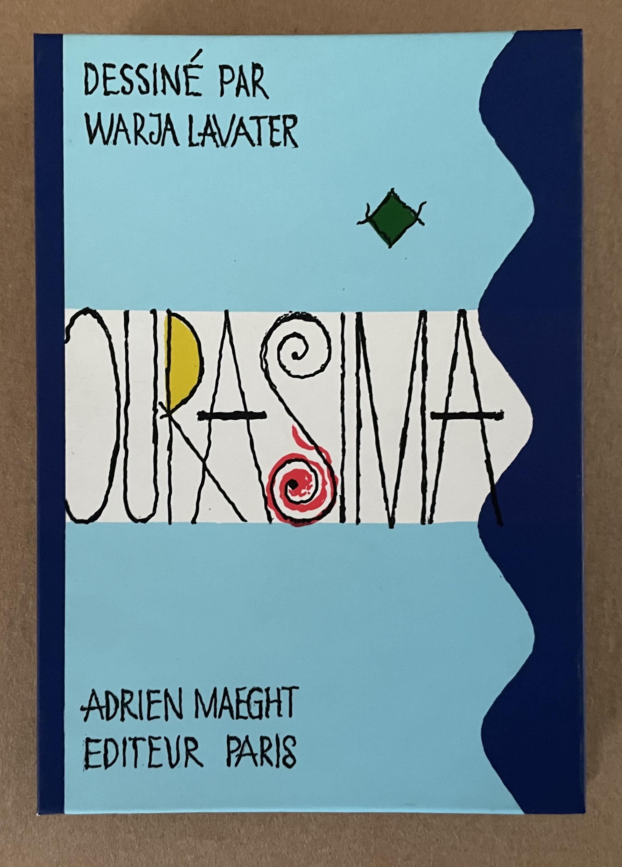
Ourasima (1991)
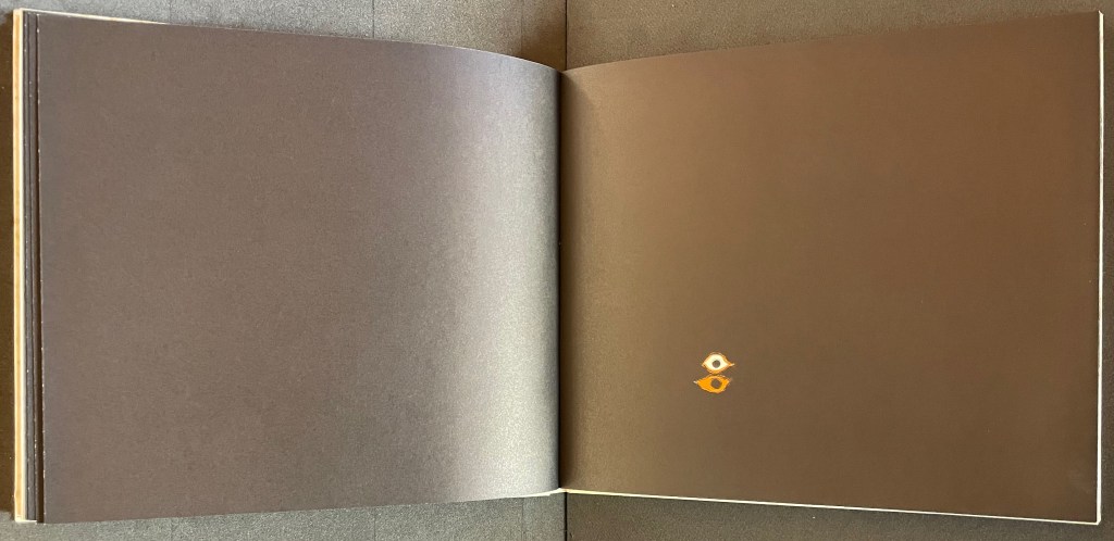
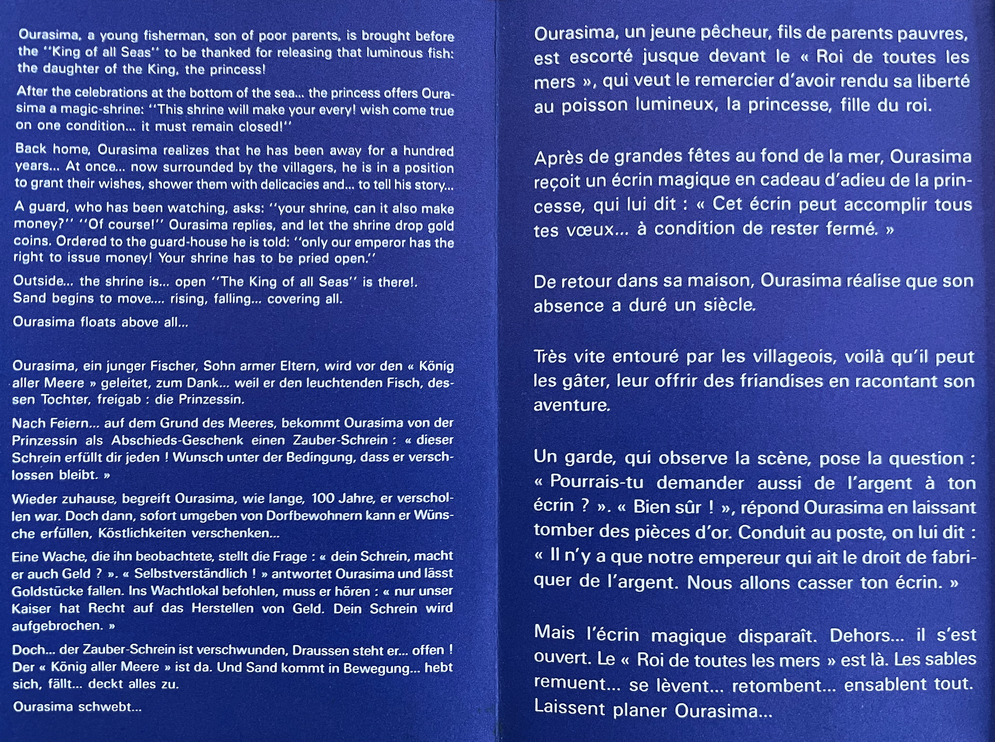
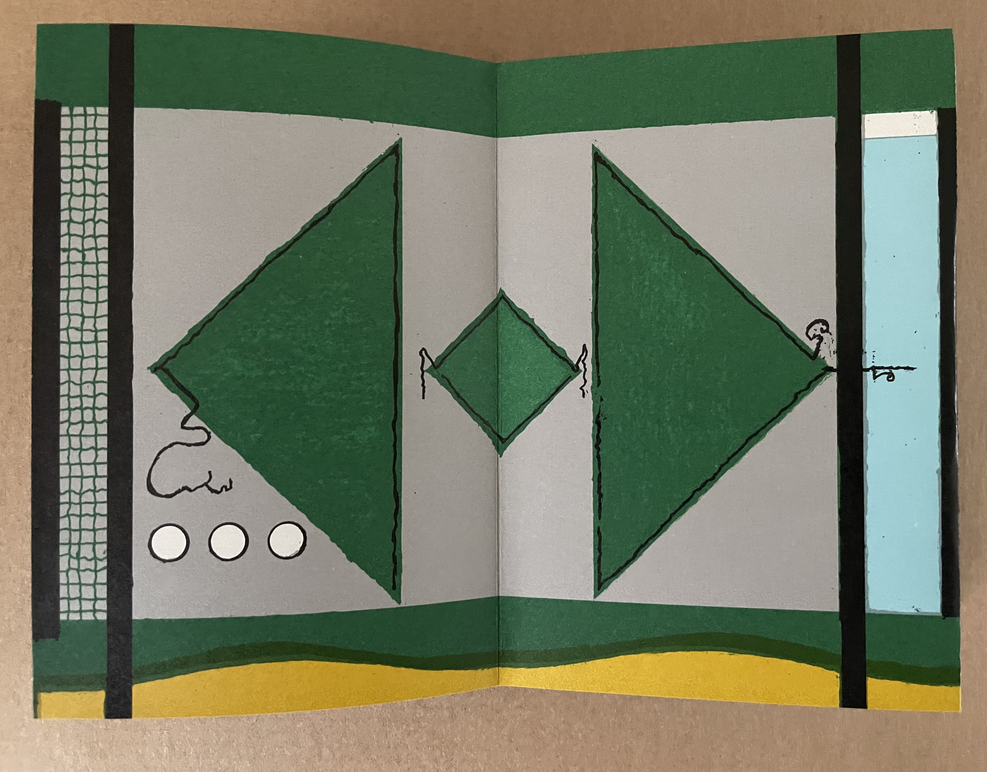
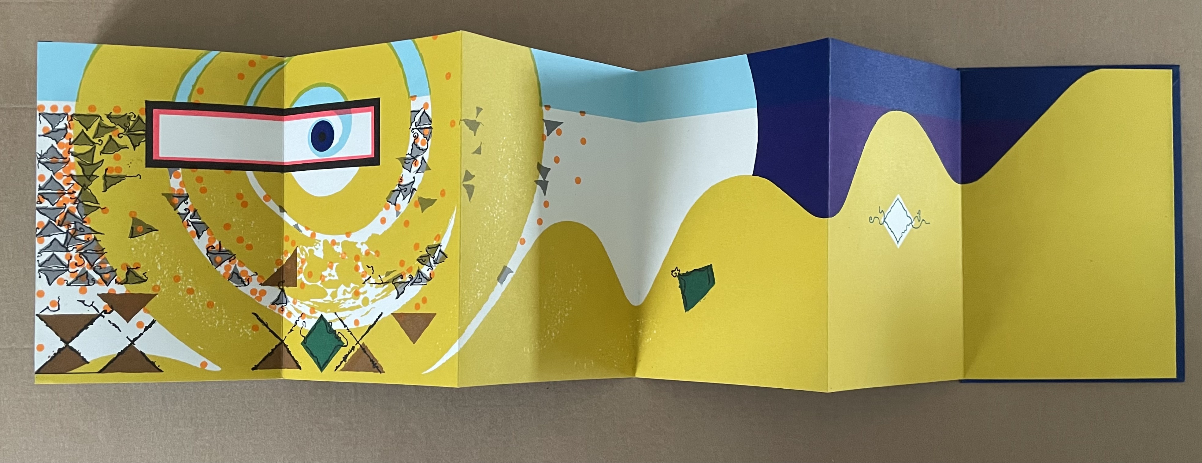
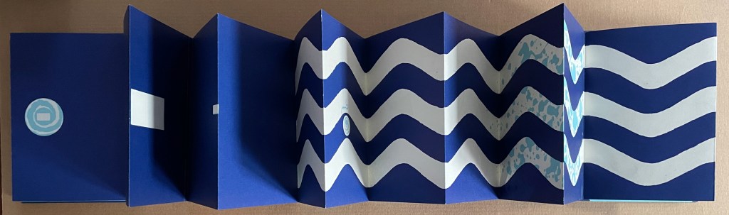
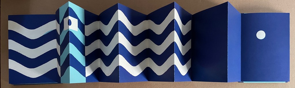
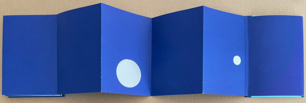
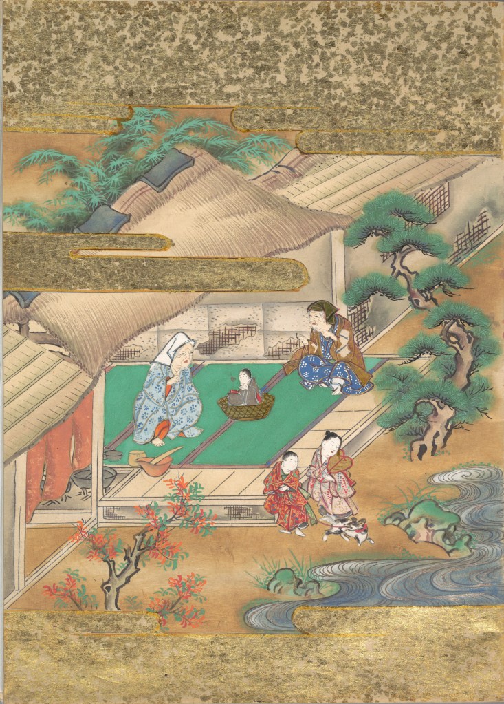
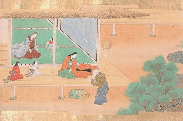
Ourasima: Une imagerie en transparence d’après le conte japonais (1991) Warja Lavater Plexiglas slipcase enclosing a double-sided accordion book. Box: H178 x W118. Closed accordion: H160 x W112 mm. Open accordion: W4624 mm. [86] panels. Acquired from Versand-Antiquariat Rainer Richner, 24 August 2023. Photos: Books On Books Collection.
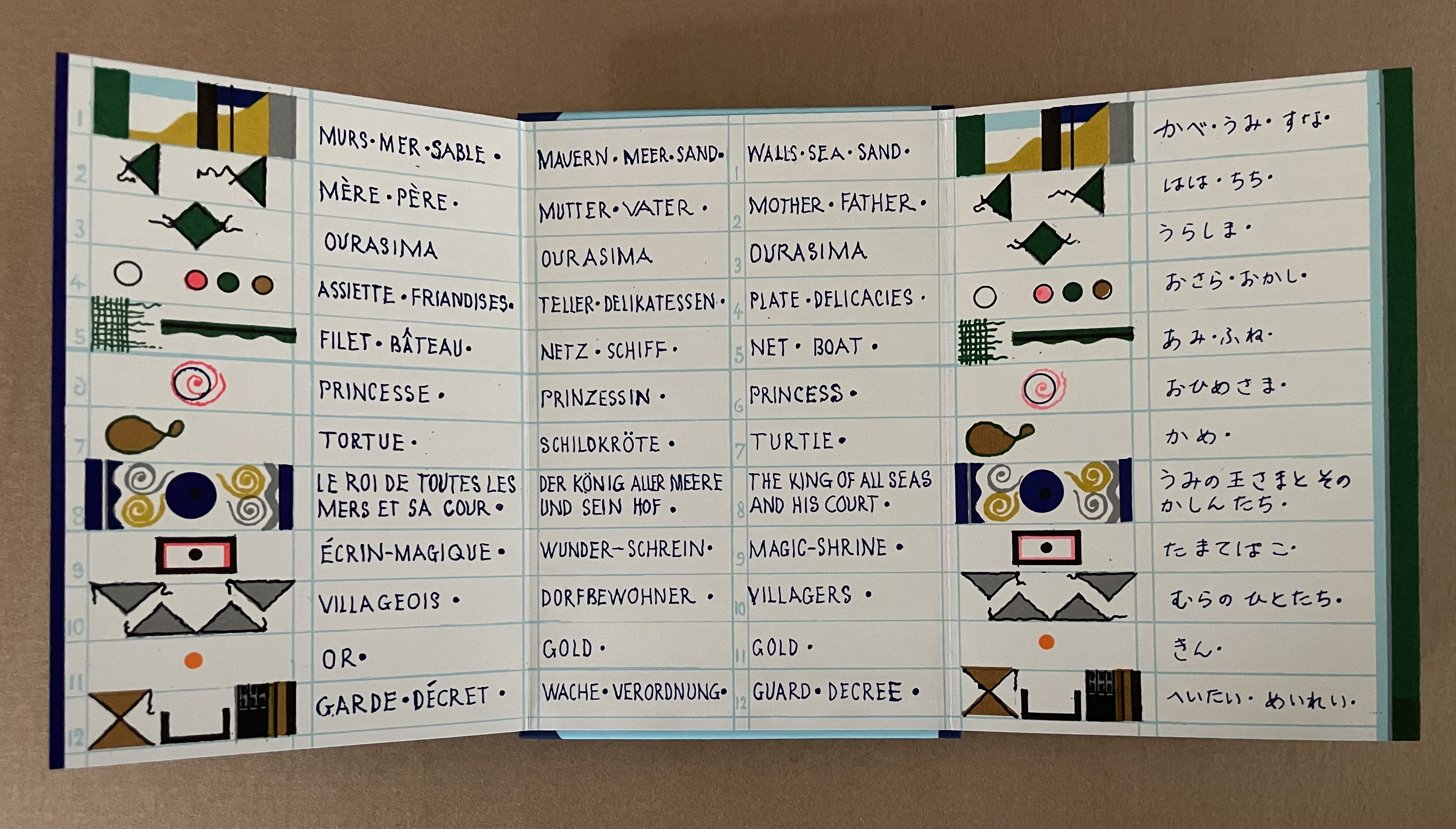
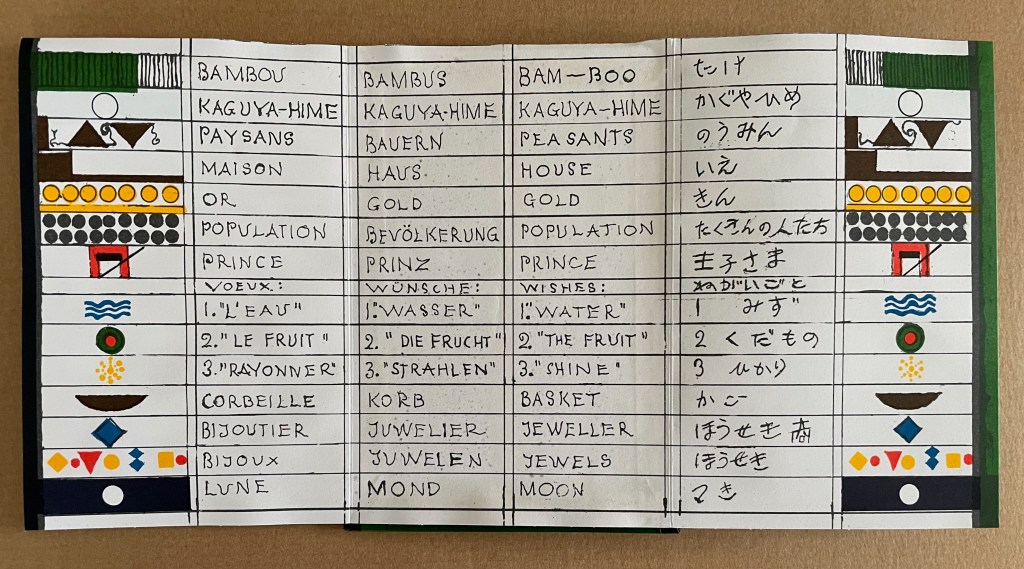
Ourasima, also known as Urasima Taro, is a Japanese folktale that reaches back to the eighth century. Lavater’s version is a cross between the stories of the Golden Goose, Rip Van Winkle and Pandora’s Box. In keeping with her treatments of Western folk and fairy tales, Lavater brackets her wordless retelling with a cast of characters, objects and their corresponding emblems at the beginning and a brief summary of the story at the end — all annotated in French, German, and English, but this time in Kanji as well.
Lavater’s version departs significantly from the traditional versions as described by the Library of Congress:
There are variations to the story depending on the intended audience and the period, and it is still known by its Japanese title Urashima Taro. It tells of a young and kind fisherman named Urashima. One day he catches a large turtle while he is out fishing. Taking pity on the turtle, he releases it back into the sea, whereupon the beautiful daughter of the god of the sea appears and tells him that the turtle was actually the personification of her. To thank him for saving her, she invites Urashima to Ryugu-jo (the Palace of the Dragon God) at the bottom of the sea. He then marries her and lives happily at the palace. Three years later he asks for permission to return to his village for a short time, because he wants to see his family. His wife gives him a box and makes him promise not to open it, as he would never be able to come back if he did. When Urashima returns home, he finds that everything has changed during those three years and that his family and his village have disappeared. He had in fact left his village 400 years before, so his parents, siblings and friends were all dead. Not knowing how to get back to the Palace of the Dragon God, he breaks his promise and opens the box, hoping that its contents can help him. After he opens the box, white smoke appears and Urashima turns into a white-haired old man and dies.
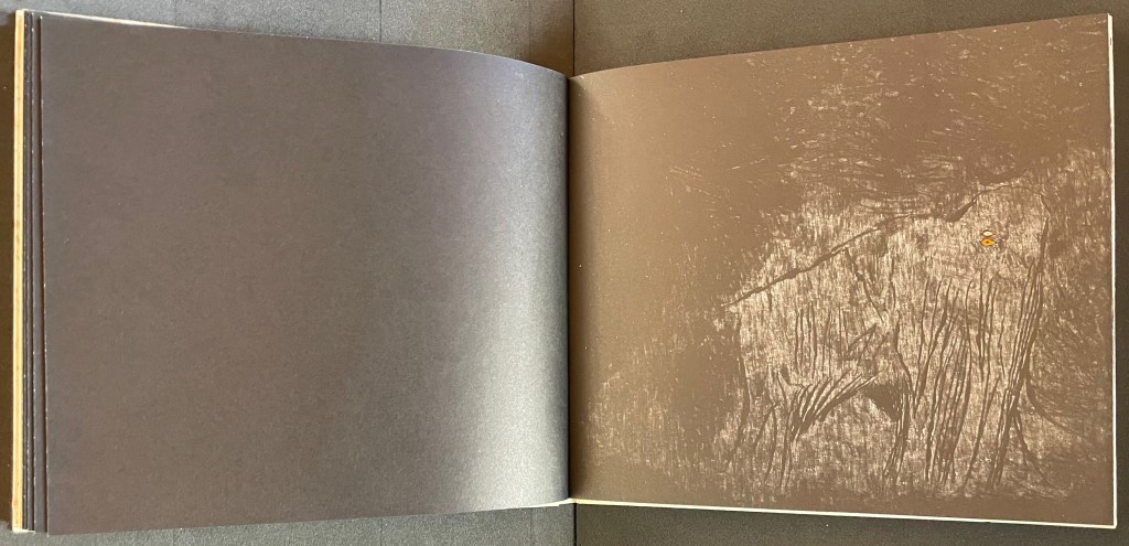
Lavater’s emblematic retelling works well with the basics such as the family home with Ourasima between his mother and father, Ourasima with his boat and fishing net, the capture and release of the princess, the turtle’s arrival and transport of Ourasima to the princess, the marriage, Ourasima’s return on the back of the turtle, and the distribution of delicacies and gold. But the “emblemism” struggles to reflect the verbal instructions of the princess and the guards’ rationale for arresting Ourasima.
Ourasima at home between his mother on the left and father on the right.
With the box forced open, chaos ensues with a whirlwind of sand dispersing everything and freeing Ourasima.Nothing in Lavater’s summary indicates that Ourasima becomes an old man at this point, but his emblem’s shift from green to white in the next panels aligns with the traditional version.
The chaos of sand freeing Ourasima and his becoming an old man.
To find Ourasima floating “above all” as Lavater’s summary indicates, we have to turn to the other side of the leporello, but the “emblemism” is difficult to follow. Has the sand, covering all, yielded to the domain of the sea? Has the empty magic box risen from the depths to float along the waves? Does the King recapture it? Has the white diamond-shaped Ourasima been transformed into a round sea creature?
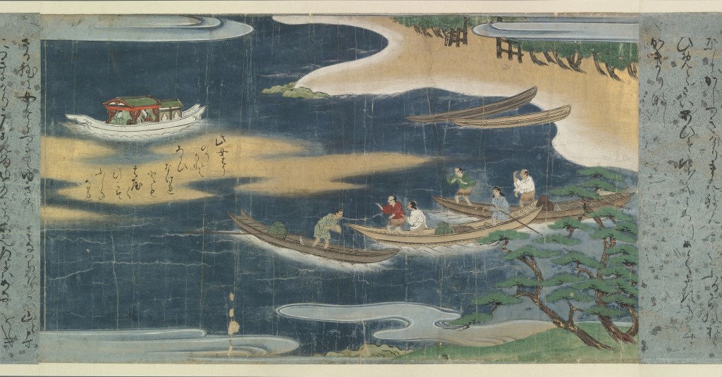
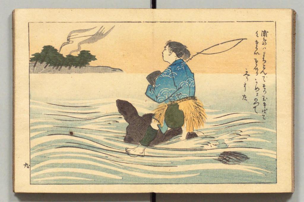
Of course, text and illustrations went side by side in all the much earlier versions with calligraphy, watercolors, woodblock prints and, in the later Meiji period, with type.
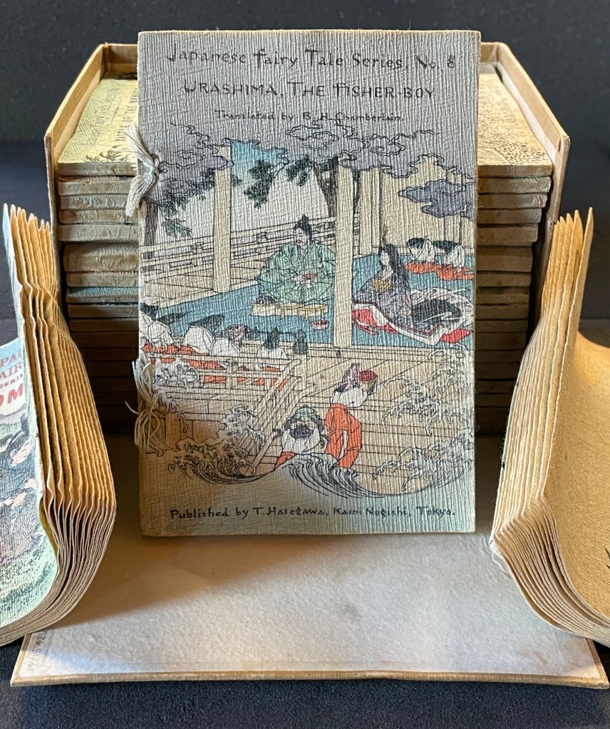
In the same period, the first translation into English appeared within a boxed set of Japanese fairy tales, printed on cloth folios and stab bound.
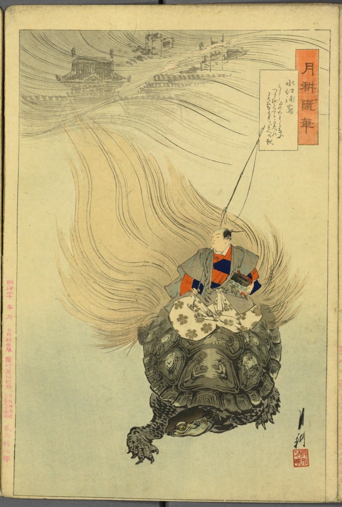
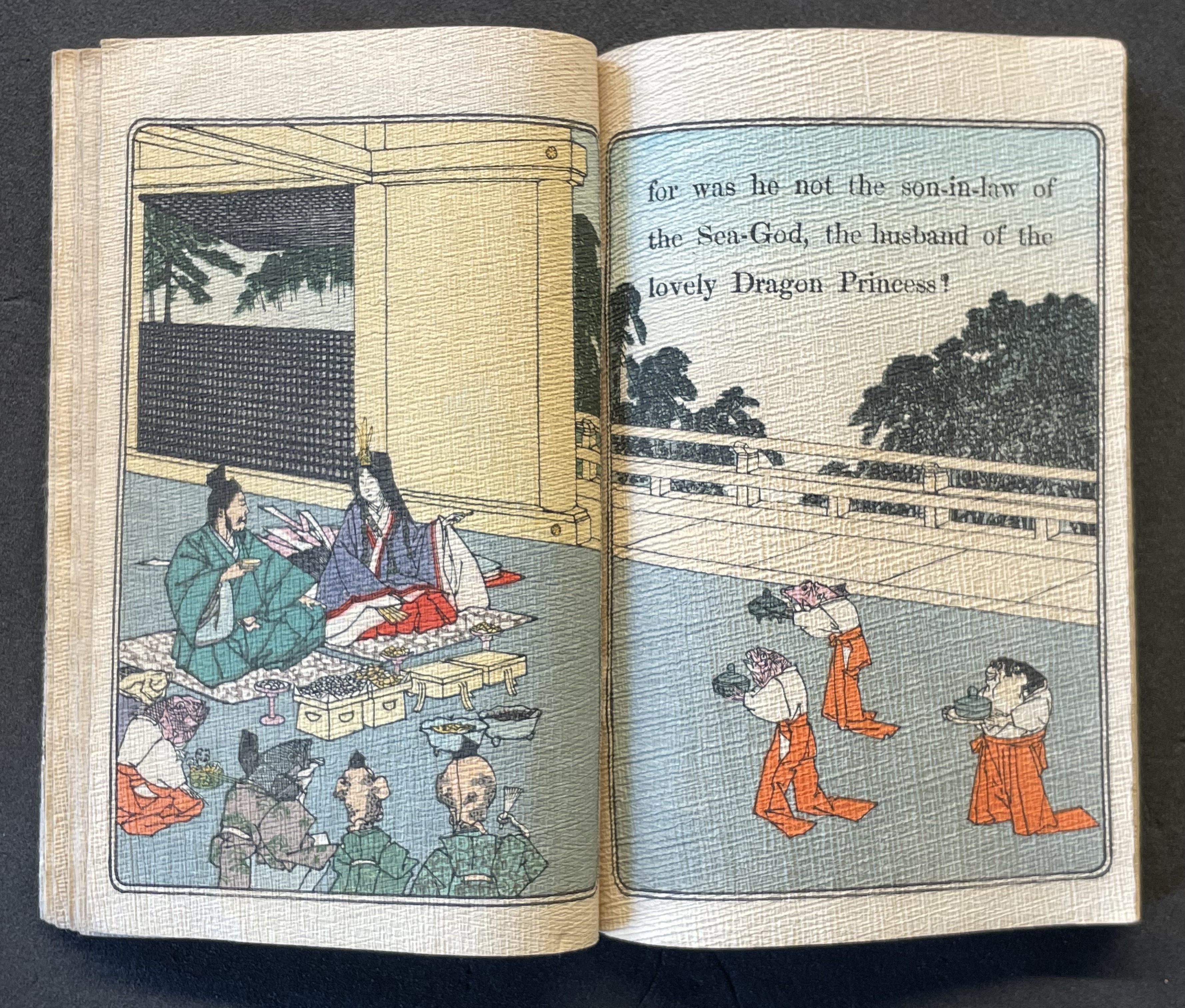
Japanese Fairy Tales Series. Bodleian Libraries. Schorr Collection f.22. The Fisher-boy Urashima, translated by Basil Hall Chamberlain, illustrated by Eitaku Kobayashi, and published by Hasegawa Takejiro (1886).
Ourasima and Otohime served in the palace by undersea servants.
In Lavater’s art, image and abstraction become the primary focus and vehicle for the narrative. As we shall see, this earliest of Lavater’s attempts with Japanese fairly tales is narratively the least straightforward, probably because of the deviations prompted by the inclusion of themes from the Golden Goose and Pandora’s Box.
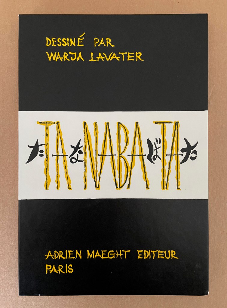
Tanabata (1994)
Tanabata(1994) Warja Lavater Acrylic slipcase, double-sided leporello. Slipcase: H216 x W150 mm; Book: H216 x W145 mm. 18 panels, each side, one foldout with 2 panels. Acquired from Dilat, 14 January 2025. Photos: Books On Books Collection.
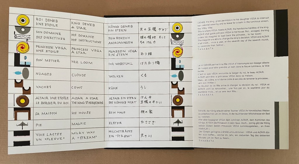
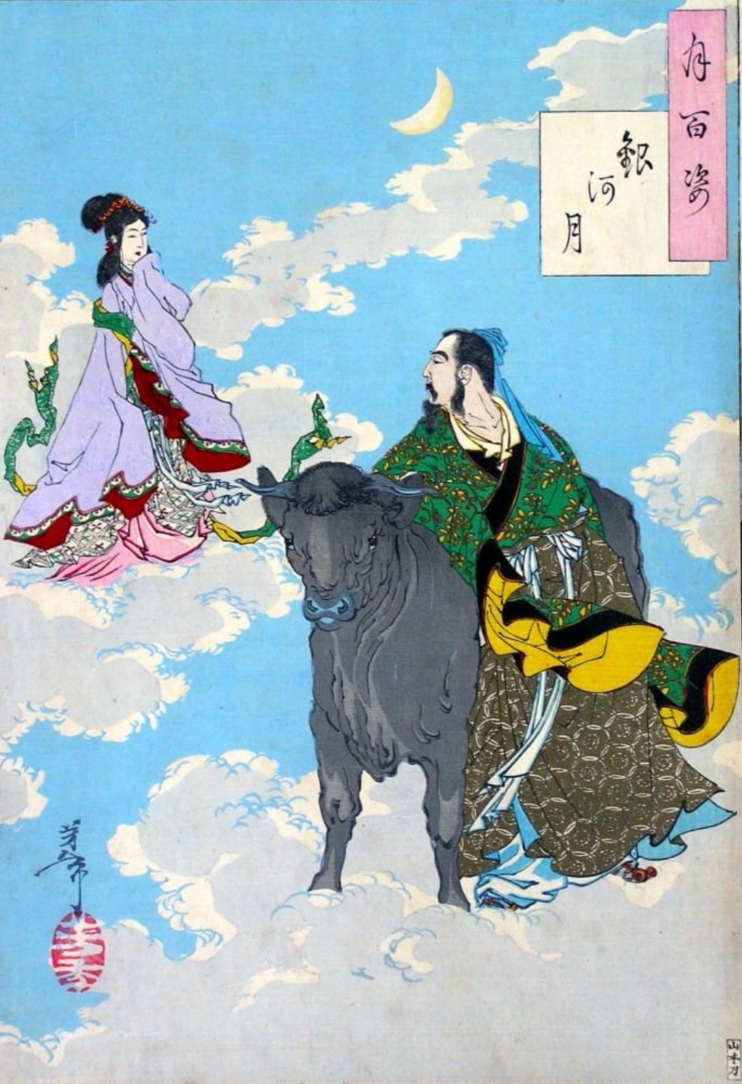
Tanabata is Lavater’s version of a Sino-Japanese constellation myth about the stars Deneb, Vega, and Altair. The story is that the princess Orihime, associated with the star Vega, also known as the weaver star, falls in love with Hikoboshi, associated with the star Altair, also known as the cow-herder star. Her father, Deneb the Sky King, banishes her to one side of the Milky Way and Hikoboshi to the other side. Later he relents and allows them to meet only on the seventh day of the seventh month of the lunar calendar when a flock of magpies form a bridge for their reunion. This has become the date of the annual Star Festival in Japan.
As with Ourasima, Lavater modifies the tale. She has the King permit Orihime to bathe in the Milky Way where she first meets Hikoboshi. Additionally, the King has the magpies drag Orihime back to her weaving, but the birds persuade the King to permit the annual reunion at the Milky Way.
Reading from left to right. Altair (cowherd star) and Vega (weaver star) cross the Milky Way over the “magpie bridge” to unite during Tanabata, the annual Star Festival in Japan.
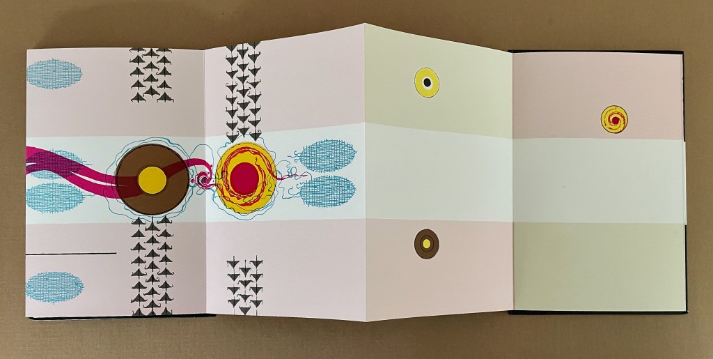
The reverse side of the leporello represents the two lovers as two solid white balls separated by the Milky Way represented as a solid white band, running right to left from the front cover. Over the course of the leporello, the lovers move to join one another on one side of the Milky Way then to separate according to their celestial fate.
Reading from the celestial map right to left: the white dots replicate the positions of Deneb and Vega above the Milky Way and Altair beneath it.
Despite the variations on the traditional tale, Tanabata is narratively more straightforward than Ourasima. With 10 emblems compared to Ourasima‘s 12, Tanabata ought to be visually more straightforward as well, but after the first two panels introducing Deneb, Vega, and Altair, every panel — except for the last two — seems just as busy as the most crowded in Ourasima. This, however, seems intentional. The last two panels stand out all the more in their simplicity mirroring the stars’ positions on the reverse side in the celestial map and the abstraction.
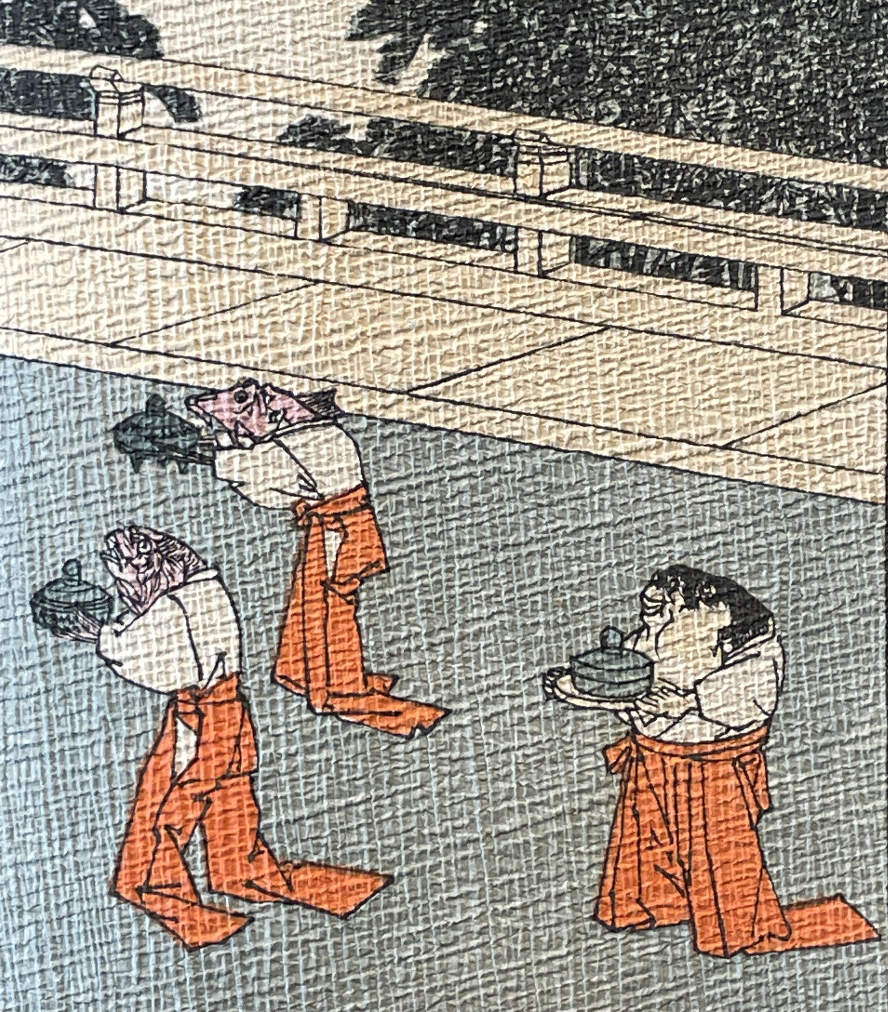
From 100 Aspects of the Moon, by Tsukioka Yoshitoshi. Late 1800’s. (Public Domain). Orihime and Hikoboshi during the night of Tanabata. Photo: Tomo Japan.
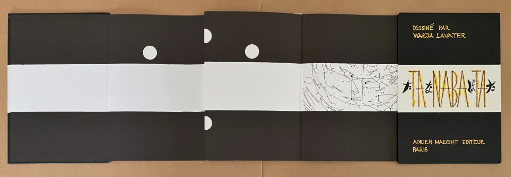
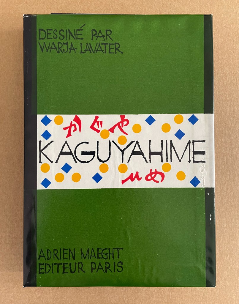
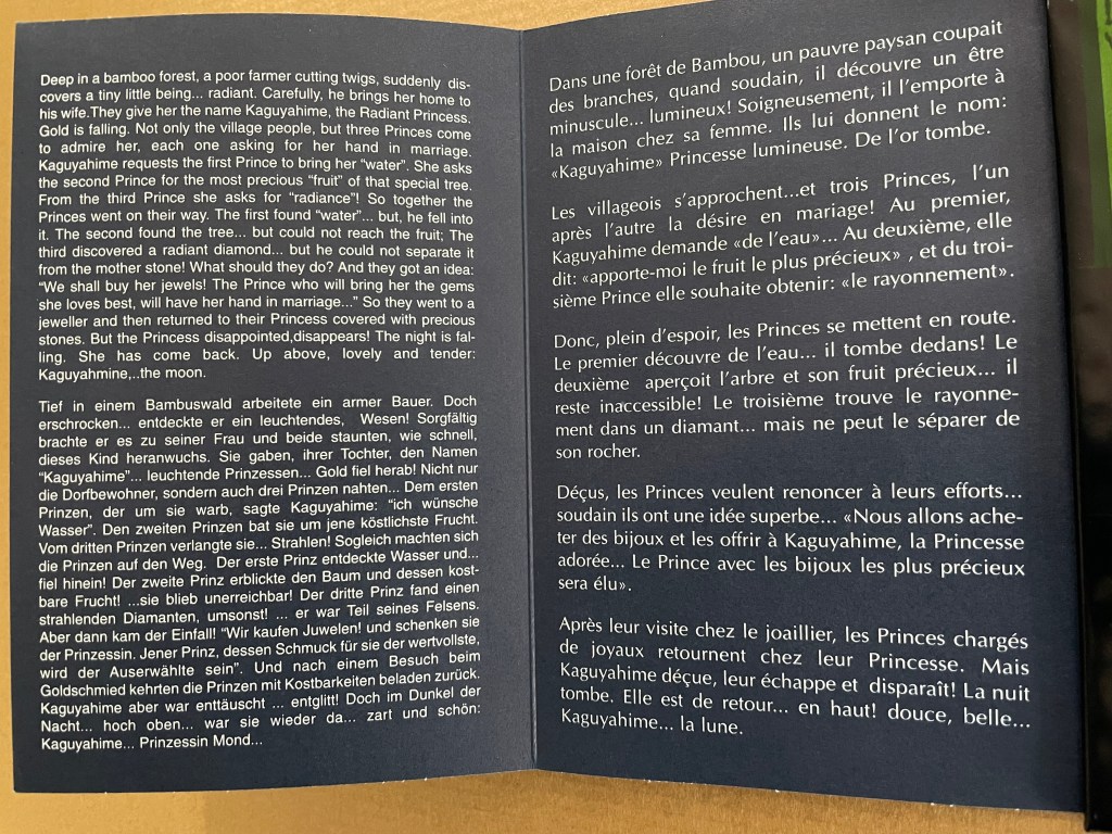
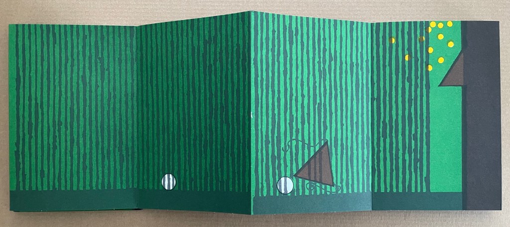
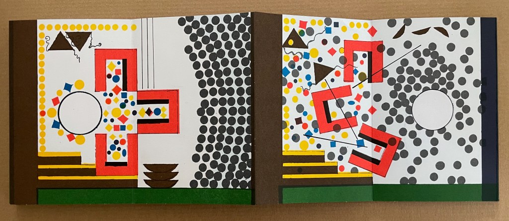
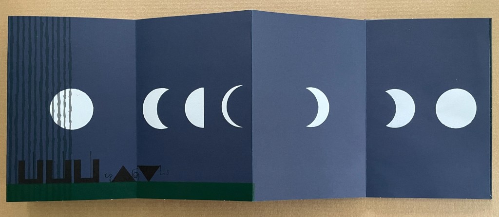
Kaguyahime (1998)
Kaguyahime(1998) Warja Lavater Acrylic slipcase, leporello. H160 x W11 mm. 44 panels. Acquired from Okmhistoire, 24 January 2025. Photos: Books On Books Collection.
With 14 emblems and with three princes whose emblems are distinguished by subtle variations, Kaguyahime seems bound to be more visually challenging than Ourasima or Tanabata.
Kaguyahime in the bamboo forest. The poor farmer discovers her and takes her home, where already gold is beginning to fall.
Having failed in their quests, the three princes, watched by her guardians and the gathered population, crowd around her to offer jewels and gold instead. But Kaguyahime storms away, scattering the jewels and gold, the princes and their baskets, and her guardians and the population in her wake.
On the other side of the leporello, Kaguyahime, the moon princess, watched by the princes and her guardians, rises through the bamboo forest into night sky where she waxes and wanes ever after.
Like Snow White and Sleeping Beauty embedded for centuries in Western culture, the tale of the moon princesss exerts a similar pull on Japanese culture. The princess and her story have appeared in many media including manga and anime. In 2023, the choreographer Jo Kanamori and the Tokyo Ballet produced Kaguyahime set to the music of Claude Debussy. A hybrid plant (E.acuminatum x E.dolichostemon) has even been named after the tale.
Lavater’s emblems in the Oriental tales do slightly differ from those in the Occidental tales, although the color palette does not vary. Her handling of Ourasima, Tanabata, and Kaguyahime does not seem as sure as that of Snow White and Sleeping Beauty nor of The Disobedient. Nevertheless, Lavater’s engagement across cultures speaks to one of the most recurrent influences on book artists: that of folk tales, fairy tales, and myths.