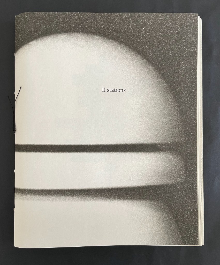
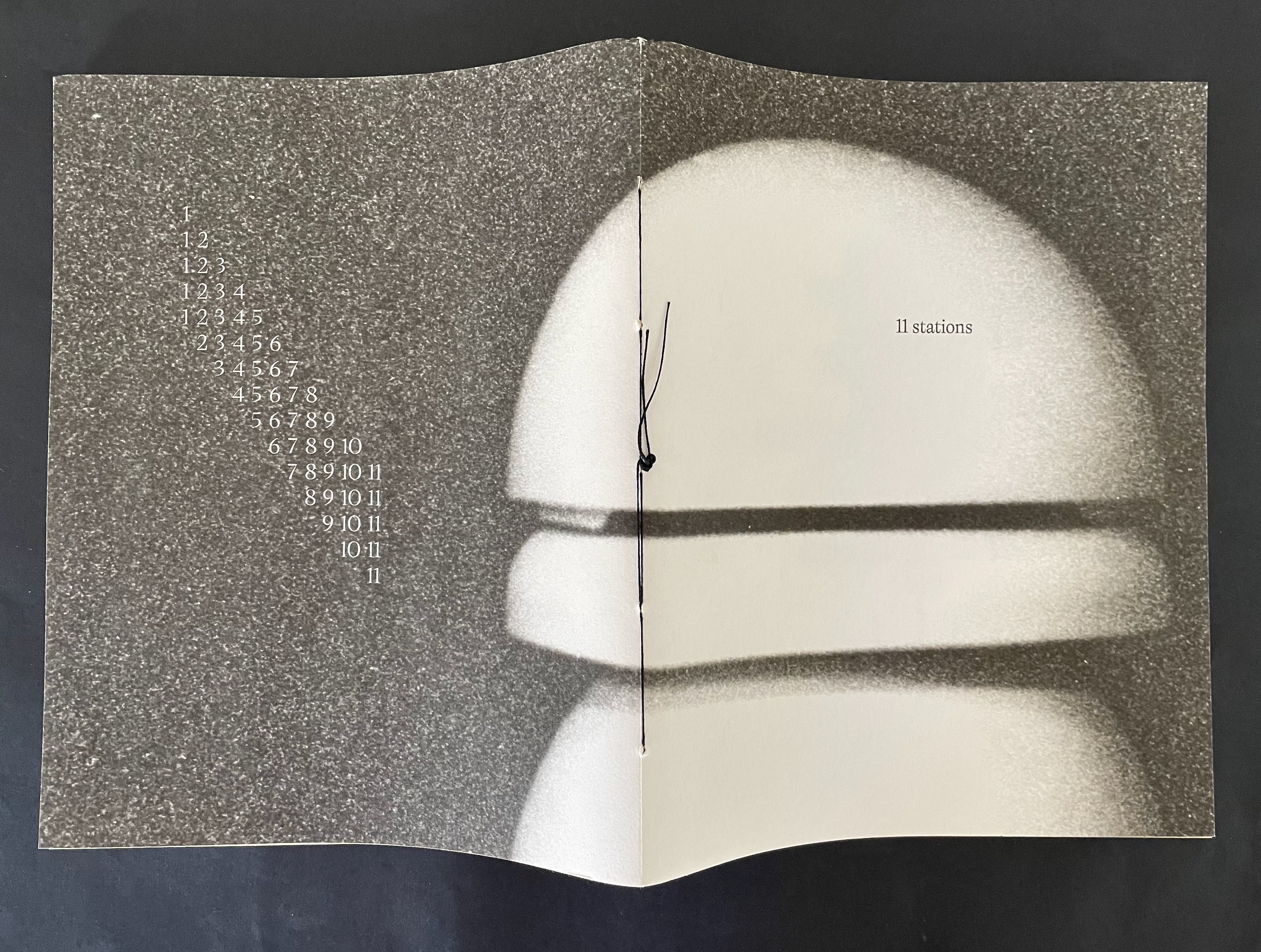
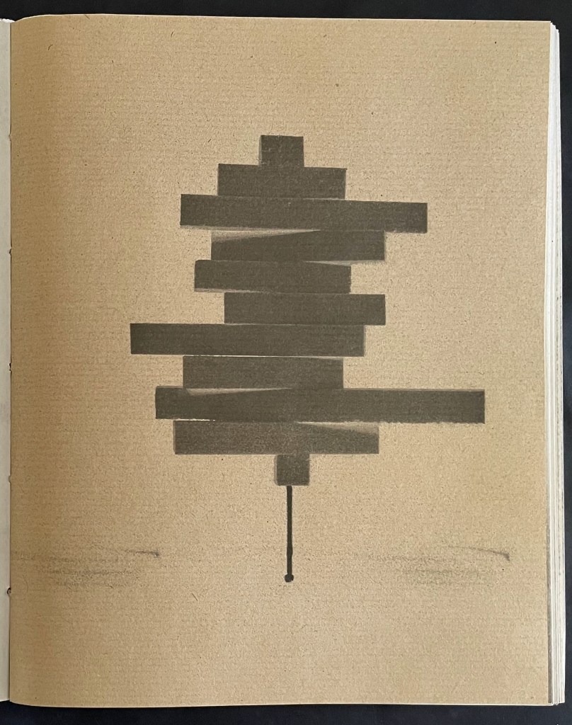
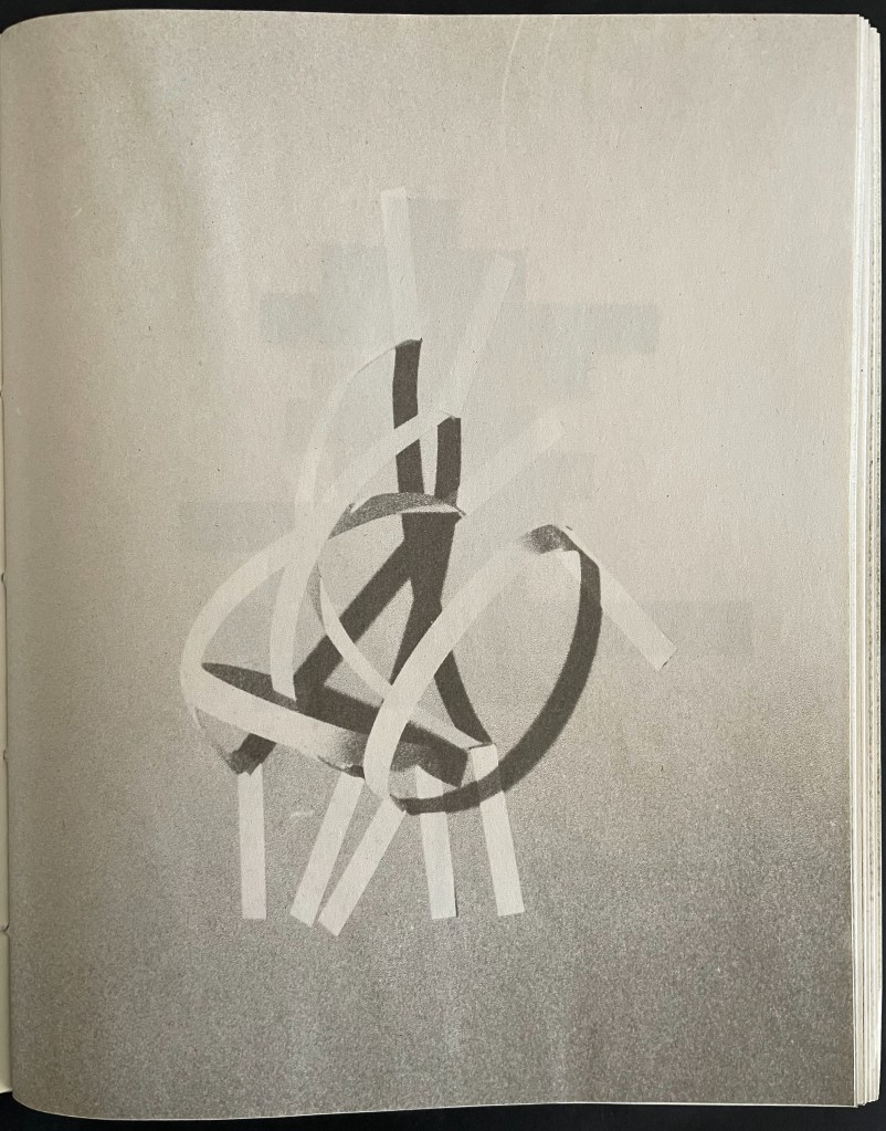
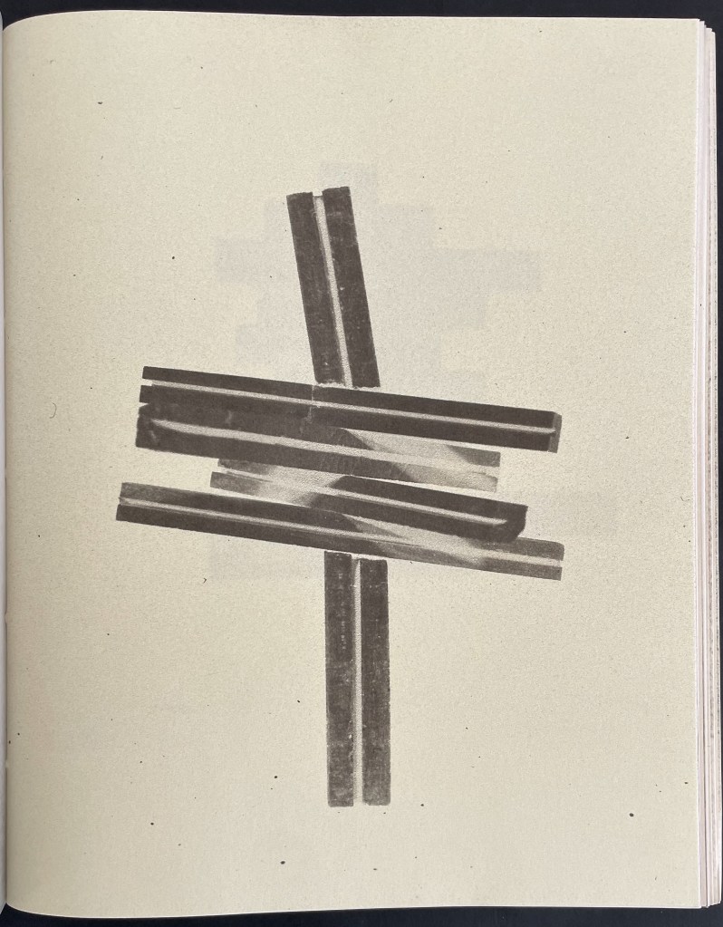
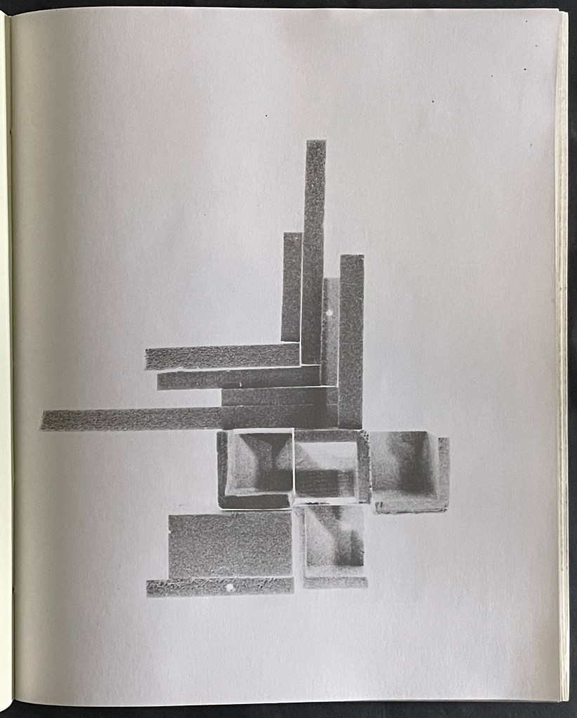
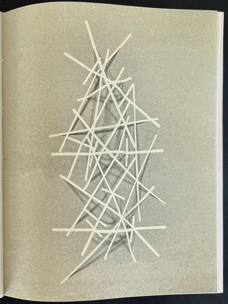
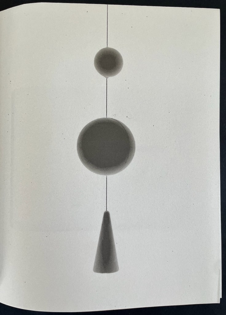
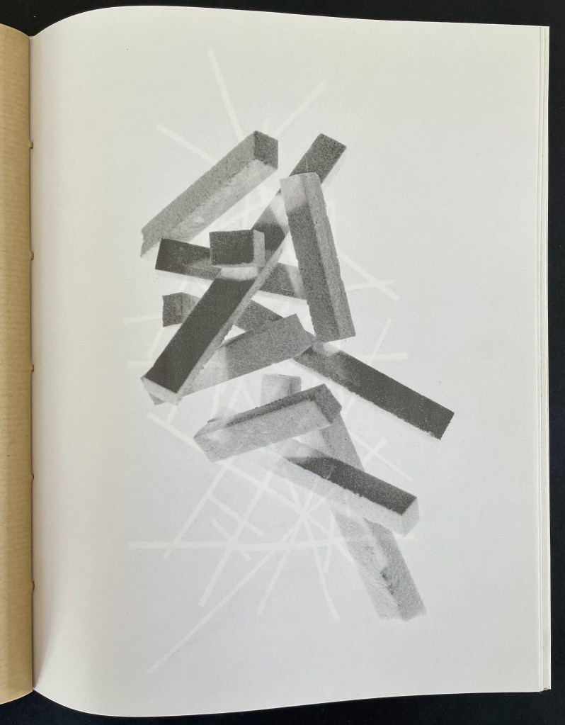
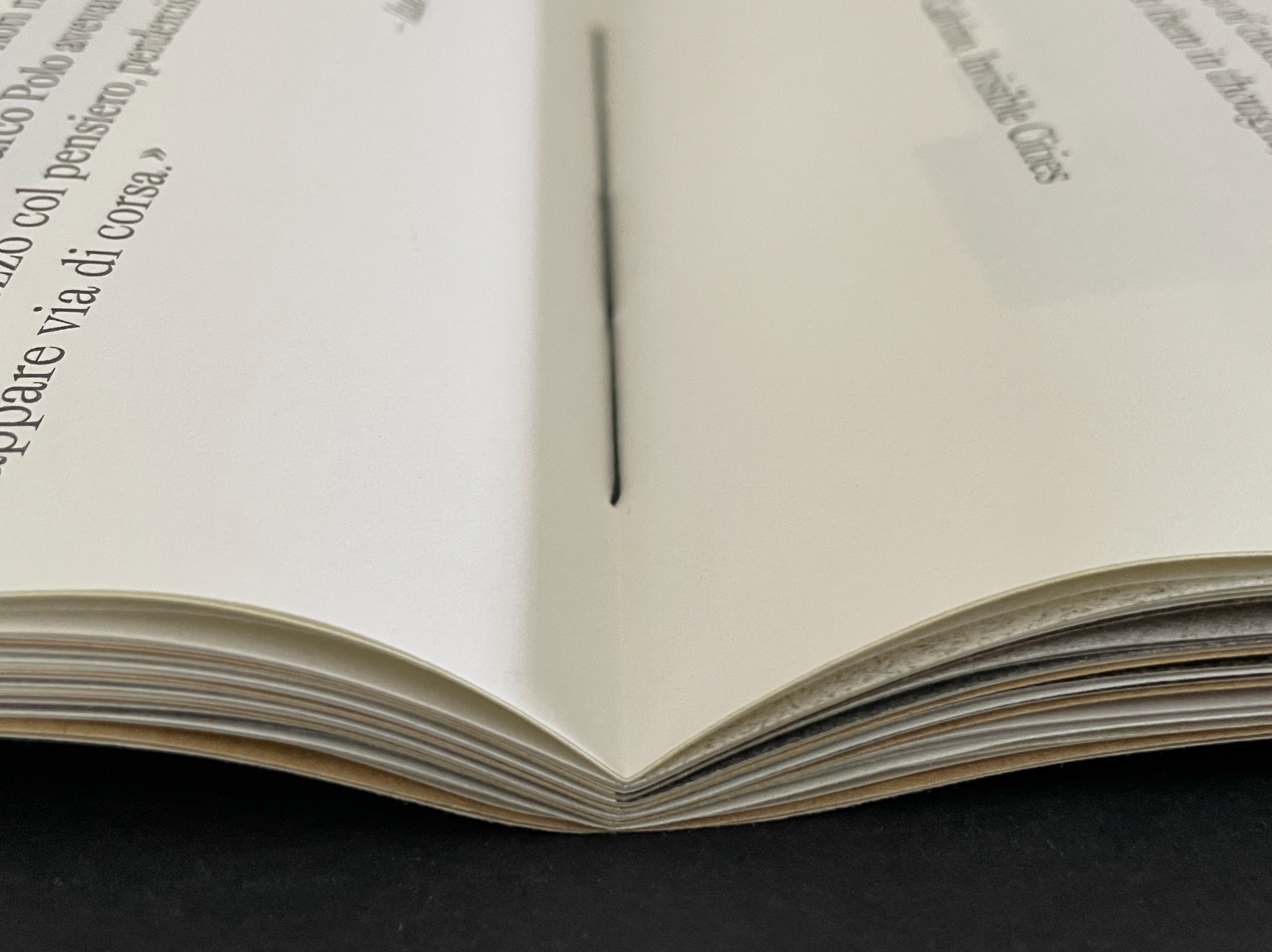
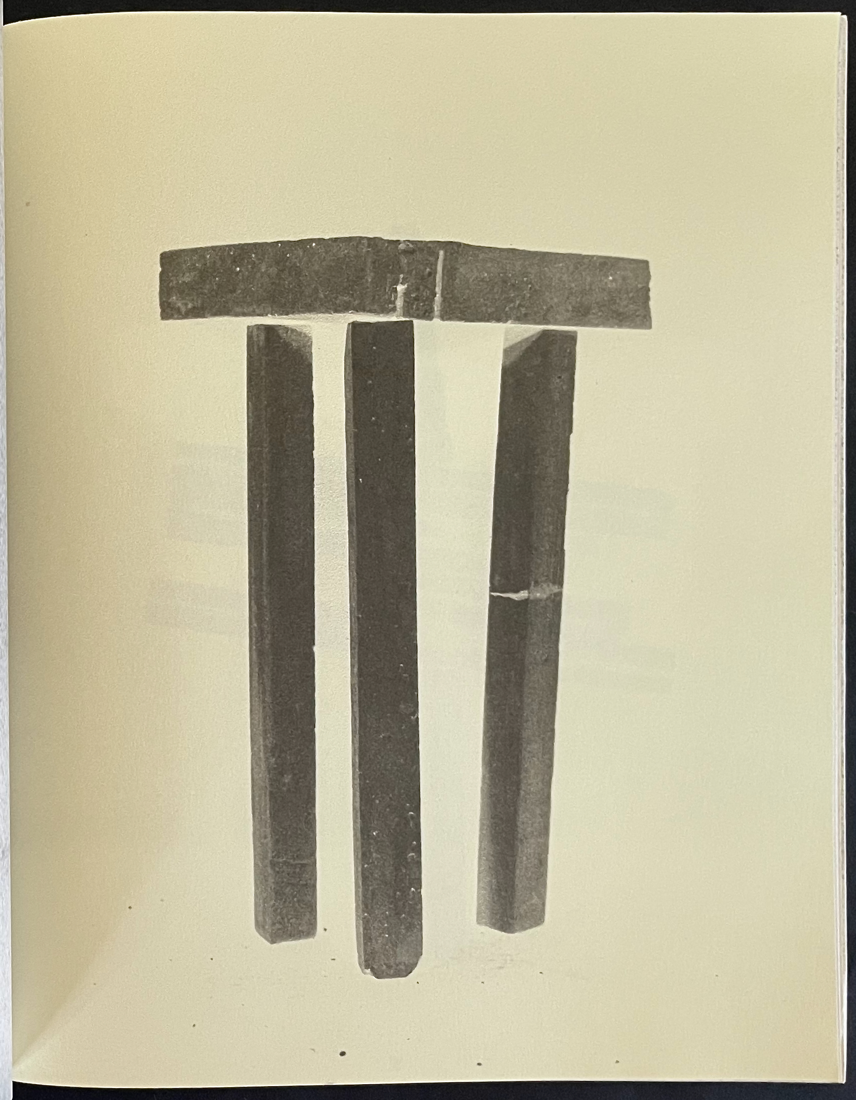
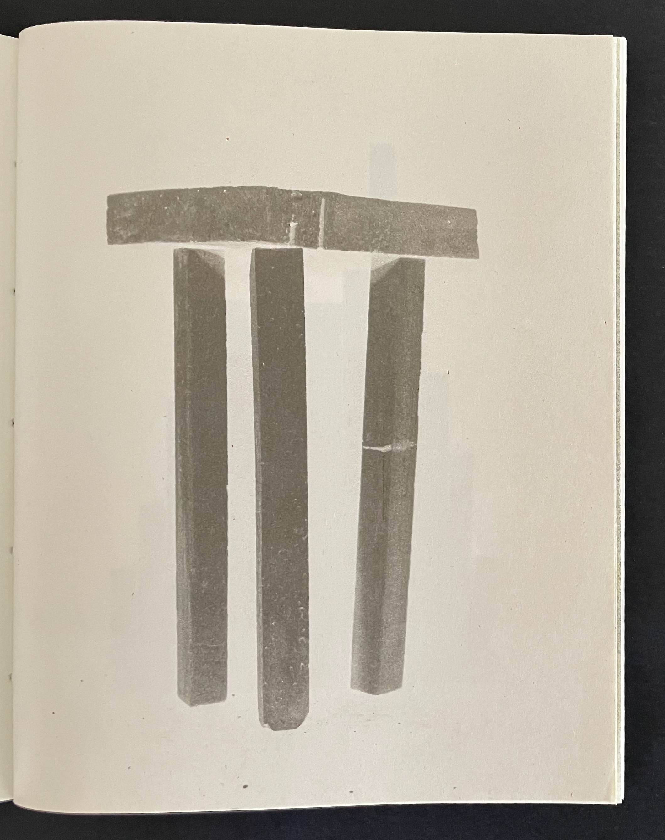
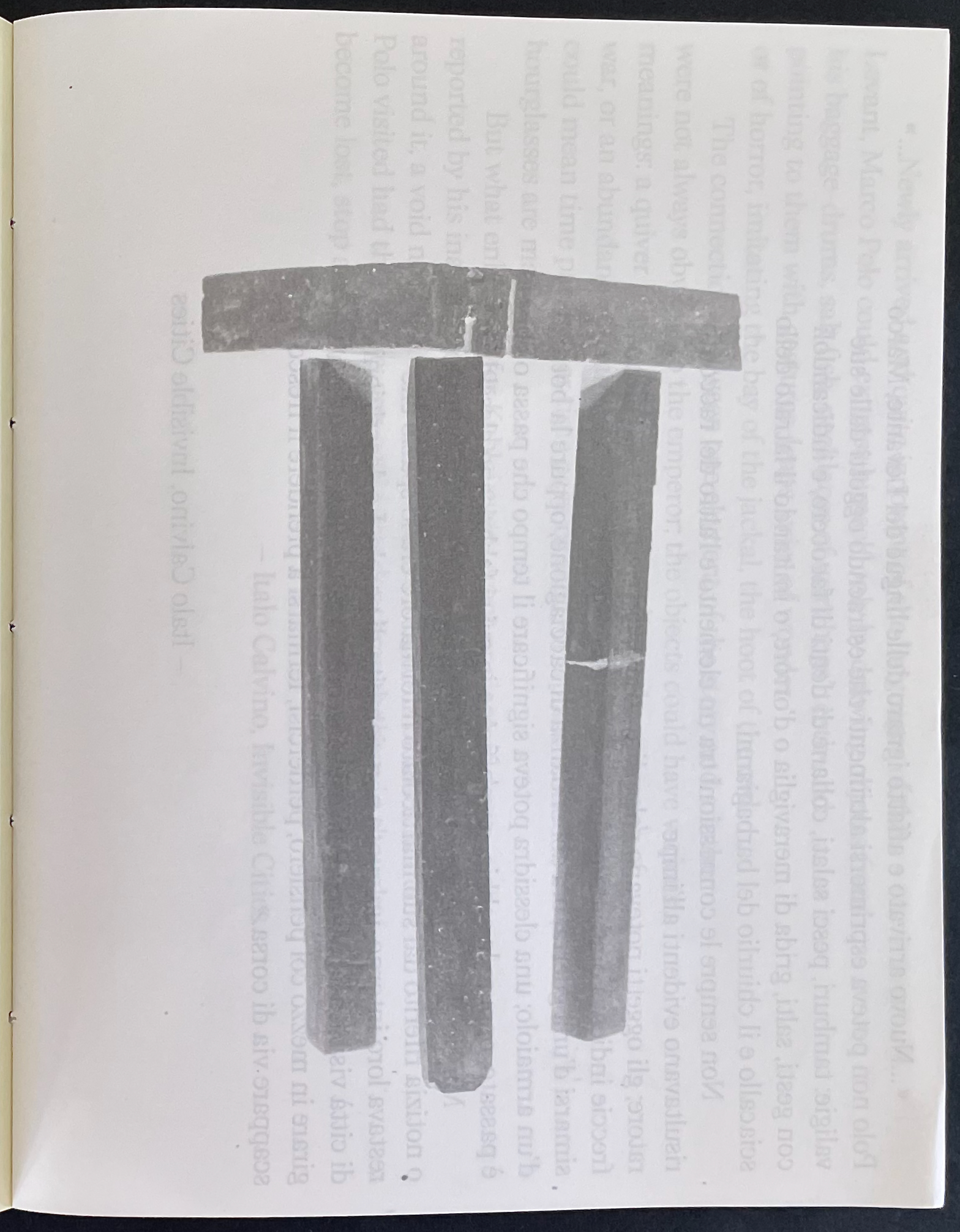
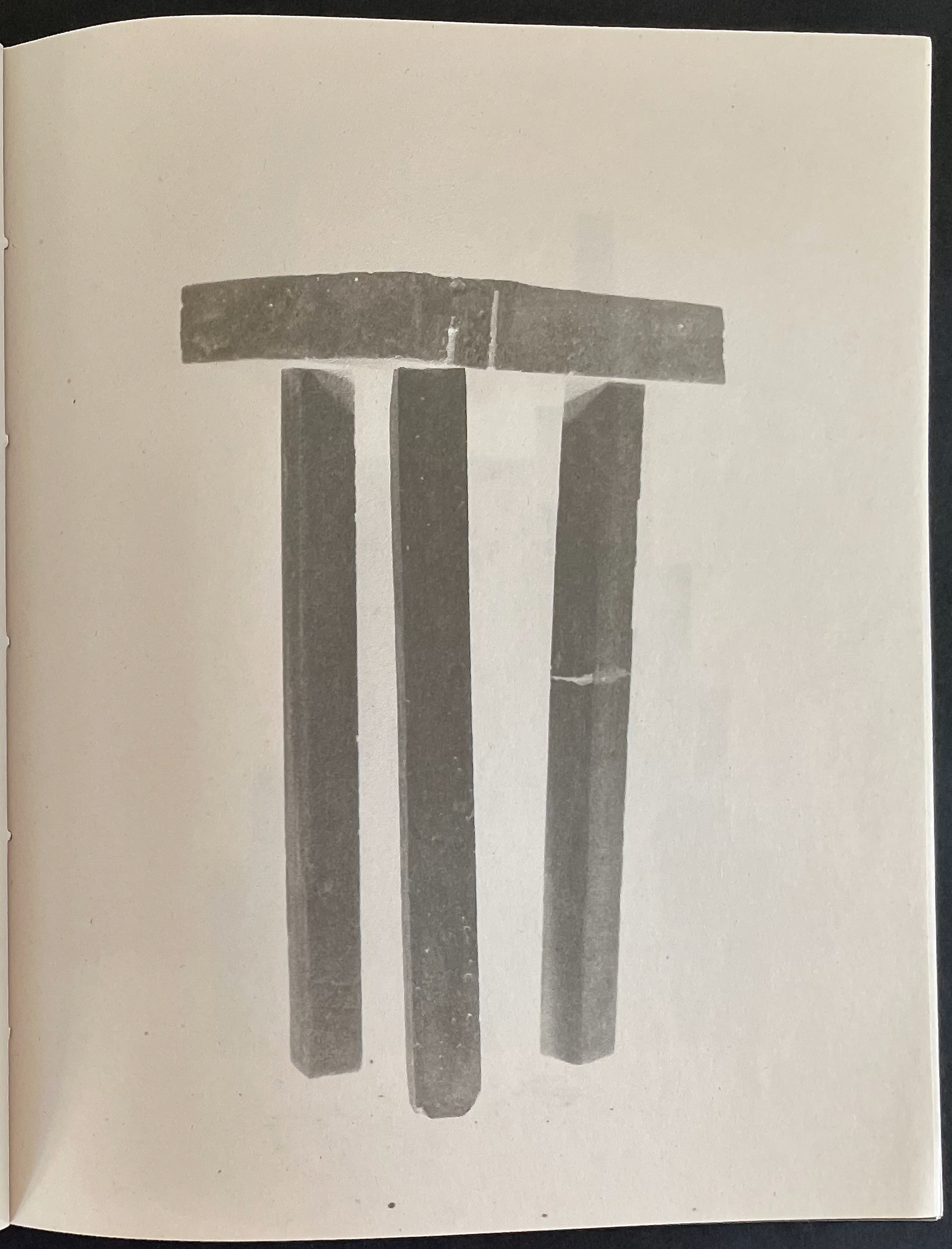
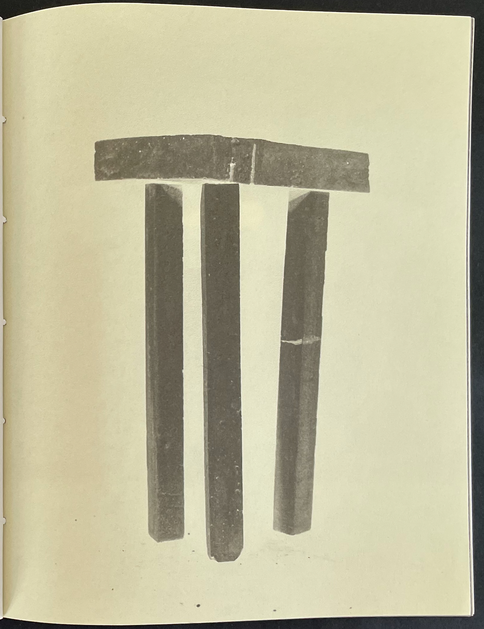
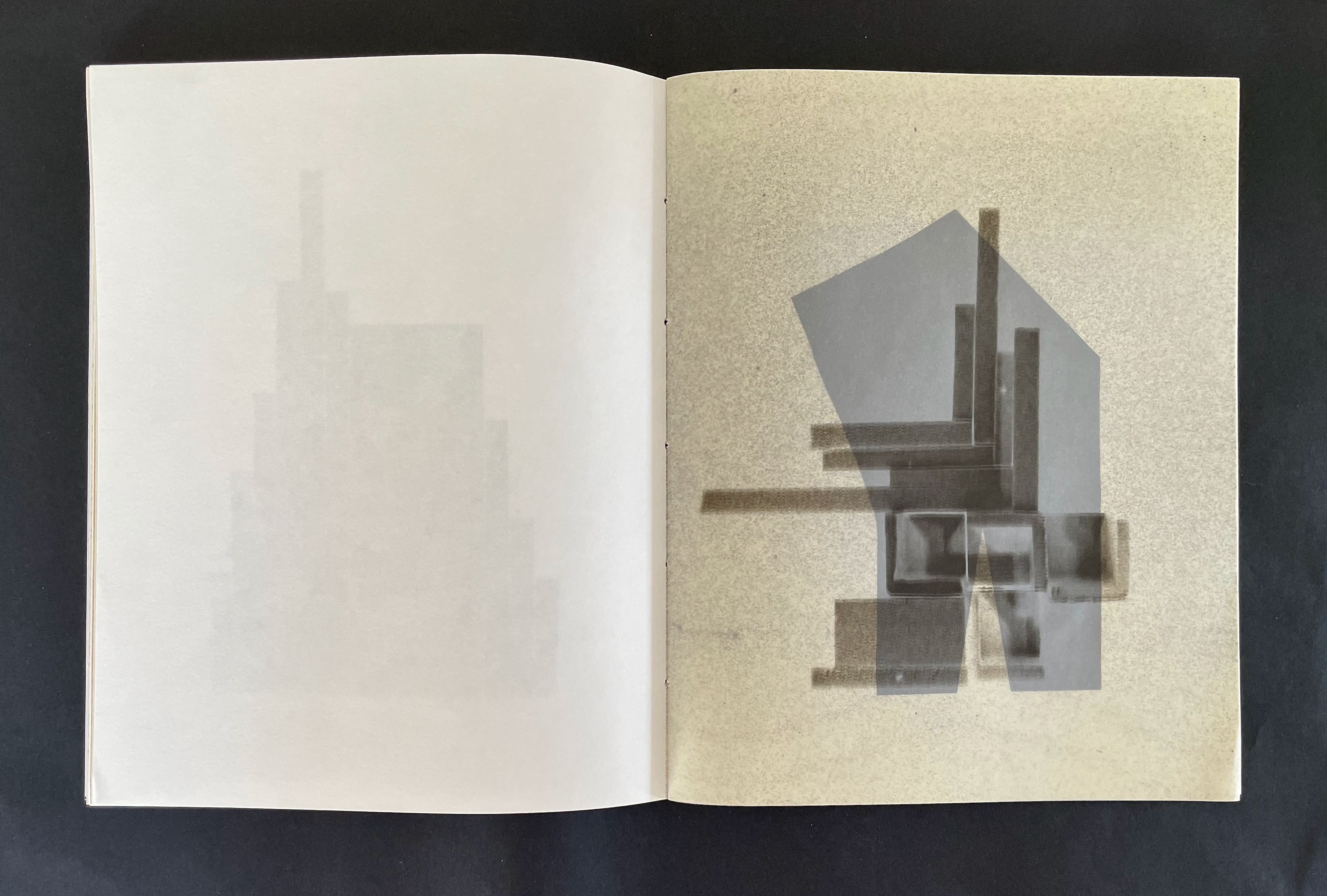
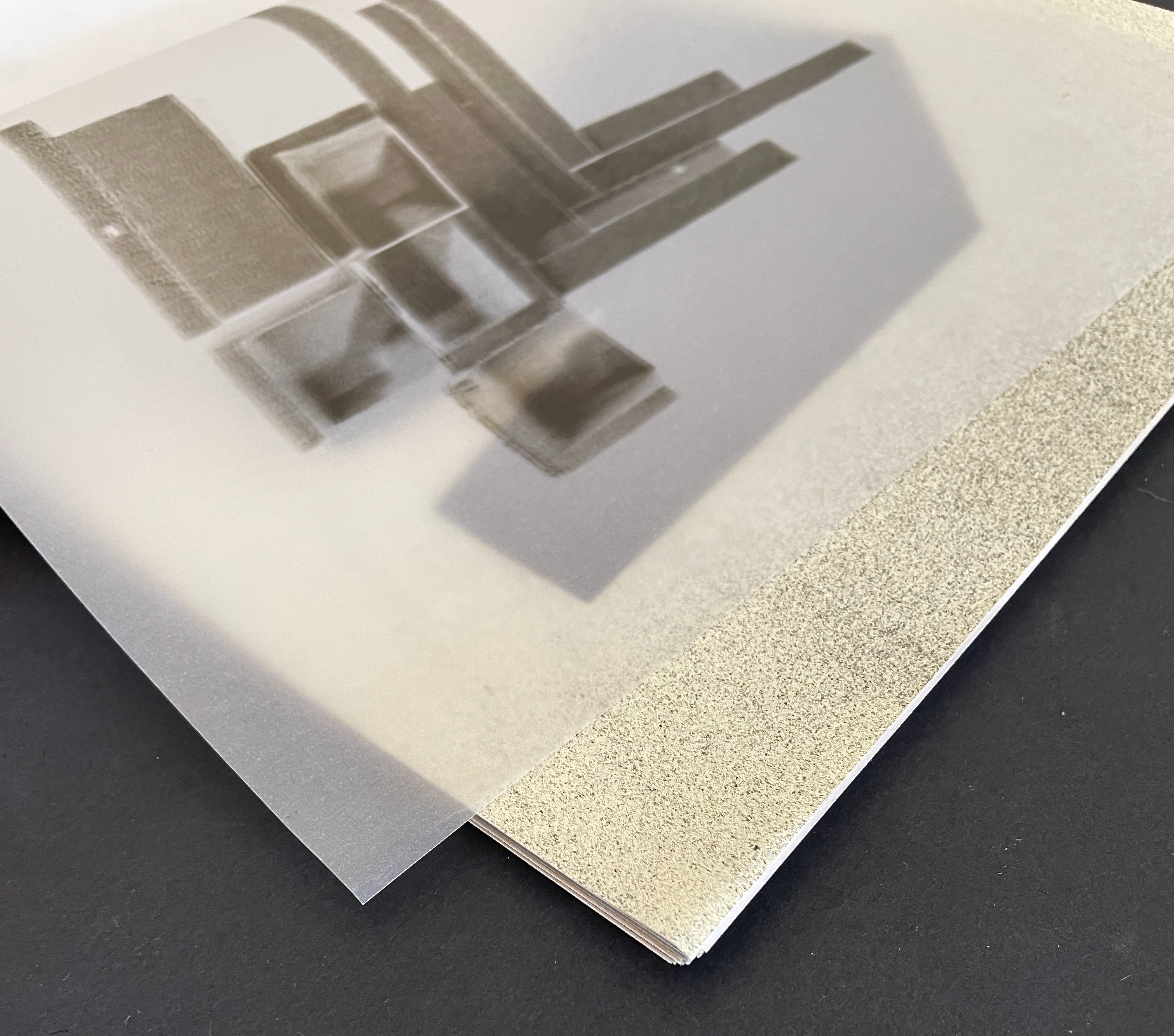
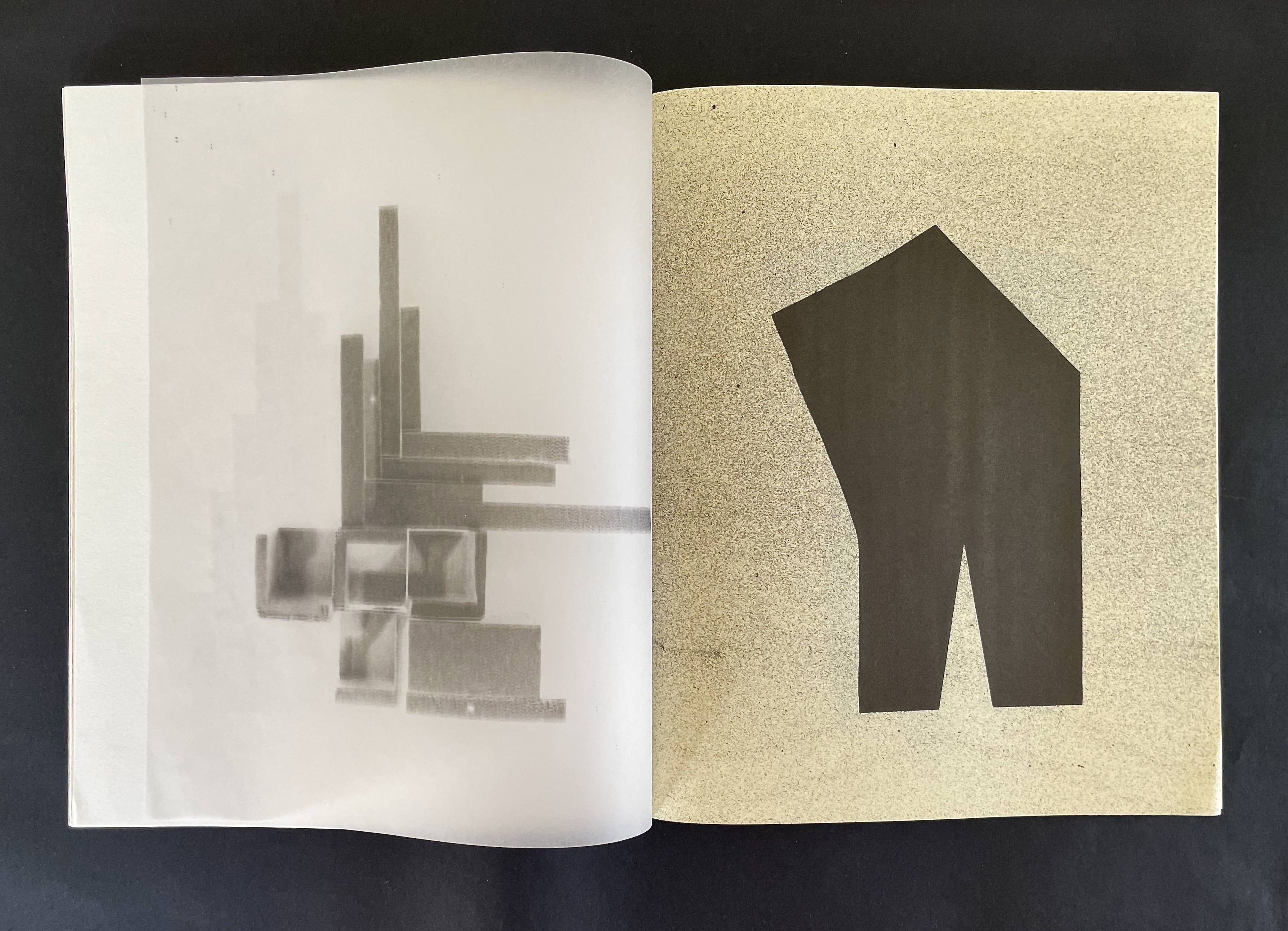
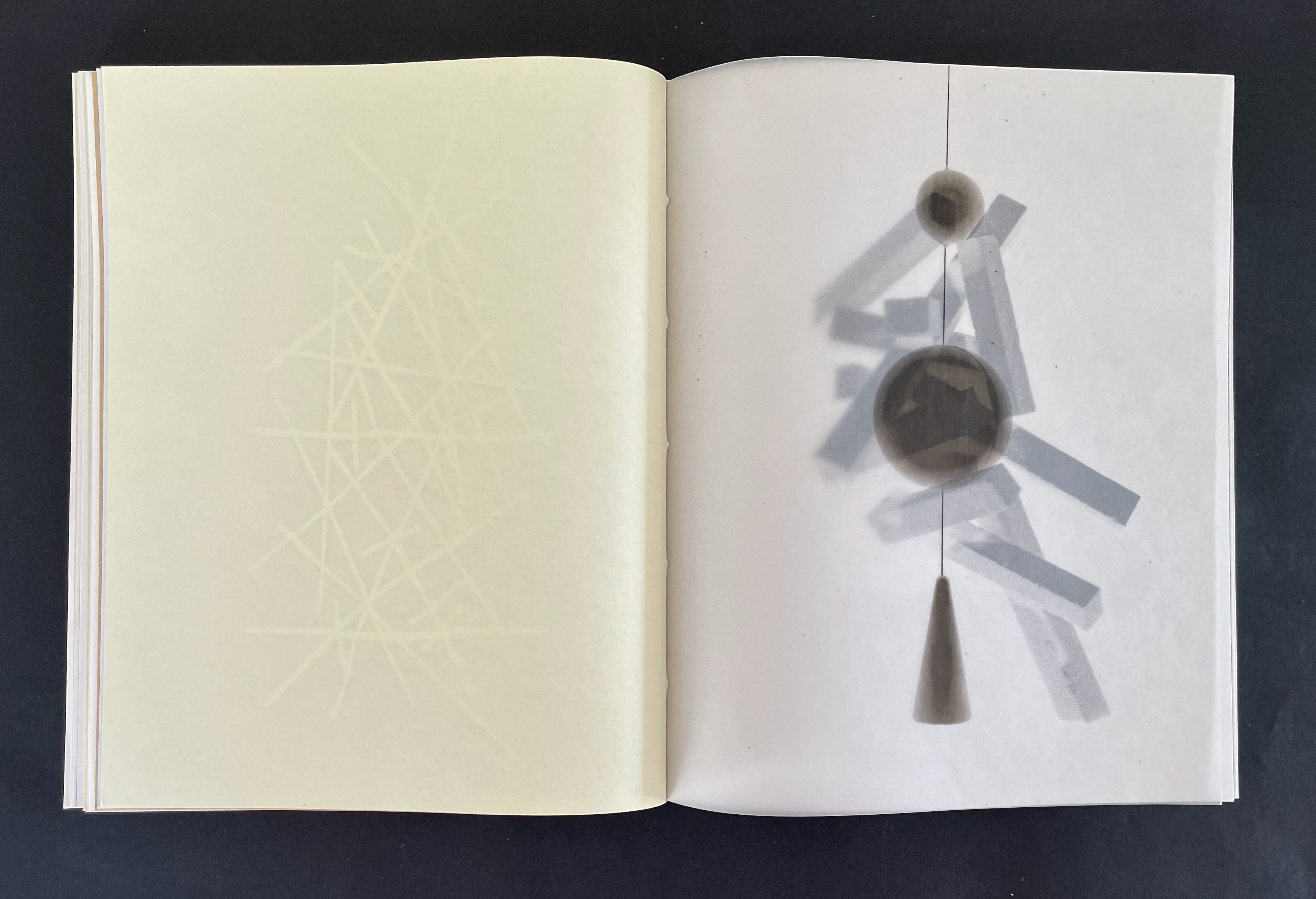
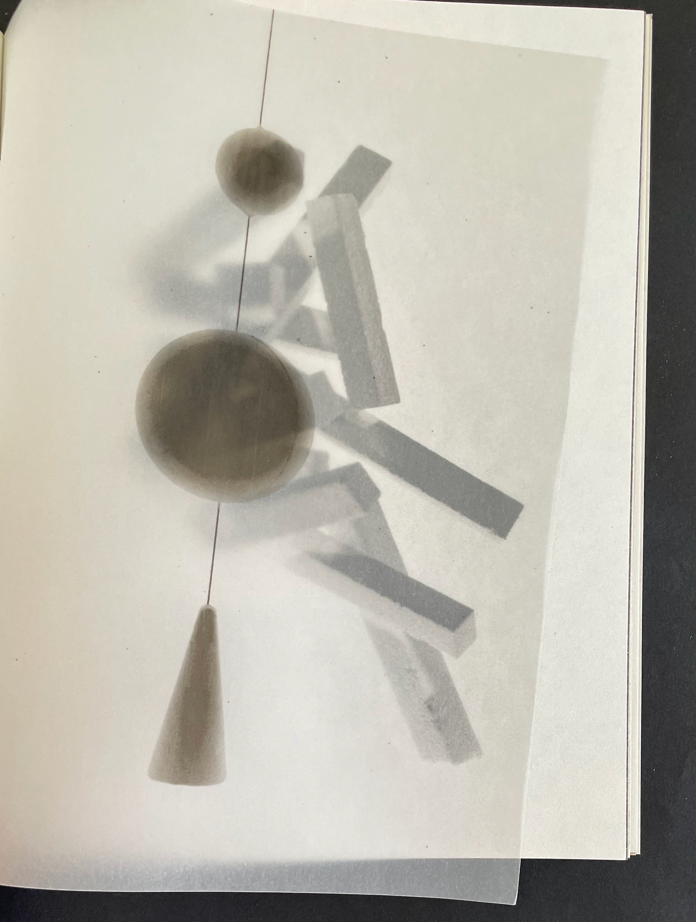
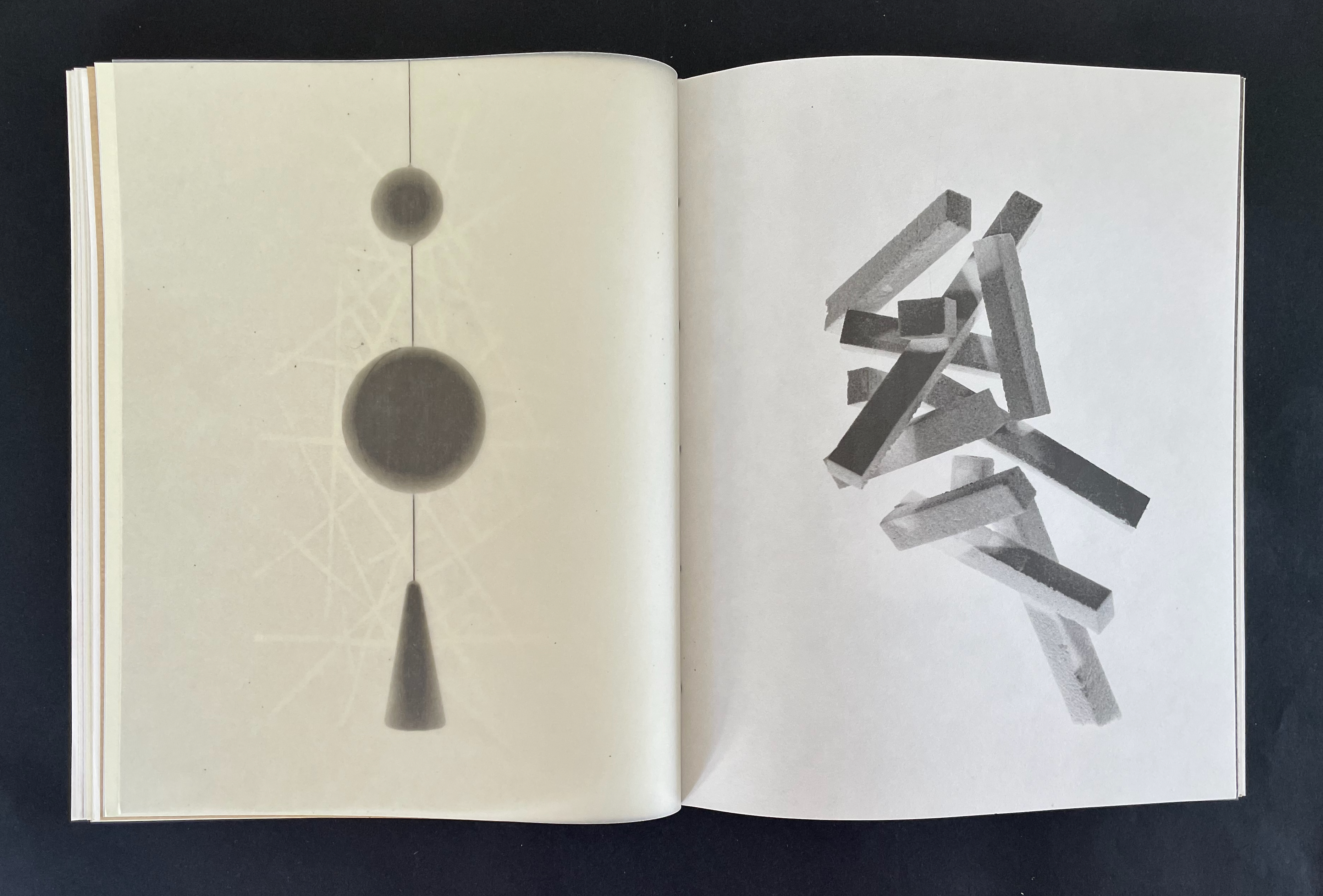
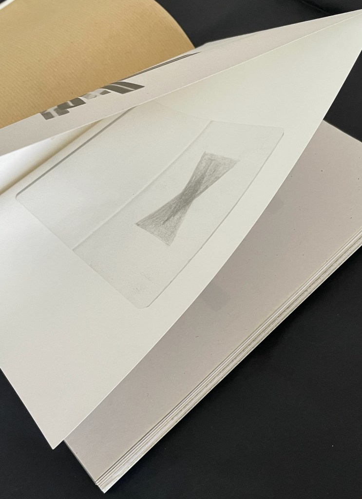
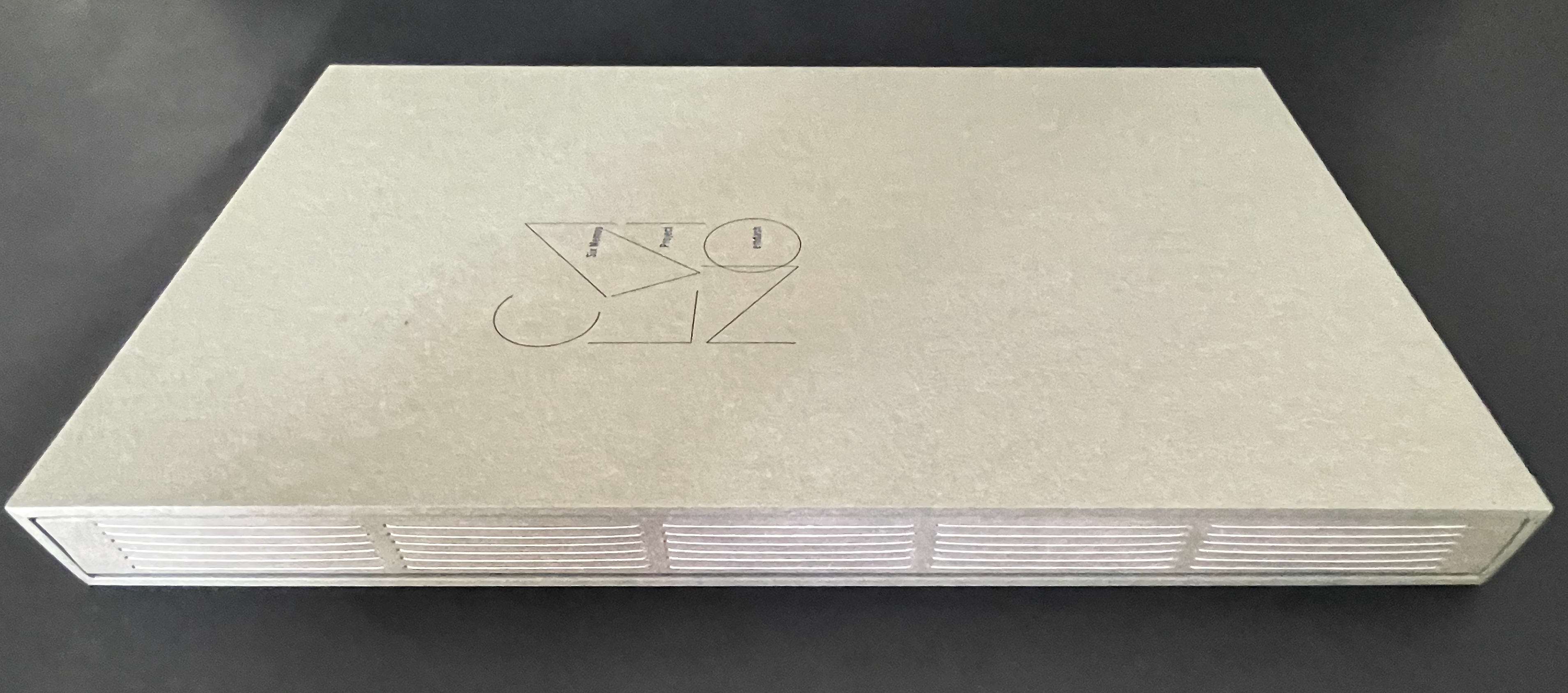
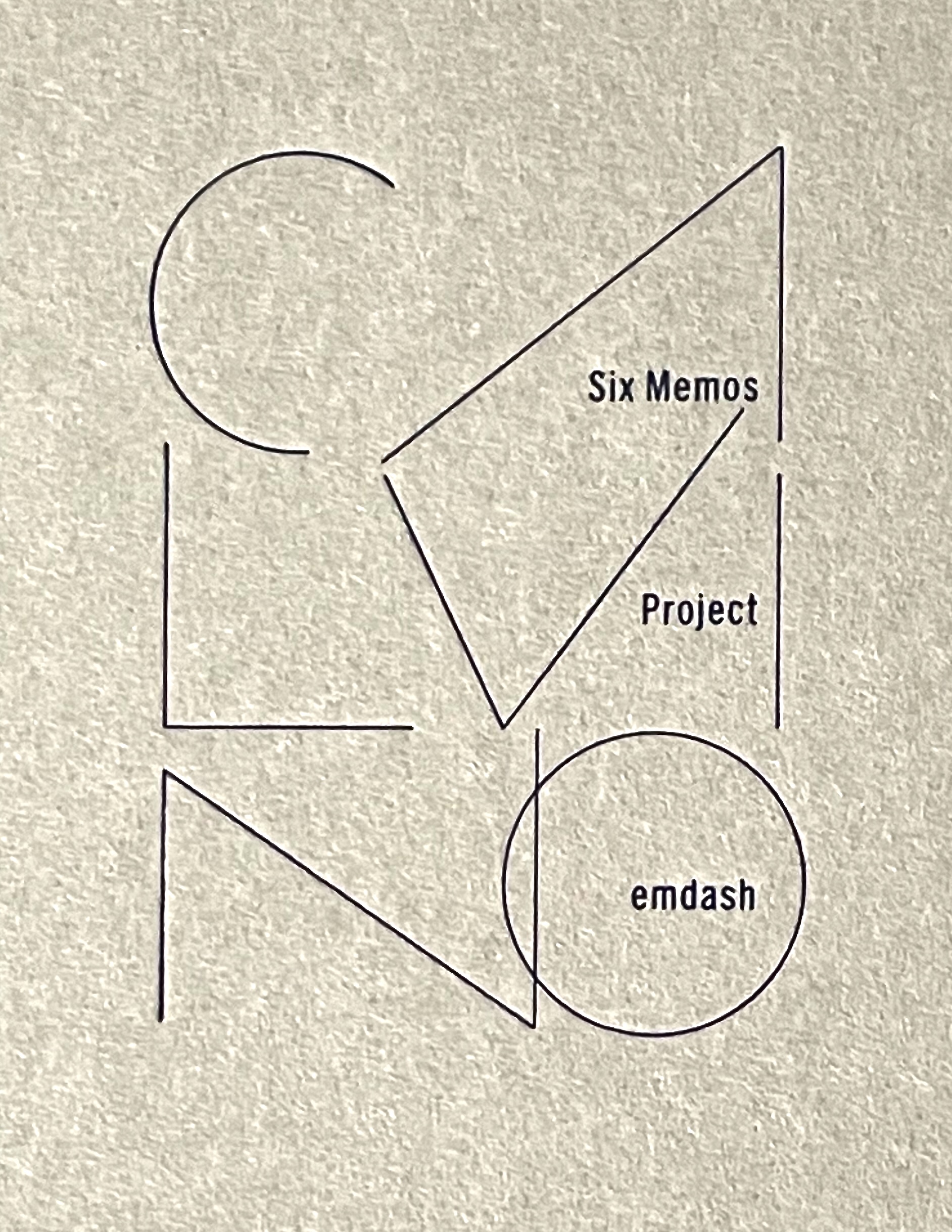
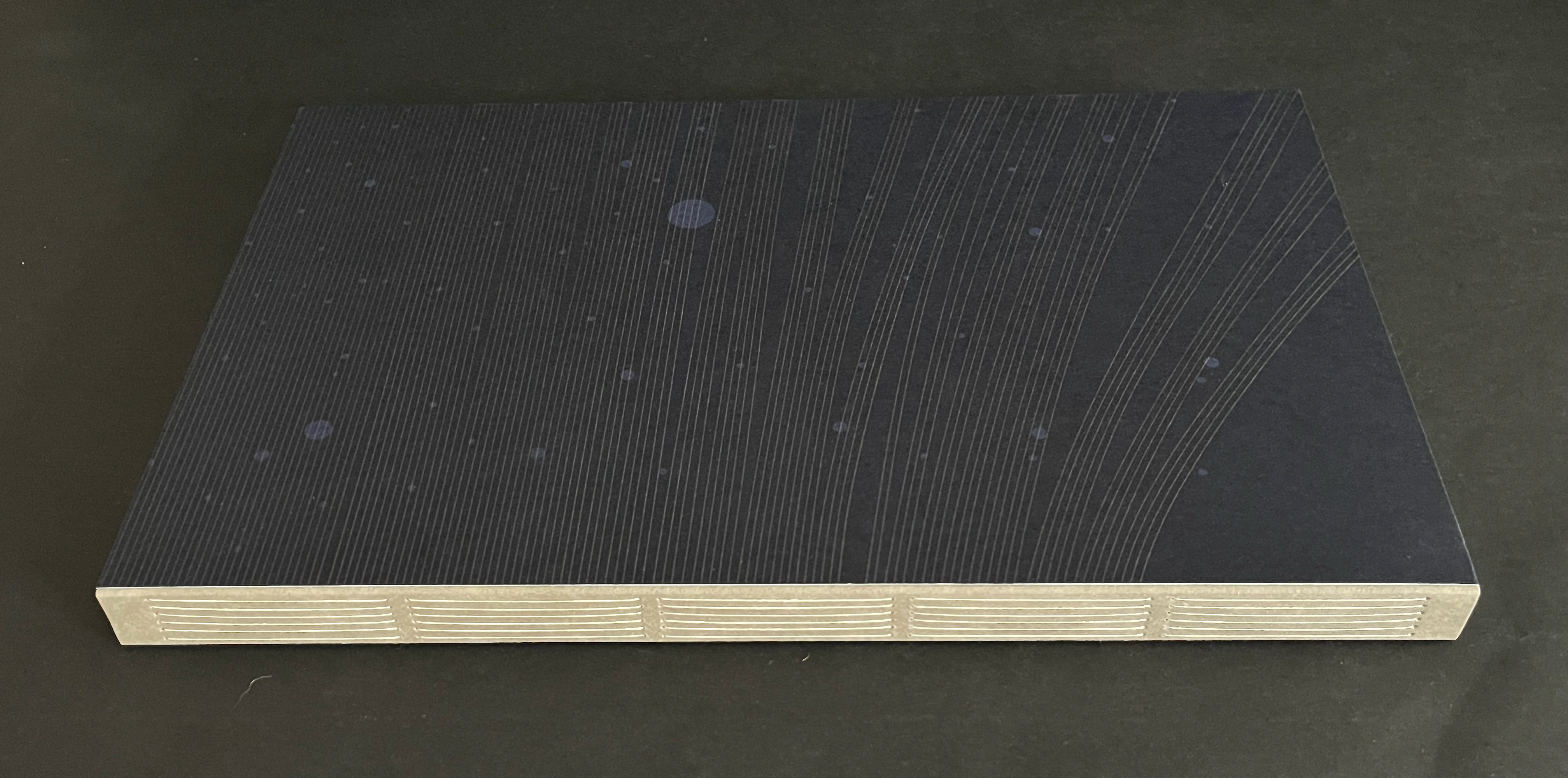
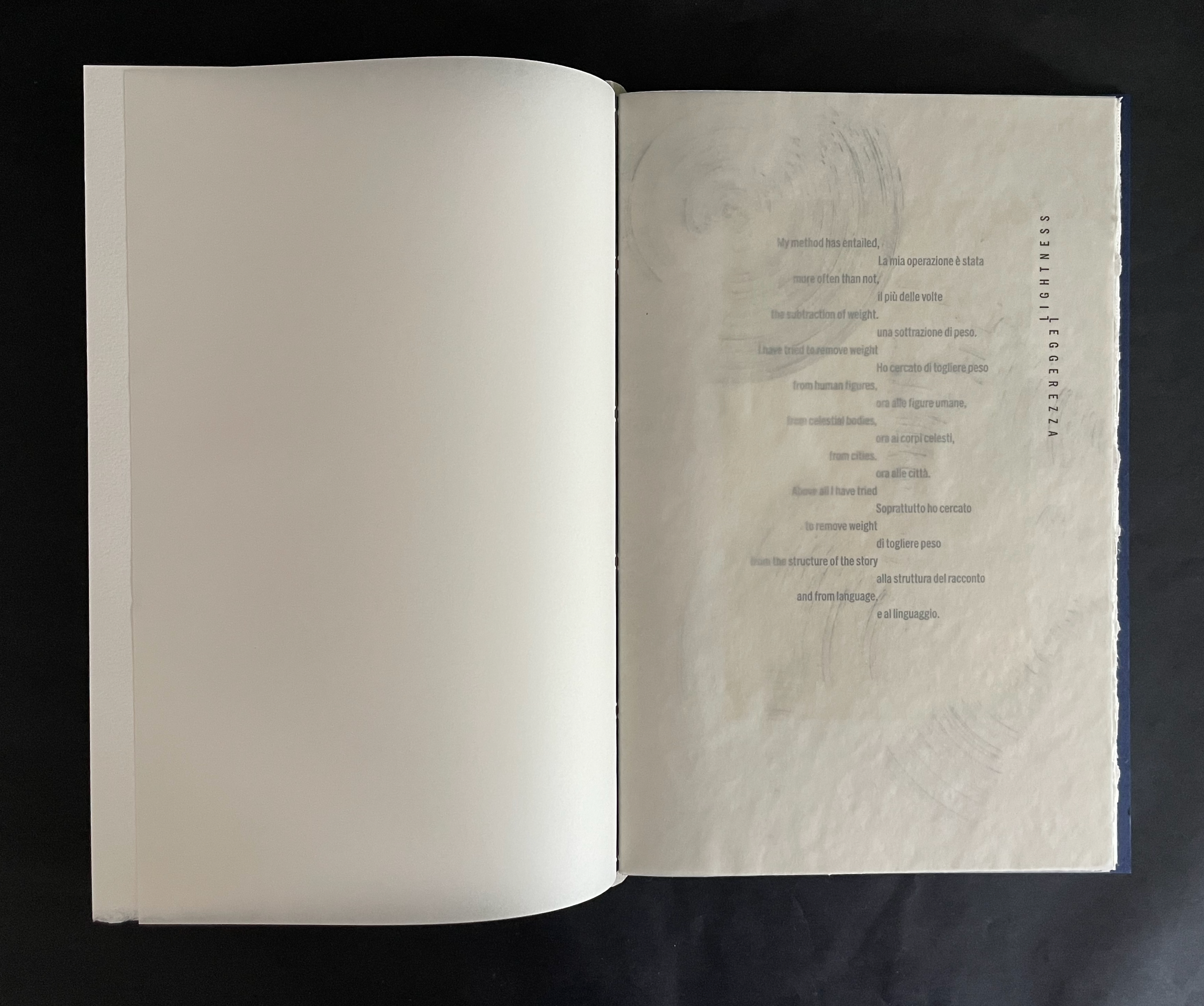
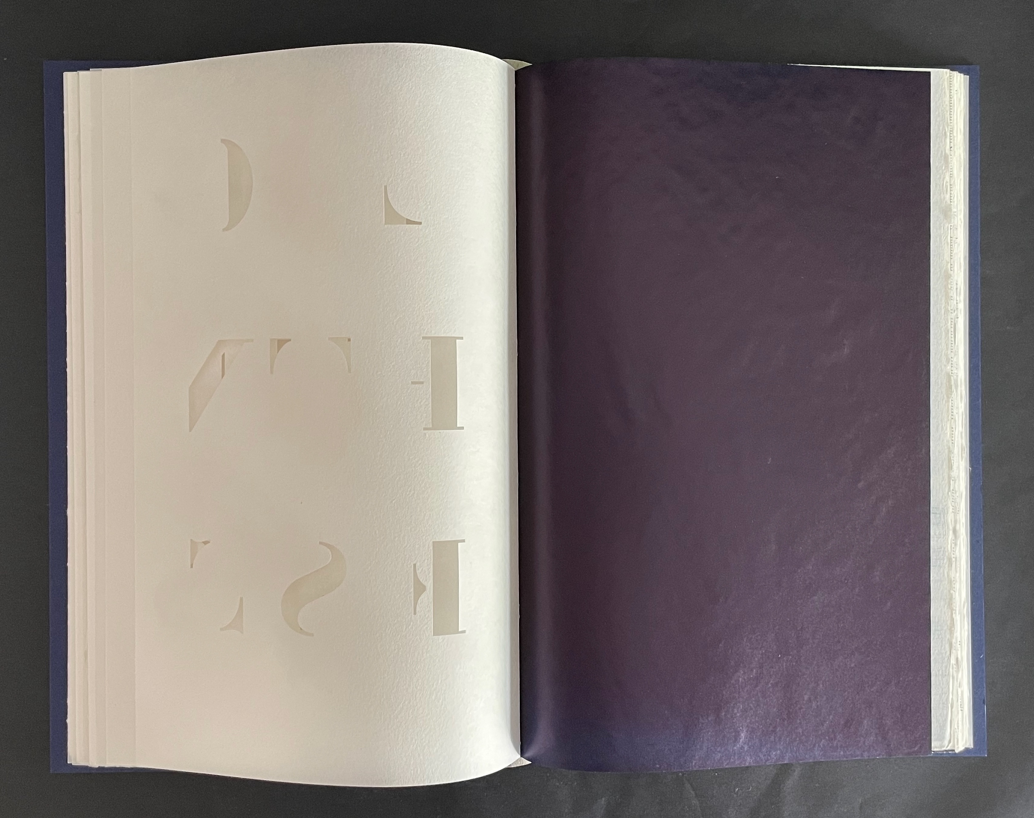
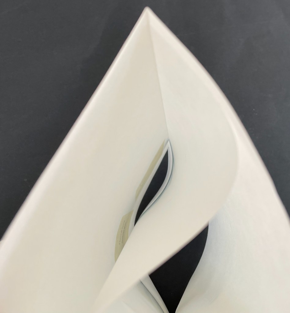
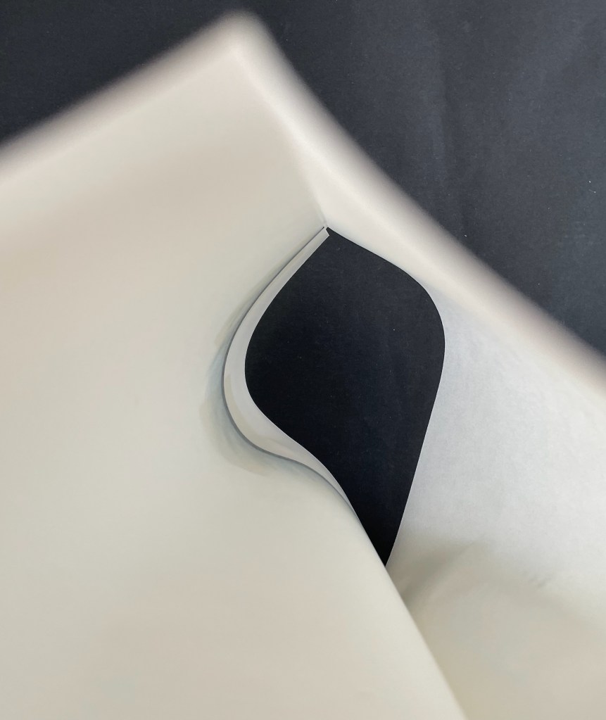
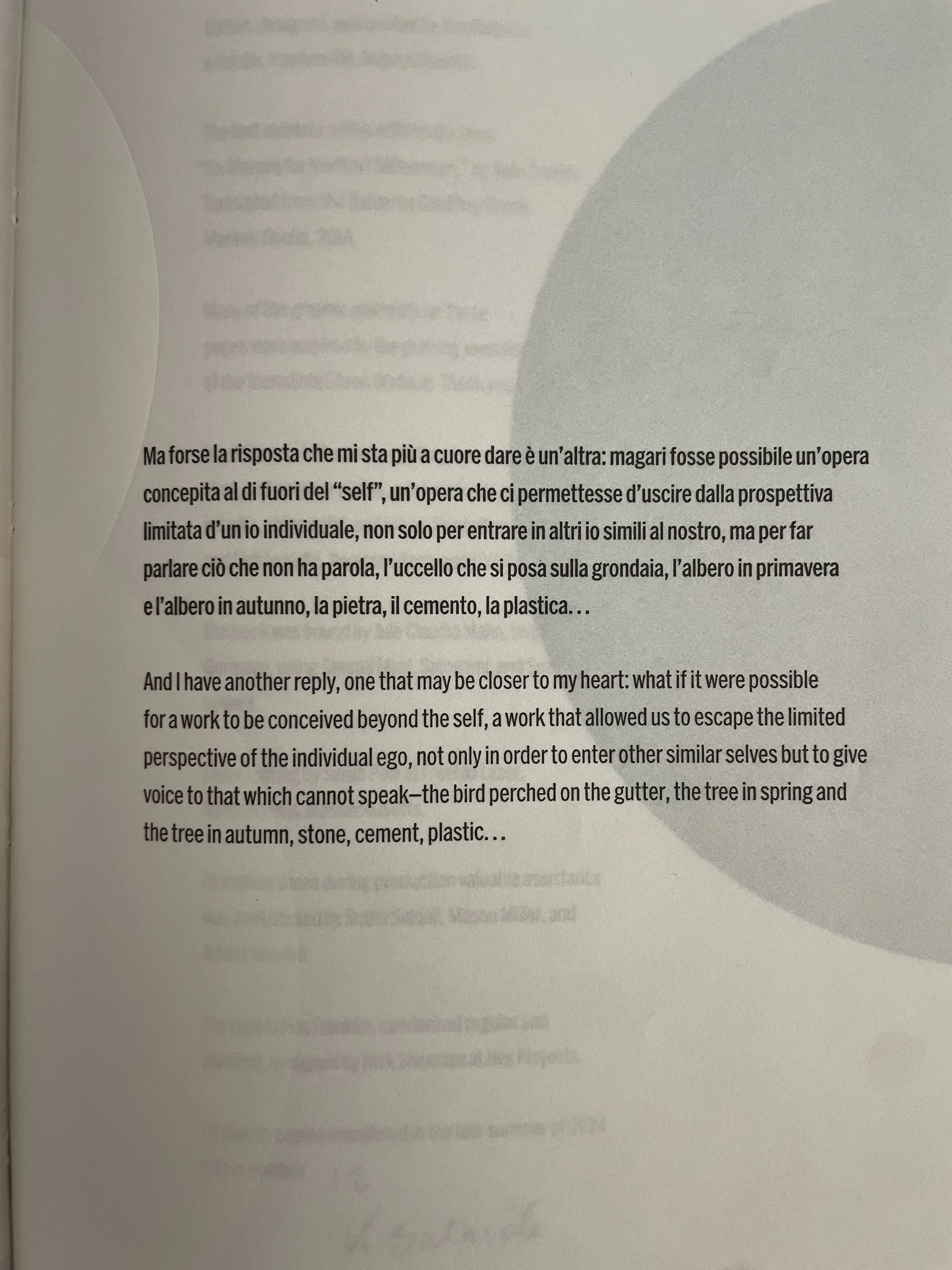
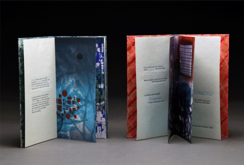
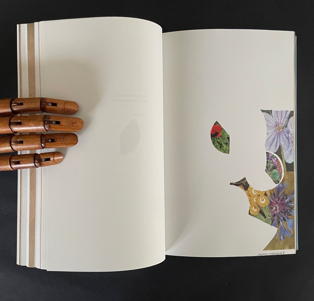
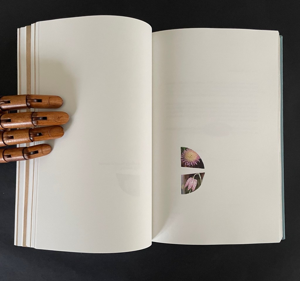
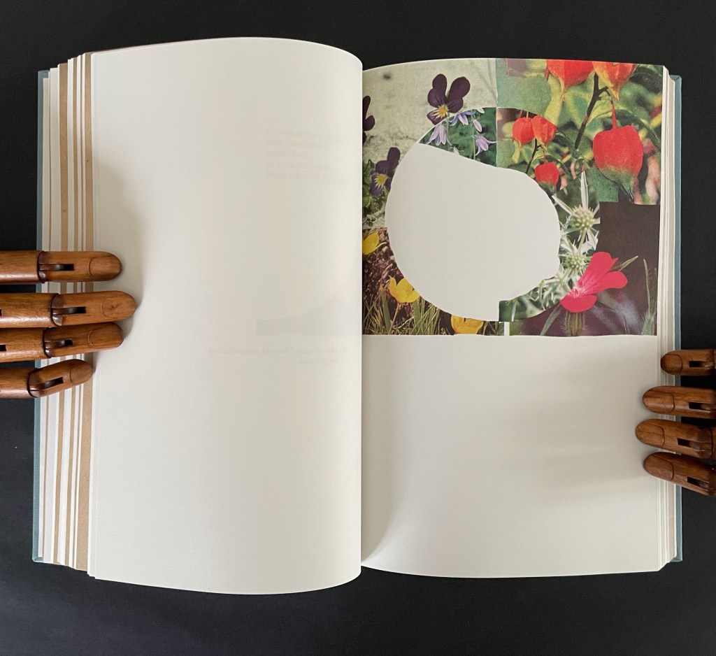
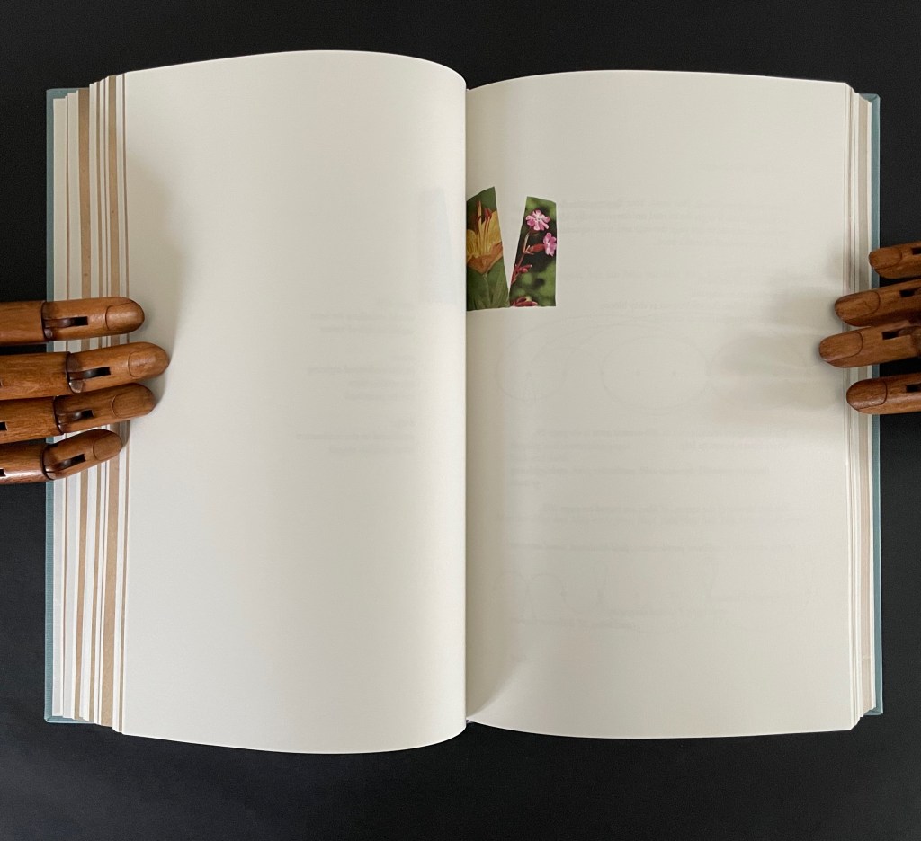
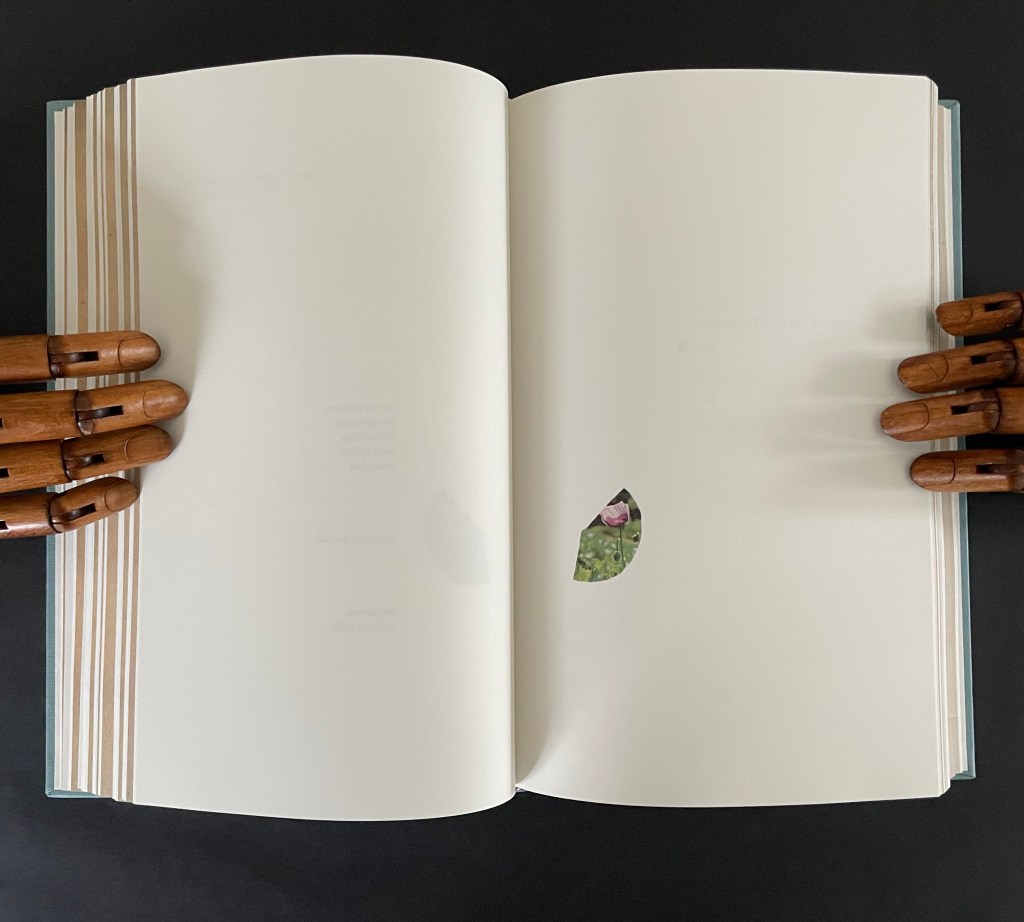
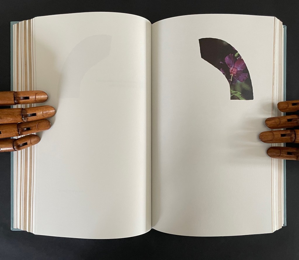
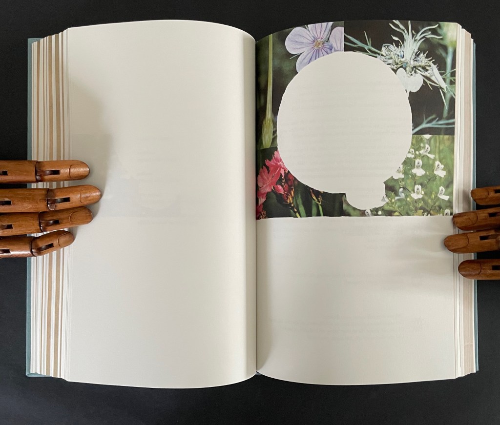
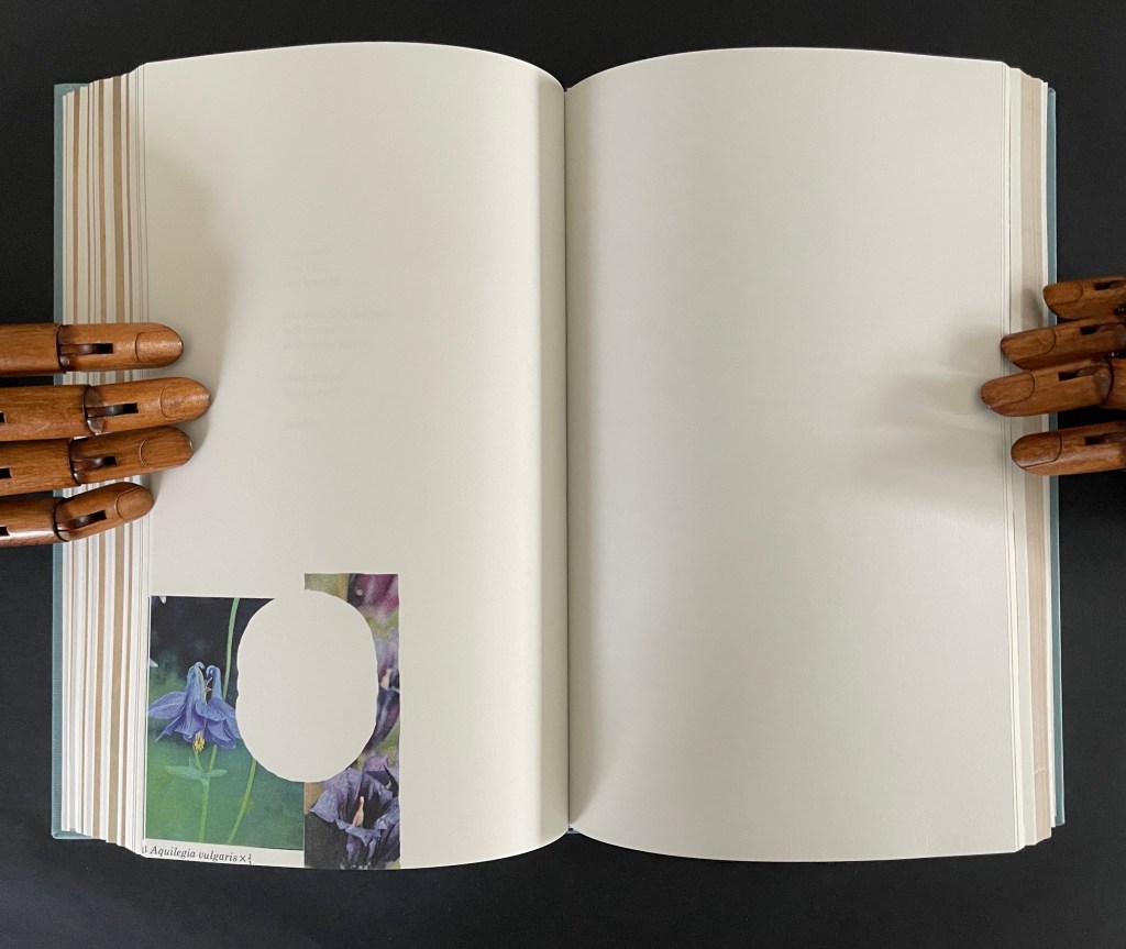
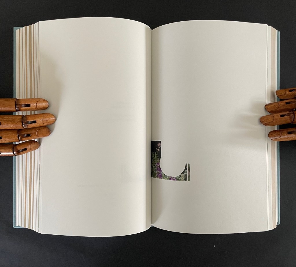
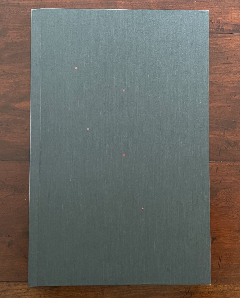
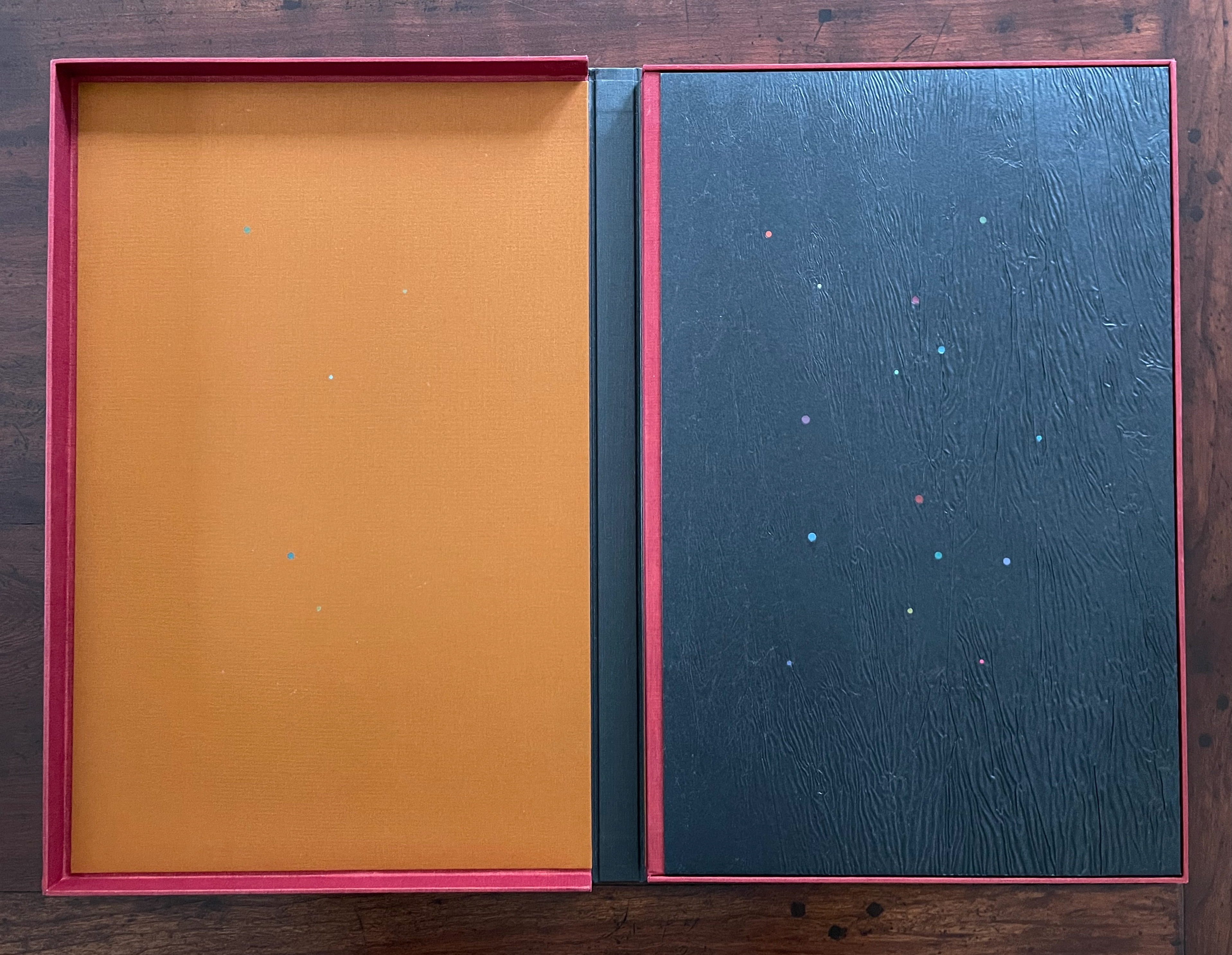
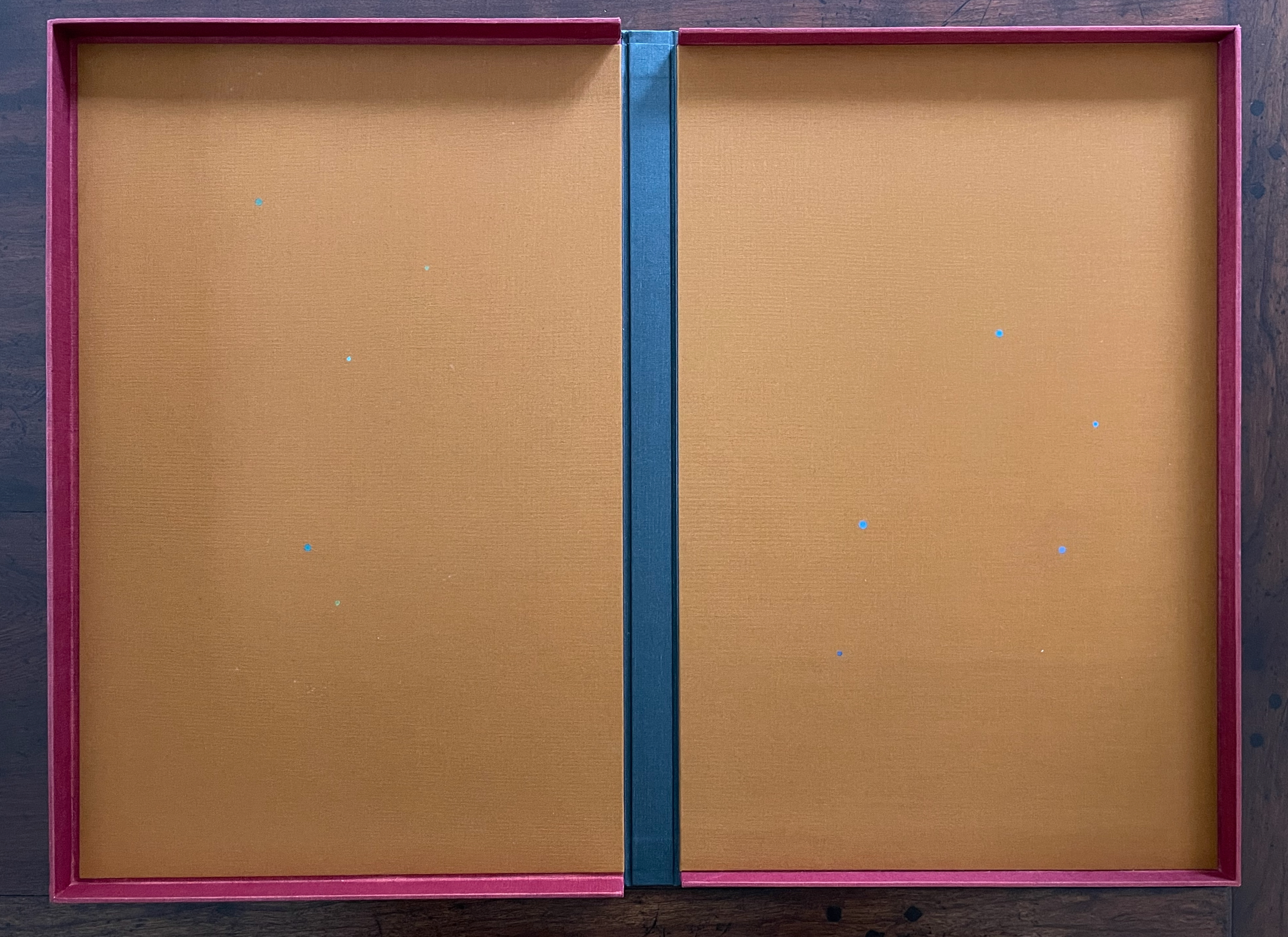
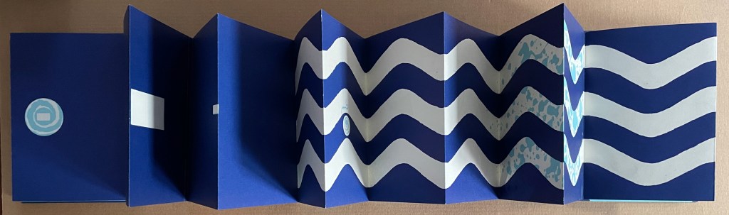
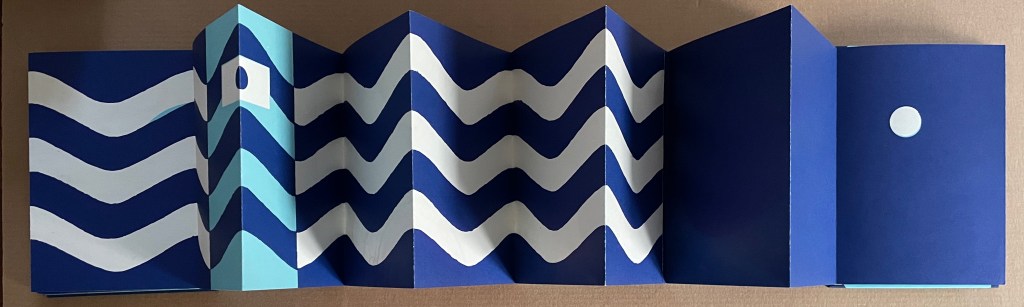
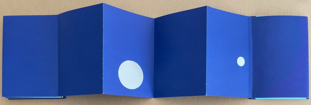
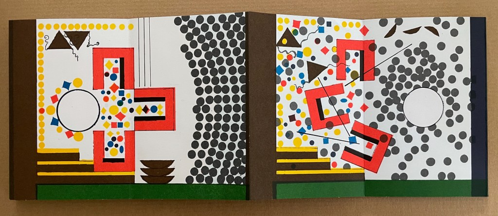
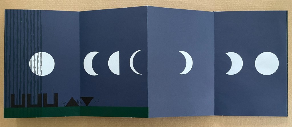
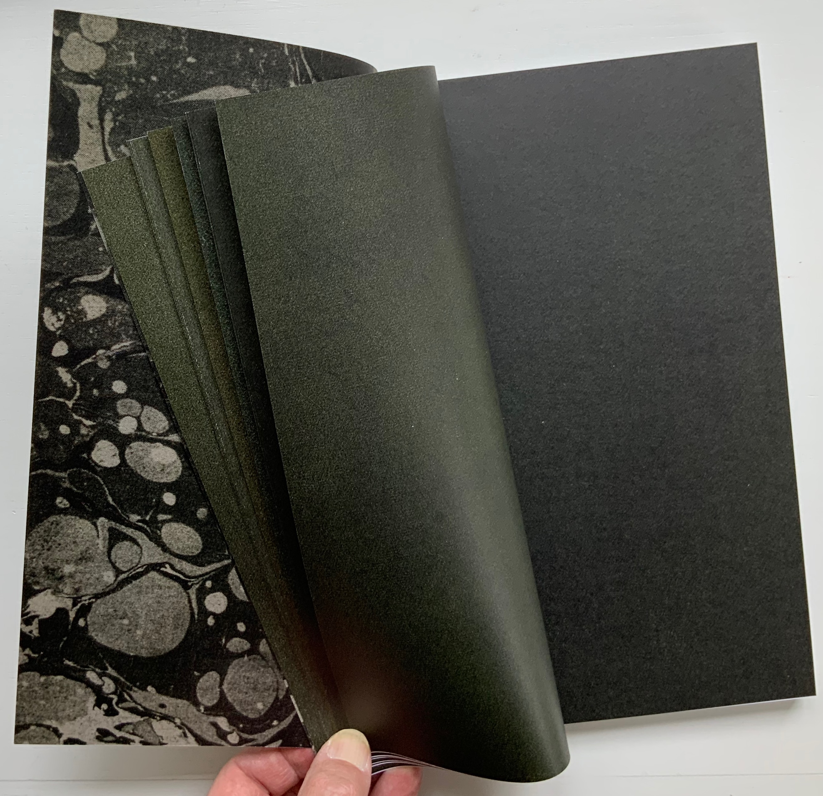
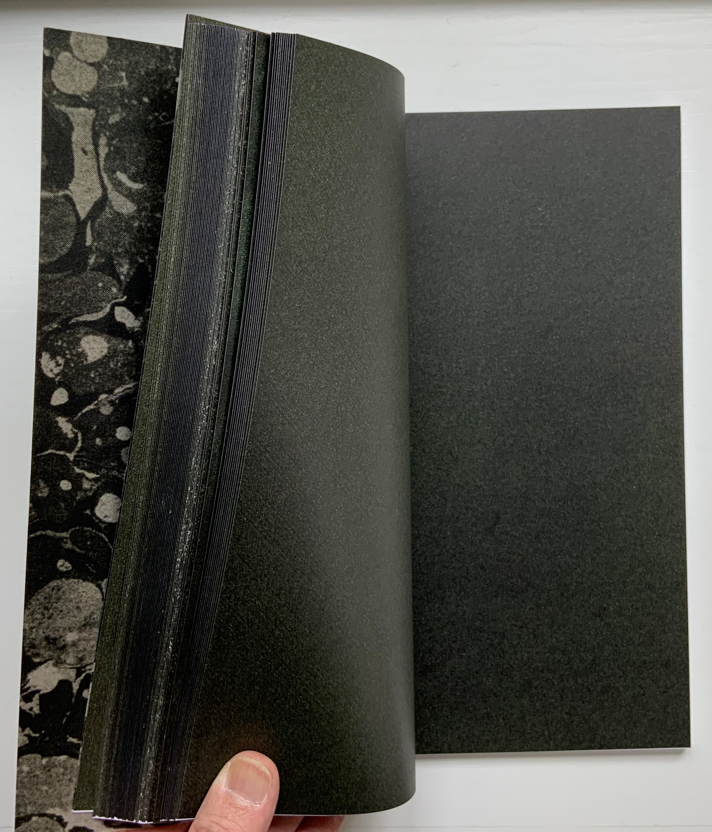
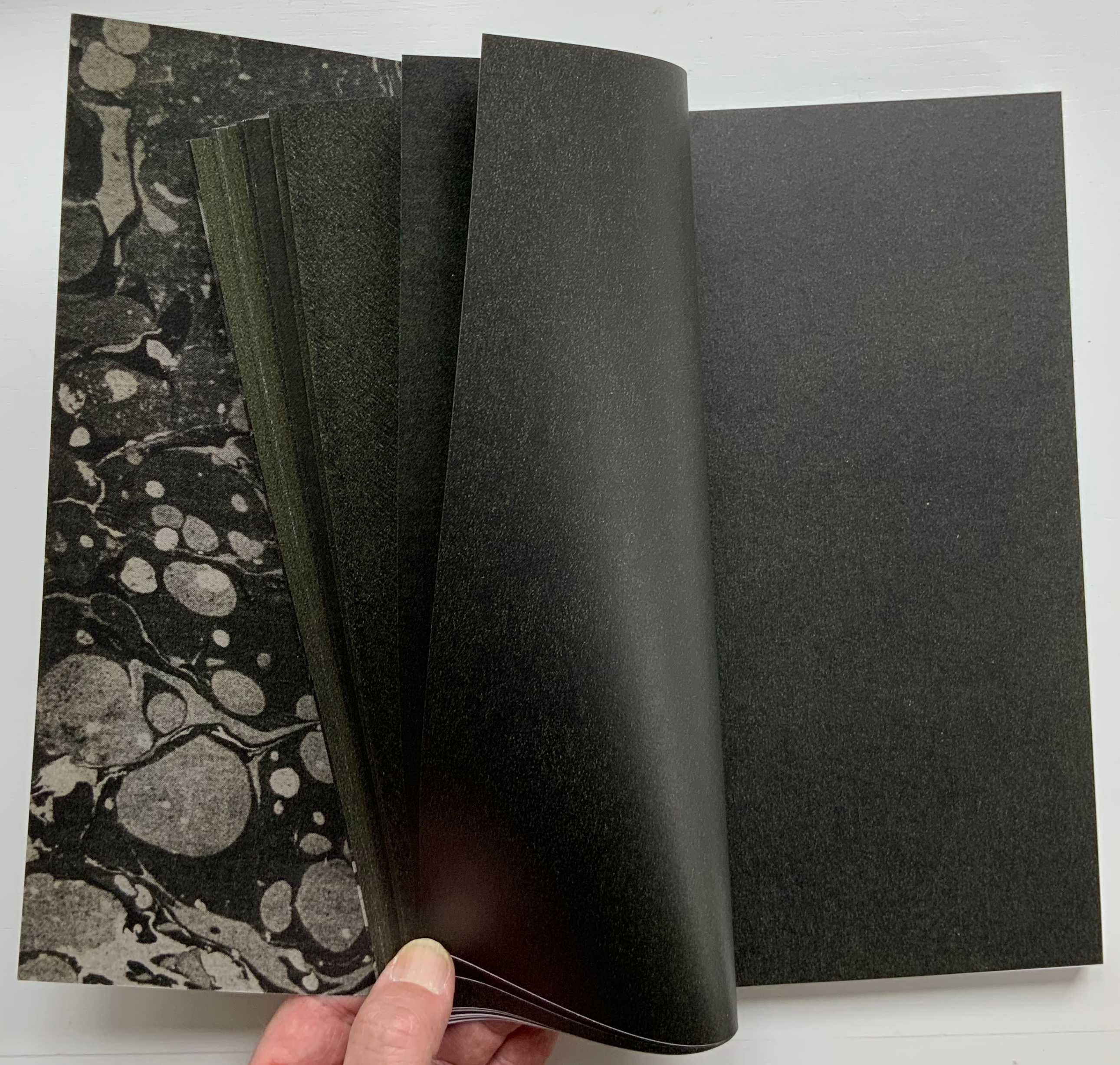
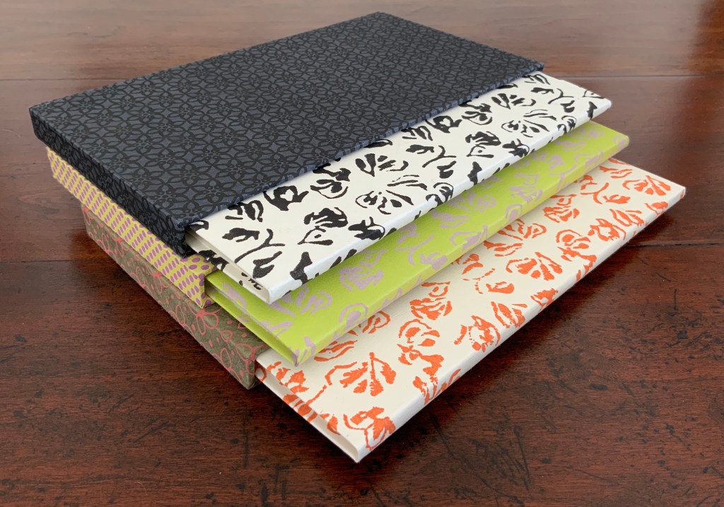
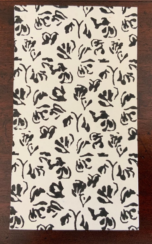
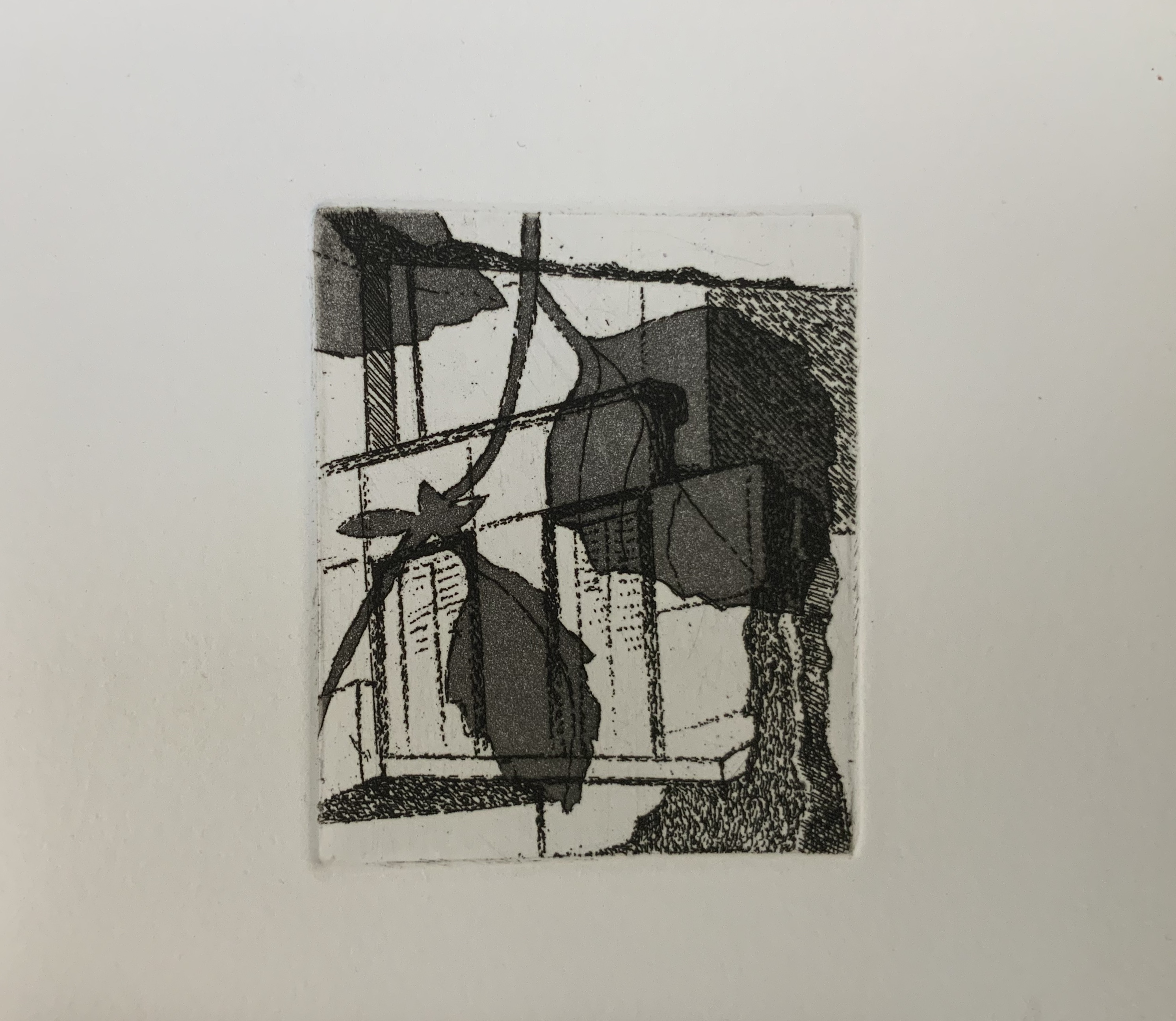
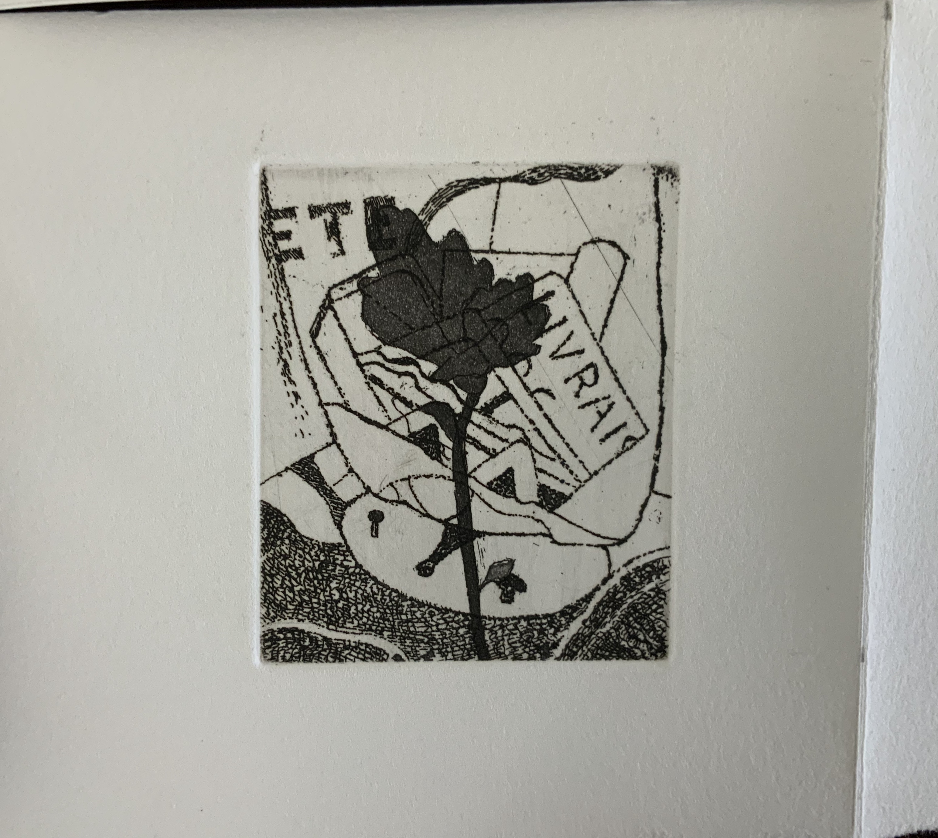
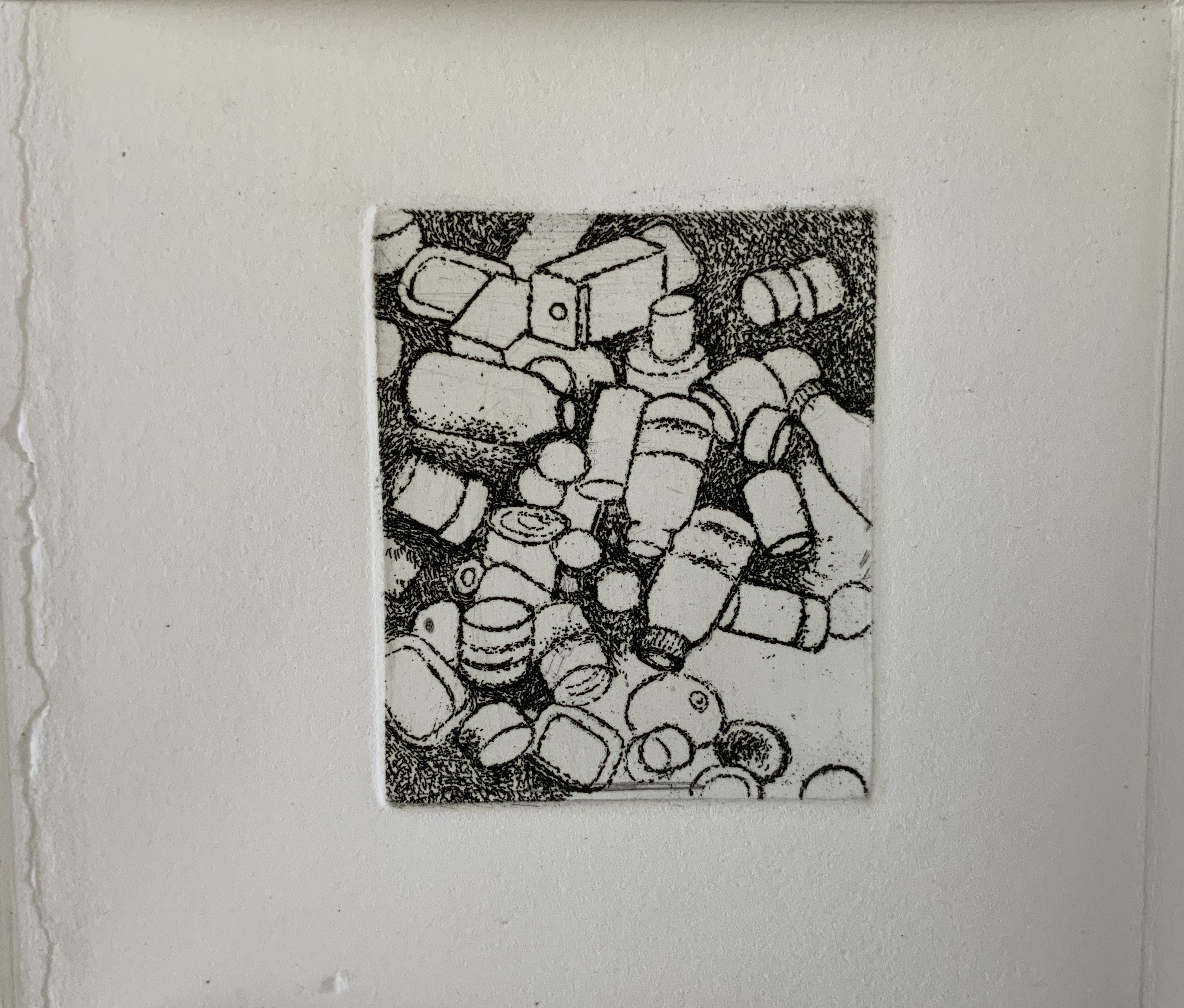
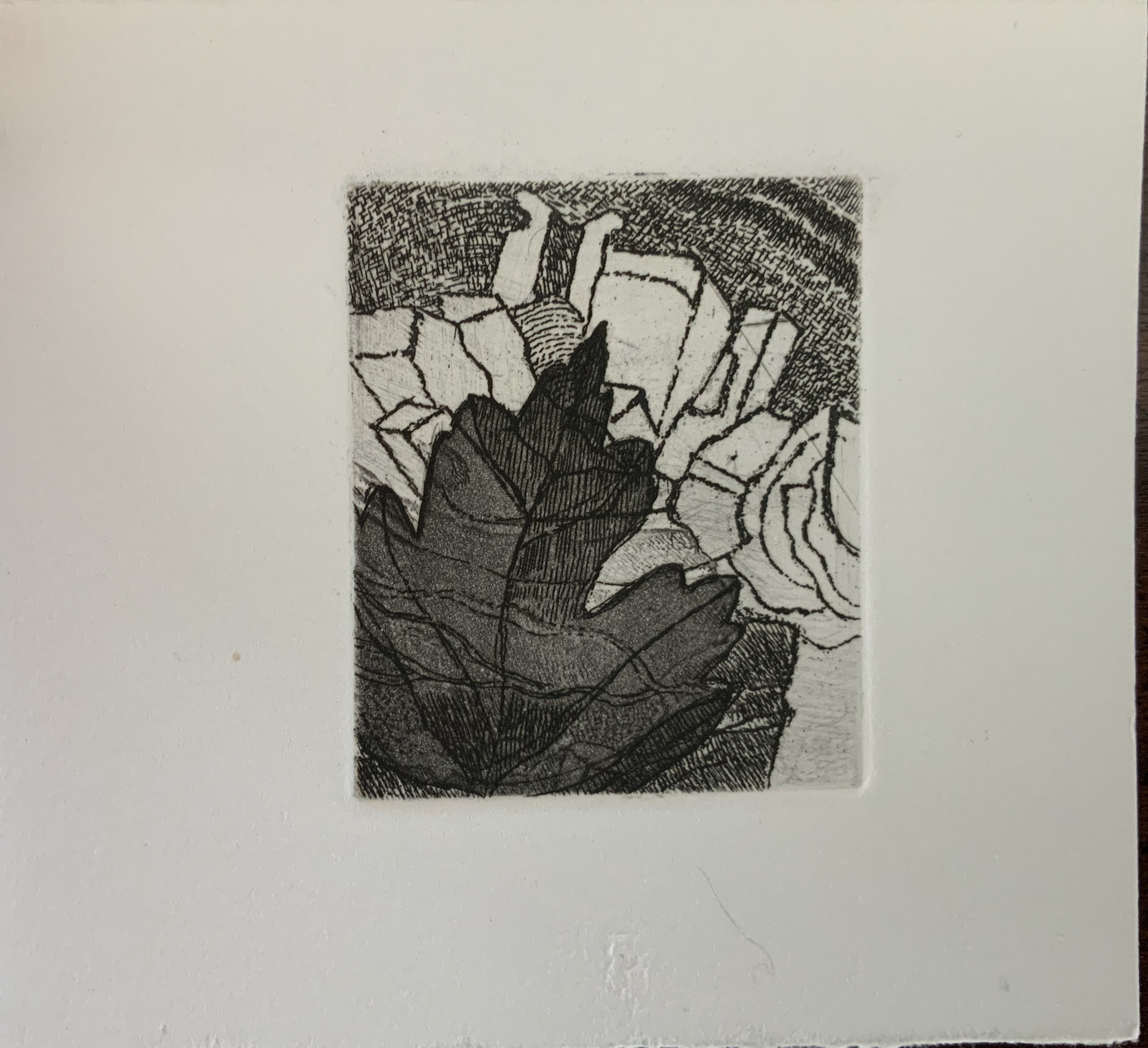
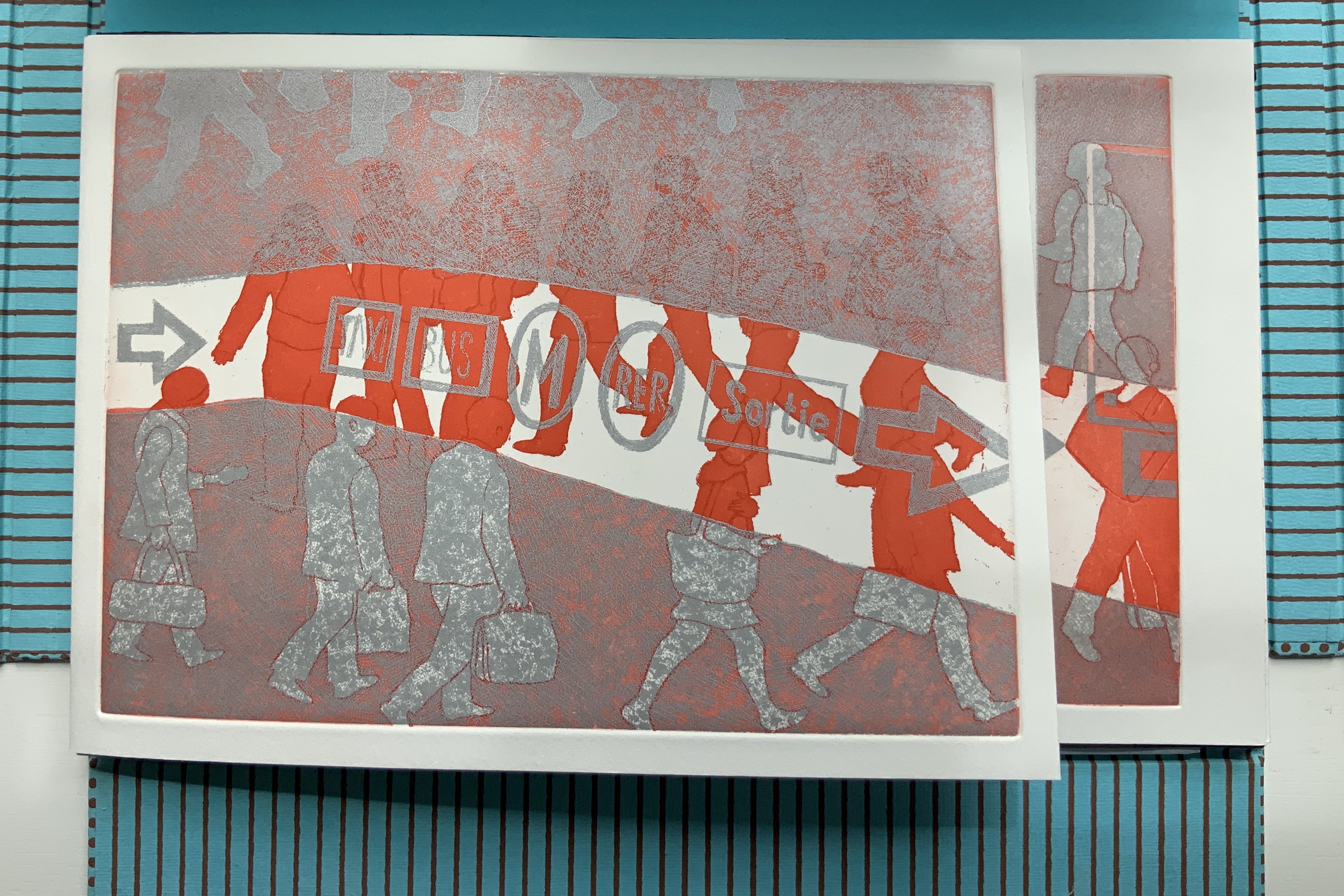
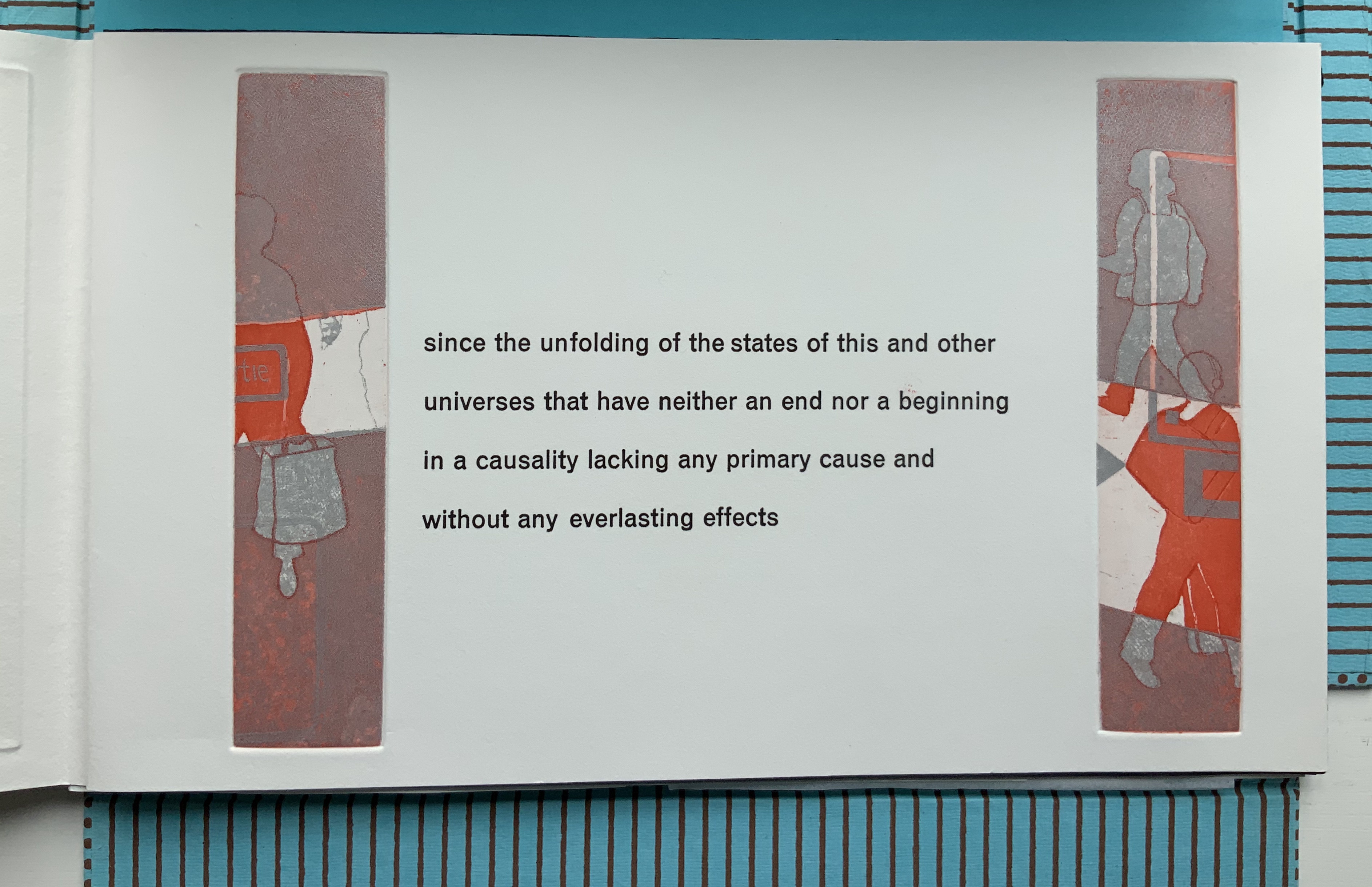
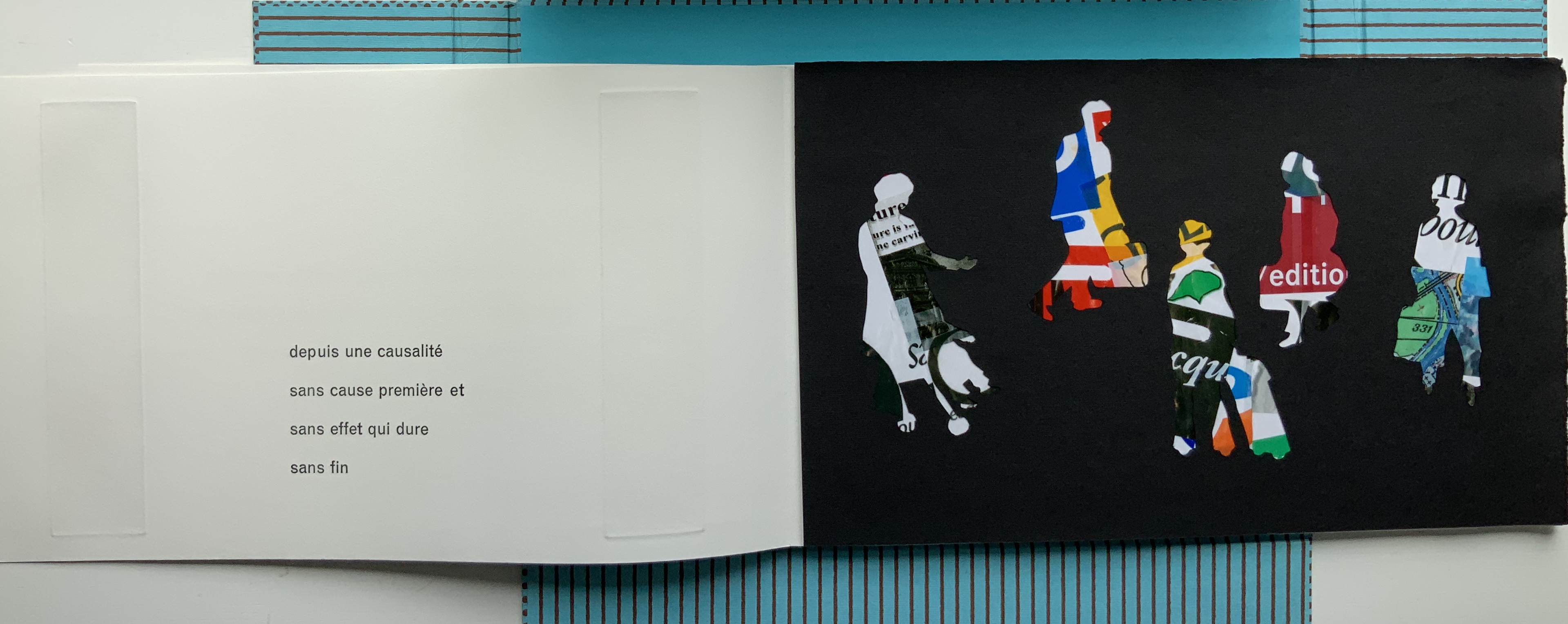
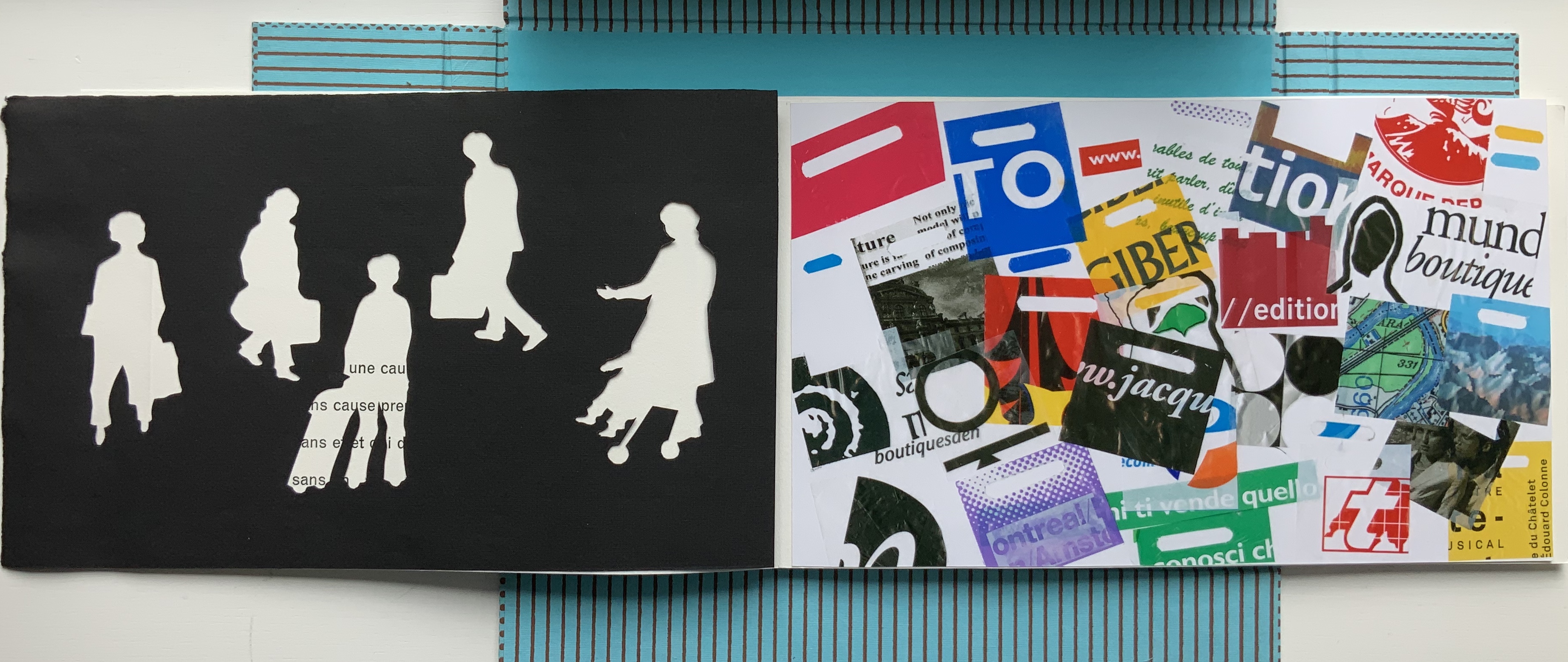
11 Stations(2025) Diego Brambilla Portfolio wrapper enclosing a paper-covered book, pamphlet-stitched with black thread. Portfolio: H308 x W225 mm.Book: H238 x W197 mm. 55 pages. Edition of 55, of which this is #53. Acquired from the artist, 16 June 2026. Photos: Books On Books Collection.
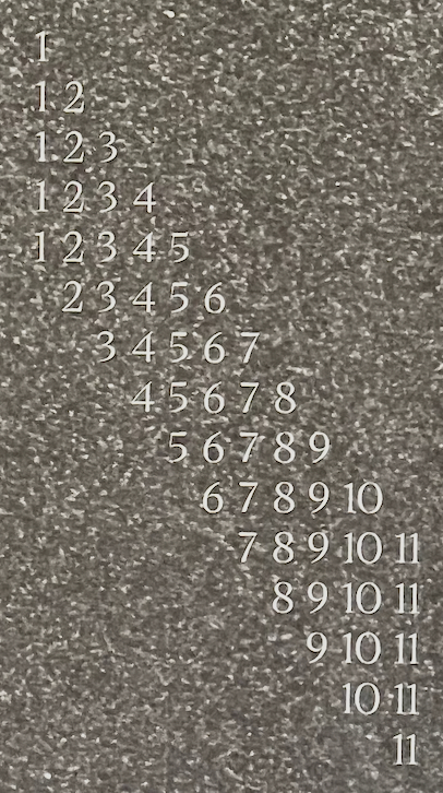
Diego Brambilla‘s 11 Stations pays homage to Italo Calvino’s Invisible Cities with a beautiful construction that visually and materially reflects the novel’s intricate structure. Where Calvino has Marco Polo describe 55 cities to Kublai Khan across a complex cascading cycle of 11 themes, Brambilla’s artist’s book has 55 pages and 11 images from handmade gelatin-silver prints each recurring 5 times. The descending staircase pattern of numbers starting from 1 and ending at 11 on the back cover shows Brambilla’s cascading cycle of images. It is in fact a structural Table of Contents for 11 Stations.
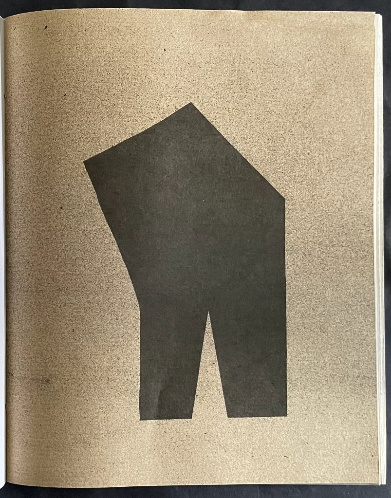
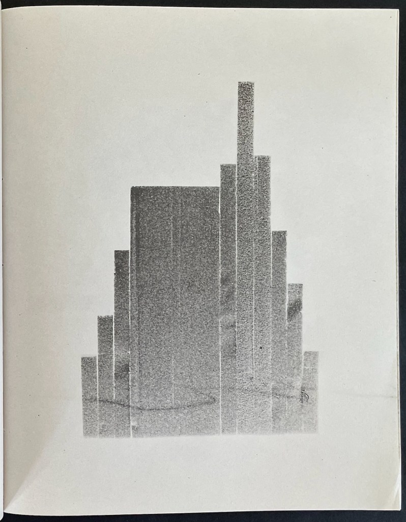
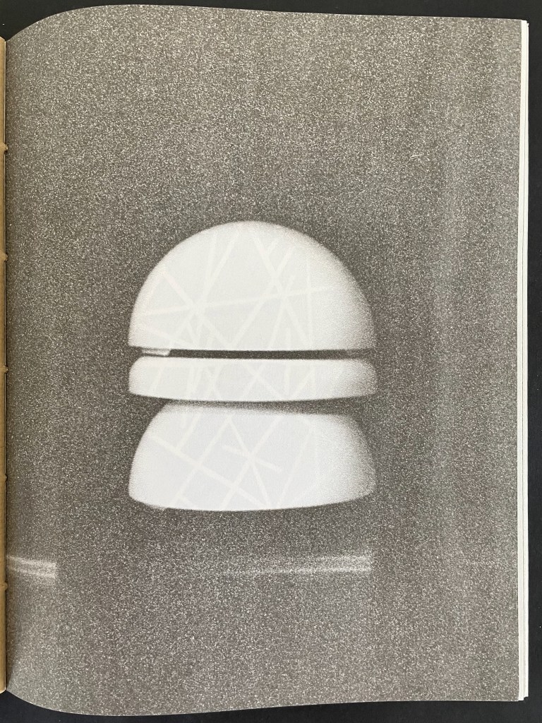
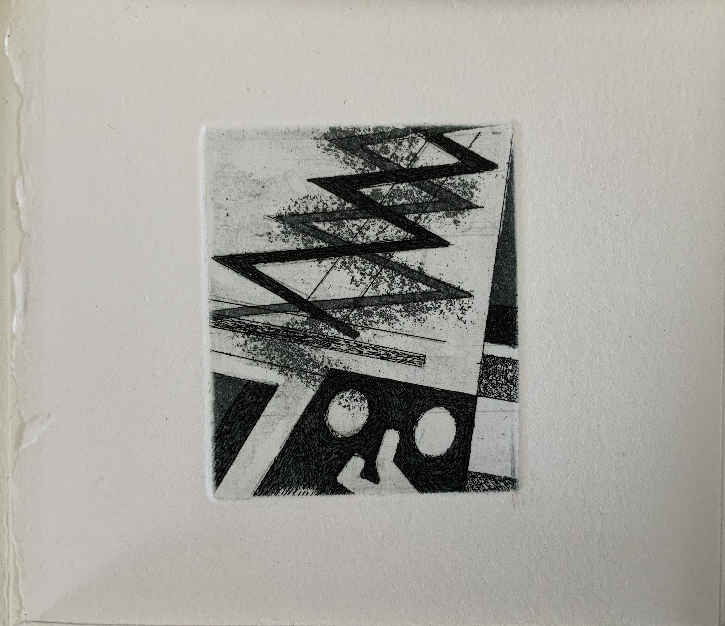
Brambilla’s 11 images are of abstract, enigmatic forms that blur the line between photography and sculpture. He has constructed the objects to be photographed, then rendered as silver-gelatin prints, and reproduced for this book.
Brambilla’s eleven images, which align with Calvino’s eleven themes.
Excluding its paper cover, the book would need 110 pages to accommodate its 55 images and 55 blanks. In fact, with 2 pages of text at the center of the book, it needs 112 pages, or 28 folios (sheets) folded in half and pamphlet stitched.
Brambilla neatly takes advantage of the arithmetic here to introduce 7 variations of paper, each used 4 times corresponding to the required 28 folios. The 7 different papers are
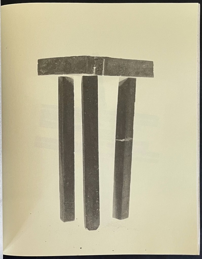
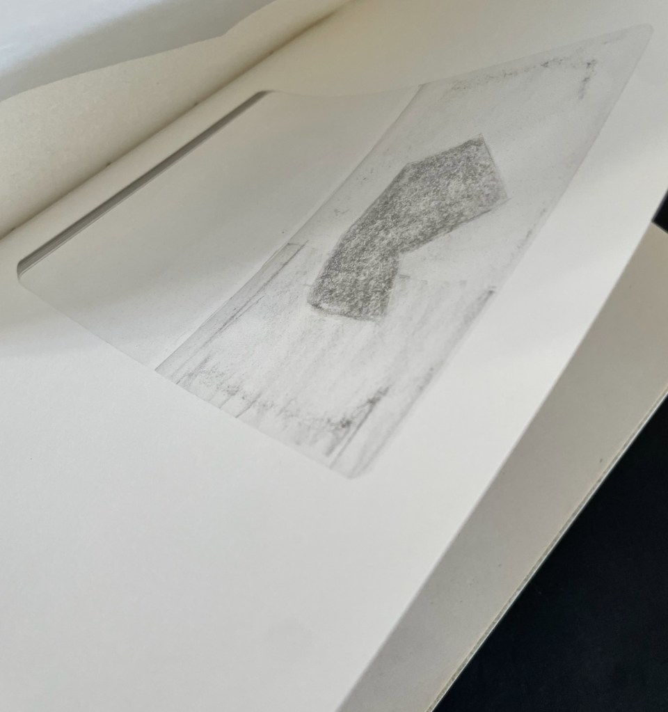
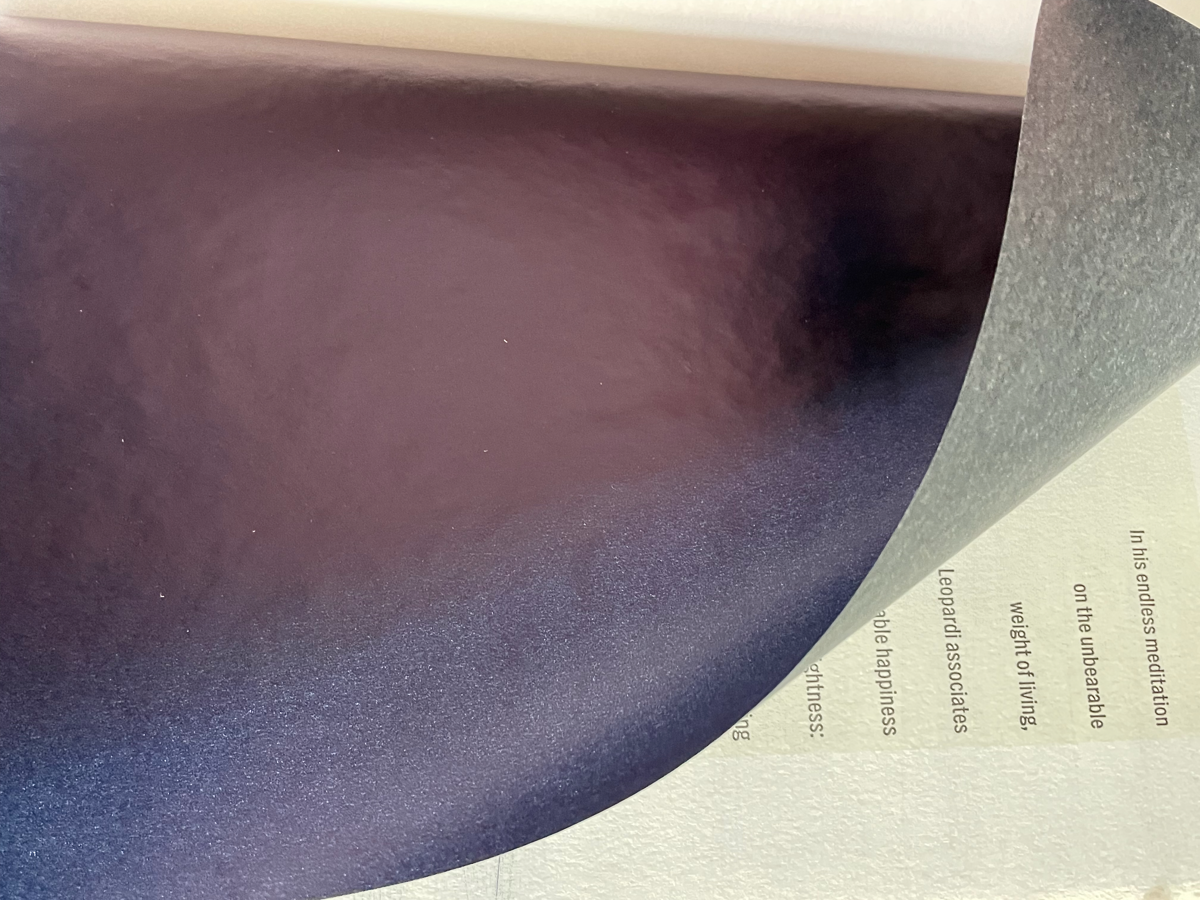
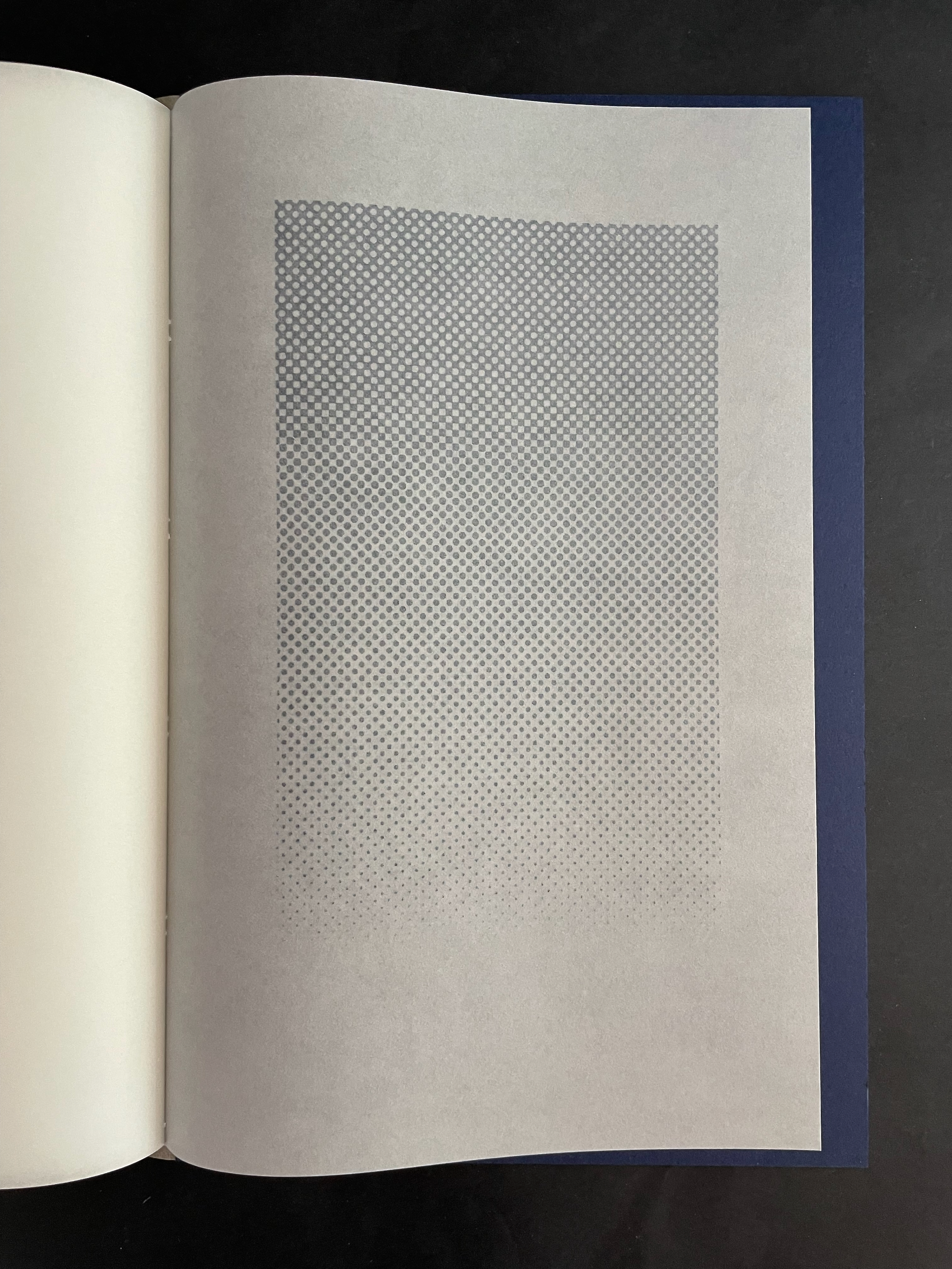
Below is the 6th image across its 5 iterations. Because the 6th falls midway among the 11 images, its position in the cascade puts its third iteration at the center folio in the book. The centered pages of text can be seen bleeding through that third iteration below. The 6th image’s position in the pamphlet stitched structure also causes its 1st and 5th iterations to share the same sheet of paper; likewise, the 2nd and 4th iterations share a folio. At first, this seems the only point on which Brambilla’s structure does not have a precise correspondent in Calvino’s structure.
But consider this: The city of Baucis is the 28th city/chapter, the midpoint, among Calvino’s 55 cities. It is the midpoint among the 5 cities in Calvino’s 6th theme: “Cities & Eyes”. As Marco Polo describes it,
After a seven days’ march through woodland, the traveler directed toward Baucis cannot see the city and yet he has arrived. The slender stilts that rise from the ground at a great distance from one another and are lost above the clouds support the city….There are three hypotheses about the inhabitants of Baucis: that they hate the earth; that they respect it so much they avoid all contact; that they love it as it was before they existed ….
If Brambilla’s choice to place this image of a three-legged stool at the center of his 11 images was coincidental, chance is a genius — with which Calvino would have likely agreed.
Reading 11 Stations exercises the visual and haptic mind. The use of translucent pages is a frequent technique to have the reader/viewer see more than the image that lies on the surface or behind the image.
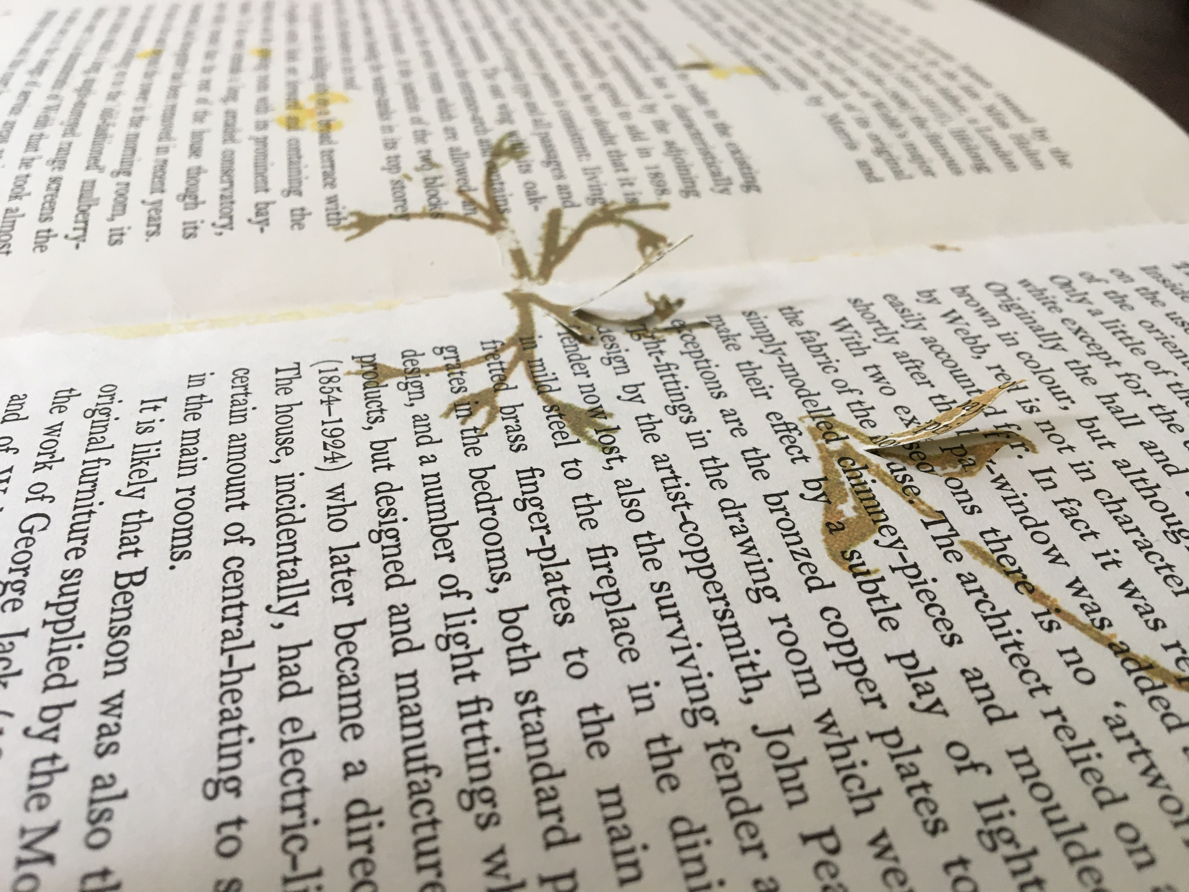
But what to make of the 4 instances in which the folio is not trimmed at the top edge? And what to make of the sketches printed inside the folded sheet? Here is another technique that makes the reader go beneath the physical surface. Is the book artist using features of bookmaking to prod the reader/viewer to think then of what lies beneath the creative surface?
Brambilla’s attention to detail is meticulous — even in the selection of Calvino Grande by Zetafont for the title and text pages — and that is what serves him so well in paying homage to Invisible Cities. Like Calvino’s book, 11 Stations is one to read and re-read.
Further Reading & Viewing
“Ken Botnick (II). 17 September 2026. Books On Books Collection.
I see that one way or another I keep circling around the idea of an interdependence between the unwritten world and the book I should write. This is why writing presents itself to me as an operation of such weight that I remain crushed by it. I put my eye to the spyglass and train it on the reader. Between her eyes and the page a white butterfly flutters. Whatever she may have been reading, now it is certainly the butterfly that has captured her attention. The unwritten world has its climax in that butterfly. The result at which I must aim is something specific, intimate, light. — Italo Calvino. If on a Winter’s Night a Traveller (Vintage Classics) (p. 172).
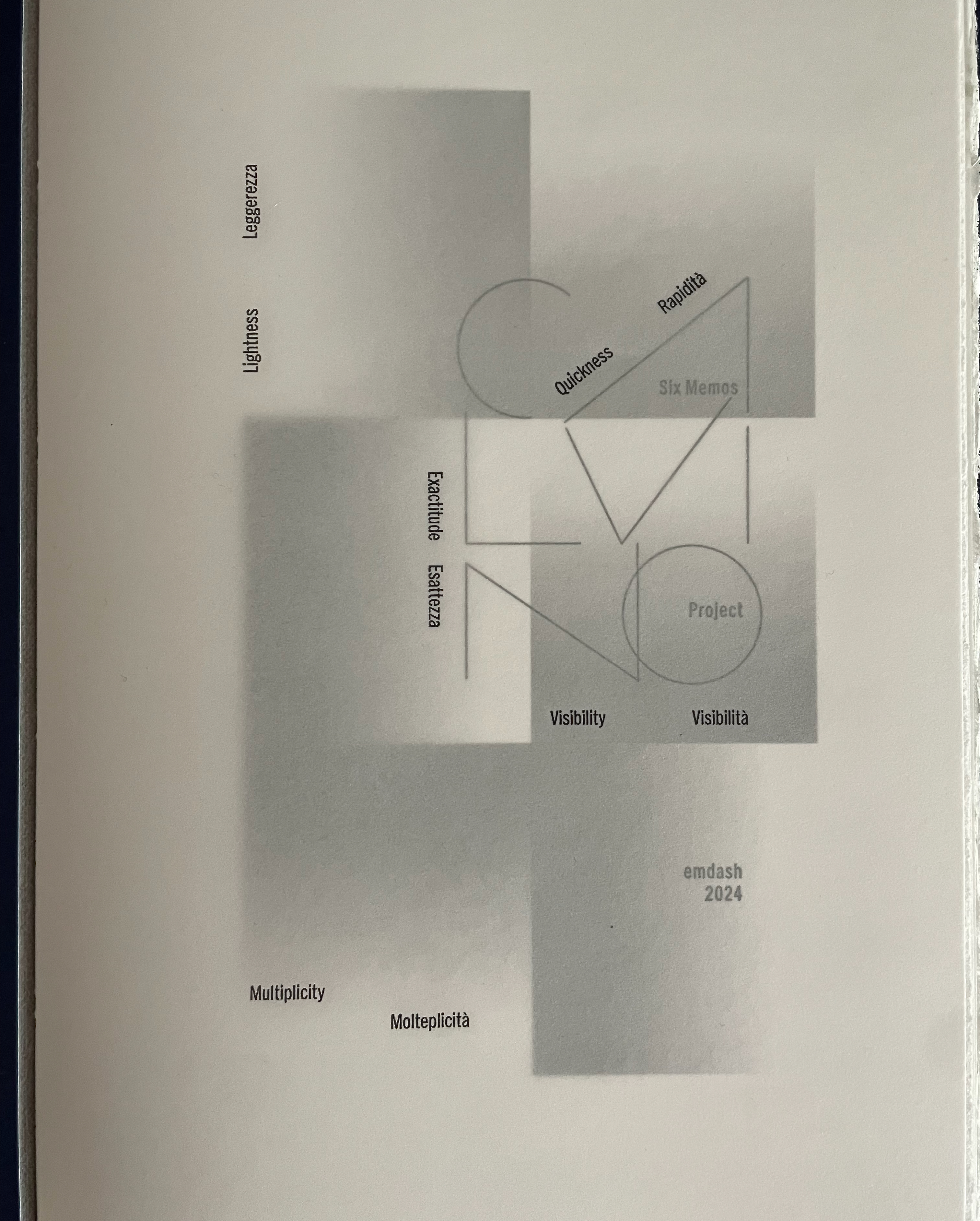
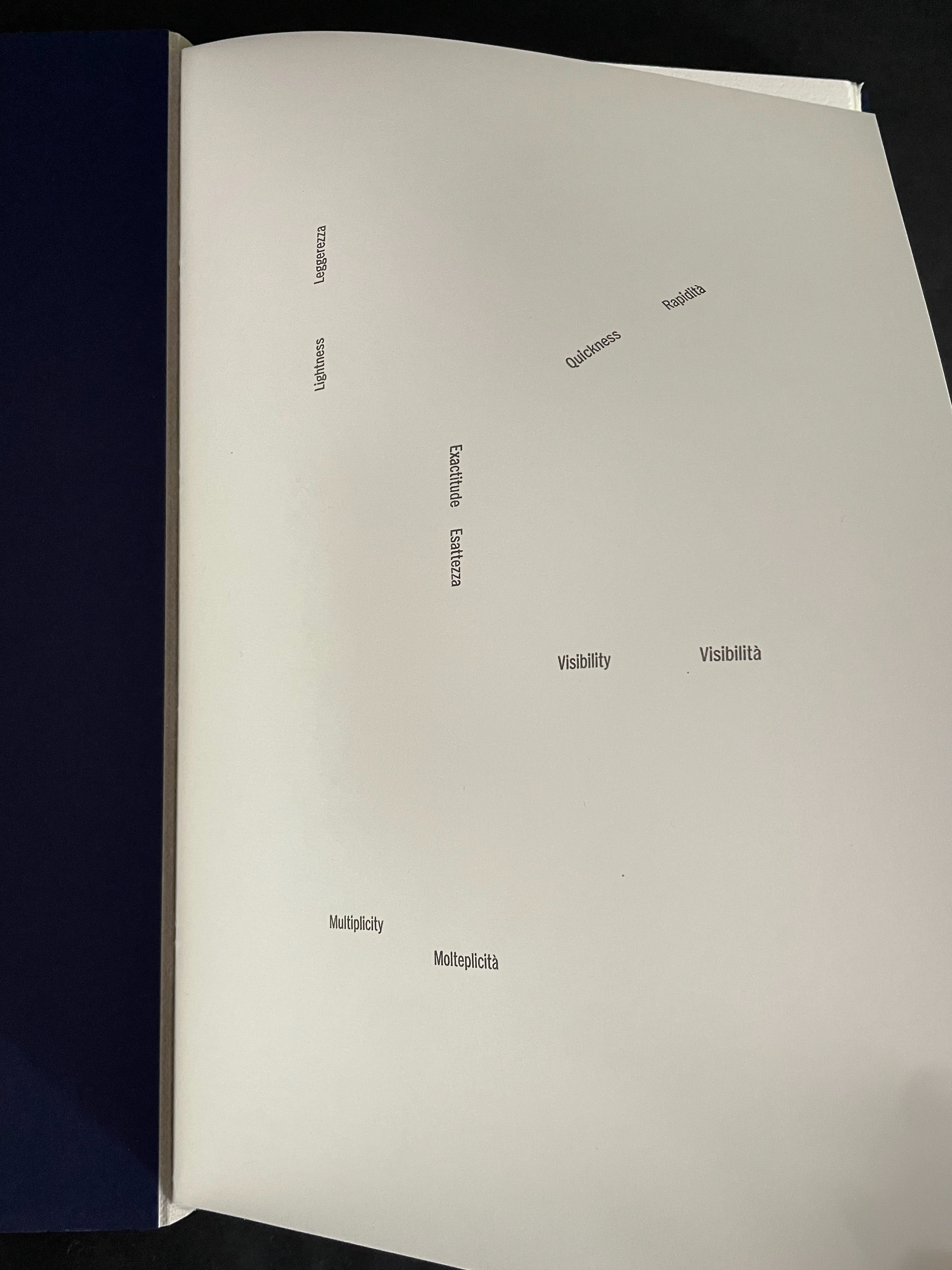
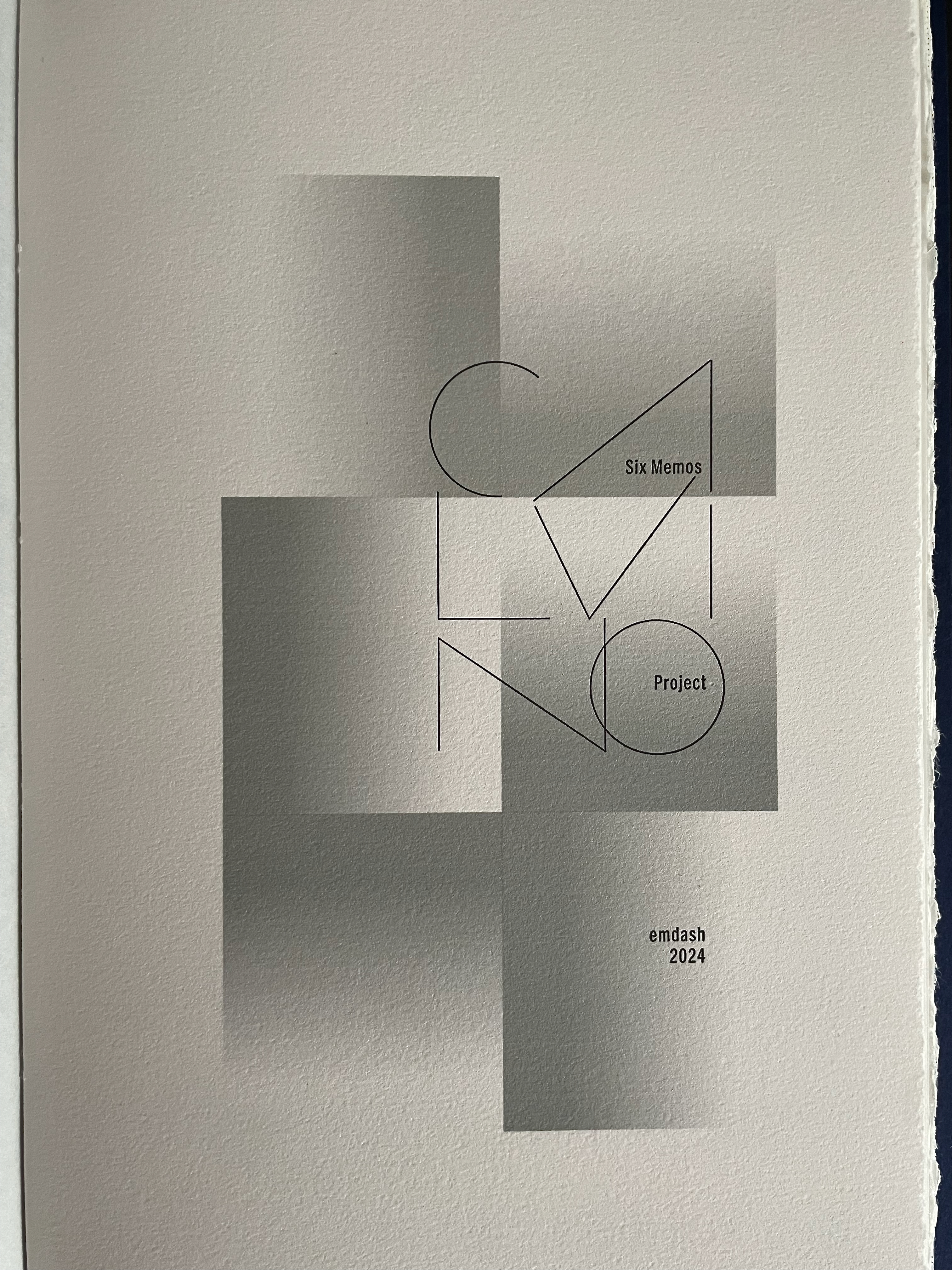
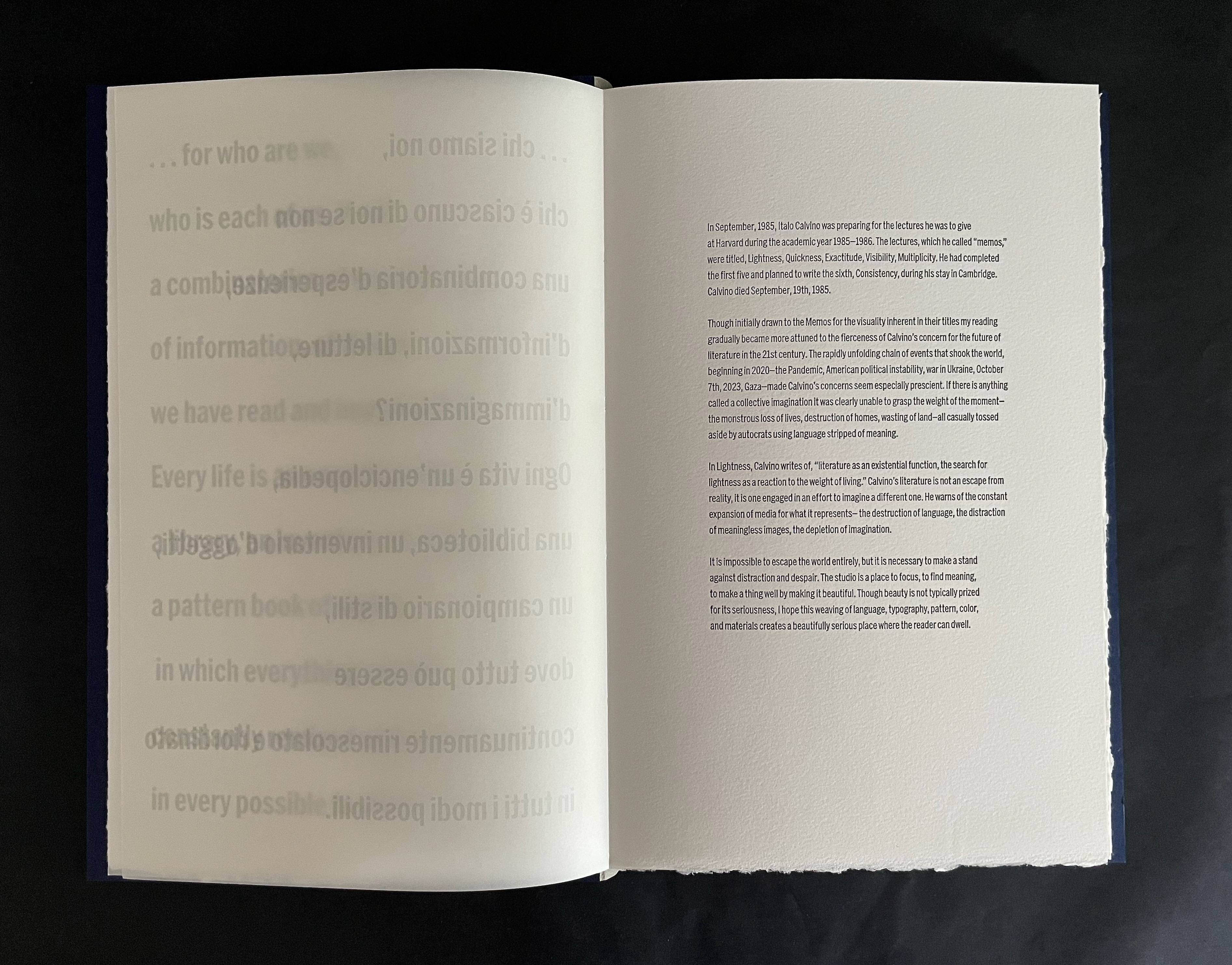
As homage and work of art, Ken Botnick’s Six Memos Project is that “something specific, intimate, light” to which Calvino’s narrator refers. It hovers between us and Calvino’s Six Memos for the Next Millennium (1985), his Charles Eliot Norton Lectures prepared for Harvard. All but the sixth lecture was written when Calvino died in the fall of 1985.
Six Memos Project (2020) Ken Botnick Board slipcase with inked embossed title. Open spine hardcover. H290 x W188 mm. [116] pages. Edition of 20, of which this is #12. Acquired from the artist, 14 July 2026. Photos: Books On Books Collection.
The Six Memos Project makes us want to read or re-read those lectures and make us long for that missing sixth. With its papers, ink, incisions, typographic layout, page structure, binding, and textures, this artist’s book captures our attention and wonder long enough to realize that it is acting as a lens on the lectures and, paradoxically, on itself and the act of reading. This self-reflexive artist’s book is the ideal medium for paying homage to Calvino’s writing about his writing.
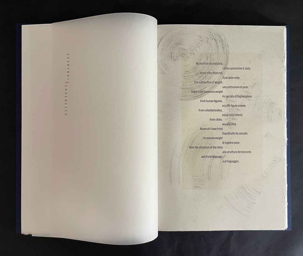
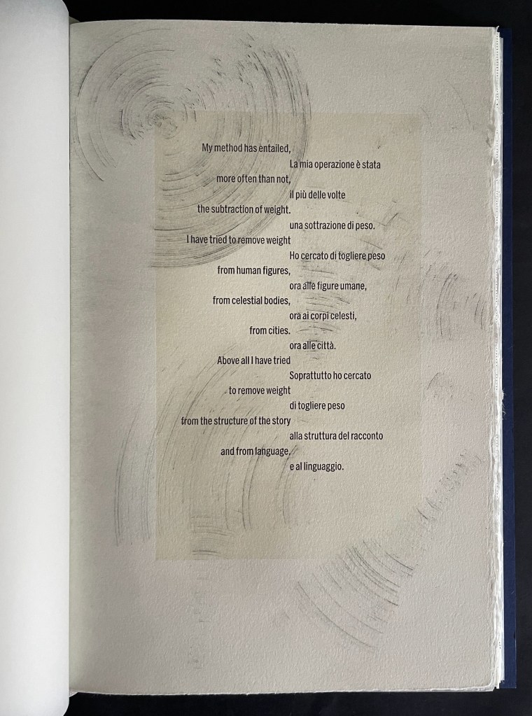
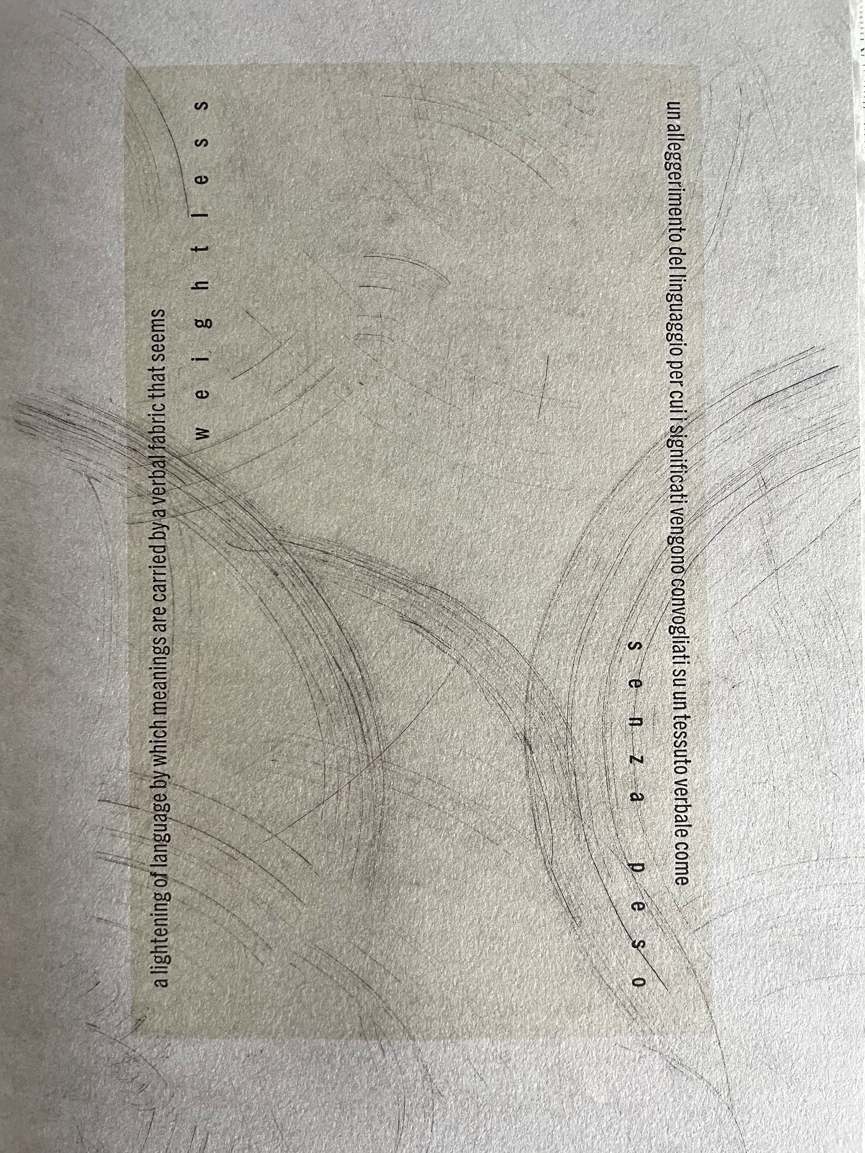
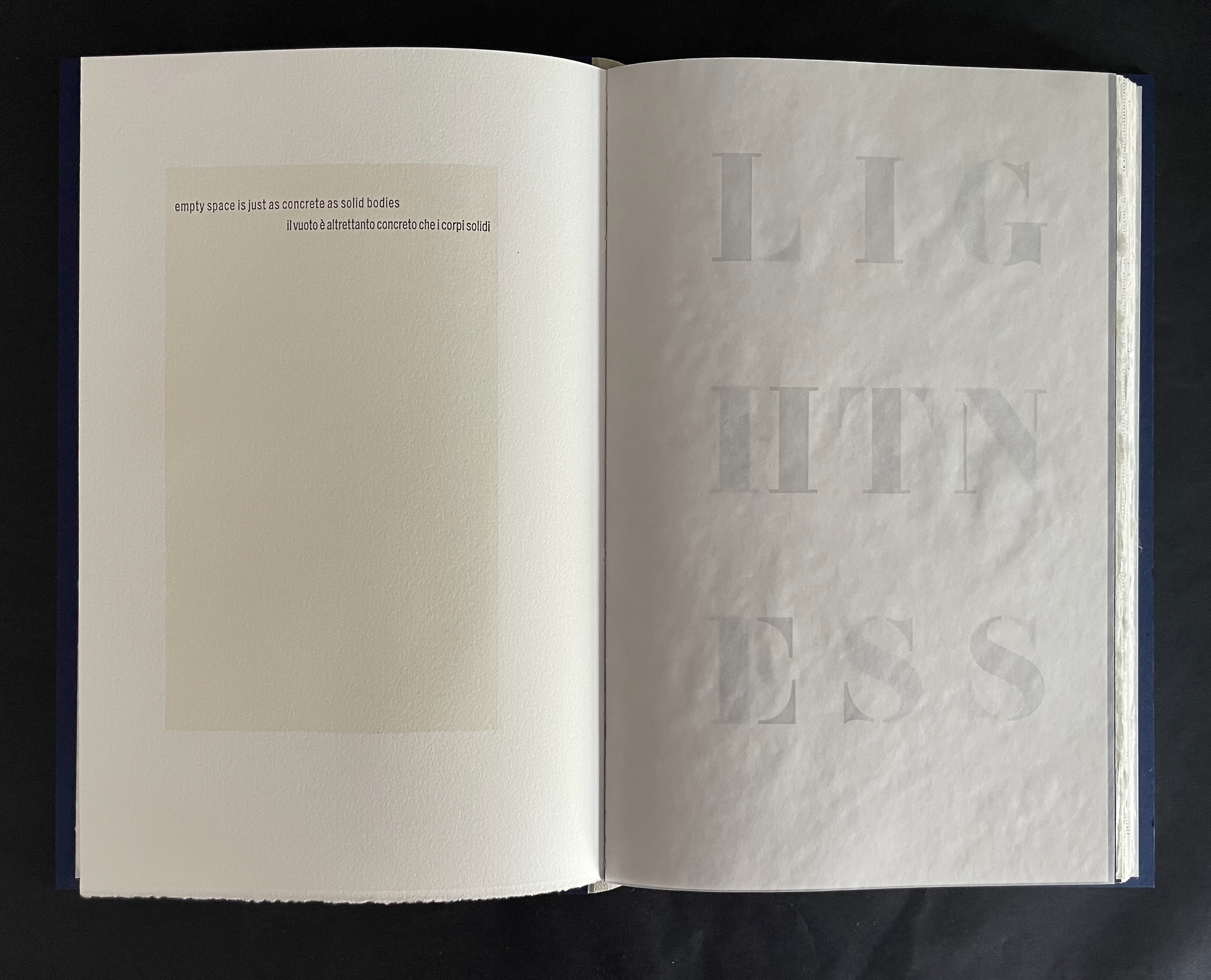
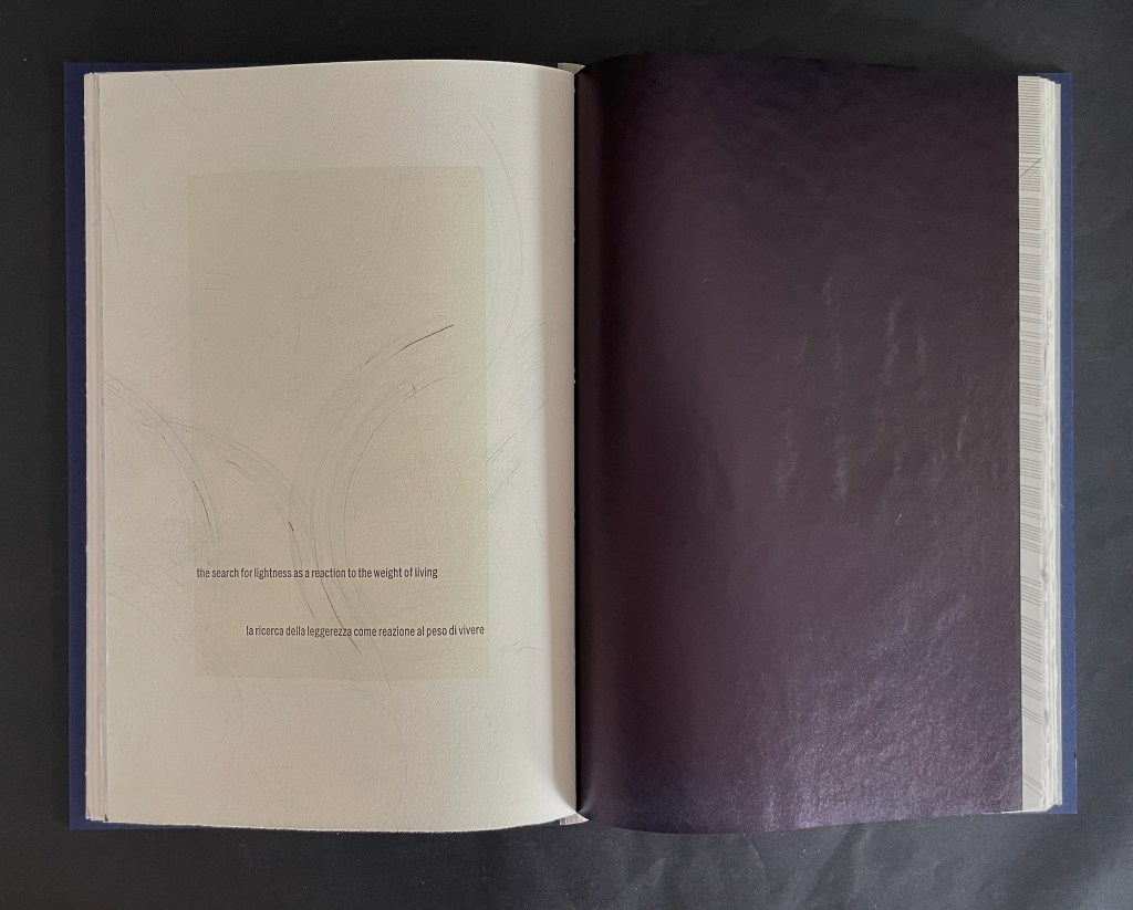
Lightness was the first of the six literary themes that Calvino commended to the next millennium. Botnick arranges its title in Italian and English on translucent paper so that it pivots on its initial letter, ascending and descending the margin. As the page turns to the left, the opening statement that Botnick has selected from the lecture emerges crisply in English on the left and Italian on the right, alternating like wings down the center of the page.
Matching Calvino’s description of his writing method, Botnick centrifugally subtracts segments from the image in the upper left corner of the same page. The expressive abstract image seems to float behind the statement’s tinted panel, and the enlarging subtracted segments surface through and over the panel as they move downwards from left to right.
In the next spread, the enlarging segments continue to follow the gist of Calvino’s theme until they seem to float off the page.
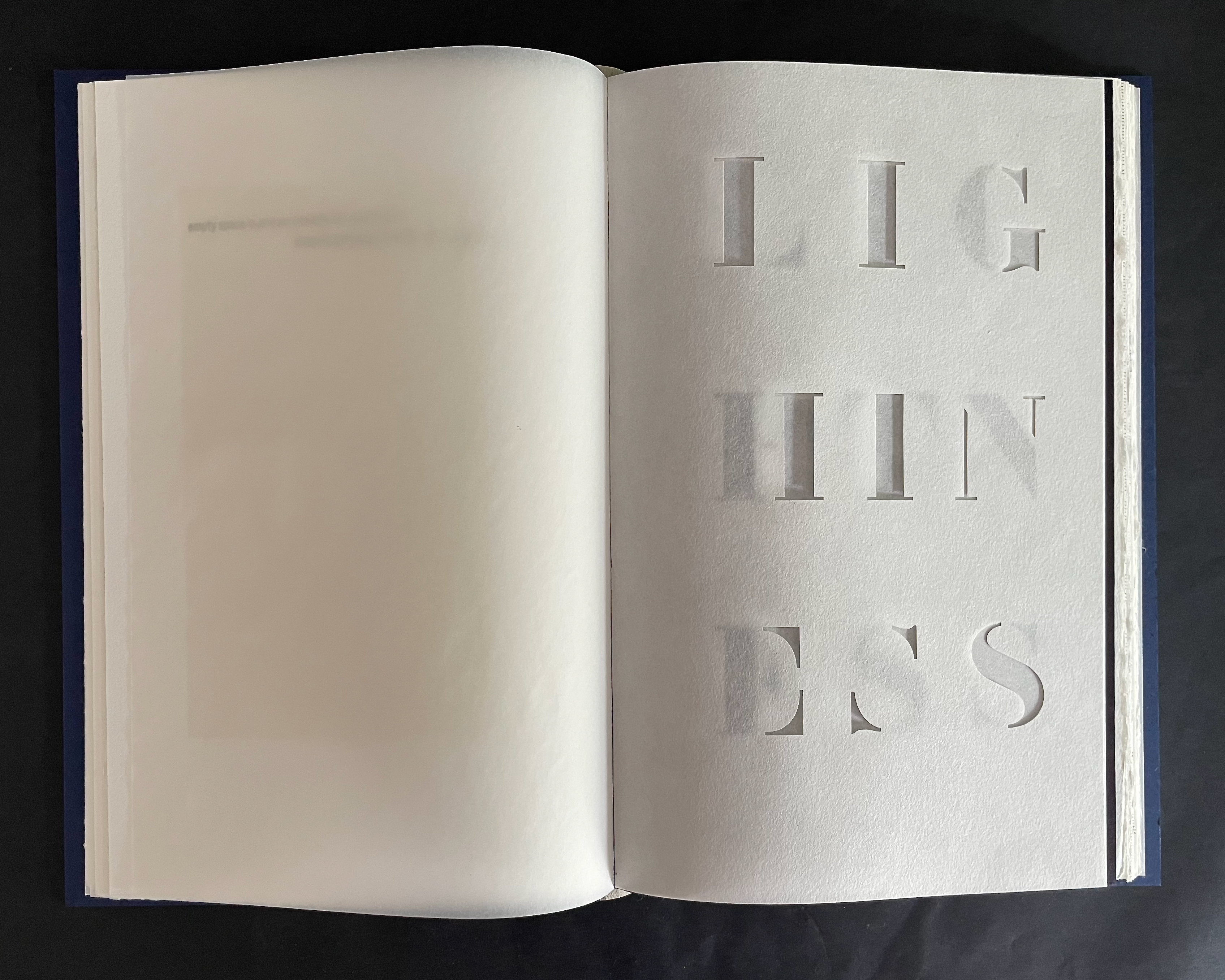
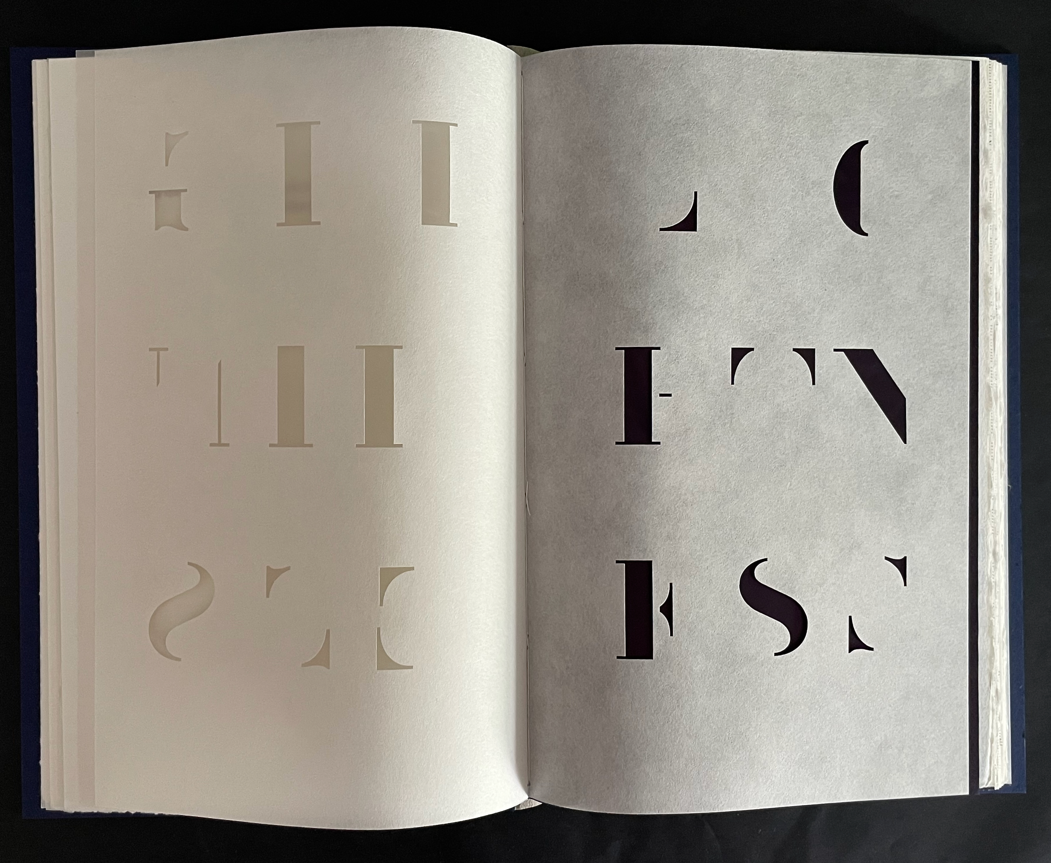
The following sequence switches techniques from inking to stenciling for the response to Calvino’s method and theme of lightness. Leaf by leaf it metaphorically enacts the removal of weight from the incised letters of the word “lightness”.
It is telling that the heavily ink-saturated opaque paper that gives the final absences their weight is used only in this section of the book. Its second and last use in the section is just as metaphorical and functional as its first. In response to the excerpt “the search for lightness as reaction to the weight of living”, it contrasts with bare remnants of the subtracted segments on the left and punctuates with its weight the end of “Lightness”.
In each of the next four sections, the artist exercises different functional metaphors corresponding to the themes and excerpts of the lectures that Calvino completed: Quickness, Exactitude, Visibility, and Multiplicity. As with the symbiosis of lightness and weight, Calvino proceeds by contrasts: quickness vs delay, exactitude vs insubstantiality, visibility of the imagination through words vs their failure under the weight of the “image civilization”, and multiplicity of language, viewpoints, and things vs a single language, an insular perspective, and a null undifferentiated whole.
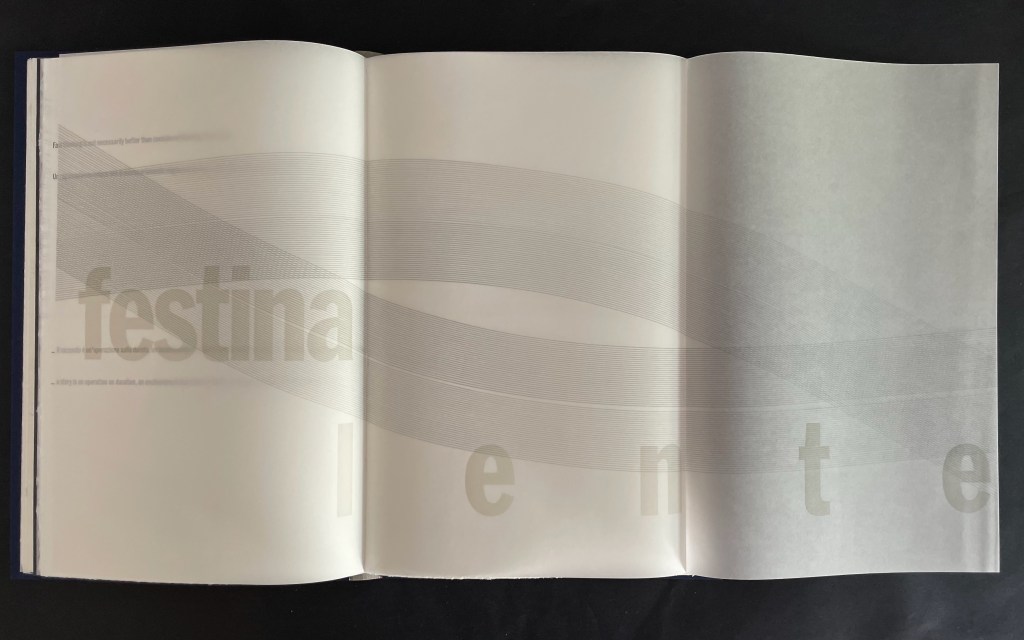
Where Calvino adopts Manutius’ motto festina lente [“make haste slowly”], Botnick gives us
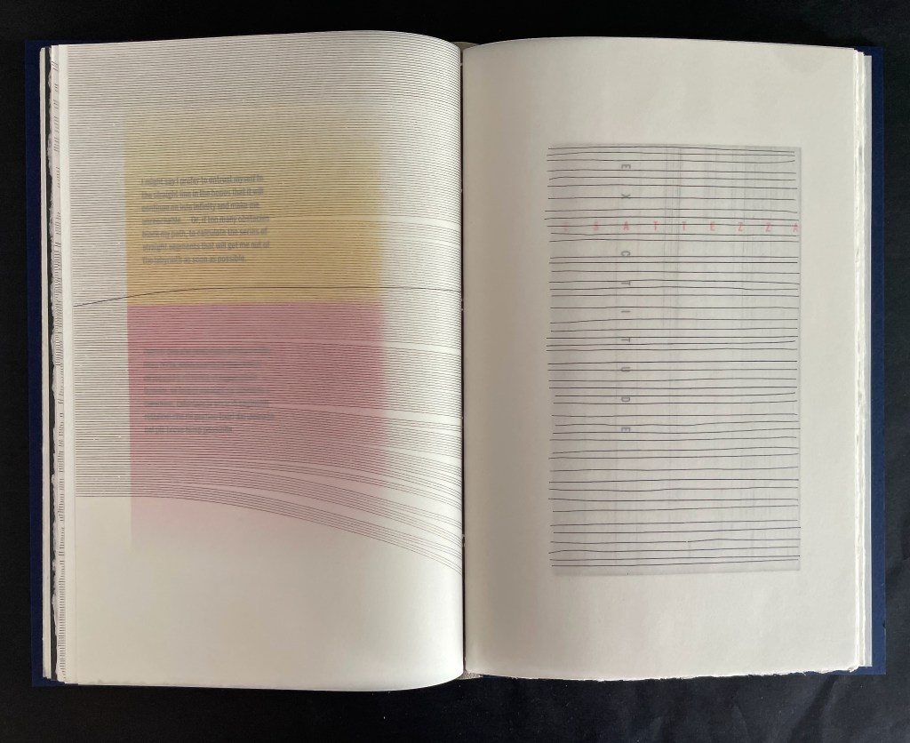
Where Calvino worries about straight lines of exactitude vs oblique curves by which to approach the unsayable, Botnick gives us
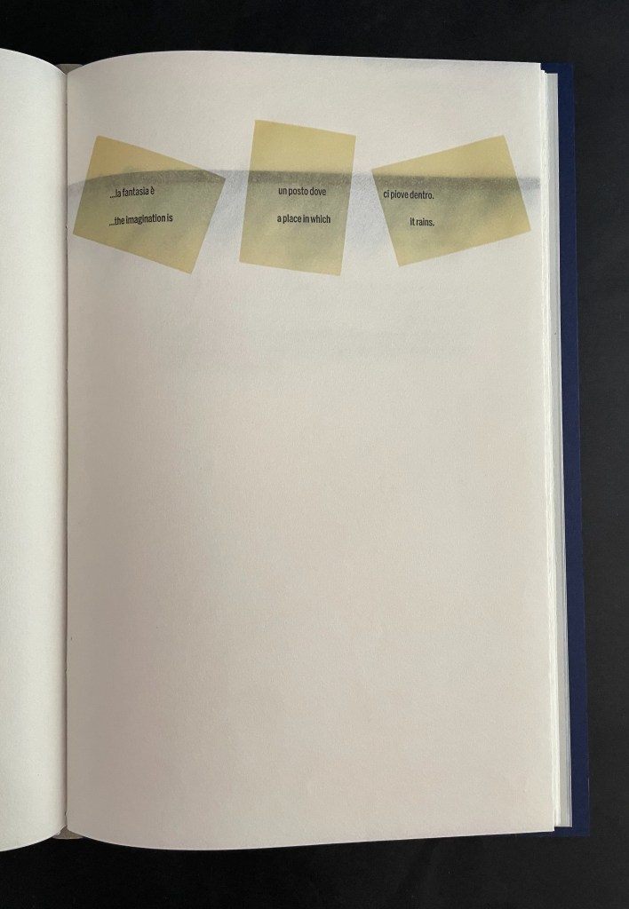
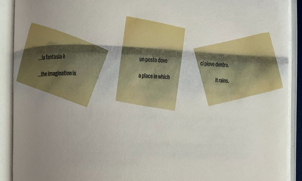
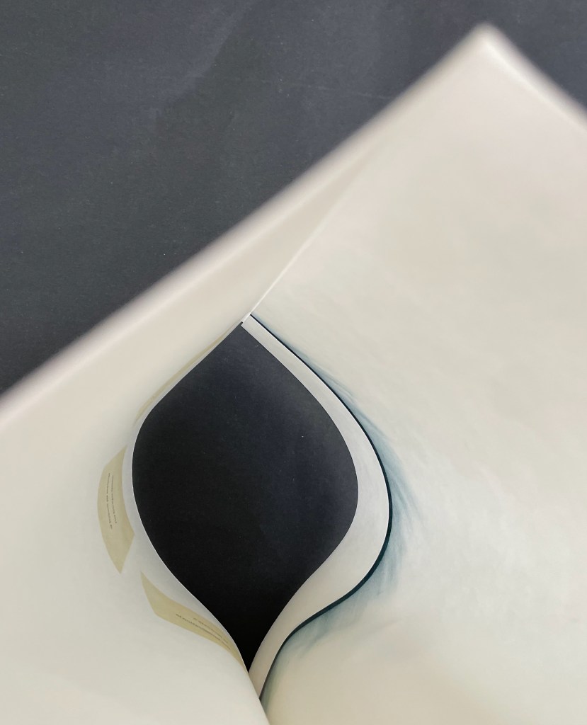
Where, in contemplating visibility, Calvino posits “the imagination is a place where it rains”, Botnick give us an image printed on a sheet held within the fold of another sheet on which Calvino’s text appears in blocks that seem to float on the watery image underneath.
Below are internal shots of the French fold sheet that envelopes the single sheet bearing the watery image that appears through the sides of the French fold. The angle is from the spread bottom edge of the French fold with the first shot showing single sheet image bowed to the right, the second showing the single sheet curving between the sides of the French fold, and the third showing the single sheet image bowed to the left.
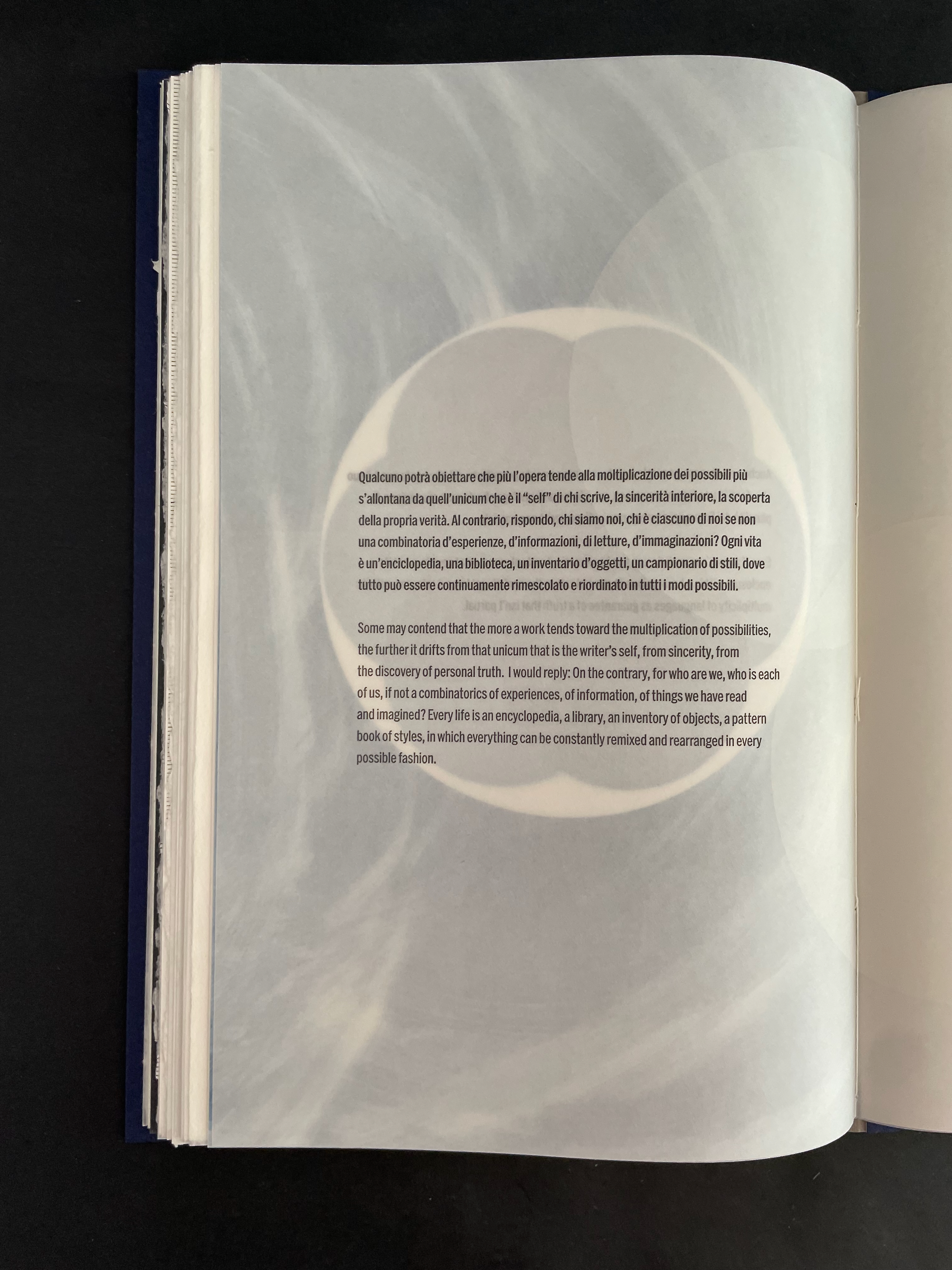
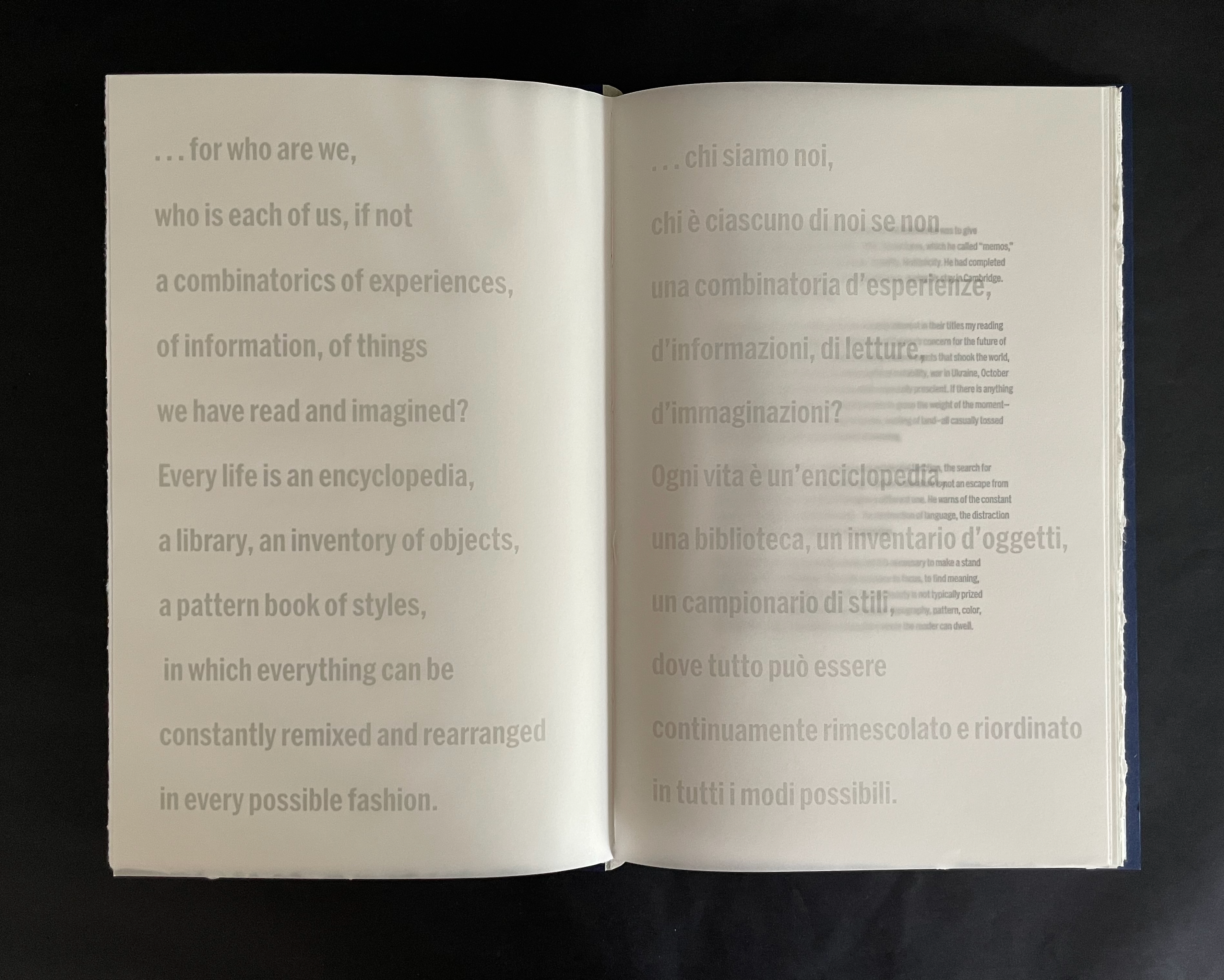
Where Calvino notes the argument of some “that the more a work tends toward the multiplication of possibilities, the further it drifts from the unicum that is the writer’s self, from sincerity, from the discovery of personal truth”, Botnick gives us the text of Calvino’s contrary reply below on the left, but note that it is the same text with which Botnick prefaced his artist’s book on the right:
That preface is the first of an enveloping move that Botnick completes at the end of Multiplicity and the end of the artist’s book. Calvino has the last word of the section in text that hovers over a large solid spot-varnished half circle. When this sheet and the next two are turned, …
we are left with this last abstract image capturing the combinatorics of our experiences, the rain descending in the imagination, and the multitude of the voices of things that cannot speak … including this object the book.
The unwritten sixth memo would have addressed the theme of Consistency. What did Calvino mean by that word? Would he have spoken of the regularity of results such as the consistent taste of the morning espresso at his local bistro? Or the mechanical consistency that worried Walter Benjamin in The Work of Art in the Age of Mechanical Reproduction (1935)? (Calvino might have had a conflict of interest given the lucrative reproduction of his fiction.) Or did he mean the essence of which a person, place, or thing consists? In Invisible Cities, the word refers to the celestial and infernal characters of the two versions of the city Beersheba, the one in the sky and the one on earth. Barring a manuscript find yet to be made, we won’t know. In the meantime, Botnick’s affinity with Calvino welcomes the speculation that his artist’s books offer the kind of consistency Calvino would have appreciated.
Further Reading
“Ken Botnick (I)“. 16 June 2022. Books On Books Collection. See for the Diderot Project (2015) and Table of Contents (2020).
“Angela Cavalieri”. In progress. Books On Books Collection.
“Karen Kunc“. 11 June 2026. Books On Books Collection.
“Pauline Lamont-Fisher“. In progress. Books On Books Collection.
Benjamin, Walter. 1968. Illuminations. Edited by Hannah Arendt. Translated by Harry Zorn. London: The Bodley Head Ltd.
Calvino, Italo. 2016. Six Memos for the Next Millennium. Translated by Geoffrey Brock. First Mariner books edition. Boston: Mariner Books/Houghton Mifflin Harcourt.
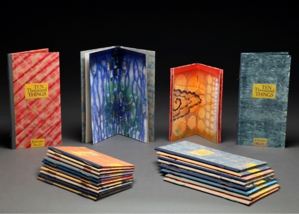
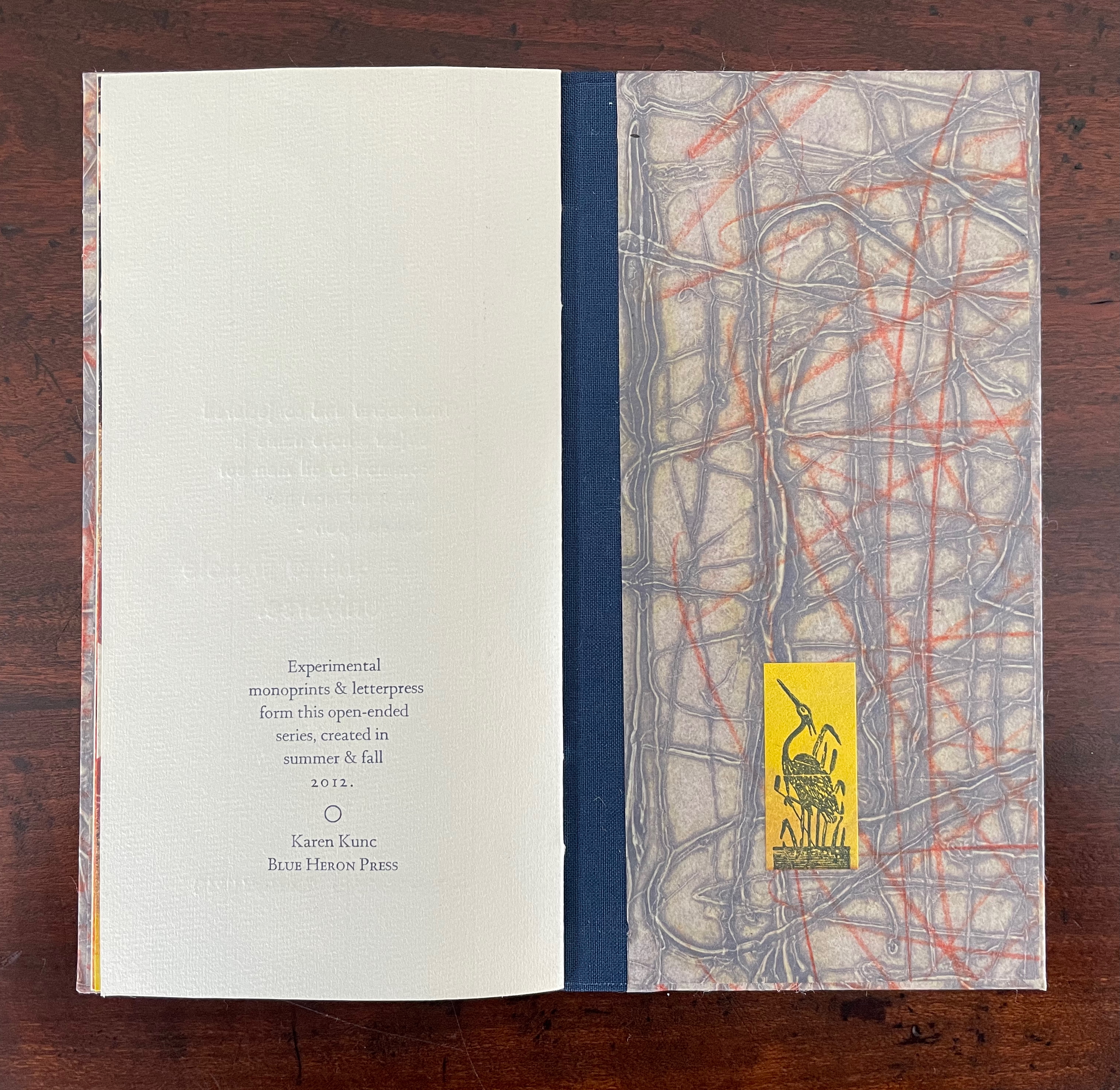
While Stéphane Mallarmé and his Un Coup de Dés may be the front runner among contenders for the title of literary patron saint of the artist’s book, Jorge Luis Borges and Italo Calvino appear in a tie for a distant but respectable second. Each have inspired some striking works. In her series Ten Thousand Things, Karen Kunc has boosted both Borges’ and Calvino’s chances and nudged Calvino’s with an additional homage in leporello format.
The series title of Ten Thousand Things springs from Chapter 42 of the Tao Te Ching:
The Tao begot one. One begot two. Two begot three. And three begot the ten thousand things. The ten thousand things carry yin and embrace yang. They achieve harmony by combining these forces.
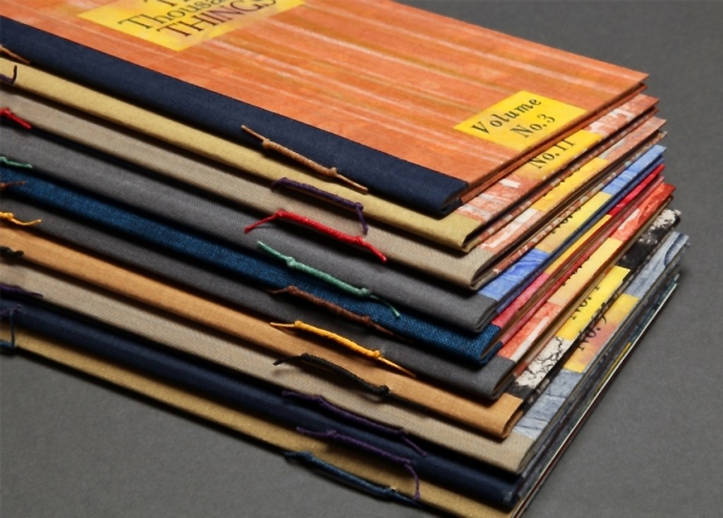
The series consists of 74 books in two sizes as the monoprints were made in two sizes of papers. The papers varied. Most of the works are on Torinoko, a Japanese paper that Kunc found to work well with waterbased Akua Intaglio inks. Some are on Arches 88 paper, a waterleaf she found also very absorbent for the Akua inks. Many of the prints have some handcoloring with ink or liquid acrylic. A few prints as well as all of the covers were made on Japanese Nishinouchi paper, a kozo fiber paper, which she has used extensively for her large woodcut prints. Printing is from collagraph plates on an etching press, with hand coloring and waxing afterwards.
Kunc chose excerpts from the works of five poets/authors and responded to each with several different monoprints not as illustrations of the text but as evocations prompted and to prompt. In addition to Borges and Calvino, she selected from Guillaume Apollinaire, Annie Dillard, and Marge Piercy. Kunc handset the metal type and letterpress printed several sheets of each text on different papers for variety with the monoprints. In each book, the text-bearing sheet folds around the sheet that bears two monoprints, one on each side.
The Tate Museum remarks that “The beauty of monoprinting lies in its spontaneity and its allowance for combinations of printmaking, painting and drawing media.” Kunc’s series extends that allowance to combinations with the elements of the book.
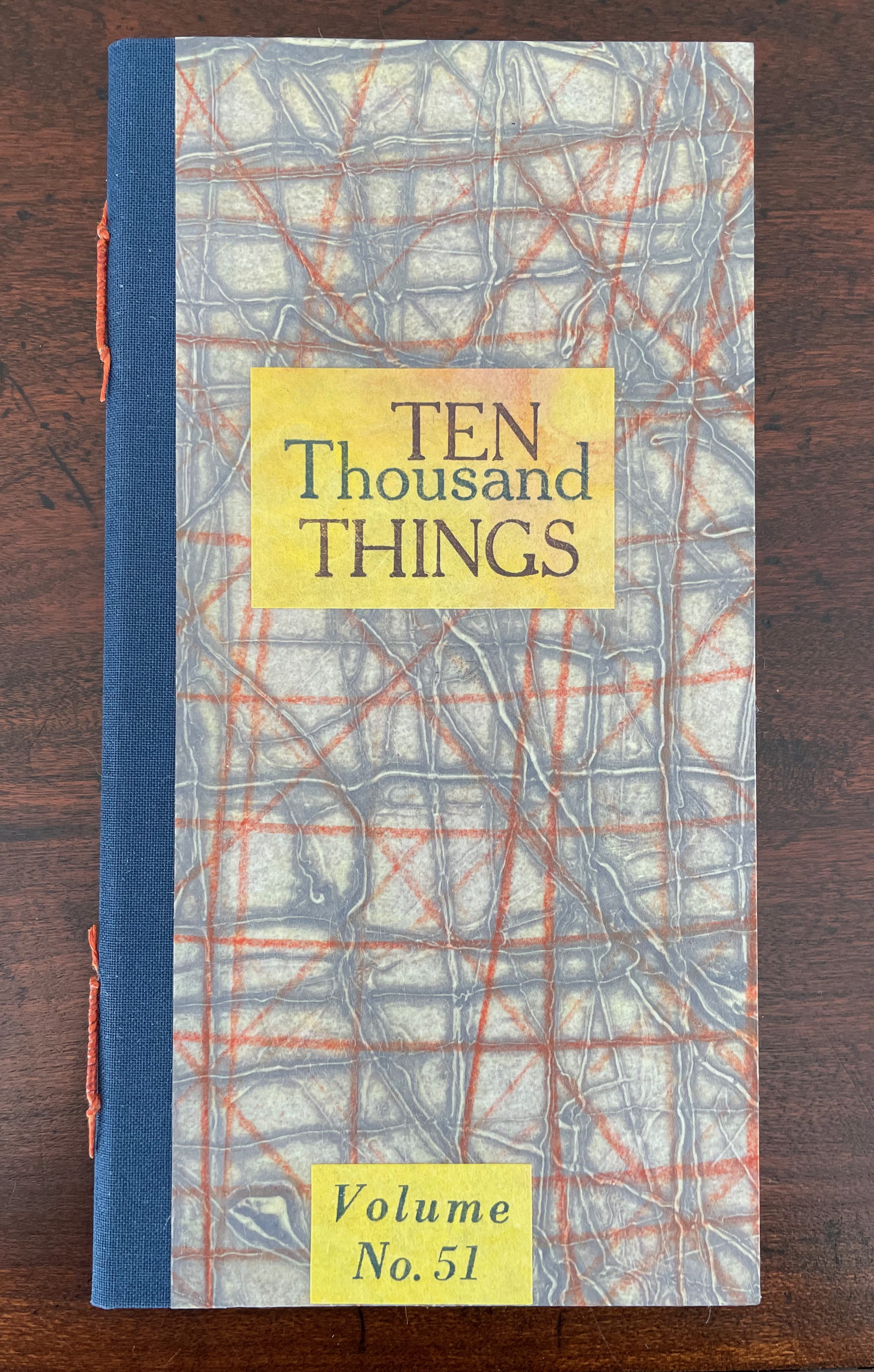
Ten Thousand Things, No. 51 (2012)
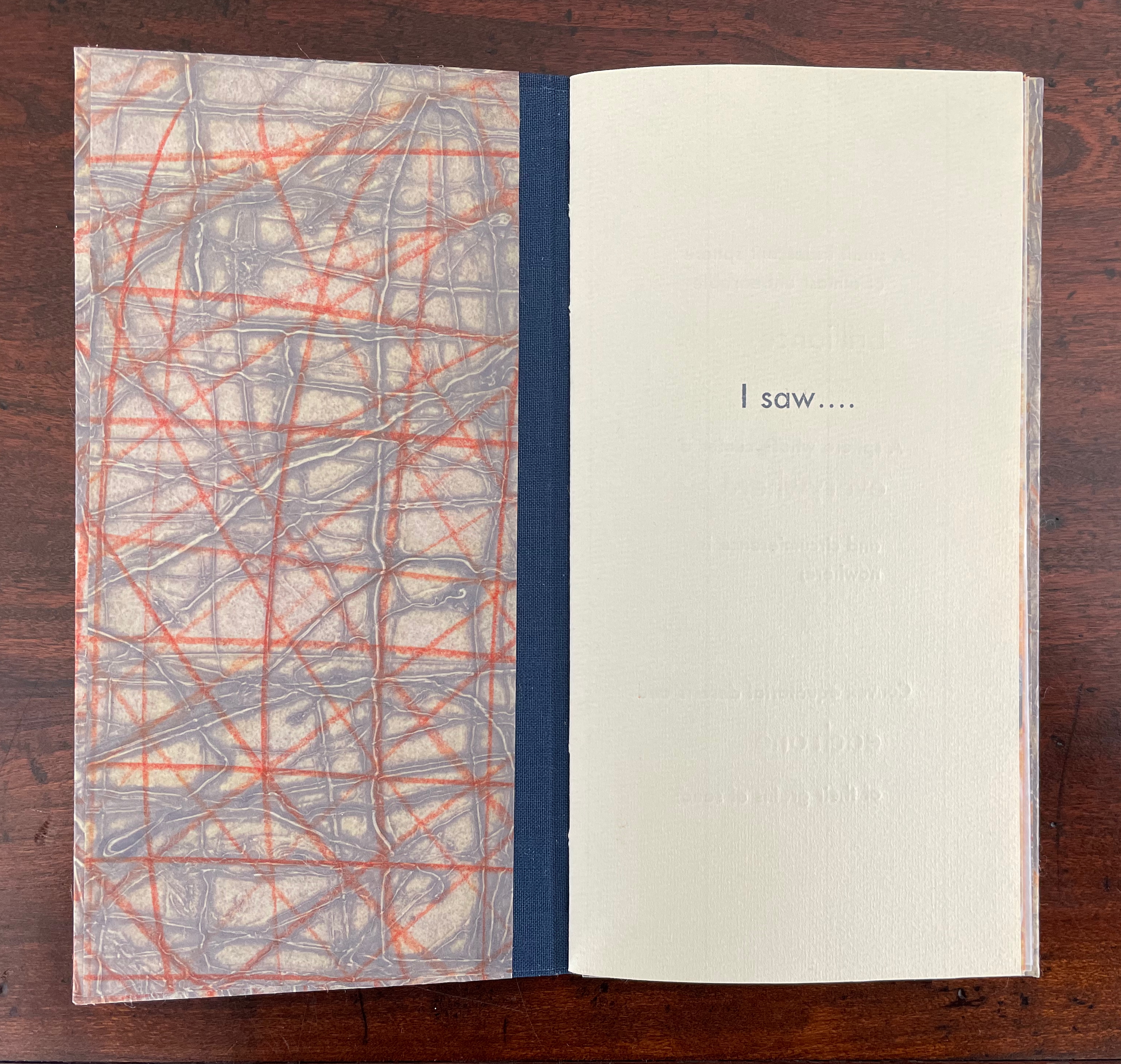
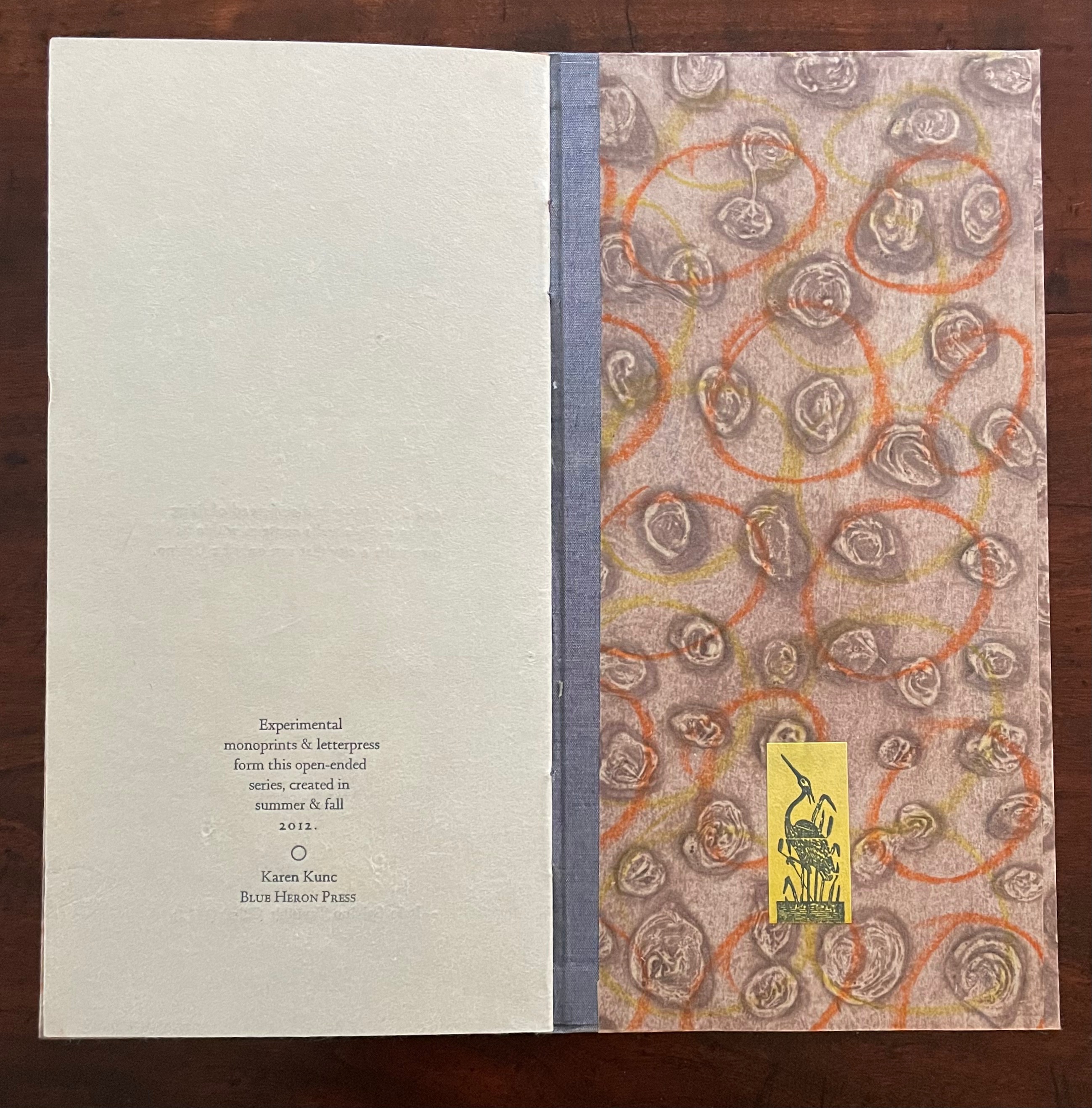
Ten Thousand Things, No. 51 (2012) Karen Kunc Single-signature booklet containing a recto and verso monoprint created by pressure printing, pochoir, and mixed media, with letterpress text. H205 x W110 mm. [8] pages. From a set of 75. Acquired from the artist, 9 February 2026. Photos: Books On Books Collection.
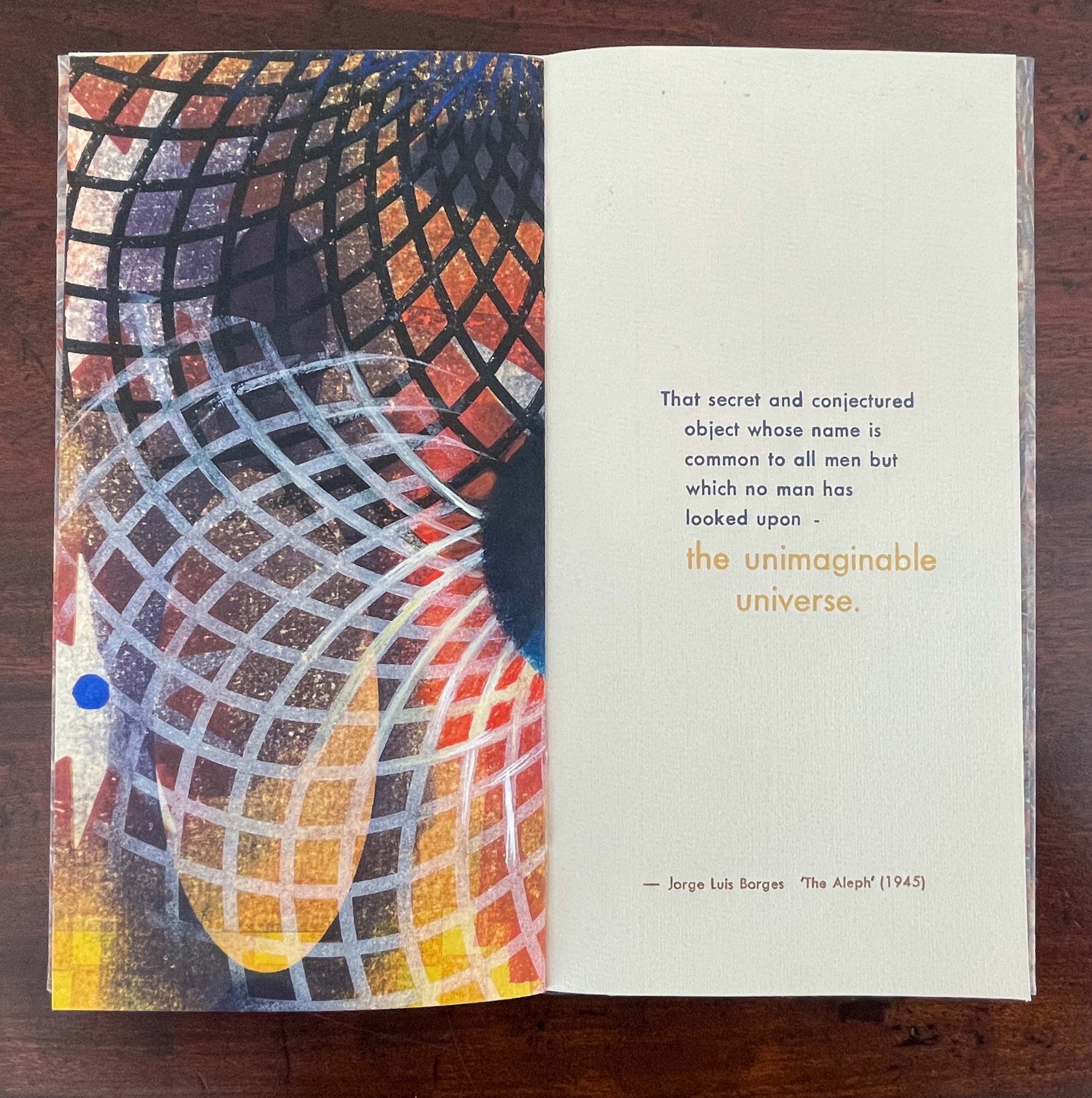
From Borges’ 1945 short story “The Aleph“, No. 51 in Kunc’s Ten Thousand Things series extracts four descriptions of the object or phenomenon Borges the narrator sees in the basement of his intolerable acquaintance Carlos Argentino Daneri:
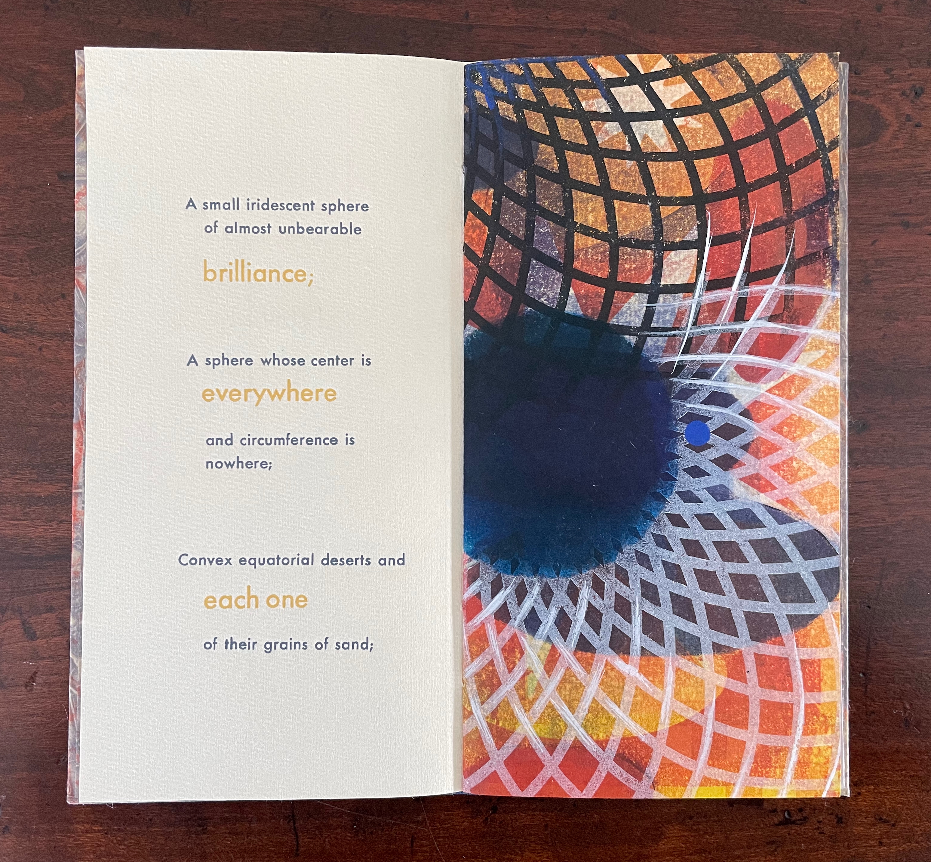
I saw a small iridescent sphere of almost unbearable brilliance[;]
a sphere whose center is everywhere and circumference is nowhere;
convex equatorial deserts and each one of their grains of sand;
that secret and conjectured object whose name is common to all men but which no man has looked upon — the unimaginable universe.
With a deft touch, Kunc has selected and slightly altered the more abstract of Borges’ long Whitmanic observations (in the first, she inserts an ellipsis and substitutes a semicolon for a full stop; for the second and third, the order of appearance is changed). Borges prefaces his catalogue of what he sees with a caveat about the inadequacy of words to depict the concept of multum in parvo [“much in little”]:
All language is a set of symbols whose use among its speakers assumes a shared past. How, then, can I translate into words the limitless Aleph, which my floundering mind can scarcely encompass? Mystics, faced with the same problem, fall back on symbols: to signify the godhead, one Persian speaks of a bird that somehow is all birds; Alanus de Insulis, of a sphere whose center is everywhere and circumference is nowhere; Ezekiel, of a four-faced angel who at one and the same time moves east and west, north and south. (Not in vain do I recall these inconceivable analogies; they bear some relation to the Aleph.) Perhaps the gods might grant me a similar metaphor, but then this account would become contaminated by literature, by fiction. Really, what I want to do is impossible, for any listing of an endless series is doomed to be infinitesimal. In that single gigantic instant I saw millions of acts both delightful and awful; not one of them occupied the same point in space, without overlapping or transparency. What my eyes beheld was simultaneous, but what I shall now write down will be successive, because language is successive.
In light of the snide literary sniping and rivalry that forms the background to “The Aleph”, Borges may be forgiven for omitting William Blake’s spectacular translation of “the limitless Aleph”:
To see a World in a Grain of Sand,/ And a Heaven in a Wild Flower,/ Hold Infinity in the palm of your hand,/ And Eternity in an hour. (Auguries of Innocence, 1803).
It might have brought Borges’ descriptive and narrative enterprise to an harrumphing halt. We would then not have had this particular instance of Karen Kunc’s taking up the challenge of rendering in an artist’s book Borges’ verbal description of the Aleph. What image could resonate with or reflect his words and reflect the impossibility he describes? How might the arrangement of pages enhance/diminish it? How might the act of turning a page reflect or obscure it?
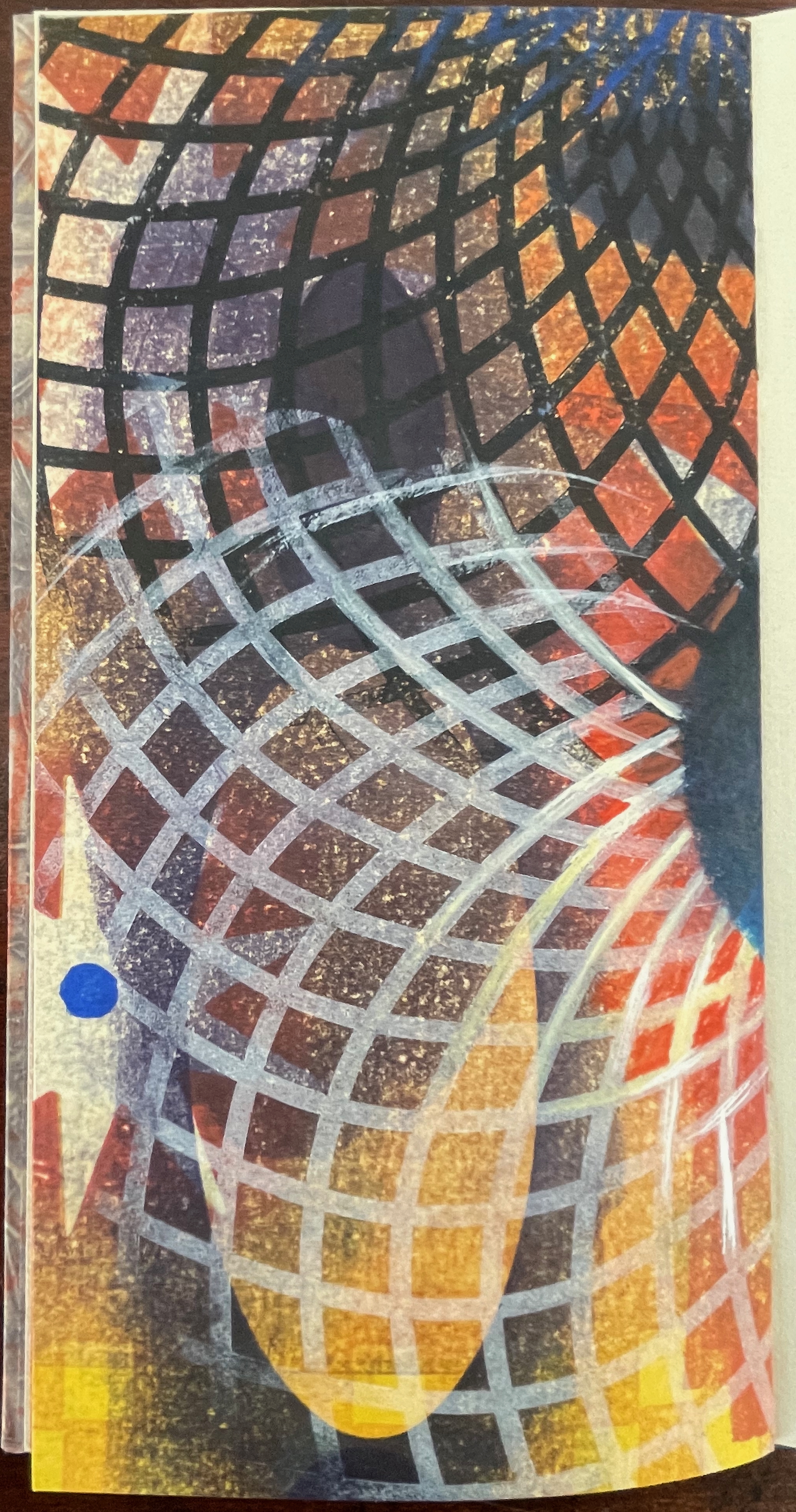
The vibrant circle of deep blue is only two dimensional, but perhaps the abstractions behind the dark convex grid suggest the three dimensionality of the story’s sphere. Perhaps the more brilliant but smaller blue circle beside the larger one conveys the multum in parvo concept in the style of medieval narration differentiating multiple points in time with images of different size in the same plane. Perhaps the full-page bleed of the image even suggests that paradoxically the image extends from the page yet encompasses the page. Likewise might the sheet’s fold that truncates the circle and the dark and light grids imply continuity coexisting with discontinuity? Does the dark blue grid that curves over the orange and burnt umber colors imply the “convex equatorial deserts”?
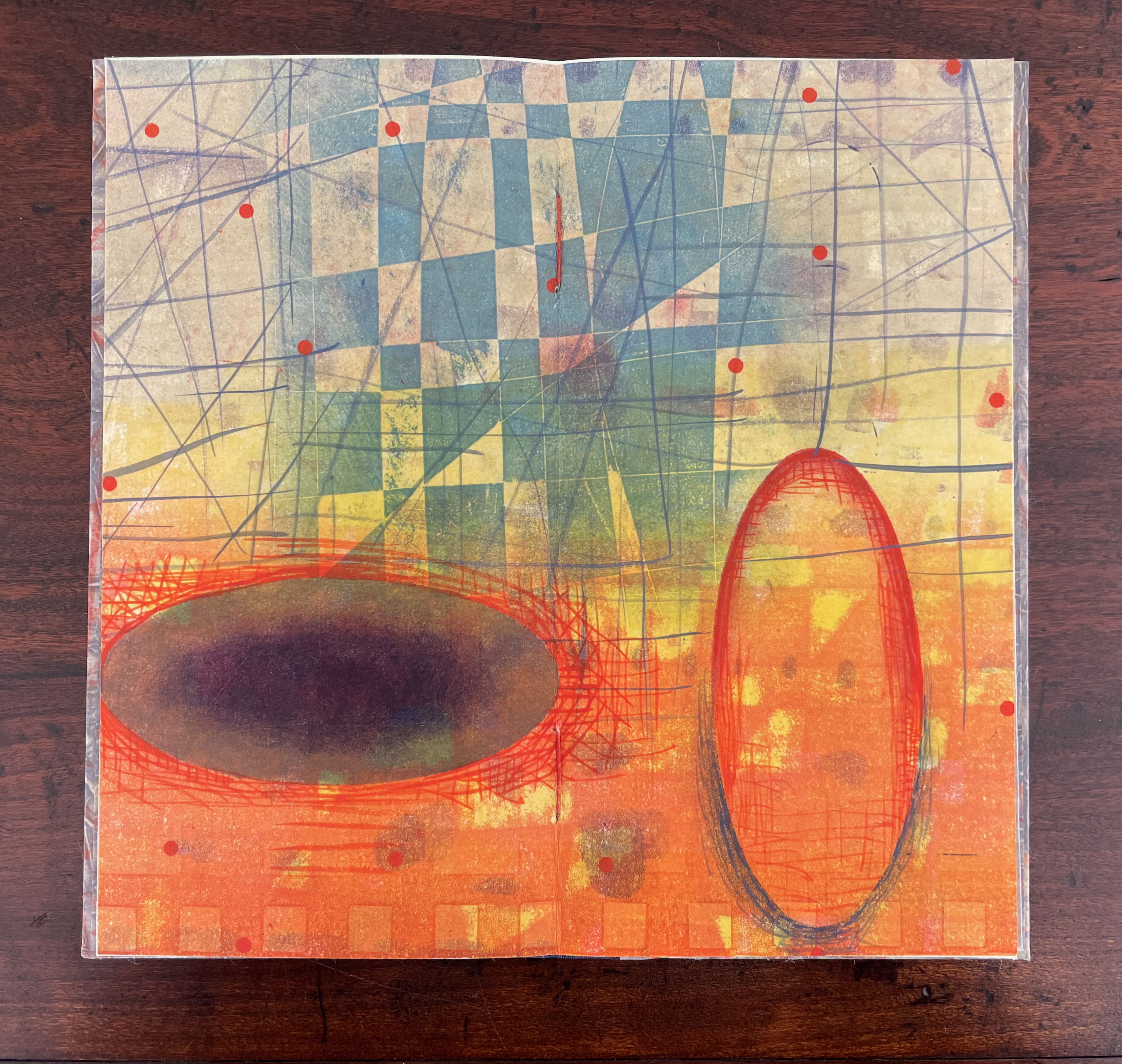
Turning from that half view of the monoprint, we have the full view of the monoprint on the other side of the sheet. An angular and checkered blue background hovers over two ellipsoid figures in an orange foreground. Is the background network with its numerous small red dots a version of Indra’s net, that cosmological metaphor of an infinite net with a jewel at each juncture reflecting and being reflected by every other? The dark ellipsoid seems to quiver surrounded by crosshatching. Is it in motion toward the upright orange ellipsoid? Is this a moment in time and space?
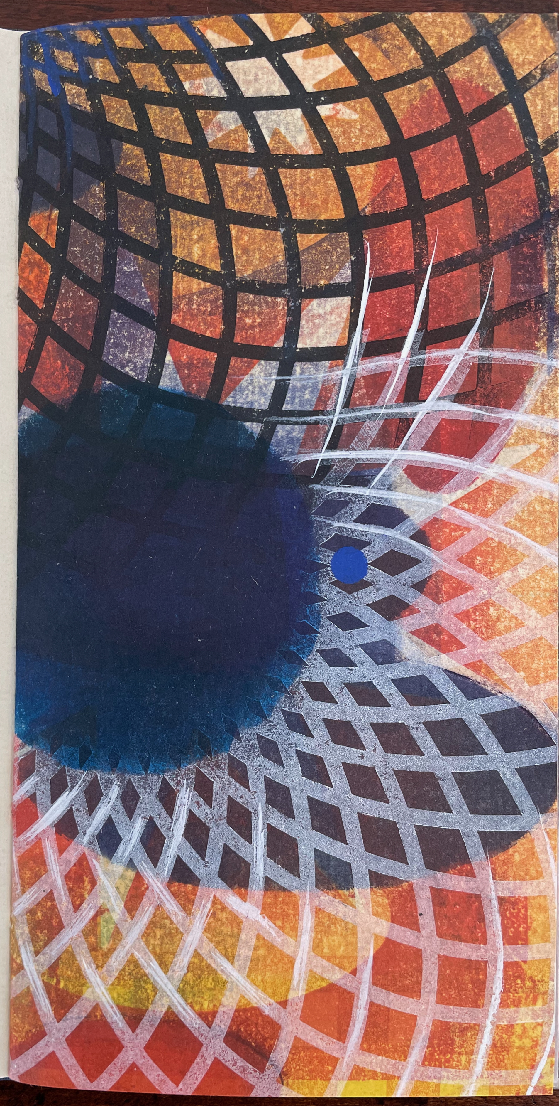
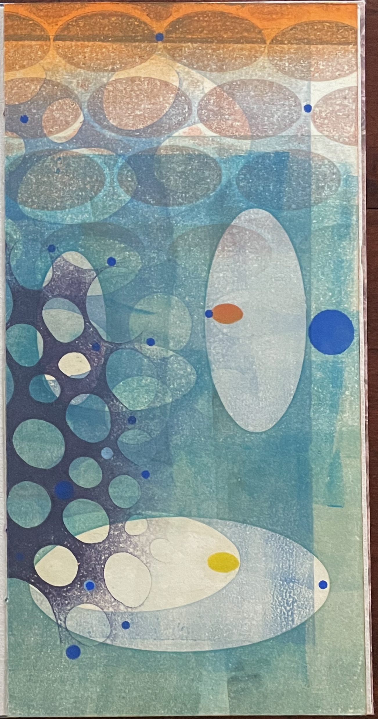
The other half of the monoprint with the dark blue circle comes into view with the last double page spread. If we could see all at once the monoprint with the dark blue circle, the juxtaposition of spheres and ellipses would stand out more.
The white stars behind the grid stand out a bit more, and the small bright circles seem more clearly positioned on curving white orbital tracks. Is it an allusion to planetary and constellatory movement, bring a universe within this small book? Without photographic manipulation, we have to open our minds to imagine it. As Carlos replies when Borges worries that it will be too dark in the cellar to see the Aleph, ““Truth cannot penetrate a closed mind. If all places in the universe are in the Aleph, then all stars, all lamps, all sources of light are in it, too.”
Of course, this photographic manipulation is a cheat and overlooks that Kunc has combined the half-views of one side of the monoprint with the full view on the other side to reflect the challenge of embodying a simultaneous phenomenon with successive phenomena.
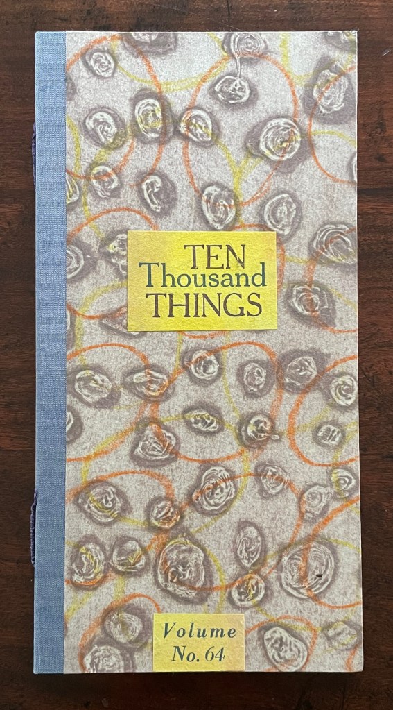
Ten Thousand Things, No. 64 (2012)
Ten Thousand Things, No. 64 (2012) Karen Kunc Single-signature booklet containing a recto and verso monoprint created by pressure printing, pochoir, and mixed media, and a letterpress text on various papers.H250 x W125 mm. [8] pages. From a set of 75. Acquired from the artist, 9 February 2026. Photos: Books On Books Collection.
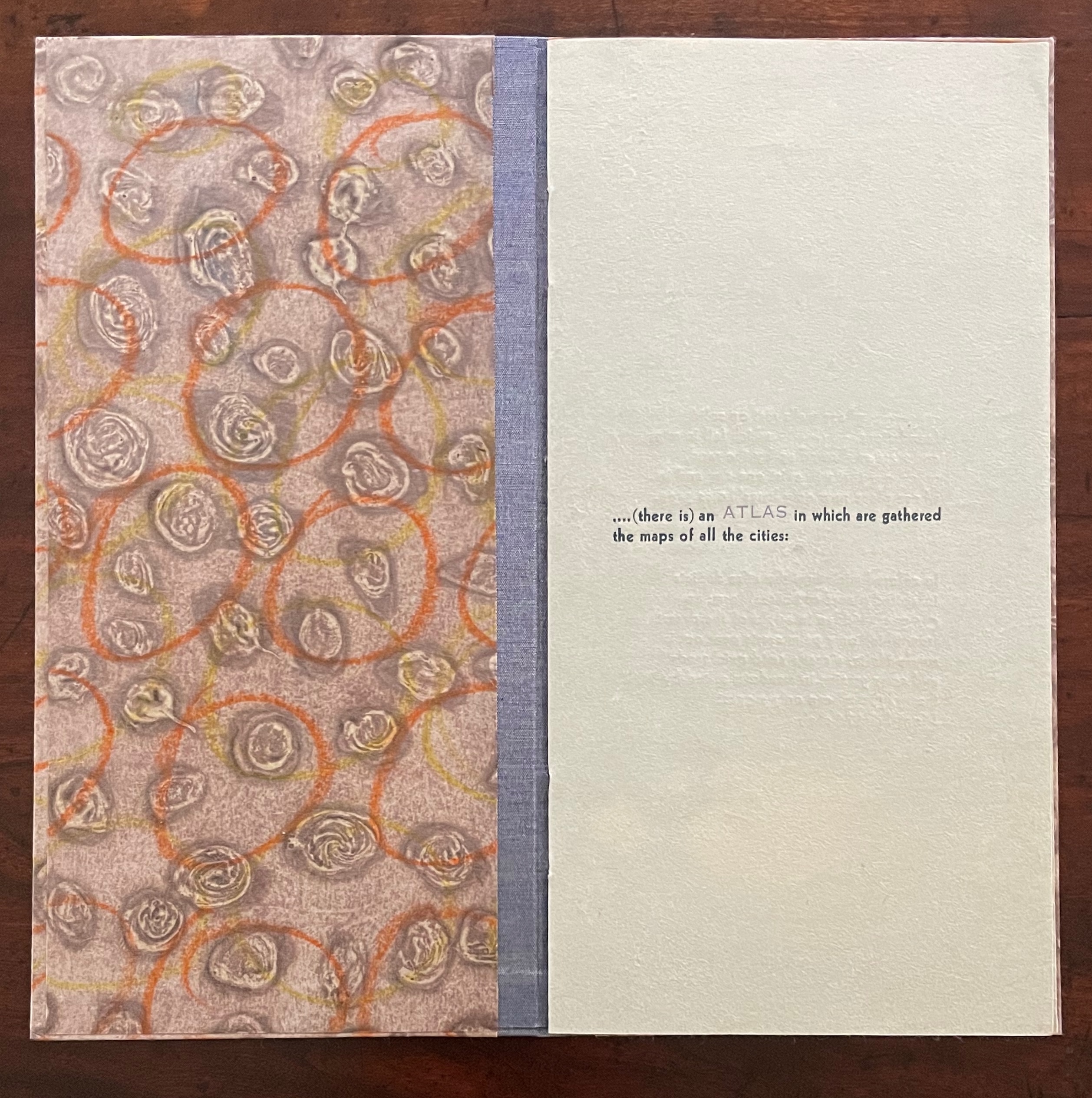
Of the 74 books in the Ten Thousand Things series, 11 of them pay homage to Italo Calvino’s Invisible Cities (1972/74). The book’s premise is that Kublai Khan sent Marco Polo out into the empire to visit the Khan’s cities and return with close descriptions. In nine parts, each prefaced and closed with a philosophical dialogue between the Khan and Polo, the traveller describes fifty-five cities — all of them imaginary. While most works of homage to Invisible Cities select one or more of these fictitious 55 cities on which to focus, Kunc chooses more general text from the preface to Part 9. This is the text used in all 11 of the works of homage to Calvino:
…. (there is) an ATLAS in which are gathered the maps of all the cities:
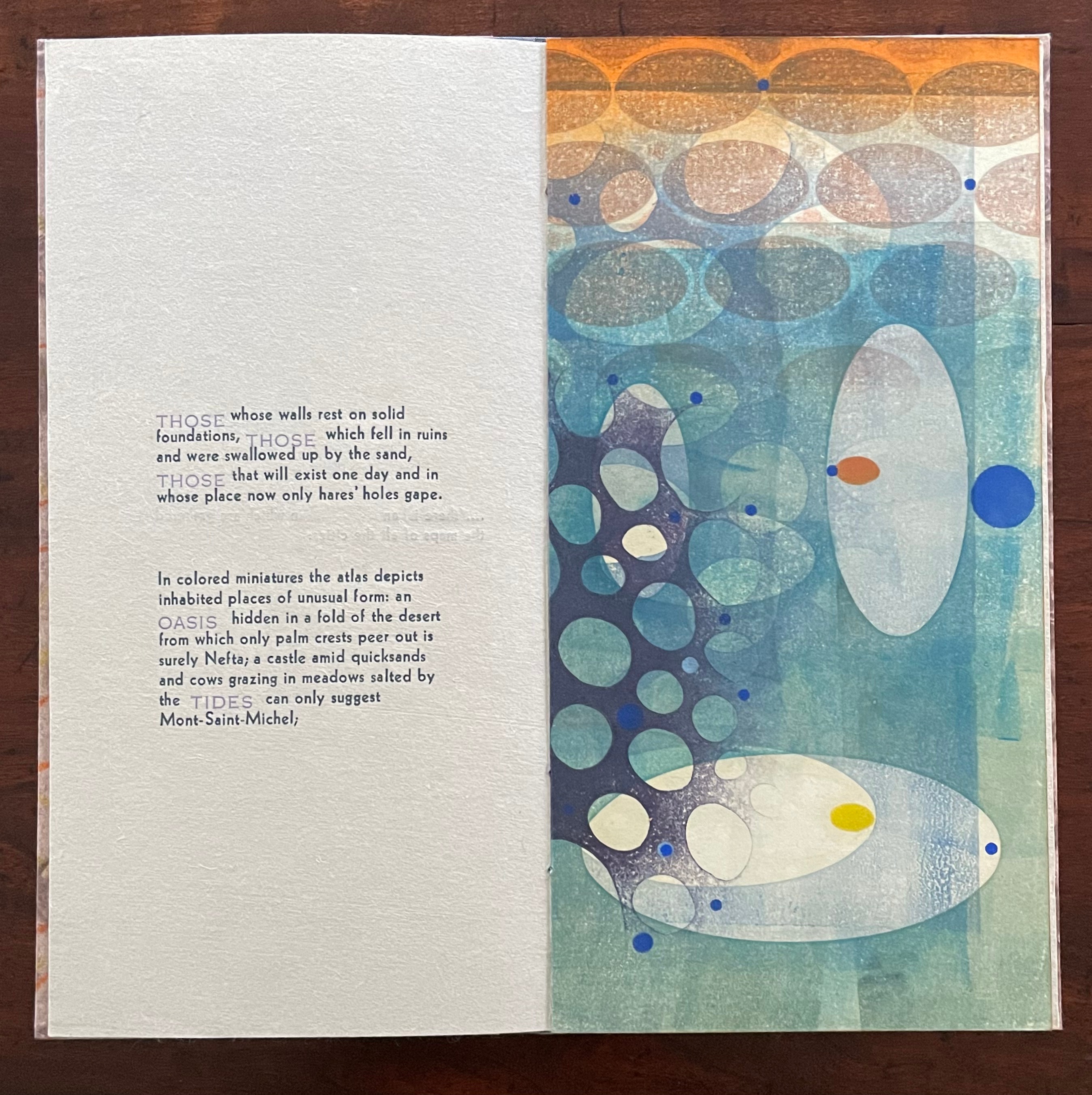
THOSE whose walls rest on solid foundations, THOSE which fell in ruins and were swallowed up by the sand, THOSE that will exist one day and in whose place now only hares’ holes gape.
In colored miniatures the atlas depicts inhabited places of unusual form: an OASIS hidden in a fold of the desert from which only palm crests peer out is surely Nefta; a castle amid quicksands and cows grazing in meadows salted by the TIDES can only suggest Mont-Saint-Michel;
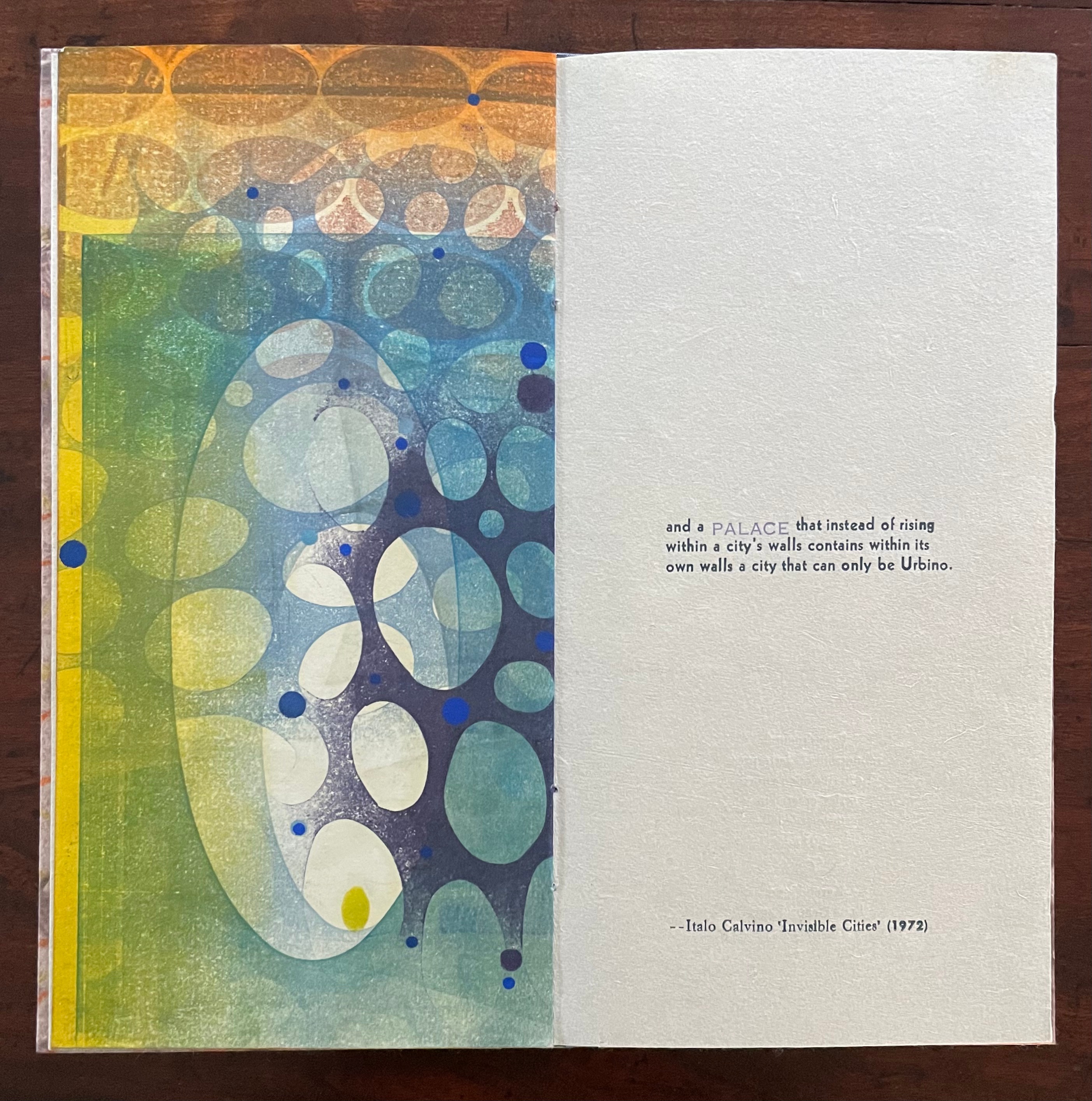
and a PALACE that instead of rising within a city’s walls contains within its own walls a city that can only be Urbino.
With certain words appearing in all caps in a lighter weight and lighter color than the surrounding text, the excerpts have a different texture from those in No. 51. The all caps words rise above or fall below the line of type.
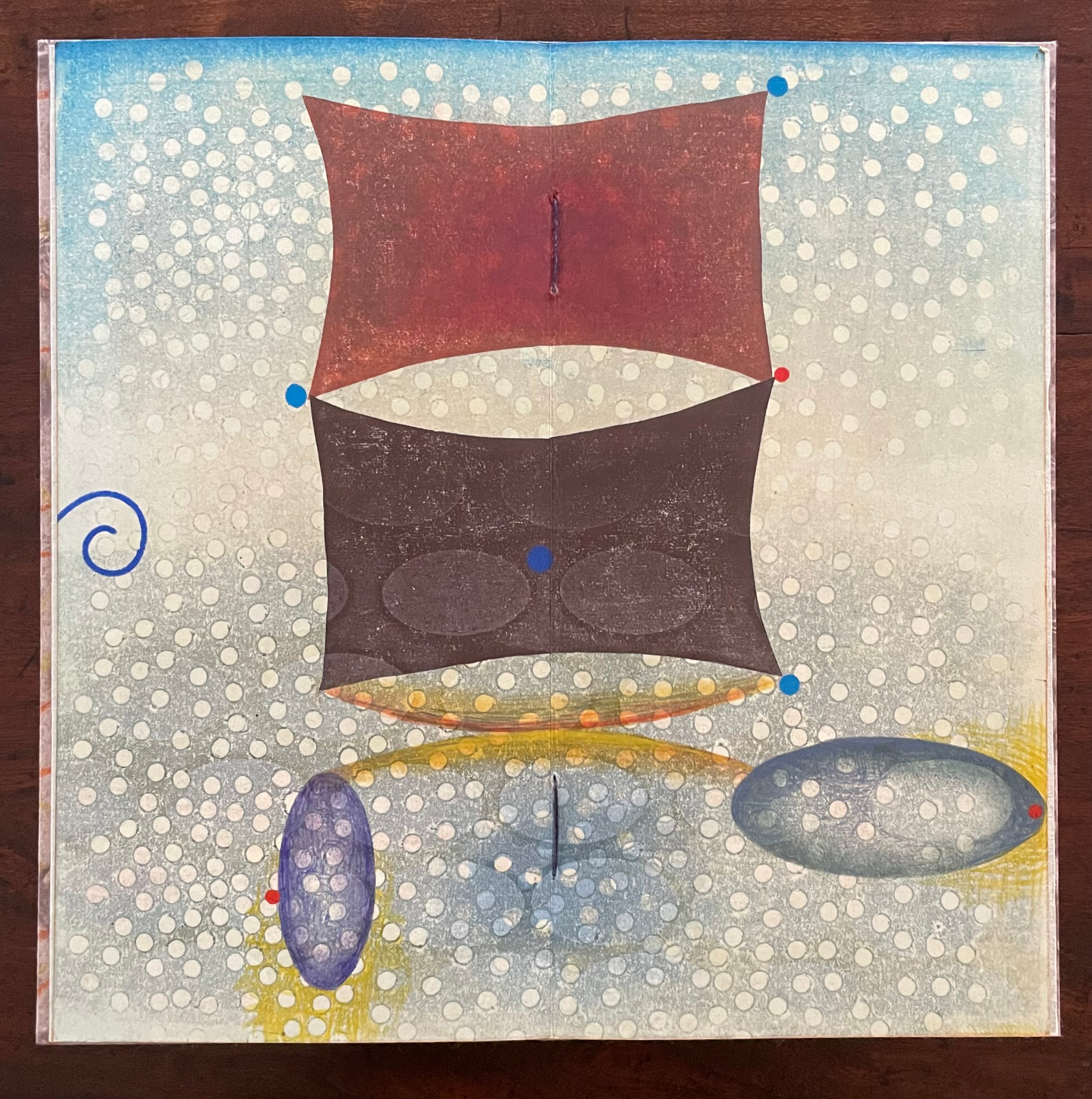
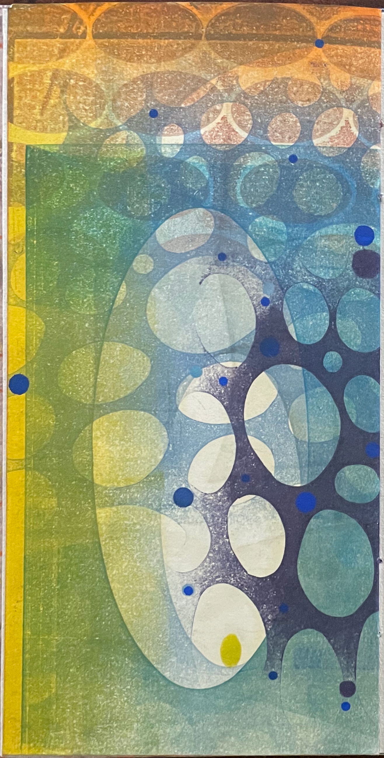
As with No. 51, only one side of the double-sided monoprint is viewable as a whole; the other side is viewable in halves. In No. 64’s first half-view, the shapes and colors have a submerged quality that echoes the now sinking or subsiding type of “THOSE”, “OASIS”, and “TIDES”:
As the most prominent feature of the full-view monoprint, perhaps the two rectangular sail-like shapes recall the Chinese emperor and Venetian traveler. Or perhaps they allude to the remnants of a tower poking above the sands. The ellipsoidal shapes might be the “hares’ holes” mentioned above. The seemingly non-allusive flurry of white dots across the spread behave strangely. They lie in the background in the upper two thirds of the spread but then shift into the foreground in the lower third. The four bright blue dots may have migrated from the first half-view, but the trio of red dots are new participants. The presence of both contributes to an urge to flip back and forth between the first half-view and this full view.
The second half-view faces text that again displays all caps letters that sink below the line: “PALACE”, but more notably, the palace does not sit within a city but a city sits within the palace, “a city that can only be Urbino”. So, a real city within a fictive palace.
We can perform the photographic cheat to bring the two halves of the monoprint together, but as with No. 51, we overlook the deliberate hiding of the whole within the halves — like the paradoxical fictive palace that holds a real city (Urbino).
Type Cities (2018)
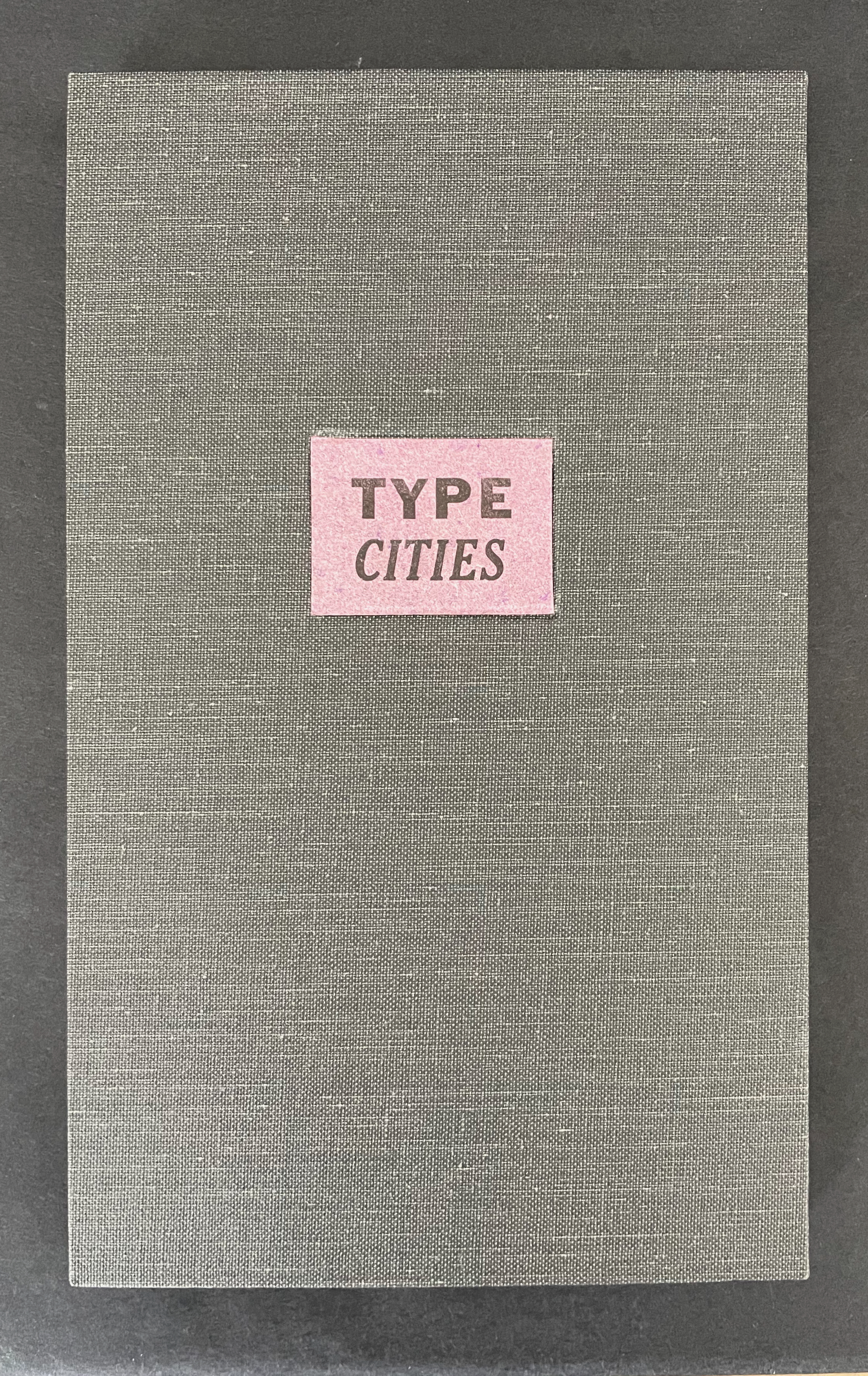
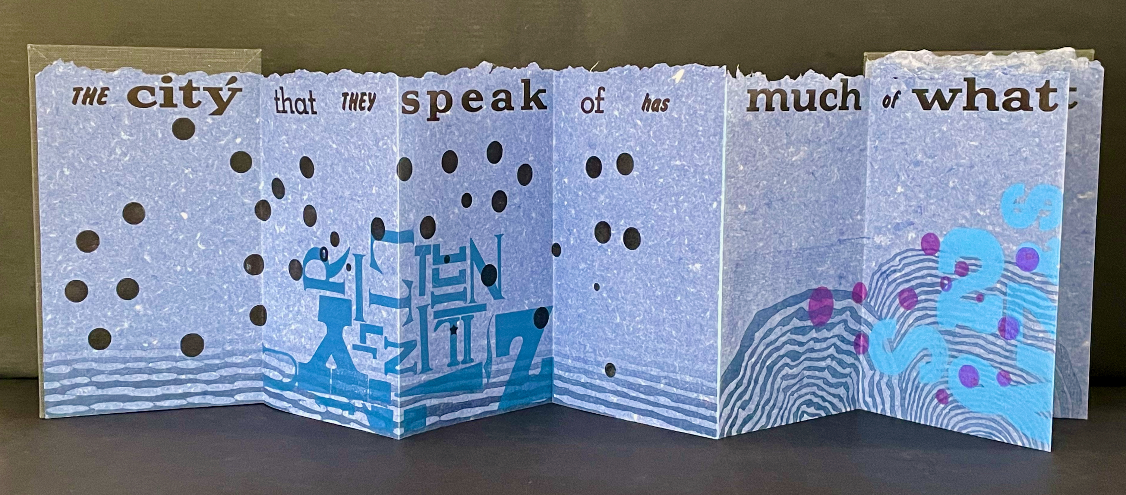
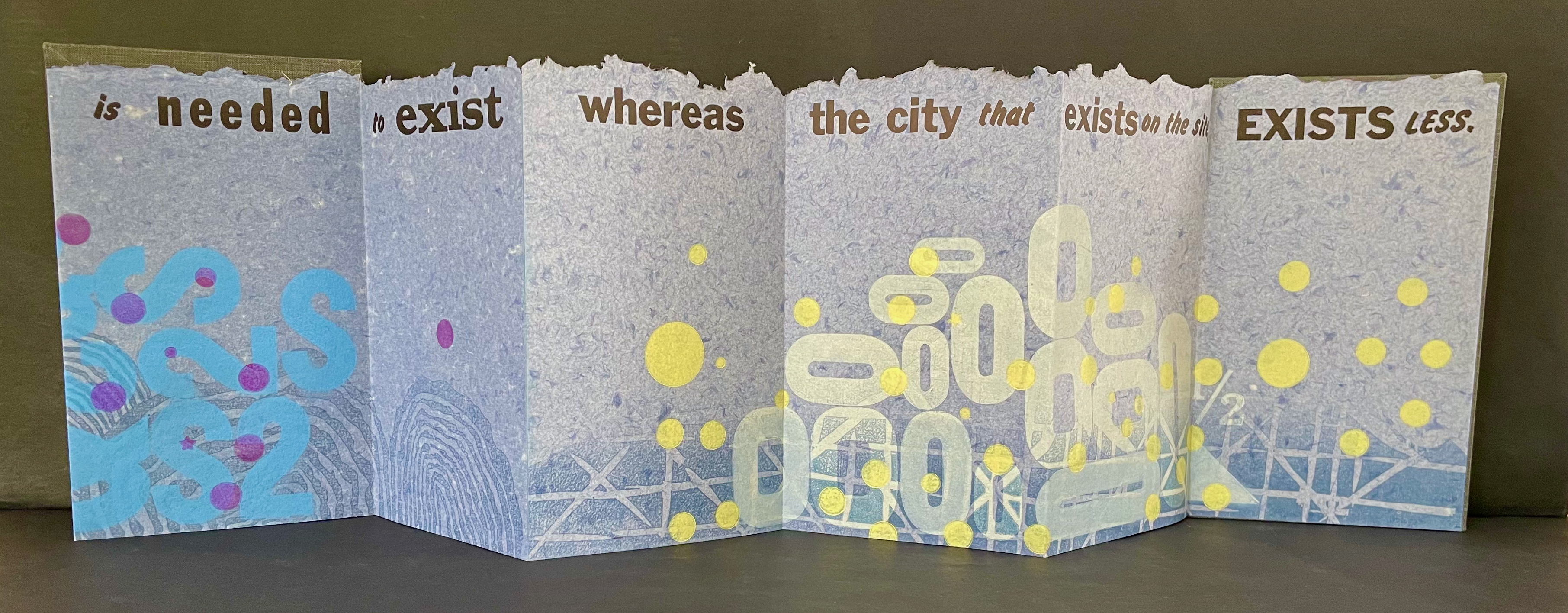
Type Cities (2018) Karen Kunc Leporello. H190 x W114 mm closed, extends to 1346 mm. [12] panels. Edition of 8, of which this is #2. Acquired from the artist, 25 March 2026. Photos: Books On Books Collection.
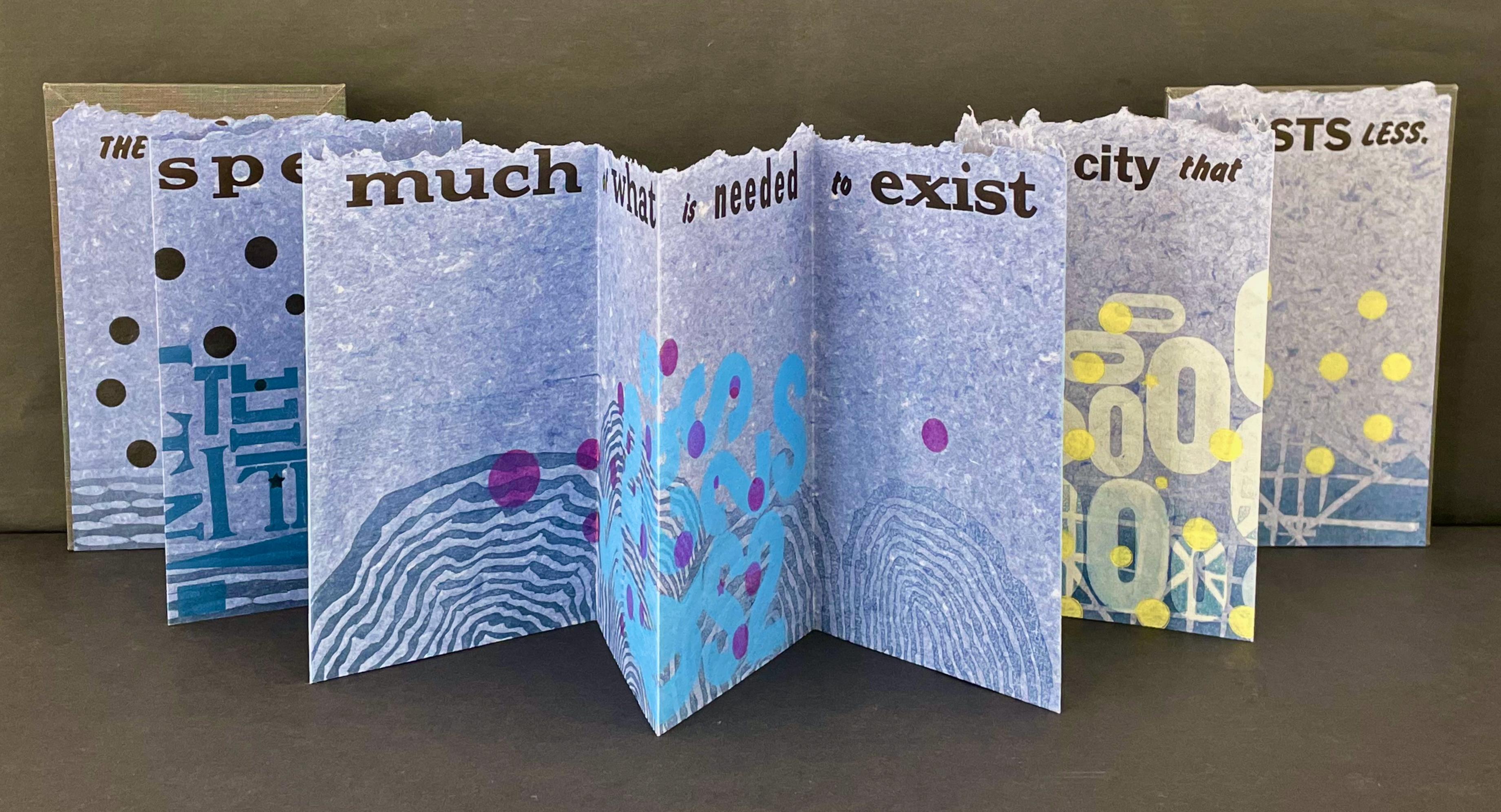
Like most other homages to Invisible Cities, Karen Kunc’s Type Cities (2018) focuses on one of the fictitious cities; in this case, Aglaura. As with Ten Thousand Things, she uses an excerpt:
The city that they speak of has much of what is needed to exist whereas the city that exists on the site, exists less.
That is cryptic. Just as the paradoxical characterizes the general cities in No.64, so it is for the particular city of Aglaura here:
So if I wished to describe Aglaura to you, sticking to what I personally saw and experienced, I should have to tell you that it is a colorless city, without character, planted there at random. But this would not be true either: at certain hours, in certain places along the street, you see opening before you the hint of something unmistakable, rare, perhaps magnificent; you would like to say what it is, but everything previously said of Aglaura imprisons your words and obliges you to repeat them than say. Therefore, the inhabitants still believe they live in an Aglaura which grows only with the name Aglaura and they do not notice the Aglaura that grows on the ground.
For Ten Thousand Things, the single-fold double-sided monoprint provided Kunc a surprisingly flexible tool with which to capture the paradoxical in two very different texts. This time she chooses the accordion structure. Also, as the title Type Cities suggests, she chooses type as an additional tool to capture what Marco Polo describes as Aglaura’s “enduring assortment of qualities”. Across the twelve panels of the leporello, Kunc lays out the text of her chosen excerpt in multiple faces and fonts:
Also across the twelve panels, the color change of black dots to purple, violet, and then yellow echoes the shift from the colorless city to something else “at certain hours, in certain places along the street”.
The “much of what is needed to exist” manifests at the bottom edge as wood type letters in dark blue floating along a river (?), then as Ss, 2s, and $s floating over a pond (?), and then yields to the less of zeroes scattered over a grid. The contrast of much and less even extends vertically to the handmade paper with its messily torn upper edge opposed to its neatly trimmed lower edge. It also extends horizontally to the paper as its tint shifts gradually from a deep blue to a light gray. These photographs do not do justice to the painted and stamped elements or texture of Type Cities.
Further Reading
Laozi. 2011. Tao Te Ching = Dao de Jing. Translated by Gia-fu Feng, Jane English, and Toinette Lippe. Third Vintage books edition. New York: Vintage Books, a division of Random House, Inc.
Works of homage to Jorge Luis Borges
Louise Grimshaw’s Ethereal Worlds(2017) celebrates “The Library of Babel” with hexagonally shaped pages of prints rotating on a central post.
This entry is preceded by “Abra Ancliffe (I)“, which describes the Personal Libraries Library (Winter 2009-10 to Spring/Summer 2021) and The Secret Astronomy of Tristram Shandy (2015).
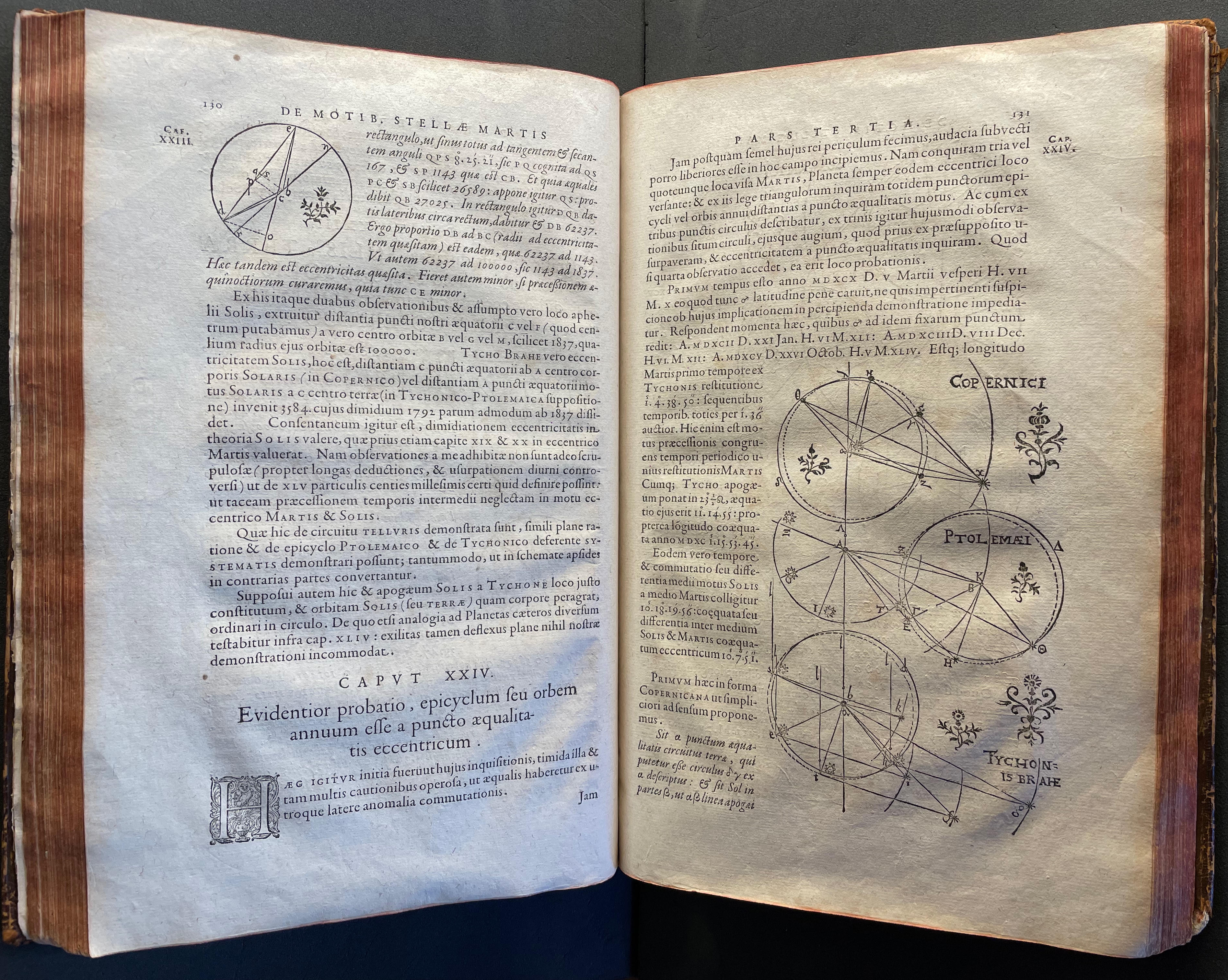
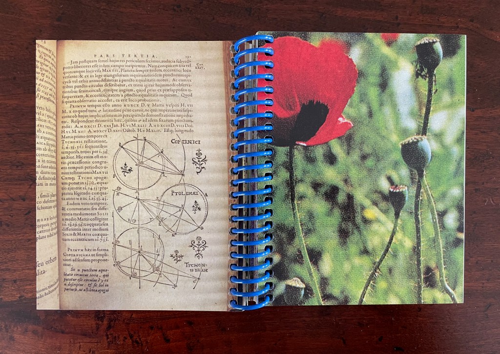
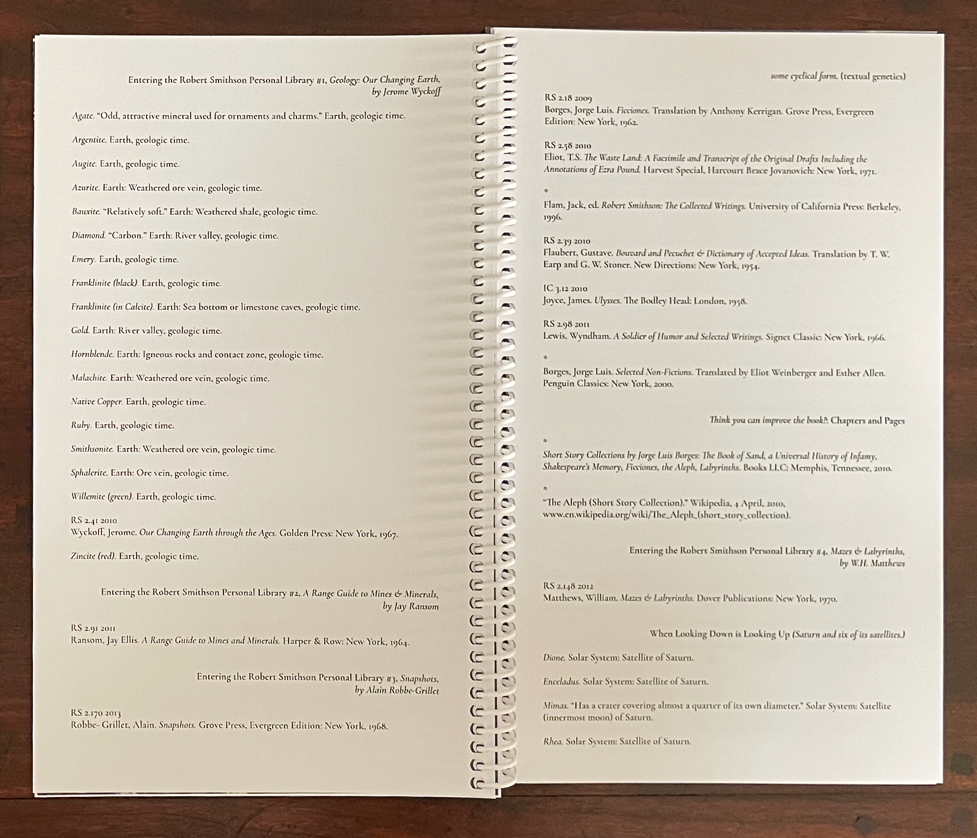
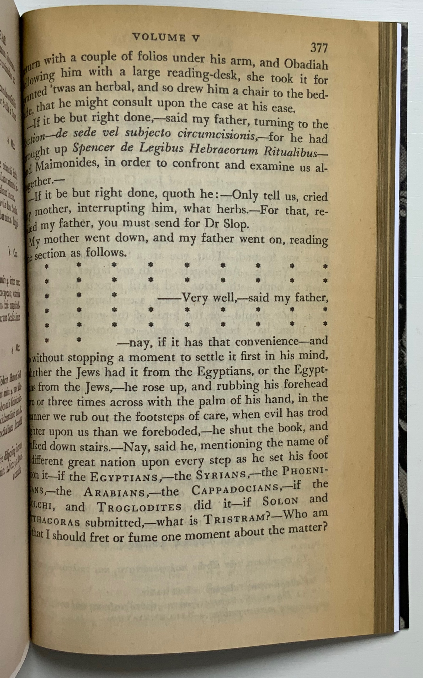
The constellatory asterisks in The Secret Astronomy of Tristram Shandy also evoke those flowers that our Personal Libraries Library (PLL) Artist/Librarian “picks” from the PLL and, later, Oleg Polunin’s Flowers of Europe: A Field Guide (1969) to include in the periodic issues of ephemera. Perhaps this confluence of stars and flowers created a predisposition in our Artist/Librarian that drew her to Johannes Kepler’s Astronomia Nova (1609). Unlike Sterne’s novel, which was part of Calvino’s personal library, Astronomia Nova lies outside the five personal collections. Of course, since Maria Mitchell was an astronomer, the works in her personal library refer to Kepler, and similarly, Robert Smithson had multiple books about astronomy, even Arthur Koestler’s Watershed: A Biography of Johannes Kepler. Still, Kepler’s “New Astronomy, Based upon Causes, or Celestial Physics, Treated by Means of Commentaries on the Motions of the Star Mars, from the Observations of Tycho Brahe, Gent.“, to give it its full and translated name, appears in Ancliffe’s heavens and garden like a new galaxy or specimen.
Astronomia Nova provided and further refined the mathematical and observational proofs of the Copernican planetary model of heliocentrism first laid out in De revolutionibus orbium coelestium [On the Revolutions of the Celestial Spheres] (1543). A little over 400 years later, our Ancliffe noticed in Kepler’s watershed publication something previously unobserved, something peculiarly geocentric about its heliocentric model.
There is no florilegium or guide to these woodcut flowers, but there they are, sprinkled throughout Johannes Kepler’s 650-page investigation of Mars’ orbit, tracked by the observations of his mentor Tycho Brahe, Emperor Rudolph II’s imperial astronomer.
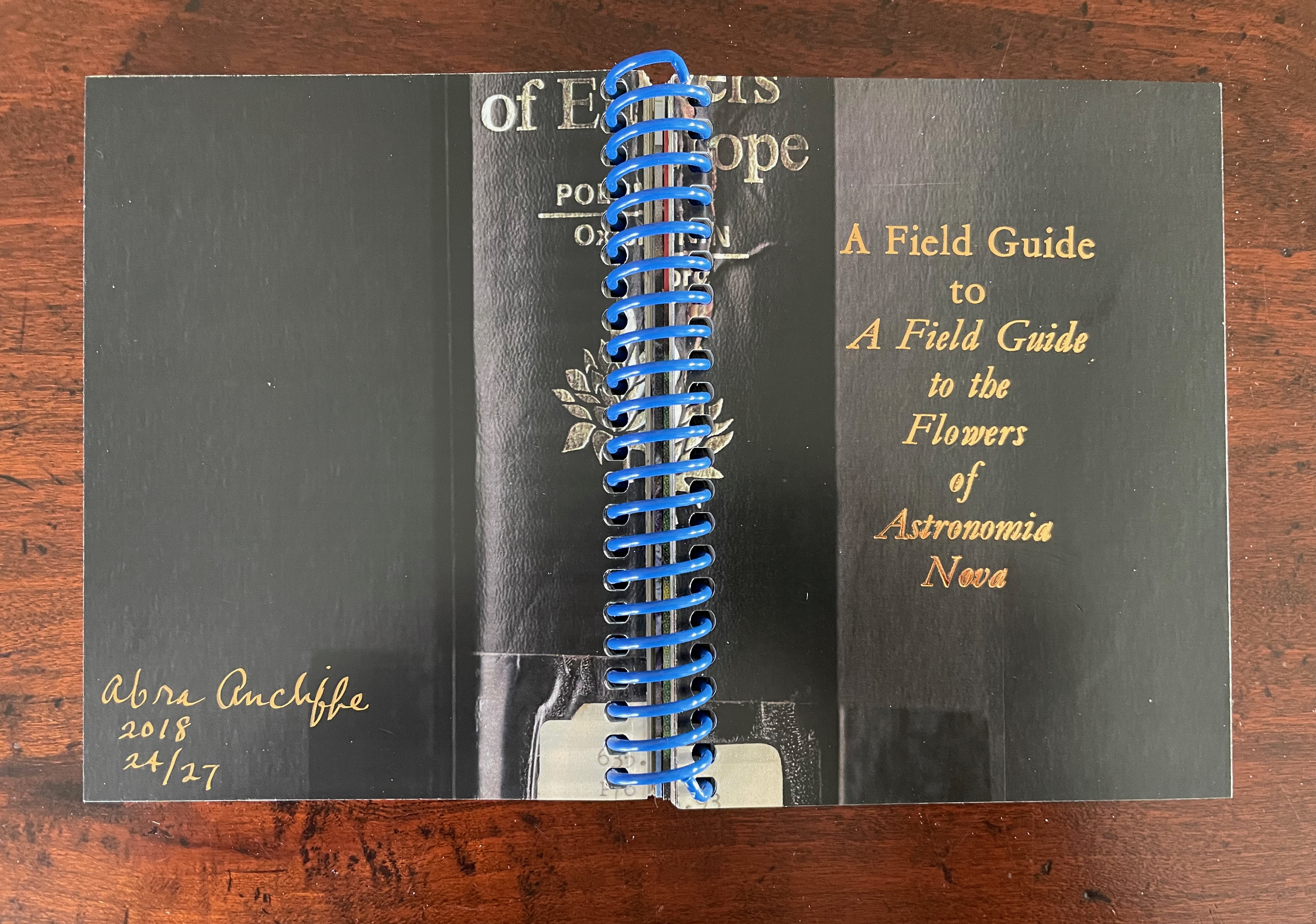
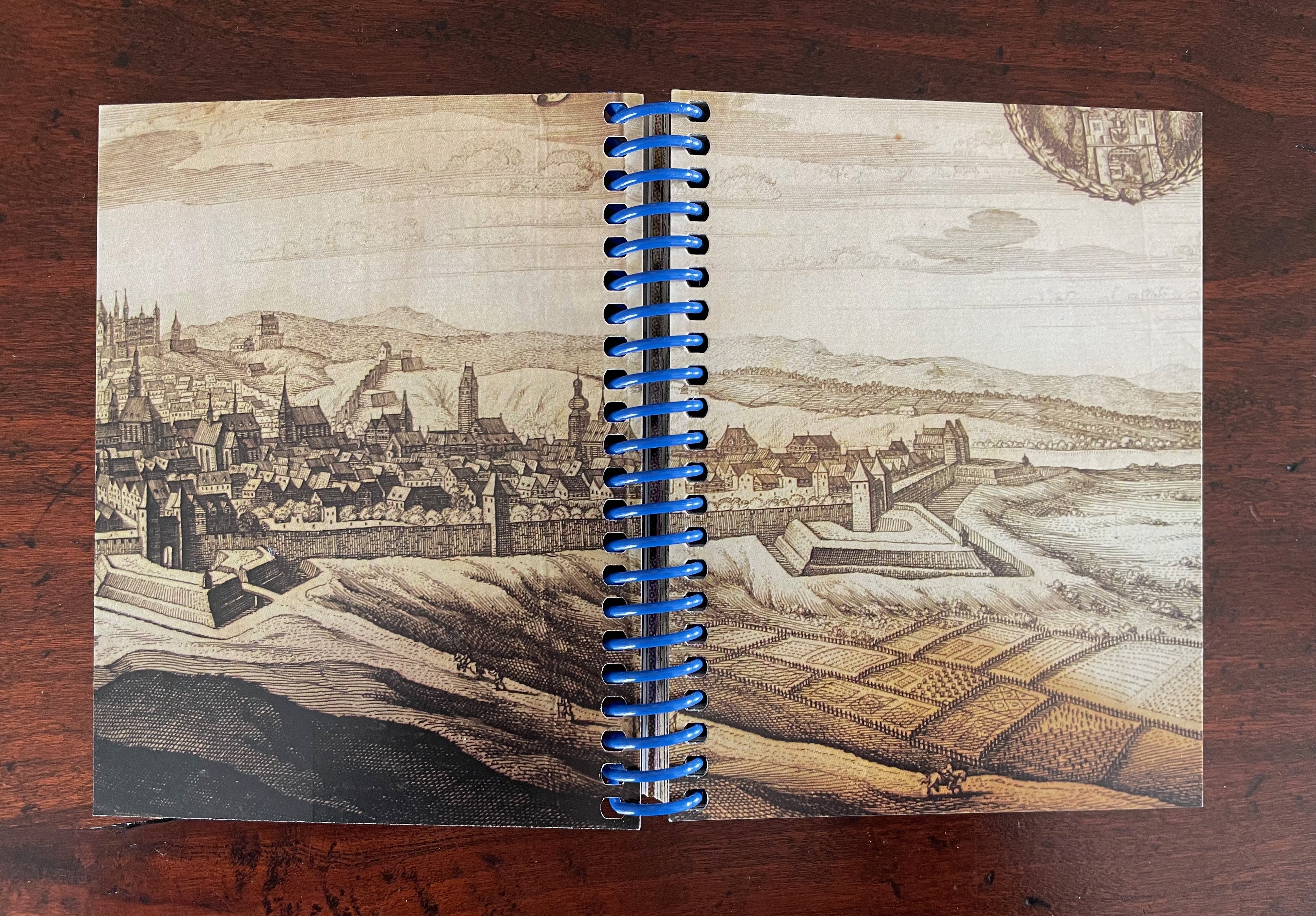
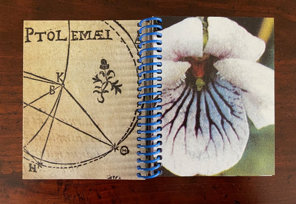
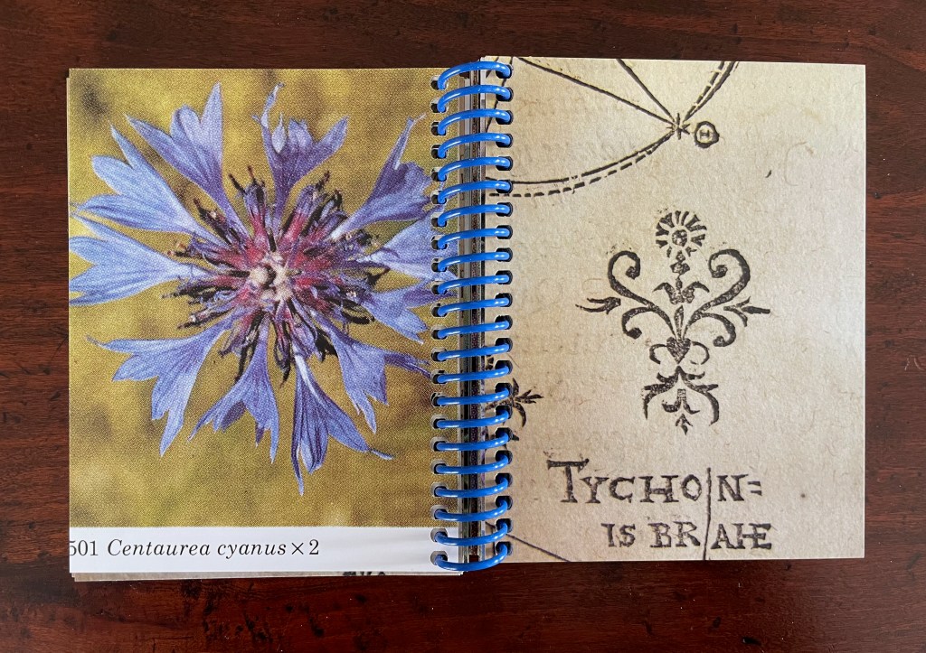
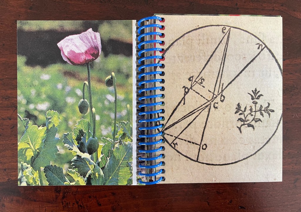
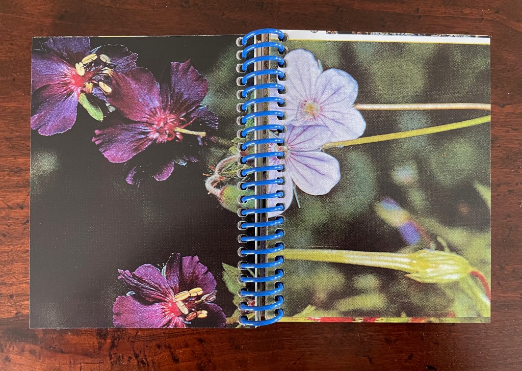
On one level, Ancliffe’s spiral bound handbook is the field guide to these flowers. Its photos of flowers , harvested from Pulinin’s Flowers of Europe, offer candidates for the historical real-life counterparts to the ornamental woodcuts. The handbook’s title, however, indicates another level: that of “a field guide to ‘a field guide’ “. But of what could such a meta-guide consist? In Ancliffe’s case, it is the artist’s book, the work before us that addresses the fields of vision and perspectives embedded in Kepler’s work, the engraver’s woodcuts, and the book artist’s work itself. The first three opening spreads of A Field Guide to “A Field Guide to the Flowers of ‘Astronomia nova‘ ” stake out the environment of the “field guide to a field guide” as well as the zooming-in approach it takes.
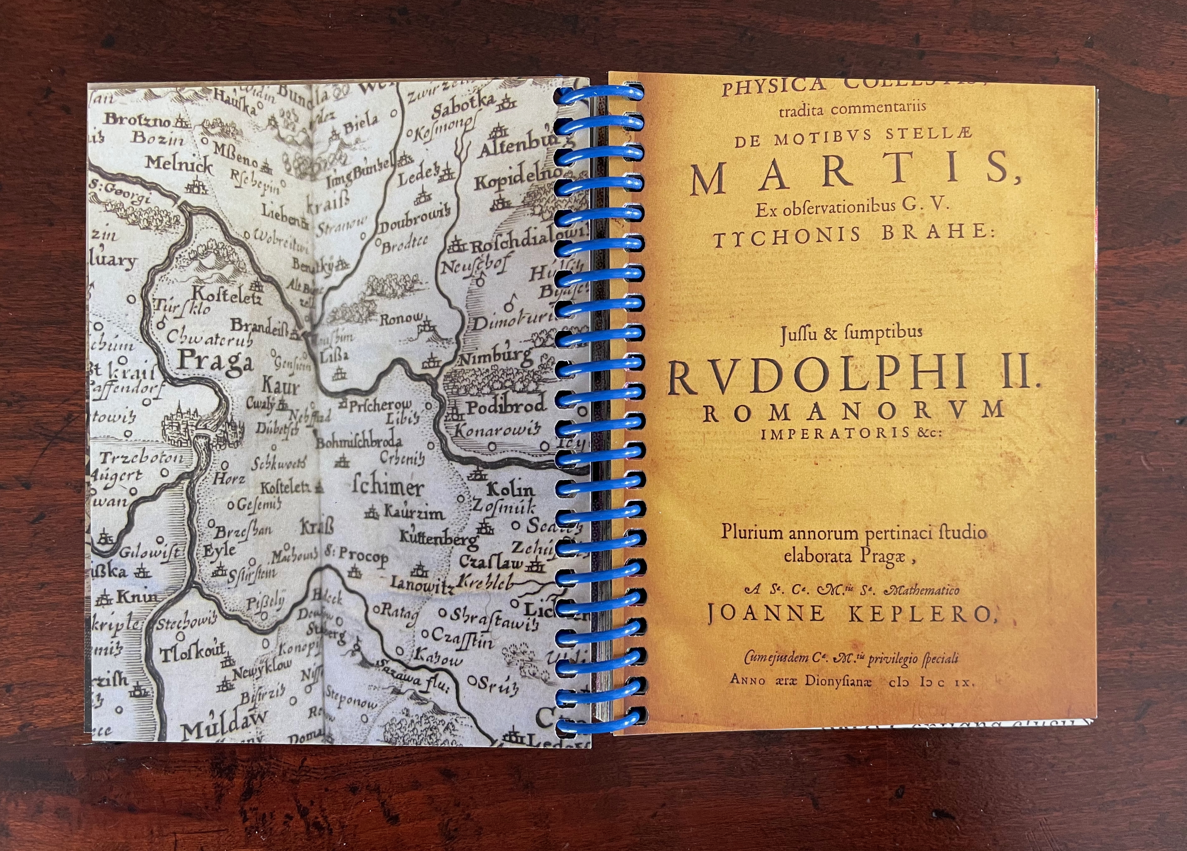
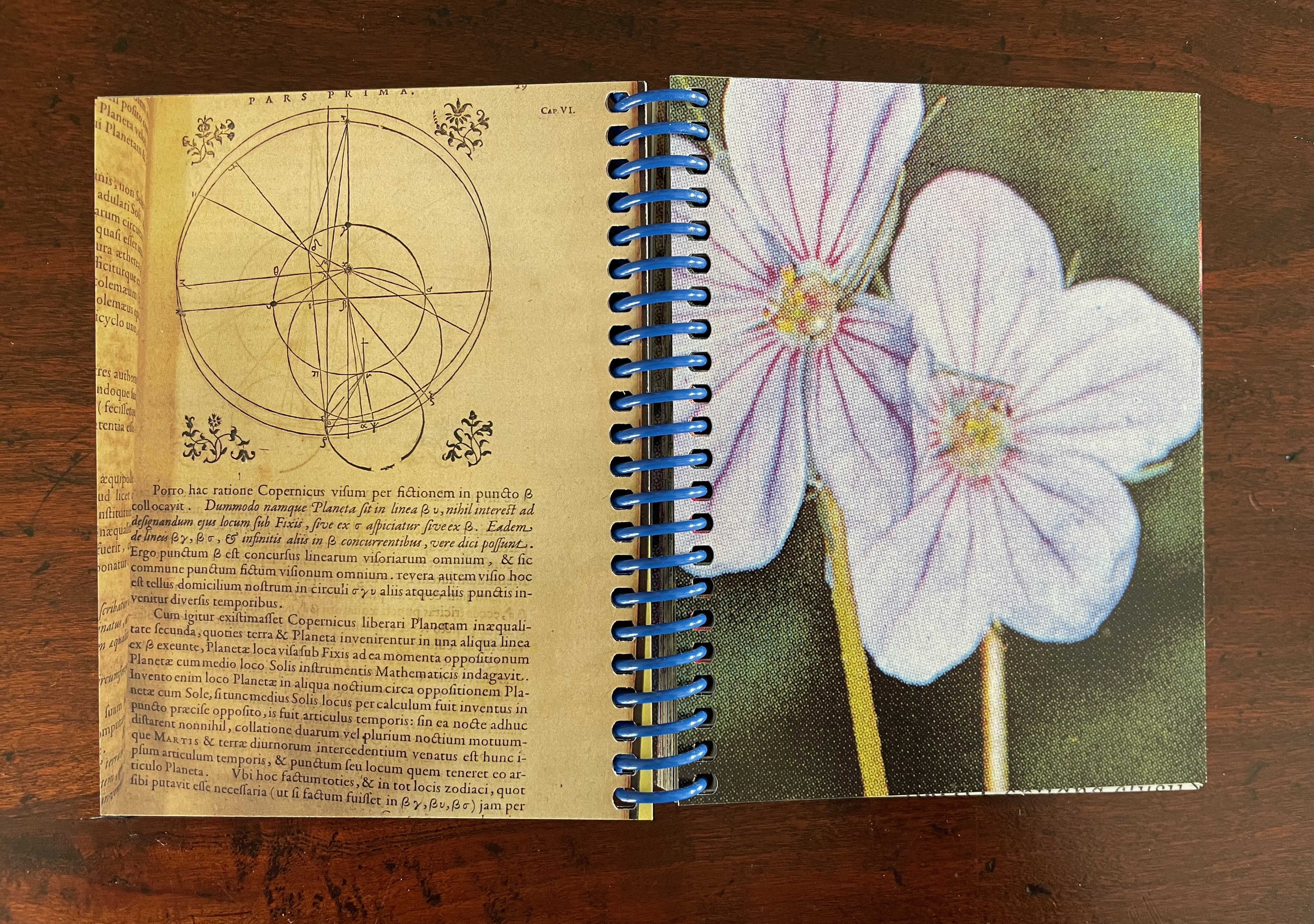
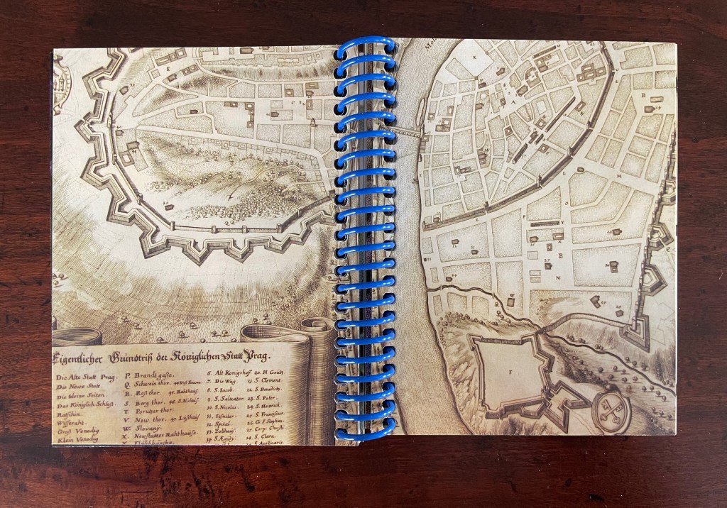
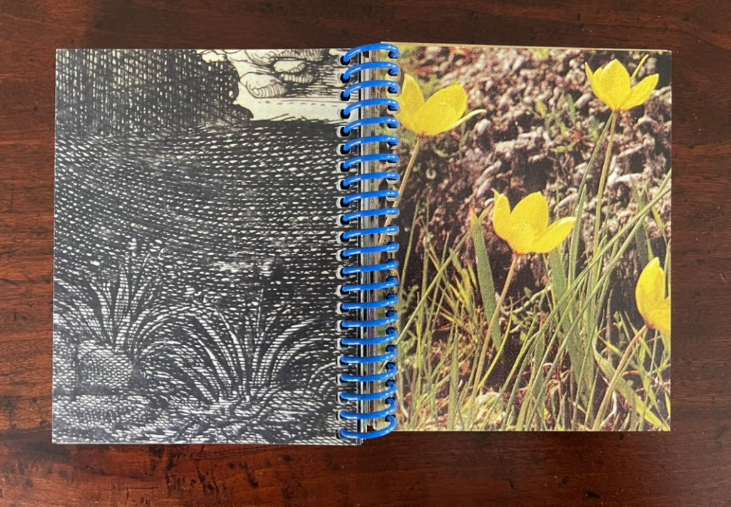
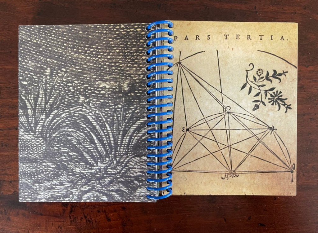
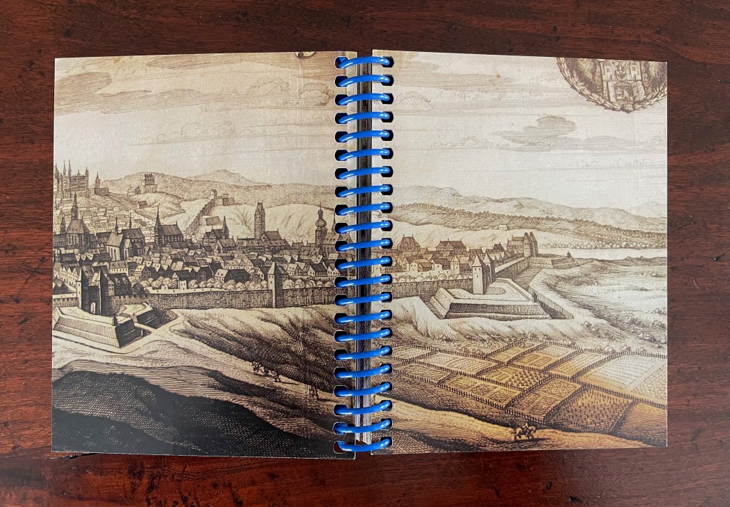
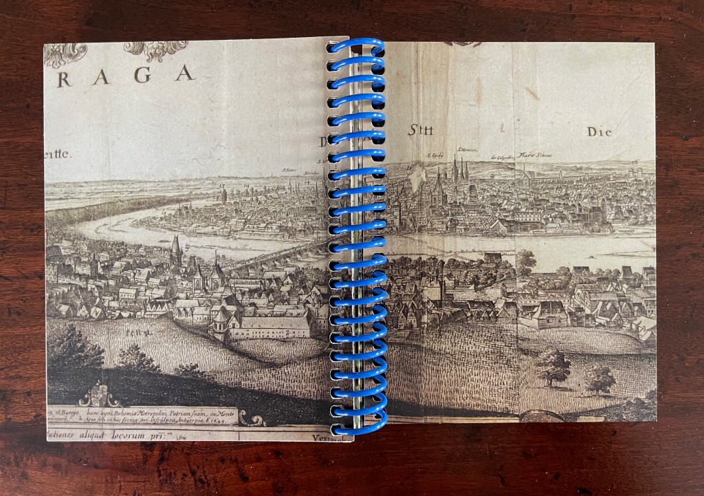
First three opening spreads: cityscape of Prague; map of Prague’s location and fragment of Astronomia Nova‘s title page; cropped page of AN showing ornamental flowers alongside cropped blown-up photo of the flower.
The field of vision hops from the cityscape of Prague to a geographical map, then to the cropped title page of Astronomia Nova, then to a detail of the Copernican model bracketed by ornamental flowers, and finally to a cropped blown-up image of one of those flowers from Polunin. The next two spreads that follow those first three underline the field guide’s zooming in across time and space.
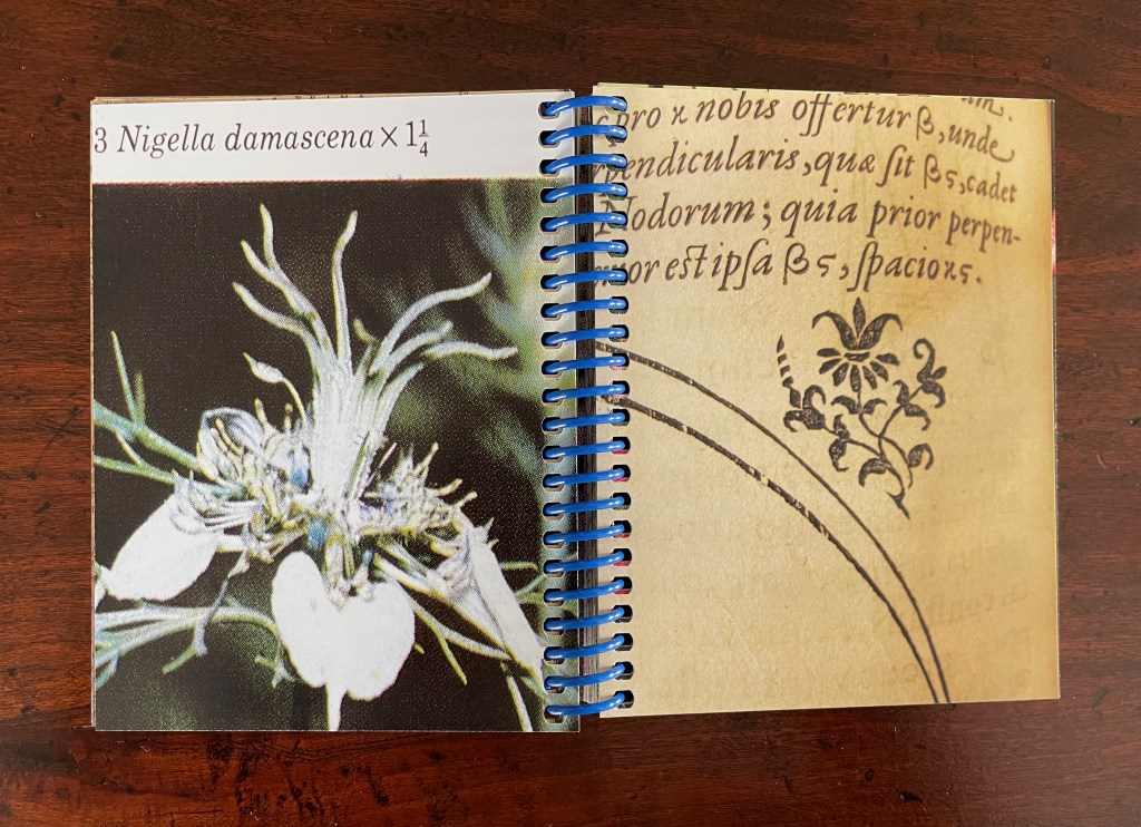
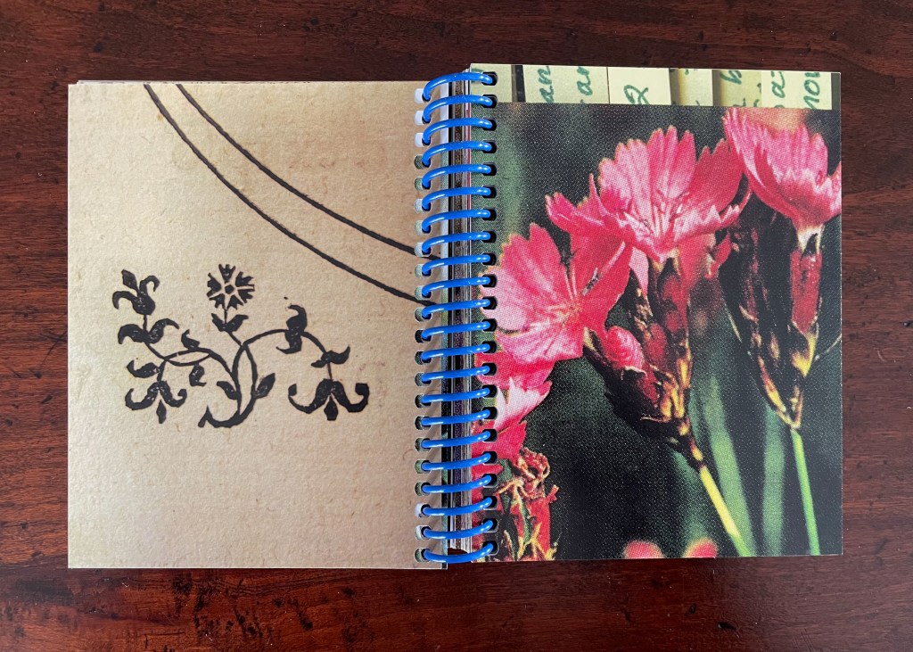
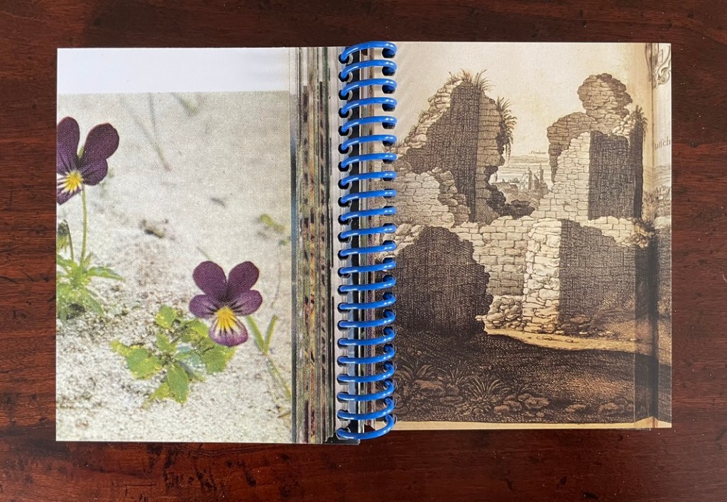
The fourth and fifth spreads: close-ups of the ornamental woodcut flowers and live photos; from the 17th century to the 21st.
Later spreads showing similar zoomed-in images highlight that we have actually hopped from the second century (Ptolemy) to the seventeenth (Tycho Brahe) to the twentieth (Polunin).
Zoomed-in images of woodcut flowers and live flowers; from Claudius Ptolemy (2d century) to Tycho Brahe (17th century) to Polunin (20th century).
Planetary diagrams, celestial maps, mathematical models, descriptive text, woodcuts and engravings are all at several representational removes from one another and from actual planetary movements over time. Likewise, the woodcutter’s ornaments had their corresponding actual flowers in the gardens and meadows of Prague. The closeness in appearance between the woodcuts and photos argues that Kepler’s artist was drawing and cutting from real-life observation. And yet the photos lie at historical and medial removes that question their correspondence. Like Kepler’s and Brahe’s mathematical and textual models of planetary movements, the artist’s book’s photos are speculative models of the flowers Kepler’s woodcut artist would have observed in Prague at the turn of the 17th century.
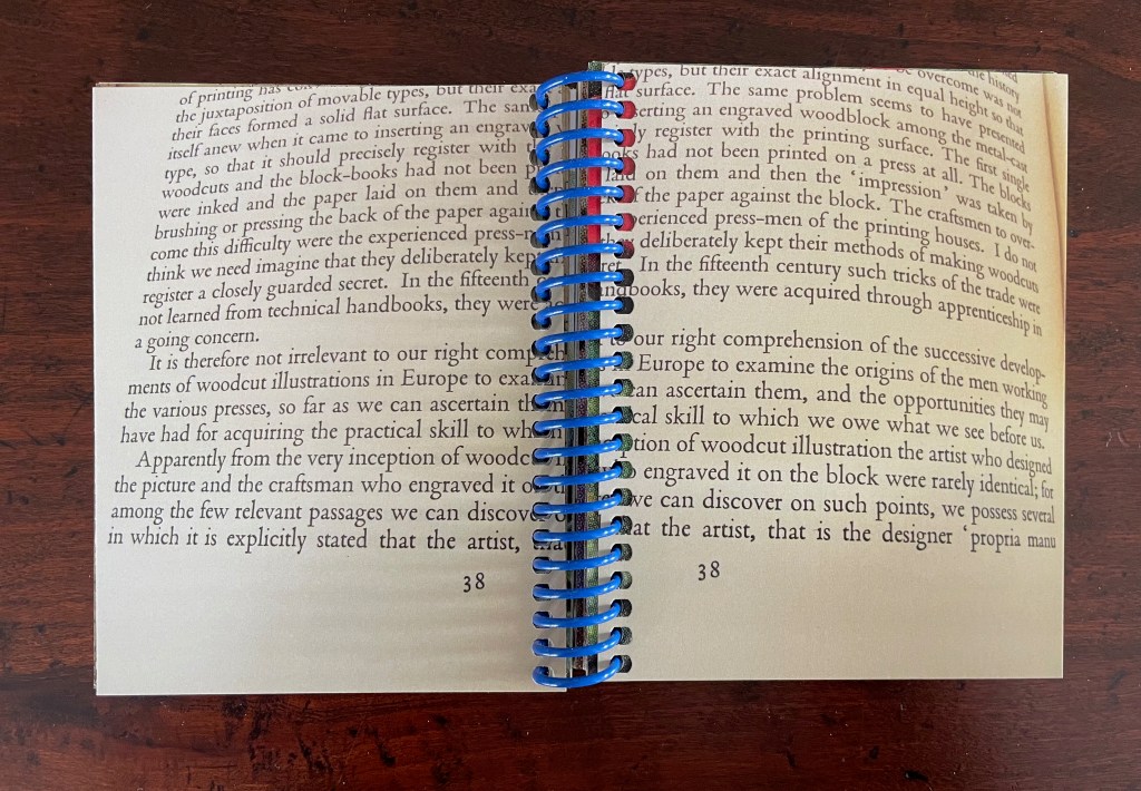
The field guide’s movement across media — engraving, printing, woodcut, photography, casebound book, and spiral bound book — is underscored by Ancliffe’s variation and sequencing of spreads. Just as we start to assume an alternating verso/recto rhythm of print/image then image/print, Ancliffe interrupts the flow with a double-page spread of print/print.
There is also interruption within the interruption: the double-page spread of text is an English translation whereas so far the text has been in Latin. Is the translation’s appearance a reminder that the various media are means of translating the observed?
Other interruptions consist of image/image spreads followed by text/text spreads. The juxtaposition seems to suggest an abstract affinity of shapes, as if the side-by-side flowers hint at an abstract shape of the map spread, and the side-by-side maps hint at an abstract shape of the flower spread.
If that seems an interpretive stretch, consider the following sequence that draws comparisons between flower photo and cityscape detail, between zoomed-in cityscape detail and flower photo, and between zoomed-in cityscape detail and ornamental woodcut detail.
Note the sequence — photo/engraving; engraving/photo; and engraving/woodcut — drawing attention to translation from medium to medium.
If we step back to take in the whole of the artist’s book and note the changing rhythms and punctuations across the spreads, it is hard not to conclude that this artist’s book as field guide is teaching us how to read the environment it has created.
Opening and closing landscape spreads.
Ancliffe’s next work in her astronomy series extends her aim of teaching us how to read her artist’s books.
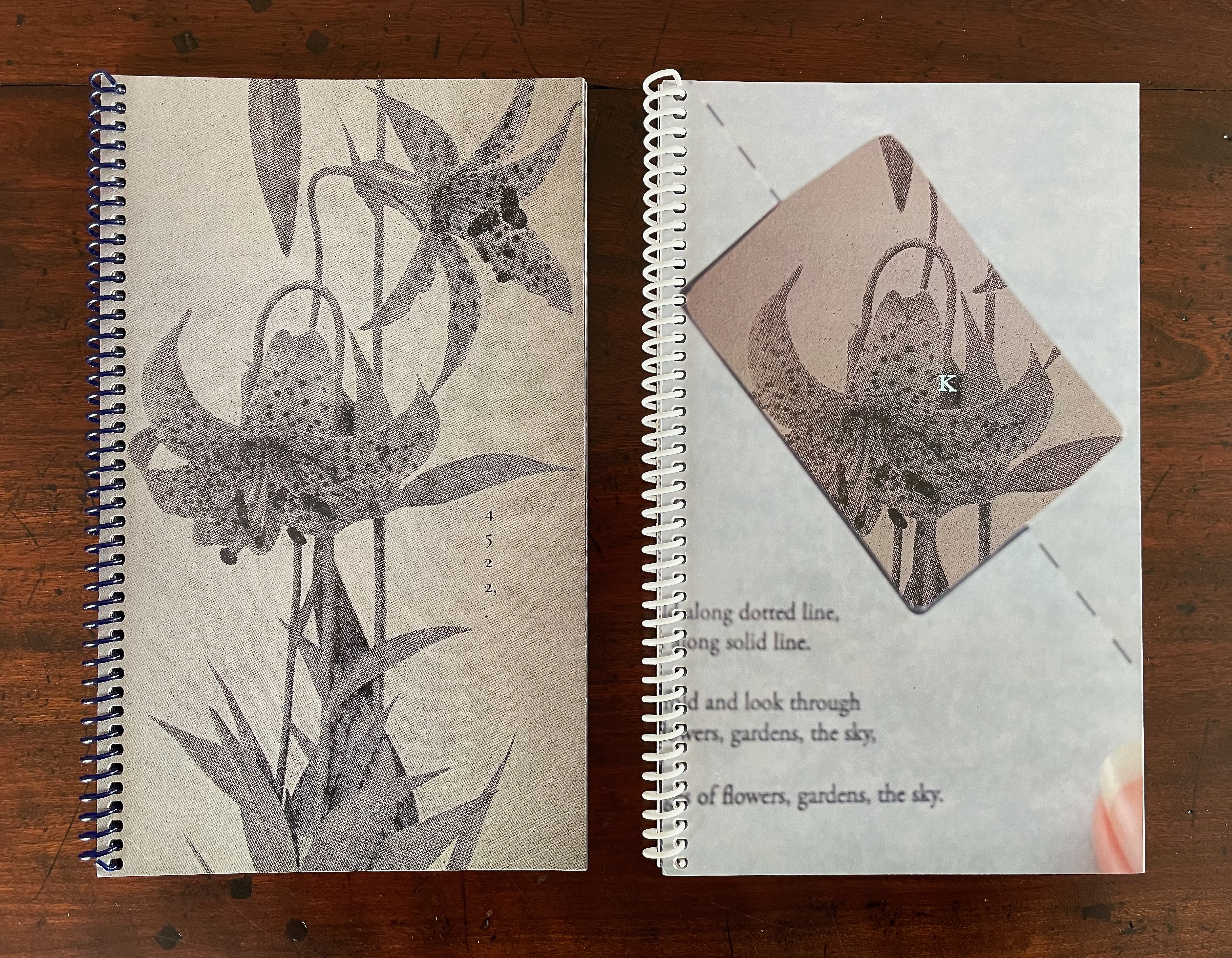
4522,. + K (companion volumes, to be read concurrently) (2024)
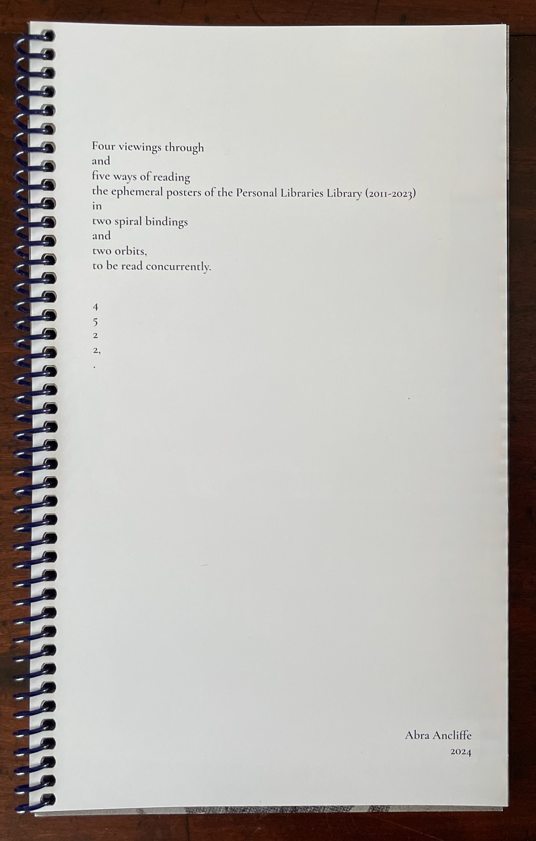
The cryptic title of this dual-volume work signals that we have some detecting to perform in order to read it. In fact, we have to read the companion volumes concurrently to perform our detective work. More teaching us how to read. The volumes’ respective title pages shed some light on the cryptic titles, but only a little. As the first volume’s title page spells out the vertically arranged numerical title 4522,., we learn at least that it has its roots in Ancliffe’s Personal Libraries Library series.
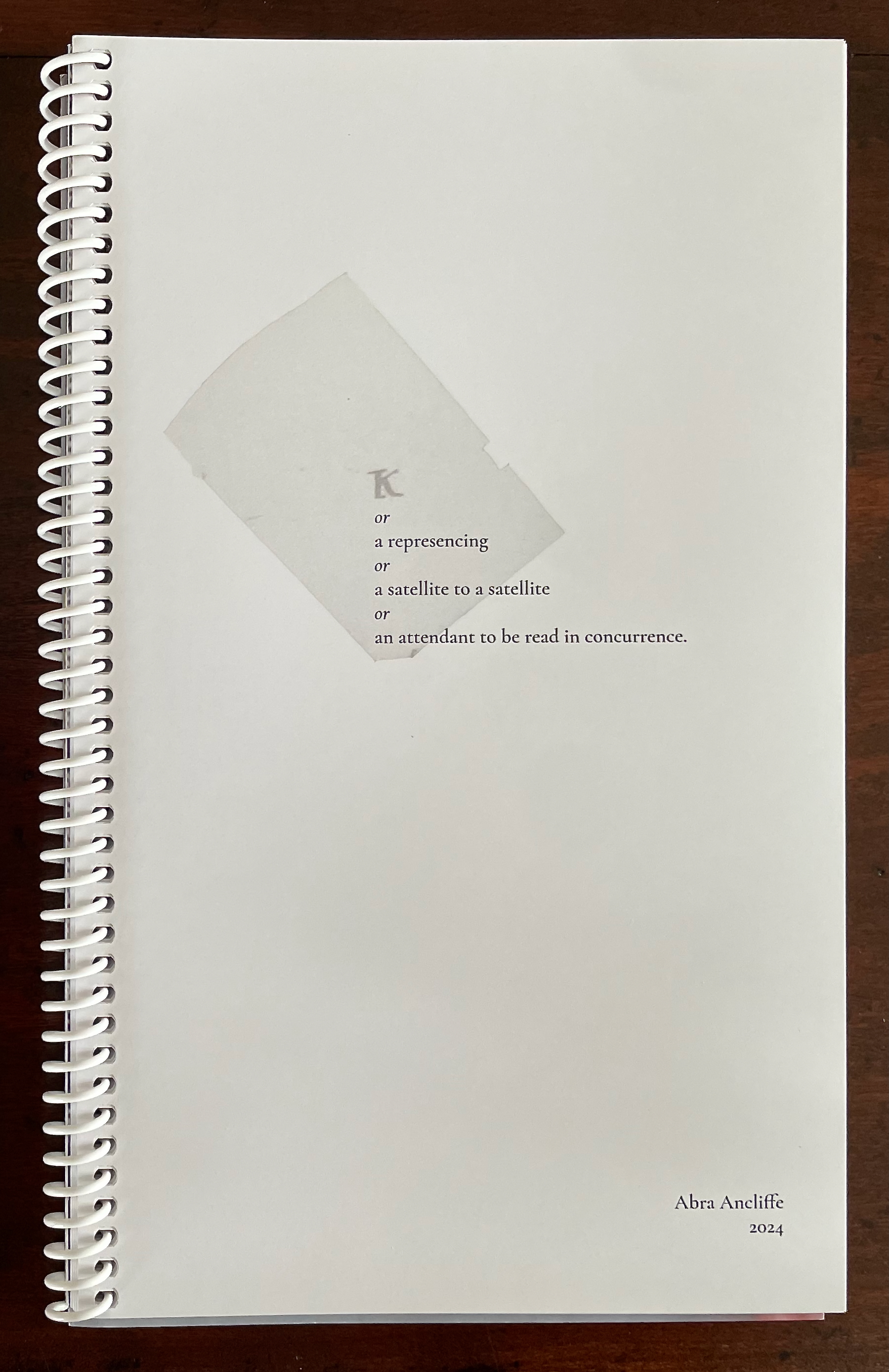
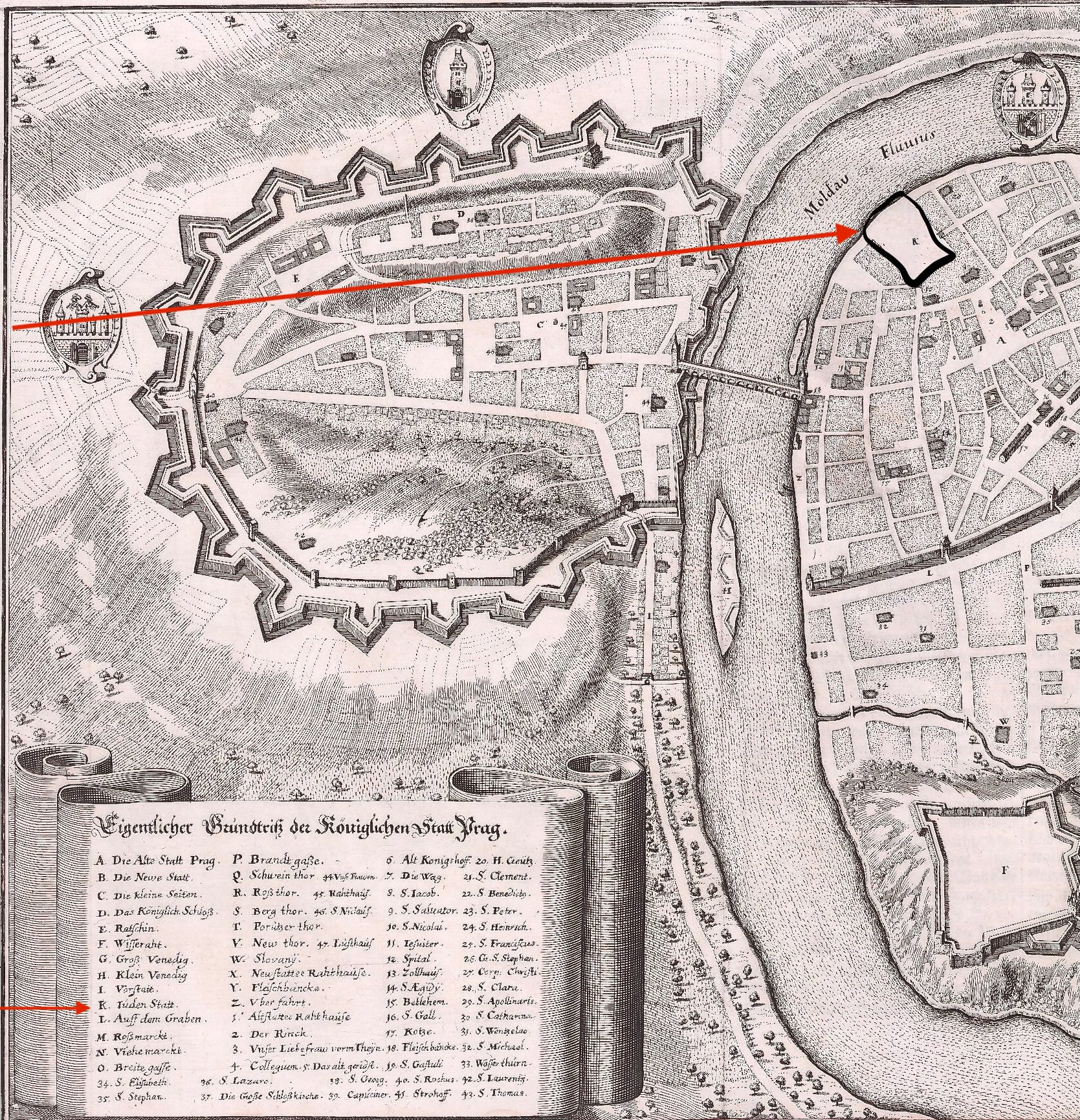
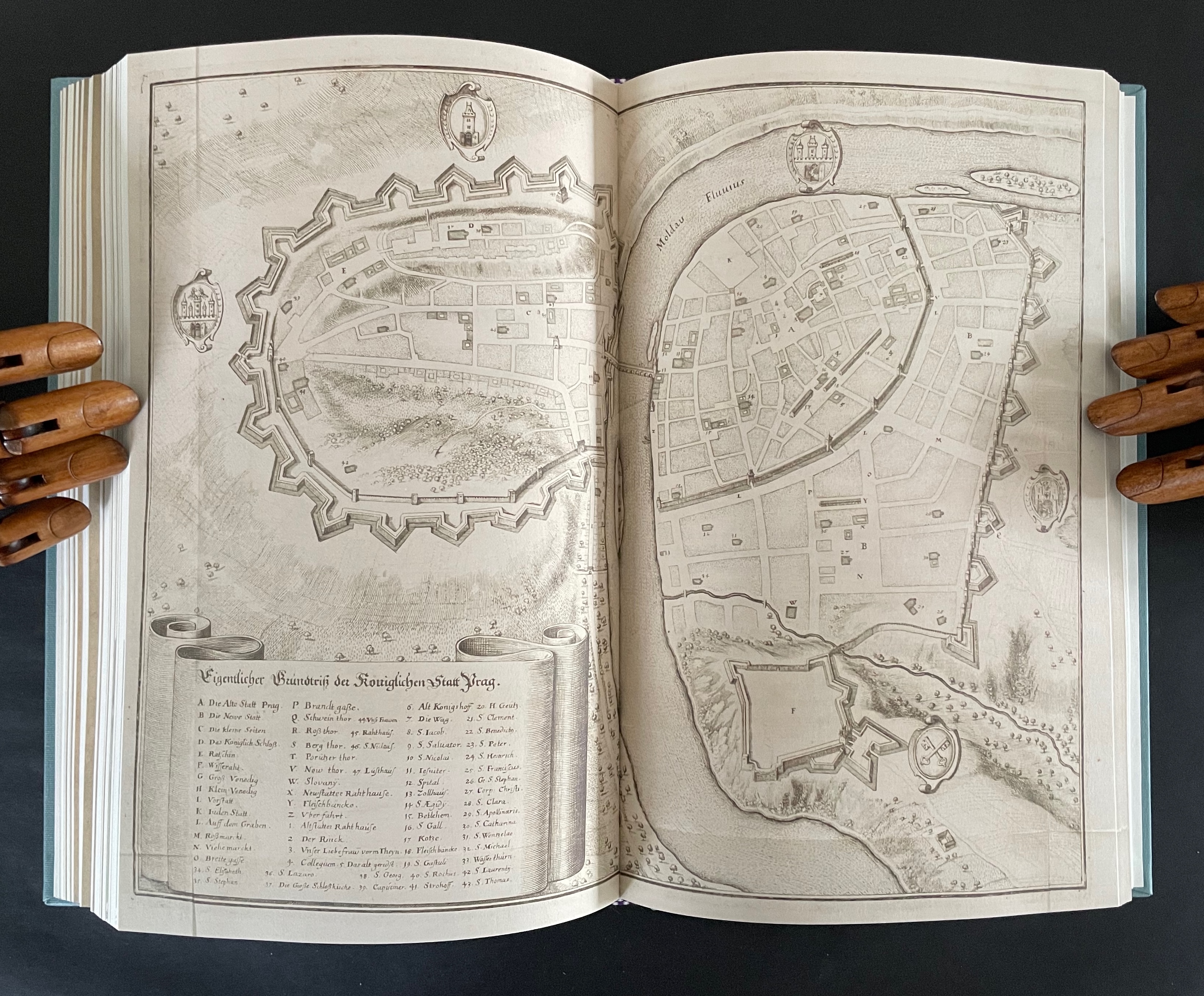
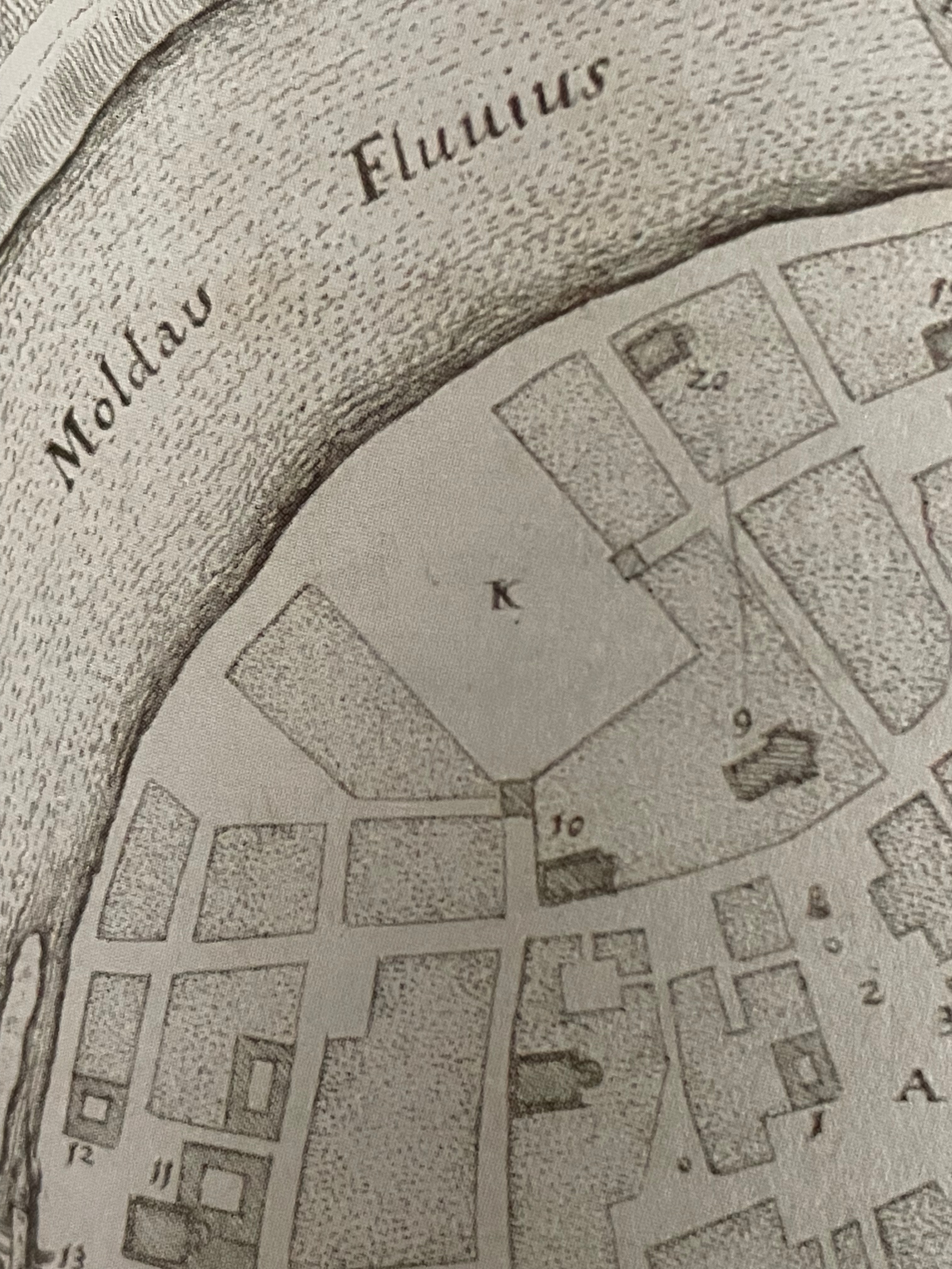
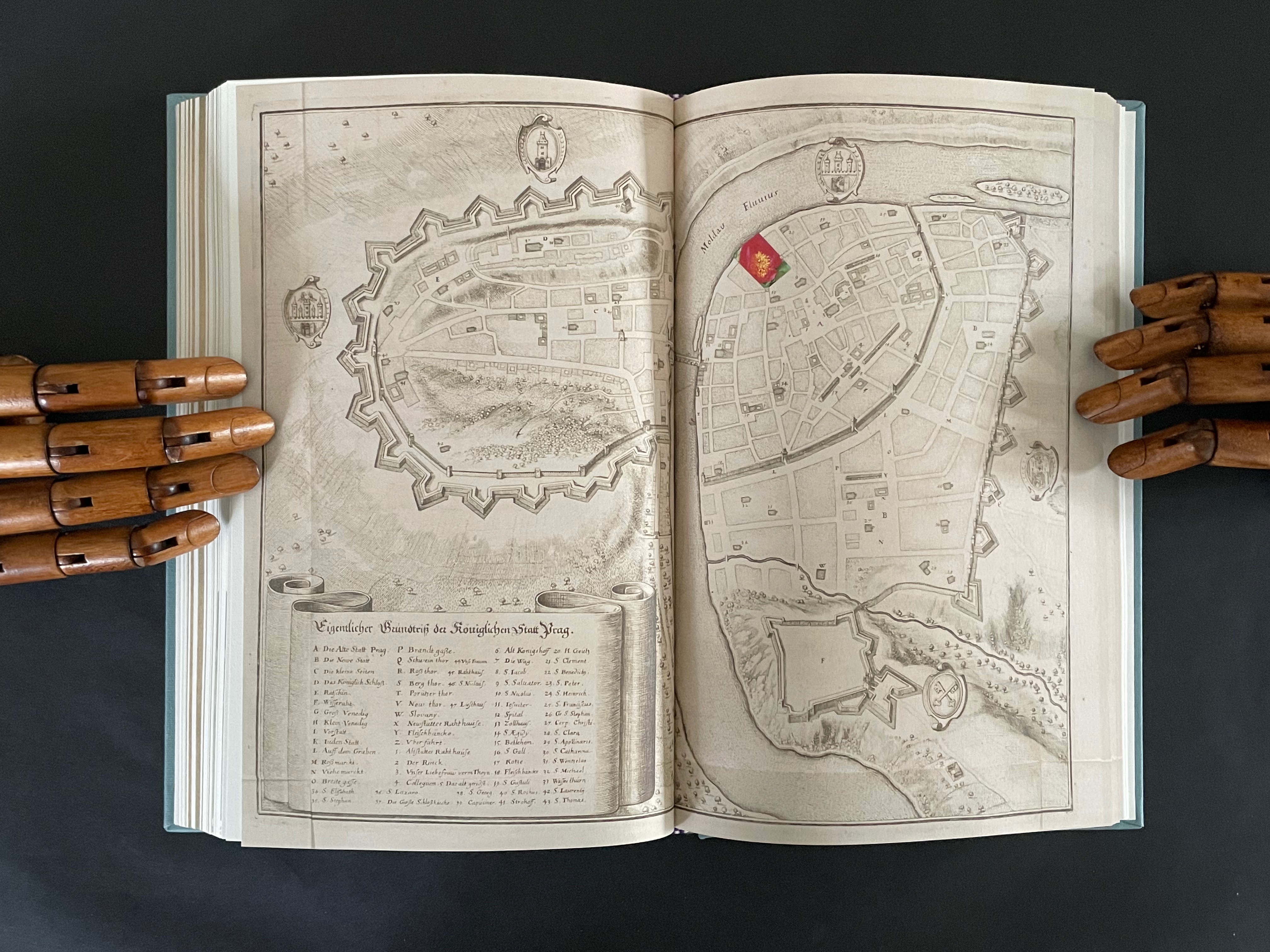
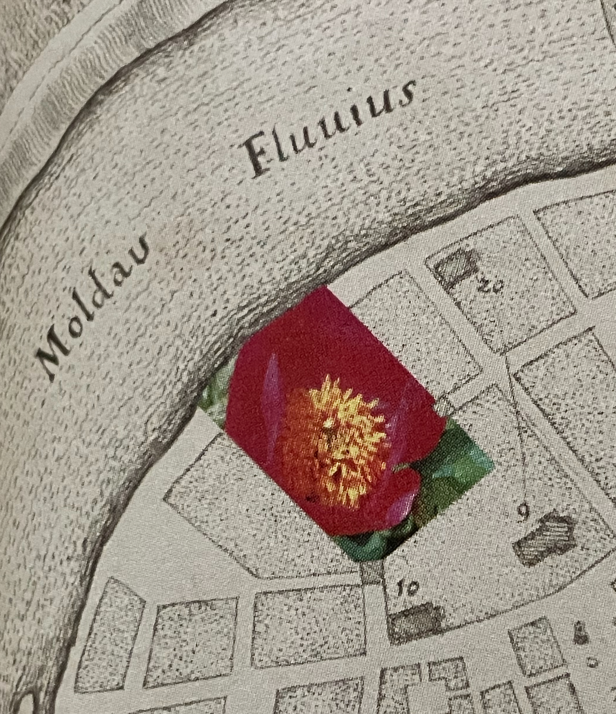
The title page of the second volume presents the title K inside a shaded irregularly shaped rectangle extracted from a map of Prague (1650) by Matthaus Merian and Martin Zeiller (which we can track through the last entry in K‘s bibliography). The letter K comes from the key to that map, which tells us that it marks the Jewish quarter of the city. It’s a “nice-to-know” detail but not essential for appreciating how to read the second volume.
The title page tells us that K is “a represencing” or “a satellite to a satellite” or “an attendant to be read in concurrence”. We already know about the concurrence from the first volume’s title page. As for “satellite to a satellite”, we can see that K is a satellite to 4522,., which makes 4522,. a satellite to something. But to what? More on that in a minute. As for “a represencing”, the volumes’ covers (above) give us a hint. Notice how the irregular rectangle on K‘s cover re-presents or represences a snippet of the floral poster image shown on the cover of 4522,. That is the recurrent pattern between the two volumes:
From the poster image shown in 4522,. on the left, a snippet is taken and displayed within the map segment in K on the right.
Just with the covers and two title pages, we have detected two of the “Four viewings through … the ephemeral posters of the Personal Libraries Library (2011-2023)”:
The PLL posters viewed in 3/4 scale (as seen in 4522,.)
Snippets of the posters viewed through the map segment (as seen in K).
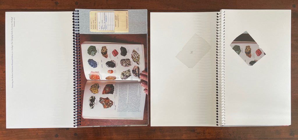
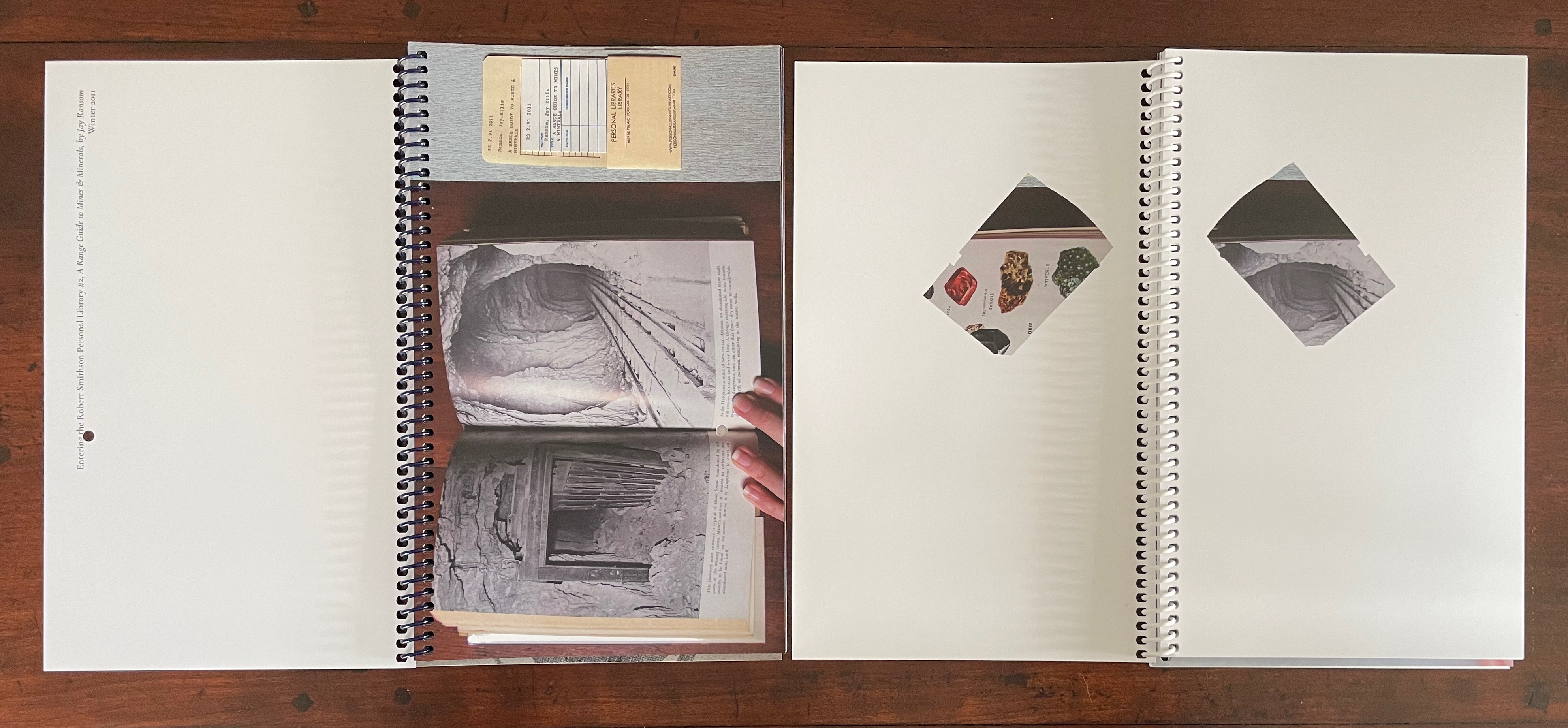
The third “viewing through” has a physical and literal form. In 4522,. a hole is punched in the recto pages where the poster images are displayed. Through that hole in one poster, the poster underneath can be viewed. In K, when a recto page turns t0 the left, its poster snippet reappears on the verso but in reverse as if we were looking through the other side of stained glass window.
With both volumes’ recto pages having been turned, we can see the punched hole on the verso of 4522,., a new poster image on its recto page, the mirror image of the three minerals from K‘s preceding recto page, and the new poster image’s snippet in K’s new recto page.
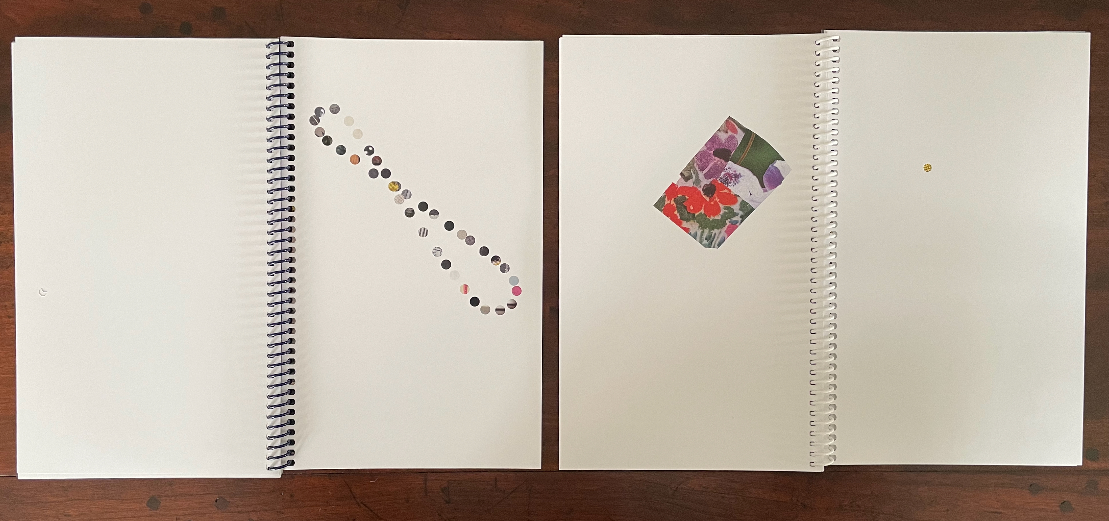
In this third “viewing through”, there is also a clue to what 4522,. is a satellite of. The small hole punched in each leaf of 4522,. seems to meander in its position from leaf to leaf. Actually it tracks a very specific shape: an analemma — a tilted, figure-8-like form. An analemma is the visual representation of the data recorded in ephemerides (tables of star positions at fixed times). In 1627, Kepler published his Rudolphine Tables, which became the new standard for accuracy of this data. If we were to point a camera skyward from a fixed location at the same angle and take multiple photos at the same time of day throughout the year, the sun’s position would form that figure across all the exposures. This is because the earth tilts on its axis as it orbits the sun and moves along an ellipse rather than a circle. So, the placement of punched holes in 4522,. embodies this projection of our orbit around the sun, and if we miss the point, the following near-to-last double-page spreads from 4522,. and K drive it home.
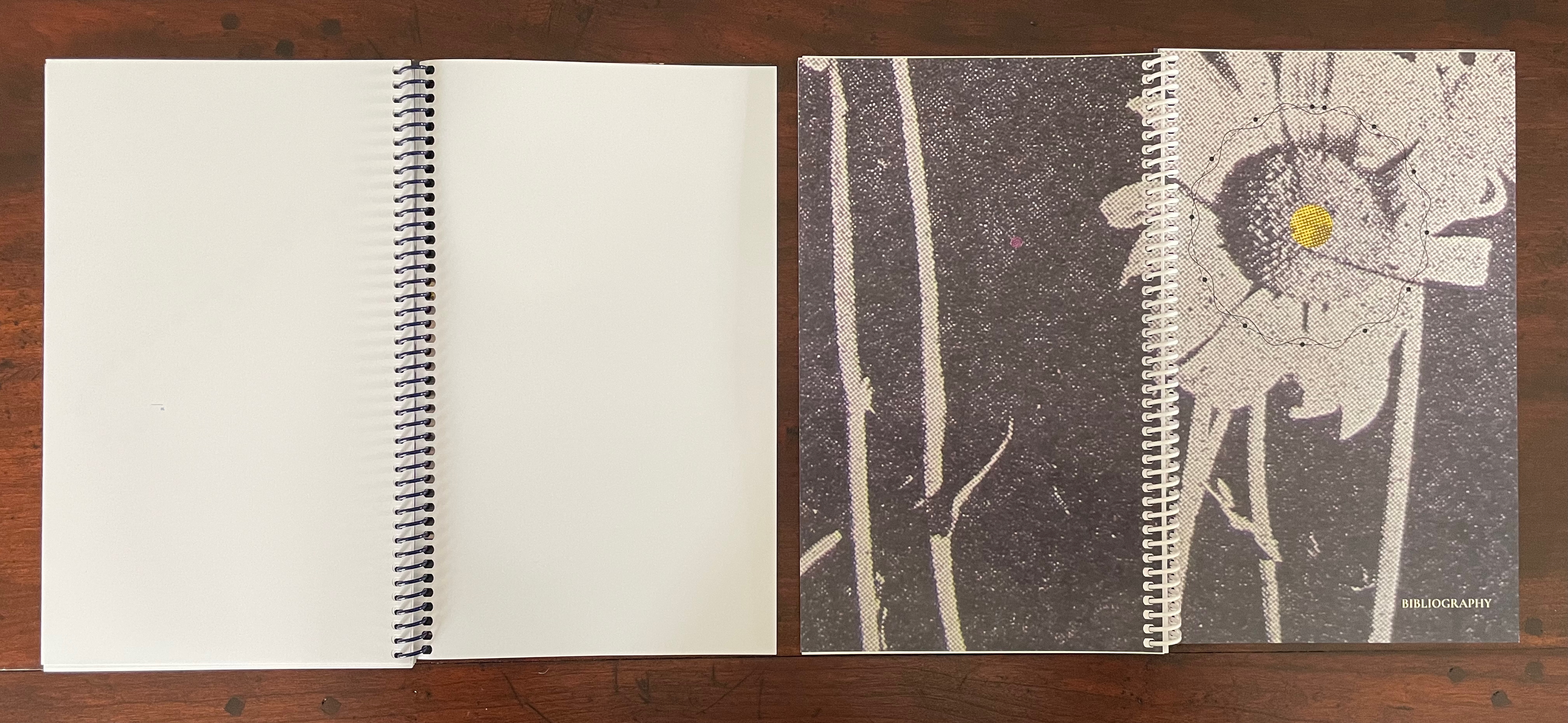
On the left, 4522,. shows the analemma diagram composed of the tiny views of the PLL posters’ images viewable through the holes in the book’s preceding pages. On the far right, K recapitulates the punched hole from 4522,. and wittily drives home the star/flower coordinates by positioning the hole over the center of the flower on the next spread, which doubles the wit with a black-and-white spread save for the strategically placed spot of yellow in the moon-gray center of the flower. The PLL posters’ images “light up” the recto pages of 4522,., and K reflects those images. In other words, K is the lunar satellite to 4522,., which is the terrestrial satellite orbiting the sun (the PLL project). These are the “two orbits” from the title page of 4522,.
The fourth “viewing through” comes into play with the Bibliography at the end of K. Although we had recourse to it to lead us to the map of Prague, a closer look reminds us of the PLL posters and the personal libraries from which they emerge.
So of course, the “five ways of reading” signaled on the title page of 4522,. refer to the five personal libraries from which the posters are composed.
This extraordinary part-autobiographical, part-biographical, part-bibliographical artist’s book brings Abra Ancliffe’s twin obsessions with astronomy and botany to their highest pitch of unity so far. Ancliffe has built it with an extended epistolary poem, collaged images from Polunin’s Flowers of Europe, and photos of the map of Prague (1650) by Merian and Zeiller, pages from Kepler’s Astronomia Nova (1609), and family memorabilia.
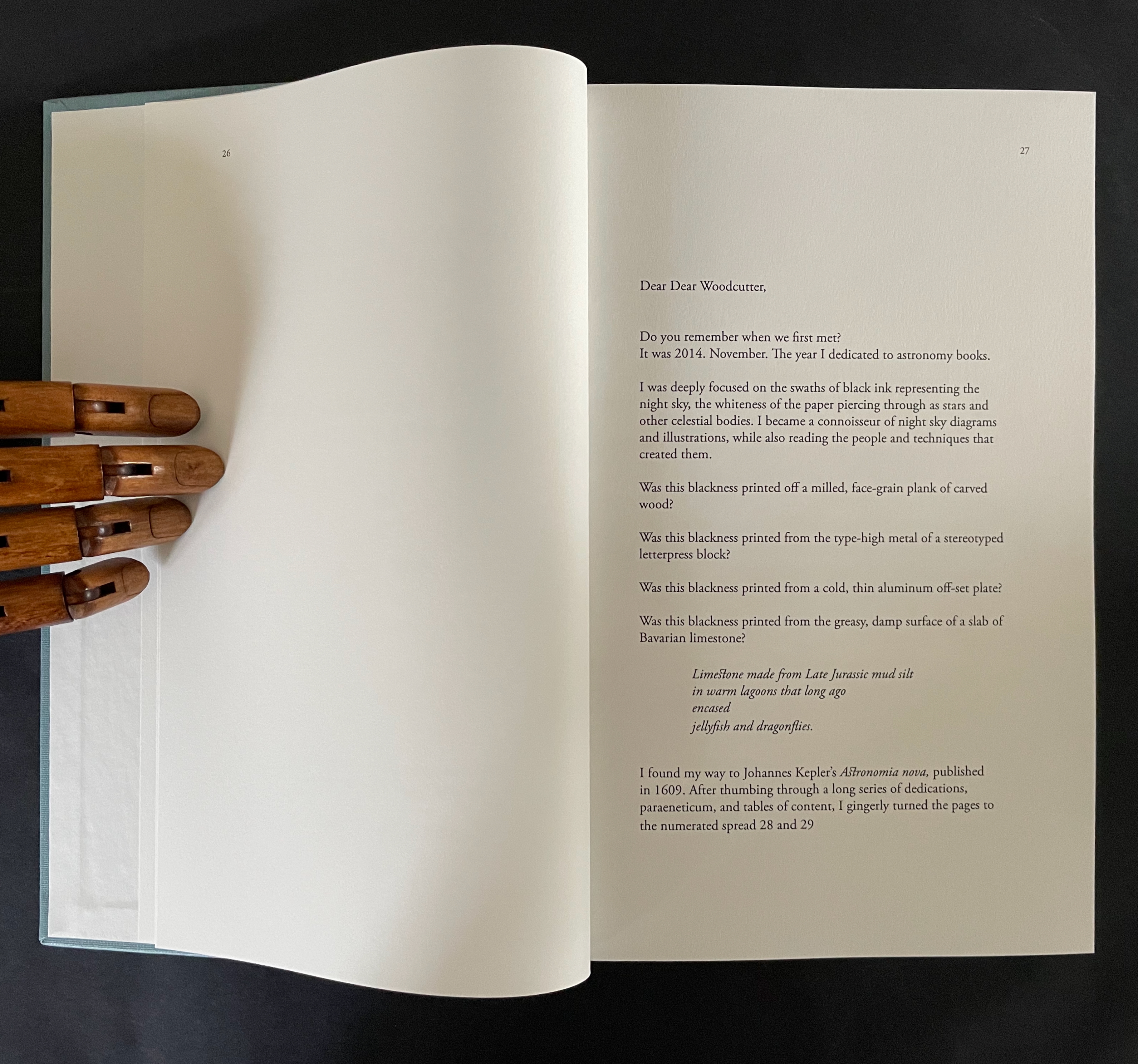
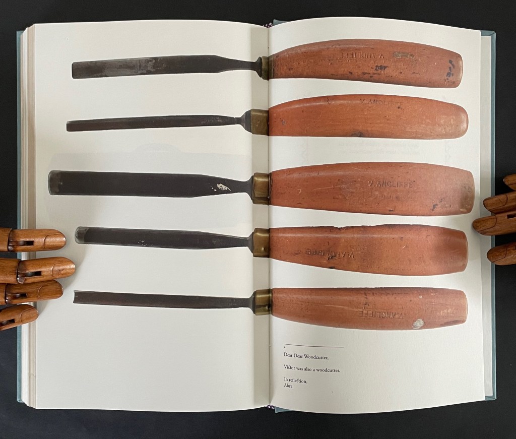
The poem addresses “Dear Dear Woodcutter”, the unknown artist who decorated Kepler’s orbital diagrams with flowers. Ancliffe’s observation of the flowers stands out when you consider that the still standard Collected Works (1938) omitted the flower images. Trying to identify the woodcutter, Ancliffe tracked down the sole reference to his existence and even visited William Donahue, Astronomia Nova‘s translator, in New Mexico to discuss the mystery. More impressively, she identified the woodcut flowers, their scientific names, and various common names, and their local habitats in and around Prague. From their unexplained presence, Ancliffe launches lyric observations on flowers (their colors, parts, and growth), astronomy, ink, paper, type, woodcutting, bookmaking, the idea of the book, and the interconnectedness of it all.
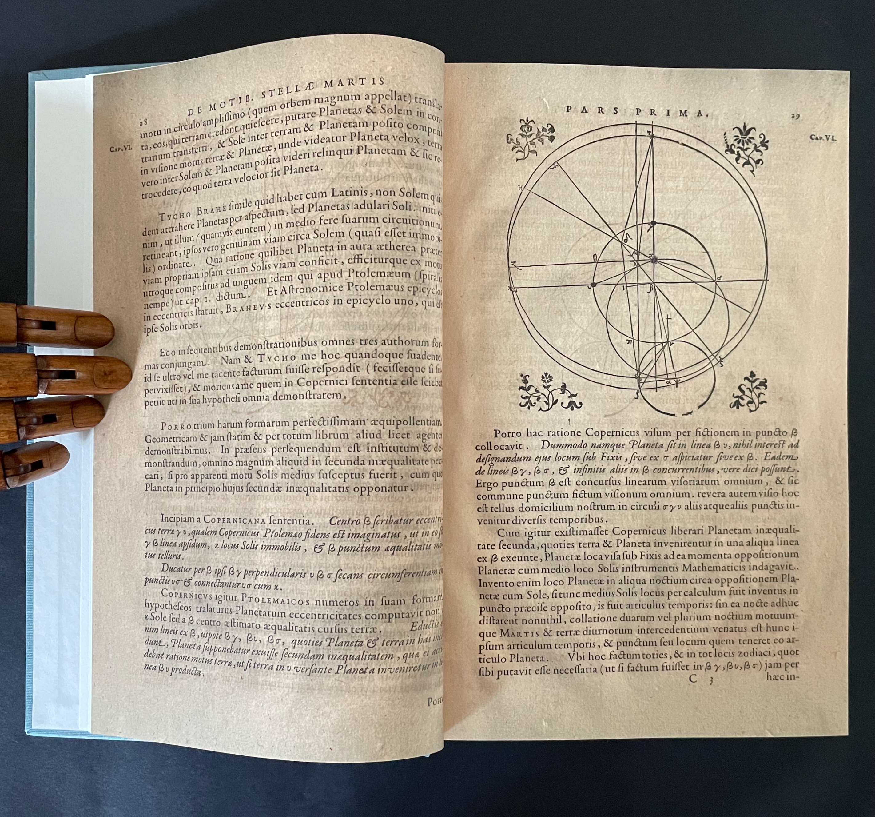
The book opens with Ancliffe’s first letter to “Dear Woodcutter”. It includes a facsimile double-page spread from Astronomia Nova , pages 28-29, showing where she first saw his woodcut flowers. From the start, Ancliffe signals how tightly woven she feels this autobiographical, biographical, bibliographical artist’s book will be. Instead of being numbered 2 and 3, her pages leading to the facsimile spread are numbered 26 and 27. So, at that moment of turning from “page 27” to page 28, the 21st century work strangely becomes part of the 17th century work as the book artist reaches back through time and craft. The letter’s tone blends fondness and fascination with matter-of-fact yet evocative observations about ink, printing methods, and the geology underlying lithography.
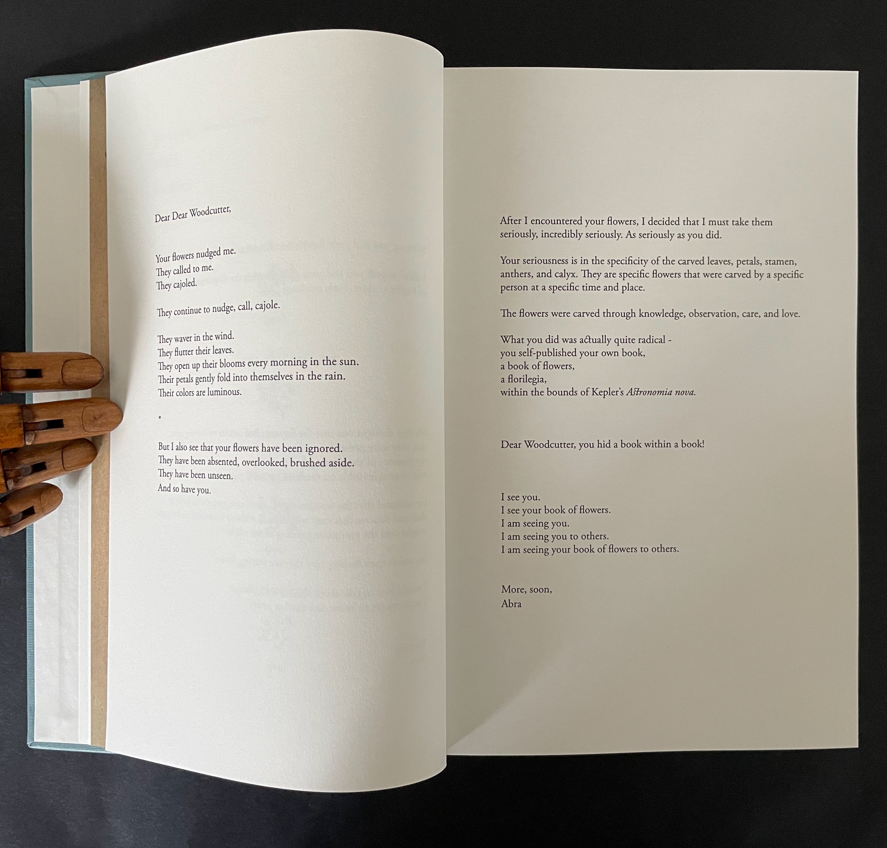
The intensity of her reaction to the woodcutter’s flowers and her absorption in her subject and craft translates into an affinity with the woodcutter that has Ancliffe addressing him in the present. This is poetic license and invention. In the act of addressing him, she is addressing us, her readers/viewers. If we are in any doubt of this, the second letter concludes with at a pitch that eliminates it and leaves us with a clear assertion of what she intends:
I see you. I see your book of flowers. I am seeing you. I am seeing you to others. I am seeing your book of flowers to others.
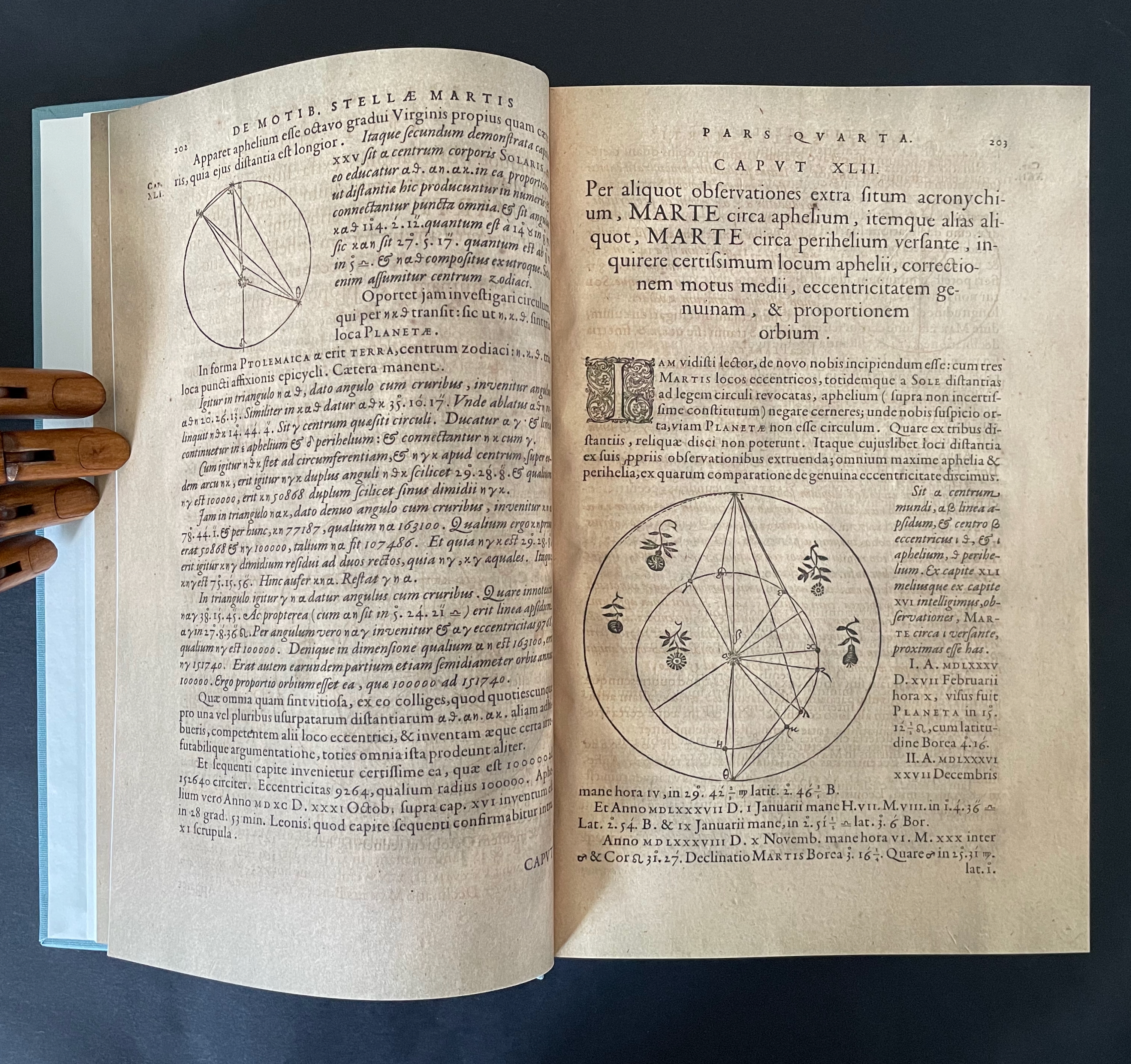
After this introductory section, Ancliffe lays out a recurrent marker of the book’s structure: a facsimile spread followed by a page reproducing a selection of woodcut flowers. There are twelve such markers.
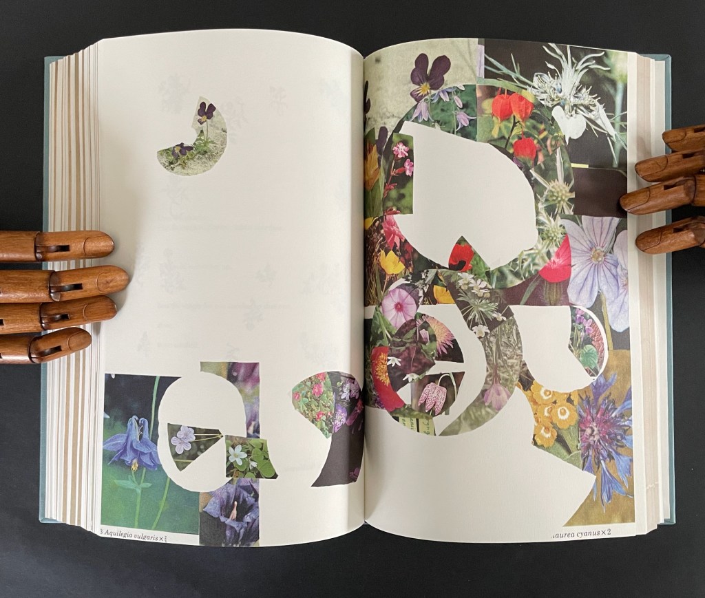
After each of them, the poem continues, accompanied by brightly colored jigsaw-like cutouts from photos of flowers Ancliffe has matched to the woodcuts. In each section, a jigsaw puzzle piece appears, then another and so on until the section ends with a page of accumulated pieces. Below is the section that follows the marker above. The accumulation (or gathering) page brings together the five preceding pieces.
There are 12 gathering pages, and they are all brought together in a closing double-page display.
Twelve “gathering pages”.
The closing accumulation page, a gathering of gathering pages.
There are also four labelled subsections or interludes that appear out of the blue.
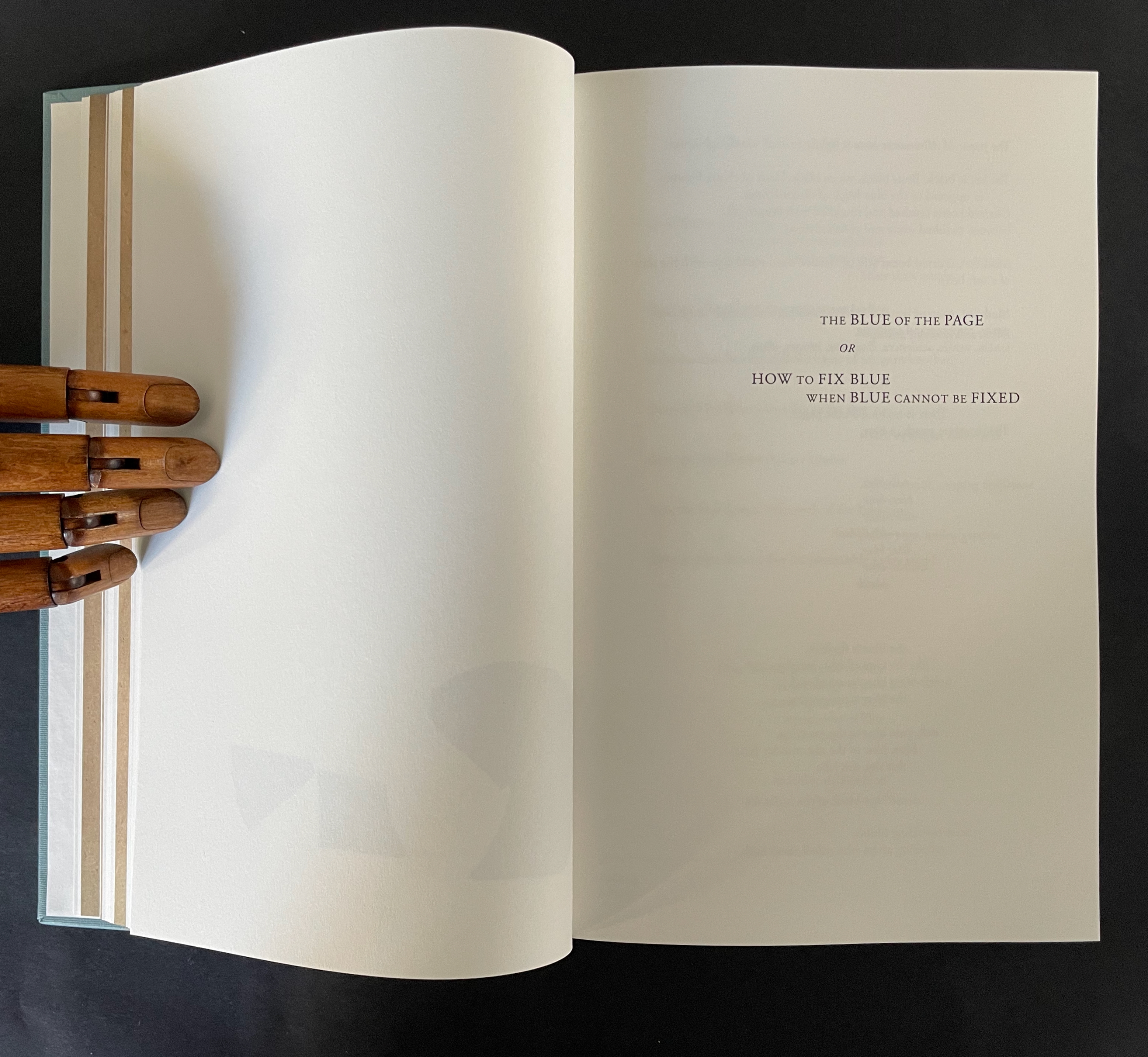
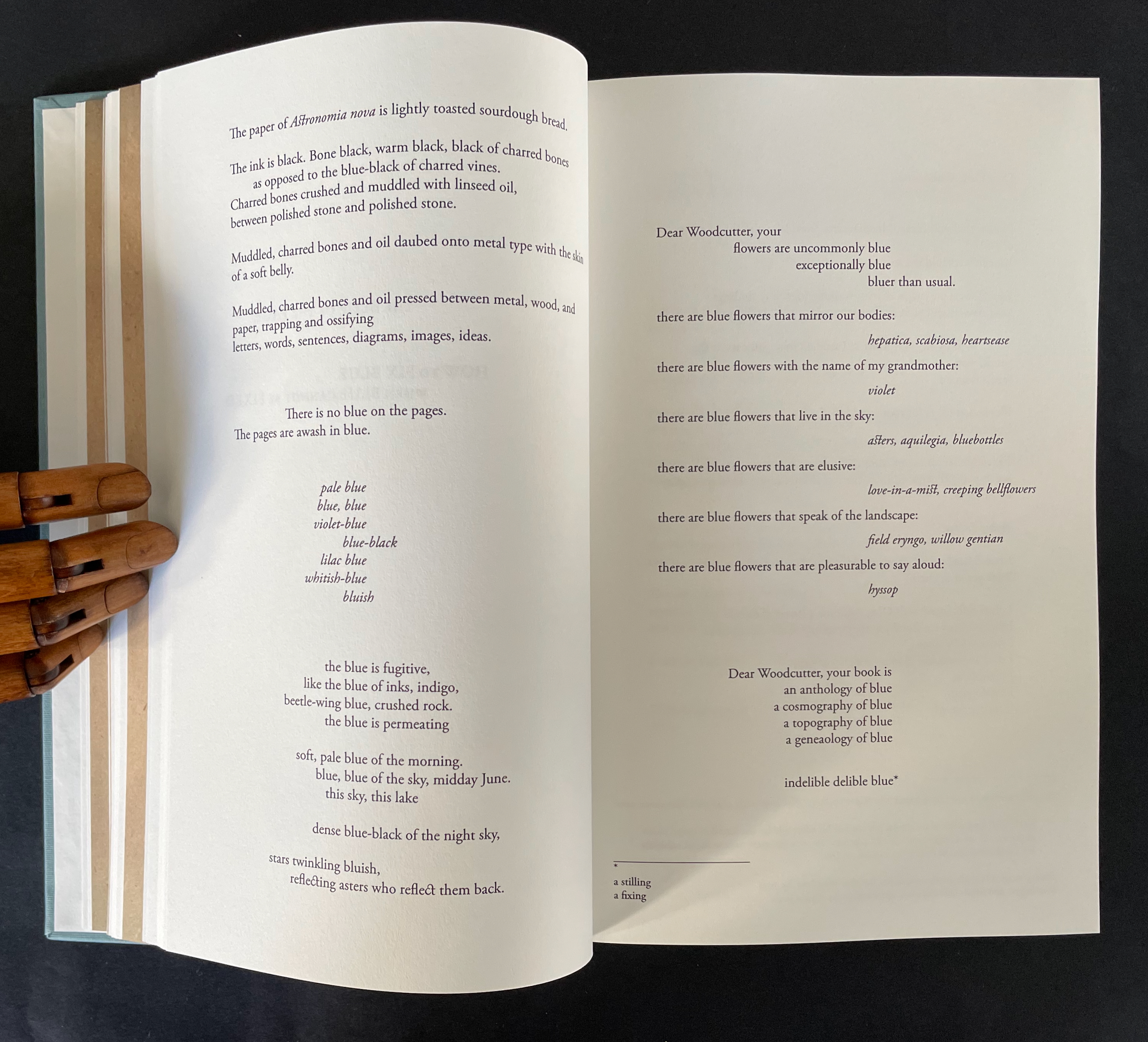
The first entitled “The Blue of the Page or How to fix Blue when Blue cannot be Fixed” addresses the color of the paper, ink, and flowers, what Ancliffe can see and cannot see but perceives (color of paper), knows (ink), imagines (flowers), metaphorizes, finds, and names.
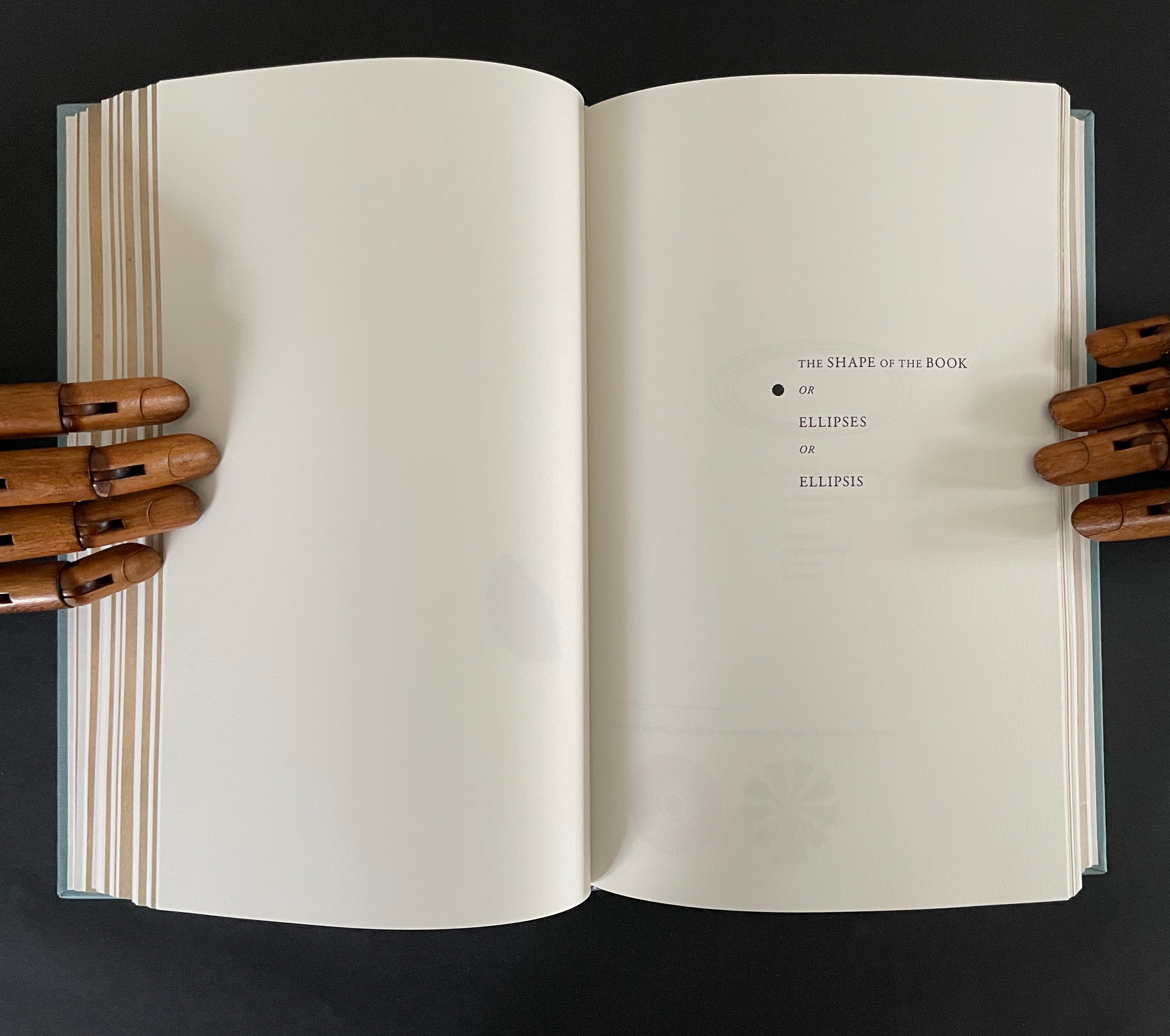
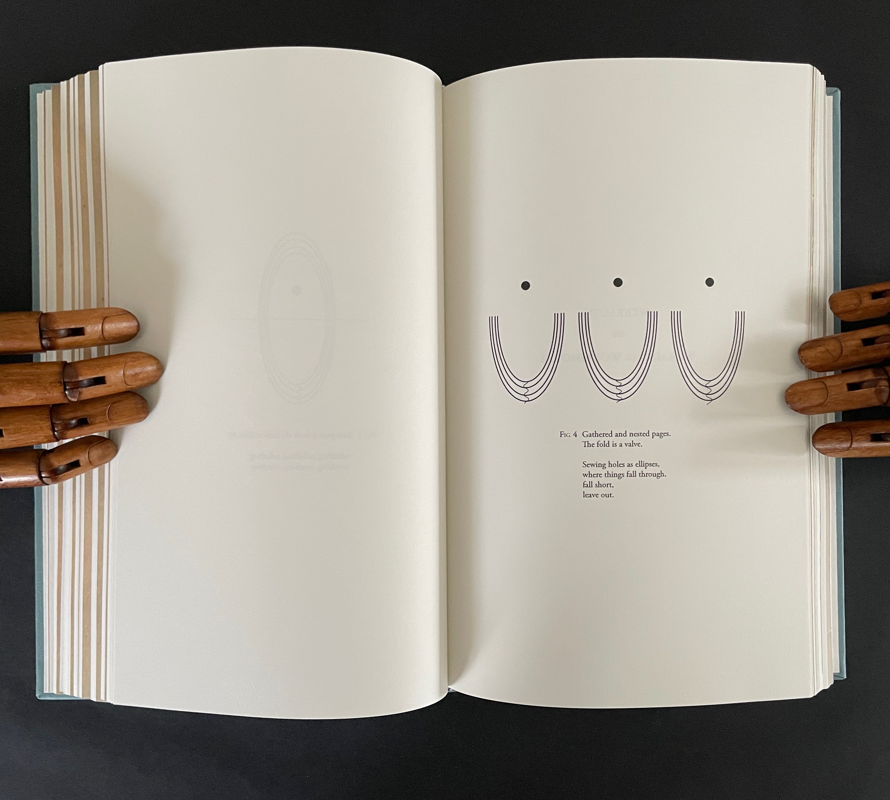
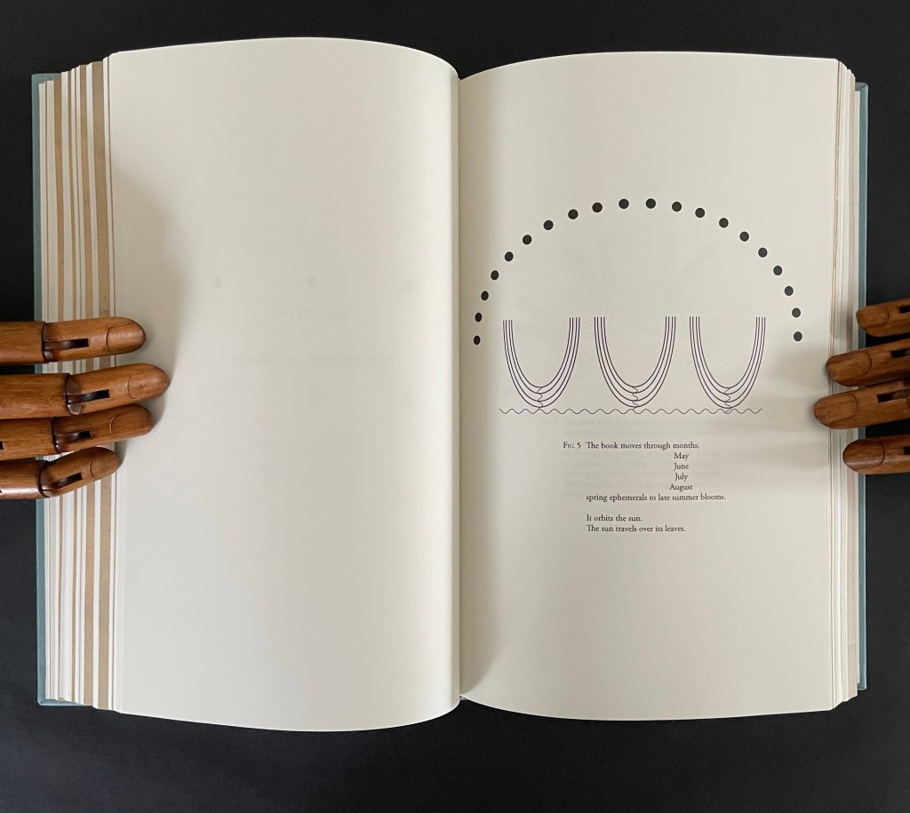
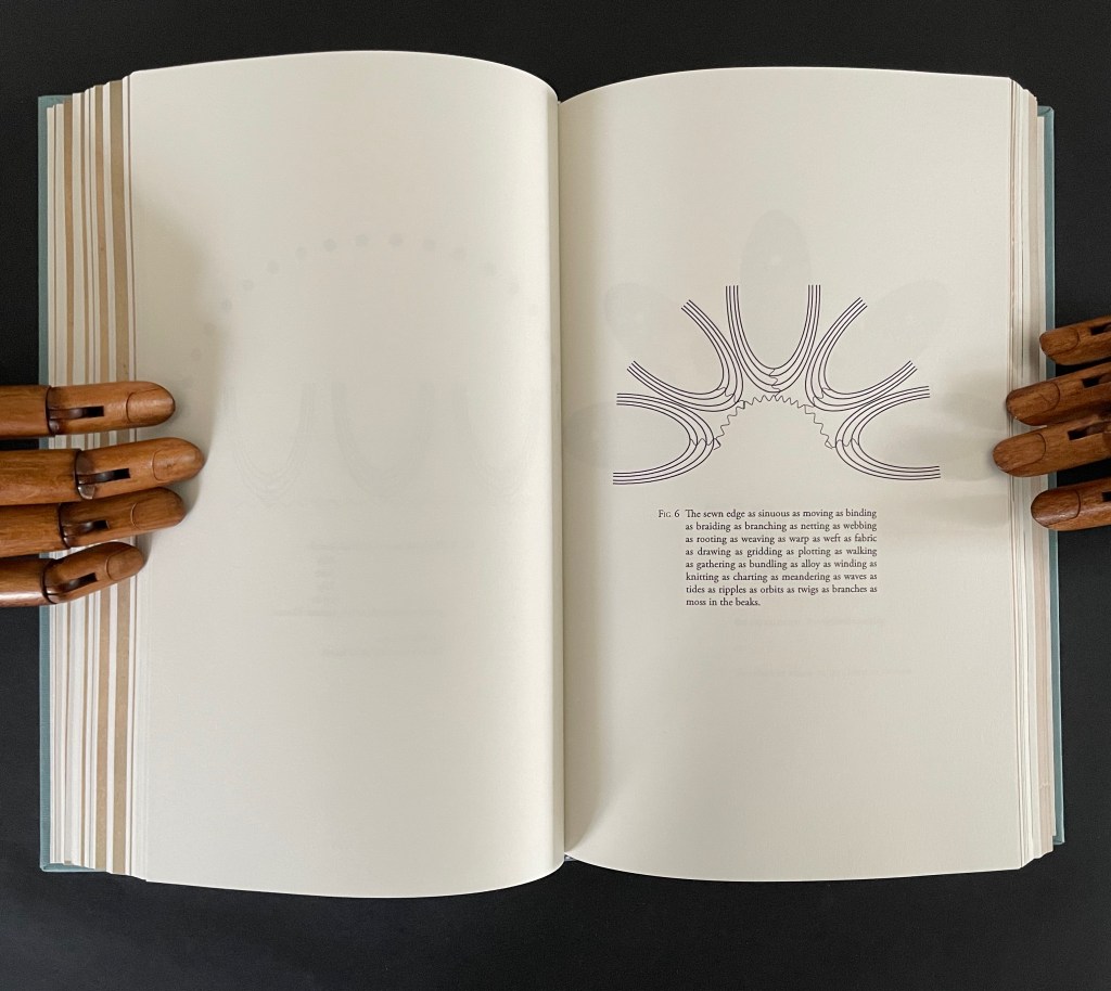
The second entitled “The Shape of the Book or Ellipses or Ellipsis” draws metaphorical, etymological, and visual links between books and orbits (ellipses) and sewing holes (ellipsis).
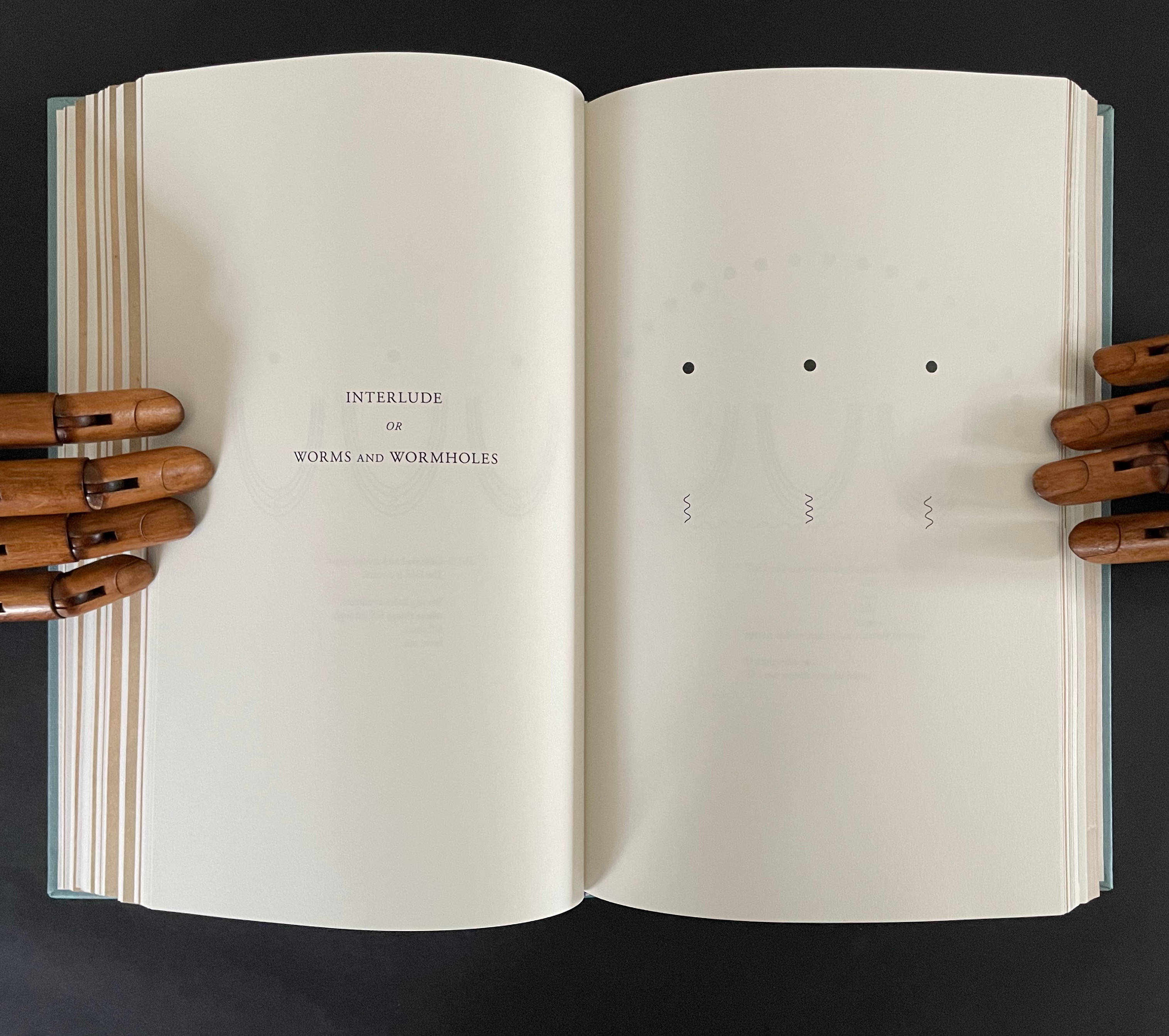
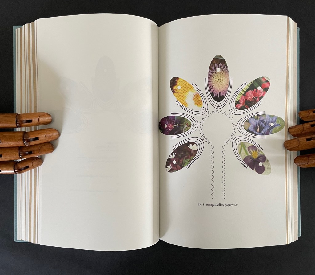
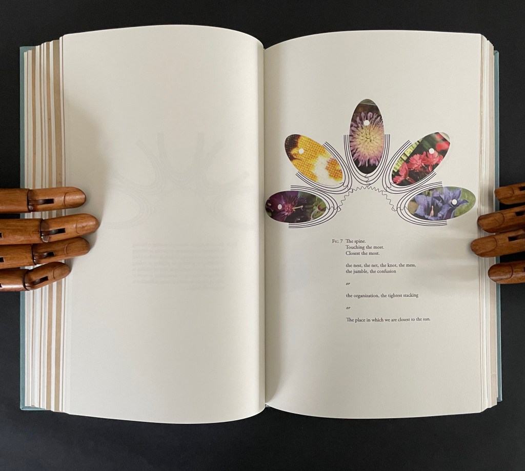
The third interlude “Interlude or Worms and Wormholes” develops an extended metaphor of the book’s sewn edge as a sinuous gathering together of nature, type production, planetary charts, and seasonal movements. It also makes another extended metaphor of the book spine as the most interconnected point of organization and confusion, the orbital point closest to the sun, and the shapes of a shallow papery cup, sewn folds, and flowers.
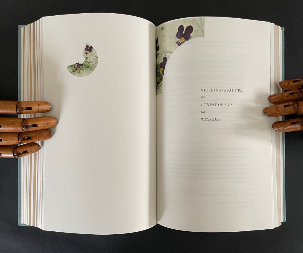
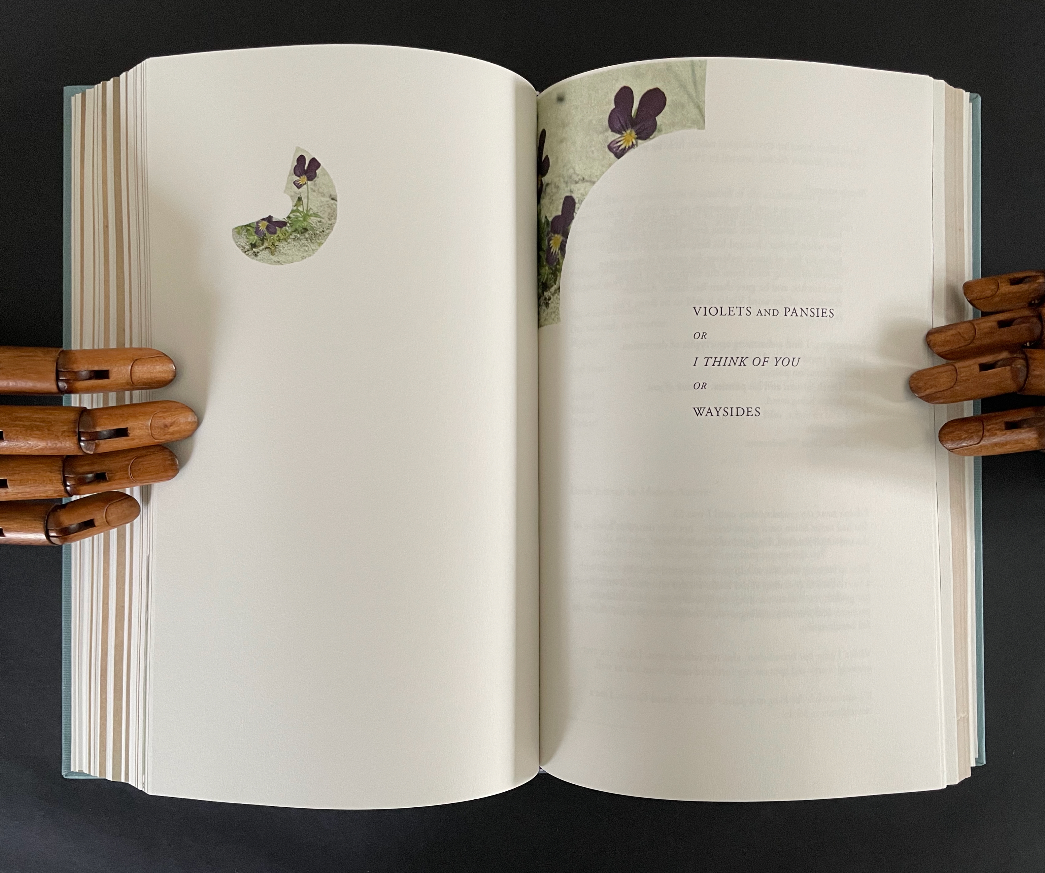
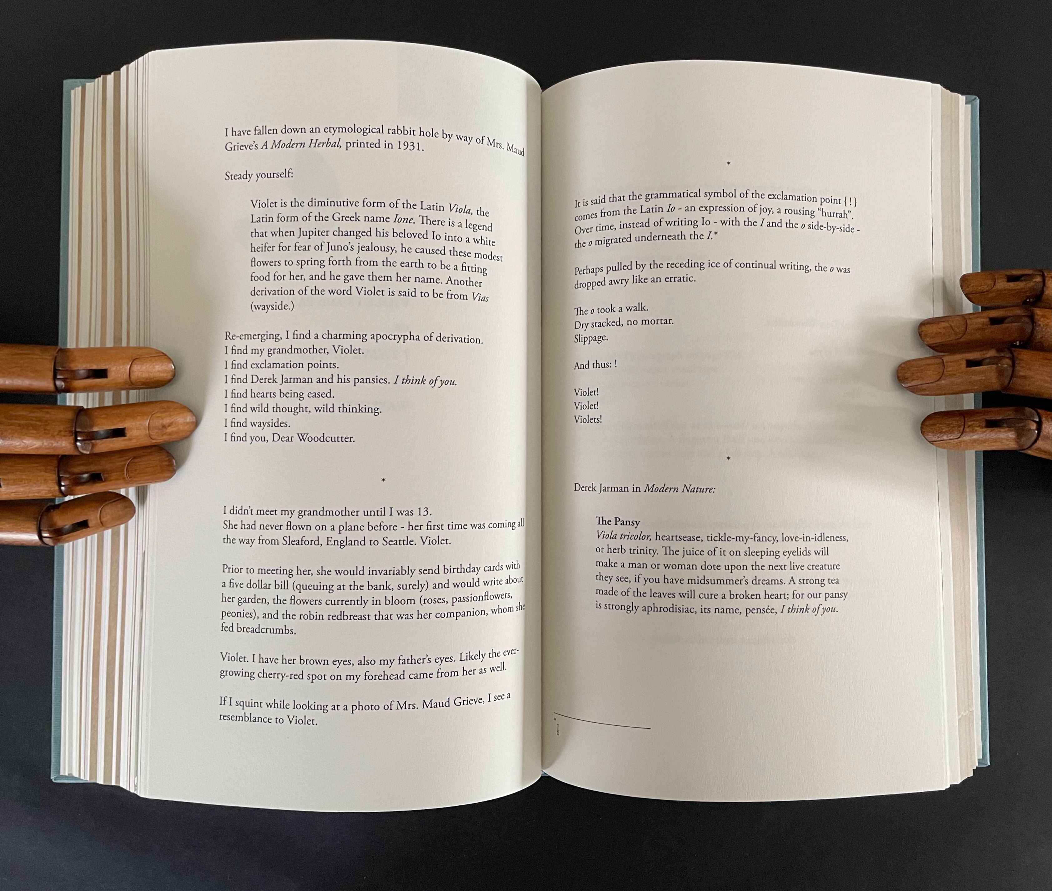
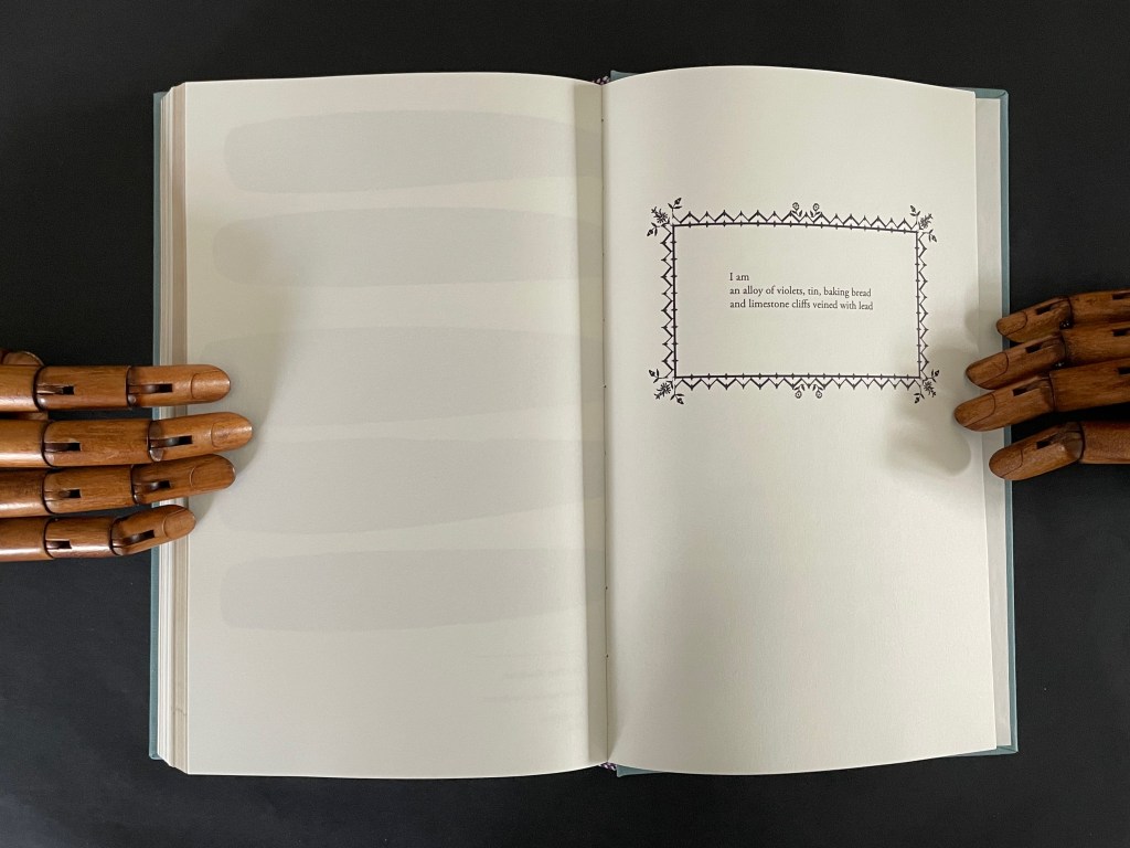
The fourth interlude is “Violets and Pansies or I Think of You or Waysides” plays on Paul Klee’s observation that “A line is a dot that went for a walk”. In Ancliffe’s case the line begins with the dot of the etymology of “violet” that leads both to the Jupiter/Io myth and Ancliffe’s grandmother’s name, that links Io to the origin of the exclamation point, which Ancliffe appends to grandmother Violet and the flowers, that jumps to Derek Jarman’s etymological linking of the common names violet/pansy/heart’s ease to the French “pensée” and thus to “I think of you”, that leads to wild pensée (wild thought), which leads back to the dubious etymology of via leading to violet and thereby “wayside”, which leads to thinking of you (woodcutter) and the flowers found by the waysides.
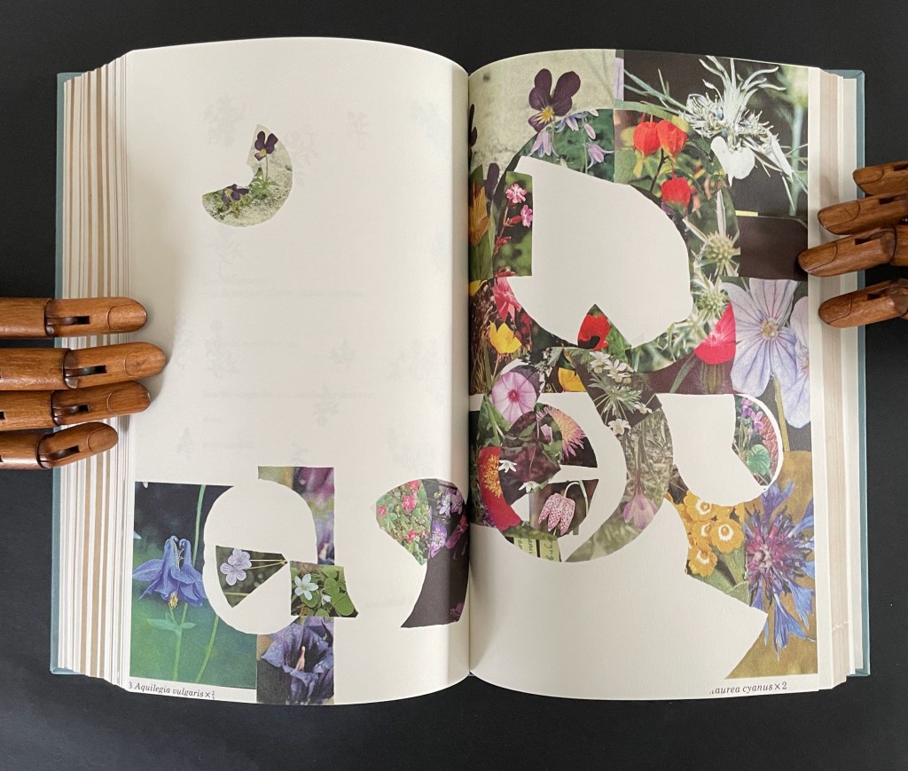
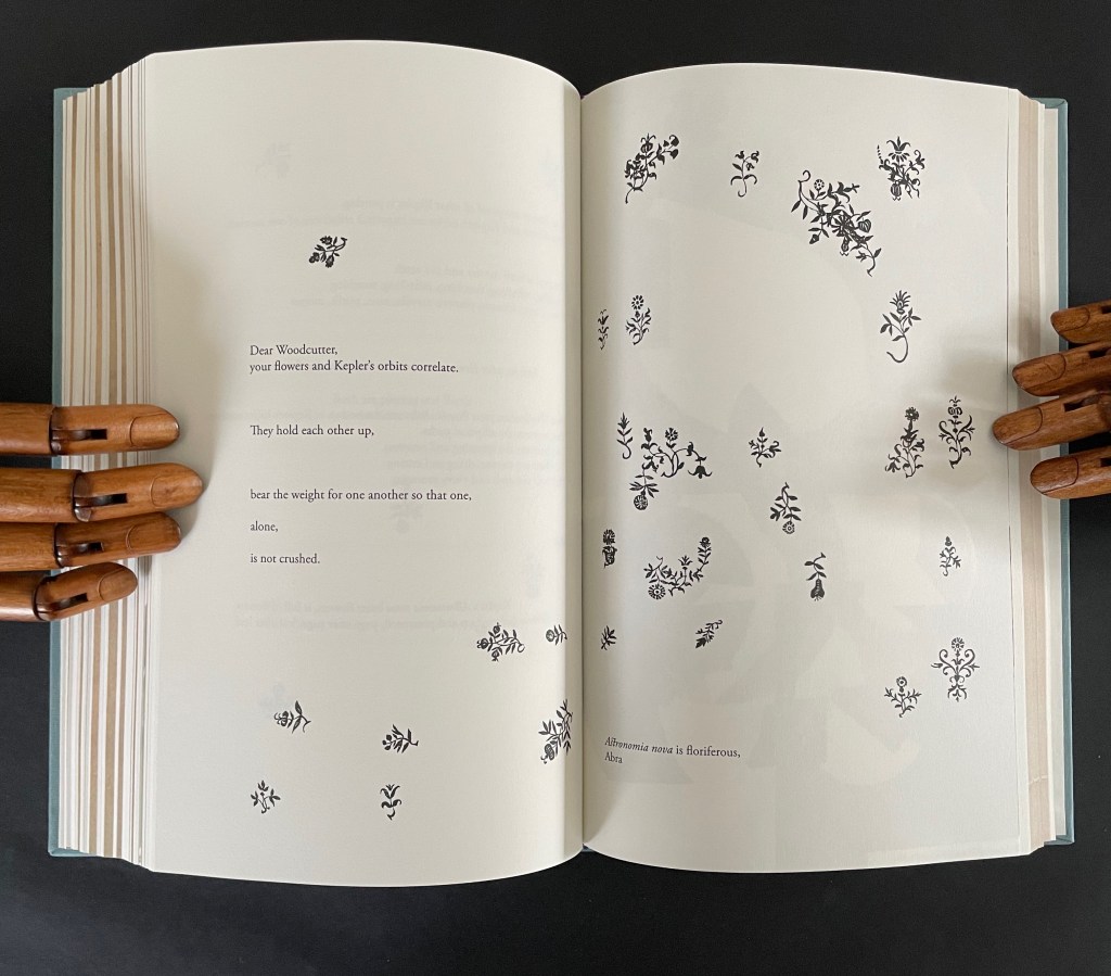
What links these subsections is their use of the elements of book production to support Ancliffe’s theme of interconnectedness. At the start of the book, she wonders whether the purpose of the woodcut flowers is that of bearing type, an insertion to prevent the weight of the press from breaking the finer woodcut lines of the orbits. Now, as the final gathering of gatherings approaches, she returns to that notion. Notice below how the layout of text and flowers on the left and the layout of the collage on the right mimic one another, which echoes Ancliffe’s observation
your flowers and Kepler’s orbits correlate.
They hold each other up,
bear the weight for one another so that one,
alone,
is not crushed.
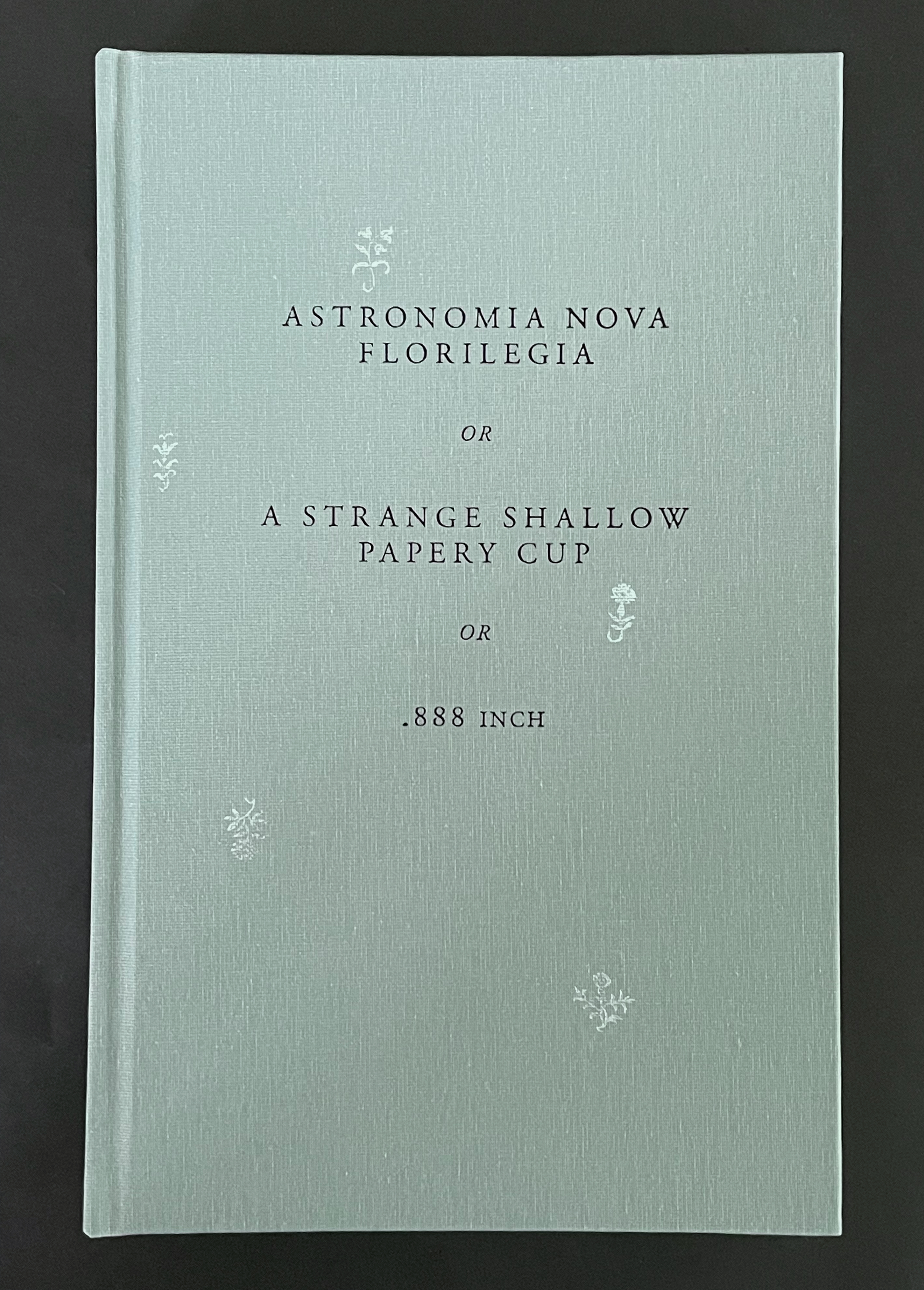
But for Ancliffe, a mutual bearing up is not the whole story of the interconnectedness she is pursuing in Astronomia Nova Florilegia or A Strange Shallow Papery Cup or .888 inch. For her, interconnectedness (correlation) is historical, metaphorical, etymological, rhetorical, seasonal, geographical, typographical, material, and personal. She sees in the woodcutter’s Prague flowers a florilegium (“you hid a book within a book!”) and a purpose — “I am seeing your book of flowers to others” — for which she chooses the medium of the artist’s book. Because this medium is so frequently recursive or self-reflexive, it is well-suited to a book hidden within a book. Like a planetary system, an artist’s book often has multiple orbits and multiple points of orbit. As noted in the interludes, any element of “the book” and its production can play a role — punctuation, words and wordplay, ink and its color, type and typesetting, images and carving, paper, sewing holes, thread, and so on.
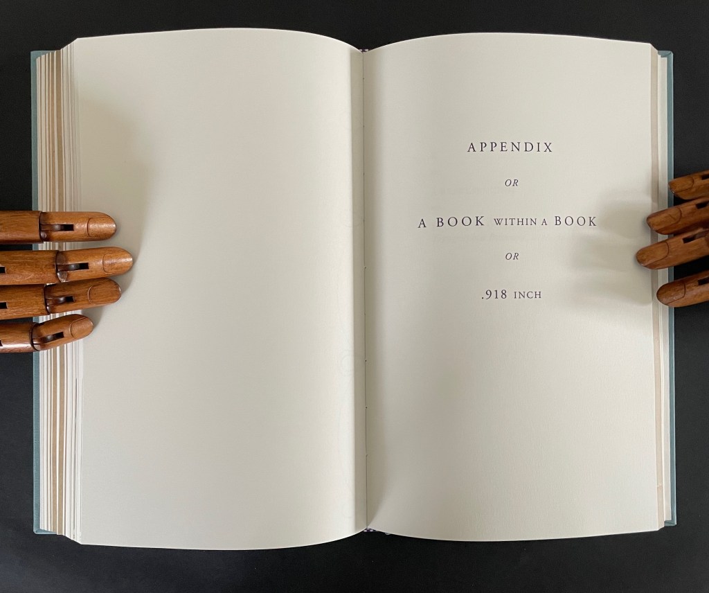
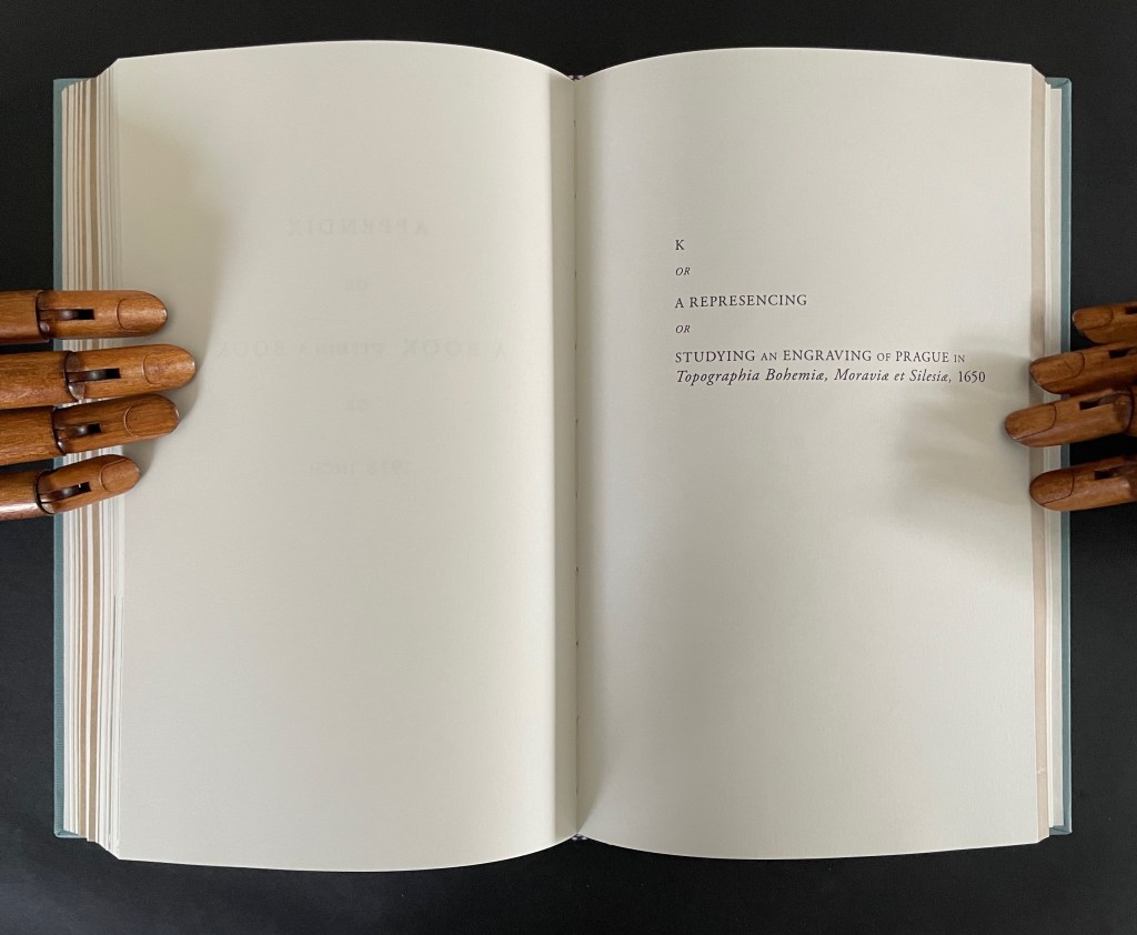
In a final honor to Dear Woodcutter and personalizing capstone, Ancliffe adds two appendixes: “the first, Appendix or A Book within a Book or .918 inch”, and the second, “K or a Represencing or Studying an Engraving of Prague in Topographia Bohemiae, Moraviae et Silesiae, 1650″.
In the first appendix, Ancliffe introduces the map of Prague, familiar from the two earlier artist’s books and then points us to K, the Jewish quarter, by filling it with a thumbnail flower. This is her book within a book: 37 flowers laid within the Jewish quarter of Prague 1650. Their color re-presences the absence surrounding the K in the map.
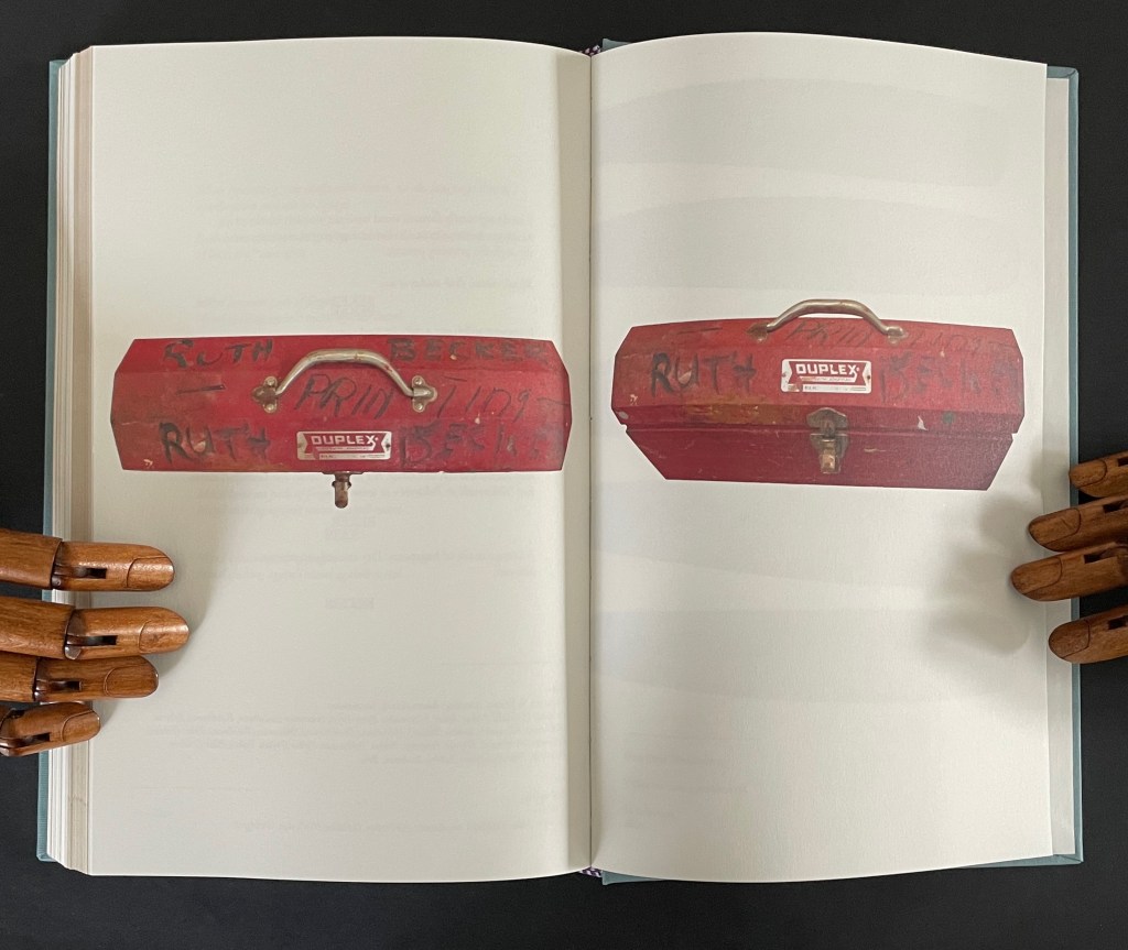
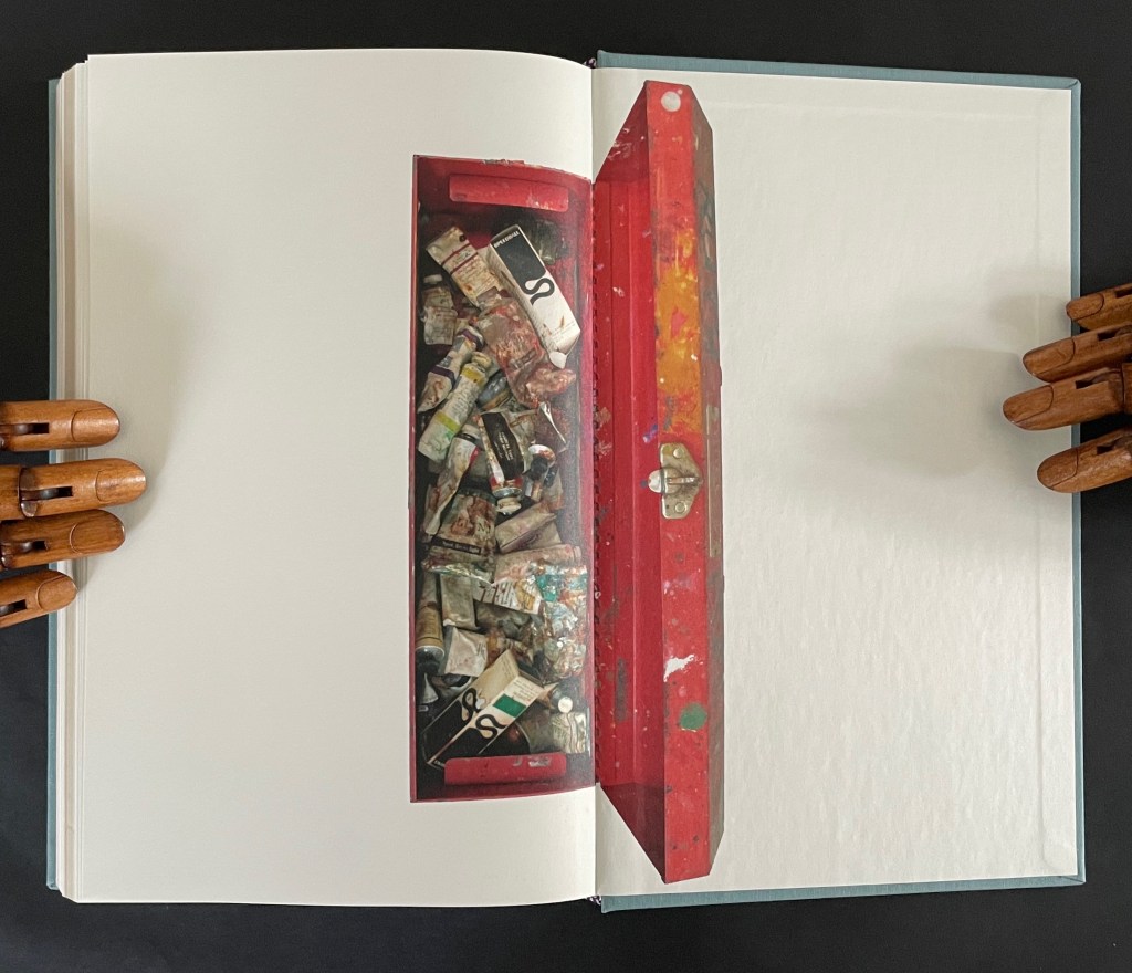
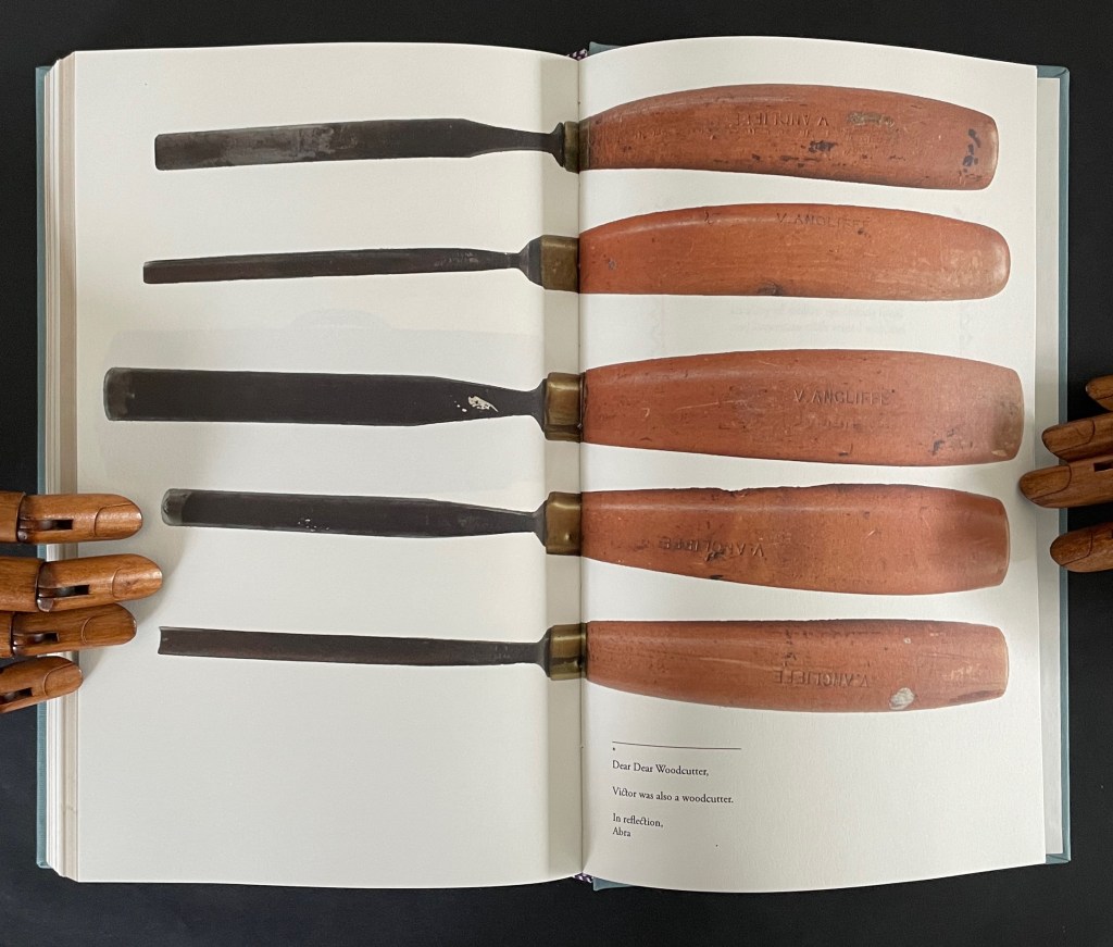
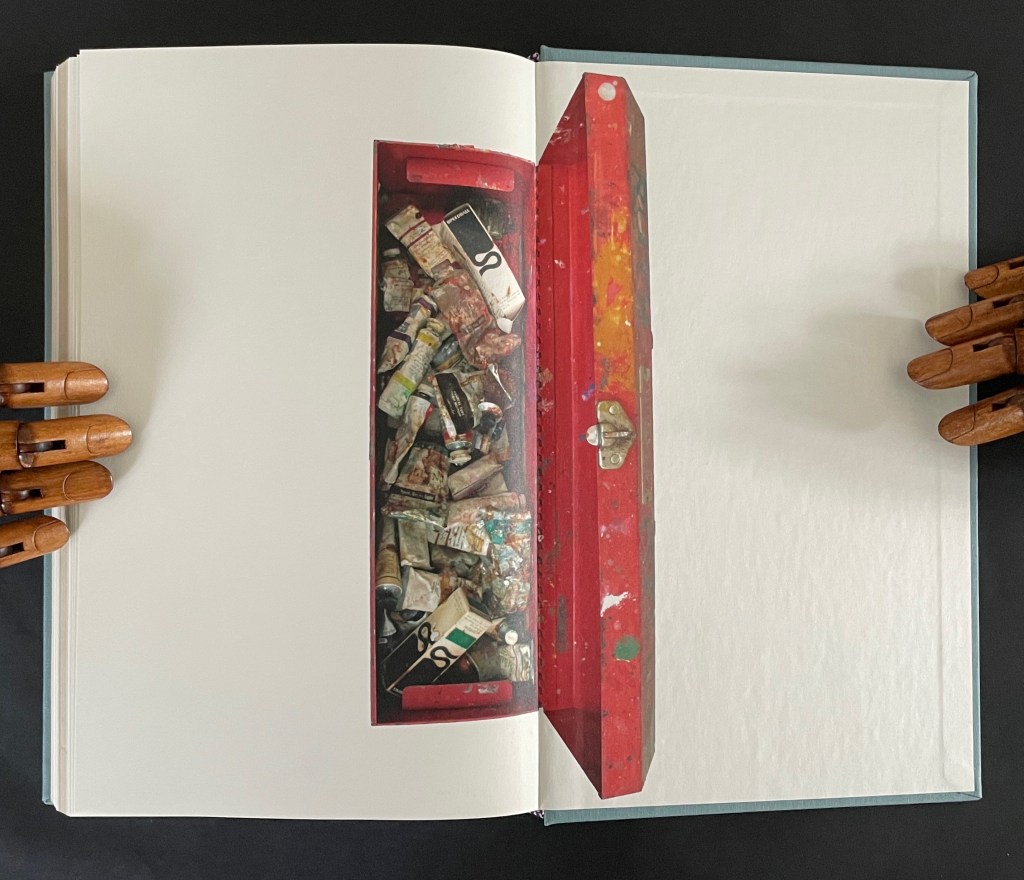
In the second appendix, Ancliffe begins with the materiality of type and setting it — how it’s made, how it feels, what it looks like — in particular for the letter K and her maternal grandmother’s married last name set in type. Again, it is an element of the book that provides the metaphor that pulls “what connects” into the orbit of Ancliffe’s artist’s book. Absence evokes presence; presence evokes absence. The absence around the carved upside down and reversed metallic strokes defines K as much as does the ink transferred from them. Likewise the presence of her grandfather Victor’s and grandmother Ruth’s metal and messy tools evokes their absence, and it is their impression on the artist that defines their presence in her,
which brings us to the autobiographical closing statement framed by Dear Woodcutter’s flowers.
Abra Ancliffe has created a body of works that, as Brian Davis puts it, “not only exploit the material and expressive possibilities of the book as object, they function as physical sites for compiling and organizing heterogeneous collections of textual artifacts for narrative and other expressive purposes”. As aesthetic objects, they demand more than a glance in an exhibition or flick-through at a book fair. They richly repay the greater attention.
Further Reading
“J. J. Abrams & Doug Dorst“. 12 December 2024. Books On Books Collection. Another example of what Davis calls a “book-archive”.
“Helen M. Brunner“. 15 April 2026. Books On Books Collection. Further example of the “book -rchive” artist’s book.
“Gracia Haby & Louise Jennison“. 28 May 2026. Books On Books Collection. Intensely colorful artists’ books exemplifying the notion of “book-archives”.
“Michael Hampton“. 8 May 2026. Books On Books Collection. Hampton’s notion of parabibliography has an affinity with Brian Davis’ notion of archival poetics. In particular, see 410/411 (2025.
Davis, Brian. 1 May 2024. “Part One: The Rise of Multimodal Book-Archives“. Book Art Theory. Starkville, MS: College Book Arts Association. Explores “archival poetics”, finding art by harvesting archives and libraries.
In Visible Cities (2012) Jean-Pierre Hébert, Harry and Sandra Liddell Reese Custom-made box enclosing sewn board binding with cloth spine, treated abaca/cotton paper with painted inlays, pastedowns with drawings, valley-fold folios of Niyodo Natural paper printed on Epson Stylus Pro 4800. Box: H442 x W290 mm. Book: H424 x W276 mm. [46] pages. Edition of 73, of which this is #48. Acquired from the Reeses, 9 February 2026. Photos: Books On Books Collection. Displayed with permission of Claire Hébert and the Reeses.
More than a few artists have been drawn to Italo Calvino’s Invisible Cities (1972/74). Its attraction is not hard to understand. Calvino supposes a series of conversations between Marco Polo and Kublai Khan about cities across the Khan’s empire that he has not visited but Marco Polo has and which he describes for the Khan. The premise, however, is paradoxical: the fifty-five cities Marco Polo describes do not exist. Calvino’s sensuous and surrealistic prose and combinatorial arrangement of the conversations and descriptions create a book that is simultaneously inwardly and outwardly reflective. Simple but complex. Realistic but fantastical. Concrete but conceptual. A work ripe for homage and inspiration.
Seven works in the Books On Books Collection represent Warja Lavater’s art: Le Petit Chaperon Rouge (1965), a later tactile version of the same work (2008), Sketchbook: Le Non-obéissant (1968), Spectacle (1990), Ourasima (1991), Tanabata (1994), and Kaguyahime (1998). The French publisher Adrien Maeght was Lavater’s most consistent champion, publishing several of her leporello works, including a now rare boxed set.
Le Petit Chaperon Rouge (1965)
Le Petit Chaperon Rouge (1965) Warja Lavater Accordion book in perspex slipcase. Slipcase: H167 x W117 x D26 mm; Book: H160 x W113 x D20 mm, closed; W4.5 m, open. 40 panels. Acquired from Patrick Wainwright Rare Books, 22 June 2022. Photos: Books On Books Collection.
Abstract shapes stand in for the characters and settings in this retelling of Little Red Riding Hood’s journey through the forest to visit her grandmother. With the only text being that matching symbols to the cast of characters and settings, the tale is told wordlessly.
Knowing the story and having the cast to hand, the reader/viewer easily follows the shapes and colors into a new and artful experience of the folktale. But what if the shapes and colors cannot be seen?
Le Petit Chaperon Rouge (2008)
Le Petit Chaperon Rouge (2008) Warja Lavater and Myriam Colin Accordion book boxed in cloth-covered board box. Box: H190 x W130 x D75 mm; Book: H176 x W122 x D70 mm. closed; W4.3 m, open. 40 panels. Acquired from Les Doigts Qui Rêvent, 30 October 2022. Photos: Books On Books Collection. Displayed with permissions of Les Doigts Qui Rêvent.
Artist Myriam Colin and publisher Les Doigts Qui Rêvent (“Fingers that Dream”) addressed this question with print, Braille, cloths of different texture, leather, blind embossed shapes, plastic filaments and sewing.
Between the printed text and Braille-rendering for the cast of characters and settings, buttons of different cloths and different embossed shapes appear. In the opening scene, the red felt button for Little Red Riding Hood is of course smaller than the orange-brown broadcloth button for Mother, who stands before the raised rectangle for the house and looks over her daughter’s head at the forest of raised dots.
Later, the wolf’s belly becomes a large sewn pouch with the slit cut by the Hunter through which Grandma and Little Red Riding can be felt, ready to escape.
The brown leather button for the Hunter unites the felt Red Riding Hood, nubby-cloth Grandmother and broadcloth Mother in a clearing in the forest. A satisfactory conclusion for the sighted and visually impaired.
Update Lavater
Seven works in the Books On Books Collection represent Warja Lavater’s art: Le Petit Chaperon Rouge (1965), a later tactile version of the same work (2008), Sketchbook: Le Non-obéissant (1968), Spectacle (1990), Ourasima (1991), Tanabata (1994), and Kaguyahime (1998). The French publisher Adrien Maeght was Lavater’s most consistent champion, publishing several of her leporello works, including a now rare boxed set.
Sketchbook: Le Non-obéissant (1968)
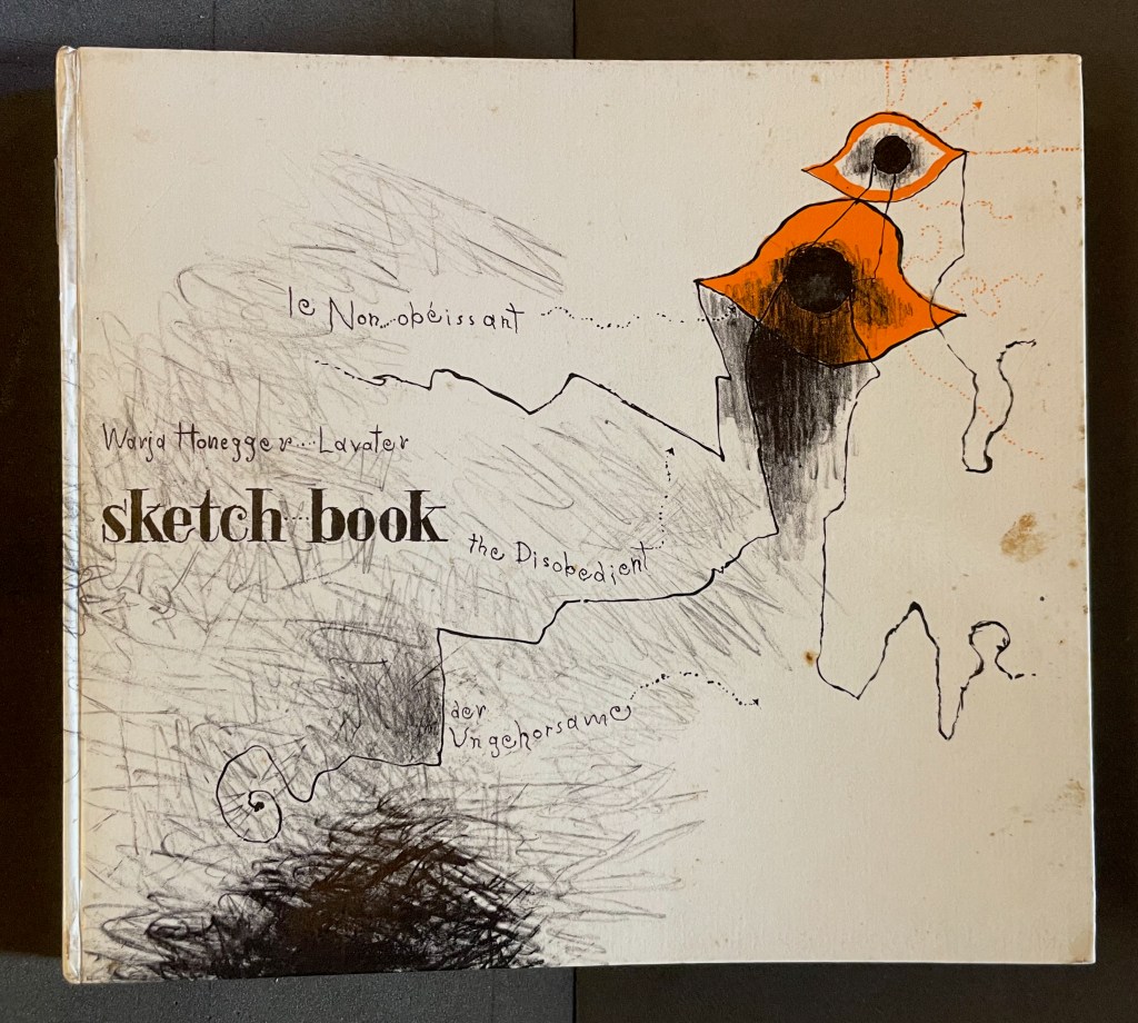
Sketchbook: Le Non-obéissant; The Disobedient (1968) Warja Lavater Casebound, printed gloss paper over boards, plain endpapers and fly leaves. H210 x W235 mm. [45] Chinese fold folios.Acquired from Ken Sanders Rare Books, 18 July 2024. Photos: Books On Books Collection.
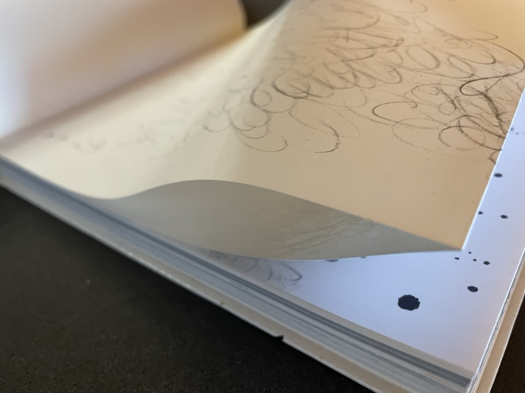
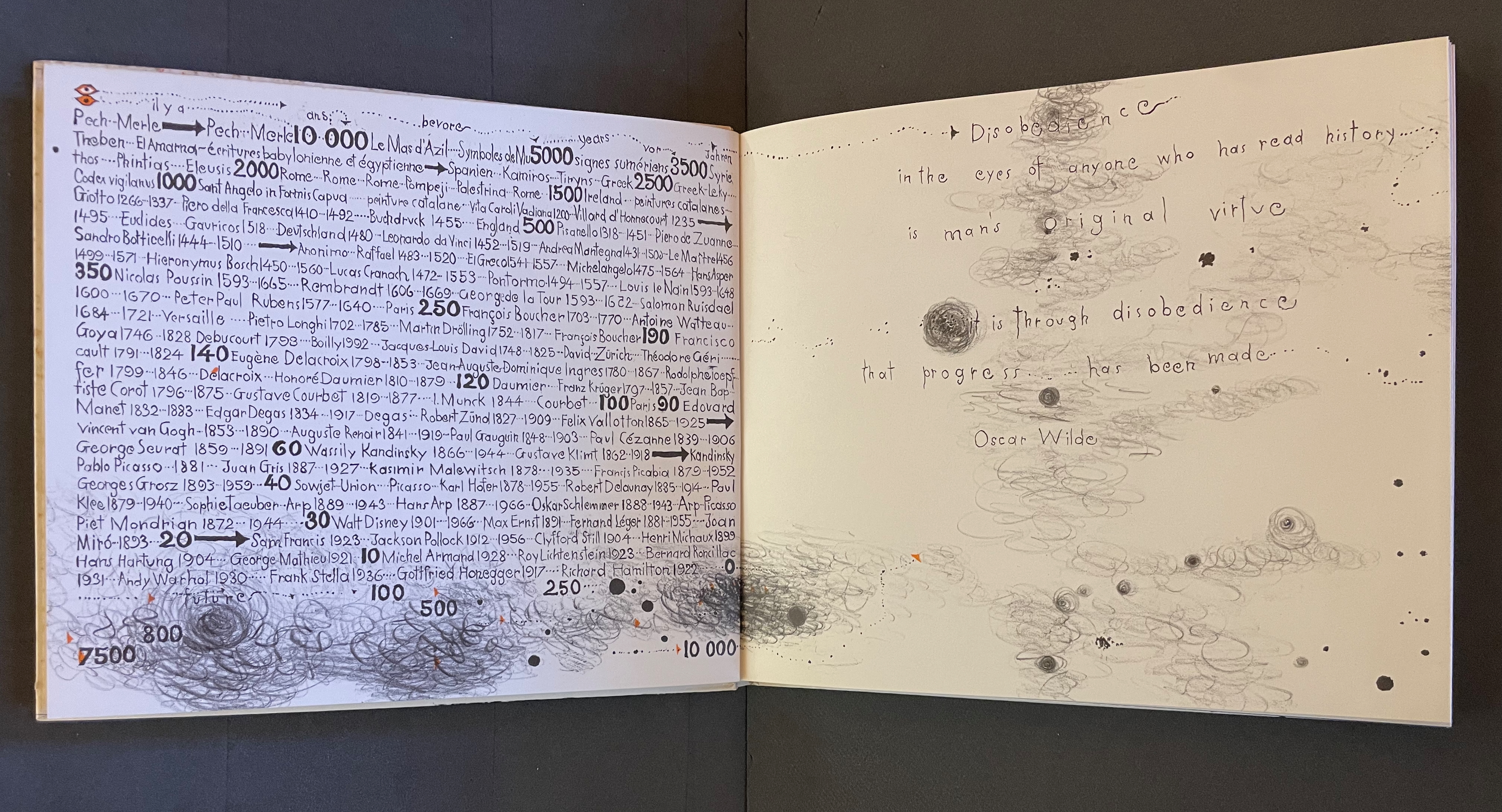
Warja Lavater’s Sketchbook opens with a page of pencil scrawling that wraps from the first side of a Chinese-fold folio, over the fold, and onto the folio’s other side, where a 10,000+ year timeline of artists appears in cramped handprint. The scribbling continues onto the next folio, embroidering Oscar Wilde’s aphorism
Disobedience in the eyes of anyone who has read history is man’s original virtue. It is through disobedience that progress has been made.
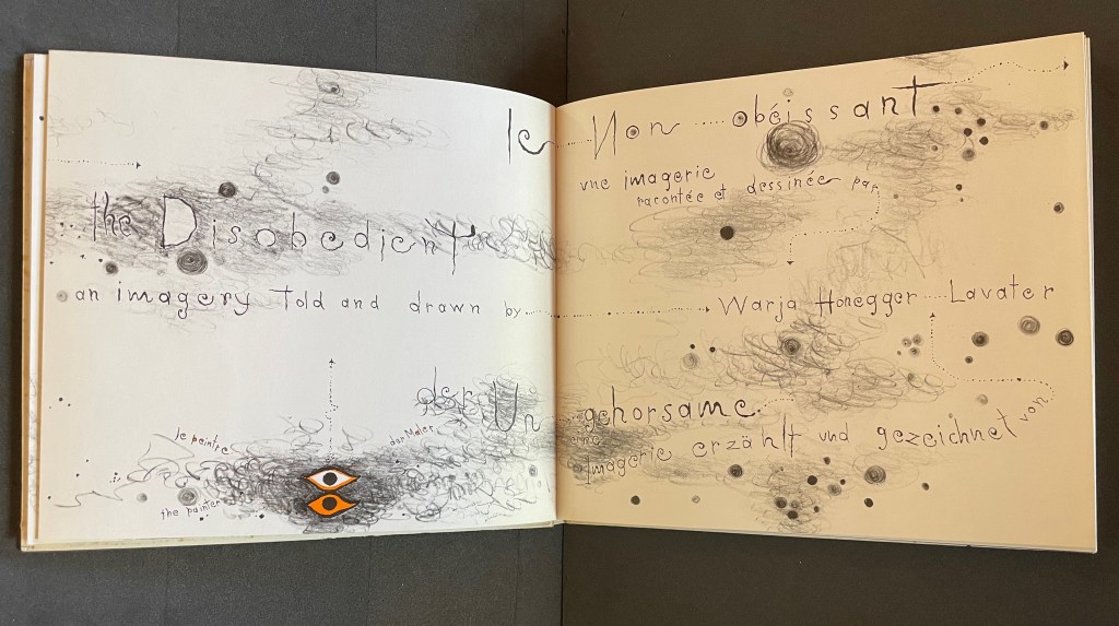
The scrawling runs over the fold of the folio and across a double-page spread to become the multilingual title page. Or rather the “subtitle becomes title page”. Look again at the cover. Wasn’t the title Sketchbook? Now it is Le Non-obéissant | The Disobedient | Der Ungehorsam, and it has acquired a new subtitle, and a strange one at that: Une Imagerie Racontée et dessinée par … |An Imagery Told and Drawn by … | Eine Imagerie Erzählt und Gezeichnet von Warja Lavater.
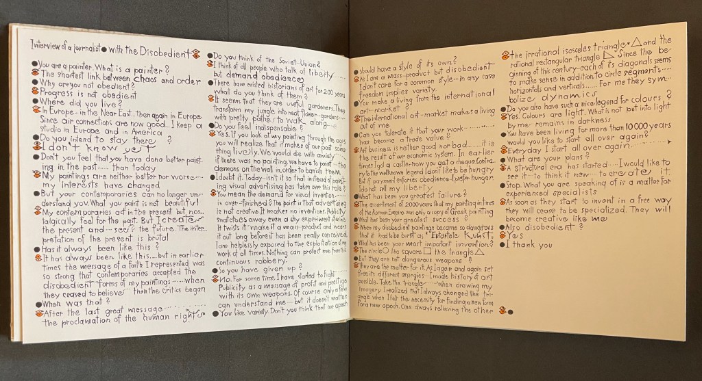
“An imagery told and drawn” captures well Lavater’s technique of abstract pictorial retelling of familiar fairy tales such as Little Red Riding Hood and Cinderella. Now, in this sketchbook, she uses it to create her own fairy tale of art history. As we are about the learn, the doodle labelled le peintre | the painter | der Maler on the left hand page above is the main character named “the Disobedient”. Reminiscent of Mel Brooks and Carl Reiner’s sketch “The 2000 Year Old Man”, the Disobedient, who has been around for almost 12,000 years, has some humorous and cantankerous answers to the interviewer’s questions about her experiences from cave art to Pop art.
“You make a living from this international art market?”
“The international art market makes a living out of me.”
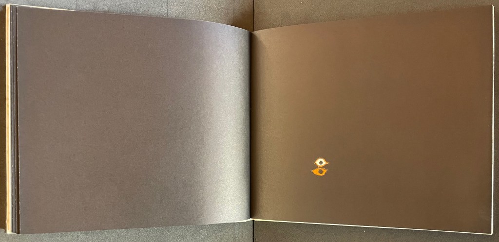
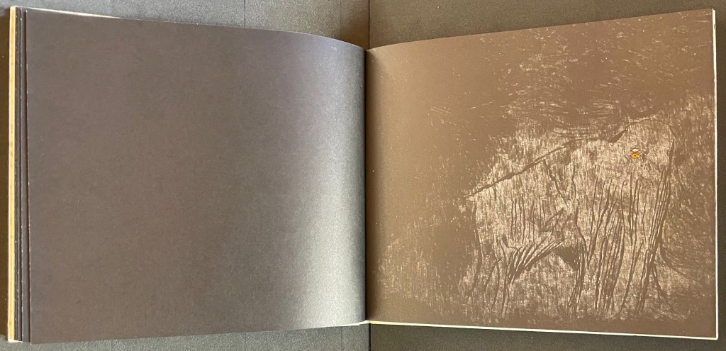
Unlike the Key pages in her fairy tales identifying the images and markings, The Disobedient’s Key page is delivered in her voice. She explains that the eye with white around its iris stands for her “exterior eye with which I look” and the eye with orange around its iris stands for her “interior eye with which I think”. Her techniques or “means of my performance” might be squiggles, geometric objects or figurative drawings. The clearly defined black dots represent her contemporaries. Orange markings represent her emotions, her ferveur and Gefuhl. All the bold numbers mark the “years more or less gone by”. But the story begins in earnest in the dark of four black folios and a fifth in which the artist appears for the first time in history followed by her first work, a drawing of a mammoth.
Spectacle (1990)
Spectacle: Pictoson Mural (1990) Warja Lavater H215 x W296 mm. 22 pages. Acquired from Antiquariat Übü, 3 August 2022. Photos: Books On Books Collection. Displayed with permission of the publisher.
Spectacle is an origin story of shapes, signs, the sounds of language, their alphabetic representation and use to form words. It is similar to the tale in Il était une fois un alphabet (1951/2009) by Souza Desnoyer and Marcelle Marquet. In both, the separate worlds of vowels and consonants join to create the alphabet. In Il était une fois, the letters already exist, have anthropomorphic shapes and engage in familiar activities like voyages, feasts, dances and processions. The narrative has scenes and settings to carry it along. Spectacle‘s origin narrative, however, letters develop from a system of signs created/discovered by a wizard. An abstract shape himself, the wizard presides over the story’s unfolding across an abstract landscape. Even though Lavater maps a written version (in eight languages) of the tale to the panels, the pictorial narrative remains challenging.
Elliptical and shamanic, the written narrative itself is challenging. It may remind the reader of Italo Calvino’s Big Bang story “Sul far del giorno” (“At daybreak”) in his collection Le Cosmicomiche (1965) (“Cosmicomics“1968), to which Shirley Sharoff paid homage in OVI: objets volants identifiés dans le ciel d’Italo Calvino, a work contemporary with Lavater’s. The verticality of Lavater’s extraordinary leporello might also remind the viewer of Blaise Cendrars and Sonia Delaunay’s La Prose du Transsibérien et de la petite Jehanne de France (1913).
Somehow, though, despite its winged emblems of words, the eleventh panel with its regimented alphabet seems visually diminished, not quite the joyous spectacle promised by the text. For that, we would have to turn elsewhere in the collection: William Joyce’s origin story The Numberlys (2014).
The Numberlys (2014) William Joyce and Christina Ellis Hardback, paper on board. H220 x W300 mm, 52 pages. Acquired from London Bridge Books, 15 April 2021. Photos of the book: Books On Books Collection.
Ourasima (1991)
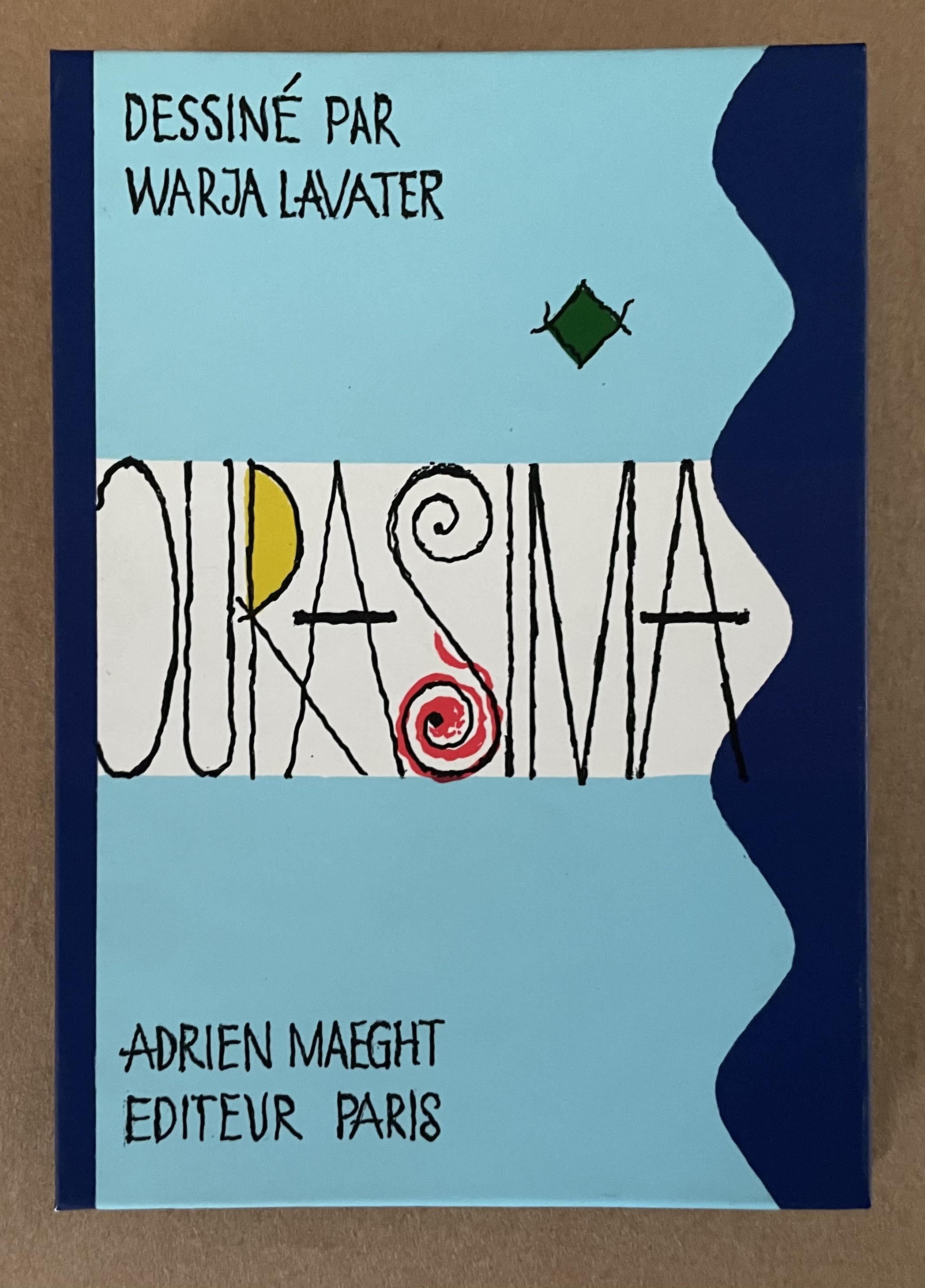
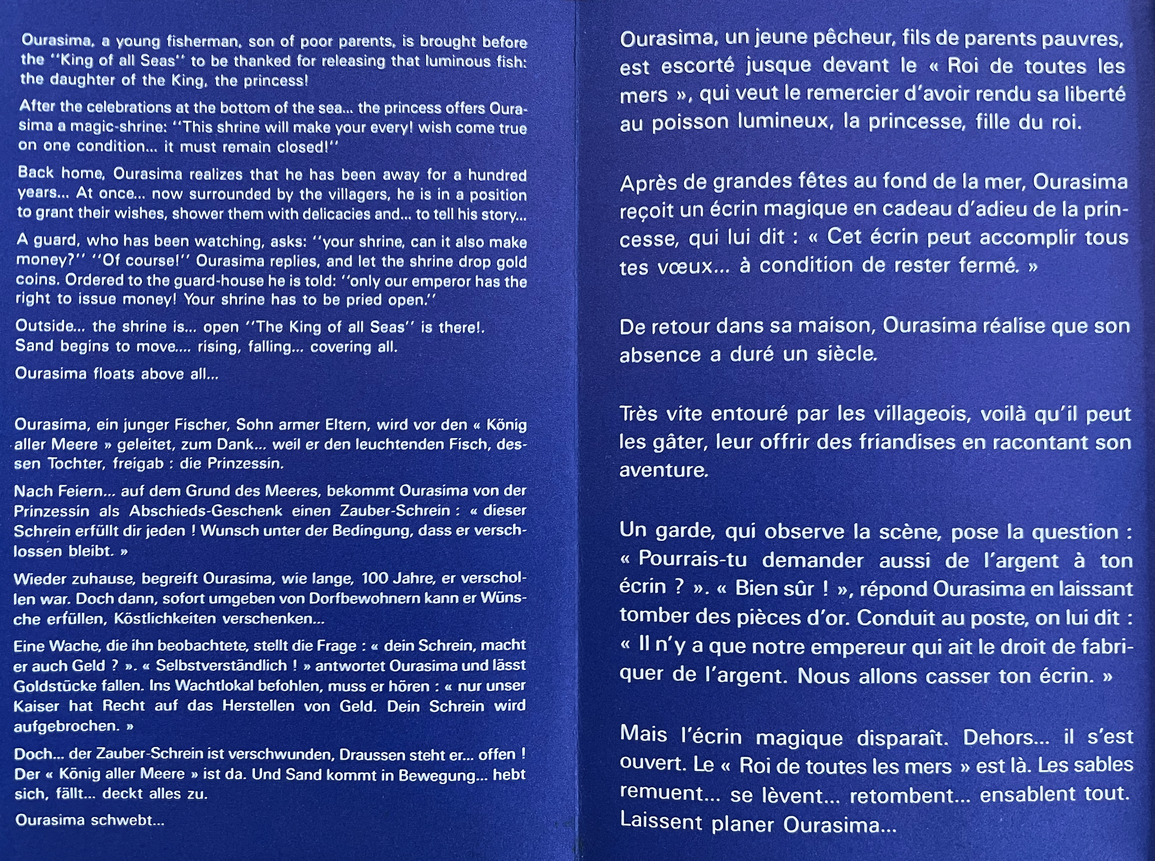
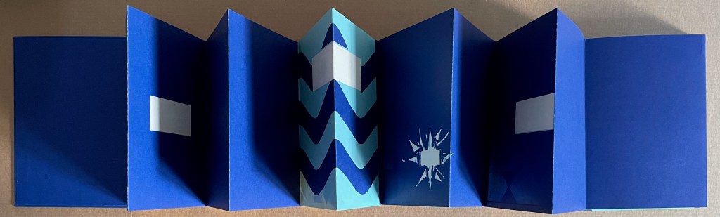
Ourasima: Une imagerie en transparence d’après le conte japonais (1991) Warja Lavater Plexiglas slipcase enclosing a double-sided accordion book. Box: H178 x W118. Closed accordion: H160 x W112 mm. Open accordion: W4624 mm. [86] panels. Acquired from Versand-Antiquariat Rainer Richner, 24 August 2023. Photos: Books On Books Collection.
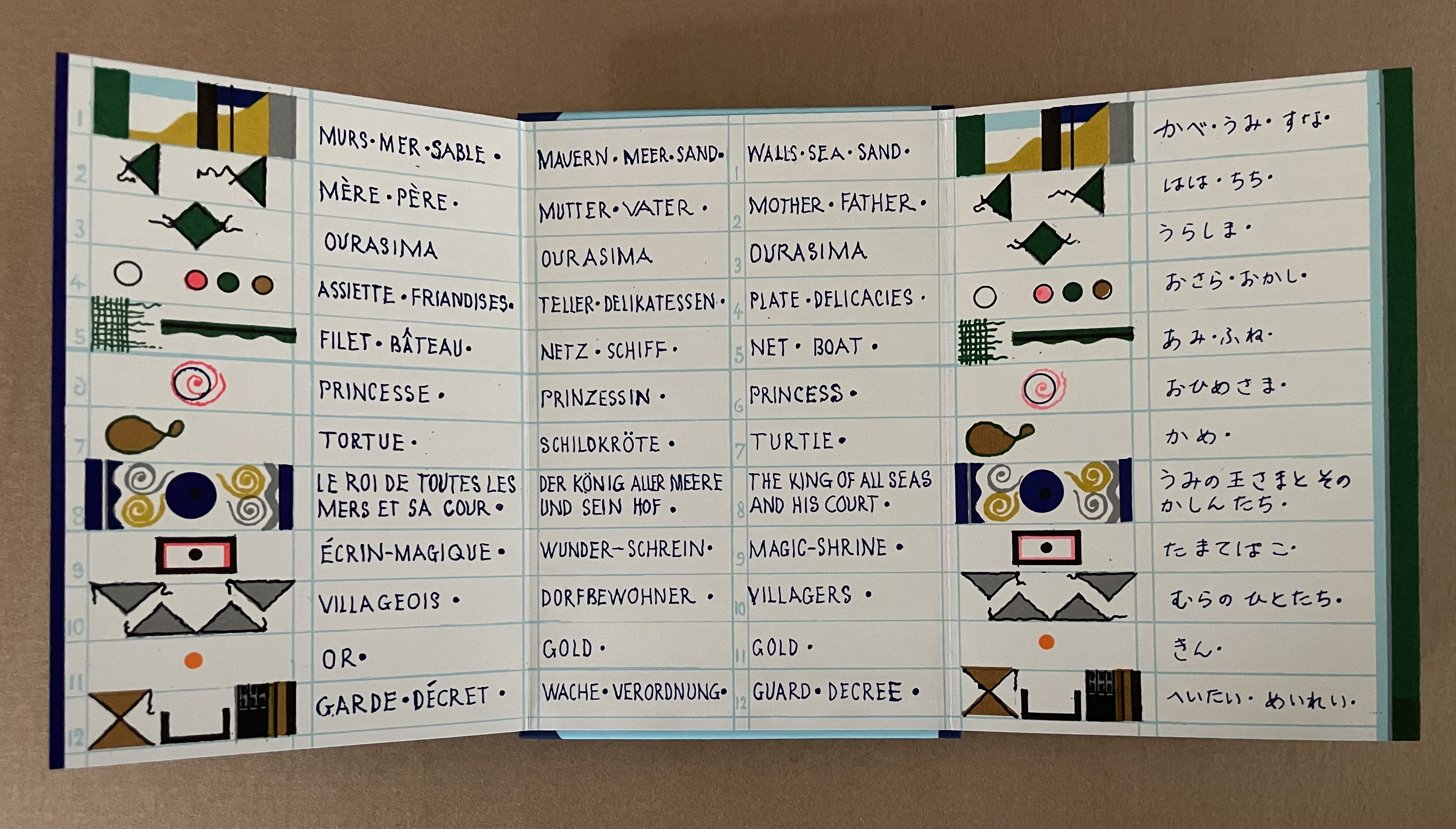
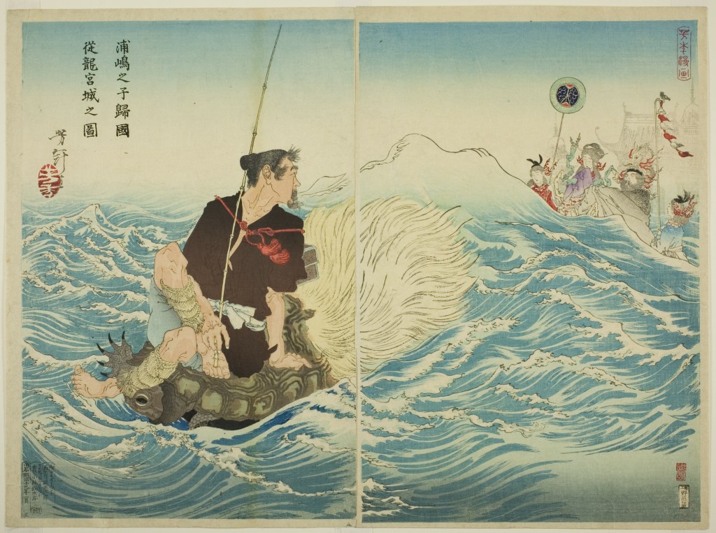
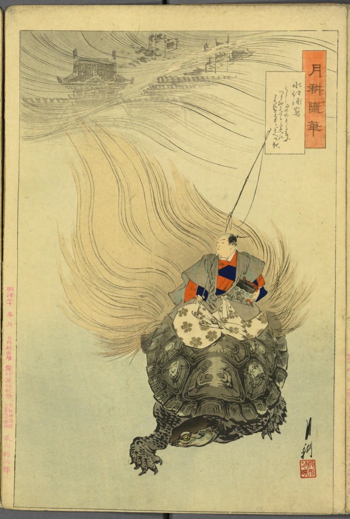
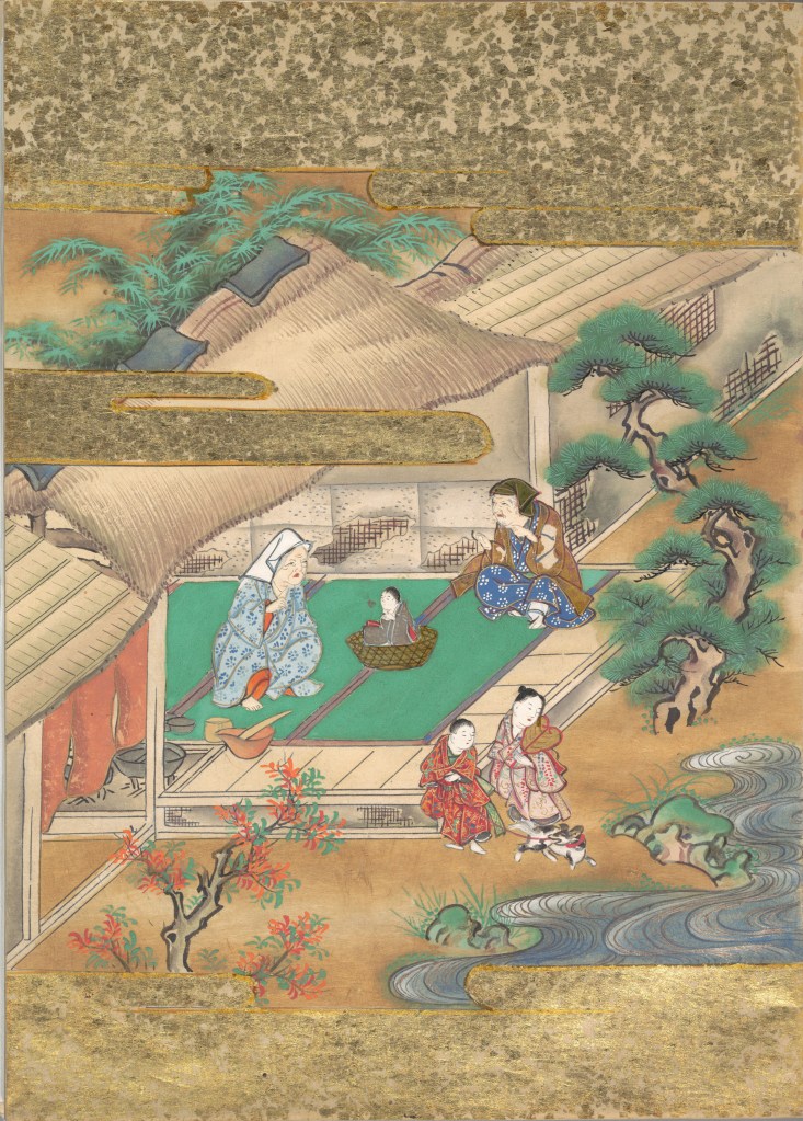
Ourasima, also known as Urasima Taro, is a Japanese folktale that reaches back to the eighth century. Lavater’s version is a cross between the stories of the Golden Goose, Rip Van Winkle and Pandora’s Box. In keeping with her treatments of Western folk and fairy tales, Lavater brackets her wordless retelling with a cast of characters, objects and their corresponding emblems at the beginning and a brief summary of the story at the end — all annotated in French, German, and English, but this time in Kanji as well.
Lavater’s version departs significantly from the traditional versions as described by the Library of Congress:
There are variations to the story depending on the intended audience and the period, and it is still known by its Japanese title Urashima Taro. It tells of a young and kind fisherman named Urashima. One day he catches a large turtle while he is out fishing. Taking pity on the turtle, he releases it back into the sea, whereupon the beautiful daughter of the god of the sea appears and tells him that the turtle was actually the personification of her. To thank him for saving her, she invites Urashima to Ryugu-jo (the Palace of the Dragon God) at the bottom of the sea. He then marries her and lives happily at the palace. Three years later he asks for permission to return to his village for a short time, because he wants to see his family. His wife gives him a box and makes him promise not to open it, as he would never be able to come back if he did. When Urashima returns home, he finds that everything has changed during those three years and that his family and his village have disappeared. He had in fact left his village 400 years before, so his parents, siblings and friends were all dead. Not knowing how to get back to the Palace of the Dragon God, he breaks his promise and opens the box, hoping that its contents can help him. After he opens the box, white smoke appears and Urashima turns into a white-haired old man and dies.
Lavater’s emblematic retelling works well with the basics such as the family home with Ourasima between his mother and father, Ourasima with his boat and fishing net, the capture and release of the princess, the turtle’s arrival and transport of Ourasima to the princess, the marriage, Ourasima’s return on the back of the turtle, and the distribution of delicacies and gold. But the “emblemism” struggles to reflect the verbal instructions of the princess and the guards’ rationale for arresting Ourasima.
Ourasima at home between his mother on the left and father on the right.
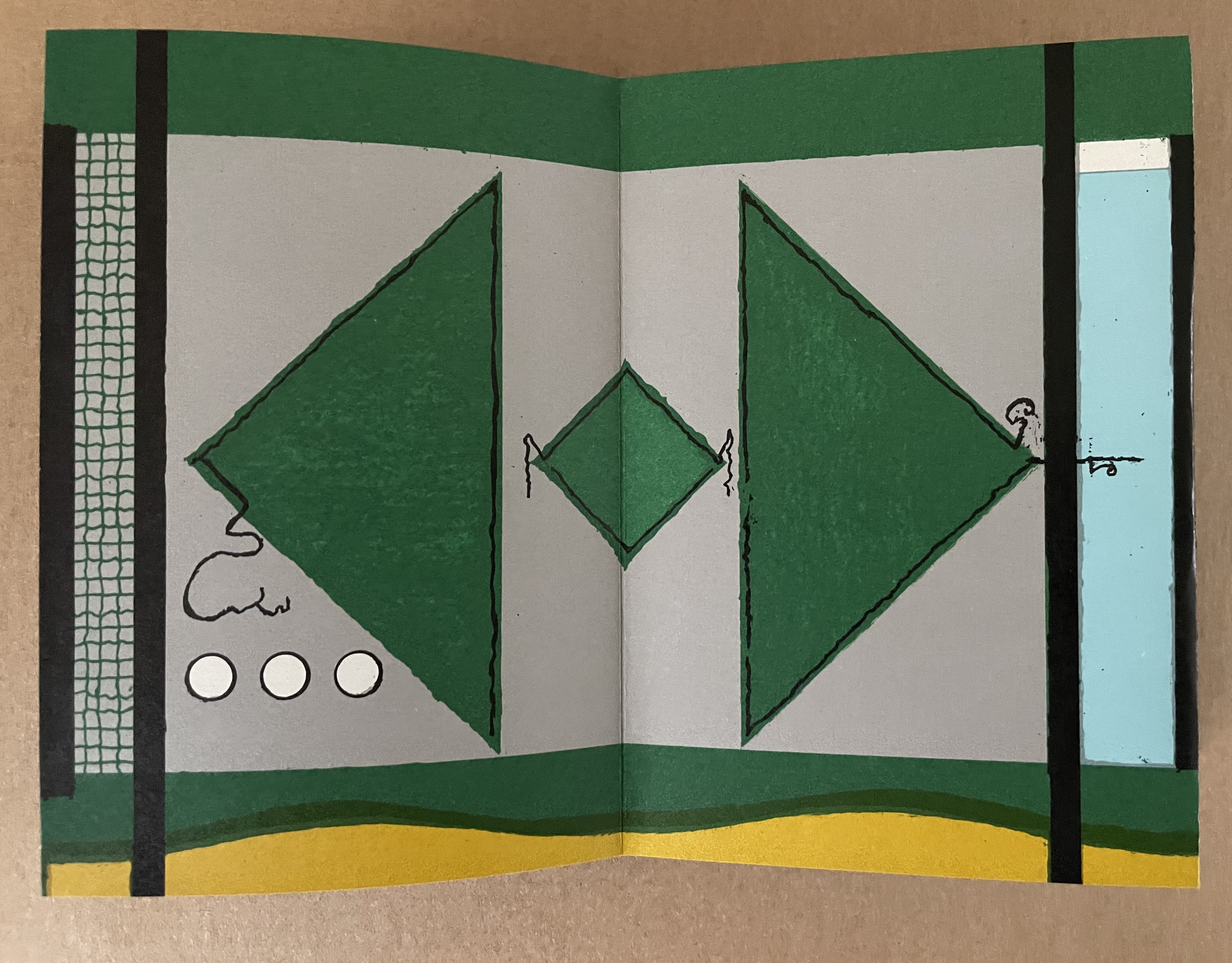
With the box forced open, chaos ensues with a whirlwind of sand dispersing everything and freeing Ourasima.Nothing in Lavater’s summary indicates that Ourasima becomes an old man at this point, but his emblem’s shift from green to white in the next panels aligns with the traditional version.
The chaos of sand freeing Ourasima and his becoming an old man.
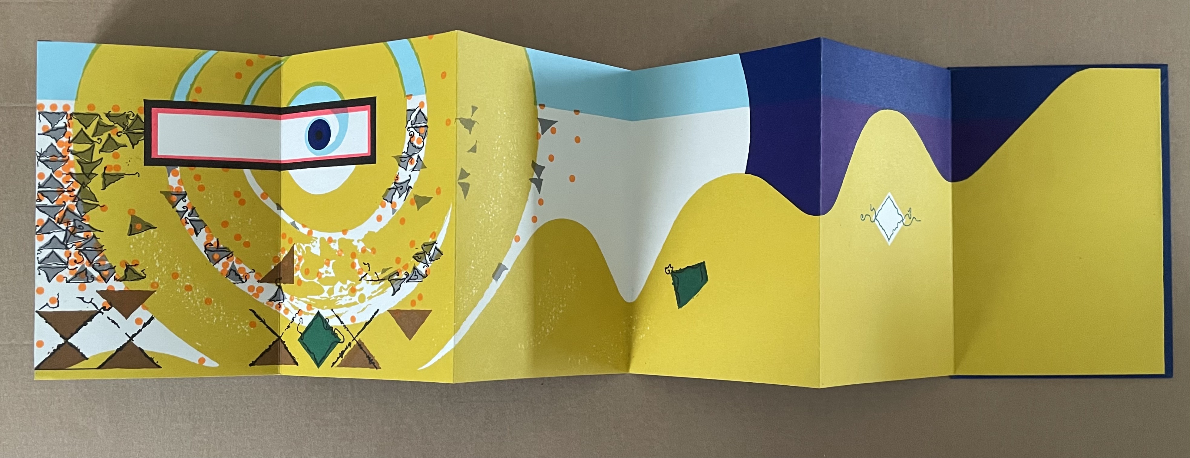
To find Ourasima floating “above all” as Lavater’s summary indicates, we have to turn to the other side of the leporello, but the “emblemism” is difficult to follow. Has the sand, covering all, yielded to the domain of the sea? Has the empty magic box risen from the depths to float along the waves? Does the King recapture it? Has the white diamond-shaped Ourasima been transformed into a round sea creature?
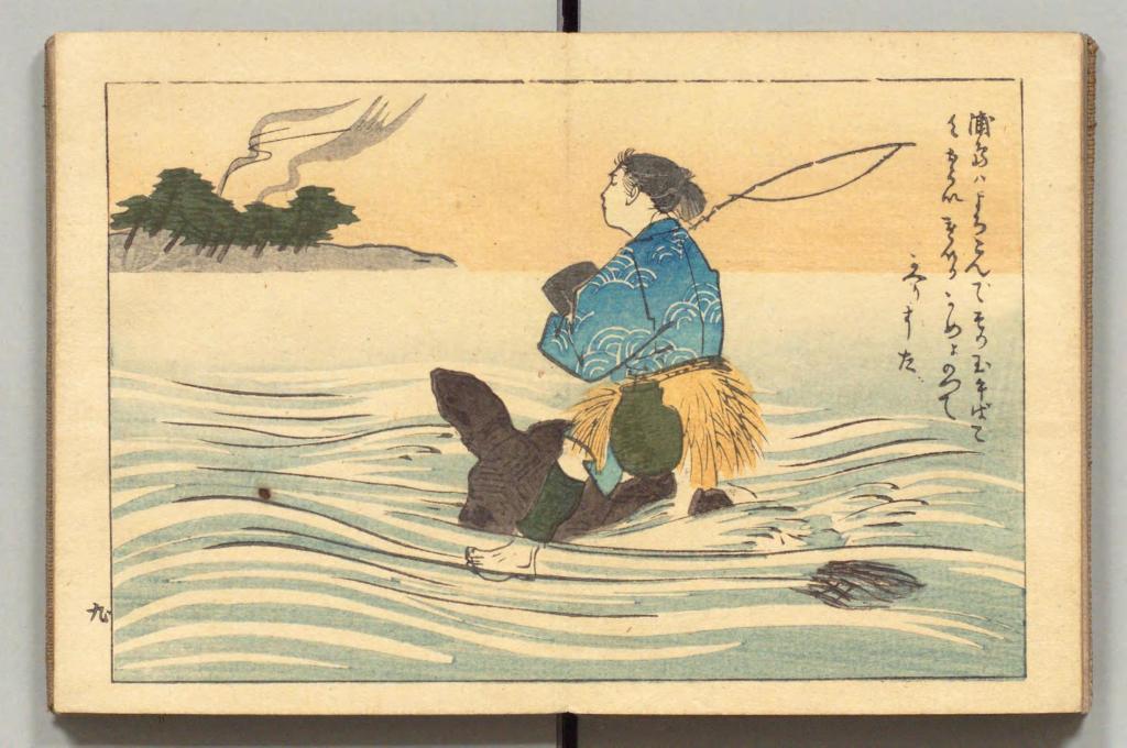
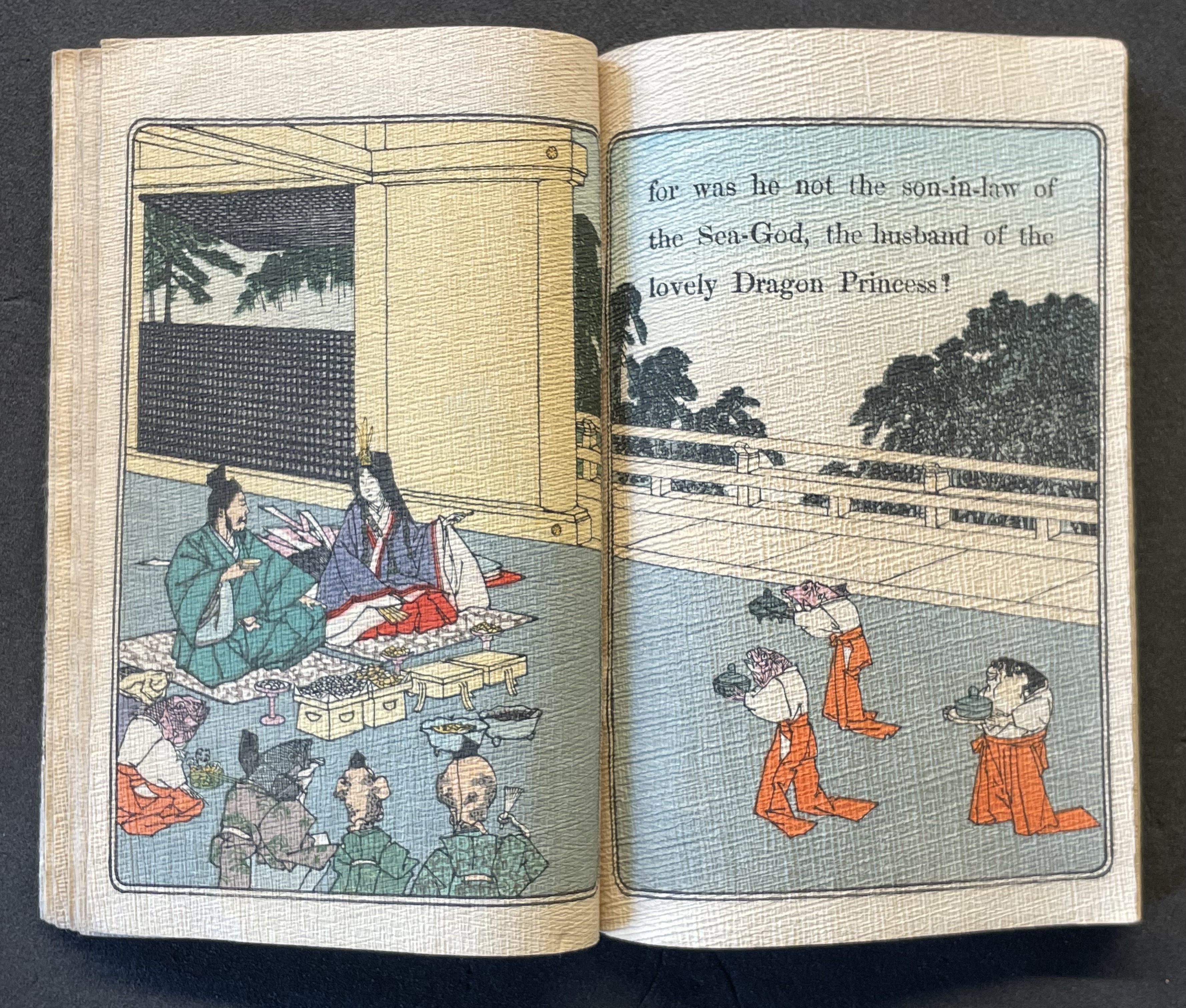
Of course, text and illustrations went side by side in all the much earlier versions with calligraphy, watercolors, woodblock prints and, in the later Meiji period, with type.
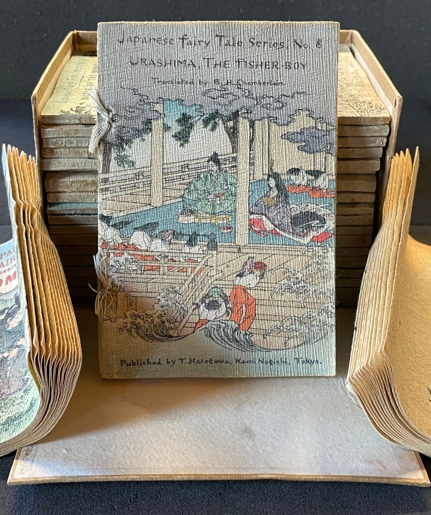
In the same period, the first translation into English appeared within a boxed set of Japanese fairy tales, printed on cloth folios and stab bound.
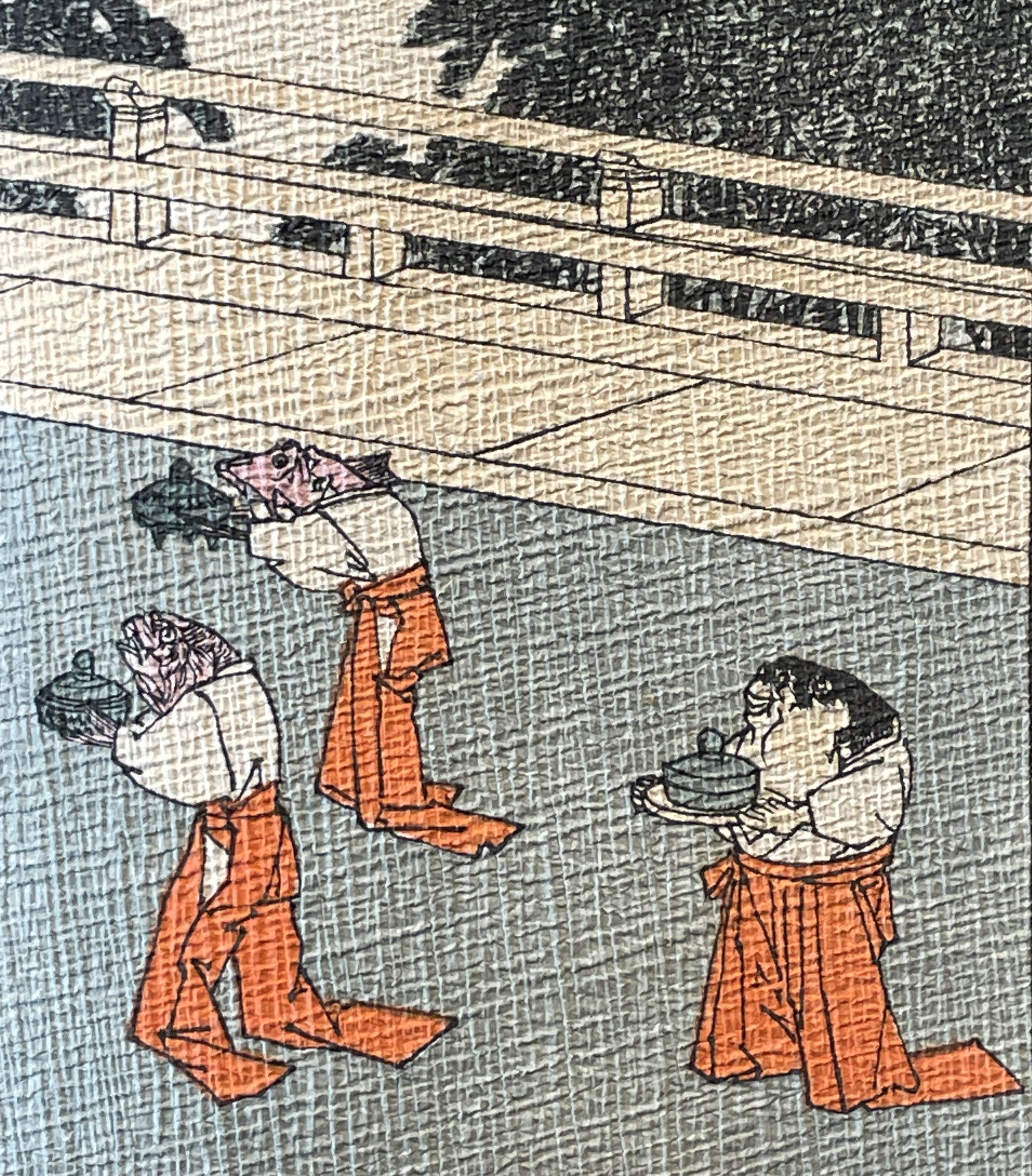
Japanese Fairy Tales Series. Bodleian Libraries. Schorr Collection f.22. The Fisher-boy Urashima, translated by Basil Hall Chamberlain, illustrated by Eitaku Kobayashi, and published by Hasegawa Takejiro (1886).
Ourasima and Otohime served in the palace by undersea servants.
In Lavater’s art, image and abstraction become the primary focus and vehicle for the narrative. As we shall see, this earliest of Lavater’s attempts with Japanese fairly tales is narratively the least straightforward, probably because of the deviations prompted by the inclusion of themes from the Golden Goose and Pandora’s Box.
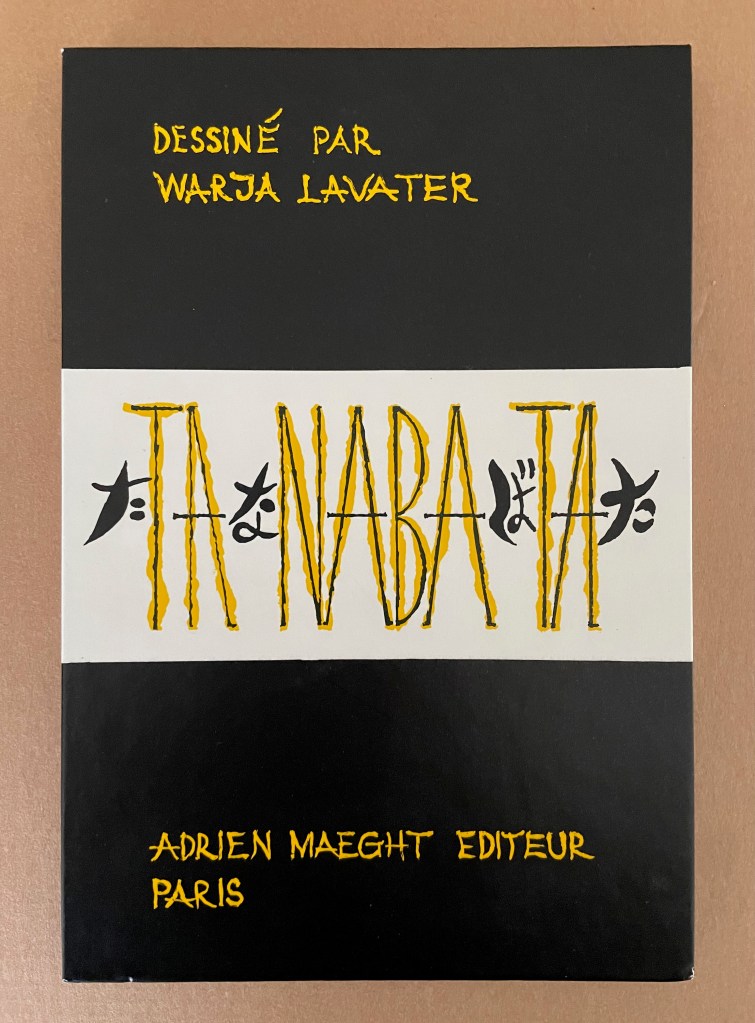
Tanabata (1994)
Tanabata(1994) Warja Lavater Acrylic slipcase, double-sided leporello. Slipcase: H216 x W150 mm; Book: H216 x W145 mm. 18 panels, each side, one foldout with 2 panels. Acquired from Dilat, 14 January 2025. Photos: Books On Books Collection.
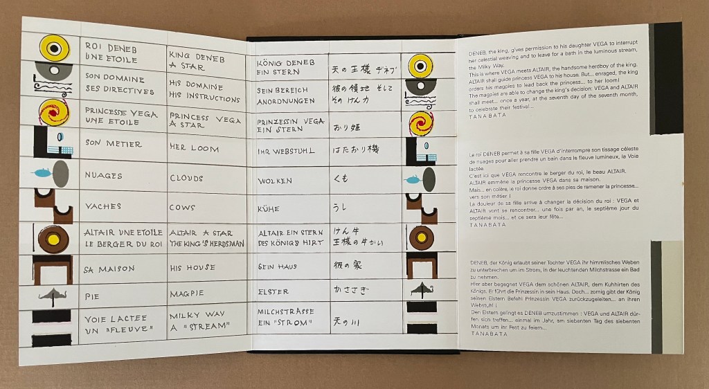
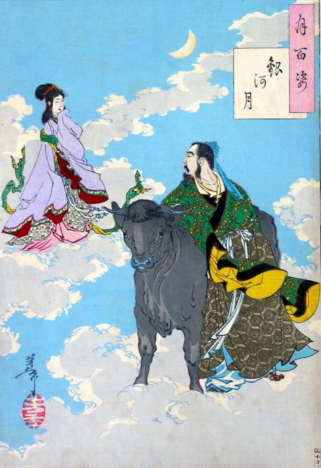
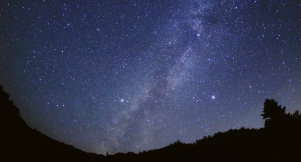
Tanabata is Lavater’s version of a Sino-Japanese constellation myth about the stars Deneb, Vega, and Altair. The story is that the princess Orihime, associated with the star Vega, also known as the weaver star, falls in love with Hikoboshi, associated with the star Altair, also known as the cow-herder star. Her father, Deneb the Sky King, banishes her to one side of the Milky Way and Hikoboshi to the other side. Later he relents and allows them to meet only on the seventh day of the seventh month of the lunar calendar when a flock of magpies form a bridge for their reunion. This has become the date of the annual Star Festival in Japan.
As with Ourasima, Lavater modifies the tale. She has the King permit Orihime to bathe in the Milky Way where she first meets Hikoboshi. Additionally, the King has the magpies drag Orihime back to her weaving, but the birds persuade the King to permit the annual reunion at the Milky Way.
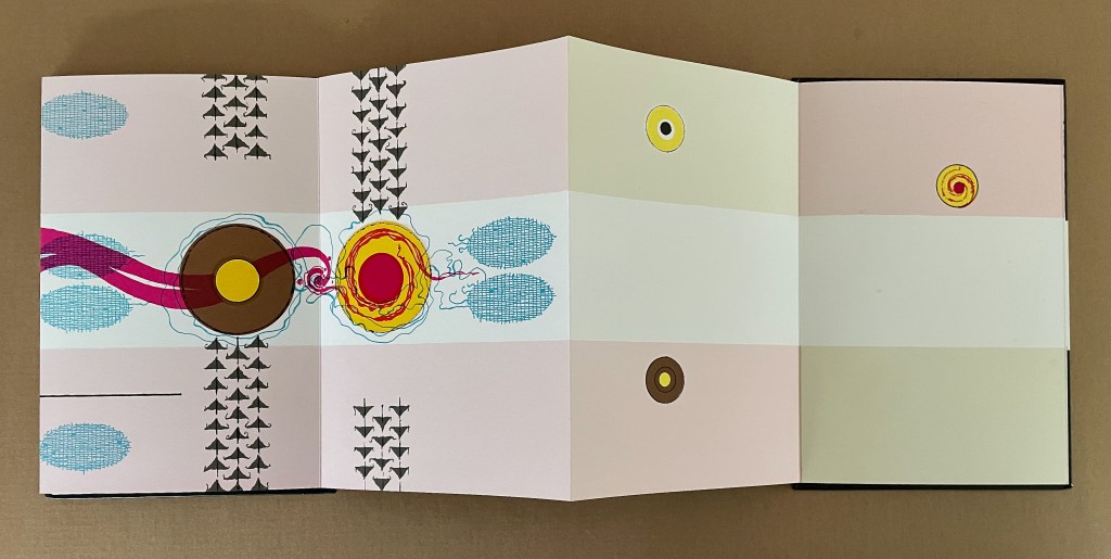
Reading from left to right. Altair (cowherd star) and Vega (weaver star) cross the Milky Way over the “magpie bridge” to unite during Tanabata, the annual Star Festival in Japan.
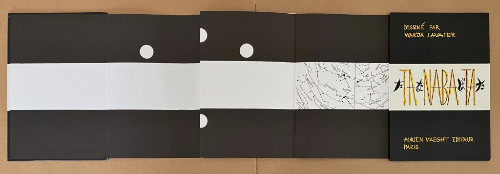
The reverse side of the leporello represents the two lovers as two solid white balls separated by the Milky Way represented as a solid white band, running right to left from the front cover. Over the course of the leporello, the lovers move to join one another on one side of the Milky Way then to separate according to their celestial fate.
Reading from the celestial map right to left: the white dots replicate the positions of Deneb and Vega above the Milky Way and Altair beneath it.
Despite the variations on the traditional tale, Tanabata is narratively more straightforward than Ourasima. With 10 emblems compared to Ourasima‘s 12, Tanabata ought to be visually more straightforward as well, but after the first two panels introducing Deneb, Vega, and Altair, every panel — except for the last two — seems just as busy as the most crowded in Ourasima. This, however, seems intentional. The last two panels stand out all the more in their simplicity mirroring the stars’ positions on the reverse side in the celestial map and the abstraction.
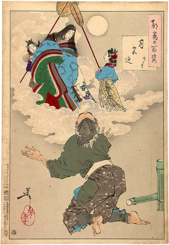
From 100 Aspects of the Moon, by Tsukioka Yoshitoshi. Late 1800’s. (Public Domain). Orihime and Hikoboshi during the night of Tanabata. Photo: Tomo Japan.
Kaguyahime (1998)
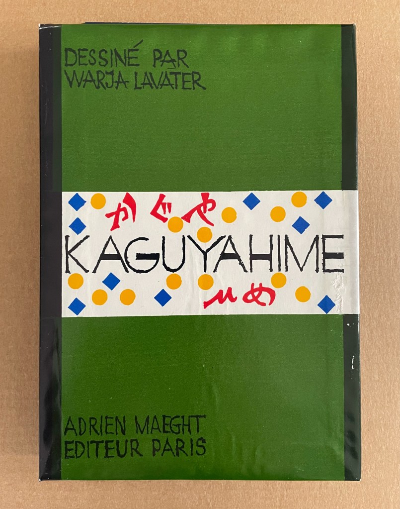
Kaguyahime(1998) Warja Lavater Acrylic slipcase, leporello. H160 x W11 mm. 44 panels. Acquired from Okmhistoire, 24 January 2025. Photos: Books On Books Collection.
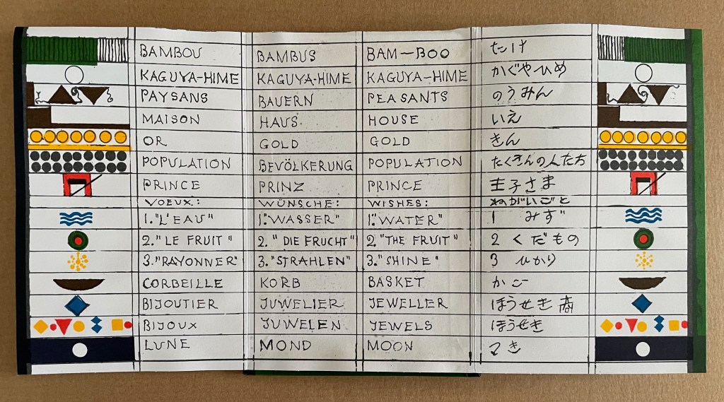
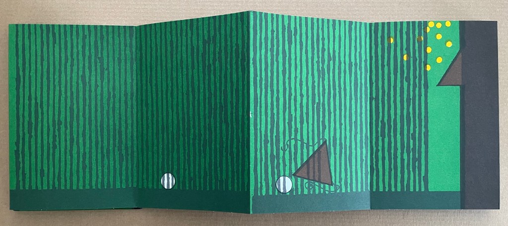
With 14 emblems and with three princes whose emblems are distinguished by subtle variations, Kaguyahime seems bound to be more visually challenging than Ourasima or Tanabata.
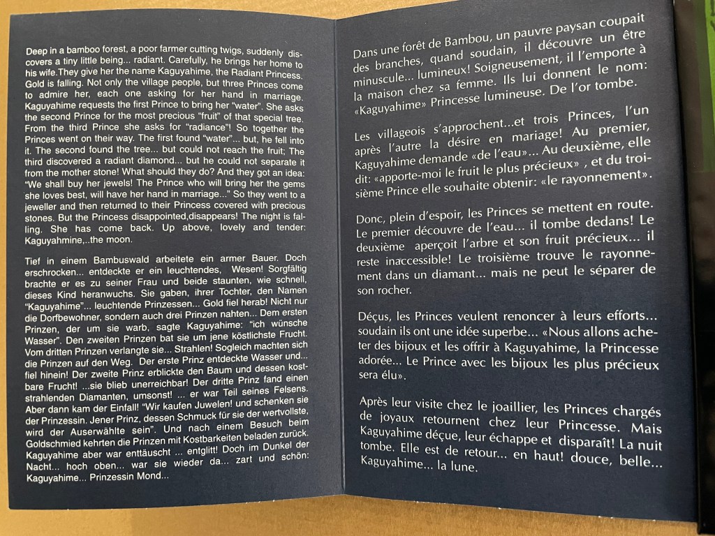
Kaguyahime in the bamboo forest. The poor farmer discovers her and takes her home, where already gold is beginning to fall.
Having failed in their quests, the three princes, watched by her guardians and the gathered population, crowd around her to offer jewels and gold instead. But Kaguyahime storms away, scattering the jewels and gold, the princes and their baskets, and her guardians and the population in her wake.
On the other side of the leporello, Kaguyahime, the moon princess, watched by the princes and her guardians, rises through the bamboo forest into night sky where she waxes and wanes ever after.
Like Snow White and Sleeping Beauty embedded for centuries in Western culture, the tale of the moon princesss exerts a similar pull on Japanese culture. The princess and her story have appeared in many media including manga and anime. In 2023, the choreographer Jo Kanamori and the Tokyo Ballet produced Kaguyahime set to the music of Claude Debussy. A hybrid plant (E.acuminatum x E.dolichostemon) has even been named after the tale.
Lavater’s emblems in the Oriental tales do slightly differ from those in the Occidental tales, although the color palette does not vary. Her handling of Ourasima, Tanabata, and Kaguyahime does not seem as sure as that of Snow White and Sleeping Beauty nor of The Disobedient. Nevertheless, Lavater’s engagement across cultures speaks to one of the most recurrent influences on book artists: that of folk tales, fairy tales, and myths.
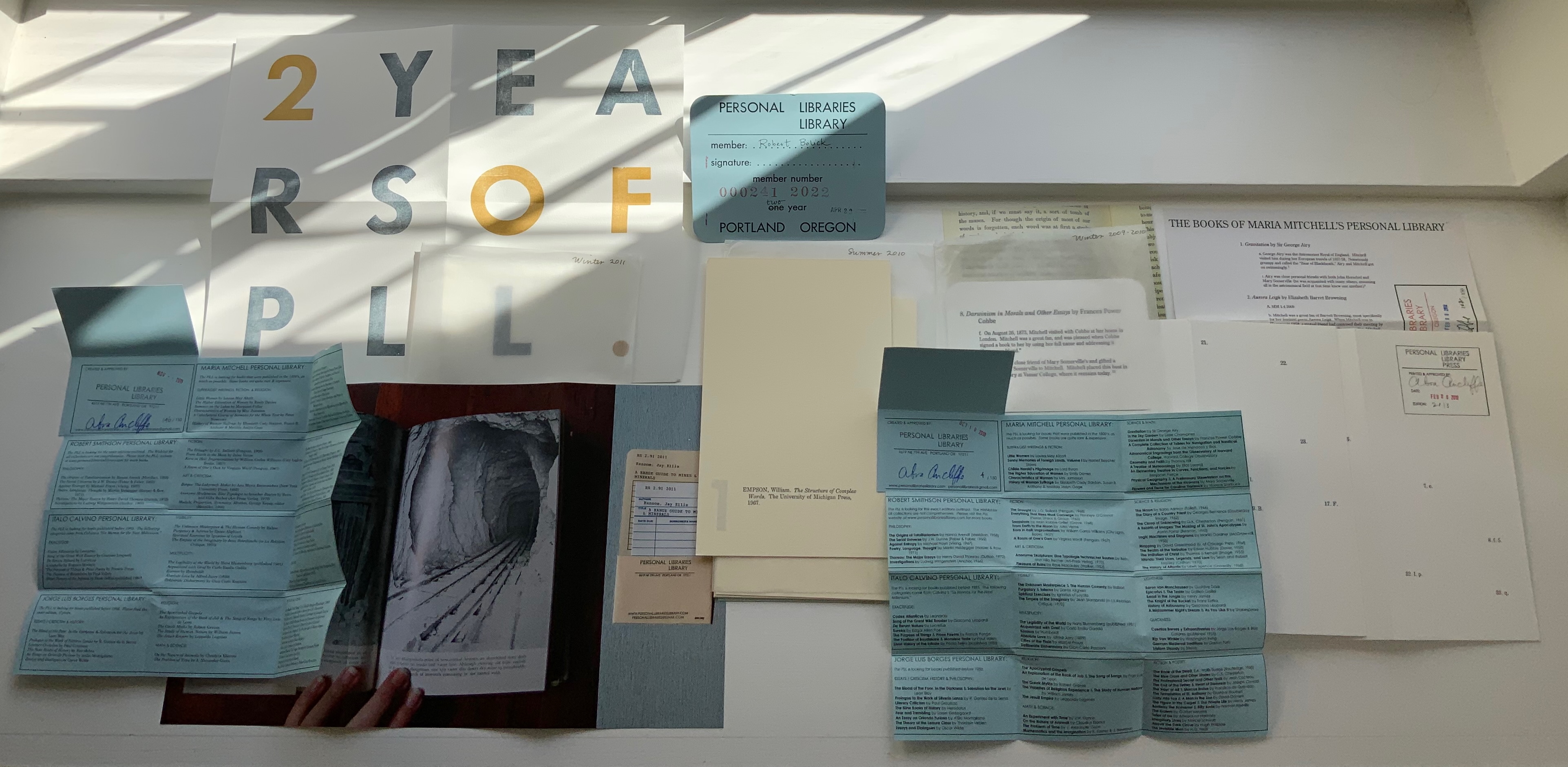
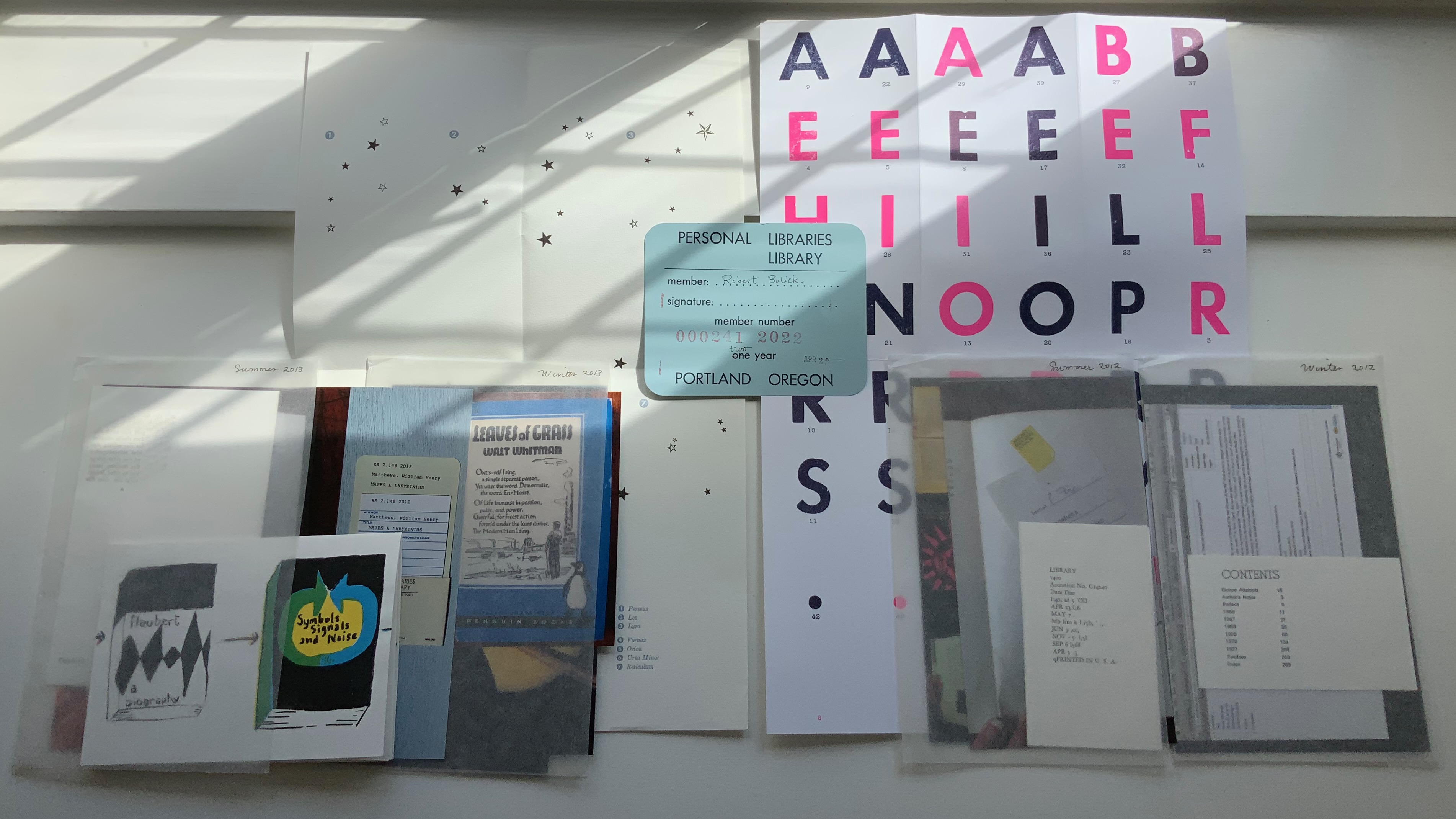
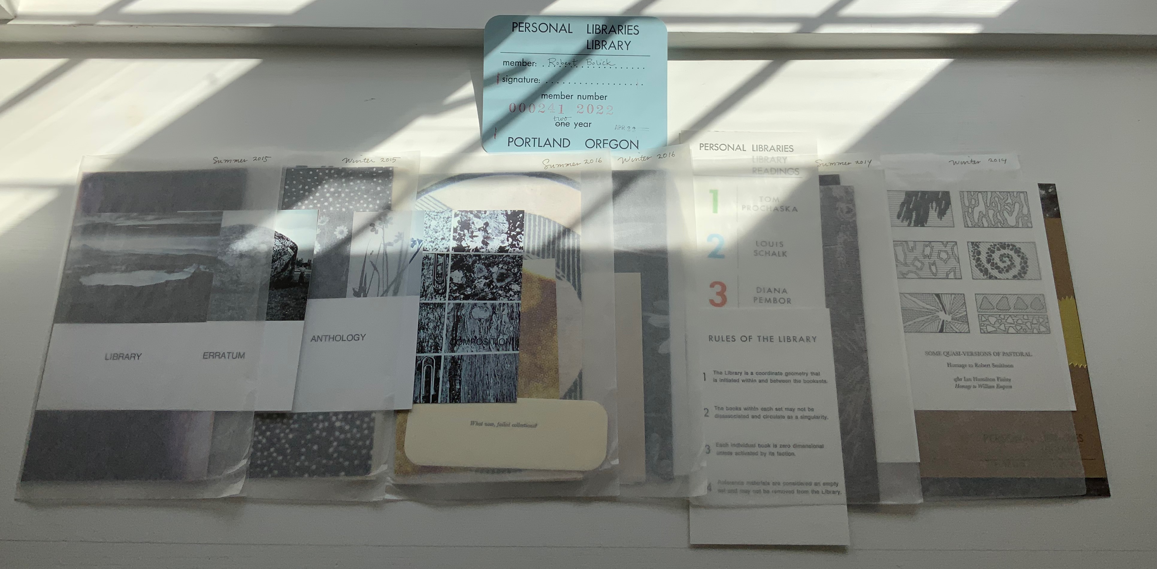
Personal Libraries Library (Winter 2009-10 to Spring/Summer 2021)
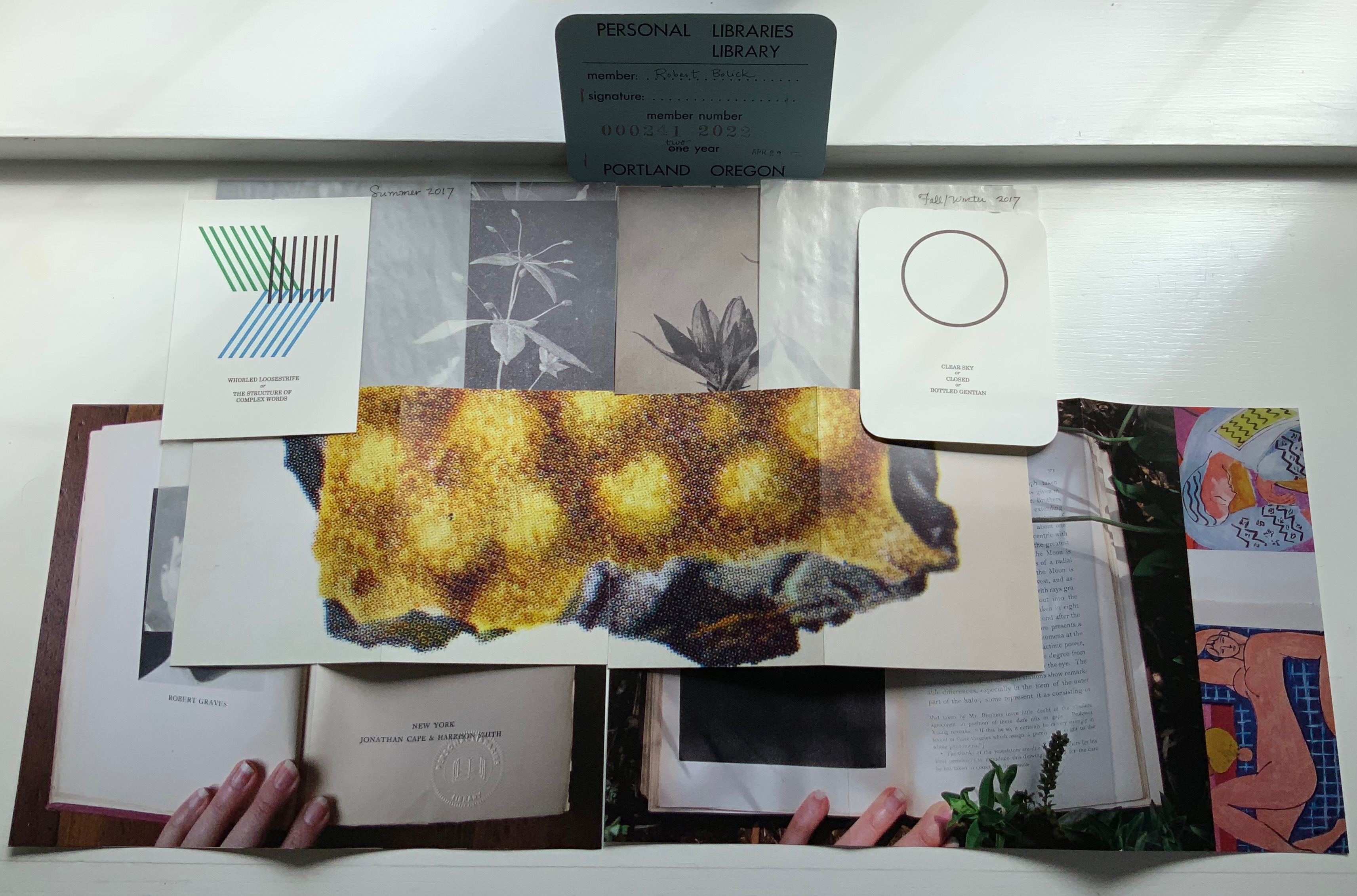
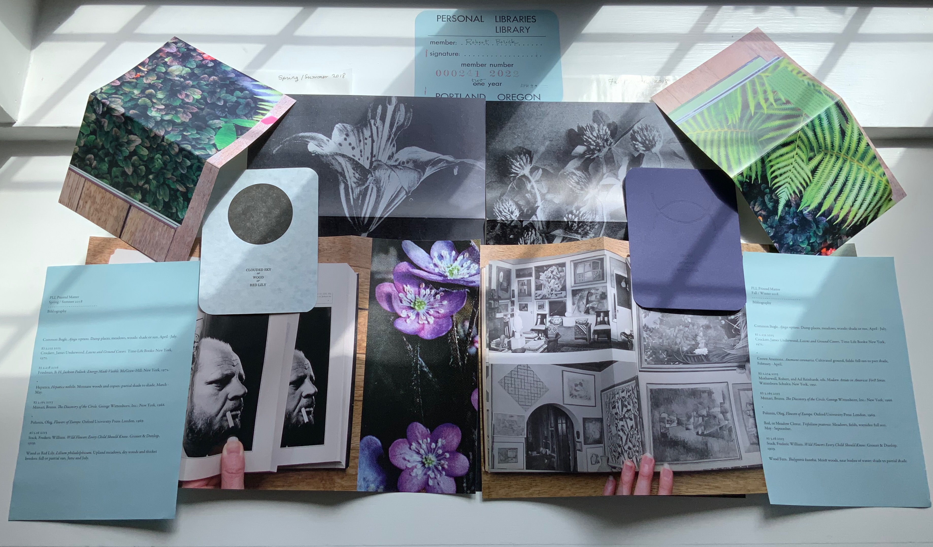
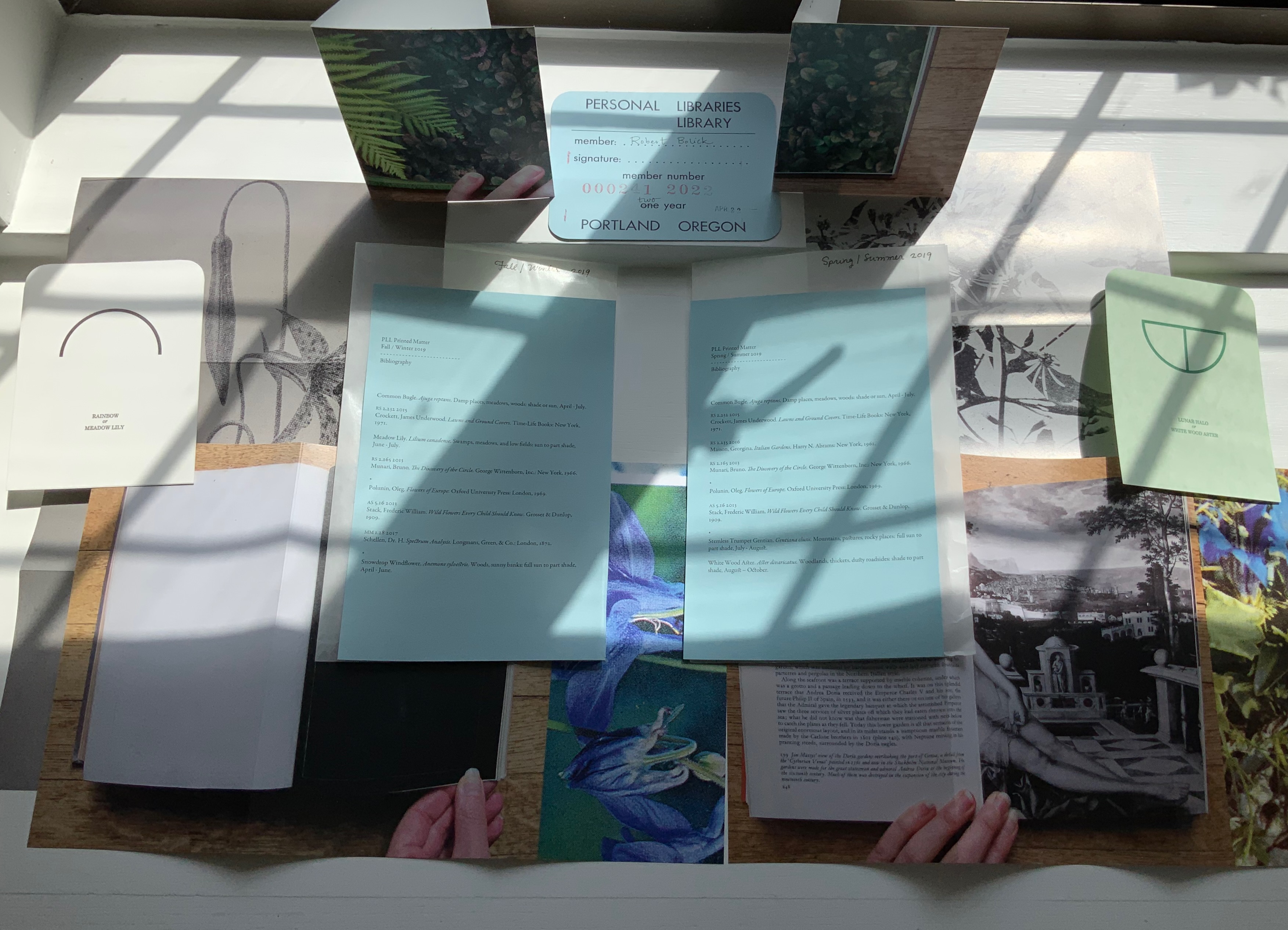
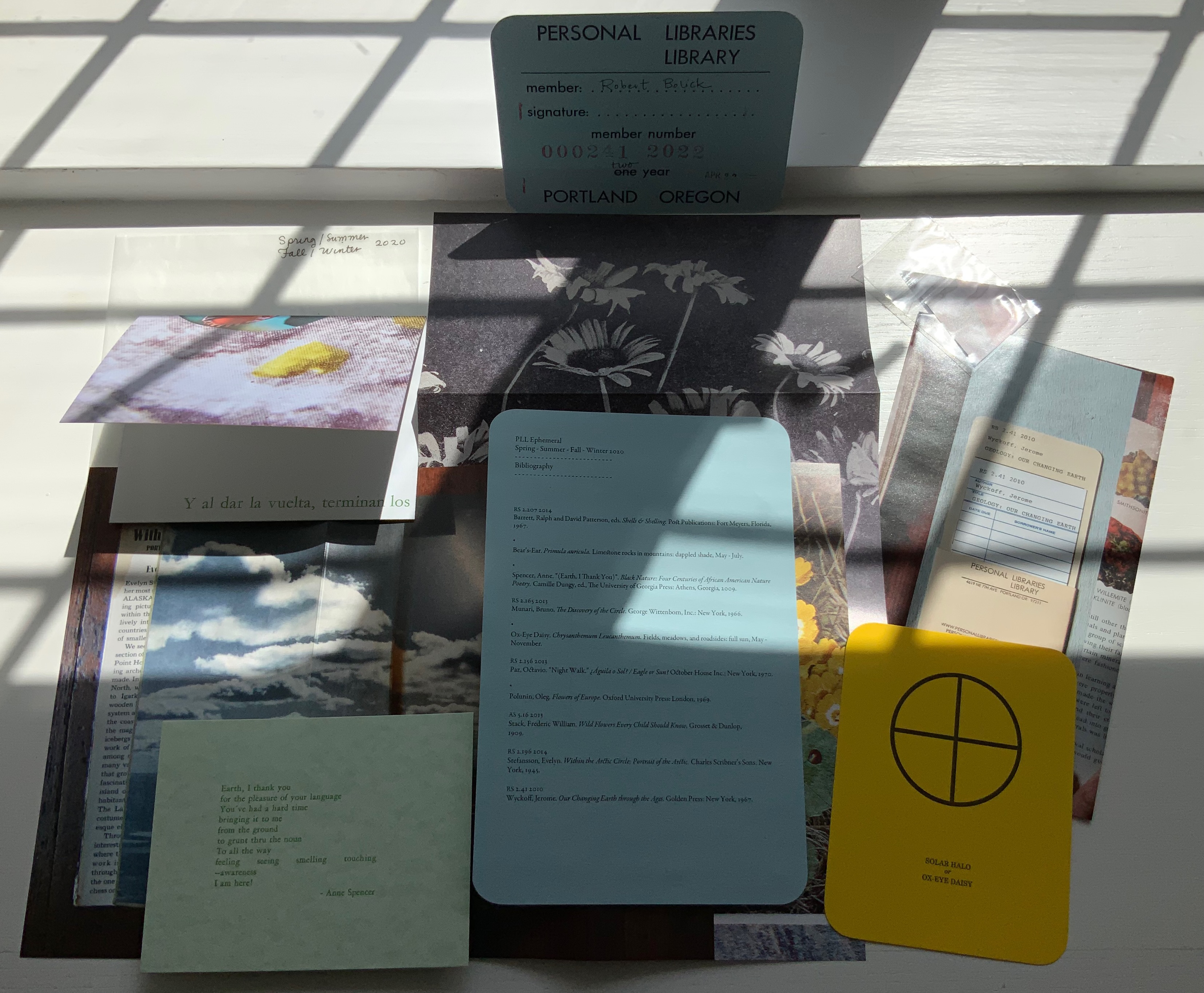
Imagine belonging to a library composed of selected personal libraries and housed on another continent. Imagine that the Librarian who selects those personal libraries and hunts down copies of the works (preferably the same editions) needed to recreate those libraries completely is also constantly harvesting them for cross-references and delivers the discoveries to you in the form of ephemera. It exists. I have a library card for it.
Since 2009, Abra Ancliffe has been replicating and making art from the personal libraries of
Maria Mitchell (1818-1889), Massachusetts astronomer, educator, suffragist and librarian Robert Smithson (1938-1973), New Jersey-born land artist, sculptor and art theorist Jorge Luis Borges (1899-1986), Argentinian writer of fiction, poetry and essays Italo Calvino (1923-1985), Cuban-Italian writer of fiction, poetry and essays Anne B. Spencer (1882-1975), Virginia-based member of the Harlem Renaissance circle, poet, civil rights activist, teacher and librarian [added in early 2014]
Each personal library has a catalogue derived from our Librarian’s research and consultation with foundations associated with each of the owners. Each library has its wish list of works needed to complete the holdings; and a Reference Library Catalogue for background on each of the owners has been added. But why these particular personal libraries? Was there a rule?
The library itself has rules (courtesy of our Librarian’s fellow artist Larissa Hammond):
1 The Library is a coordinate geometry that is initiated within and between the booksets. 2 The books within each set may not be disassociated and circulate as a singularity. 3 Each individual book is zero dimensional unless activated by its faction. 4 Reference materials are considered an empty set and may not be removed from the Library.
Given such rules, it is no surprise that our Librarian has included Borges. The fabulist of “The Library of Babel” once held the job of first assistant in a Buenos Aires municipal library and reportedly remarked “if I were asked to name the chief event in my life, I should say my father’s library” and “I always imagined Paradise to be some kind of a library”. Also, given such rules and the inclusion of Borges, could the Cuban-Italian Italo Calvino, a member of the Oulipo movement, be far behind?
Maria Mitchell’s personal library was the seed or germinating star of the PLL in the winter of 2009-2010 (see the item in the upper right corner of the photo above). Flowers and constellations are two elements in the coordinate geometry that our Librarian finds “within and between the booksets”.
Another link between the libraries are the books common to more than one library. For instance, Ralph Waldo Emerson’s Essays appears in Maria Mitchell’s and Robert Smithson’s libraries. Perhaps there is a sort of transcendentalism driving the library! How appropriate that the first book from Mitchell’s library acquired and the first in the PLL was Ralph Waldo Emerson’s Essays.
By virtue of these collage-like connections that our Librarian draws in the periodic issues of ephemera, a book published at a later date may seem to belong equally to an earlier owner. Perhaps, as in the collages into which the ephemera can fall, “one book may hide another” to paraphrase Kenneth Koch. The issues of ephemera arrive like challenges to Robert Smithson’s notion of site and non-site works of art. They are works that depend and do not depend on their site. They arrive so similar and so different, regular enough but sporadic enough, that they are like “Miss Mitchell’s comet” — non-periodic (until it appears again).
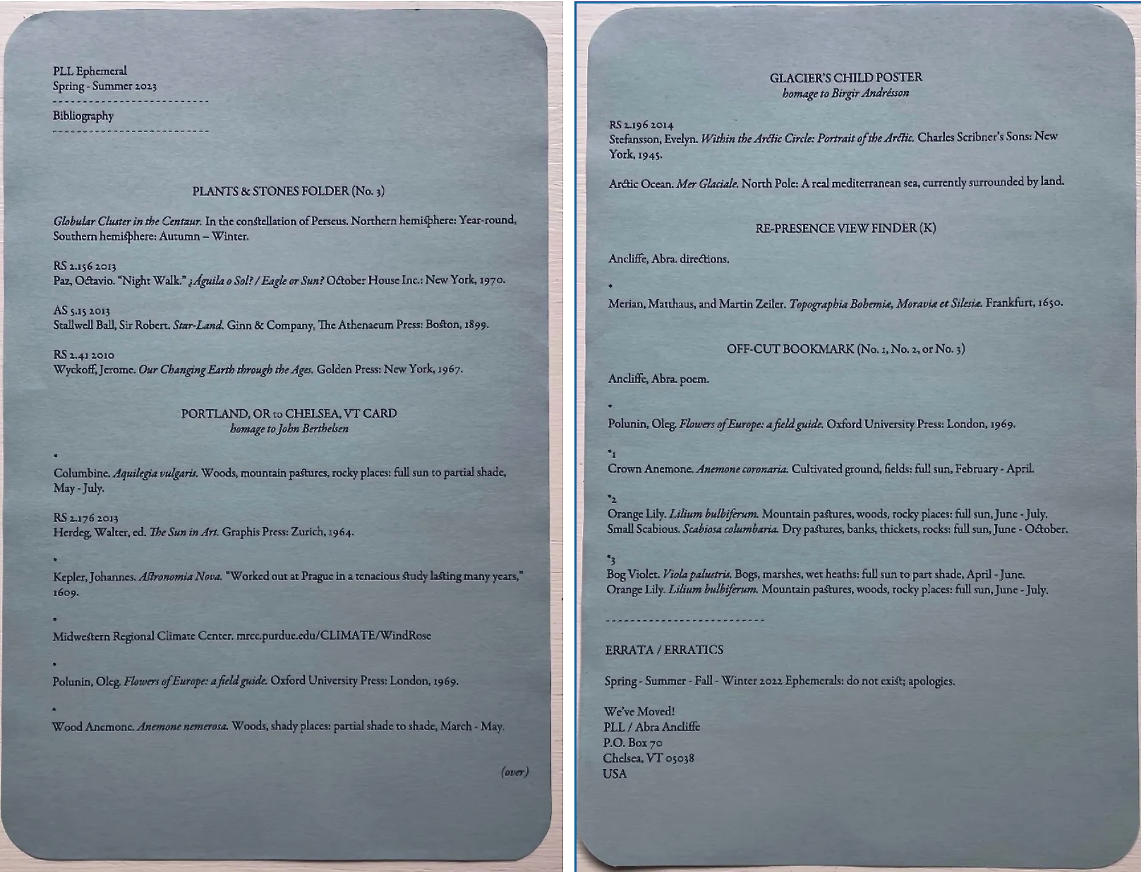
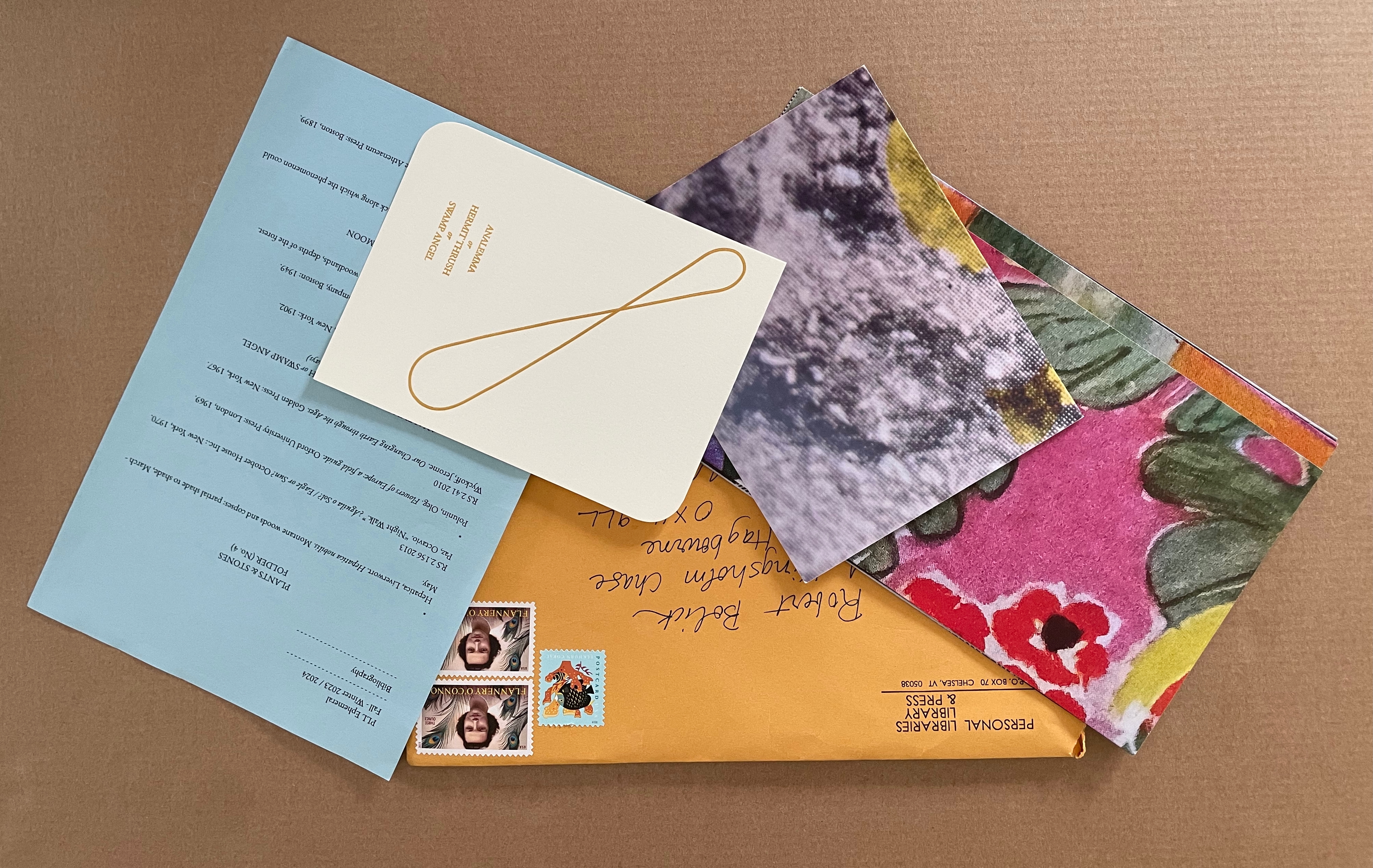
PLL Ephemeral Issues. Top down and left to right: 1) PLL 2011 Winter, PLL 2010 Summer, PLL 2009-10 Winter. 2) PLL 2013 Summer/Winter, PLL 2012 Summer/Winter. 3) PLL 2016 to 2014. 4) PLL 2017 Summer/Winter. 5) PLL 2018 Spring/Summer, Fall/Winter. 6) PLL 2019 Spring/Summer, Fall/Winter. 7) PLL 2020 Spring/Summer, Fall/Winter. 8) PLL 2021 Spring – Summer. 9) PLL 2023 Spring-Summer 10) PLL 2023-2024 Fall Winter.
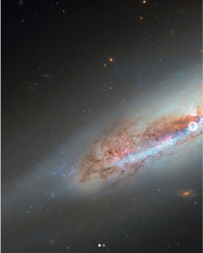
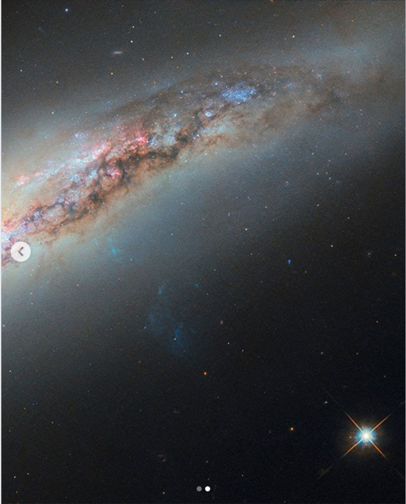
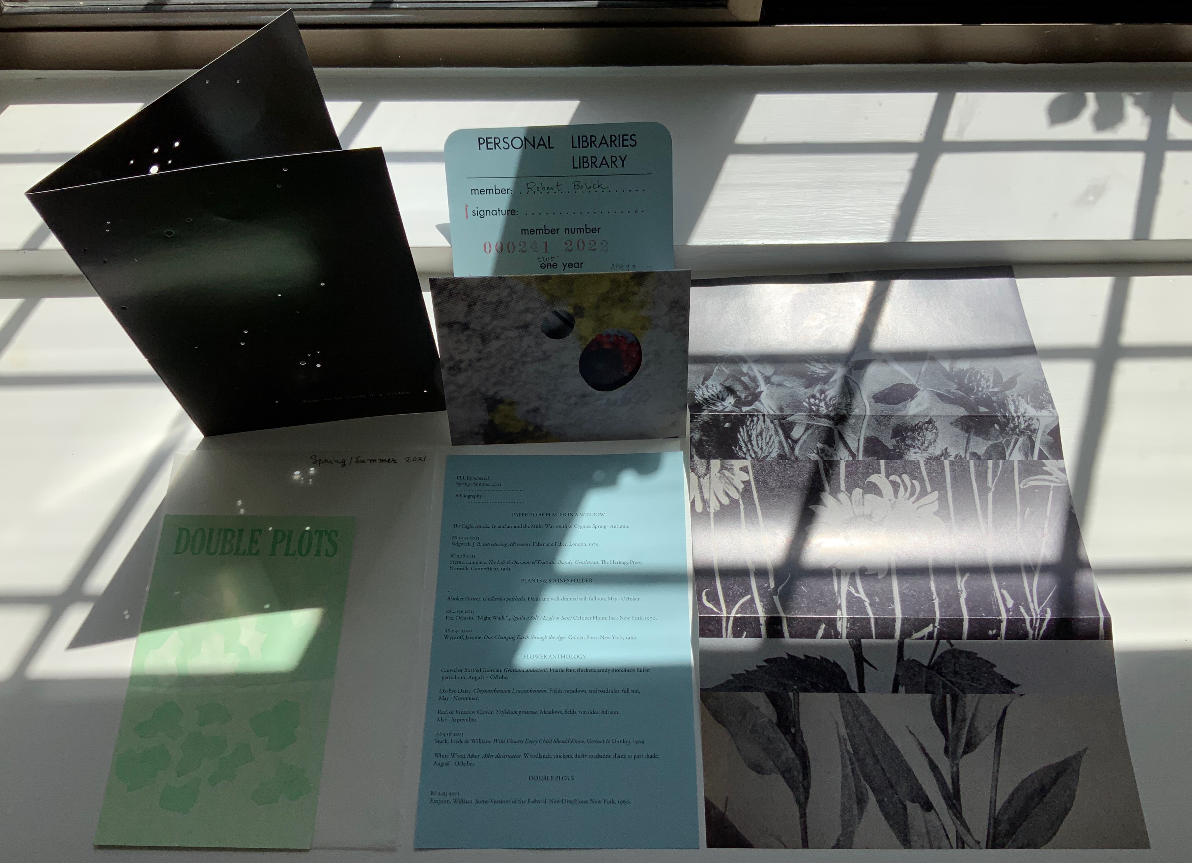
The ephemera themselves represent “collaborations” among the personal libraries — courtesy of our Librarian’s reading of the Library’s “coordinate geometry”, of course. For the Spring/Summer 2021 issue, the first piece of ephemera listed on the blue manifest (its Bibliography) is “Paper to be Placed in a Window” (see the upper left-hand corner of the photo immediately above). Glossy black on both sides, the single folded sheet displays an astronomical photo with holes of different size punched to let light light up the constellation.
According to the manifest or Bibliography, the work connects the constellation Aguila (Eagle) “in and around the Milky Way south of Cygnus” with J.B. Sedgwick’s Introducing Astronomy from Smithson’s library and with Laurence Sterne’s The Life & Opinions of Tristram Shandy, Gentleman from Calvino’s. The connection with Sedgwick is obvious. The connection with Sterne’s novel may be obvious to readers familiar with its “black page”, or will be to readers here who proceed to the entry for the next of Abra Ancliffe’s works in the Books On Books Collection.
It is no surprise that Ancliffe’s work of book-art-cum-academic-treatise is part of the Laurence Sterne Trust Foundation’s permanent collection. Like Shandy Hall’s own The Black Page Catalogue (2010), The Secret Astronomy extrapolates and celebrates page 73 with the same whimsy and seriousness that the 73 writers and artists invited to make their own Black Page exercised. In its own self-publishing status, it also underscores like Simon Morris’s manifesto Do or DIY (2012) the same status of Sterne’s work as a forerunner to the self-published, self-referential works of book art of the mid- to late 20th century. It is Ancliffe’s elevation of the self-reflexive academic treatise to art status that secures The Secret Astronomy its position in the Books On Books Collection.
The rectangle of black appearing on page 173 in the first edition of Sterne’s novel faces the brief announcement of Parson Yorick’s death on page 172: “Alas, poor Yorick”. Taking off on the concept of academe’s variorum edition, Ancliffe has reproducedthe black pages from more than one hundrededitions of Sterne’s novel. What is a singularity in the novel becomes a contemplation of a regularity that reveals a material irregularity since the 1759 edition. Densities of ink have varied, oxidation occurred, spots from lint and fingerprints accumulated — even show-throughs from the next chapter’s text — so that the eye begins to read the accumulated pages for astronomical images — Tristram’s and Sterne’s secret astronomy. (The temptation to Grangerize this work by slipping into it Ancliffe’s ephemera “Paper to be Placed in a Window” is strong.) Ancliffe urges forward her case for the discovery of a secret astronomy with a series of appendices, one of which draws attention to Sterne’s use of the asterisk in the novel and proposes one of its hidden kabbalistic meanings in an equation: if star = *, and Sterne = star, then Sterne = *. There is even the dutiful source appendix listing all of the editions from which black pages have been gathered.
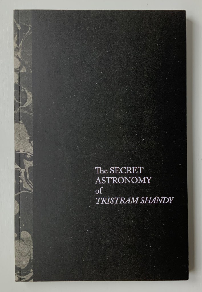
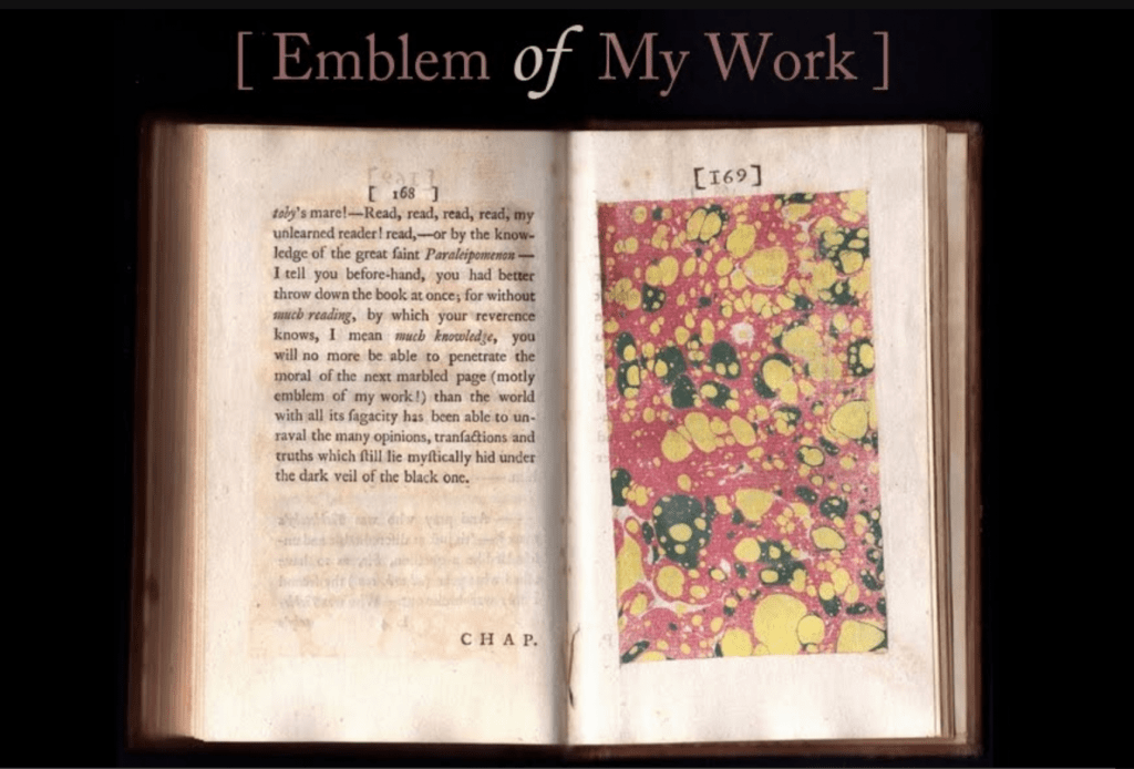
Pages 169-70 of the first edition of Tristram Shandy account for another famous singular, regular irregularity — the marbled page, which Tristram calls “the motly emblem of my work”. Ancliffe’s black, brown and gray marbled spine and inside covers make for an apt, ironic and artistic stroke — a reminder of the element of chance that is so characteristic of Sterne’s narrative project, of The Secret Astronomy, and of the ephemera arising from the Personal Libraries Library.
From Shandy Hall’s Emblem of My Workblog, accessed 18 September 2019.
This entry continues with three other works by Ancliffe. To continue reading, click here.
“Shandy Hall“. 1 January 2021. Books On Books Collection.
“Jorge Luis Borges“, last edited on 8 May 2022. Wikipedia. Accessed 15 May 2022.
“Italo Calvino“, last edited 20 April 2022. Wikipedia. Accessed 15 May 2022.
“Maria Mitchell“, last edited 8 March 2022. Wikipedia. Accessed 15 May 2022.
“Robert Smithson“, last edited 14 May 2022. Wikipedia. Accessed 15 May 2022.
“Anne B. Spencer“, last edited 25 April 2022. Wikipedia. Accessed 15 May 2022.
Baldwin, Kate, Denise Bookwalter, Sarah Bryant, Macy Chadwick and Tricia Treacy. 2021.REF. Another work that finds its art in libraries.
Davis, Brian. 1 May 2024. “Part One: The Rise of Multimodal Book-Archives“. Book Art Theory. Starkville, MS: College Book Arts Association. Explores “archival poetics”, finding art by harvesting archives and libraries.
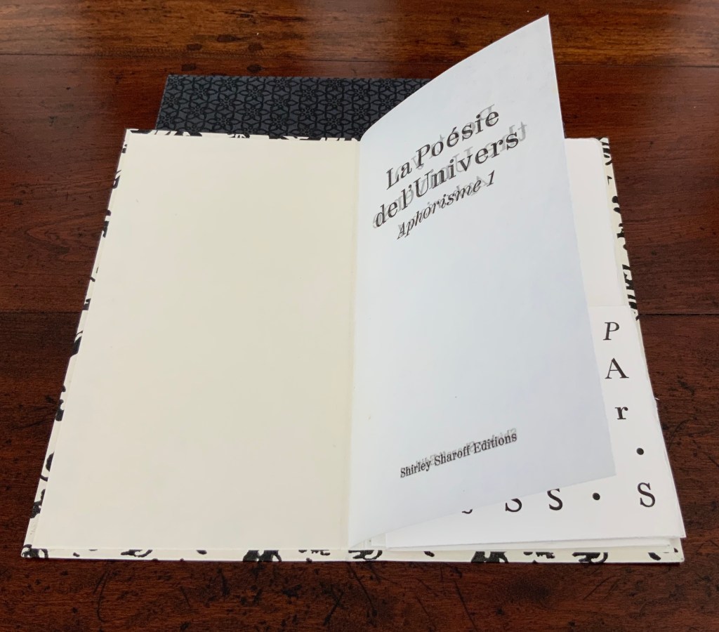
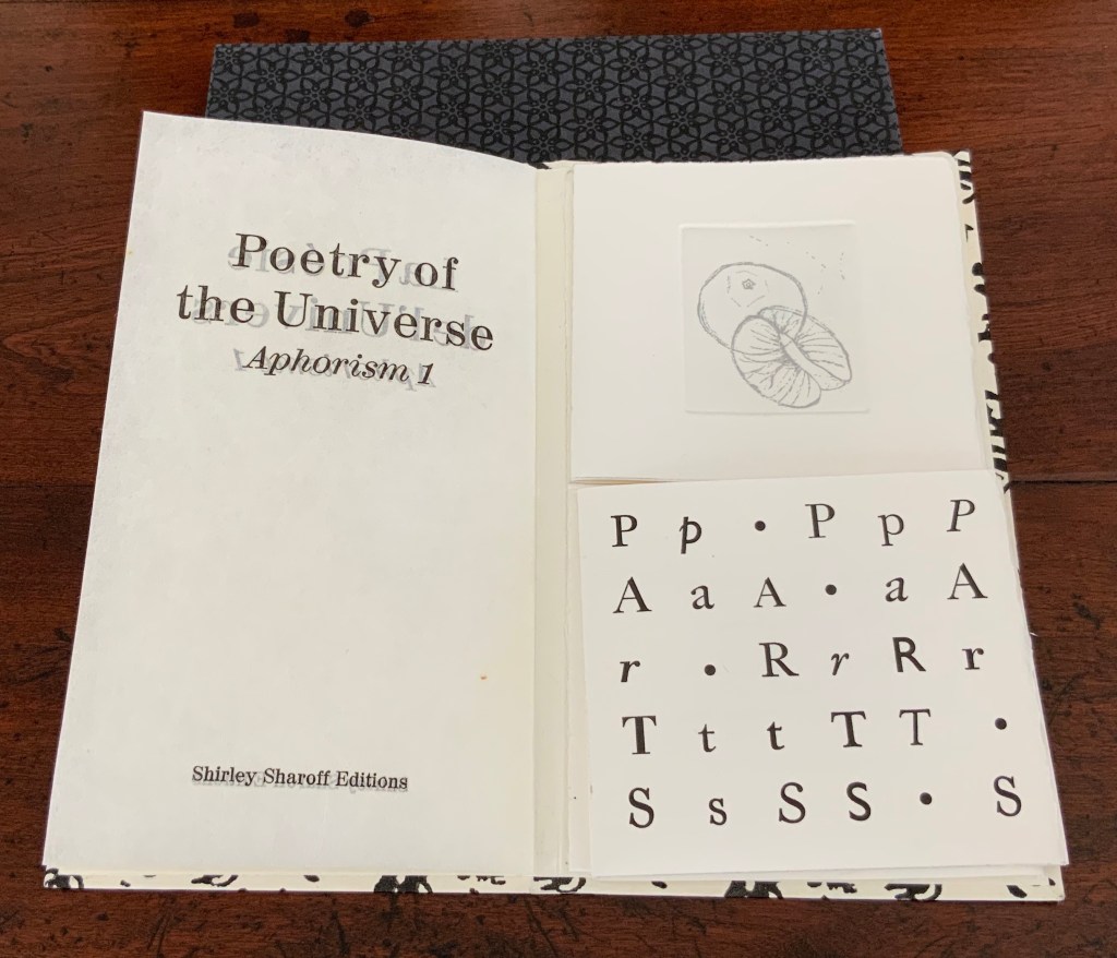
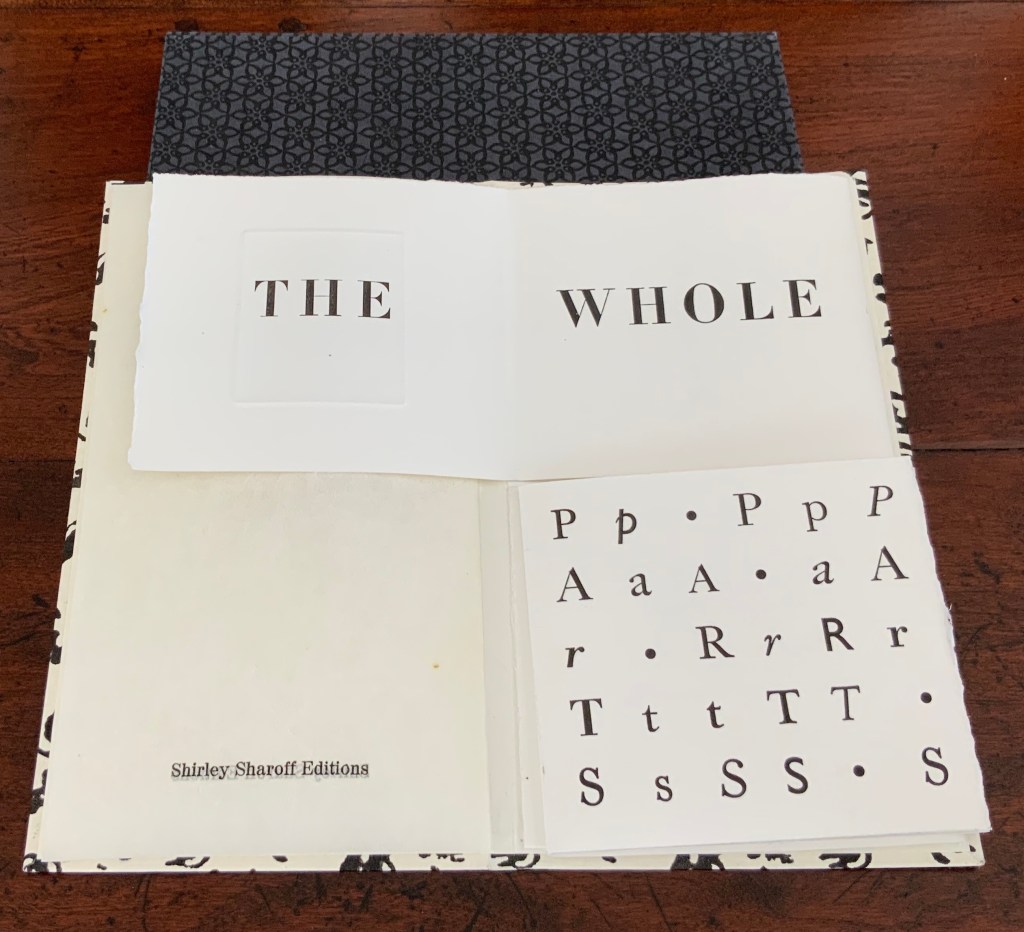
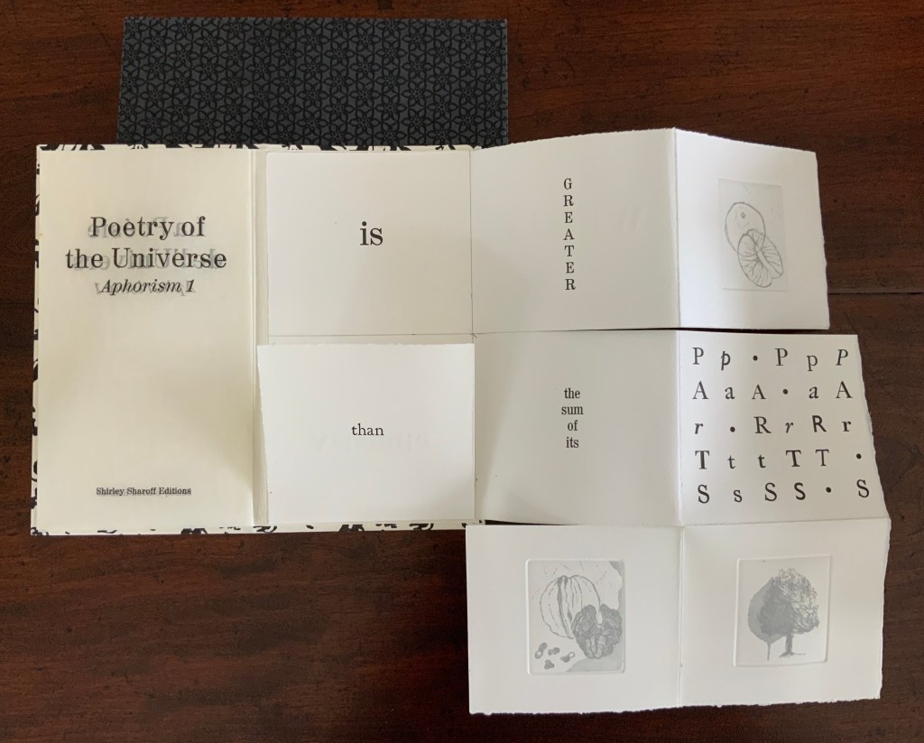
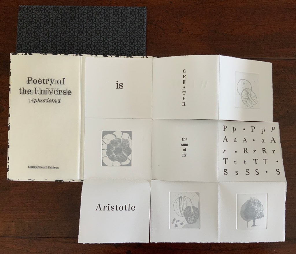
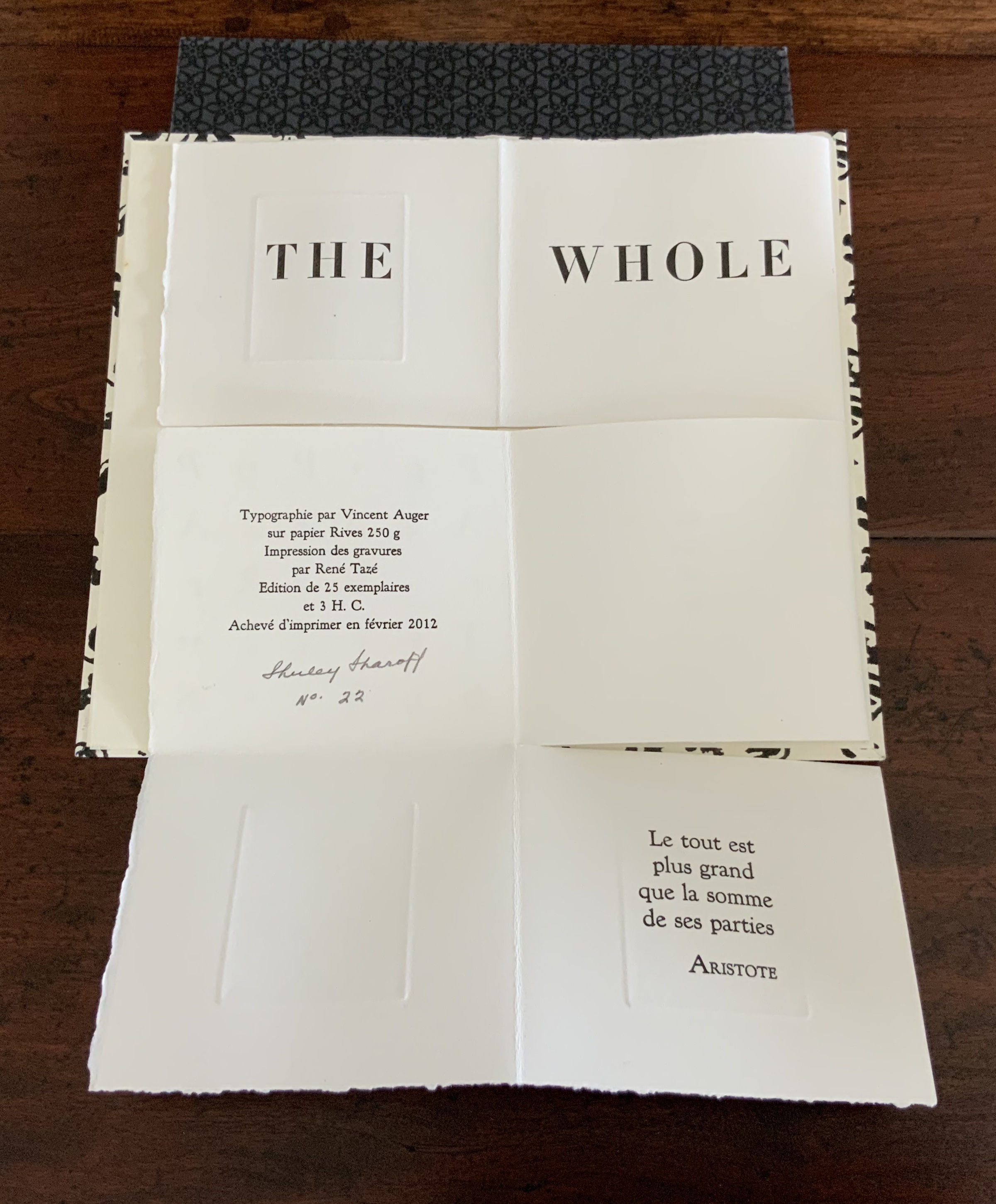
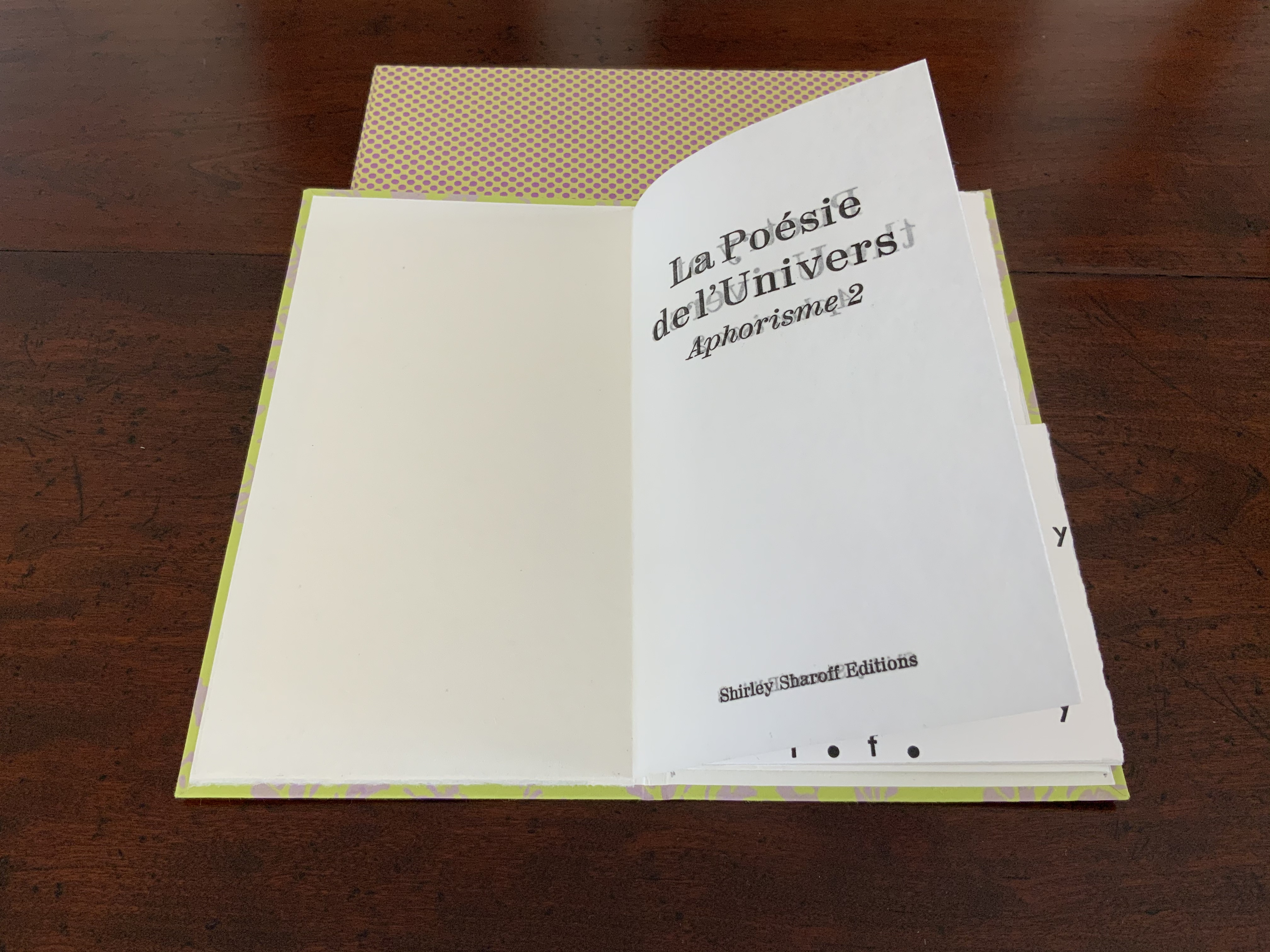
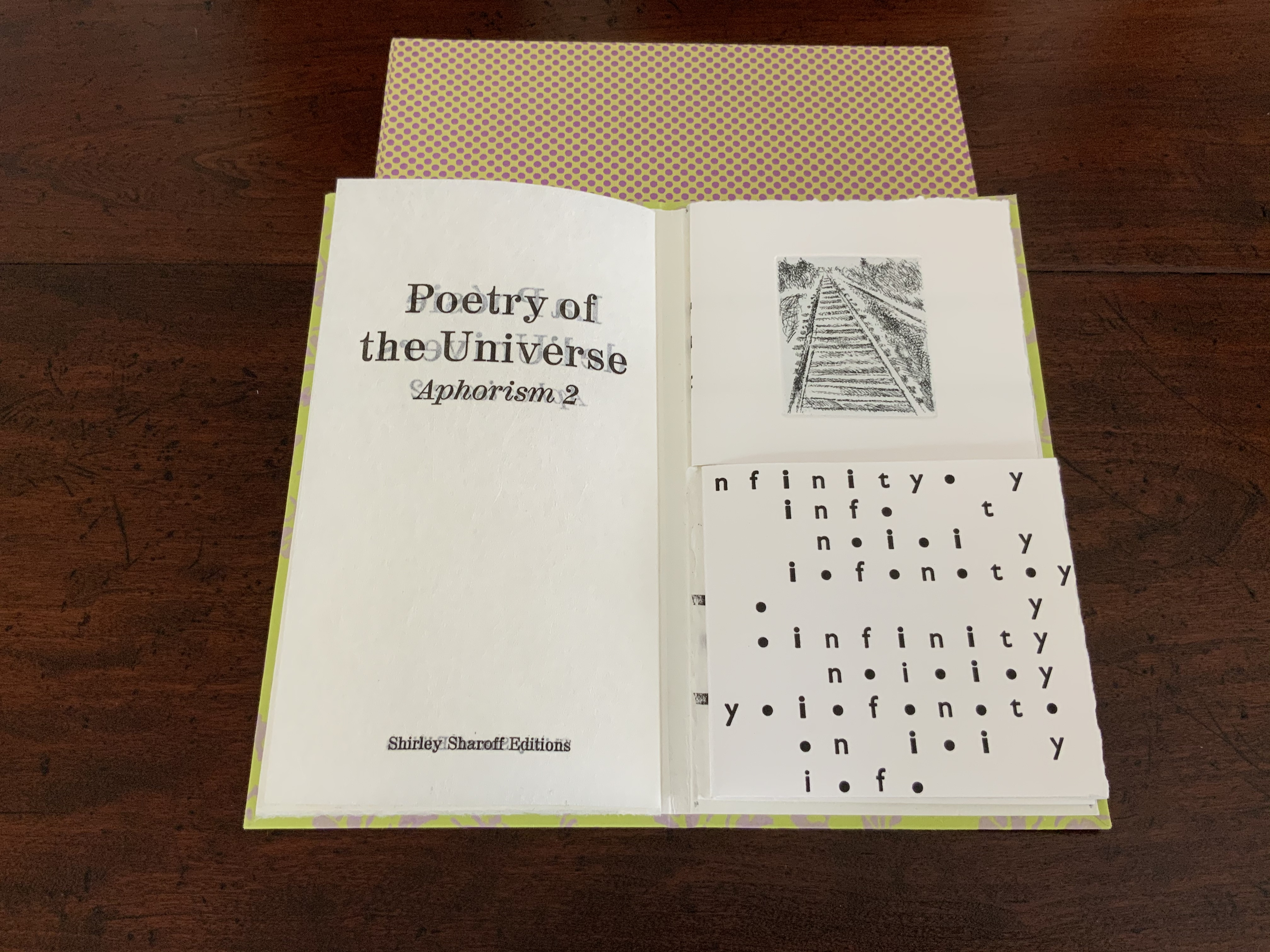
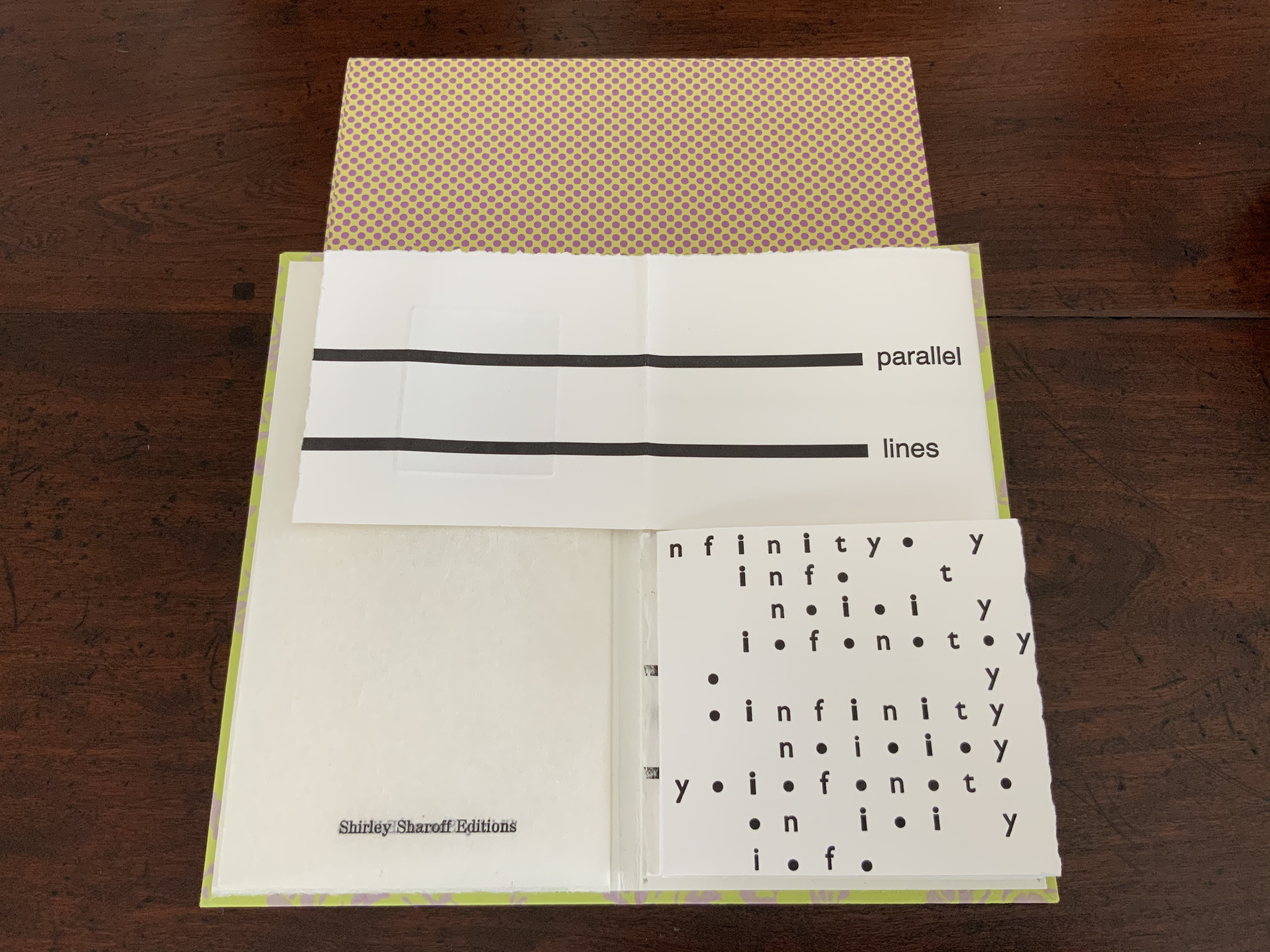
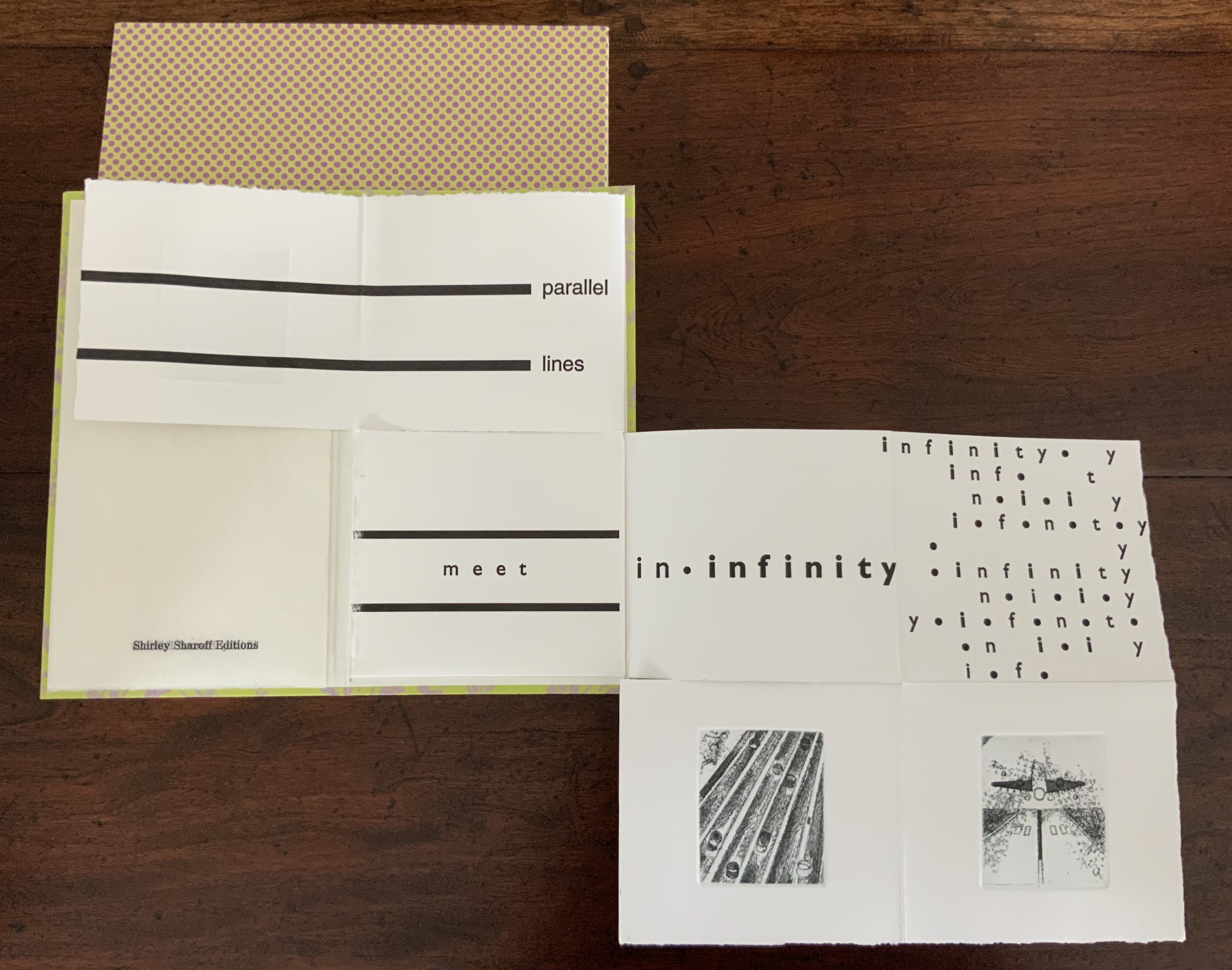
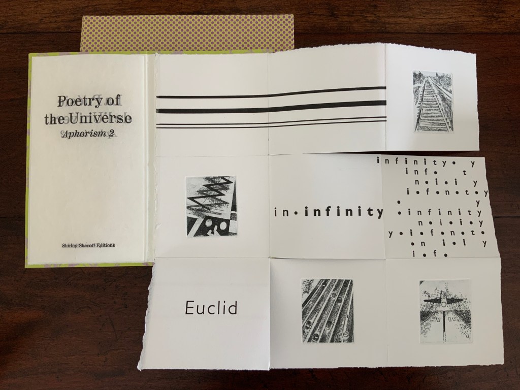
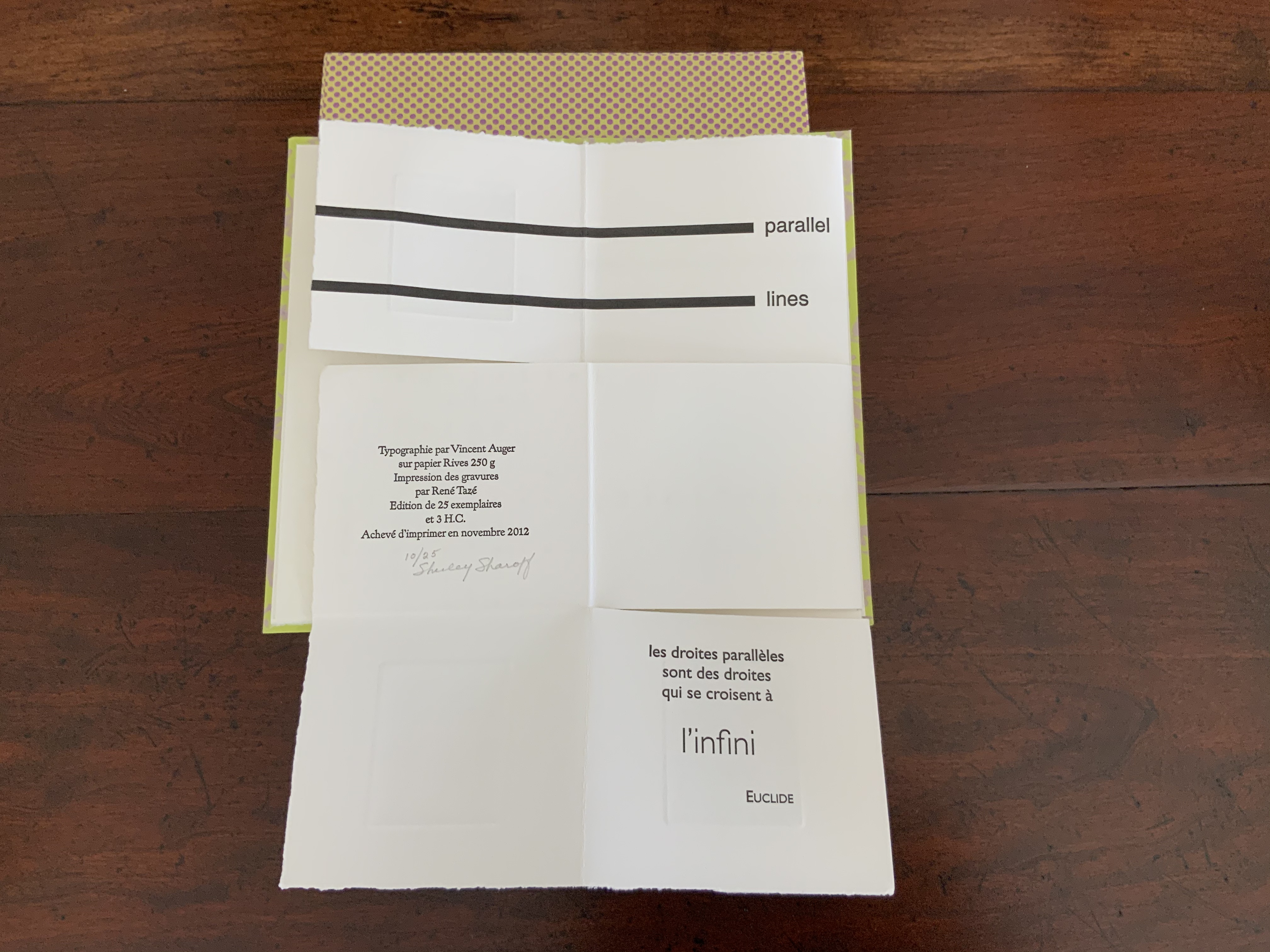
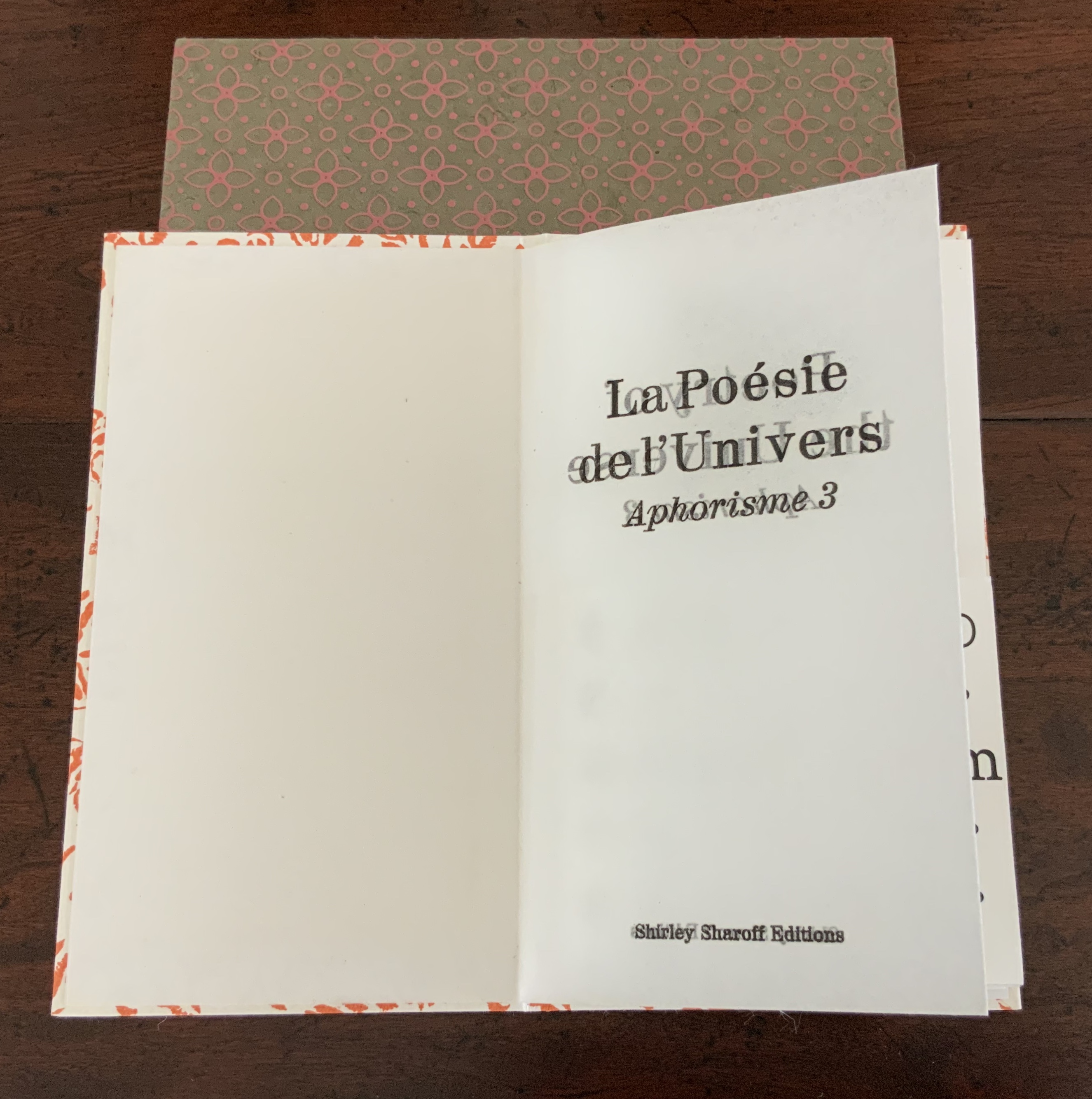
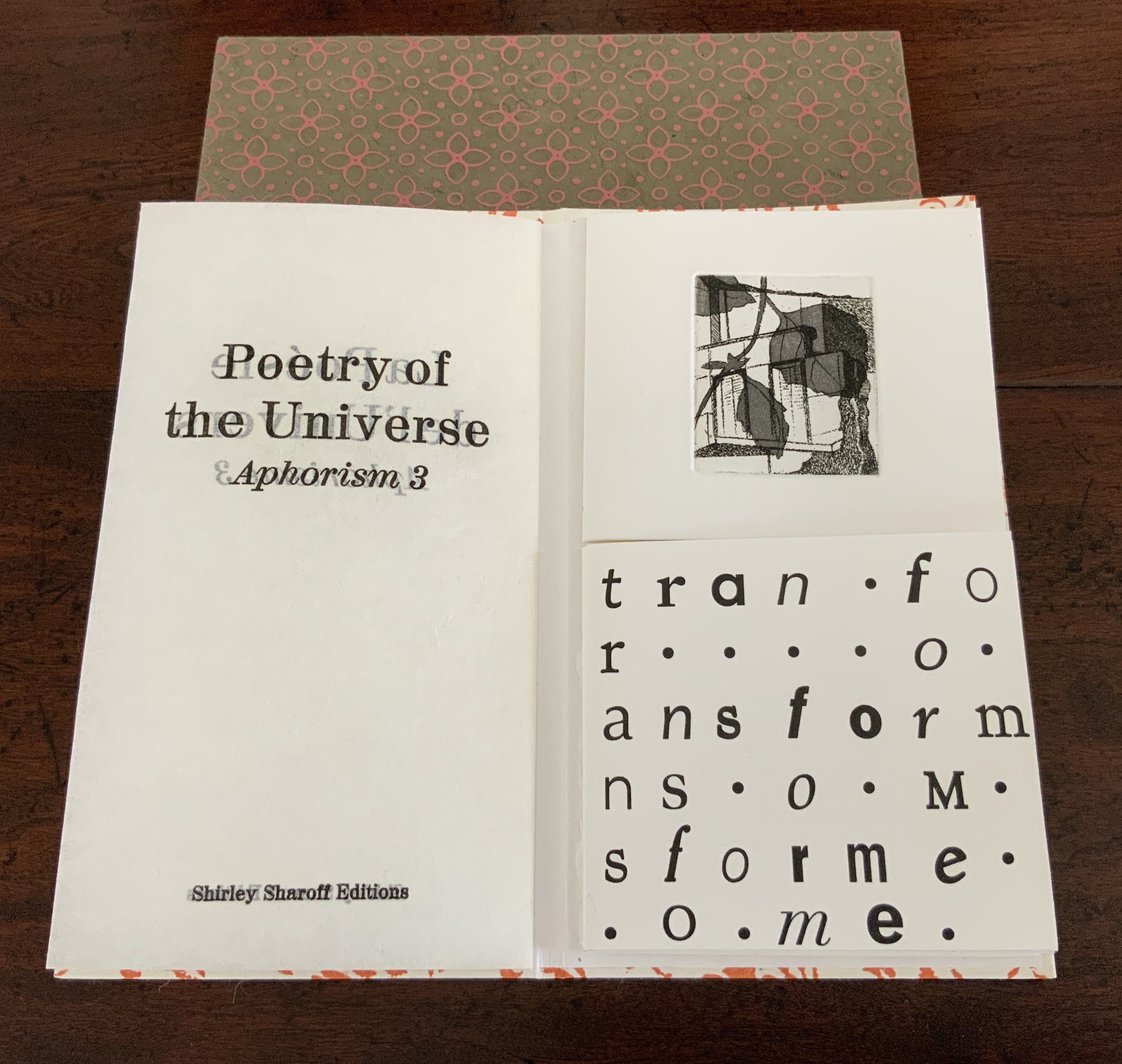
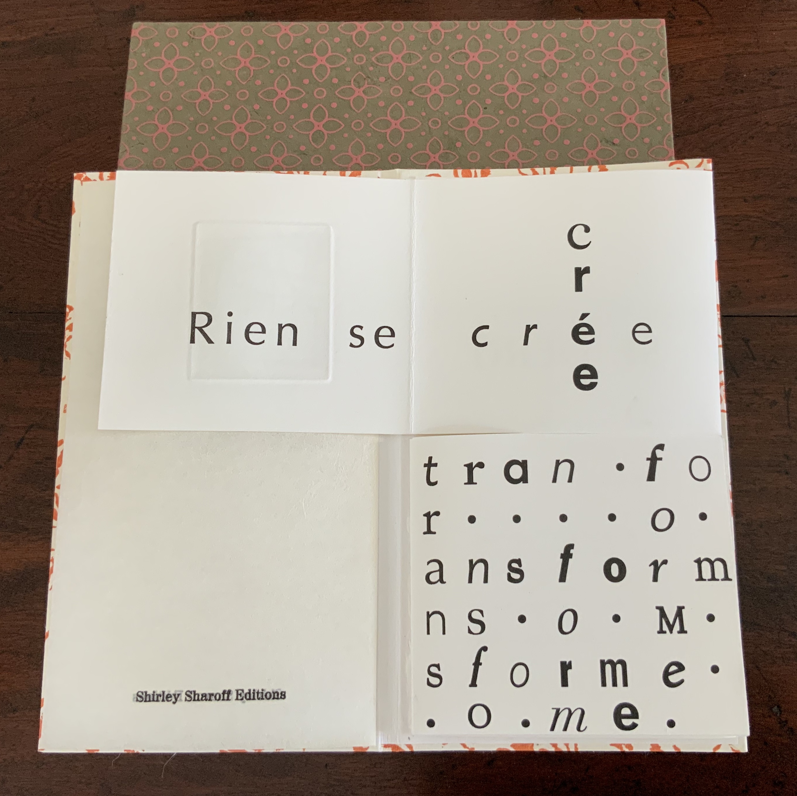
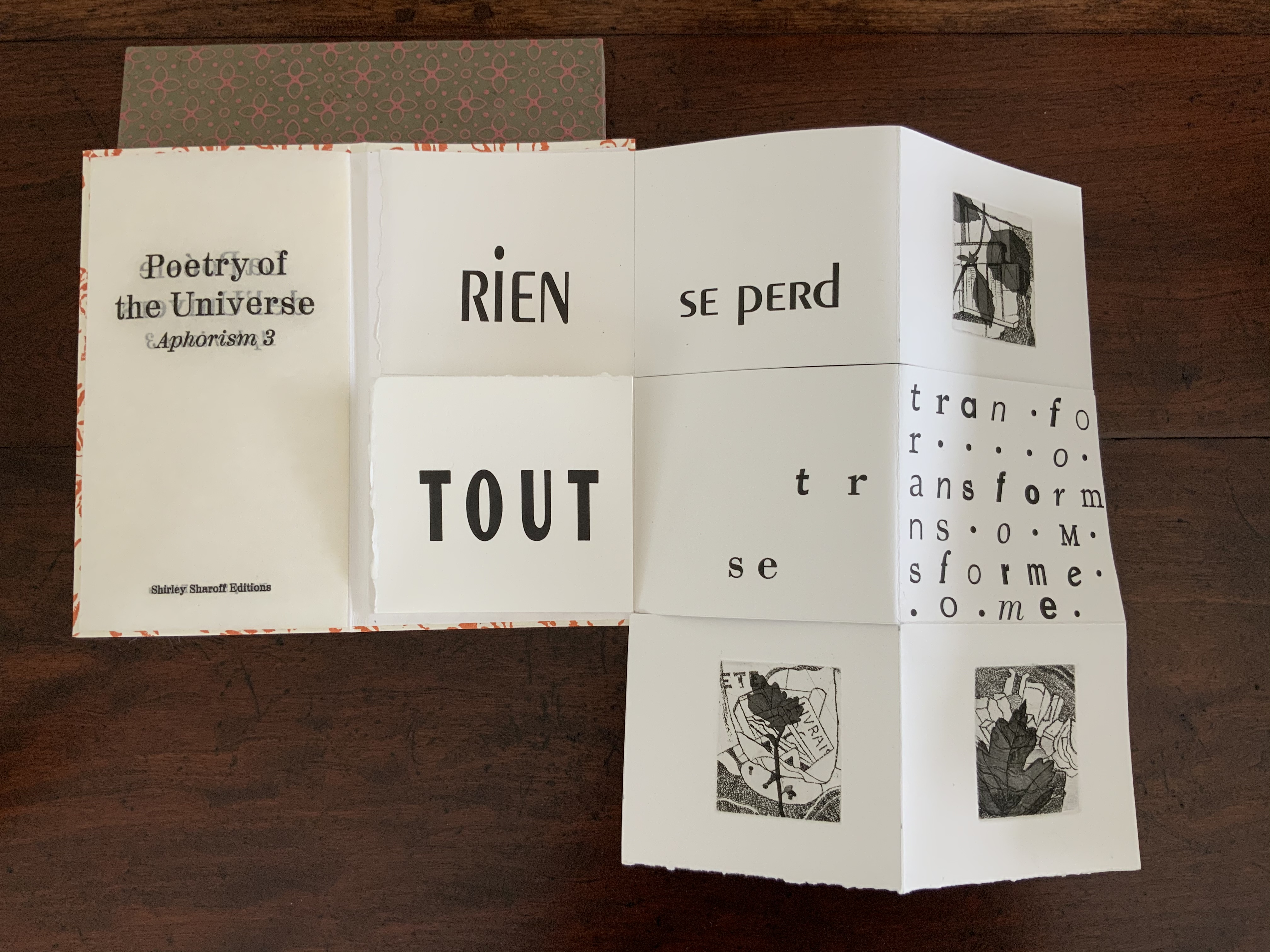
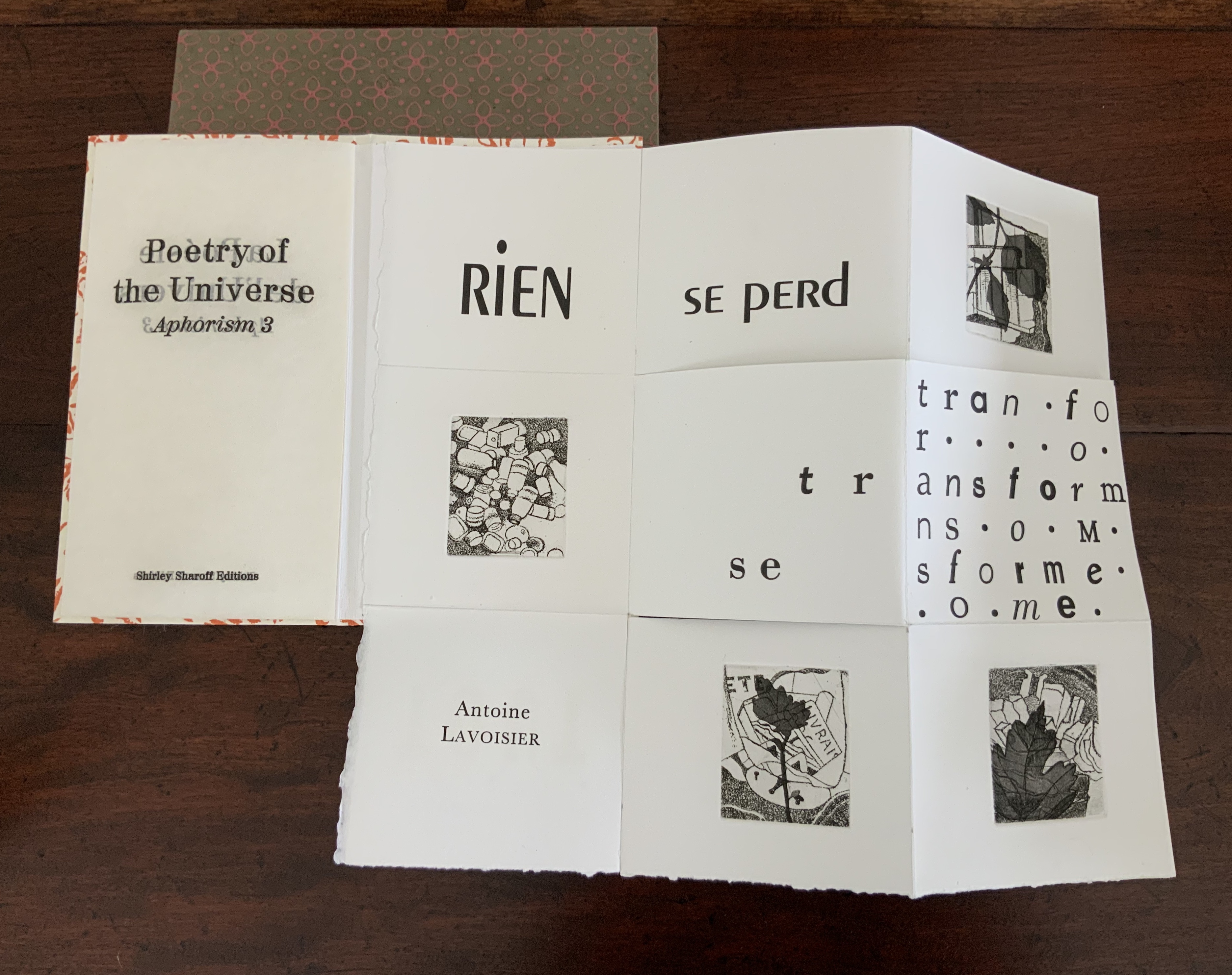
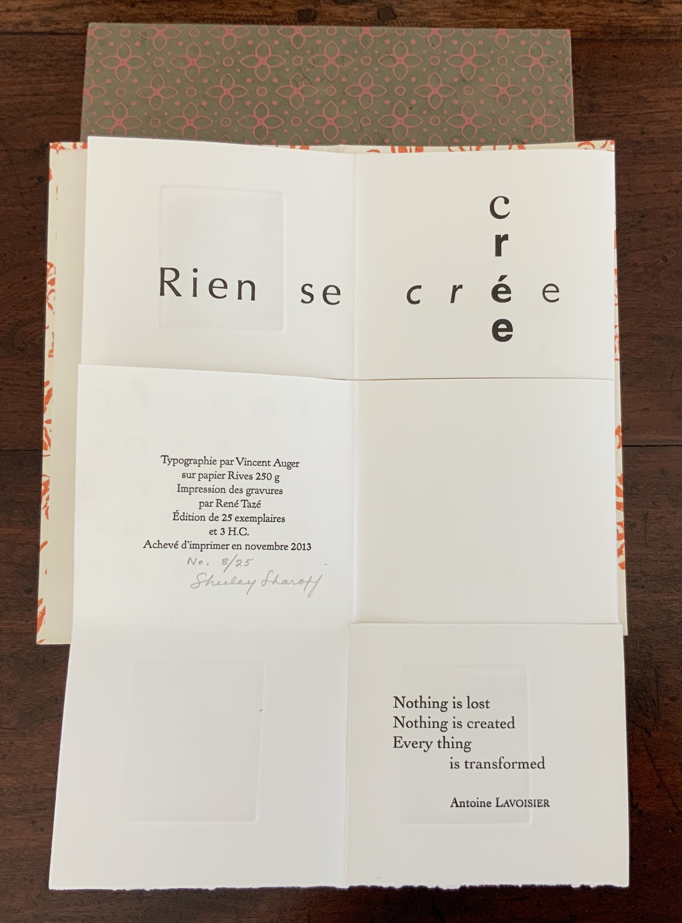
Three small volumes with aphorisms by Aristotle, Euclid, and Antoine Lavoisier (one per volume, respectively, in both English and French); each printed letterpress in various fonts and typographical arrangements along with four intaglio prints on one sheet of paper. The paper is cut along some of the folds so that folding and unfolding reveals different combinations of the text and images. Typography by Vincent Auger on Rives 250 GSM. Engravings printed by René Tazé. Edition of 25 and 3 casebound. H215 x W120 mm. Acquired from the artist, 5 February 2019. Photos: Books On Books Collection.
According to Shirley Sharoff (Books On Books interview, 5 February 2019), the fold and form of these three books were inspired by Katsumi Komagata’s work, and “Making each one was like a different game I was playing or puzzle I was solving”. Although the fold and form of each book is the same, the effect differs in each because of the placement of text and image. The result is three works of book art teasing the reader/viewer into playing with the artwork or solving the puzzle of reading/viewing it — and appreciating how the text from Aristotle, Euclid or Lavoisier fuses with the fold, form, typography and prints in each book.
The game or puzzle of finding the order of unfolding the books has several interlocking levels. On one level, there are origami “mountain” and “valley” folds, there are kirigami cuts, and vertical and horizontal openings. As these present themselves, the process of discovering or reading the text — what it is and how its syntactic order suggests the direction and order of unfolding — emerges as another level in the game. In parallel are the dual levels of deciphering the order (if any) of the intaglio prints’ appearance and relating the images to the text. And then there is the level of the relation of French to English and vice versa.
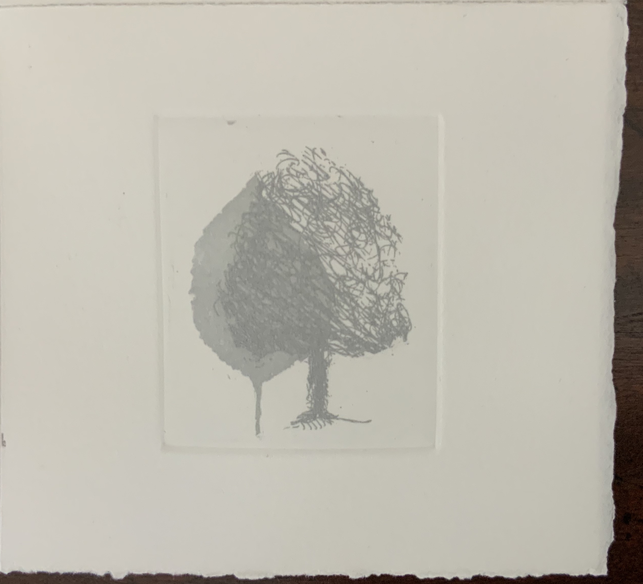
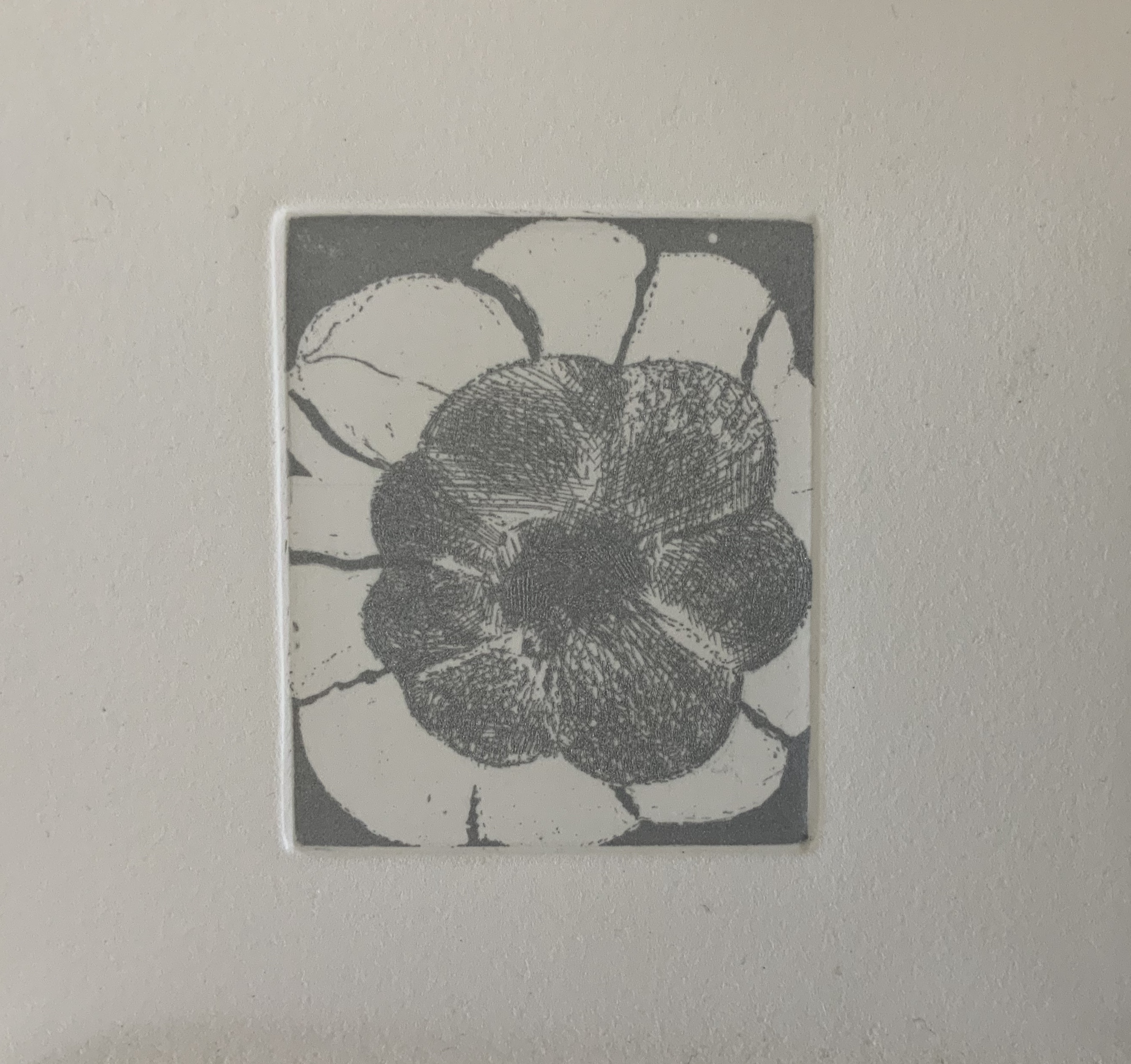
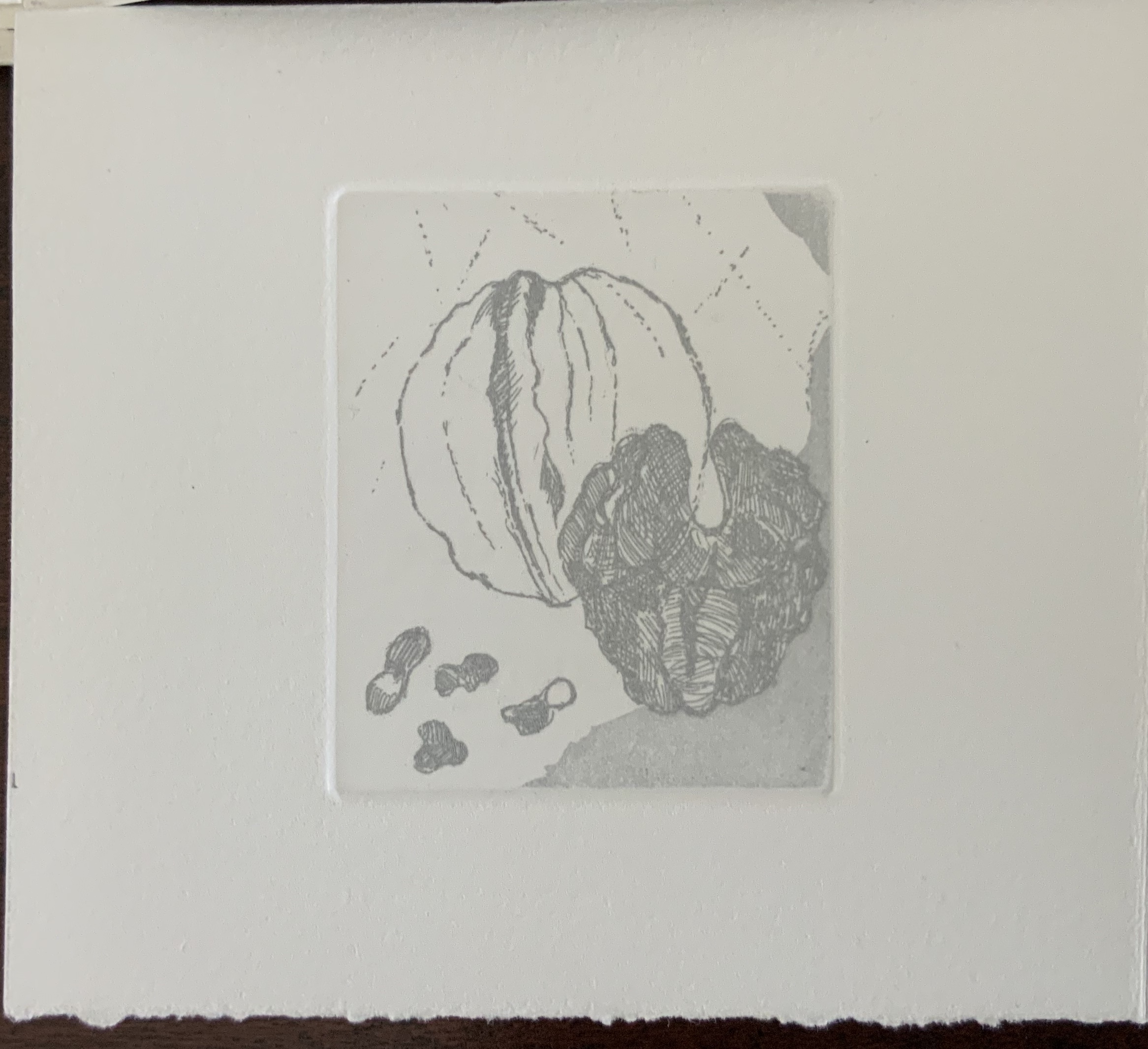
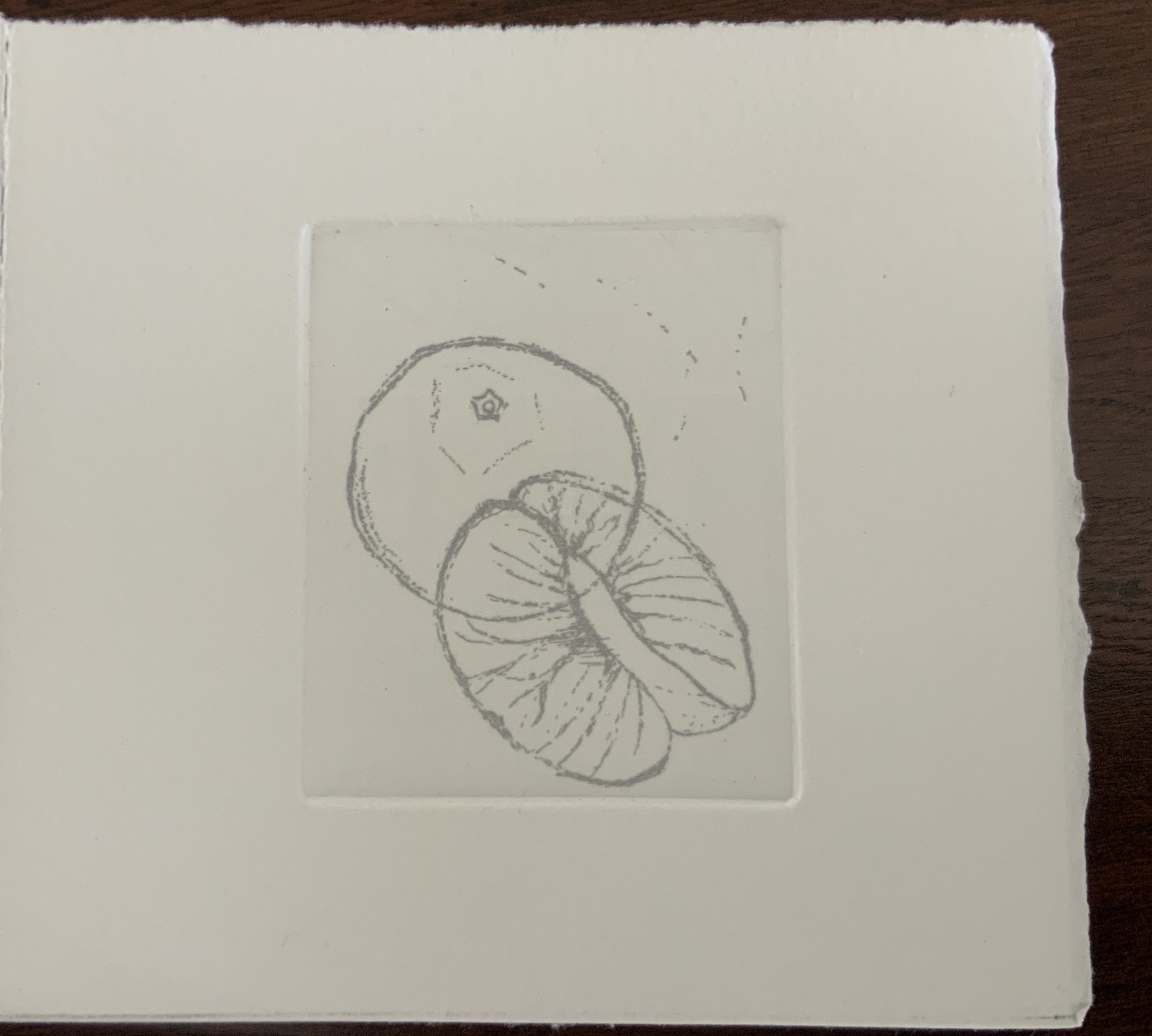
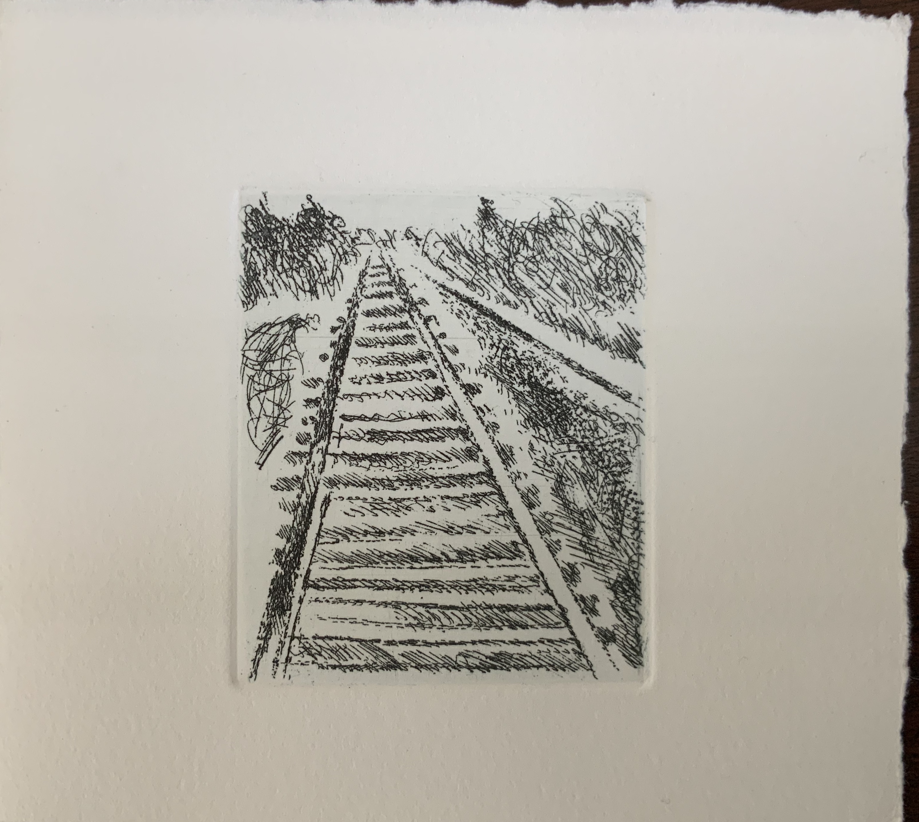
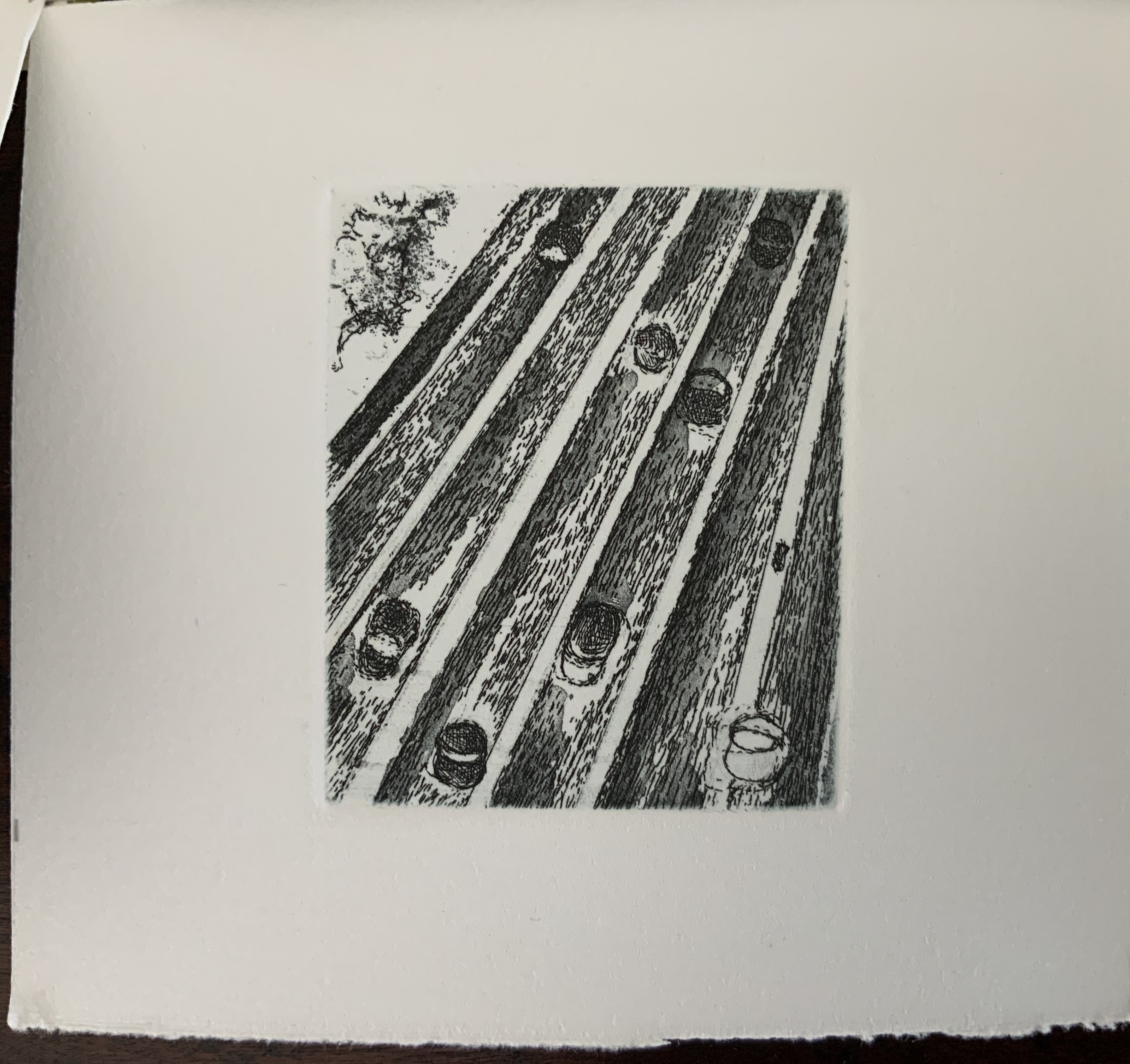
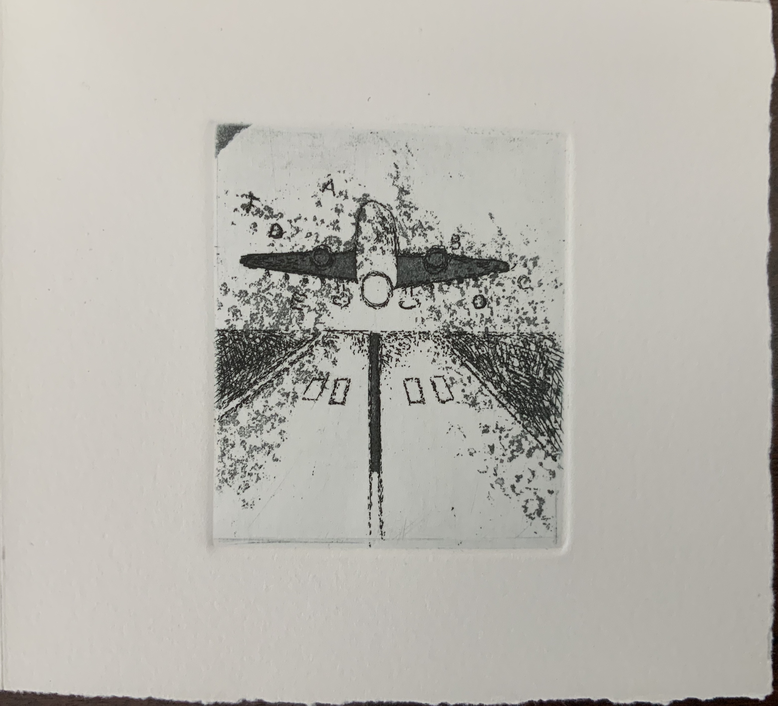
While the sets of four prints occupy the same position in each of the three single sheets, they “illustrate” their texts in different ways. In Aphorism 1, the whole tree occupies the “concluding” position of the lower right-hand corner, making a whole that is greater than the sum of the parts depicted in the other prints. In Aphorism 2, the images of transportation — train, car, plane, feet — follow from the abstract image of parallel lines. And in Aphorism 3, the two images of leaves overlapping human creations — buildings and litter — are bracketed by a central image of nothing but litter and a lower right-hand image of nature and the human-made landing atop a protruding pair of legs and feet like those of the Wicked Witch under the house in the Land of Oz.
In their variety of relationship to the structure and text, the three sets of images feel a bit secondary. Not so the presence of two languages. From the start, the French title page backed by an English title page on translucent paper suggests some sort of centrality for this bilingual feature. The only variation among the three volumes is that in Aphorism 1 and Aphorism 2, the complete French expression appears in a single panel, whereas in Aphorism 3, the English expression takes up that position. Why the bilingualism at all? The breaking up the expressions across the folds and cuts, the interspersing of images among the phrases, and the summary panels (two in English, one in French) suggest a halting, fragmented relation of each language to the other. Despite the title pages’ implication, the bilingual expressions do not exist simultaneously in parallel in any one of the single sheet books. By extension, is the relationship of language-image-thought to reality (whether metaphysical, geometrical or chemical) similarly fraught?
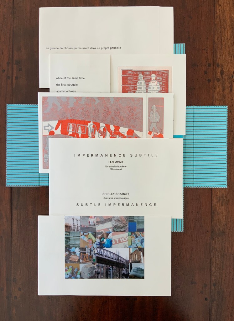
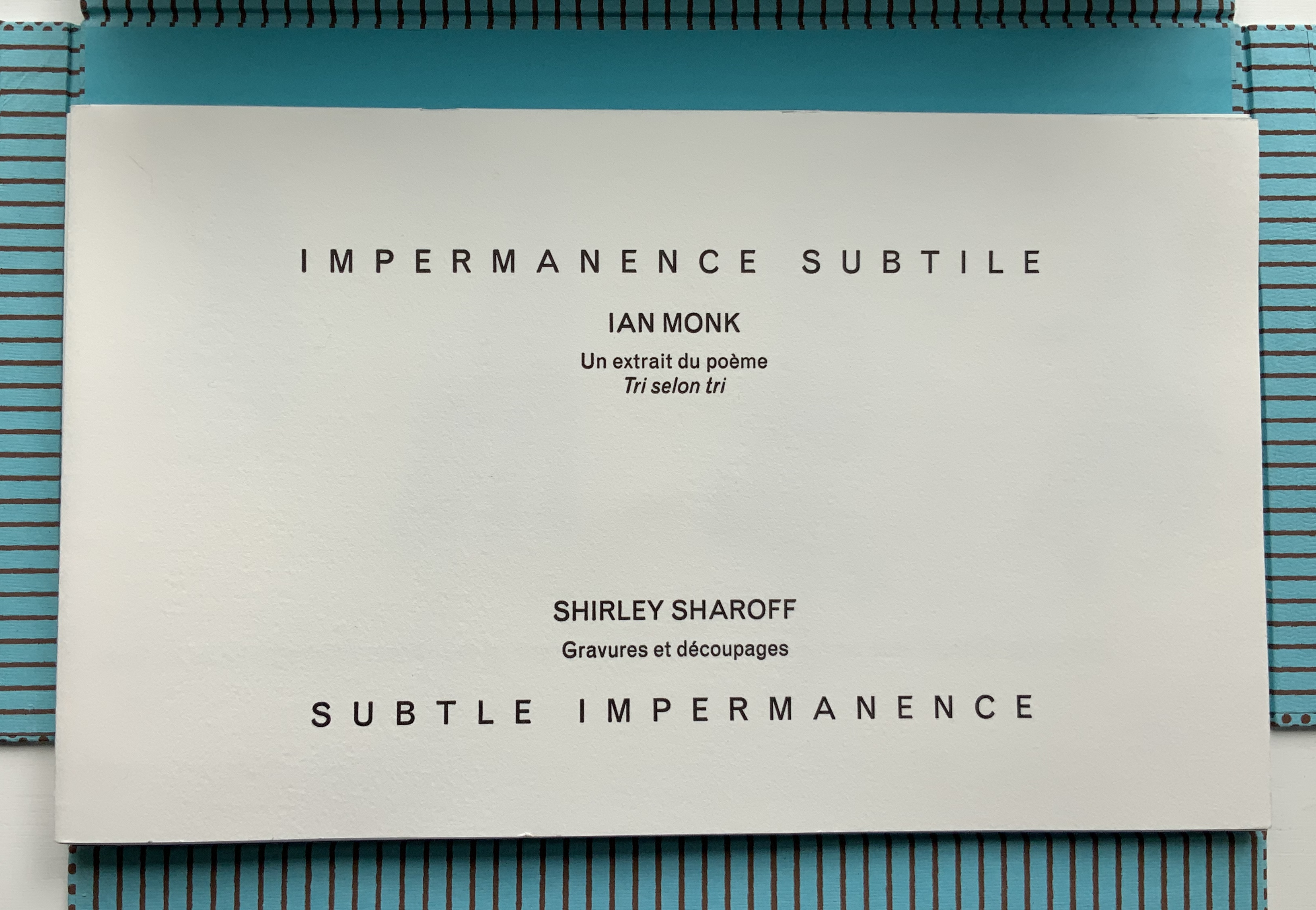
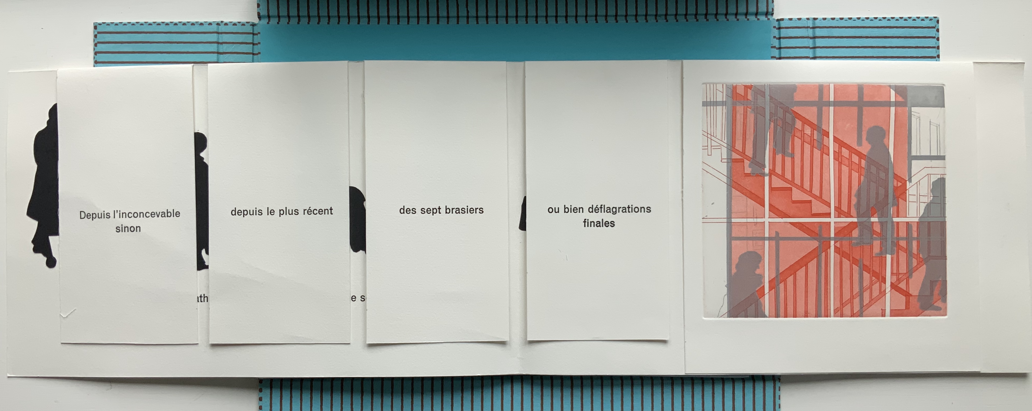
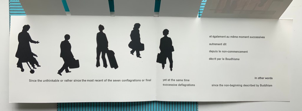
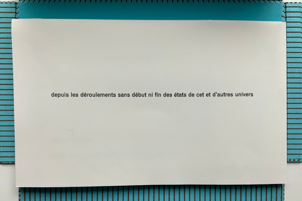
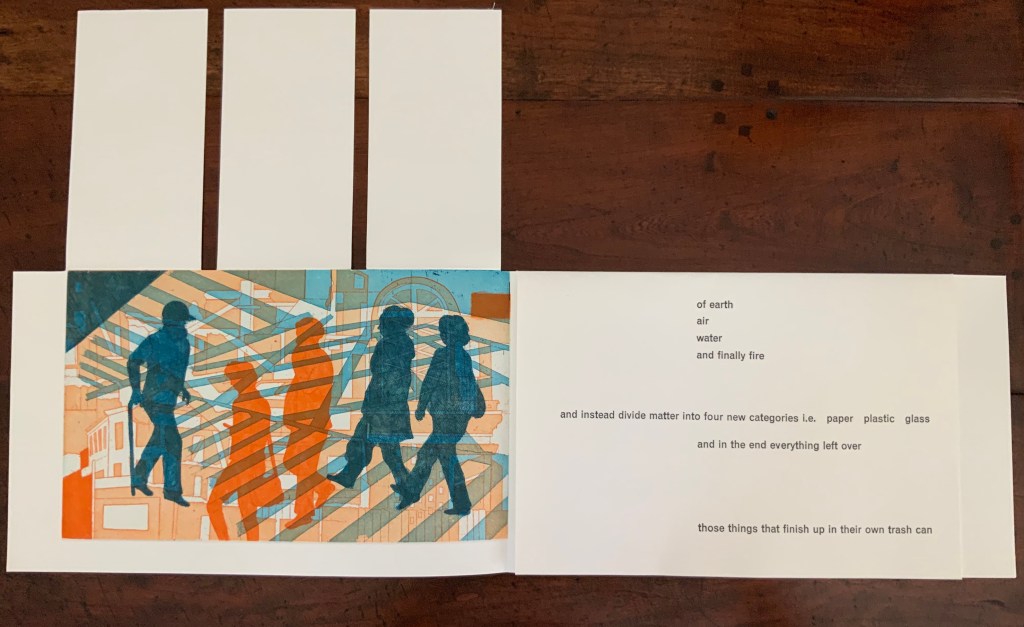
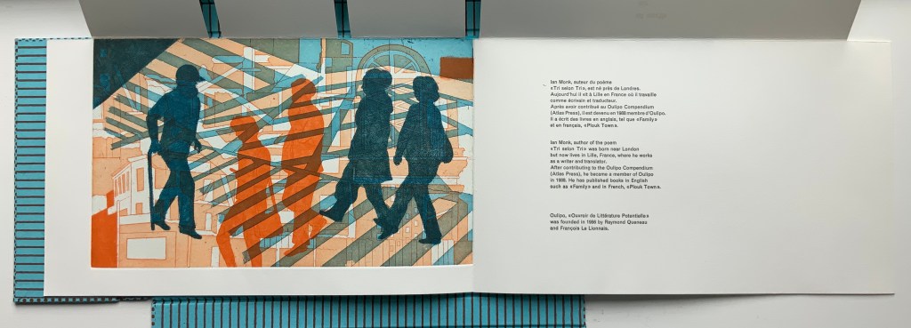
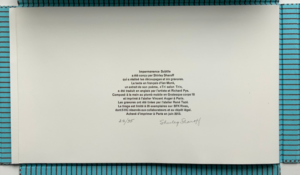
Portfolio box with four hinged flaps; five gatherings of folios bearing seven prints, collages, photos and cut paper. Text in English and French. Portfolio box: H212 x W340 x D24 mm; Folios: H200 x W330 mm, closed; variable width open, maximum W780 mm. Edition of 35, of which this is #22. Acquired from the artist, 5 February 2019. Photos: Books On Books Collection.
In Impermanence subtile/Subtle Impermanence, Sharoff’s bilingual perception of the world displays itself as more parallel, simultaneous and integrated — more subtle — than in La Poésie de l’univers/Poetry of the Universe. Where Poetry of the Universe explores this perception through dual forms (single-sheet origami/kirigami and book), Subtle Impermanence uses a multiplicity of forms (portfolio, flap book and pop-up book).
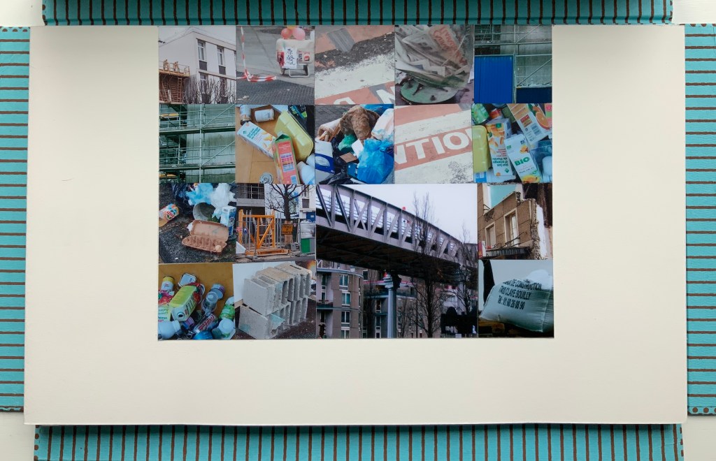
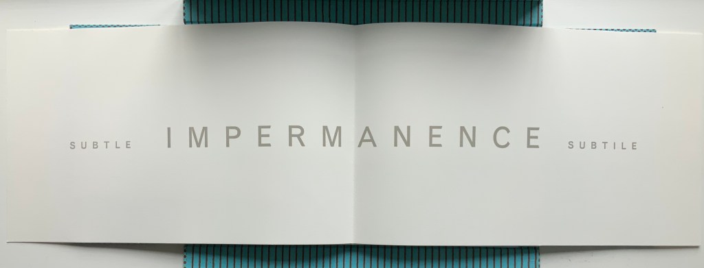
The first gathering — a single-fold folio whose first page presents the photo-collage of litter, demolition, construction and warning signs and tape — opens to a double-page spread that performs the book’s half-title function and also announces the work’s bilingual theme with the English adjective leading and the French adjective following the noun equivalent in both languages: IMPERMANENCE.
The first page of the second gathering performs the “title page” function of the book. When it opens, the first flap-book feature appears, the French text initially covering the English and, then, revealing a more parallel existence of the English and French. This is subtlety layered on subtlety. The text that appears and disappears under the flaps, and unfolds across the gathered folios, proceeds syntactically in a similar way, unrolling its qualifying dependent clauses one after another seemingly without beginning or end. As if mentally preparing a translation, the reader has to hold in mind each qualifier until what is being qualified can be reached.
Those 5 flaps signal yet another subtlety. The text comes from the opening of Ian Monk’s Tri selon Tri (“sort by sort”), a concrete poem in the Oulipo tradition of Raymond Queneau, Italo Calvino and Georges Perec. Following this tradition means creating a literary work that adheres to some rule or constraint — like those in a game. In its original presentation, the poem works within a structural constraint consisting of 5 blocks of text, each 37 characters wide with the first and last blocks being 25 lines deep and the three middle blocks each being 22 lines deep. In self reference to its main theme that humanity is replacing the 4 elements (earth, air, fire and water) with categories of human detritus, the poem calls the first and last blocks poubelles (“trash cans”) and the three middle blocks “dumpsters” (bennes). In each middle block, a blank space — 7 characters wide by 3 lines deep — appears, mimicking the side openings of trash sorting bins. Sharoff’s subtle sculptural nod is 5 flaps (as well as 5 gatherings) for the 5 receptacles.
The third gathering above consists of a shortened single-fold sheet bearing the large print of commuters and shoppers and embracing a larger single-fold sheet divided by a loose black paper stencil. With its cutout human figures, the stencil overlaying another photo-collage of litter foreshadows the extract’s concluding metaphor: that, after the first three new elements of paper, plastic and glass comes the fourth new element — those things that finish up in their own trash can, i.e., humanity itself.
The fourth gathering above delivers yet another hint in the form of a pop-up feature: three receptacles, two of which have human-figure cutouts. These human figures have been appearing throughout in the intaglio prints, and in their over- (or under-?) printing of litter and construction, they too have been delivering the same hint.
Just as the first gathering’s closed flaps display French only, the fifth and final gathering’s closed flaps display English only. The three flaps on the left rise to reveal the final print showing human figures entangled in their fully constructed world and undercut by the fourth flap’s articulation of the metaphor and implicit identification of them as “those things that finish up in their own trash can”.
Beneath that fourth flap, the artist concludes in French and English, leaving the colophon to appear on the last page — oddly — in French only.
These two works by Sharoff are perhaps bettered only by two others not in the Books On Books Collection: Ovi (1988) and La grande muraille/The Great Wall (1991). It is interesting that, while the former reflects her preoccupation with the Oulipo circle (Ovi draws on Calvino’s work), it sticks to one language (French); whereas La grande muraille engages with three languages (French, English and Chinese) yet draws on the text of a Chinese modernist (Lu Xun), not the Oulipo circle. Both, however, reflect the same ingenuity of juxtaposition and integration of language, image and forms to be found in La Poésie de l’Univers/Poetry of the Universe and Impermanence Subtile/Subtle Impermanence, which makes them defining works in the Books On Books Collection.
The most extensive essay on Sharoff’s work can be found in Paul van Capelleveen’s Artists & Others(2016). It comments on La reparation (2001), The Waves (2003), Les amazones sont parmi nous (2005), Bruits de la ville (2007), Impermanence subtile (2013), La poésie de l’univers (2012-2013). He addresses La grande muraille (1991) in Voices and Visions (2009). The special collection at the Koninklijke Bibliotheek in The Netherlands is one of the few where several of Sharoff’s works — including La grande muraille — can be seen and handled in one place. Also prepared by Van Capelleveen is this entry “Impermanence subtile. Subtle impermanence“, KB National Library of the Netherlands, Koopman Collection, n.d. Accessed 26 July 2020.
Christophe Comentale’s essay captures the delight of exploration and discovery in the encounter with Sharoff’s art.
Shirley Sharoff, entre France et Etats-Unis, présente une pluralité d’inspiration consommée entre l’estampe et le livre devenu un média, entre unique et multiple. […] Magicienne des formes et des couleurs, Shirley Sharoff ne cesse de remettre en cause, par besoin autant que par défi personnel, tout ce qui pourrait ressembler au début d’un système de lecture, de vision, figé et donc clos. L’impossibilité de savoir -qui vaut aussi pour elle- de quoi sa prochaine oeuvre-livre-manuscrit-tableau-dépliant, ou tout cela à la fois, sera fait est assez excitant. La présence de textes sentis par affinités sensorielles, personnelles, avec des écrivains non encore classiques, autant de raisons d’apprécier de pénétrer dans cet univers où le conformisme est inexistant.
Christophe Comentale, “Shirley Sharoff, des livres a tenir debout et des estampes a voir aussi”, Art & Métiers du Livre, n°231 (Aout-Septembre 2002), p.63.
Standen (2014) Caroline Penn Altered book, overprinted digitally, cut with a scalpel and rebound with thread. H210 x W140. Acquired from the artist, 9 June 2020. Photos: Books On Books Collection.
The William Morris wallpapers in Standen House, an Arts & Crafts home in Sussex, and the memory of Charlotte Perkins Gilman’s story “The Yellow Wallpaper” inspired the creation of this altered book. The work altered is a 1979 National Trust publication on Standen House. In Gilman’s story, the main character, who has a mental breakdown from being forced into domestic seclusion, gradually claws away the yellow wallpaper in the room where she is locked away. In correspondence, Penn writes that she unbound the original booklet, ran the pages through a digital printer, performed the cutting and then rebound it. In a clever reversal, by the end, the wallpaper print and its excision have taken over the walls of the book of Standen House.
Photo: Courtesy of the artist.
By coincidence, American book artist Harriet Bart co-curated an intriguing exhibition called “Wallpaper“. Bart’s entry, too, was inspired by the Gilman story.
fieldwork (2017)
fieldwork (2017) Caroline Penn Digitally printed concertina. Cover: H126 x W90 mm; pages, H125 x W88 mm. Edition of 20, of which this is #8. Acquired from the artist, 6 February 2020. Photos: Books On Books Collection.
A book within a book, fieldwork offers an entrancing visual narrative. A small white book unfolds from nothing to small pebbles, larger pebbles, more pebbles to fewer, and finally to one pebble in the center. Is it the reverse of the process of erosion? Is it categorization by the human eye and hand striving with nature’s agglomeration?
The artist has embedded the visual narrative here in an innovation on the framing device to be found in Helen Douglas’s Wild Woodand A Venetian Brocade. As with the latter works, fieldwork encourages us to touch with our eyes. It is a stunning piece of trompe l’oeil. On glimpsing any double-page spread, the reader/viewer is tempted to pick up one of the pebbles apparently resting on that white piece of paper open on a photo of a shingle beach. Visitors to Kettle’s Yard will recognise the temptation.
Project C: Destination Unknown (2020)
Organised by Pauline Lamont-Fisher, Project C is the result of a collaborative effort among 14 artists:
This project is about intersemiotic translation between images to words and from words to images and the paths that form between them. Roman Jakobson in Linguistic Aspects of Translation suggests the idea of intersemiotic translation as the translation from one sign system to another: i.e. interpretation of verbal signs by means of signs of non-verbal sign systems. So every novel adaptation into film, constitutes a translation. The illustrations in a book act as translations of text into images. Every time you watch Tchaikovsky’s Nutcracker, you watch an intersemiotic translation from narrated story into ballet.
The artists were given a set of anonymised covers of Italy Calvino’s If on a winter’s night a traveler and asked to choose one and, keeping in mind Jakobson’s notions of intersemiotic translation, produce a folio or pamphlet in response. Caroline Penn’s contribution uses text, typography, structure, choice of paper, density of ink and a pattern of hole punches to translate or evoke not only the image below but the substance of Calvino’s novella — or at least a key element of the substance susceptible to translation to an artist’s book of translucent Bible paper and pergamenata.
Project C: Destination Unknown (2019) Caroline Penn Digitally printed on Offenbach bible paper stitched to pergamenata. Concertina, H186 x W130 mm. Edition of 30. Acquired from whnicPRESS, 7 March 2020. Photos: Books On Books Collection.
The contrasting whites of the Bible paper and the translucent paper that comes uncannily close to animal parchment mirror the different colors of snow in the cover.
The dispersed positioning of the letters of the word “vapour” mimic the falling snow. The series of darker inked phrases set below, separated from each other by hyphens and staggered downwards across the panels echoes the rail track and cars in the cover.
The body of light gray likewise sloping down from left to right recalls the declining mountain gap crossed by those train tracks.
Across the foot of the page, the holes punched in a lowercase letter “o” and separated by two unpunched uppercase “O’s” also evoke the rail tracks and cars. In a nod to the Oulipo pattern-driven nature of Calvino’s work, the noughts of the “O’s” are answered in the crosses of the “X’s” supporting the text that crawls across the panels, finally turns the corner of the last panel and fades into the gray word “invisibility” on the reverse of the last panel.
A tour de force of book art — making text, image, ink, papers, layout, structure and impression work, mean and become a thing independent of the inspiring constraint.