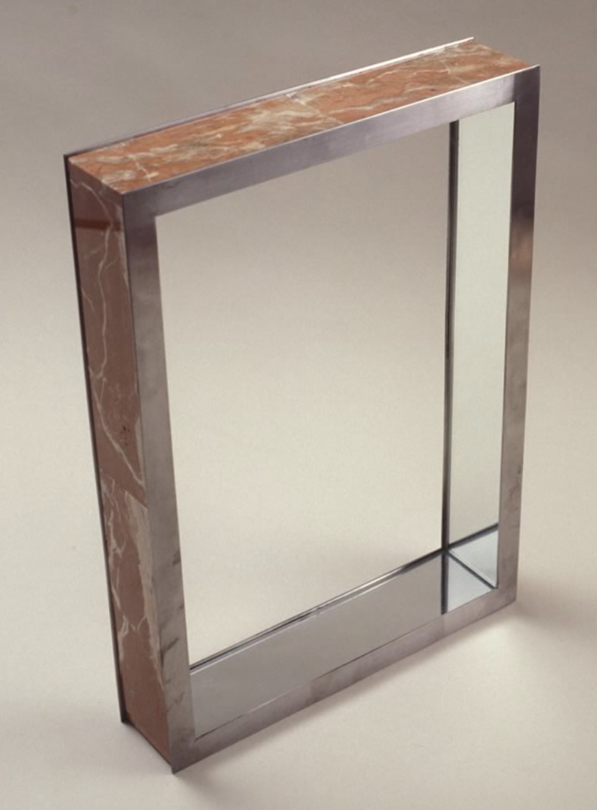
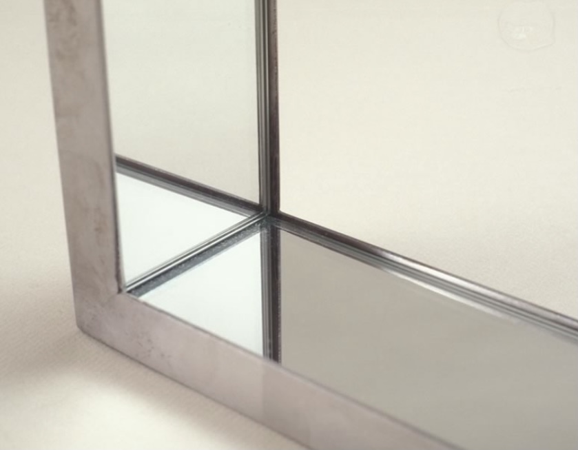
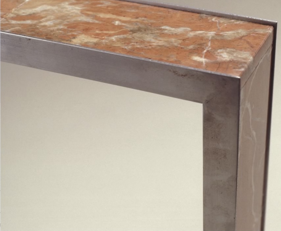
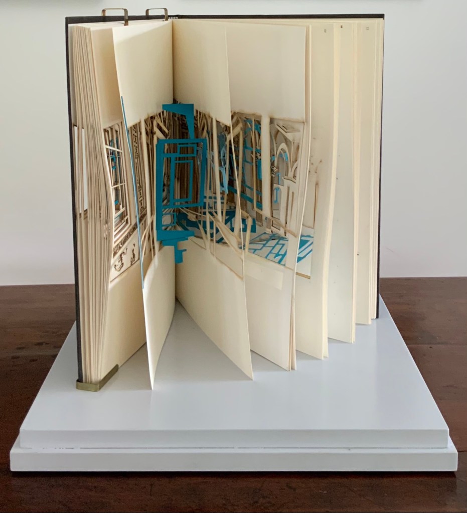
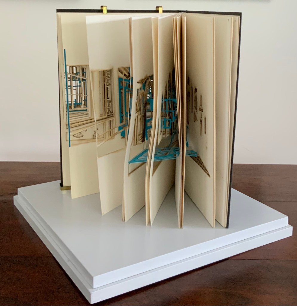
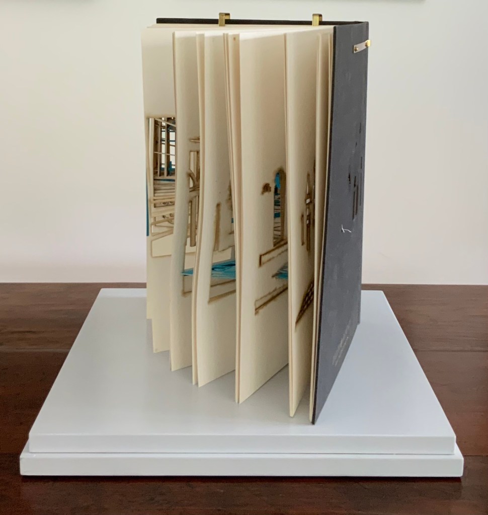
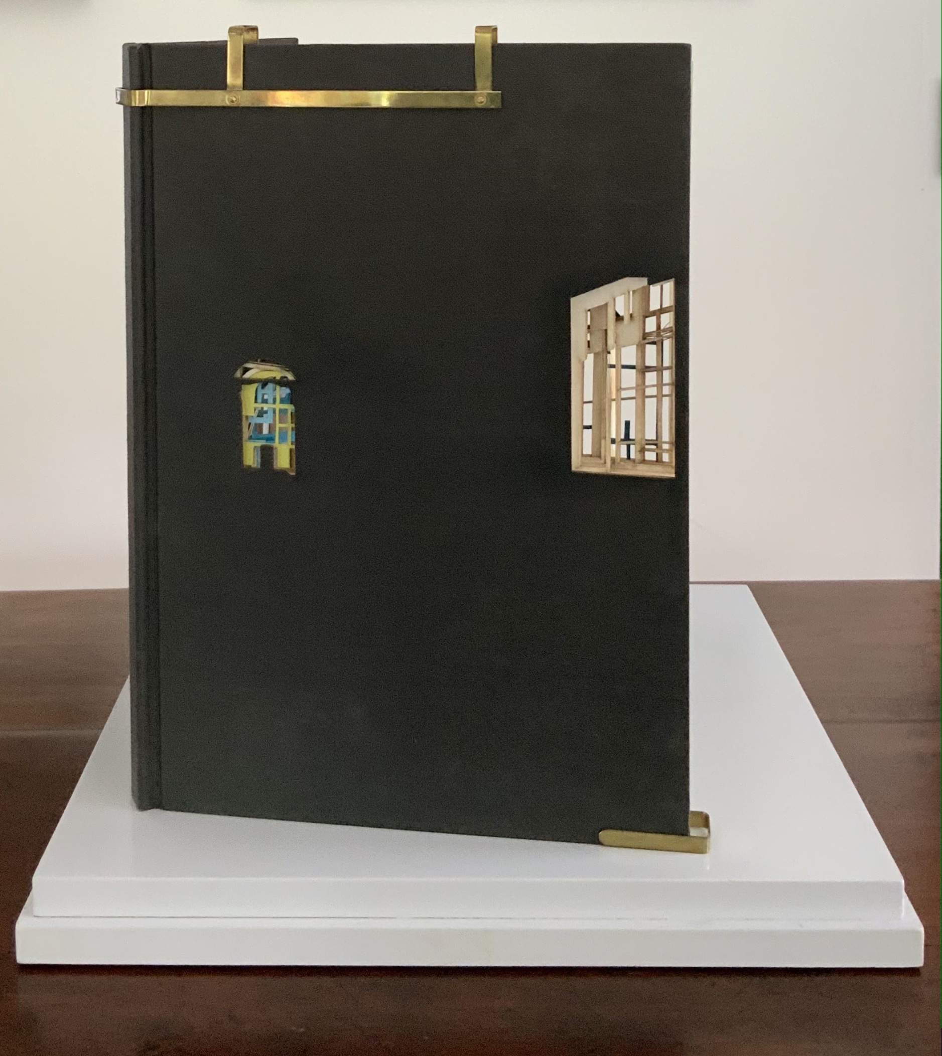
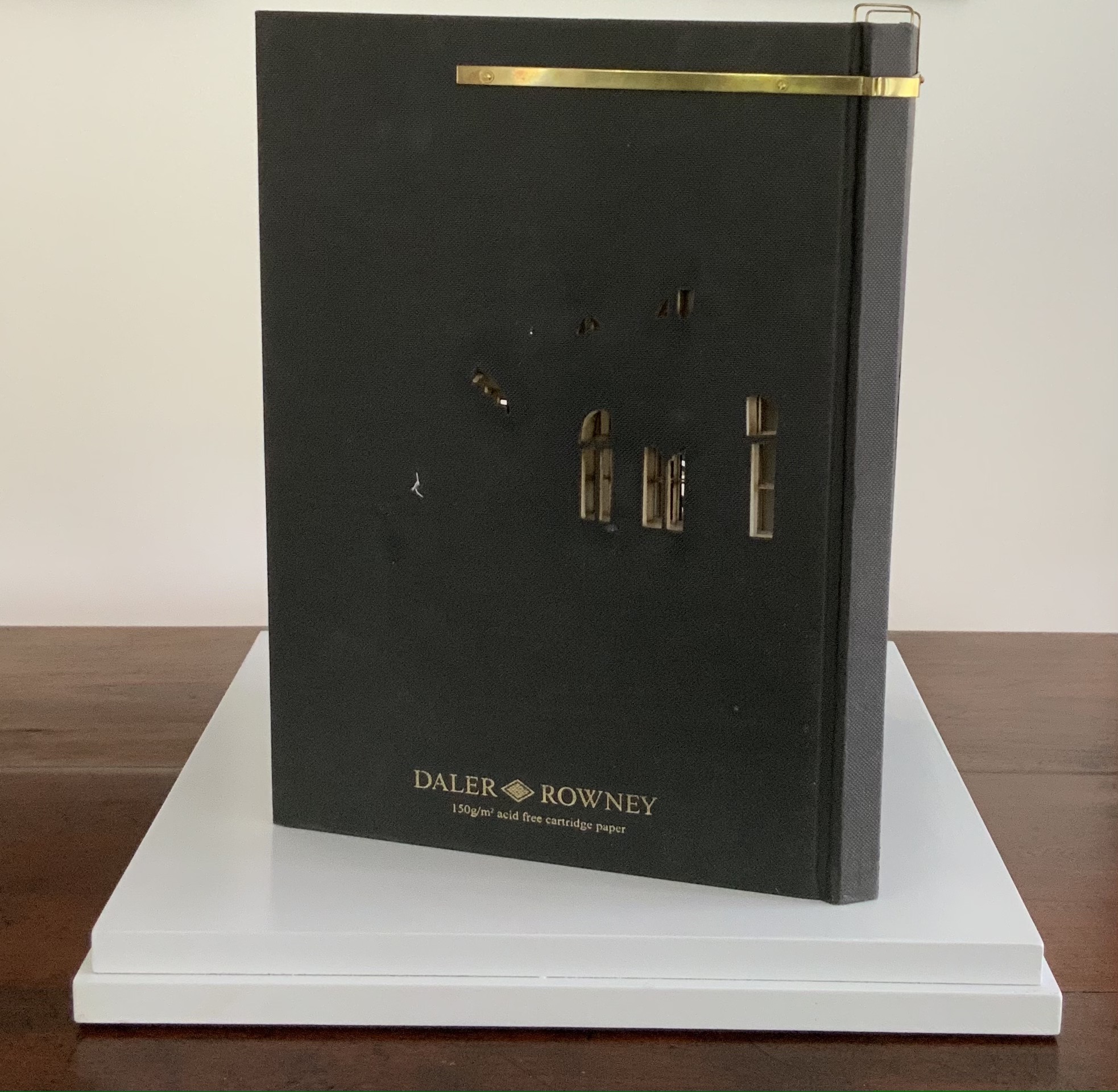
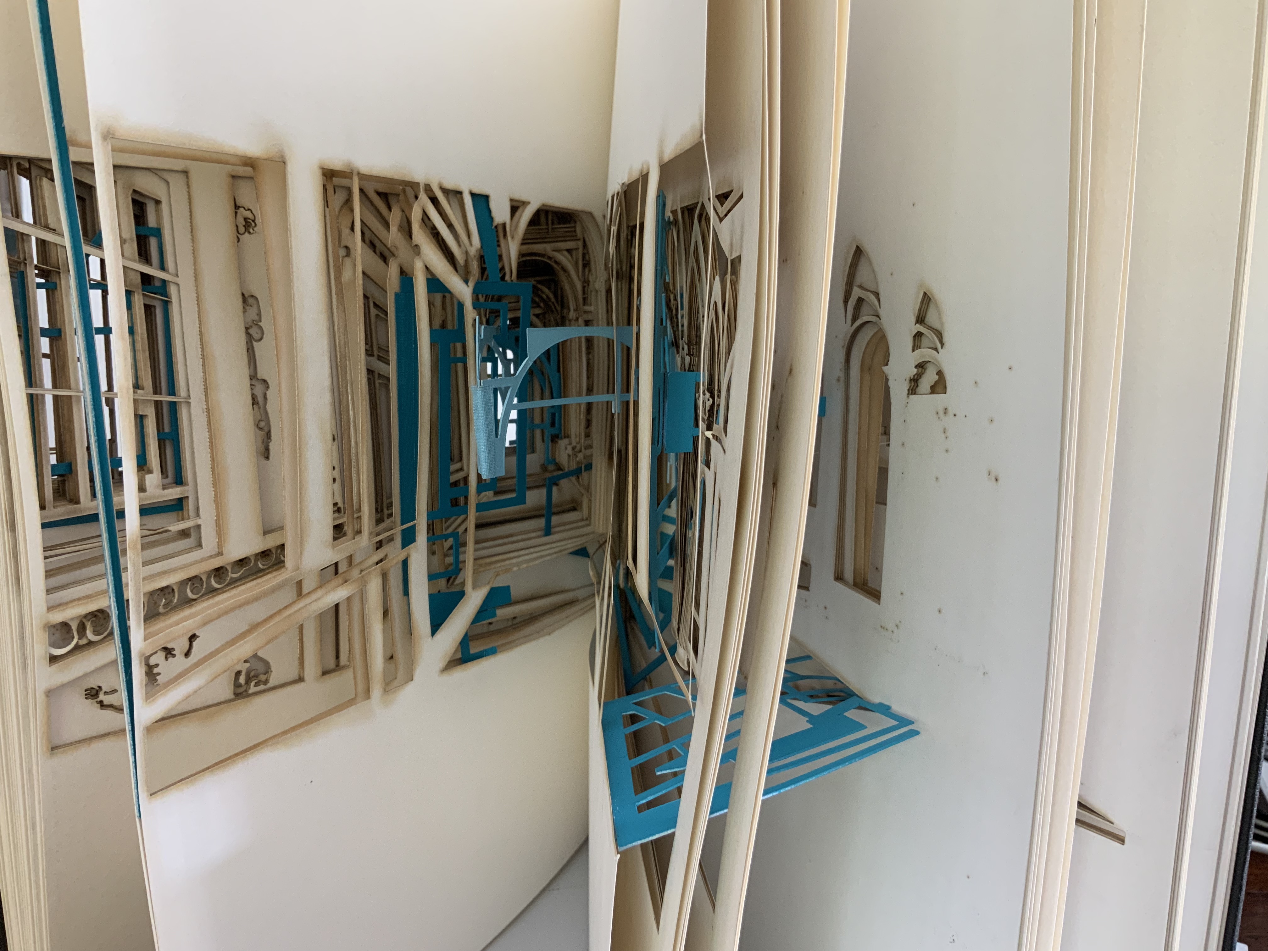
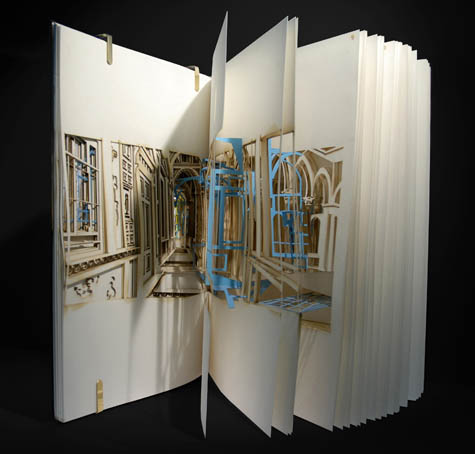
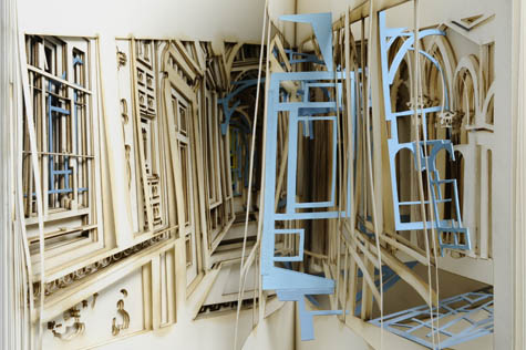
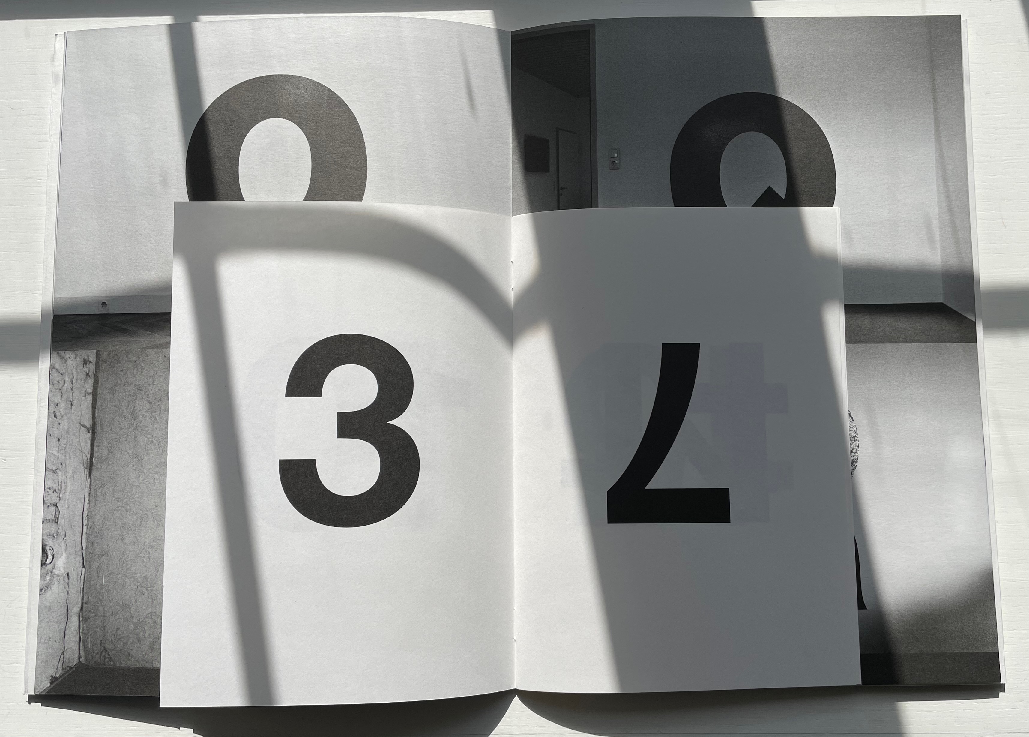
Alphabet Everywhere (2012) Elliott Kaufman Casebound, paper over board, cutout cover. 235 x 235 mm. 62 pages. Published by Abbeville Press. Acquired from Amazon, 22 September 2022. Photos: Books On Books Collection. Displayed with permission of the artist.
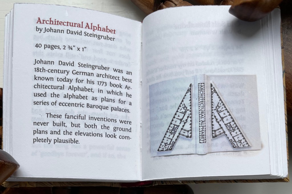
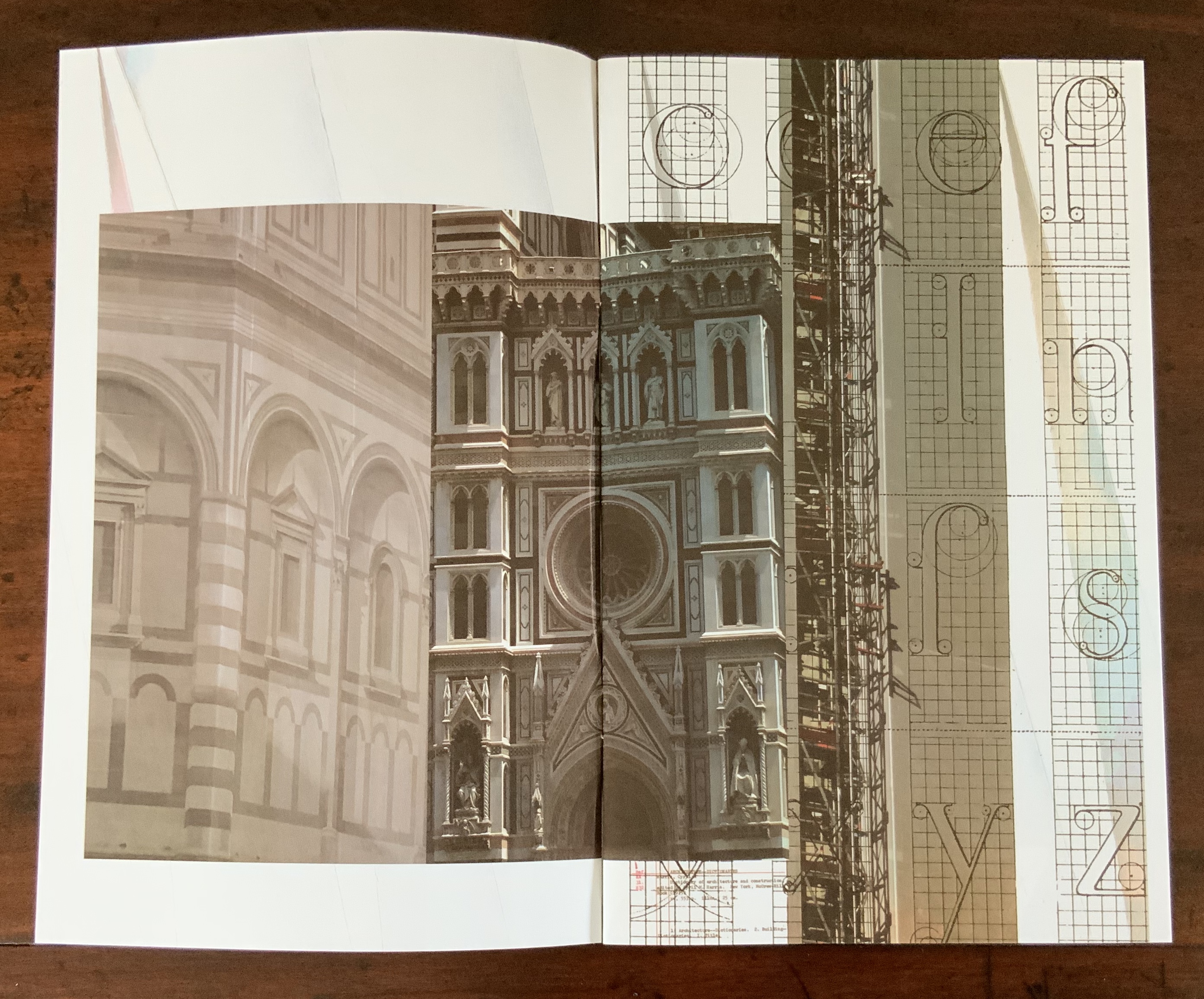
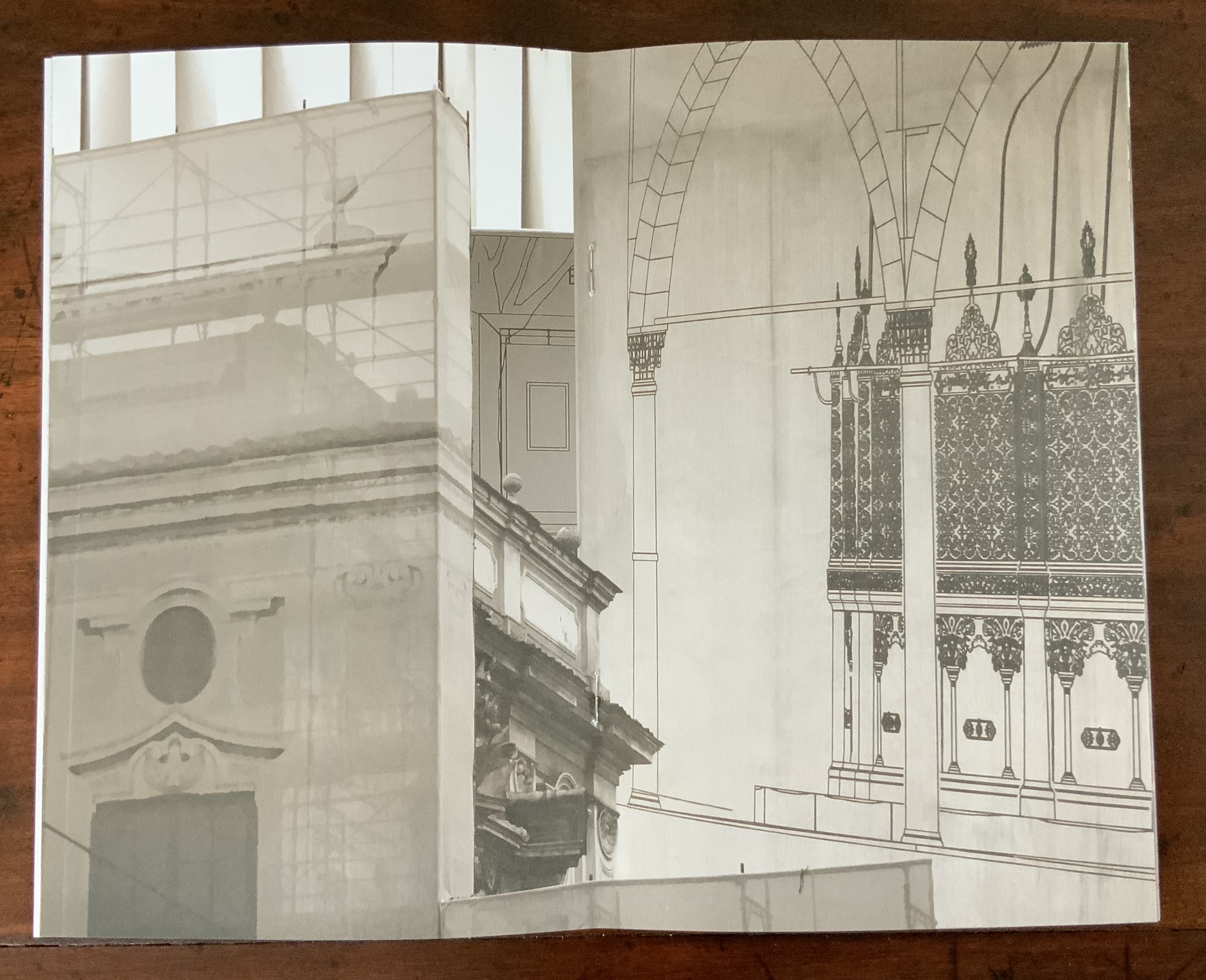
Evident across the images in his alphabet book and website, Elliott Kaufman’s work revolves around architectural motives. The Books On Books collection has found a recurrent theme in architectural alphabets. Would that Johann David Steingruber’s designs for palaces in the shape of the letters from A to Z had actually been built so that Kaufman could photograph them.
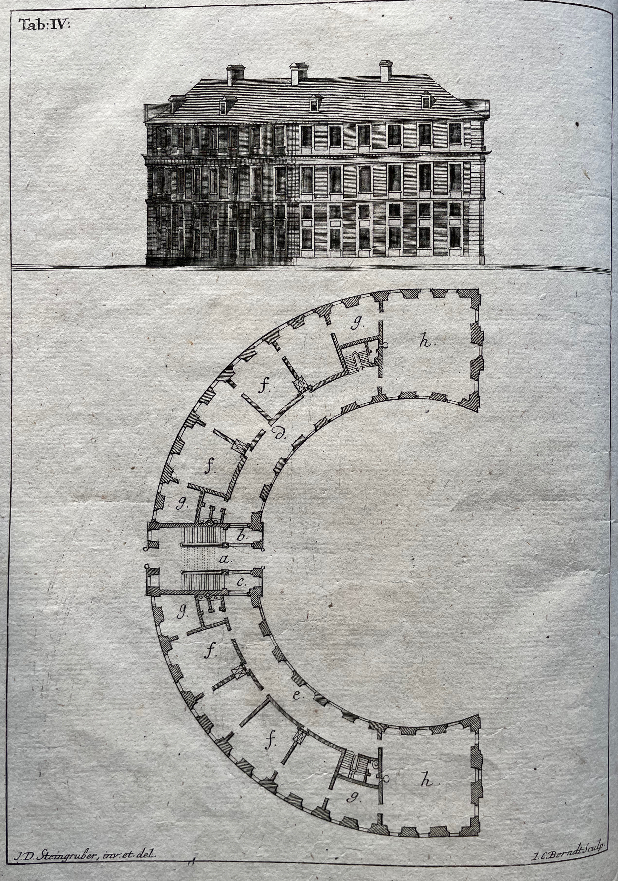
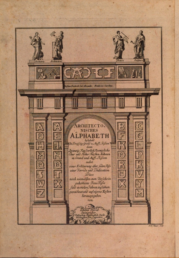
Architectonisches Alphabeth (1773) bestehend aus dreyßig Rissen wovon Jeder Buchstab nach seiner kenntlichen Anlage auf eine ansehnliche und geräumige Fürstliche Wohnung, dann auf alle Religionen, Schloß-Capellen und ein Buchstab gänzlich zu einen Closter, übrigens aber der mehreste Theil nach teutscher Landes-Art mit Einheiz-Stätte auf Oefen und nur theils mit Camins eingerichtet, wobey auch Nach den mehrest irregulairen Grund-Anlagen vielerley Arten der Haupt- und Neben-Stiegen vorgefallen, dergleichen sonsten in Architectonischen Rissen nicht gefunden werden, zu welchen auch Die Façaden mit merklich abwechslender Architectur aufgezogen sind. Johann David Steingruber Casebound. H395 x W240 mm. 71 folios. Acquired at auction from Kiefer Buch- und Kunstauktionen, 15 December 2022. Photos: Books On Books Collection.
More Romantic than romantic, Victor Hugo wrote to his wife while traveling that the alphabet is all around us in nature. Kaufman has a different view. Kaufman’s several images per letter prove the point of his book’s title but in keeping with his architectural slant: our constructions distribute our oldest construction all around us.
Ironically if inadvertently, Kaufman gives the Romantic another tweak of the nose. In his Hunchback of Nôtre Dame, Hugo has his character Archdeacon Claude Frollo point to a book in his hand and then to the cathedral outside and say, “This will kill that”, by which he meant among other things that the book’s permanence of replicability will outlast the building’s permanence of stone. If by fictional time travel we could put Kaufman’s book in the archdeacon’s hand, we could point to the cathedral and retort: “But Venerable Sir, look here how ‘that’ foretells the building blocks of ‘this’.”
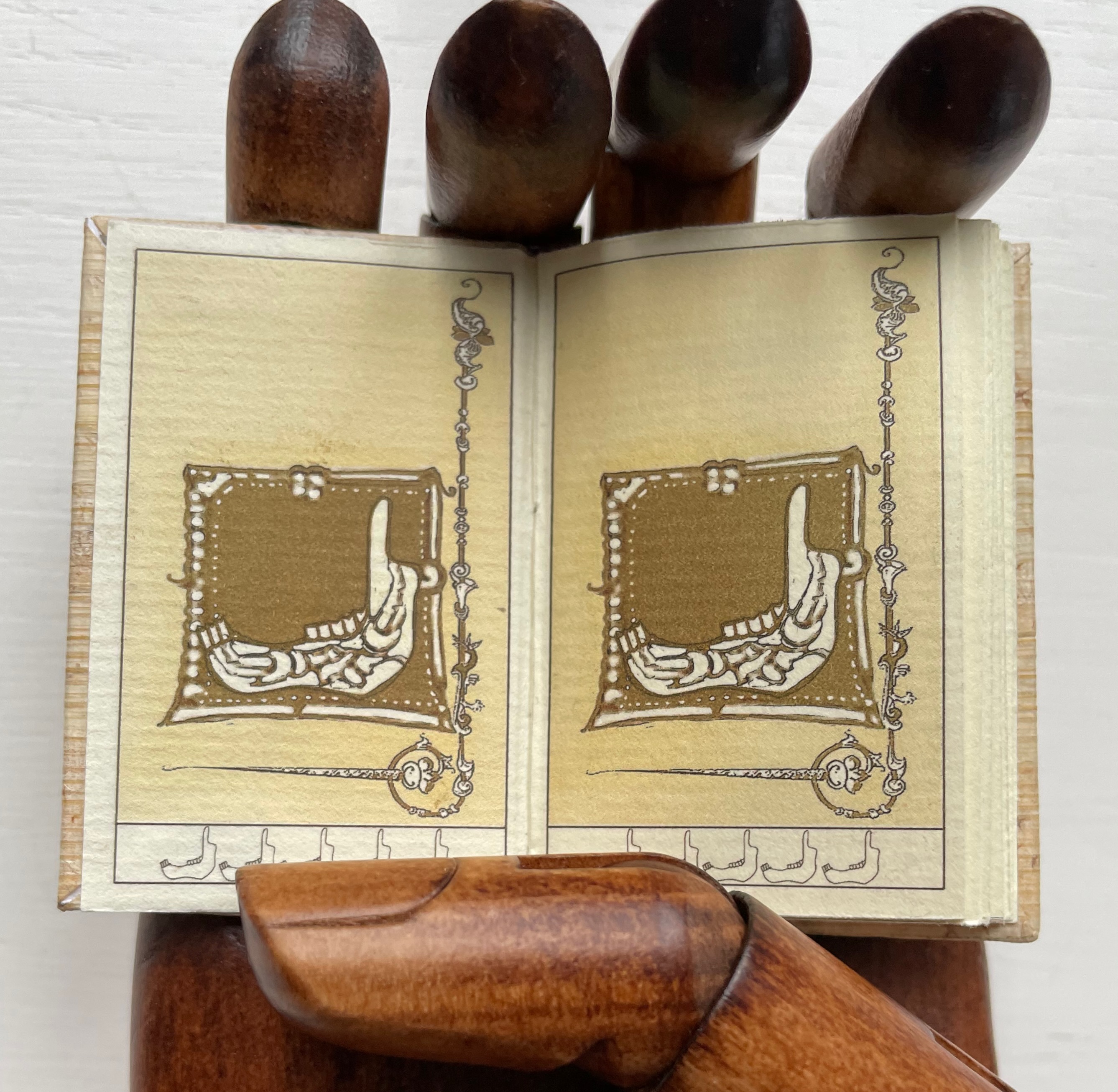
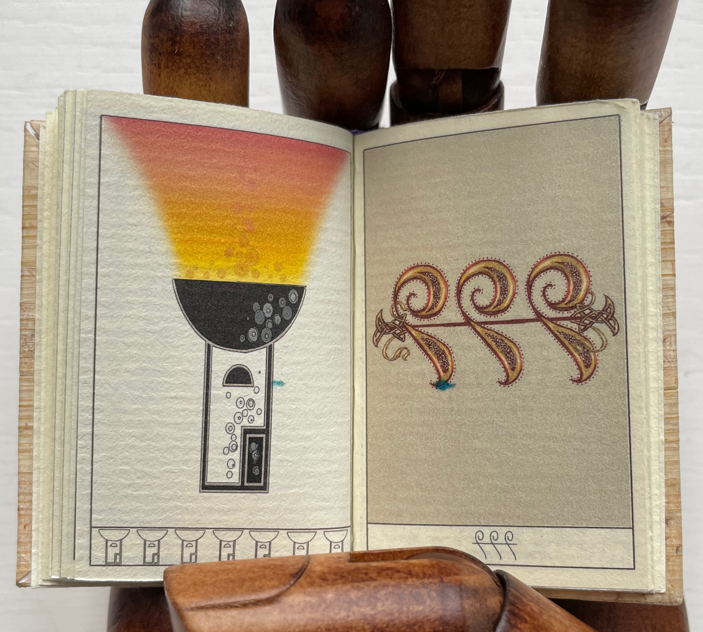
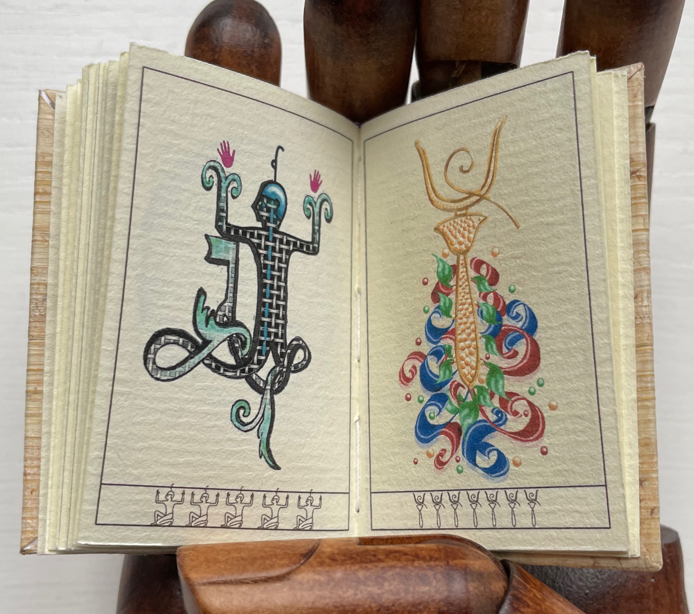
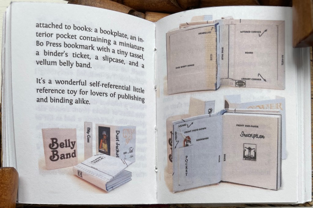
Hieroglyphs (2009) Pat Sweet Miniature. H57 x W38 mm. 40 pages. Acquired from Rebecca Bingham, 23 November 2022. Photos: Books On Books Collection. Displayed with artist’s permission.
Not until the early 19th century was the Egyptian writing system of hieroglyphs deciphered. How much more quickly Jean-François Champollion and Thomas Young could have accomplished it if hieroglyphs were alphabet-based.
It is understandable that a 20th century Western book artist steeped in the alphabet might be lured into projecting a need for an ABC artist’s book onto the ancient Egyptian system. With this miniature, Pat Sweet has answered that need and reinterpreted twenty-six hieroglyphs to pay an “alphabet-in-cheek” homage to one of the earliest writing systems. Taking basic hieroglyphs (each shown at the foot of a page), Sweet transforms them into fanciful, colorful images.
In some cases, the colors recall the hand-colored folios produced after Champollion’s death and based on his reproductions of hieroglyphs. In other cases, the style echoes medieval and Renaissance illuminated letters, 18th century decorated letters and even Art Deco illustrations. The endpapers below certainly run from a melange of them to the Surreal. The tongue-in-cheek wit extends to the format and cover. No scroll here, but rather a codex covered in papyrus.
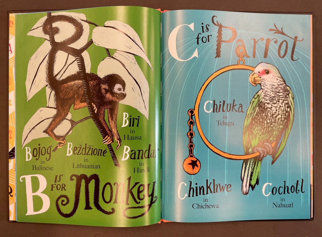
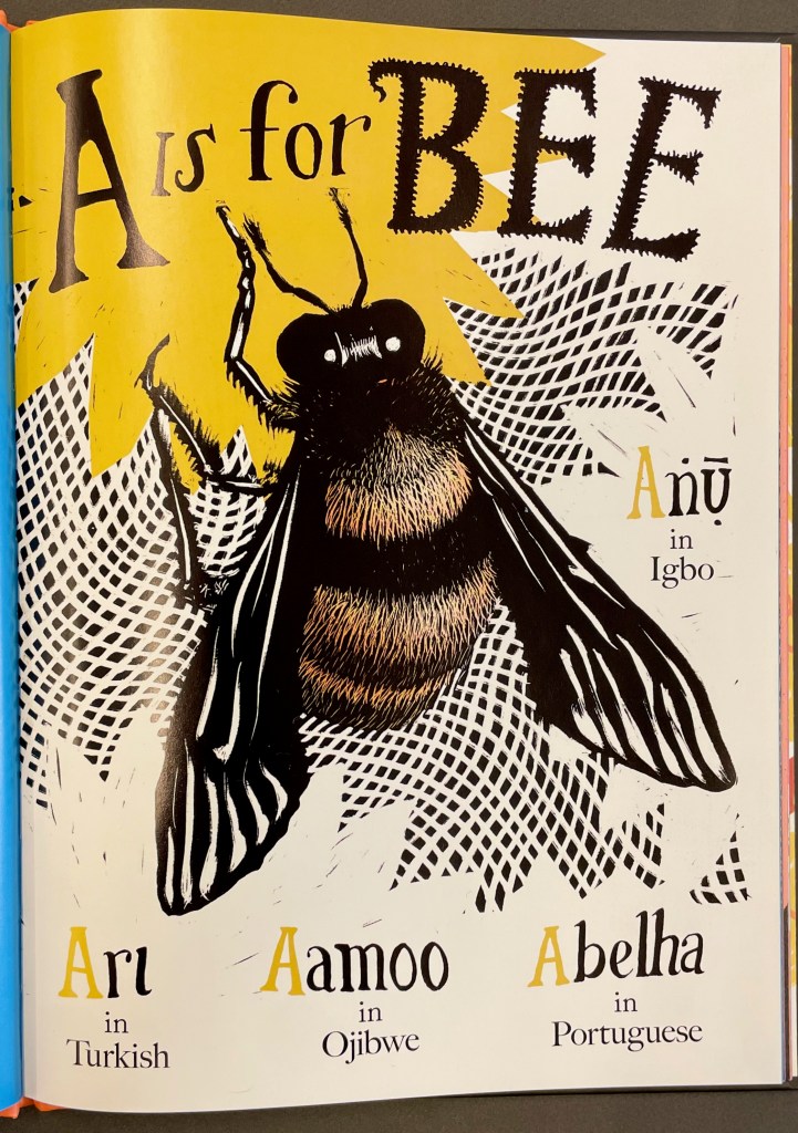
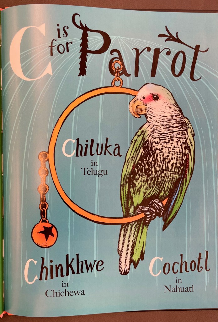
Earlier animal abecedaries’ efforts to nudge us toward more multilingual awareness led with English and either limited themselves to animals whose names in other languages are the same or simply surrounded the English name with the names from other languages. Ellen Heck leads with the usual English formula “A is for …” but has the reader turning somersaults when the named animal is one whose name in English does not begin with the formula’s letter; rather the initial letter belongs to the animal’s name in several other languages.
There are many bilingual abecedaries. Naturally there are fewer multilingual ones and even fewer whose main purpose is to challenge the reader’s English-centric mindset. More than most of those neighbors, Heck’s work is colorful and full of character — and in both the portrayal of the animals the letterforms. The letters in “bee” and the initial and final letters of “monkey” are hairy and furry like their namesakes; “P” and “t” of “parrot” are feathered; and perhaps more subtle, the pose of the bee forms the letter A, the monkey’s tail and the branch being climbed for the letter B; and the parrot blocks out a segment of its ring to form the letter C. The more detailed shots of the artwork do not do justice to the textures it conveys.
The related website and app to which the QR code at the book’s end leads offers recordings of native or fluent speakers pronouncing words. Since such a feature is not assured to outlast updates to devices and their operating systems, users will no doubt look for hacks to capture the files. More lasting will be the author’s comments on the challenges of writing across languages: sorting the singular name in one language that is plural in another, dealing with a species name from one culture that explodes into multiple sub-species in another, juggling transliteration from languages with non-Latin alphabets and more.
Leeper, Angela. 15 March 2022. Review. Booklist Online. American Library Association. Accessed 9 November 2022.
Vo, Young. 2022. Gibberish. Montclair: Levine Querido. Not an abecedary, but has a similar multicultural purpose.
Wang, Andrea and Hyewon Yum. 2022. Luli and the Language of Tea. New York: Holiday House. Also not an abecedary and more akin to Vo’s book.
Winston, Sam. 2022. One and Everything. London: Walker Studio. Again not an abecedary, but nevertheless a book about alphabets and language by another powerful artist.
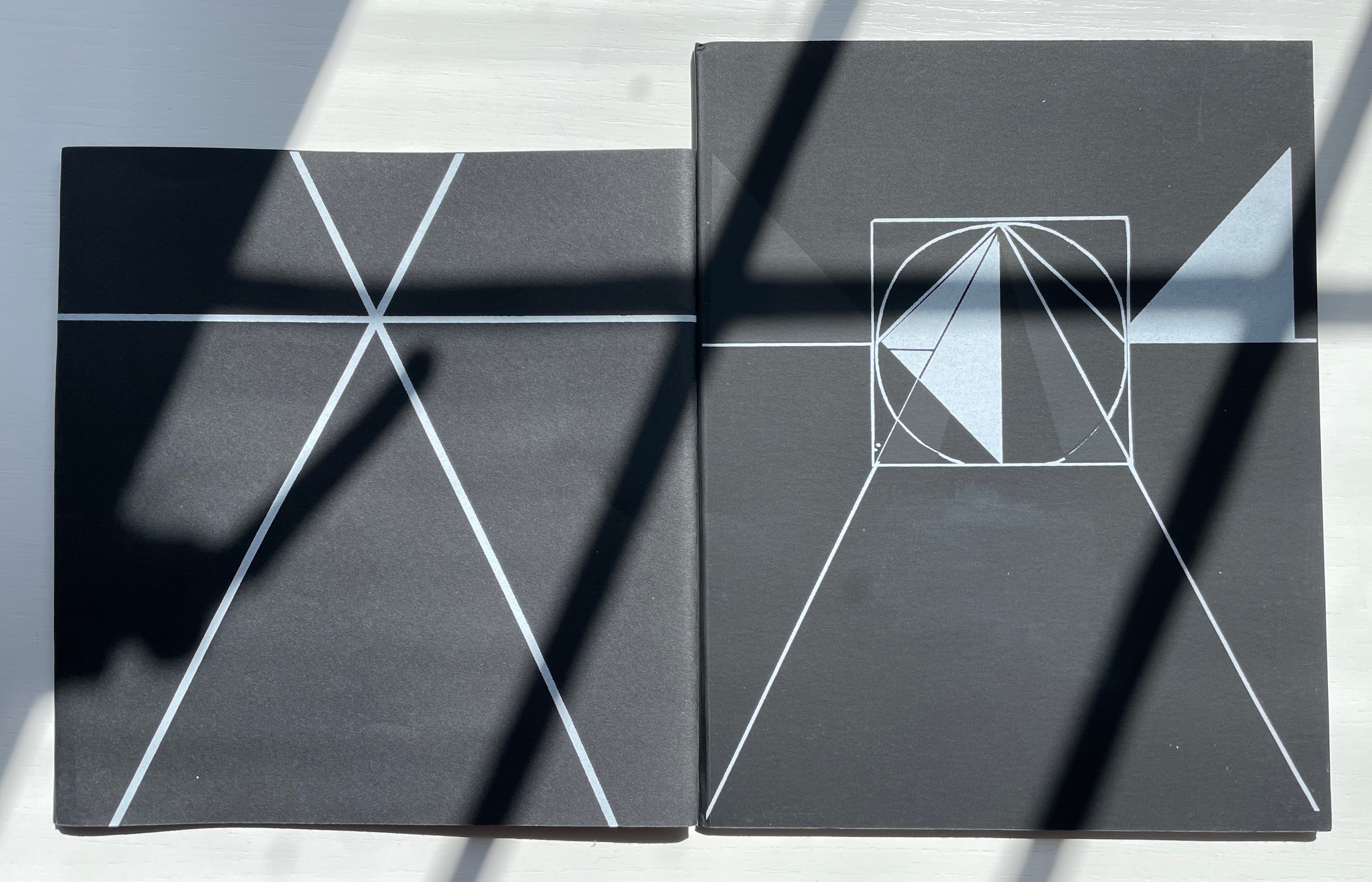
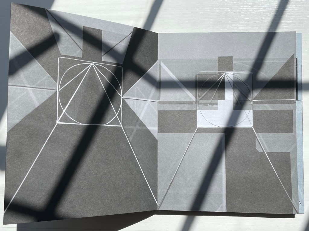
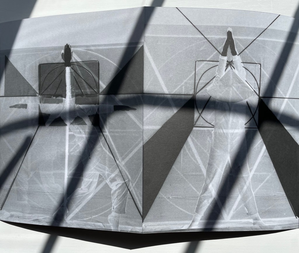
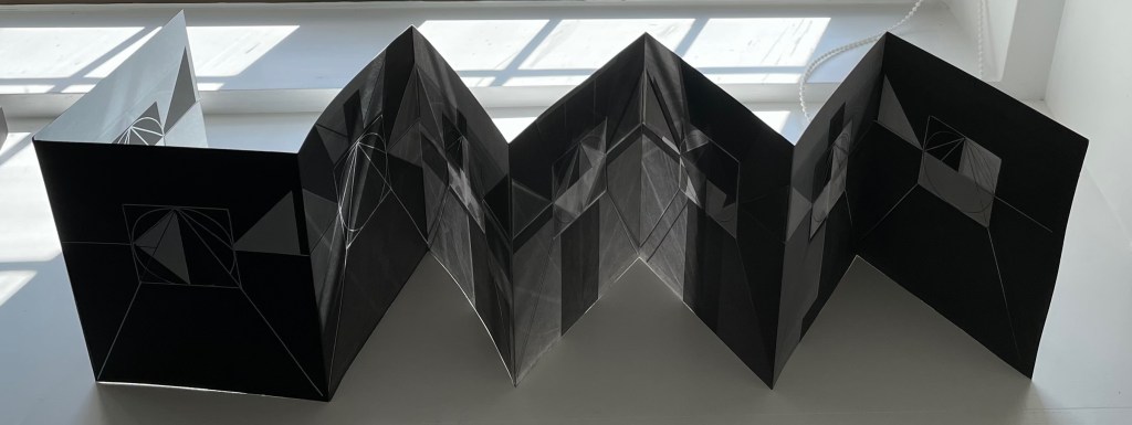
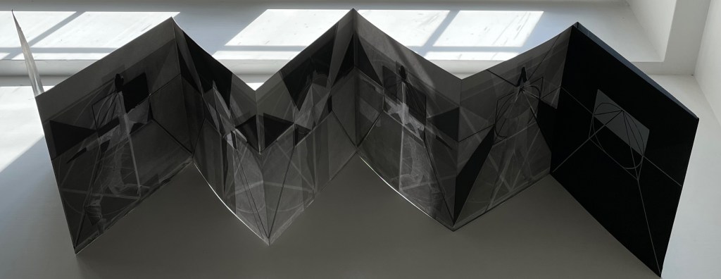
Gestes Alphabétiques (2014) Marie Lancelin Double-sided leporello with sleeve. H200 x W170 mm (closed). 14 panels. Laser-printed, screen print. Interior: offset on Arcoset Extra White 170 gsm. Cover and band: serigraphy on Curious Skin 270 gsm. Edition of 100. Acquired from Printed Matter, Inc., 31 July 2022. Photos: Books On Books Collection. Displayed with permission of the publisher, Grante Ègle (Nantes, France).
There is a long-standing tradition of “dancing the alphabet”. In his satyr play Amphiaraus, Sophocles brings in an actor dancing the letters. A more extended instance comes from 5th century Greek dramatist Kallias; his entire play Grammatike Theoria (“ABC Show” or “The ABC Tragedy“) presents the alphabet and pronunciation exercises. Apparently in acting out the letters psi and omega, the chorus member’s performance tended to the erotic, a phenomenon still to be found in Erté’s alphabet suite (1927/1978) and Anthon Beeke’s Alphabet (1970). Less suggestive are Vítězslav Nezval’s Abeceda (1926), Toshifumi Kawahara’s Dancing Alphabets (1991) and, most recently, Marie Lancelin’s Gestes Alphabétiques (its publisher issued two editions of 100 copies each in 2008 and 2014).
All the media and techniques that Lancelin engaged to make Gestes Alphabétiques — photograms, photomontage, laser printing, serigraphy, staging, lighting, drawing, printing — take her gestures beyond the alphabet and geometric abstractions we can easily see. Also apparent is her grounding in filming; the overlaying of the model’s poses transform that side of the leporello into a dance sequence. With the combined techniques, the ink and paper create the effect of displaying the dance through transparencies or glass or within some black and white computer graphic setting.
Fundamentally, through these media, techniques and the double-sided leporello form, Lancelin translates gesture, symbol, shape and light into one another and back again, offering the viewer the opportunity to see the artist explore the making of meaning.
Gagné, Renaud. 2013. “Dancing Letters: The Alphabetic Tragedy of Kallias”. In Choral Mediations in Greek Tragedy, ed. R. Gagné and M. Hopman, Cambridge University Press 282-307.
Goetz, Sair. “Letterforms / Humanforms“. 11 June 2020. Letterform Archive. Accessed 7 June 2021.
Lancelin, Marie. 29 October – 19 December 2015. “My Models“. Exhibition. In Extenso. Accessed 1 January 2023.
Lawler, Lillian. April 1941. “The Dance of the Alphabet”. The Classical Outlook, 18: 7, pp. 69-71.
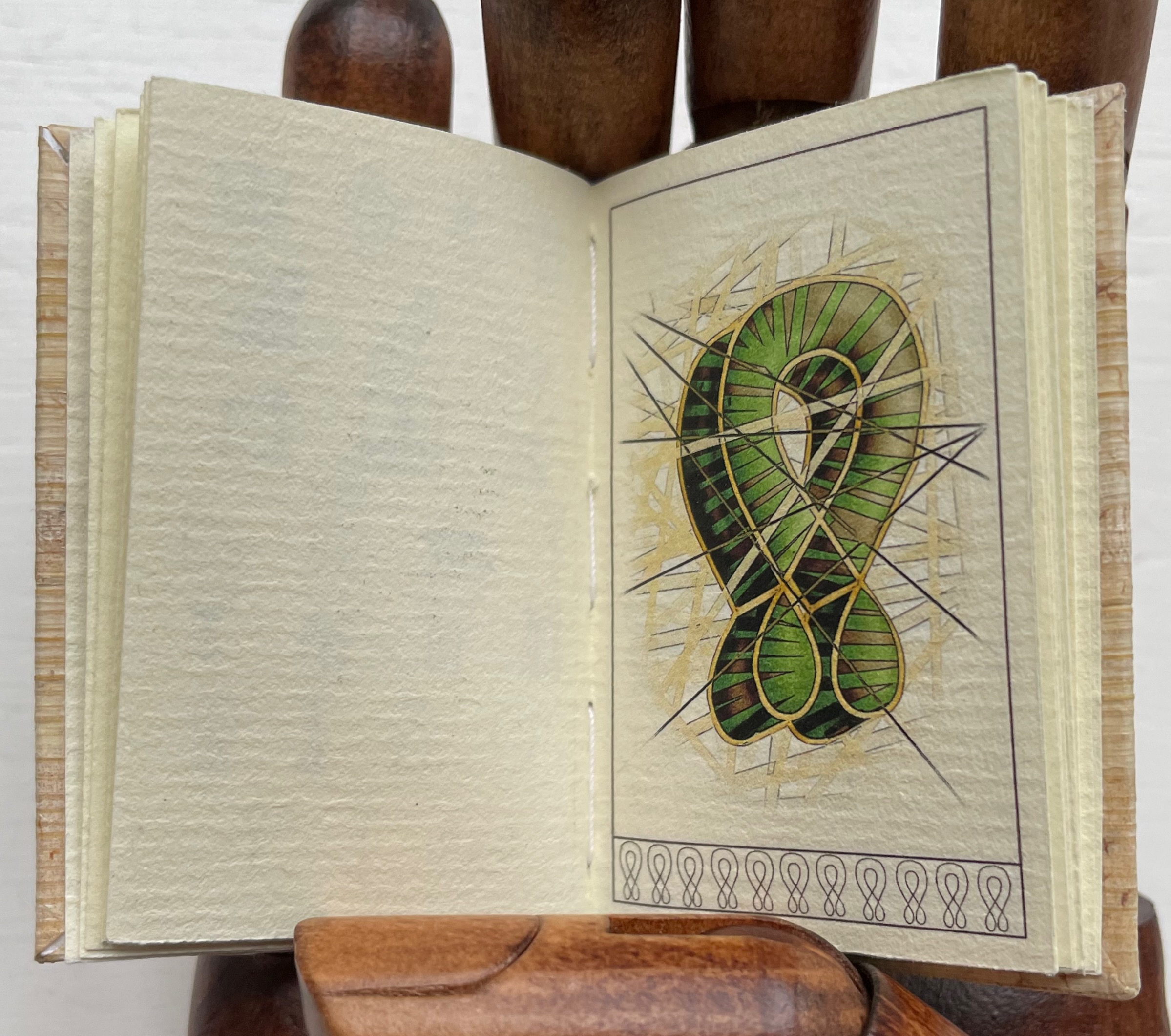
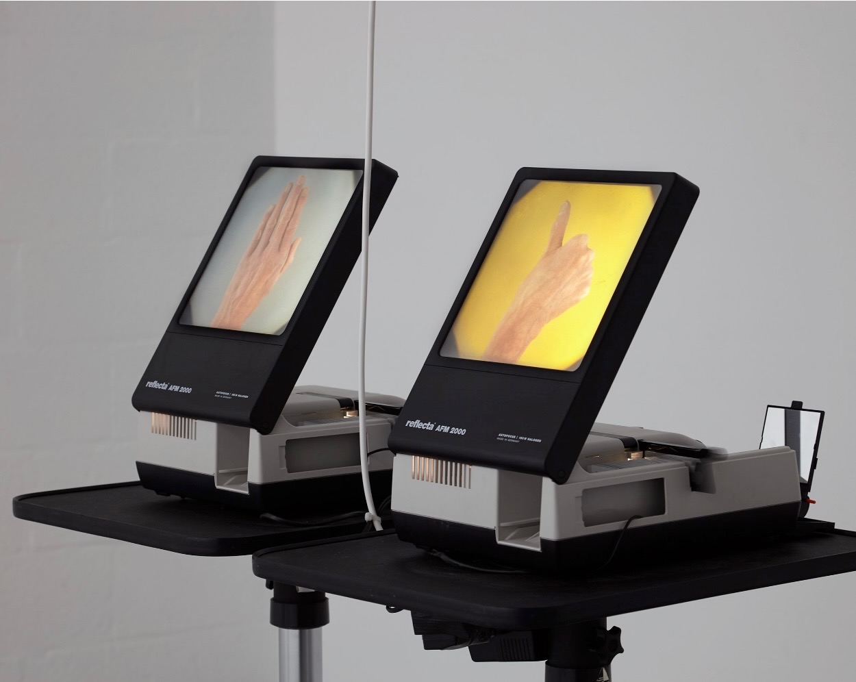
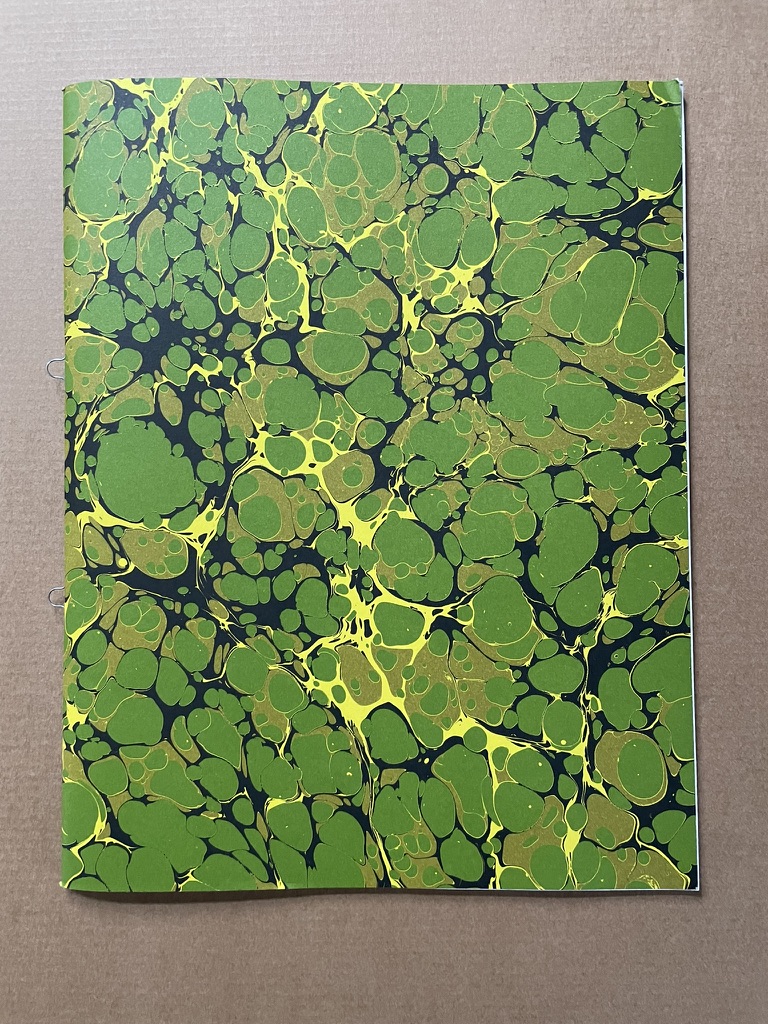
Feeling with Fingers that See (2017) Stuart Whipps Saddle stitched booklet with loop staples and marbled cover. H270 x W210 mm (W216 mm including loop staple). 52 pages and loose sheet for colophon. Edition of 300. Acquired from Loose Joints Publishing, 6 September 2022. Photos: Books On Books Collection. Displayed with permission of the artist.
From “Isle of Slingers“, 9 July to 18 September 2016, Spike Island, Bristol, UK. Images: Courtesy of the artist.
Wren designed two systems of sign language (1650?). The diagrams for both were found interleaved in the Royal Institute of British Architects’ “heirloom copy” of Parentalia, a family memoir published in 1750 by Wren’s grandson also named Christopher. In the first system’s diagram, four letters are assigned to each of the fingers and thumb of the left hand, two each on the knuckle side and two each on the palm side. The five vowels are assigned to the fingertips on the palm side, with the letter I doing double duty for J, and U being subsumed by V. The letter W requires two hands yoked at the thumbs, and likewise the letter X, yoked at the forefingers. Y is created with the thumb spread away from the joined fingers, and Z, with a closed fist.
Whipps uses the second system’s diagram, which he recreates on the last page of his book. The first 25 letters of the alphabet are represented on the five digits of the left hand, and two flat hands represent the 26th letter. The digits of the right hand stand for the order of the letters on the left.
So, below, the display of the left and right thumbs means the letter A. The show of the left thumb and right little finger means E. But there is some “noise” in Whipps’ system. Why, for example, is the thumb for letter A held horizontally but for letter E, it is held vertically?
A and E
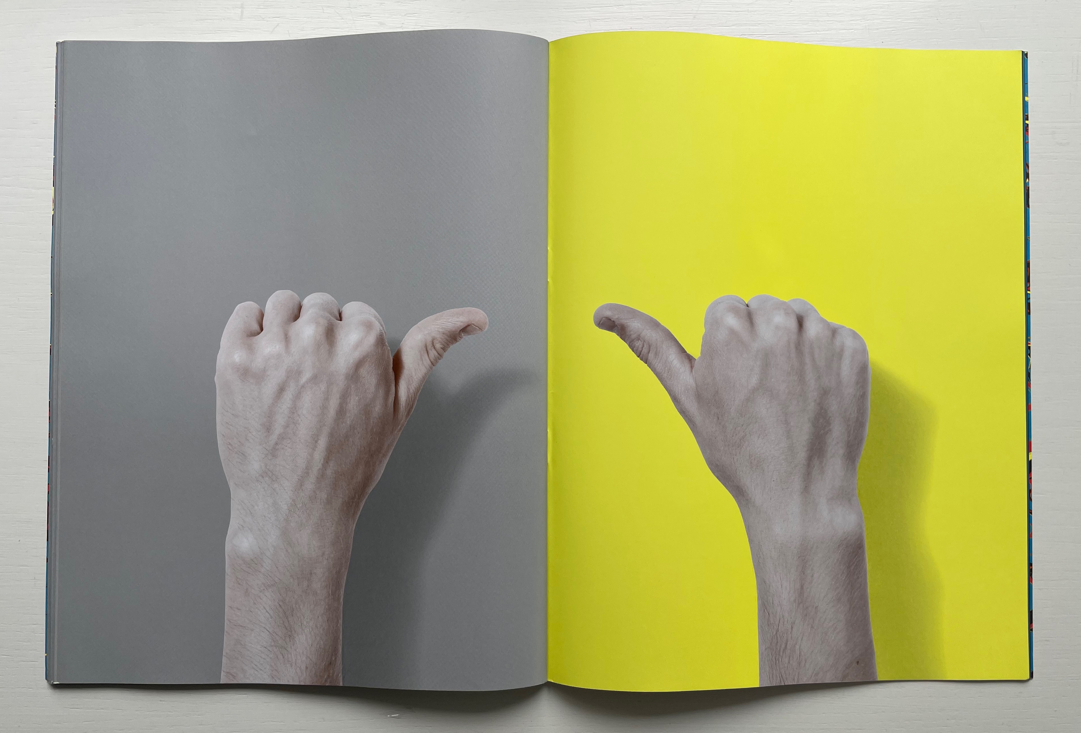
Likewise, sometimes a finger is displayed from the back of the hand, sometimes from the side –even for the same letter.
Variant letter E’s
Variant letter I’s
And in these two separate displays of the letter F, perhaps we also have noise introduced by a slip of the thumb.
F and F
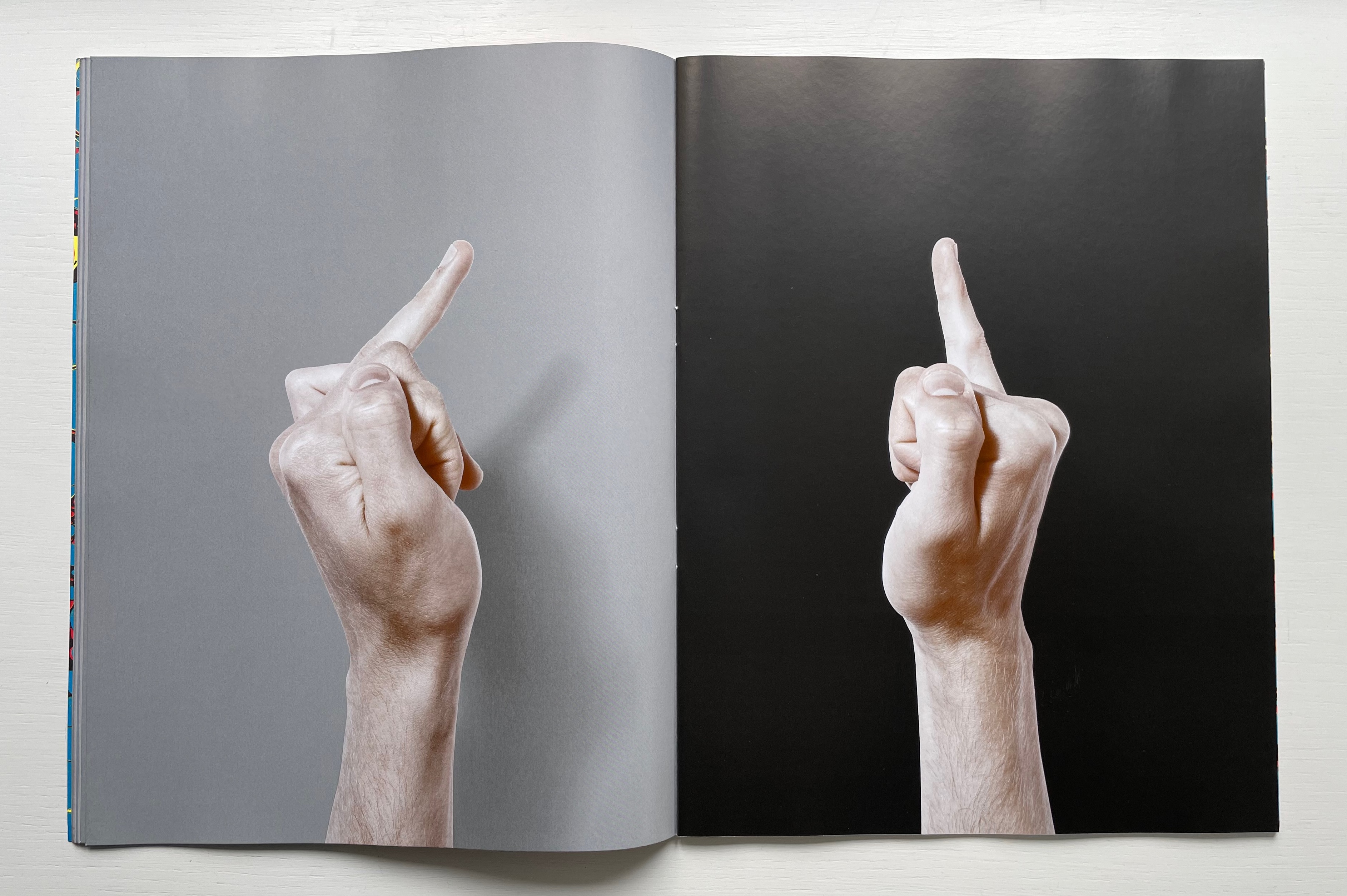
The marbled cover and diagram’s explanation draw attention to a sort of noise reduction feature — color. The left hand always appears against a gray background; the right appears against a colored background. Where there might be some difficulty in distinguishing the fourth digit from the fifth in their side views, the colors bright blue and black are helpful.
S (ring finger, fourth letter), T (ring finger, fifth letter)
But communicating with ghosts shouldn’t be too easy. In the exhibition, two projectors generated potential messages, and random combinations of letters were recorded throughout. The randomness in Whipp’s system — juxtaposed with Wren’s architectural order — and his introduction of color to an otherwise binary, black-and-white system — provide a depth reflected in that marbled cover. A paradox similar to that of “feeling with fingers that see”.
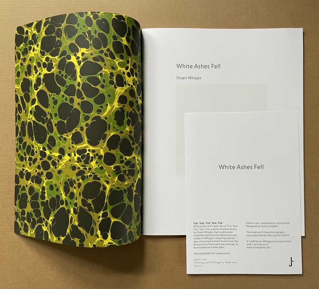
White Ashes Fell (2018)
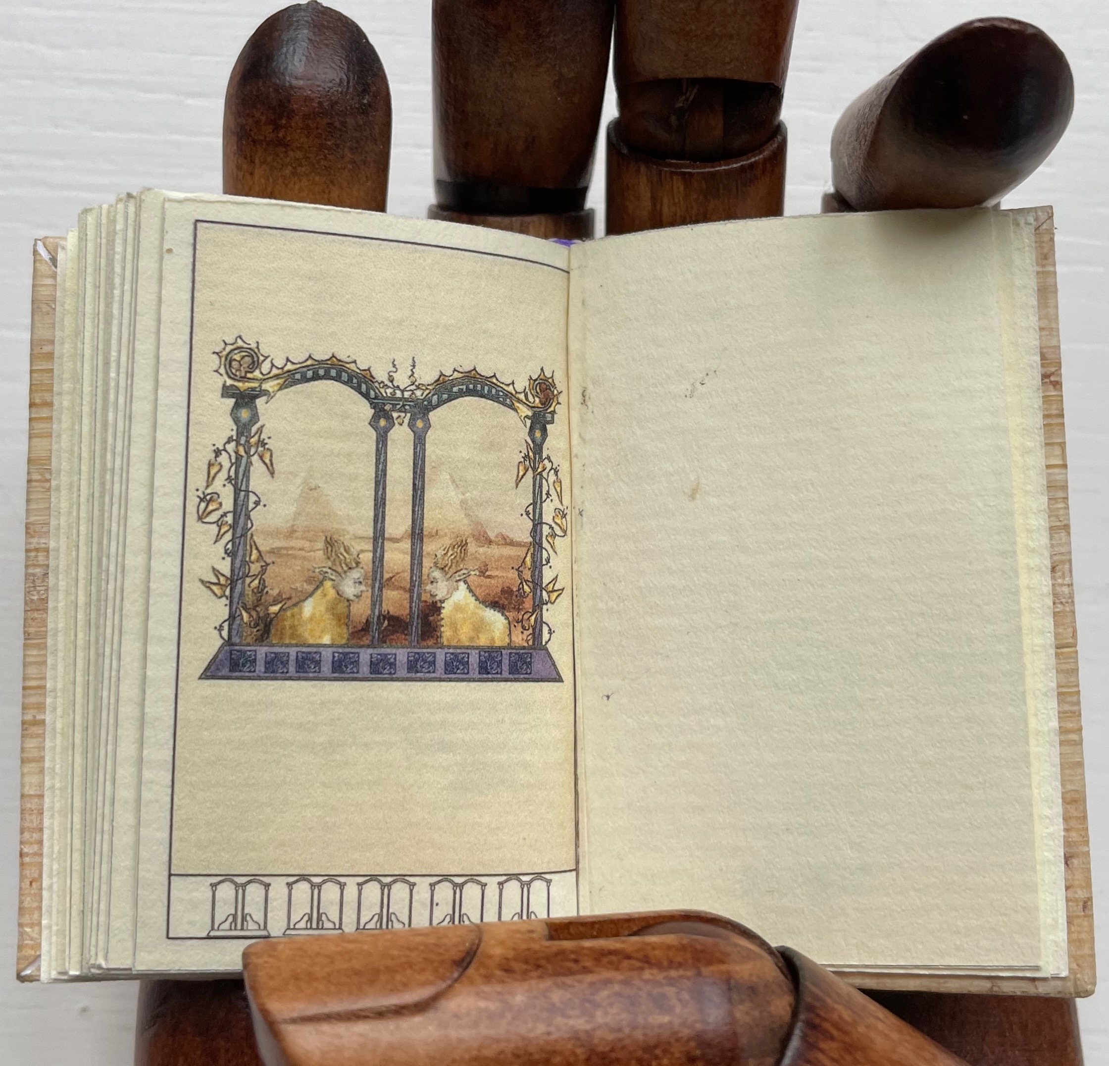
White Ashes Fell (2018) Stuart Whipps Saddle stitched booklet with loop staples and marbled cover. H270 x W210 mm (W216 mm including loop staple). [44] pages. Edition of 300. Acquired from Loose Joints Publishing, 27 December 2022. Photos of the work: Books On Books Collection.
Publisher’s description: “White Ashes Fell presents photographs made by Stuart Whipps in Xilitla, Mexico in 2012. These photographs depict the surrealist sculpture garden of Las Pozas, a collection of 36 large concrete structures with titles such as The House with Three Stories That Could Be Five, and The Temple of The Ducks. Las Pozas was built by the English patron and poet Edward James between 1962 and 1979. These images are accompanied by photographs of the wooden moulds that were used to cast James’ structures. The title comes from a story told to George Melly and published in Swans Reflecting Elephants:
The building occurred only after the first 20 years here. For the first 20 years I was only interested in horticulture and then suddenly, in 62 there was a snowfall. Nobody had seen snow before, they didn’t know what it was. When I got back from New York a month later they said Don Edwardo, for 3 days white ashes fell and burnt everything so then I decided I would do something that couldn’t be killed by freak weather so I began building only then, things that look like trees and plants and flowers. Things that could not be killed by snow.
Las Pozas served to inspire Helen Douglas’ In Mexico (2014) also in the Books On Books Collection.
Further Reading
“Helen Douglas“. 24 February 2020. Books On Books Collection.
“Carina Hesper“. 18 July 2022. Books On Books Collection.
What is it about artists’ books and architecture that they intersect so often? Architectural interiors and exteriors, ideas, themes, styles, landmark dwellings and edifices have found their metaphorical expression and embodiment in book art with such regularity that they make up a genre within the genre. Perhaps it is that, as Victor Hugo expresses it in Nôtre Dame de Paris (1831/1902),
… the human race has two books, two registers, two testaments: masonry and printing; the Bible of stone and the Bible of paper. … The past must be reread upon these pages of marble. This book, written by architecture, must be admired and perused incessantly; but the grandeur of the edifice which printing erects in its turn must not be denied. (Book V, Chapter 2, p. 187)
Or perhaps it is even more fundamental. As Hugo asserts in his posthumous The Alps and the Pyrenees (1890/1895):
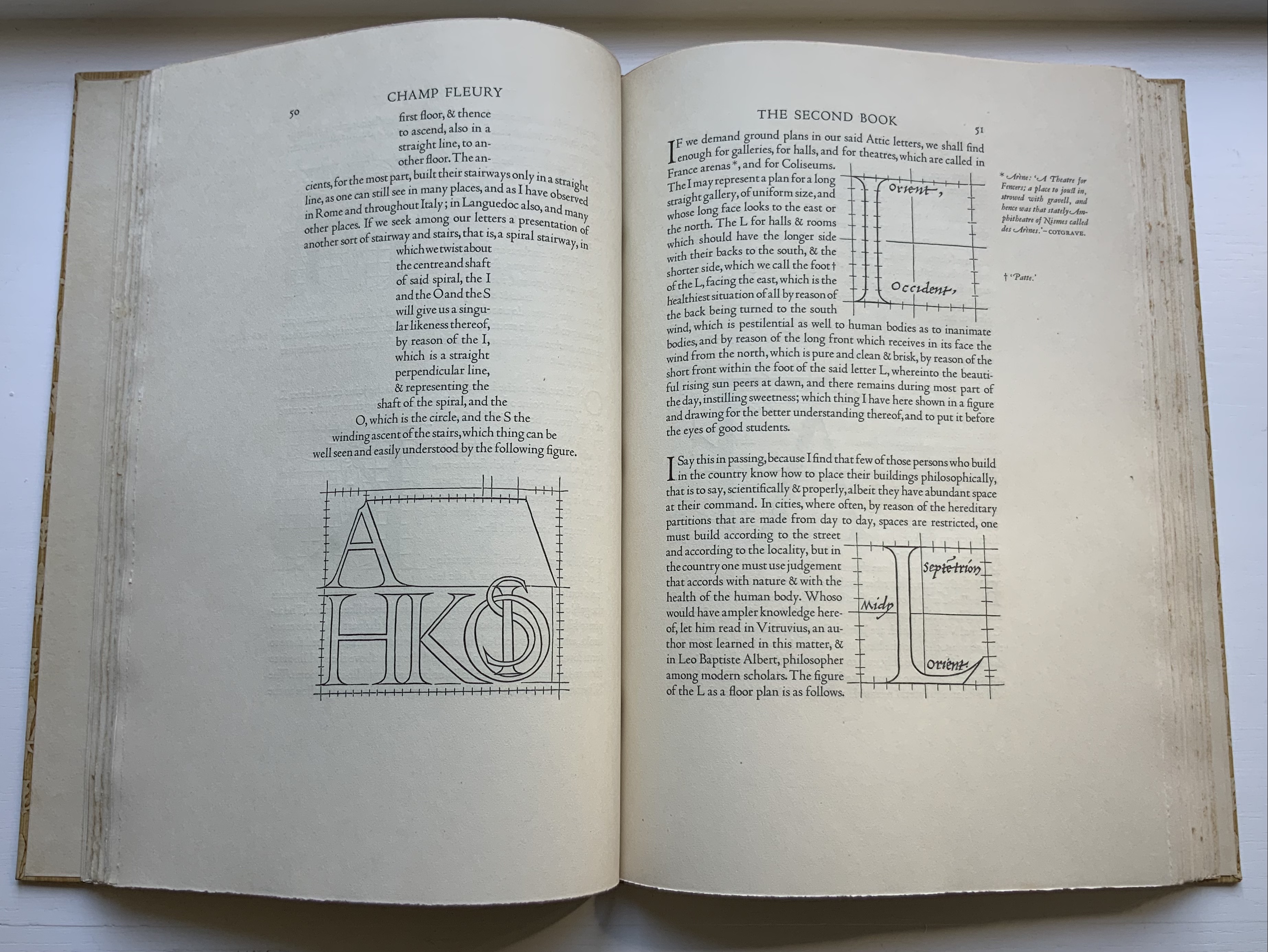
All letters were signs at first, and all signs were images at first…. Human society, the world, man as a whole, is in the alphabet….A is the roof, the gable with its cross-beam, the arch, arx; … Z is the lightning, it is God. (pp. 64-65)
Beneath the mysticism and pareidolia, Hugo is on to something. Maybe the affinity of books and architecture lies in the origin of the raw material of books — the alphabet — whose second letter comes from a mark signifying shelter or house.
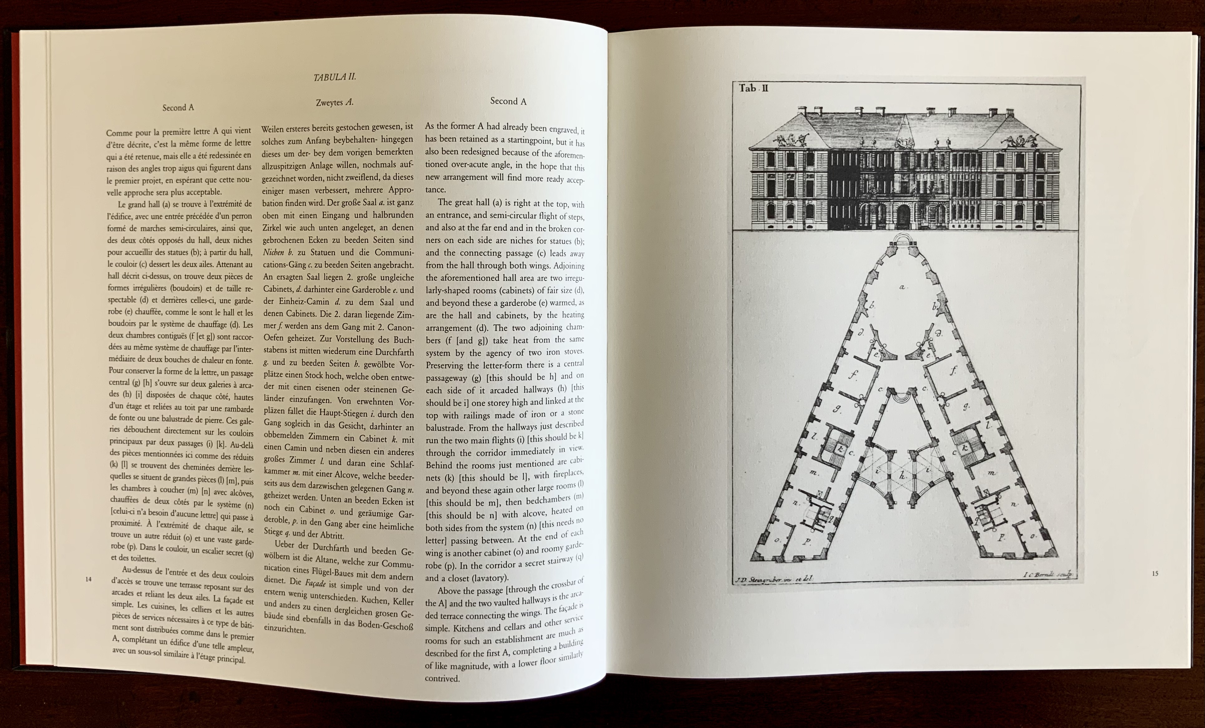
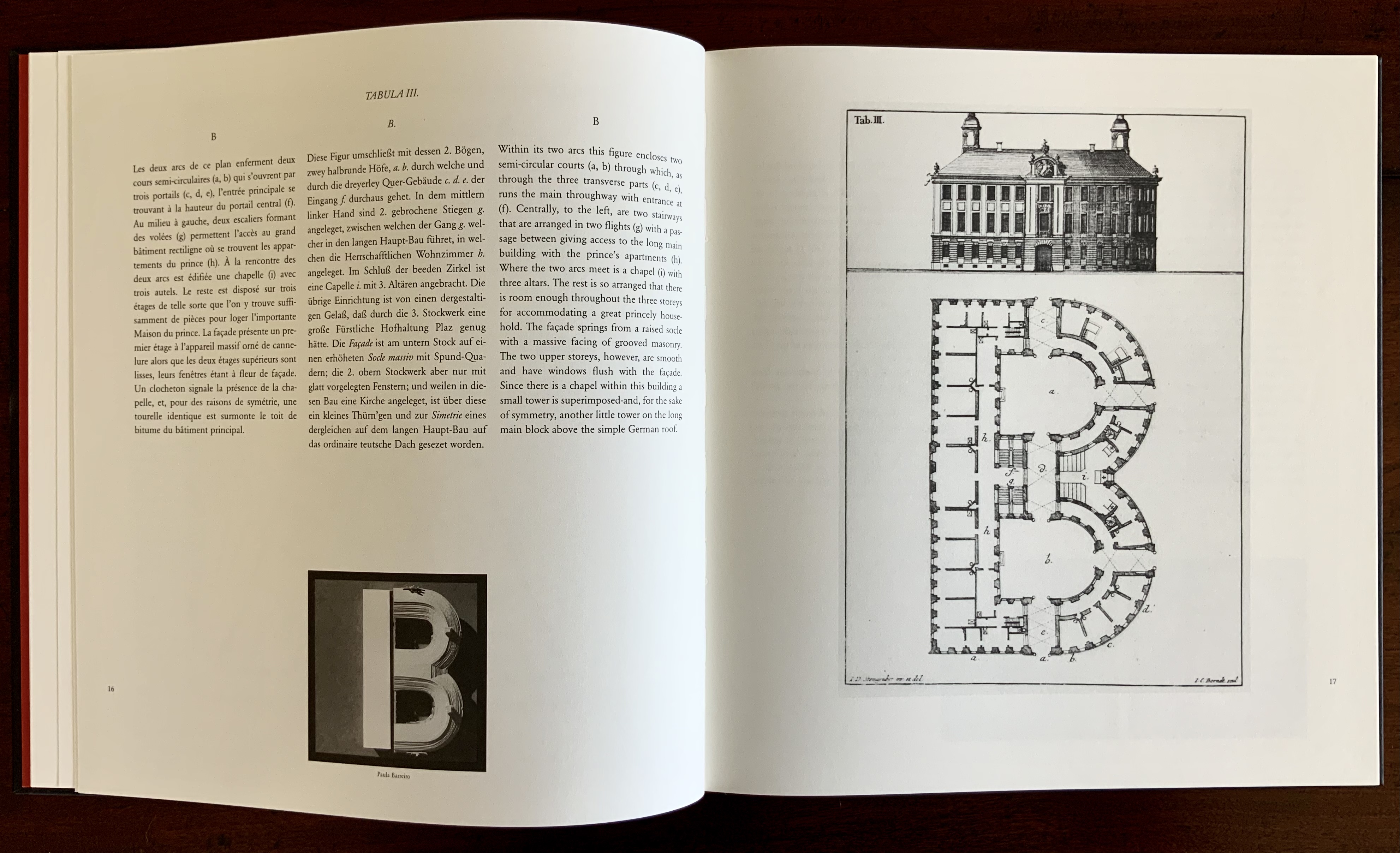
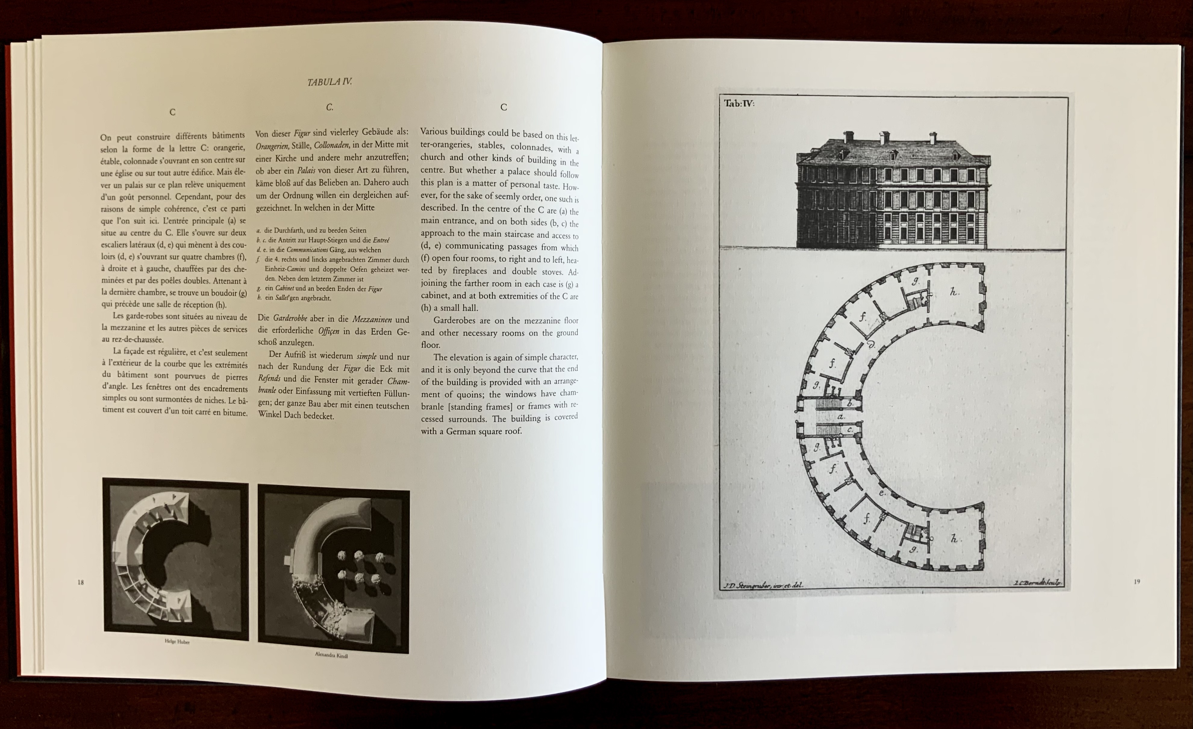
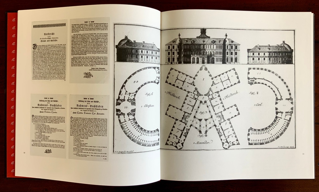
This wondering and wandering about the intersection of architecture and the artist’s book is prompted by the 250th anniversary of the publication of Johann David Steingruber’s Architectonisches Alphabeth(1773). This postcard-famous volume of print folios depicts architectural elevations and plans for residences in the shape of the letters of the alphabet. It is dedicated to Christian Friedrich Carl Alexander, Margrave of Brandenburg-Ansbach, not to be confused with the paying dedicatee of Bach’s Brandenburg Concertos, the Margrave of Brandenburg-Schwedt. By a baroque coincidence, however, the first Brandenburg concertos, the ones composed by Giuseppe Torelli and influencing Bach, are dedicated to the Margrave of Brandenburg-Ansbach, then George Friedrich II, Alexander’s great-uncle who employed Torelli as court composer. Unlike Bach, however, Torelli received no direct payment for his composition. Steingruber too had to be satisfied with his payment as an appointee (court and public surveyor, and later principal architect of the board of works).
Steingruber may have felt he had good reason to be miffed. After all he had published the volume in installments at his own expense and made sure that the Margrave’s monogram (and that of Carolina Frederica, his wife) in building form appeared in the span above the roman arch on the title page. His elevations and plans draw attention to the heating, kitchen, toilet and servants’ arrangements as if conferring with a prospective client ready to commission one of these typographic palaces. Perhaps he was thinking, Who would not want a serif with a view? Or conduct guests on a tour of the bowl, capline, crossbar, stem, stroke and tail of the property? In a flourish that illustrates the intersection of book and architecture, the title page presents the title and subtitle inside an arch and serves double duty as a Table of Contents with thumbnail images of the letter-shaped buildings to come inscribed on the columns.
Munich, Bavarian State Library
To celebrate the Architectural Alphabet‘s 250th anniversary, this online essay/exhibition explores sixteen propositions about the affinity of architecture and artists’ books. Examples supporting each proposition include works from within and without the Books On Books Collection, and each example includes a link or links for additional views of the work. Every effort has been made to provide bibliographical (or webliographical?) links from WorldCat and the Internet Archive. The former will allow the reader to find local libraries that hold a copy of the exhibited work to be viewed in person; the latter will partly address the problem of broken links. Where broken links (or factual errors) do appear, readers are encouraged to alert the curator in the Comments section at the end of the essay/exhibition.
Proposition #1: The affinity of architecture and artists’ books lies in the alphabet.
Architectonisches Alphabeth (1773/1995) Prepared by Joseph Kiermeier-Debre and Fritz Franz Vogel for Ravensburger Verlag.
Of course the first exhibit would be Steingruber’s Architectural Alphabet, but related works — before and after, published or built — will clamor for admission: Geofroy Tory’s Champ Fleury (1529/1927/1998), Antonio Basoli’sAlfabeto Pittorico(1839/1998), Giovanni Battista de Pian’s Alphabetto Pittoresque (1842), and Daniel Libeskind’s Contemporary Jewish Museum (2000), whose form within the walls of a former power substation is composed of two Hebrew letters — the Yud and the Chet — which make up the word Chai (“Life”).
Left to right: Tory/Rogers, Basoli, Battista de Pian (Photos by Books On Books Collection), Libeskind (The Yud Gallery, Photo by Paul Dyer).
Lanore Cady’s Houses & Letters(1977) is another work supporting the proposition, in this case with calligraphy, watercolor and verse.
More than the novel inventions and historical associations above, though, the space within and around a letter, a building and the artist’s book suggests the real root of the affinity. As cultural historian Fiona MacCarthy put it: “‘the Italians knew by instinct what we are slowly grasping, that the meaning of the city is not so much a matter of the buildings as the spaces in between.’” To which John Ryder added: “‘This is exactly how typography works.’” (From David Esslemont’s Inside the Book, 2002). And it is exactly how book art works.
Proposition #2: The affinity of architecture and artists’ books lies in telling stories.
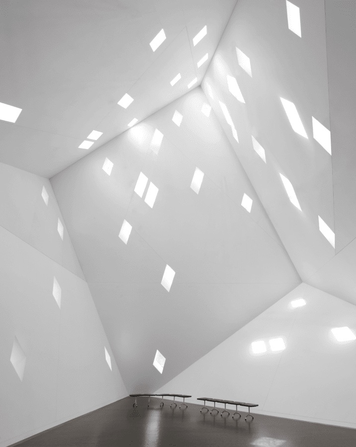
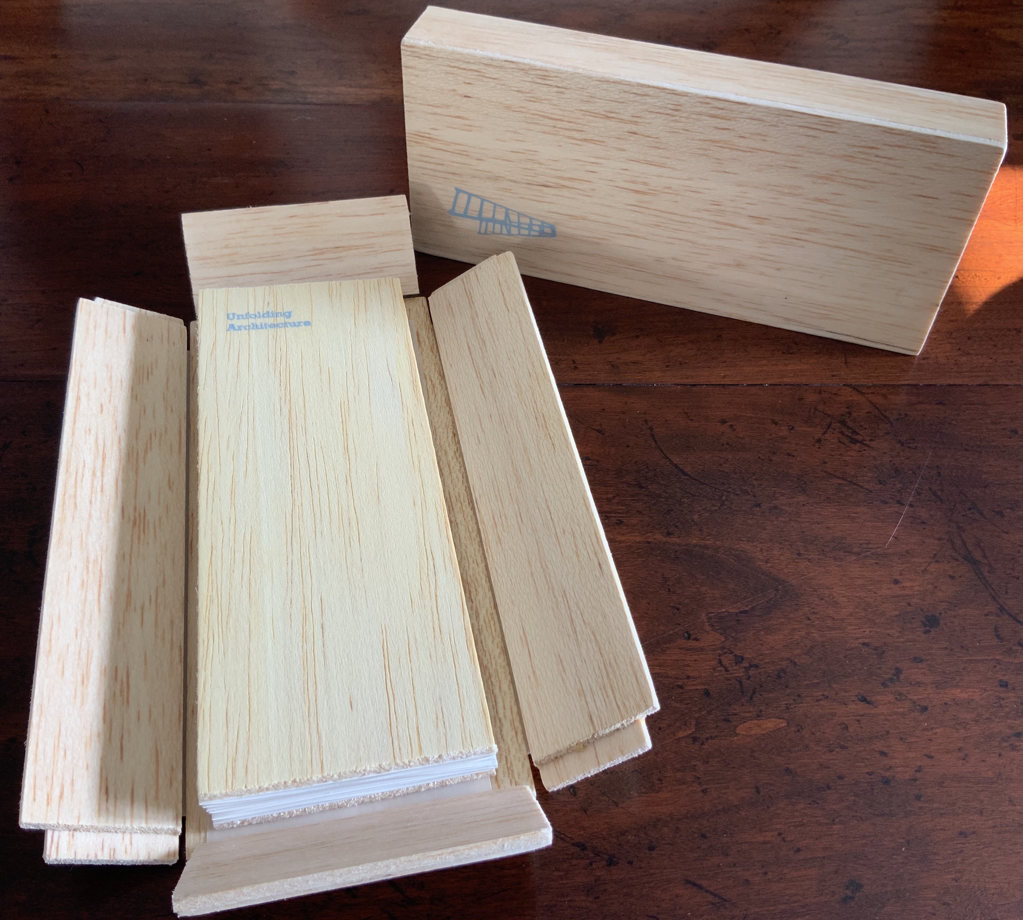
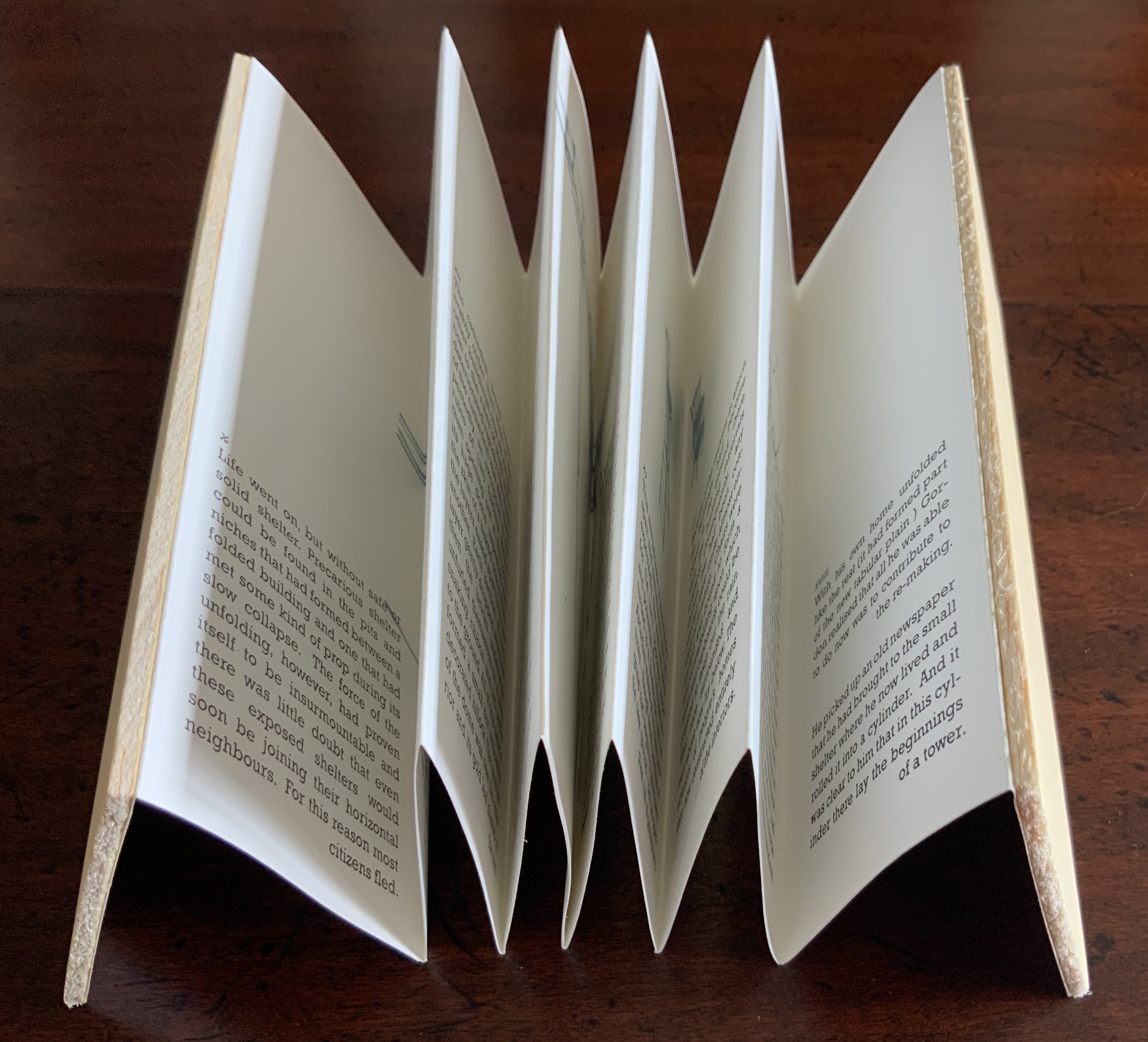
As Daniel Libeskind has said, “For me, a building is a medium to tell a story.” Emily Speed’s Unfolding Architecture (2007) tells the tale of Gordon, a city dweller who witnesses the collapse of public buildings and, ultimately, his own home as the urban fabric begins to unfold around him — a story replicated by the housing’s structure and the book’s accordion fold.
But Ulises Carrión denied that books are about narrative. Instead they are about space and time, which leads to the next proposition.
Proposition #3: The affinity of architecture and artists’ books lies in space and time.
Olafur Eliasson’s Your House (2006) is a laser-cut model of his residence in Copenhagen at a scale of 1:85, which means that each page equates to a 220 mm section of the actual house. In the film Russian Ark (2003), Aleksandr Sokurov made cinematic history with his one continuous shot in 90 minutes, depicting a 17th century time traveller moving through different periods of history as he moves through the rooms of St. Petersburg’s Winter Palace. The film inspired Johan Hybschmann’sBook of Space (2009).
How do you read works like this? The size, weight and delicacy of Eliasson’s book and the fragility of Hybschmann’s book and its need for an armature to freeze-frame it defy a simple turning of pages. They must be turned slowly and carefully. Both works heed the task of the arts as posed by architect Juhani Pallasmaa for our age of speed: to defend the comprehensibility of time, its experiential plasticity, tactility and slowness (The Embodied Image, p. 78).
Proposition #4: The affinity of architecture and artists’ books lies in process.
A trained architect and book artist, Marian Macken articulates and illustrates in her book Binding Space why and how the artist’s book can serve as an important tool for design, documentation and critique of architecture. Macken’s perceptive descriptions show how to observe materiality and its functioning and understand how they contribute to the making of art.
Investigating bookness results in the book becoming a highly productive intervening medium with which one can imagine, investigate, analyze, represent and exhibit particular qualities — haptically, and with narrative and ambiguity — of a built environment and the design process. Through the book, we read spatial practice anew (p. 163).
Reading Macken’s book will sharpen the ability of any reader or viewer to appreciate book art, especially her Ise Jingū: Beginning Repeated. Ise Jingū is a Shinto shrine complex in the Mie Prefecture, Japan. “Once every 20 years, since … the seventh century, every fence and building is completely rebuilt on an identical adjoining site, a practice of transposition known as shikinen-zōkan” (Binding Space, p. 101). For Macken, this ritualistic rebuilding poses architecture as performative process rather than as inert object; it “manifests the replication of a beginning, of a process” (p. 100).
Macken’s artwork consists of 61 loose sheets with a watermarked image within each, the number reflecting the 61 iterations of the shrine up until the making of this work of book art. The watermark is a perspective image based on Yoshio Watanabe’s photograph of the Inner Shrine, taken in 1953 on the occasion of the 59th rebuilding. The contrast of the watermark in kozo and the movement of its placement from one sheet to the next entice reflection on the phenomenon of representation and the architectural process of shikinen-zōkan.
Proposition #5: The affinity of architecture and artists’ books lies in phenomenology.
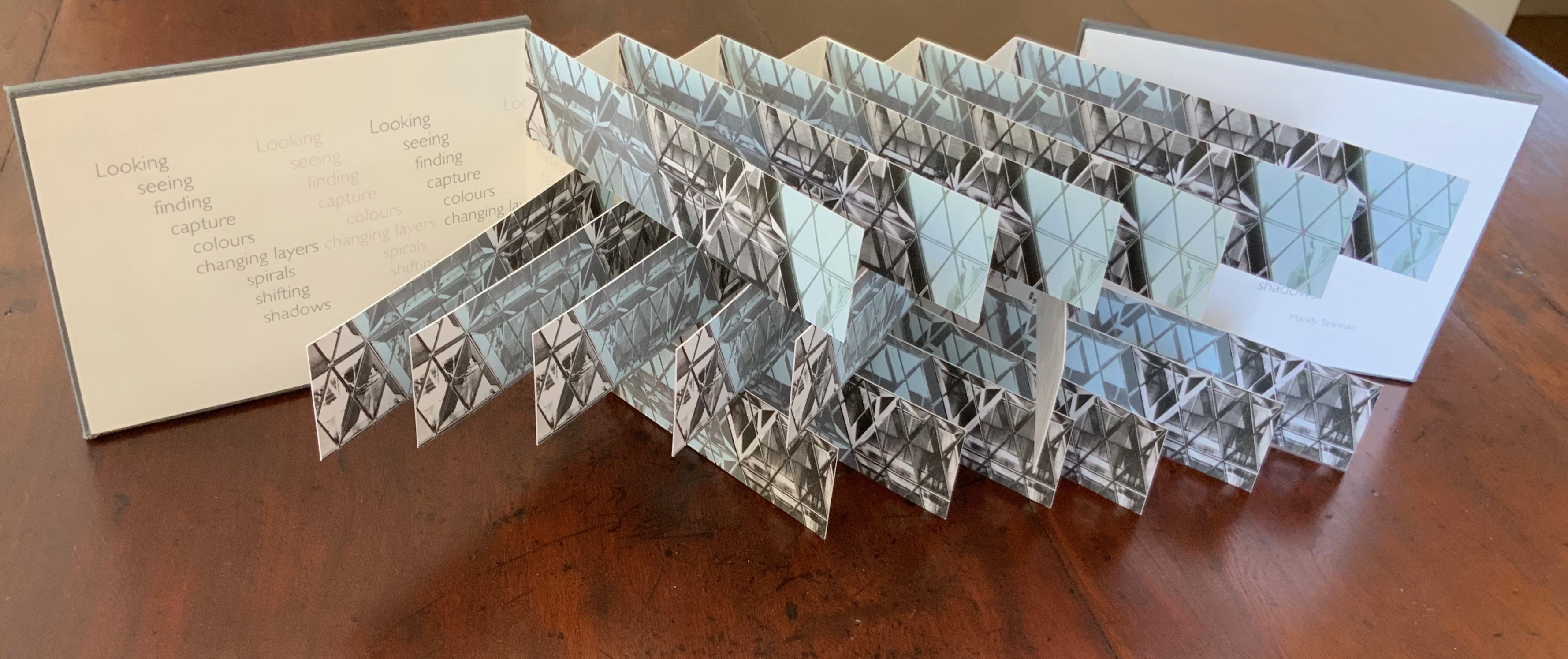
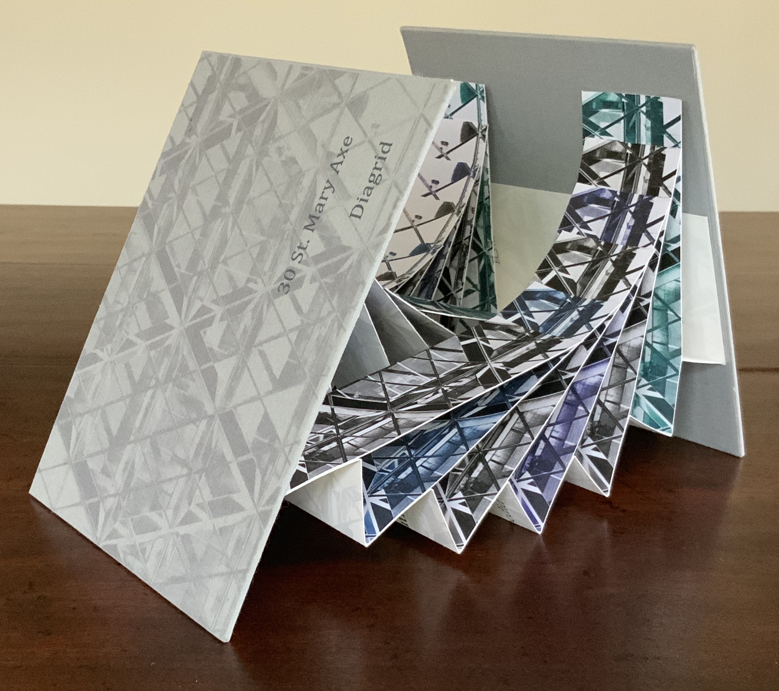
Architects such as Alfredo Muñoz and his firm ABIBOO, Juhani Pallasmaa and Peter Zumthor are among those often associated with architectural phenomenology, concerned with perception psychology, focused on the primacy of sensory and experiential qualities. Norman Foster and phenomenology are not so often yoked, but 30 St Mary Axe: Diagrid (2009) and 30 St. Mary Axe: Cladding(2009)– Mandy Brannan’s treatments of his iconic London office tower (aka “the Gherkin”) that refocus the perception and experience of it — might prompt reconsideration.
Proposition #6: The affinity of architecture and artists’ books lies in geometry.
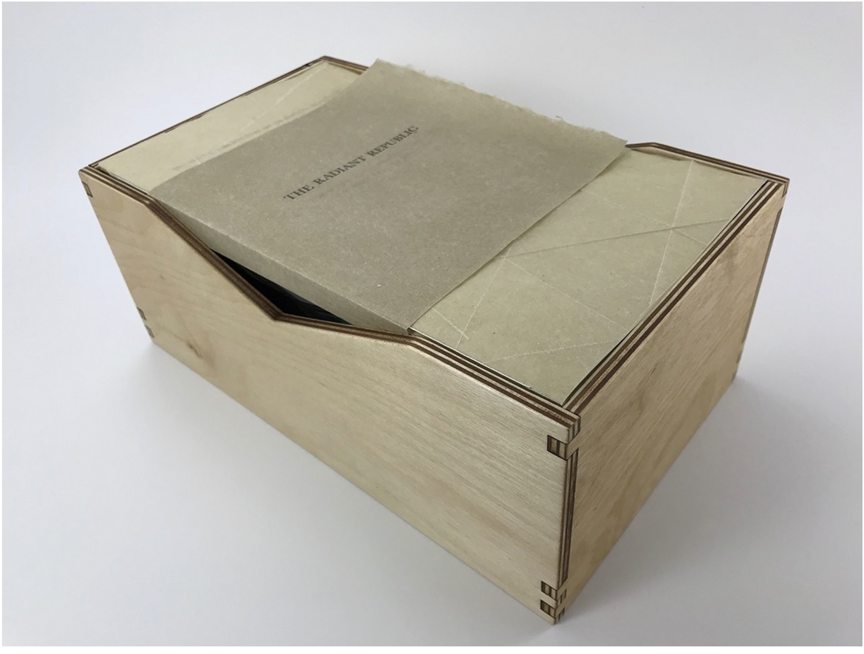
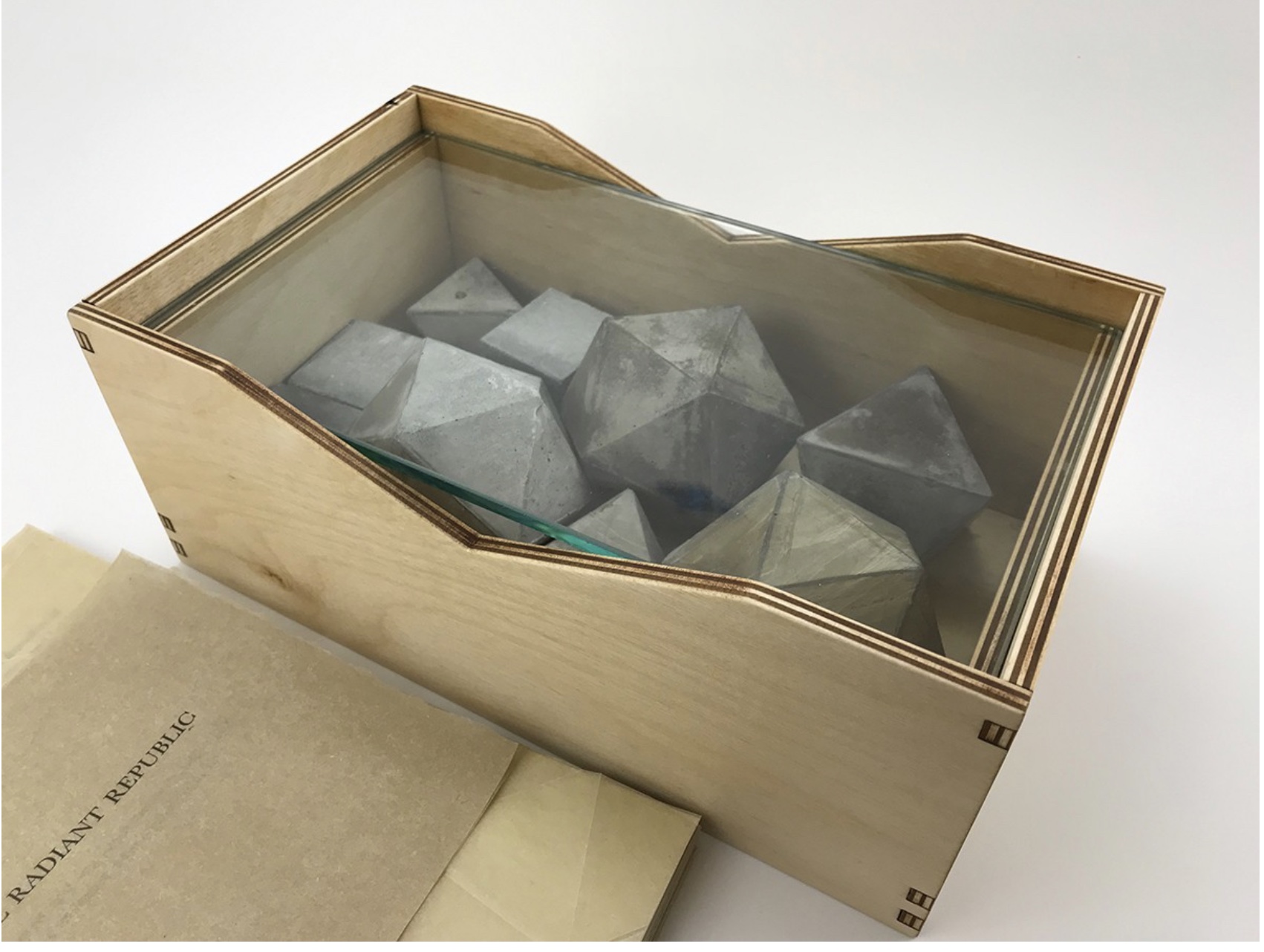
Sarah Bryant’s The Radiant Republic(2019) insightfully integrates Plato’s and Le Corbusier’s texts and ideas. The very physicality of the blond wood, linen cover, glass window, concrete representations of Platonic solids, embossed type and sewn papers could easily be a response to Juhani Pallasmaa’s comment: “The current overemphasis on the intellectual and conceptual dimensions of architecture contributes to the disappearance of its physical, sensual and embodied essence” (The Eyes of the Skin, p. 35).
Proposition #7: The affinity of architecture and artists’ books lies in modelling.
Helen Malone’s Ten Books of Architecture (2017) takes a broad historical and, most important, haptic view of architecture from Vitruvius to Hadid. Each of the ten books is a bookwork that models its architectural subject.
Proposition #8: The affinity of architecture and artists’ books lies in folding.
At the end of the 20th century, architects like Peter Eisenman, Jeffrey Kipnis and Greg Lynn latched on to computer-aided design and Gilles Deleuze’s Le pli: Leibniz et le baroque (1988) / The Fold: Leibniz and the Baroque (1993). This led to real constructions such as Eisenman’s Rebstock Park in Frankfurt as well as to the seminal books Folding in Architecture (1993), edited by Lynn, and Folding Architecture 92003) by Sophia Vyzoviti.
Folded book pages rarely generate a work that rises above mere craft. Heather Hunter’s Observer Series: Architecture(2009) achieves the necessary height. It combines the altered book with an accordion book that incorporates a found poem composed of the words excised and folded outwards from the folded pages of The Observer’s Book of Architecture.
Proposition #9: The affinity of architecture and artists’ books lies in light.
Marlene MacCallum’sTheme and Permutation(2012) is a response to the permutations and variations over time in five houses built to a common plan in Townsite area of Corner Brook, Newfoundland. MacCallum used digital tools to translate the original film source of eight different window images from the houses. A tritone image of a single Townsite window under translucent pages opens the book. As the pages turn, new window images appear and layer over each other, darkening up to the book’s mid-point. In the center spread, two text blocks appear speaking to the history, architectural permutations and economic shifts of the Townsite area. The tonality begins to lighten over the ensuing new combinations of window layers. A third text block of personal narrative is introduced, and a tritone image of one of the Townsite windows in its original condition concludes the work.
Proposition #10: The affinity of architecture and artists’ books lies in perspective.
Cees Nagelkerke’s Piranesian Window (1996) resides in the Vedute Foundation’s collection of “spatial manuscripts”, invited works that must conform to the dimensions of the Gutenberg Bible. Piranesian Window‘s form and title capture multiple meanings of vedute (“views”). Views are things seen — which this spatial manuscript is. Views are prospects from which to see — which a window offers. Views are perspectives — for which Giambattista Piranesi’s etchings are famous. Views are thoughts held — which “Piranesian” implies (the work’s title could be that of a manuscript on art history and philosophy). Piranesi’s mid-eighteenth century etchings Vedute di Roma(“Views of Rome”) and Carceri d’invenzione (“Imaginary Prisons”) are the obvious sources of inspiration, but Nagelkerke provides an interview describing the dream source of the work:
– … Please, continue relating your dream … – I wandered through vast ruins … along wrecked bridges … feeling remarkably at ease. – How did you find the window in this windowless world? – When a cool breeze wafted inside, I suddenly saw it. It showed a landscape, within the distance a city. There was complete tranquillity and harmony there, like in a painting by Piero della Francesca … I stood there for some considerable time and I became increasingly saddened, because I discovered that I was looking at something that had vanished forever. – But how did you manage to take the window? – I wanted to touch it … as a result, I immediately fell down. The gap left in the wall closed by itself … I picked it up and continued on my way, meeting people who spoke to me saying that I should leave the Carceri. I was taken to a gateway. No one looked at, or said anything about, the window… In the square where I found myself, there was an intense, chaotic commotion. The window still reflected something of the vast space I had left. The exterior showed traces of the wall in which it had been mounted. I looked through it and saw everyday life …
Proposition #11: The affinity of architecture and artists’ books lies in archaeology.
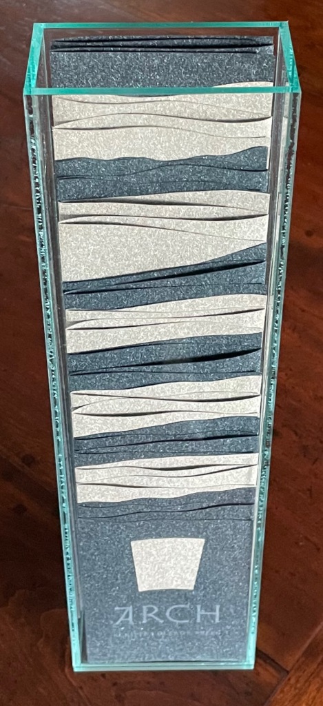
Mill: A journey around Cromford Mill, Derbyshire (2006) by Salt + Shaw (Paul Salt and Susan Shaw) is the result of the artists’ exploration of Cromford Mill in Derbyshire, the first water-powered, cotton-spinning mill developed by Richard Arkwright in 1771. Bound in a cover of recycled wooden library shelves, three plaster cast blocks and seven calico pocket pages containing hidden texts imply the hidden archaeological history to be found. The forensic-like casts are taken from interior surfaces, and the texts walk the reader step by step through each area of the mill.
Proposition #12: The affinity of architecture and artists’ books lies in assemblage and collage.
Based on an architectural installation at the Minnesota College for Art and Design and drawing on her photos of Ayvalik, Amsterdam, Florence, Istanbul, New York City, Rome, San Diego and Venice, Karen Wirth’sPaper Architecture (2017) certainly prompts a revisit to MoMA’s “Cut ’n’ Paste: From Architectural Assemblage to Collage City“, 10 July 2013 – 5 January 2015, to prove this proposition.
Proposition #13: The affinity of architecture and artists’ books lies in luxe.
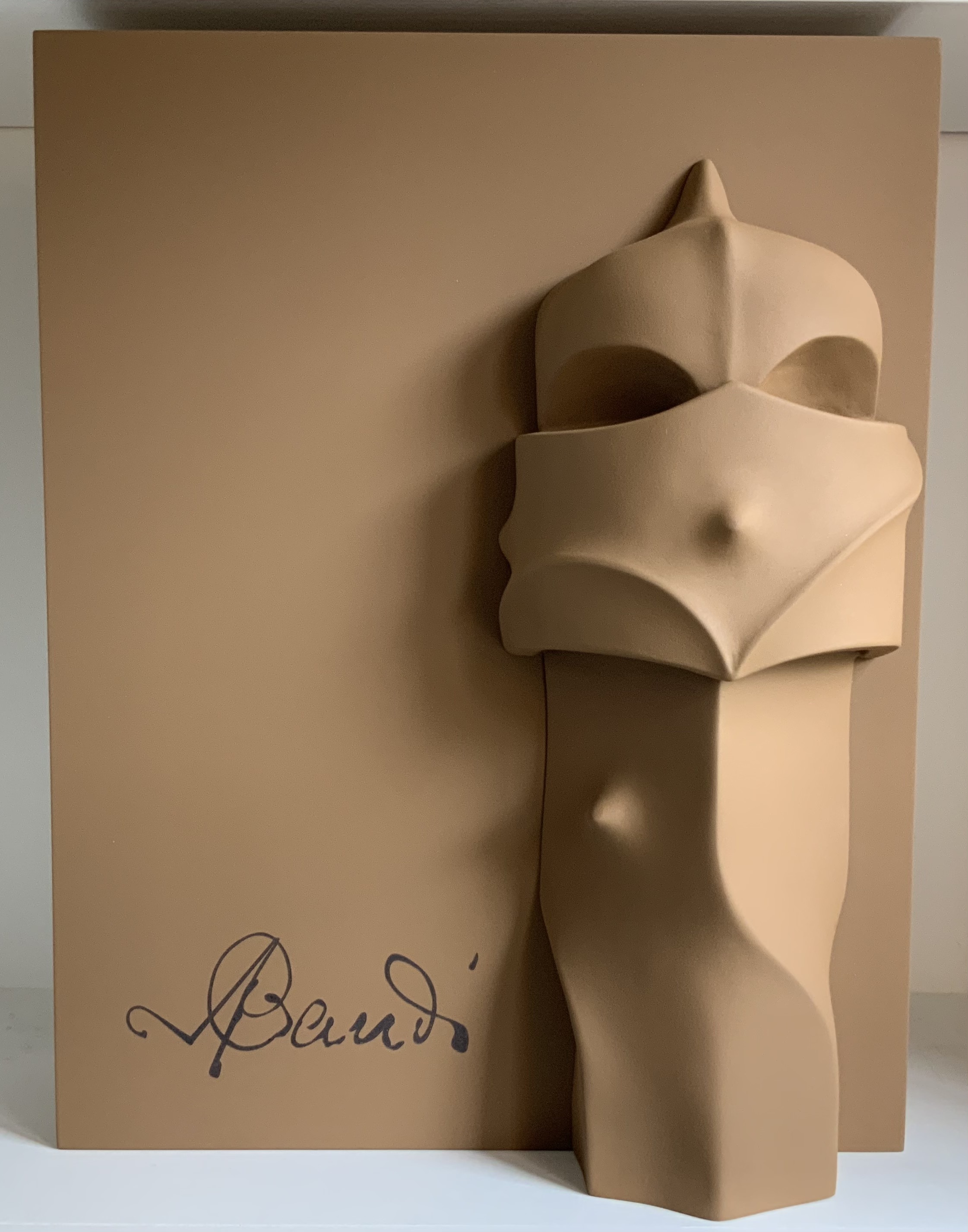
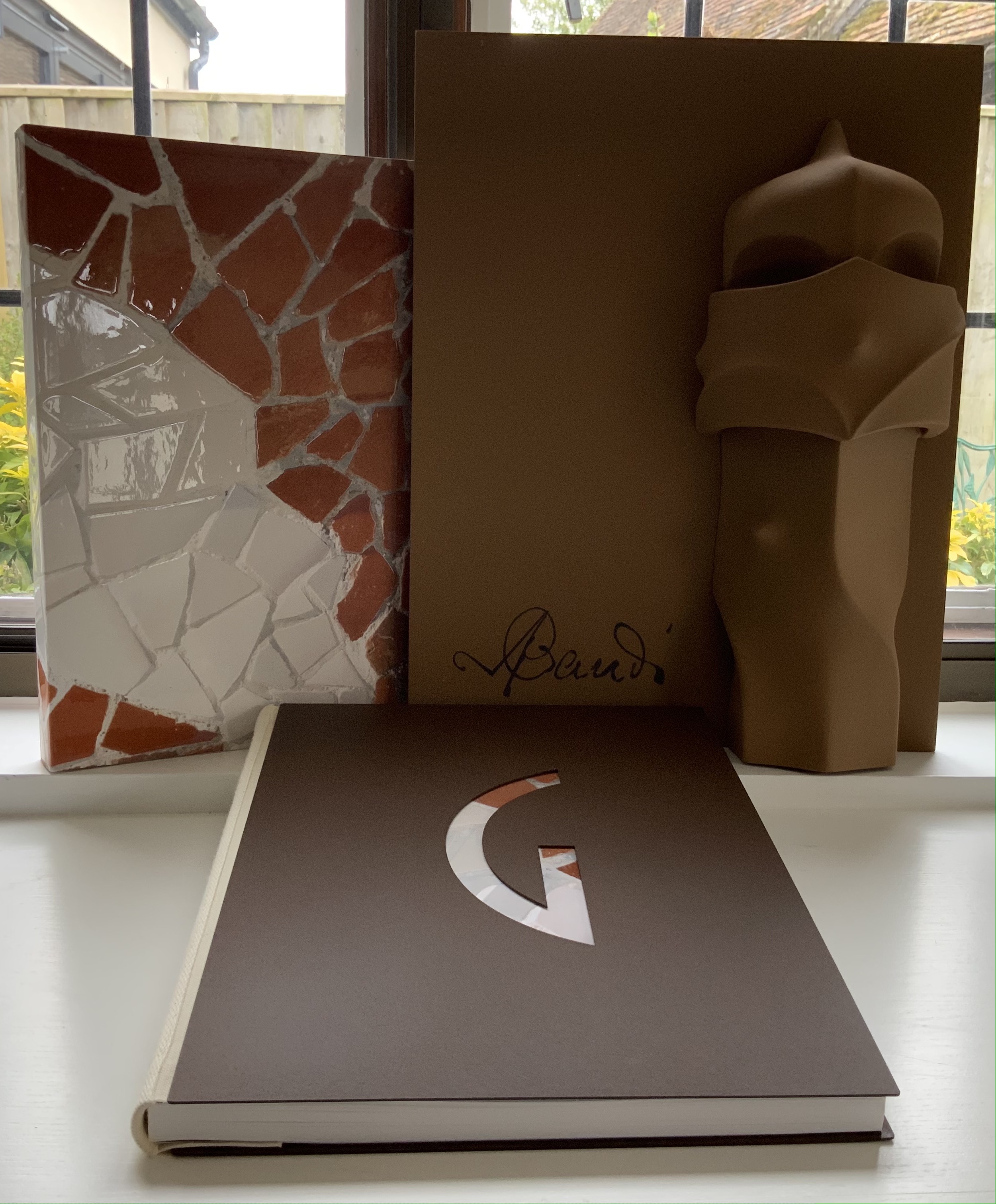
Early theorists, critics and artists of book art expended great effort to exclude livres d’artiste and deluxe productions from the definition of a form of art that struggled to find a name: artist’s book, artists’ books, bookworks, book art, etc. The spectrum from objects of conspicuous consumption to democratic multiples characterizes both architecture and book art. Antoni Gaudí’s architectural efforts easily span that spectrum — from his Casa Milà to his tiles found underfoot in Barcelona’s Passeig de Gràcia. Under the guidance of Juan José Lahuerta (chief curator at the National Museum of Art of Catalonia), the publisher Artika produced Gaudí Up Close(2020), enclosed in a wooden case with marble sculpture finished in paint, cement powder and anti-graffiti varnishes and lined with Naturlinnen fabric.
Gaudí Up Close(2020) Published by Artika. Photos: Books On Books Collection.
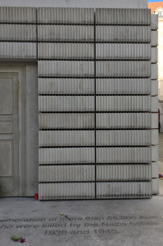
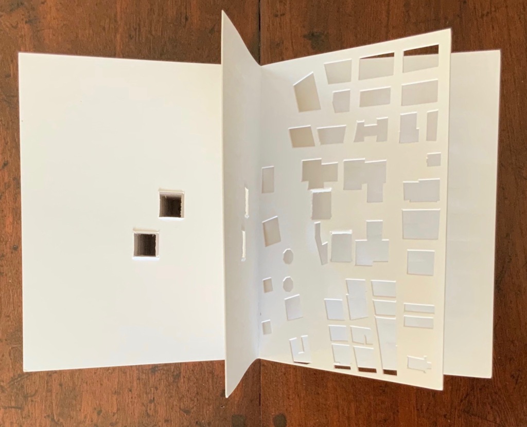
Proposition #14: The affinity of architecture and artists’ books lies in the memorial.
As you turn the corner into Judenplatz in Vienna, Rachel Whiteread’s great cube appears showing only the fore edge of book after book. As you hold J. Meejin Yoon’s small white brick of paper and turn its thick pages, a small pinhole appears on the page. Then two larger square holes emerge, one of which falls over the pinhole. Page after page, the two square holes repeat, creating two small dark wells in the field of white, until on the last page they take their place in the cut-out schematic footprint of the city blocks and buildings surrounding the Twin Towers. Whiteread’sNameless Library (2000) and Yoon’sAbsence (2004) surely underscore this proposition of memorial.
Proposition #15: The affinity of architecture and artists’ books lies in the sacred.
Jeffrey Morin and Steven Ferlauto’s Sacred Space (2003) is an intimate monument of book art. Made intimate by the content and texture of its book, made more intimate by the viewer’s having to construct the chapel. Made monumental by the echo of typographic history, made more monumental in Galileo Galilei’s echo from its floor: Mathematics is the alphabet with which God has created the universe.
Proposition #16: The affinity of architecture and artists’ books lies in collaboration.
In Victor Hugo’s Nôtre-Dame de Paris (1831), Archdeacon Claude Frollo points to the book in his hand and then to the cathedral and says, “This will kill that”. It is ironic that Hugo’s book (popularly known now by its English title The Hunchback of Nôtre-Dame) was written in large part to save the then-decaying cathedral (post-Revolution, it served as a warehouse), and it succeeded. It is also ironic that, while the fictional character’s metaphor has a point about the book’s permanence of replicability outlasting the building’s permanence of stone, it misses the collaborative foundations of both.
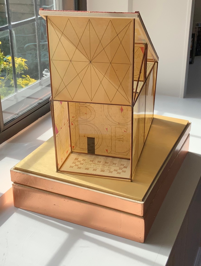
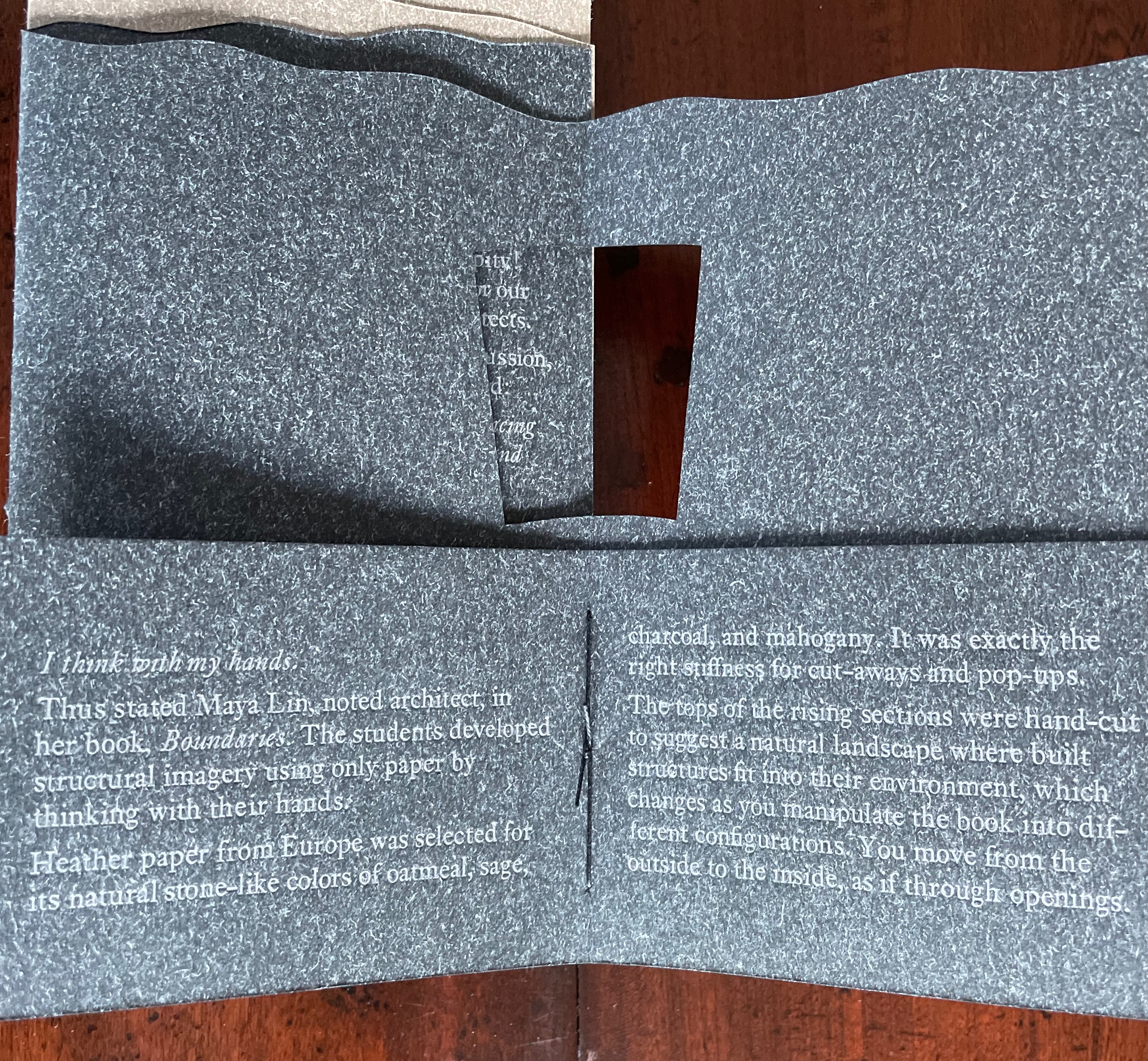
Created by ten students at Scripps College under the direction of Kitty Maryatt, Arch (2010) reminds us that the creation of a book — even a work of book art — is a collaborative effort.
Arch (2010) Kitty Maryatt, Jenny Karin Morrill, Ali Standish, Alycia Lang, Jennifer Wineke, Mandesha Marcus, Catherine Wang, Kathryn Hunt, Ilse Wogau, Jennifer Cohen, Winnie Ding Photos: Books On Books Collection
Maryatt’s preface to Arch is entitled “Blueprint” and is brief enough to warrant citing in full:
Books are inherently architectonic. Studying architecture would naturally be profitable to students building their own books.
On January 17, 2010, just days before class was to start, the Los Angeles Times published a fascinating article on contemporary women architects, highlighting a striking building by Jeannie Gang.
Earlier this year, the brand-new President of Scripps College chose The Genius of Women as her inaugural theme. What serendipity! This gave us the perfect inspiration for our artist book: the genius of women architects.
After extensive research and class discussion, a mission statement for the book evolved:
Architecture, like books, is a delicate balancing act between stability and motion, interior and exterior, aesthetic values and structural practicalities.
Books, like building, are fundamentally inhabited spaces. They are incomplete without human interaction.
The first portals were built of post and lintel construction. A curved arch is more difficult: the keystone is needed at the apex to lock the other pieces into position. Building a book is a similarly difficult feat. — Professor Kitty Maryatt
Conclusion: The affinity of architecture and artists’ books lies in our attraction to the beauty of form.
No doubt the proximity of the need for shelter and the need for oral and written language have played some gravitational role of mutual attraction for architecture and books (and latterly artists’ books). But equally, both architecture and artists’ books speak to our attraction to the beauty of form. All of the examples above are re-offered here in support of this proposition. Look at them again.
“Architecture”, “art” and “the book” are all fluid concepts. So it should be no surprise that we arrive at the equally fluid similes: architecture is like book art, book art is like architecture.
An earlier version of this essay appeared in The Blue Notebook, Volume 16 No 2, Spring – Summer 2022.
Further Reading
“Architecture“. 12 November 2018. Bookmarking Book Art.
Lynn, Greg. 2004. Folding in Architecture Rev. ed. Chichester, West Sussex: Wiley-Academy. See for references to Mario Carpo, Gilles Deleuze and Peter Eisenman.
Book of Space (2009) Johan Hybschmann A4 sketchbook, laser cut watercolor paper, spray paint. brass and string. Perspex display case made by Hamar Acrylics with a sprayed mdf base, H360mm x W330 x D330 mm; Attachable brass frame and white thread for display. One of two. Acquired from the artist, 22 August 2021. Photos: Books On Books Collection.
If you are familiar with Olafur Eliasson’s Your House (2006) or J. Meejin Yoon’s Absence (2004), you will applaud Johan Hybschmann’s Book ofSpace not only for its complexity and beauty but its audacious overcoming of any anxiety of influence. Inspired by Aleksandr Sokurov’s film Russian Ark, Hybschmann made Book of Space while at the Bartlett School of Architecture, University College London. UCL. The film is famous for being made in one continuous shot with a SteadiCam. It begins with a silent black screen then the voice of an unseen narrator wondering where he is and how he got there, remembering vaguely some accident. Sounds of laughter swell, and a scene of party goers in early 19th century finery decamping from a coach onto a street outside the Hermitage bursts into our view and the narrator’s. They cannot see or hear the narrator. Following the party goers through a basement entrance, we come across another time traveller, Astolphe, the Marquis de Custine (1790-1857), who apparently can see and converse with the narrator and most of the other characters as he and the narrator move through the rooms of the gallery and Winter Palace and a jumble of centuries from one room to another featuring Peter the Great, Catherine the Great and even the 2002 directors of the Hermitage.
While the viewer’s primary sensory experience is the temporal surreality, Hybschmann’s interest lies
in the way that the camera never looks back. Even though the viewer never sees the full dimensions of these spaces, we are still left with a sense of coherence and wholeness. But what if the back of the room was mindblowingly different? It’s as if we constantly use the previous space to create an understanding of what should be behind us. The book is an attempt to spatially prolong that perceptual idea. (From interview with Geoff Manaugh)
Selecting two different spaces from the film sequence, Hybschmann drew layered silhouettes in constructed perspectives for each. Using an A4 watercolor sketchbook, he attached one space’s first silhouette to a page and laser-cut it into the leaf; then, turning to the next leaf, he attached the next silhouette layer, laser-cut it; and so on through the first half of the sketchbook’s leaves. The process was repeated in the second half of the book for the second selected space.
With age and travel, some pages have acquired a foxing-like “patina” of ash marks from the edges of the laser cuts. Previously incomplete cutouts, along with thin bars defining columns, windows, etc., have fallen into the gutter.
Further Reading
Deryabin, Andrey, Jens Meurer, Karsten Stöter, Anatoly Nikiforov, Aleksandr Sokurov, Sergeĭ Dontsov, Mariia Kuznetsova, et al. 2003. Russian ark. New York: Wellspring Media. Viewable here.
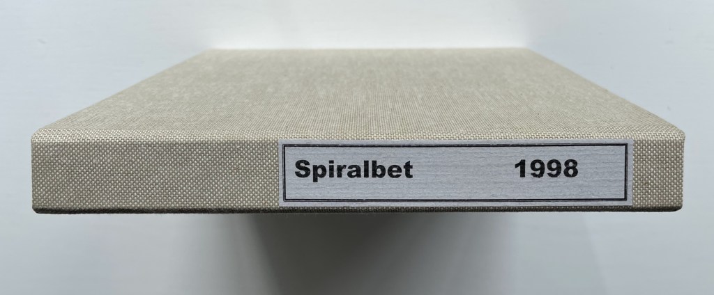
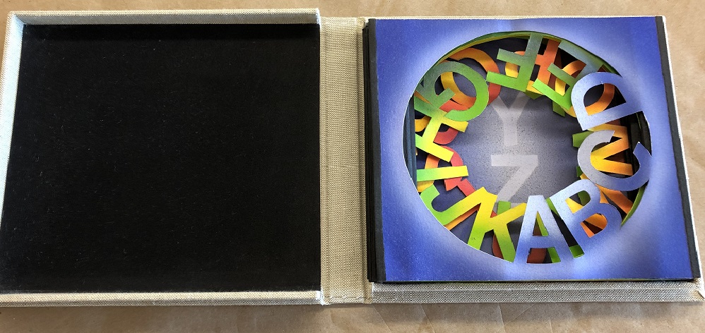
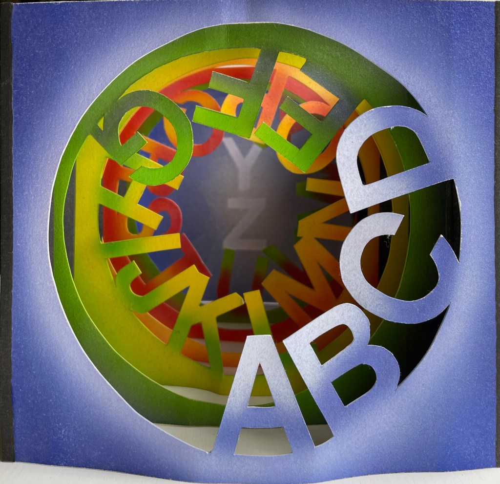
Spiralbet(1998) Amy Lapidow Tunnel book. Cloth bound and lined archival box. Closed:H165 x W185 x D5 mm. Open: D220 Acquired from the artist, 9 September 2022. Photo: James Prinz
This work was first spotted in the online catalogue for Abecedarium: An Exhibition of Alphabet Books (1998) from the Guild of Bookworkers. Being a small thumbnail on the second screen or page and accessed only by clicking on the artist’s name, its discovery was serendipitous. Its still being available was pure luck.
Photo: Books On Books Collection.
Photo: Amy Lapidow.
The structure and binding are the work of Amy Lapidow, who has taught bookbinding at the North Bennett Street School in Boston, MA. The airbrush coloring was executed by student Nancy Ames.
Photo: Books On Books Collection.
Other tunnel books with which compare and enjoy Lapidow’s are Borje Svensson & James Diaz’s Letters and Animals (1982), Karen Hanmer’s The Spectrum A-Z (2003) and Helen Malone & Jack Oudyn’s The Future of an Illusion (2017).
Along with Lapidow’s and Hanmer’s explorations of color and the alphabet, Jean Holabird’s Vladimir Nabokov: AlphaBet in Color (2005), Carol DuBosch’s Rainbow Alphabet Snowflake (2013) and Rebecca Bingham’s Defining the Rainbow (2018) offer a range of variations to compare and contrast. Andrew Morrison’s Chroma Numerica (2019) offers a similar exploration of colors but with numbers.
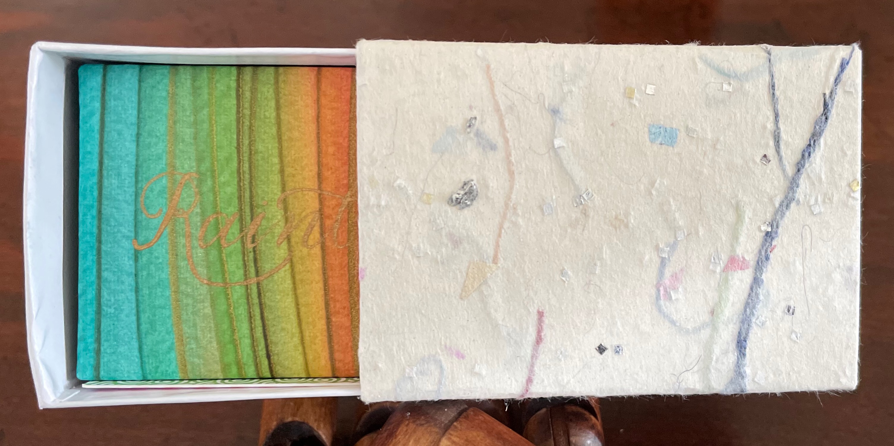
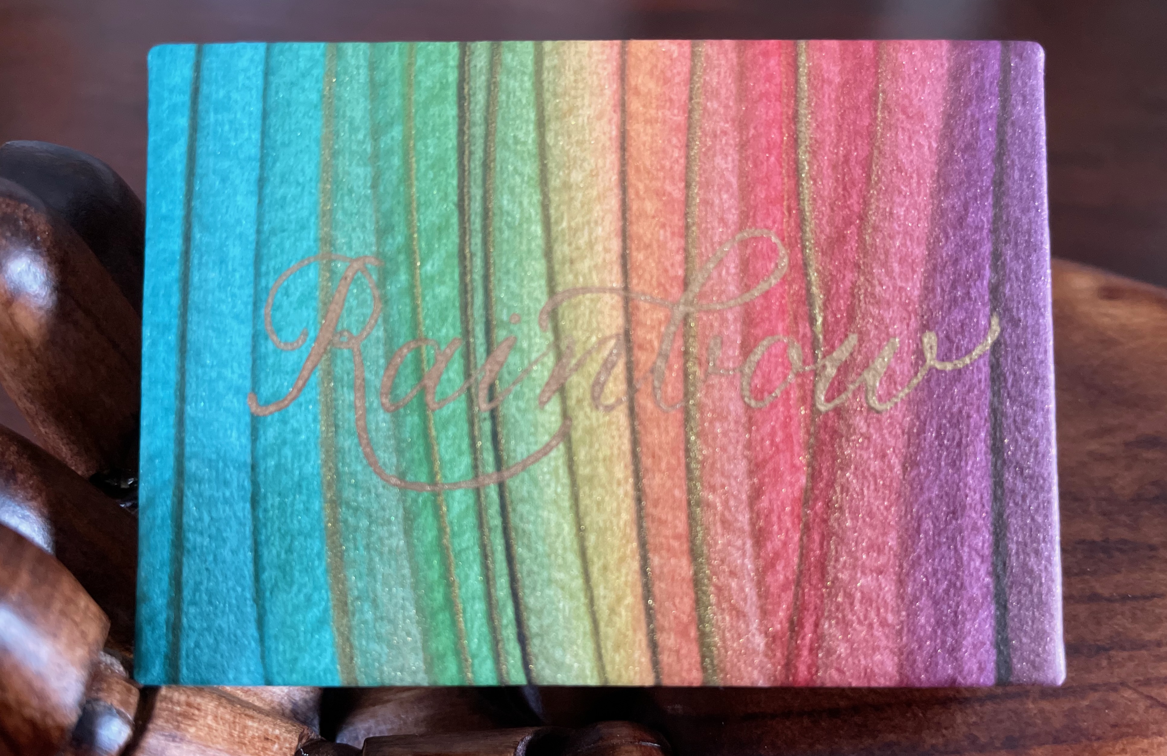
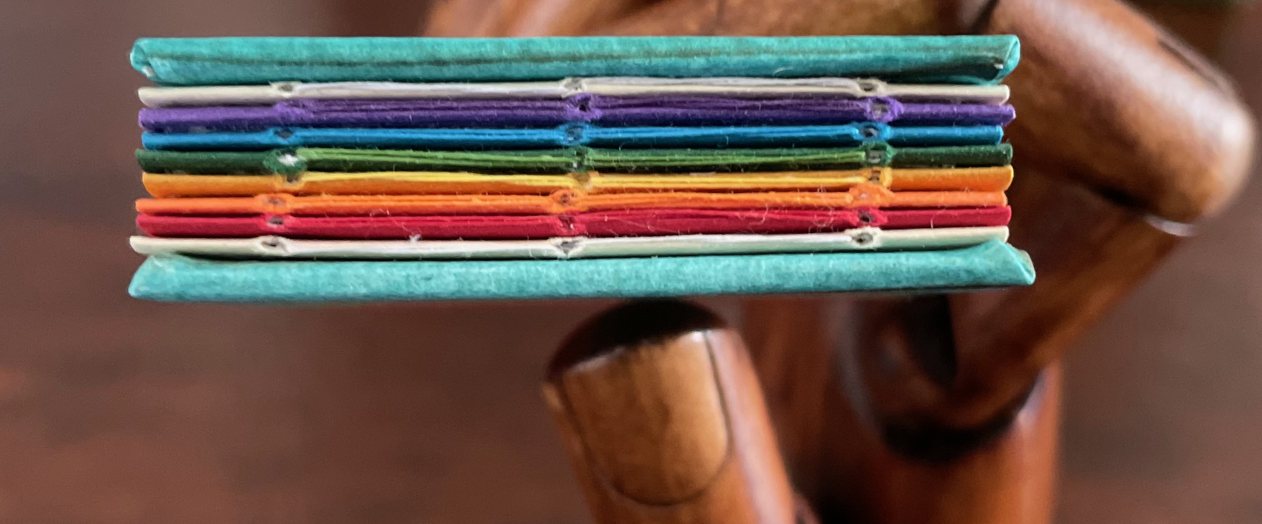
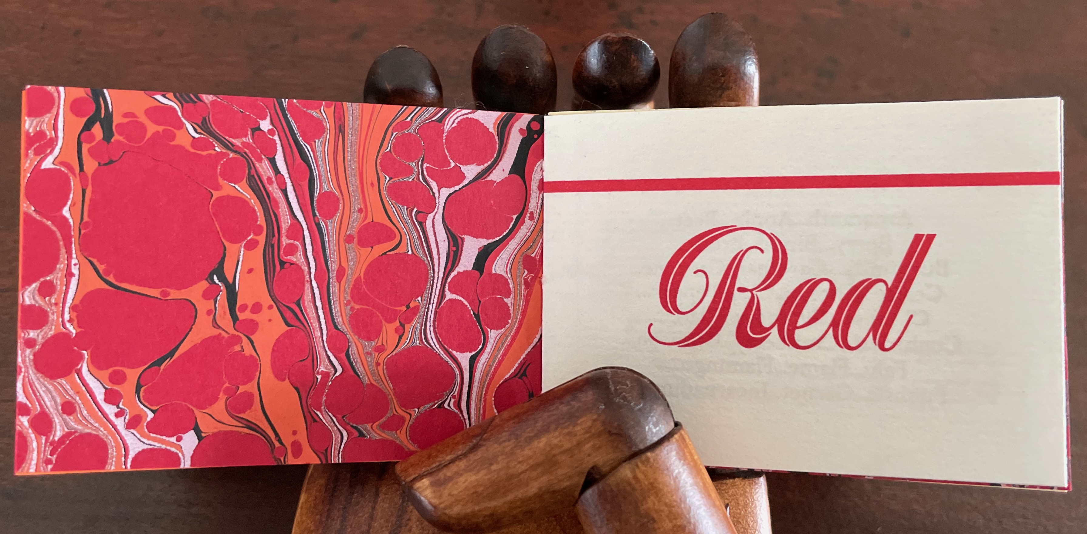
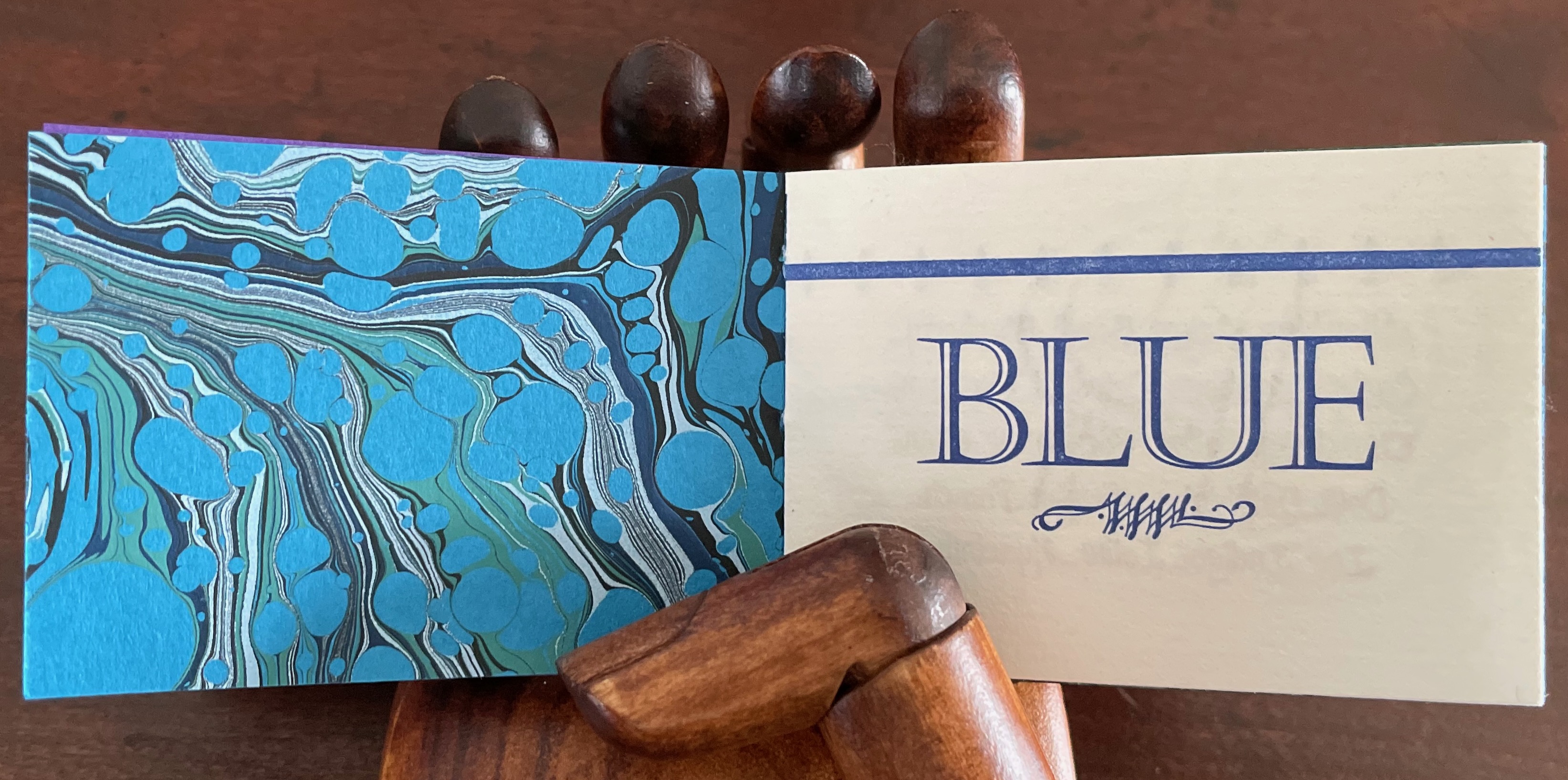
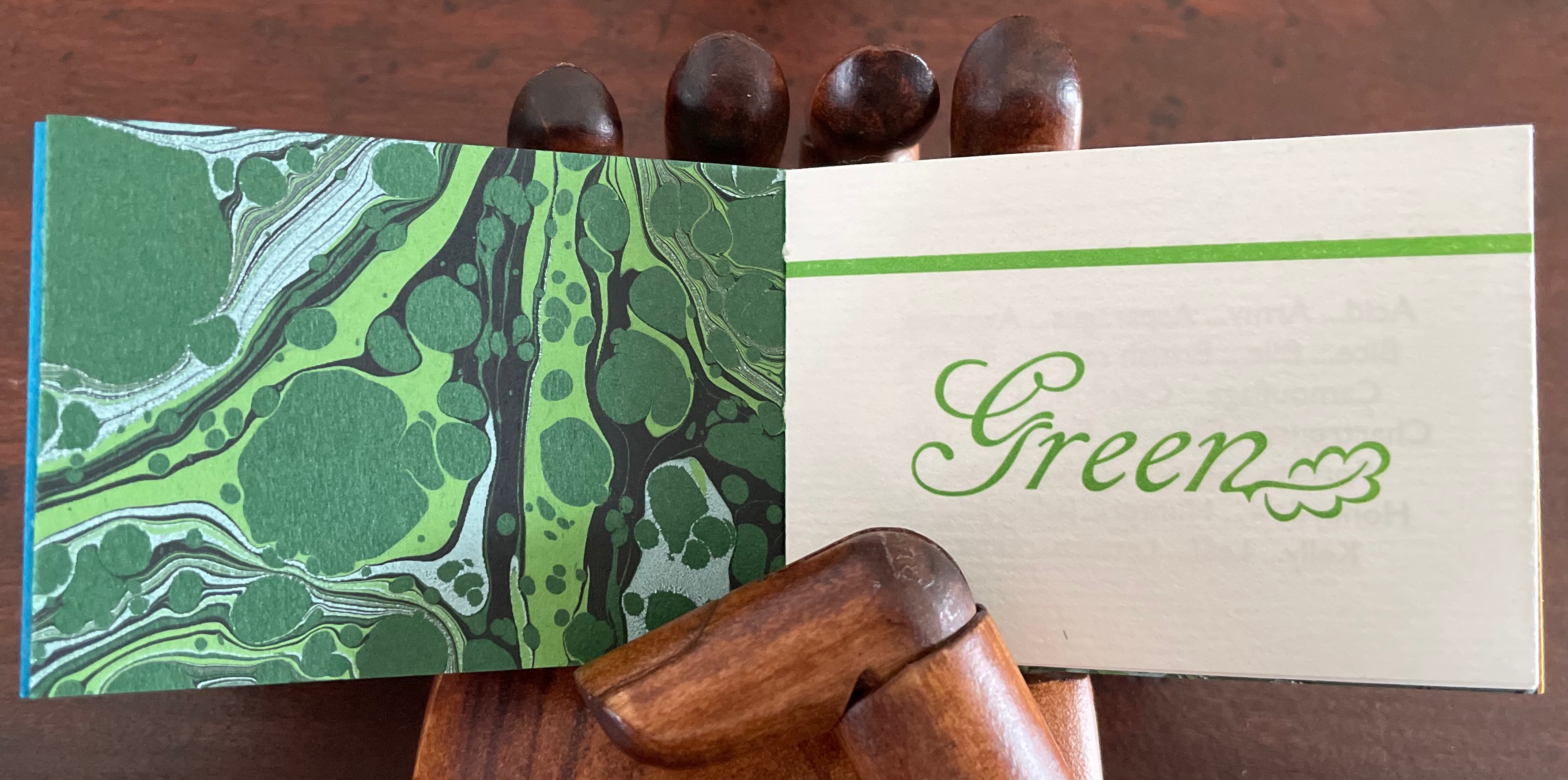
Defining the Rainbow(2018) Rebecca Bingham Matchbox-style box containing a miniature open spine book with paper over board covers. Box: H57 x W82 x D35 mm. Book: H51 x W73 mm. 46 pages. Edition of 81 (50 regular and 26 deluxe), of which this is #34. Acquired from Rebecca Press, 23 November 2022. Photos: Books On Books Collection. Displayed with the artist’s permission.
Defining the Rainbow is the product of a rainbow of talent. Madeleine Durhammade the paste papers for the box and covers of the book. Leonard Seastone of Tideline Press printed the book on his VanderCook from polymer plates made by Boxcar Press. Two four-page signatures for the front matter and colophon sandwich six four-page signatures of text listing shades and hues of Purple, Blue, Green, Yellow, Orange and Red. Between those signatures of handmade Hayle paper are back-to-back dividers made of marbled papers, hand-marbled by Jemma Lewismeeting several requirements: a scaled-down pattern and very specific color needs for the marbling to extend the idea of many-hued colors. Having collected and squirreled away names of shades and hues such as Byzantium, Zaffre, Smaragdine, Gamboge, Tangelo and Thulian (and researched them) and having waited for 30 years for the right project on which to expend a hoard of the handmade Hayle paper, Rebecca Bingham conceived and designed the project, convened the above-mentioned talents, spelled out their requirements, then hand-sewed and bound the results of their efforts.
On the Rebecca Press site, Bingham provides an engaging and enlightening description of the book’s letterpress printing “for those who are more familiar with the near-immediate gratification of digital printing”:
Each side of the page is printed separately (in this case, with the sheets being hand-placed into the press), after the ink has been applied (manually) to the type or (in this case) polymer plates. For something printed in one color, this means each sheet of paper passes through the press twice (front and back and alignment is not automatic — it’s fiddly work). In between, the ink needs several hours to dry. If you want a second color (for example, in my “green” section, both black and green inks are used), then the sheet must go through the press again (if color on 2 sides, then that means twice). I remind you of the alignment challenge. If you remember how hard it was to reinsert a typewriter page when corrections were needed (well, if you’re pretty old or are freakishly fascinated by ancient tech), you’ll have an idea of what this means. Plus, if you are changing the color on the press then the press needs to be thoroughly washed down so that the new color is crisp and clean (in the case of a light color like yellow, this can require more than one washing). Of course, this is a book about color, so 6 of the sections have their own second color and must go through the press 4 times (multiplied by the number of copies, of course). With the washing up and the aligning and the waiting for things to dry…
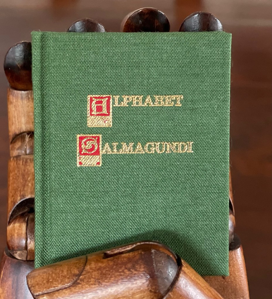
Alphabet Salmagundi (1988)
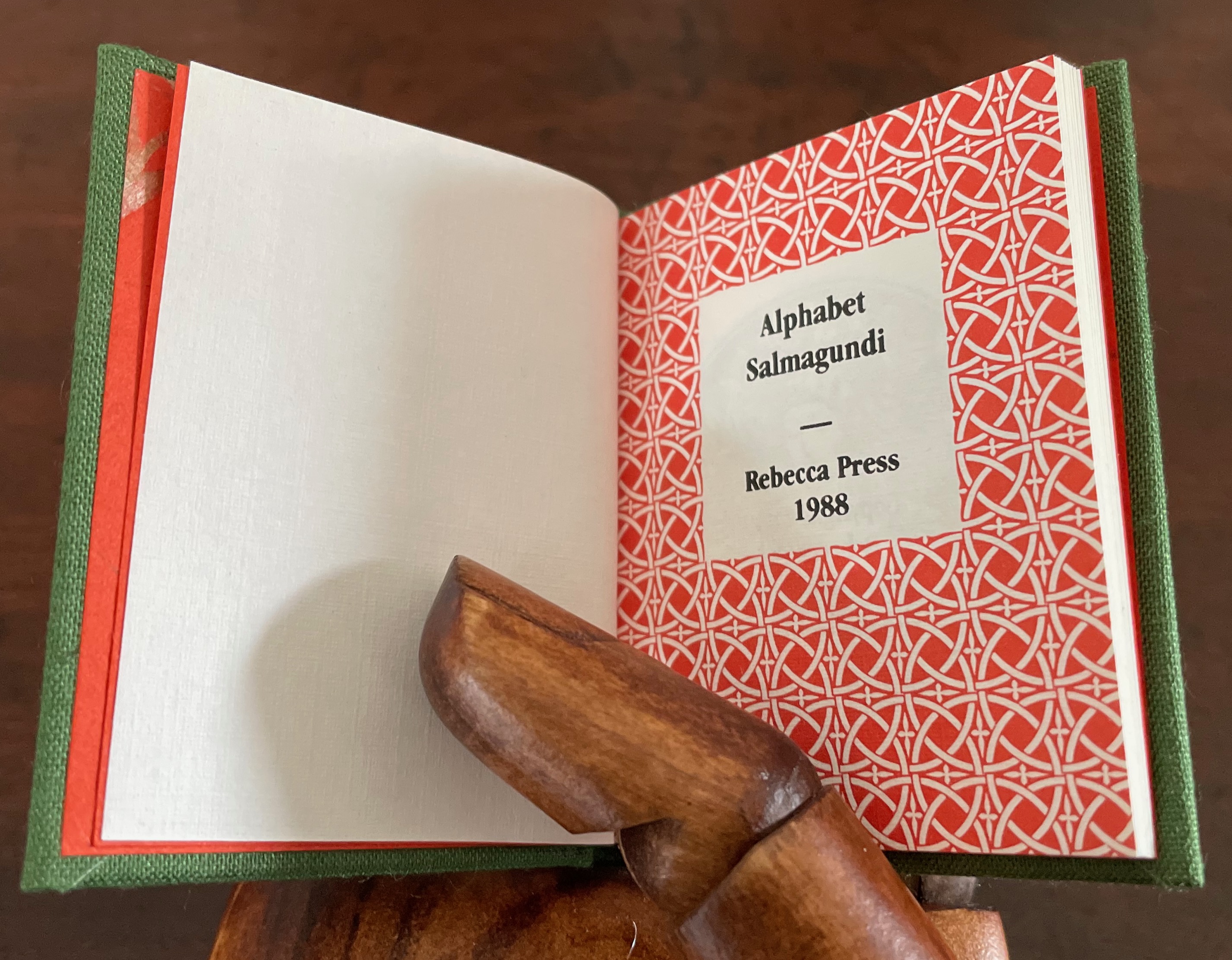
Alphabet Salmagundi (1988) Rebecca Bingham Miniature casebound, cloth over boards, colored decorated doublures, perfect bound book block. H66 x W57 mm. 40 unnumbered pages. Edition of 200, of which this is #150. Acquired from Rebecca Press, 23 November 2022. Photos: Books On Books Collection. Displayed with the artist’s permission.
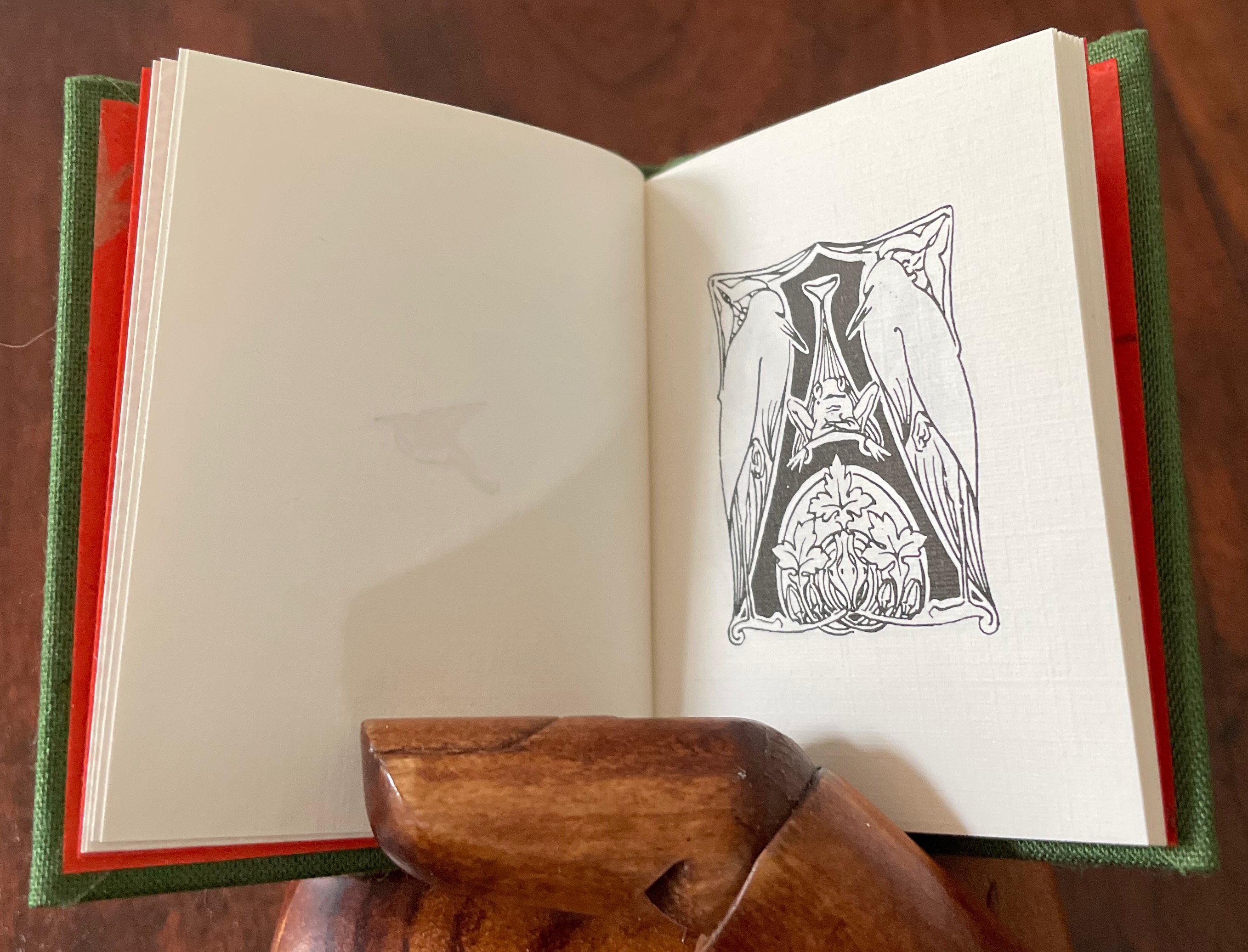
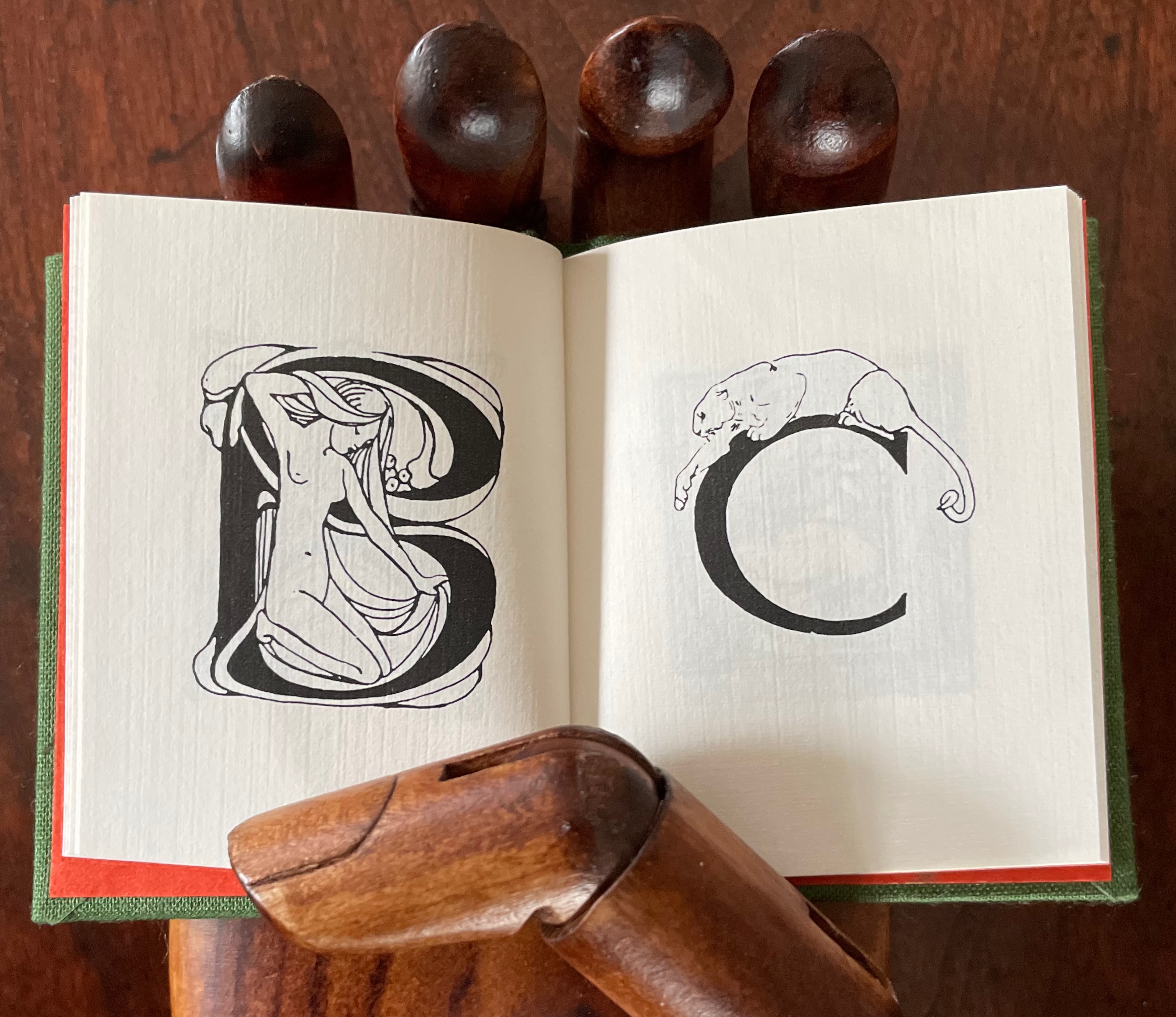
This alphabet book is a miscellany of letter styles and images, some of which clearly reflect the letters with which they are associated and some of which are less clear. For instance, C is clearly associated with cat, but the big cat depicted looks like a lioness. The letter B has a bare-breasted young lady bathing, so the usual one-to-one association is elusive. And for the letter A, any association between it and two birds eying a nervous frog — unless the scene stands for “Appetite” — is downright obscure.
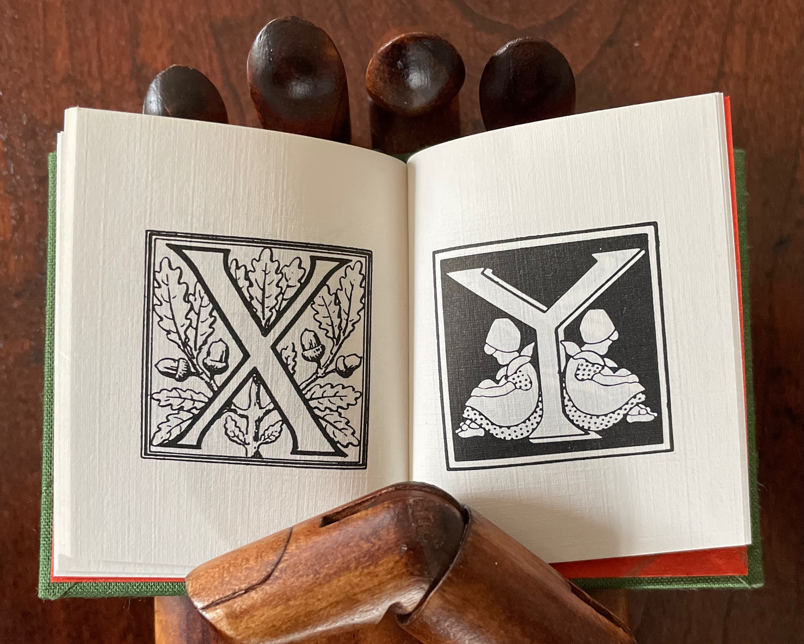
The relation of the letters X, Y and Z with their images is just as loose. X for oak or acorn? Y might be for youngsters. Does the decoration of letter Z suggest a zephyr?
If “salmagundi” implies a loose collection, a mélange, a potpourri, an olio, then this little book lives up to its name.
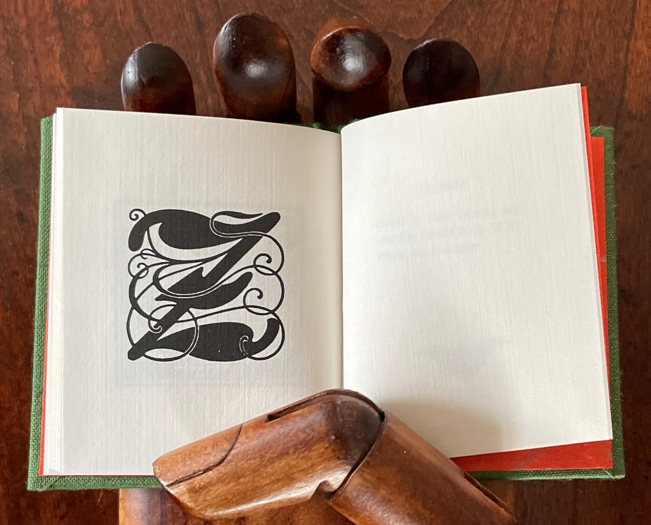
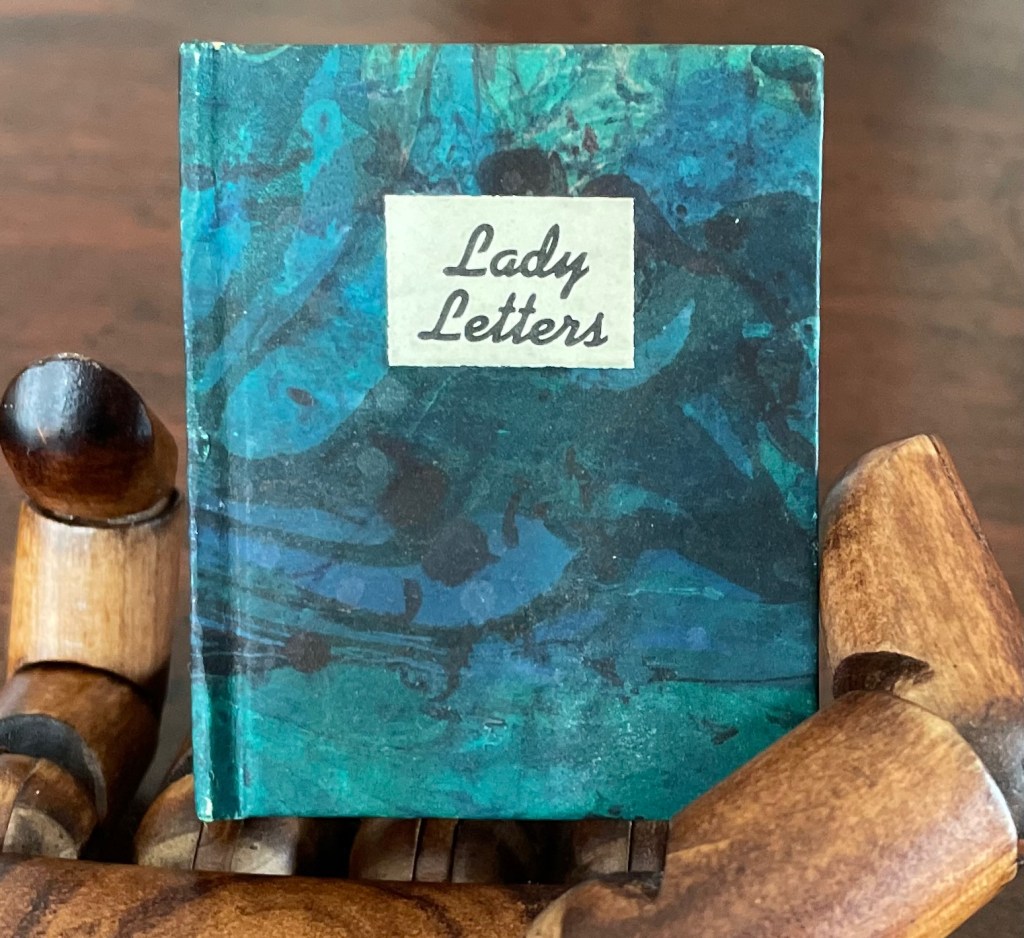
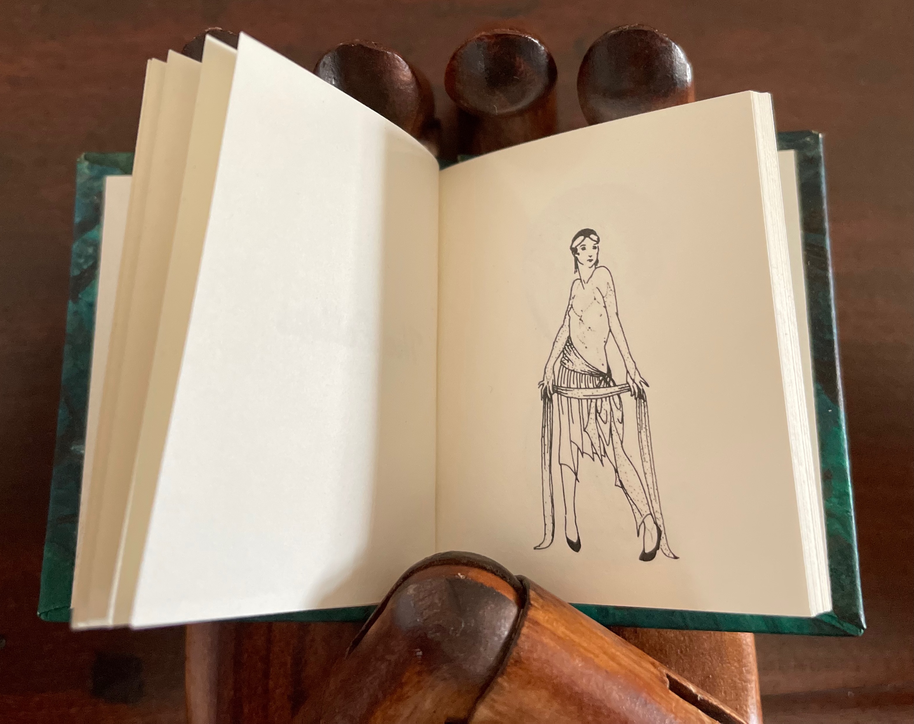
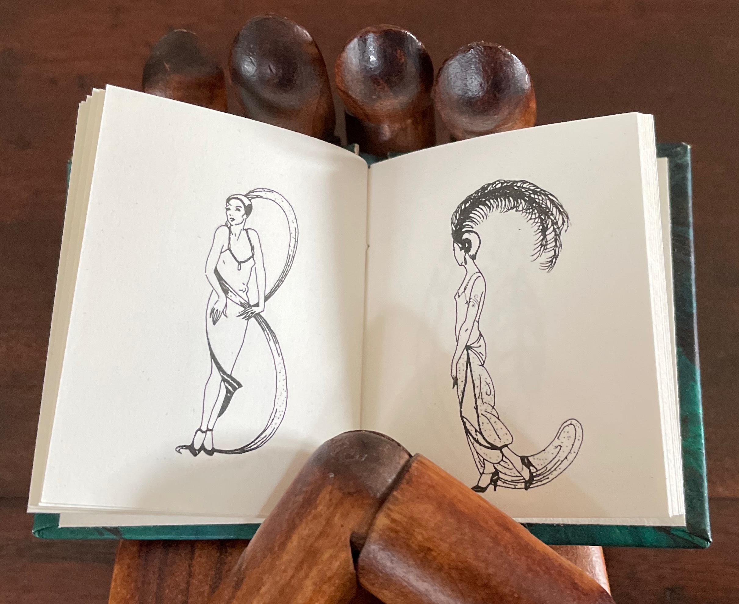
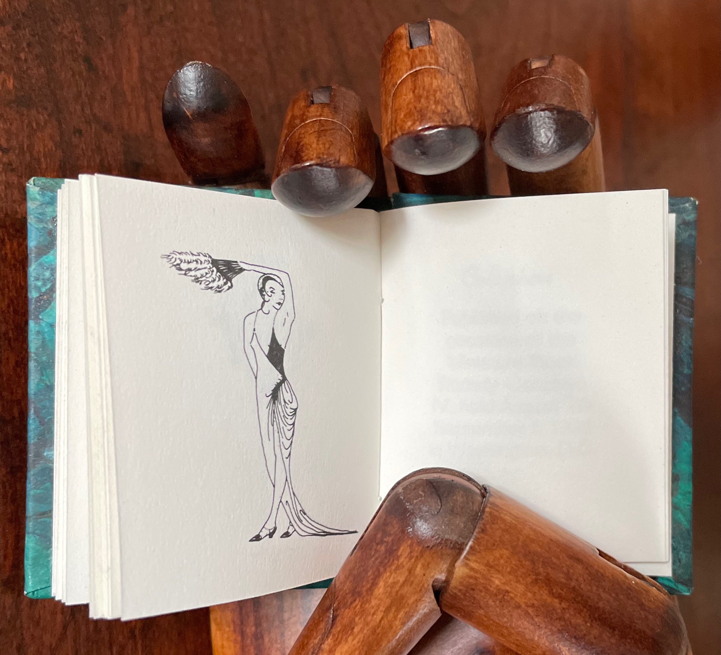
Lady Letters (1986)
June Sidwell designed, modelled and illustrated the haute couture alphabet for which Rebecca Bingham designed this book. Sidwell’s “lady letters” will likely remind the viewer of Erté’s alphabet, although his ladies take more risqué poses than Sidwell’s. Bingham actually met Erté, and on her site, she relates how she met him and presented him with a miniature version of his alphabet.
Lady Letters (1986) June Sidwell and Rebecca Bingham Miniature casebound, plain doublures, sewn book block. H58 x W48 mm. 40 unnumbered pages. Edition of 200, of which this is #33. Acquired from Rebecca Press, 23 November 2022. Photos: Books On Books Collection. Displayed with the artist’s permission.
The tradition of anthropomorphic abecedary reaches back at least as far as biblical manuscripts. The Bodleian Libraries’ “Kennicott Bible” is one example.
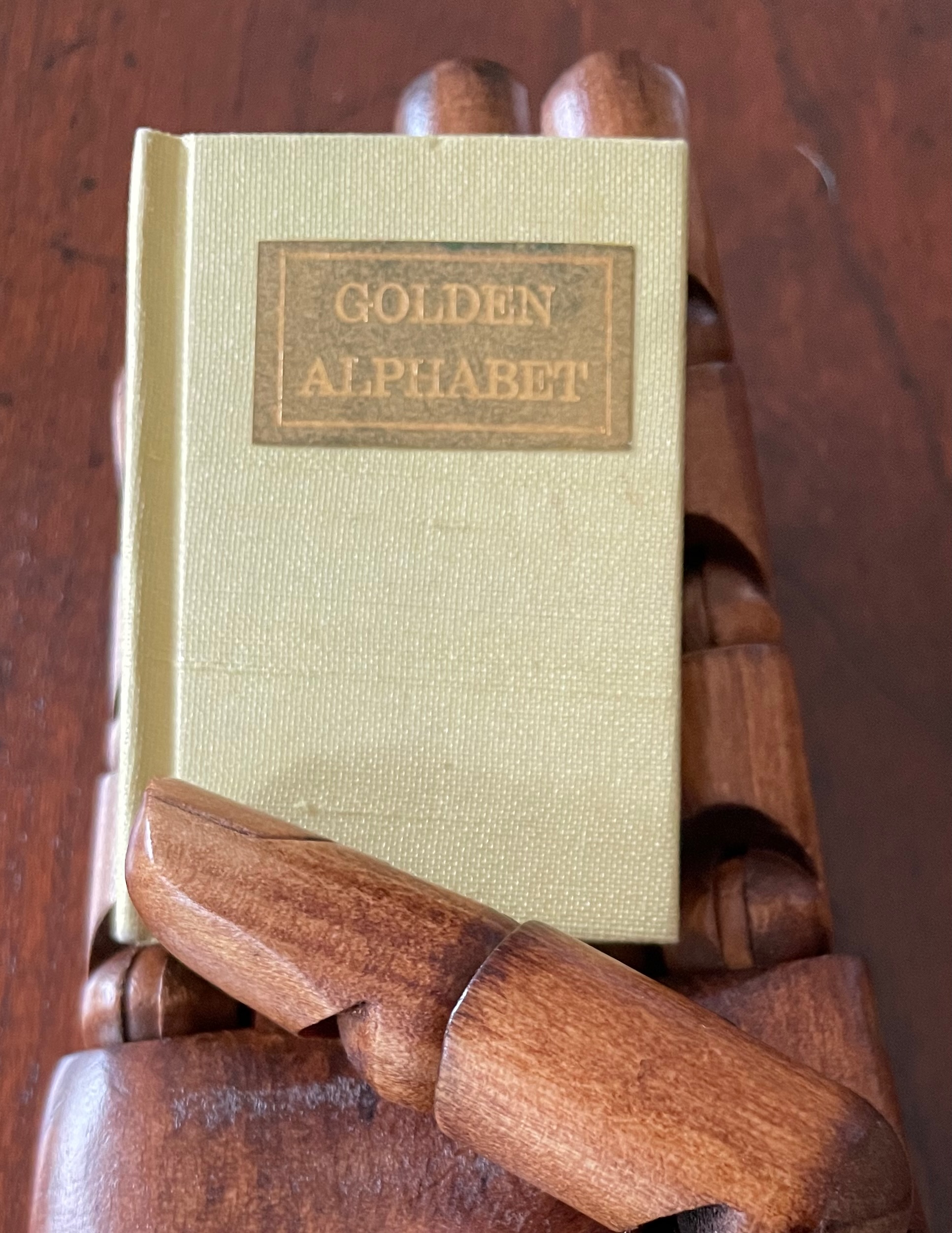
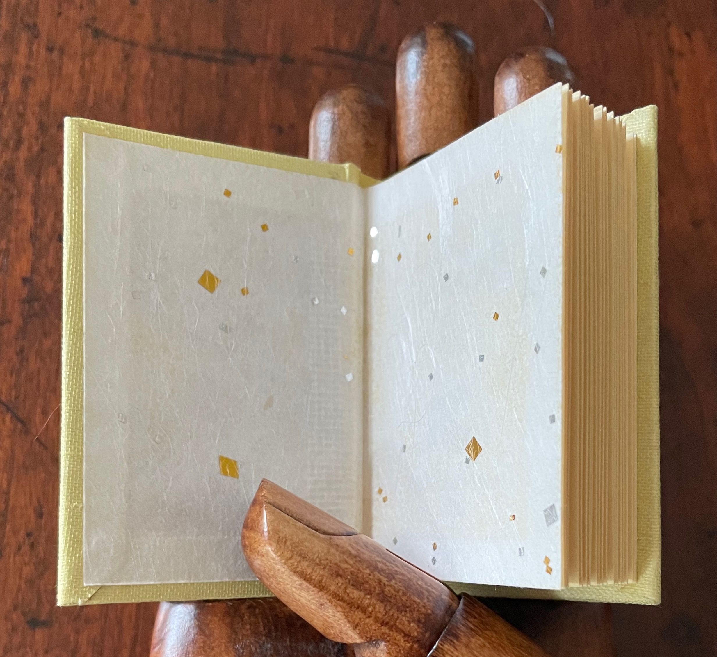
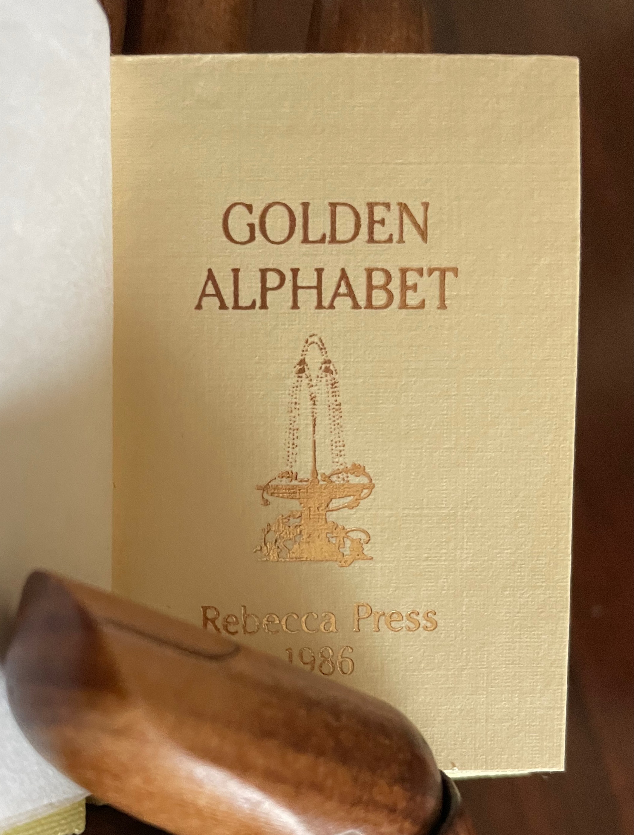
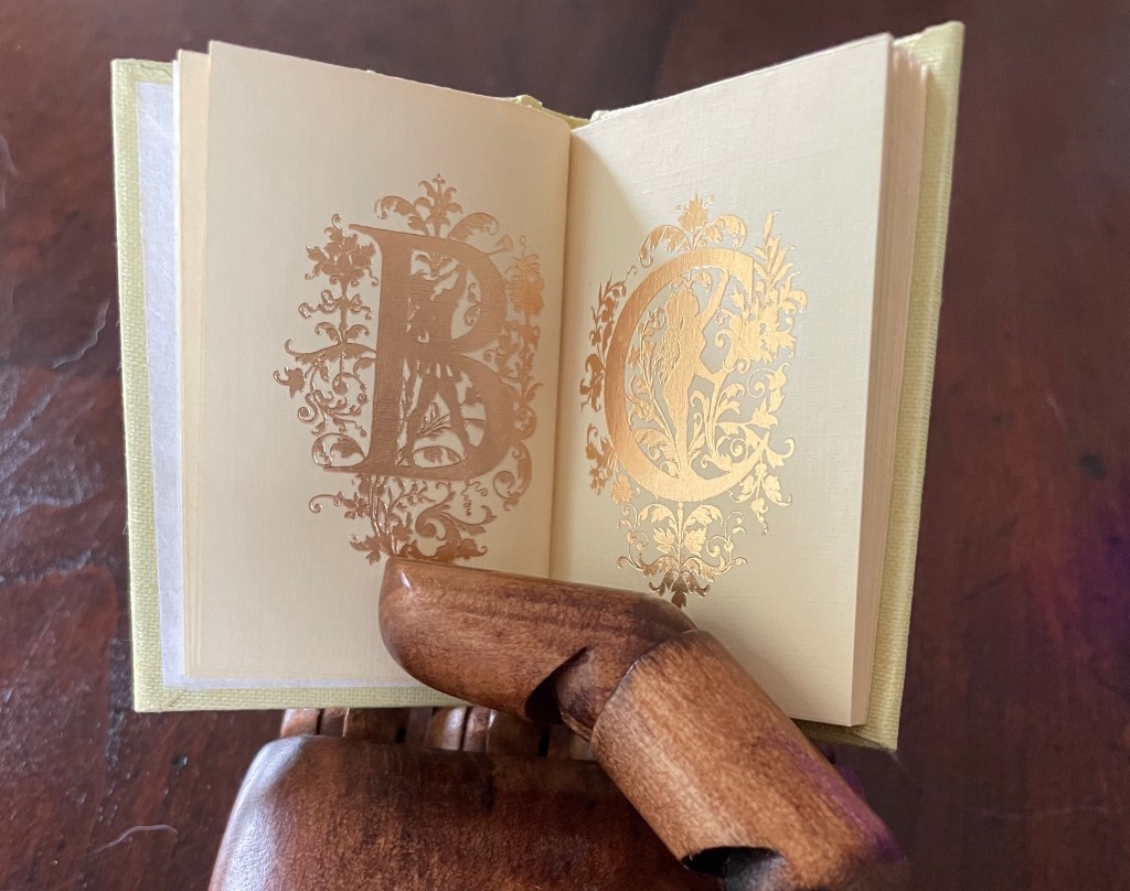
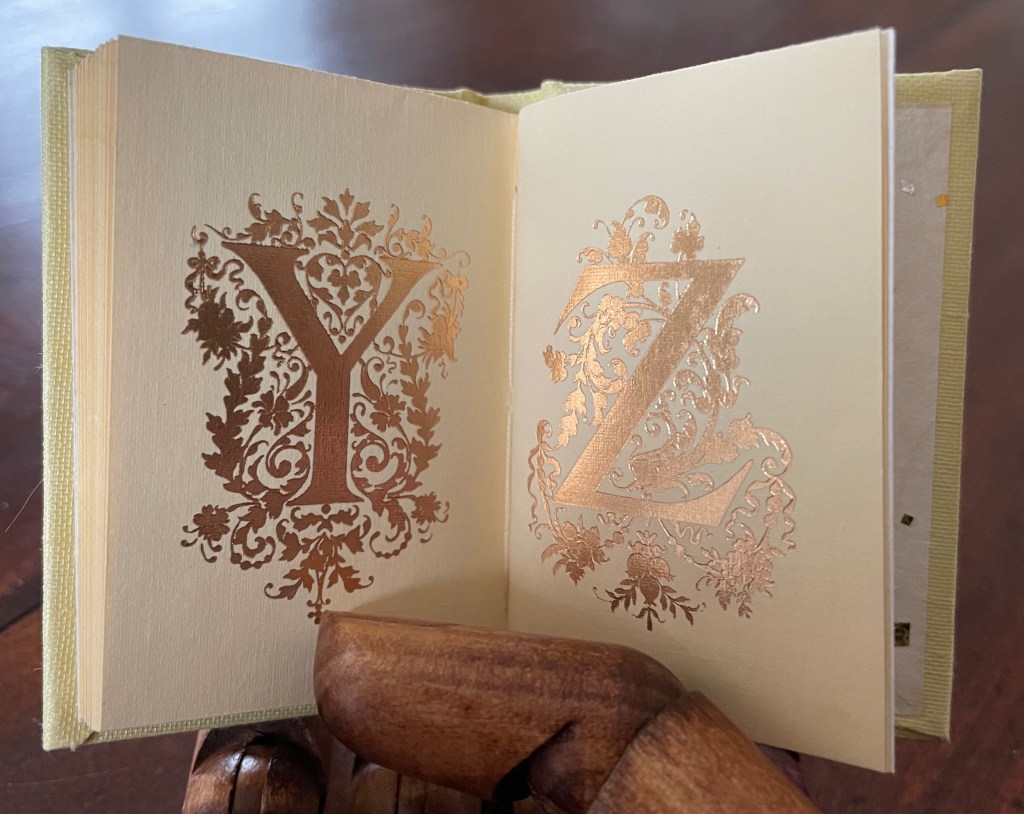
Golden Alphabet (1986) Rebecca Bingham Miniature casebound, gilt-titled leather front cover label, decorative doublures, sewn. H68 x W38 mm. 28 unnumbered pages. Edition of 200, of which this is #96. Acquired from John Howell for Books, 31 October 2022. Photos: Books On Books Collection. Displayed with the artist’s permission.
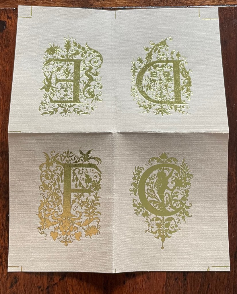
Although each letter has its own artistic treatment, this alphabet of gilt letters with their rococo decoration is no salmagundi. The folios are uncut at the top edge (the inner pages not printed on or included in the pagination), which would have been necessary for the application of the gilt foil. In a separate order, the artist sent a gratis loose folio, shown below.
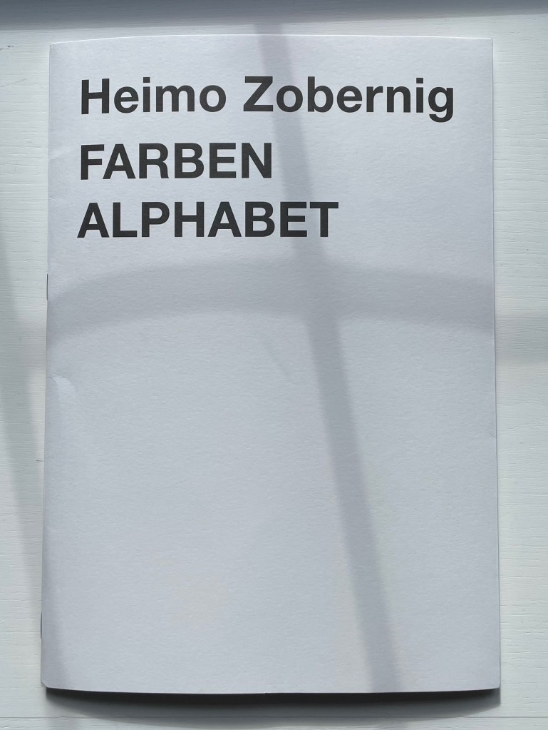
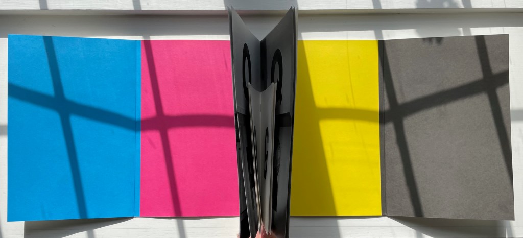
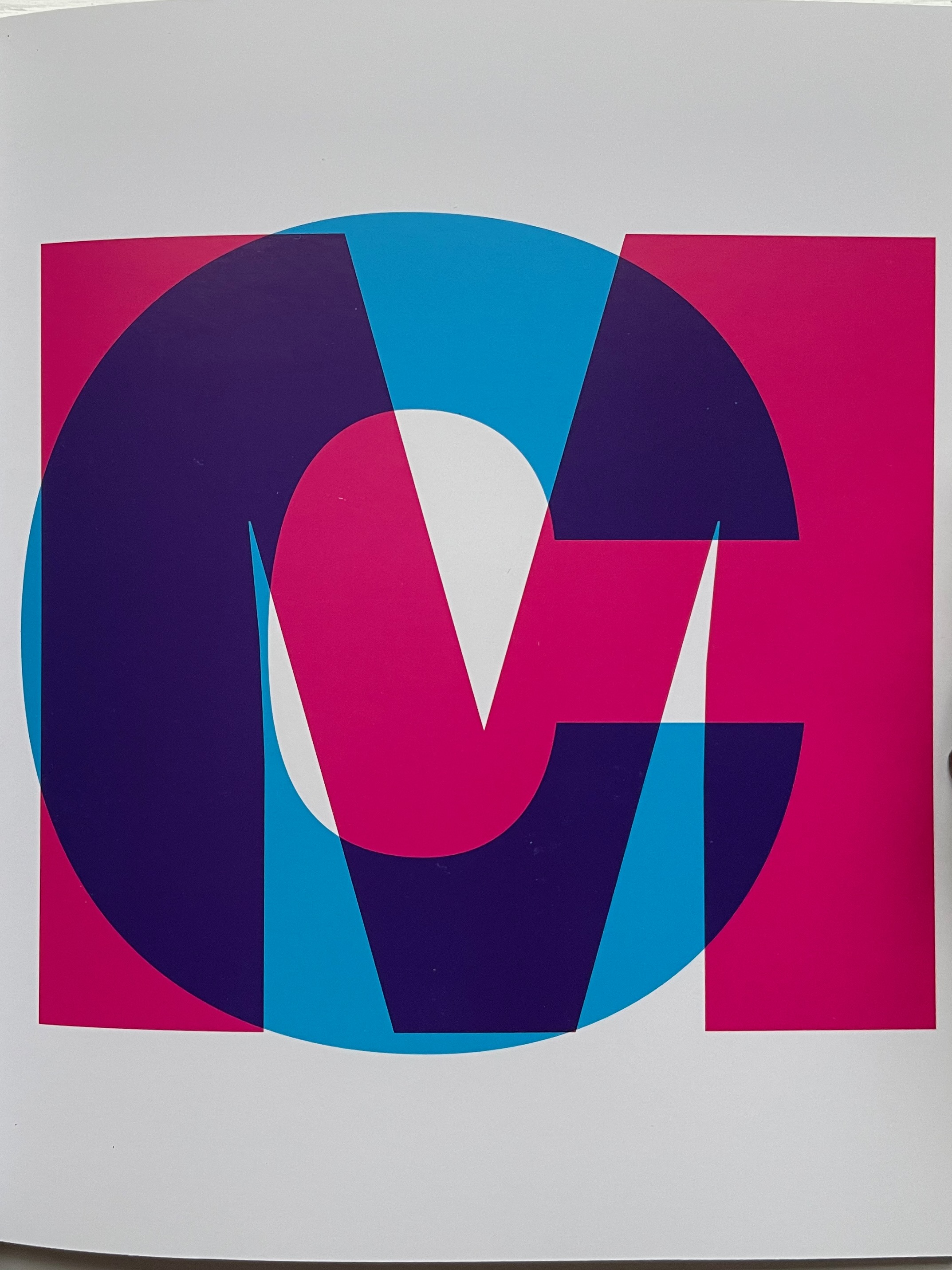
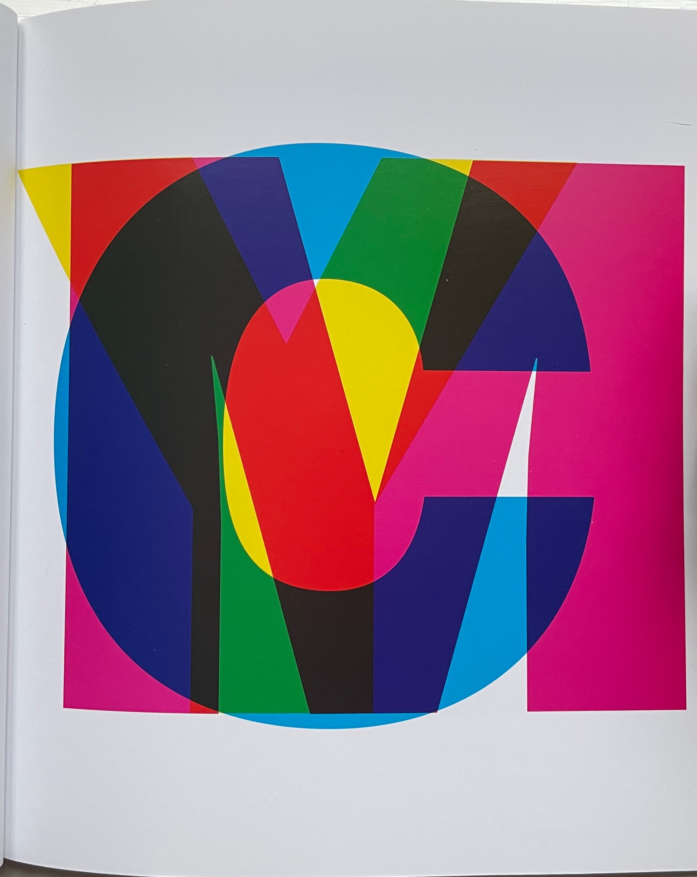
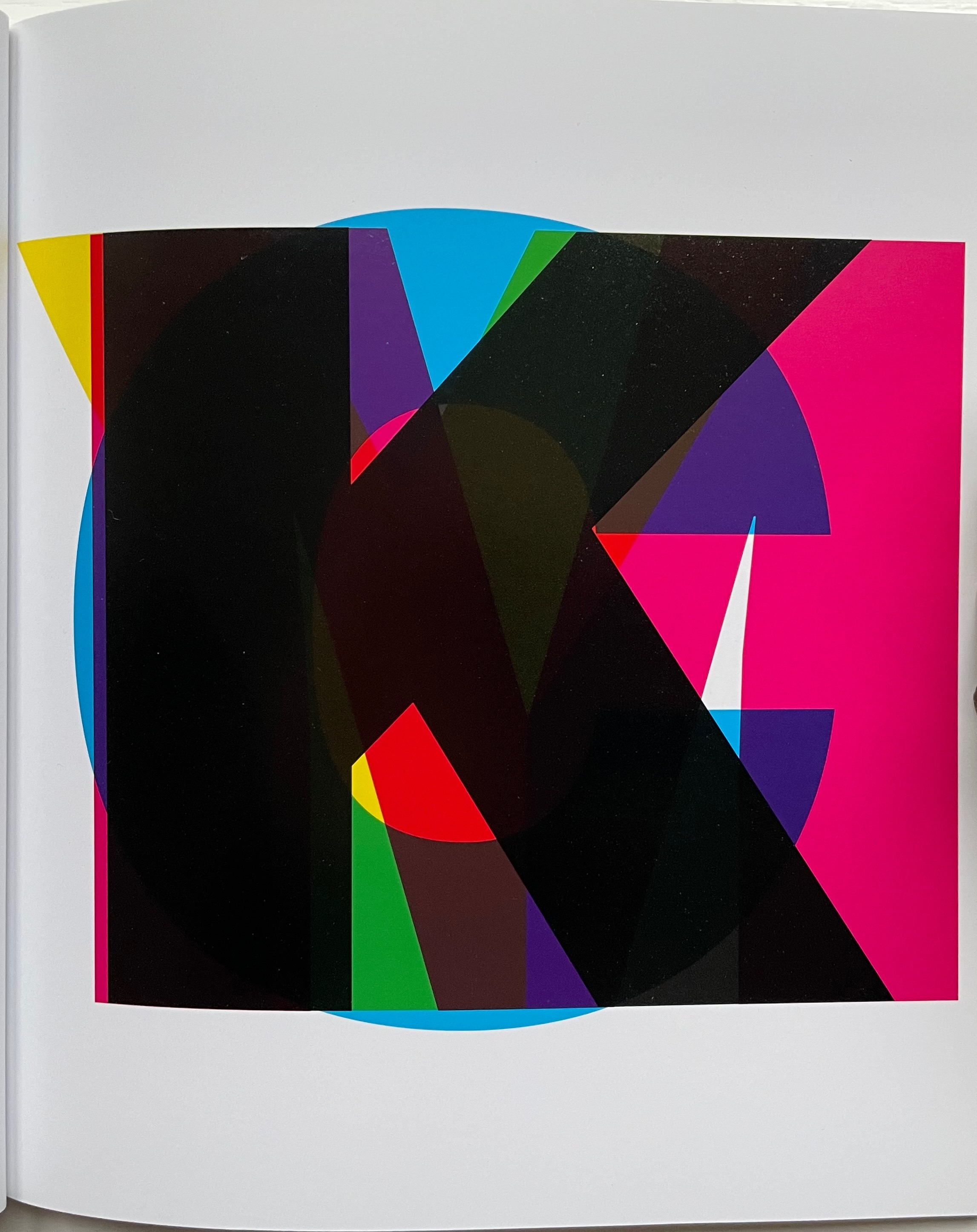
FARBEN ALPHABET (2018) Heimo Zobernig Paperback. H297 x W210 mm. 32 unnumbered pages in two signatures. Edition of 500, of which this is #427. Acquired from Les Presses du Reel, 18 September 2022. Photos: Books On Books Collection.
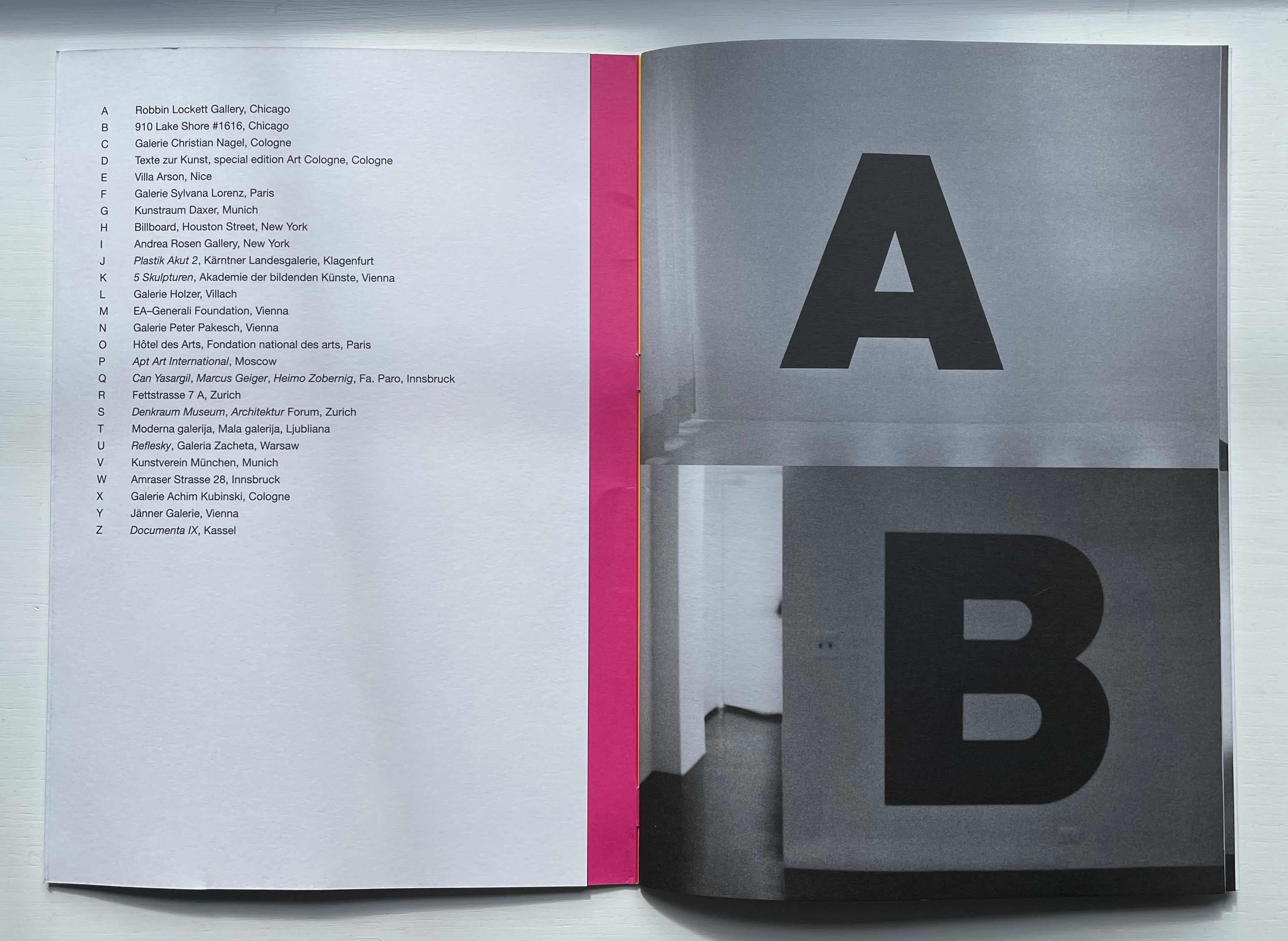
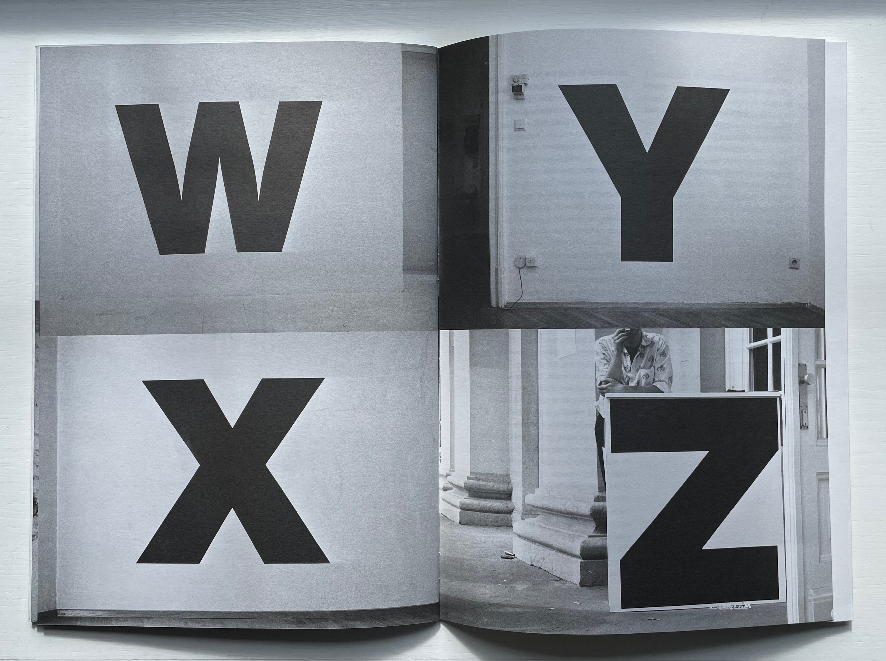
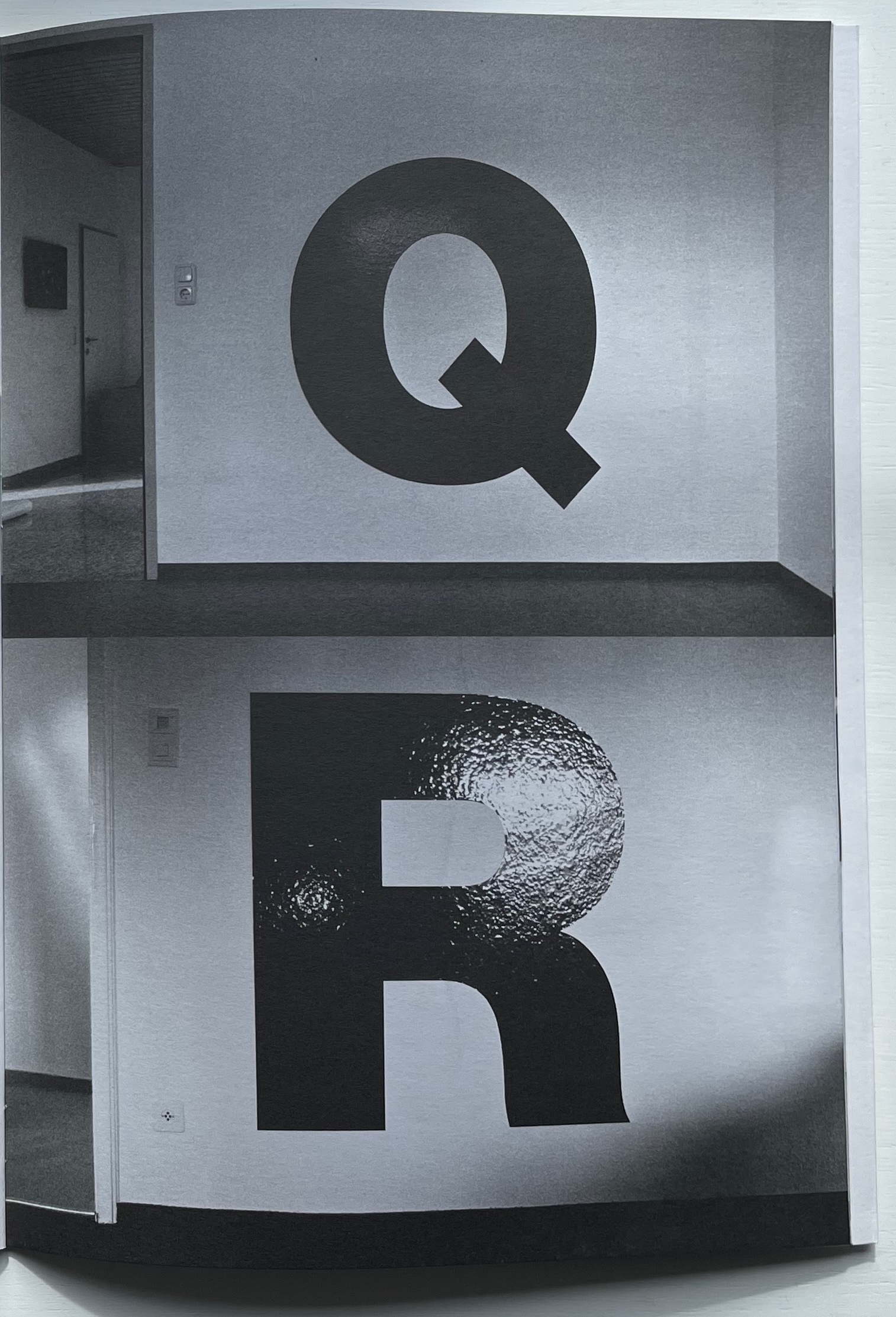
Starting with his first solo exhibit in the US, Heimo Zobernig placed a 115 cm high letter A in black adhesive vinyl foil on a wall near the entrance to the Robbin Locket Gallery in Chicago.
That was in 1990. By 1992 and twenty-five more exhibits later, he had accumulated a complete alphabet, the Z appearing on the ticket counter for Documenta IX in Kassel, Germany. The literary magazine Freibord (Vienna) published Zobernig’s photographic alphabetic record of his exhibitions in its centenary issue (1997). With Zobernig’s cover design, IF Publications (Barcelona) has produced Alphabet for the first time as an artist’s book. Here is the artist’s alphabet book as intervention over time. As the cover’s title and absence of color in these letters suggests, though, “But wait, there’s more”.
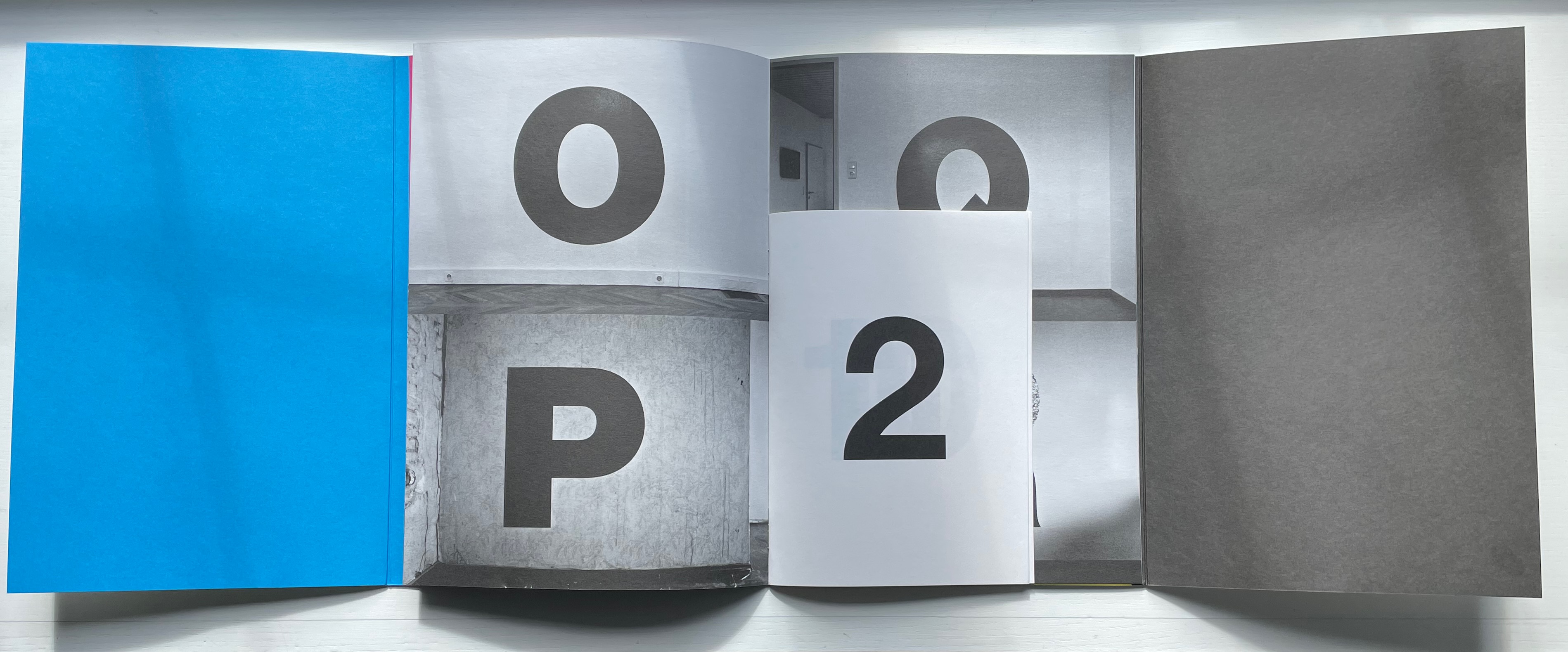
At the center of the photographed alphabet’s 16 pages measuring H297 x W210 mm, another 16-page signature measuring H210 x W150 appears, showing the numeral 2 in 220pt Helvetica on its cover, then the numerals 11 and 10 on the first double-page spread, then 3 and an upside-down 7 on the next spread. On the tenth unnumbered page, the word — FARBEN — appears. As if the numeric disorder were not puzzling enough, the numerals and letters are all in black despite the word FARBEN meaning “COLORS”. At the end of the book, Moritz Küng, the book’s editor, provides two crucial insights for untangling the puzzle.
First, that from the mid-1980s, Zobernig selected fifteen combinations of CMYK to define a palette from which he would not deviate until the early part of this century. Second, that the center signature self-referentially reflects on the principle of imposition (how sheets are printed and folded into signatures). Each number in the center brochure belongs to one of Zobernig’s fifteen CMYK combinations. From the top left of one side of the sheet to the bottom right of the other side of the sheet, Zobernig placed “right reading” numerical representations of these color combinations so that, when the sheet is folded and trimmed to form the booklet, the numbers and title appear in their strange orientation. This orientation that calls attention to the mechanics of the inside booklet’s creation results in the numeral 2 appearing on its cover, seemingly labelling the booklet within a booklet as the second of two volumes. Yet the cover of the outer booklet indicates that FARBEN comes first.
The seemingly contrary self-referencing abstraction does not end there. Or rather, if we stick with the cover of FARBEN ALPHABET with Küng’s clues in mind, it resolves itself. Just as Zobernig’s black and white alphabetic labels abstractly introduced his color-rich 1990-92 exhibitions, the other side of FARBEN ALPHABET’s black and white cover displays cyan, magenta, yellow and black panels, otherwise known as CMYK, the color alphabet from whose combinations Zobernig’s abstract expressionist art is created. Paradoxically, though, Zobernig’s FARBEN ALPHABET challenges such reductive labelling. Abstraction does not merely yield labels, he seems to suggest. It yields art through process and form — such as alphabetizing exhibitions to generate an artist’s alphabet book.
CMYK (2013)
CMYK (2013) Heimo Zobernig Perfect bound in glossy card, glossy text paper. H160 x W140 cm. 36 pages. Edition of 300, of which this is #214. Acquired from Pia Jardí, 26 October 2022. Photos: Books On Books Collection.
In the additive color model RGB, white includes all the primary colors — red, green and blue — of the light spectrum, and black is the absence of light. In the subtractive color model CMYK — cyan, magenta, yellow and key (black) — white is the absence of any ink leaving the natural color of the paper as the white background on which the combination of all the CMY inks yields black. What better cover for CMYK than pure white paper. Just as Farben Alphabet uses the A-Z alphabet and printing imposition to play with our expectations, this artist’s booklet uses the letters of the color model, the colored inks and the printing process to play with our expectations. C is overlapped by M, then CM is overlapped by Y, and, to yield the letter K, CMY are combined. From there, the booklet cycles through subtracting the letters in reverse, adding them back and so on.
This conceptual, process-driven artist’s booklet, arising from a multi-artist exhibition curated by Pia Jardí for the Open Structure Art Society (OSAS) in Budapest, makes for an interesting contrast with Amy Lapidow’s Spiralbet (1998), Karen Hanmer’s The Spectrum A to Z (2003), Annesas Appel’s Ruiten Alfabet (2006), Carol DuBosch’s Rainbow Alphabet Snowflake (2013) or Rebecca Bingham’s Rainbow (2018).