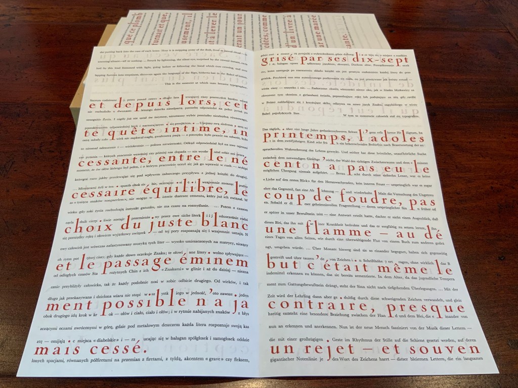
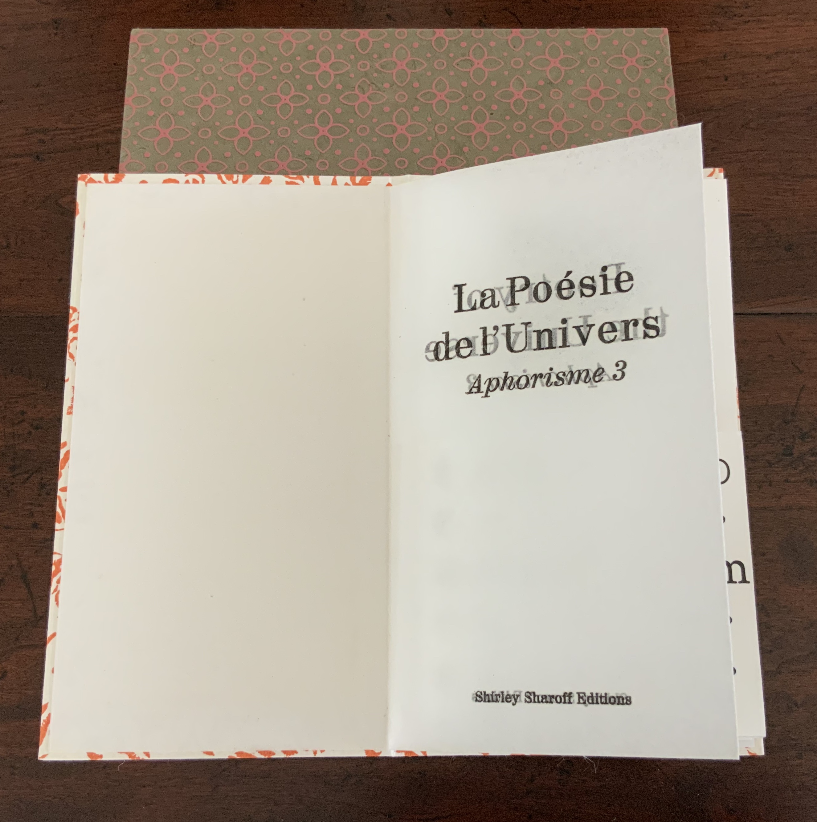
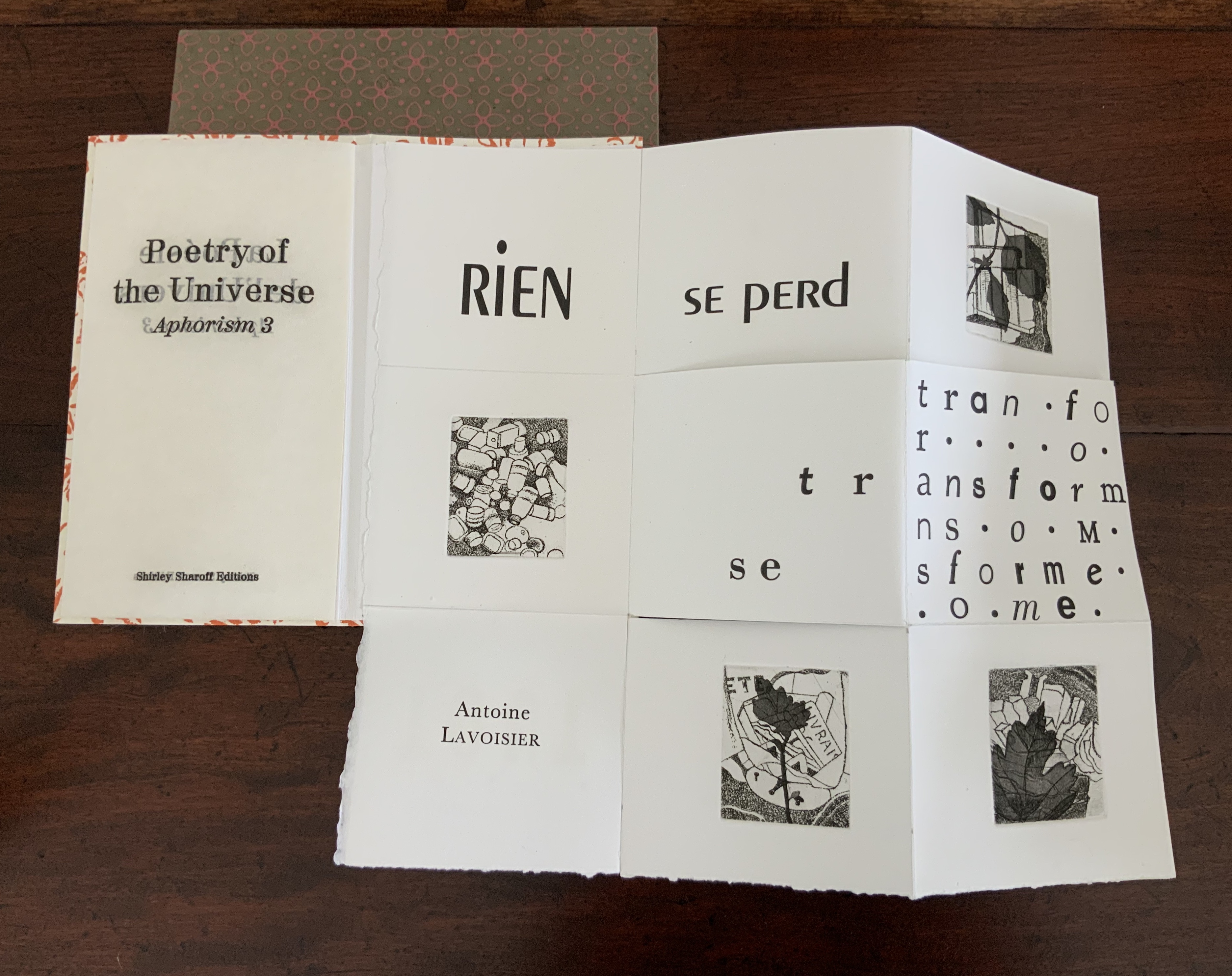
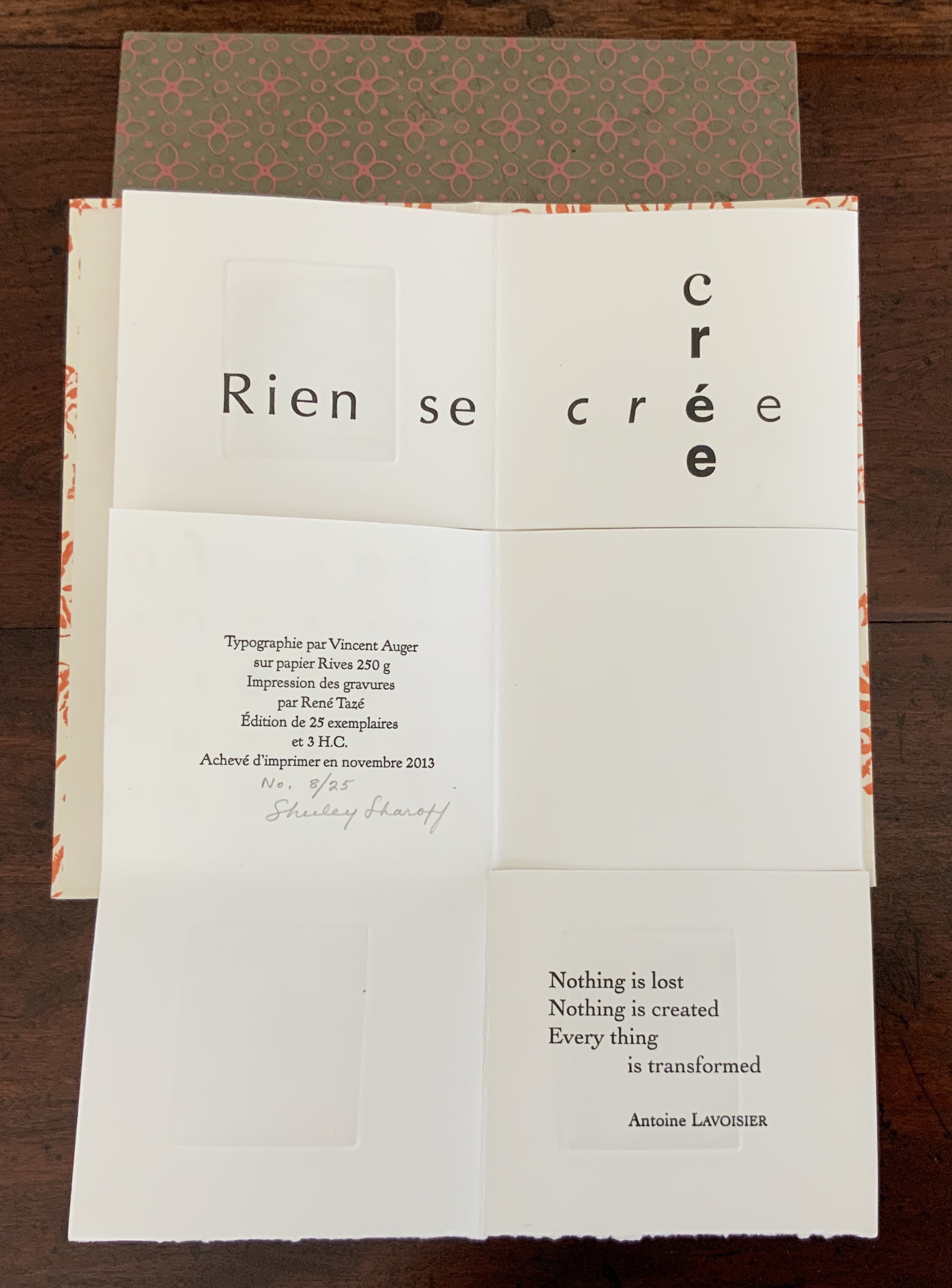
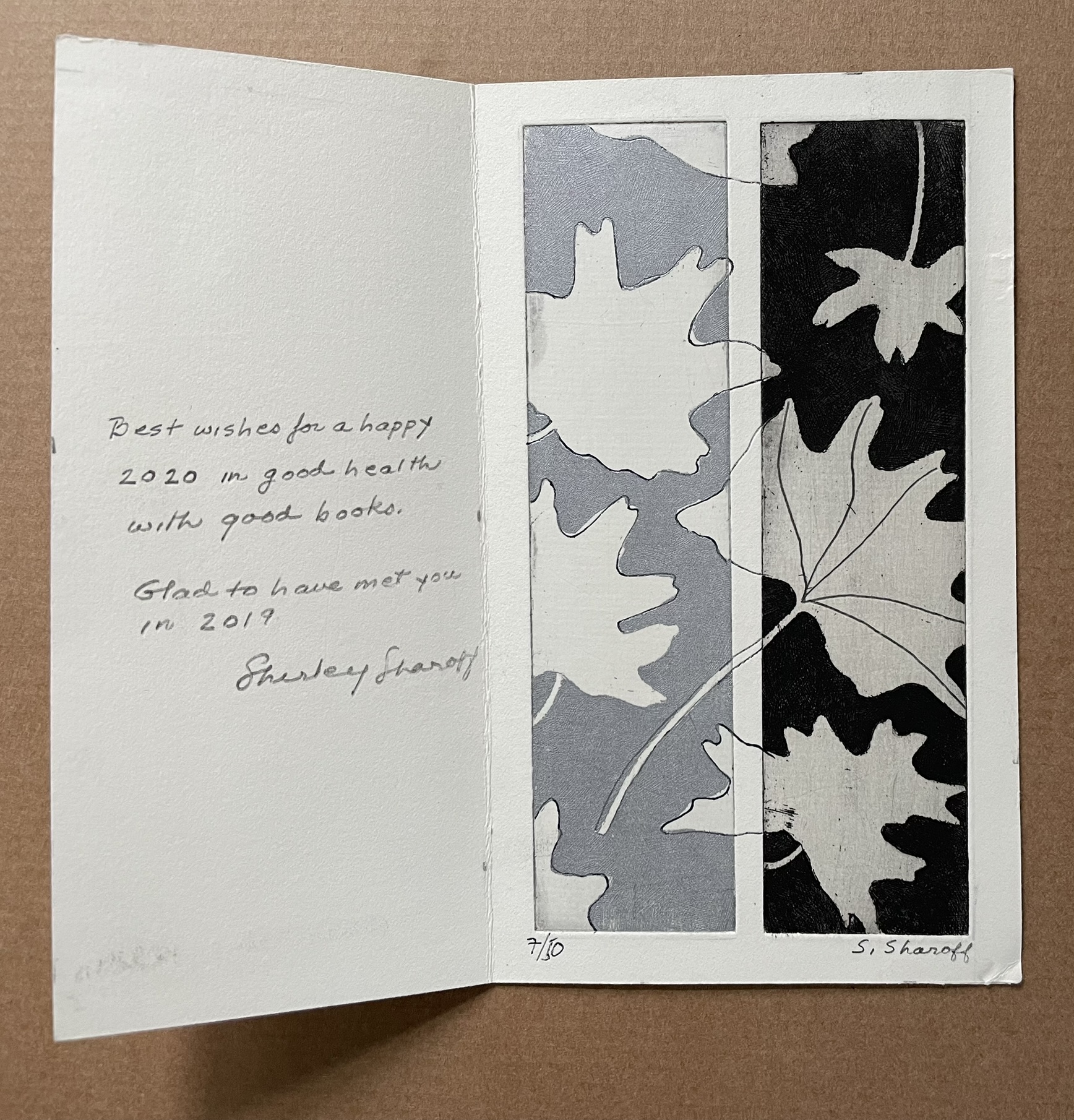
Warja Lavater’s work first came to this collection’s attention through Jeffrey Abt and Buzz Spector. Entitled Jeu: livre en “papier modulé” (1980), the work had been included in an exhibition organized by Abt and, for which, Spector designed the catalogue: The Book Made Art: A Selection of Contemporary Artists’ Books, exhibited in the Joseph Regenstein Library, The University of Chicago, February through April 1986. No image of Lavater’s entry appeared in the catalogue, nor was an online image ever located. The description suggested that it was not a leporello, so later it came as a surprise that this was the form for which she was best known. Still, a vote of thanks to The Book Made Art for planting the artist’s name for future reference.
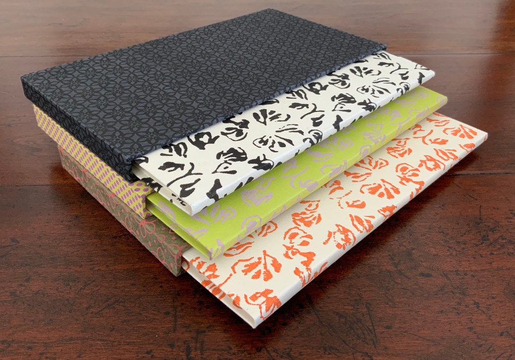
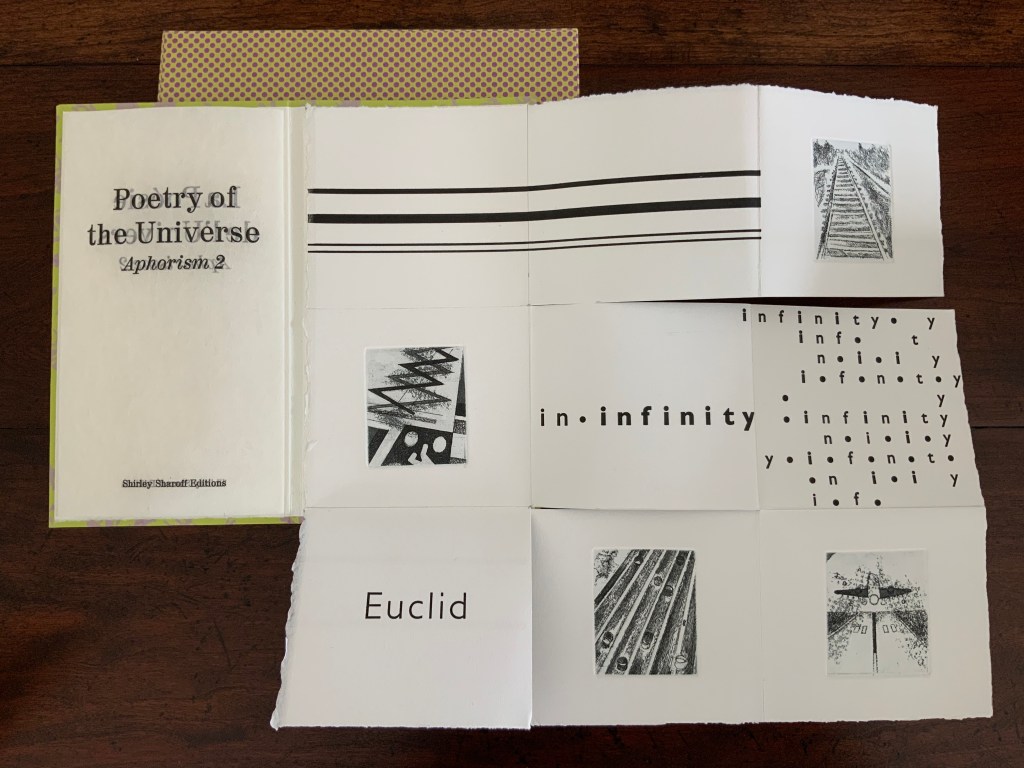
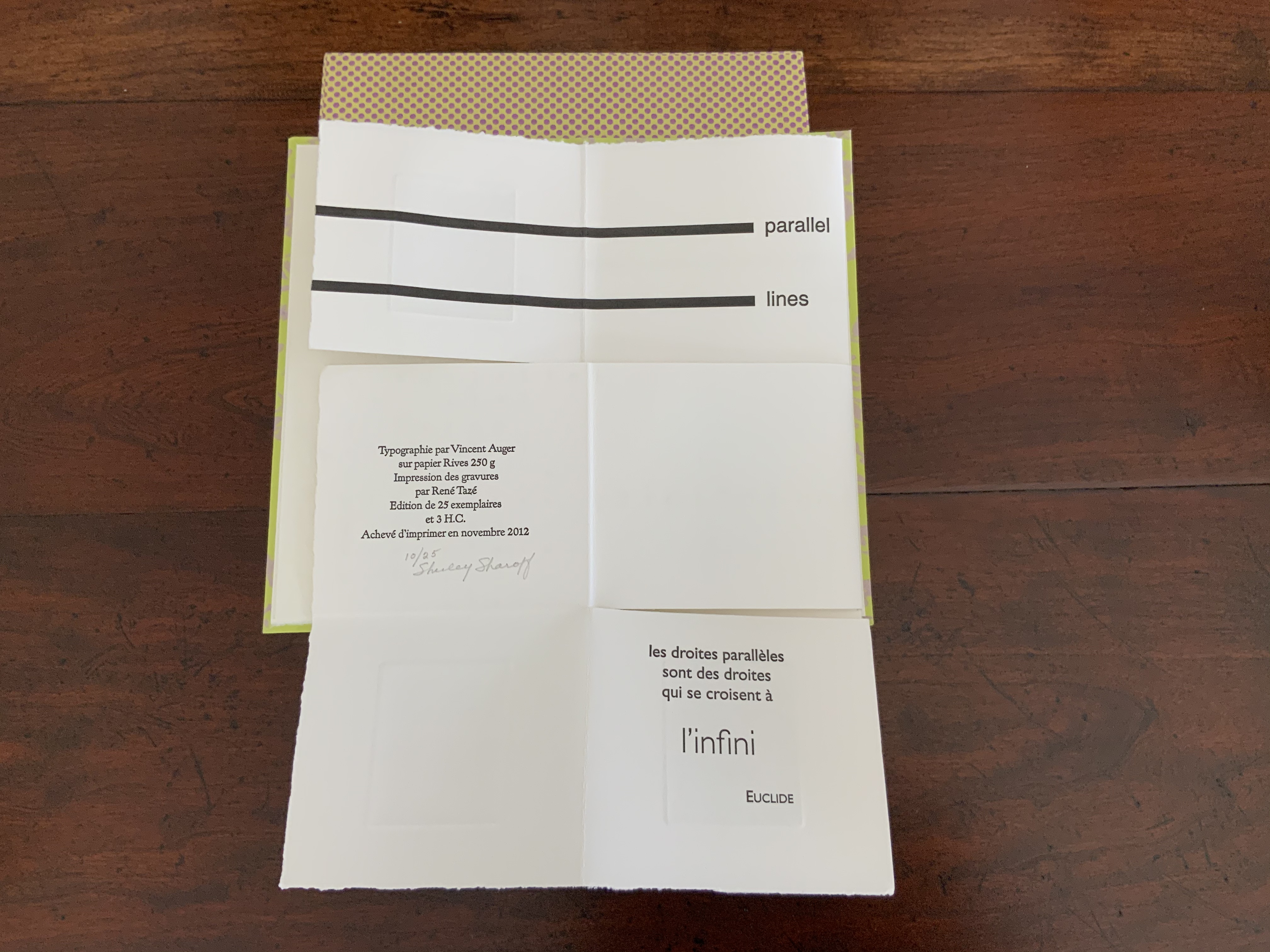
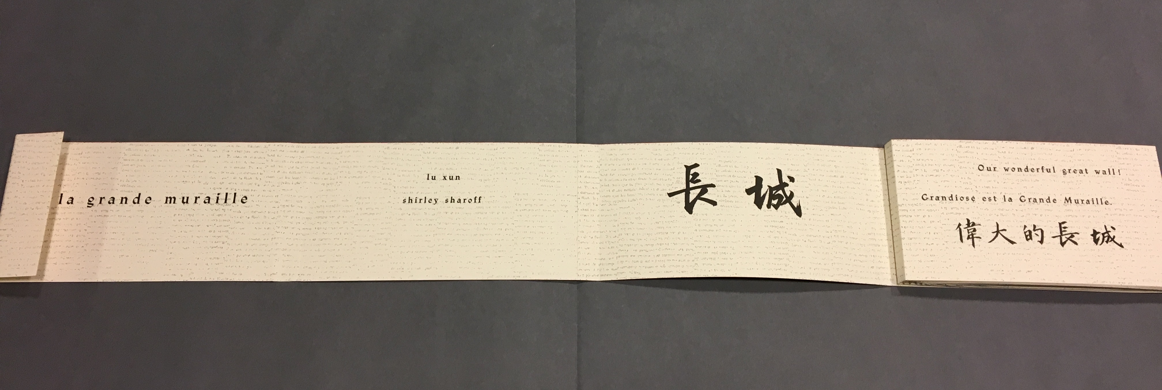
Seven works in the Books On Books Collection represent Warja Lavater’s art: Le Petit Chaperon Rouge (1965), a later tactile version of the same work (2008), Sketchbook: Le Non-obéissant (1968), Spectacle (1990), Ourasima (1991), Tanabata (1994), and Kaguyahime (1998). The French publisher Adrien Maeght was Lavater’s most consistent champion, publishing several of her leporello works, including a now rare boxed set.
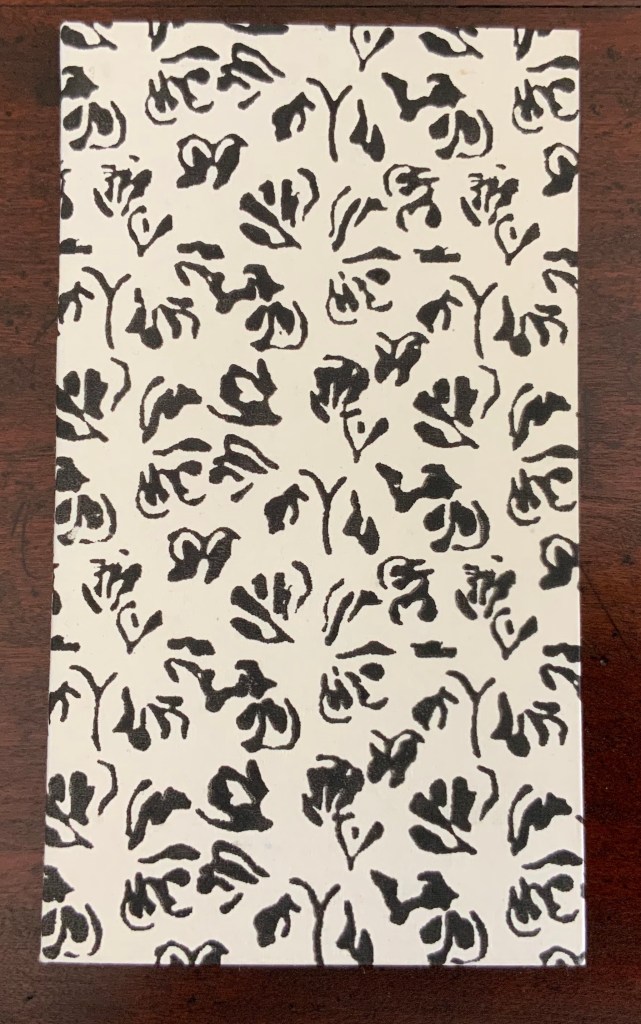
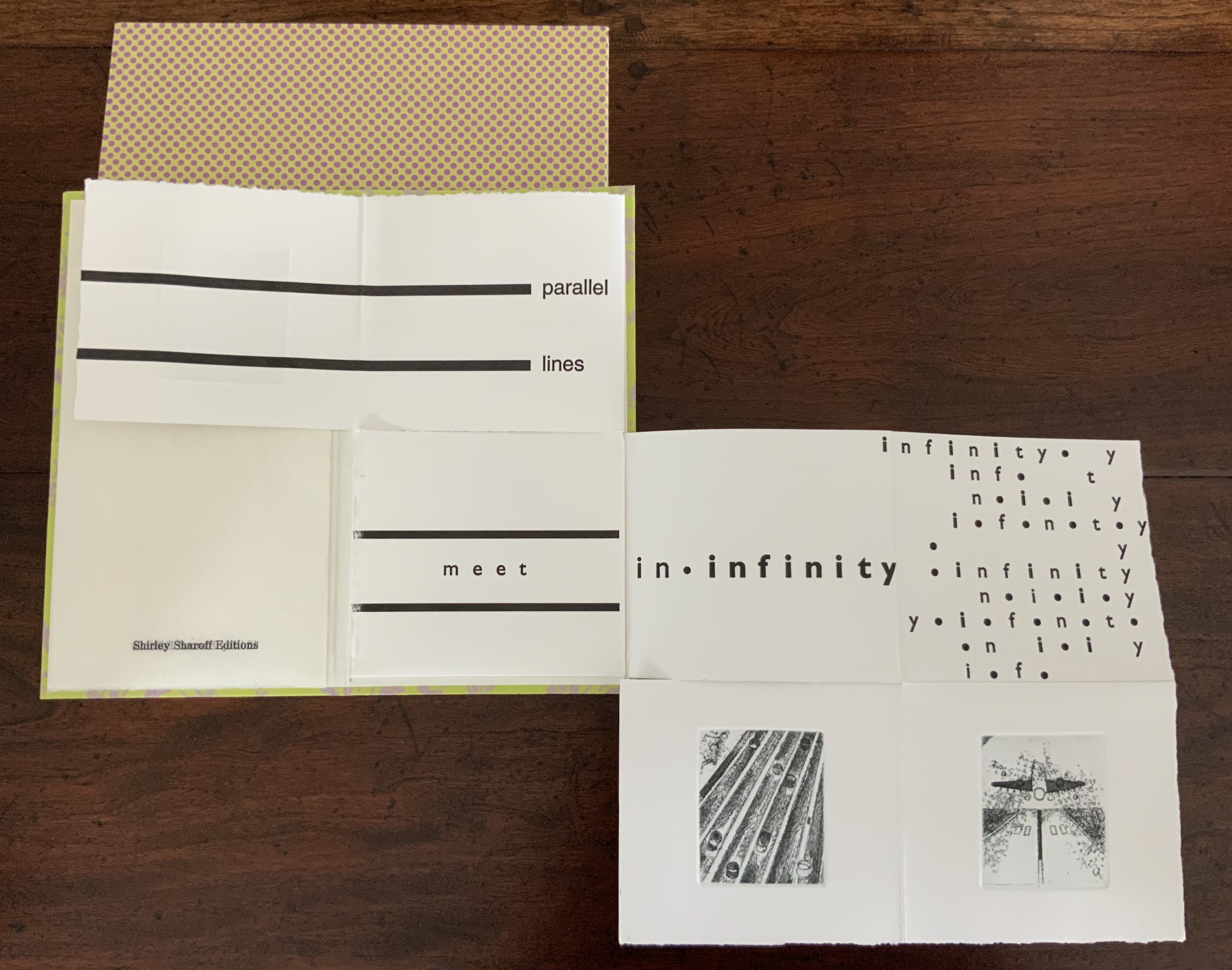
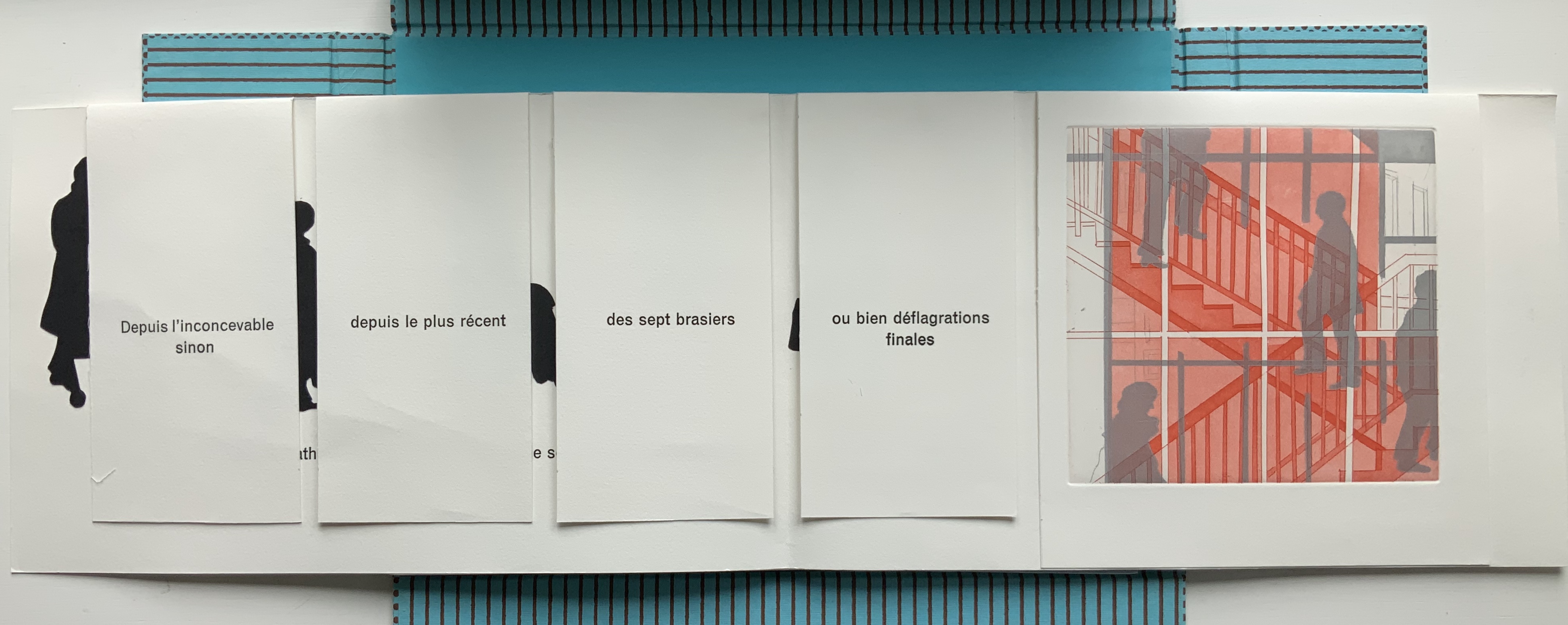
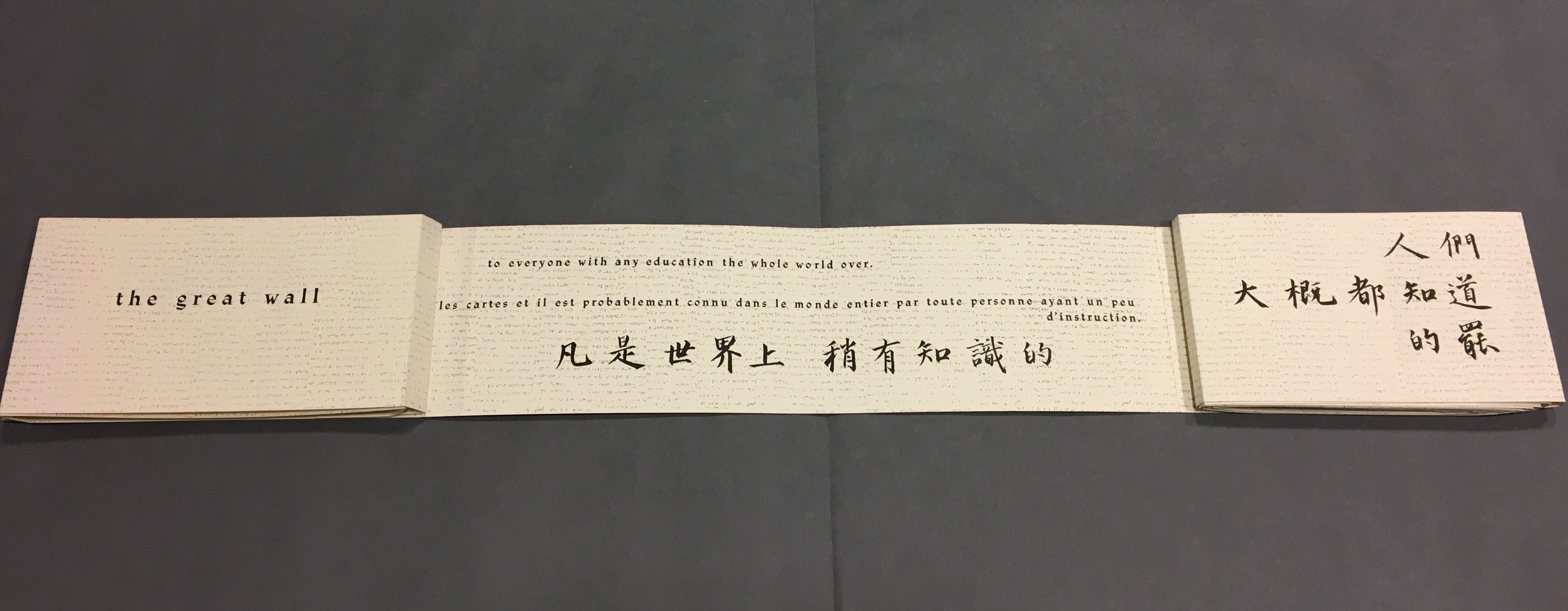
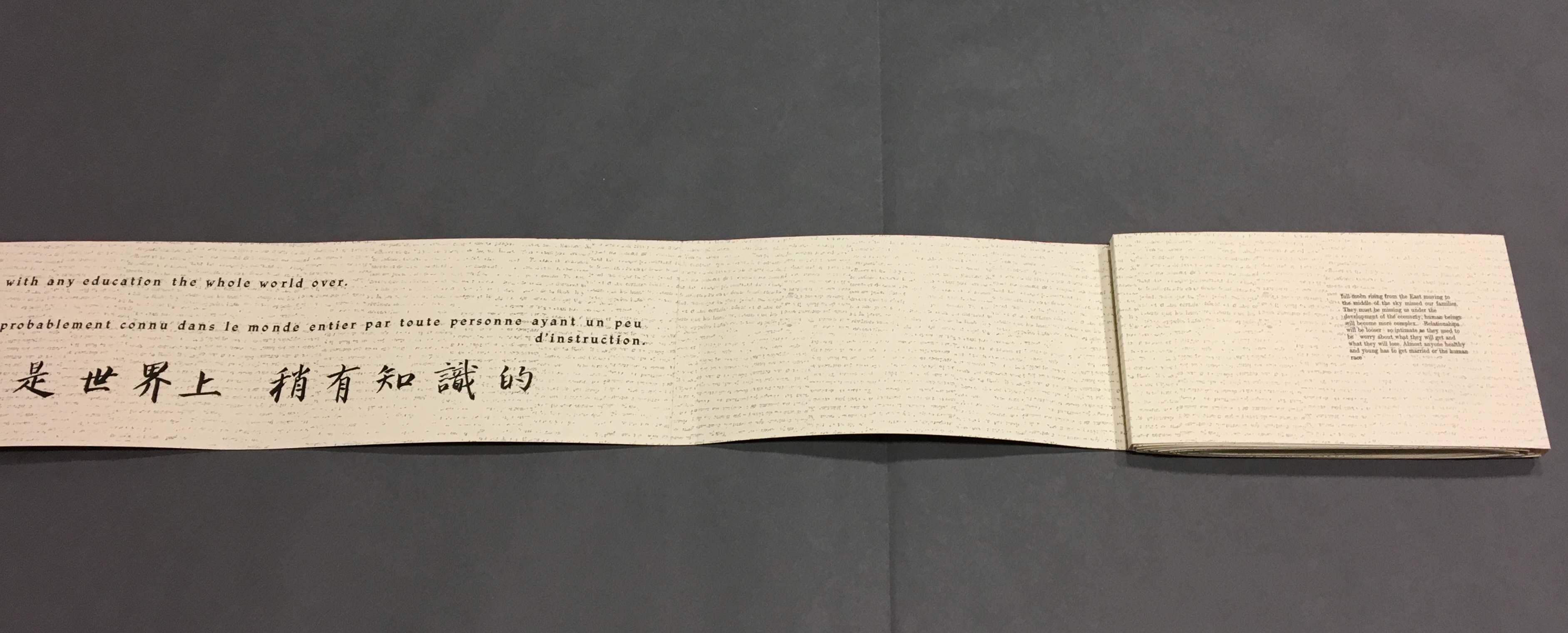
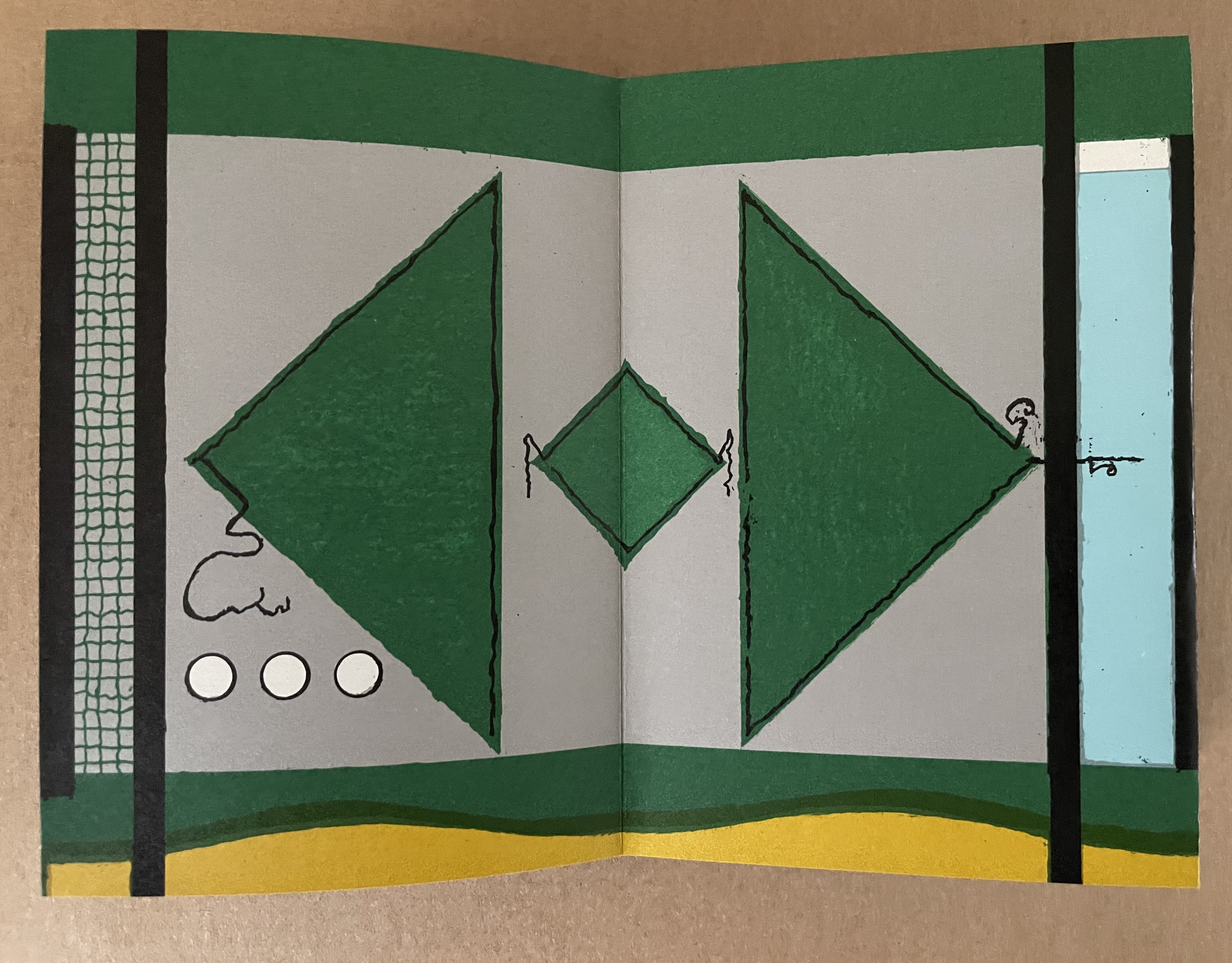
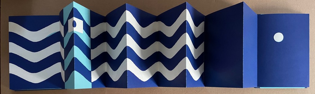
Le Petit Chaperon Rouge (1965)

Le Petit Chaperon Rouge (1965)
Warja Lavater
Accordion book in perspex slipcase.
Slipcase: H167 x W117 x D26 mm; Book: H160 x W113 x D20 mm, closed; W4.5 m, open. 40 panels.
Acquired from Patrick Wainwright Rare Books, 22 June 2022.
Photos: Books On Books Collection.
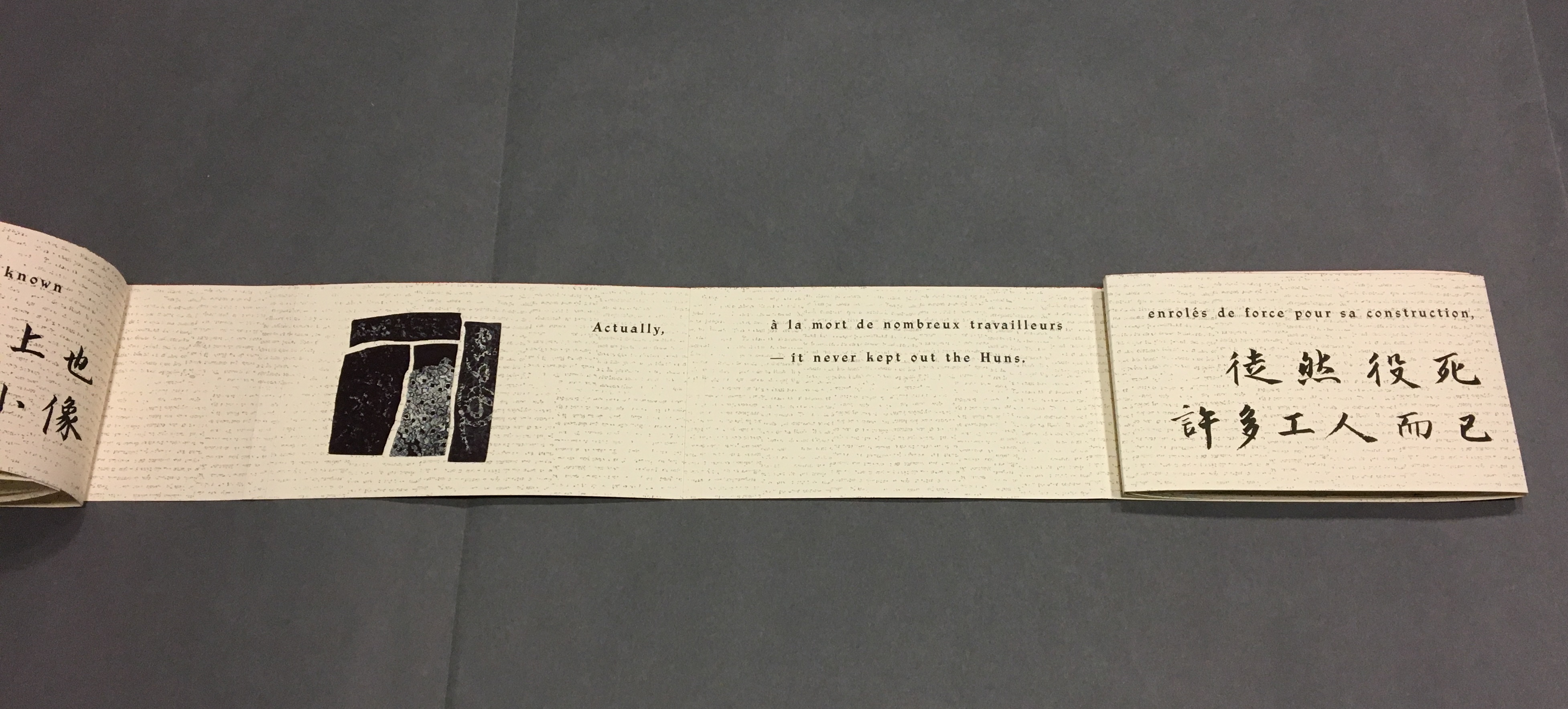
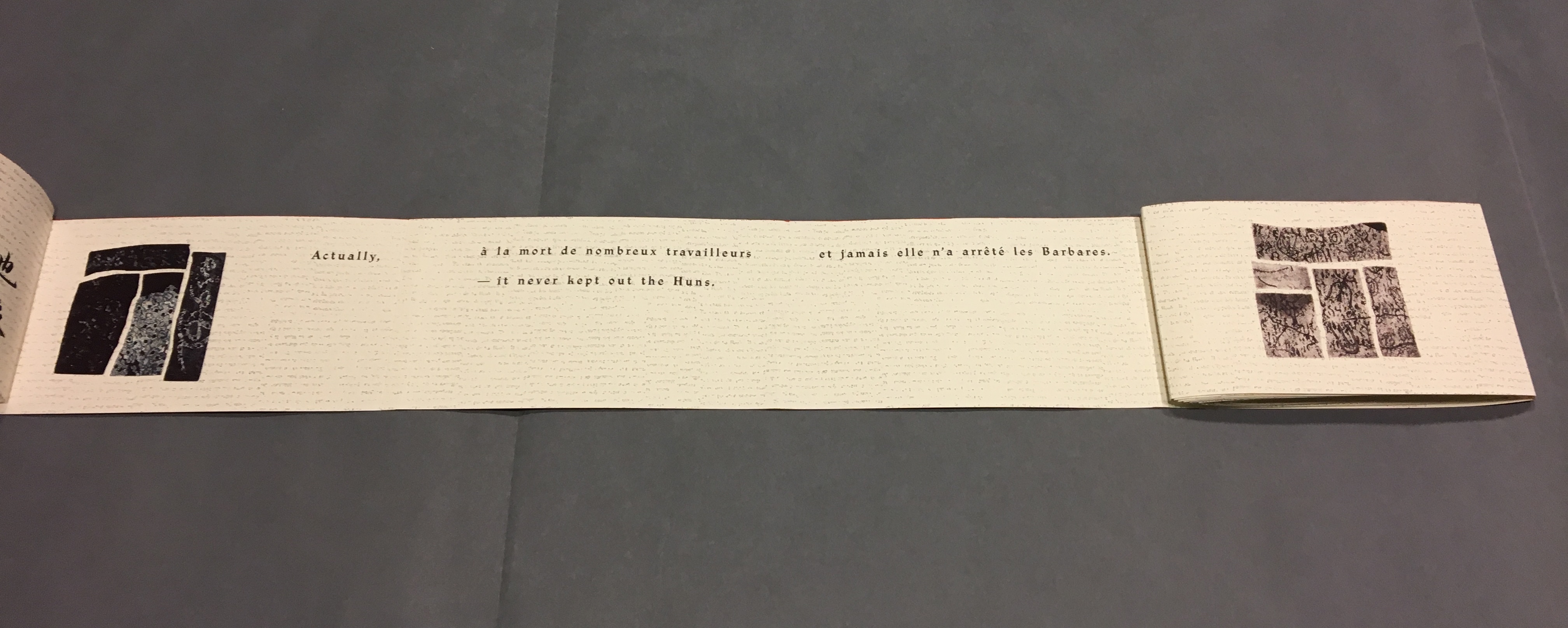
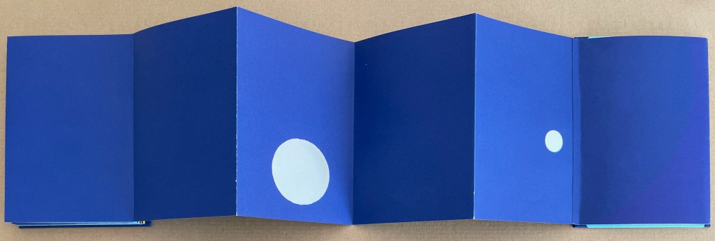
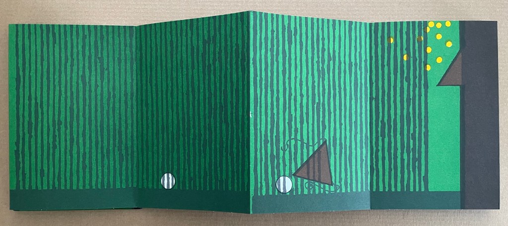
Abstract shapes stand in for the characters and settings in this retelling of Little Red Riding Hood’s journey through the forest to visit her grandmother. With the only text being that matching symbols to the cast of characters and settings, the tale is told wordlessly.


Knowing the story and having the cast to hand, the reader/viewer easily follows the shapes and colors into a new and artful experience of the folktale. But what if the shapes and colors cannot be seen?
Le Petit Chaperon Rouge (2008)

Le Petit Chaperon Rouge (2008)
Warja Lavater and Myriam Colin
Accordion book boxed in cloth-covered board box. Box: H190 x W130 x D75 mm; Book: H176 x W122 x D70 mm. closed;
W4.3 m, open. 40 panels. Acquired from Les Doigts Qui Rêvent, 30 October 2022.
Photos: Books On Books Collection. Displayed with permissions of Les Doigts Qui Rêvent.
Artist Myriam Colin and publisher Les Doigts Qui Rêvent (“Fingers that Dream”) addressed this question with print, Braille, cloths of different texture, leather, blind embossed shapes, plastic filaments and sewing.

Between the printed text and Braille-rendering for the cast of characters and settings, buttons of different cloths and different embossed shapes appear. In the opening scene, the red felt button for Little Red Riding Hood is of course smaller than the orange-brown broadcloth button for Mother, who stands before the raised rectangle for the house and looks over her daughter’s head at the forest of raised dots.

Later, the wolf’s belly becomes a large sewn pouch with the slit cut by the Hunter through which Grandma and Little Red Riding can be felt, ready to escape.

The brown leather button for the Hunter unites the felt Red Riding Hood, nubby-cloth Grandmother and broadcloth Mother in a clearing in the forest. A satisfactory conclusion for the sighted and visually impaired.
Update Lavater
Seven works in the Books On Books Collection represent Warja Lavater’s art: Le Petit Chaperon Rouge (1965), a later tactile version of the same work (2008), Sketchbook: Le Non-obéissant (1968), Spectacle (1990), Ourasima (1991), Tanabata (1994), and Kaguyahime (1998). The French publisher Adrien Maeght was Lavater’s most consistent champion, publishing several of her leporello works, including a now rare boxed set.
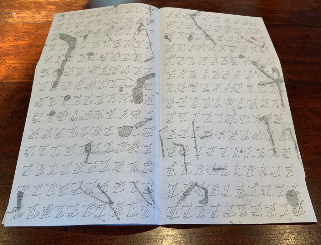
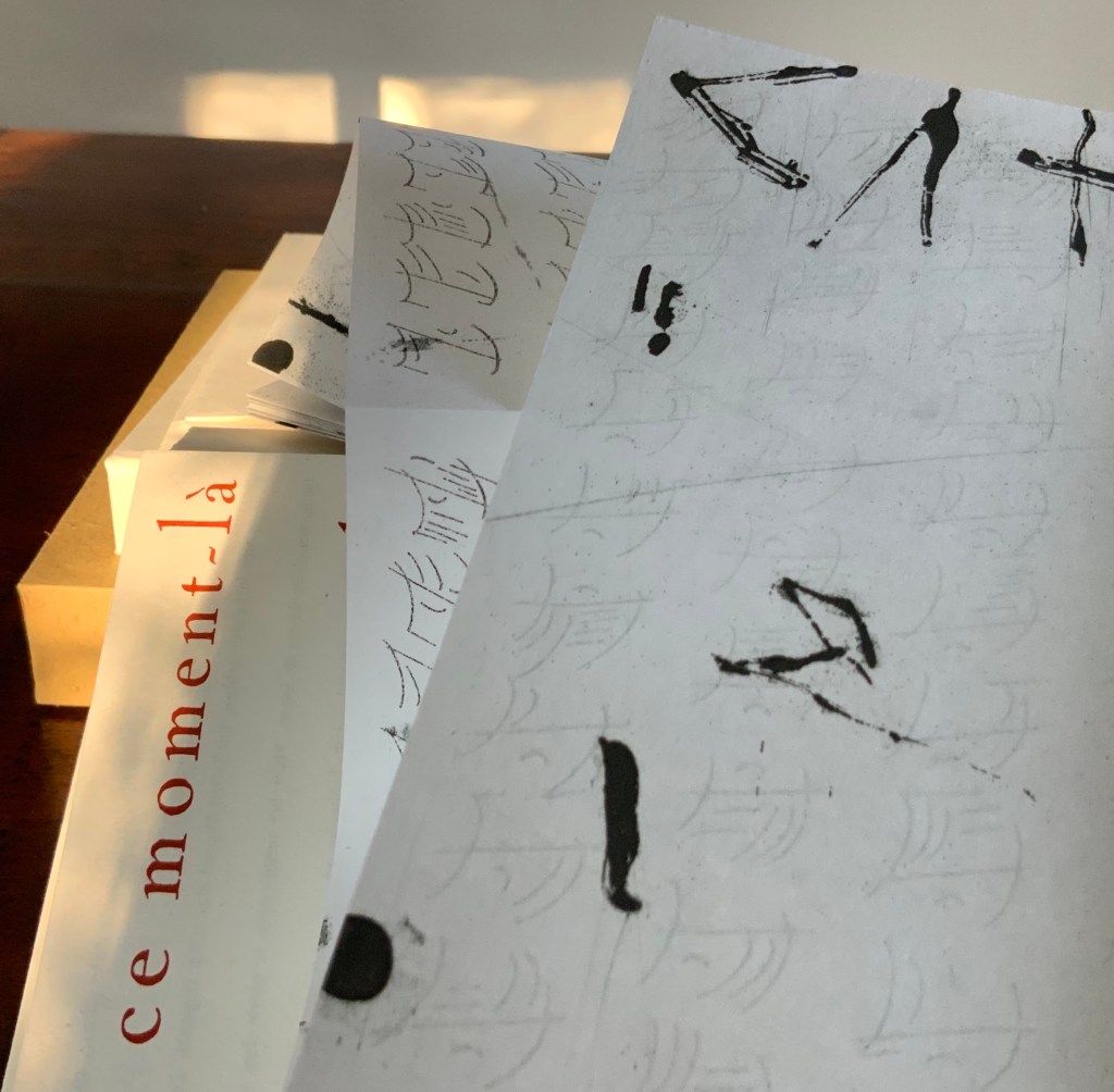
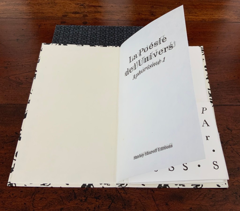
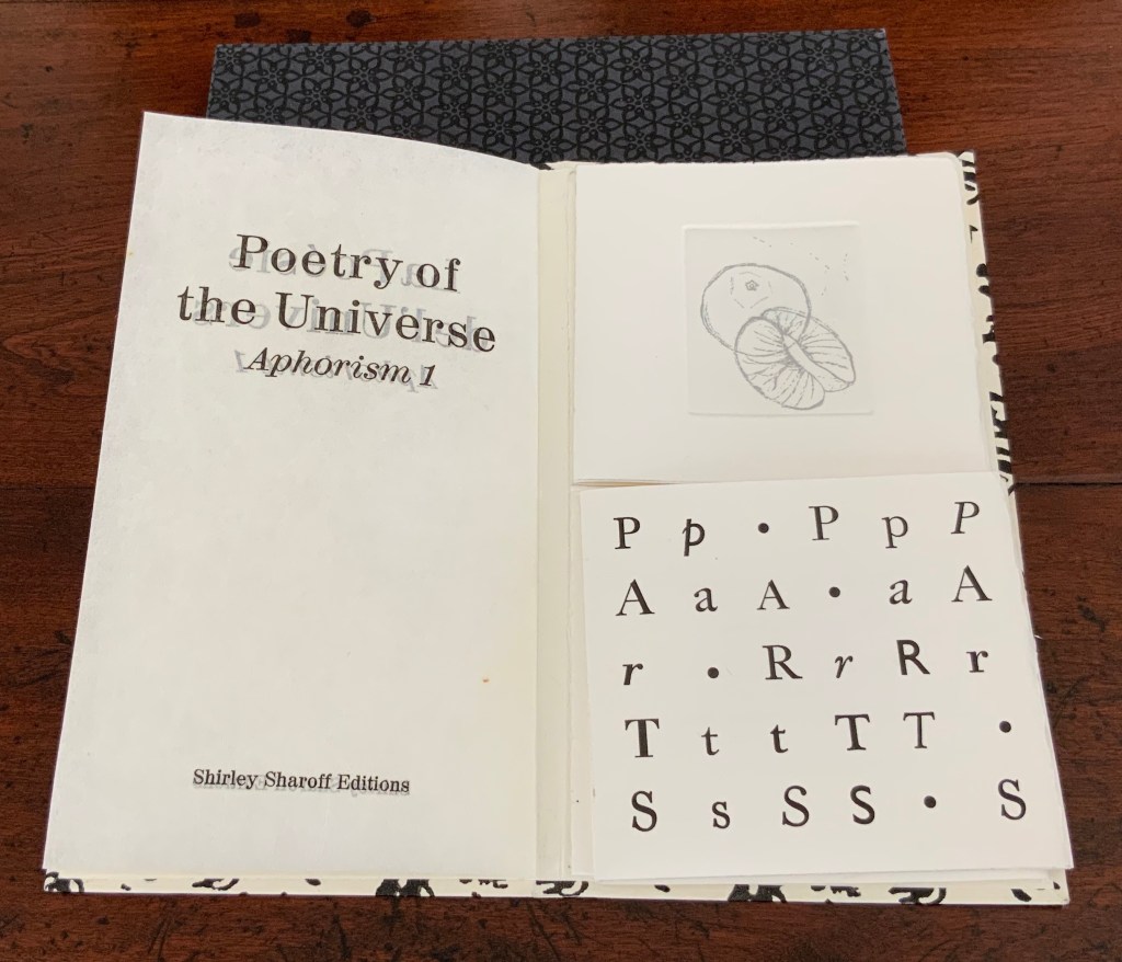
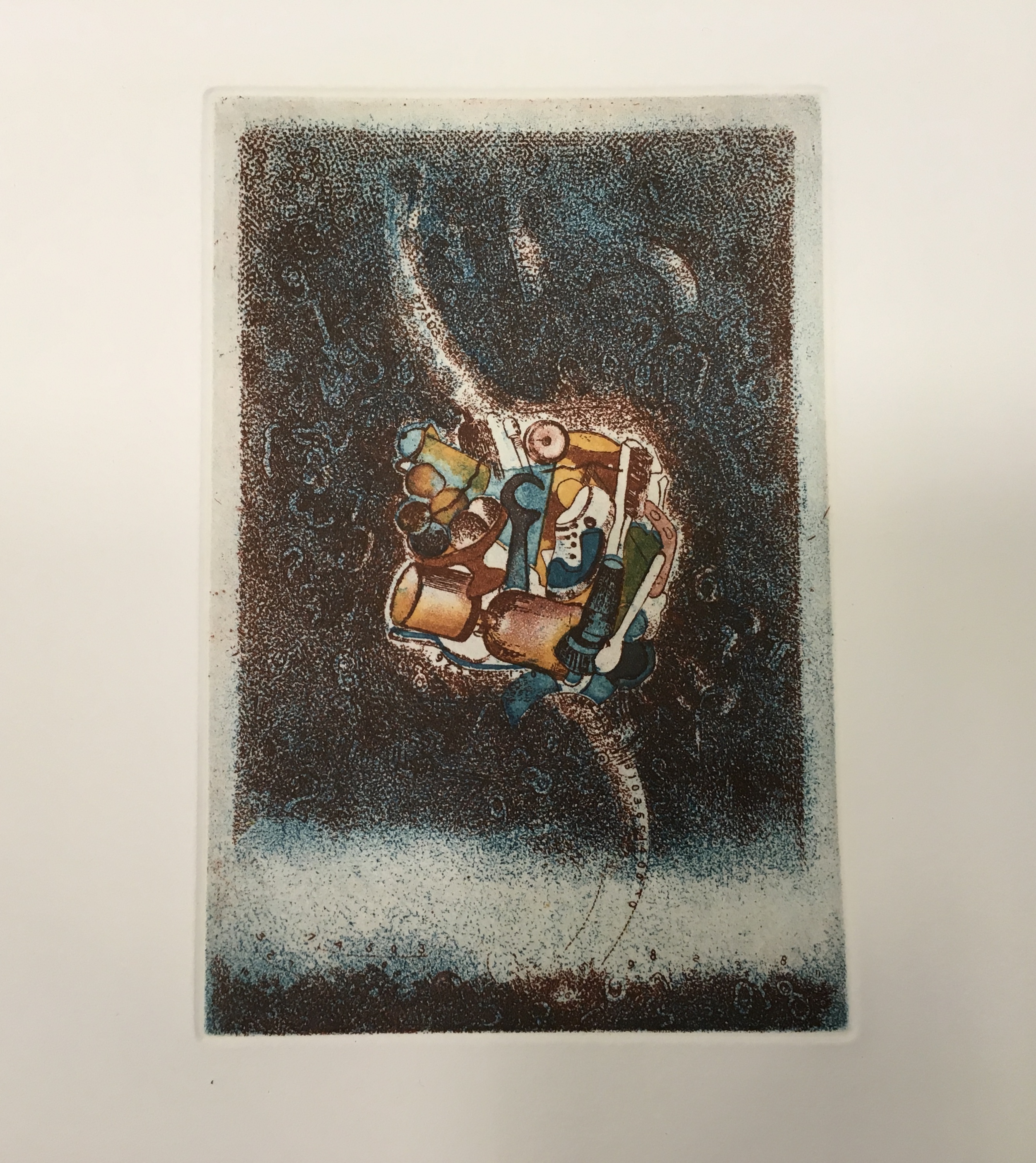
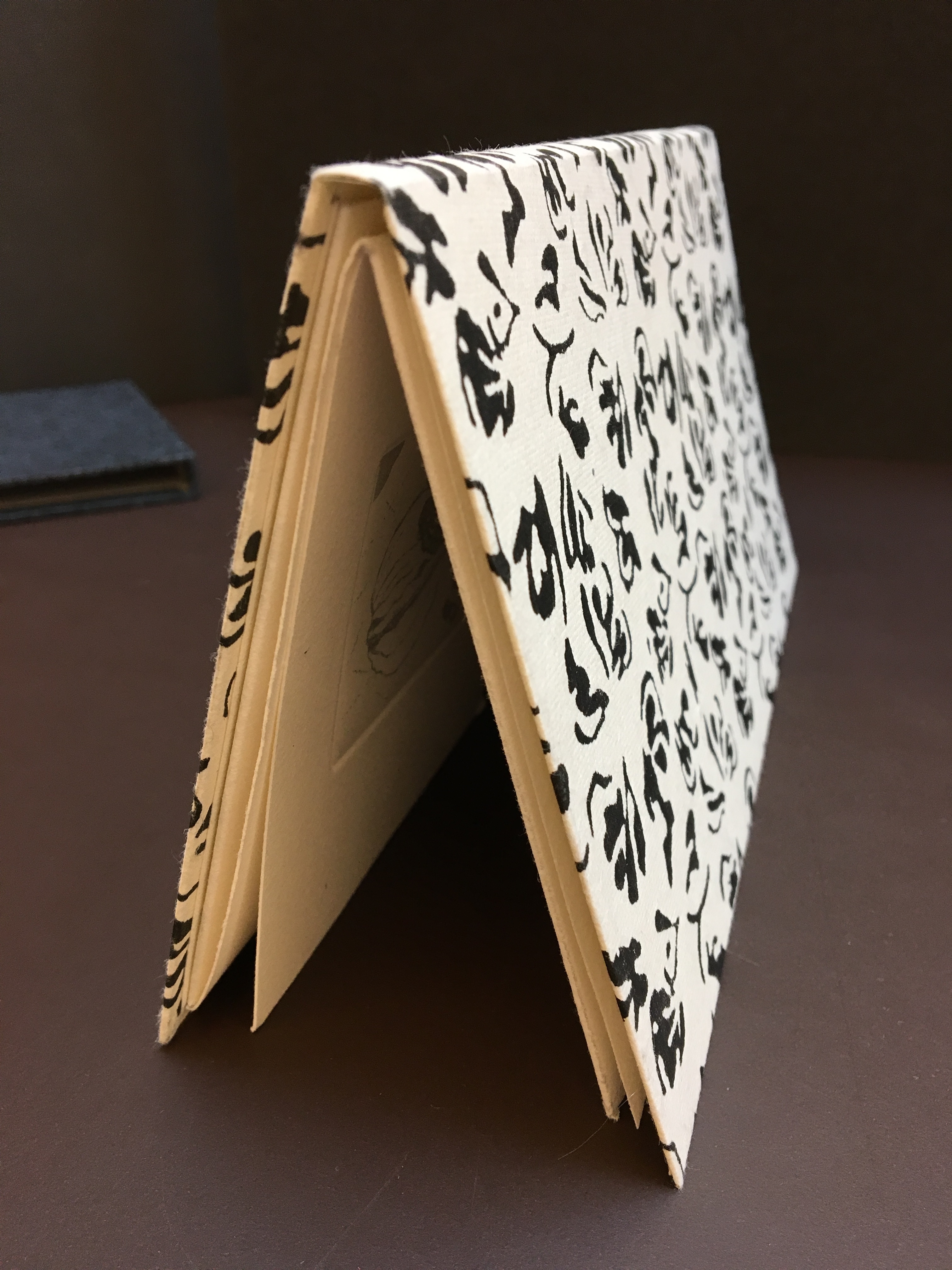
Sketchbook: Le Non-obéissant (1968)
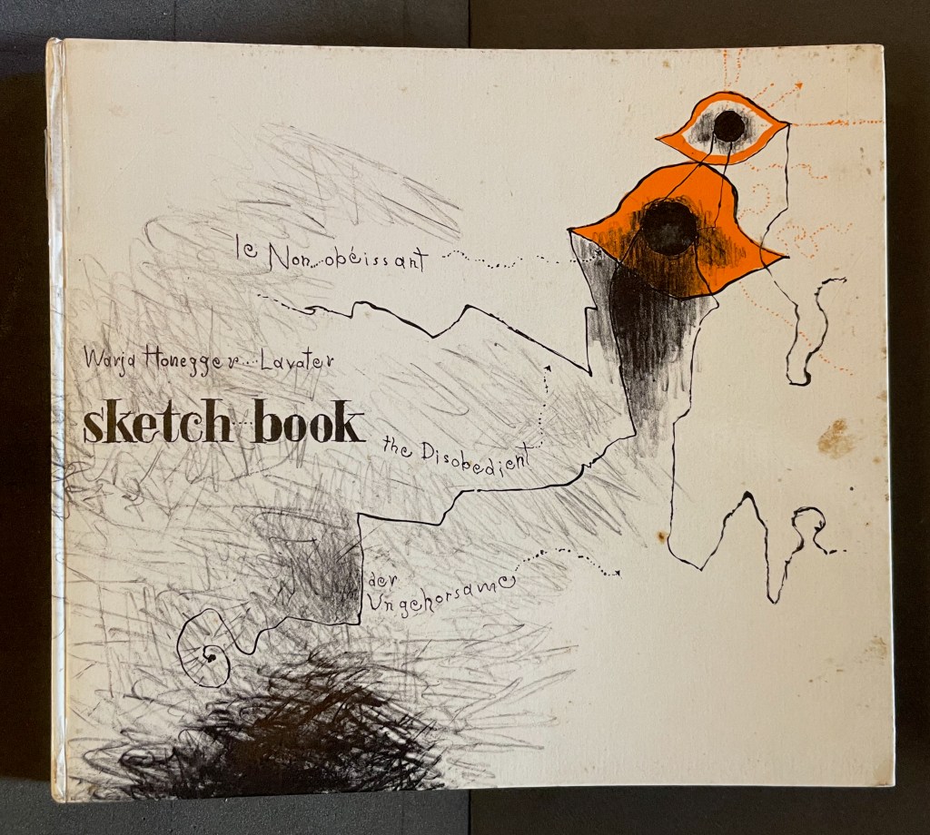
Sketchbook: Le Non-obéissant; The Disobedient (1968)
Warja Lavater
Casebound, printed gloss paper over boards, plain endpapers and fly leaves. H210 x W235 mm. [45] Chinese fold folios.Acquired from Ken Sanders Rare Books, 18 July 2024.
Photos: Books On Books Collection.
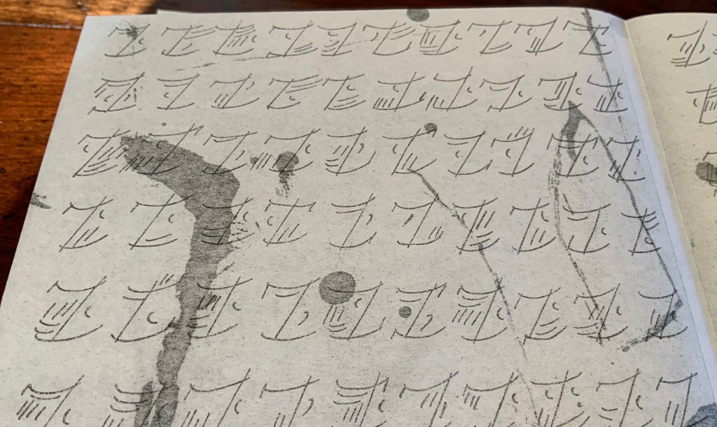
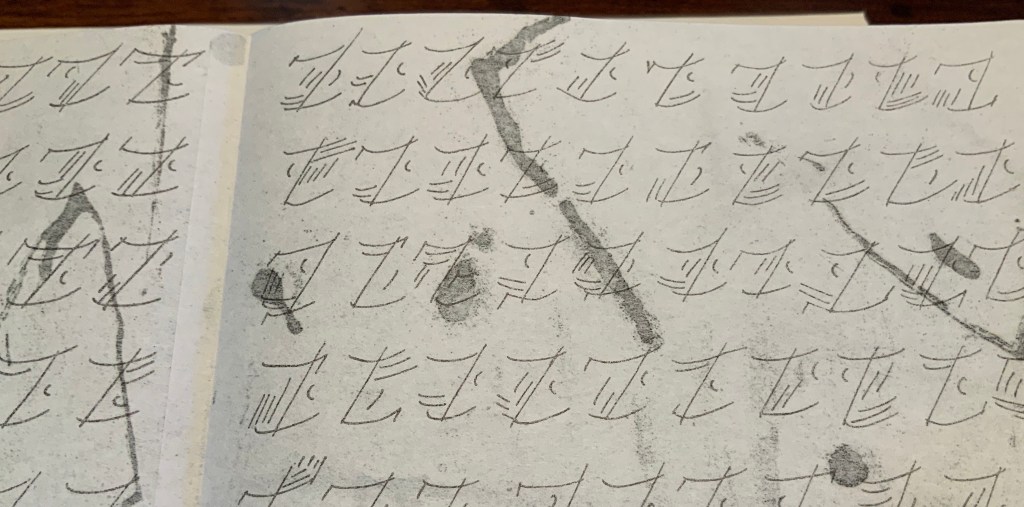
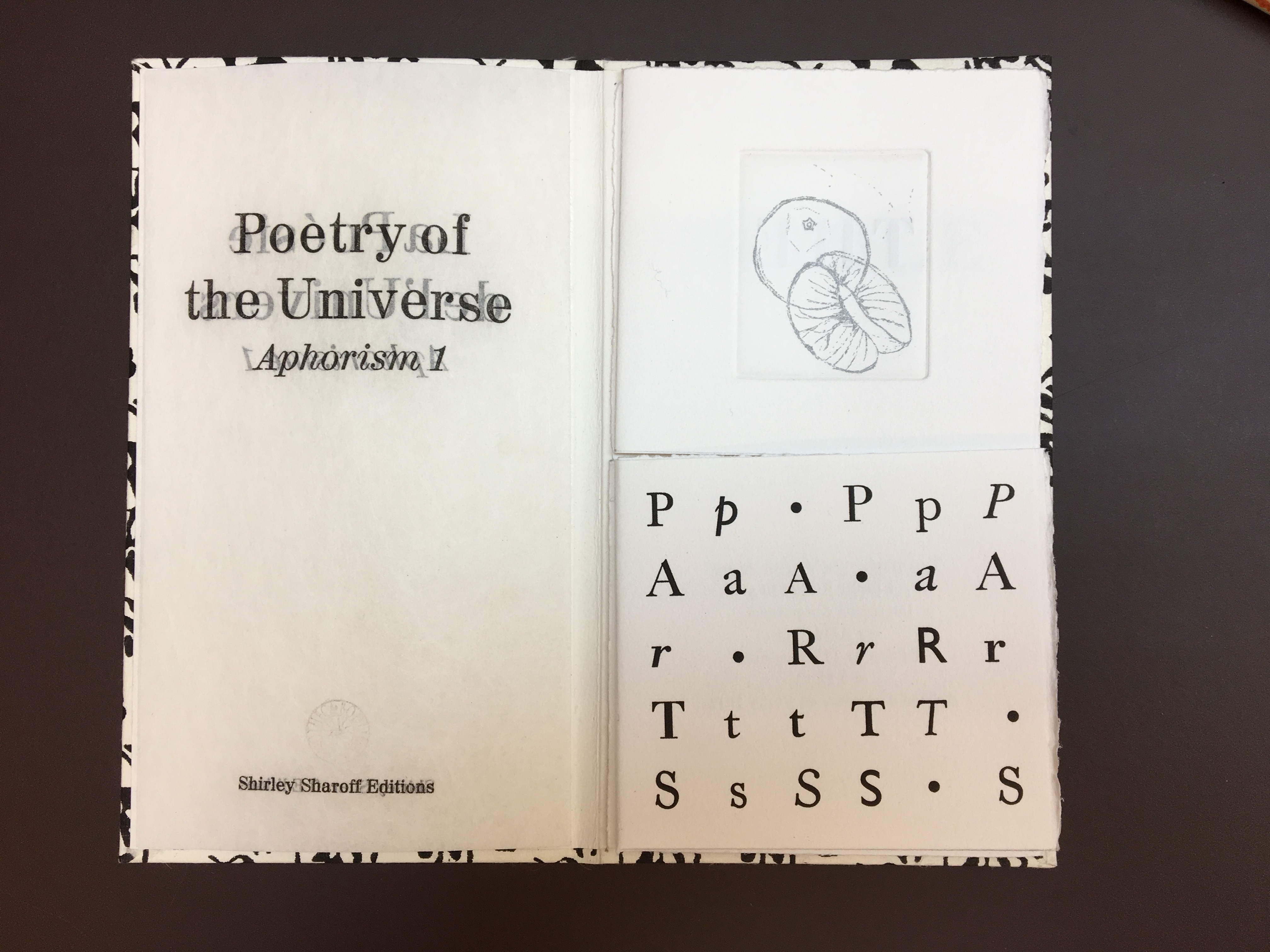
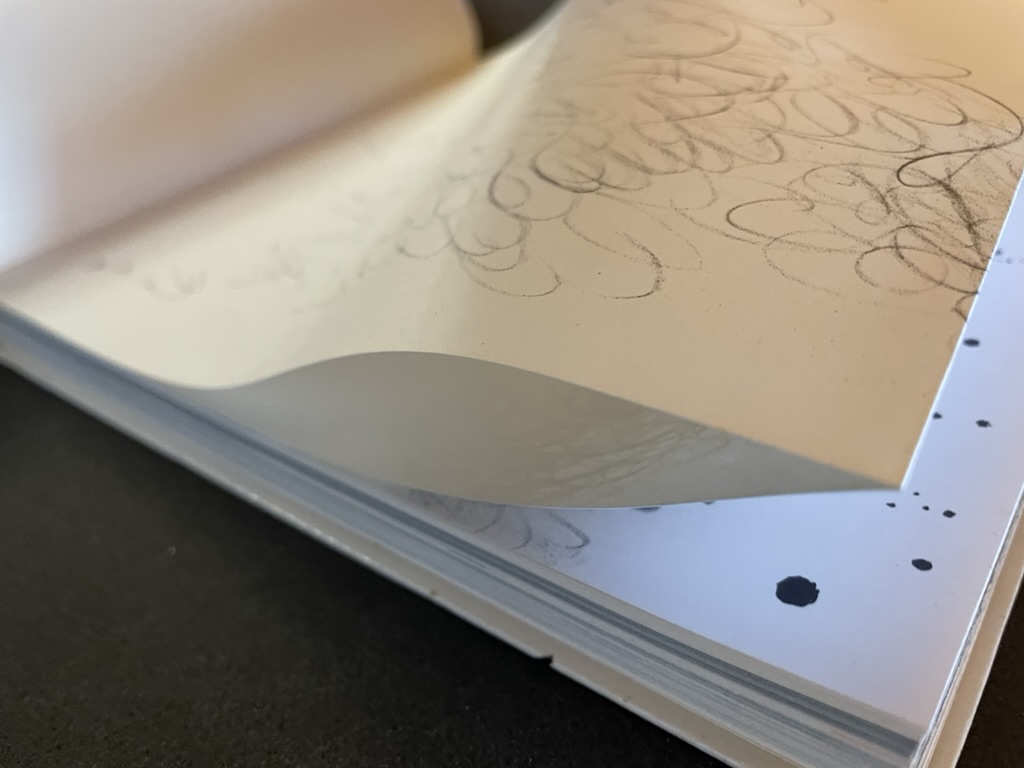
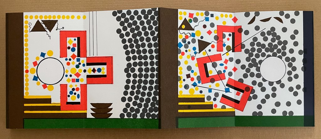
Warja Lavater’s Sketchbook opens with a page of pencil scrawling that wraps from the first side of a Chinese-fold folio, over the fold, and onto the folio’s other side, where a 10,000+ year timeline of artists appears in cramped handprint. The scribbling continues onto the next folio, embroidering Oscar Wilde’s aphorism
Disobedience in the eyes of anyone who has read history is man’s original virtue. It is through disobedience that progress has been made.
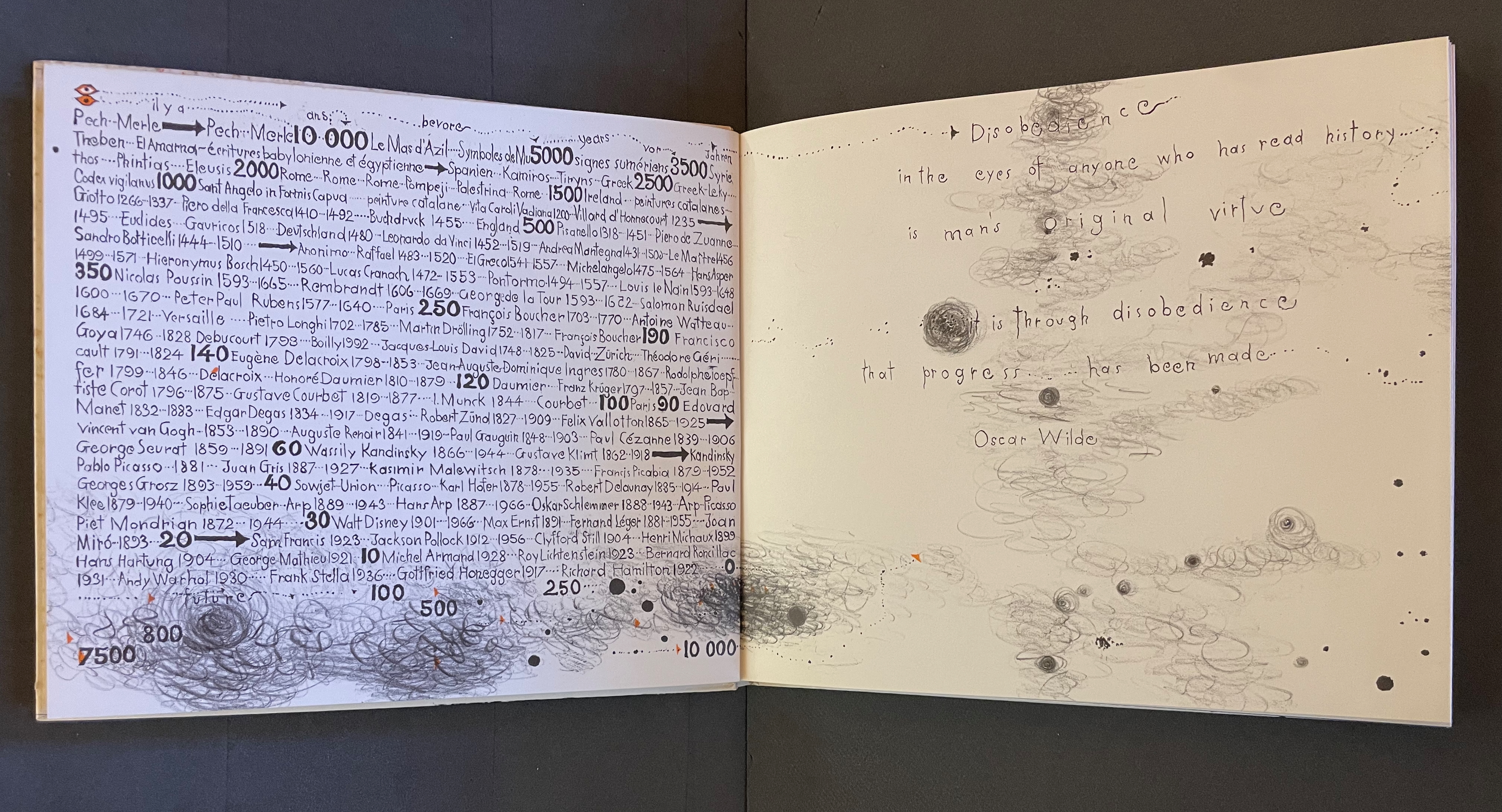
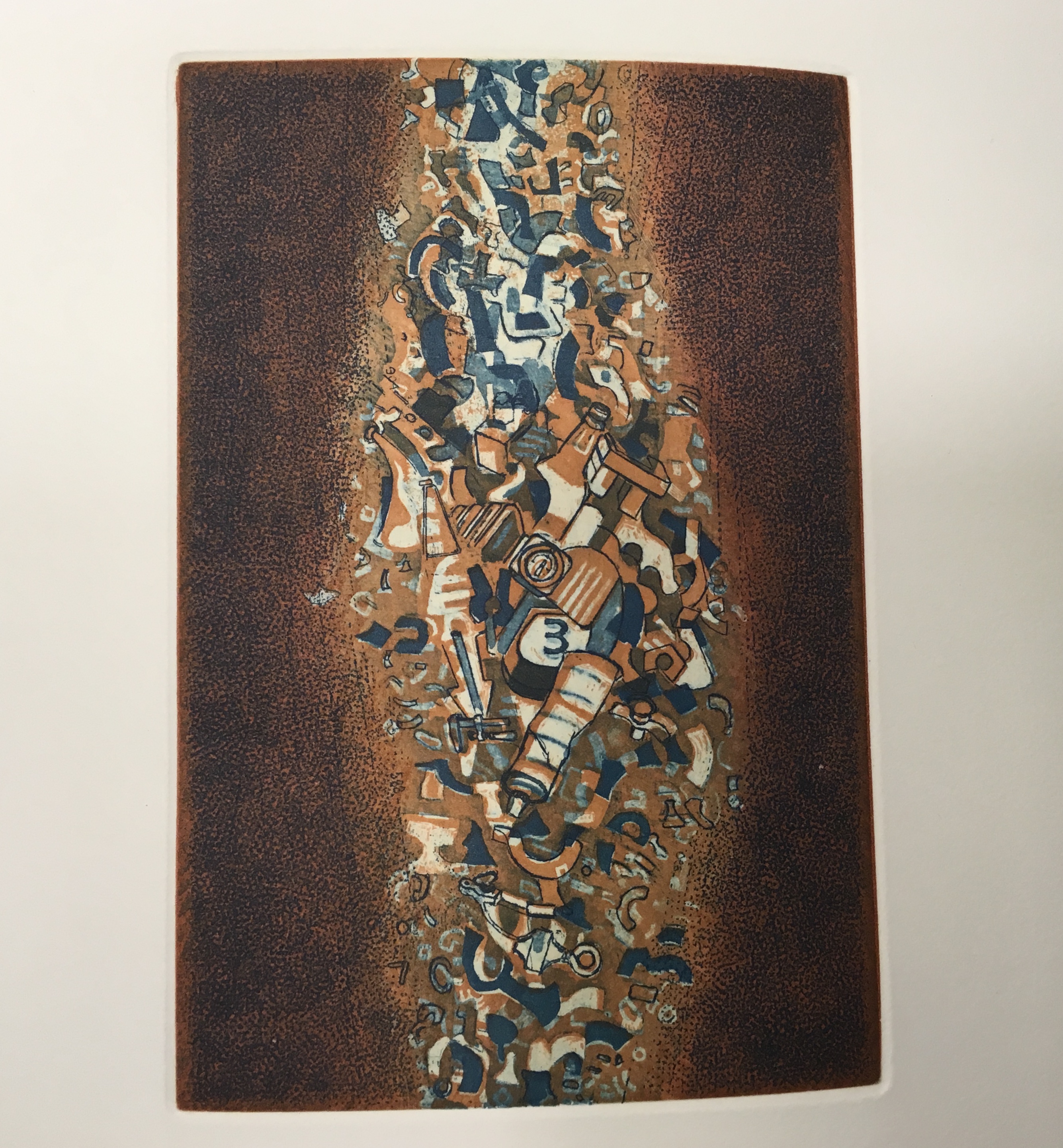
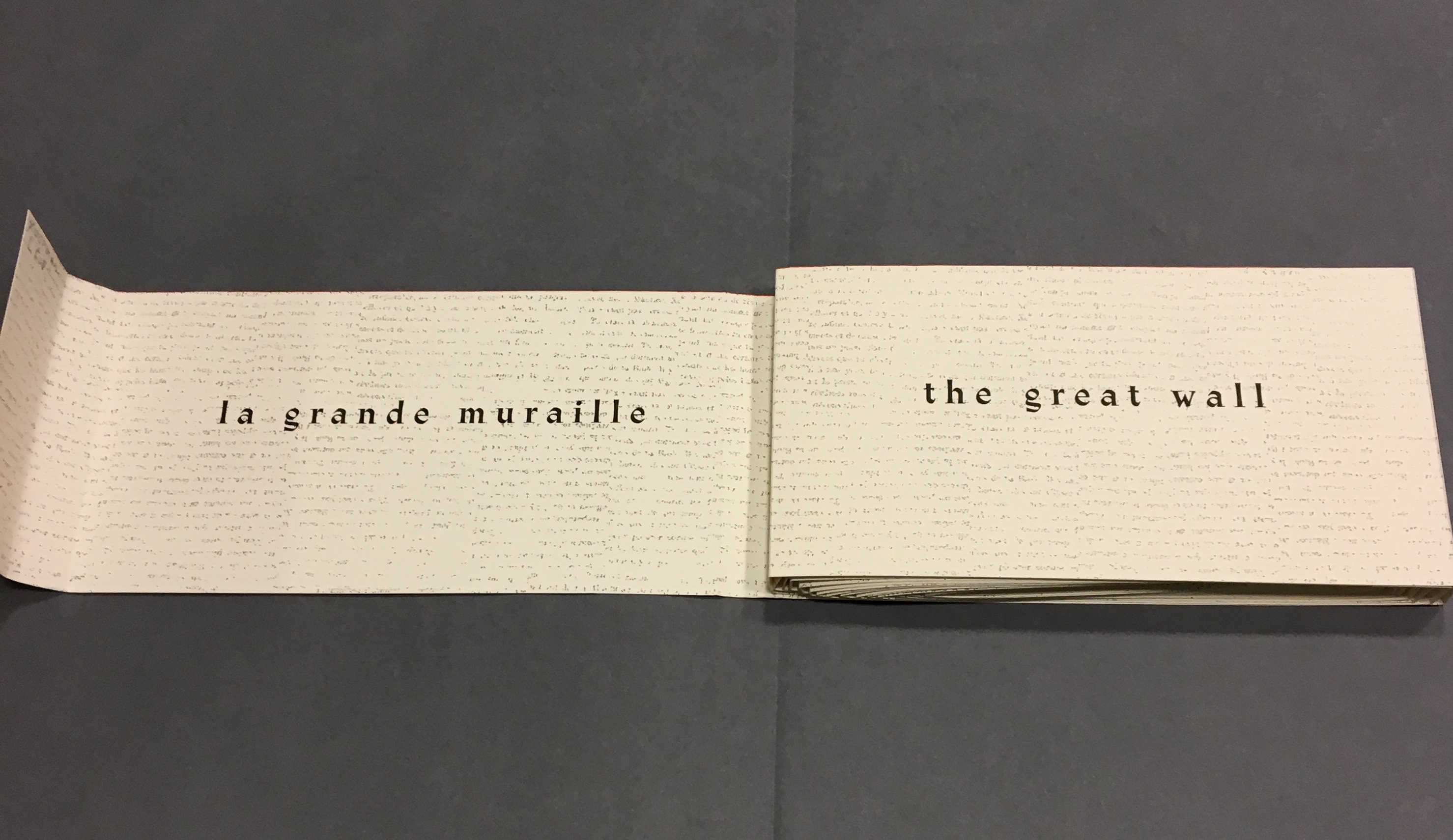
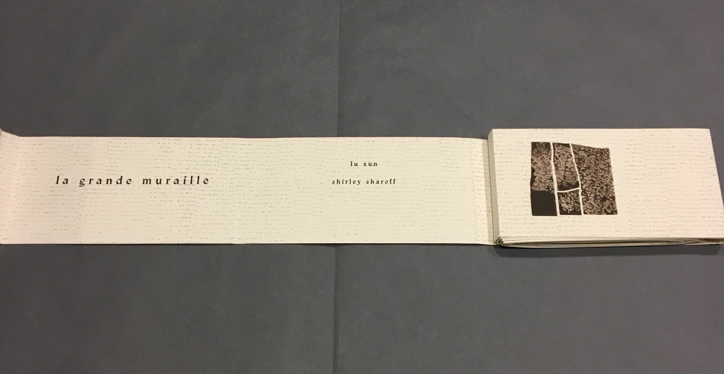
The scrawling runs over the fold of the folio and across a double-page spread to become the multilingual title page. Or rather the “subtitle becomes title page”. Look again at the cover. Wasn’t the title Sketchbook? Now it is Le Non-obéissant | The Disobedient | Der Ungehorsam, and it has acquired a new subtitle, and a strange one at that: Une Imagerie Racontée et dessinée par … |An Imagery Told and Drawn by … | Eine Imagerie Erzählt und Gezeichnet von Warja Lavater.
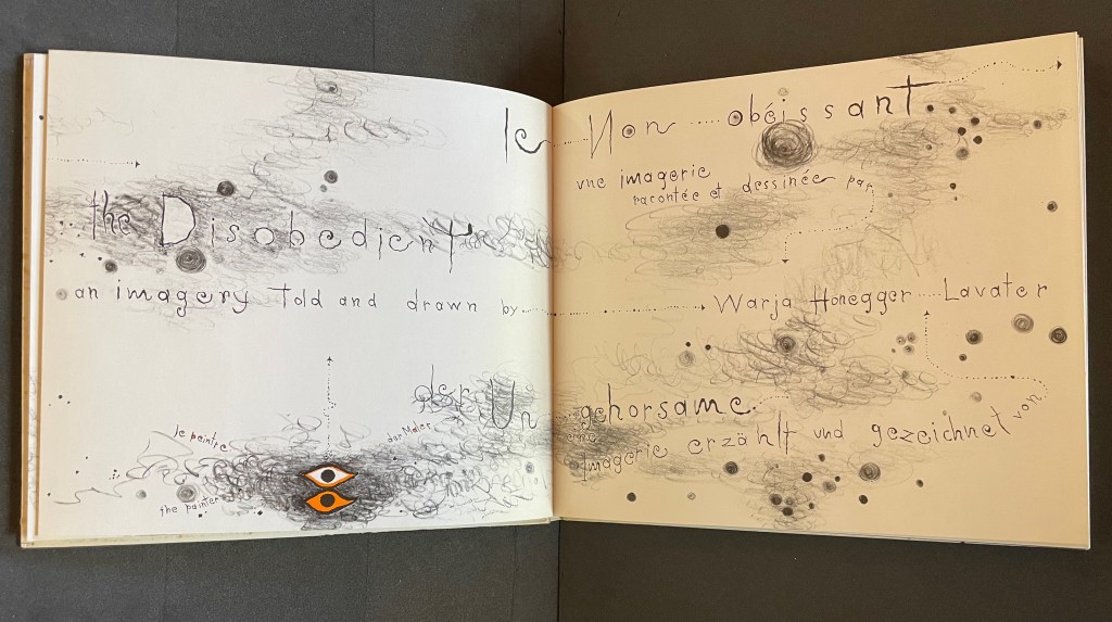
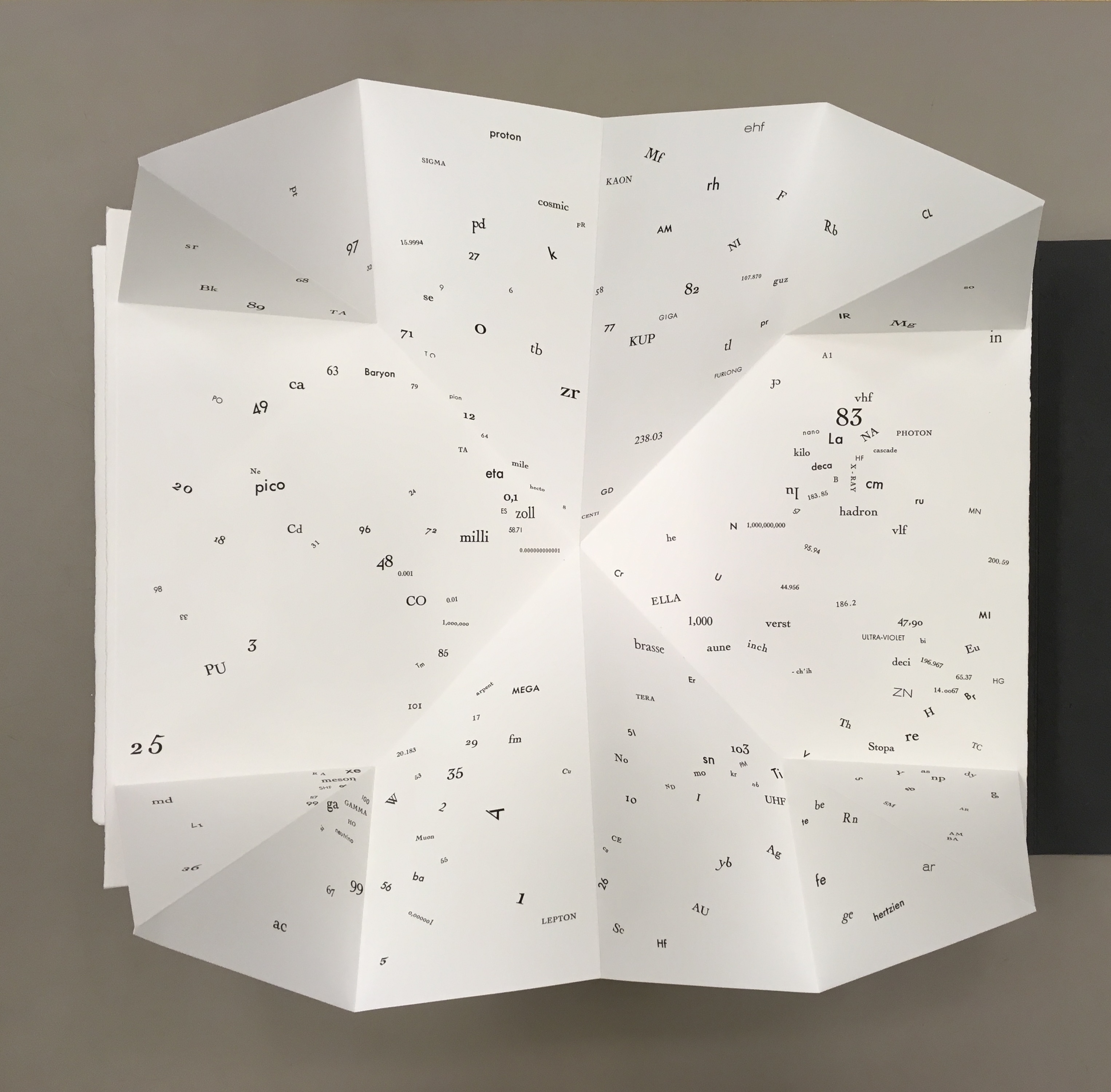
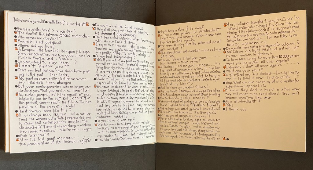
“An imagery told and drawn” captures well Lavater’s technique of abstract pictorial retelling of familiar fairy tales such as Little Red Riding Hood and Cinderella. Now, in this sketchbook, she uses it to create her own fairy tale of art history. As we are about the learn, the doodle labelled le peintre | the painter | der Maler on the left hand page above is the main character named “the Disobedient”. Reminiscent of Mel Brooks and Carl Reiner’s sketch “The 2000 Year Old Man”, the Disobedient, who has been around for almost 12,000 years, has some humorous and cantankerous answers to the interviewer’s questions about her experiences from cave art to Pop art.
“You make a living from this international art market?”
“The international art market makes a living out of me.”
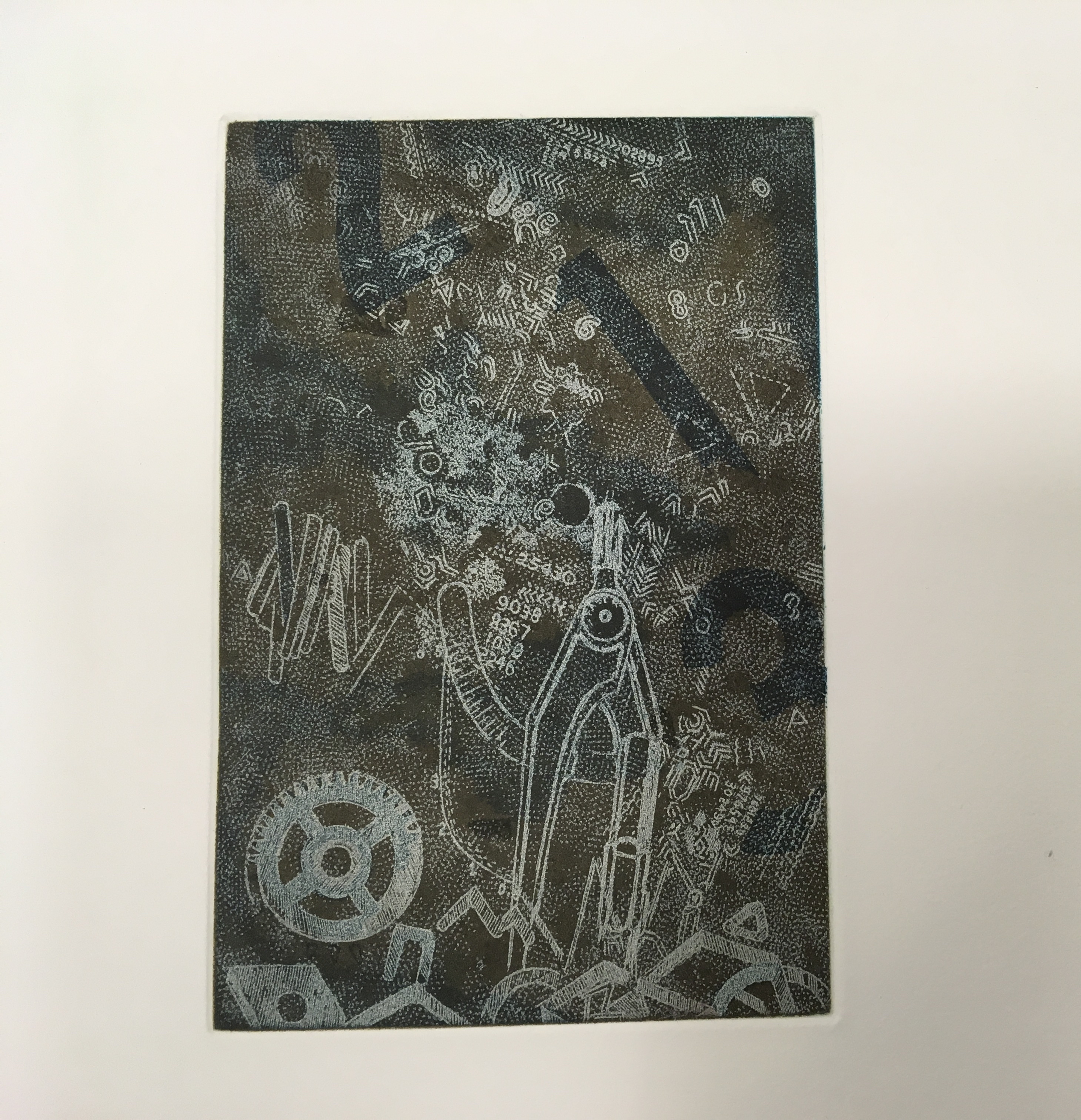
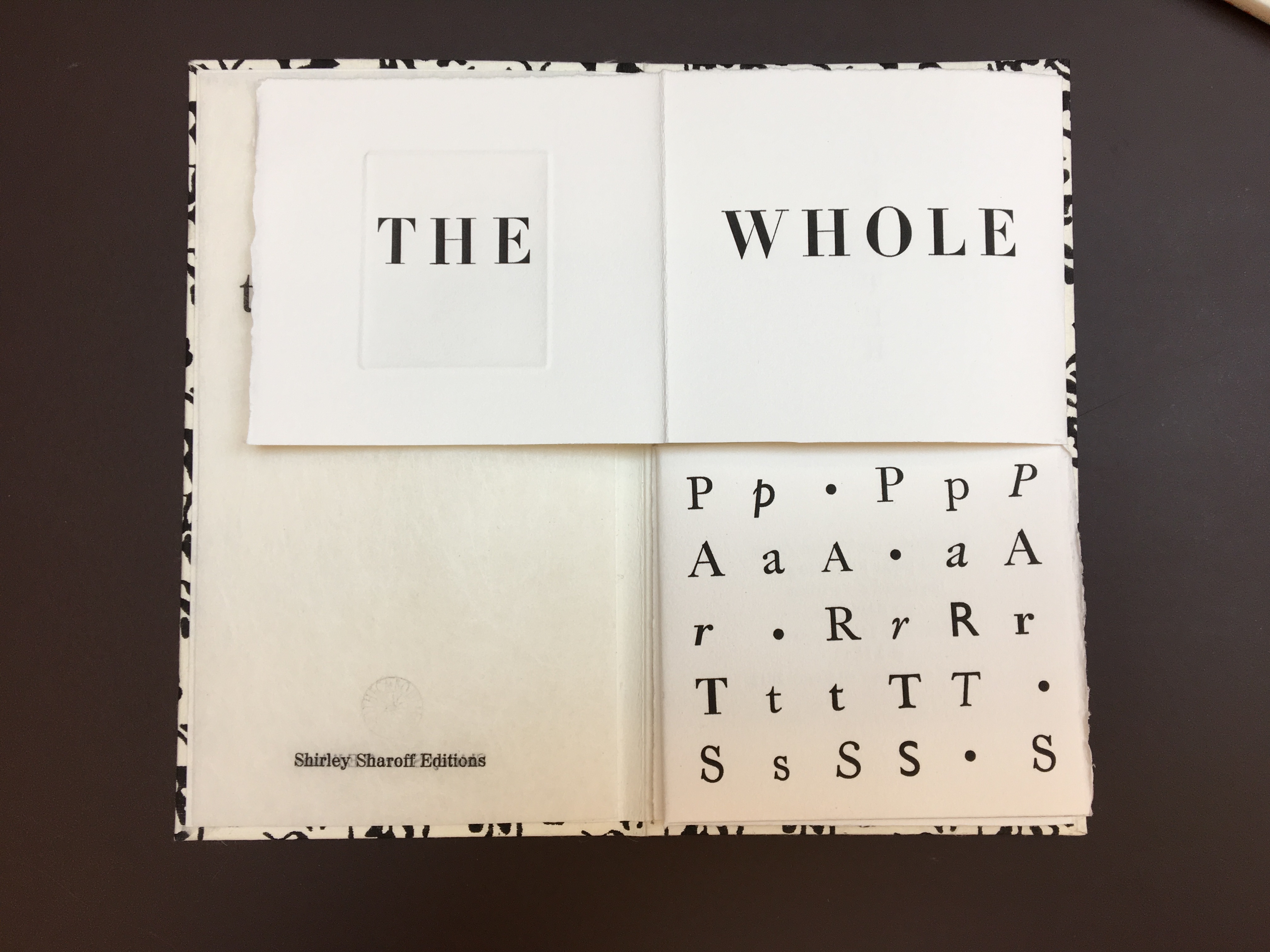
Unlike the Key pages in her fairy tales identifying the images and markings, The Disobedient’s Key page is delivered in her voice. She explains that the eye with white around its iris stands for her “exterior eye with which I look” and the eye with orange around its iris stands for her “interior eye with which I think”. Her techniques or “means of my performance” might be squiggles, geometric objects or figurative drawings. The clearly defined black dots represent her contemporaries. Orange markings represent her emotions, her ferveur and Gefuhl. All the bold numbers mark the “years more or less gone by”. But the story begins in earnest in the dark of four black folios and a fifth in which the artist appears for the first time in history followed by her first work, a drawing of a mammoth.
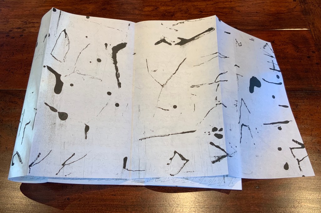
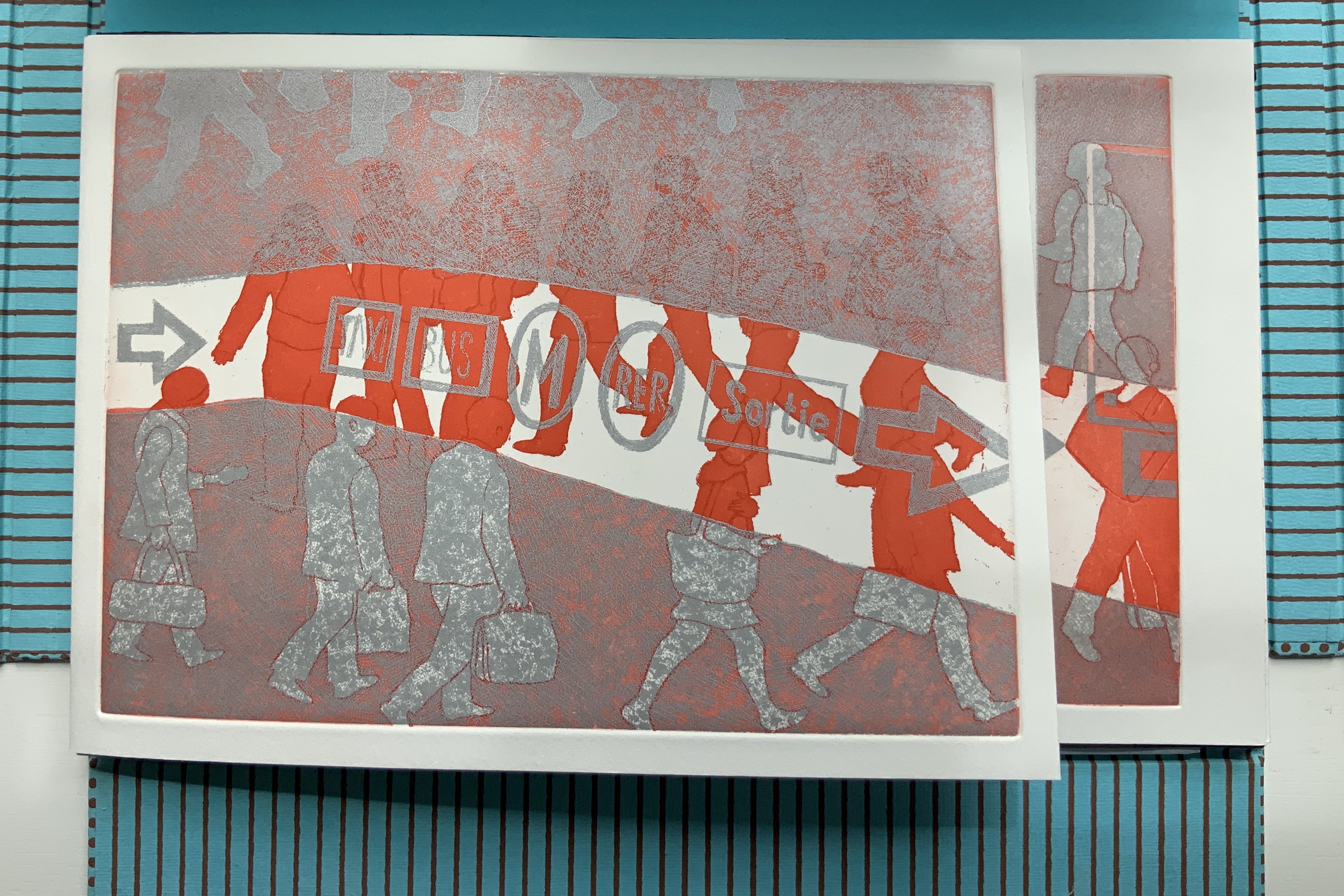
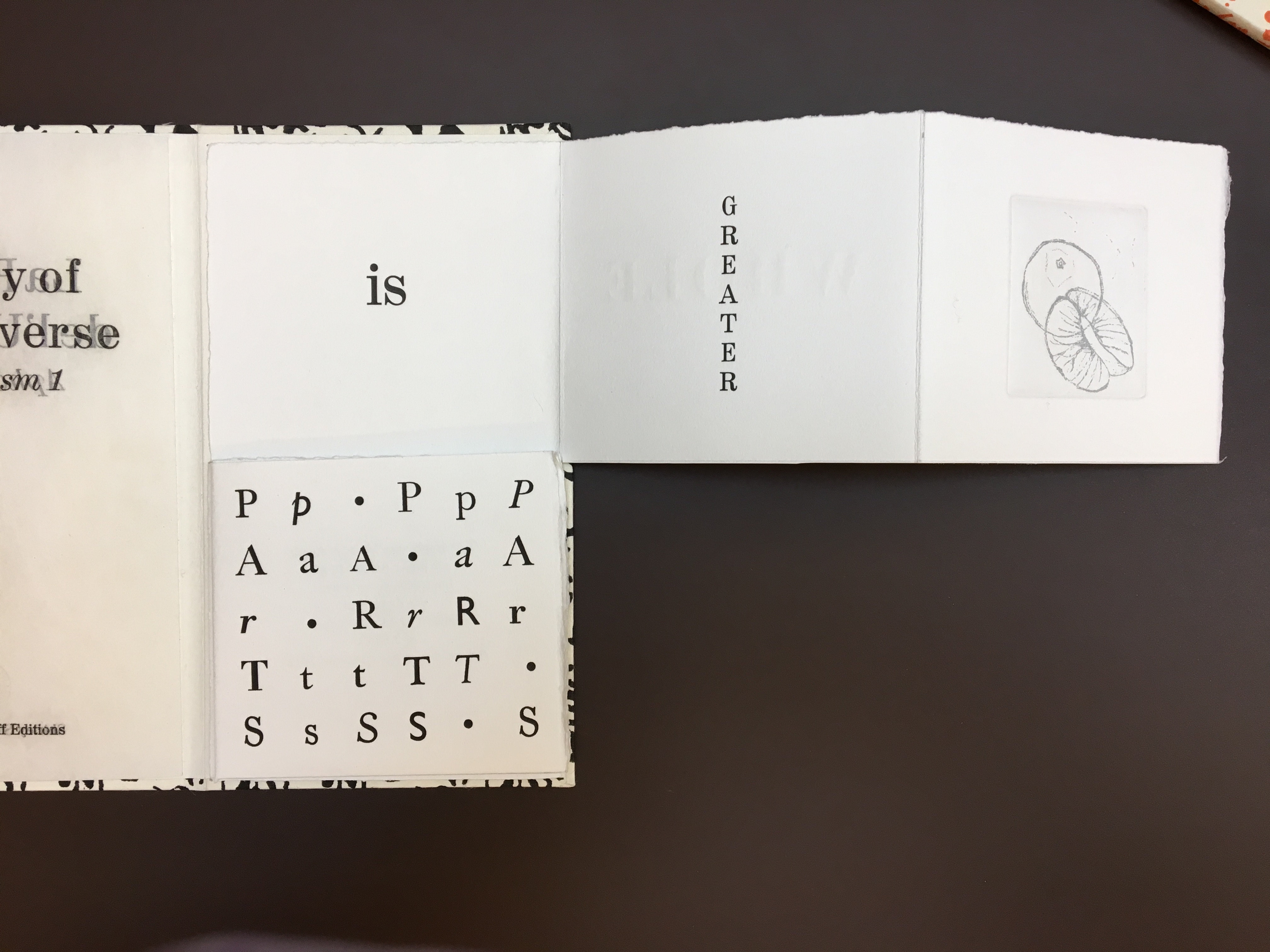
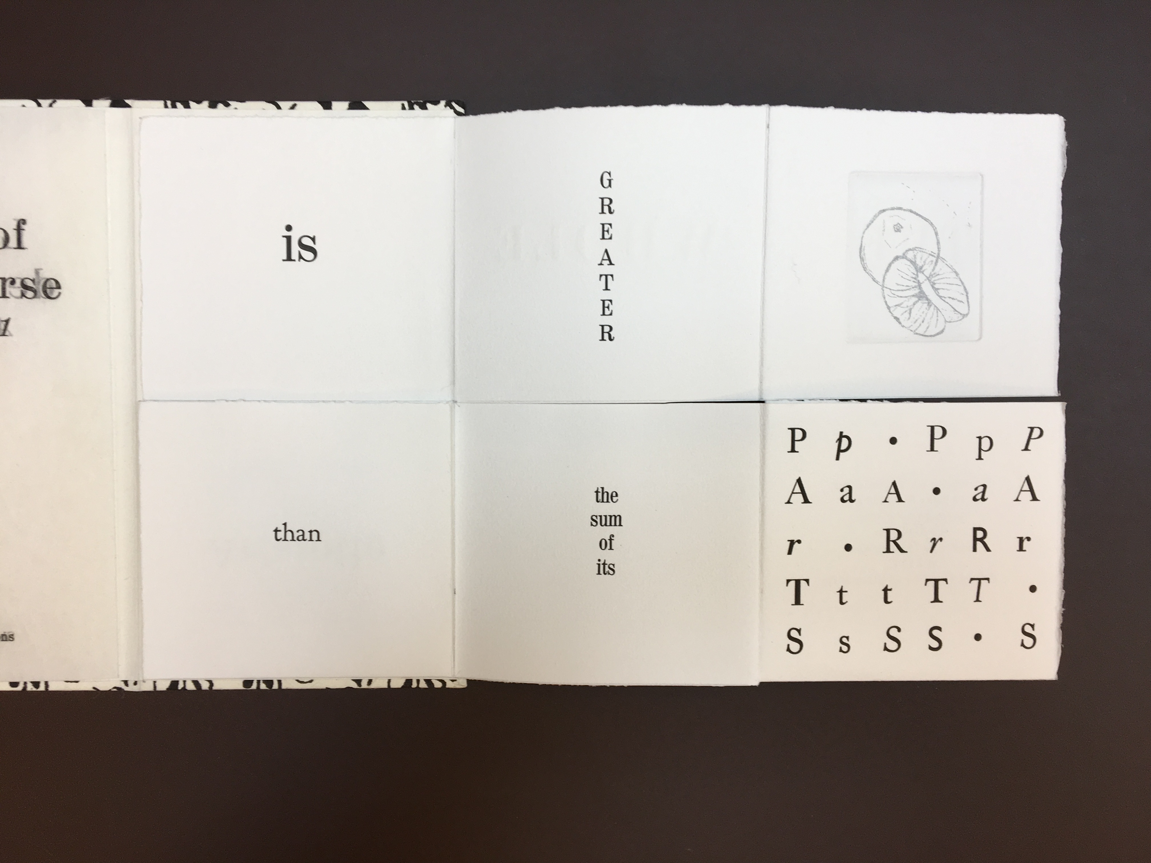
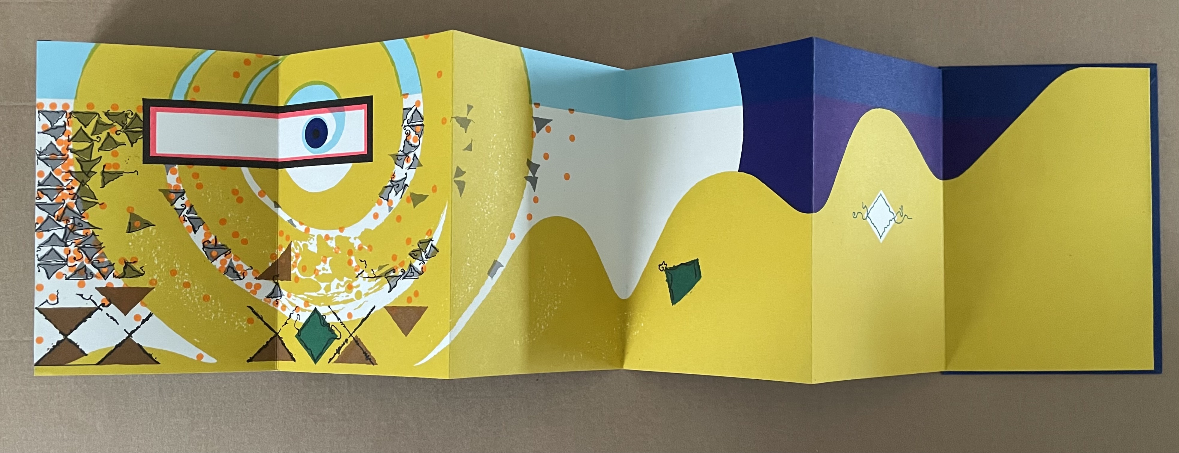
Spectacle (1990)

Spectacle: Pictoson Mural (1990)
Warja Lavater
H215 x W296 mm. 22 pages. Acquired from Antiquariat Übü, 3 August 2022.
Photos: Books On Books Collection. Displayed with permission of the publisher.
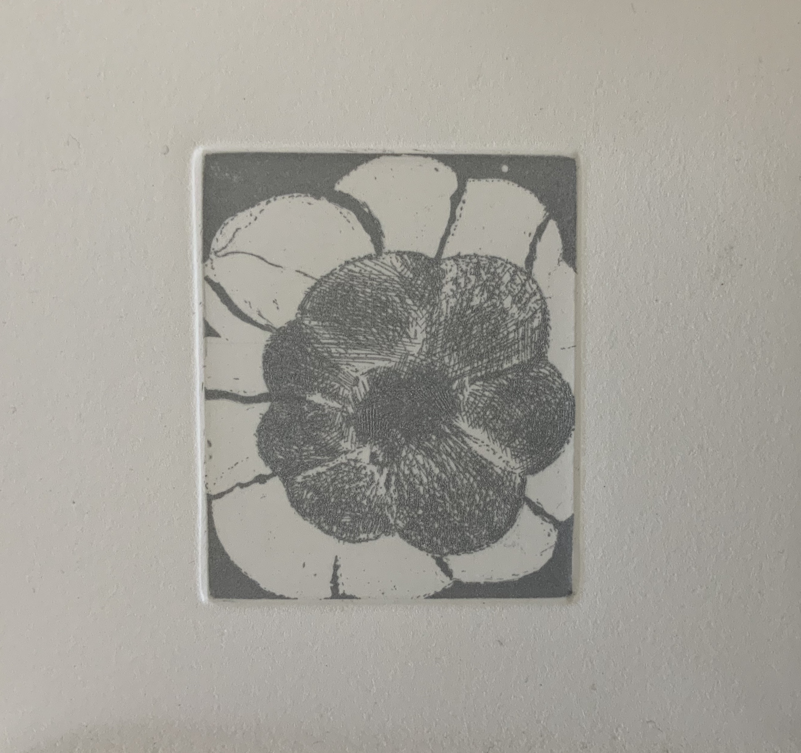
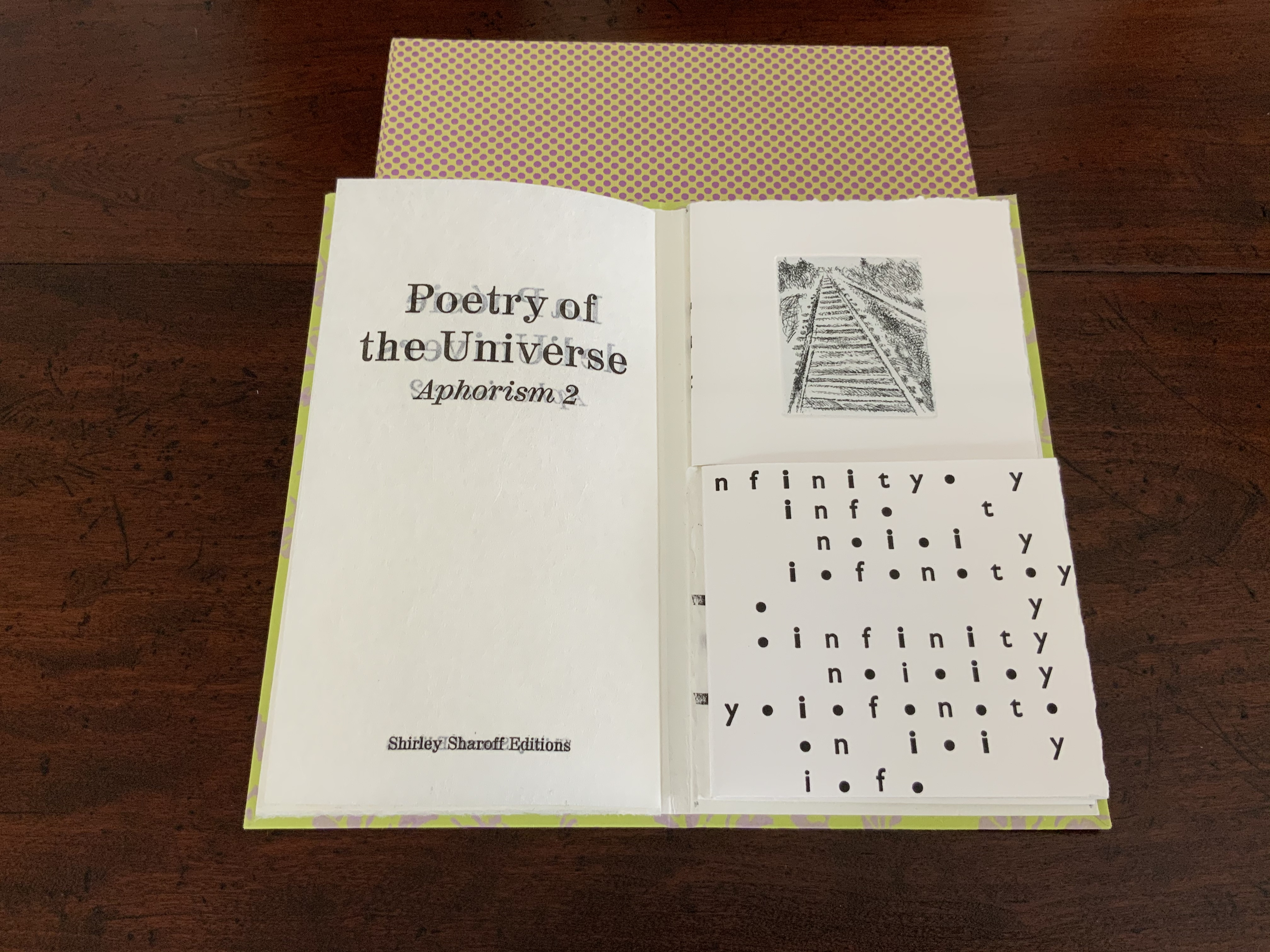
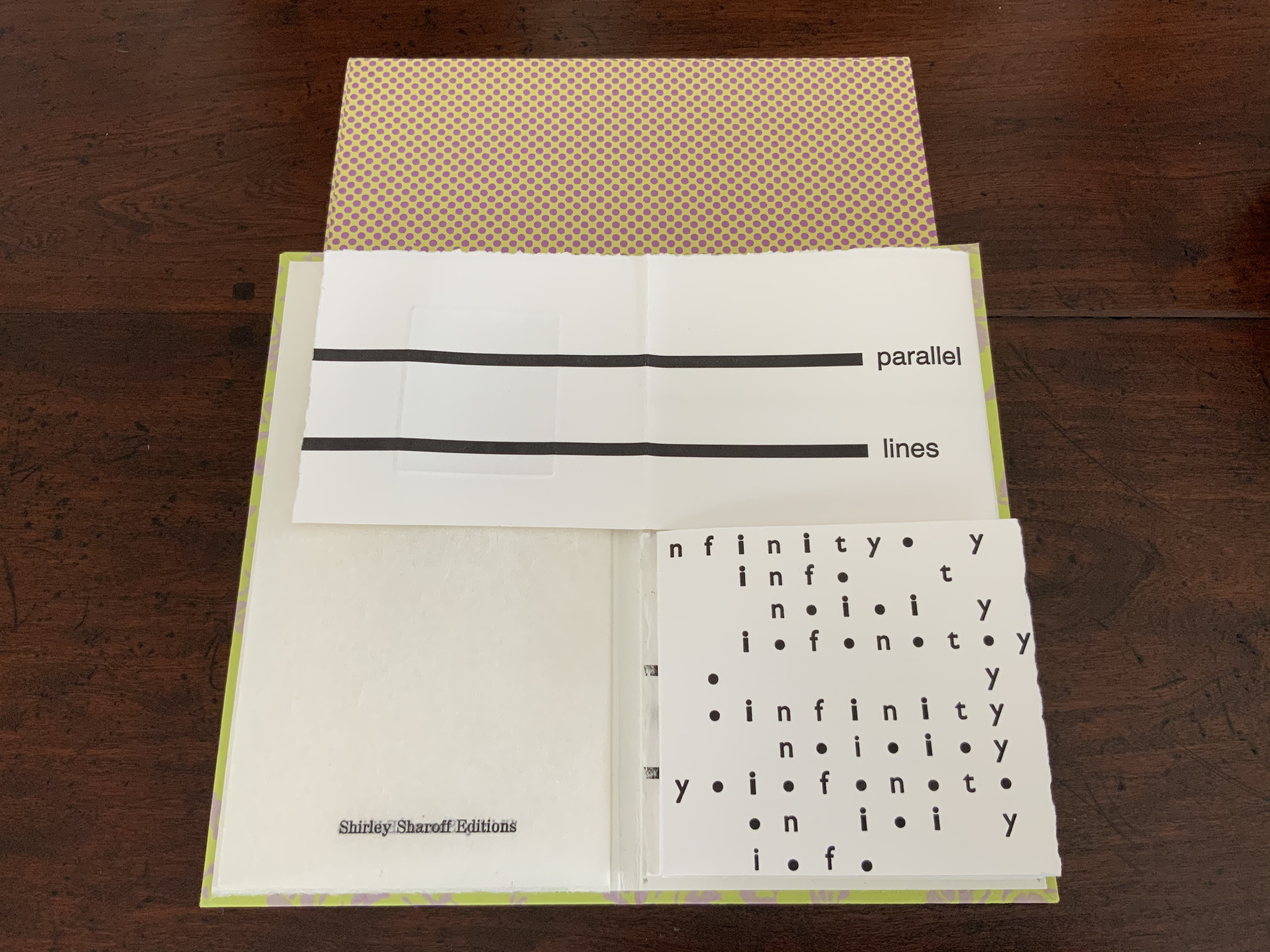
Spectacle is an origin story of shapes, signs, the sounds of language, their alphabetic representation and use to form words. It is similar to the tale in Il était une fois un alphabet (1951/2009) by Souza Desnoyer and Marcelle Marquet. In both, the separate worlds of vowels and consonants join to create the alphabet. In Il était une fois, the letters already exist, have anthropomorphic shapes and engage in familiar activities like voyages, feasts, dances and processions. The narrative has scenes and settings to carry it along. Spectacle‘s origin narrative, however, letters develop from a system of signs created/discovered by a wizard. An abstract shape himself, the wizard presides over the story’s unfolding across an abstract landscape. Even though Lavater maps a written version (in eight languages) of the tale to the panels, the pictorial narrative remains challenging.

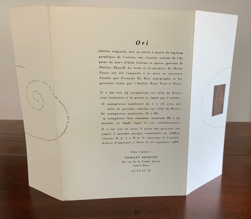
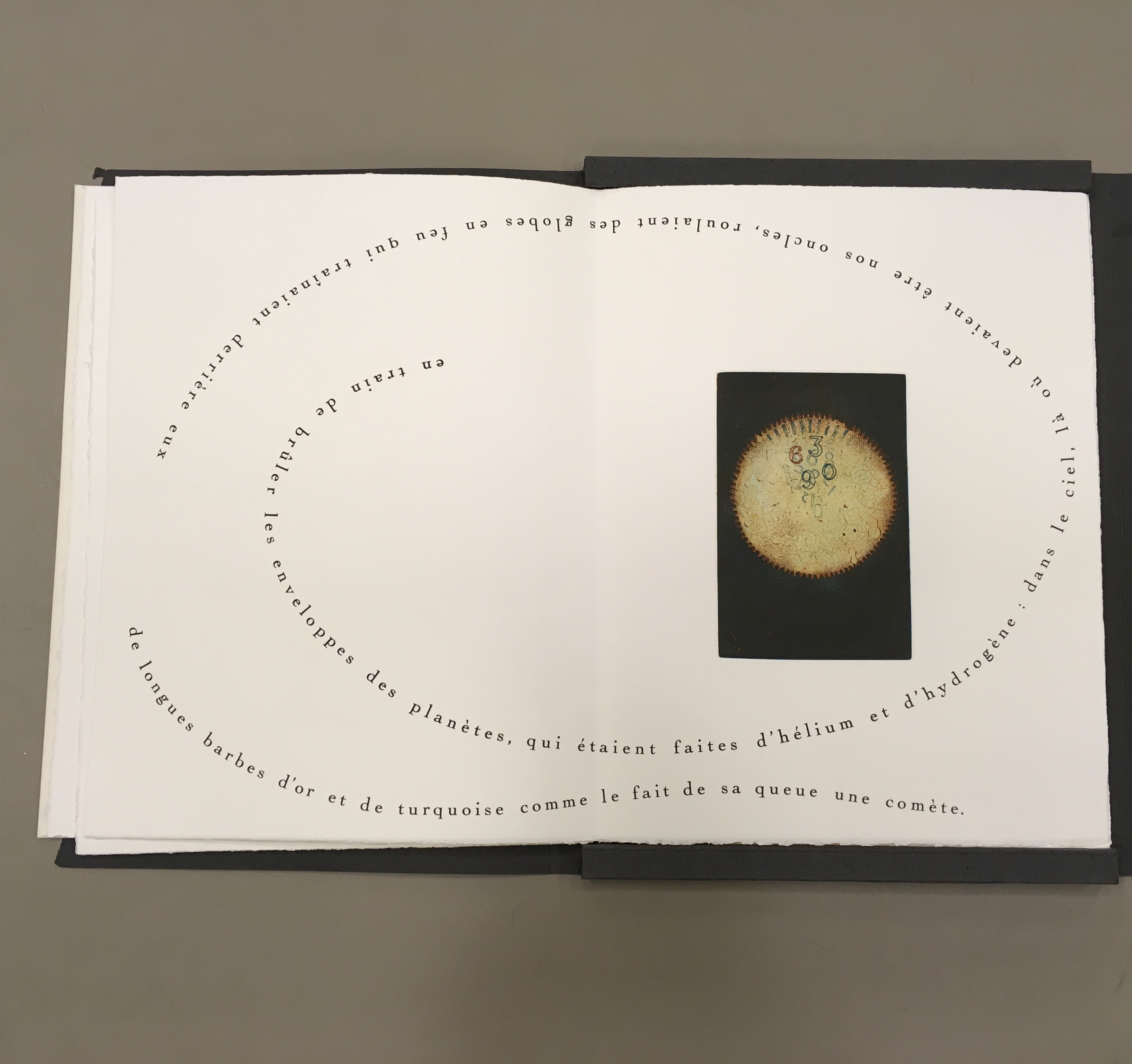
Elliptical and shamanic, the written narrative itself is challenging. It may remind the reader of Italo Calvino’s Big Bang story “Sul far del giorno” (“At daybreak”) in his collection Le Cosmicomiche (1965) (“Cosmicomics“1968), to which Shirley Sharoff paid homage in OVI: objets volants identifiés dans le ciel d’Italo Calvino, a work contemporary with Lavater’s. The verticality of Lavater’s extraordinary leporello might also remind the viewer of Blaise Cendrars and Sonia Delaunay’s La Prose du Transsibérien et de la petite Jehanne de France (1913).


Somehow, though, despite its winged emblems of words, the eleventh panel with its regimented alphabet seems visually diminished, not quite the joyous spectacle promised by the text. For that, we would have to turn elsewhere in the collection: William Joyce’s origin story The Numberlys (2014).

The Numberlys (2014)
William Joyce and Christina Ellis
Hardback, paper on board. H220 x W300 mm, 52 pages. Acquired from London Bridge Books, 15 April 2021.
Photos of the book: Books On Books Collection.
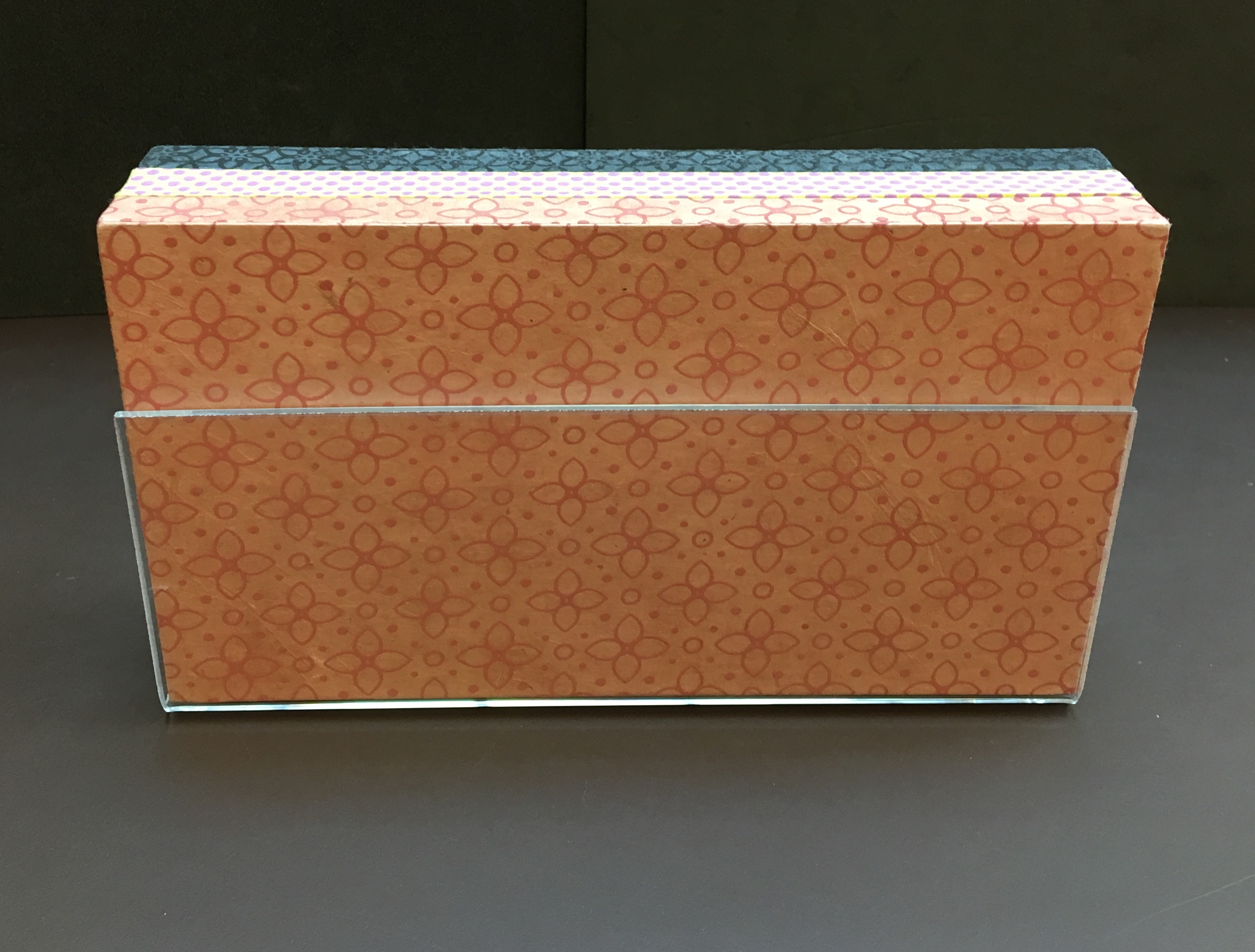
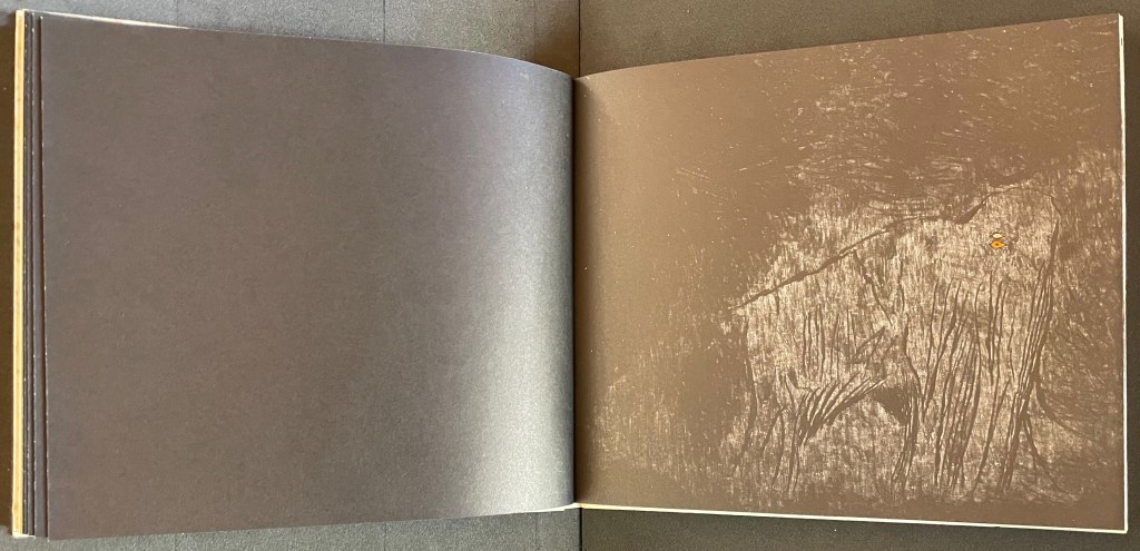
Ourasima (1991)
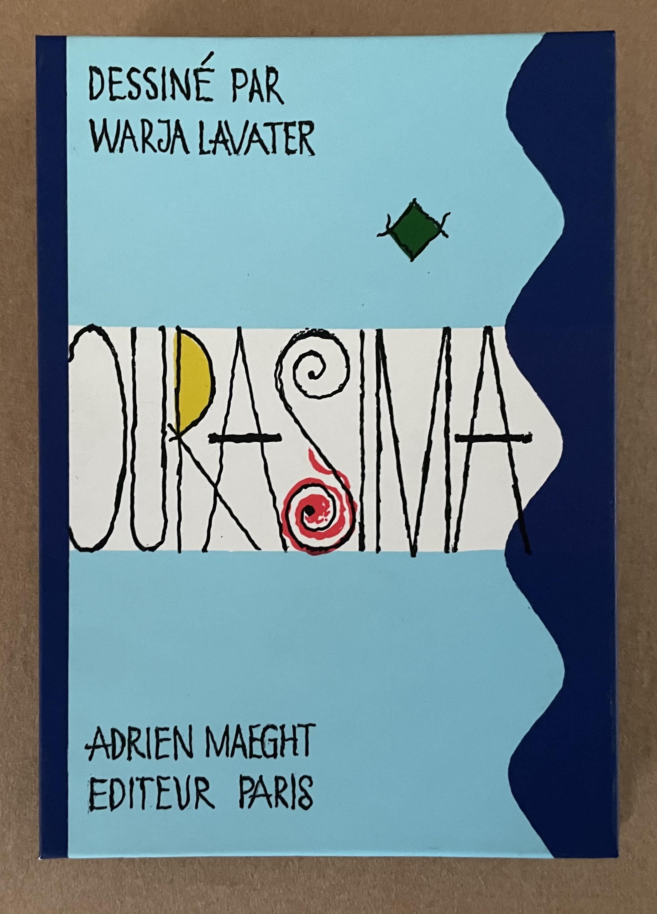
Ourasima: Une imagerie en transparence d’après le conte japonais (1991)
Warja Lavater
Plexiglas slipcase enclosing a double-sided accordion book. Box: H178 x W118. Closed accordion: H160 x W112 mm. Open accordion: W4624 mm. [86] panels. Acquired from Versand-Antiquariat Rainer Richner, 24 August 2023.
Photos: Books On Books Collection.
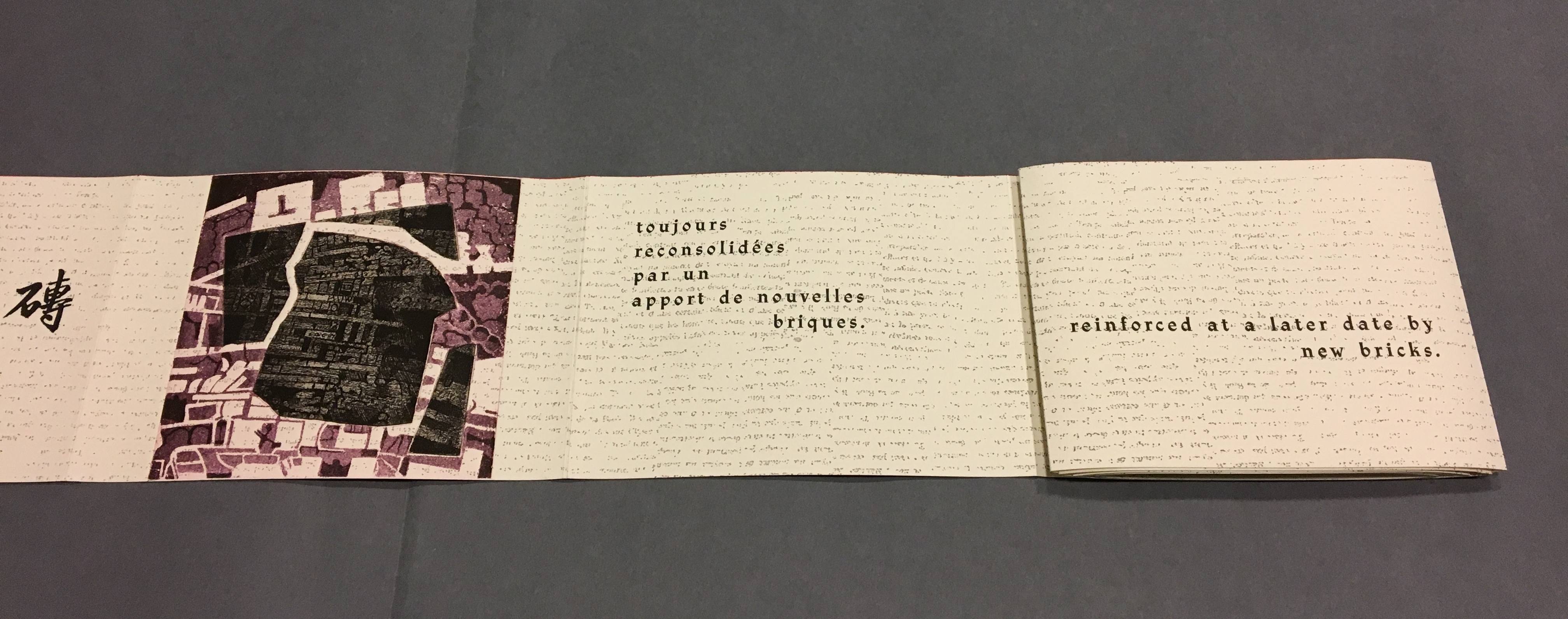
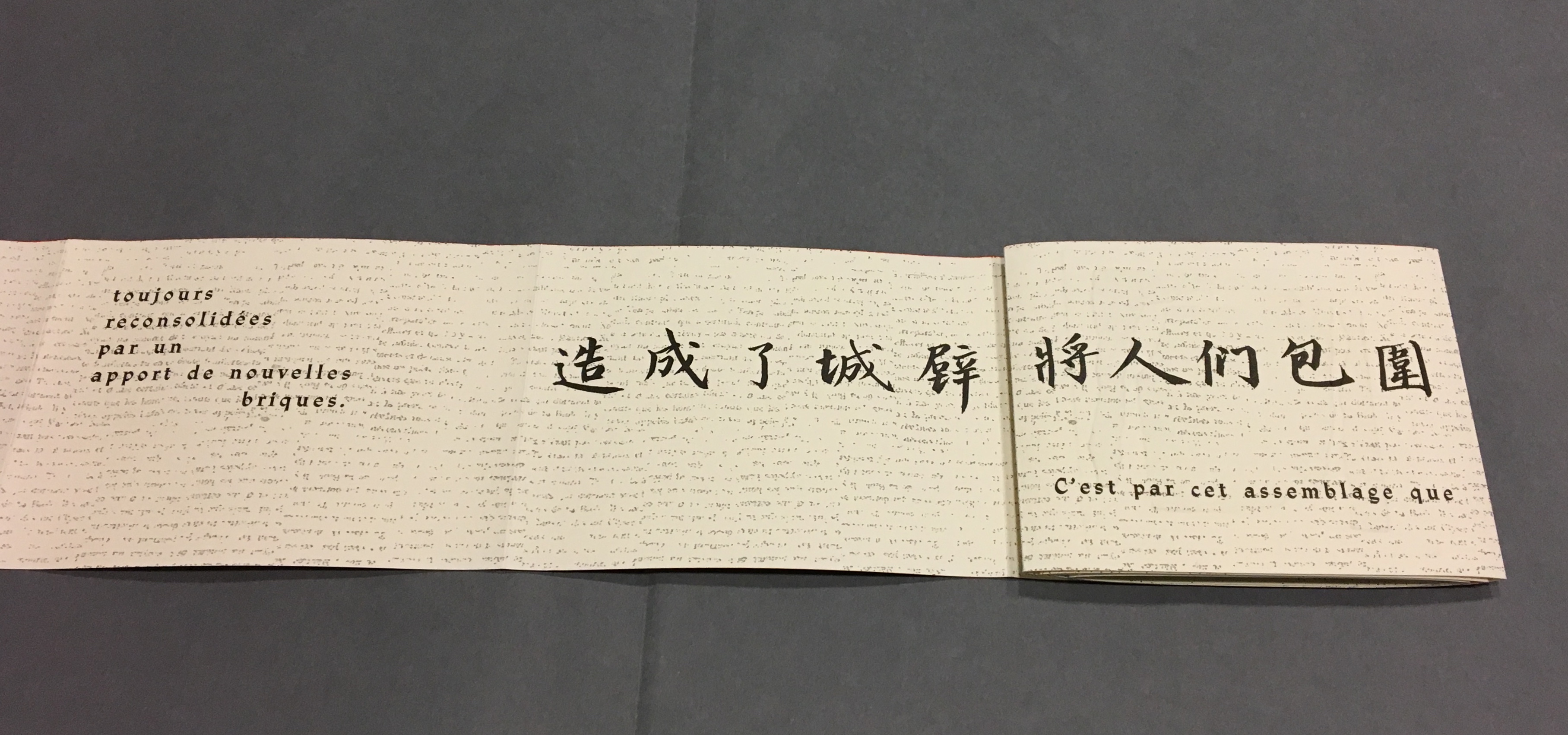
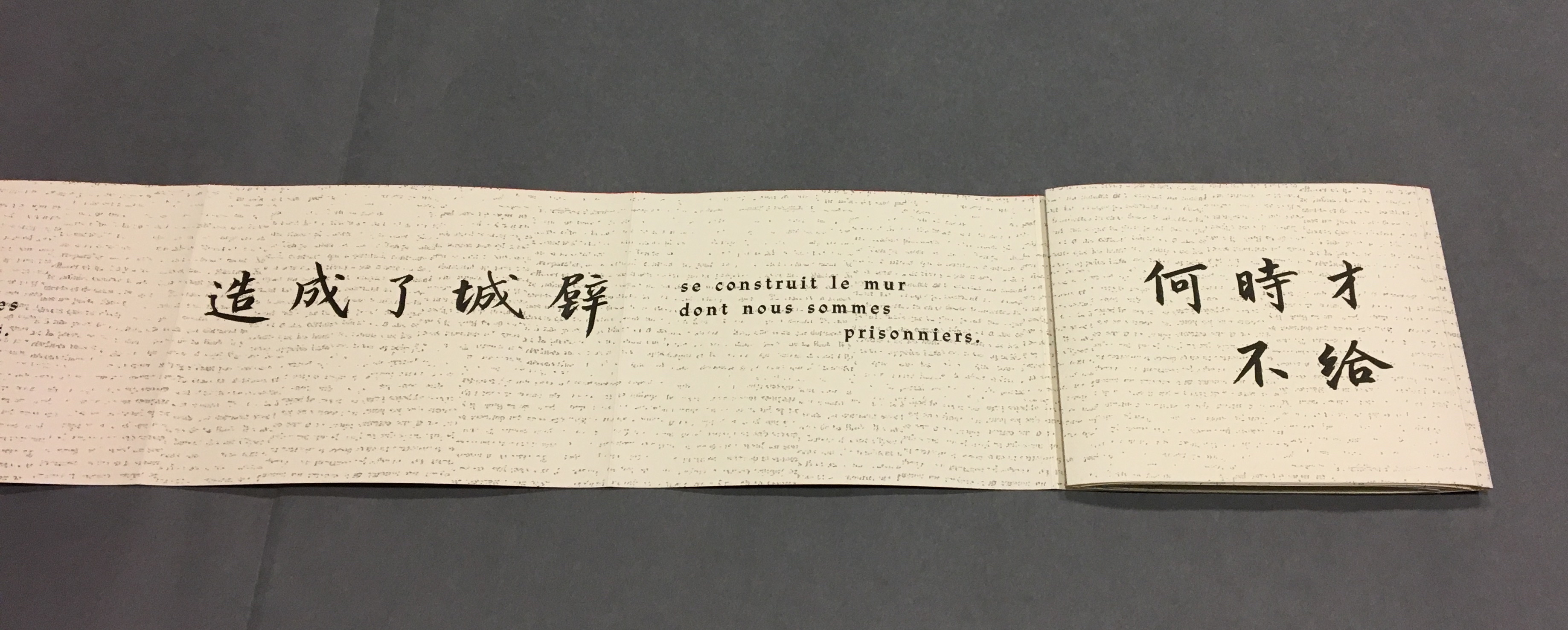
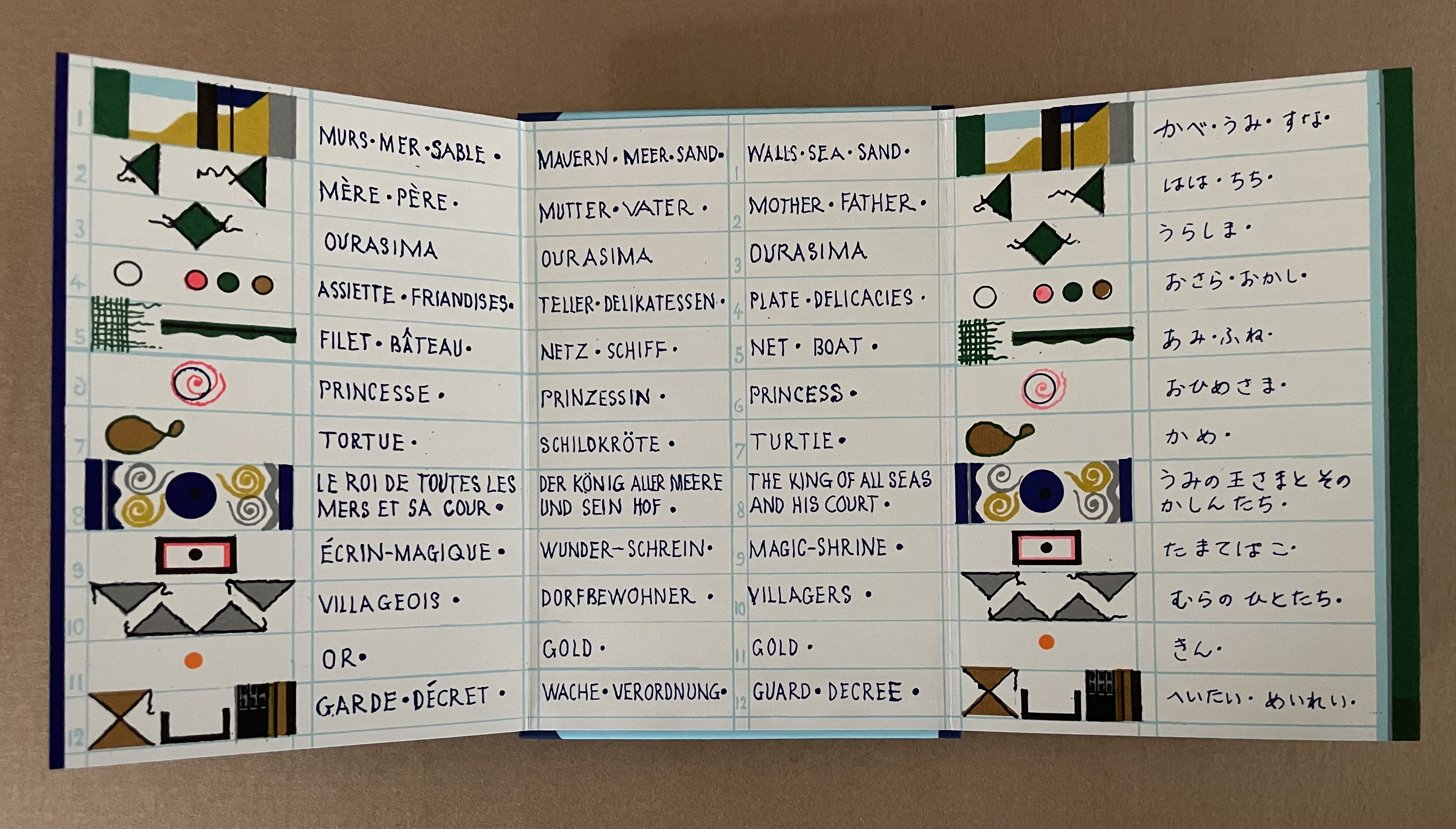
Ourasima, also known as Urasima Taro, is a Japanese folktale that reaches back to the eighth century. Lavater’s version is a cross between the stories of the Golden Goose, Rip Van Winkle and Pandora’s Box. In keeping with her treatments of Western folk and fairy tales, Lavater brackets her wordless retelling with a cast of characters, objects and their corresponding emblems at the beginning and a brief summary of the story at the end — all annotated in French, German, and English, but this time in Kanji as well.
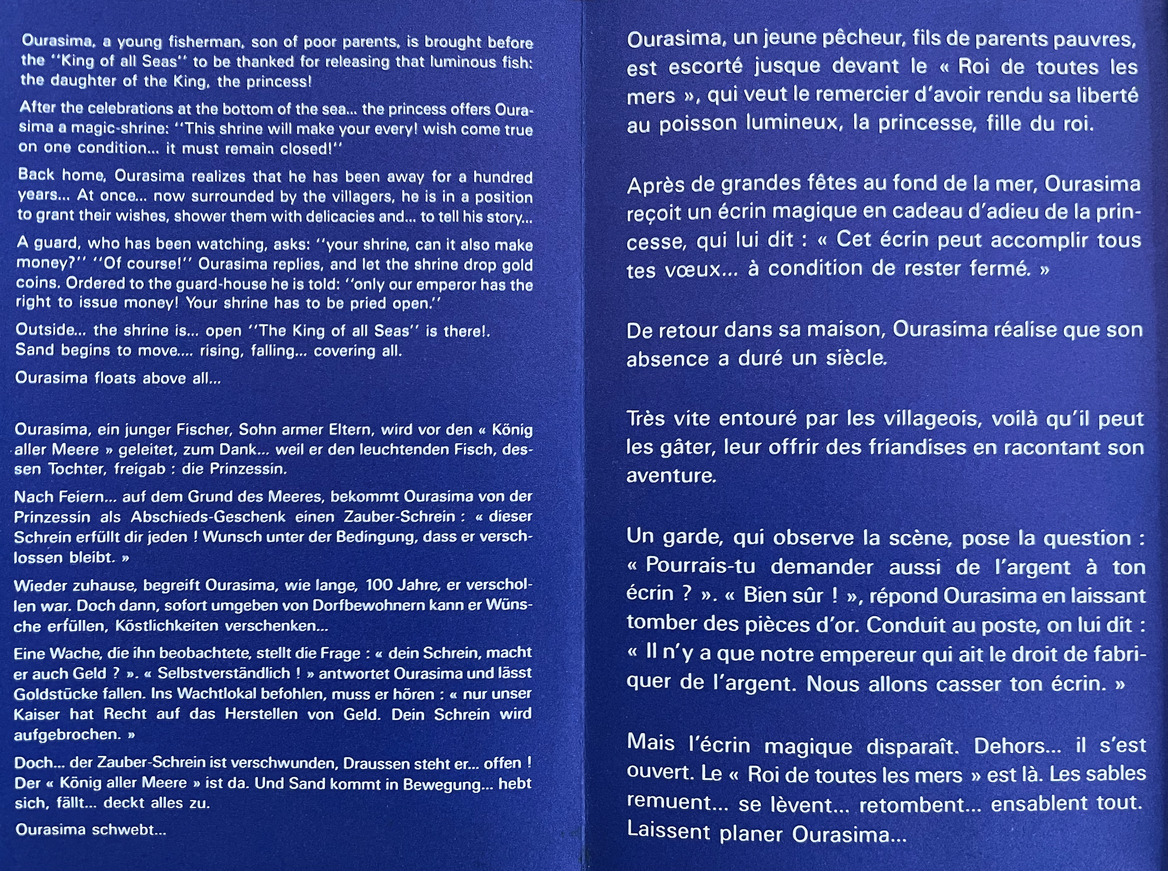
Lavater’s version departs significantly from the traditional versions as described by the Library of Congress:
There are variations to the story depending on the intended audience and the period, and it is still known by its Japanese title Urashima Taro. It tells of a young and kind fisherman named Urashima. One day he catches a large turtle while he is out fishing. Taking pity on the turtle, he releases it back into the sea, whereupon the beautiful daughter of the god of the sea appears and tells him that the turtle was actually the personification of her. To thank him for saving her, she invites Urashima to Ryugu-jo (the Palace of the Dragon God) at the bottom of the sea. He then marries her and lives happily at the palace. Three years later he asks for permission to return to his village for a short time, because he wants to see his family. His wife gives him a box and makes him promise not to open it, as he would never be able to come back if he did. When Urashima returns home, he finds that everything has changed during those three years and that his family and his village have disappeared. He had in fact left his village 400 years before, so his parents, siblings and friends were all dead. Not knowing how to get back to the Palace of the Dragon God, he breaks his promise and opens the box, hoping that its contents can help him. After he opens the box, white smoke appears and Urashima turns into a white-haired old man and dies.
Lavater’s emblematic retelling works well with the basics such as the family home with Ourasima between his mother and father, Ourasima with his boat and fishing net, the capture and release of the princess, the turtle’s arrival and transport of Ourasima to the princess, the marriage, Ourasima’s return on the back of the turtle, and the distribution of delicacies and gold. But the “emblemism” struggles to reflect the verbal instructions of the princess and the guards’ rationale for arresting Ourasima.
Ourasima at home between his mother on the left and father on the right.
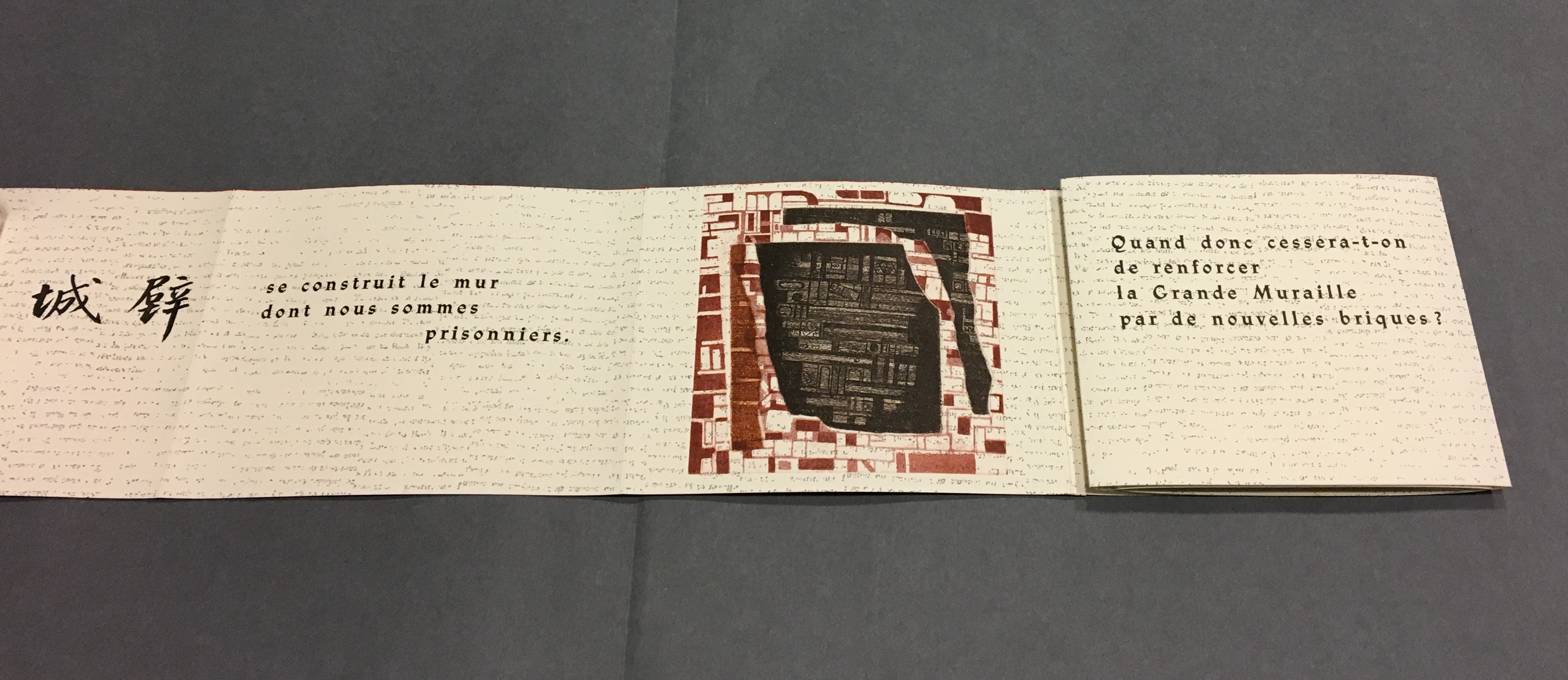
With the box forced open, chaos ensues with a whirlwind of sand dispersing everything and freeing Ourasima.Nothing in Lavater’s summary indicates that Ourasima becomes an old man at this point, but his emblem’s shift from green to white in the next panels aligns with the traditional version.
The chaos of sand freeing Ourasima and his becoming an old man.
To find Ourasima floating “above all” as Lavater’s summary indicates, we have to turn to the other side of the leporello, but the “emblemism” is difficult to follow. Has the sand, covering all, yielded to the domain of the sea? Has the empty magic box risen from the depths to float along the waves? Does the King recapture it? Has the white diamond-shaped Ourasima been transformed into a round sea creature?
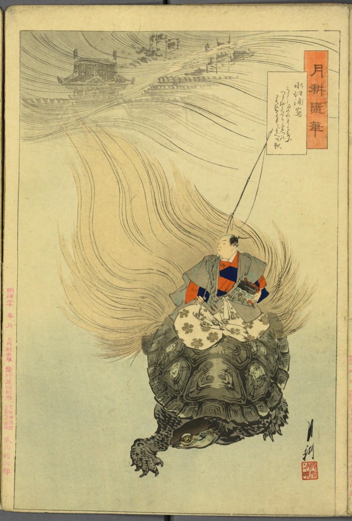
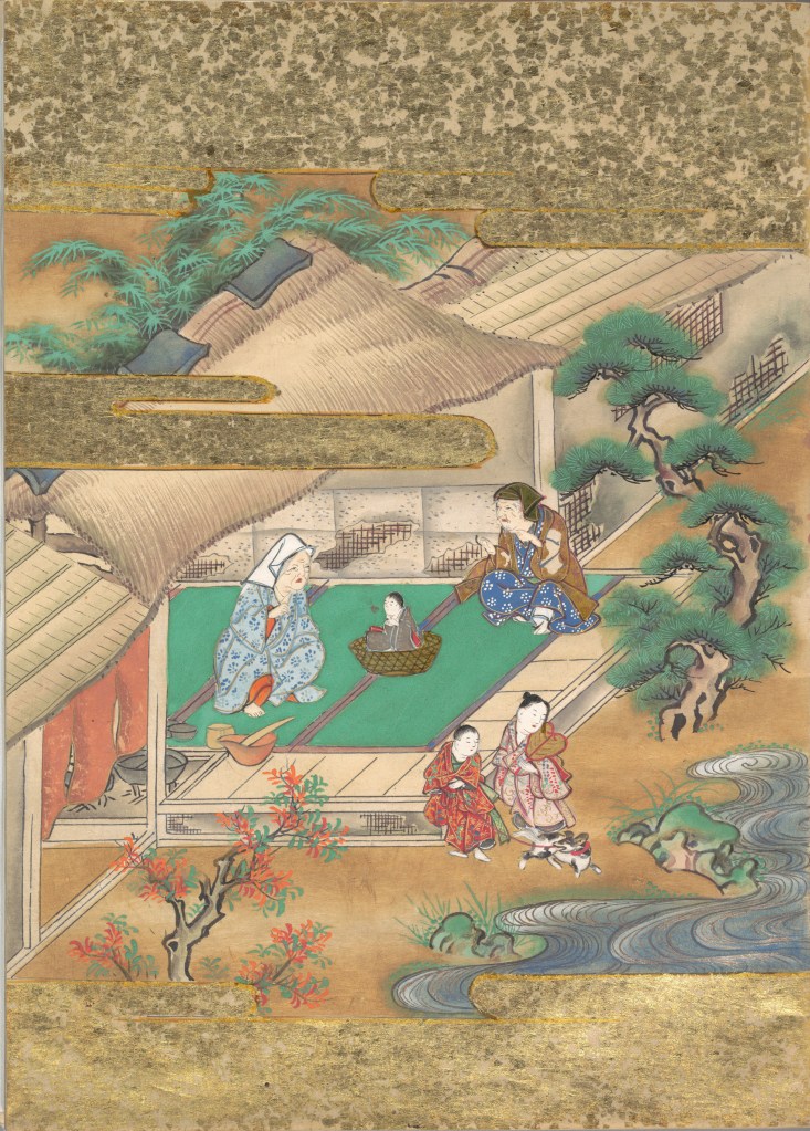
Of course, text and illustrations went side by side in all the much earlier versions with calligraphy, watercolors, woodblock prints and, in the later Meiji period, with type.
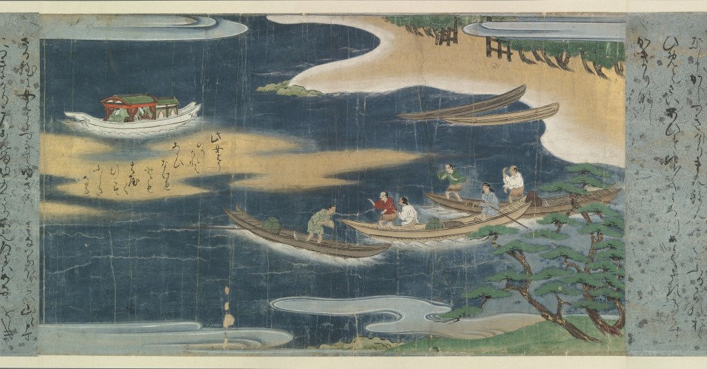
Urashima. Painted handscroll. Late 17th century. Bodleian Library. MS. Jap. c.4(R).
Ourasima returning home with the magic box at his back. Woodblock print by Tsukioka Yoshitoshi (1880s-90s). Art Institute of Chicago.
Ourasima riding from the undersea palace with the magic box under his arm. Woodblock print by Ogata Gekkō (1887). National Diet, Tokyo. Public Domain.
Ourasima riding home with magic box. Woodblock print by Matsuki Heikichi (1899). Kyōiku mukashibanashi Urashimatar. National Diet, Tokyo. Public Domain.
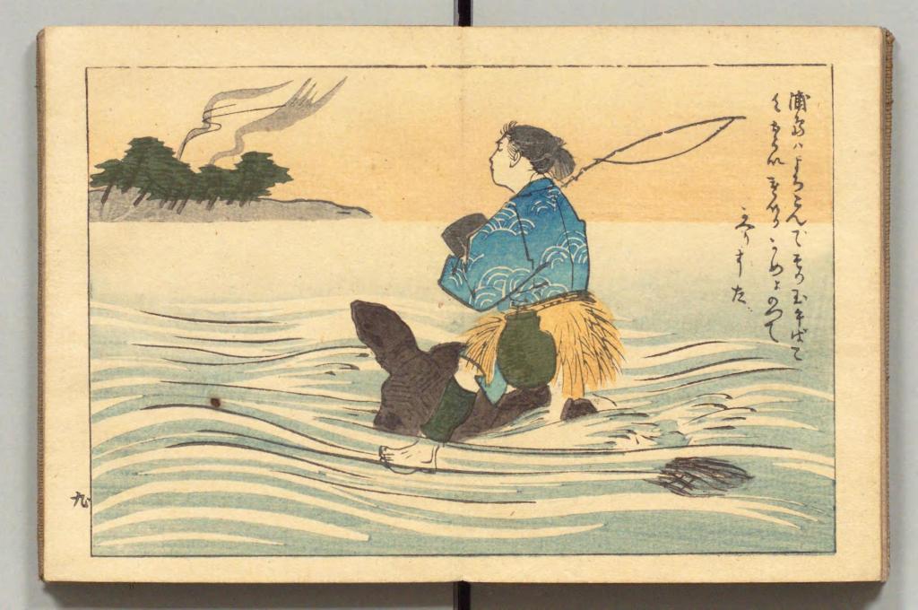
In the same period, the first translation into English appeared within a boxed set of Japanese fairy tales, printed on cloth folios and stab bound.
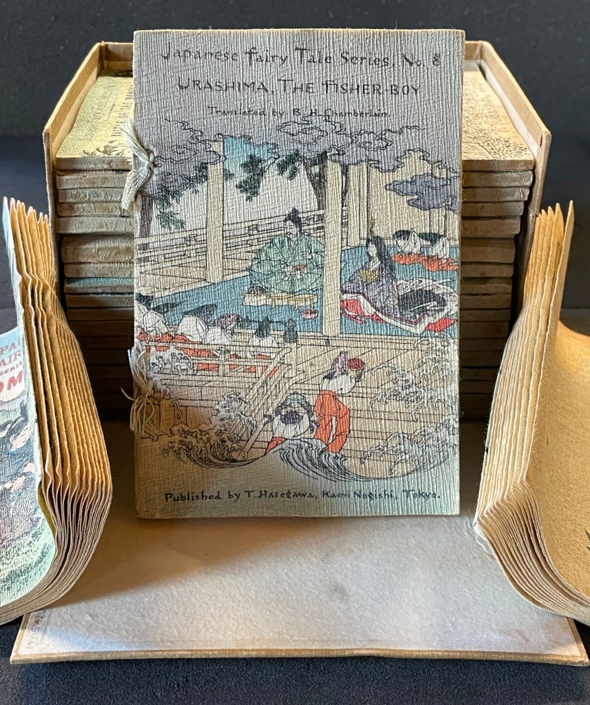
Japanese Fairy Tales Series. Bodleian Libraries. Schorr Collection f.22. The Fisher-boy Urashima, translated by Basil Hall Chamberlain, illustrated by Eitaku Kobayashi, and published by Hasegawa Takejiro (1886).
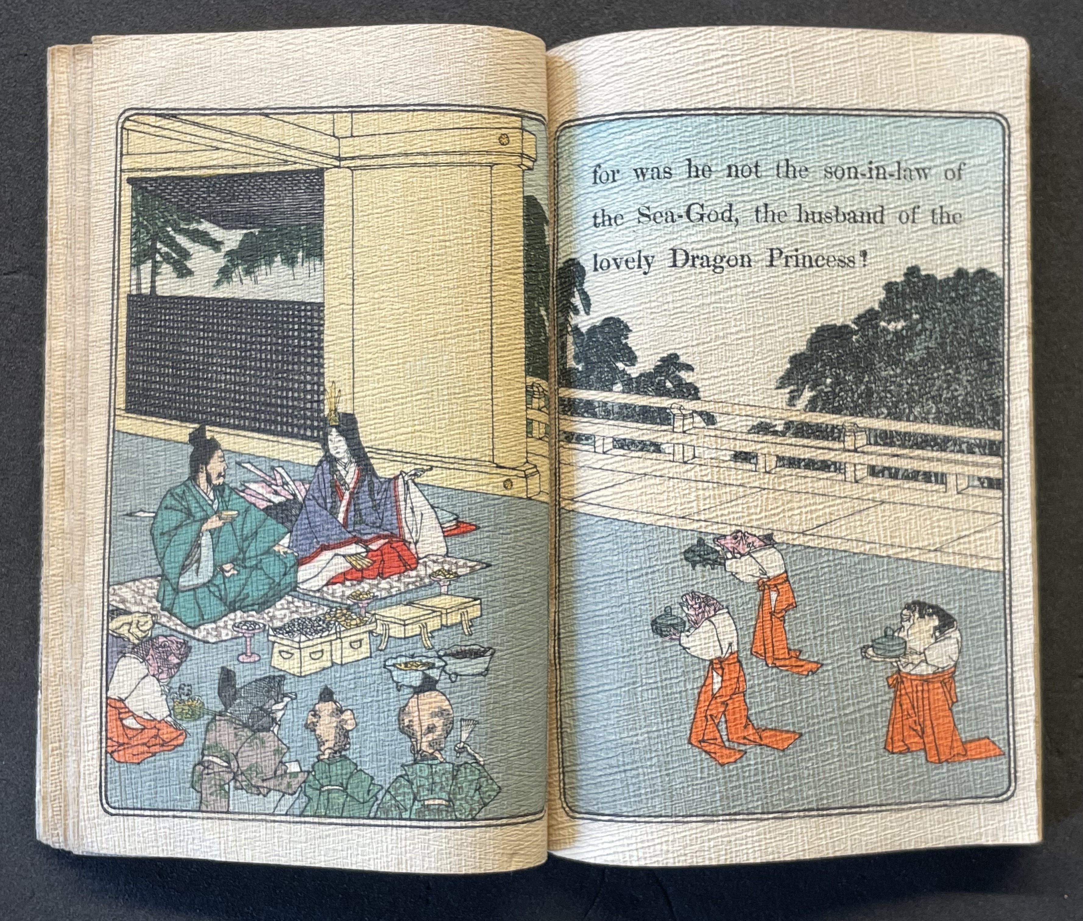
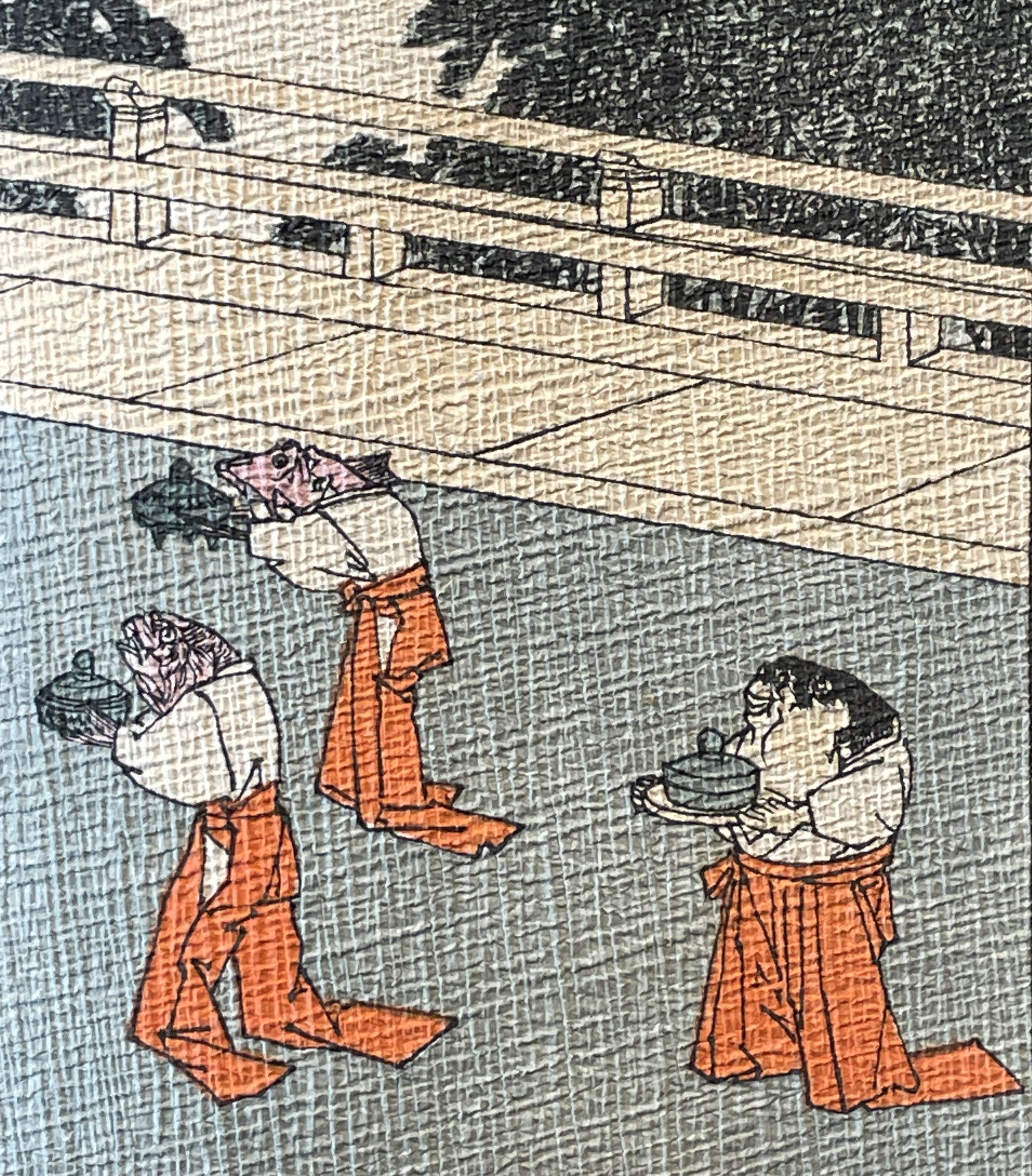
Ourasima and Otohime served in the palace by undersea servants.
In Lavater’s art, image and abstraction become the primary focus and vehicle for the narrative. As we shall see, this earliest of Lavater’s attempts with Japanese fairly tales is narratively the least straightforward, probably because of the deviations prompted by the inclusion of themes from the Golden Goose and Pandora’s Box.
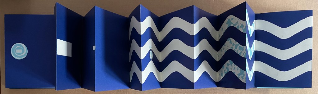
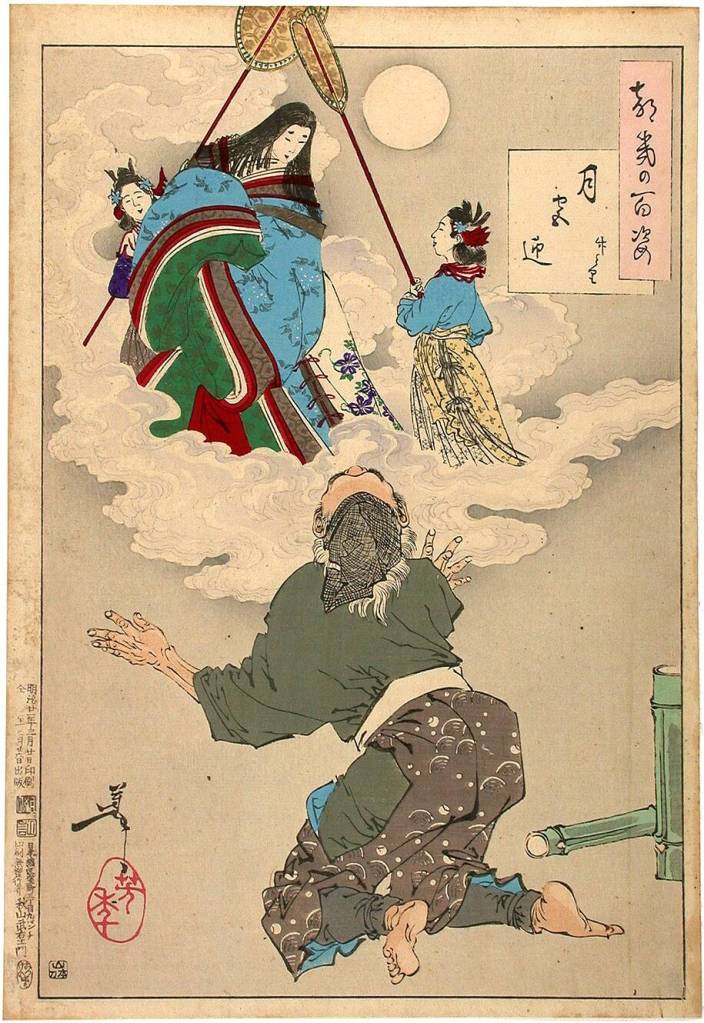
Tanabata (1994)
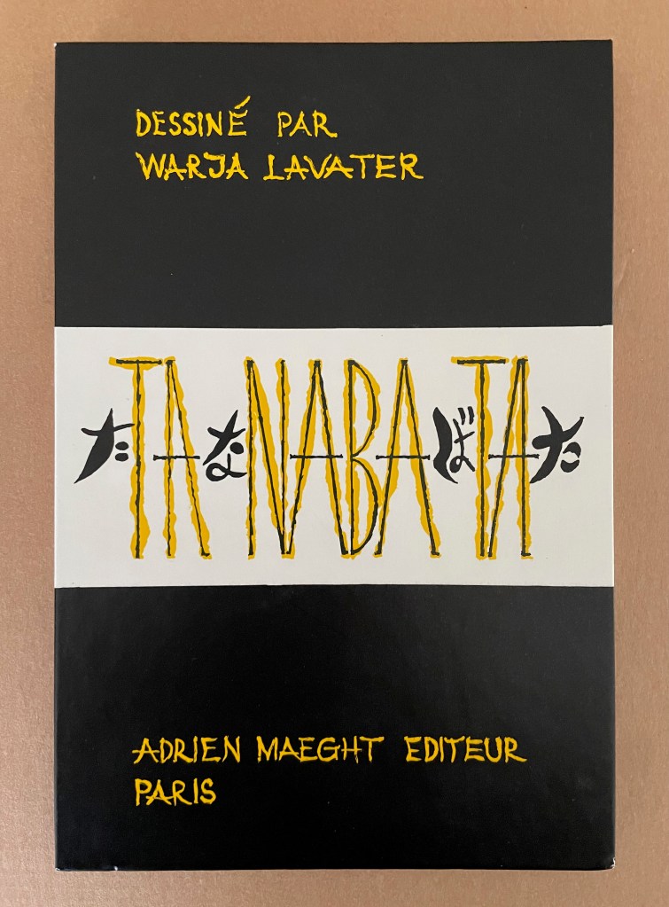
Tanabata (1994)
Warja Lavater
Acrylic slipcase, double-sided leporello. Slipcase: H216 x W150 mm; Book: H216 x W145 mm. 18 panels, each side, one foldout with 2 panels. Acquired from Dilat, 14 January 2025.
Photos: Books On Books Collection.
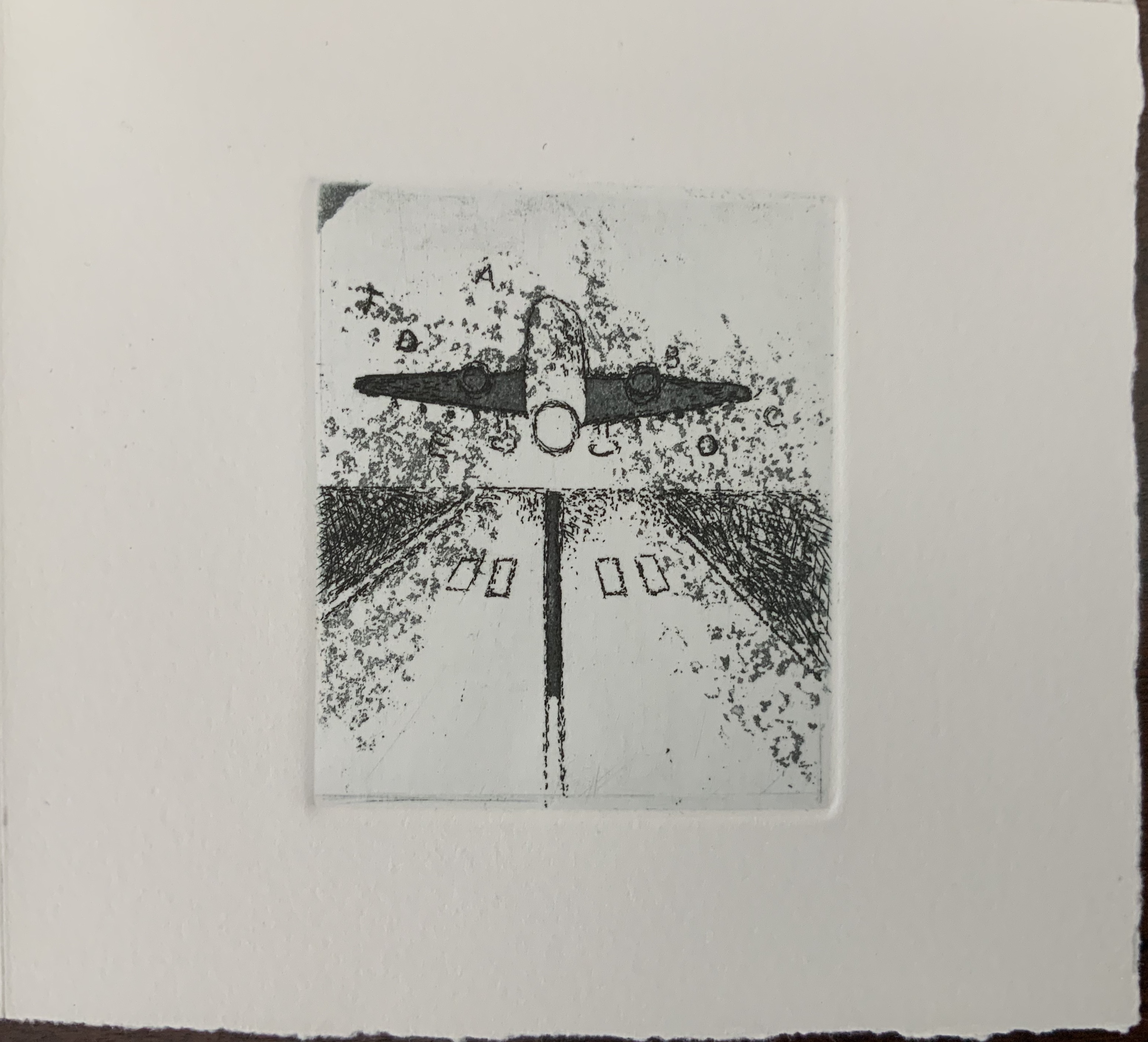
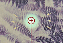
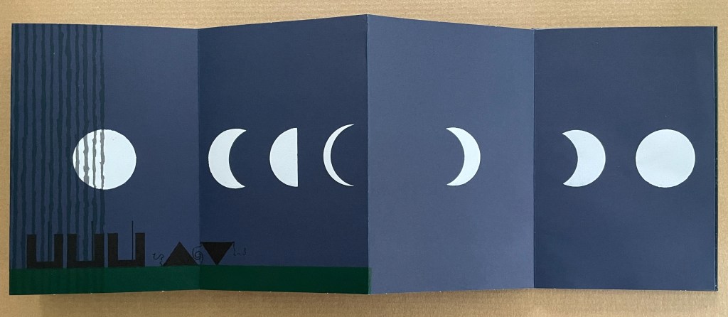
Tanabata is Lavater’s version of a Sino-Japanese constellation myth about the stars Deneb, Vega, and Altair. The story is that the princess Orihime, associated with the star Vega, also known as the weaver star, falls in love with Hikoboshi, associated with the star Altair, also known as the cow-herder star. Her father, Deneb the Sky King, banishes her to one side of the Milky Way and Hikoboshi to the other side. Later he relents and allows them to meet only on the seventh day of the seventh month of the lunar calendar when a flock of magpies form a bridge for their reunion. This has become the date of the annual Star Festival in Japan.
As with Ourasima, Lavater modifies the tale. She has the King permit Orihime to bathe in the Milky Way where she first meets Hikoboshi. Additionally, the King has the magpies drag Orihime back to her weaving, but the birds persuade the King to permit the annual reunion at the Milky Way.
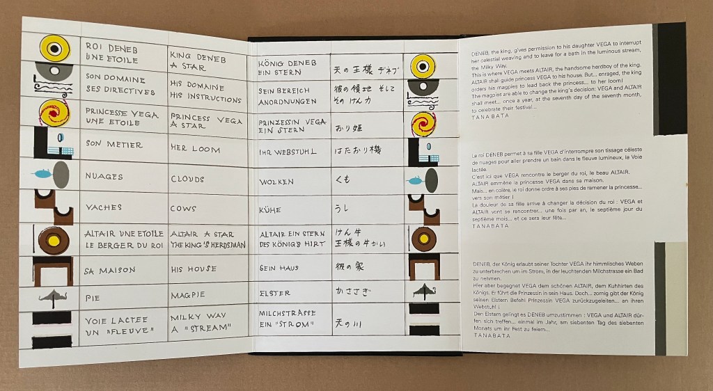
Reading from left to right. Altair (cowherd star) and Vega (weaver star) cross the Milky Way over the “magpie bridge” to unite during Tanabata, the annual Star Festival in Japan.
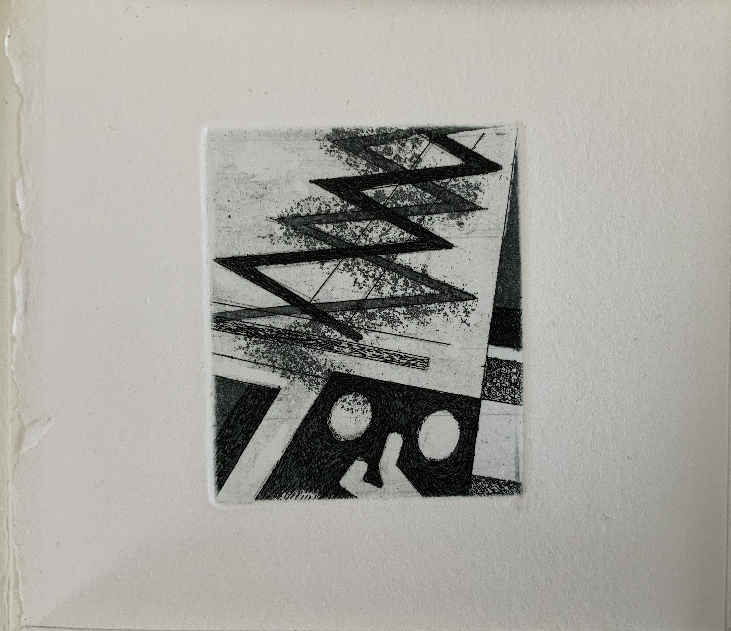
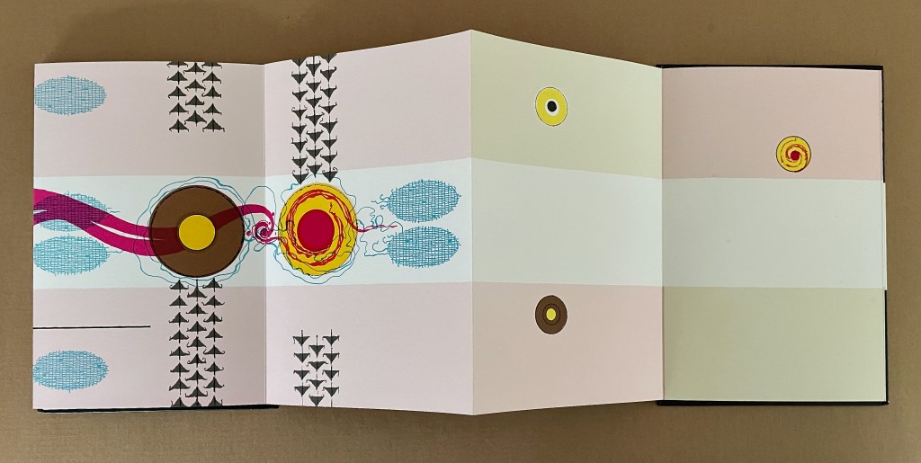
The reverse side of the leporello represents the two lovers as two solid white balls separated by the Milky Way represented as a solid white band, running right to left from the front cover. Over the course of the leporello, the lovers move to join one another on one side of the Milky Way then to separate according to their celestial fate.
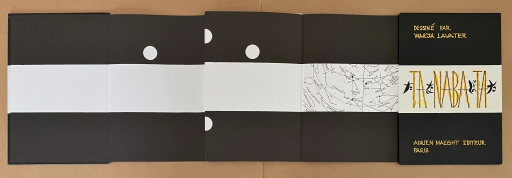
Reading from the celestial map right to left: the white dots replicate the positions of Deneb and Vega above the Milky Way and Altair beneath it.
Despite the variations on the traditional tale, Tanabata is narratively more straightforward than Ourasima. With 10 emblems compared to Ourasima‘s 12, Tanabata ought to be visually more straightforward as well, but after the first two panels introducing Deneb, Vega, and Altair, every panel — except for the last two — seems just as busy as the most crowded in Ourasima. This, however, seems intentional. The last two panels stand out all the more in their simplicity mirroring the stars’ positions on the reverse side in the celestial map and the abstraction.

From 100 Aspects of the Moon, by Tsukioka Yoshitoshi. Late 1800’s. (Public Domain). Orihime and Hikoboshi during the night of Tanabata. Photo: Tomo Japan.
Kaguyahime (1998)
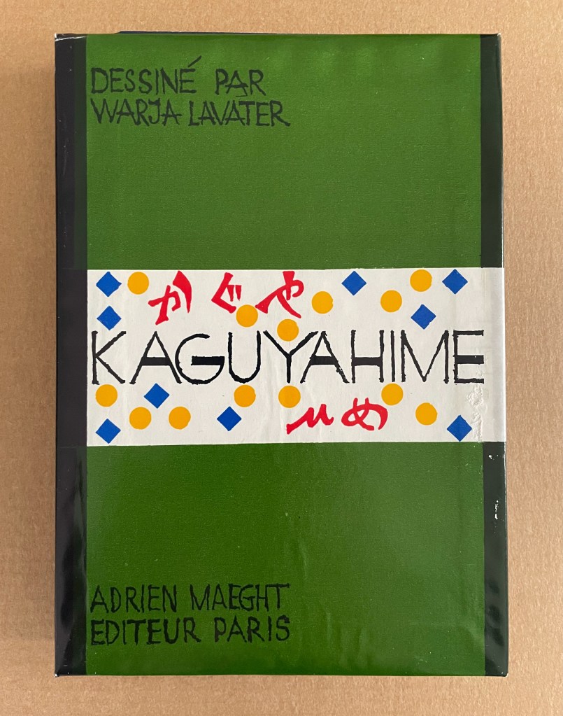
Kaguyahime (1998)
Warja Lavater
Acrylic slipcase, leporello. H160 x W11 mm. 44 panels. Acquired from Okmhistoire, 24 January 2025.
Photos: Books On Books Collection.
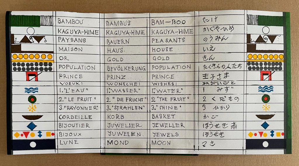
With 14 emblems and with three princes whose emblems are distinguished by subtle variations, Kaguyahime seems bound to be more visually challenging than Ourasima or Tanabata.
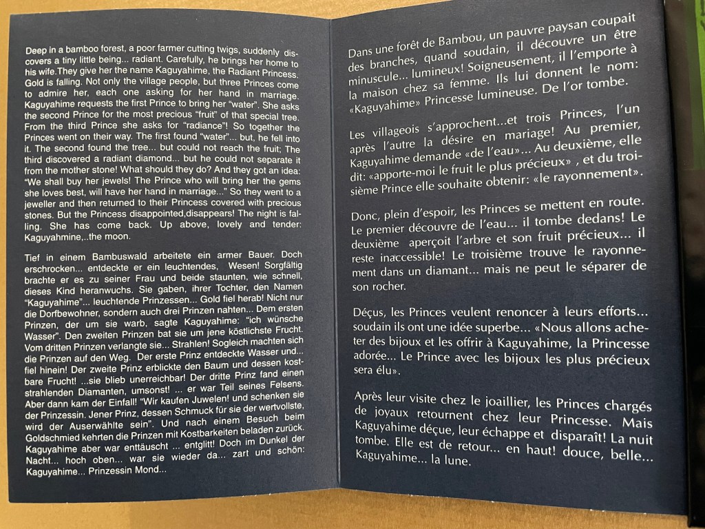
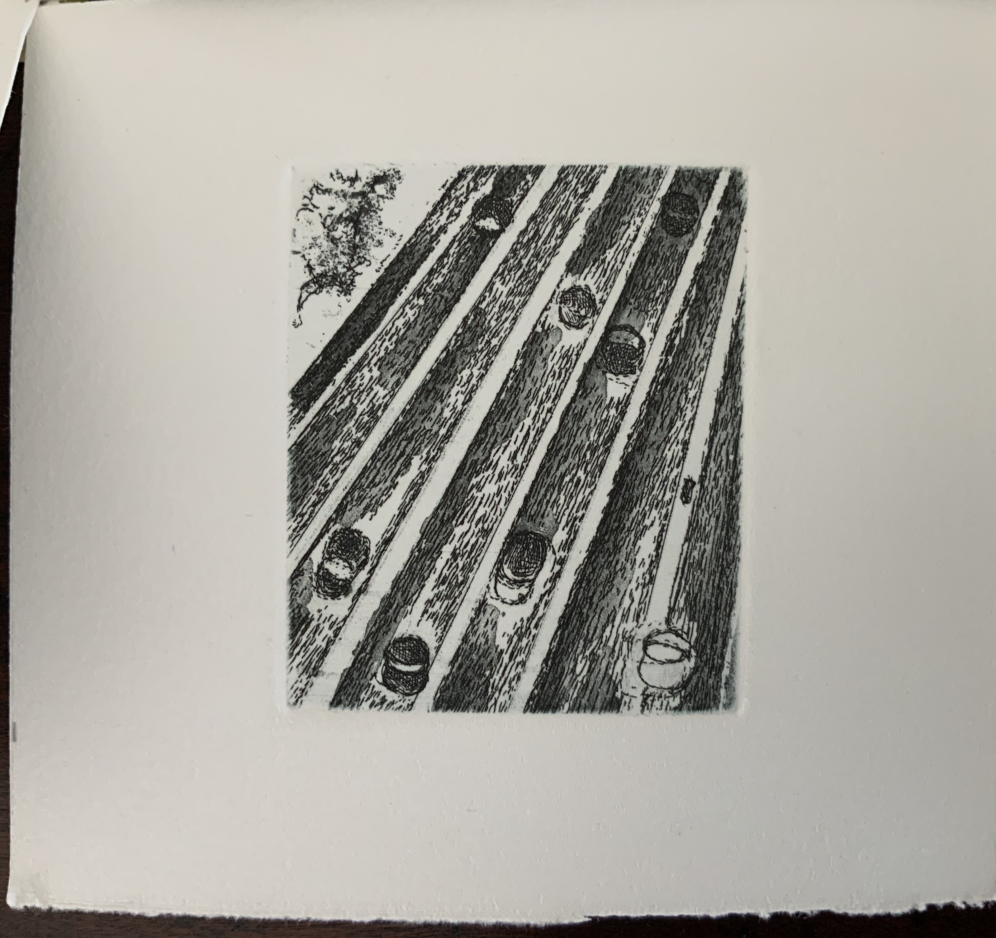
Kaguyahime in the bamboo forest. The poor farmer discovers her and takes her home, where already gold is beginning to fall.
Having failed in their quests, the three princes, watched by her guardians and the gathered population, crowd around her to offer jewels and gold instead. But Kaguyahime storms away, scattering the jewels and gold, the princes and their baskets, and her guardians and the population in her wake.
On the other side of the leporello, Kaguyahime, the moon princess, watched by the princes and her guardians, rises through the bamboo forest into night sky where she waxes and wanes ever after.
Like Snow White and Sleeping Beauty embedded for centuries in Western culture, the tale of the moon princesss exerts a similar pull on Japanese culture. The princess and her story have appeared in many media including manga and anime. In 2023, the choreographer Jo Kanamori and the Tokyo Ballet produced Kaguyahime set to the music of Claude Debussy. A hybrid plant (E.acuminatum x E.dolichostemon) has even been named after the tale.
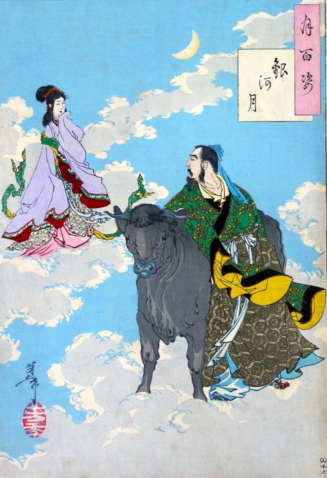
Discovery of Kaguya-hime, late 17th century depiction by unknown illustrator; Princess Kaguya returns to the Moon, 1888 print by Yoshitoshi; Taketori no Okina takes Kaguya-hime to his home, painting c. 1650 by Tosa Hiromichi.
Lavater’s emblems in the Oriental tales do slightly differ from those in the Occidental tales, although the color palette does not vary. Her handling of Ourasima, Tanabata, and Kaguyahime does not seem as sure as that of Snow White and Sleeping Beauty nor of The Disobedient. Nevertheless, Lavater’s engagement across cultures speaks to one of the most recurrent influences on book artists: that of folk tales, fairy tales, and myths.
Further Reading
Beckett, Sandra L. « When Modern Little Red Riding Hoods Cross Borders… or Don’t…. » Meta, Vol. 48, No. 1-2, May 2003, 15–30.
Beckett Sandra L. 2013. Crossover Picturebooks : A Genre for All Ages. London: Routledge.
Gromer, Bernadette. Winter 1991. “Tête à tête: Entretien avec Warja Lavater“. La Révue des livres pour enfants. No. 137-138, 40-48.
Lavater, Warja. 1968. Der Ungehorsame Eine Imagerie, ErzäHlt U. Gezeichnet. [Sketchbook] = the Disobedient = Le Non-Obéissant. 2. Aufl. Gräfelfing vor München: Moos.
Meunier, Christophe. Posted 18 January 2013. “Les imageries de Warja Lavater : une mise en espace des contes…”. Les Territoires de l’Album: Espace et spatialités dans les albums pour enfants. Accessed 24 June 2022.
Perkins, Stephen. Posted 13 May 2022. “Warja Lavater, Little Red Riding Hood (1965/1971), Snow White (1974), and OURASIMA (1991)“. Accordion Publications. Accessed 23 June 2022.
Ribi, Carol Jana. 2019. “Warja Lavater’s folded stories. Work genesis and aesthetic impact” in Schulz Christoph Benjamin. 2019. Die Geschichte(n) Gefalteter Bücher : Leporellos Livres-Accordéon Und Folded Panoramas in Literatur Und Bildender Kunst. Hildesheim: Georg Olms Verlag.
Yang, Mia. 24 December 2024. “The Kaguya – hime Hypothesis“. XFic: The Journal of Experimental Non-fiction. University of Pennsylvania.