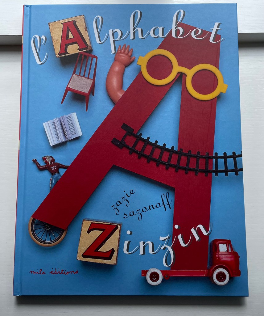
There’s a Monster in the Alphabet (2002)
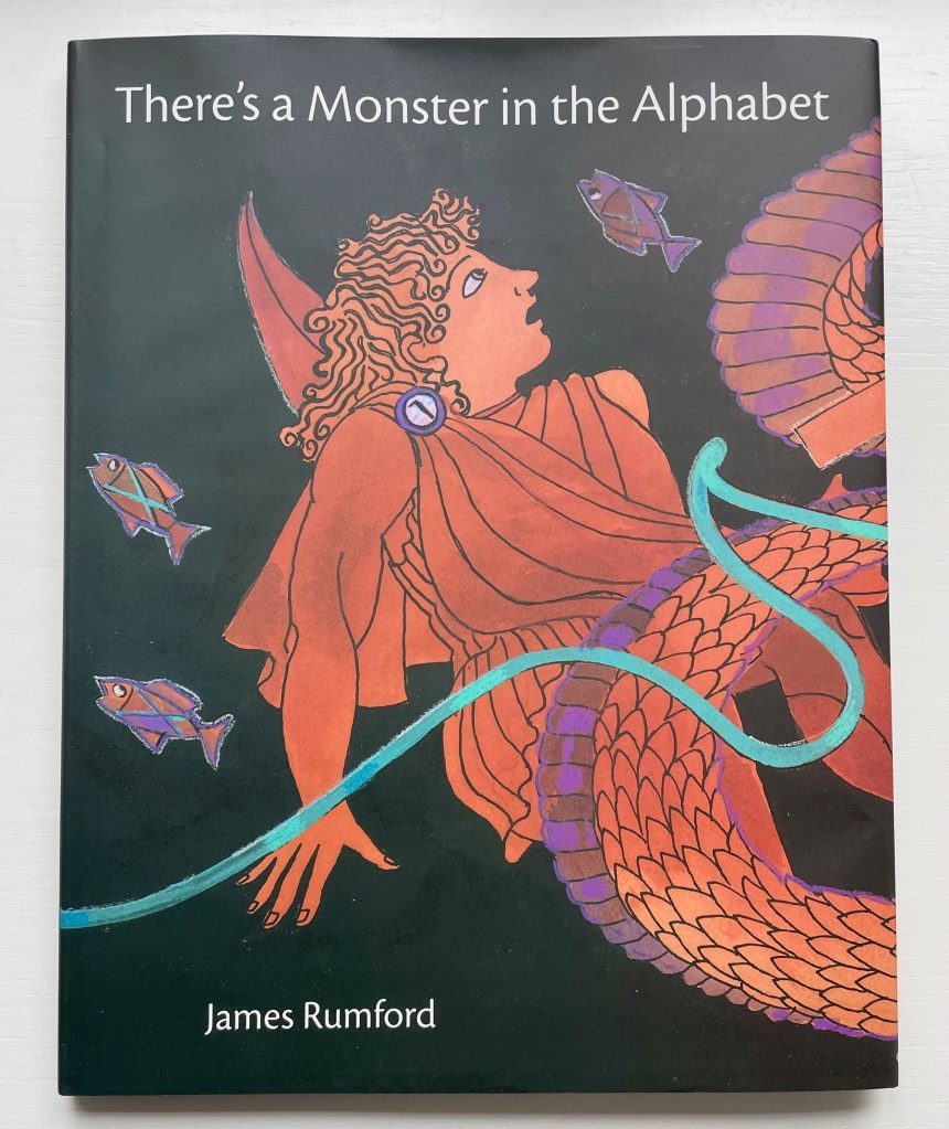
There’s a Monster in the Alphabet (2002)
James Rumford
Dustjacket, hardcover. H285 x W230 mm. 32 pages. Acquired from Bud Plant and Hutchison Books, 3 November 2022.
Photos: Books On Books Collection. Displayed with permission of the author.


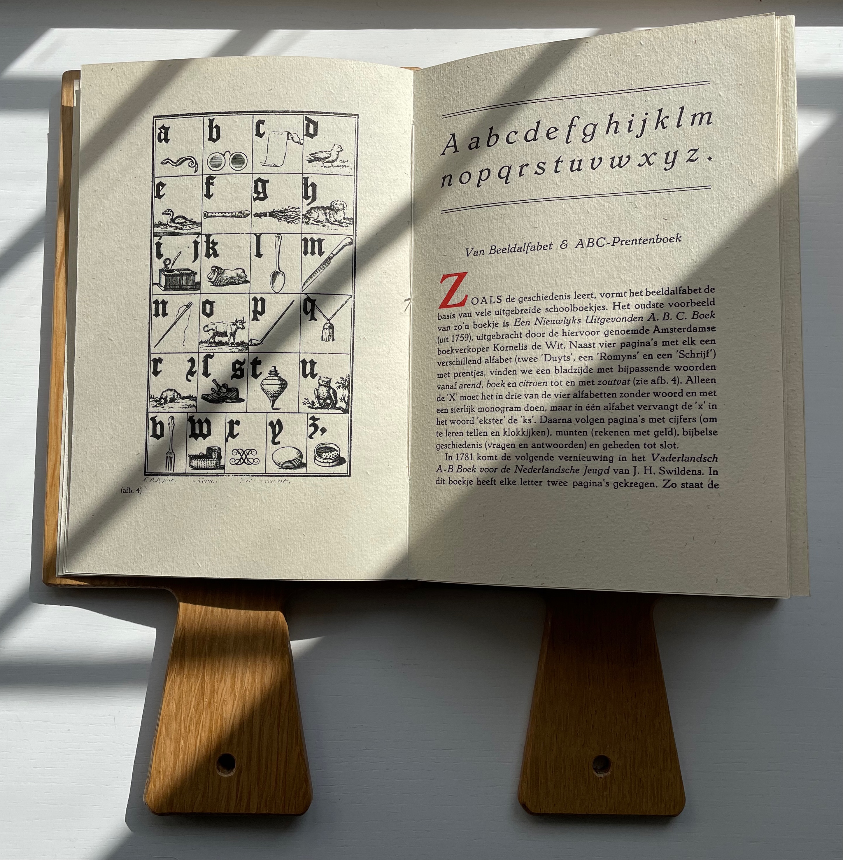
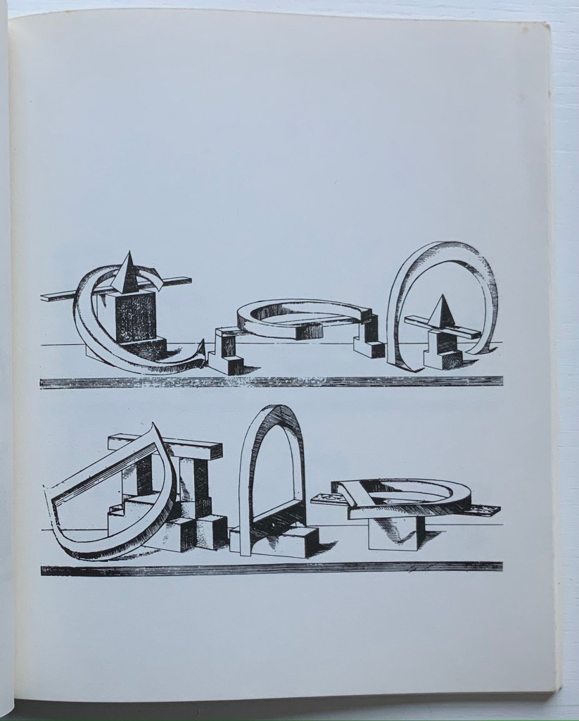
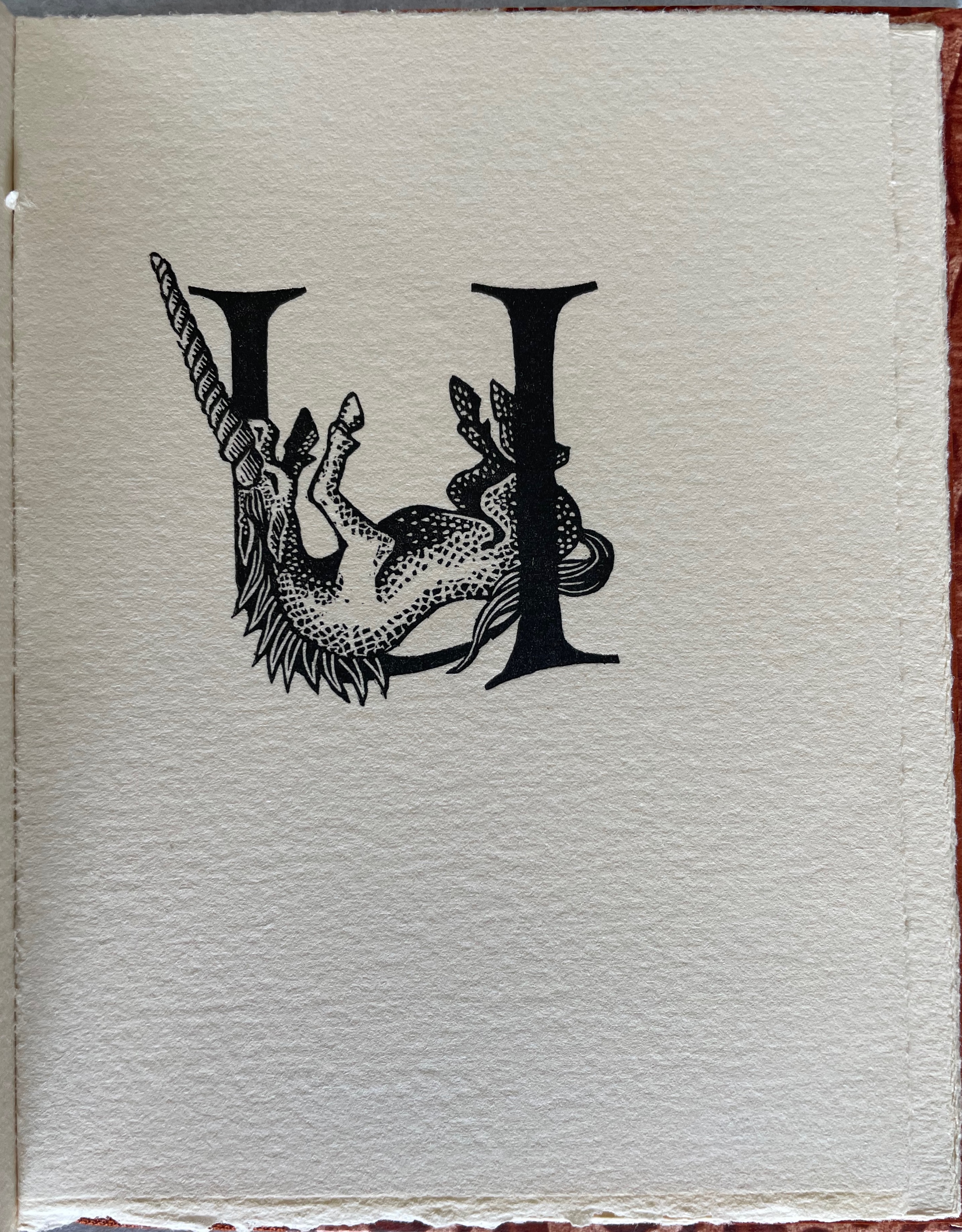
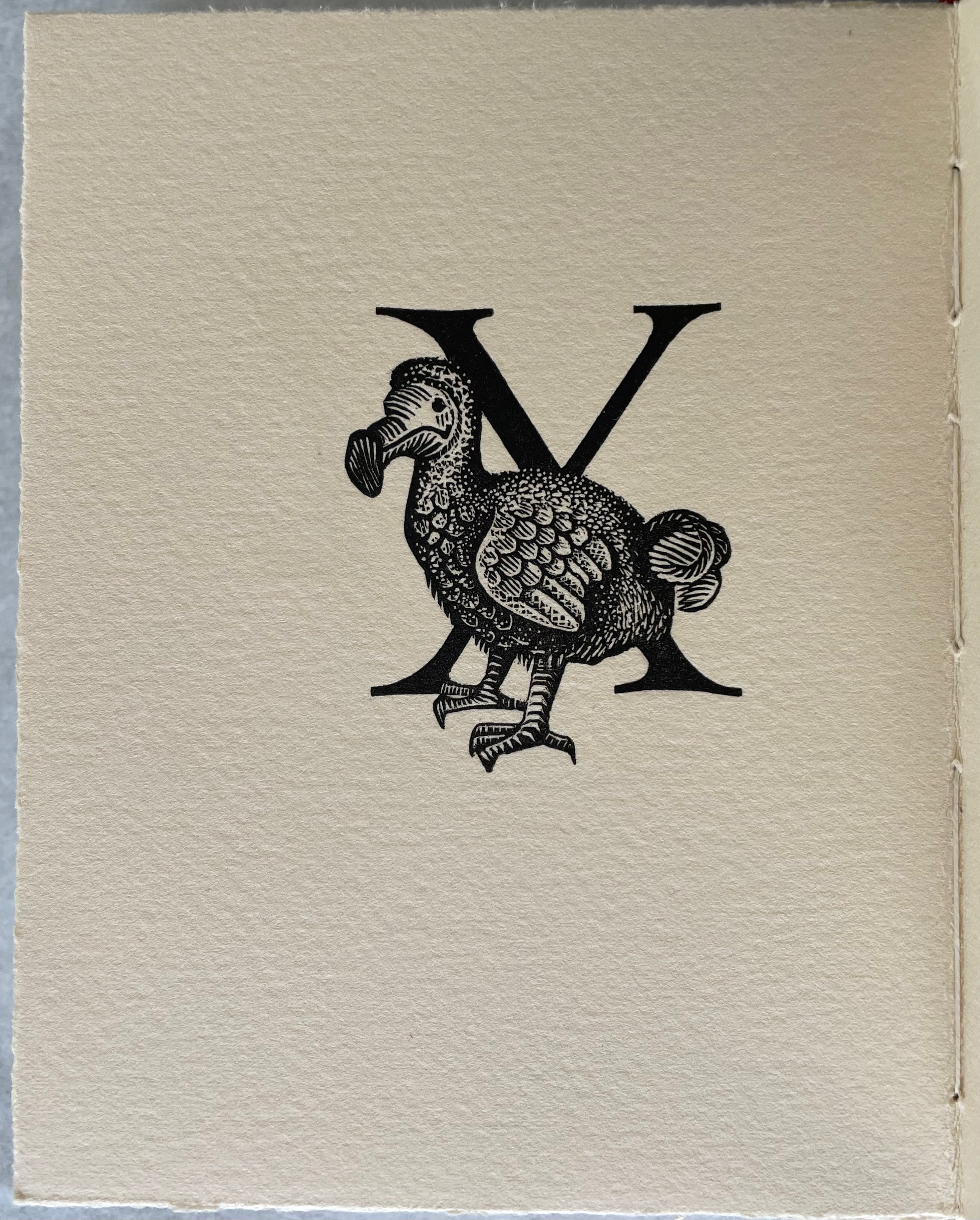
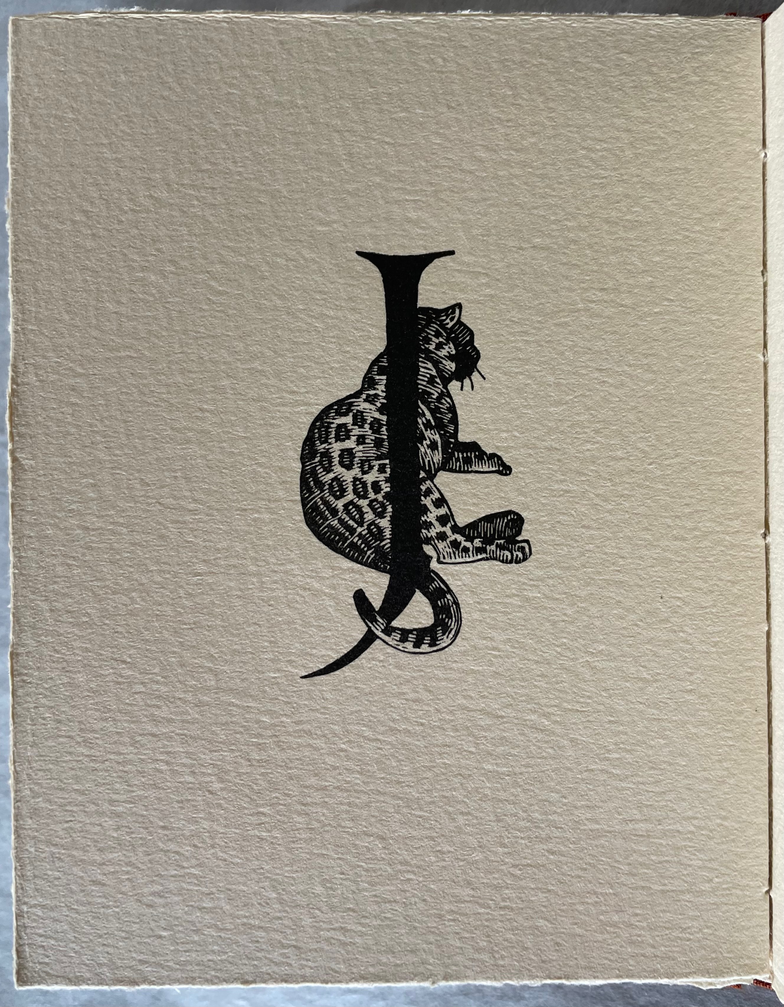
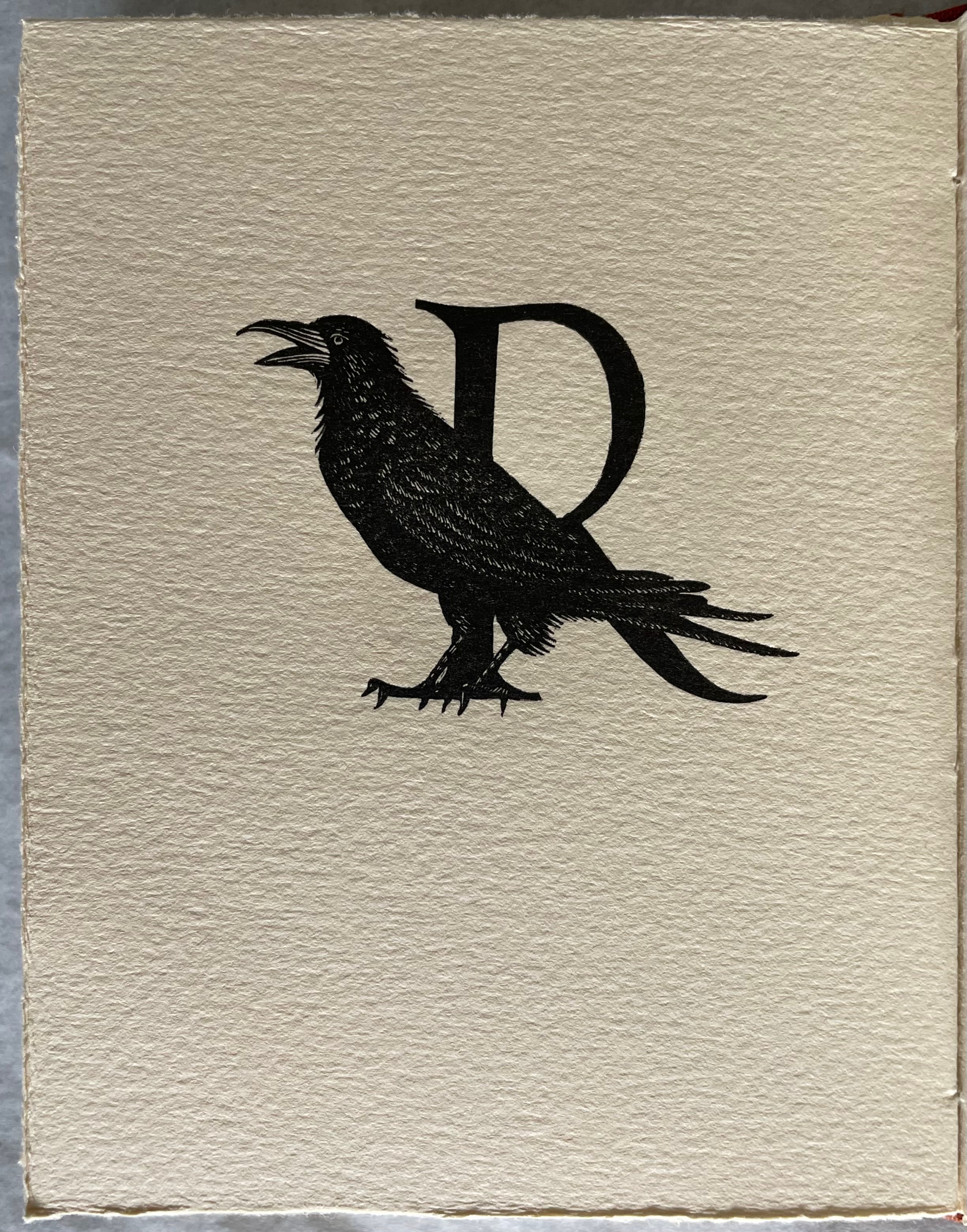
James Rumford subtly weaves fanciful, speculative and well-founded points about the origin and transmission of the alphabet into his inventive reframing of Herodotus’s tale of how the Phoenicians brought the alphabet to Greece. In the double-page spread above, the letter A’s evolution can be found in the ox’s head on the right and among the fish on the left.
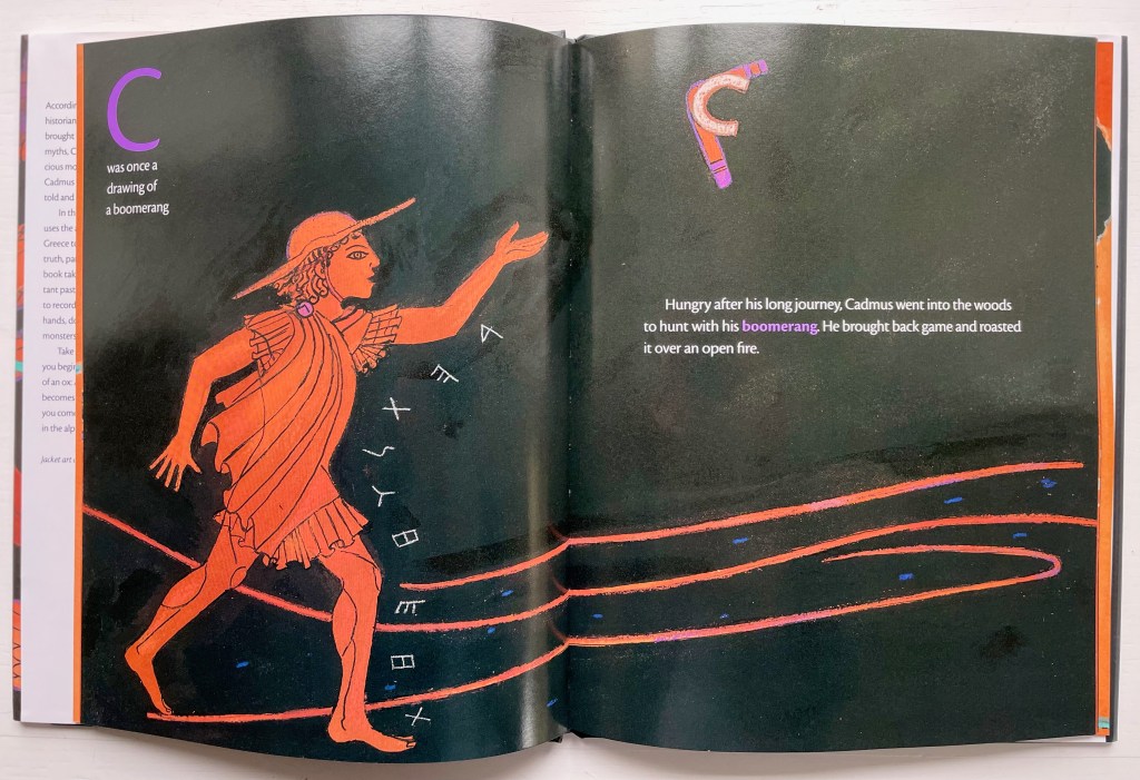
Rumford’s painting with letters is another reminder of the fluidity of picture and letter. Phoenician and early Greek letters are used white on black to outline figures and suggest motion (as with the stick-throwing Cadmus above) or orange on black to evoke the decorative patterns of Greek pottery (as with the vase below).

The note shaped within the vase makes for a deft graphic transition from the pictorial to the fully textual appendix on the recto page, whose explanations will send an attentive reader back to the preceding pages to look more closely at their images.
Sequoyah (2004)
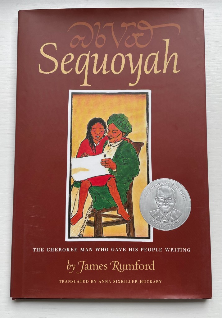
Sequoyah (2004)
James Rumford
Dustcover, hardback. H285 x W230 mm. 32 pages. Acquired from Amazon EU, 25 September 2022.
Photos: Books On Books Collection. Displayed with permission of the author.
Rumford’s Hawaiian residence places him on the equivalent of a linguistic equator reflected in the range of languages his books have engaged: Arabic, Bamum, Chinese, English, French, Ikinyarwanda, Persian and, of course, Hawaiian. He might be suspected of aiming to create an A-Z library of stories about the world’s languages. He has even covered hieroglyphics and Latin.
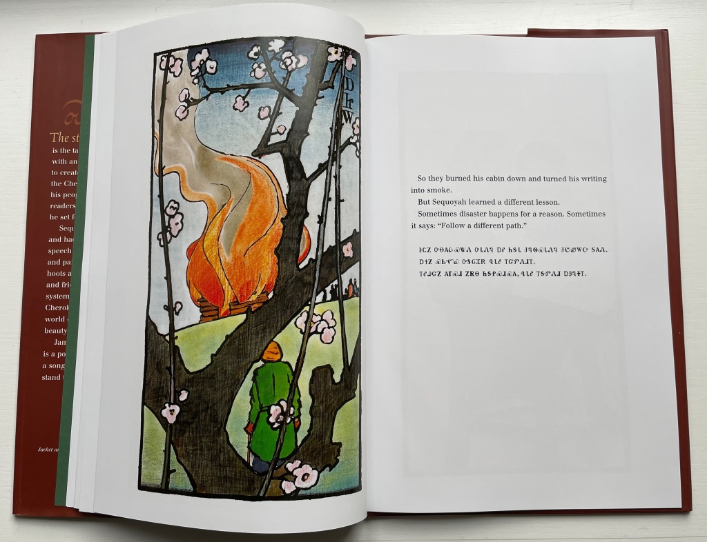
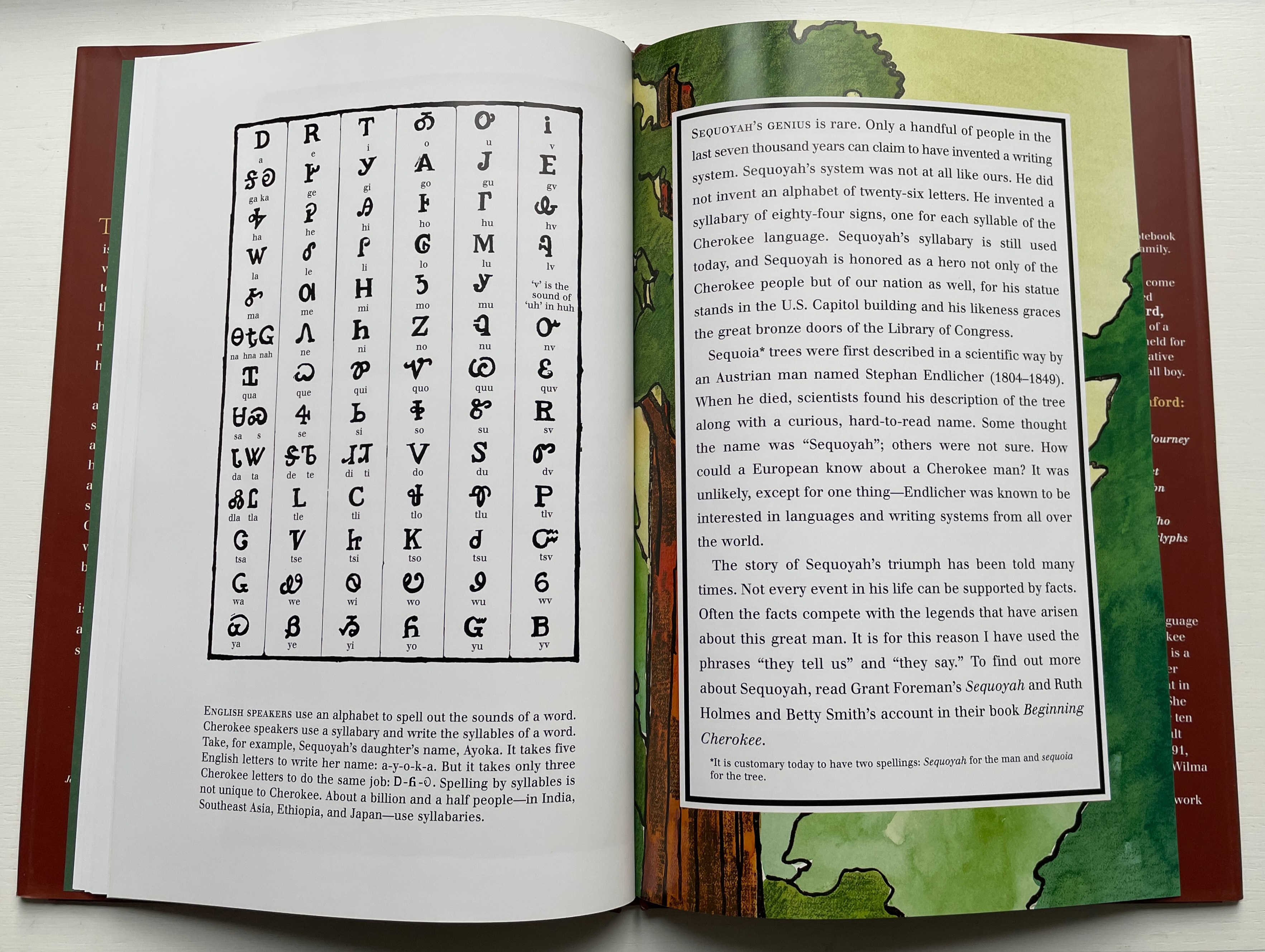
With Sequoyah, Rumford gives bilingual treatment to an astonishing feat — the creation of a syllabary within decades as opposed to the centuries it has taken for most other languages’ alphabets and syllabaries.
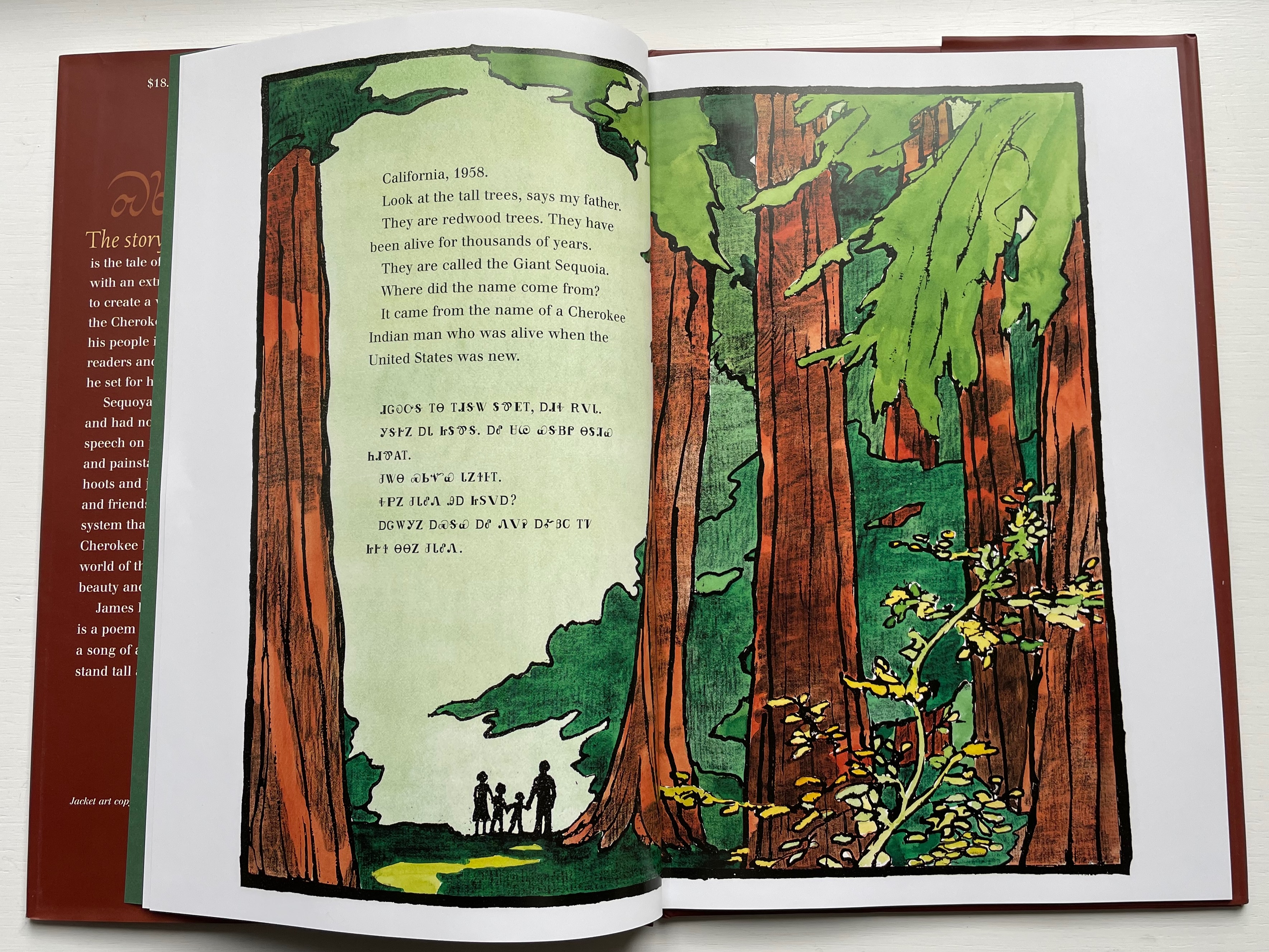
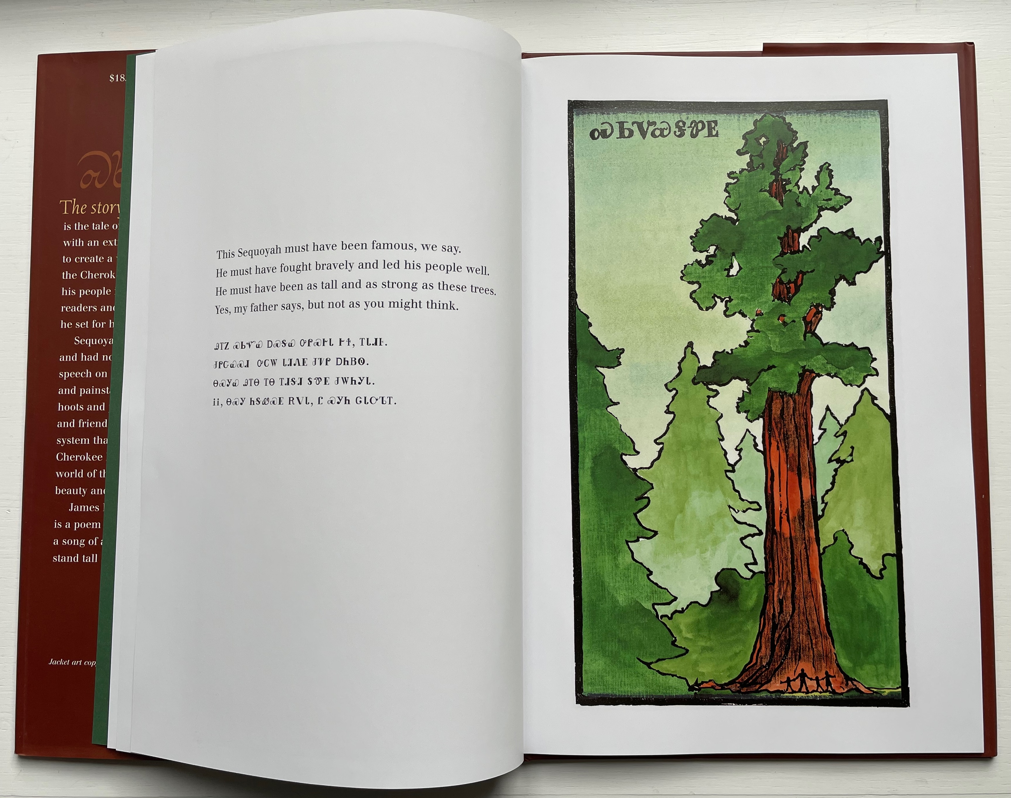
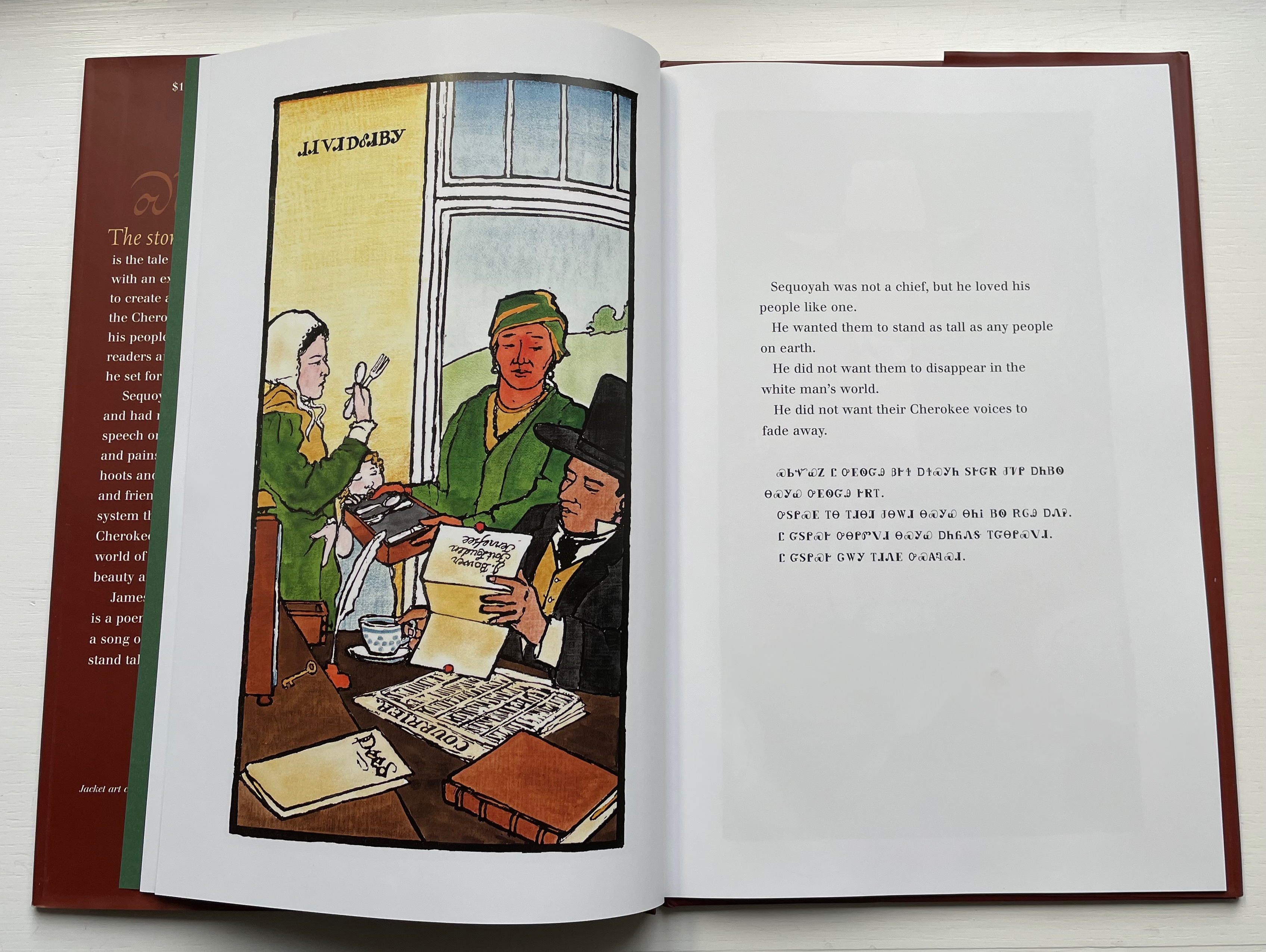
Rumford’s style in this book takes on elements of Japaneses woodcuts and the perspective and color that Gaugin found in them.

As with There’s a Monster in the Alphabet, the audience for Sequoyah is older children (probably ages 8 and older), but supporters of the Endangered Alphabets Project and fans of works such as Sam Winston’s One and Everything (2022) would also enjoy Rumford’s two books.
Further Reading
“Abecedaries I (in progress)“. Books On Books Collection.
“Lyn Davies“. 7 August 2022. Books On Books Collection.
“Ben Shahn“. 20 July 2022. Books On Books Collection.
“Tommy Thompson“. 21 August 2022. Books On Books Collection.
Bernal, Martin. 1990. Cadmean Letters : The Transmission of the Alphabet to the Aegean and Further West Before 1400 B.C. Winona Lake IN: Eisenbrauns.
Diringer, David, and Reinhold Regensburger. 1968. The alphabet: a key to the history of mankind. London: Hutchinson. A standard, beginning to be challenged by late 20th and early 21st century archaeological findings and palaeographical studies.
Drucker, Johanna. 1999. The alphabetic labyrinth: the letters in history and imagination. New York, N.Y.: Thames and Hudson.
Ege, Otto. 1921/1998. The Story of the Alphabet, Its Evolution and Development… Embellished Typographically with Printer’s Flowers Arranged by Richard J. Hoffman. Van Nuys, CA: Richard J. Hoffman. A miniature. The type ornaments chosen by Hoffman are arranged chronologically by designer (Garamond, Granjon, Rogers) and printed in color.
Firmage, Richard A. 2001. The alphabet. London: Bloomsbury.
Fischer, Steven Roger. 2008. A history of writing. London: Reaktion Books.
Gannon, Megan. 10 April 2019. “Cave Markings Tell of Cherokee Life in the Years Before Indian Removal“. Smithsonian Magazine. Accessed 14 July 2023.
Goldman, David. 1994. A is for ox: the story of the alphabet. New York: Silver Moon Press. Children’s book.
Jackson, Donald. 1997. The story of writing. Monmouth, England: Calligraphy Centre.
Moziani, Eliyahu. 1984. Torah of the Alphabet or How the Art of Writing Was Taught Under the Judges of Israel (1441-1025) : -The Original Short Course in Alphabetic Writing Conceived by Israel in Sinai. Herborn: Baalschem.
Pflughaupt, Laurent. 2008. Letter by letter: an alphabetical miscellany. New York: Princeton Architectural Press.
Robb, Don, and Anne Smith. 2010. Ox, house, stick: the history of our alphabet. Watertown, MA: Charlesbridge. Children’s book.
Robinson, Andrew. 1995. The story of writing. London: Thames and Hudson.
Rosen, Michael. 2014. Alphabetical: how every letter tells a story. London: John Murray.
Sacks, David. 2003. Language visible unraveling the mystery of the alphabet from A to Z. New York: Broadway Books.
Samoyault, Tiphaine. 1996, 1998 trans. Alphabetical order: how the alphabet began. New York: Viking.
Shaw, Gary. 15 April 2021. “Ancient ABCs: The alphabet’s ‘missing link’ discovered in Israel“. The Art Newspaper.