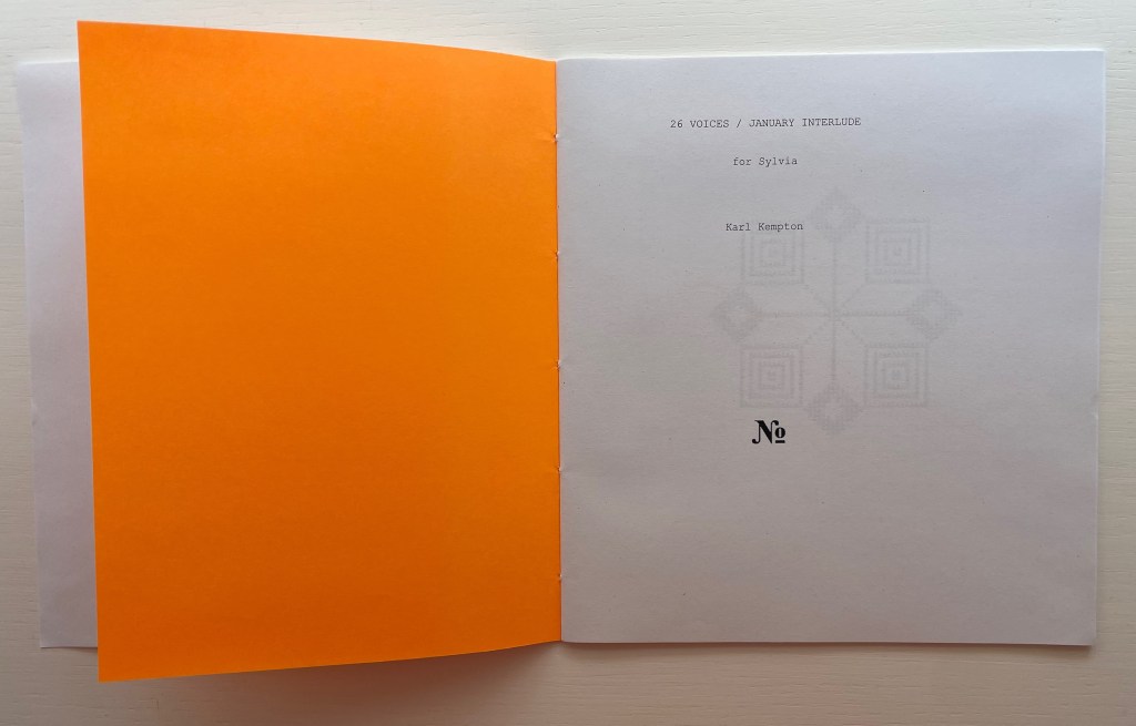
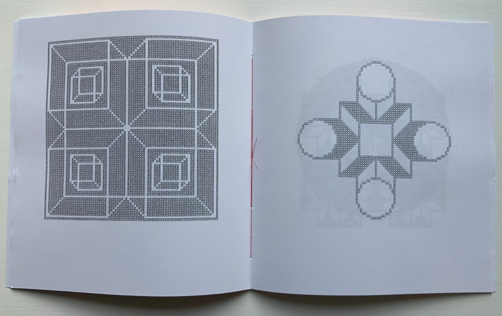
26 Voices / January Interlude (2020) Karl Kempton Sewn booklet. H190 x W177 mm. 28 pages. Edition of 60 unnumbered. Acquired from Derek Beaulieu, 4 January 2021. Photos of the work: Books On Books Collection. Displayed with permission of the artist.
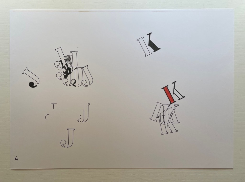
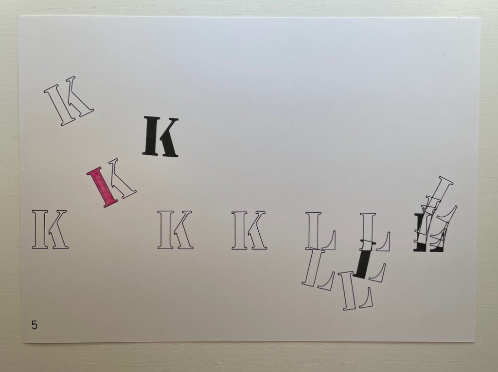
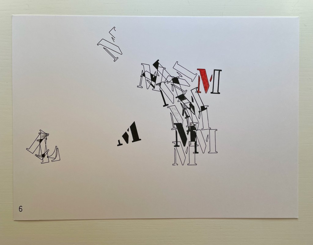
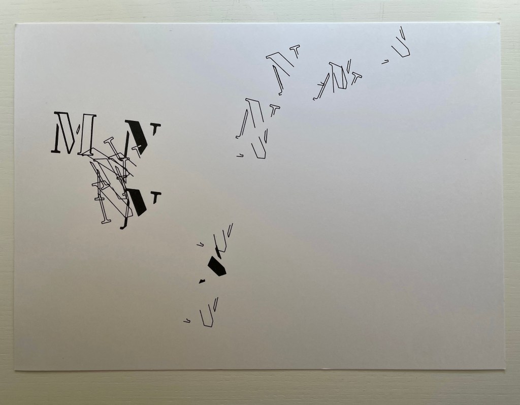
Derek Beaulieu deserves a vote of thanks for bringing this work back into print, even if for a limited edition. 26 Voices / January Interlude first appeared under the title Rune 2: 26 voices/ january interlude as number 10 in Robert Caldwell’s Typewriter series, published by Bird in the Bush Press (1980). In the Acknowledgements, Kempton writes that the series “was composed in January, 1978 in 28 days. After the letter K the flow stopped until a dream of L’s form arrived unblocking the flow”.
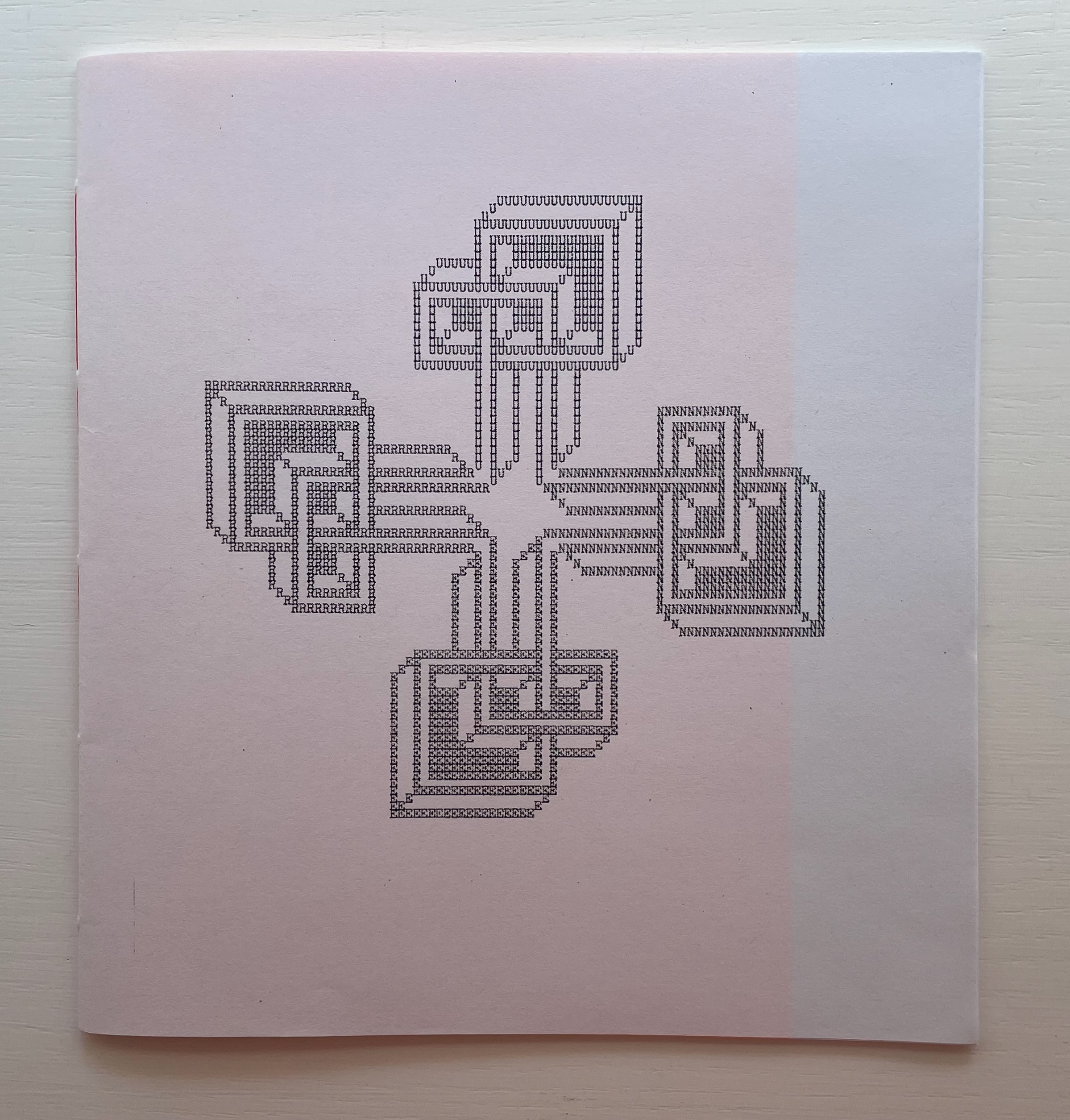
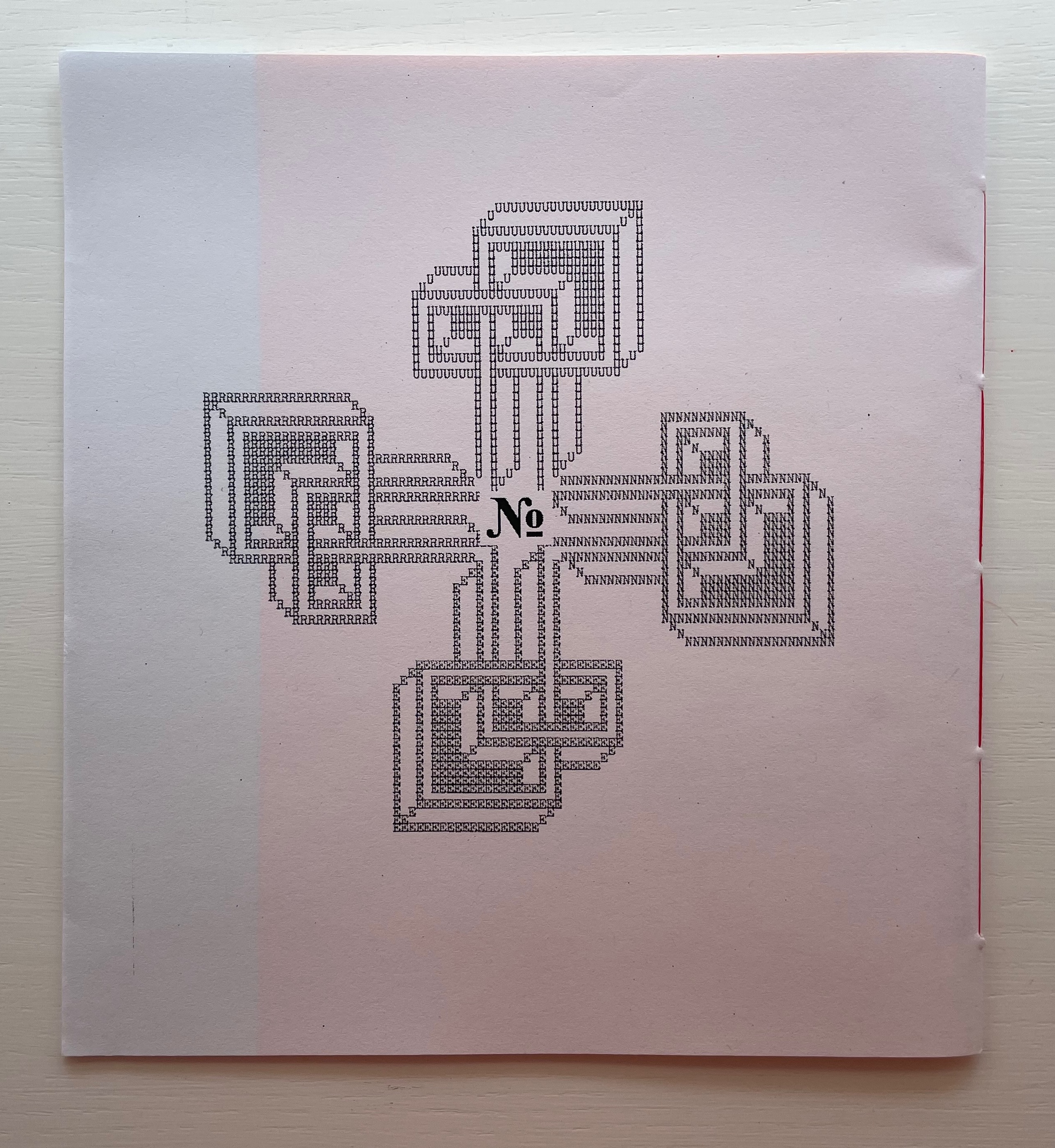
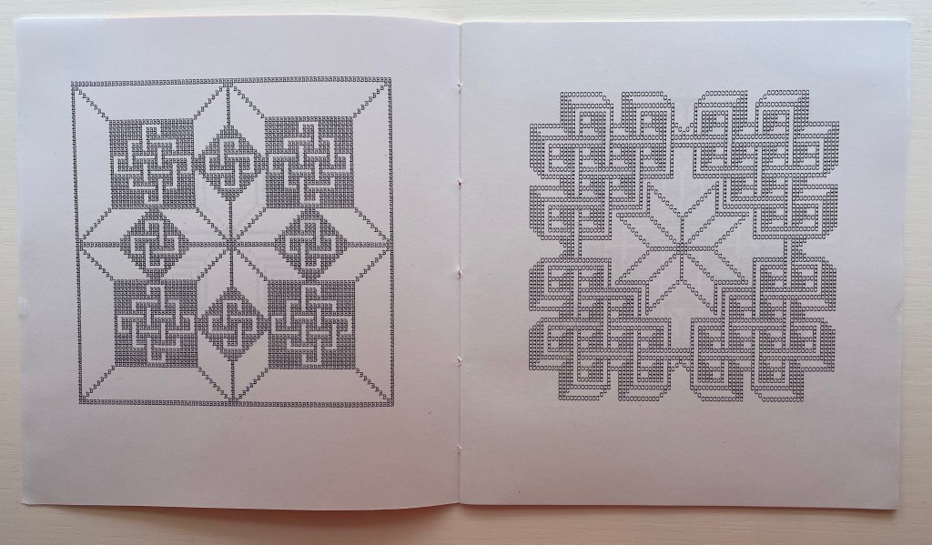
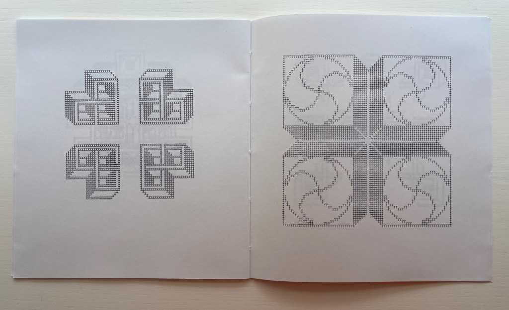
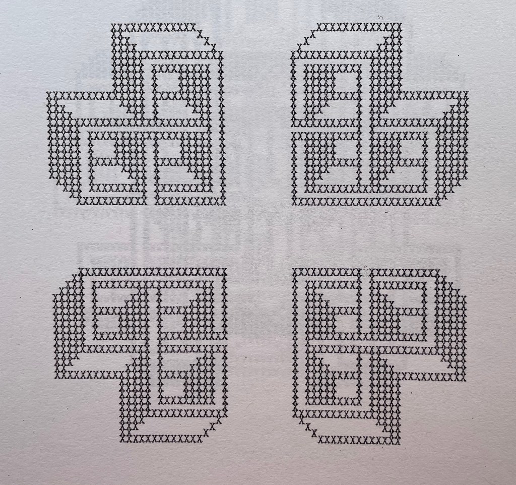
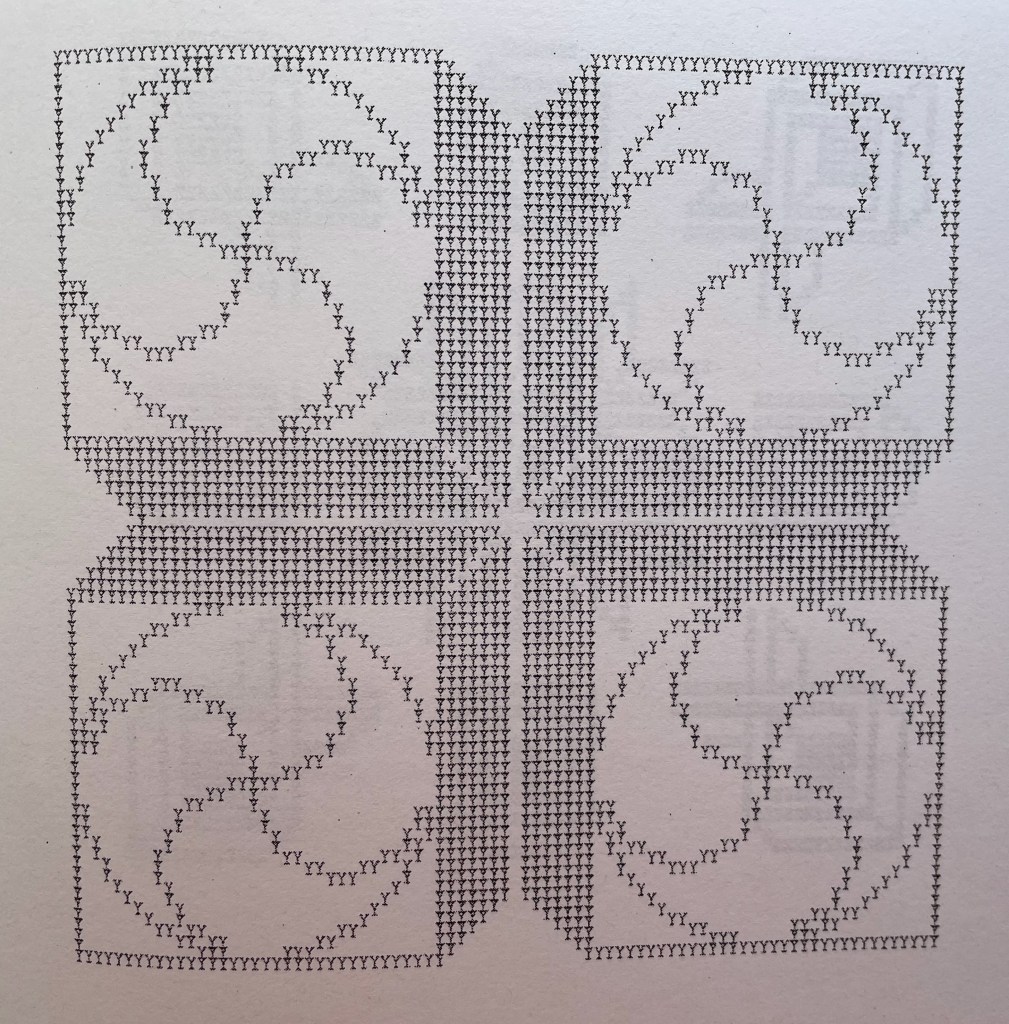
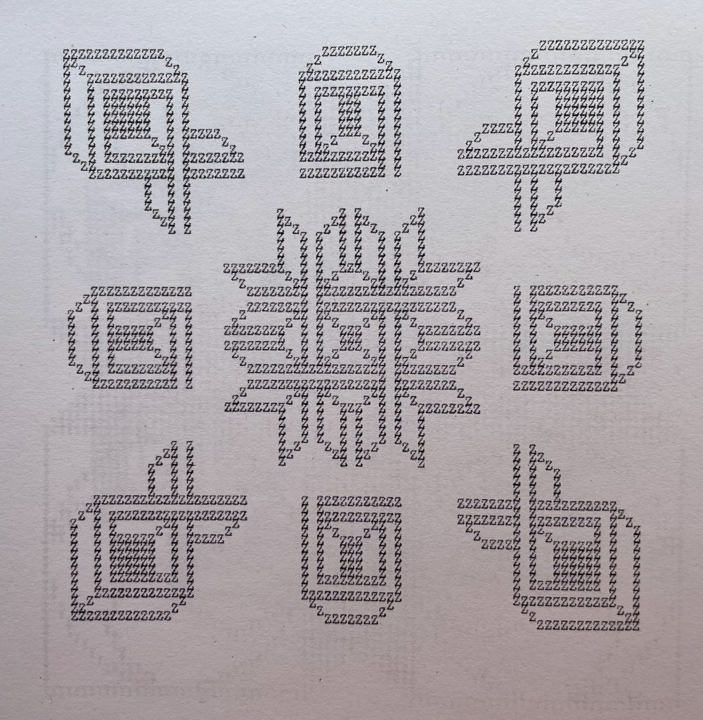
The series of patterns, each made from an upper case letter of the alphabet typed over and over, range in appearance — some like Amish quilts, some like Byzantine rugs, some like Celtic knots, but like snowflakes, no two alike. Given how some pairs of letters are mirror images of each other (bd, pq) or inverse (bp, dq), you would expect some close affinity in their two patterns, but no. No pairs of those patterns look at all alike. You would also be mistaken to expect a pattern to reflect the letter that constitutes it. Instead, you find one pattern resembling the letter X, but it is made of letter U’s. There are naturally some similarities between patterns at the broadest level — E and N, L and M or R and S — but these have little to do with the letters themselves, and the similarity recedes as details come to the fore or falls into the background with illusory three dimensionality. The shapes are not rune like, but individually and sequentially, they have the associative dream-like qualities of runes.
A close up
Double-page spread B&C
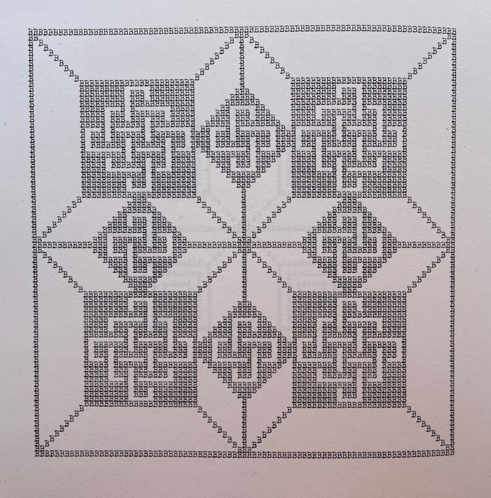
B close up
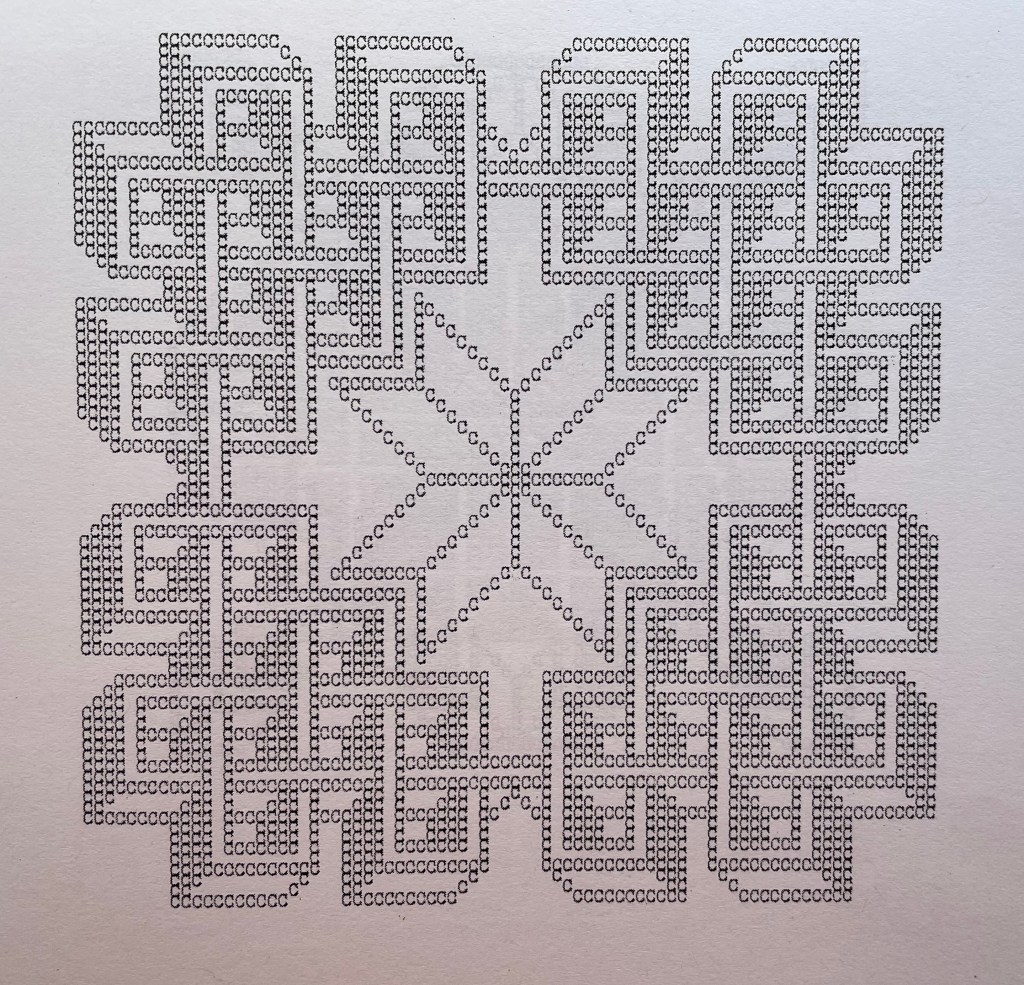
C close up
Center double-page spread N&O
Double-page spread X&Y
X close up
Y close up
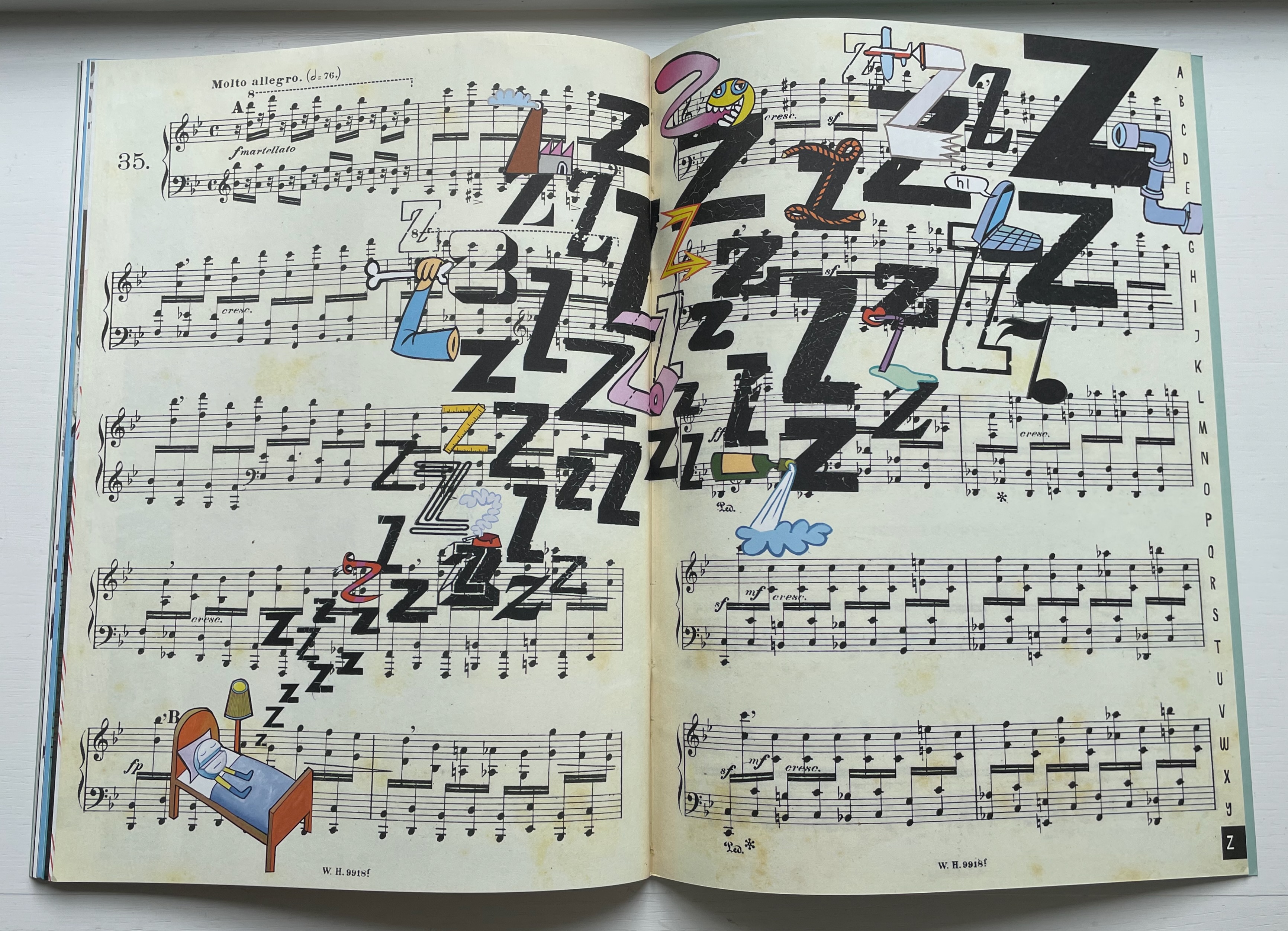
Z close up
Actual runes appear in the following work, similarly in black and white and with similarly illusory three dimensionality. Not technically in the Books On Books Collection, playground (2013-14) can be found online. Surprisingly, it has not been in print.
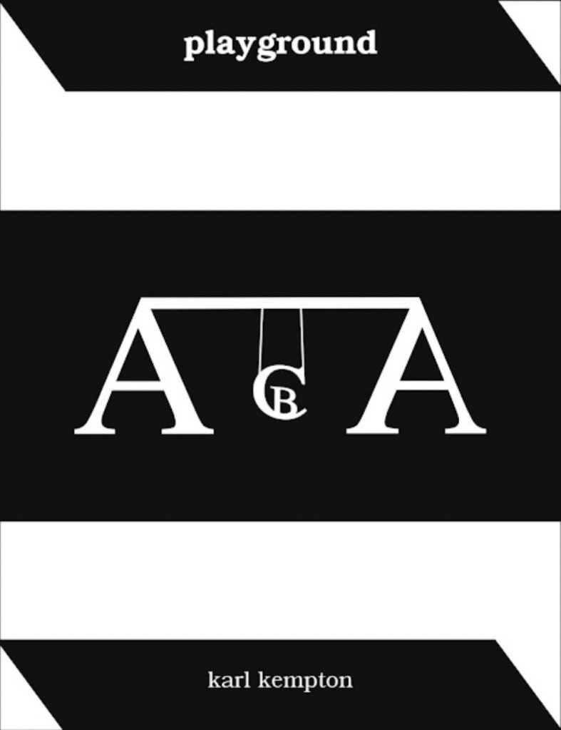
playground (2013-14)
playground (2013-14) karl kempton Online, 78 pages (screens). Accessed 7 August 2022. Screenshots reproduced with permission.
What an opportunity for collaborators to join with Kempton to produce playground in different editions varying in color (black and white, red and white, green and white, blue and white, etc.), in paper (handmade, watercolor, washi, high gloss, matte, etc.) and in binding (accordion, stab binding, case bound, scroll, etc.). Perhaps such an extravaganza is not in keeping with Kempton’s style and approach over the years, but this playground is such an invitation to play.
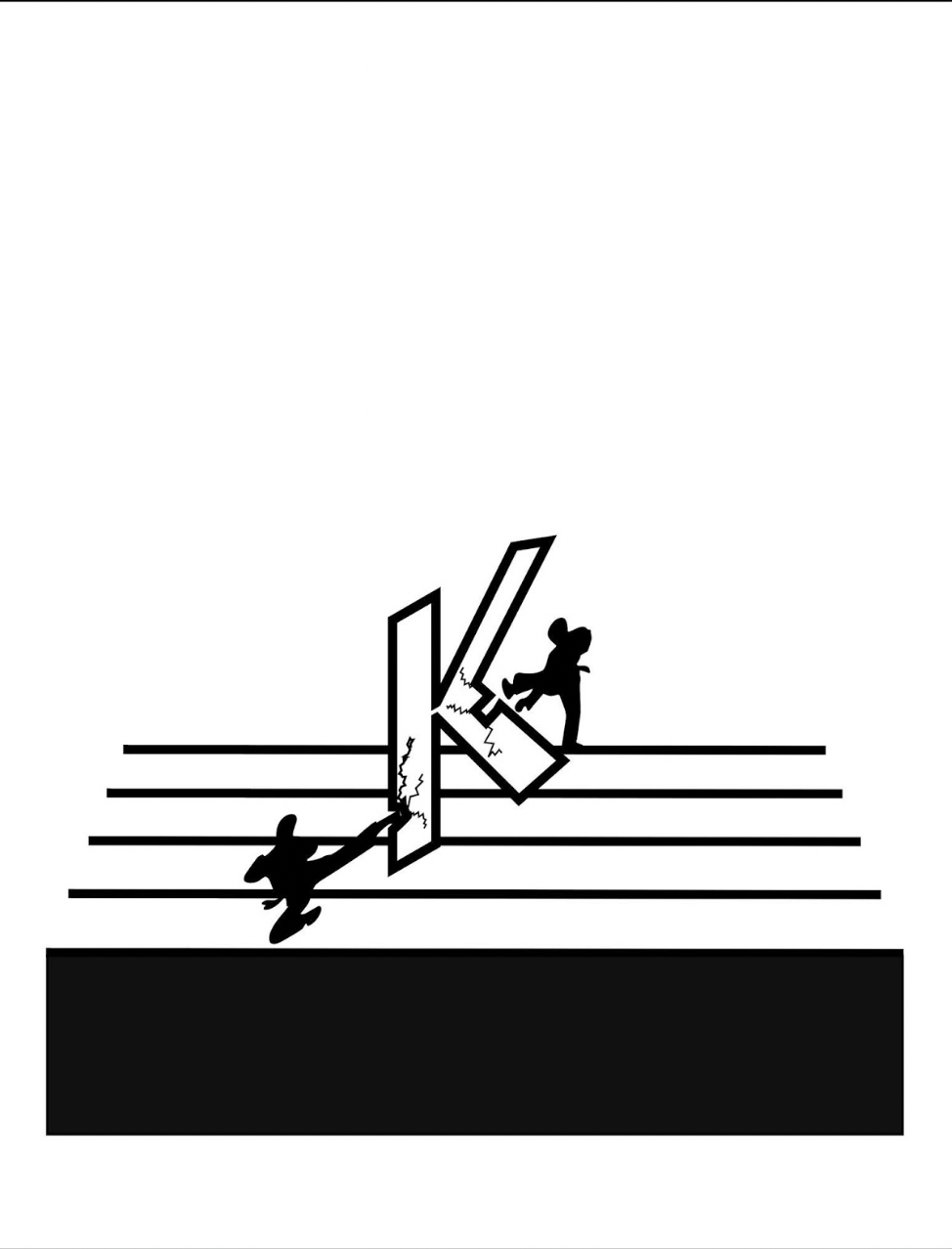
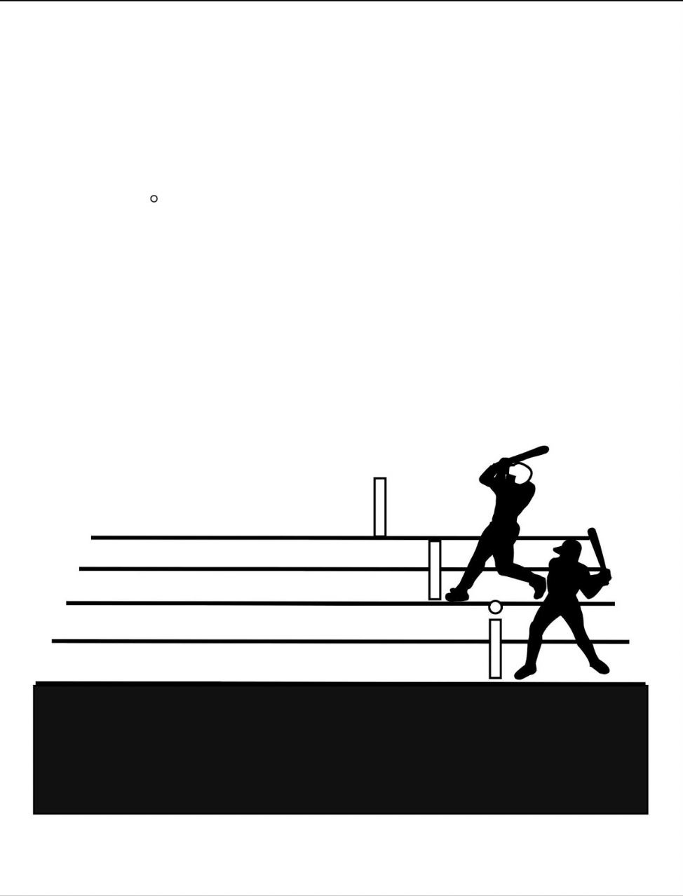
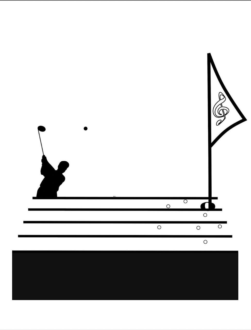
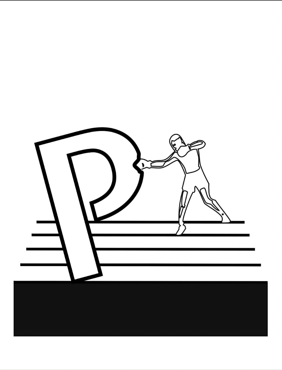
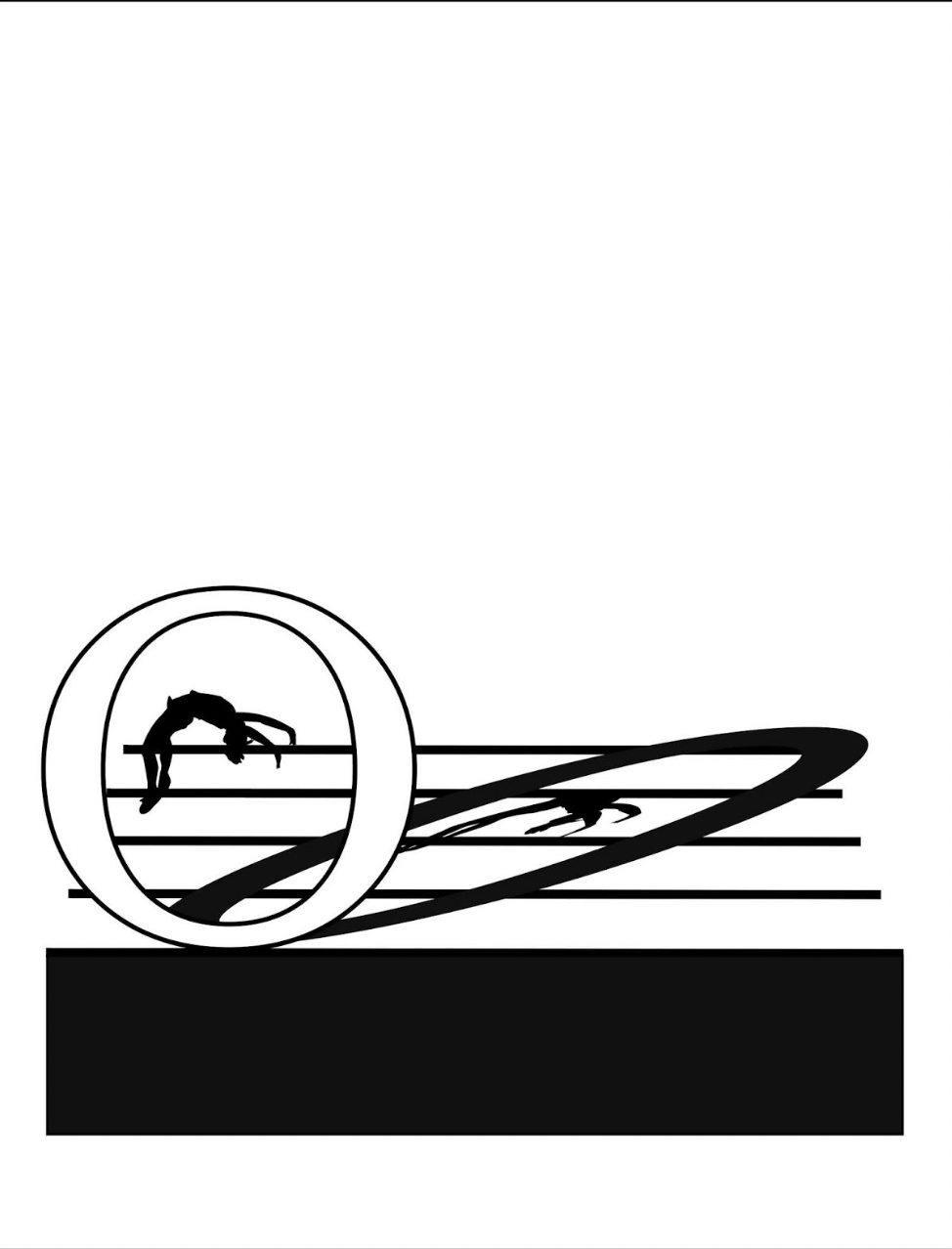
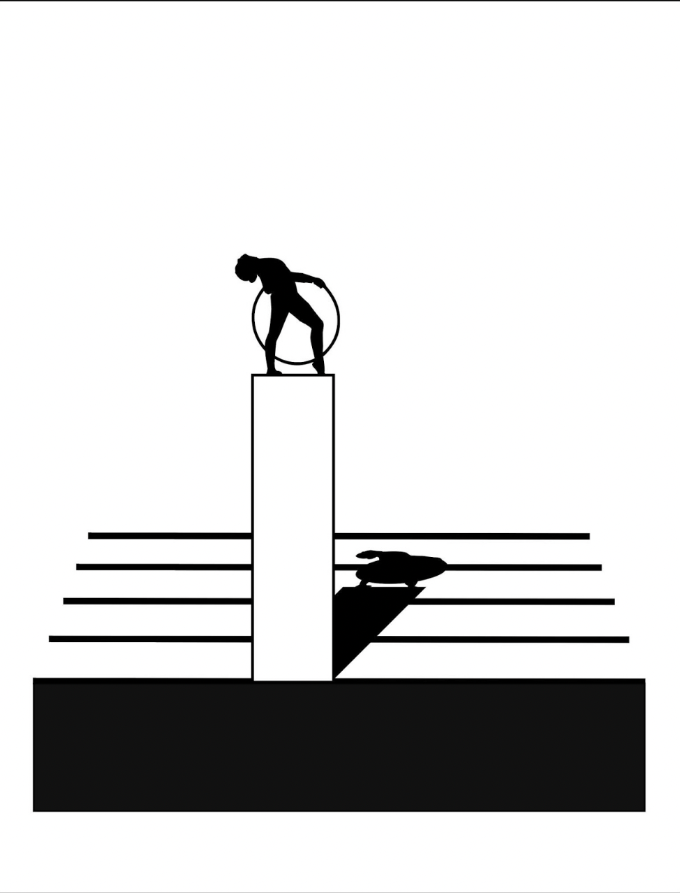
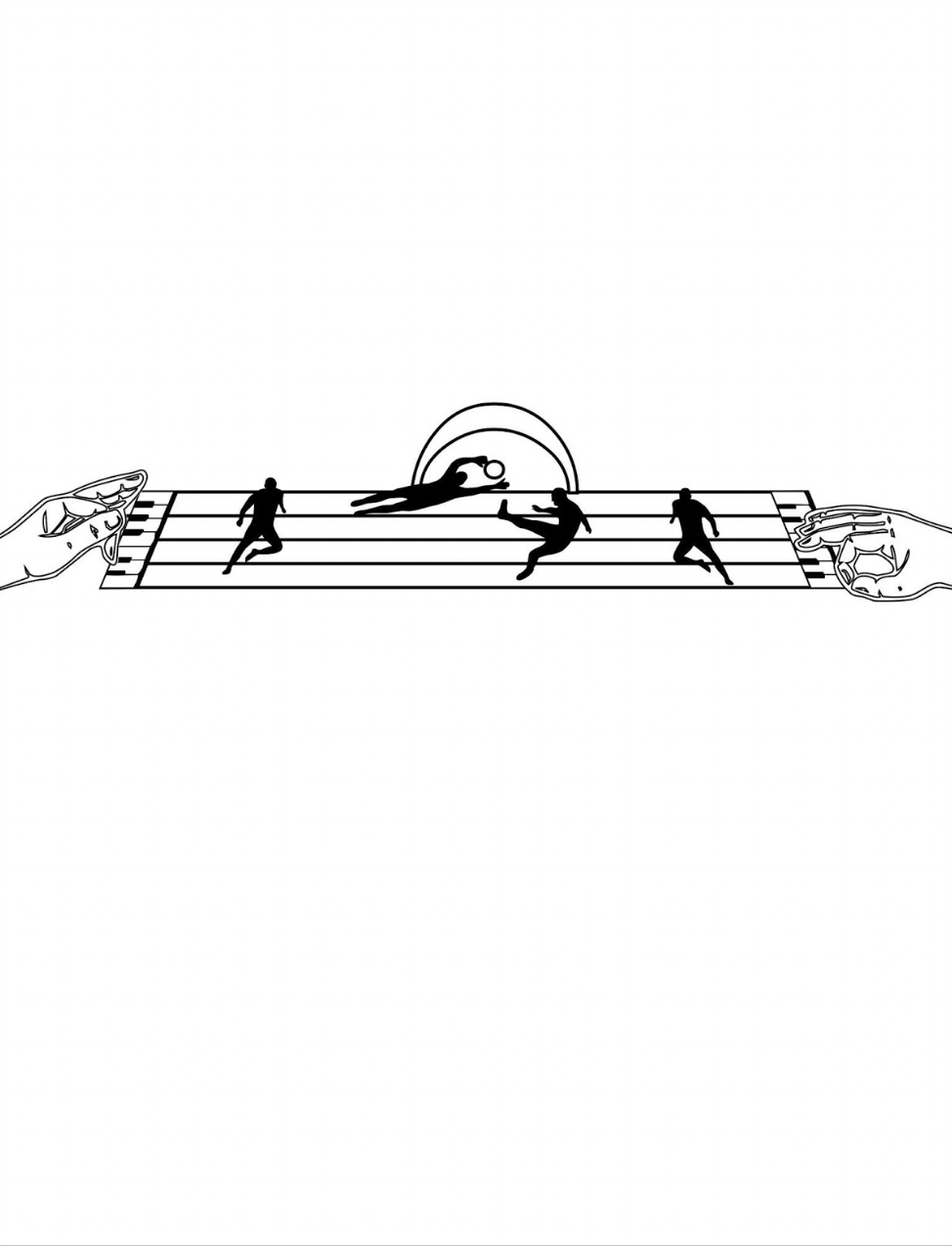
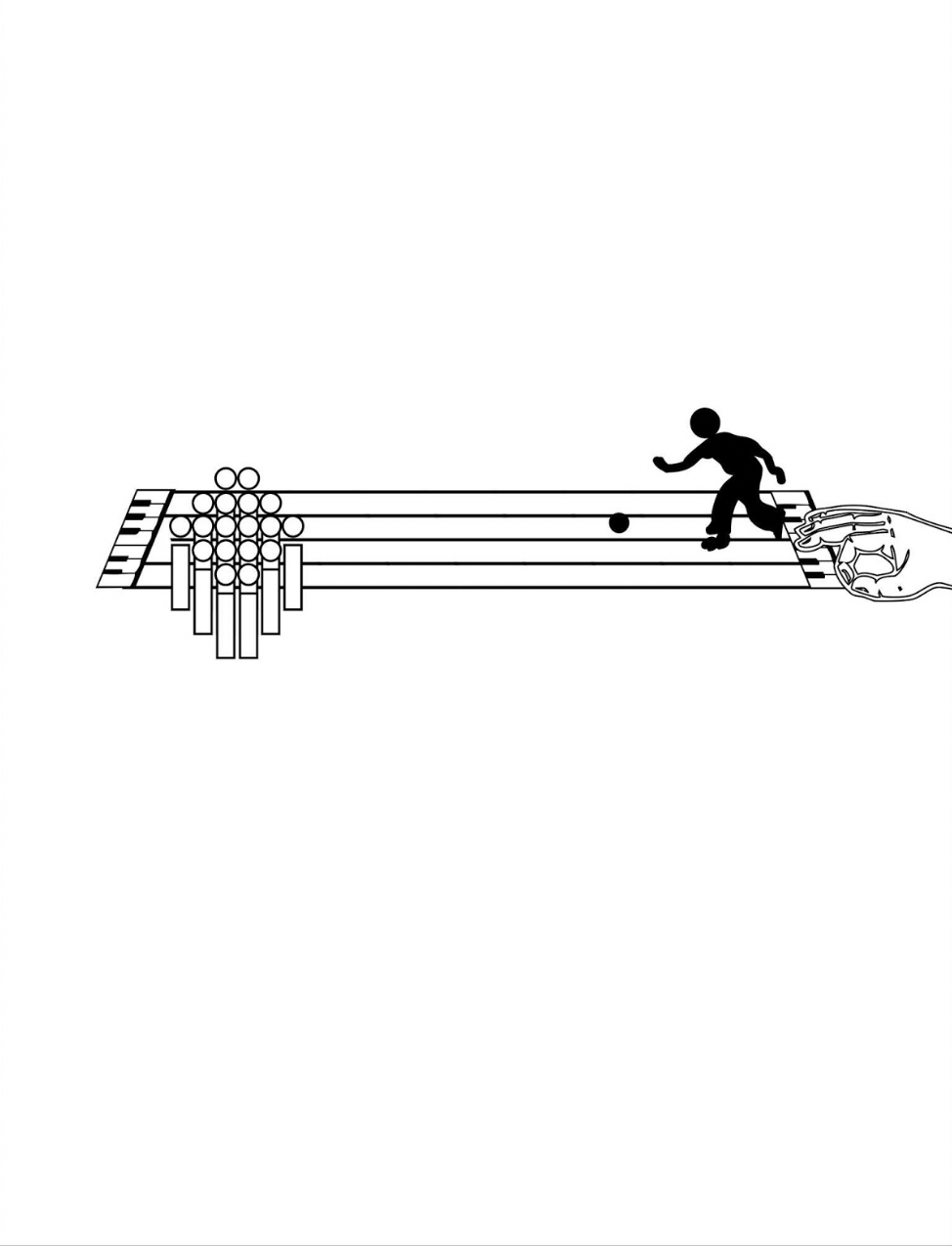
Games and sports are depicted together with letters and punctuation marks on platforms made of the musical staff or stave, all of which offer Kempton multiple means of metaphor. FIrst, inked martial arts figures break a K of karate boards. Then, a baseball player bats the dot of a lowercase i into the air. A basketball player jumps and aims at a basket formed of a half note. A golfer chips toward a half-note hole flagged with a pennant bearing the treble clef G. A boxer punches the bowl of a large P.
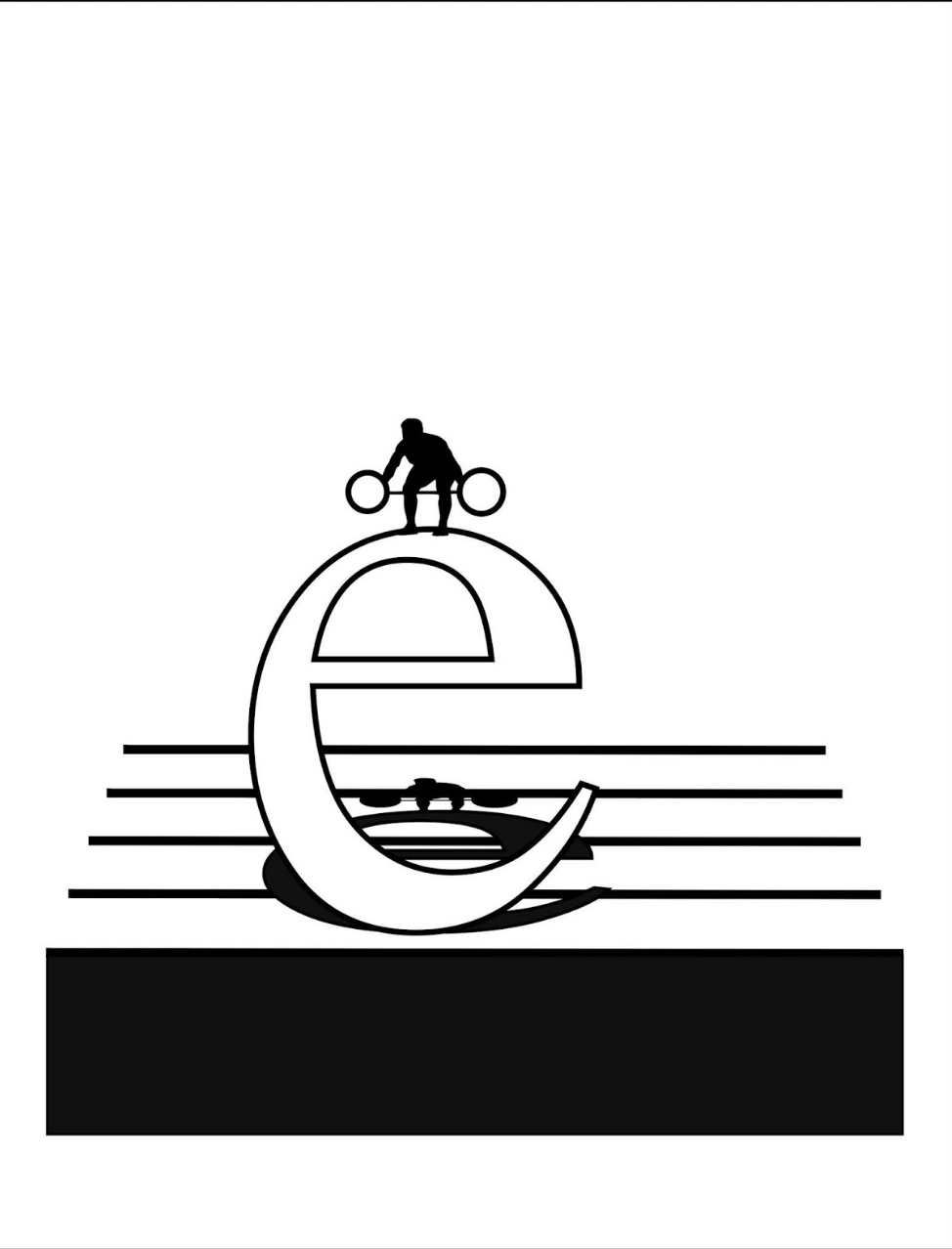
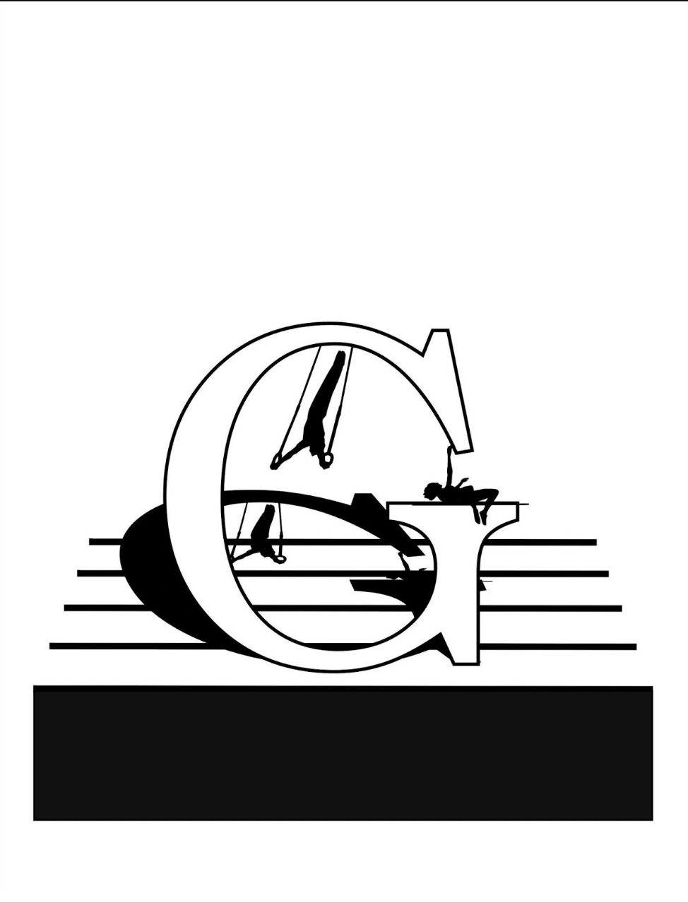
The images become more worked as the book proceeds. A weightlifter atop a lowercase e lifts a set of weights composed of the umlaut above the e, and the shadow of the image is cast across the stave lines behind the letter. Shadows of gymnasts appear behind an uppercase G, lowercase o and lowercase i.
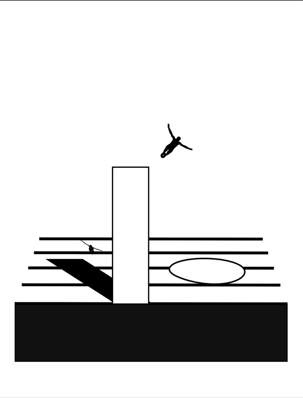
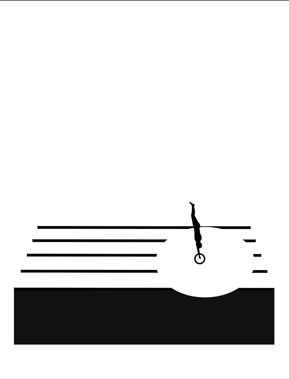
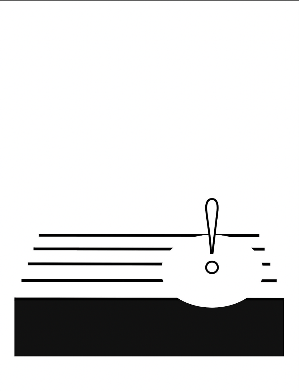
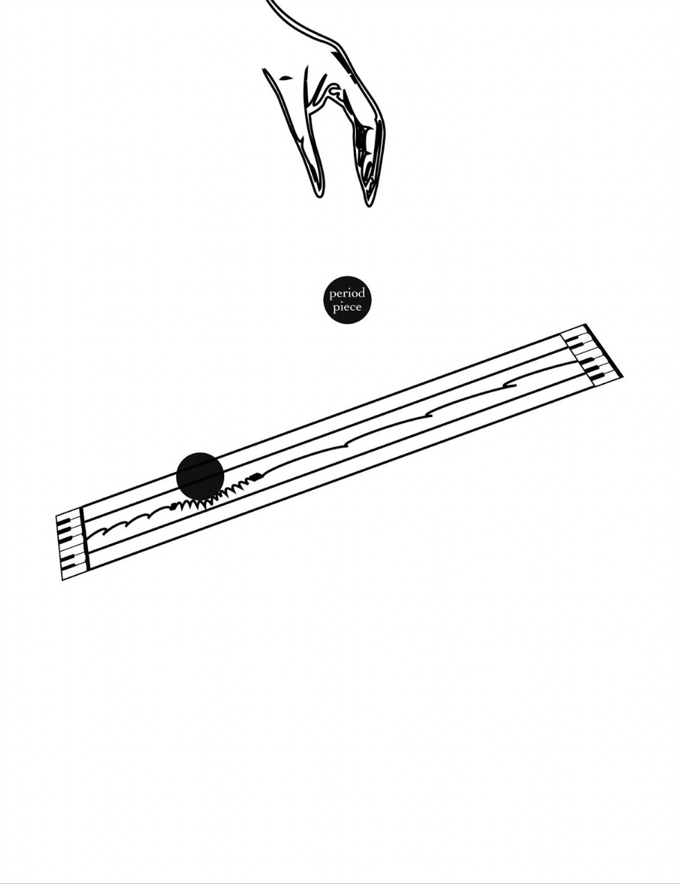
Animation sequences occur, such as the platform diver leaping from the body of a lowercase i and creating an exclamation-point splash in a pool formed by a circle that widens across the stave as the diver submerges.
Around the same time of playground‘s inception, this combination of letters and musical notation found expression among other artists: for example, Jim Avignon & Anja Lutz in Neoangin: Das musikalische ABC (2014) and Bernard Heidsieck in Abécédaire n° 6 clef de sol : été 2007 (2015). Metaphorically linking textual expression, if not individual letters of the alphabet, with musical scores goes back at least as far as Stéphane Mallarmé’s Un Coup de Dés Jamais N’Abolira le Hasard (1897) and carries forward into explicit linkage by Michalis Pichler (2009) and Rainier Lericolais (2009) in their works of homage to Un Coup de Dés.
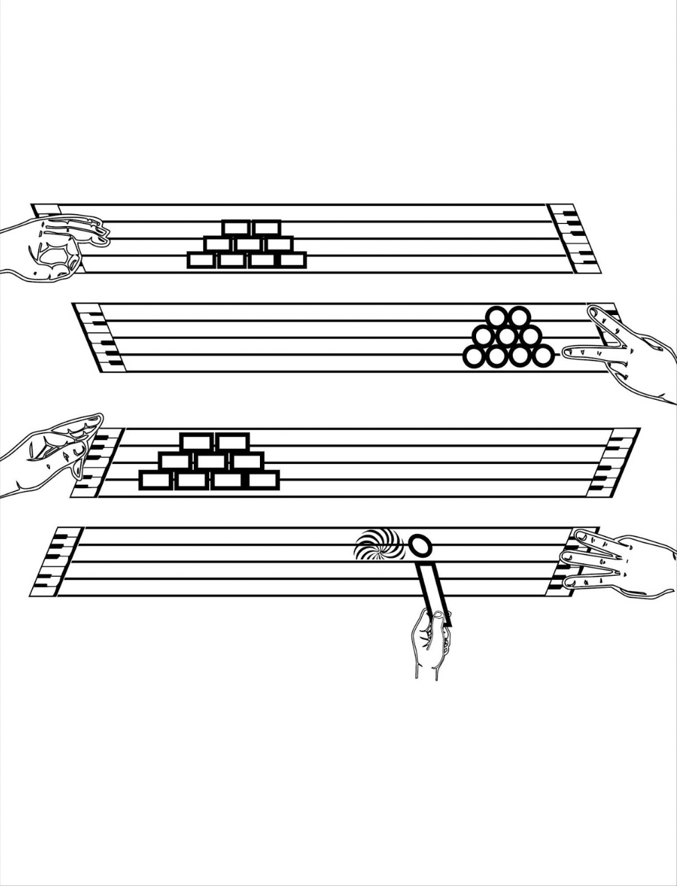
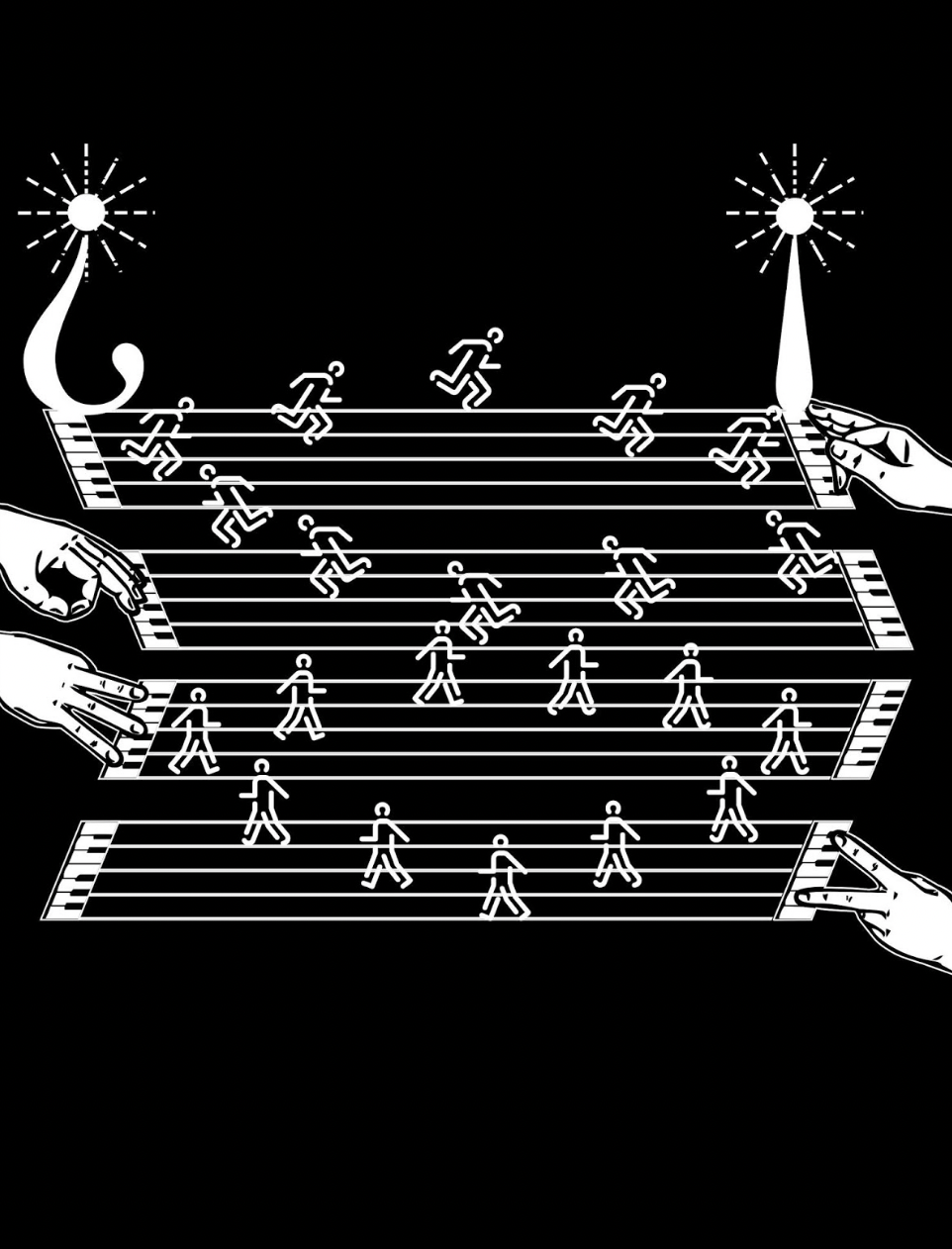
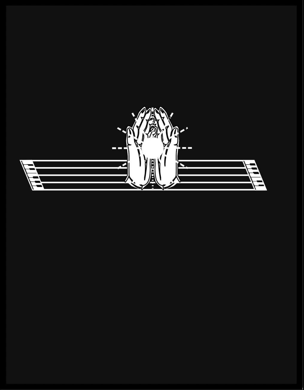
To return to Kempton’s playground, an interlude occurs to associate the alphabet with magnetism, then breaks off to return to the games motif, this time in the form of winter sports. The musical notation motif is still there, but Kempton modifies it with a piano keyboard at both ends of the stave and with manicules fingering the keyboards at both ends while articulating a variation on sign language. Musically and metaphorically, matters become more complex with the introduction of two pairs of staves, pyramids of squares and circles and one manicule using the lowercase i to bring back the magnetism interlude.
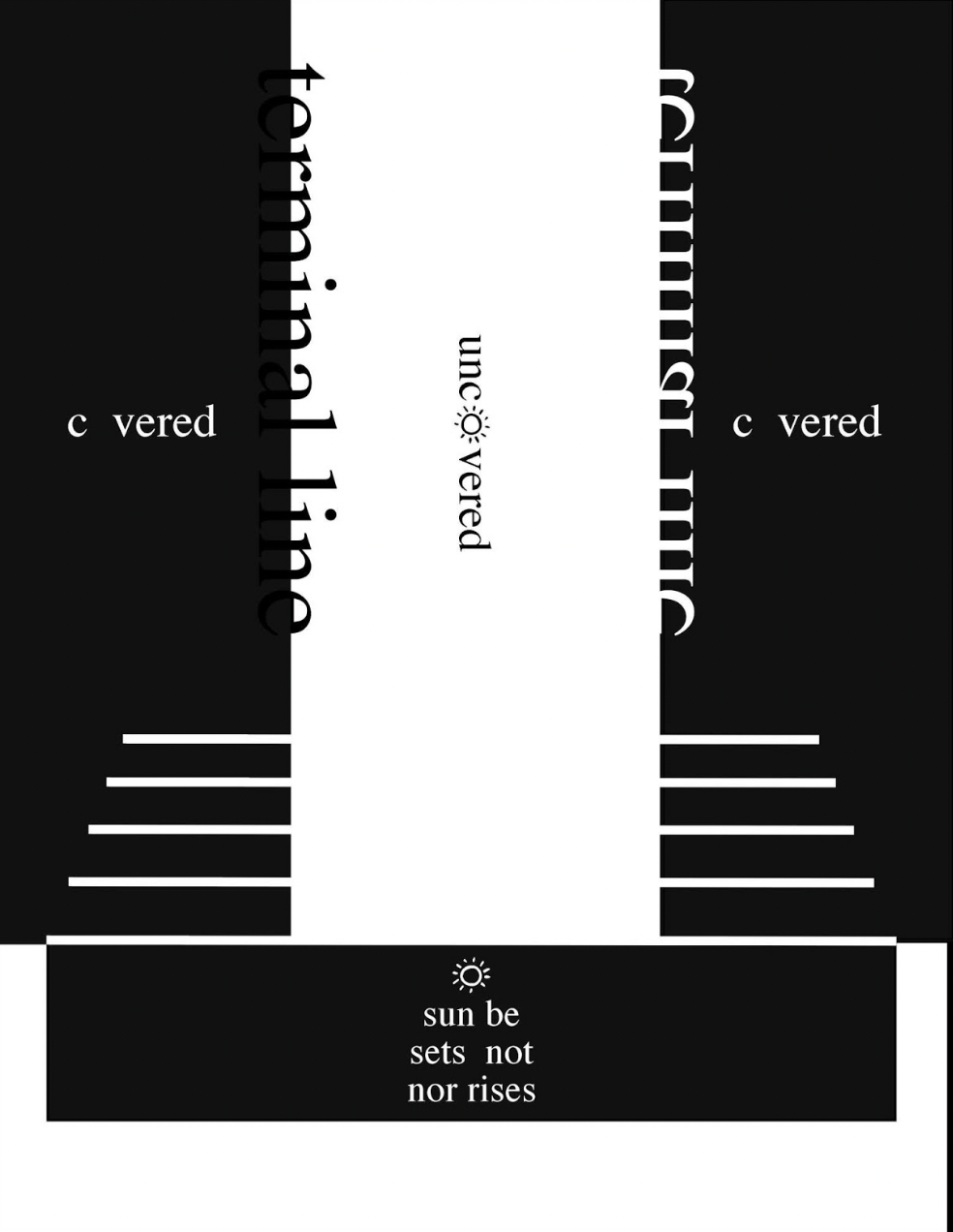
From here on, additional motifs are developed, and words and phrases appear: a physics experiment punningly labeled “period piece”, a night game lit by inverted question and exclamation marks, and juxtaposed opposites (“covered/uncovered” and “sunrise/sunset”).
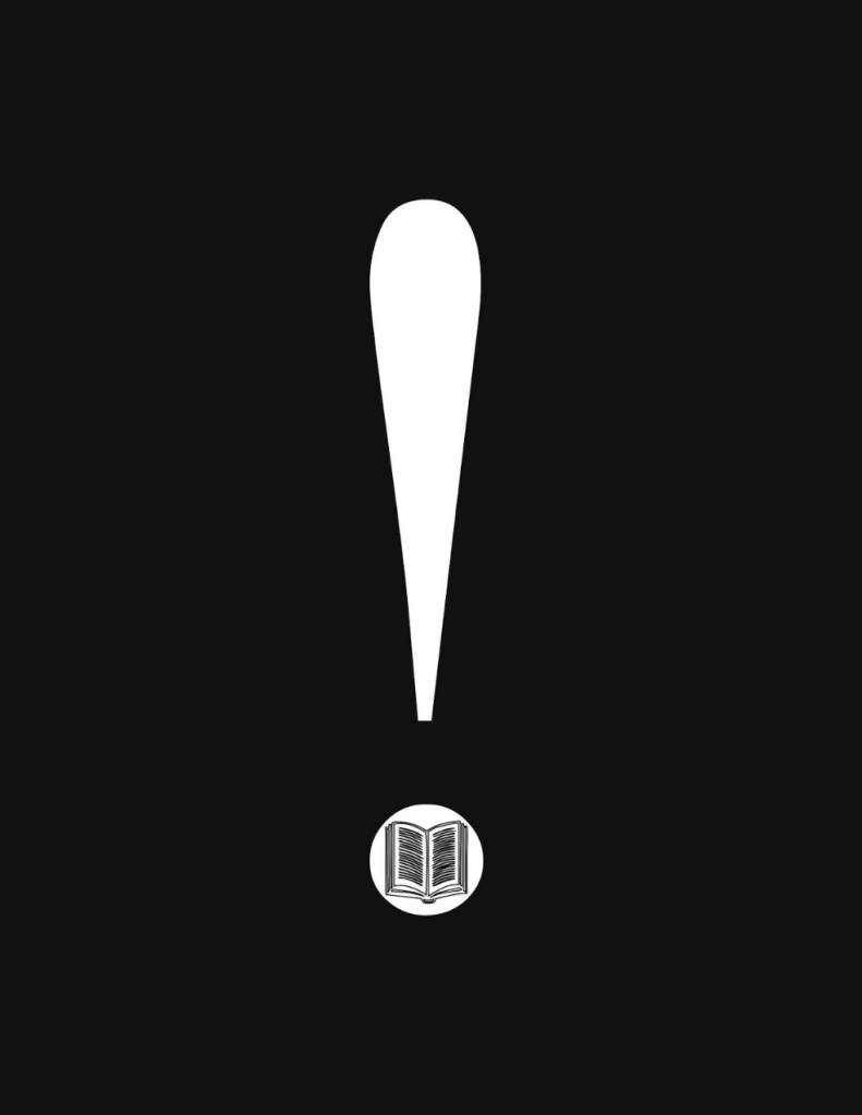
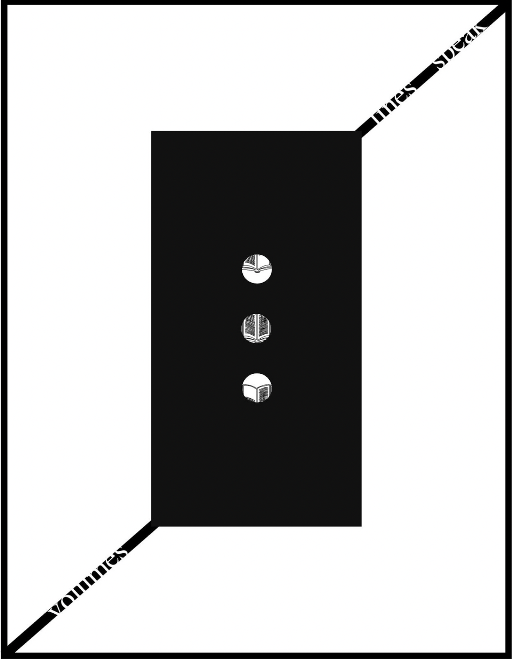
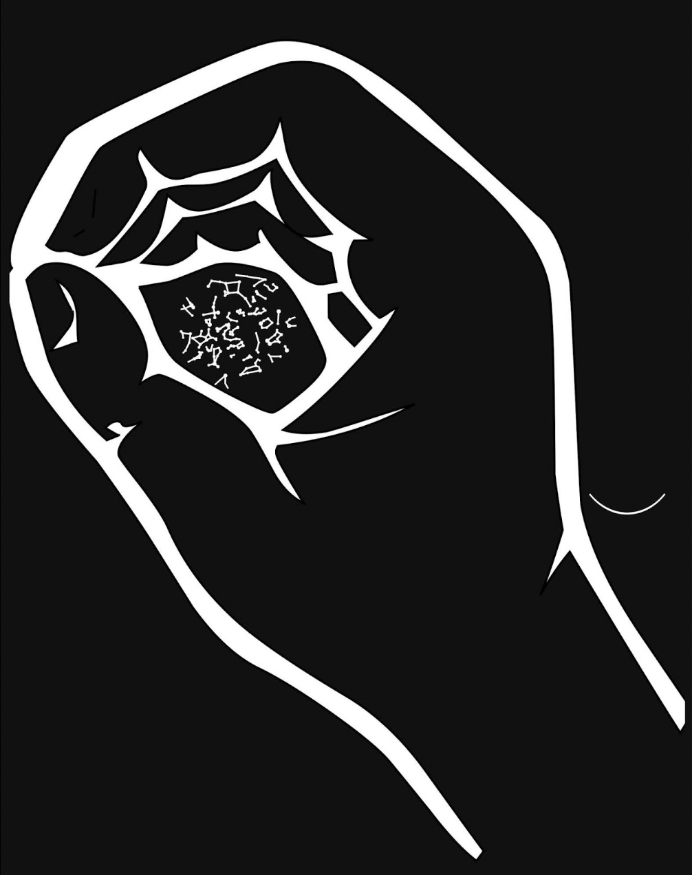
All these motifs, textual and visual puns, and images seem concerned with the development of symbols for interpreting the world and communicating that interpretation. With the appearance on black background of an exclamation mark with an open book inside its point, then a pair of rectangles each suspended by the sentence “volumes lines speak / lines speak volumes”, an animated sequence begins an extended narrative drawing everything together.
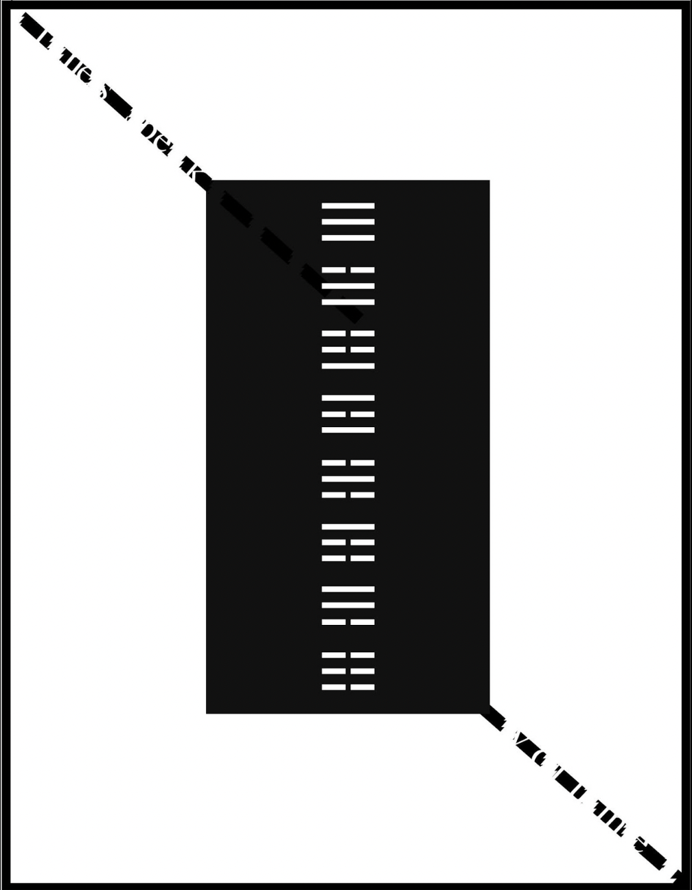
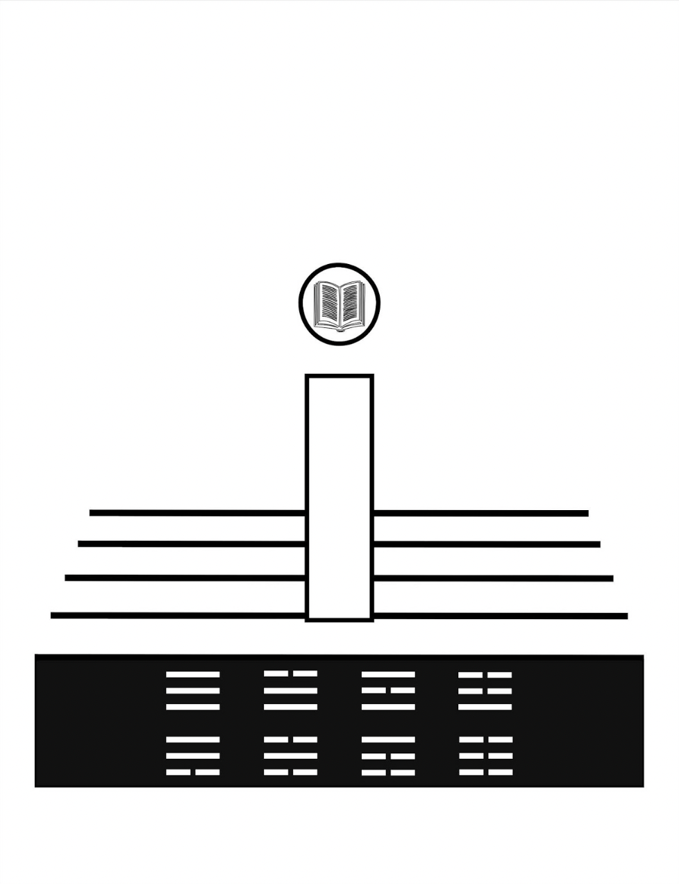
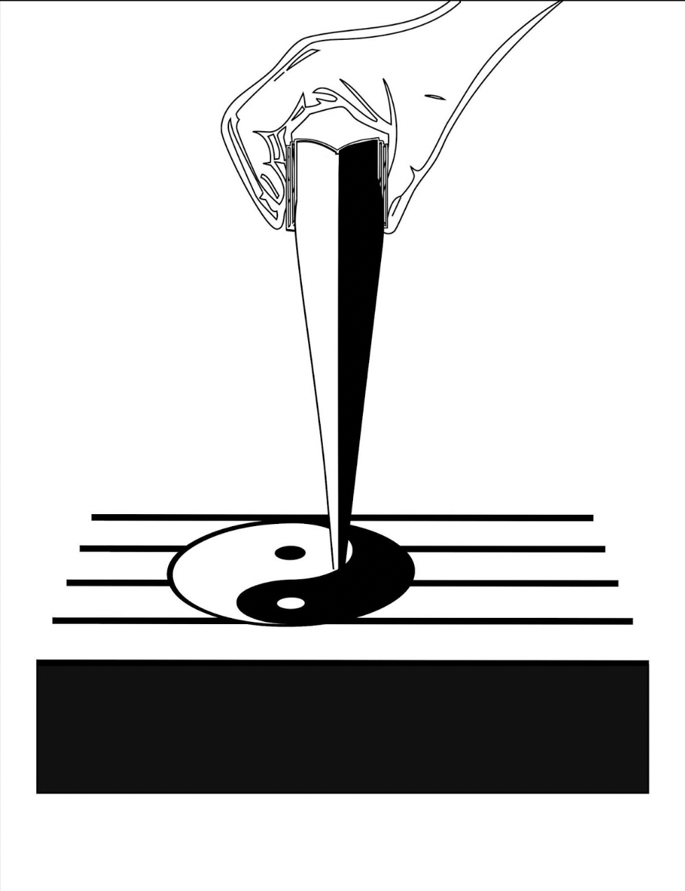
After the descending hand squeezes out the yin yang symbol onto the stave from the image of an open book, Kempton joins this theme of interconnected opposite forces with the development of language, which is where the runes come in, held in an unclosed fist. Eventually the book concludes with an open pair of hands, centered on reversed-out stave/keyboards and holding a point of light radiant against the blackness.
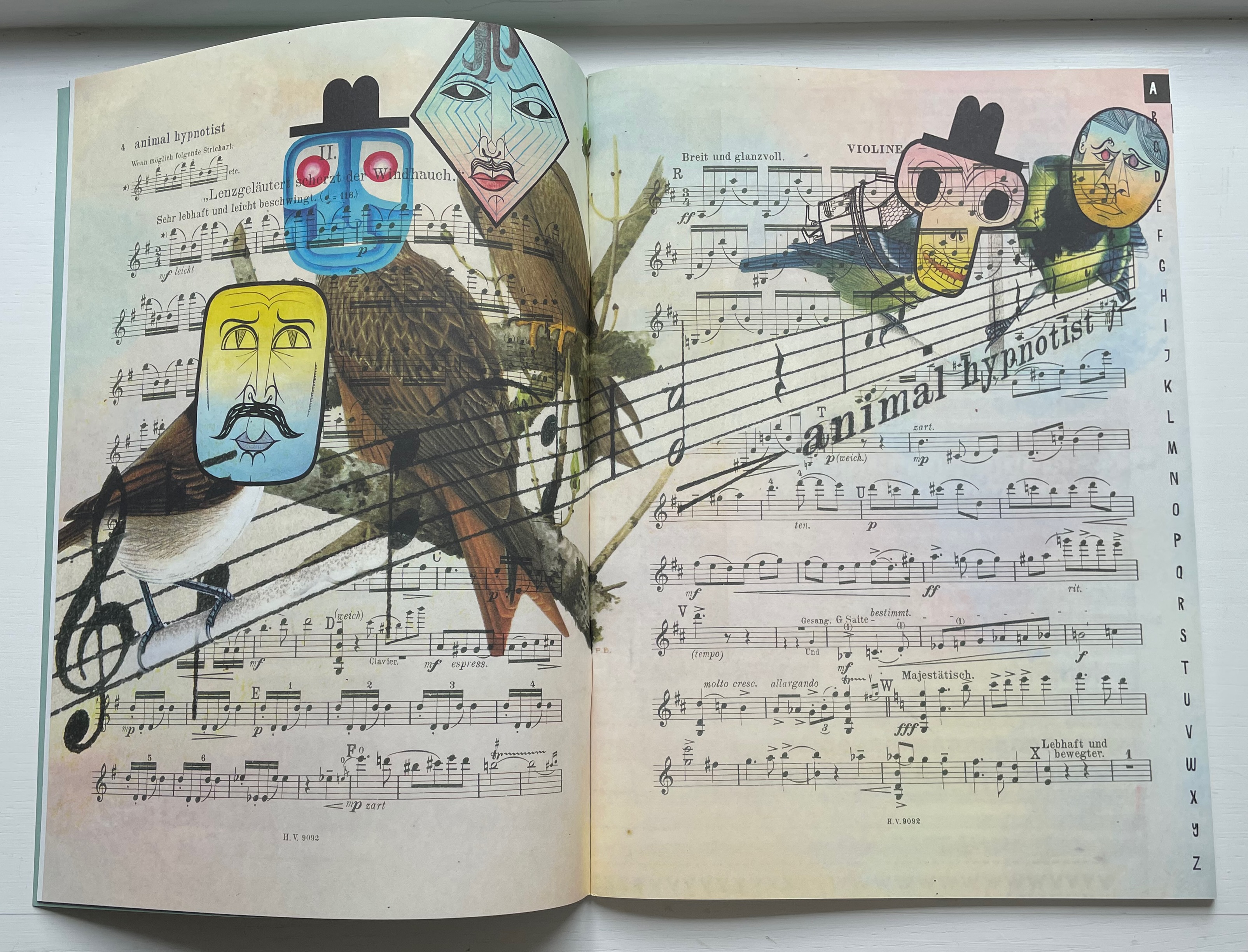
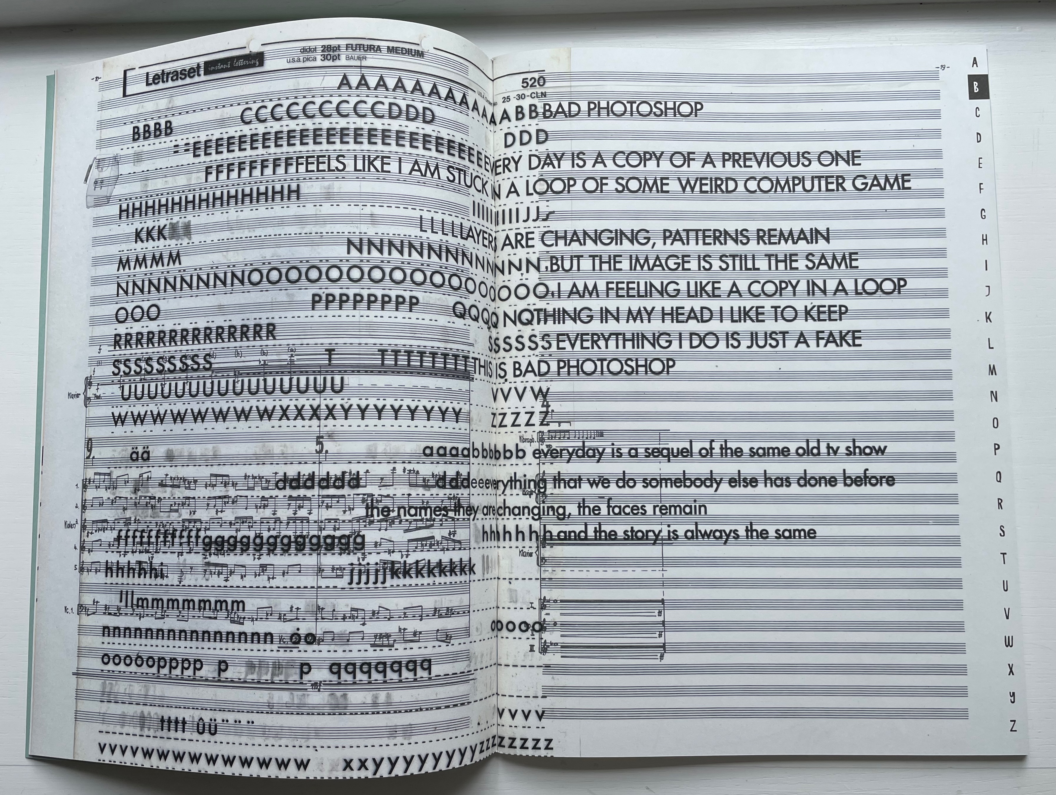
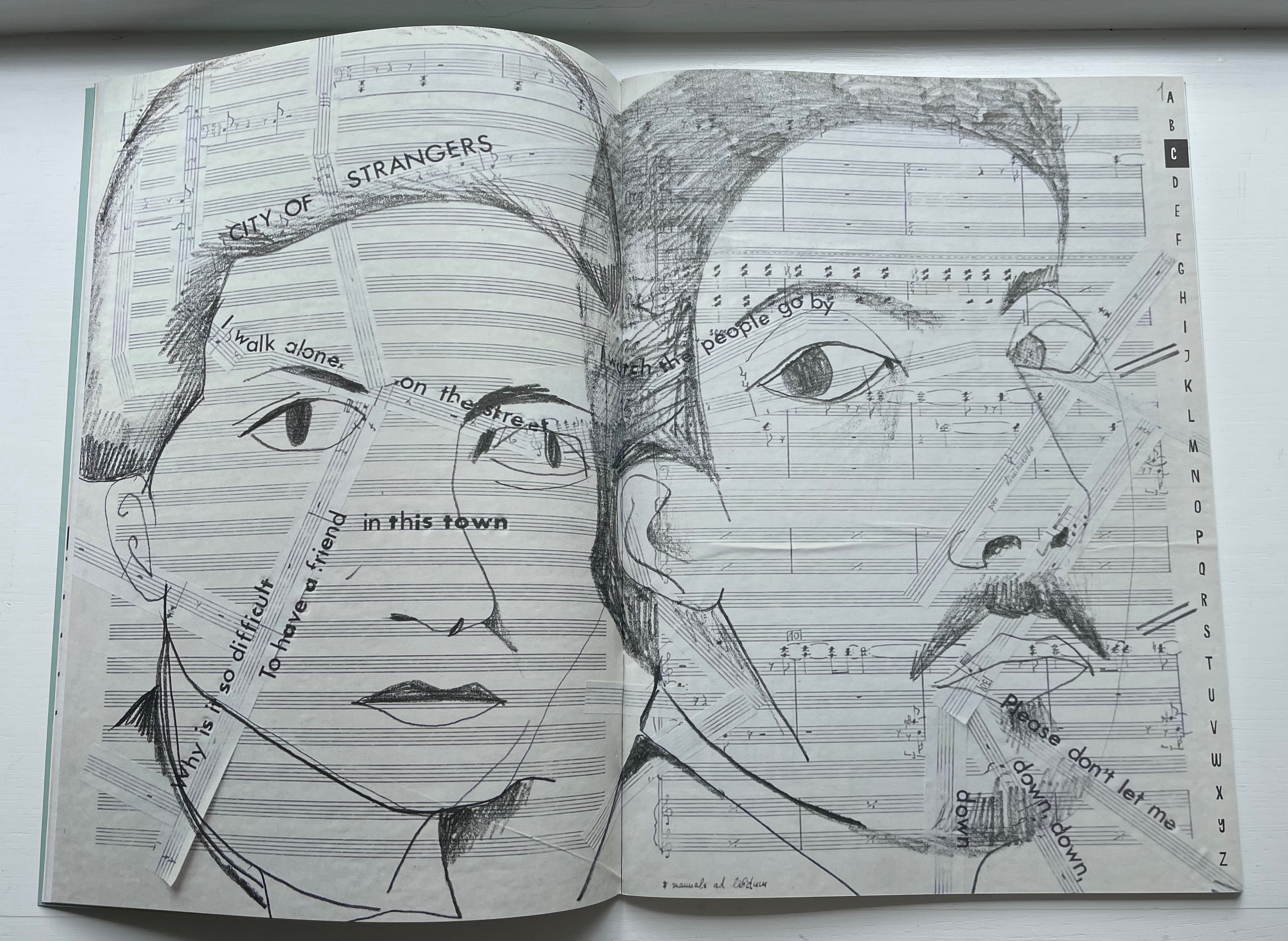
Jim Avignon’s website describes Neoangin: Das musikalische ABC (2014) as a “synaesthetic experiment, [on] which Lutz and Avignon have worked together again after almost 15 years, [in which] music, illustration and typography mix in the most cheerful and unsparing way”. For each letter of the alphabet, Avignon has written a song, presented on a double-page spread designed by Lutz and Avignon. The book and performance were prepared and premiered at Typo Berlin 2014.
Songs A through C are “Animal Hypnotist”, “Bad Photoshop” and “City of Strangers”.
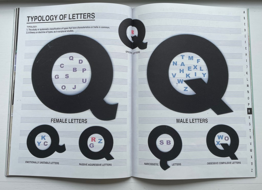
The song for Q is “Q Typology of Letters”. The tails of various Qs straddle female, male and epicene symbols and characters as well as emotional quotients and characters.
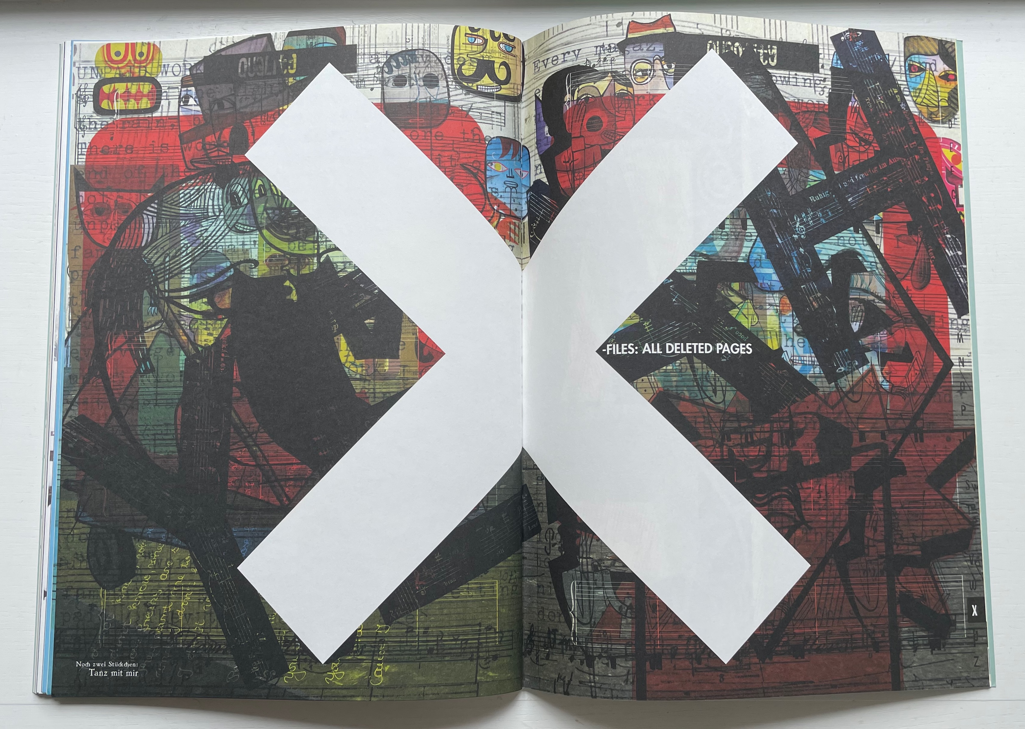
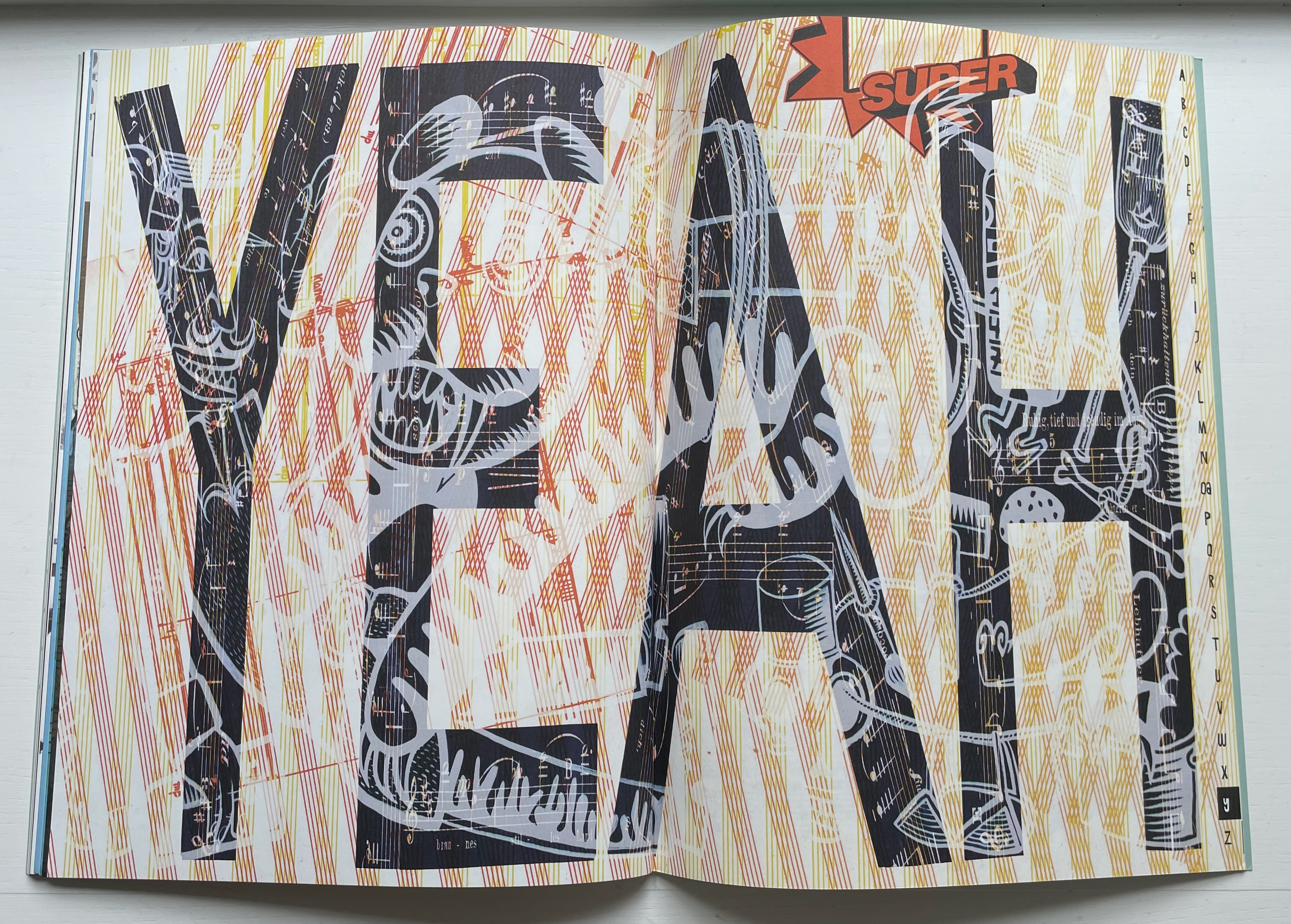
The songs for X, Y and Z are “X-Files: All Deleted Pages”, “Yeah” and “ZZZZZ”.
Synesthesia of the alphabet can be found elsewhere in the Books On Books Collection: Jean Holabird’s Vladimir Nabokov: AlphaBet in Color (2005) and Le Cadratin’s rendition of Rimbaud’s Voyelles (1871/1883/2012) under Jean-Renaud Dagon. And so can conjunctions of the alphabet and musical notation: Karl Kempton’s playground (2013-14) and Bernard Heidsieck’s Abécédaire n° 6 clef de sol : été 2007 (2015). But Avignon and Lutz have the claim to the only combination of the two and certainly when the musical performance is added.
“Jean Holabird“. 8 February 2022. Books On Books Collection.
“William Joyce“. 18 June 2021. Books On Books Collection. For the more innocent end of literary synesthesia where the cold gray-black of numbers gives way to an alphabet of jelly bean colors.
“Karl Kempton“. 29 October 2022. Books On Books Collection.
Clearly the alphabet has held an especially productive place in Jeremy Adler’s imagination.
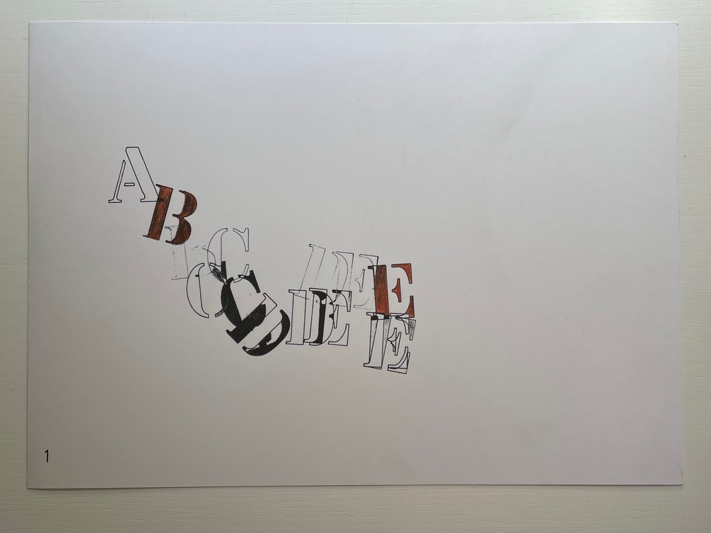
From 1972 to 1977, he issued A: an envelope magazine of visual poetry. His Alphabox (1973) was the first issue in the Writers Forum Object Series, founded by Bob Cobbing, and he named his Alphabox Press after it. Alphabox consisted of four sheets, printed on one side only, each folded six times and fixed at three edges in total, folding out concertina-style to show twenty-eight panels with one letter of the alphabet per panel. The following years brought Alphabet Music (1st ed., 1974), two alphabet-themed exhibitions (1975-77), Vowel Jubilee (1979), Alphabet (1980), Soapbox (1991) including “Alphabet Spaghetti”, and The Electric Alphabet/Elektrická Abeceda (1996) with Jiří Šindler. What makes most of these works — and particularly Alphabet Music — stand out is their synesthetic suggestion and calculated complexity.
The colophon to Alphabet Music, a separate folio accompanying seven loose folios, says, “Each sheet of Alphabet Music contains 15 letters, either whole, or split up into fragments, except the last, where the sequence breaks off… For a full reading, the sheets should be laid out in sequence… Colour denotes key.”
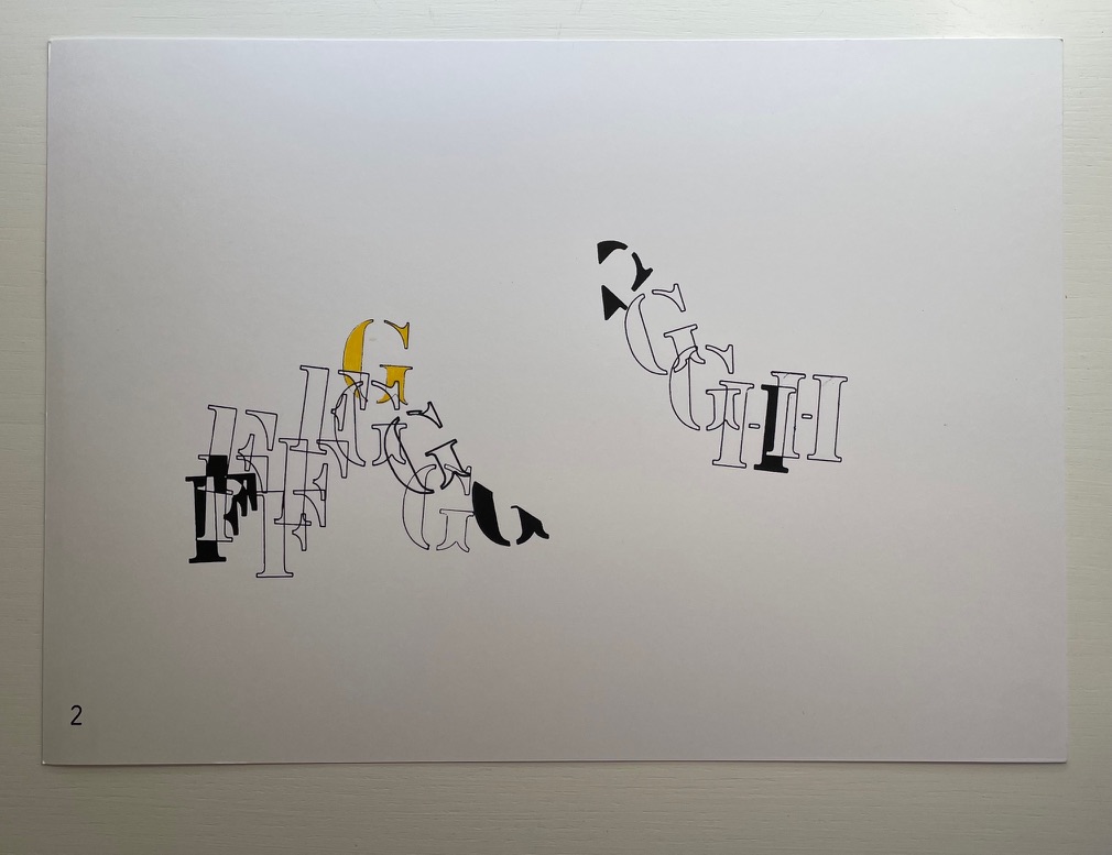
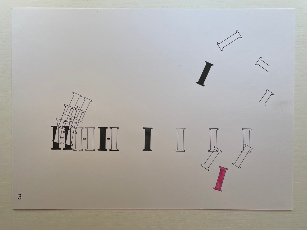
In Oulipo-esque fashion,that limit appears to be determined by the sum of the first five letters’ numerical position in the alphabet (1+2+3+4+5 = 15, so sheet one has 1 A, 2Bs, 3Cs, 4Ds and 5Es). Sheet two, likewise, has 6Fs, 7 Gs, and 2Hs to make 15 letters. Sheet three continues with the remaining 6 Hs for this eighth letter in the alphabet plus 9 Is for the ninth letter, adding up to 15 letters. Sheet four includes 10 Js and 5 letter Ks, and sheet five continues with the remaining 6 Ks for the eleventh letter plus only 9Ls of the twelfth letter, leaving sheet six to pick up the remaining 3 Ls and 12 Ms of the thirteenth letter. Contrary to the explanation, the seventh and last sheet doesn’t break off the sequence; its 1 M and presumably 14 fractured Ns add up to 15.
But why does the music end there? The letters tumble, leap and cascade like musical notes or expressions on the page. Why not additional sheets? Having come this far with the constraint of 15, perhaps Adler worked out that no sum from any summative series from the start of the alphabet could provide a constraint that would work out “evenly” in the end. There would always be leftover or remainder Zs. Alphabet Music has always to be unfinishable — much like the textual expressions the alphabet can yield.
The first edition of Alphabet Music was published in 1974 in an edition of 130 copies by Adler’s Alphabox Press (London) and was first performed with Paul Burwell, Bob Cobbing, and Bill Griffiths at the Poetry Festival in Münster 1979. Extracts first appeared in Kroklok 3 (December 1972), Poetry Review 63:3 (Autumn 1972), and Typewriter (NY) 3 (1973). Although online searching has not uncovered any recording of this performance, or instructions for performing Alphabet Music, perhaps an impression can be gleaned from this recording of Alphabox. Given the title of Alphabet Music, the visual impression it makes, its expressed intent and its reported performance, Alphabet Music would seem an exemplar of Dick Higgins’ definition of an intermedial work: “a conceptual fusion of scenario, visuality and, often enough, audio elements”.
“Ernest Fraenkel“. 30 October 2021. Books On Books Collection. Jeremy Adler’s uncle was Ernest Fraenkel, author of Les Dessins Trans-conscients de Stéphane Mallarmé à propos de la Typographie de Un Coup de Dés(1960), also in this collection.
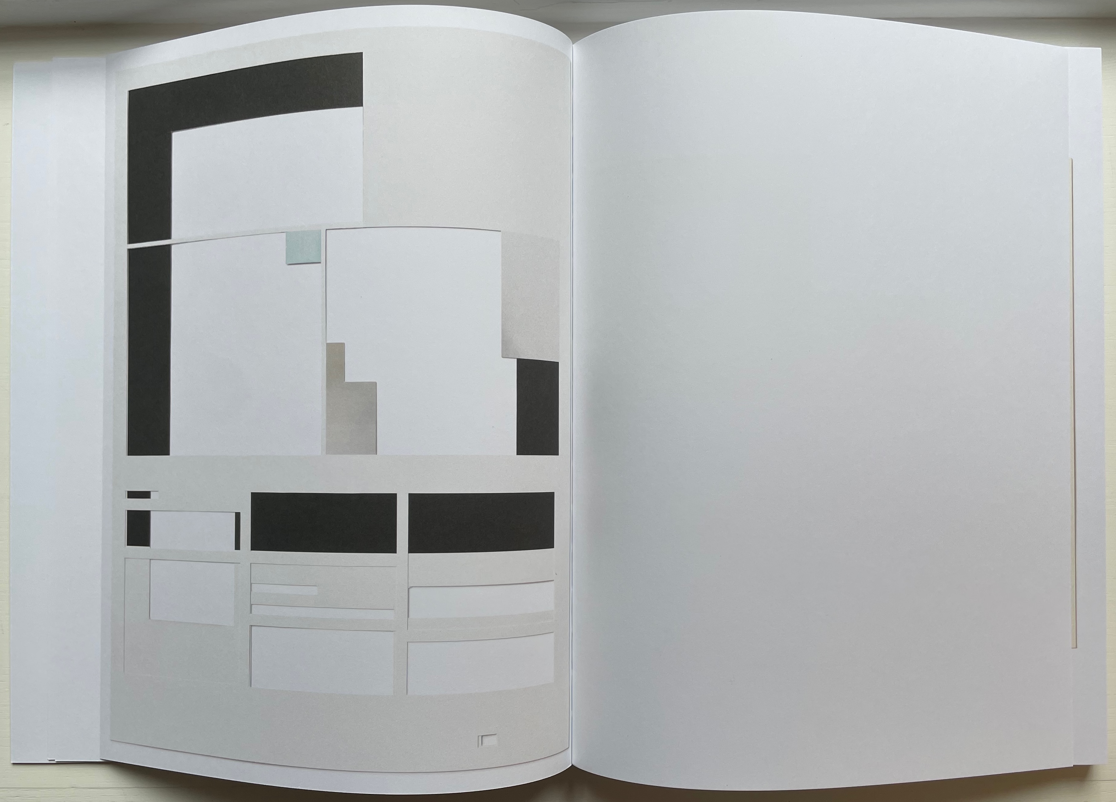
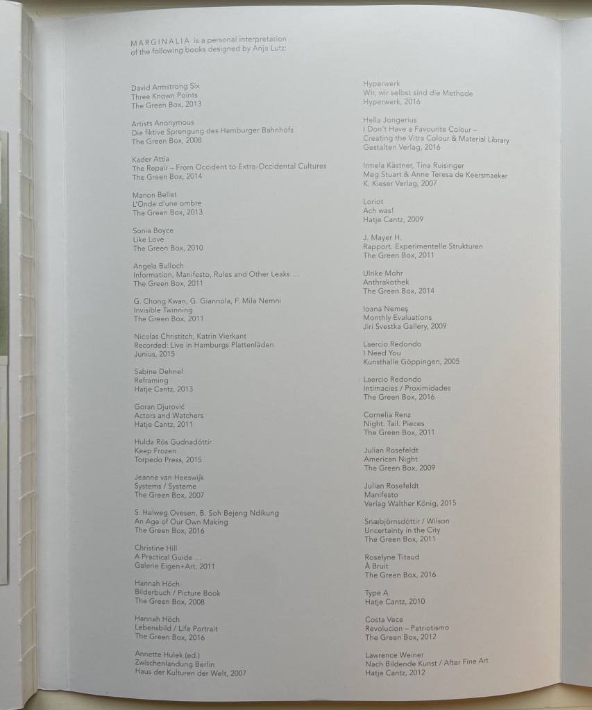
Marginalia (2017) Anja Lutz Open back sewn spine with dust jacket 245 x 330 mm. 112 pages. Acquired from The Greenbox Press, 3 August 2022. Photos: Books On Books Collection. Displayed with permission of the artist.
In 1964, the Fluxus artist George Brecht created a work called Book, which Michael Werner published in 1972 and which Moritz Küng reintroduced in facsimile in 2017. Also sometimes called This is the cover of the book, it proceeds to label each of the otherwise blank pages with its structural label: “These are the end pages of the book”; “This is the page before the title page of the book that tells you what the title is or was, or is going to be”; “This is the title page”; “This is the other side of the title page …” and so on. Like most self-referential or tautological artists’ books, it has its facetiousness. One page is labeled “This is the page with text on it”; another, “This the page that rustles when you turn it (maybe)”. Individual pages and perhaps the whole will lead to pauses to reflect on the thing being defined by labels and self-reference and how the mental funny-bone is being tickled. In the end, the structure or skeleton of the book as a thing — one thing — has been defined by the naming of parts.
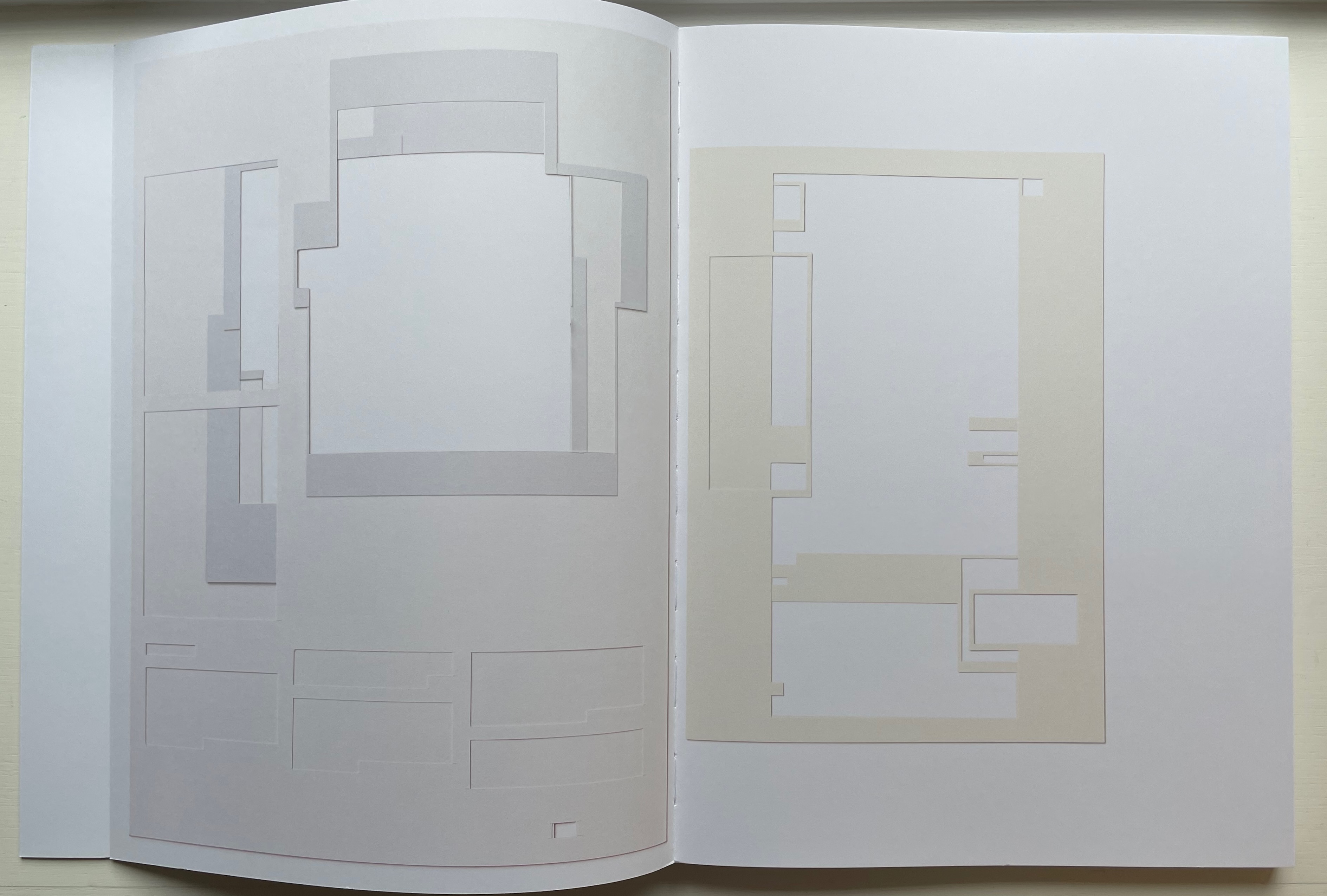
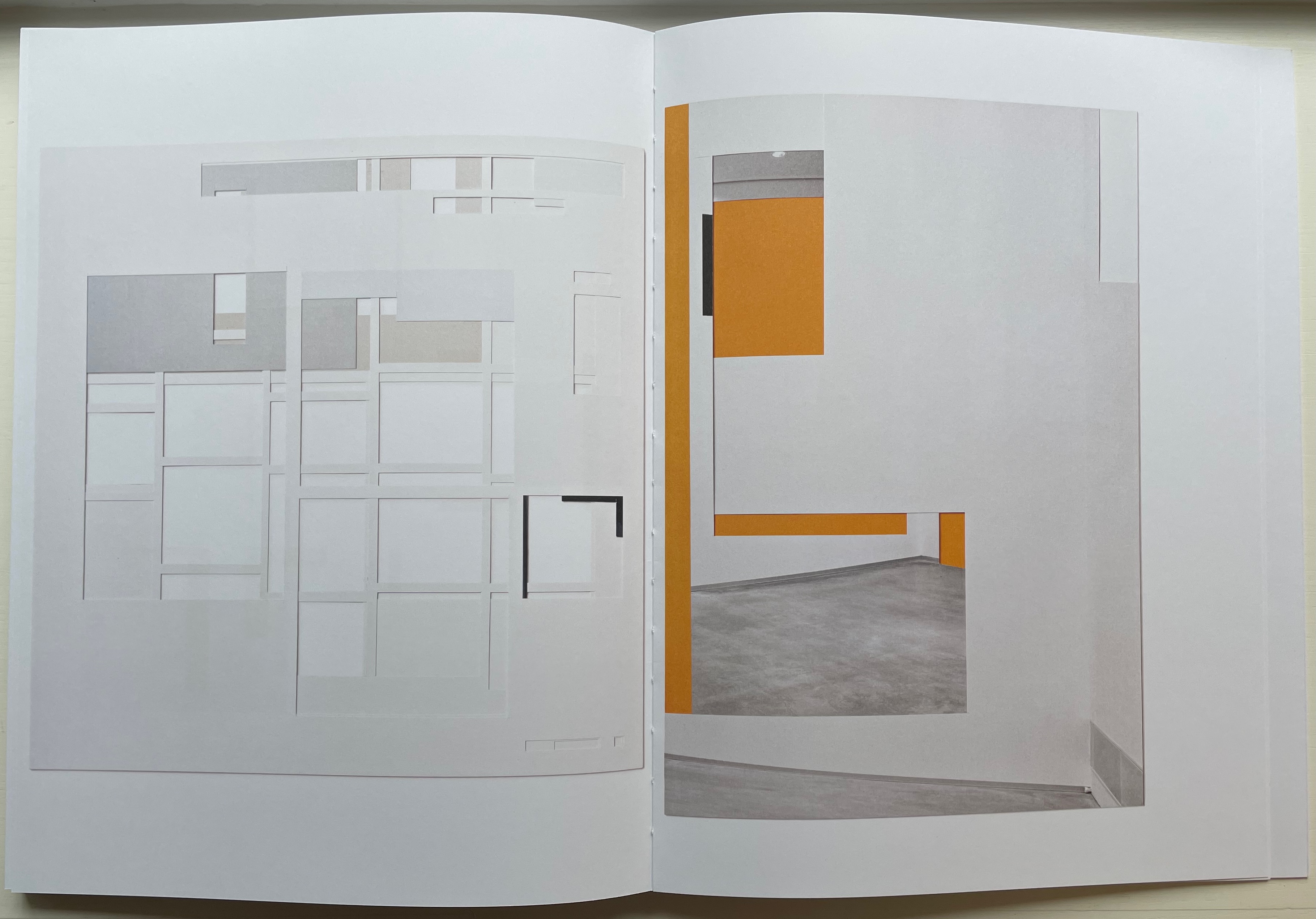
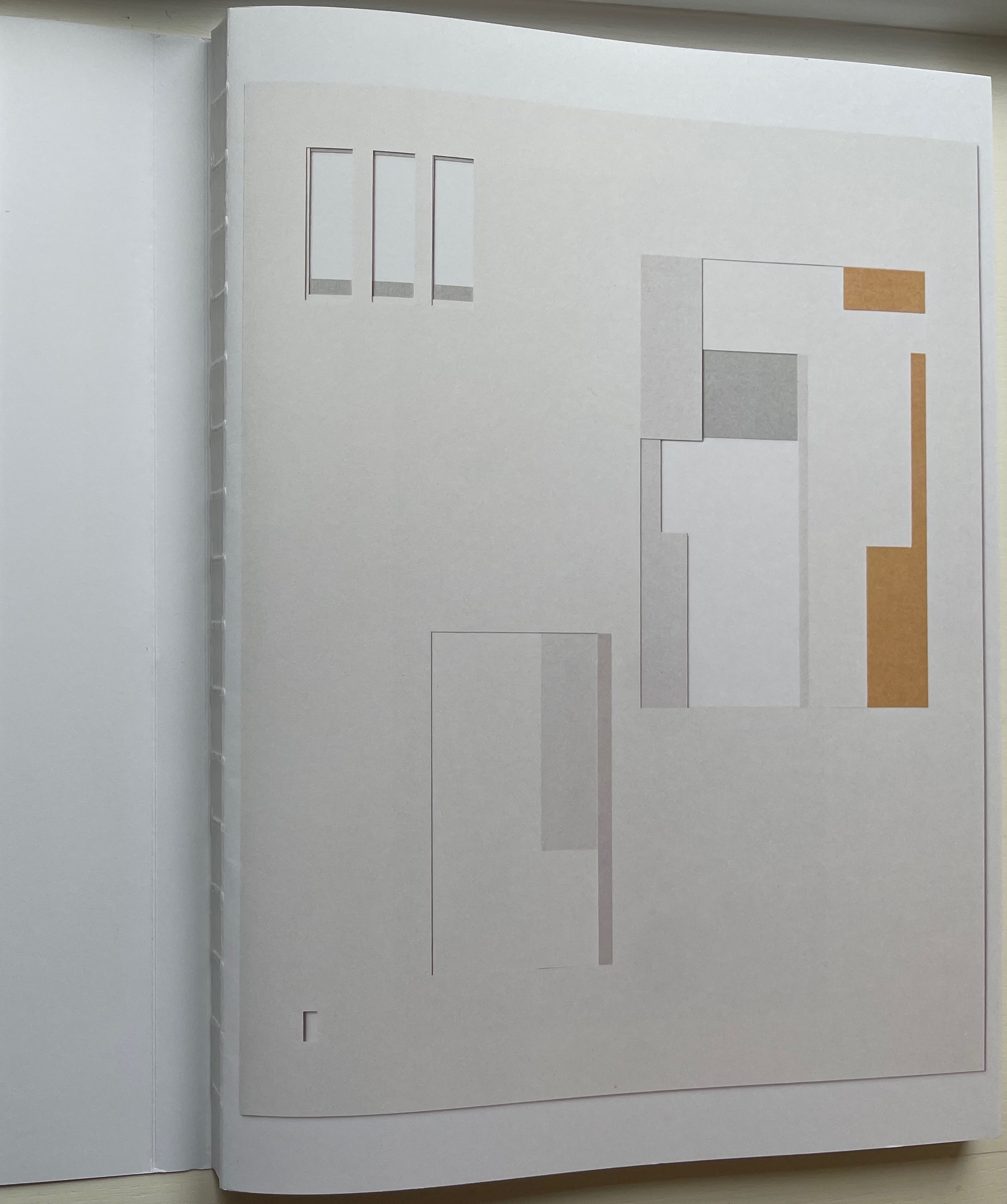
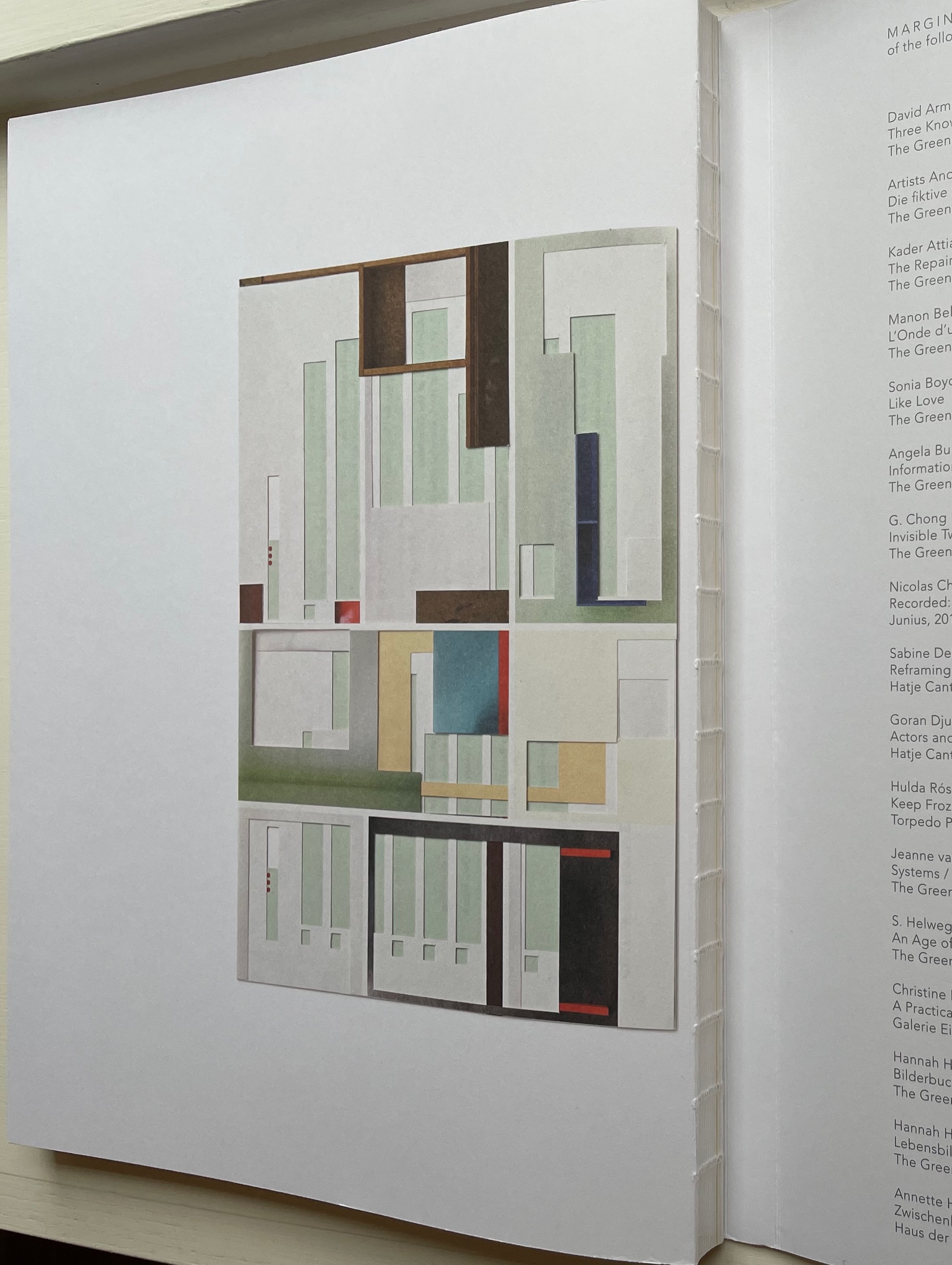
Anja Lutz ‘s Marginalia proceeds differently. Her pages are the pages without text on them — or images, running heads, page numbers, etc. Lutz has taken thirty-four of the books she has designed under her imprint The Greenbox Press and carefully excised from each the text and images layer by layer until the empty spaces define the blank spaces that previously supported the content. But this does not result in the definition of a generic book structure or skeleton.
While Lutz’s technique might be similar to that of other book artists who have altered books by excavating or strip mining them, she is not offering precisely the same invitation that, say, Brian Dettmer offers with Tristram Shandy (2014). Dettmer, too, has excised layers away from an underlying work — the Folio Society’s illustrated edition of Laurence Sterne’s The Life and Opinions of Tristram Shandy, Gentleman (1759-67). While both works invite us to think about the book as thing (or the guts and structure of this thing the book), Dettmer is inviting us to look into the specific underlying work in a different way or consider how the new shape is his response to the underlying work. Sterne’s novel remains present, and we can peer into its crevices and nooks to pick out words, sentences and images — to look into the novel in a new way. Lutz’s surgery does not leave enough of the underlying work to permit a “look in”. We look through instead. Even though she provides a list of the designed books she used, they are not present as Tristram Shandy is.
Each of the books with which Lutz start is, as she puts it, “unique in its choice of format, material, layout, composition, and rhythm”. Despite her nod and the listing of books, this does not mean that she wants us to respond to the results of her surgery with “before and after” comparisons. Rather she invites us to look only at the newly created works. In the end, each has its own structure or skeleton — the struts or bones of the marginal space defined by the negative space of removed content.
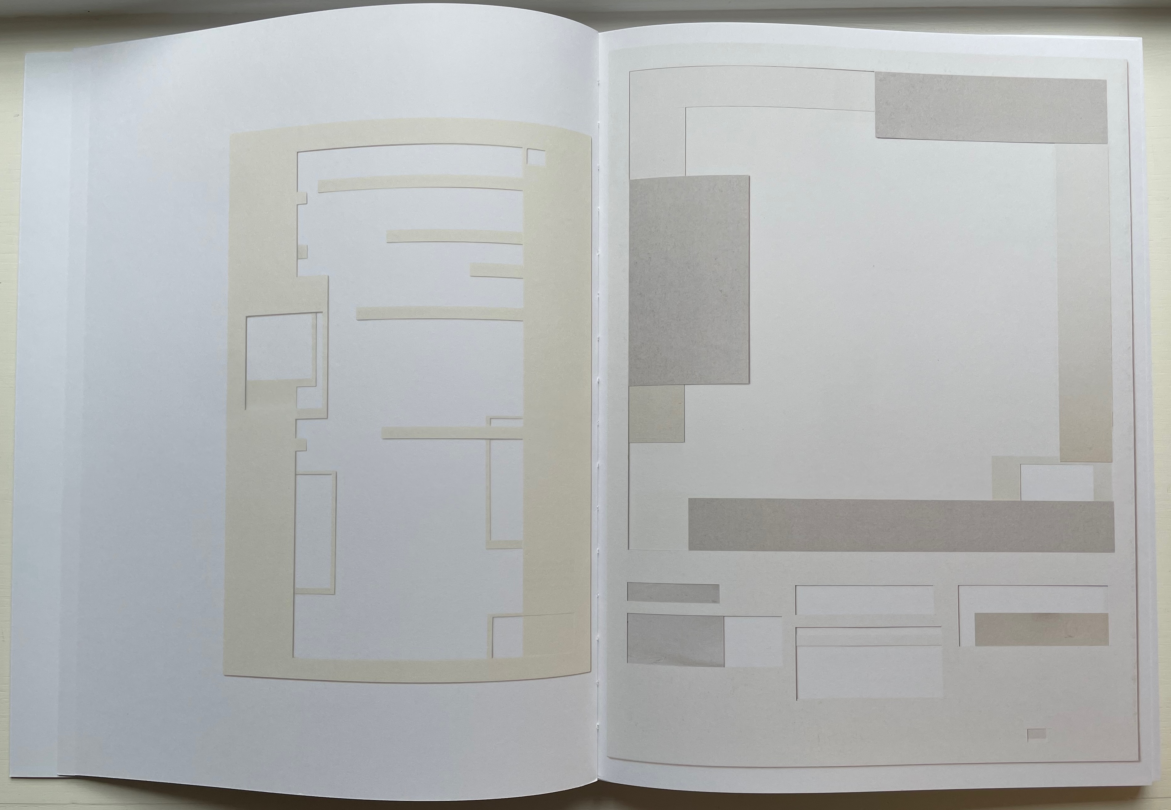
But the means of that invitation is this codex entitled Marginalia. With its dust-jacket-like wrapper around the exposed sewn spine, is Marginalia being offered as an artist’s book itself or a catalogue with artist’s book-like features? Beautifully produced, Marginalia is nevertheless not a limited edition. Besides the book, a limited number of collages shown in it are available, each framed floating between two panes of glass. They certainly qualify as works of sculptural book art, and if the artist were to turn her scalpel to copies of Marginalia itself, they too would surely qualify as artist’s books. A collection that held one of the collages, a copy of Marginalia and an altered copy of it would have won a trifecta.
Front and back of the book block, showing the exposed spine.
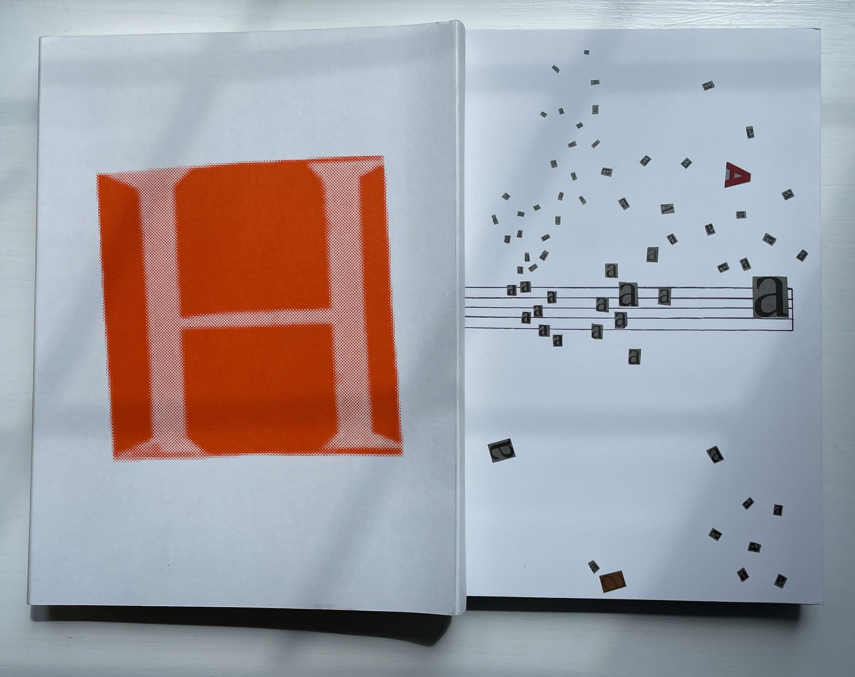
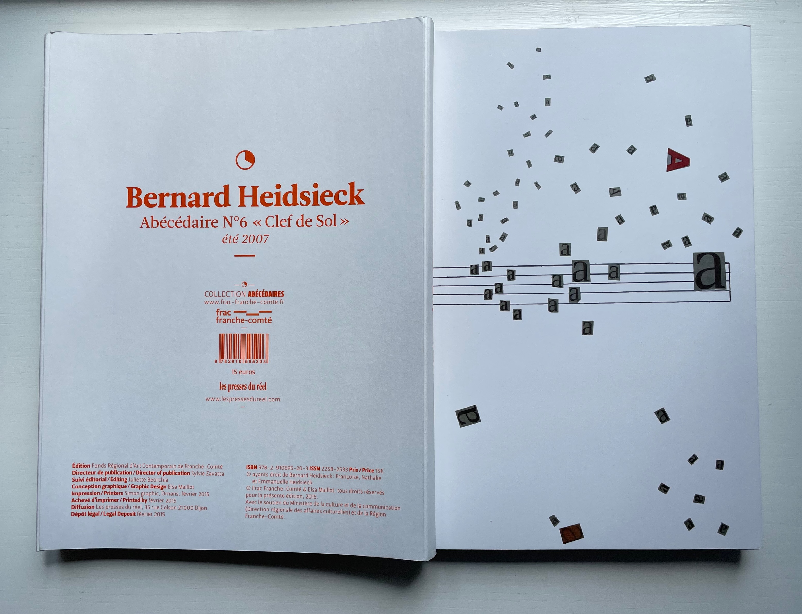
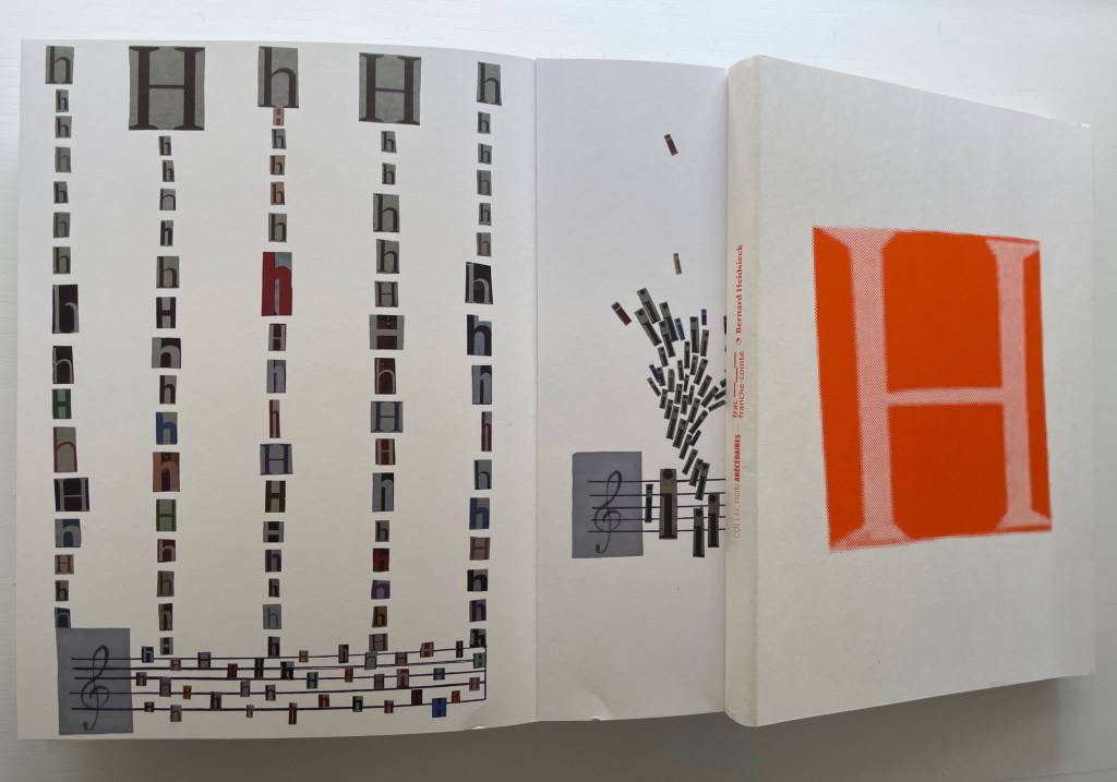
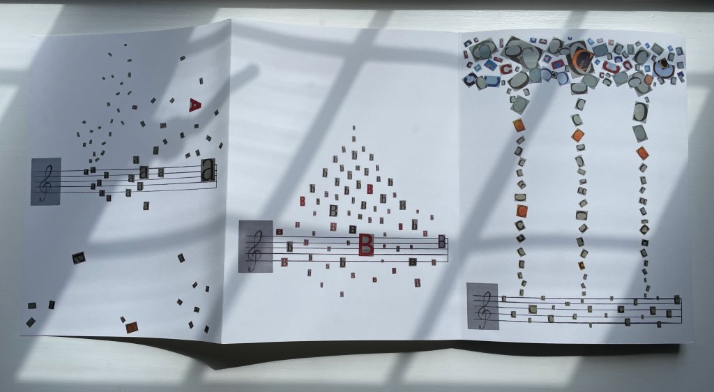
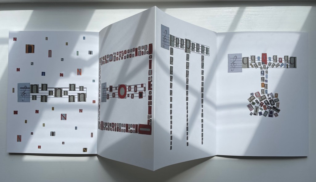
In French, wouldn’t an abecedary in the key of G (the fifth note “sol” in the Do-Re-Mi song) have to be associated with the summer (été) and sun (soleil)? That may be the nearest to the fixed association of letters with objects you will find in this work by one of the 1950s creators of Sound Poetry (Poésie sonore).
The collage mixes uppercase and lowercase, serif and sans serif and numerous families of type.
Like beauty and a Rohrshach test, any significance to the collage of each letter is left to the eye of the beholder. Or the ear. Do the positions of the main A, B and C suggest the opening notes of the ABC song?
The confetti-like N’s and n’s look like stemless notes being drawn up and down the staves. The O in the center of the staves surrounded by a rectangle of O’s resembles the sound hole in a cigar box guitar. The P’s are dripping in three dwindling streams of p’s. The Q’s and q’s seem bottled up and rising to spout onto the staves.
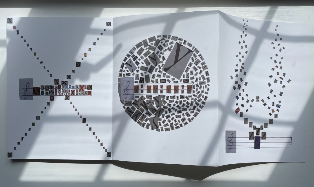
The X’s make an X, or perhaps the struts of a drum with a bass drum stick tucked in. Y forms a mosaic banjo. While Z looks like a bird of prey with its wings at the peak of an upbeat, readied for a powerful downbeat and lift off, it could the horned helmet of a nineteenth-century opera soprano.
Other artists in the collection have used the musical stave in their alphabet-related works: Karl Kempton and Jim Avignon & Anja Lutz. But Heidsieck uses the stave like a musical note and the leporello structure like a musical stave itself. Across its panels, the image of the stave sometimes keeps to the same position, sometimes descends or ascends across two or more panels — like musical notes. Sometimes it supports the letters, sometimes it suspends them, sometimes it embraces them, sometimes it embeds itself among them. The letters defy any expectation of behavior of notes fixed to the stave, but they are never independent of it. Rather than asserting synesthesia as Rimbaud or Nabokov do with words, Heidsieck’s work enacts it by conflating the structures and elements of musical notation, the alphabet, the accordion book and painting.