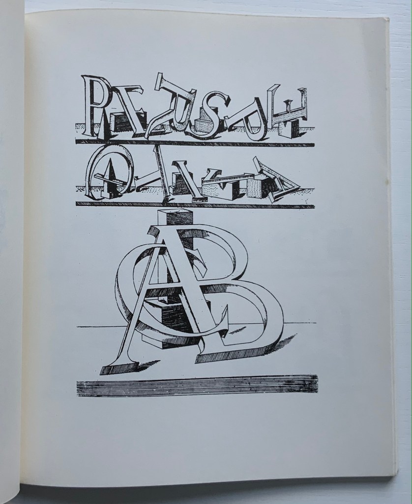
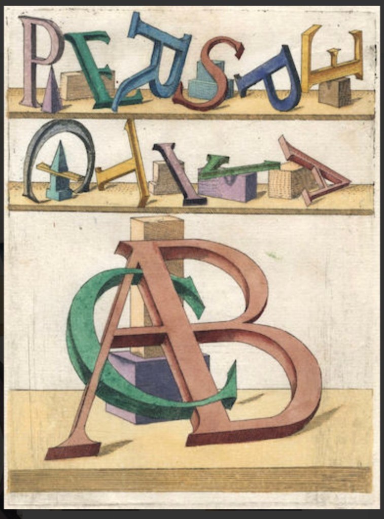
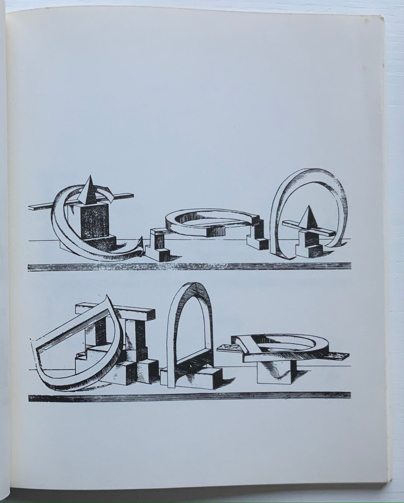
Perspectiva Literaria (1557/1972) Johannes Lencker, Ed. Eberhard Fiebig Perfect bound paperback. H235 x W197 mm. 60 unnumbered pages. Acquired from Antiquariat Bernard Richter, 11 November 2021. Photo: Books On Books Collection.
About a dozen institutions hold copies of the 1567 original from which this 1972 facsimile was made. They list Johannes (or Hans) Lencker (German, active by 1551–died 1585) as the author and Matthias Zündt (German, probably ca. 1498–1572) as the artist, meaning engraver. Lencker’s hand lies behind the book’s images and Perspektivische Buchstaben (“Perspectival Letters“), a pen and brown ink and wash print auctioned in 2019.
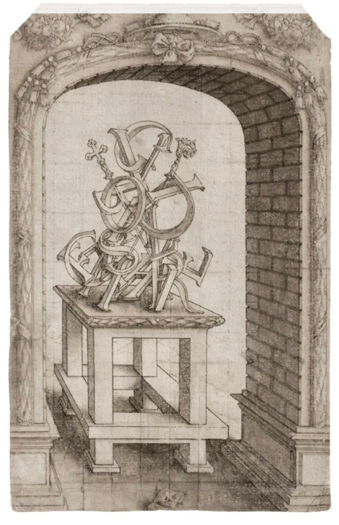
Lencker and Zündt’s achievements with perspective, letters and geometric shapes stand on the shoulders of Leonardo da Vinci (ca. 1490) and Albrecht Dürer (1525), just as theirs stand on those of the rediscoverers of linear perspective: Filippo Brunelleschi (1415), Leon Battista Alberti (1435) and Piero della Francesco (ca.1460). Lencker’s originality lay in designing his letters as solids leaning against geometrical solids and resting on a horizontal shelf. The shelf’s thick, grainy fore edge and the thin parallel line above it, suggesting the shelf’s intersection with a blank wall, set up a field of depth in which the geometrical models’ mass and shape set off the three-dimensionality of the foreshortened letters balanced on and against them. Some letters’ feet and edges seem to enter the viewer’s space, an effect enhanced by a hand-colored version of the original. Sadly the facsimile contains no examples of the hand-colored images.
Perspectiva literaria. Das ist ein clerliche fürreyssung wie man alle Buchstaben des gantzen Alphabets… in die Perspectif einer flachen Ebnen bringen mag (1567) After drawings by Hans Lencker, engraved by Matthias Zündt Limp binding in vellum. H307 x W200 mm. 21 of 22 plates. From Bonhams auction, 19 August 2020.
From 1972 facsimile.
These are not letters for calligraphic or typographic use. They are objects the viewer wants to touch, pick up and play with — something that can also be found in works by Takenobu Igarashi, Ji Lee, Peter Vandermark and Johnson Banks.
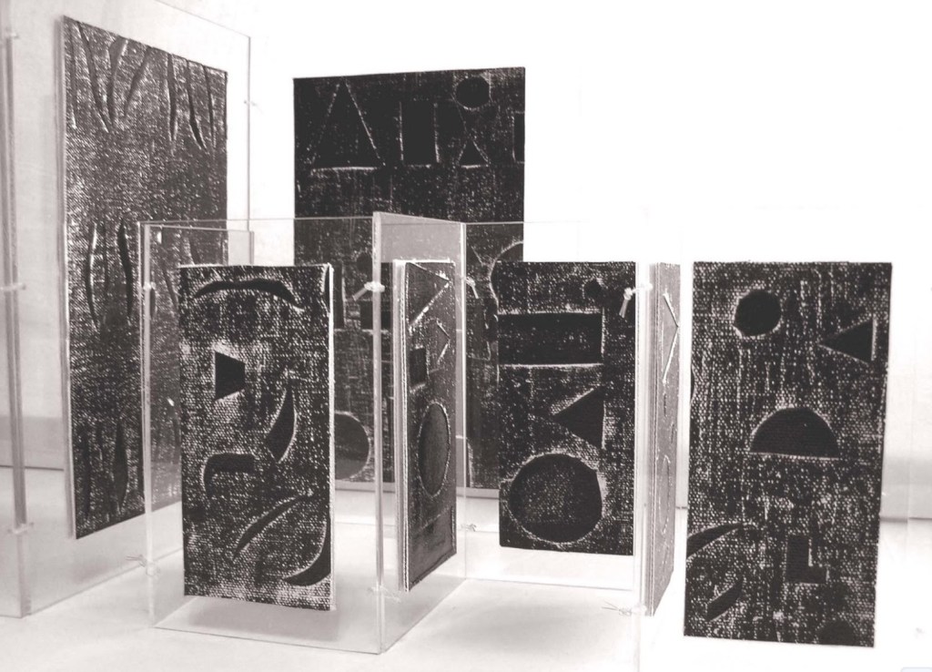
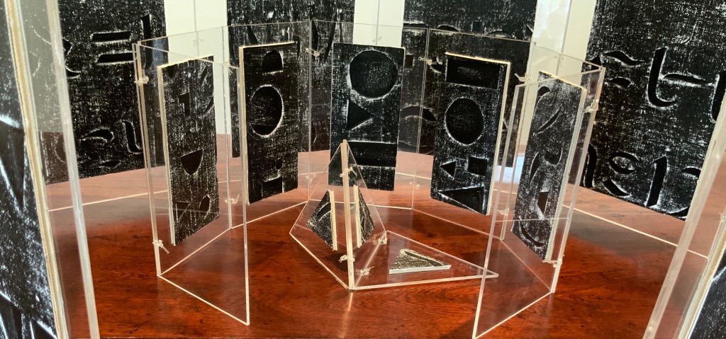
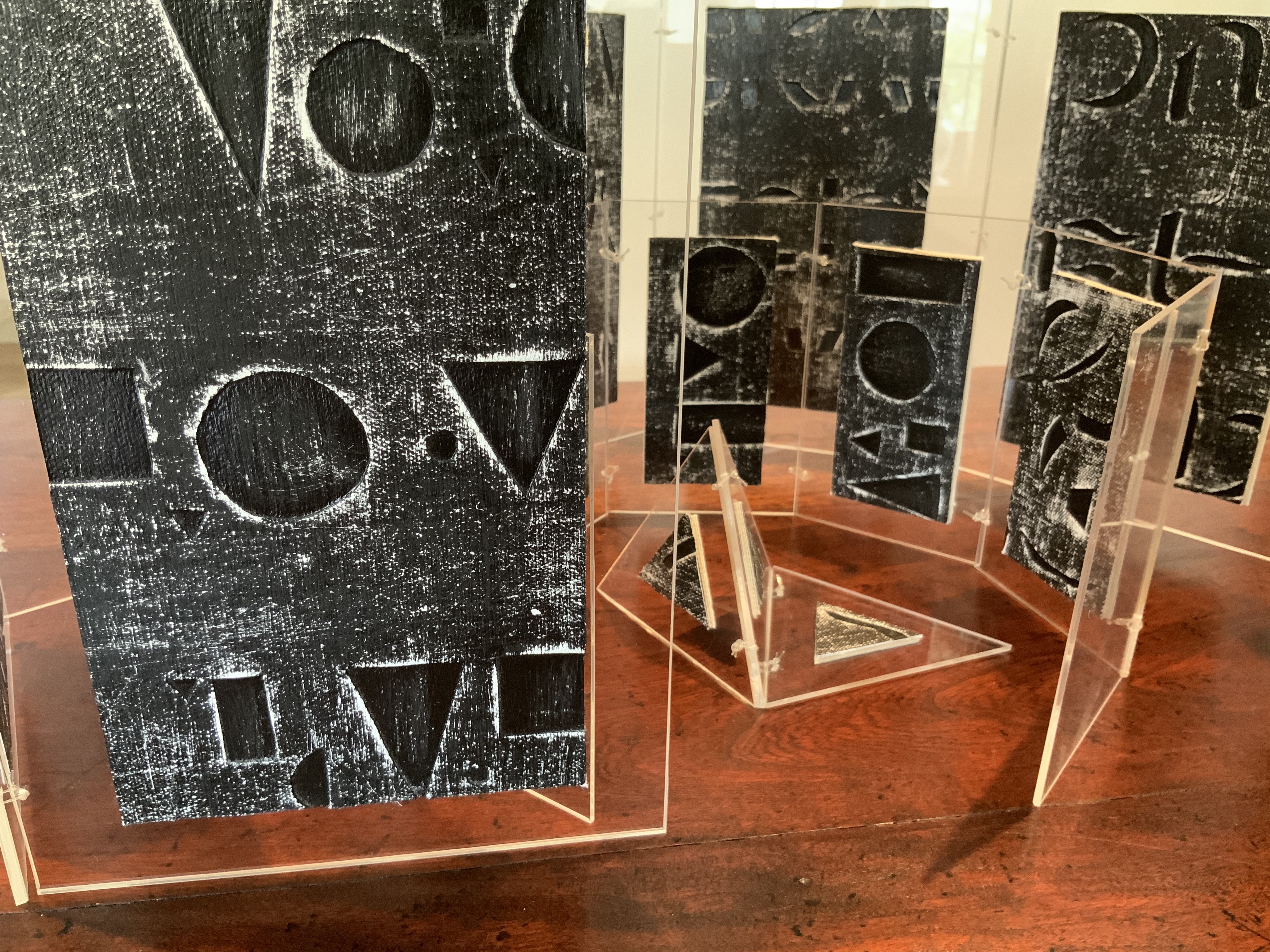
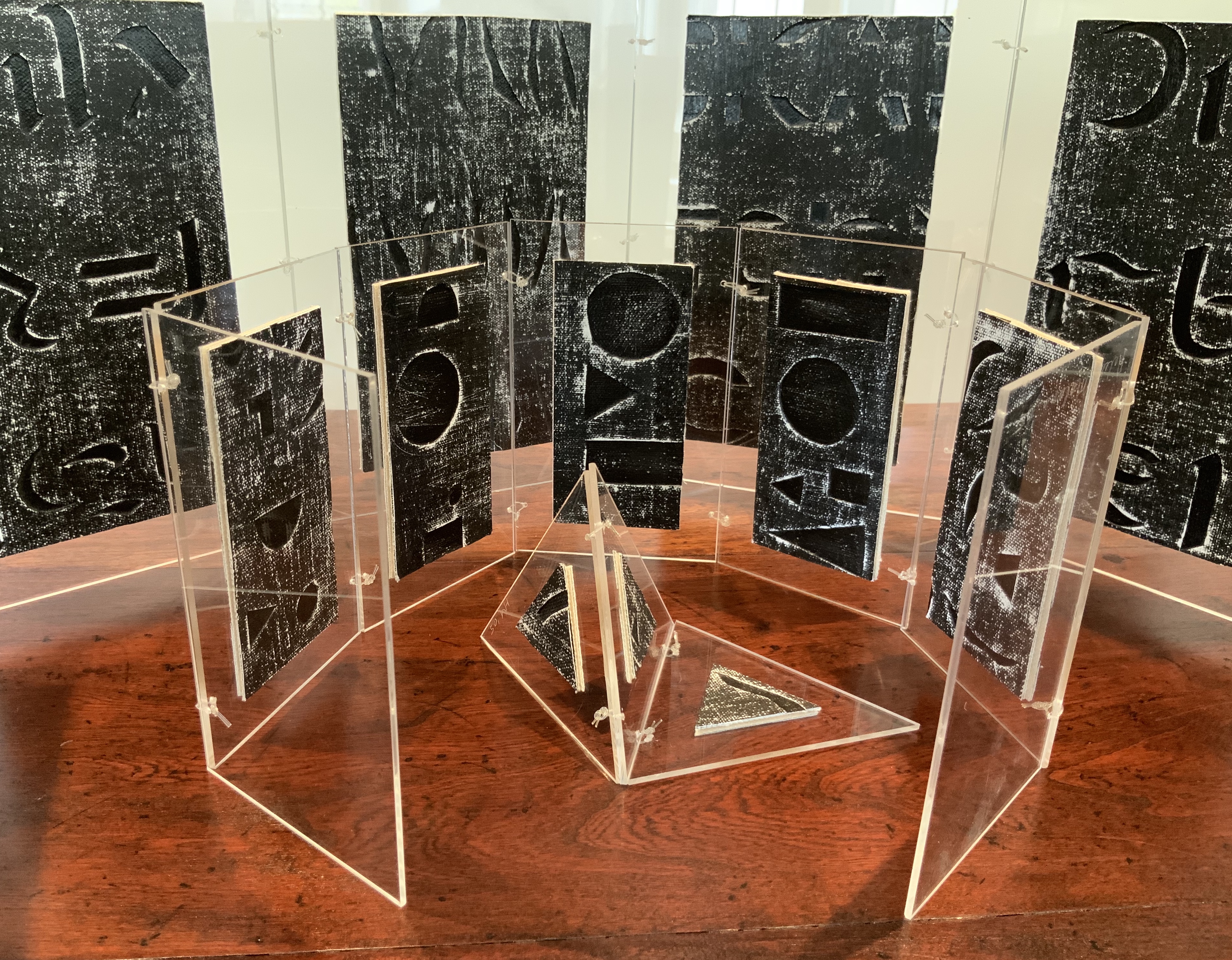
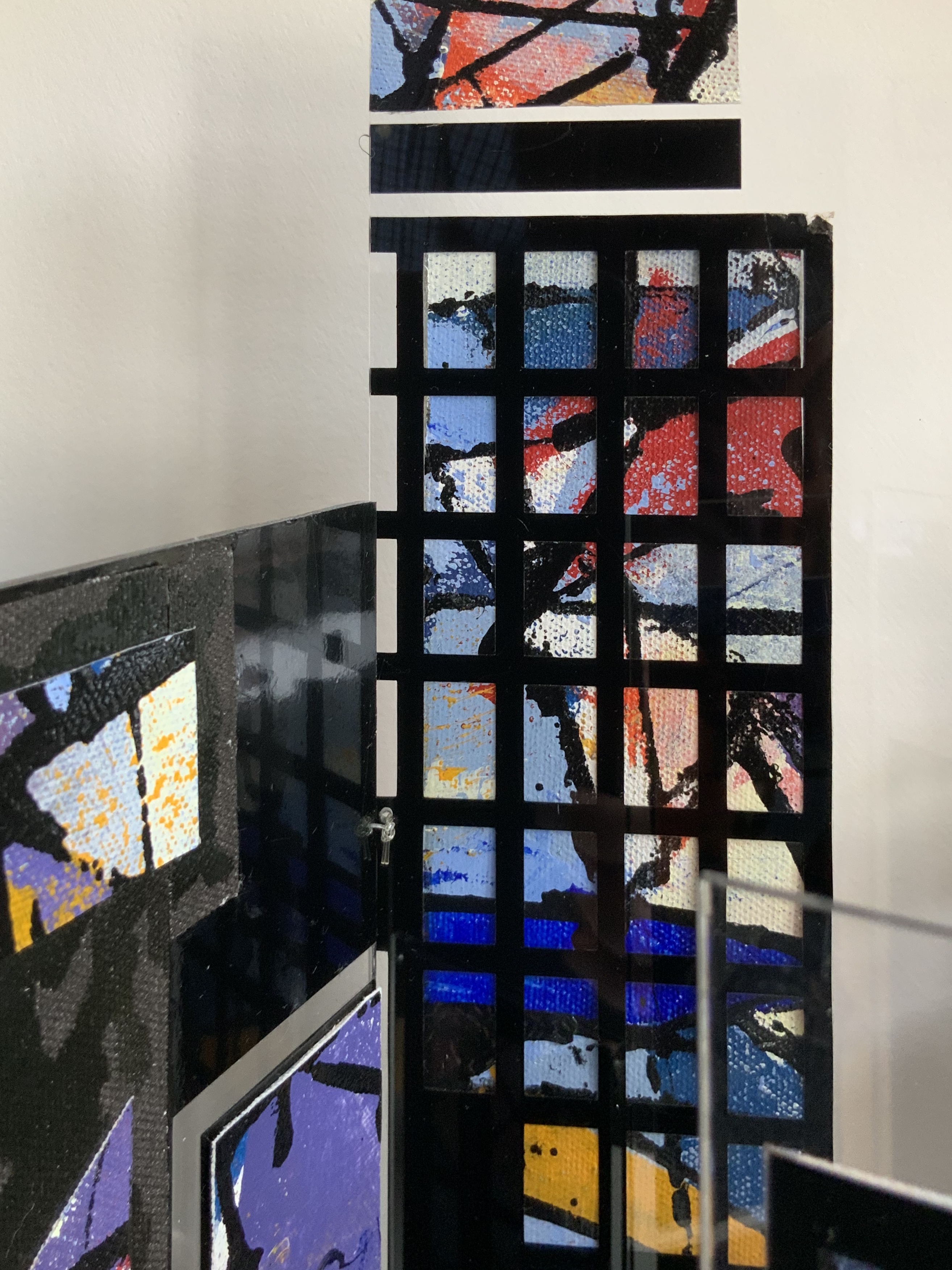
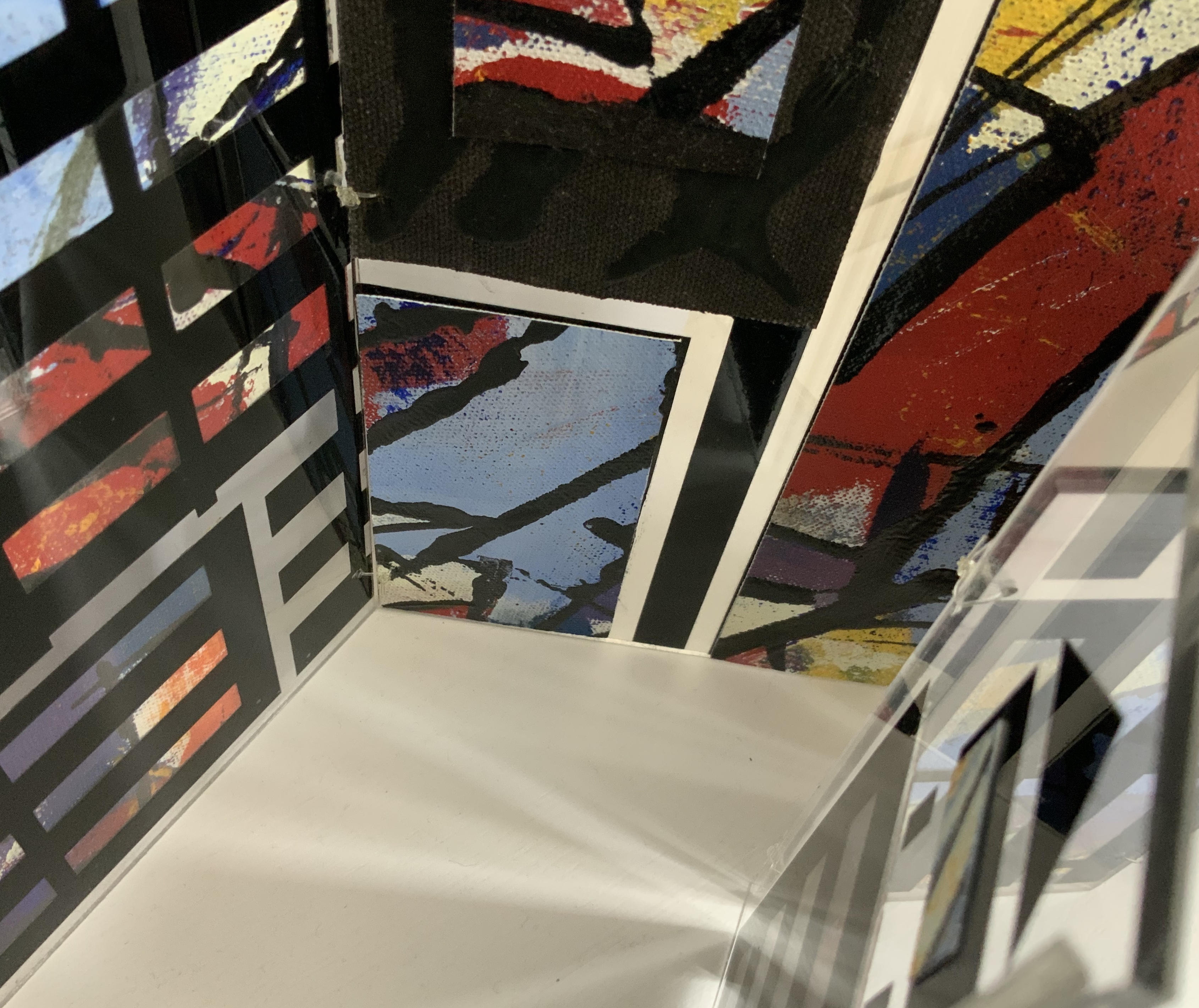
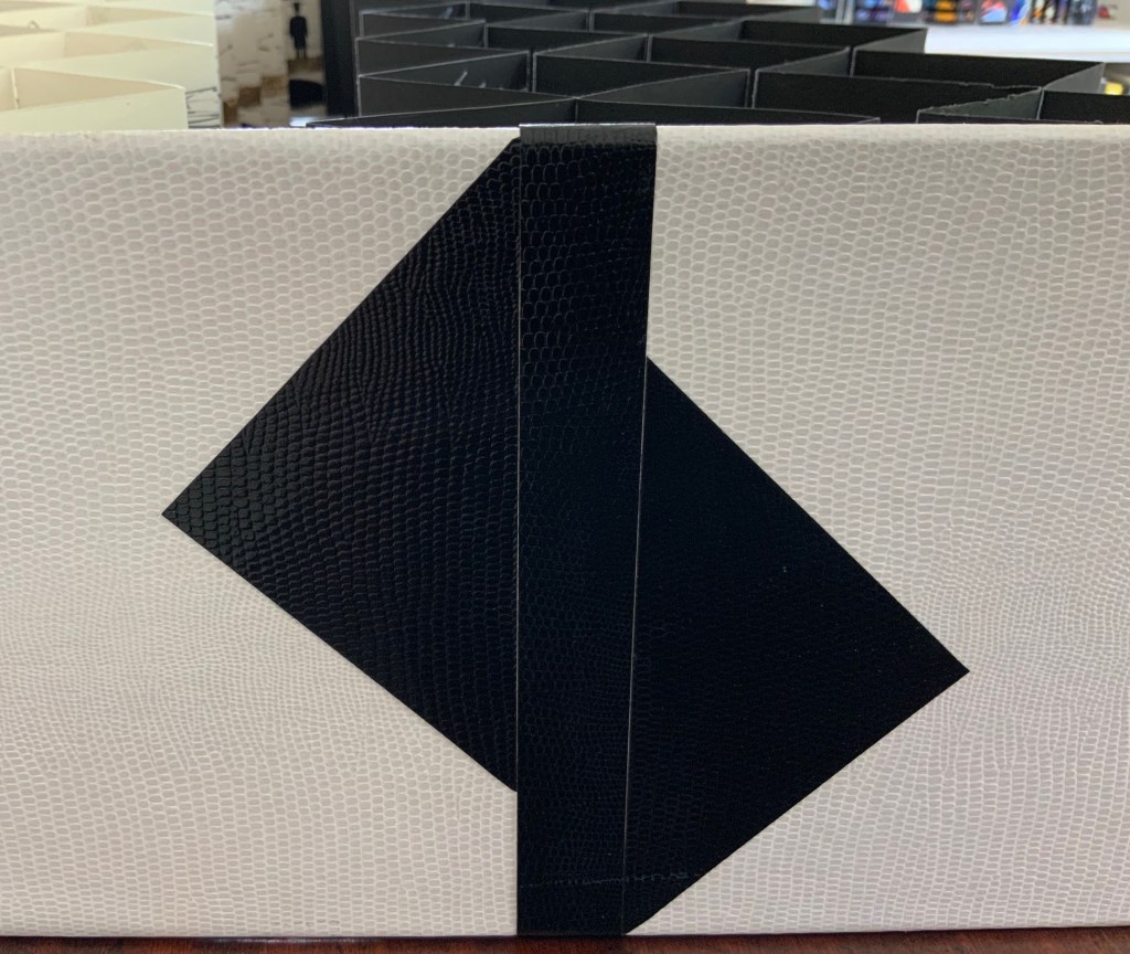
Box containing three books: two concertina books of different sizes and one tetrahedron shape of three pages. Two layered canvases painted with acrylic paint mounted on both sides of Perspex pages in Perspex box. Box: H230 x W160 x D80 mm. Unique edition. Acquired from the artist, 2 July 2020. Photos above: Courtesy of the artist. Photos below: Books On Books Collection.
Artist’s description:
Referencing ancient writing systems, hieroglyphs and engravings, this book is an investigation of sign systems and shared cultural knowledge. Fragmented coded images derived from familiar letterforms lie beneath the surface of the canvas and although visible remain undecipherable and incomprehensible.
The alphabet has traditionally served as calligraphic and typographic seed for book art, perhaps with roots of expression in illuminated letters, the Kabbalah, tomes on penmanship and calligraphy and typography specimen books. In its material and technique, Alphabetic Codes has a rough and smooth tactility; the former pointing to ancient, haptic forms, the latter to current, screen-generated forms. It enriches the subset of alphabet books and abecedaries in the Books On Books Collection.
Exhibitions:
Books 05 Image as Text as Image, Noosa Regional Gallery 9 September – 17 October 2005.
Botanical Books, Coffs Calligraphers, Botanic Garden, Coffs Harbour, 29 September 29 – 7 October 2007.
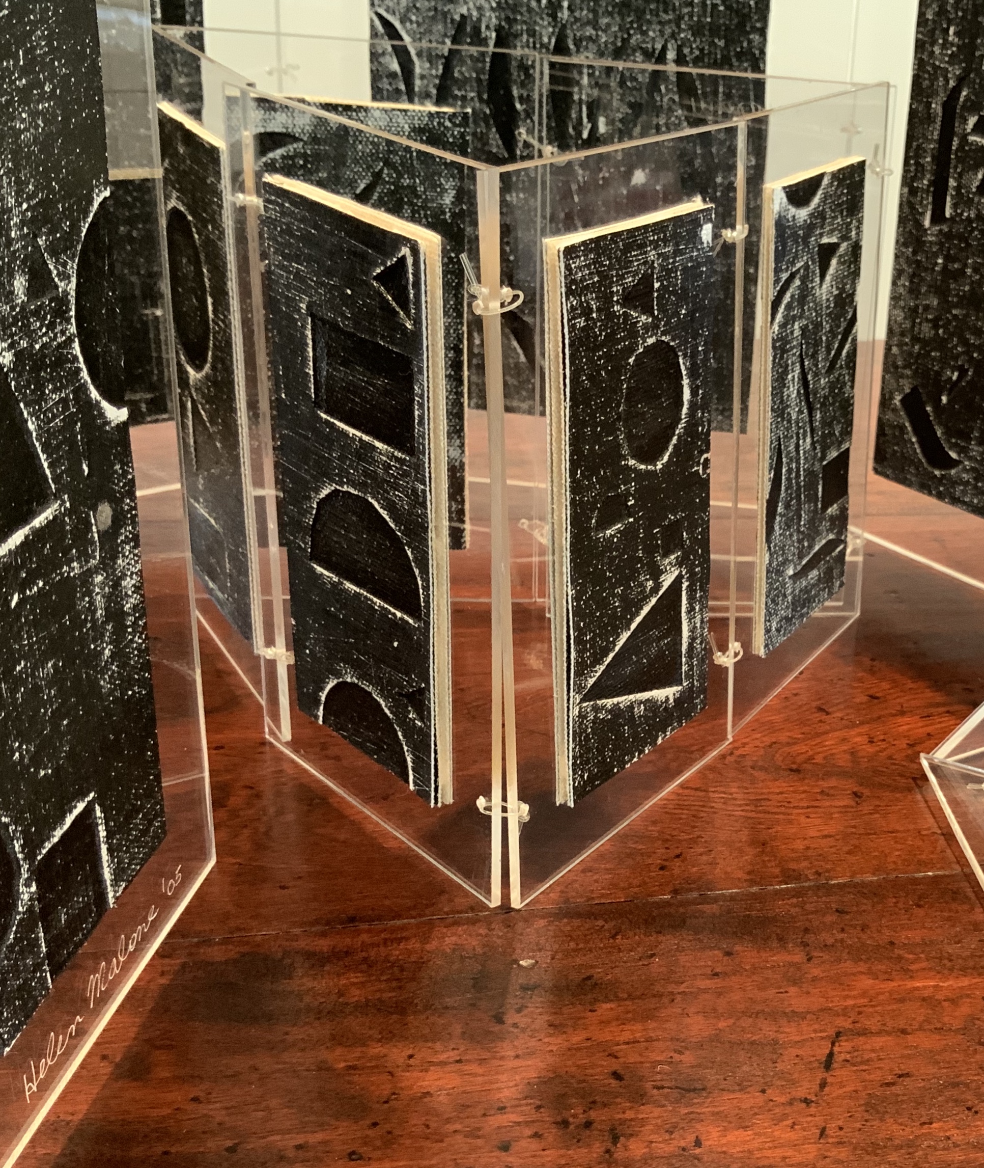
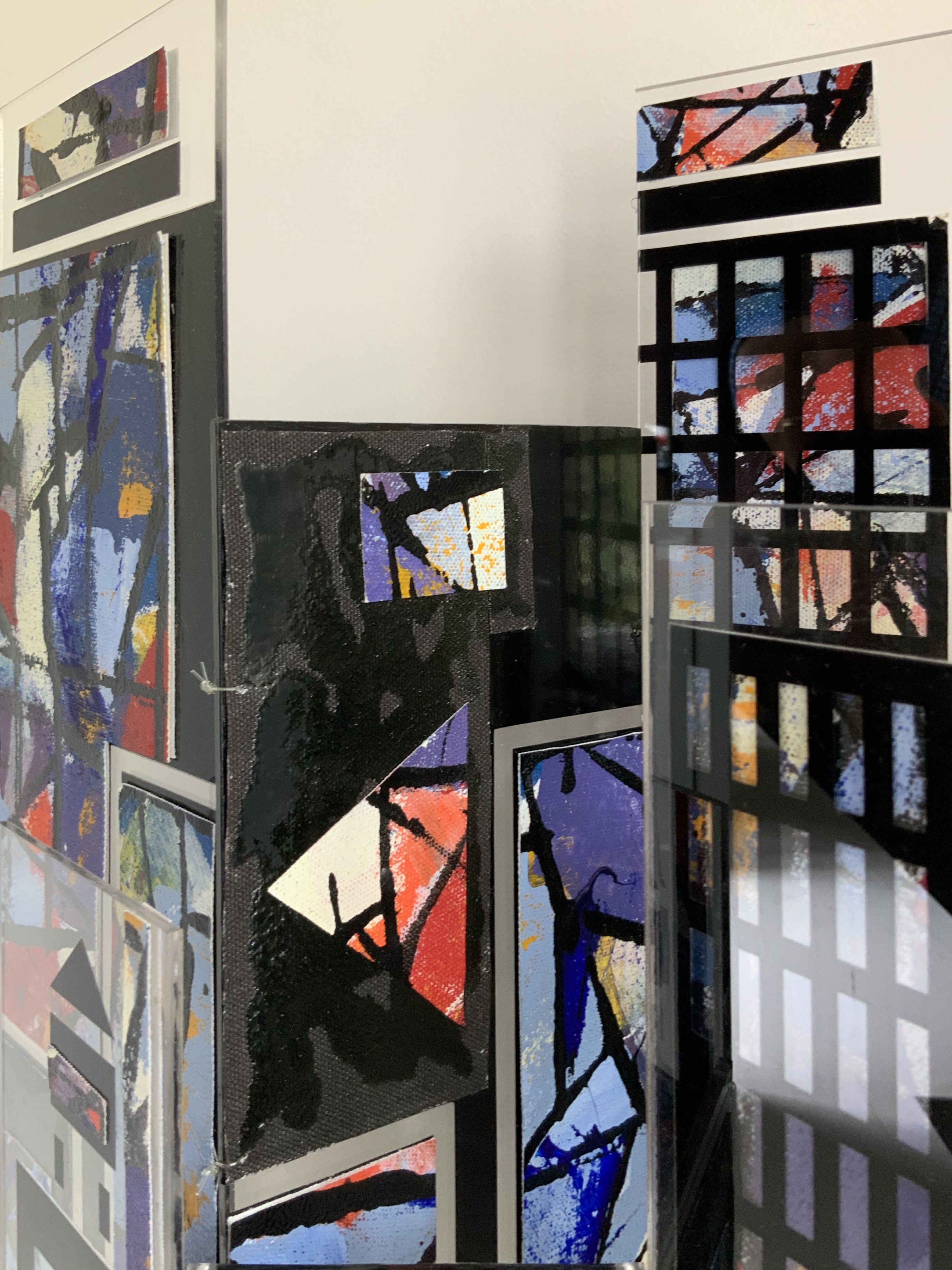
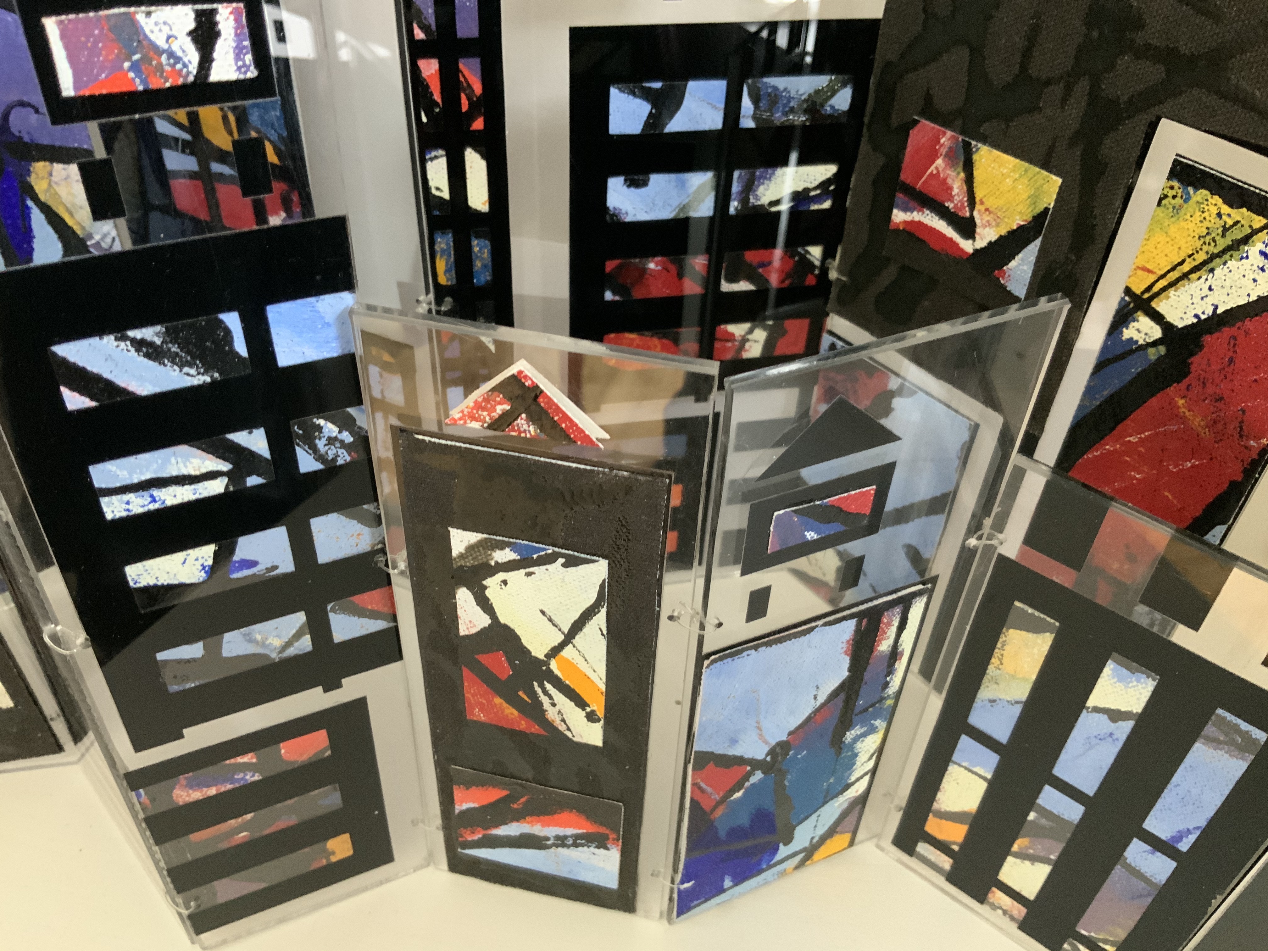
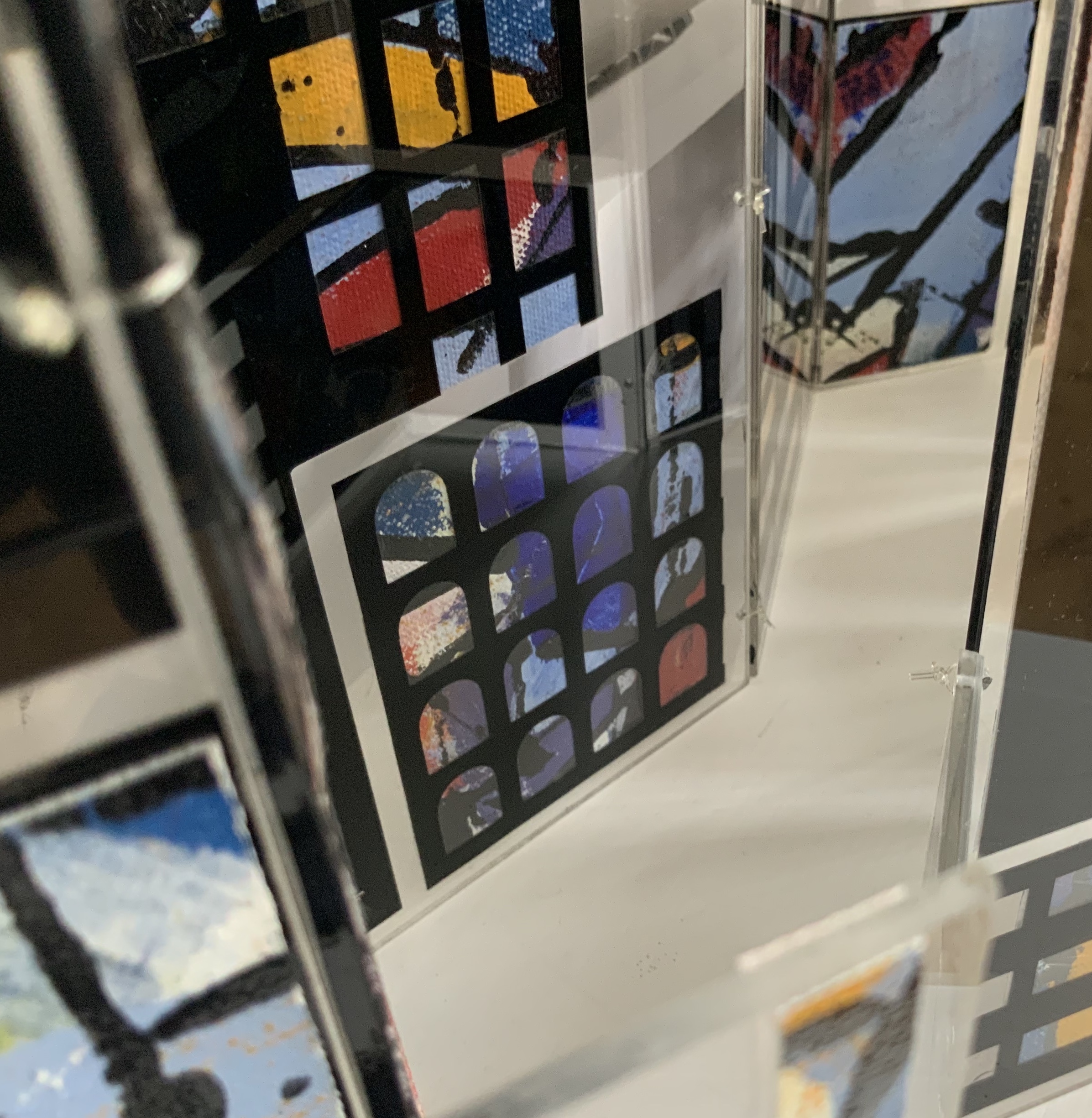
Perspex box containing two concertina books of different sizes made of recycled Perspex panels with mounted canvas painted with acrylics. Box: H360 x W125 x D75 mm. Unique edition. Acquired from the artist, 2 July 2020. Photo: Books On Books Collection.
Photos: Books On Books Collection.
Artist’s description:
Technological illuminations such as television screens, computer screens, big screens and advertising visually transmit images and act as carriers of global information, education and entertainment. The medieval purpose of stained glass windows, besides aesthetic and mystical was to visually educate and enlighten.
Purely in color, Windows on the World recalls Albers, Chagall, Mondrian (even though he hated stained glass) or Joep Nicolas. In material, technique and theme, it may echo Alphabetic Codes and its allusion to computer-screen-based windows, but Windows has a more architectural feel that can also be found in the I.M. Pei and Mies van der Rohe “volumes” of Ten Books on Architecture (2017) further enriching the architectural subset of the Books On Books Collection.
Exhibition:
Books 05, Image as text as Image, Noosa Regional Gallery, 9 September – 17 October 2005.
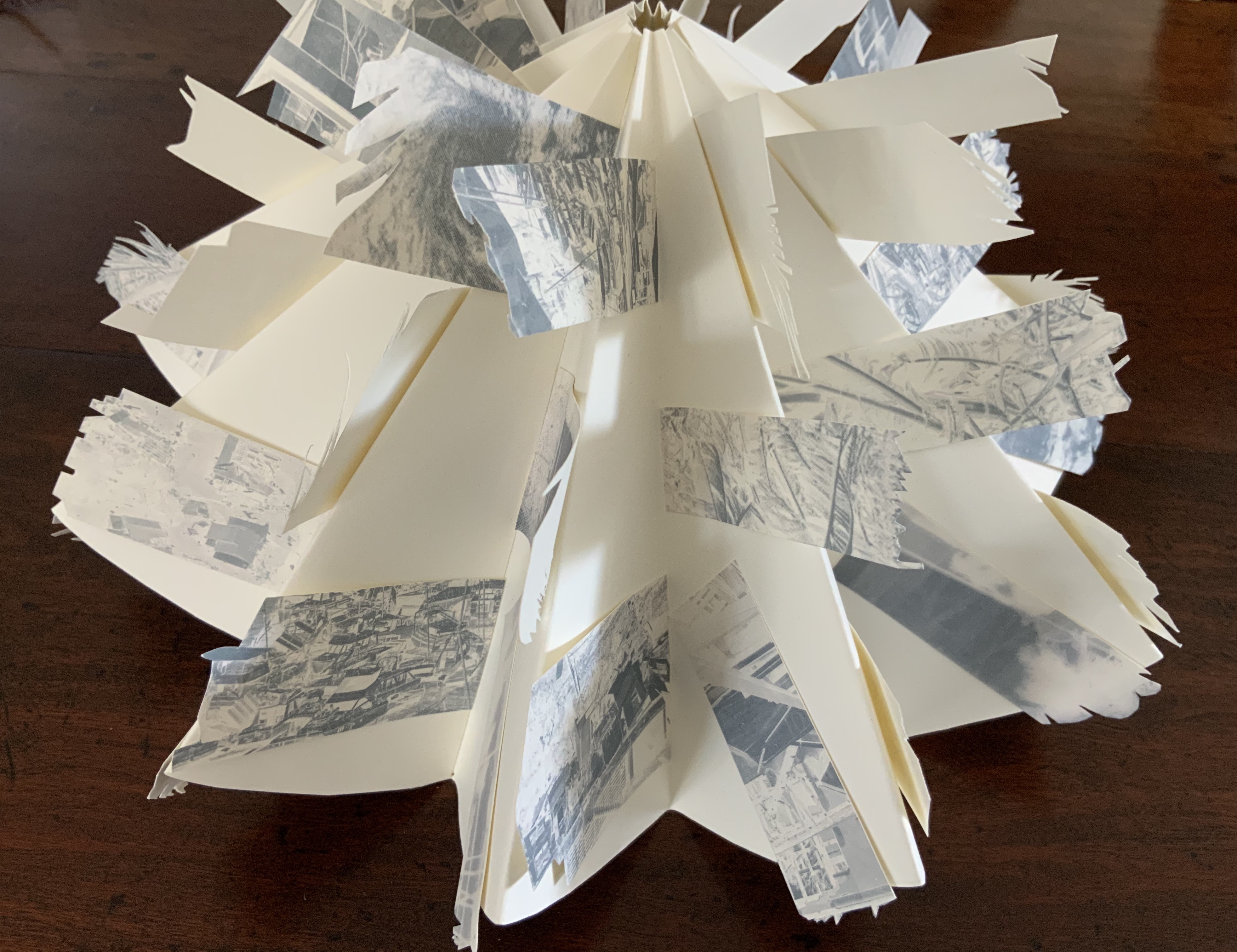
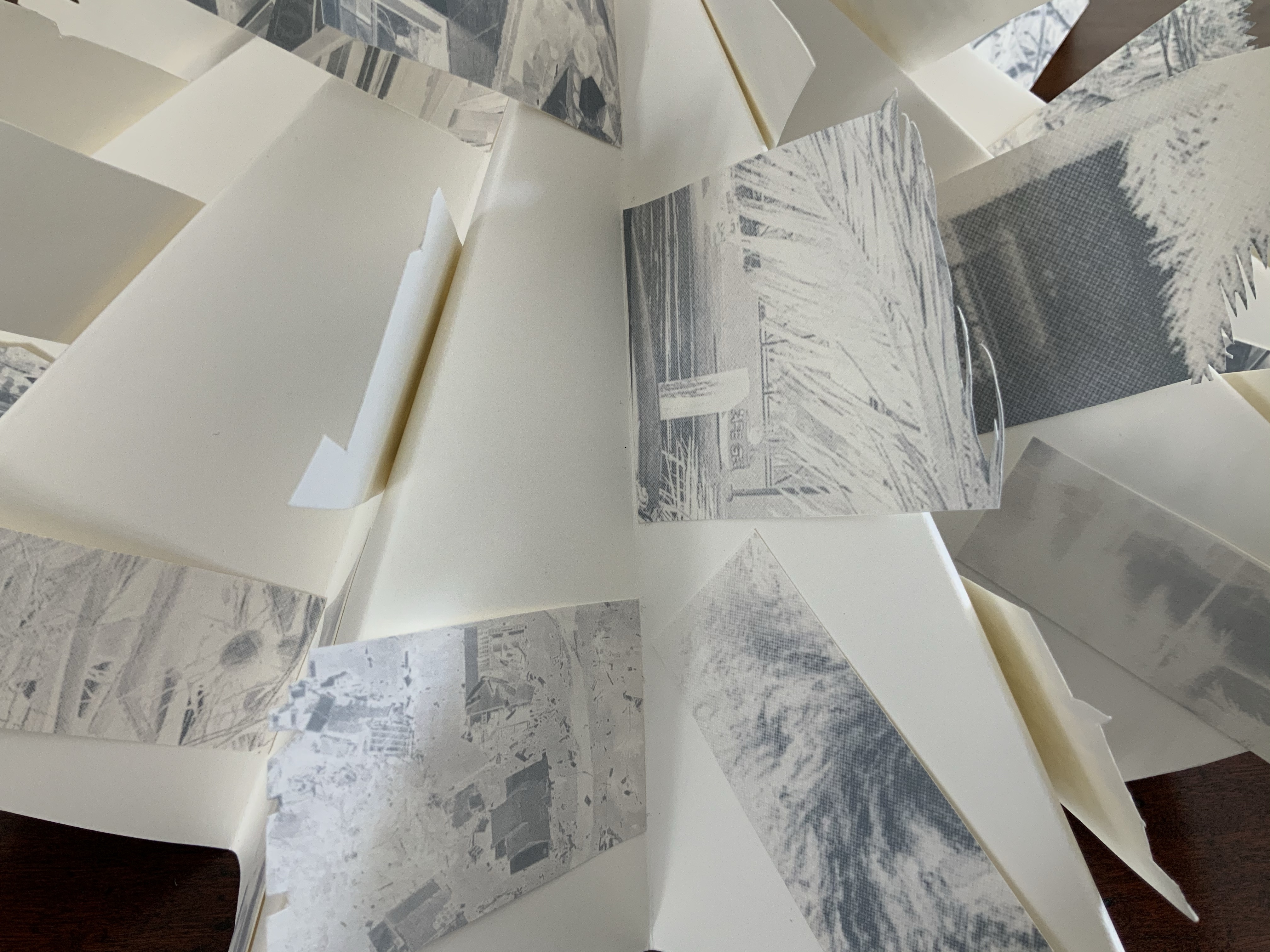
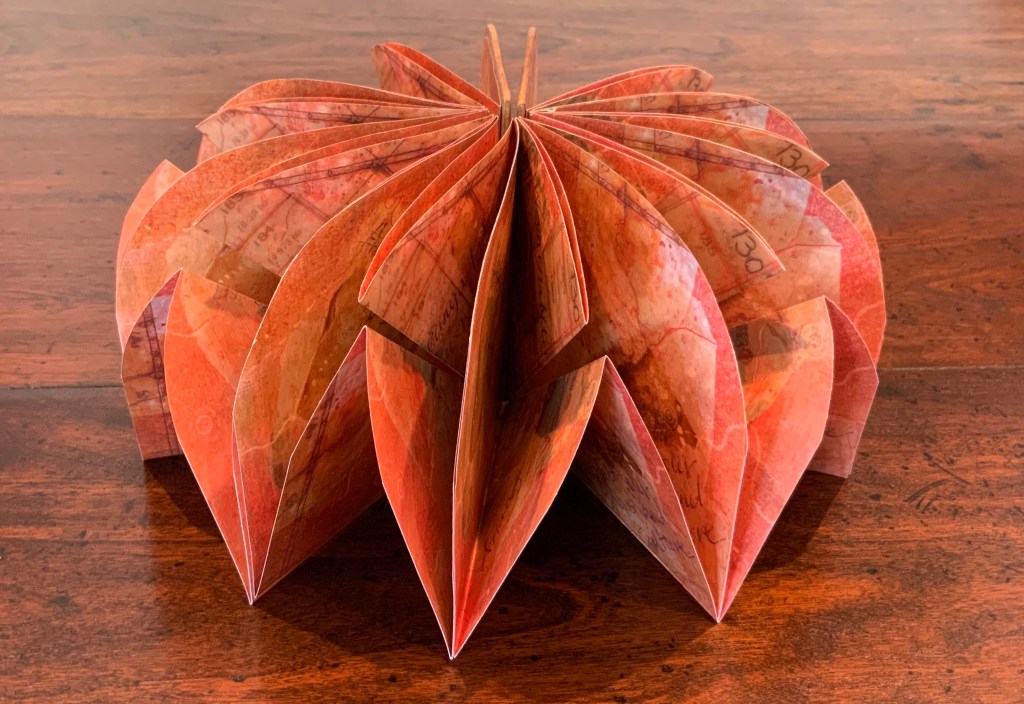
Beautiful One Day, Blown Away the Next (2011)
Beautiful One Day, Blown Away the Next (2011)
Helen Malone
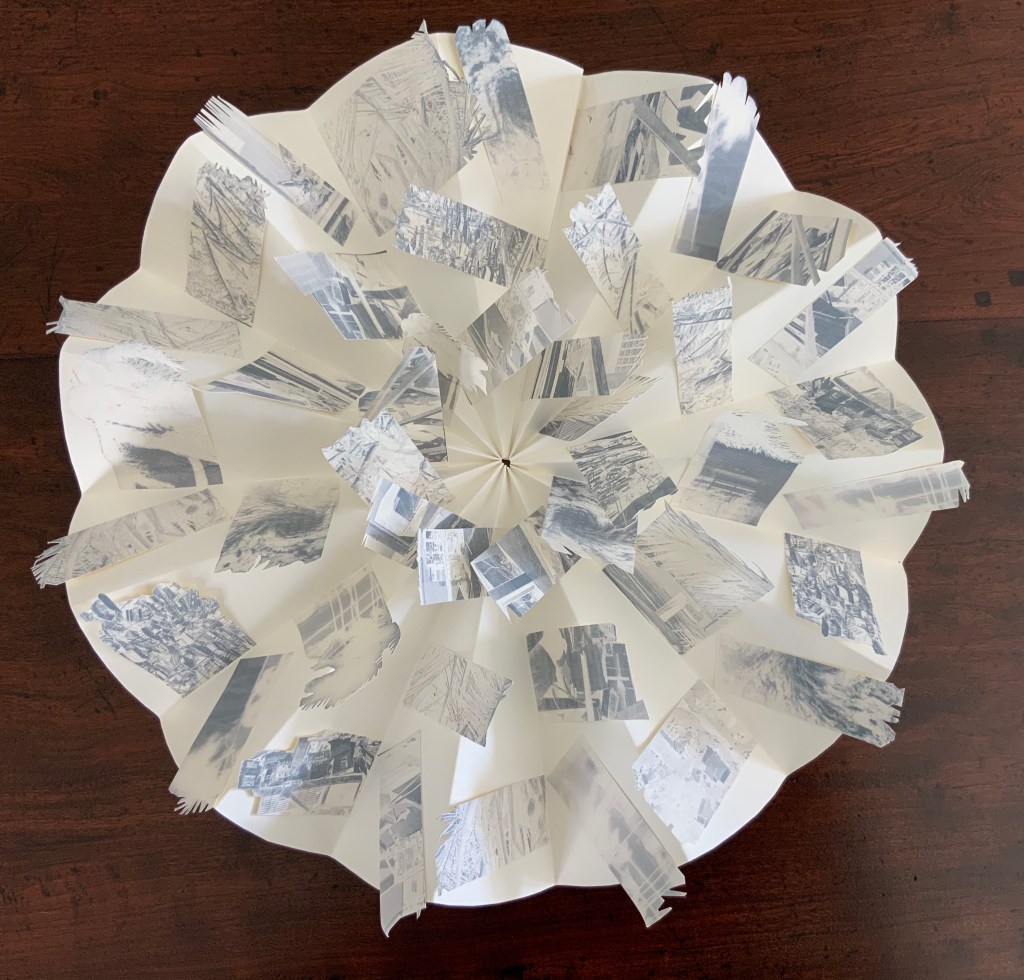
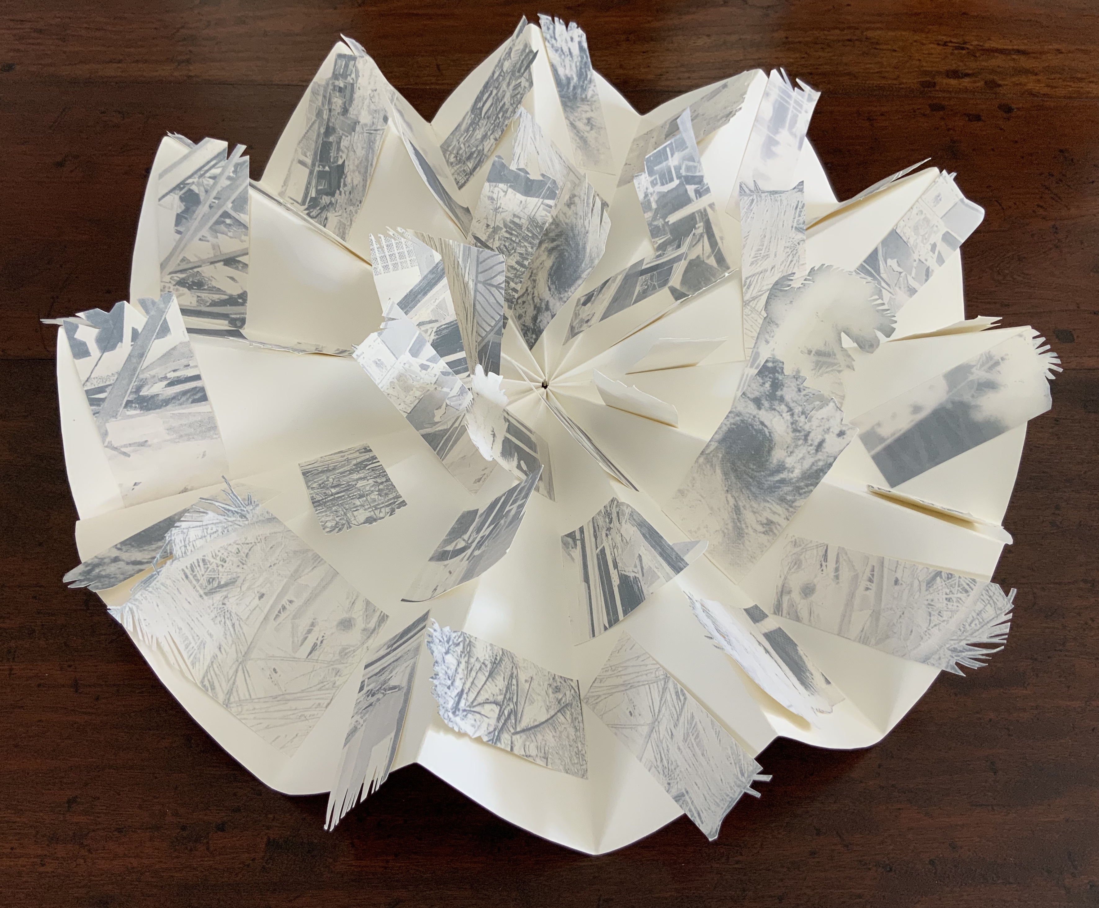
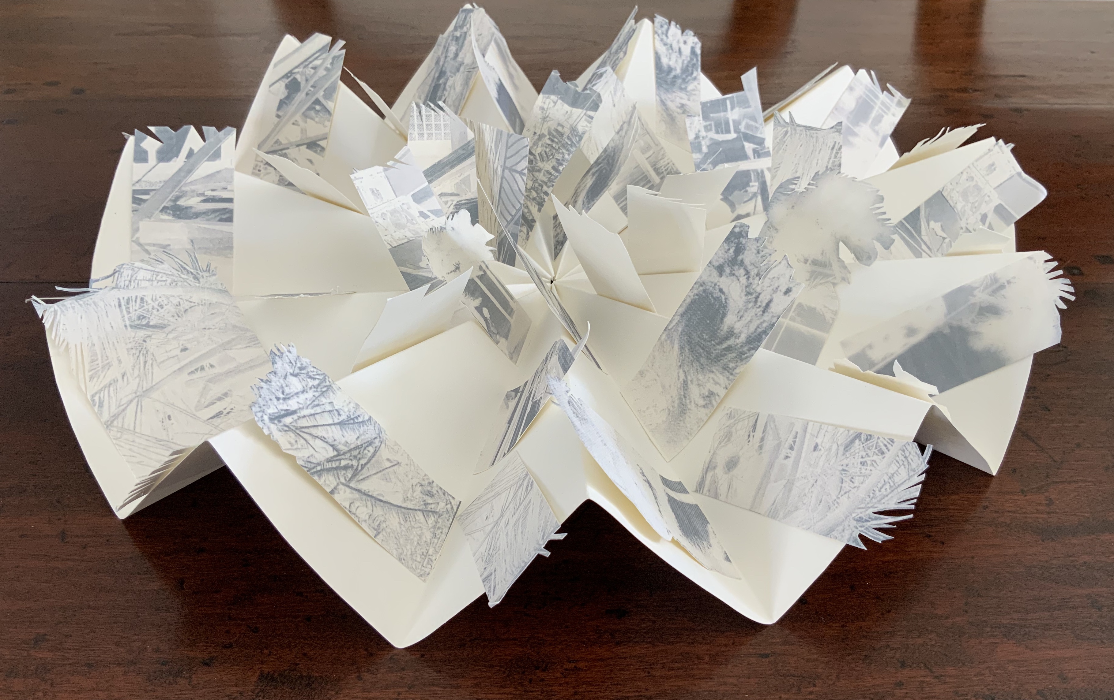
Box containing circular concertina flag book of Fabriano paper, manipulated digital photographs cut and transferred to flags. H90 x W190 x D55 mm closed, 380 mm diameter open. Unique edition. Acquired from the artist, 2 July 2020. Photo: Books On Books Collection.
Artist’s description:
On the eve of 2 February 2011 Cyclone Yasi made landfall on the coast of Queensland. Sweeping through the coastal communities, the Category 5 Tropical Storm of historic proportions left a trail of mayhem and destruction that inspired the artist Malone to create this piece.
Photos: Books On Books Collection.
Bringing together a flag book, concertina and tab-and-lot closure, Malone engineers an ideal structure to evoke the meterological pattern and order of the cyclone. The shattered, blue-filtered photographic images transferred to the flags contribute a kaleidoscopic chaos. The theme of the environment and the struggle between the human race and natural forces is a subset of the Books On Books Collection well represented by this work, Tsunami (below) and others such as Holuhraun by Chris Ruston and Landscapes of the Late Anthropocene by Philip Zimmerman.
Exhibition:
Books…beyond words evolution, East Gippsland Art Gallery, Bairnsdale,Vic., 6 August – 3 September 2011.
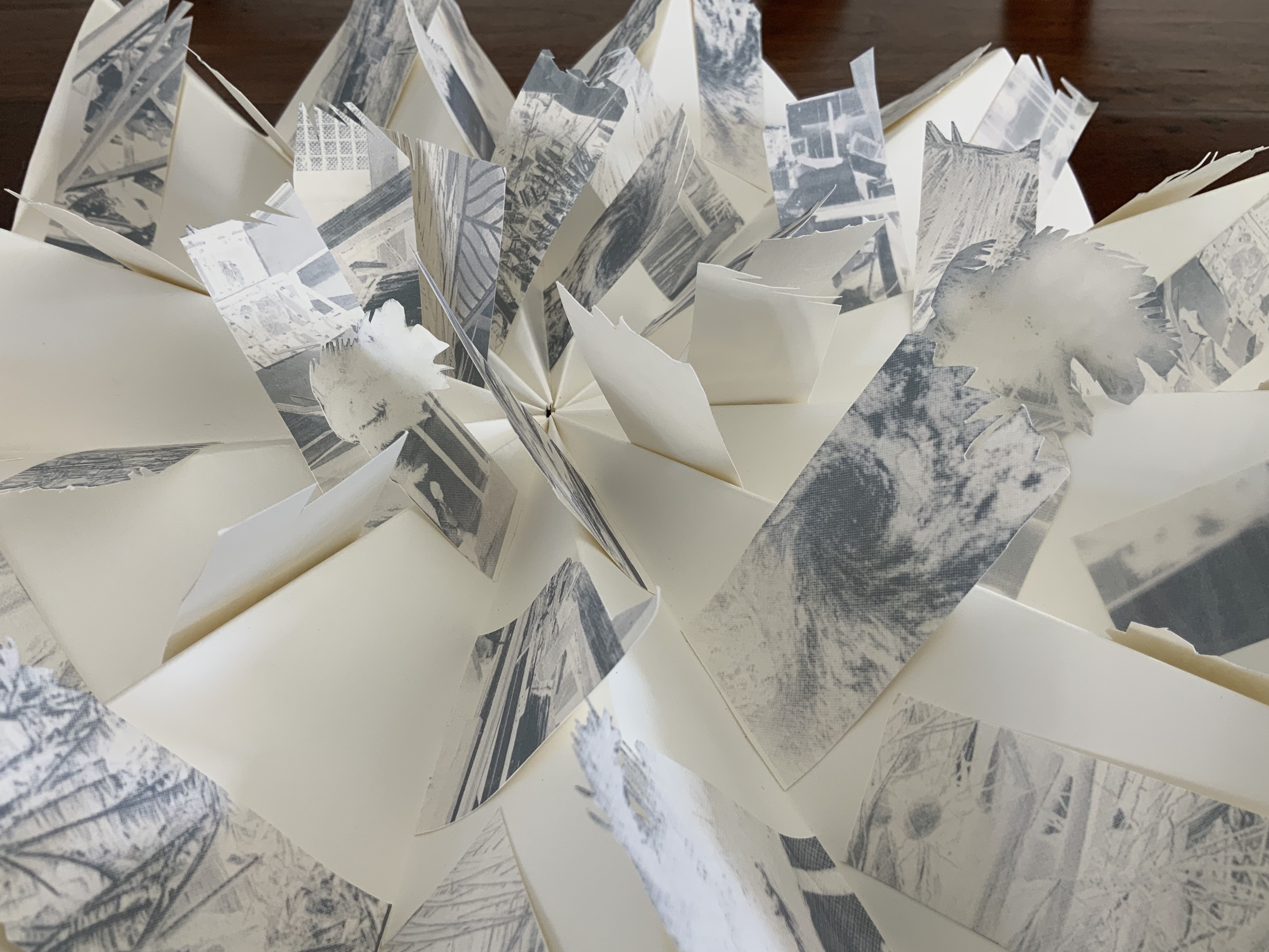
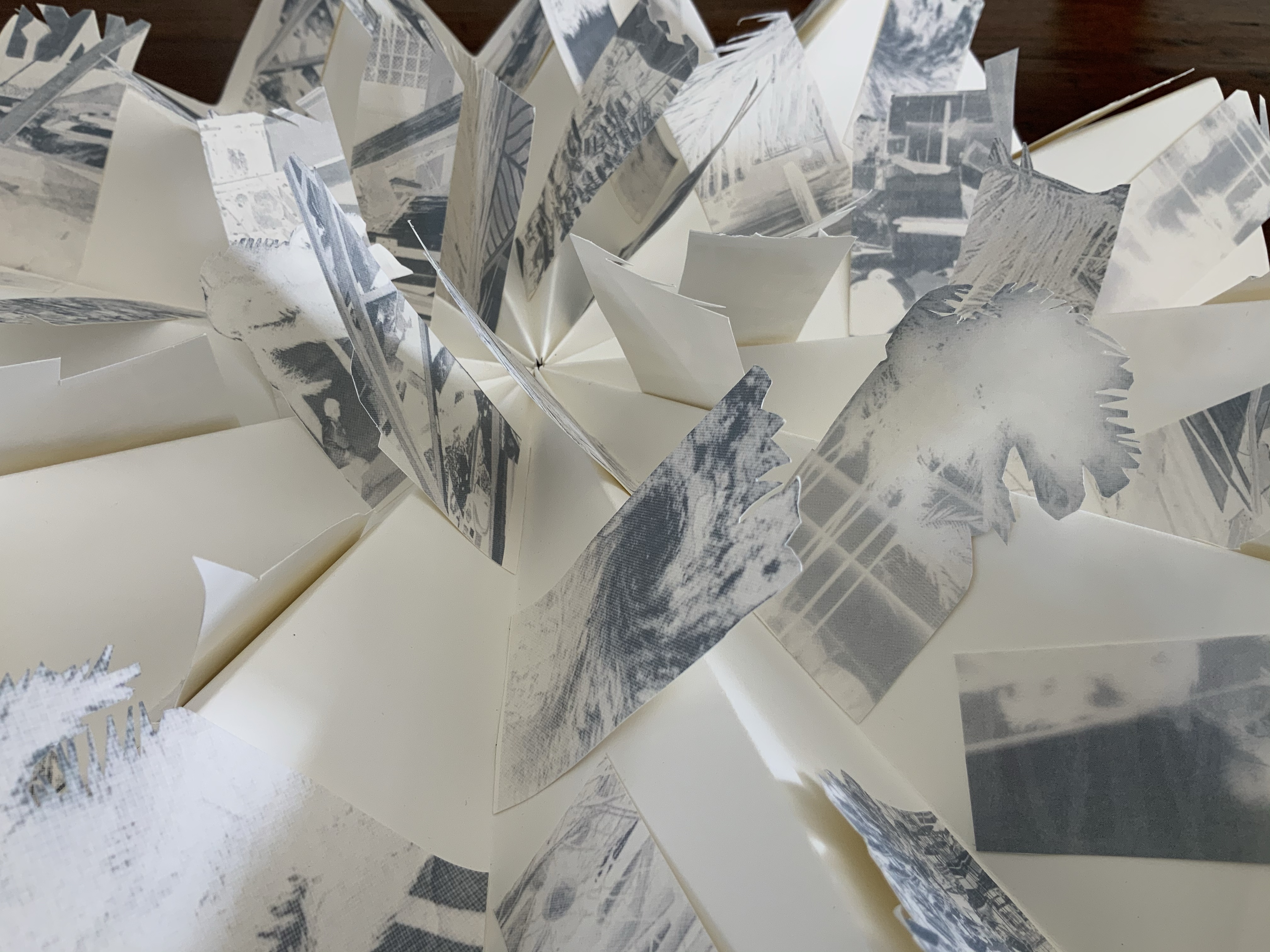
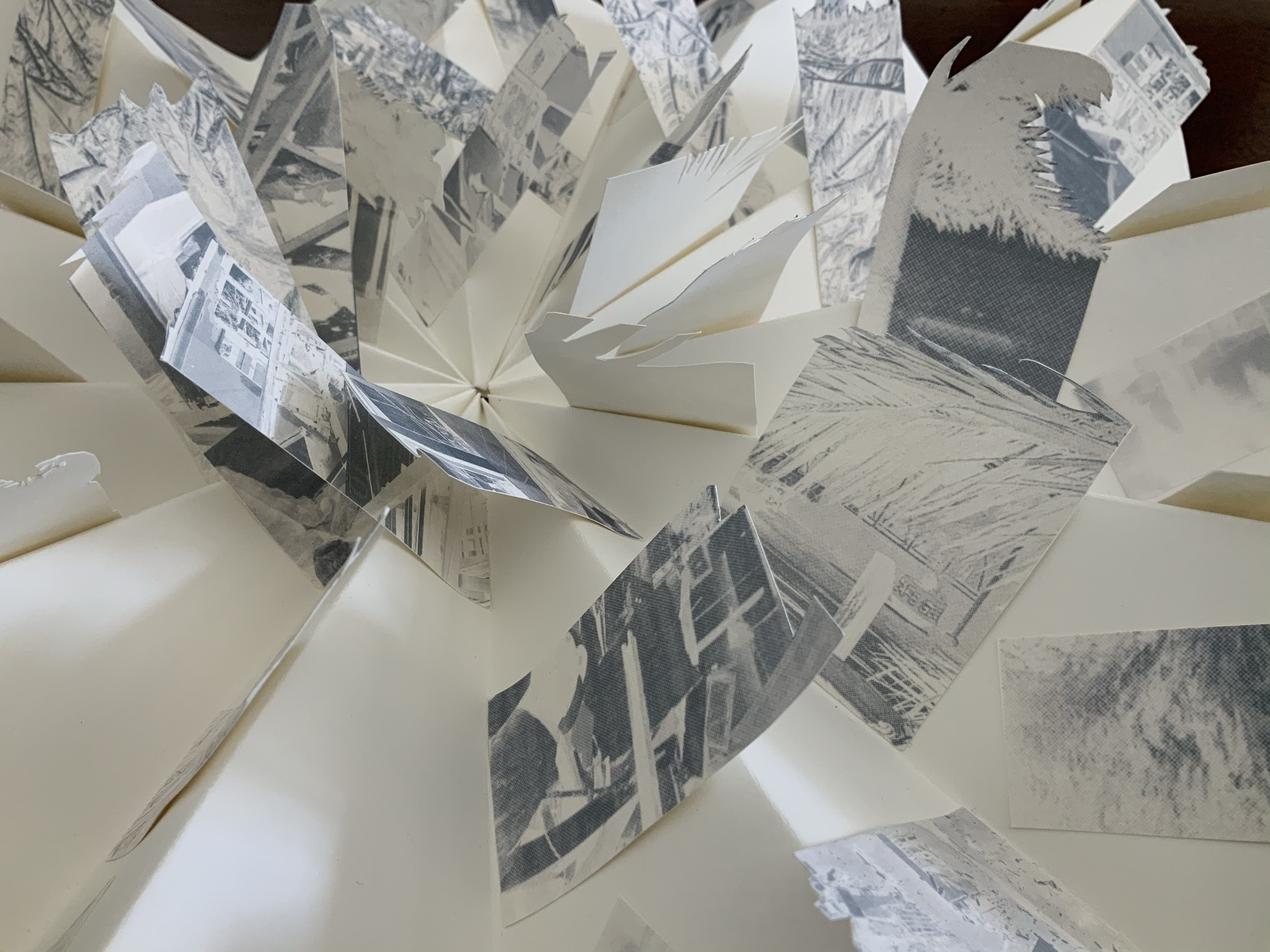
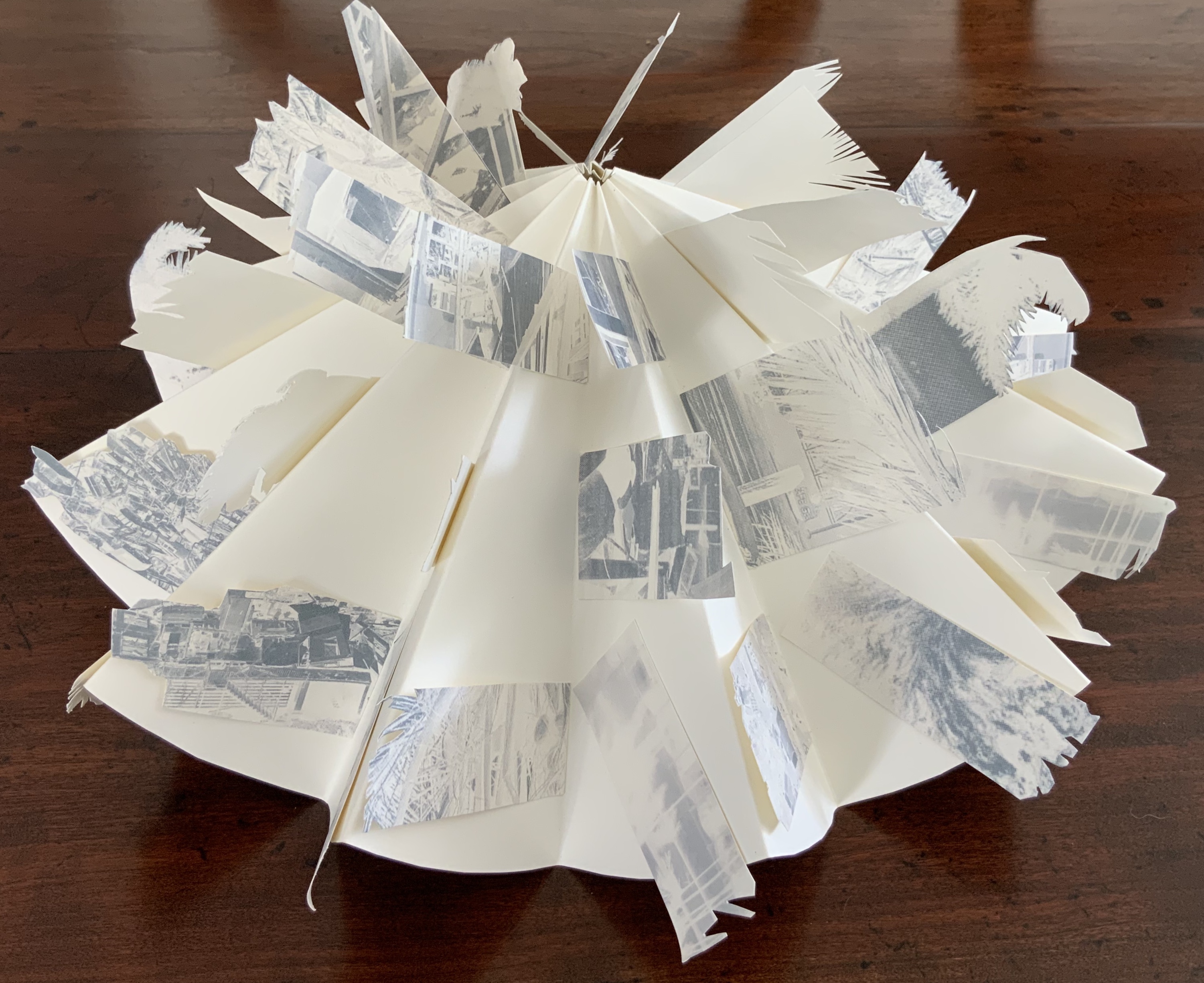
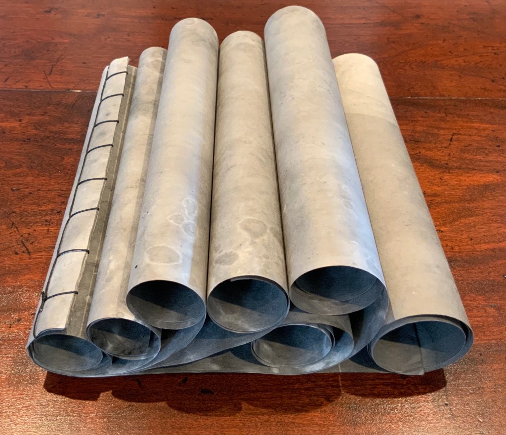
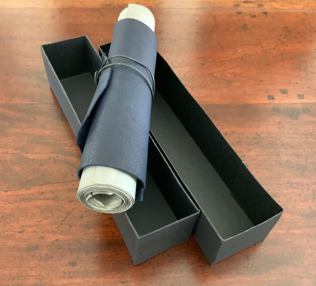
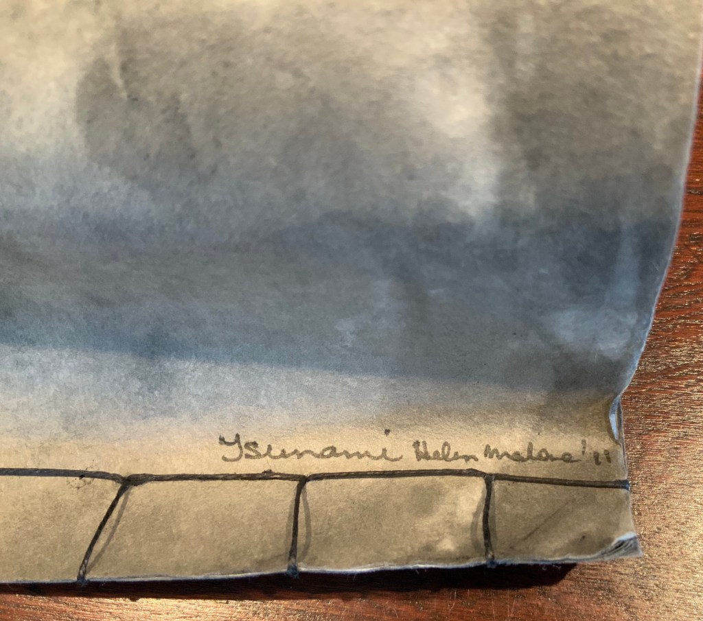
Tsunami (2011)
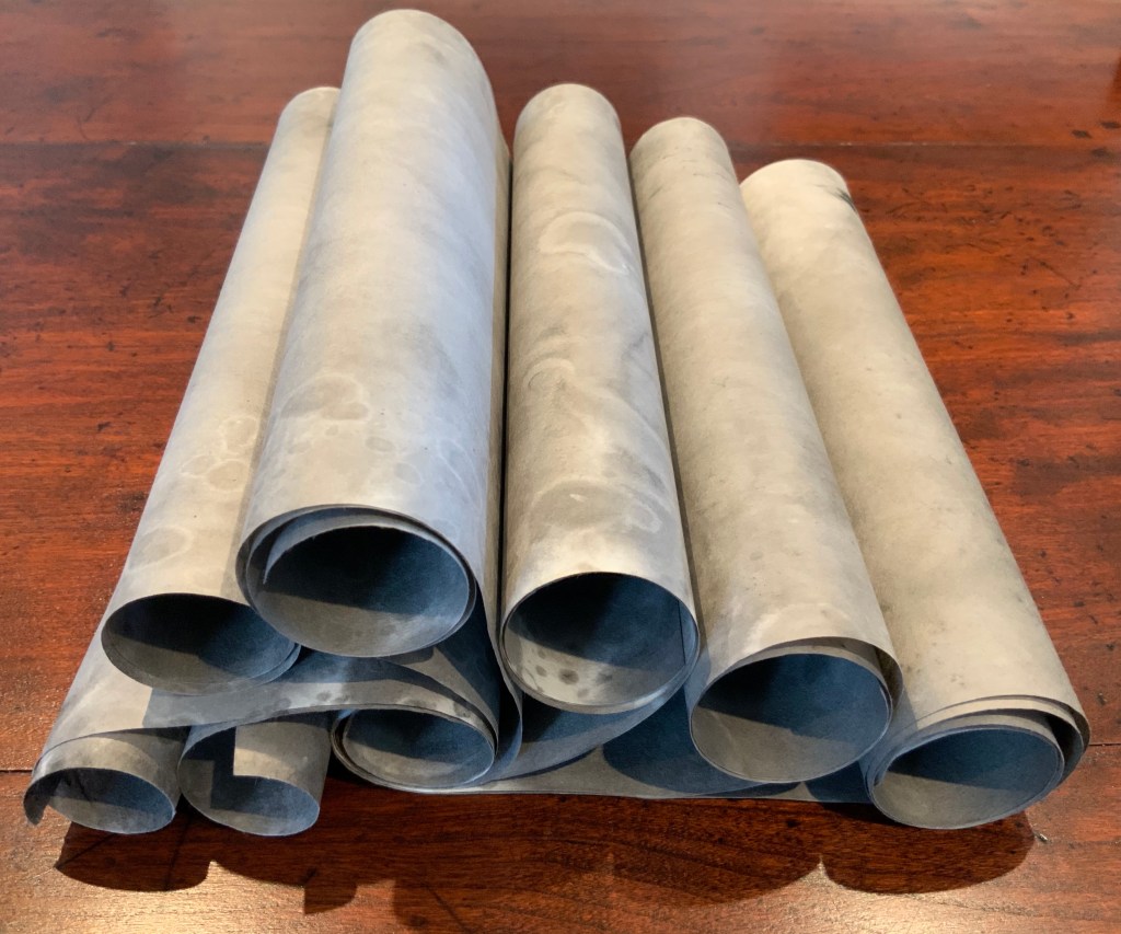
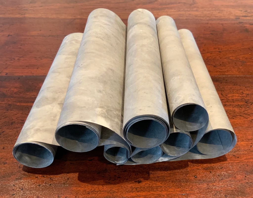
Tsunami (2011) Helen Malone Box containing “whirlwind” book of Japanese paper washed with sumi ink and water, Japanese stab binding, leather roll. H230 mm, variable width. Unique edition. Acquired from the artist, 2 July 2020. Photo: Books On Books Collection.
Photos: Books On Books Collection.
Artist’s description:
Part of the series of disasters explored by Malone through her art, this piece is her interpretation of the catastrophic tsunami that followed the massive earthquake that struck Japan in 2011.
The earthquake and tsunami were so powerful that their effects were felt around the globe: from Antarctica’s ice sheet to the fjords of Norway. Indeed the debris from the monstrous wave continues to wash up on North American shores nearly a decade later.
The combination of Japanese paper and mottled color of sumi ink and water, the way the work “fights back” as the scrolls are manipulated to display the work, the multiple displays generated by the piling wave-like scrolls — all evoke the picture of inescapable, roiling force of the 2011 tsunami.
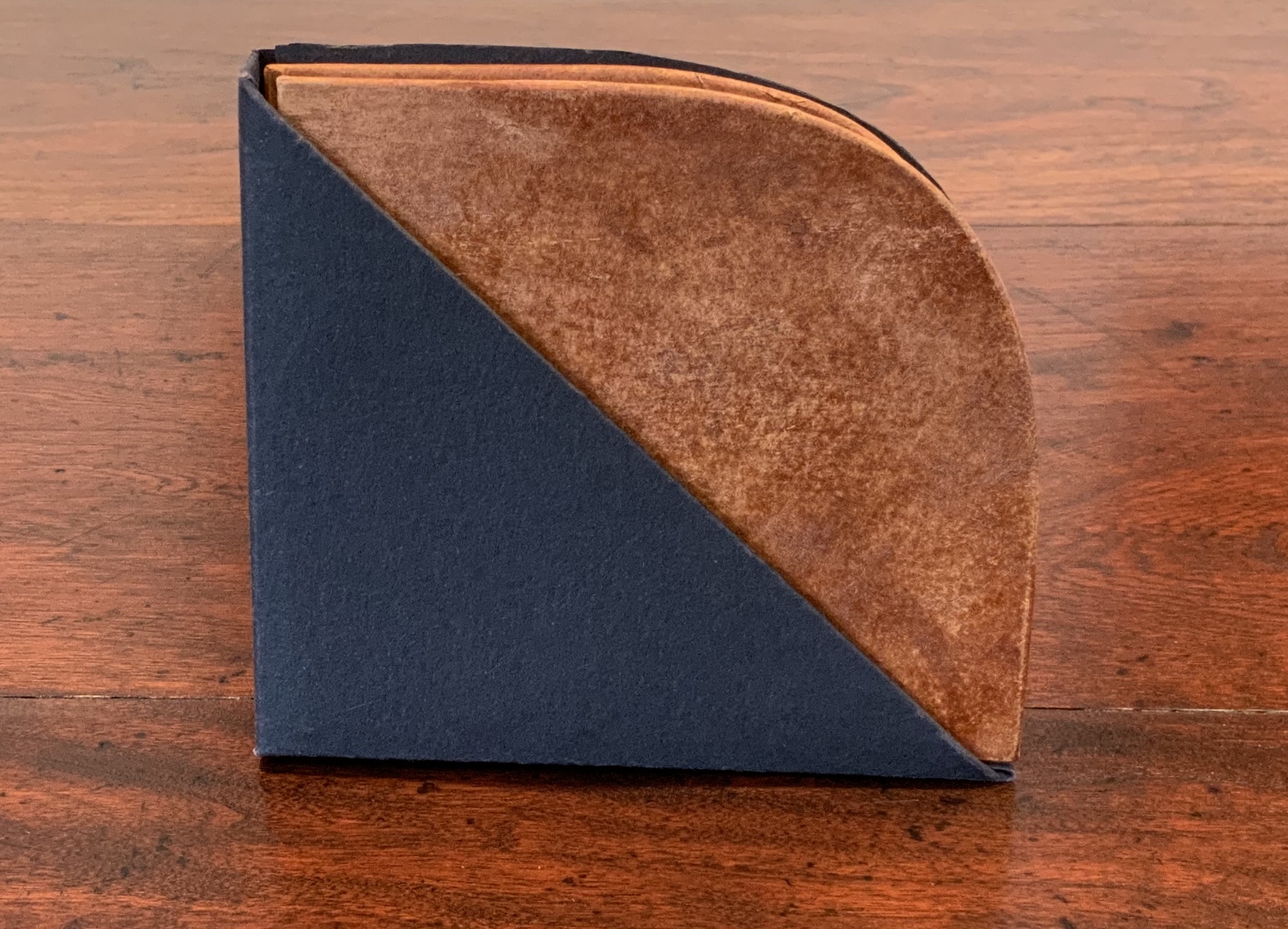
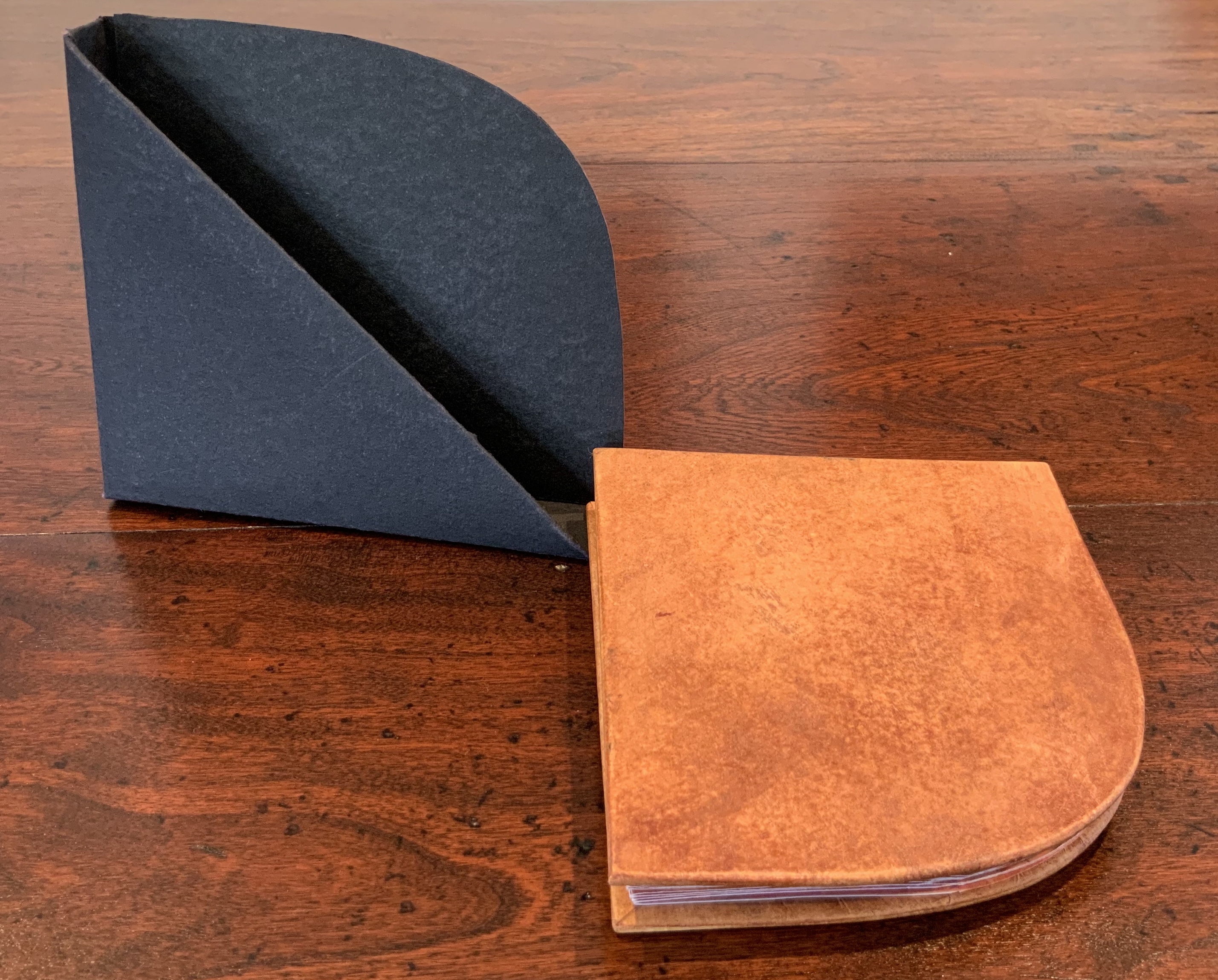
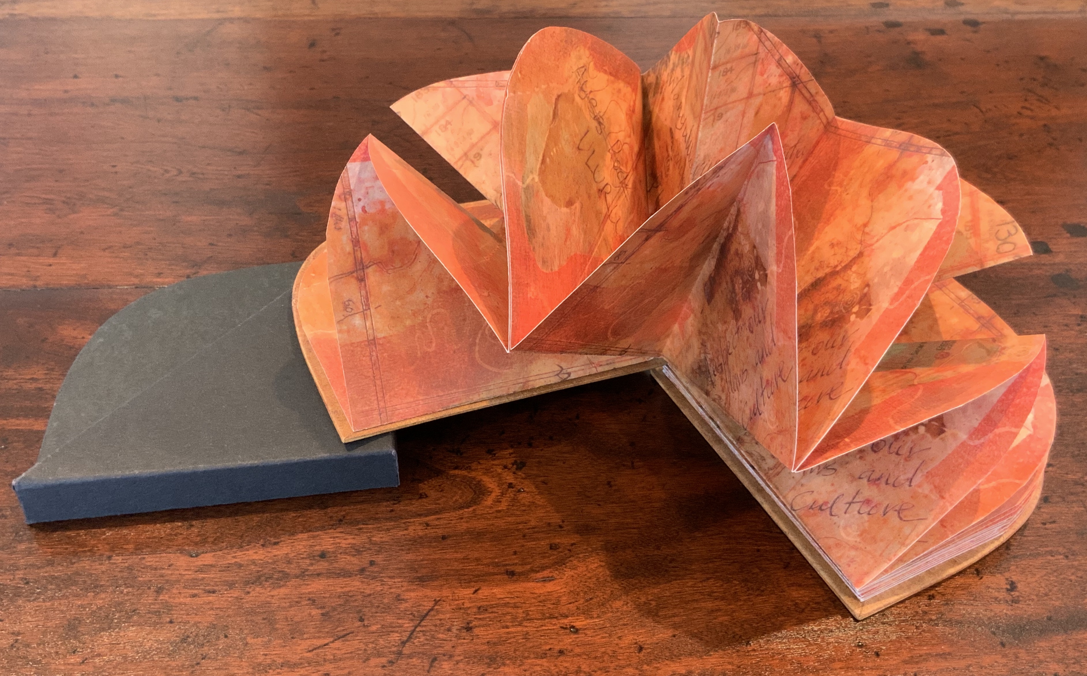
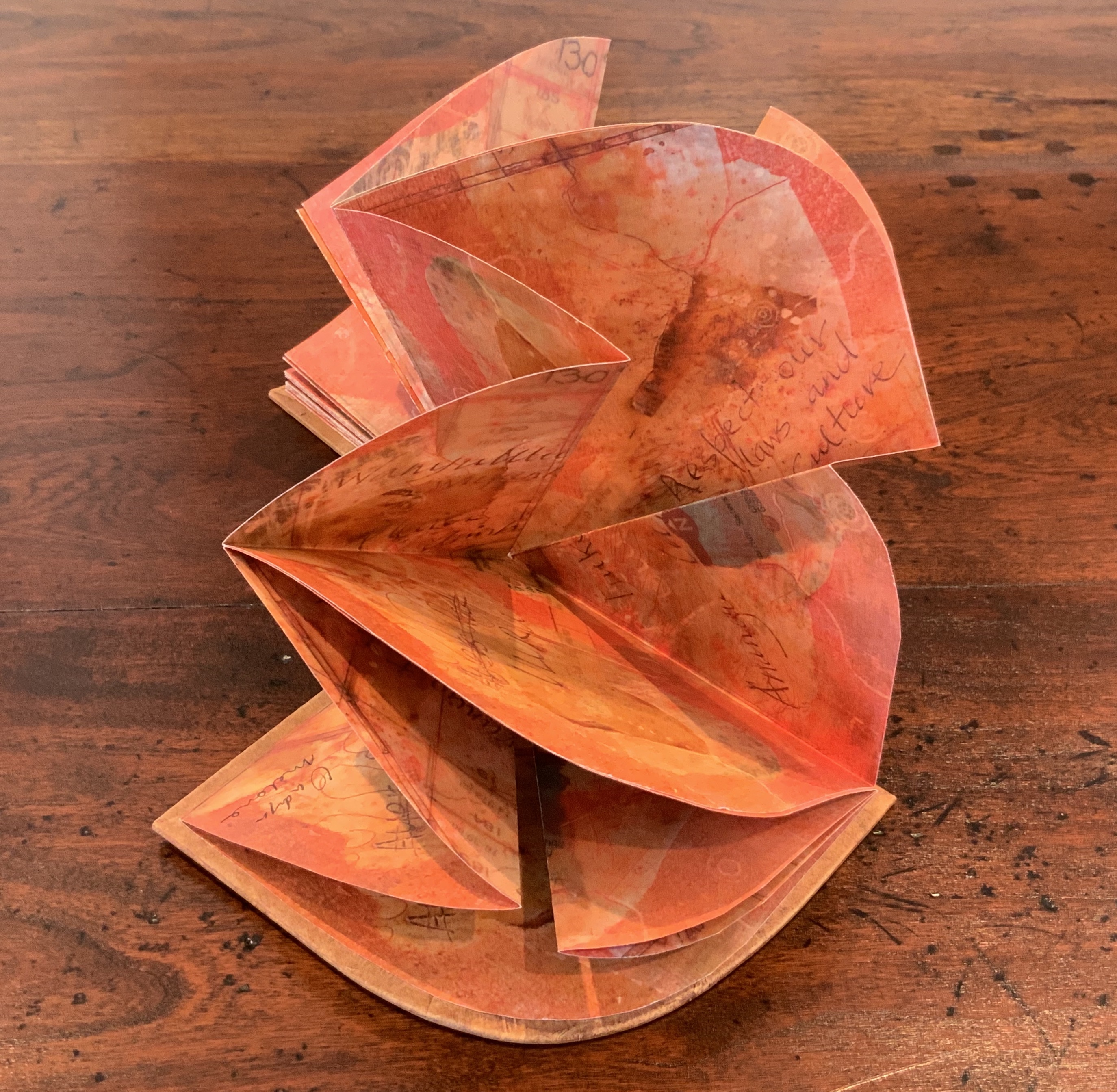
Laser printed images of waxed drawing, collage, painting and Chinese paper covered boards painted by Jack Oudyn with earth pigments, acrylic and xanthorrhoea resin. Sculptural folded page book structure and box by Helen Malone. H105 x W95 x D15 mm. Editions: 6 and 1 A/P. Acquired from Helen Malone, 2 July 2020. Photos: Books On Books Collection.
Photos: Books On Books Collection.
Artist’s description:
Malone and Jack Oudyn collaborated to create this representation of Uluru to resonate with the pleas of the indigenous Anangu people of the Northern Territory in Australia to “Wanyu Ulurunya Tatintja Wiyangku Wantima” (Respect our laws and culture).
For the Anangu the massive sandstone monolith is so sacred that they will not climb it nor photograph it. They ask visitors to respect the spirituality of the site and to follow their customs.
The blend of laser prints of wax drawings, Chinese paper, collage and painting seeks to capture the changing light of the rock as the sun passes over it throughout the day. The boards painted by Oudyn with earth pigments, acrylic and xanthorrhoea resin contribute a glowing depth of color to this homage to the Anangu. As with The Future of an Illusion (below), this collaboration presents an unusual unity of vision and integration of technique, materials and process with structural “rightness” for the subject at hand.
Exhibitions:
Art on Show Awards, Artspace Mackay Artist Book Award, Mackay Show Association, Mackay Qld, 16-19 June 2014.
Sheffield International Artists Book Prize, Bank Street Arts, Sheffield UK, 7-31 October 2015.
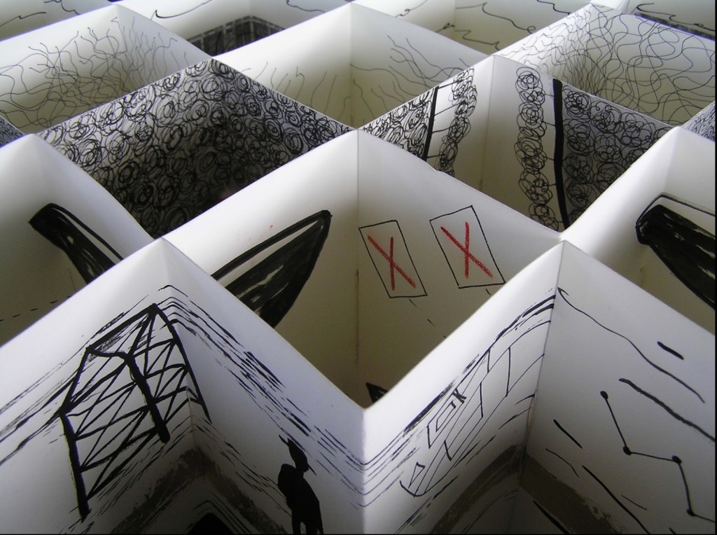
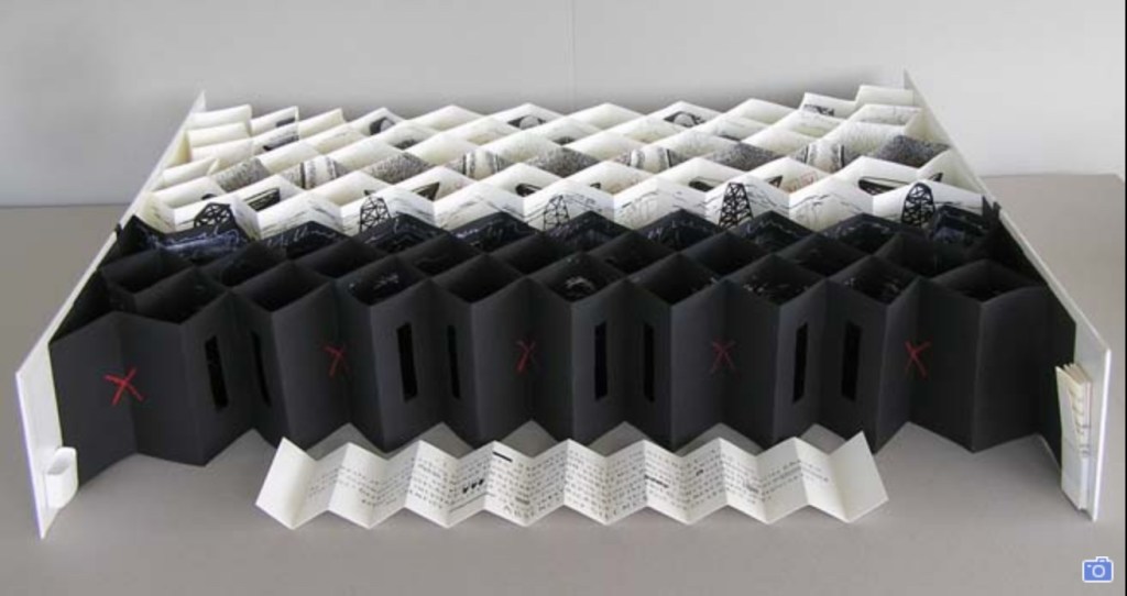
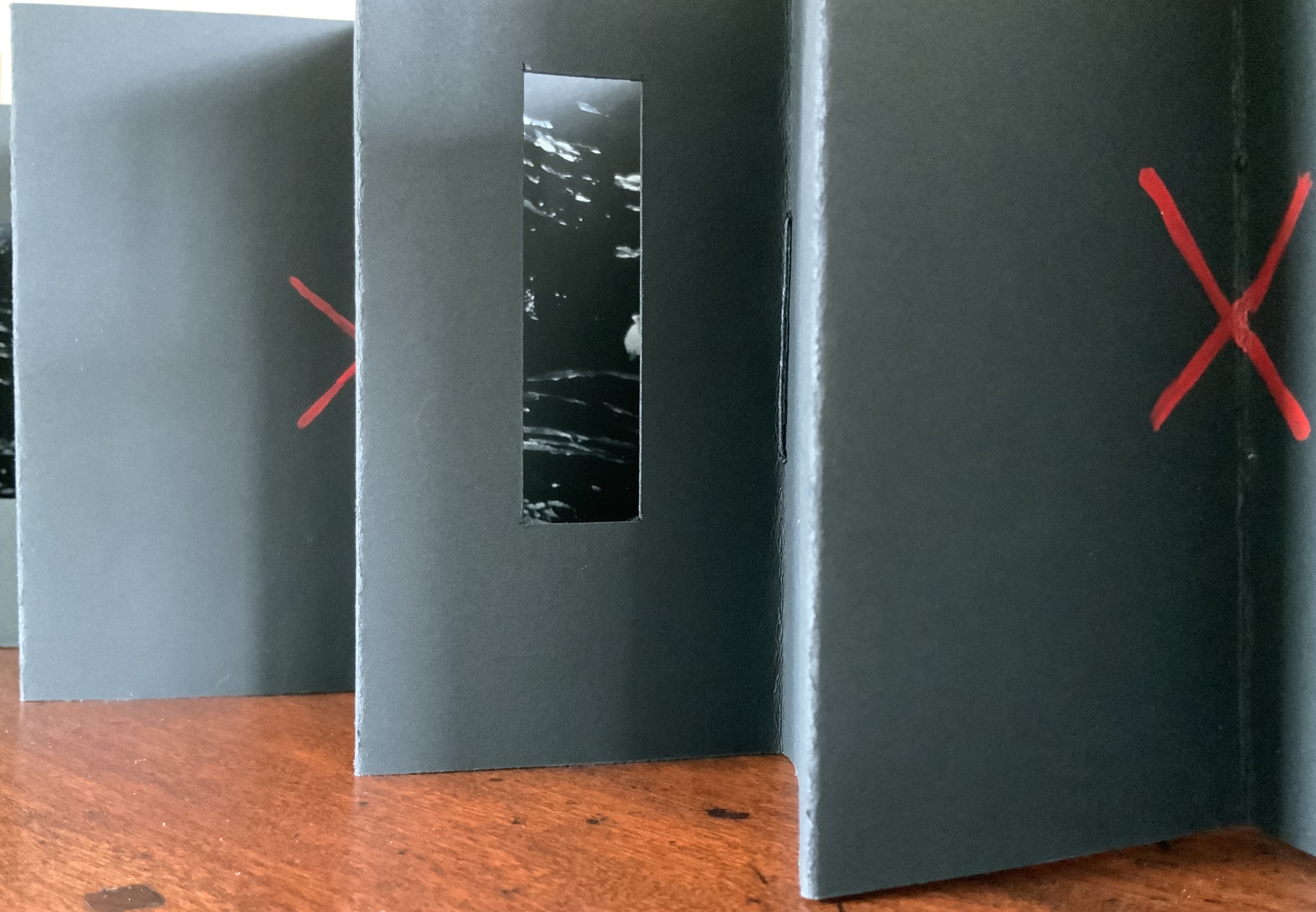
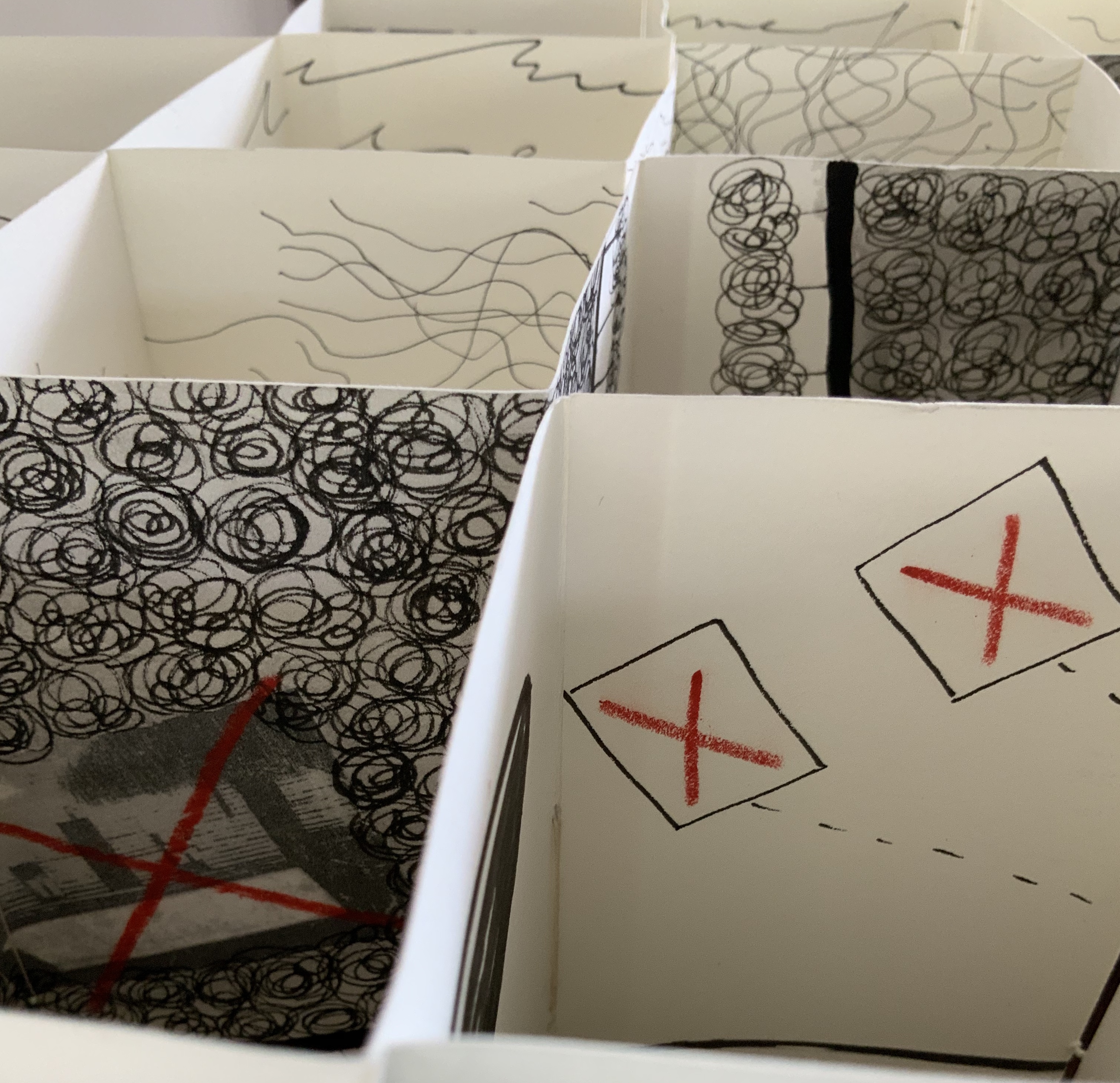
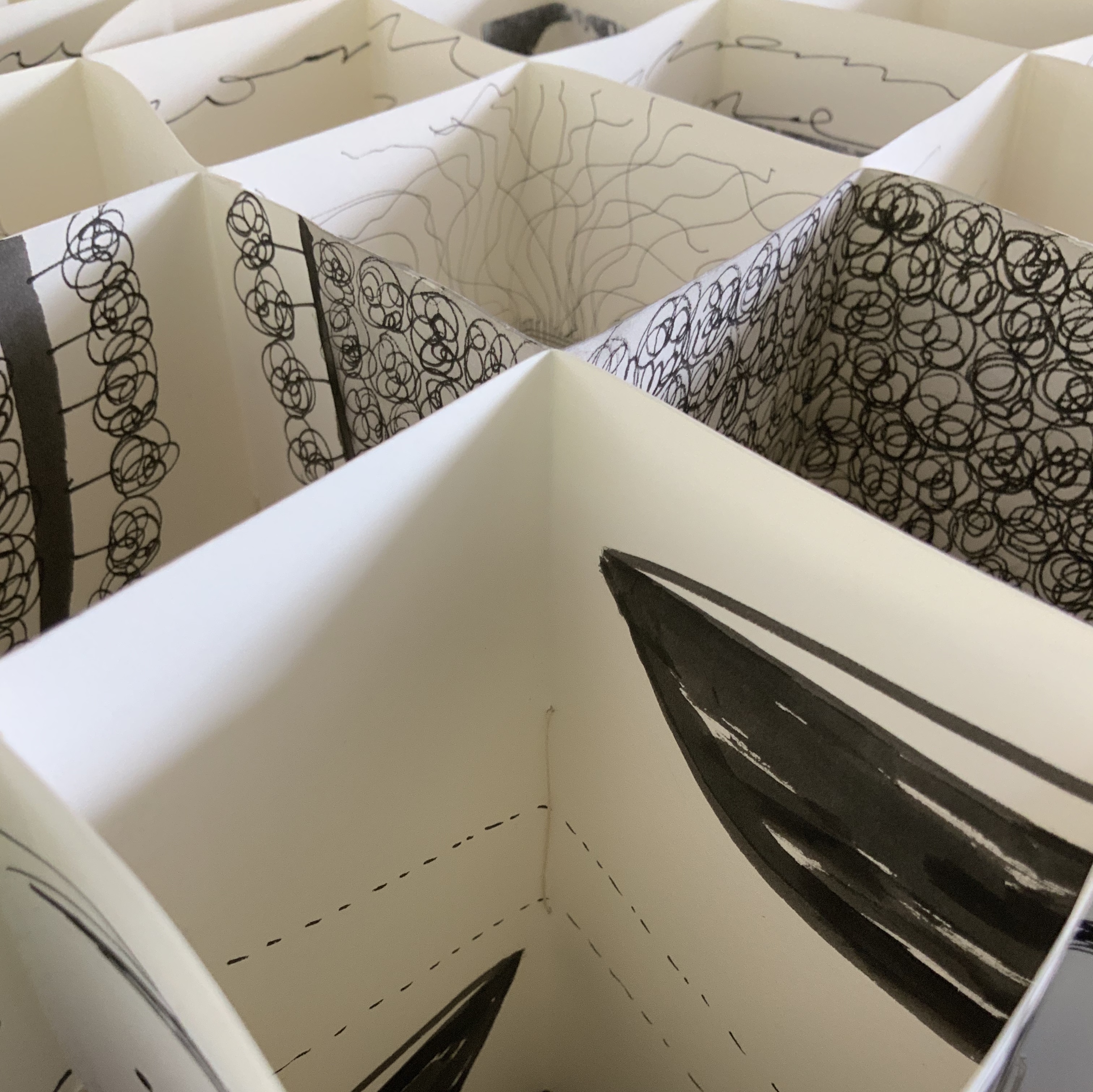
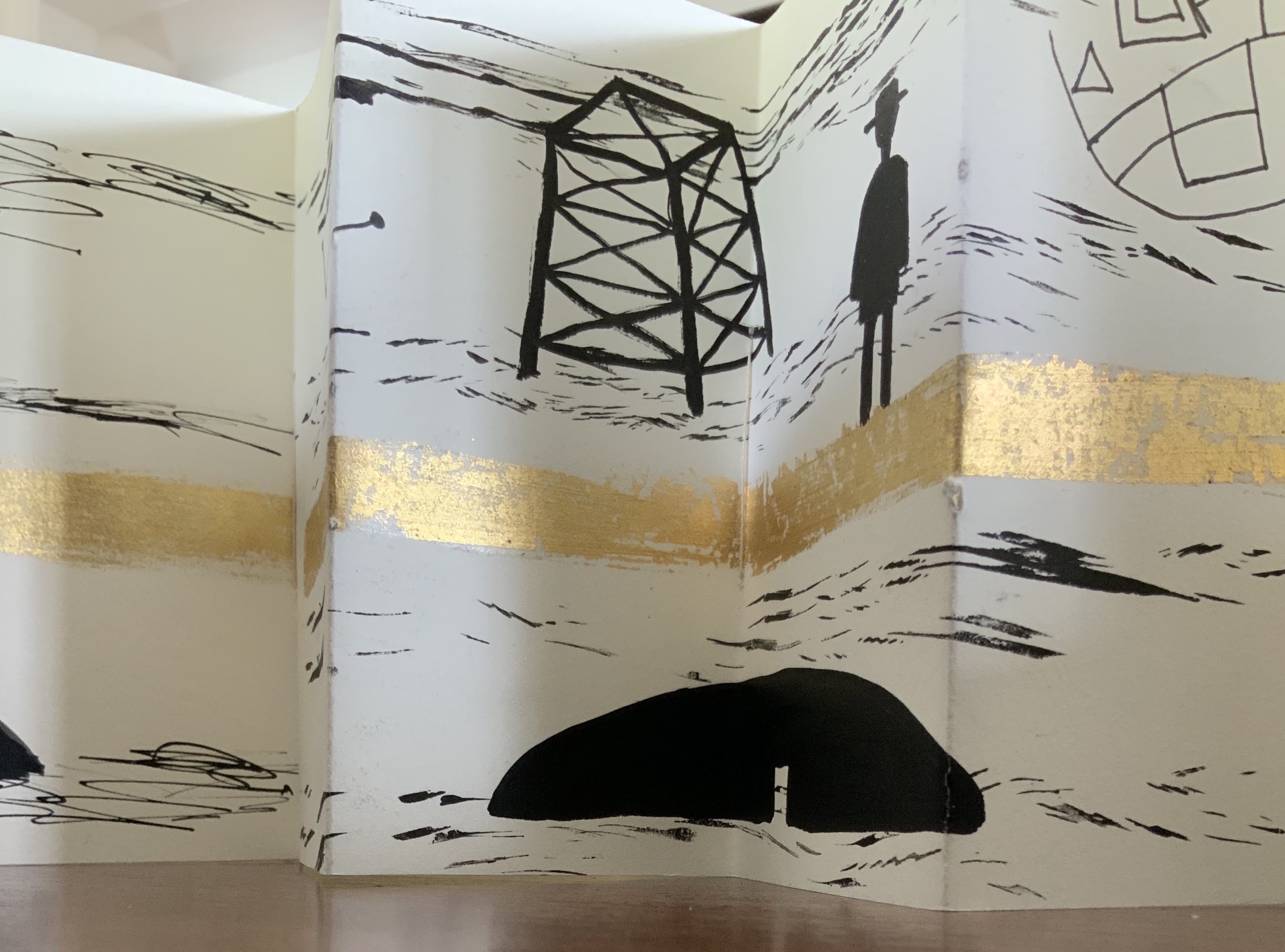
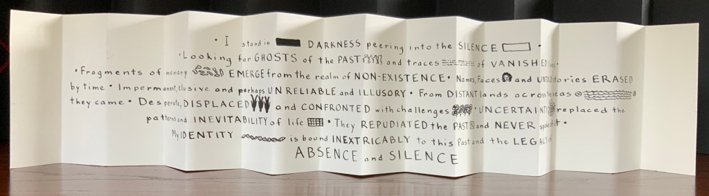
Binding of French faux leather. Multiple accordions in Fabriano 200gsm HP paper and Strathmore papers, pigmented ink, acrylic ink, printing ink, gold leaf, chinagraph pencil and image transfers. Closed: H780 x W50 x D150mm; Open: W750 mm. Unique edition. Acquired from the artist, 2 July 2020. Photos: Courtesy of the artist.
Artist’s description:
The Legacy of Absence and Silence refers to the present-day Australians whose forbears were immigrants to the continent in the nineteenth century. Many of those who came to Australia during that period made such an effort to assimilate that they have left no clues for their descendants to discover their origins. In fact some immigrants went to great lengths to eradicate their beginnings.In this work Malone has designed the structure of the book to reflect the effort of a search for meaning. The black foreground requires the viewer to struggle to peer inside the construction to glimpse details. Beyond the visual obstruction the white pages reveal snippets of information but never the full story.
Photos: Books On Books Collection.
This is a work that demands display in-the-round on a table allowing viewers to lean far enough over to catch the details within the cells formed by the joined accordions, to circle it to see how emblems and signs emerge and disappear, and to move closer and step back to experience the shifting geometric patterns.
Exhibition:
Libris Awards, Artspace Mackay, Queensland, from 26 August – 16 October 2016.
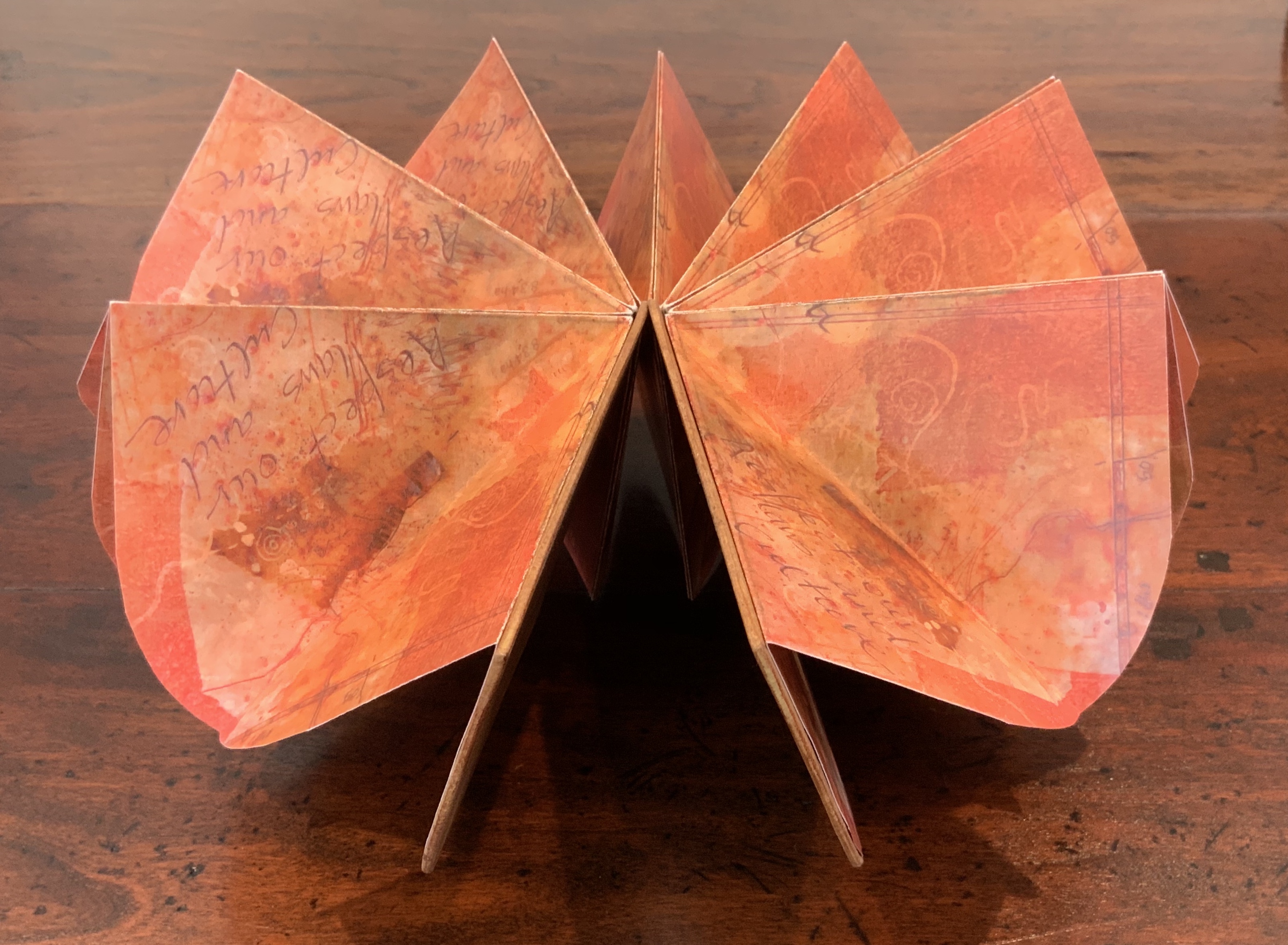
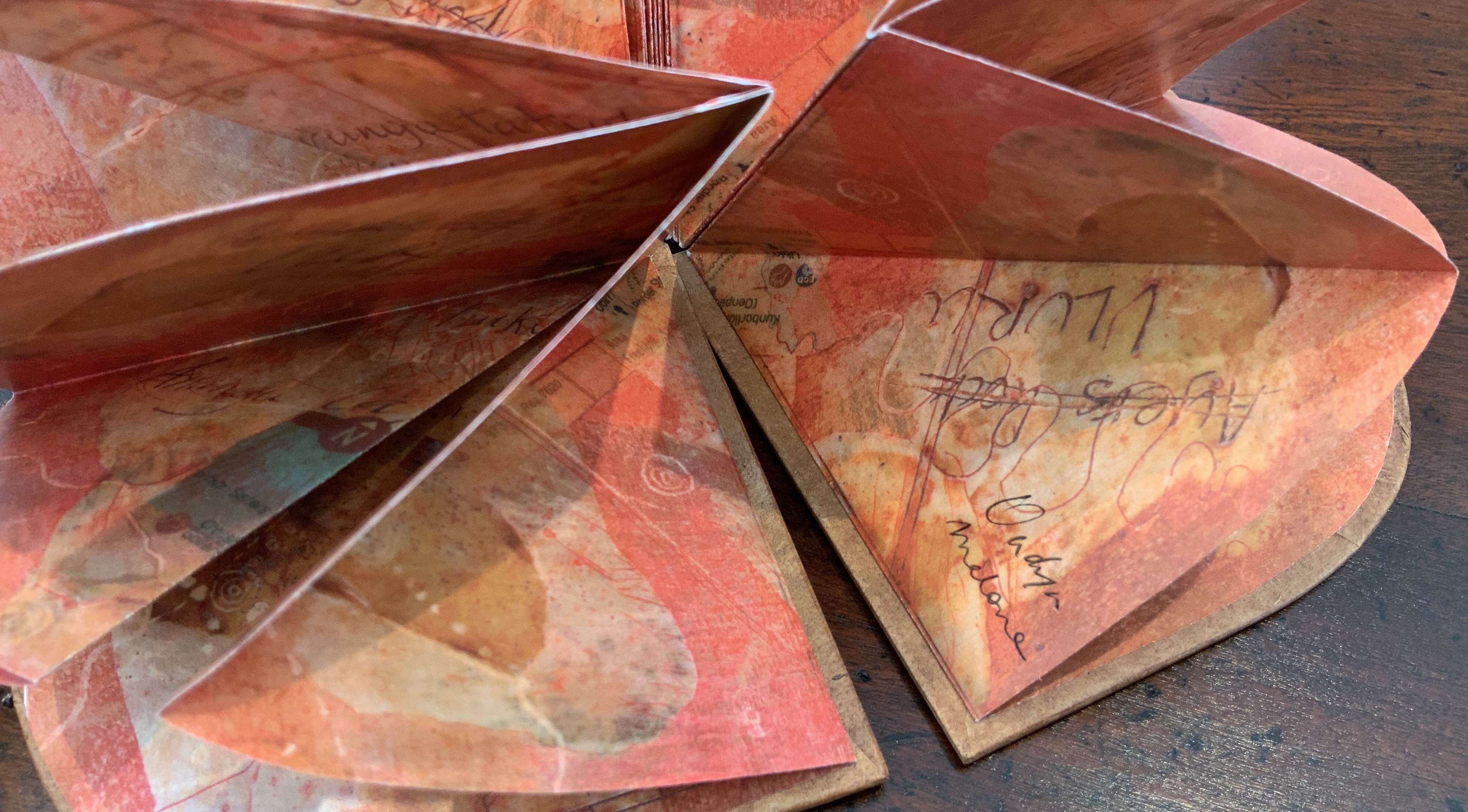
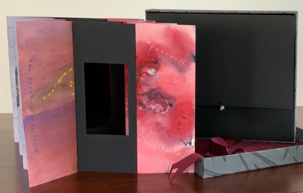
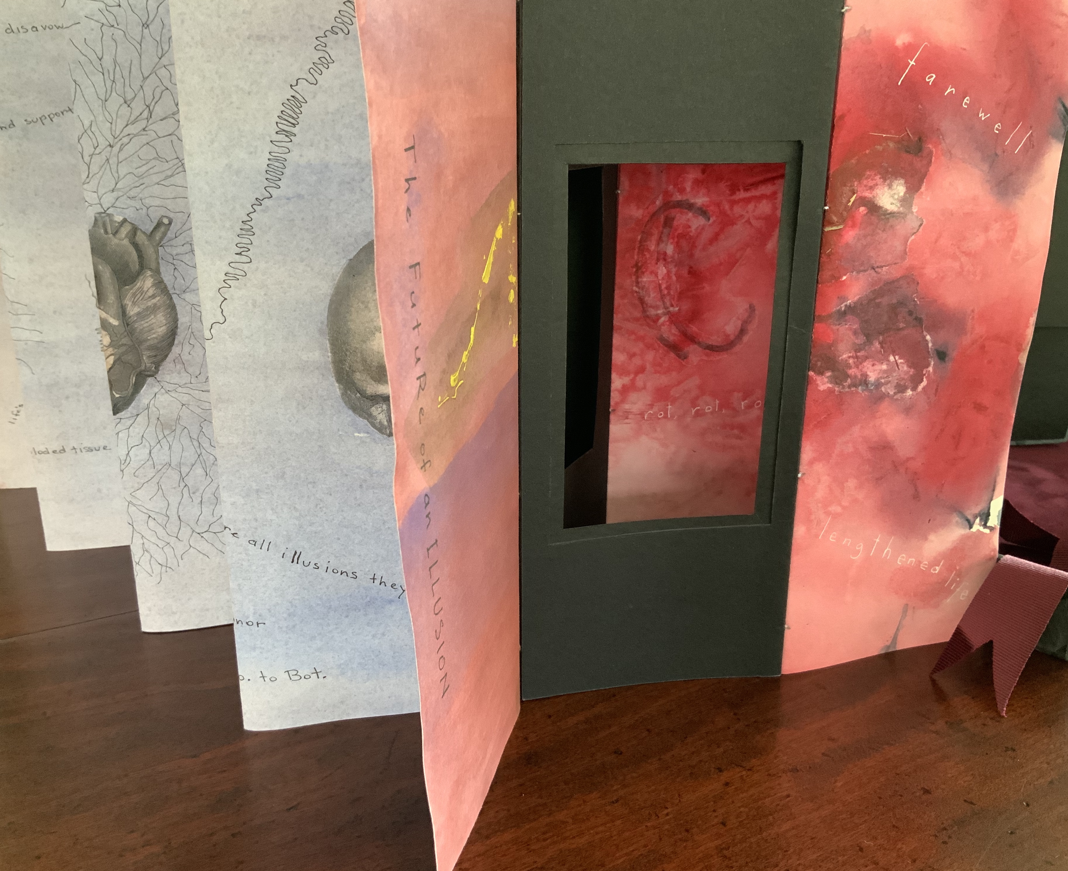
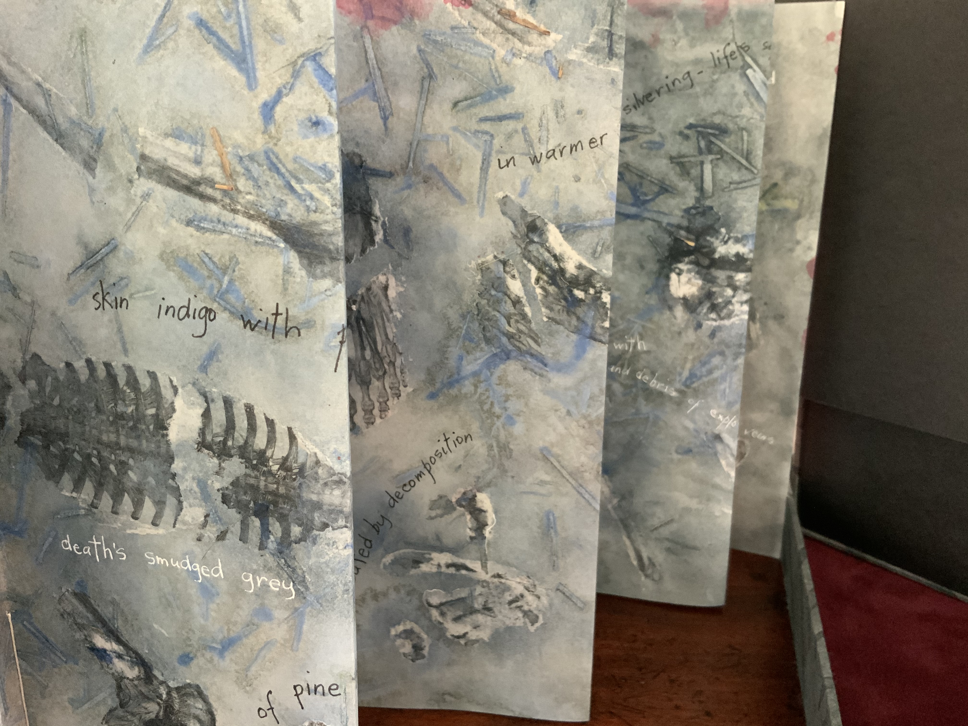
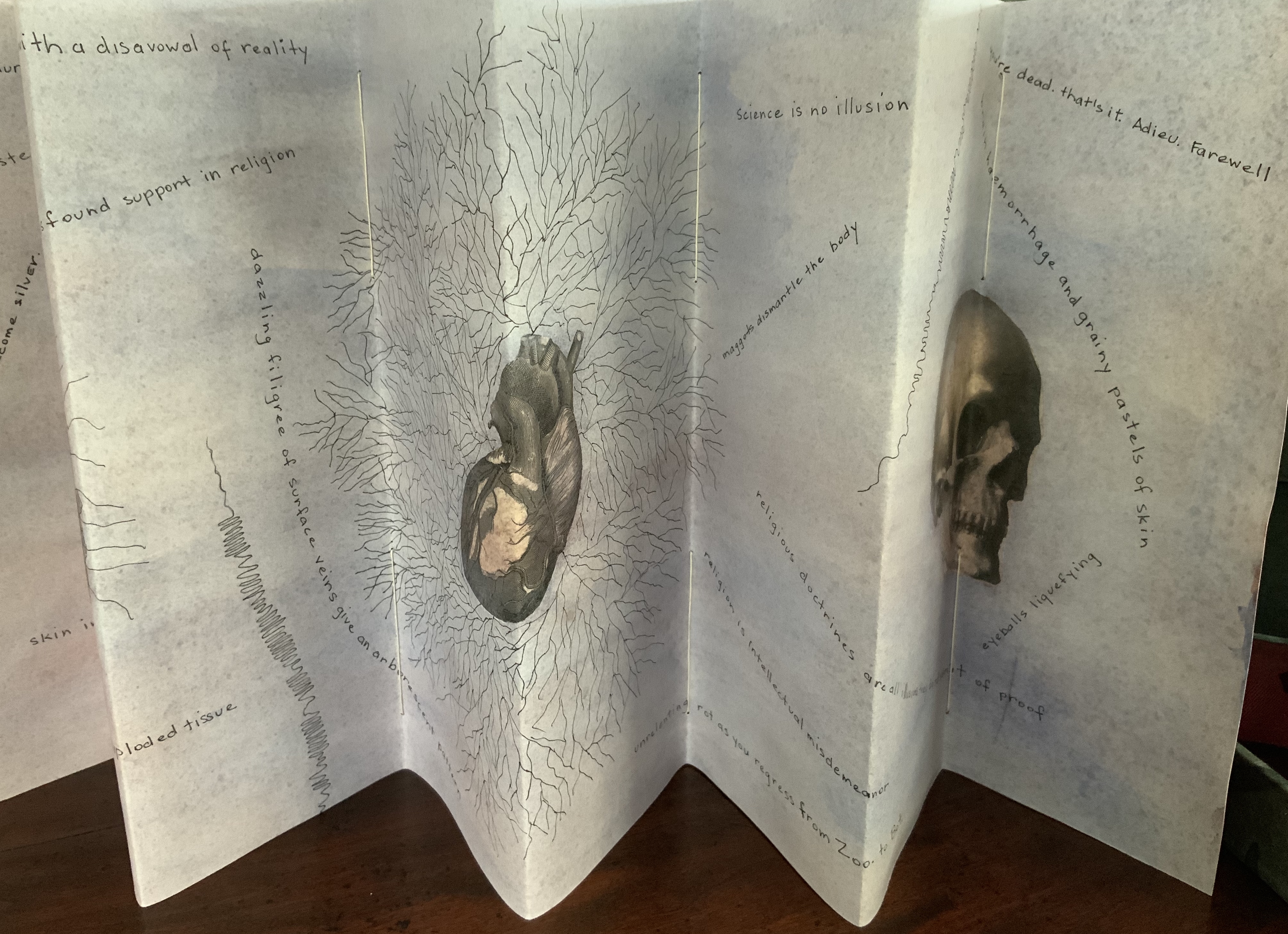
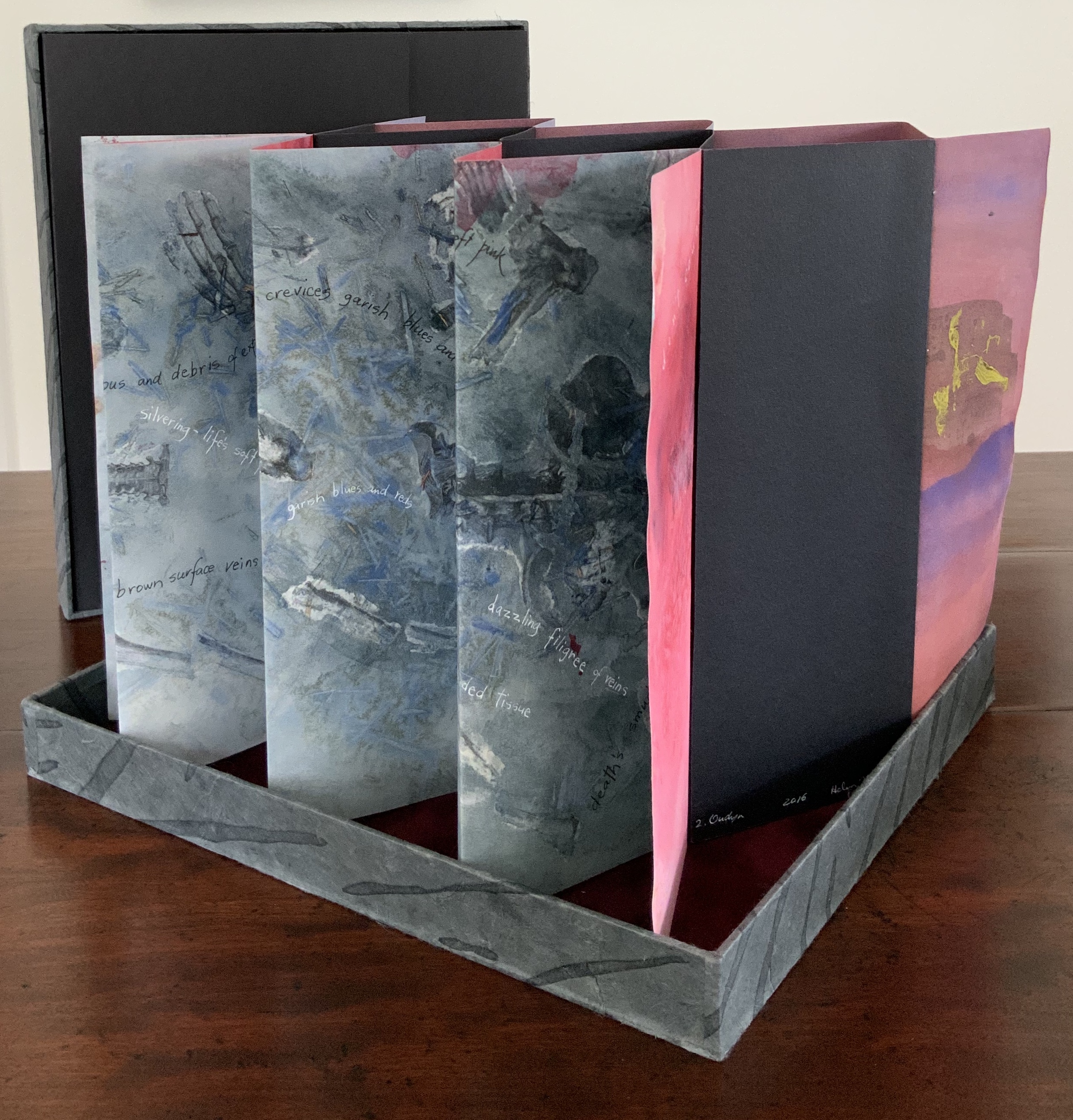
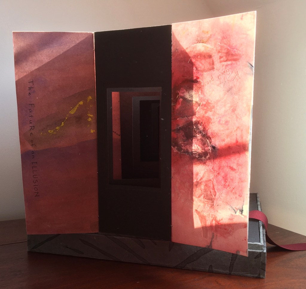
Sculptural tunnel book structure (three joined four-fold leporellos) enclosed in a folder and protective boxin a box,. Box made with Lamali handmade paper, suede paper (lining), silk ribbon and Somerset Black 280 gsm; Folder: Canson black 200gsm, skull button and waxed thread; Leporello: center leporello made of Canson black 200 gsm, adjoining leporellos made of Arches watercolour paper 185 gsm with acrylic, soluble carbon, gouache and transfer ink jet images. Box: H275 x W313 x D34 mm; Folder: H258 x W295 x D21 mm; Book: H250 x W290 x D16 mm closed, D770 mm. One of an unnumbered, signed edition of 4. Acquired from Helen Malone, 12 September 2017. Photo: Books On Books Collection.
Photos: Books On Books Collection.
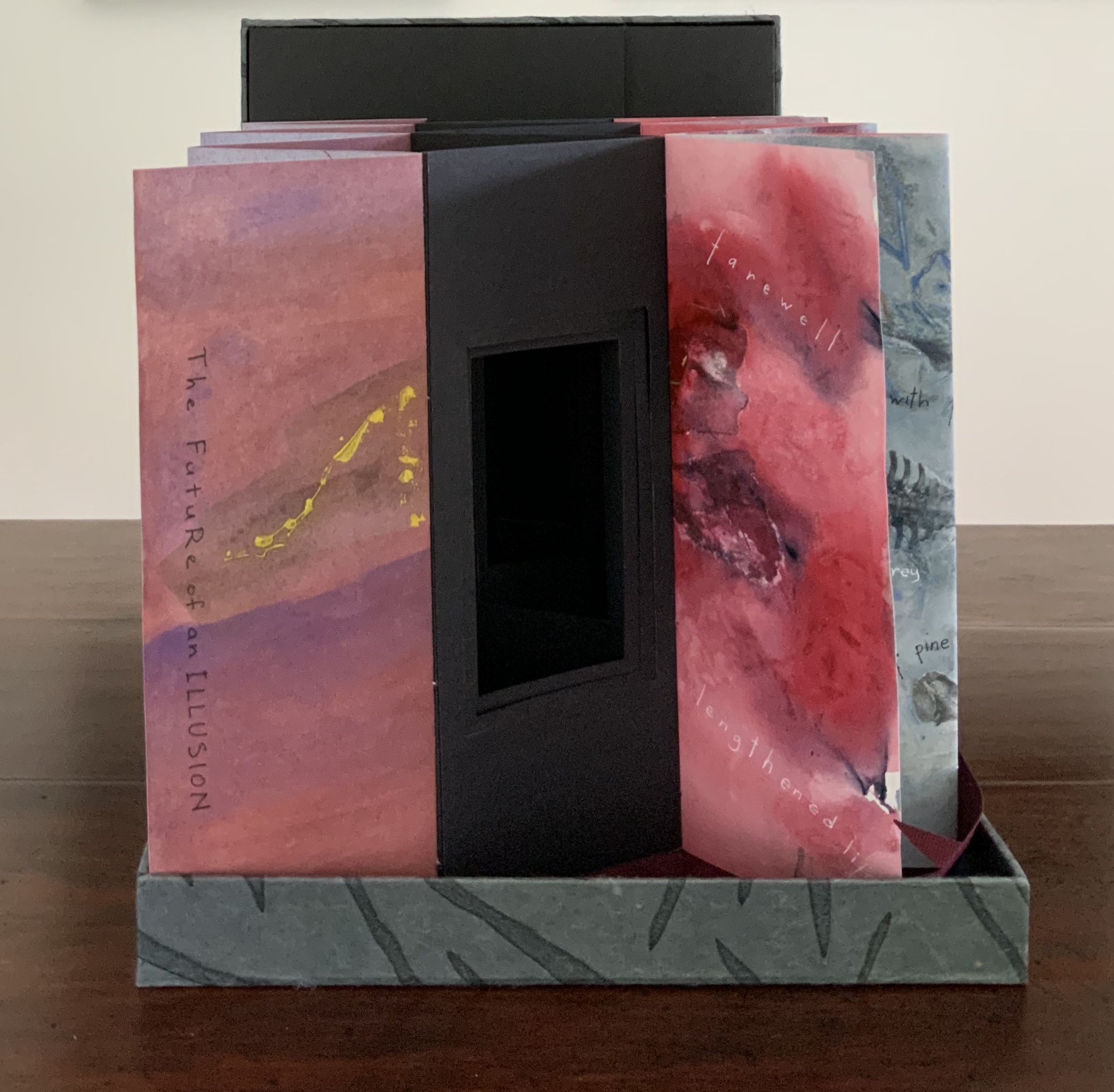
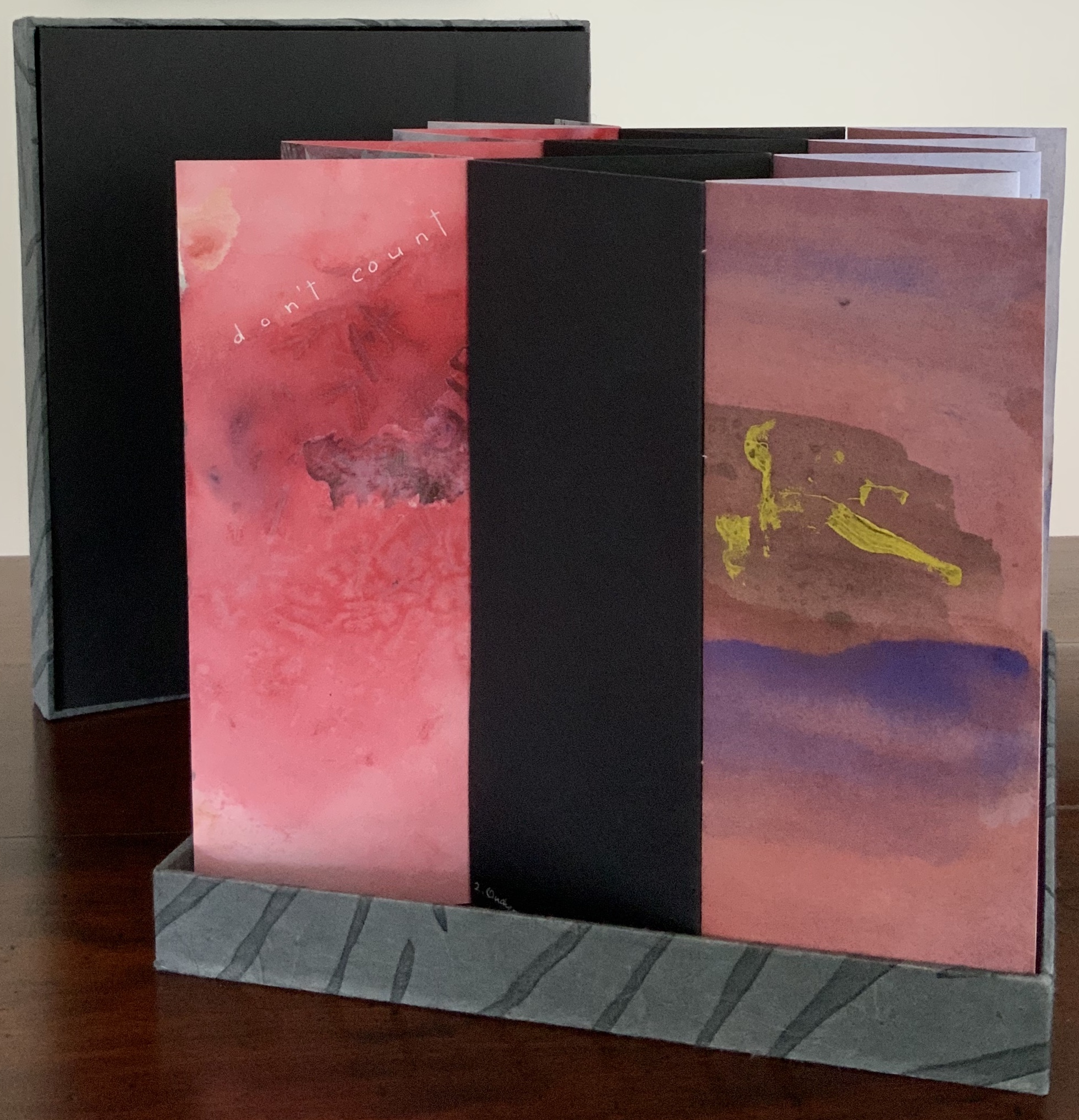
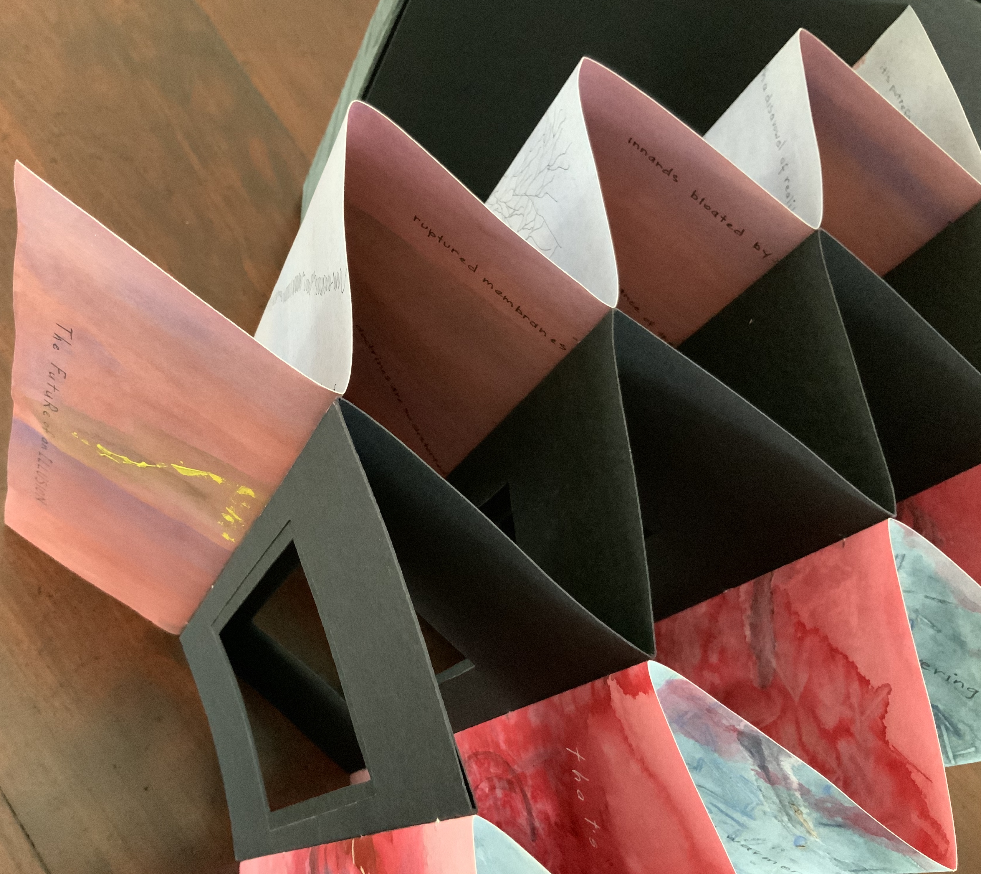
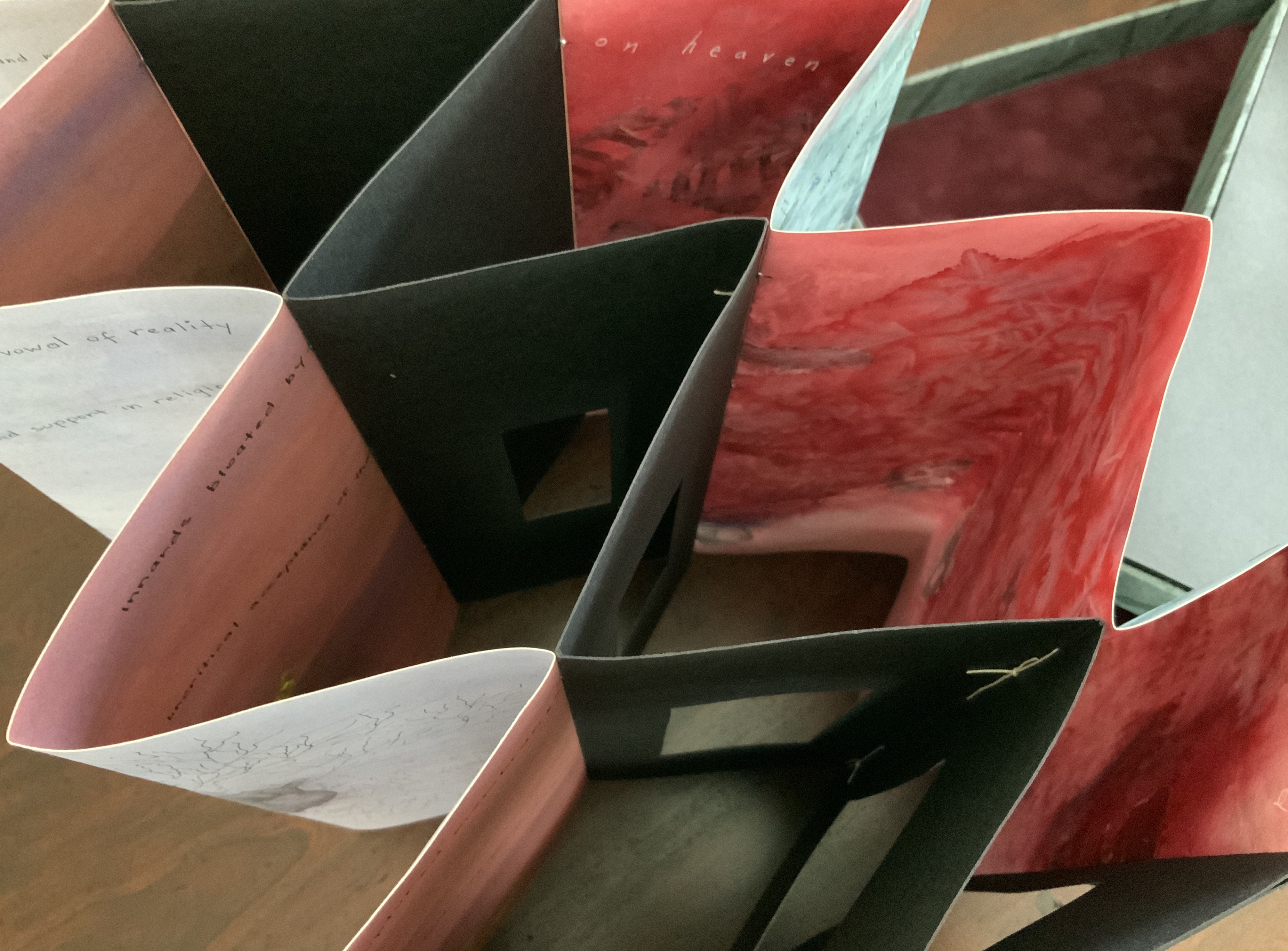
Like The Legacy of Absence and Silence, this work uses joined accordions, but builds on the cut-outs in the former to construct a tunnel book down the middle. The integration of structures here is further remarkable as a result of another collaboration between Malone and Jack Oudyn. Selected for the 2017 Manly Library Artists’ Book Award exhibition in New South Wales, Australia, The Future of an Illusion demonstrates an effective collaboration in a field of art densely populated with — almost defined by — collaborative efforts. One pair of artists to compare with Malone and Oudyn is Sonia Delaunay and Blaise Cendrars. Over a century ago and half a world away, they collaborated on La Prose du Transsibérien et de la Petite Jehanne de France, also in an accordion format modified perfectly to its subject with an aim to create a work in which color, image and words are experienced simultaneously. Malone writes that it “has always been very influential generally on my work” (correspondence with Malone, 24 September 2017).
Rather than springing from an interaction over one poem, The Future of an Illusion springs from two imaginations struck by two literary works: Sigmund Freud’s eponymous book arguing against belief in an afterlife and Jim Crace’s novel Being Dead documenting the decomposition of a dead body left in nature. The choice of the two texts, the colors of putrescence, the void toward which the central tunnel leads, the coffin-like box in which the work is stored, locked with a button skull — all create a simultaneous tension of several emotions — fear, humor, sorrow, hope, despair, revulsion and aesthetic pleasure.
Photo: Books On Books Collection.
Exhibitions:
Between the Sheets, Central Gallery, Perth , WA, 18 March – 8 April 2017.
Second venue for Between the Sheets, Australian Galleries, Collingwood, Melbourne, Vic, 13 June – 2 July 2017.
Manly Library Artists Book Award, The Creative Space, North Curl Curl, NSW, 30 March – 2 April 2017.
Art on Show Awards, Artspace Mackay in association with Mackay Show Association, 11-22 June 2017.
6th Artists Books Fair, Grahame Galleries in association with Griffith University, Brisbane, 7 – 9 July 2017.
Collections:
Artists (1/4 & 3/4), State Library of Queensland Artists Book Collection, Brisbane (4/4).
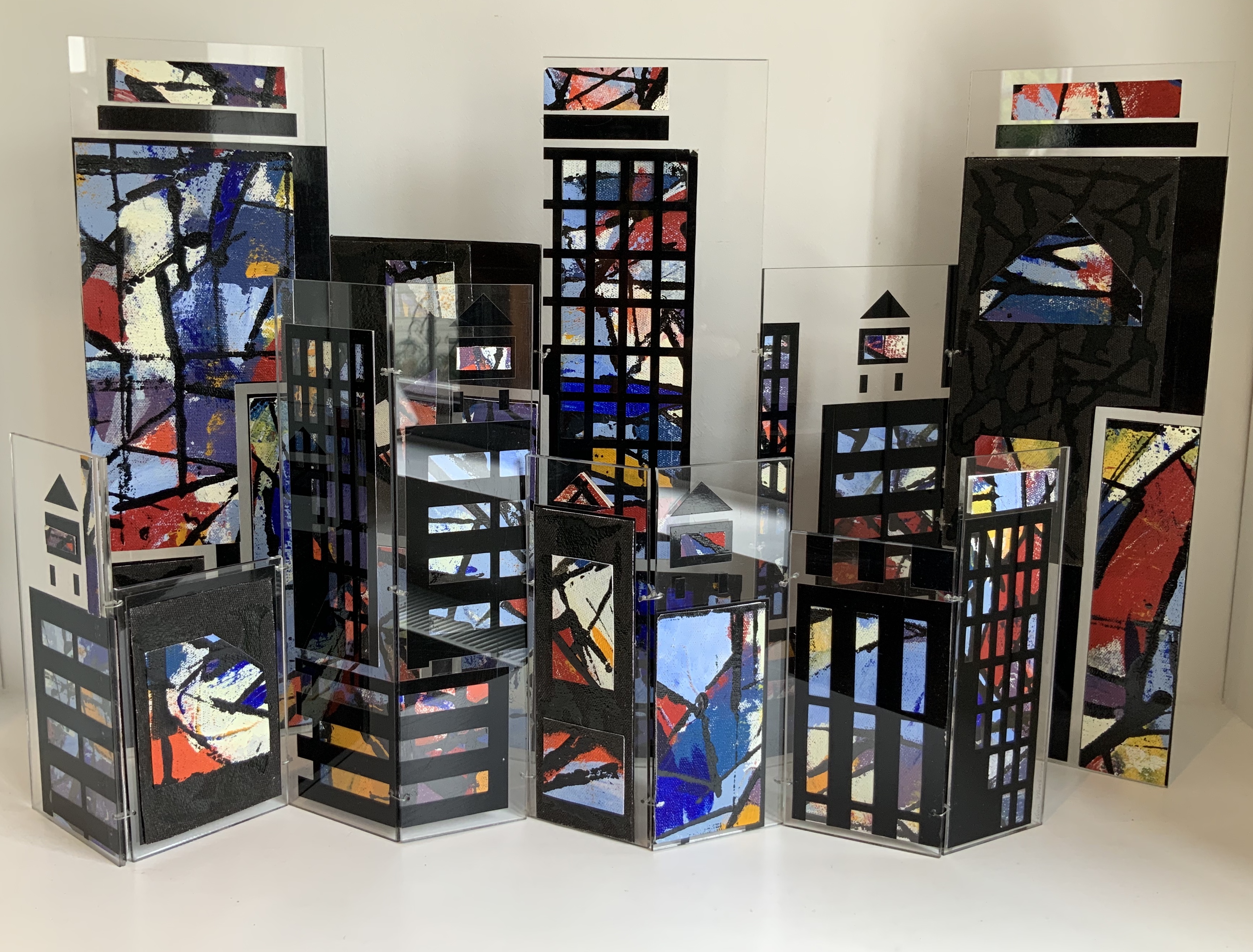
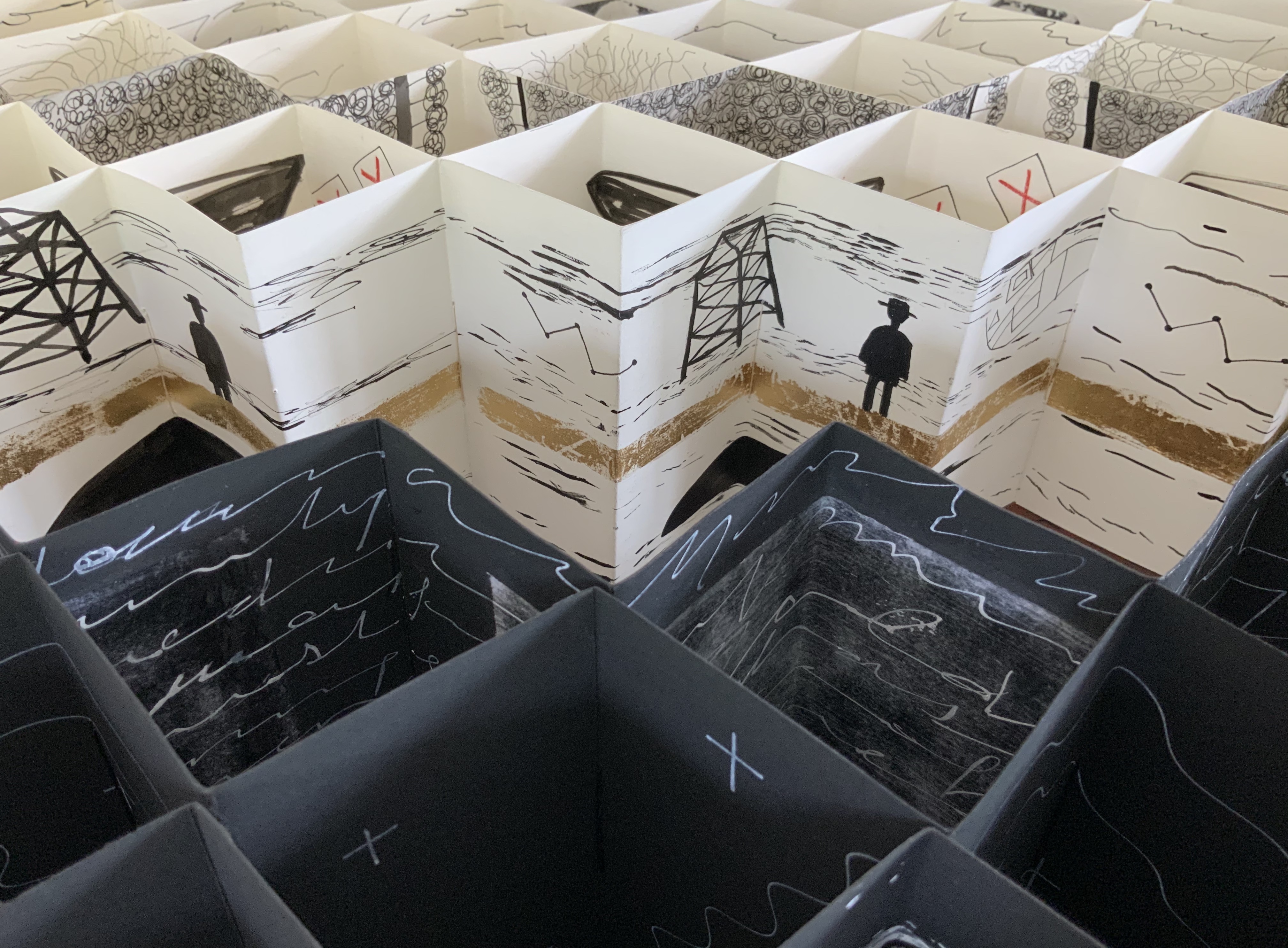
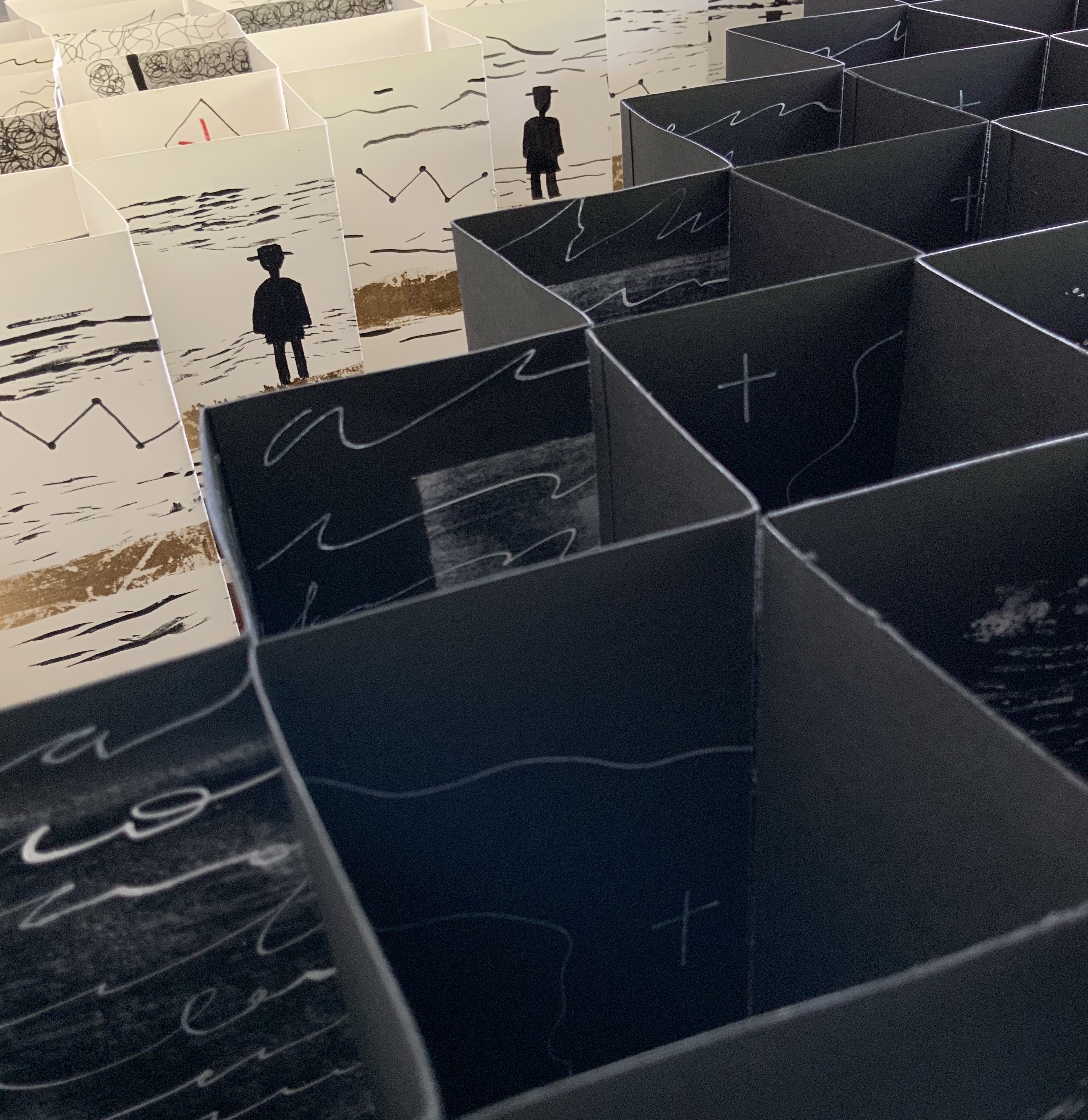
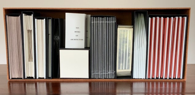
Open-sided box containing ten individual adapted book structures. Closed: H175 x W440 x D110 mm; Open: H500 x W600 mm. Version 4. Acquired from the artist, 24 November 2017. Photo: Books On Books Collection.
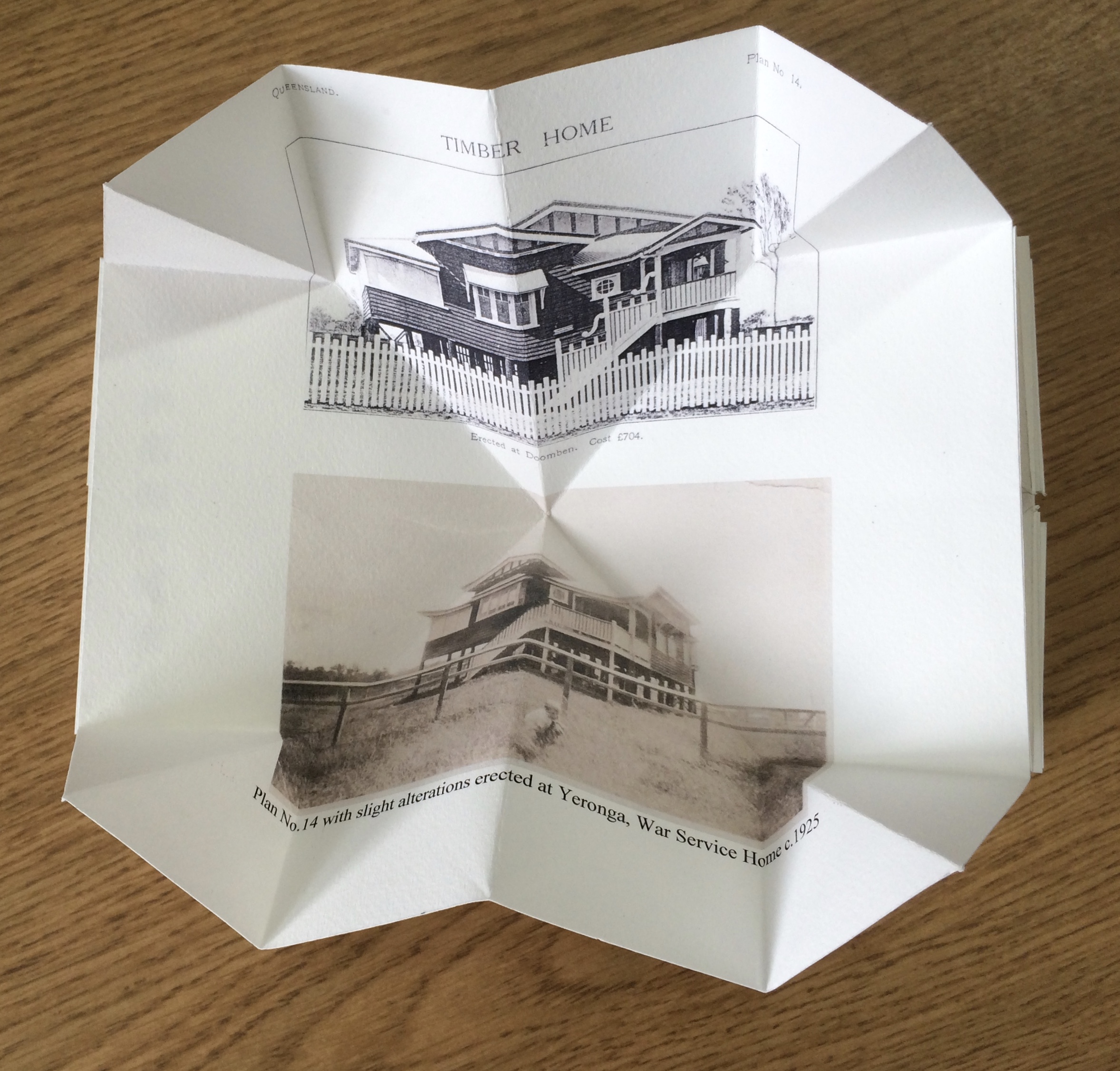
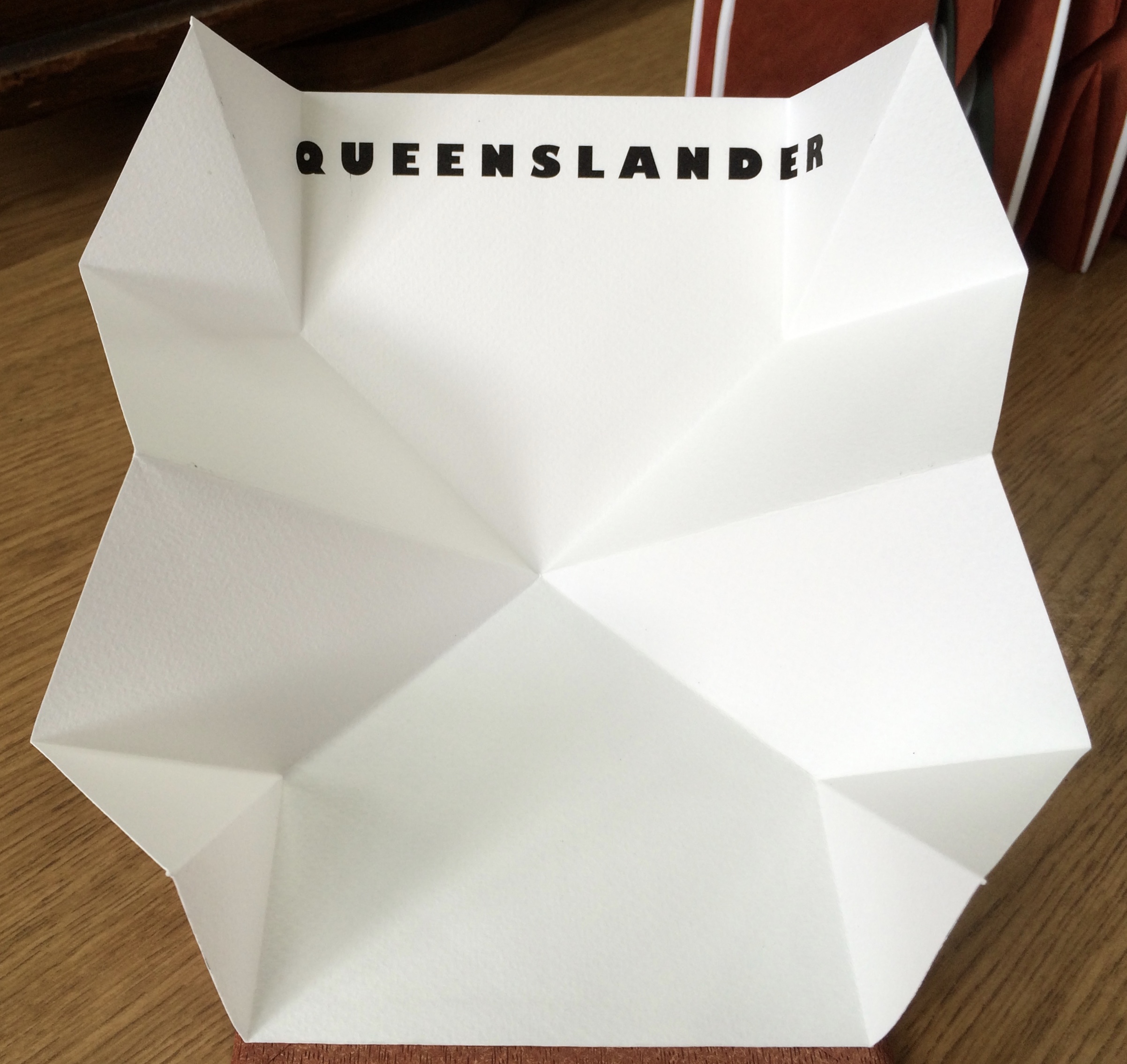
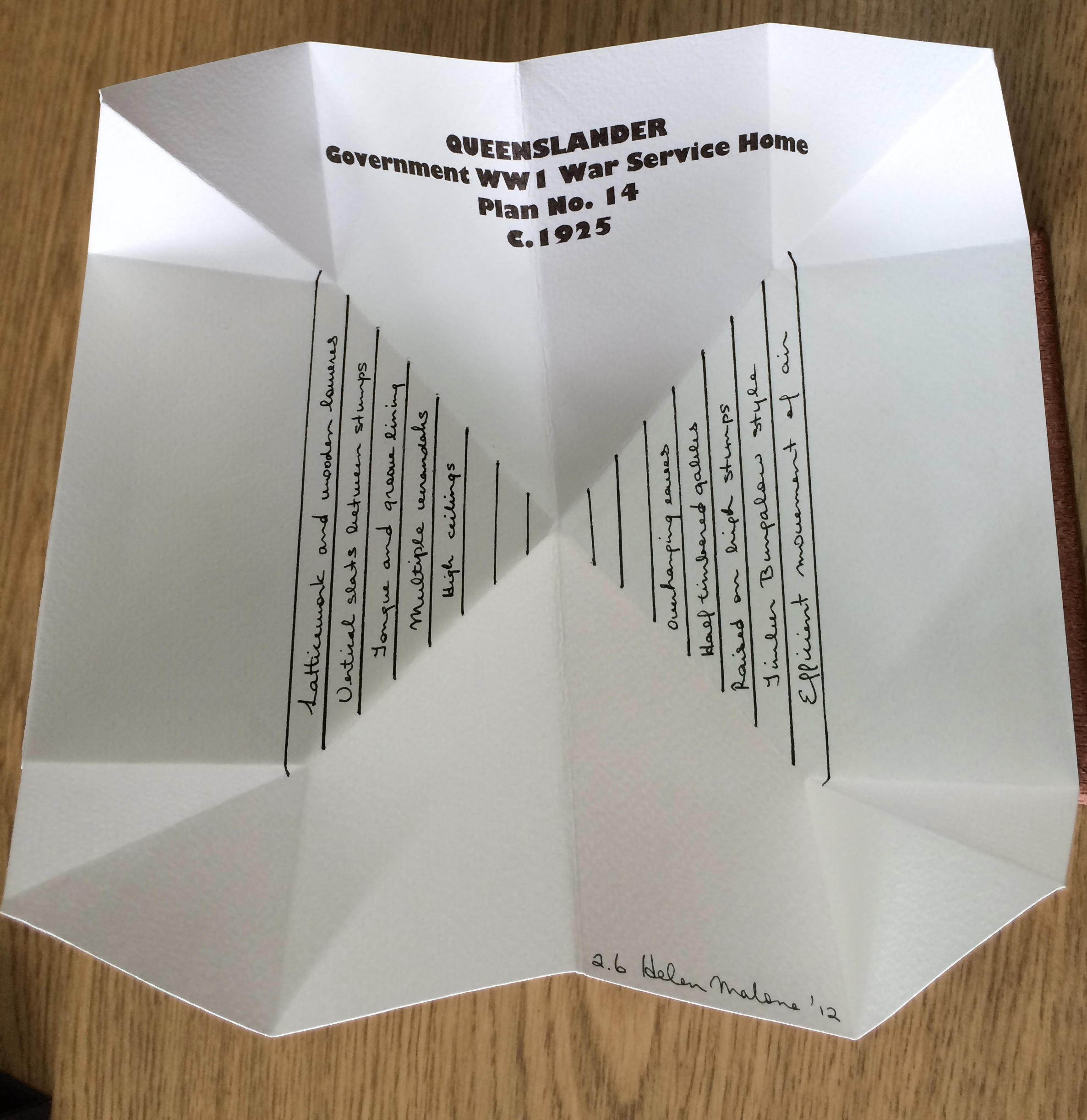
Inspired by De Architettura by Vitruvius and De Re Aedificatoria by Leon Battista Alberti, Malone created her first version of this work in 2006. Three others followed: in 2012, for the Pratt Institute; in 2013, for the State Library of Queensland; and in 2017, for this collection. In the 2012 version, the sixth book — Queenslander — differentiates that version from the others. The 2017 version is differentiated by its tenth book — Zaha Hahid.
These differentiators signal the abundant variety of structures within each version. Their unerring “rightness” for the subject of each “volume” astounds.
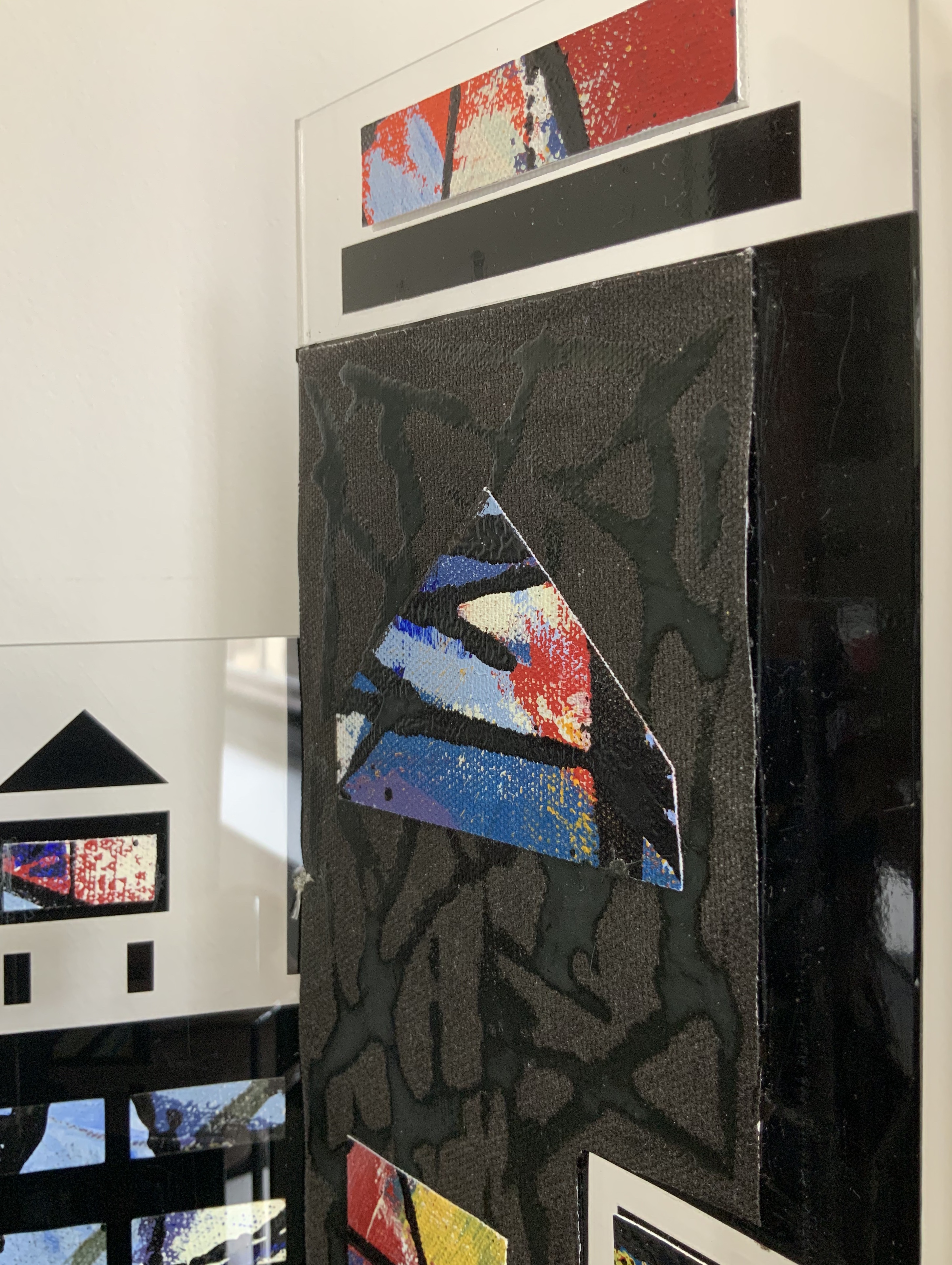
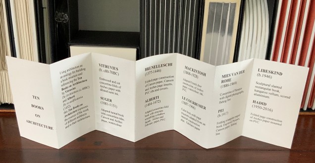
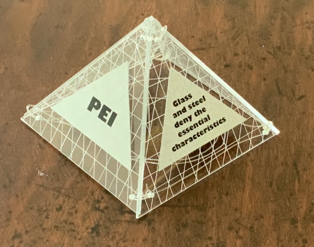
Book One — Vitruvius — consists of embossed and cut concertina folds of Arches paper with diluted sumi ink; when displayed, the line of columns suggests a Roman temple. Book Two — Suger — celebrates the French patron of Gothic architecture with an adapted tunnel book with cut concertina sides in Canson and Arches paper, ink and watercolor; when displayed, the structure suggests the stained glass windows of St. Denis. Book Three — Brunelleschi — is a folded page construction of Canson paper with page inserts of Canson and Arches paper, PVC ribs and covers; when displayed, it references the dome of the Cathedral of Santa Maria del Fiore in Florence, the internal colors of the cathedral and Brunelleschi’s credited invention of linear perspective. Book Four — Alberti — is a concertina fold book in Fabriano and Arches paper with PVC covers; its gutters and collaged pages make a structure resembling shallow facades on which several of Alberti’s statements elaborating Vitruvian principles are printed. Book Five — Mackintosh — adapts a French door construction in Arches paper, watercolor, ink and PVC to celebrate the Scottish architect and designer; when displayed, it echoes his design and its Japanese influences. Book Six — Le Corbusier — is a cube book of Fabriano paper and resembles a white concrete box; its page structure is adapted from Corbu’s internal construction plans with mezzanine floors. Book Seven — Mies van der Rohe — consists of a concertina of double Perspex pages linked with fishing line and containing digital photo images of Chicago taken by the artist; it can be manipulated to form various displays, with multiplying reflections suggesting the spread of the architect’s influence on twentieth-century cityscapes. Book Eight — Pei — is a folding triangular paged book made of Perspex and Canson paper, linked with fishing line; when displayed, the pyramid pays homage to Pei’s dome over the entrance to the Louvre. Book Nine — Libeskind — echoes the architect’s intentionally disorienting Jewish museum in Berlin; a slanted rectangular box book, made of kangaroo vellum and scored aluminum, presents its text in a way intentionally difficult to access and read. Book Ten — Zaha Hadid — consists of organic shapes and patterns on a folded pages construction of Arches paper mounted on PVC; when displayed, the book takes on a shape that echoes that of Hadid’s architectural designs.
Additional commentary and images for Ten Books of Architecture (2017) can be found here.
Exhibitions and collections:
2006 version was exhibited in Books.06, Ten and Beyond, Noosa Regional Gallery, 22 September – 22 October 2006 and was purchased from this exhibition by a private collector.
2012 version commissioned by The Pratt Institute, New York.The Collections on View at the Brooklyn Campus of the Pratt Institute and online, May – August 2013. Image published in 500 Handmade Books, Lark Publishers USA, September 2013.
2013 version commissioned by the State Library of Queensland, Brisbane.
2017 version commissioned by Books On Books Collection.
Bruce, Joan. 20 March 2023. “‘The River City’ by Helen Malone“. Queensland Memory. John Oxley Library, State Library of Queensland. Accessed 24 March 2023.
Cascio, Davide. Travel Architecture (2006). Compare with The Legacy of Absence and Silence.
Chen, Julie. 2013. 500 Handmade Books. Volume 2. New York: Lark. P. 144 (Ten Books).
Salamony, Sandra, and Peter and Donna Thomas. 2012. 1,000 Artists’ Books : Exploring the Book as Art. Minneapolis: Quarto Publishing Group USA. Pp. 95 (Tsunami), 170 (Shattered in the Shaky City).
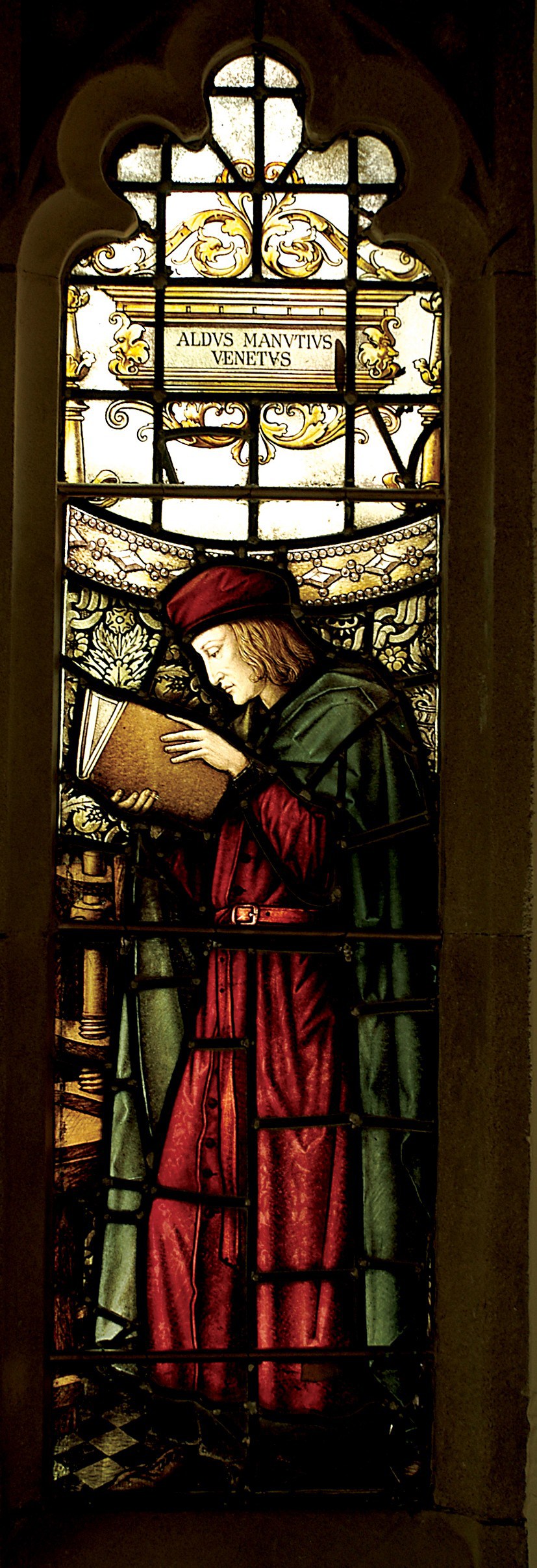
Aldus Manutius, John Rylands Library, University of Manchester
Merchants of Print from Venice to Manchester, 29 January to 21 June 2015, John Rylands Library, University of Manchester, UK:
This exhibition celebrates the legacy of Aldus Manutius (1449 – 1515), an Italian humanist scholar who founded the Aldine Press at Venice. His publishing legacy includes scholarly editions of classical authors, the introduction of italic type, and the development of books in small formats that were read much like modern paperbacks. The firm was continued after his death by his son and grandson until 1598. John Rylands Library, University of Manchester website, accessed 17 May 2015
Back in February as I enjoyed Oxford’s recognition of the 500th anniversary of the death of Teobaldo Manucci, the Manchester exhibition was already running. Where the Oxford event focused on the more architectural motifs distinguishing early Venetian from Roman printing, the Manchester event dwelt more on the educational thrust, technical and business aspects of the Aldine legacy and provenance of the Manchester collection.
The Manchester focus on provenance wends its way back through the library’s donors dedicated to the cause of education (if not to impressing its practitioners with the importance of the woolen industry’s contribution to it) to the Renaissance circle on which Manutius depended:
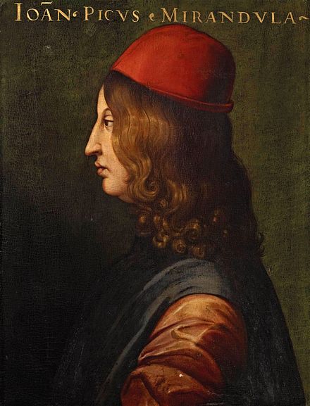
Giovanni Pico della Mirandola, 1463-1494 Uffizi Gallery, Florence
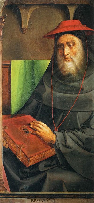
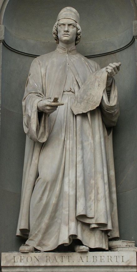
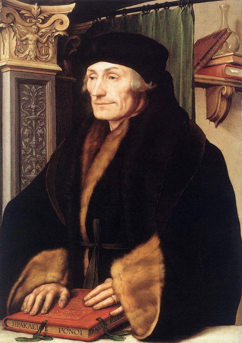
In 1482 Manutius lived with Pico della Mirandola and served as tutor to his nephews, the sons of the Princess of Carpi. Like the later, beneficent Manchester merchants, Pico’s family contributed financially to the cause: they funded the opening of the Aldine printing office in Venice in 1494. Of course, Pico made more than a patron’s financial contribution to the cause. Along with Cardinal Bessarion, Marsilio Ficino, Leon Battista Alberti and Erasmus – all known intimately to Manutius – Pico drove the revival of learning embodied in the output of the Aldines and numerous other printers (John Addington Symonds, Renaissance in Italy, Volume 2 (of 7): The Revival of Learning, John Murray, 1914).
Cardinal Bessarion, Justus van Gent and Pedro Berruguete , (Les Hommes Illustres)
Marsilio Ficino, Duomo, Florence
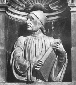
Leon Battista Alberti, Piazza degli Uffizi, Florence
Desiderius Erasmus, 1523?, Hans Holbein the YoungerThe Manchester exhibition closes this month.
The next major Aldine event is the summer school hosted by The Catholic University in Siena (31 August – 3 September) and jointly organized by the Centro di ricerca europeo libro editoria biblioteca (CRELEB). Other events with dates still to be confirmed are planned in Brighton, Treviso, Milan and Arezzo.
Here’s a previously missed infographic for the evolution of the book – a bit skeletal but with the elegance of the format. And while we are at it, let’s add some bibliographic and webographic “evolution” entries:
Feel free to suggest new additions to the timeline!
Ebook Timeline Updated – 20120812
Yesterday, the 11th of August 2012 marked the twenty-fifth anniversary of Hypercard. Alerted by Matthew Lasar in Ars Technica in May, gurus lined up to comment on Bill Atkinson‘s contribution in the 80s to Apple and the basics of hyperlinking techniques we now take for granted.
David Weinberger and Roy Tennant celebrated the anniversary with engaging and personal posts linked from their names here.
With the publication of The Cluetrain Manifesto, Weinberger became one of the Web’s leading light-shedders (gurus) and provocateurs. Most important in this context, he was in the audience when Bill Atkinson presented Apple’s Hypercard to the MacWorld conference in 1987. Weinberger writes, “HyperCard was a groundbreaking, beautiful, and even thrilling app. Ahead of its time for sure. But the time it was ahead of seems to me to be not so much the Age of the Web as the Age of the App. I don’t know why there isn’t now an app development environment that gives us what HyperCard did. Apparently HyperCard is still ahead of its time.”
Tennant, too, has written several books and a monthly column on digital libraries for Library Journal for a decade and currently works at OCLC. Most important, he “was there” as an early user of the Hypercard system and HyperTalk programming language on which it is based. As Tennant puts it, “HyperCard was where I learned how to DO the Web. It was where I learned the importance of screen real estate. It was where I learned the law of 7, plus or minus 2. It was where I learned how important graphics are in creating an engaging site. It was where I cut my teeth on interactivity.”
Apps, screen real estate, Miller’s law, graphics and “cutting teeth” on interactivity — all are part of the new toolkit for making books.
Timelines are, of course, for looking further back as well as forward. Earlier this year, April 2012 marked the fifteenth anniversary of the publication of Liane Lefaivre’sLeon Battista Alberti’sHypnerotomachia Poliphili: Re-Configuring the Architectural Body in the Early Italian Renaissance (Cambridge, MA: MIT Press, 1997) and the online publication of The Electronic Hypnerotomachia, which contains the facsimile text and illustrations. The online publication of extracts from Lefaivre’s book illustrates the linking prefigured by the “card stack” approach of HyperCard. What MIT Press and TU Delft, Lefaivre’s affiliation, host on their servers are not ebooks or even e-incunabula of the sort we experience today, but they are clearly forerunners to them.
In twenty-eight more months, December 2014, we will see the 515th anniversary of the original work’s publication by Aldine Press (Venice, December 1499). The founder Aldus Manutius did not normally publish heavily illustrated books. The Hypnerotomachia Poliphili was the exception and the only commissioned work that Manutius undertook. The exception reflects favorably on the overall success of his business and supports the view that Venice had become the capital of printing and publishing very shortly after the invention of printing by moveable type.
The book unveils an inscrutable, almost comic-book-illustrated story, glittering with made-up words in Greek, Latin, Hebrew and Arabic (including proto-Greek, -Hebrew and -Arabic fonts). In addition to the page displays sculpted into shapes such as goblets, this one volume displayed the technological mastery of and improvement on the new Roman (as opposed to the heavy Gothic) typeface Bembo. According to Norma Levarie in The Art & History of Books (New York, 1968), this singular volume revolutionized typography in France in less than twenty-five years.
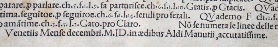
Somewhat like software releases, though, the 1499 edition came with bugs. The colophon to the Hypnerotomachia Poliphili falls at the end of a full page of errata.
“Venice Month December. 1499. in the house of Aldus Manutius, most accurately done.”
“The Book Industry Study Group (BISG), a leading U.S.-based trade association representing the entire book supply chain, announced today the publication of a new Policy Statement endorsing EPUB 3 as the accepted and preferred standard for representing, packaging, and encoding structured and semantically enhanced Web content — including XHTML, CSS, SVG, images, and other resources — for distribution in a single-file format.”
For the record and from the Library of Congress:
“The Open eBook Publication Structure or “OEB,” originally produced in 1999, was the precursor to EPUB. Version 1.0 of the Publication Structure was created in the winter, spring, and summer of 1999 by the Open eBook Authoring Group. Following the release of OEBPS 1.0, the Open eBook Forum (OeBF) was formally incorporated in January 2000. OEBPS Version 1.0.1 [OEBPS_1_0], a maintenance release, was brought out in July 2001. OEBPS Version 1.2 [OEBPS_1_2], incorporating new support for control by content providers over presentation along with other corrections and improvements, was released as a Recommended Specification in August 2002. EPUB 2 was initially standardized in 2007. EPUB 2.0.1 was approved in 2010. EPUB, Version 3, was approved as an IDPF Recommendation in October 2011. It is substantially different from EPUB, Version 2, both in using only a single form for textual content and in having support for audio, video, and scripted interactivity (through Javascript). No longer supported are the EPUB_2 formats for text content, one based on the Digital Talking Book [DTB_2005] format and a second form based on XHTML 1.1 compatible with OEBPS_1_2. A single new encoding for textual Content Documents is based on HTML5/XHTML and CSS3, despite the fact that both of these W3C standards are still works in progress. SVG is supported for graphics and it is possible to have an EPUB_3 document whose “pages” consists [sic] only of graphics, for example for a graphic novel. Several legacy features are deprecated. Some legacy structures may be included for compatibility of EPUB_3 documents with existing EPUB_2 readers. EPUB_3 readers are expected to render publications using version 2 and version 3.”
Coincidentally, Amazon UK reported today that it is now selling 114 Kindle ebooks for every 100 print books it sells.
The EPUB format is not natively readable on the Kindle device or in the Kindle application. Customers can add conversion apps easily to their devices to make EPUB readable on a Kindle, but as consumers seek the advantages of an industry standard, how will Amazon respond?
Feel free to suggest new additions to the timeline!
Added 20120806.
Ebook Timeline Updated – 20120725
As we are still in the Age of e-Incunabula, what better than a trip half way around the world to Japan to see one of the world’s largest collections of Western incunabula — and an excellent site to bookmark?
The National Diet Library’s site refers to itself as an exhibition based on the book “Inkyunabura no Sekai” (The World of Incunabula) / written by Hiroharu Orita, compiled by the Library Research Institute of the National Diet Library. Tokyo: Japan Library Association, July 2000 (in Japanese).
The exhibition provides a timeline of incunabula from the second half of the 4th century when the shift to the codex occurred to 1980 when the British Library began entering data on its collection of incunabula into the ISTC. The site provides much more than this chronology.
Images from the collection, statistics on the type fonts used, coverage of design and how the quires (sheets of paper folded, forerunner of book signatures and files in EPUB!) were arranged, and the binding process — all are covered straightforwardly and often in entertaining detail. Look on this site and consider how far we have to go with our ebooks and apps!
Added 20120725.
Ebook Timeline Updated – 20120719
Not as interactive as the Counterspace timeline for typography below, but certainly as densely informative, and it extends to typography online.
Added 20120719.
Ebook Timeline Updated – 20120717
Another timeline, this one focused on bookbinding. Is .zip the binding for an ebook?
Added 20120717.
Ebook Timeline Updated – 20120710
On the heels of the question above comes an outstanding interactive infographic on a critical element of the book and ebook: typography.
Added 20120710.
Ebook Timeline Updated – 20120706
Yet another ebook timeline, and this one is broken down into interpretive categories, “The Age of Writing” and “The Network Era,” which is thought-provoking. Are we in “The Age of the Tablet”?
Added 20120706.
Start of the Ebook Timeline
In 1936, “Chronology of Books & Printing” appeared in its revised edition, published by Macmillan in New York. In 1996, Cor Knops picked up the torch and started a Book History Timeline from Sumerian clay tablets (he could have started with the caves at Lascaux!) through to 1997 with the first issue of “Biblio Magazine” but with little acknowledgment of ebooks.
Now in 2012, looking back to 2002, we find this journalistic stab at a timeline for ebooks.
Forged together, the chronologies would have to include “As we may think” by Vannevar Bush in 1945, Ted Nelson’s coining of “hypertext” in 1963-65, the Apple Newton in 1993 (how many publishers and authors have kept track of the free downloads of their Newton ebooks?) and much more.
Another extension of the ebook timeline appears in this book by Marie Lebert, which fills in important gaps, misses others and offers more than a few overemphasized continental developments. Her timeline takes us through 2009, which means that the signal events in 2011/12 of ebook sales’ outstripping those of print in some markets are still to be added.