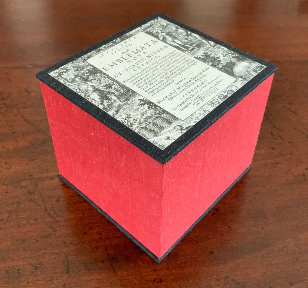
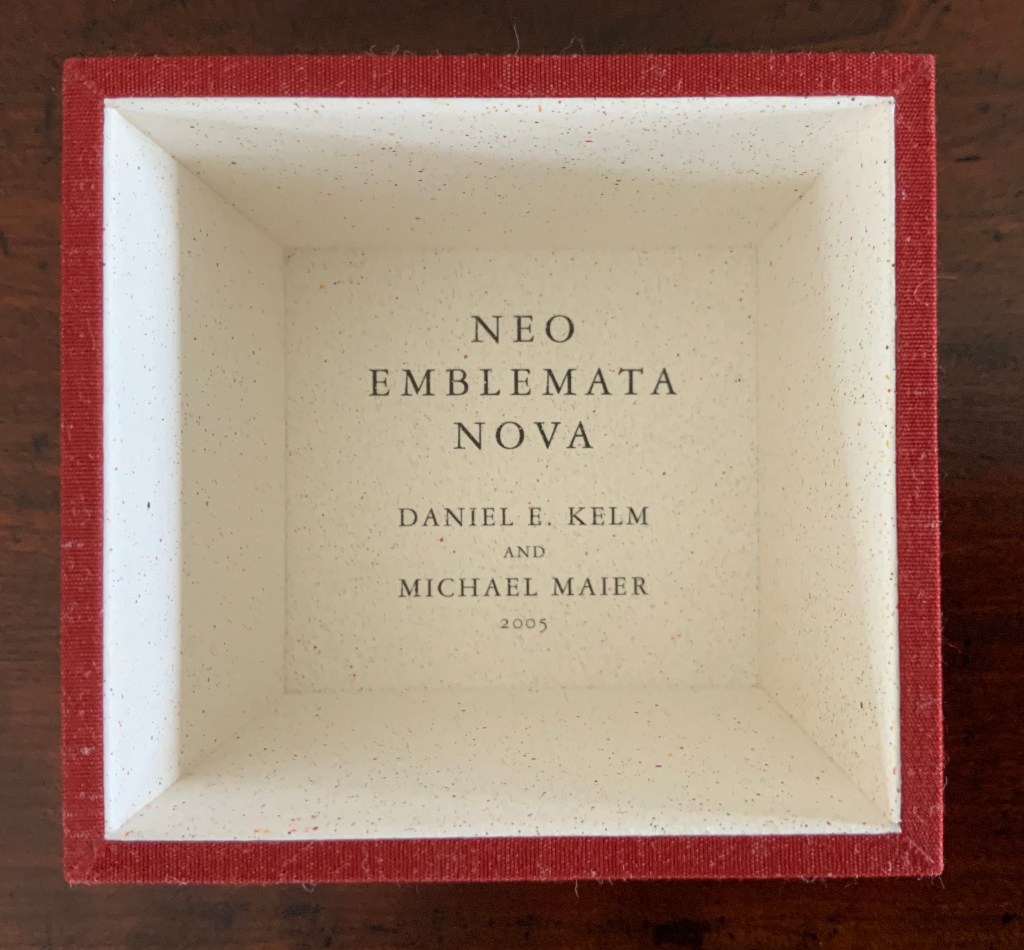
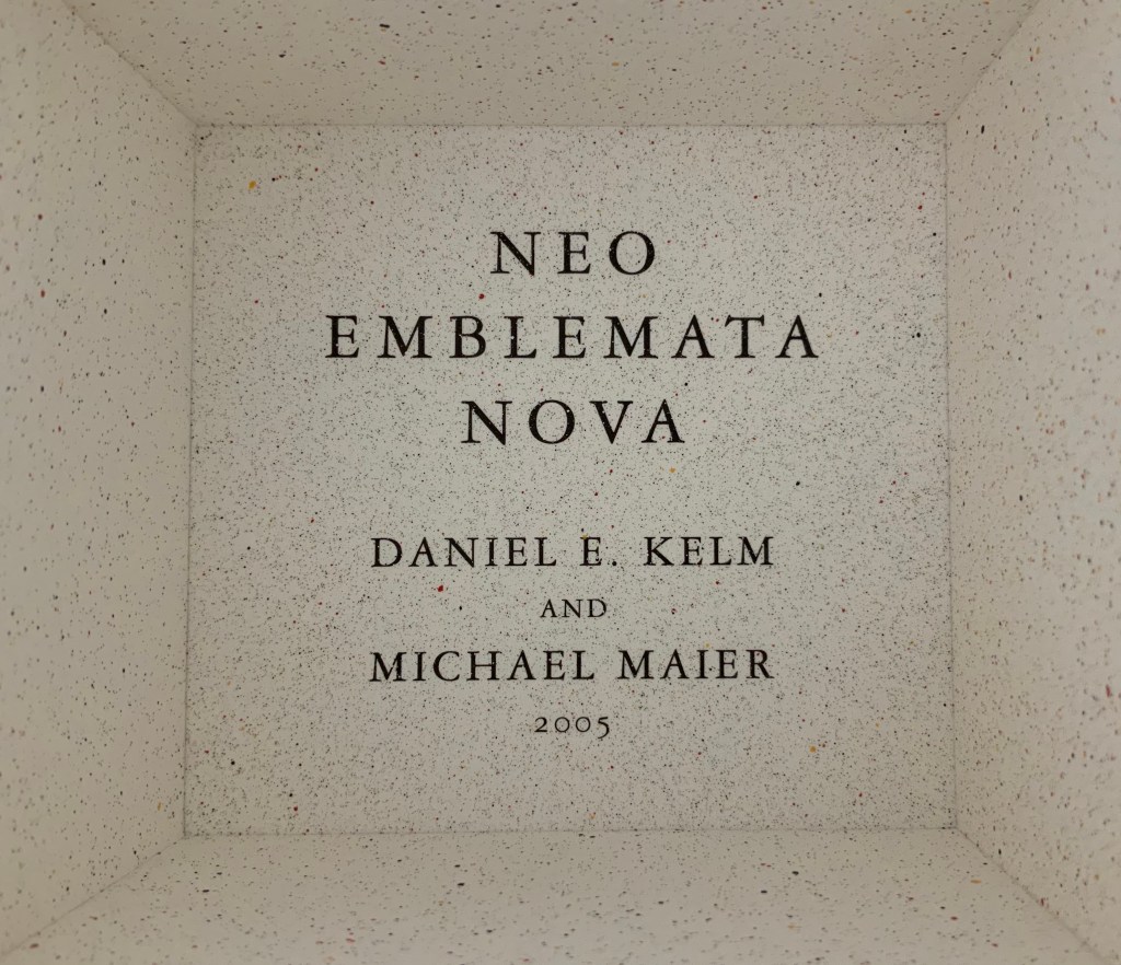
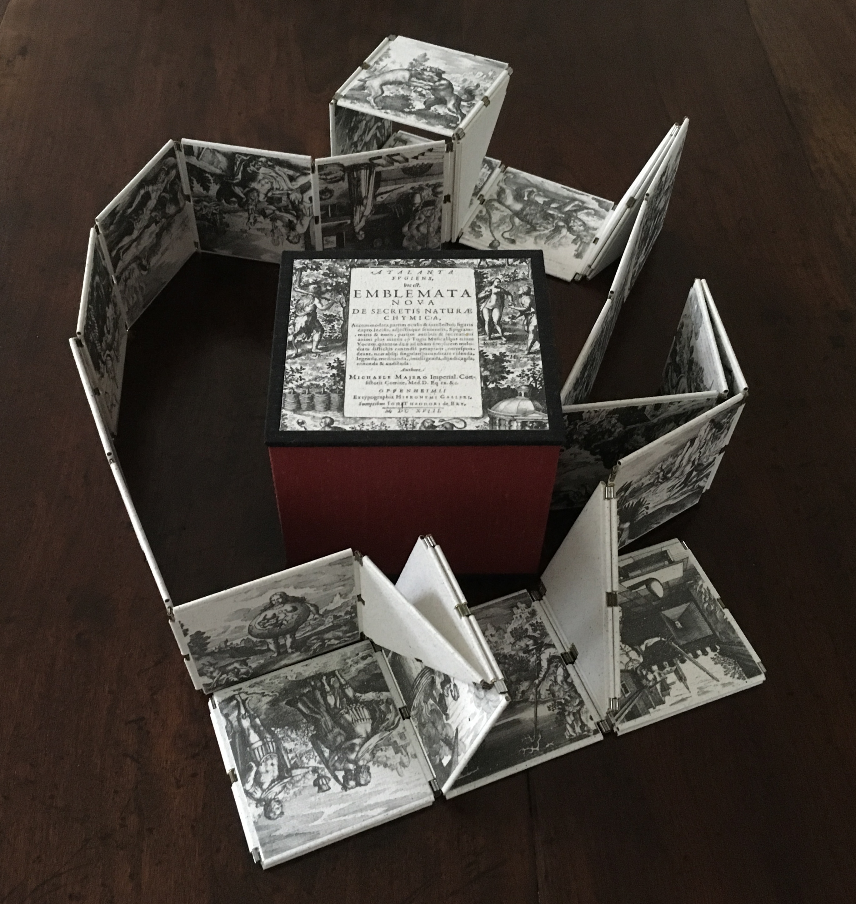
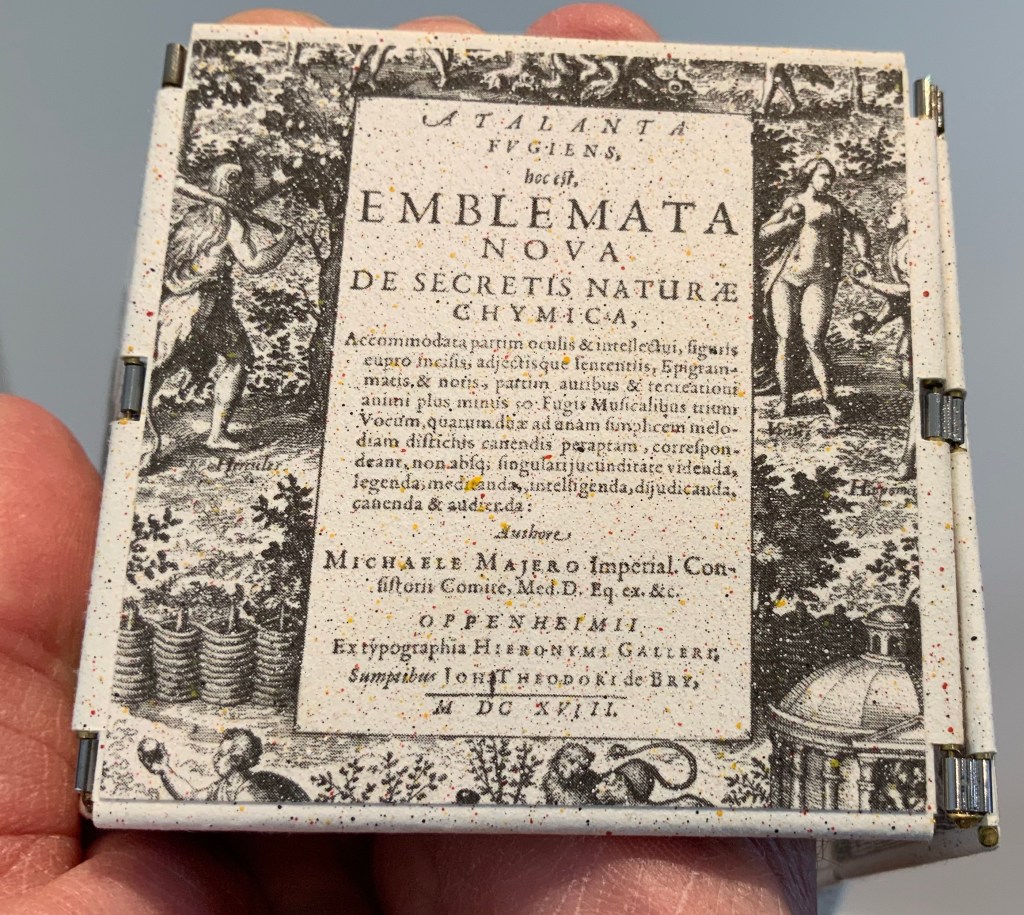
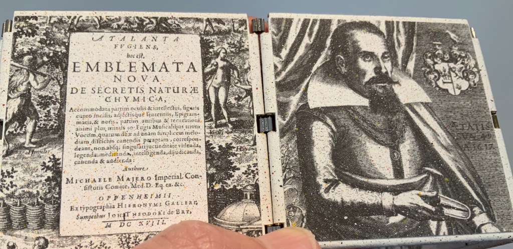
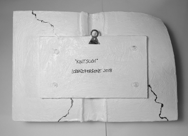
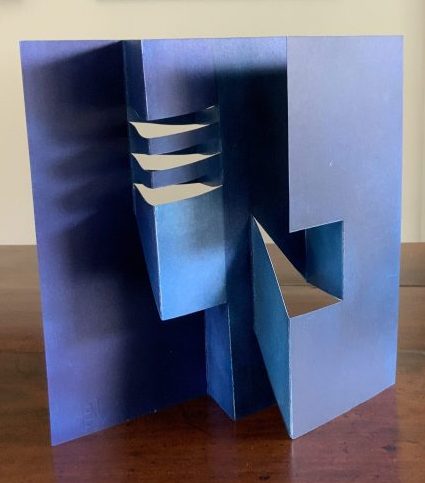
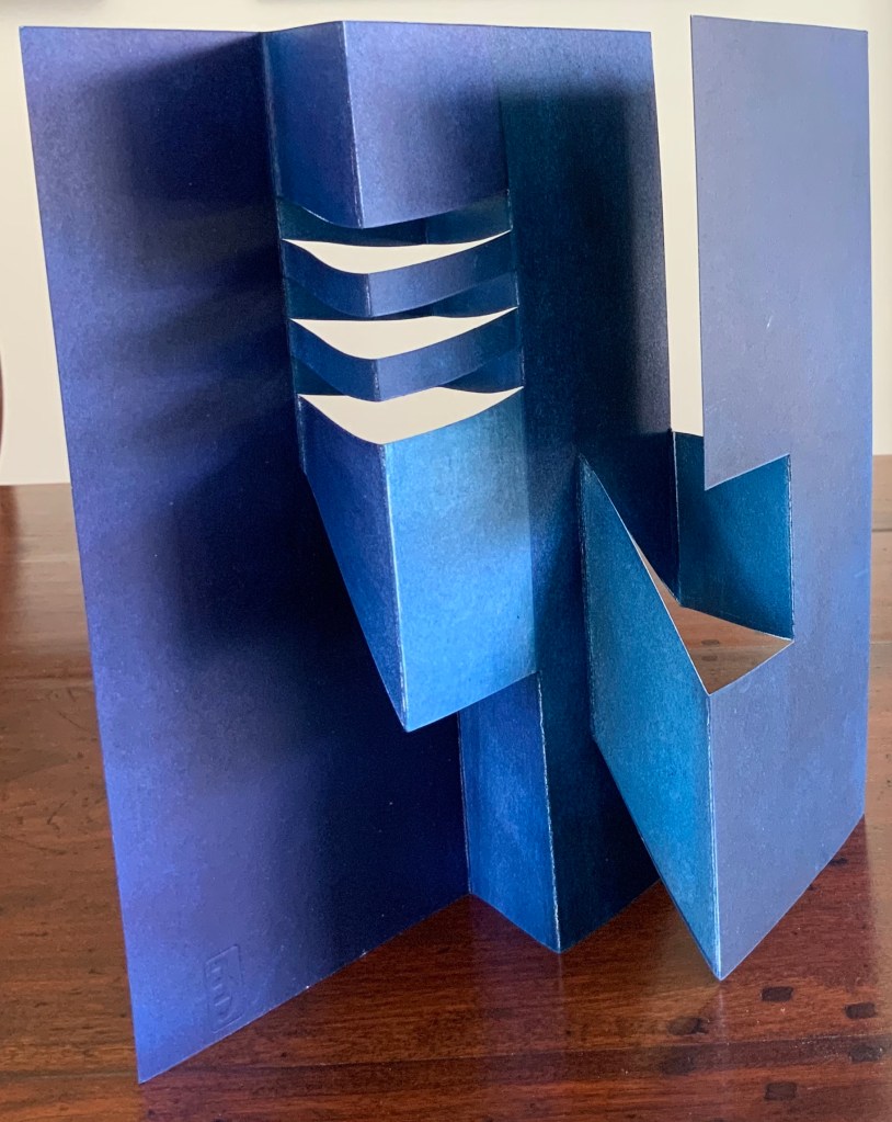
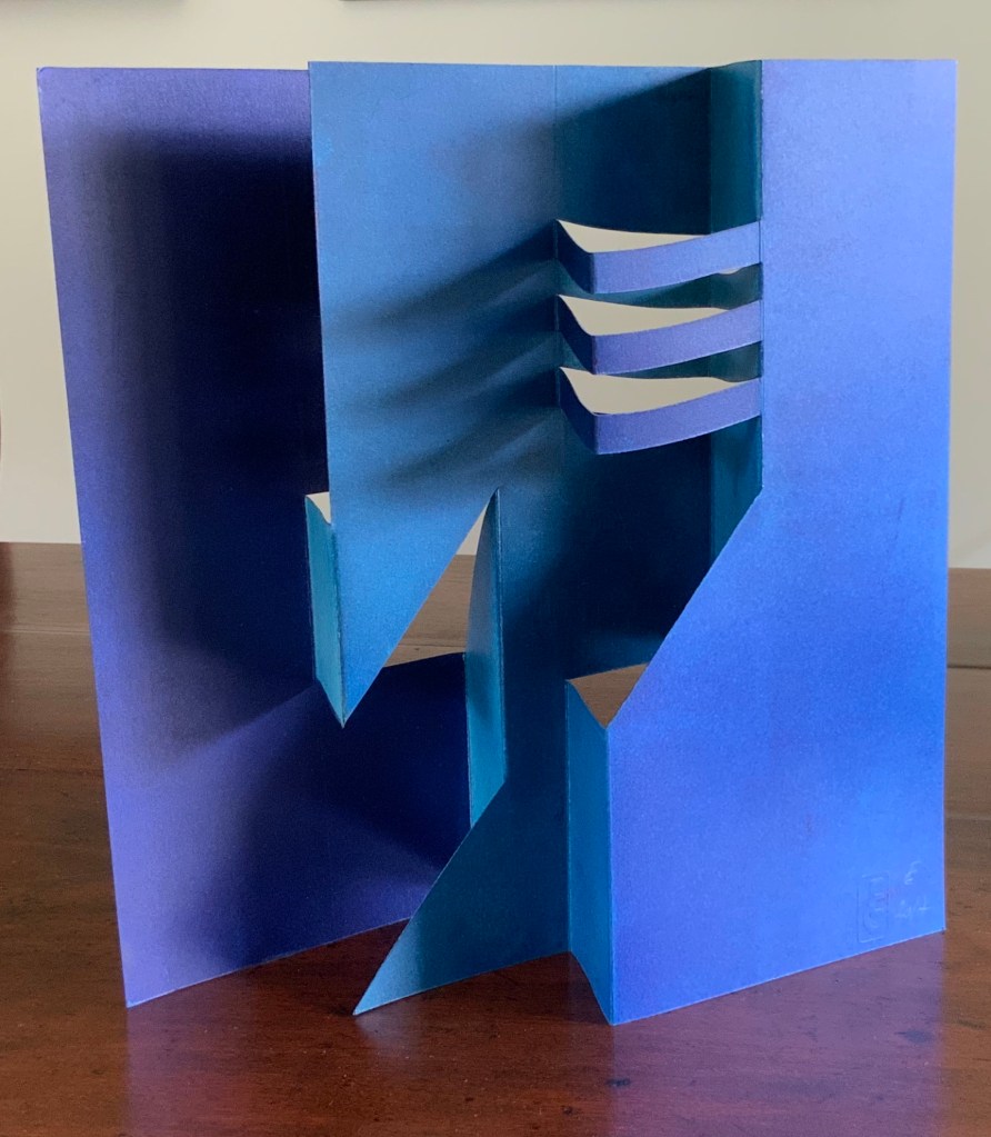
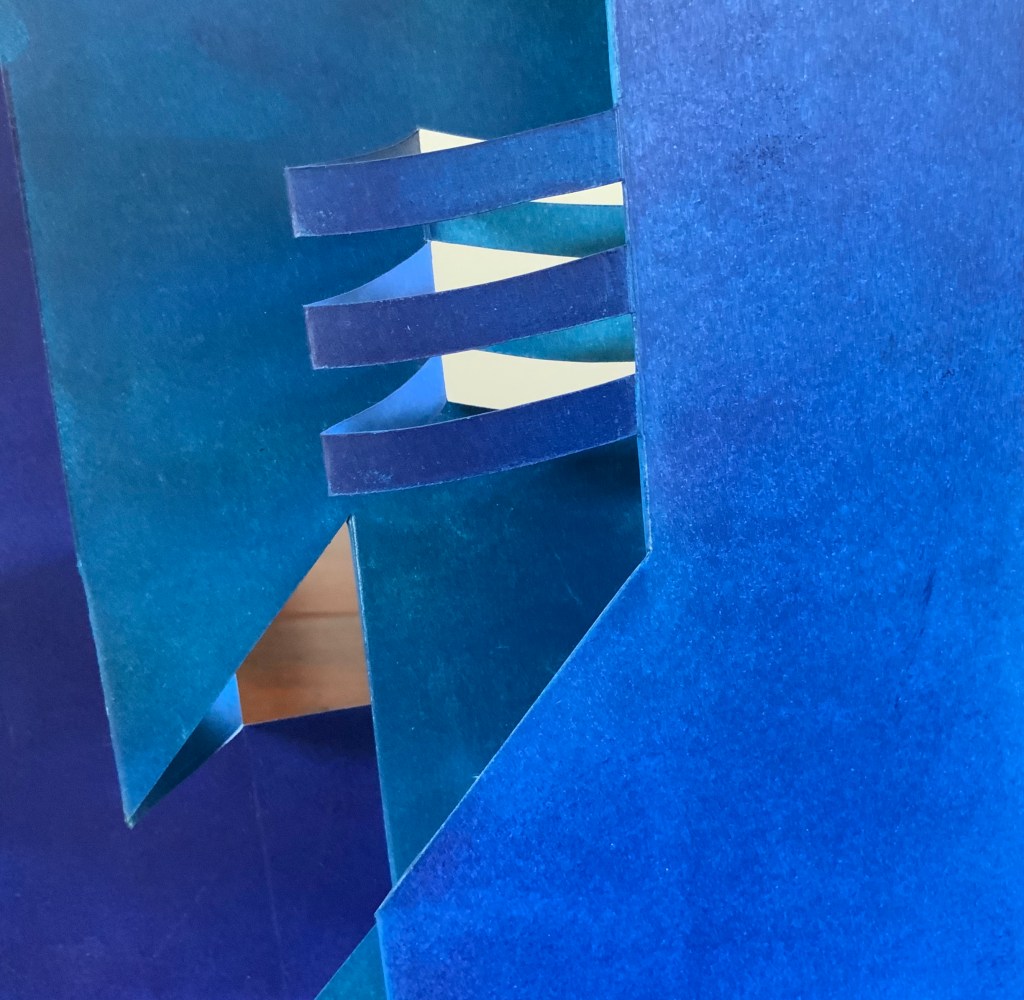
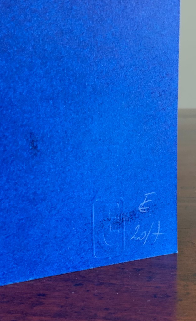
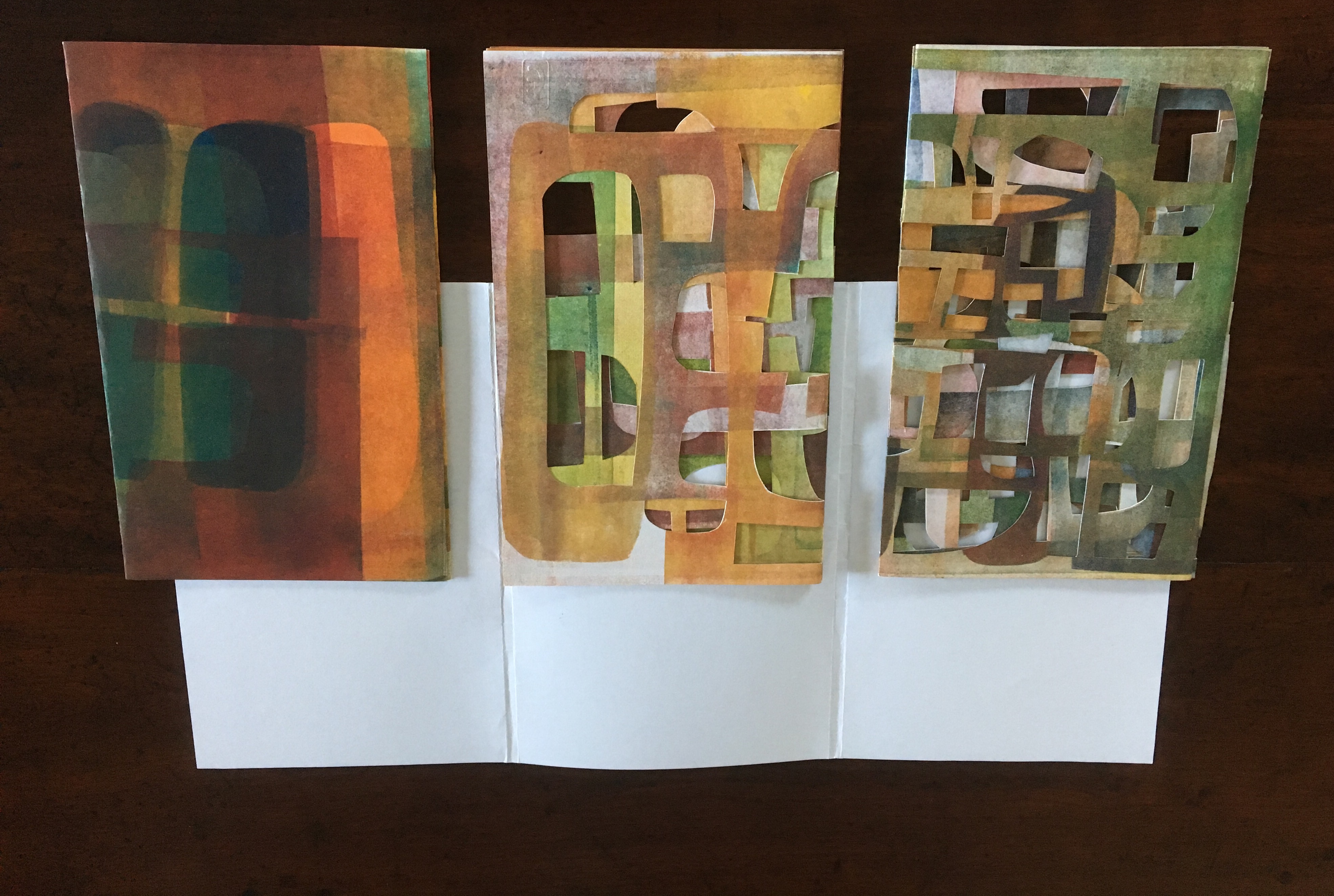
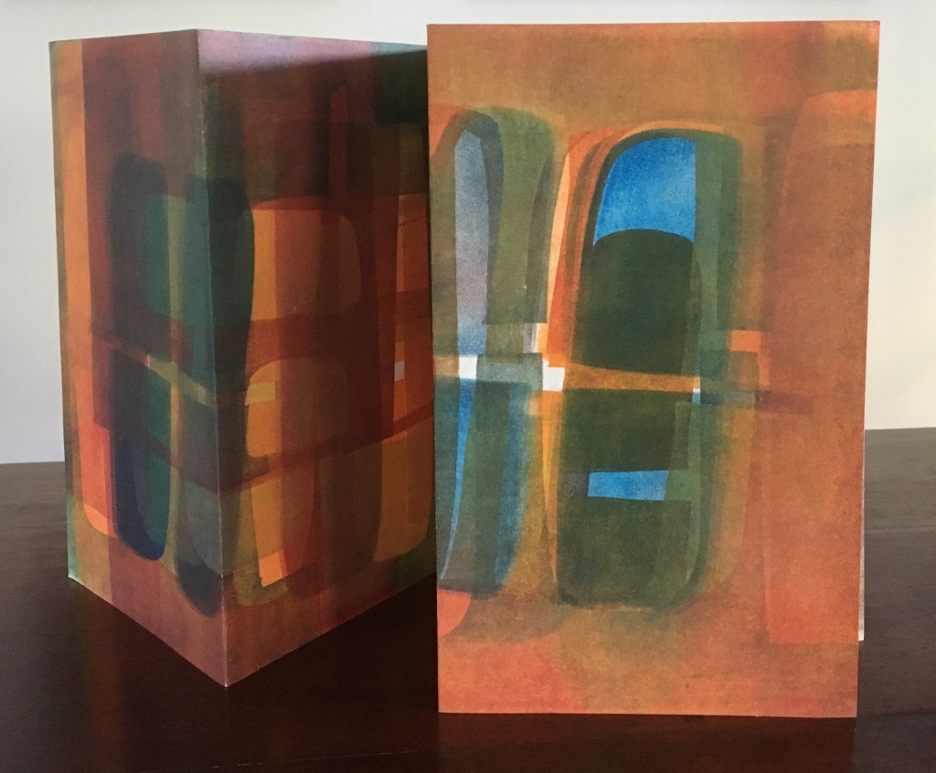
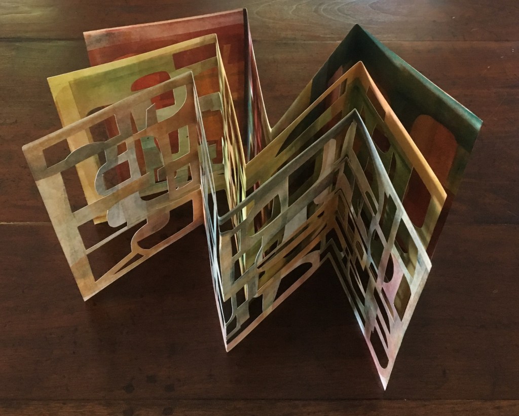
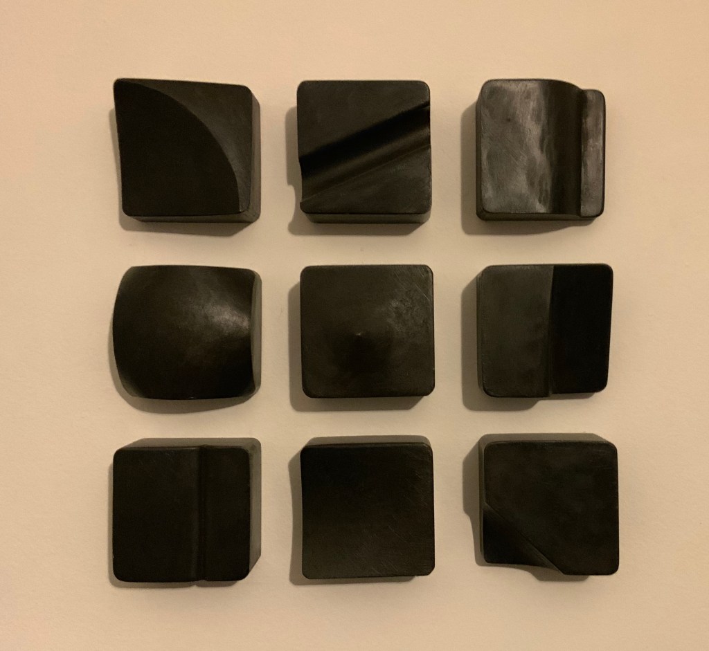
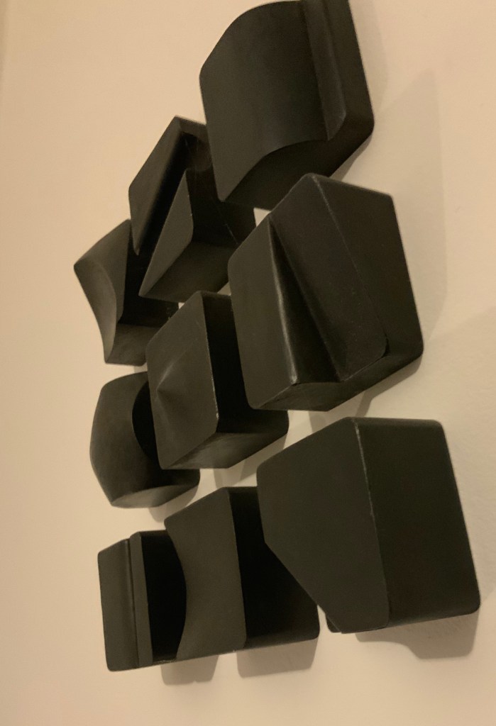
Neo Emblemata Nova (2005) Daniel E. Kelm Box: H96 x W109 x D102 mm closed. Booklet cover: H72 x W79 mm closed, H72 x W224 mm open. Booklet: H72 x W78 mm. Möbius strip: each tile is H70 x W70 mm; the strip extended is 1000 mm. Edition of twenty-one, of which this is #18. Acquired from the artist, 20 October 2018.
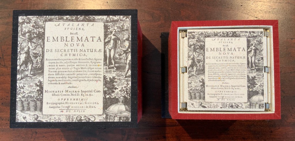
Opening the work.
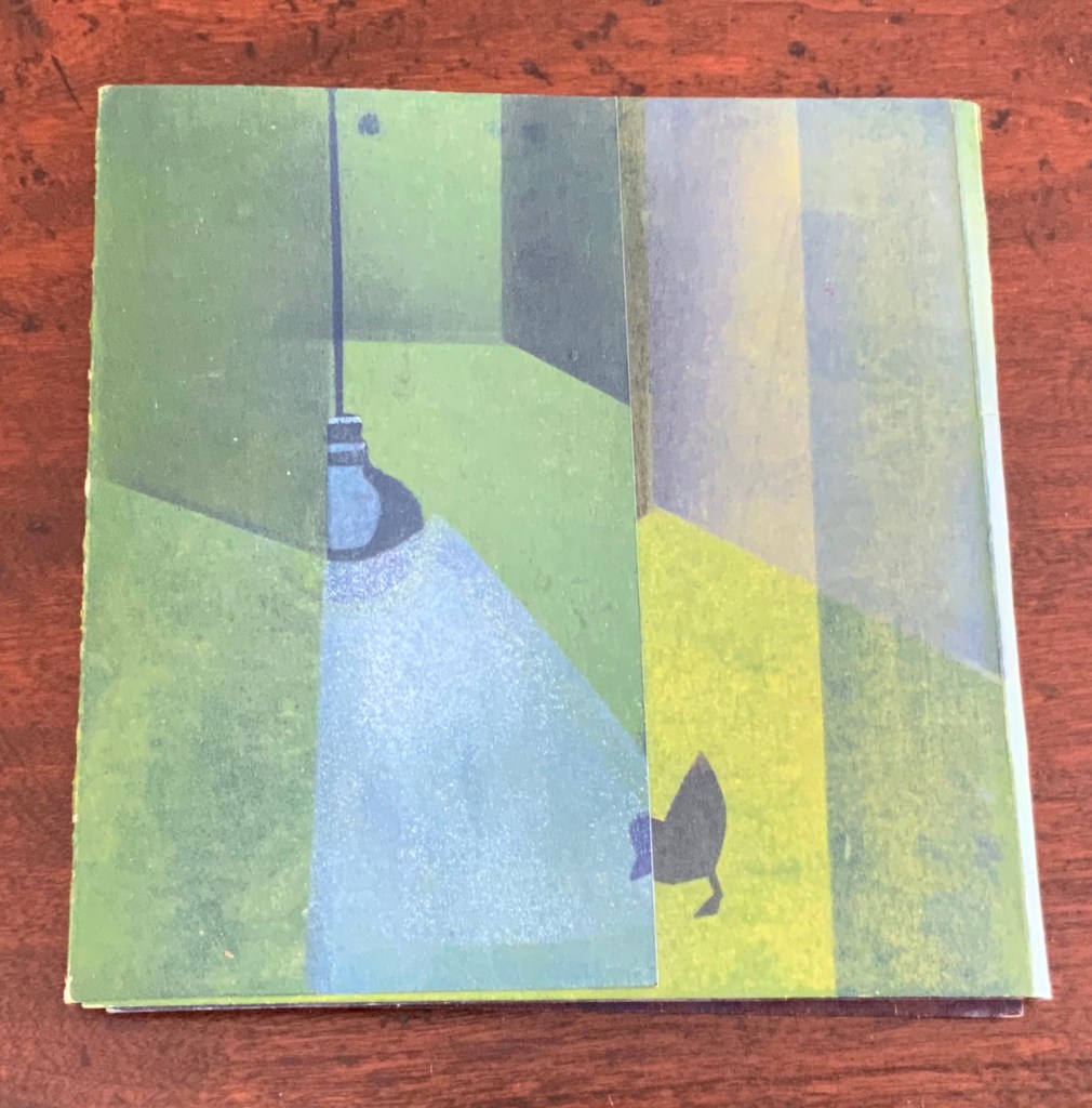
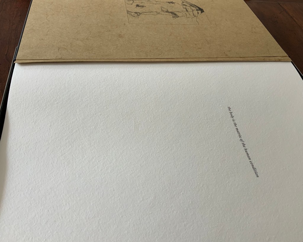
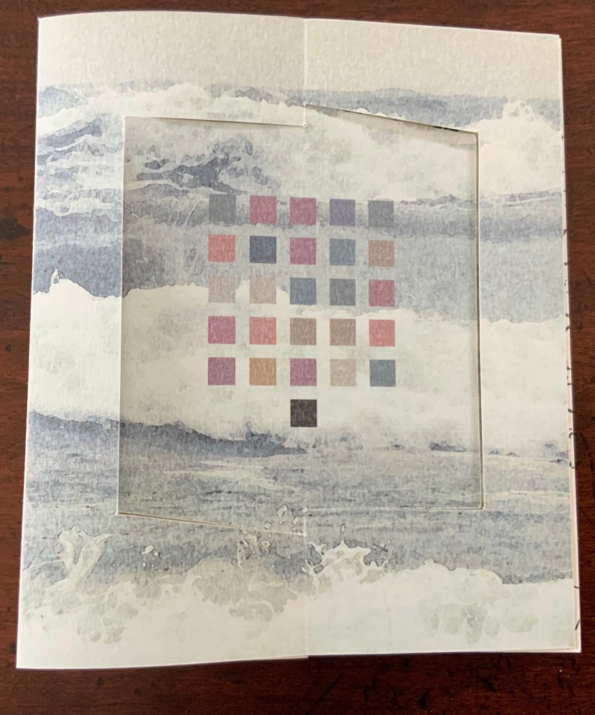
Booklet about the work and its creation.
Inside the top of the box.
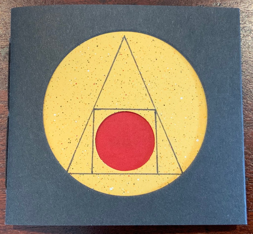
Closing and returning the Möbius strip to its box requires considerably more dexterity than reading; so much so that the booklet included provides instructions.
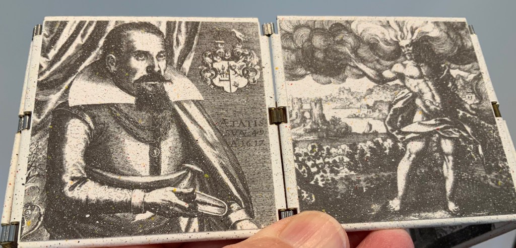
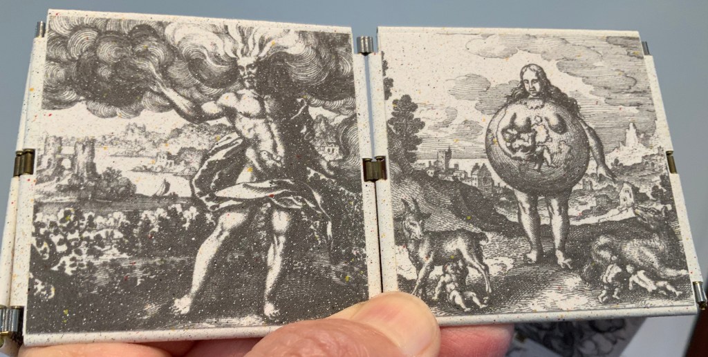
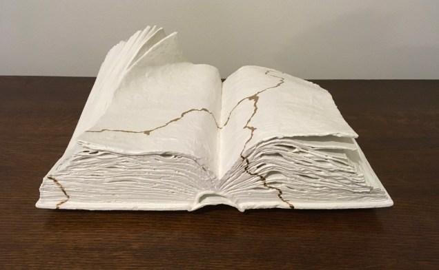
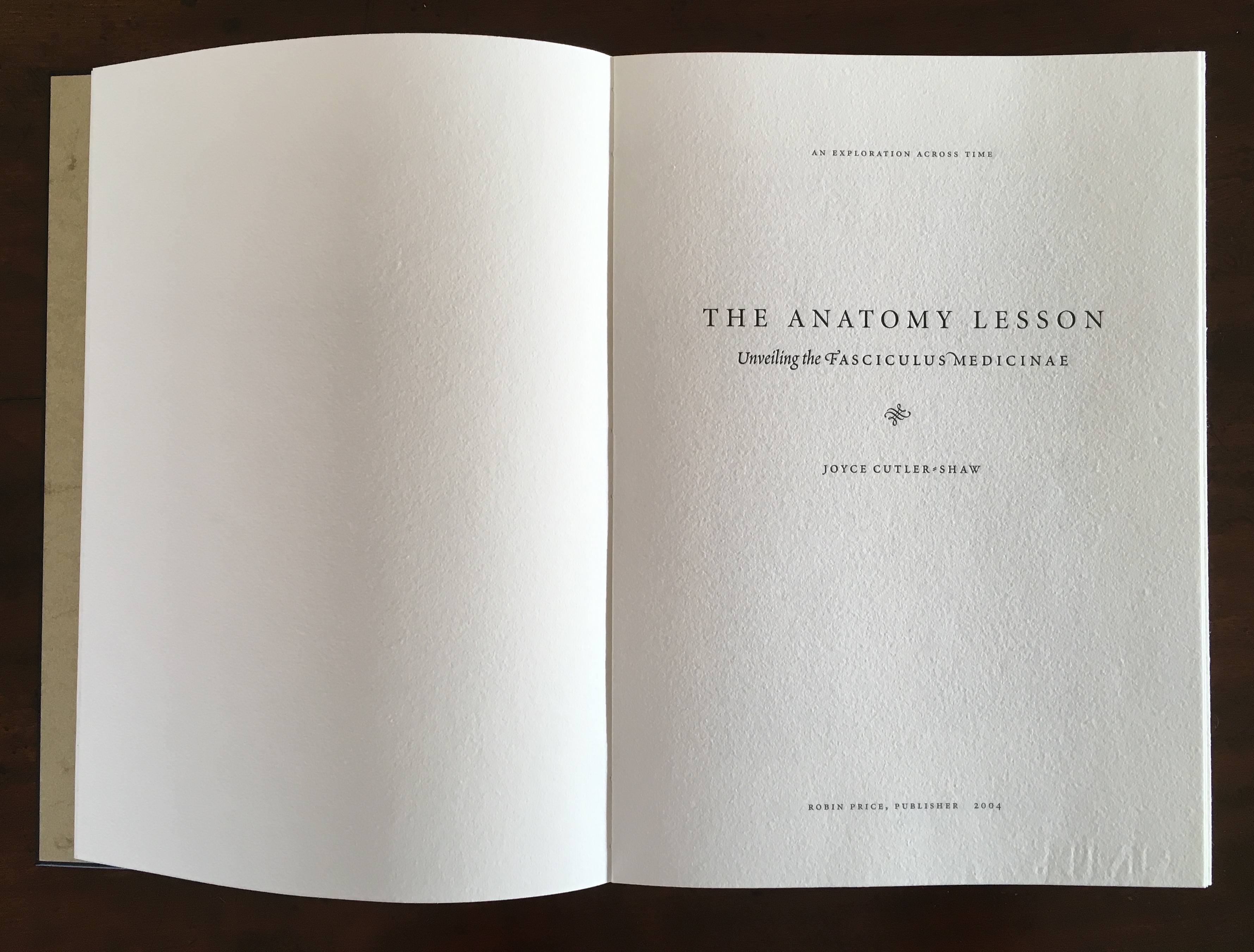
The Anatomy Lesson (2004)
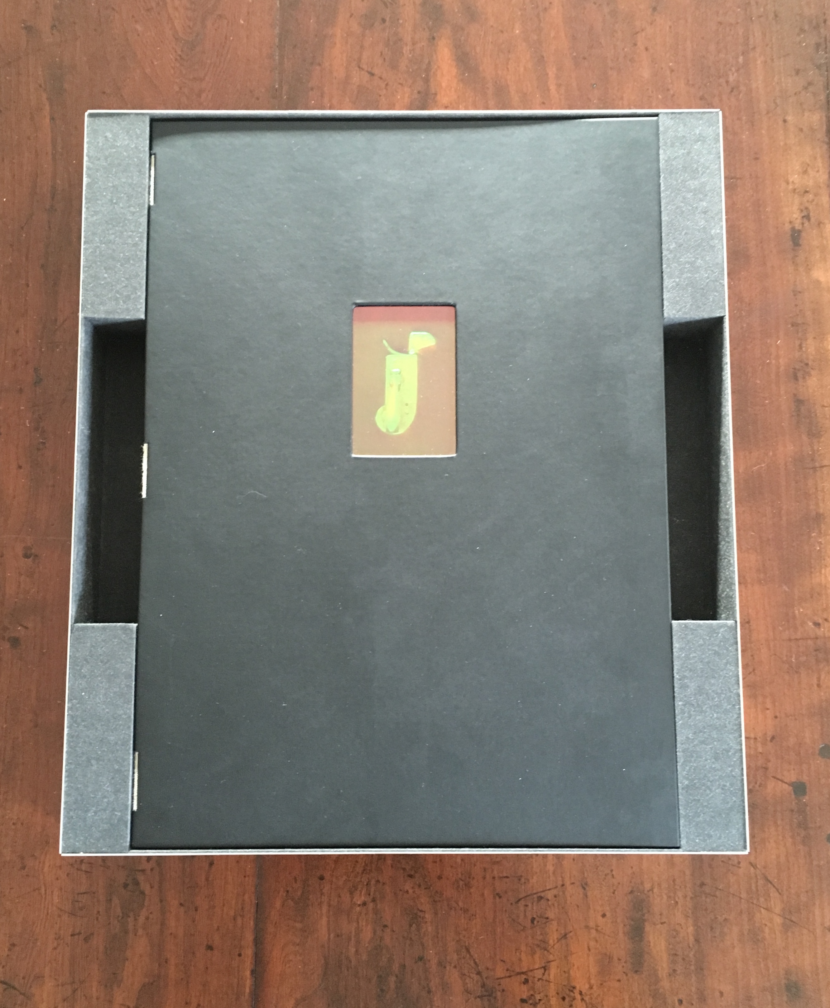
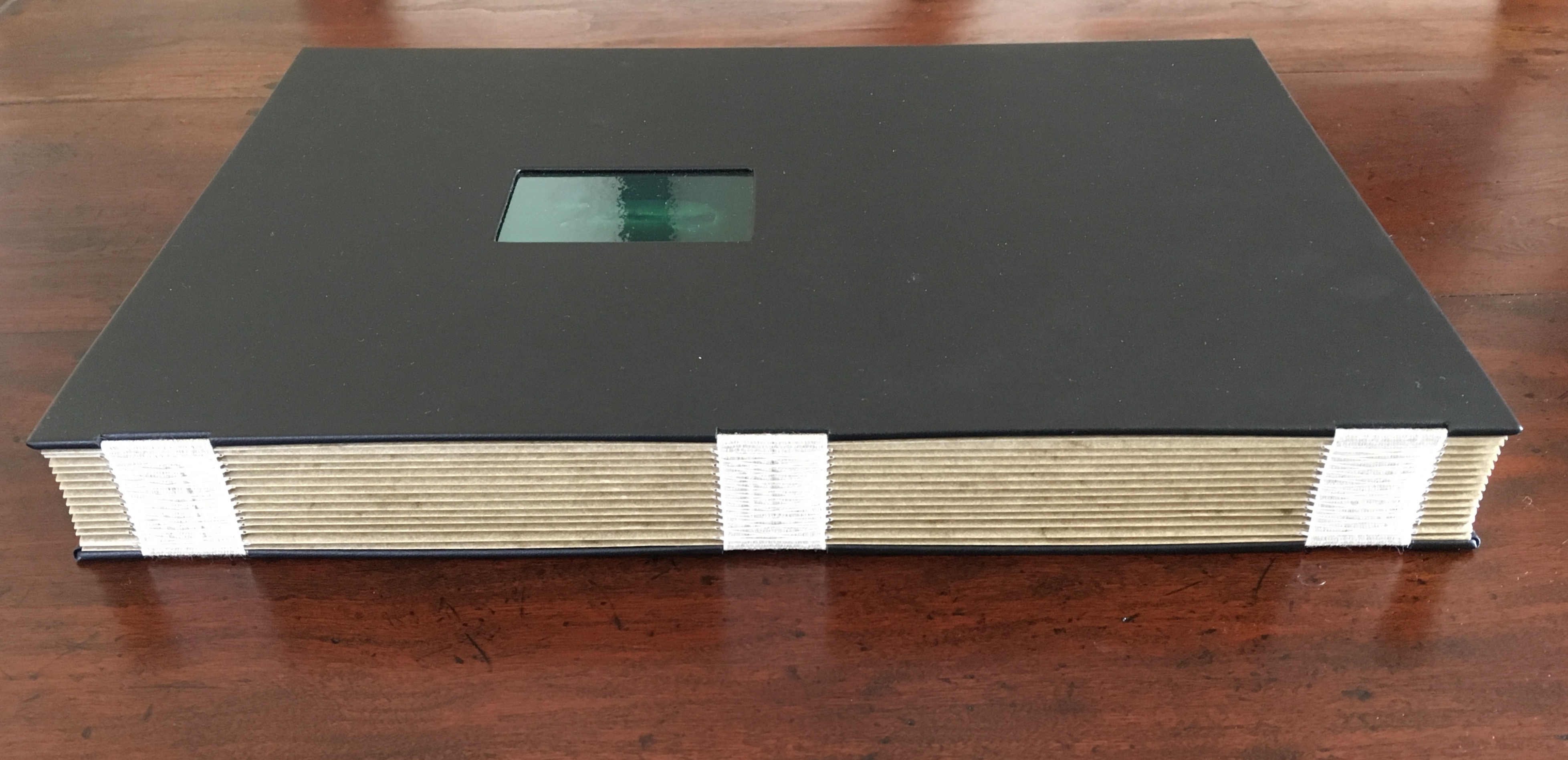
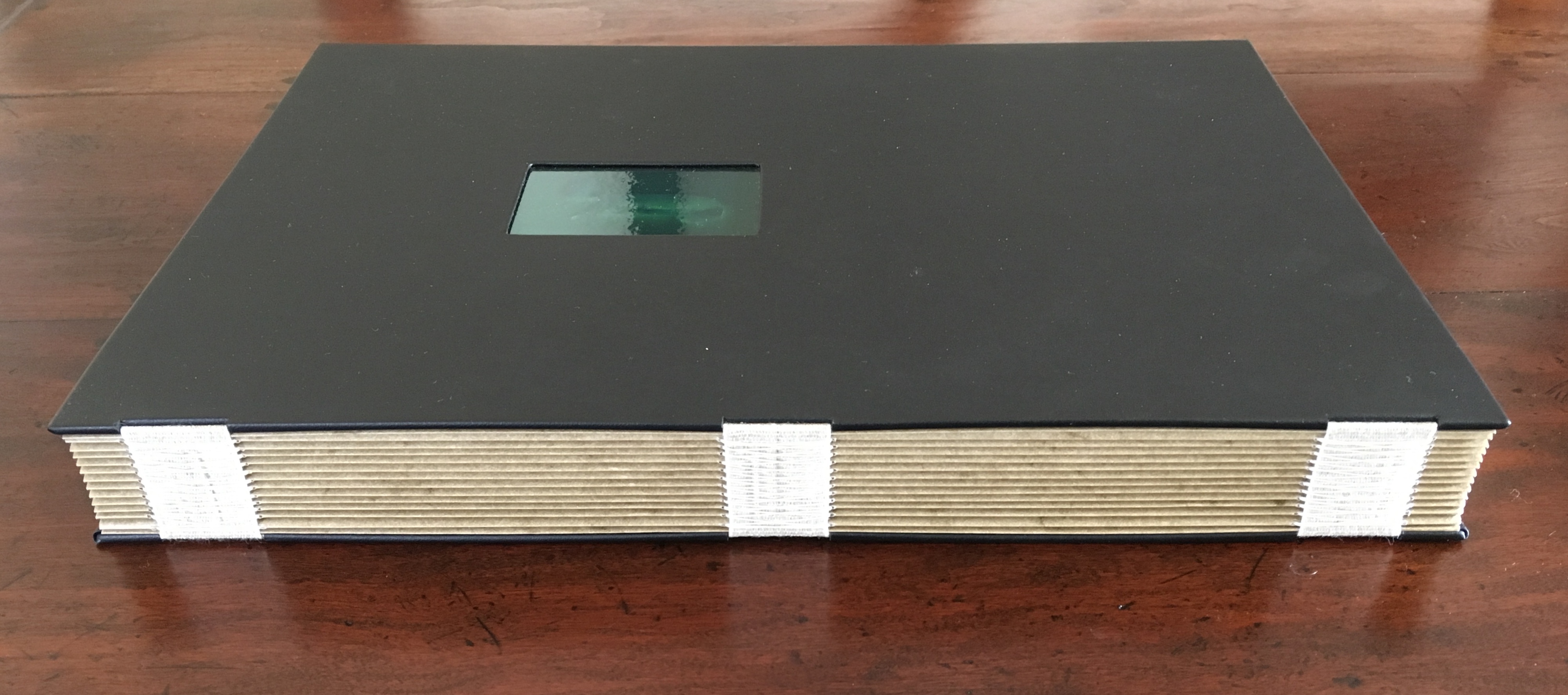
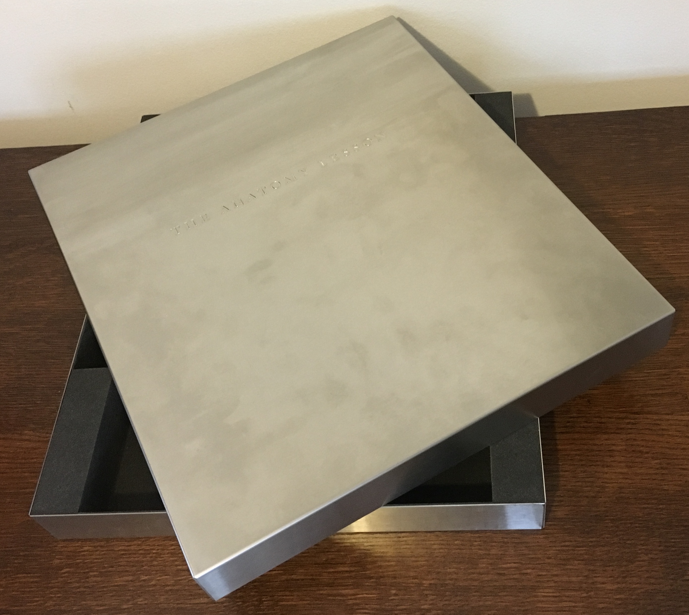
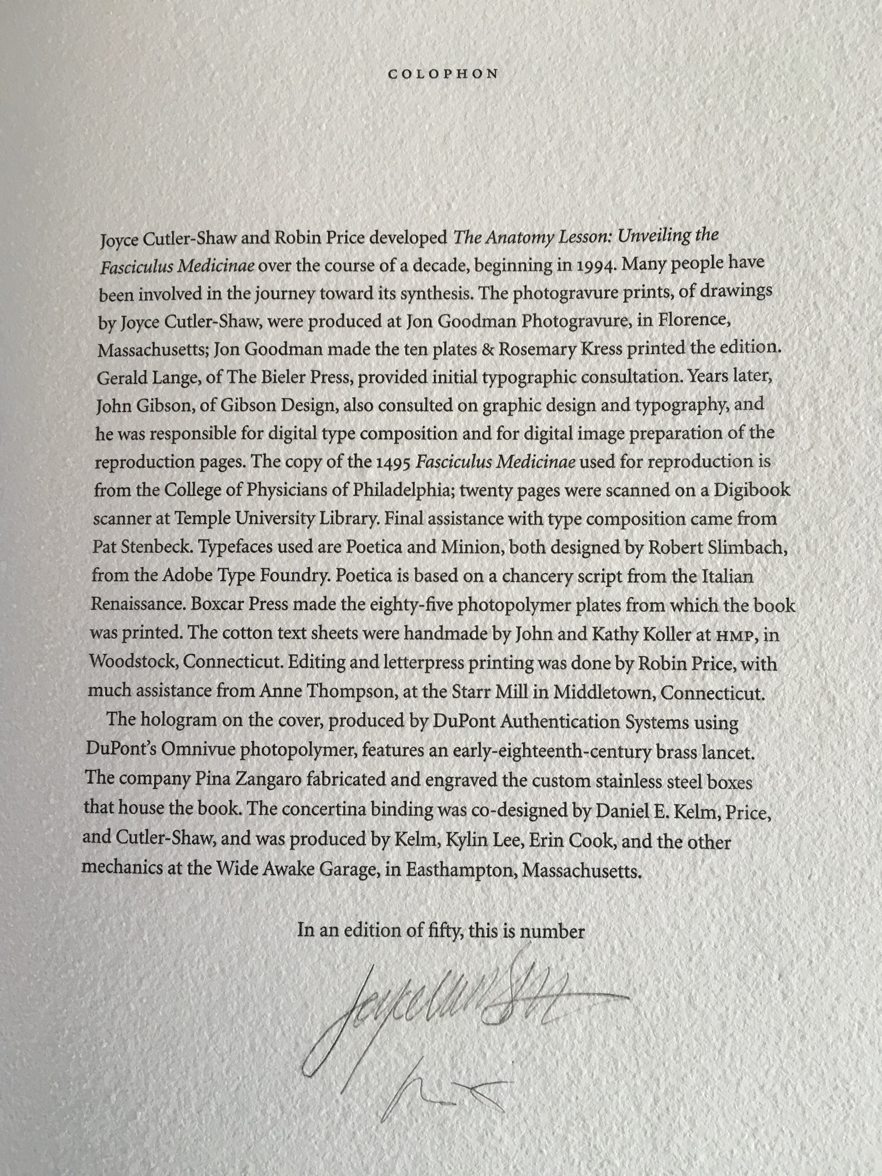
The Anatomy Lesson (2004) Joyce Cutler-Shaw Middletown, CT: Robin Price, Publisher, 2004) Limited edition of 50, of which this signed copy is the binder’s copy (Daniel E. Kelm). Acquired from the binder, 20 October 2018.
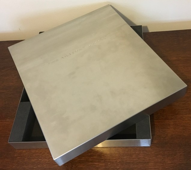
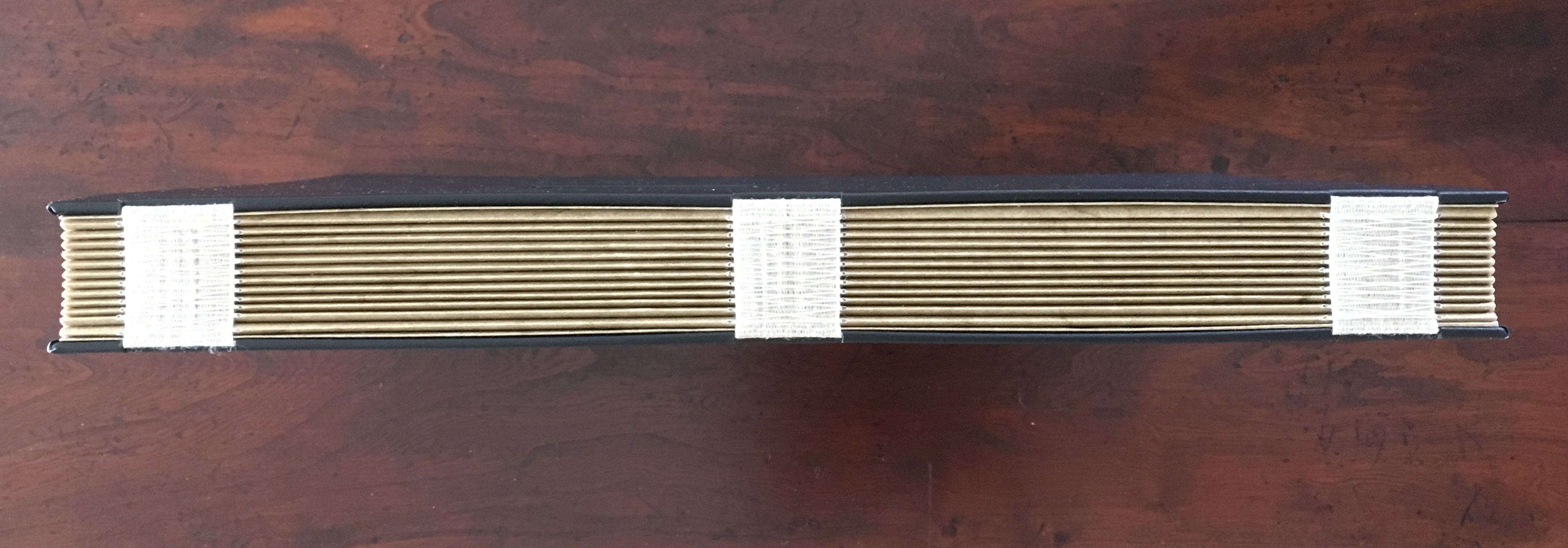
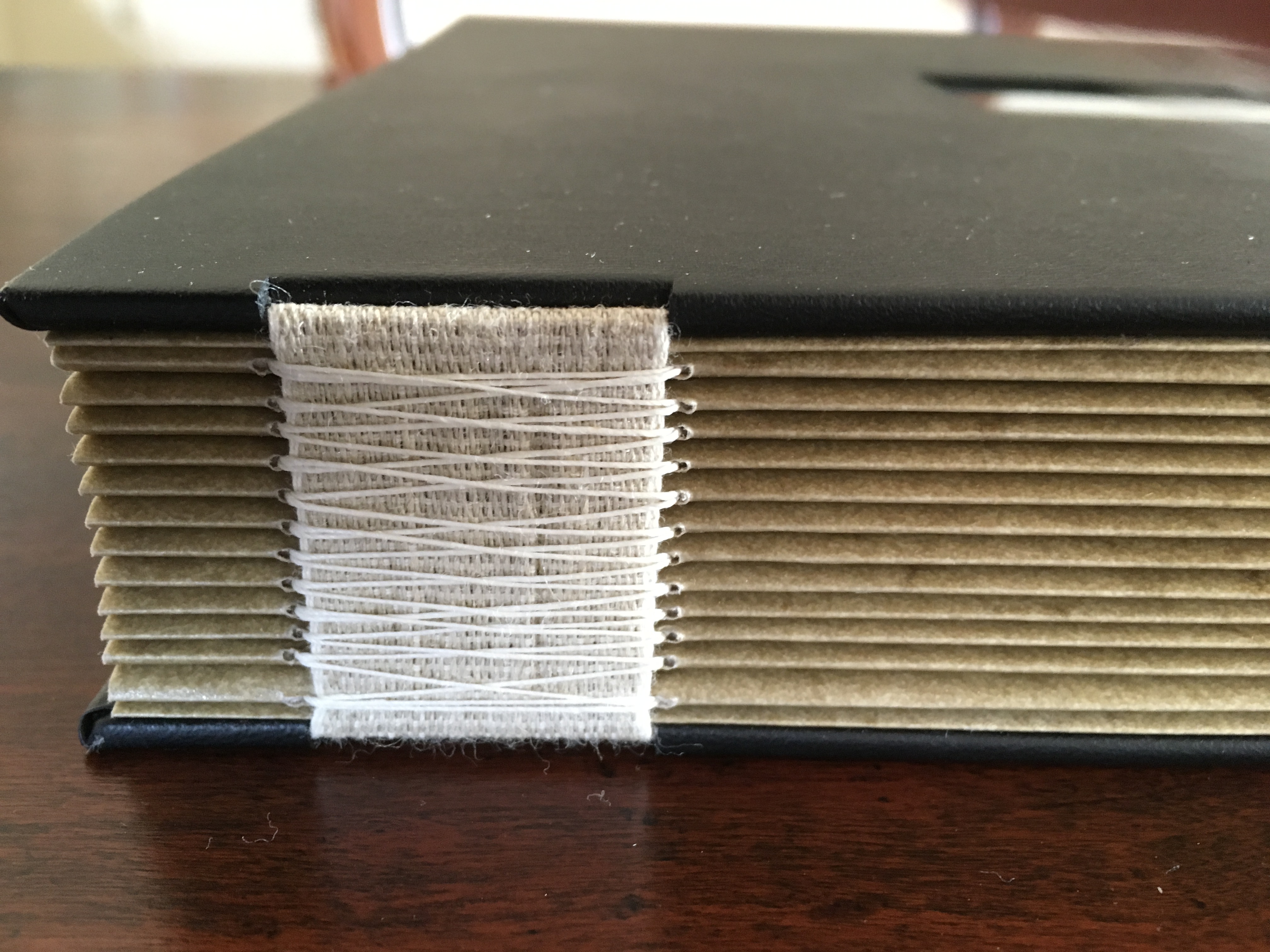
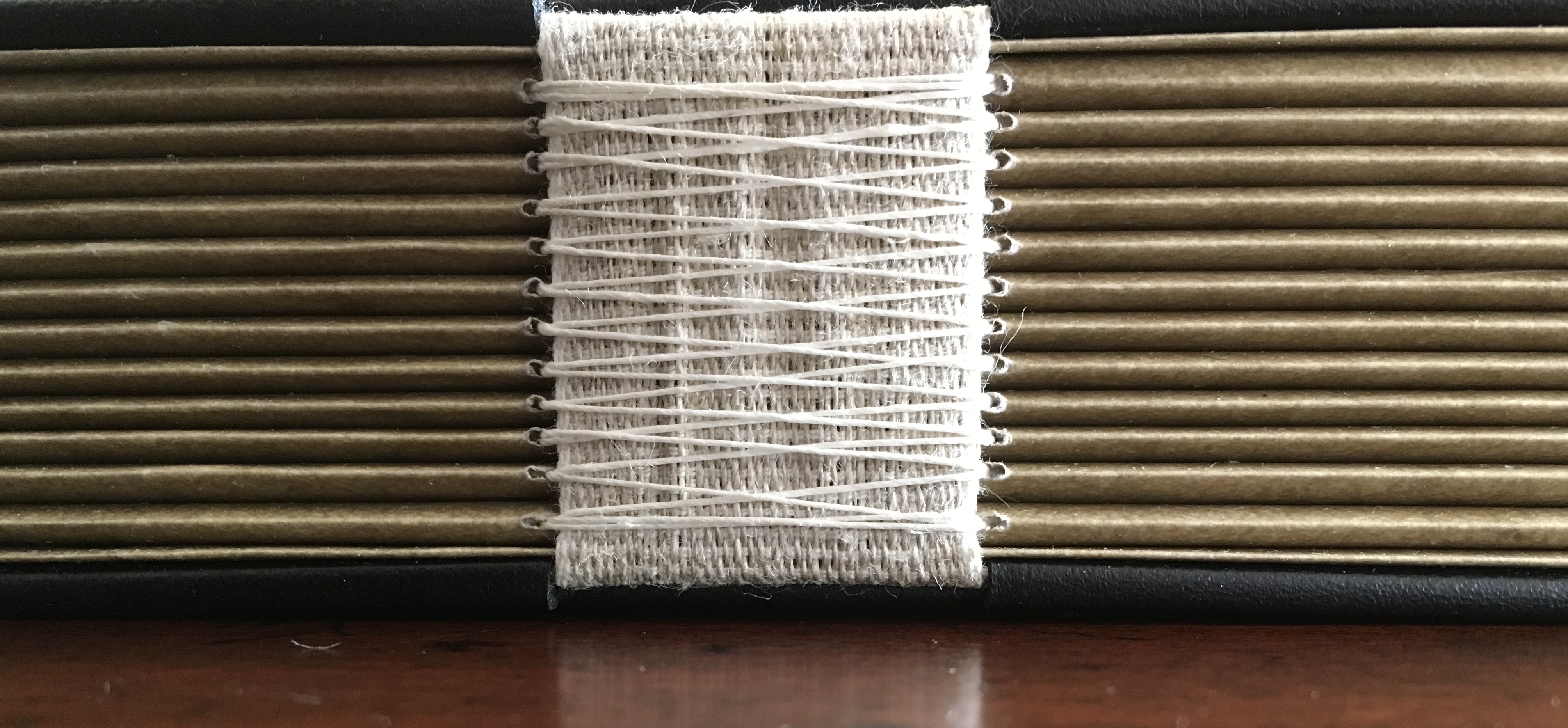
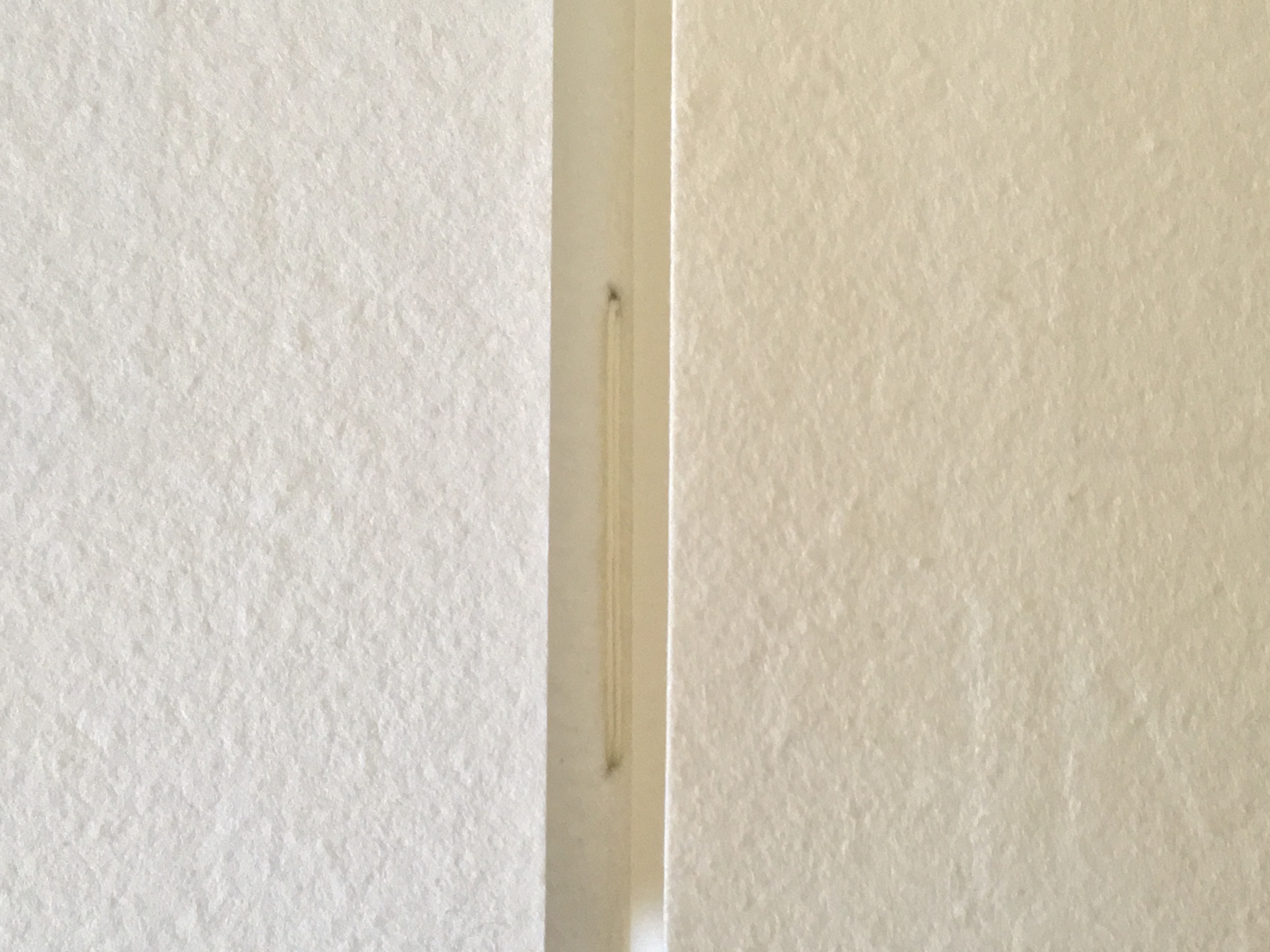
Twelve signatures of handmade cotton text paper, the central ten signatures each made up of one sheet H356 x W514 mm and one sheet H356 x W500 mm glued to the 14 mm margin of the first sheet, for a total of ninety-six pages, each measuring H356 x W253 mm. Binding of leather covered boards (a hologram embedded in front cover) with an open spine, taped and sewn into a reinforcing concertina structure: H361 X W259 mm. Contained in engraved steel box: H370 x W326 x D44 mm.
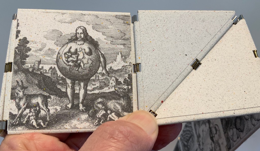
Detail of sewing and internal view of reinforcing accordion structure. For a description of this type of structure, see Hedi Kyle’s The Art of the Fold(London: Laurence King, 2018), pp. 82-85.
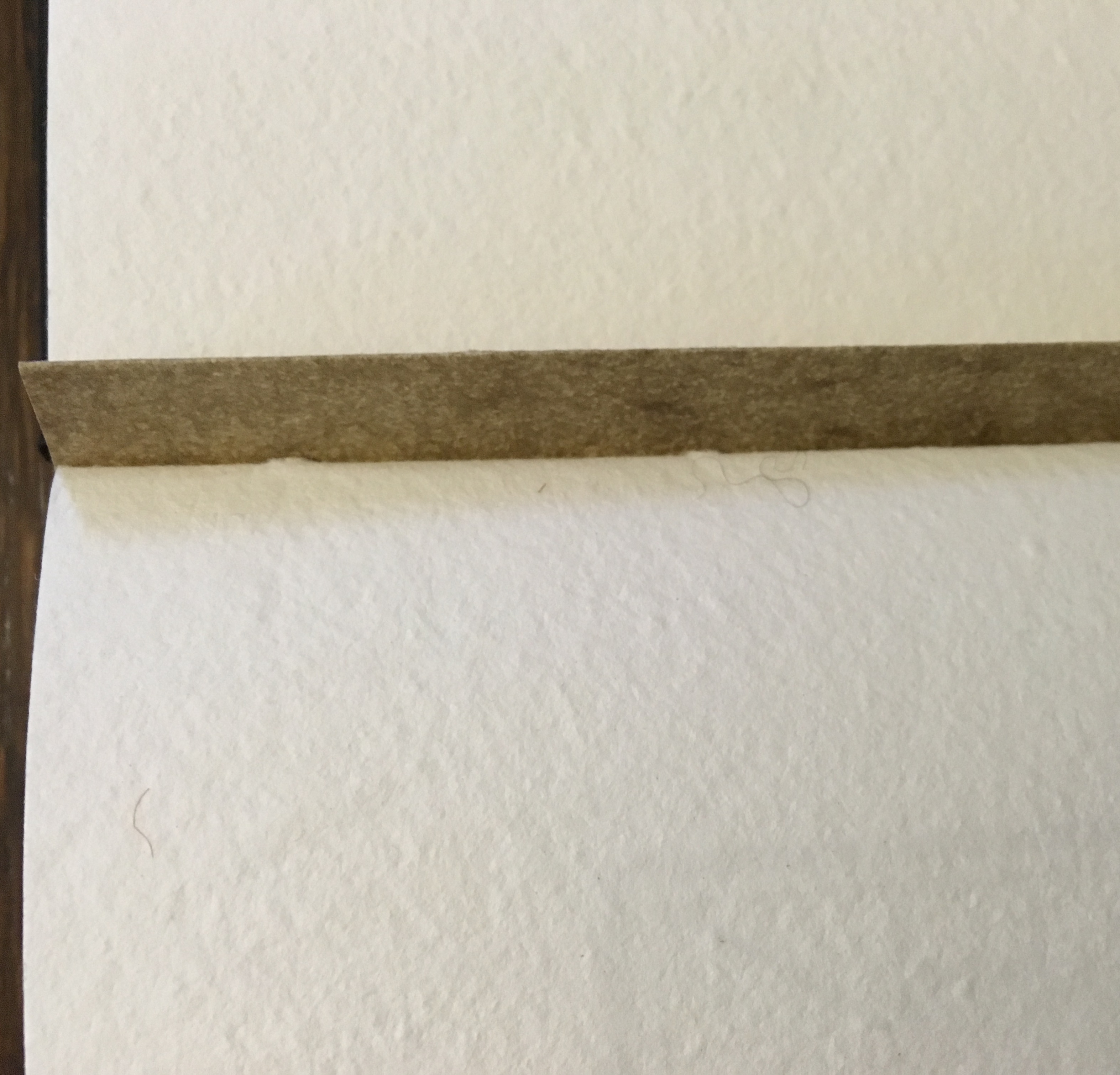
View of the doublure, which is part of the reinforcing concertina structure.
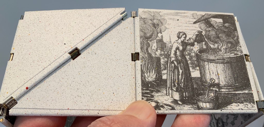
Cover page of second signature.
Second signature open to double-page spread.
Second signature open to four-page spread.
Further Reading
“Bieler Press”, in Book Art Object, ed. David Jury (Berkeley, CA: Codex Foundation, 2008), pp. 116-17.
Miller, Steve. “Daniel Kelm”, Book Arts Podcasts, School of Library and Information Studies, University of Alabama, 22 July 2012. Accessed 6 September 2019.
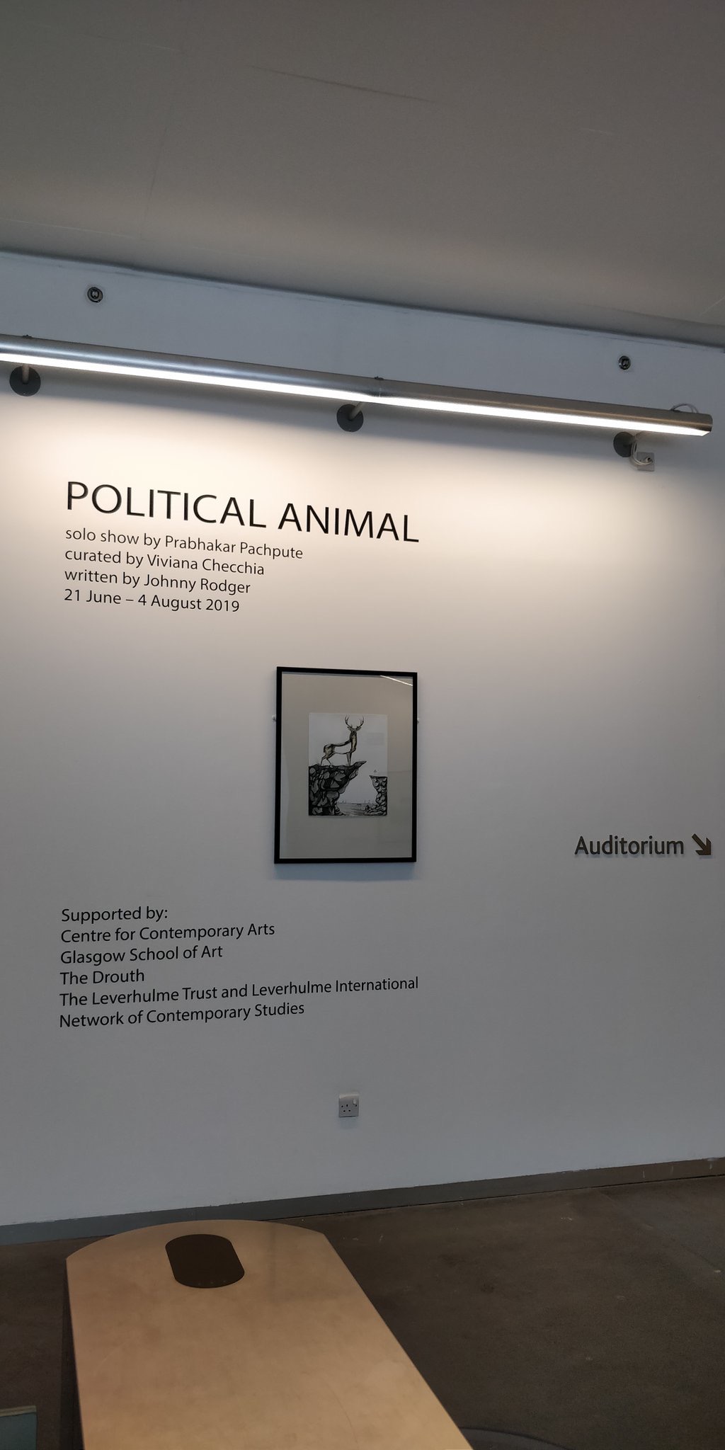
From 21 June to 4 August 2019, the Glasgow School of Art hosted an exhibition curated by Vivianna Checchia based on and named after the artist’s book Political Animal by Johnny Rodger (text) and Prabhakar Pachpute (drawings). The event is particularly noteworthy as an addition to this list of large-scale works of book art.
With Pachpute’s involvement, Checchia transformed the gallery at 167 Renfrew Street in Glasgow into “a book”, its pages consisting of Pachpute’s A3 framed drawings, drawings directly on the gallery’s walls as well as 3D objects, and the curator’s notes/bibliography delivered as displayed copies of the works referenced. Walking and looking become “reading”.
Earlier “walk-through books” include Alison Knowle’s The Big Book (1968) and Anselm Kiefer’s The Rhine (1982-2013), but Political Animal, the exhibition, takes large-scale book art and what we mean by the book just that “little” bit further.
Further Reading
Borsuk, Amaranth. The Book (Cambridge, MA: MIT Press, 2018). Reviewed here.
Malaya, Vinutha. “Art of the Book”, Pune Mirror, 18 July 2019. Accessed 9 September 2019.
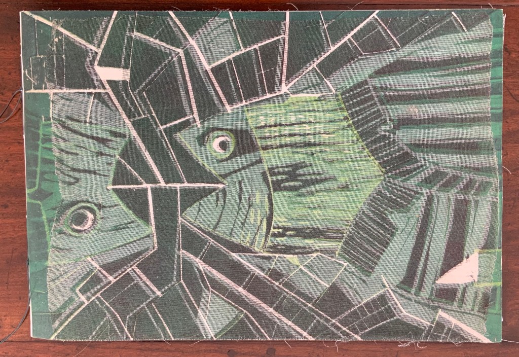
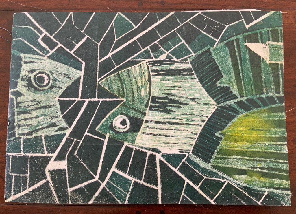
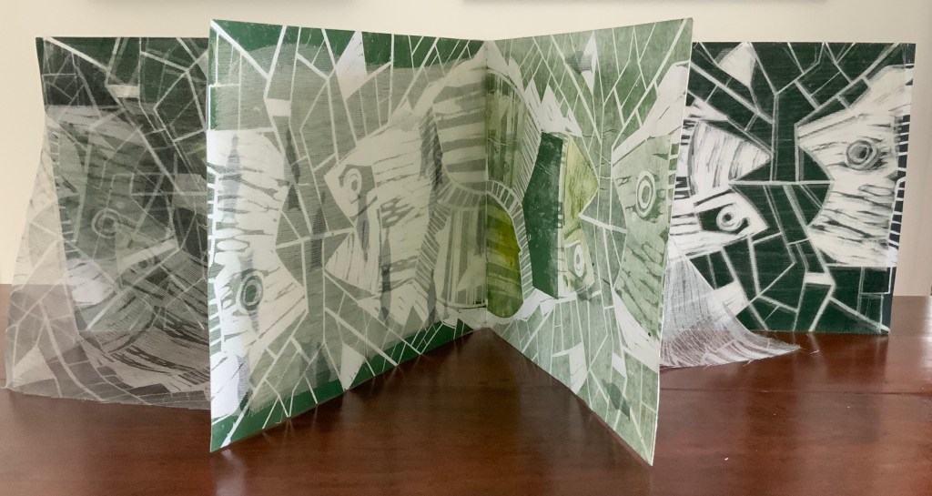
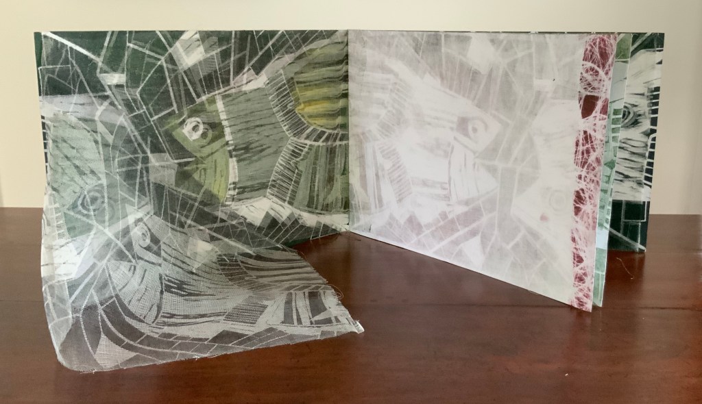
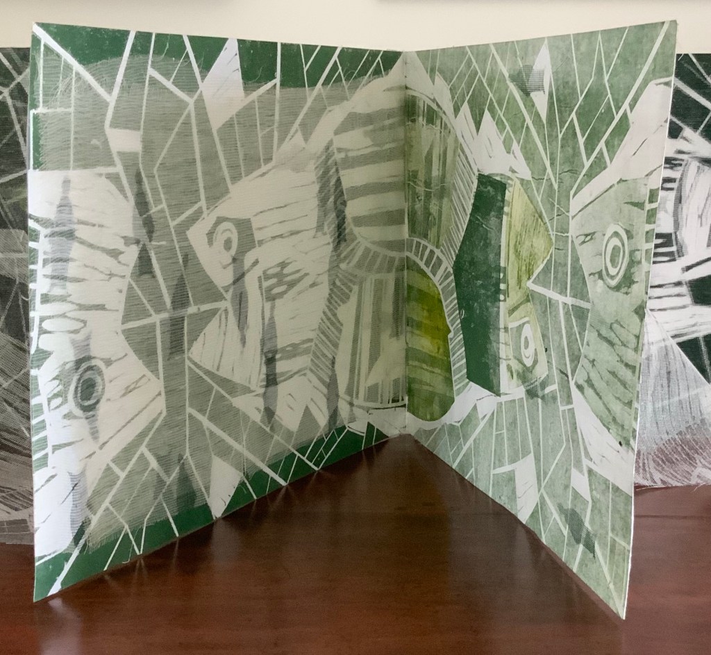
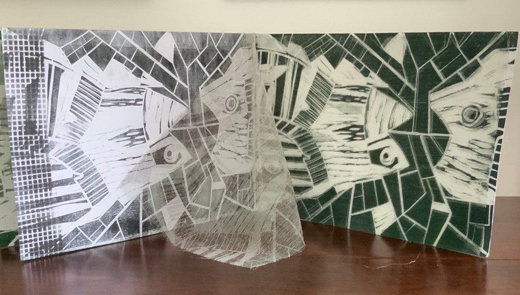
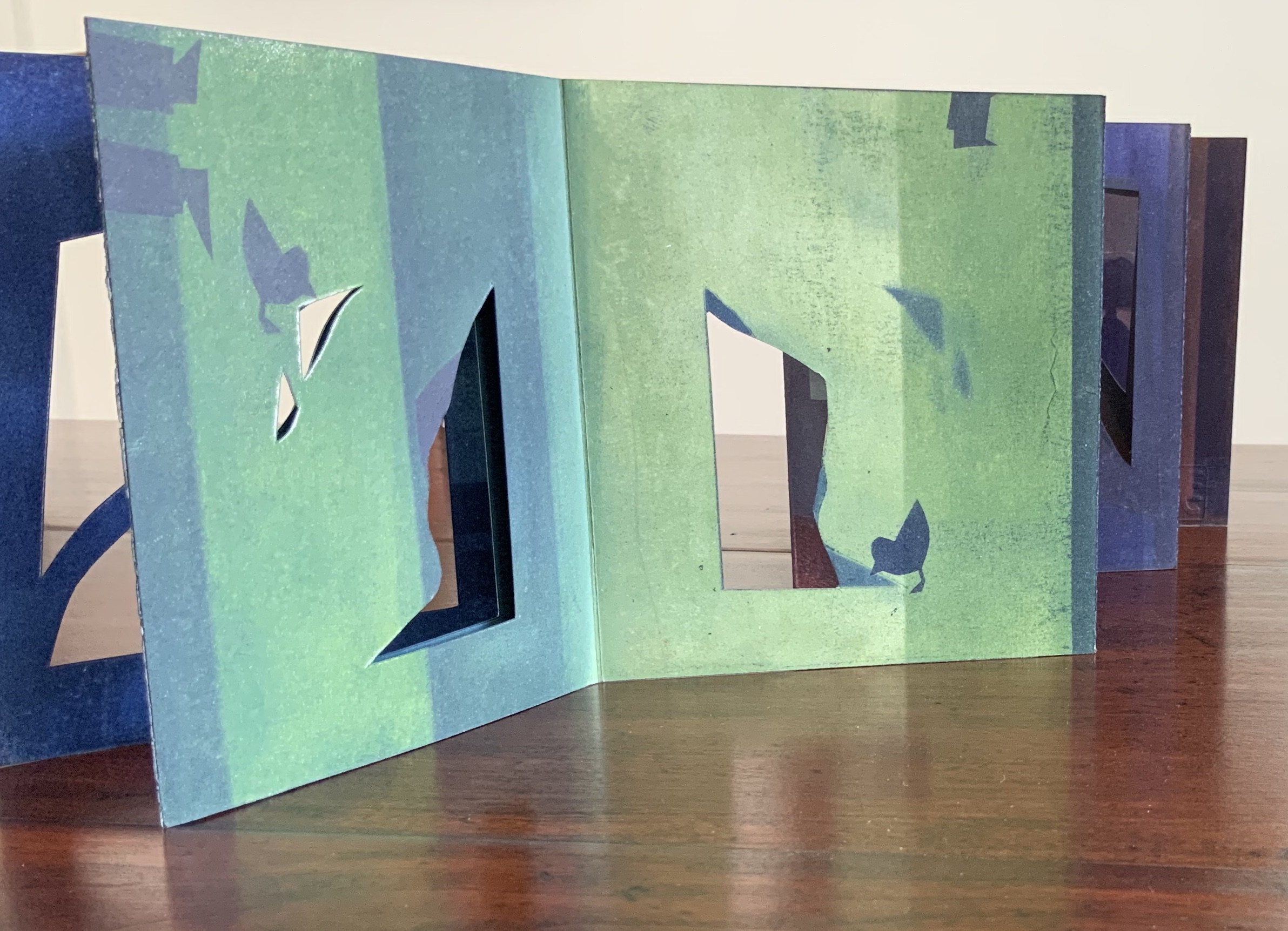
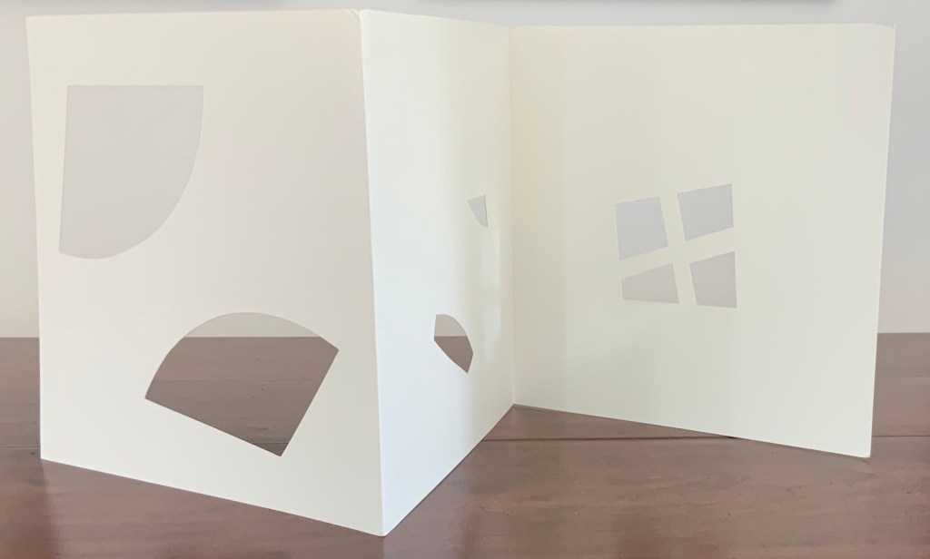
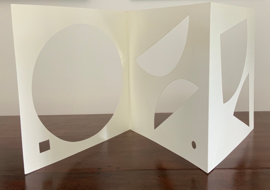
variazione (2015) Eleonora Cumer Linocut on card and tarlatana. Unique. H287 x 416 mm closed. Showing front and back covers. Acquired from the artist, 16 September 2017.
Centrally open view, showing printed linen crape (tarlatana) pages.
Views of the three “double-page spreads.
Open envelope for note of thanks. Container for the work. Both with pin-pricked and thread-sewn images. Container initialed and dated on reverse.
scultura da viaggio dipinta n.2 (2017)
scultura da viaggio dipinta n.2/ sculpture de poche peinte n. 2 (2017) Eleonora Cumer Single sheet of card, cut and painted front and back. Unique, embossed with artist’s stamp and initialed. H250 x W116 mm closed, H250 x W270 mm open. Acquired from the artist, 16 September 2017.
Cumer’s scultura da viaggio builds on Bruno Munari’s portable or “travelling sculptures”, but they could just as easily have emerged from her own earlier works such as l’attesa, visioni urbani and contaminazione.
l’attesa/ l’attente (2010)
l’attesa/ l’attente (2010) Eleonora Cumer Three-dimensional accordion book with painted front and back pages in painted case. H135 x W125 mm closed, H135 x W 1200 mm open. Unique. Acquired from the artist, 16 September 2017. Selected for the Abracadabra Bookcase Exhibition, Barcelona, May 2010.
Internal and external views of open cover.
“Reading” the opened concertina l’attesa (“the wait”).
Front view of l’attesa.
Rear view of l’attesa.
visioni urbane/ visions urbane (2015)
visioni urbani/urban visions (2015) Eleonora Cumer Three cards, tri-fold, painted front and back, and cut, encased in a duo-fold sheet, painted on one side. H240 x 150 mm closed, H240 x 600 mm open Unique. Acquired from the artist, 16 September 2017.
Opening the work.
Rear view, top view.
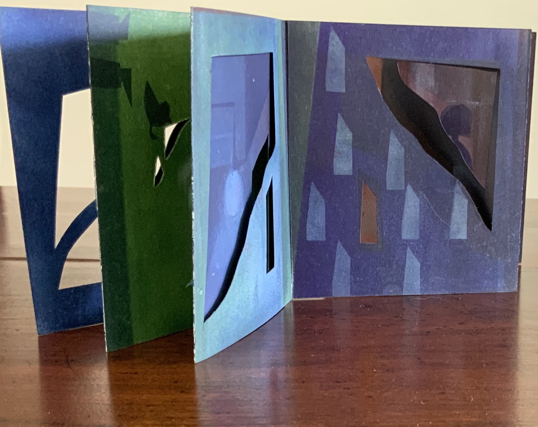
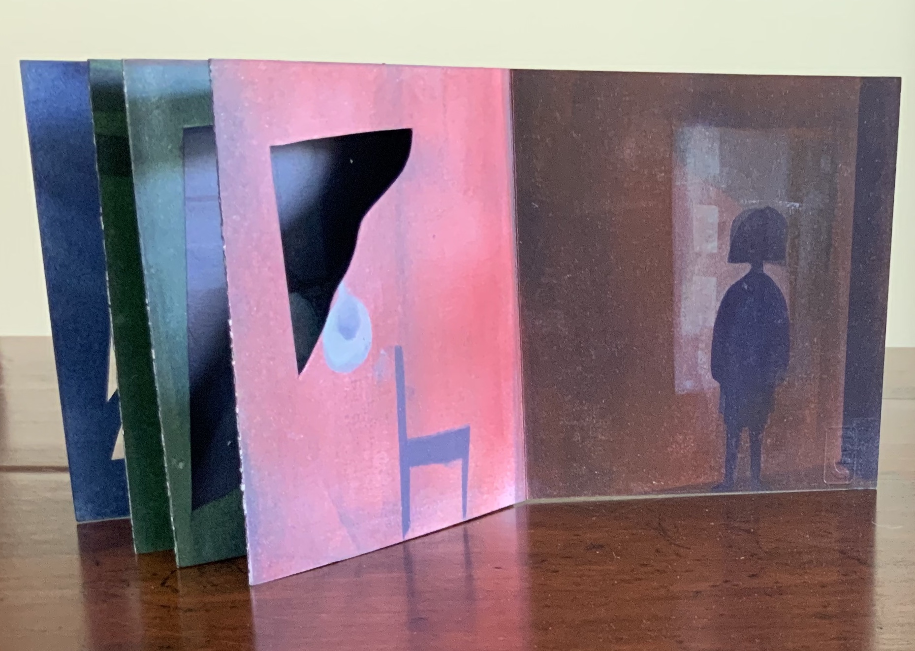
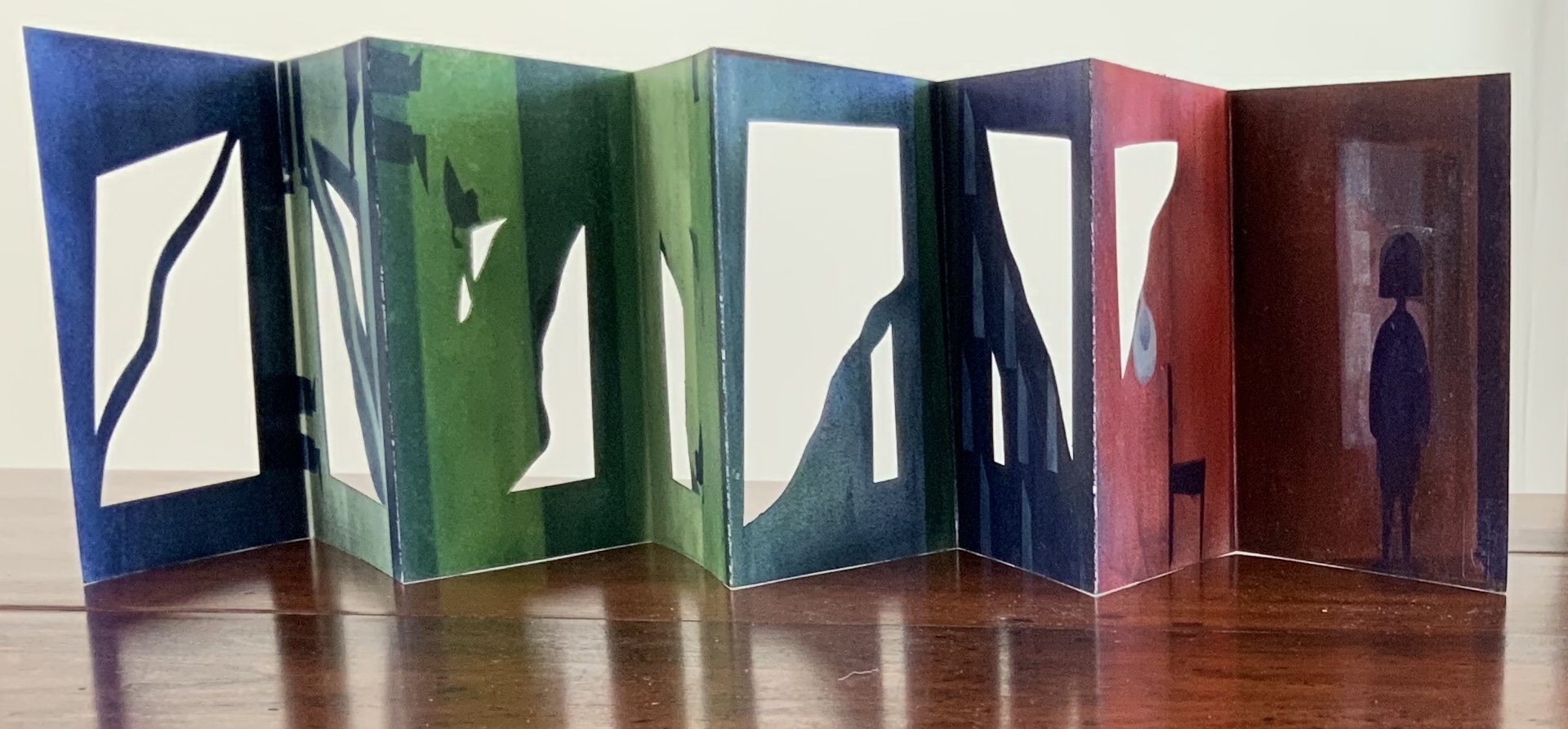
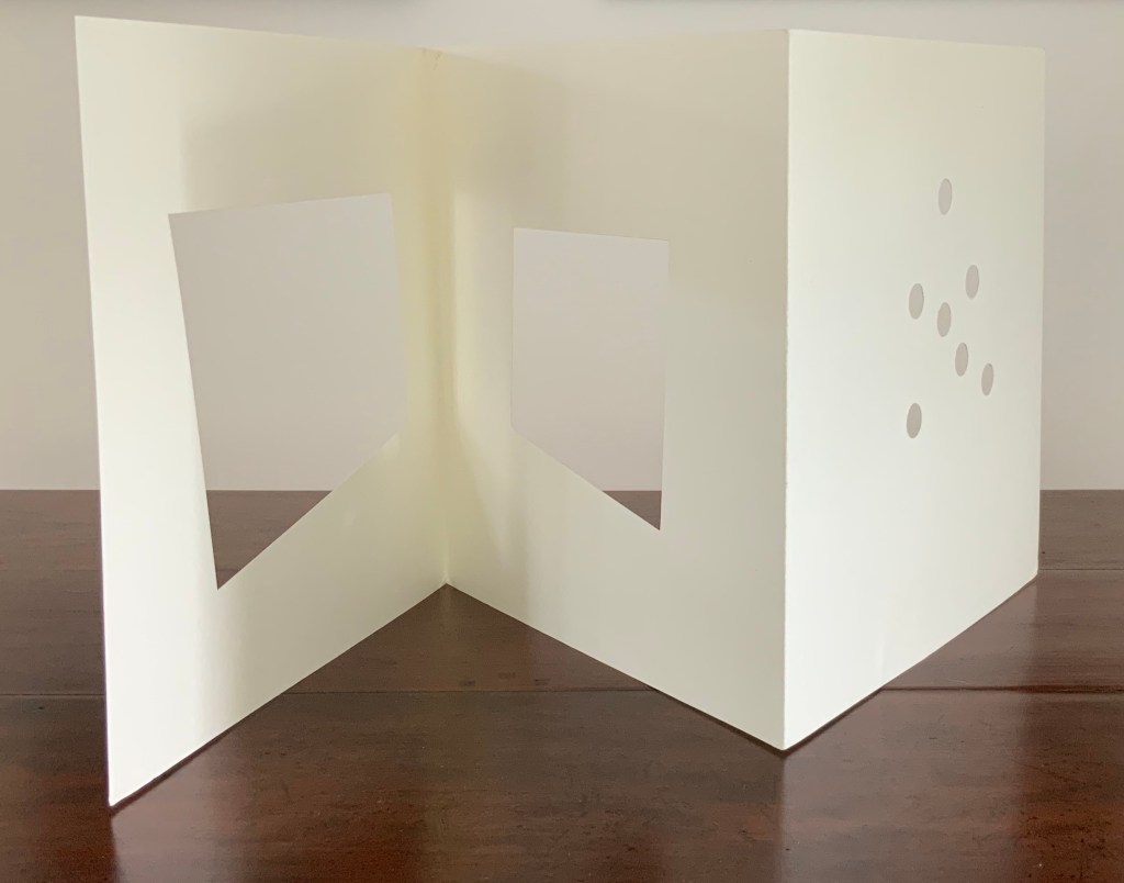
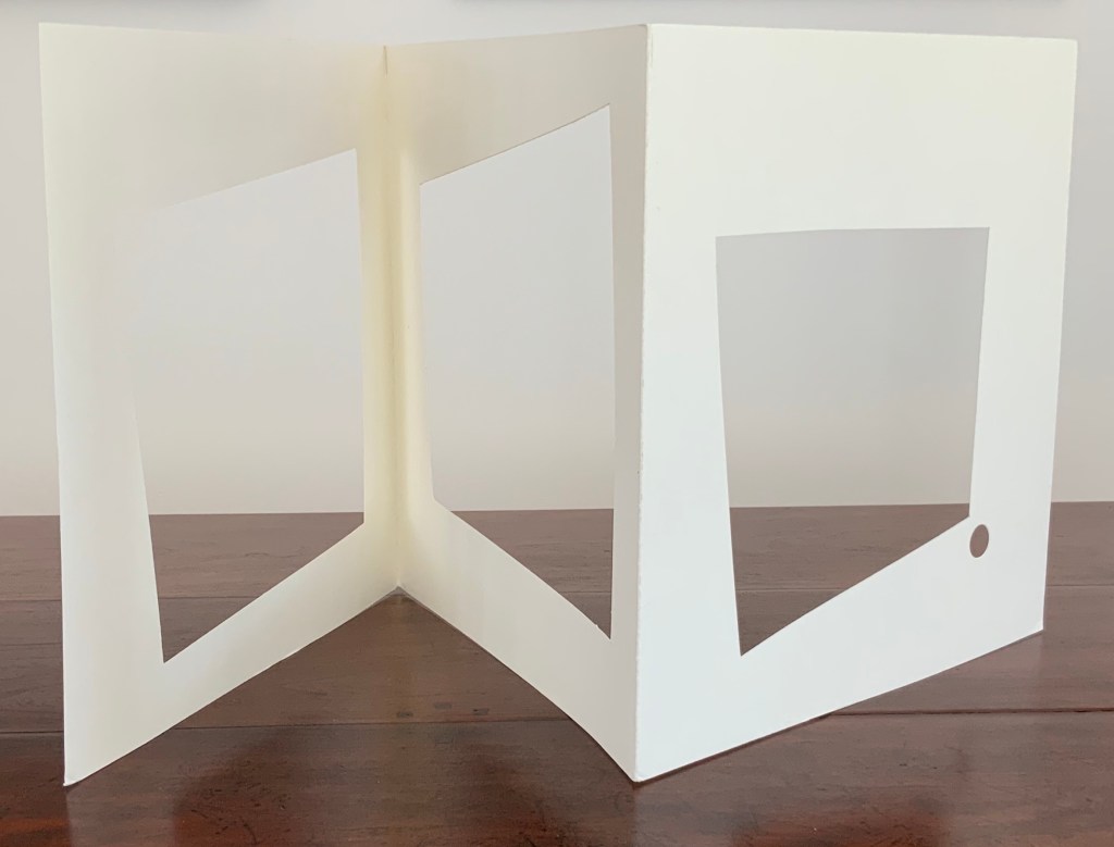
contaminazione (2015)
contaminazione (2015) Eleonora Cumer Four sheets of card, each cut and folded into three panels. H300 x W300 mm closed, H300 x 900 mm open. Acquired from the artist, 16 September 2017.
View of the four component cards.
Duo-fold gray cover H302 x W315 mm closed, H302 x W943 mm open. Fourth component card, initialed and dated by the artist.
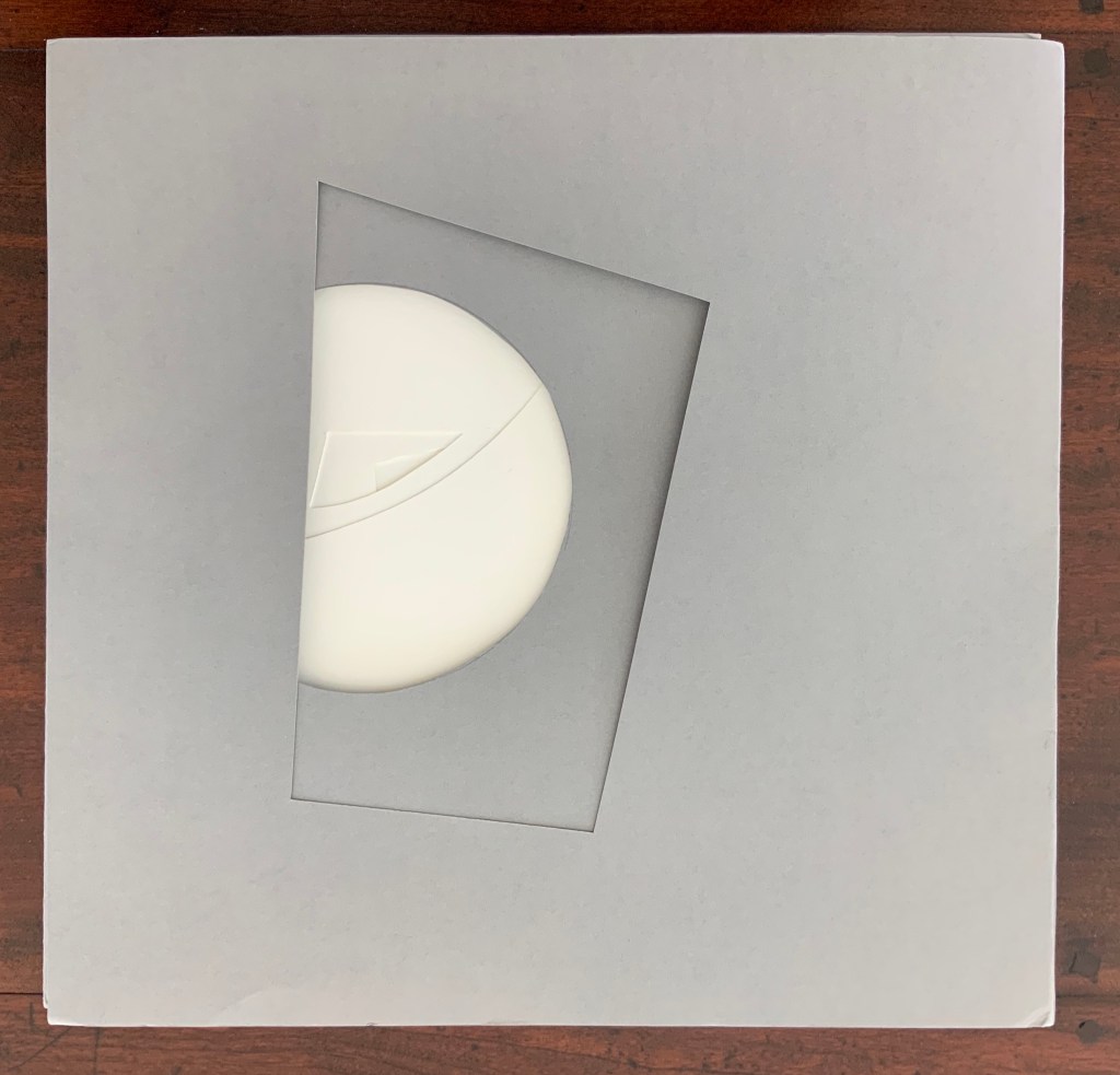
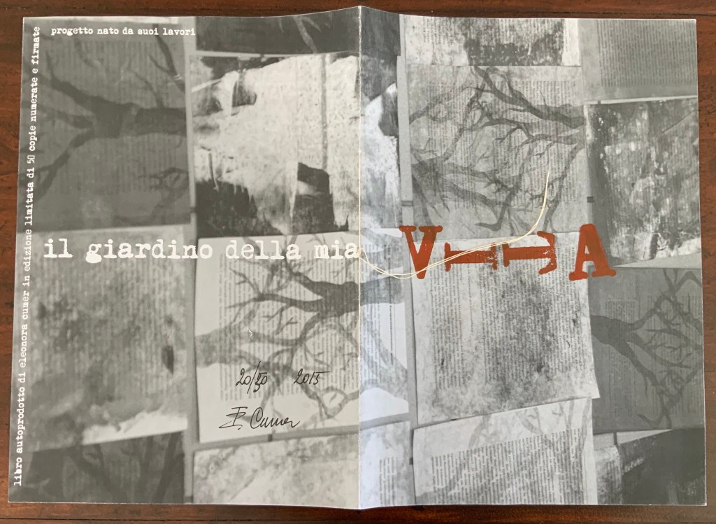
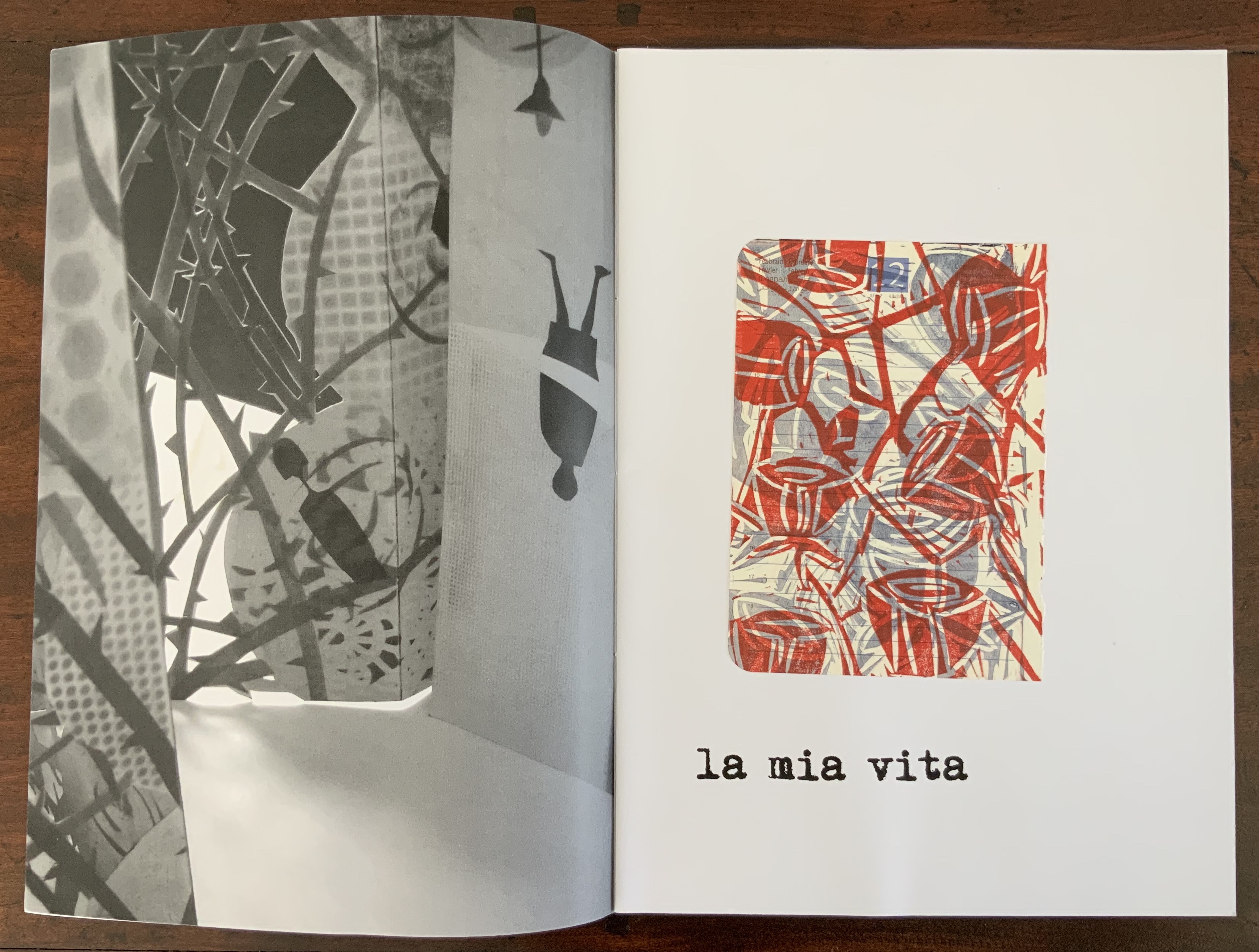
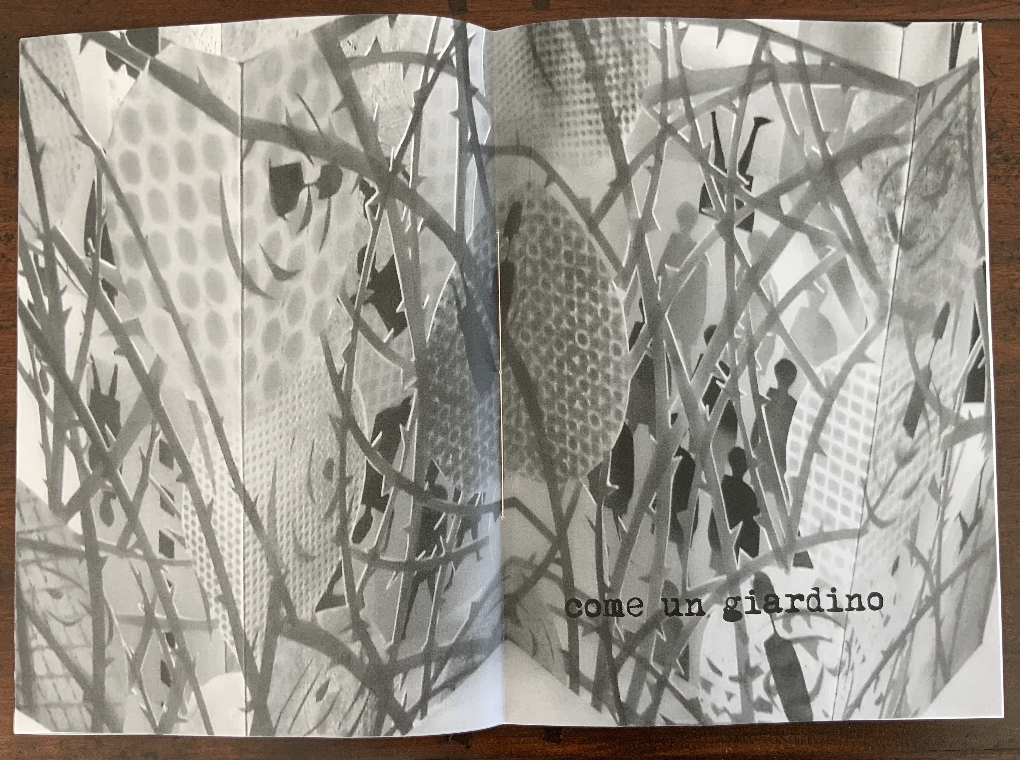
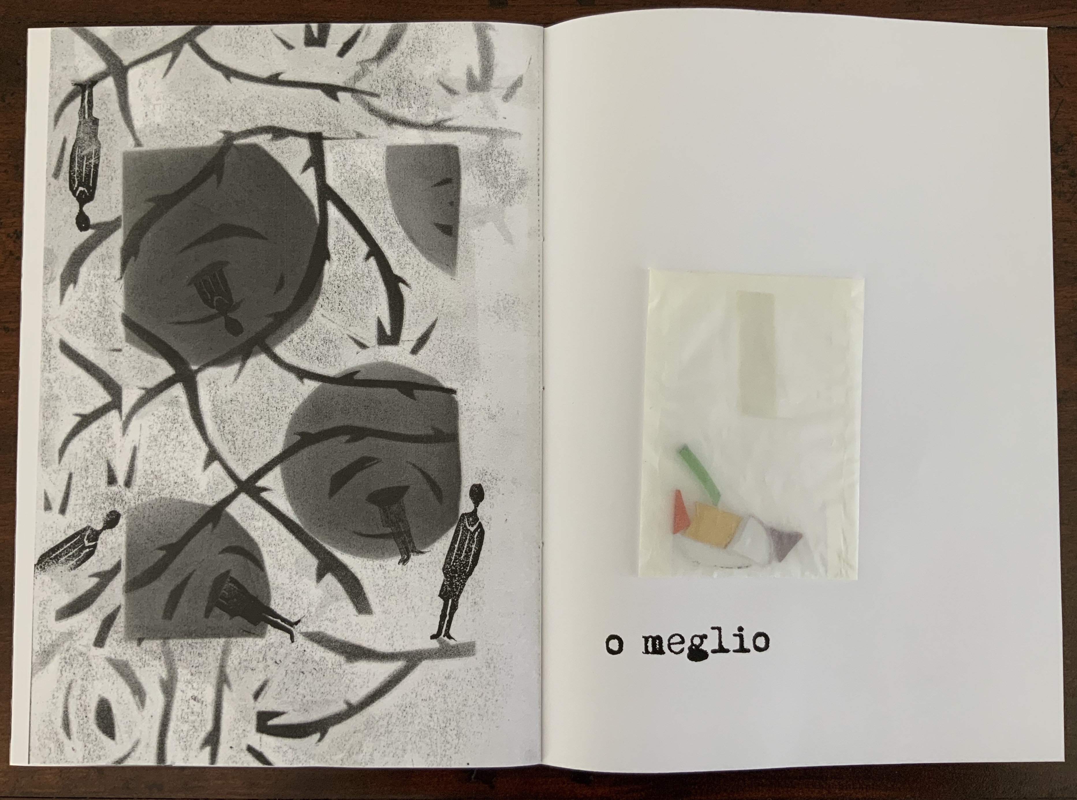
il giardino della mia VITA (2015)
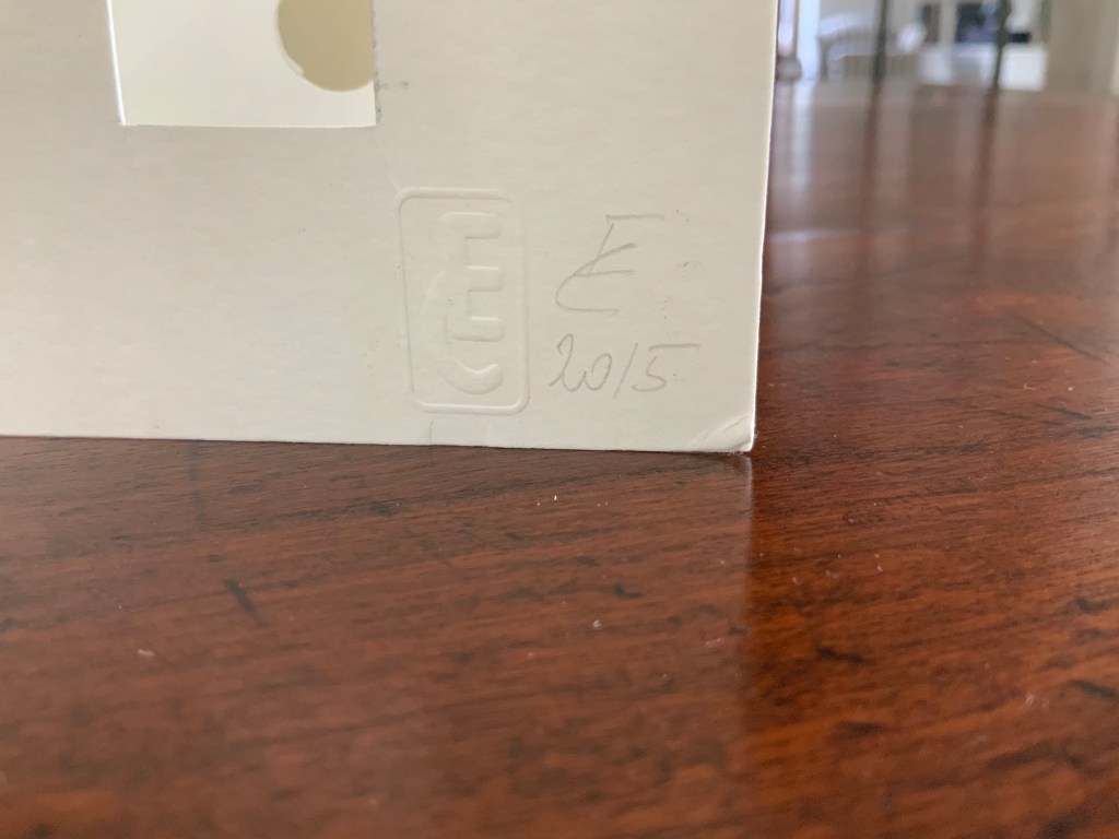
il giardino della mia VITA (2015) Eleonora Cumer Hand-sewn booklet of hand-stamped photo-collaged paper. Glassine envelope, glued to page 6, contains shards of coloured glass. H288 x W205 mm closed, H288 x W410 open. Edition of 50 numbered and signed, of which this is #20. Acquired from the artist, 16 September 2017.
The text in English: “The garden of my life: my life like a garden or better”
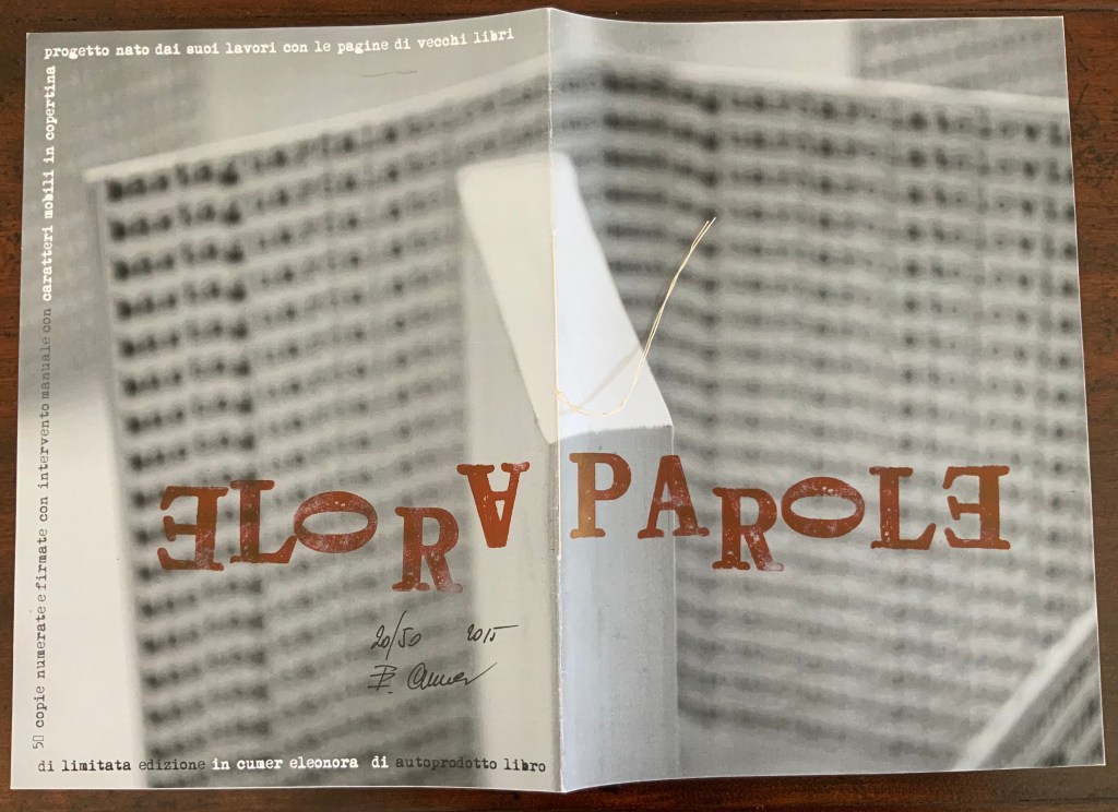
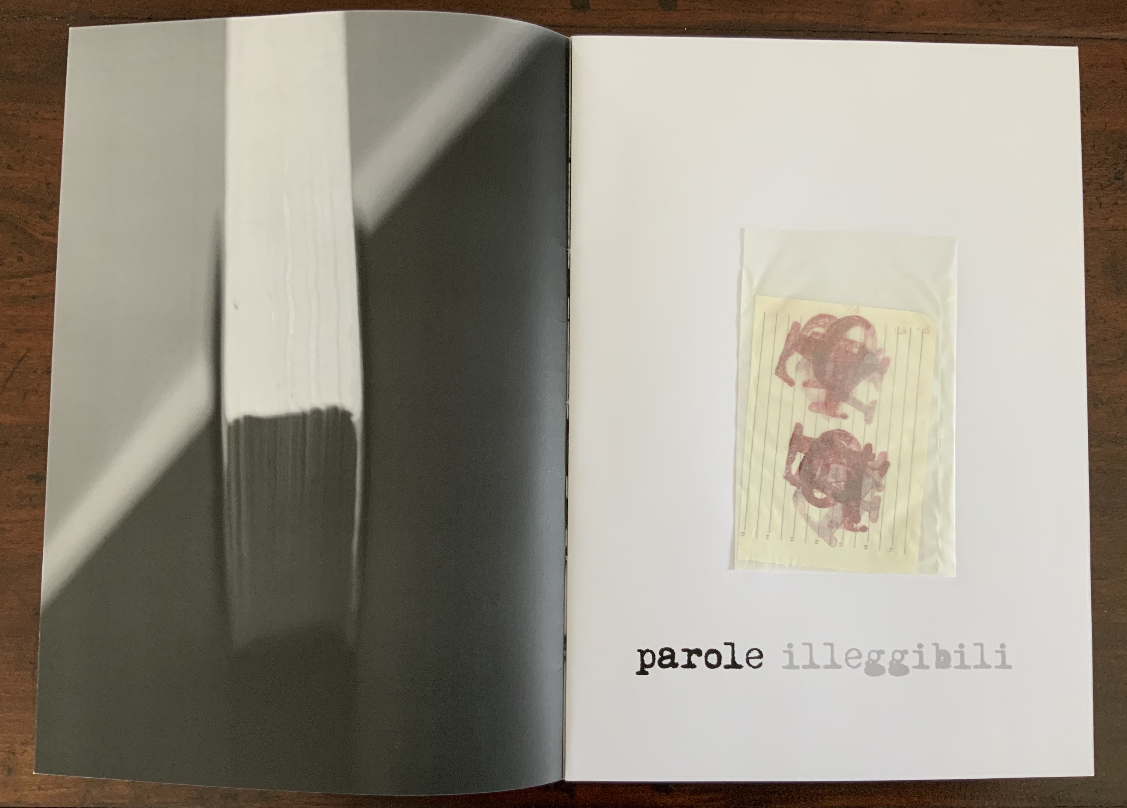
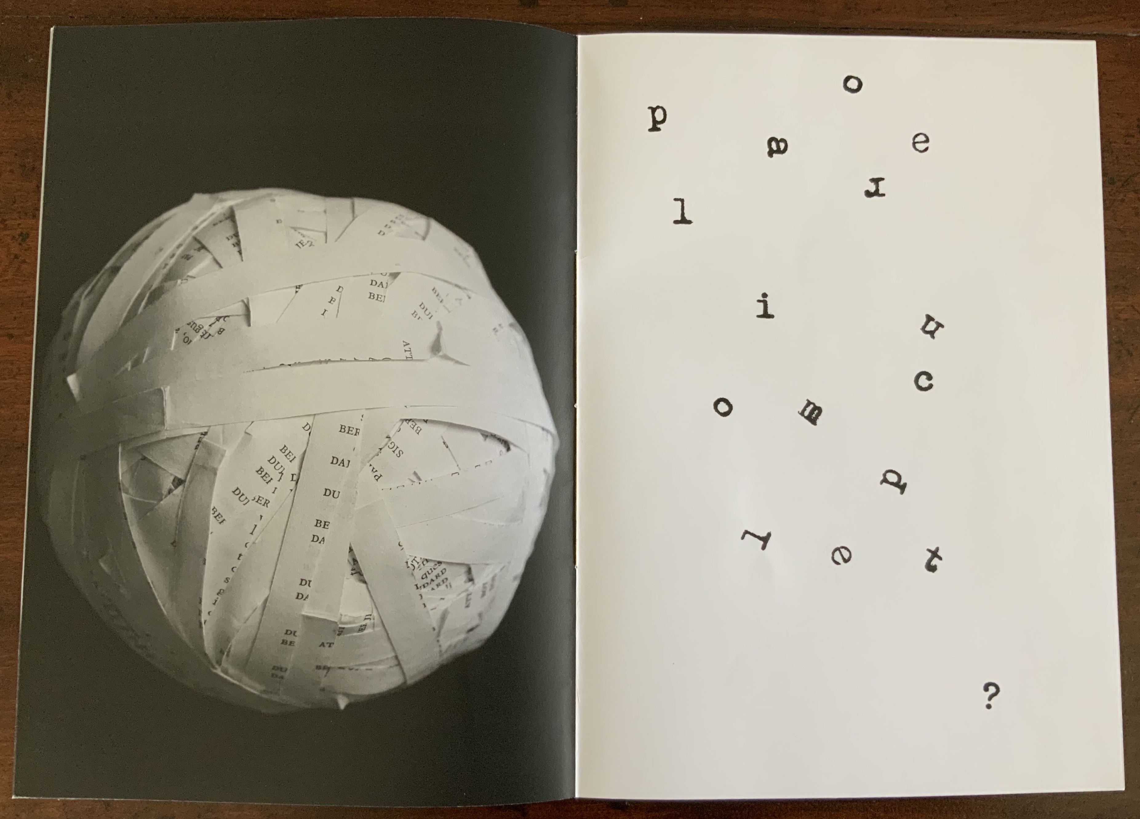
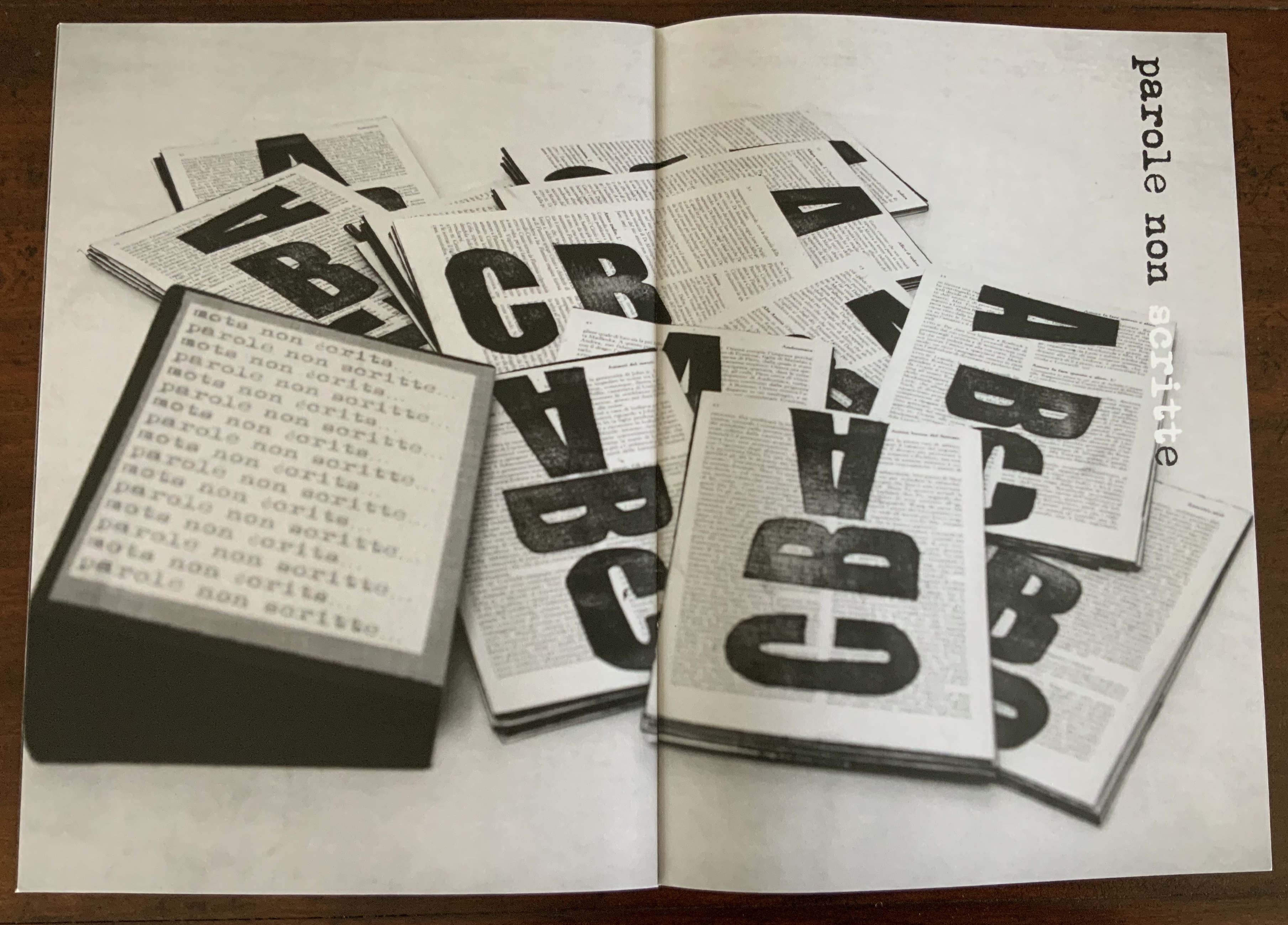
PAROLE (2015)
Parole (2015) Eleonora Cumer Hand-sewn booklet of hand-stamped photo-collaged paper. Glassine envelope, glued to page 2, contains slip of lined paper hand-stamped with the letters of the word “parole” superimposed on one another in two groups. H288 x W205 mm closed, H288 x W410 open Edition of 50 numbered and signed, of which this is #20. Acquired from the artist, 16 September 2017.
The text in English: ”Words: unreadable words, incomplete words, unspoken words”
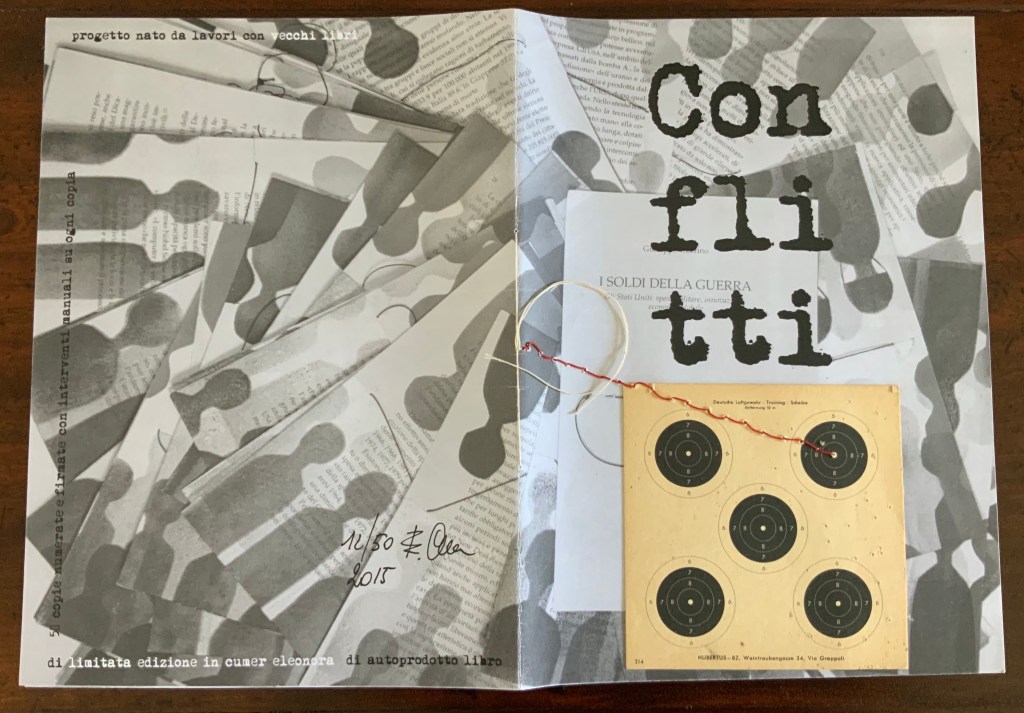
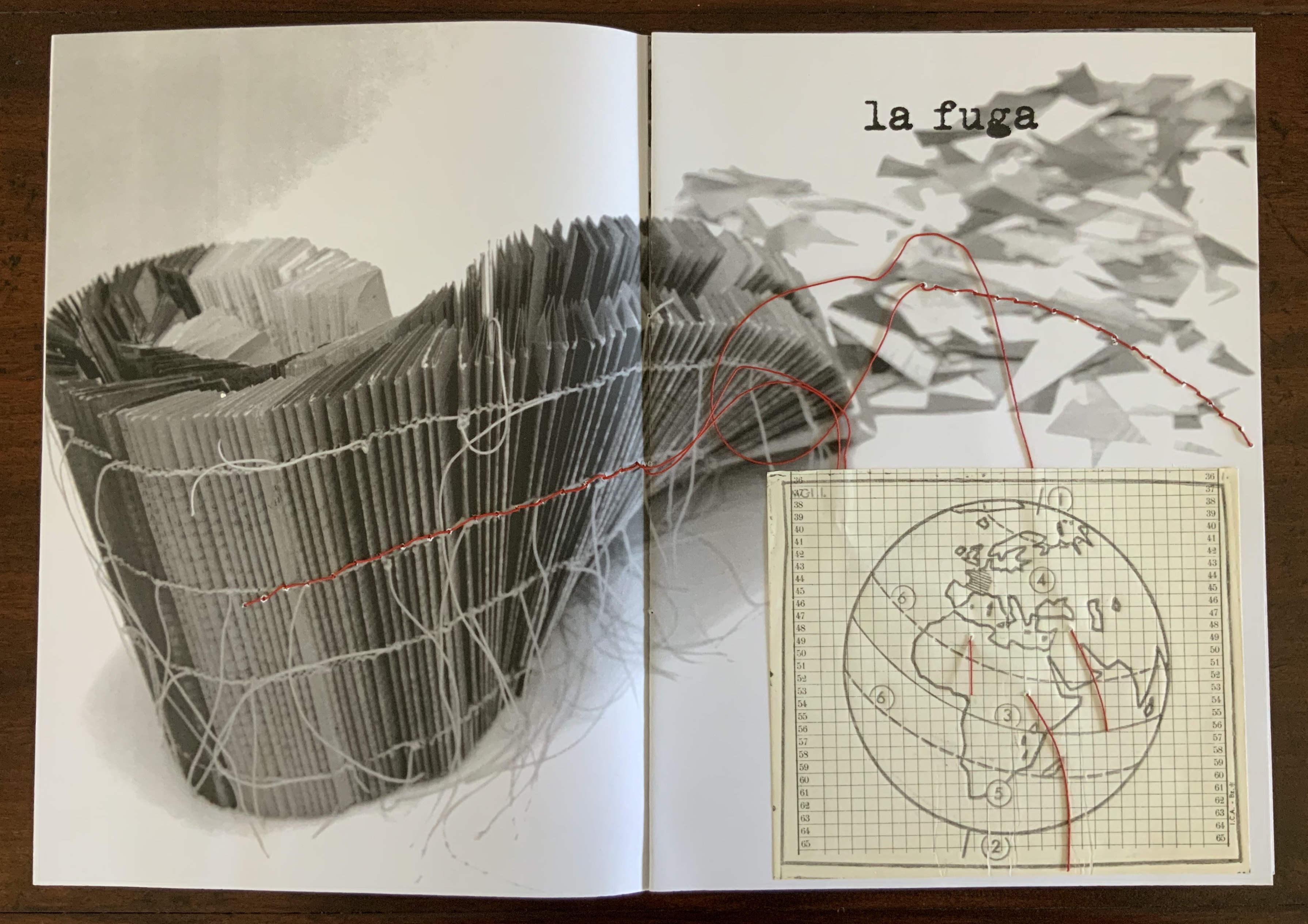
Conflitti (2015)
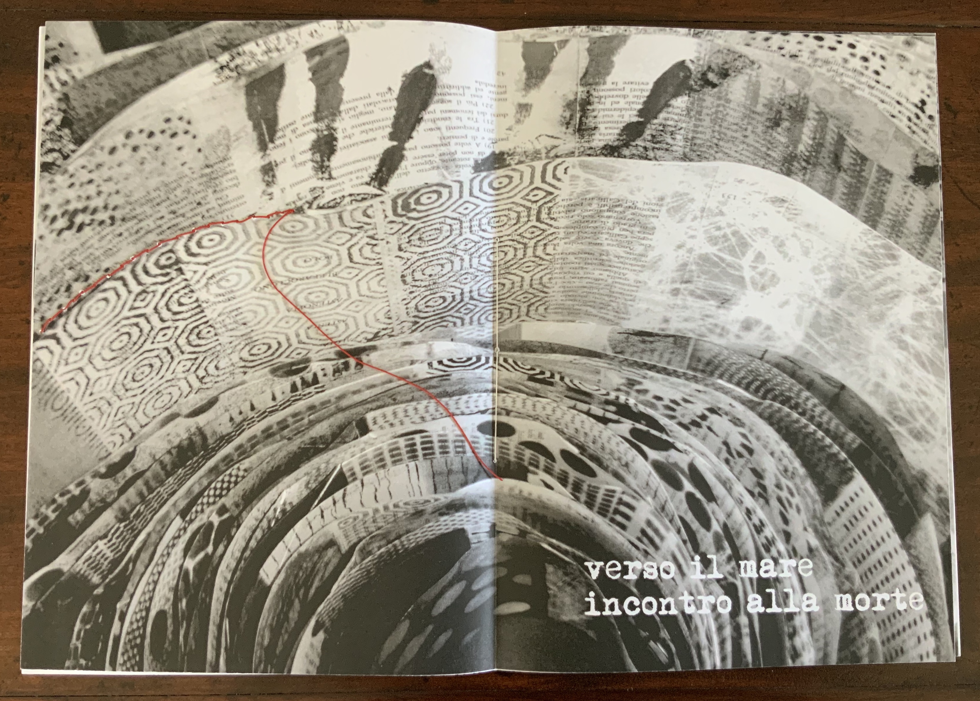
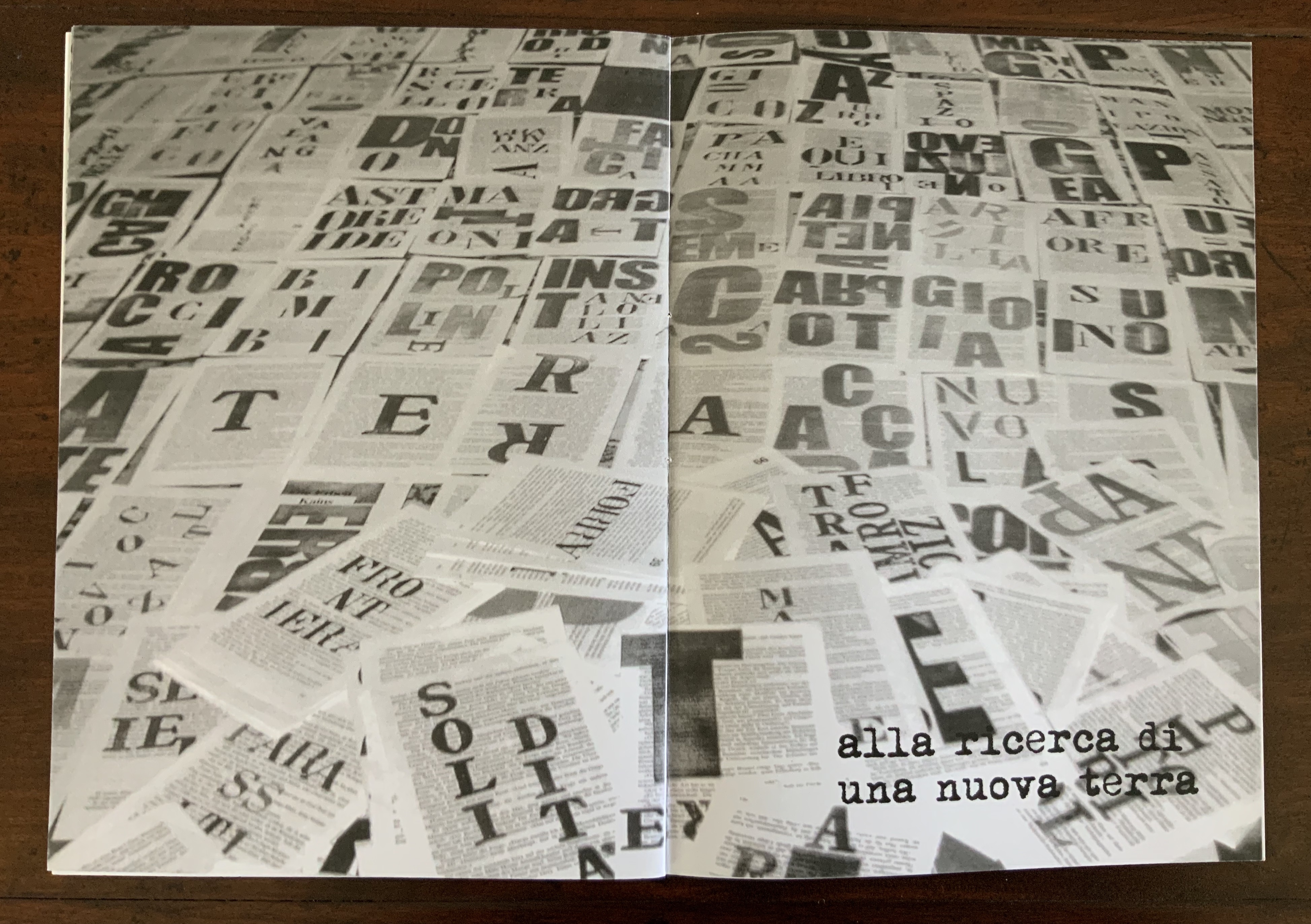
Conflitti (2015) Eleonora Cumer Hand-sewn booklet of hand-stamped photo-collaged paper. German air rifle training disc (distance 10 m) sewn with red thread and glued to cover; exiting on page 1, the red thread crosses to pages two and three; page two includes a pastedown grid, labelled in its margin with the abbreviation for an anti-cholergenic incapacitating chemical weapon. H288 x W205 mm closed, H288 x W410 open. Edition of 50 numbered and signed, of which this is #16. Acquired from the artist, 16 September 2017.
The text in English: “Conflict: the flight to the sea to meet death in search of a new land”
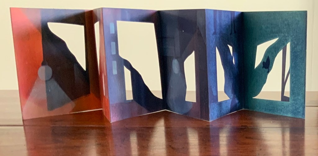
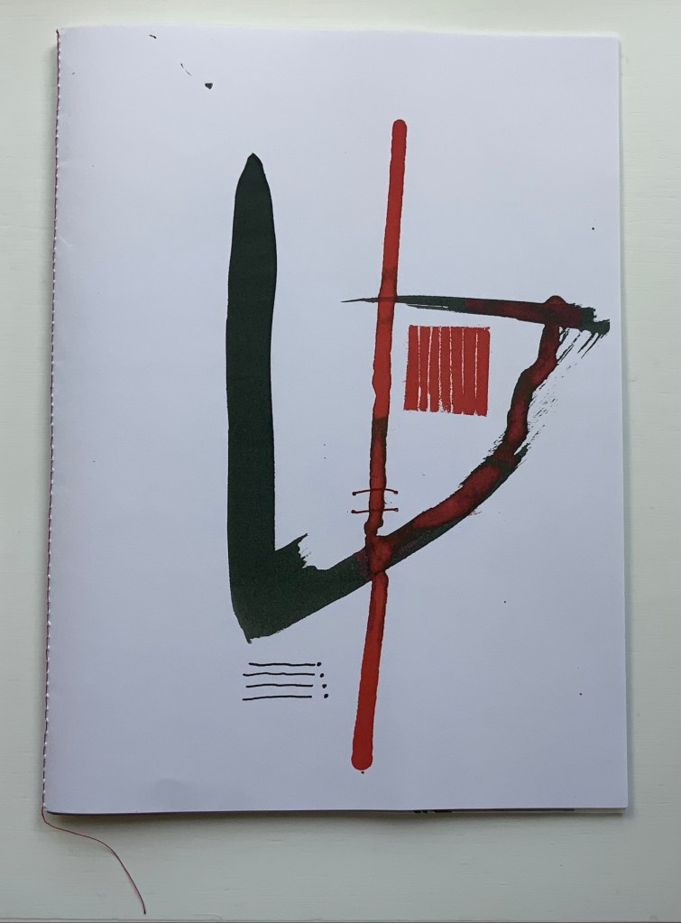
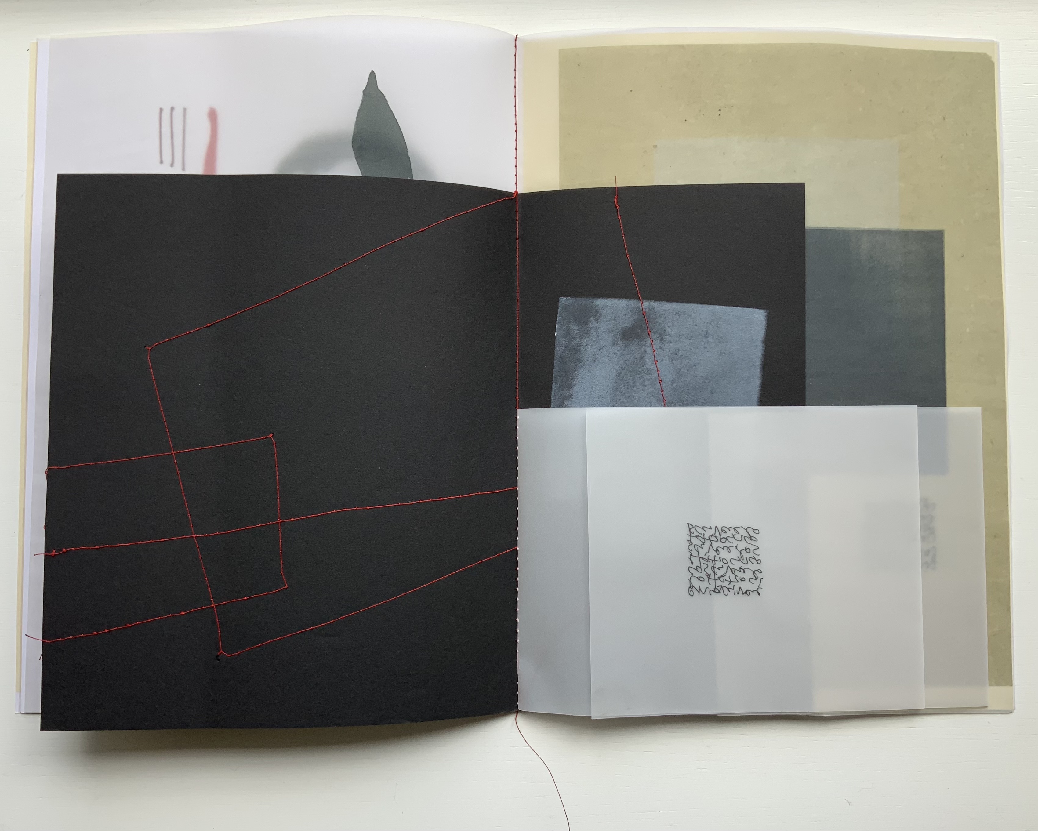
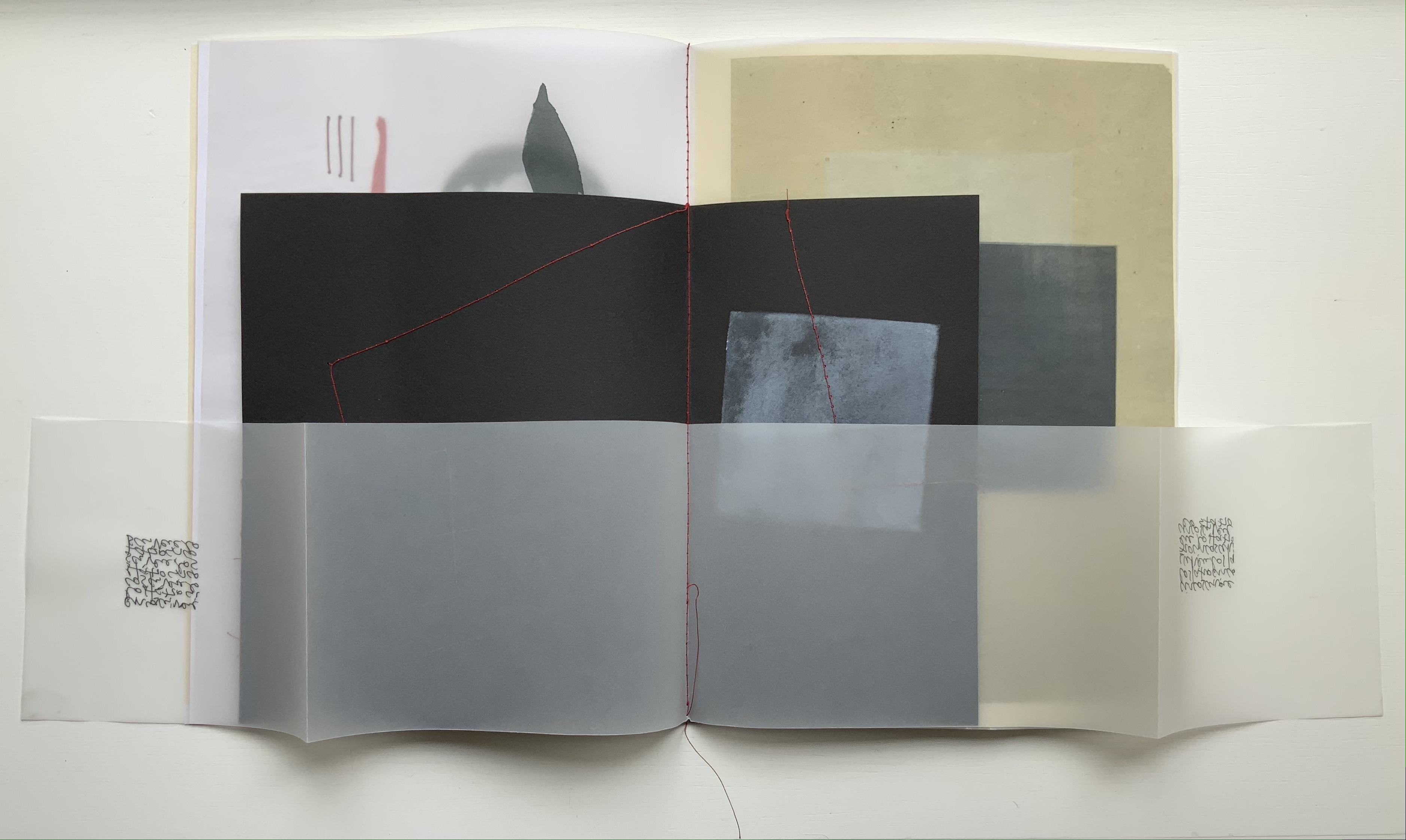
Circoscrivere lo spazio (2021)
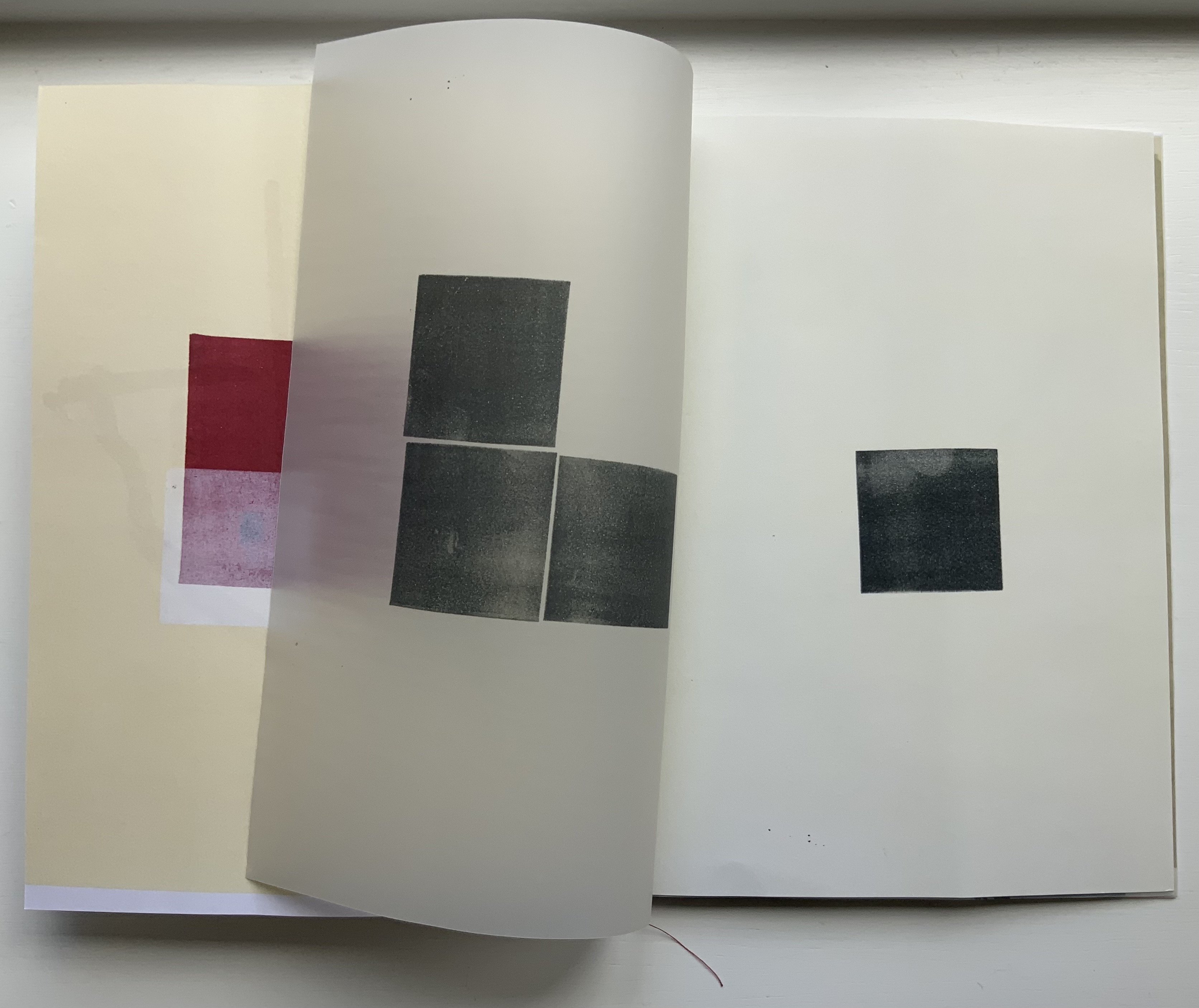
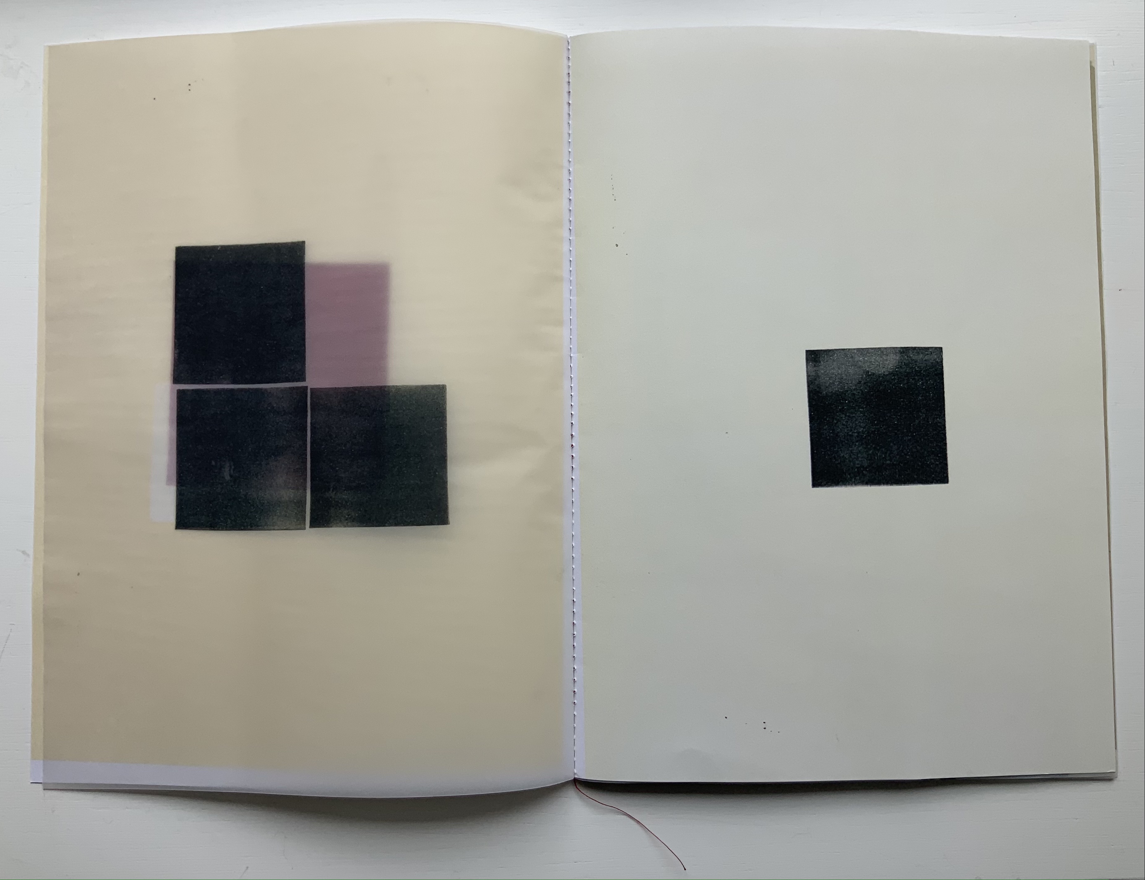
Circoscrivere lo spazio No. 3 (2021) Eleonora Cumer Booklet with alternating folios of papers and folded inserts. H275 x W200. mm. Edition of 15, of which this is #10. Acquired from the artist, 26 May 2021. Photos: Books On Books Collection.
The thick stroke of black on the front cover runs downwards, then veers diagonally and upwards to the right. As it does, it narrows, reddens and loops over a leftward thrust suggesting a needle crossing under the moderately thick red stroke that tilts off center. The two thin red stitch-like lines further down the length of that off-center stroke strengthens the suggestion. Something is being bound or stitched together.
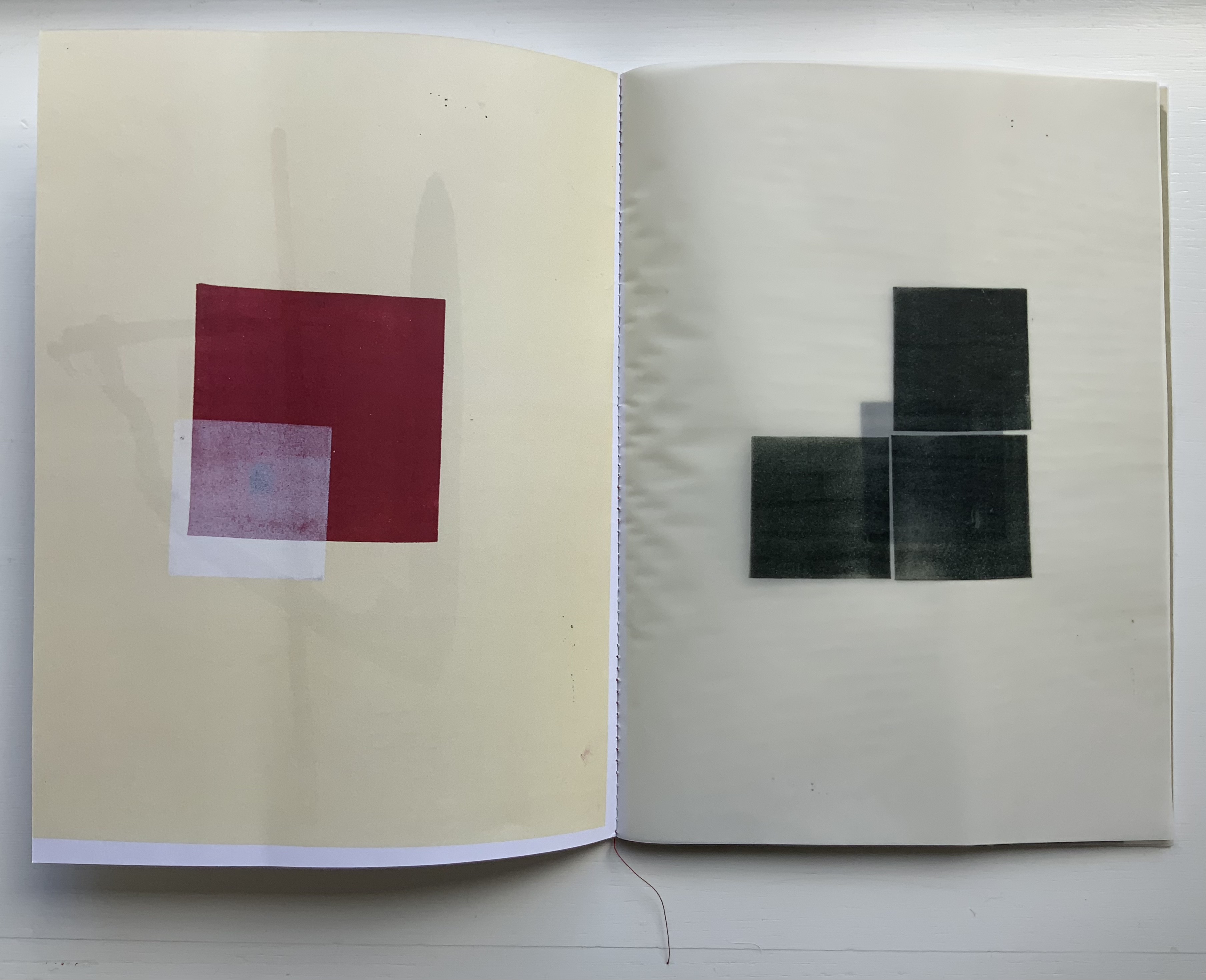
When the booklet opens, a translucent page appears on the right. It bears three black squares, but an off-center fourth peeks through them. As the translucent page turns, a crackling sound startles while the page with the off-center square comes into view. It is made of the same paper as the front cover but inked slightly less yellow than is the inside of the front cover. The smudges lightening the upper righthand corner of the fourth black square fool the eye into seeing another translucent layer, an illusion strengthened by another illusion. Looking to the left, the eye sees through the real translucent sheet the white margins at the foot and center of the inside front cover, and it appears that the translucent sheet has the same margins and an undertone of yellow aligned with that on the inside front cover. Not so.
The next two double-page spreads tease and hint to the eye in the same and different ways. Stitching images like those on the front cover reappear but now enlarged. Another crackling sheet of translucent paper covers an enlarged black square, which turns out to be an insert of black paper embroidered with red thread. When the hooked-needle image overlays the other stitchery images on the white verso page, it becomes clear that the insert hides another smaller insert. Smaller, yes, but with its own widening surprise — two valley folds that are really mountain folds when the insert unfolds completely over the double-page spread.
All of these “deceptions” — and others to come in the booklet — involve circumvention of circumscription. Circoscrivere lo spazio (“To circumscribe space”) and the next work are Cumer’s most sophisticated metaphoric works in the Books On Books Collection.
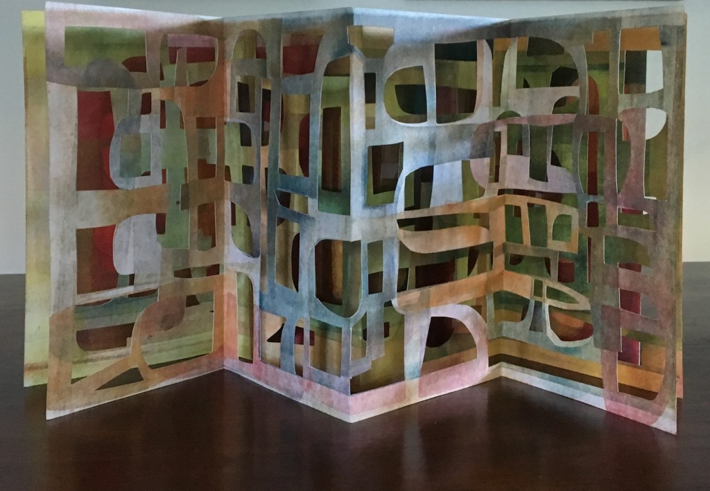
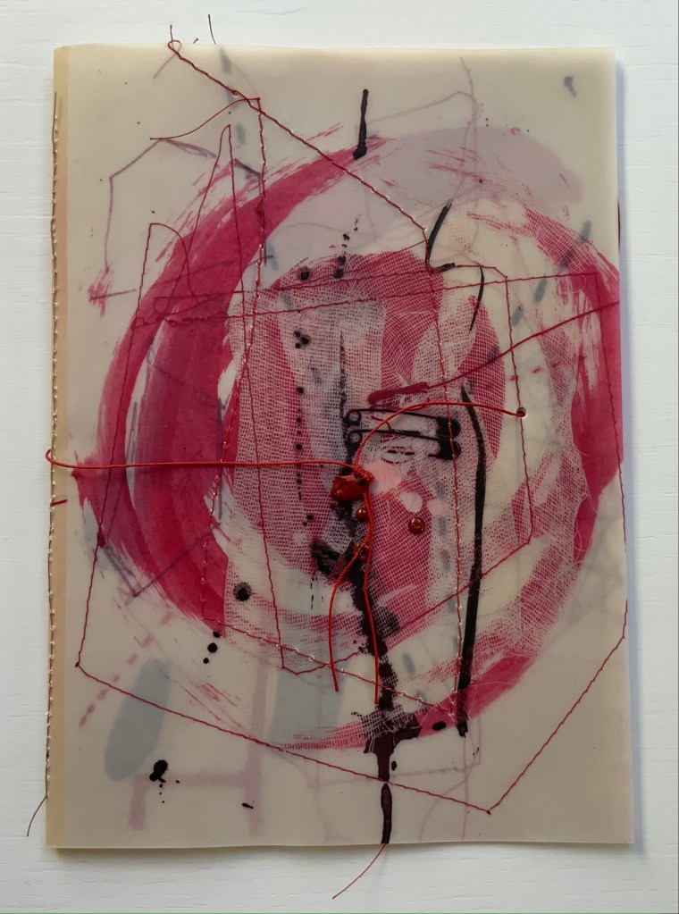
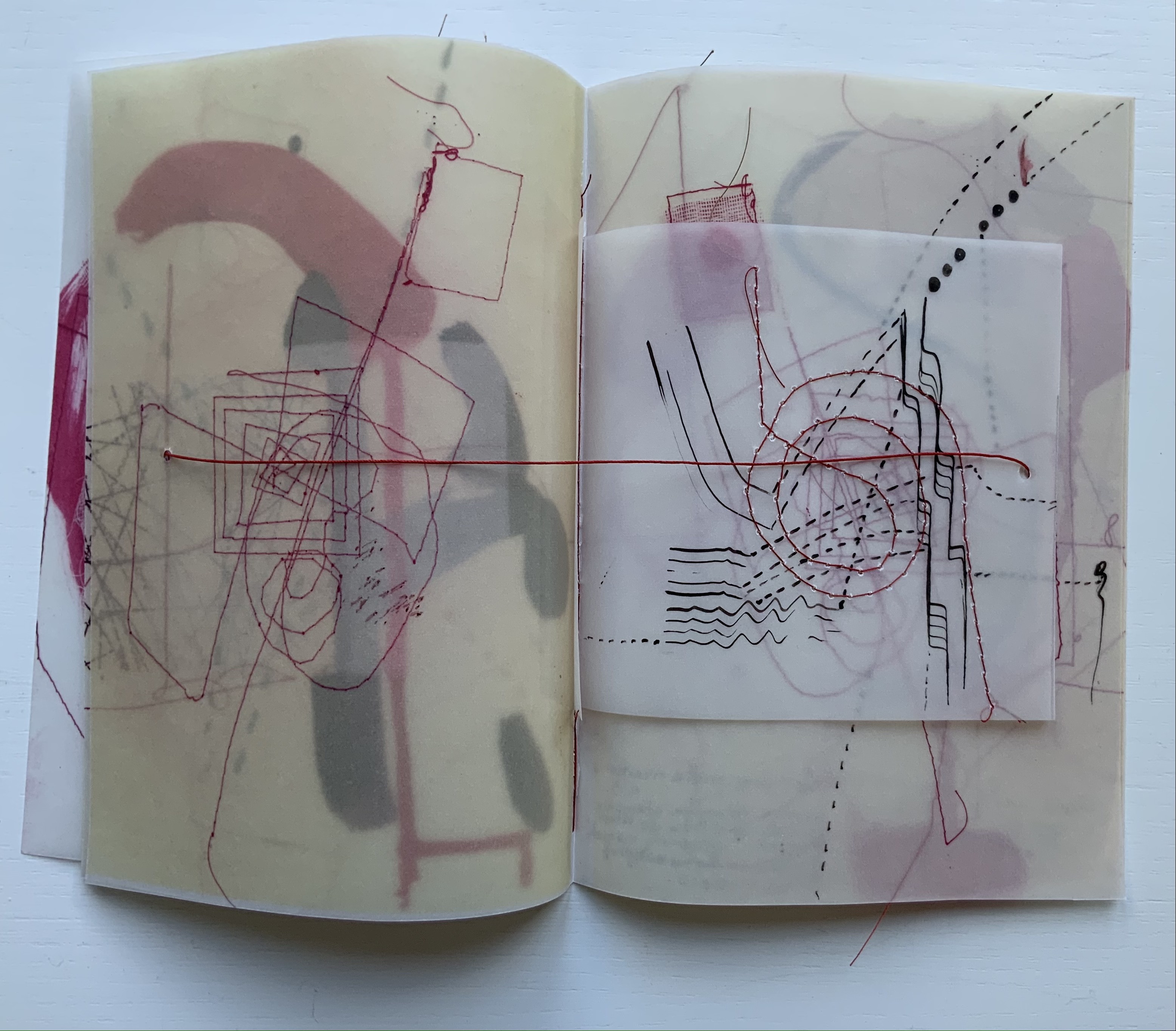
Cercare nella memoria (2021)
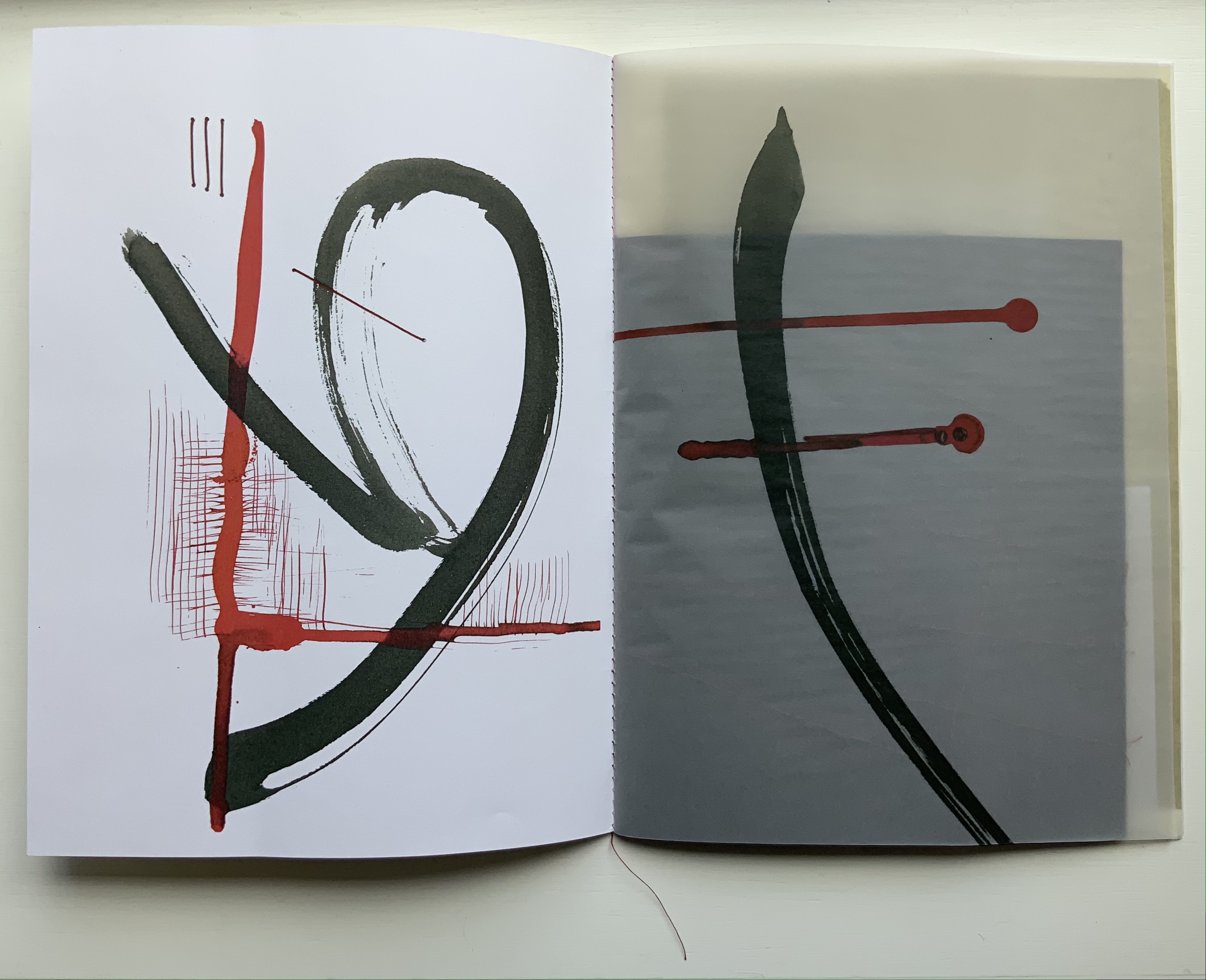
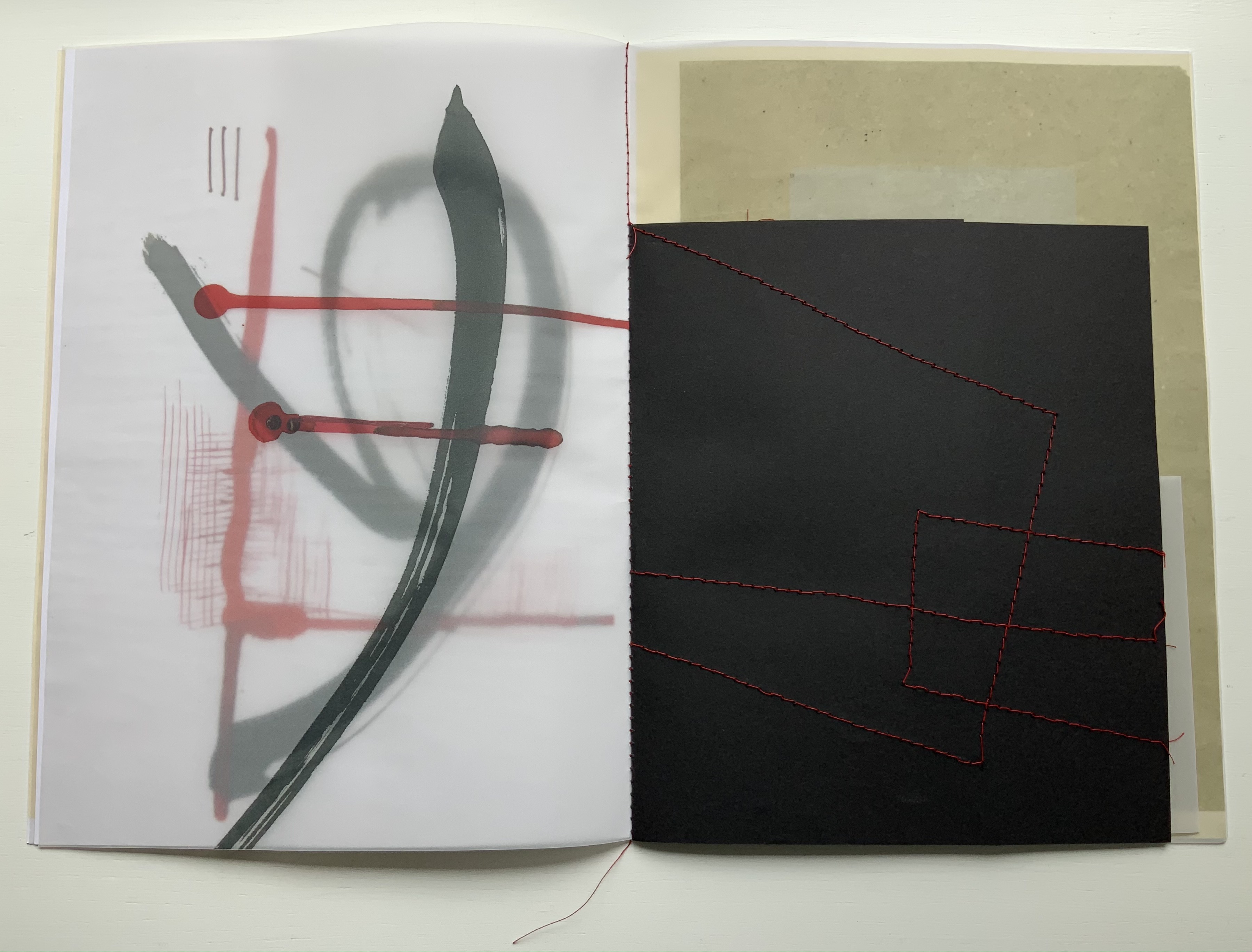
Cercare nella memoria (2021) Eleonora Cumer Booklet of translucent papers, center sewn, hole-punched and strung together with a single thread. H195 x W140 mm. Edition of 15, of which this is #1. Acquired from the artist, 26 May 2021. Photos: Books On Books Collection.
Each copy is printed with a photocopier, then subjected to different manual interventions: embroidered images in red thread, ink and watercolor, wax seals, a translucent white single-sheet insert, and collage with tarlatana. The binding is twofold: a single brown thread sewn through the fold of the gathered folios, and a punched hole through which a single red thread is loosely strung, secured with a single stitch through the spine and two drops of sealing wax, one on the back and one on the front over a knot in the thread.
Each of these material and technical details, by itself and together, contributes to the meaning of this work, spelled out in its title: Cercare nella memoria (“To seek in memory”). When we speak of searching our memories, we speak in metaphors and images. Many of them are here in this booklet: pulling on a thread, losing the thread, picking up the thread, tying a string around a finger, circling in on something, holes in recollection, and peeling back layers of memory. The drops of sealing wax might jog the memory of Giordano Bruno’s Thirty Seals, the third volume in his Art of Memory. Pulling on that thread might lead to the discovery of a resemblance between Bruno’s seals and Cumer’s images.
Cercare is smaller than Circoscrivere. It may, perhaps, have fewer moving parts. But it is more dense, more crowded, more delicate, and more violent with its splashing red and lines crashing across one another — and, for anyone who thinks seriously about memory, more frightening.
Giordano Bruno’s “The Bookbinder” seal from Julia Buntaine Hoel’s “The Art of Memory” (2018 to present). Accessed 27 June 2021.
Further Reading
“Eleonora Cumer”, WorldCat Identities. Accessed 5 September 2019.
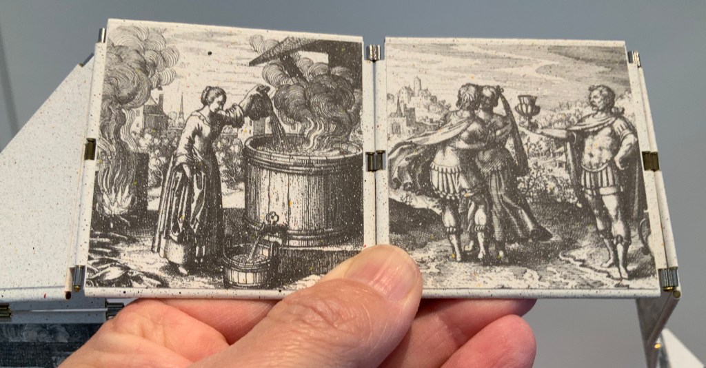
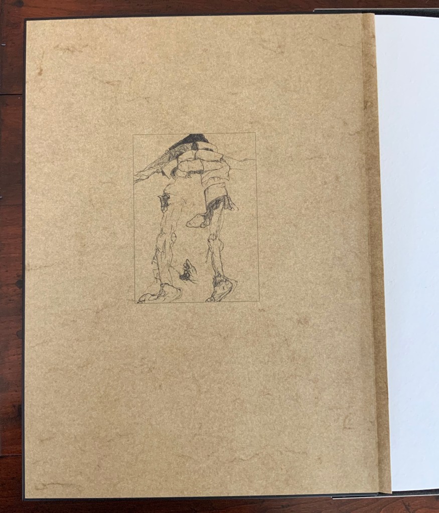
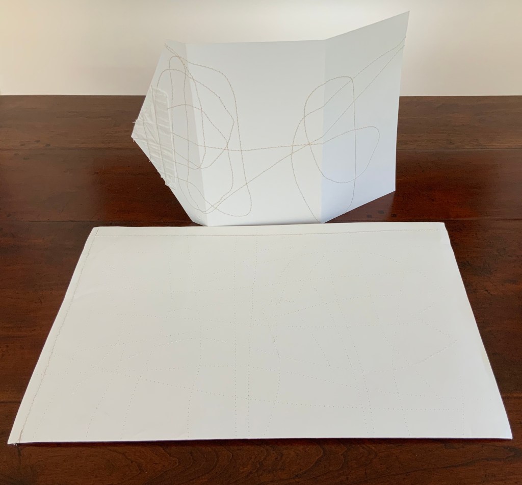
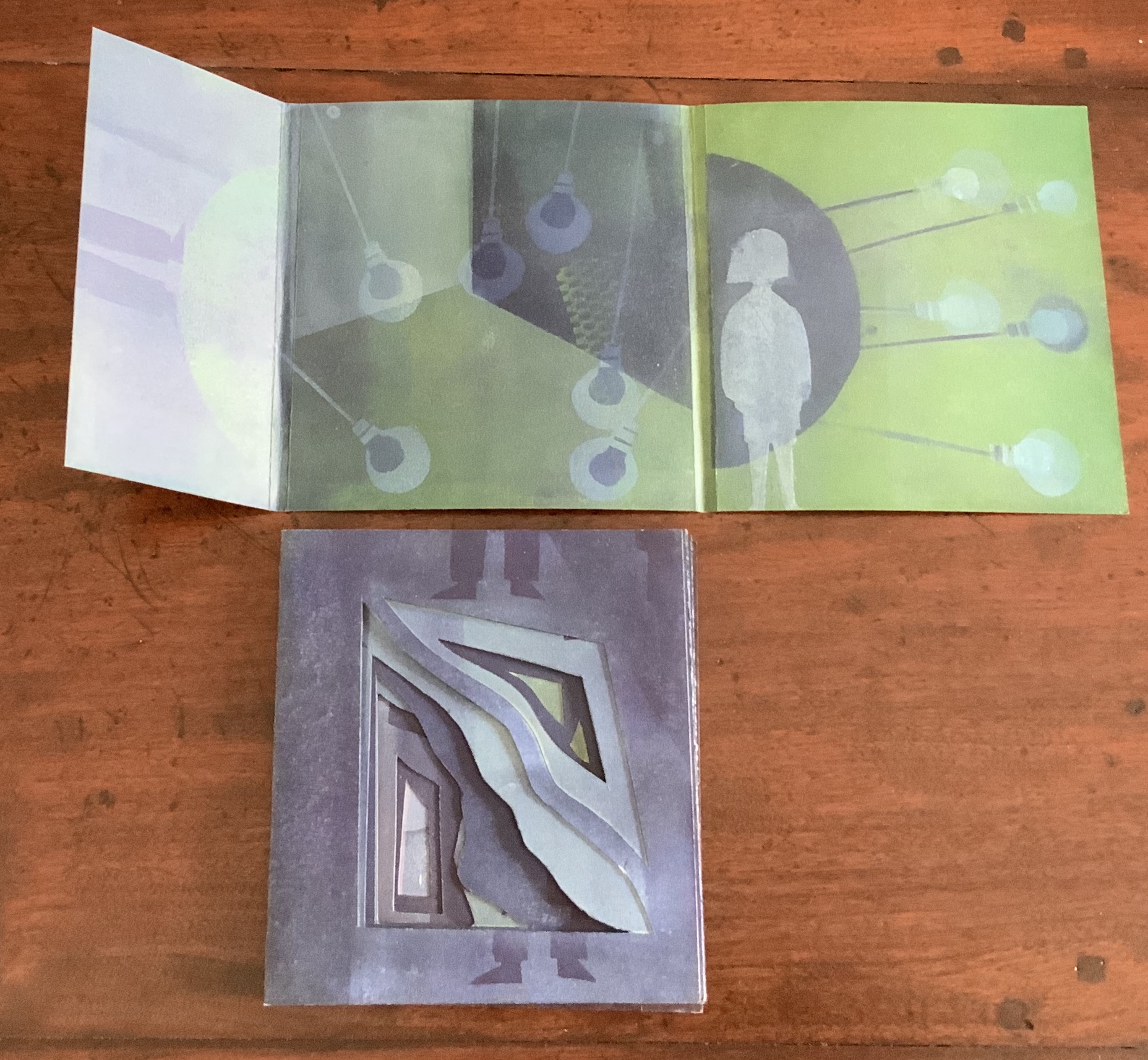
The Anatomy Lesson: Unveiling the Fasciculus Medicinae (2004)
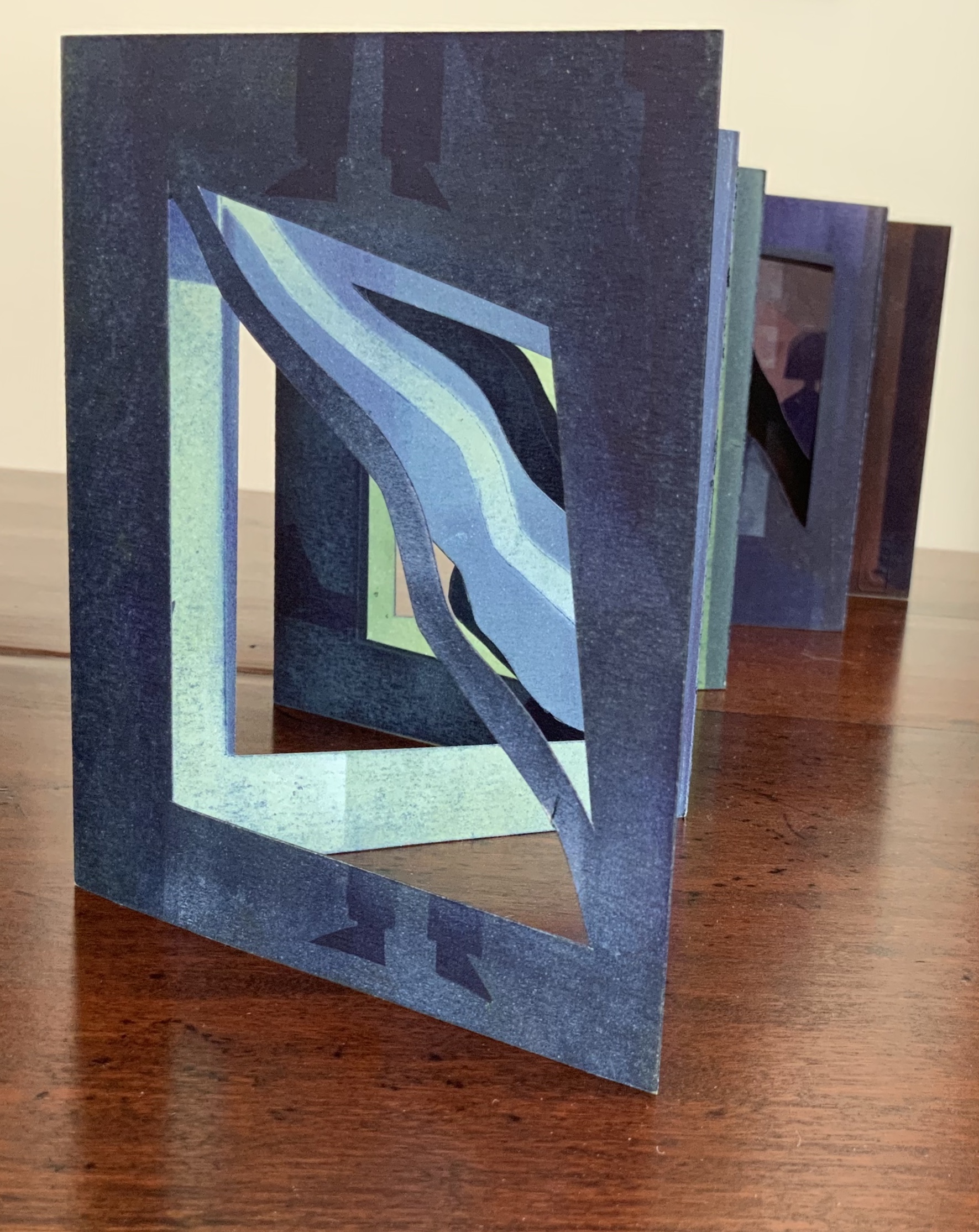
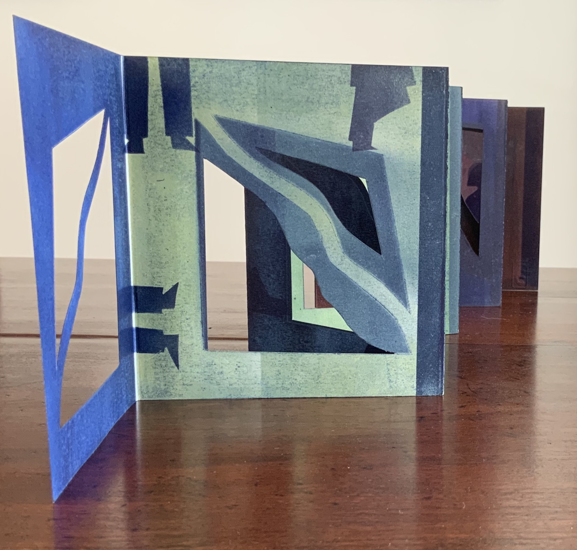
The Anatomy Lesson: Unveiling the Fasciculus Medicinae (2004) Joyce Cutler-Shaw Middletown, CT: Robin Price, Publisher, 2004) Housed in a custom-made, engraved stainless steel box (H370 x W326 x D44 mm), concertina binding co-designed with Daniel E. Kelm and Joyce Cutler-Shaw, produced at The Wide Awake Garage; twelve signatures of handmade cotton text paper, the central ten signatures each made up of one sheet H356 x W514 mm and one sheet H356 x W500 mm glued to the 14 mm margin of the first sheet, for a total of 96 pages, each measuring H356 x W253 mm. Binding of leather covered boards (a hologram embedded in front cover) with an open spine, taped and sewn into a reinforcing concertina structure: H361 X W259 mm. The hologram, produced by DuPont Authentication Systems, features an early eighteenth-century brass lancet. Edition of 50, of which this is a binder’s copy. Acquired from the binder, Daniel E. Kelm, 15 October 2018.
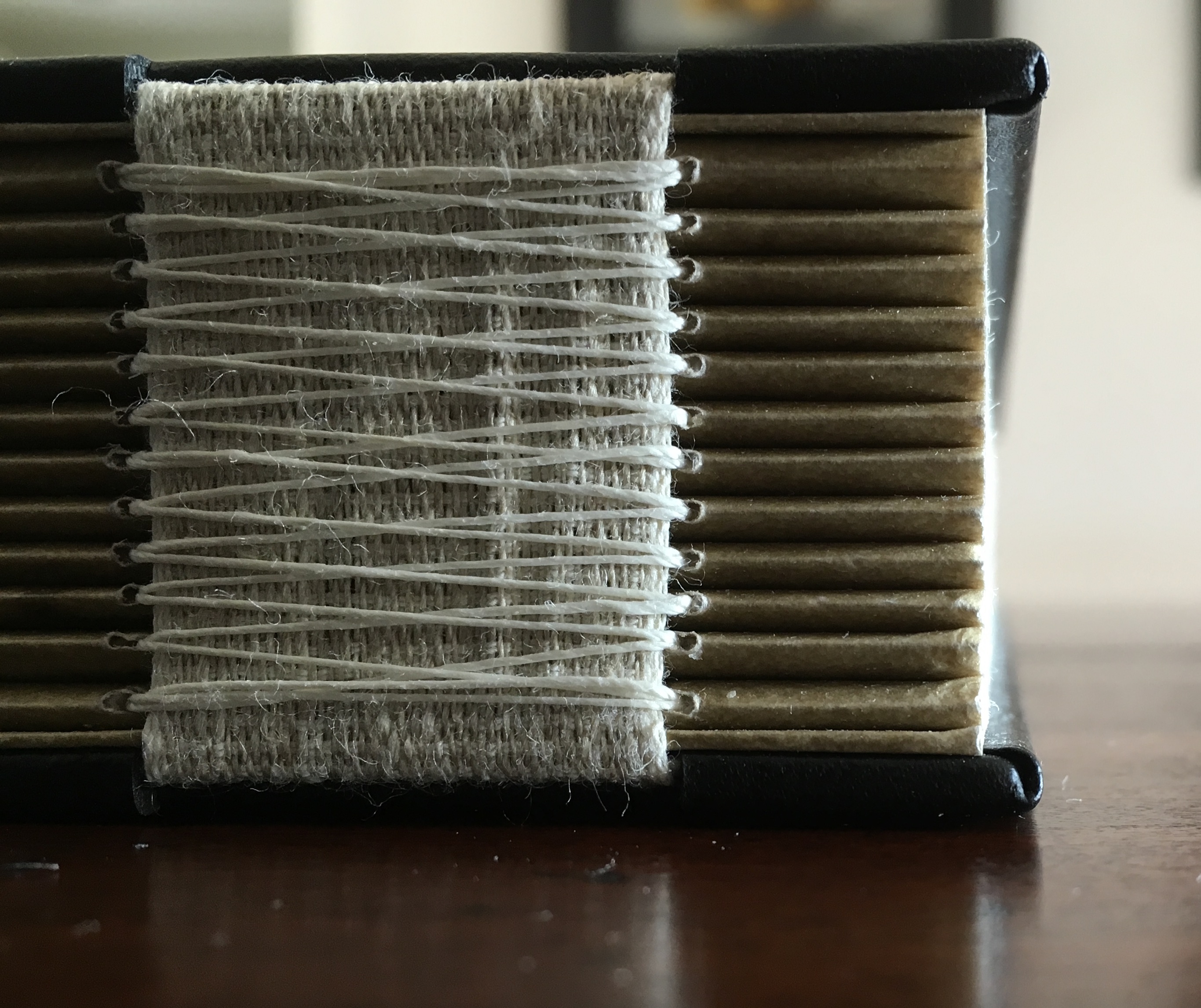
Twelve signatures of handmade cotton text paper, the central ten signatures each made up of one sheet H356 x W514 mm and one sheet H356 x W500 mm glued to the 14 mm margin of the first sheet, for a total of ninety-six pages, each measuring H356 x W253 mm. Binding of leather covered boards (a hologram embedded in front cover) with an open spine, taped and sewn into a reinforcing concertina structure: H361 X W259 mm. Contained in engraved steel box: H370 x W326 x D44 mm.
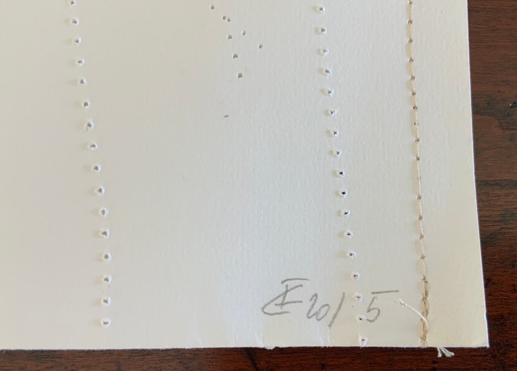
Clockwise: stainless steel box container, detail of sewing and detail of reinforcing accordion structure. For a description of this type of structure, see Hedi Kyle’s The Art of the Fold (London: Laurence King, 2018), pp. 82-85.
Top of photo: gives a view of the doublure, which is part of the reinforcing concertina structure. Bottom of photo: gives a view of page 1, which precedes a blank page and half-title. Note that pages are unnumbered.
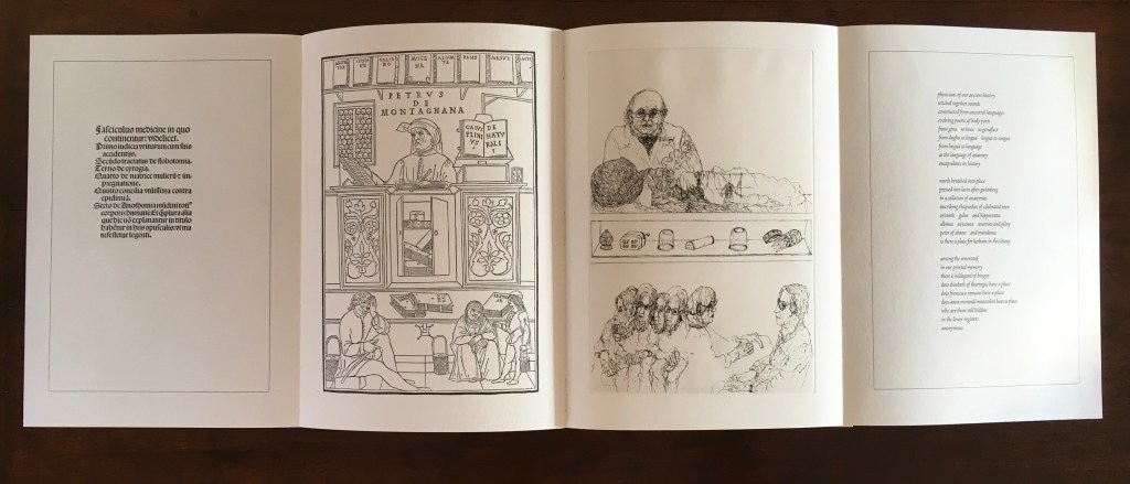
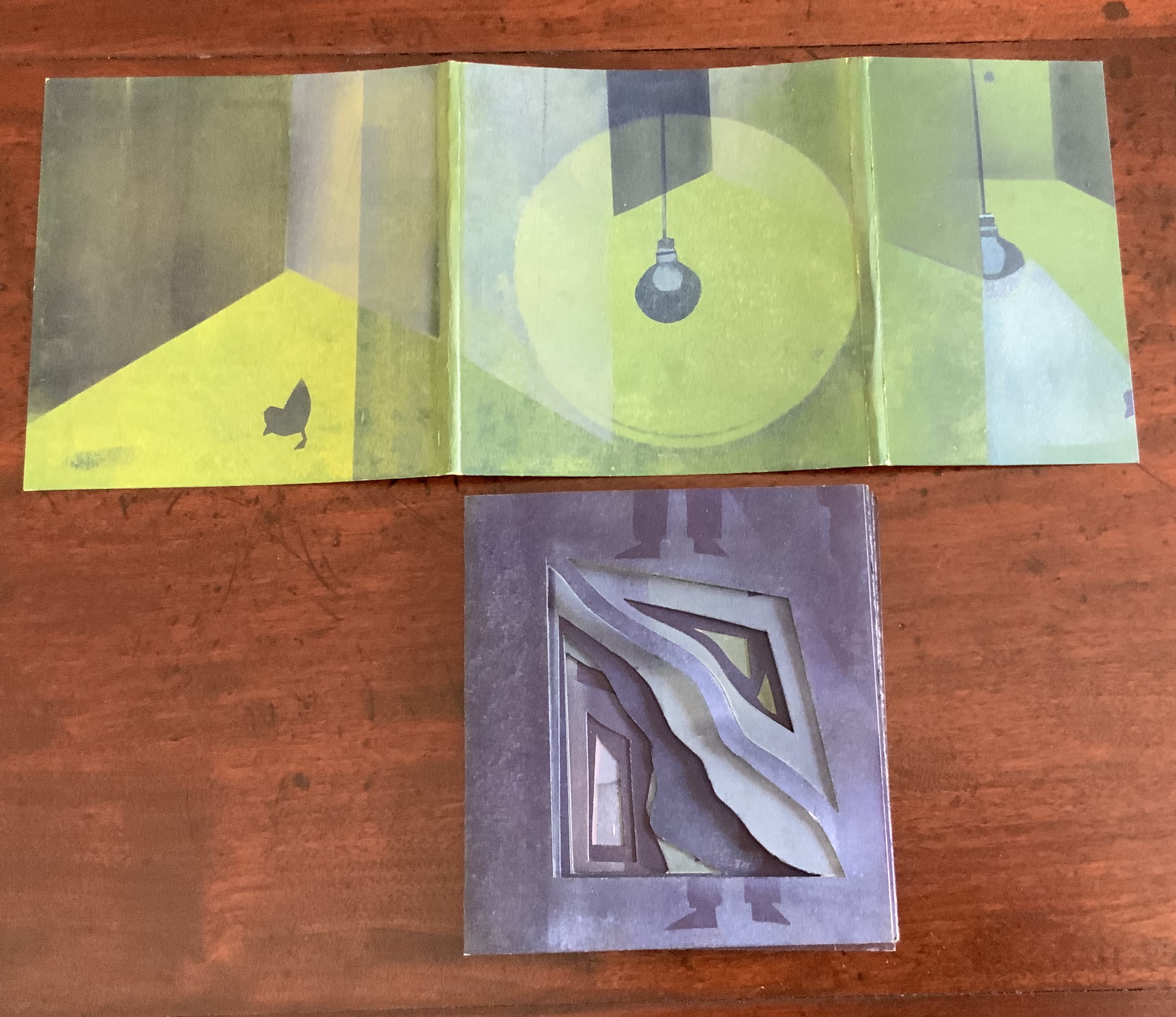
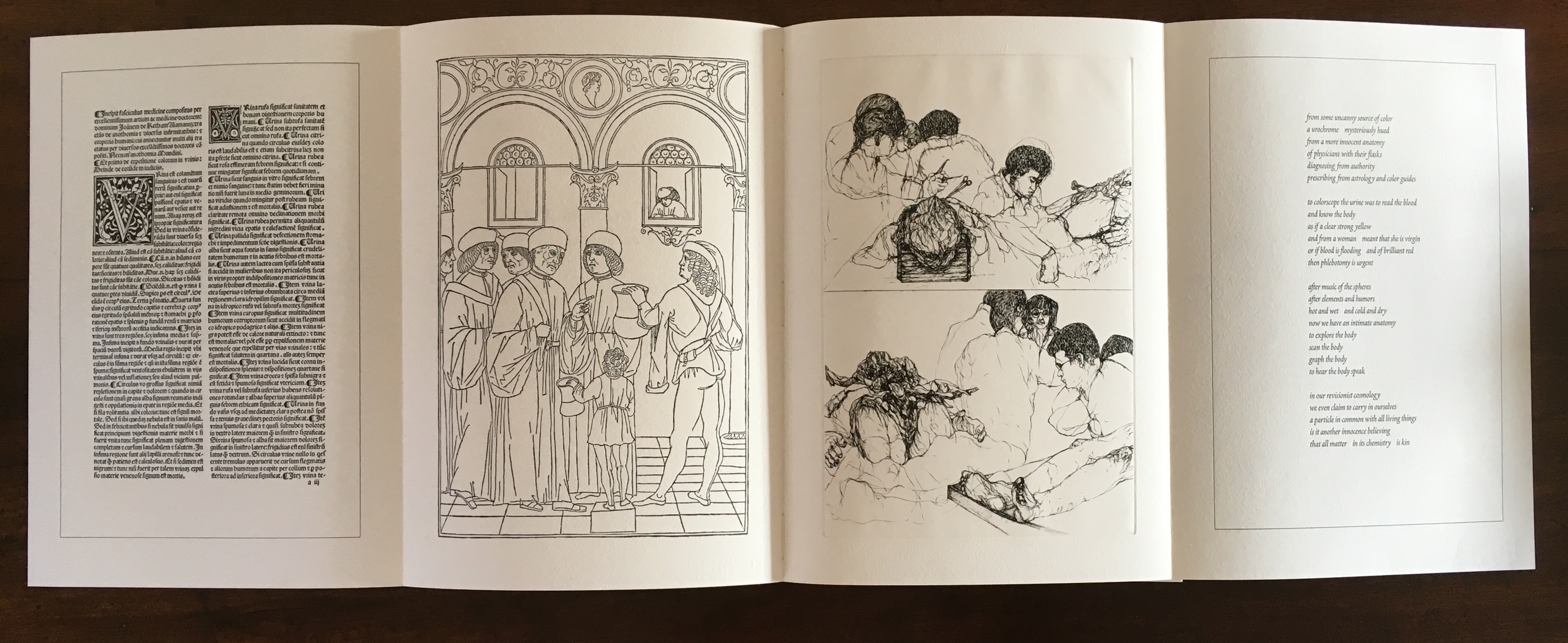
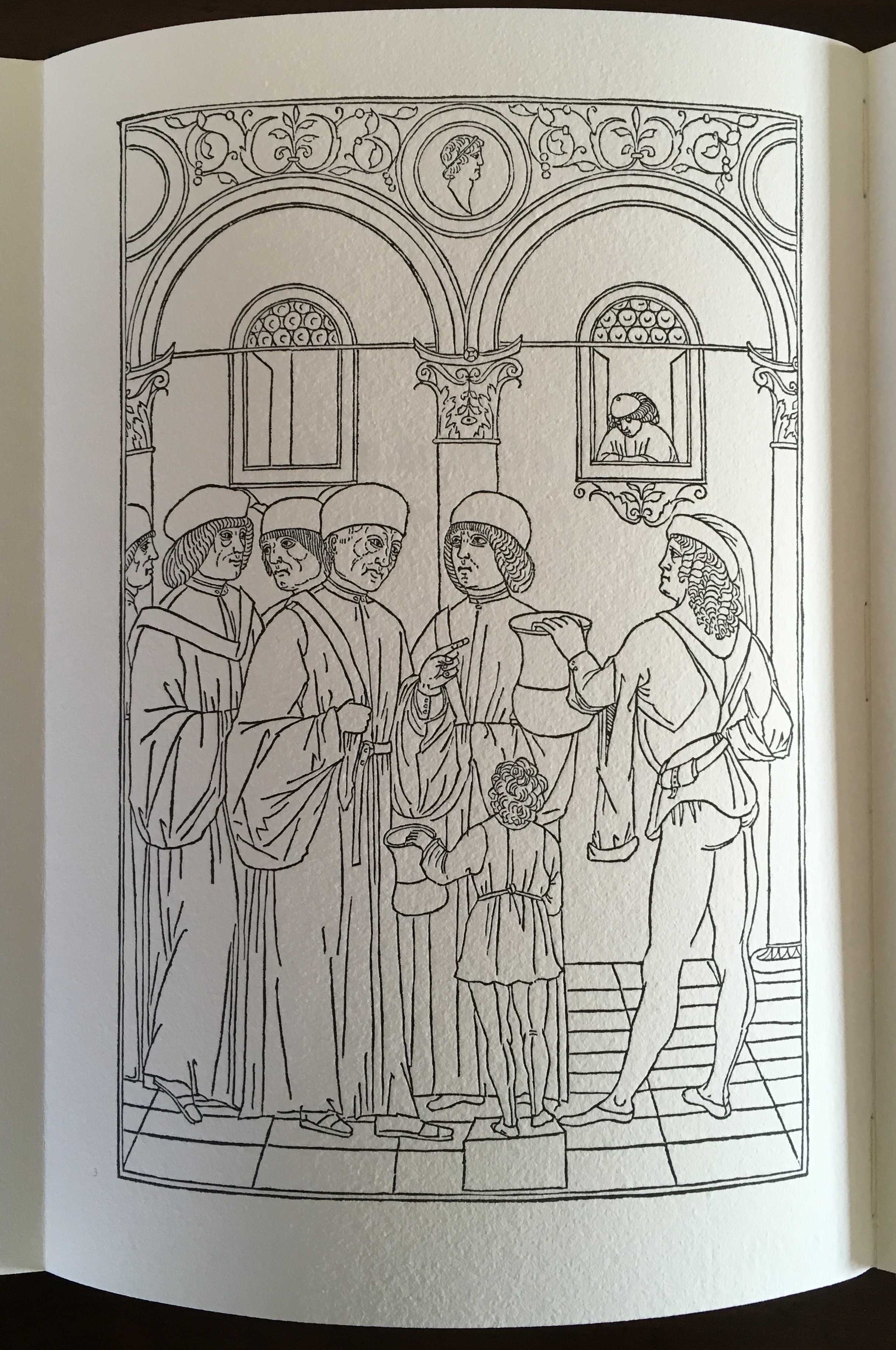
Title page of the third signature.
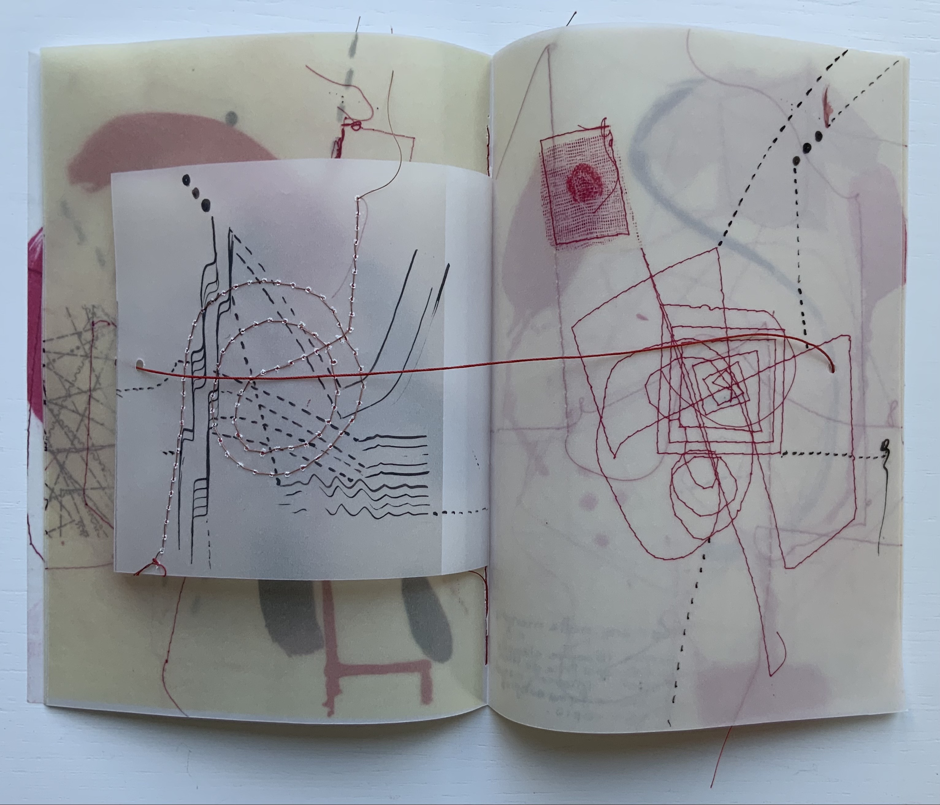
Opening of the third signature.
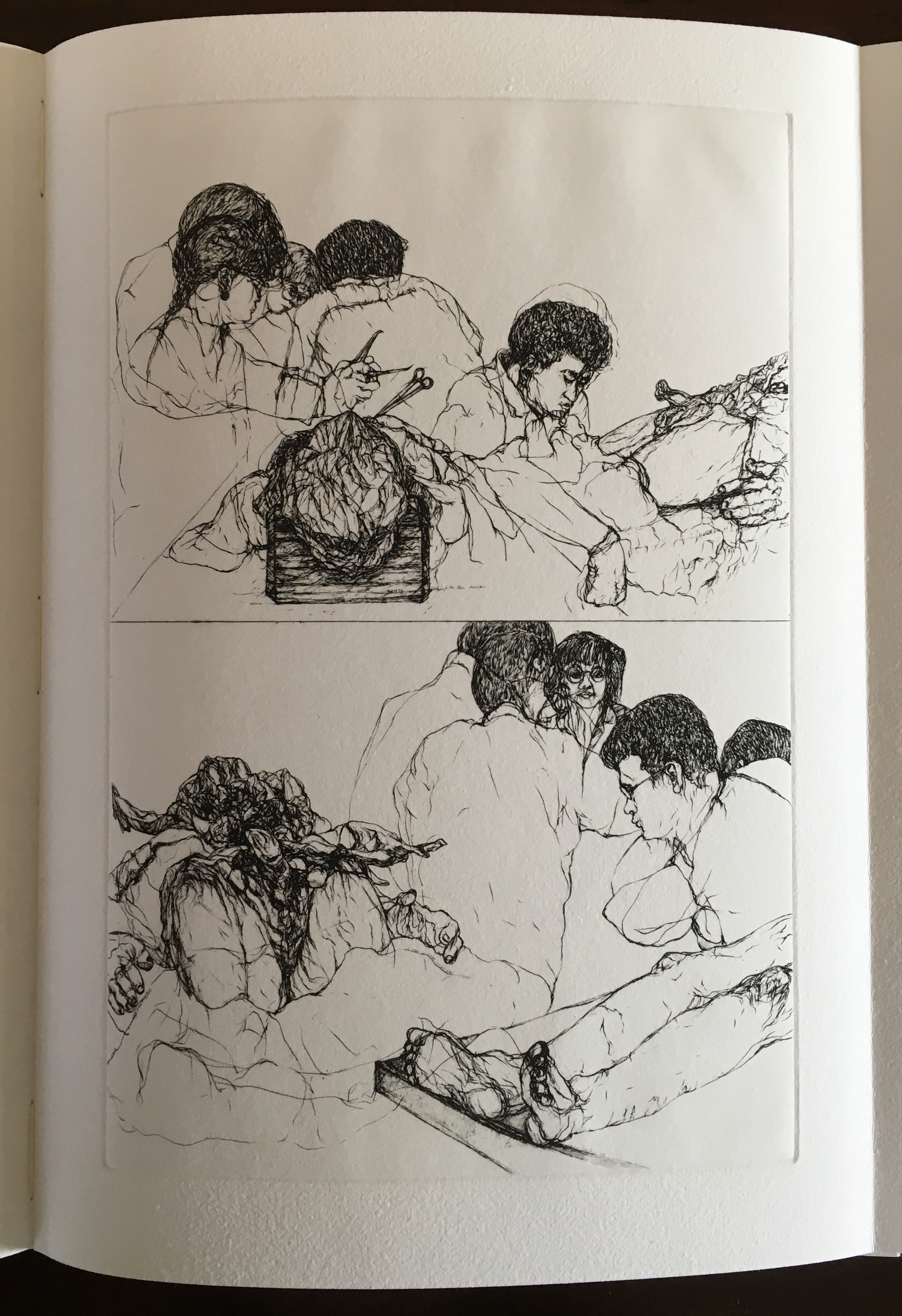
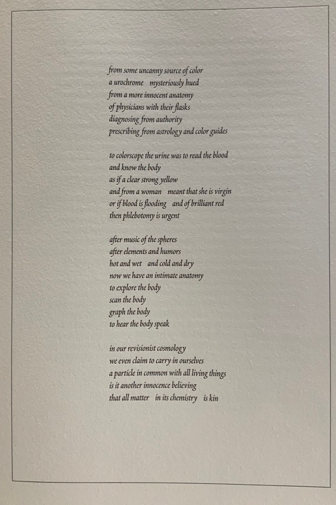
Internal four-page spread of the third signature.
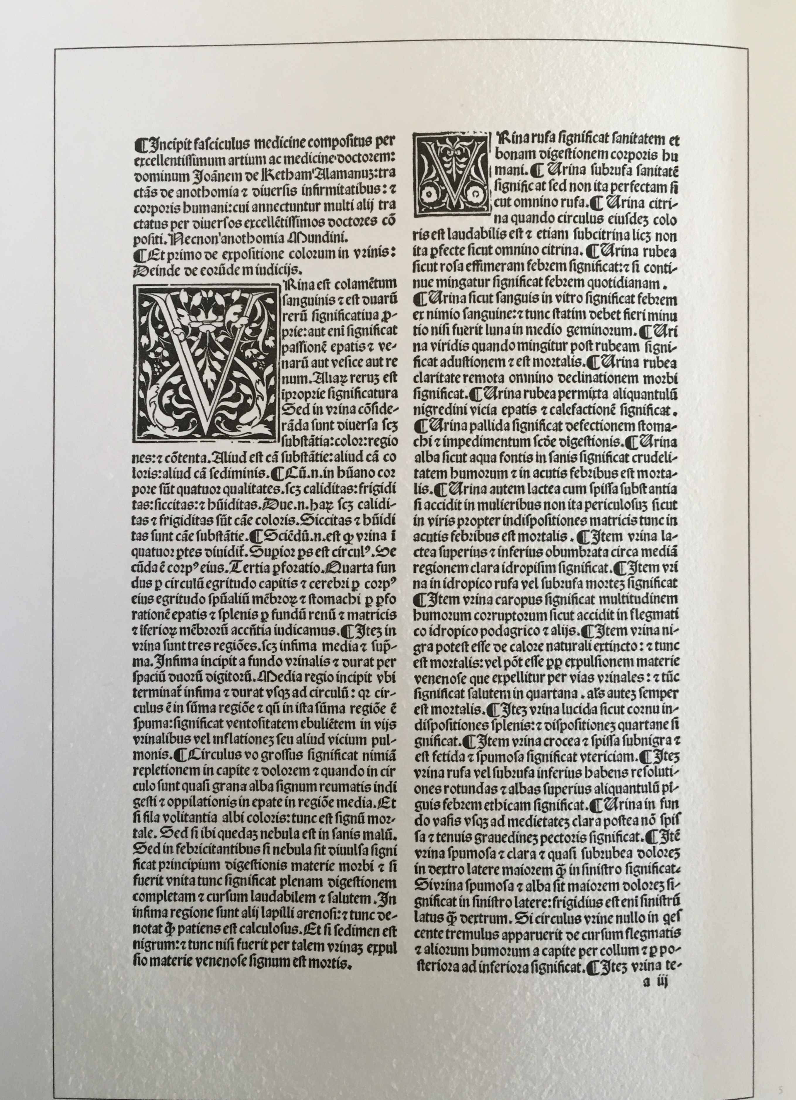
Left-hand page (from the Fasciculus Medicinae) of the four-page spread above. Note that the pagination (lower right) refers to the page number in the source text.
Second page (from Fasciculus Medicinae) of the four-page spread. Again note that the pagination (lower left) refers to the page number in the source text.
Third page from the four-page spread above. Print by Joyce Cutler-Shaw
Fourth page from four-page spread above. Poem by Joyce Cutler-Shaw.
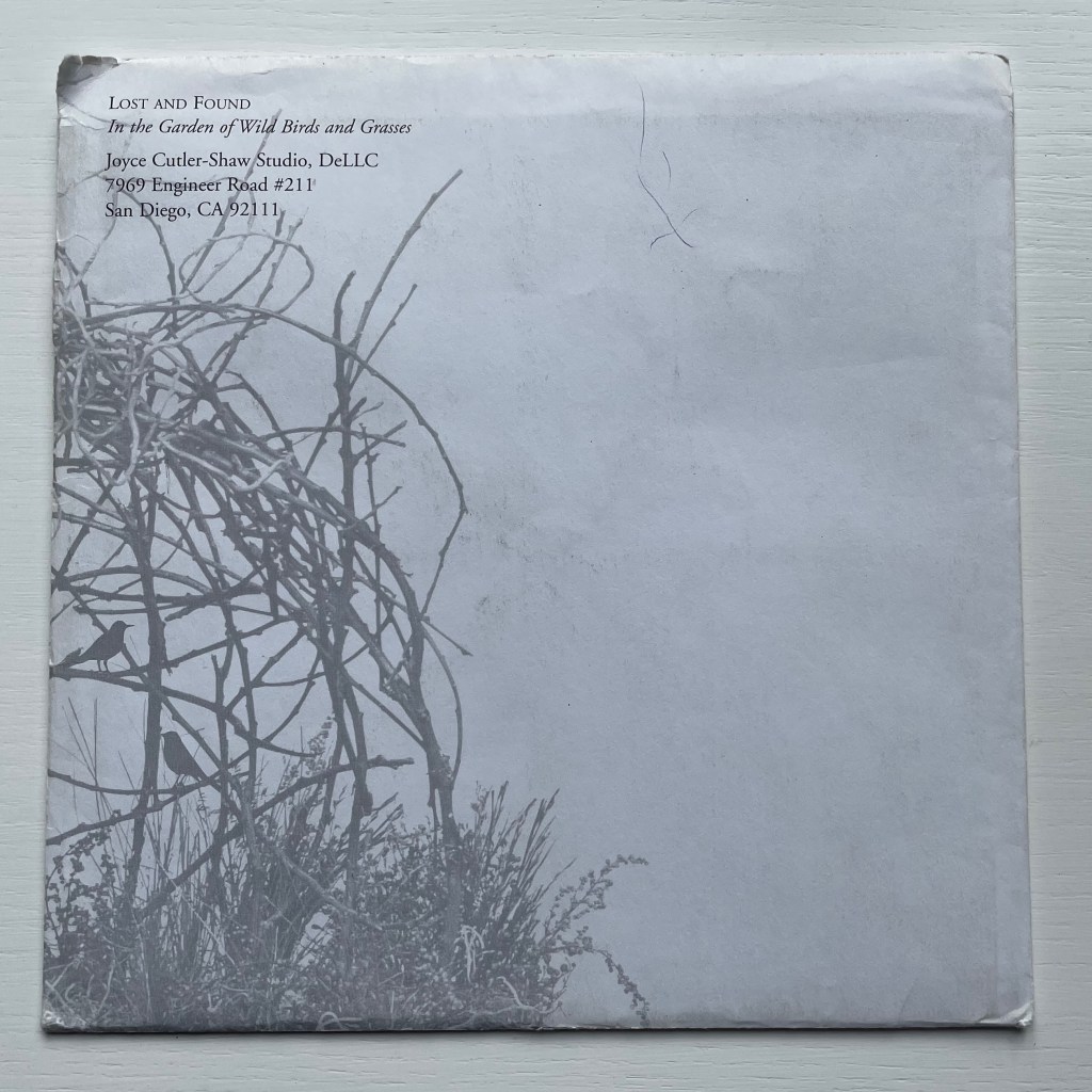
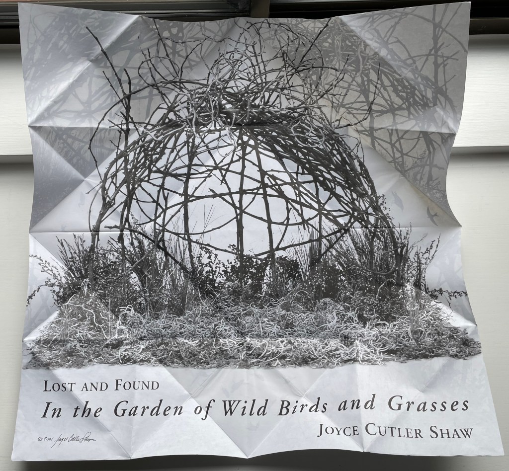
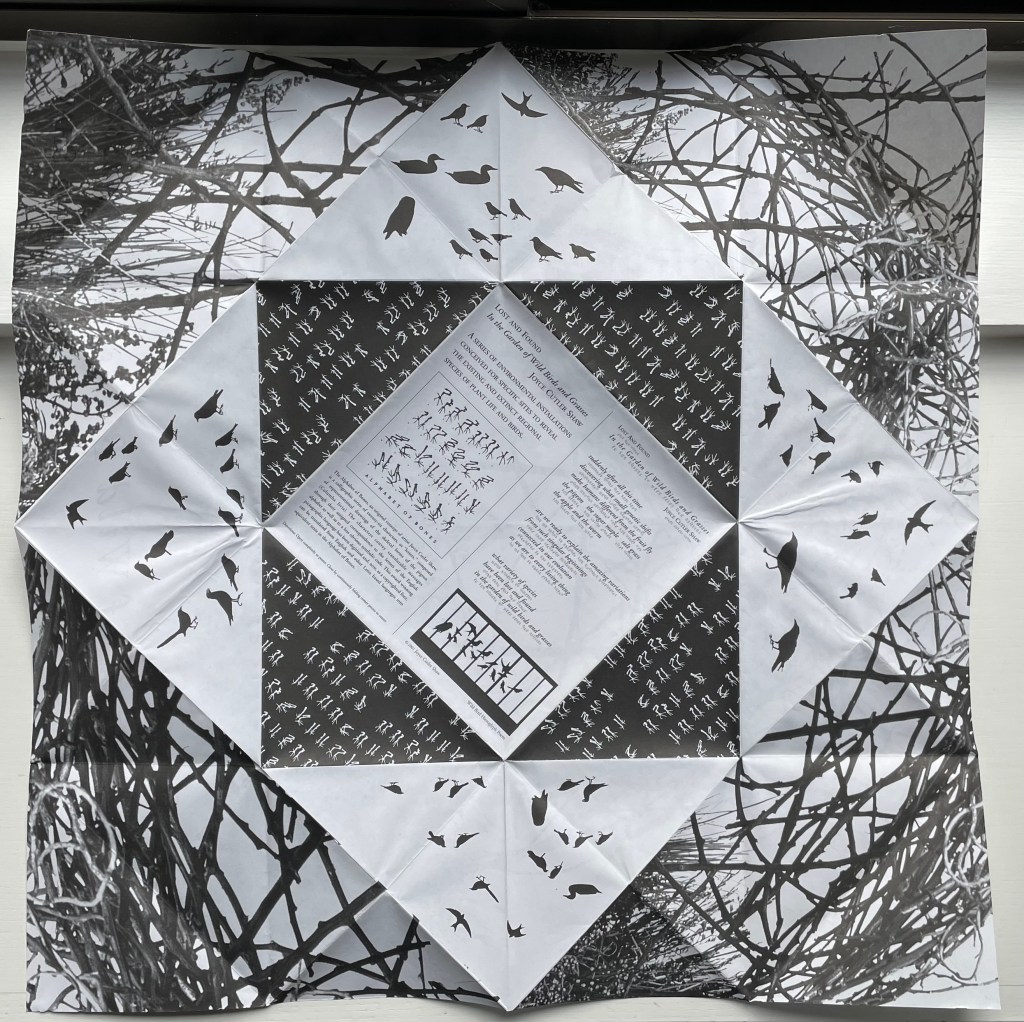
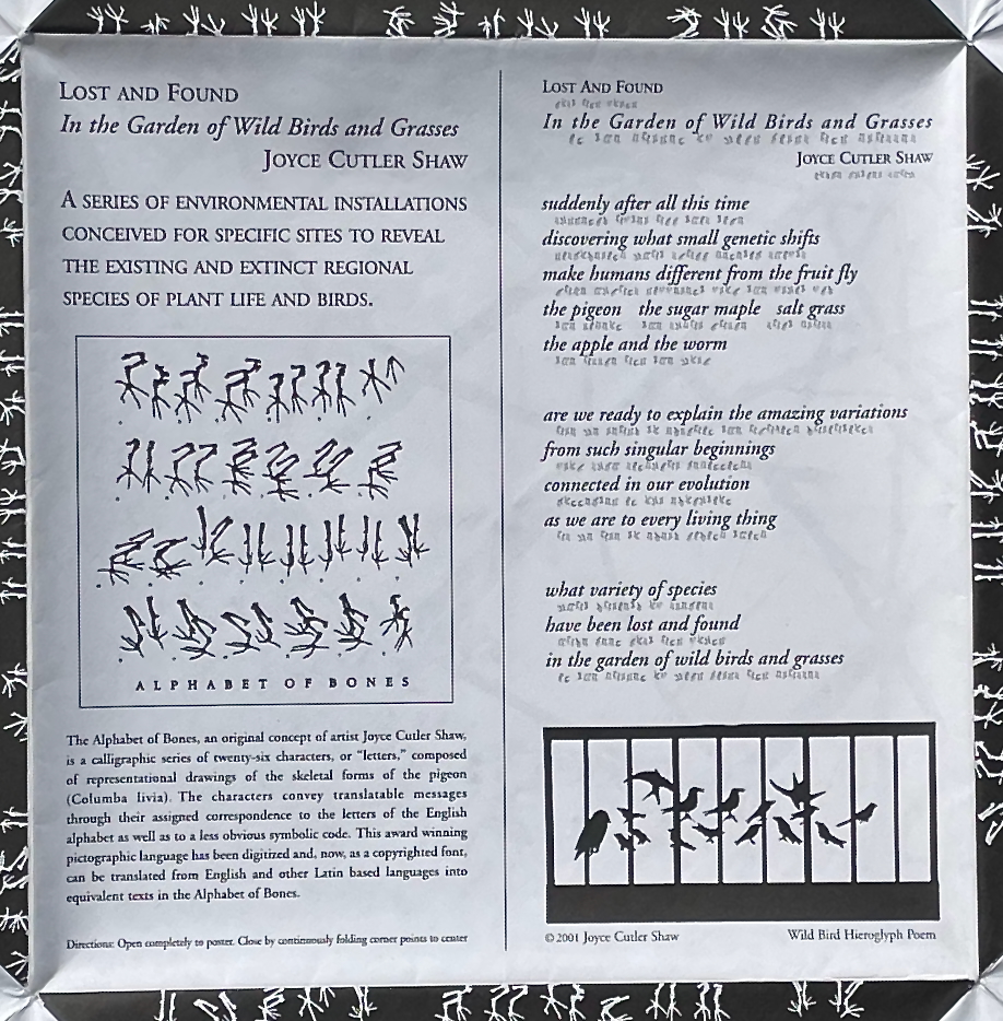
Lost and Found in the Garden of Wild Birds and Grasses (2001)
Lost and Found in the Garden of Wild Birds and Grasses (2001) Joyce Cutler-Shaw Two-sided sheet in triangle folds. 190 x 190 mm (closed). Edition of 1000. Acquired from Printed Matter, Inc., 23 September 2022. Photos: Books On Books Collection.
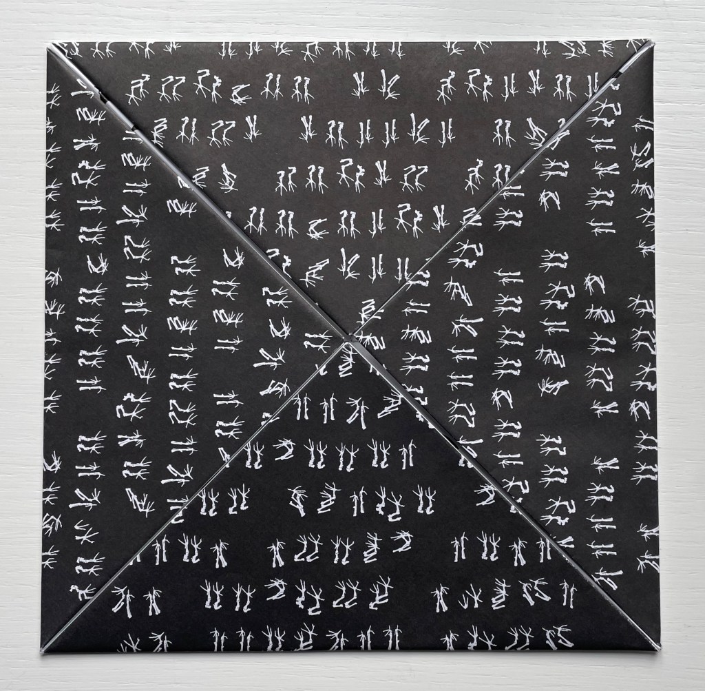
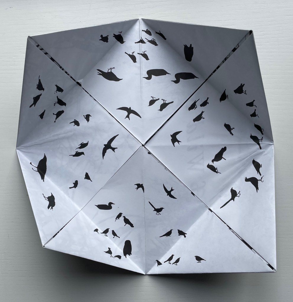
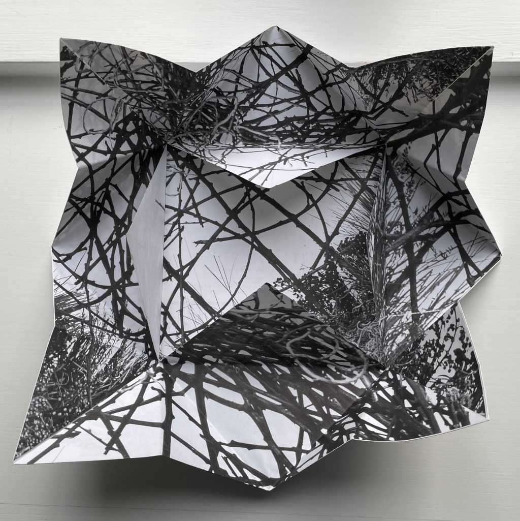
Distributor’s description: “Lost and Found in the Garden of Wild Birds and Grassesis a twelve part continuously unfolding paper narrative. Shaped like a fortune teller, the book’s four corners open out to reveal successive layers of the artist’s calligraphies – the first being her alphabet of bones, based on the hollow bones of birds, the next an alphabet based on the silhouettes of wild birds. The most interior layers of the book show photographs of an environment of grasses and branches, and at the final opening, the book becomes a single sheet on the back of which is printed an explanatory text and the translation of a poem inThe Alphabet of Bones.“
Printed Matter’s description of the origami fold as a “fortune teller”, also known as a chatterbox, whirlybird, or cootie catcher, is not quite right as can be seen from the images below.
The work is simultaneously a poster, a photographic collage from site-specific environmental installations, and, at the heart of one side of this single-sheet book, a poem dually presented in roman and Cutler-Shaw’s copyrighted font for the Alphabet of Bones. Note how the three squares framing the explanatory text and poem rotate to create a sculptural sense of depth, turning this side of the sheet almost into a nest. Like The Anatomy Lesson, this work reflects Cutler-Shaw’s engagement with uniting folds, binding, and printing to achieve singular artistic results. The same can be found in an earlier work showcasing the Alphabet of Bones font.
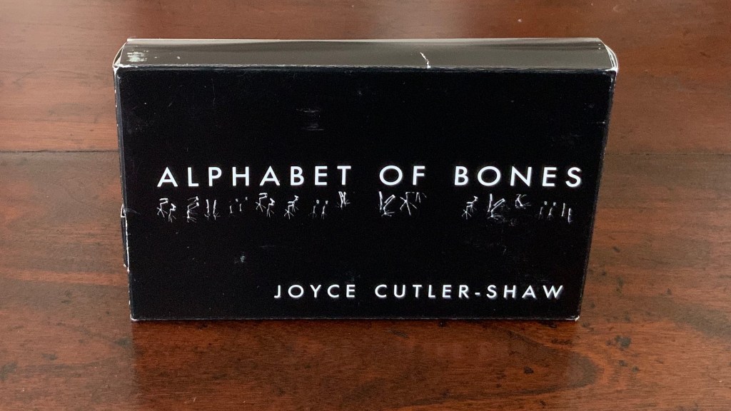
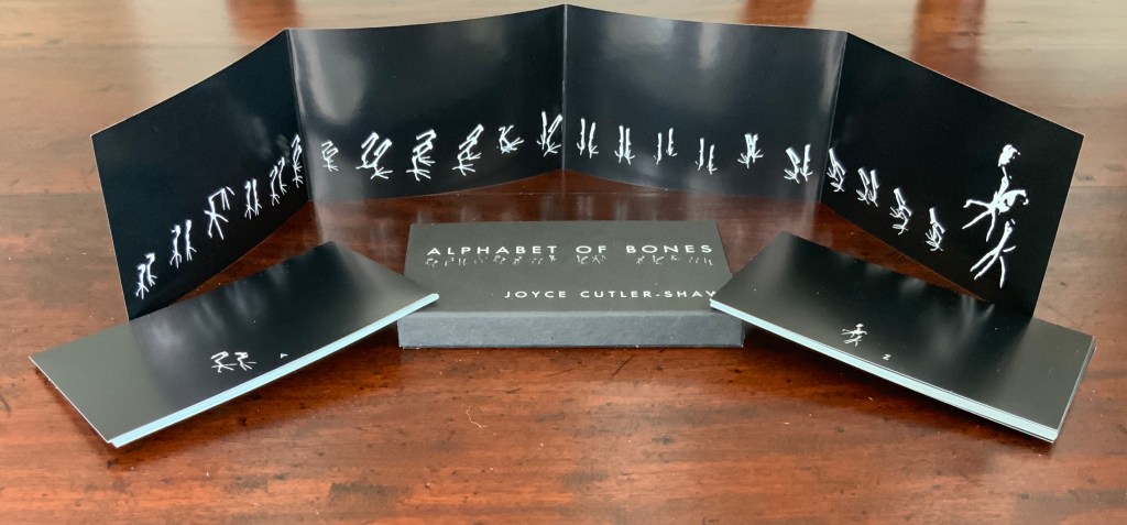
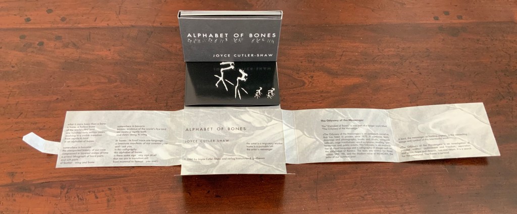
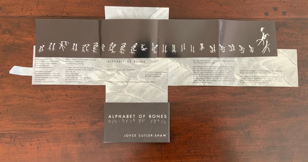
Alphabet of Bones (1987)
The Alphabet of Bones (1987) Joyce Cutler-Shaw Munich, West Germany: VerlagKretschmer and Grossman Edition of 700. Acquired as a gift from Hubert Kretschmer, 10 January 2019
Twenty-six glossy photo cards, offset white on black, H70 x W114 mm with trifold panel of glossy photo paper, offset white on black: H70 x W458 mm Contained in pasted, open-ended box of matte card, offset white on black: H72 x W117 x D14 mm Contained in fold-flap box: H73 x W118 x D15 closed, H72 x W498 open
Further Reading
Chen, Julie. 2013. 500 Handmade Books. Volume 2. New York: Lark. See Orbital Loops on p. 262 for comparison with Lost and Found in the Garden of Wild Birds and Grasses (2001).
Jury, David, and Peter Rutledge Koch (eds.) 2008. Book Art Object. Edited by David Jury. Berkeley, California: Codex Foundation. Pp. 198 (Where Do We Start?), 199 (Surplus Value Books #13).
Salamony, Sandra, and Peter and Donna Thomas. 2012. 1,000 Artists’ Books : Exploring the Book as Art. Minneapolis: Quarto Publishing Group USA. Pp. 10 (Chained Album), 11 (Altered), 220 (Crested), 298 (Collection).
Cutler-Shaw, Joyce. “Embodied/Disembodied”, LitMed Magazine, 10 March 2009. Accessed 3 September 2019.
Hoffberg, Judith A. “Birds, Bones, and Books”, Episodes of The City – New York as a Source Book, Wallworks and Artists Books of Joyce Cutler-Shaw, exhibition catalogue (New York, NY: Elmer Holmes Bobst Library, New York University, 2007).
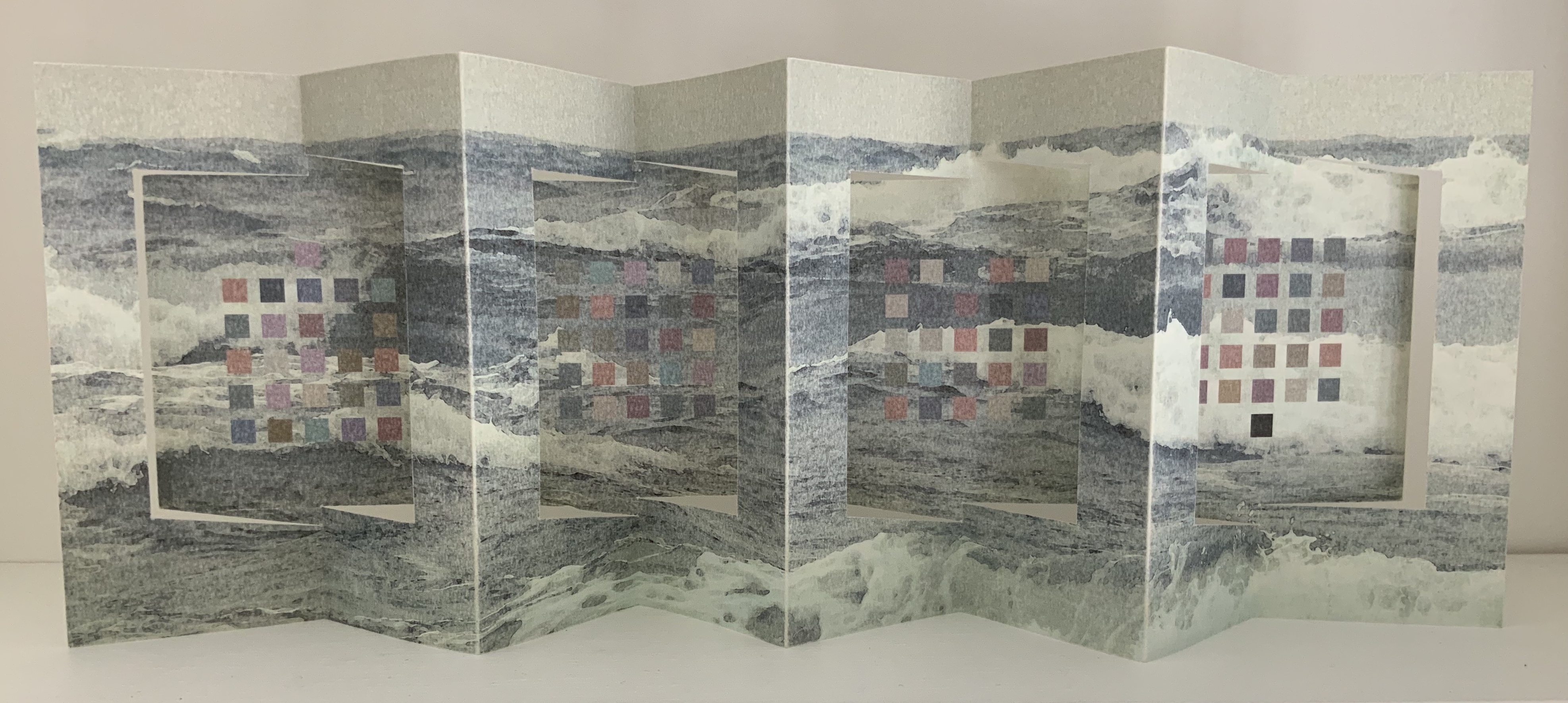
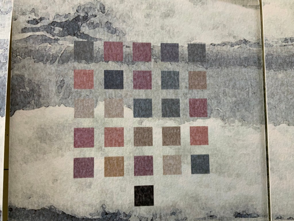
Theme and Permutation (2012) Marlene MacCallum Hand sewn pamphlet, images custom-printed in offset lithography on Mohawk Superfine, text printed in inkjet, covers inkjet printed on translucent Glama. H235 × W216 mm Edition of 100, of which this is #54. Acquired 5 October 2018.
Photos: Books On Books Collection.
Theme and Permutationis one of a series of artist’s books inspired by the experience of living in Corner Brook’s Townsite area on the west coast of the island of Newfoundland. Between 1924-34 the pulp mill built 150 homes to house the mill management and skilled labourers. Over a period of 10 years, I have photographed in several homes, all the same type-4 model as the one I live in. These homes vary in condition from close to original in design and décor to highly renovated. This project gave me the rare opportunity to record the evolution of interior aspects of these homes. It has been the context to explore the paradoxical phenomena of conformity and individualization that occurs in a company town. Having grown up in a suburban housing development, my earliest memories of home is that of living in a space that is reminiscent of my neighbors’. Each artist’s book explores a distinct facet of image memory, multiplicity, sequence and offers the viewer a visual equivalence of the uncanny. Theme and Permutation is a response to the permutations and variations of the type-4 Townsite House. Digital tools were used to translate the original film source of eight different window images from five houses. The sixteen offset lithographic plates were custom printed in twenty-nine separate press runs. Each image is the result of a different combination of plates. The structure is a sewn pamphlet with translucent covers. The viewer enters the body of the book with a tritone image of a single Townsite window. As one moves into the piece, new window images appear and layer over each other. The images become darker and more heavily layered towards the mid-point. The center spread has an inkjet layer of two text blocks printed over the offset litho images. The text speaks of the history of the homes, the architectural permutations and economic shifts within the Townsite area. The ensuing pages continue to provide new combinations of window layers, gradually lightening in tonality and allowing the individual windows to become more distinct. A third text block provides a personal narrative. The piece concludes with a tritone image of one of the Townsite windows in original condition.(From artist’s website. Accessed 1 September 2019.)
*From the artist’s description of Wall Stories (2014).
Chicago Octet (2014)
Chicago Octet (2014) Marlene MacCallum Hand bound artist’s book with folded paper structure, letterpress and inkjet printing, H166 × W78 mm closed, H443 x W293 mm open Unique. Acquired 5 October 2018.
Photos: Books On Books Collection
Chicago Octet is a work of visual poetry by eight masters of book art. If they were performing music (and you can almost hear the music of Michigan Avenue), MacCallum would be their performing conductor.
The piece I created, Chicago Octet, had several collaborative components. The letterpress printing consisted of a word selected by each participant printed on one of Scott [McCarney]’s folded structures. The images were a digital layering of every cityscape photograph that I made and then inkjet printed on top of the letterpress. The final folded structure was designed by Mary Clare Butler. The case was designed and built by Scott McCarney, the front cover embossment was by David Morrish and Clifton Meador. (From artist’s website. Accessed 31 August 2017.)
Update: With funding from the Canada Council for the Arts Digital Originals Grant and assistance of Matthew Hollett and David Morrish during the Covid pandemic, the artist created Shadows Cast and Present, a digital re-imagining of her three most recent book works. The three cantos into which the work is divided also enrich one’s appreciation of Theme and Permutation and Chicago Octet. MacCallum orchestrates the various media — text; sound from music, voice and the noise of city and nature; video — with a touch as light as paper and light.
Further Reading
Books On Books. “Architecture”. Books On Books, 12 November 2018.
MacCallum, Marlene. 2014. Wall Stories. Website. For the text cited in the epigraph for this entry, go to the last linked image in the series of thumbnails displayed.
Otis Artist Book Collection. “Conrad Gleber ‘Chicago Sky Line’”, 27 January 2014. Gleber’s work is an interesting one to compare with Chicago Octet. Chicago Sky Line (1977) is a fan book of photographs secured at a single point by the binding and, when spread clockwise, reveals the sky above Chicago and, when spread counterclockwise, shows the Chicago “skyline” below clouds and sky.
Westron Wynde (2016) Cathryn Miller Double-sided accordion with swing panel structure, 4 double-page openings, based on Hedi Kyle’s panel or panorama fold. In wrapper with slip and slot closure. Initialed and numbered by the artist. Edition of 6, of which this is #3.
Cathryn Miller, colophon: “Part of an ongoing series of works based on exploration of colour-graphemic synesthesia. This book presents the poem ‘Westron Wynde‘ in a purely visual form. Letters become colours, and are used as graphic elements. The book manifests the essence, if not the sense, of the poem.”
Westron wynde when wyll thou blow, The smalle rayne down can rayne – Cryst, yf my love wer in my armys And I yn my bed agayne!
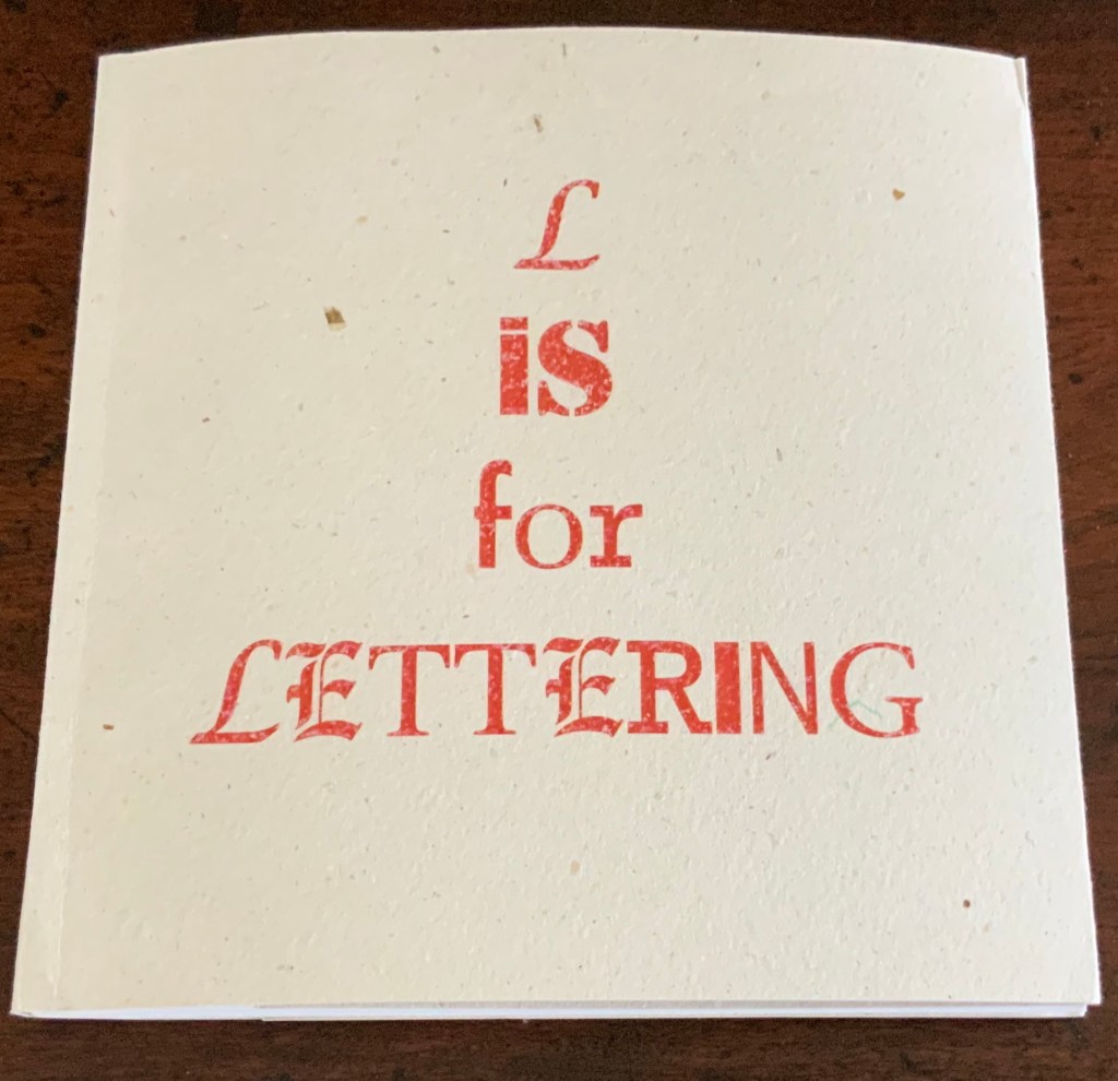
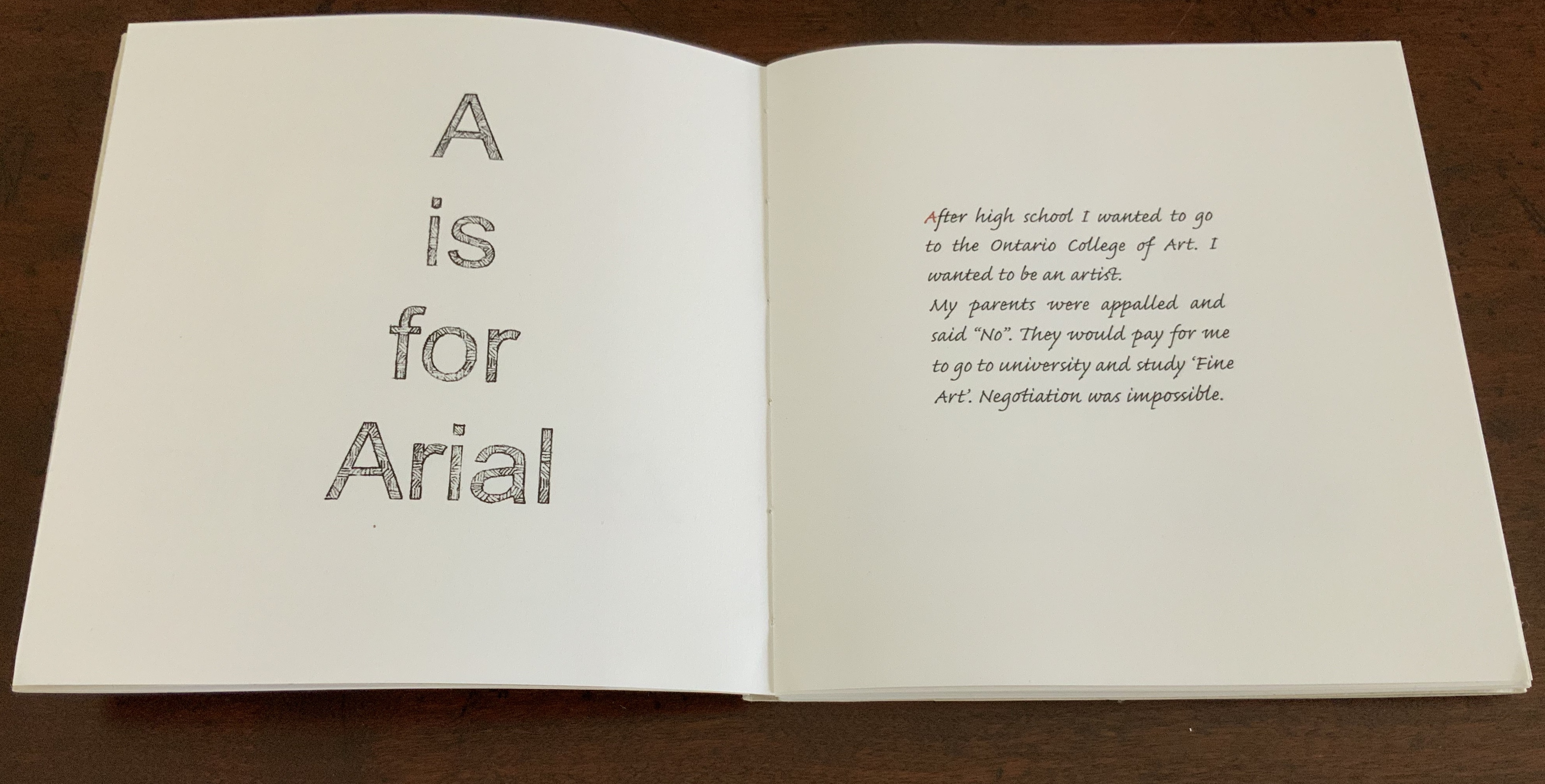
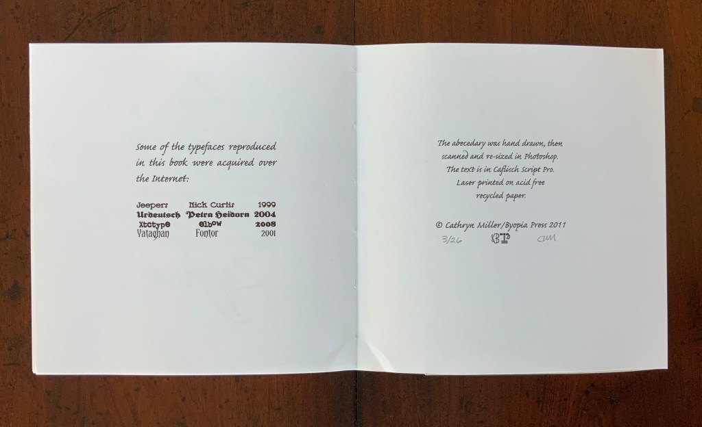
L is for Lettering (2011)
L is for Lettering (2011) Cathryn Miller Hand bound codex of 56 unnumbered pages. Laser printed on acid free recycled paper, hemp paper covers. The book was hand drawn, then scanned and resized in Photoshop. Text is Caflisch Script Pro. Hand annotated in red pencil. Edition of 26, of which this is #3. H160 x W158 mm
An alphabet book based on the artist’s personal struggle to become a practicing artist. Cathryn Miller: “The trials and tribulations of the art education process as recalled from a satisfactory distance after the author learns that everything is useful after all.”
Further Reading
“Lyn Davies“. 7 August 2022. Books On Books Collection. For Miller’s comment re Davies’ A is for Ox: “unable to resist this book when I saw it so it is part of my collection of books on letters and lettering. The use of a coloured initial letter on each page of my ‘L is for Lettering’ is a direct nod to the design of this book.”
“Ilka Van Schalwyk“. In progress. Books On Books Collection. A novel of color-graphemic synesthesia.
Chen, Julie. 2013. 500 Handmade Books. Volume 2. New York: Lark. Pp. 14 (Double Entendre), 414 (Tower of Babel).
Miller, Cathryn. 23 February 2020. “Almost There”, Byopia Press, Accessed 26 February 2020. The artist comments on L is for Lettering.
Miller, Cathryn. 22 February 2021. “Square Dance“. Video of talk and presentation for Sakatchewan Craft Council on the occasion of her solo exhibition at the SCC Gallery in Saskatoon, SK, from January 16 – March 06 2021.
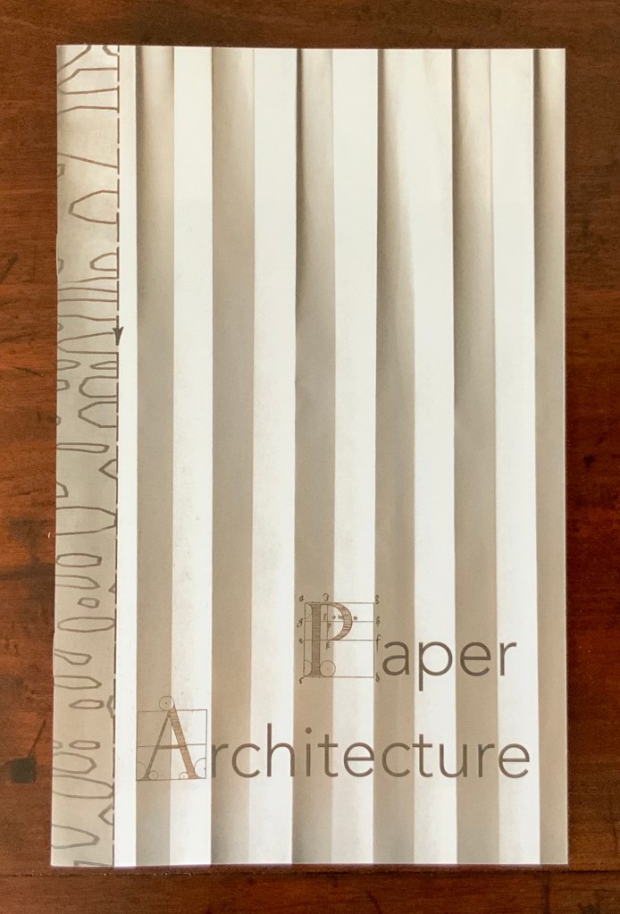
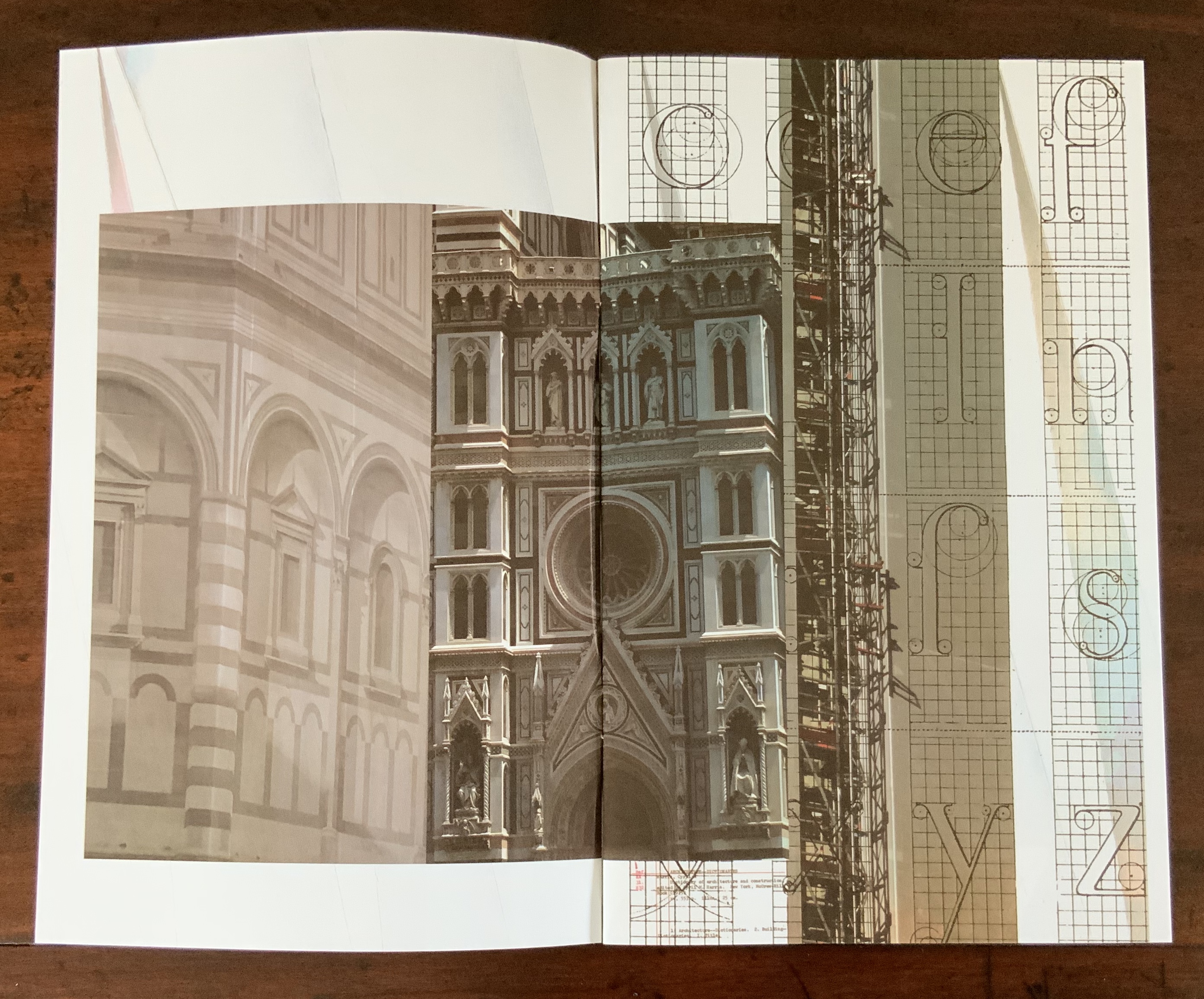
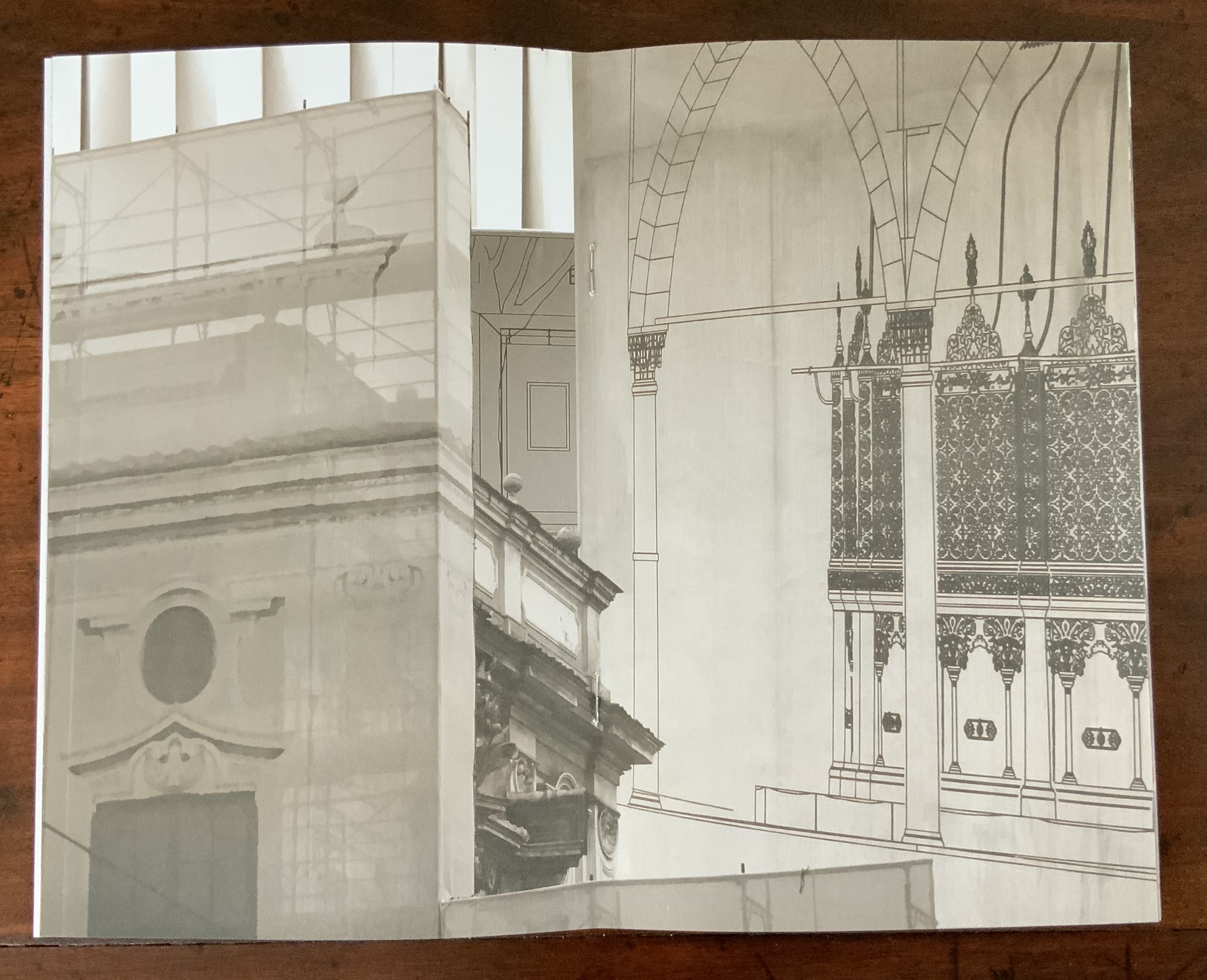
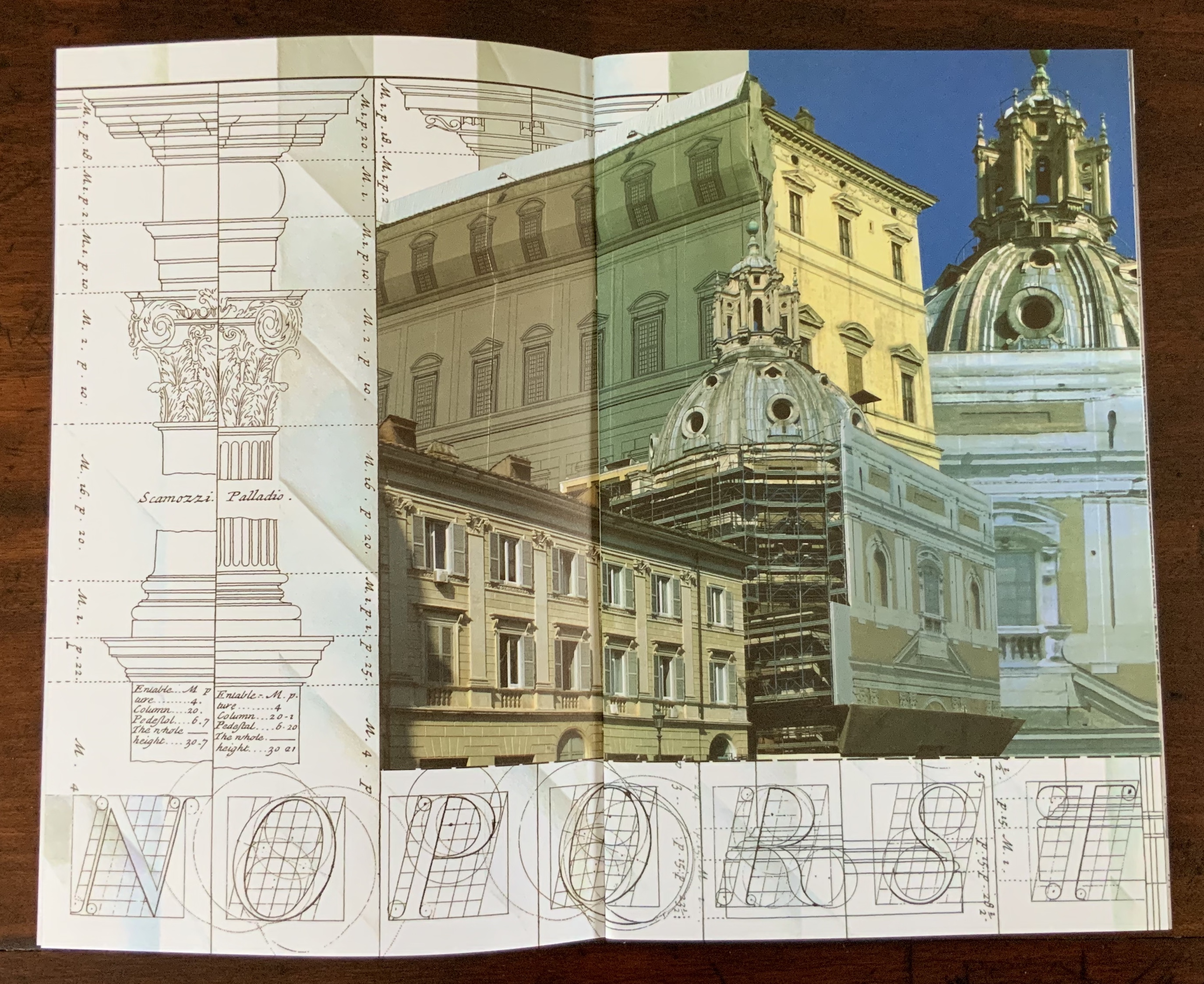
Photographic images by Karen Wirth from Ayvalik, Amsterdam, Florence, Istanbul, New York City, Rome, San Diego and Venice. The photos are collaged, and the work is based on an architectural installation at the Minnesota College for Art and Design that included a large-scale book. Photos of the book: Books On Books Collection.
Architecture has long played an inspirational role in Karen Wirth’s portfolio. In 2000, she designed the Open Book Gail See Staircase at the Minnesota Center for Book Arts and stations for the Hiawatha Light Rail, both in Minneapolis. In 2008, she produced Archidrawings, a series of collaged altered pages from the booklet, Architectural Drawings in the Bodleian Library.
More recent is Archabet: An Architectural Abecedarium (2025) on display in the Outlook Gallery, Minnesota Center for Book Arts, 12 April – 8 June 2025. A 6-foot high drum leaf bound book, its collage of digital photographs of building façades taken over 20 years of travel, showing details and structures that mimic letter forms, surrounds extracts from Johann David Steingruber’s Architectonisches Alphabet (1773). This alphabet book of cityscapes takes up the gallery’s street-level window inviting the viewer into the space of the book.
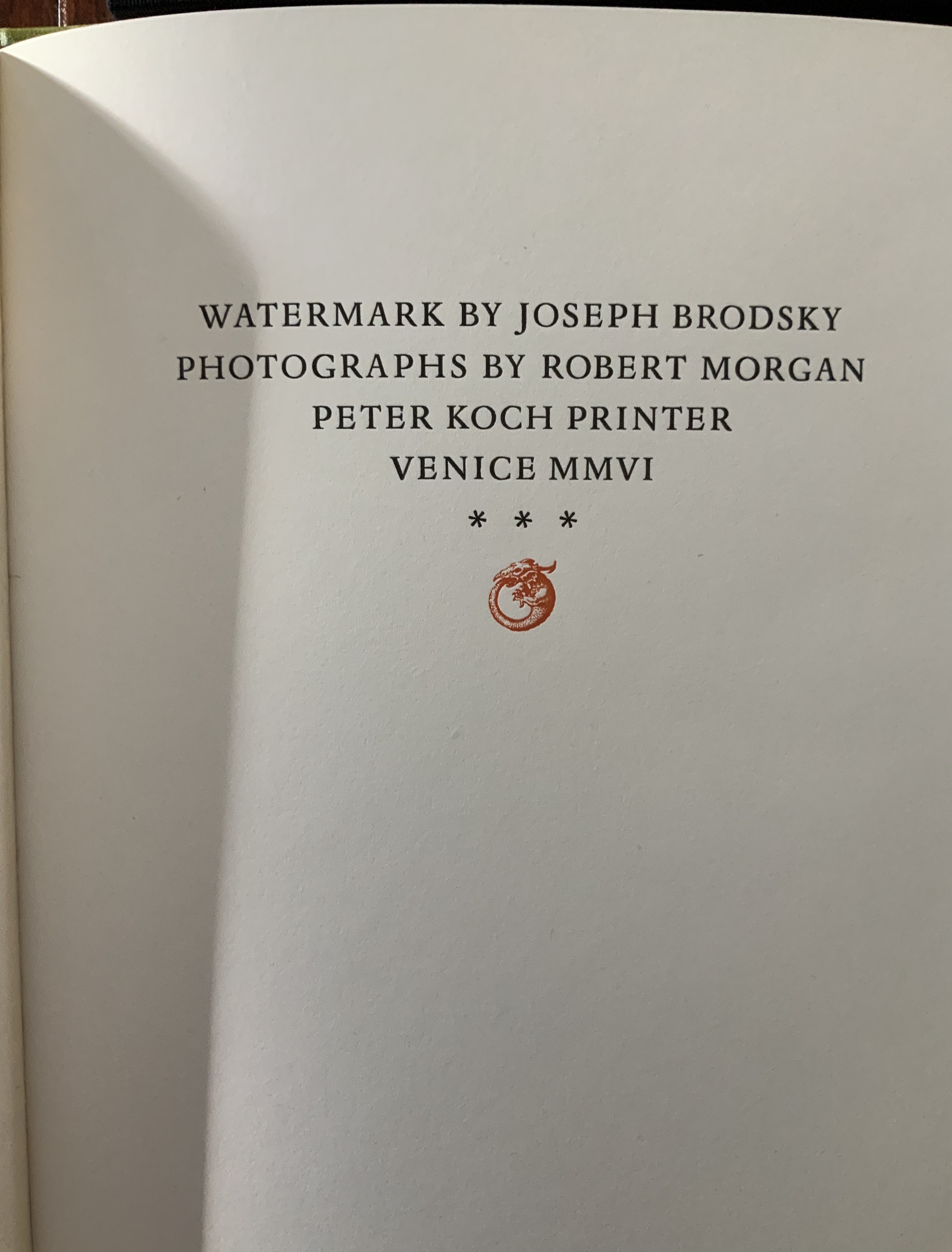
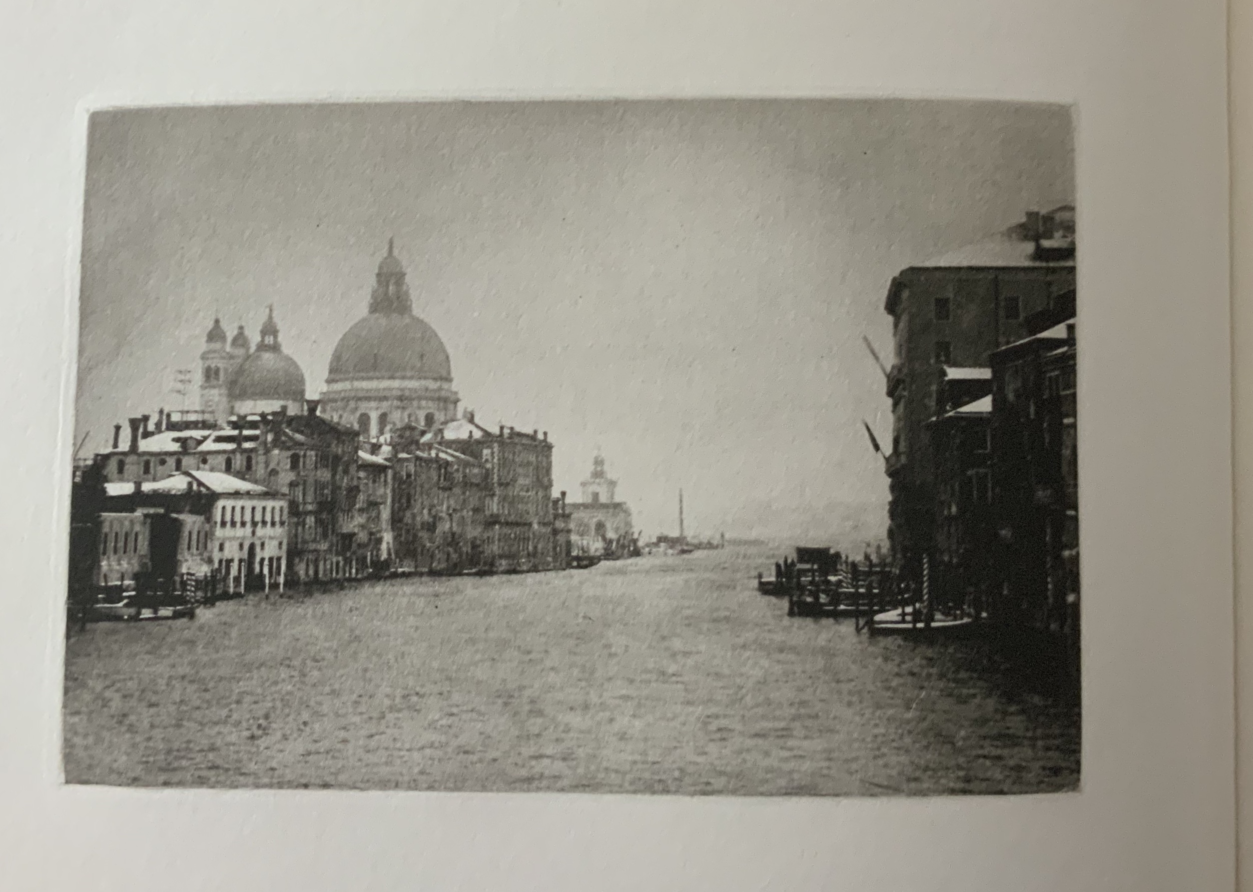
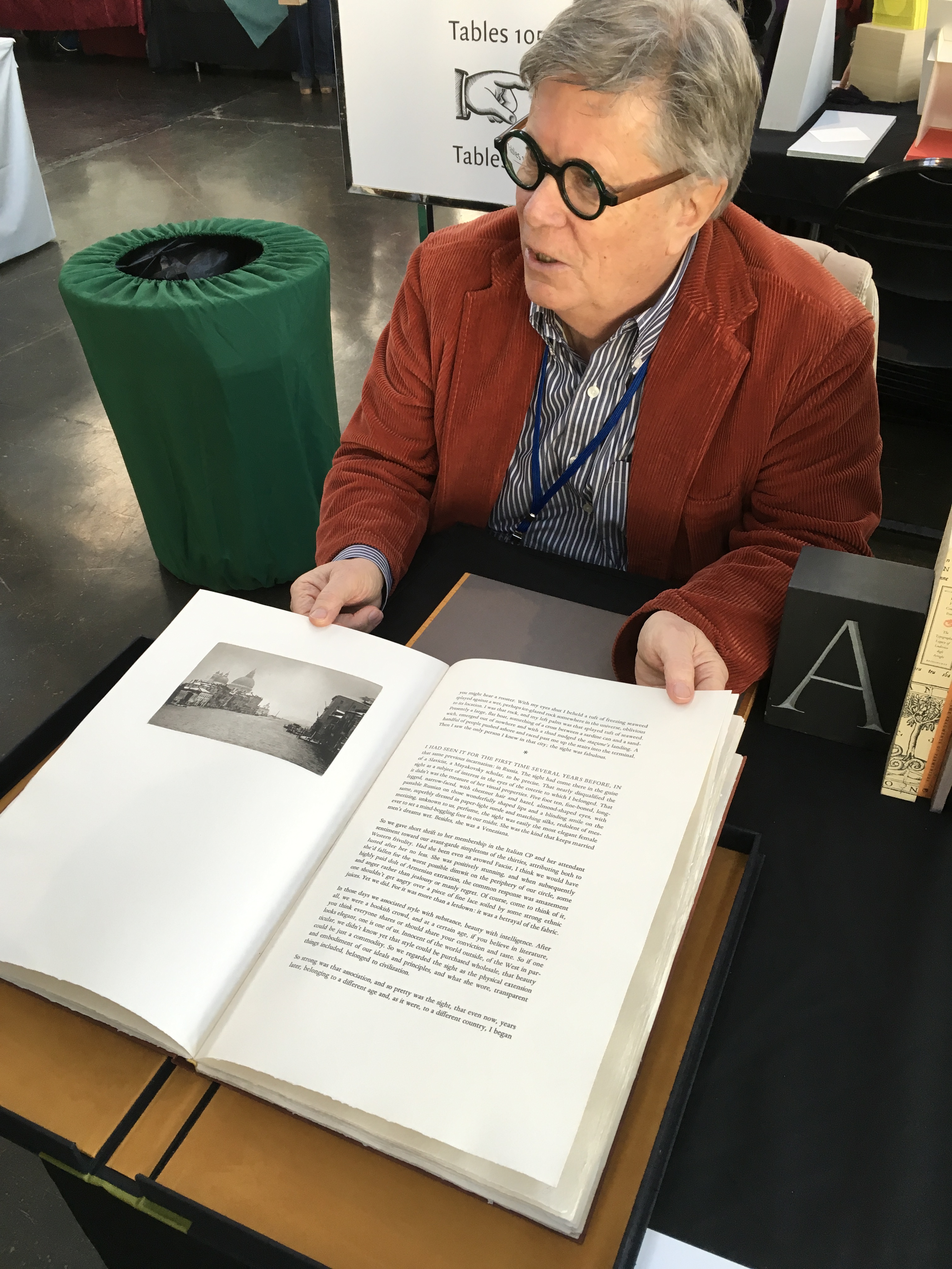
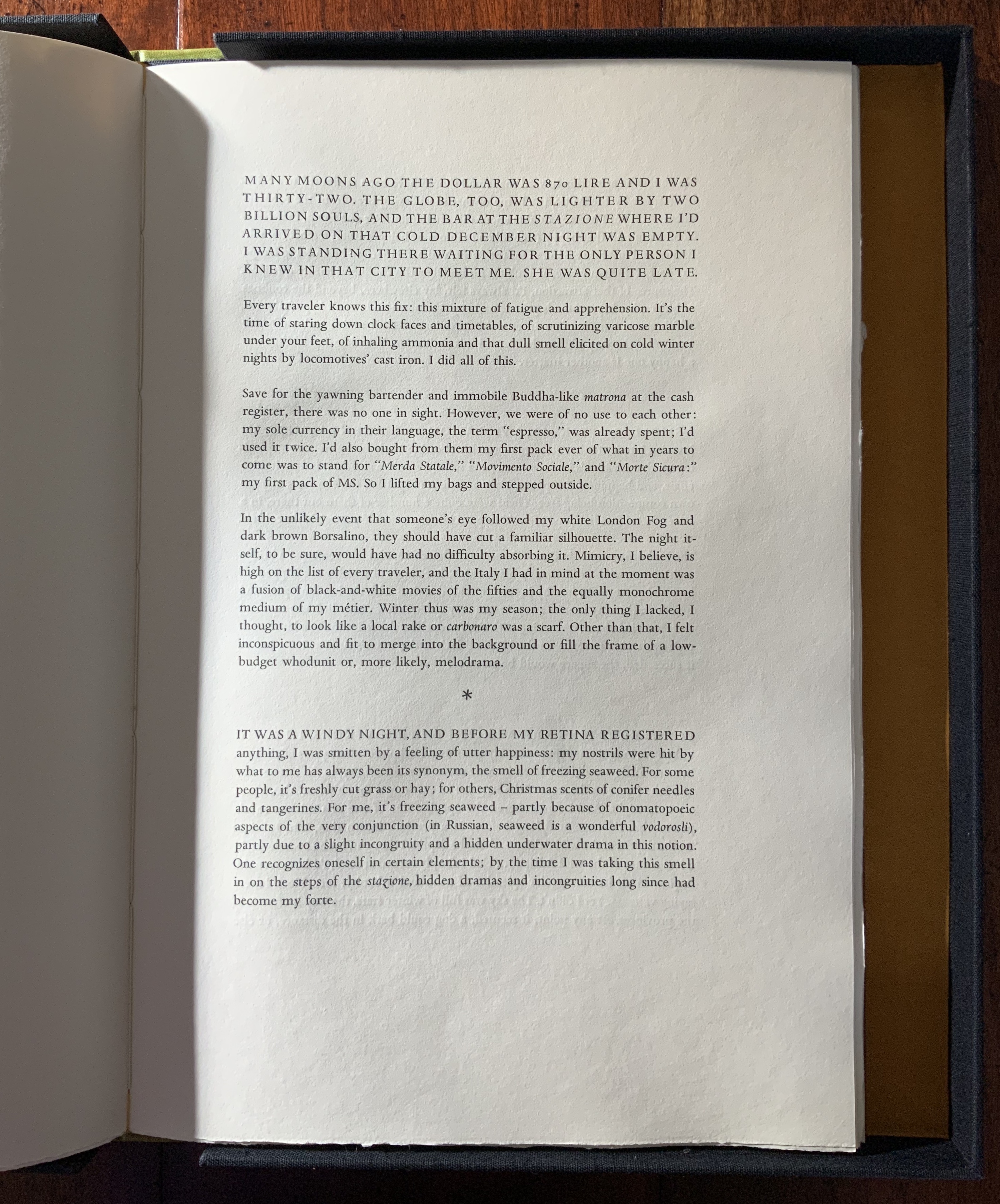
Joseph Brodsky dedicated Watermark to his friend the American painter, Robert Morgan who has lived in Venice for more than 30 years. Koch celebrates Brodsky’s evocative text with this artist’s book, illustrated with 14 photogravures made from Morgan’s original photographs.
While Koch was artist-in-residence at the Scuola Internazionale di Grafica Venezia, a printing press was imported from the Tipoteca Italiana Fondazione printing museum to produce this work. The paper is Twinrocker “Da Vinci” handmade, with the Koch firm’s watermark designed by Christopher Stinehour and Susan Filter. The edition is limited to fifty copies. Copies numbered 1 to 30 are bound Venetian-red hand made papers and housed in a clamshell box. This copy was acquired 31 July 2019.
Donald Farnsworth digitally reconfigured Morgan’s photographs and printed them at his Magnolia Editions in Oakland, California from photogravure plates made by Unai San Martin. The printed sheets were then shipped to Venice.
The text was set in Monotype Dante types cast in lead at the Olivieri Typefoundry in Milano. Once the printing at the Scuola Internazionale di Grafica Venezia was completed, the sheets were shipped to Koch’s studio in Berkeley where the book was bound in richly pigmented papers made by hand at Cave Papers in Minneapolis, MN.
Koch, Peter Rutledge, Michael A. Keller, Roberto G. Trujillo, Mark G. Dimunation, Timothy Murray, Nina M. Schneider, Rick Newby, et al. Peter Koch printer: embodied language and the form of the book (Stanford, CA: Stanford University Libraries, 2017).