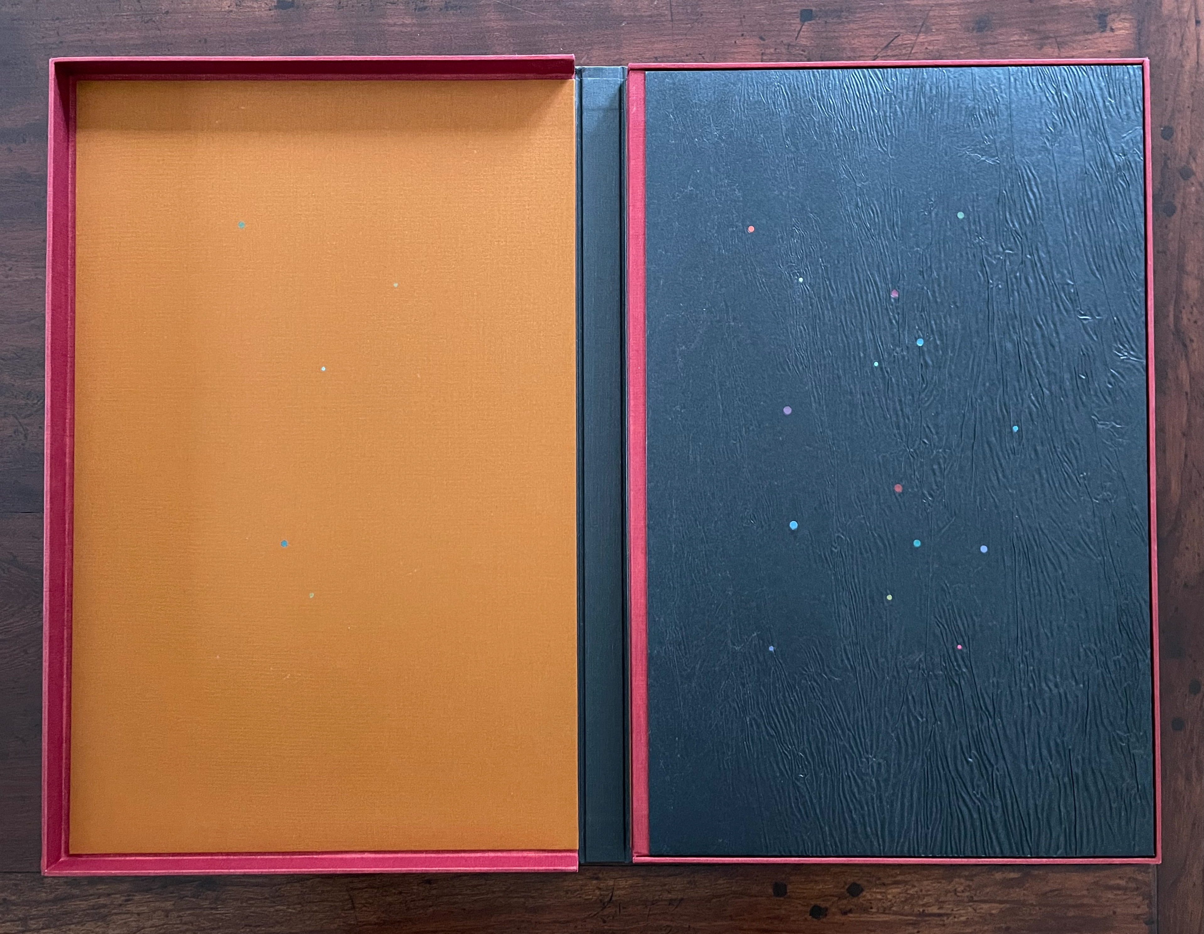
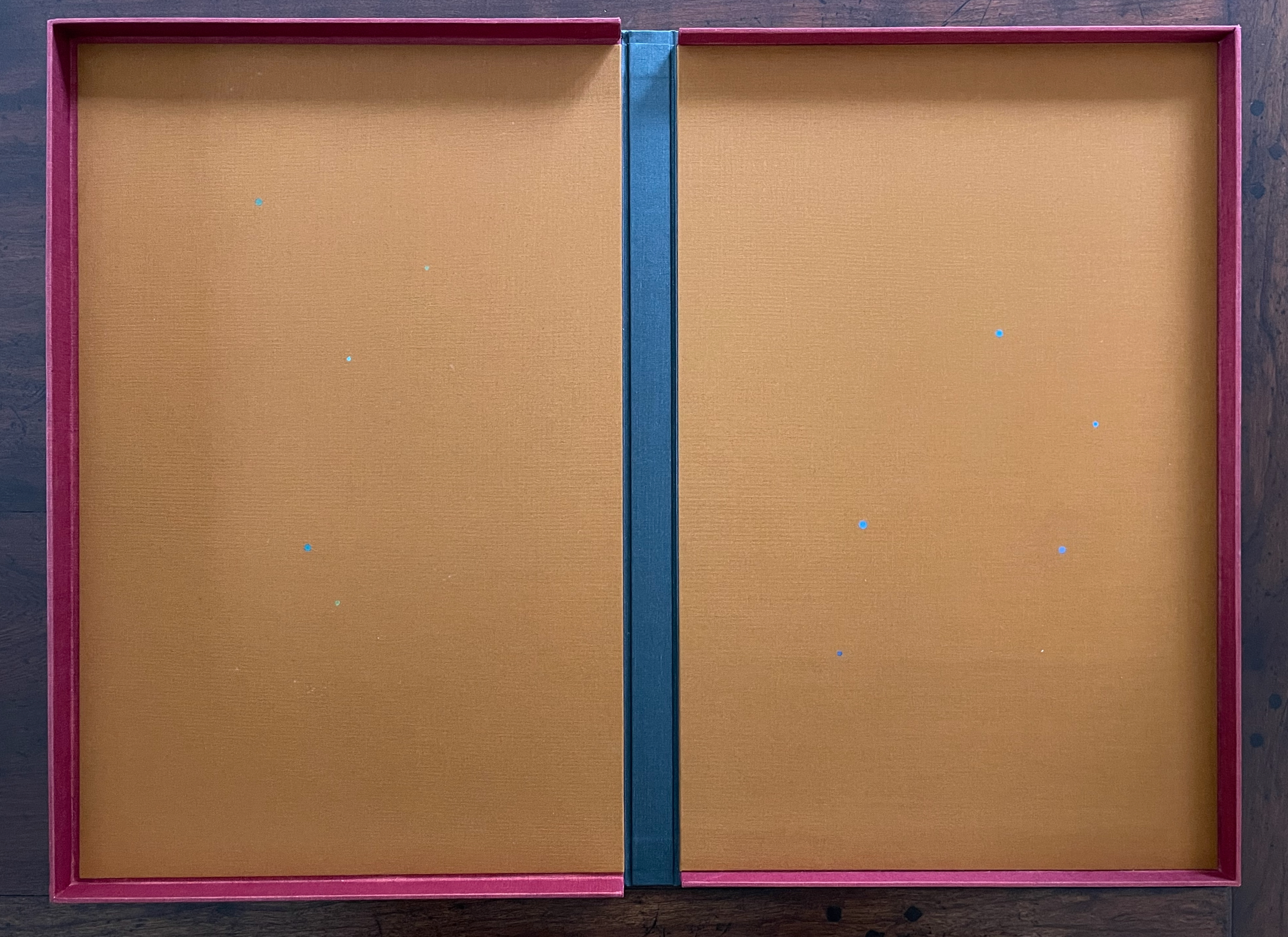
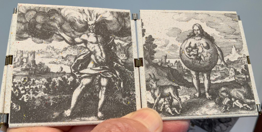
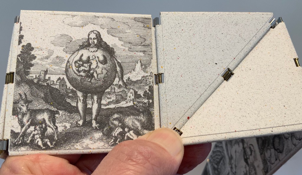
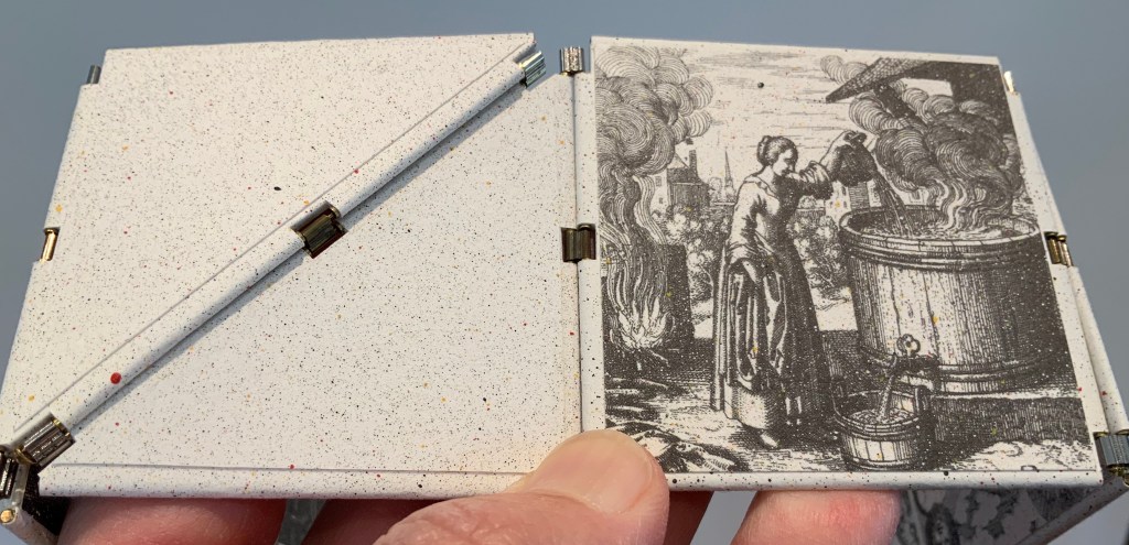
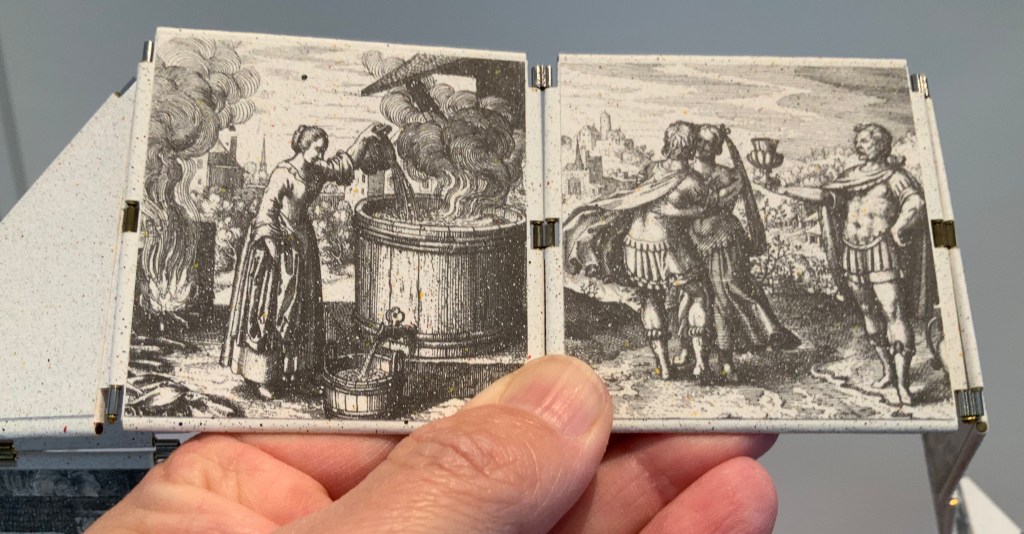
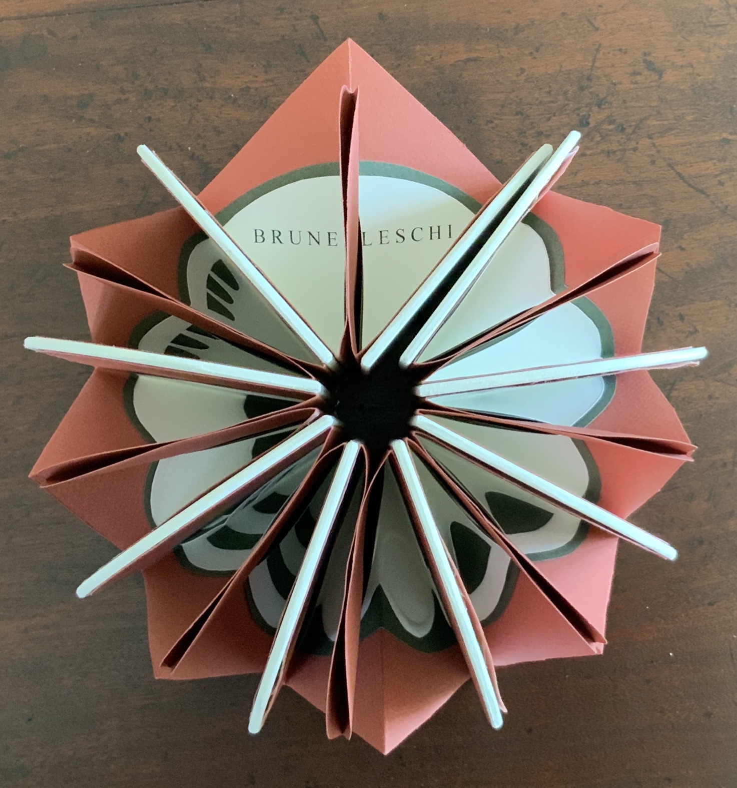
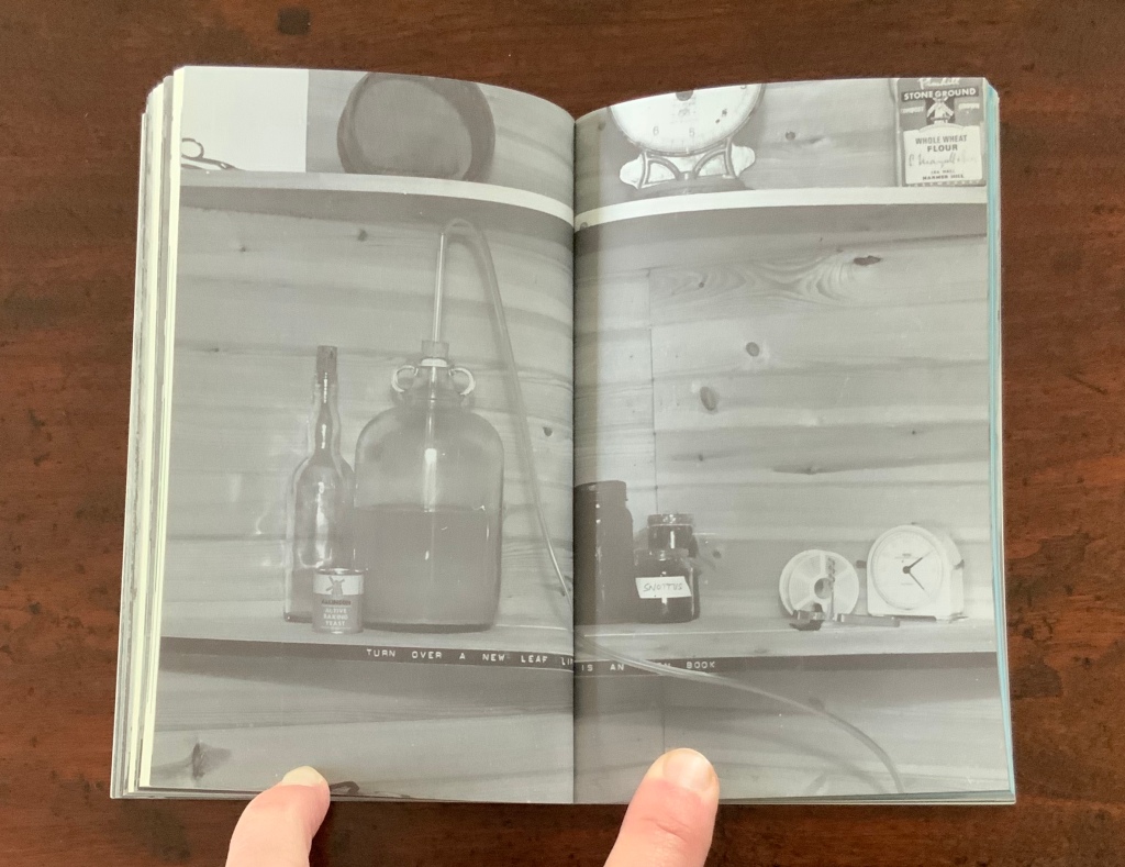
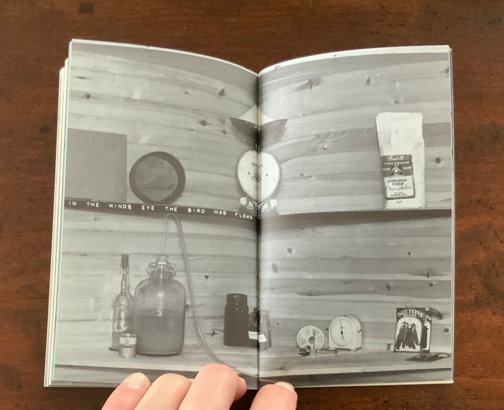
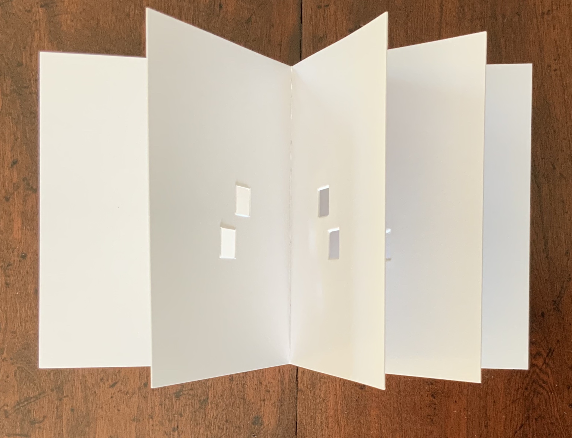
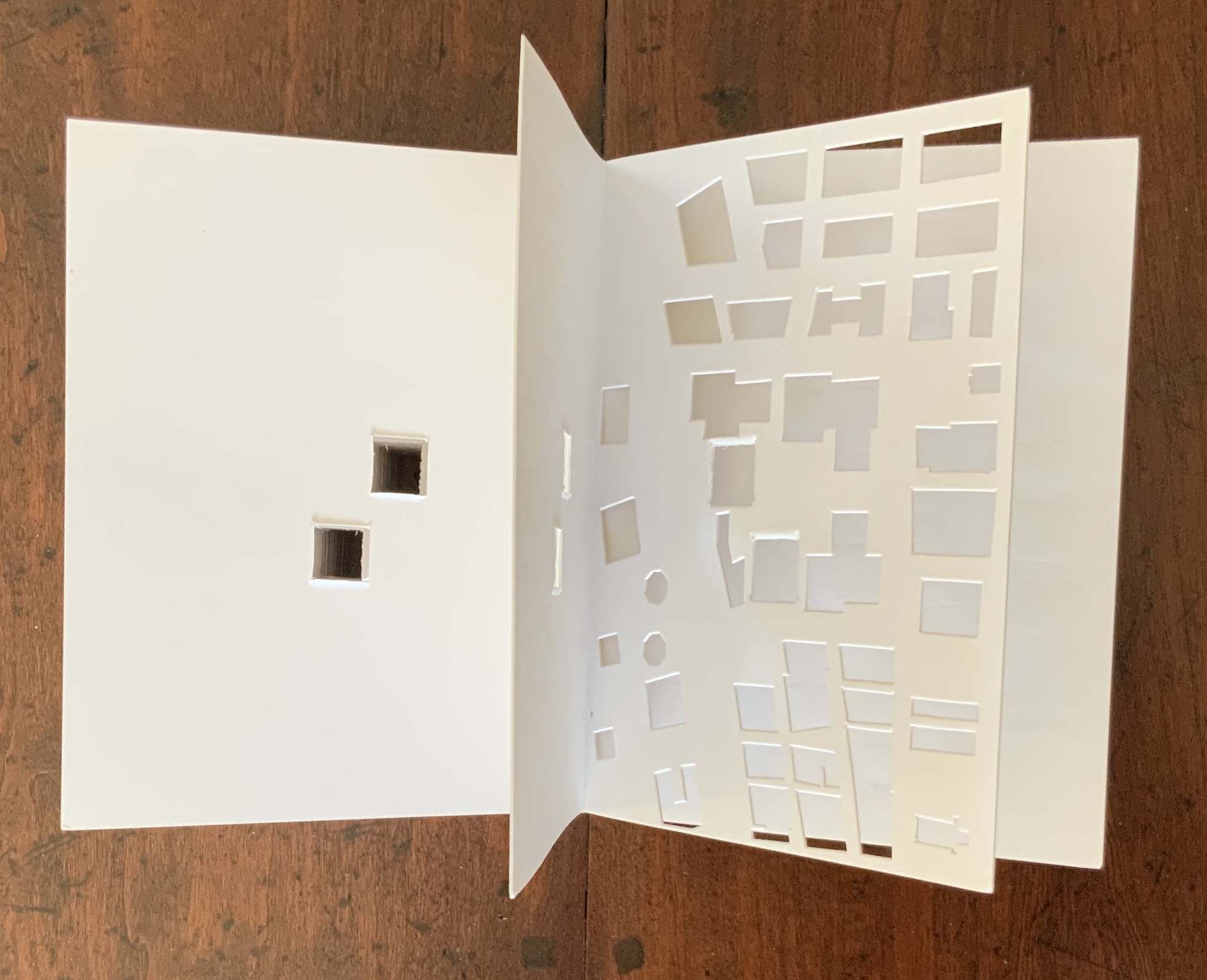
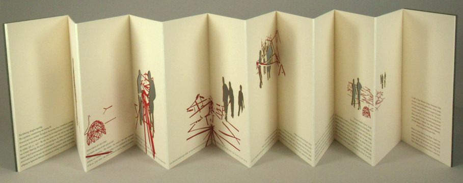
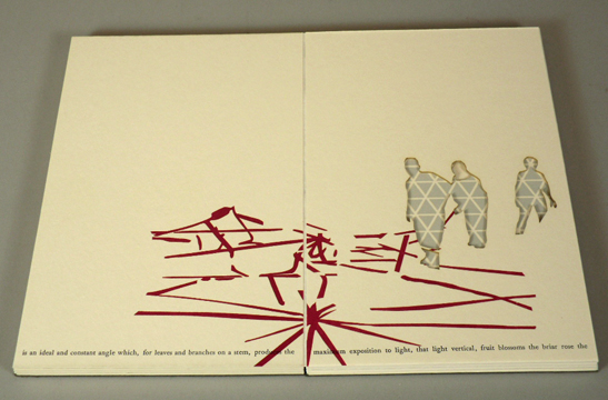
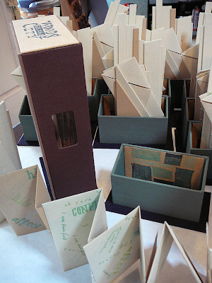
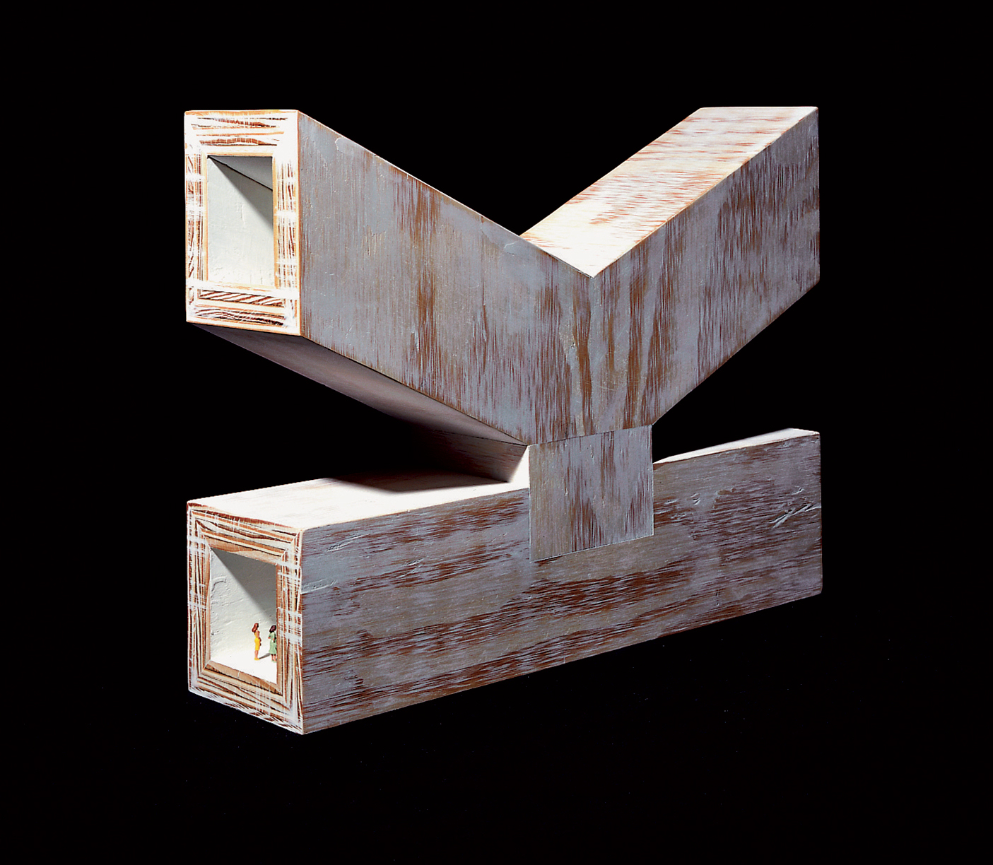
In Visible Cities (2012) Jean-Pierre Hébert, Harry and Sandra Liddell Reese Custom-made box enclosing sewn board binding with cloth spine, treated abaca/cotton paper with painted inlays, pastedowns with drawings, valley-fold folios of Niyodo Natural paper printed on Epson Stylus Pro 4800. Box: H442 x W290 mm. Book: H424 x W276 mm. [46] pages. Edition of 73, of which this is #48. Acquired from the Reeses, 9 February 2026. Photos: Books On Books Collection. Displayed with permission of Claire Hébert and the Reeses.
More than a few artists have been drawn to Italo Calvino’s Invisible Cities (1972/74). Its attraction is not hard to understand. Calvino supposes a series of conversations between Marco Polo and Kublai Khan about cities across the Khan’s empire that he has not visited but Marco Polo has and which he describes for the Khan. The premise, however, is paradoxical: the fifty-five cities Marco Polo describes do not exist. Calvino’s sensuous and surrealistic prose and combinatorial arrangement of the conversations and descriptions create a book that is simultaneously inwardly and outwardly reflective. Simple but complex. Realistic but fantastical. Concrete but conceptual. A work ripe for homage and inspiration.
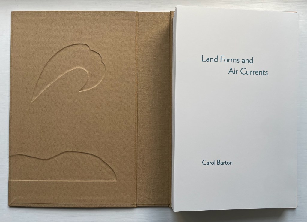
Land Forms and Air Currents (2014) Carol Barton Leporello (with 11 pop-ups) fixed to inside cover of case, cloth over board, debossed with fitted, pastedown artwork on front cover and spine. Cover: H292 x W192 x D50 mm. Leporello: H275 x W175 mm. 37 panels. Edition of 25, of which this is #21. Acquired from the artist, 27 October 2023. Photos: Books On Books Collection. Displayed with artist’s permission.
Carol Barton’s reputation for paper-engineering, supported by her well-received multi-volume The Pocket Paper Engineer, should not overshadow appreciation of her talents with watercolor and words. With its poems of free verse, scanned watercolors and pop-up structures all by the same author/artist, Land Forms and Air Currents (2014) qualifies as a champion of the Blakean tradition in artists’ books.
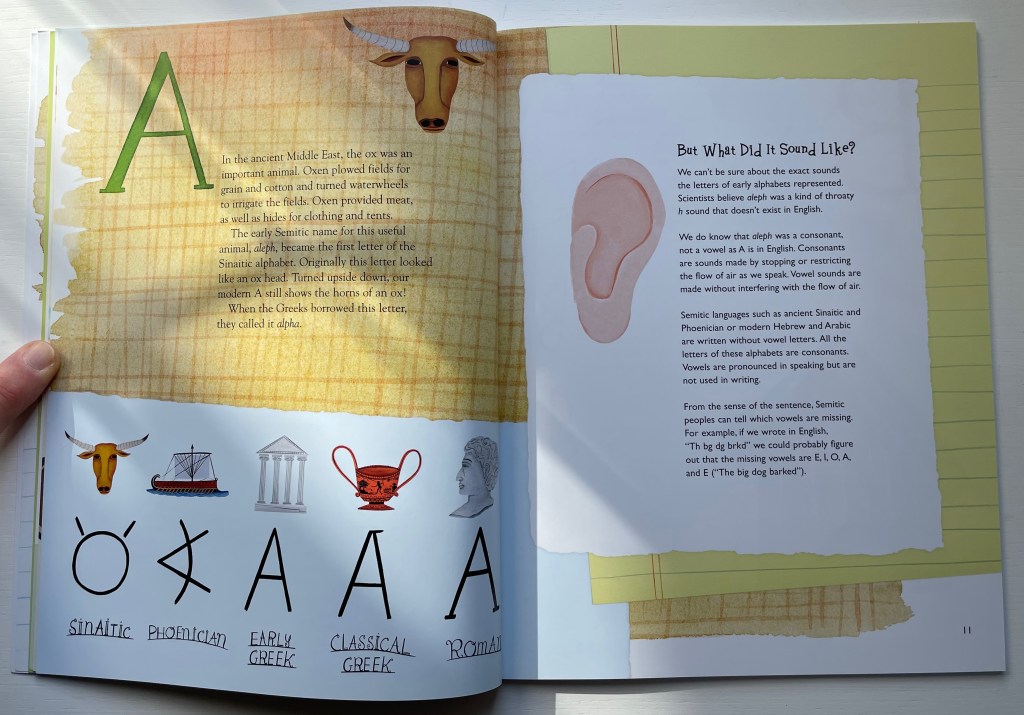
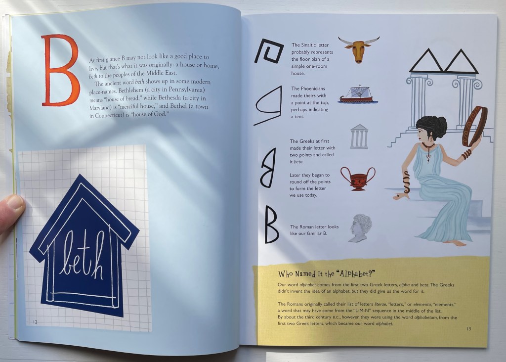
A fair number of fiction and non-fiction children’s books on the history of the alphabet have made their way into the Books On Books Collection.
Of the fiction variety, there is Rudyard Kipling’s “Just So Story” of the alphabet’s invention: How the Alphabet Was Made (1983), illustrated by Chloe Cheese. Another fiction entry is James Rumford’s retelling of Cadmus’ visit to Crete in There’s a Monster in the Alphabet (2002) and William Joyce’s inventive The Numberlys (2014).
In the non-fiction category are William Dugan’s How Our Alphabet Grew (1972), Tiphaine Samoyault’s Alphabetical Order (1998), Renzo Rossi’s The Revolution of the Alphabet (2009) and the entry here: Don Robb’s and Anne Smith’s Ox, House, Stick.
Ox, House, Stick is scheduled to appear as part of an exhibition at the Bodleian Libraries in Oxford (opening 15 July 2023). “A is for Ox” designates the display case devoted to the question: Where did the alphabet come from? It’s not just a question for archaeologists, historians, linguists and paleographers — or children’s book authors and illustrators. It’s one generating repeated inspiration for book artists as shown by Abe Kuipers’ Letters (1971), Lanore Cady’s Houses & Letters (1977), another rendition of the Kipling tale by Gerald Lange in The Neolithic Adventures of Taffi-Mai Metallu-Mai (1997), designed by Gerald Lange and produced with Robin Price, Dave Wood’s Alphabetica (2002), Cari Ferraro’s The First Writing (2004), and Helen Malone’s Alphabetic Codes (2005).
Artists’ books share much with children’s books in general. They both play with form and structure. They play with words and images, sometimes images without words and sometimes just shapes. Almost always an attention to all the senses. Children’s alphabet books in particular display features that appeal to book artists: play with animals, the Babel of languages, bodies, calligraphy, colors, design (of letters, page and book) and, as above, alphabet origin stories. Viewing and exploring alphabet books and artist’s books side by side heightens the enjoyment and appreciation of both.
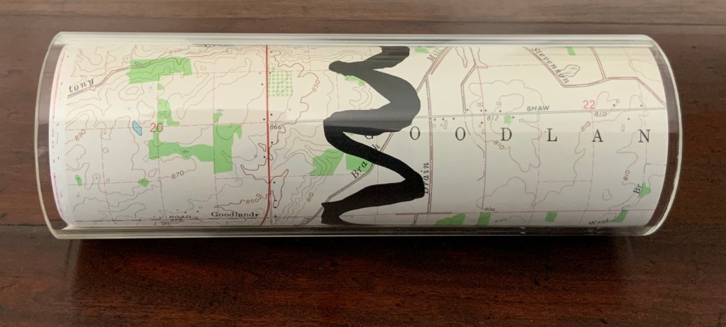
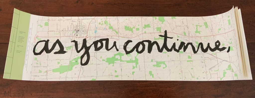
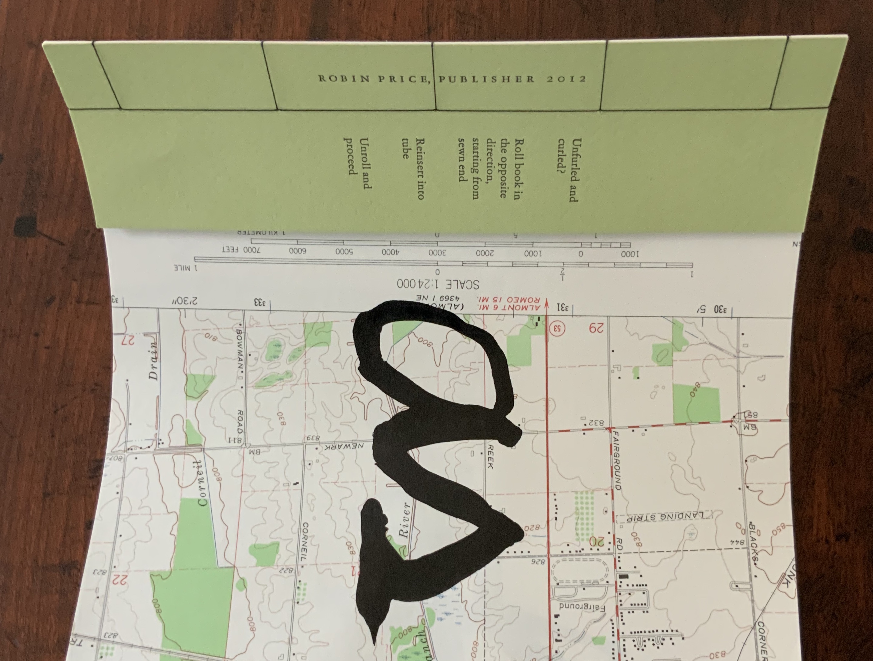
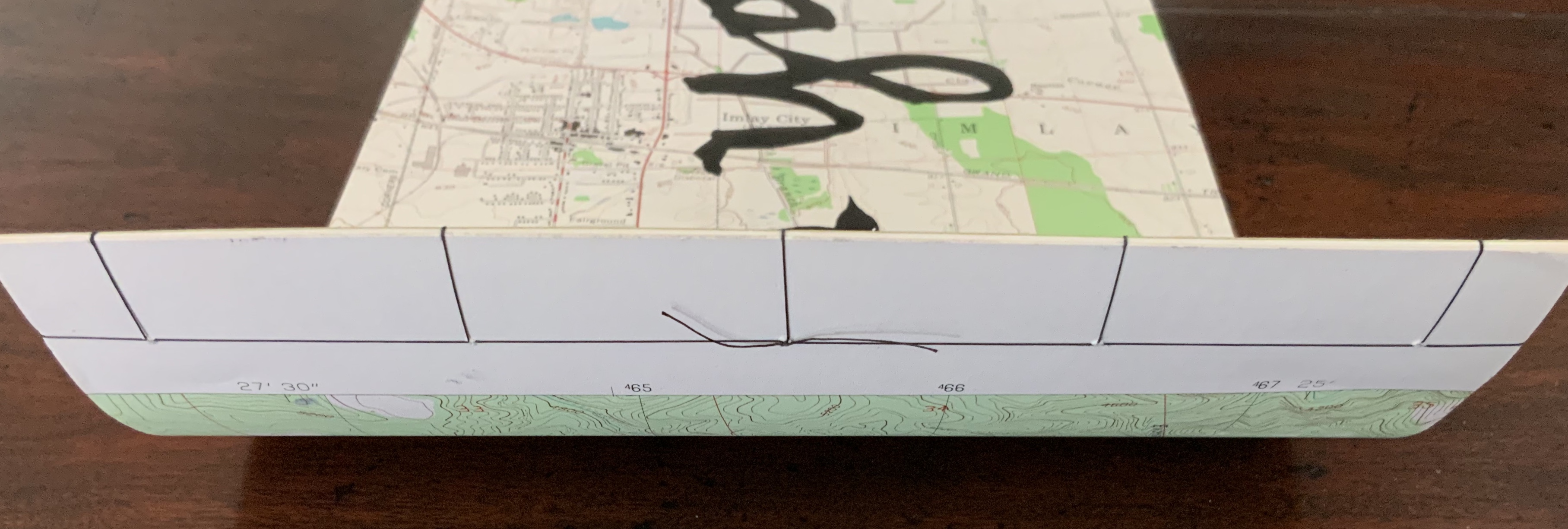
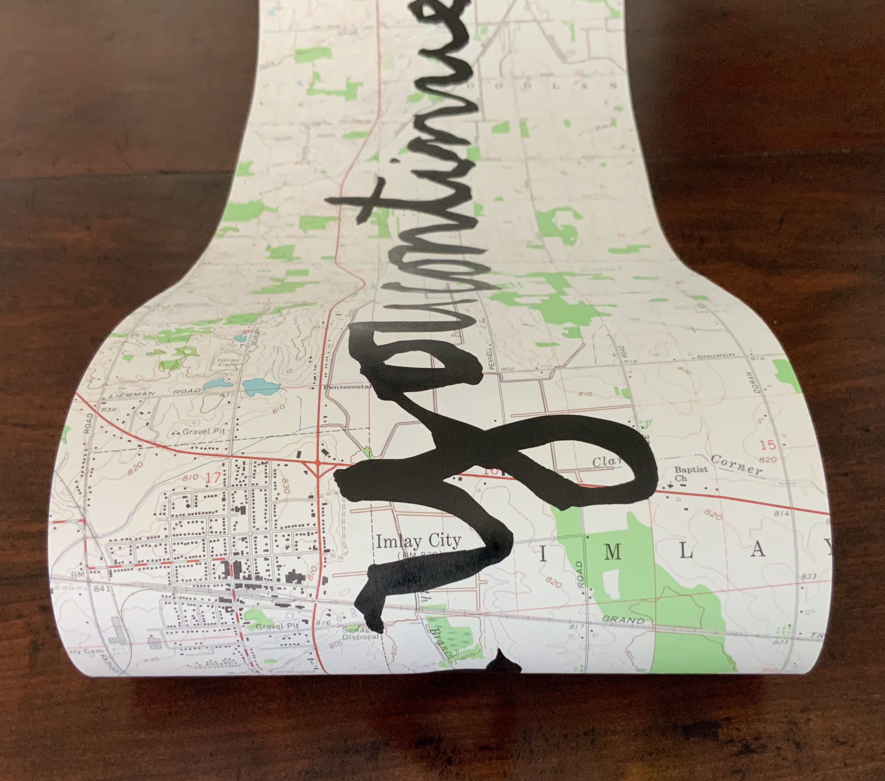
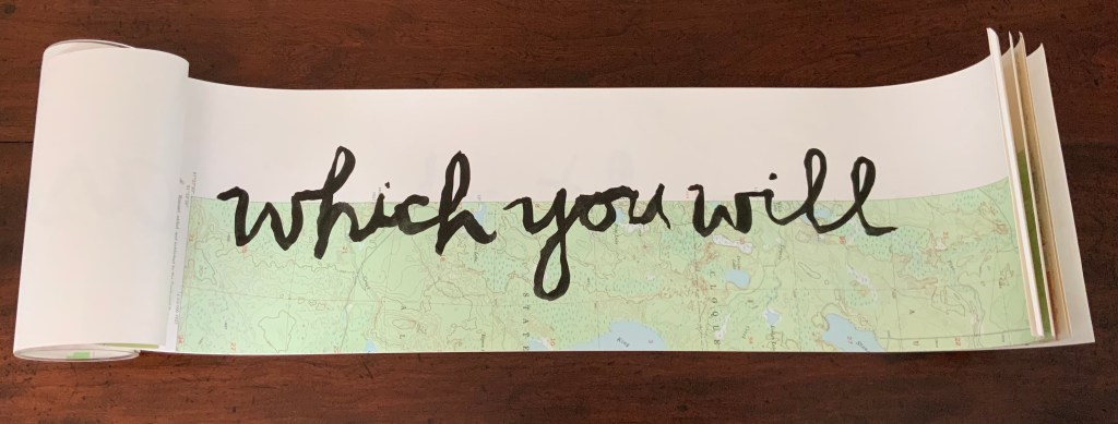
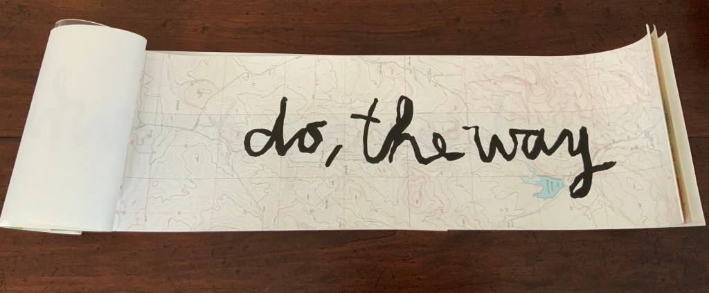
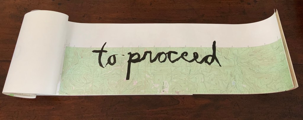
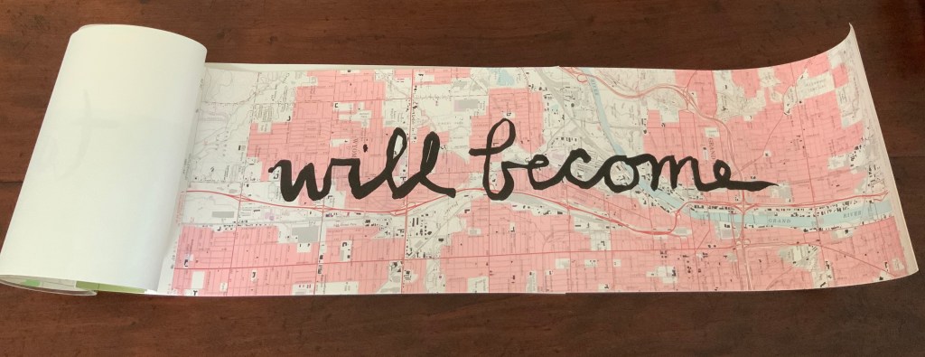
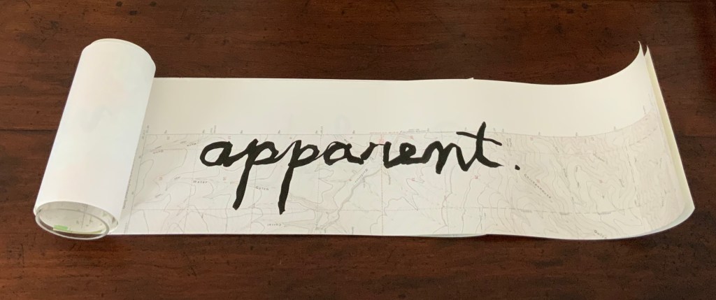
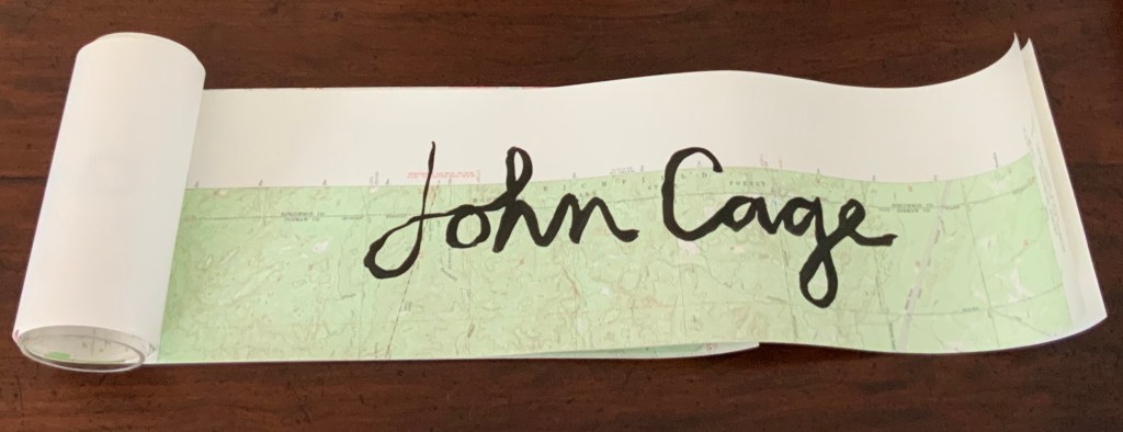
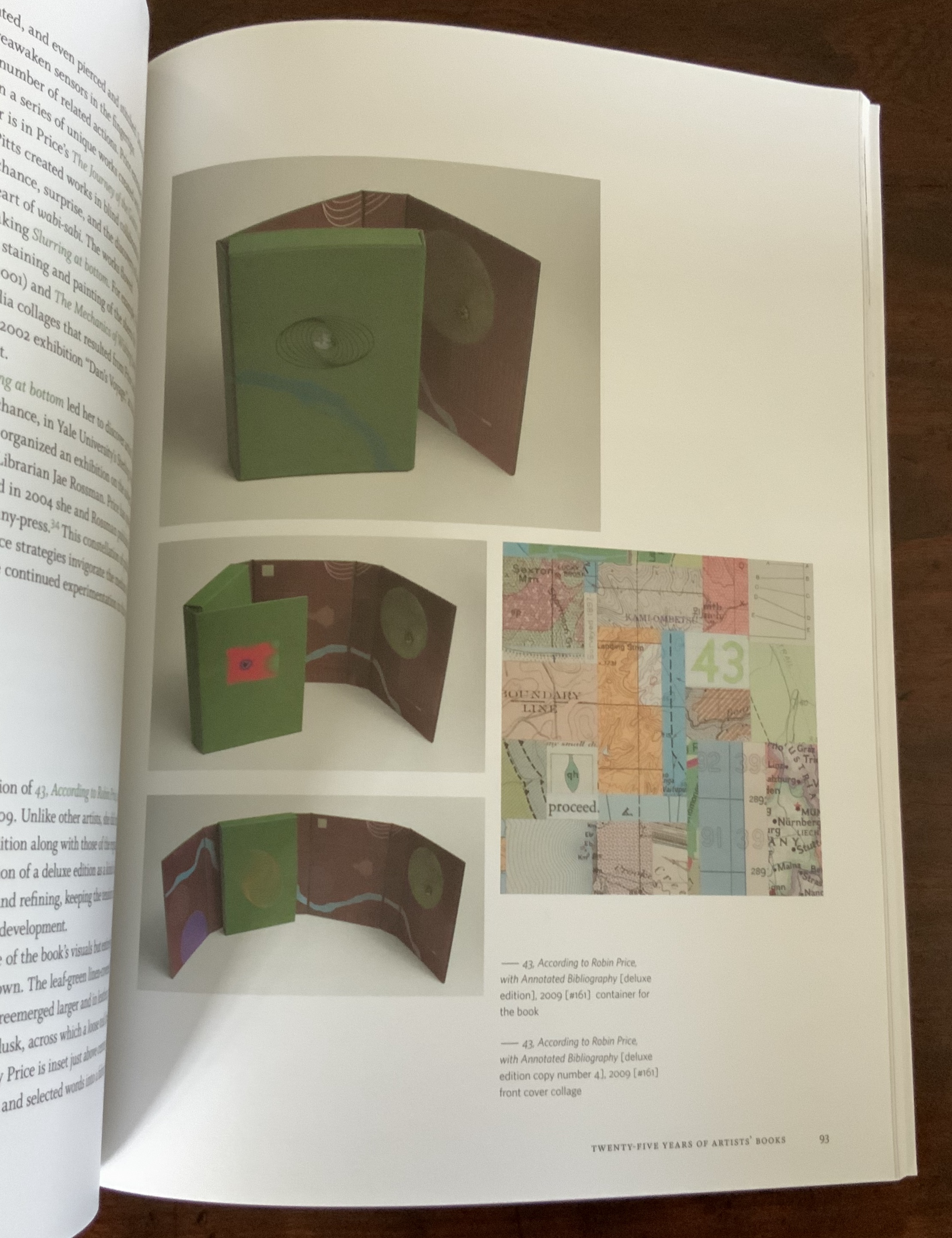
Housed in acrylic tube, eight pages including letterpress printed colophon page, seven pages of USGS topographic maps inscribed with sumi ink by hand, bound with a small piece of Fabriano Tiziano green in Japanese side-stitch. H184 x W679.5 mm unfurled. Edition of approximately 65, of which this one is dated and initialed on 7 November 2012. Acquired from the artist, 25 March 2015. Photos: Books On Books Collection.
When as you continue first appeared, Jen Larson wrote of it in Multiple, Limited, Unique: Selections from the Permanent Collection of the Center for Book Arts (2011):
… this work serves as an elegant meditation and metaphor on the subject of life journeys — and orienting oneself in the midst of landscape or circumstance that can only be apprehended by survey and the will to move forward.
The year 2012 marked the centennial of composer and artist John Cage’s birth. An aficionado of “chance”, Robin Price revisited this work that had begun in December 2010 when she discovered on the Crown Point Press’ Magical-Secrets website the quotation by Cage. Cage had made this remark to Kathan Brown in 1989 after the Crown Point Press’ building was condemned following an earthquake. By chance, it now seemed fitting as a centenary birthday wish to this artistic master of “the purposeful use of chance and randomness”. Also by purposeful chance, Price turned to a technique that seemed entirely fitting for the work, its history and her personal perspective. Price writes:
… I took up the project anew and practiced writing on several different occasions, feeling dissatisfied with various trials. Eventually I found my way to writing with my left (non-dominant) hand as the most authentic expression I could bring to the content, as visualization of struggle, fear, and acceptance of imperfection.
Perfect bound. H305 x W229 mm. Acquired from the artist, 25 March 2015. Photos: Books On Books Collection.
The very covers of the book were created by chance operations. Generated solely on press using three of the four process color printing plates from the book’s interior via “make-ready”, areas of image were built up on the paper by repeatedly passing the sheets through the press, and consistently rotating the sheets prior to their feeding through ensured variation among the covers within the edition.
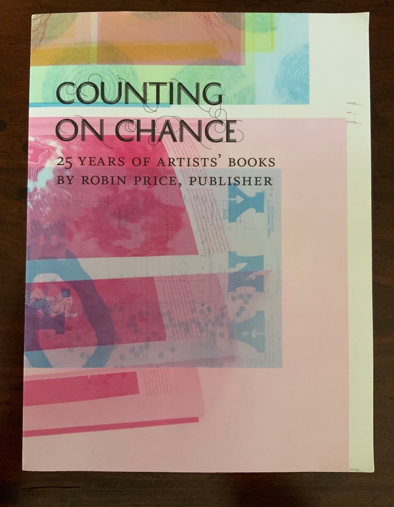
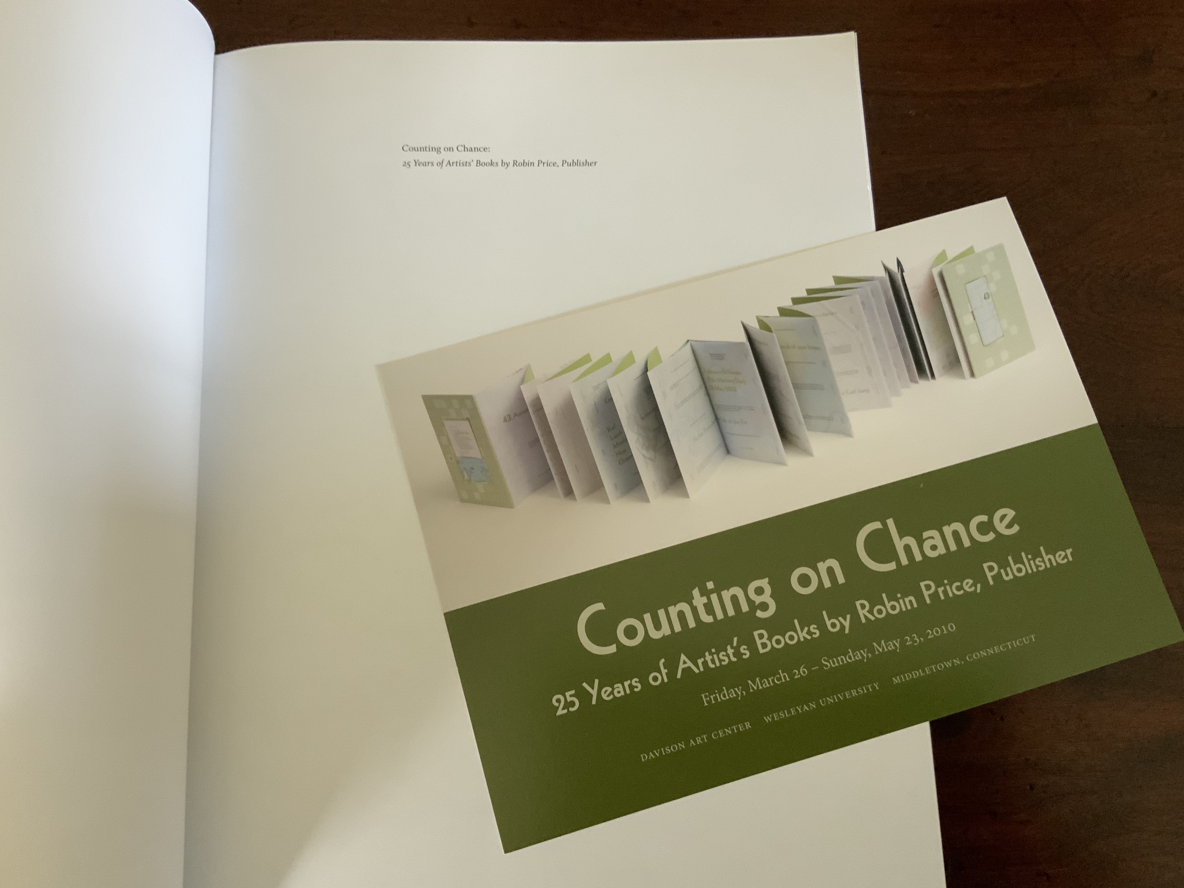
In addition to the theme core to Price’s art, Counting on Chance embodies another aspect key to her work: choice and collaboration. Published in conjunction with the exhibition held at Wesleyan University’s Davison Art Center, the volume includes a brilliant essay by Betty Bright, interview by Suzy Taraba and a catalogue raisonné prepared by Rutherford Witthus. Like choosing the right colors, the right combination of fonts, the right layout, the right weight and opacity of paper, and the right structure, Price’s choice of collaborators (or their choice of her) in her work and publishing is an artistic practice itself.
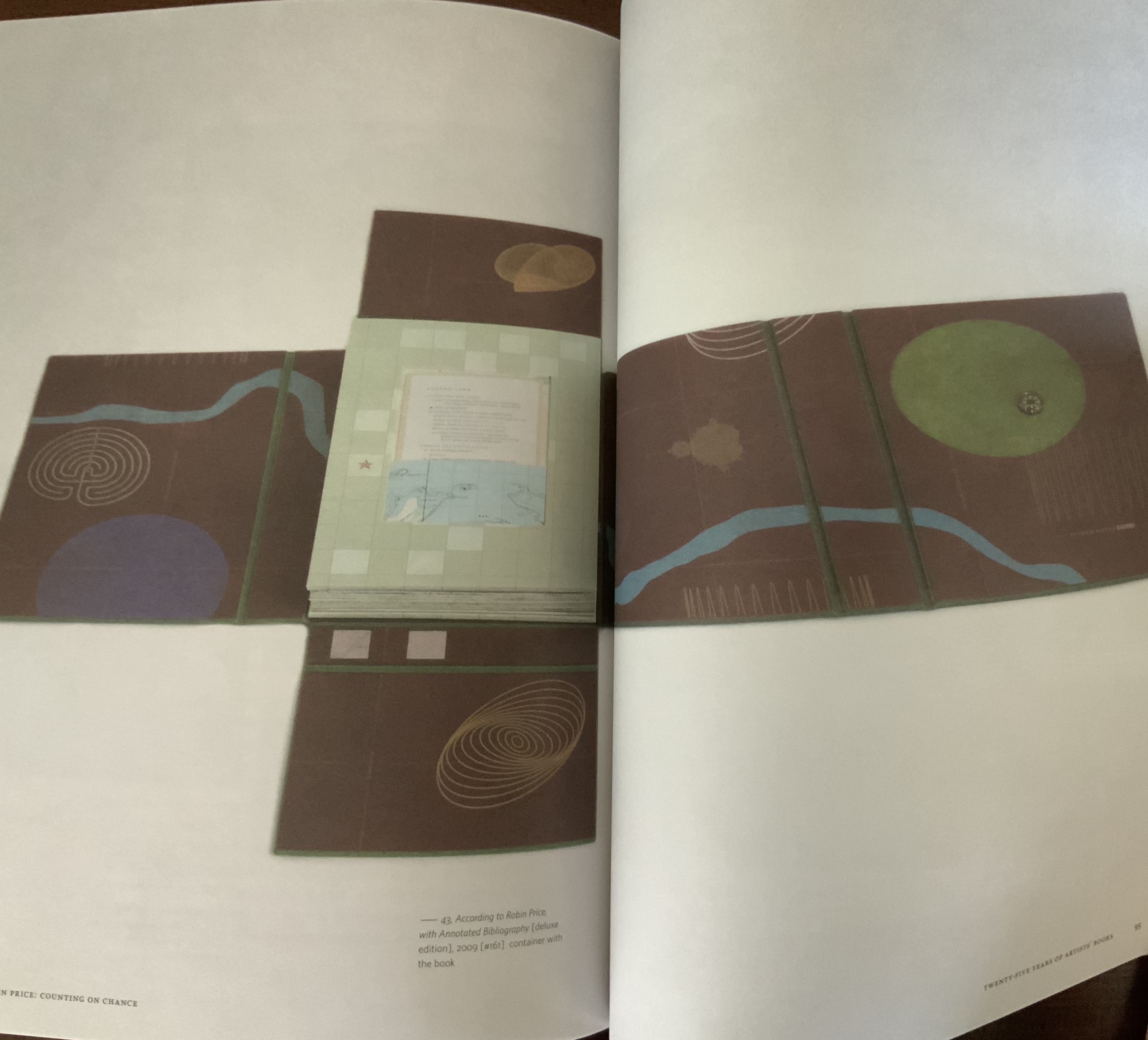
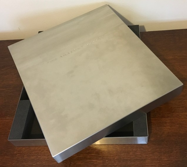
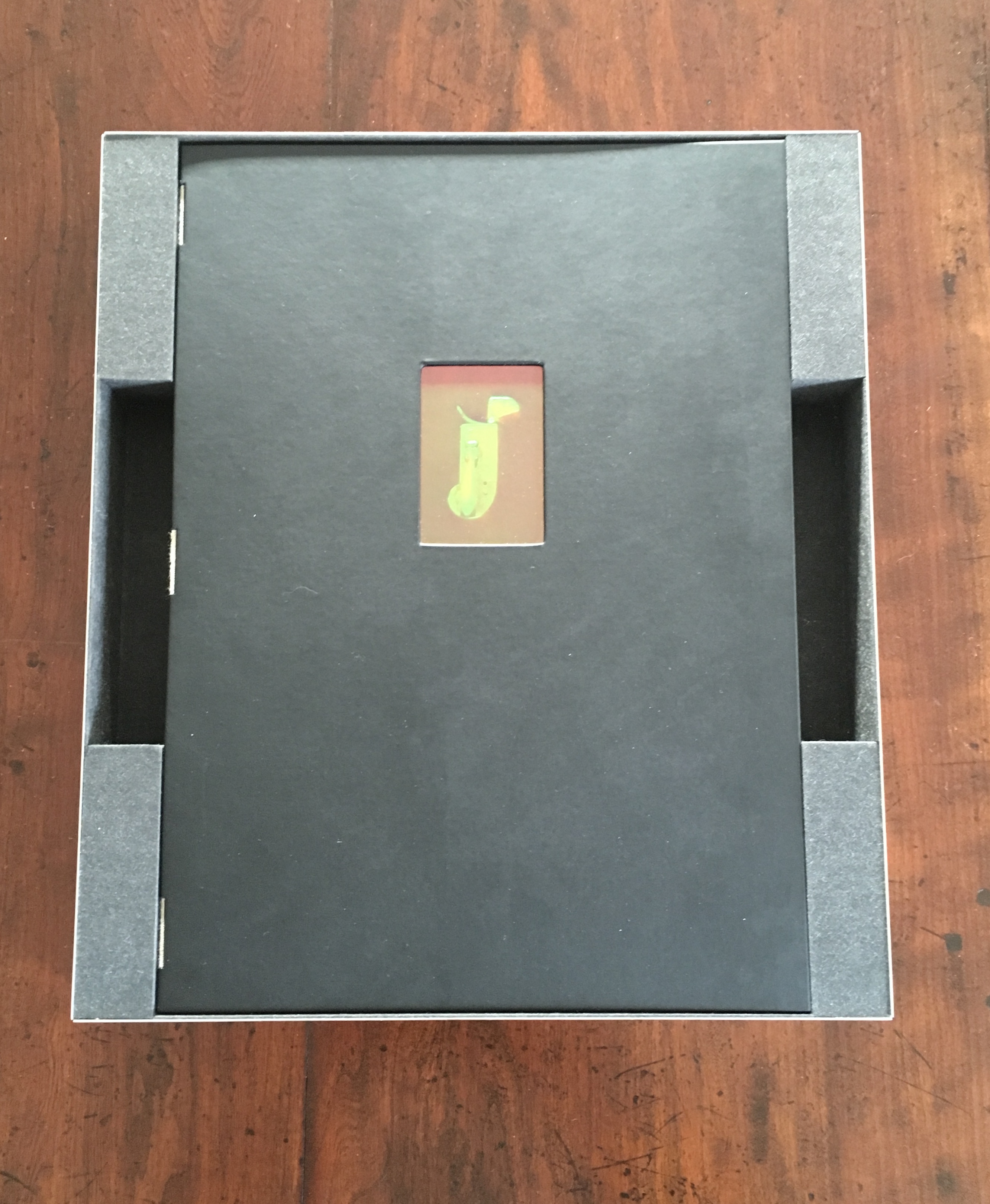
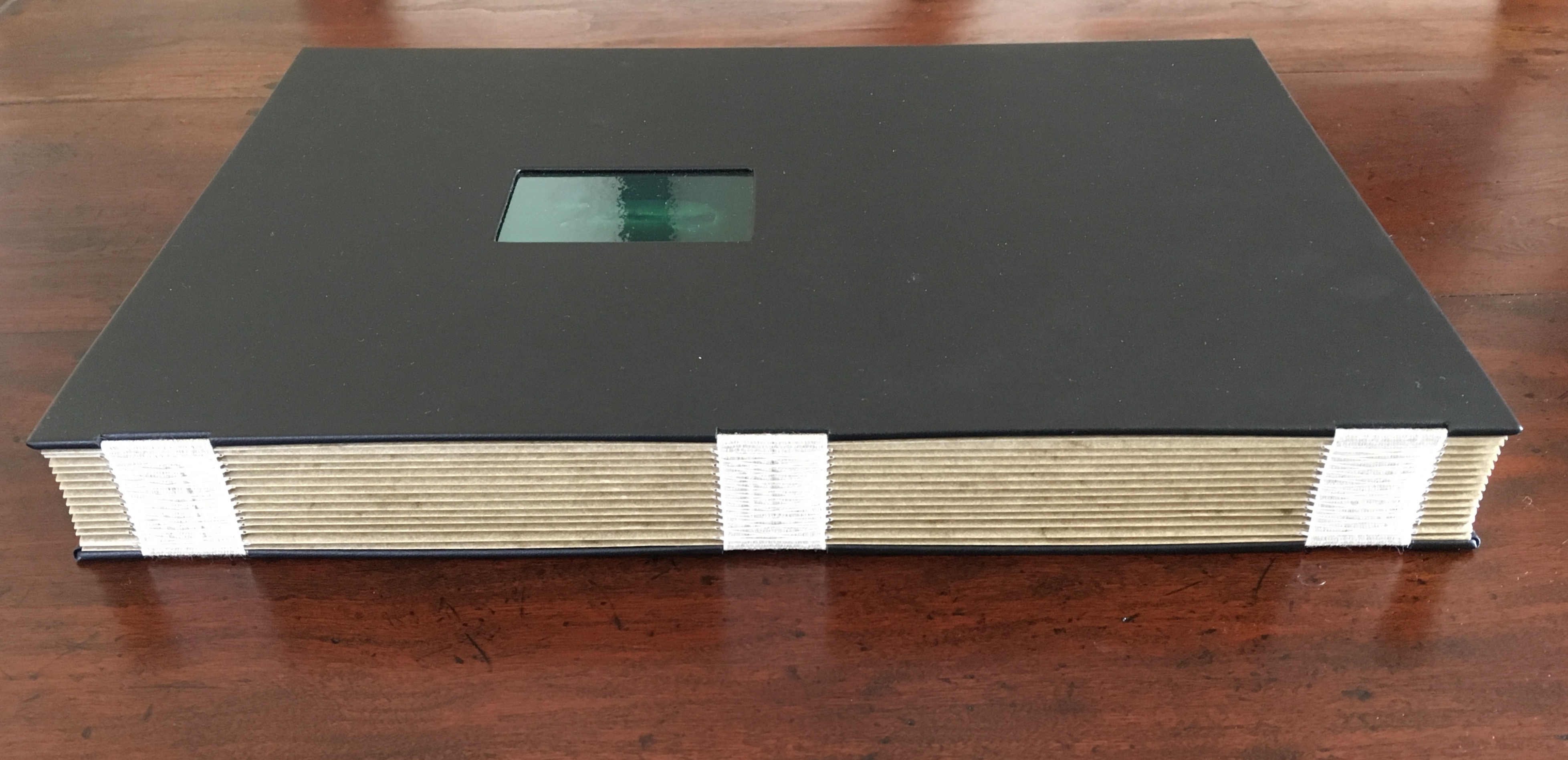
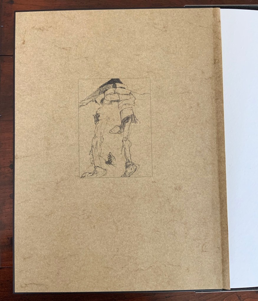
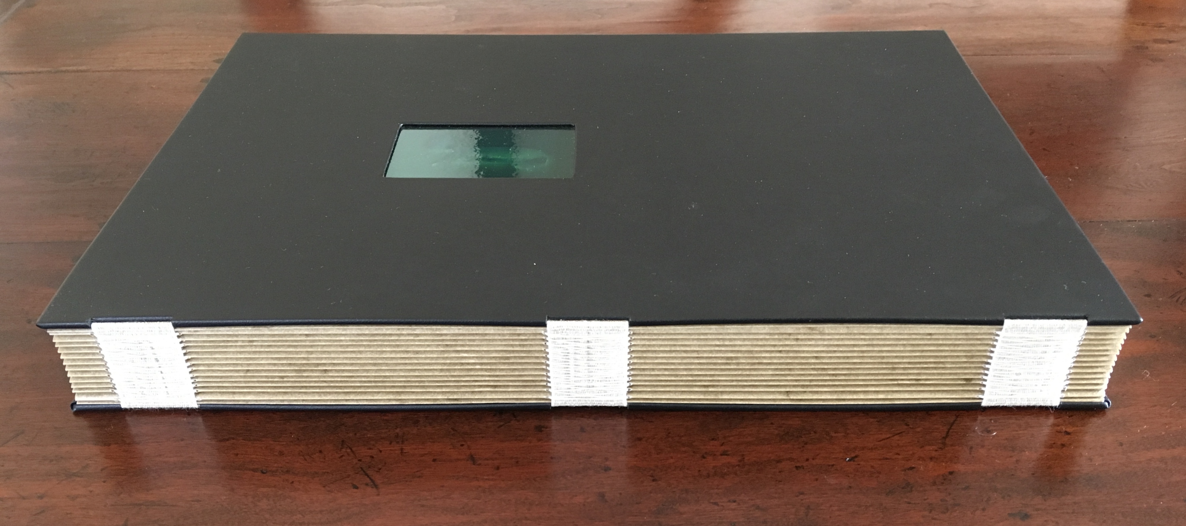
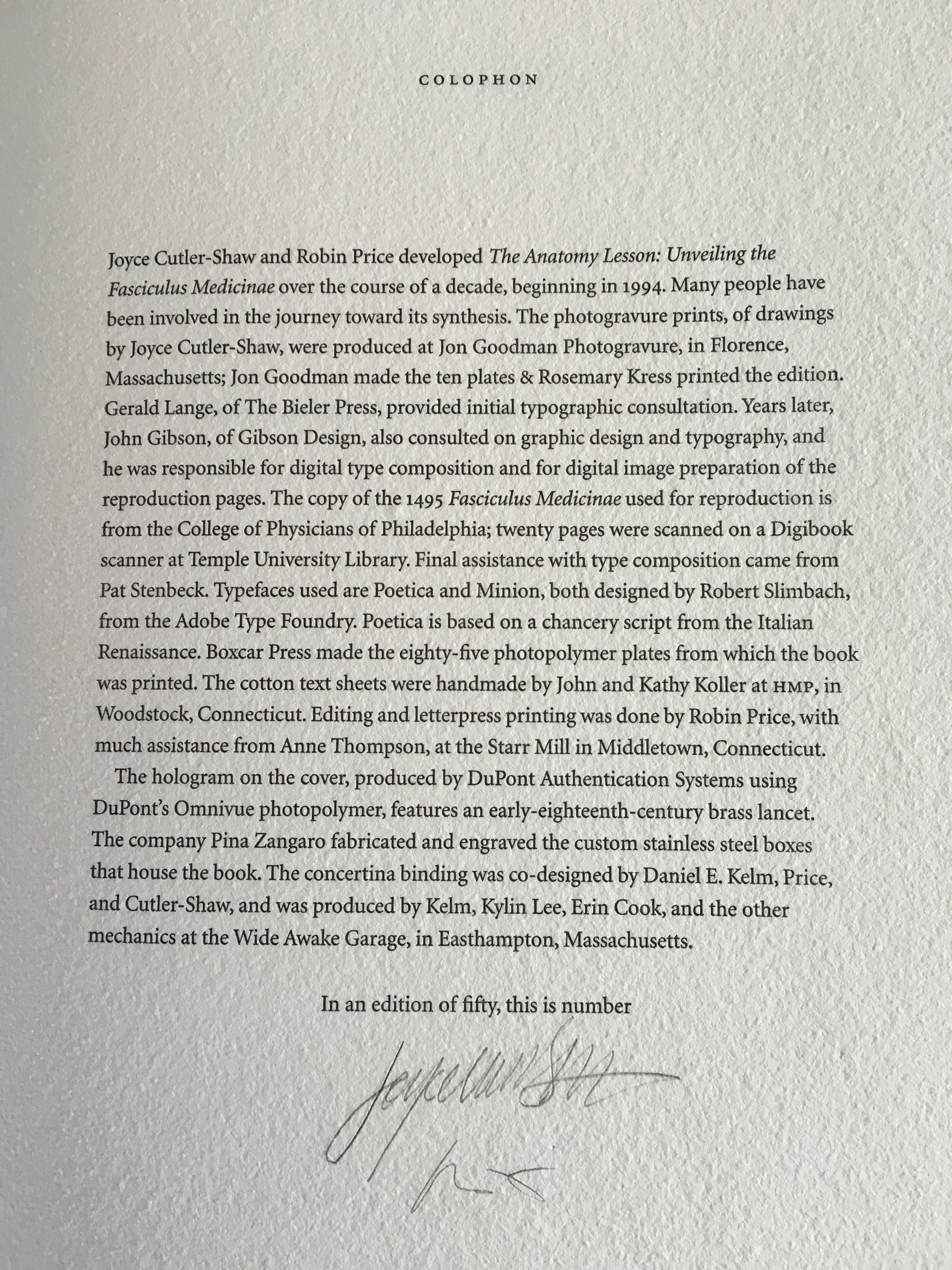
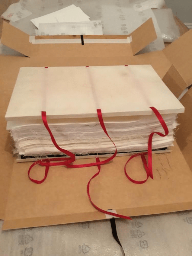
Housed in a custom-made, engraved stainless steel box (H370 x W326 x D44 mm), concertina binding co-designed with Daniel E. Kelm and Joyce Cutler-Shaw, produced at The Wide Awake Garage; twelve signatures of handmade cotton text paper, the central ten signatures each made up of one sheet H356 x W514 mm and one sheet H356 x W500 mm glued to the 14 mm margin of the first sheet, for a total of 96 pages, each measuring H356 x W253 mm. Binding of leather covered boards (a hologram embedded in front cover) with an open spine, taped and sewn into a reinforcing concertina structure: H361 X W259 mm. The hologram, produced by DuPont Authentication Systems, features an early eighteenth-century brass lancet. Edition of 50, of which this is a binder’s copy. Acquired from the binder, Daniel E. Kelm, 15 October 2018.
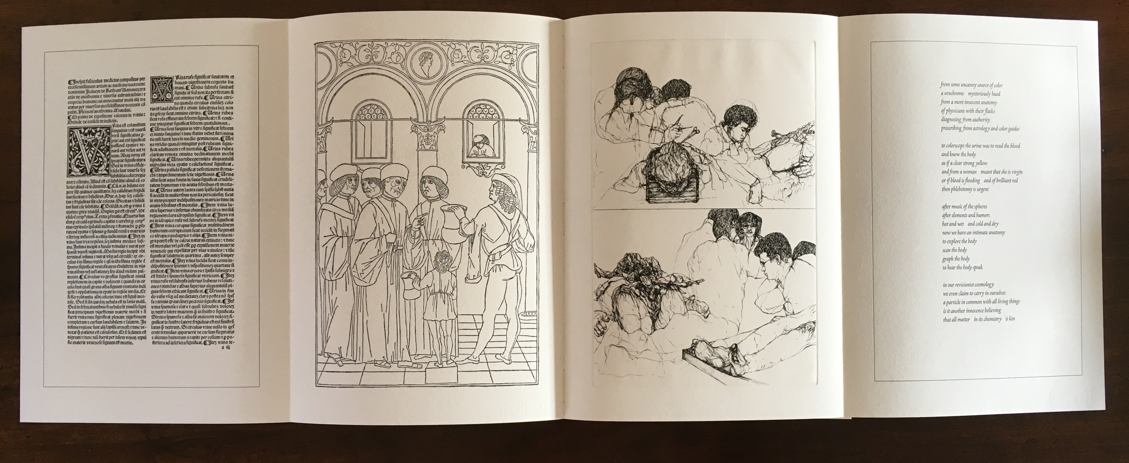
Generating two double-page spreads, one for the Fasciculus Medicinae on the left and Cutler-Shaw on the right, the foldout pages extend to 1016 mm.
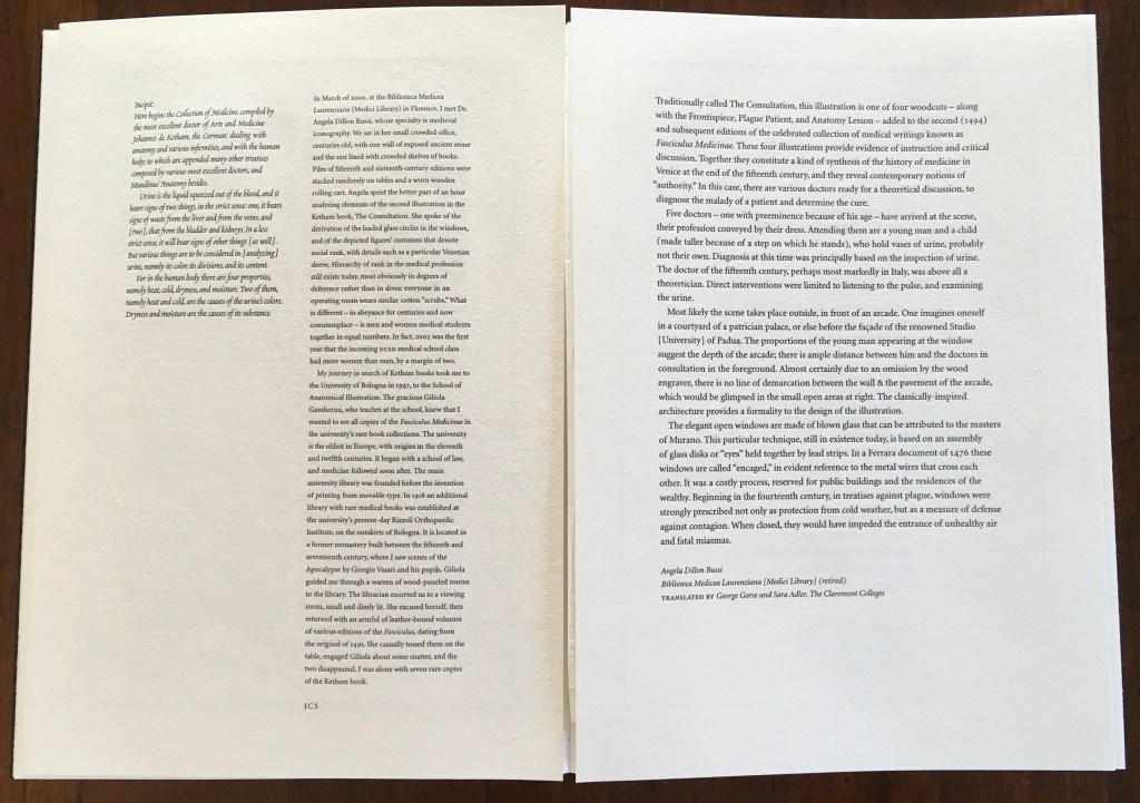
Responding to the 1993 Smithsonian challenge to book artists to create a work in response to a scientific or technical work in the Dibner Library, Joyce Cutler-Shaw approached Price for assistance in creating a unique book based on Shaw’s response to the Fasciculus Medicinae (1495), the first printed book with anatomical illustrations. A decade later, Price was convinced to issue this 50-copy edition. In Counting On Chance, Betty Bright recounts the story behind this brilliant collaboration. Detail and additional images about the work can be found here.
Bright, Betty. “Handwork and Hybrids: Contemporary Book Art,” in Extra/ordinary: Craft and Contemporary Art, edited by Maria Elena Buczek (Durham, NC: Duke University Press, 2010). Essay highlighting the work of Robin Price and Ken Campbell.
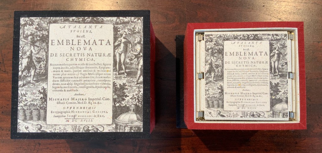
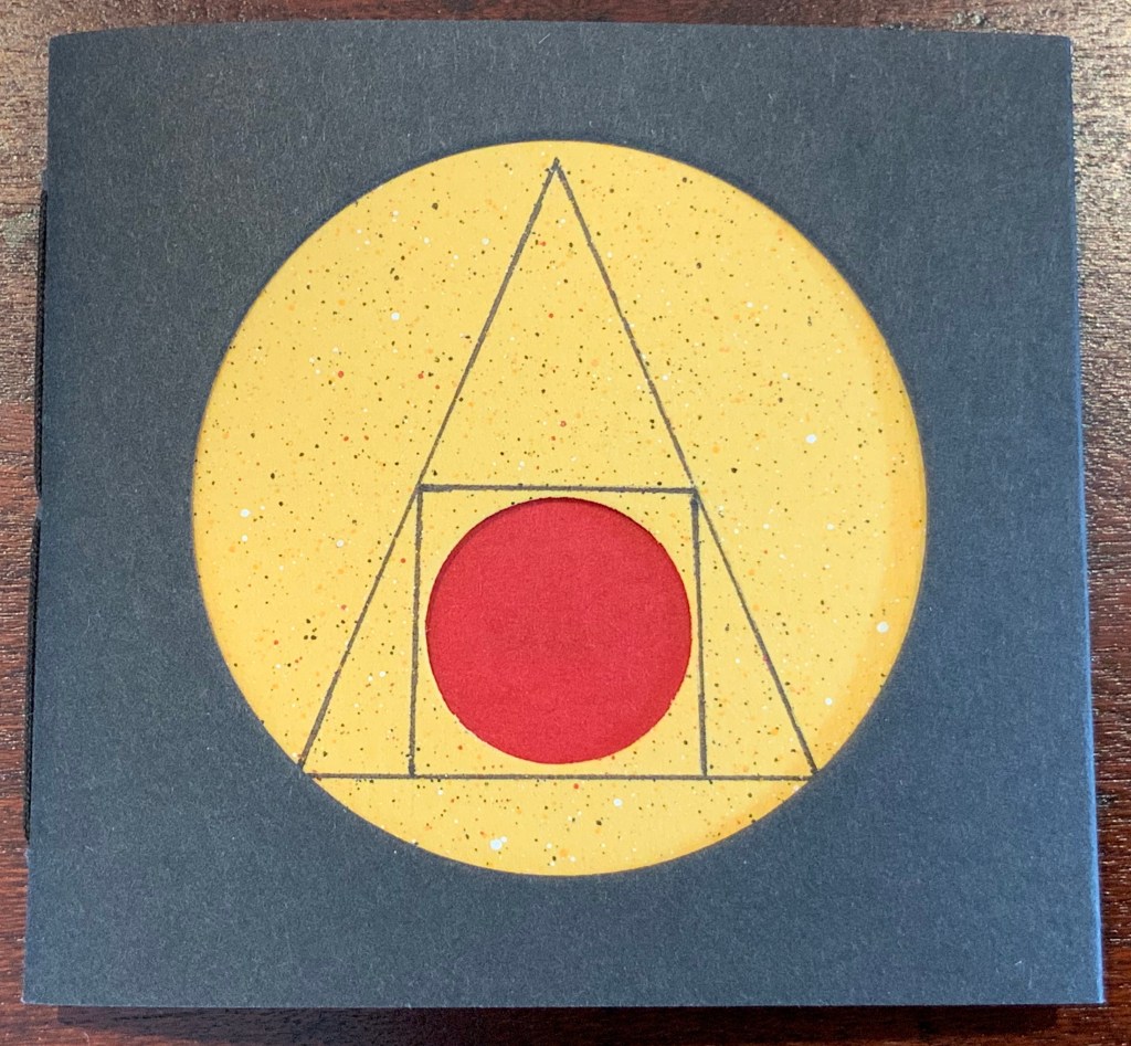
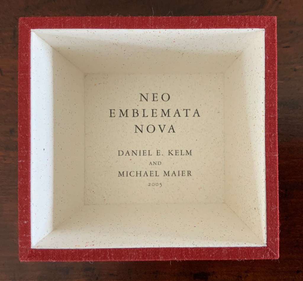
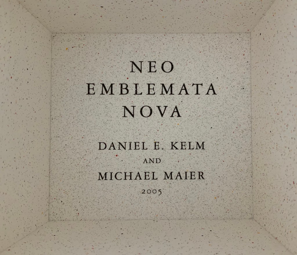
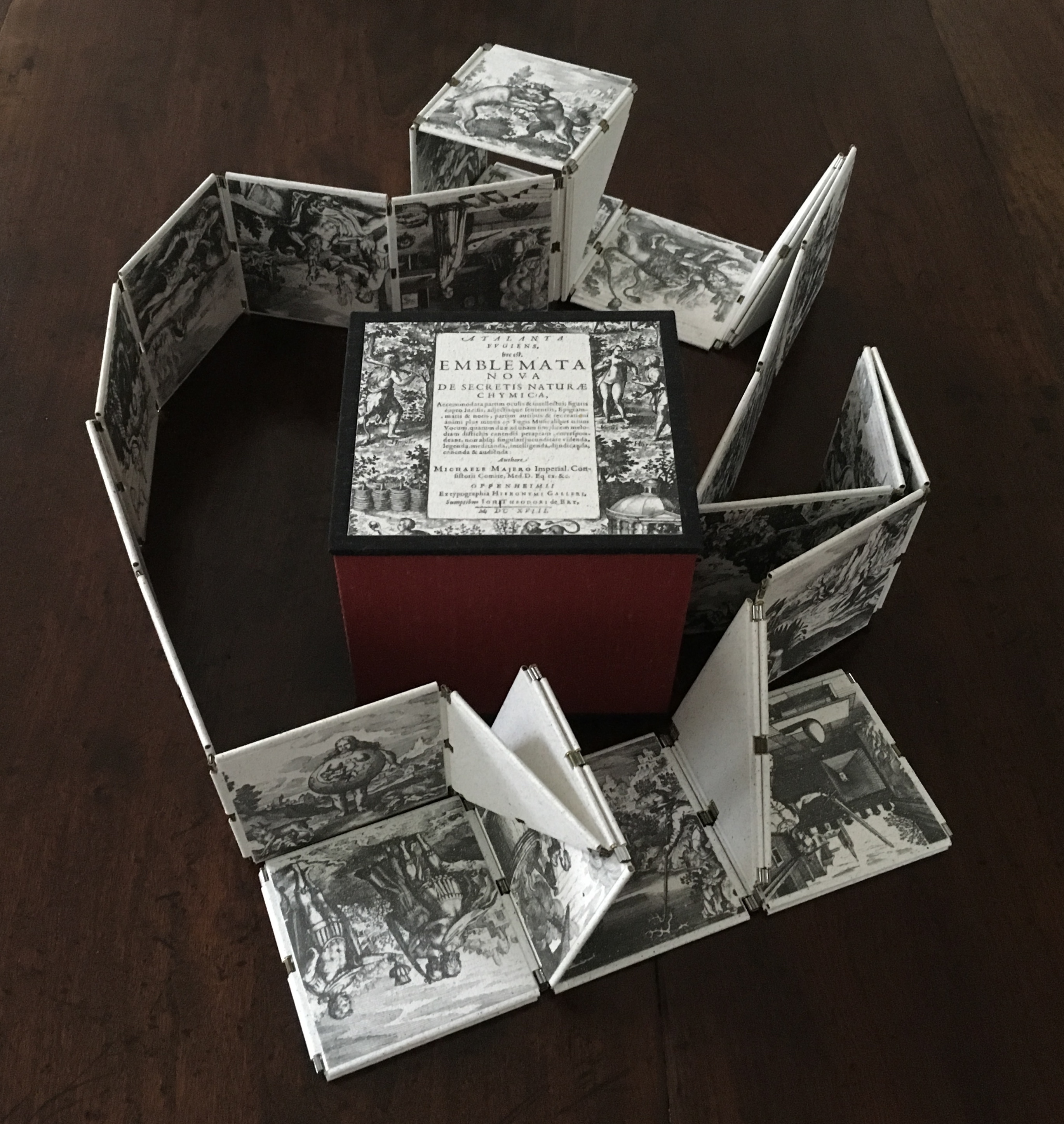
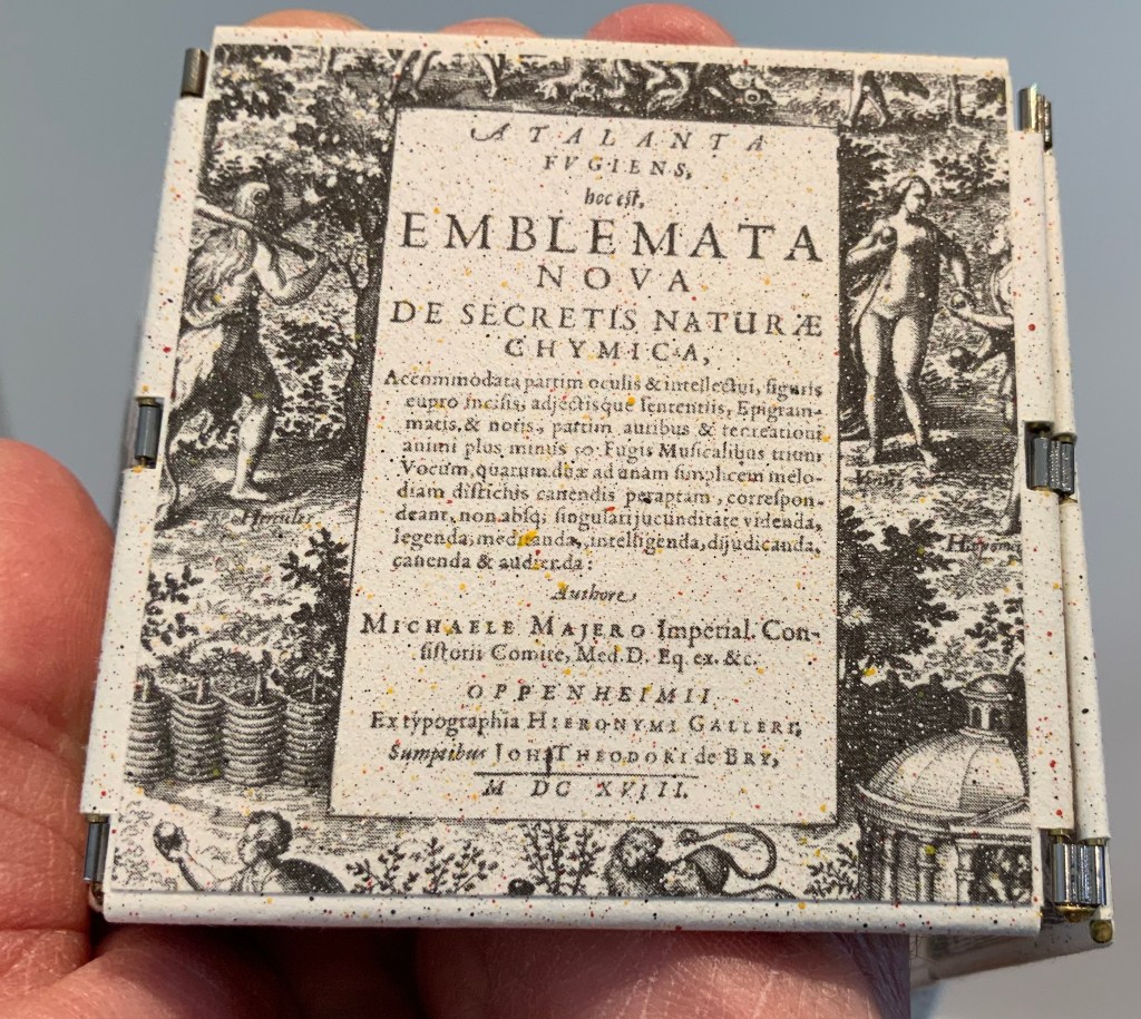
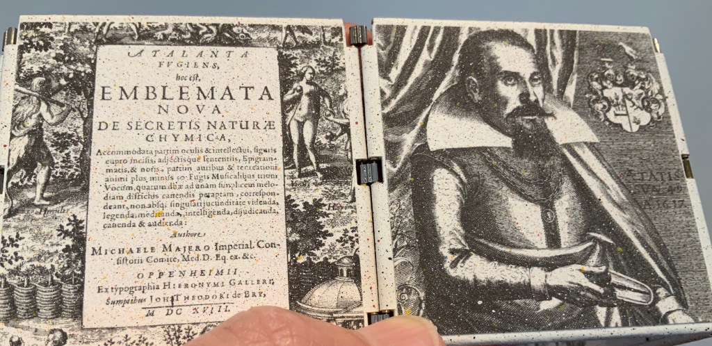
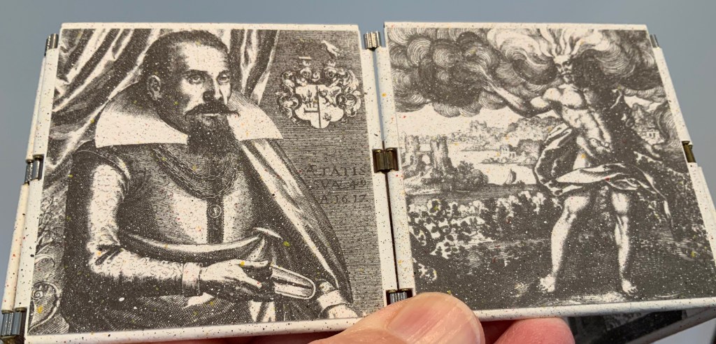
Neo Emblemata Nova (2005) Daniel E. Kelm Box: H96 x W109 x D102 mm closed. Booklet cover: H72 x W79 mm closed, H72 x W224 mm open. Booklet: H72 x W78 mm. Möbius strip: each tile is H70 x W70 mm; the strip extended is 1000 mm. Edition of twenty-one, of which this is #18. Acquired from the artist, 20 October 2018.
Opening the work.
Booklet about the work and its creation.
Inside the top of the box.
Closing and returning the Möbius strip to its box requires considerably more dexterity than reading; so much so that the booklet included provides instructions.
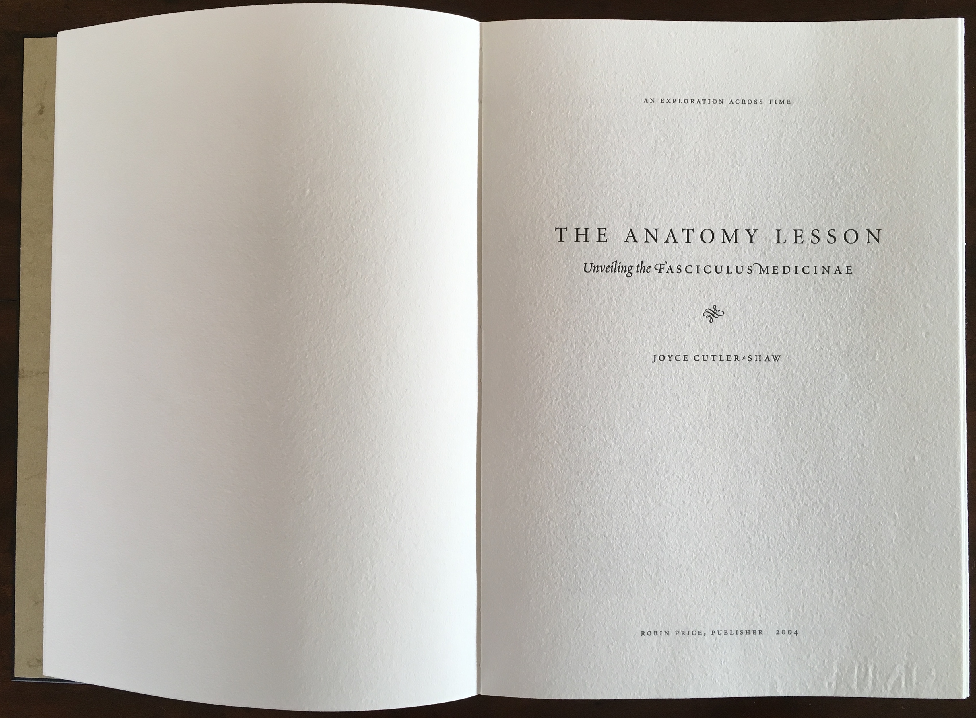
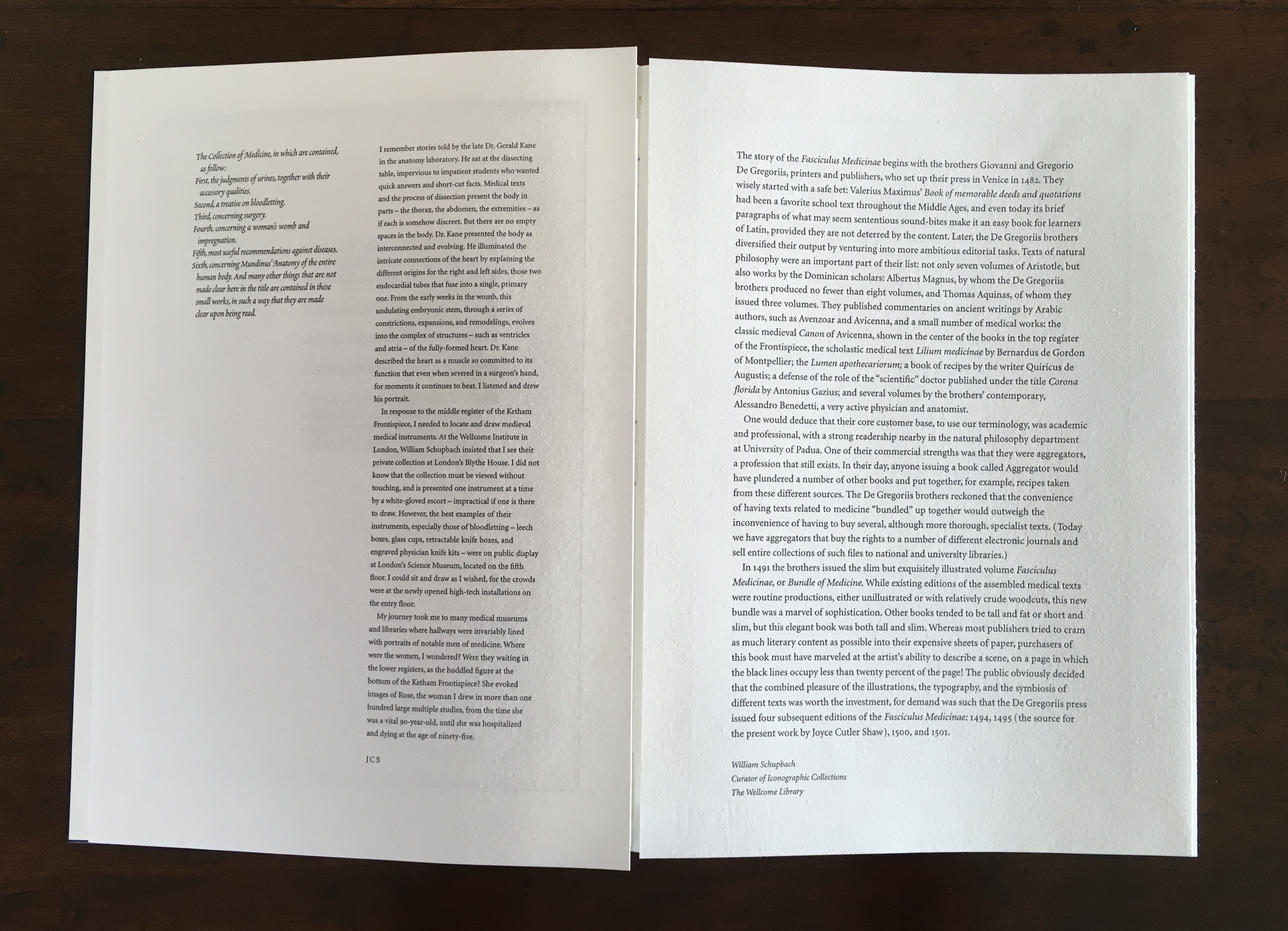
The Anatomy Lesson (2004)
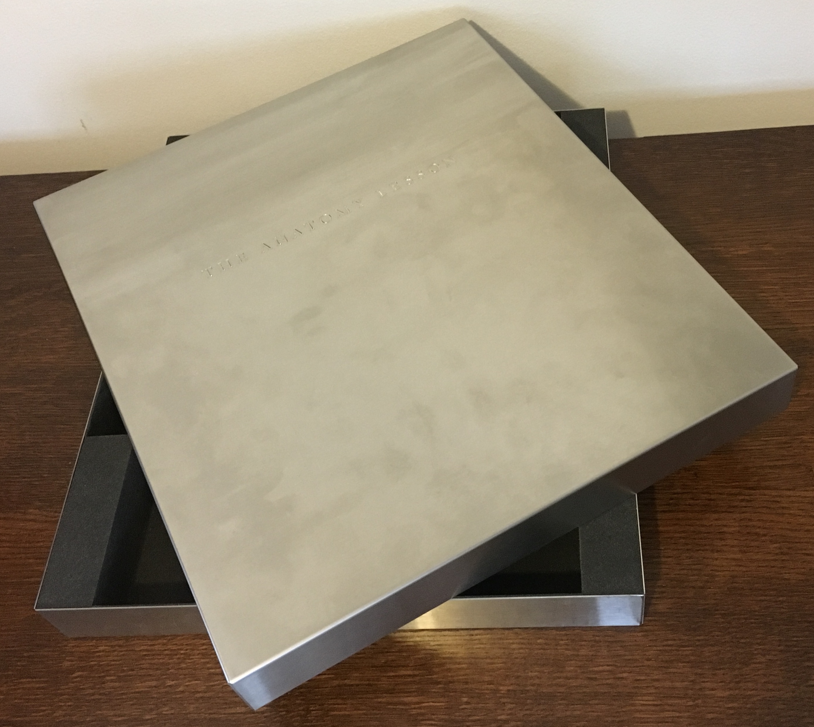
The Anatomy Lesson (2004) Joyce Cutler-Shaw Middletown, CT: Robin Price, Publisher, 2004) Limited edition of 50, of which this signed copy is the binder’s copy (Daniel E. Kelm). Acquired from the binder, 20 October 2018.
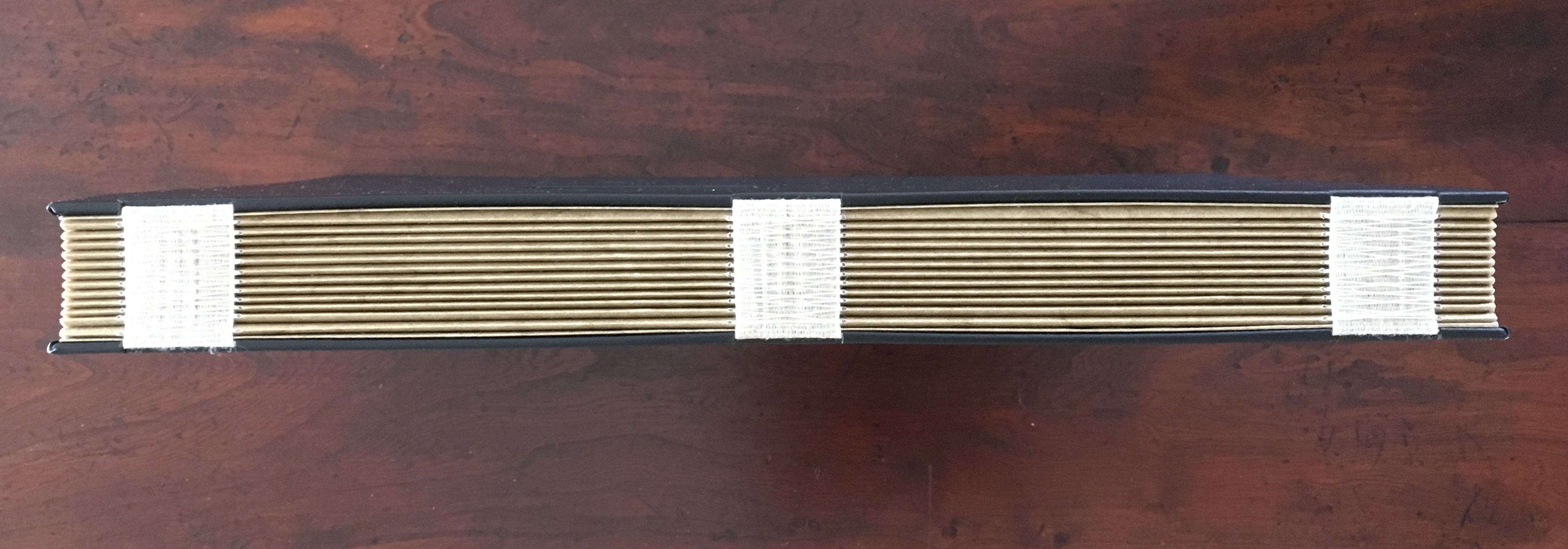
Twelve signatures of handmade cotton text paper, the central ten signatures each made up of one sheet H356 x W514 mm and one sheet H356 x W500 mm glued to the 14 mm margin of the first sheet, for a total of ninety-six pages, each measuring H356 x W253 mm. Binding of leather covered boards (a hologram embedded in front cover) with an open spine, taped and sewn into a reinforcing concertina structure: H361 X W259 mm. Contained in engraved steel box: H370 x W326 x D44 mm.
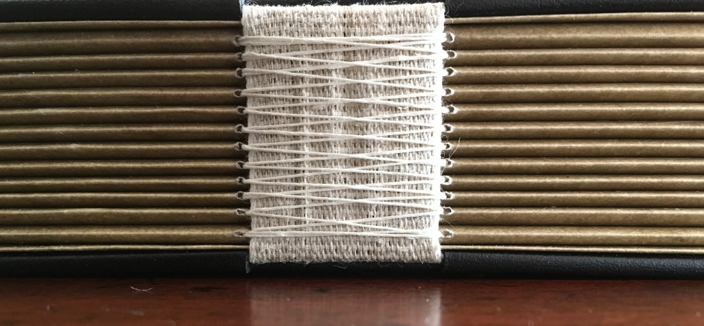
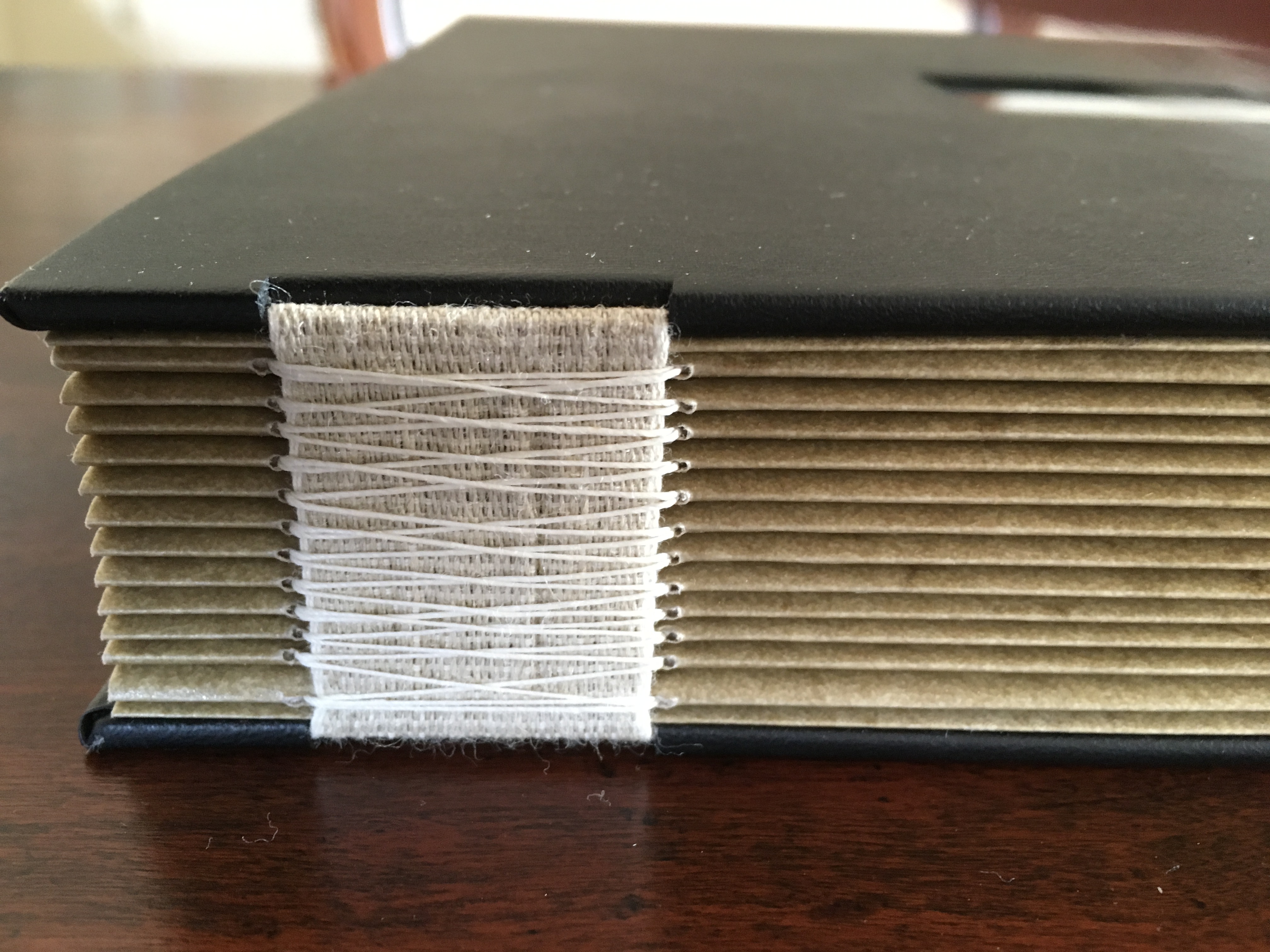
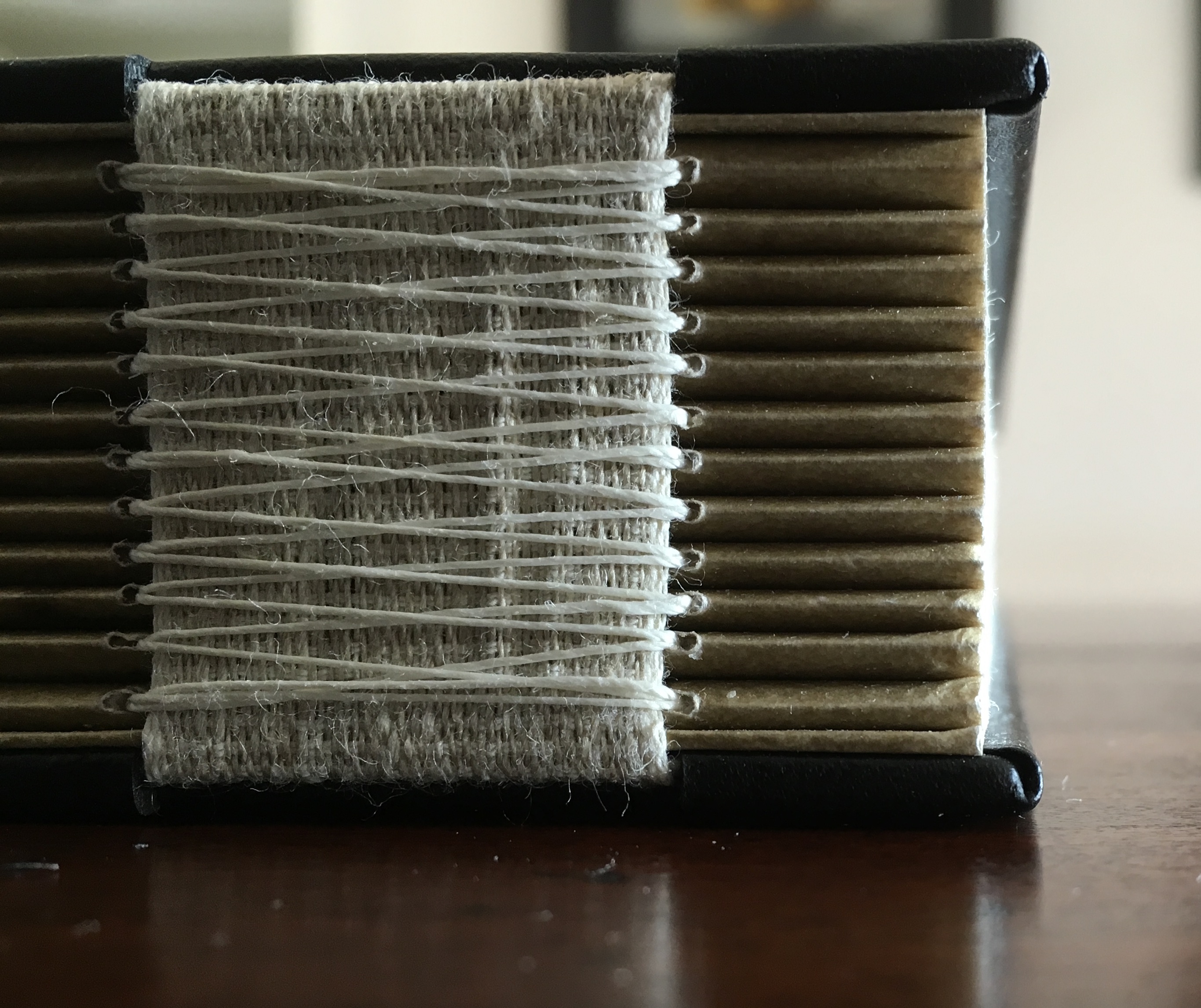
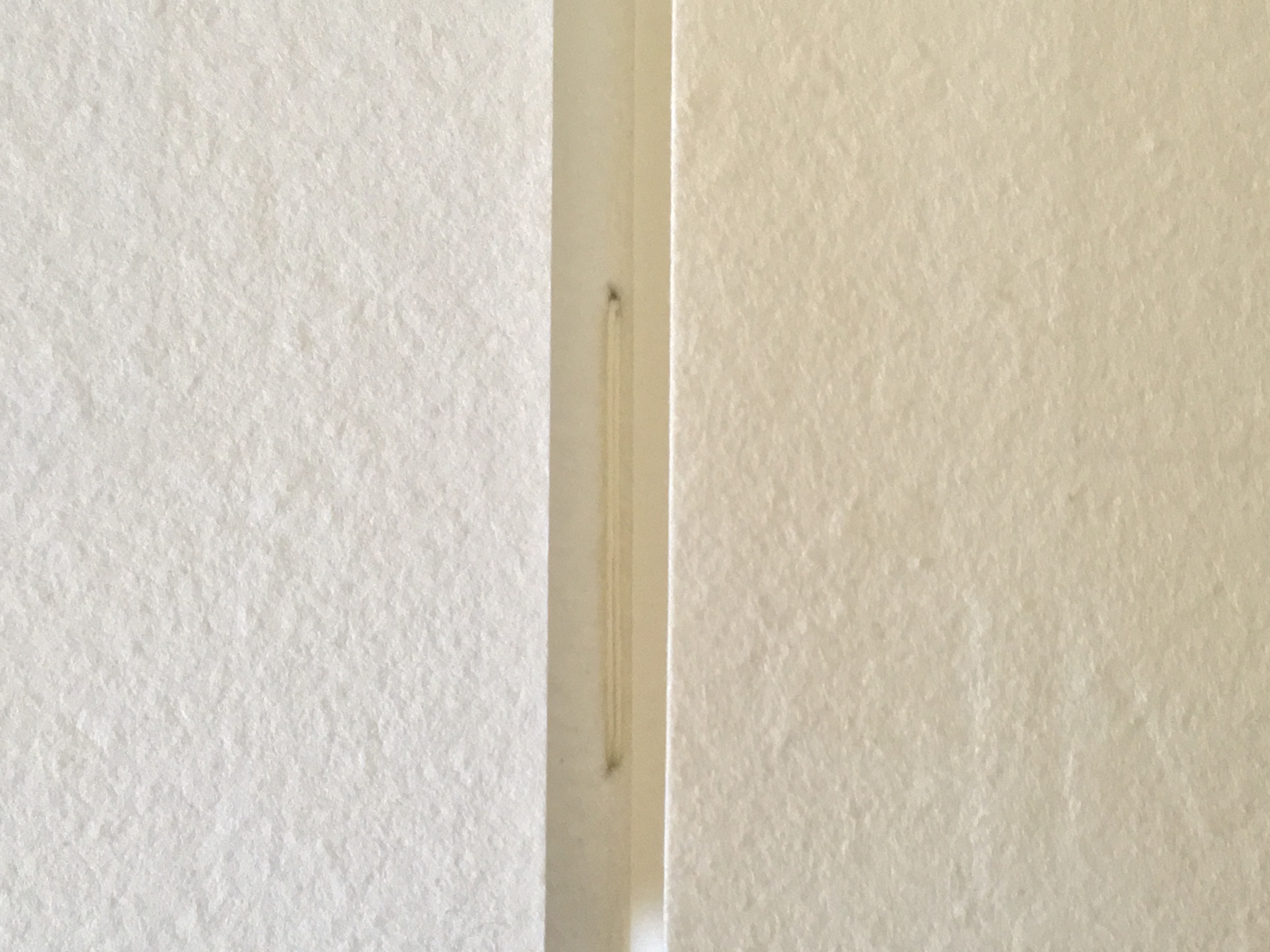
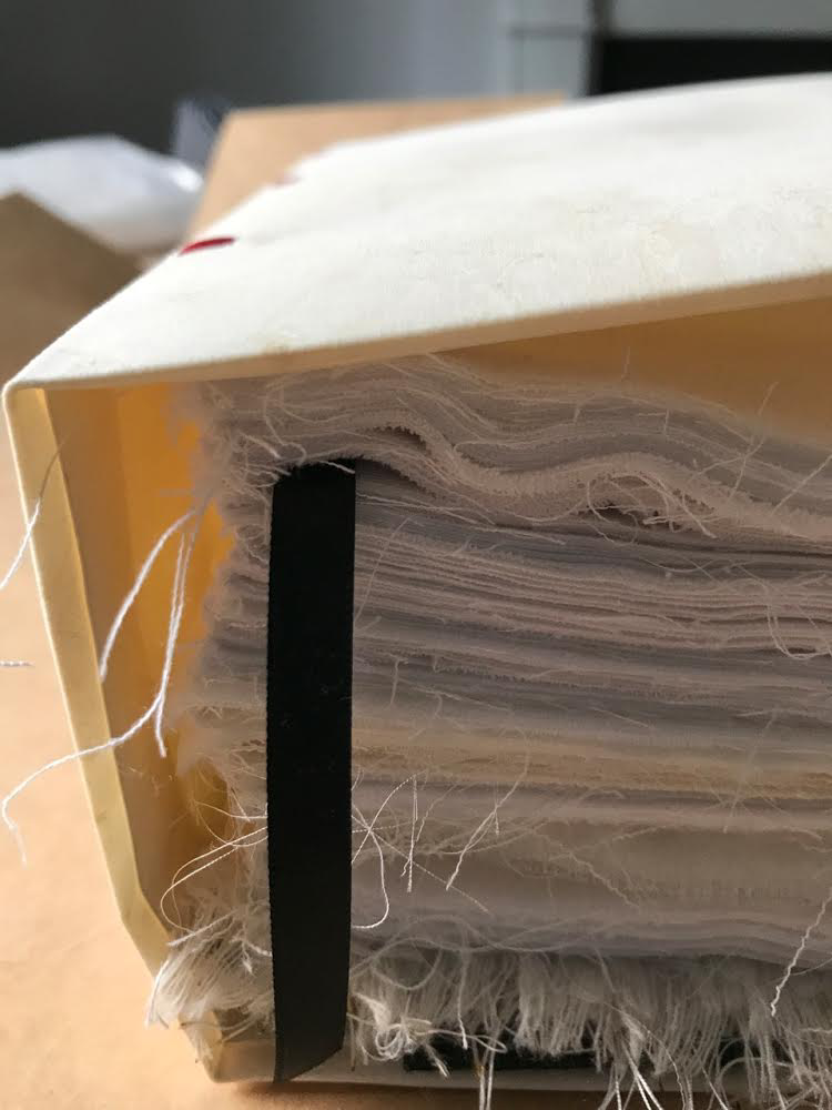
Detail of sewing and internal view of reinforcing accordion structure. For a description of this type of structure, see Hedi Kyle’s The Art of the Fold(London: Laurence King, 2018), pp. 82-85.
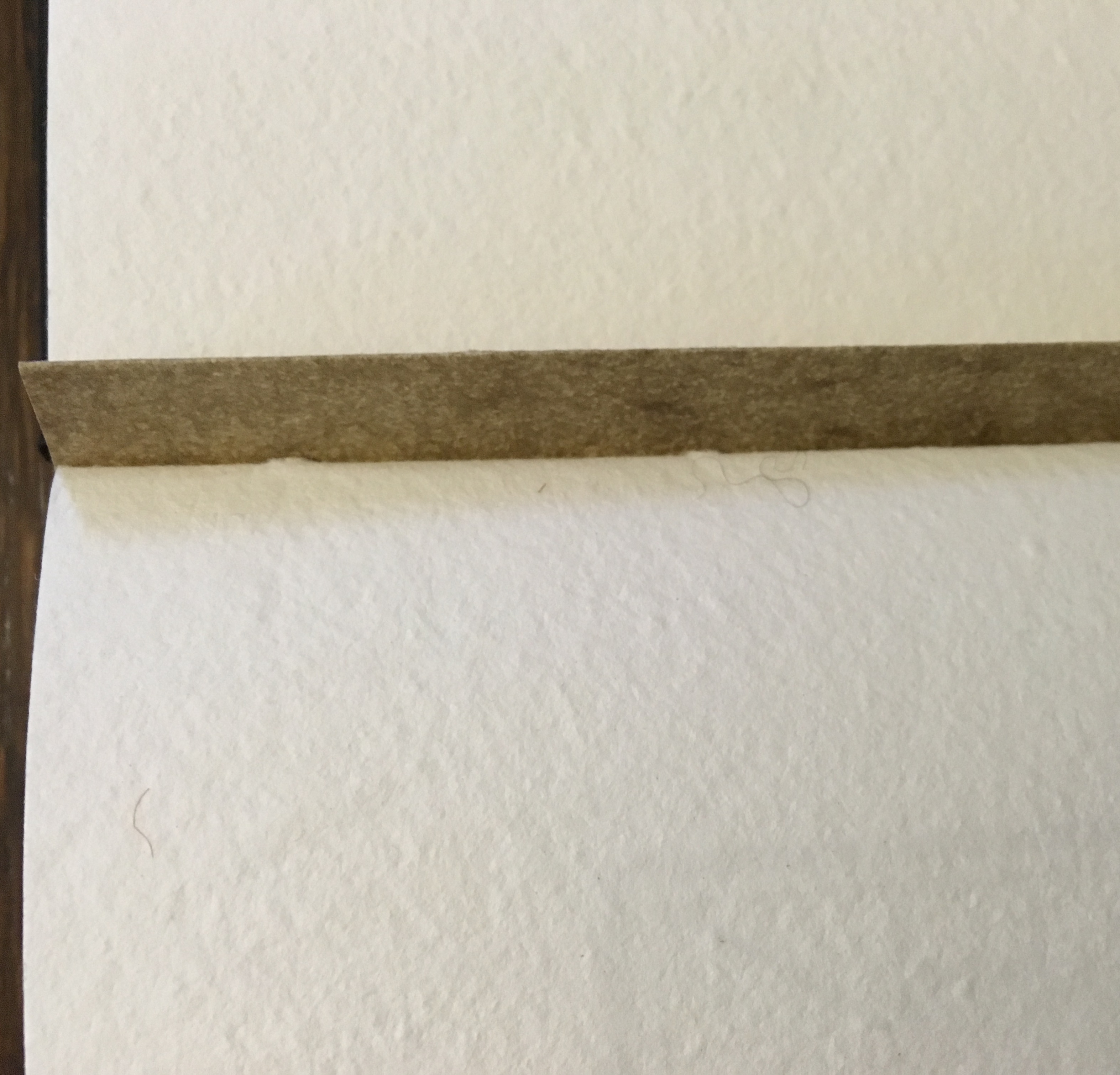
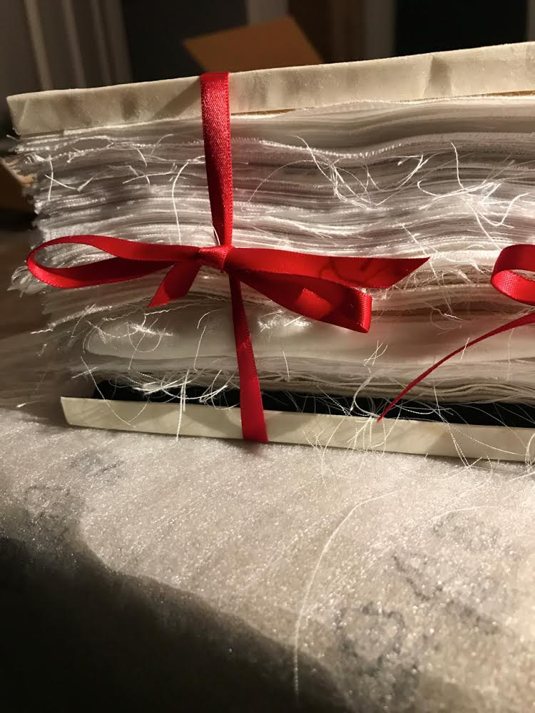
View of the doublure, which is part of the reinforcing concertina structure.
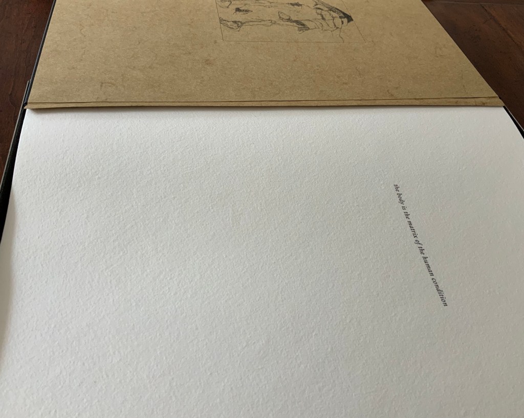
Cover page of second signature.
Second signature open to double-page spread.
Second signature open to four-page spread.
Further Reading
“Bieler Press”, in Book Art Object, ed. David Jury (Berkeley, CA: Codex Foundation, 2008), pp. 116-17.
Miller, Steve. “Daniel Kelm”, Book Arts Podcasts, School of Library and Information Studies, University of Alabama, 22 July 2012. Accessed 6 September 2019.
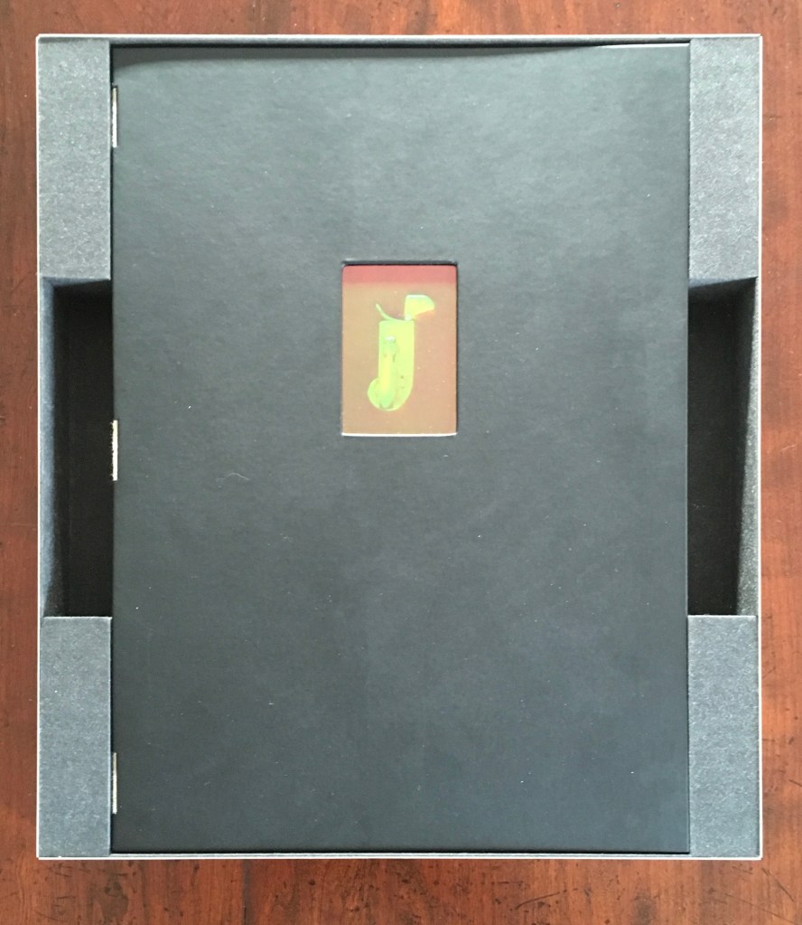
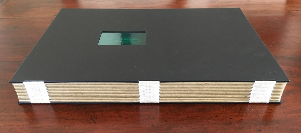
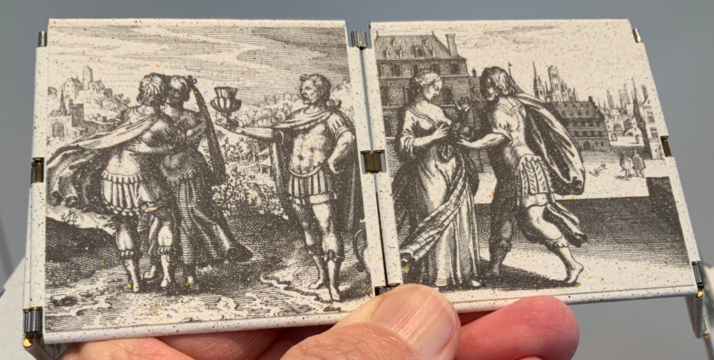
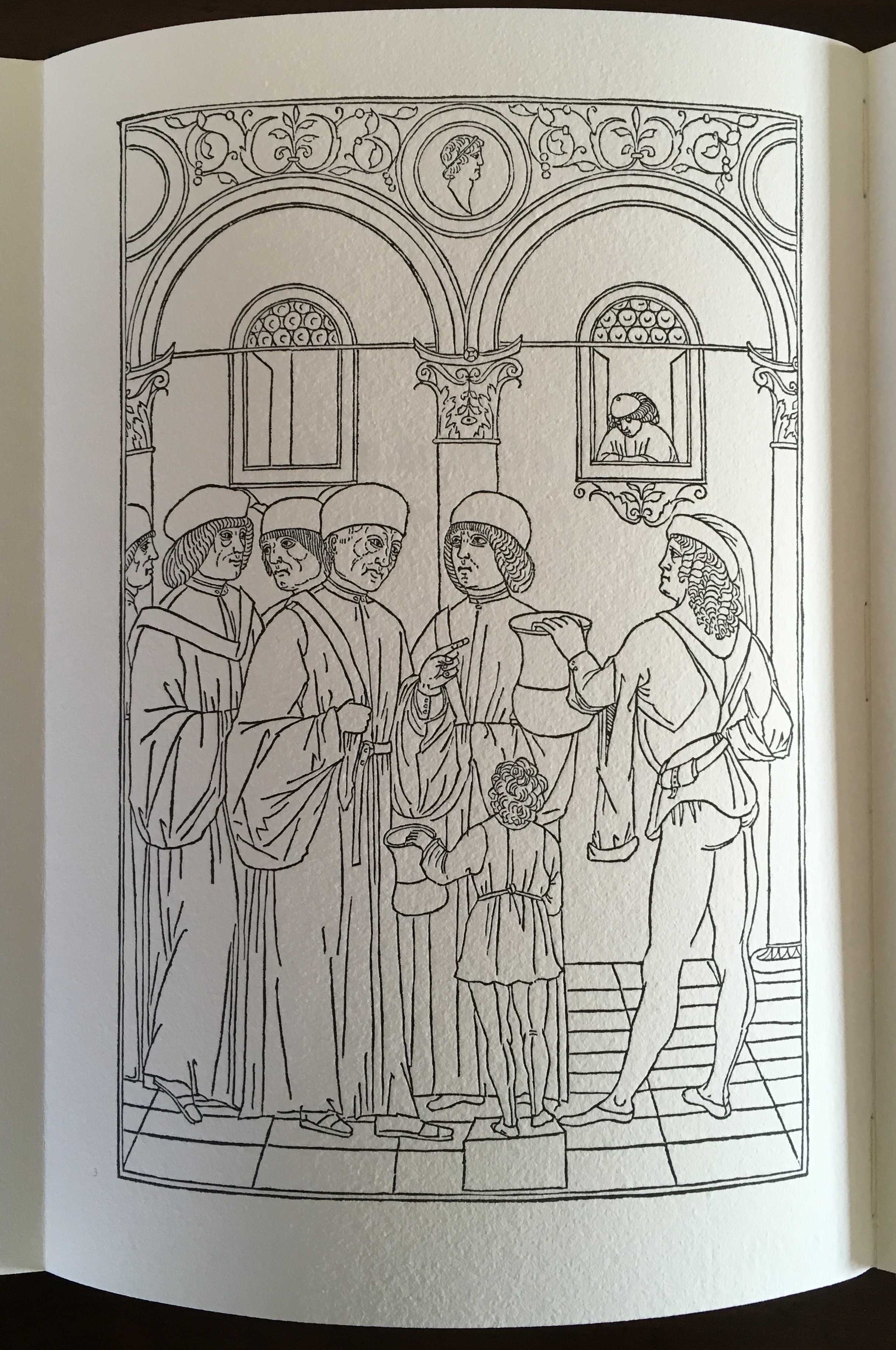
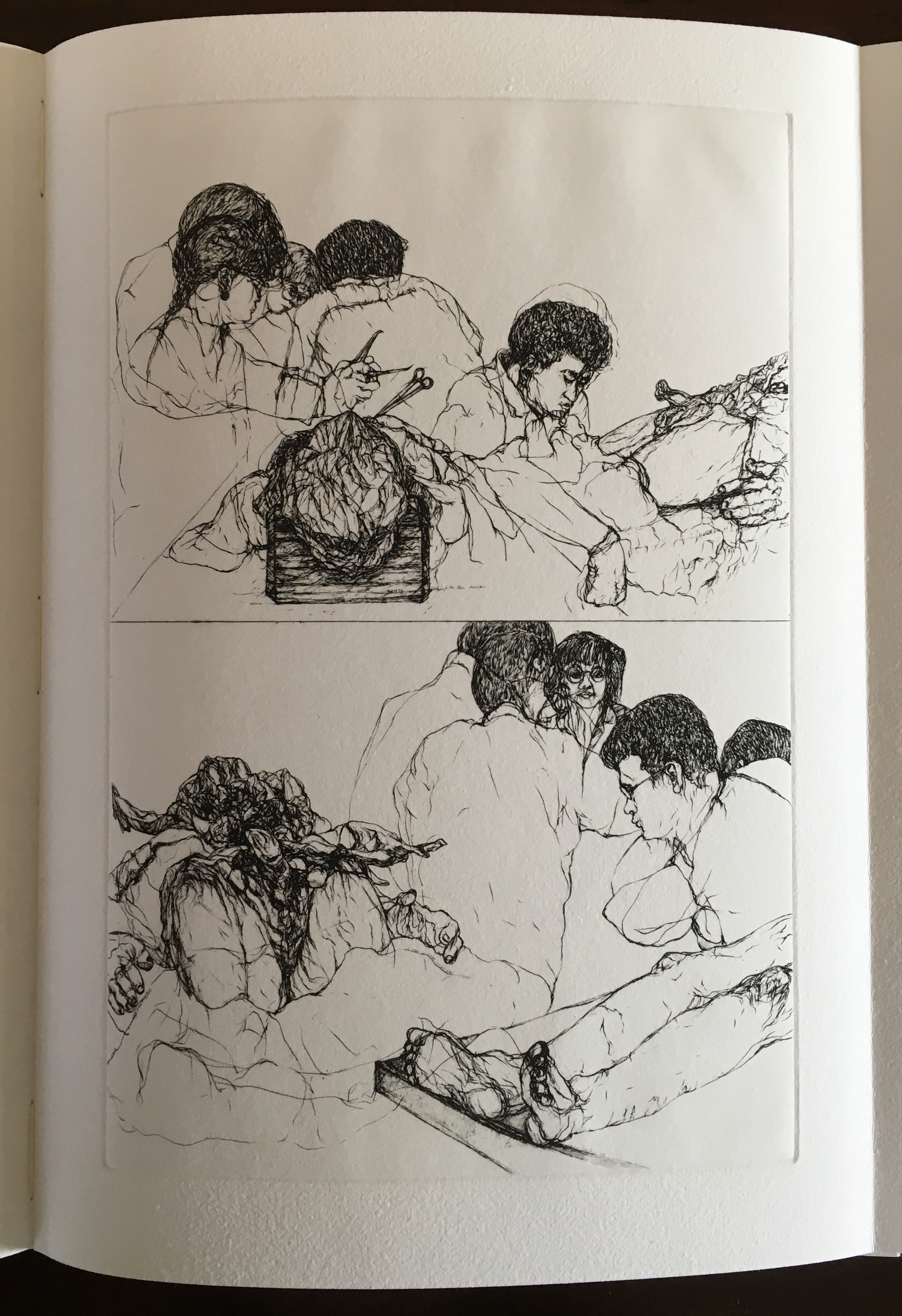
The Anatomy Lesson: Unveiling the Fasciculus Medicinae (2004)
The Anatomy Lesson: Unveiling the Fasciculus Medicinae (2004) Joyce Cutler-Shaw Middletown, CT: Robin Price, Publisher, 2004) Housed in a custom-made, engraved stainless steel box (H370 x W326 x D44 mm), concertina binding co-designed with Daniel E. Kelm and Joyce Cutler-Shaw, produced at The Wide Awake Garage; twelve signatures of handmade cotton text paper, the central ten signatures each made up of one sheet H356 x W514 mm and one sheet H356 x W500 mm glued to the 14 mm margin of the first sheet, for a total of 96 pages, each measuring H356 x W253 mm. Binding of leather covered boards (a hologram embedded in front cover) with an open spine, taped and sewn into a reinforcing concertina structure: H361 X W259 mm. The hologram, produced by DuPont Authentication Systems, features an early eighteenth-century brass lancet. Edition of 50, of which this is a binder’s copy. Acquired from the binder, Daniel E. Kelm, 15 October 2018.
Twelve signatures of handmade cotton text paper, the central ten signatures each made up of one sheet H356 x W514 mm and one sheet H356 x W500 mm glued to the 14 mm margin of the first sheet, for a total of ninety-six pages, each measuring H356 x W253 mm. Binding of leather covered boards (a hologram embedded in front cover) with an open spine, taped and sewn into a reinforcing concertina structure: H361 X W259 mm. Contained in engraved steel box: H370 x W326 x D44 mm.
Clockwise: stainless steel box container, detail of sewing and detail of reinforcing accordion structure. For a description of this type of structure, see Hedi Kyle’s The Art of the Fold (London: Laurence King, 2018), pp. 82-85.
Top of photo: gives a view of the doublure, which is part of the reinforcing concertina structure. Bottom of photo: gives a view of page 1, which precedes a blank page and half-title. Note that pages are unnumbered.
Title page of the third signature.
Opening of the third signature.
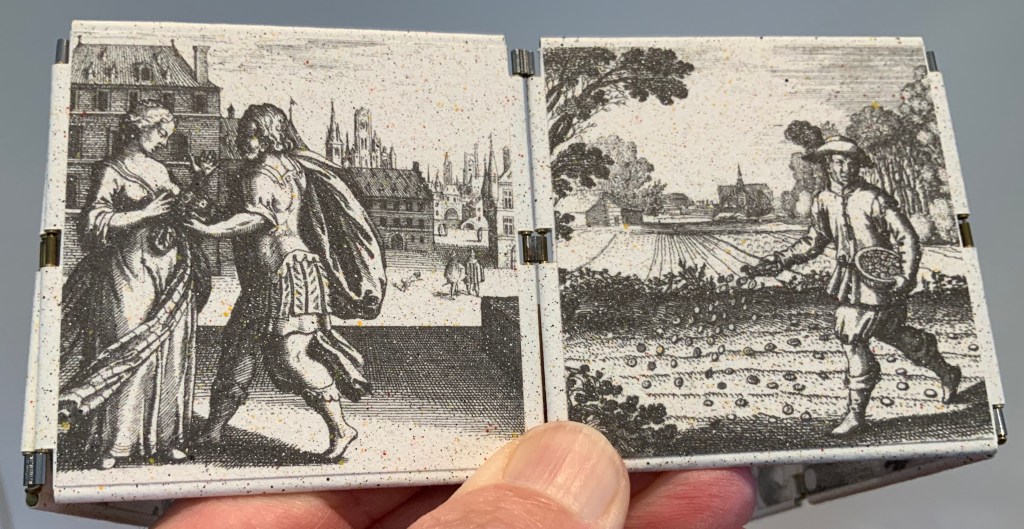
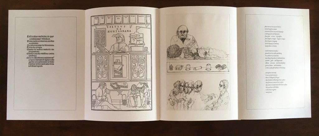
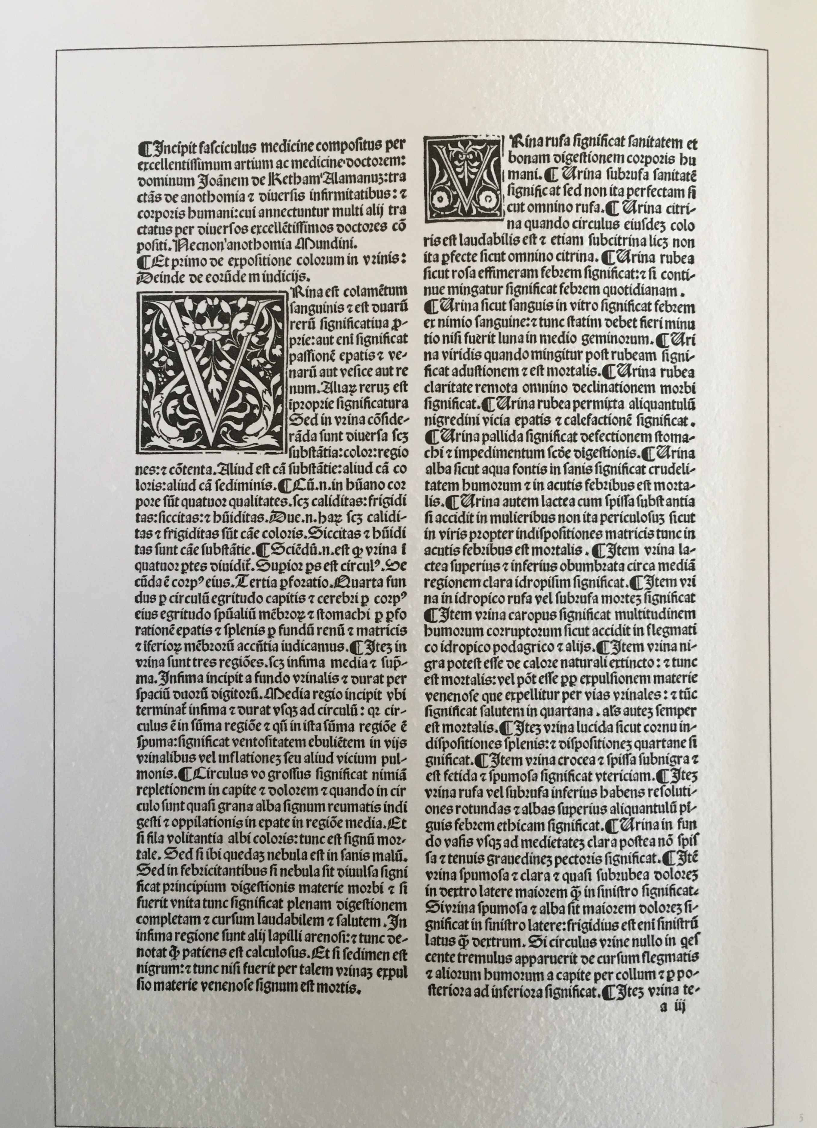
Internal four-page spread of the third signature.
Left-hand page (from the Fasciculus Medicinae) of the four-page spread above. Note that the pagination (lower right) refers to the page number in the source text.
Second page (from Fasciculus Medicinae) of the four-page spread. Again note that the pagination (lower left) refers to the page number in the source text.
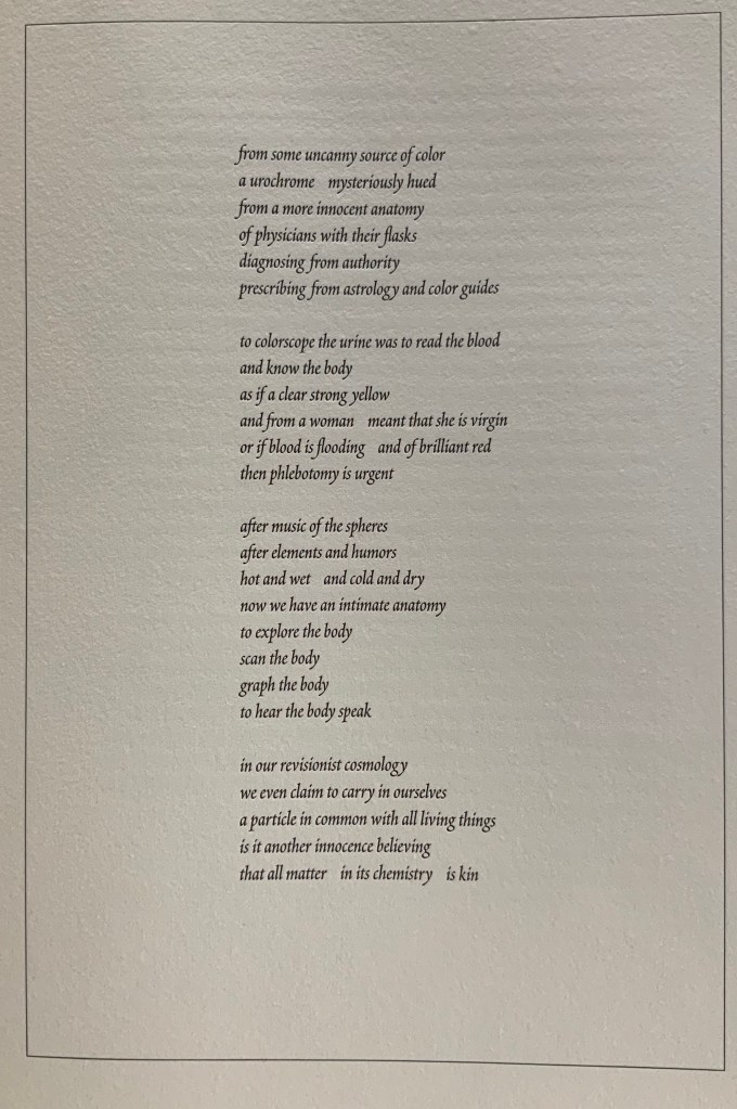
Third page from the four-page spread above. Print by Joyce Cutler-Shaw
Fourth page from four-page spread above. Poem by Joyce Cutler-Shaw.
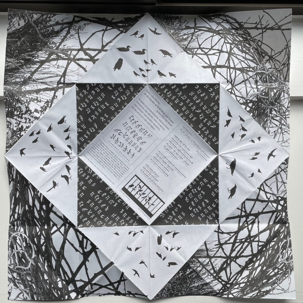
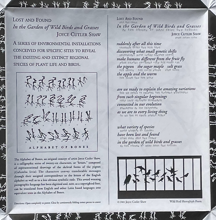
Lost and Found in the Garden of Wild Birds and Grasses (2001)
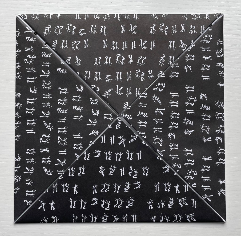
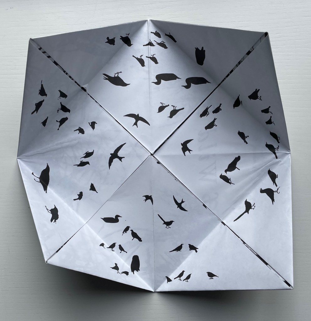
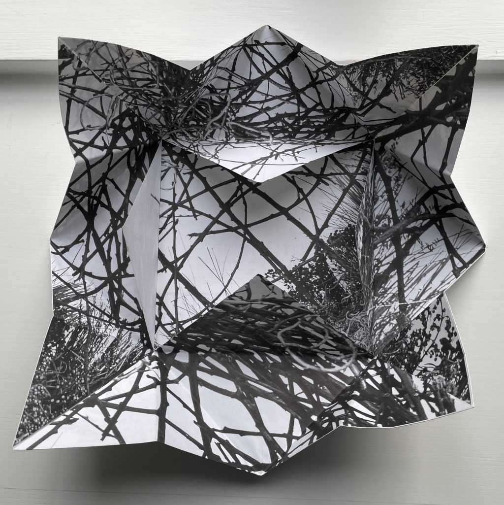
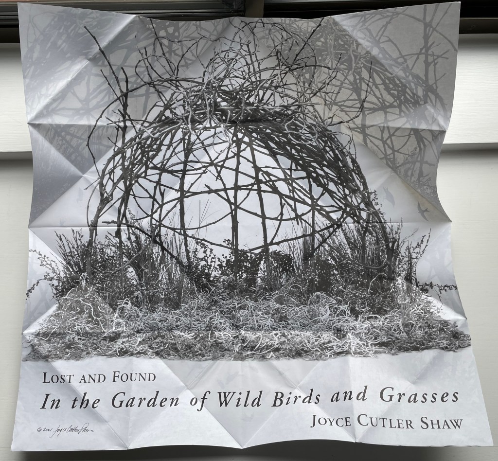
Lost and Found in the Garden of Wild Birds and Grasses (2001) Joyce Cutler-Shaw Two-sided sheet in triangle folds. 190 x 190 mm (closed). Edition of 1000. Acquired from Printed Matter, Inc., 23 September 2022. Photos: Books On Books Collection.
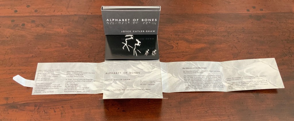
Distributor’s description: “Lost and Found in the Garden of Wild Birds and Grassesis a twelve part continuously unfolding paper narrative. Shaped like a fortune teller, the book’s four corners open out to reveal successive layers of the artist’s calligraphies – the first being her alphabet of bones, based on the hollow bones of birds, the next an alphabet based on the silhouettes of wild birds. The most interior layers of the book show photographs of an environment of grasses and branches, and at the final opening, the book becomes a single sheet on the back of which is printed an explanatory text and the translation of a poem inThe Alphabet of Bones.“
Printed Matter’s description of the origami fold as a “fortune teller”, also known as a chatterbox, whirlybird, or cootie catcher, is not quite right as can be seen from the images below.
The work is simultaneously a poster, a photographic collage from site-specific environmental installations, and, at the heart of one side of this single-sheet book, a poem dually presented in roman and Cutler-Shaw’s copyrighted font for the Alphabet of Bones. Note how the three squares framing the explanatory text and poem rotate to create a sculptural sense of depth, turning this side of the sheet almost into a nest. Like The Anatomy Lesson, this work reflects Cutler-Shaw’s engagement with uniting folds, binding, and printing to achieve singular artistic results. The same can be found in an earlier work showcasing the Alphabet of Bones font.
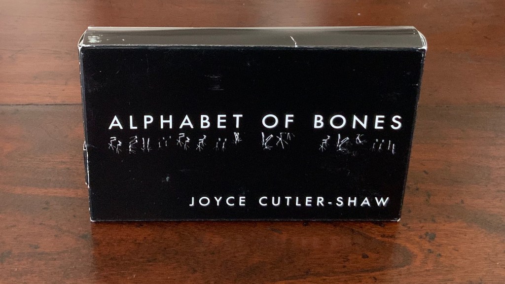
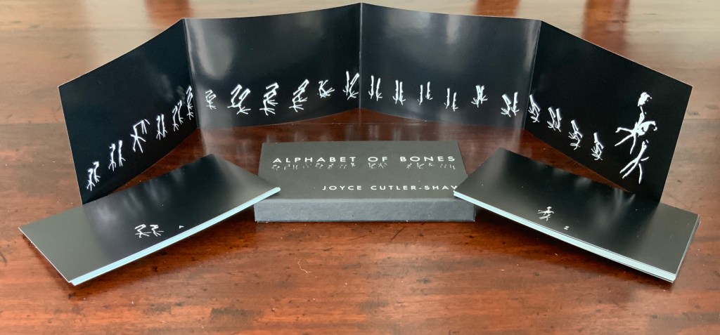
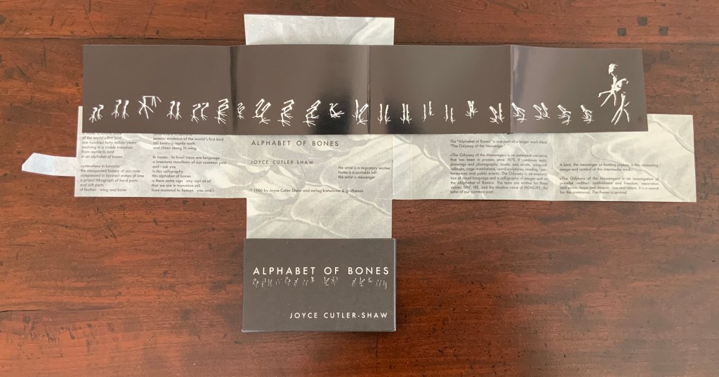
Alphabet of Bones (1987)
The Alphabet of Bones (1987) Joyce Cutler-Shaw Munich, West Germany: VerlagKretschmer and Grossman Edition of 700. Acquired as a gift from Hubert Kretschmer, 10 January 2019
Twenty-six glossy photo cards, offset white on black, H70 x W114 mm with trifold panel of glossy photo paper, offset white on black: H70 x W458 mm Contained in pasted, open-ended box of matte card, offset white on black: H72 x W117 x D14 mm Contained in fold-flap box: H73 x W118 x D15 closed, H72 x W498 open
Further Reading
Chen, Julie. 2013. 500 Handmade Books. Volume 2. New York: Lark. See Orbital Loops on p. 262 for comparison with Lost and Found in the Garden of Wild Birds and Grasses (2001).
Jury, David, and Peter Rutledge Koch (eds.) 2008. Book Art Object. Edited by David Jury. Berkeley, California: Codex Foundation. Pp. 198 (Where Do We Start?), 199 (Surplus Value Books #13).
Salamony, Sandra, and Peter and Donna Thomas. 2012. 1,000 Artists’ Books : Exploring the Book as Art. Minneapolis: Quarto Publishing Group USA. Pp. 10 (Chained Album), 11 (Altered), 220 (Crested), 298 (Collection).
Cutler-Shaw, Joyce. “Embodied/Disembodied”, LitMed Magazine, 10 March 2009. Accessed 3 September 2019.
Hoffberg, Judith A. “Birds, Bones, and Books”, Episodes of The City – New York as a Source Book, Wallworks and Artists Books of Joyce Cutler-Shaw, exhibition catalogue (New York, NY: Elmer Holmes Bobst Library, New York University, 2007).
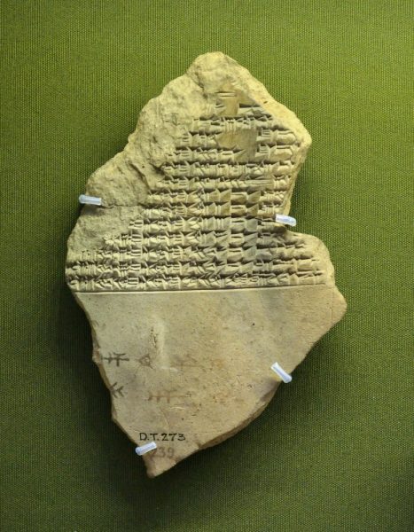
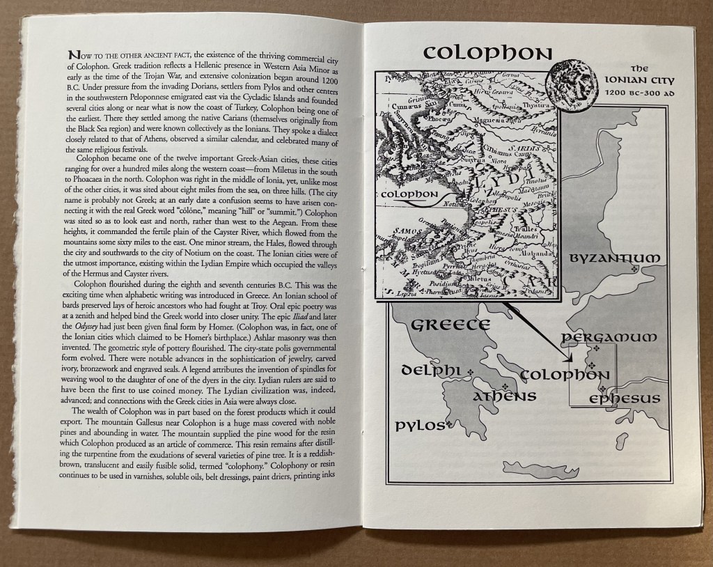
This tale comes from J. S. Kennard’s short 1901 tome on the colophon — that last page at the end of a manuscript or book. The colophon has served many purposes: giving the title of the work, identifying the scribe or printer, naming the place and date of completion or imprint, thanking and praising the patron, bragging, blaming, apologizing, entreating, praying and much more. Examples can be traced back to clay tablets and forward to websites.
Cuneiform tablet from the Library of Ashurbanipal, British Museum. Interesting that the colophon was added in ink after the clay had dried.
Its presence on websites may be one of those decried skeuomorphic hangovers from book publishing, but perhaps the colophon has an underlying value or purpose to serve in both the analogue and digital worlds. The late Bill Hill, who wrote the 1999 Microsoft white paper “The Magic of Reading” and was an early contributor to online typography, suggested making colophons a compulsory standard for website design and asked:
Why not introduce the venerable concept of the colophon to the Web? Could it be used to drive a new business model for fonts which would benefit the font industry, web developers and designers – and the people who visit their sites? [Sadly this page at the Bill Hill’s site is no longer available.]
Fanciful? Perhaps, but not much more fanciful than Erasmus’ proffered explanation of the word “colophon”. His expanded edition of Adagia printed by Manutius in 1508 includes this adage:
Colophonemaddidit He added the colophon. This came to be used when the finishing touch is added to something, or when some addition is made without which a piece of business cannot be concluded. The origin of the adage is pointed out by Strabo in … his Geography, …
And here is Strabo from the Loeb Classical Library online; scroll down to paragraph 28:
As venerable a publishing custom as the colophon may be, it is more honoured in the breach than the observance. Book artists tend to be more observant, but not religiously so, and of course some works of book art might be disfigured by a colophon. Still, there are sound reasons why book artists should bother themselves with a colophon — even if it stands apart from the work. In her review of Book Artists and Artists Who Make Books (2017), India Johnson gives one of those sound reasons:
It’s probably impossible to include every detail of production in a colophon—but some give it their best stab, exhaustively listing everyone that took part in a project. More concise colophons recap only the most relevant details of making—perhaps those the primary creator feels will factor saliently into making meaning of the book.
The convention of the colophon in our field exposes an assumption that the meaning of an artwork is informed not only by the finished product, but by the specifics of artistic labor. “Book Artists and Artists Who Make Books“, CBAA, 1 October 2018. Accessed 3 October 2018.
If craft does figure in a work’s meaning, then the more we can see how it figures, the greater our ability to appreciate and understand the work. For conveying insight — what materials and from what sources, what processes, what tools, who contributed, where and when the work occurred — the colophon stands ready. But where does it stand?
A contemporary of Kennard, A.W. Pollard declared that, to be a proper colophon, it had to appear at the conclusion or summit of the work. Artful as are some of the manuscripts and books that Kennard and Pollard cite, none push the envelope in the manner that works of contemporary book art do. Which brings us to another reason for book artists to consider the colophon: inspiration from history or tradition.
The last page of the codex may be a rightful spot for placing the codex, but what if the bookwork’s shape is challenging or musing about the shape of the book? Finishing touches might go anywhere. Think of Van Eyck’s self-portrait hidden in a reflection in The Arnolfini Portrait, or that of Vélazquez in Las Meninas.
Historians’ diligent cataloging of the “hands” of the scribes has enriched the self-identifications in colophons and connected those craftspersons with additional manuscripts. Book artists who use calligraphy or involve calligraphers should ponder the implications of this tool historians use to identify scribes by the style of their “hands”.
What potential, meaningful “tells” in a work’s colophon might the book artist or calligrapher leave to enrich the work — and provide insights for historians and connoisseurs poring over the finishing touch?
The colophon’s underlying value or purpose warrants book artists’ thinking about recording it offline and online, though this might be stretching the definition of the colophon. Our enjoyment of Kitty Maryatt’s 2018 reconstruction of La prose du Transsibérien et de la Petite Jehanne de France (1913) by Blaise Cendrars and Sonia Delaunay is certainly enhanced by the “colophonic” booklet she included with the work and the “About” page online.
Perhaps the story of the little “i” left over – the colophon – will prod the future historians of book art to examine bookworks and their artists’ websites for those finishing touches and stir artists to bestow that last finishing touch for the sake of the work’s soul if not their own.
A Prospect of Colophons
The Anatomy Lesson: Unveiling the Fasciculus Medicinae (2004) Joyce Cutler-Shaw The careful reader will notice that the edition number is missing. This instance of the work is one of the binder’s signed but unnumbered copies, having been acquired directly from Daniel E. Kelm.
Lyn Dillin, The Ballad of the Self Same Thing (2019) Can this be the first rhyming colophon?
Finding Home (2016) Louise Levergneux This may not be the first bilingual colophon I have seen, but its being inside the top of the box enclosing the work makes it the first to occupy the physical summit a work.
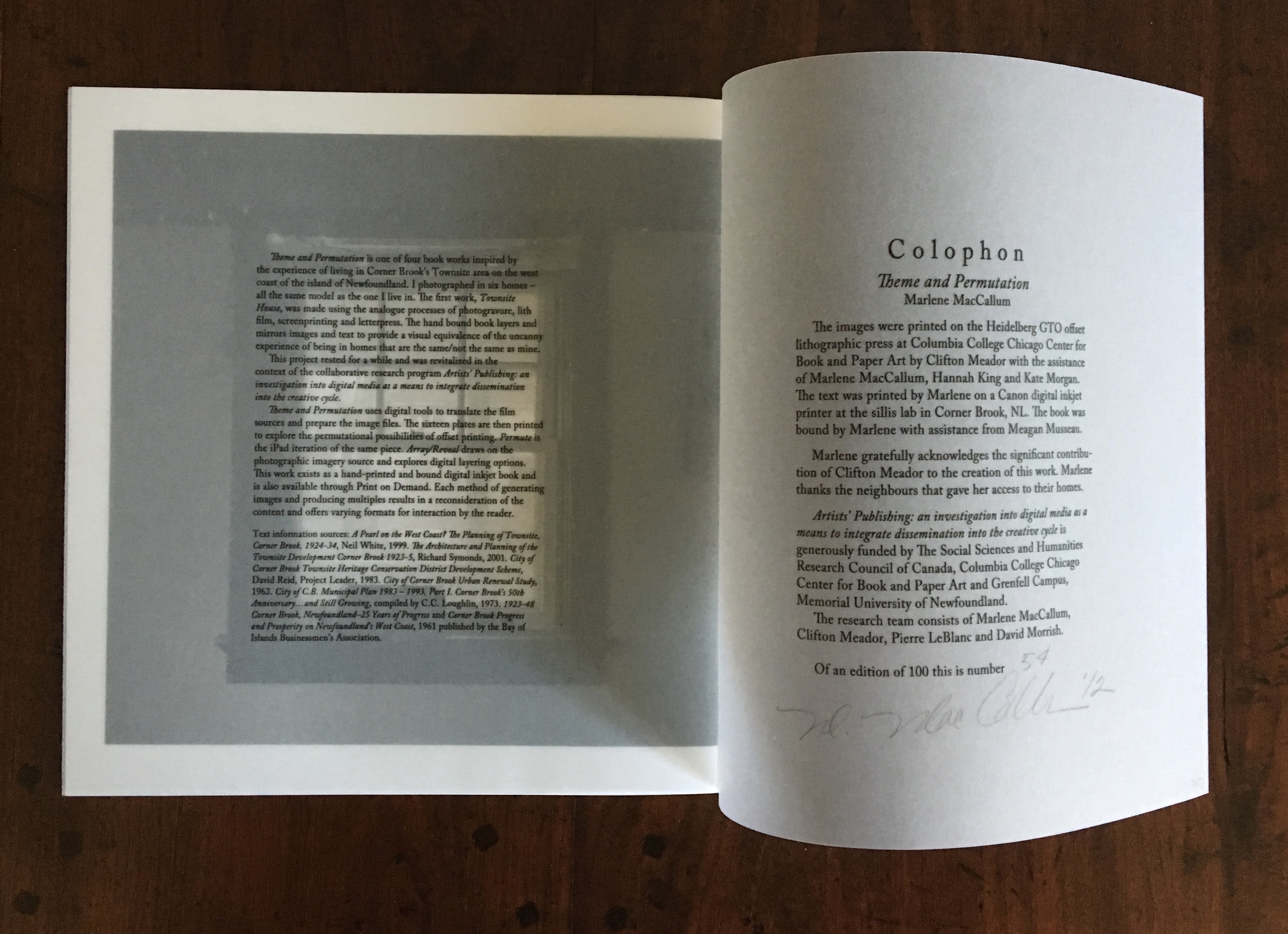
Theme and Permutation (2012) Marlene MacCallum This double-page spread reveals process information about the work that adds to the reader/viewer’s appreciation of the themes and permutations occurring in the pages.
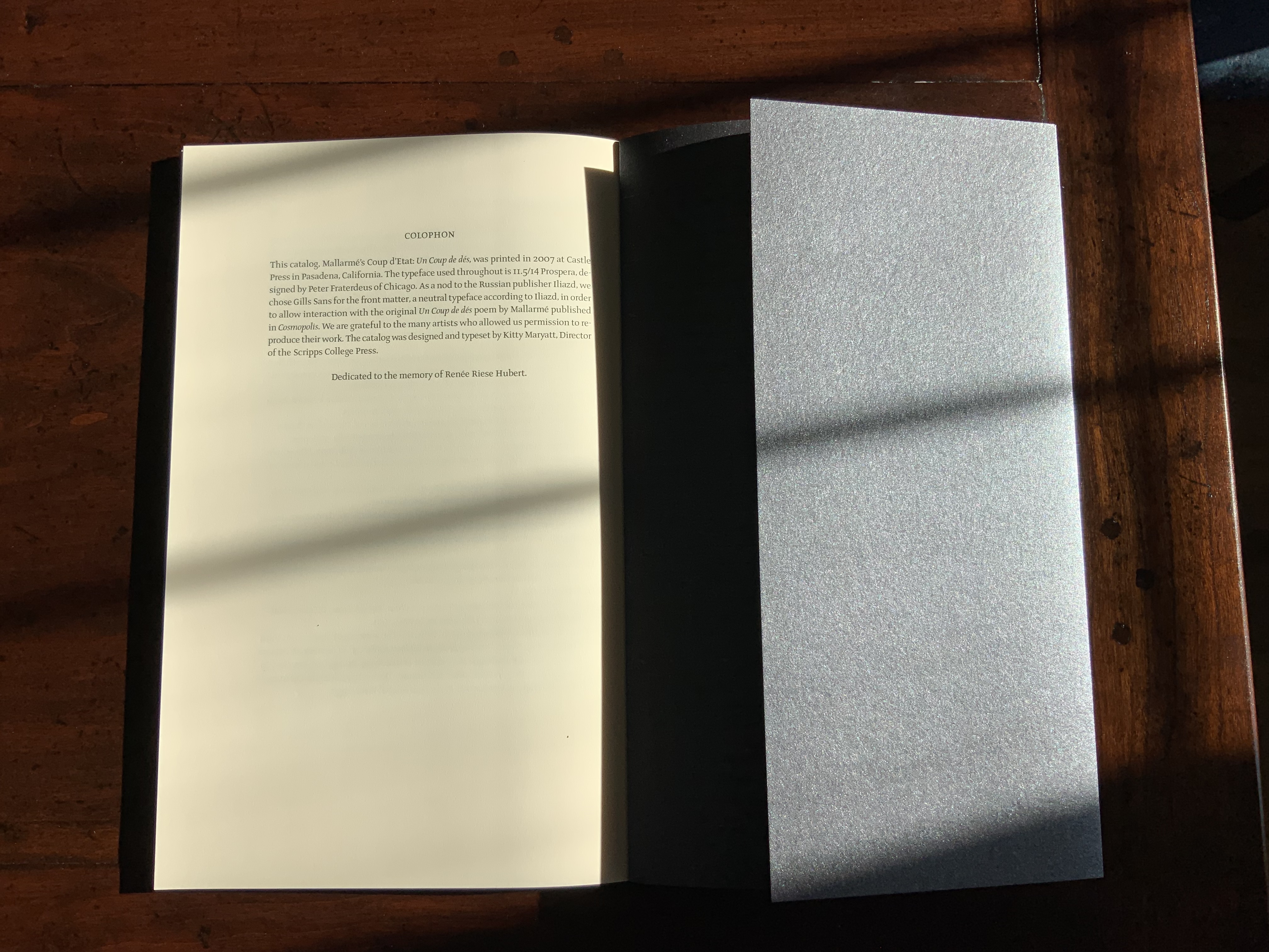
Mallarmé’s Coup d’État (2007) Kitty Maryatt The colophon’s nod to Iliazd sends the reader/viewer back to the start of this catalogue that is a bookwork in its own right.
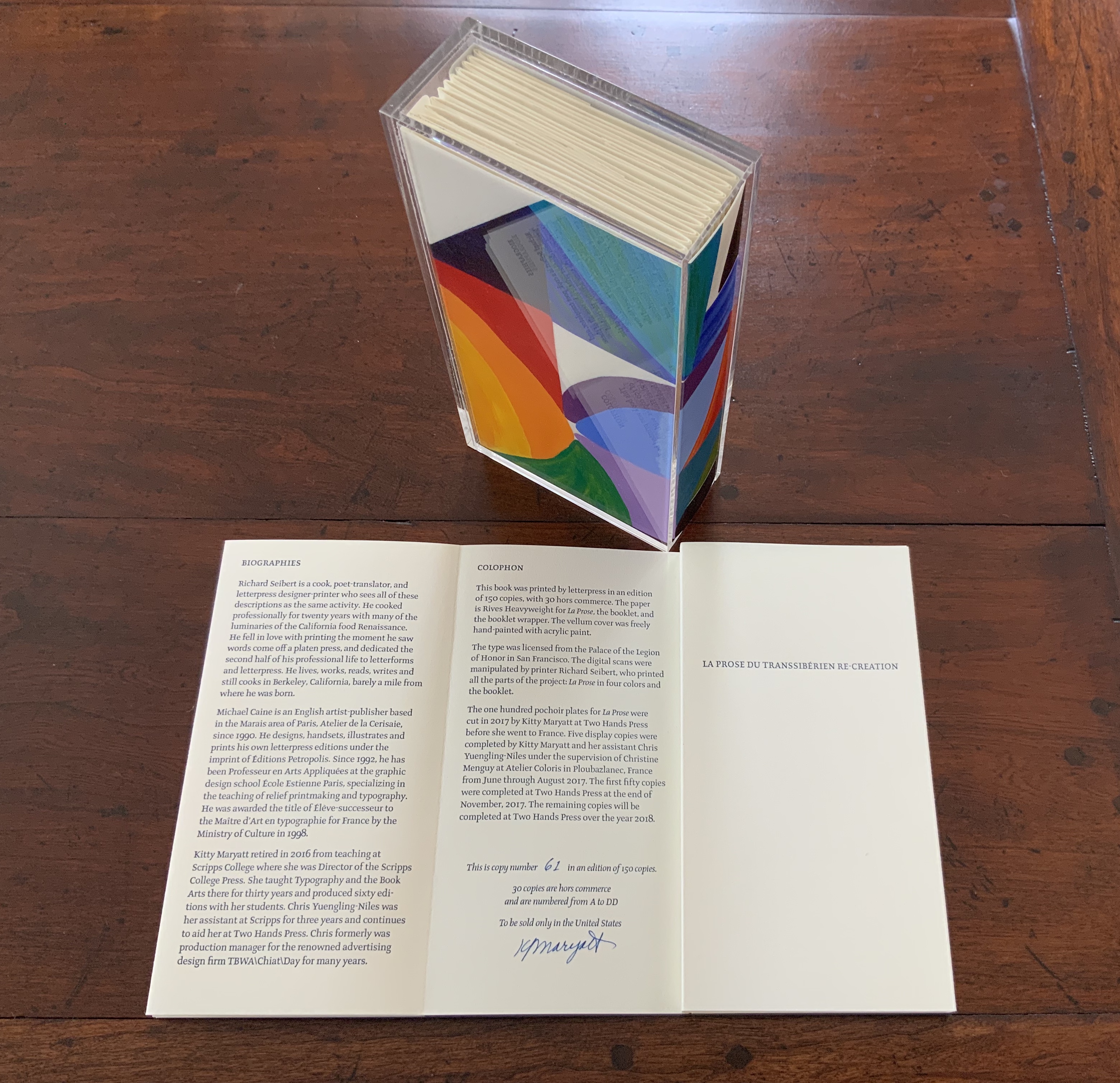
La prose du Transsibérien Re-Creation (2019) Kitty Maryatt A “colophon within a colophon”. The booklet providing details about the original work and Maryatt’s re-creation has an accordion structure and collapses into its own tri-fold wallet, which fits within the cover of the main work, seen here in its acetate holder.
L is for Lettering (2011) Cathryn Miller This hilarious and touching abecedary parades as a marked work handed in for a course, a portrait of the artist within a contemplation of the past and future of typography and letterpress. This colophon embodies the finishing touch.
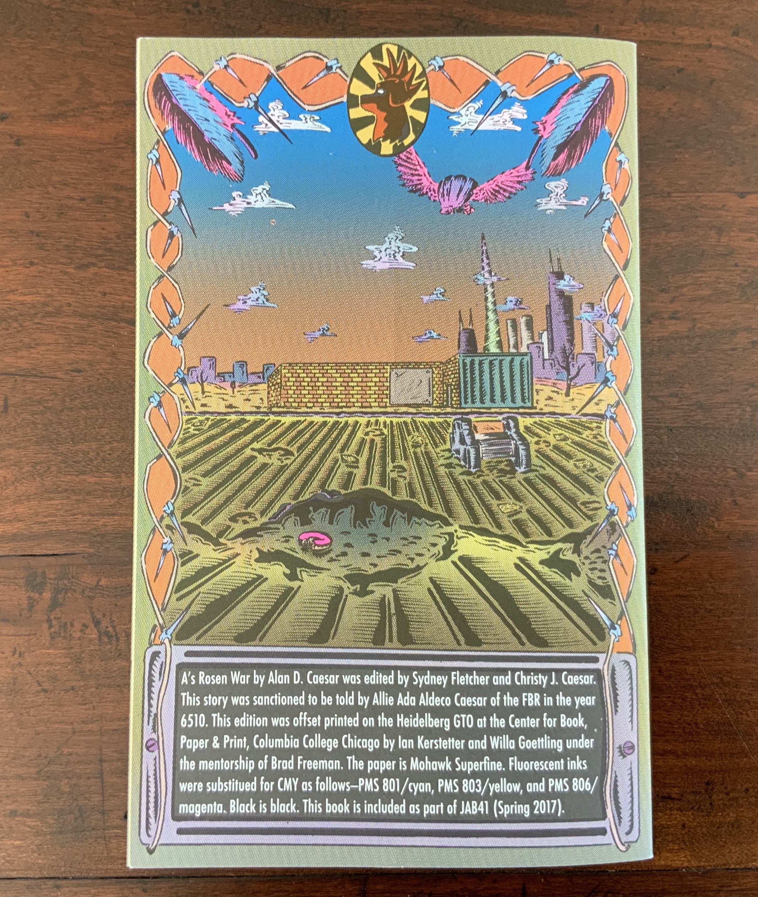
A’s Rosen War (2017) Alan Caesar This colophon continues the premised date with which this work of science fiction book art begins.
Richard Gameson. The Scribe Speaks? Colophons in Early English Manuscripts. Cambridge: Cambridge University Press, 2001. (See for the human interest: “I, Aelfric, wrote this book in the monastery of Bath”; “Pray for Wigbald”; “Just as the port is welcome to sailors, so is the final verse to scribes”.)
Hurtig, Alain. “Les colophons“. L’outil typographique. Accessed 26 January 2022. (Seventeen brilliantly designed and shaped colophons.)
Joseph Spencer Kennard. Some early printers and their colophons. Philadelphia : G.W. Jacobs and Co., 1902. (Less academic but just as interesting and typographically more fun than Gameson.)
Ming-Sun Poon, “The Printer’s Colophon in Sung China, 960-1279”, The Library Quarterly,43:1 (January 1973). (See for the 34 calligraphic inscriptions and the colophon to the Diamond Sutra: “On the 15th of the 4th moon of the 9th year of Hsien-t’ung [May 11, 868], Wang Chiek on behalf of his two parents reverently made this for universal free distribution.”)
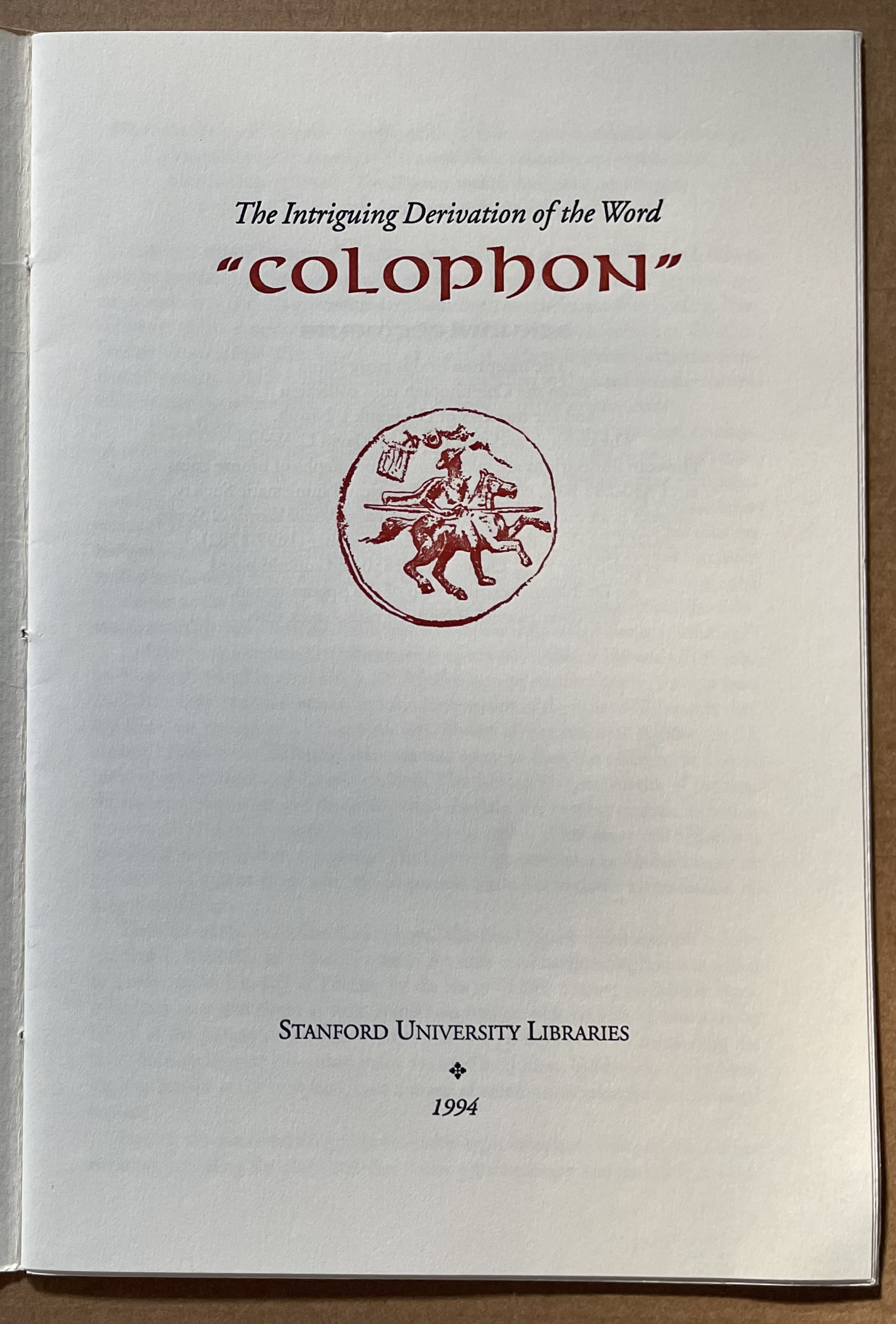
The intriguing derivation of the word “Colophon” (1994) David C. Weber Sewn booklet. H230 x W155 mm. [16] pages. Acquired from Cotswold Internet Books, 7 May 2023. Photos: Books On Books Collection.
Pollard, Alfred W. Last Words on the History of the Title-Page, with Notes on Some Colophons and Twenty-Seven Fac-Similes of Title-Pages. Burt Franklin Research & Source Works Series, 668. B. Franklin, 1971. Pollard, Alfred W. 1859-1944. Last Words on the History of the Title-Page, with Notes on Some Colophons and Twenty-Seven Fac-Similes of Title-Pages, by Alfred W. Pollard. J.C. Nimmo, 1891. Pollard, Alfred W. 1859-1944. An Essay on Colophons, with Specimens and Translations, by Alfred W. Pollard, and an Introduction by Richard Garnett. The Caxton Club, 1905. Pollard, Alfred W., and Richard Garnett. An Essay on Colophons : With Specimens and Translations. Burt Franklin Bibliography and Reference Series ; #142. Burt Franklin, 1968. Van Elverdinghe, Emmanuel. “Modèles et Copies : Étude d’une Formule Des Colophons de Manuscrits Arméniens (VIIIe – XVIIIe Siècles).” Dissertation, 2017.
The seventh biennial Codex book fair and symposium in Berkeley and Richmond, California have come to a close. Of what use it is now to explain how to enjoy them, you be the judge. Your first step is to read the story in Mark Twain’s Roughing It of “Jim Blaine and His Grandfather’s Ram”. Being the story of a story — book art being so self-reflexive and all — it is the best way to commence:
Every now and then, in these days, the boys used to tell me I ought to get one Jim Blaine to tell me the stirring story of his grandfather’s old ram—but they always added that I must not mention the matter unless Jim was drunk at the time—just comfortably and sociably drunk.
Not to advise drink before the fair.
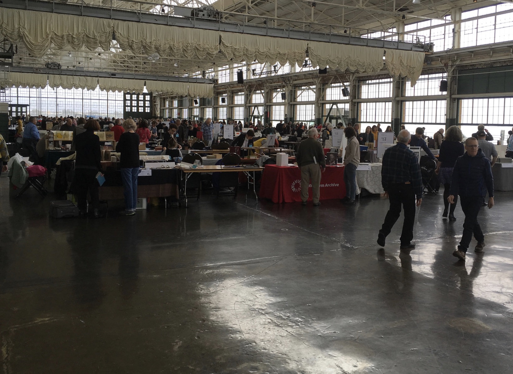
For the start of this Codex, rain and mist hover outside the hangar. The polished concrete floor looks wet but isn’t — so first-time visitors step to avoid slips that won’t really occur. The old-timers though stride from table to table arms wide, bussing each other on the cheek or humping crates around and placing and re-placing their works for the right effect. Arriving early to watch adds a certain enjoyment.
At last, one evening I hurried to his cabin, for I learned that this time his situation was such that … he was tranquilly, serenely, symmetrically drunk—not a hiccup to mar his voice, not a cloud upon his brain thick enough to obscure his memory. As I entered, he was sitting upon an empty powder- keg, with a clay pipe in one hand and the other raised to command silence. … On the pine table stood a candle, and its dim light revealed “the boys” sitting here and there on bunks, candle-boxes, powder-kegs, etc. They said: “Sh—! Don’t speak—he’s going to commence.”
‘I don’t reckon them times will ever come again. There never was a more bullier old ram than what he was. Grandfather fetched him from Illinois—got him of a man by the name of Yates—Bill Yates—maybe you might have heard of him; his father was a deacon—Baptist—and he was a rustler, too; a man had to get up ruther early to get the start of old Thankful Yates; it was him that put the Greens up to jining teams with my grandfather when he moved west.
‘Seth Green was prob’ly the pick of the flock; he married a Wilkerson—Sarah Wilkerson—good cretur, she was—one of the likeliest heifers that was ever raised in old Stoddard, everybody said that knowed her. She could heft a bar’l of flour as easy as I can flirt a flapjack. And spin? Don’t mention it! Independent? Humph! When Sile Hawkins come a browsing around her, she let him know that for all his tin he couldn’t trot in harness alongside of her. You see, Sile Hawkins was—no, it warn’t Sile Hawkins, after all—it was a galoot by the name of Filkins—I disremember his first name; but he was a stump—come into pra’r meeting drunk, one night, hooraying for Nixon, becuz he thought it was a primary …
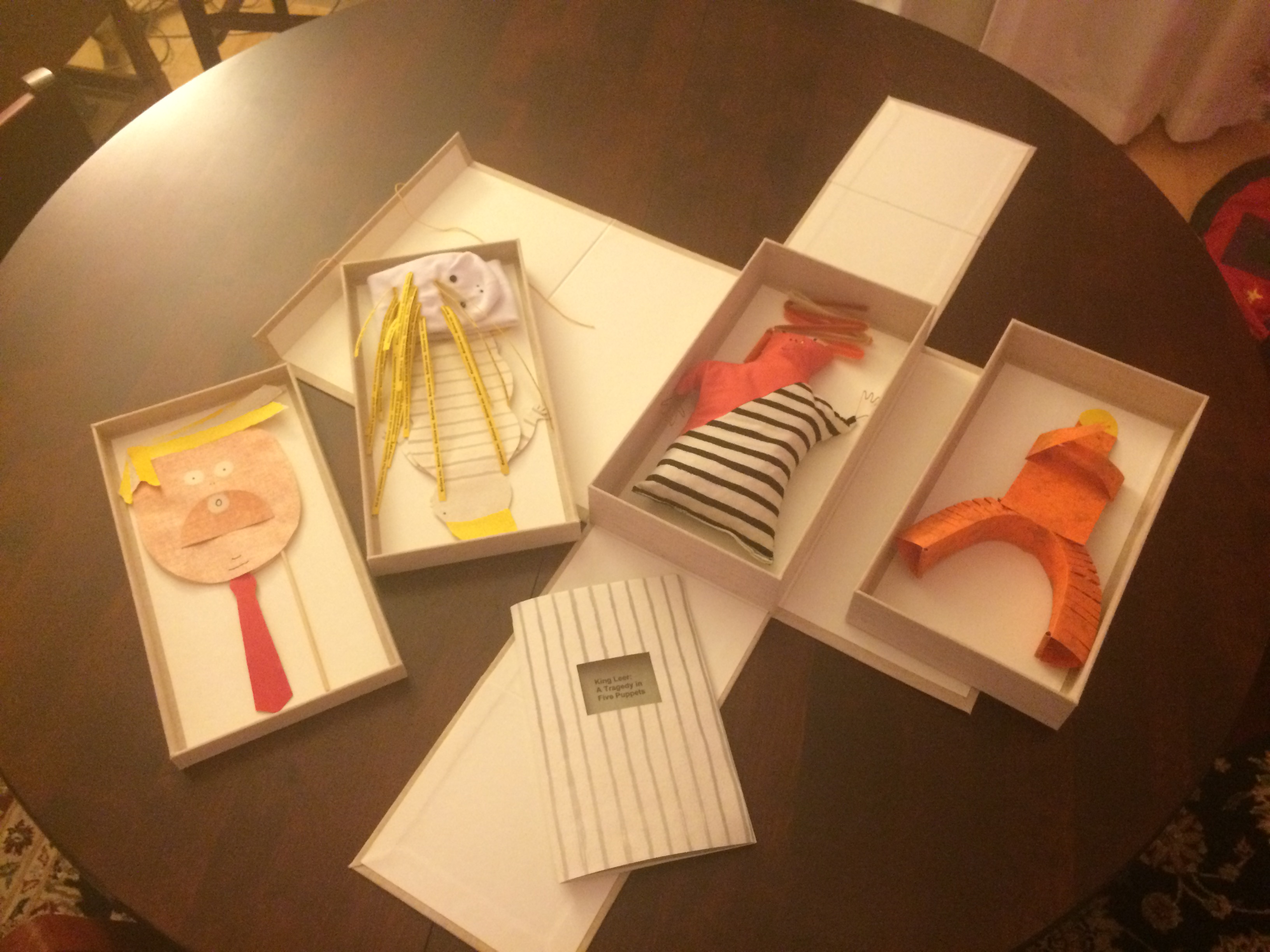
Which reminds me of Emily Martin and her politically biting King Leer —
King Leer: A Tragedy in Five Puppets (2018) Emily Martin
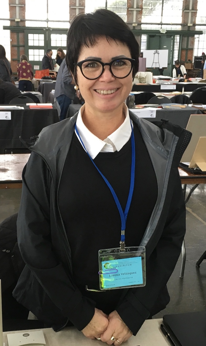
There is plenty more somber work to go around: Lorena Velázquez from Mexico has followed up her powerful Cuarenta y tres with Exit, her hope in our turbulent times;
Barcelona’s Ximena Perez Grobet has 2.10.1968-2018on display, commemorating the 50th anniversary of the Tlatelolco massacre in Mexico City; Sue Anderson and Gwen Harrison from Australia offer Phantomwise Flew the Black Cockatoo, an indictment of a cruel welfare system; and there is Islam Aly from Egypt with Inception, Bedaya, inspired by stories and journeys of refugees. Book art everywhere wears its heart on its cover.
Still, book artists are a convivial bunch and cheerful in their internationality. On Monday evening, Mary Heebner (Simplemente Maria Press) and her husband photographer Macduff Everton are in the Berkeley City Club’s off-limits members’ room settling down to a bottle of Santa Barbara red, and here come upstate New Yorker Leonard Seastone (Tidelines Press), Anglo-German Caroline Saltzwedel (Hirundo Press), Irishman Jamie Murphy (The Salvage Press) and Geordie David Esslemont (Solmentes Press). Macduff is launched on a tale about running into Queen Elizabeth on her horse-riding visit to Ronald Reagan’s ranch, when David remembers rounding down a path in the Lake District during an art residency to find Prince Charles legging it up the same — by which time Macduff has just returned from his room with a bottle of single malt — which reminds Caroline of a stormy weather hike along Hadrian’s Wall, where Macduff diverts onto a tale of nearly being blown off the same and making his shaky, near-death way back to a bed-and-breakfast for a hot bath and terrible food from the grumpy owners, which launches Leonard onto the story about his local Russian butcher/grocer/refugee who refuses to sell him salad but insists on providing chiropractic services one day and adopts Leonard as his only friend in the US with whom he can have true political debate. Jamie still wants to know why the Russian wouldn’t sell Leonard any salad.
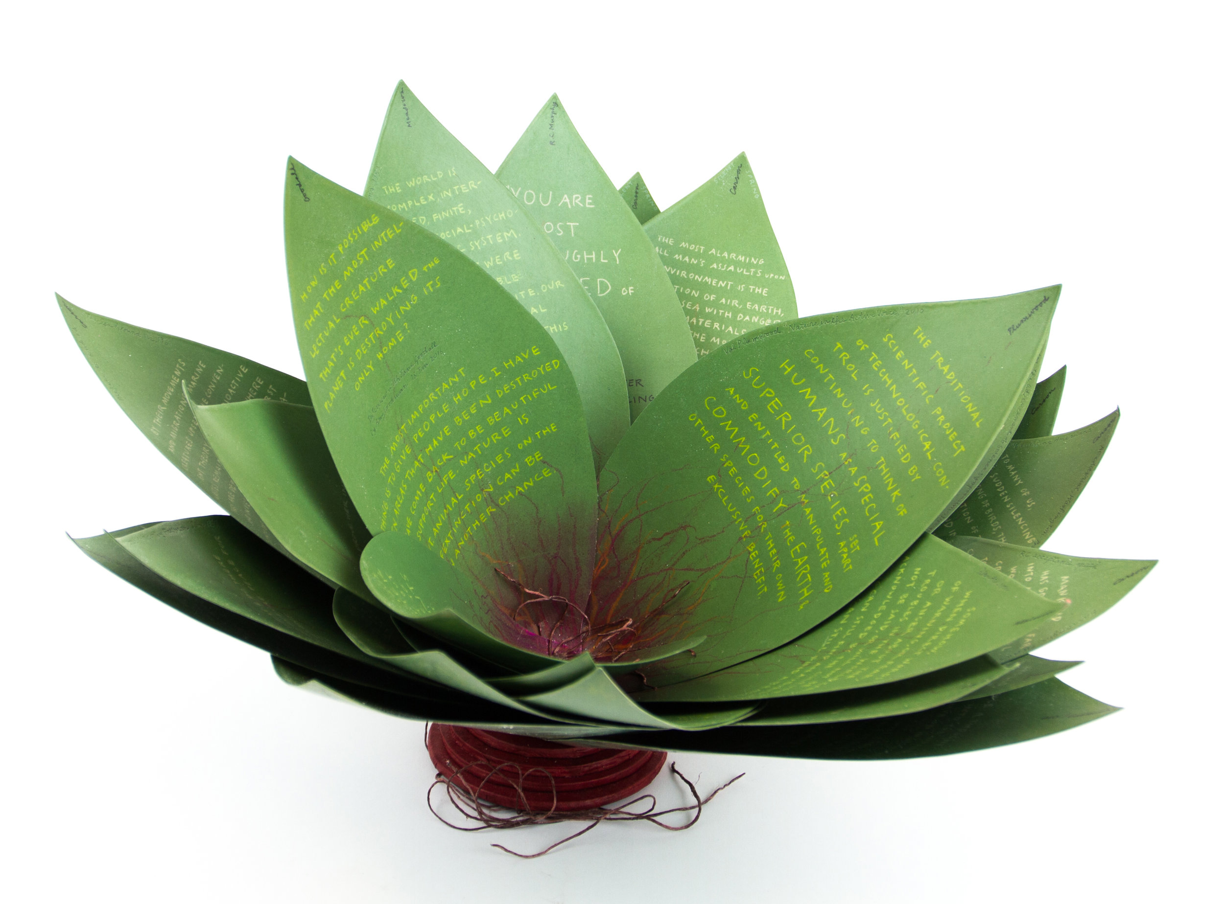
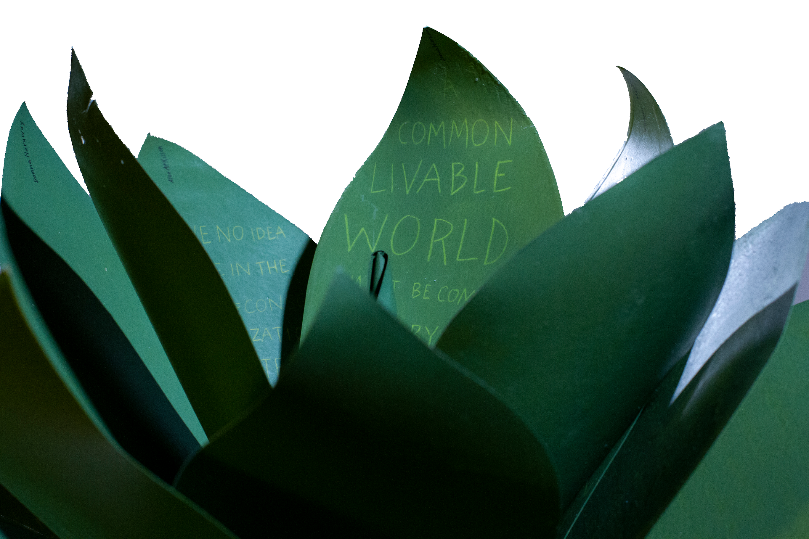
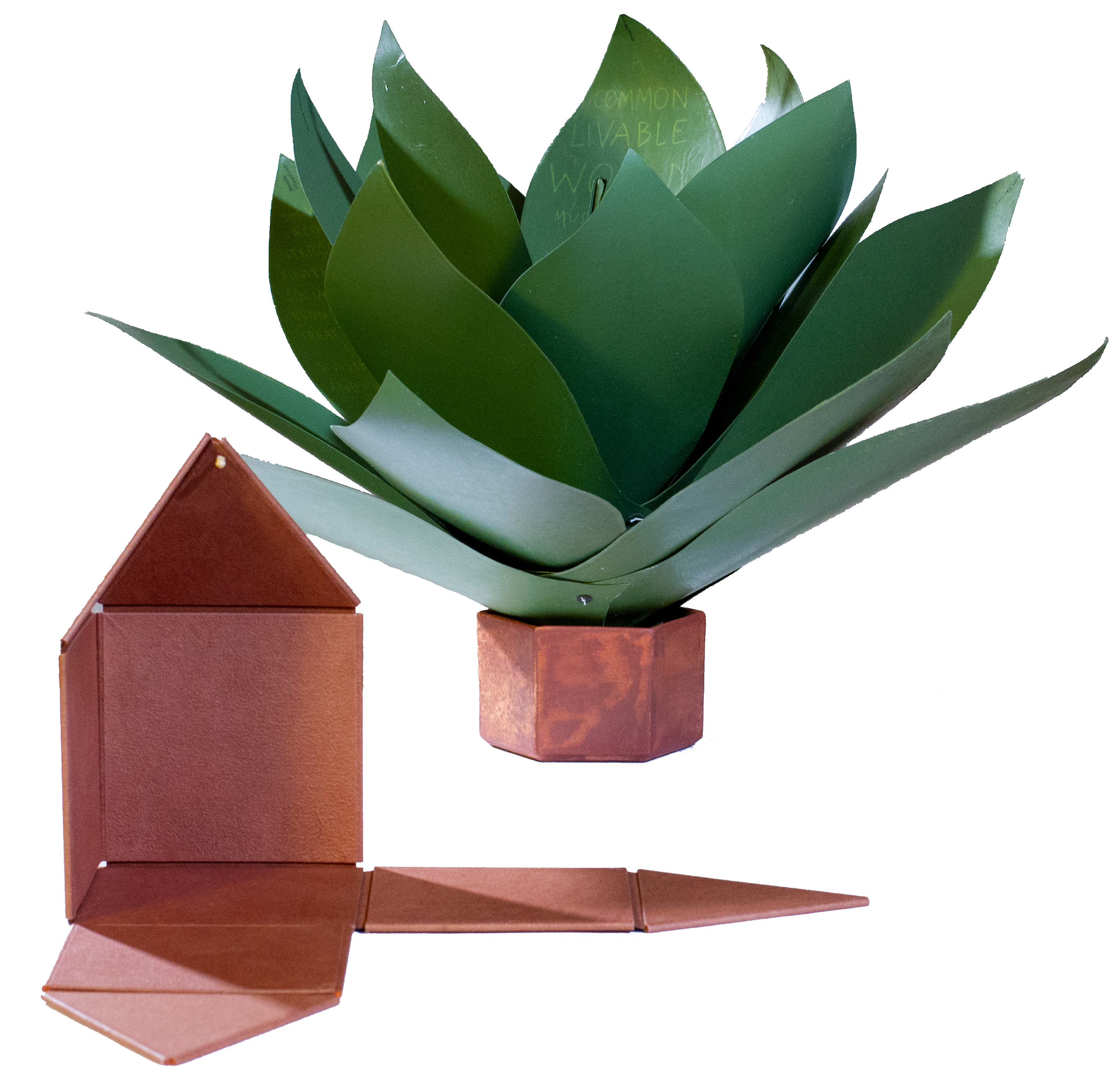
Speaking of greens — Robin Price’s prototype for Witnessing Ecology: the agave plant book again displays that thread of social concern, but this work and Price herself draw attention to another thread of enjoyment to pursue: the recurrence of collaboration among book artists. One artist leads to another.
Witnessing Ecology: the agave plant book (2019) Robin Price Photo: Mike Rhodes
As with the now-famous The Anatomy Lesson by Joyce Cutler-Shaw, Price has joined forces again with Daniel Kelm on the agave plant book, Kelm also collaborated with Ken Botnick on the long-gestating Diderot Project on display here just a few tables away, Botnick collaborated with the novelist and translator William Gass on A Defense of the Book, who in turn with the photographer Michael Eastman — who lives over in Oakland — created the digital-only book Abstractions Arrive: Having Been There All the Time. Whatever the medium, the book just naturally encourages collaboration — and chance. As Price’s book Counting on Chance implies and as so many book artists echo — as does Jim Blaine —
‘… There ain’t no such a thing as an accident. When my uncle Lem was leaning up agin a scaffolding once, sick, or drunk, or suthin, an Irishman with a hod full of bricks fell on him out of the third story and broke the old man’s back in two places. People said it was an accident. Much accident there was about that. He didn’t know what he was there for, but he was there for a good object. If he hadn’t been there the Irishman would have been killed. Nobody can ever make me believe anything different from that. Uncle Lem’s dog was there. Why didn’t the Irishman fall on the dog? Becuz the dog would a seen him a coming and stood from under. That’s the reason the dog warn’t appinted. A dog can’t be depended on to carry out a special providence. Mark my words it was a put-up thing. Accidents don’t happen, boys. Uncle Lem’s dog—I wish you could a seen that dog. He was a reglar shepherd—or ruther he was part bull and part shepherd—splendid animal; belonged to parson Hagar before Uncle Lem got him.’
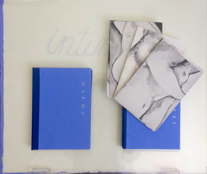
Chance, luck or accident — if you are to enjoy this book fair, you need to count on them, not just allow for them. How likely was it that in pursuit of Mary Heebner’s Intimacy: Drawing with light, Drawn from stone, I would be caught up with that crew in the off-limits members’ club?
Intimacy: Drawing with light, Drawn from Stone (2017) Mary Heebner
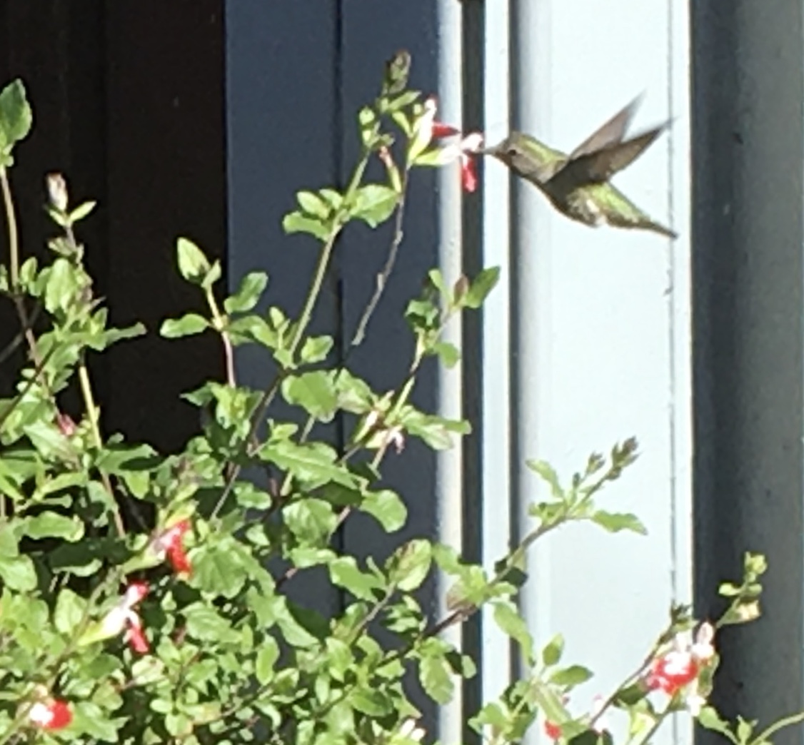
Or if I weren’t staying a good walking distance from the symposium, how would I have come across a hummingbird in the cold of February after being delighted with Sue Leopard’s Hummingbird?
Hagar is a common Nordic name. But how likely was it that Twain would use that particular name in his California mining-camp story and that Codex VII is hosting “Codex Nordica”? Mark my words it was a put-up thing.
That not one of the symposium presenters introducing us to “Codex Nordica” is named Hagar should not be held against the organizers. Their choices — Åse Eg Jørgensen (co-editor of Pist Protta, Denmark’s longest running contemporary artists’ journal), Tatjana Bergelt (multilingual, of German-Russian-Jewish culture and settled in Finland), Thomas Millroth (art historian from Malmö) — are entertaining, informative and good humoured (proof at least for the Danes that they can’t all be Hamlet or Søren Kierkegaard). What they have to say and show speaks to book art’s uncanny rhyming across geographies and times.
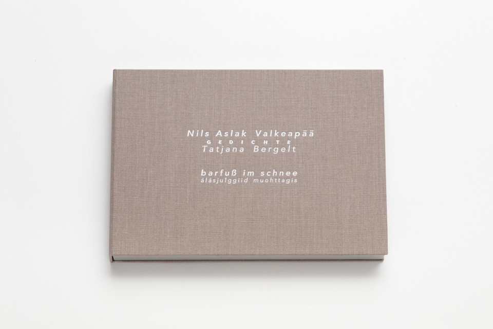
With every issue the outcome of guest editing, artists’ contributions and a mandate to be unlike any previous issue, Pist Protta is a cross between Other Books and So, the collaborative, gallery-challenging venture of Ulises Carrión in the last century, and Brad Freeman’s US-based Journal of Artists’ Books.Printed Matter has faithfully carried every issue of Pist Protta, so there is little excuse to be unaware of it and its liveliness. Fitting for someone who thinks of herself as a collage of cultures, Tatjana Bergelt’s barfuß im Schnee-álásjulggiid muohttagis (“Barefoot in the Snow”) is a photo-collage of old maps, satellite maps, poetic texts, landscapes and portraits of the Sámi, the dwindling inhabitants of the northern parts of Norway, Sweden, Finland and the Murmansk Oblast. It reminds me of UK-based Nancy Campbell’s Vantar/Missing.
Vantar/Missing (2014) Nancy Campbell Digitally printed on Munken Polar, hand-sewn binding with hand-incised design, edition of 300
Both works delve into the vulnerable and disappearance — be it culture, gender or environment. Vantar‘s cold diptychs recording the mountain snow cover and barely perceptible signs of life in the ghost town Siglufjörður chime with Bergelt’s final slide:
“From Finland barefoot in snow”, Codex VII, 4 February 2019 Tatjana Bergelt
barfuß im Schnee-álásjulggiid muohttagis (2015) Tatjana Bergelt 2 books in linen cassette, edition of 4, in each book 6 poems by Nils Aslak Valkeapää in Sámi, Finnish and German languages, translations P.Sammallahti, C.Schlosser
The bus from the symposium in Berkeley to the fair itself in Richmond is another chance for chance to play its role. One day I’m sitting next to Amanda Degener (Cave Paper), who delights in our common acquaintance with Ioana Stoian and Eric Gjerde; the next, it’s Jeanne Drewes (Library of Congress), who introduces me to Mark Dimunation (Library of Congress), who regales us and the collector Duke Collier with tales of the British artist Ken Campbell. But the terrible thing about chance is that it takes up so much time and, at the same time, shows you what you wish you had more time for.
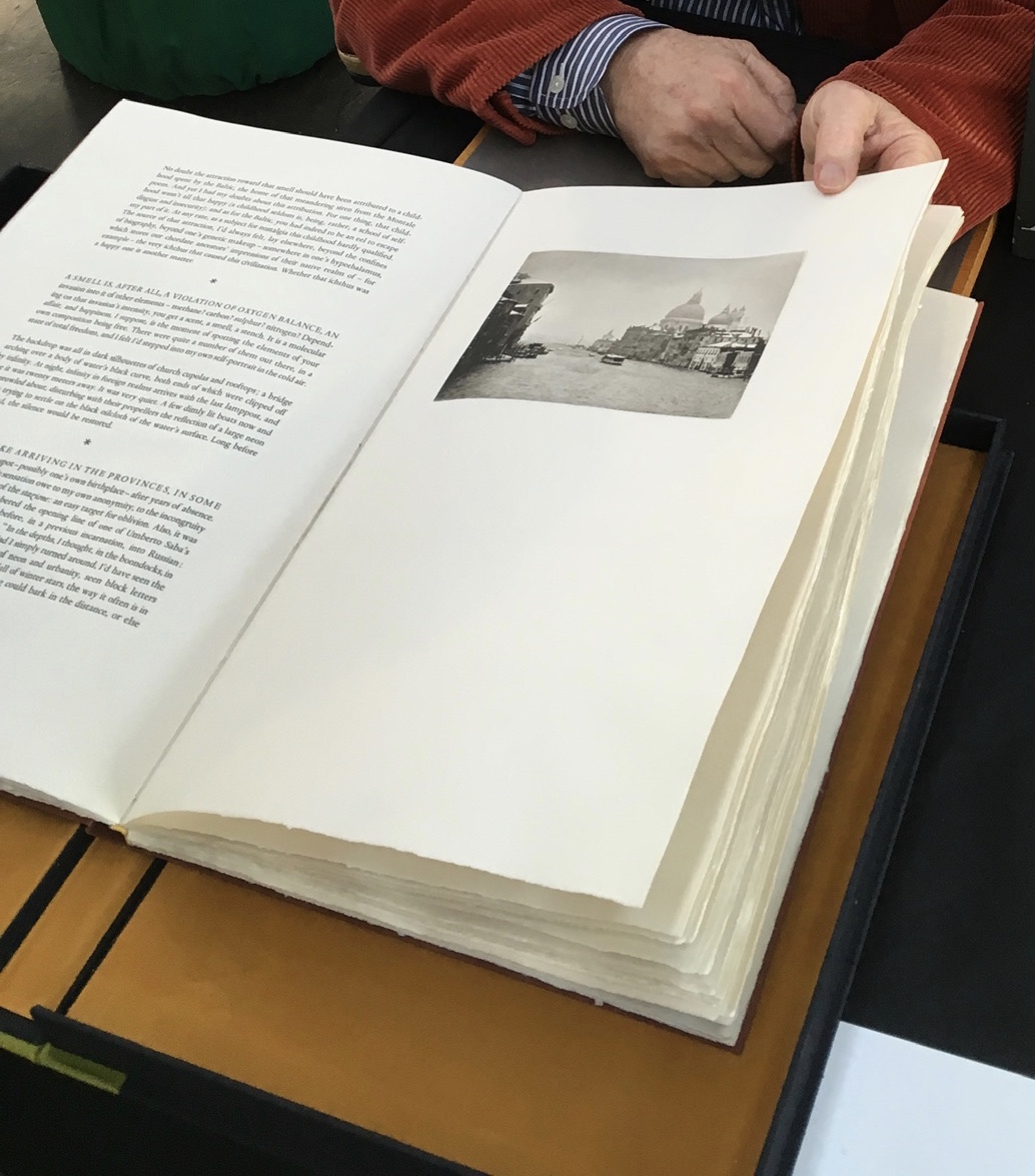
Recto: note the vaporetto in the image.Verso: think of the registration magic.The conclusion to Watermark and Koch’s homage to Aldus Manutius
Or to Russell Maret discussing his work Character Traits and Geoffroy Tory’s Champ Fleury: The Art and Science of the Proportion of the Attic or Ancient Roman Letters, According to the Human Body and Face (1529):
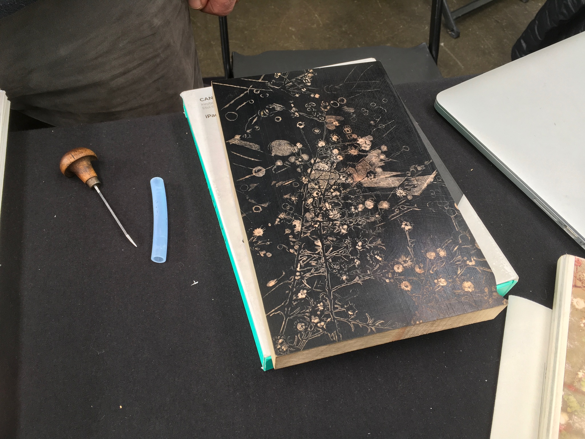
Or to Gaylord Schanilec (Midnight Paper Sales) enjoying his work on a woodblock:
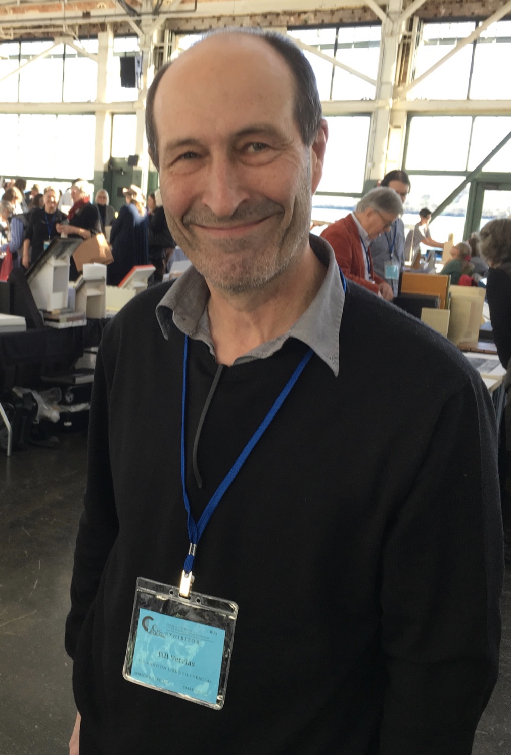
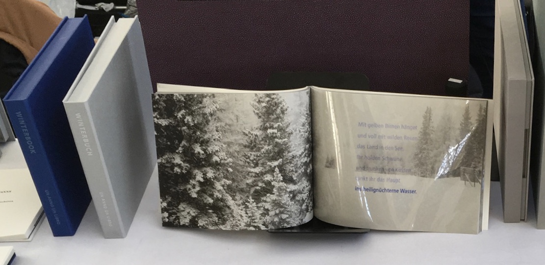
Or to Till Verclas (Un Anno Un Libro) explaining how his children helped achieve the effect of snow falling over Friedrich Hölderlin‘s words in Winterbuch:
Or to Sam Winston (ARC Editions) sharing his Reading Closed Books, which like Darkness Visible, sprang from his 7 Days performance in a blacked-out studio:
Sam is kind enough to introduce me to his colleagues at ARC Editions (Victoria Bean, Rick Myers and Haein Song). Individually and together, they are forces to watch. Myers’ An Excavation, which I’d had the pleasure to see previously in The Hague, can be partly experienced in these videos, and Song’s fine bindings and artist’s books must be seen. Bean’s symposium talk is on Check, her portfolio of typewriter prints featuring fifty writers, from Oscar Wilde to Joan Didion, and the checks they wore, and on Flag, the follow-up series of artist’s books that takes a writer from Check and uses colour, cloth and typewriter prints to explore an individual work by that writer.
Slide from “Flag”, Codex VII, 5 February 2019 Victoria Bean
Typewriter prints from Check by Victoria Bean
Tess (2019) Victoria Bean The red and black ribbons and white linen are drawn from images in Hardy’s Tess of the D’Urbervilles symbolizing Tess and critical events of her life and death.
Detail of Tess Victoria Bean
Detail of Tess Victoria Bean
Check and Flag illustrate that bright enjoyable thread that shows up again and again at Codex and book art at its prime — the integration of letter, image, material, form, process and subject in a way that self-consciously calls attention to them yet yields a work of art that simply is — on its own terms.
Which, if you have read “Jim Blaine and His Grandfather’s Ram”, ought to remind you that
… Parson Hagar belonged to the Western Reserve Hagars; prime family; his mother was a Watson; one of his sisters married a Wheeler; they settled in Morgan county, and he got nipped by the machinery in a carpet factory and went through in less than a quarter of a minute; his widder bought the piece of carpet that had his remains wove in, and people come a hundred mile to ‘tend the funeral. There was fourteen yards in the piece.
‘She wouldn’t let them roll him up, but planted him just so—full length. The church was middling small where they preached the funeral, and they had to let one end of the coffin stick out of the window. They didn’t bury him—they planted one end, and let him stand up, same as a monument.
With its 222 exhibitors here weaving the threads of book art and the book arts, Codex VII is a monument to enjoy. As for that old ram, you will have to read the story — and prepare for Codex VIII.
Architecture — be it theory, principles, practices or instances — inspires book art. Lay the book flat; you have a foundation. Open and turn it on its fore-edge; you have a roof beam or arcade. Stand it upright; you have a column or tower. Turn the front cover; you open a door. Put the text and types under a microscope; you have a cityscape. As the examples in this virtual exhibition show, architecture-inspired book art goes beyond these simple analogies.
There are seemingly unrelated texts that help considerably in going there. The Eyes of the Skin (2005) and The Embodied Image (2010) by Juhani Pallasmaa, architect, teacher and critic, are two of them. He writes as if he were an artist preparing an artist’s statement or descriptions of the book art below. The title of his earlier book gives away his alignment with the visual and tactile nature of book art. Pallasmaa’s two books will enrich anyone’s enjoyment of the works shown and mentioned here.
“Book. Space. House. Space of Movement“. Exhibition curated by Susanne Padberg, 7 May – 26 June 2026. Padberg, Susan (curator). 7 May – 26 June 2026. at Galerie Druck & Buch, Vienna, Austria. Accessed 22 May 2026. “The artist’s book as a three-dimensional space: forming a house, outlining, remembering, mimicking—thinking the human being within space. Between object and narrative, books unfold as architectural structures, as inhabitable thought-spaces, as reflections of individual and collective experience. The exhibition brings together artistic positions that expand the book as a spatial body.”
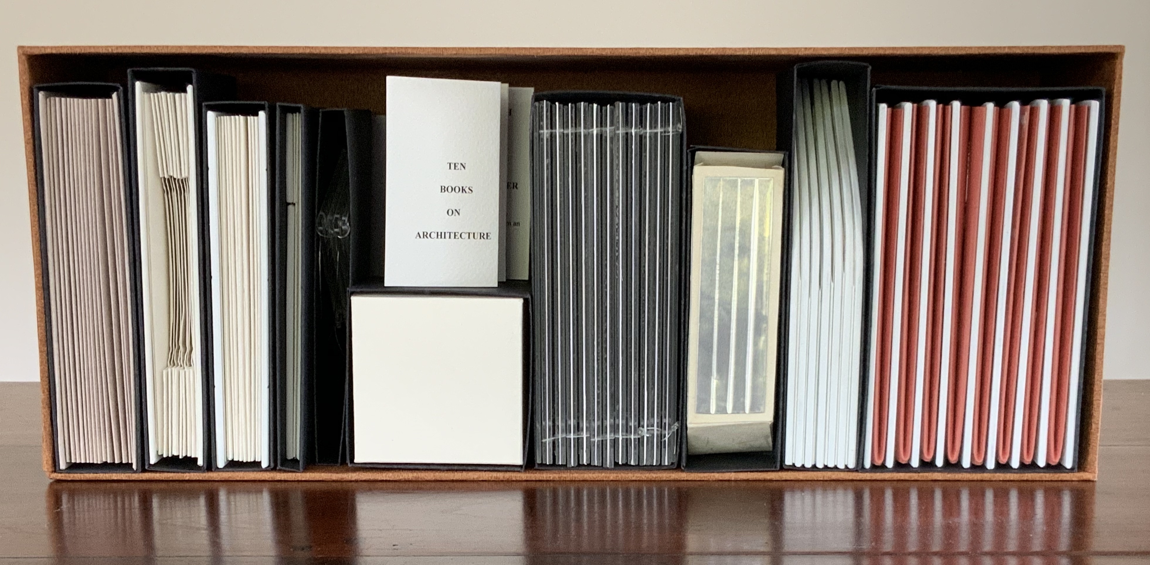
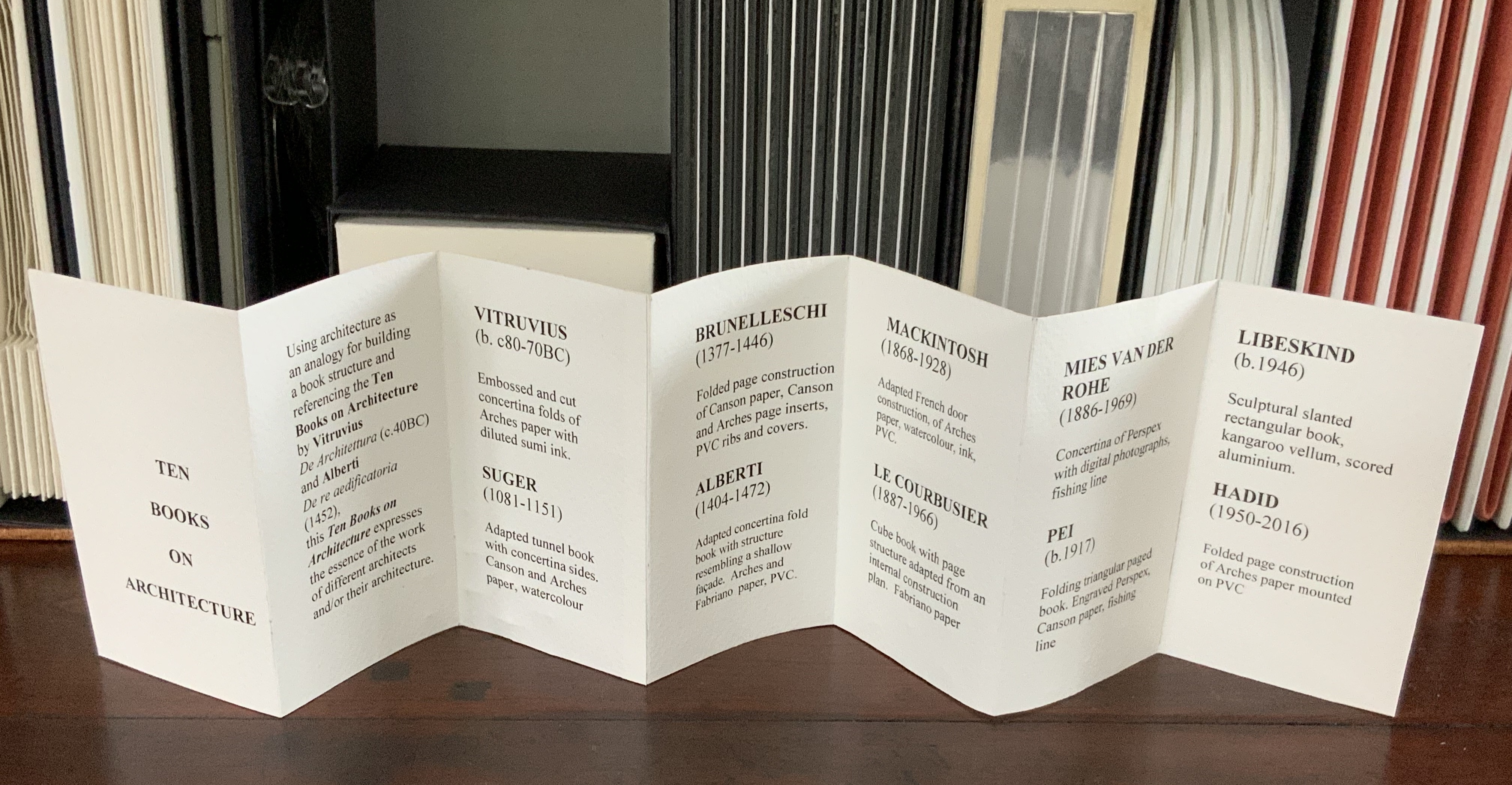
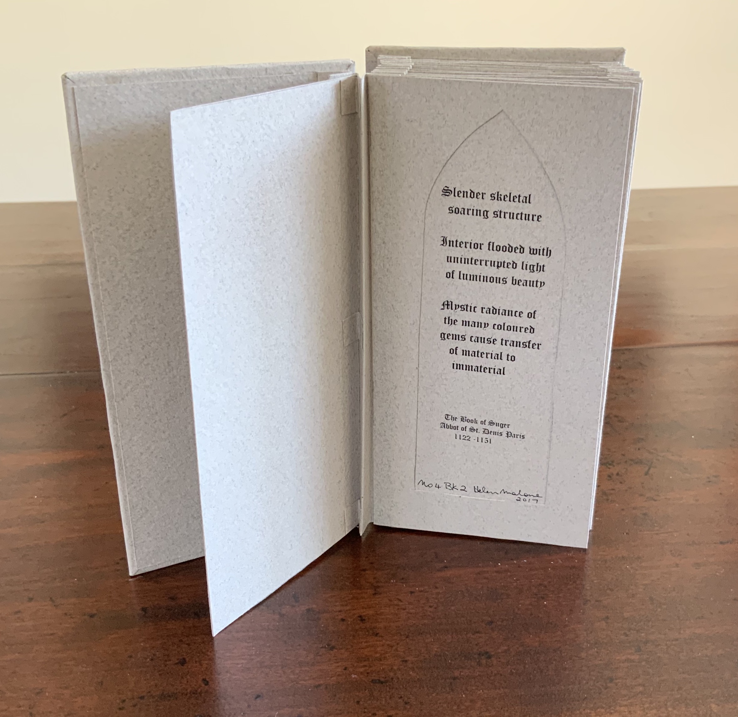
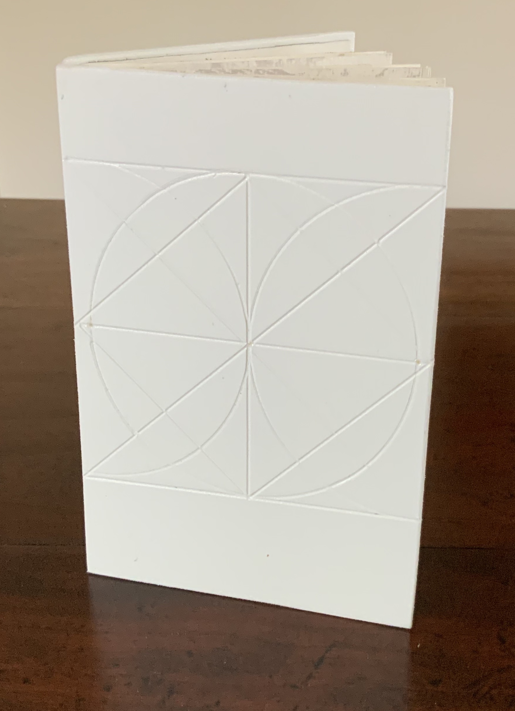
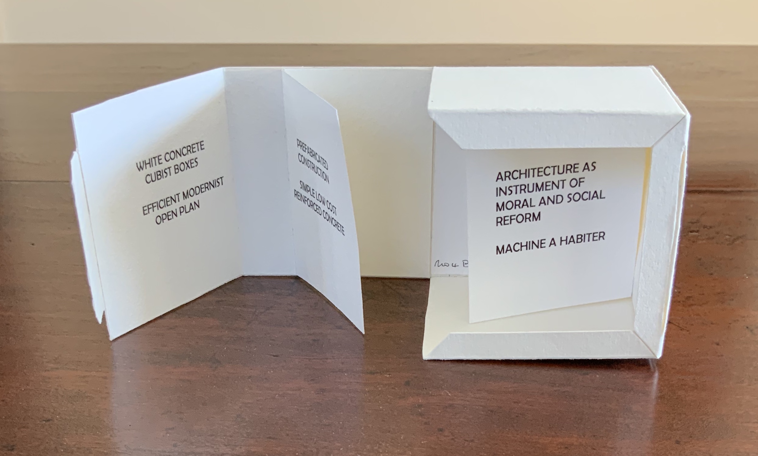
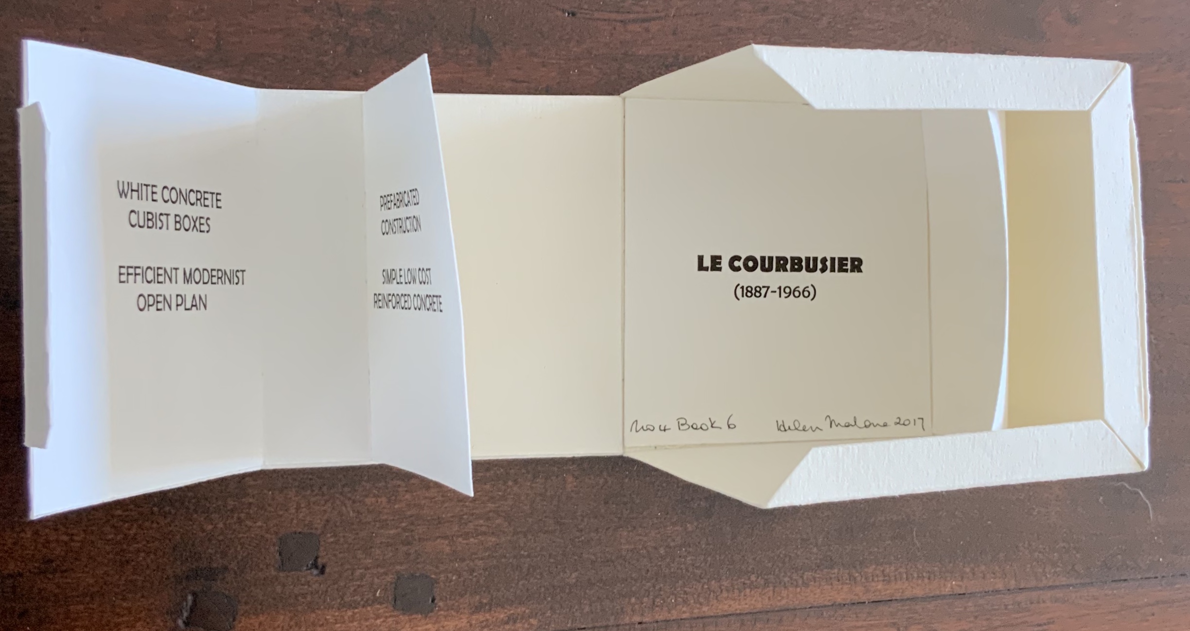
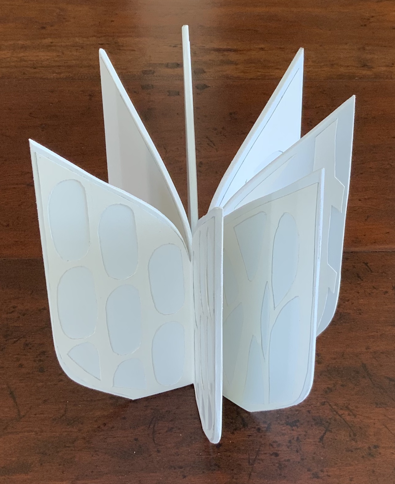
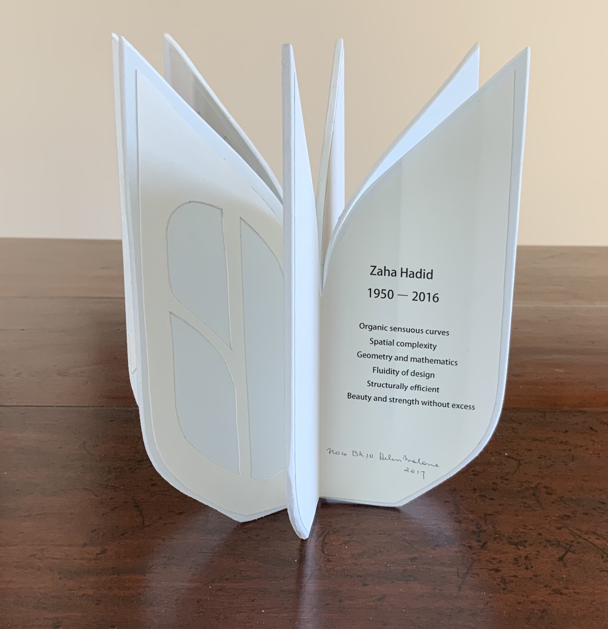
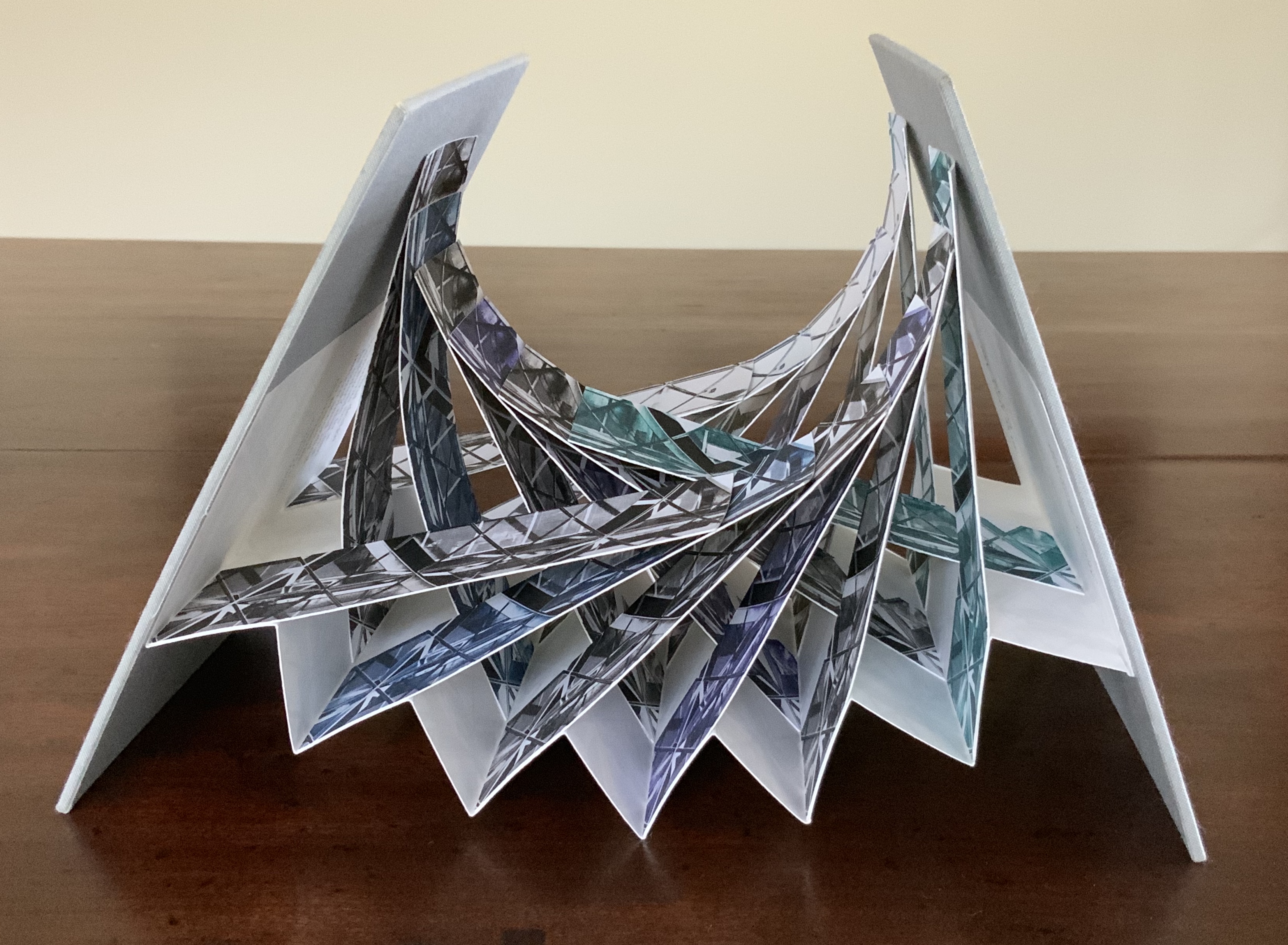
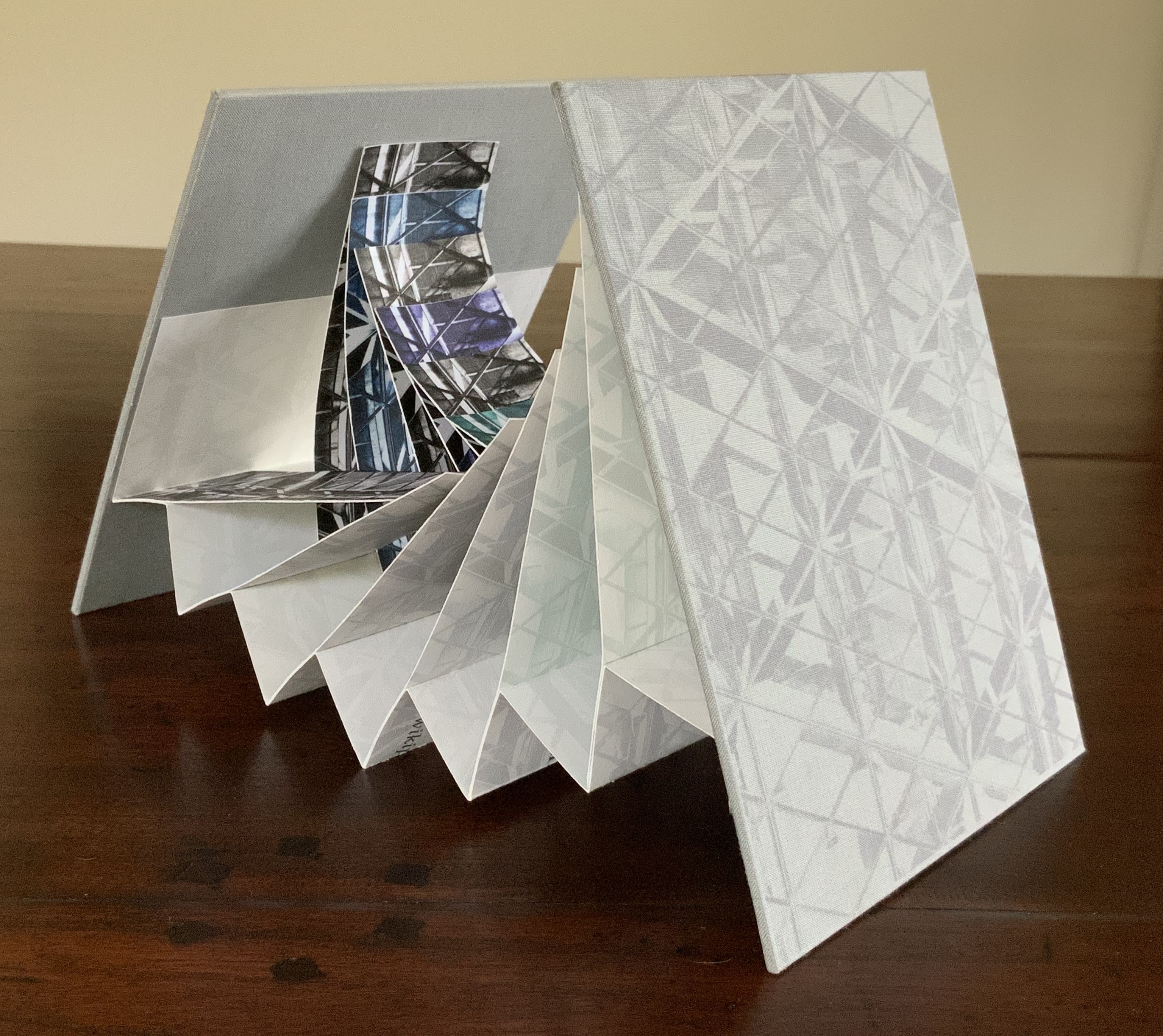
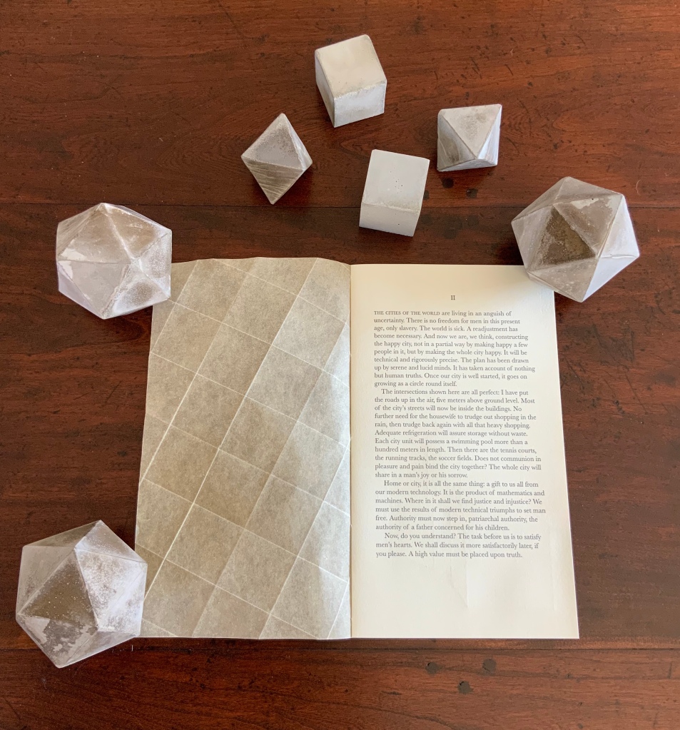
Malone’s Ten Books of Architecture is a good place to start in the collection. Like Pallasmaa, Malone takes a broad historical and, most important, haptic view of architecture from Vitruvius to Hadid. Each of the ten books is a bookwork that exemplifies its subject.
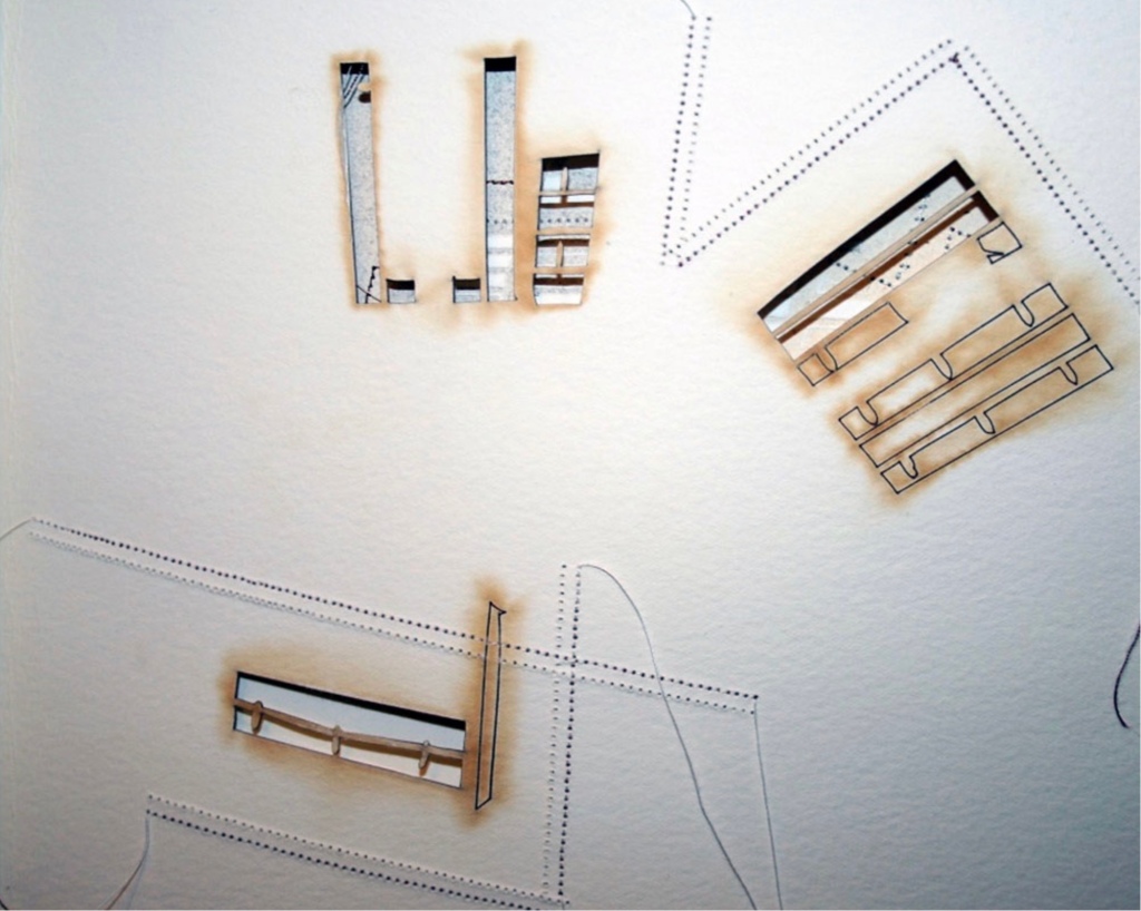
Adapted tunnel book with accordion sides Photo: Books On Books Collection
A watercolour at the tunnel’s end to evoke the stained glass clerestory windows in the Basilique Saint-Denis, Paris Photo: Books On Books Collection
The aspiration to fuse the cosmic and the human, divine and mortal, spiritual and material, combined with the systems of proportion and measure deriving simultaneously from the cosmic order and human figure, gave architectural geometries their meaning and deep sense of spiritual life.The Embodied Image, p. 23.
And further apropos the link between the book and architecture, consider the connection that Vasari drew between Gutenberg and Alberti:
In the year 1457 [sic], when the very useful method of printing books was discovered by Johann Gutenberg the German, Leon Batista [sic], working on similar lines, discovered a way of tracing natural perspectives and of effecting the diminution of figures by means of an instrument, and likewise the method of enlarging small things and reproducing them on a greater scale; all ingenious inventions, useful to art and very beautiful. Lives of the Most Eminent Painters, Sculptors and Architects, vol. 1, trans. Gaston Du C. de Vere (London: Medici Society/ Philip Lee Warner, 1912-1914), 494.
In “An Architectural Confession”, Pallasmaa writes:
One’s most important teacher may have died half a millennium ago; one’s true mentor could well be Filippo Brunelleschi or Piero della Francesca. I believe that every serious artist — at the edge of his/her consciousness — addresses and offers his/her work to a superior colleague for approval.The Eyes of the Skin, p. 82.
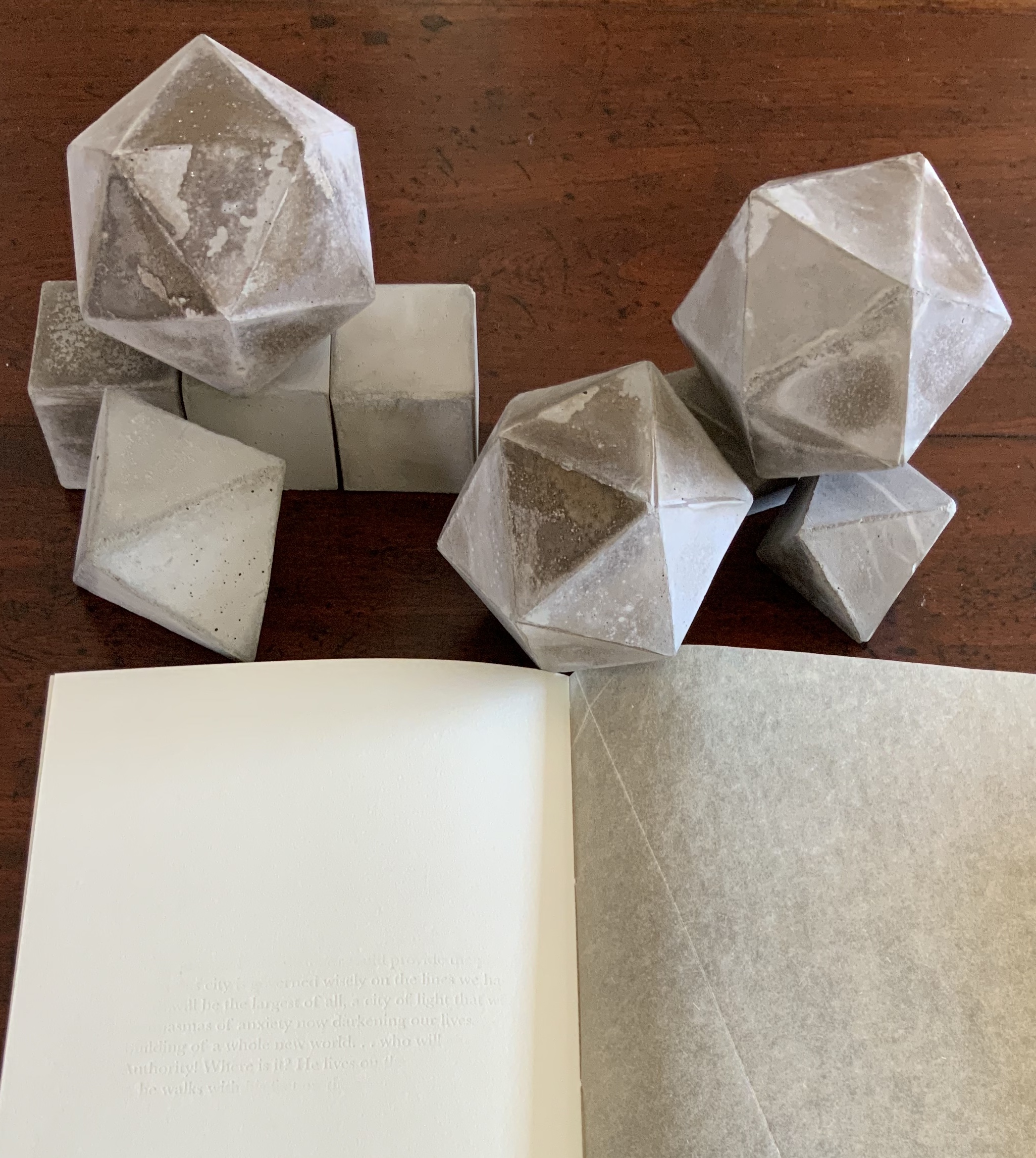
This curiously textured cube sits perfectly alongside Pallasmaa’s observation: “The basic geometric shapes have their symbolic connotations, but more important than their conventional meanings are their conceptual and visual organising powers” (The Embodied Image, p. 58).
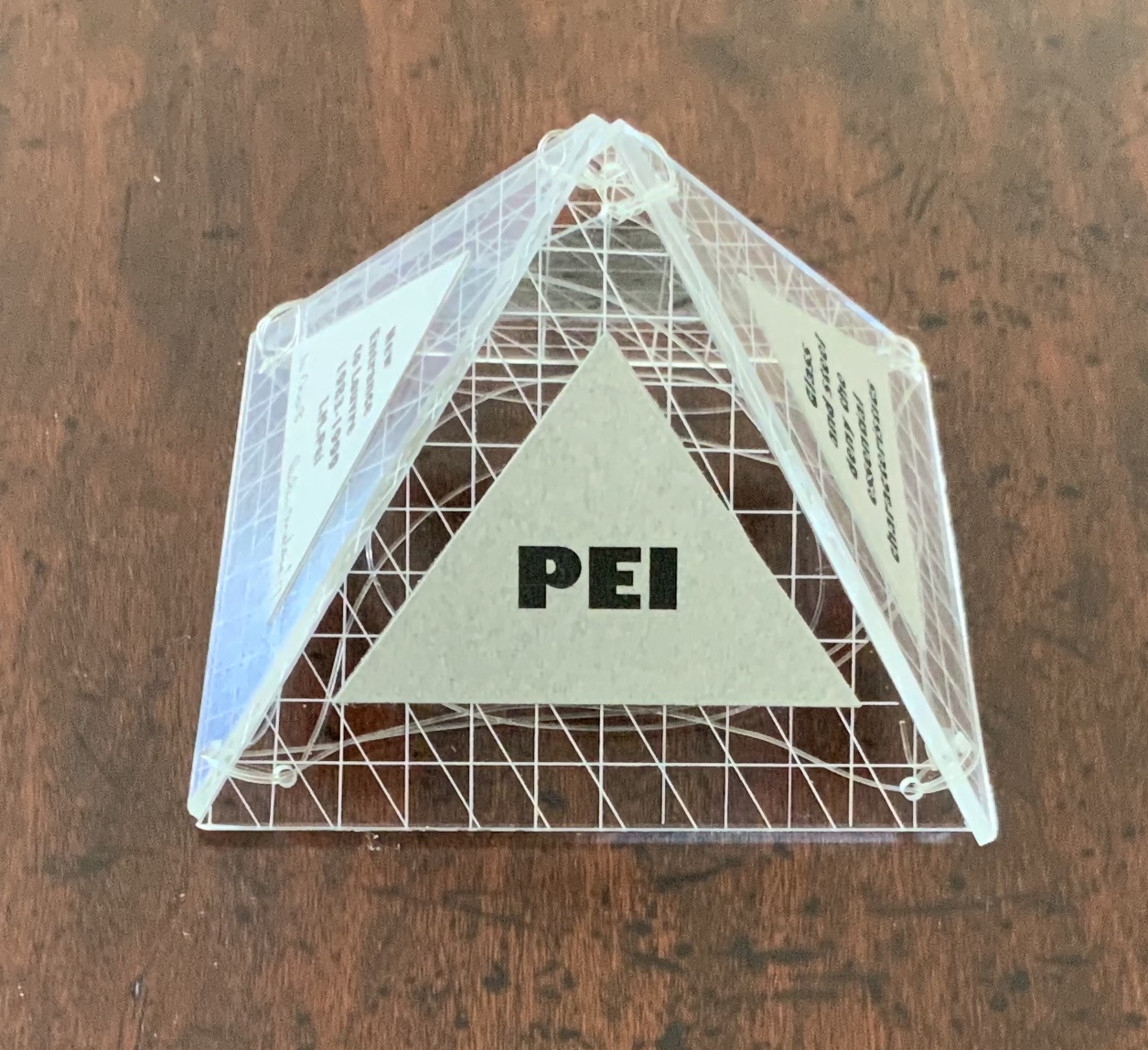
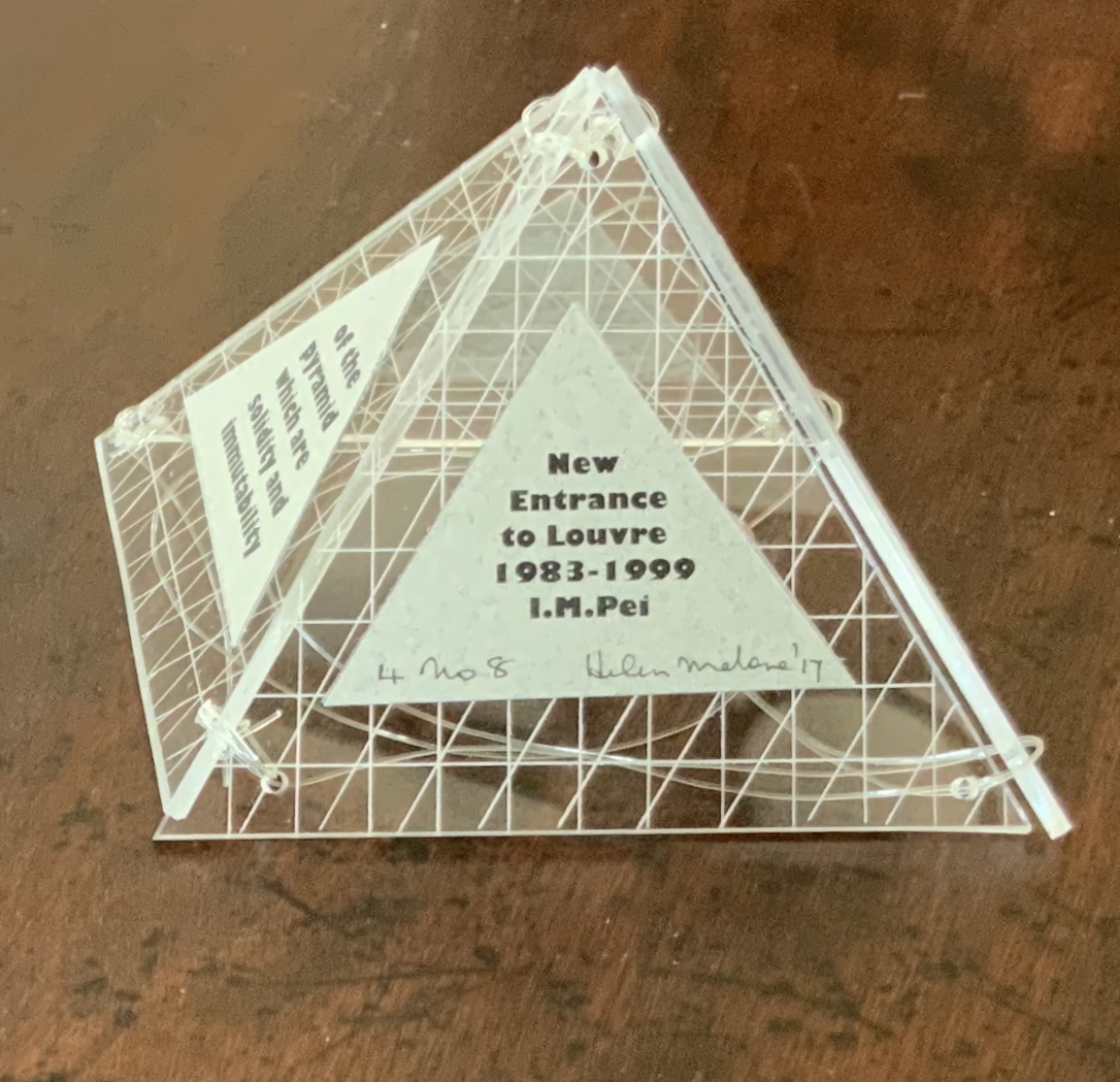
A short trip around this small pyramid as a reminder of the entrances that were always on the far side of museums you visited Photos: Books On Books Collection
This edition of Malone’s Ten Books is unique in its inclusion of Hadid, who is not mentioned in either of Pallasmaa’s books but whose artistry and turn to the organic and curves of nature certainly fit with their spirit. Photo: Books On Books Collection
Malone’s Ten Books has a predecessor in Laura Davidson’s contribution to the 1994 Smithsonian show on book art inspired by its collection of rare science books (see section below). Although there is also Karen Wirth’s sculptural take on the Ten Books as well as Ron Keller’s take (see section below) on Palladio’s Fours Books of Architecture, which is Palladio’s take on Vitruvius, I have not found any other Vitruvian-inspired works of book art. (Pointers welcome.)
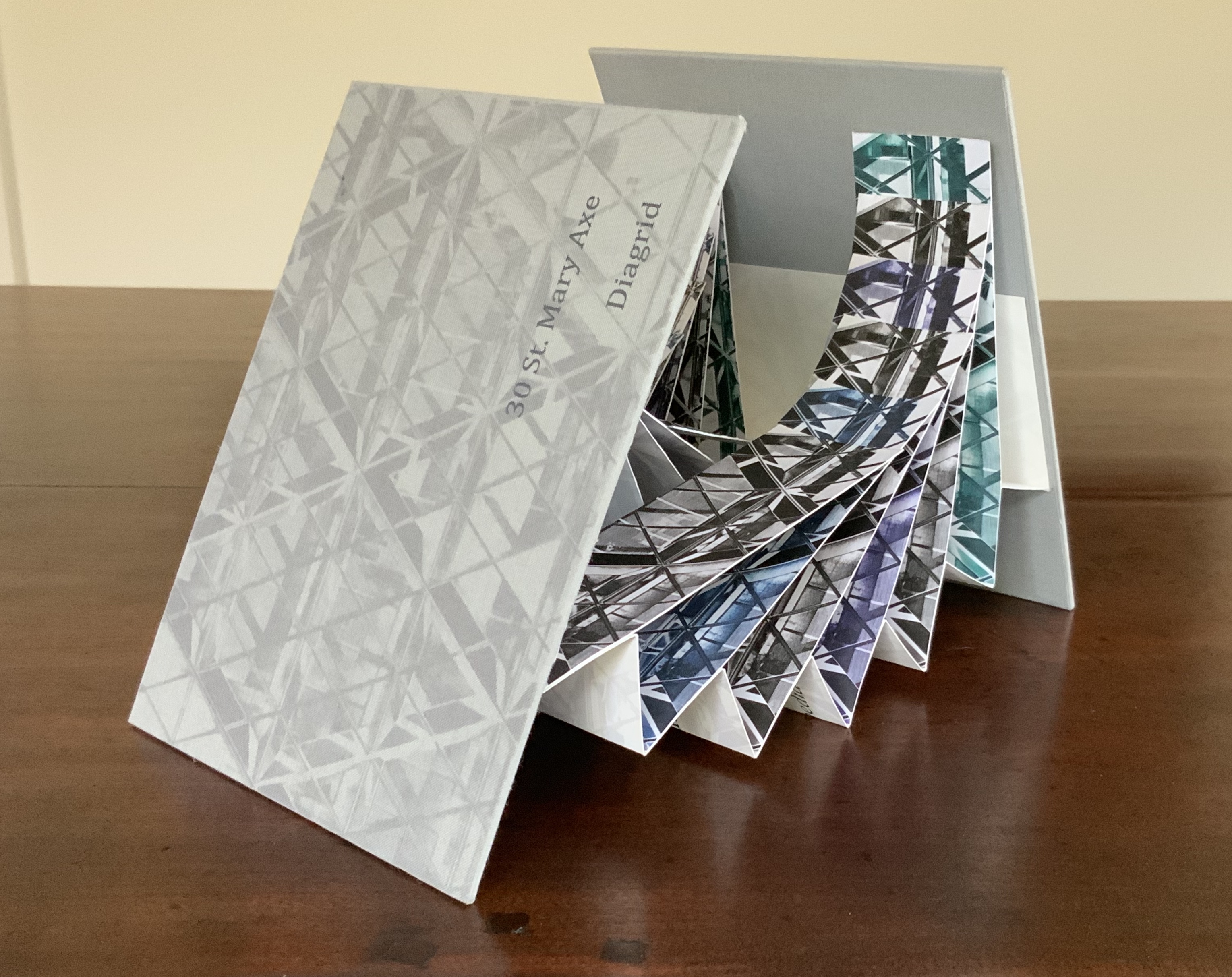
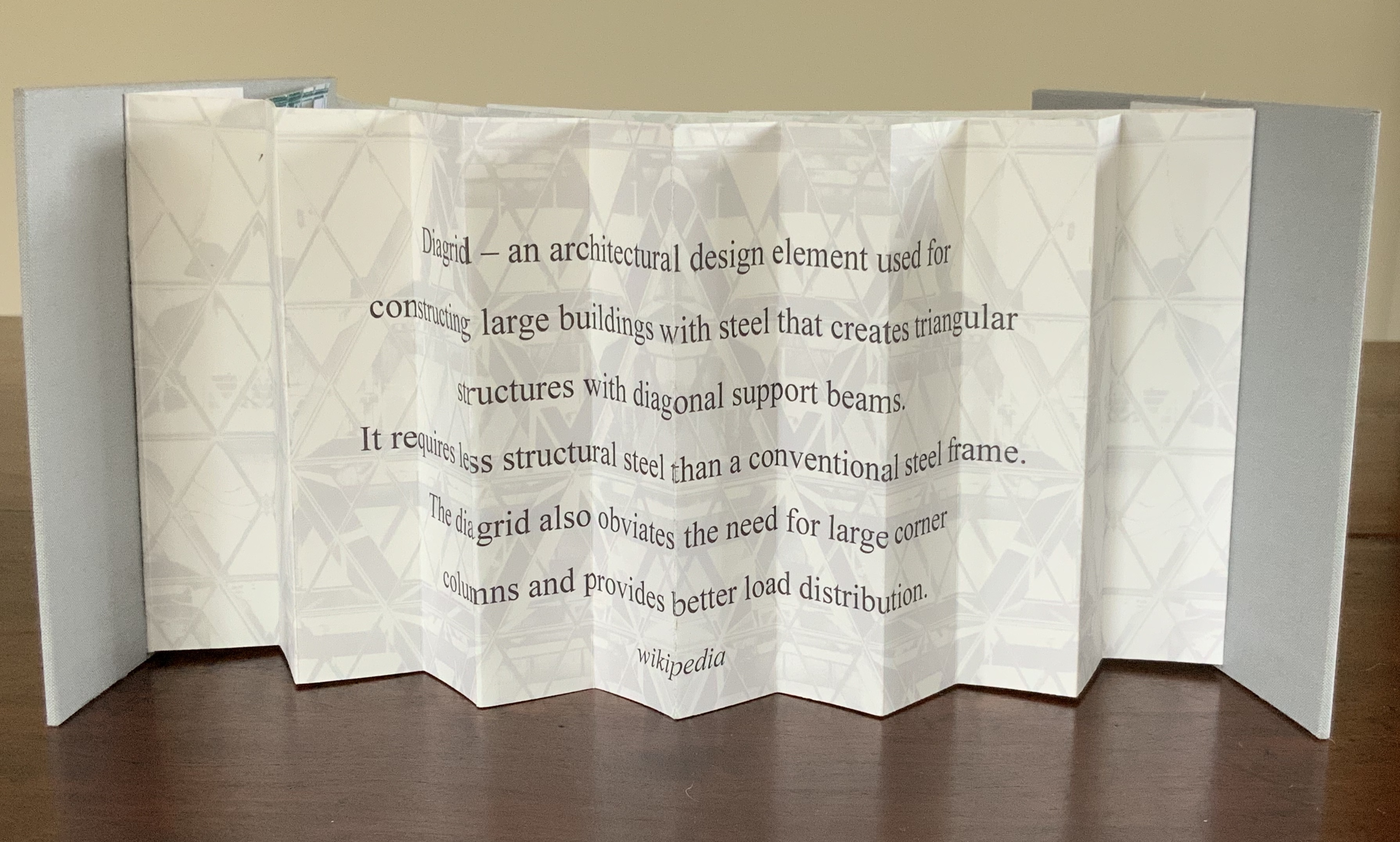
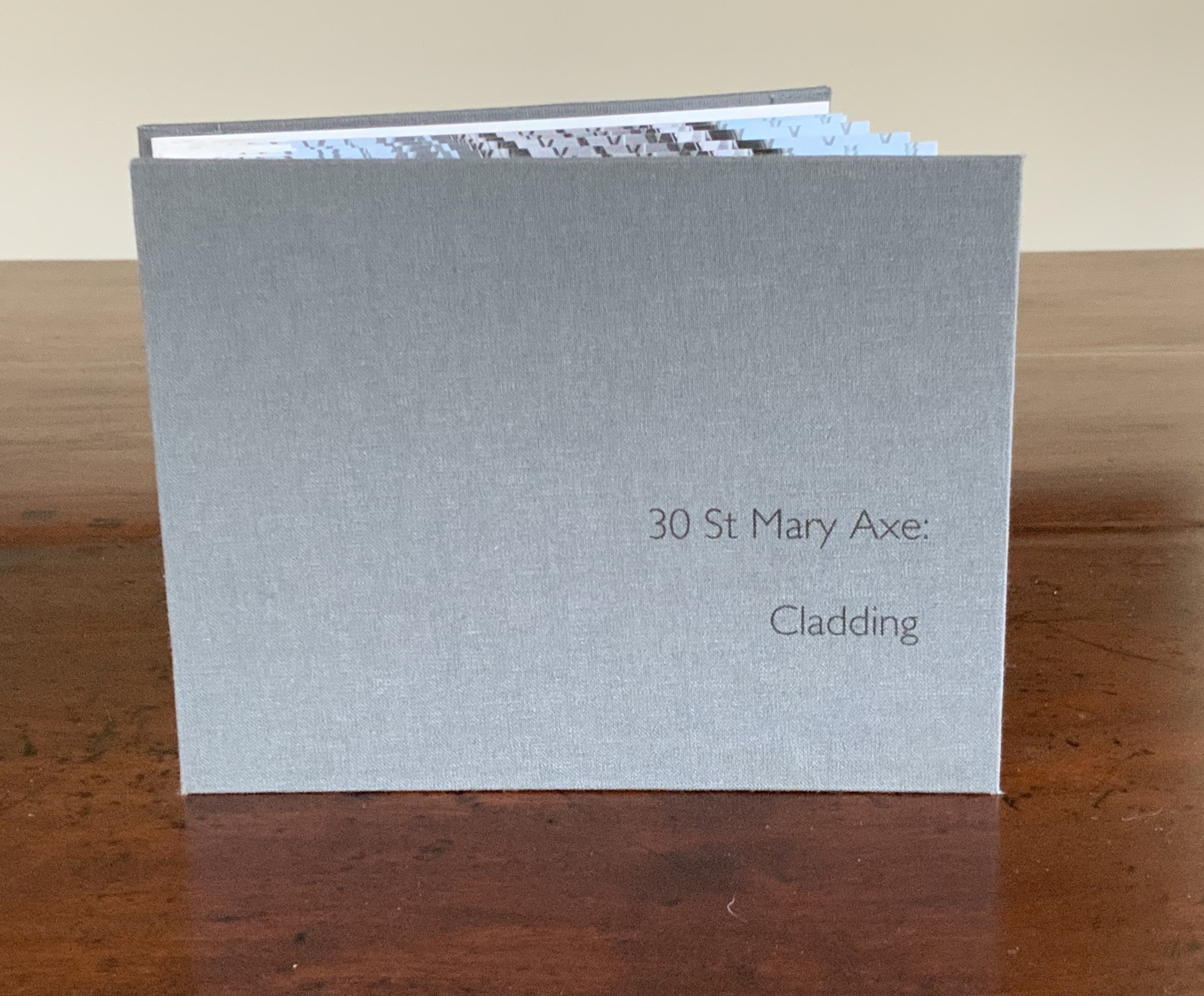
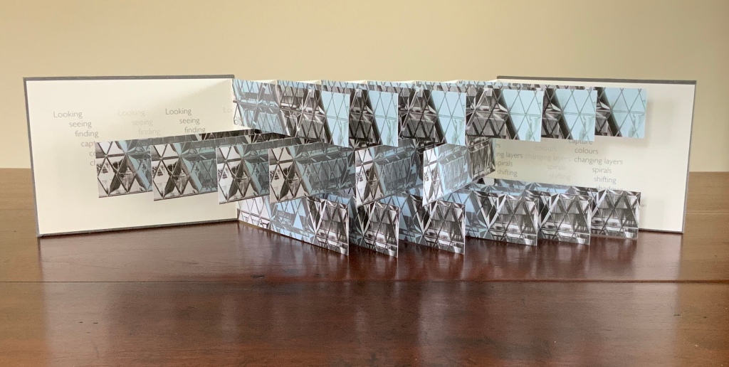
These two works — 30 St Mary Axe: Diagrid (2009) and 30 St. Mary Axe: Cladding(2009) — are among several architecture-inspired works of book art that Brannan has created. The text in one of those several — Situated — could have come straight from Pallasmaa, Bachelard or Merleau-Ponty:
Being situated is generally considered to be part of being embodied, but it is useful to consider each perspective individually. The situated perspective emphasizes that intelligent behaviour derives from the environment and the agent’s interactions with it.
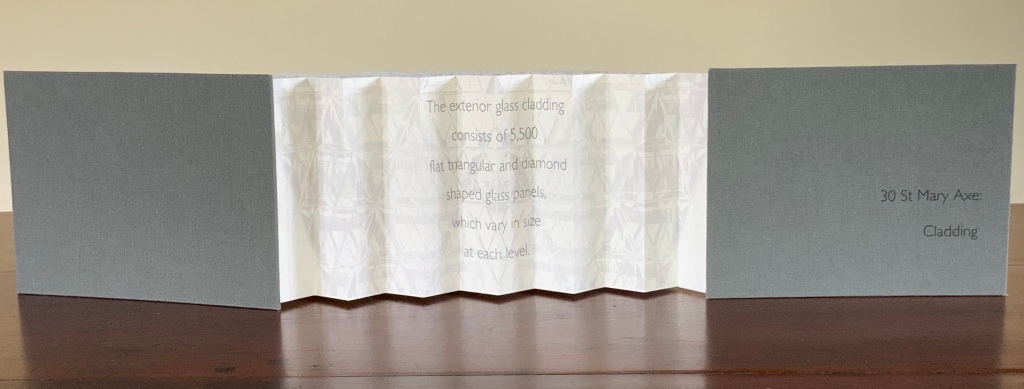
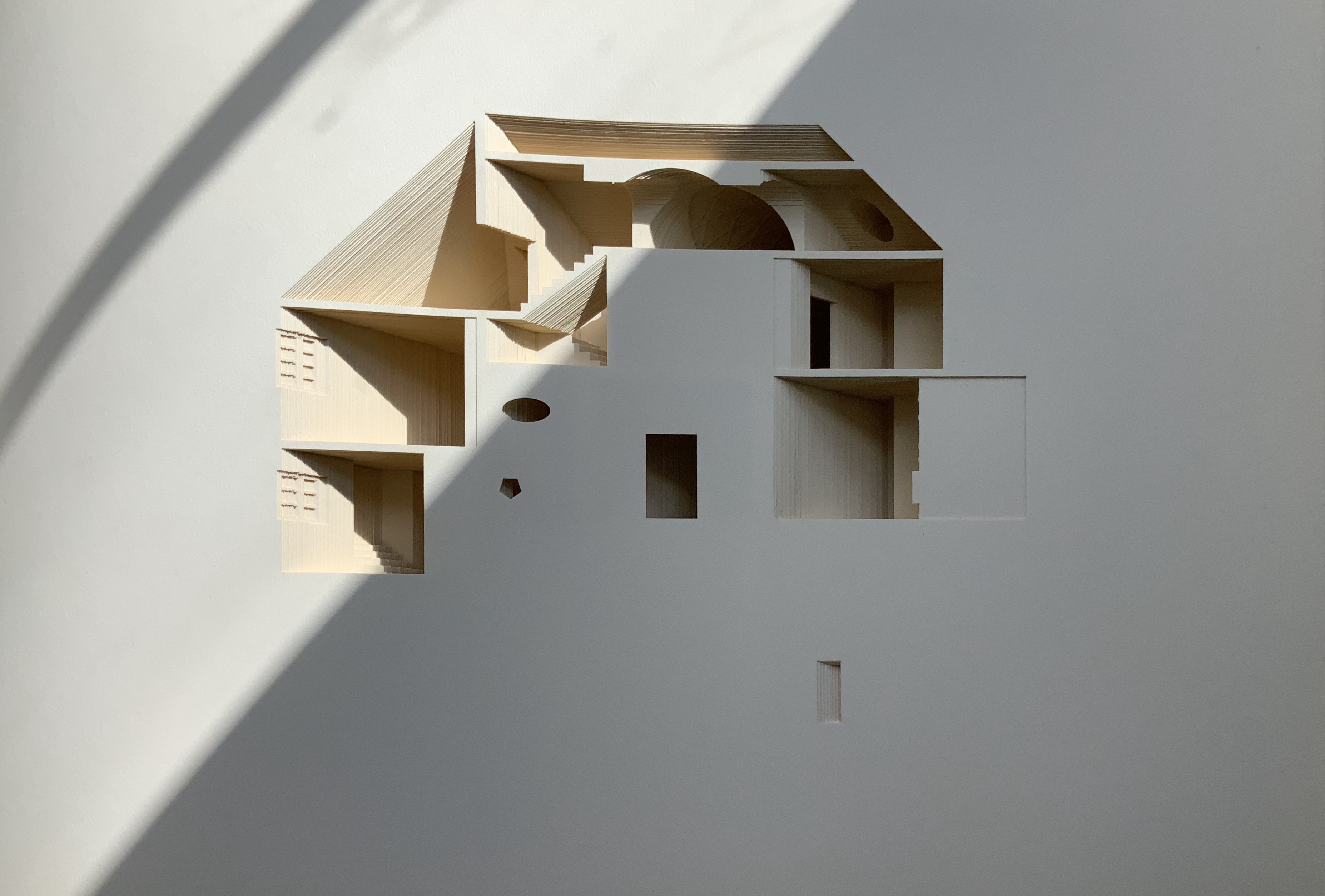
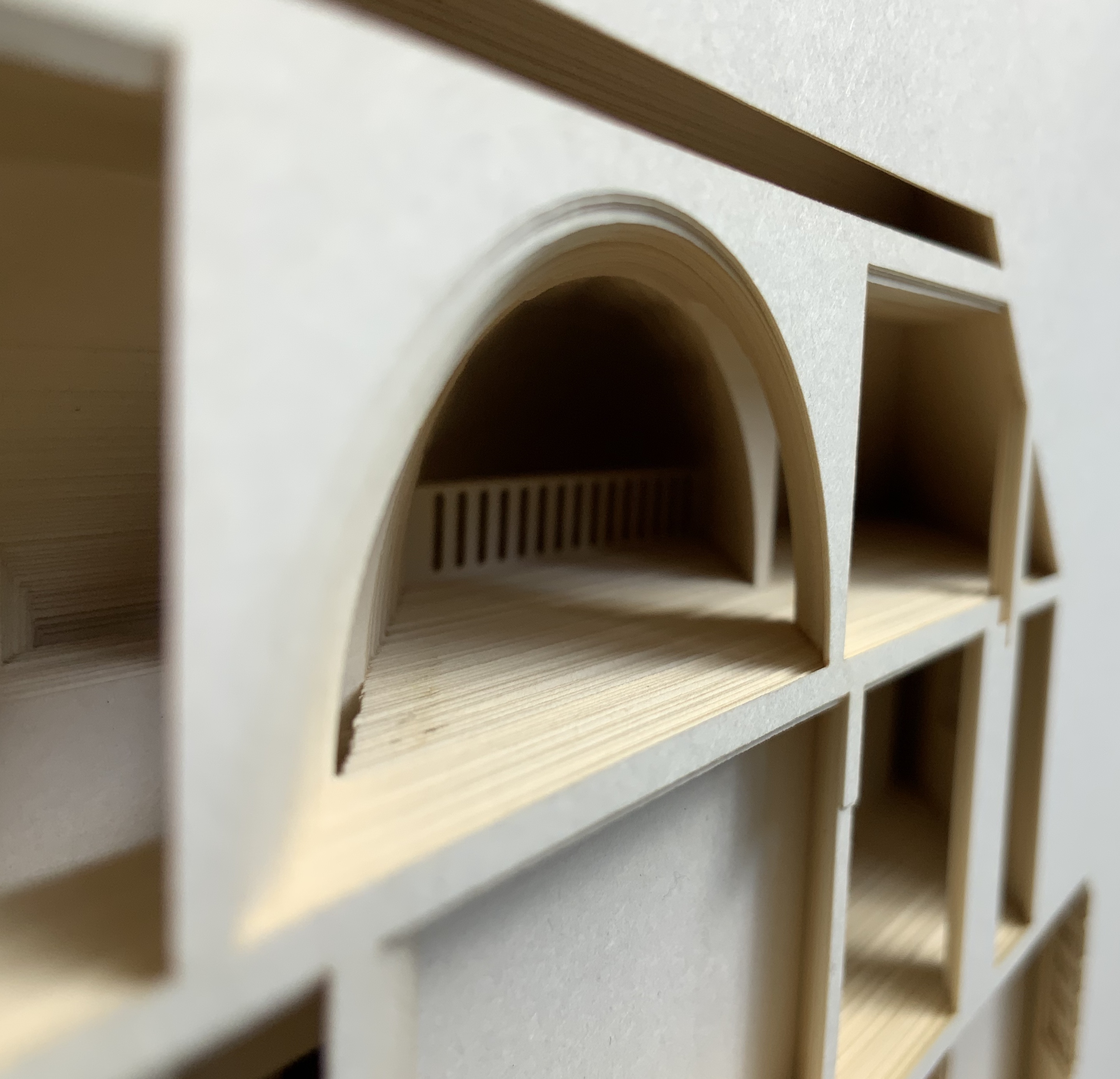
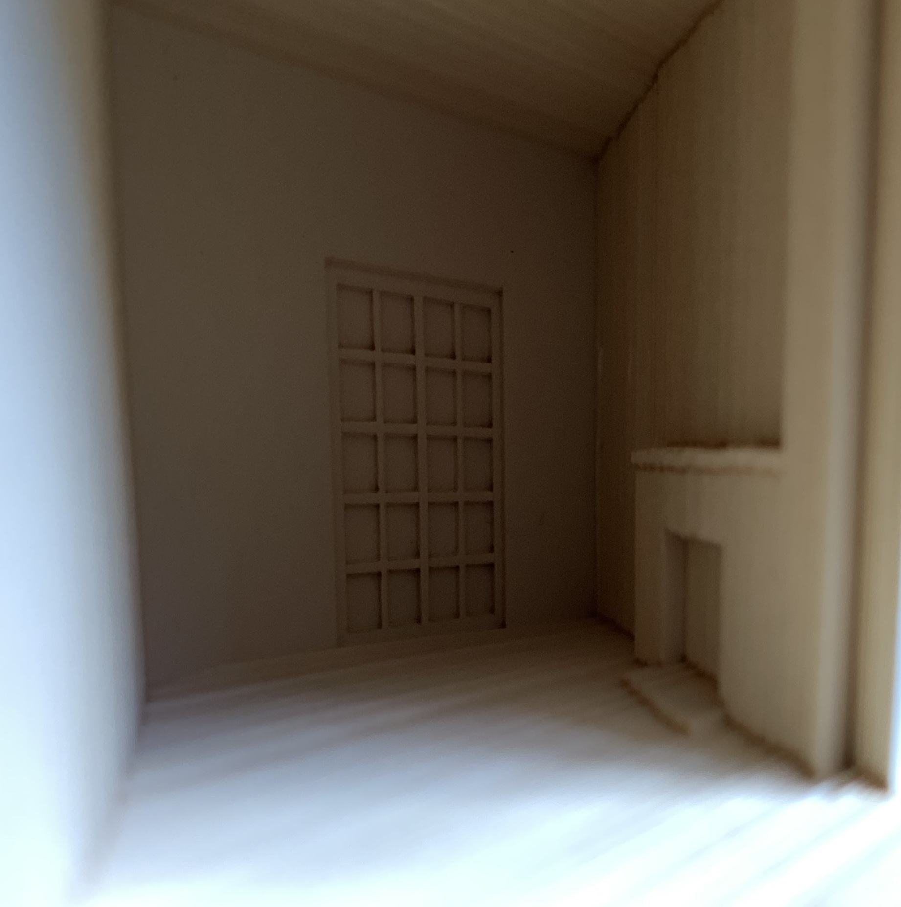
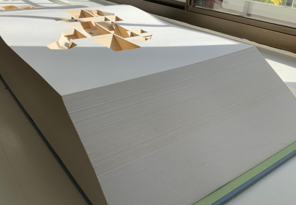
30 St Mary Axe: Diagrid(2009) Mandy Brannan London has nicknamed the building at 30 St. Mary Axe “the Gherkin”. Photo: Books On Books Collection
In the The Radiant Republic (2019), Sarah Bryant (Big Jump Press) brings together concrete, wood, glass, paper, ink and embossed printing, sewn binding, box container and texts from Plato and Le Corbusier.
Note the embossed text on the verso. Across the five volumes, the embossed text is the same as that printed in ink, but it runs in fragments backwards from this last page of the last volume to the last page of the first volume. Photo: Books On Books Collection
Bryant’s insightful integration of Plato’s and Le Corbusier’s texts and ideas and her setting them in the physicality of the blond wood, linen cover, embossed type and sewn papers could easily be a response to Pallasmaa’s comment in The Eyes of the Skin: “The current overemphasis on the intellectual and conceptual dimensions of architecture contributes to the disappearance of its physical, sensual and embodied essence.” (p. 35)
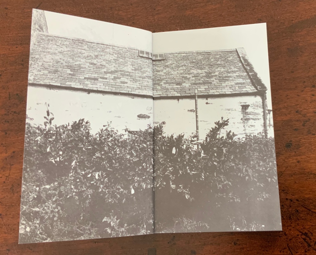
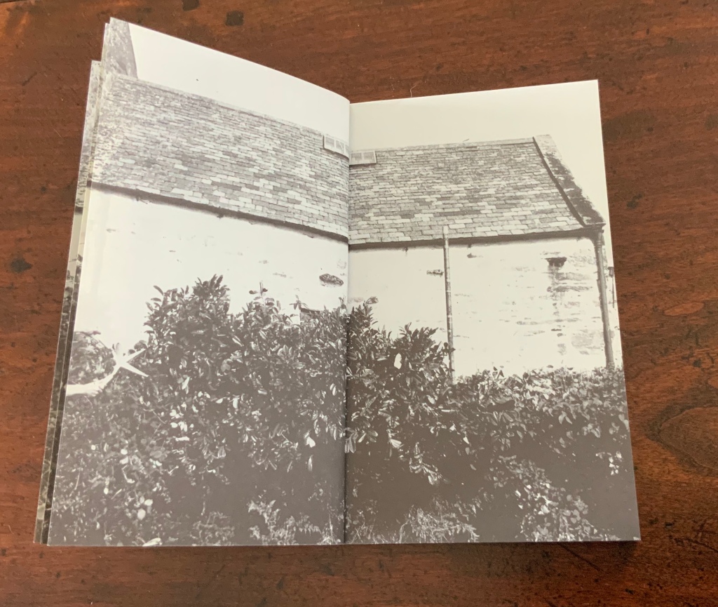
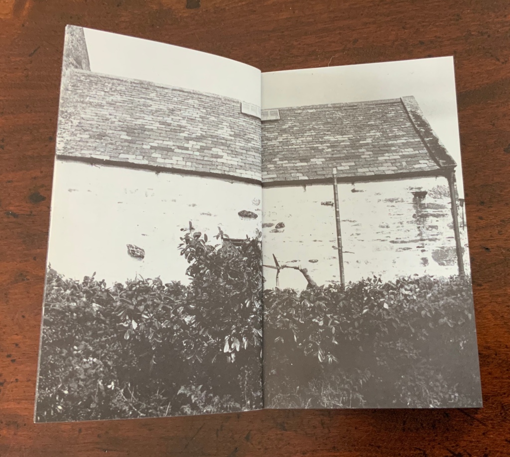
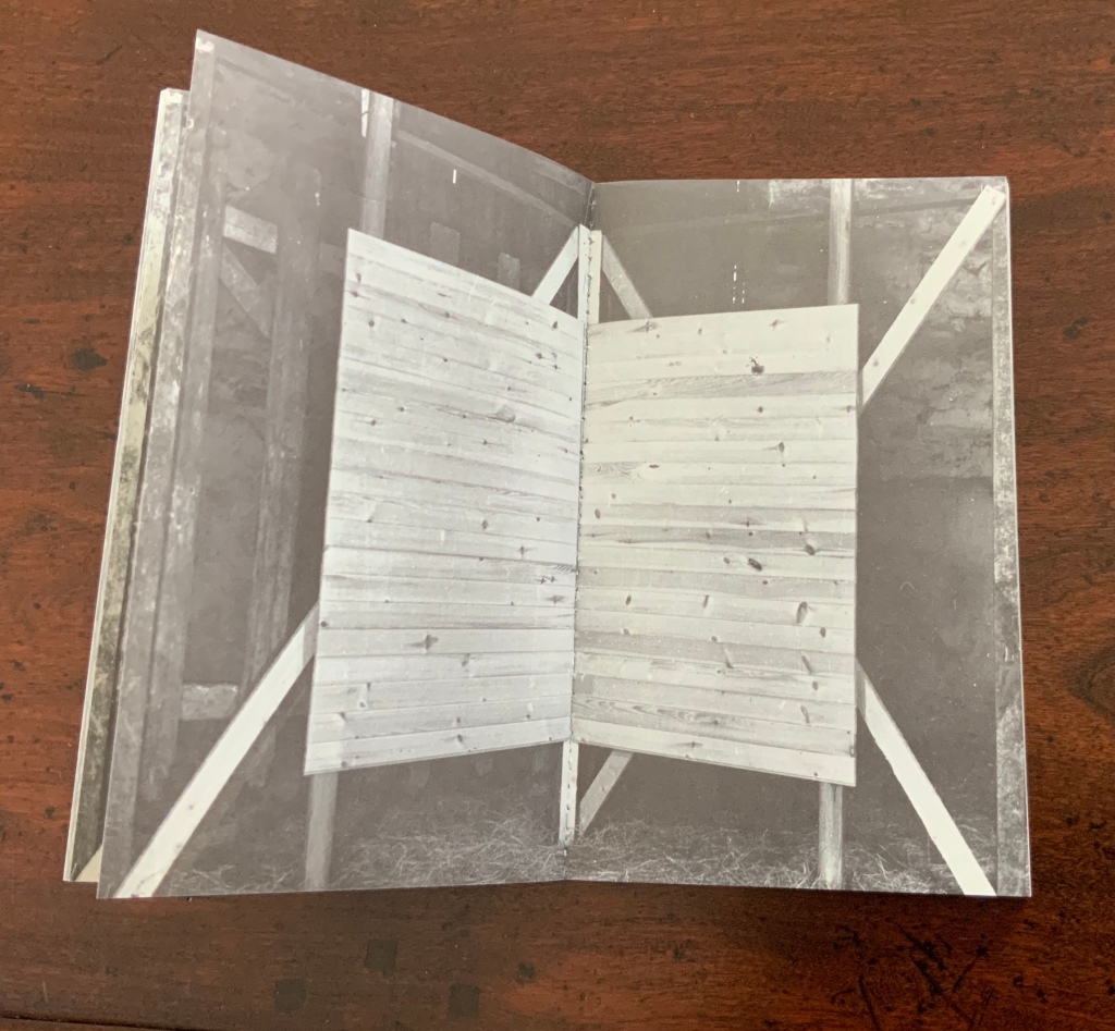
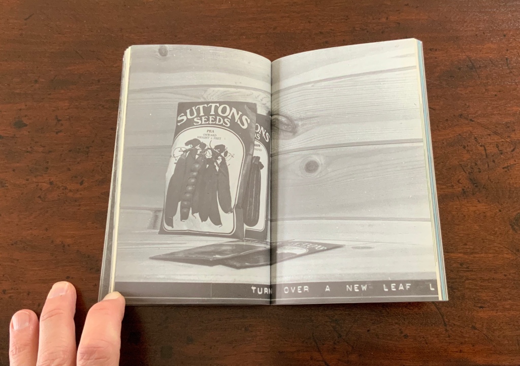
Chinese Whispers (1975) is conceptual, visual and spatial narrative that takes the reader into a “game of embedded games”: a game of Chinese Whispers used by the artists to combine the process of making a book with the process of recovering an old cottage, making a corner cupboard, making jam, making ideas and making an exit.
Chinese Whispers(1975) Helen Douglas and Telfer Stokes Photo: Books On Books Collection
The selection of images above begins with the front cover’s photo of a patch of grass outside an abandoned farm building and ends with the back cover’s photo of the underside of the patch of grass. In between, the pages take the viewer through the trimmed hedge and the doorway into the room, through the building, the stocking of the shelves, using of the stock and closing of the shed cupboard, and so back to the other side of the patch of grass. As Stokes explained in the Journal of Artist’s Books (Vol. 12, 1999):
We started with the corner cupboard, that was the part that occupied our thinking most, that and the two colour vignettes (as we called them) printed on different stock. But then we started to think backward to what might be before the cupboard’s construction. To the thing before that, and the thing before that, and the thing before that which was cutting of the hedge and before that which was the boot brush which we called the hedgehog- that was where the book started. Then we started to photograph from that point forward, through the book.
The work blends the features of book structure, collage and montage to create something that resonates uncannily with Pallasmaa’s approving citations of Bachelard’s central idea of the hearth and domicile as central to our time-bound “being-in-the-world”.
Your House is a laser-cut model of Olafur Eliasson’s residence in Copenhagen at a scale of 1:85, which means that each page equates to a 220 mm section of the actual house. How do you read a work like this — physically? At the 22″ mark in this video, the pages fall in a cascade like a flipbook, but for the most part, their size, accumulated bulk and weight — and delicacy — defy that handling. As in the video below, they must be turned slowly and carefully. Your House heeds the task of the arts as posed by the architect Juhani Pallasmaa, “in our age of speed, …to defend the comprehensibility of time, its experiential plasticity, tactility and slowness” (The Embodied Image, p. 78).
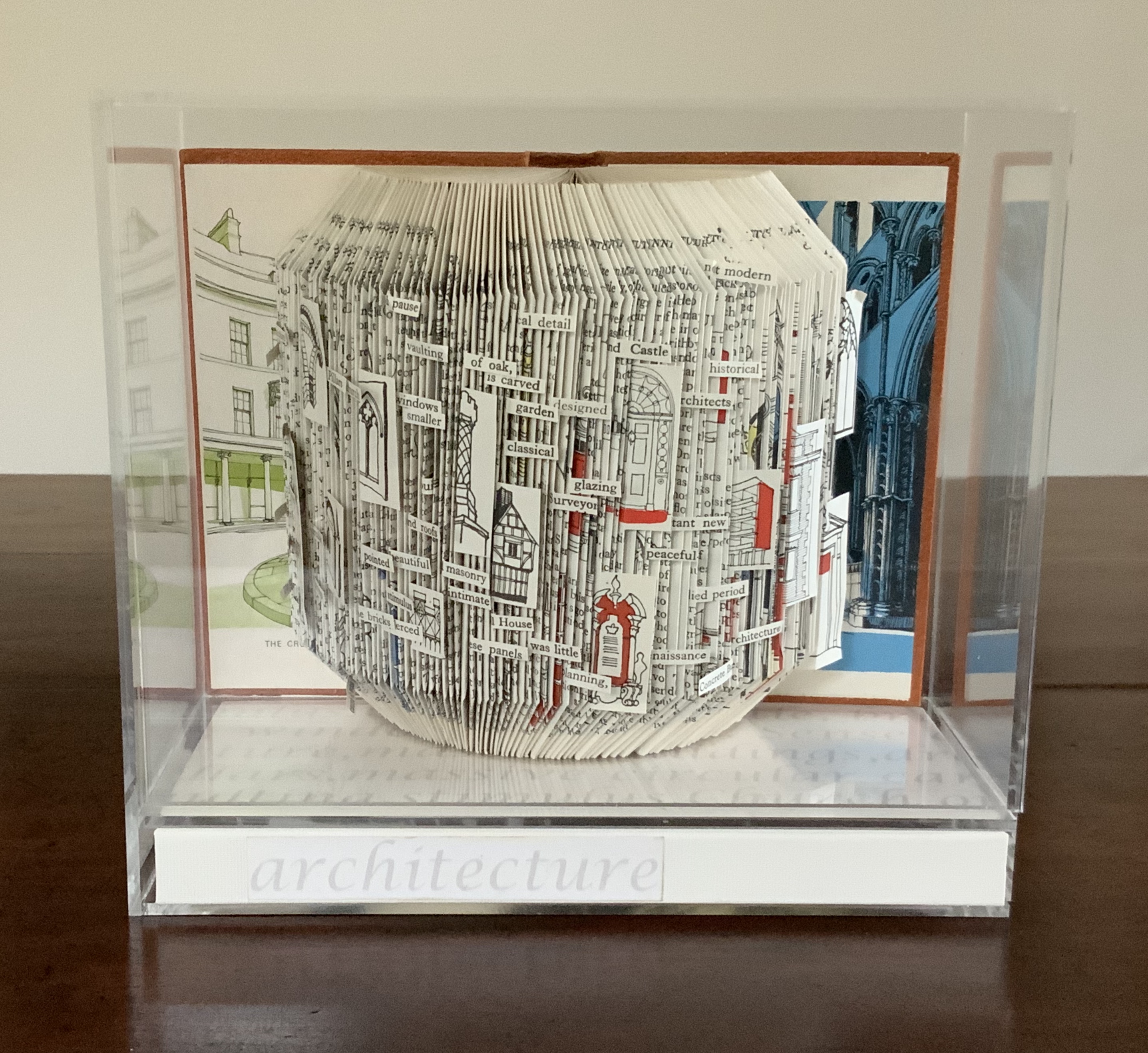
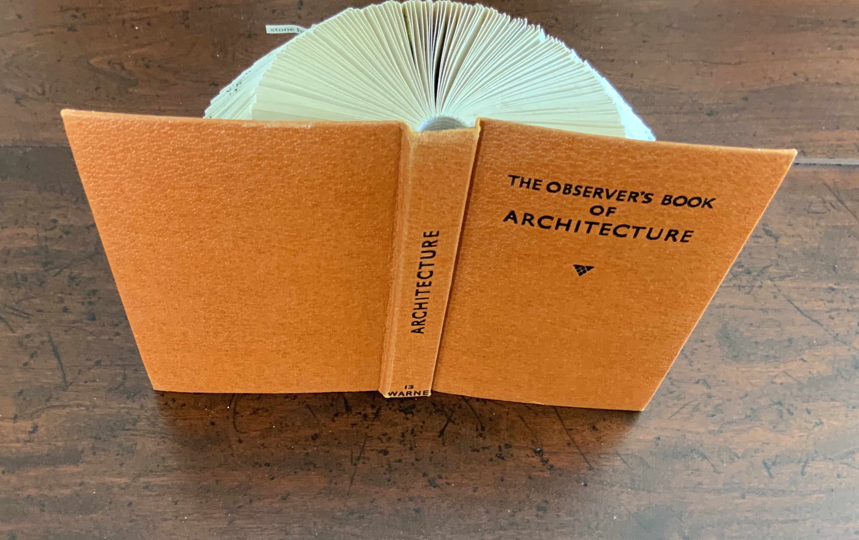
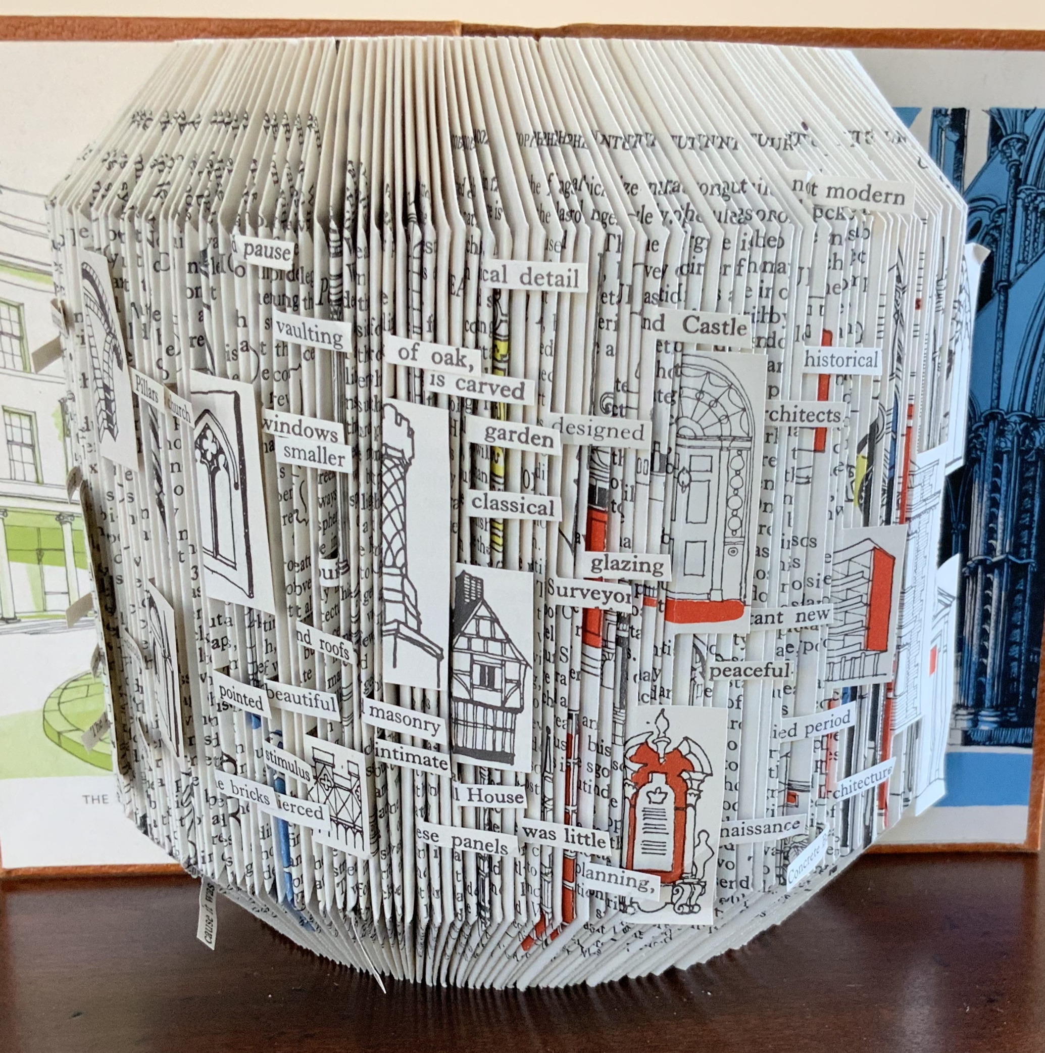
Folded book pages rarely generate a work that rises above mere craft. Heather Hunter’s Observer Series: Architecture (2009) achieves the necessary height. It combines the altered book with an accordion book that incorporates a found poem composed of the words excised and folded outwards from the folded pages of The Observer’s Book of Architecture.
The very fact of a found poem made of excised words that happen to fall at the folds shaping a column from a book on architecture chimes with the title of Bachelard’s The Poetics of Space.
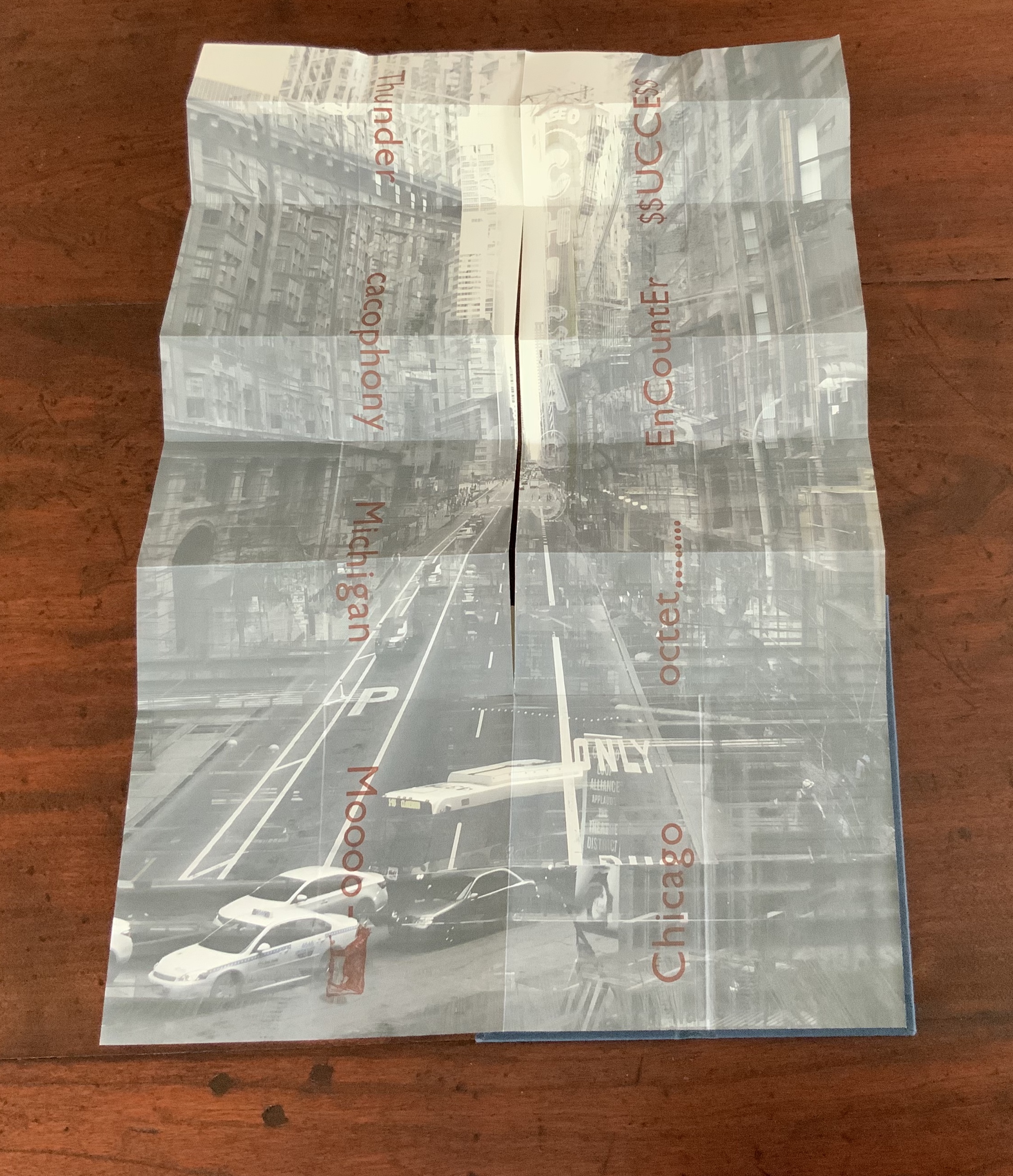
Chicago Octet (2014) byMarlene MacCallum embodies the collaborative creative approach often taken in architects’ practices. Collaborative working arises almost as frequently in book art. Think of Blaise Cendrars and Sonia Delaunay, Helen Malone and Jack Oudyn, Julie Chen and Clifton Meador, Robin Price and Daniel Kelm. Many more can be added. As described by MacCallum:
From May 19 – 26, 2014 a group of eight gathered at the Columbia College Center for Book and Paper Arts for a final collaborative project. This event was organized by Clifton Meador and myself and included David Morrish, Scott McCarney, and four Grenfell Campus BFA (Visual Arts) grads, Stephen Evans, Maria Mercer, Virginia Mitford, and Meagan Musseau…. The letterpress printing consisted of a word selected by each participant printed on one of Scott’s folded structures. The images were a digital layering of every cityscape photograph that I made and then inkjet printed on top of the letterpress. The final folded structure was designed by Mary Clare Butler. The case was designed and built by Scott McCarney, the front cover embossment was by David Morrish and Clifton Meador.
Chicago Octet(2014) Marlene MacCallum Hand bound artist’s book with folded paper structure, letterpress and inkjet printing, 6.5 × 3 × 0.5 inches (closed dimension). Photo: Books On Books Collection
Photo: Books On Books Collection
Chicago Octet fully unfolded, 17.5 × 11.5 inches Photo: Books On Books Collection
Can you hear the traffic and sense the layers of experience? What Pallasmaa writes here of rock art in Africa and Australia reminds me of Chicago Octet (or is it vice versa?): “
At the same time that great works of art make us aware of time and the layering of culture, they halt time in images that are eternally new. … Regardless of the fact that these images may have been painted 50,000 years ago, … we can … hear the excited racket of the hunt.The Embodied Image, p. 109.
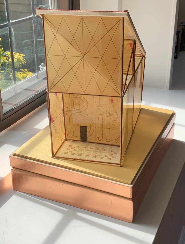
Sacred Space(2003) is an intimate monument of book art. Made intimate by the content and texture of its book, made more intimate by the viewer’s having to construct the chapel. Made monumental by the echo of typographic history, made more monumental in Galileo Galilei’s echo from its floor: Mathematics is the alphabet with which God has created the universe.
Sacred Space (2003) Jeffrey Morin and Steven Ferlauto Book: Reduction linoleum prints with typographic illustrations using overprinting of letterforms; open spine sewn with brown cord binding; brown cloth-covered boards; title and design on front board; endpapers of handmade paper from Nepal. Book: 6 x 14.25″; 17 leaves. Chapel kit: Six walls, roof, base. Walls: copper rod skeleton with Okawara rice paper skin covered with a casting resin. Book and kit housed in wooden box. Roof copper-leafed Davey board. Roof forms the tray in which the book rests. Base: Box lid becomes the base for the chapel. Brass holes in the base allow the rods to fit exactly. Print pattern on the base becomes the floor pattern. Box painted with copper leaf. Sculpture base 15.75 x 11.5″, height 12″. Edition of 35, of which this is #23. Photo: Books On Books Collection.
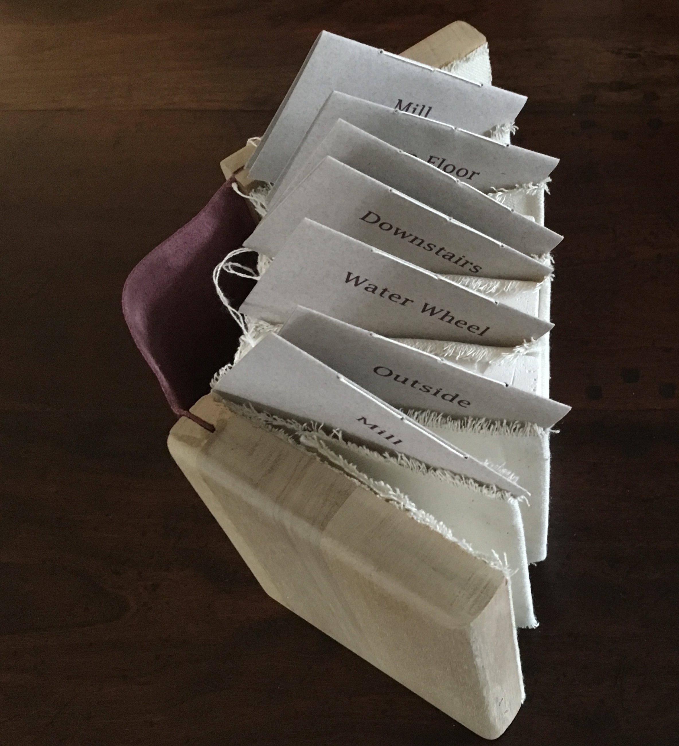
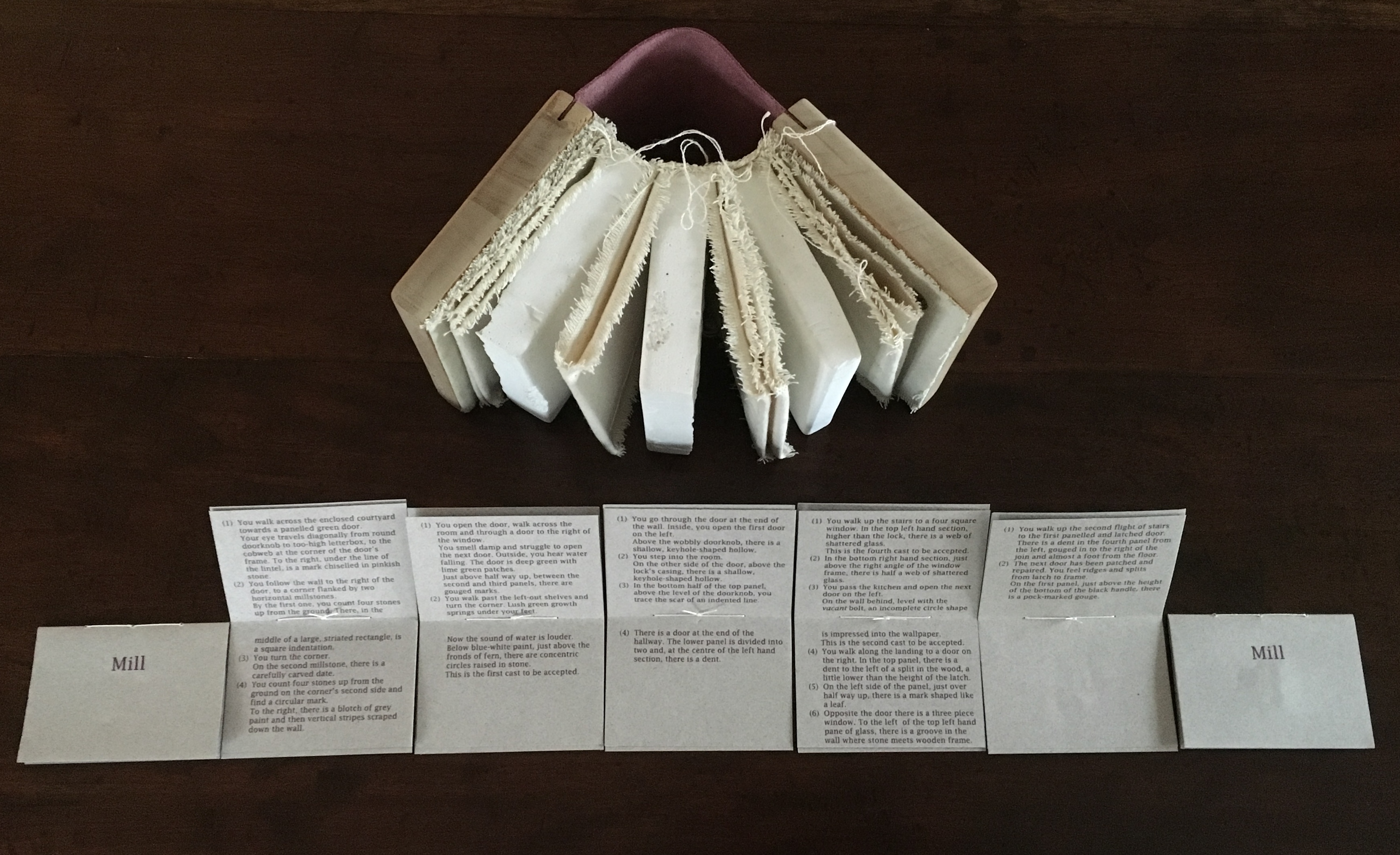
Mill: A journey around Cromford Mill, Derbyshire (2006) is the result of the artists’ exploration of Cromford Mill in Derbyshire, the first water-powered, cotton-spinning mill developed by Richard Arkwright in 1771. Solid, plaster cast blocks are held softly between calico pages containing hidden texts, bound in recycled wooden library shelf covers that indicate there is history to be found within.
Mill: A journey around Cromford Mill, Derbyshire (2006) Salt + Shaw (Paul Salt and Susan Shaw) Photo: Books On Books Collection
Having Mill is like having the building inside your house.
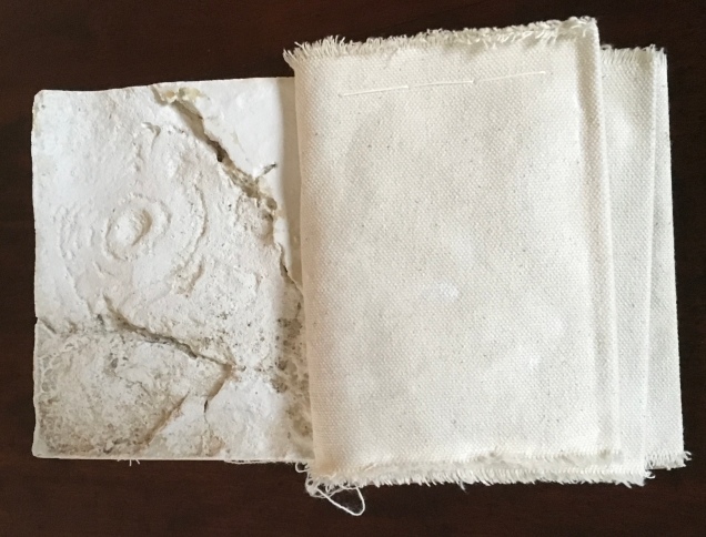
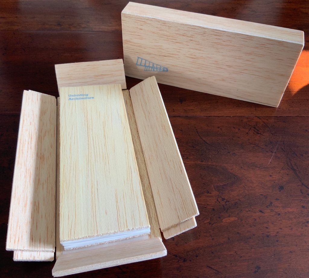
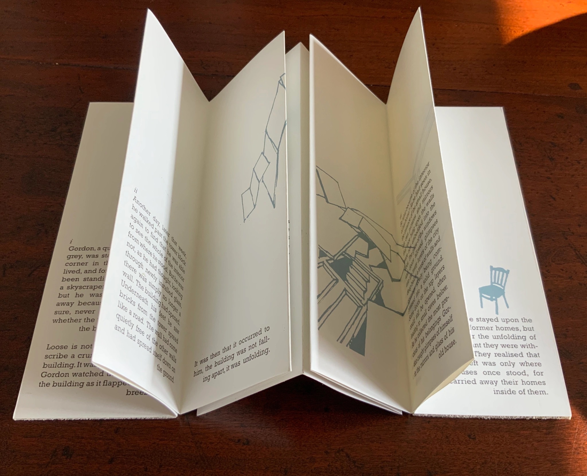
When Emily Speed is not creating architectural costumes for architectural performative art, she creates artist’s books to express her inner edifices. Unfolding Architecture (2007) coheres title, metaphor, narrative, image, technique of silk-screening, letterpress, texture of paper and wood, the workings of the accordion and box enclosure — all — into an artwork about un-cohering.
Unfolding Architecture(2007) Emily Speed Double-sided accordion book, attached to balsa wood covers, housed in a hinged, covered box of balsa wood. Book – H190 x W70 x D18 mm (closed), H190 x ~W2280 (open); Box – H203 x W88 x D63 mm; 24 panels, including cover panels. Edition of 90, of which this is #7. Acquired from the artist, 24 October 2020.
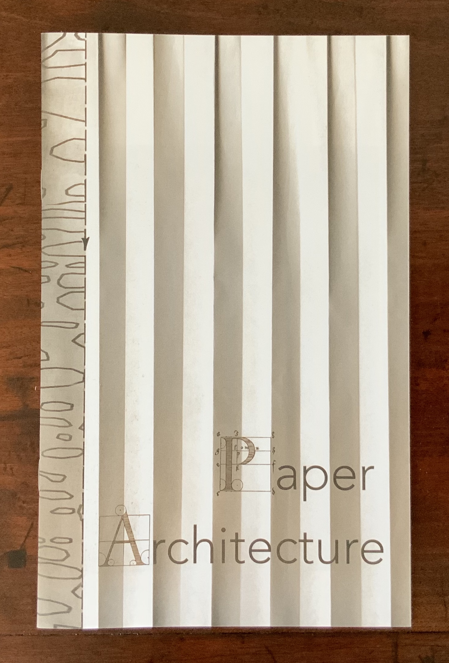
Architecture plays more than an inspirational role in Karen Wirth’s portfolio. As mentioned above, she has created her own take on Vitruvius’ Ten Books. She designed the Gail See Staircase at Open Book and the Hiawatha Light Rail Station, both in Minneapolis. The collage work Paper Architecture is based on an architectural installation at the Minnesota Center for Arts Design and draws on Wirth’s photos of Ayvalik, Amsterdam, Florence, Istanbul, New York City, Rome, San Diego and Venice.
In The Embodied Image, Pallasmaa singles out “the collaged image” as creating “a dense non-linear and associative narrative field through initially unrelated aggregates, as the fragments obtain new roles and significations through the context and dialogue with other image fragments” (pp.71-72). The materially disparate words in the title of Wirth’s work imply the dialogues she creates among paper, designs of letters and architecture, buildings across time and the globe, and photos tinted, four-colour, and black-and-white in palimpsest.
For Wirth’s own comments about the intersection of book art and architecture, see her interview with Betty Bright.
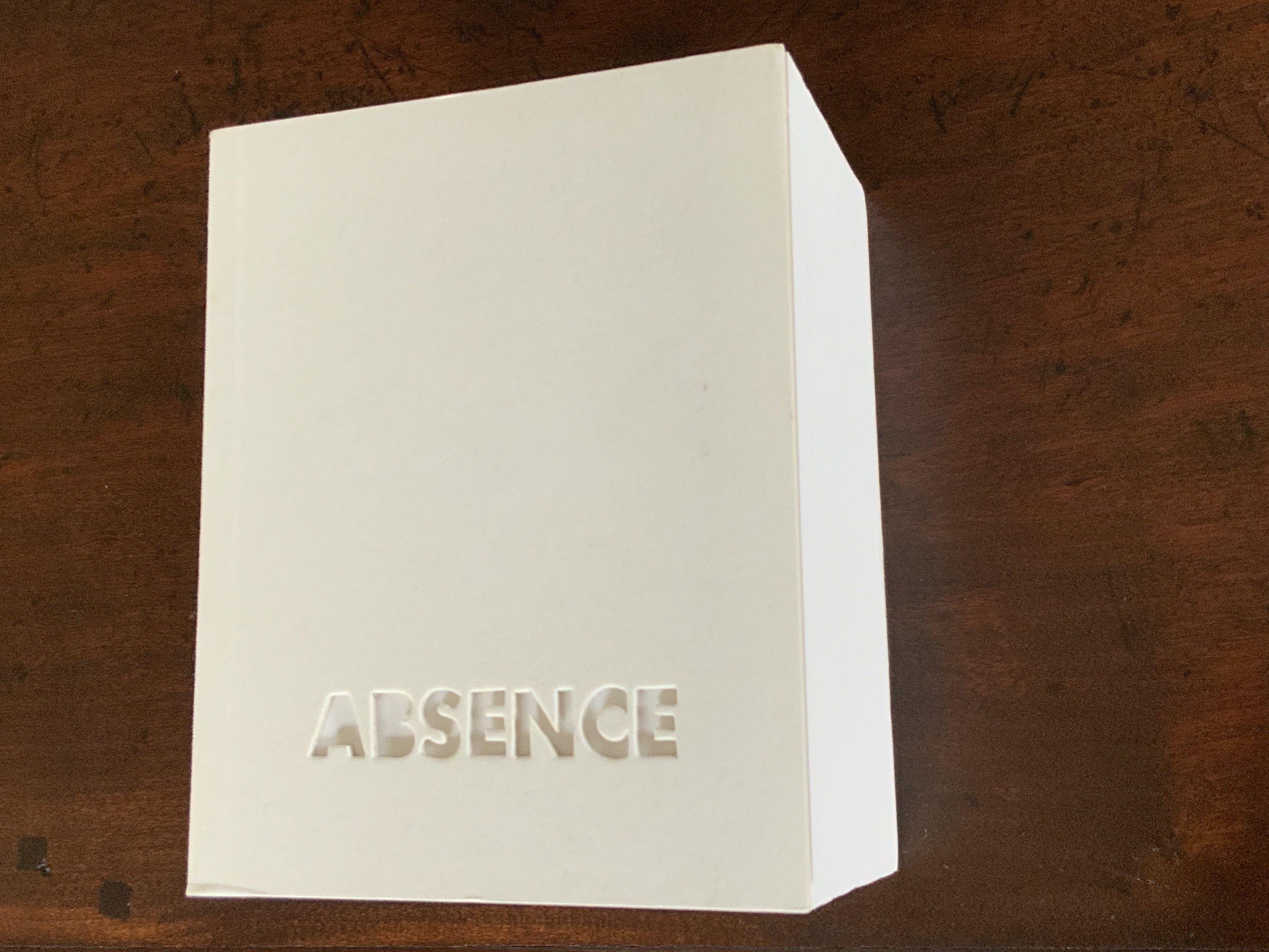
Former professor and head of the Department of Architecture at MIT’s School of Architecture and Planning, Yoon is now Gale and Ira Drukier Dean of the College of Architecture, Art and Planning at Cornell University. She is also cofounder of Höweler + Yoon, a design-driven architecture practice. Absence appears to be her only work of book art so far.
When you hold this small white brick of paper and turn its thick pages, a small pinhole appears on the page. Then two larger square holes emerge, one of which falls over the pinhole. Page after page, the two square holes repeat, creating two small dark wells in the field of white, until on the last page they take their place in the cut-out schematic footprint of the city blocks and buildings surrounding the Twin Towers of New York City. What you hold in your hands at the end is an object of art and book of memorial prayer.
Absence (2003) J. Meejin Yoon Photo: Books On Books
Other sites, other works
Twice a semester, the Environmental Design Library at the University of California, Berkeley hosts “Hands On: An Evening with Artists’ Books”. In 2017, one evening’s theme was “Building on the Built”, illustrated by 25 works of book art. Organised by 23 Sandy Gallery in the same year, “BUILT“ was an international juried exhibition featuring 66 artist books by 51 artists examining the relationship between contemporary book art practices and architecture, engineering, landscape and construction.
Arranged alphabetically by artist’s name, this section provides links to works from these two exhibitions as well as other collections, exhibitions, installations and recommendations from the Book-Arts listserv members.
A Crisis Ethicist’s Directions for Use: Or How to be at Home in a Residence-cum-Laboratory (2003) Inge Bruggeman Photos: Courtesy of the artist
On her site, Bruggeman writes, “This book/box project is built around excerpts from Architectural Body by Madeline Gins and Arakawa…. incorporates a blueprint of their Bioscleave House as part of the imagery….”. Somewhat like A Clockwork Orange or perhaps more like Heideigger’s tomes, the Gins and Arakawa book is a challenge to the reader’s expectations of diction and syntax.
Richard Minsky: Model of Buckminster Fuller’s Tetrascroll (1979). See also Polly Lada-Mocarski, Richard Minsky and Peter Seidler, “Book of the Century: Fuller’s Tetrascroll“, Craft Horizons, October 1977 (Vol. 7, No. 35). For one (very helpful) reading of Tetrascroll see Jessica Prinz’s “The ‘Non-Book’: New Dimensions in the Contemporary Artist’s Book” in The Artist’s Book: The Text and its Rivals, a special two-issue volume of Visible Language, Vol. 25, Nos. 2/3, edited by Renée Riese Hubert (Providence, RI: Rhode Island School of Design, 1991), pp. 286-89.
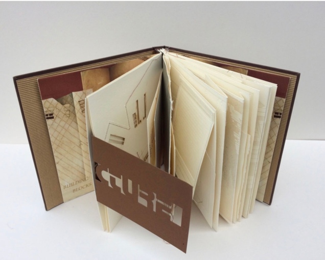
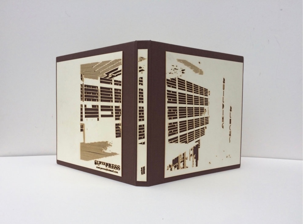
Building Blocks Book XVII (2017) Sumi Perera Photos by artist’s permission
Going against the usual structure of the book, that of a beginning, a middle and an end, Perera provides a space for infinite possibilities and multiple authors, creating “modules that can be re-sequenced and re-aligned to develop variable permutations and encourage participatory involvement, to share the final editorial control with the viewer to transform the ever-evolving work”.These possibilities for variable permutations are no more evident than in her constantly evolving project, Building Blocks Book, and its numerous subsequent iterations including The Negative Space of Architecture and The House That Jack Never Built (2008). Once again we find Perera exploring human interaction, not only with the concepts and her quizzical ideas surrounding architectural and public spaces and how we build between and move within, but also the physical interaction with the artists’ books she produces – the rearrangement and reinsertion of pages which allow the audience and participants new opportunities and pathways to proceed. Through the positive and negative space of the page or the type font, the Underground versus over ground, the artist takes us on journeys that are at once fluid and at other times obstructive. In these cityscapes, the U-turn is as common as the page turn – a necessary rupture in a free-flowing narrative. Chris Taylor, From Book to Book (Leeds: Wild Pansy Press, 2008).
Robbin Ami Silverberg: Home Sweet Home (2006). Artist’s description — “an architectural album of an imaginary middle-class suburban house, … its plans and layout [filled] with the many proverbs I’ve found about women in the home. The book was printed to look like the almost obsolete technique of Diazo printing (blue-printing), but in fact, it is archival inkjet.”
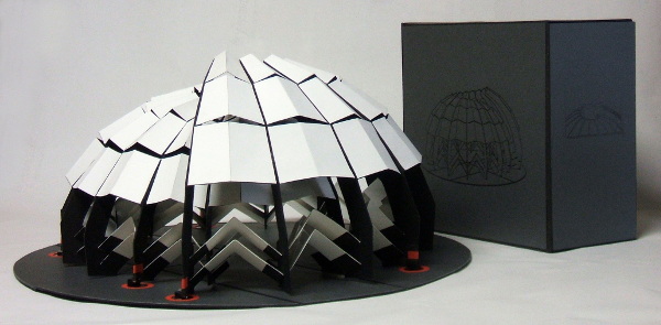
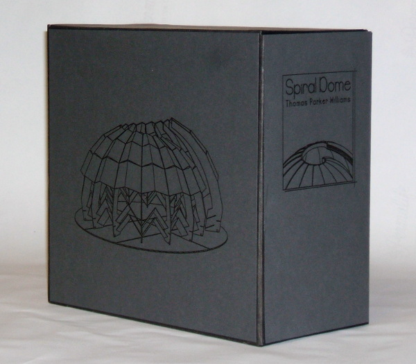
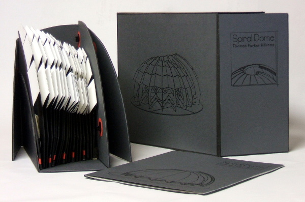
Spiral Dome: Sculptures in Paper and Steel (2016) Thomas Parker Williams Photos: Courtesy of the artist
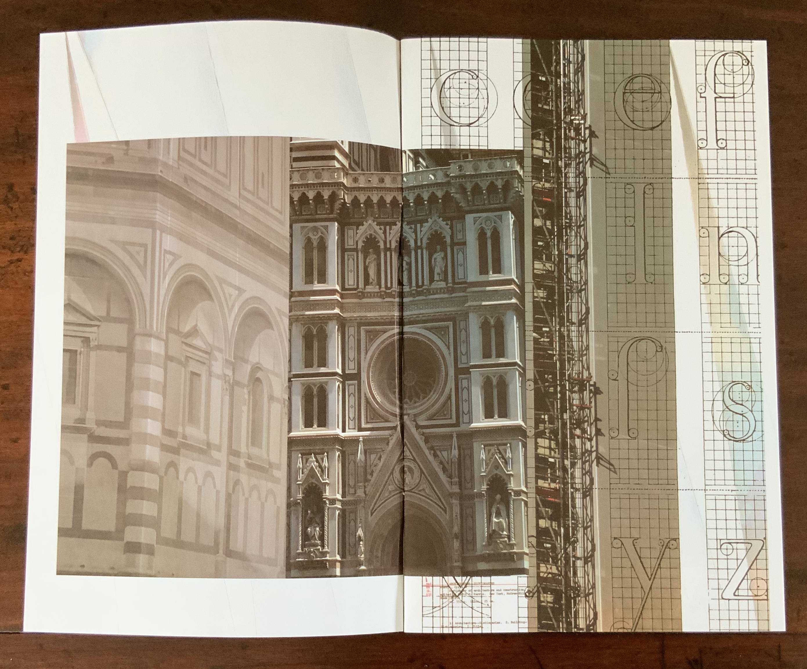
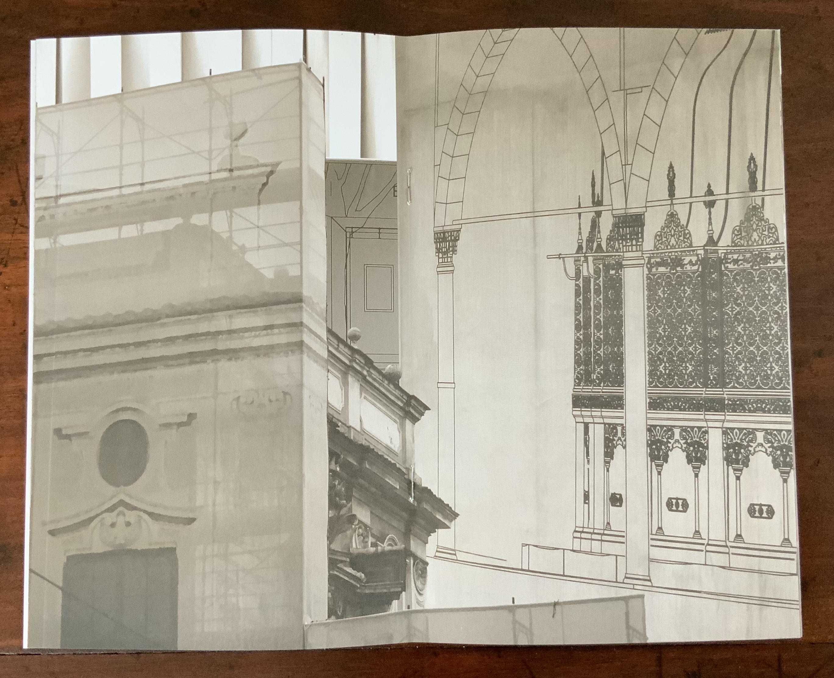
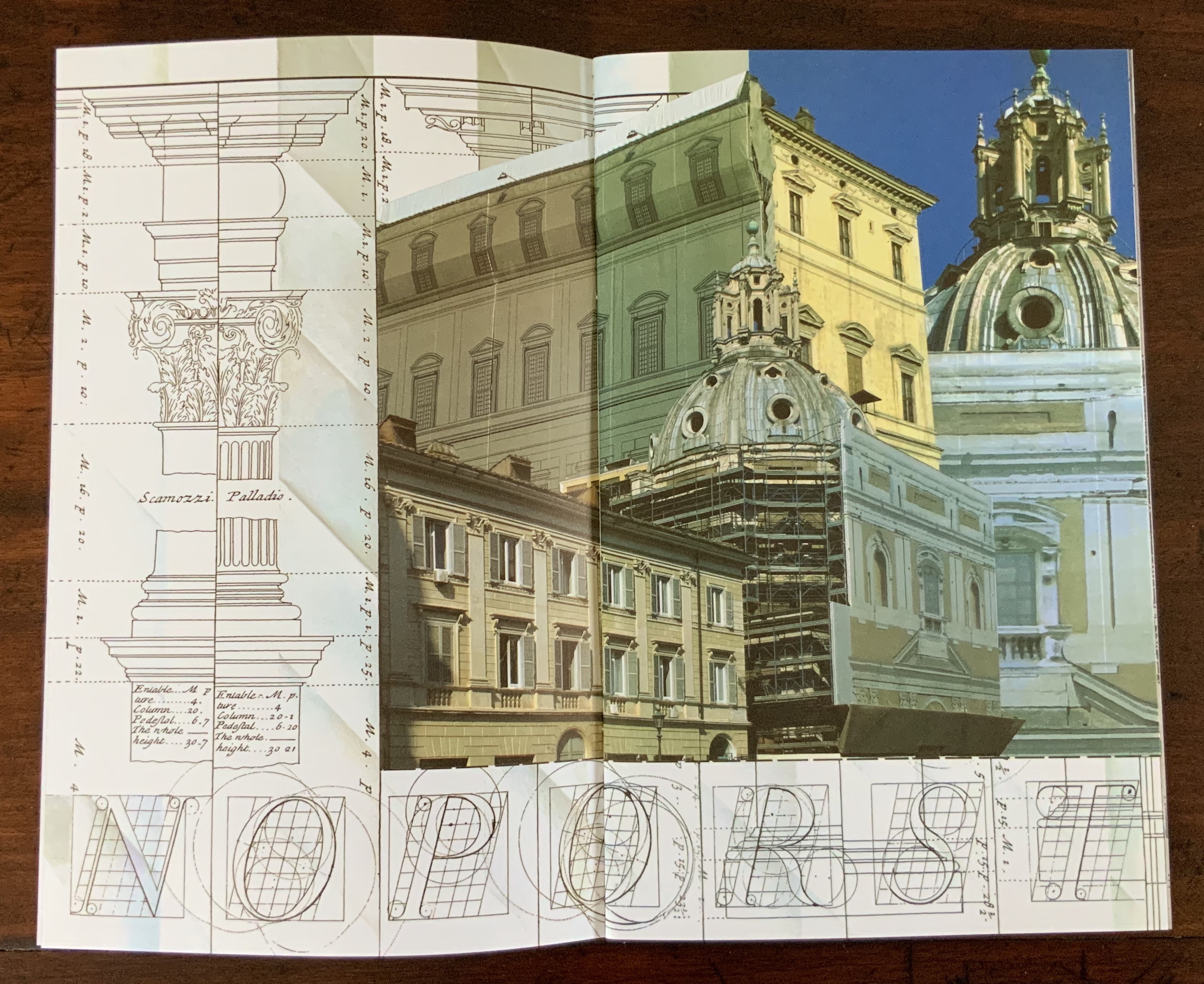
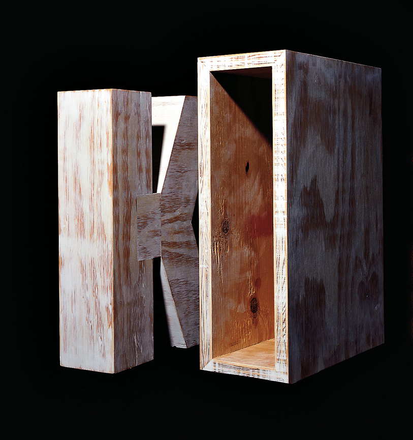
Update: With the addition of Marian Macken’s book Binding Space, mentioned above, comes the Vedute Foundation, a collection of objects/manuscripts by artists/designers/architects created within the constraint that each work has the proportion of the Gutenberg Bible and the relationship of ‘Text’ and ‘Form’ as its subject. For this essay in Books On Books and for the Books On Books Collection’s acquisition of the Merrion edition of Johann David Steingruber’s Architectural Alphabet, the most apropos and favorite work in the Vedute collection is K (1996) by Peter Wilson.
K(1996) Peter Wilson “This contribution (a double volume) is based on the letter ‘K’ (an atom of language), materialised within the Gutenberg proportions in sturdy plywood. It is the responsibility of an architect not only to ‘give form’ but also to explore latent interiorities, potential spatialities. Here the ‘K’ interior has its own inherent geometric agenda − a tunnel, a tube, an inverting telescope (apex mirror). Object becomes instrument (a window to the antipodes even), a trigger for multiple ‘K’ vectors (textural and spatial).” Bolles+Wilson
23 Sandy Gallery. 2017. Built: an international exhibition of contemporary artist books, April 7-May 27, 2017. Portland, Oregon: 23 Sandy Gallery. “… examining the relationship between contemporary book art practices and architecture, engineering, landscape and construction as form, function and structure. Book artists took this opportunity to re-image the ways we as designers, of either books or buildings can inhabit and shape the world around us. Our disciplines have a natural synergy. After all, books and buildings are both kinetic, sequential, structural and time based. BUILT examines the relationship between the built and the book. BUILT features 66 artist books by 51 artists from across the country and as far away as Canada, United Kingdom and Australia.” Publisher’s website.
Sophia Kramer, “Variations of Vitruvius: Four Centuries of Bookbinding and Design”, The Met, 22 August 2018. This essay reviews and illustrates the conservation and rehousing of ninety-five copies of De Architectura libri decem (The Ten Books of Architecture) by Marcus Pollio in the collection of the Department of Drawings and Prints. They are part of a donation of 356 publications from the architect William Gedney Beatty (1869–1941). For book artists, the section on a 1556 edition with double volvelles to display a theater design should be of interest.
Marian Macken, Binding Space: The Book as Spatial Practice (London: Taylor and Francis, 2018). A trained architect and book artist, Macken articulates and illustrates the how and why of the overlap between architecture and book art.
David Sume, The architectural nature of the illustrated books of Iliazd : (Ilia Zdanevich, 1894-1975, University of Montreal, 2019. This dissertation is a reminder that the importance of architecture to book art reaches back to the avant-garde and modernists of the early 20th century — and more important, that its importance may lie beneath the surface.
Elizabeth Williams, “Architects Books: An Investigation in Binding and Building”, The Guild of Book Workers Journal, Volume 27, Number 2, Fall 1989. This essay not only pursues the topic of architecture-inspired book art but turns it on its head. An adjunct professor at the time, Williams set her students the task of reading Ulises Carrión’s The New Art of Making Books (Nicosia: Aegean Editions, 2001) then, after touring a bindery, “to design the studio and dwelling spaces for a hand bookbinder on an urban site in Ann Arbor, Michigan”. But before producing the design, the students were asked “to assemble the pages [of the design brief and project statement] in a way that explored or challenged the concept of binding”. In other words, they had to create bookworks and then, inspired by that, create their building designs. Williams illustrates the essay with photos of the students’ bookworks. [Special thanks to Peter Verheyen for this reference.]


