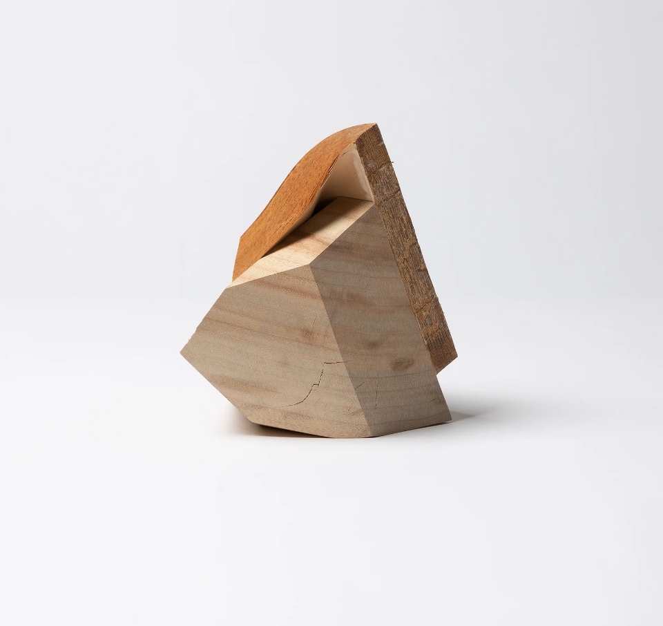
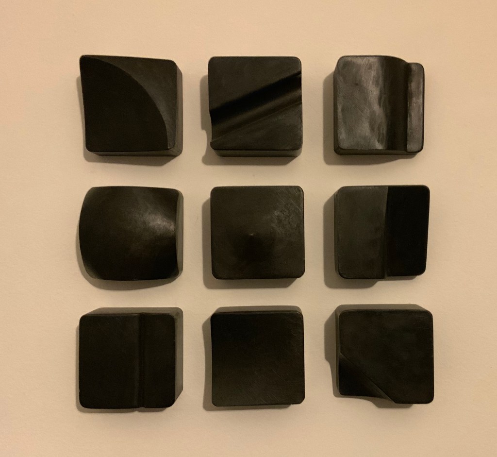
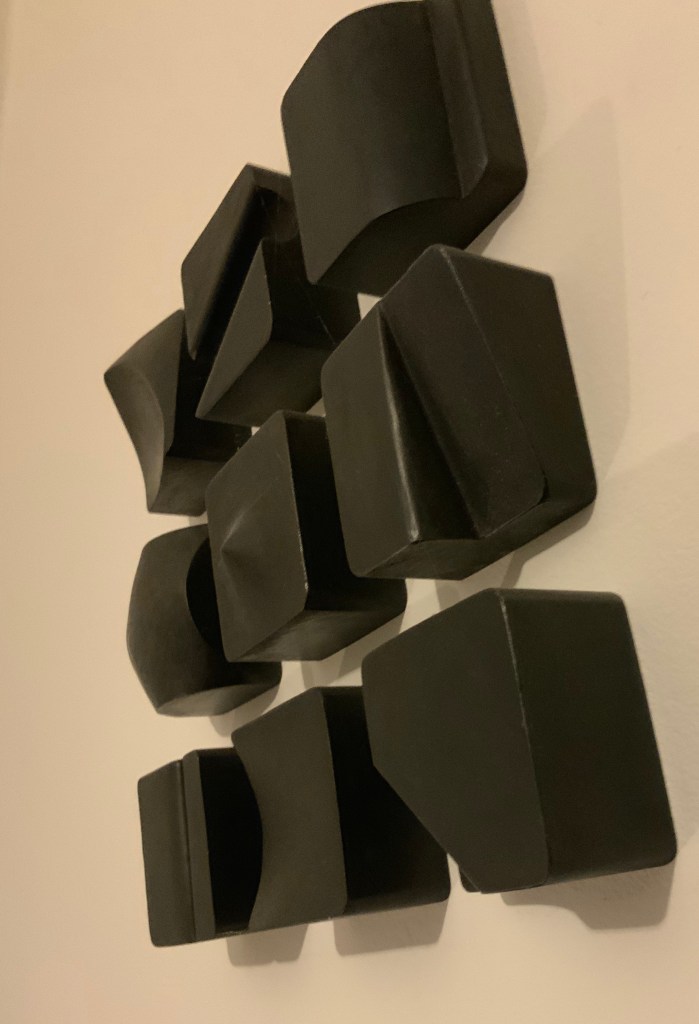
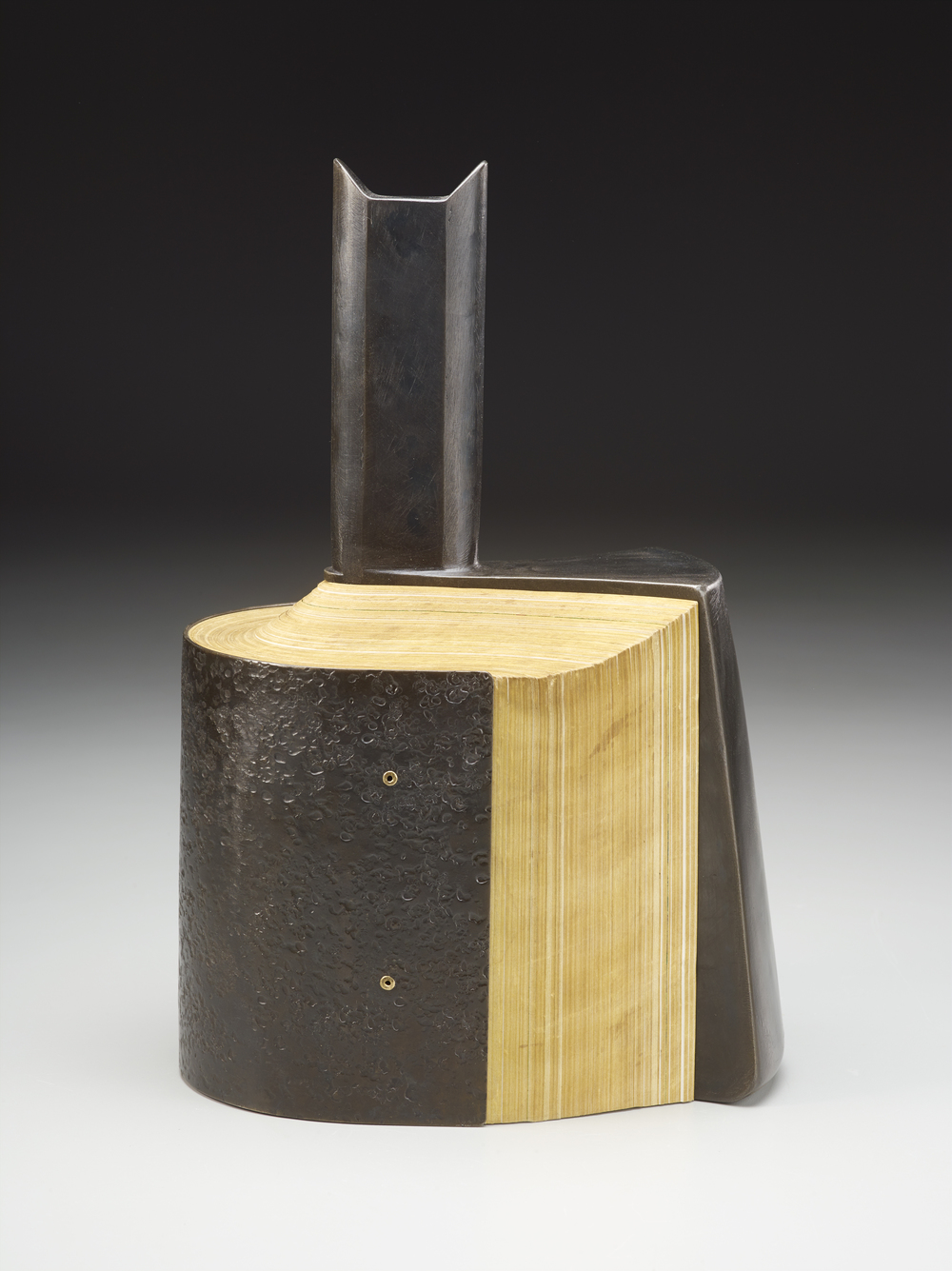
Silent Book, vol. 11 (2023) Ryuta Iida Altered book, camphor tree stump, and glue. H210 × W170 × D190 mm. Unique. Acquired from Fragile Books (Tokyo), 20 August 2024. Photos: Above, courtesy of Fragile Books; below, Books On Books Collection.
The cover, door, table of contents, numbering, text, and endnotes are all filled with a series of information. I thought to stop and crystallize all the functions of the “book,” … I decided to crystallize it. It took the time to go through the hands of people, the old book that finally reached me, sealed on a pedestal, it is now ripe for its next role. (Artist’s statement)
“Crystallized” is not the first word that comes to mind when viewing and handling this eleventh in Ryuta Iida’s series Silent Book. Perhaps it does for the angled planes of the cut block of camphor wood, but for the coverless codex, folded, draped, moulded, carved, and sculpted come closer. Two names that might not spring to mind (but should) are Giambologna (Jean Boulogne) and Gian Lorenzo Bernini. Like them, Iida offers us more than a single or primary vantage point from which to appreciate his work. Like Giambologna’s Abduction of a Sabine Woman (Loggia dei Lanzi, Florence) or Bernini’s Apollo and Daphne (Galleria Borghese, Rome) Silent Book must be circled and viewed in the round. The nine images below show the work turned right to left in stages.
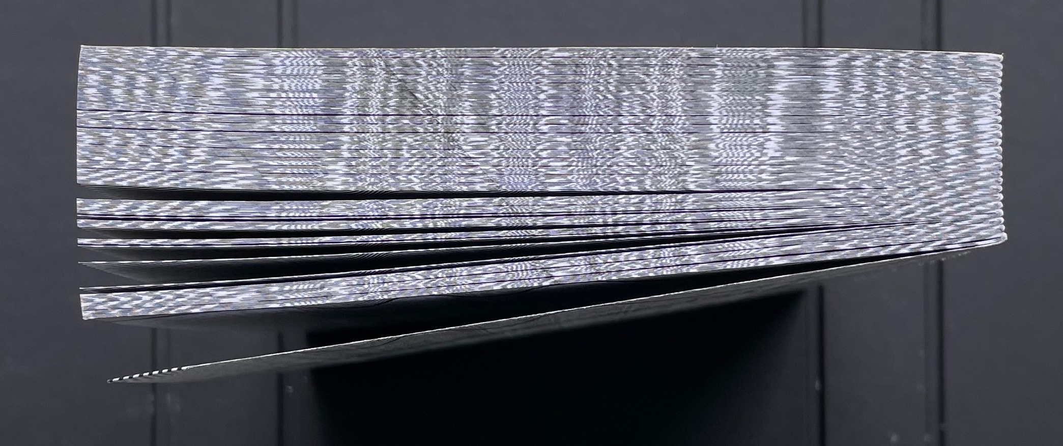
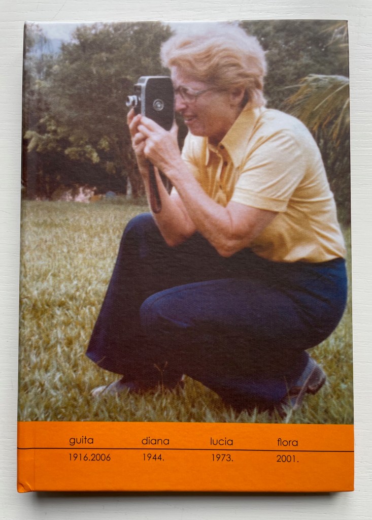
A photographer since 1991, Brazilian Lucia Mindlin Loeb turned to the book as the surface and form for her art. Works such as Livro sobre Livros (“Book about Books“), Entre páginas (“Between Pages”) and Biblioteca (“Library“) speak to an academic fascination with the structural elements of the book — especially its volume, edges, pages and spine. Along with Memória fotográfica (“Photographic memory”), they explore what photography and the book can tell us about time, space, memory, the world we see and a familial experience of it. The works below from the Books On Books Collection show only a fraction of how far beyond the photobook Loeb has gone.
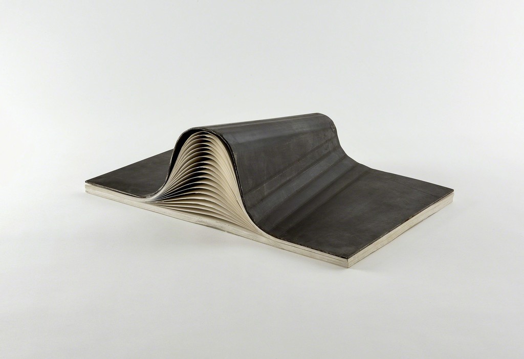
Abismo (2012)
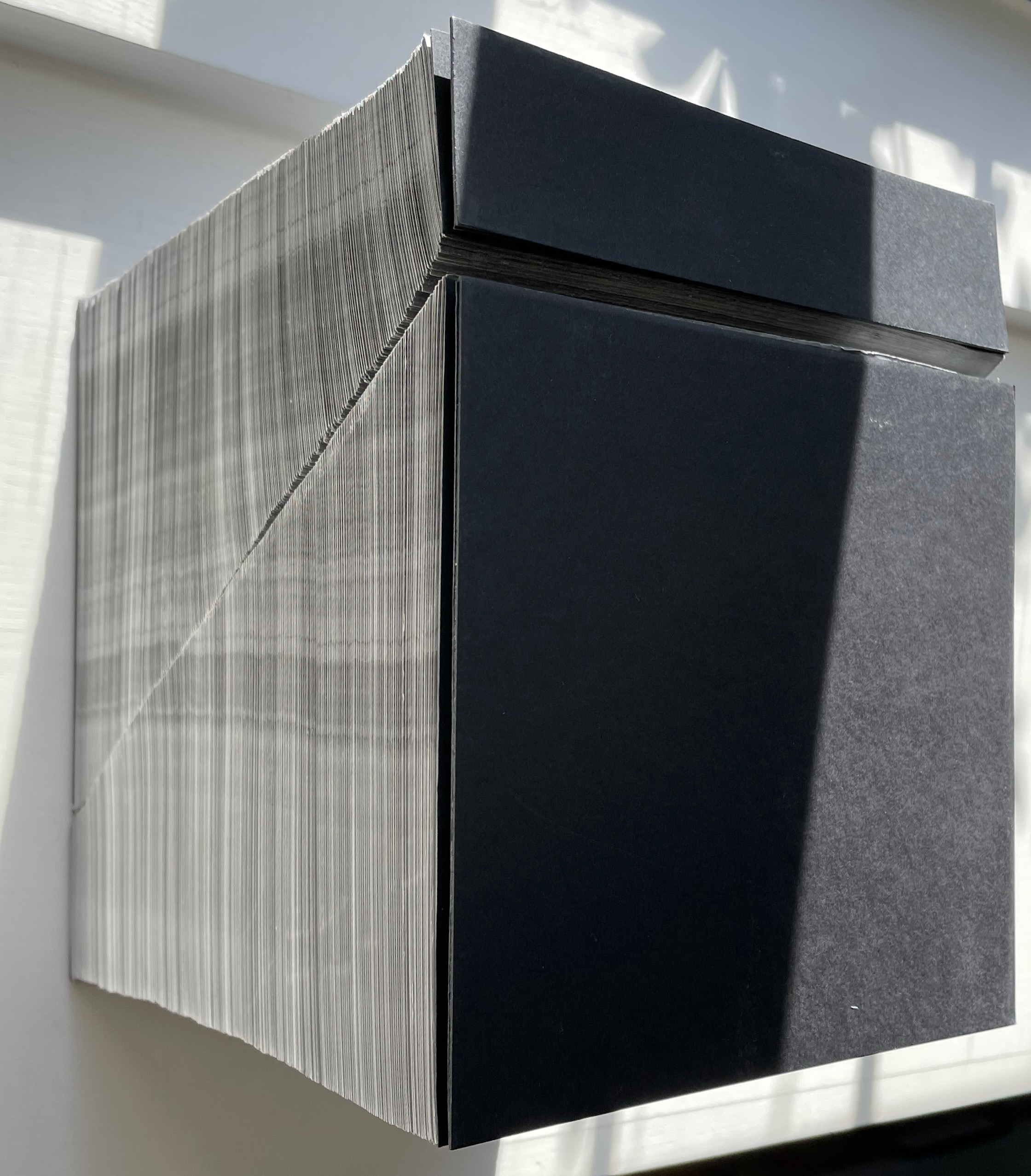
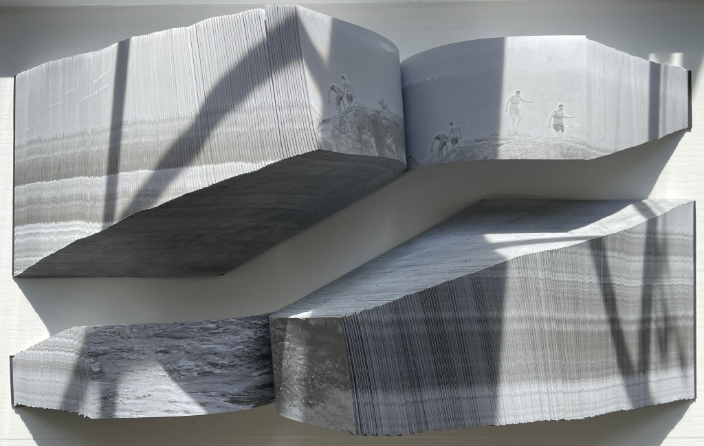
Abismo (2012) Lucia Mindlin Loeb Front and back card covers on a sewn, exposed-spine book block cut diagonally into two volumes, each housed in a custom archival box. H210 x W210 x D175 cm. Edition of 5 and 2 artist’s proofs, of which this is A/P #2. Acquired from the artist, 5 October 2022. Photos: Books On Books Collection.
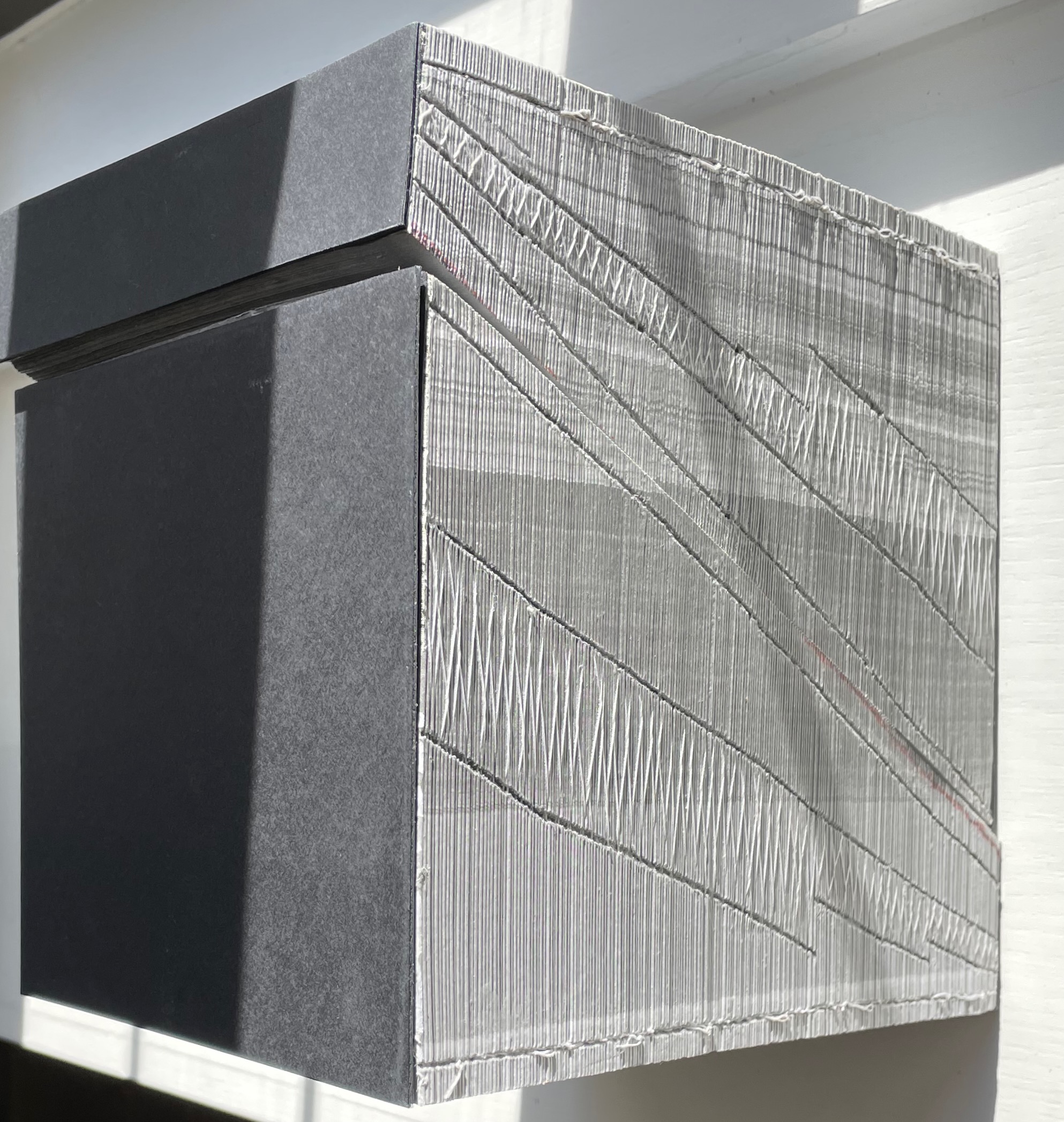
Fore-edge view (L) and spine view (R) of the cut halves resting against each other.
Close up of spine.
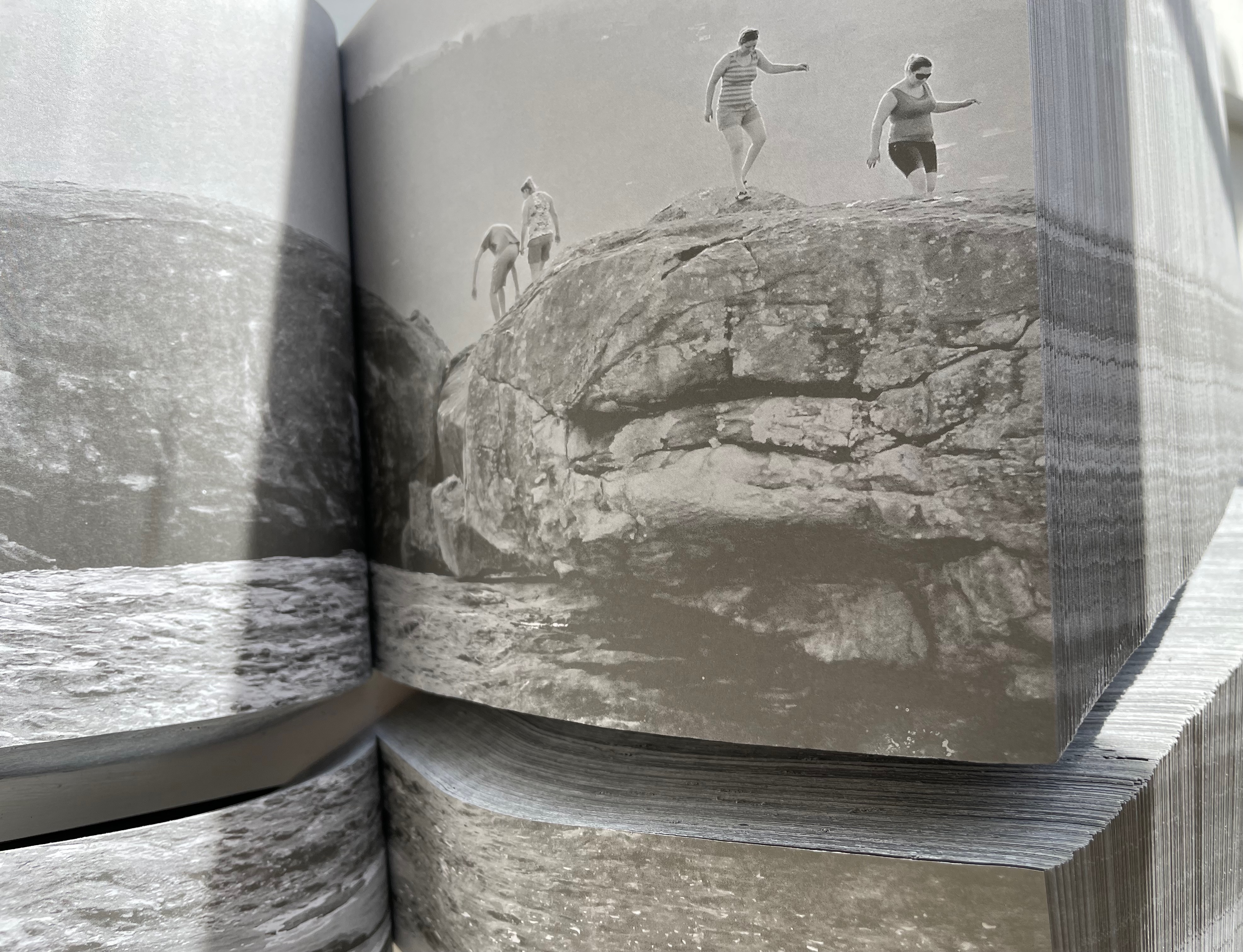
With the two halves open and positioned properly, their parallel opening and page turning soon creates a disorientation. The top half thickens and narrows, while the bottom half thickens and deepens.
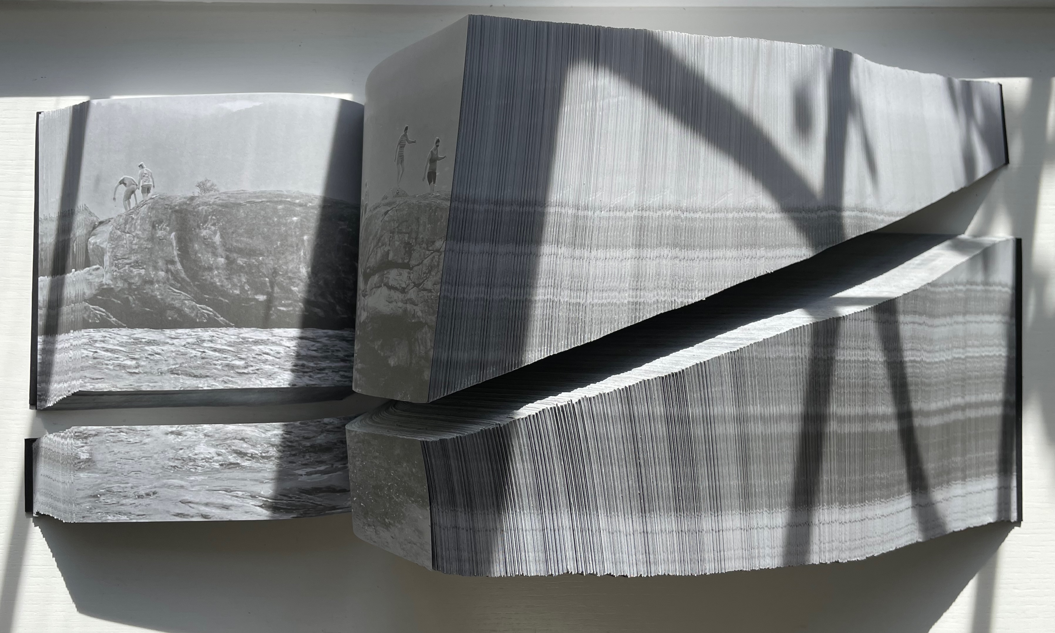
Below, a close-up view of the abyss and the cliffwalkers evokes a sense of precariousness and vertigo.
Few books allow views of double-page spreads simultaneously from two different places in the book, and varying the position of the two halves can widen the abyss.
The brief clip below conveys more of the disorienting effects that “reading” this work offers. Perhaps the same feelings the cliffwalkers experienced.
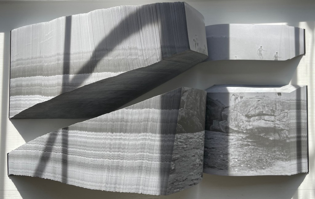
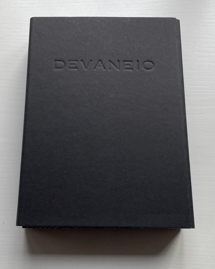
Devaneio (2015)
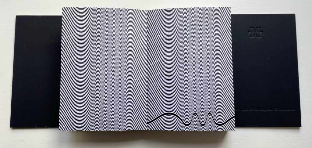
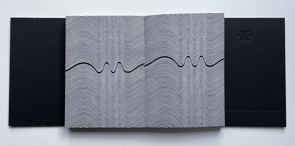
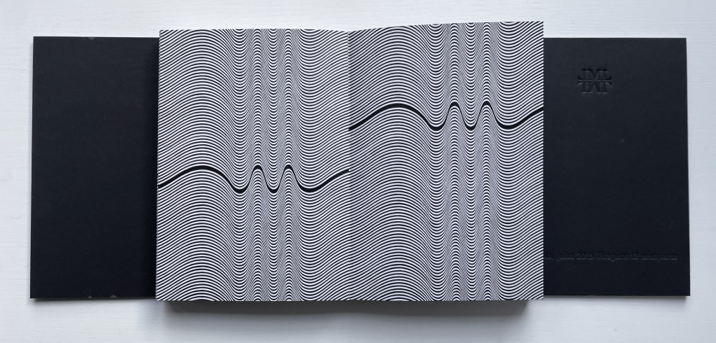
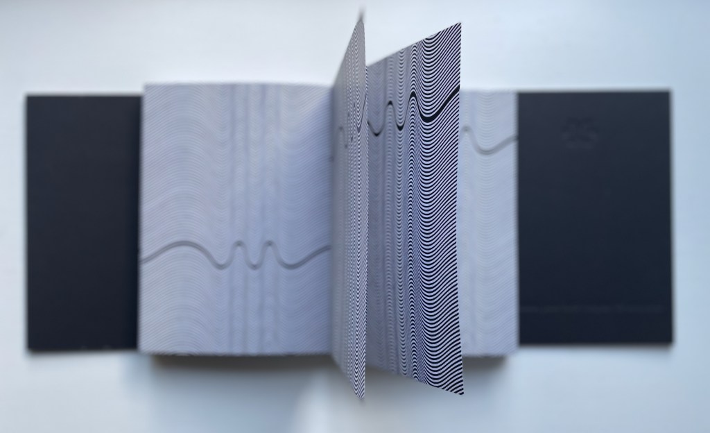
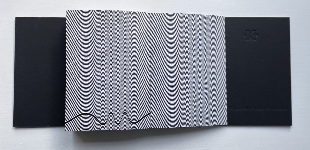
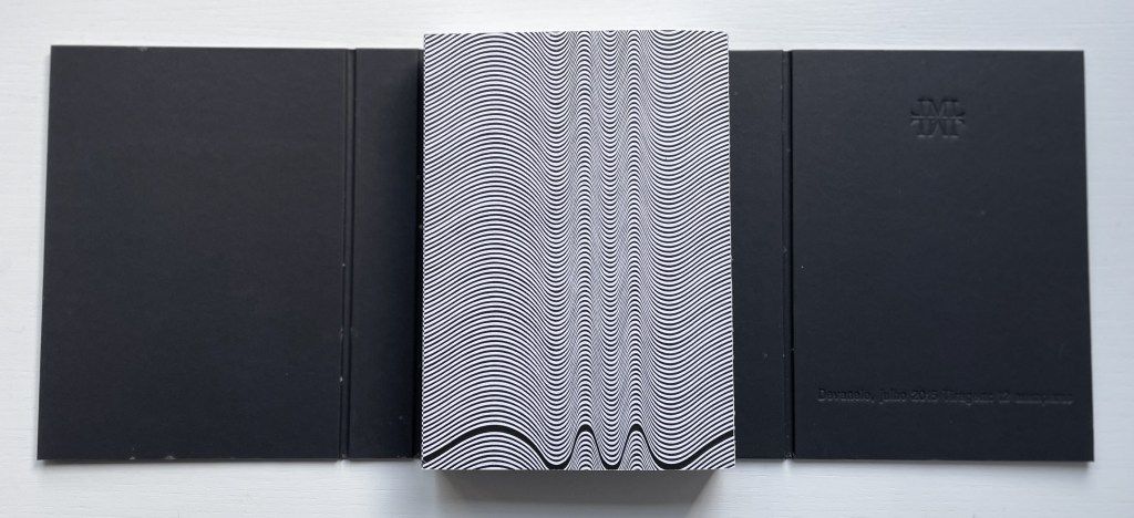
Devaneio (2015) Lucia Mindlin Loeb Exposed spine book block, handsewn and glued, loose in trifold case. H180 x W130 x D3 mm. 384 pages. Edition of 12, of which this is #5. Acquired from the artist, 5 October 2022. Photos: Books On Books Collection.
Devaneio means “daydream”, which is certainly elicited by the thick black line undulating over the hills and valleys optically created by the thinner lines parallel to each other and the thicker line. Over the first seventeen pages, the thick line appears only at the bottom of the recto page, but almost imperceptibly rises up the page.
First recto page
Seventeenth recto page
As the seventeenth recto page turns, another thick line begins its descent seemingly from outside the top edge of the eighteenth verso page. From here on, in their respective downward and upward movements, the thick lines on the verso and recto pages appear headed for convergence. The stroboscopic effect of the background of tightly packed thinner lines enhances this appearance of downward and upward motion. Although they converge, the thick lines skip over any direct intersection and continue their journeys toward the bottom edge of the verso page and top edge of the recto page.
The thick line on the verso page makes its appearance.
The lines begin to converge,
but do not intersect.
The lines diverge, the verso continuing downwards and the recto, upwards.
As the daydream begins to end, the upward bound thick line has almost disappeared at the top of its recto page. As the page turns, only the downward bound thick line remains to finish its journey at the bottom of the last verso page, the last page of the book. Of course, the the thick line’s end position on the last verso page is the same as its start position on the first recto page.
The upward bound thick line almost gone on the recto page.
The thick line has gone from the recto page.
The thick line at rest on the last verso page.
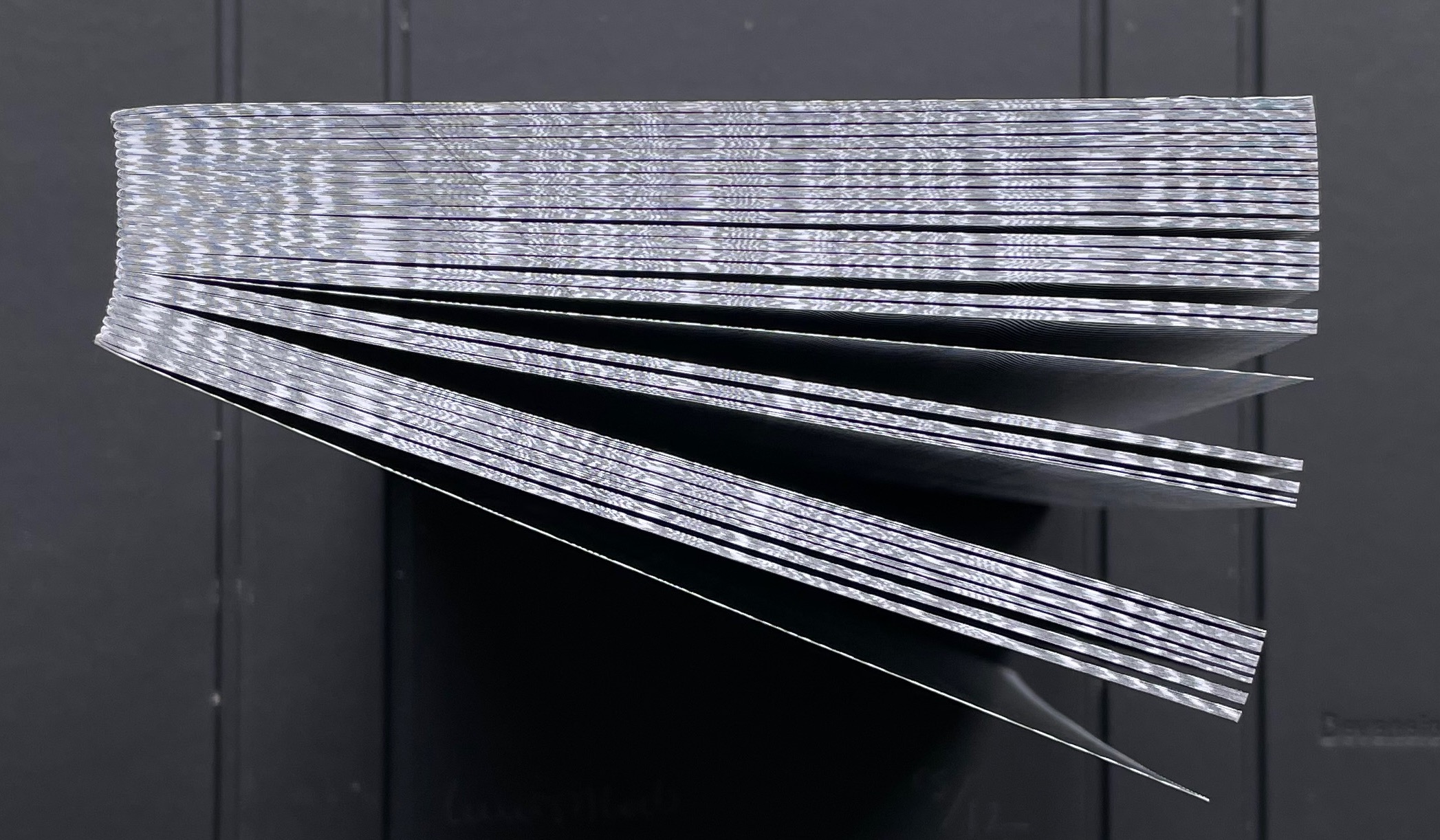
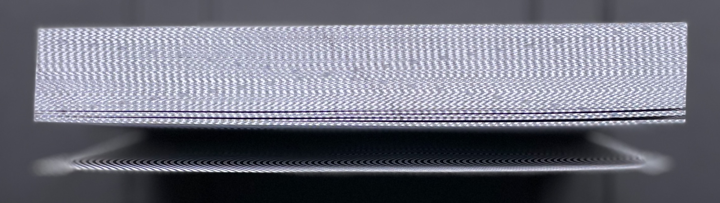
The crossover of the verso and recto thick lines can be observed on the book’s fore edge, and the thinner lines’ stroboscopic effect shows up even on the top and bottom edges.
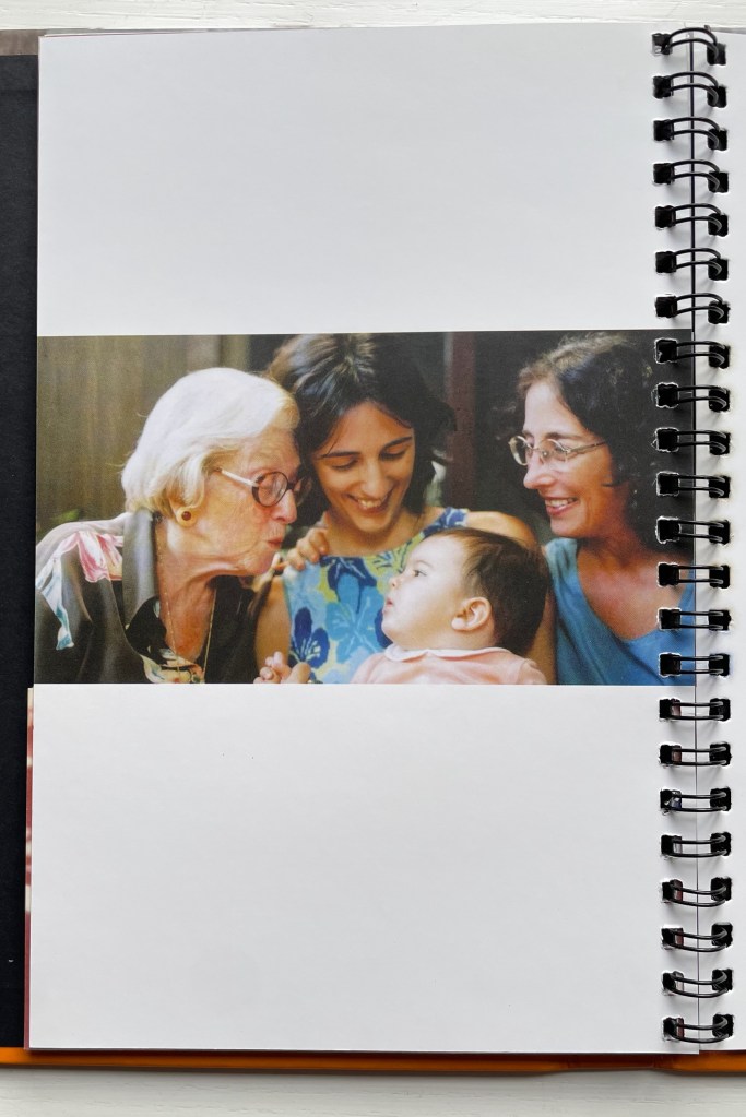
Devised by Robert Sayer (1756), “harlequinade” was a form of children’s book. Also called a “metamorphosis” or “turn-up” book, its pages were cut horizontally so that their parts could turn independently of one another and generate amusing mix-and-mismatch images. Book artists such as Emily Martin have seized on the form to great satirical effect.
Loeb’s “Memories of You” maintains the form’s comic nature but blends it with the forms of the photobook and family photograph album to deliver a whimsical and sentimental celebration of four generations. Loeb plays her title’s deliberate ambiguity out with the form’s interchange of resemblances in faces, poses and costumes and lifts her work out of mere sentimentality. The video below provides a better view of the work than would photos of the book.
The sculptural mastery in Loeb’s works makes for intriguing and enjoyable comparison with that of Doug Beube, Andrew Hayes and Guy Laramée in the Books On Books Collection, while the photographic mastery calls up Scott Kernan, Marlene MacCallum and Michael Snow for similar revisits.
Further Reading
“Doug Beube“. 21 April 2020. Books On Books Collection.
“Andrew Hayes“. 4 September 2019. Books On Books Collection.
“Guy Laramée“. 18 September 2019. Books On Books Collection.
“Scott Kernan“. 22 February 2019. Books On Books Collection.
Danish artist Hanne Stochholm Exe‘s “assemblages”, which garnered first prize in the 7th International Artist’s Book Triennial Vilnius 2015, have cousins far afield — geographically and chronologically.
Remake (2015) Hanne Stochholm Exe Reproduced with permission of the artistTalks (2005) Hanne Stochholm Exe Reproduced with permission of the artistSmall Talk (2005) Hanne Stochholm Exe Reproduced with permission of the artist
Geographically, this merging of book and metal finds common cause in the US (see Andrew Hayes’ works) and Israel (see the work of Neil Nenner and Avihai Mizrahi, represented — as is Hayes — by the Seager/Gray Gallery).
Offset (2013) Andrew HayesCover Story #4 (2017) Neil Nenner and Avihai Mizrahi
Chronologically, the hold that books and metal have had on one another reaches far past the moveable type of Gutenberg’s Bible and Master Baegun‘s earlier Jikji.
Of course, those 11th century metal fittings probably passed unnoticed by studious readers. Not so with these studious artists in the 21st century whose imaginations have seized on the contrast of materials to recast the book object as an art object.
When Andrew Hayes told me it was e.e. cummings’ 100 poems he had found in the middle of the stacks of books awaiting a bookshelf he planned to build, I winced. Cummings has always been hard for me to figure. I was hoping for a more accessible book as a pretext to kick off our interview.
If you have not encountered one of these interviews on Books On Books, I should explain. The idea is that the book artist selects a book from the middle of the home or studio bookshelf, opens it to the middle, and tells me the author, title and page number. After tracking down the book, I send off some questions and so the interview begins.
It turned out that cummings was hard to access for Andrew as well. He wrote:
As I took the book from its place in the middle I had to take care, as you can see this is not the most efficient way to retrieve a book. I was able to carefully remove the book with out the top half toppling down, this time…
Just like extracting the meaning from the poem that just happened to be bookmarked in the middle of the cummings volume. The poem begins:
Just like extracting the meaning from the poem that just happened to be bookmarked in the middle of the cummings volume. The poem begins:
kind)
YM&WC

(of sort of)

A soursweet bedtime
and ends:
iSt

ep

into the not

merely immeasurable into
the mightily alive the
dear beautiful eternal night
Until Andrew carefully pulled out this volume bookmarked by his partner Kreh Mellick, he had not read it. “To be honest, I do not read as much as I would like, ….” Still, I wonder if, as his eyes moved through the broken-up layers of syntax and the juxtaposition of the “soursweet bedtime” story with “the mightily alive the/ dear beautiful eternal night”, he recognized something of his own?
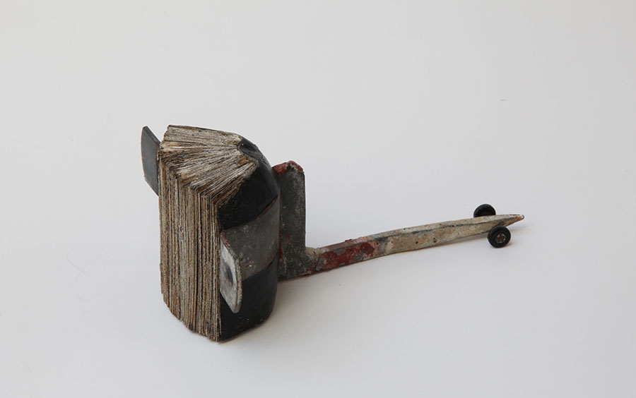
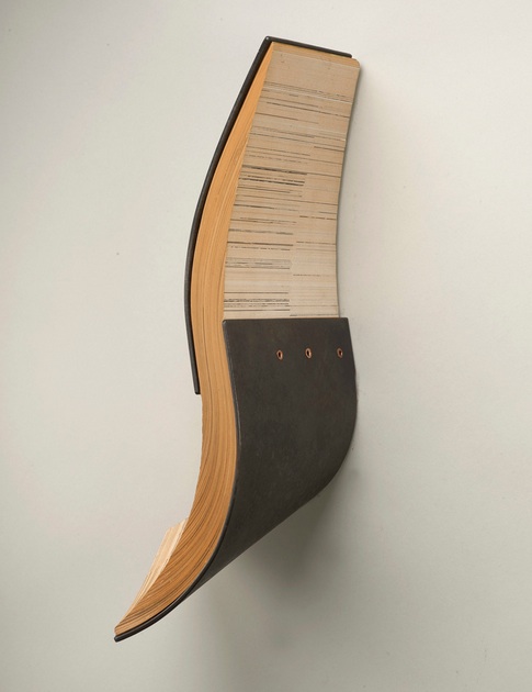
The title of this piece is Hade. “Hade” is a geological term, like Placer and Lode (titles of these other striking sculptures).
Hade, 2013 Steel, book pages, and copper 16” x 6” x 3” Reproduced with permission of the artist. Photo credit: Steve Mann, Black Box Photography
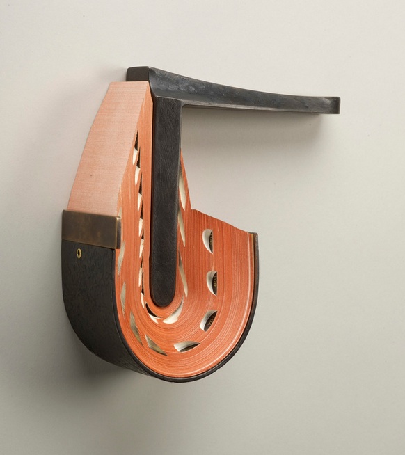
Placer, 2013 Steel, book pages, and brass 10” x 7” x 9” Reproduced with permission of the artist Photo credit: Steve Mann, Black Box Photography
Hade refers to “the angle of inclination from the vertical of a vein (geology), fault, or lode”. In Hade the yellowed pages slip between the parenthesis of steel plates like the sense lode through the fractured syntax of e.e. cummings’ poem. This is book art for the sensualist, much as most of cummings’ better poems are words for the sensualist. It exudes appreciation and care for the material of which it is made. That comes through clearly in Andrew’s response to my question “As an artist whose work has an intimate relationship to ‘the book’, could you describe the effect this has on you when you are reading books in general?”:
… as I read a book I love watching it wear and change as I pass through the pages. I’m sure this happens with everyone’s books, but I love this transformation. I find it happens best in shoes and books. I have a hard time keeping my hands clean so my books take a beating, I almost don’t need a book marker because I can just turn to the first clean page. It is funny I don’t like to dog ear pages I feel like that is almost disrespectful in a way, but I just like seeing what happens to the book as it serves its function. … for me finding a book that has been seasoned is like finding two stories. I like figuring out who read the book before and reading the notes and things I find in the books I end up using for sculpture.
An e.e. cummings poem can amuse like a Rube Goldberg or Heath Robinson contraption, but always with a sting at the end. Andrew clearly has a love of contraptions, words and paradox as well.
Lode, 2013 Steel and book pages 16” x 7” x 2.5” Reproduced with permission of the artist. Photo credit: Steve Mann, Black Box Photography
… as I read a book I love watching it wear and change as I pass through the pages. I’m sure this happens with everyone’s books, but I love this transformation. I find it happens best in shoes and books. I have a hard time keeping my hands clean so my books take a beating, I almost don’t need a book marker because I can just turn to the first clean page. It is funny I don’t like to dog ear pages I feel like that is almost disrespectful in a way, but I just like seeing what happens to the book as it serves its function. … for me finding a book that has been seasoned is like finding two stories. I like figuring out who read the book before and reading the notes and things I find in the books I end up using for sculpture.
An e.e. cummings poem can amuse like a Rube Goldberg or Heath Robinson contraption, but always with a sting at the end. Andrew clearly has a love of contraptions, words and paradox as well.
Balastae, 2013 Steel and book pages 16” x 8” x 3” Reproduced with permission of the artist Photo credit: Steve Mann, Black Box Photography
“Balastae” is an ancient variant on “ballistae”– the oversized Roman crossbow, comparable to a catapult or trebuchet. Its kinetic energy is captured here in the potential energy of the pages of words poised to fly over the steel. The contrast and tension between the kinetic and potential, between noun/verb and tool/rest, between paper and metal, characterize many of Andrew’s titles and works, for example, Kedge and Plow. My favorite works are Shift, Waver, Swarm and Kedge. The latter, in particular, captures the paradoxes in Andrew’s works; the word is noun and verb (transitive and intransitive) all in one: a nautical term for a light anchor, also the term for the act of warping a vessel and the term for moving a vessel by pulling on the anchor. Shift and Waver capture the kinetic energy of his works and beg to be circled and viewed from every angle like any of the dynamic figures of Giambologna.
Kedge, 2013 Steel, book pages, and brass 9.5” x 18” x 9” Reproduced with permission of the artist. Photo credit: Steve Mann, Black Box Photography
Shift, 2013 Steel, book pages, and brass 11” x 5” x 2” Reproduced with permission of the artist. Photo credit: Steve Mann, Black Box Photography
Waver, 2013 Steel, book pages, and brass, 16” x 9” x 9” Reproduced with permission of the artist. Photo credit: Steve Mann, Black Box Photography
And Swarm – ah, yes – like swarming bees, words have gathered across the splayed edges of the pages, whirling up framed by brass-riveted metal. Swarm is one of the biologically allusive pieces along with Divaricate, reflecting how Andrew’s imagination ranges over the words, objects and concepts in so many domains:
Swarm, 2013 Steel, book pages, and brass 13” x 14” x 3” Reproduced with permission of the artist. Photo credit: Steve Mann, Black Box Photography
the architectural (Prohedria, Mullion),nautical (Helm, Kedge), agricultural (Harrow, Plow) and military (Sentry, Citadel) as well as others ripe for verbal and visual puns. Witty as well as sensual, there is almost something of the Metaphysical poets about his work. One such work of metaphysical visual and verbal punning is Wry. Definitions of the word invariably include “twisted”, “distorted”, “lopsided” and apply it to facial features such as “a wry grin” or “wry mouth”. Now take a look at Wry:
Wry, 2013 Steel, book pages, and brass 7” x 8” x 3” Reproduced with permission of the artist. Photo credit: Steve Mann, Black Box Photography
Book art can easily fall off into mere craftwork. On the one hand, the book artist requires the freight that the book’s content and form carry, requires it somewhat analogously to the way Eric Gill required Hopton-Wood Stone for his sculpture. But the degree to which the freight weighs down the treatment, or the handling does not take the material beyond itself, that is the degree by which the work is closer to handicraft than to art. From the way that Andrew writes of his perspective on the freight that his found material carries with it, you can understand why each of his works — solid and dense as they are — translates the raw material beyond itself:
Book art can easily fall off into mere craftwork. On the one hand, the book artist requires the freight that the book’s content and form carry, requires it somewhat analogously to the way Eric Gill required Hopton-Wood Stone for his sculpture. But the degree to which the freight weighs down the treatment, or the handling does not take the material beyond itself, that is the degree by which the work is closer to handicraft than to art. From the way that Andrew writes of his perspective on the freight that his found material carries with it, you can understand why each of his works — solid and dense as they are — translates the raw material beyond itself:
When making work I take my love for the used book and search for pages that I can use in my sculpture. The book pages are a loaded found material. Other materials I use like steel that I find at the scrap yard come with built in history as well but it may not be as universal as the book pages. The books I am drawn to are usually worn or rich with color or deckled edges, but that is just the beginning. It is always a surprise when I cut the pages from their binding. This is when I try to find a way that I can compose the pages into a new shape in combination with steel.
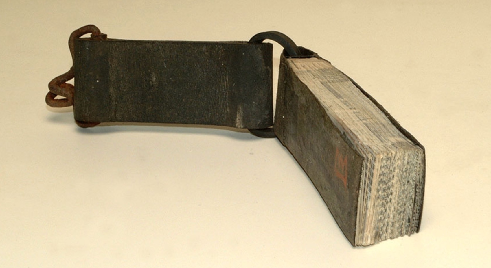
To find a union of metal and the printed page as rich and tactile as that created by Andrew, we would have to hark back to the days of hot metal typesetting or farther still to the chained library. But, while the titles of Andrew’s works may evoke the historical or archaeological, the works themselves do not assume the printed book’s demise; they emphasize and celebrate the material of the book.
It is strange how these objects – books and scraps of metal that have their own individual logic and structural coherence, both material and semantic – become an object of art. In each – book or scrap steel – raw material has been amassed and wrought (words, paper, ink and cloth; or iron, carbon, manganese and nickel) to make a finished thing whose physicality inheres and obtrudes. The ways in which those raw materials are amassed and wrought into objects such as dictionaries or kitchen sinks create meaning and accumulate meanings by use and context. Then along comes Andrew Hayes. Drawing on his experience as a welder, his work as a student with fabricated steel and his time as a Fellow at the Penland School of Crafts in North Carolina, Andrew takes these found objects with their own logic and transforms them into this realm we call art.
Michael Yonan, “Toward a Fusion of Art History and Material Culture Studies”, West 86th: A Journal of Decorative Arts, Design History, and Material Culture, 20 September 2011, accessed 11 January 2014:http://www.west86th.bgc.bard.edu/articles/yonan.html#. Yonan notes the discomfort of art historians in addressing art as I have addressed Andrew Hayes’ work: ‘… fore- grounding the idea exalts art history into a philosophical endeavor, whereas emphasizing matter renders the discipline subject to what could be called “the fear of the tchotchke.” … the trinketization of art.’
To find a union of metal and the printed page as rich and tactile as that created by Andrew Hayes, we have to hark back to the days of hot metal typesetting or farther still to the chained library.
Books chained in Zutphen
As a Core Fellow at Penland School of Crafts, Andrew Hayes explored a variety of materials and technique, drawing on his experience in Portland, Oregon as a welder and his work with fabricated steel as a student at Northern Arizona University. At Penland, the book insinuated itself in this exploration, and his work today joins the rigidity of metal with the delicacy of the book page.
Placer Steel, book pages, and brass 10” x 7” x 9” Andrew Hayes, 2013
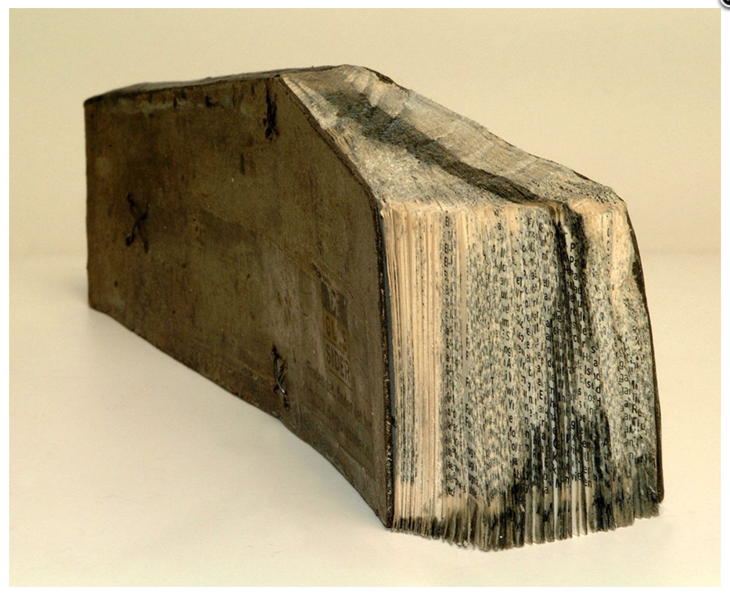
This codex is almost Dali-esque in its appearance. Its title seems to allude to the thumb index, and the fluid shape that distorts the indexed pages is a paradoxical cast on that title. As a work of art in the age of digital reproduction, it offers a slippery tale.