Book with florentine paper bookmark. (Photo credit: Wikipedia)
Publishing and editorial folk who wish to educate themselves in the changing craft of the book should track this ongoing discussion on the merits of browsers versus apps/devices –even if at times it becomes finely technical.
Books On Books logged several articles on this last year when Jason Pontin declared MIT Technology Review’s colors (decidedly HTML5). Here is another worth a quick read: 5 Myths About Mobile Web Performance | Blog | Sencha. A quick read? Yes, publishers and editors need not be HTML jockeys or Java connoisseurs, but they need to have a business-like grasp of what they are choosing to ride or drink.
Understanding why to publish an ebook through an app or in a browser-friendly format — or both — and what the implications are for crafting finds its rough print analogs in selecting the primary channel and form of publication (trade or academic, hardback or paperback) as well as the structure of the work (design, layout and organization) and working out the financial case for deciding whether to publish and how.
The Mystery Book Artist of Edinburgh has delivered by post a third sculpture in a bird-inspired series to the Edinburgh UNESCO City of Literature Trust (EUCL). For aficionados of the MBAE, the EUCL site provides the most comprehensive source to date of links and media on the artist’s work. As well, the MBAE’s Twitter address can be found there.
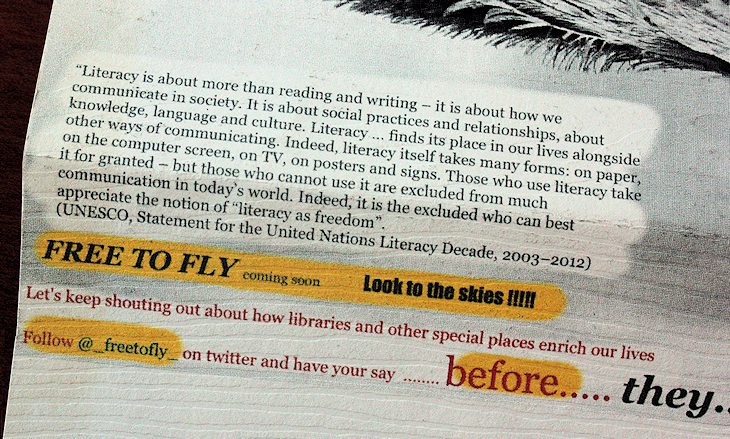
With the third piece, the artist has taken her work to the brink of didacticism, sentimentalism and “good works.” As much as one may applaud the literacy movement, its message weighs heavily, albeit it cleverly, on the feathers delicately sculpted from book pages and the paperclip body stored in a stickered cardboard travel chest along with a miniature copy of Daphne du Maurier’s The Birds and Other Stories, a small beaked and goggled flight helmet, a flight map and instructions on how to assemble the sculpture. It is perhaps the instruction sheet that leaves the brink behind as one reads the hortatory UNESCO-ese shown here.
From the Literary City (c) Edinburgh UNESCO City of Literature Trust 2013
The instruction sheet promises more to come after this last in the “Preparing to Fly” series. What that “more” may be can be followed (chased?) @#freetofly on Twitter. At which point though, art seems to have flown the coop and left us up a “twee.”
Perhaps what the MBAE launches next will bring her body of work so far nearer to its roots (or roost?) in Joseph Cornell’s exquisite boxes.
“The British Library is delighted to be a major lender to the exhibition The Lindisfarne Gospels in Durham, which runs from 1 July to 30 September 2013. No fewer than six of the Library’s greatest Anglo-Saxon and medieval treasures are on display at Palace Green Library in Durham, among them the St Cuthbert Gospel, the Ceolfrith Bible and, of course, the magnificent Lindisfarne Gospels.” – via The British Library
“The Lindisfarne Gospels is one of the most magnificent manuscripts of the early Middle Ages. It was almost 400 years old when the Domesday Book was compiled, 500 years old when Magna Carta was witnessed, and over 700 years old when Gutenberg invented movable type.
It was written and decorated at the end of the 7th century by the monk Eadfrith, who became Bishop of Lindisfarne in 698 and died in 721. Its original leather binding, long since lost, was made by Ethelwald, who succeeded Eadfrith as bishop, and was decorated with jewels and precious metals later in the 8th century by Billfrith the Anchorite.
The Latin text of the Gospels is translated word by word in an Old English gloss, the earliest surviving example of the Gospel text in any form of the English language, it was added between the lines in the mid 10th century by Aldred, Provost of Chester-le-Street.
Today the manuscript is once again bound in silver and jewels, in covers made in 1852 at the expense of Edward Maltby, Bishop of Durham. The design is based on motifs drawn from the decoration of the manuscript itself.
This is an eBookTreasures edition which includes all pages from the manuscript and audio narration and interpretation on selected pages.” — via The Lindisfarne Gospels – Complete, published by ebooktreasures.
Page with Chi Rho monogram from the Gospel of Matthew in the Lindisfarne Gospels. (Photo credit: Wikipedia)
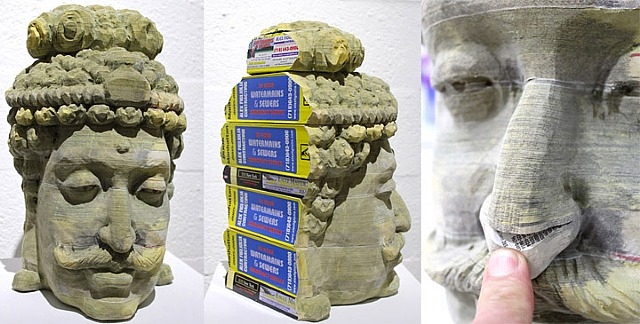
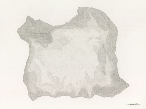
This video accompanies the exhibition entitled Rebound: Dissections and Excavations in Book Art. Curated by Karen Ann Myers, Assistant Director of the Halsey Institute, Rebound brings together the work of Doug Beube, Long-Bin Chen, Brian Dettmer, Guy Laramée, and Francesca Pastine. Of the five, Chen and Laramée’s pieces have the greatest superficial resemblance to one another, and while it seems that their difference in import could not be greater, perhaps they come to same point. The apparently stone heads of the Buddha come from the East “to care for” the millions of individuals in the West whose names and addresses appear in the telephone books from which the heads are sculpted. Laramée’s mountains are “erosions of disused knowledge,” returning “to that which does not need to say anything, that which simply IS.”
“Encore une fois bienvenue dans les coulisses de mon prochain défi: faire entrer un peu de poésie à l’intérieur d’une cloche de verre avec pour point de départ un vieux livre dépoussiéré de J. Feildel: Le Jardin – 1942.”
For those who enjoy the work of the Mystery Book Artist of Edinburgh (MBAE), the details of the small house within a bell-jar will equally appeal. The artist is Karine, who goes by the name AnemyaPhotoCreations at DeviantArt.com and FaceBook. The fine, dexterous work in the sculpted roses and cat in the garden, the clothes hanging from the miniature clothesline and the paper spray of water from the paper watering can held by the paper gardener raises the piece above simply being a garden scene suggested by the content of the book being altered. Karine’s work is every bit as delicate as that of the MBAE.
Do visit AnemyaPhotoCreations to see Karine’s other work “Piano,” “Les petites filles modeles” and “Reading is escaping.” You will half suspect that she has made some round trips to Edinburgh.
When it comes to acquiring skills and professional training in book publishing, from the early days of the printing press onwards, learning by doing has been book publishing’s order of the day. Consider the following interview exchange between Mac Slocum (Tools of Change) and Theodore Gray (The Elements):
.
MS: What skills — or people with those skills — must be incorporated into the editorial process to produce something like the iPad/iPhone editions?
TG: Specifically in the case of “The Elements,” the skills required were writing, commercial-style stills photography, Objective-C programming, and a whole, whole lot of Mathematica programming to create the design and layout tool and image processing software we used to create all the media assets that went into the ebook.
Other ebooks might well require different skills. My next one, for example, is going to include a lot more video, so we’re gearing up to produce high-grade stereo 3D video. That’s one of the challenges in producing interesting ebooks: You need a wider range of skills than to produce a conventional print book.
Starting out in book publishing late in the last century, a novice would have consulted Marshall Lee’s Bookmaking and the Chicago Manual of Styleto learn the basics of design, editorial and production. If it were Trade publishing that beckoned, a familiarity with A. Scott Berg’s biography of Maxwell Perkins (“Editor of Genius”) would have been likely.
Maxwell Perkins, half-length portrait, seated at desk, facing slightly right / World Telegram & Sun photo by Al Ravenna. (Photo credit: Wikipedia)
But as with the acquisition of print publishing skills through learning by commissioning, designing, editing, printing, marketing and selling, the acquisition of the skills required for ebook publishing could use a hand up from appropriate resources. People like Joshua Tallent, Joel Friedlander, Liz Castro, Craig Mod, Matthew Diener are those resources — either by example or authoring — and novices today would do well to start bookmarking their output.
For notes on the availability of formal training and career conditions in publishing, see Thad McIlroy’s The Future of Publishing.
Related sources:
“Joshua Tallent of Ebook Architects on the State of Digital Publishing,” Bill Crawford, Publishing Perspectives
“Understanding Fonts & Typography,” Joel Friedlander, The Book Designer
Published by Impact Press at the Centre for Fine Print Research, UWE Bristol, this newsletter is an important tool, kept honed by Sarah Bodman. The link will take you to the June 2013 issue.
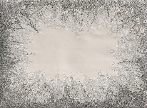
Presented here is an ongoing exploration of Charles Darwin’s ‘On the Origin of Species’ and Ruth Padel’s ‘Darwin, A Life In Poems’.
I initially separated the text of these two books into nouns verbs, adjectives & other. I wanted to present a visual map of how a scientist and a poet use language – a look at how much each author used real world names (Nouns) and more abstract terminology (Verb, Adjective and Other) in their writings.
By determining the frequency of each part of speech and generating pointillist-like dots with different pencil lead weights assigned to each part of speech, Winston also creates what he calls “Frequency Poems.”
“Origin Drawing” by Sam Winston
A similar result is achieved by categorizing all the words from “Romeo & Juliet” under the headings solace, passion and rage and then creating a collage for each heading with the actual words. Here from the artist’s site is the collage “Solace”:
“Solace” by Sam Winston
Winston’s work wrestles with paradoxical “divides” and “unions” — the divide and union of science and poetry, those of categories and the whole, those of non-linear (patterned) and linear (narrative) meaning, that of the word as perceived object and semantic signal.
In technique and process, Winston’s work also implies a divide and union of the print and digital. It is no surprise then that Victoria Bean and Chris McCabe included Winston in The New Concrete: Visual Poetry in the 21st Century, an illustrated overview of artists and poets working at the intersection of visual art and literature. As if to underline Bean’s and McCabe’s wisdom, Winston and Oliver Jeffers published the charming and innovative A Child of Books shortly afterwards. Winston’s creativity is equally at home with the trade book, installations of book art and finely crafted unique works.
An exploration of semantics or an effective re-structuring of what typography and words REALLY are, whatever the case, Sam Winston’s work is breathtaking. A visual explorer of language, the London-based artist and educator has spent his working life examining the way we approach all manner of literary artifacts. Always engaging his audience with words in a visually stunning manner, Winston started writing stories and selling artist books through London’s Institute of Contemporary Arts and …
Winston’s experiments came from looking at the structures of different types of literature: from storybooks to bus timetables: “The way you navigate a timetable is very different to the way you read a short story” he comments. “I wanted to take these different types of visual navigation and introduce them to each other: a timetable re-ordering all the words from beauty and the beast, or a newspaper report on Snow White.” By imposing the visual rules of one style of writing to a different system of organizing language, Winston has created a visually arresting and verbally intriguing piece.” Paula Carson, Graphic Poetry. June 2005
2013 by Justin James Reed Publication Date: 2012 Artwork type: Editioned book Medium: Inkjet, UV Firefly Ink Dimensions: 9.5 in W x 13.0 in H Binding Type: pamphlet Publisher: Horses Think Press
2013 is apparently a booklet of blank pages, until the lights go out and the reader begins to search the pages with the ultraviolet flashlight that accompanies the book in its archival box. Is this reading with one’s whole body? The tactile nature of a book takes on more than three-dimensionality through the pages’ reaction to the reader’s gestures. The time it takes to “read” the book is the time it takes to perceive its ghostly images. Reading the book becomes experiencing the book.
I enjoy the idea that when a viewer first encounters the book it appears to be blank. Indeed, this notion of the “invisible book,” was an important starting point for the work. And in this, ingrained in the book itself, are two very concrete ways to experience the book: as a set of blank pages and then, with the help of an ultraviolet light source, a completely radical way of looking at pictures. My intention is to have this process lead a viewer to perceive the imagery less representationally and more sculpturally….
For me, this book is broadly about the future and the end or rebirth of time. The title, “2013,” came about because of the rapid pace of technology and culture. No longer do we have to look far into the future to perceive change, we witness it daily, to such an extent that even the idea of the year 2013 seems far away and distant. Beyond this though is also the concept that time is a construct. Again, this ties into perception, that in addition to the viewing experience, I want to reinforce the notion that time itself is just a way of perceiving reality. The iconography in the book: sculpture, form, nature, digital information, etc., is all mixed together so that a viewer encounters each on the same plane, and by the end of the book the number 2013 takes on the same qualities as one of the landscapes, the number has meaning.
One of my main goals with this book was also to facilitate a group experience. In my mind most books are made to be enjoyed by oneself. However, with this book, it is my intention to make something that encourages people to share in the viewing experience…. I am fascinated by the idea that an object, a book, can be a reason for people to come together and share in something. In some ways this is one of the most important components of the book.
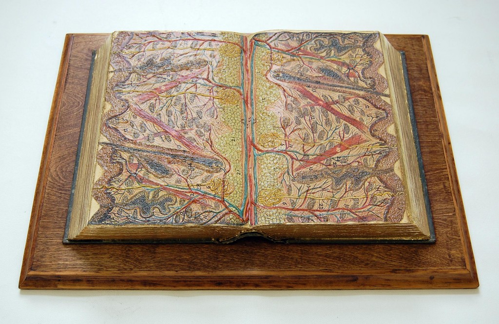
Paul Forte has assembled a display of his own bookworks and those of Doug Beube, Claire Dannenbaum, Donna Ruff, Jacqueline Rush Lee and Irwin Susskind for the Hera Gallery, Wakefield, RI, June 15 to July 13.
“Liber Dermis (Skin Book),” Paul Forte, 2008 Medical illustrations (human skin cross section) on sealed medical book, mounted on wood, 17 1/2 x 12 1/2 x 3/4 inches
Douglas Glover’s Numéro Cinq provides an excellent venue for Forte’s introduction to this exhibition and additional photographs of items with artists’ statements. If you cannot go to Rhode Island, visit Numéro Cinq.
Photograph of Hera Gallery’s exterior (Photo credit: Wikipedia)