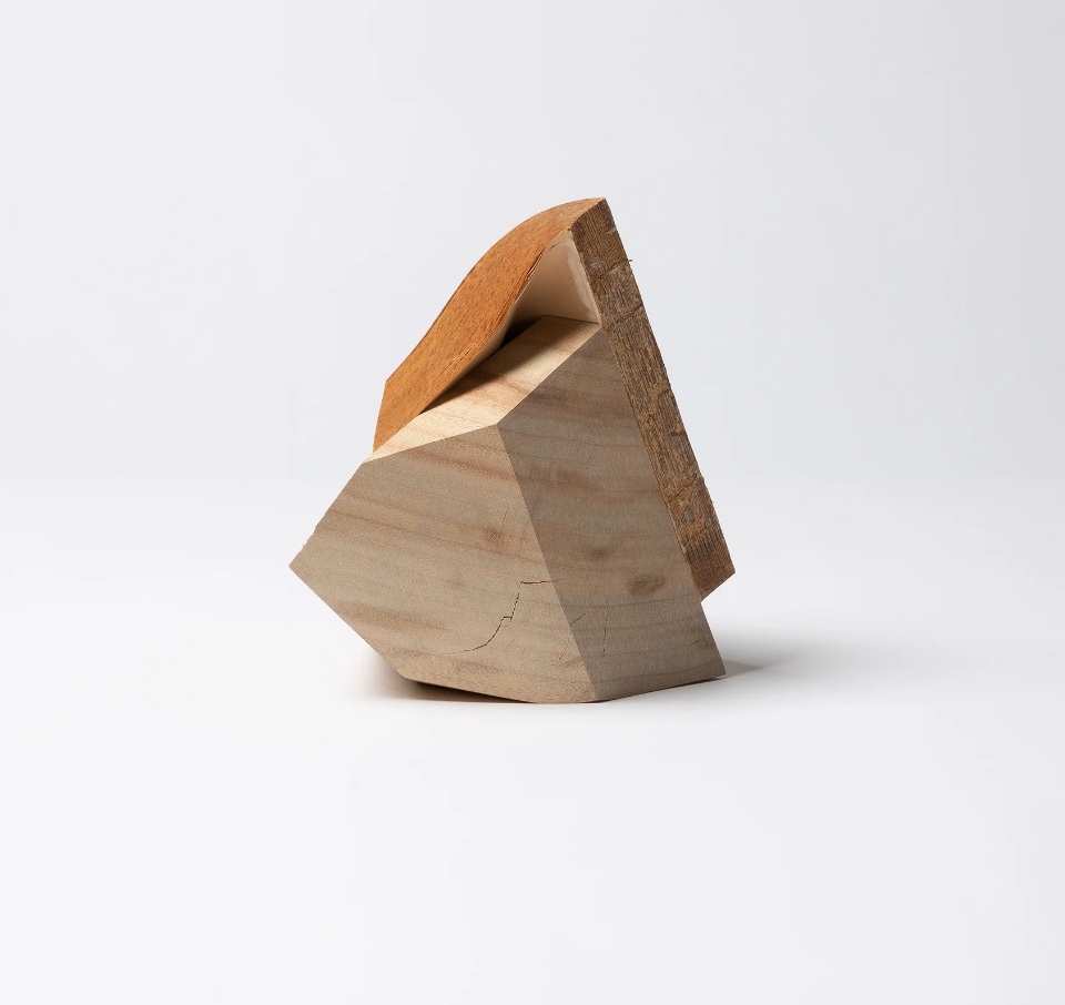
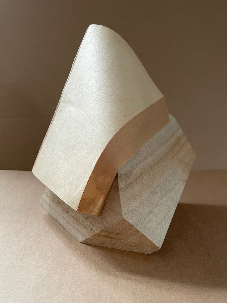
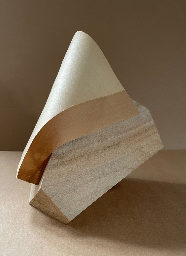
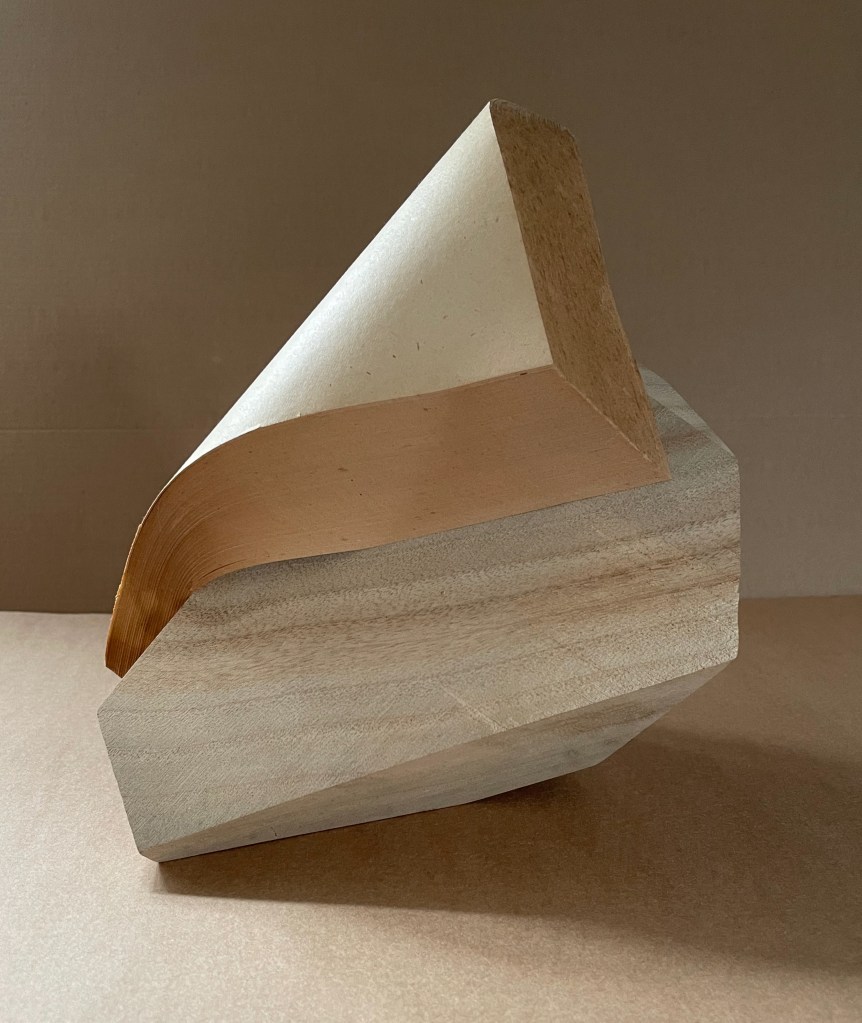
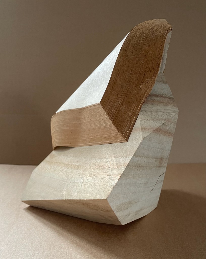
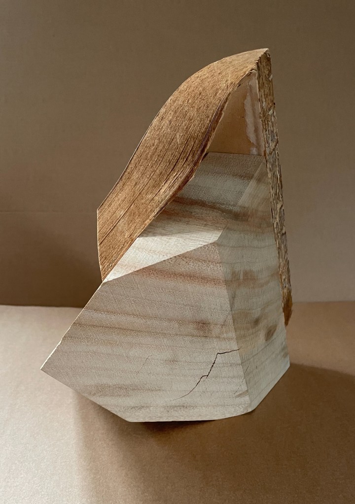
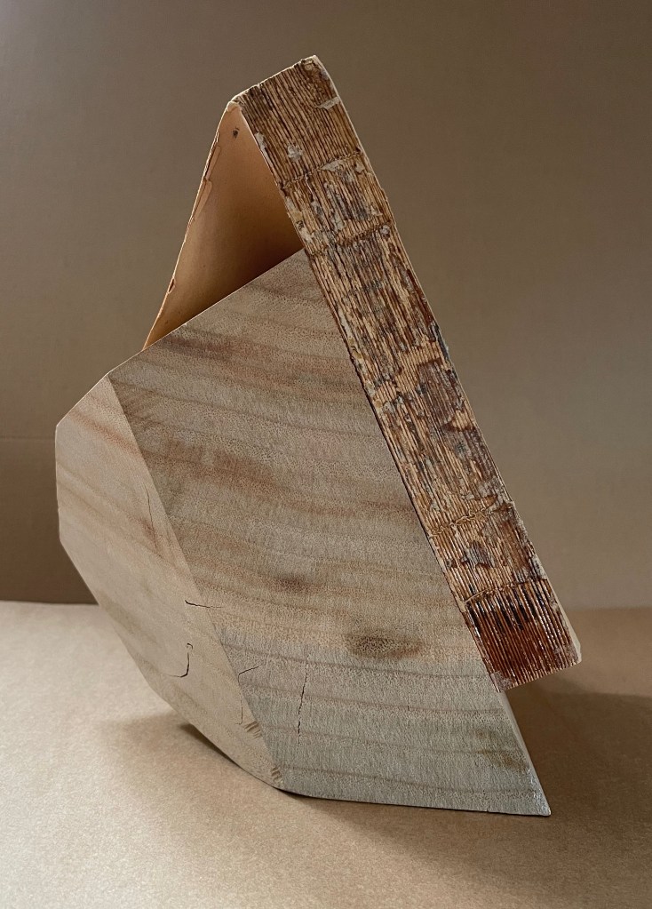
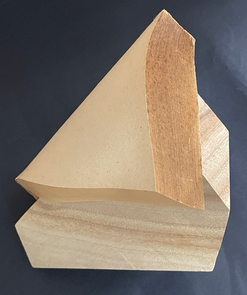
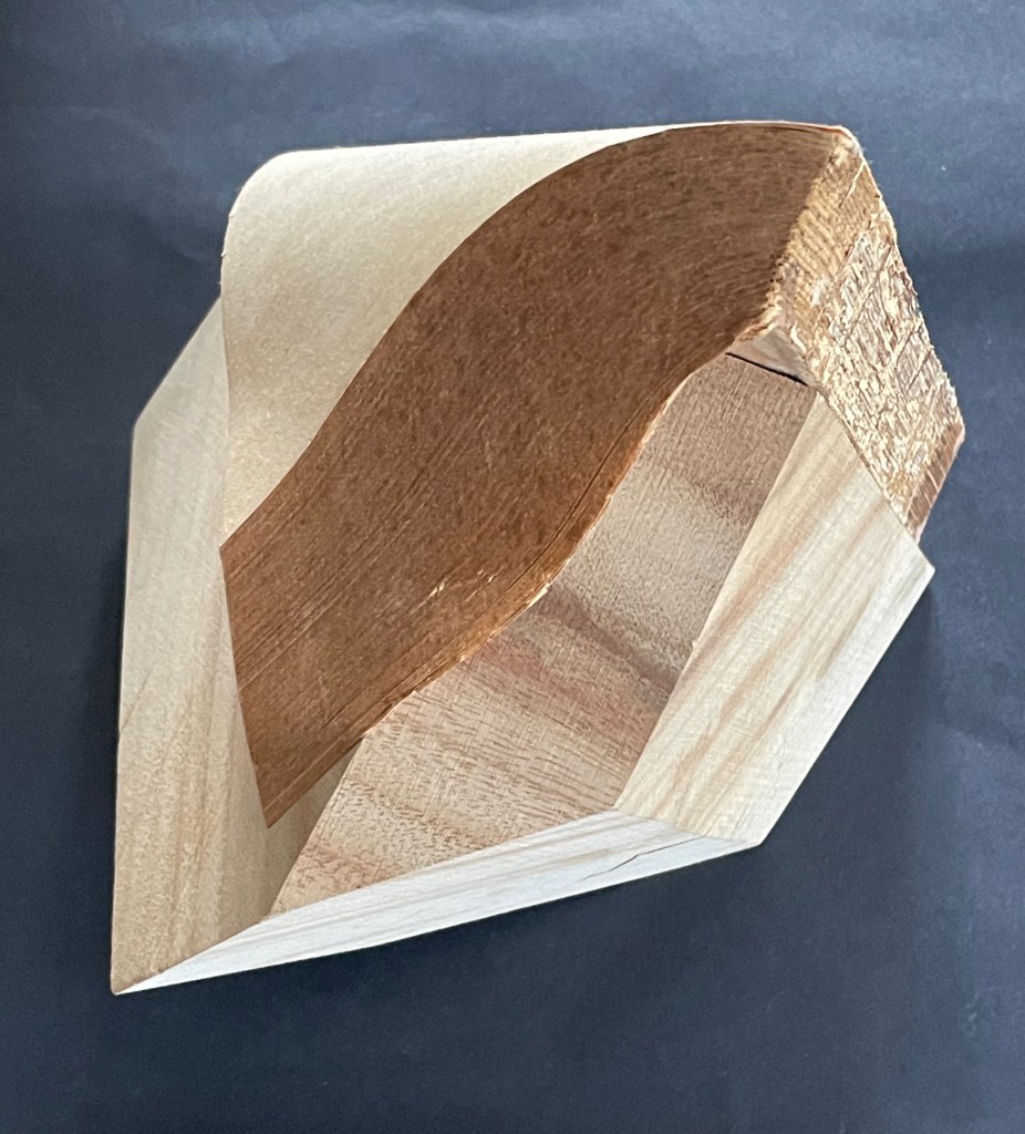
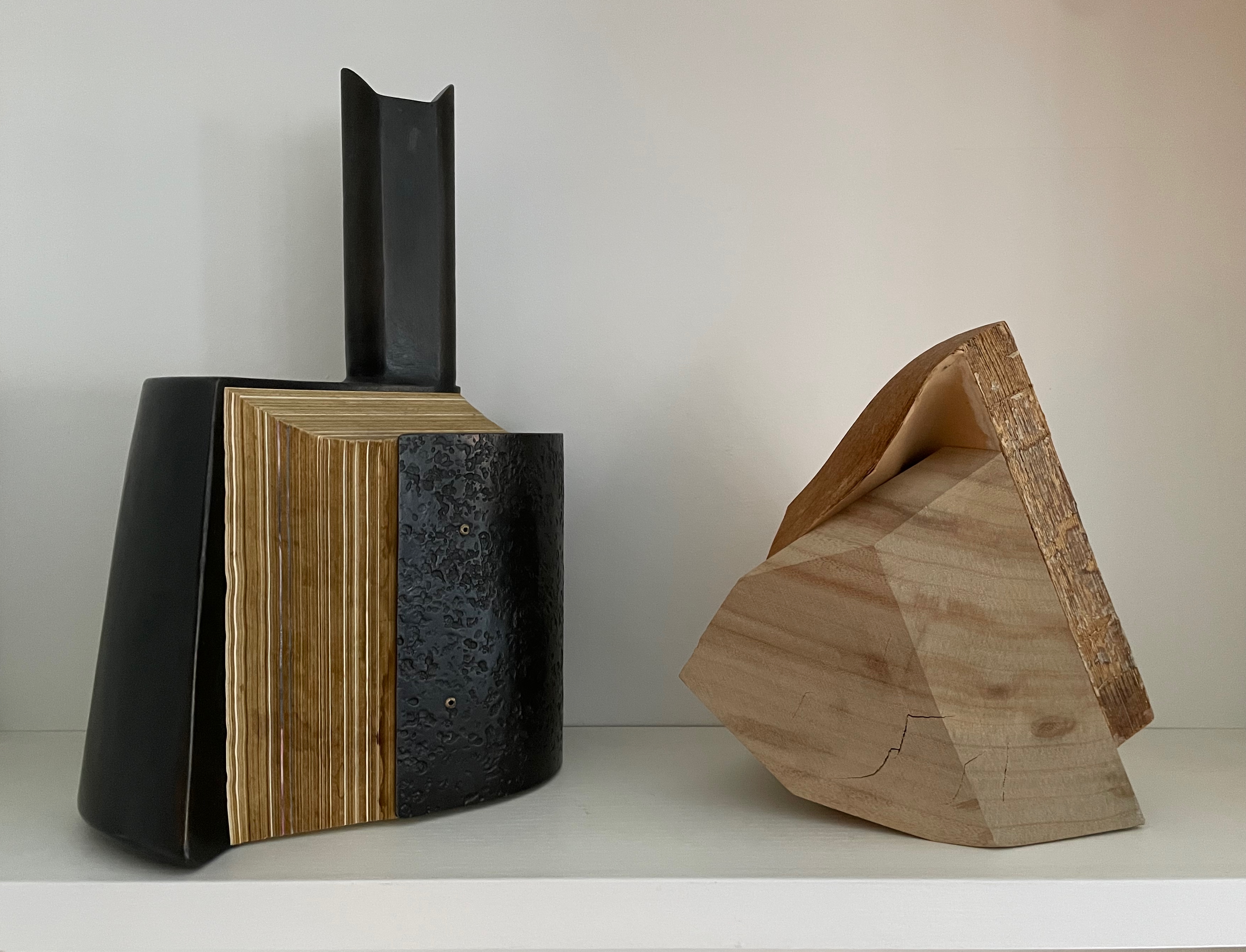
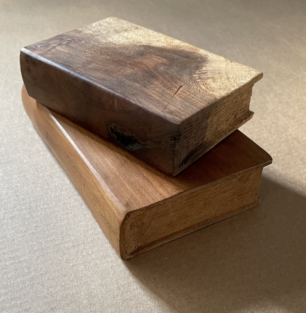
Silent Book, vol. 11 (2023) Ryuta Iida Altered book, camphor tree stump, and glue. H210 × W170 × D190 mm. Unique. Acquired from Fragile Books (Tokyo), 20 August 2024. Photos: Above, courtesy of Fragile Books; below, Books On Books Collection.
The cover, door, table of contents, numbering, text, and endnotes are all filled with a series of information. I thought to stop and crystallize all the functions of the “book,” … I decided to crystallize it. It took the time to go through the hands of people, the old book that finally reached me, sealed on a pedestal, it is now ripe for its next role. (Artist’s statement)
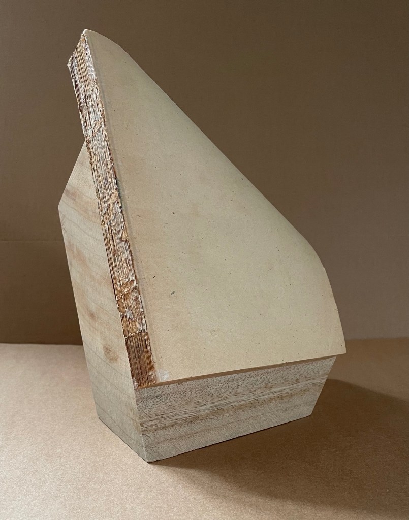
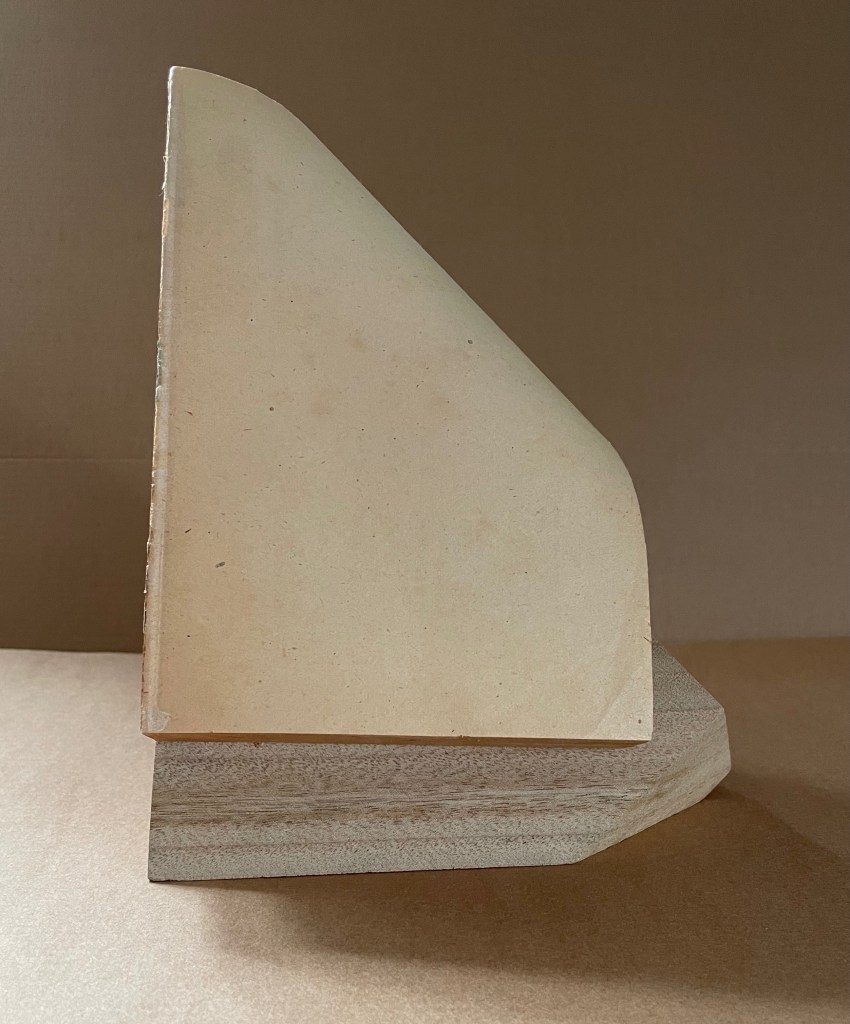
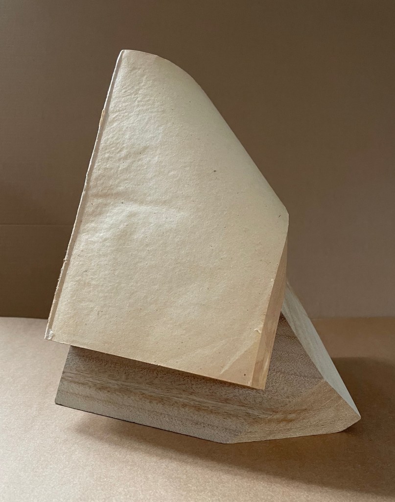
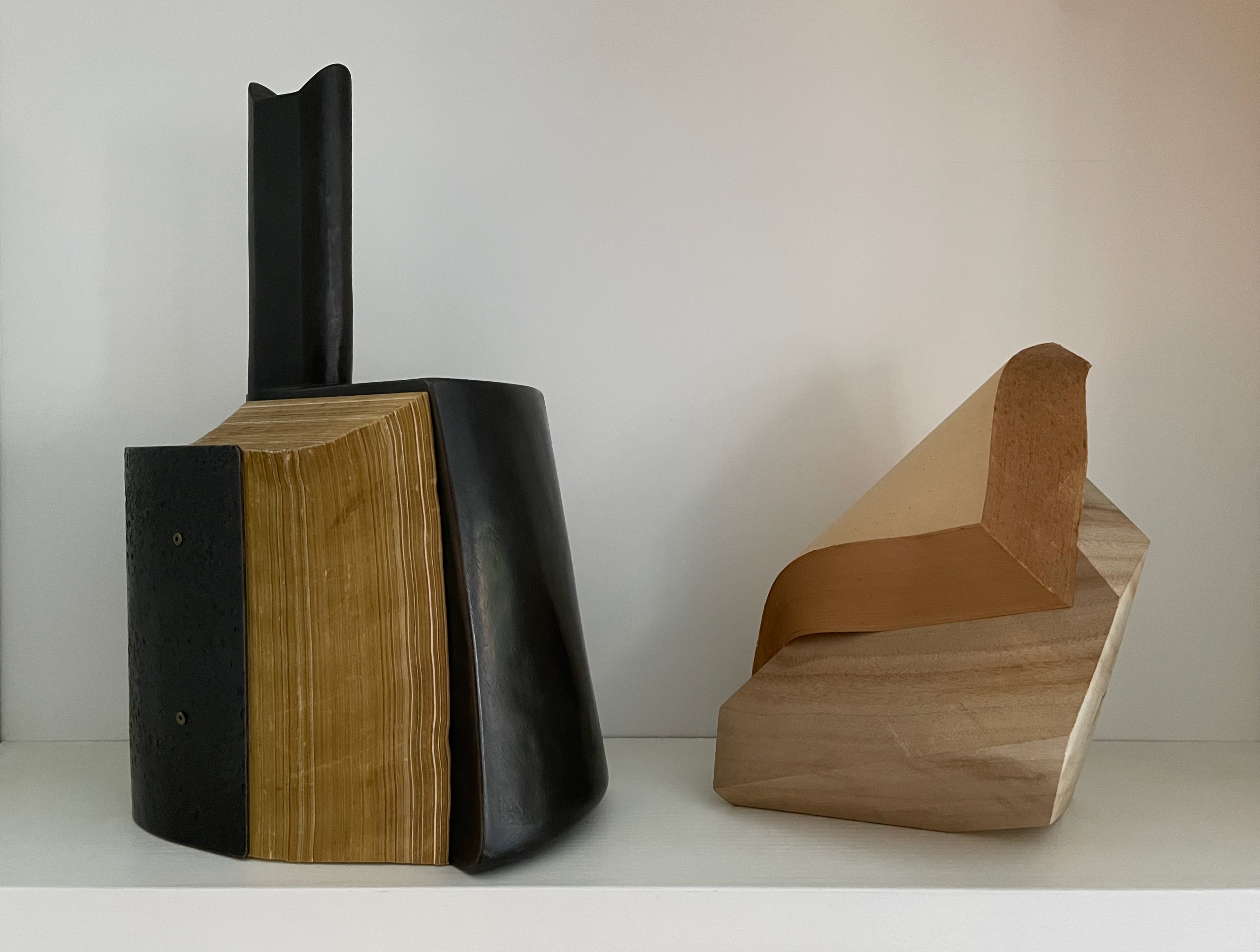
“Crystallized” is not the first word that comes to mind when viewing and handling this eleventh in Ryuta Iida’s series Silent Book. Perhaps it does for the angled planes of the cut block of camphor wood, but for the coverless codex, folded, draped, moulded, carved, and sculpted come closer. Two names that might not spring to mind (but should) are Giambologna (Jean Boulogne) and Gian Lorenzo Bernini. Like them, Iida offers us more than a single or primary vantage point from which to appreciate his work. Like Giambologna’s Abduction of a Sabine Woman (Loggia dei Lanzi, Florence) or Bernini’s Apollo and Daphne (Galleria Borghese, Rome) Silent Book must be circled and viewed in the round. The nine images below show the work turned right to left in stages.
Far as Silent Book is from the figurative, violent, and ornate features of the 16th and 17th century masterpieces, it still harbors its own complexities of line, shadow, texture, and form. There is a volume of dynamics between and among them that belies the work’s title. Note how the layers of pages echo the wood’s grain, and how the color and texture of the page surface contrasts with those of the book’s top edge, and how that contrast reverberates with the shifting colors of the wood. Iida has moulded and sealed the book block so that the top edge curves to a point in a duet with the cut angles of the wood block.
Silent Book has many kin in the world of book art, works that make the content of a ready-made volume inaccessible and make something anew from the material object. Too often this sub-genre has been dismissed as a fetishization of the book. This overlooks how Silent Book and its kin make us think about the book as a material for making art and as a source of metaphors, and we overlook what the individual artworks are. By sealing away the content of a book, giving the book block a sinuous shape, and fusing it with a carved block of wood, Iida invites us to look afresh.
In the Books On Books Collection, several other works share this play of inaccessibility with tangibility: Barton Lidice Beneš’s Untitled (1973), Andrew Hayes’ Offset (2013), Jacqueline Rush Lee’s The First Cut and Silenda (both 2015), Doug Beube’s Red Infinity #4 (2017), Lorenzo Perrone’s Kintsugi (2018), and Chris Perry’s 217 Ripples: Sediment(2020). Of these, Offset seems closest to Silent Book. Comparison can increase appreciation of each and their sub-genre.
Both Hayes and Iida have managed to elicit a sense of action and motion from their materials. From one view of Offset, metal embraces the body of the book; from another, the book pushes the metal apart. From one side of Silent Book, the upward-angled block of wood supports the coverless codex folding over and slipping down its pedestal; from another, the book drapes a protective arm over the sideways-angled block.
Views of Offset (2013) by Andrew Hayes and Silent Book (2023)
The titling of the two works raises appreciable similarities and differences. Offset suggests the printing method of the same name, which does involve metal plates. The overall shape, however, suggests some strange assemblage of early letterpress components: the bulbous ink balls (or dabbers) with their handles, the torque bar, and the metal furniture locks. The offset position of the piece’s “handle” also reflects the title. What can’t be appreciated from the images is that Offset wobbles if touched in the slightest.
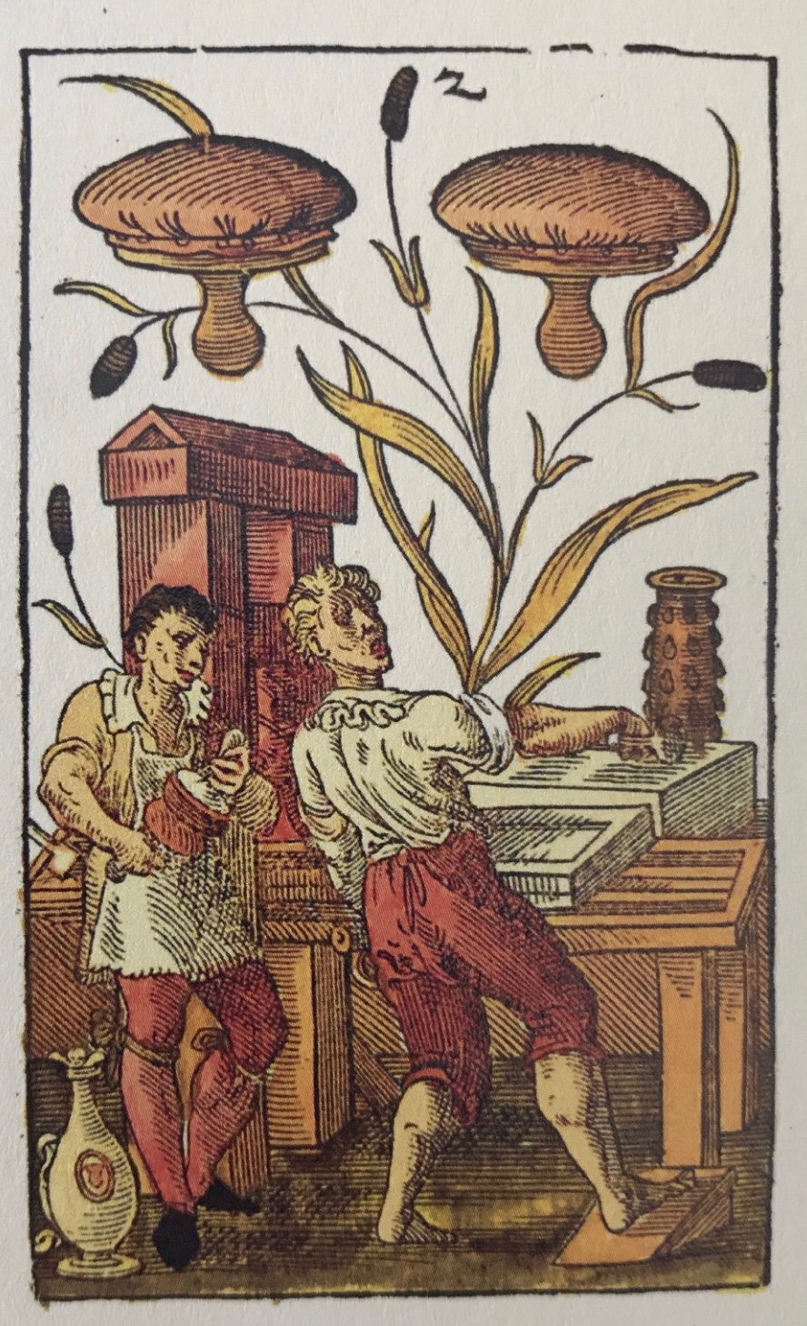
“The two of printer’s dabbers” from Jost Amman’s 1588 deck of cards.
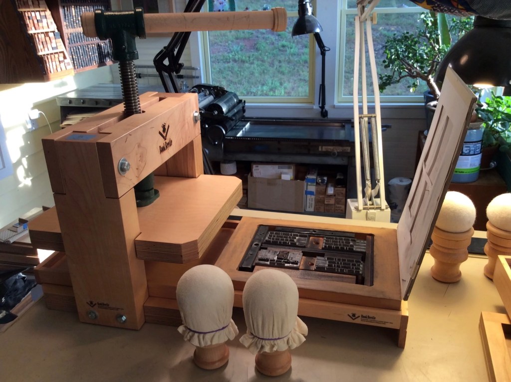
The BookBeetle Press, a portable screw press designed and built by Josef Beery. Reproduced with permission of Beery.
The title of Silent Book refers, of course, to the book block’s being sealed, an obvious visual/verbal pun. None of its information passes the lips of its pages. Like Offset, however, the title is also oblique. Although the derivation of the word book from the Old German Buche (meaning “beech”) is a debatable assumption, it’s widely accepted enough to allow that the block of wood is also a silent book.
Now imagine the substitution of a large block of pink bubble gum for the book material in Offset and Silent Book. Not a block of gum in the shape of a book, but an oversized, unchewed block of gum. Something very different to chew on now, isn’t it? The ways in which book artists manipulate the material and metaphor of the book vary every bit as much as the ways in which painters, sculptors, and other artists vary their techniques, materials, and subjects. Even within the slice of book art that focuses on physical inaccessibility, such as Marcel Broodthaers’ Pense-Bête (1964), Wolf Vostell’s Betonbuch (1971), Irwin Susskind’s Book Faced Down – Embedded in Plaster(1999), Jonathan Callan’s Rational Snow (2002), Anselm Kiefer’s Untitled (Constellation Book) (2004), Hanne Stochholm Exe’s Remake(2015), and Neil Nenner and Avihai Mizrahi’s Cover Story (2017), the variety abounds. Ryuta Iida’s series Silent Book is a resounding reminder.
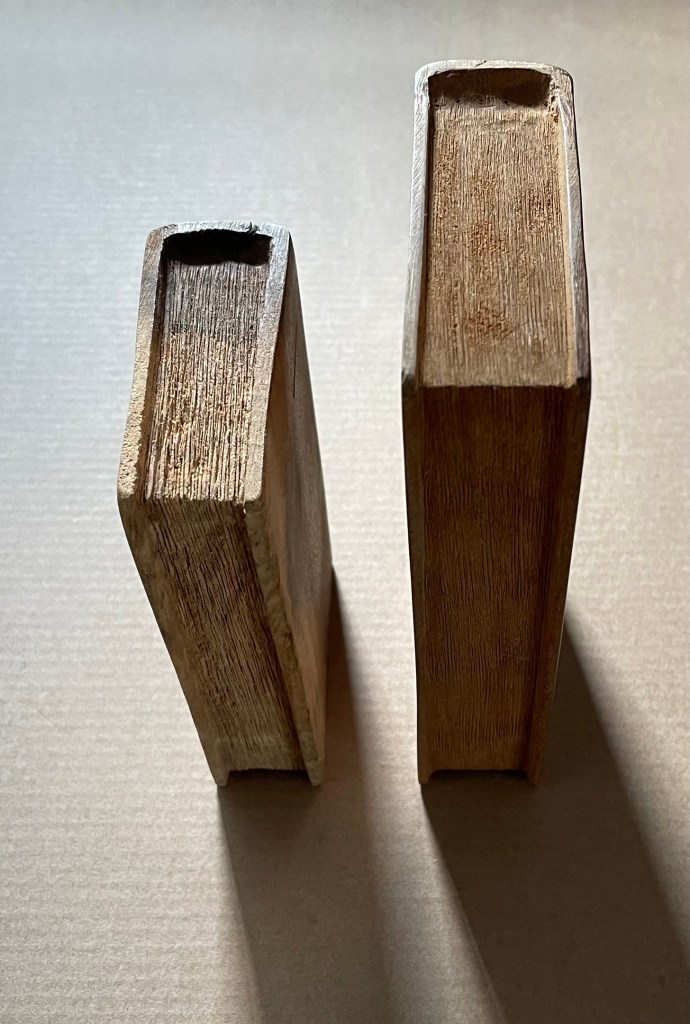
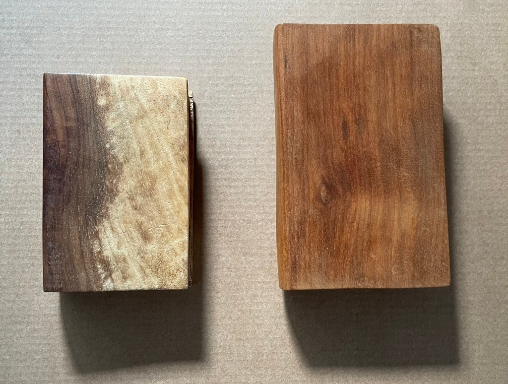
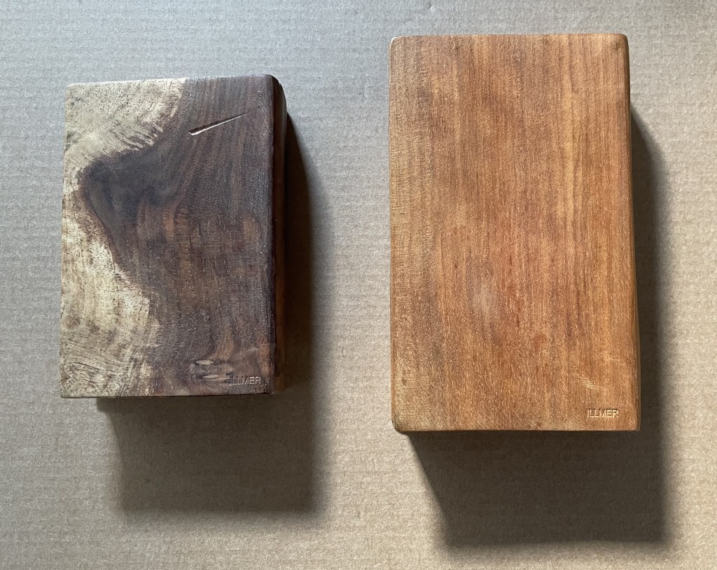
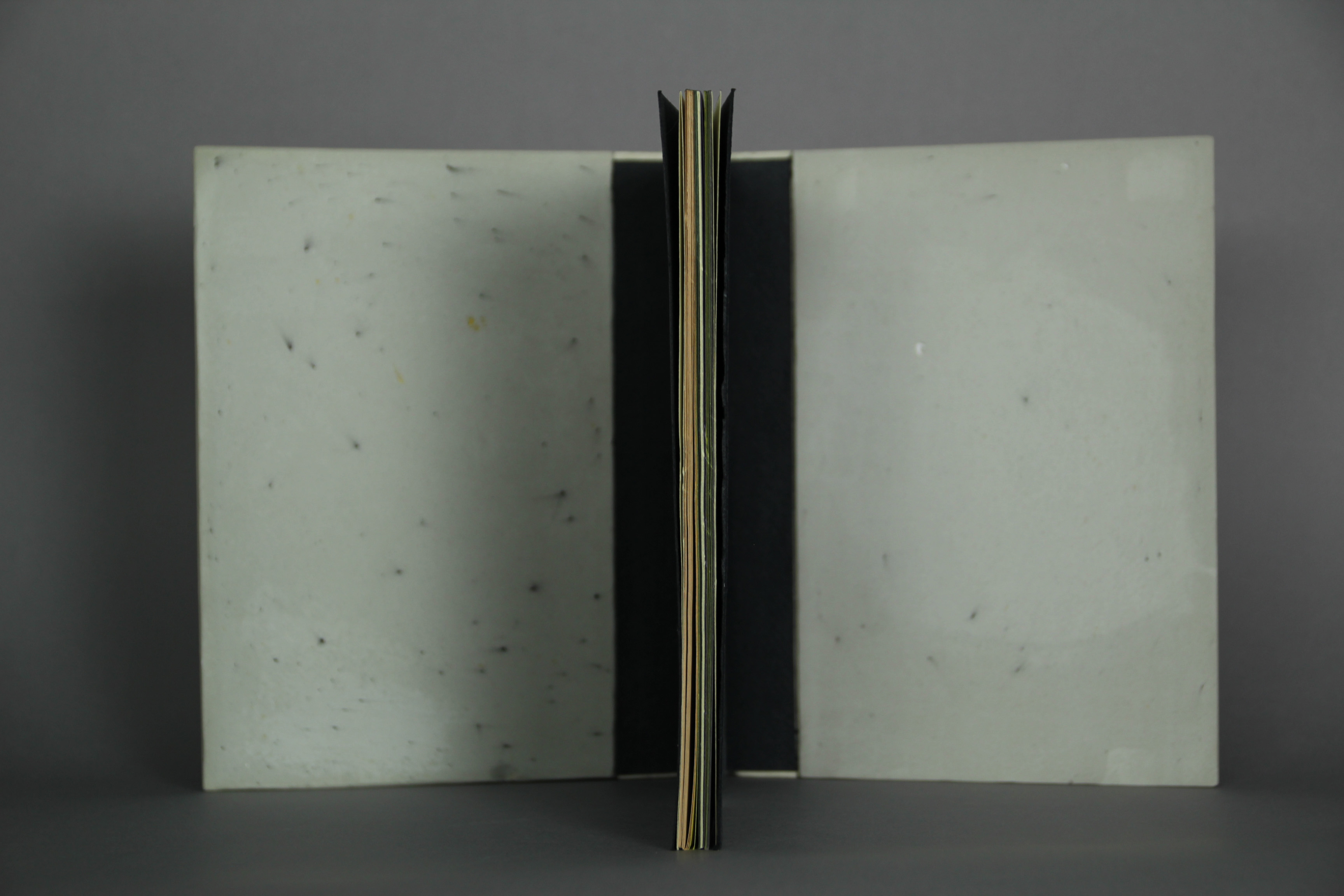
Untitled(2015) Ivon Illmer Book-shaped wood sculpture. Top: Almond wood, H100 x W65 x D27 mm.Bottom: Poplar wood, H123 x W78 x D27 mm. Unique. Acquired from the artist, 10 October 2014. Photos: Books On Books.
From Ivon Illmer’s website: Books preserve history and stories. Each book has its own individual story. This ranges from loving treatment to neglect to ostracism and even burning. The arc almost inevitably stretches from the fate of the book to the fate of man. Everyone should let their imagination run wild when touching the book sculptures and invent their own story for each book. Touching is important, the haptic experience flatters the sense of touch. You “grasp” the beauty of the wood. Imagining the book sculptures in the raw piece of wood is the art. Each piece is unique in shape, structure and grain. Accessed 14 October 2024.
Illmer categorizes his work as “book sculpture / book art”. The carvings from various woods primarily celebrate the shape and tactility of the closed codex. The similitude of the exterior, right down to the fore, top and bottom edges, belies the inaccessibility of the interior.
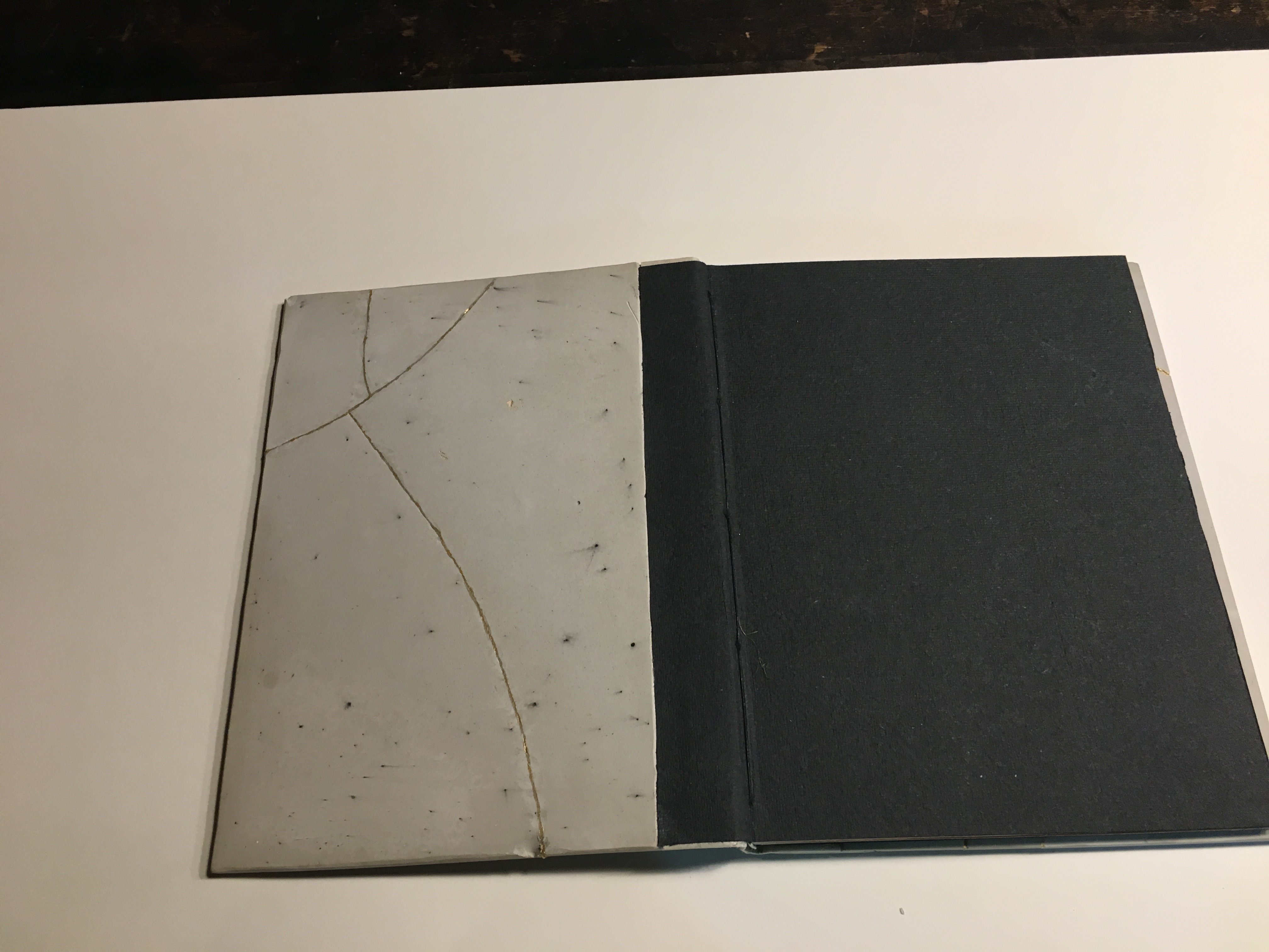
Untitled
If simply entitled Unreadable Book or A Closed Book, these works would lead us down a narrow path of interpretation. Another easy path of interpretation could be etymological. The derivation of the word book from the Old German Buche (meaning “beech”) is a debatable assumption. Still, it’s widely accepted enough to start us down the path that, since the paper of traditional books is made from wood, so, Illmer’s carved codices just represent another way of using wood to make a book. He could have entitled them Buchmaterial, which in English also captures the same pun between the book’s content and its material. In his self-published catalogue, however, Illmer is explicit that his use of “untitled” is totemic:
… each of my books represents every book published so far. That’s why none of them has a title, and that’s why none of them is based on a real book.
Illmer leaves it to the imagination of the viewer to determine whether and how his works “interrogate” the nature of the book.
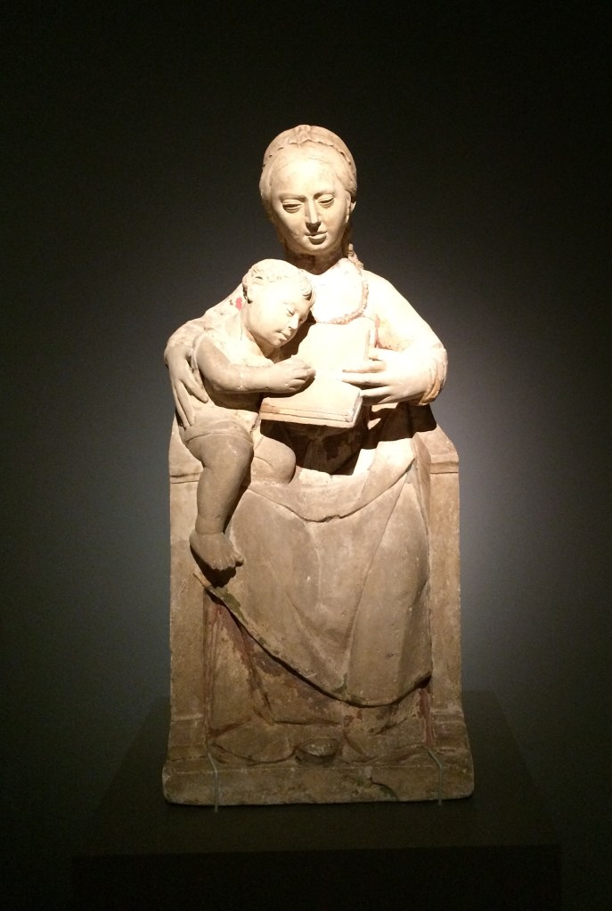
Presenting physically inaccessible books is fairly common among wood carvers, sculptors, and painters. A closed or open book appears in the hands of countless saints and Madonnas and carries with it various iconological interpretations, depending on the bearer. From the St. Servatius Cathedral Treasury in Maastricht, here’s a library of letters, scrolls and books in the hands of the Holy Kinship.
And from Lisbon’s National Museum of Antique Art, here’s a Madonna and Child with book, which seems to underscore the interpretation in Christian art that an open book in connection with Mary indicates the fulfillment of the promise.
Madonna and Child (c. 1540-1550), Unknown sculptor, Museu Nacional de Arte Antiga, Lisbonne, Inv 1182 Esc. Photos: Books On Books Collection, 2015, at “Pliure. Prologue (la part du feu)”, Fondation Calouste-Gulbenkian, Paris.
The fifteenth-century Van Lymborch, or Limbourg, brothers of Les Très Riches Heures du Duc de Berry fame, however, may be the first to have created an inaccessible book for the sheer pleasure of trompe-l’oeil and trompe-le-main. They made it from a block of wood, decorated its exterior to look like a sumptuous illuminated manuscript, and gave it to their patron as a New Year’s day joke. Another two centuries later in Venice, Francesco Pianta the Younger carved shelves of inaccessible wooden books for the Chapter Room in the Scuola Grande di San Rocco (1657-75). Arranged as if recently consulted and replaced on their shelves, the books provide the studious background for inconographic and allegorical sculptural figures of “Curiosity”, “Wrath”, “Melancholy”, and others. The influence of this particular fantasy has persisted in Venice and found an enthusiastic expansionist in Livio de Marchi, whose project entitled House of Books, begun in 1990, boasted three residential-sized installations by 2025. From the spine- and cover-clad exterior walls, to the carved splayed book for a roof, to the furnishings — everything is made from wood and has a bookish allusion in its shape or function, including the pen-shaped chimney and a pencil-picket fence. The more prolific joker, however, may be Alain Stanké, whose wood sculptures suggest there is no bookish pun he would not carve.
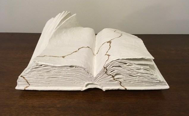
While facetiousness and jokery also characterize the path taken by conceptual book artists by making an inaccessible book the material of the artwork, there is now an edge. Marcel Broodthaers encased his previously published books of poetry in plaster to create Pense-Bête (1964), an elaborate farewell to literary aims. Following Broodthaers, Wolf Vostell purportedly encased his paper-based booklet Betonierungen (“Concretifications”) in a 40 x 28 x 6cm slab of concrete shaped like a book (Frengel et al.), not a farewell but rather an embodied manifesto. Vostell’s Betonbuch (1971) allows for both the interpretive paths of inaccessibility and punning on the book’s material. (Further trickery may be involved; radiographic examinations are inconclusive on whether there really is a booklet embedded in there; see White, below.) Despite, or because of, its title, Barton Lidice Beneš’ inaccessible Untitled (1973) plays differently with titular punning: Beneš has almost obliterated the titles of the condensed books from the spines of his sealed Reader’s Digest Condensed Books series. Jacqueline Rush Lee’s The First Cut (2015) soaks, rolls, and dries the three volumes of the Loeb translation of Ovid’s Metamorphoses into a single firewood-like chunk; its inaccessibility and title join in a punning allusion to the transformation of Daphne and others into trees or plants to escape the grasp of the gods. Lorenzo Perrone’s inaccessible Kintsugi (2018) casts yet a different titular pun by applying “repair” lines of gold glue to a presumably unbreakable and pristinely white plastered book.
Moritz Küng’s exhibition catalogue Blank. Raw. Illegible … : Artists’ Books as Statements (1960-2022) devotes one of its fifteen thematic sections to inaccessible books, including Vostell’s Betonbuch. Among the ten works included, five of them introduce puns unlike those mentioned so far. They pun on a structural or material feature of “the book”. Timm Ulrich’s Dem Leser den Rücken zukehrend (1970/76) is an hermetically sealed book dummy, whose only text is the title (“Turning your back on the reader”) appearing on the spine of the book. Richard Olson’s Perfect Bind (1978), David C. Stairs’ Boundless (1983), and Nicolas Geiser’s Le non-livre (2006) are each bound on all four sides. Les Coleman’s Glue (2002) qualifies as a fifth inaccessible book with a book-material-referring title, although it does have an accessible table of contents to let you know the different types of glue used to make the different sections of the book inaccessible.
Like art and its history in general, book art is not linear. The point of Anthony Caro’s sculptures that include inaccessible books is not “the book” as it is with the conceptualists. His works carry more directive titles and nudge the viewer’s interpretation away from the inaccessibility and toward the subject the books illustrate or support. His minimalist Book of Eden (1999) is a pulp paper sculpture and lithograph. Its title clarifies, or is clarified by, the two outline images evoking the Adam and Eve myth: an apple and buttocks. Another example is Stave (2013), entitled after his death. The title comes from the source of the work’s inspiration: “a reproduction of an illustrated musical score that Caro had chanced upon inside a catalogue for an Italian exhibition about Duccio” (Sooke). Given Caro’s aims at associating his sculptures with music (see, for example, his Concerto series), Stave is probably not far from the mark and provides a very different example of the title’s directing the viewer’s interpretation. The sculpture may present an inaccessible book, but the suggestions of stave lines and musical notations rise in metal above the open pages. Likewise, Book of Eden‘s lithograph is the minimalist distillation from the blank white paper-pulp book under it.
Anselm Kiefer’s book art is a whirlwind of the above uses of inaccessible books, allusive titles, and the untitled. The several works of his like Das Buch (1979-85) that have an inaccessible lead book hanging against an acrylic-on-canvas background make for interesting pairings with Caro’s Book of Eden. Where Caro backgrounds his blank inaccessible Bible beneath his minimalist lithograph and allusive title, Kiefer foregrounds his books. As he writes in L’Alchimie du Livre (2015):
In the beginning was the word. But in my work, first there were the books made of lead. And those books are interesting in that they are impossible to read, they are too heavy, the lead lets nothing get through, it’s a complete concealment… Lead books are perfect paradoxes then. You can neither thumb through them nor read them, and you will never know what’s inside. (Minssieux-Chamonard, 237).
Kiefer’s Mesopotamia – The High Priestess (1985-89) with its 196 lead volumes ranged across two open book cases contrasts with Francesco Pianta’s loosely shelved, allusive but decorative wooden books in Venice. The work is not background to adjacent artwork or surroundings. Neither is Kiefer’s title an indirect pun allusively signaling after something more like those of other book artists. It is indeed allusive but to something that stands apart from the form and material of the artwork. The distance makes the viewer work backwards from the inaccessibility, the volume, and distressed appearance to connect with the title. When Kiefer uses “untitled” as a title, he often adds explanatory words in brackets after it, as in Untitled (Constellation Book) (2004). Although made of lead, this work, however, is not inaccessible. Its nearly 5.5-foot pages stand open to be read “in the round”.
Johanna Drucker is one of the few writers about artists’ books who has commented at any length on Kiefer’s artist’s books:
Anselm Kiefer’s large-scale books made of heavy dull grey lead, laid open on stands designed to hold their outsized form and ponderous weight absorb the viewer into their profound depths, rather than offering themselves for communication. Such works become affective pieces rather than textual vehicles or message bearing forms, their physical, tactile presence takes the iconic and cultural resonance of book forms and plays it out through an extenuated spectrum of propositions — “what if” this were a book and a book were this, what then? Books of bread, marble, granite, soap and dried leaves pressed with flowers delicate and impossible to manipulate without destroying them. Books of lost objects, found texts, destroyed titles, remade photographs — all gaining some value by using the book form, insisting on its familiar structure as a frame to the otherwise elusive meaning of these constructions. …. (Drucker, 114-15.)
Which brings us back to Illmer’s more totemic works. Each work celebrates the grain and flaws of its material by using the book form. It could do so with a different form (beads, animals, geometric shapes, etc.), but Illmer chose the book. Although an inaccessible book, the object gains s0me value by this choice. And with the totemic title of Untitled, each work demonstrates that title matters as much as material and shape. Untitled offers the viewer’s eyes and hands the challenge that all inert totems offer: to invest its shape, grain, colors, and markings with meaning. But where do such works sit in our appreciation of artists’ books and book art? What are the distinctions between them and those of Kiefer, Caro, Coleman, Geiser, Stairs, Olson, Ulrich, Perrone, Lee, Beneš, Vostell, and Broodthaers? Keep looking and, wherever possible, touching.
Further Reading
Drucker, Johanna. 2004. The Century of Artists’ Books [Second edition] ed. New York City: Granary Books. Others who have commented at some length on Kiefer’s books as artist’s books include Zdenek Felix, “The Readability of the World” (1991); Buzz Spector, “Anselm Kiefer’s Bookworks” in Art Forum in 1987 (reprinted in The Book Maker’s Desire); Elizabeth Long in The Journal of Artists’ Books 21 (2007), and Garrett Stewart in Critical Inquiry (spring 2010).
Drawn, Cut & Layered Werner Pfeiffer Plastic box containing illustrated pop-ups.Acquired from Toledo Museum of Art, 5 Jun 2017. Photos: Books On Books Collection.
Werner Pfeiffer’s playfulness finds its way into viewers’ hands with this offering from his Toledo Museum of Art exhibition in 2015. His archives are housed at Vassar College.
With its structures and photographic representation of Pfeiffer’s other works of paper engineering, Drawn, Cut & Layered demonstrates his breadth in that sub-domain of book art. Not detectable in the box, though, are Pfeiffer’s white altered book objects, which formed the 2010 exhibition at Cornell University, entitled censor, villain, provocateur, experimenter, and demonstrates his scope in the sub-domain of altered books.
In kind, they were preceded by Barton Lidicé Beneš‘ The Life of Gandhi and Beauty Book (both 1973), M.L. Van Nice‘s Swiss Army Book (1990) Irwin Susskind‘s Book Faced Down – Embedded in Plaster (1999). In kind and whiteness, they were followed by Jonathan Callan‘s Zurbarán’s Color Plates (2011), Michael Mandiberg‘s Print Wikipedia (2015), and Lorenzo Perrone‘s Kintsugi(2018).
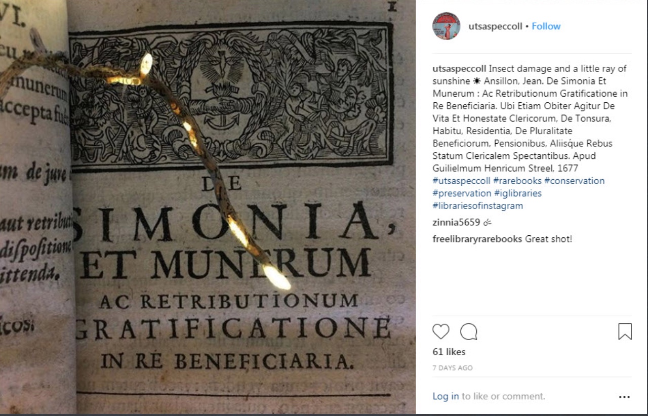
Photo: Agnieszka Czeblakow, University of Texas at San Antonio Special Collections
Staff in Special Collections at the University of San Antonio libraries caught this sudden slant of sunlight on insect-damaged pages. It makes a good start for a serendipitous trek across conservation, book history and book art.
Those dry tunneled pages tear easily with turning, compounding the loss with further damage. To forestall such damage, the areas of loss could be filled page by page with Japanese paper (kozo or gampi) or with paper pulp. The Smithsonian’s book conservation lab illustrates the former method here:
The mending with Japanese paper reminds me of passages in A Degree of Mastery, where the author describes mending rare books with kozo paper under the eagle eye of the late Bill Anthony. The mending with paper pulp though recalls the painstaking art of Pat Gentenaar-Torley.
Working on pulp painting from the front to the back Photo credit: courtesy of Pat Gentenaar-Torley
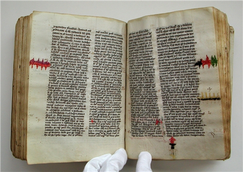
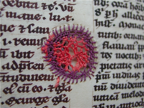
Three centuries before the paper in the San Antonio book was printed, bound and readied for damage in the centuries to follow, parchment — sturdier as it was — had its inherent flaws and elicited peculiar remedies for tears and loss. Erik Kwakkel’s site and books illustrate and celebrate several examples of what he calls “the beauty of the injured book”:
Dreamcatchers spring to mind. What were the thoughts caught in words now missing on these pages, words slipped from the dreamcatching pages? Our medieval “dreamcatcher” conservator seems to have in mind more than the principles of modern conservation — perhaps something more akin to kintsugi.
Kintsugi (or kintsukuroi) is a Japanese method for repairing broken ceramics with a special lacquer mixed with gold, silver, or platinum. The philosophy behind the technique is to recognize the history of the object and to incorporate the repair visibly into the new piece instead of disguising it.
Several centuries later, confronted with an 18th century volume of Horace, UK bookbinder Kathy Abbott was similarly inspired. Her story is recounted in Flash of the Hand (13 December 2015) and Skin Deep (Spring 2017).
Q. Horatii Flacci Carmina Expurgata (1784) Conserved binding ‘Kintsugi’ style, 2011 Hand-dyed alum tawed thongs, hand-gilded hand-made paper Kathy Abbott Photo from Skin Deep (Spring 2017). Accessed 31 December 2018.
Whether this is “conservation binding” is a debated point. According to Jeff Peachey, it is “very creative repurposing of existing binding elements that add a new layer of meaning to old books, which is, I submit, more properly considered book arts” [Correspondence with Books On Books, 13 August 2018].
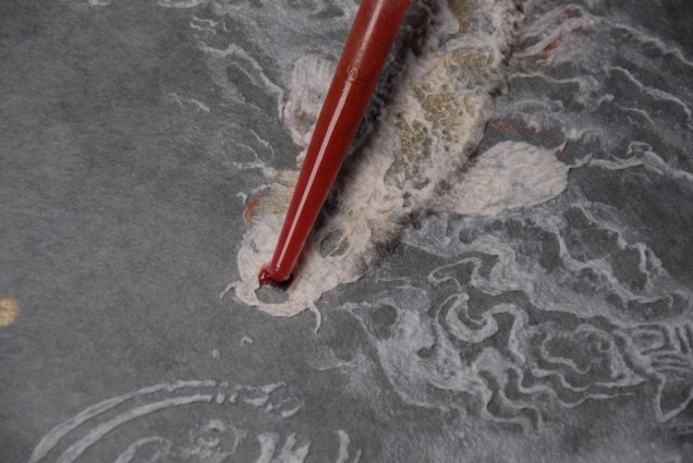
The extensive and well-documented work of Mark Cockram, book artist, master bookbinder and founder of Studio 5 Book Arts in London, bridges the debate. Cockram’s first venture with kintsugi occurred by accident, falling out of a separate, deliberate experiment to collaborate with nature — by burying books with the help of friends around the world and by submitting them to tanks of insects with the help of forensic entomologist Amoret Whitaker. Marc Webb (Park Light Pictures) captures Cockram’s original intent and results in this video created to accompany Cockram’s and nature’s works of art displayed at Pestival (2010). Cockram’s first kintsugi work, entitled Kintsugi (2013), came as a response to cracks appearing after freeze-drying the cover of one of sketchbooks buried in a garden in Bangkok.
Kintsugi (2013) Mark Cockram Unique. Buried book with 23.5 ct gold leaf inclusions. 15cm x 20cm. Courtesy of Maggs Brothers Ltd
So pleased with the outcome of the accident, Cockram produced Kintsugi 2 (2018).
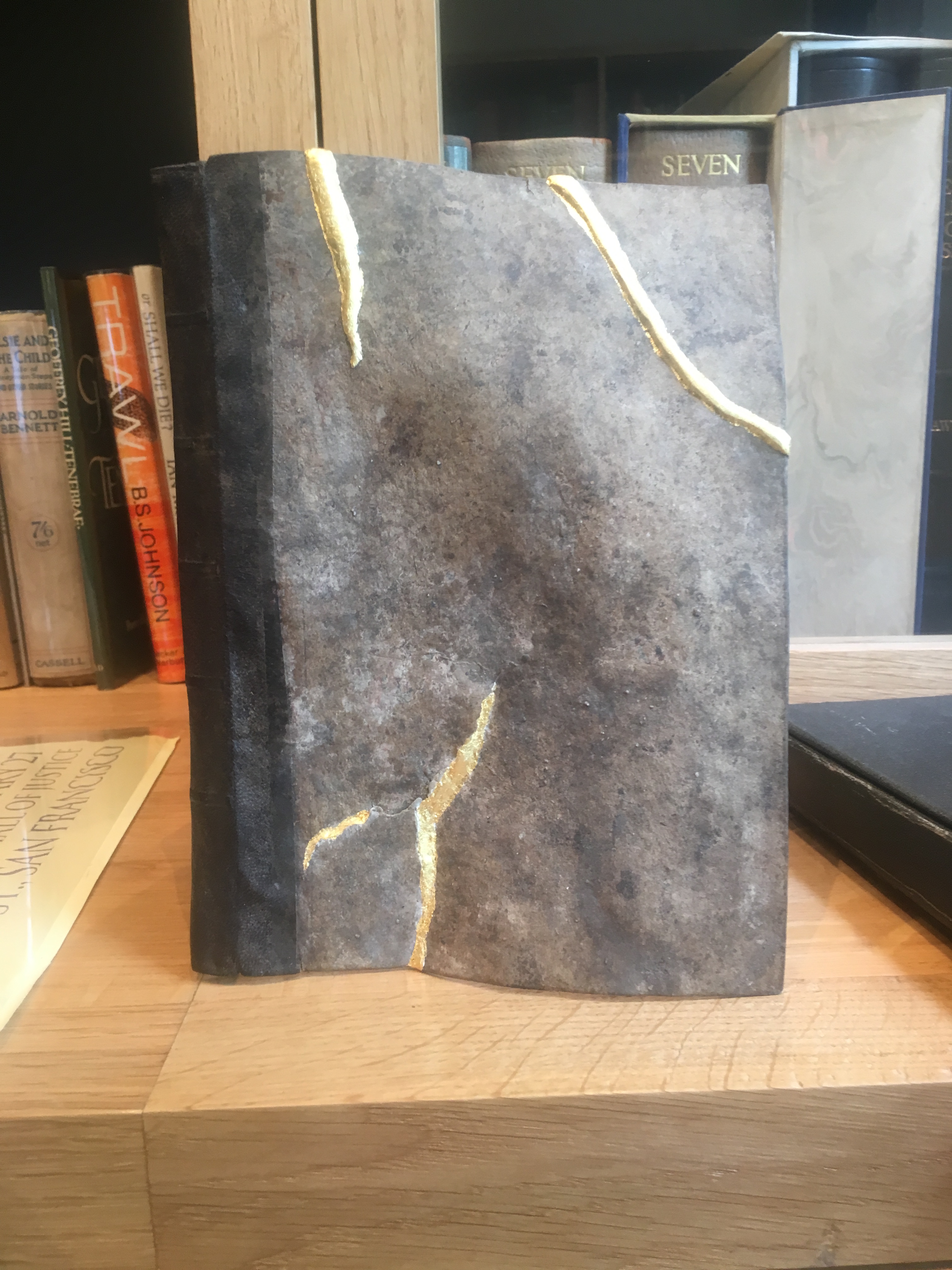
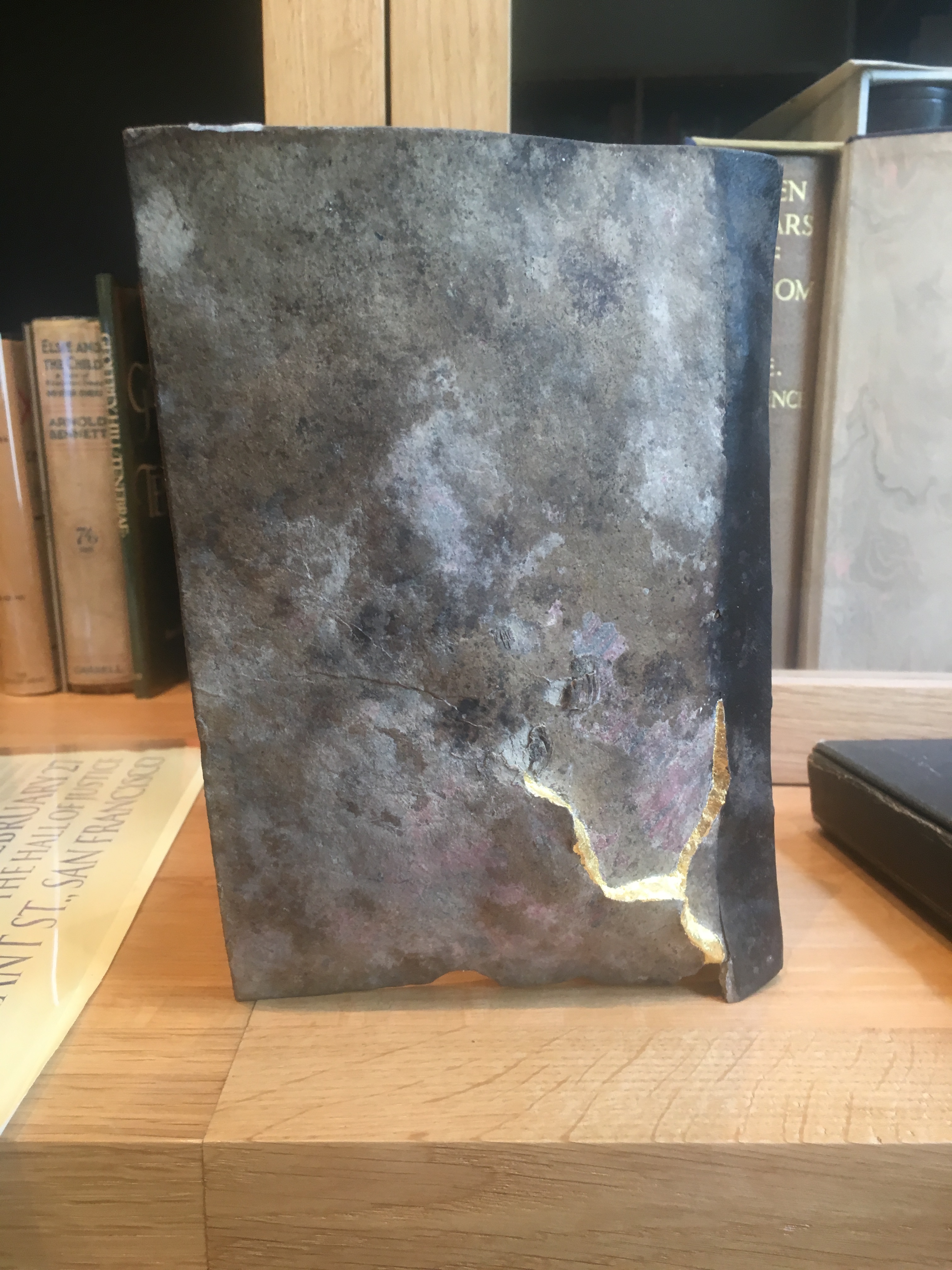
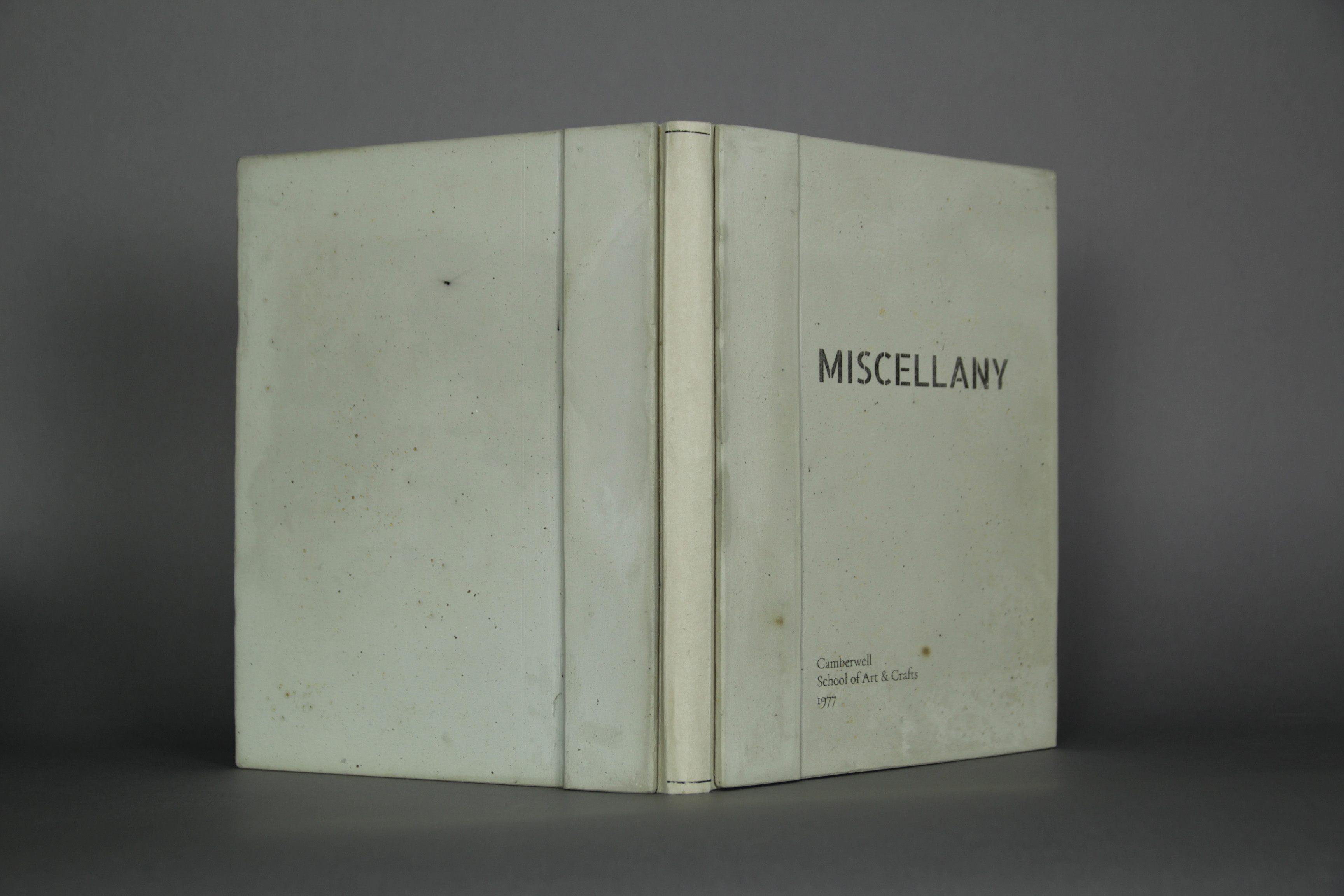
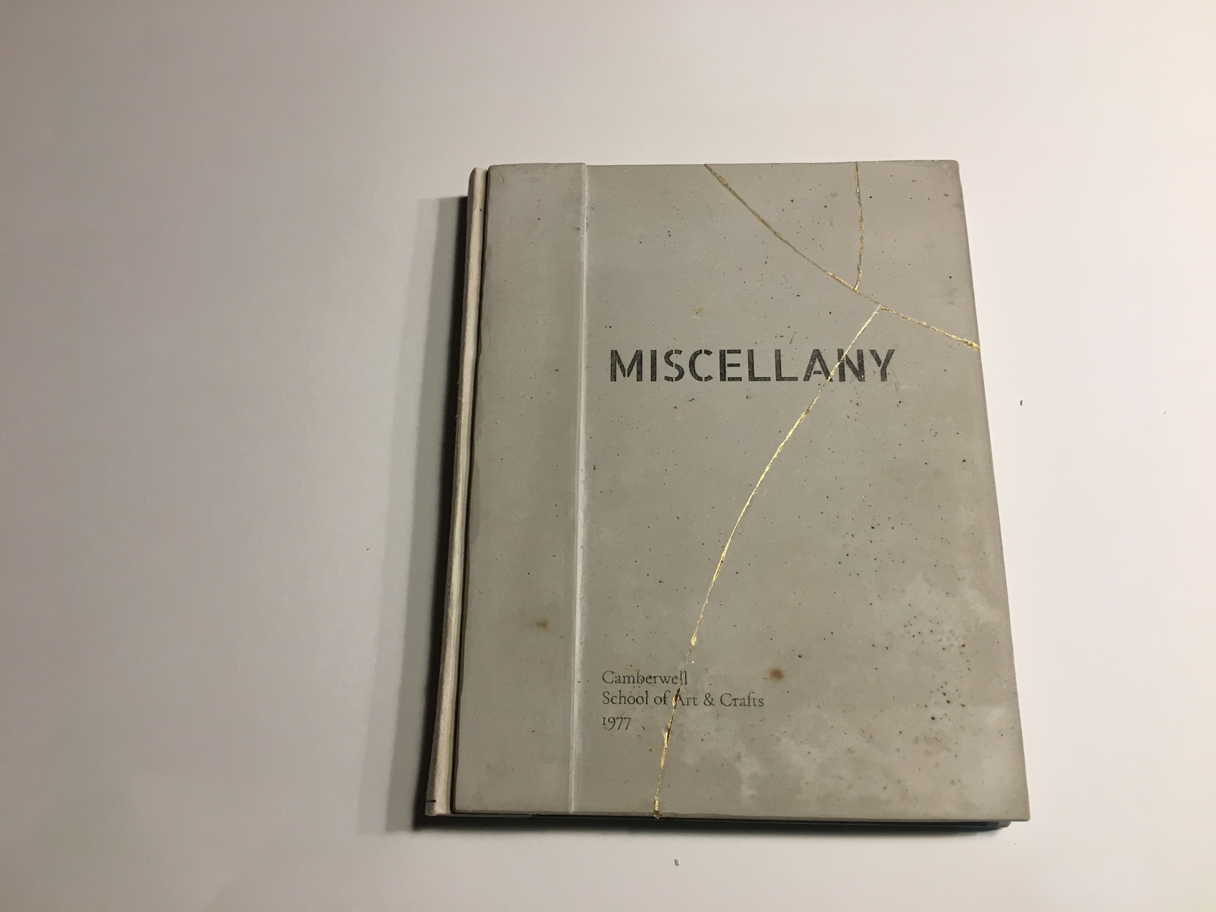
Another work of kintsugi-by-accident is Michele Emerick Brown‘s Miscellany, which began as an entry to the 2016 Guild of Book Workers’ binding exhibition. Sewn with a link stitch and of German paper case construction, it consists of printing examples from the bookbinding and restoration program at the Camberwell School of Art and Crafts, as it was known back in the 70s. Of more interest, its boards are made of Rockite (a concrete mix) and marble dust.
Miscellany (2018) Before breakage Michele Emerick Brown
After its not being accepted to the GBW exhibition, Brown writes,
I decided to enter it in the Artistree exhibit. I have a cottage in NH and thought I’d drop it off the same week-end I was meeting some friends. I took it out of the bag to show them, turned, tripped and dropped the book. Each board broke in several pieces. Very traumatic. It seemed like this book wasn’t meant to be exhibited.
After a couple of weeks I decided to glue it back together using construction adhesive and thought I would use gold leaf to highlight the cracks. While I was thinking about how to do it (what kind of glaire to use etc), someone told me about kintsugi. I ended up using gold acrylic (Golden). I went ahead and submitted it and it was accepted.[Correspondence with Books On Books, ]
Miscellany (2018) After breakage and “kintsugi” repair Michele Emerick Brown
Miscellany (2018) Inside view of concrete boards “before” breakage Michele Emerick Brown
Miscellany (2018) Inside front cover after breakage and “kintsugi” repair Michele Emerick Brown
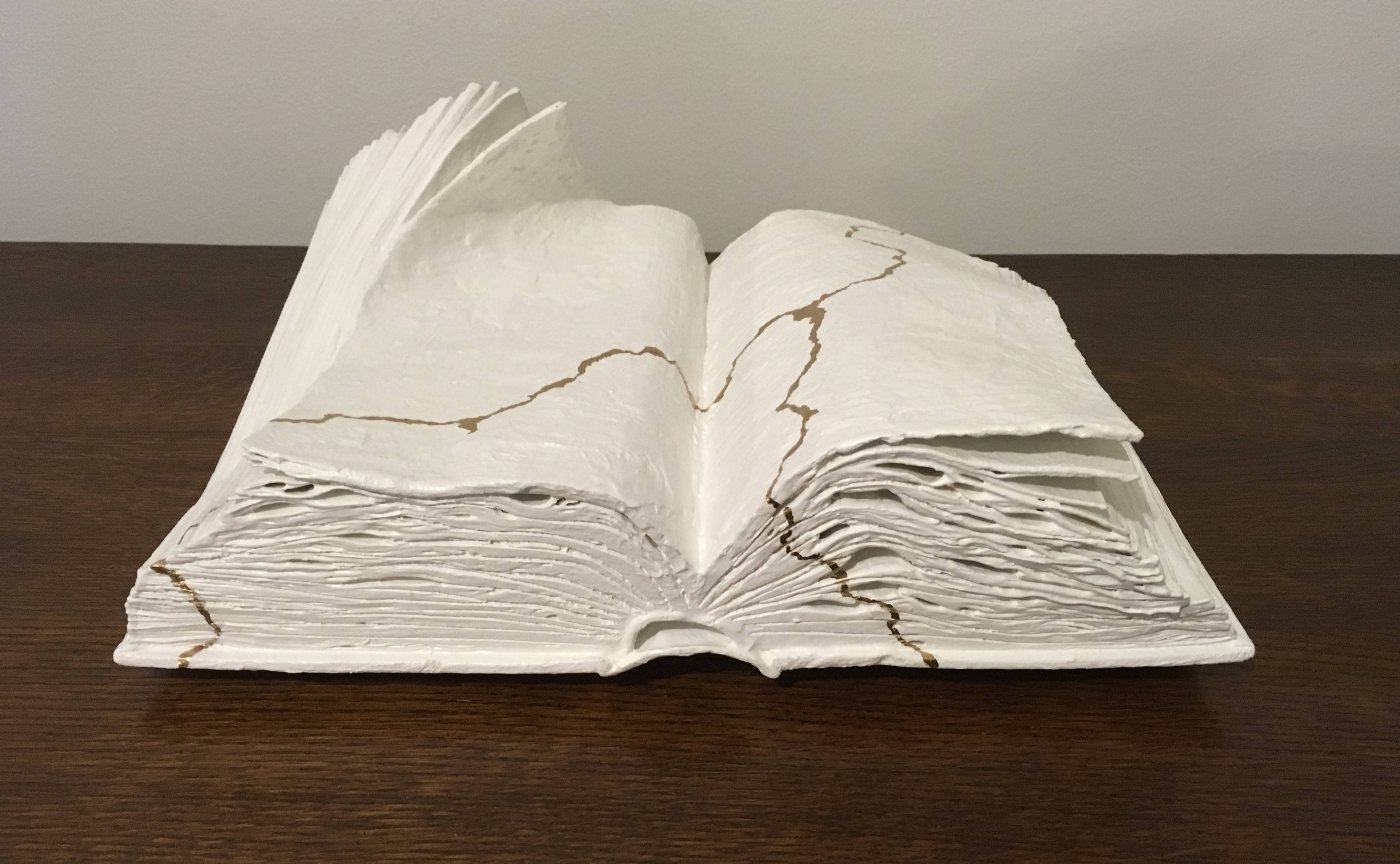
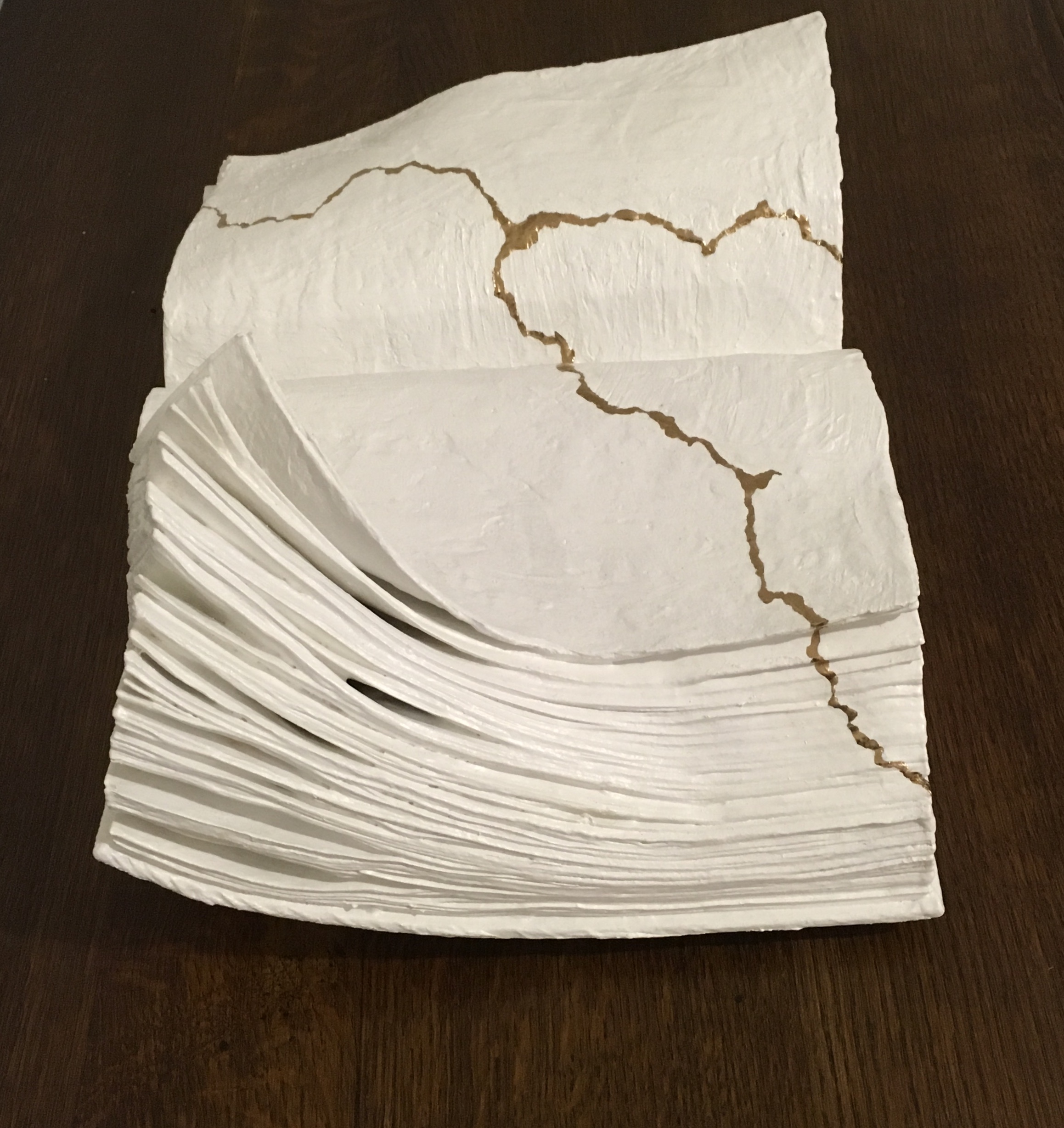
Another “kintsugi book artist” is Lorenzo Perrone. Much like Werner Pfeiffer, Perrone has focused on the book as unreadable object and, as his site called “Libribianchi” implies, almost completely white.
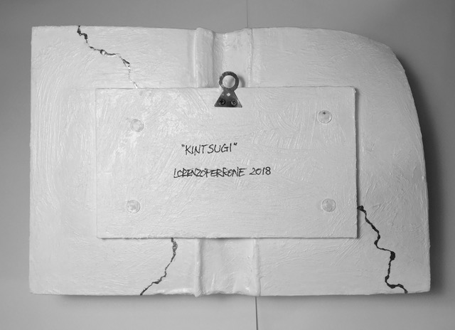
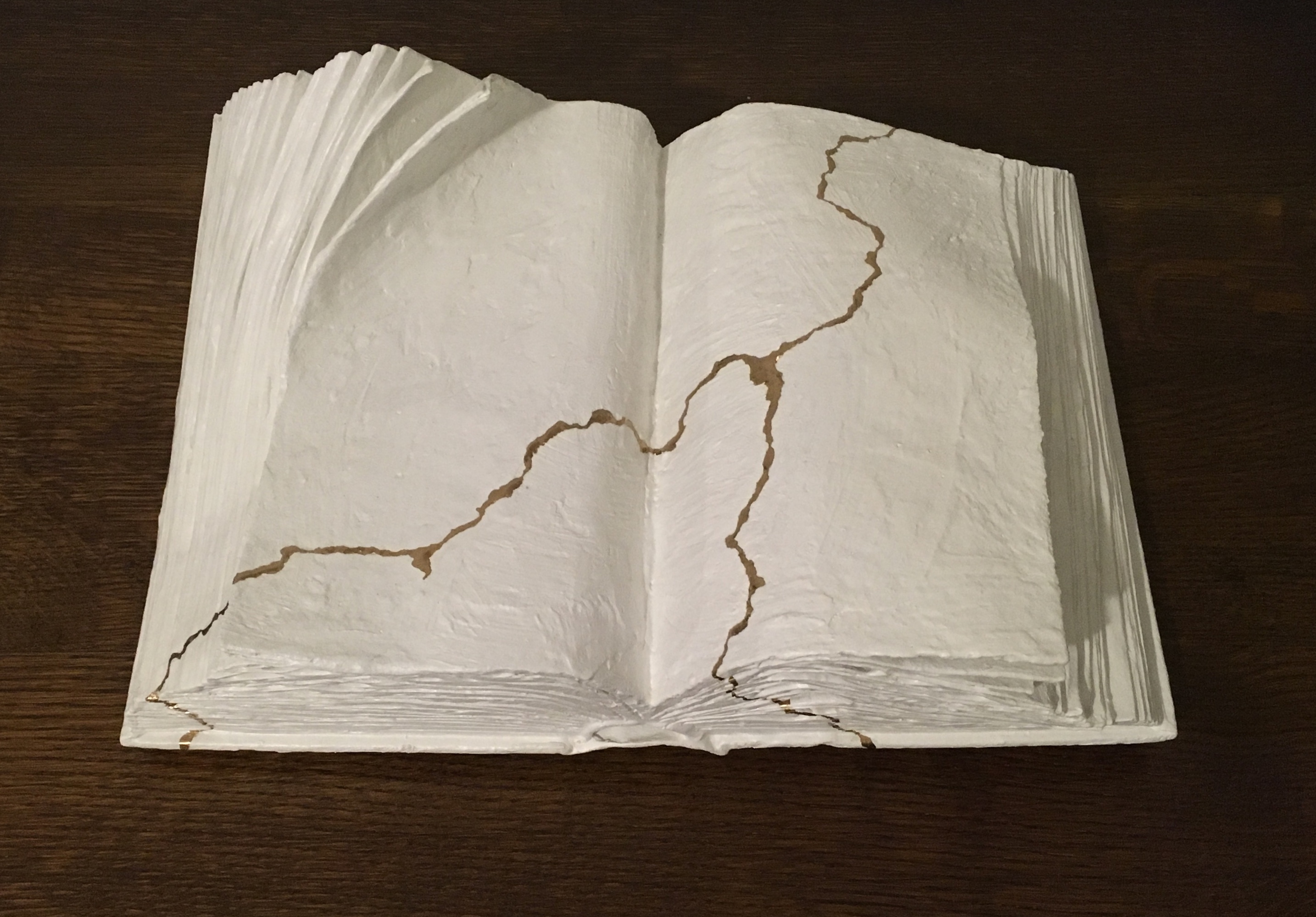
Kintsugi (2018) Lorenzo Perrone Mixed media: book, plaster, white and gold pigments 42x26x16cm
Evident from this video about Perrone and this one about Pfeiffer, Perrone’s work is more romantic in a literary sense. His recent adoption of bronze and installations adds an elemental, alchemical, even phenomenological feel to his oeuvre. As he puts it, “Before, water was enough to make paper malleable, now I need fire to make bronze compliant.” Despite the disappearance of text in Perrone’s works, they still perform that ekphrastic act of book art and send me back to re-read — this time Bachelard’s Water and Dreams and Fragments of a Poetics of Fire.
Like the pleasure of kintsugi, an increase of enjoyment in something elemental, something fusing the past with the present, the broken with the re-created and the head with the heart.