Books On Books Collection – Robbin Ami Silverberg

Morning Prayer II (2000-04)
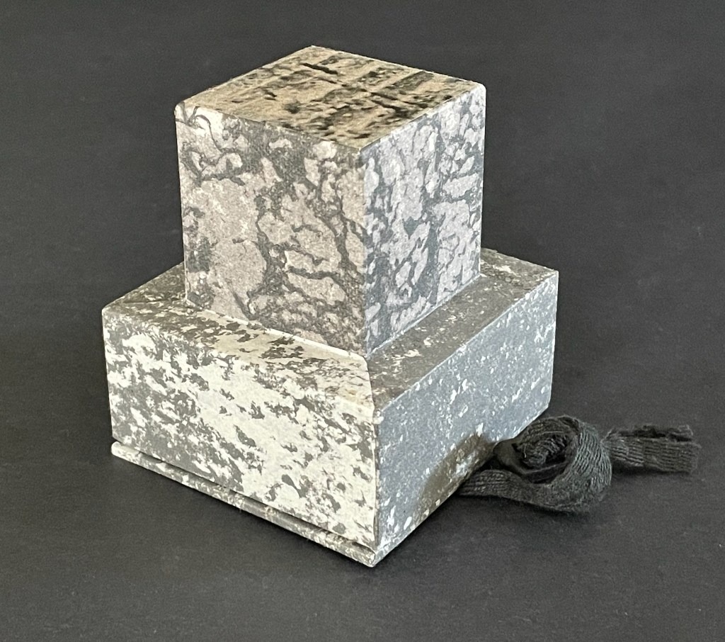
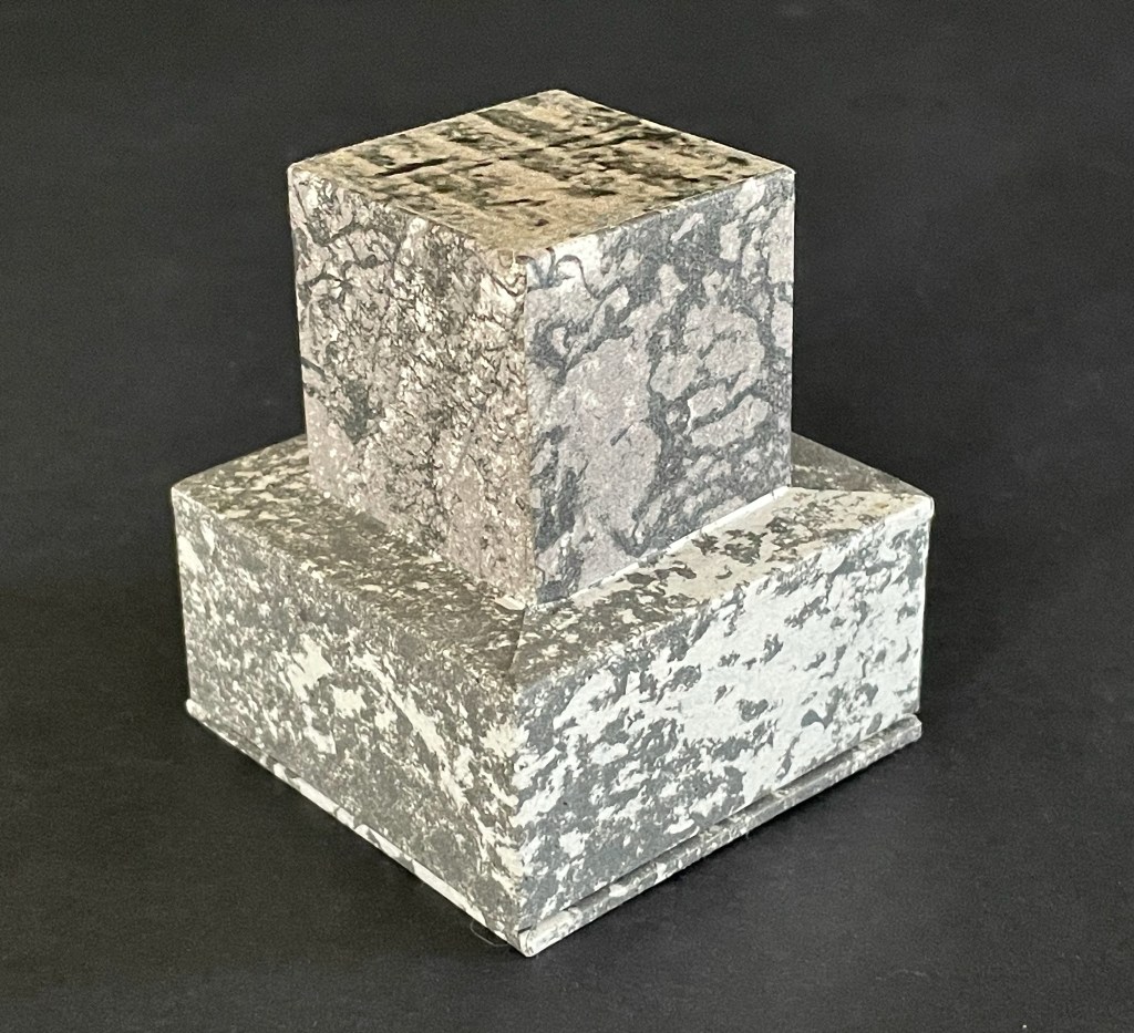
Morning Prayer II (2000-04)
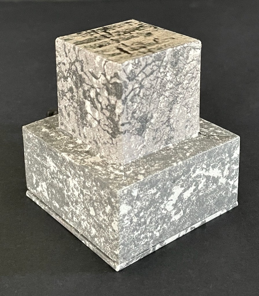
Robbin Ami Silverberg
Tefillah-shaped box: H70 x W65 x D65 mm. Meander-fold booklet: 52 x 52 mm (closed); H250 x W150 mm (open). Mica inlay on bookle’t front cover. Edition of 20, fo which this is #7. Acquired from the artist, 20 April 2026.
Photos: Books On Books Collection.

In the granite quarry at Mauthausen in Austria, there are 186 uneven steps made of stone leading out of it. These are the “Stairs of Death”, so named for the countless who died in the forced labor of carrying blocks hacked from the quarry up the nearly vertical climb. Morning Prayer II is a heart-breaking memorial to these victims.

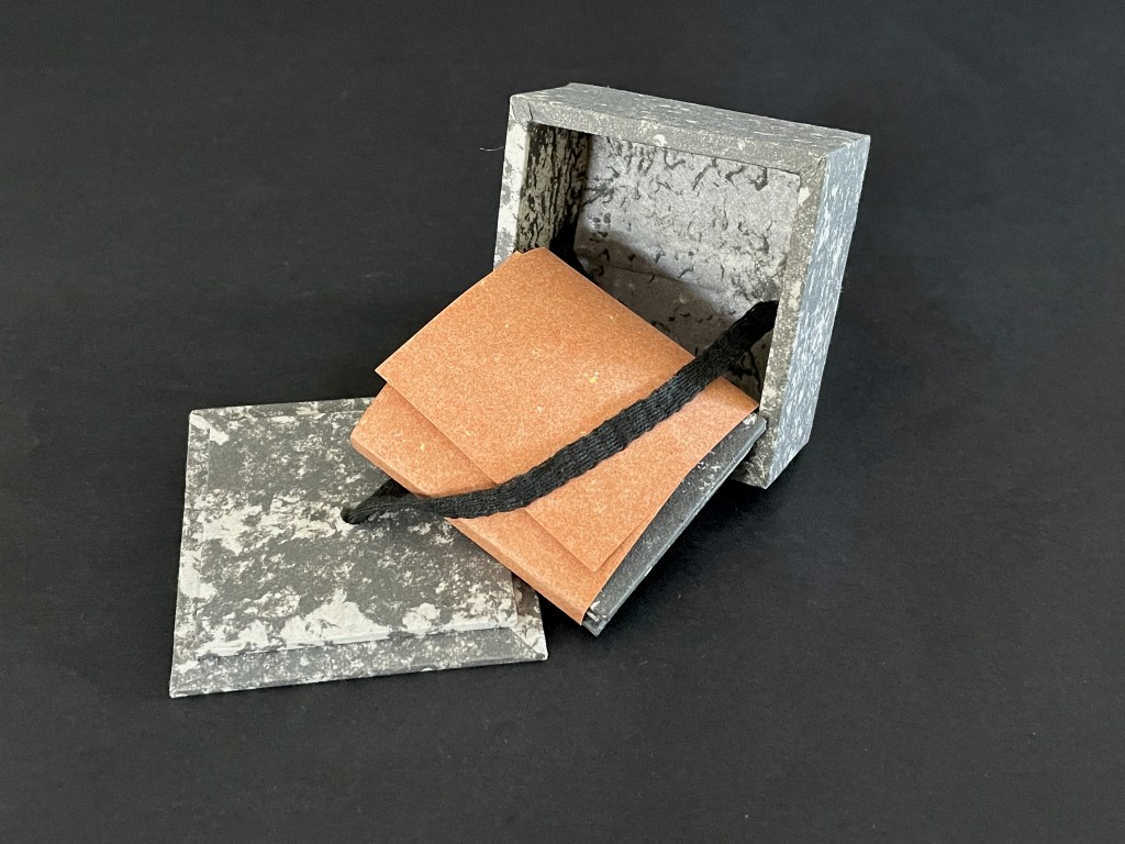
A tefillah-shaped box holds a double-sided meander-fold booklet illustrated with archival photographs from the concentration camp. Tefillin (one worn on the arm, one on the head) honor the biblical commandment to remember the Exodus from Egypt and observe Passover. Associated with morning weekday prayers, they hold parchment scrolls with four verses from the Torah: (Exodus 13:1–10, Exodus 13:11–16; Deuteronomy 6:4–9, and Deuteronomy 11:13–21). They are usually made of leather.

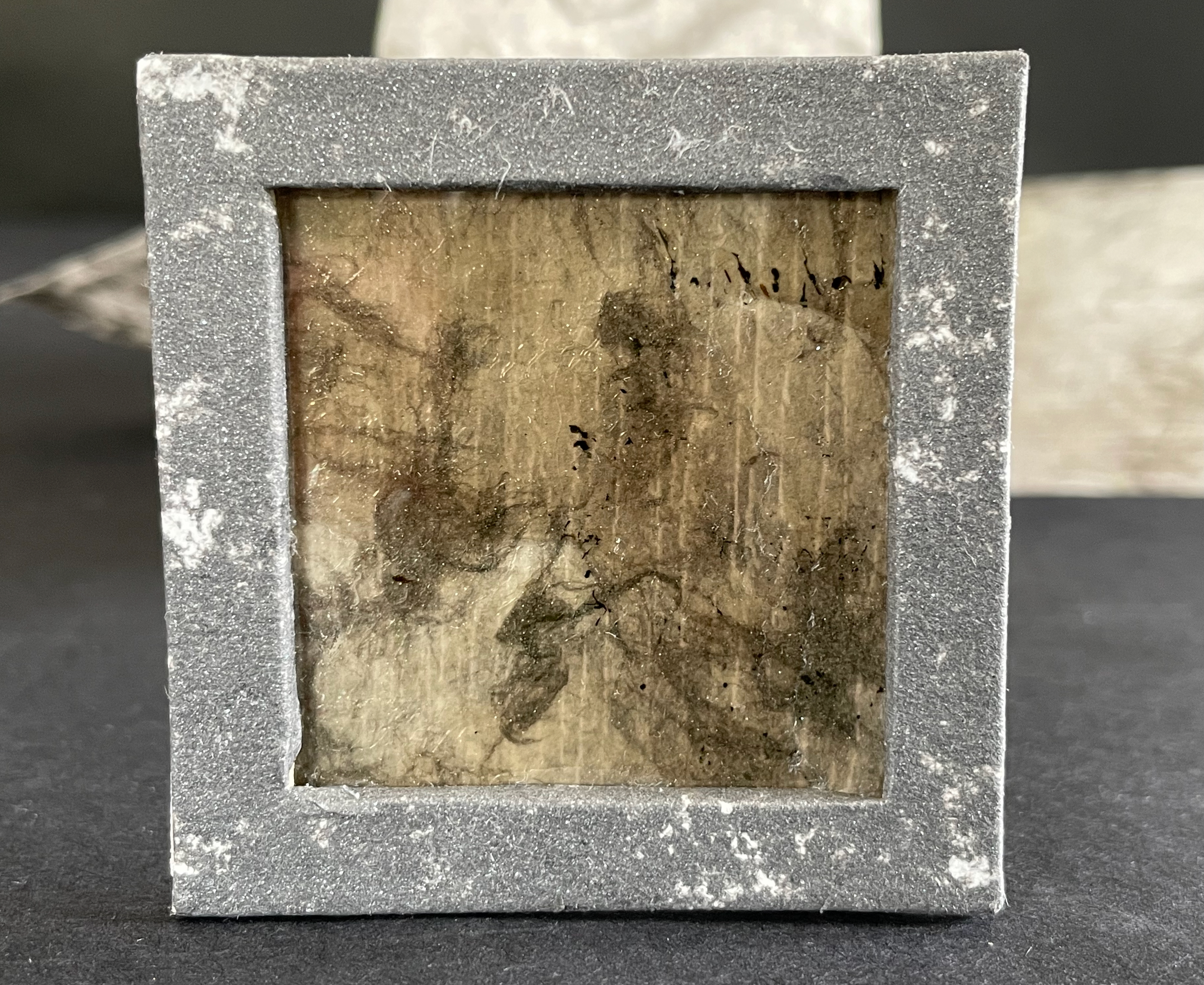
In contrast, the container of Morning Prayer II appears as stone — mica embedded in its base and granite simulated on its paper covering. Instead of a morning prayer in remembrance of the trek to freedom and passing over of the angel of death, we have a mourning prayer counting each of the 186 stone steps of the staircase.
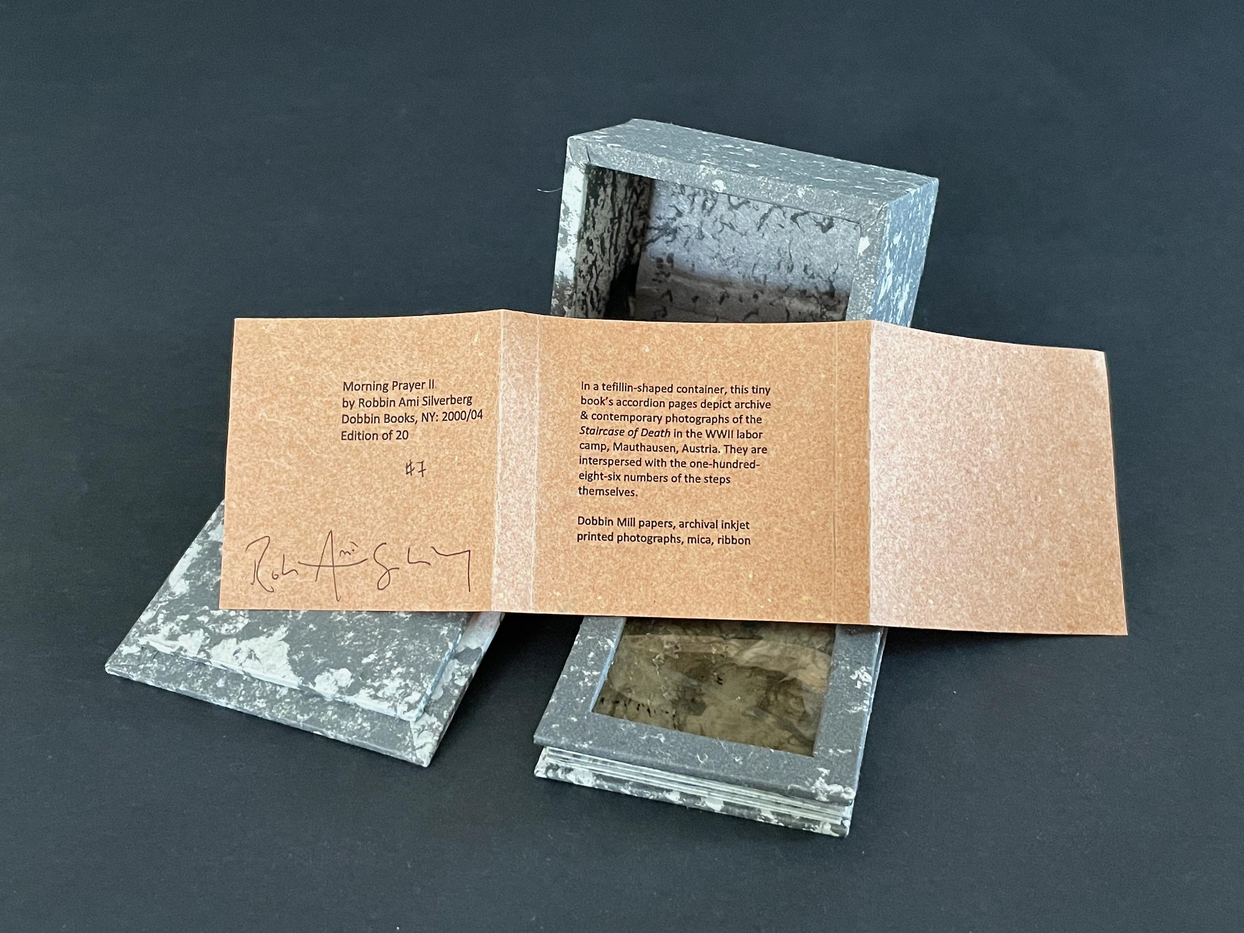
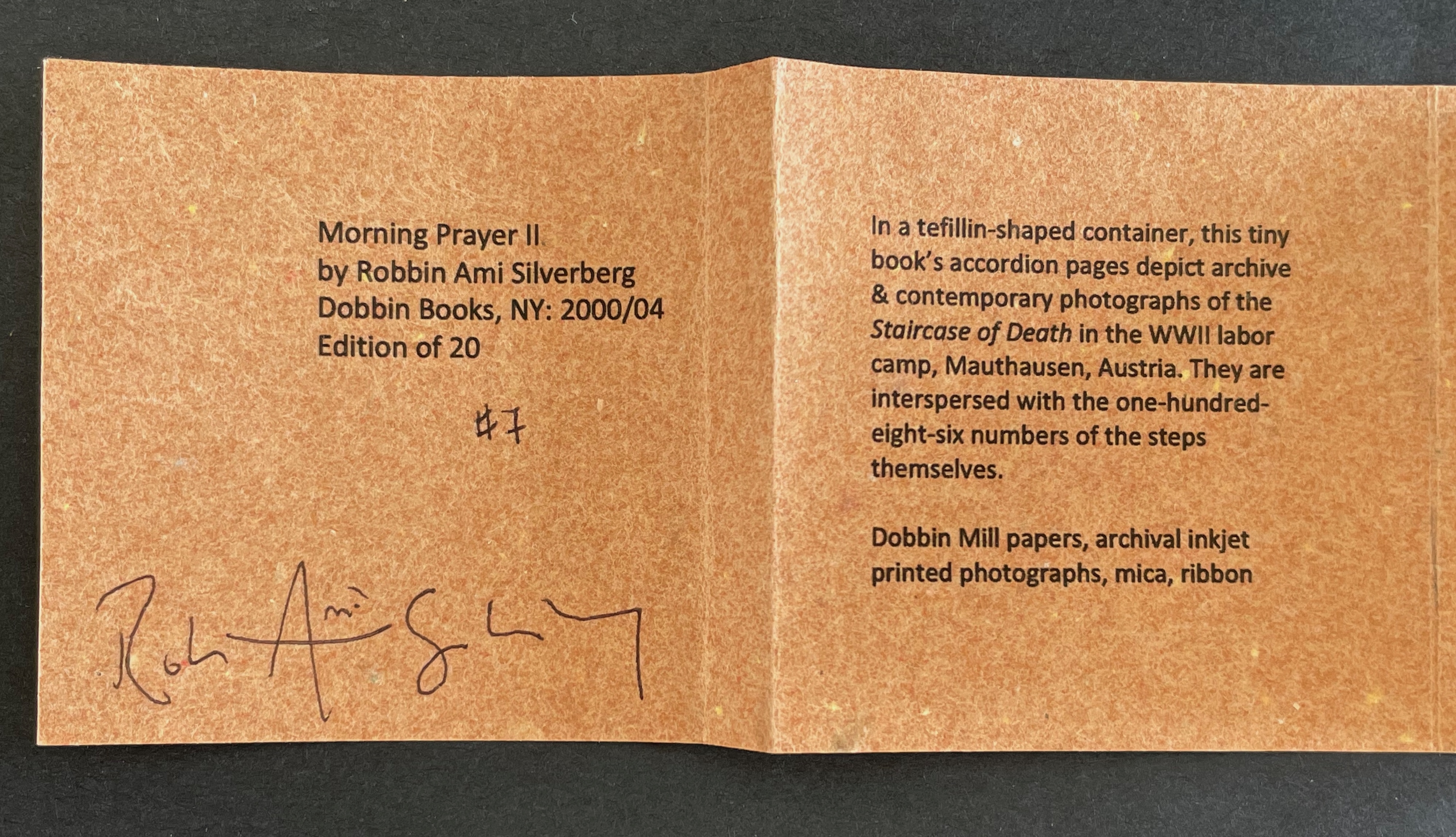
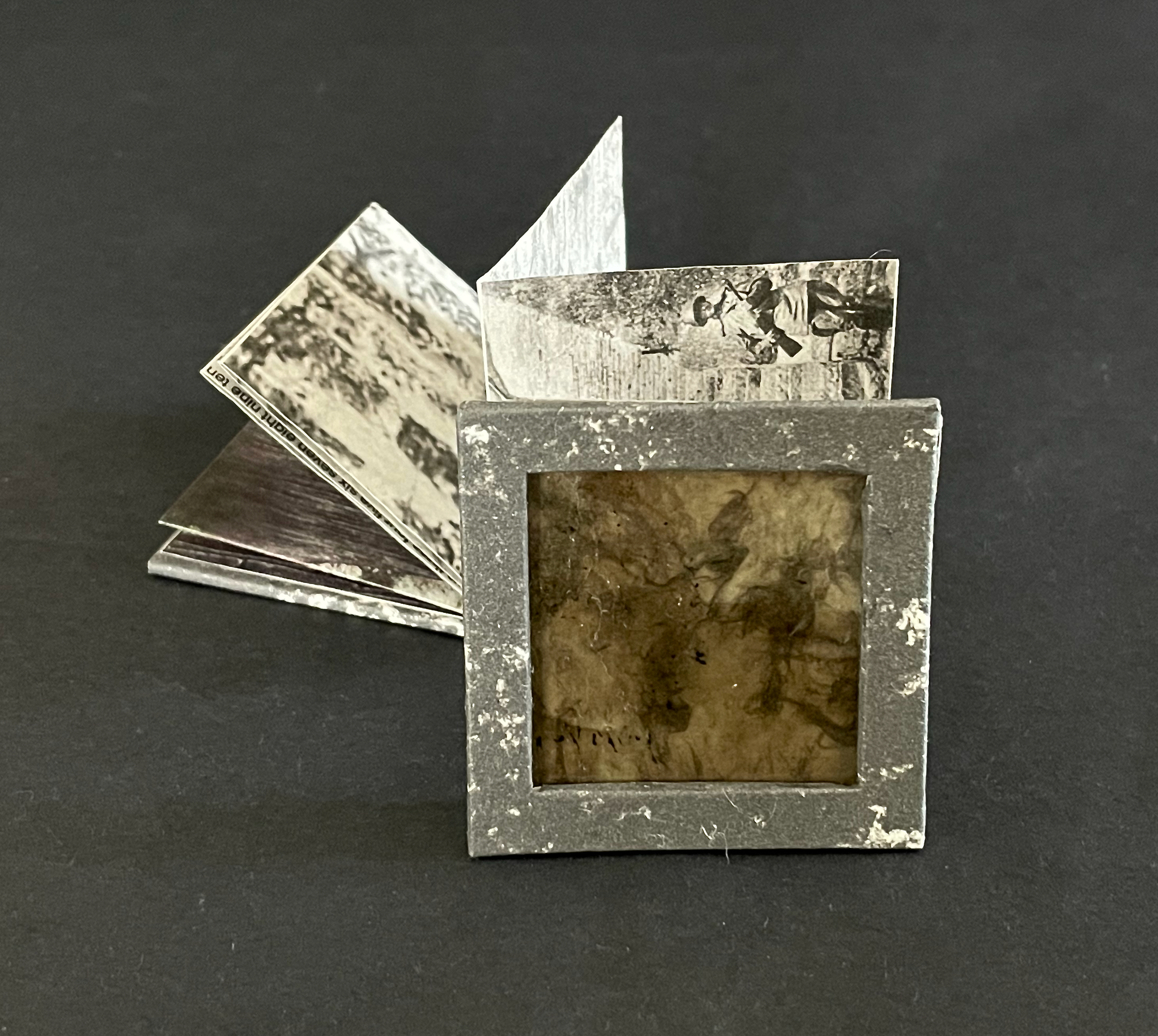
An open vintage photo album featuring black and white photographs, with a square frame at the front displaying a textured surface.

Instead of scrolls extolling the laws of the deity, we have a single sheet, cut and folded to open in a zigzag meander recalling and showing photos of the uneven granite steps.
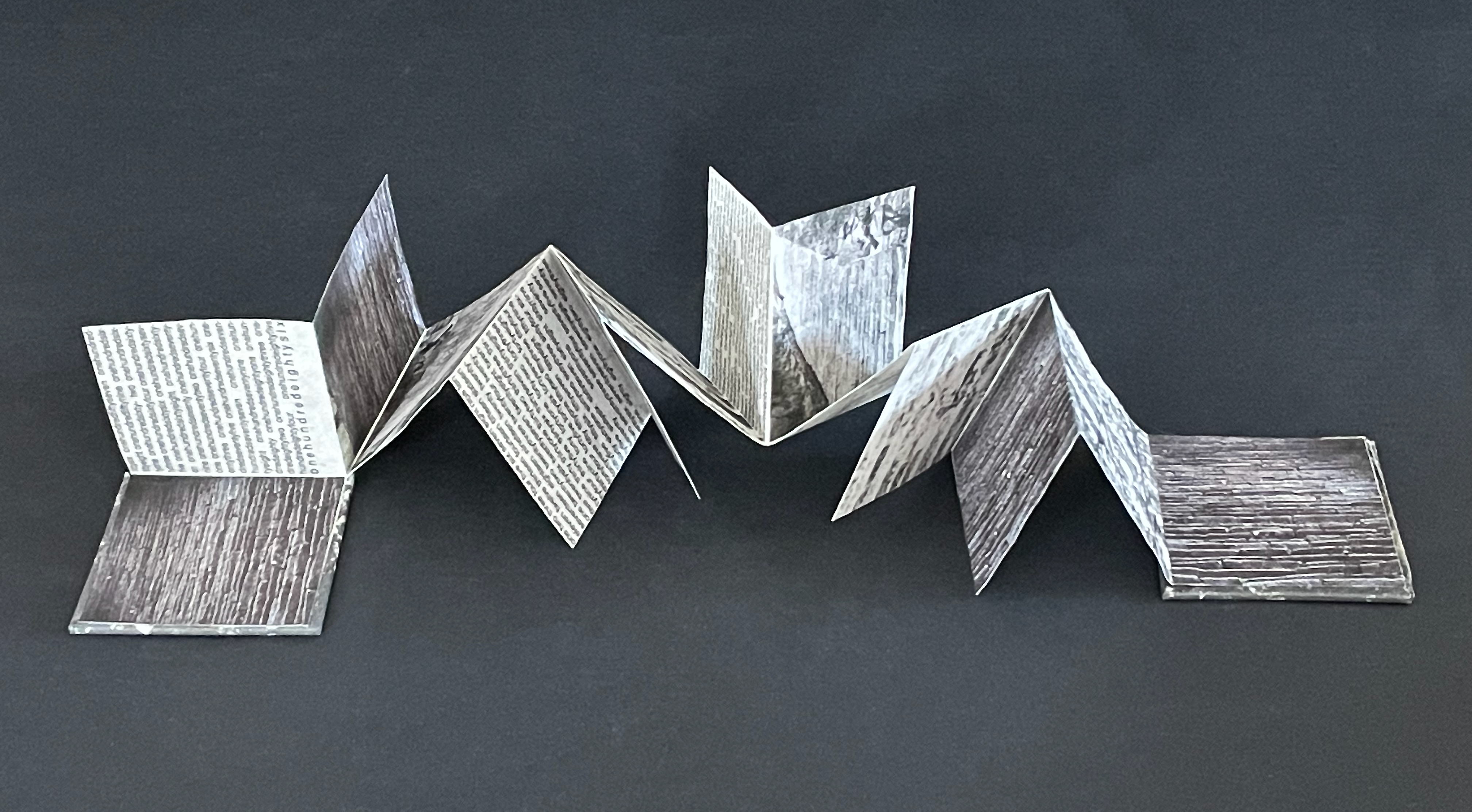
An artistic fold-out book made of paper, displaying various textures and printed text, arranged on a dark background.

Instead of the calligraphy of verses from the Torah scrolls, we have the typeset counting of steps confined and justified left and right within four of the fourteen segments of the artist’s book.
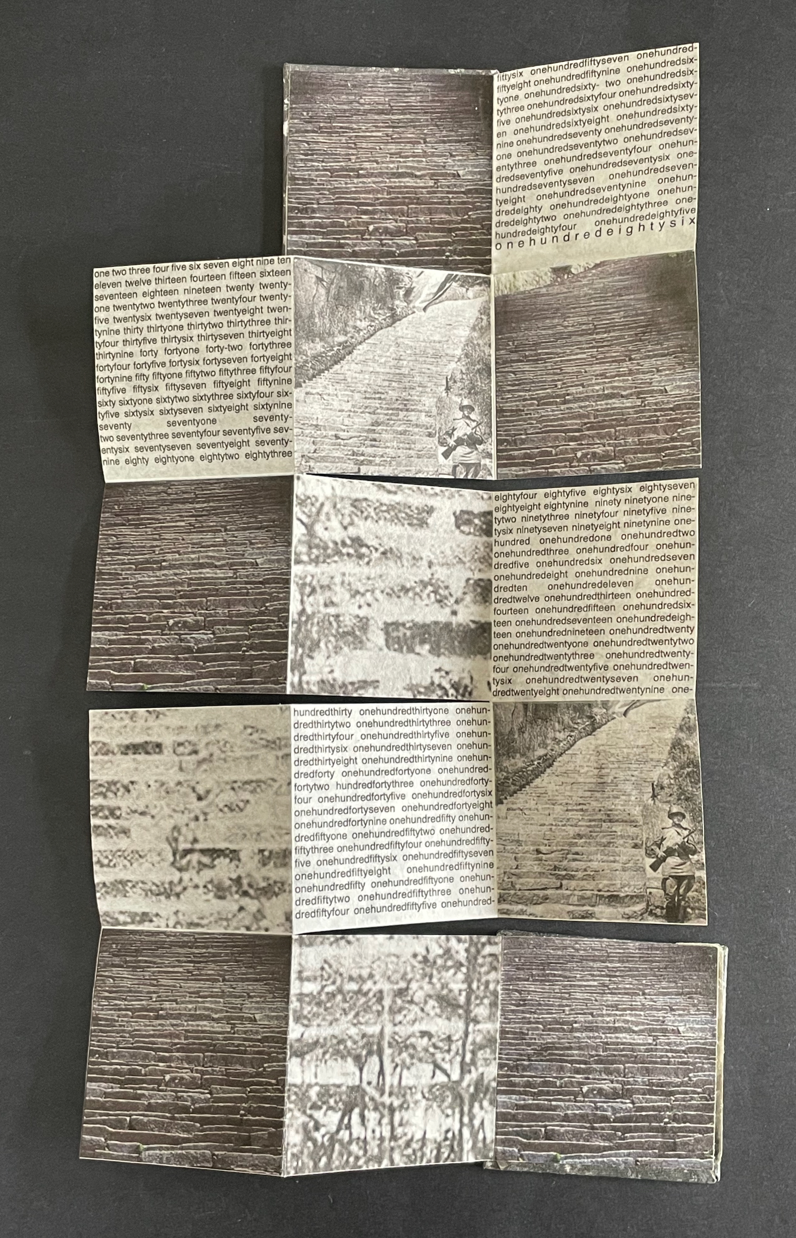
A folded piece of paper featuring a collage of images depicting stone steps and brick patterns, interspersed with text in a repeated, structured format.

Instead of morning sunlight, we have gray ink on the reverse, mimicking marble or ashes.
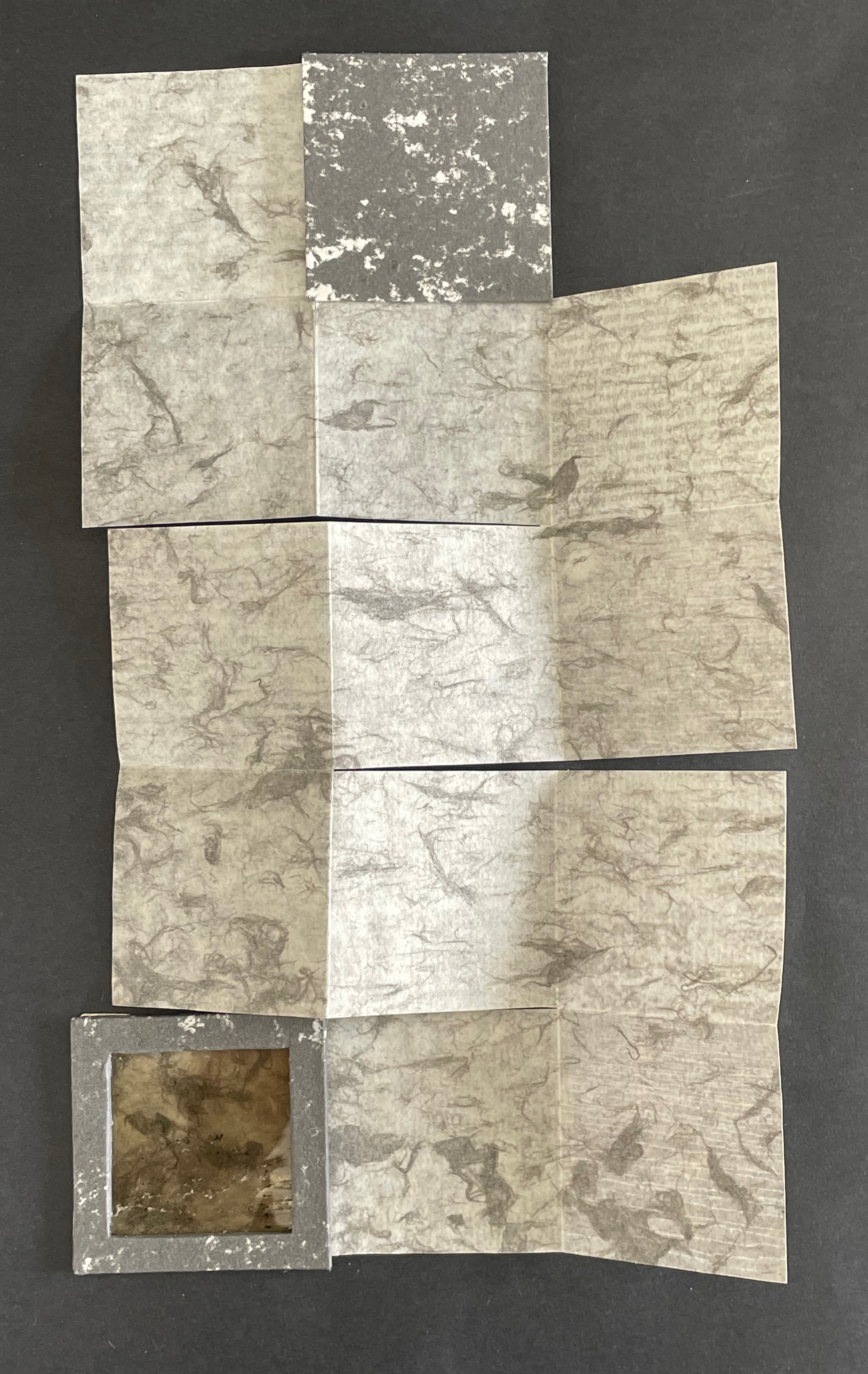
A layered composition of various textured papers in shades of gray and beige, arranged in a unique pattern, with a small square frame integrated into the design.

Instead of the rhythm of scripture, we have the gaps between stones mimicked by the gaps between run-together words enumerating the 186 steps.
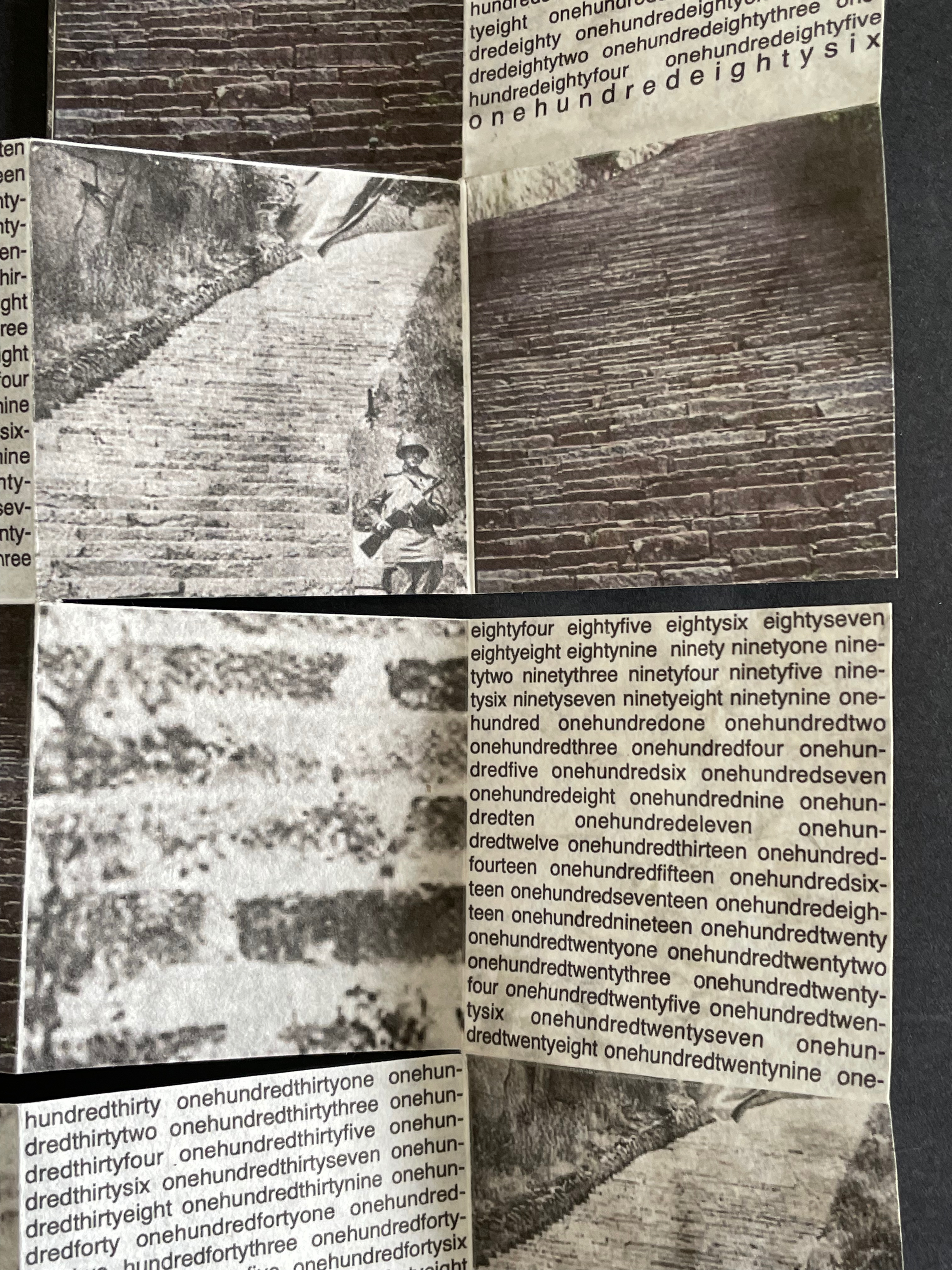
Black and white collage featuring images of stone stairs and a soldier holding a rifle, surrounded by text in a stylized layout.

Each stone in each step represents where prejudice, racism, and xenophobia lead. Each stone in each step recalls yesterday’s and today’s iniquity and inequity of persecuting those with the “wrong” color of skin, different beliefs, ethnicity, or geographic background. Each stone is the one cast against someone who is not you — until it is you.

La durée réelle: Make this cut first (2024-25)
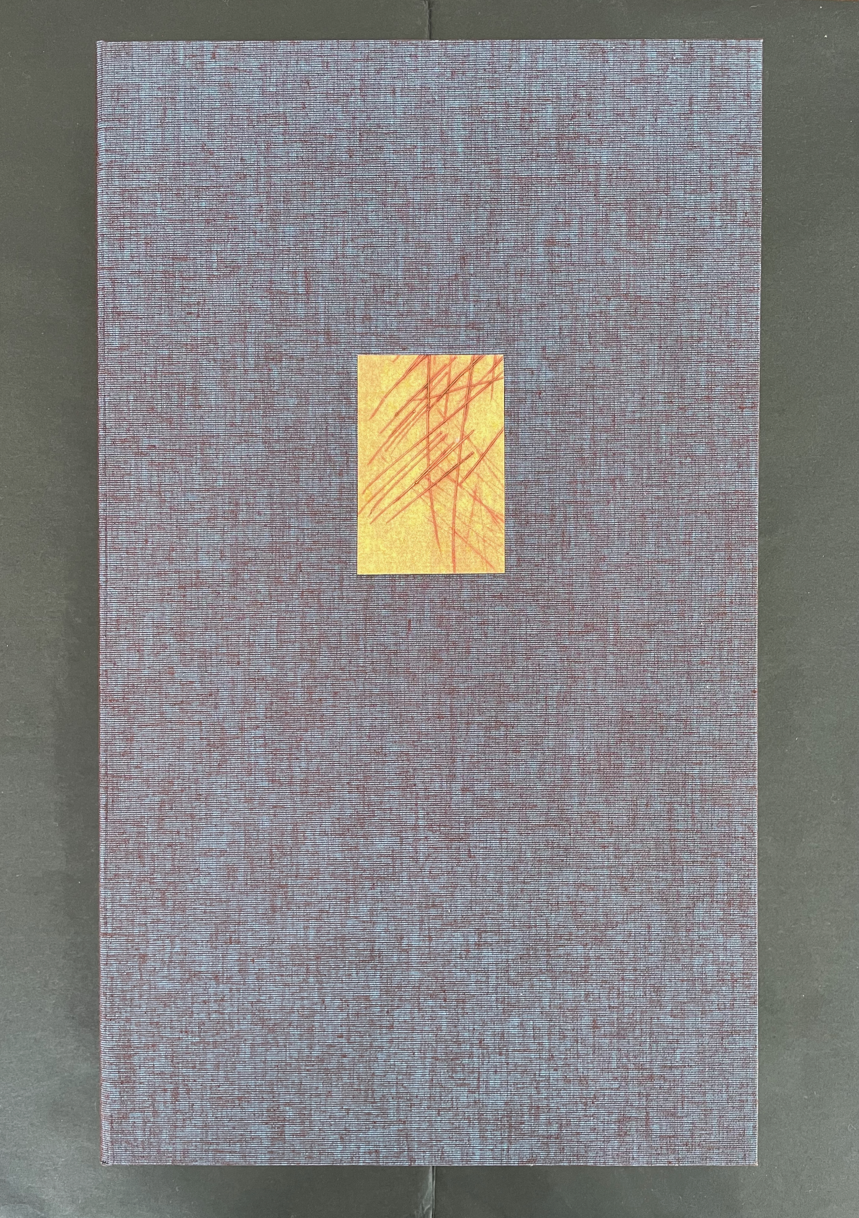
A textured book cover with a dark purple fabric background and a small square cutout featuring a yellow-orange paper with red lines.

La durée réelle: Make this cut first (2024-25)
Robbin Ami Silverberg
Box: H388 c W229 x D58 mm. Book: H352 x W204 xD28 mm. Edition of 12, of which this is #10. Acquired from the artist, 20 April 2026.
Photos: Books On Books Collection.

Our experience of time is no small topic in philosophy, literature, and art. The title of Robbin Ami Silverberg’s artist’s book comes from Henri Bergson’s 1889 dissertation on the subject and his later collection of essays translated as Creative Evolution (1911). With his term la durée réelle (“real duration” or “lived time”) and metaphor-driven exposition, his books aim to describe time as a continuous, flowing, yet nonlinear stream of consciousness rather than surrender it to the mechanistic, linear, and causal descriptions of science. Silverberg’s artist’s book is her meditation on time and life expressed with handmade paper, watermarks, pulp painting, dry point, typography, quotations as if from a commonplace book, and the form of the book.
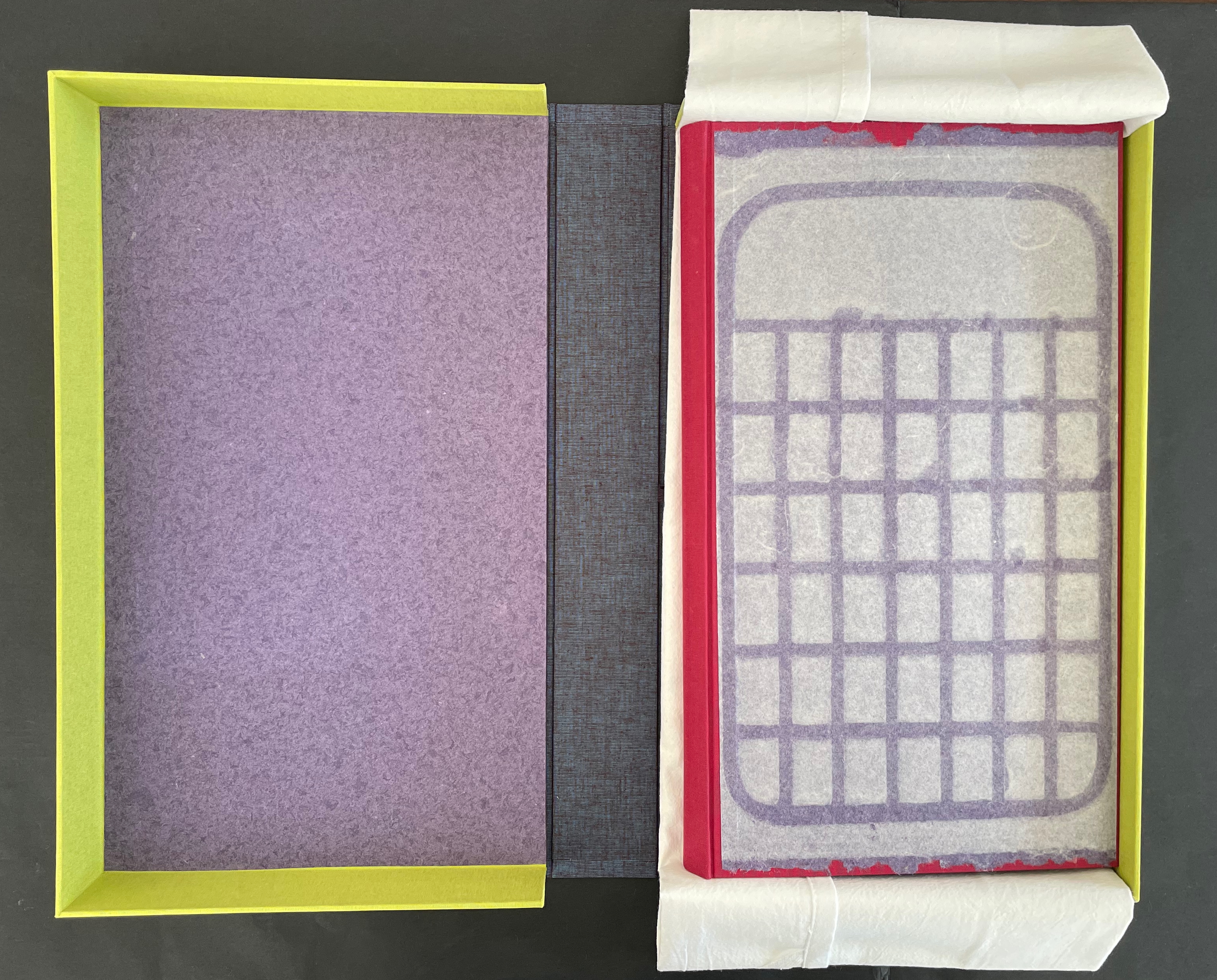
An open box with a yellow border showcasing a purple interior, a grayish-blue outer layer, and a sheet of parchment paper laid over a red base featuring a grid pattern.
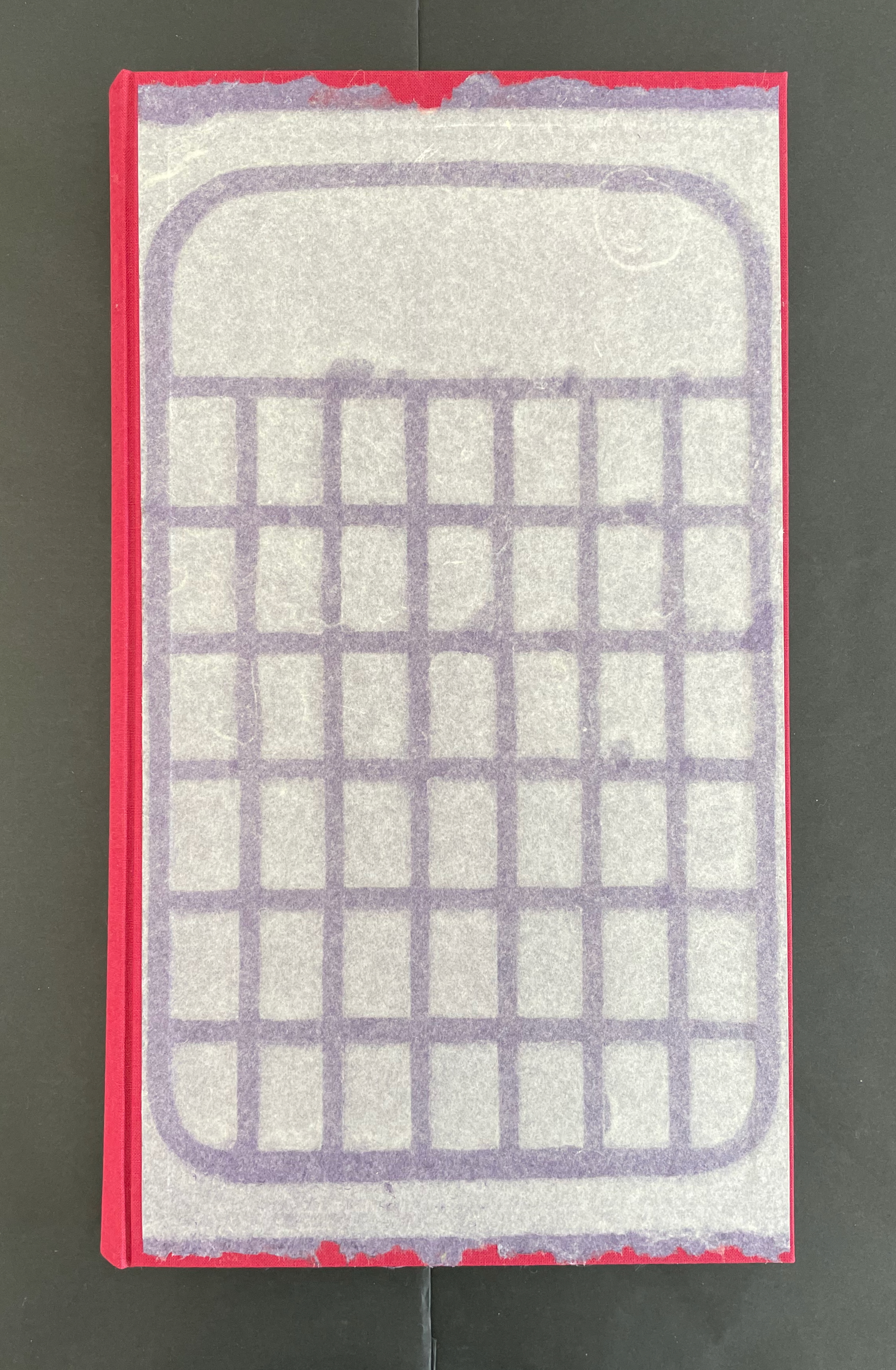
Top view of a book with a red spine and a paper cover featuring a grid pattern in purple.

So much is going on in this artist’s book. Motives interact with technique, material, allusion, text, image, and structure. Motives interact with motives, techniques with techniques, material with material, allusion with allusion, and text with image. All of it like the crisscrossing strokes left on the cutting board and transferred to paper by drypoint.
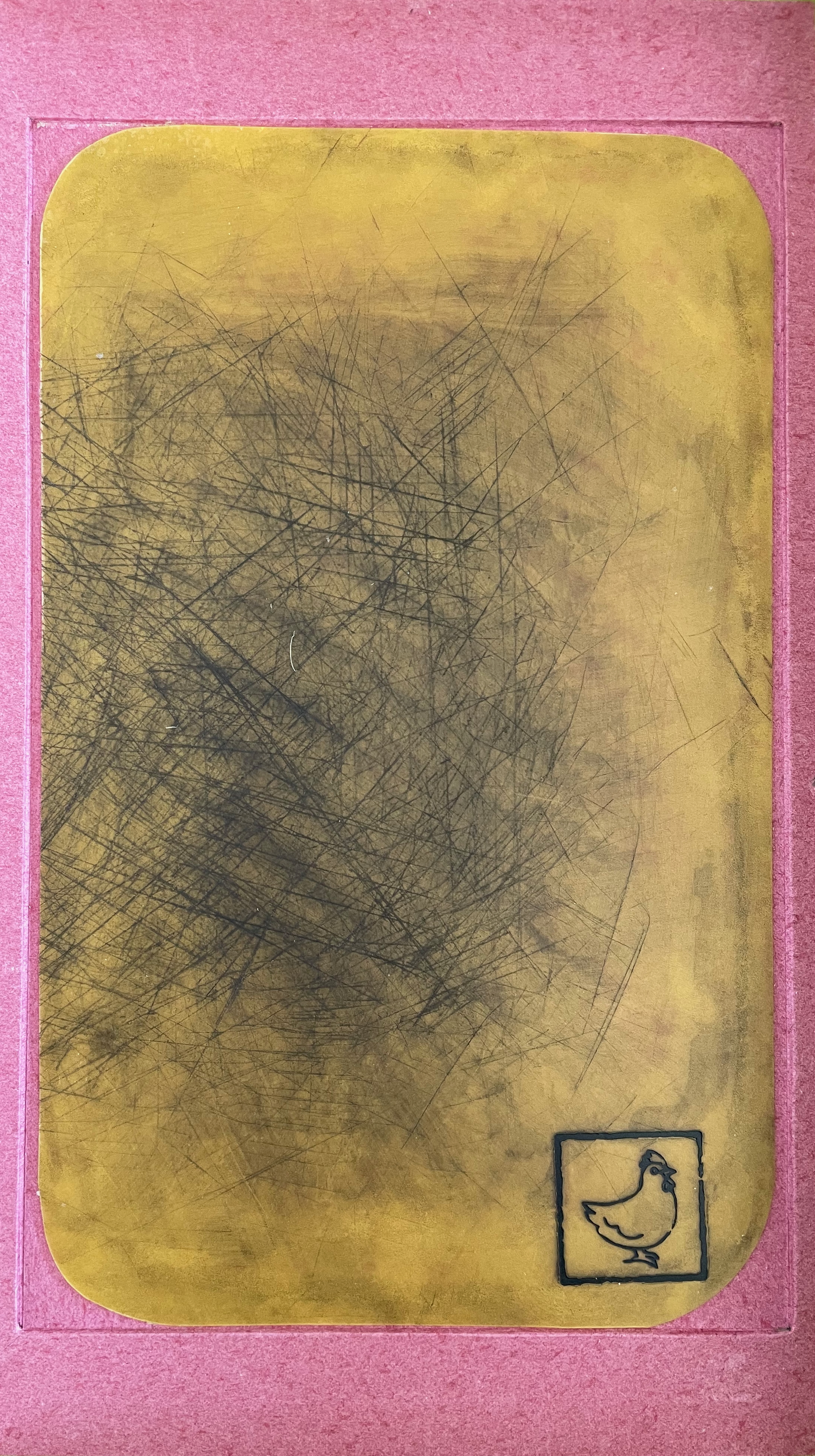
An abstract artwork featuring a textured yellow background with visible scratch marks, framed by a pink border, and a small black outline of a bird in the bottom corner.

Embedded in the custom box, a cutting board used as a printing plate.

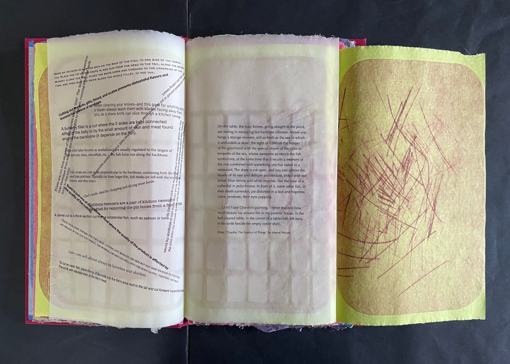
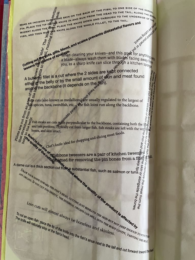
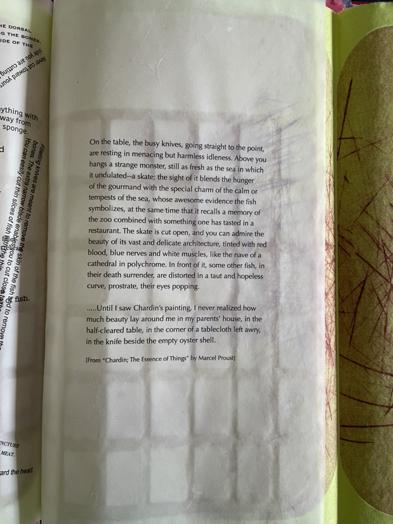
Consider the following sequence. On the verso page of chartreuse green paper, inside the impress of the printing plate, the small image of the fish in the lower left hand corner indicates the seasonal food being prepared in the Spring. On the recto page, the as-yet-illegible text showing through translucent paper mimicks the marks on the cutting board print. When the recto page turns to the left, the now legible text explaining techniques of cutting fish appears in different weights, different cases, and different orientations, mimicking the different blades and direction of cuts. The translucent paper on which the instructions are typeset bears a watermark grid in the shape of the cutting board. When the fold-over sheet of chartreuse green paper turns to the right, it shows another cutting board print. In the center of the triptych is a quotation drawn from Marcel Proust’s appreciation of Jean Siméon Chardin’s La Raie (“The Ray” or “The Skate” ).

By way of the season for fresh fish and the etched evidence of cutting, we have come to instructions for making the cuts. By way of the instructions, we have come to a description of Chardin’s still life of a gutted ray, the text of which is typeset on the cutting-board-watermarked translucent paper. By way of a still life freezing a moment in time, we have come to Marcel Proust, author of the septology In Search of Lost Time and its fictional exploration of the experience of memory. By way of Proust’s essay the “Essence of Things”, we have come to his good friend Henri Bergson and la durée.
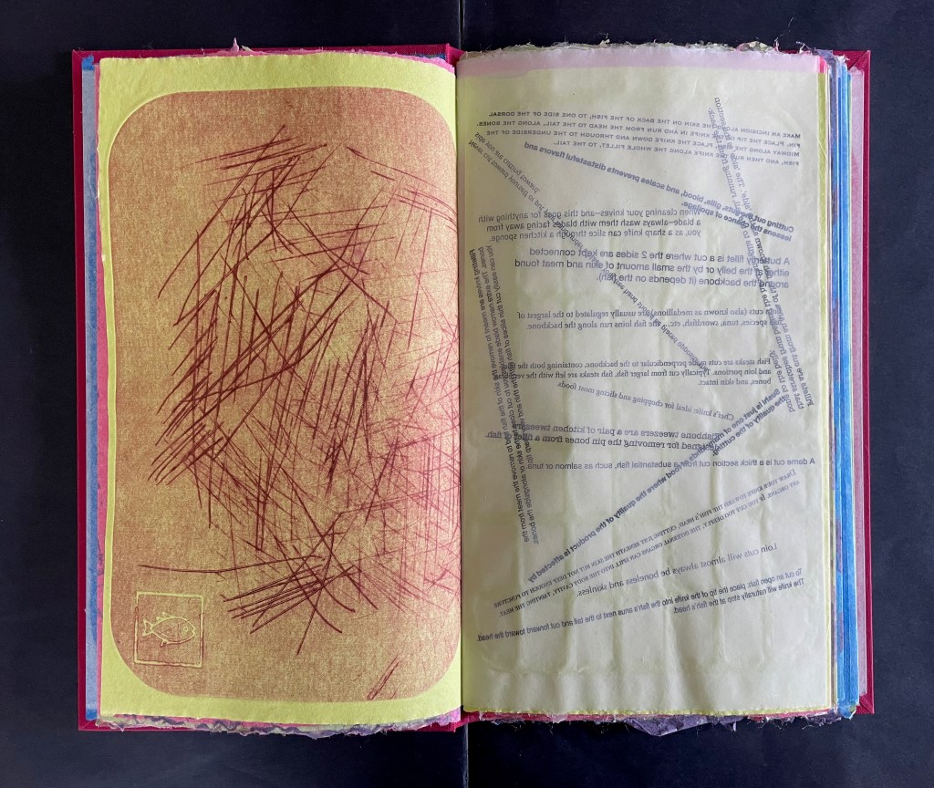
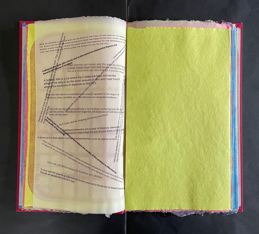
As the translucent page with Proust’s text and the cutting-board watermark is turned to the left, we now have a diptych of two cutting board prints on the chartreuse green paper. We may think of the translucent pages and the accumulated cuts as evidence of times past, but the flow of the sequence, the feel of the different papers as they turn, and the interaction of associations offer a layer of experience approaching the essence of the thing Bergson calls la durée réelle. More than a static artifact, Silverberg’s artist’s book functions to evoke temporal experiences.
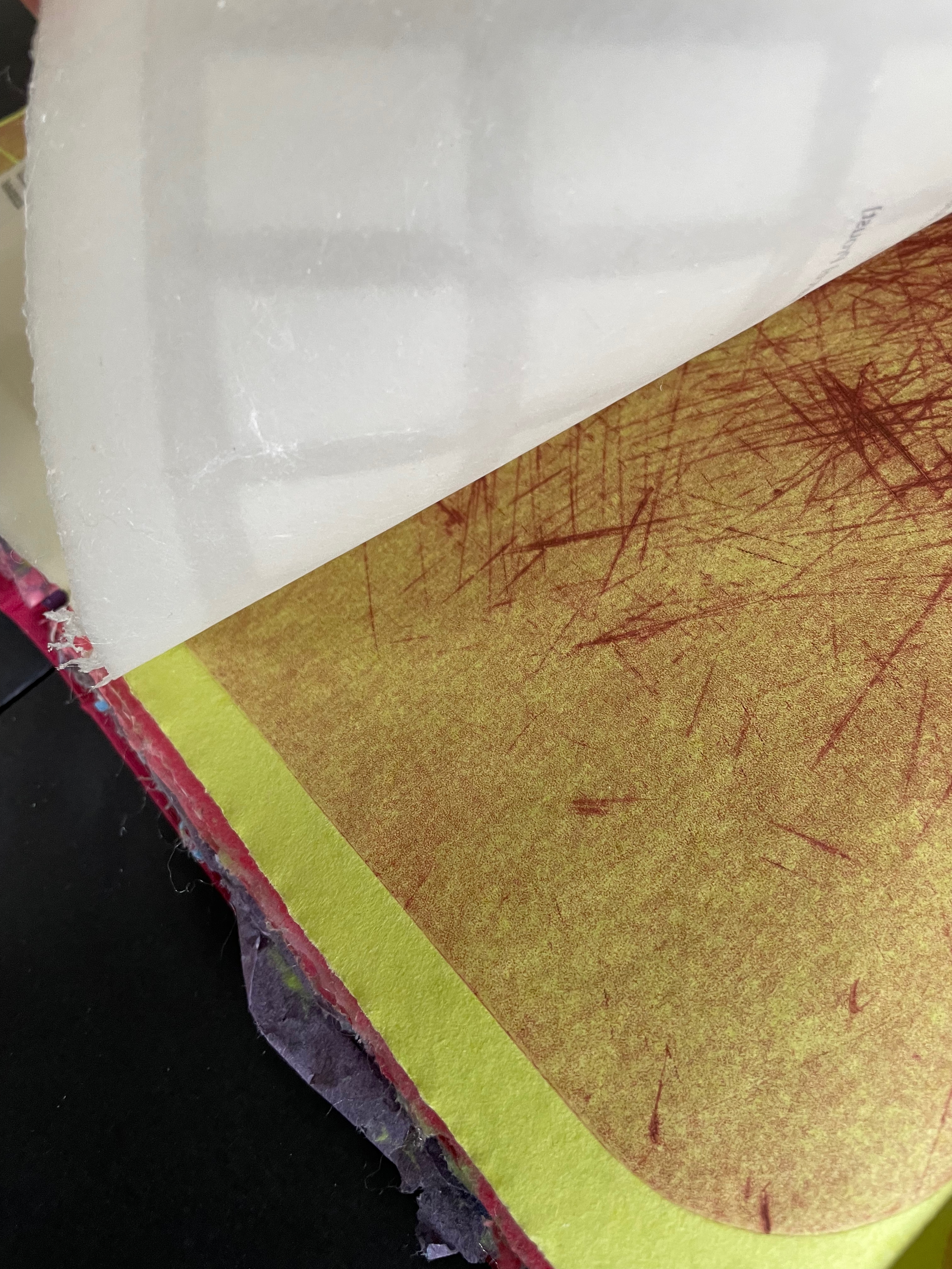
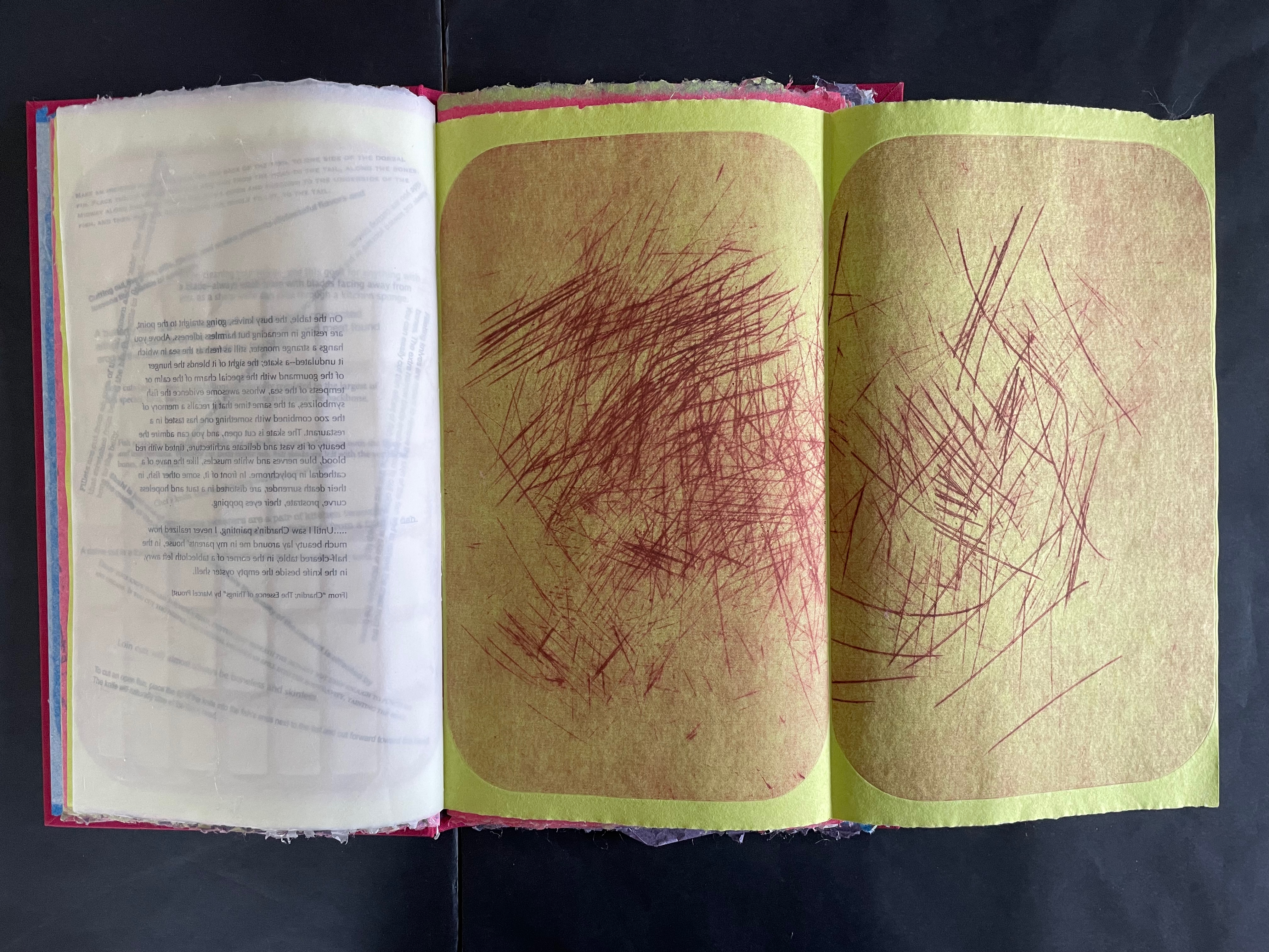
But can visual and physical art really represent or conjure up Bergson’s concept of the lived experience of time? Juxtaposition of images, techniques, texts as well as text and image, material, page with page, etc., is almost unavoidable — indeed is often sought — in an artist’s book. For Bergson, juxtaposition is static and does not fit with the concept of duration. Explaining that concept is not the point of Silverberg’s artist’s book, but if it sends you on a hunt for an explanation and you wind up at The Stanford Encyclopedia of Philosophy, you will find the following passage that chimes extraordinarily with La durée réelle: Make this cut first:

… Bergson calls intuition a method. … The method resembles that of the good butcher who knows how to cut at the articulations or the good tailor who knows how to sew pieces of cloth together into clothes that fit. On the basis of the division into extremes or into a duality, one can then confront our everyday “mixtures” of the two extremes. Within the mixture, one makes a division or “cut” into differences in kind: into matter and spirit, for instance. Then one shows how the duality is actually a monism, how the two extremes are “sewn” together, through memory, in the continuous heterogeneity of duration. — Lawlor, 2025.

Much has been made of Bergson’s influence on William Faulkner, James Joyce, Virginia Woolf, and others. Their technique of stream of consciousness in internal monologues captures the fluidity of time as experienced by single characters such as Benjy in The Sound and Fury, Molly Bloom in Ulysses, or Mrs. Ramsay in To the Lighthouse. There is no single character in Silverberg’s artist’s book unless we count the artist or the artwork itself as that character. The quotations from such a wide range of sources — Hans Christian Andersen, Matsui Basho, Jorge Luis Borges, Lewis Carroll, Charles Dickens, Janet Flanner, Franz Kafka, Etgar Keret, Alan Lightman, George R. R. Martin, István Őrkény, Plutarch, Marcel Proust, Bruno Schulz, and Wallace Stevens — appear in free association across the seasons of food preparation. They punctuate the images made with the cutting boards and the “images” made with phrases of instructive texts angled across the pages like so many cuts on the cutting board. The text jumps and glides like a knife from Plutarch’s anthropological/moral query about eating meat to István Orkény’s sly query of euthanasia for animals but not for humans. And then to the political violence in the excerpts from Etgar Keret and Wallace Stevens. And from culinary advice to self-harm cutting and statements about seppuku. From lines about skating to definitions for various types of knives.

As an aside: the repeated use of Bruno Schulz’s works, especially Street of Crocodiles (1934), conjures up Jonathan Safran Foer’s dissection of Street of Crocodiles to create Tree of Codes (2010). It is certainly apposite, but is it also a challenge to assumptions of male hegemony in the world of book art? With the use of cutting boards as printing plates, is there a sharp cut at the denigrators of women’s book art as kitchen table craftwork?

If you are still visiting The Stanford Encyclopedia of Philosophy trying to make sense of Bergson’s concept of duration, consider how this passage below echoes with what La durée réelle: Make this cut first is doing with its multiplicity of quotations and cuts:

For Bergson, we must understand the duration as a qualitative multiplicity – as opposed to a quantitative multiplicity. As the name suggests, a quantitative multiplicity enumerates things or states of consciousness by means of externalizing one from another in a homogeneous space. In contrast, a qualitative multiplicity consists in a temporal heterogeneity, in which “several conscious states are organized into a whole, permeate one another, [and] gradually gain a richer content” (Time and Free Will, p. 122). 

Silverberg’s cutting boards and their multiplicity of cuts do capture something of Bergson’s ideas of la durée réelle [“duration”]. The boards display linear traces of individual acts over time, and their accumulated presence represents the nonlinearity of the “duration”. Likewise, the unfolding diptychs and triptychs disrupt the usual expectation of linear paging through a book. Like Bergson’s concept, Silverberg’s artist’s book is complex. Much is going on in both. To grasp them, it is best to let them wash over you — like time.
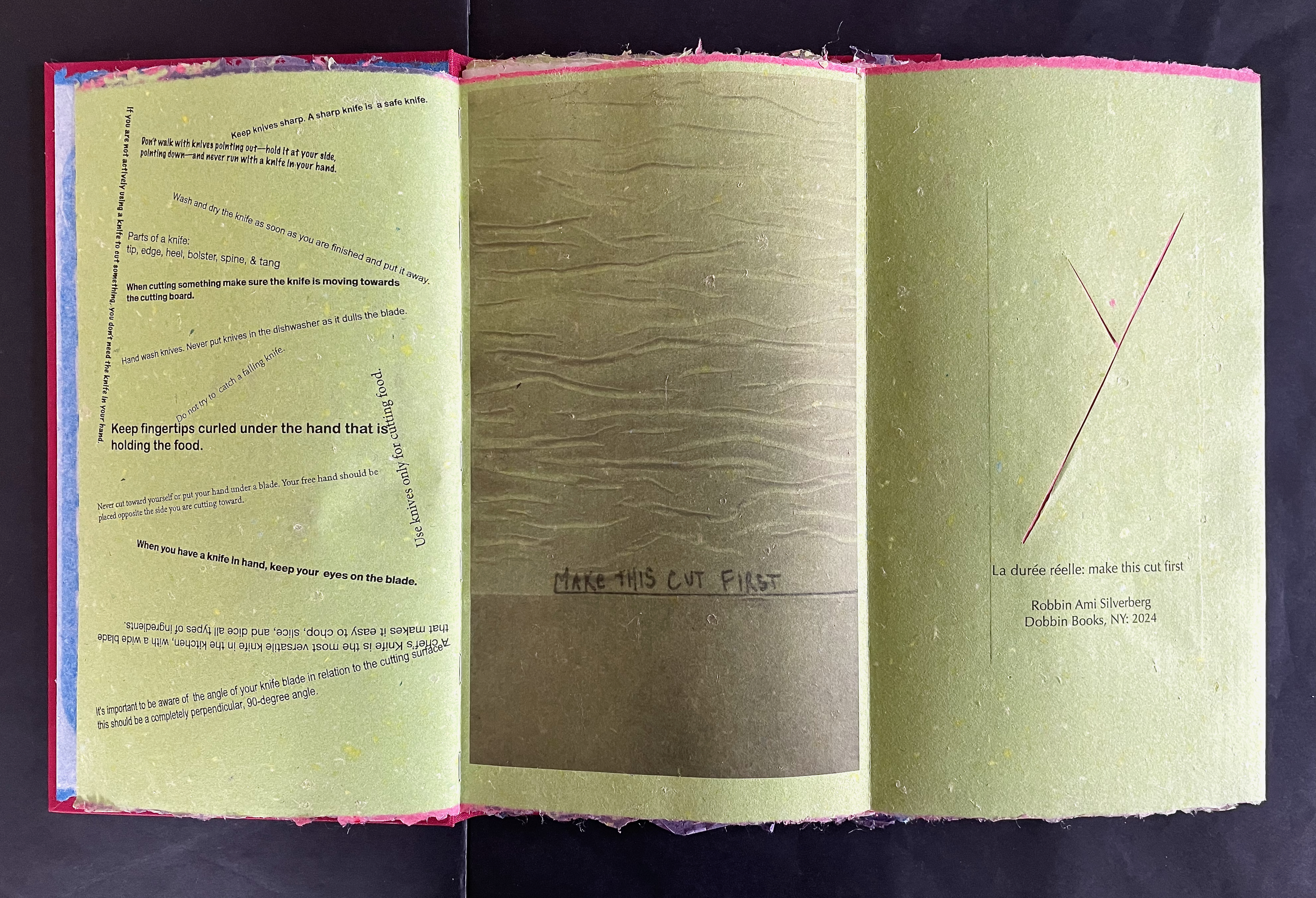
An open book with brightly colored pages displaying safety instructions for using a knife, interspersed with illustrated cut lines. The left page features text on knife handling and safety tips, while the right page includes a marker note and a design element with cut lines.

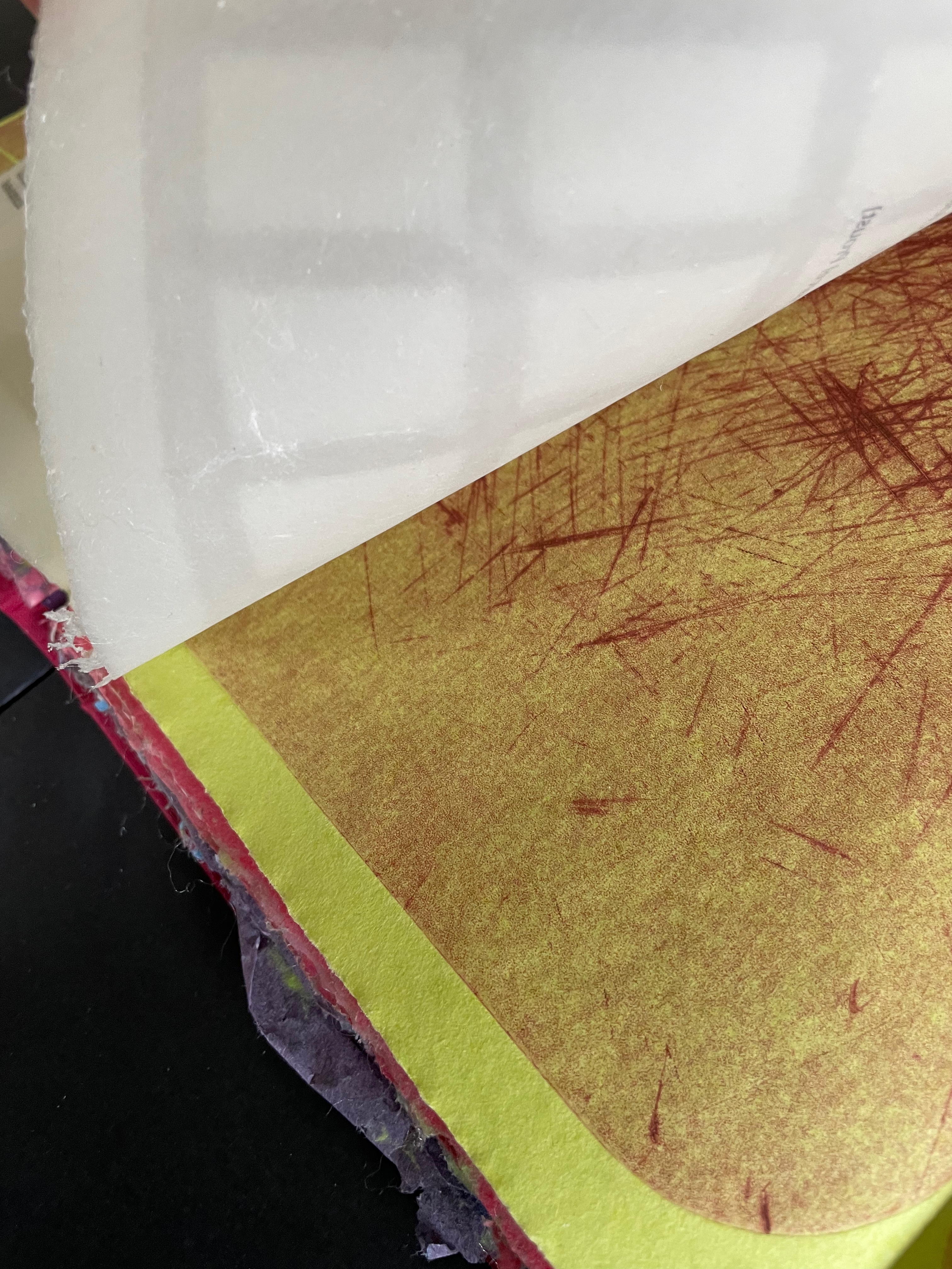
“Behind the scenes”: text-bearing translucent sheet fixed to chartreuse green folio; “watermark” grid in translucent sheet; double-spread of cutting board “abstracts”.

An open cookbook page detailing fish preparation techniques, including filleting, removing bones, and cutting methods.

Text close-up

A close-up of a page from a book featuring a passage about culinary art and a description of fish on a table, highlighting elements like a skate and various fish, reflecting on beauty and memory.

Proust on Chardin’s La Raie.

Further Reading

Bergson, Henri. 1911. Creative Evolution. Translated by Arthur Mitchell. New York: H. Holt and Company.

Bernadac, Christian. 1978. The 186 Steps. Geneva: Ferni Pub. House.

Lawlor, Leonard and Valentine Moulard-Leonard. Winter 2025. “Henri Bergson“, The Stanford Encyclopedia of Philosophy. Edward N. Zalta & Uri Nodelman (eds.), URL = <https://plato.stanford.edu/archives/win2025/entries/bergson/&gt;.

Books On Books Collection – Jérémie Bennequin

Un Coup de Dés jamais n’abolira le Hasard, Dé-composition (2009-2013)

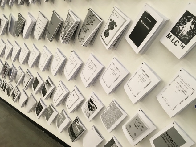
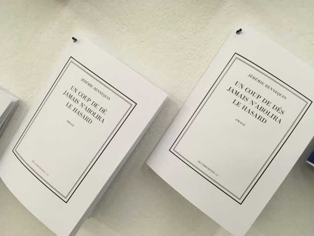
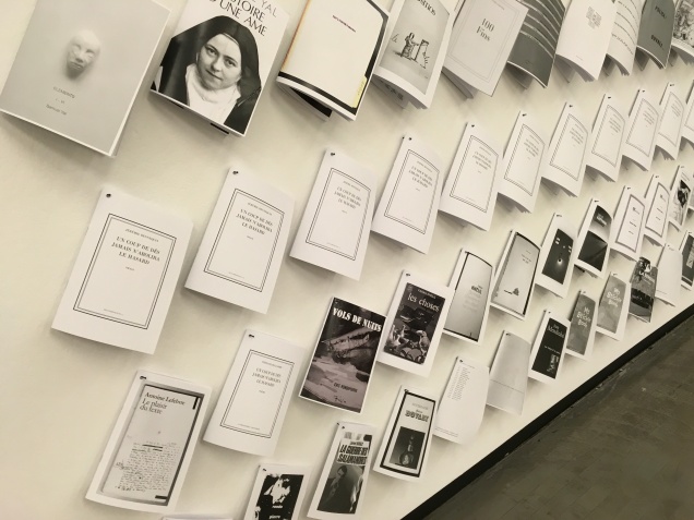
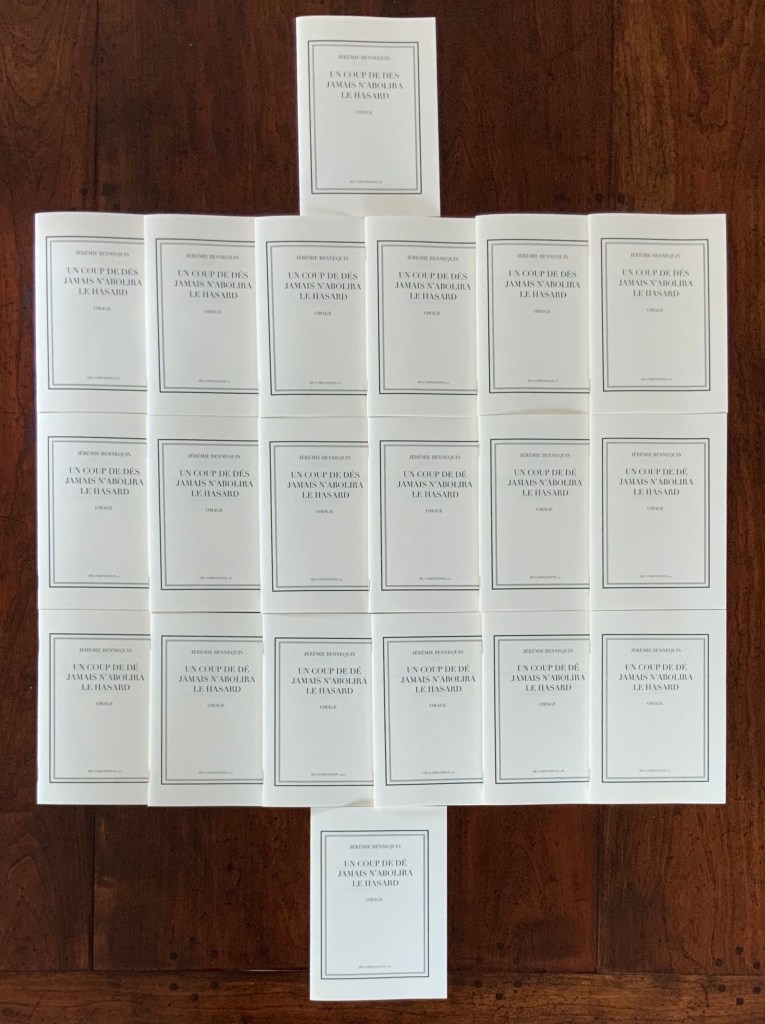
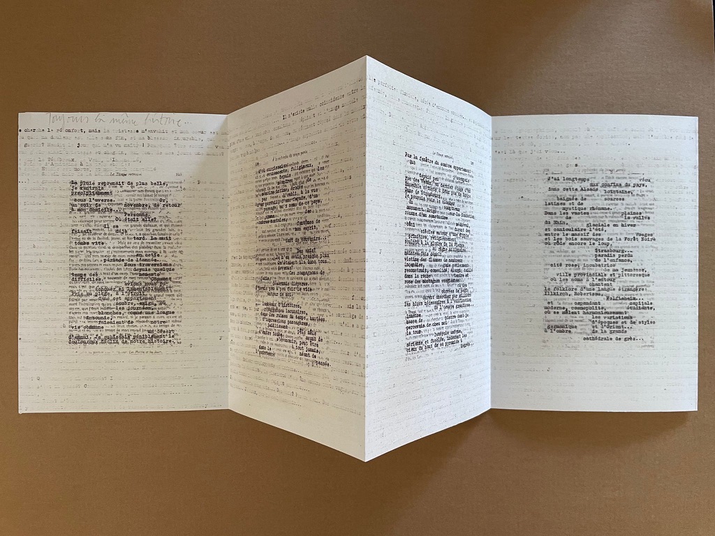
In “Publishing as an Artistic Toolbox“, an exhibition in Vienna in 2018, Antoine Lefebvre displayed several rows of works from La Bibliothèque Fantastique. They were pinned to the wall at the rear of the exhibition space. One work and one only made up the third row from the bottom: Jérémie Bennequin’s hommage to Mallarmé’s Un Coup de Dés, clearly not singular and missing its “h” and “m”. An exhibition hall is a difficult setting in which to explore a multi-volume work of book art much less answer the questions “Why omage?” and “Why the hyphenation of “décomposition” at the foot of all twenty covers?”

Away from the exhibition and onto Bennequin’s and Lefebvre’s websites, the intrigue only grew with the knowledge that nineteen of those twenty booklets are the results of algorithmically dice-driven live performances of erasing the text from Mallarmé’s poem. With several works of homage to Un Coup de Dés in the Books On Books Collection, Bennequin’s omage composed with a single seemed an essential addition.

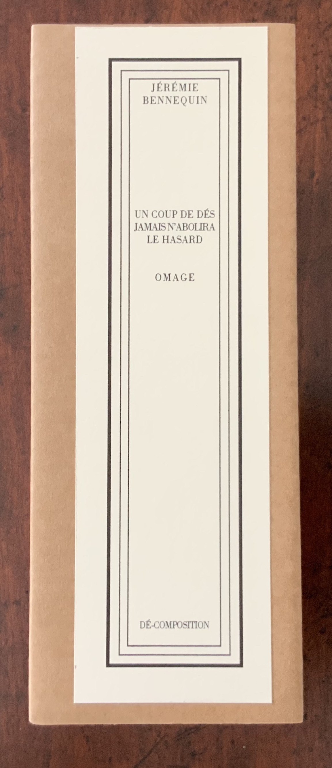
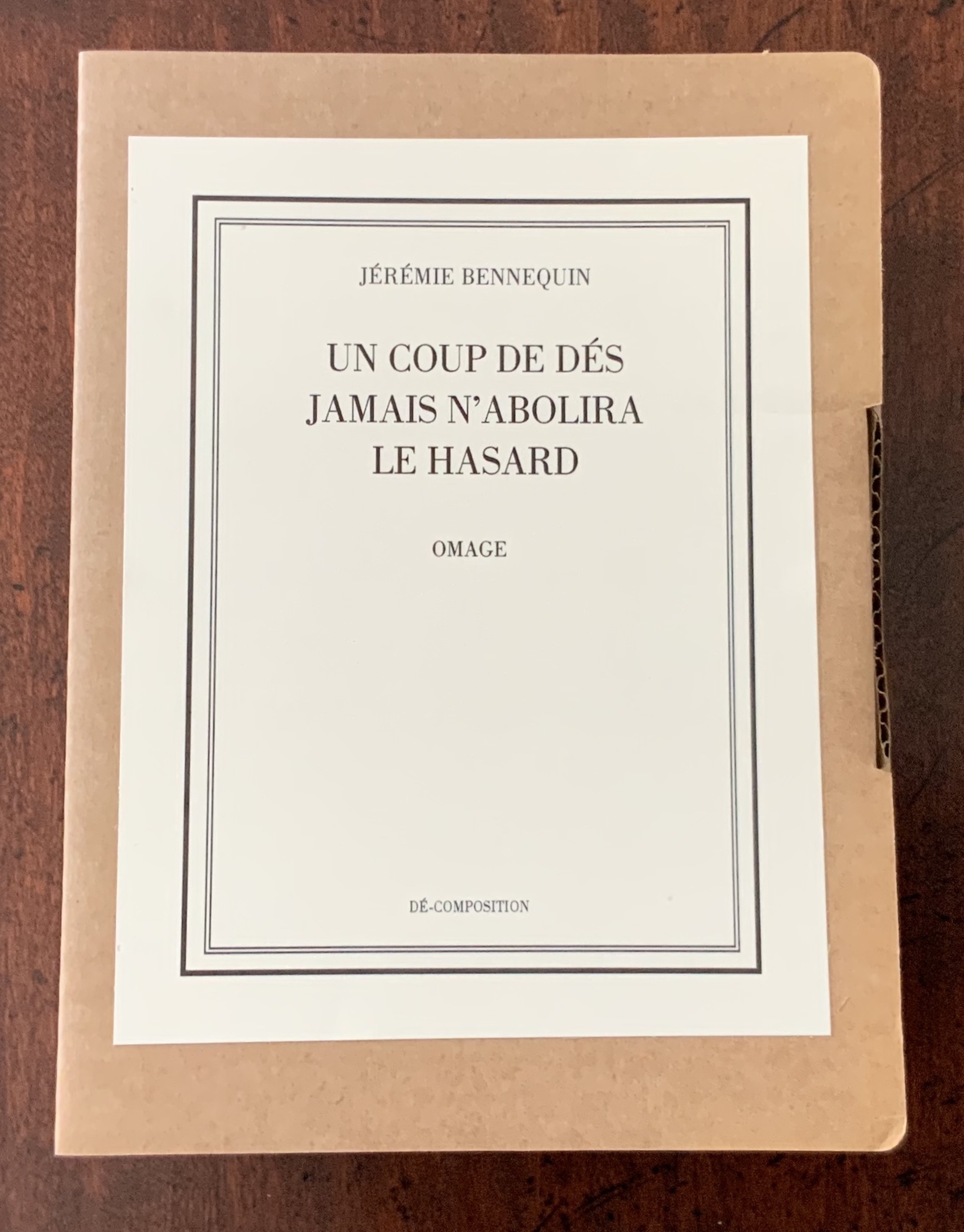
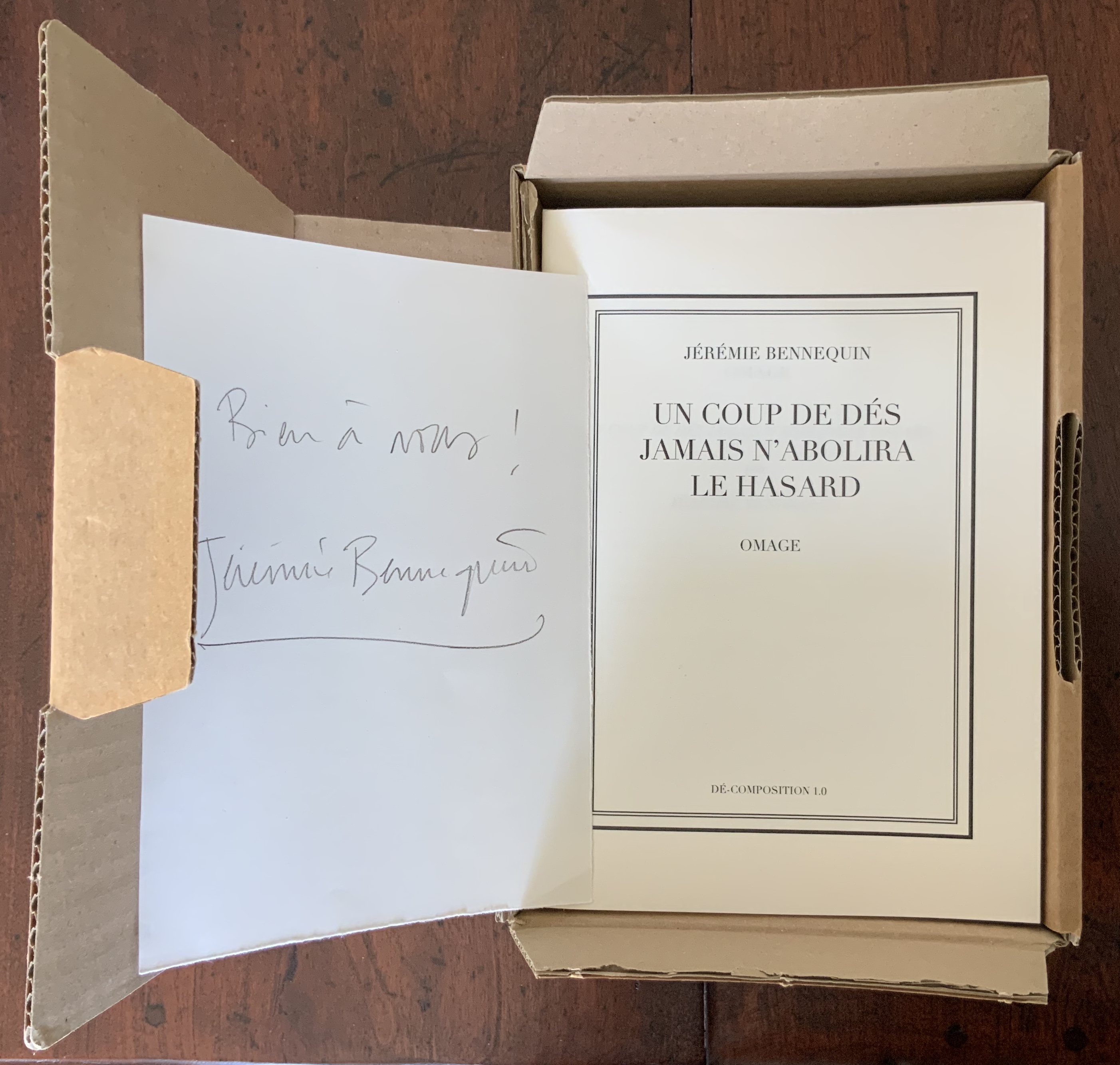
Dé-composition arrives in a sturdy cardboard box.

Un Coup de Dés jamais n’abolira le Hasard, Dé-composition (2009-2013)
Jérémie Bennequin
Cardboard box of 20 livres d’artistes. Each booklet 210 x 150 mm, 28 pages.
Paris: Éditions de La Bibliothèque Fantastique. Photos: Books On Books Collection

Booklet 1.0, which reproduces Mallarmé’s complete poem in its 1897 format, also contains a preface to Bennequin’s multi-volume boxed work. Arguing in the preface that Un Coup de Dés does not abolish chance but rather enhances, elevates, ennobles it, Bennequin poses the questions that initiate his homage. The first is:

“Or, le hasard peut-il abolir Un Coup de Dés?” (So, can chance abolish Un Coup de Dés?)

Bennequin argues that, being an artist of the eraser, he is well-suited to erasing or abolishing Mallarmé’s work, and that rolling the die to direct his act of erasure or abolition is fitting. But then comes his second crucial question:

… comment définir au juste, dans le détail, la cible de chaque coup? (how to define in detail the target of each throw?)

After considering such targets as the letter, the word, the page, the double-page spread, Bennequin settles on the syllable for reasons reflecting Mallarmé’s own theories of poetry and music. Booklet 1.0 represents the starting point, with the next volume 1.1 being the outcome of the end of a live performance on 23 October 2009, which involved Bennequin decomposing Mallarmé’s poem by repeatedly rolling a die then locating, vocalising and erasing the syllable corresponding to the number rolled. This occurred on computer screen in real time. With each of the subsequent eighteen performances, the starting point was the state arrived at in the preceding booklet; 1.2 began with 1.1, 1.3 with 1.2 and so on. By the last performance, very little — but something — of Un Coup de Dés was left. So Bennequin has the answer to his first question. As he puts it in the last sentence of his preface: Le hasard jamais n’abolira Un Coup de Dés (Chance will never abolish Un Coup de Dés).

To answer those awkward questions asked in the exhibition hall: First, the removal of “h” and “m” from hommage to create omage is a visual clue to the work’s destructive/creative process — the dice-driven algorithm’s targeting and erasure of phonemes. Second, the isolation of “dé” in the hyphenation of décomposition puns self-reflexively — as book art so often does — on the singular of dés, underscoring the means of Bennequin’s paradoxical decomposition/composition. No matter how this work is displayed or examined, it puts before us a visual constellation of fragments of sound. But, having completed the performances leading to this particular self-reflexive constellation, Bennequin produced another self-reflexive work, an homage within an homage.

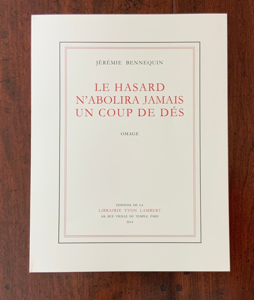
Le Hasard n’abolira jamais un Coup de Dés, Omage (2014)

Le Hasard n’abolira jamais un Coup de Dés, Omage (2014)
Jérémie Bennequin
Perfect bound, 325 x 25 mm, 32 pages.
Paris, Éditions Yvon Lambert, Photos: Books On Books Collection.

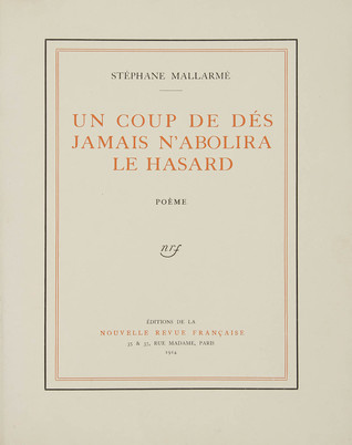
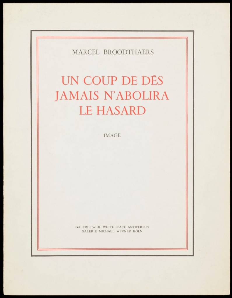
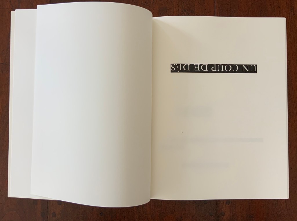
Le Hasard n’abolira jamais un Coup de Dés replicates in size, colour and appearance the 1914 edition Un Coup de Dés jamais n’abolira le Hasard. The main textual difference — the inversion of the title — announces the work as an homage to Mallarmé. But a smaller textual difference — the replacement of Poème with Omage — subtly announces another homage: to Broodthaers’ 1969 homage to Mallarmé. Broodthaers had replaced the word Poème on the 1914 edition’s cover with the word Image.

But it is Le Hasard‘s preface that unequivocally announces its homage to Broodthaers’ homage. Broodthaers had printed all the text of Un Coup de Dés as a “Préface” within a left- and right-justified block of text, and he omitted Mallarmé’s own preface. He then went on to blot out Mallarmé’s verses and their carefully placed typographical rendering with strips of black, shaped with equal care.

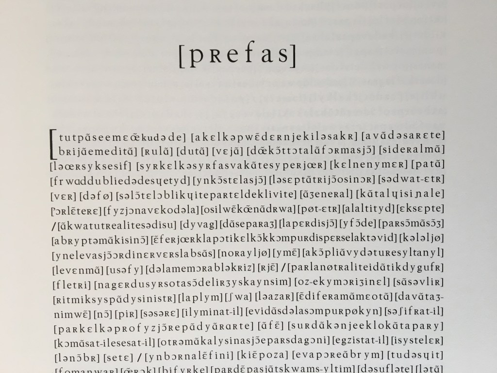
Bennequin returns the favour of Broodthaers’ transformative gestures at least twice over. Like Broodthaers’ opening block of text, Bennequin’s includes all the text of Mallarmé’s poem but renders it in phonetic symbols. Even the word Préface is replaced with [pRefas]. The square brackets in Bennequin’s block of text surround the verse units that Broodthaers went on to blot out. In further gestures of lèse-majesté to Broodthaers and Mallarmé, Bennequin adds his own explanatory “Note” in place of Mallarmé’s note, the one omitted by Broodthaers. Furthermore, signalling an inversion to come, Bennequin inverts the order of words in Broodthaers’ block of text. The last line of verse in Mallarmé’s poem and in Broodthaers’ block of text is “Toute Pensée émet un Coup de Dés” (All thought issues a throw of the dice). The first verse in Bennequin’s square of text is [tutpãseemɛœ̃kudəde].

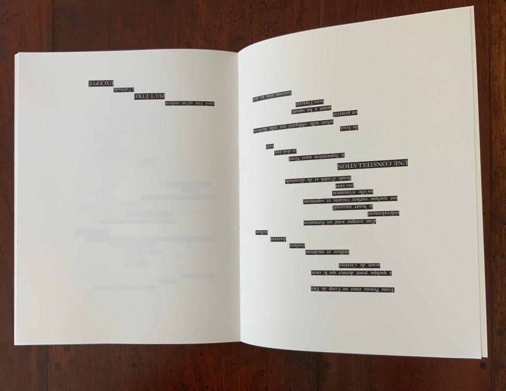
The “inversion to come” lies in the subsequent pages where Bennequin inverts Mallarmé’s words and lets them peek out in white from behind Broodthaers’ black strips. He “un-erases” Broodthaers’ erasure. He uses white on black to re-emphasize the black on white abstraction created by Broodthaers. But that inversion is more than meets the eye.

In his preface to Dé-composition, Bennequin has already shown us an exact inversion of Mallarmé’s title: “Le hasard jamais n’abolira Un Coup de Dés”. Moving jamais to its grammatically correct position, Le Hasard’s inversion of the title is deft artistic lèse-majesté. It proclaims the bookwork as allusive to but distinct from Dé-composition and its preface — and distinct from the two targets of homage. As “omage” to Mallarmé, Le Hasard does not abolish Un Coup de Dés; it pulls it back from obliteration albeit by inversion. As “Omage” to Broodthaers, Le Hasard does not abolish the “Image”; it re-establishes the link between the black-imaged “musical” score and the sounds of the text — again albeit by inversion and also phonetic symbols.

Allusive, self-allusive, creative and subversive through inversion — Le Hasard is a new constellation born from that encounter with the twin stars preceding it.

Sur un rêve de John Cage… les rayons roses d’un jour qui se lève colorent doucement un Mo(n)t de poussière… (2020)

Sur un rêve de John Cage… les rayons roses d’un jour qui se lève colorent doucement un Mo(n)t de poussière… (2020)
Jérémie Bennequin
MP4, duration 08:42.

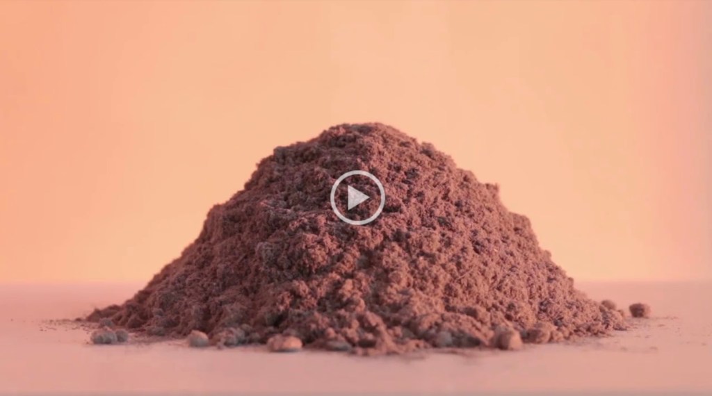
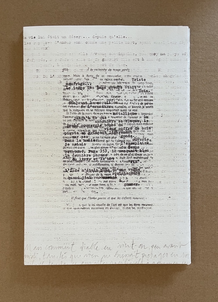
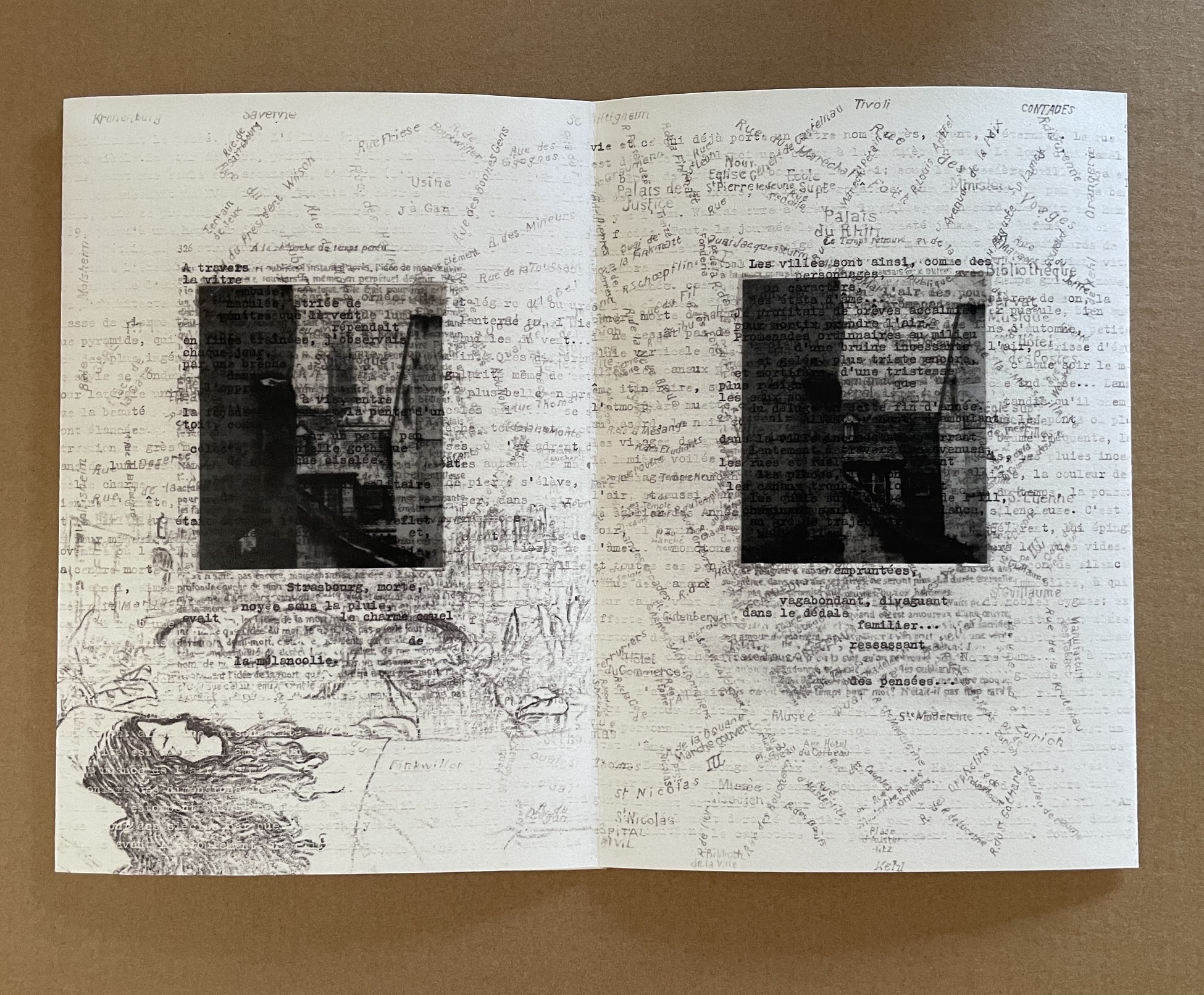
Erasure is Bennequin’s paintbrush, sculpting tool and pen. Before his “omages” to Mallarmé and Broodthaers, Bennequin created “Ommage” (a play on gomme, the French for eraser) by rubbing out the words on each page of the seven volumes of Proust’s À la recherche du temps perdu. From this effort, he issues artist books in limited editions. But nothing goes to waste — not the eraser dust, not the worn erasers, not the activity, not even the sound.

Mo(n)ts et Tom(b)es is the display of small mountains of erased words (ink, paper and rubber) alongside the ruined tomes from which they came. Sur un rêve de John Cage … takes this work to another level. Bennequin has filmed a gradual passage of light over one such small mountain of erased words and timed it to coincide with a performance of Cage’s Dream (1948). In its visual effect, it could also be an homage to Cézanne’s Mont Saint Victoire series or Monet’s paintings of Rouen Cathedral. In its fusion of light, sound, material and thought, it takes us from the whimsy of omage and ommage to meditation.

Sur un rêve de John Cage … is a freely downloadable multimedia work of art.

Le Hasard N’Abolira Jamais Un Coup de Dés (Changes of Music) (2020)

Le Hasard N’Abolira Jamais Un Coup de Dés (Changes of Music) (2020)
Jérémie Bennequin
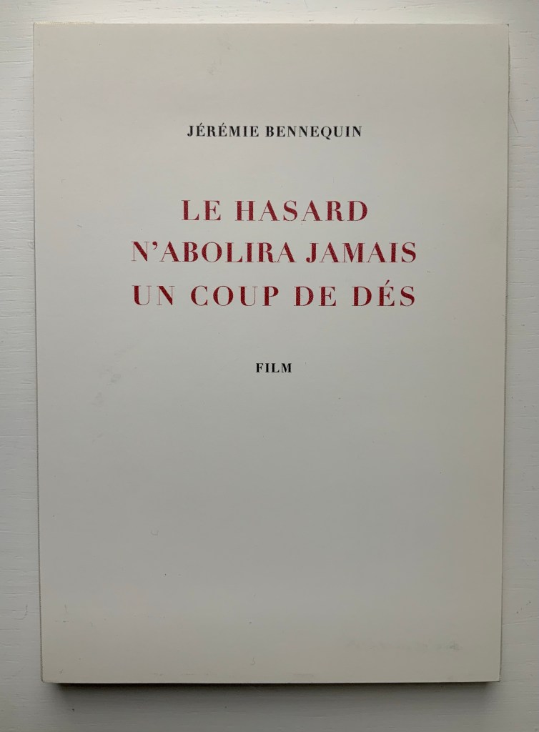
Film (4 minutes, 33 seconds) recorded on USB drive, embedded in cloth-tape-bound foam boards. H210 x W150 mm. Edition of 6, of which this is #2. Photos: Books on Books Collection, displayed with permission of the artist.

The film records dice being thrown against the open pages of Bennequin’s 2014 OMAGE (see above). Continuing with his technique of homage within homage, Bennequin’s Le Hasard N’Abolira Jamais Un Coup de Dés (Changes of Music): Film) reverses John Cage’s 1951 Music of Changes not only in its title but also in its recorded notes. The object in the Books on Books Collection fixes all these reversals on a USB drive. The reader can view and listen to it here and compare the recording with Cage’s original here.

Descent (2020)

Descent 2021
Jérémie Bennequin (text by Edgar Allan Poe)
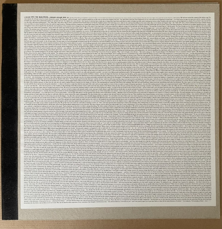
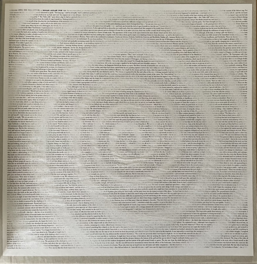
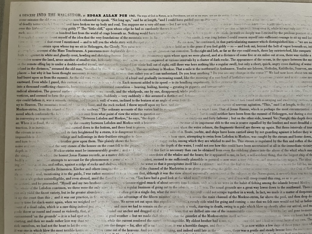
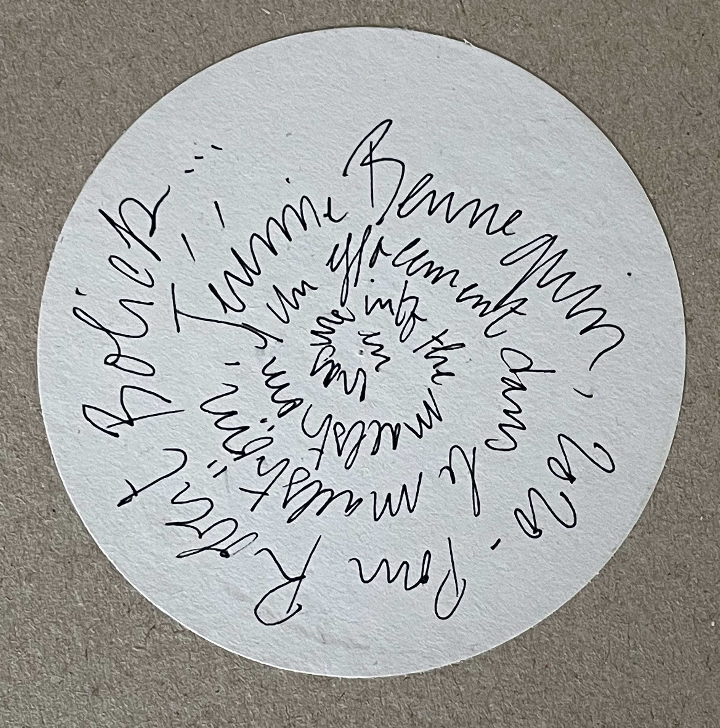
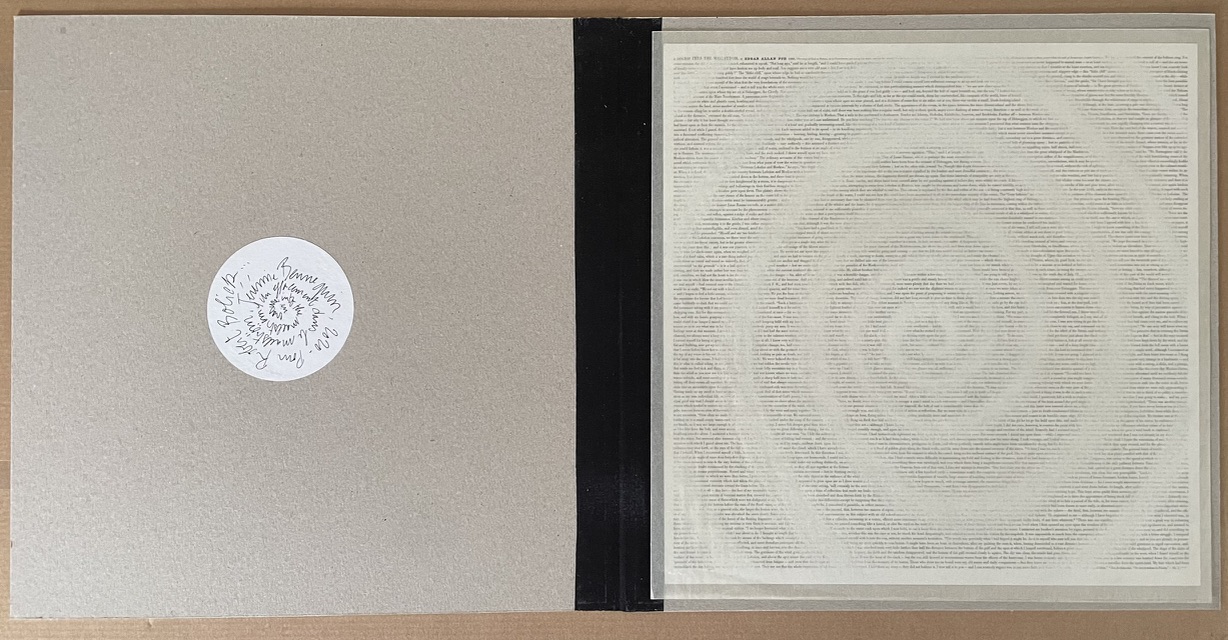
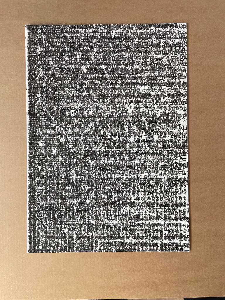
Cardboard portfolio with pastedown prints on both covers, enclosing a double-sided print with spiraling erasure.
Portfolio: 330 x 330 mm. Prints: H300 x W295 mm.
Acquired from Jérémie Bennequin, 1 May 2021.
Photos: Books On Books Collection.

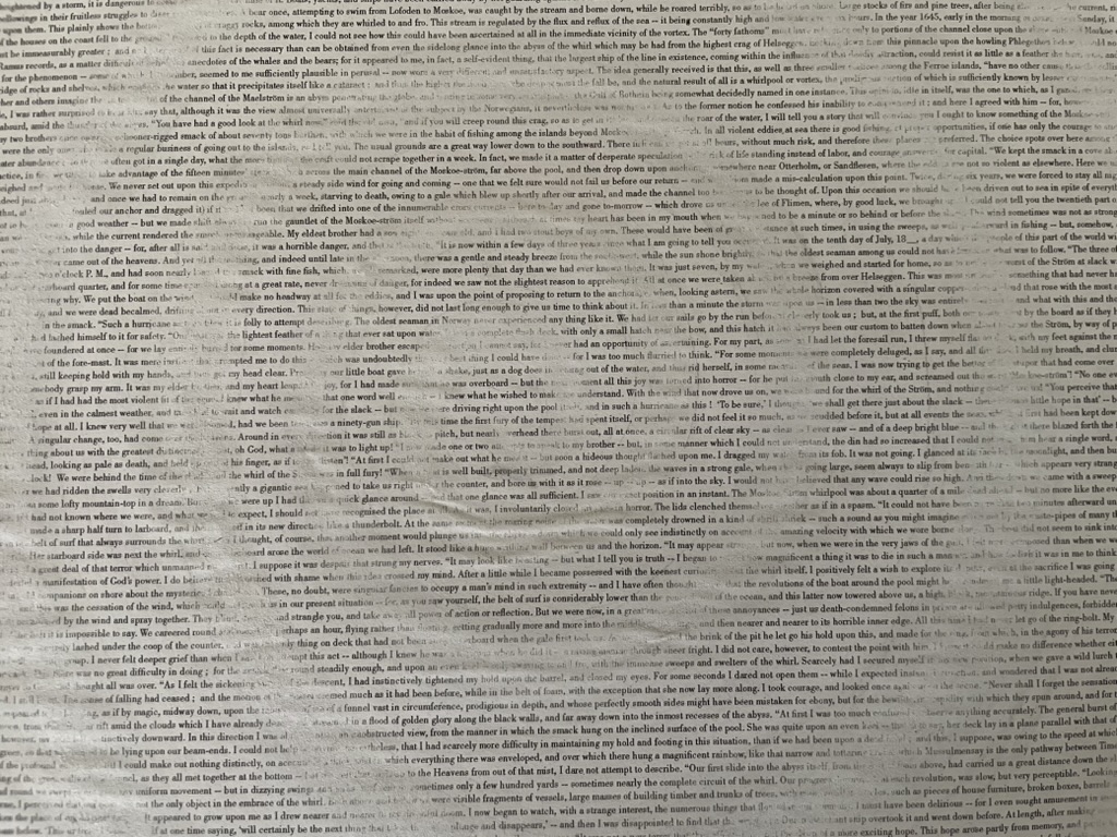
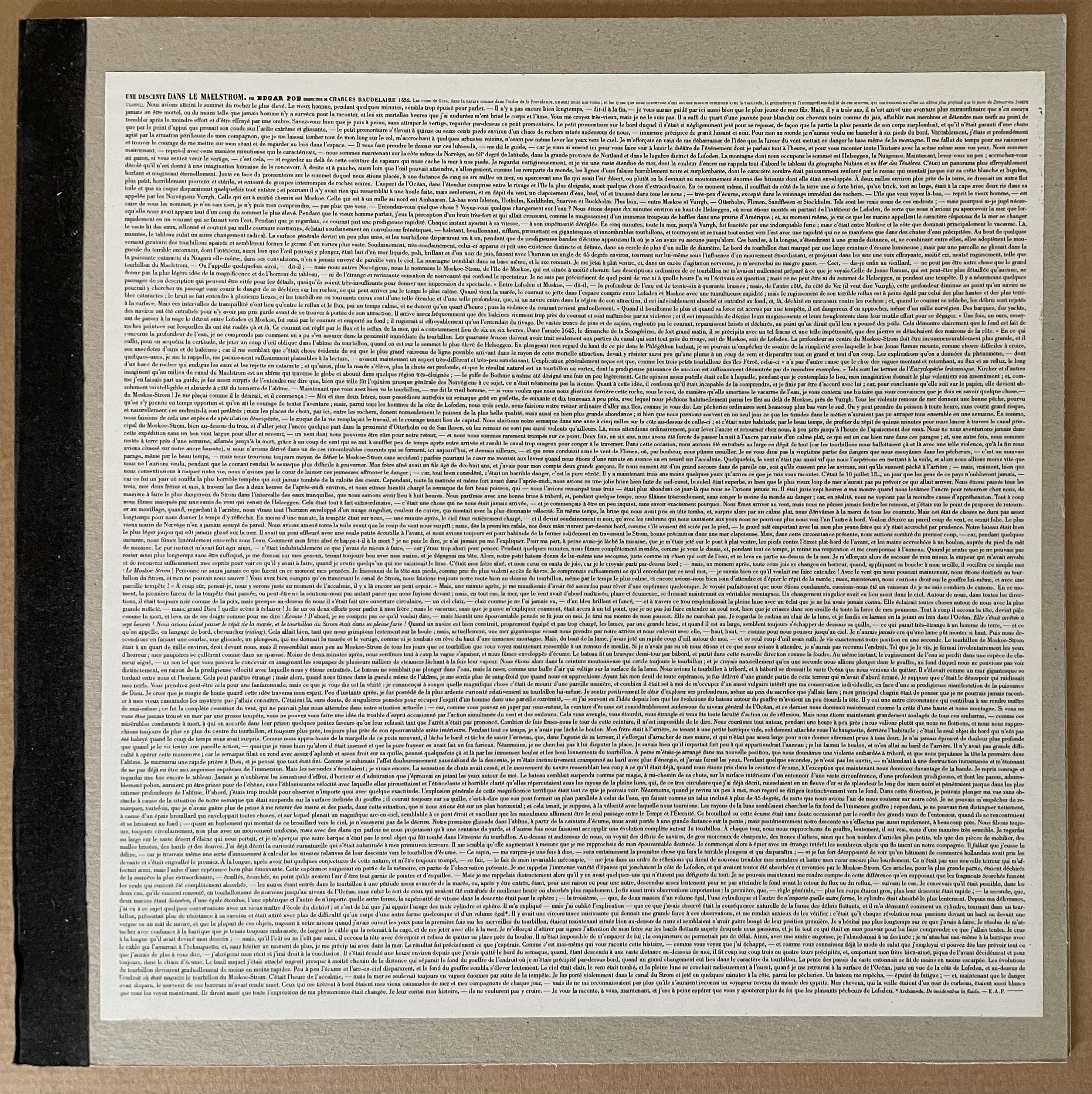
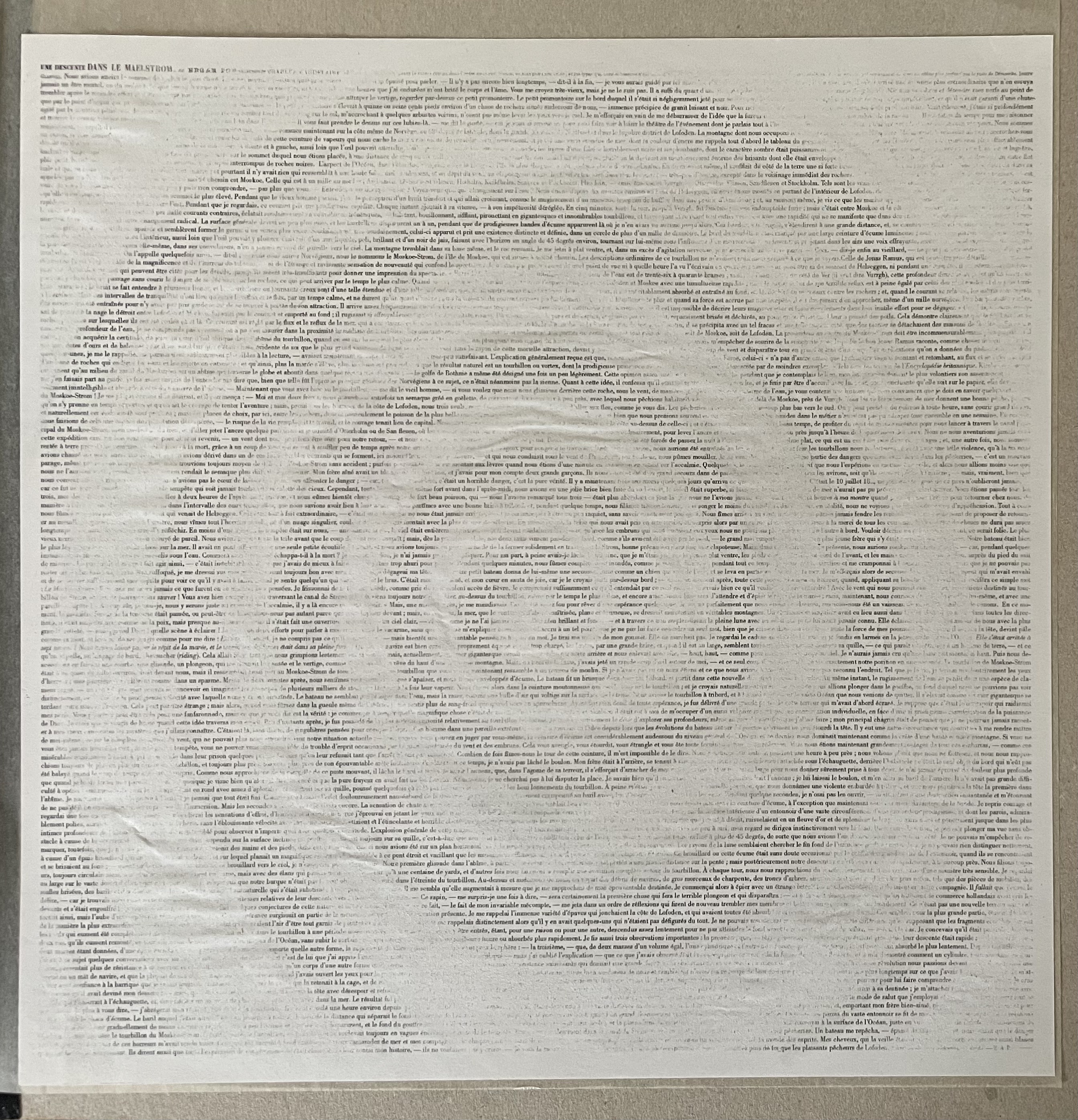
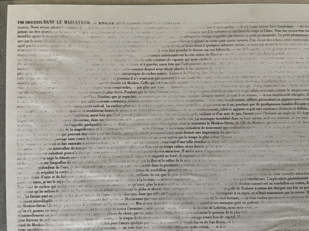
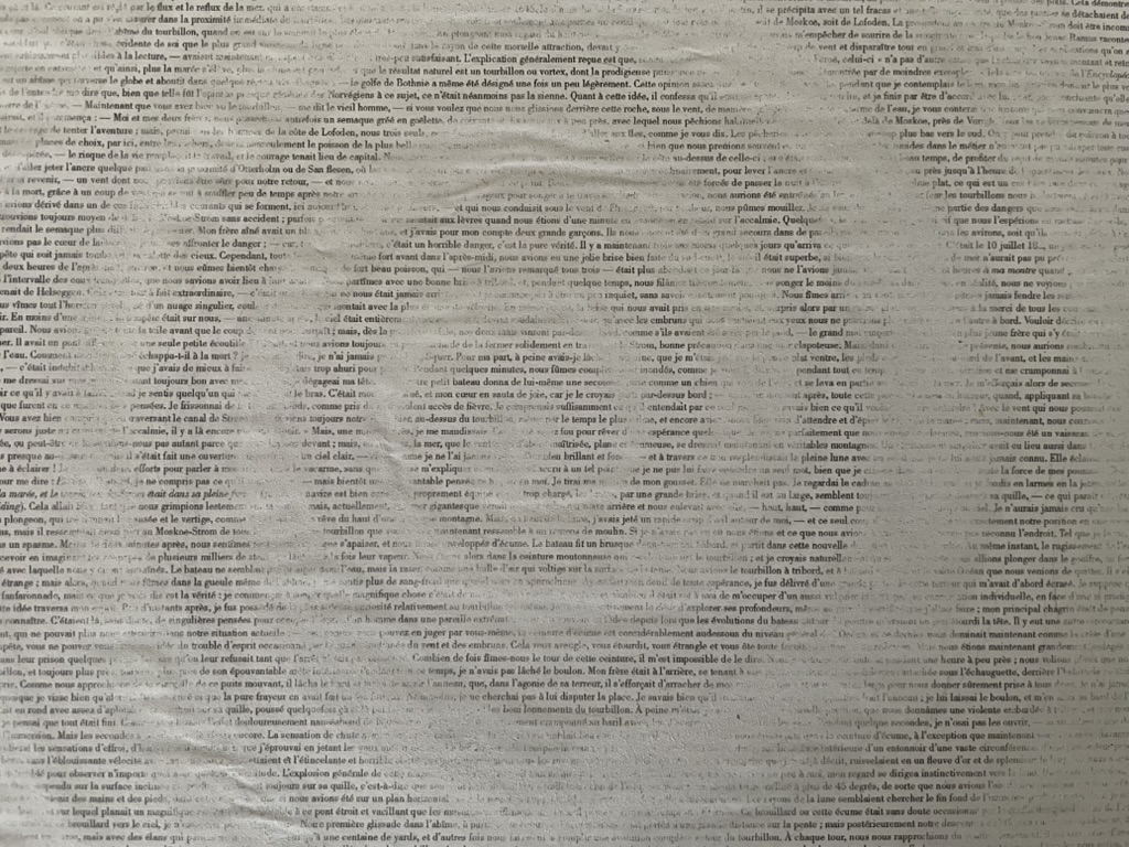
As early as 1988, the idea of reprinting an entire literary work onto a single sheet and silhouetting some relevant art found its way into commercial posters with the One Page Book Company, then Spineless Classics and, later, Litographs. No surprise then that the innovative journal Inscription chose to include an oversized poster version of Bennequin’s fine print in its inaugural 2020 issue. Bennequin’s treatment of Edgar Allan Poe’s short story “A Descent into the Maelstrom” is an oblique homage to Mallarmé, who would have found Poe’s vertiginous tale of an abyss resonant with the images that appear in Un Coup de Dés.

Erased English side of the print.

Beginning the descent into the erasure.

The center of the abyss or maelstrom.

The French side of the print.

Exhibition Catalogues

Further Reading

Inscription 1“. 15 October 2020. Books On Books Collection.

Bennequin, Jérémie. “Lecture”. Leeds Beckett University, 25 February 2016. Accessed 10 April 2020.

Briers, David. “Reading as Art”, Art Monthly, October 2016, pp. 25-26.

Mœglin-Delcroix, Anne. “De l’appropriation artistique d’œuvres littéraires dans le livre d’artiste: entre destruction et incorporation” in Annette Gilbert (ed.), Wiederaufgelegt. Zur Appropriation von Texten und Büchern in Büchern (Bielefeld : transcript, 2012) p. 233-264).

Pigeat, Anaëlle. “Jérémie Bennequin, effacements“, Art Press, No. 432, April 2016, pp. 66-67. Accessed 10 April 2020.

Bookmarking Book Art – Kim Anno

From www.kimanno.com. Accessed 23 September 2018

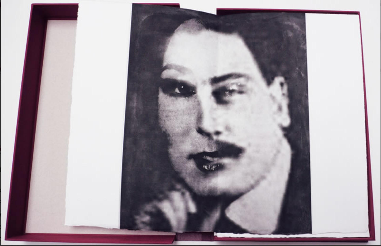
The Albertine Workout is a collaboration between artist Kim Anno and poet Anne Carson. 

Albertine is Albertine Simonet, the central love interest in Proust’s In Search of Lost Time. The Workout explores her character in text and image.  The illustration above touches the biographical note that, according to Proust, the Albertine character was based on Alfred Agostinelli, sometime chauffeur and typist for Proust.

The images resting in the burgundy Solander box on Anno’s website are well worth a look. (Carson’s text not seen.)