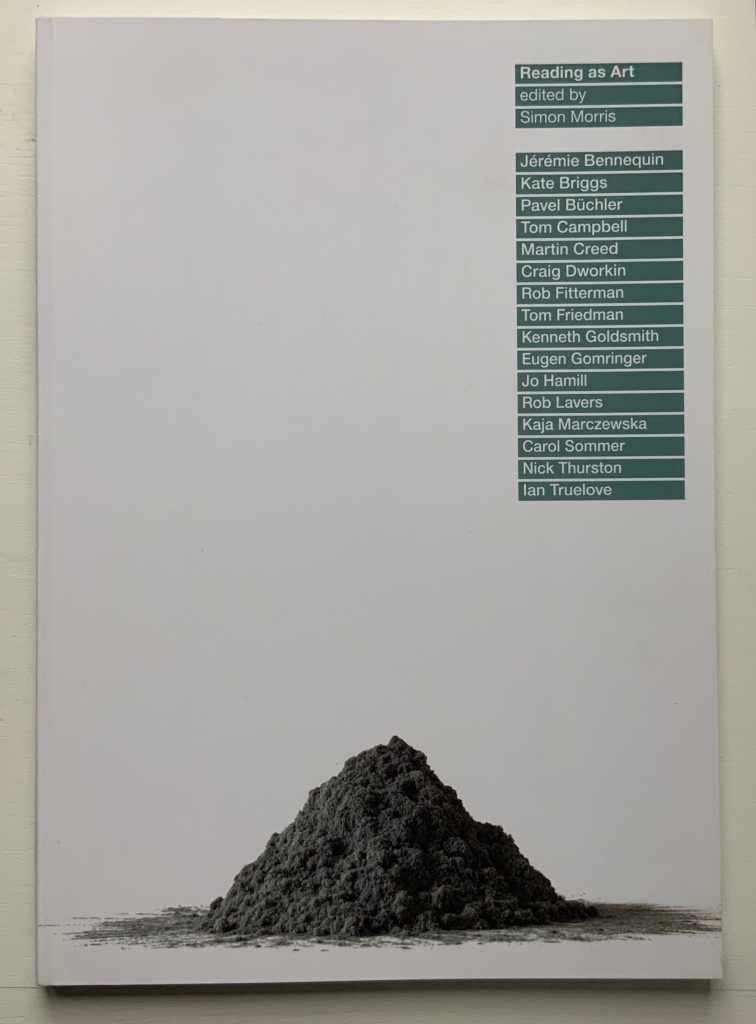
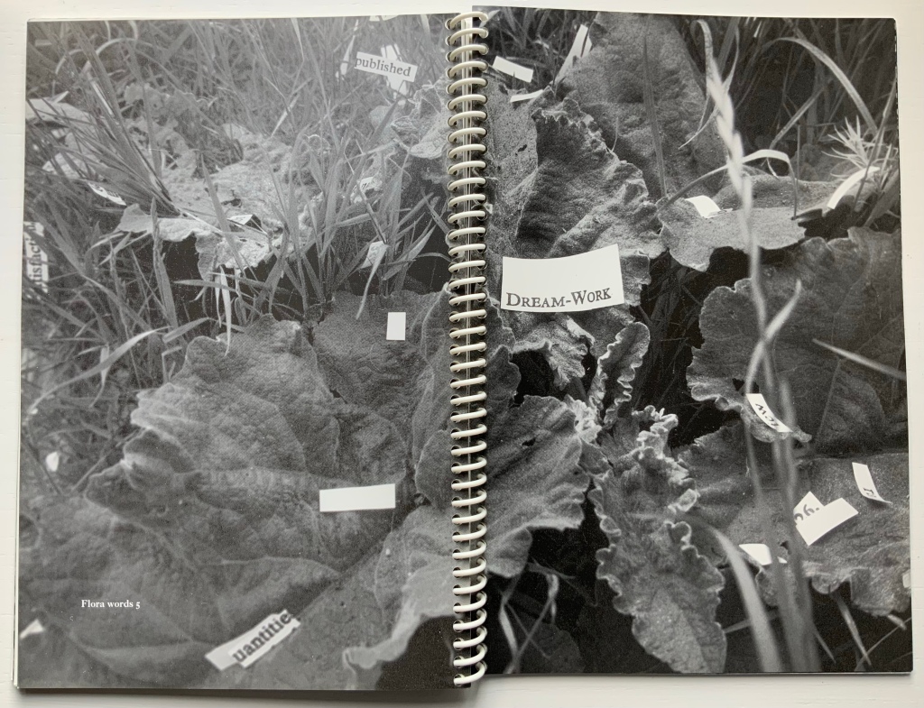
Reading as Art (2016) Simon Morris, ed. Perfect bound paperback. H297 x W210 mm. Acquired from Information as Material, 22 August 2020. Photo: Books On Books Collection. Displayed with permission of the publisher.
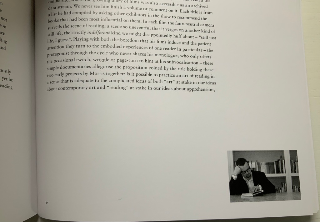
Simon Morris and Books On Books crossed paths at the opening of an exhibition at the Meermanno Museum in The Hague. The exhibition was called “The Art of Reading“, and he gave a talk on his performative work Reading as Art (2004), a compiled-stills film of him reading and turning the pages of a book. (Not at all like watching paint dry or grass grow, if you are unkindly thinking so.) Reading as Art (the volume) provides a taste of Reading as Art (the performance) with black-and-white frames from the film appearing at the bottom right-hand corner of nearly every page: just run your thumb down the fore edge and let the pages flip to see the “action”.
Details from Reading as Art (the book). Photos: Books On Books Collection. Displayed with permission of the publisher.
That feature of this one volume speaks volumes about Simon Morris as an artist. The idea of “reading as art” is not far off “publishing as art”. Morris’s collaborative publishing operation Information as Material has employed nearly every tool in the “Publishing as Artistic Toolbox“, as the 2018 exhibition in Vienna was called: documented performances, polemics, apps, free downloadable PDFs, prints and broadsides, and a journal Inscription, whose first issue is a sculptural bookwork and comes with a vinyl LP record, poster and chapbook.
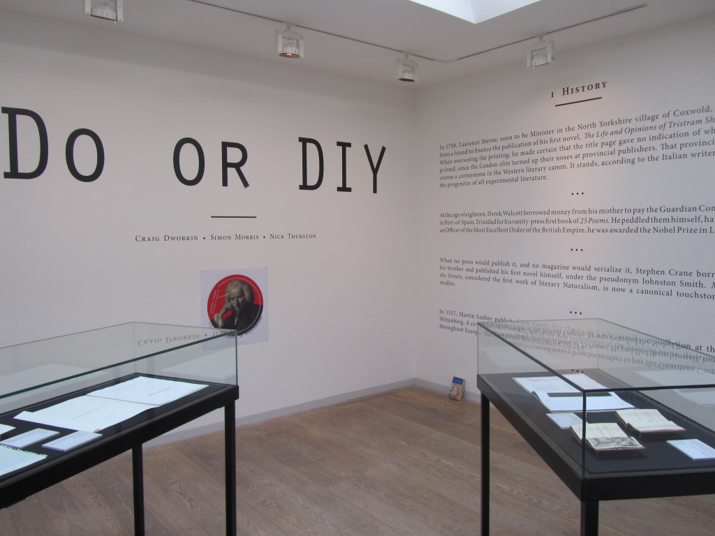
It is strange that this polemic does not mention William Blake among literary history’s do-it-yourselfers. Although their primary message of “don’t wait for a commercial publisher” is for wordsmiths, the authors include the book artist Johanna Drucker among their hortatory examples as well as The Life and Opinions of Tristram Shandy, which can lay a plausible claim to being the first work of modern book art, even before Blake’s “artist’s books”. The authors themselves have even played their parts in book art. So why no nod to the world of book art and its past and current contributions to Do or DIY?
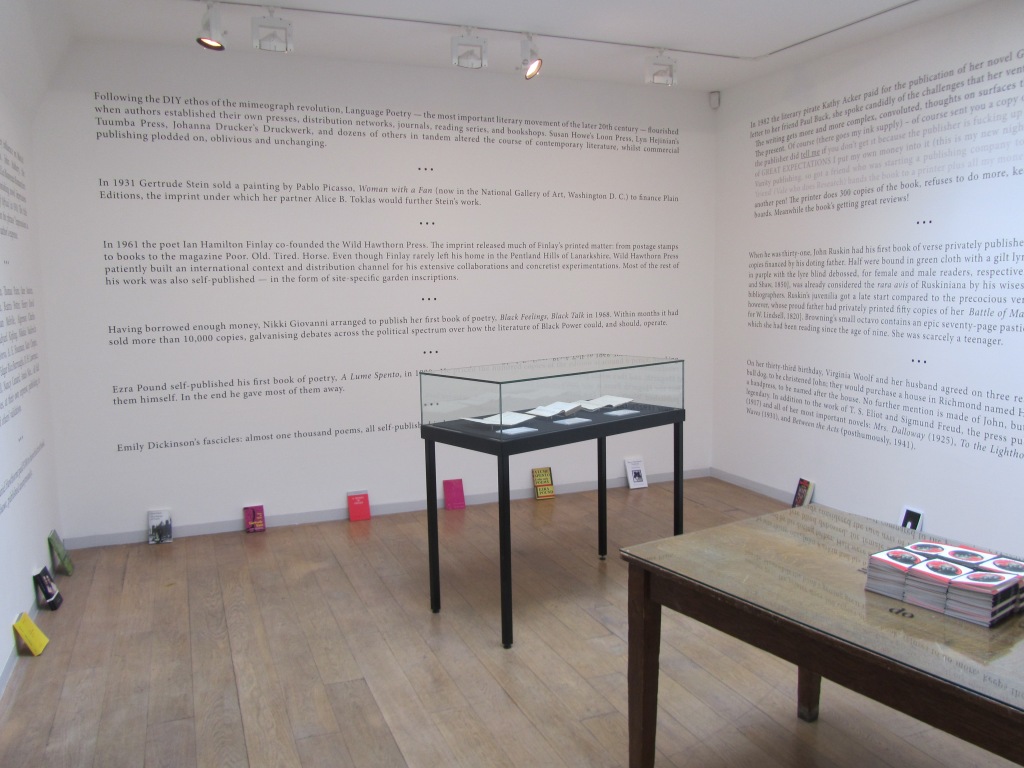
In the 1960s and 70s, book artists’ democratic multiples aimed to sidestep the galleries, museums and art industry. Whether chicken or egg, photocopying and cheap printing brought forth or hatched Siegelaub’s The Xerox Book, Ruscha’s Royal Road Test and many more fair fowl. By century’s end and into the 21st, book artists were still doing it themselves, but the democratic multiple ceded quite a bit of territory to limited editions and unique works. Toward the 20th century’s end, desktop publishing and digital publishing, however, offered up a different, much larger target — the super-concentrated publishing industry — for a much larger cadre of creators — wordsmiths. Perhaps that bit-torrent caught up the authors on this occasion.
Still, the occasion itself — an exhibition that saw the polemic printed on indoor walls and on outside posters — must have appealed to the book art community. Book art makes us read differently, and that clearly happened with this exhibition.
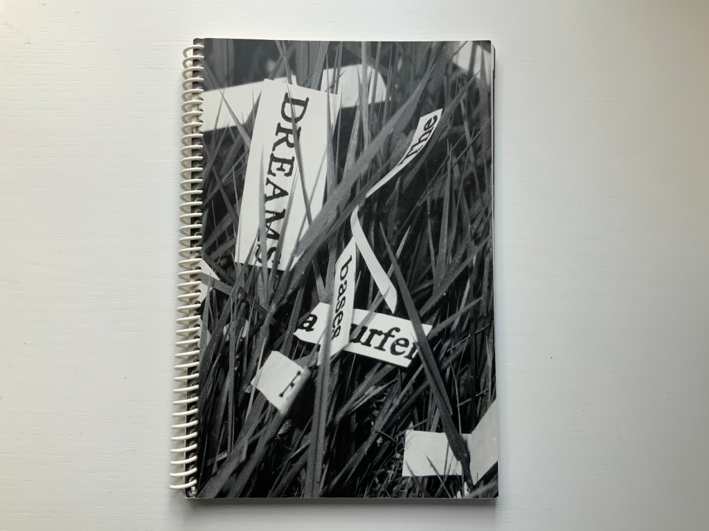
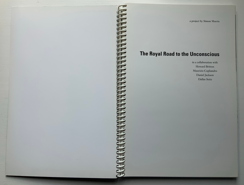
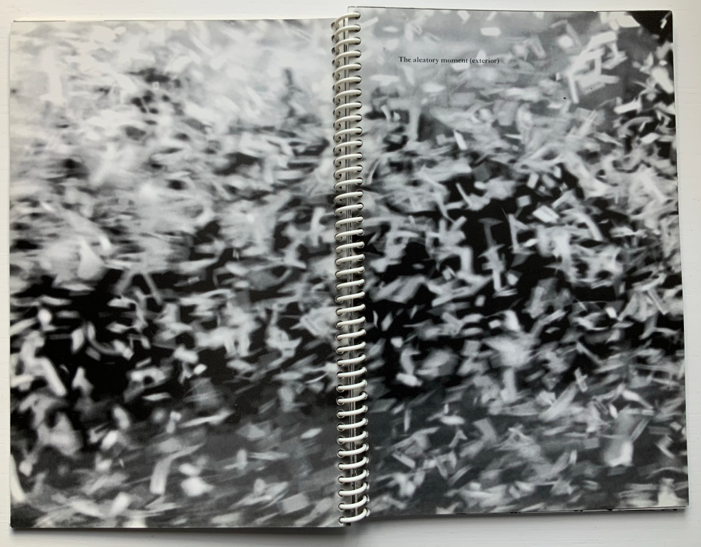
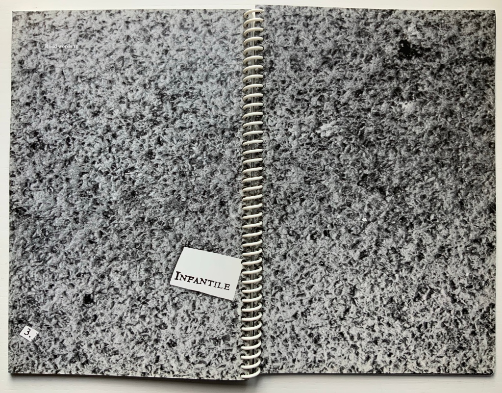
Royal Road to the Unconscious (2004)
Royal Road to the Unconscious (2004) Simon Morris Spiral bound paperback. H240 x W160 mm, 80 pages. Acquired from Johan Deumens, 10 October 2020. Photos: Books On Books.
This is the book of the movie. Or the book of the movie “made by the book” of the movie. Or…. Better let the artist explain:
Utilising Ed Ruscha’s book Royal Road Test as a readymade set of instructions, seventy-eight students cut out every single word from Sigmund Freud’s Interpretation of Dreams. On Sunday, June 1st, 2003, the artist, Simon Morris (thrower) threw the words out of the window of a Renault Clio Sport on Redbridge Road, Crossways, Dorset, travelling at a speed of 90mph, approximately 122 miles southwest of Freud’s psychoanalytical couch in London. The action freed the words from the structural unity of Freud’s text as it subjected them to an ‘aleatory moment’ – a seemingly random act of utter madness.
Daniel Jackson (filmmaker), Maurizio Cogliandro (photographer) and Dallas Seitz (photographer) documented the action as 222,704 words erupted from the window of the car. They also recorded the stream of words strewn along the side of the road. Dr. Howard Britton, a psychoanalyst (driver), directed them to any slippages or eruptions of the Real that occurred in the reconfigured text. The poetic act of liberating Freud’s text allows us to engage with what Jacques Lacan called the register of the Real. The concept of the Real is far removed from anything that we conventionally attribute to reality. It is the experience of a world without language. If language names, it is all that escapes the name – an encounter beyond images and words.
Conceptual art can do one’s head in. So, in the meantime, enjoy the aleatory moment.
Mitchell, Beverly. “Q & A with conceptual writer and professor, Simon Morris“, Blog of the Hamon Arts Library, 22 February 2019. Accessed 2 December 2020. Good coverage of The Royal Road to the Unconscious as well as the exhibition “Reading as Art”.
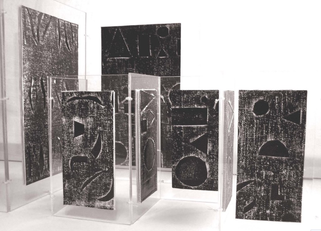
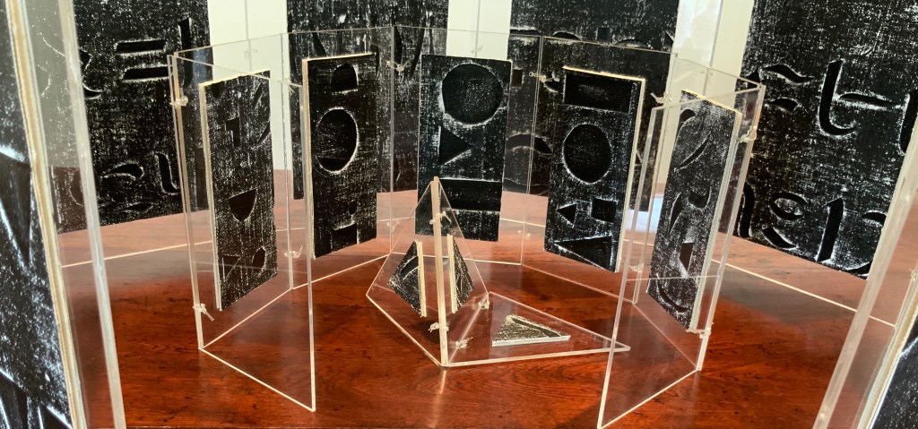
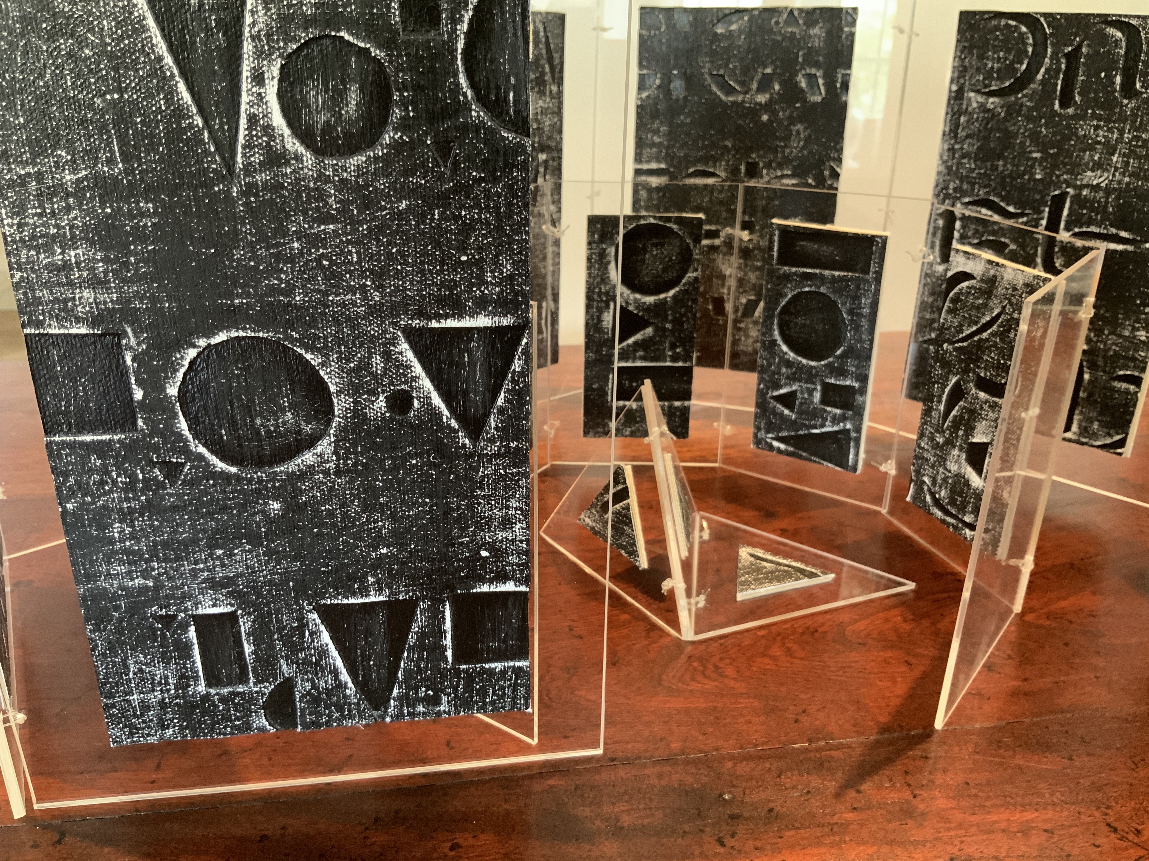
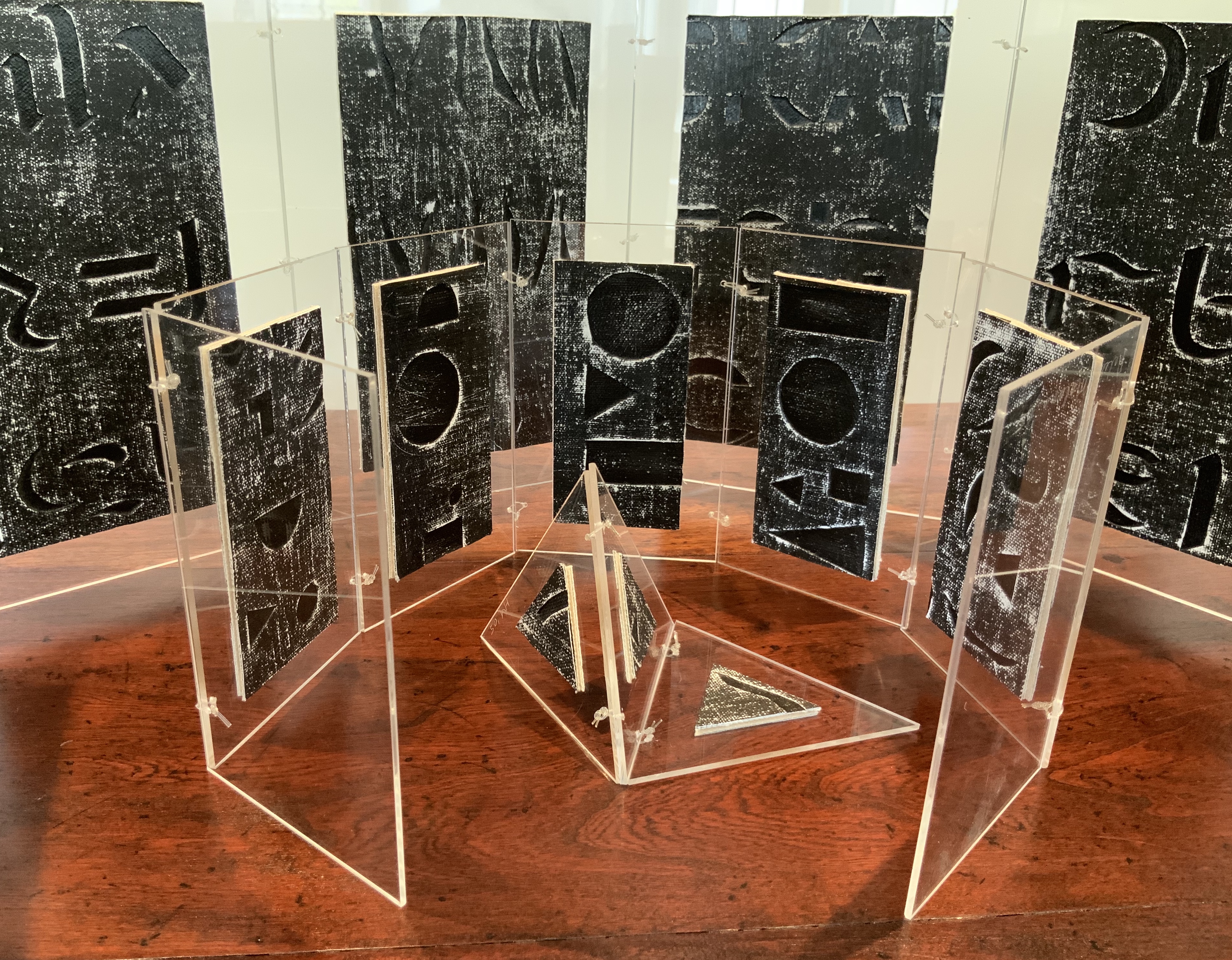
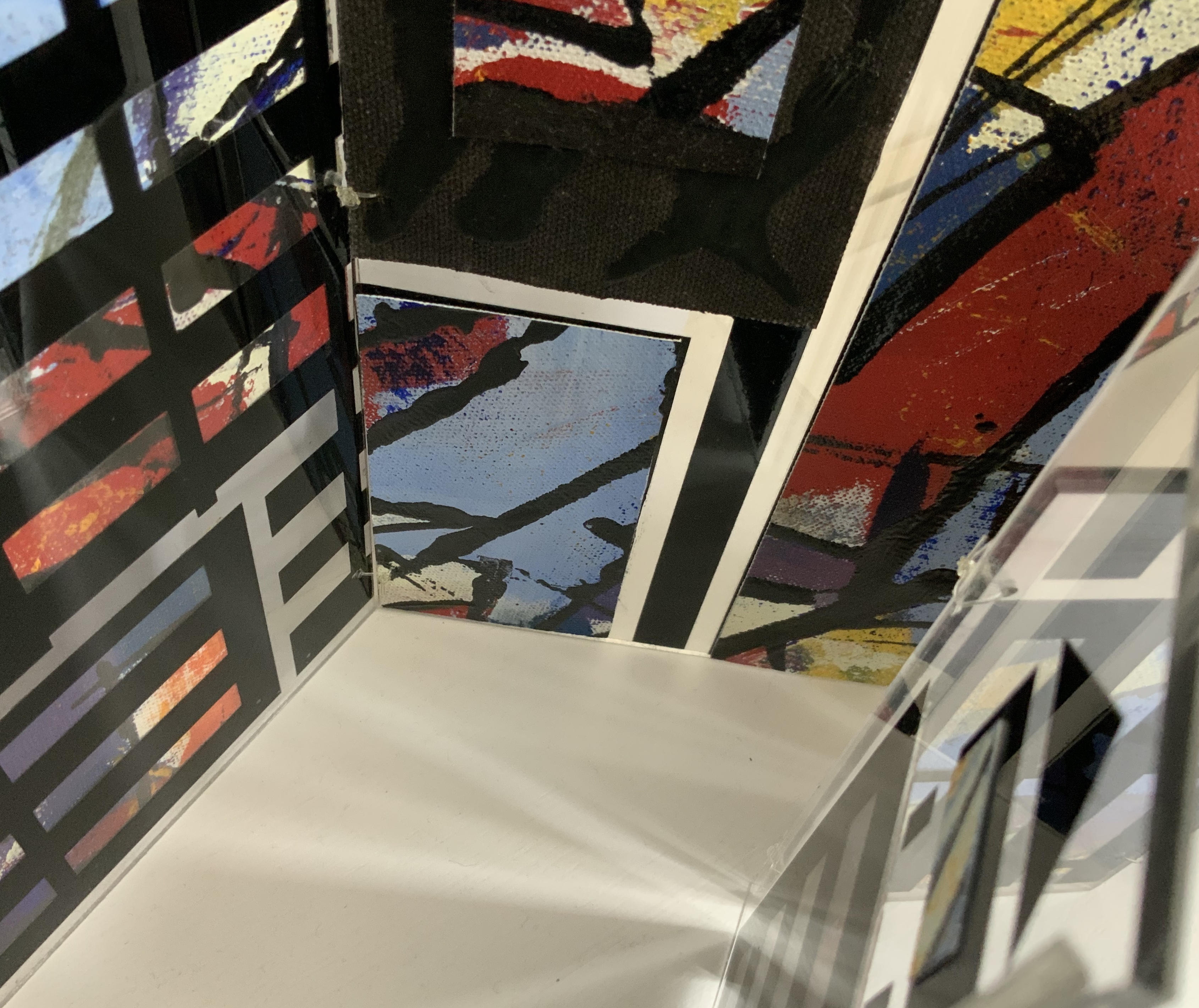
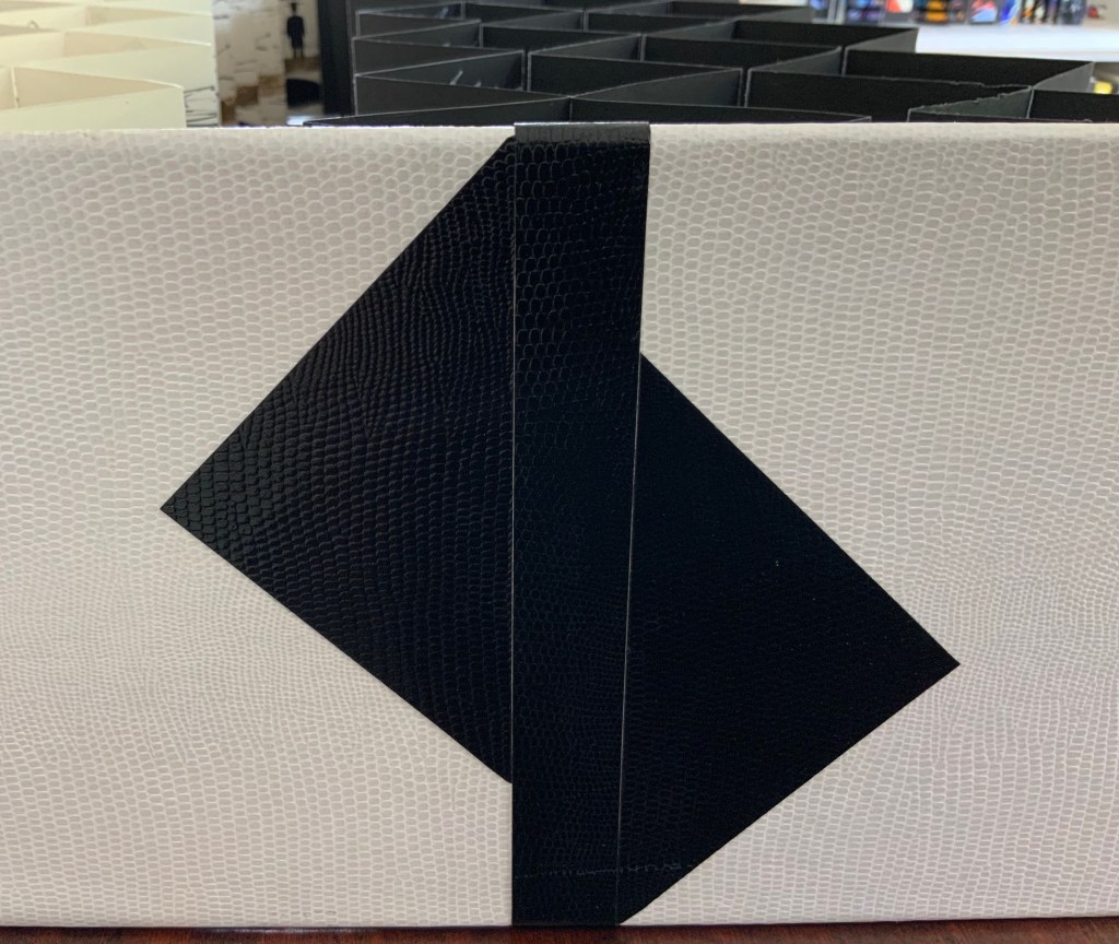
Box containing three books: two concertina books of different sizes and one tetrahedron shape of three pages. Two layered canvases painted with acrylic paint mounted on both sides of Perspex pages in Perspex box. Box: H230 x W160 x D80 mm. Unique edition. Acquired from the artist, 2 July 2020. Photos above: Courtesy of the artist. Photos below: Books On Books Collection.
Artist’s description:
Referencing ancient writing systems, hieroglyphs and engravings, this book is an investigation of sign systems and shared cultural knowledge. Fragmented coded images derived from familiar letterforms lie beneath the surface of the canvas and although visible remain undecipherable and incomprehensible.
The alphabet has traditionally served as calligraphic and typographic seed for book art, perhaps with roots of expression in illuminated letters, the Kabbalah, tomes on penmanship and calligraphy and typography specimen books. In its material and technique, Alphabetic Codes has a rough and smooth tactility; the former pointing to ancient, haptic forms, the latter to current, screen-generated forms. It enriches the subset of alphabet books and abecedaries in the Books On Books Collection.
Exhibitions:
Books 05 Image as Text as Image, Noosa Regional Gallery 9 September – 17 October 2005.
Botanical Books, Coffs Calligraphers, Botanic Garden, Coffs Harbour, 29 September 29 – 7 October 2007.
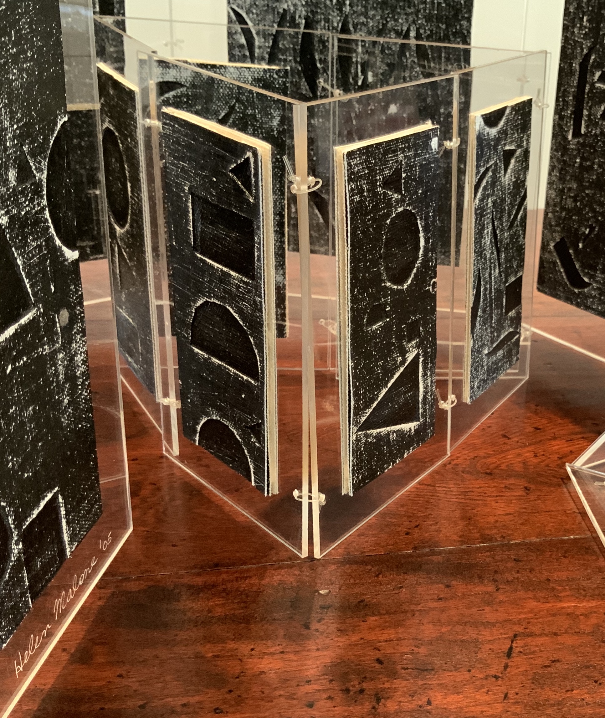
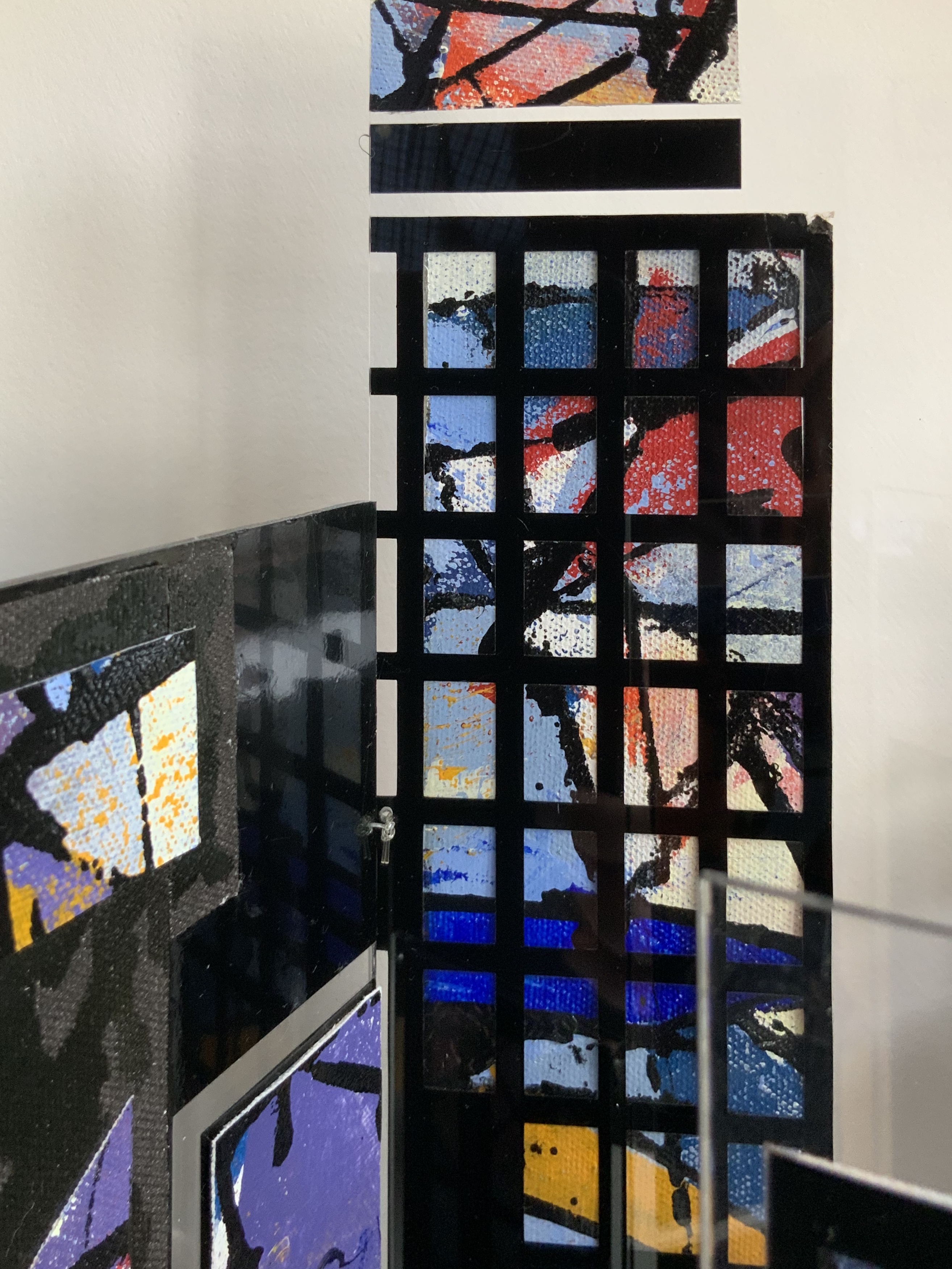
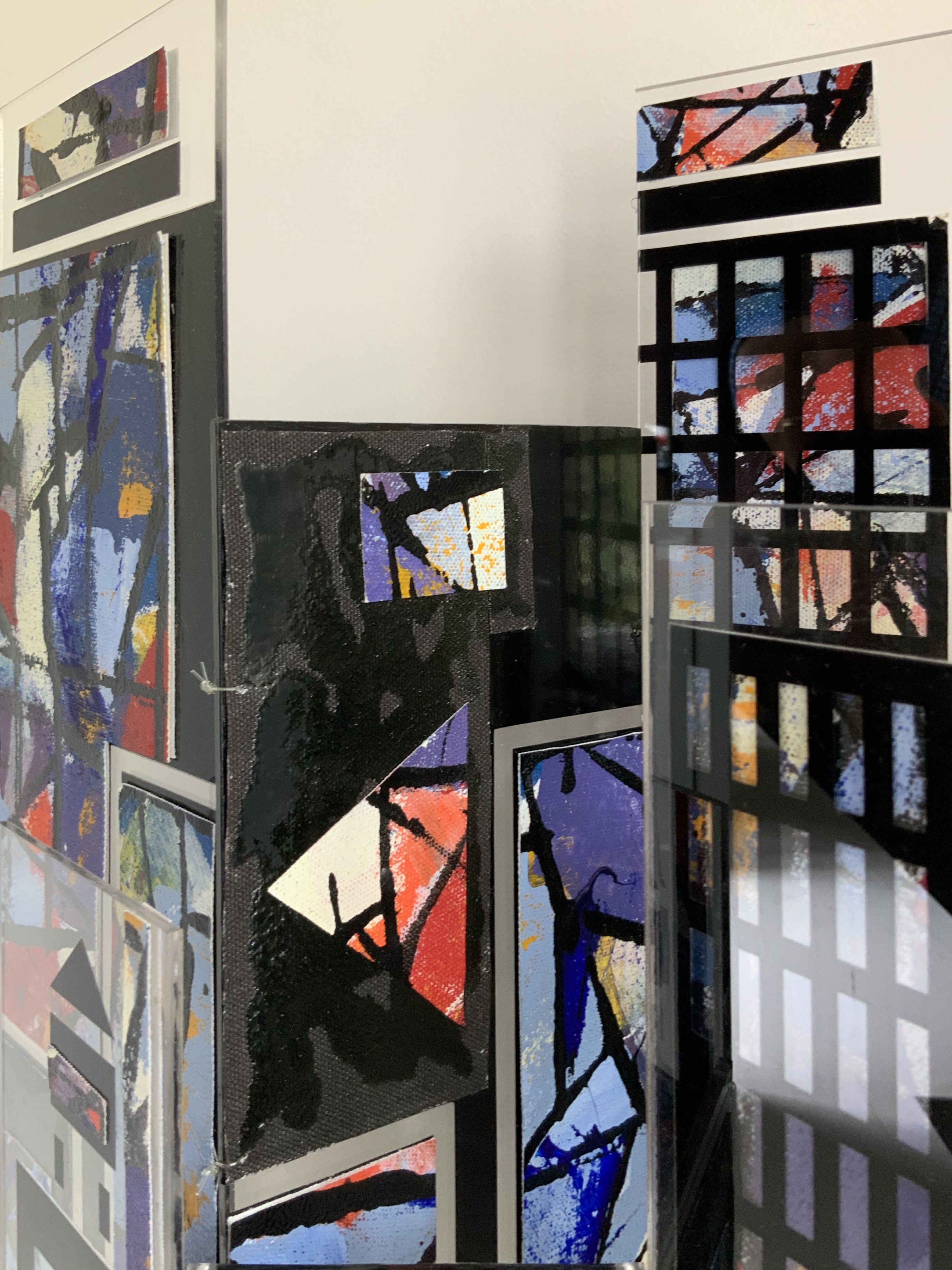
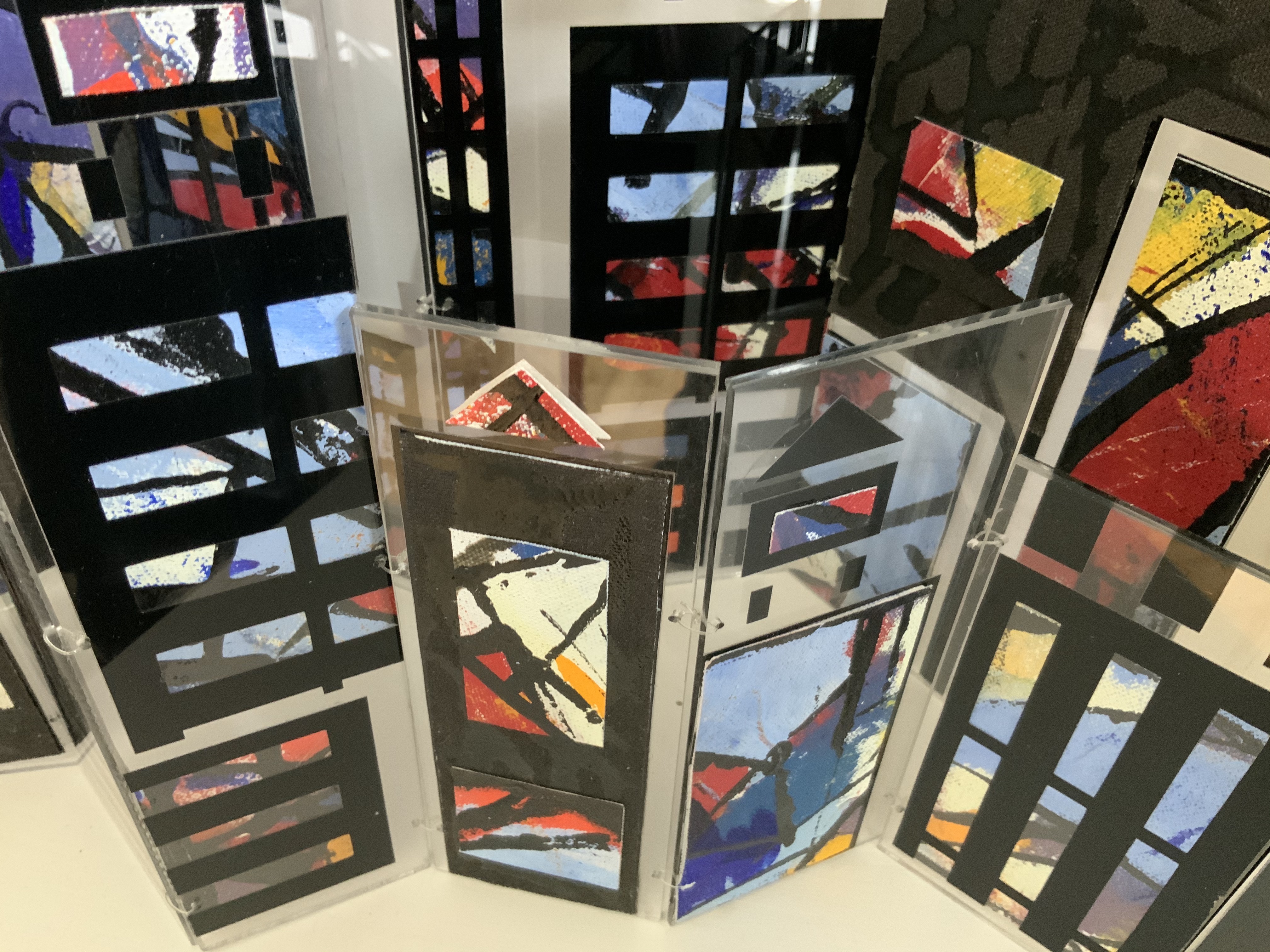
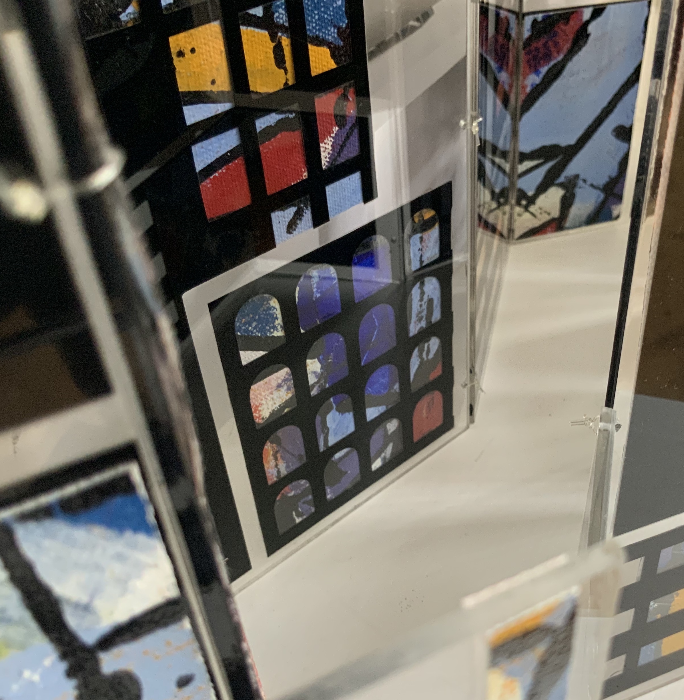
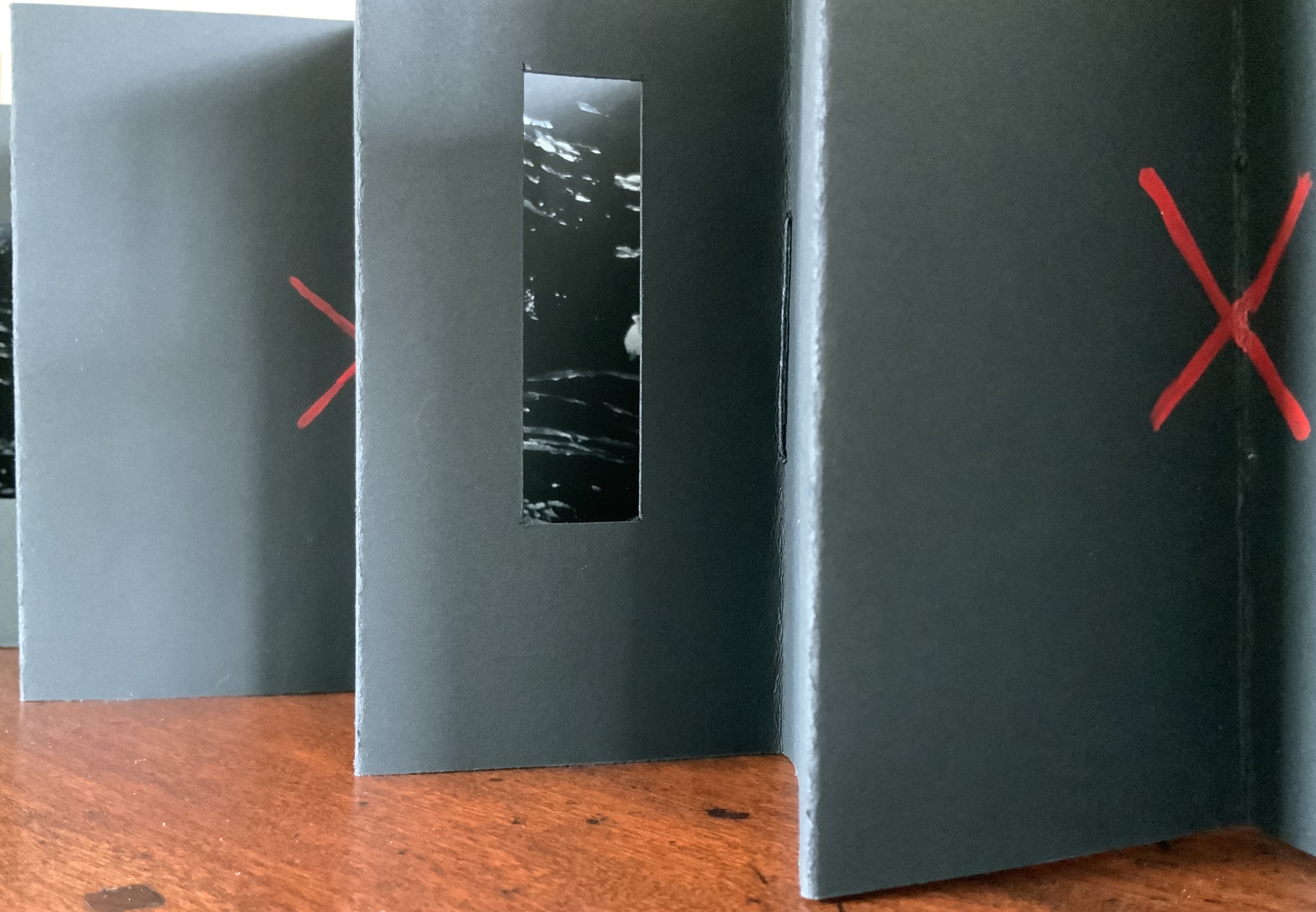
Perspex box containing two concertina books of different sizes made of recycled Perspex panels with mounted canvas painted with acrylics. Box: H360 x W125 x D75 mm. Unique edition. Acquired from the artist, 2 July 2020. Photo: Books On Books Collection.
Photos: Books On Books Collection.
Artist’s description:
Technological illuminations such as television screens, computer screens, big screens and advertising visually transmit images and act as carriers of global information, education and entertainment. The medieval purpose of stained glass windows, besides aesthetic and mystical was to visually educate and enlighten.
Purely in color, Windows on the World recalls Albers, Chagall, Mondrian (even though he hated stained glass) or Joep Nicolas. In material, technique and theme, it may echo Alphabetic Codes and its allusion to computer-screen-based windows, but Windows has a more architectural feel that can also be found in the I.M. Pei and Mies van der Rohe “volumes” of Ten Books on Architecture (2017) further enriching the architectural subset of the Books On Books Collection.
Exhibition:
Books 05, Image as text as Image, Noosa Regional Gallery, 9 September – 17 October 2005.
Beautiful One Day, Blown Away the Next (2011)
Beautiful One Day, Blown Away the Next (2011)
Helen Malone
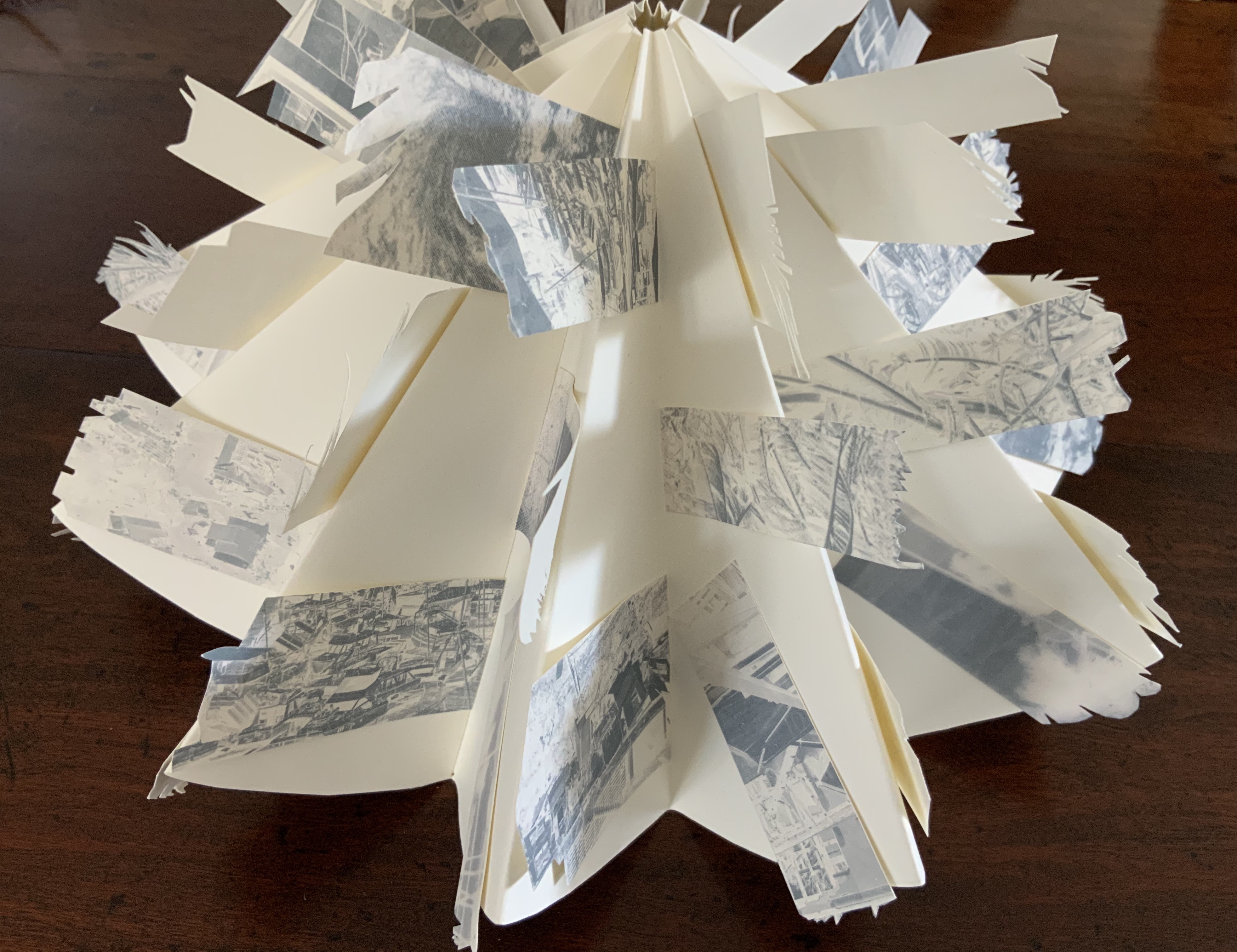
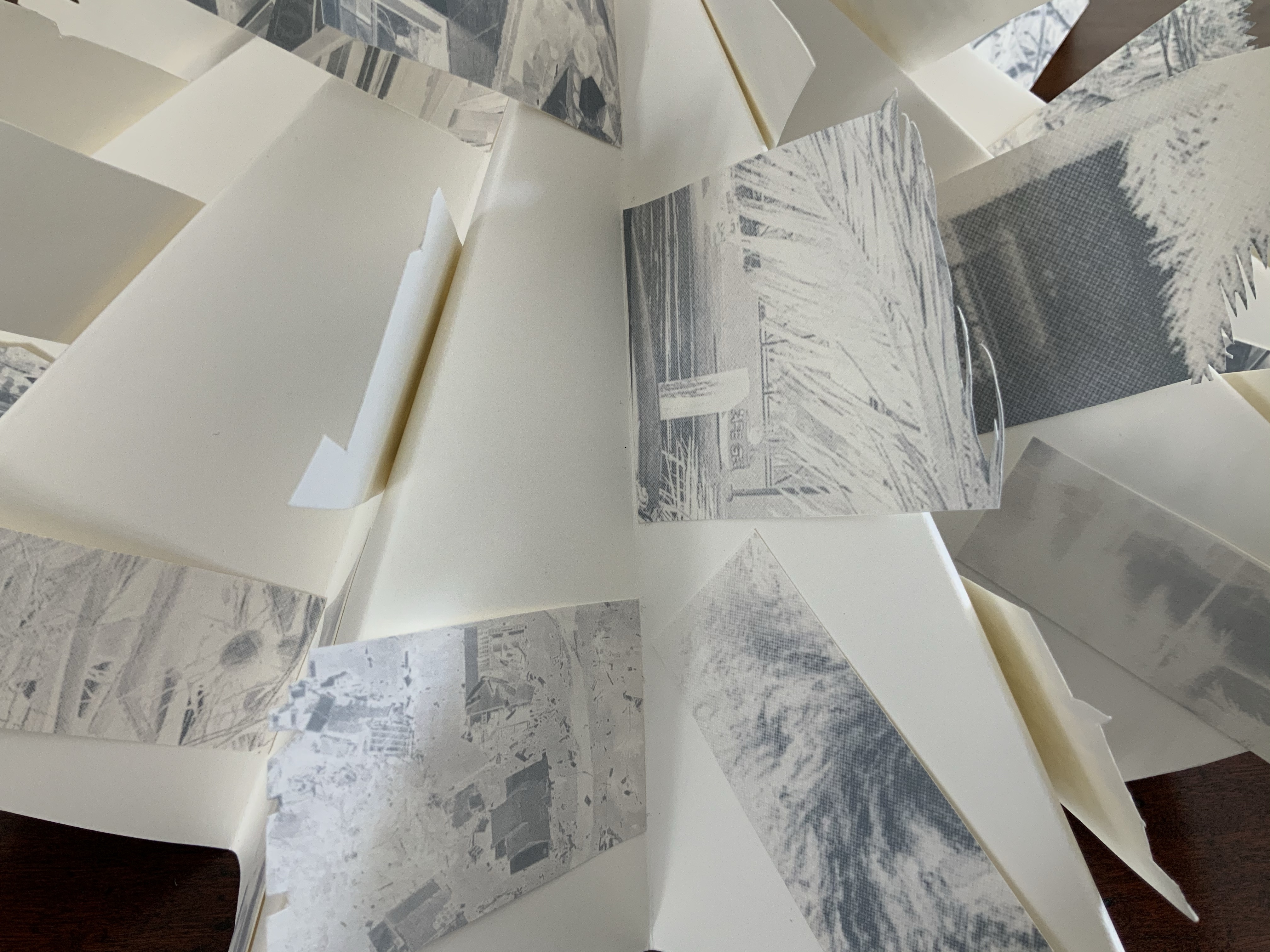
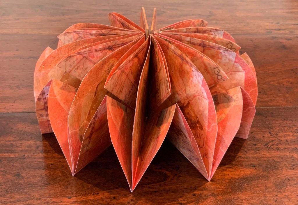
Box containing circular concertina flag book of Fabriano paper, manipulated digital photographs cut and transferred to flags. H90 x W190 x D55 mm closed, 380 mm diameter open. Unique edition. Acquired from the artist, 2 July 2020. Photo: Books On Books Collection.
Artist’s description:
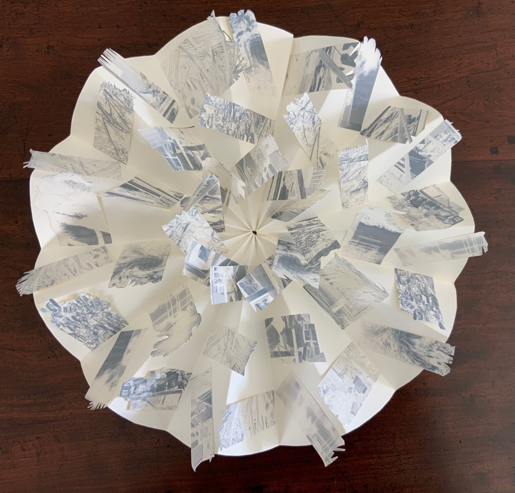
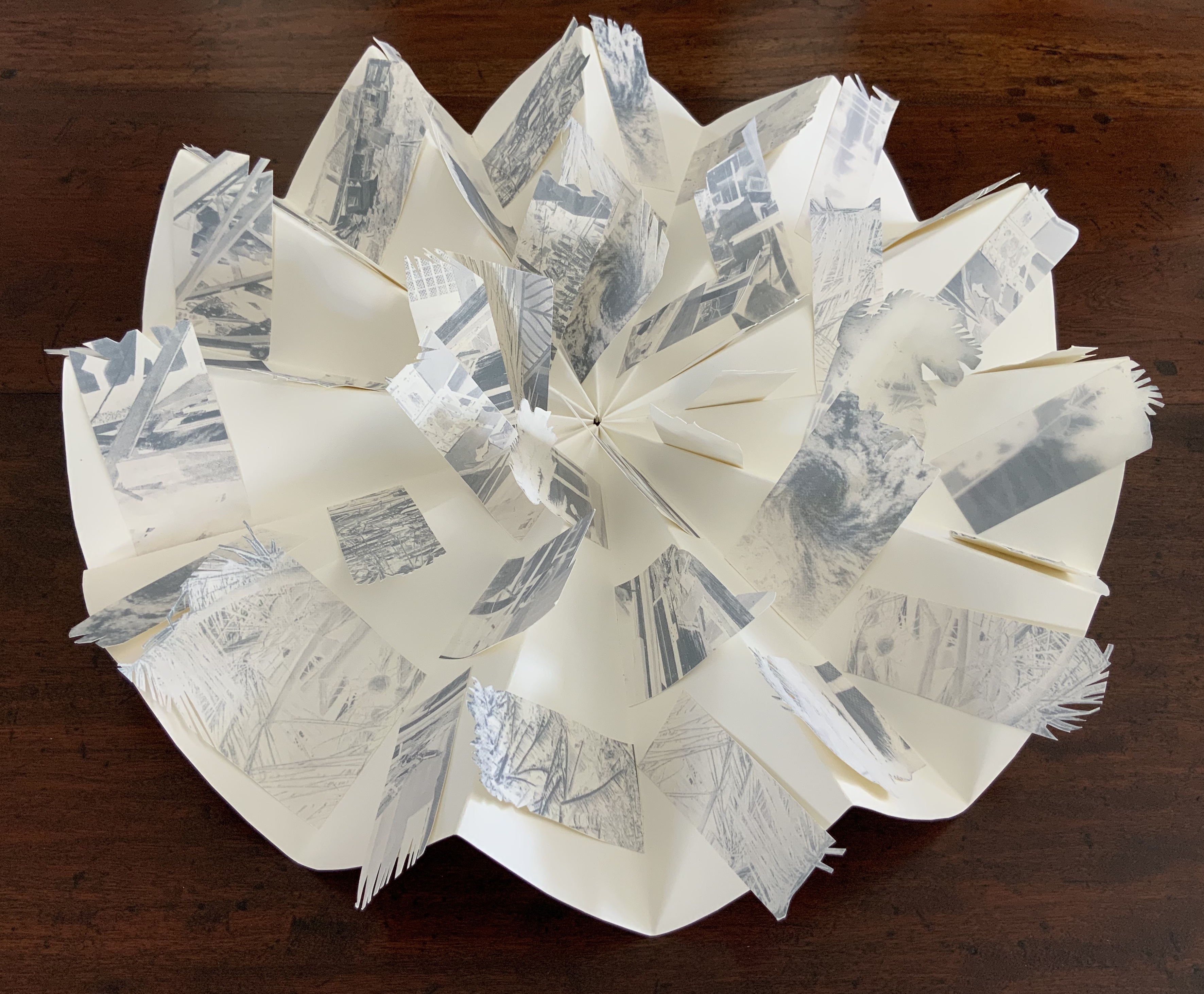
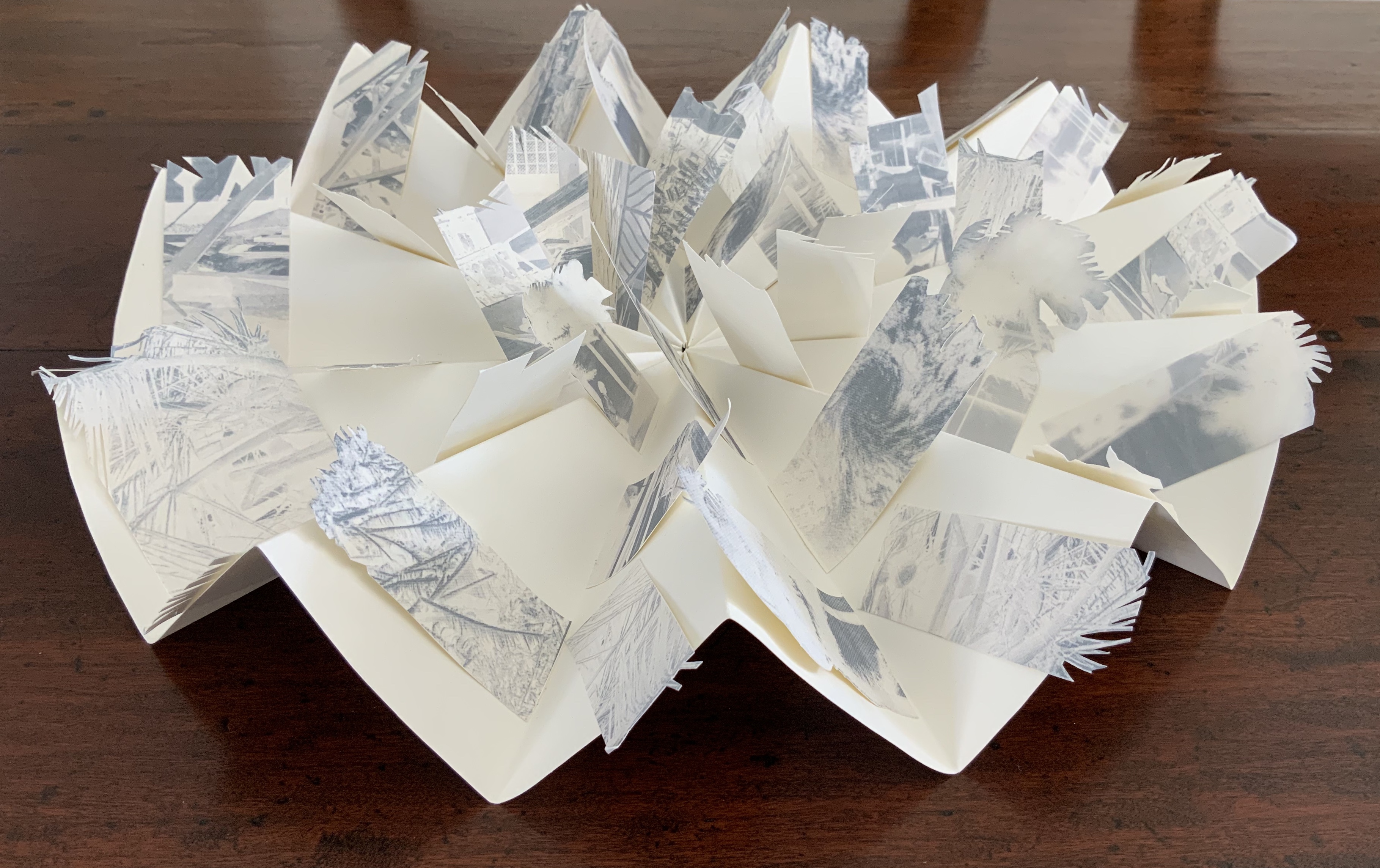
On the eve of 2 February 2011 Cyclone Yasi made landfall on the coast of Queensland. Sweeping through the coastal communities, the Category 5 Tropical Storm of historic proportions left a trail of mayhem and destruction that inspired the artist Malone to create this piece.
Photos: Books On Books Collection.
Bringing together a flag book, concertina and tab-and-lot closure, Malone engineers an ideal structure to evoke the meterological pattern and order of the cyclone. The shattered, blue-filtered photographic images transferred to the flags contribute a kaleidoscopic chaos. The theme of the environment and the struggle between the human race and natural forces is a subset of the Books On Books Collection well represented by this work, Tsunami (below) and others such as Holuhraun by Chris Ruston and Landscapes of the Late Anthropocene by Philip Zimmerman.
Exhibition:
Books…beyond words evolution, East Gippsland Art Gallery, Bairnsdale,Vic., 6 August – 3 September 2011.
Tsunami (2011)
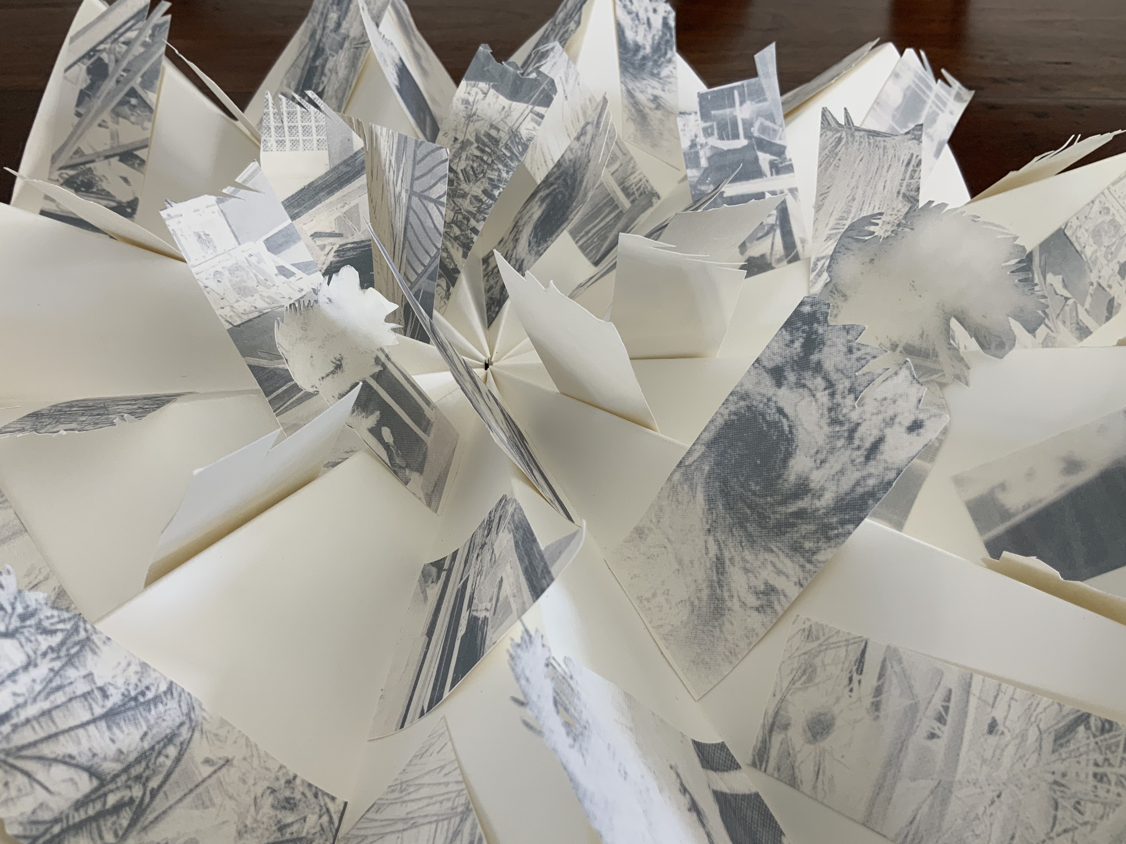
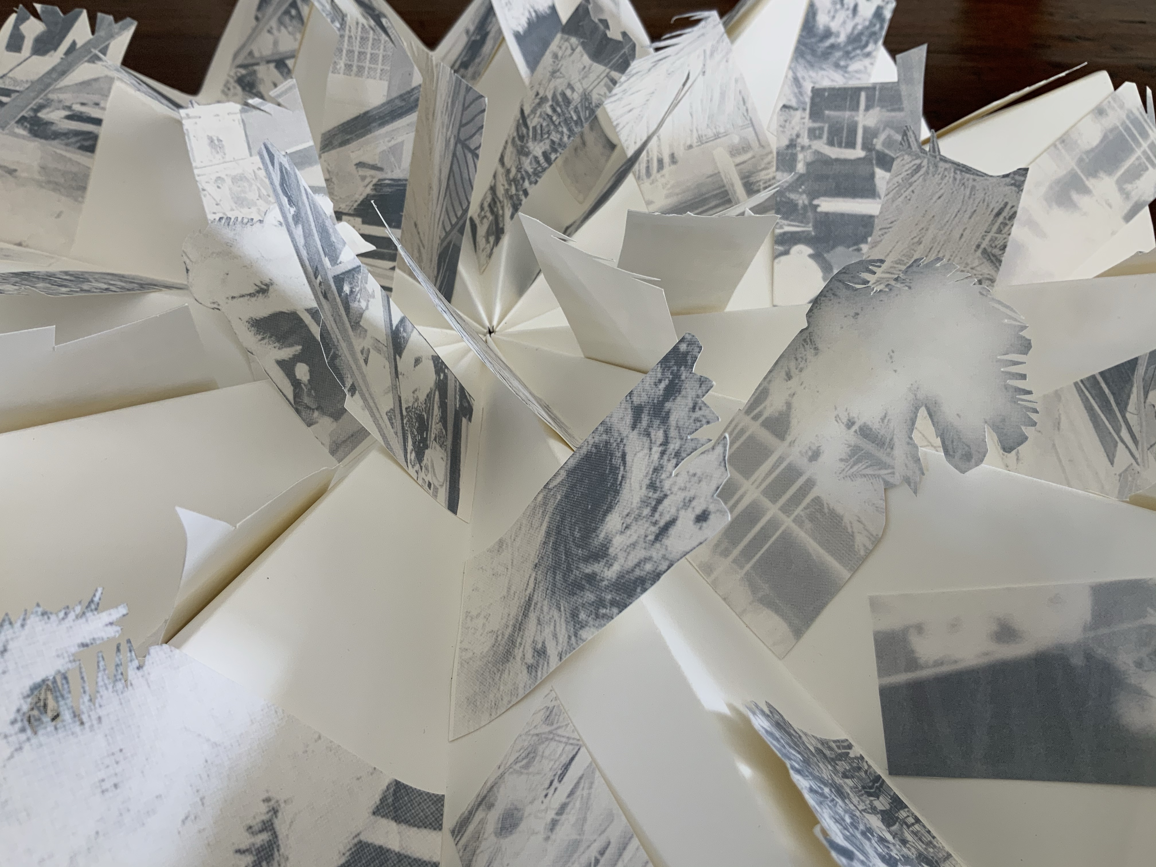
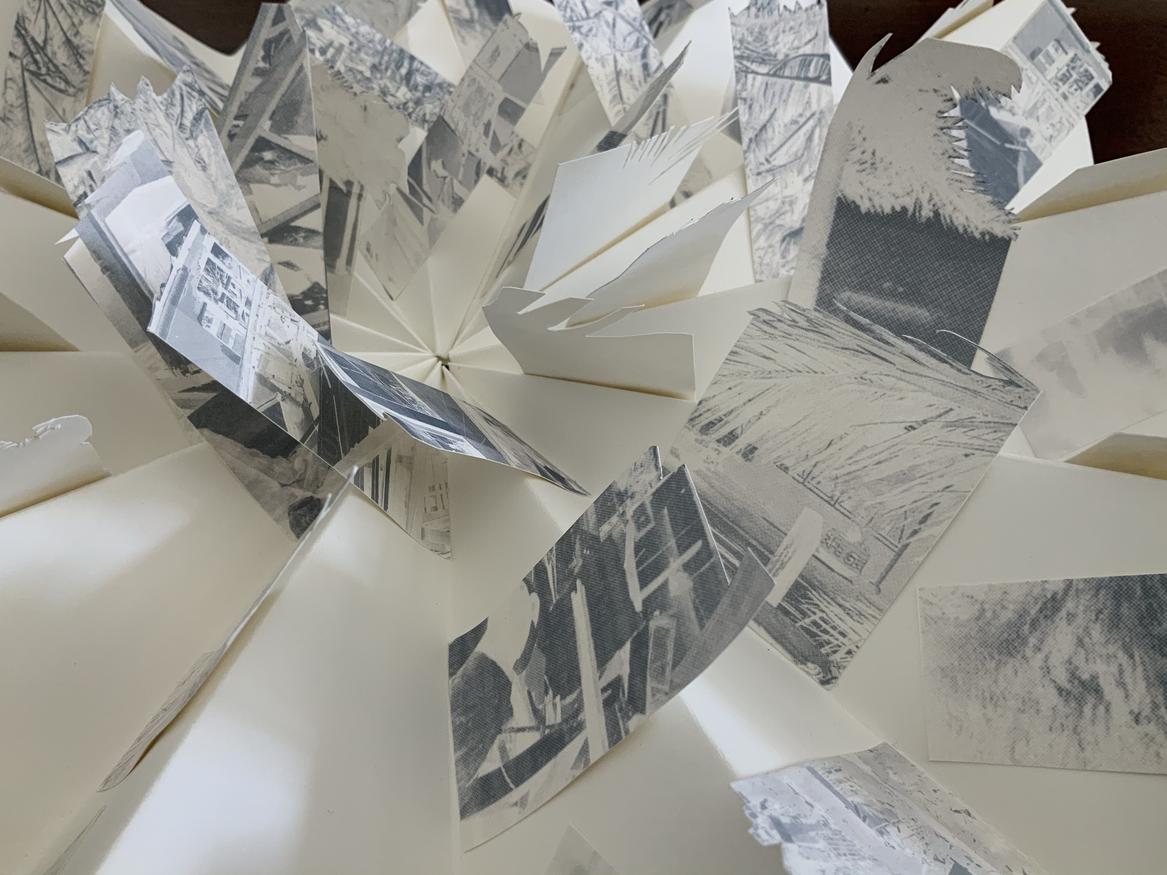
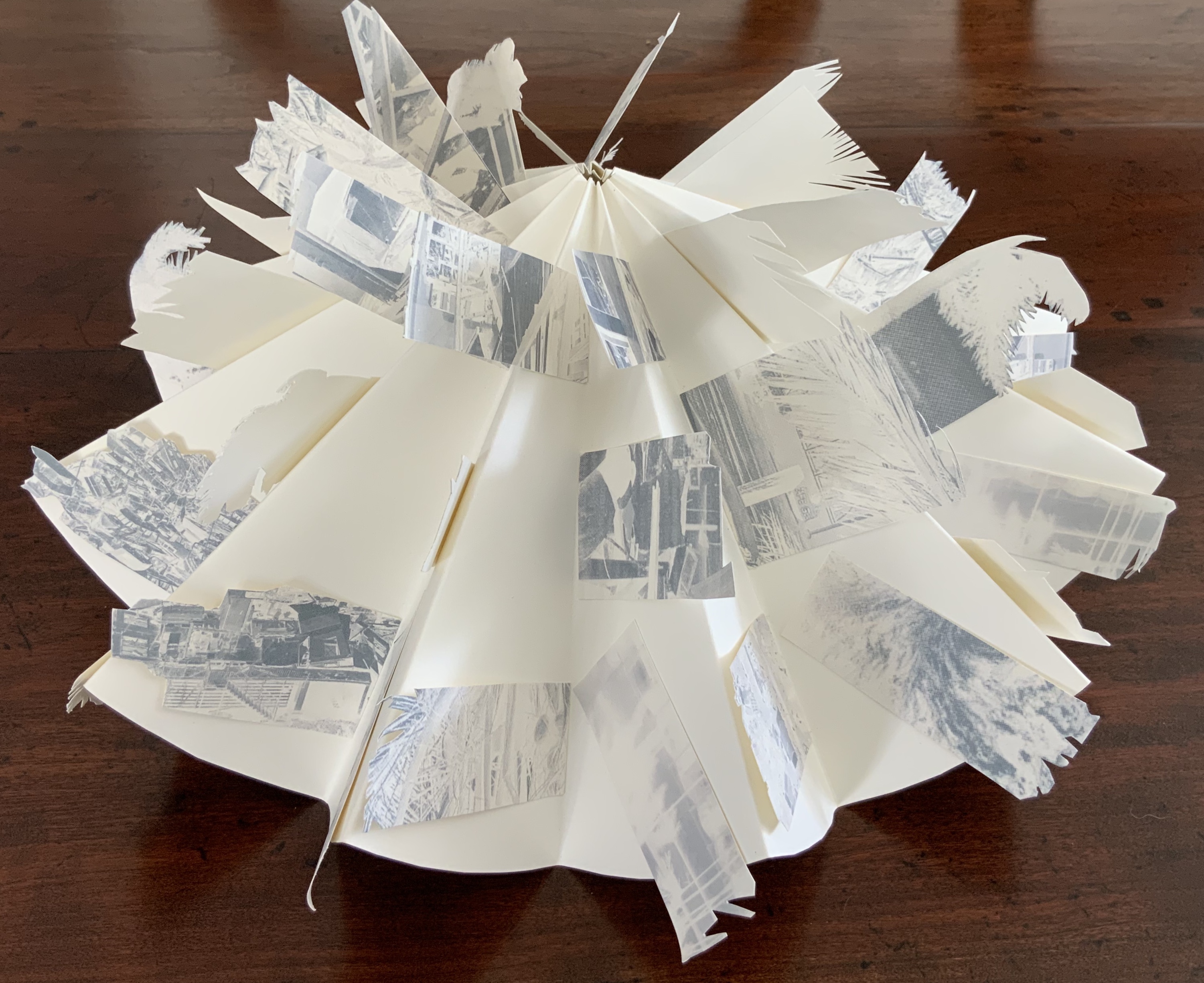
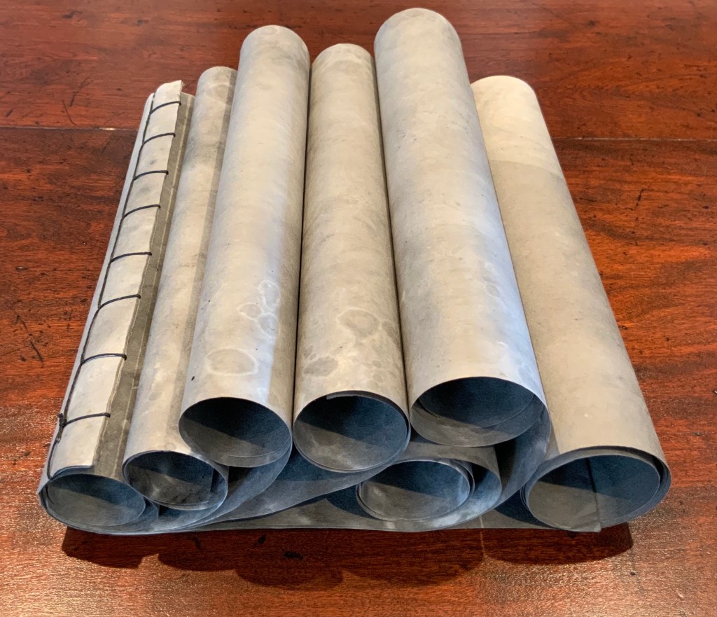
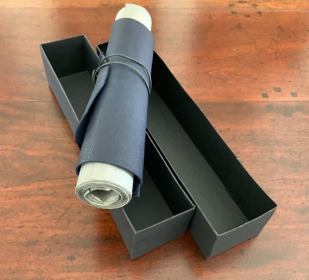
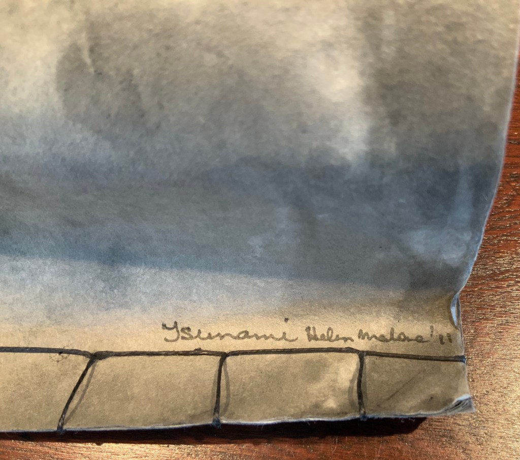
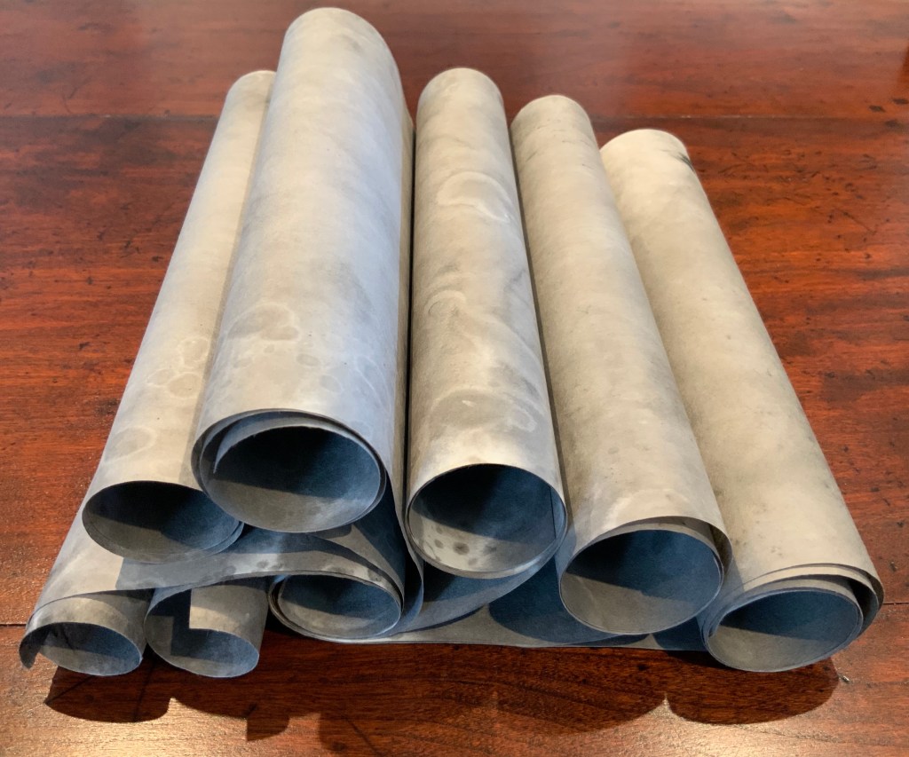
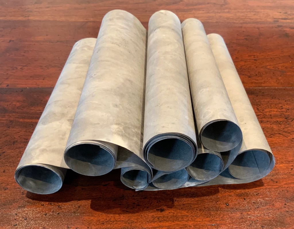
Tsunami (2011) Helen Malone Box containing “whirlwind” book of Japanese paper washed with sumi ink and water, Japanese stab binding, leather roll. H230 mm, variable width. Unique edition. Acquired from the artist, 2 July 2020. Photo: Books On Books Collection.
Photos: Books On Books Collection.
Artist’s description:
Part of the series of disasters explored by Malone through her art, this piece is her interpretation of the catastrophic tsunami that followed the massive earthquake that struck Japan in 2011.
The earthquake and tsunami were so powerful that their effects were felt around the globe: from Antarctica’s ice sheet to the fjords of Norway. Indeed the debris from the monstrous wave continues to wash up on North American shores nearly a decade later.
The combination of Japanese paper and mottled color of sumi ink and water, the way the work “fights back” as the scrolls are manipulated to display the work, the multiple displays generated by the piling wave-like scrolls — all evoke the picture of inescapable, roiling force of the 2011 tsunami.
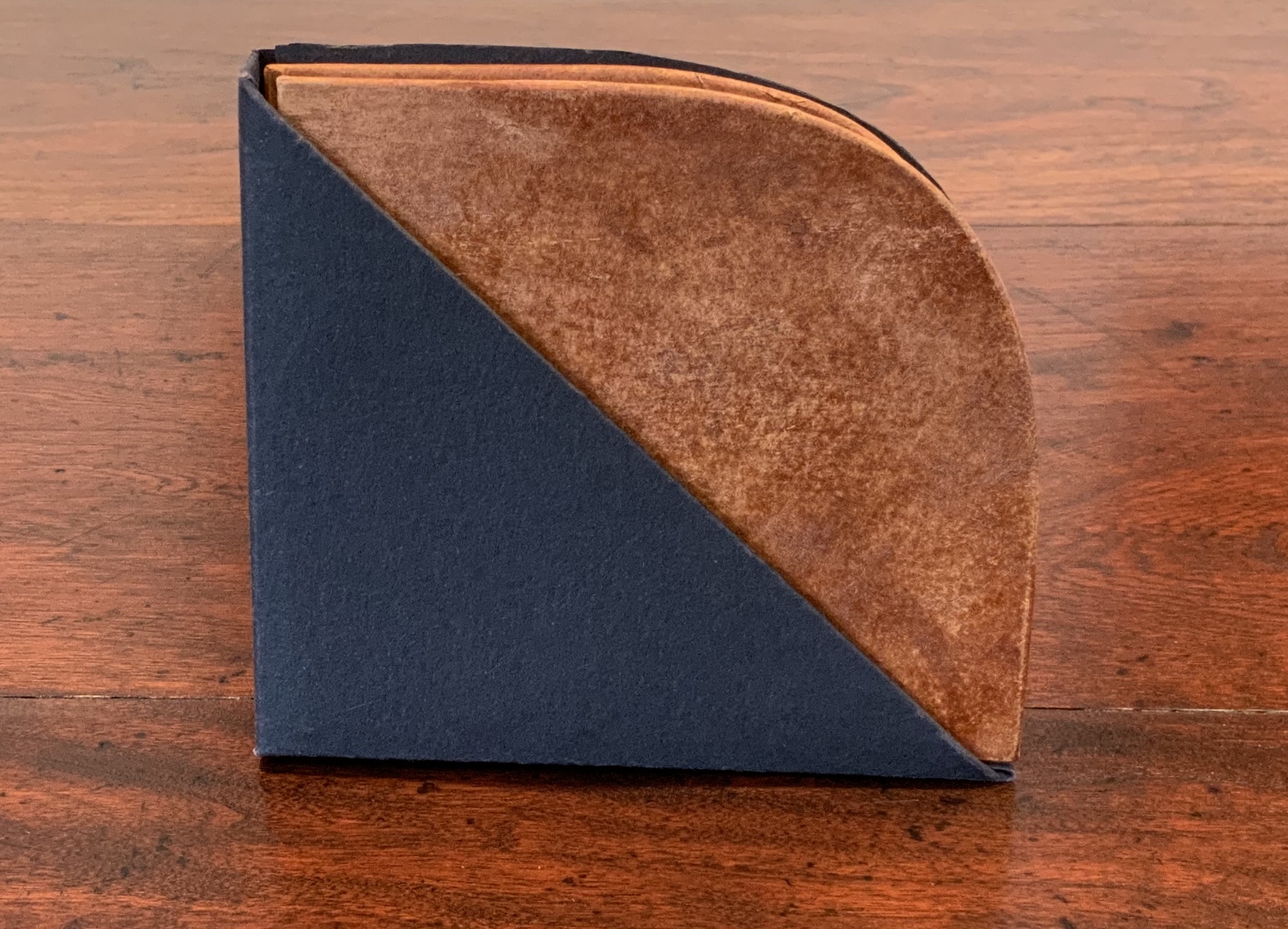
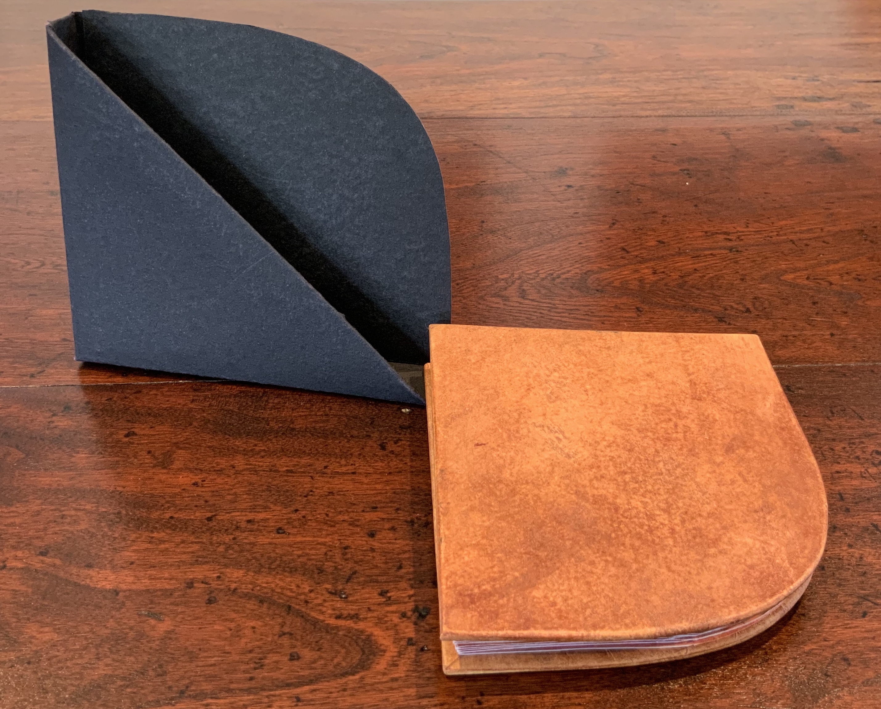
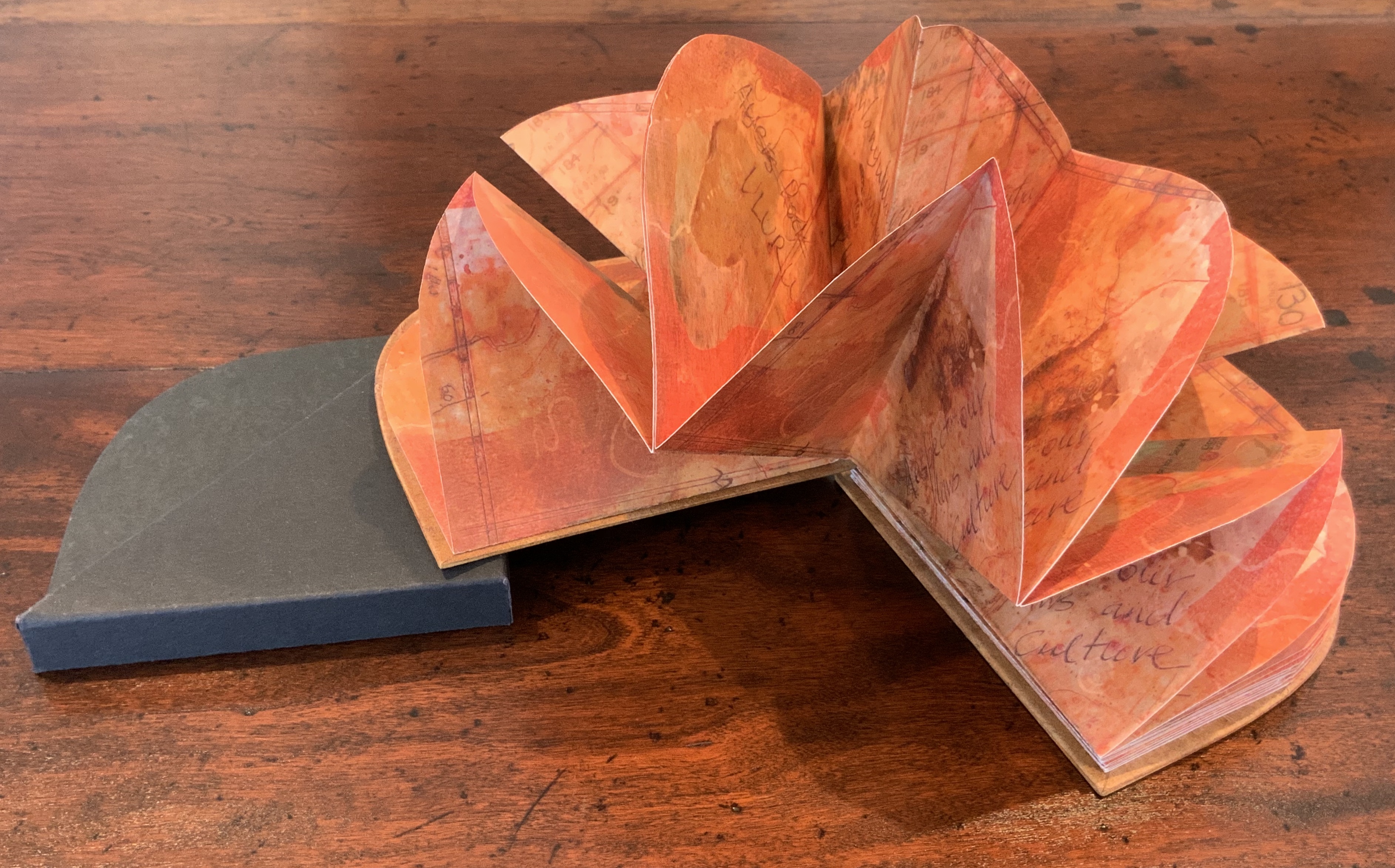
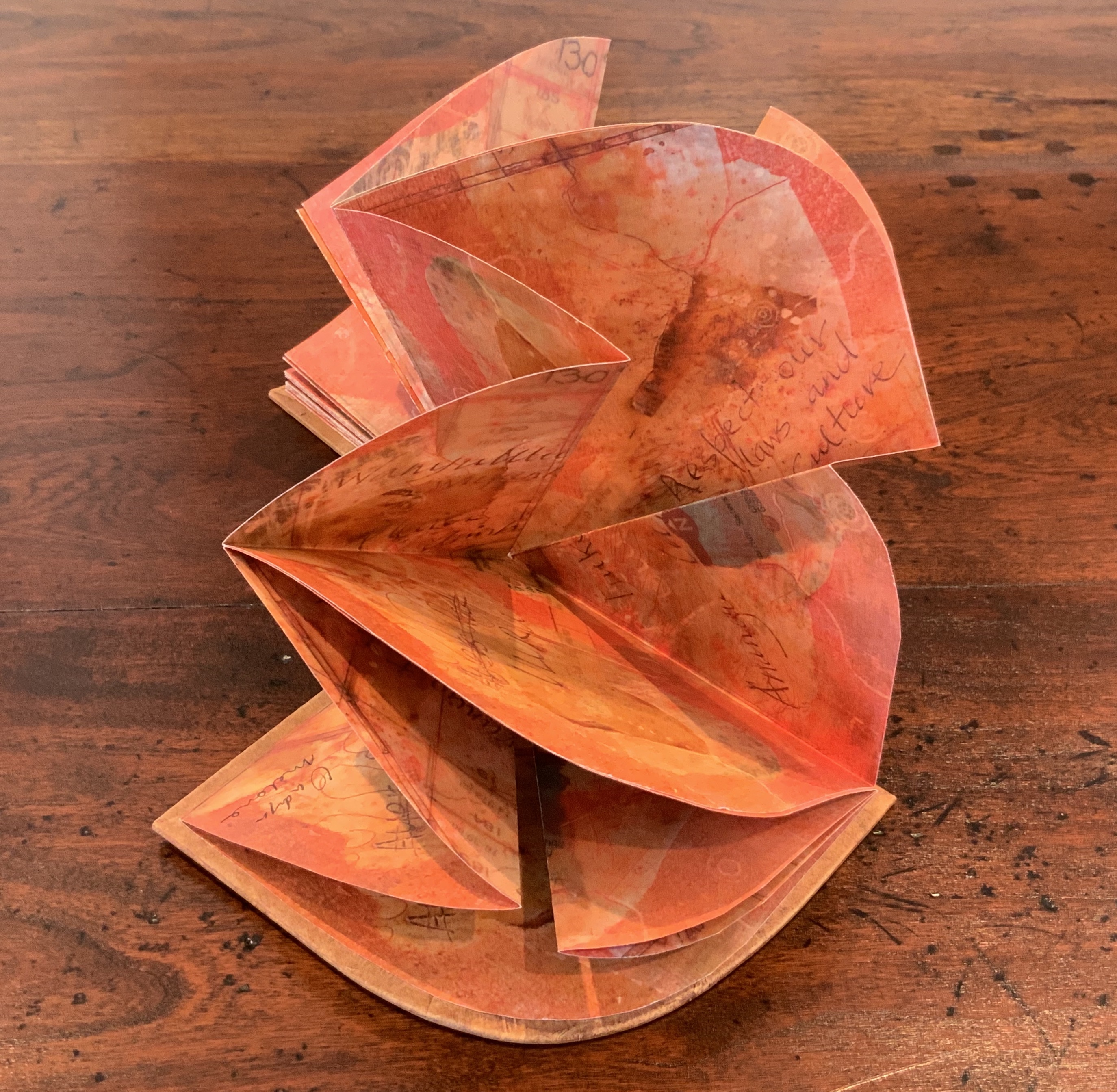
Laser printed images of waxed drawing, collage, painting and Chinese paper covered boards painted by Jack Oudyn with earth pigments, acrylic and xanthorrhoea resin. Sculptural folded page book structure and box by Helen Malone. H105 x W95 x D15 mm. Editions: 6 and 1 A/P. Acquired from Helen Malone, 2 July 2020. Photos: Books On Books Collection.
Photos: Books On Books Collection.
Artist’s description:
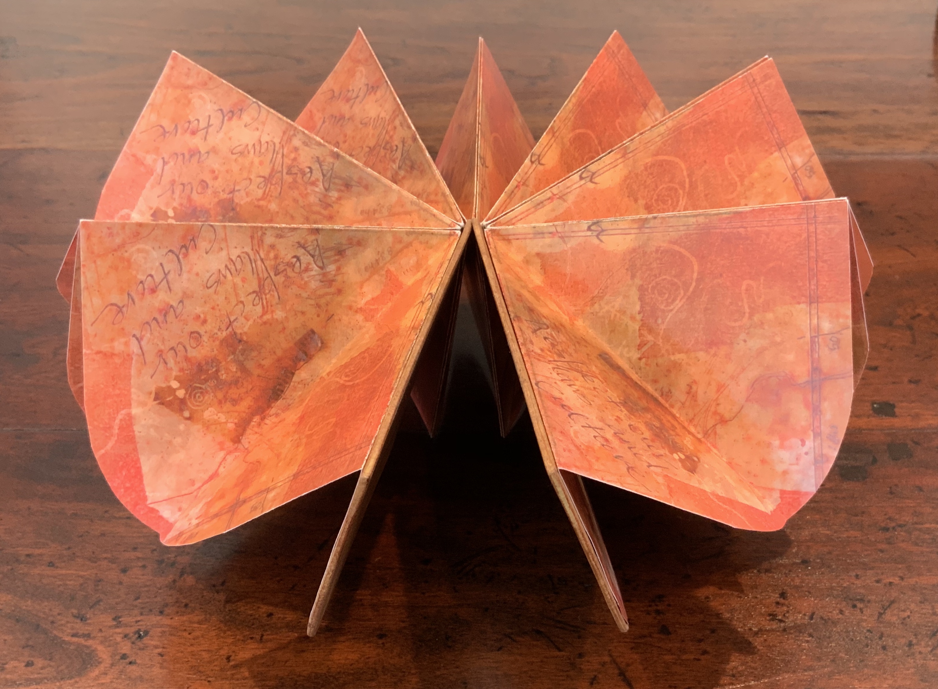
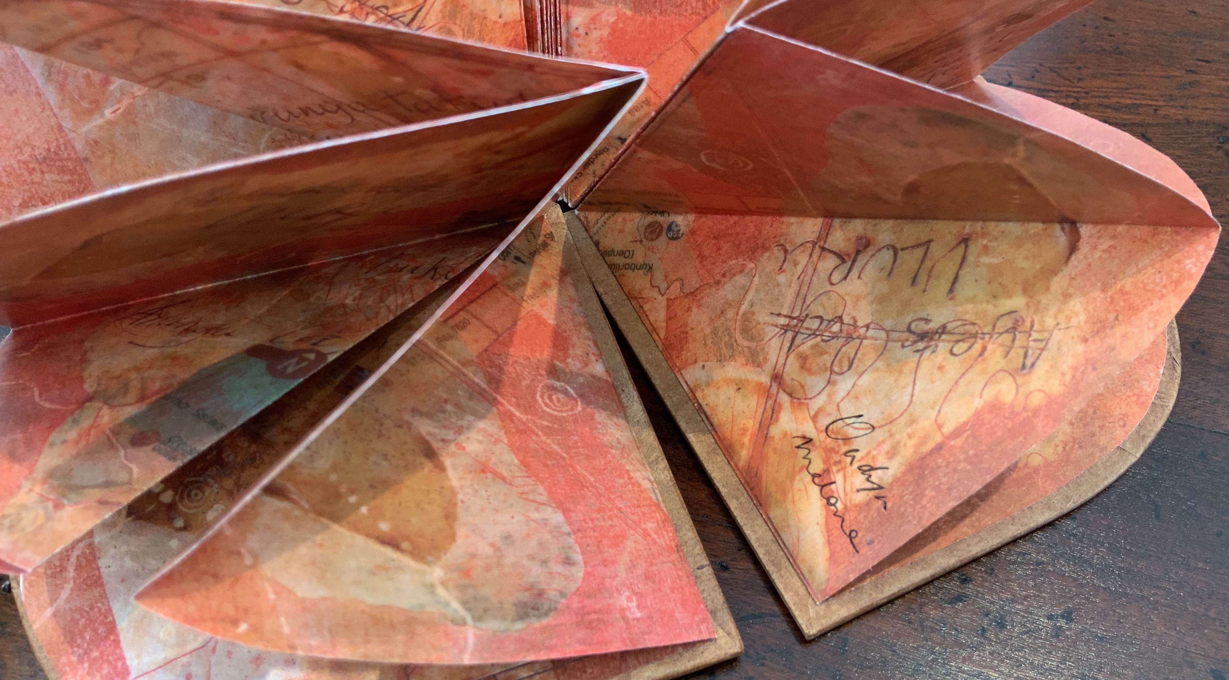
Malone and Jack Oudyn collaborated to create this representation of Uluru to resonate with the pleas of the indigenous Anangu people of the Northern Territory in Australia to “Wanyu Ulurunya Tatintja Wiyangku Wantima” (Respect our laws and culture).
For the Anangu the massive sandstone monolith is so sacred that they will not climb it nor photograph it. They ask visitors to respect the spirituality of the site and to follow their customs.
The blend of laser prints of wax drawings, Chinese paper, collage and painting seeks to capture the changing light of the rock as the sun passes over it throughout the day. The boards painted by Oudyn with earth pigments, acrylic and xanthorrhoea resin contribute a glowing depth of color to this homage to the Anangu. As with The Future of an Illusion (below), this collaboration presents an unusual unity of vision and integration of technique, materials and process with structural “rightness” for the subject at hand.
Exhibitions:
Art on Show Awards, Artspace Mackay Artist Book Award, Mackay Show Association, Mackay Qld, 16-19 June 2014.
Sheffield International Artists Book Prize, Bank Street Arts, Sheffield UK, 7-31 October 2015.
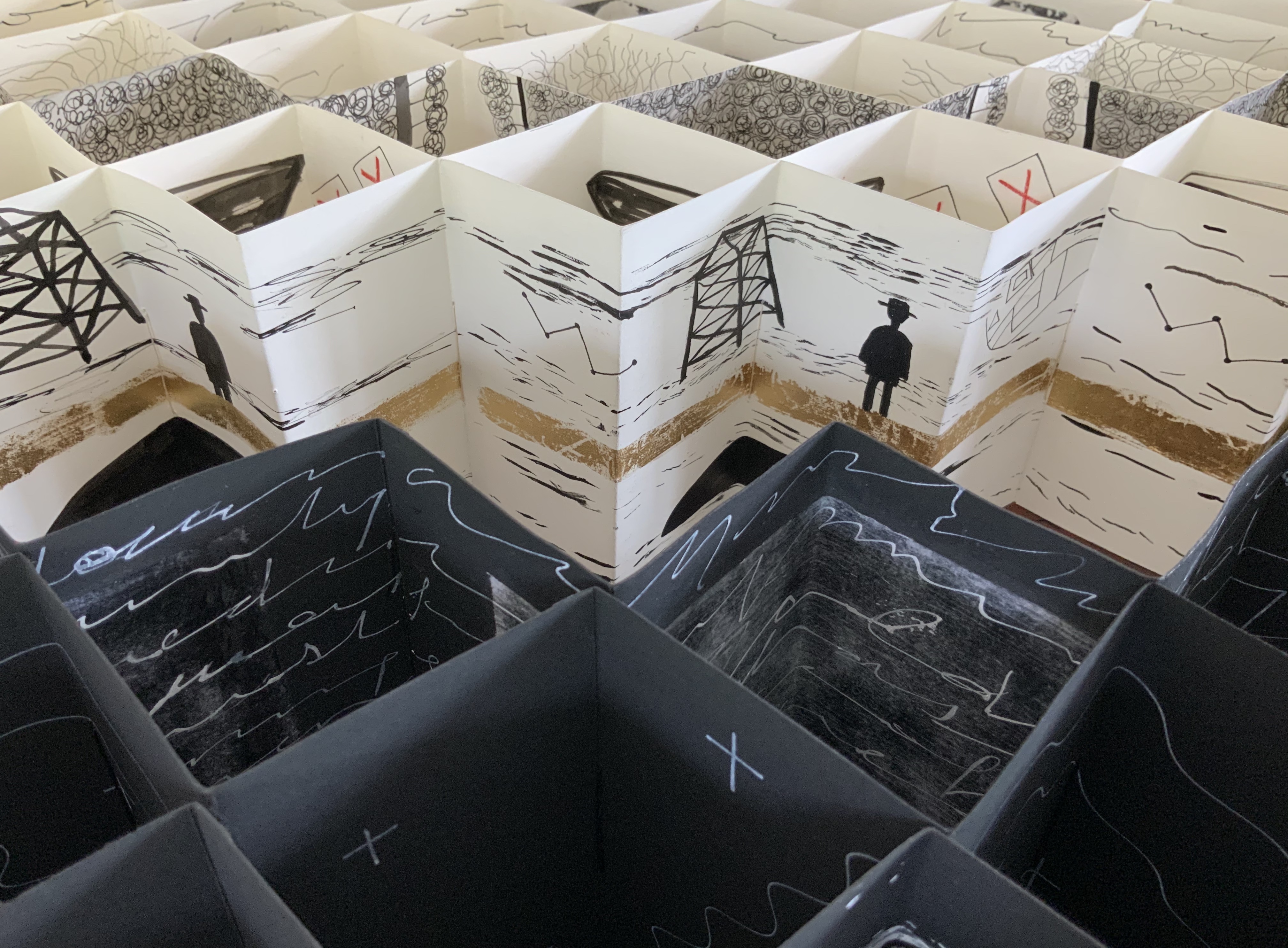
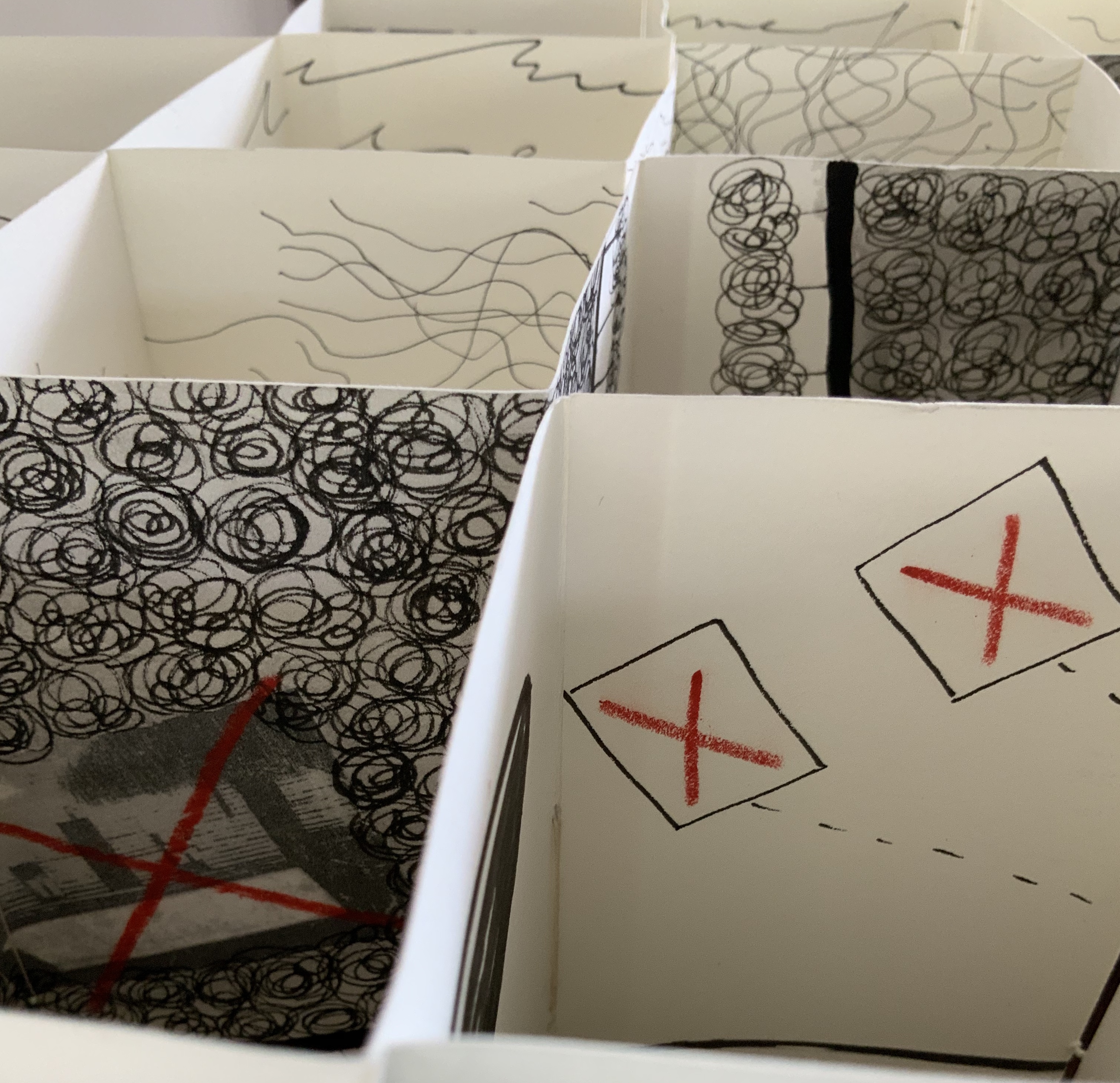
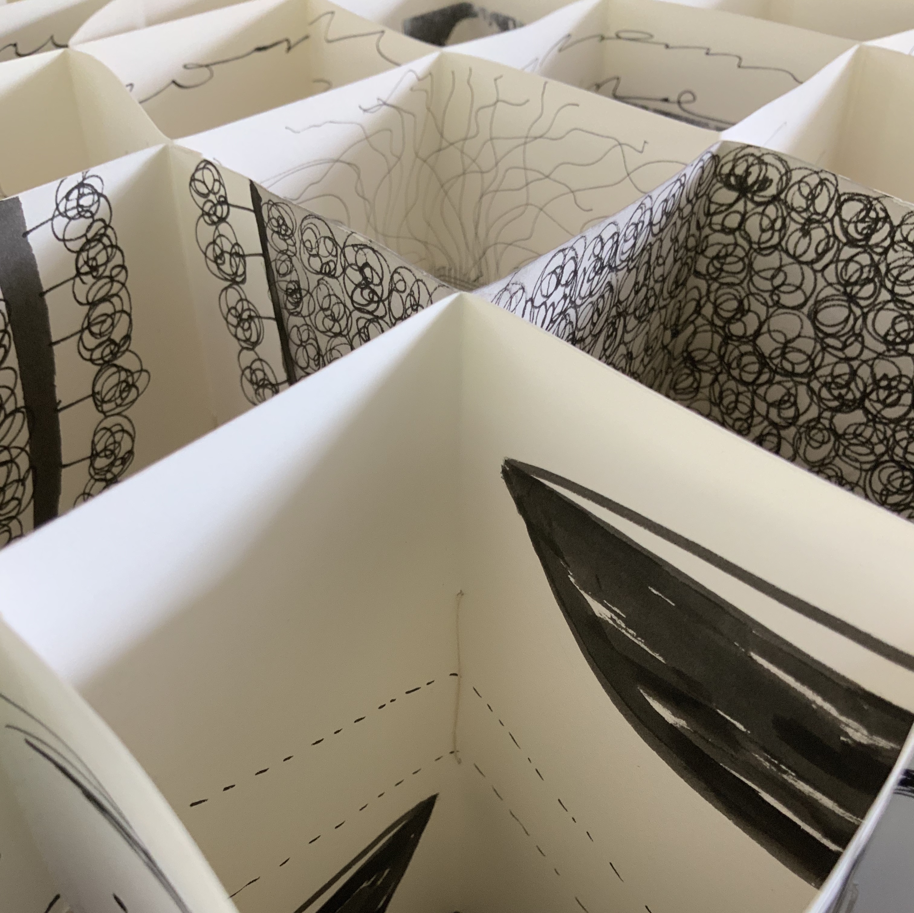
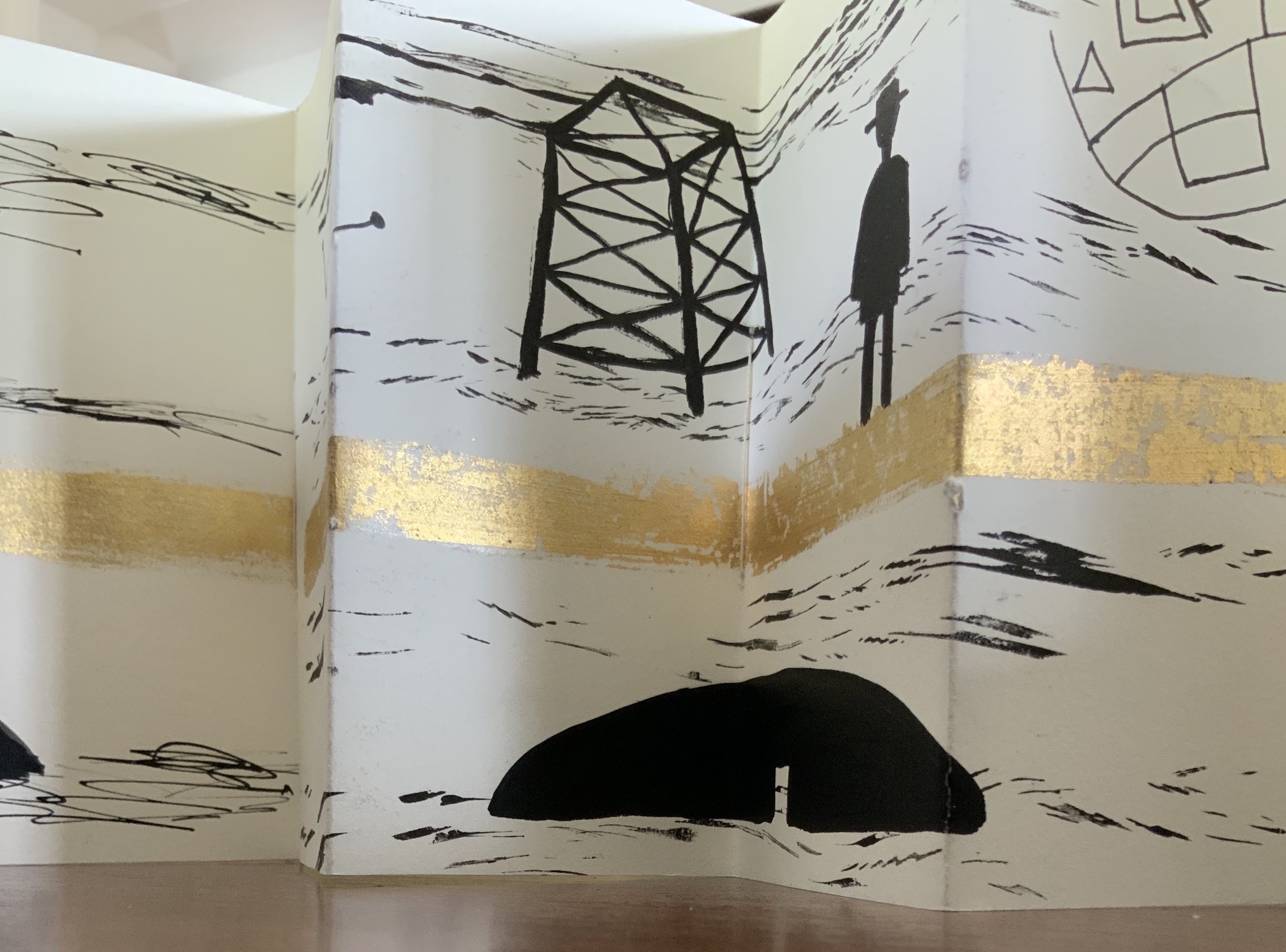
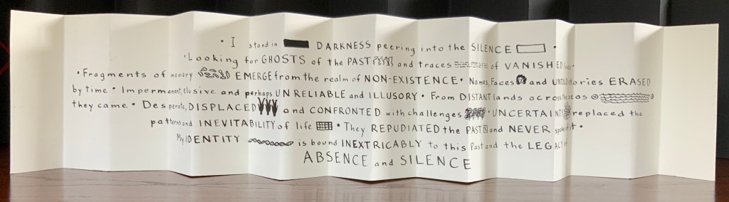
Binding of French faux leather. Multiple accordions in Fabriano 200gsm HP paper and Strathmore papers, pigmented ink, acrylic ink, printing ink, gold leaf, chinagraph pencil and image transfers. Closed: H780 x W50 x D150mm; Open: W750 mm. Unique edition. Acquired from the artist, 2 July 2020. Photos: Courtesy of the artist.
Artist’s description:
The Legacy of Absence and Silence refers to the present-day Australians whose forbears were immigrants to the continent in the nineteenth century. Many of those who came to Australia during that period made such an effort to assimilate that they have left no clues for their descendants to discover their origins. In fact some immigrants went to great lengths to eradicate their beginnings.In this work Malone has designed the structure of the book to reflect the effort of a search for meaning. The black foreground requires the viewer to struggle to peer inside the construction to glimpse details. Beyond the visual obstruction the white pages reveal snippets of information but never the full story.
Photos: Books On Books Collection.
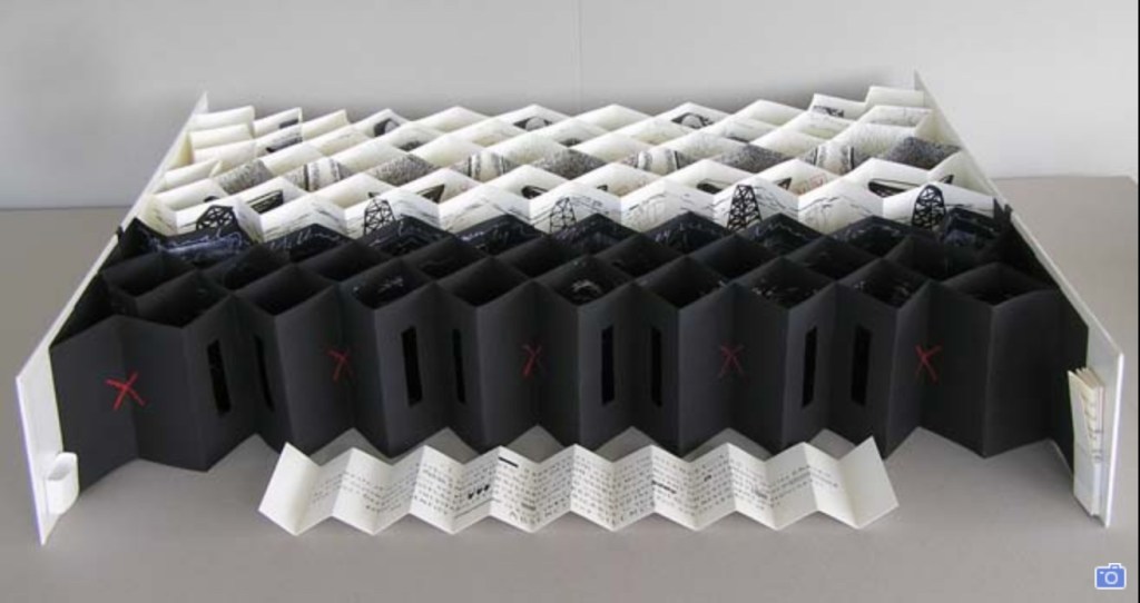
This is a work that demands display in-the-round on a table allowing viewers to lean far enough over to catch the details within the cells formed by the joined accordions, to circle it to see how emblems and signs emerge and disappear, and to move closer and step back to experience the shifting geometric patterns.
Exhibition:
Libris Awards, Artspace Mackay, Queensland, from 26 August – 16 October 2016.
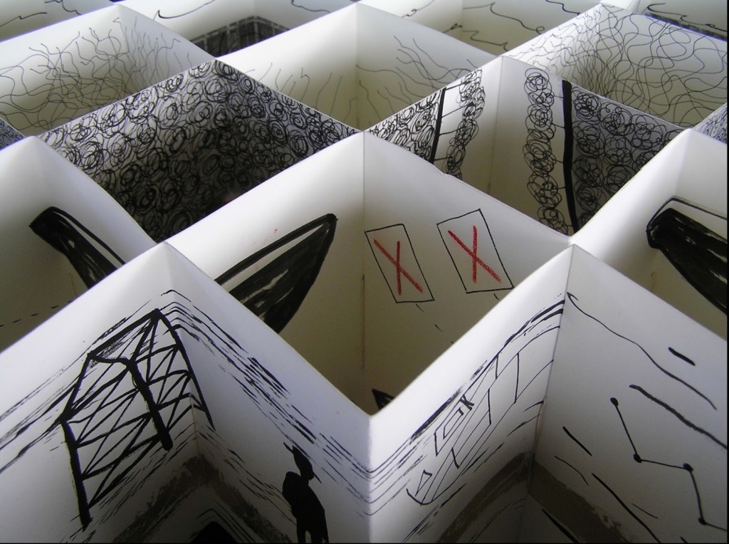
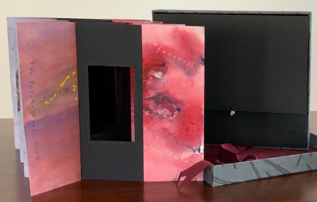
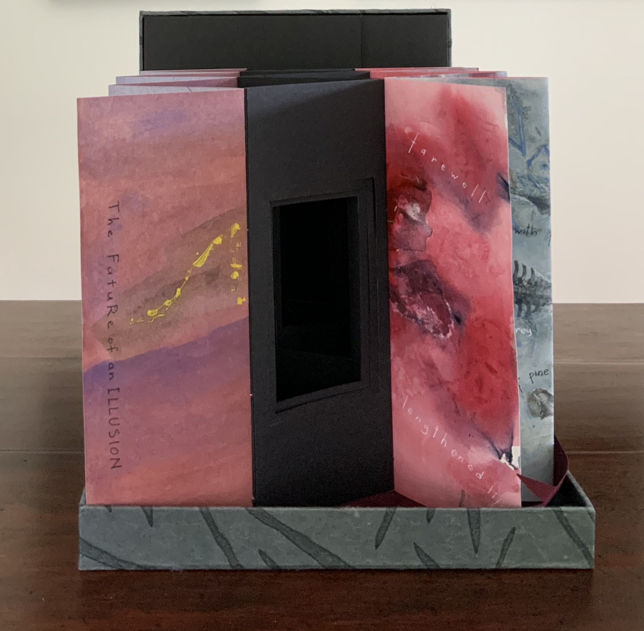
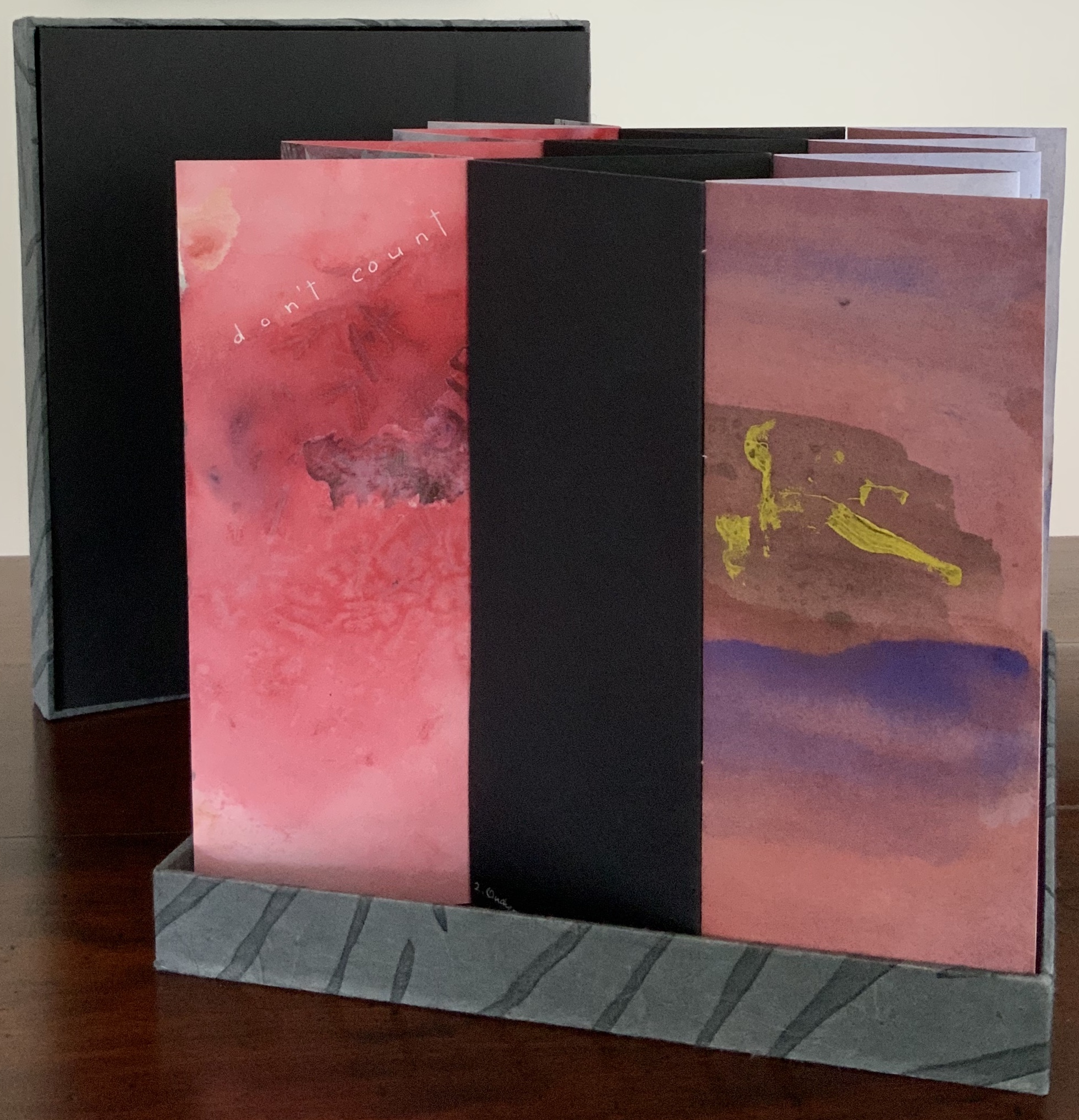
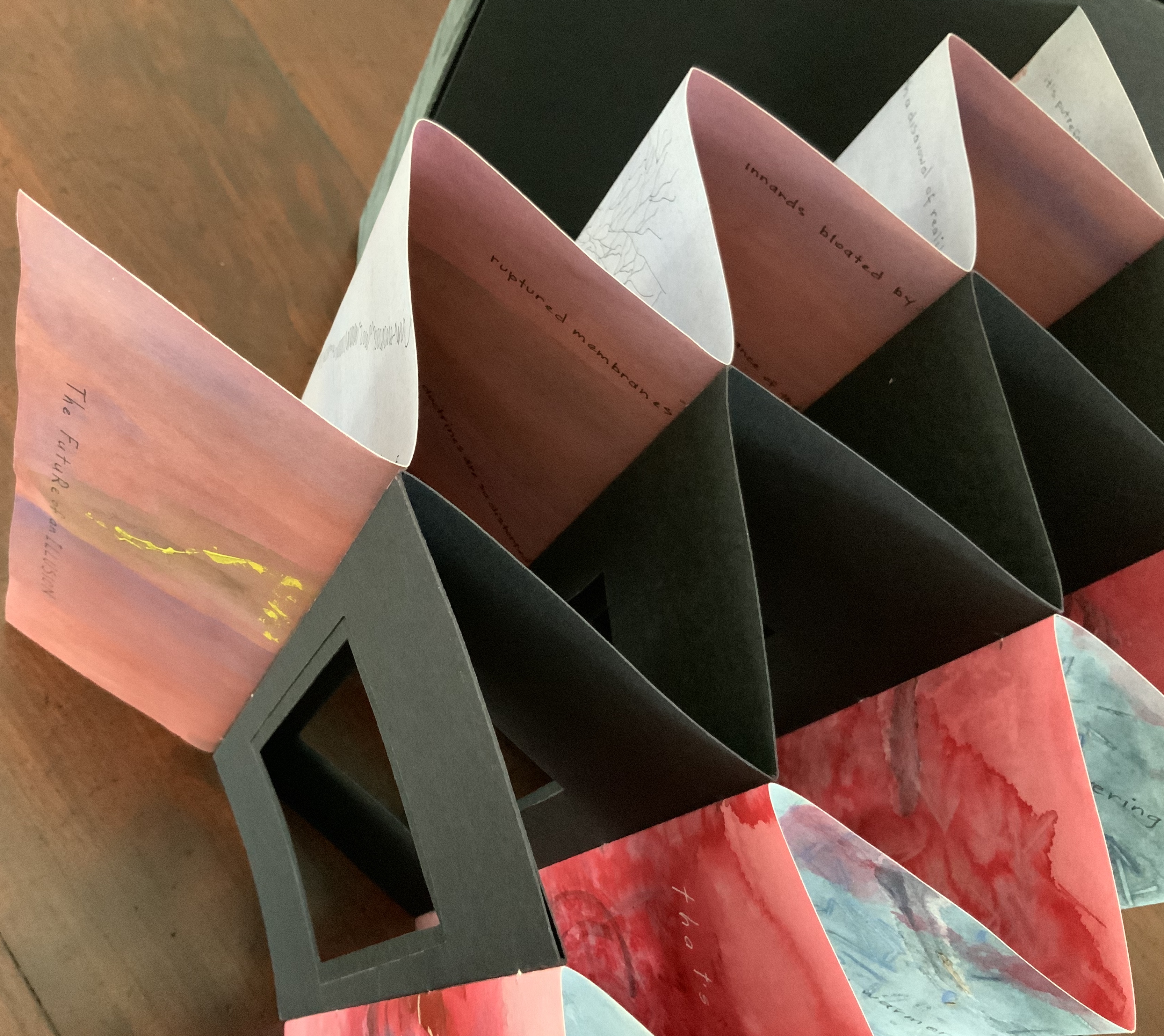
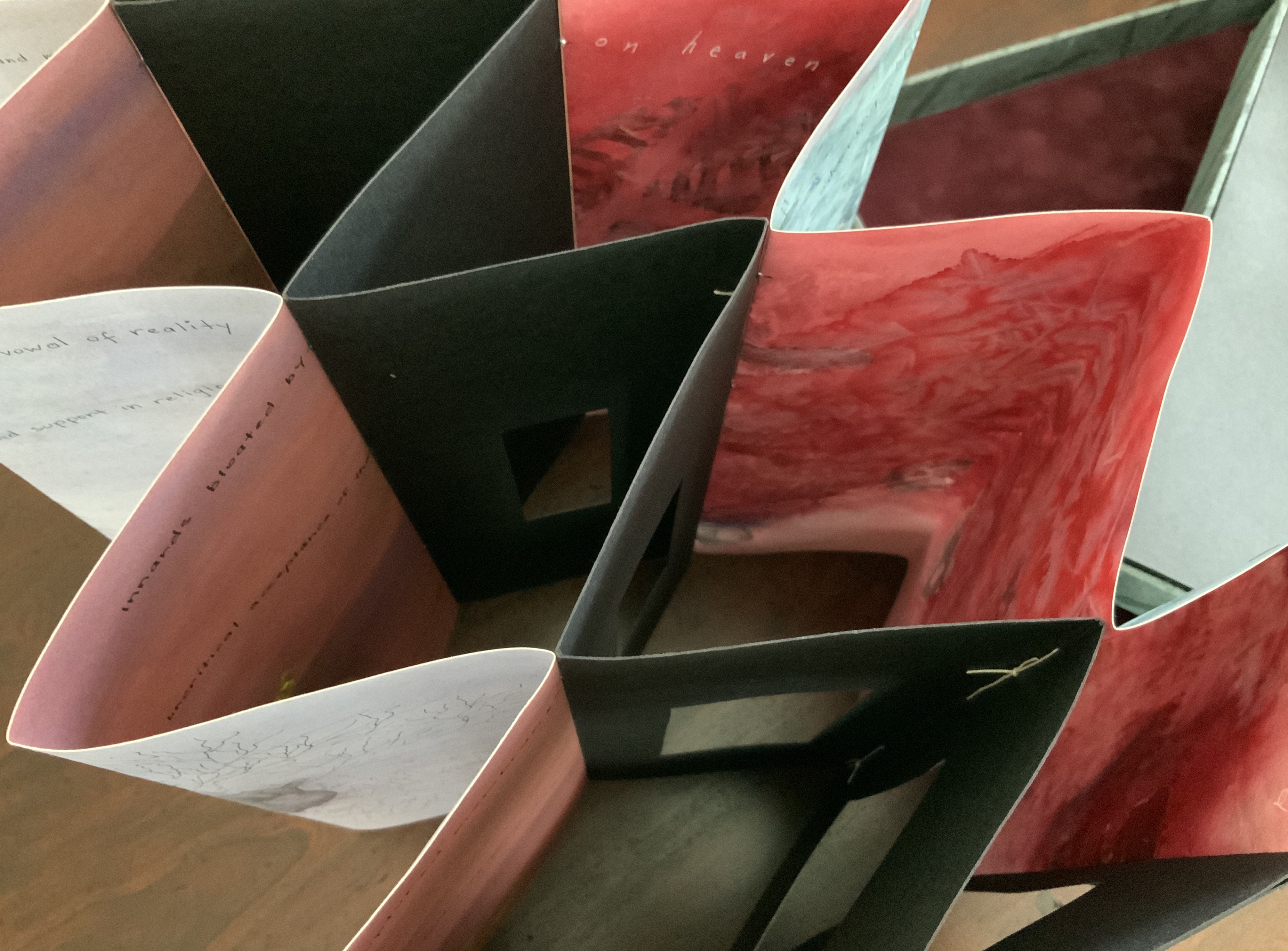
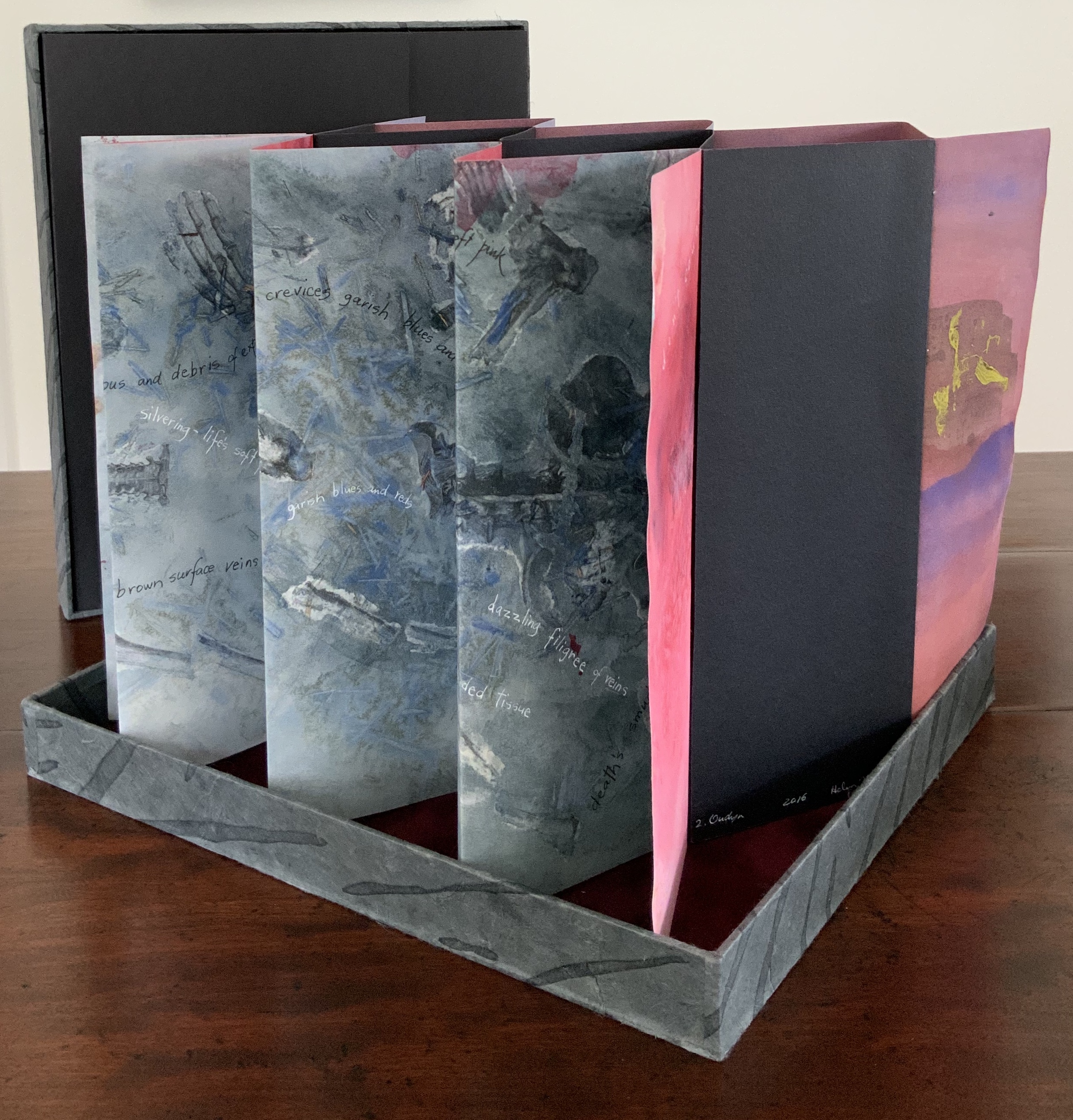
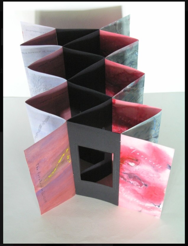
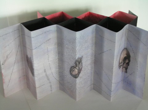
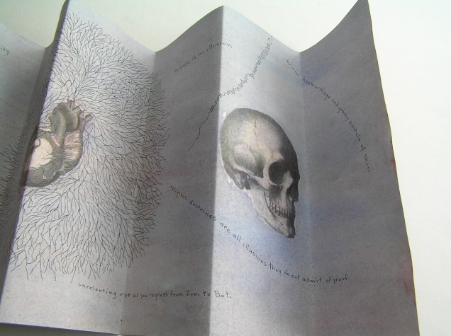
Sculptural tunnel book structure (three joined four-fold leporellos) enclosed in a folder and protective boxin a box,. Box made with Lamali handmade paper, suede paper (lining), silk ribbon and Somerset Black 280 gsm; Folder: Canson black 200gsm, skull button and waxed thread; Leporello: center leporello made of Canson black 200 gsm, adjoining leporellos made of Arches watercolour paper 185 gsm with acrylic, soluble carbon, gouache and transfer ink jet images. Box: H275 x W313 x D34 mm; Folder: H258 x W295 x D21 mm; Book: H250 x W290 x D16 mm closed, D770 mm. One of an unnumbered, signed edition of 4. Acquired from Helen Malone, 12 September 2017. Photo: Books On Books Collection.
Photos: Books On Books Collection.
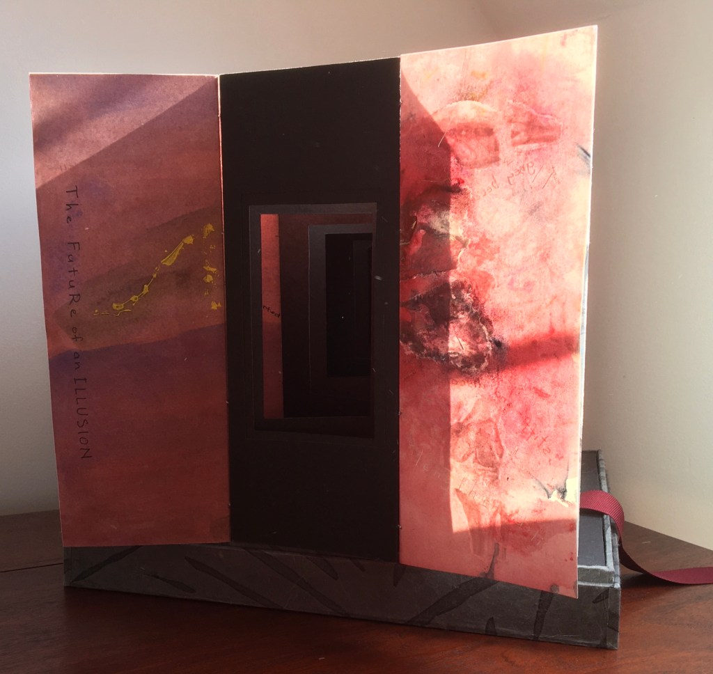
Like The Legacy of Absence and Silence, this work uses joined accordions, but builds on the cut-outs in the former to construct a tunnel book down the middle. The integration of structures here is further remarkable as a result of another collaboration between Malone and Jack Oudyn. Selected for the 2017 Manly Library Artists’ Book Award exhibition in New South Wales, Australia, The Future of an Illusion demonstrates an effective collaboration in a field of art densely populated with — almost defined by — collaborative efforts. One pair of artists to compare with Malone and Oudyn is Sonia Delaunay and Blaise Cendrars. Over a century ago and half a world away, they collaborated on La Prose du Transsibérien et de la Petite Jehanne de France, also in an accordion format modified perfectly to its subject with an aim to create a work in which color, image and words are experienced simultaneously. Malone writes that it “has always been very influential generally on my work” (correspondence with Malone, 24 September 2017).
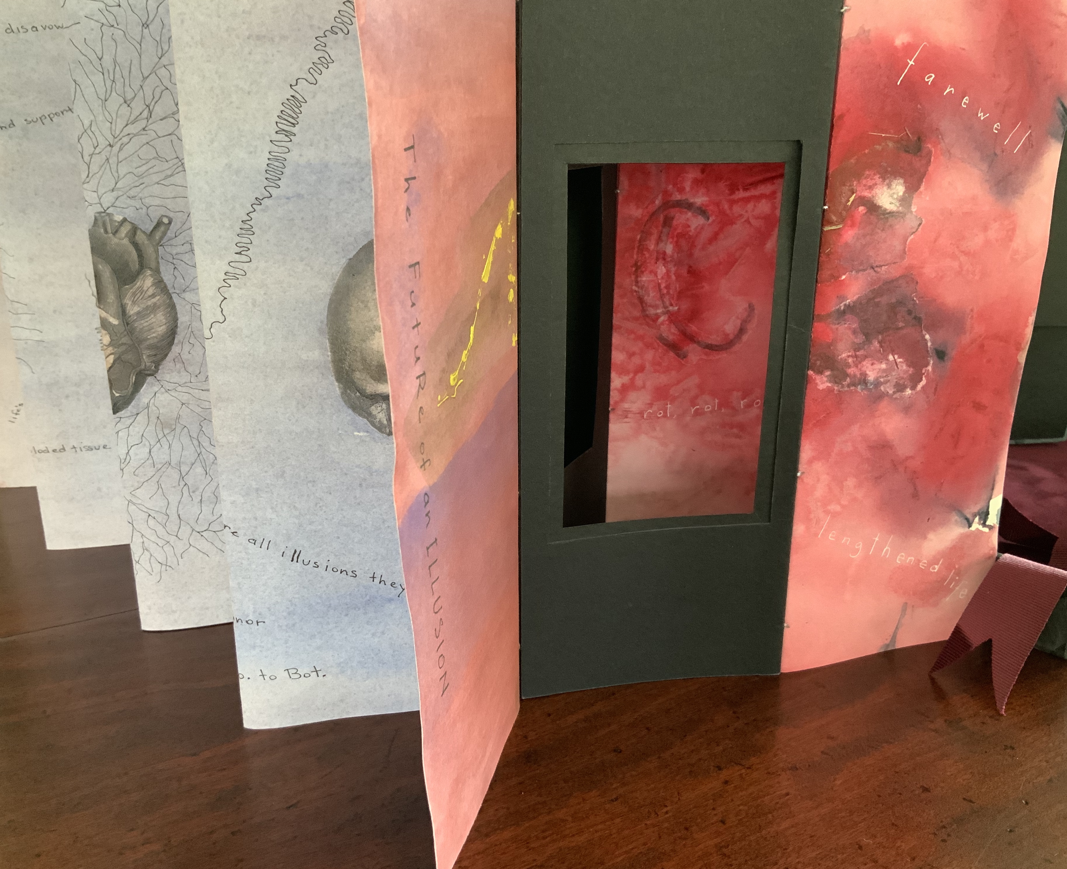
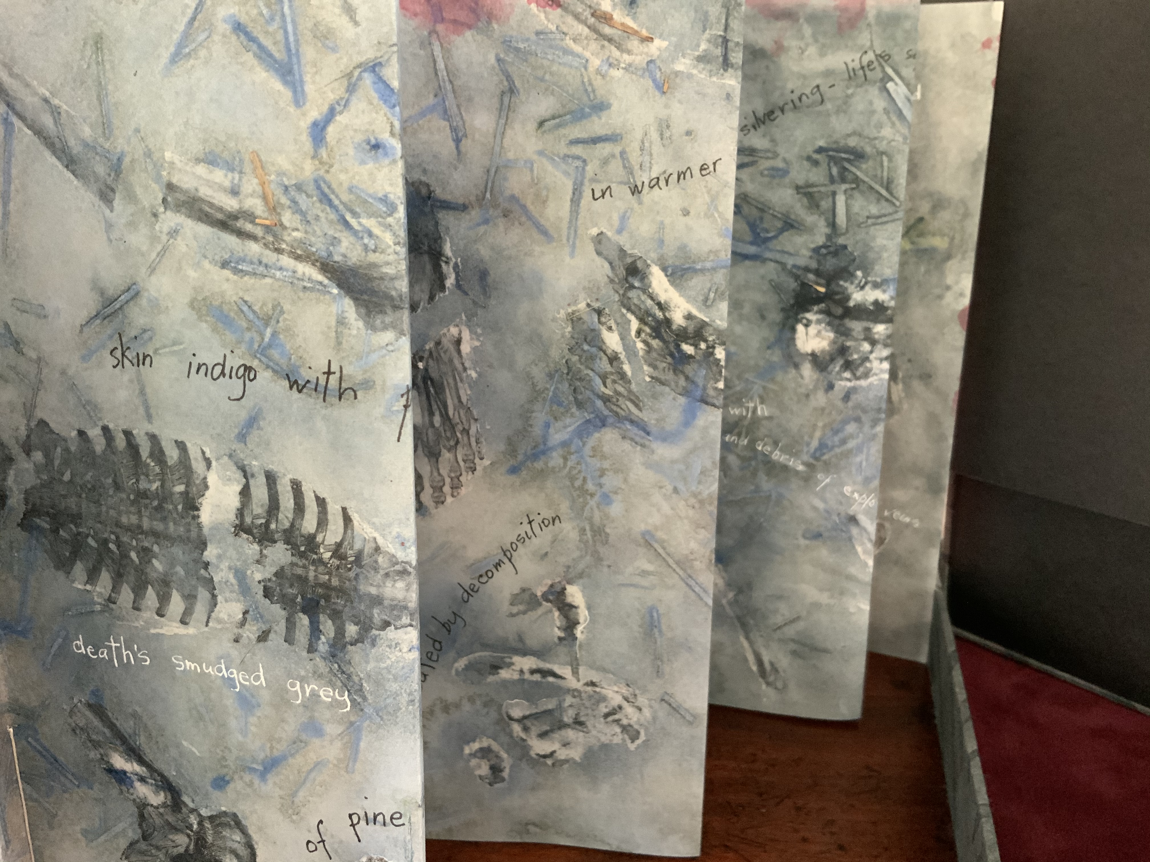
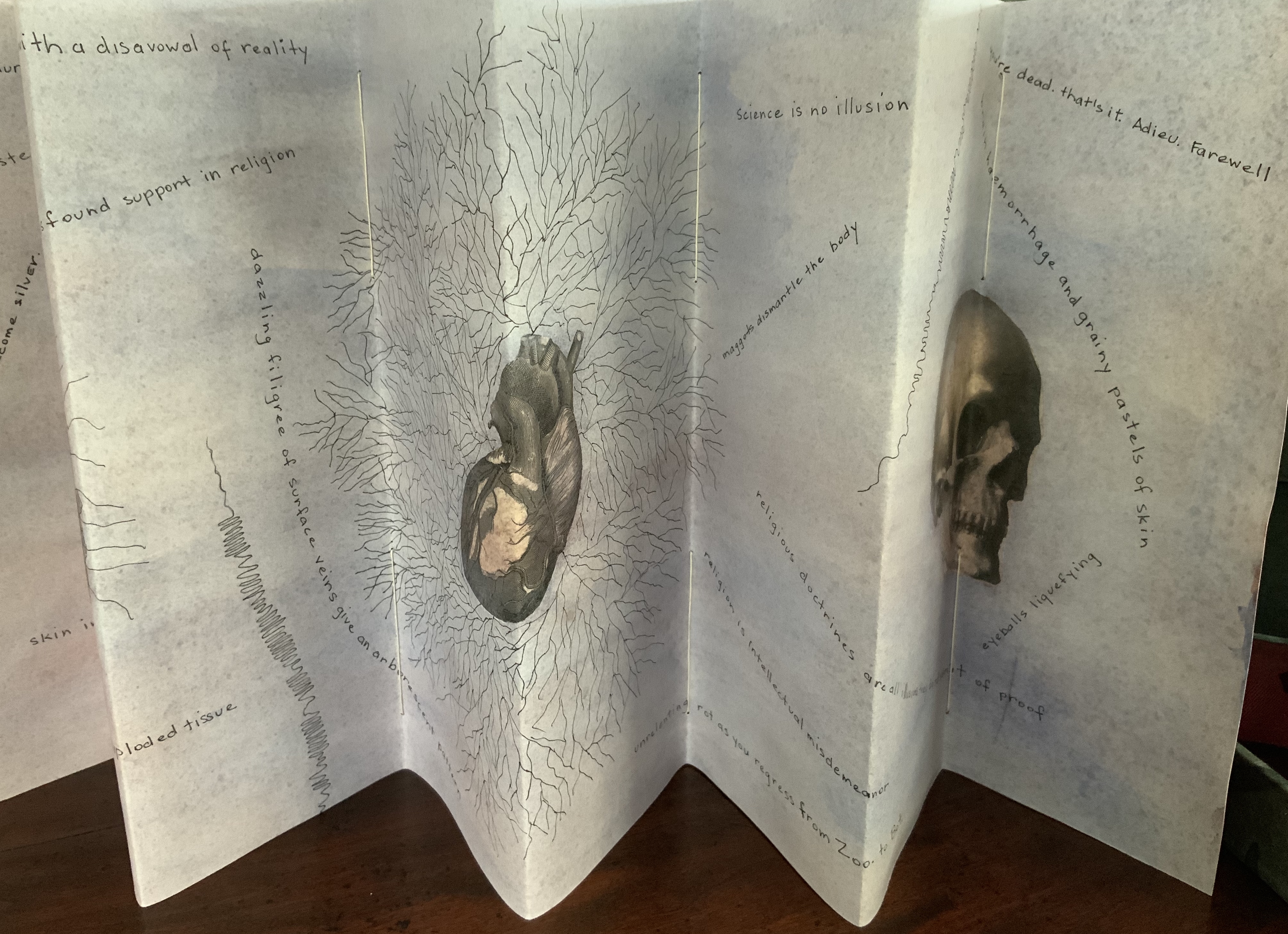
Rather than springing from an interaction over one poem, The Future of an Illusion springs from two imaginations struck by two literary works: Sigmund Freud’s eponymous book arguing against belief in an afterlife and Jim Crace’s novel Being Dead documenting the decomposition of a dead body left in nature. The choice of the two texts, the colors of putrescence, the void toward which the central tunnel leads, the coffin-like box in which the work is stored, locked with a button skull — all create a simultaneous tension of several emotions — fear, humor, sorrow, hope, despair, revulsion and aesthetic pleasure.
Photo: Books On Books Collection.
Exhibitions:
Between the Sheets, Central Gallery, Perth , WA, 18 March – 8 April 2017.
Second venue for Between the Sheets, Australian Galleries, Collingwood, Melbourne, Vic, 13 June – 2 July 2017.
Manly Library Artists Book Award, The Creative Space, North Curl Curl, NSW, 30 March – 2 April 2017.
Art on Show Awards, Artspace Mackay in association with Mackay Show Association, 11-22 June 2017.
6th Artists Books Fair, Grahame Galleries in association with Griffith University, Brisbane, 7 – 9 July 2017.
Collections:
Artists (1/4 & 3/4), State Library of Queensland Artists Book Collection, Brisbane (4/4).
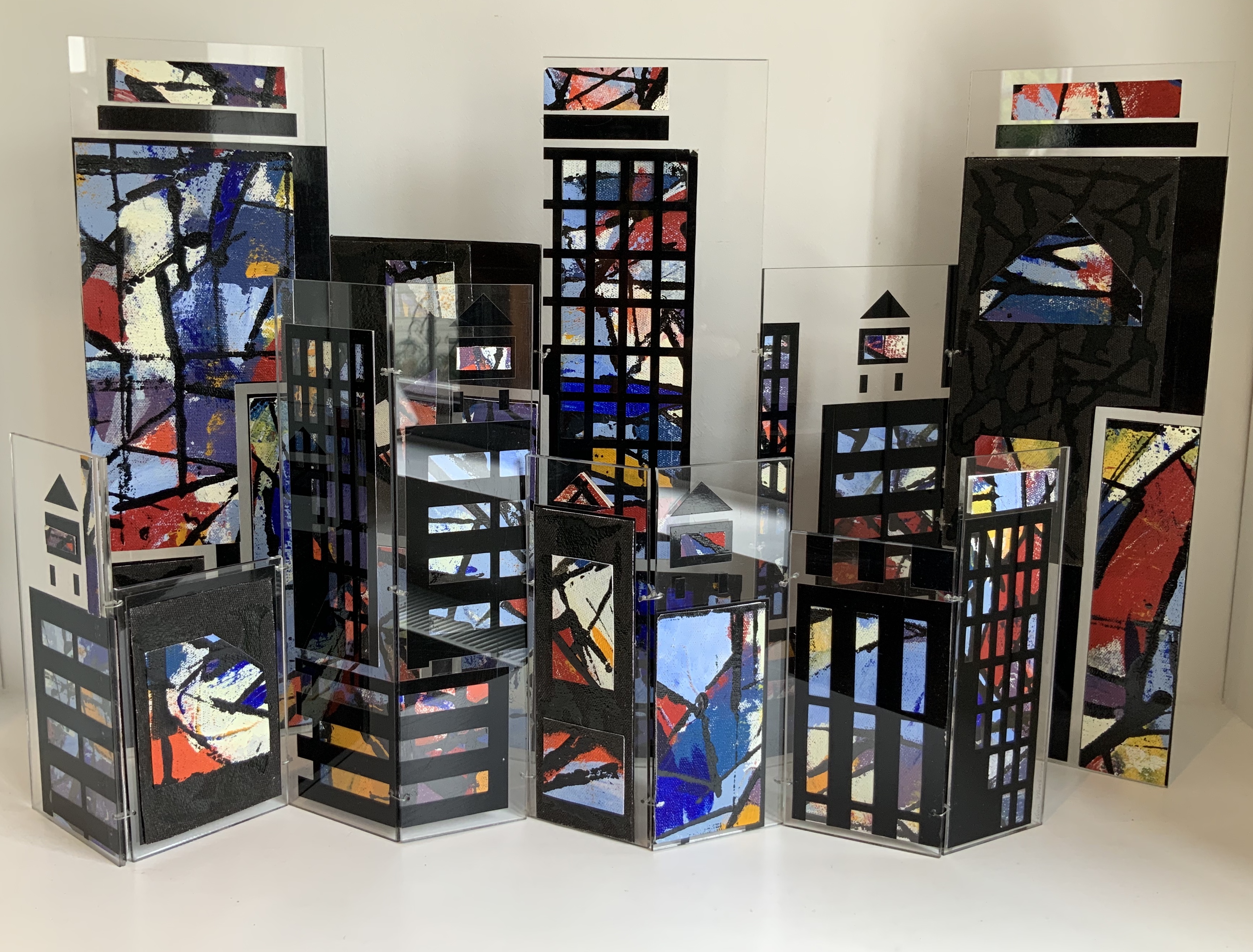
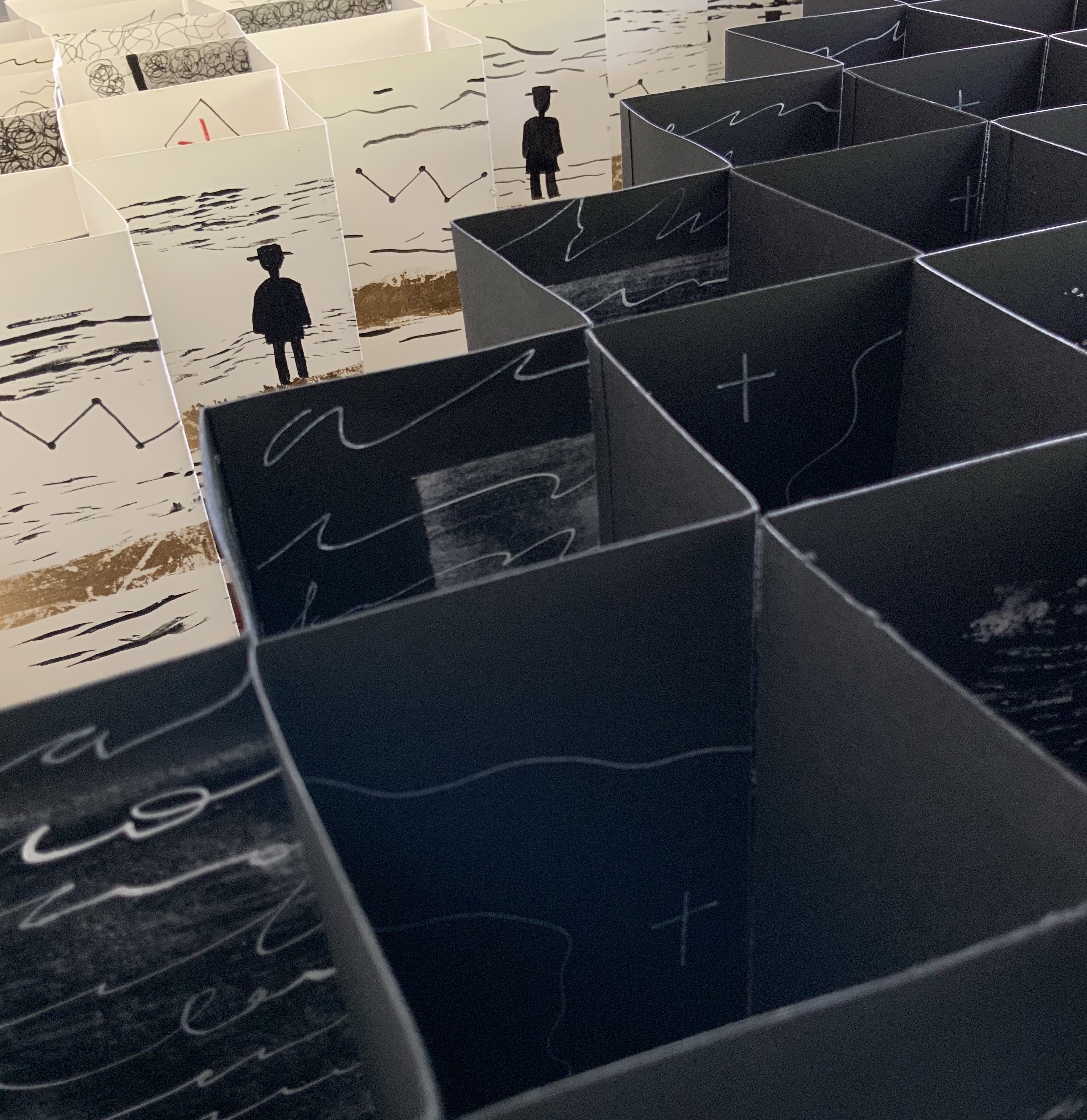
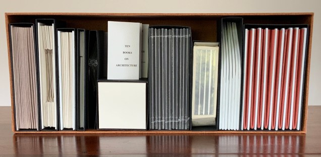
Open-sided box containing ten individual adapted book structures. Closed: H175 x W440 x D110 mm; Open: H500 x W600 mm. Version 4. Acquired from the artist, 24 November 2017. Photo: Books On Books Collection.
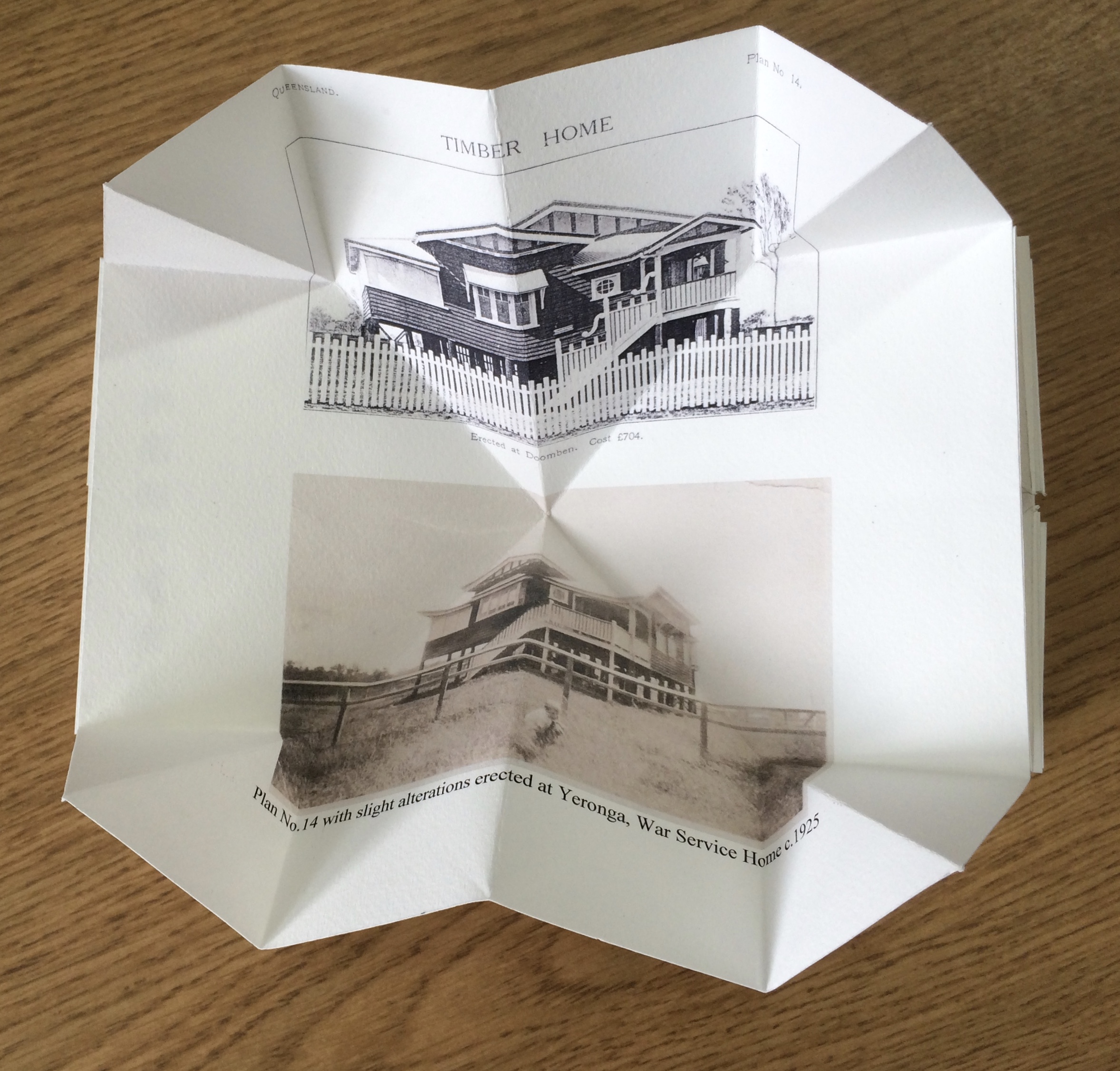
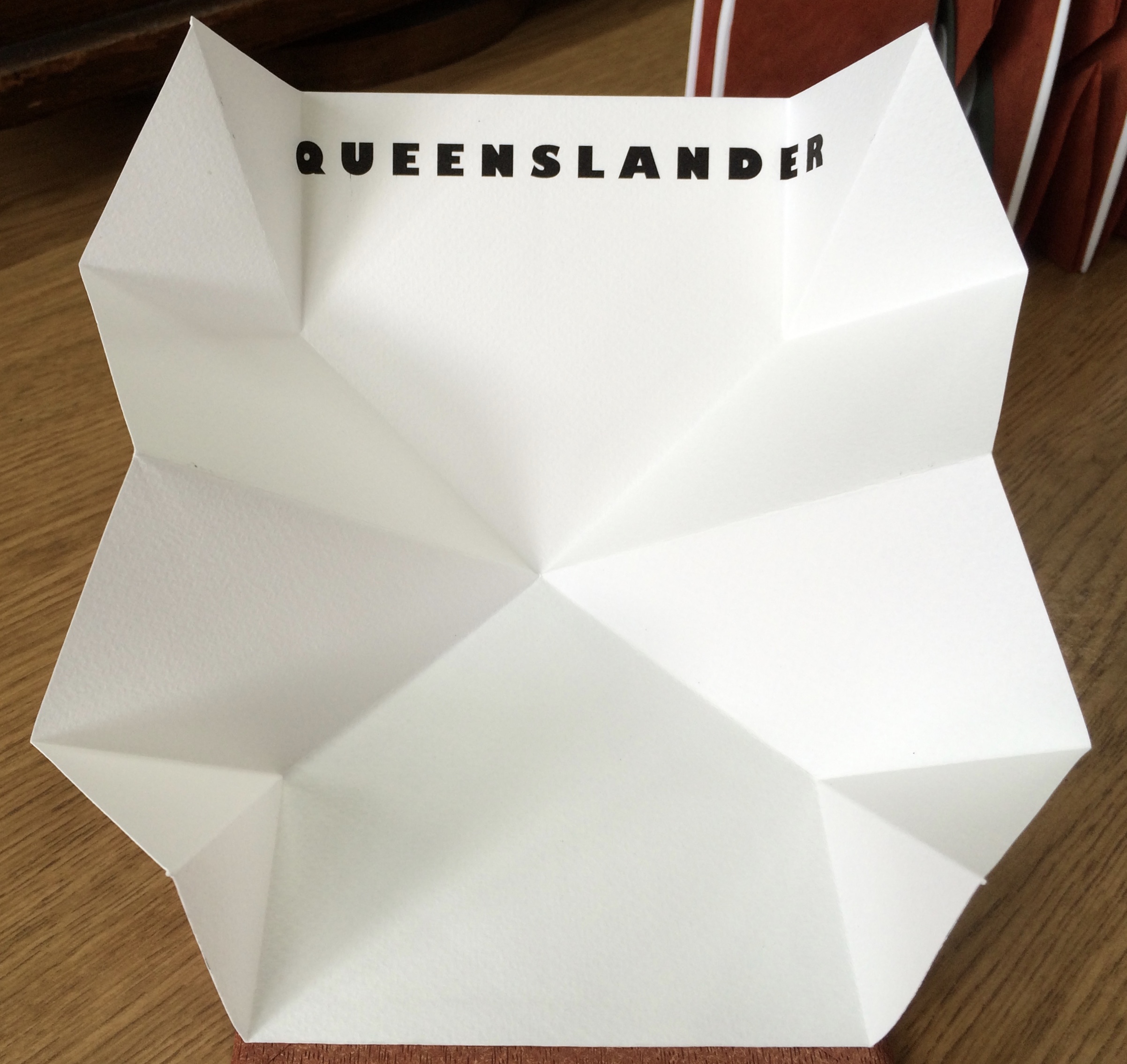
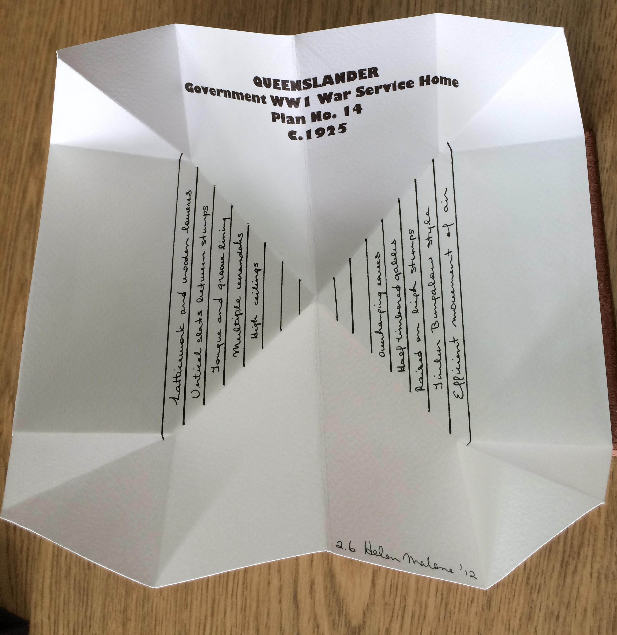
Inspired by De Architettura by Vitruvius and De Re Aedificatoria by Leon Battista Alberti, Malone created her first version of this work in 2006. Three others followed: in 2012, for the Pratt Institute; in 2013, for the State Library of Queensland; and in 2017, for this collection. In the 2012 version, the sixth book — Queenslander — differentiates that version from the others. The 2017 version is differentiated by its tenth book — Zaha Hahid.
These differentiators signal the abundant variety of structures within each version. Their unerring “rightness” for the subject of each “volume” astounds.
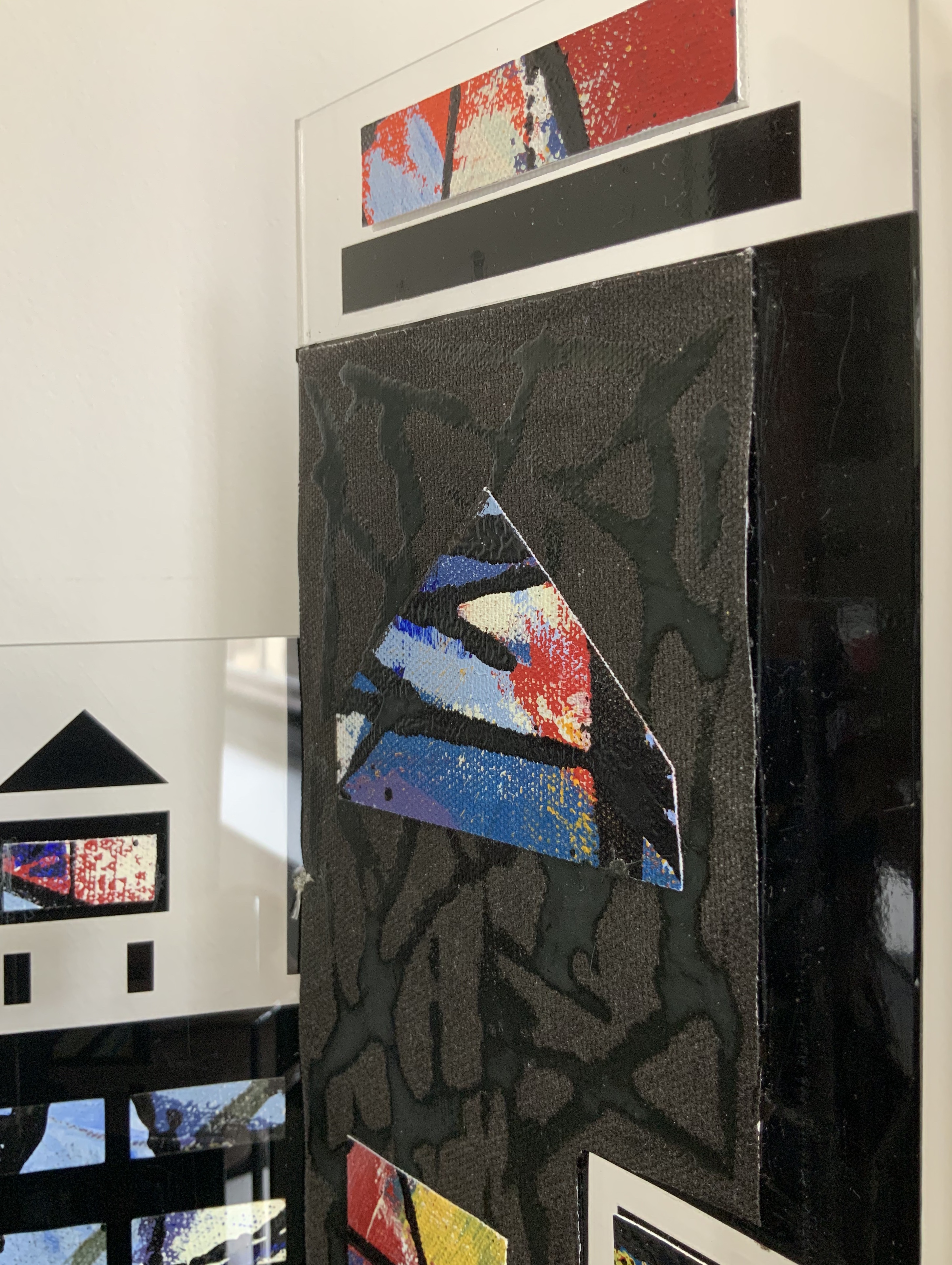
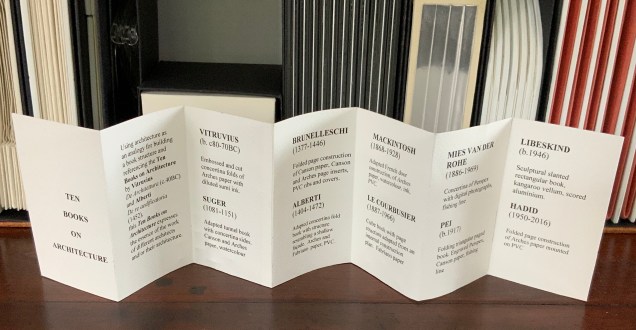
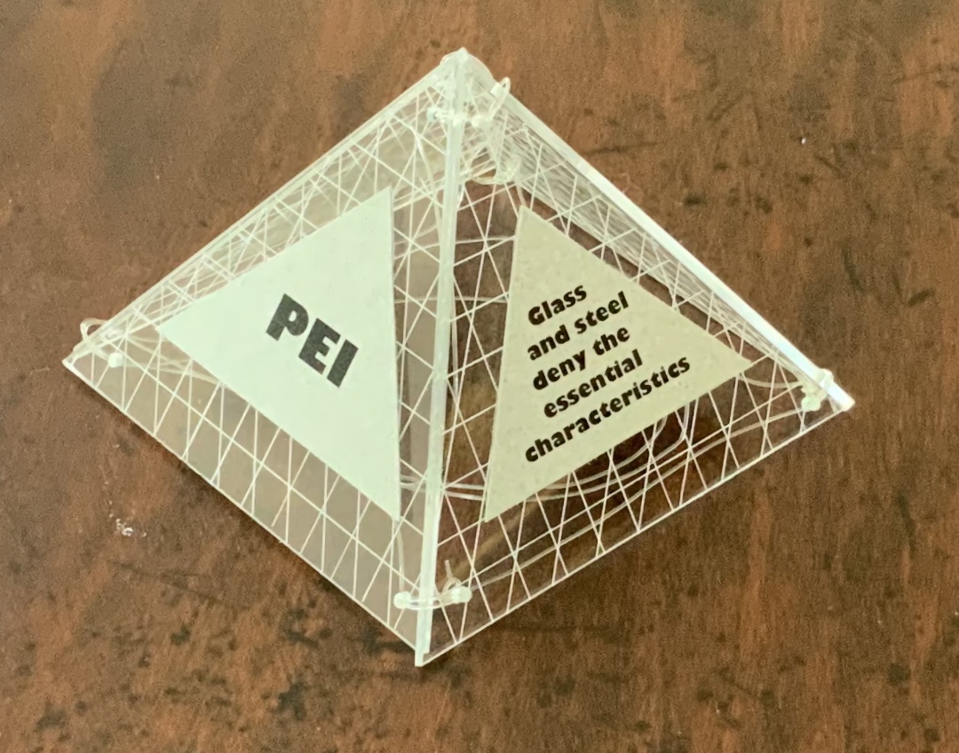
Book One — Vitruvius — consists of embossed and cut concertina folds of Arches paper with diluted sumi ink; when displayed, the line of columns suggests a Roman temple. Book Two — Suger — celebrates the French patron of Gothic architecture with an adapted tunnel book with cut concertina sides in Canson and Arches paper, ink and watercolor; when displayed, the structure suggests the stained glass windows of St. Denis. Book Three — Brunelleschi — is a folded page construction of Canson paper with page inserts of Canson and Arches paper, PVC ribs and covers; when displayed, it references the dome of the Cathedral of Santa Maria del Fiore in Florence, the internal colors of the cathedral and Brunelleschi’s credited invention of linear perspective. Book Four — Alberti — is a concertina fold book in Fabriano and Arches paper with PVC covers; its gutters and collaged pages make a structure resembling shallow facades on which several of Alberti’s statements elaborating Vitruvian principles are printed. Book Five — Mackintosh — adapts a French door construction in Arches paper, watercolor, ink and PVC to celebrate the Scottish architect and designer; when displayed, it echoes his design and its Japanese influences. Book Six — Le Corbusier — is a cube book of Fabriano paper and resembles a white concrete box; its page structure is adapted from Corbu’s internal construction plans with mezzanine floors. Book Seven — Mies van der Rohe — consists of a concertina of double Perspex pages linked with fishing line and containing digital photo images of Chicago taken by the artist; it can be manipulated to form various displays, with multiplying reflections suggesting the spread of the architect’s influence on twentieth-century cityscapes. Book Eight — Pei — is a folding triangular paged book made of Perspex and Canson paper, linked with fishing line; when displayed, the pyramid pays homage to Pei’s dome over the entrance to the Louvre. Book Nine — Libeskind — echoes the architect’s intentionally disorienting Jewish museum in Berlin; a slanted rectangular box book, made of kangaroo vellum and scored aluminum, presents its text in a way intentionally difficult to access and read. Book Ten — Zaha Hadid — consists of organic shapes and patterns on a folded pages construction of Arches paper mounted on PVC; when displayed, the book takes on a shape that echoes that of Hadid’s architectural designs.
Additional commentary and images for Ten Books of Architecture (2017) can be found here.
Exhibitions and collections:
2006 version was exhibited in Books.06, Ten and Beyond, Noosa Regional Gallery, 22 September – 22 October 2006 and was purchased from this exhibition by a private collector.
2012 version commissioned by The Pratt Institute, New York.The Collections on View at the Brooklyn Campus of the Pratt Institute and online, May – August 2013. Image published in 500 Handmade Books, Lark Publishers USA, September 2013.
2013 version commissioned by the State Library of Queensland, Brisbane.
2017 version commissioned by Books On Books Collection.
Bruce, Joan. 20 March 2023. “‘The River City’ by Helen Malone“. Queensland Memory. John Oxley Library, State Library of Queensland. Accessed 24 March 2023.
Cascio, Davide. Travel Architecture (2006). Compare with The Legacy of Absence and Silence.
Chen, Julie. 2013. 500 Handmade Books. Volume 2. New York: Lark. P. 144 (Ten Books).
Salamony, Sandra, and Peter and Donna Thomas. 2012. 1,000 Artists’ Books : Exploring the Book as Art. Minneapolis: Quarto Publishing Group USA. Pp. 95 (Tsunami), 170 (Shattered in the Shaky City).
Selected for the 2017 Manly Library Artists’ Book Award exhibition in New South Wales, Australia, The Future of an Illusion by Helen Malone and Jack Oudyn demonstrates an effective collaboration in a field of art densely populated with — almost defined by — collaborative efforts:
The Future of an Illusion (2017) Helen Malone and Jack Oudyn Sculptural tunnel book structure (three joined four-fold leporellos) enclosed in a folder and protective boxin a box,. Box made with Lamali handmade paper, suede paper (lining) and Somerset Black 280 gsm; Folder: Canson black 200gsm, skull button and waxed thread; Leporellos: center leporello made of Canson black 200 gsm, linen thread adjoining two leporellos made of Arches watercolour paper 185 gsm with acrylic, soluble carbon, gouache and transfer ink jet images. Box: H275 x W313 x D34 mm; Folder: H258 x W295 x D21 mm; Book: H250 x W290 x D16 mm closed, D410 mm open. One of an unnumbered, signed edition of 4. Acquired from Helen Malone, 12 September 2017.
Edouard Manet and Stéphane Mallarmé; Bertrand Dorny and Michel Butor; Dorny and Michel Deguy; Barbara Fahrner and Kurt Schwitters; Ron King and Roy Fisher; Telfer Stokes and Helen Douglas; the Art + Language Group (Terry Atkinson, David Bainbridge, Michael Baldwin, Ian Burn, Harold Hurrell, Joseph Kosuth, Christine Kozlov and Mel Ramsden); Tom Rollins + K.O.S.; Julie Chen and Clifton Meador; and Chen and Barbara Tetenbaum.
That list is by no means comprehensive nor representative – chronologically or categorically — but it flags the strength of the tradition. One pair that is particularly apropos for Malone and Oudyn is Sonia Delaunay and Blaise Cendrars. Over a century ago and half a world away, they collaborated on La Prose du Transsibérien et de la Petite Jehanne de France, also in the leporello, accordion or concertina format. Malone writes that it “has always been very influential generally on my work.”
Cendrars as poet and publisher and Delaunay as painter were interested in achieving what they called simultaneisme, or a “simultaneous book.” They wanted to create a form of art in which painting and text could be united in expression. Delaunay painted the left column of color and abstract shapes guides us through the text, which is set in various typefaces, allowing for movement as the reader mimics the journey across the page as described in the train ride in the poem. Claire Kelly, Melville Books
The Future of an Illusion springs from two imaginations struck by two literary works: Sigmund Freud’s eponymous book on belief in an afterlife and Jim Crace’s novel Being Dead.
It delivers an emotional simultaneity that echoes the different kind of simultaneity Sonia Delaunay and Blaise Cendrars achieved. Malone and Oudyn have the advantage of their subject — death, decay and the afterlife — that provokes simultaneously conflicting emotions and states of mind. Fear, humor, sorrow, hope, despair, etc.
The choices of two texts, the double leporello and techniques — and the way they are applied — play with that emotional simultaneity beautifully. The use of Crace’s text (and the “inverse ekphrastic” influence of the whole novel, which documents the decomposition of a dead body left in nature) adds to the work’s physicality. The choice of title from Freud’s book centers the artwork’s perspective on death — the void toward which the central tunnel leads.
The Future of an Illusion appeared in exhibition at Grahame Galleries in Paddington, Brisbane, and a copy resides in the collection at the State Library of Queensland.