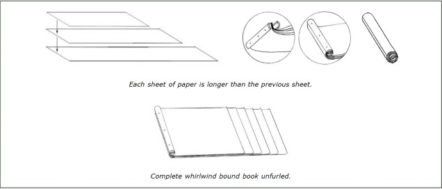
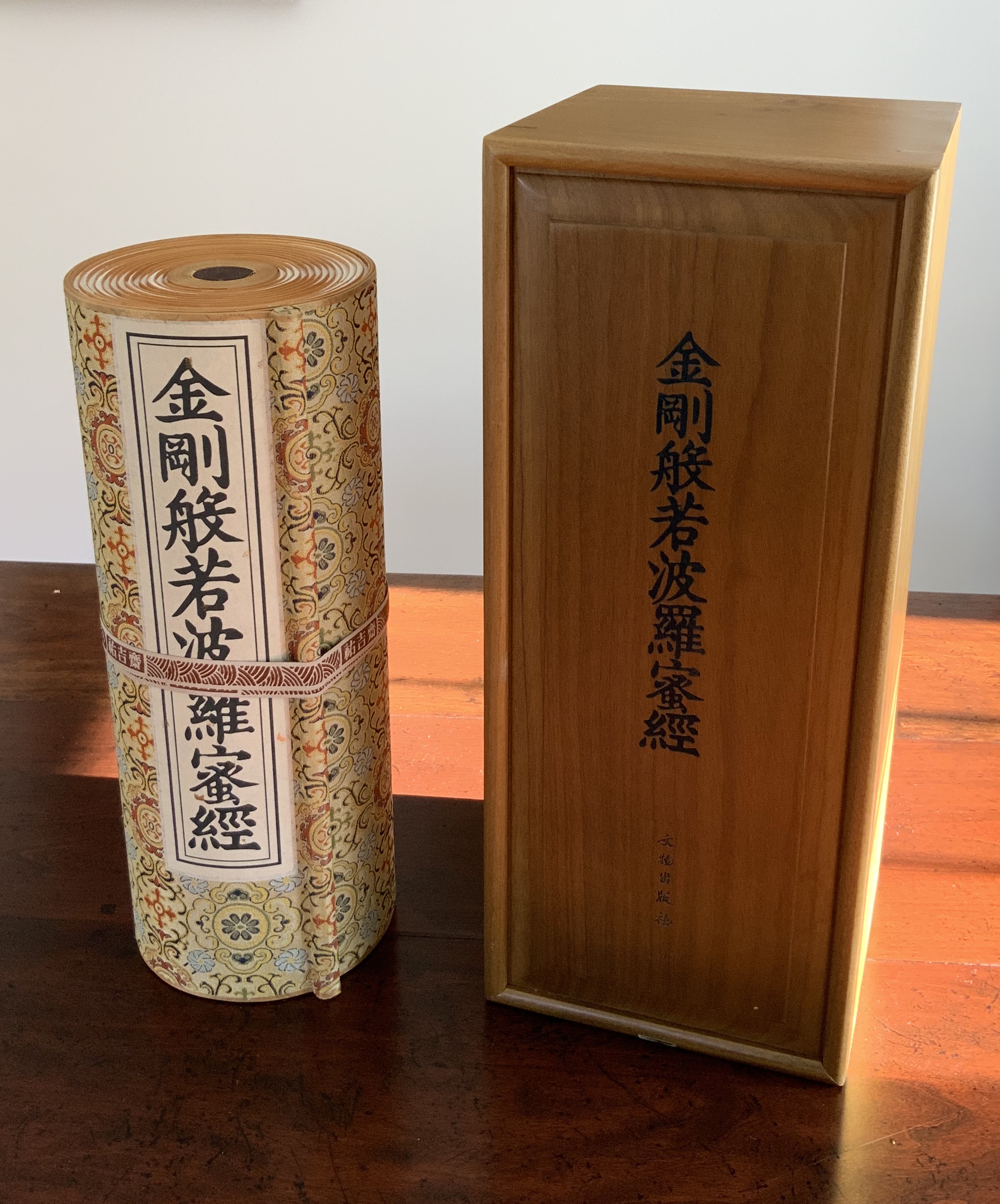
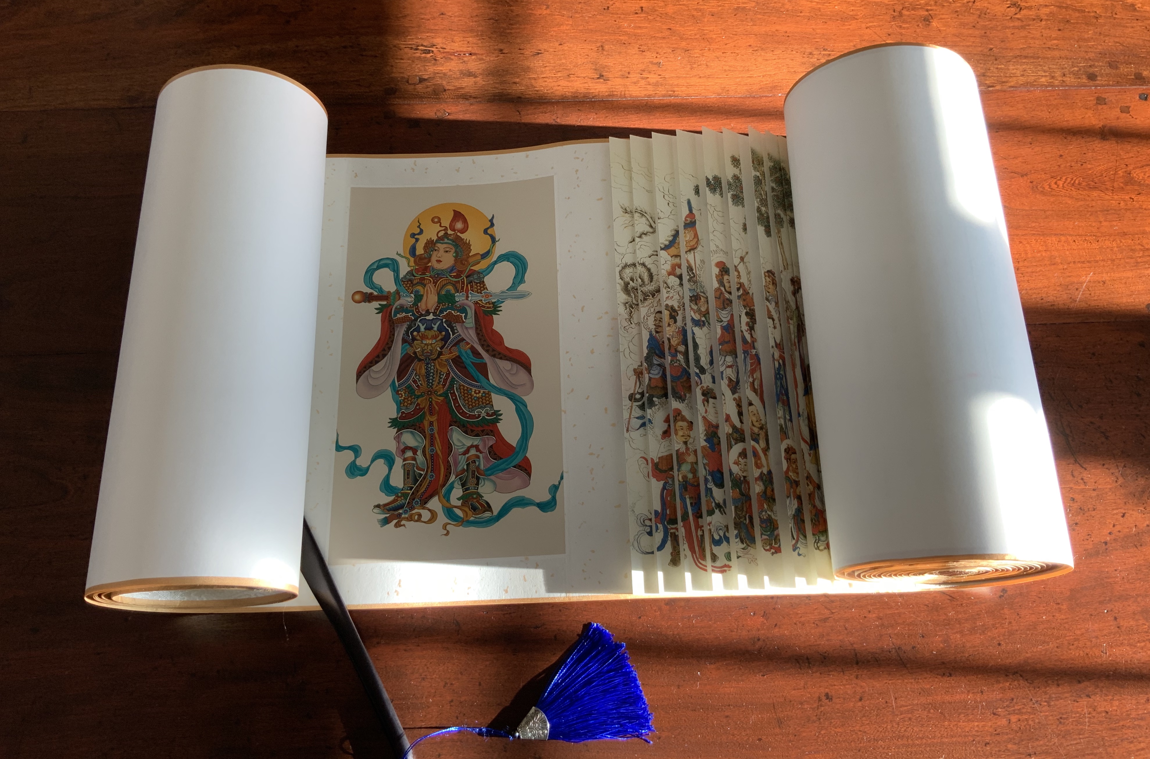
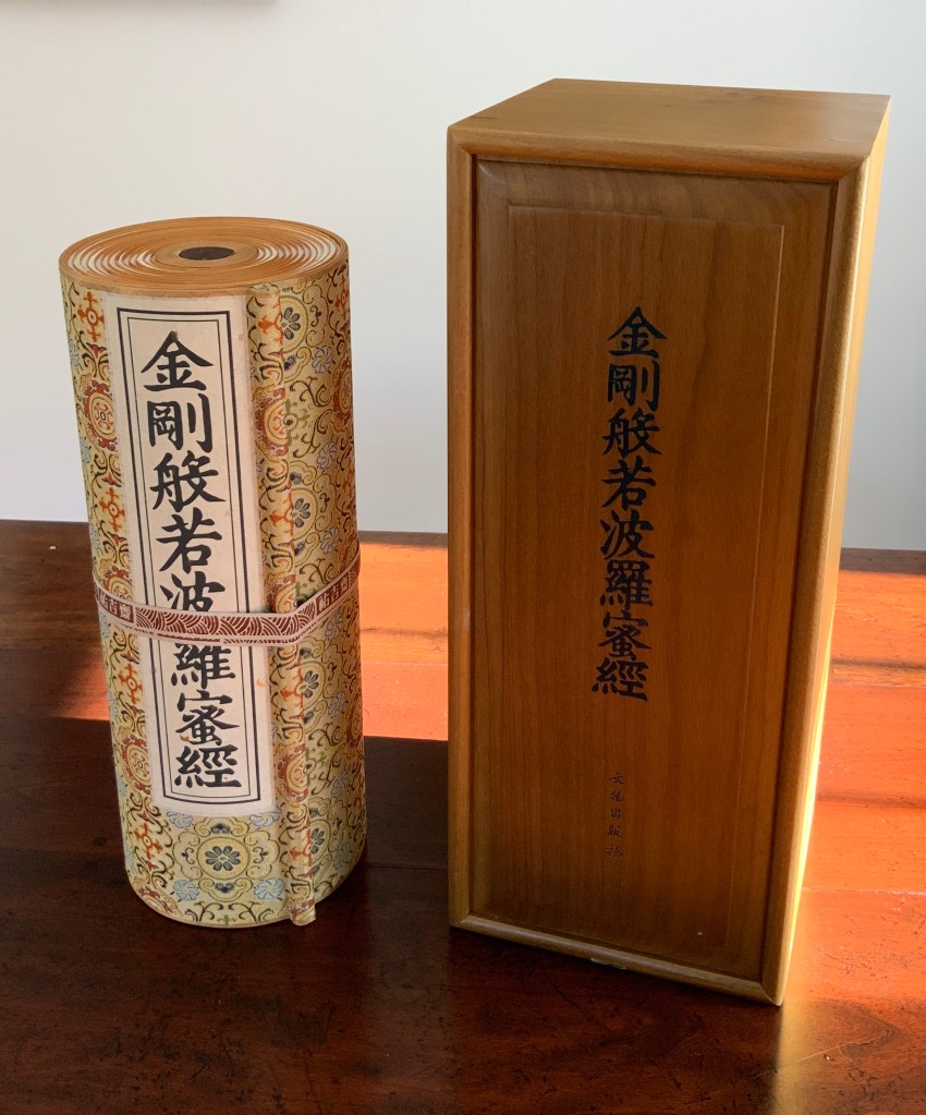
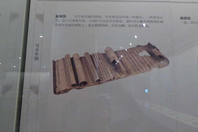
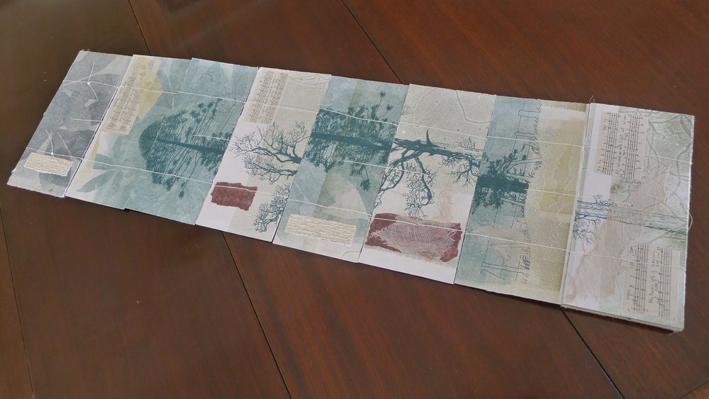
Diamond Sutra in 32 zhuan (seal) fonts (2017) Zhang Xiaodong Scroll in dragon scale binding. 152 x 382 x 160 mm. Edition of 300, of which this #197. Acquired from Sin Sin Fine Arts (Hong Kong), 31 October 2019. Photos: Books On Books Collection.
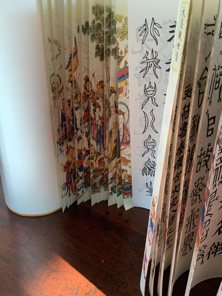
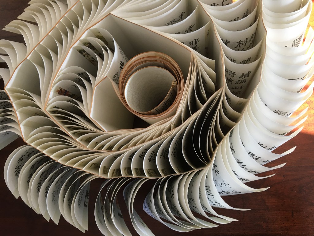
In 1900, in China’s Dunhuang province, the Diamond Sutra (868 CE), the world’s earliest complete and dated printed book, was discovered in a cave along with 40,000 scrolls. One of those other scrolls — Or.8210/S.6349 — was possibly just as important for the book arts as the Diamond Sutra was for the history of printing. Like the Diamond Sutra, Or.8210/S.6349 resides in the British Library and is “the only known example of whirlwind binding in the Stein collection of the British Library” (Chinnery). The structure is also known as dragon scale binding, although distinctions between the two have been debated (Song). It came into use in the late Tang dynasty (618-907 CE) then fell away in the face of the easier to handle butterfly and wrapped-back bindings. Besides Or.8210/S.6349, there are few surviving examples of original whirlwind or dragon scale bindings.
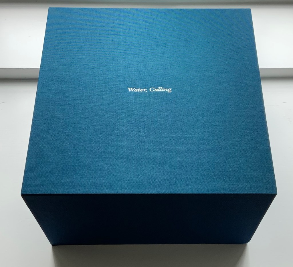
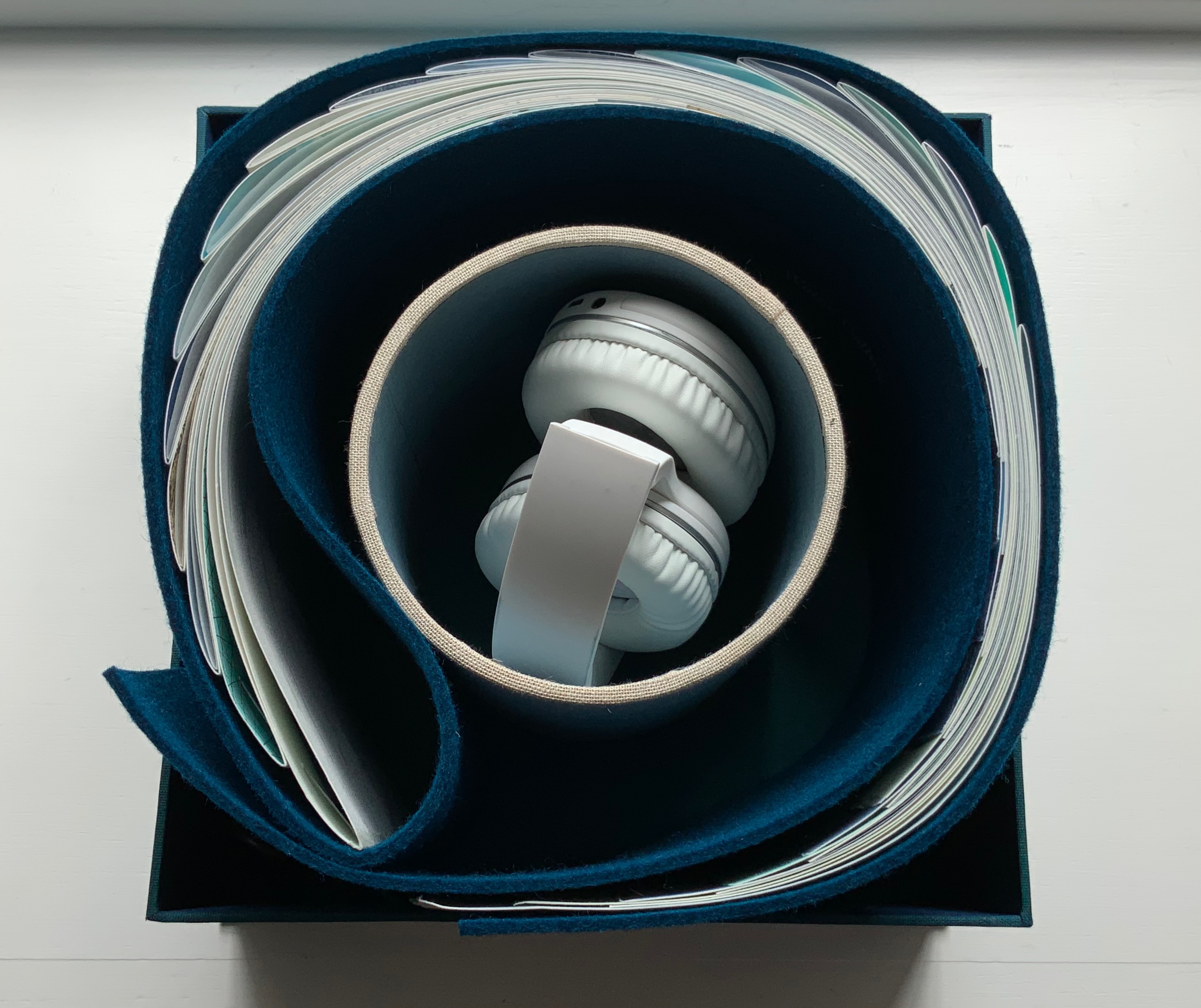
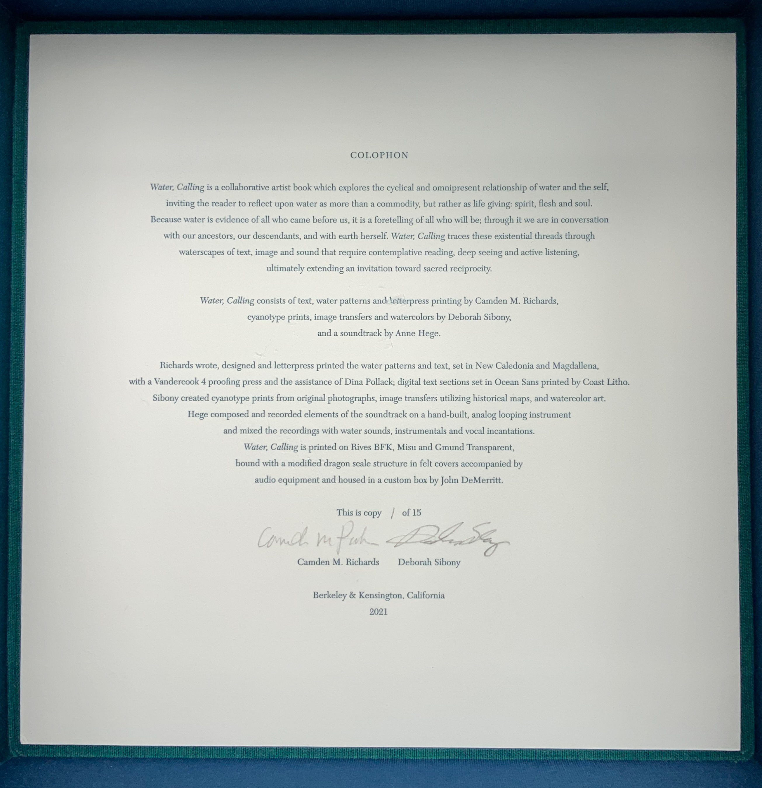
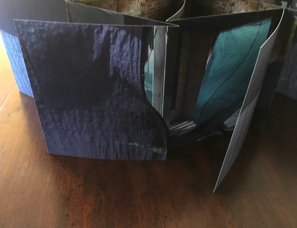
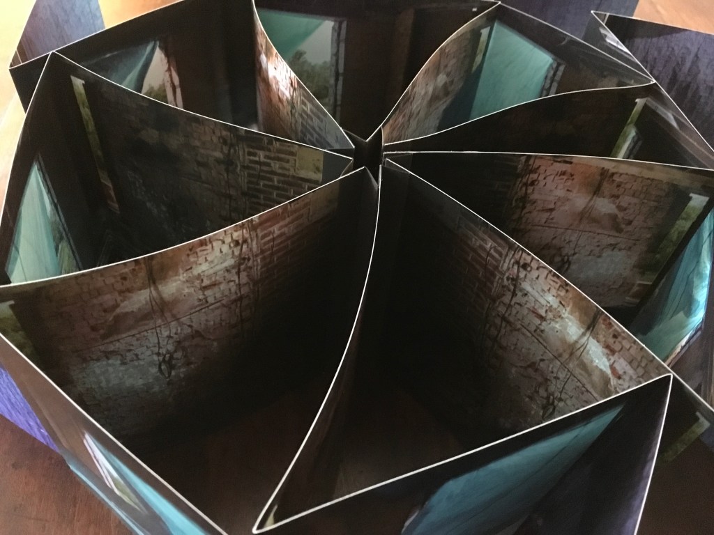
Water, Calling (2021) Camden Richards & Deborah Sibony Felt-covered, modified dragon-scale bound artists’ book, accompanied by audio equipment in custom box. Box: 262 x 262 x D170 mm. Book: H155 x W775 mm (closed). 110 pages. Edition of 15, of which this is #1. Acquired from the artists, 5 October 2022. Photos: Books On Books Collection. Displayed with artists’ permission.
Colophon “Water, Calling is a collaborative artist book which explores the cyclical and omnipresent relationship of water and the self, inviting the reader to reflect upon water as more than a commodity, but rather as life giving: spirit, flesh and soul. Because water is evidence of all who came before us, it is a foretelling of all who will be; through it we are in conversation with our ancestors, our descendants, and with earth herself. Water, Calling traces these existential threads through waterscapes of text, image and sound, extending an invitation to enter more fully into a dialogue composed of acts requiring active listening, contemplative reading and deep seeing with the hope of inspiring sacred reciprocity.”
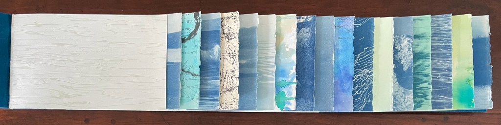
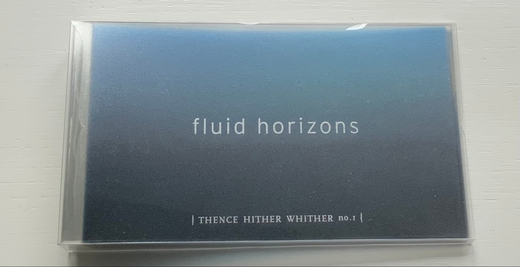
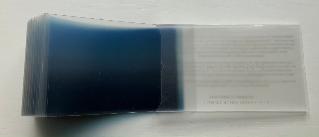
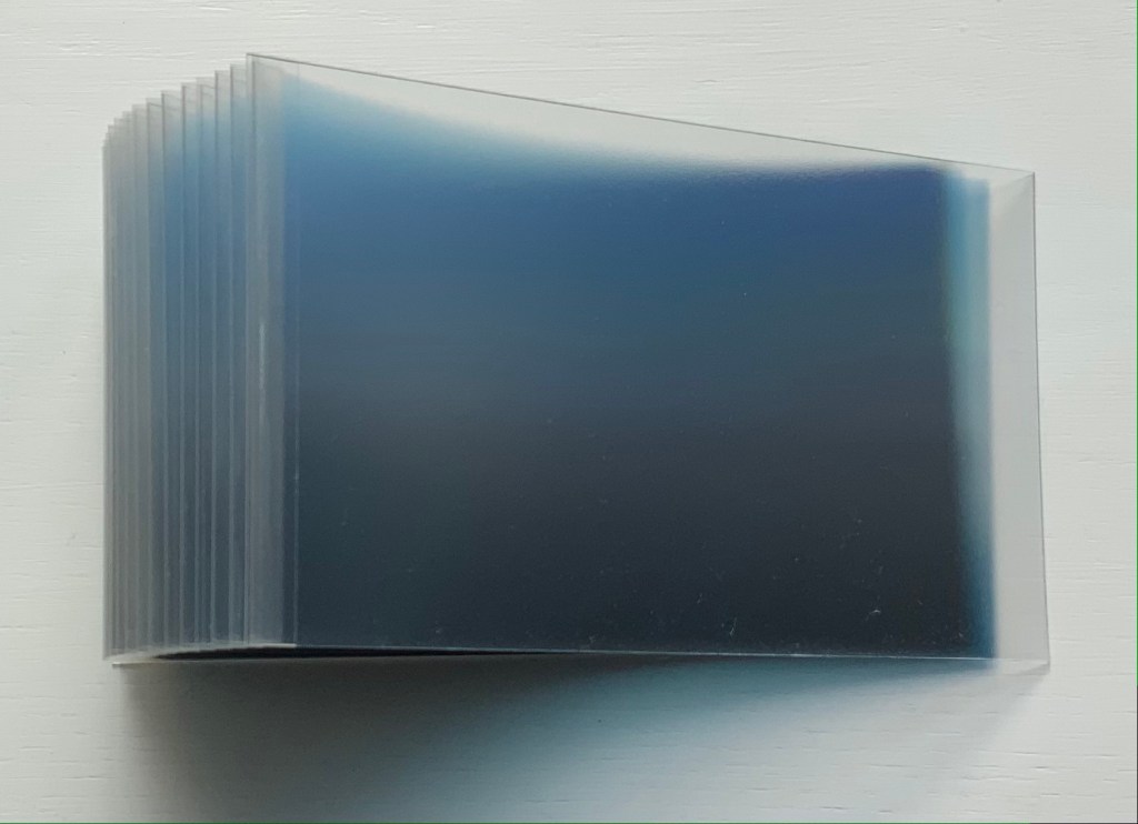
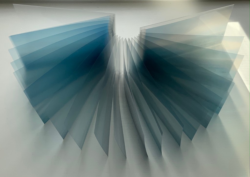
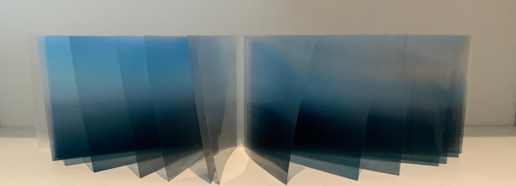
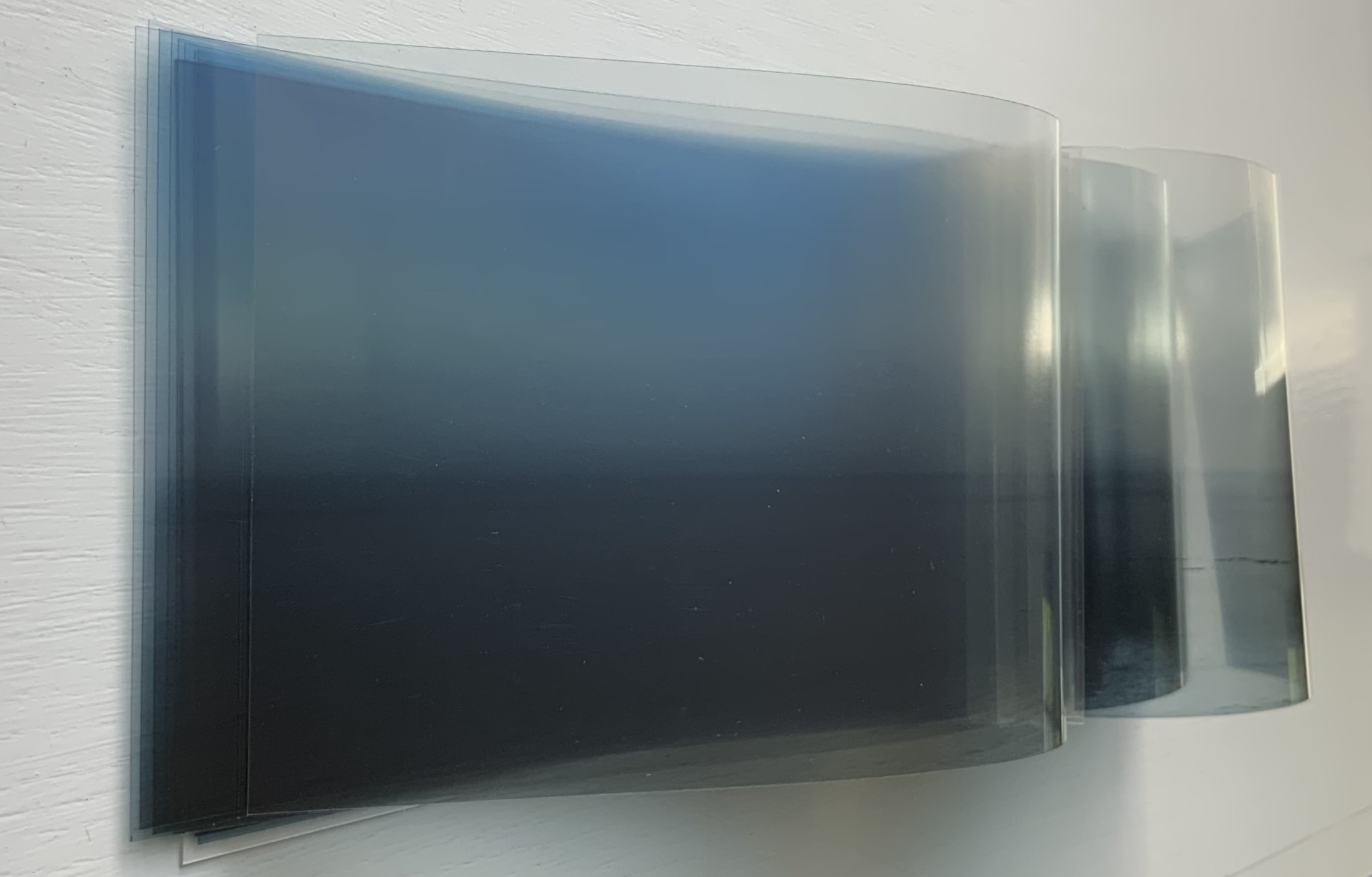
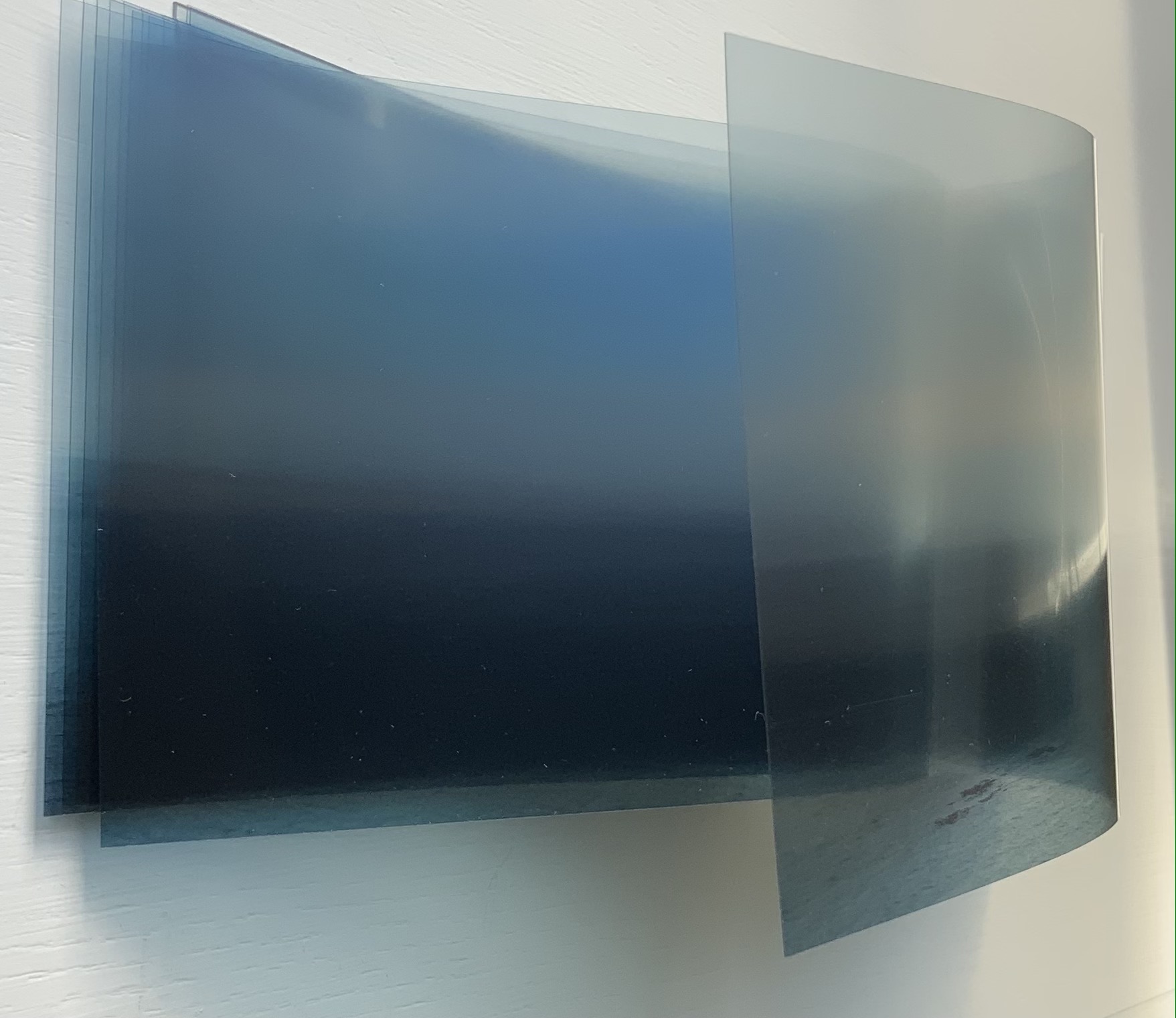
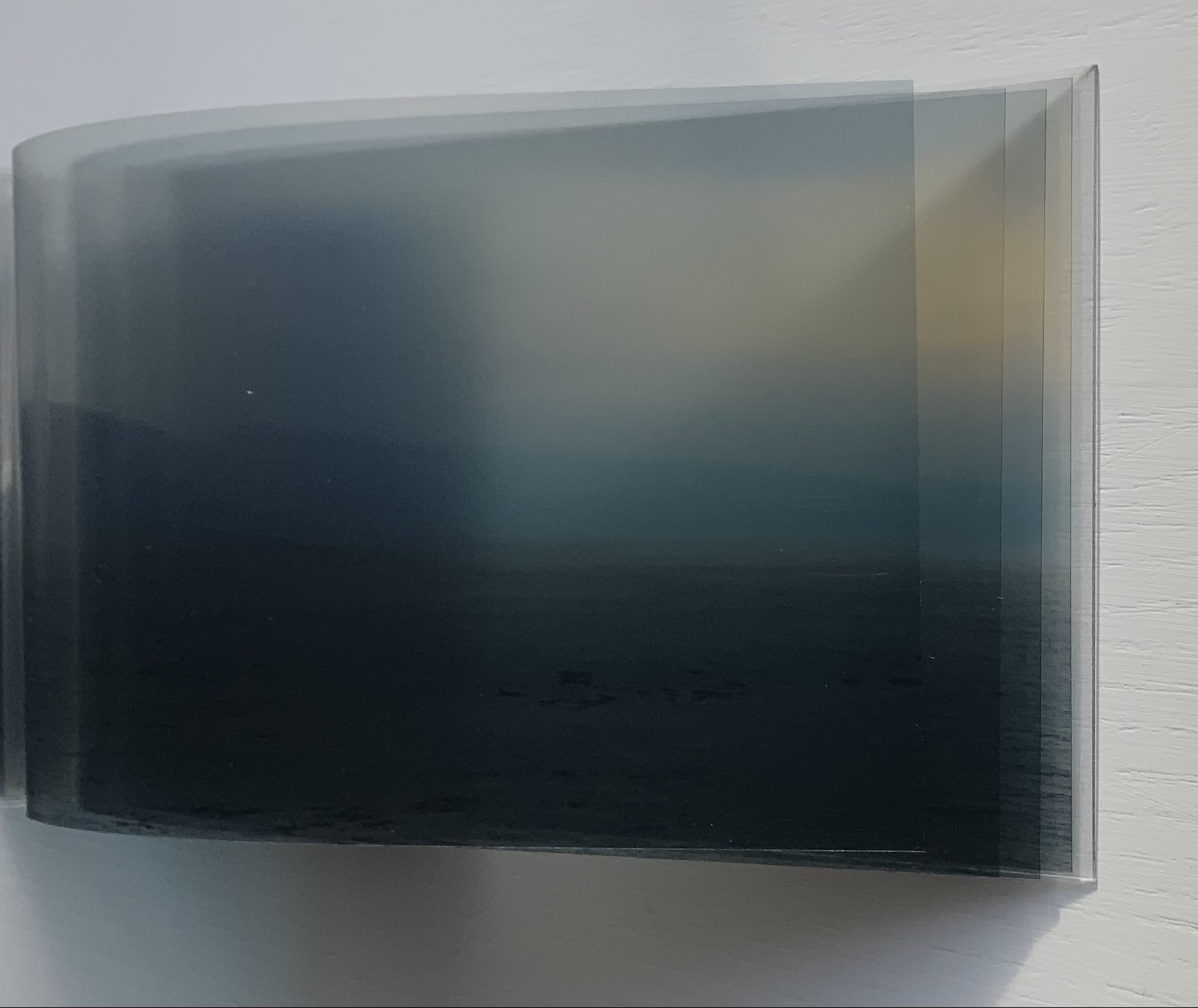
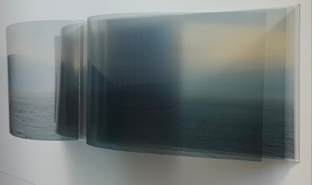
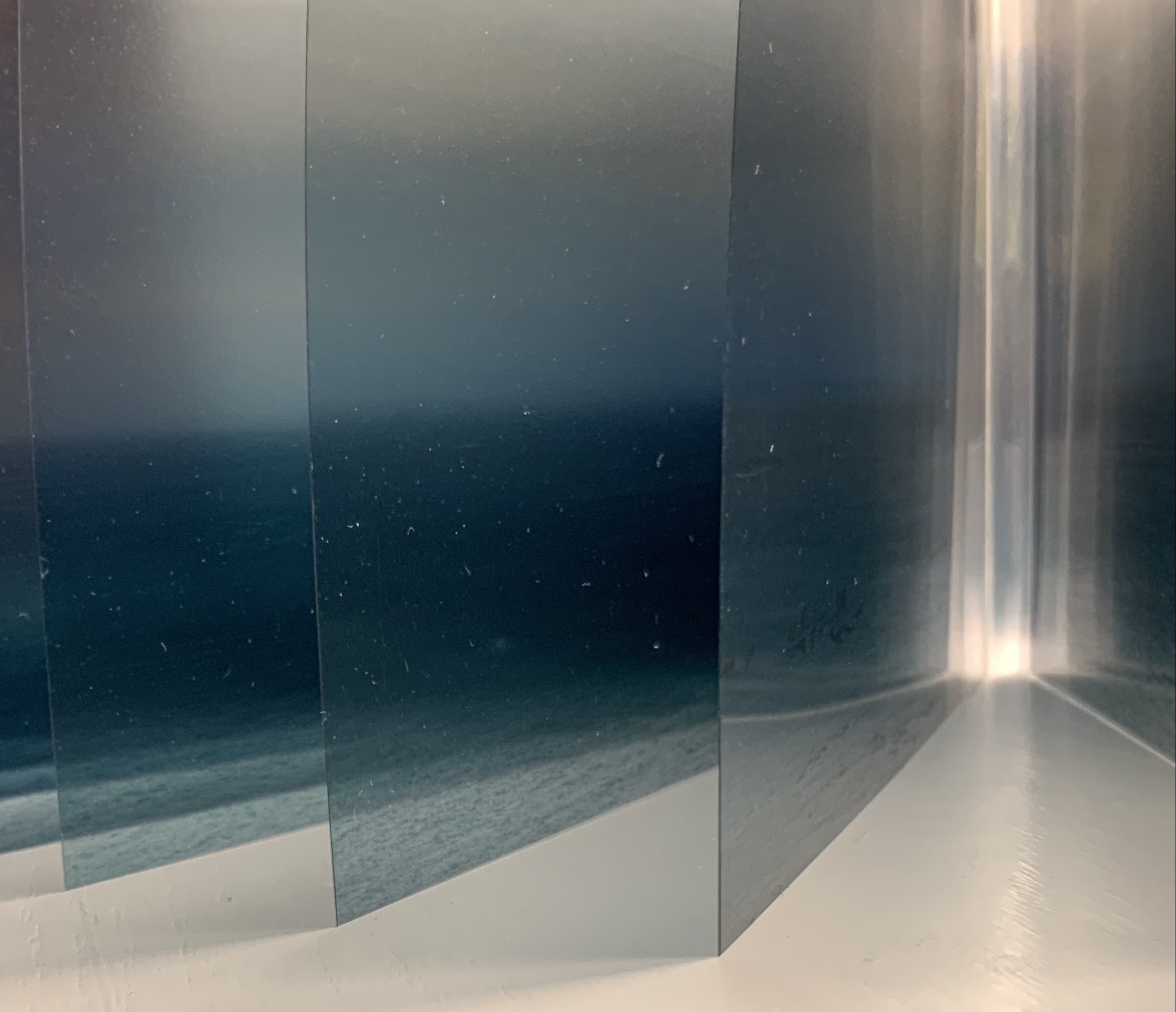
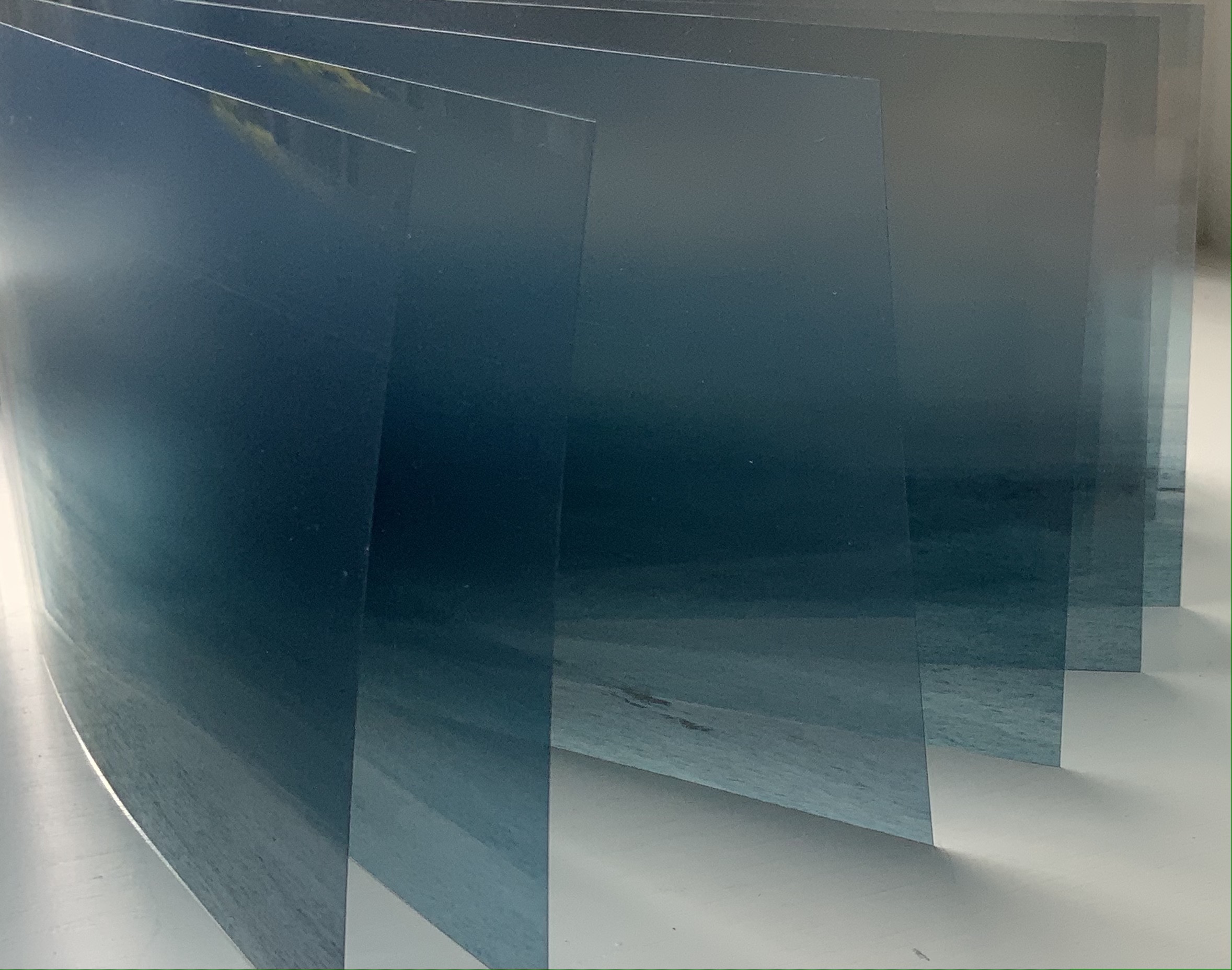
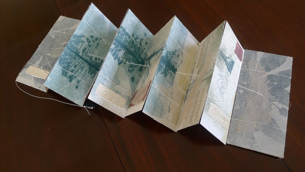
Fluid Horizons (2021) Nif Hodgson Slipcase. Modified dragon-scale concertina. Slipcase: H91 x W158 mm. Book: H90 x W156 mm, 20 panels. Variable edition of 10, of which this is #1. Acquired from 23 Sandy Gallery, 2 September 2021. Photos of the work: Books On Books Collection. Displayed with artist’s permission.
The opportunity to add another dragon-scale binding (see Rutherford Witthus and Zhang Xiaodong below) to the collection would have been incentive enough. The binding of Fluid Horizons is not, however, the usual dragon-scale binding as applied to multi-leaved scrolls. It comprises an effective accordion spine with leaves attached to the inside folds. What made Fluid Horizons irresistible is the effect the structure achieves with the unusual technique and material: screenprint and archival pigment ink on Arista II transparency film, Duralar polyester film and Lexan polycarbonate film.
Each book in an edition varies because its twenty images are selected from hundreds of photographs taken by Hodgson with the same horizon-dimension. Although not in sequence, each image influences the selection of the next, which creates a sense of progression. With the gradation of light and transparency across the selection, the sense of progression increases. But it is not a “film-like” progression of images, or snapshots taken one after another in sequence. Like memory and our sense of time, on which this work meditates, the progression is a fragile reconstruction. The transparent materials, expandable accordion spine and fluttering panels reflect the ephemeral, flexible and fragmentary way in which memory is shaped while also being affected by perception in the moment.
There is a further material ephemerality to the work. The panel surface is delicate, subject to dissolving from contact with moisture, smudging from fingers and scratching from grit. As Hodgson puts it, “the sensitive materials lightly wear with viewing and play, just as memory faintly fogs with time and recollection”. Fluid Horizons is a stunning union of form and metaphor.
“Zhang Xiaodong“. 7 August 2025. Books On Books Collection.
Chinnery, Colin. “Whirlwind binding (xuanfeng zhuang)“. The International Dunhuang Project. Site last revised: September 2016. Accessed 21 October 2021.
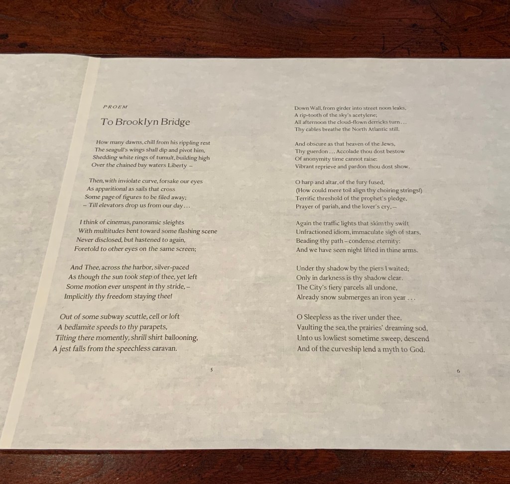
In the fifth show of his series Raw Craftof visits and interviews to celebrate craftsmen and craftswomen, the late Anthony Bourdain met with Andrew Hoyem, poet, master typographer and now retired printer of Arion Press. Although the Arion Press production of Hart Crane’s poem “The Bridge” does not feature, the episode is worthwhile background for enjoyment of this collaborative work of book art.
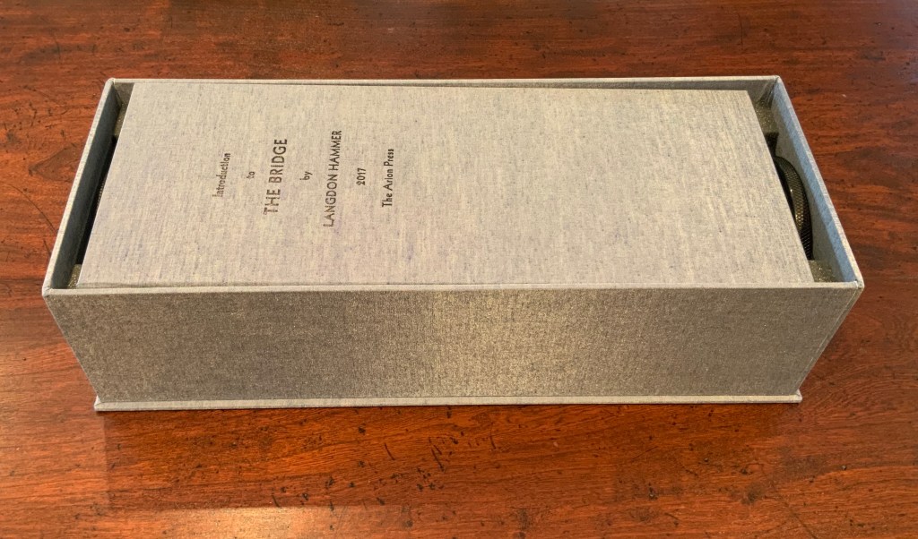
The Bridge (1930/2017)
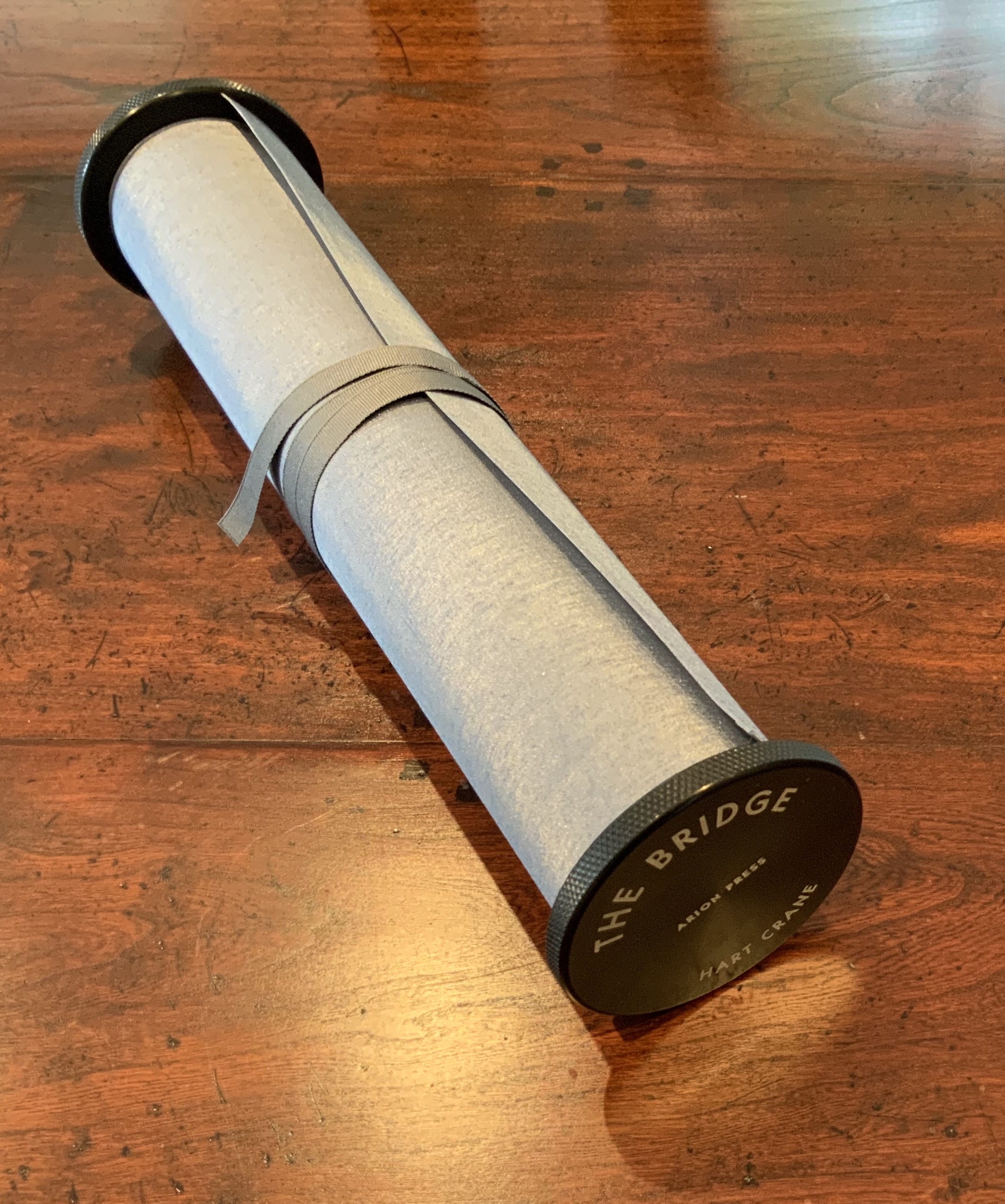
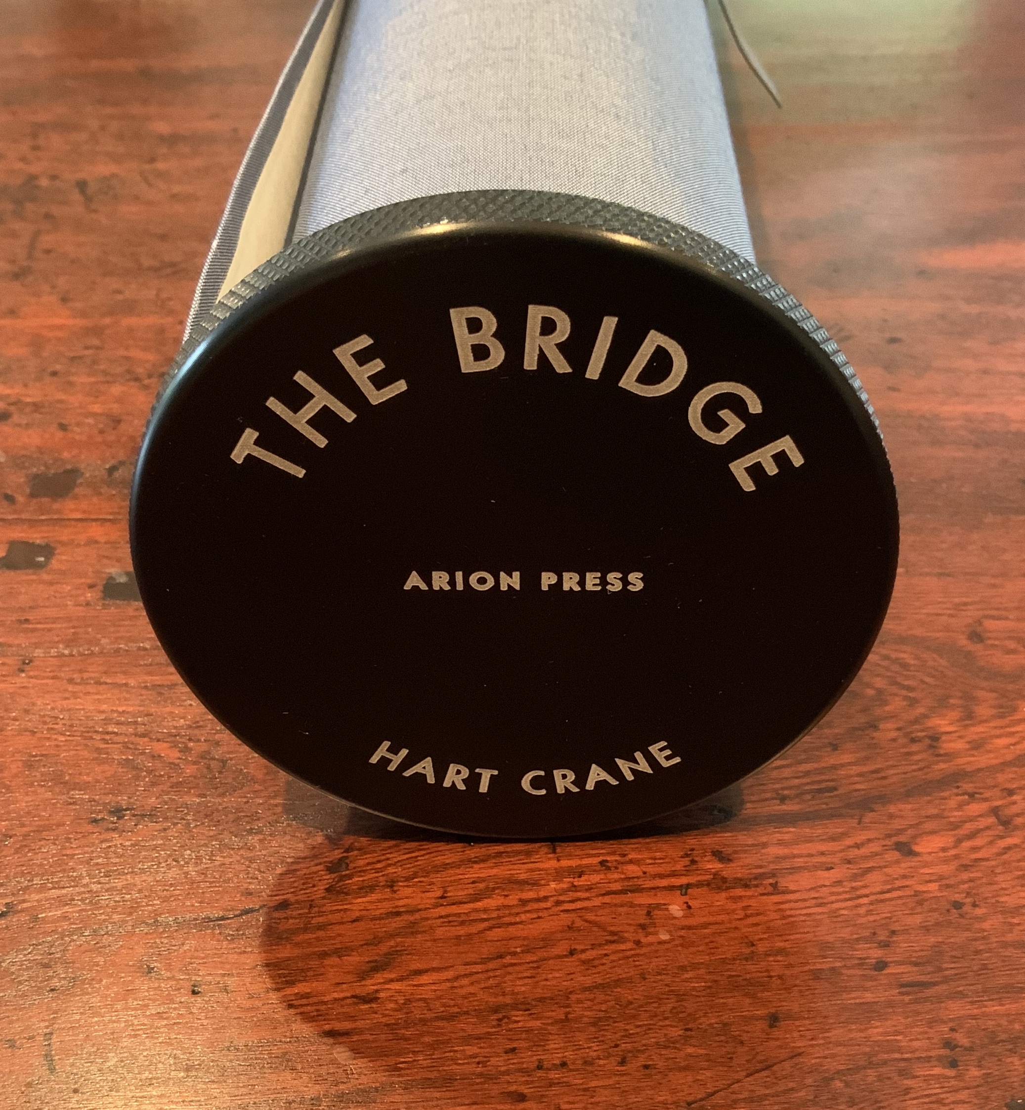
The Bridge(1930/2017) Hart Crane Design, Arion Press. Woodblock prints, Joel Shapiro. Introduction, Langdon Hammer. Scroll, 13-1/2 inches by 50 feet, wound on aluminum spool with bookcloth wrapper, housed in a box. Edition of 300, of which this is #97. Acquired from Classic Editions, 10 June 2020. Photos of the work: Books On Books Collection. Displayed with permission of Arion Press.
From first sight, this work of art evoked thoughts of an earlier acquisition — the dragon scale binding of the Diamond Sutra, done by Zhang Xiaodong in 2017.
Diamond Sutra, Dragon scale binding (2017) Zhang Xiaodong In 32 zhuan (seal) fonts, 152 x 382×160mm. Edition of 300, of which this #197. Acquired from Sin Sin Fine Arts (Hong Kong), 31 October 2019. Photos: Books On Books Collection.
It was more than the similarities of scrolls stored in boxes. Despite the differences in texts and images, something resonated –still resonates — between the two works. The Arion Press prospectus for The Bridge holds the clue to what that something is:
The publisher, Andrew Hoyem, conceived of a scroll format for “The Bridge” while he and senior editor Diana Ketcham were on a two-week tour of China in April 2017 organized by the Grolier Club, an association of bibliophiles in New York City. The theme of the trip was the history of paper, type, printing, binding, and the collecting of books, both private and institutional, in China.
During the first week they visited the Red Star Paper Company in Wuxi, Anhui Province. The Chinese government has recently sought to revive and support traditional crafts. Red Star is the fore-most producer of handmade paper in the nation, using ancient methods and many plant fibers in exacting proportions to make sheets of beautiful thin paper, used mainly for calligraphy and ink and watercolor painting.
In Beijing they visited the most important book collector in China, who showed them an unmounted scroll from the eighth century. Hoyem was inspired to order handmade paper from the mill and to make “The Bridge” in a single-spool scroll format.
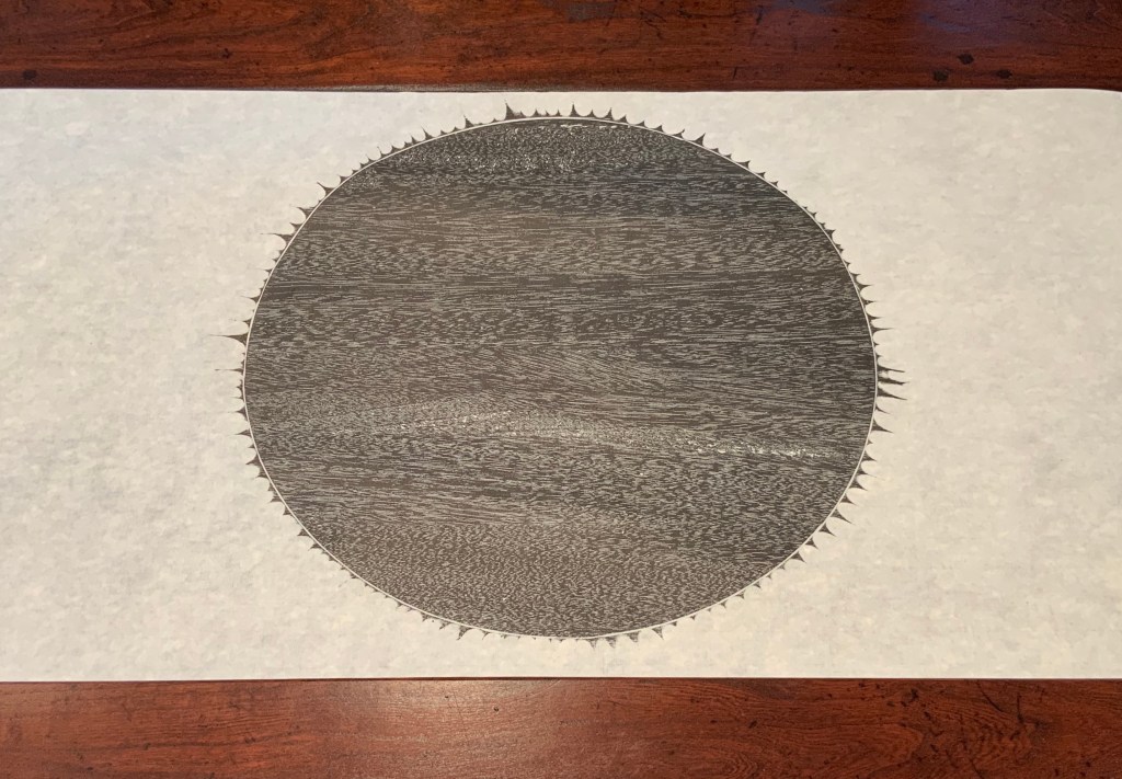
In each case, content, image, structure and handmade paper more than complement one another. Even though they do so in different ways, the rightness and thoroughness with which it is done and the feel of the paper strike that resonant chord. A comparison of the texts of the two works would not ordinarily arise, but once it is made, the prayerfulness of Crane’s “Proem” stands out even more in its French Elzevir handset by Hoyem himself and printed on handmade paper of his choosing. Hoyem’s choices of material and structure put him on an equal artistic footing with Shapiro and Zhang. Note the scroll end’s echo of Shapiro’s woodcut, which itself may be an allusion to the Black Sun Press, first publisher of The Bridge (1930). What is it that bridges the precision mechanical fixture and the wood grain revealed by hand and ink if not Crane’s words? In pairing Crane with Shapiro, Hoyem made as canny and artistic a choice as any that book impresario Ambroise Vollard ever made.
In his comments at the opening of his 2018 exhibition at Pace Prints, which featured The Bridge, Shapiro refers to the rapture and ecstasy of the poem as his chief challenge. Here he is in an earlier interview that speaks to how he approaches such a challenge:
Visual art can be tricky – the goal is not simply to illustrate, but, in this case, to create images which correspond to profound and historically significant prayers and material. My role here is that of mediator – attempting to capture the meaning I see in the material, and translate it into form. — “Artist Joel Shapiro Discusses the Art in Mishkan HaNefesh”.
Alongside those comments, the interplay of artists Hoyem and Shapiro, Crane’s text, the continuous scroll, the French Elzevir typeface and the Chinese handmade paper suggests an entirely new meaning for Dick Higgins’ term “intermediation”. In his 1965 essay “Intermedia”, republished in Leonardo in 2001, Higgins adopted the term from Samuel Taylor Coleridge. As Higgins expressed it, “Many fine works are being done in mixed media: paintings which incorporate poems within their visual fields, for instance. But one knows which is which. In intermedia, on the other hand, the visual element (painting) is fused conceptually with the words” (p. 52). With The Bridge — as with Diamond Sutra, Dragon-Scale Binding — the fusion goes beyond the visual and textual and yields two exceptional works of art.
Further Reading
“Joel Shapiro and Hart Crane“. 19 December 2017. Graphic Arts Collection, Special Collections, Firestone Library, Princeton University. Accessed 4 August 2020.
“Playing Against Type“. 2 November 2017. Antiques: The Magazine. Accessed 4 August 2020.
Higgins, Dick. February 2001. “Intermedia“. Leonardo, Volume 34, Number 1, February 2001, pp. 49-54. Reprint of his 1965 essay with an addendum from Hannah Higgins, co-curator with Simon Anderson (School of the Art Institute of Chicago) of a 2000-2002 travelling restrospective on Dick Higgins’ life and art.
Thirty-three years after this rare volume’s appearance, some renewed interest in Igarishi’s design and artistry has arisen. The Thames & Hudson volume noted below was widely noted but reviewed in depth in only a few places (see below).
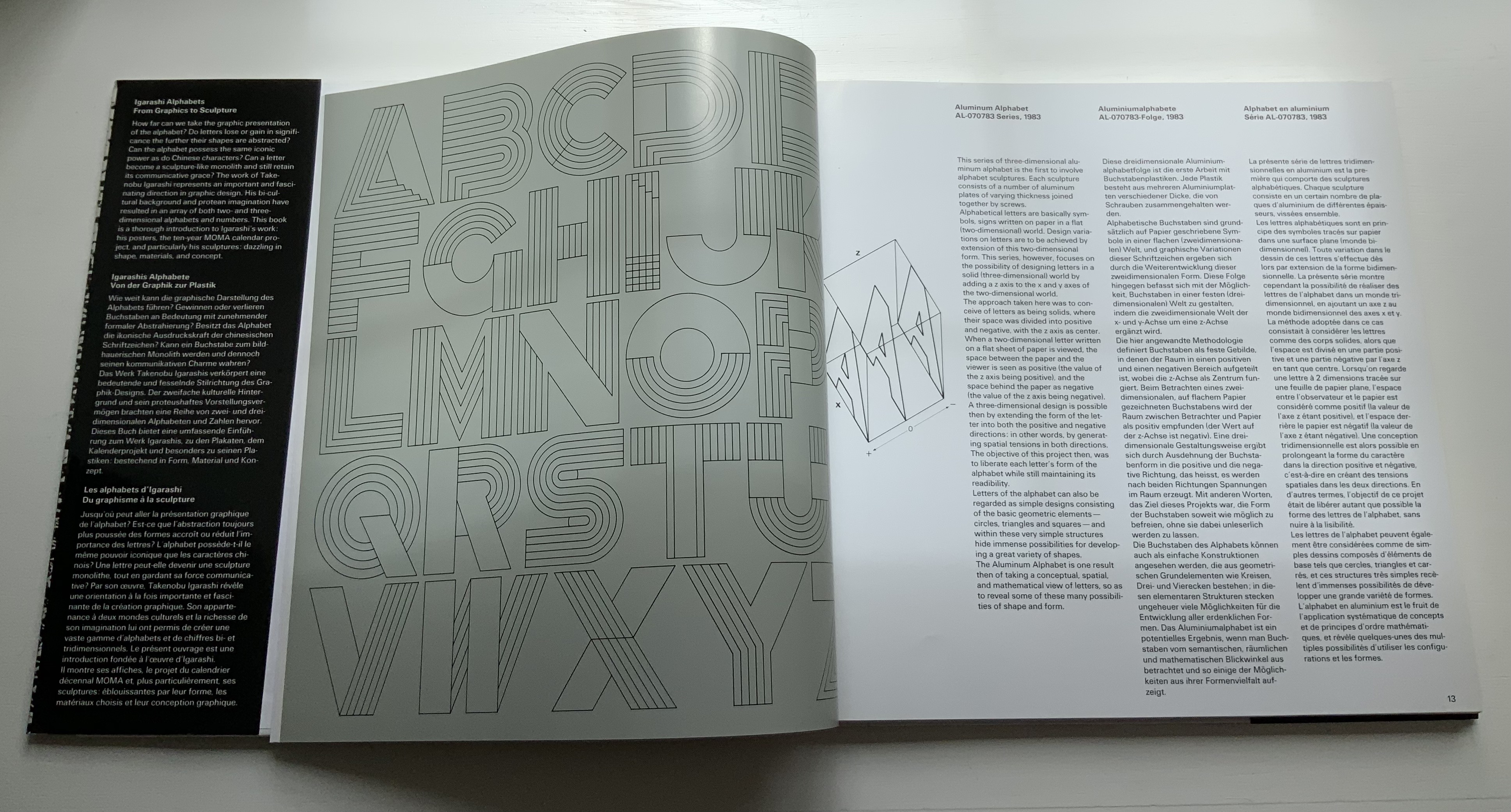
In noting in their 1995 facsimile of Johann David Steingruber’s Architectonisches Alphabeth that three-dimensional alphabet design inevitably reflects its typographic and architectural milieu, Joseph Kiermeier-Debre and Fritz Franz Vogel single out Igarishi’s work in aluminum, concrete, wood and plastic as a perfect 20th century example. Unlike that of his European predecessors, Igarashi’s milieu has been both Eastern and Western. It shows not only in his design, surfaces and choice of material but also in the global attention paid to his work. The briefest search online yields sources in Poland, the Czech Republic, Spain, Singapore and many others besides those expected in the US and Japan.
Along with the works of Katsumi Komagata, Yasushi Cho and Zhang Xiaodong, Igarashi’s volume adds some Eastern balance to the Western bias in the Books On Books Collection.
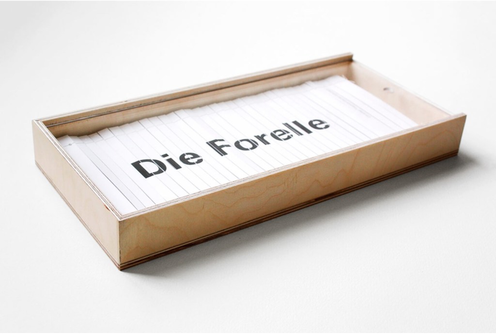
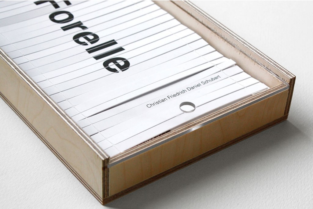
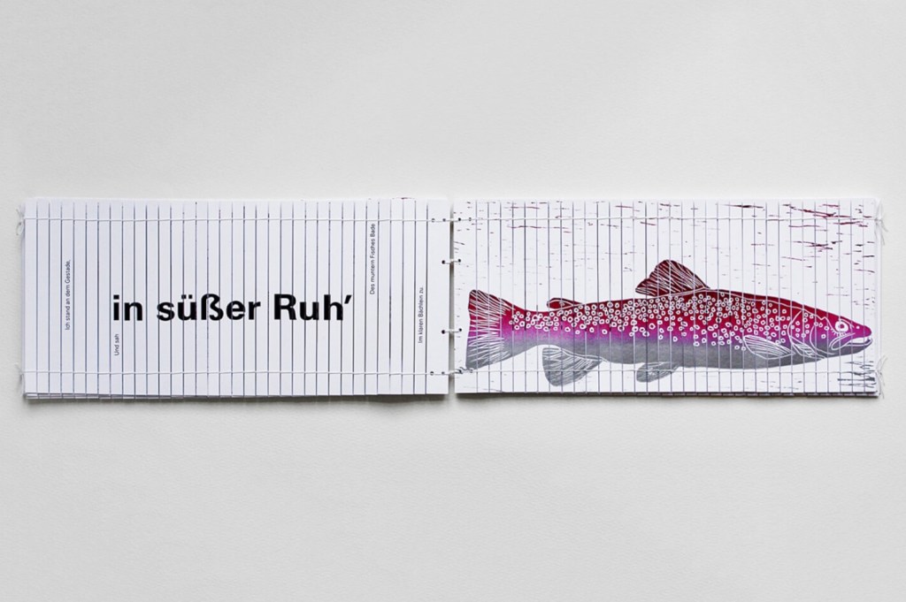
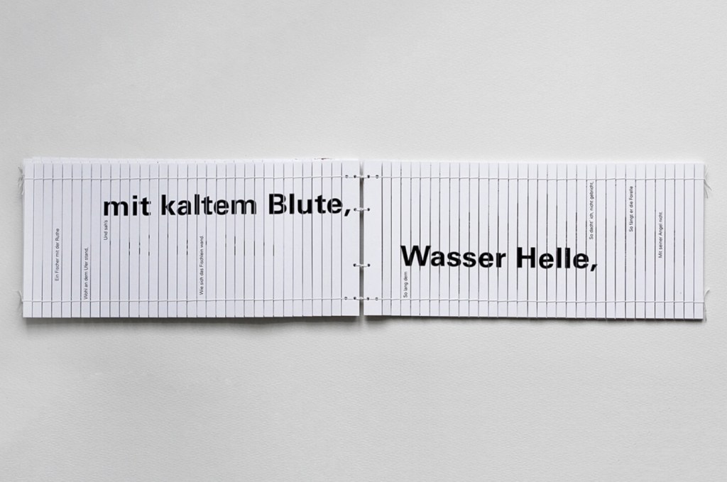
Even under the glass of vitrine or screen, Yasutomo Ota’s Die Forelle evokes by typography, image and structure a physical perception hard to shake.†
Die Forelle (2014) Yasutomo Ota Printed on 34 narrow laminated cardboard strips per sheet, which are held together by two threads, one on each side. Eighteen unnumbered pages H140 x 300 mm in box H160 x W340 x D50 mm. All photos with permission of the artist.
Franz Schubert first wrote a song called Die Forelle, based on a poem of the same name by Christian Friedrich Daniel Schubart. Schubert was later commissioned to turn it into a piece of chamber music, which resulted in the “Trout Quintet” (1819).
If you are lucky enough to live near one of the six libraries that hold a copy of Ota-san’s Die Forelle, you can take your phone and earbuds, cast your line for it in the quiet of the rare book section and listen to the music inspired by the poem printed across the pages made of thirty-four laminated cardboard strips held together by two rows of threads and wriggling in your hands like a fish and flowing over them like a stream.
Or failing such access, you can view the artist’s demonstration here. The book’s structure is based on the chikukan, originally a Chinese scroll formed of bamboo strips, written on vertically and linked by thread to be rolled up correspondingly. The Coptic binding, the type that reads horizontally and the printing on both sides of a leaf shifts the form from scroll to codex. Also, as the artist writes, “By using the alphabet on a panel intended for vertical writing brings a strong sense of the direction taken by the written word” (Correspondence with Books On Books, 9 November 2020).
Of course, the Asian printing tradition also included horizontal reading and printing on both sides of the scroll. Consider the dragon-scale binding of the Diamond Sutra re-created by Zhang Xiadong (demonstrated here).
Diamond Sutra, Dragon scale binding (2017) Zhang Xiaodong In 32 zhuan (seal) fonts, 152 x 382×160mm. Edition of 300, of which this #197. Acquired from Sin Sin Fine Arts (Hong Kong), 31 October 2019. Photos: Books On Books Collection.
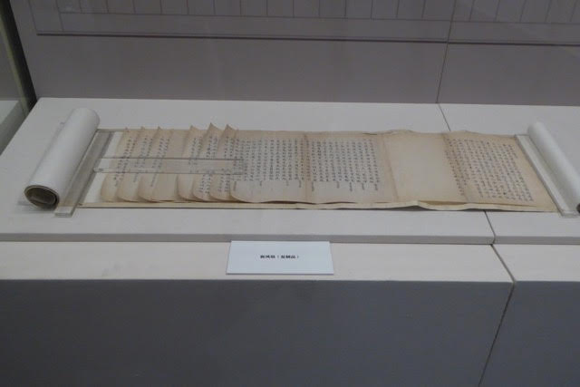
Examples of dragon-scale binding in the National Library of China’s permanent display of the history of the book in China. Photos: Marcia Watt, reproduced with permission.
“Balinese Bamboo Book”, Special Collections & Archives Research Center. Accessed November 10, 2020, .
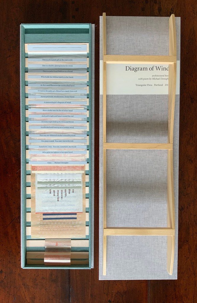
Contemporary book art also holds vertical and horizontal variations on the related “Venetian blind” or bamboo book form. Consider the dynamic Diagram of Wind by Barbara Tetenbaum (demonstrated below) and Diane Harries’ Legacy (below).
Diagram of Wind (2015) Barbara Tetenbaum Letterpress printed texts and images cut into strips and adhered to Japanese ‘silk tissue’ (gampi). Sewn to cloth and wood backing. Supported by a wood wave-form platform and held inside a lidded box made of cloth and book board. Poem by Michael Donaghy: “Glass”. H17 x W10 x D3 inches, ten pages. Edition of 30, of which this is #. Acquired from the artist, 8 October 2020. Photos: Books On Books Collection.
Legacy (2018) Diane Harries Venetian-blind book. Photos: Reproduced with permission of the artist.
In all of the works above, form draws attention to itself but also inevitably back to the content. The reader/viewer marvels at the mechanics of each work and how its interaction with hand and eye creates a simile for its content. The unscrolling and fluttering dragon-scale binding demands a prayer’s concentration and contemplation. The “curveship” of the support, the segmentation of the Donaghy poem “Glass” into strips, and the stir and lift of pages under the slightest breath demonstrate the wave form that Tetenbaum investigated for three years. Panel by panel, connected by slender threads, Legacy draws together different pasts in Harries’s work. Likewise, the flipping, slipping, shuttering/shuddering of Die Forelle‘s pages re-create the trout in the brook. That is book art at its best.
† With thanks to Andrew Schuller for drawing attention to Yasutomo Ota.
Chinnery, Colin. “Whirlwind binding (xuanfeng zhuang)”, International Dunhuang Project, British Library. Posted 07 February 2007. Accessed 12 December 2019.
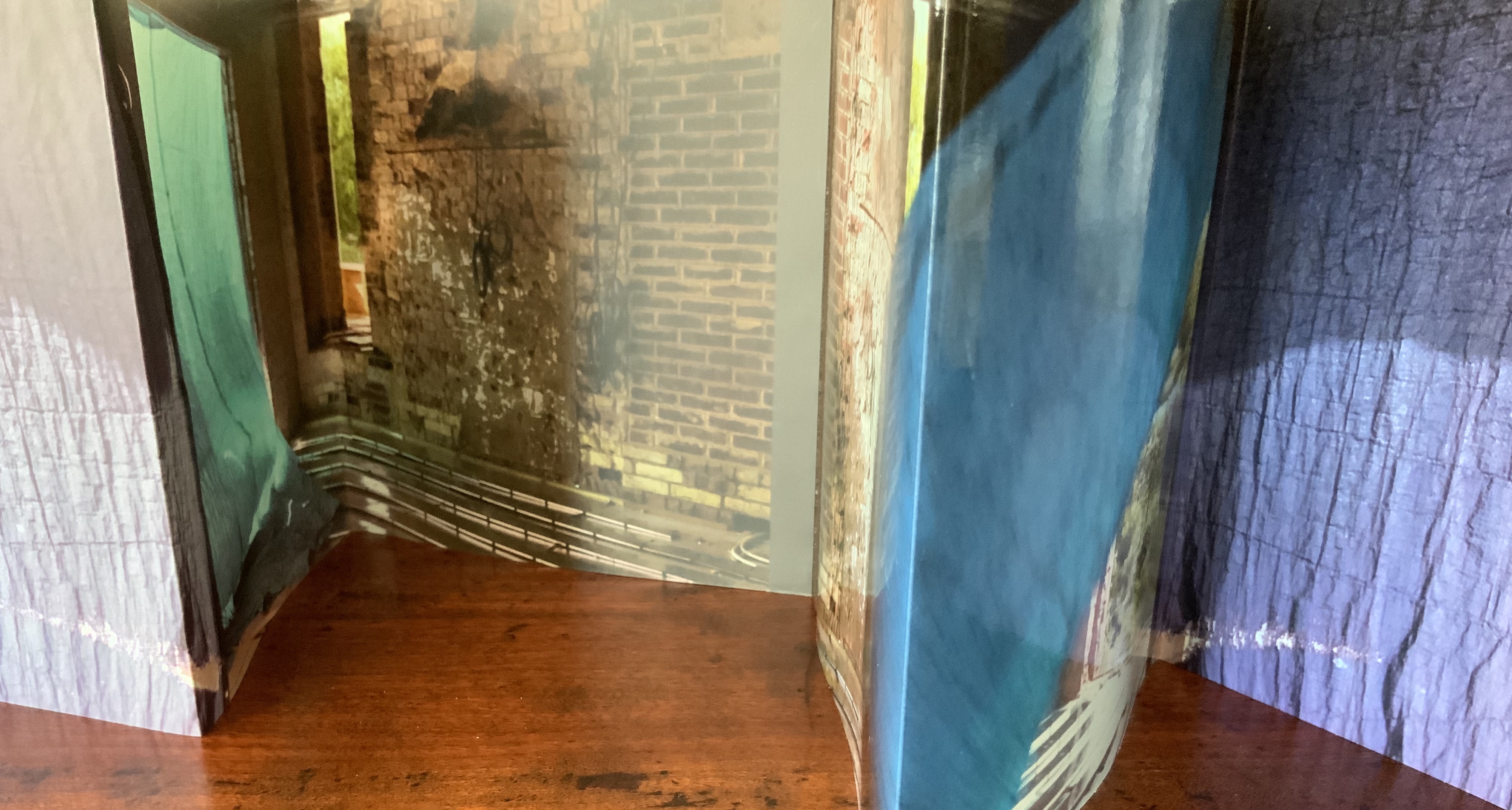
Belly band with edition details, spider style binding; eight leaves, 16 pages, 48 panels; laser printed onto 250gsm card glossy on one side. Open edition of signed copies. Acquired from AM Bruno, 9 November 2018. Photos: Books On Books Collection.
This spiral of imagery, is an allegory for breath, found in the material world, photographed in the house I was building. A variety of modalities of folds – from the fold of our material selves, our bodies – to the folding of time, or simply memory, an interiority and exteriority. — Artist’s description
The “spider style” binding here is not quite the same as that designated by Hedi Kyle as the “spider book” in The Art of the Fold (2018). It is more a cross between an accordion fold, crown fold and spider book as explained by Kyle. It also recalls the effect of the Chinese dragon fold, exemplified by the re-creation of the Diamond Sutra by Zhang Xiaodong. Whatever its source or name, the fold and binding create a prismatic bookwork that invites teasing away each sheet and fold, poring over each panel as well as setting the work up in various display aspects.
Although Spiration is not currently listed in WorldCat, several of Goldhill’s other publications are: for example, In the Beginning and Sanguine Shifts, both of which arose from projects posed to the AMBruno coalition of artists. Her work has drawn the attention of the British curator and writer David Alan Mellor.