The Burning of the Books(2009) George Szirtes (poems) and Ron King (prints) Slipcase with sewn hardback, duotone letterpress reproduction of the 2008 artist book version. H220 x W160 mm, 66 unnumbered pages. Edition of 1000, the first 100 signed and numbered by the author and artist and presented in a specially designed slipcase. Acquired from the artist, 28 January 2021. Photos of the work: Books On Books Collection.
The Burning of the Books is the harshest of Ron King’s work in the Books On Books Collection. According to the artist, this work’s genesis was his long fascination with Elias Canetti’s Auto da Fe (1946). King commissioned Szirtes to respond to Canetti’s work with a text to accompany the etchings that King had been holding in abeyance. The result in 2008 was a large format artist book, of which this work is a reproduction.
With its photo-collages of a Guernica-like fold-out, newspaper clippings of shamed collaborators, fists and human limbs, The Burning of the Books delivers a visual indictment of the 20th century that creeps into the 21st century with the added images of celebrity police ID photos and Euro currency notes. Szirtes’ take on King’s take on Canetti’s take on his main character’s solipsistic slip from obsession into madness in a world of alienating -isms is the work of art with which we — sadly, more than a decade later — keep catching up.
This work’s fascination with horrors may have its roots in a childhood experience in Brazil — seeing a photograph of a bandit gang’s mass beheading — but, more often than not, King’s works emphasize a humor in blackness (as does this work in its recurrent image of Mr. Punch-like figures). Most often, though, a sheer joy of making and material prevails.
Alphabeta Concertina and alphabeta concertina (2007)
Alphabeta Concertina and alphabeta concertina miniscule (2007) Ron King Printed, cut and creased onto Heritage paper and glued to Heritage Museum board. H170 x W110 x D30 mm,stretching to 3 meters. Edition of 600. Majuscule acquired from the artist, 24 July 2021; miniscule acquired from Sophie Schneideman Rare Books and Prints, 27 November 2020. Photos: Books On Books Collection.
The “abc” series displays the restrained, minimalist side of King’s inventiveness. With more than one of these works to hand, his enjoyment and humor come through — especially in the subtle and not-so-subtle variations. Take alphabeta concertina miniscule as an example. It arrived like a long awaited chuckle after the majuscule version — Alphabeta Concertina (1983) — which had been expanded into the poster versions Alphabet I and Alphabet II (below). Size and surprise seem to matter in King’s sense of humor. For size, see the large-scale steel version of the alphabet in 2016. For surprise, consider his catalogue raisonné Cooking the Books or this set of paperweights.
ABC[nd] Ron King Resin sculptures on painted wooden board Acquired from the artist, 24 July 2021. Photos: Books On Books Collection.
Further down are Alphabet II (1999) and The White Alphabet (1984). Compare their uppercase letter C with that above to see how King developed his sculpting over time.
Cooking the Books (2002)
Cooking the Books: Ron King and the Circle Press (2002) Ron King, Andrew Lambirth Paperback with end flaps, sewn with headbands. Pop-up and metallic paper inserts. H225 x W165 x D20 mm, 180 pages. Acquired from the artist, 24 December 2020. Photo: Books On Books Collection.
King’s catalogue raisonné does not merely illustrate his work, it illustrates it. Inserts of mirror paper, wax paper and a pop-up letter E transform what appears to be a simple codex into a treasure chest.
Alphabet II (1999)
Alphabet II (1999) Ron King Pop-up poster. H760 x W500 mm. The letters have been cut onto a 190lb Waterford paper and mounted onto a heavier version of the same stock. Edition of 200 signed. Acquired from Circle Press, 26 June 2015. Photo of Cooking the Books, p. 101: Books On Books Collection.
The collection’s framed poster interferes with photography, but Cooking the Books provides the alternative.
Matisse’s Model (1996)
Matisse’s Model (1996) Ron King An edition of 50 signed book-works made by the same process as Acrobats. 23 x 17 cm with mirror-foil, sprayed pages, and a removable freestanding figure in collaged cardboard box. Photos: Books On Books Collection.
The sculptural element toward which King’s work has always turned is on display in the title and forms of Matisse’s Model. The mirror paper appears as it must for any attractive model.
The Looking Book (1996)
The Looking Book: A Pocket History of Circle Press, 1967-96 (1996) Cathy Courtney Casebound in wire print paper. H160 x W120 xD20 mm Edition of 1000, of which this #67 and initialled by Ron King. Acquired from Peter J. Hadley Bookseller ABA ILAB, 25 June 2015. Photos: Books On Books Collection
Pop-up insert of “Scenes from the Alphabet” by Roy Fisher. Photo: Books On Books Collection.
As with Cooking the Books, this catalogue raisonné, prepared by Cathy Courtney, provides samples of the artist’s work. They appear in the wire debossed cover and this centrepiece of “Scenes from the Alphabet” done with Roy Fisher, which led to a full-scale alphabet book at Fisher’s suggestion.
Turn Over Darling (1994)
Turn Over Darling (1994) Ron King Slipcase (H204 x W153 x D28 mm) containing a light brown paper portfolio (H195 x W150 x D24) into which are hand-sewn six sheets (H190 x W282) of J. Green RWS hand-made paper, folded in half, bearing embossed and debossed images of a female figure. A signed copy from the limited edition of 75. Acquired from the artist, 1 December 2020. Photos: Books On Books Collection, displayed with artist’s permission.
The six embossed and debossed drawings were created from wire forms pressed into dampened sheets of paper. Turn Over Darling elegantly combines King’s sculptural skills with his printer’s skills. When folded and juxtaposed in sequence, they make for eleven reclining female nude images that change position from front to back view as the pages turn. Determining the folds and sequence is a form of imposition, although quite different from the usual imposition for a single sheet with twelve pages on either side as shown below. Again, here is a work that evokes a joy in the material and in its handling.
JBG 1984 watermark in J. Green RWS paper
The White Alphabet (1984)
The White Alphabet (1984) Ron King Box made of two slipcases, one inside the other. Gilt lettering on spine of inner slipcase. Back-to-back leporellos with wooden front and back covers. Outer slipcase: H305 x W140 x D70 mm. Leoprello: H290 x W135 mm. Edition of 150, of which this is #99. Acquired from Veatch’s, 11 June 2021. Photos: Books On Books Collection.
Earth Birds (1981)
Earth Birds: forty six poems written between May 1964 and June 1972 (1981) Larry Eigner (poems) and Ron King (plates) Fifty hard-bound copies, I-L, printed on pure rag-made paper with six plates printed blind intaglio and one hundred and fifty copies, 51-200, printed on Glastonbury Book stock with the same plates printed relief, in one color. Photos: Books On Books Collection.
As with George Szirtes, King has collaborated more than once with Larry Eigner. Looks like nothing, the shadow through air (1972) was the earlier joint effort. Compared to Earth Birds, later works like The Burning of the Books (2008) and Anansi Company(1992) with Roy Fisher show King’s development toward more deeply collaborative efforts.
Earth Birds does recall the wide range of similar works by others at Circle Press that King made possible: Hadrian’s Dream (1990) by Asa Benveniste and Ken Campbell and Machines (1986) by Michael Donaghy and Barbara Tetenbaum.
Chaucer’s The Prologue, 2nd Edition (1978)
Chaucer’s The Prologue, 2nd Edition (1978) Ron King Casebound sewn, letterpress printed on 190 gsm Queen Anne Antique White. Hand-set in Monotype Plantin series 110. H405 x W281 mm, 72 pages. Edition of twenty separate versions I-XX each of 250 copies, of which this is XI, #131, and includes a folder of Buckler Light Grey Plain with a poem by Roy Fisher and screen-print on 190 gsm Bockingfordby Ron King entitled “Webbe”. Acquired from private seller, 27 February 2021. Photos of work: Books On Books Collection. Displayed with permission of artist.
King originally prepared The Prologue for Editions Electo in 1966, then published a limited edition of 125 copies in 1967 under the Circle Press imprint. In this collection, the work represents King’s straightforward fine press work and a successful livre d’artiste. The screenprints of Chaucer’s characters and Chaucer himself are based on African and Brazilian masks as well as heraldic symbols. King’s inspiration to match these richly colored masks to the personae captures the pageantry and individuals within the social hierarchy of Chaucer’s Canterbury Tales. Opening this oversized fine press edition, turning its stiff, creamy pages with their 18 pt Plantin type and confronting these human-sized masks are reminders of the monumentality that this human-scale work of literature has achieved.
Knight and Squire masks
Nun and Monk masks
Chaucer’s mask and King’s original print “Webbe”
Ephemera
Almost always, small gifts of ephemera arrive with purchases from the Ron King Studio. They illustrate how King marshals his artistry even in marketing his art and that of those he has published.
Hare (single-fold card, H125 x W180 mm), blind-embossed. 2021.
Announcement (single-fold card, H216 x W140 mm) with blind embossed image of a fulmar. Describes artist book Sednar and the Fulmar with Richard Price’s poems. 2017.
Invitations (four-fold pop-up cards) to Pallant House Gallery opening preview. 2005.
Announcement (wax and paper pamphlet, H174 x W134 mm) of Lettre de la Mer Noire/Black Sea Letter by Kenneth White (poem) and Jean-Claude Loubières (images and wax dipping). 1997.
Announcement (card, line block reproduction, H150 x W125 mm) of the 200 portfolios of fifty-one woodcut designs reproduced from the only remaining proofs of Brazilian Miniatures, an unpublished book with a bilingual introduction; printed in two versions. 1973?
“Squire” (single-fold card, H235 x W165 mm) with hand-printed serigraph from Chaucer’s “Prologue” to The Canterbury Tales. 1969?
Image of map of My Ántonia reproduced in A Close Read: The Cather Projects (2012) Barbara Tetenbaum and Jennifer Viviano Photos: Books On Books Collection, displayed with permission of the artist.
For the Books On Books Collection, Barbara Tetenbaum’s works have offered a map for exploring the different ways that text, image, structure and material bring about enjoyment and meaning in book art and bookmaking. Broadsides, chapbooks, a codex, a sculpture and, yes, a map have joined the collection over time.
The broadside and chapbook forms seem to be both a rite of passage and a pastime of pleasure for book artists. For Tetenbaum, it has been both of these and a rite of remembrance of friendship. During Tetenbaum’s time at Circle Press, founded and run by UK artist Ron King, she reconnected with Chicago friends poet Michael Donaghy and his wife Maddy Paxman, who had moved earlier to London. Understandably taken with his poetry, she chose his “Machines” when King offered her the chance to set and print anything she liked while King and his wife were away on vacation.
The earliest of Tetenbaum’s work in this collection, the chapbook Machines (1986) pairs Donaghy’s neo-metaphysical poem with the asemic markings that Tetenbaum had begun to pursue as a technique in 1985. Taken on their own, the markings do not call to mind any particular image or metaphor in the poem. Considered more closely as a physical response to the poem, though, they do share in the poem’s building rhythm and density (see further commentary here).
Back in the US, the artist continued with the marks and Donaghy’s words. The broadside below was the result. This time, technique, form and subject cannot avoid similarity — like a reflection in a mirror. ‘Smith’ has a regularity but looseness often found in Donaghy’s poems, something essential to their charm. The iambic pentameter is not always iambic or ten-syllabled, and the length of stanzas vary. Flush right to Donaghy’s flush left, Tetenbaum’s lines of marking mirror the poem’s ragged right and variable counts — but not precisely.
A love poem that takes off from the act of trying to remember forging a name in a hotel register for an assignation that forged something true and lasting, ‘Smith’ is about making one’s mark as artist and responding, intimately, one human to another. To transfer her marks made in response to the poem, Tetenbaum used
coated wire (bell wire) brought to type high on a piece of MDF covered in carpet tape to hold them in place. This is a technique I learned from Elmar Heimbach and used in a bit of the illustration in O’Ryan’s Belt. (Correspondence with artist, 21 November 2020. Link added.)
Another of Tetenbaum’s earliest chapbooks, Donaghy’s O’Ryan’s Belt (1991) foreshadows her move toward work that responds with a growing independent relationship to the text.
The spine of O’Ryan’s Belt consists of a small fold. Inside, on either side of it, is a gathering of folios. The two sets of folios are sewn (belted?) together through the small fold. Each set includes a tunnel-book-like artwork of three layers. The first sits adjacent to the poem “A Spectacle”, and the second, to “The Hunter’s Purse”, a line from which the chapbook takes its name.
View of the “internal spine”, an inward fold of the cover creating a tab to which signatures on either side are sewn.
View of the tunnel-book image adjacent to “A Spectacle”
The colophon explains that stencils, string and other found objects were used to print the illustrations. Note how the artworks’ lines cross the pages but not into the space of their adjacent poems. It’s as if the artwork is asserting a claim — this is a part of, but apart from; or this is apart from, but a part of. The images created by the artwork seem more related to “A Spectacle” than “The Hunter’s Purse”. Both artworks capture the idea of the image started by the lines “The shape of man, a shadow on the ground,/ Returns a mirror image from pondwater.” As the poem proceeds, we see through the shadow/mirror image to the objects and gravel at the bottom of the pool. Hinting at stalactites or stalagmites as well as the layers reflected on and beneath the water, the first paper sculpture makes sure we recognize the poet’s shadow boxing here with Plato’s cave.
So snugly fitted to the structure, the artwork seems to be waiting to surprise the reader.
The broadside Co-Pilot extends this structurally interpretive technique. The poem “Co Pilot” (no hyphen in the original) hilariously turns the speaker’s conscience into a parrot on his shoulder, “a tiny Charlton Heston” squawking the Ten Commandments. But there is no parrot, no Charlton Heston, no Ten Commandments in the broadside’s artwork beneath the typeset poem.
There is, however, an eye peeking from four holes scattered among bubble-like transparent circles printed over a collage of images and texts from newspapers, health and housekeeping guides (from the Fifties?), history books, clothing ads and prayer cards. Are the eyes the conscience in bubbles beneath the surface of a clear punch bowl? Are those images the compromised and socially mundane background noise of the party?
The collage comes from a large photoengraved block, originally made for a tiny book, Collage Book #3 (see below). This may explain the viewer’s urge to turn the broadside upside down to examine the image: it’s an imposition of the unfolded, uncut pages of that book (correspondence with the artist, 21 November 2020).
Not strictly a work in the collection, the installation The Reading Room (2002) should be mentioned here — not merely because it occurred the same year as Co-Pilot but also because it is a reminder of a constant theme and a harbinger of other installations to come. Thin slabs of plexiglas bearing text in black serif type hang at angles to one another from clear fishing line. The words, phrases and sentences suspended in air are drawn from a short story composed by Tetenbaum; they are what make The Reading Room a room for reading. That’s almost all there is to do in it. If, as Anthony Powell’s character Lindsay Bagshaw says, “Books do furnish a room”, Tetenbaum’s installation proves, “Words do furnish a room”. What reading is, can or might be is that constant theme in the artist’s works — whether evoked by asemic markings, a walk through the words of a story, a “map of reading” or a “diagram of wind”.
The Reading Room (2002) Barbara Tetenbaum Installation at Nine Gallery, Portland, OR, December 2002. Photos: Courtesy of the artist.
Half-Life (2005) is the collection’s representative codex by Tetenbaum. A catalogue raisonné for works between 1978 and 2005, with a chronology of the artist’s life and an appreciation of her work from Uta Schneider, the book reveals several of the influences on Tetenbaum’s development, including Ron King (as noted above) and Walter Hamady (evident particularly in the Co-Pilot broadside). Tetenbaum is generous in her collaborations and acknowledgments. Although closer to a fine press edition than anything produced by Dick Higgins, Half-Life notes in its colophon the influence of his FOEW&OMBWHNW (New York: Something Else Press, 1969).
For a body of work realized after Half-Life, Tetenbaum spent a month in a gallery listening to a recording of Willa Cather’s 1918 novel, My Ántonia. The result was two installations and two publications: a catalogue called A Close Read: My Ántonia (2010) and an “artist’s book” or “bookwork” called Mining My Ántonia: Excerpts, Drawings, and a Map (2012). The collection currently includes only the map and the catalogue. Some work in this category of “response to literary material” can be primarily craftwork — as in those well-known narrative scenes sculpted from the pages of the book in question. Other responses to books — including altered books — stand as works of art yielding depths of meaning and aesthetic response on their own.
Of course, the antecedent to this in literature is called ekphrasis. W.H. Auden’s ekphrastic poem Musée des Beaux Arts stands on its own — though with — Breughel’s Landscape with the Fall of Icarus. Even more so Keats’ Ode on a Grecian Urn stands on its own; the urn described is unknown. Tetenbaum’s direction of ekphrasis is inverse to that of Auden and Keats. The artwork comes after the literary expression. Nevertheless, her inversely ekphrastic artwork Mining My Ántonia stands on its own — though with — Cather’s My Ántonia.
A Close Read: The Cather Projects (2012) Barbara Tetenbaum and Jennifer Viviano Catalogue with three inserts sewn to folded card, published by Oregon Arts Commission. Photos: Books On Books Collection, displayed with permission of the artist.
For the collection, the map has been framed between two sheets of glass to make enjoyment of its translucent paper a daily possibility. Each time the catalogue is opened, its binding harks back to O’Ryan’s Belt (see above). Three inserts of different trim sizes are sewn into the central inwardly folded tab.
The first insert provides details from the 2010 installation; the double-page spread below recalls the dangling tags from The Reading Room (2002). The second insert shows images of the artist book Mining My Ántonia and details from the second installation in the Hoffman Gallery at Oregon College of Art and Craft (2012); an image of the map from Mining My Ántonia: Excerpts, Drawings, and a Map is shown at the start of this entry. The third insert is a 14-page pamphlet from Nathalia King, Professor of English and Humanities at Reed College where the first installation occurred.
Put aside — difficult as it may be — the play of craft and art so plainly suffusing the print, paper and binding of the catalog and artist book, what are their relation to the text that drove them? Is it like making a “movie of the book”? Are we looking at some new form of literary/artistic criticism? As Nathalia King’s essay walks us through the installation, she points out how it teaches the viewer to read My Ántonia in multiple ways. To what degree, though, can we appreciate Tetenbaum’s book art or installations without having read My Ántonia? They certainly inspire the reader/viewer to read or re-read the work. But inevitably this reader/viewer is drawn back to enjoying Tetenbaum’s “making the novel her own” (as in the pun on mining). As with all book art, the more informed we are about the “material” of which it is made, the greater the enjoyment. We want to make such a work our own — to mine it — which may send us back to multiple quarries from which the artist drew her material. Cather’s novel is not the only material of which Mining My Ántonia is made. It is made of the artist’s experience of the novel in print, the novel as read aloud and the exterior/interior space in which that occurred. It is made of various papers, tabs, reveals and media. The artist book offers a solitary way of ”material reading”, but with the catalogue, it also offers a glimpse at the ambulatory and perhaps social way of reading offered in the installations.
Willa Cather’s Prairie, Nebraska (Photo credit: Ross Griff)
Also offering a different way of reading, Diagram of Wind (2015) pulls further away from its responding point than Mining My Ántonia. A line in Donaghy’s poem “Glass” provides the title for this sculptural work, and the work’s structure draws on the poem’s sestina form in its undulating, layering structure. Yet Diagram of Wind goes far beyond that.
There are seven “pages” to this work, each sewn to green book cloth panelled with wooden slats and backed with gampi. The first page carries Donaghy’s sestina, each line letterpress printed on a strip of paper pasted to gampi paper. Less wide than the sestina page and shorter than the third, the second page shows an etching image of waterspouts rising from a body of water with mountains in the background. Less wide than the second page and shorter than the fourth, the third page consists of narrow, evenly sized white strips of paper pasted on gampi. The fourth page, slightly wider than the preceding page but still shorter than the following, offers the school-book-like statements:
Air movements have
helped to change the
whole face of the earth.
We usually call air move-
ments wind. Wind may be
started when cold and
warm air masses are
next to each other.
Suddenly much less wide than the fourth page but still shorter than the sixth, the fifth page presents narrow dark panels or strips that narrow in themselves and narrow the space between them as they descend the page. Much wider than the preceding page, shorter than the seventh and printed with blue and white dots reminiscent of Co Pilot (above), the sixth page gives guidance on determining the amount of space to leave between the top of a flume (an engineering structure for measuring water flow) and the height of the water moving through it. The narrowest page of all and ending flush with the slatted backing, the seventh page shows a print similar to that on page two, but here between the evenly spaced paper strips, there is a small ship in the distance and the subsiding whirlpool and withdrawing upper part of a waterspout in the foreground.
The poem that inspired this work uses images of the natural world — sand, smoke, wind — to build its metaphor of love’s paradox (its holding fast with an open hand). Humanity is in the foreground, nature in the background. Tetenbaum’s Diagram of Wind reverses that. Nature with its air movements and waterspouts move into the foreground. Then humanity with its controlling and measuring flume comes into the middle ground. And finally it ends with humanity’s ship on the horizon and nature’s dissipating waterspout in the foreground. Even though by virtue of its page one position the poem is in the foreground, it has become as much “material” for the artwork as the paper, ink, wood, cloth, earthy colors and physical structure are. The artist has transformed the poem’s sestina shape, its use of nature and its paradox into “material” for Diagram of Wind. In this instance of inverse ekphrasis, Tetenbaum has created a work that stands independently of, and in dependence on, its literary inspiration.
An early guidebook and two of Tetenbaum’s non-ekphrastic works, one early and one late, are in the collection: Paper Art, the third publication under her Triangular Press imprint, and Collage Book #6.
A Guide to Experimental Letterpress Techniques (2004)
A Guide to Experimental Letterpress Techniques (2004) Barbara Tetenbaum Spiral-bound. H190 X W123 mm, 16 unnumbered pages, Chinese fold. Acquired from the artist, 11 April 2022. Photos: Books On Books Collection.
For a non-practitioner, instruction books like this encourage closer examination of artwork and an appreciation of the act of thinking with one’s hands.
Paper Art (1980)
Paper Art(1980) Barbara Tetenbaum “Sequential picture plane / book-like object”. String-bound container: 165 x 165 mm; Object: H135 x W145 mm, 16 unnumbered pages and one fold-out leaf. Edition of 42. Acquired from Versand-Antiquariat Konrad von Agris, 22 January 2022. Photos: Books On Books Collection. Permission to display from the artist.
“Sequential picture plane / book-like object” is the artist’s description of this work. The images come from cut paper and collage, relief printing, pen and ink, and washes. A narrative-like sequence develops involving two triangles and a community of triangles in a sort of landscape with a scribbled wilderness, parallel rivers or tracks, stars above, and moving to a boundaried community of triangles beneath a brownish wash and concluding with a double-page spread of the river or track images migrating to a final blank page.
Just as important are the binding, paper, folds and container. In its three-hole sewn deckle-edged cover, four more different kinds of paper make up the object and its images. The fold-out leaf, composed of the work’s most fragile paper, encloses the central four pages, which have the most intense concentration of images. The cutout paper rivers or tracks are attached with brown thread on either side of this fold-out leaf, which further cues us to be aware of parallel scenes. The range of papers from dense and thick to sheer and thin reminds us that parallels can present opposites: the couple and the collective, conflict and resolution, lost and found.
The container consists of the densest and darkest paper and, at one time, had a box-like shape held closed by string at its four corners. There is a barely perceptible hole in the upper left corner of the container’s cover.
The contrast between the sturdiness of the paper and the flimsiness of the string closure echoes the cut-out rivers or tracks, loosely attached by brown thread and embracing the central fold-out leaf enclosing the densest body of images. All of these material aspects suggest looking for the paradoxical in this “sequential picture plane / book-like object”.
Collage Book #6: A Lesson in Subjective Relativity (2019)
Collage Book #6: A Lesson in Subjective Relativity (2019) Barbara Tetenbaum H190 x W120 mm, 32 unnumbered pages. Acquired from the artist, 11 April 2022. Photos: Books On Books Collection.
Collage Book #6 also consists of sequential picture planes, but the sequence is not narrative. Rather it is one of visual association. In an oval shape, a three-masted schooner and longboat hover over a swirling blue abyss. The image is repeated on the following verso page, which faces a full-page bleed depicting a calving iceberg or glacier in blue and white. Again, the image is repeated on the following verso page, which faces an overdrawn black-and-white image of crops along a winding road leading to a steepled building at the edge of a lake. This image, too, repeats on the verso page, and its reddish-orange overdrawn lines or stakes echo the color in the facing photo of a textbook graphic representing exports. And on it goes until the final image on the back cover echoes the initial image on the front cover (see below).
The booklet’s structure recalls that of O’Ryan’s Belt: Eleven Poems: 1990-1991 by Michael Donaghy (see above). The spine consists of inward folds of the front and back covers. Internally (see below) two sets of signatures are sewn together through the inward-folded tabs.
Old-Time Film (2011)
Old-Time Film: Letterpress-printed Animated Short (2011) Barbara Tetenbaum and Marilyn Zornado Slotted cardboard envelope containing DVD and print. Acquired from Barbara Tetenbaum, 12 July 2019. Photos: Books On Books Collection.
Artists’ description: DVD contents: Old-Time Film (2min, 58 sec) and “Behind-the-scenes” (2m, 48 sec). ; “Hand-set type, printer’s ornaments, and antique engravings come to life in this animated short created entirely through letterpress printing. Includes behind-the scenes showing the letterpress animation techniques on the Vandercook. Tetenbaum and Zornado have dubbed their process of combining letterpress techniques and animation ‘Vander-Mation.’ In this production using Vander-Mation shoes tap, sheep jump an ornamental enclosure, and words expand and contract in time with the music.
Postscript
Tetenbaum has provided another way to experience the Cather Projects: The Slow Read (2018). Take a wander through that site, composed of an introductory page to “a public literary and fine art project conceived and produced by Barbara Tetenbaum honoring the centenary of the publication of Willa Cather’s novel My Ántonia“, a set of seventy-four links to the daily scheduled readings, a blog section, a “concordance” that is more an unfolding of the installation and artist’s book than a listing of words and phrases against page references, and finally a portfolio of artwork by Tetenbaum.
Michaelis, Catherine Alice. 20 March 2021. “Elemental Impressions“. Artist’s Books Unshelved. Bainbridge Island Museum of Art. Accessed 22 March 2021. Video presentation and discussion of Diagram of Wind.
King, Nathalie. “Reading the Literary Text as ‘Art in Space’: Barbara Tetenbaum’s My Ántonia,” The Artist’s Yearbook, 2014-2015. Bristol: Impact Press, pp. 95-99.
Schneider, Uta. “Turning the Page”, pp. 18-28 in Tetenbaum, Barbara, James Carmin, and Uta Schneider. 2005. Half-life: 25 years of books by Barbara Tetenbaum & Triangular Press. Portland, OR: Triangular Press. Three key works not in the collection are described in Half-Life. The first would be an edition from the Gymnopaedia series, based on the artist’s response to Erik Satie’s musical compositions of the same name. The second would be Tetenbaum’s collaboration with Julie Chen that resulted in a powerfully moving work: Ode to a Grand Staircase (for Four Hands) (2001). The third key work returns to Donaghy’s poetry with the clear aim to incorporate sound in book art: Black Ice and Rain: Psalms 6.6 (2002). In the absence of the work itself, Uta Schneider’s description of it in Half-Life is as close as one can come to experiencing it.
Tetenbaum, Barbara. 14 June 2021. “My Ántonia at Six Pages a Day: The Slow ReadProject”, presentation for the panel “Willa Cather and Her Readers”, organized by the Willa Cather Foundation for the American Literature Association Virtual Panel. Accessed 19 July 2021.
Four Proposals for Reading (2015)
Four Proposals for Reading (2015) Seager Gray Gallery and Barb Tetenbaum (ed.) Perfect bound book. 203 x 203 mm. [44] pages. Acquired from Barb Tetenbaum, 2019. Photos: Books On Books Collection.
Even under the glass of vitrine or screen, Yasutomo Ota’s Die Forelle evokes by typography, image and structure a physical perception hard to shake.†
Die Forelle (2014) Yasutomo Ota Printed on 34 narrow laminated cardboard strips per sheet, which are held together by two threads, one on each side. Eighteen unnumbered pages H140 x 300 mm in box H160 x W340 x D50 mm. All photos with permission of the artist.
Franz Schubert first wrote a song called Die Forelle, based on a poem of the same name by Christian Friedrich Daniel Schubart. Schubert was later commissioned to turn it into a piece of chamber music, which resulted in the “Trout Quintet” (1819).
If you are lucky enough to live near one of the six libraries that hold a copy of Ota-san’s Die Forelle, you can take your phone and earbuds, cast your line for it in the quiet of the rare book section and listen to the music inspired by the poem printed across the pages made of thirty-four laminated cardboard strips held together by two rows of threads and wriggling in your hands like a fish and flowing over them like a stream.
Or failing such access, you can view the artist’s demonstration here. The book’s structure is based on the chikukan, originally a Chinese scroll formed of bamboo strips, written on vertically and linked by thread to be rolled up correspondingly. The Coptic binding, the type that reads horizontally and the printing on both sides of a leaf shifts the form from scroll to codex. Also, as the artist writes, “By using the alphabet on a panel intended for vertical writing brings a strong sense of the direction taken by the written word” (Correspondence with Books On Books, 9 November 2020).
Of course, the Asian printing tradition also included horizontal reading and printing on both sides of the scroll. Consider the dragon-scale binding of the Diamond Sutra re-created by Zhang Xiadong (demonstrated here).
Diamond Sutra, Dragon scale binding (2017) Zhang Xiaodong In 32 zhuan (seal) fonts, 152 x 382×160mm. Edition of 300, of which this #197. Acquired from Sin Sin Fine Arts (Hong Kong), 31 October 2019. Photos: Books On Books Collection.
Examples of dragon-scale binding in the National Library of China’s permanent display of the history of the book in China. Photos: Marcia Watt, reproduced with permission.
“Balinese Bamboo Book”, Special Collections & Archives Research Center. Accessed November 10, 2020, .
Contemporary book art also holds vertical and horizontal variations on the related “Venetian blind” or bamboo book form. Consider the dynamic Diagram of Wind by Barbara Tetenbaum (demonstrated below) and Diane Harries’ Legacy (below).
Diagram of Wind (2015) Barbara Tetenbaum Letterpress printed texts and images cut into strips and adhered to Japanese ‘silk tissue’ (gampi). Sewn to cloth and wood backing. Supported by a wood wave-form platform and held inside a lidded box made of cloth and book board. Poem by Michael Donaghy: “Glass”. H17 x W10 x D3 inches, ten pages. Edition of 30, of which this is #. Acquired from the artist, 8 October 2020. Photos: Books On Books Collection.
Legacy (2018) Diane Harries Venetian-blind book. Photos: Reproduced with permission of the artist.
In all of the works above, form draws attention to itself but also inevitably back to the content. The reader/viewer marvels at the mechanics of each work and how its interaction with hand and eye creates a simile for its content. The unscrolling and fluttering dragon-scale binding demands a prayer’s concentration and contemplation. The “curveship” of the support, the segmentation of the Donaghy poem “Glass” into strips, and the stir and lift of pages under the slightest breath demonstrate the wave form that Tetenbaum investigated for three years. Panel by panel, connected by slender threads, Legacy draws together different pasts in Harries’s work. Likewise, the flipping, slipping, shuttering/shuddering of Die Forelle‘s pages re-create the trout in the brook. That is book art at its best.
† With thanks to Andrew Schuller for drawing attention to Yasutomo Ota.
Chinnery, Colin. “Whirlwind binding (xuanfeng zhuang)”, International Dunhuang Project, British Library. Posted 07 February 2007. Accessed 12 December 2019.
Michael Donaghy (1954-2004) was something of a throwback to the Metaphysical Poets of the seventeenth century. Their love poetry excelled at extended metaphors designed to touch the heart and mind. “Machines” illustrates this best among his poems. It is worth a listen.
For Barbara Tetenbaum, intense listening to works of literature has provided a rich source of artwork. Her Mining My Ántonia (2012) is based on hours in a gallery at Reed College listening to a recorded reading of Willa Cather’s novel. Here is how she describes the artist’s book:
It features five automatic drawings made while listening to the novel, printed as etchings. A cloth-bound book of handset letterpress-printed excerpts accompanies this. A large fold-out map of how I see the novel, printed as a large etching with letterpress text, is housed inside the book along with one piece of text from the original Reed College installation.
Framed copy of the large fold-out map included in Mining My Ántonia (2012). Photos: Books On Books Collection. With permission of the artist.
Decades earlier while working with Ron King, founder of Circle Press, Tetenbaum was engaged in a 10-year body of work of “marks on pages, marks as diary entries, marks as keeping time, marks as recording lived experience”. That work foreshadowed Mining My Ántonia — as did the result of meeting Michael Donaghy and his wife Maddy Paxman in 1986. That same year, when King and his wife left for an extended vacation in Eygpt, he gave Tetenbaum free rein to make any chapbook she wanted while he was away. She naturally turned to Donaghy’s melodic poetry to find the right one to react to with typesetting, paper choice, printing, binding and her own artwork — not to illustrate the poem but rather to create a companion experience for the reader.
The first of that companion experience comes from the warmth of the cover’s color, texture and weight.
The cover is actually a large single deckle-edged sheet, trimmed at top and bottom then folded to quarters.
In addition to strengthening the cover, the folding protects the three-point single-thread binding that attaches two sheets of rag paper and one sheet of mitsumata paper to the cover.
Structurally the pages have a subtle imbalance. The first sheet of rag, bearing the title and colophon, folds to two slightly unequal panels. The title page is wider than the colophon page.
The second sheet folds to three unequal panels, the last bearing the dedication to Maddy Paxman on one side and the poem itself on the reverse. In a gestural embrace, the panels fold to envelop the sheet of mitsumata paper on which Tetenbaum’s marks appear.
Also folded in “slightly off” thirds, the soft translucent mitsumata has an additional subtle imbalance. Unfolded for “reading”, the panels show a steady increase in the number of marks from left to right. Oddly though, the first and third panels show vertical marks, while the second’s are horizontal and printed on the other side of the sheet.
What is going on? The answer begins to appear from the view of the triptych of marks alongside the poem and its music. The columns of marks move left to right and down like the lines of verse. Taken together, the four panels achieve a forward-moving balance: vertical-horizontal-vertical- horizontal. Like a bicycle ride, the poem and marks start slowly, then move forward picking up speed — a natural outcome of a performative response to Donaghy’s poem.
But then, this is a view the artist did not fully intend. She writes, “The folding in the book was in part to allow the reader to have access to the poem without the intrusion of the visuals“. Listen though to Donaghy as he speaks the poem, which at the end appositely replies to the artist’s intention: “So much is chance, So much agility, desire and feverish care, As bicyclists and harpsichordists prove Who only by moving can balance Only by balancing move”. The same for the book artist. The varying folds and contrasting papers envelop, separate and blend art and text. Just as the asemic pulsing marks contrast with and mirror the rhythmic, rhyming text.
Before going on to the next artist, it is worth a short online detour for background on the mitsumata paper that Tetenbaum chose. The paper is handmade from the inner bark (or bast fibre) of a plant called mitsumata (argeli in Sikkim, India). A sustainable and renewable resource, the plants are cropped above ground level and reharvested after 3-4 years. Argeli’s scientific name is Edgeworthia gardneri, in honour of Michael Pakenham Edgeworth, botanist and civil servant in India, and for his half-sister, writer Maria Edgeworth. So much is colonial science, so much is literary chance.
Mitsumata paper is made with the Japanese nagashizuki dipping and layering method of papermaking. From “Mountain Plants to Paper: A Sikkim Story“, documentary by Jaya Jaitly, Dastkari Haat Samiti, n.d. Accessed 25 September 2020.
Béatrice Coron has dived into the mechanical and musical metaphors of the poem and emerged with a knife-cut leporello pop-up incorporating text, images and metal gears.
The black thread unwinds from the sprocket on the fore edge of the box, and the box opens to a pastedown title page sprinkled with drops of solder. The enclosed leporello unfolds to a tour de force of paper engineering.
The first double-panel spread presents a centered fanfolded pop-up, whose slits and folds across the crease deliver a stroboscopic effect. Or that of a speaker vibrating with music. The words of the first stanza bracket the pop-up like parentheses representing motion or sound.
For the next double-panel spread, Coron takes the first line of the poem’s second stanza — “The machinery of grace is always simple” — and centers it appropriately at the top. The lines expanding on that statement are cut just below the teeth and into the circumference of interlocking gears. Along with their struts, rims and teeth, these gears are the only remains of this section of paper. Despite all that air and the weight of the small metallic flywheels and gears centered in the cutouts, the double-panel spread balances gracefully.
The floating layer technique is used for the third double-panel spread. The whole note (or circle) in the center hovers over the musical staves by virtue of hinged multi-tier paper supports. The words appearing between the staves and inside the whole notes (or rests?) take in all of the third stanza and first line of the fourth.
The remaining lines of the poems are cut above, below and into two interlinked spiral pop-ups. Normally a spiral is cut from a circle on one page, and one end of it is attached to the facing page. Here, with this variant on the technique, Coron give us the two bicycle wheels linked by a chain, or perhaps two treble clefs fallen over.
Coron’s and Tetenbaum’s palettes reflect the rich diversity of book art. With a few elements in common from the book arts, these two very different works, engaging the same poem, speak to the eclecticism of the Books On Books Collection and some of its underlying themes. One is the meaningful materiality of book art as well as its haptic pleasure — be it in the structure, paper, the type or lettering or marking, the colors, the balance of image and text, or that of shape and space.
The second is a particular kind of engagement with literature. Not all of the book art in the collection engages with literature, but that which does performs a sort of inverse ekphrasis, where the poem engenders the work of art. So distinctively different in their responses, the two works show that, even within that underlying theme, eclecticism seems inevitable.
And finally, the last of the three is chance. As noted, the poem itself addresses the role of chance in the “gadgetry of love” and creativity. But what of this then? When Donaghy reviewed the proofs of Tetenbaum’s typesetting, he called out the presence of one extra word that threw off the meter. The type had to be reset. When Coron’s rendering was opened and inspected, the collector called out the absence of one word. The leporello had to return for recutting. Mirrored typos thirty-one years apart — now there’s chance.
Tetenbaum, Barbara. Interview with Claudia Hamilton, Book Arts Podcasts, School of Library Information and Sciences, University of Alabama, 13 January 2006.
Tetenbaum, Barbara. Interview with Sarah Lange, University of Wisconsin-Madison Book Arts: Oral History, 18 June 2018.
Tetenbaum, Barbara. Correspondence with Books On Books. 22 September 2020.
Small quarto book chain-stitched in boards, with a paper label to the upper cover, 40 pages, H275 x W272 x D15 mm, housed in a paper four-flap enclosure H175 x W278 x D16 mm. Signed edition of 20, of which this is #18. Acquired from the artist, 29 July 2020. Photos: Books On Books Collection.
In the playground of the alphabet, papermaking, calligraphy, page design and layout, image and text, printing and binding, John Gerard has created an outstanding and contemplative work of book art and the book arts. Eastern and Western traditions meet on the page and in the material and structure: Coptic-style binding, handmade paper and spirited brushing of the letters right up against the geometric constraints of Jan Tschichold’s diagram for deriving the text block’s ideal space and positioning from the Golden Ratio.
The cover’s paper label shows the image of Jan Tschichold’s canon for page layout, which is reproduced on every page of the work. Each letter of the alphabet is messily brushed in black over and over to fill the mathematically precise text area defined by Tschichold’s canon.
The text and label papers for Alpha Beta are handmade from cotton and hemp using a velin mould with Gerard’s early watermark depicting the Eifeltor Mühle (Eifeltor Mill) and the letters S and G (Studio John Gerard). The weight of the paper is about 150-180gsm. The lettering is done with Indian ink, and the printing of Tschichold’s diagram, with a proofing press using a photo-sensitive nylon plate. The cover papers are also made with cotton and hemp using a coagulant with slightly different pigmented pulps, which creates the decorative speckled look. The sewing thread is linen.
Artist booklet, stitched with linen thread, two sheets hand-made of cotton and abaca fibers, the cover sheet being double couched using a layer of colored pulps, the inner sheet printed in 14p Book Antiqua in relief printing. H200 x W150 mm. Edition of 100 unnumbered copies. Acquired from the artist, 29 July 2020. Photos: Books On Books Collection.
Inspired by the 19th century poem “Seifenblasen” (“Soap Bubbles”) by Theodor Fontane, John Gerard uses pulp painting to create the shifting prismatic colors displayed on the surface of a soap bubble. By layering different colored pulps on a sheet of plain wet pulp, he evokes the same pleasure, color and lightness evoked by the words.Here is a loose translation:
Soap Bubbles

Children to show their delight
Send soap bubbles up to the light.
How they shimmer in the sun —
Some big, some small.
Blown with a mouth just so, some
Hold out a whole second —
But several there —
Yes! — hold on for two.
One rises as high as the house —
Bumps there — then it’s over.
Gerard seems drawn to respond to things displaying a tension between spirit and form, be it the tension of soap bubbles or the tension between repeatedly scrawled letters constrained by a canonical grid.
Leporello of two connected sheets of hand-made cotton and hemp paper, pulp-painted with red and black lines. H140 x W130 mm (unfolded approx. 770 mm). Unnumbered, signed edition of 25 copies. Acquired from the artist, 29 July 2020. Photos: Books On Books Collection.
Rainer Maria Rilke’s poem “The Panther” embodies the tension that Gerard seems to love. Three stanzas in black 12 pt Book-Antiqua pace across the leporello like the panther behind what seem to him “a thousand bars”, which Gerard evokes in black and red pulp painting on the reverse of the leporello. Fully open, the torn top edge slopes and rises like the back and shoulders of the panther as it strides and turns in the smallest circle it can make. The bars behind, or in front of it, end above the lower edge in rounded shapes like the panther’s paws, whose texture the soft and rough handmade paper mimics.
The alternation of black and red pulp echoes the tension between the cage and panther’s heart in the poem, and the leporello opens and closes on the panther just as its own pupil’s nictitating membrane slides open, then closes on its world. Reportedly, at Augusta Rodin’s behest, Rilke stood before the animal’s cage in the Jardins des Plantes in Paris for nine hours. At the end of the poem, he has placed the reader/viewer inside the animal, absorbed the reader/viewer through the animal’s movement and gaze. Gerard’s artist booklet — by giving the reader/viewer a chance to see through the panther’s eyes — makes Rilke’s poem just as tangible as Rilke’s poem makes the panther and its world.
Gerard’s three works belong with the Books On Books Collection’s first seven books of the Rijswijk Biennial. His Alpha Beta even features in that series’ Papier op de vlucht = Paper takes flight (2006) and contributes to two of the collection’s sub themes: abecedaries as well as the technique of pulp painting. Seifenblasen and De Panther exemplify the sub theme of “reverse ekphrasis” represented by works such as Barbara Tetenbaum’s version of Michael Donaghy’s poem “Machine” or herman de vries’ argumentstellen 1968 / 2003 (de wittgenstein — tractatus — ) (2003). Gerard’s two works are, in fact, the epitome of transforming a literary text into an artwork.
Architecture — be it theory, principles, practices or instances — inspires book art. Lay the book flat; you have a foundation. Open and turn it on its fore-edge; you have a roof beam or arcade. Stand it upright; you have a column or tower. Turn the front cover; you open a door. Put the text and types under a microscope; you have a cityscape. As the examples in this virtual exhibition show, architecture-inspired book art goes beyond these simple analogies.
There are seemingly unrelated texts that help considerably in going there. The Eyes of the Skin (2005) and The Embodied Image (2010) by Juhani Pallasmaa, architect, teacher and critic, are two of them. He writes as if he were an artist preparing an artist’s statement or descriptions of the book art below. The title of his earlier book gives away his alignment with the visual and tactile nature of book art. Pallasmaa’s two books will enrich anyone’s enjoyment of the works shown and mentioned here.
“Book. Space. House. Space of Movement“. Exhibition curated by Susanne Padberg, 7 May – 26 June 2026. Padberg, Susan (curator). 7 May – 26 June 2026. at Galerie Druck & Buch, Vienna, Austria. Accessed 22 May 2026. “The artist’s book as a three-dimensional space: forming a house, outlining, remembering, mimicking—thinking the human being within space. Between object and narrative, books unfold as architectural structures, as inhabitable thought-spaces, as reflections of individual and collective experience. The exhibition brings together artistic positions that expand the book as a spatial body.”
Malone’s Ten Books of Architecture is a good place to start in the collection. Like Pallasmaa, Malone takes a broad historical and, most important, haptic view of architecture from Vitruvius to Hadid. Each of the ten books is a bookwork that exemplifies its subject.
Adapted tunnel book with accordion sides Photo: Books On Books Collection
A watercolour at the tunnel’s end to evoke the stained glass clerestory windows in the Basilique Saint-Denis, Paris Photo: Books On Books Collection
The aspiration to fuse the cosmic and the human, divine and mortal, spiritual and material, combined with the systems of proportion and measure deriving simultaneously from the cosmic order and human figure, gave architectural geometries their meaning and deep sense of spiritual life.The Embodied Image, p. 23.
And further apropos the link between the book and architecture, consider the connection that Vasari drew between Gutenberg and Alberti:
In the year 1457 [sic], when the very useful method of printing books was discovered by Johann Gutenberg the German, Leon Batista [sic], working on similar lines, discovered a way of tracing natural perspectives and of effecting the diminution of figures by means of an instrument, and likewise the method of enlarging small things and reproducing them on a greater scale; all ingenious inventions, useful to art and very beautiful. Lives of the Most Eminent Painters, Sculptors and Architects, vol. 1, trans. Gaston Du C. de Vere (London: Medici Society/ Philip Lee Warner, 1912-1914), 494.
In “An Architectural Confession”, Pallasmaa writes:
One’s most important teacher may have died half a millennium ago; one’s true mentor could well be Filippo Brunelleschi or Piero della Francesca. I believe that every serious artist — at the edge of his/her consciousness — addresses and offers his/her work to a superior colleague for approval.The Eyes of the Skin, p. 82.
This curiously textured cube sits perfectly alongside Pallasmaa’s observation: “The basic geometric shapes have their symbolic connotations, but more important than their conventional meanings are their conceptual and visual organising powers” (The Embodied Image, p. 58).
A short trip around this small pyramid as a reminder of the entrances that were always on the far side of museums you visited Photos: Books On Books Collection
This edition of Malone’s Ten Books is unique in its inclusion of Hadid, who is not mentioned in either of Pallasmaa’s books but whose artistry and turn to the organic and curves of nature certainly fit with their spirit. Photo: Books On Books Collection
Malone’s Ten Books has a predecessor in Laura Davidson’s contribution to the 1994 Smithsonian show on book art inspired by its collection of rare science books (see section below). Although there is also Karen Wirth’s sculptural take on the Ten Books as well as Ron Keller’s take (see section below) on Palladio’s Fours Books of Architecture, which is Palladio’s take on Vitruvius, I have not found any other Vitruvian-inspired works of book art. (Pointers welcome.)
These two works — 30 St Mary Axe: Diagrid (2009) and 30 St. Mary Axe: Cladding(2009) — are among several architecture-inspired works of book art that Brannan has created. The text in one of those several — Situated — could have come straight from Pallasmaa, Bachelard or Merleau-Ponty:
Being situated is generally considered to be part of being embodied, but it is useful to consider each perspective individually. The situated perspective emphasizes that intelligent behaviour derives from the environment and the agent’s interactions with it.
30 St Mary Axe: Diagrid(2009) Mandy Brannan London has nicknamed the building at 30 St. Mary Axe “the Gherkin”. Photo: Books On Books Collection
In the The Radiant Republic (2019), Sarah Bryant (Big Jump Press) brings together concrete, wood, glass, paper, ink and embossed printing, sewn binding, box container and texts from Plato and Le Corbusier.
Note the embossed text on the verso. Across the five volumes, the embossed text is the same as that printed in ink, but it runs in fragments backwards from this last page of the last volume to the last page of the first volume. Photo: Books On Books Collection
Bryant’s insightful integration of Plato’s and Le Corbusier’s texts and ideas and her setting them in the physicality of the blond wood, linen cover, embossed type and sewn papers could easily be a response to Pallasmaa’s comment in The Eyes of the Skin: “The current overemphasis on the intellectual and conceptual dimensions of architecture contributes to the disappearance of its physical, sensual and embodied essence.” (p. 35)
Chinese Whispers (1975) is conceptual, visual and spatial narrative that takes the reader into a “game of embedded games”: a game of Chinese Whispers used by the artists to combine the process of making a book with the process of recovering an old cottage, making a corner cupboard, making jam, making ideas and making an exit.
Chinese Whispers(1975) Helen Douglas and Telfer Stokes Photo: Books On Books Collection
The selection of images above begins with the front cover’s photo of a patch of grass outside an abandoned farm building and ends with the back cover’s photo of the underside of the patch of grass. In between, the pages take the viewer through the trimmed hedge and the doorway into the room, through the building, the stocking of the shelves, using of the stock and closing of the shed cupboard, and so back to the other side of the patch of grass. As Stokes explained in the Journal of Artist’s Books (Vol. 12, 1999):
We started with the corner cupboard, that was the part that occupied our thinking most, that and the two colour vignettes (as we called them) printed on different stock. But then we started to think backward to what might be before the cupboard’s construction. To the thing before that, and the thing before that, and the thing before that which was cutting of the hedge and before that which was the boot brush which we called the hedgehog- that was where the book started. Then we started to photograph from that point forward, through the book.
The work blends the features of book structure, collage and montage to create something that resonates uncannily with Pallasmaa’s approving citations of Bachelard’s central idea of the hearth and domicile as central to our time-bound “being-in-the-world”.
Your House is a laser-cut model of Olafur Eliasson’s residence in Copenhagen at a scale of 1:85, which means that each page equates to a 220 mm section of the actual house. How do you read a work like this — physically? At the 22″ mark in this video, the pages fall in a cascade like a flipbook, but for the most part, their size, accumulated bulk and weight — and delicacy — defy that handling. As in the video below, they must be turned slowly and carefully. Your House heeds the task of the arts as posed by the architect Juhani Pallasmaa, “in our age of speed, …to defend the comprehensibility of time, its experiential plasticity, tactility and slowness” (The Embodied Image, p. 78).
Folded book pages rarely generate a work that rises above mere craft. Heather Hunter’s Observer Series: Architecture (2009) achieves the necessary height. It combines the altered book with an accordion book that incorporates a found poem composed of the words excised and folded outwards from the folded pages of The Observer’s Book of Architecture.
The very fact of a found poem made of excised words that happen to fall at the folds shaping a column from a book on architecture chimes with the title of Bachelard’s The Poetics of Space.
Chicago Octet (2014) byMarlene MacCallum embodies the collaborative creative approach often taken in architects’ practices. Collaborative working arises almost as frequently in book art. Think of Blaise Cendrars and Sonia Delaunay, Helen Malone and Jack Oudyn, Julie Chen and Clifton Meador, Robin Price and Daniel Kelm. Many more can be added. As described by MacCallum:
From May 19 – 26, 2014 a group of eight gathered at the Columbia College Center for Book and Paper Arts for a final collaborative project. This event was organized by Clifton Meador and myself and included David Morrish, Scott McCarney, and four Grenfell Campus BFA (Visual Arts) grads, Stephen Evans, Maria Mercer, Virginia Mitford, and Meagan Musseau…. The letterpress printing consisted of a word selected by each participant printed on one of Scott’s folded structures. The images were a digital layering of every cityscape photograph that I made and then inkjet printed on top of the letterpress. The final folded structure was designed by Mary Clare Butler. The case was designed and built by Scott McCarney, the front cover embossment was by David Morrish and Clifton Meador.
Chicago Octet(2014) Marlene MacCallum Hand bound artist’s book with folded paper structure, letterpress and inkjet printing, 6.5 × 3 × 0.5 inches (closed dimension). Photo: Books On Books Collection
Photo: Books On Books Collection
Chicago Octet fully unfolded, 17.5 × 11.5 inches Photo: Books On Books Collection
Can you hear the traffic and sense the layers of experience? What Pallasmaa writes here of rock art in Africa and Australia reminds me of Chicago Octet (or is it vice versa?): “
At the same time that great works of art make us aware of time and the layering of culture, they halt time in images that are eternally new. … Regardless of the fact that these images may have been painted 50,000 years ago, … we can … hear the excited racket of the hunt.The Embodied Image, p. 109.
Sacred Space(2003) is an intimate monument of book art. Made intimate by the content and texture of its book, made more intimate by the viewer’s having to construct the chapel. Made monumental by the echo of typographic history, made more monumental in Galileo Galilei’s echo from its floor: Mathematics is the alphabet with which God has created the universe.
Sacred Space (2003) Jeffrey Morin and Steven Ferlauto Book: Reduction linoleum prints with typographic illustrations using overprinting of letterforms; open spine sewn with brown cord binding; brown cloth-covered boards; title and design on front board; endpapers of handmade paper from Nepal. Book: 6 x 14.25″; 17 leaves. Chapel kit: Six walls, roof, base. Walls: copper rod skeleton with Okawara rice paper skin covered with a casting resin. Book and kit housed in wooden box. Roof copper-leafed Davey board. Roof forms the tray in which the book rests. Base: Box lid becomes the base for the chapel. Brass holes in the base allow the rods to fit exactly. Print pattern on the base becomes the floor pattern. Box painted with copper leaf. Sculpture base 15.75 x 11.5″, height 12″. Edition of 35, of which this is #23. Photo: Books On Books Collection.
Mill: A journey around Cromford Mill, Derbyshire (2006) is the result of the artists’ exploration of Cromford Mill in Derbyshire, the first water-powered, cotton-spinning mill developed by Richard Arkwright in 1771. Solid, plaster cast blocks are held softly between calico pages containing hidden texts, bound in recycled wooden library shelf covers that indicate there is history to be found within.
Mill: A journey around Cromford Mill, Derbyshire (2006) Salt + Shaw (Paul Salt and Susan Shaw) Photo: Books On Books Collection
Having Mill is like having the building inside your house.
When Emily Speed is not creating architectural costumes for architectural performative art, she creates artist’s books to express her inner edifices. Unfolding Architecture (2007) coheres title, metaphor, narrative, image, technique of silk-screening, letterpress, texture of paper and wood, the workings of the accordion and box enclosure — all — into an artwork about un-cohering.
Unfolding Architecture(2007) Emily Speed Double-sided accordion book, attached to balsa wood covers, housed in a hinged, covered box of balsa wood. Book – H190 x W70 x D18 mm (closed), H190 x ~W2280 (open); Box – H203 x W88 x D63 mm; 24 panels, including cover panels. Edition of 90, of which this is #7. Acquired from the artist, 24 October 2020.
Architecture plays more than an inspirational role in Karen Wirth’s portfolio. As mentioned above, she has created her own take on Vitruvius’ Ten Books. She designed the Gail See Staircase at Open Book and the Hiawatha Light Rail Station, both in Minneapolis. The collage work Paper Architecture is based on an architectural installation at the Minnesota Center for Arts Design and draws on Wirth’s photos of Ayvalik, Amsterdam, Florence, Istanbul, New York City, Rome, San Diego and Venice.
In The Embodied Image, Pallasmaa singles out “the collaged image” as creating “a dense non-linear and associative narrative field through initially unrelated aggregates, as the fragments obtain new roles and significations through the context and dialogue with other image fragments” (pp.71-72). The materially disparate words in the title of Wirth’s work imply the dialogues she creates among paper, designs of letters and architecture, buildings across time and the globe, and photos tinted, four-colour, and black-and-white in palimpsest.
For Wirth’s own comments about the intersection of book art and architecture, see her interview with Betty Bright.
Former professor and head of the Department of Architecture at MIT’s School of Architecture and Planning, Yoon is now Gale and Ira Drukier Dean of the College of Architecture, Art and Planning at Cornell University. She is also cofounder of Höweler + Yoon, a design-driven architecture practice. Absence appears to be her only work of book art so far.
When you hold this small white brick of paper and turn its thick pages, a small pinhole appears on the page. Then two larger square holes emerge, one of which falls over the pinhole. Page after page, the two square holes repeat, creating two small dark wells in the field of white, until on the last page they take their place in the cut-out schematic footprint of the city blocks and buildings surrounding the Twin Towers of New York City. What you hold in your hands at the end is an object of art and book of memorial prayer.
Absence (2003) J. Meejin Yoon Photo: Books On Books
Other sites, other works
Twice a semester, the Environmental Design Library at the University of California, Berkeley hosts “Hands On: An Evening with Artists’ Books”. In 2017, one evening’s theme was “Building on the Built”, illustrated by 25 works of book art. Organised by 23 Sandy Gallery in the same year, “BUILT“ was an international juried exhibition featuring 66 artist books by 51 artists examining the relationship between contemporary book art practices and architecture, engineering, landscape and construction.
Arranged alphabetically by artist’s name, this section provides links to works from these two exhibitions as well as other collections, exhibitions, installations and recommendations from the Book-Arts listserv members.
A Crisis Ethicist’s Directions for Use: Or How to be at Home in a Residence-cum-Laboratory (2003) Inge Bruggeman Photos: Courtesy of the artist
On her site, Bruggeman writes, “This book/box project is built around excerpts from Architectural Body by Madeline Gins and Arakawa…. incorporates a blueprint of their Bioscleave House as part of the imagery….”. Somewhat like A Clockwork Orange or perhaps more like Heideigger’s tomes, the Gins and Arakawa book is a challenge to the reader’s expectations of diction and syntax.
Richard Minsky: Model of Buckminster Fuller’s Tetrascroll (1979). See also Polly Lada-Mocarski, Richard Minsky and Peter Seidler, “Book of the Century: Fuller’s Tetrascroll“, Craft Horizons, October 1977 (Vol. 7, No. 35). For one (very helpful) reading of Tetrascroll see Jessica Prinz’s “The ‘Non-Book’: New Dimensions in the Contemporary Artist’s Book” in The Artist’s Book: The Text and its Rivals, a special two-issue volume of Visible Language, Vol. 25, Nos. 2/3, edited by Renée Riese Hubert (Providence, RI: Rhode Island School of Design, 1991), pp. 286-89.
Building Blocks Book XVII (2017) Sumi Perera Photos by artist’s permission
Going against the usual structure of the book, that of a beginning, a middle and an end, Perera provides a space for infinite possibilities and multiple authors, creating “modules that can be re-sequenced and re-aligned to develop variable permutations and encourage participatory involvement, to share the final editorial control with the viewer to transform the ever-evolving work”.These possibilities for variable permutations are no more evident than in her constantly evolving project, Building Blocks Book, and its numerous subsequent iterations including The Negative Space of Architecture and The House That Jack Never Built (2008). Once again we find Perera exploring human interaction, not only with the concepts and her quizzical ideas surrounding architectural and public spaces and how we build between and move within, but also the physical interaction with the artists’ books she produces – the rearrangement and reinsertion of pages which allow the audience and participants new opportunities and pathways to proceed. Through the positive and negative space of the page or the type font, the Underground versus over ground, the artist takes us on journeys that are at once fluid and at other times obstructive. In these cityscapes, the U-turn is as common as the page turn – a necessary rupture in a free-flowing narrative. Chris Taylor, From Book to Book (Leeds: Wild Pansy Press, 2008).
Robbin Ami Silverberg: Home Sweet Home (2006). Artist’s description — “an architectural album of an imaginary middle-class suburban house, … its plans and layout [filled] with the many proverbs I’ve found about women in the home. The book was printed to look like the almost obsolete technique of Diazo printing (blue-printing), but in fact, it is archival inkjet.”
Spiral Dome: Sculptures in Paper and Steel (2016) Thomas Parker Williams Photos: Courtesy of the artist
Update: With the addition of Marian Macken’s book Binding Space, mentioned above, comes the Vedute Foundation, a collection of objects/manuscripts by artists/designers/architects created within the constraint that each work has the proportion of the Gutenberg Bible and the relationship of ‘Text’ and ‘Form’ as its subject. For this essay in Books On Books and for the Books On Books Collection’s acquisition of the Merrion edition of Johann David Steingruber’s Architectural Alphabet, the most apropos and favorite work in the Vedute collection is K (1996) by Peter Wilson.
K(1996) Peter Wilson “This contribution (a double volume) is based on the letter ‘K’ (an atom of language), materialised within the Gutenberg proportions in sturdy plywood. It is the responsibility of an architect not only to ‘give form’ but also to explore latent interiorities, potential spatialities. Here the ‘K’ interior has its own inherent geometric agenda − a tunnel, a tube, an inverting telescope (apex mirror). Object becomes instrument (a window to the antipodes even), a trigger for multiple ‘K’ vectors (textural and spatial).” Bolles+Wilson
23 Sandy Gallery. 2017. Built: an international exhibition of contemporary artist books, April 7-May 27, 2017. Portland, Oregon: 23 Sandy Gallery. “… examining the relationship between contemporary book art practices and architecture, engineering, landscape and construction as form, function and structure. Book artists took this opportunity to re-image the ways we as designers, of either books or buildings can inhabit and shape the world around us. Our disciplines have a natural synergy. After all, books and buildings are both kinetic, sequential, structural and time based. BUILT examines the relationship between the built and the book. BUILT features 66 artist books by 51 artists from across the country and as far away as Canada, United Kingdom and Australia.” Publisher’s website.
Sophia Kramer, “Variations of Vitruvius: Four Centuries of Bookbinding and Design”, The Met, 22 August 2018. This essay reviews and illustrates the conservation and rehousing of ninety-five copies of De Architectura libri decem (The Ten Books of Architecture) by Marcus Pollio in the collection of the Department of Drawings and Prints. They are part of a donation of 356 publications from the architect William Gedney Beatty (1869–1941). For book artists, the section on a 1556 edition with double volvelles to display a theater design should be of interest.
Marian Macken, Binding Space: The Book as Spatial Practice (London: Taylor and Francis, 2018). A trained architect and book artist, Macken articulates and illustrates the how and why of the overlap between architecture and book art.
David Sume, The architectural nature of the illustrated books of Iliazd : (Ilia Zdanevich, 1894-1975, University of Montreal, 2019. This dissertation is a reminder that the importance of architecture to book art reaches back to the avant-garde and modernists of the early 20th century — and more important, that its importance may lie beneath the surface.
Elizabeth Williams, “Architects Books: An Investigation in Binding and Building”, The Guild of Book Workers Journal, Volume 27, Number 2, Fall 1989. This essay not only pursues the topic of architecture-inspired book art but turns it on its head. An adjunct professor at the time, Williams set her students the task of reading Ulises Carrión’s The New Art of Making Books (Nicosia: Aegean Editions, 2001) then, after touring a bindery, “to design the studio and dwelling spaces for a hand bookbinder on an urban site in Ann Arbor, Michigan”. But before producing the design, the students were asked “to assemble the pages [of the design brief and project statement] in a way that explored or challenged the concept of binding”. In other words, they had to create bookworks and then, inspired by that, create their building designs. Williams illustrates the essay with photos of the students’ bookworks. [Special thanks to Peter Verheyen for this reference.]
… in medias res … in the midst of things … Nel mezzo del caminn di nostra vita …
Mining My Ántonia; Excerpts, Drawings, and a Map Barbara Tetenbaum, 2012. A portfolio containing five automatic drawings/etchings, a book of excerpted text from the novel, a pull-out map, and a fragment from the 2010 installation at Reed College. The book is bound as a soft-cover pamphlet using reproduction fabrics from the late 1800s. The portfolio is cloth-covered binder’s board and features a wood frame to house and display the prints.
I asked Barbara Tetenbaum if we could base this interview on her selection of a book she owns and may or may not have read. Perhaps sounding like a card magician, I instructed:
Go to any row or stack of books (or file folder of books; yes, ebooks would count) in your home or workplace. Select the title that is in the middle. Please note the author, title, year of publication, publisher and ISBN, if available. Now, turn to the middle of the title selected and choose any element (paragraph, image, footnote and sentence footnoted, bit of dialogue, etc.). Please note the page number or other means of identifying the element’s location.
And here is the result of this “deliberated” selection of the book, of this bit of ordered randomness or random order in finding our point of departure for our interview.
Hines, Collaborative Form, in Barbara Tetenbaum’s studio
BoB: Where was Hines’ book when you selected it? What are the objects immediately on either side of the book when it’s on the shelf? As you take the book from its place, what are your physical sensations? As you open it to its midpoint, what do you hear, smell or see about it or around it?
BT: I took the book from my living room, the main bookshelf that houses my main books-about-art library. I chose the middle shelf and the middle book.
Here are the first four books to the left of the book in contiguous order:
When I took the book out, I had these feelings: trepidation – on what was inside; pride – that I had found it years ago and knew to acquire it; charm – that it so reflects what I’m working on at the moment; slight disgust – at its ugly dust jacket; and curiosity – to read and discover what I had been missing all these years since purchasing it.
The book smelled academic. Like a book that is published for a very narrow audience and is rarely opened, but produced with a certain level of quality that is better than a mass-market paperback for instance.
And to say something about the adjacent books on the shelf: I was surprised how many of them had German content! These books represent people I have met, places I’ve been. For instance, the Hildegard Korger book was a gift from her after I spent a semester in Leipzig. She had been so very suspicious of me as an American, so shortly after the Wall had come down, very odd to speak with, but in the end she saw that I was trying to do something positive for the school and the students. She gave me this book and told me we could say “Du”. It was an important moment for me. And Peter and Ines’s encyclopedia is one of my favorite projects of the last decade or so. I admire them so much and can’t begin to imagine what it takes to make the work they make. I know them well, but they are super heroes for me. That book on paper is smart and continues to prove that the development of book culture is primarily a political process.
BoB: You say you had forgotten you bought this book. Having taken it from its place, have you recalled the circumstances of the book’s purchase? What were you doing when you decided to buy it? What prompted the purchase?
BT: I bought it possibly 10 years ago. I found it in Powell’s “Literary Criticism” section, which is a place I go to when I am not being productive in the studio and feel like reading some smart book will inspire me to be a better/smarter artist. I often buy books in this way that I don’t get around to reading. Or maybe I read a bit and find that it actually triggers an idea that was sitting dormant. In this case, I think it did. I was working a lot between music and visual books then. I was interested in the languages that these arts have developed individually and how these languages can be learned and used by other disciplines. This book for me is a bit dry as I like books that get to the point without exploring example after example. I’m often bored by the examples used by these theoreticians and would prefer them to get to the point! (that’s me in general).
BoB: As an artist whose work has an intimate relationship to “the book,” could you describe the effect this has on you when you are reading books in general?
BT: Reading/handling books can lead to many possible reactions! First off, I’m very aware of their physical body: the weight in my hands, the feel of the cover, of the paper, how well the book opens and the pages ‘drape’, the smell to a certain extent. I notice if the layout is of good quality, that the text is easy to read for my eyes, that this is an object that will help me spend time with its contents and not annoy me. I think we are all this way, though maybe not so conscious. Because I am both a book artist and a teacher, I’m always noticing/looking for books that add to the discussion about the dynamic nature of the book. So I may become interested in a book because it shows something that I want my students to think about, or that will inspire me to utilize a particular ‘move’ in a future project. So books themselves contain the evidence/proof of the vitality of the book structure and book organization.
I’m also very interested in the presumed ‘authority’ that books convey. I think this was my opening into the book arts back in 1979: to challenge this presumption. I still am!
BoB: Turning the question on its head, when the act of creating a work rather than the act of reading is in flight, how do books feed your working process?
BT: When I’m working on a project, books are everywhere, on all surfaces. [In the] photo of my new kittens hanging out on my kitchen table [you can] see all the books that I was referencing as I worked this week on a new quick Cather project (creating a visual score for My Ántonia). Books are either direct source material, or they are reminders of a standard of design, or palette of colors, or format, or mix of materials, etc., that I want to influence this particular project. Buzz Spector gave an interesting talk a year or so ago on the artist’s library relationship to their studio practice. I like this image of the fluid interaction between the studio and the library.
BoB: As might be expected with a university press book, the Hines text is dry, but it came to life a bit for me when I noticed how it touches on two key themes in your life and work. In particular, the collaborative form in which two or more artists work together on a joint creation and the collaborative form in which an artist works the elements of two or more arts into a solo creation. Now you have taken this several steps beyond what Hines writes of. Not only do you work in mixed media but you collaborate with contemporaries (like Julie Chen) and with past authors and artists (like Willa Cather).
Most often we think of the literary or pictorial artist as creating in solitude. If asked for outstanding examples of artistic collaboration, don’t we most often turn to music? Picking one or more of your contemporary collaborations, can you tell me how that kind of collaboration works with what so many think of as the solitary creative process?
BT: Hmmm….’solitary creative process’ is definitely an aspect of being an artist and for me personally it is the most bizarre part of my time making work. I am a fairly social being and my imagination is mostly ignited by the world/ideas/people around me. But yes, there are those times when it’s just your own struggle to get through the place you’ve brought yourself to. I love rereading Georges Perec’s essay “The Parachute Jump” just to be reminded of the absolute fear that one can experience in the studio, not knowing where to go, but knowing that you brought yourself to this point and the only thing you can do is throw yourself into the void.
Maybe collaboration for me is to partly feel the impetus from outside myself. So this is an energy thing. I am really great at answering to the needs of others. If I collaborate, then there’s another person to help drive the projects. Otherwise I can spin in on my projects for a long time.
I have a highly reactive mind. So even having a very brief interaction with another artist can trigger a direction to take. So to sum up this part of the question: collaboration is a way to get outside of myself and bring impetus into moments of fear and stagnation.
But the other side of collaboration, the bringing together of otherwise distinct, separate disciplines, is something I must thrive off of. I have always loved collage. Max Ernst said that there’s a spark that comes from bringing together seemingly unrelated things. So collaboration contains a lot of potential ‘sparking’! I like to create things that show something new to the world. Collaboration offers a means to discover new territory. A Reed College professor brought her literature class to see my Cather installation last year, and we also looked at the book project I’d just finished. She said that having an artist show a way of seeing a novel opened up otherwise uncharted ways of looking at a piece of literature. Literary scholars have long discussed “My Ántonia”, but here was new information. So this aspect of working outside, but slightly parallel to one’s discipline, can be exciting.
A third reason I like to collaborate with certain people is because I admire them so much, that this is the closest way I can get to walking in their shoes. I’m not normally a collaborator who is all about showing MY imagery in the work, but rather one who is always thinking “What would Julie do?” These questions help me work in ways that I don’t usually. And maybe collaborating with a dead author is the ultimate homage and selfish way to make a connection…??!!! I only say that, but don’t think this was my impetus for making work with Cather’s text, whom I had never read before then.
BoB: You have described how you listened for days to Willa Cather’s work being read aloud when preparing for Mining My Ántonia. And Ute Schneider in her essay “Turning the Page” writes of the “sound world” of your work Black Ice and Rain. And you mentioned that when you bought Collaborative Form you were “working a lot between music and visual books.” How important is sound to your work? What do you hear as the work progresses? Or when it is finished, what do you hear and hope your audience hears when experiencing the work?
BT: … I never thought about this, but there is definitely a rhythm to my books (well, anyone’s books, really). I know intuitively when this rhythm is ‘right’. We know what it means to sit through a symphony, or a sonata, or a rock song. We know that there will be certain refrains, changes in texture, returning themes. I think we all make books with this kind of sense. I can’t say that there’s any real sound going through my head, but its more knowing that something is right. Not just based on aesthetics, but more on rhythm.
I did teach a class in NYC a few years ago in which we examined musical notation as inspiration for mark-making, and looked at musical form as inspiration for the organization of the parts of the book, so I definitely am in tune (sorry) with this other discipline. And I am a musician, too.
BoB: As you described taking Hines’ Collaborative Form from the shelf, you spoke of the “drape” of the page, the weight in your “hands,” and the “feel” of the cover and paper. That strange but apt word “haptic” (from the Greek ἅπτω = ‘I fasten onto, I touch’) comes to mind. It often comes up in critiques of the digital revolution we have been, and are, living. The digital revolution challenges almost everything physical around us – especially the book. You are something of a “biblioclast,” too, in your challenging “the presumed ‘authority’ that books convey,” no? Many of the digerati, the “born digital first” or the “born-again” digital first are proclaiming that the social network effect and the inevitable demise of print on paper mark a fundamental challenge to the authority of the book and its form. Is that digital challenge to the book’s authority different from what you have in mind?
BT: I think my journey with the book, being at first iconoclastic, could be explained as a way of making friends/healing a wound from childhood. I grew up with intelligent scientific parents who luckily loved music and art. I was kind of the black sheep, the one who didn’t get the good grades, who smoked pot, ran with the wild crowd, got in trouble. My siblings were achievers. My brother got perfect scores on 2 of his SATs and went to M.I.T. So the book and text and school-learning became an easy target for my early youthful endeavors. What I didn’t expect was that I would do a 180 degree turn and become so enamored of books and the printed word, and have become fairly missionary about the future-of-the-book. I have been inspired and influenced by Gary Frost who points to the fact that learning IS a haptic phenomenon. When we remove the physicality of knowledge, we are in danger of losing levels of understanding. Also, I am worried about the survival of so much digital information. Paper, even acidic paper, can still survive wars, floods, fires, neglect, political change. So I’ve become pretty militant about the survival of the paper-based book. It is still the most accessible object for the widest amount of readers.
BoB: The kittens in your photo suggest a world “a-borning” in your life. On what will you fasten or touch next in your art?
Kittens in the middle of things
BT: Ahhh, the kittens. It’s just nice to come home to these living creatures who are so interactive and of course very very cute. They won’t be the subject of my art, but rather a distraction from the studio.
Like the conversation that Willa Cather relates to begin My Ántonia, this one concludes too soon for me. By some ordered randomness — as in pulling the book that happens to rest in the middle of the shelf and finding our way from it to the things around us — I will find myself in Portland or in a gallery somewhere and suddenly hear that generosity of spirit, and our conversation will resume.
Further reading and listening relating to Barbara Tetenbaum and her art:
Donaghy, Michael. “Black Ice and Rain.” [Read by the late poet, the poem incorporated in Tetenbaum’s limited edition artwork Black Ice and Rain.]
Black Ice and Rain, 2002. Designed, letterpress printed & bound in a limited edition of 50 by Barbara Tetenbaum with assistance from Maki Yamashita and Clare Carpenter. The type is handset Meridien; the paper, Hahnemühle Ingres; the interleaved collages were made using an abaca paper handmade by Katie MacGregor of Whiting, Maine.
Schneider, Ute. “Turning the Page,” Half-Life: 25 Years of Books. Tetenbaum, Barbara, and Triangular Press. 2005. Triangular Press. Portland, OR.
Half-Life: 25 Years of Books Barbara Tetenbaum and Triangular Press, 2005.
Tetenbaum, Barbara. Interview with Claudia Hamilton about early book arts influences, and what inspires her work. Podcast series, Book Arts Program, University of Alabama, accessed 6 February 2014: http://www.bookarts.ua.edu/podcast/podcasts.html


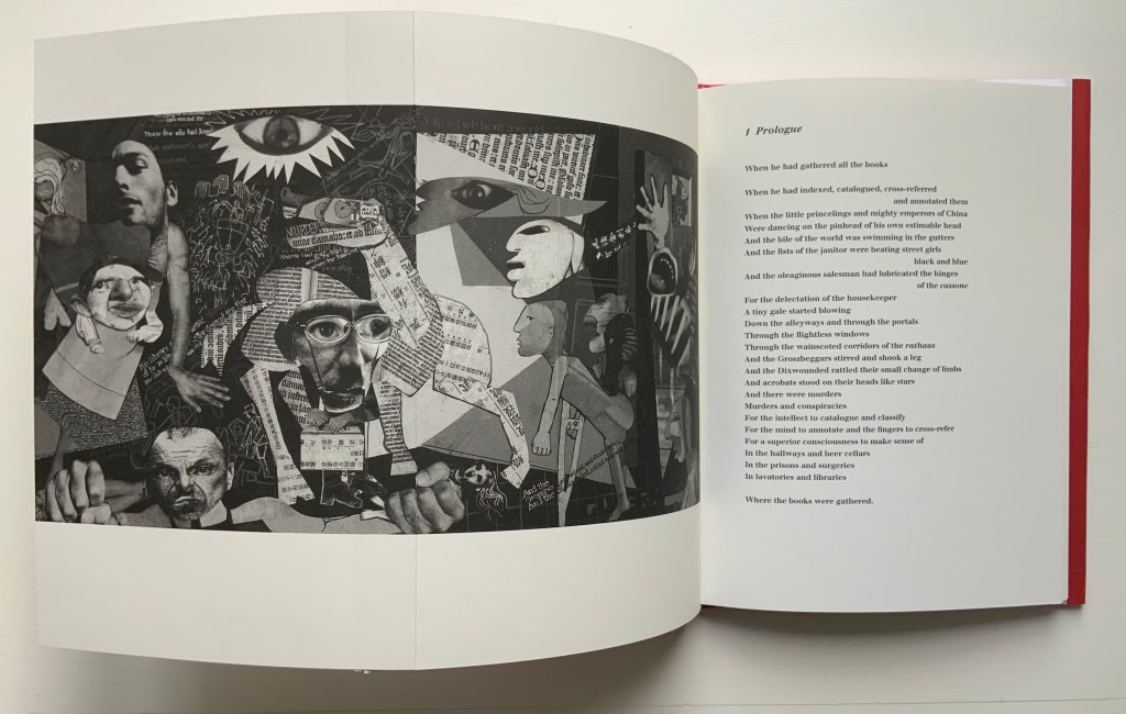
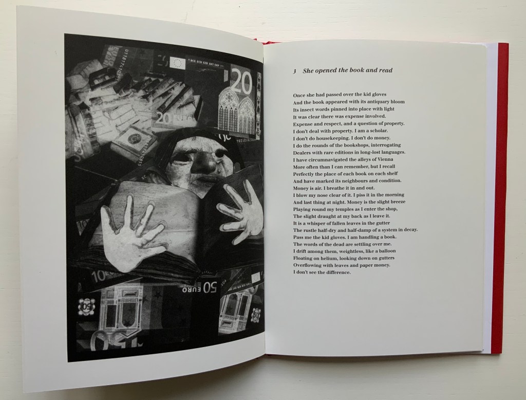
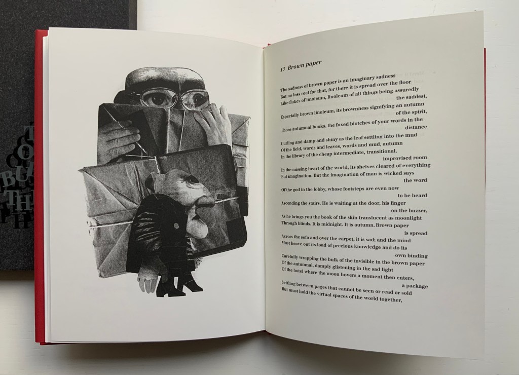
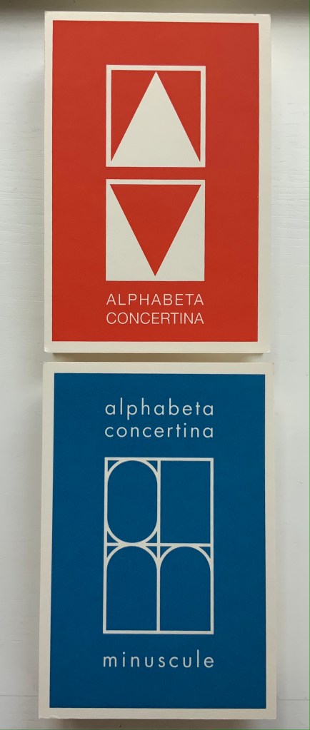

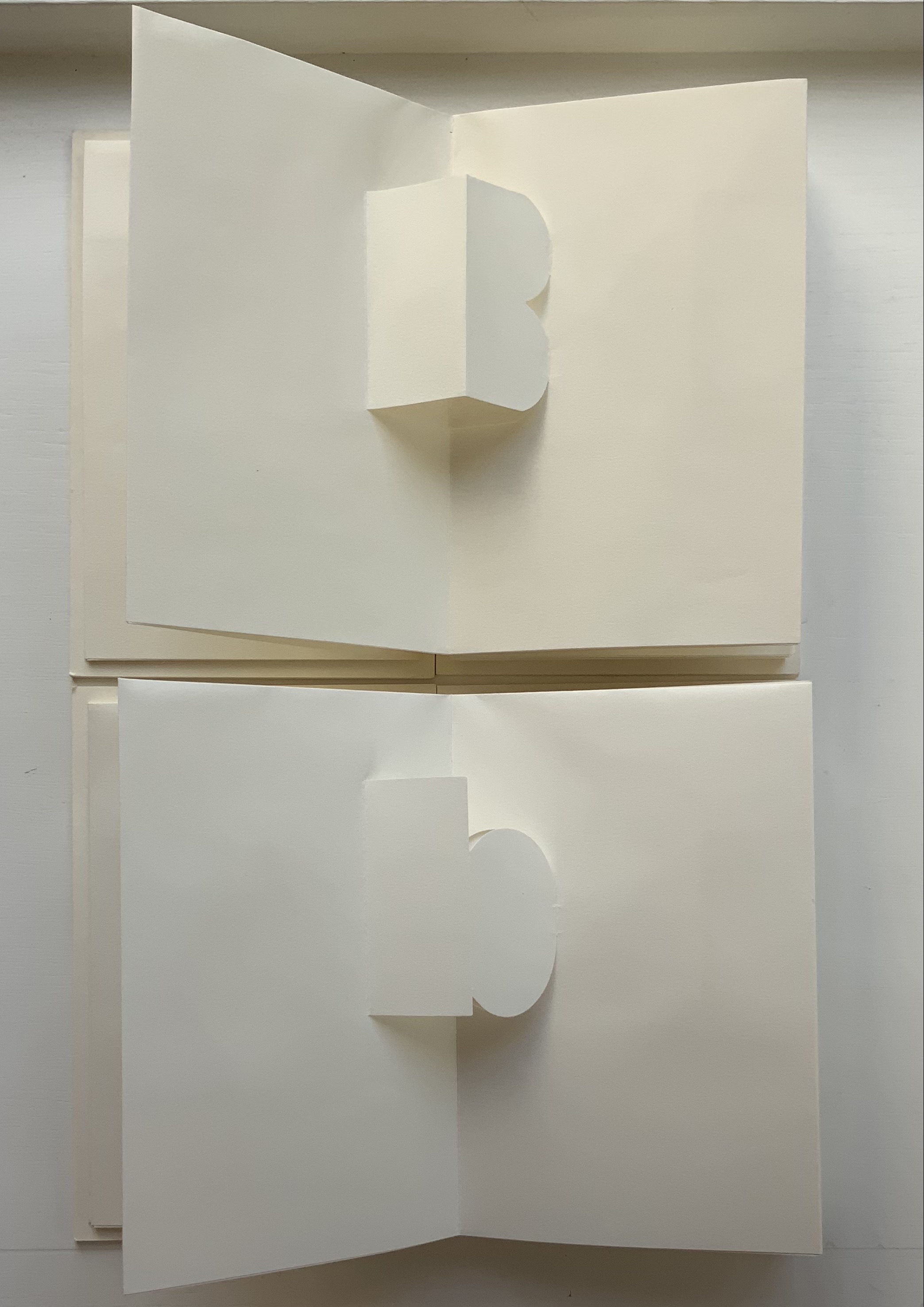

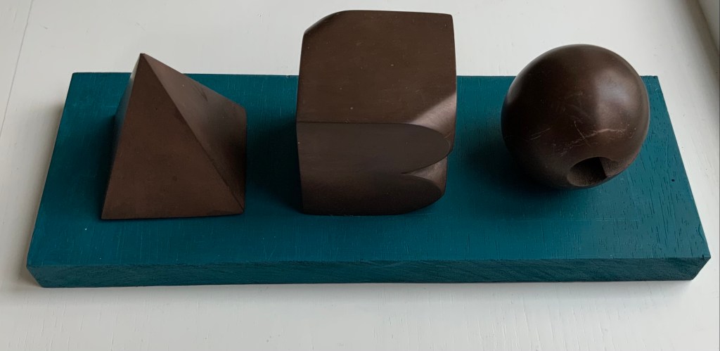
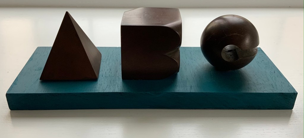

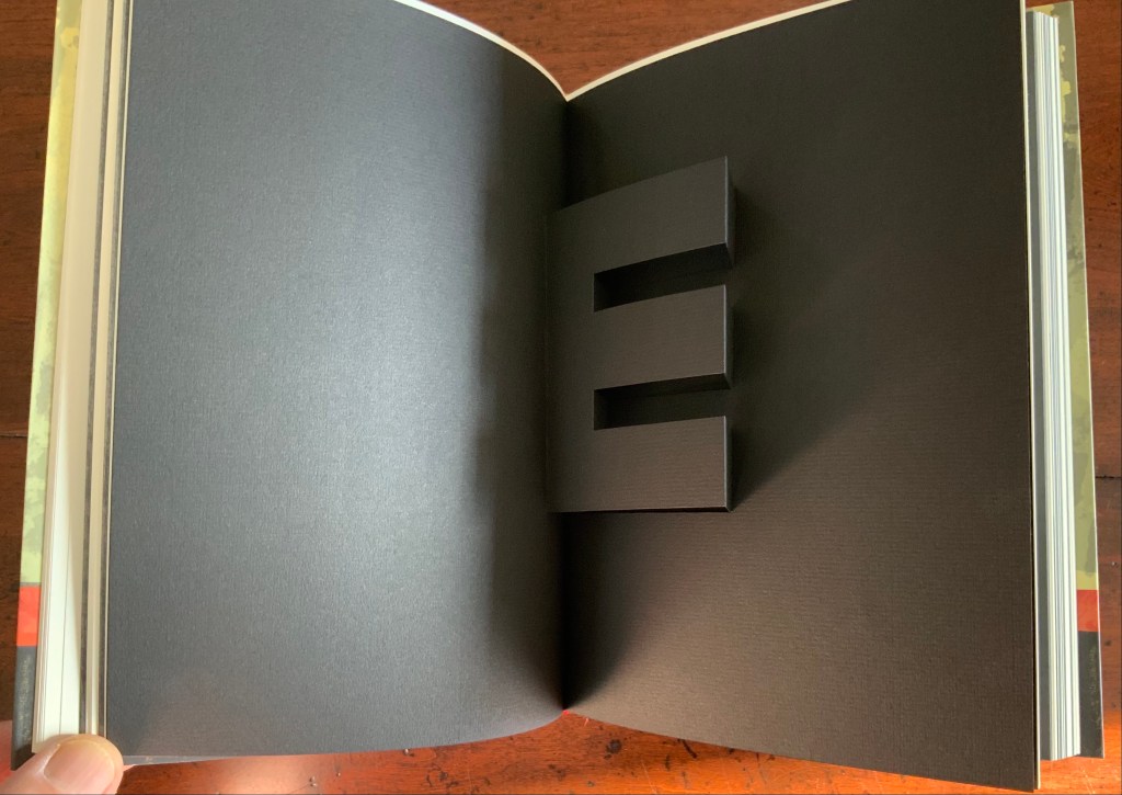
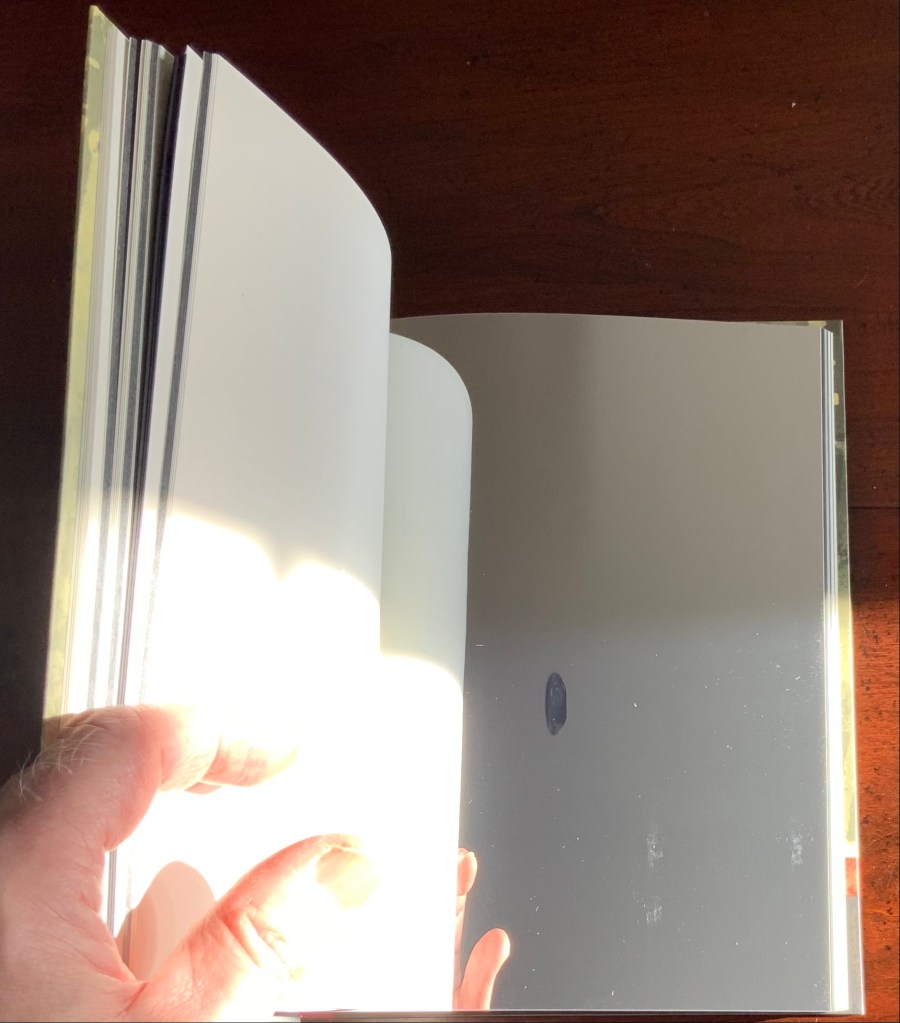
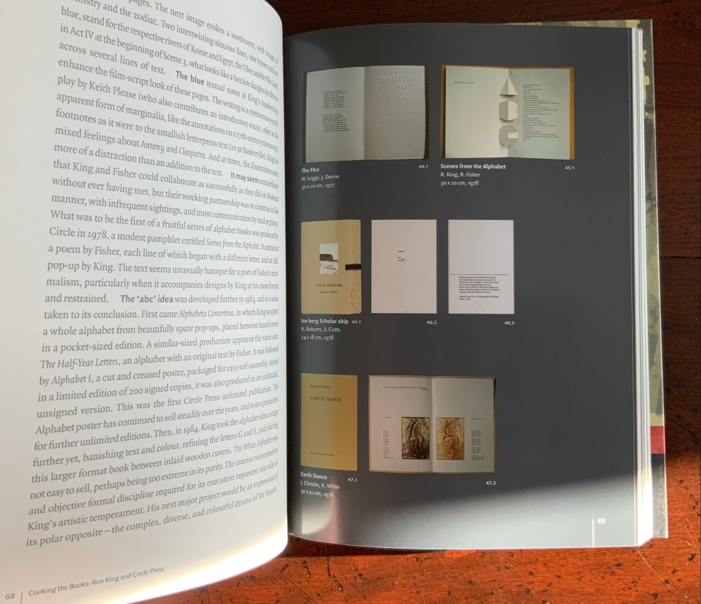
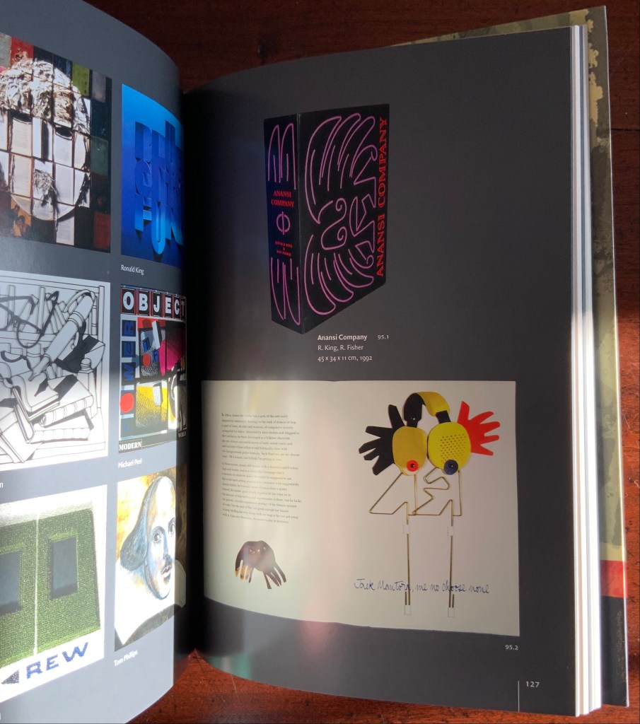
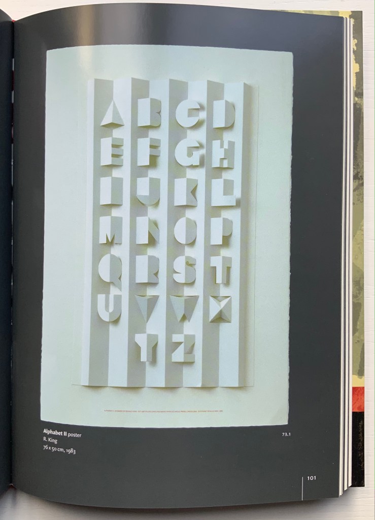
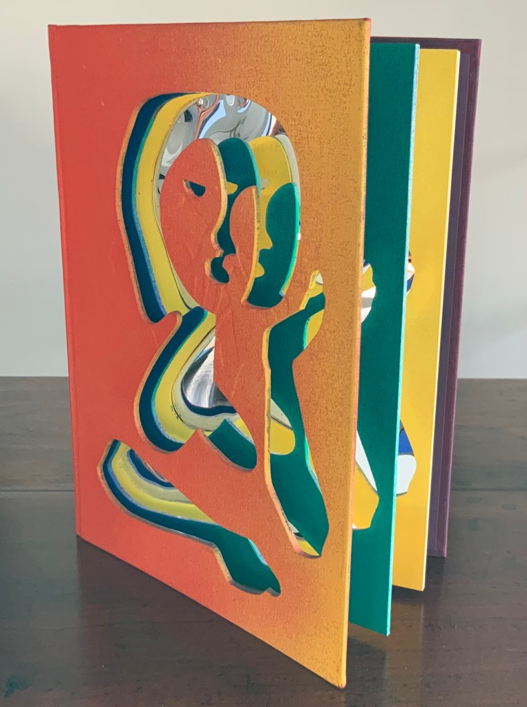

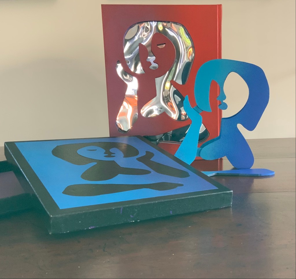
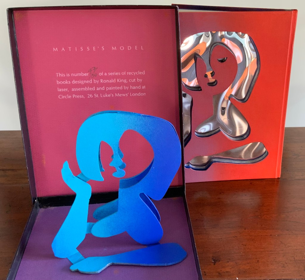
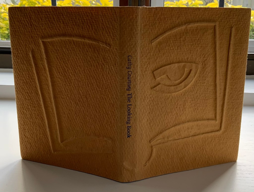
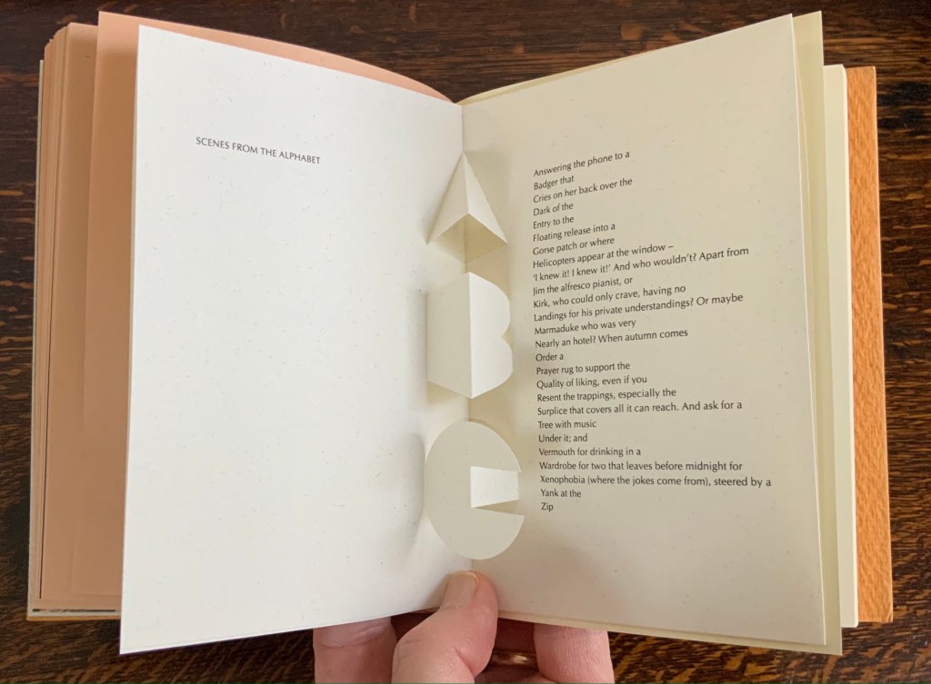

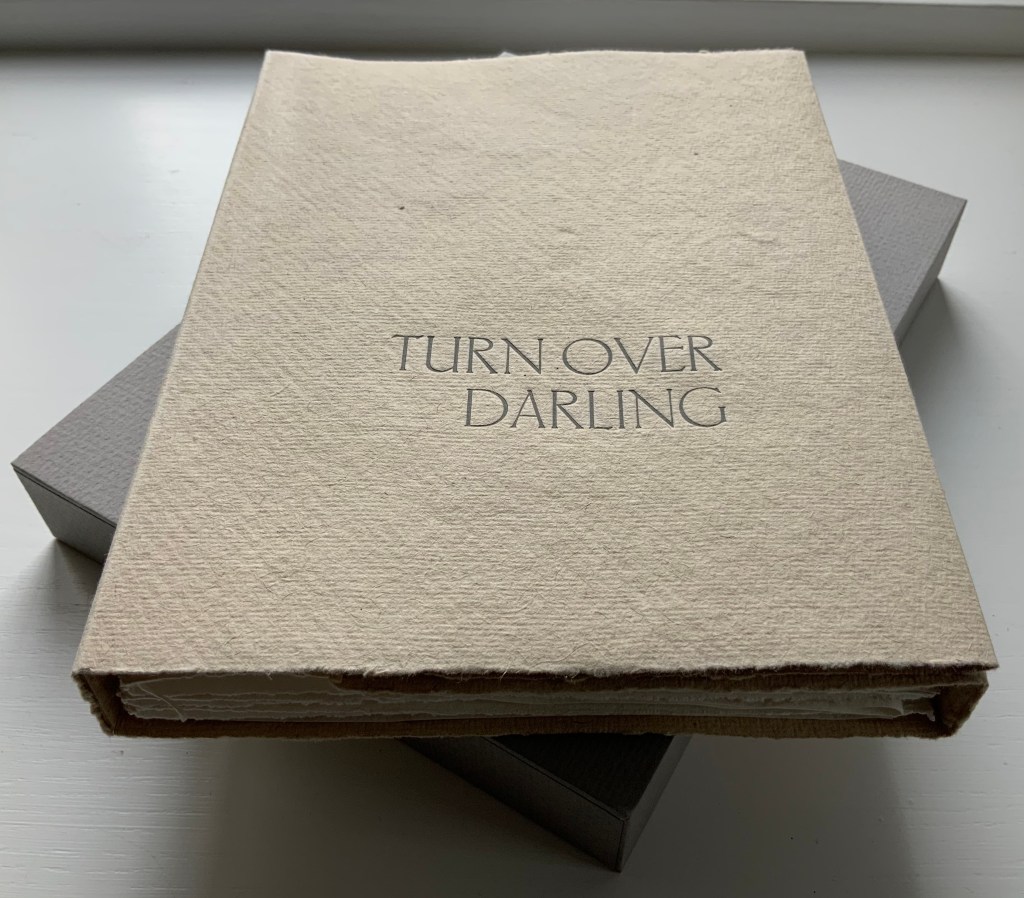
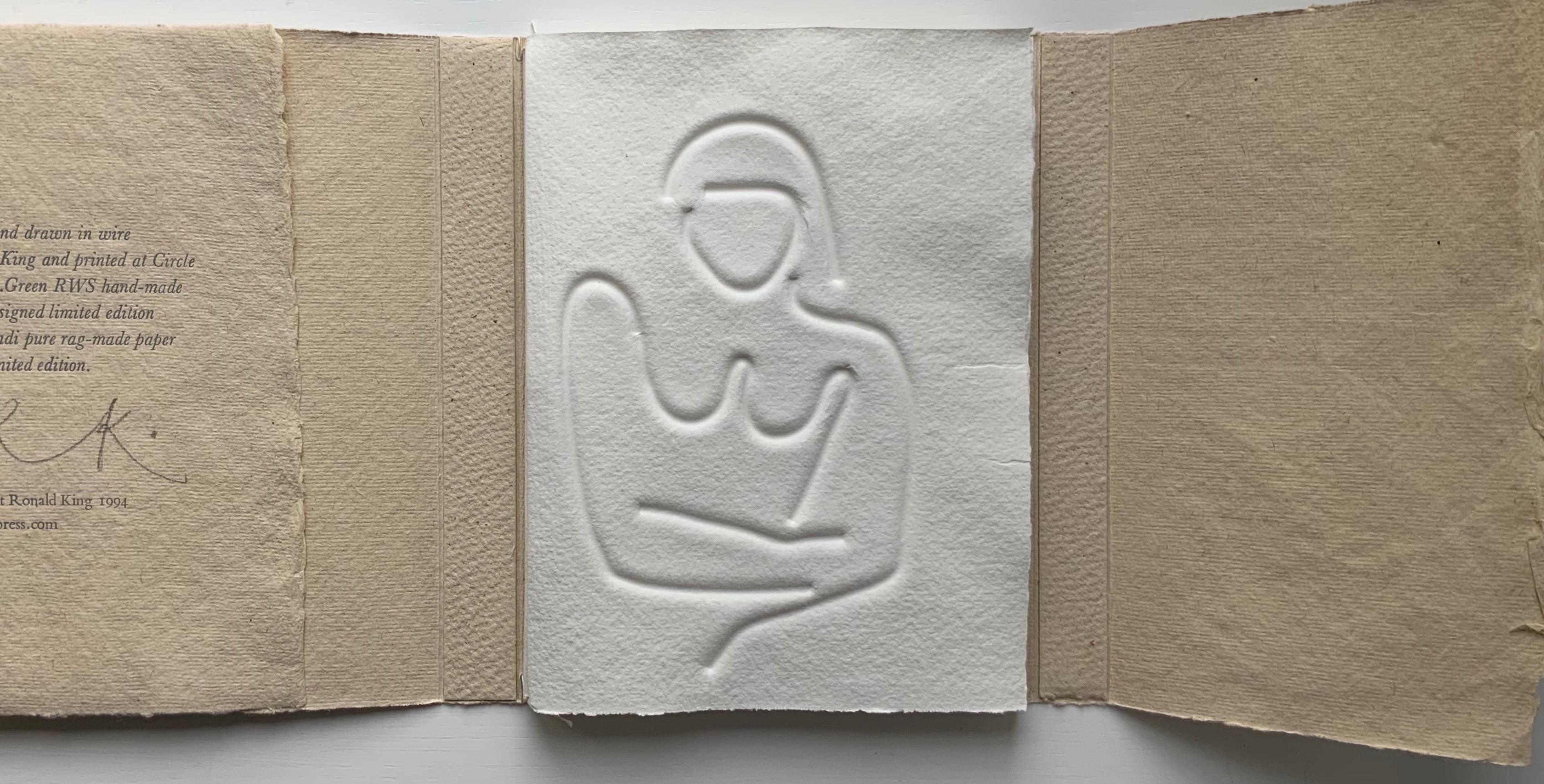
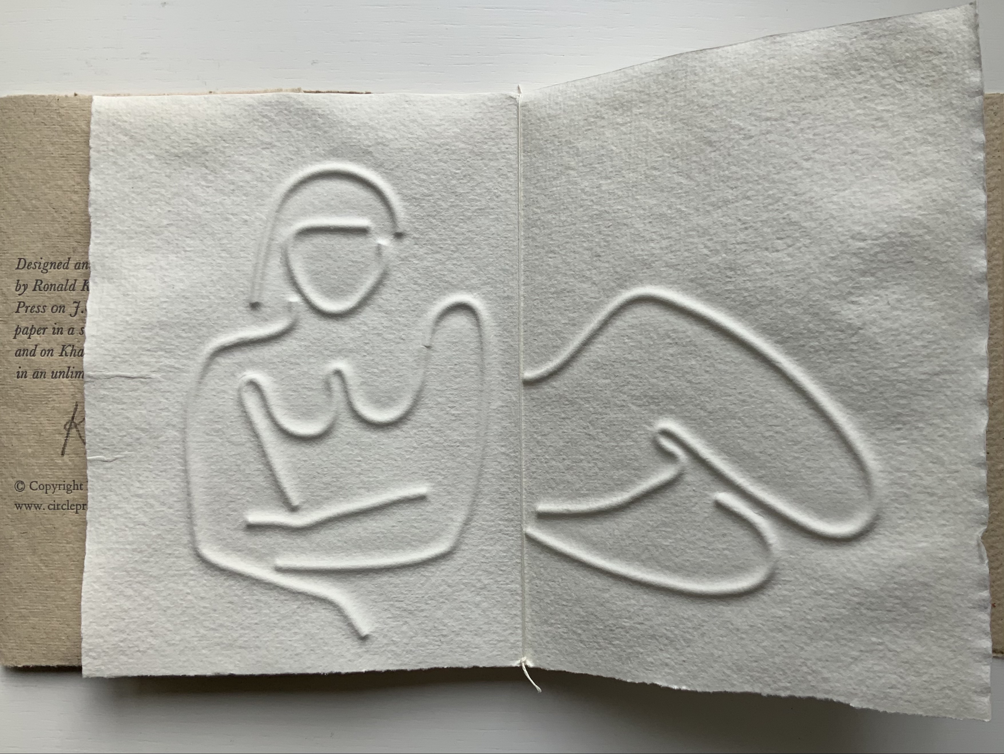
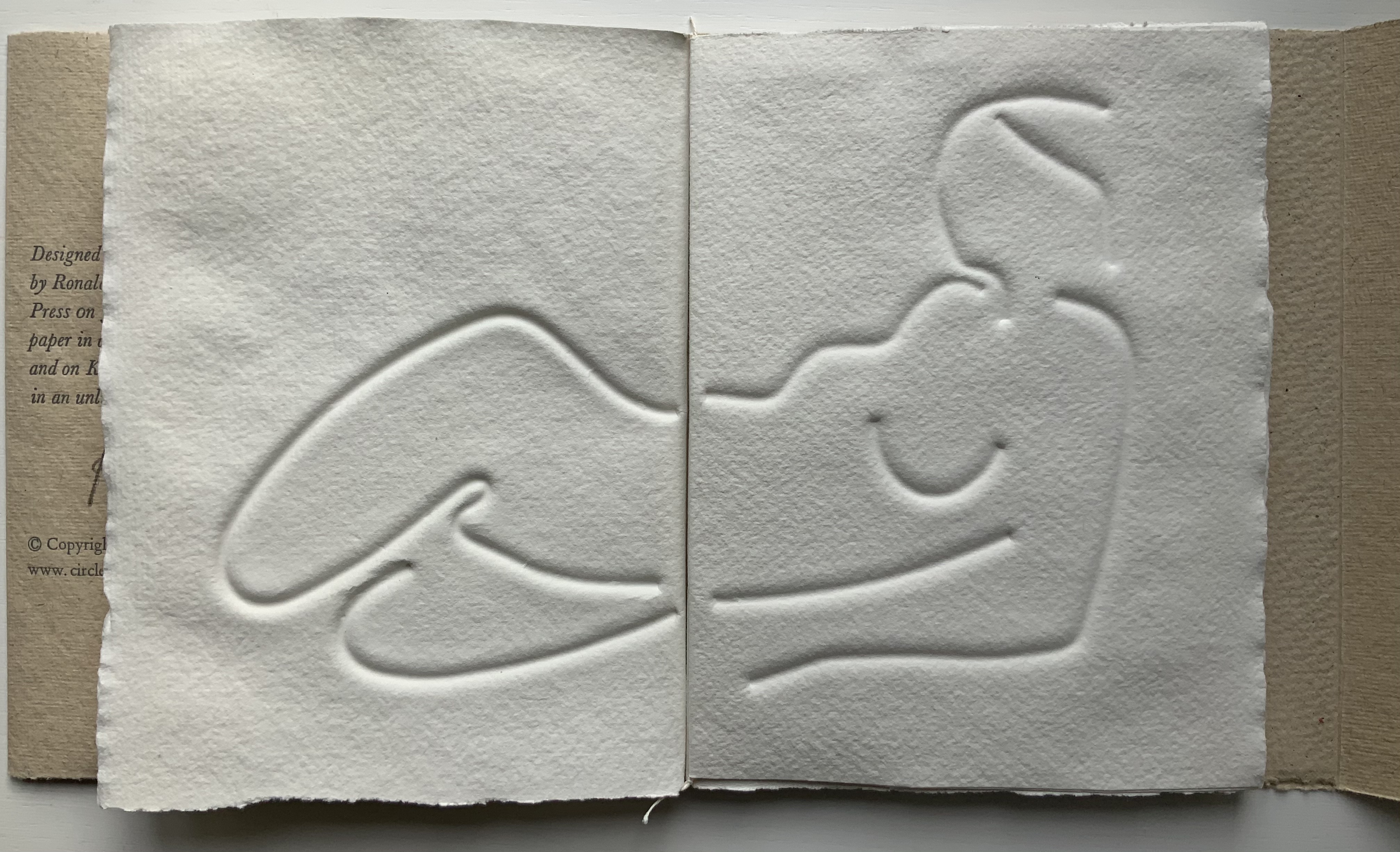
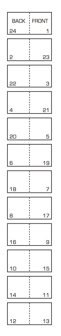

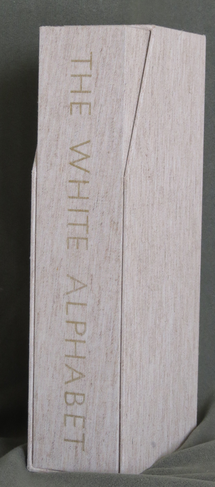
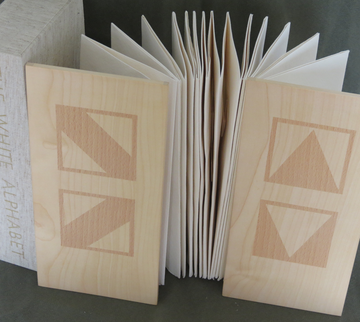

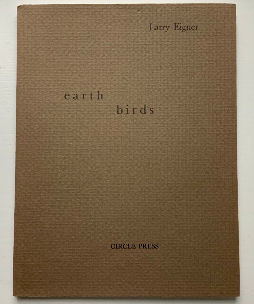

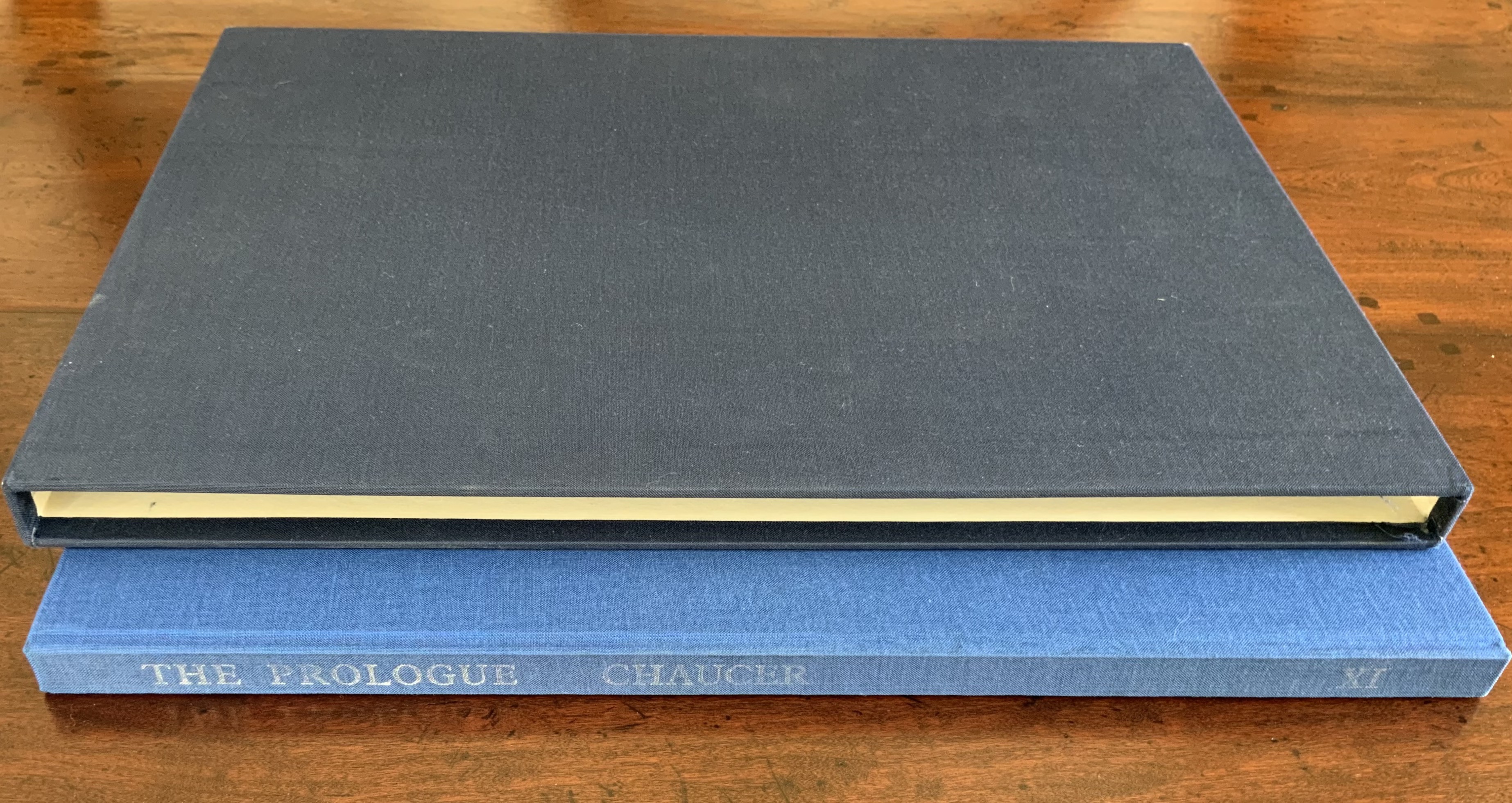
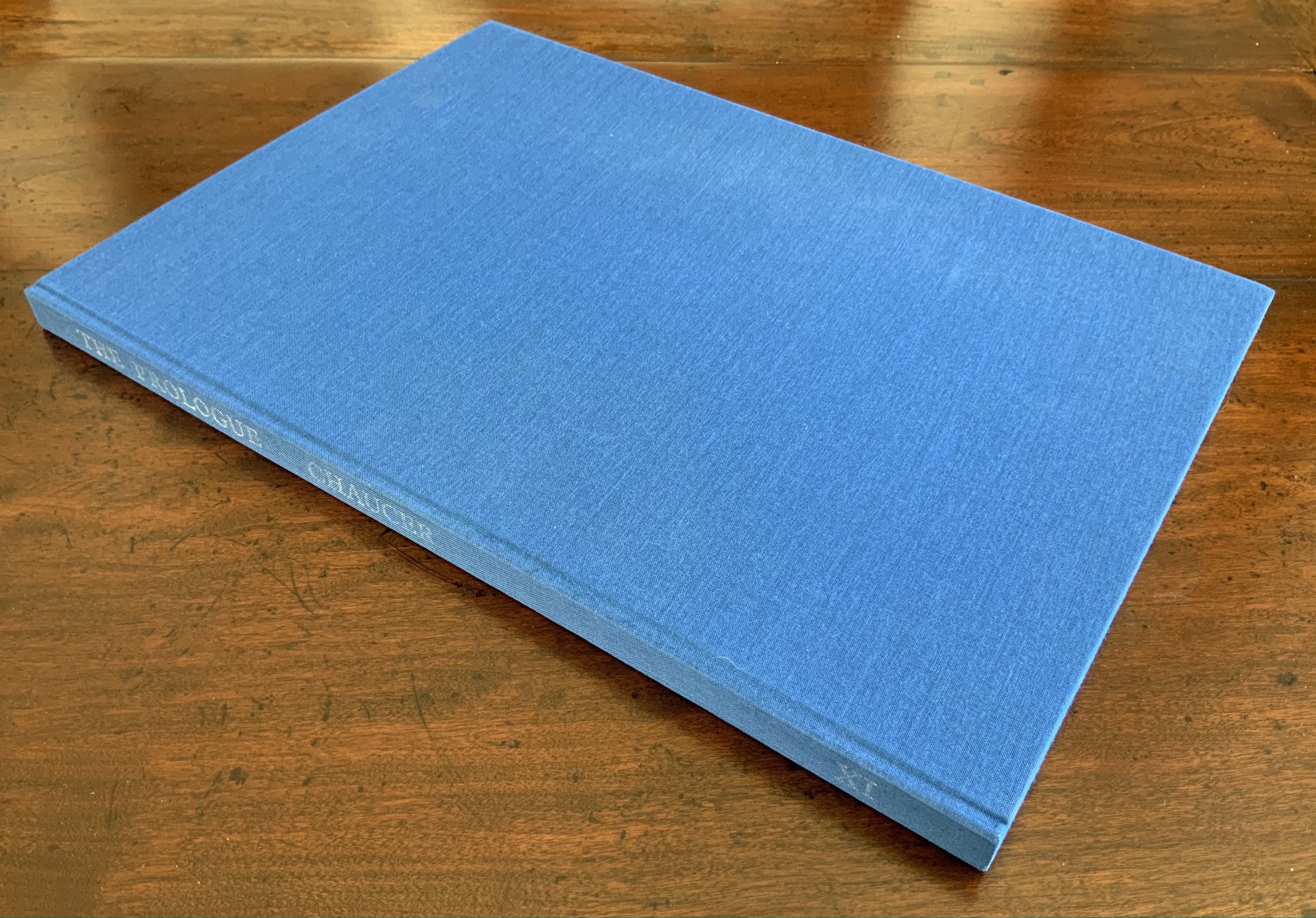
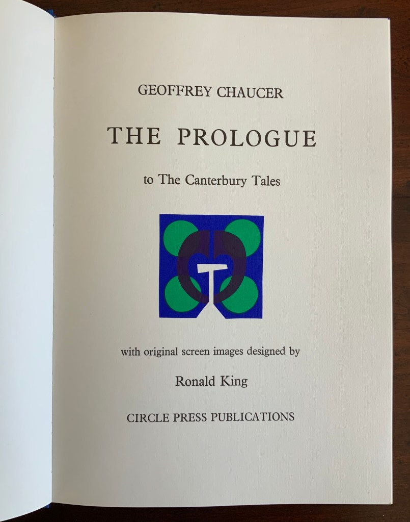
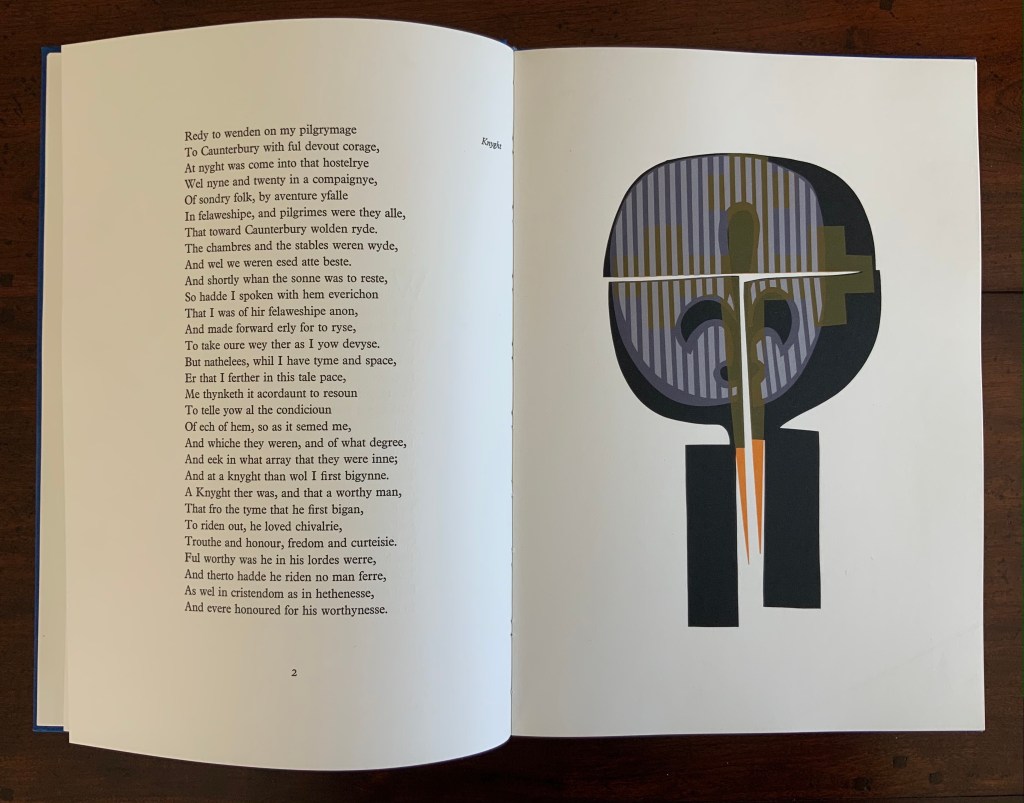
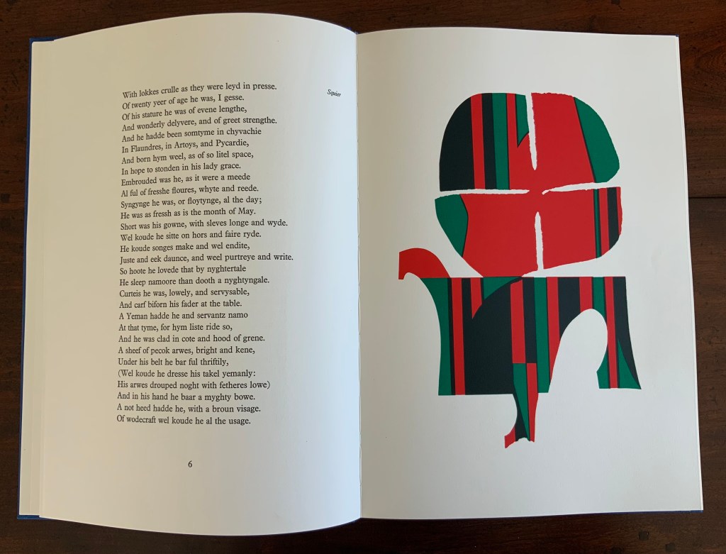
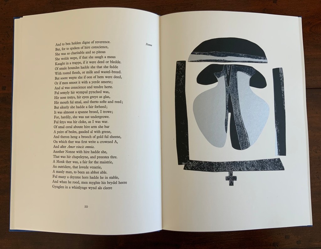
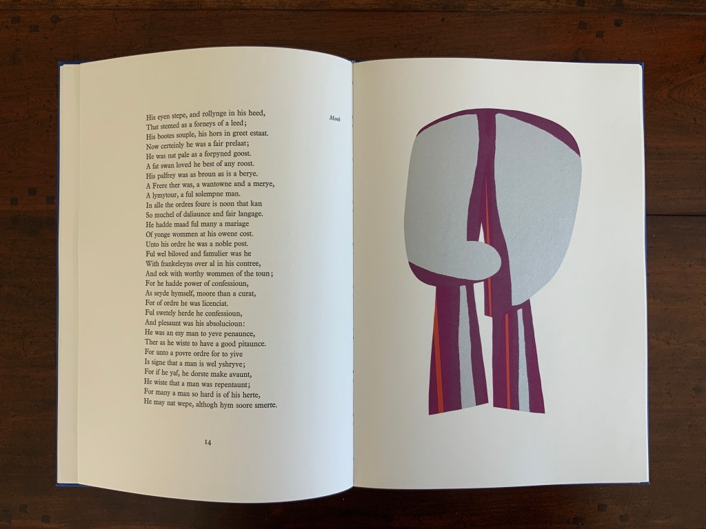
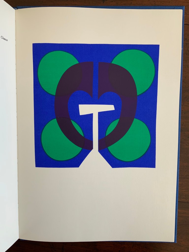
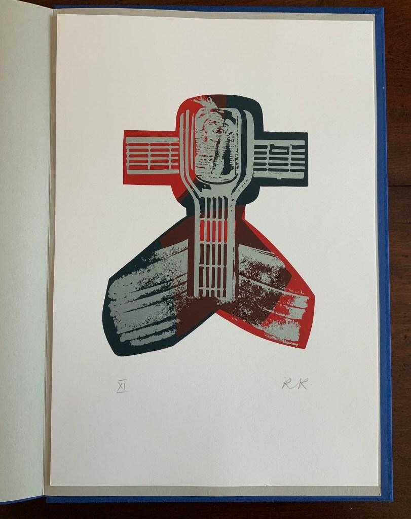
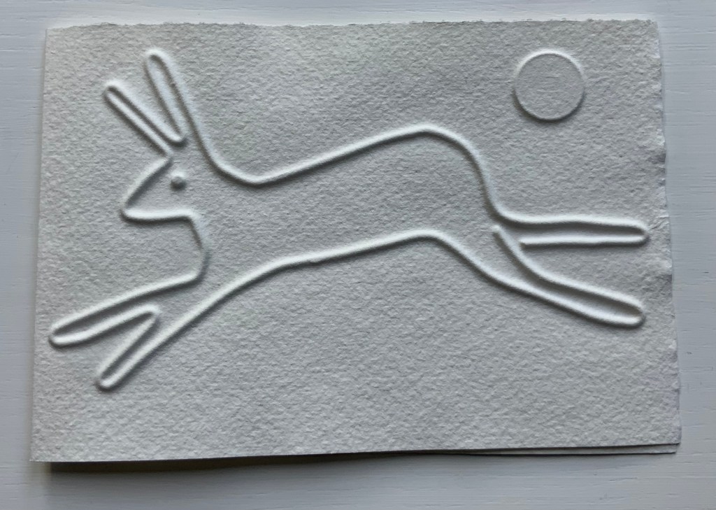
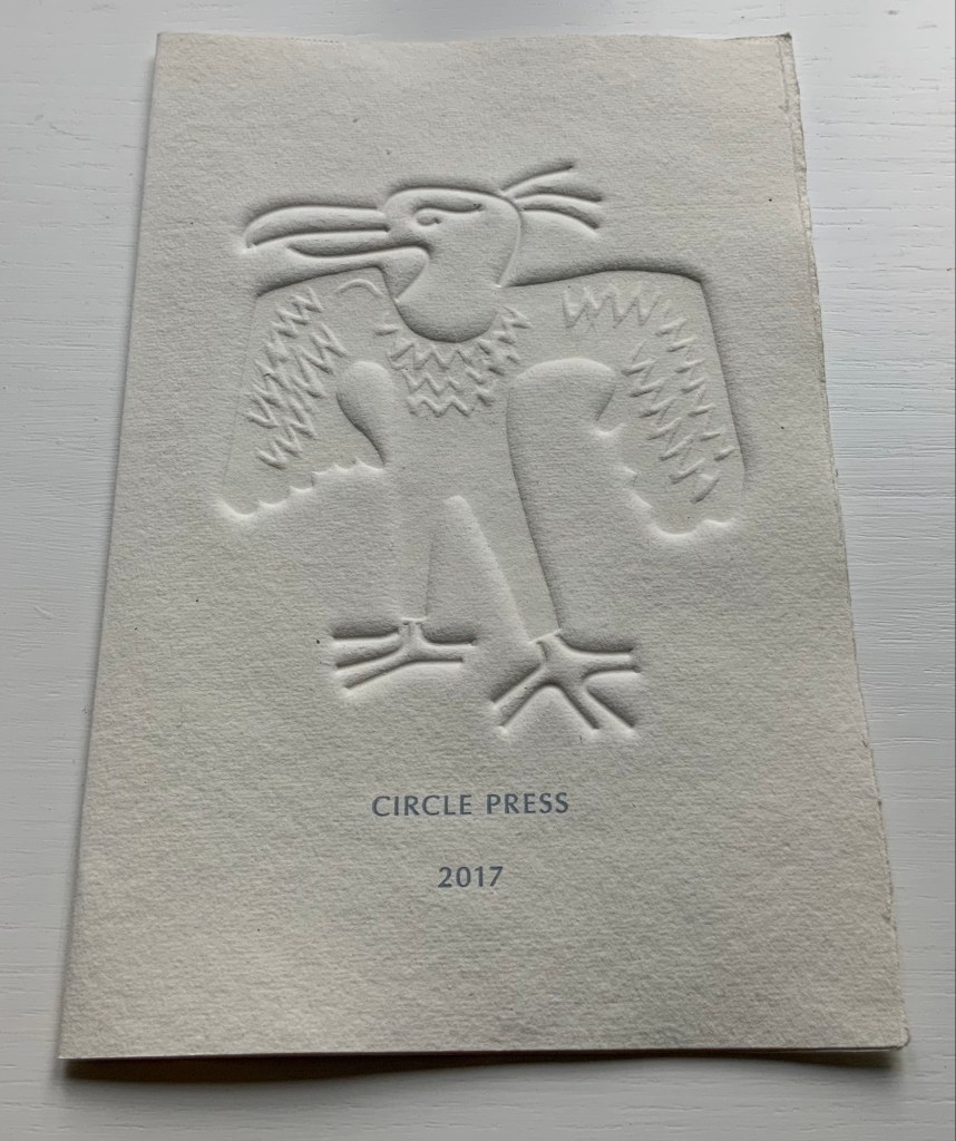
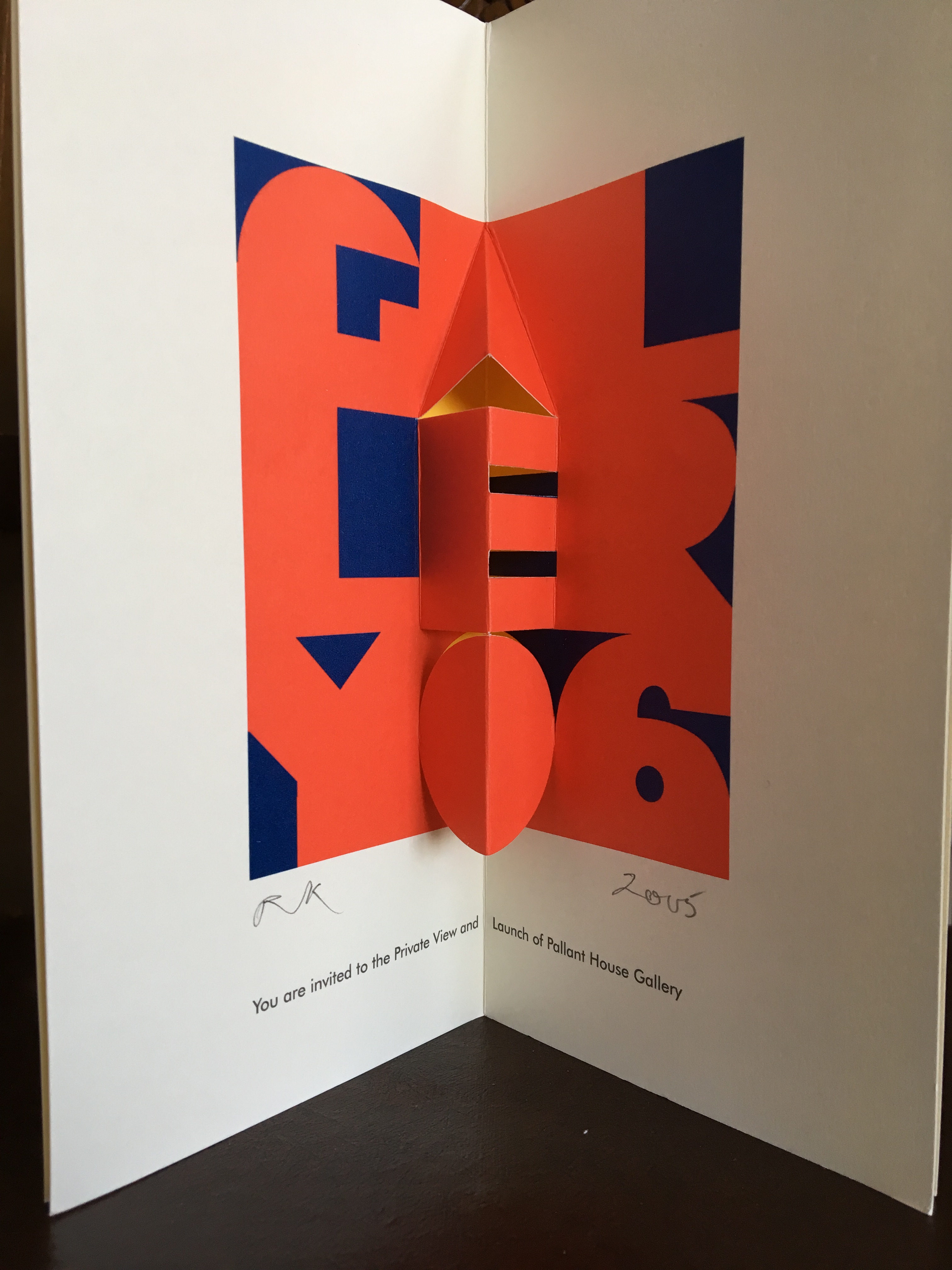
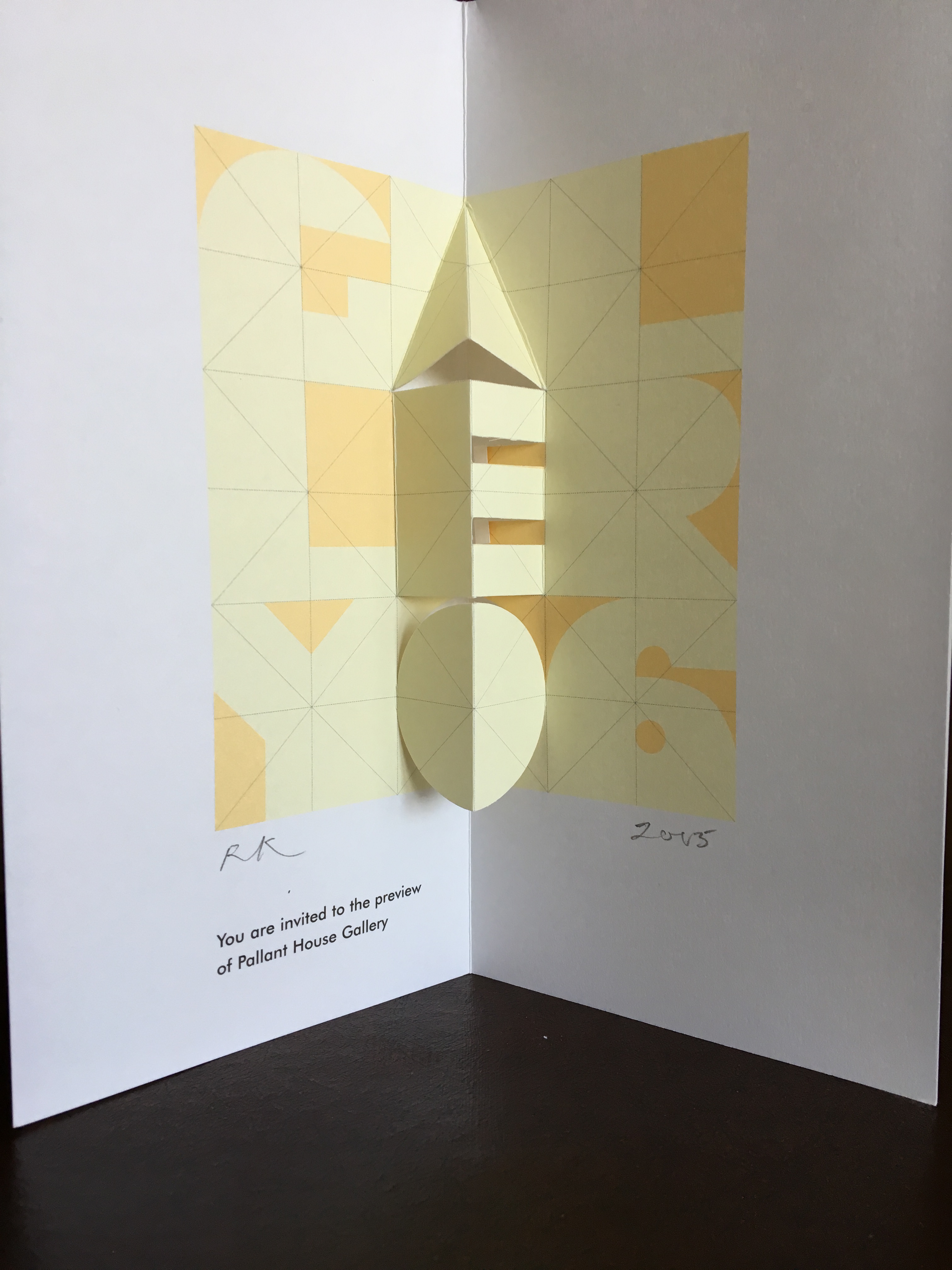
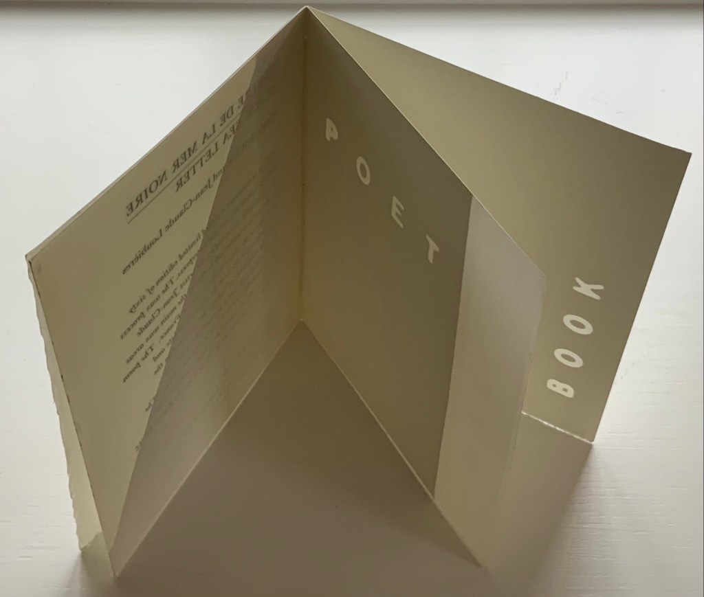
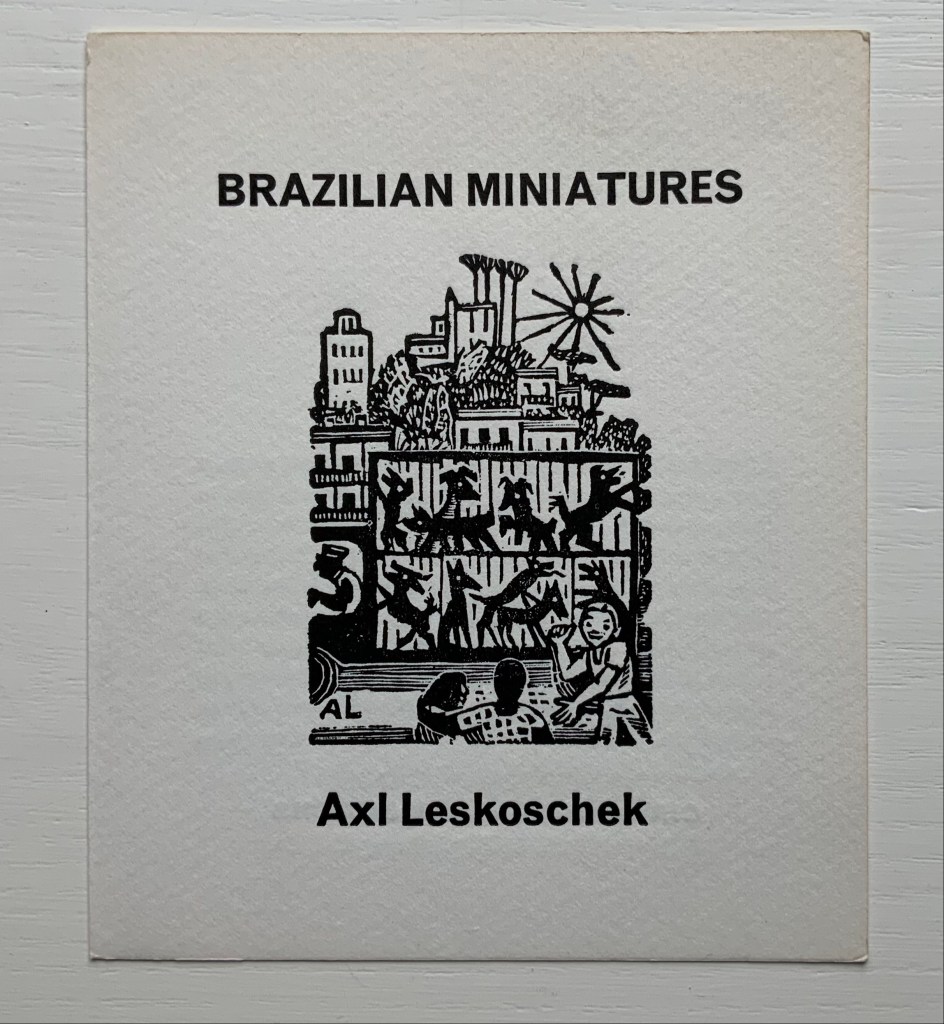
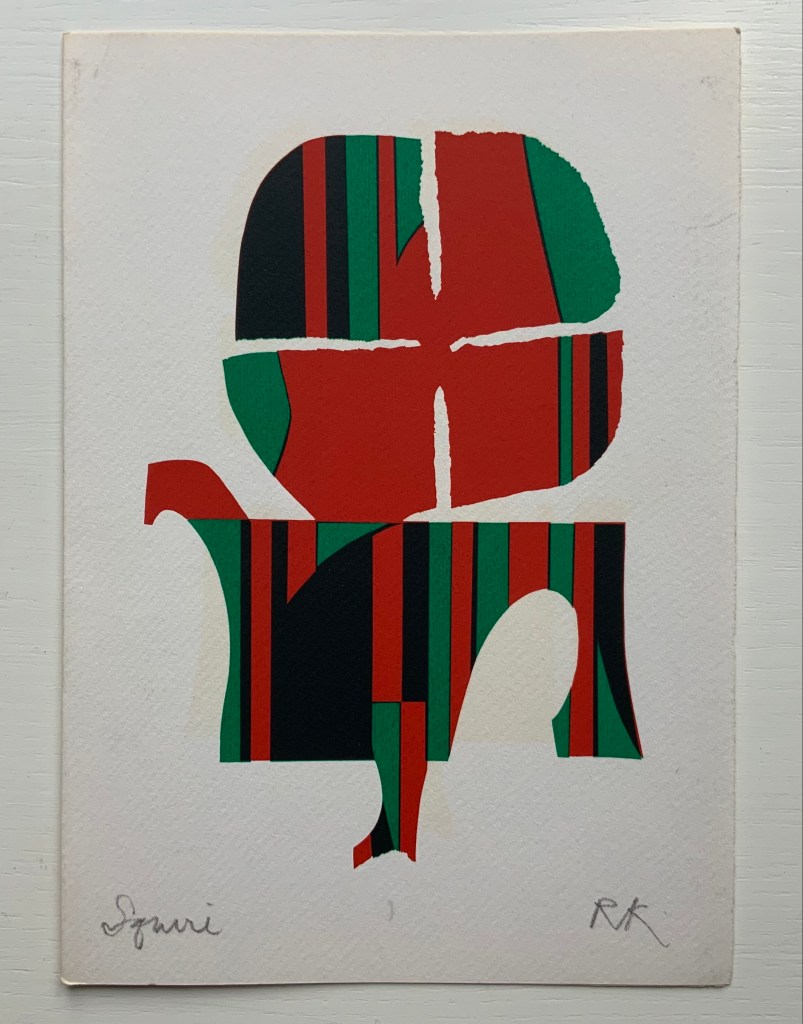
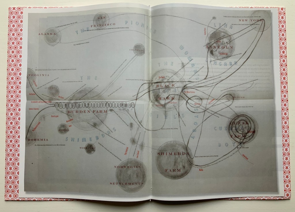

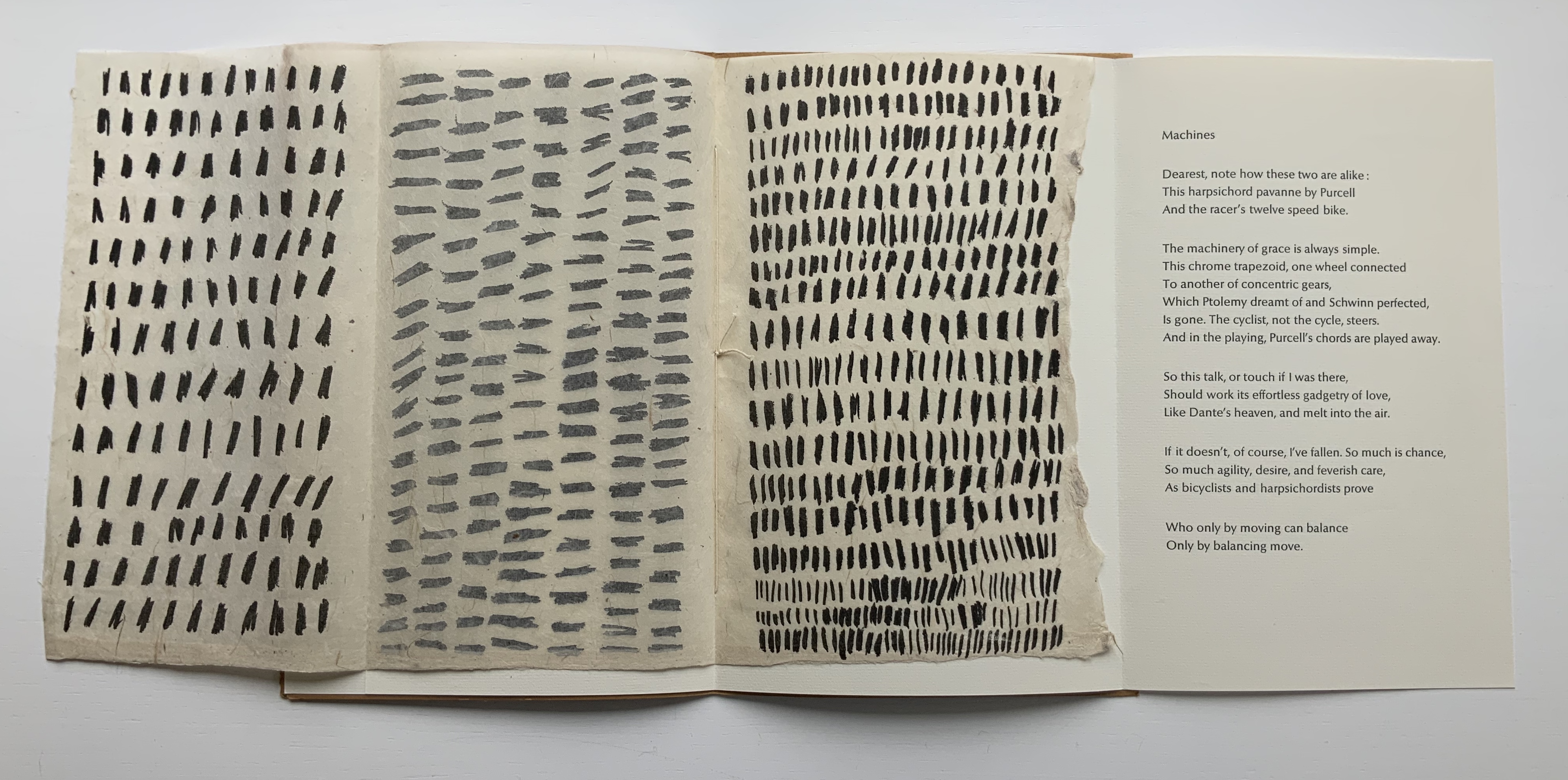
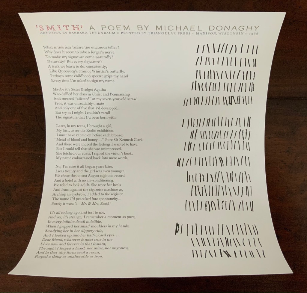
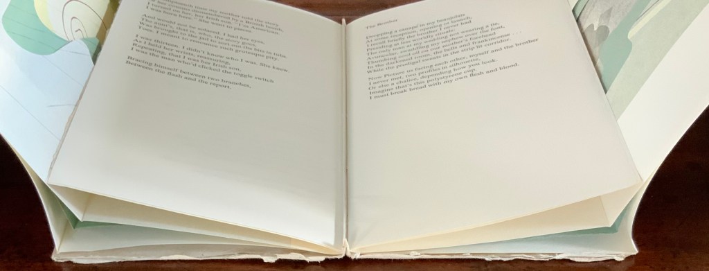
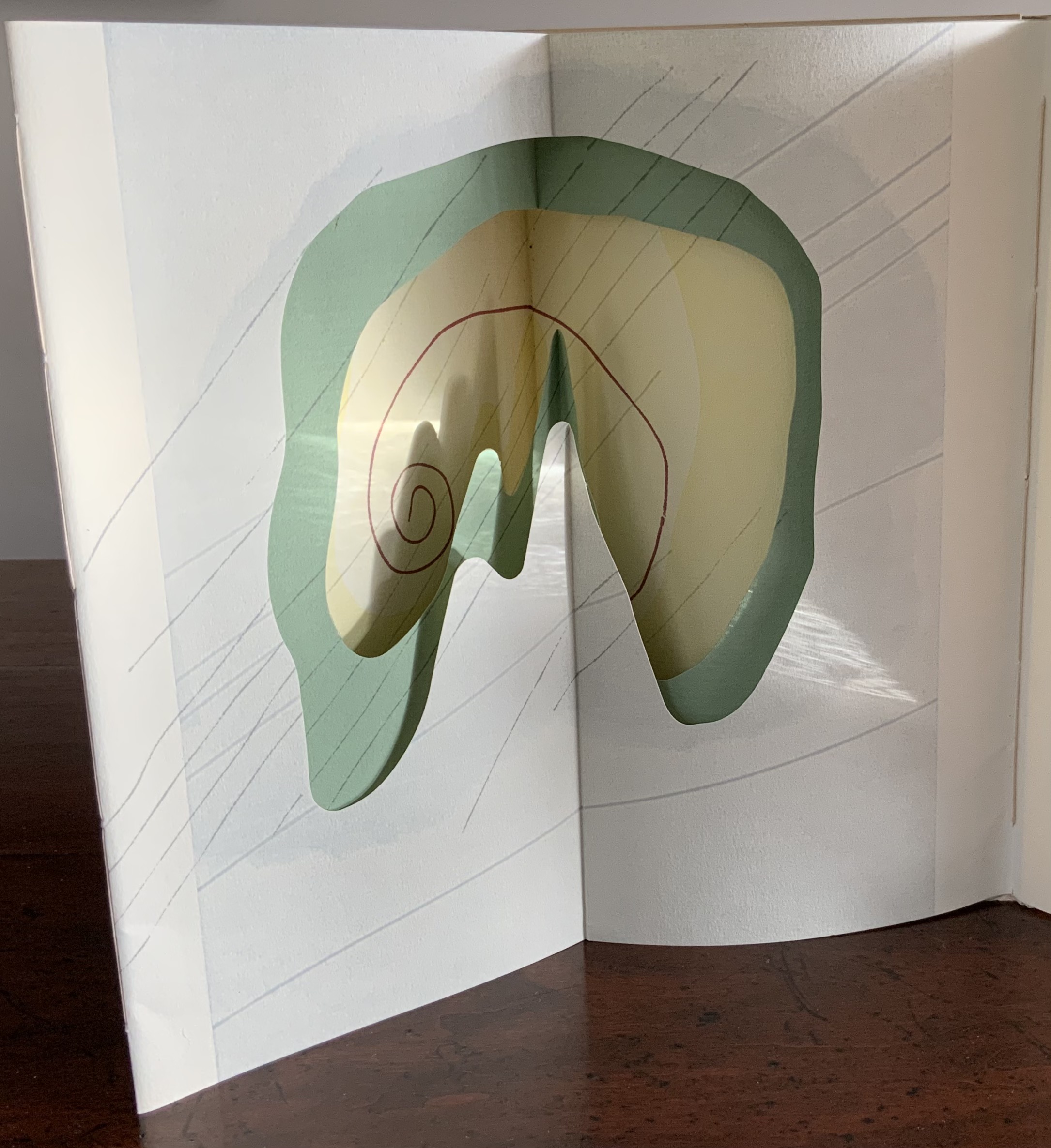
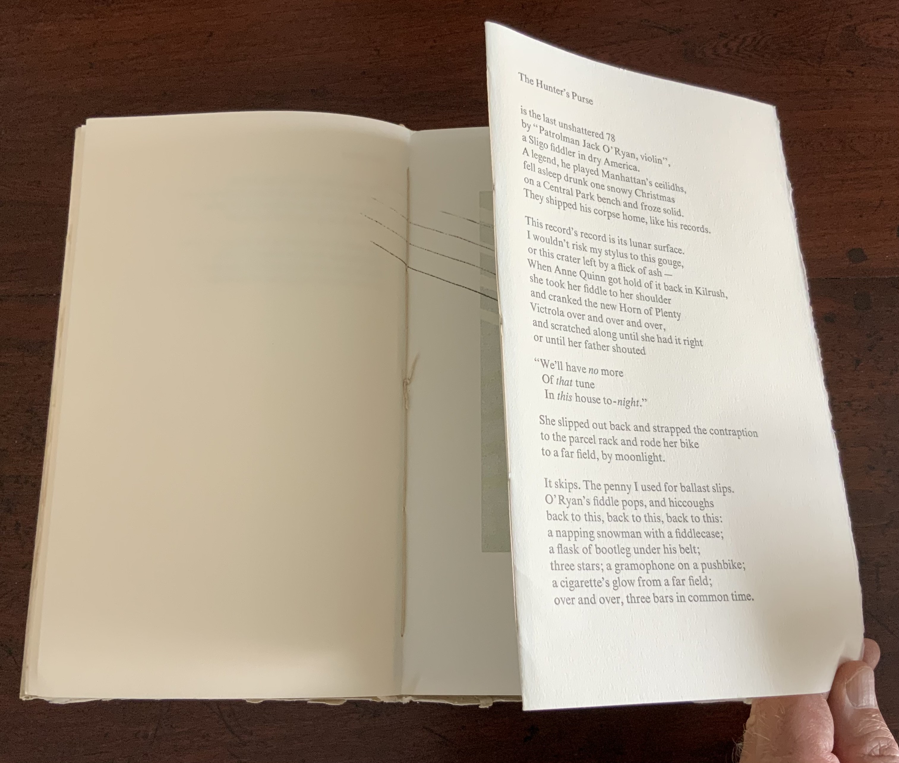
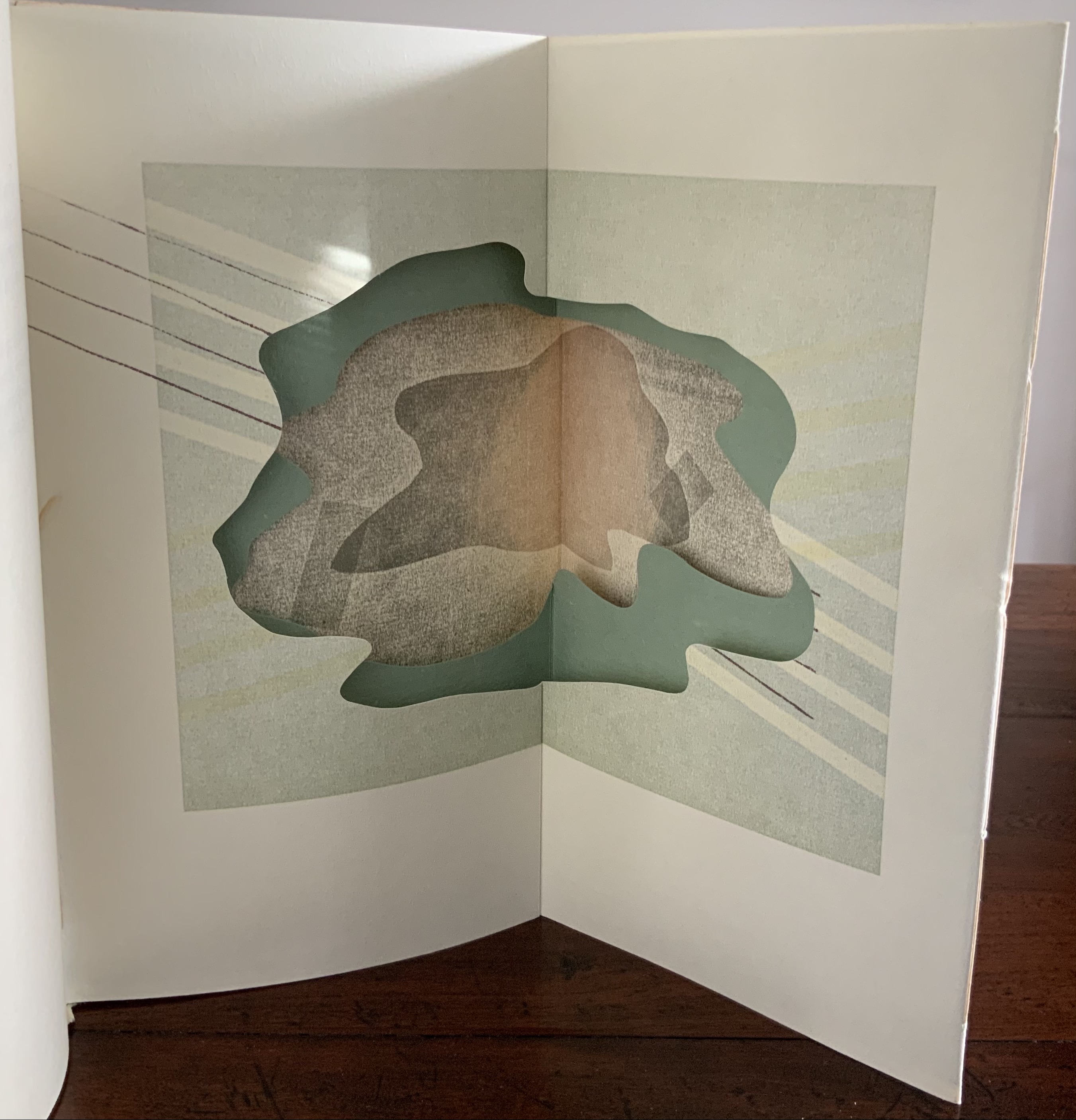

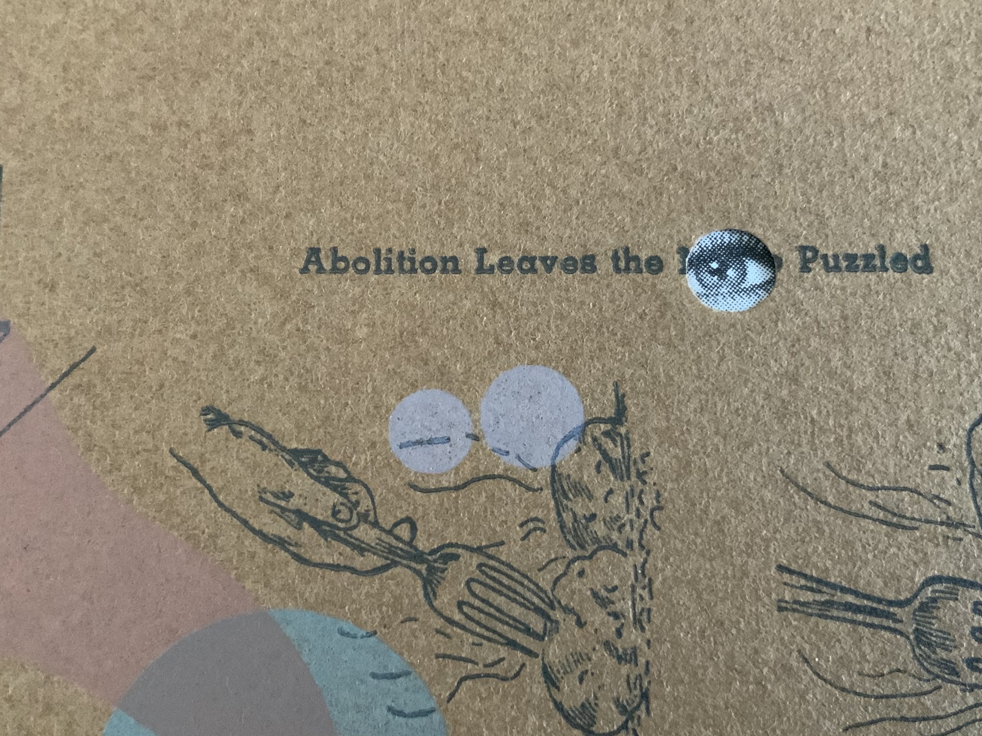
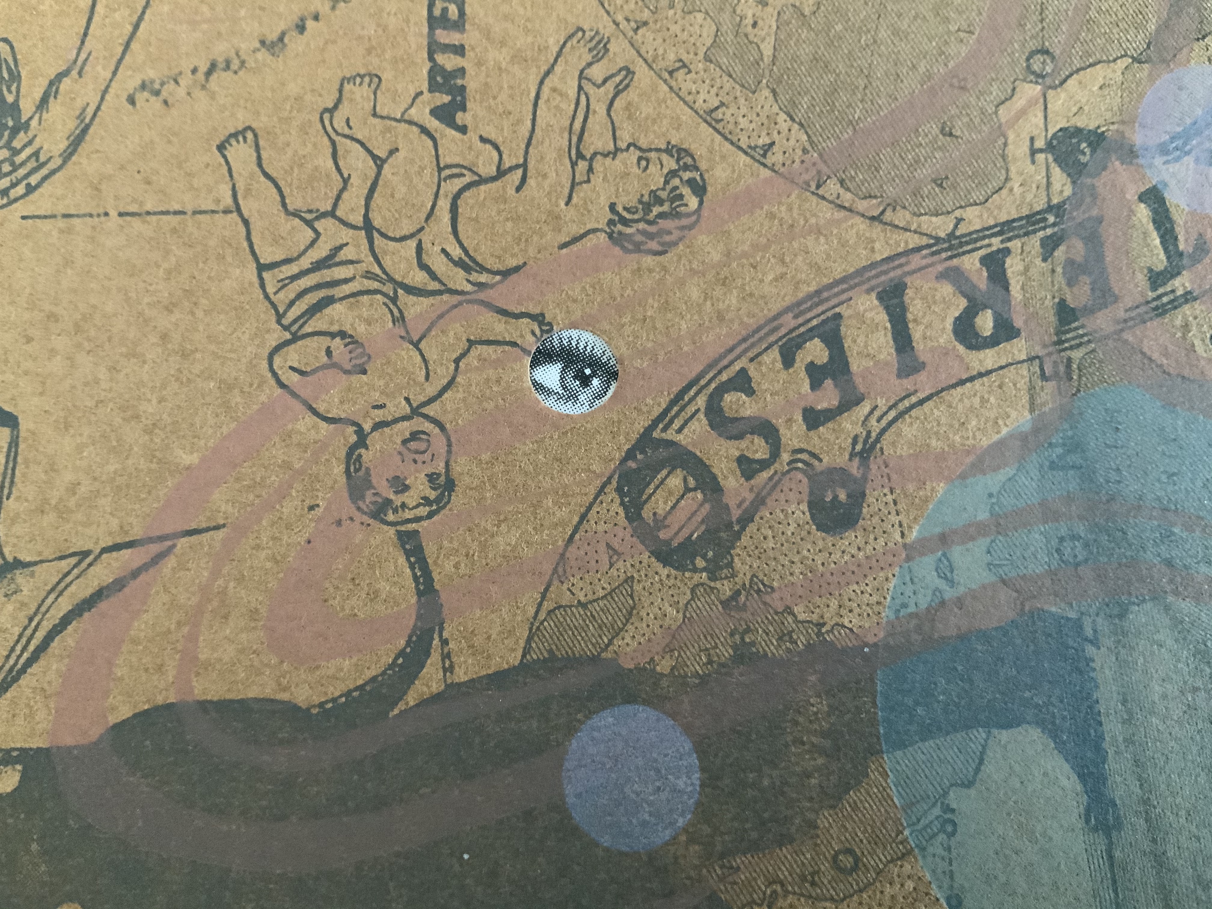
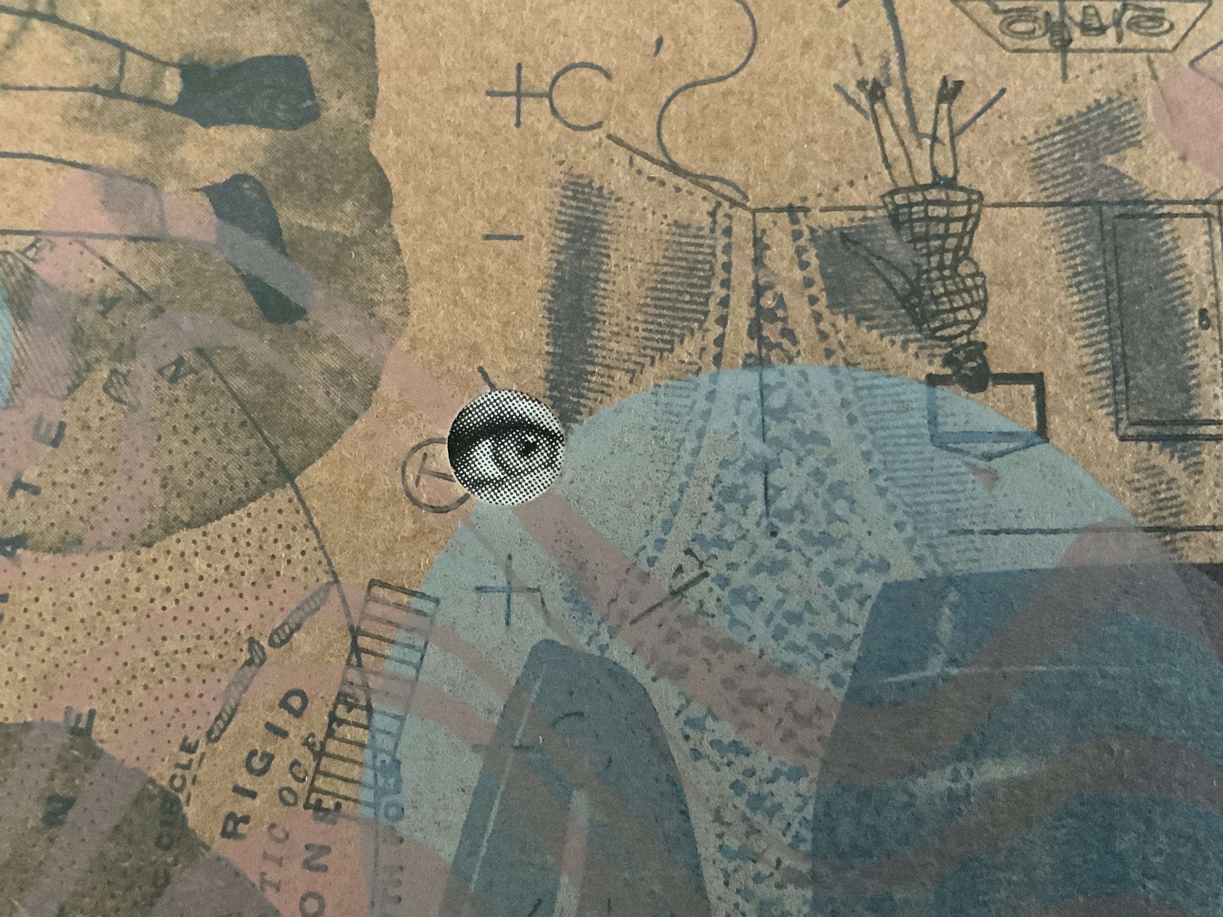
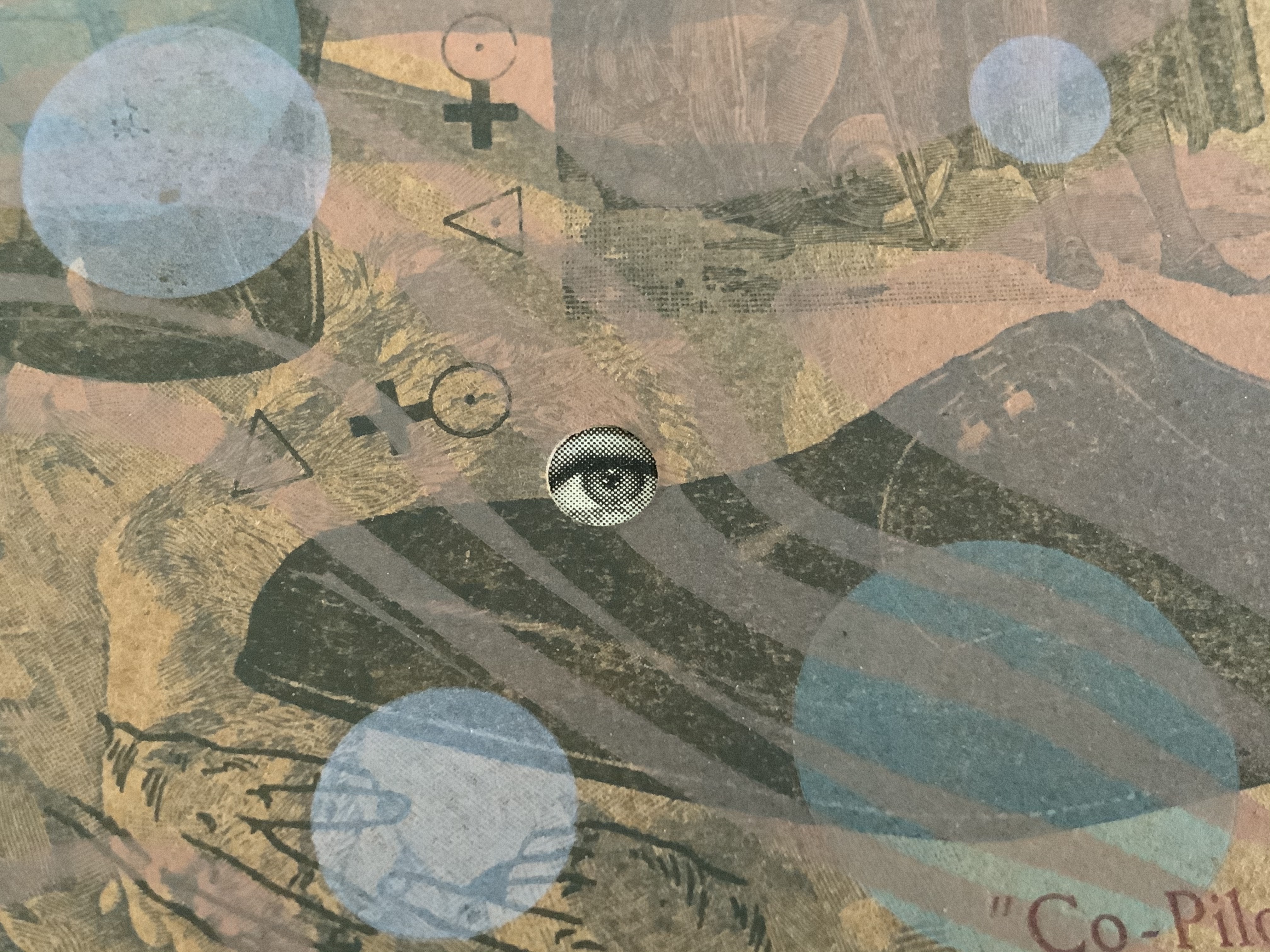
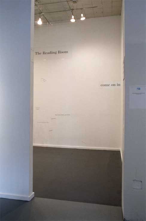
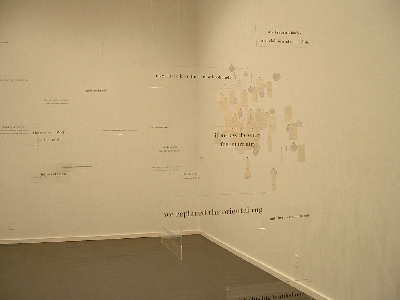
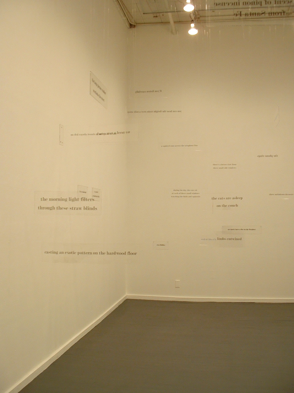
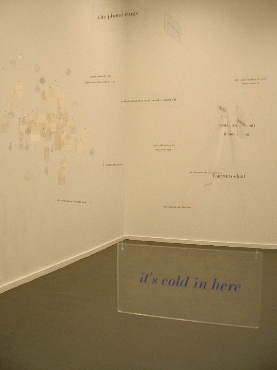
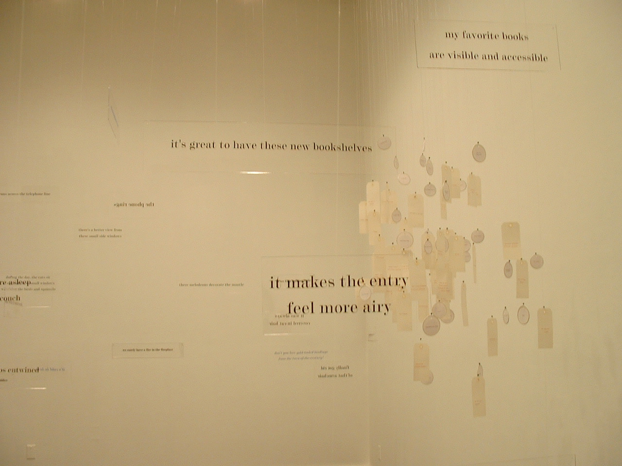
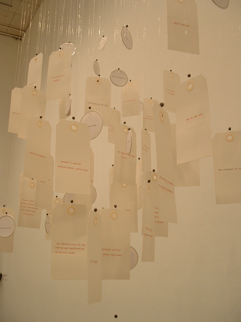
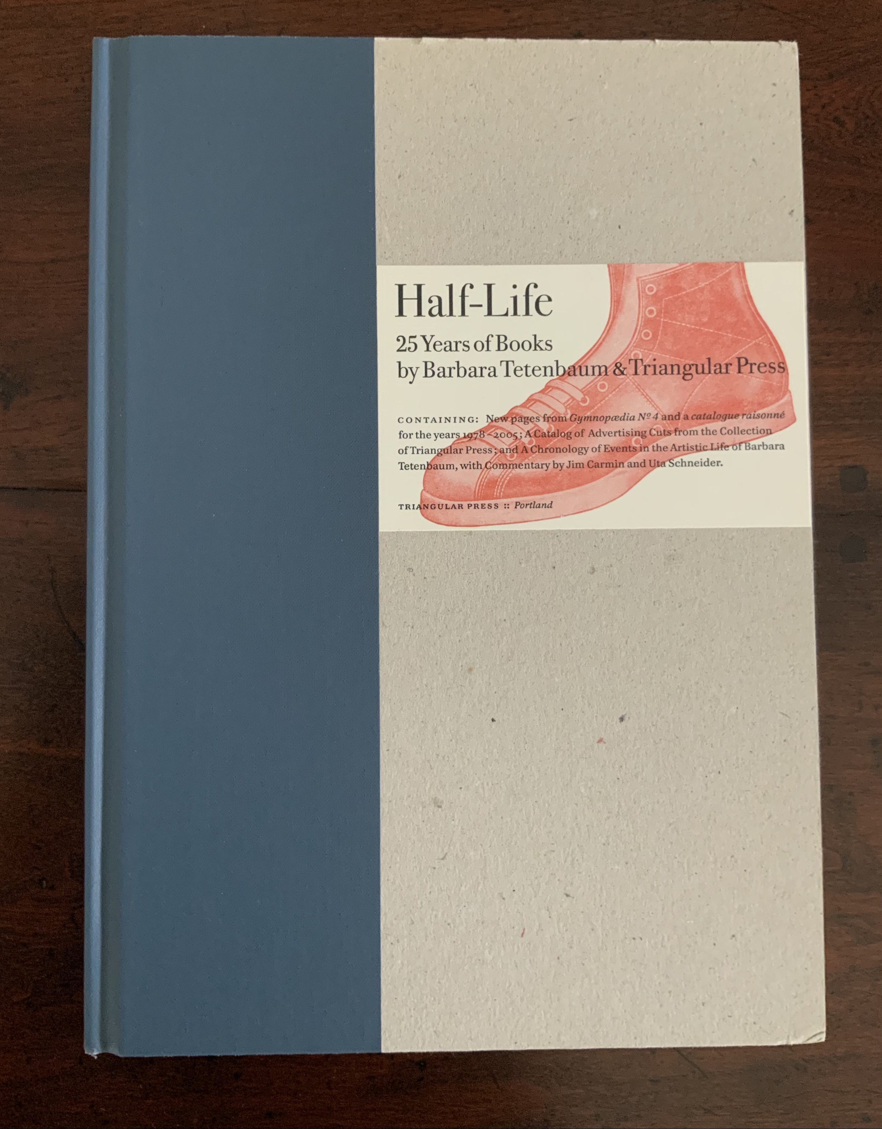
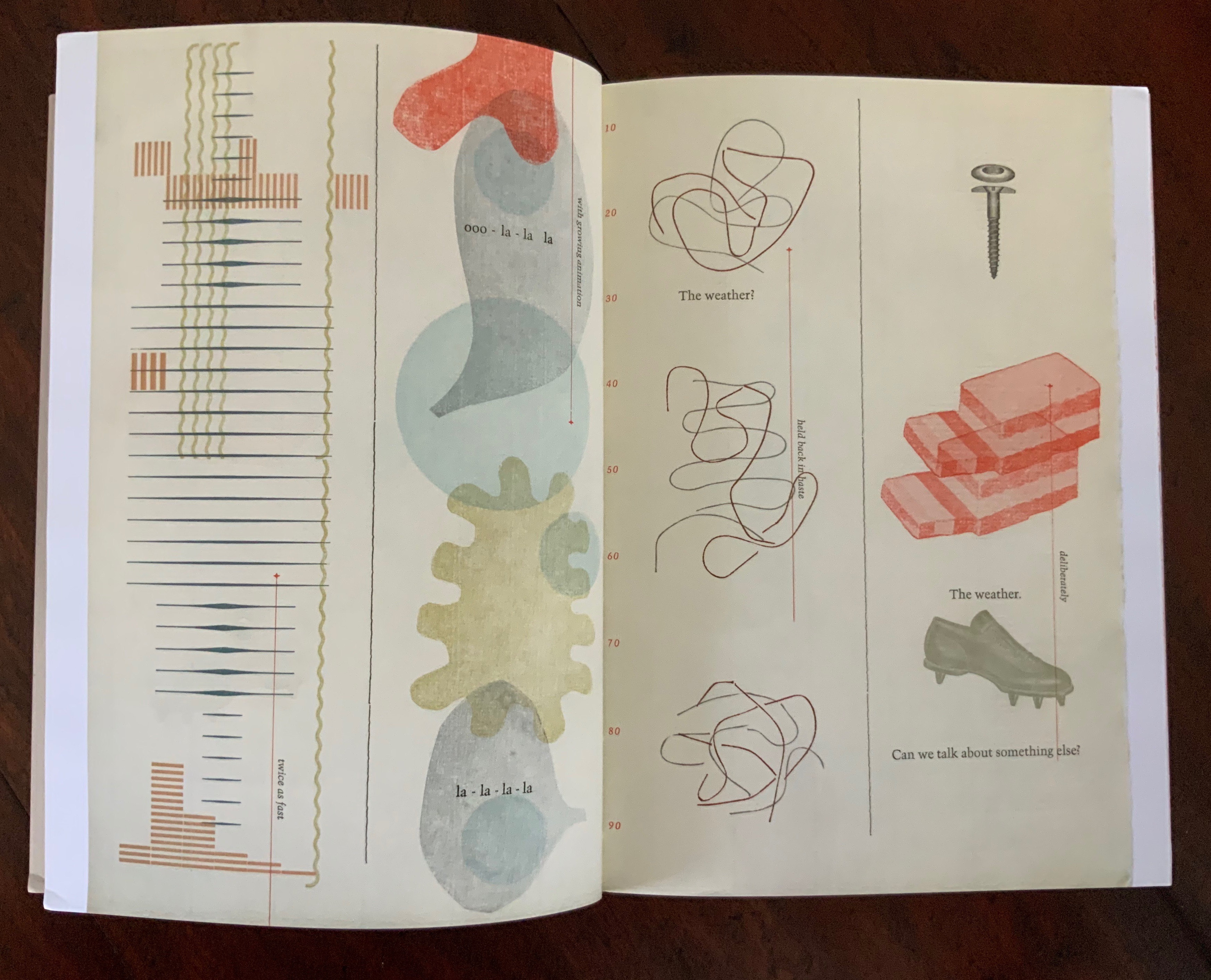
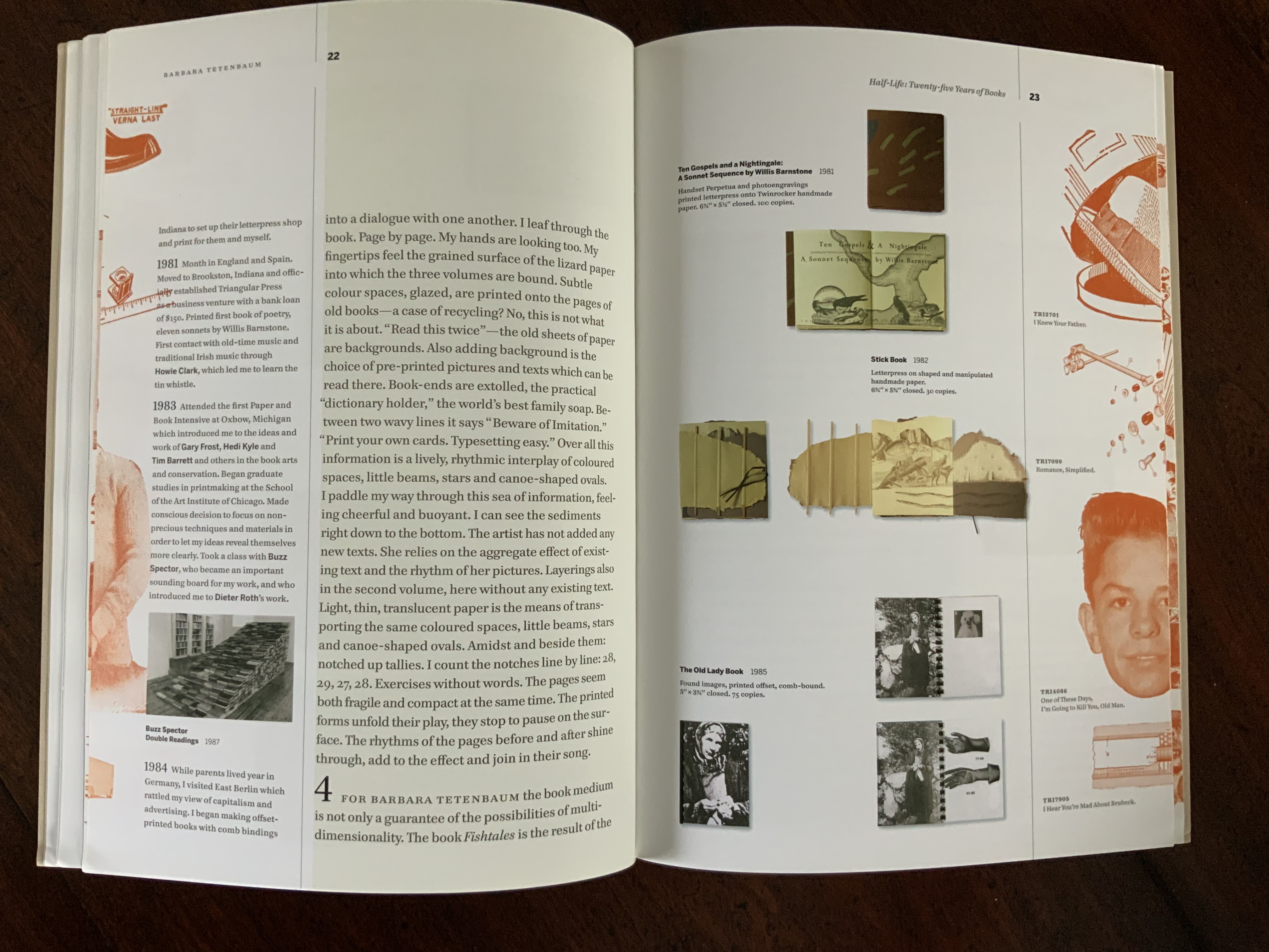
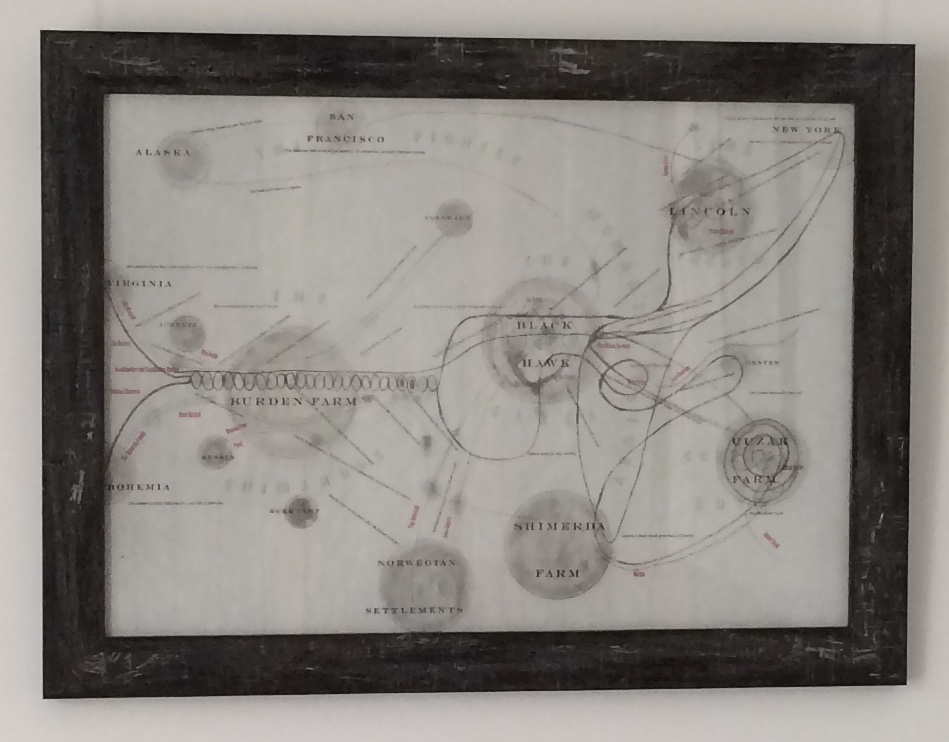
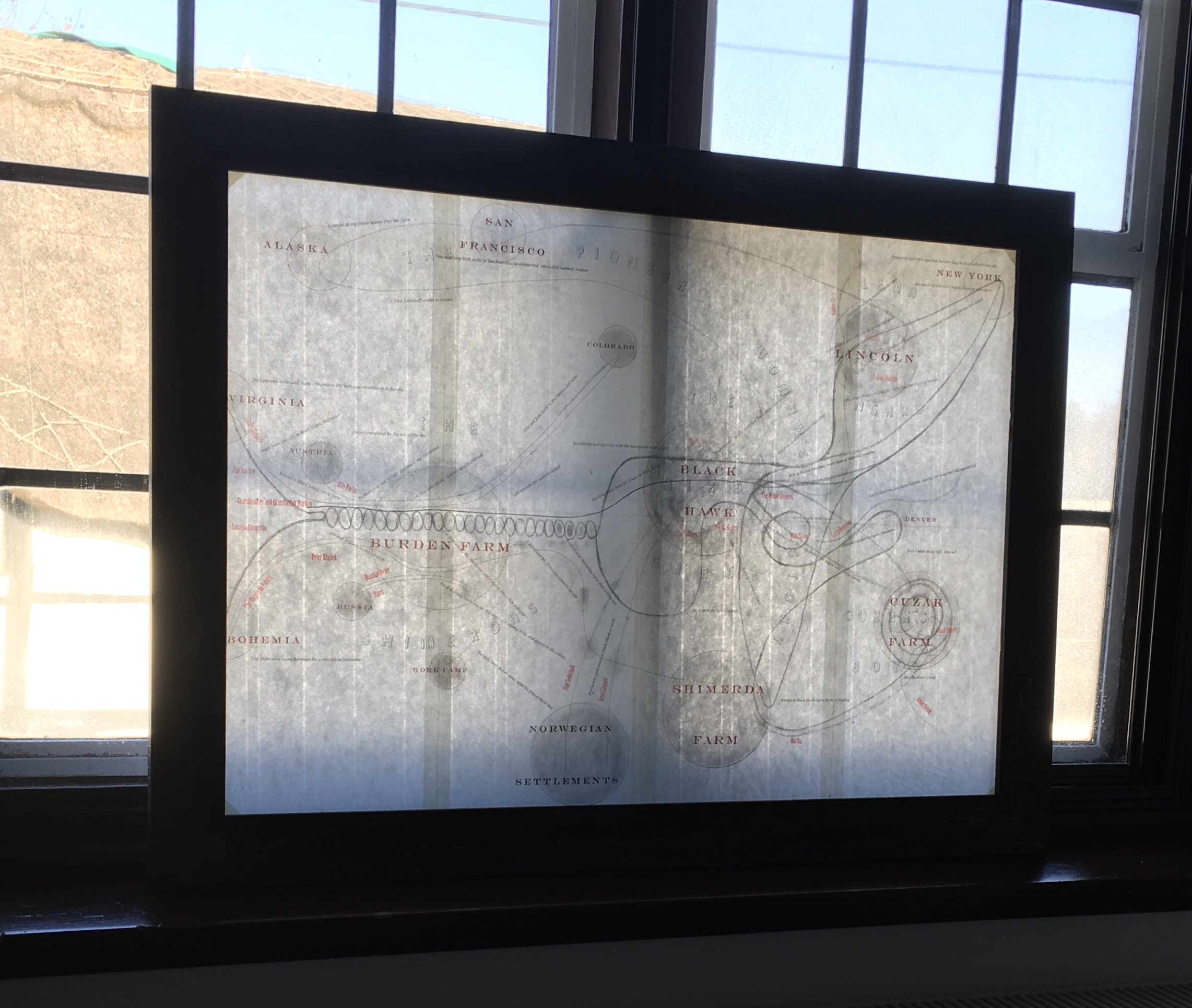
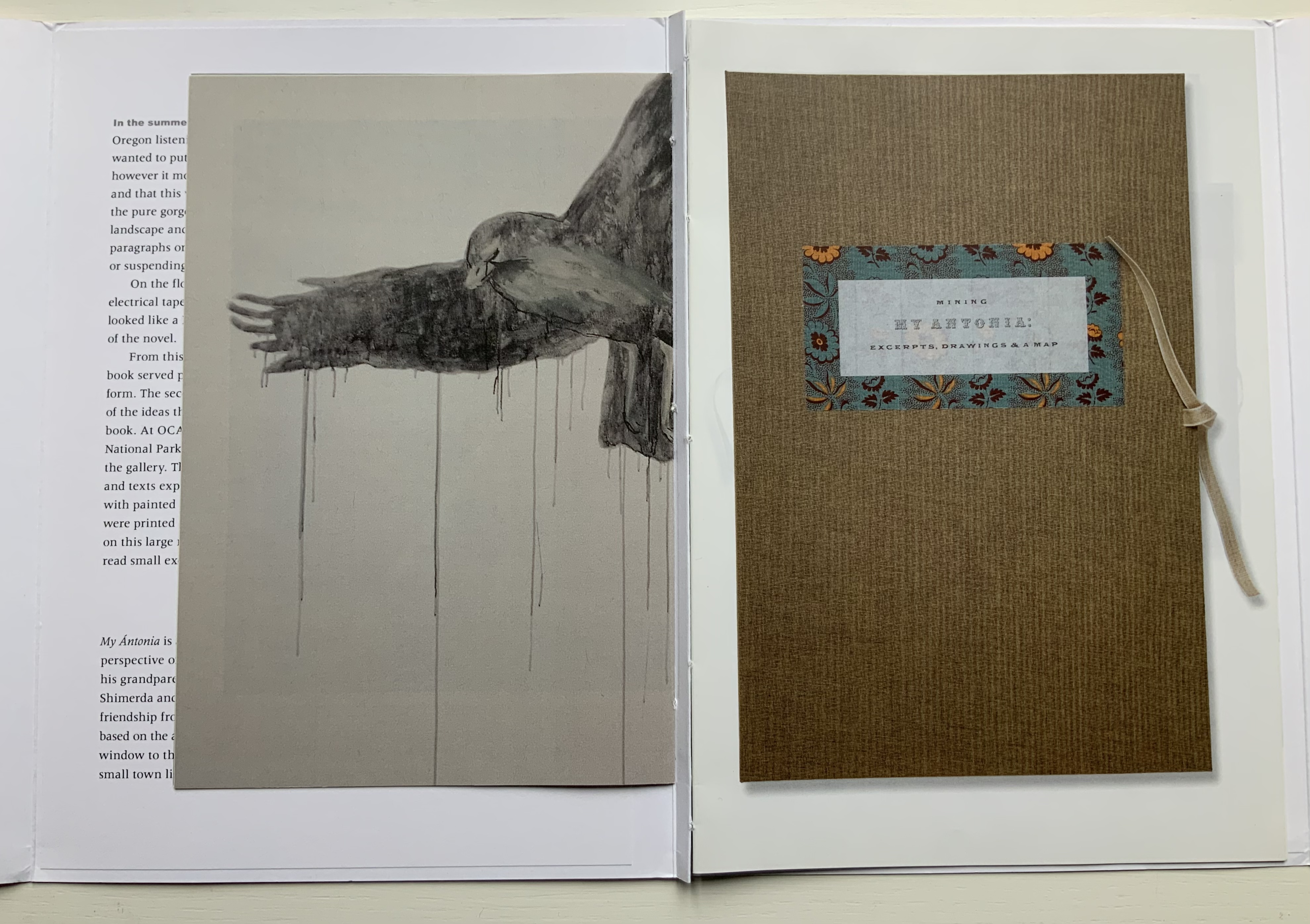
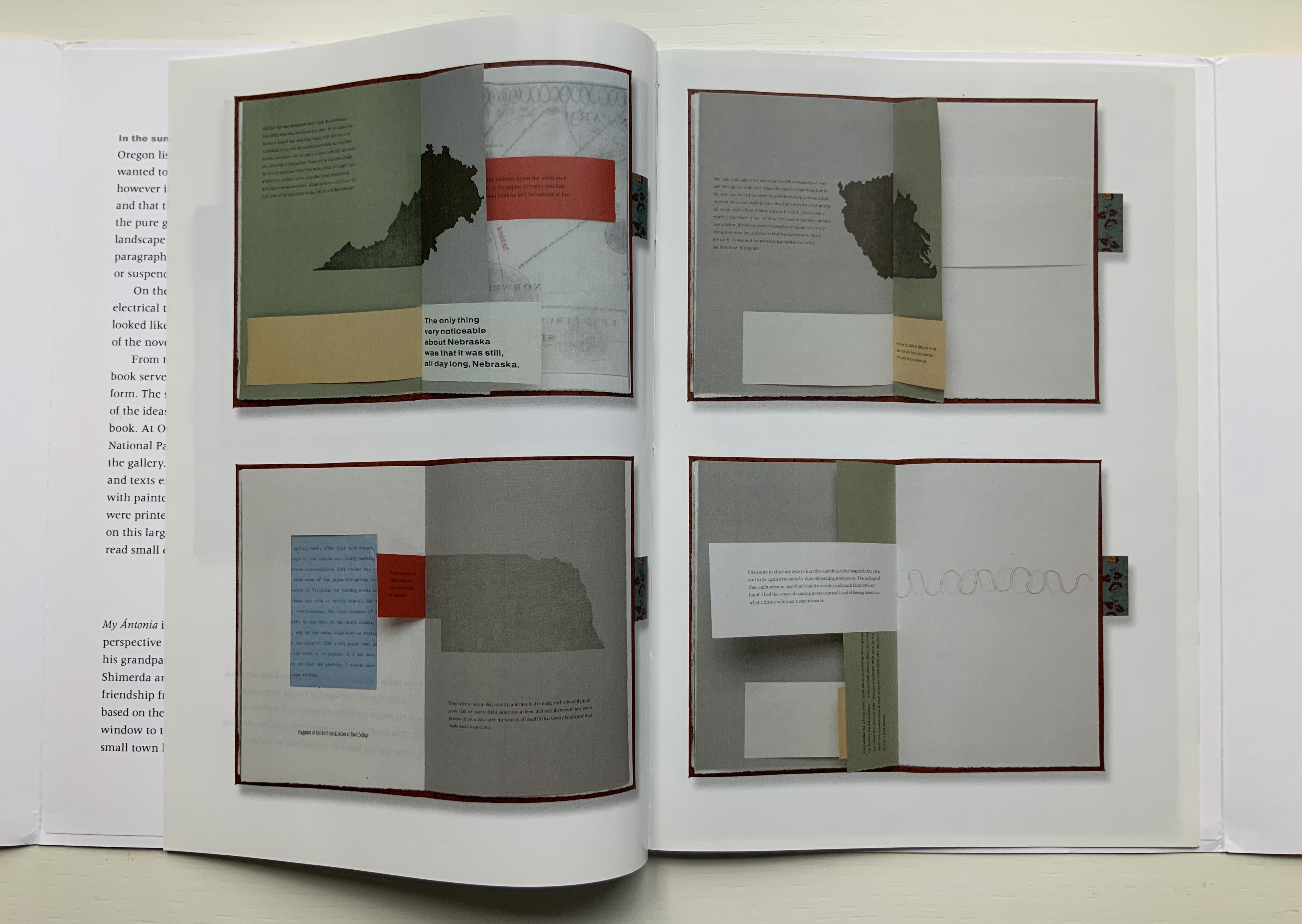
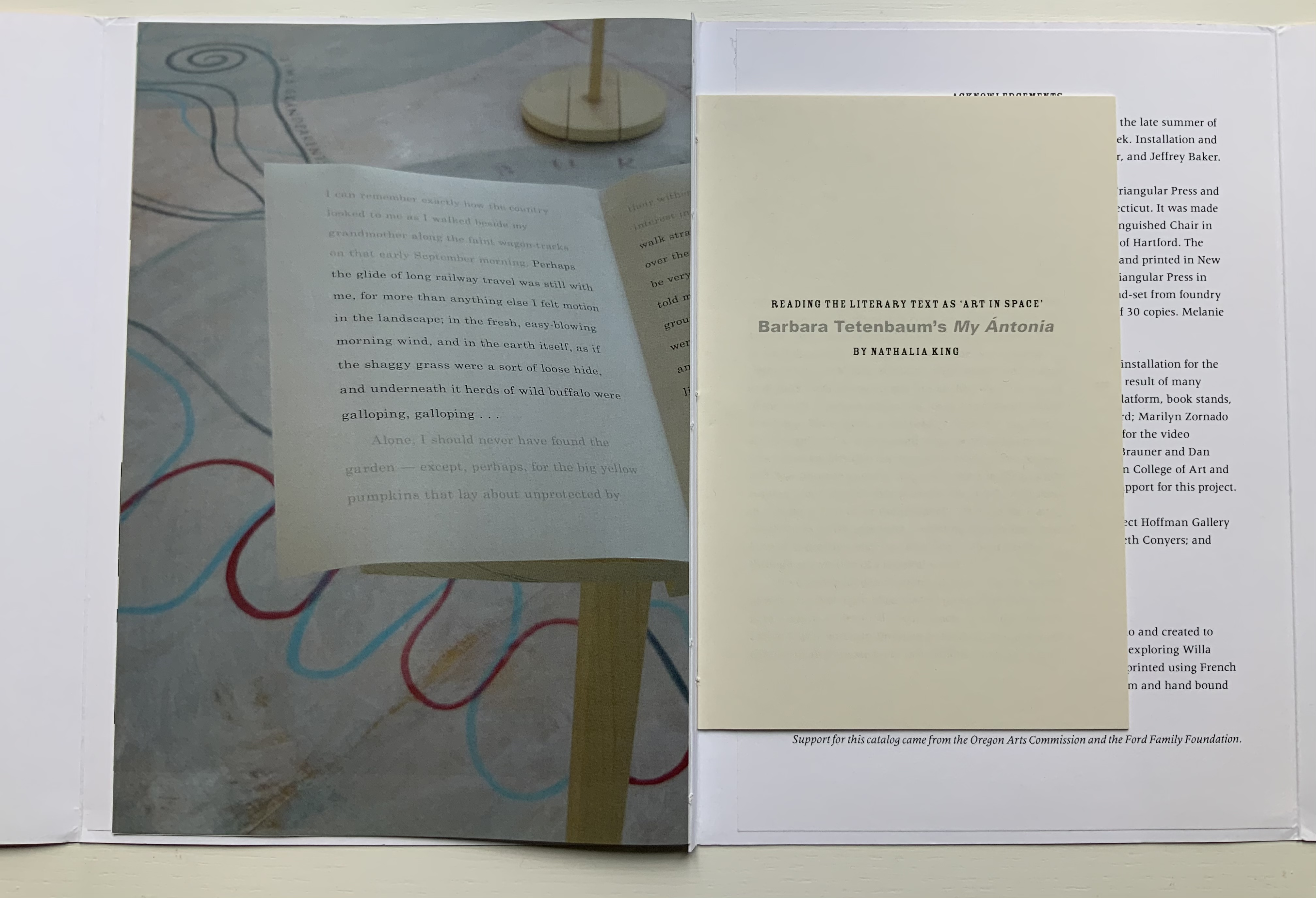
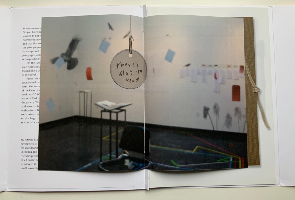

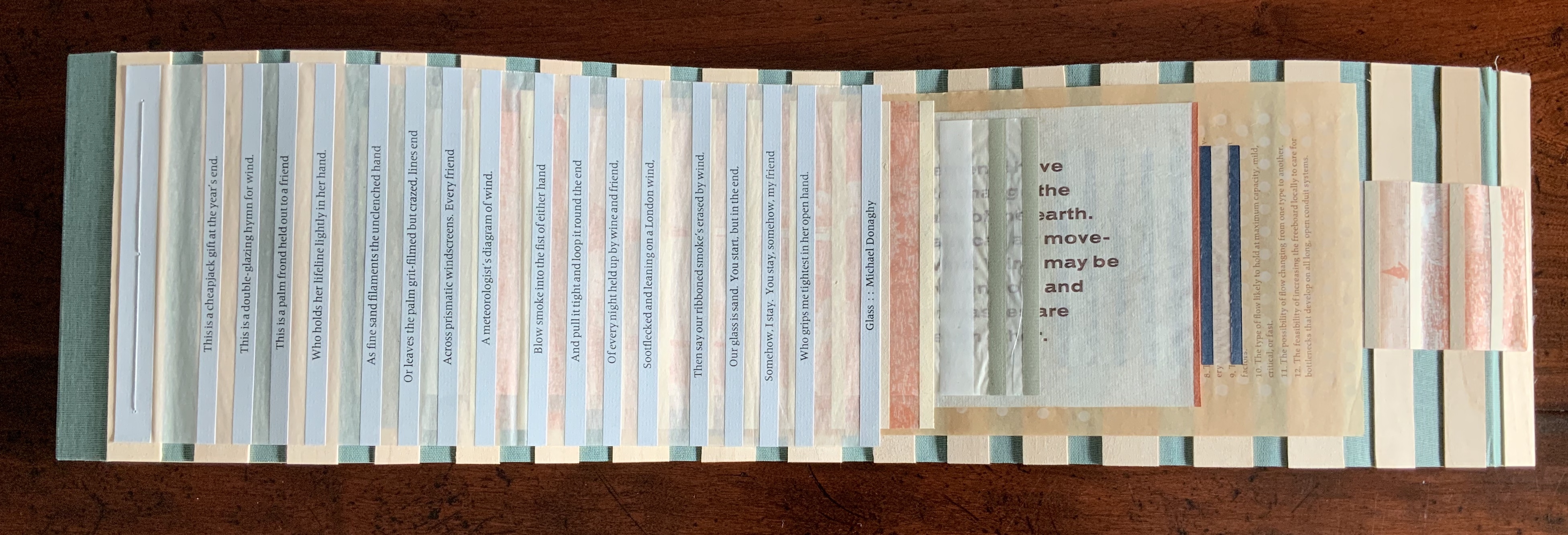
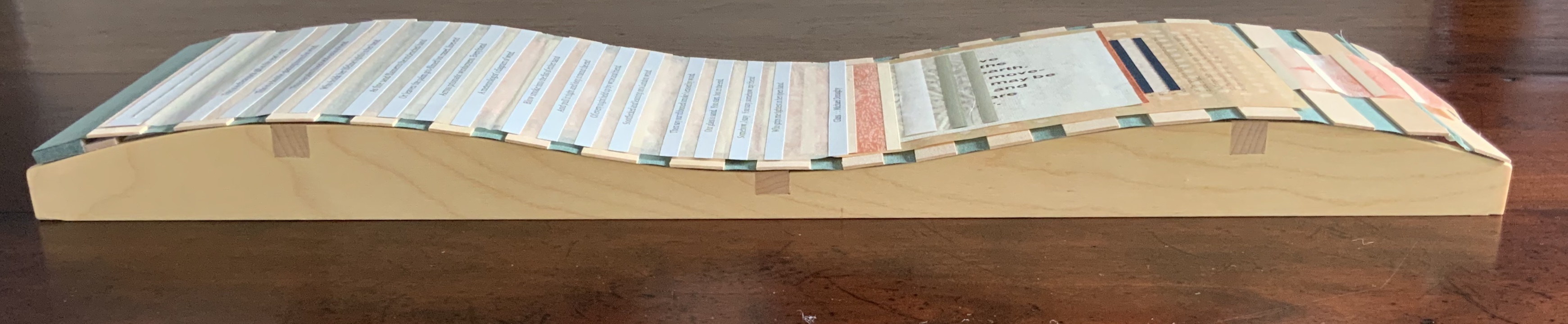
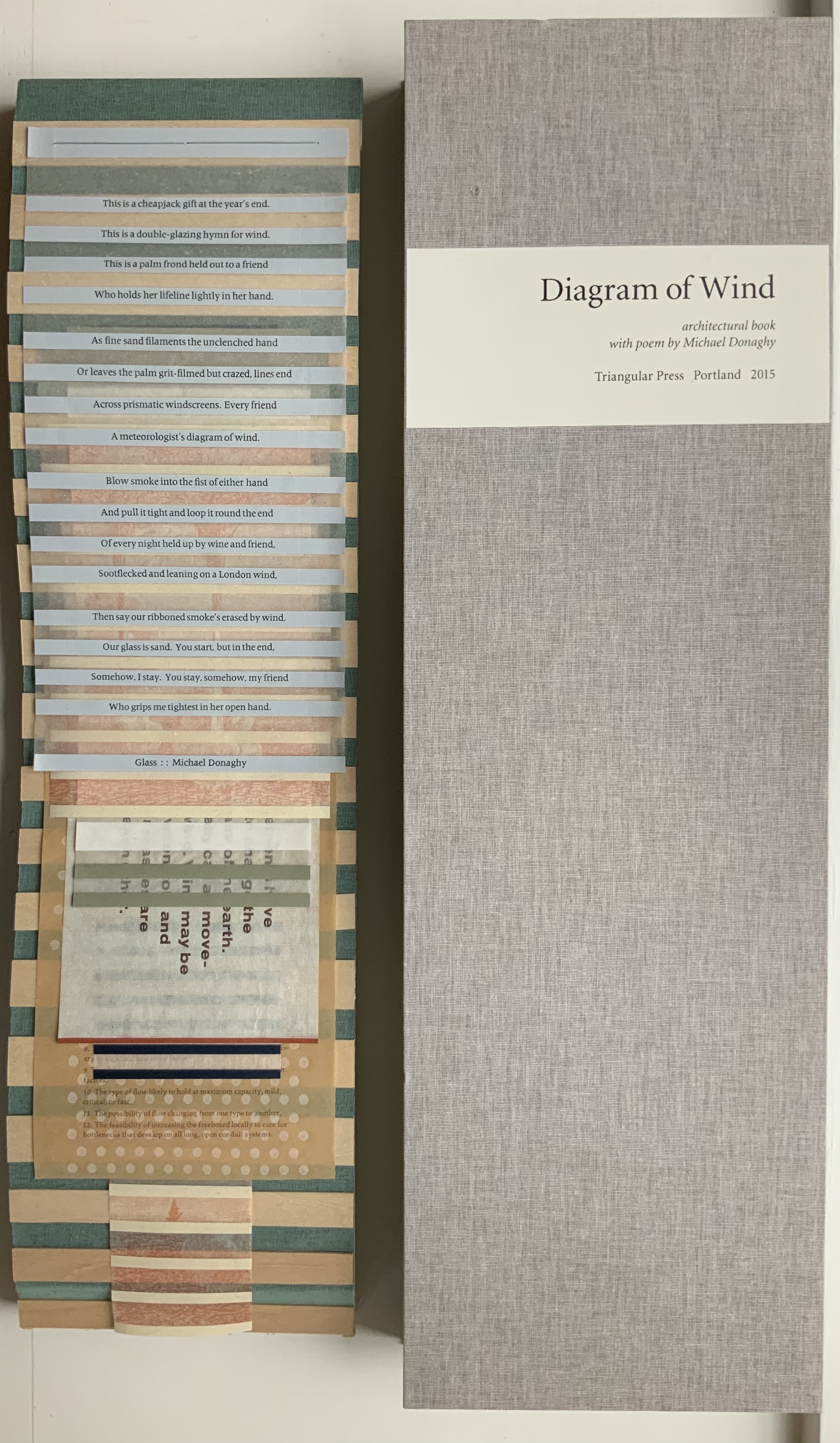
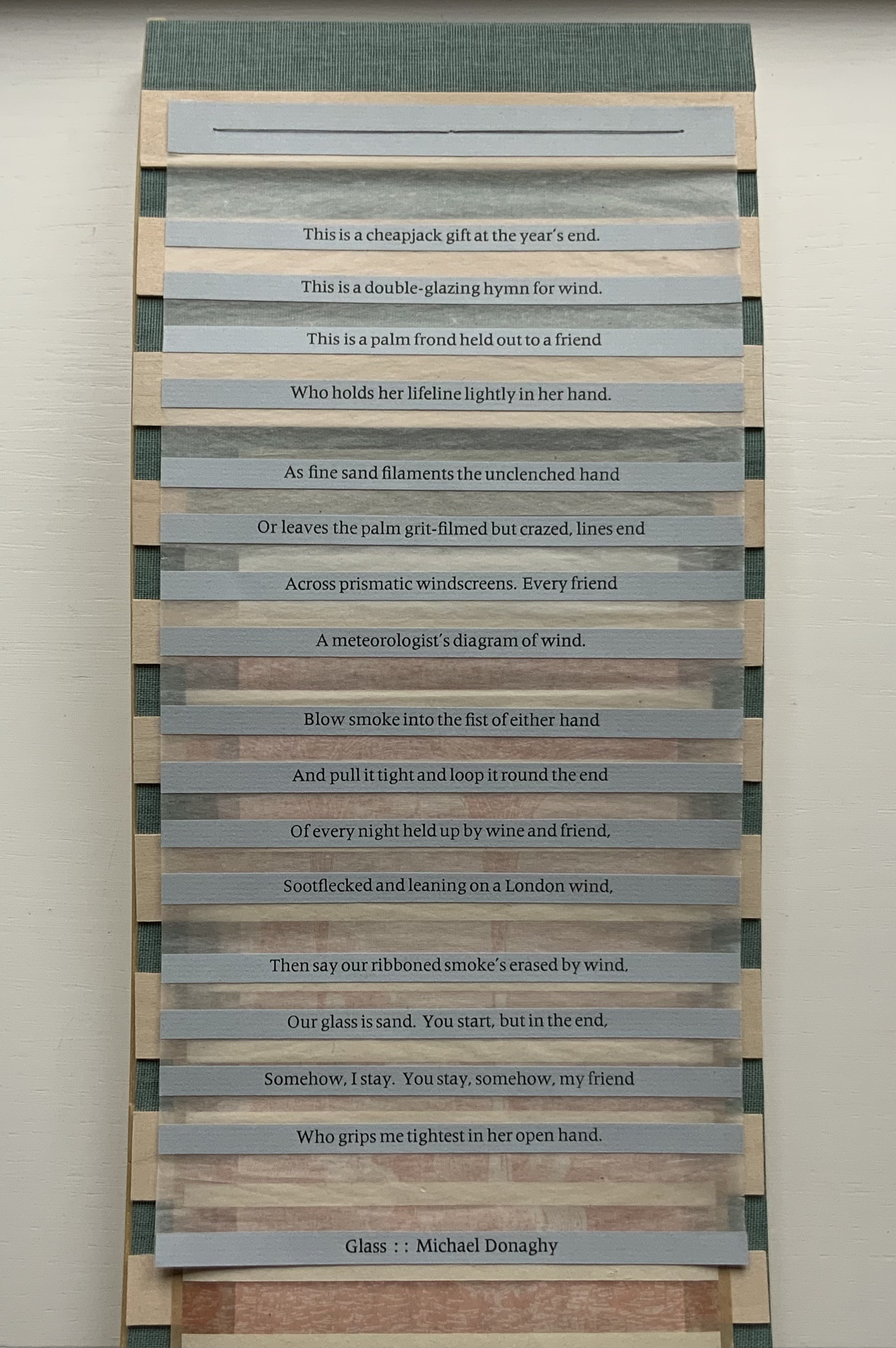


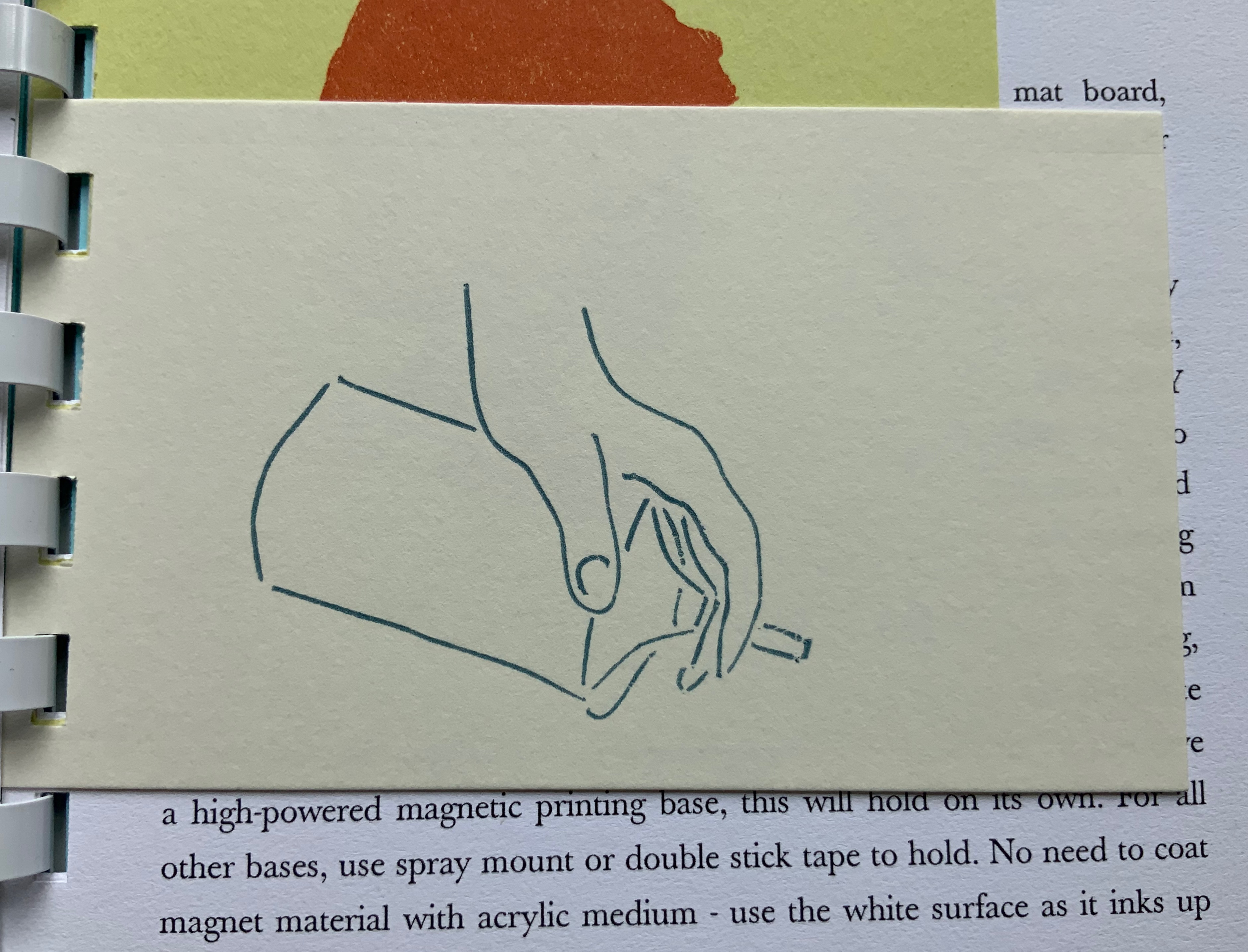
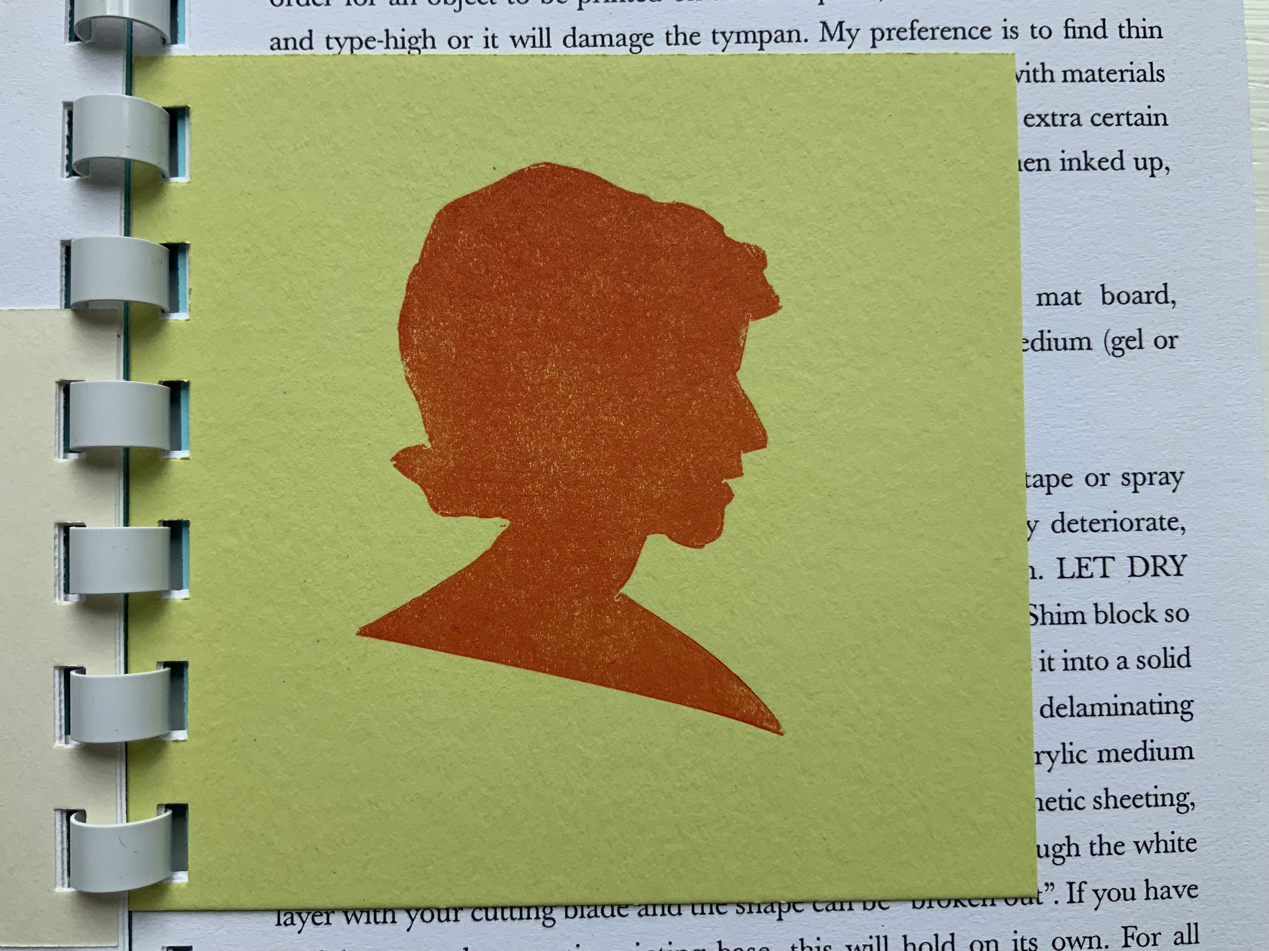
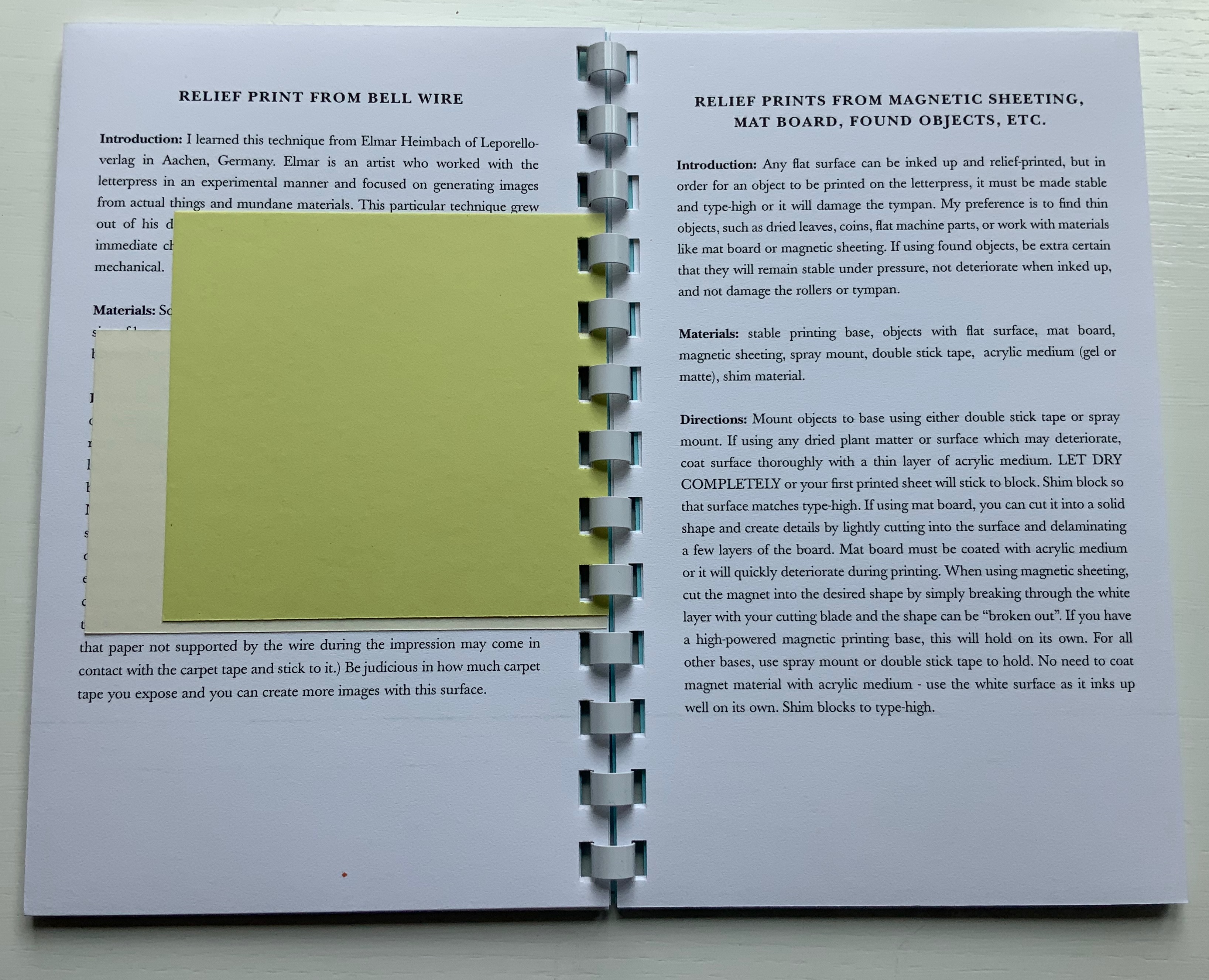
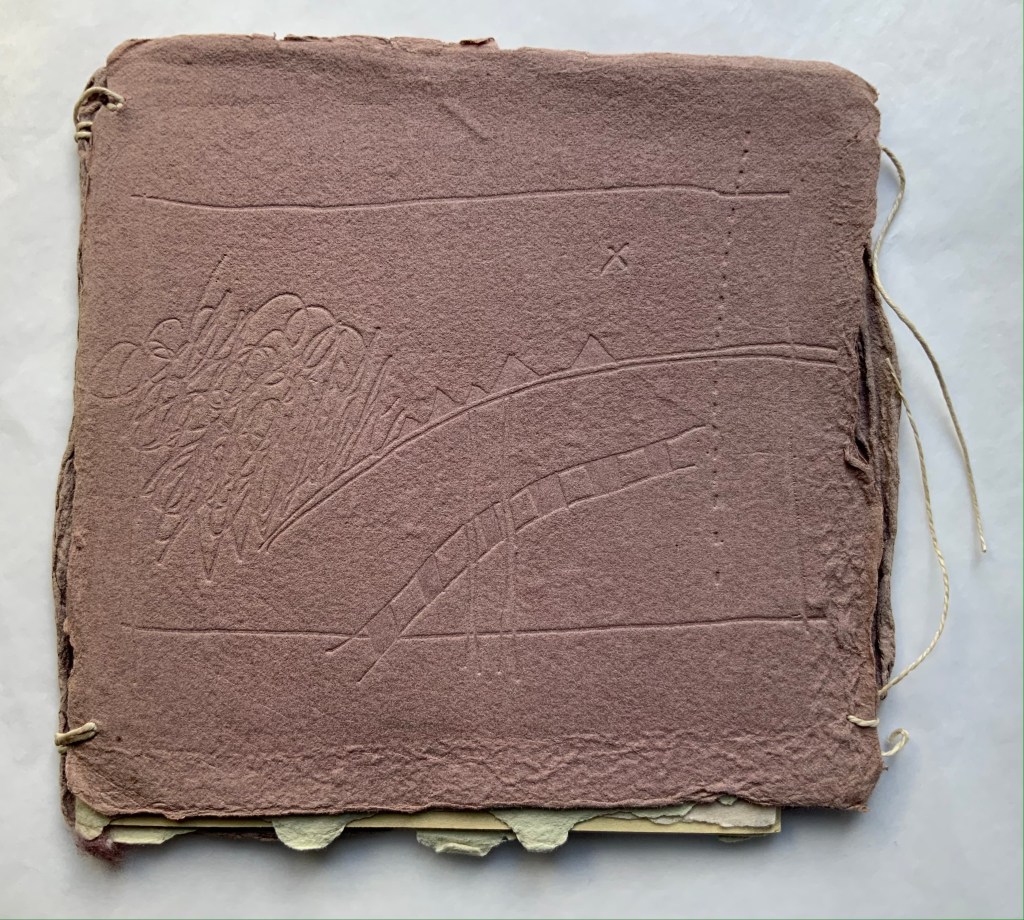

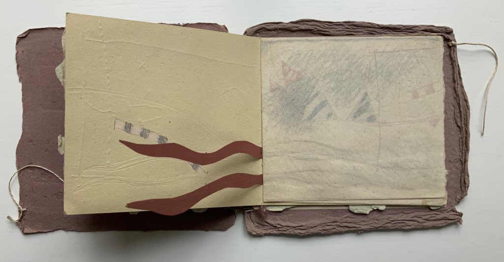
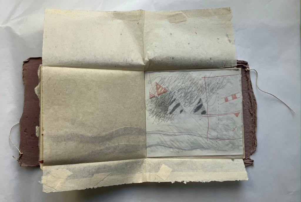
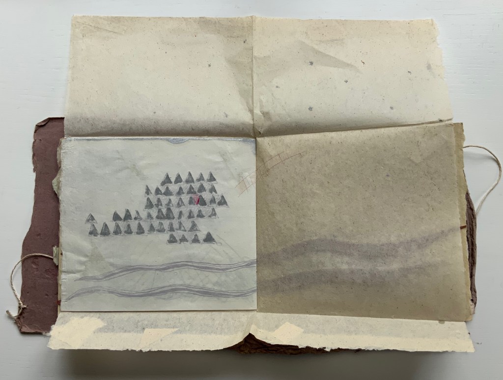
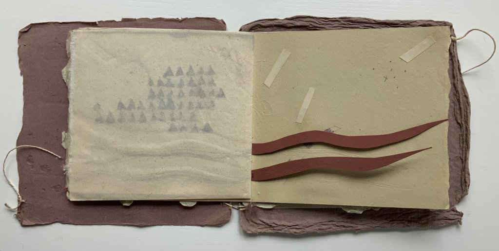

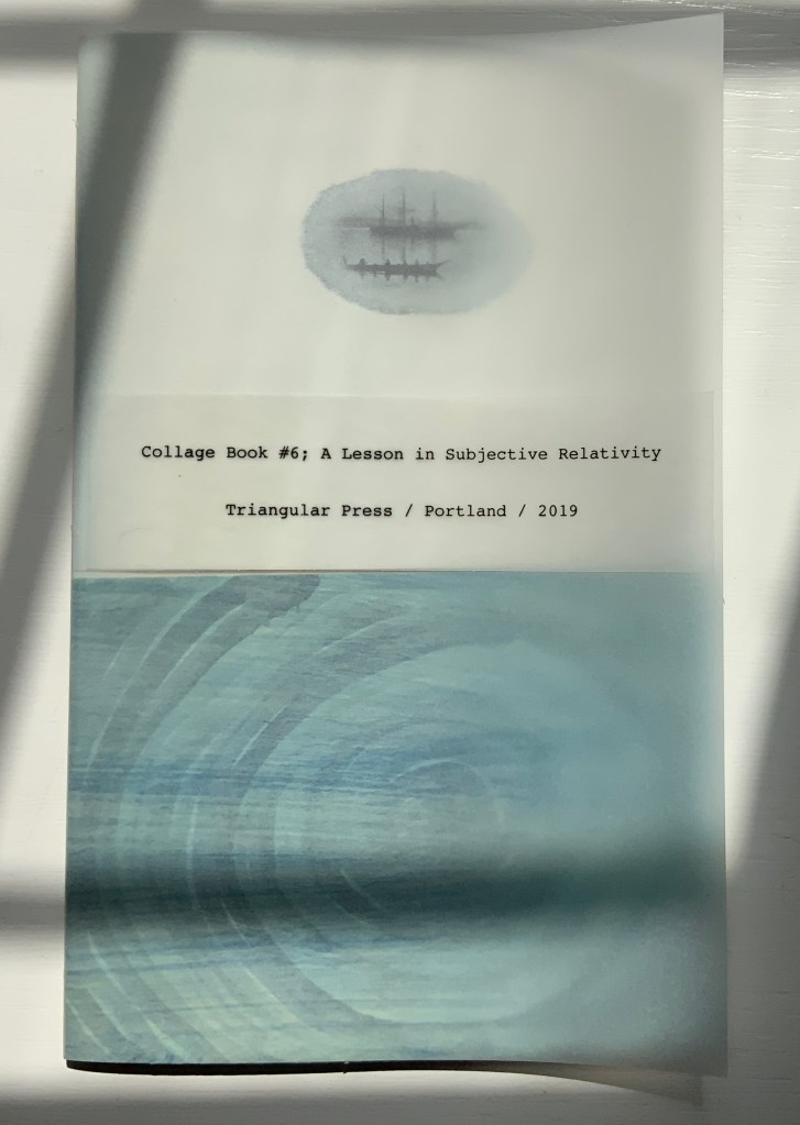
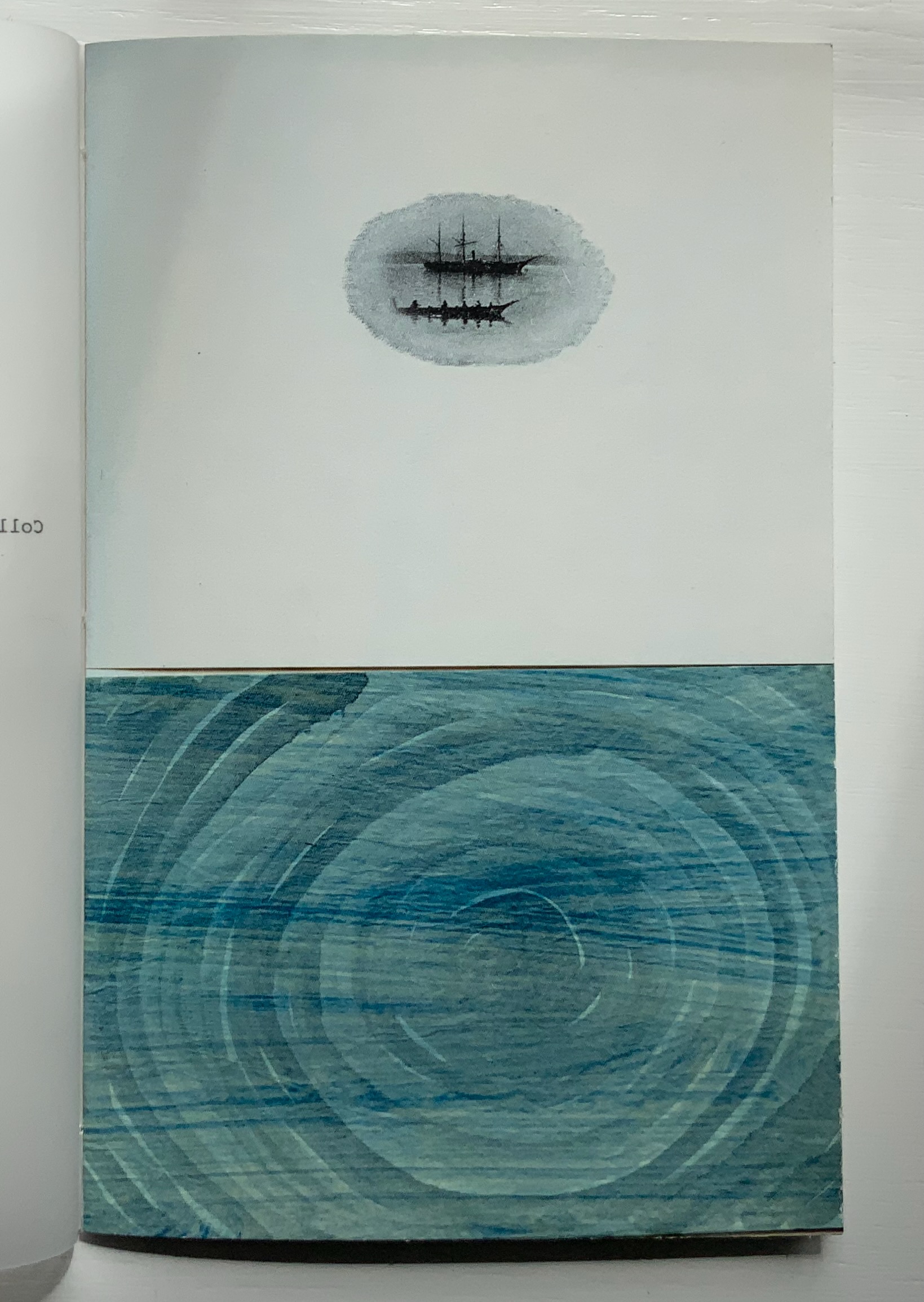
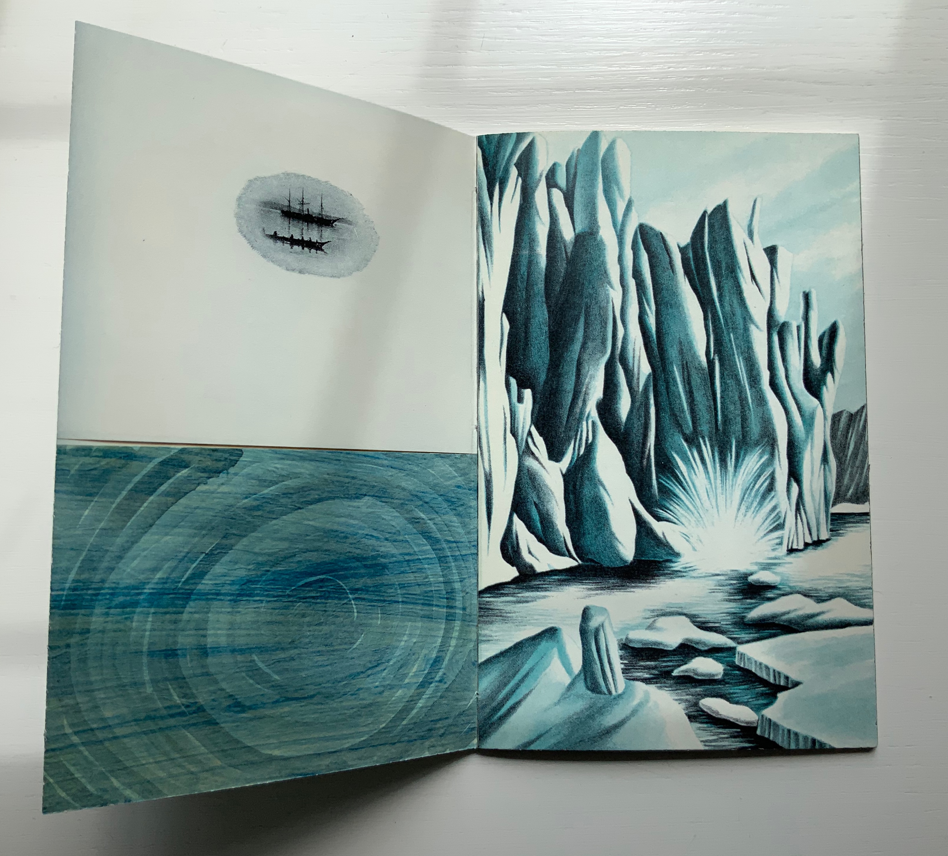
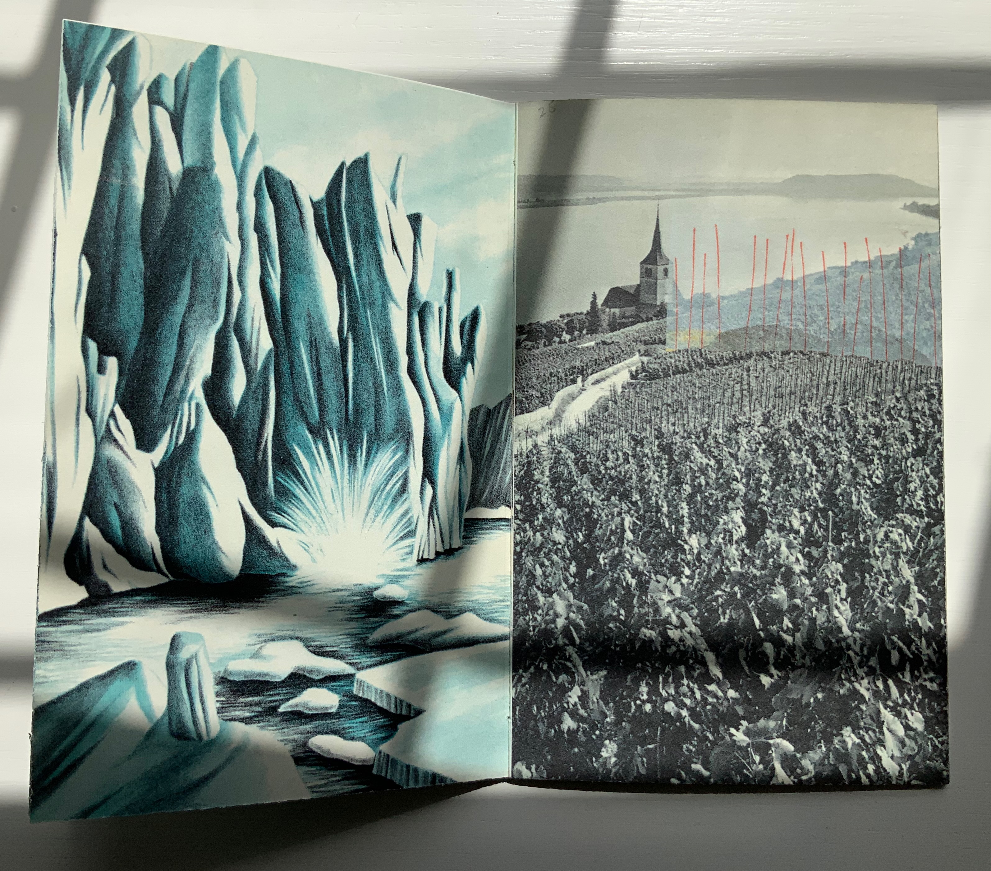
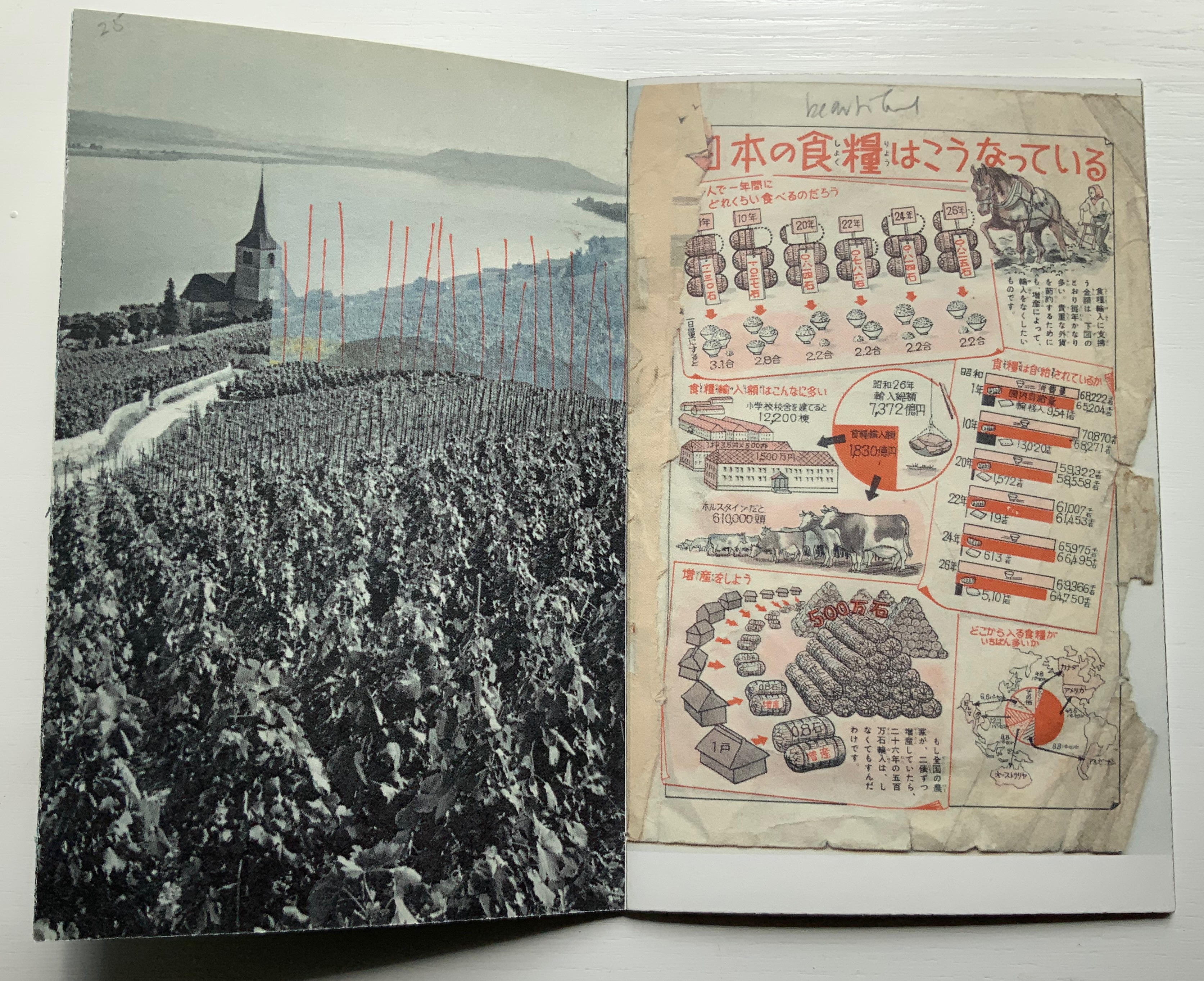

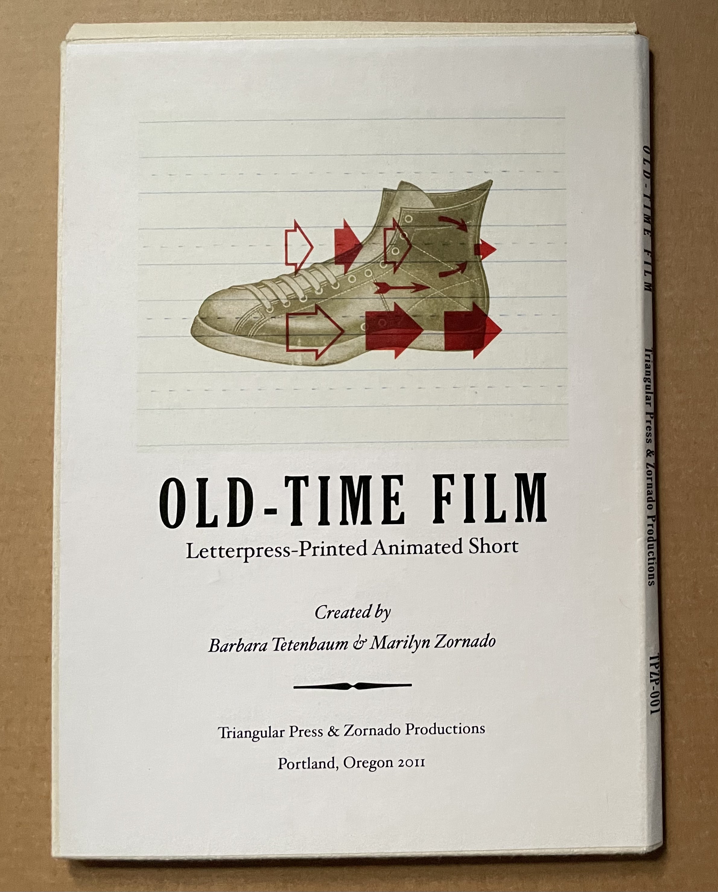
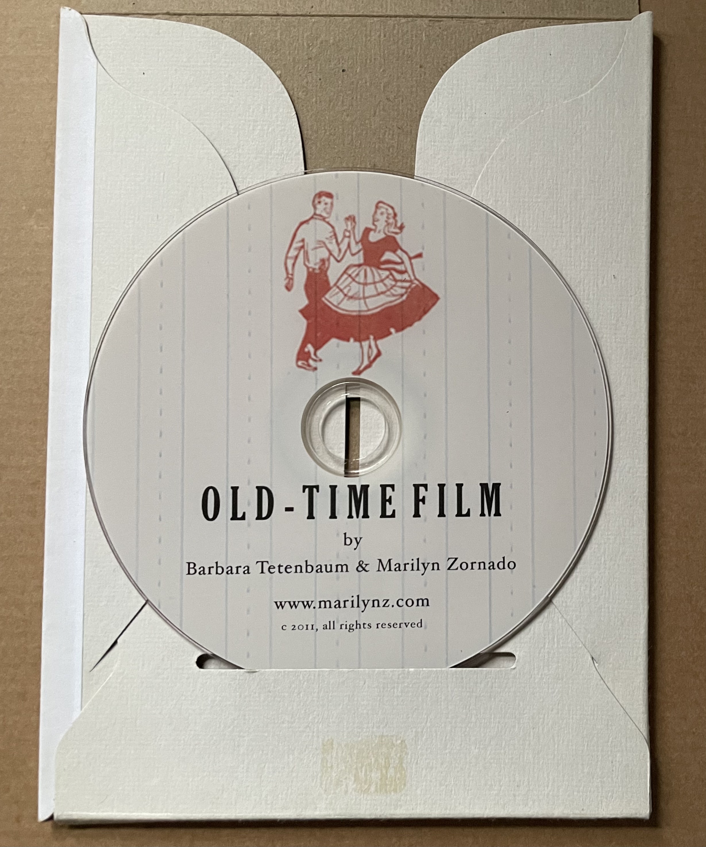
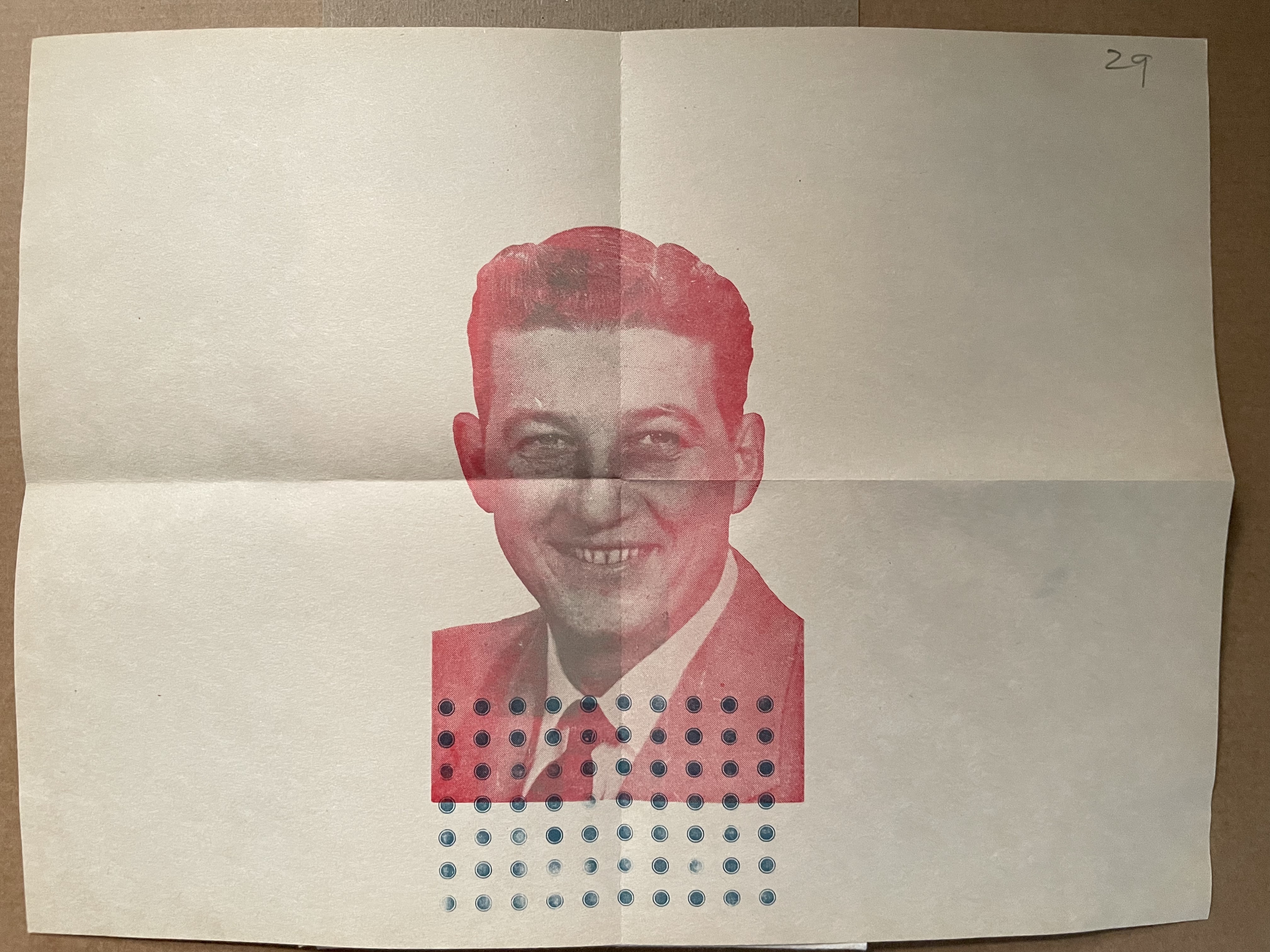
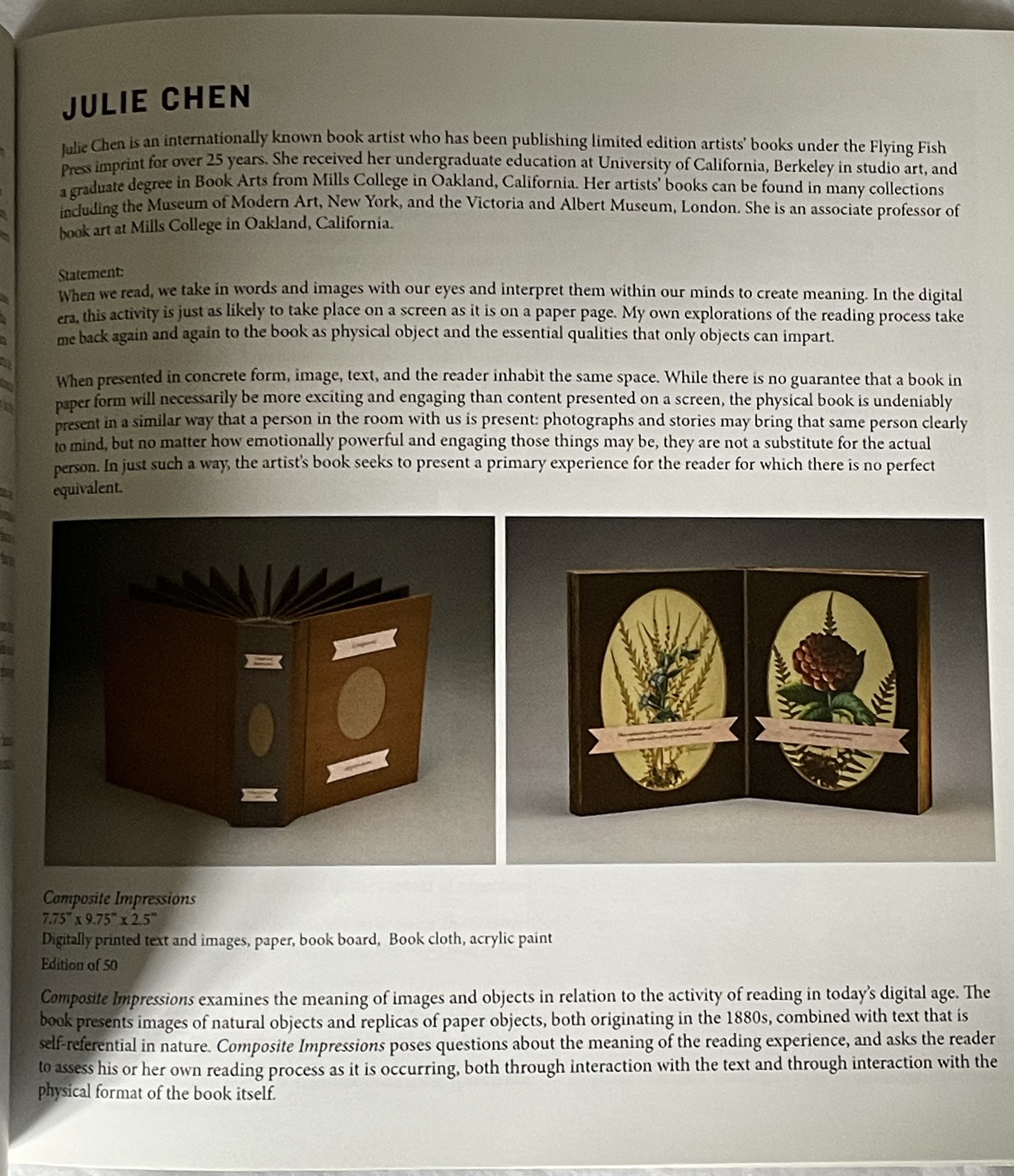
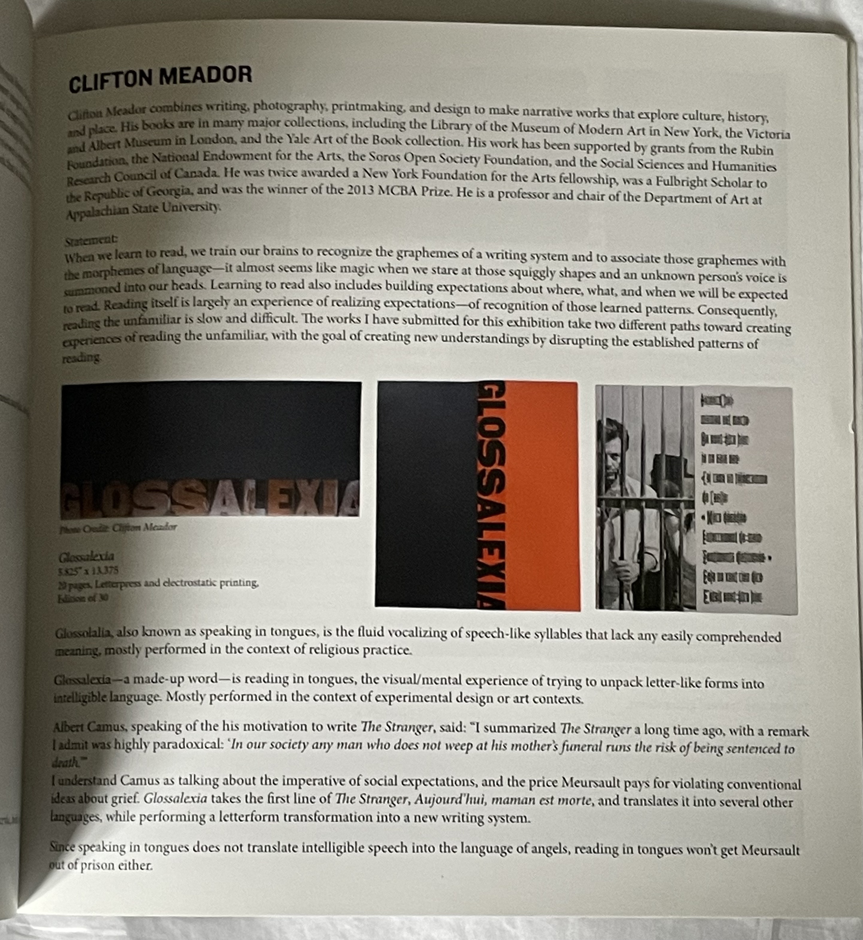
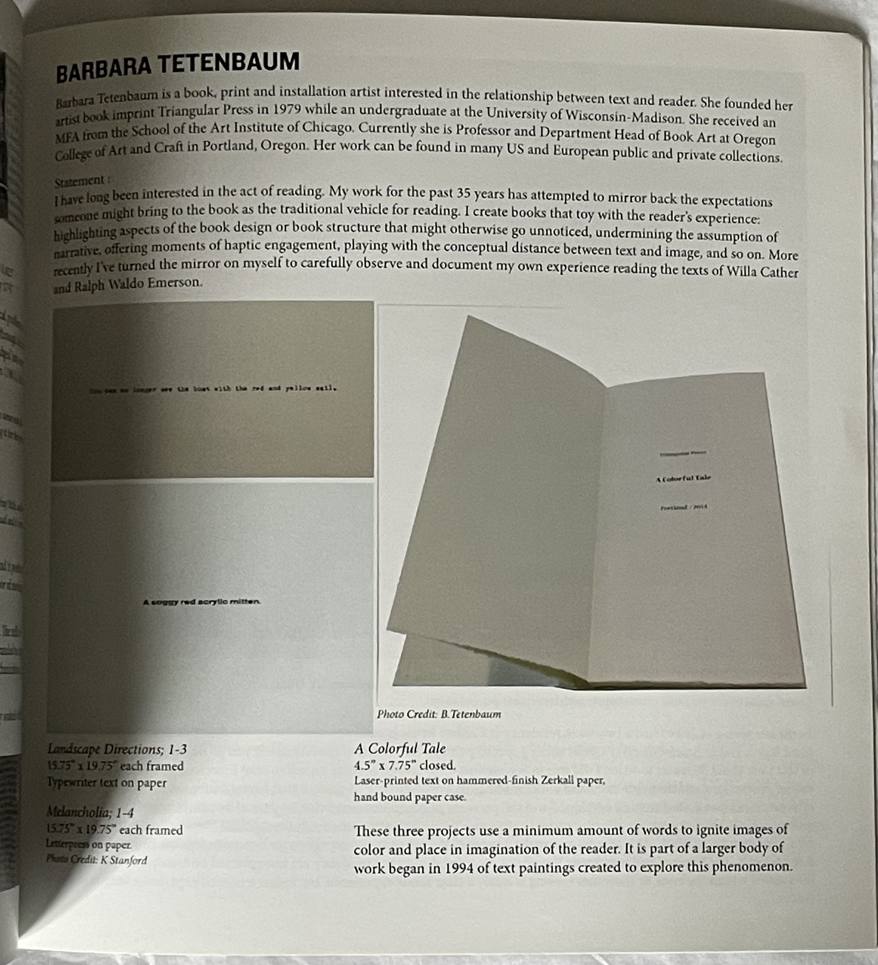
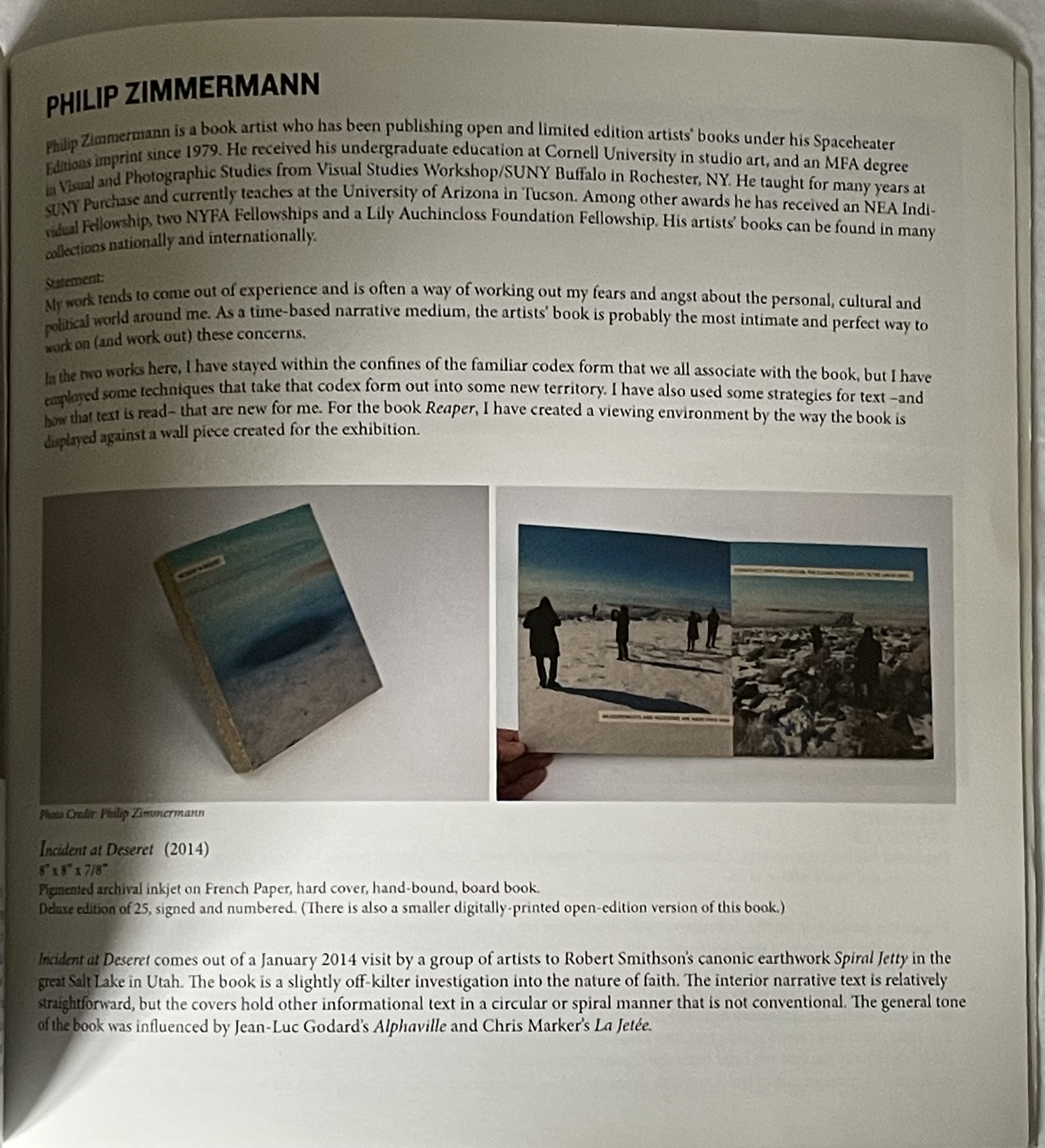
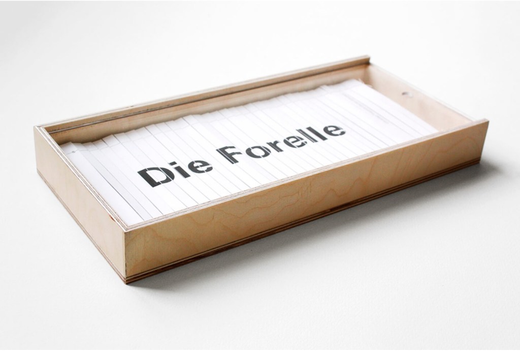
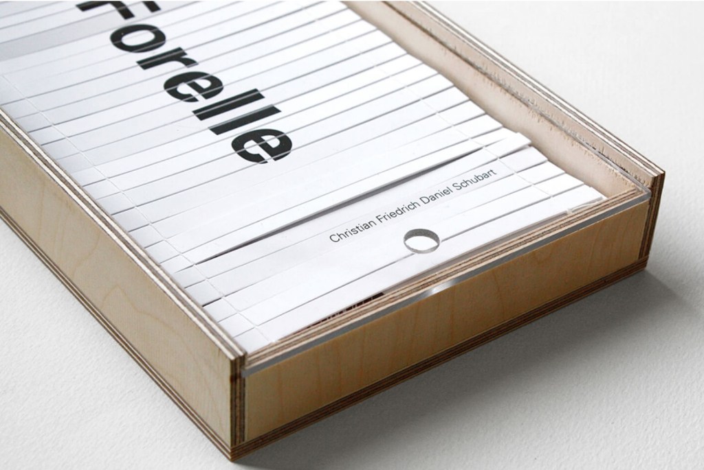
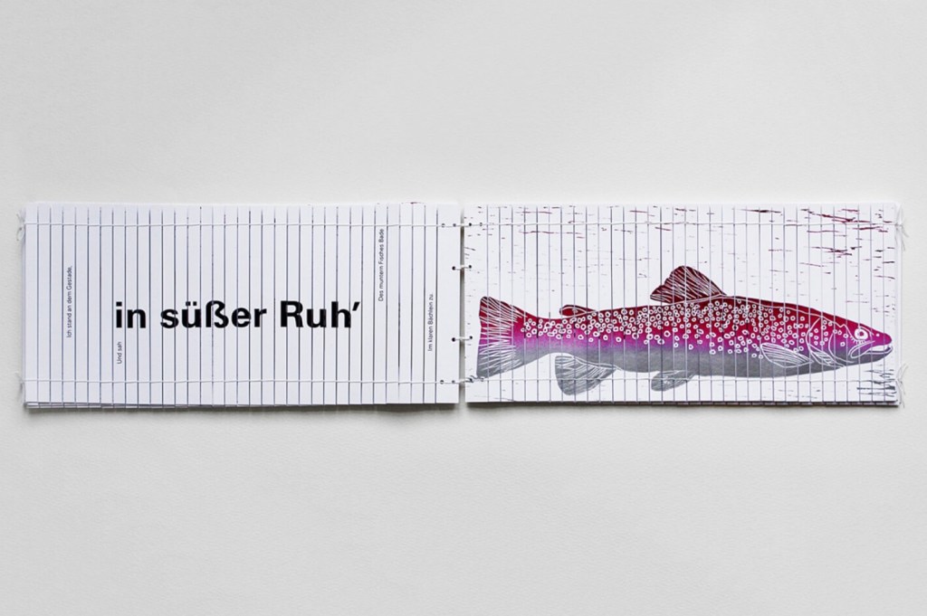
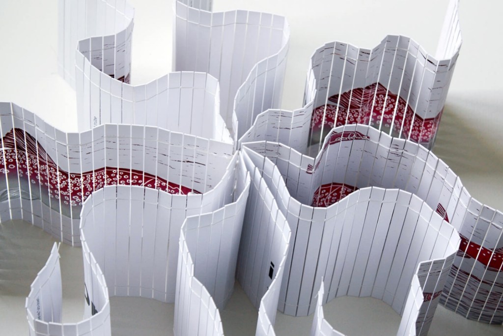
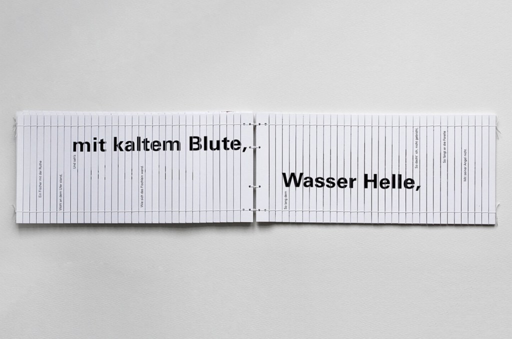
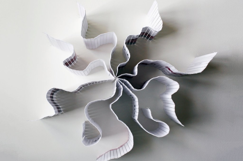
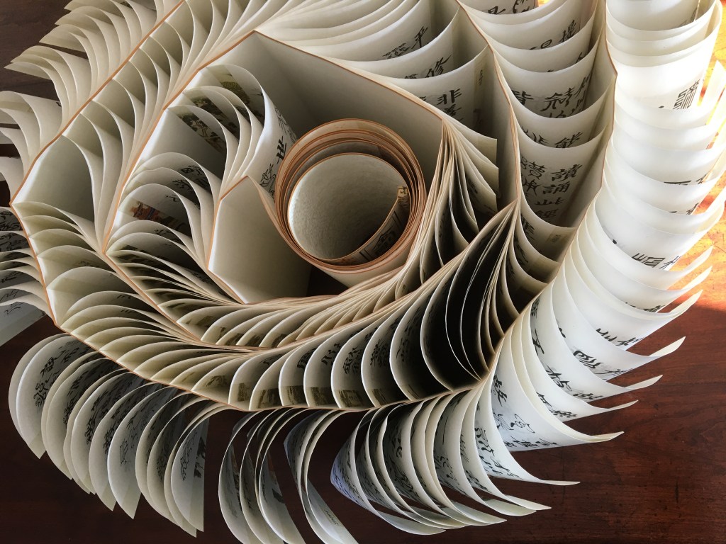
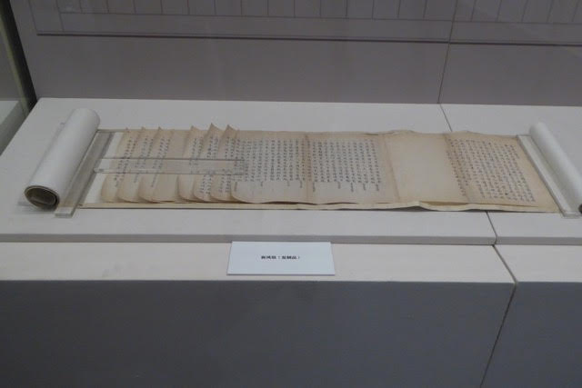
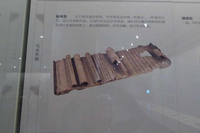
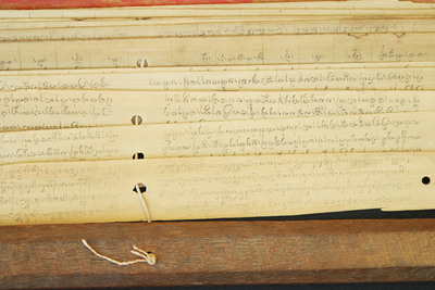

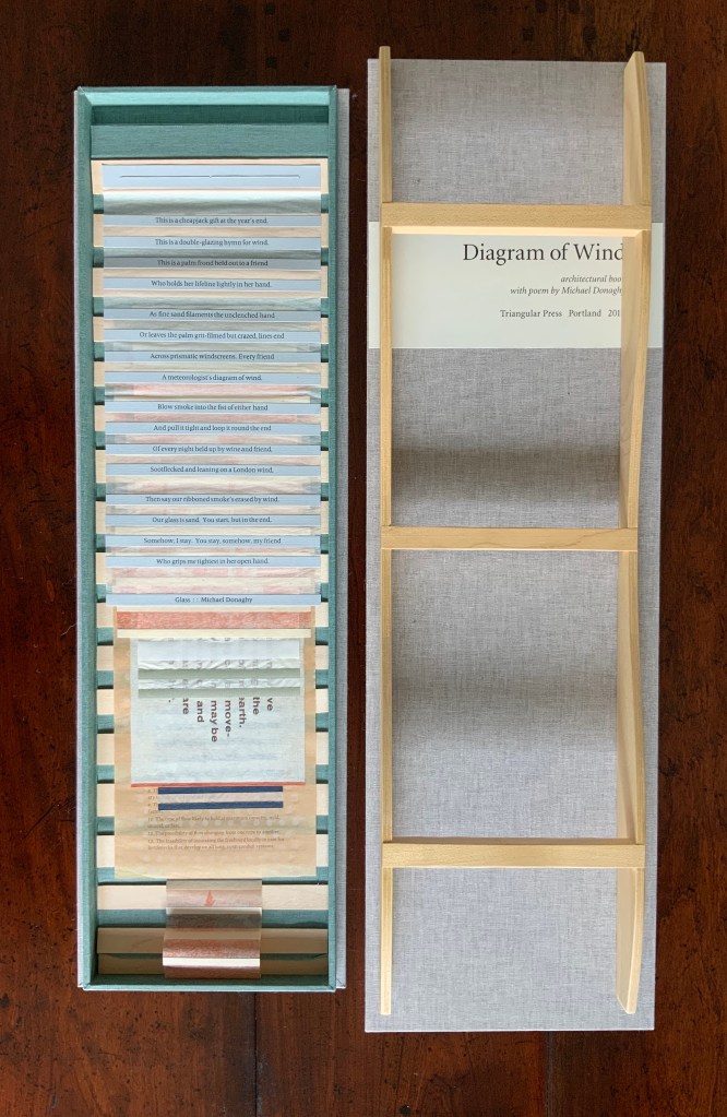

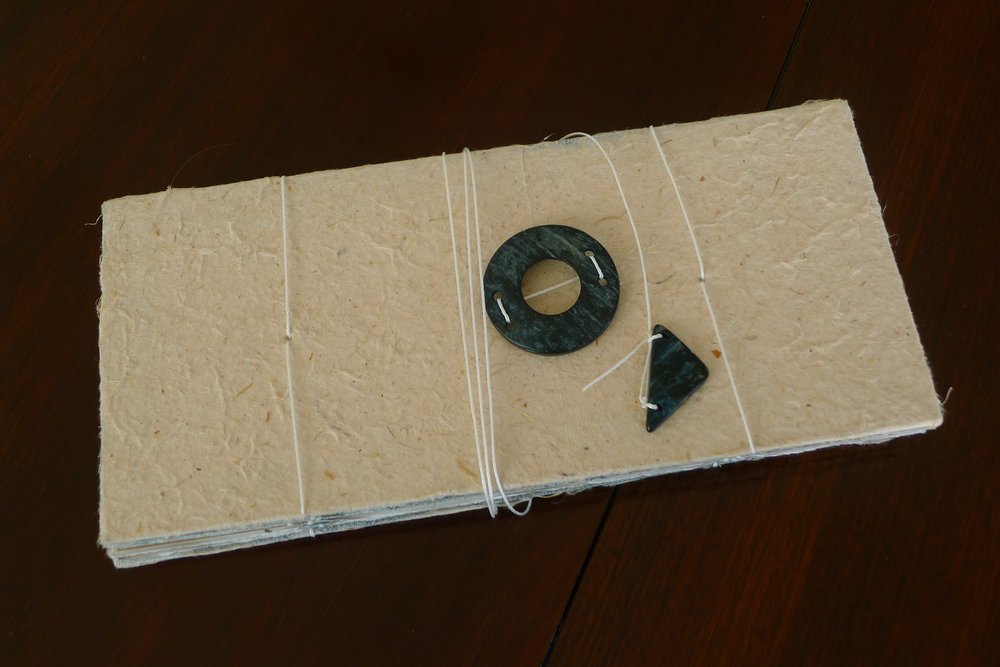
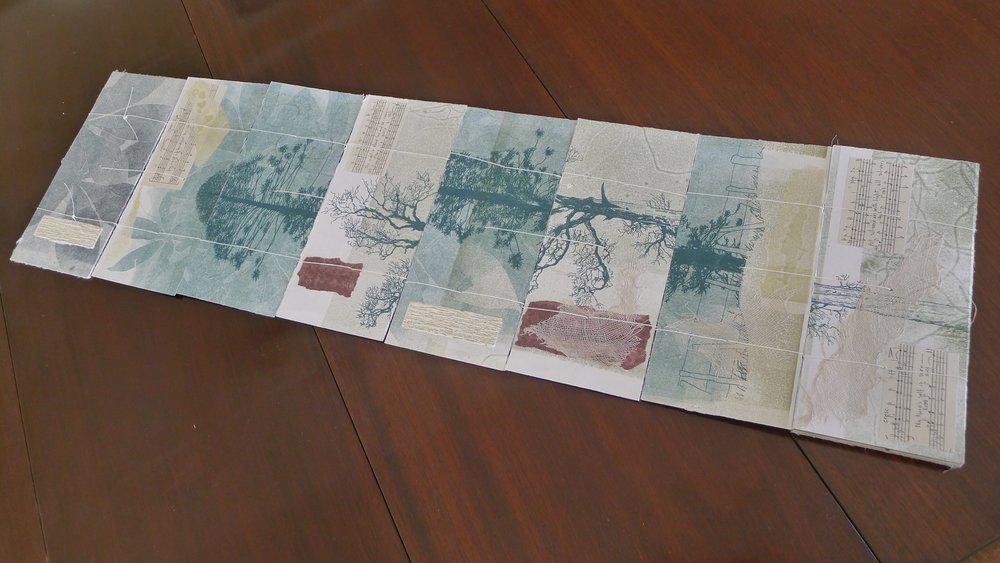
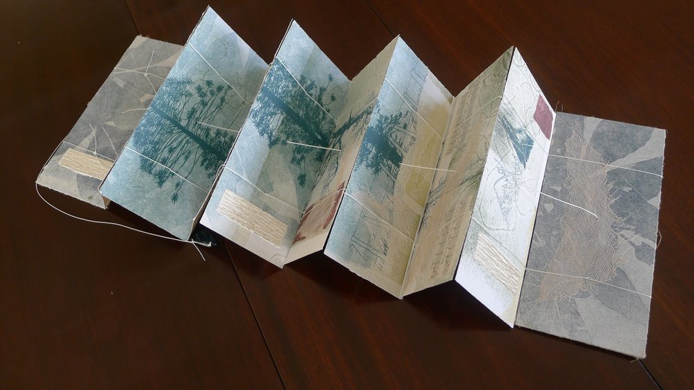
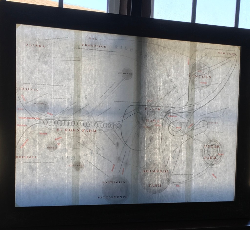
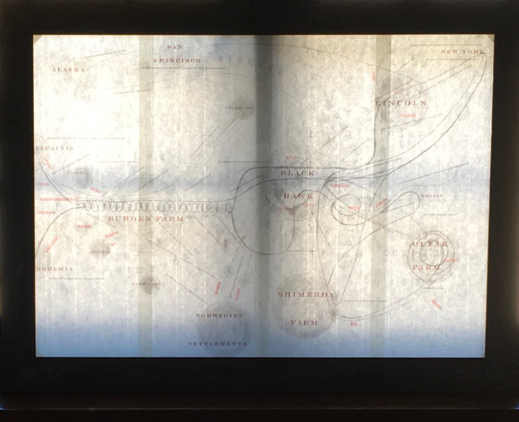
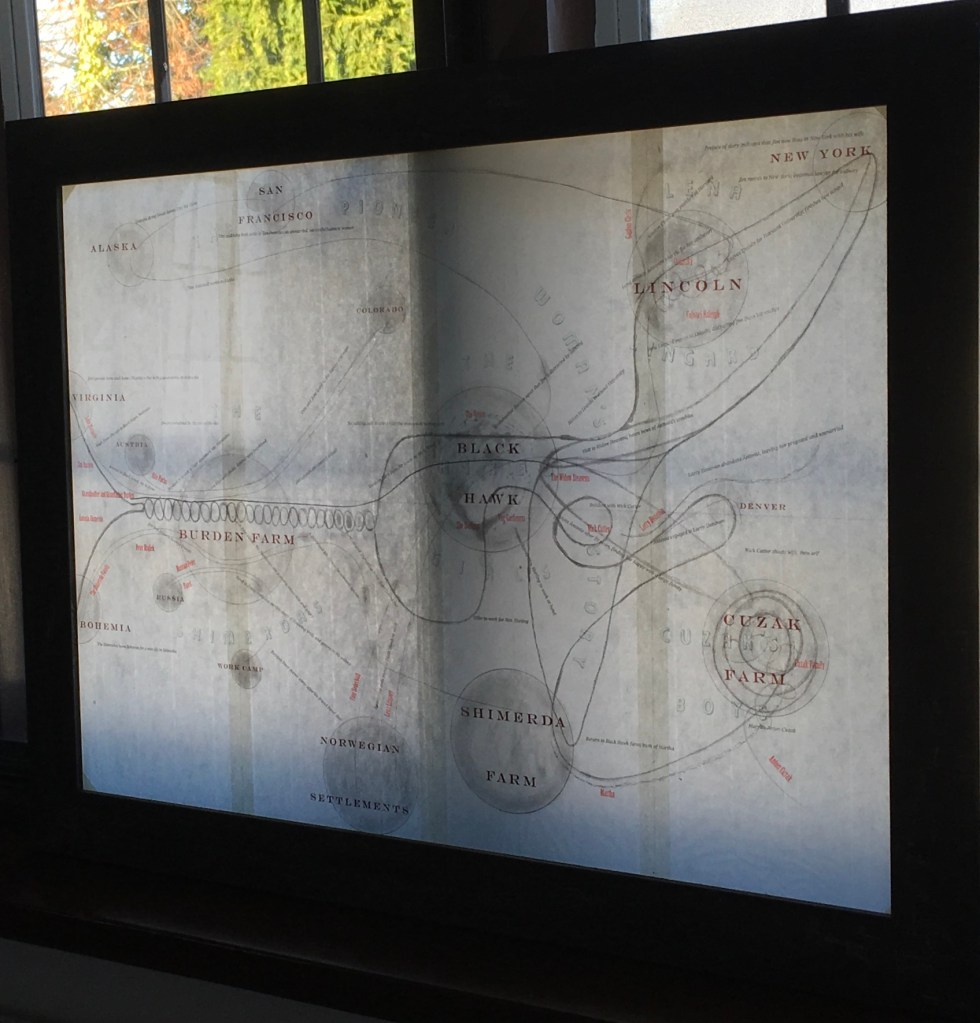
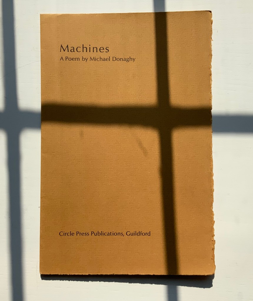
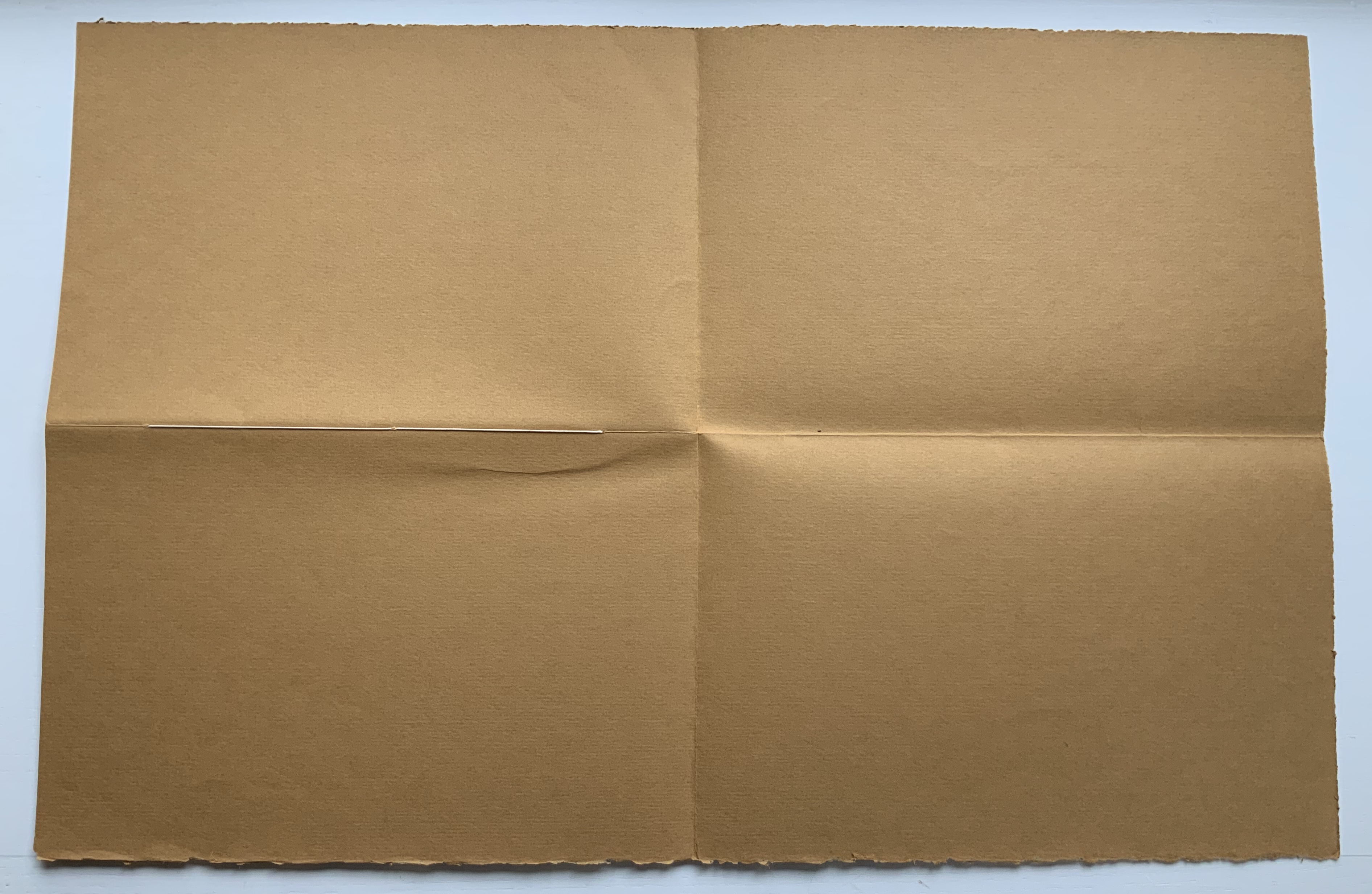
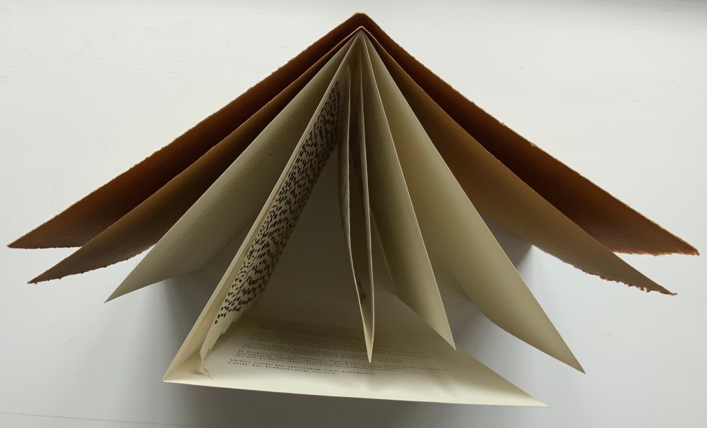
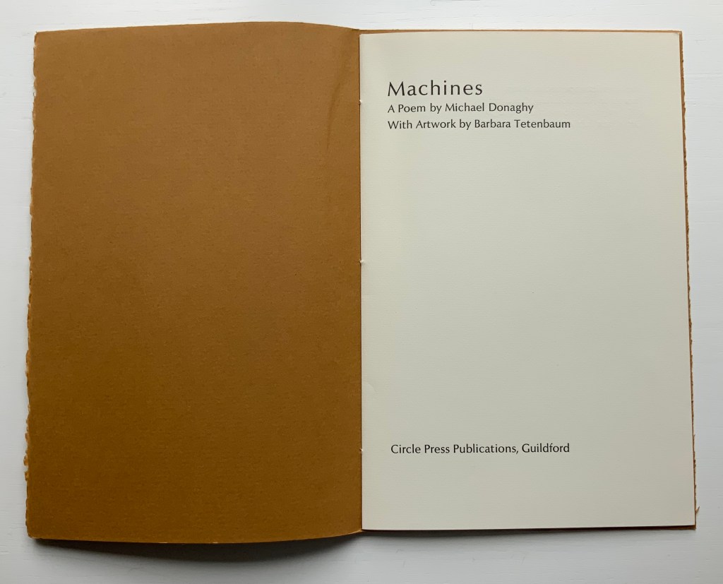
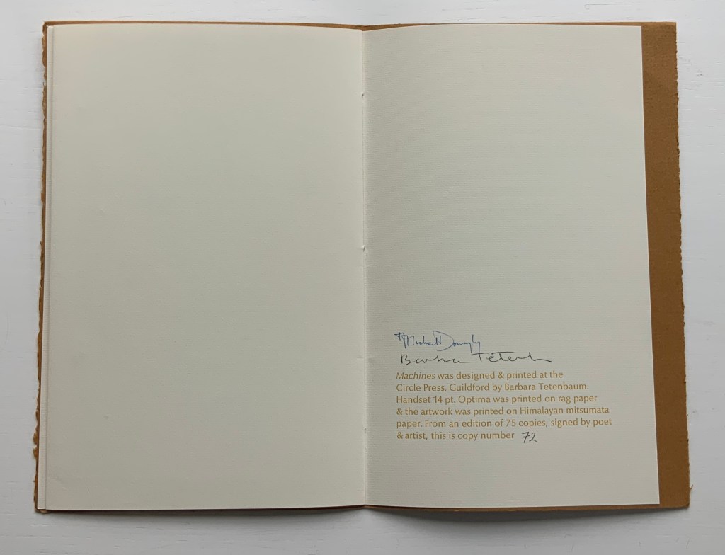
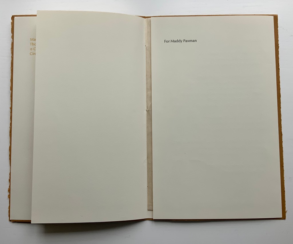
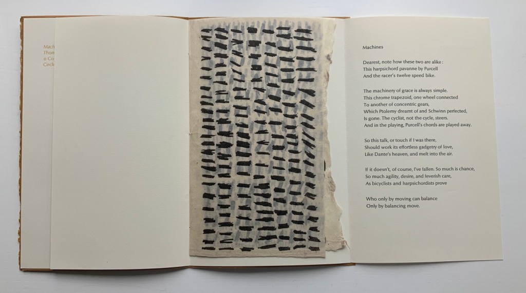
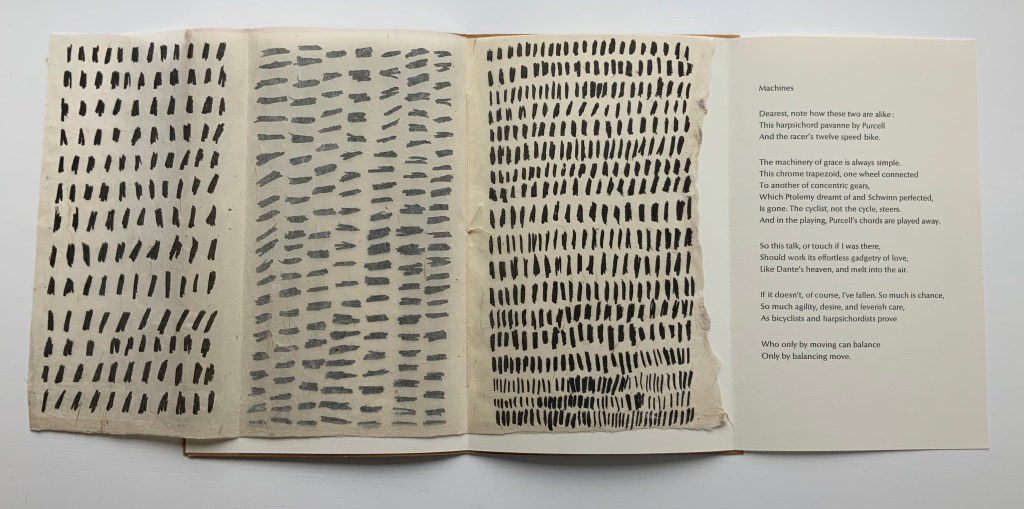

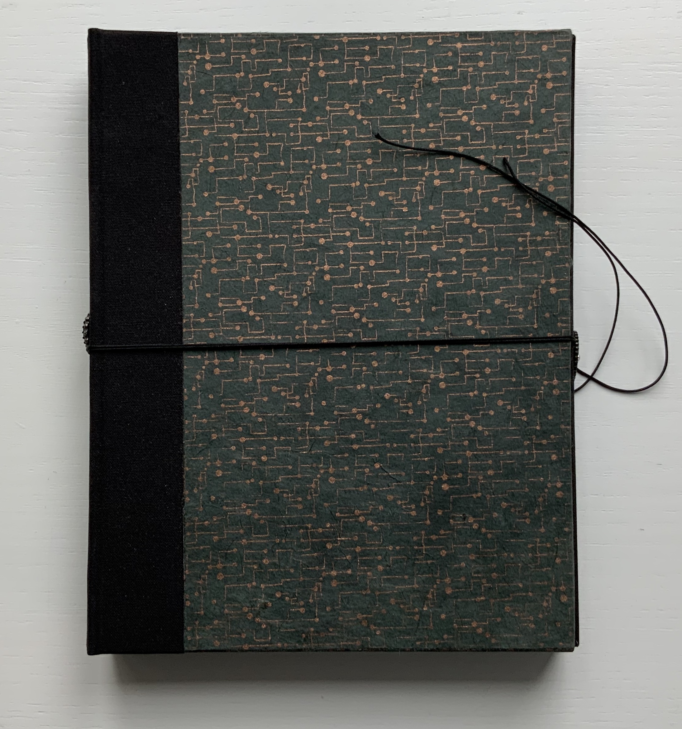
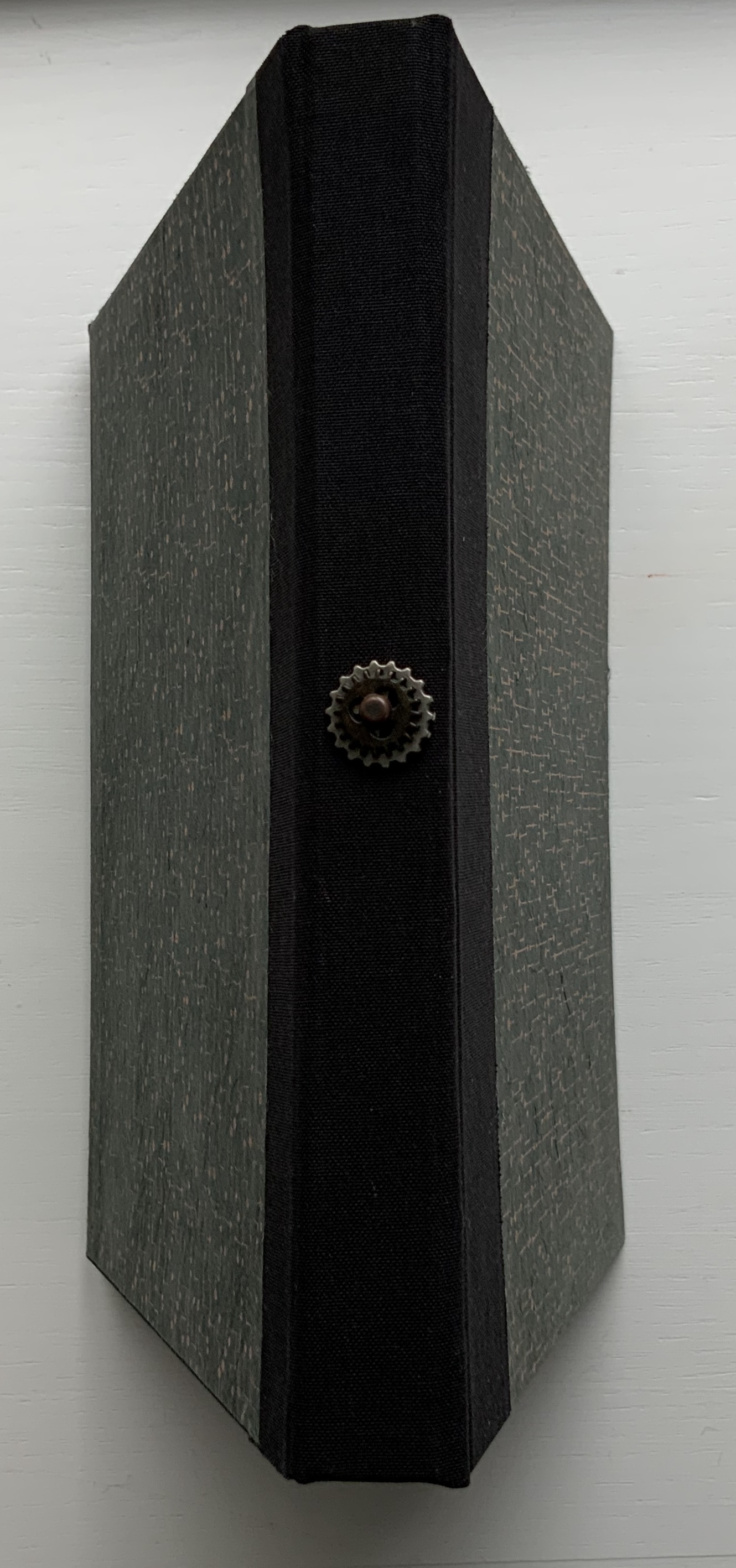
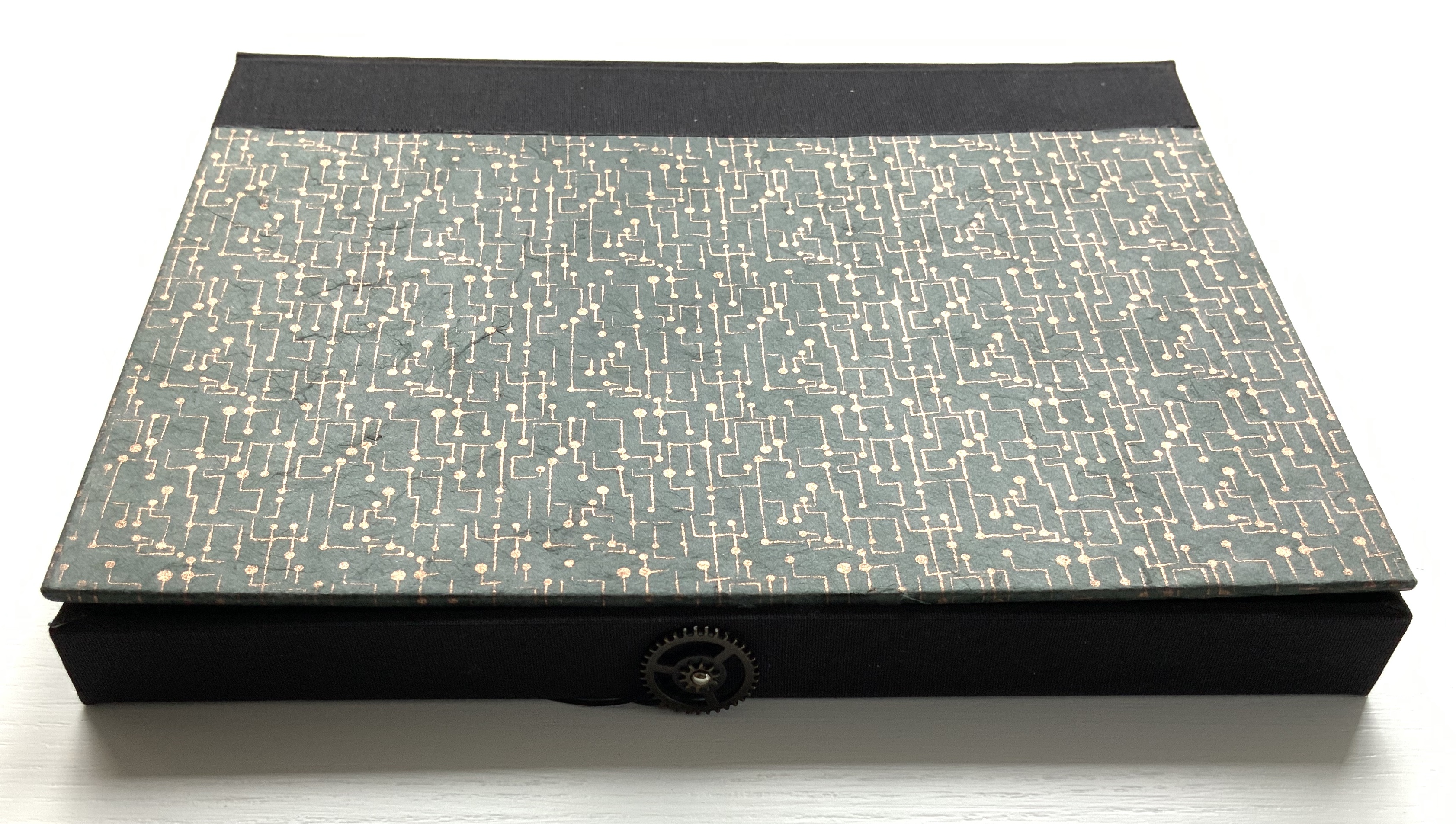
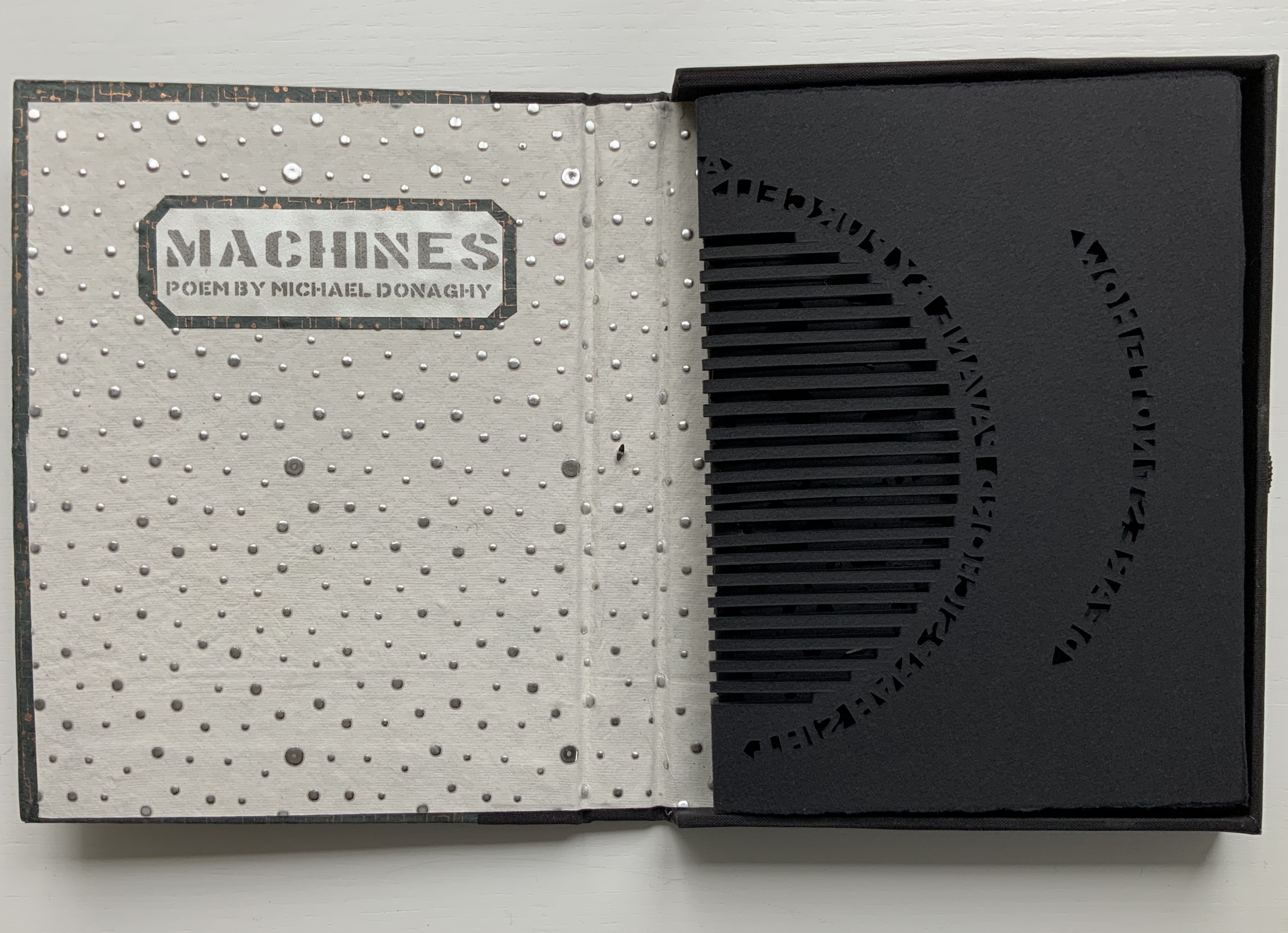
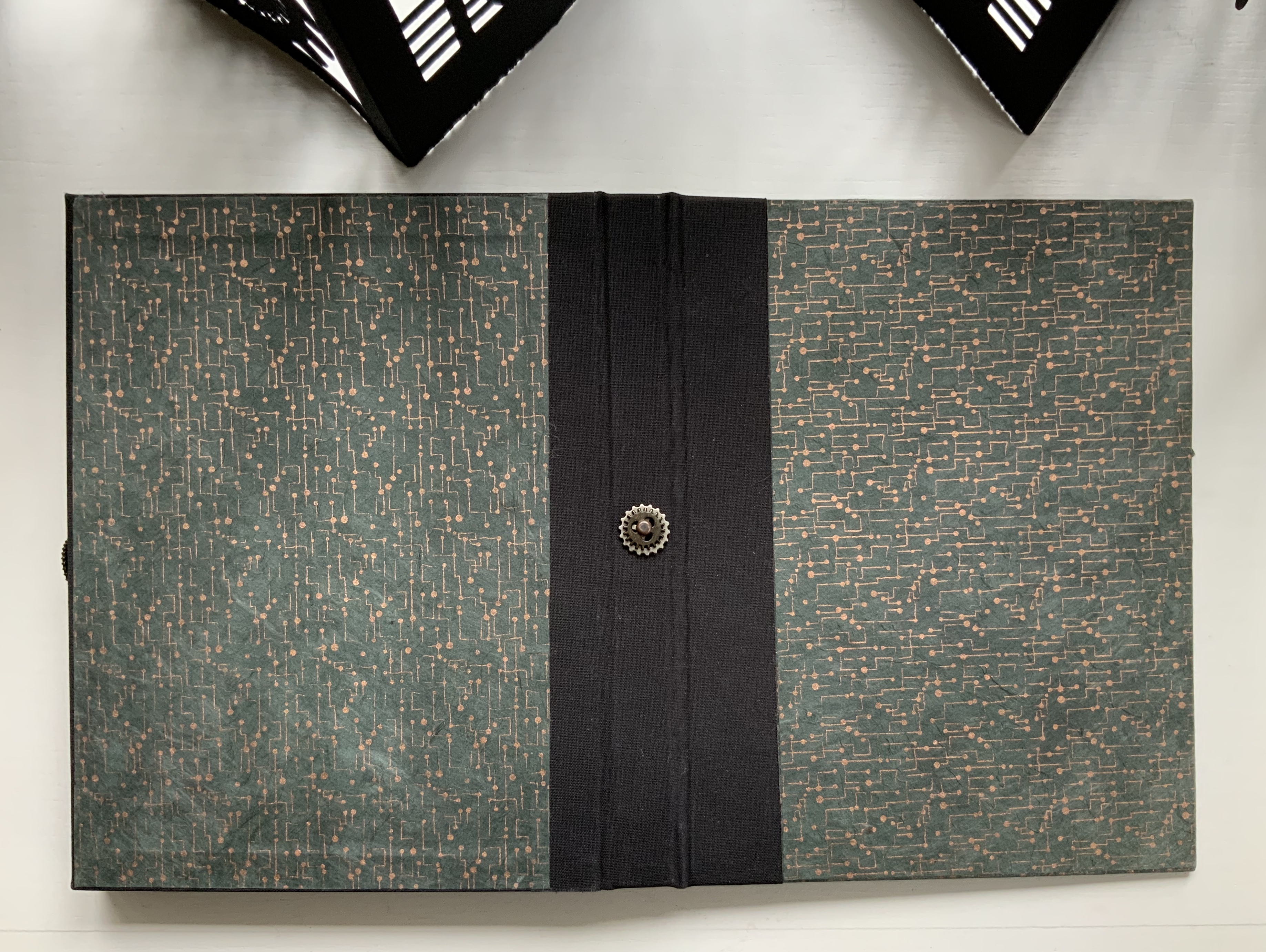
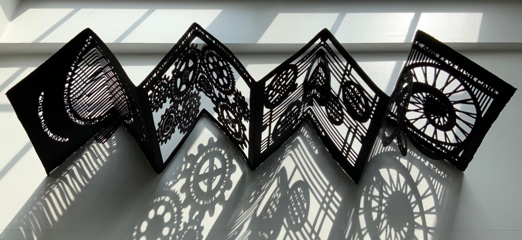
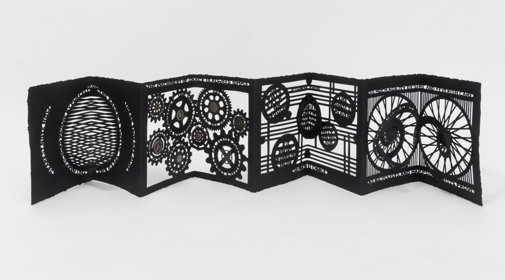
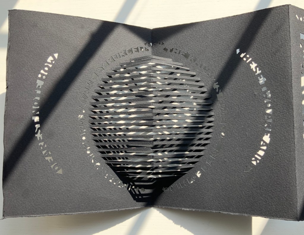
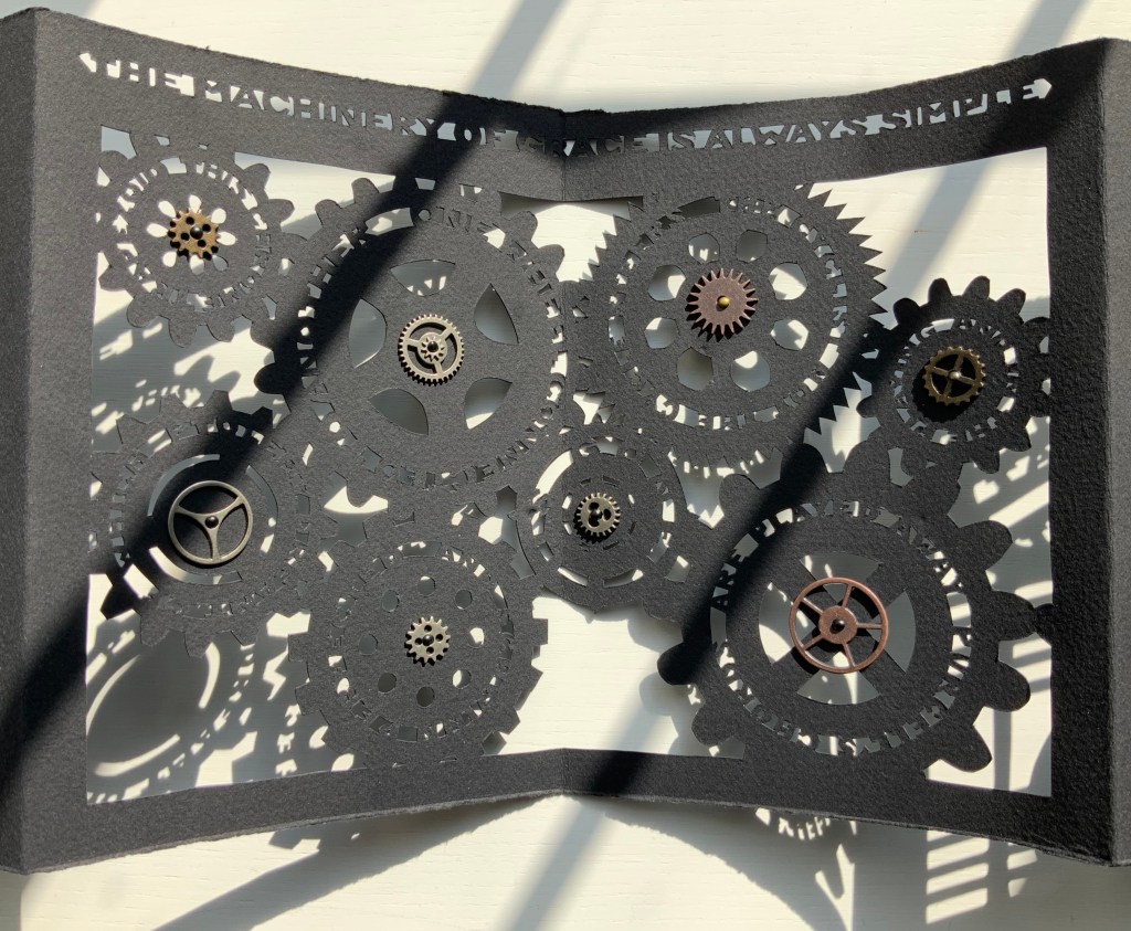
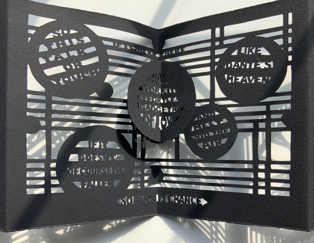
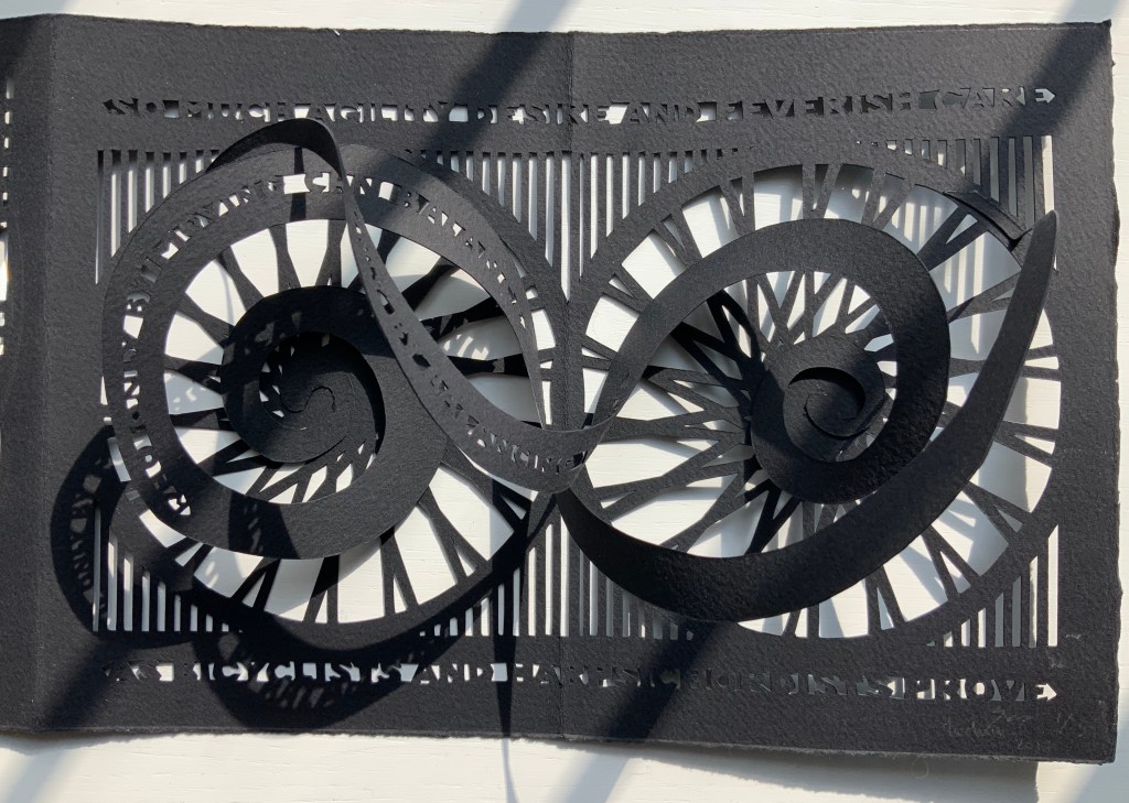
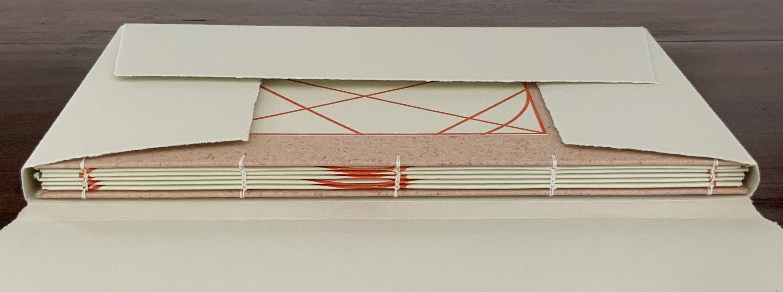
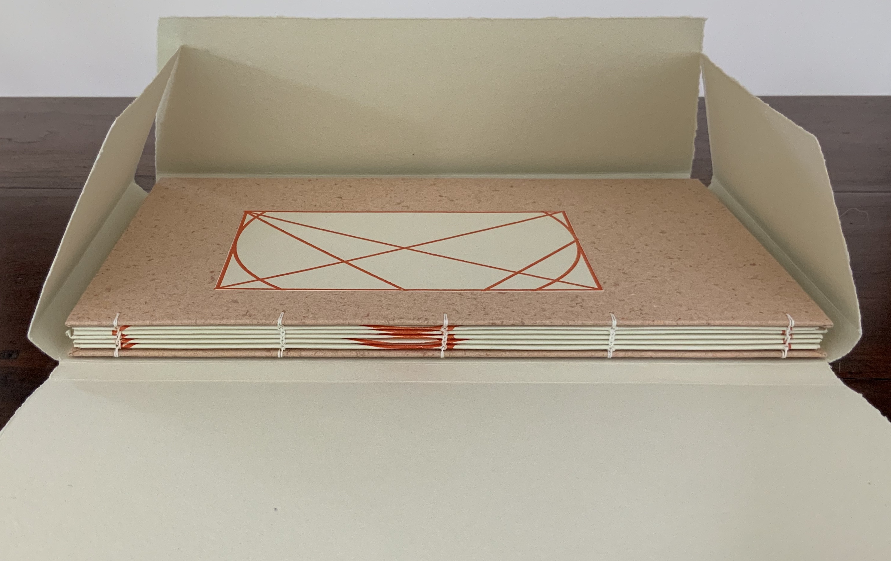
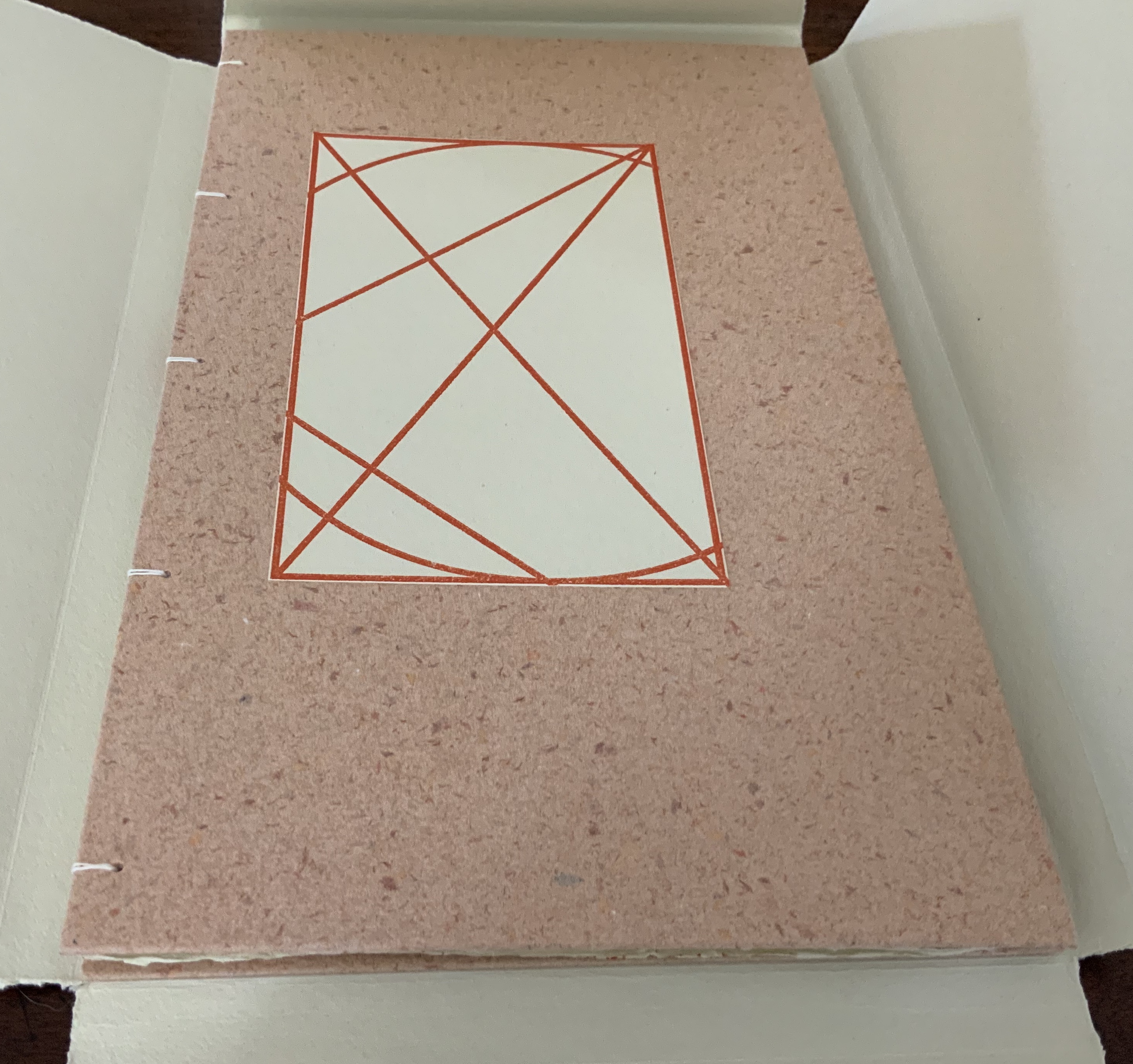
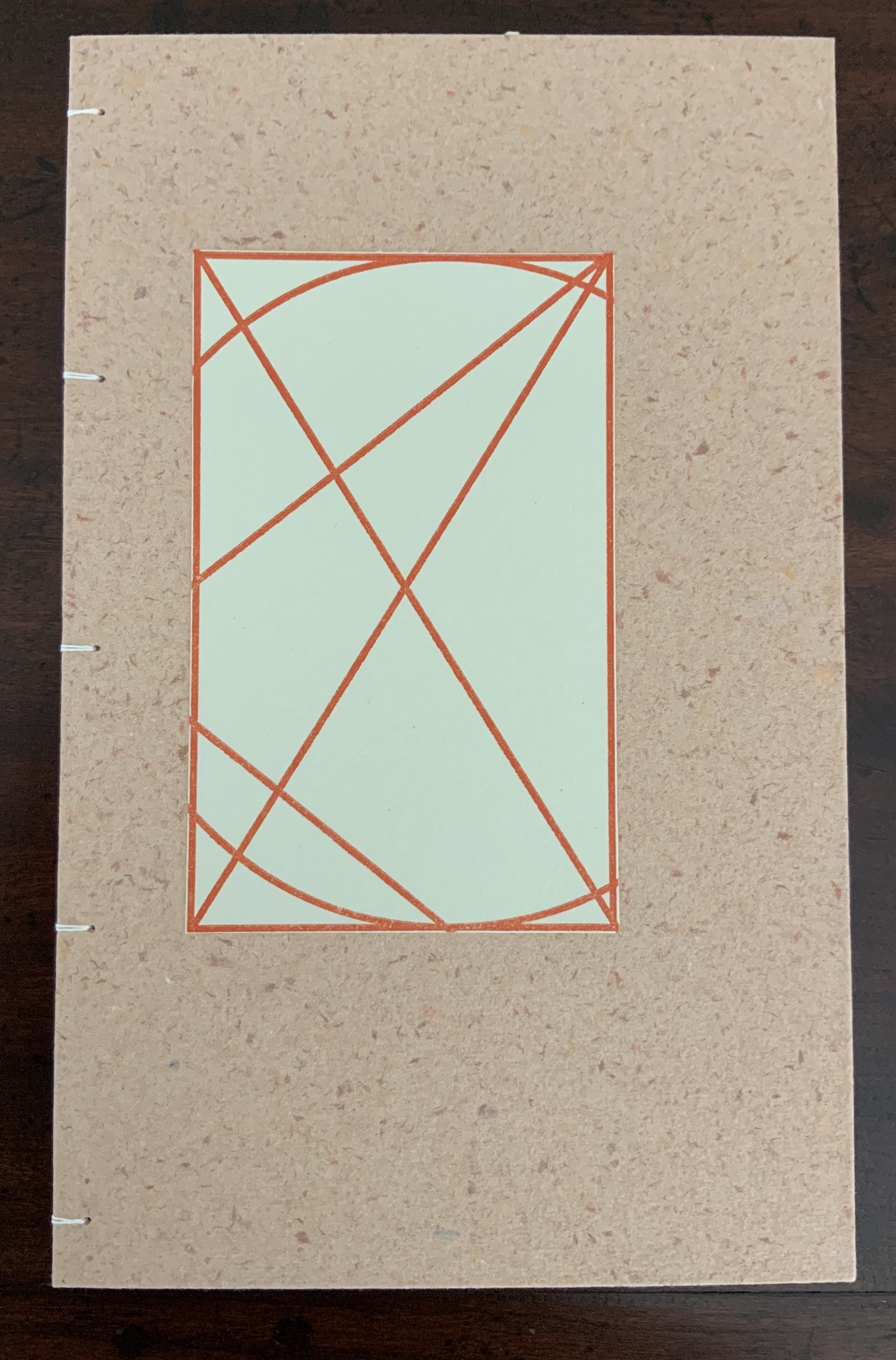
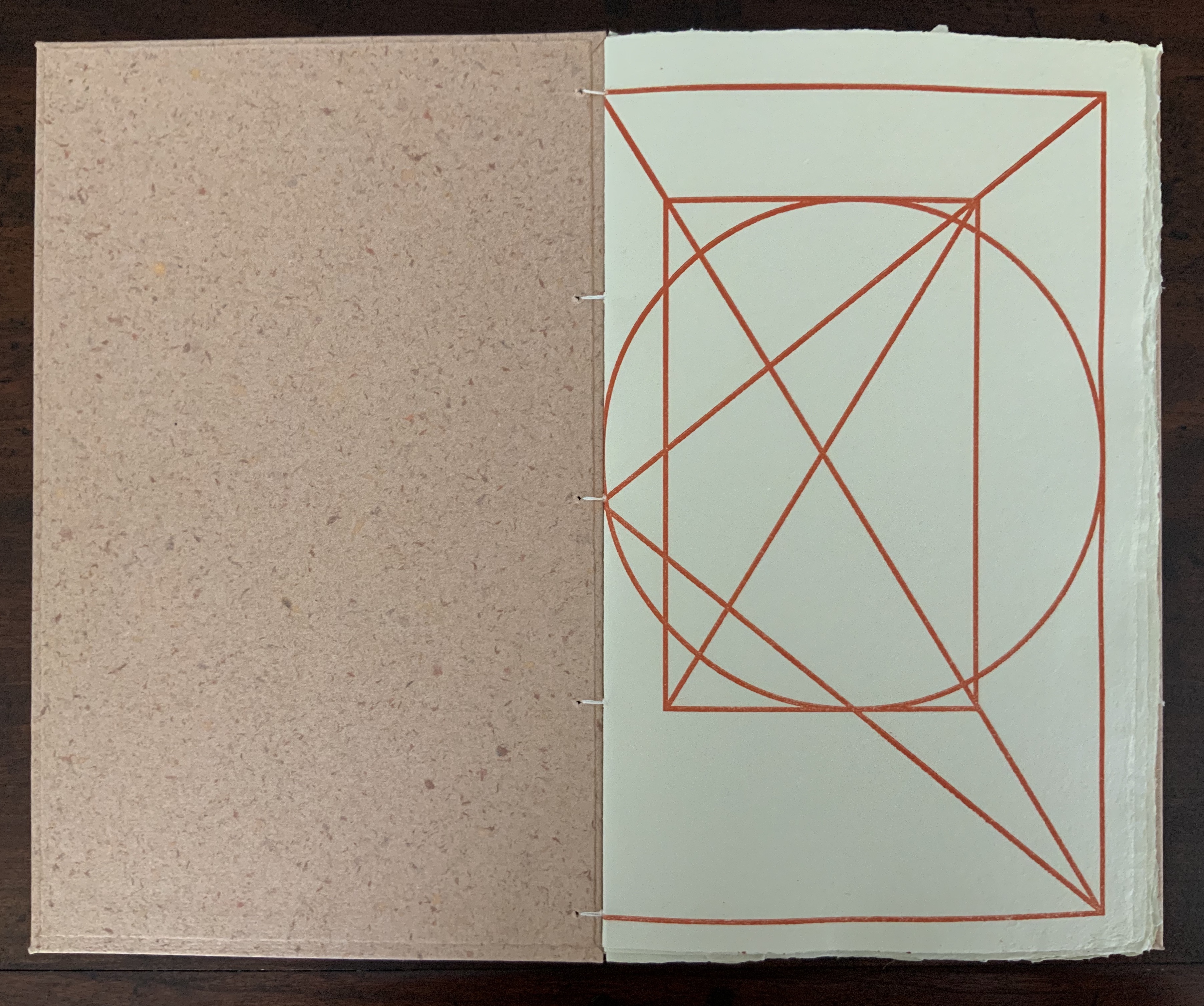

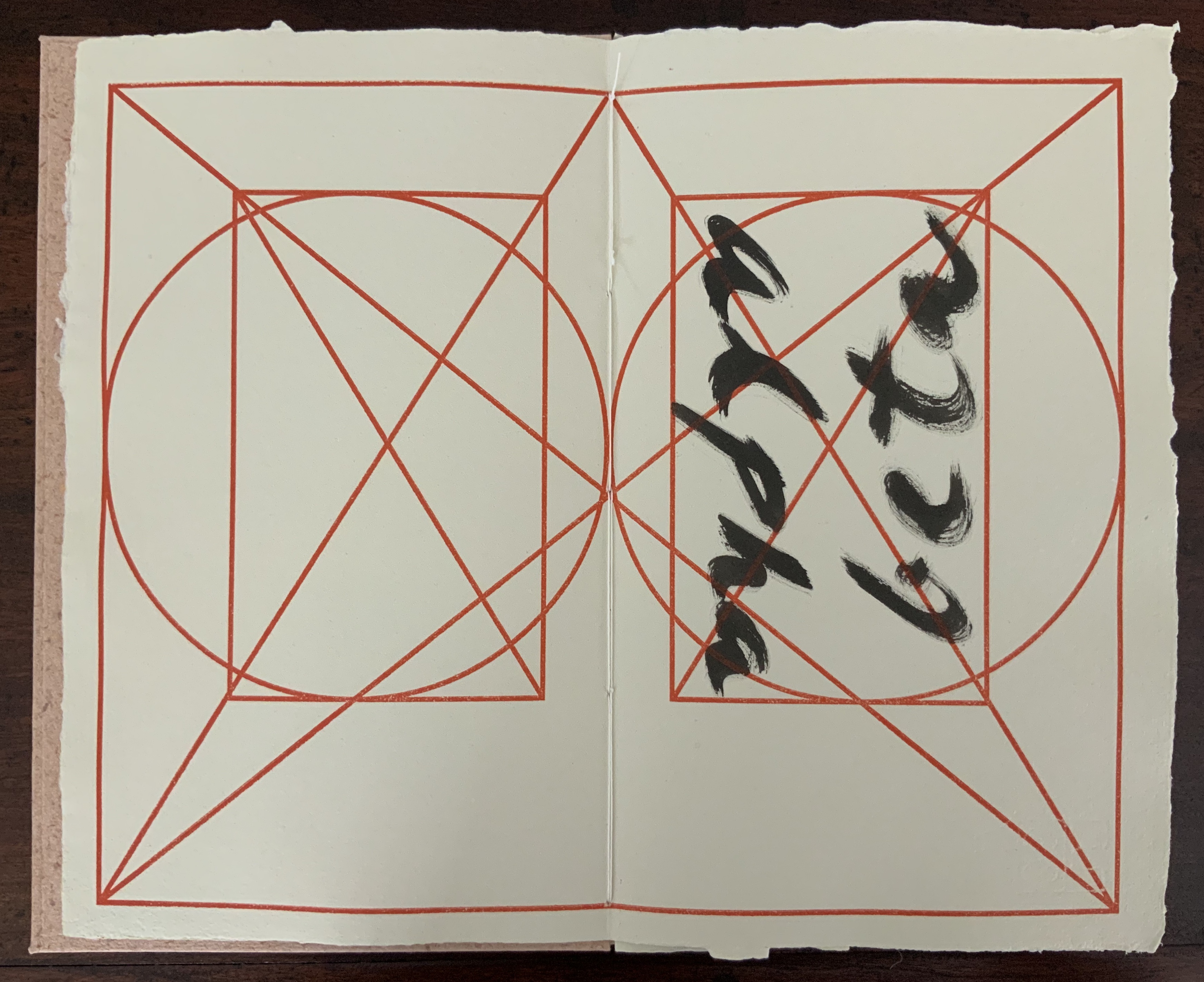
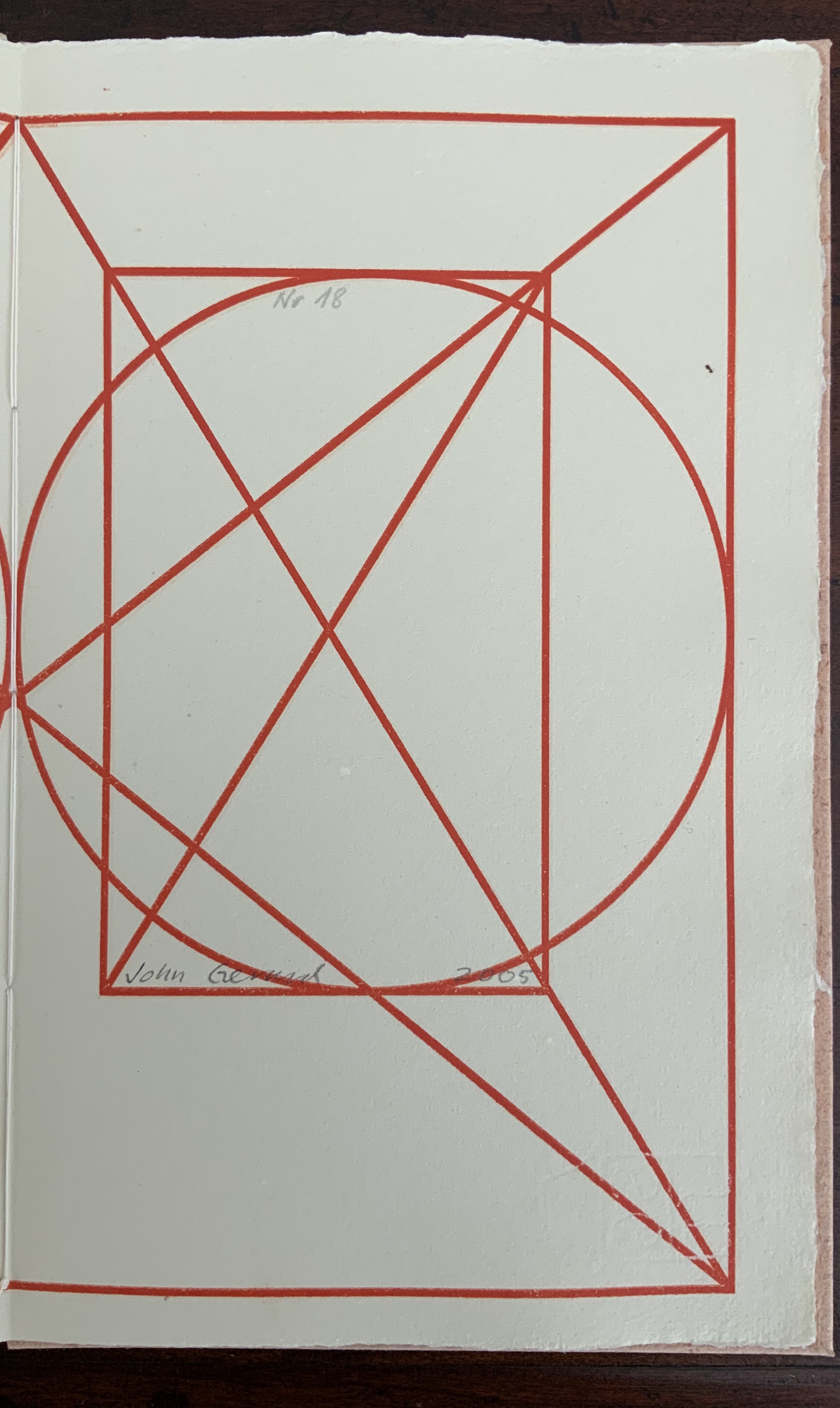

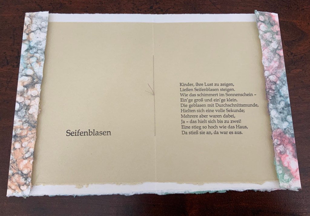
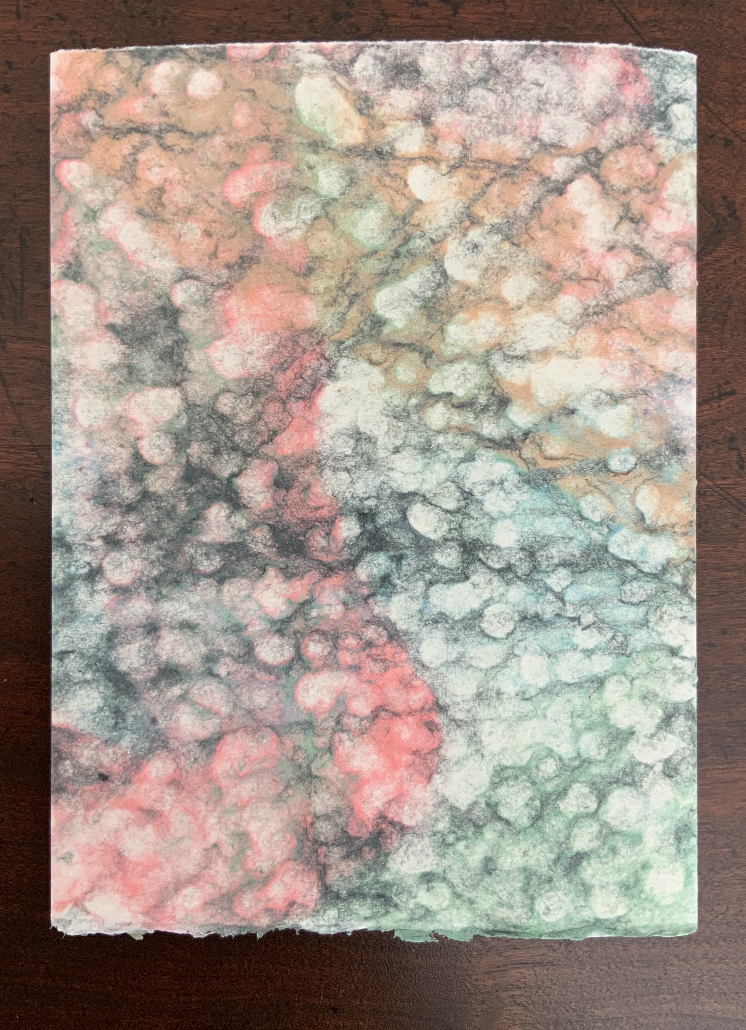
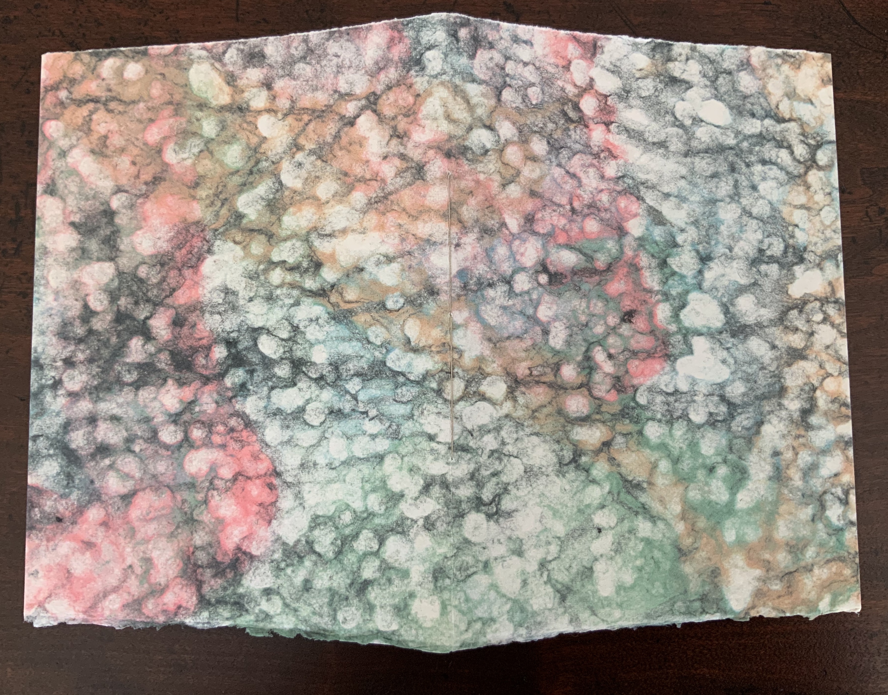
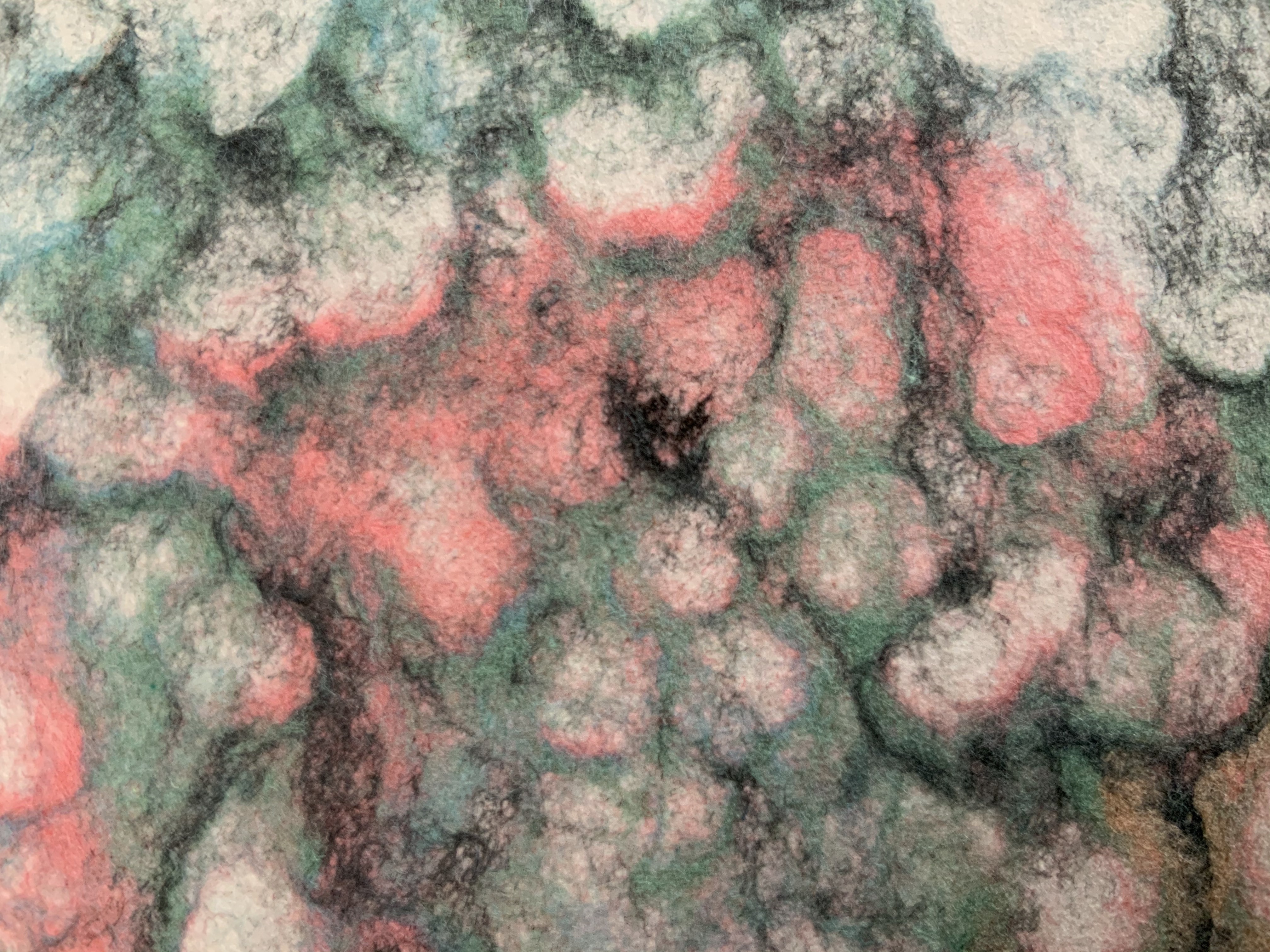
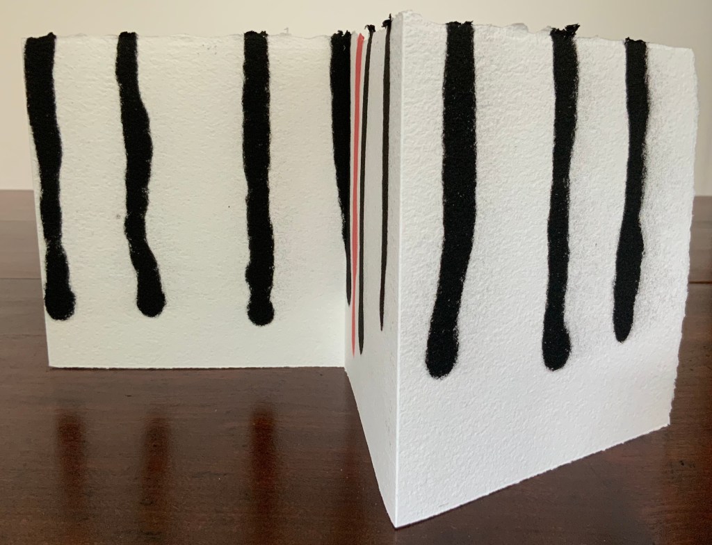

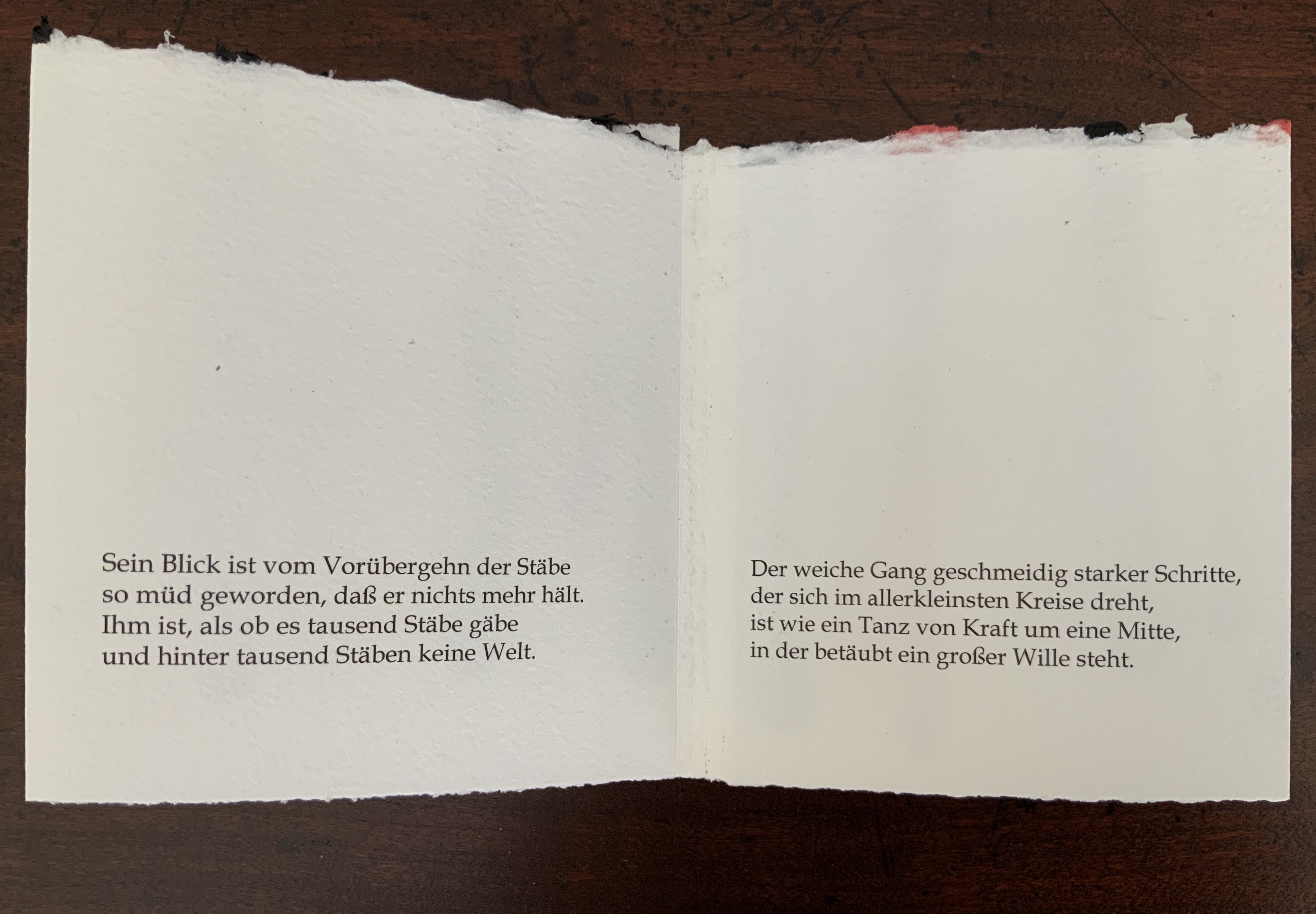
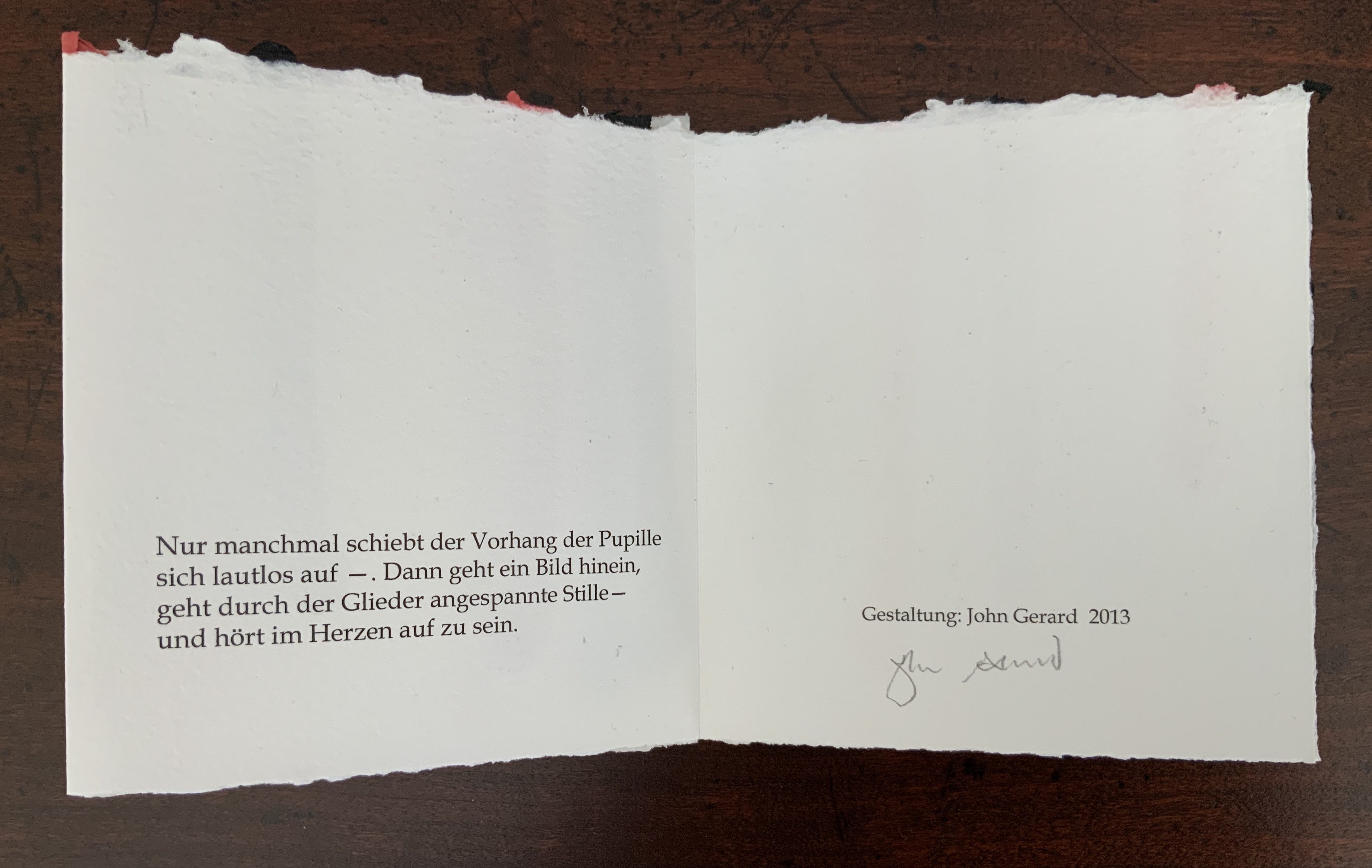
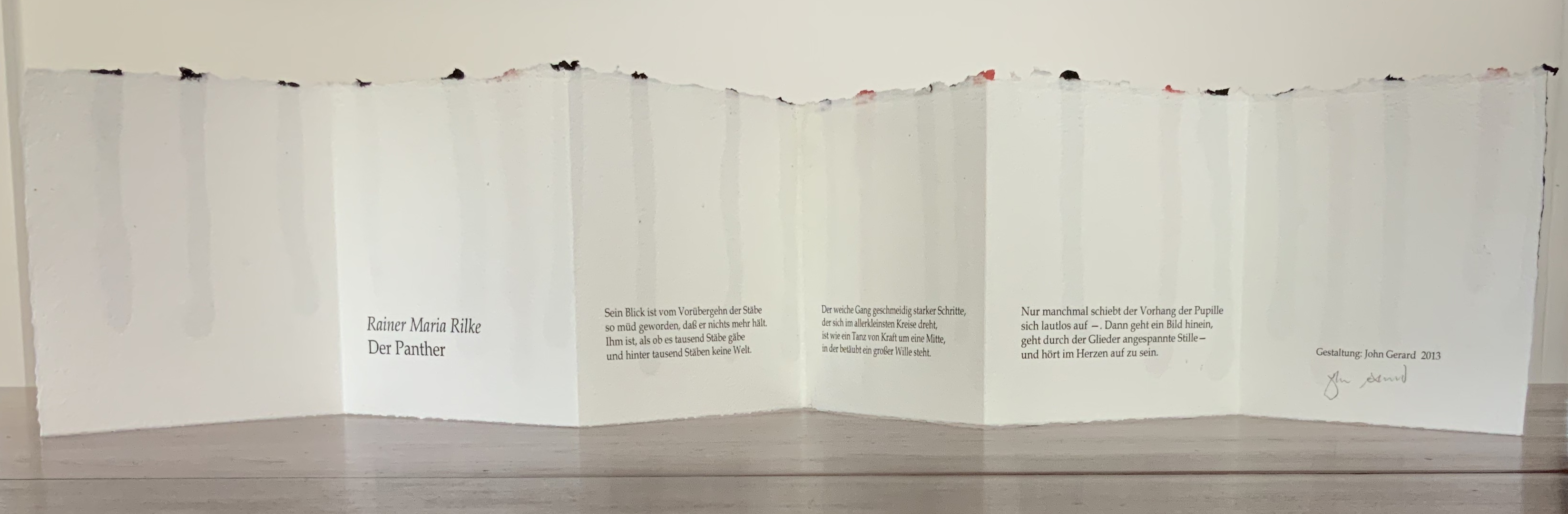
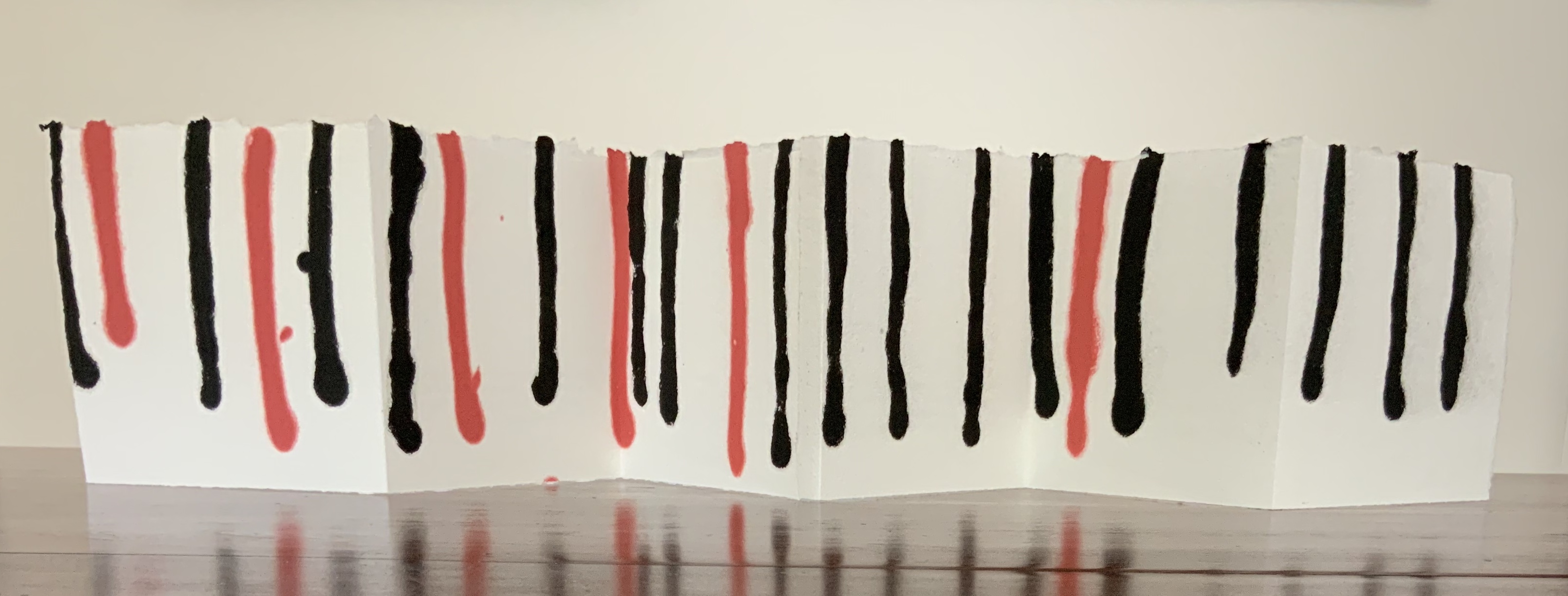

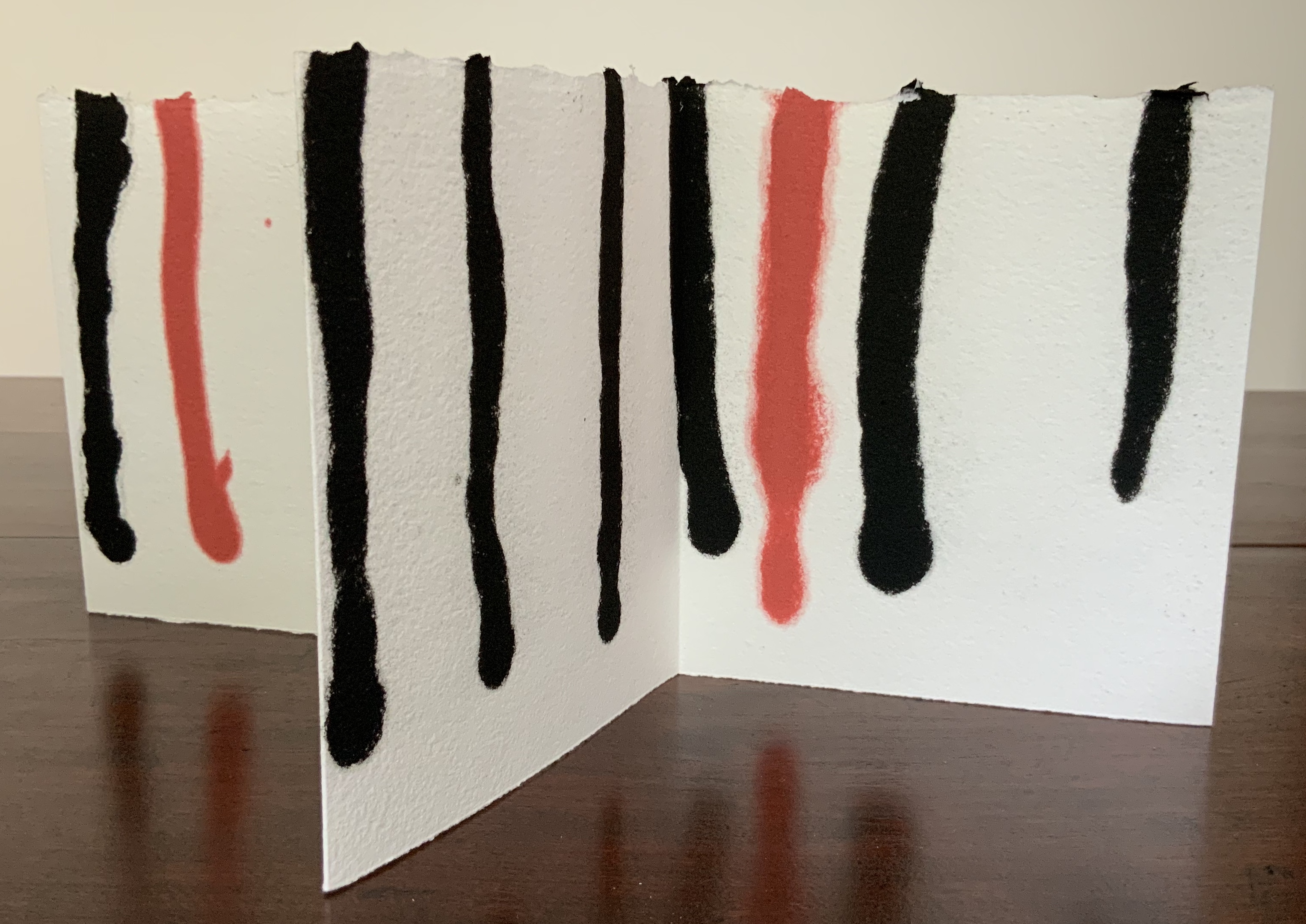
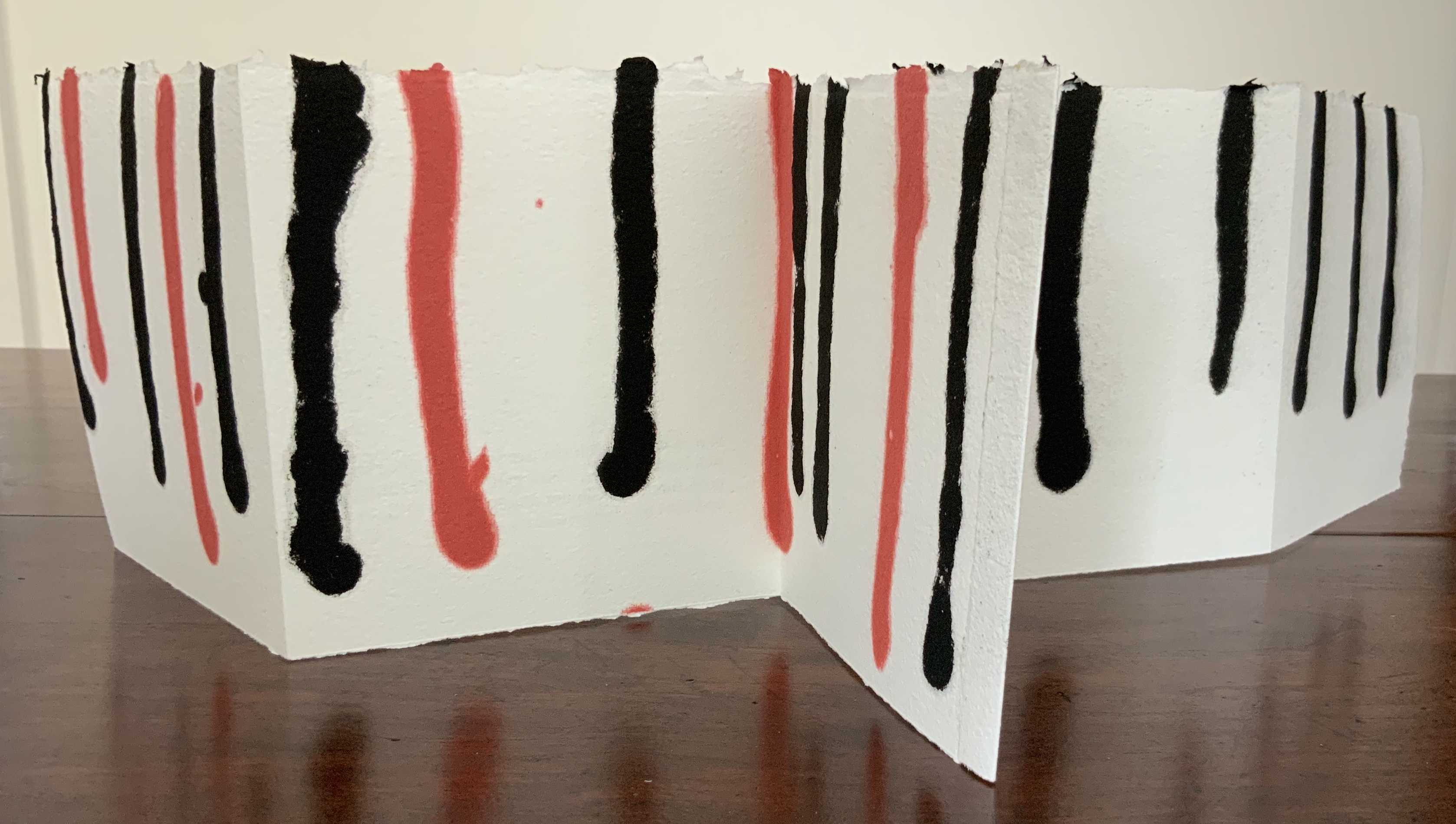
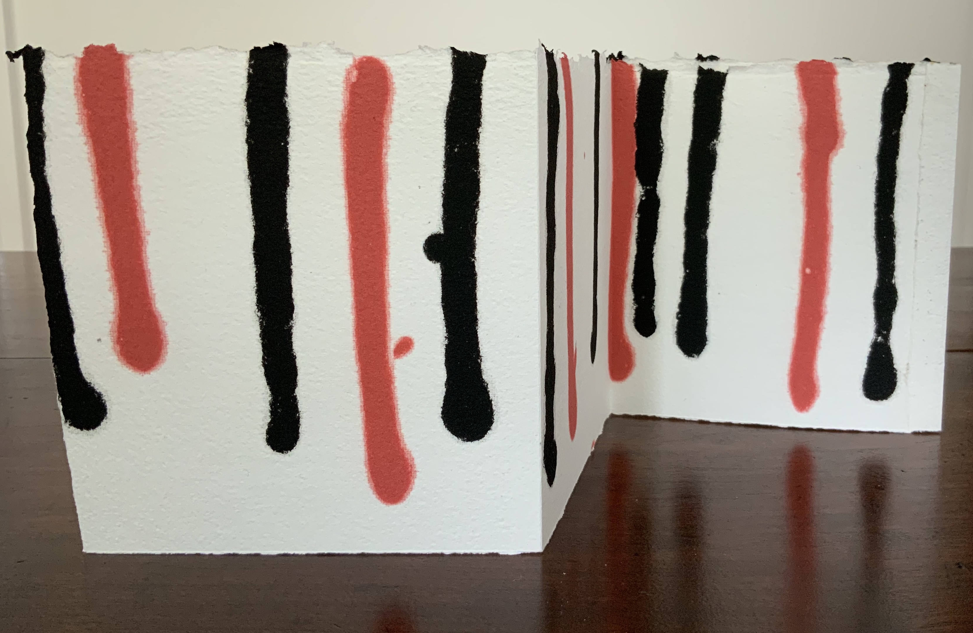
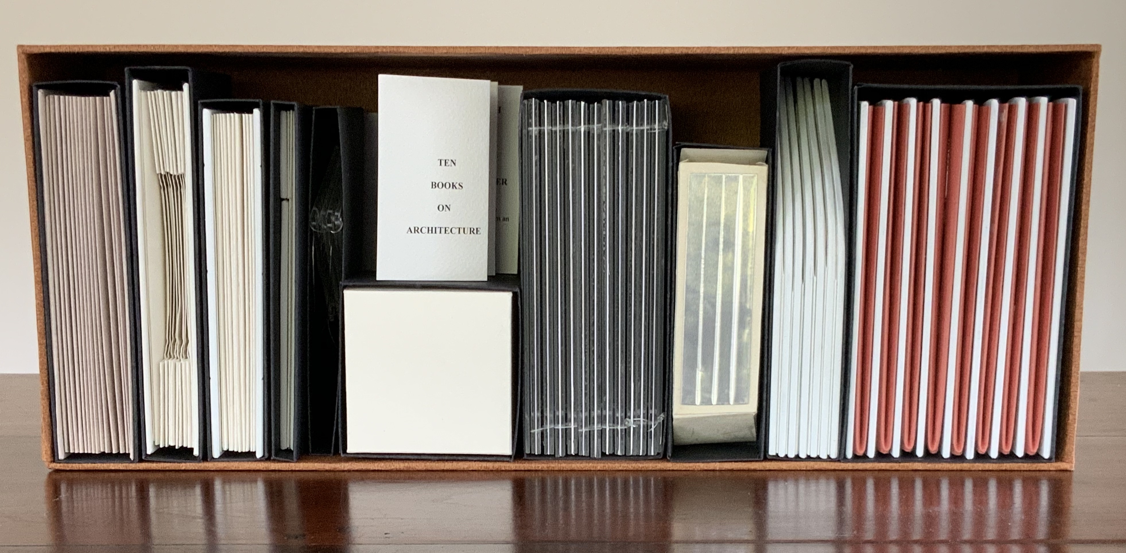
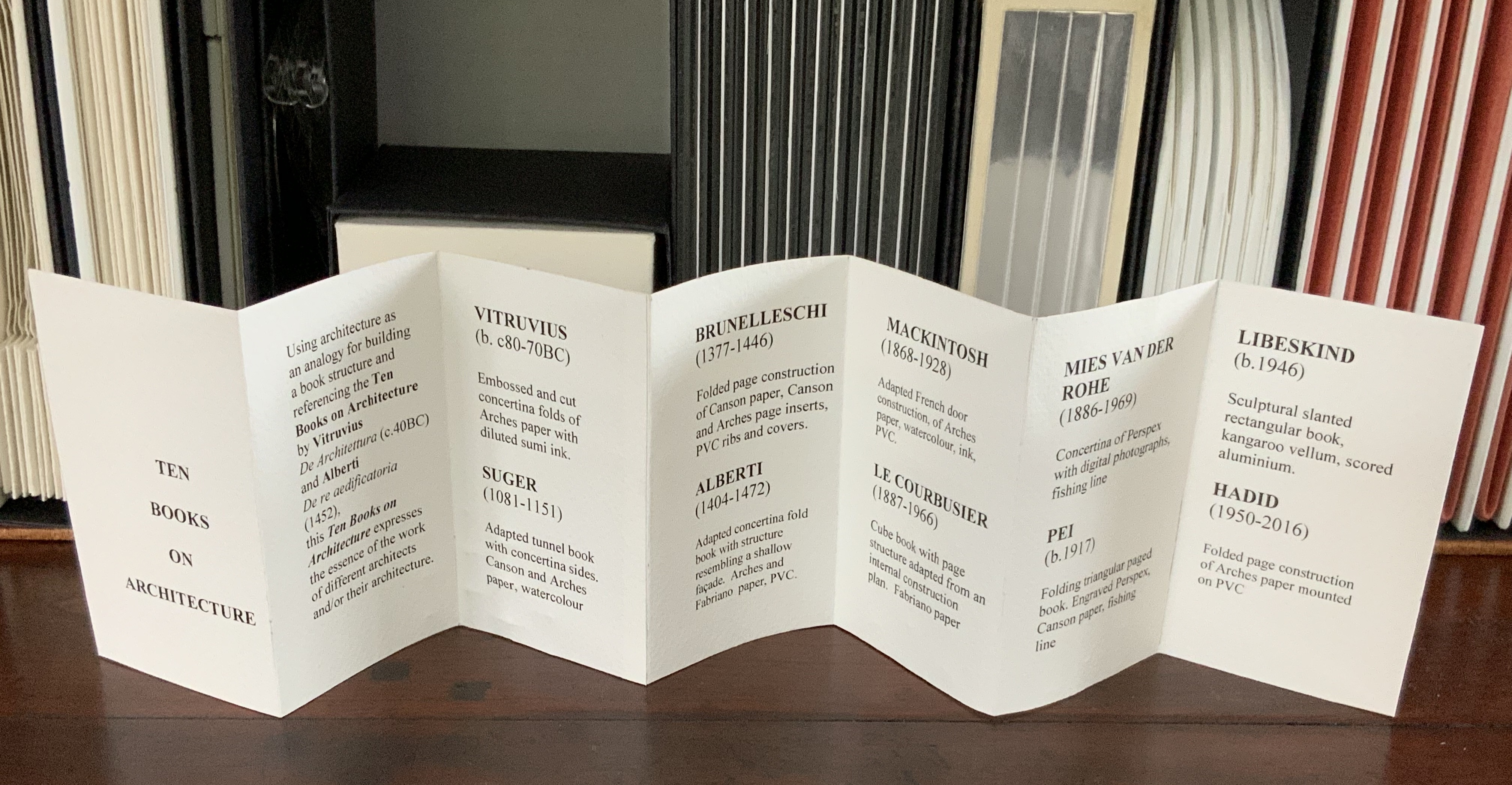

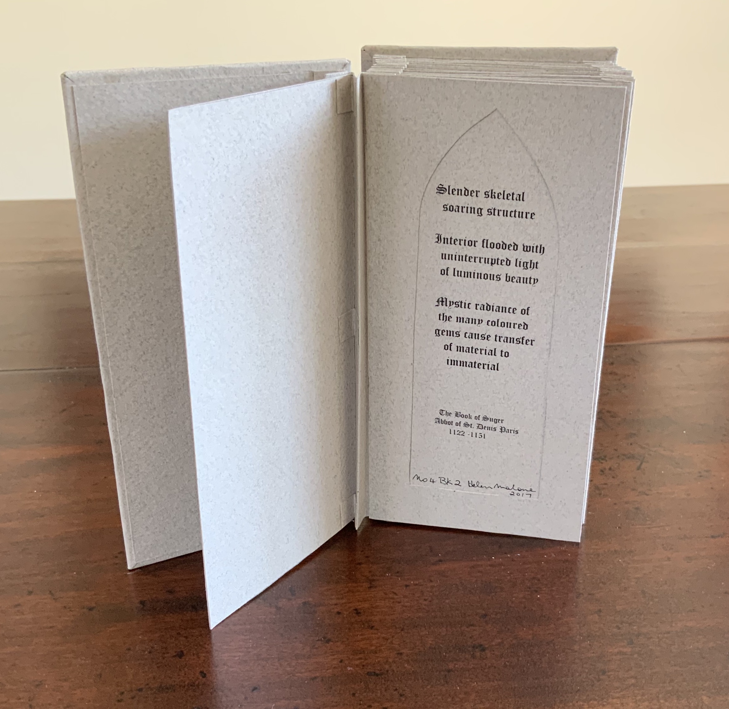

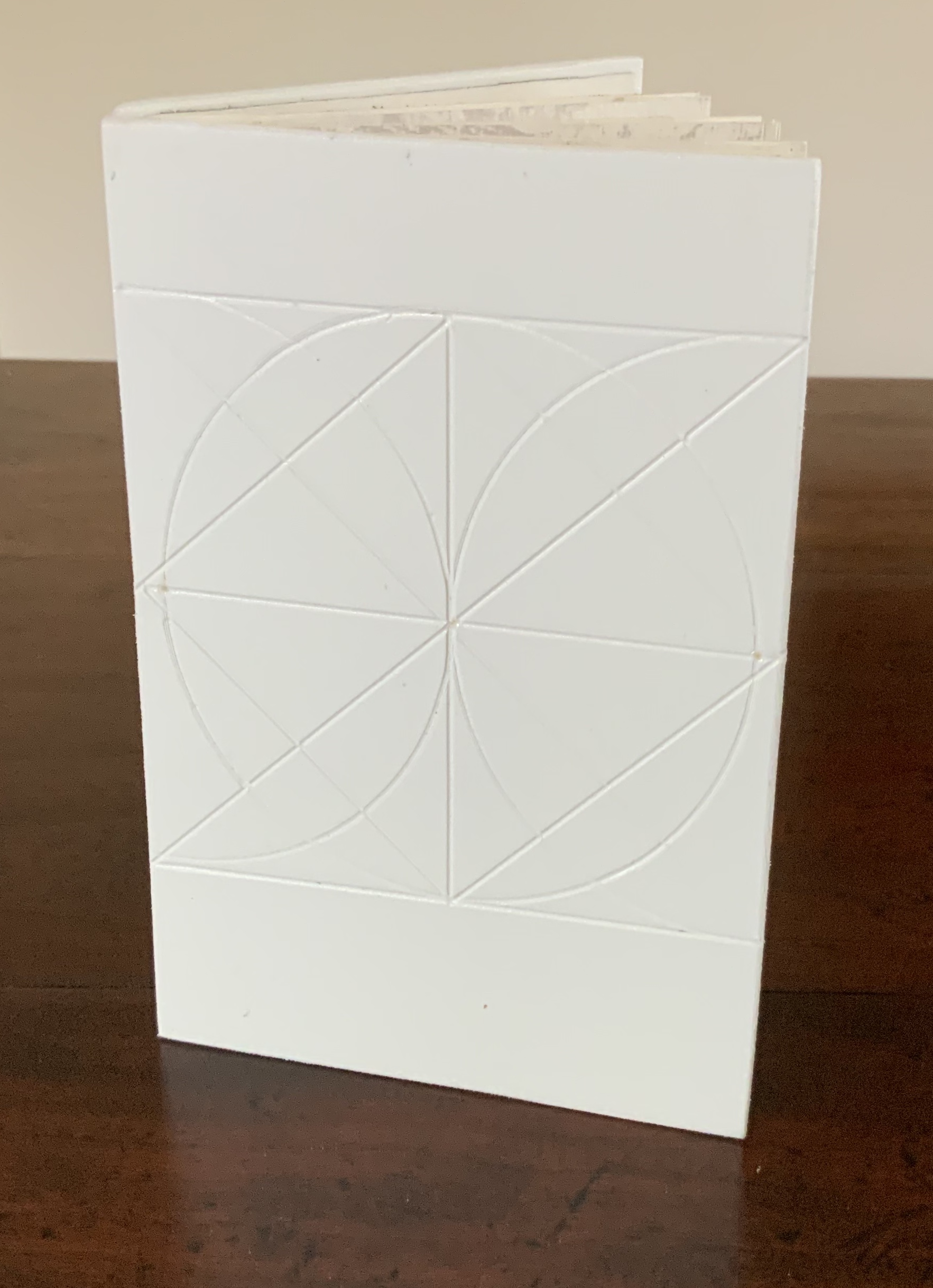

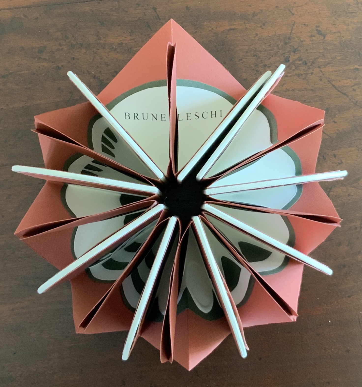


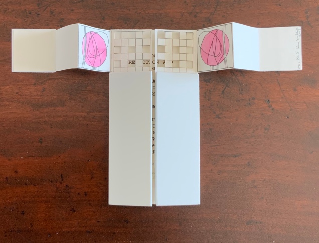
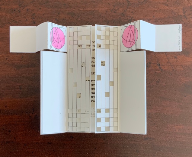


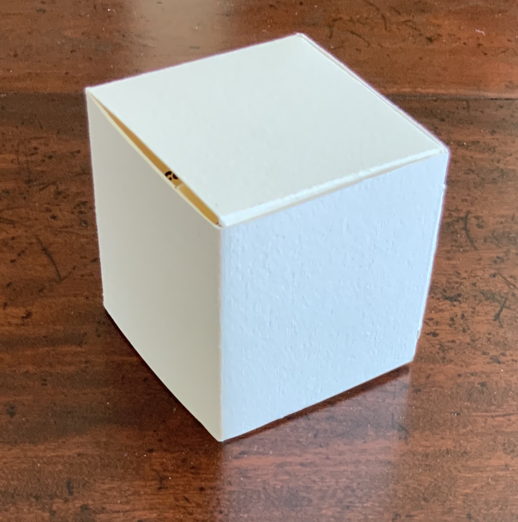

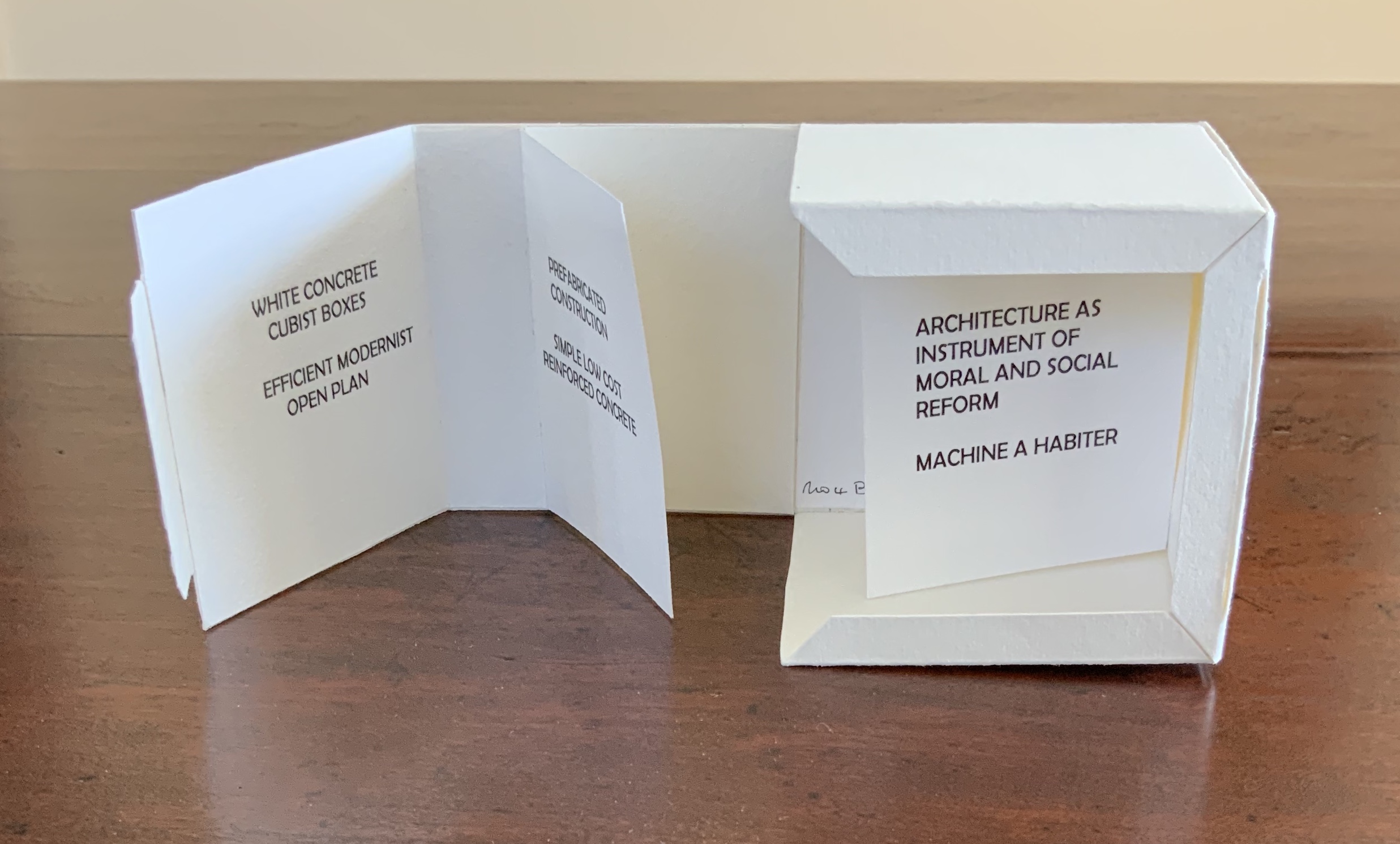
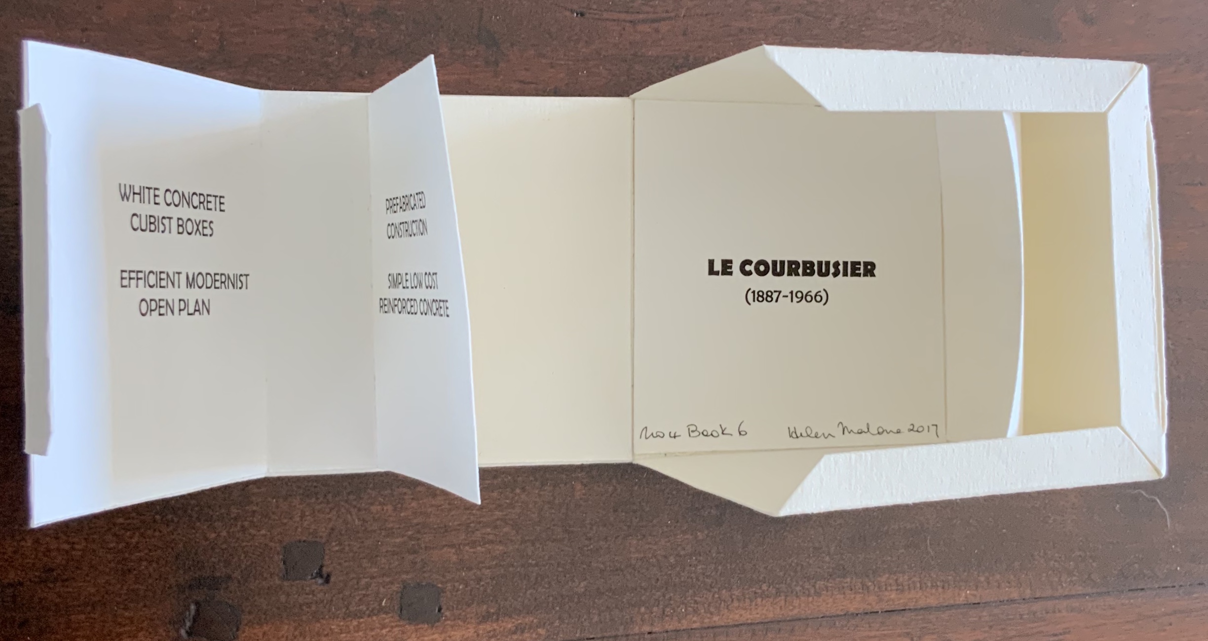
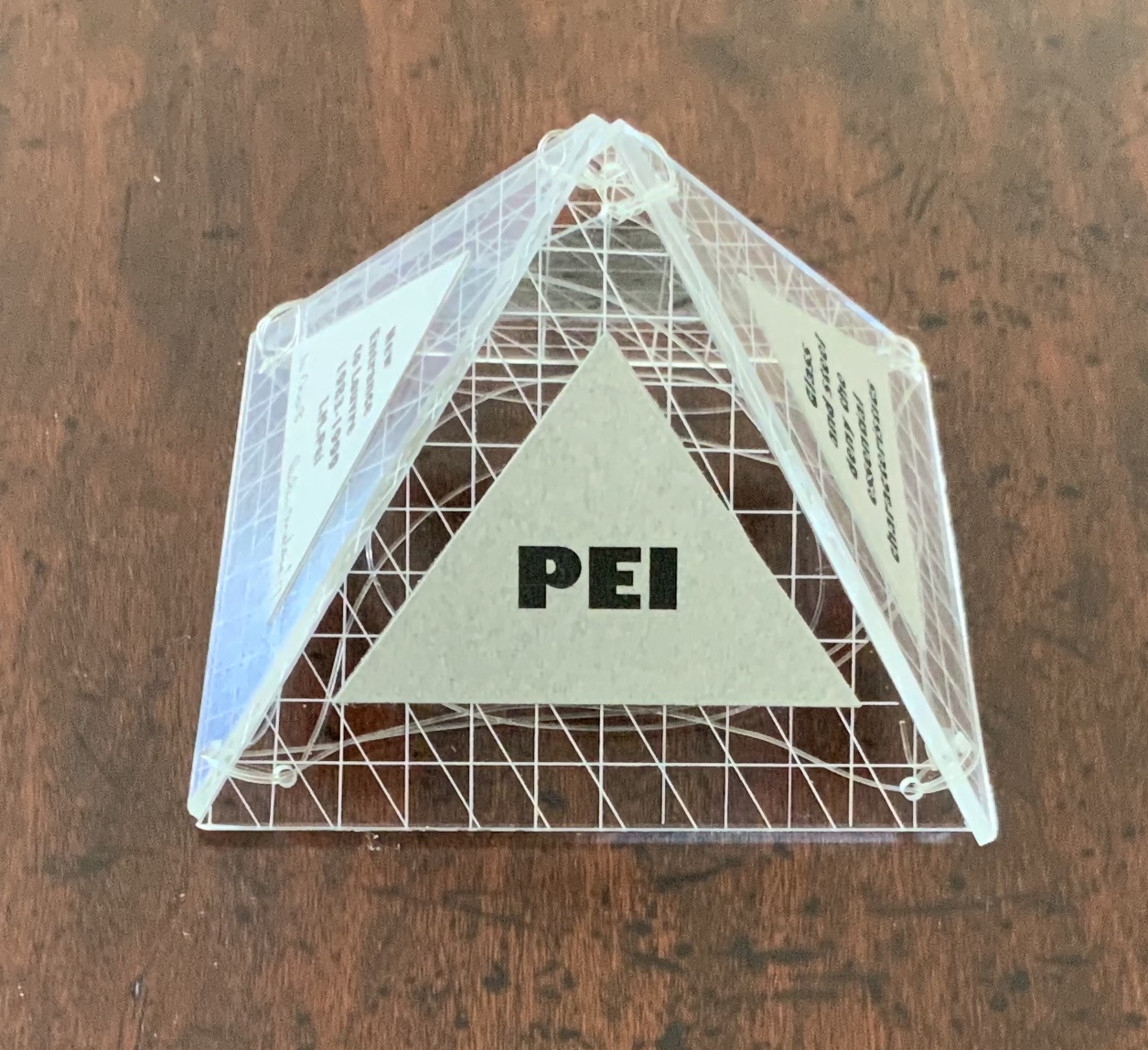


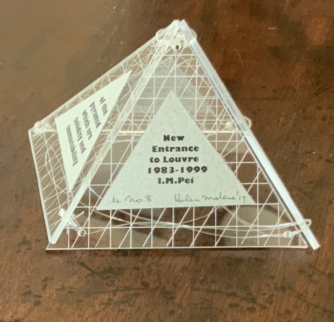
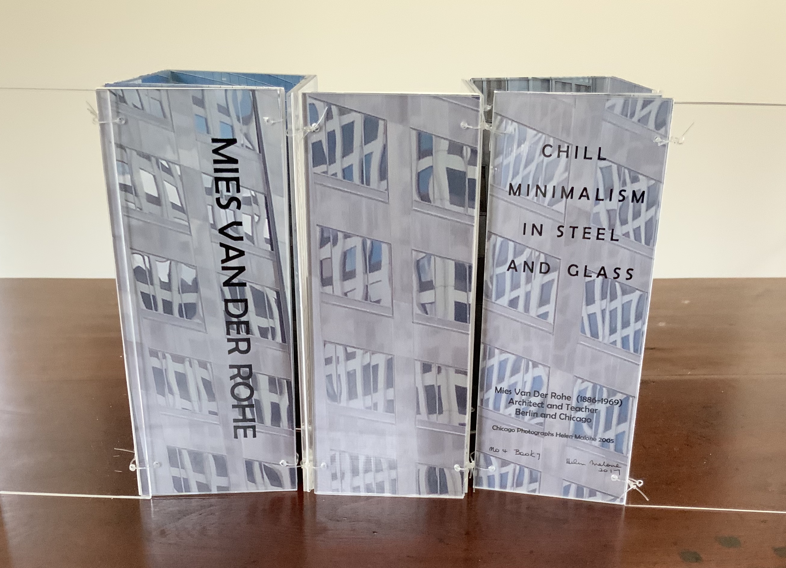

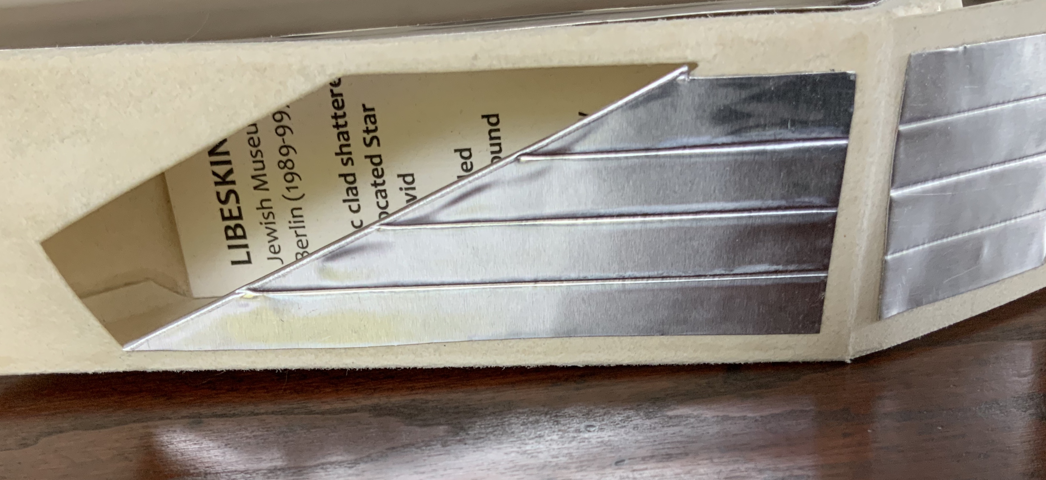

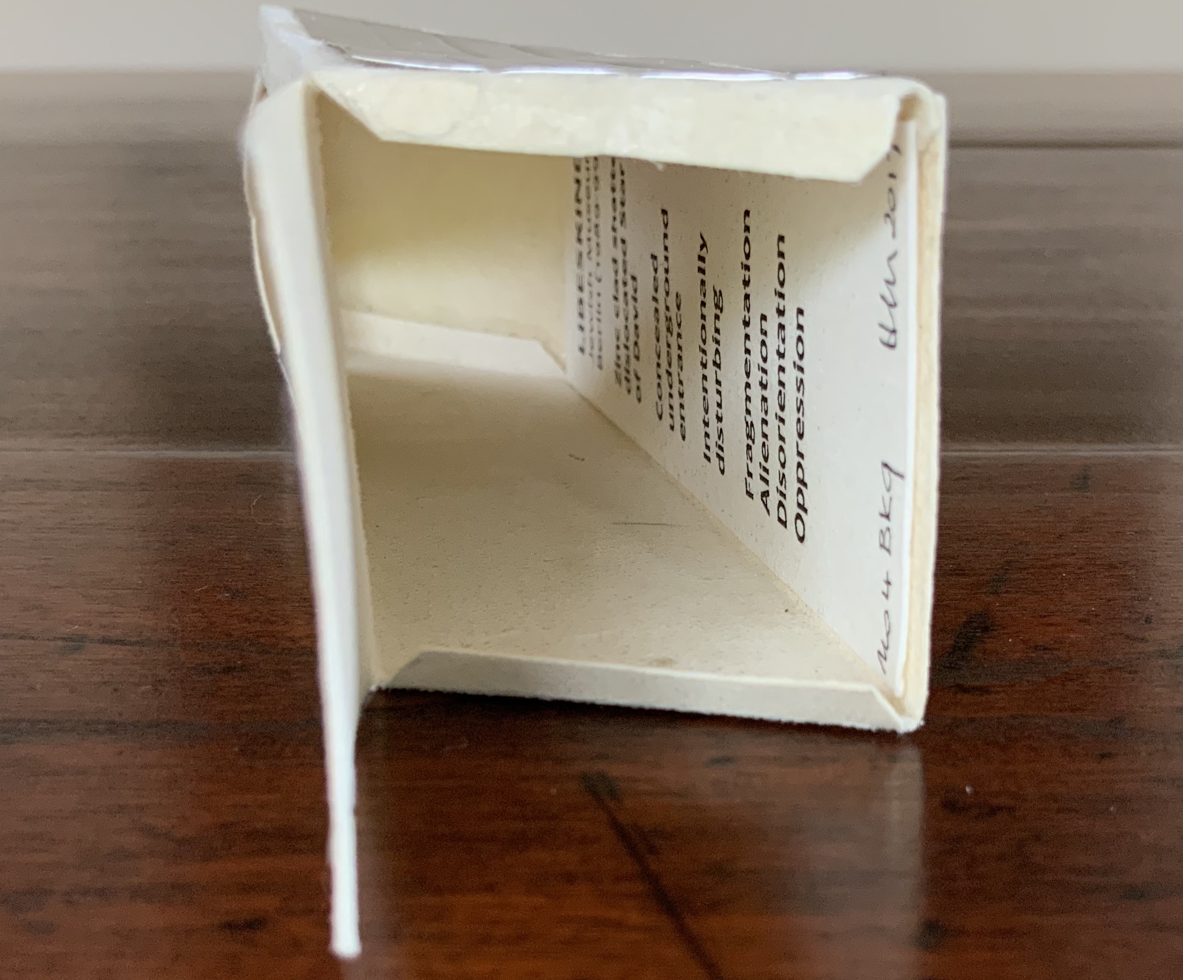
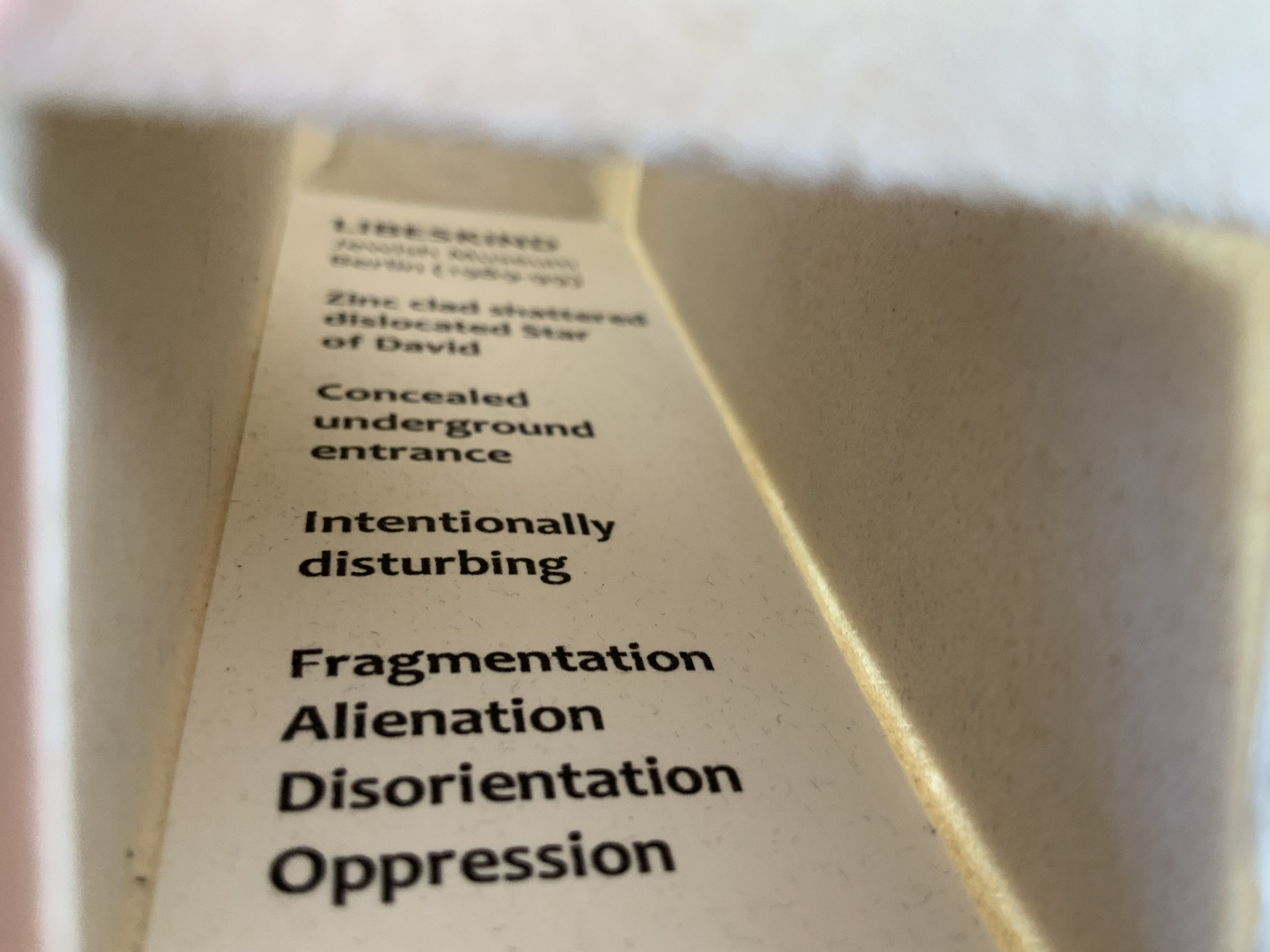

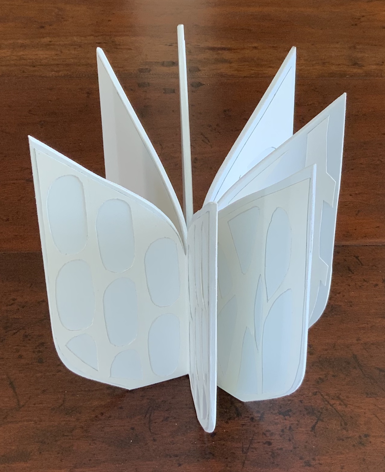
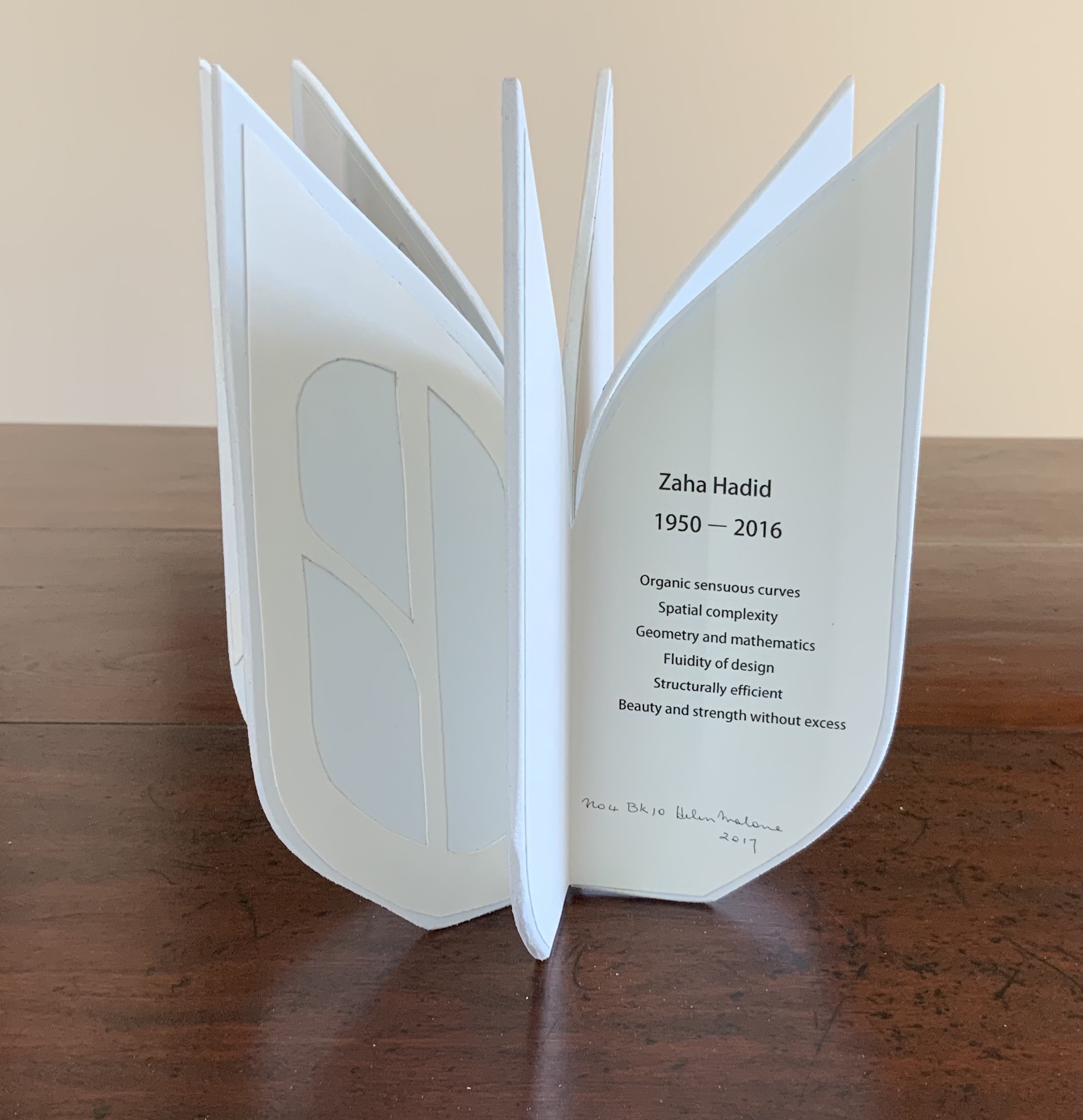

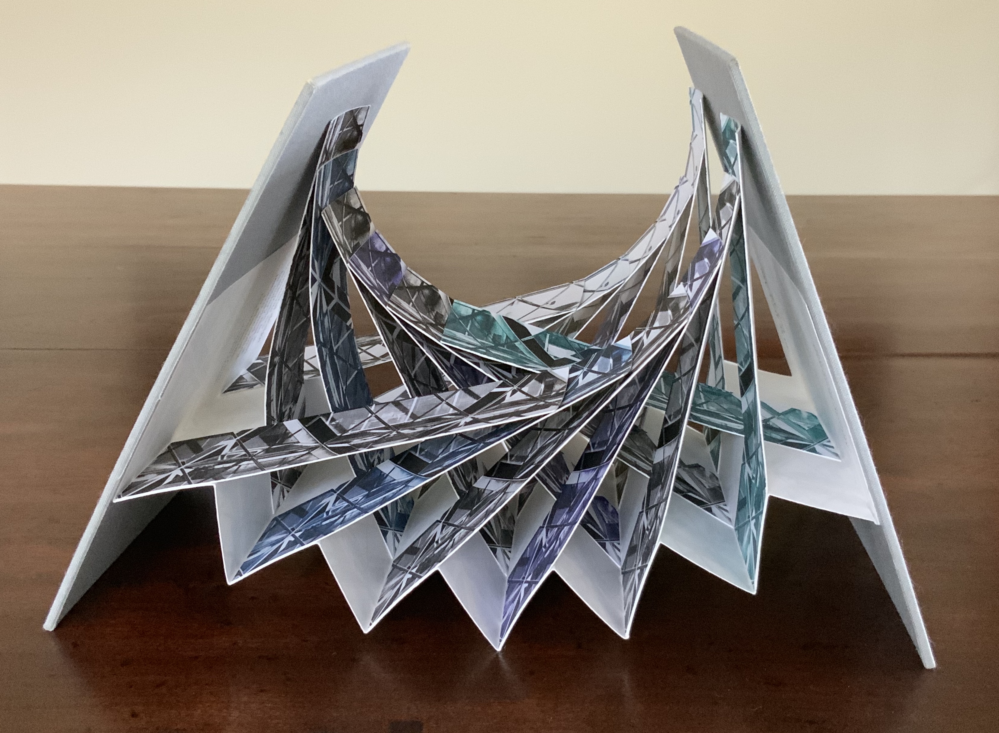
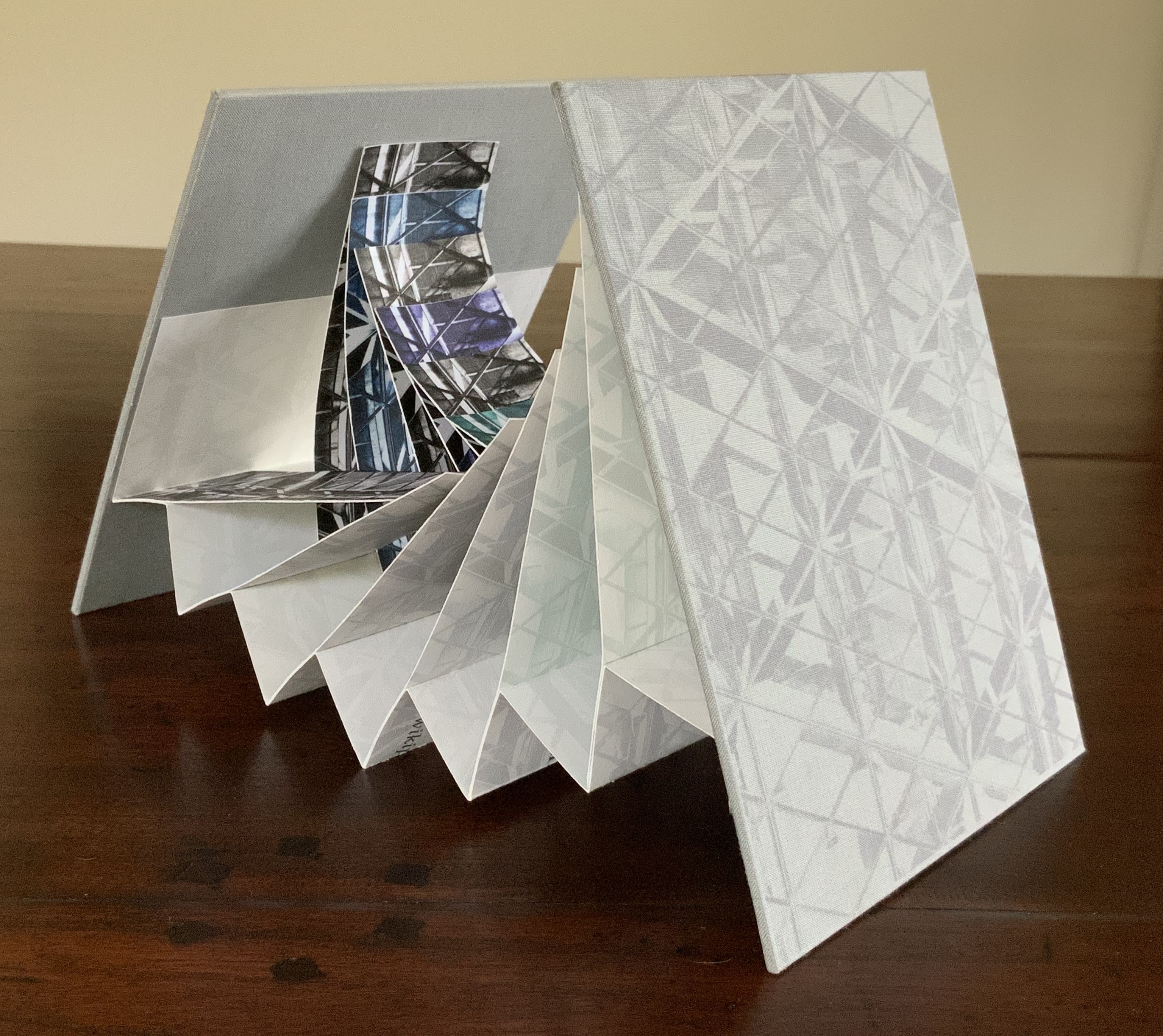
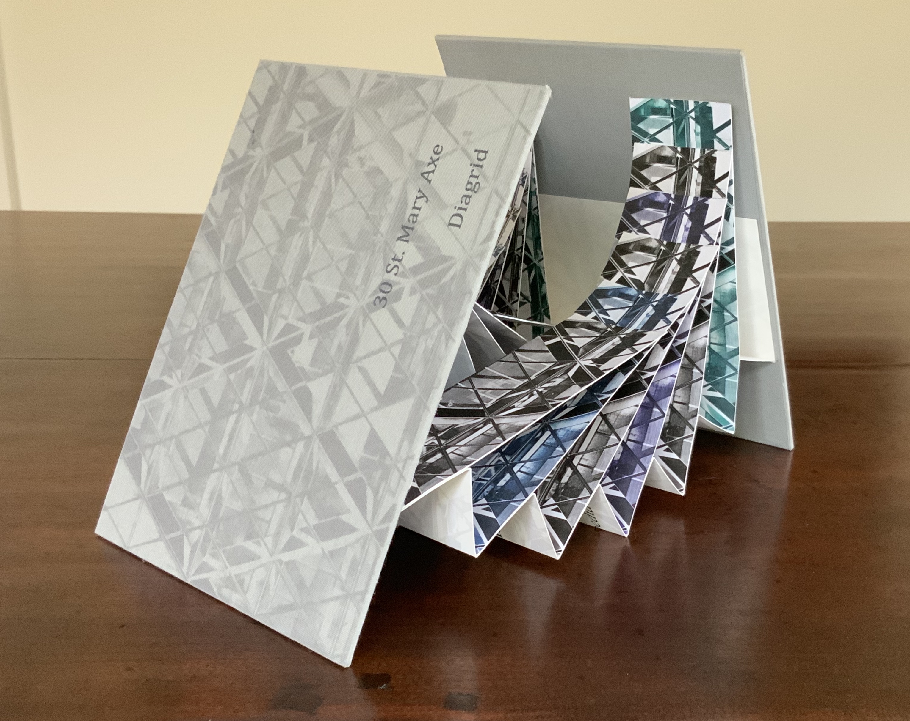
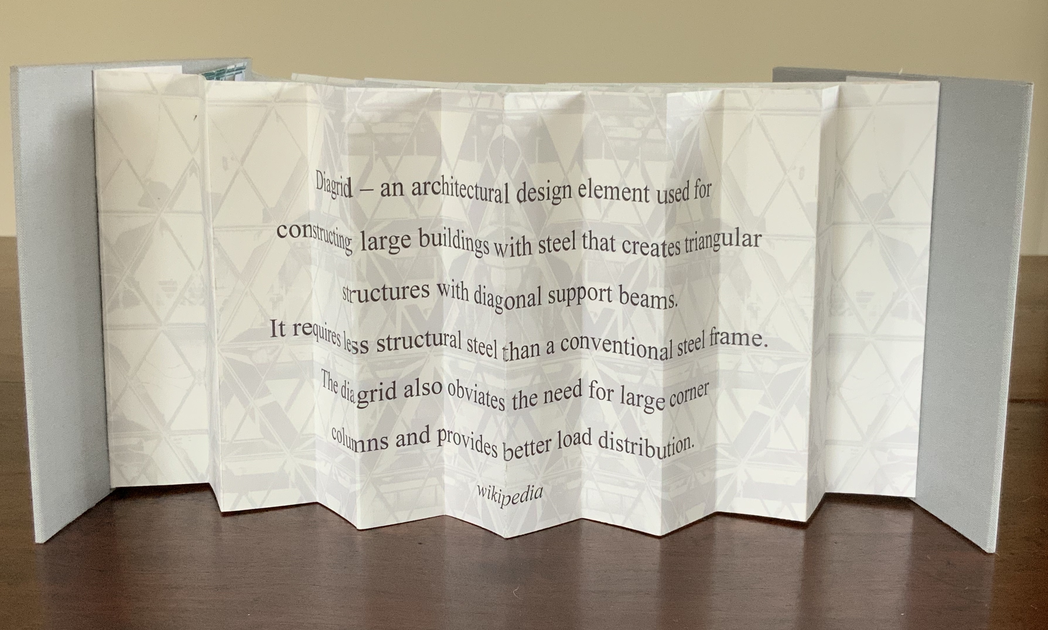
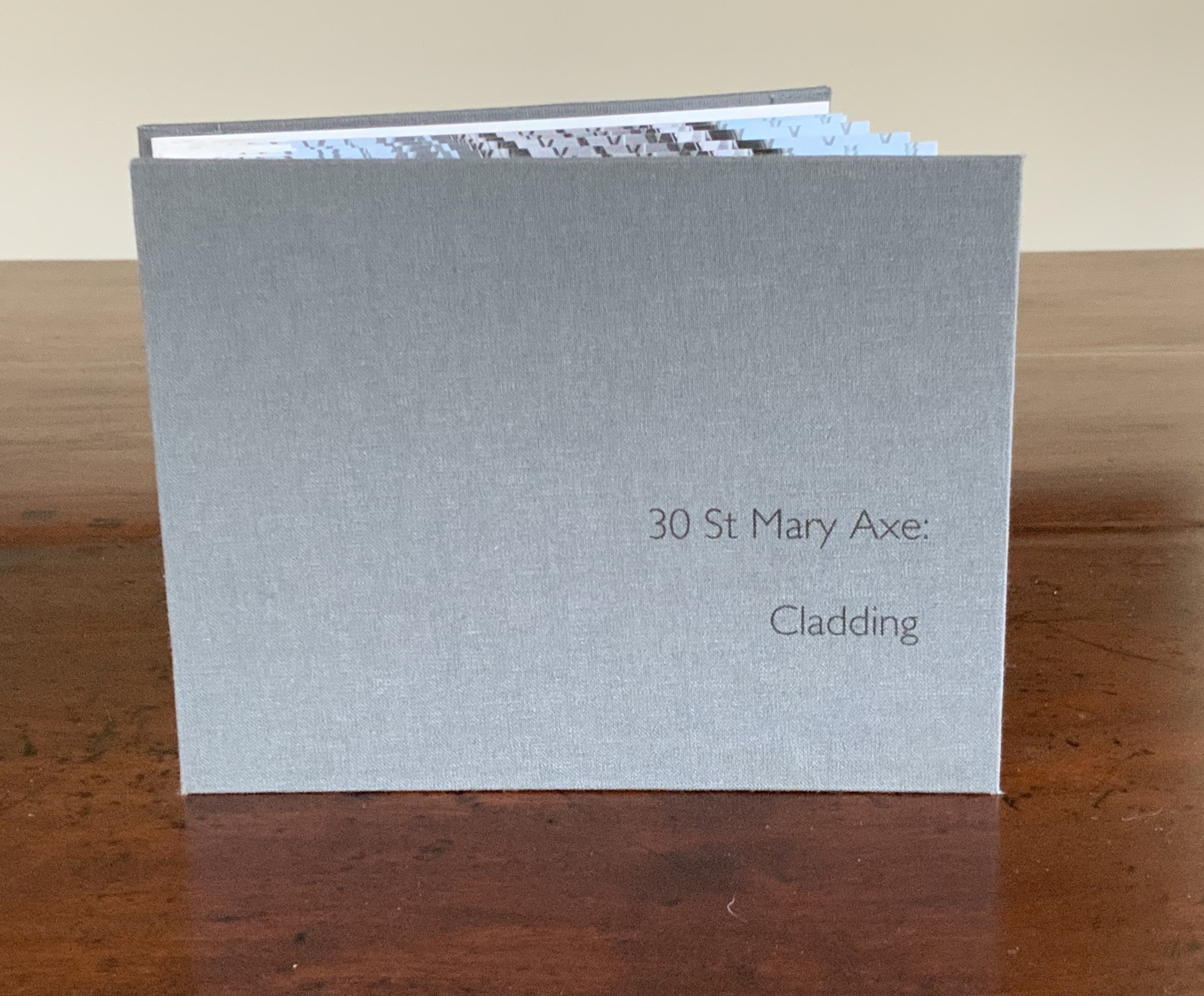
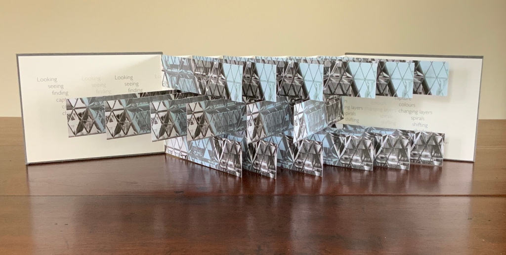
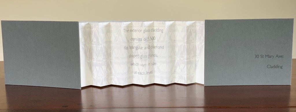

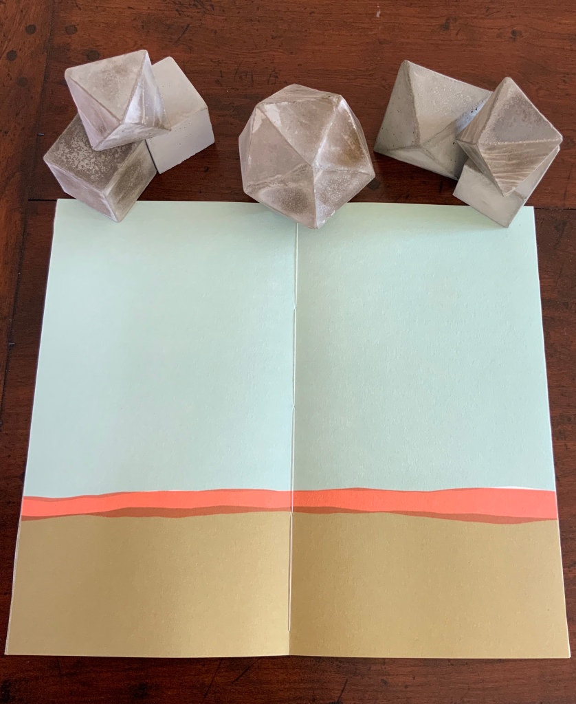
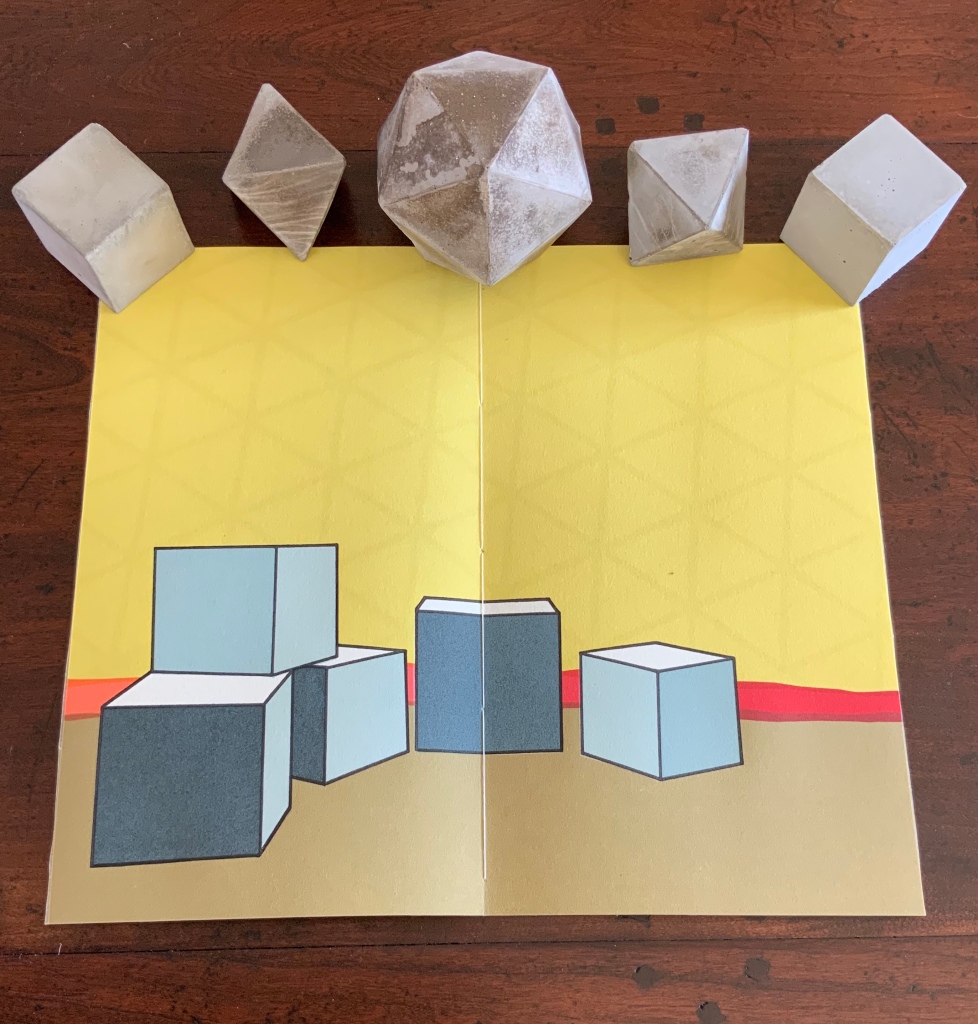
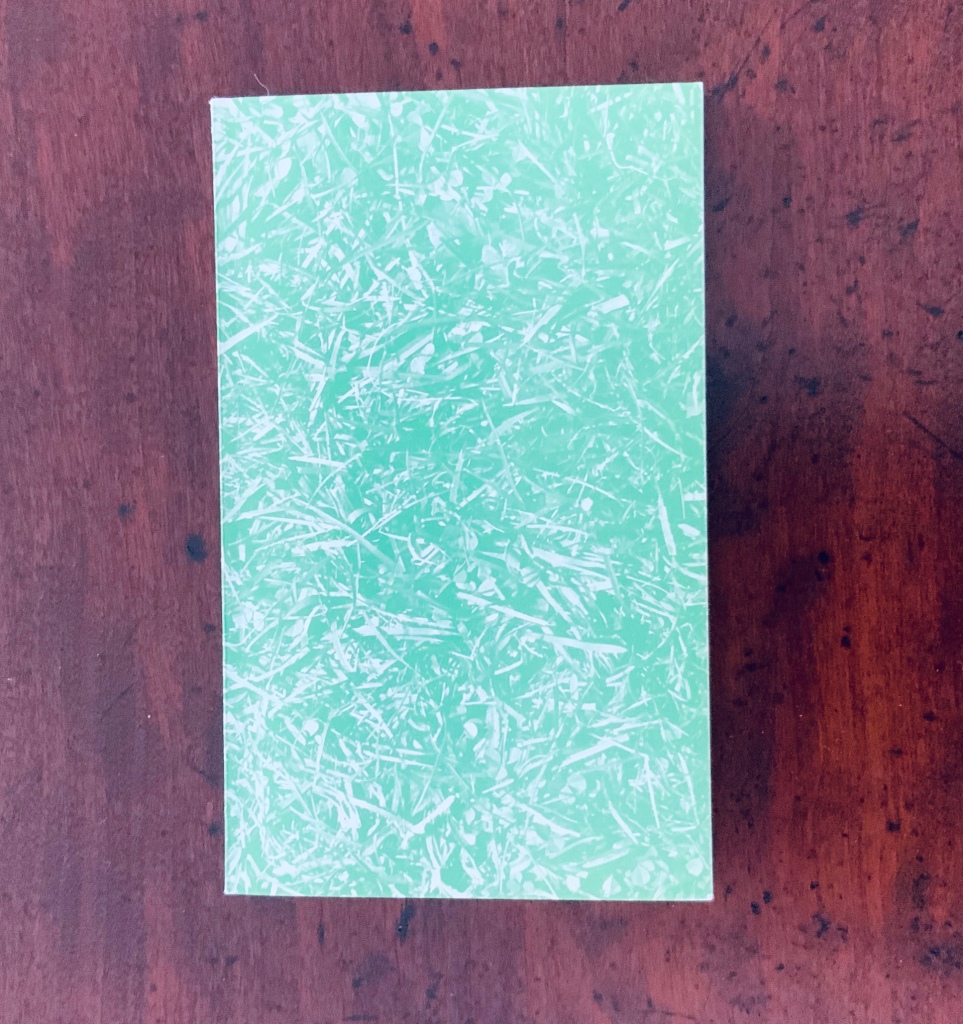
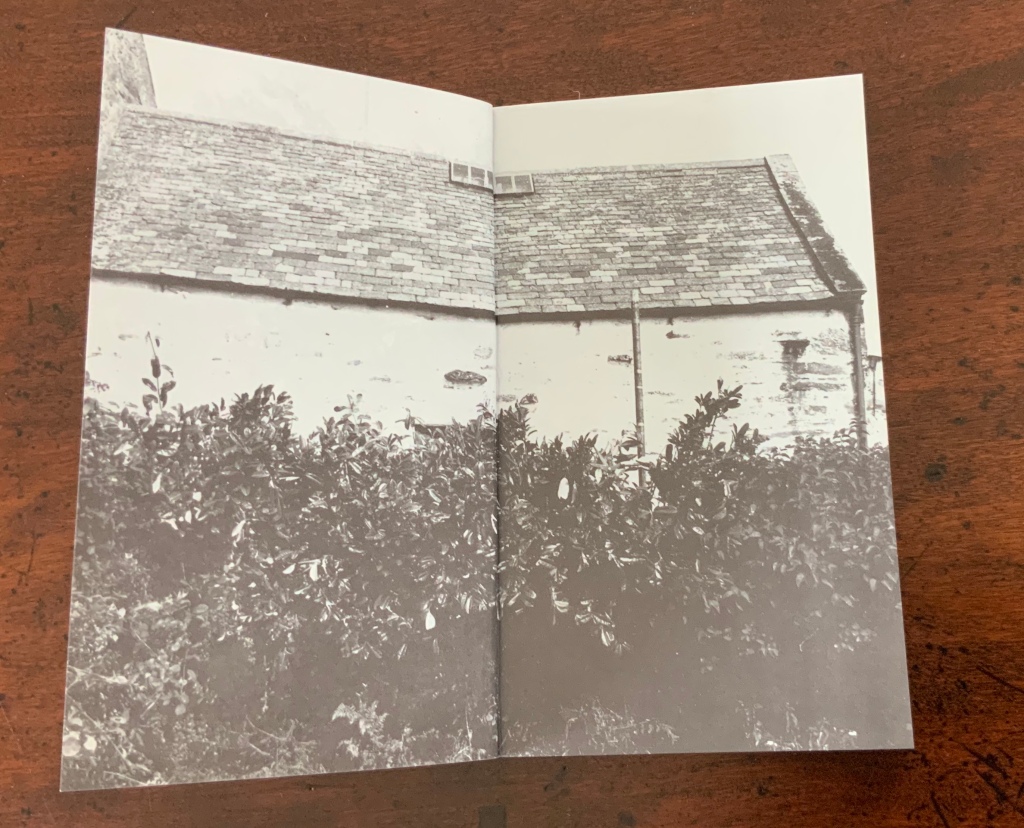
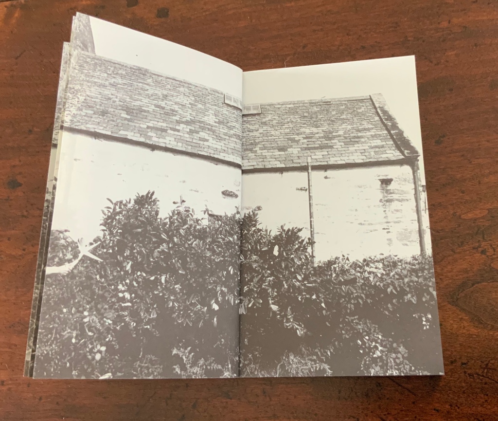
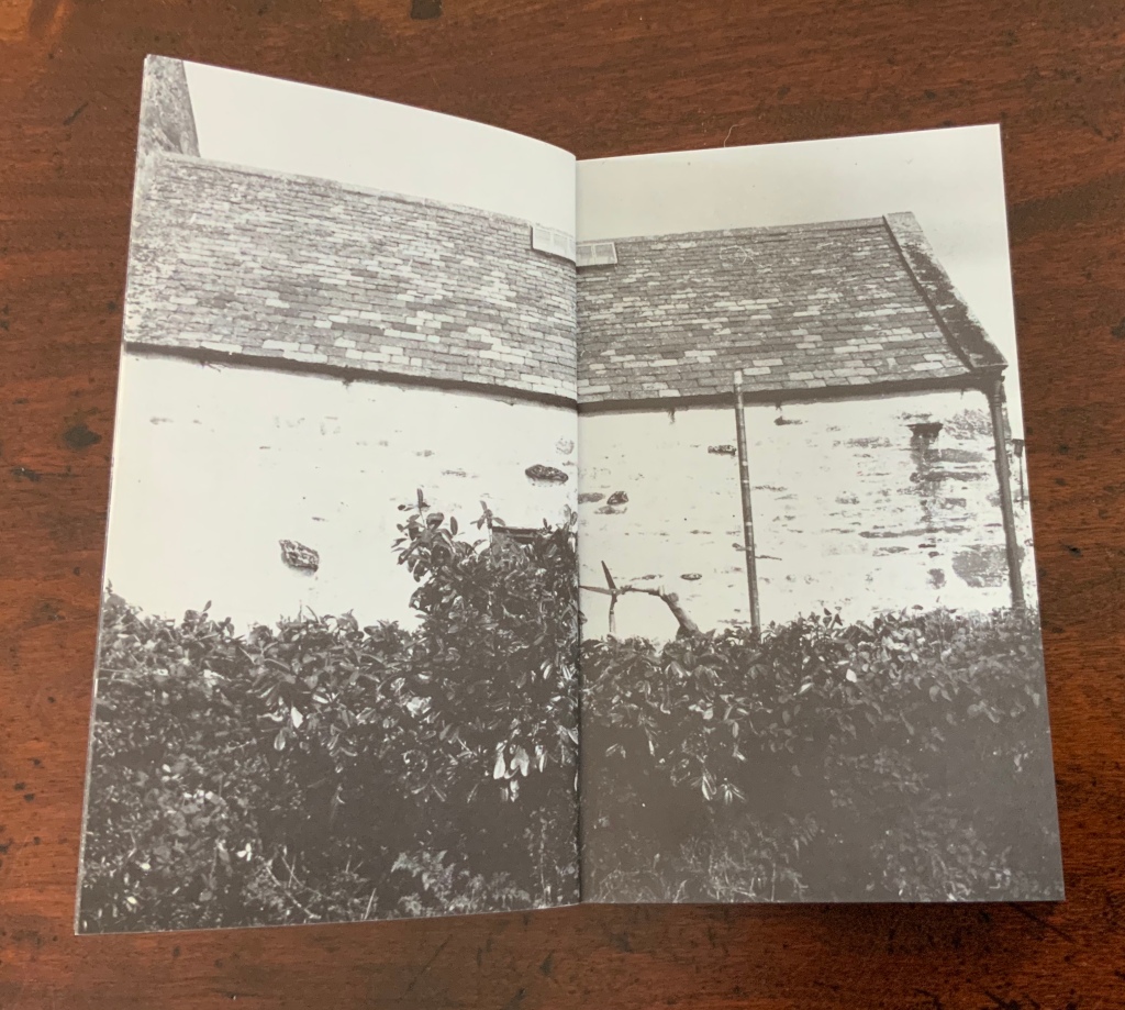
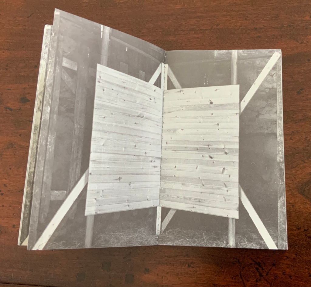
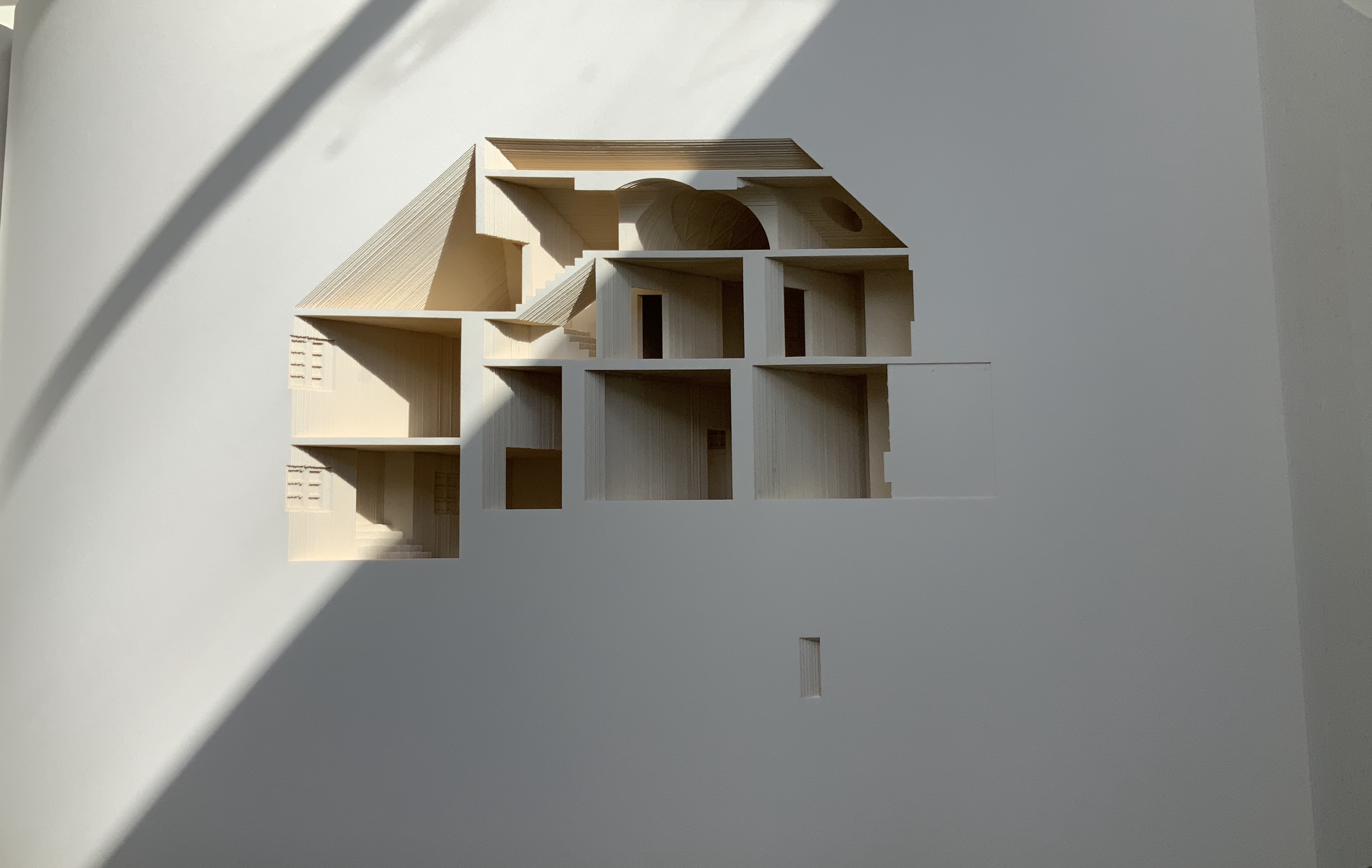
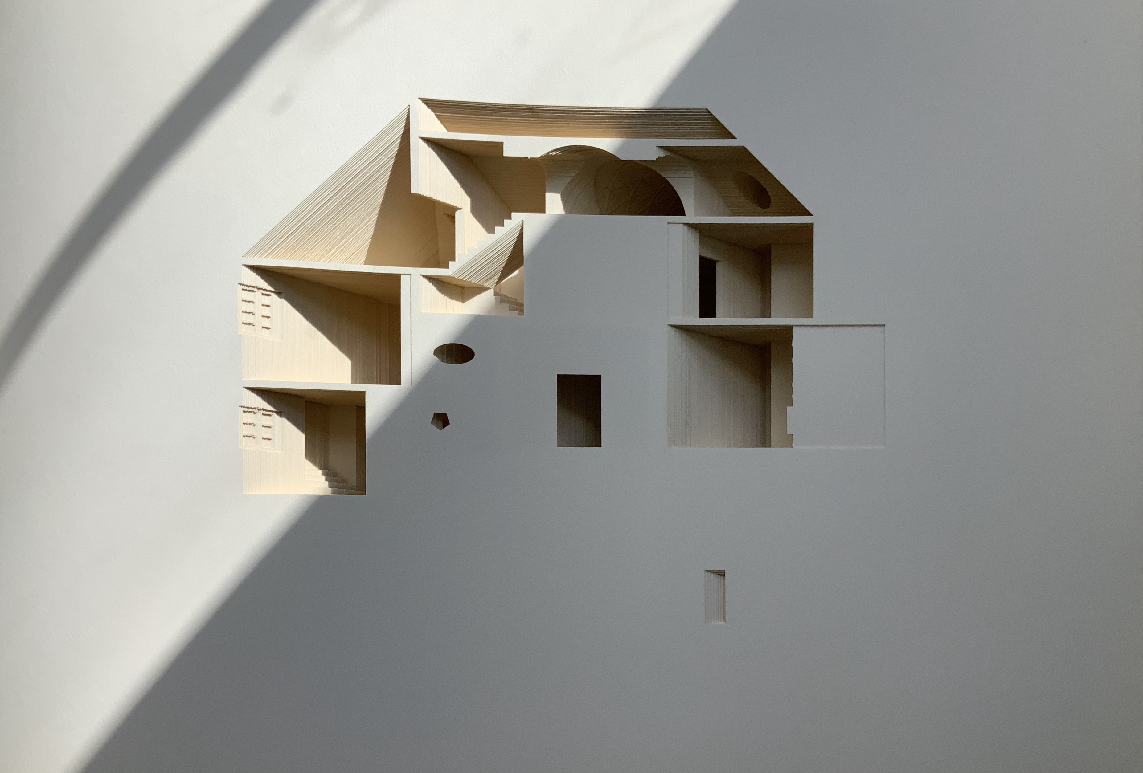
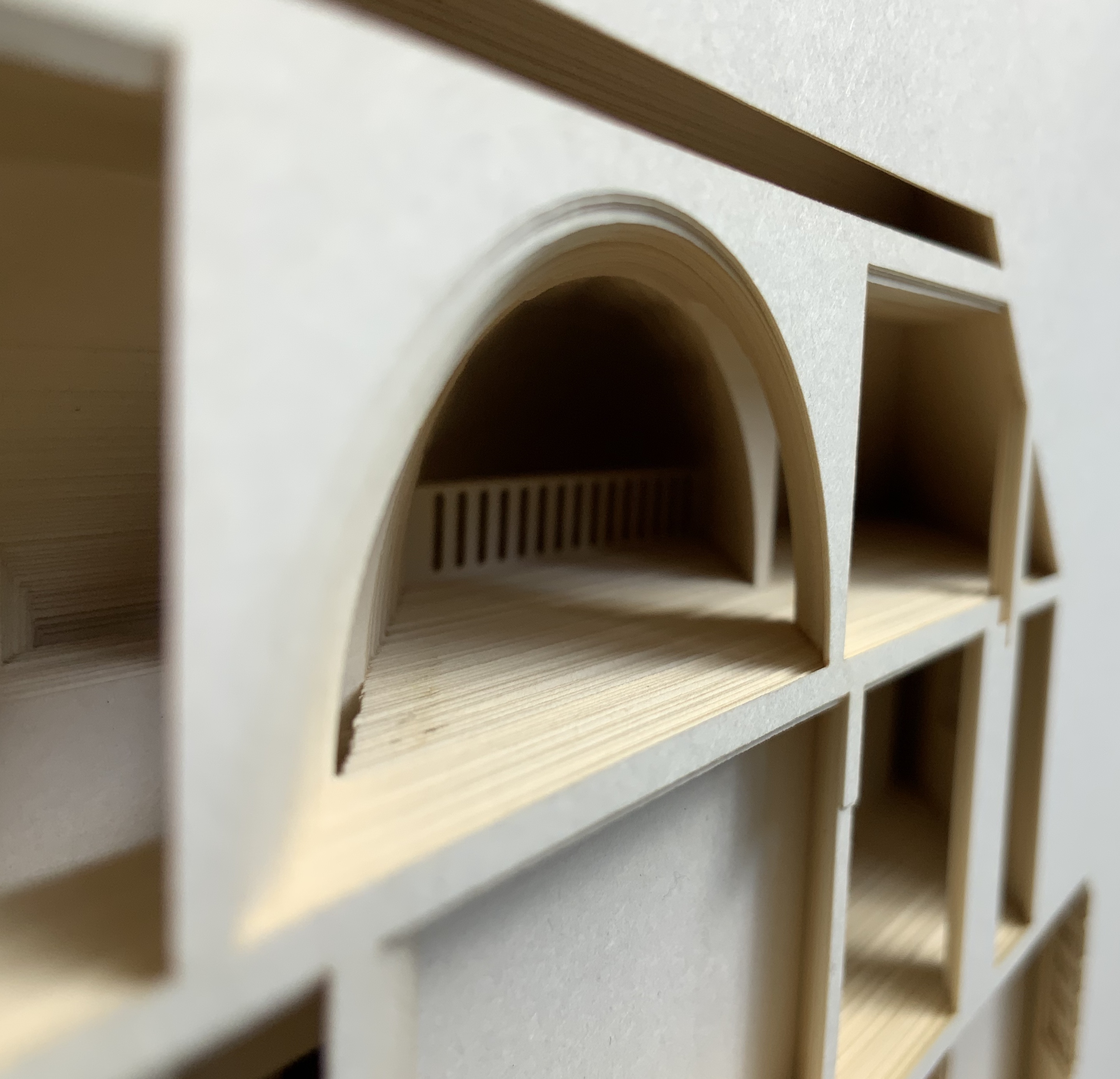
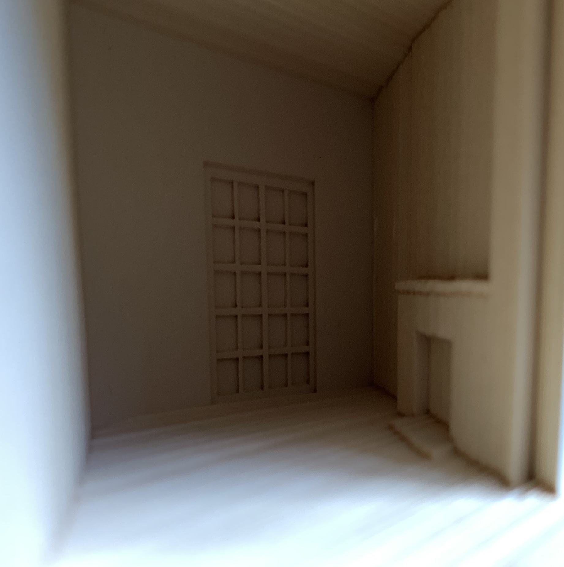
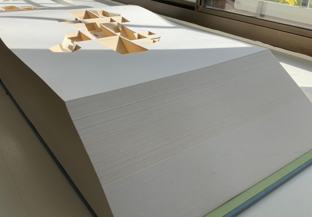
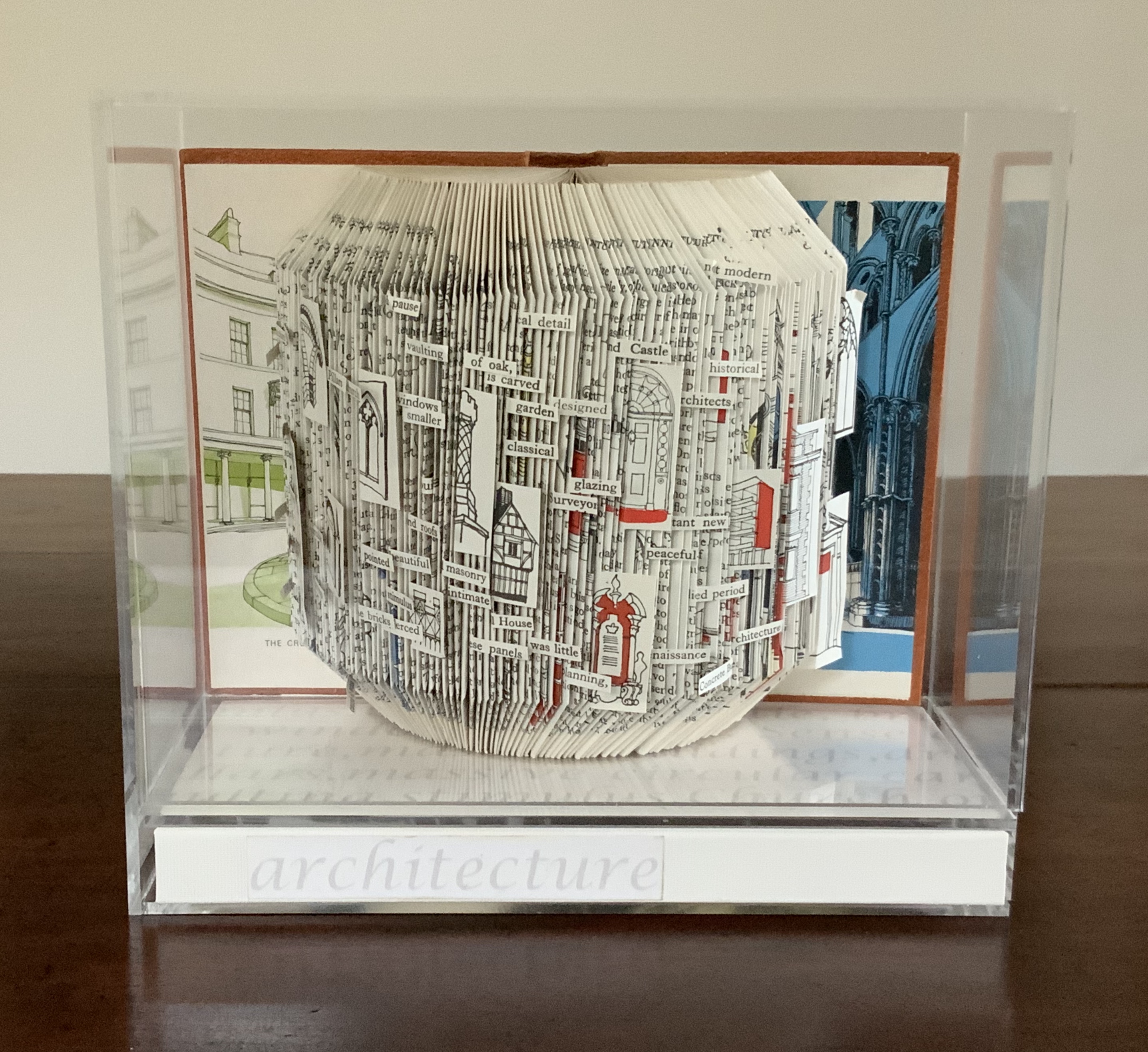
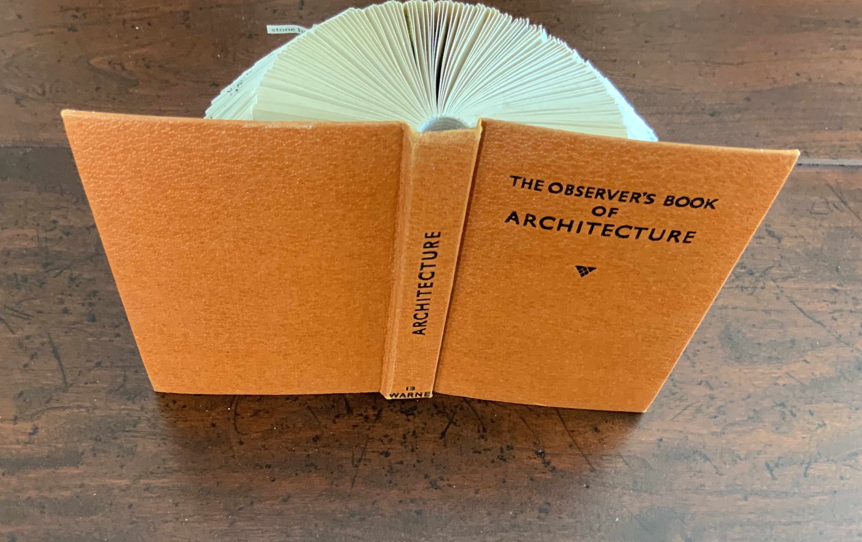
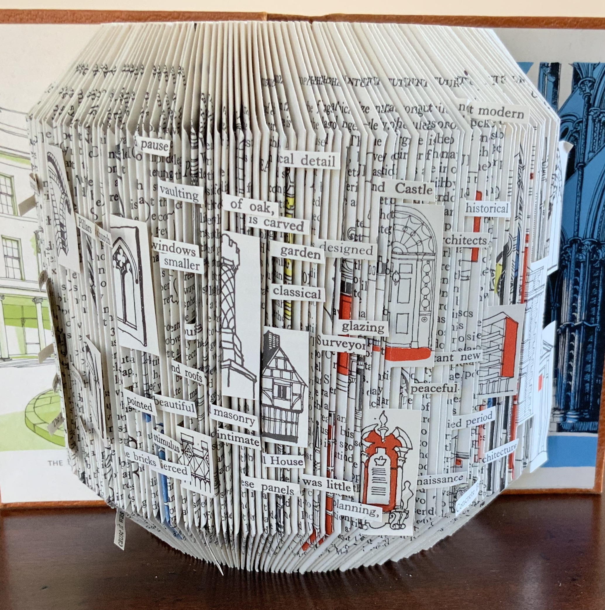


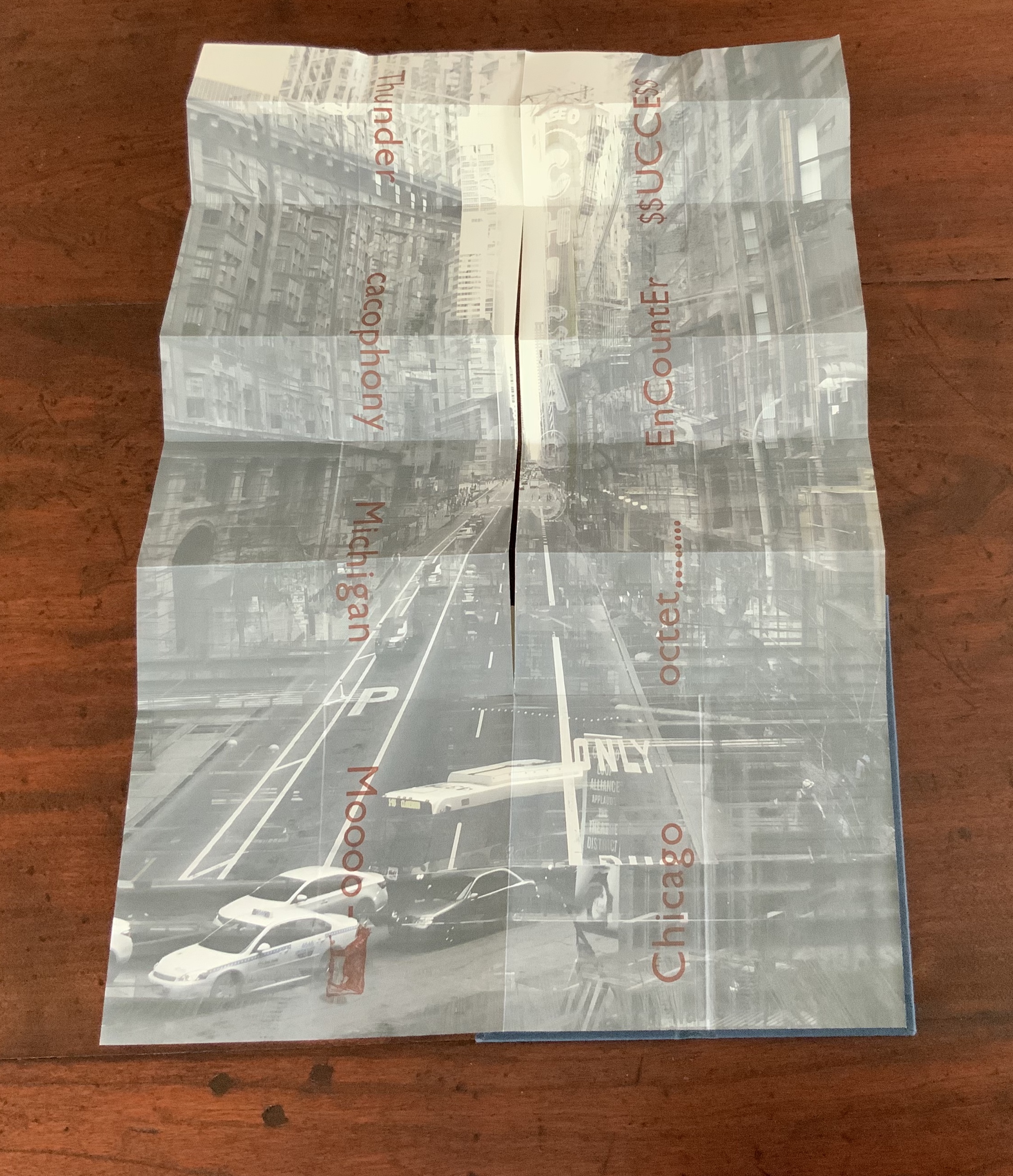
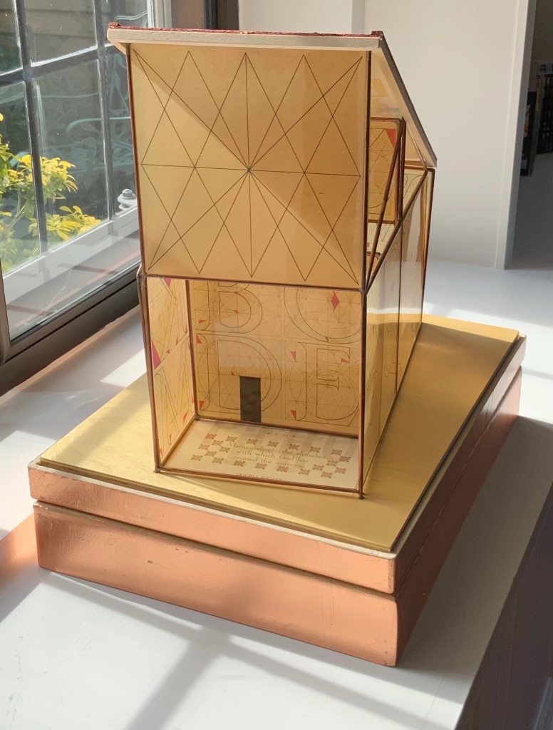

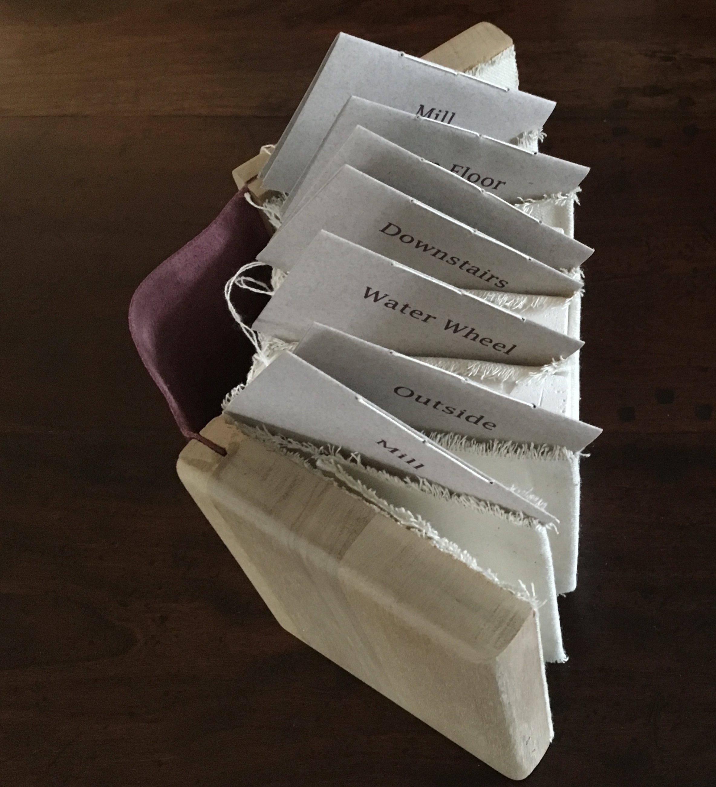
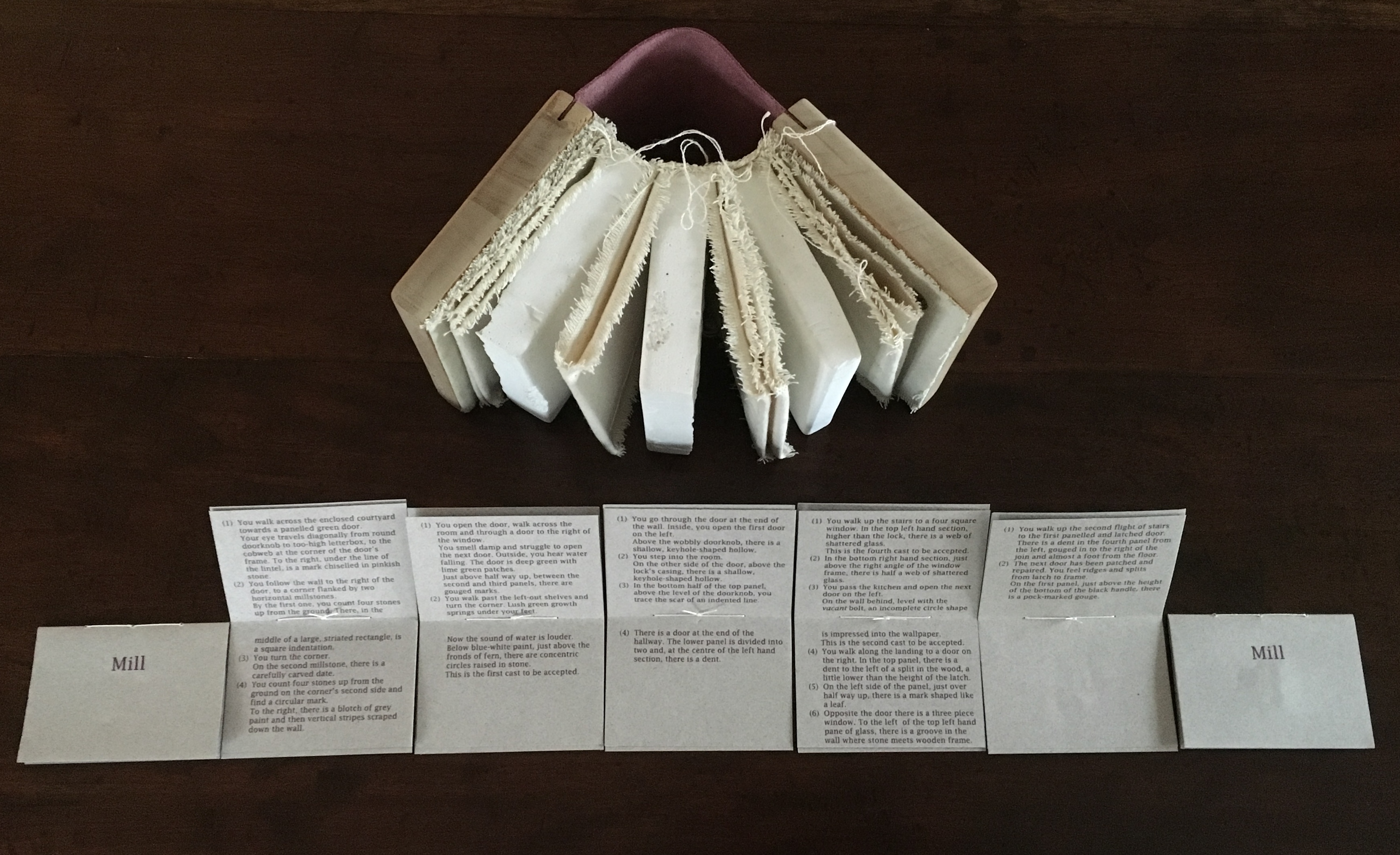
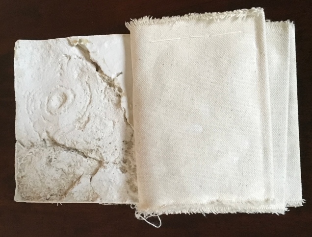

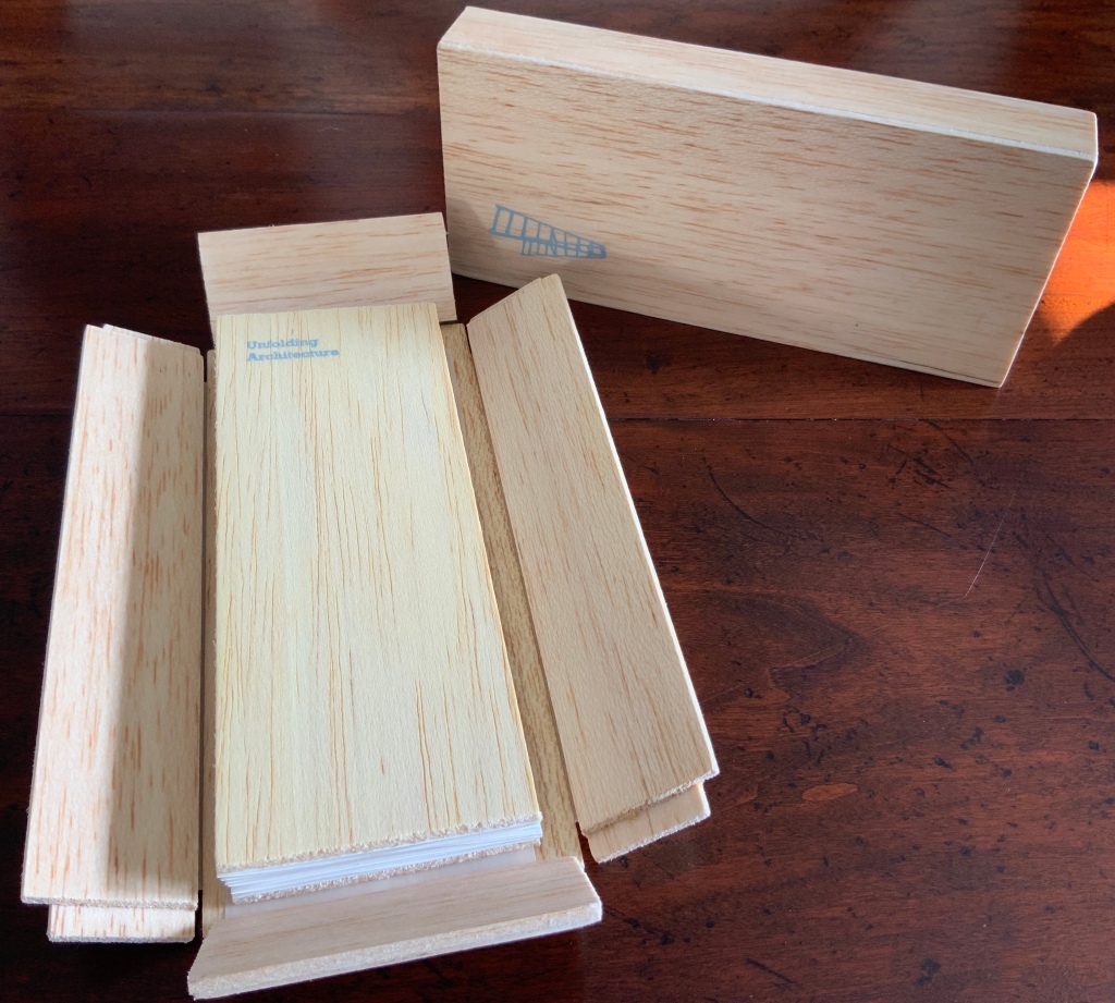
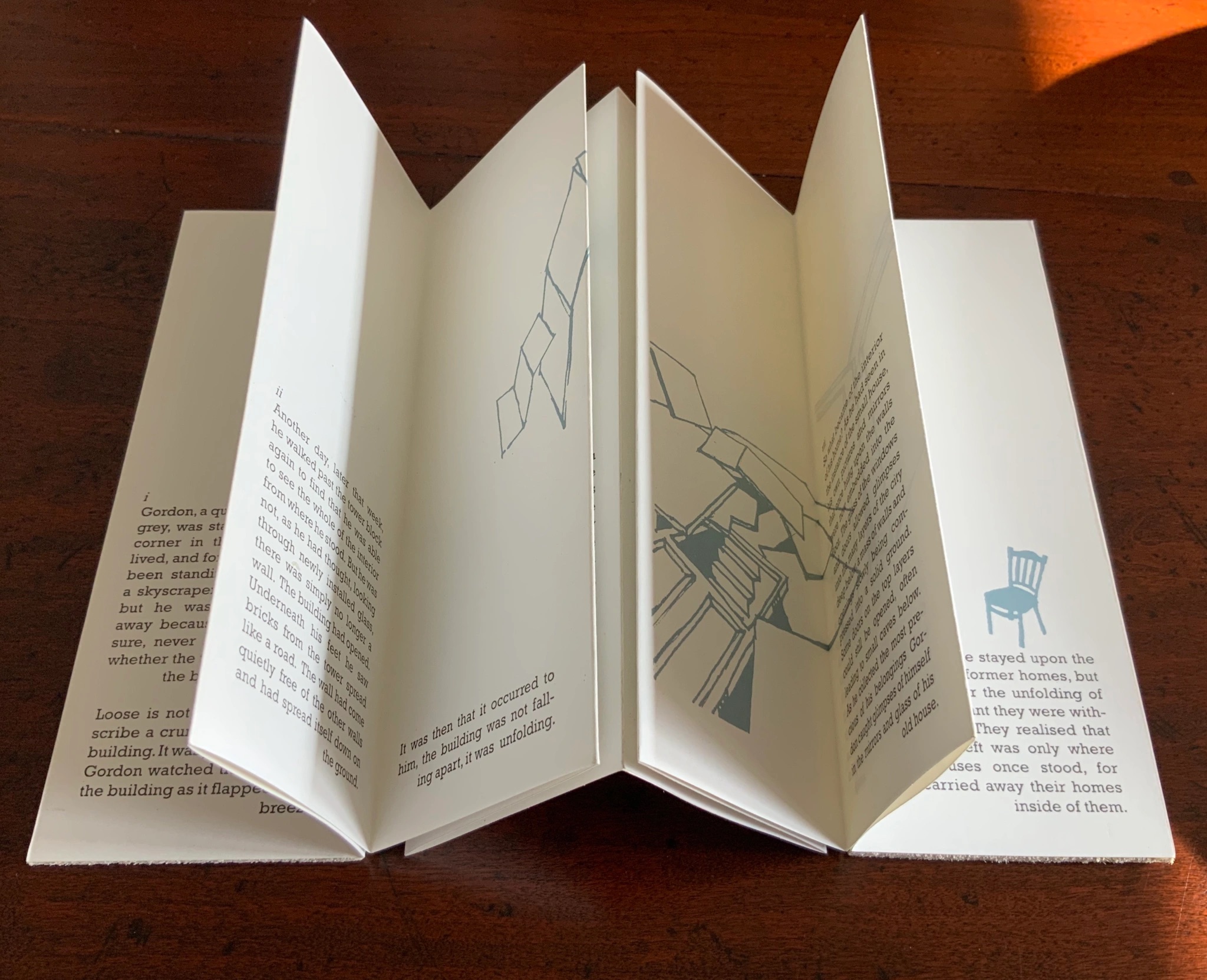
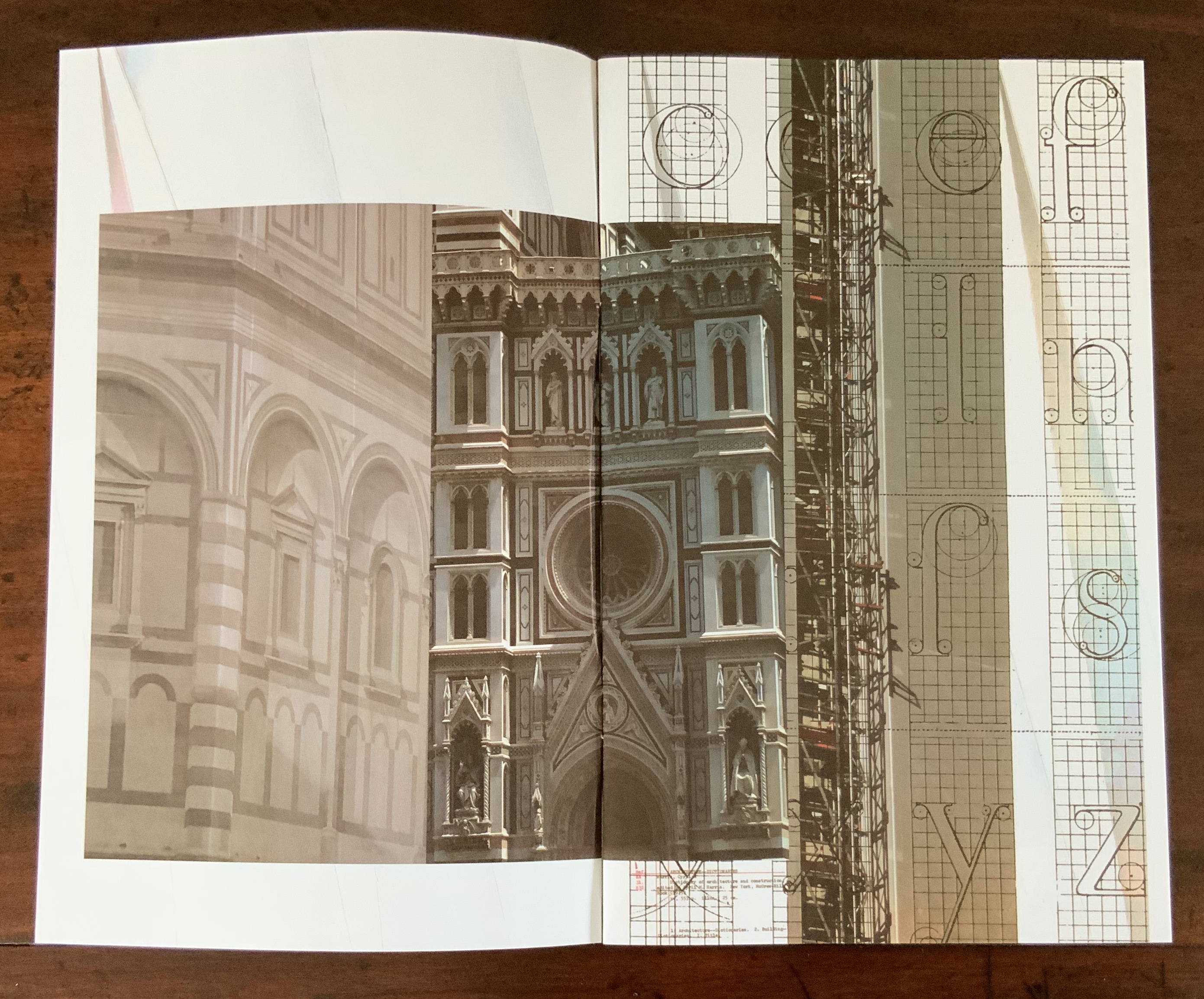
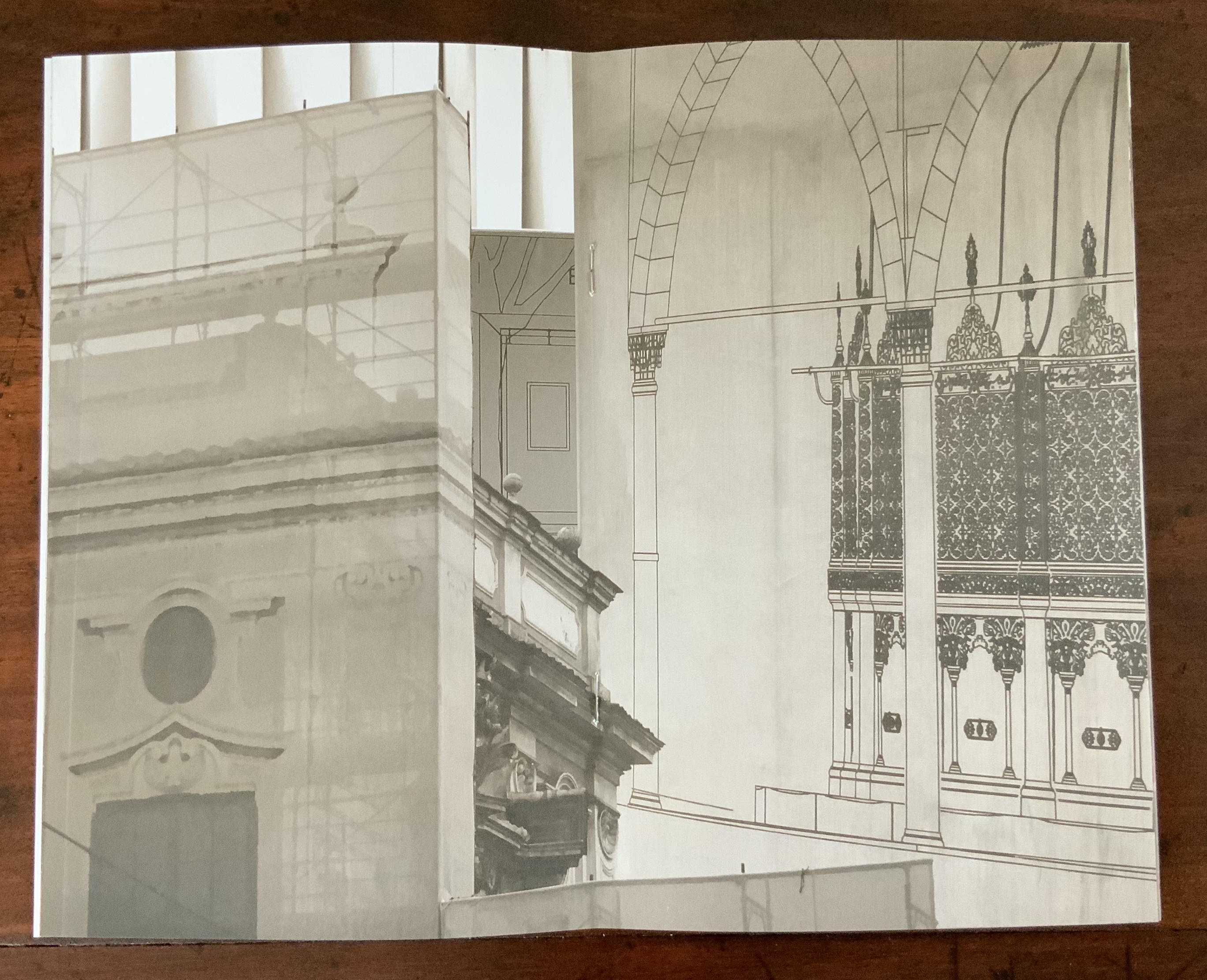
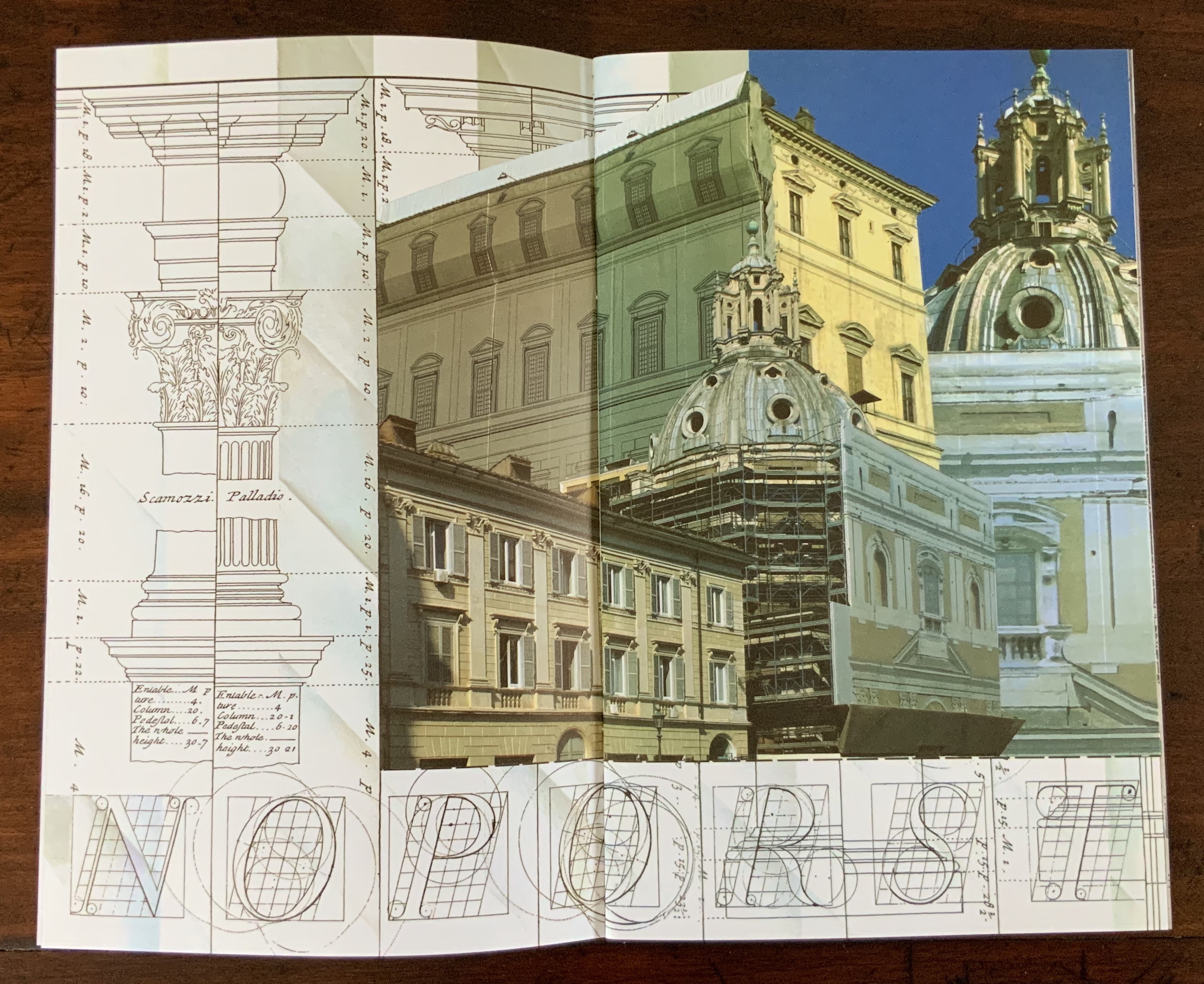
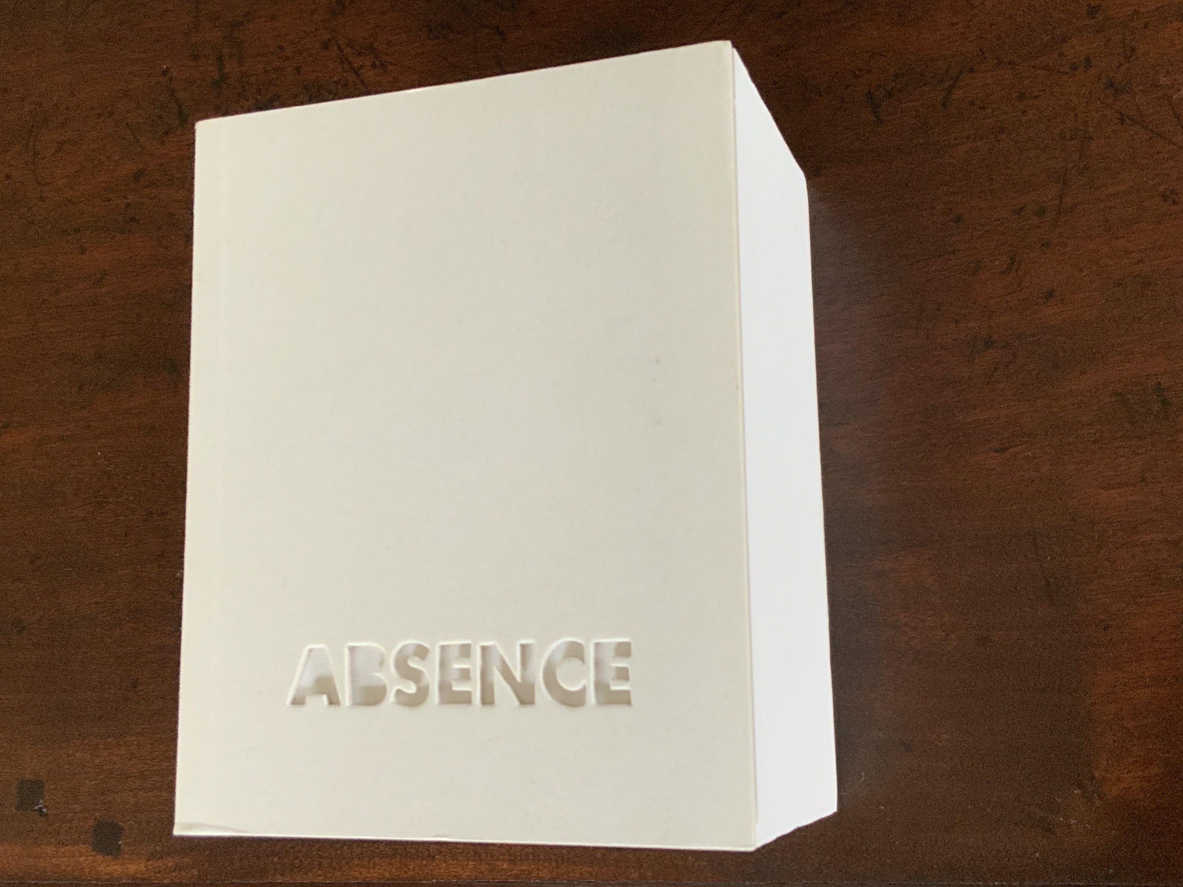
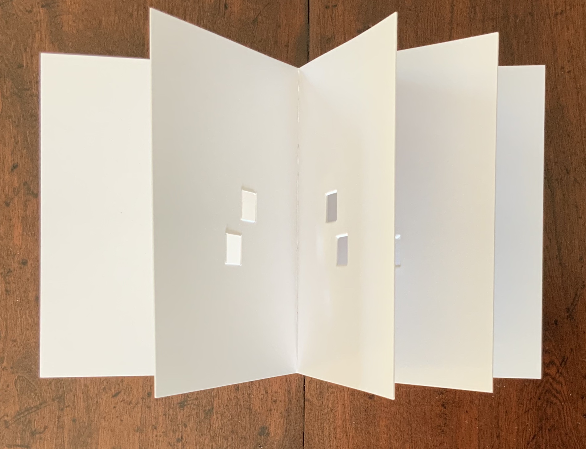
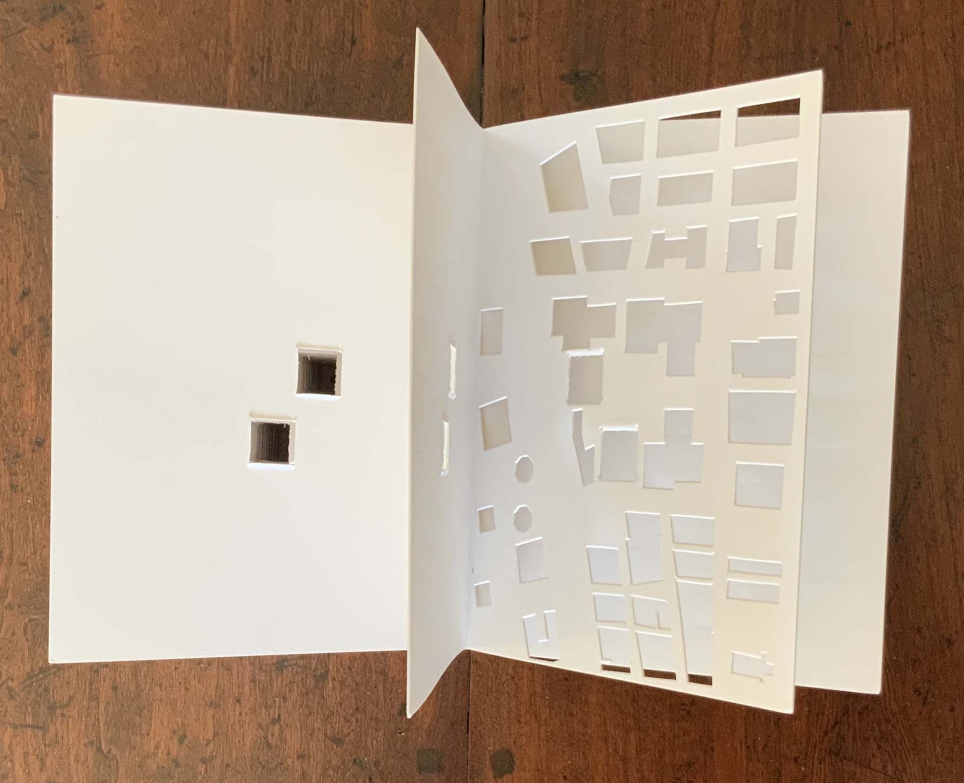
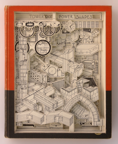
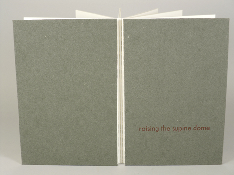
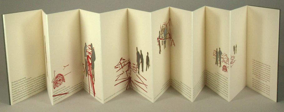
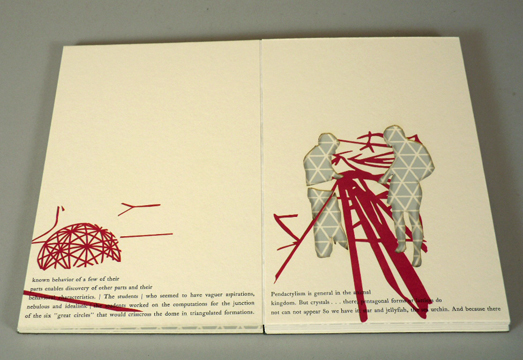
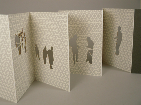
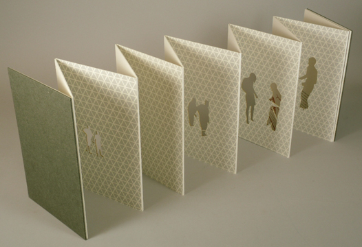
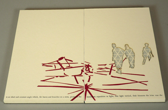

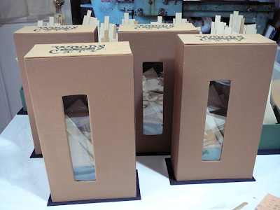
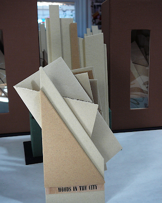
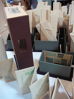


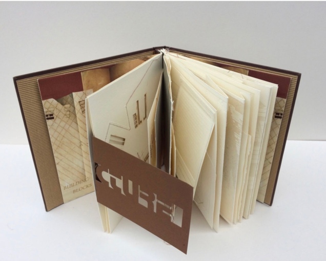
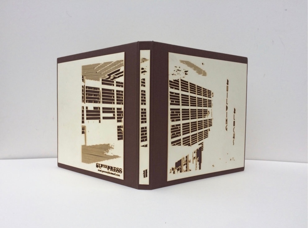
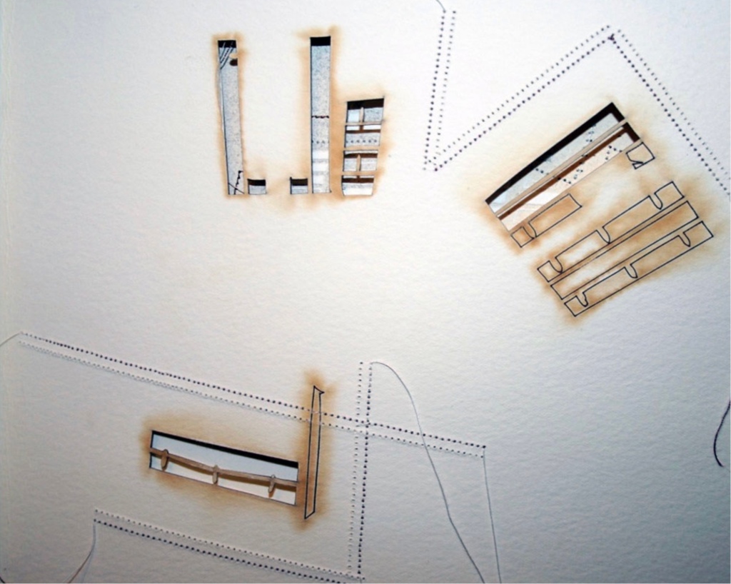
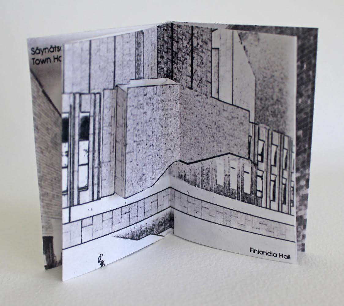
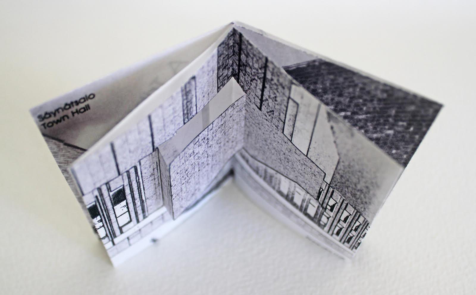

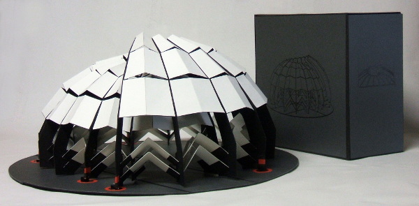
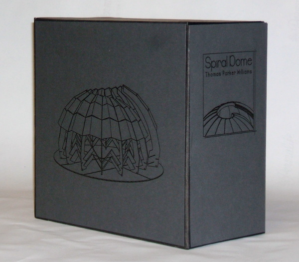
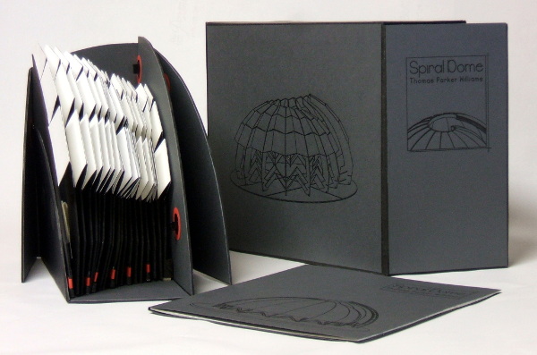
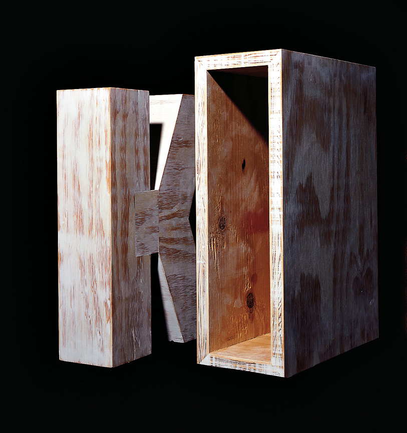

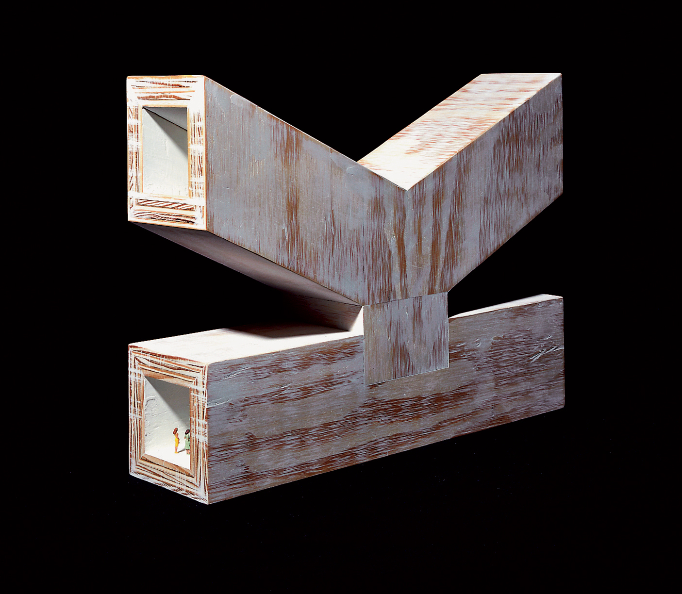
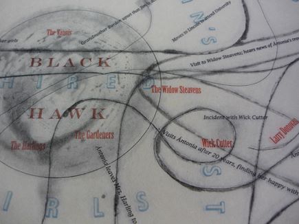
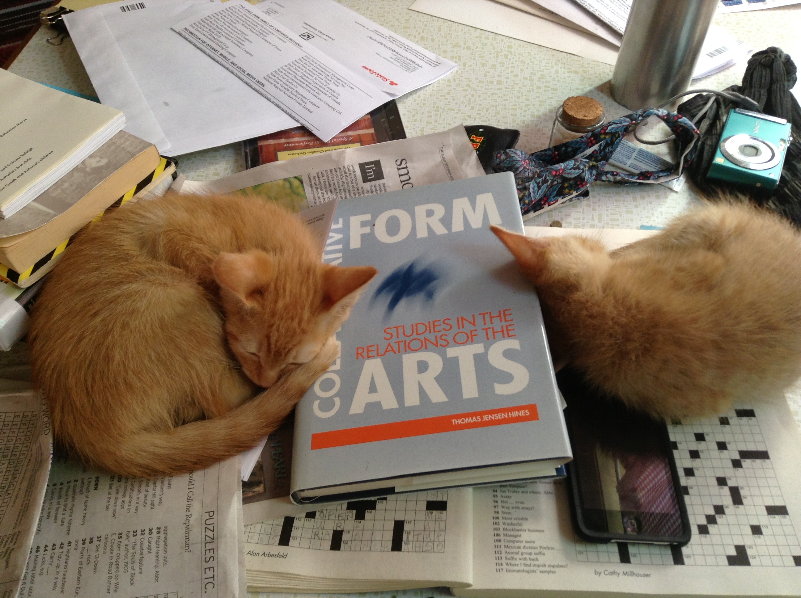
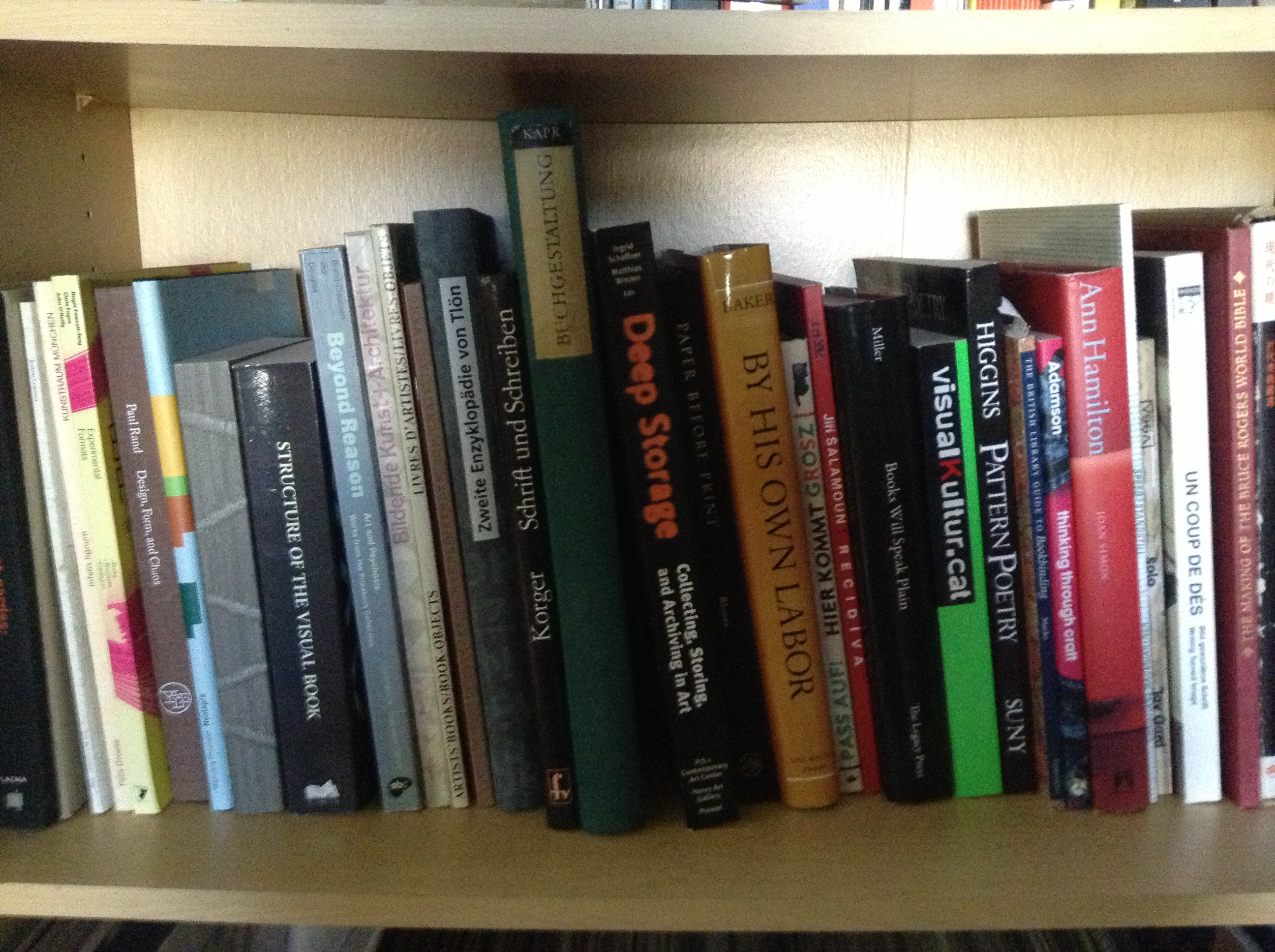
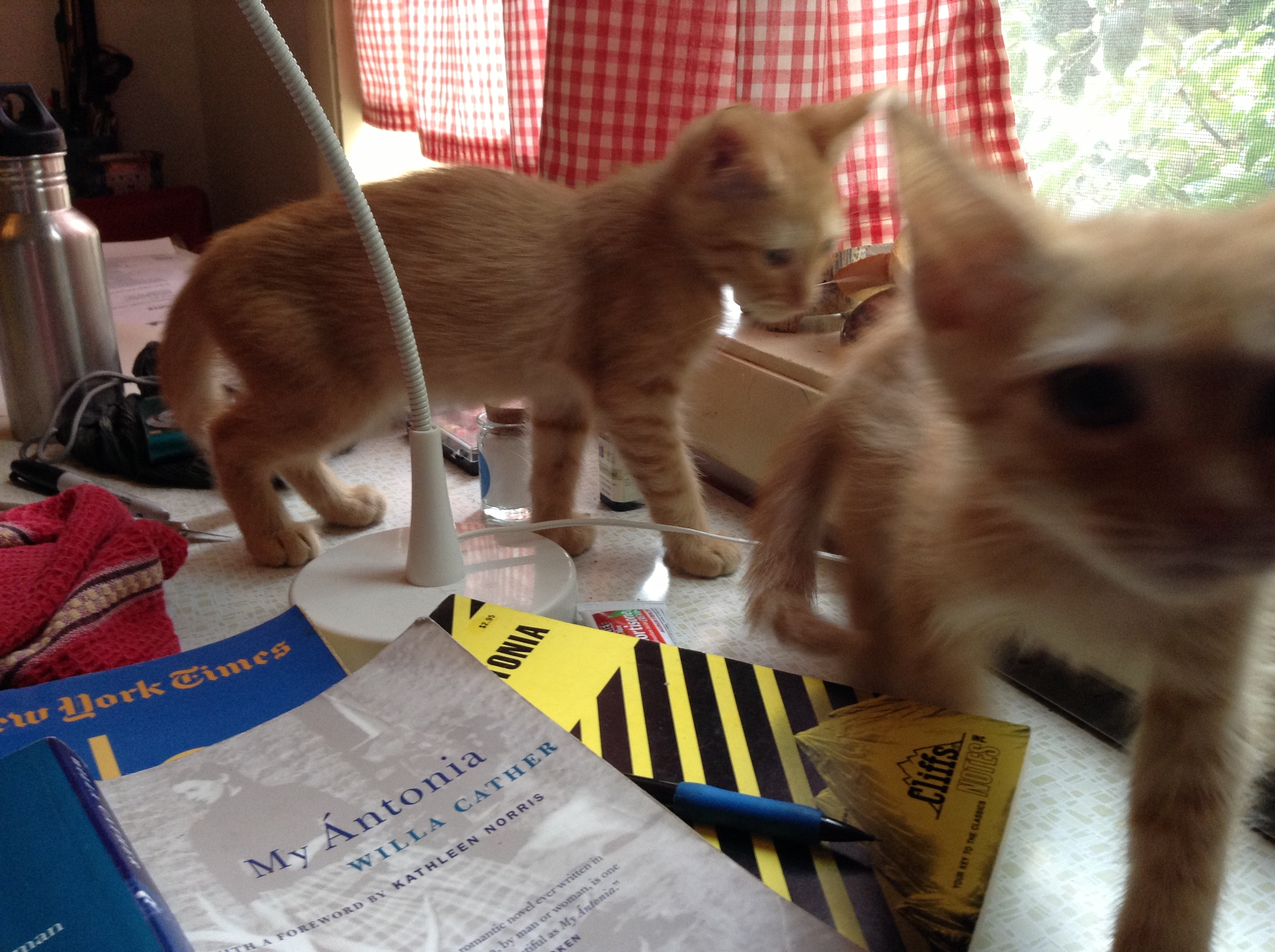
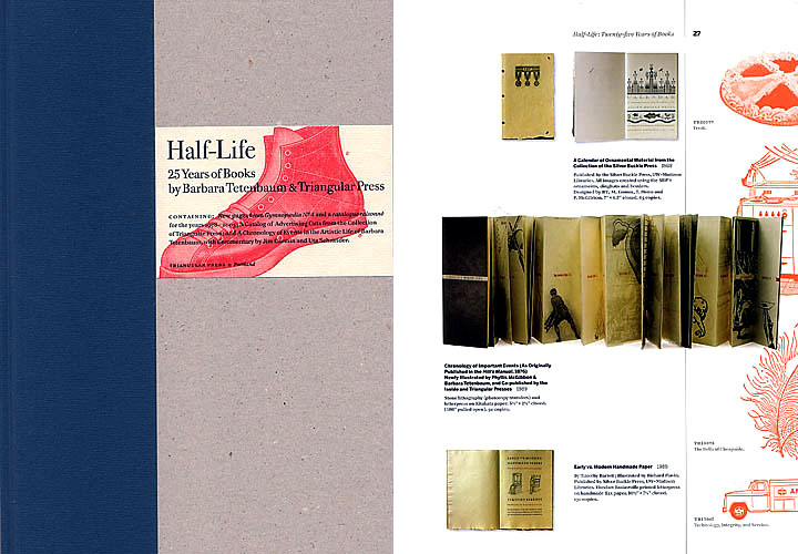
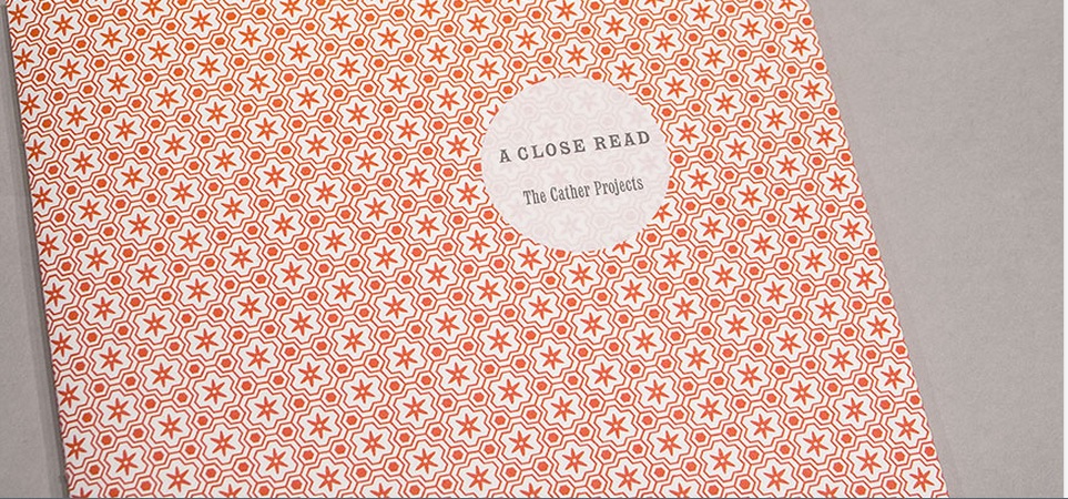
