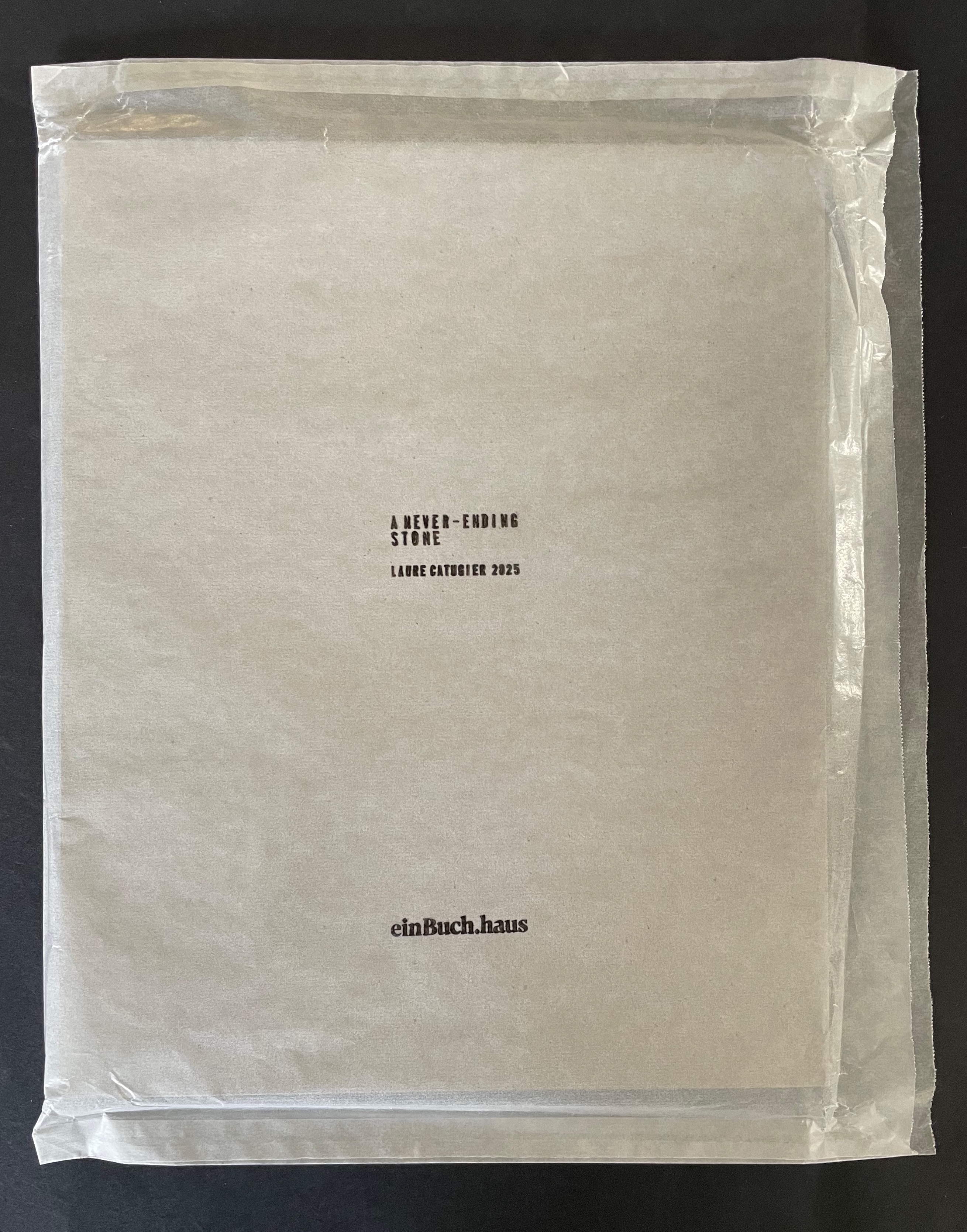
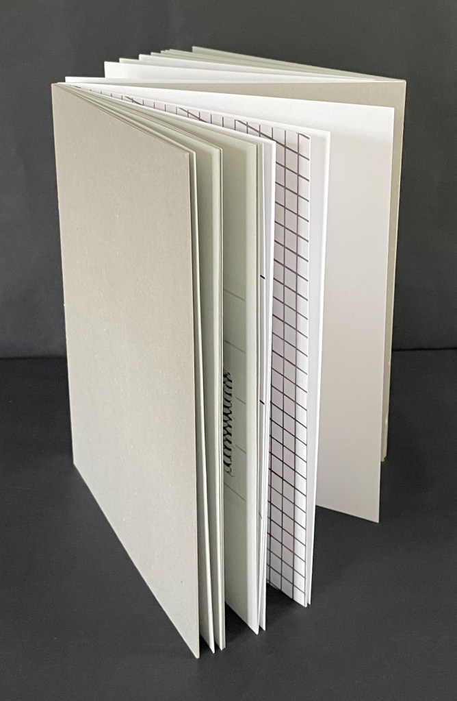
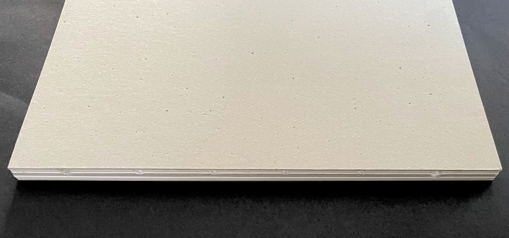
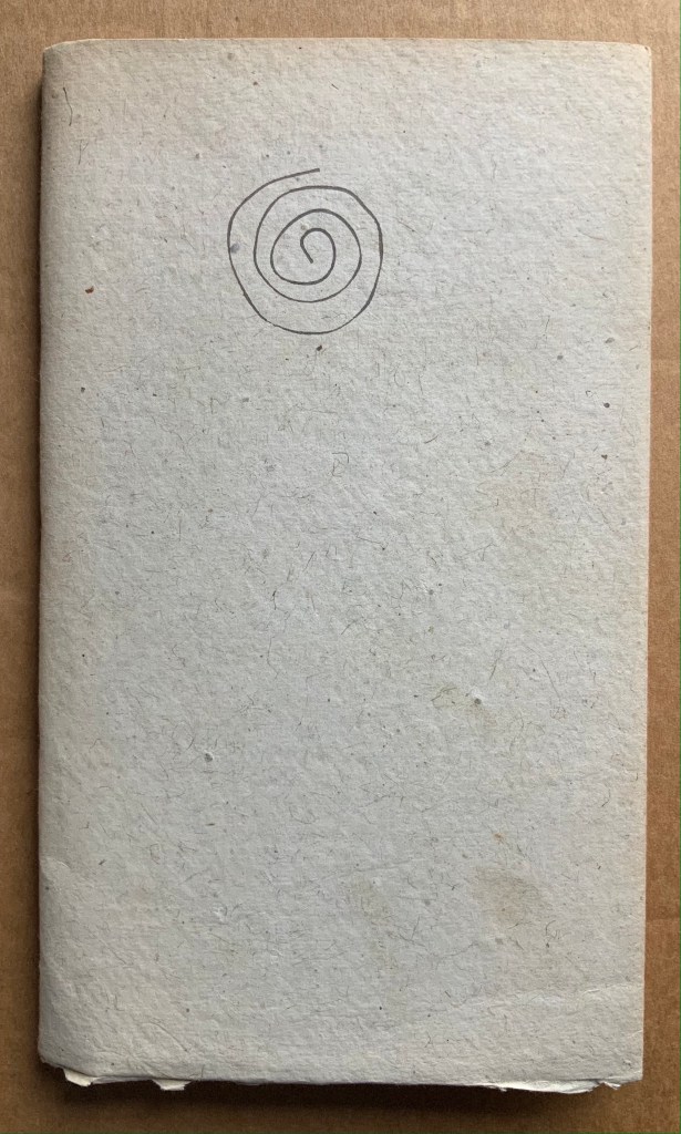
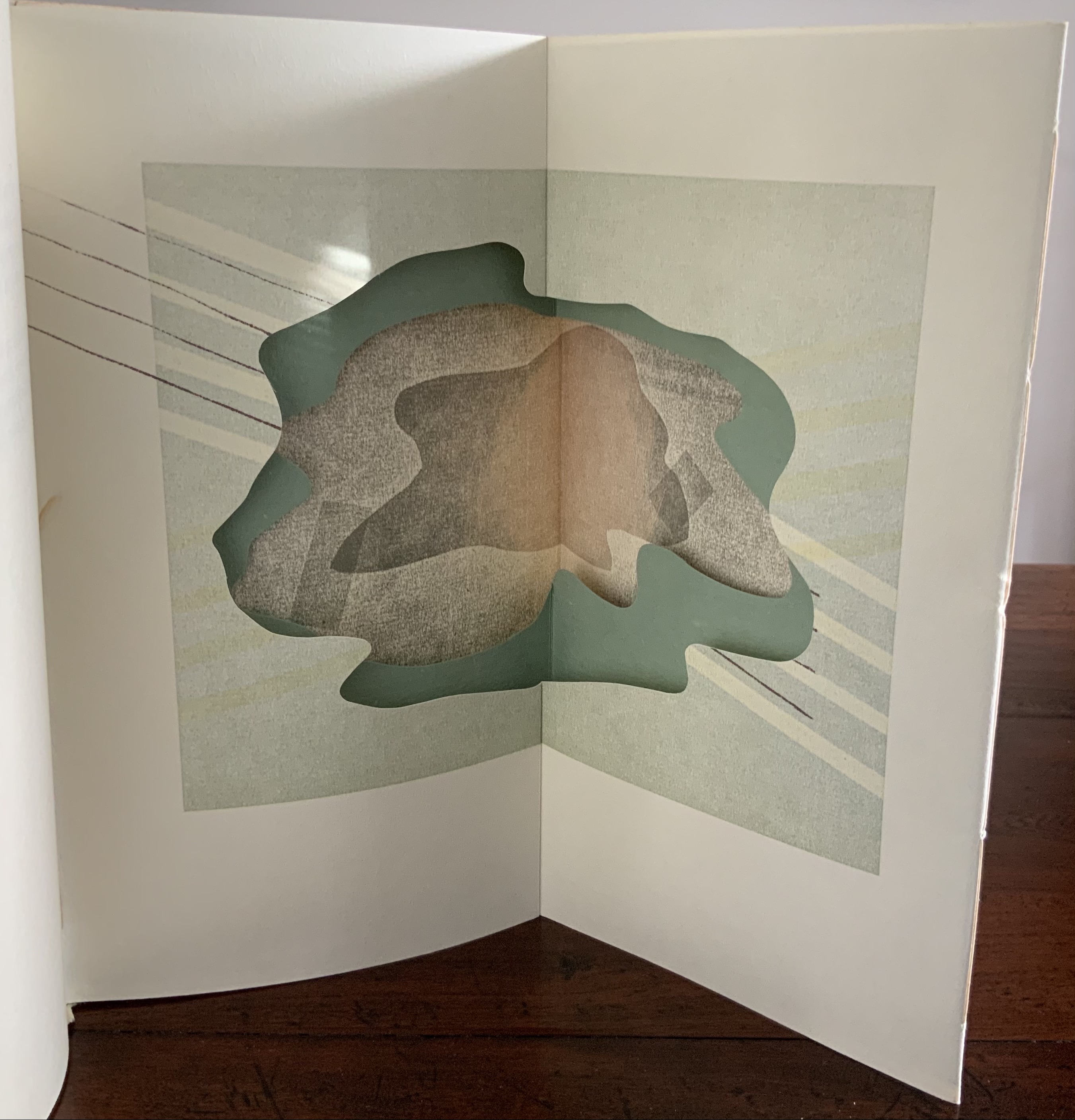
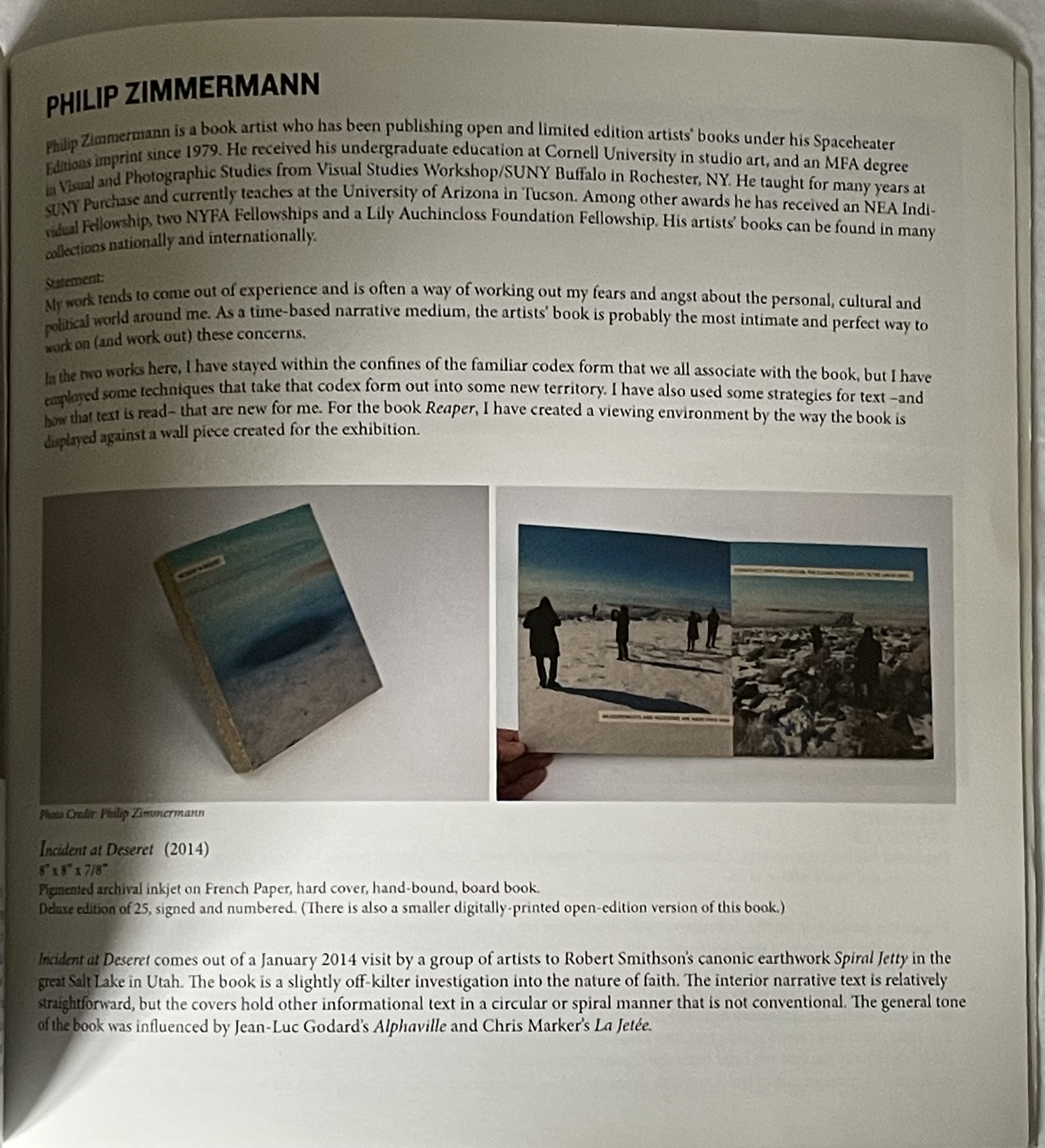
A Never-Ending Stone (2025) Laure Catugier Open spine, dos-à-dos with grey bookbinding board. 210 x H260 x 210 mm. 104 pages. Edition of 250. Acquired from einBuch.haus, 3 December 2025. Photos: Books On Books Collection.
A Never-Ending Stone is Laure Catugier’s first monographic catalog. Her skill with collage, alignment, shadows, materials, and the book format transform it into an artist’s book very much driven by her fascination with architecture and especially the architectural theories and practice of Oskar and Zofia Hansen. The Hansens eclectically embraced “human-scale” architecture, “environment art”, and what they called the “open form” structure, using space and time as its key elements. The Hansens also proposed that the architect should not be the all-knowing expert but should partner with clients as co-authors of their space, respecting how their interior and outside activities and relations with one another defined them and their space. Though somewhat a forerunner to User-Centered Design, Open Form radically aimed at structures that would evolve with interaction with the user and, as they unfolded, also align with nature.
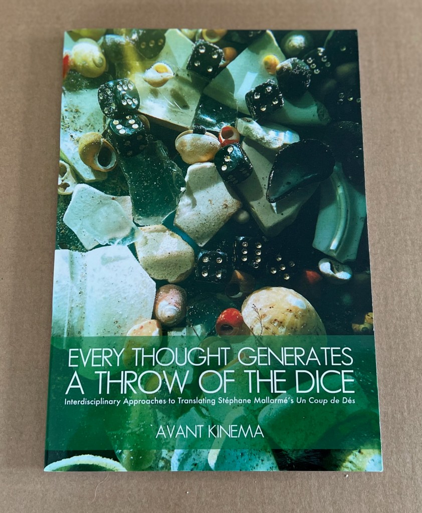
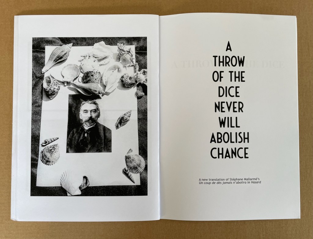
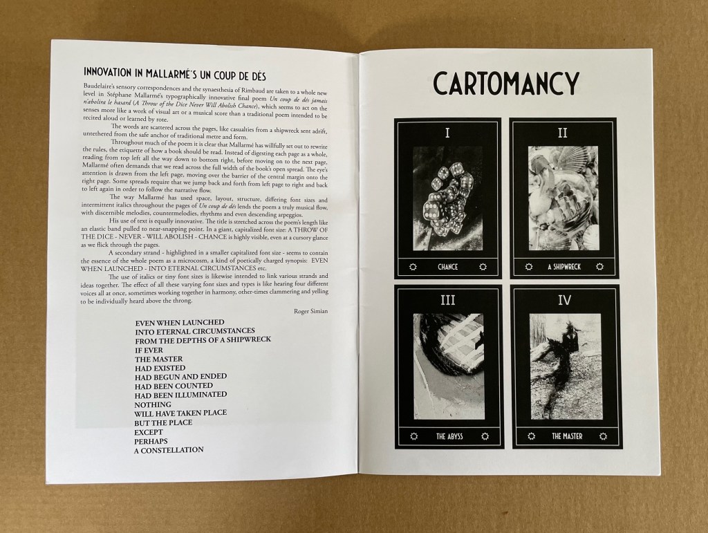
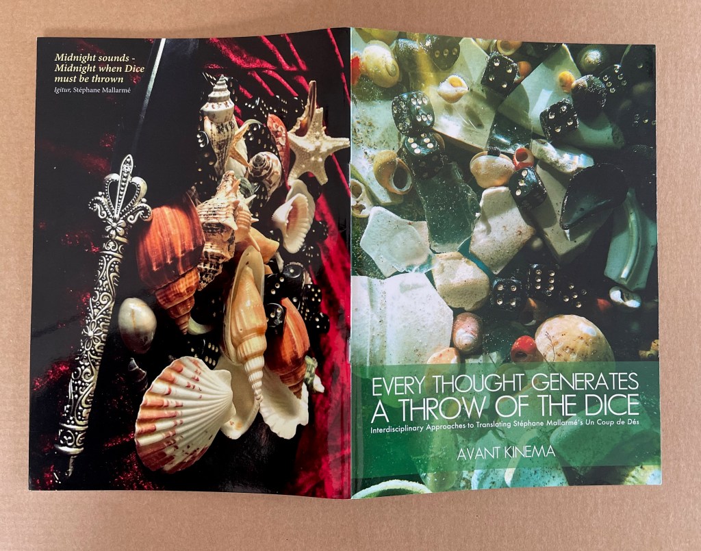
Sarahjane Swan & Roger Simian (the strangely named duo behind Avant Kinema) were responding to an invitation from the AHRC-funded project Imprints of the New Modernist Editing in 2019, which would have resulted in an exhibition at Shandy Hall, home of the Laurence Sterne Trust, but the Covid-19 pandemic intervened. Their response consisted of “visual artworks, photography, poetry, fiction and Tarot style card designs featuring ‘twelve virgin symbols extracted from Un coup de dés‘” (Swan & Simian, “Introduction”). This booklet captures those works and concludes with a new translation of the poem.
The subtitle characterizes the works as an interdisciplinary approach to translating the poem, but Dick Higgins’ term “intermedial” might be a more apt description.
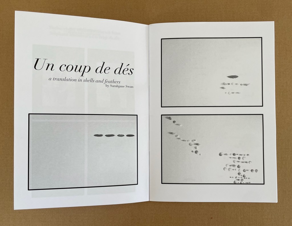
Swan’s substitution of feathers and shells for Mallarmé’s words, Broodthaers’ redactions and Pichler’s excisions brings a new form of materiality to Un Coup de Dés. It recalls the similar playfulness of other artists such as Clotilde Olyff with the alphabet.
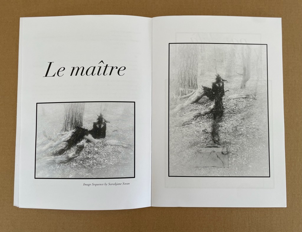
From an image sequence by Swan, the artists pull together a set of Tarot-like cards to introduce a new angle on the poem’s invocation of chance.
Avant Kinema’s homage is a collage or assemblage of different media distilled in this booklet. The preempted installation might have echoed that of Marine Hugonnier’s The Bedside Book Project (2006-07).
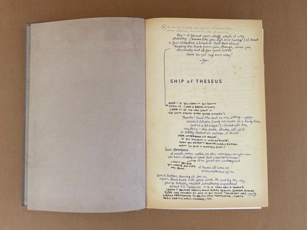
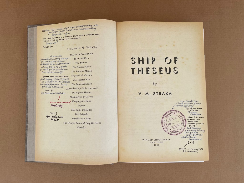
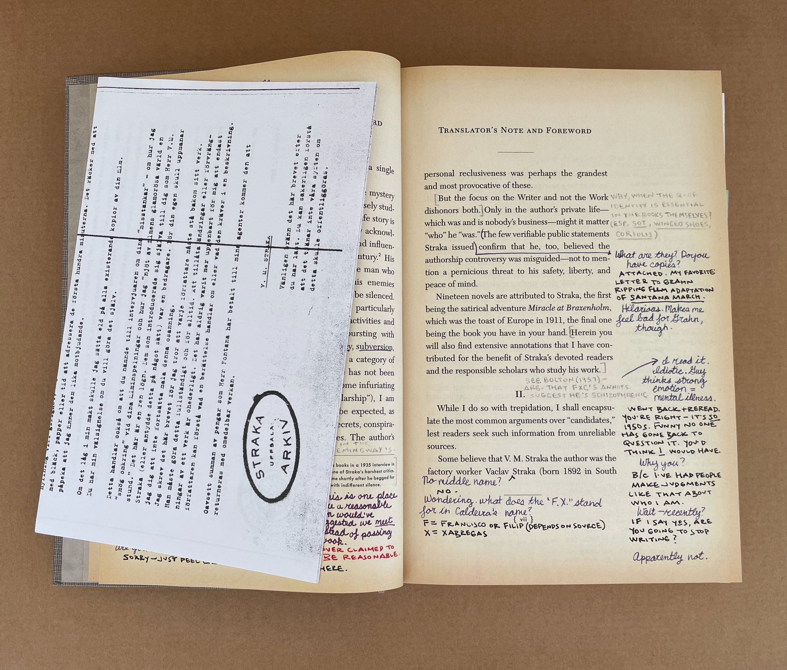
S: Ship of Theseusby V.M. Straka (2013) J.J. Abramsand Doug Dorst Printed card slipcase. Casebound stamped and printed cloth over boards, gray doublures, yellow head- and endbands. H242 x W162 mm. 472 pages. 22 inserts (postcards, photocopies, photo, prayer card, circular cipher device, campus café napkin, etc.). Acquired from AbeBooks, 5 March 2024. Photos: Books On Books Collection.
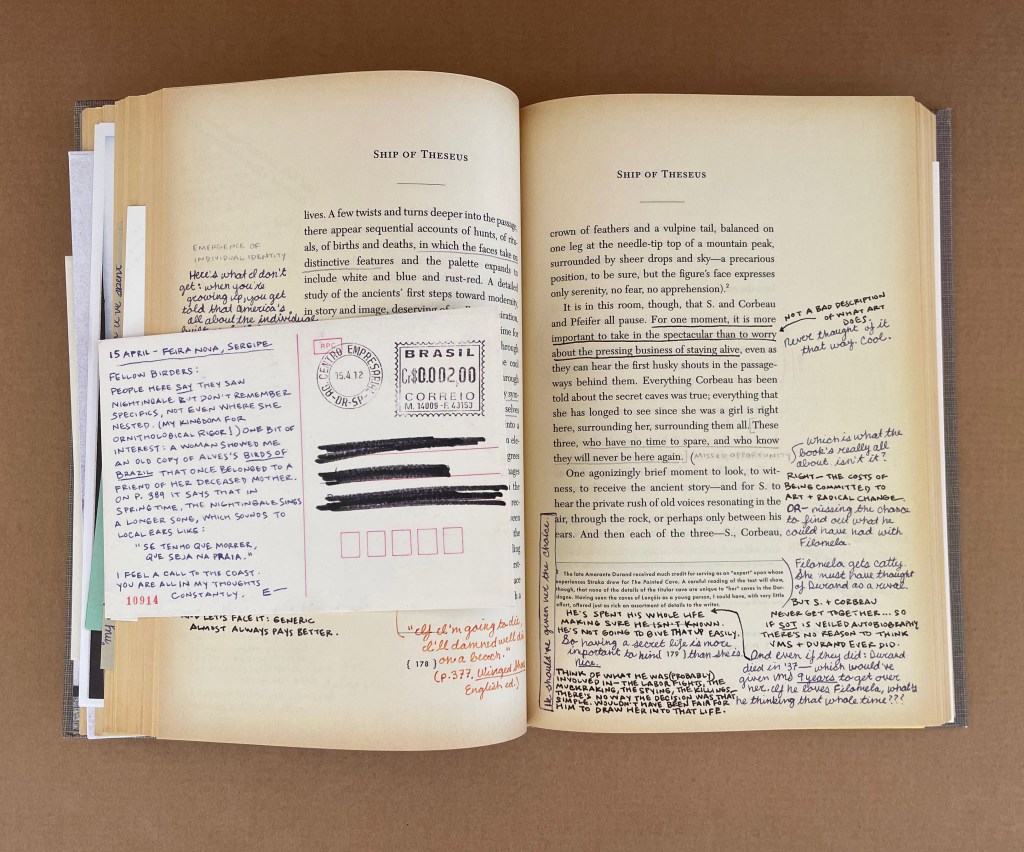
A young woman picks up a book left behind by a stranger. Inside it are his margin notes, which reveal a reader entranced by the story and by its mysterious author. She responds with notes of her own, leaving the book for the stranger, and so begins an unlikely conversation that plunges them both into the unknown. The book: Ship of Theseus, the final novel by a prolific but enigmatic writer named V.M. Straka, in which a man with no past is shanghaied onto a strange ship with a monstrous crew and launched onto a disorienting and perilous journey. The writer: Straka, the incendiary and secretive subject of one of the world’s greatest mysteries, a revolutionary about whom the world knows nothing apart from the words he wrote and the rumors that swirl around him. The readers: Jennifer and Eric, a college senior and a disgraced grad student, both facing crucial decisions about who they are, who they might become, and how much they’re willing to trust another person with their passions, hurts, and fears.— Publisher’s description on the slipcase.
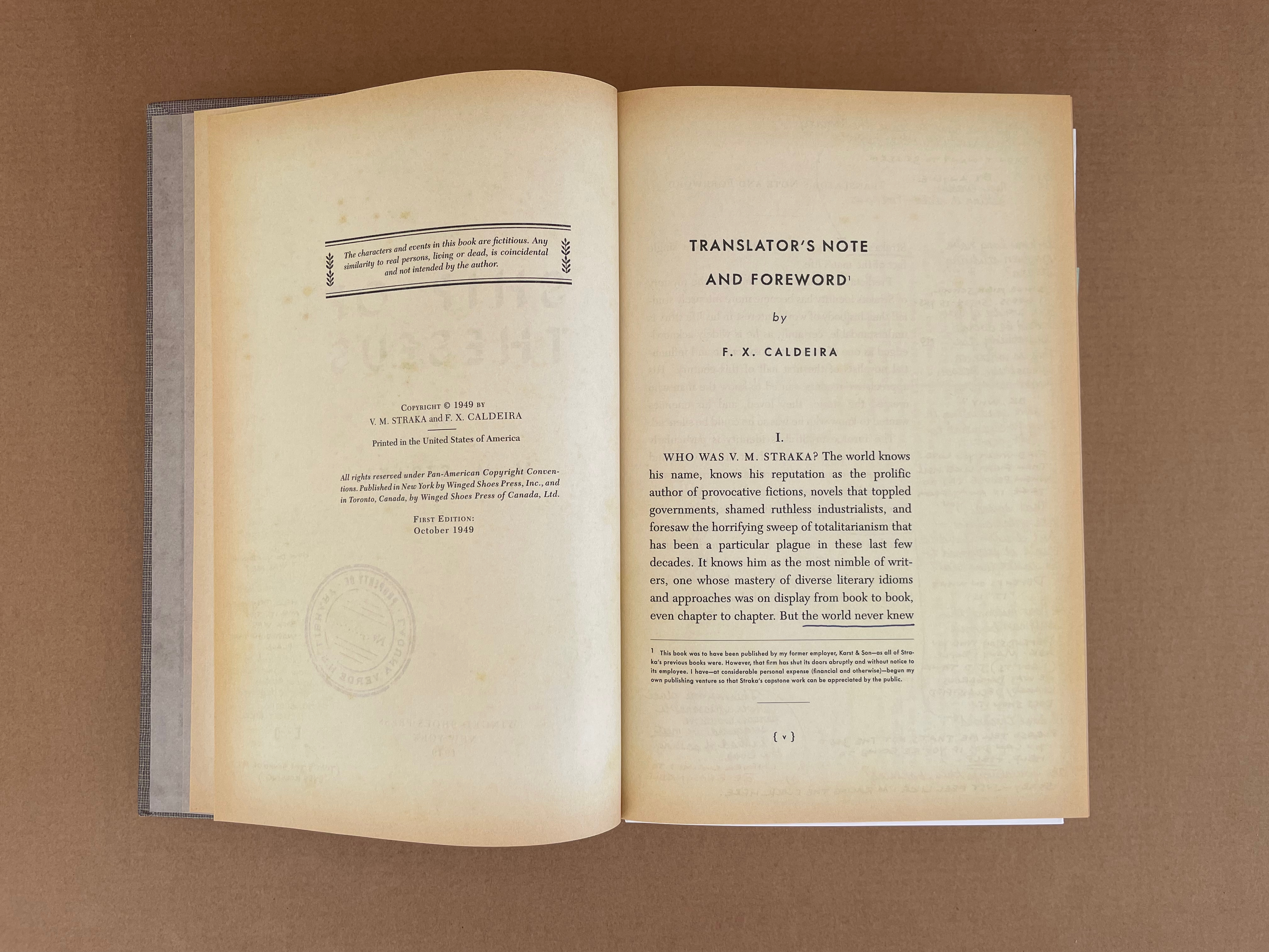
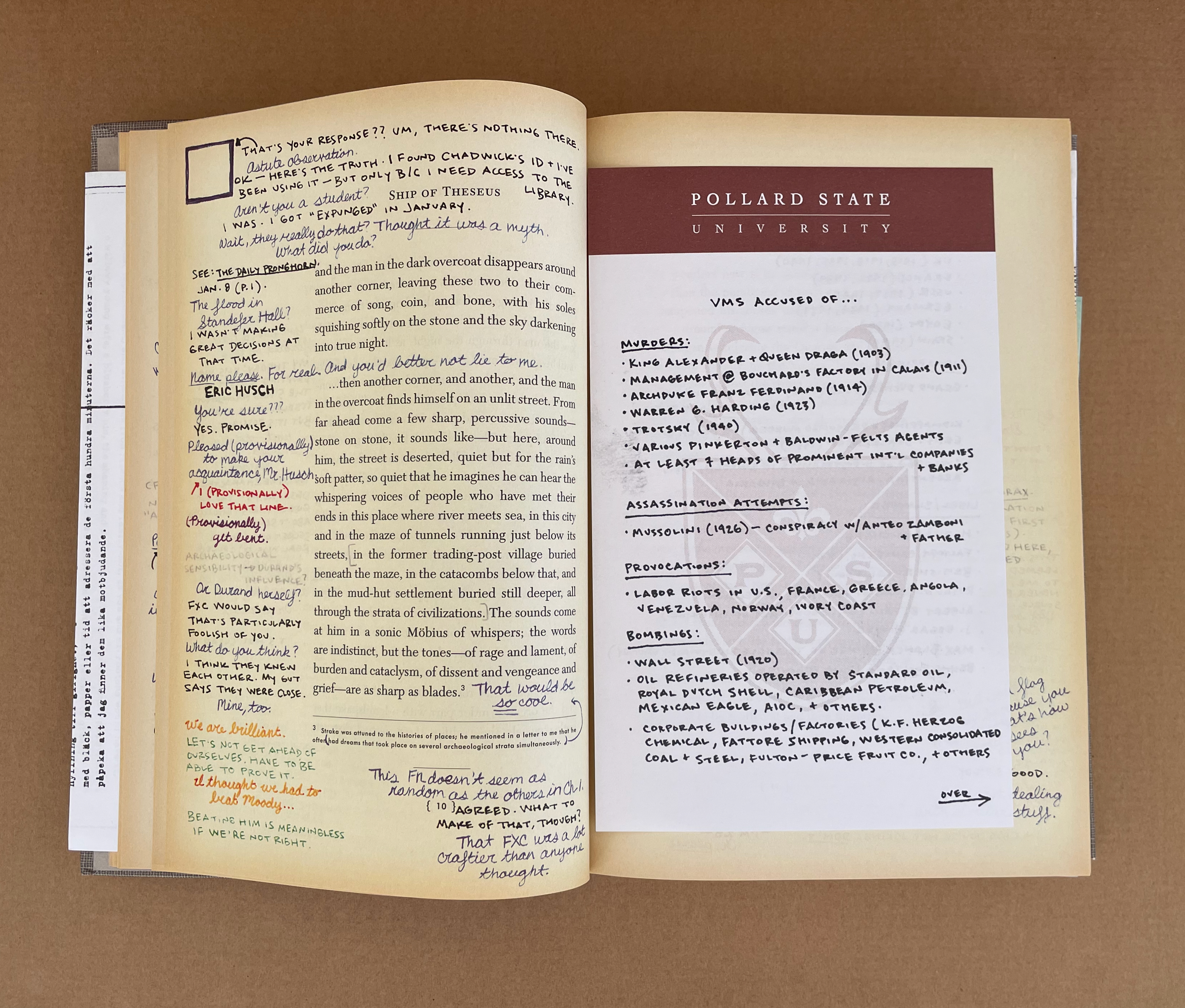
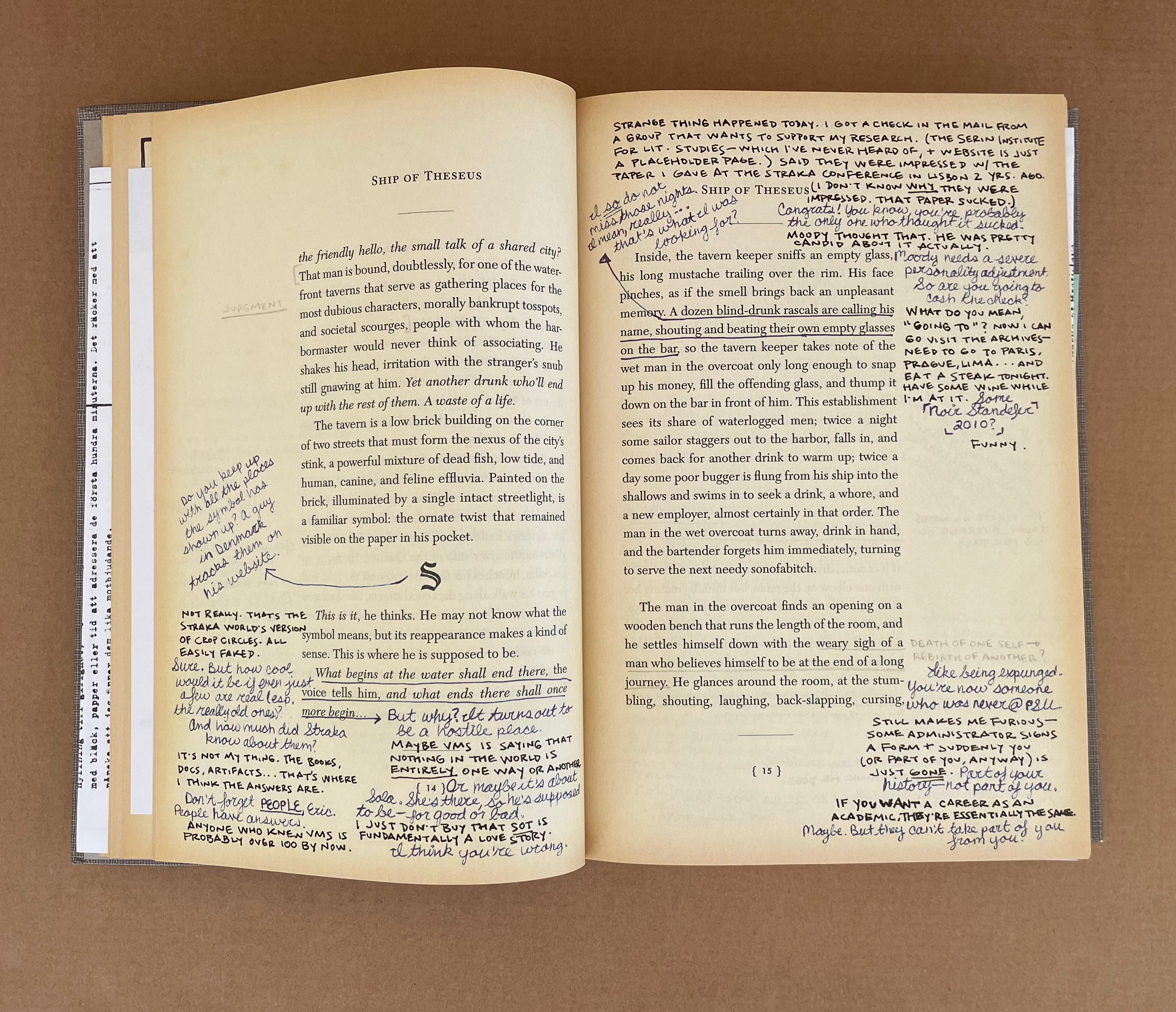
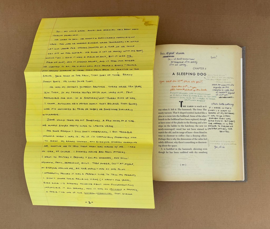
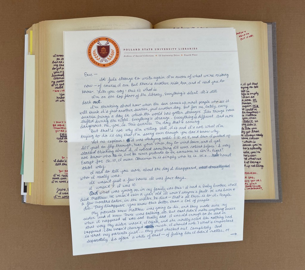
Most of the reviewers’ and libraries’ summaries of Ship of Theseus describe it as a traditional narrative with a second story in the form of marginal notes, letters and objects left by two readers of the main narrative, but I count five, possibly six, narrative lines or plots in this strange book. First is the story of the main character “S”, the shanghaied man with no past. Second is the story of the author V.M. Straka and his mysterious identity told by the fictitious translator F. X. Caldeira in his “Translator’s Note and Foreword” and footnotes. Third is the story of the two readers, Jennifer Heyward and Eric Husch, and their pursuit of Straka’s identity and his novel’s “meaning”. Fourth is Jennifer’s and Eric’s personal narratives of their academic lives to be found in their notes and left objects. Fifth is their love story that unfolds in the margins and objects as they discover each other’s identity and share their stories.
As for the sixth, in his Bibliography and the Sociology of Texts (1986), the scholar D.F. McKenzie writes: “every book tells a story quite apart from that recounted by its text”. Of course, McKenzie means the historical and social story told by the font, typesetting, binding, paper and so on. So the story of the production of Ship of Theseus would be its sixth narrative to be deduced from the book as object. Fortunately, Abrams and Dorst were interviewed in 2013 by Joshua Rothman in The New Yorker and told him a large part of that story. Sociologists of the book will revel in Abrams’ comparison of the book’s creation with that of a screenplay and movie, and they will marvel that, with all of its of seemingly one-off insertions and its realistic appearance as a used library book, it was produced as a trade book. A decade later, there are still copies available for purchase online. Speaking of online, S: Ship of Theseus has its own Wikipedia page and countless fan sites (academic and non-academic).
Like many artist’s books, S; Ship of Theseus has layers of self-referentiality “interrogating” the nature of the Book. Like many artist’s books, it challenges the act of reading — in this case with narrative frames, parallel color-coded narratives and objects of evidence each related to different narratives. The verisimilitude of its inserts and used-book appearance speaks to levels of craft and craftiness offered by many limited-edition works of book art. Like many artist’s books, it is the result of an intricate collaboration. But somehow it bulges the genre of the artist’s book.
After acquiring it, I came across Brian Davis’ two essays for the College Book Arts Association, which comment on S: Ship of Theseus. He must have felt the same “bulge” and found a sufficient number of similar works to coin a name for them: “Multimodal Book-Archives”. Yes, more academic jargon, but with a genre of art that has had its troubles with apostrophes and coinages such as “bookwork”, can we complain? Probably not, but we can cavil.
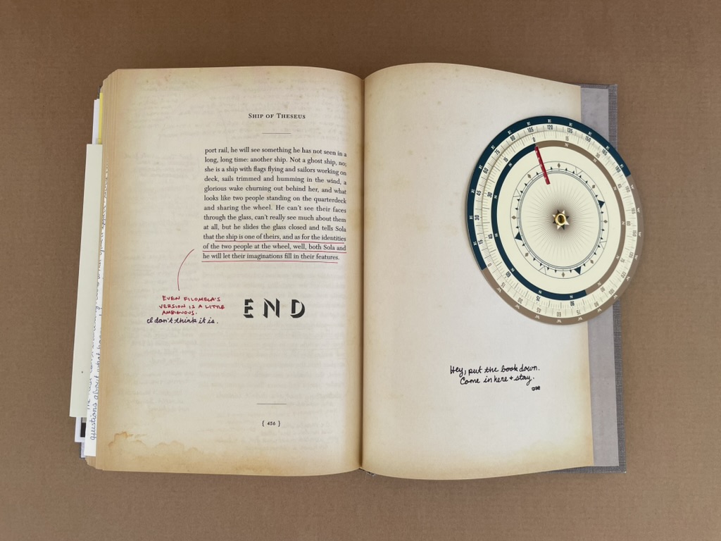
“Archives”can be temporally and spatially open ended without even hinting at boundedness. Works like S: Ship of Theseus and Warren Lehrer’s A Life in Books (2013), among others, do seem to “exploit the material and expressive possibilities of the book” through documentation, curation or compilation and preservation of artifacts. These two works, however, have not only a trade book boundedness, even allowing for loose inserts, but also a sense of narrative closure that makes “archives” not quite on the money. Faced with an artist’s book relying on narrative framing, documentation, and loose artifacts, we usually fall back on the terms of collage and assemblage to describe them, but then neither of the two examples has the pasted-down single view of collage or the sometimes disjointedness of assemblage.
Narrative closure: “END” and “Hey, put the book down. Come in here & stay.”
“Archives” may not hit the mark, but Davis is right that these two works are multimodal. And/or, maybe they are instances of Dick Higgins’ “intermedia”, in which case I am reminded of his closing caveat:
And with this I would leave the matter of intermedia. It is today, as it was in 1965, a useful way to approach some new work; one asks oneself, “what that I know does this new work lie between?” But it is more useful at the outset of a critical process than at the later stages of it. Perhaps I did not see that at the time, but it is clear to me now. Perhaps, in all the excitement of what was, for me, a discovery, I overvalued it. I do not wish to compensate with a second error of judgment and to undervalue it now. But it would seem that to proceed further in the understanding of any given work, one must look elsewhere—to all the aspects of a work and not just to its formal origins, and at the horizons which the work implies, to find an appropriate hermeneutic process for seeing the whole of the work in my own relation to it.
Below are a few images of S: Ship of Theseus and its types of media. Below that is the product of “a poor devil of a Sub-Sub” librarian at the Fleet Library of the Rhode Island School of Design, who took the trouble to list all of the inserts and describe them as well as the features of the slipcase, spine, title page, etc., that contribute to its success.
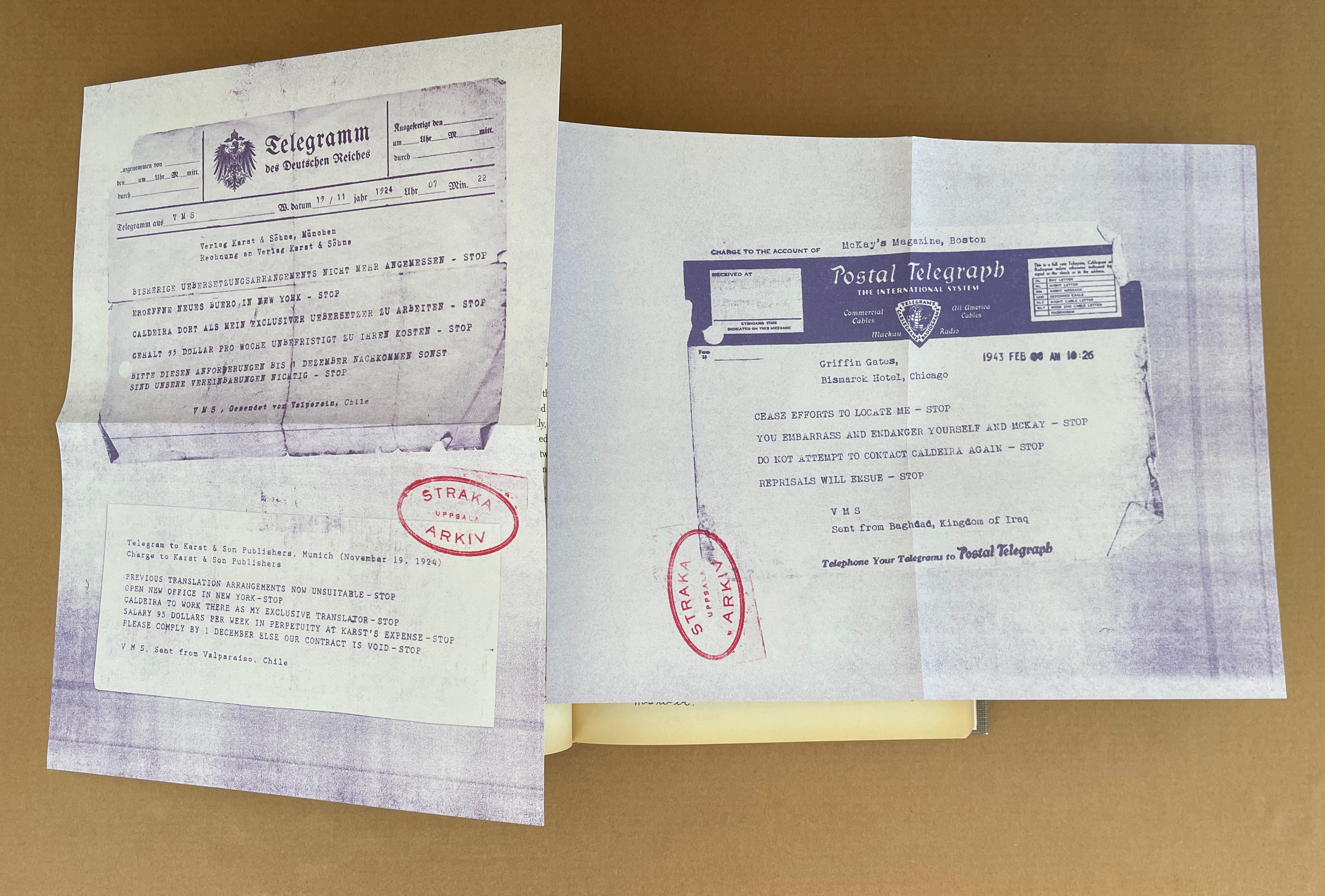
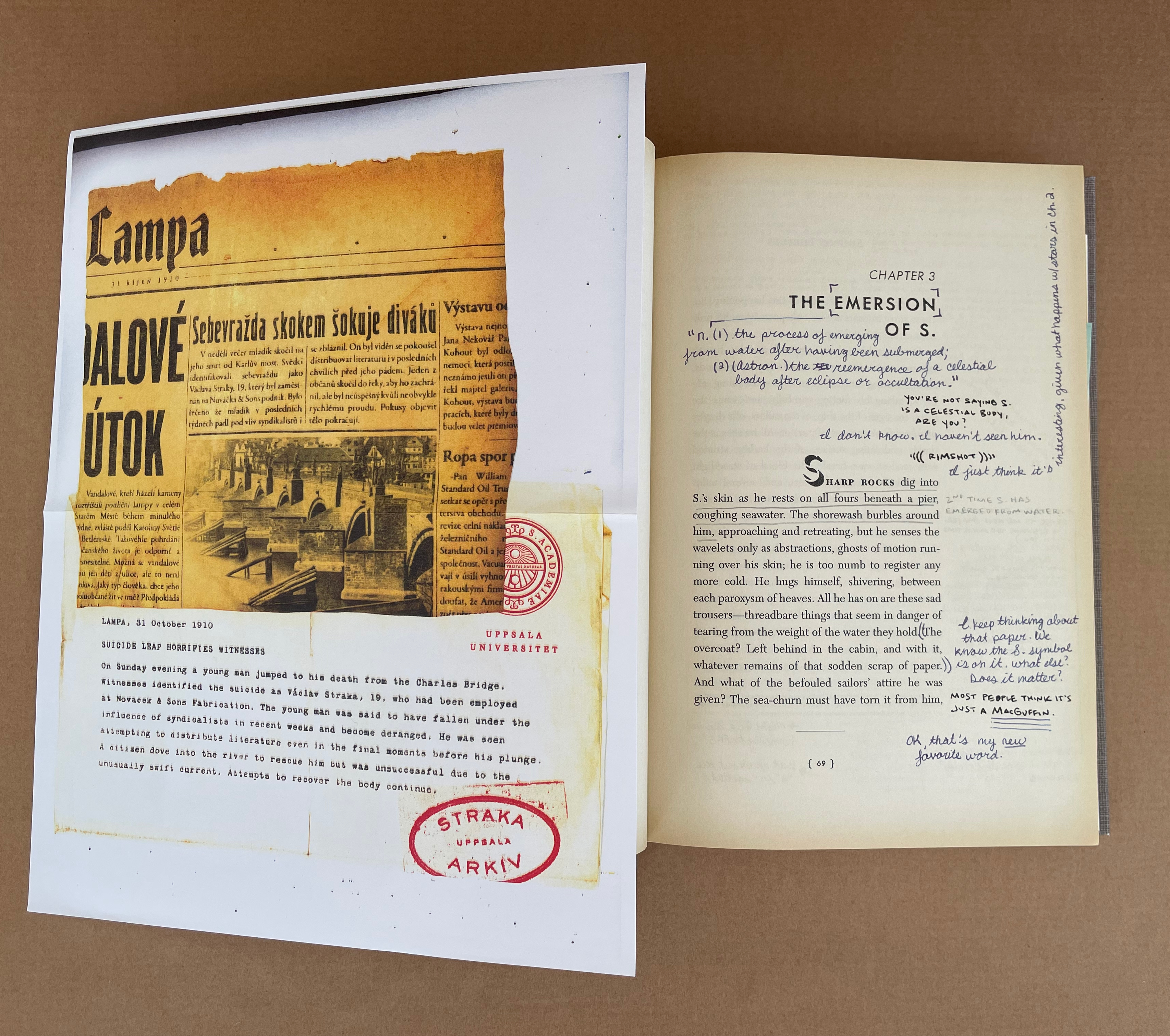
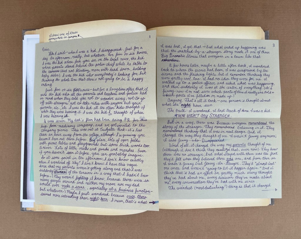
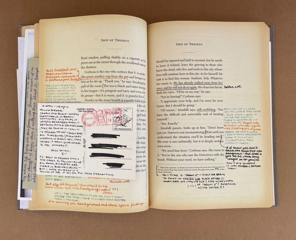
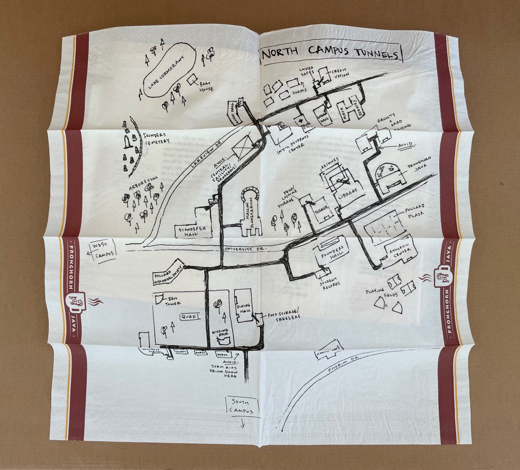
Konfidentiell letter (2 leaves) [insert between pages viii-ix] + Pollard State University : VMS accused of … (1 leaf) [insert between pages 10-11] + Xerox copy of journal article (1 leaf) [insert between pages 20-21] + Newspaper clipping (2 pages) [insert between pages 32 -33] + Telegram (2 leaves) [insert between pages 54-55] + 1 newspaper clipping/memo (1 leaf) [insert between pages 68-69] + Letter from Desjardins (1 leaf) [insert between pages 86-87] + Letter from Jen (4 pages) [insert between pages 100-101] + 1 Brazil postcard [insert between pages 112-113] + 1 photograph of stone wall [insert between pages 130-131] + 1 Birds of Brazil postcard [insert between pages 178-179] + 1 postcard of palms [insert between pages 190-191] + 1 postcard of a beach [insert between pages 192-193] + 1 Pictorial Brazil postcard (20 April near Marau) [insert between pages 200-201] + So … My Uncle Zeke (5 pages) [insert between pages 202-203] + 1 photograph of woman [insert between pages 242-243] + 1 newspaper clipping within 1 greeting card [insert between pages 256-257] + 1 map on napkin [insert between pages 306-307] + 1 in memoriam card [insert between pages 360-361] + Letter from J (4 pages) [insert between pages 376-377] + Letter from Esmerlinda Pega (1 leaf) [insert between pages 416-417] + 1 decoder wheel [insert between end leaf and pages 3 of cover]. Altered book. Issued in slipcase. Title and statement of responsibility from slipcase.”Bad Robot, Melcher Media.”–Spine of slipcase. Title page and cover title of volume inside slipcase: Ship of Theseus / V.M. Straka. Imprint on title page: Winged Shoes Press, New York, 1949. Title page and page [3] of cover printed with “stamps” of Laguna Verde High School Library; spine includes a Dewey call number label. Includes 23 items purporting to be documents concerning the “author,” V.M. Straka, and his “translator,” F.X. Caldeira from the Straka Arkiv; decoding wheel, letters, postcards and notes by the “readers,” Jennifer and Eric; and other related materials.Marginalia printed in various colors. Description from Fleet Library Special Collections, Rhode Island School of Design.
Further Reading
“Warren Lehrer“. 28 May 2024. Books On Books Collection.
The Fall(1976) Michelle Stuart Saddlestitched with staples in landscape format, glossy paper. H x W mm. 28 pages. Acquired from Specific Object, 15 March 2024. Photos of the work: Books On Books Collection.
The Fall is one of the earliest publications of Printed Matter, founded in 1976 by a group of individuals working in the arts (among them artist Sol LeWitt and critic Lucy Lippard).
In the fifth show of his series Raw Craftof visits and interviews to celebrate craftsmen and craftswomen, the late Anthony Bourdain met with Andrew Hoyem, poet, master typographer and now retired printer of Arion Press. Although the Arion Press production of Hart Crane’s poem “The Bridge” does not feature, the episode is worthwhile background for enjoyment of this collaborative work of book art.
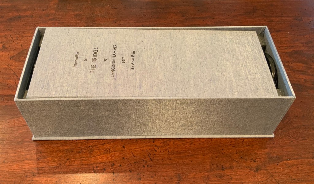
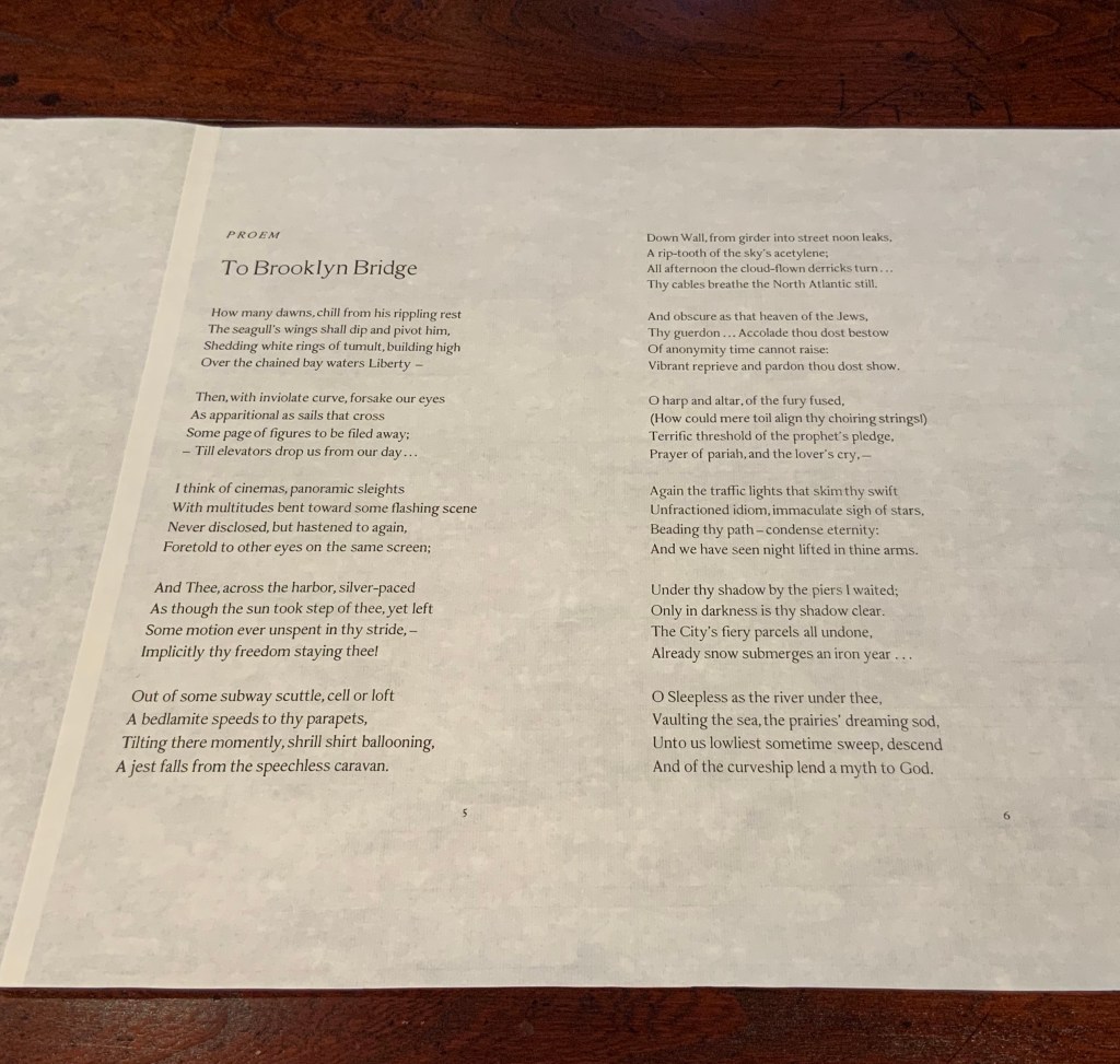
The Bridge (1930/2017)
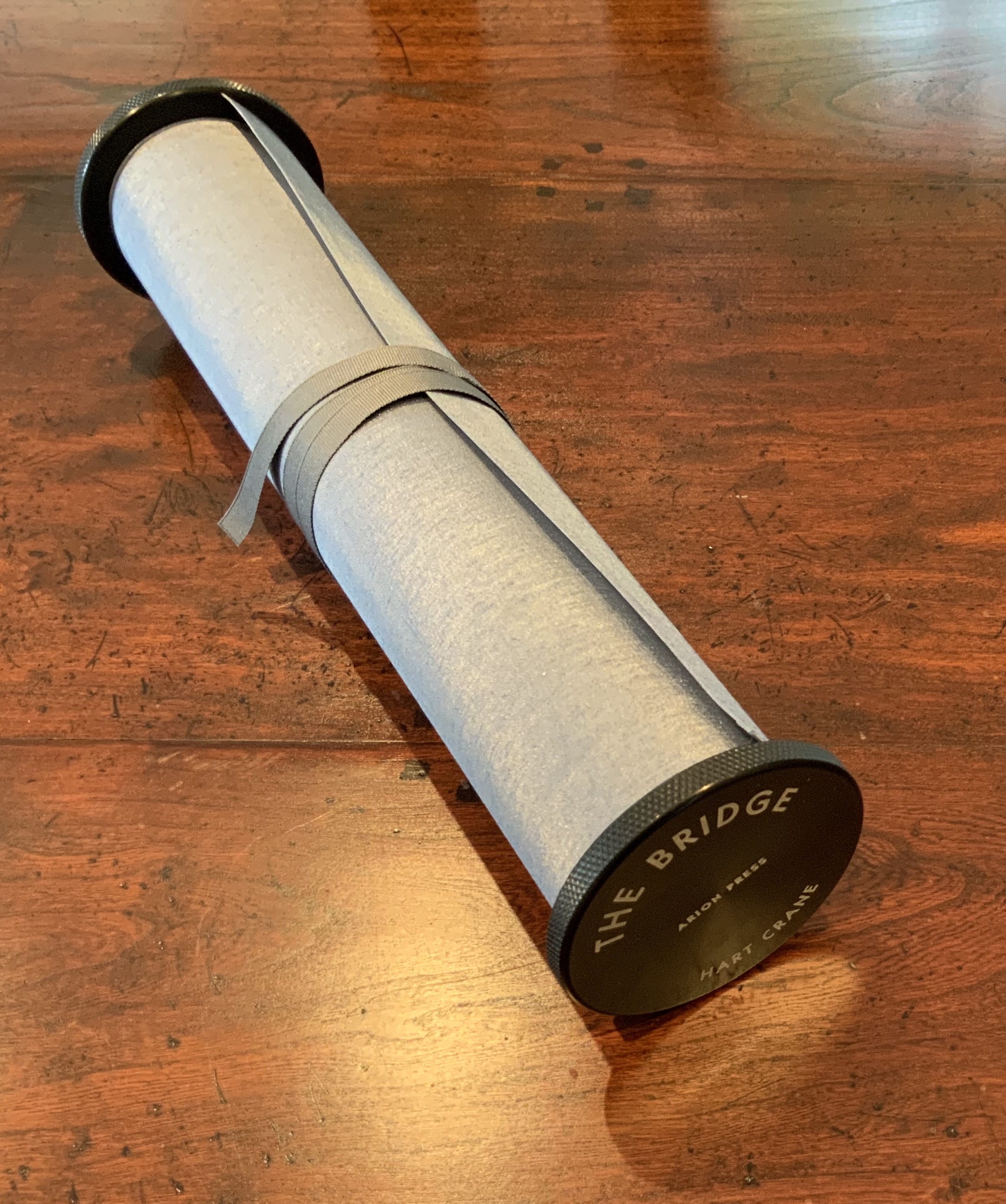
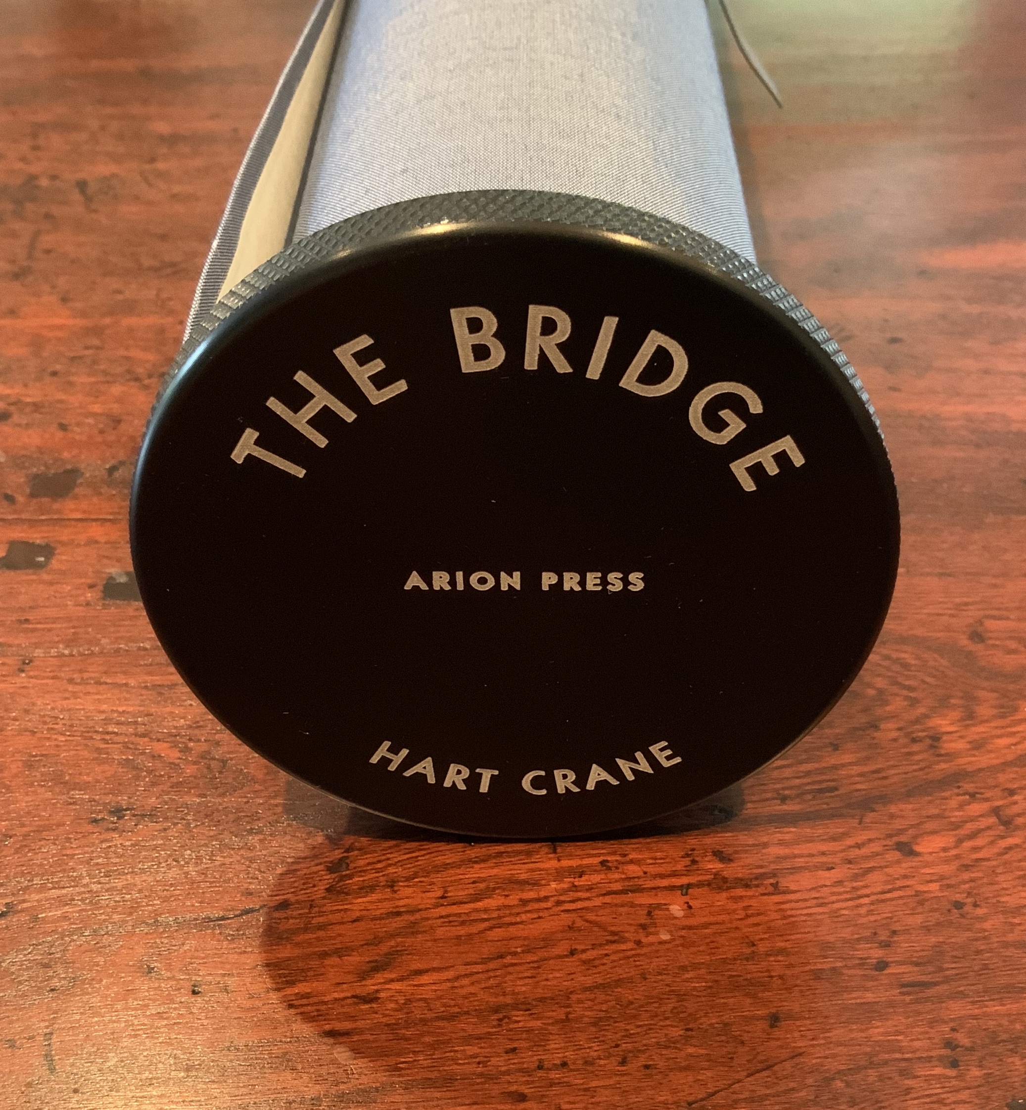
The Bridge(1930/2017) Hart Crane Design, Arion Press. Woodblock prints, Joel Shapiro. Introduction, Langdon Hammer. Scroll, 13-1/2 inches by 50 feet, wound on aluminum spool with bookcloth wrapper, housed in a box. Edition of 300, of which this is #97. Acquired from Classic Editions, 10 June 2020. Photos of the work: Books On Books Collection. Displayed with permission of Arion Press.
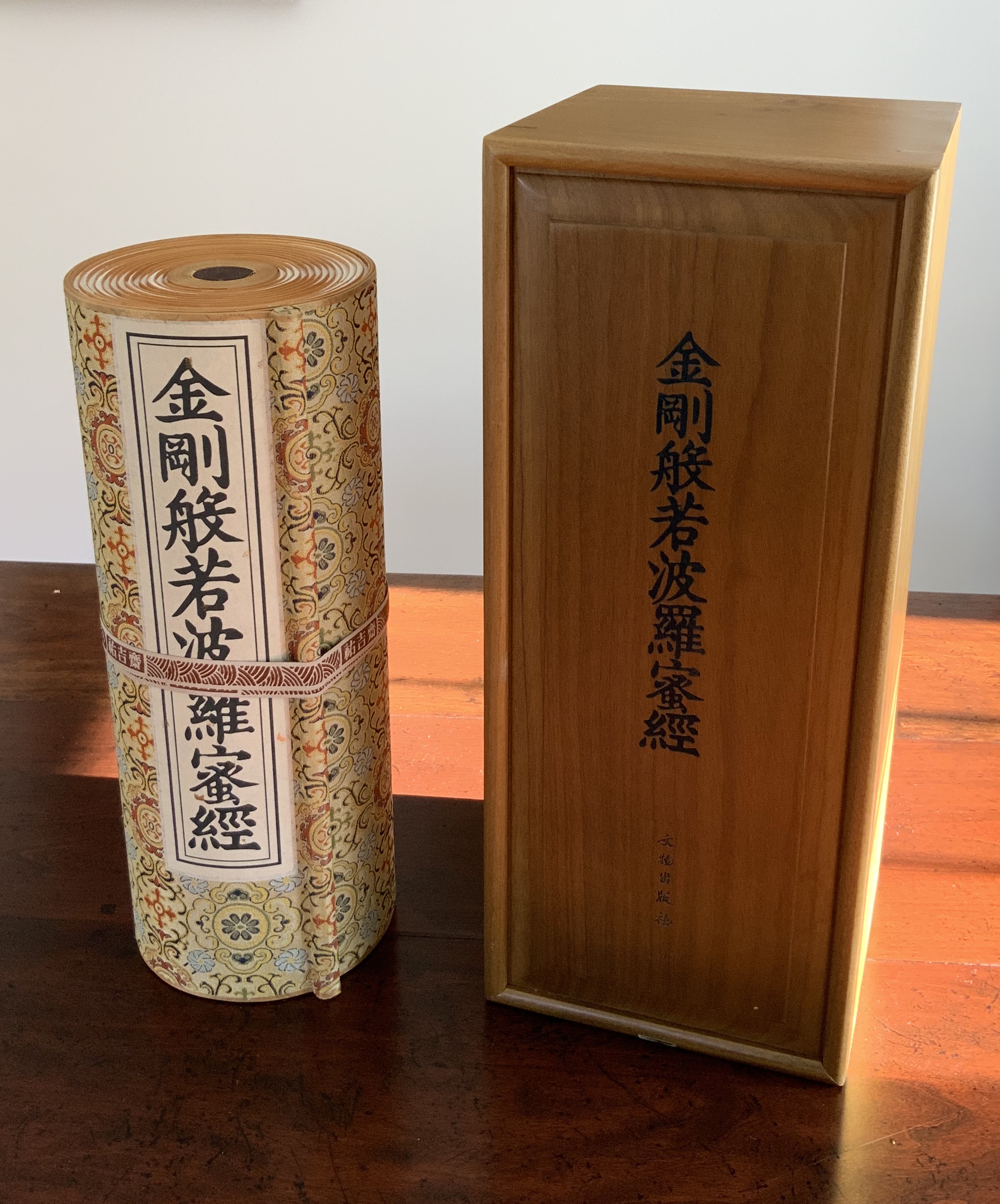
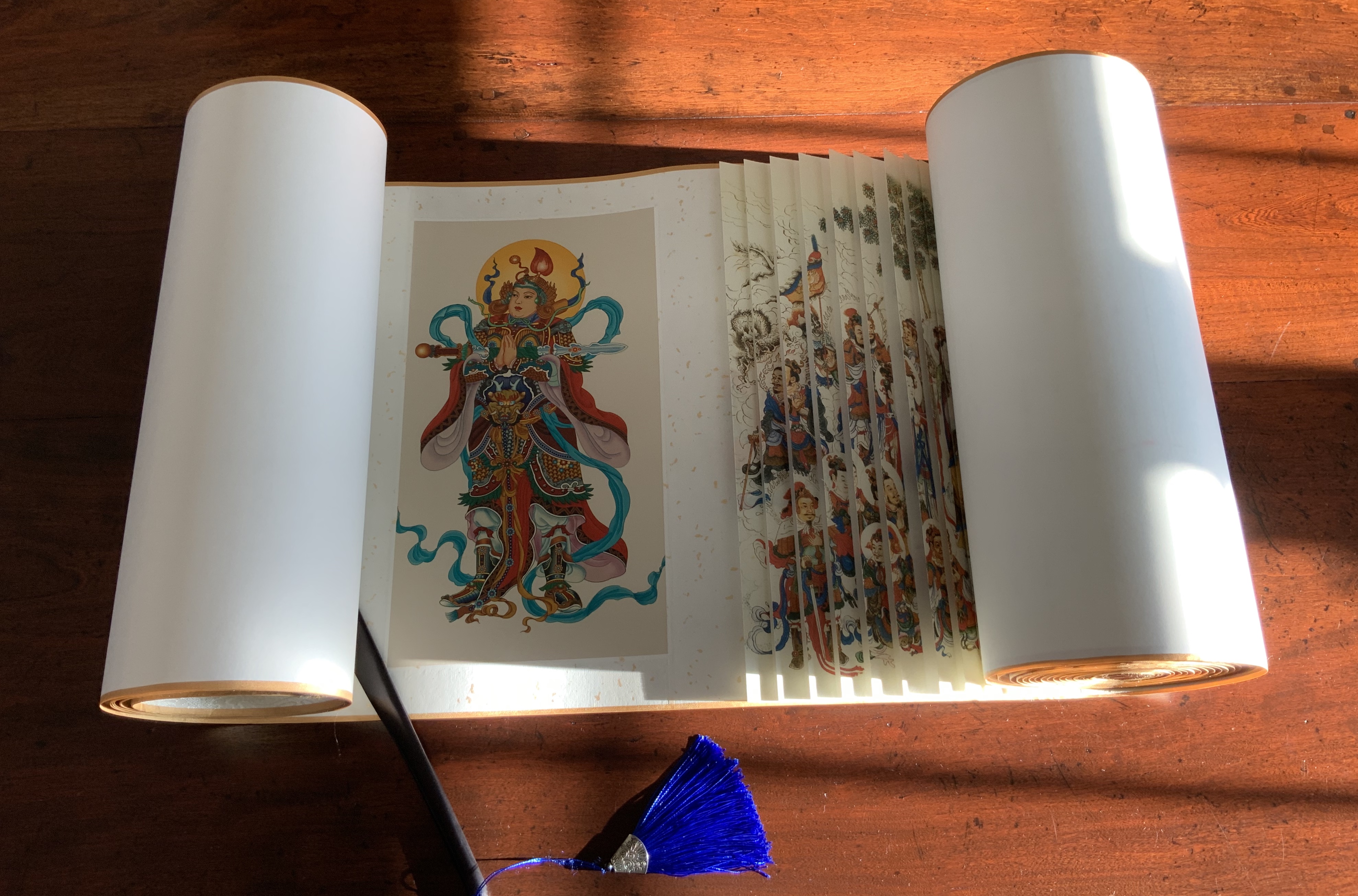
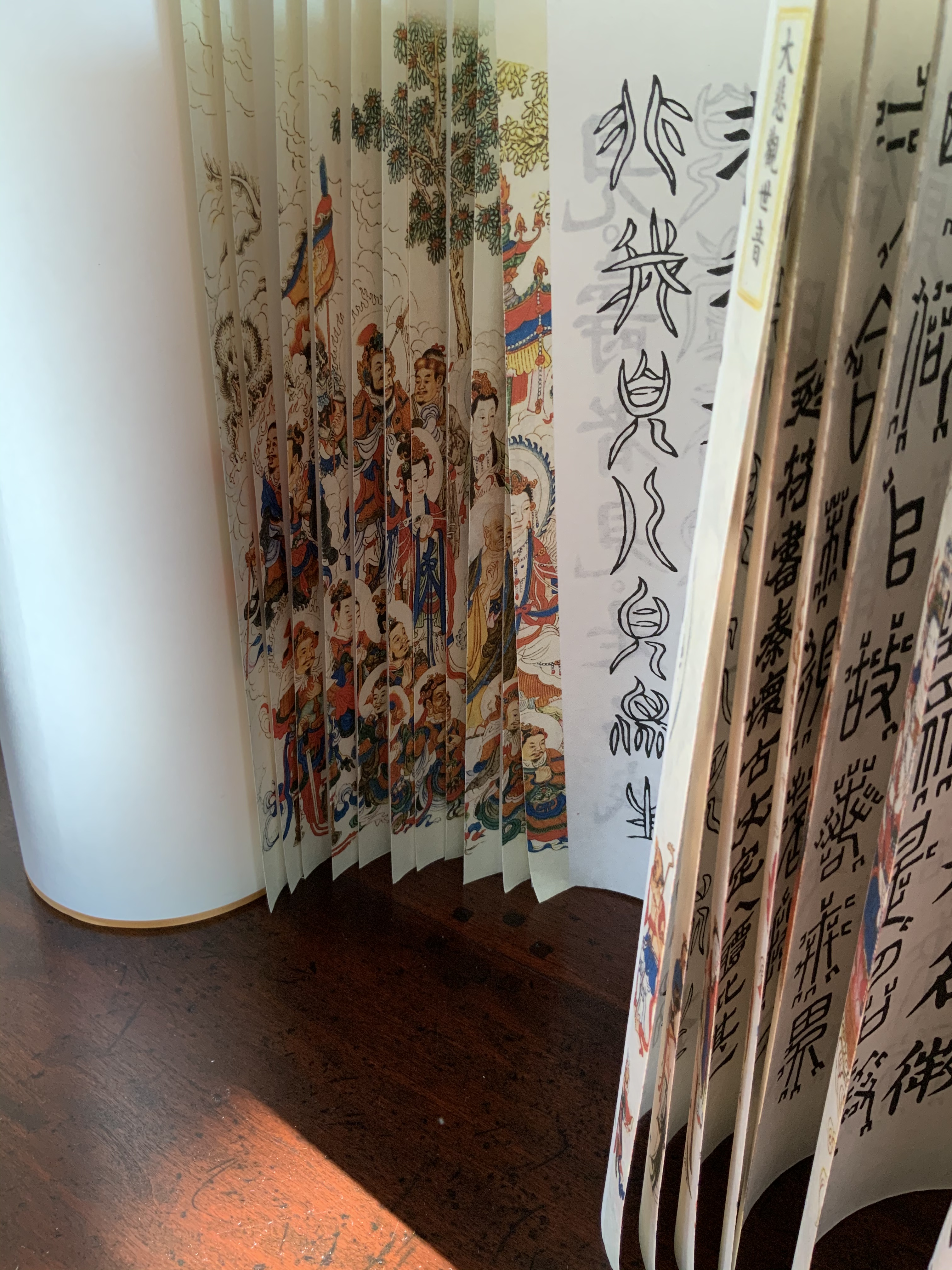
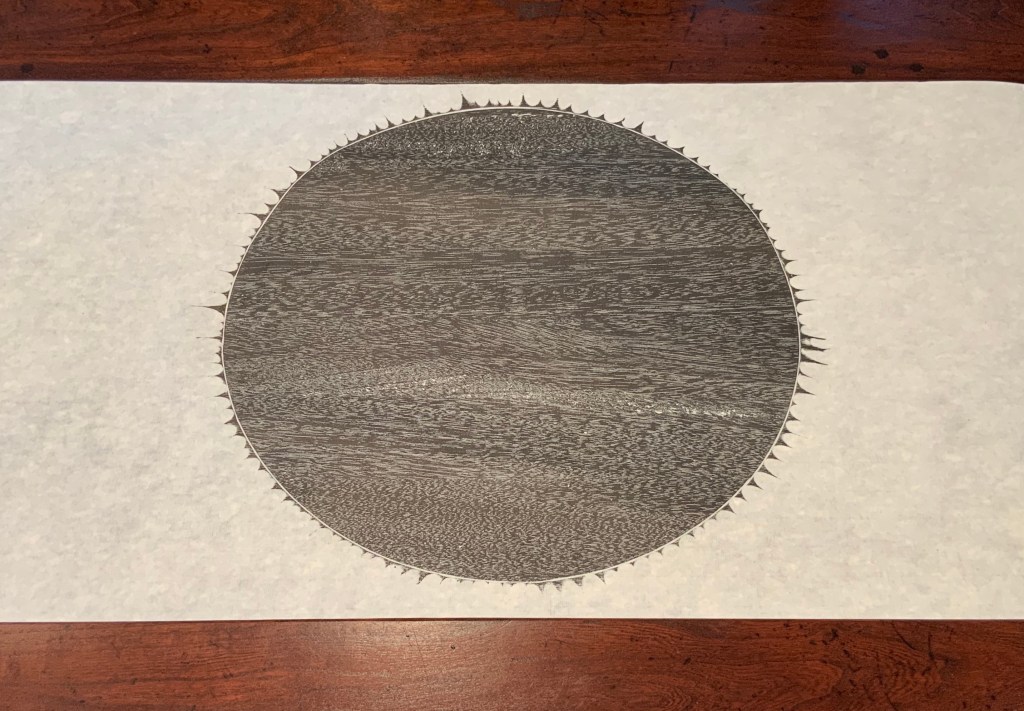
From first sight, this work of art evoked thoughts of an earlier acquisition — the dragon scale binding of the Diamond Sutra, done by Zhang Xiaodong in 2017.
Diamond Sutra, Dragon scale binding (2017) Zhang Xiaodong In 32 zhuan (seal) fonts, 152 x 382×160mm. Edition of 300, of which this #197. Acquired from Sin Sin Fine Arts (Hong Kong), 31 October 2019. Photos: Books On Books Collection.
It was more than the similarities of scrolls stored in boxes. Despite the differences in texts and images, something resonated –still resonates — between the two works. The Arion Press prospectus for The Bridge holds the clue to what that something is:
The publisher, Andrew Hoyem, conceived of a scroll format for “The Bridge” while he and senior editor Diana Ketcham were on a two-week tour of China in April 2017 organized by the Grolier Club, an association of bibliophiles in New York City. The theme of the trip was the history of paper, type, printing, binding, and the collecting of books, both private and institutional, in China.
During the first week they visited the Red Star Paper Company in Wuxi, Anhui Province. The Chinese government has recently sought to revive and support traditional crafts. Red Star is the fore-most producer of handmade paper in the nation, using ancient methods and many plant fibers in exacting proportions to make sheets of beautiful thin paper, used mainly for calligraphy and ink and watercolor painting.
In Beijing they visited the most important book collector in China, who showed them an unmounted scroll from the eighth century. Hoyem was inspired to order handmade paper from the mill and to make “The Bridge” in a single-spool scroll format.
In each case, content, image, structure and handmade paper more than complement one another. Even though they do so in different ways, the rightness and thoroughness with which it is done and the feel of the paper strike that resonant chord. A comparison of the texts of the two works would not ordinarily arise, but once it is made, the prayerfulness of Crane’s “Proem” stands out even more in its French Elzevir handset by Hoyem himself and printed on handmade paper of his choosing. Hoyem’s choices of material and structure put him on an equal artistic footing with Shapiro and Zhang. Note the scroll end’s echo of Shapiro’s woodcut, which itself may be an allusion to the Black Sun Press, first publisher of The Bridge (1930). What is it that bridges the precision mechanical fixture and the wood grain revealed by hand and ink if not Crane’s words? In pairing Crane with Shapiro, Hoyem made as canny and artistic a choice as any that book impresario Ambroise Vollard ever made.
In his comments at the opening of his 2018 exhibition at Pace Prints, which featured The Bridge, Shapiro refers to the rapture and ecstasy of the poem as his chief challenge. Here he is in an earlier interview that speaks to how he approaches such a challenge:
Visual art can be tricky – the goal is not simply to illustrate, but, in this case, to create images which correspond to profound and historically significant prayers and material. My role here is that of mediator – attempting to capture the meaning I see in the material, and translate it into form. — “Artist Joel Shapiro Discusses the Art in Mishkan HaNefesh”.
Alongside those comments, the interplay of artists Hoyem and Shapiro, Crane’s text, the continuous scroll, the French Elzevir typeface and the Chinese handmade paper suggests an entirely new meaning for Dick Higgins’ term “intermediation”. In his 1965 essay “Intermedia”, republished in Leonardo in 2001, Higgins adopted the term from Samuel Taylor Coleridge. As Higgins expressed it, “Many fine works are being done in mixed media: paintings which incorporate poems within their visual fields, for instance. But one knows which is which. In intermedia, on the other hand, the visual element (painting) is fused conceptually with the words” (p. 52). With The Bridge — as with Diamond Sutra, Dragon-Scale Binding — the fusion goes beyond the visual and textual and yields two exceptional works of art.
Further Reading
“Joel Shapiro and Hart Crane“. 19 December 2017. Graphic Arts Collection, Special Collections, Firestone Library, Princeton University. Accessed 4 August 2020.
“Playing Against Type“. 2 November 2017. Antiques: The Magazine. Accessed 4 August 2020.
Higgins, Dick. February 2001. “Intermedia“. Leonardo, Volume 34, Number 1, February 2001, pp. 49-54. Reprint of his 1965 essay with an addendum from Hannah Higgins, co-curator with Simon Anderson (School of the Art Institute of Chicago) of a 2000-2002 travelling restrospective on Dick Higgins’ life and art.
Richard Kostelanetz writes of an essential distinction that separates the imaginative from the conventional book:
In the latter, syntactically familiar sentences are set in rectangular blocks of uniform type …, and these are then ‘designed’ into pages that look like each other (and like pages we have previously seen). An imaginative book, by definition, attempts to realize something else with syntax, with format, with pages, with covers, with size, with shape, with sequence, with structure, with bnding — with any or all of these elements, ideally reflecting the needs and suggestions of the particular book. Most books are primarily about something outside themselves; most book-art books are primarily about themselves. P. 48.
This catalogue of the exhibition organized by the late Hermann Havekost at Oldenburg University in 1986 qualifies as imaginative on nearly every one of those criteria. To boot, it is about itself as well as about something outside itself.
The ambidextrous book appeared the same year as The Book Made Art, edited by Jeffrey Abt and designed by Buzz Spector. The size of the Oldenburg catalogue dwarfs that of The Book Made Art, is more globally representative (especially of Central and Eastern Europe), and has more of a textual, Fluxus feel to it. Nevertheless, the catalogue’s German and Italian titles, several of its selections and its very production and performance chime with the sculptural, book-object tenor that Spector achieved with his design and Abt with his selections for The Book Made Art.
Among the Oldenburg exhibition’s artists and their works clearly addressing the book as object are
Denise AubertinJournal impubliable (1984), a work of altered, torn, collaged-over pages
Sheril CunningSummer Rain (1984), a codex of pages of gampi and abaca with mica particles, bearing watermarks of a rain storm
Elisabetta GutLibro-incabbiato (1981), a bamboo bird cage with a miniature Italian-German dictionary inside
J.H. Kocman Paper-re-making book No. 057 (1982), a book made handmade paper sheets made from seven books that were ground to pulp in water
Martin PeulenUntitled (c. 1984), a matchbox labelled “Martin Peulen Caution Book!” and holding a stapled book (H20 x W200 mm)
Adam RzepeckiUntitled (1984), a book with a saw stuck halfway through
Franz E. WaltherStoffbuch 2 Zwei (1969), a book of blank fabric pages, closed with cloth straps and resembling a folded straitjacket.
However broadly representative of book art in the 1980s and star-studded (Roberta Allen, Barton L. Beneš, Mirella Bentivoglio, Agnes Denes, Robert Filliou, Dick Higgins, Dennis Oppenheim and Tibor Papp to mention a handful), the Oldenburg catalogue’s chief claim to a place in the Collection remains its status of “catalogue as book art”, a claim to “book art” that rests on its four-fold binding structure. In this, it is similar to The Book Made Art (1986) with its trim and trompe l’oeil vitrine pages; or Irma Boom’s The Architecture of the Book (2013), a catalogue miniaturisé; or Odd Volumes (2014) with its more “traditional” dos-à-dos binding.
These “interrogations” of the book’s structure serve to excite the appetite for even more complex, self-reflexive acrobatics with exhibitions of book art. Which institution of book art will spring for this six-fold structure?
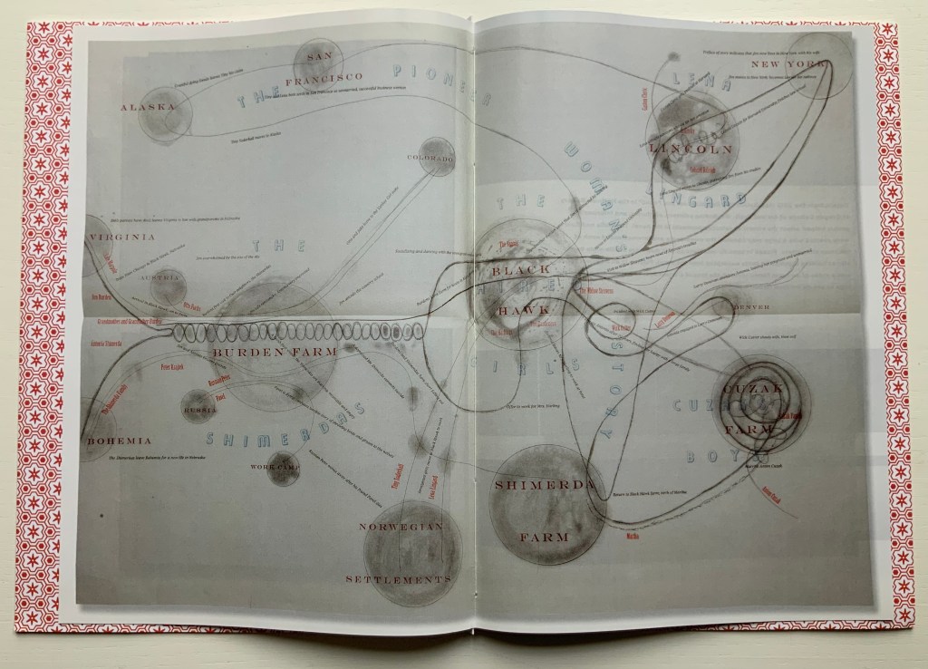
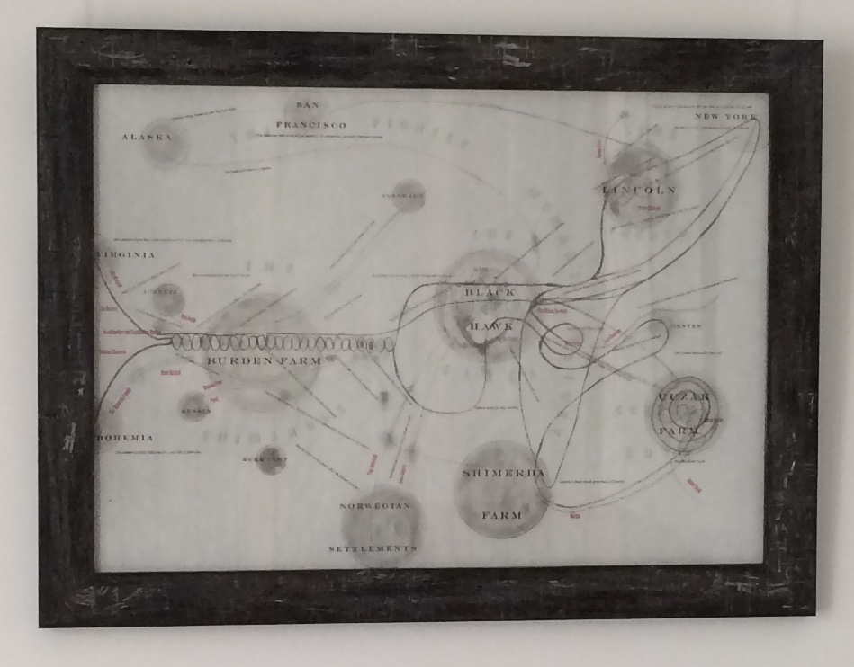
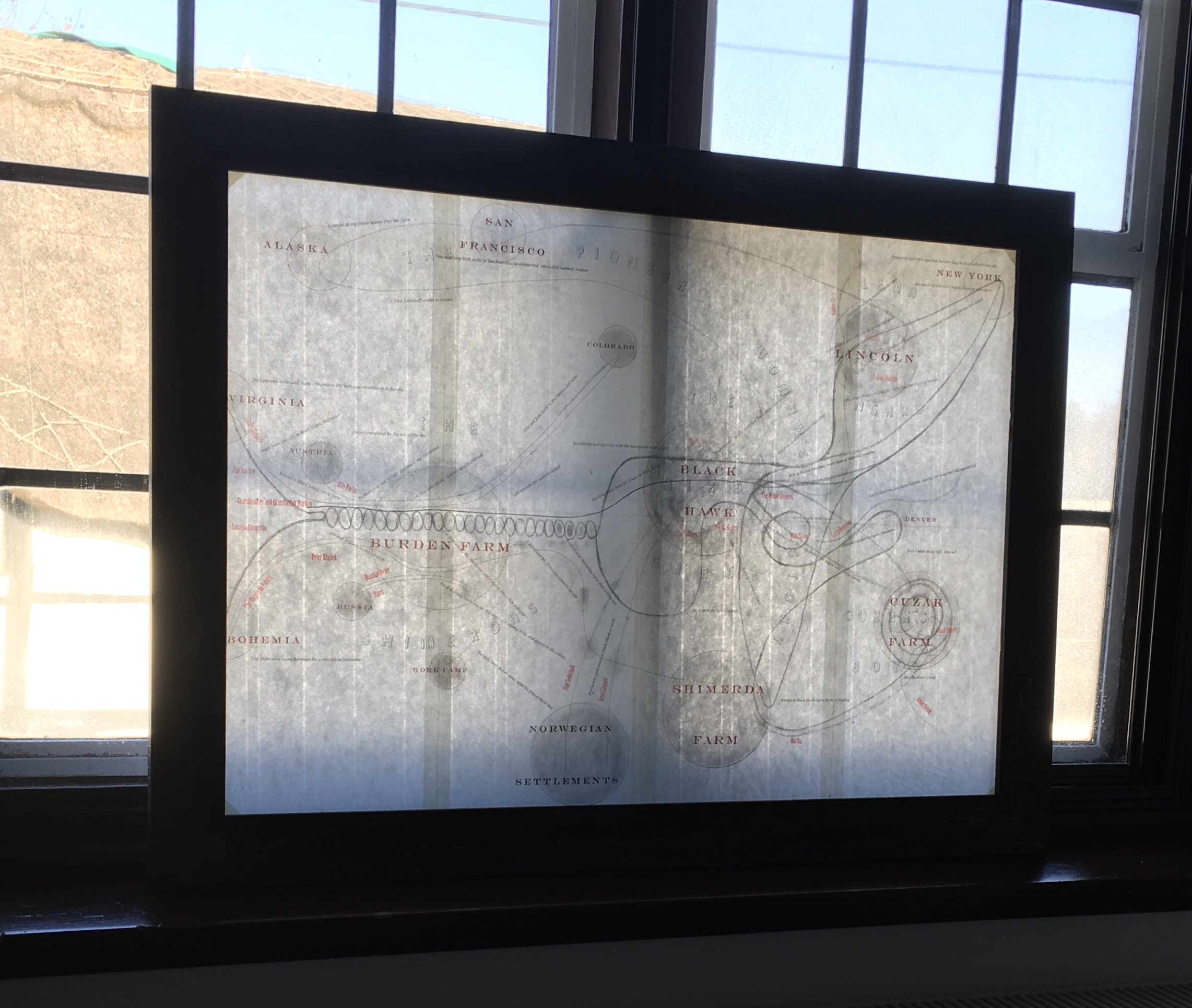
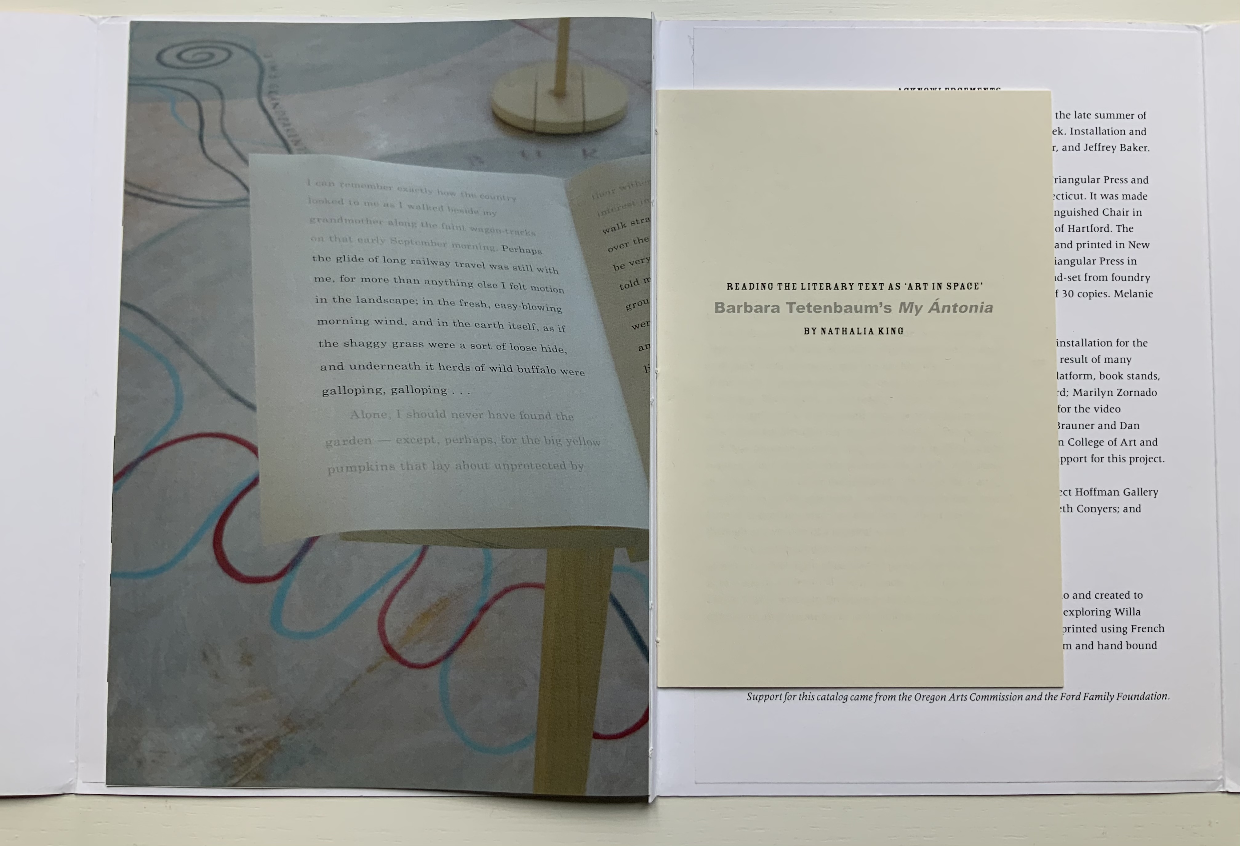
Image of map of My Ántonia reproduced in A Close Read: The Cather Projects (2012) Barbara Tetenbaum and Jennifer Viviano Photos: Books On Books Collection, displayed with permission of the artist.
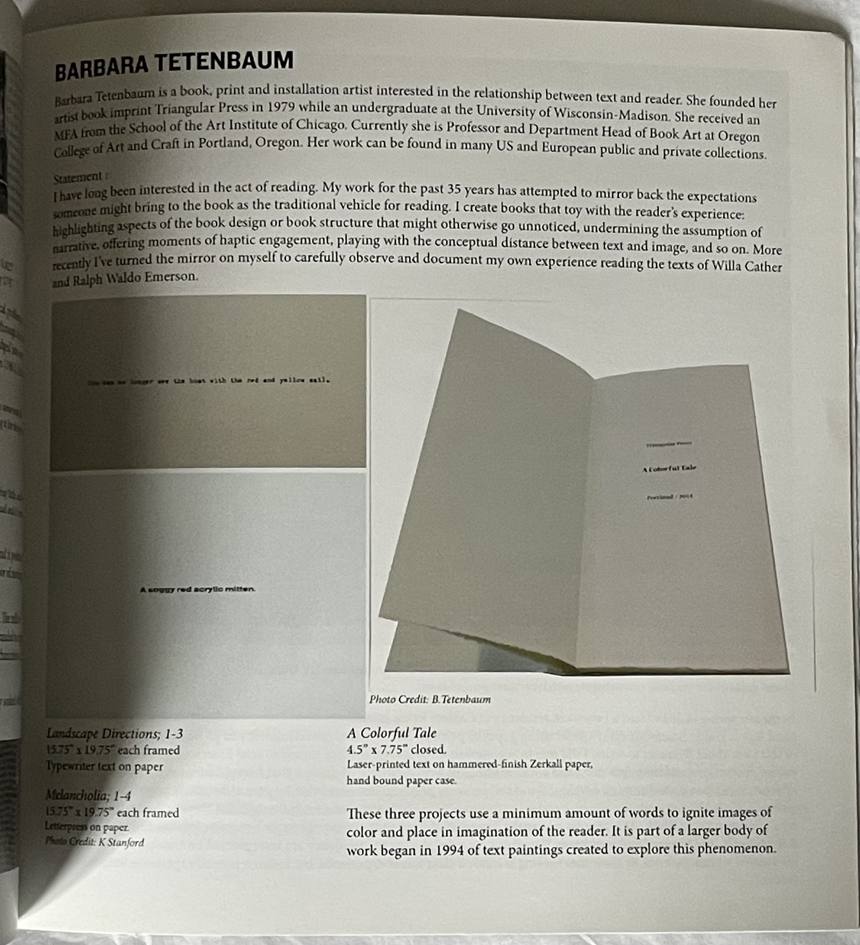
For the Books On Books Collection, Barbara Tetenbaum’s works have offered a map for exploring the different ways that text, image, structure and material bring about enjoyment and meaning in book art and bookmaking. Broadsides, chapbooks, a codex, a sculpture and, yes, a map have joined the collection over time.
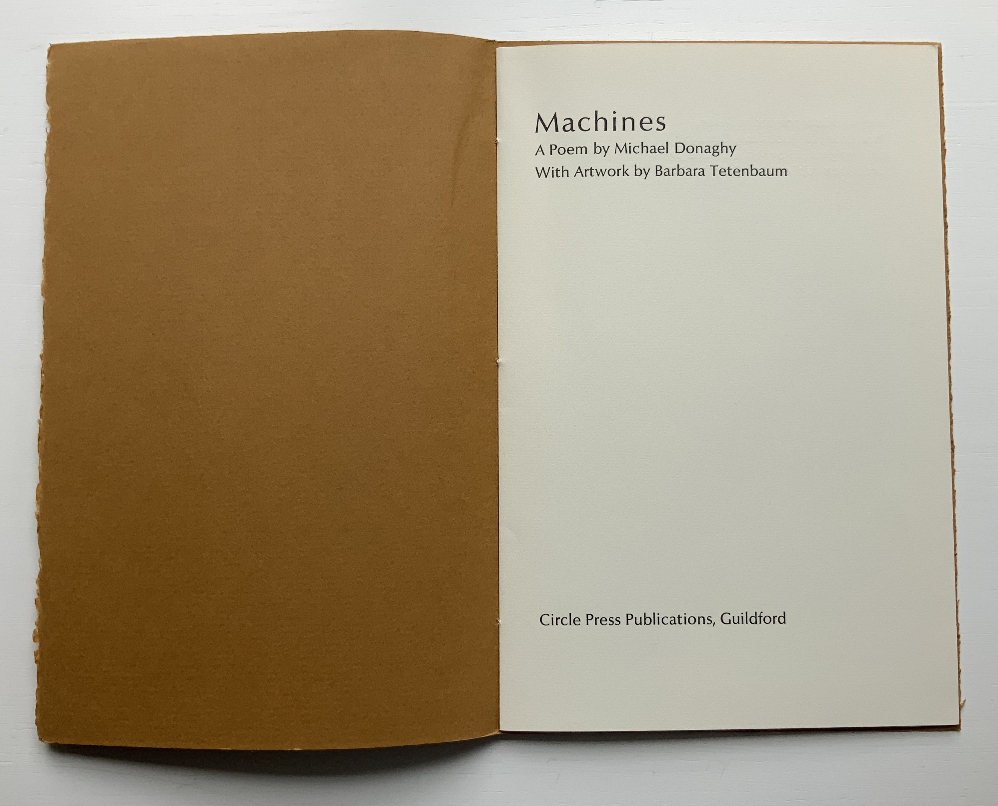
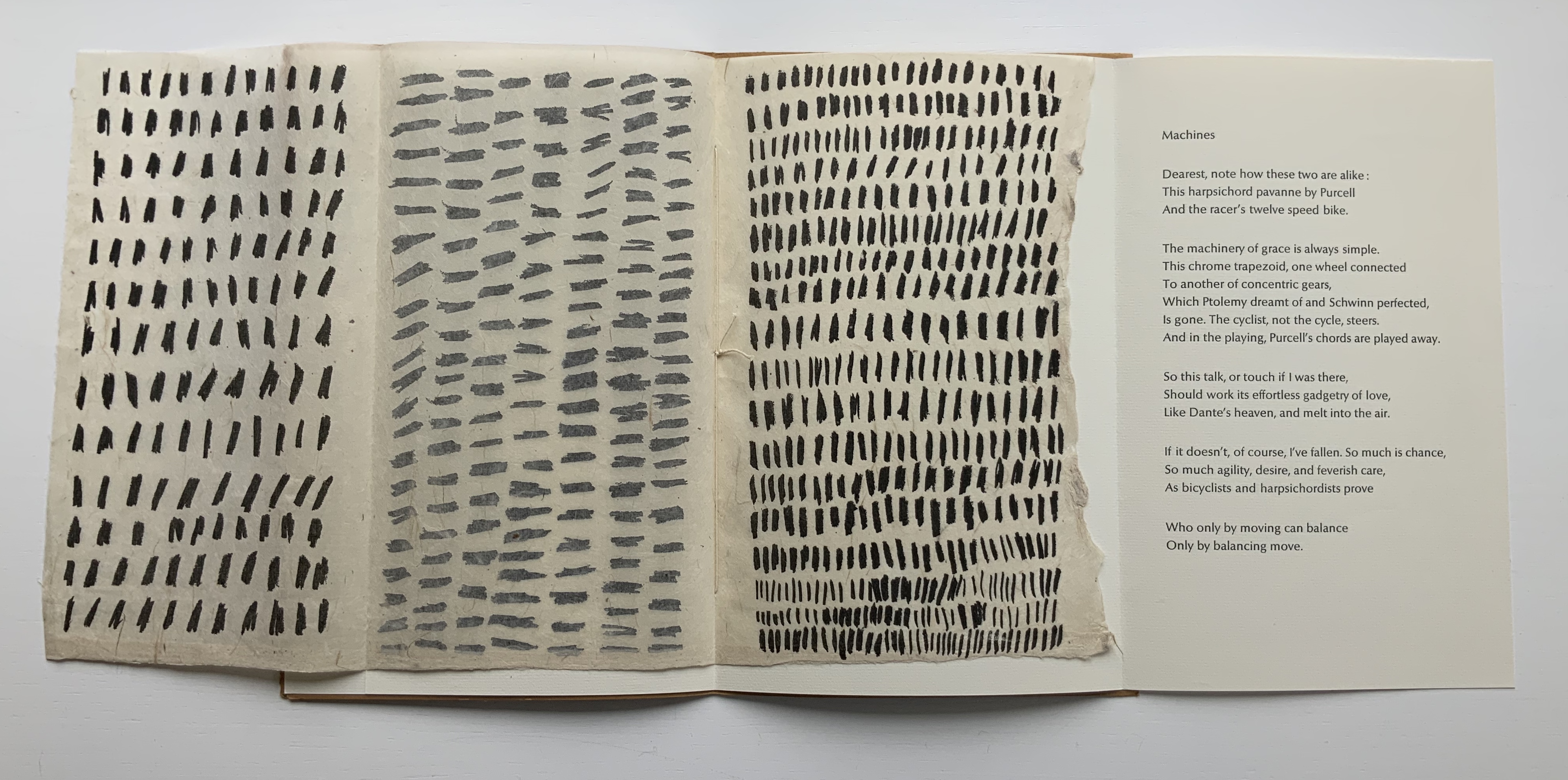
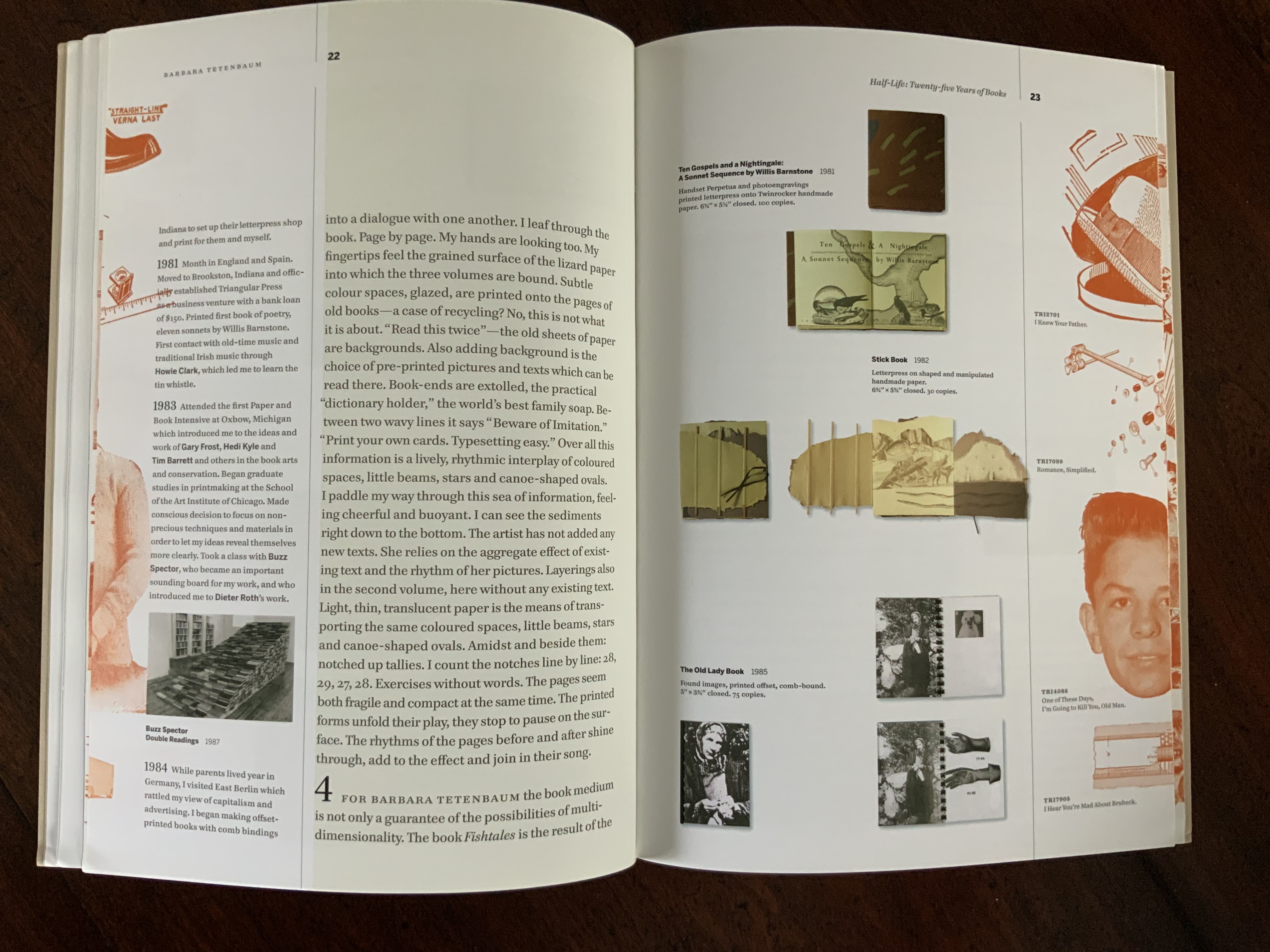
The broadside and chapbook forms seem to be both a rite of passage and a pastime of pleasure for book artists. For Tetenbaum, it has been both of these and a rite of remembrance of friendship. During Tetenbaum’s time at Circle Press, founded and run by UK artist Ron King, she reconnected with Chicago friends poet Michael Donaghy and his wife Maddy Paxman, who had moved earlier to London. Understandably taken with his poetry, she chose his “Machines” when King offered her the chance to set and print anything she liked while King and his wife were away on vacation.
The earliest of Tetenbaum’s work in this collection, the chapbook Machines (1986) pairs Donaghy’s neo-metaphysical poem with the asemic markings that Tetenbaum had begun to pursue as a technique in 1985. Taken on their own, the markings do not call to mind any particular image or metaphor in the poem. Considered more closely as a physical response to the poem, though, they do share in the poem’s building rhythm and density (see further commentary here).
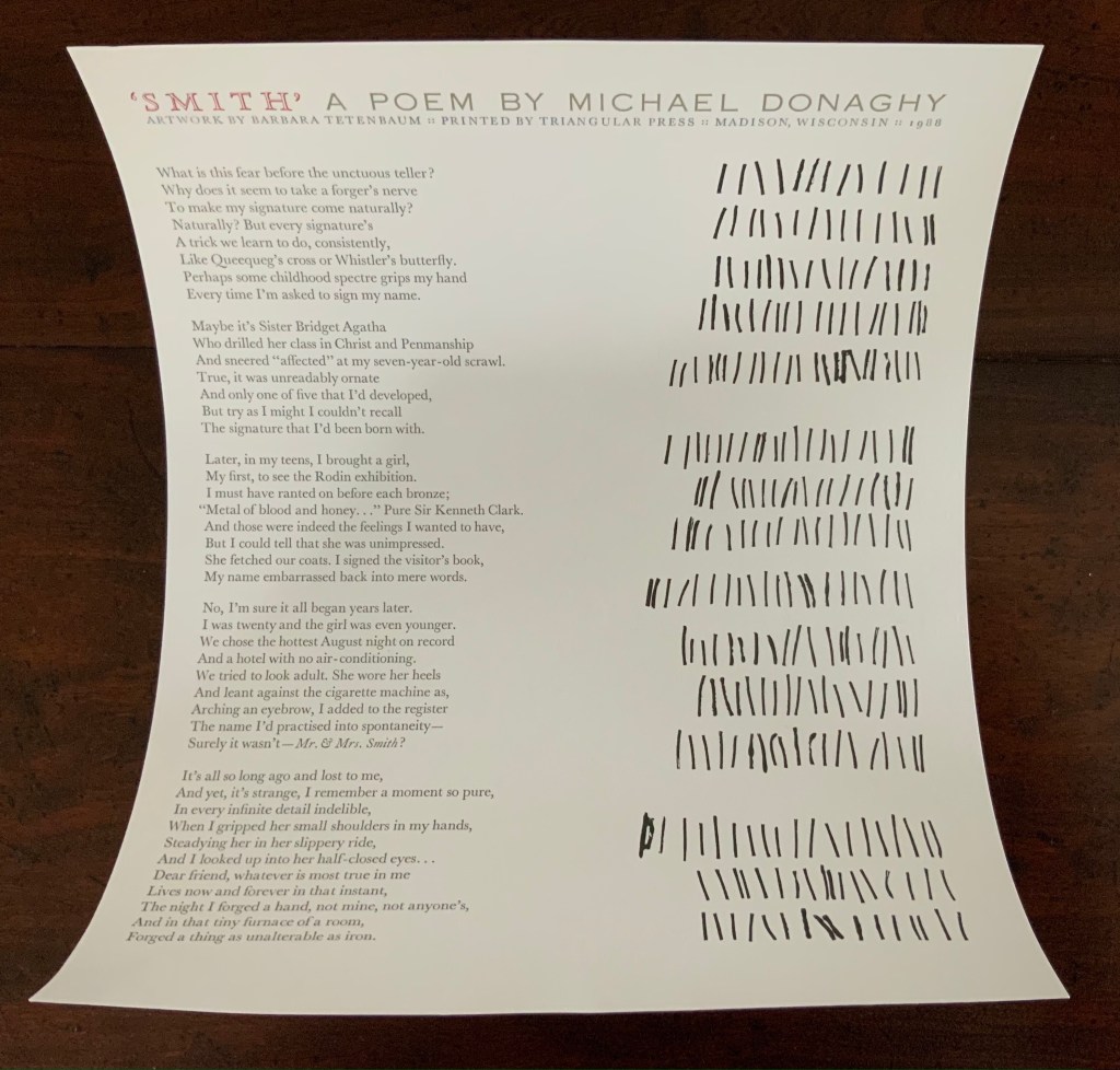
Back in the US, the artist continued with the marks and Donaghy’s words. The broadside below was the result. This time, technique, form and subject cannot avoid similarity — like a reflection in a mirror. ‘Smith’ has a regularity but looseness often found in Donaghy’s poems, something essential to their charm. The iambic pentameter is not always iambic or ten-syllabled, and the length of stanzas vary. Flush right to Donaghy’s flush left, Tetenbaum’s lines of marking mirror the poem’s ragged right and variable counts — but not precisely.
A love poem that takes off from the act of trying to remember forging a name in a hotel register for an assignation that forged something true and lasting, ‘Smith’ is about making one’s mark as artist and responding, intimately, one human to another. To transfer her marks made in response to the poem, Tetenbaum used
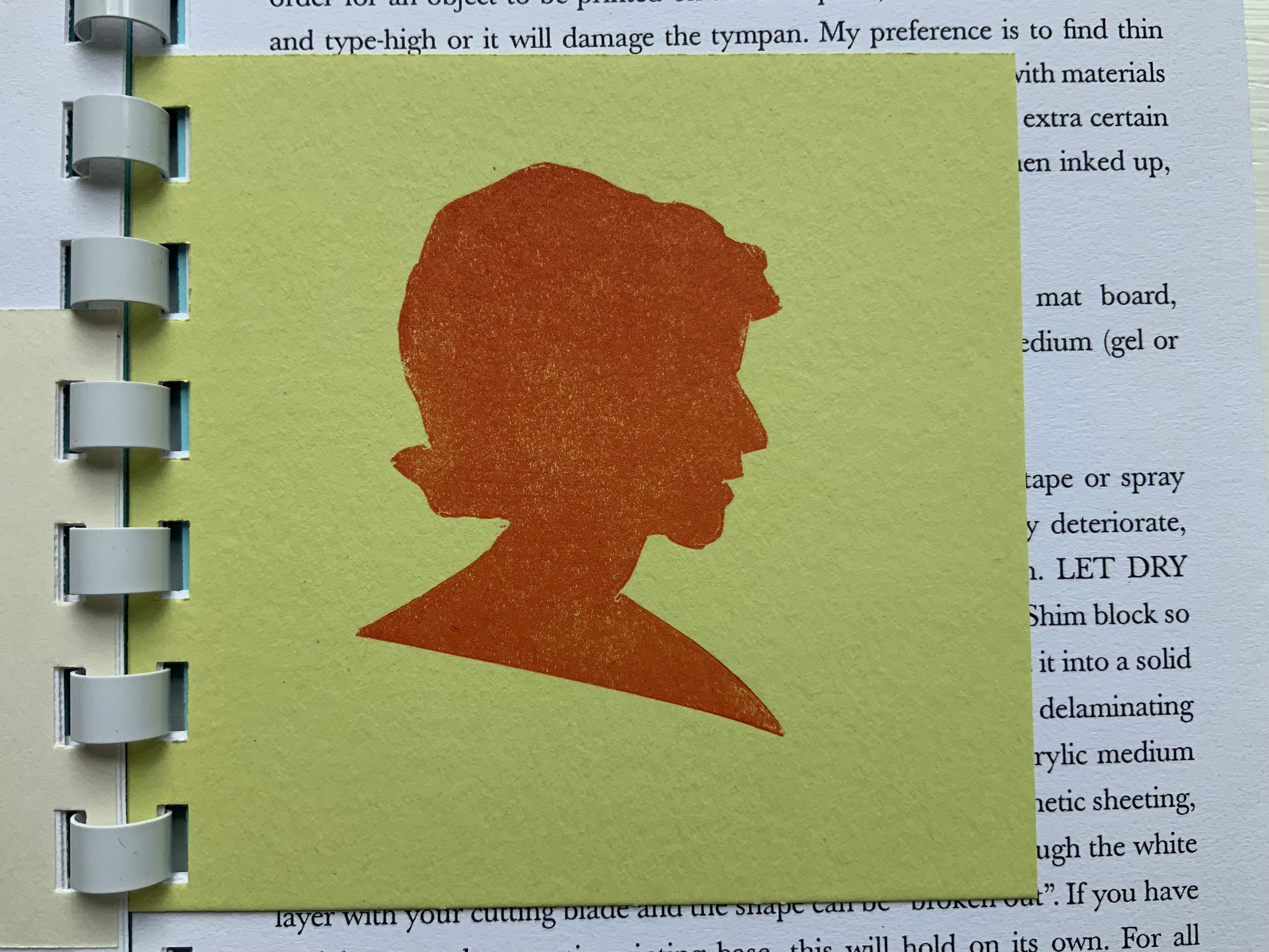
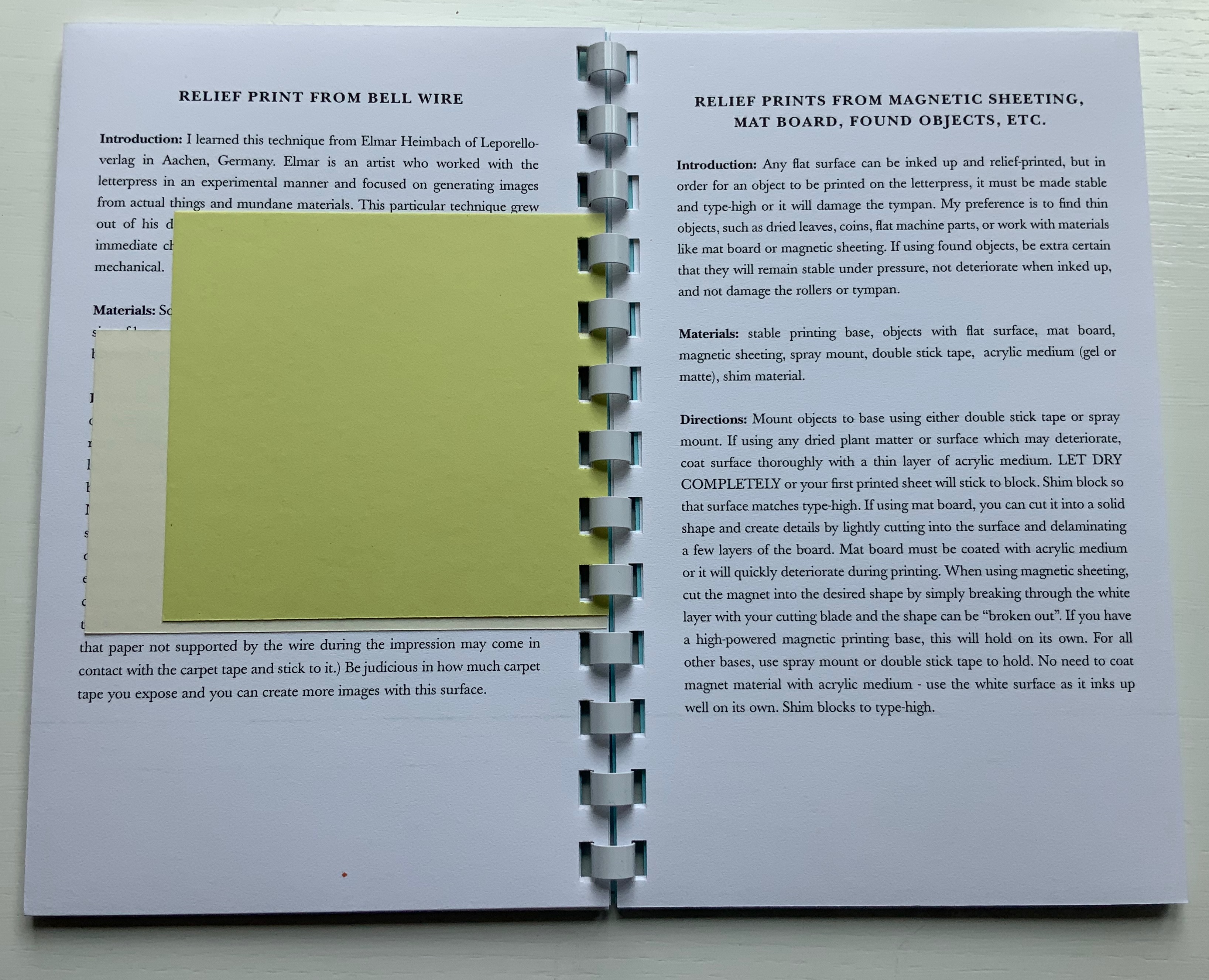
coated wire (bell wire) brought to type high on a piece of MDF covered in carpet tape to hold them in place. This is a technique I learned from Elmar Heimbach and used in a bit of the illustration in O’Ryan’s Belt. (Correspondence with artist, 21 November 2020. Link added.)
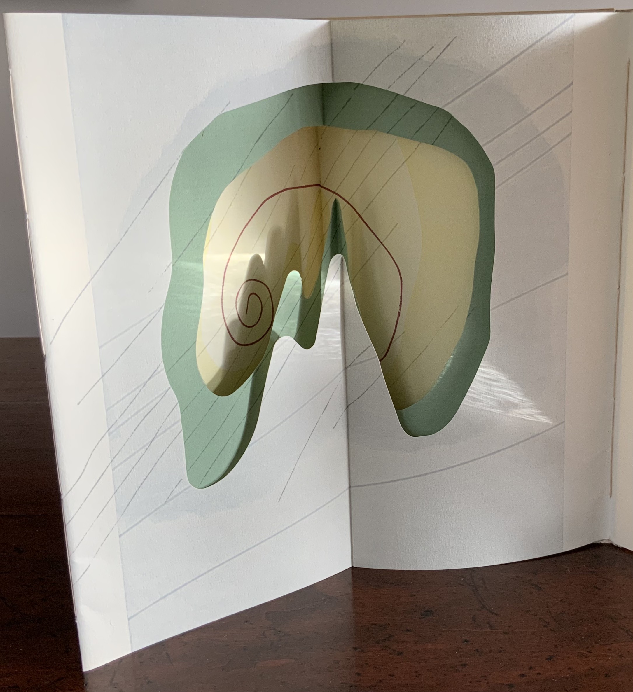
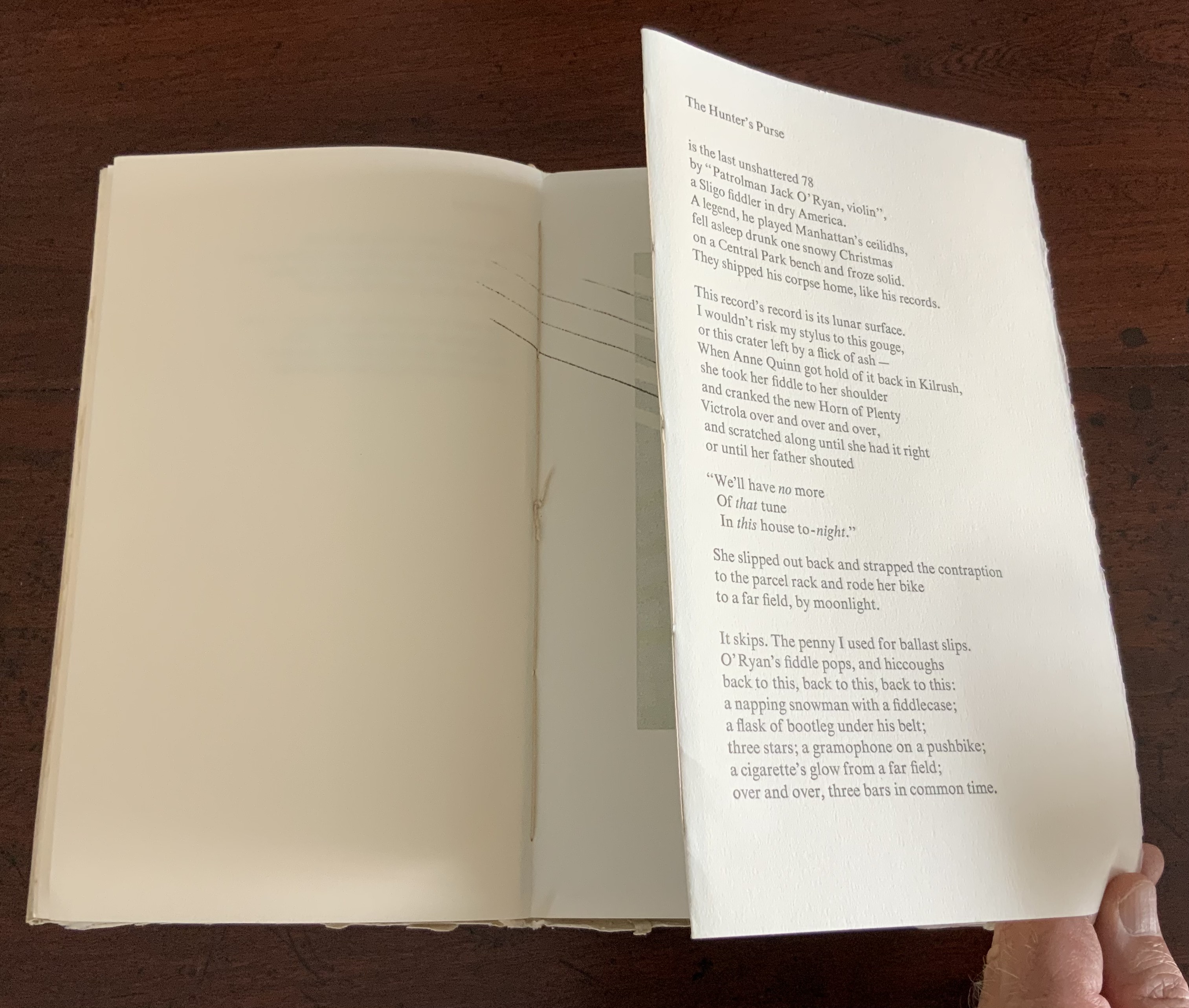
Another of Tetenbaum’s earliest chapbooks, Donaghy’s O’Ryan’s Belt (1991) foreshadows her move toward work that responds with a growing independent relationship to the text.
The spine of O’Ryan’s Belt consists of a small fold. Inside, on either side of it, is a gathering of folios. The two sets of folios are sewn (belted?) together through the small fold. Each set includes a tunnel-book-like artwork of three layers. The first sits adjacent to the poem “A Spectacle”, and the second, to “The Hunter’s Purse”, a line from which the chapbook takes its name.
View of the “internal spine”, an inward fold of the cover creating a tab to which signatures on either side are sewn.
View of the tunnel-book image adjacent to “A Spectacle”
The colophon explains that stencils, string and other found objects were used to print the illustrations. Note how the artworks’ lines cross the pages but not into the space of their adjacent poems. It’s as if the artwork is asserting a claim — this is a part of, but apart from; or this is apart from, but a part of. The images created by the artwork seem more related to “A Spectacle” than “The Hunter’s Purse”. Both artworks capture the idea of the image started by the lines “The shape of man, a shadow on the ground,/ Returns a mirror image from pondwater.” As the poem proceeds, we see through the shadow/mirror image to the objects and gravel at the bottom of the pool. Hinting at stalactites or stalagmites as well as the layers reflected on and beneath the water, the first paper sculpture makes sure we recognize the poet’s shadow boxing here with Plato’s cave.
So snugly fitted to the structure, the artwork seems to be waiting to surprise the reader.
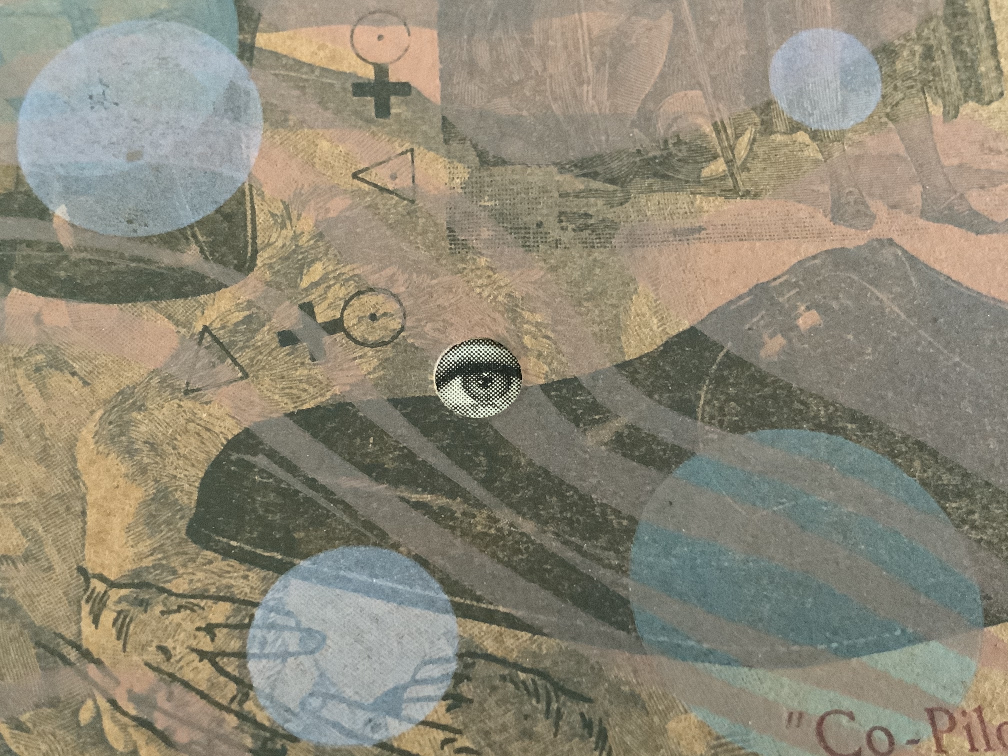
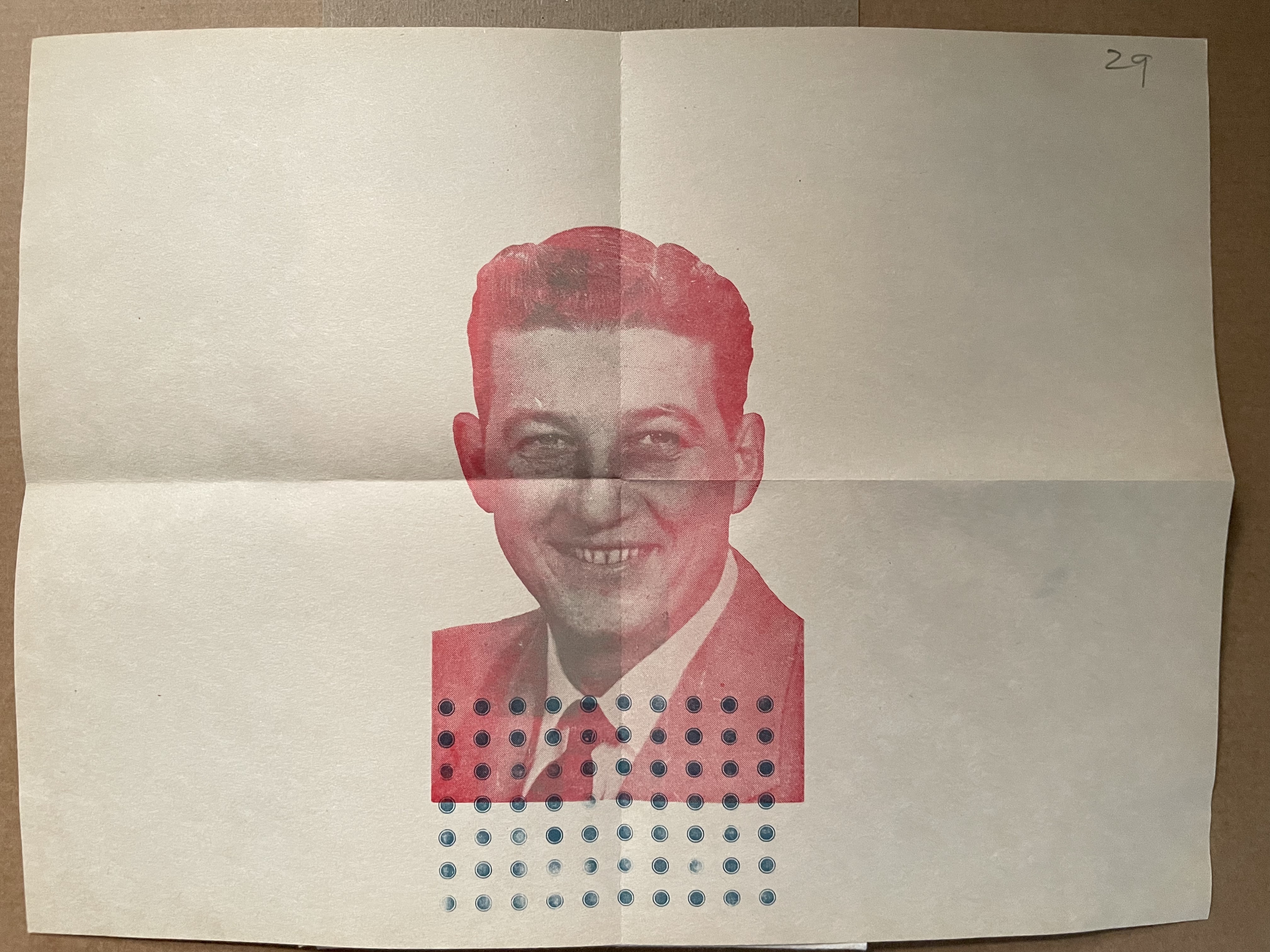
The broadside Co-Pilot extends this structurally interpretive technique. The poem “Co Pilot” (no hyphen in the original) hilariously turns the speaker’s conscience into a parrot on his shoulder, “a tiny Charlton Heston” squawking the Ten Commandments. But there is no parrot, no Charlton Heston, no Ten Commandments in the broadside’s artwork beneath the typeset poem.
There is, however, an eye peeking from four holes scattered among bubble-like transparent circles printed over a collage of images and texts from newspapers, health and housekeeping guides (from the Fifties?), history books, clothing ads and prayer cards. Are the eyes the conscience in bubbles beneath the surface of a clear punch bowl? Are those images the compromised and socially mundane background noise of the party?
The collage comes from a large photoengraved block, originally made for a tiny book, Collage Book #3 (see below). This may explain the viewer’s urge to turn the broadside upside down to examine the image: it’s an imposition of the unfolded, uncut pages of that book (correspondence with the artist, 21 November 2020).
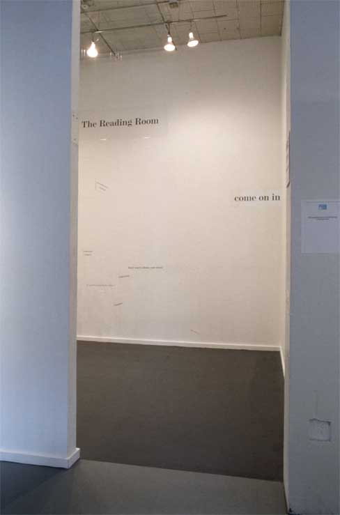
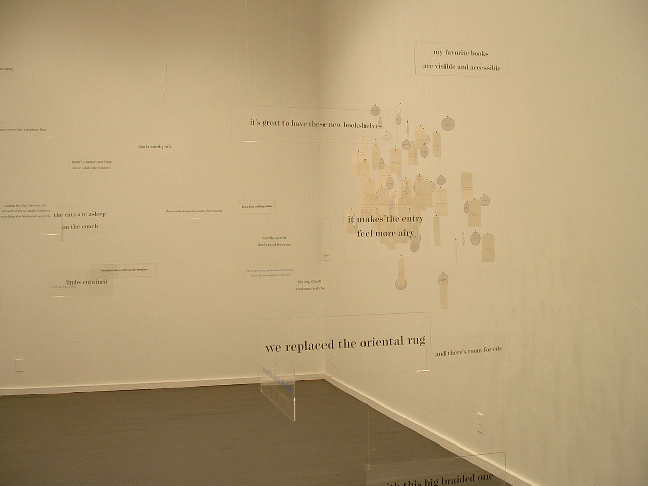
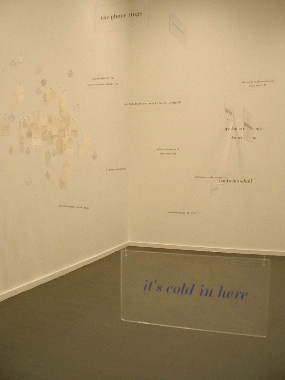
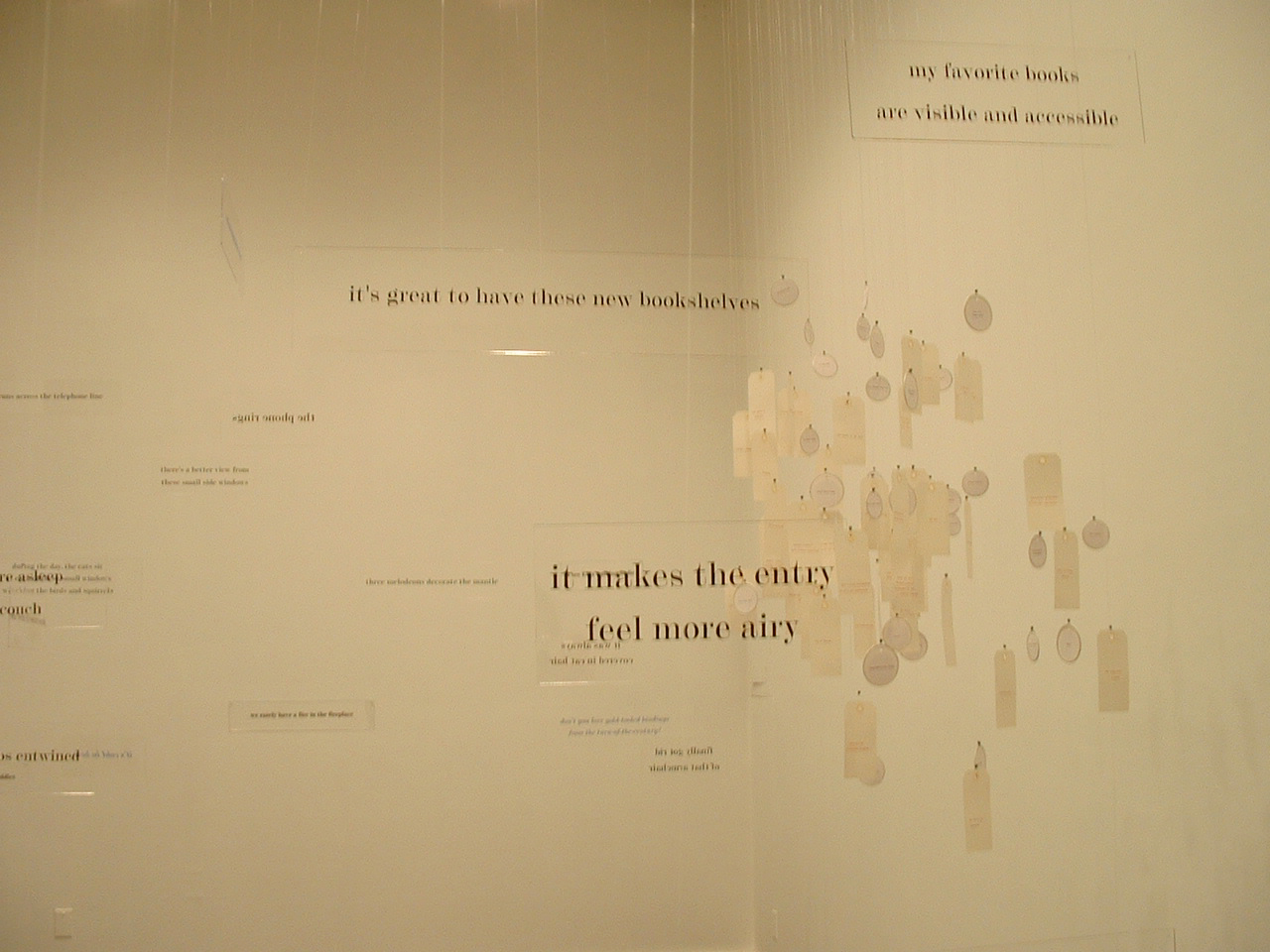
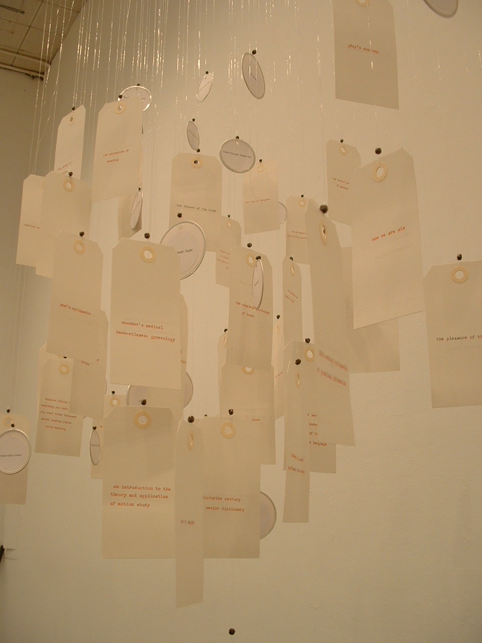
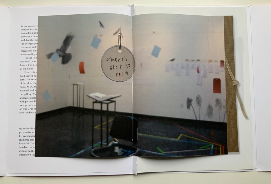
Not strictly a work in the collection, the installation The Reading Room (2002) should be mentioned here — not merely because it occurred the same year as Co-Pilot but also because it is a reminder of a constant theme and a harbinger of other installations to come. Thin slabs of plexiglas bearing text in black serif type hang at angles to one another from clear fishing line. The words, phrases and sentences suspended in air are drawn from a short story composed by Tetenbaum; they are what make The Reading Room a room for reading. That’s almost all there is to do in it. If, as Anthony Powell’s character Lindsay Bagshaw says, “Books do furnish a room”, Tetenbaum’s installation proves, “Words do furnish a room”. What reading is, can or might be is that constant theme in the artist’s works — whether evoked by asemic markings, a walk through the words of a story, a “map of reading” or a “diagram of wind”.
The Reading Room (2002) Barbara Tetenbaum Installation at Nine Gallery, Portland, OR, December 2002. Photos: Courtesy of the artist.
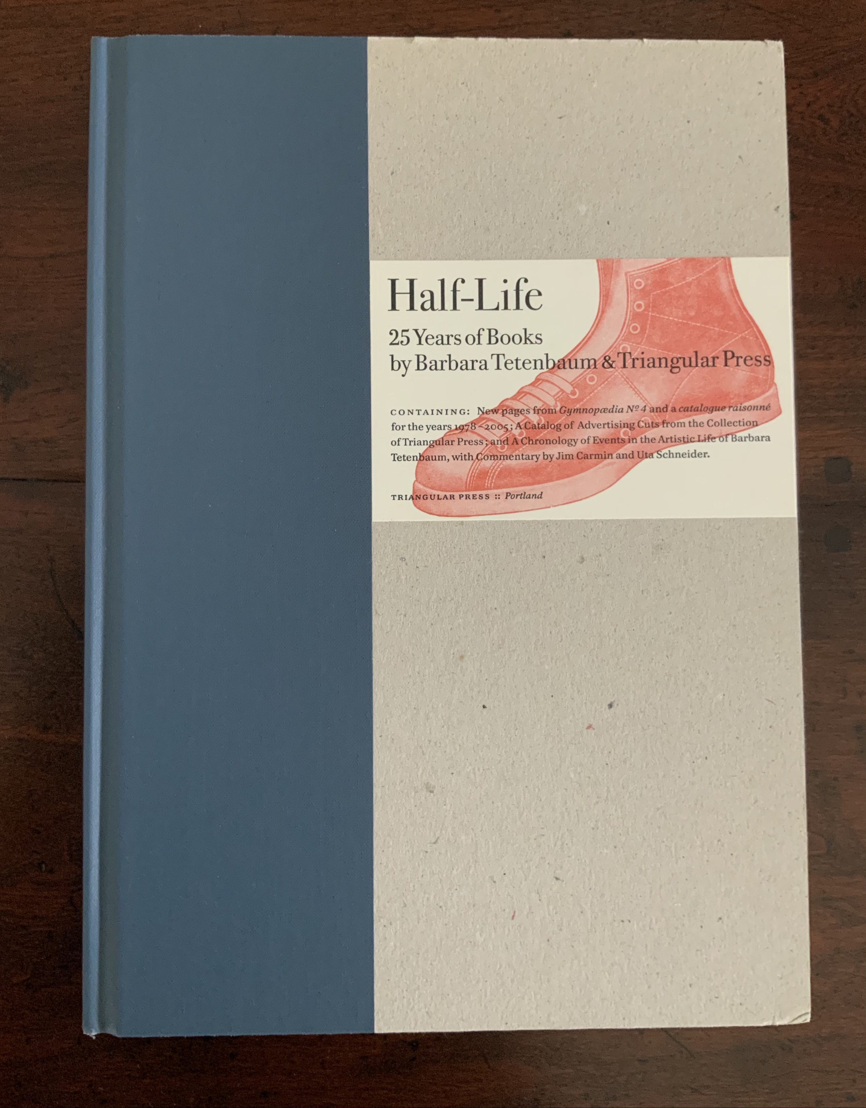
Half-Life (2005) is the collection’s representative codex by Tetenbaum. A catalogue raisonné for works between 1978 and 2005, with a chronology of the artist’s life and an appreciation of her work from Uta Schneider, the book reveals several of the influences on Tetenbaum’s development, including Ron King (as noted above) and Walter Hamady (evident particularly in the Co-Pilot broadside). Tetenbaum is generous in her collaborations and acknowledgments. Although closer to a fine press edition than anything produced by Dick Higgins, Half-Life notes in its colophon the influence of his FOEW&OMBWHNW (New York: Something Else Press, 1969).
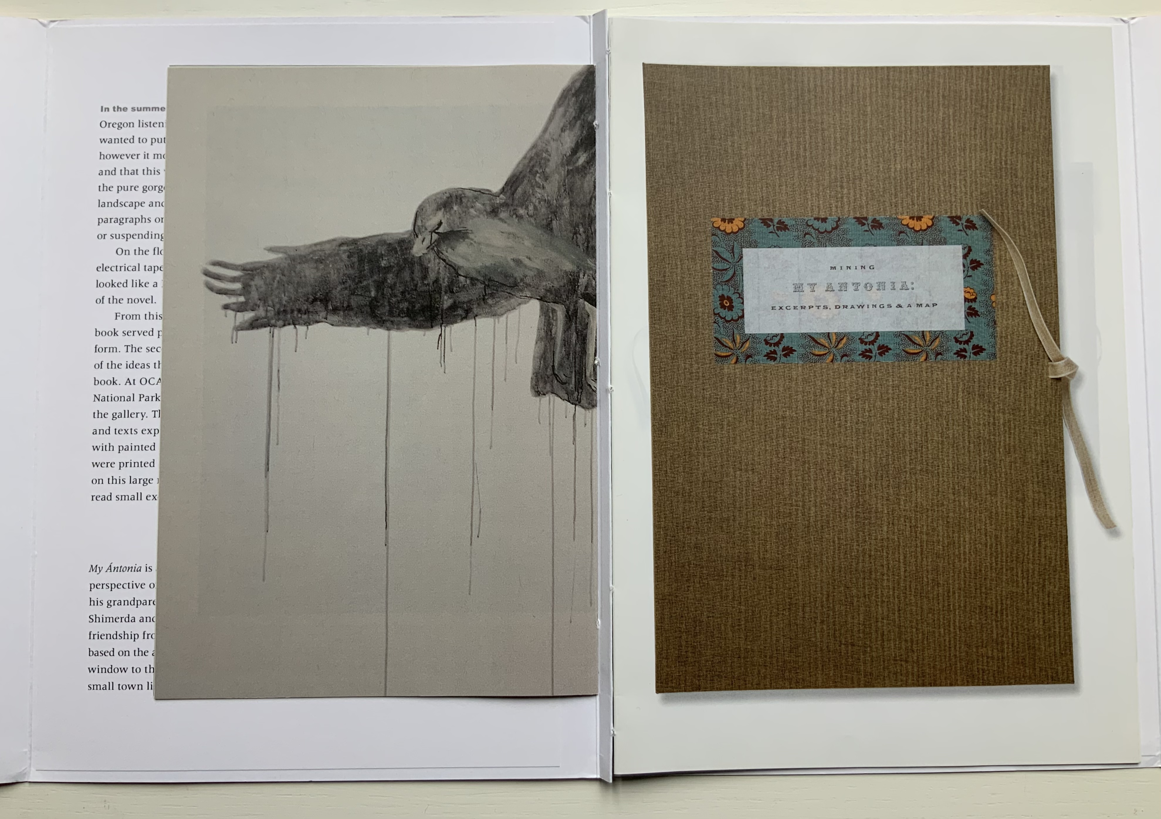
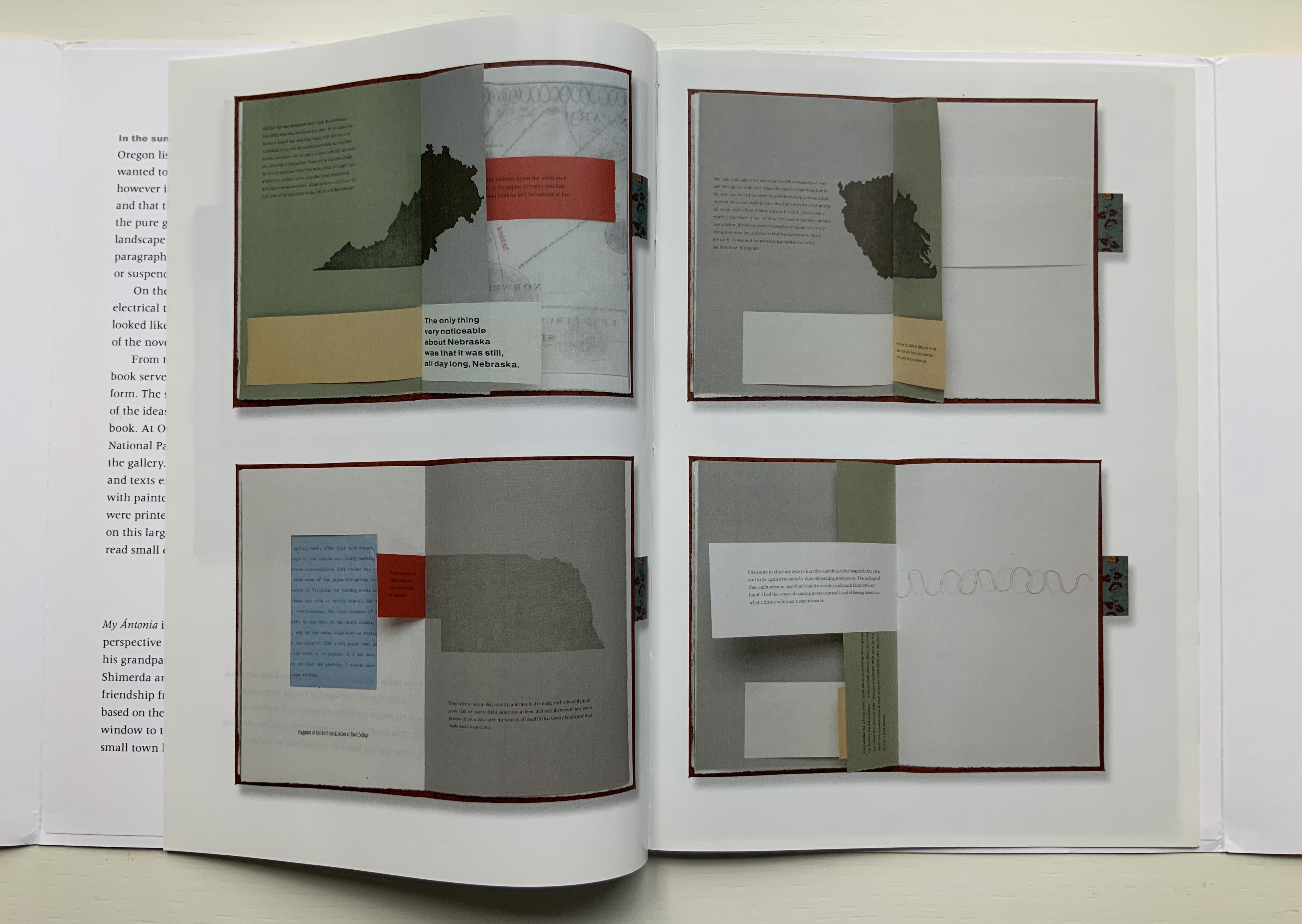
For a body of work realized after Half-Life, Tetenbaum spent a month in a gallery listening to a recording of Willa Cather’s 1918 novel, My Ántonia. The result was two installations and two publications: a catalogue called A Close Read: My Ántonia (2010) and an “artist’s book” or “bookwork” called Mining My Ántonia: Excerpts, Drawings, and a Map (2012). The collection currently includes only the map and the catalogue. Some work in this category of “response to literary material” can be primarily craftwork — as in those well-known narrative scenes sculpted from the pages of the book in question. Other responses to books — including altered books — stand as works of art yielding depths of meaning and aesthetic response on their own.
Of course, the antecedent to this in literature is called ekphrasis. W.H. Auden’s ekphrastic poem Musée des Beaux Arts stands on its own — though with — Breughel’s Landscape with the Fall of Icarus. Even more so Keats’ Ode on a Grecian Urn stands on its own; the urn described is unknown. Tetenbaum’s direction of ekphrasis is inverse to that of Auden and Keats. The artwork comes after the literary expression. Nevertheless, her inversely ekphrastic artwork Mining My Ántonia stands on its own — though with — Cather’s My Ántonia.
A Close Read: The Cather Projects (2012) Barbara Tetenbaum and Jennifer Viviano Catalogue with three inserts sewn to folded card, published by Oregon Arts Commission. Photos: Books On Books Collection, displayed with permission of the artist.
For the collection, the map has been framed between two sheets of glass to make enjoyment of its translucent paper a daily possibility. Each time the catalogue is opened, its binding harks back to O’Ryan’s Belt (see above). Three inserts of different trim sizes are sewn into the central inwardly folded tab.
The first insert provides details from the 2010 installation; the double-page spread below recalls the dangling tags from The Reading Room (2002). The second insert shows images of the artist book Mining My Ántonia and details from the second installation in the Hoffman Gallery at Oregon College of Art and Craft (2012); an image of the map from Mining My Ántonia: Excerpts, Drawings, and a Map is shown at the start of this entry. The third insert is a 14-page pamphlet from Nathalia King, Professor of English and Humanities at Reed College where the first installation occurred.
Put aside — difficult as it may be — the play of craft and art so plainly suffusing the print, paper and binding of the catalog and artist book, what are their relation to the text that drove them? Is it like making a “movie of the book”? Are we looking at some new form of literary/artistic criticism? As Nathalia King’s essay walks us through the installation, she points out how it teaches the viewer to read My Ántonia in multiple ways. To what degree, though, can we appreciate Tetenbaum’s book art or installations without having read My Ántonia? They certainly inspire the reader/viewer to read or re-read the work. But inevitably this reader/viewer is drawn back to enjoying Tetenbaum’s “making the novel her own” (as in the pun on mining). As with all book art, the more informed we are about the “material” of which it is made, the greater the enjoyment. We want to make such a work our own — to mine it — which may send us back to multiple quarries from which the artist drew her material. Cather’s novel is not the only material of which Mining My Ántonia is made. It is made of the artist’s experience of the novel in print, the novel as read aloud and the exterior/interior space in which that occurred. It is made of various papers, tabs, reveals and media. The artist book offers a solitary way of ”material reading”, but with the catalogue, it also offers a glimpse at the ambulatory and perhaps social way of reading offered in the installations.
Willa Cather’s Prairie, Nebraska (Photo credit: Ross Griff)
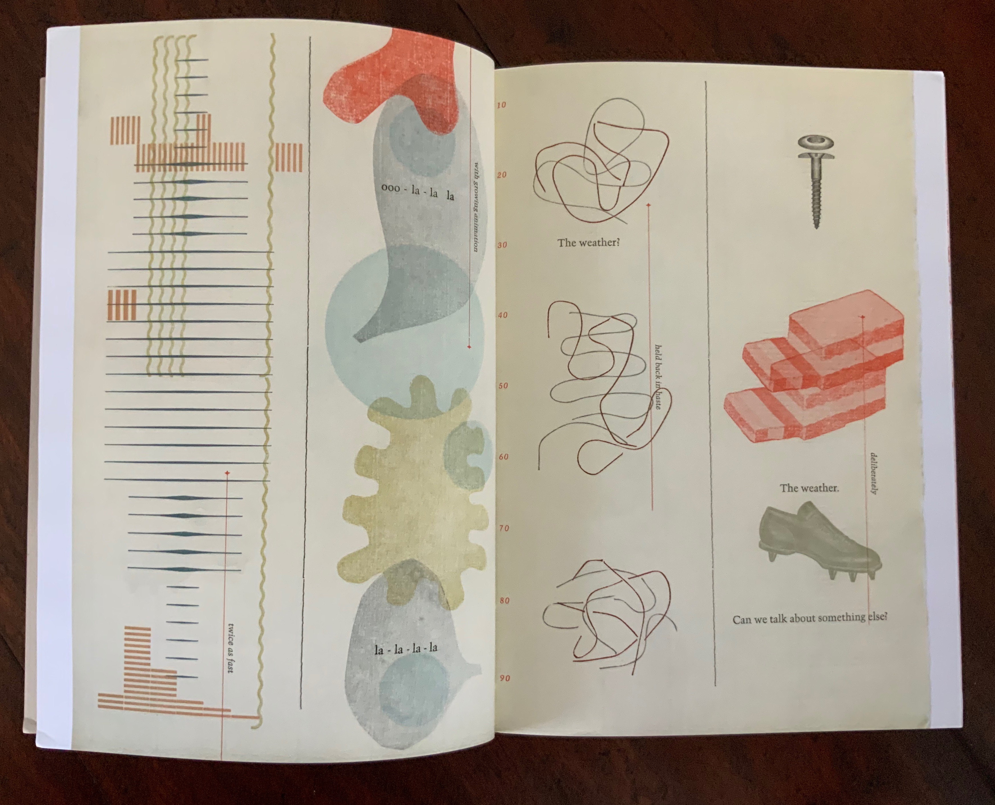
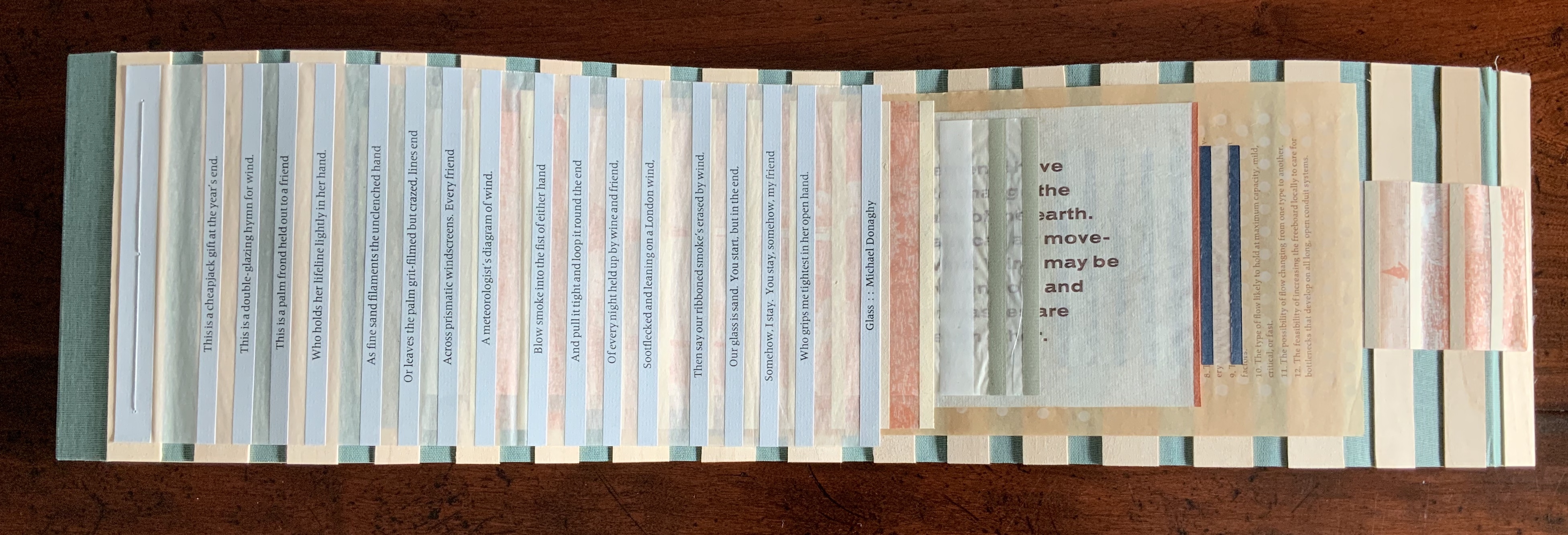
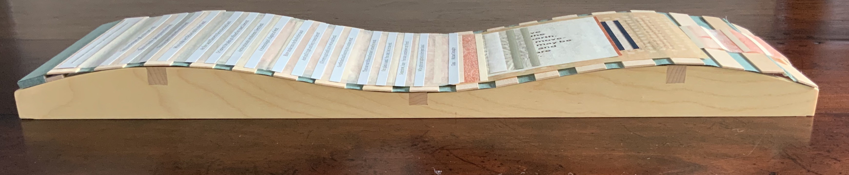
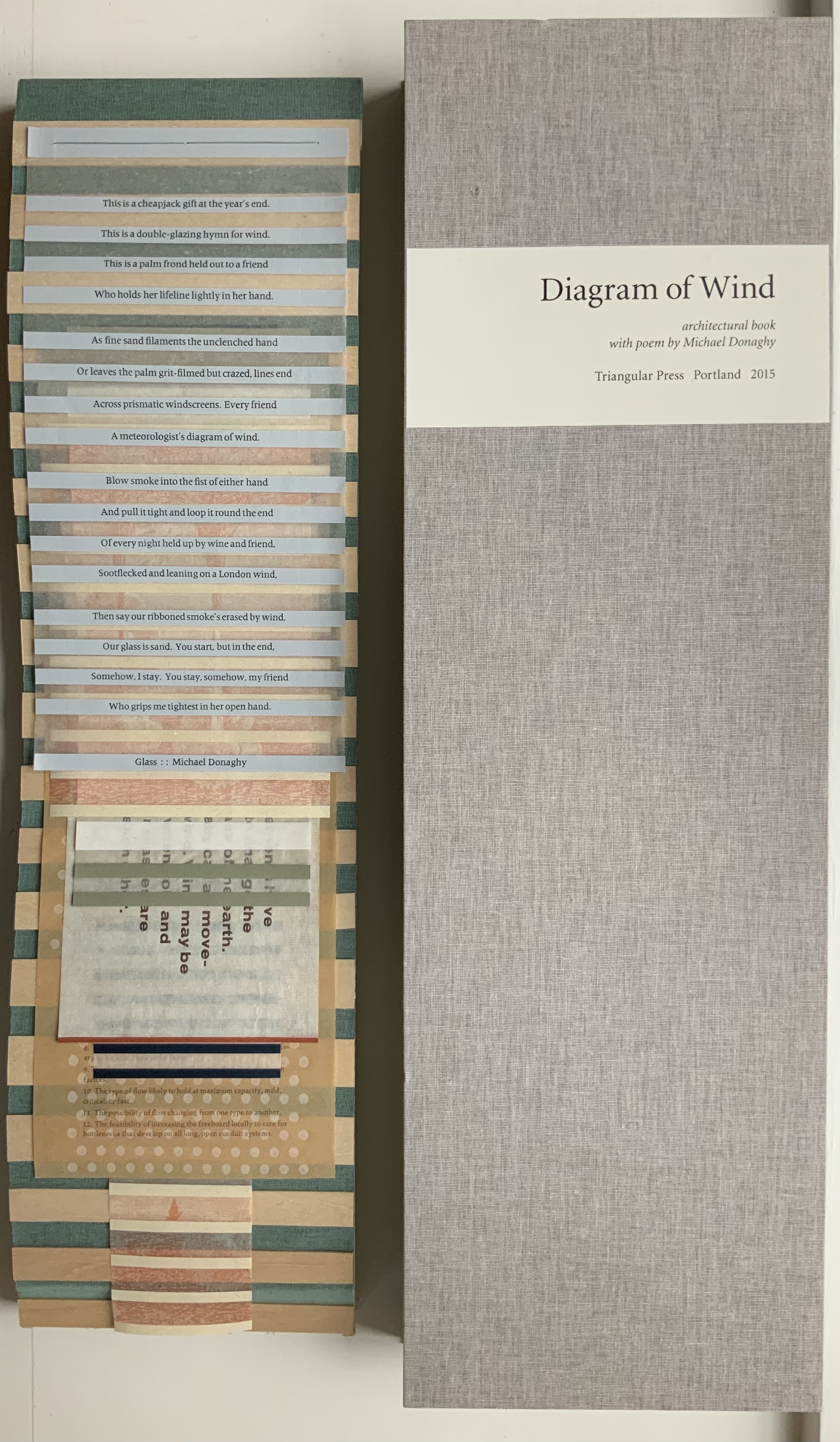
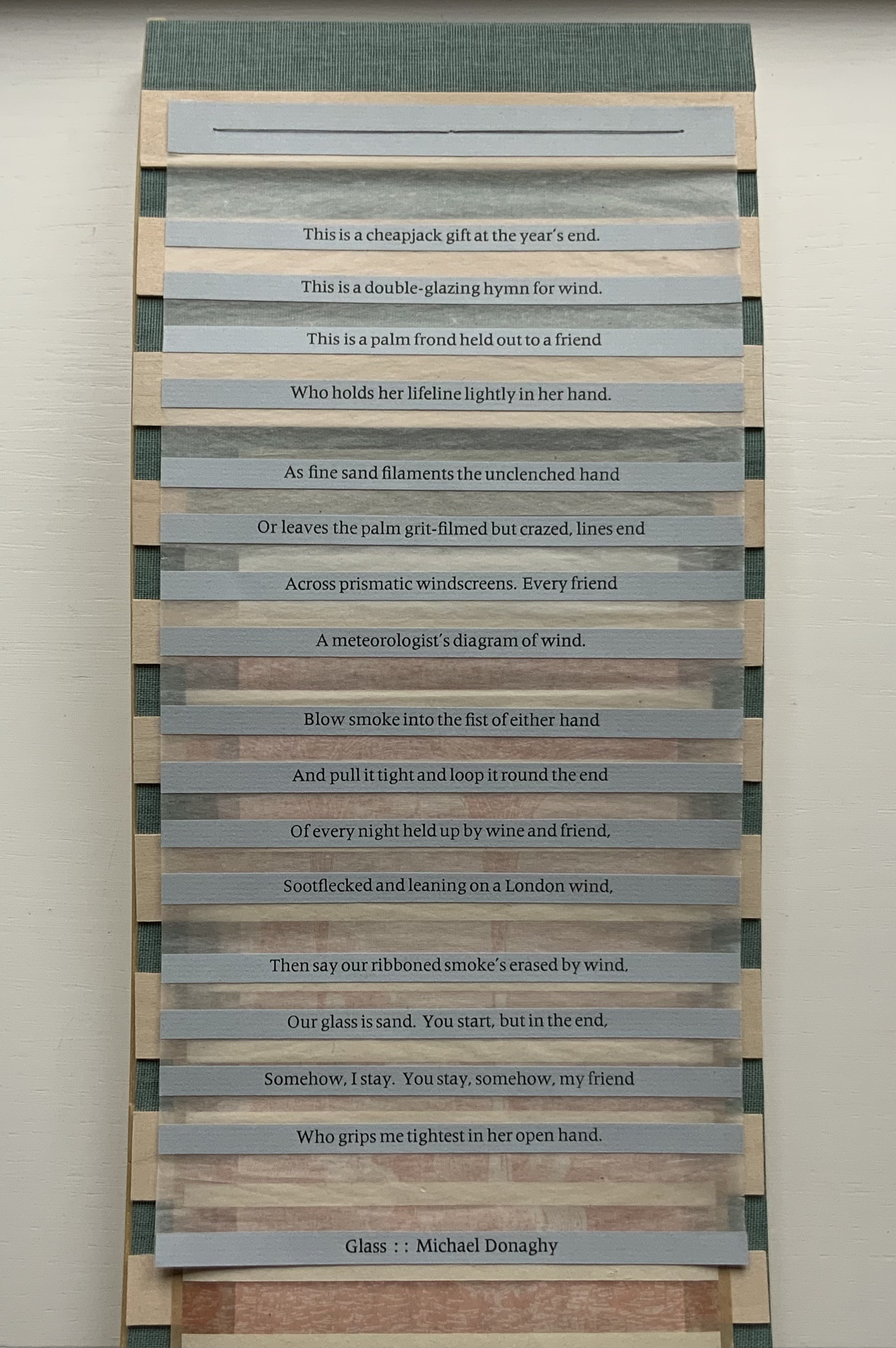
Also offering a different way of reading, Diagram of Wind (2015) pulls further away from its responding point than Mining My Ántonia. A line in Donaghy’s poem “Glass” provides the title for this sculptural work, and the work’s structure draws on the poem’s sestina form in its undulating, layering structure. Yet Diagram of Wind goes far beyond that.
There are seven “pages” to this work, each sewn to green book cloth panelled with wooden slats and backed with gampi. The first page carries Donaghy’s sestina, each line letterpress printed on a strip of paper pasted to gampi paper. Less wide than the sestina page and shorter than the third, the second page shows an etching image of waterspouts rising from a body of water with mountains in the background. Less wide than the second page and shorter than the fourth, the third page consists of narrow, evenly sized white strips of paper pasted on gampi. The fourth page, slightly wider than the preceding page but still shorter than the following, offers the school-book-like statements:
Air movements have
helped to change the
whole face of the earth.
We usually call air move-
ments wind. Wind may be
started when cold and
warm air masses are
next to each other.
Suddenly much less wide than the fourth page but still shorter than the sixth, the fifth page presents narrow dark panels or strips that narrow in themselves and narrow the space between them as they descend the page. Much wider than the preceding page, shorter than the seventh and printed with blue and white dots reminiscent of Co Pilot (above), the sixth page gives guidance on determining the amount of space to leave between the top of a flume (an engineering structure for measuring water flow) and the height of the water moving through it. The narrowest page of all and ending flush with the slatted backing, the seventh page shows a print similar to that on page two, but here between the evenly spaced paper strips, there is a small ship in the distance and the subsiding whirlpool and withdrawing upper part of a waterspout in the foreground.
The poem that inspired this work uses images of the natural world — sand, smoke, wind — to build its metaphor of love’s paradox (its holding fast with an open hand). Humanity is in the foreground, nature in the background. Tetenbaum’s Diagram of Wind reverses that. Nature with its air movements and waterspouts move into the foreground. Then humanity with its controlling and measuring flume comes into the middle ground. And finally it ends with humanity’s ship on the horizon and nature’s dissipating waterspout in the foreground. Even though by virtue of its page one position the poem is in the foreground, it has become as much “material” for the artwork as the paper, ink, wood, cloth, earthy colors and physical structure are. The artist has transformed the poem’s sestina shape, its use of nature and its paradox into “material” for Diagram of Wind. In this instance of inverse ekphrasis, Tetenbaum has created a work that stands independently of, and in dependence on, its literary inspiration.
An early guidebook and two of Tetenbaum’s non-ekphrastic works, one early and one late, are in the collection: Paper Art, the third publication under her Triangular Press imprint, and Collage Book #6.
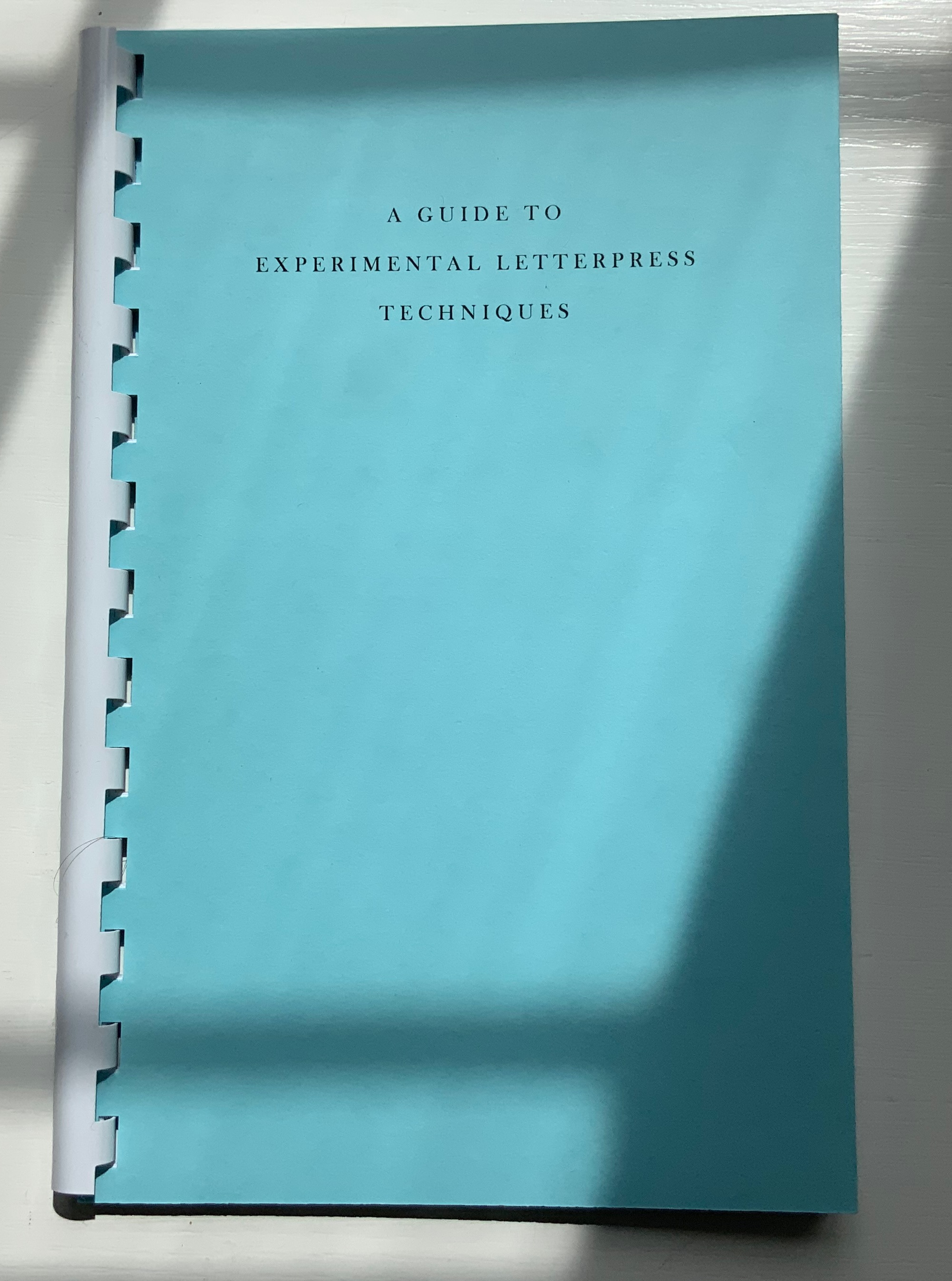
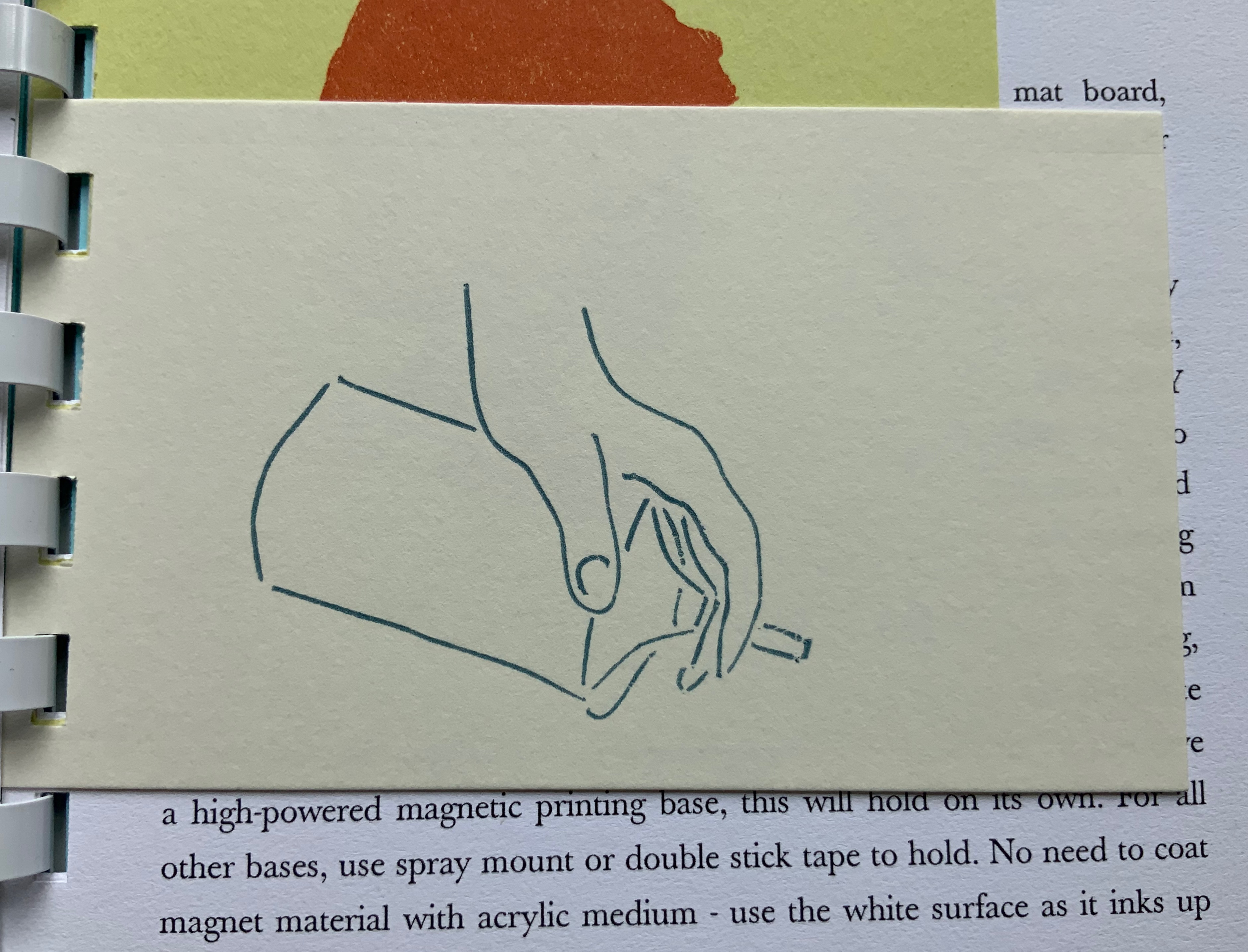
A Guide to Experimental Letterpress Techniques (2004)
A Guide to Experimental Letterpress Techniques (2004) Barbara Tetenbaum Spiral-bound. H190 X W123 mm, 16 unnumbered pages, Chinese fold. Acquired from the artist, 11 April 2022. Photos: Books On Books Collection.
For a non-practitioner, instruction books like this encourage closer examination of artwork and an appreciation of the act of thinking with one’s hands.
Paper Art (1980)
Paper Art(1980) Barbara Tetenbaum “Sequential picture plane / book-like object”. String-bound container: 165 x 165 mm; Object: H135 x W145 mm, 16 unnumbered pages and one fold-out leaf. Edition of 42. Acquired from Versand-Antiquariat Konrad von Agris, 22 January 2022. Photos: Books On Books Collection. Permission to display from the artist.
“Sequential picture plane / book-like object” is the artist’s description of this work. The images come from cut paper and collage, relief printing, pen and ink, and washes. A narrative-like sequence develops involving two triangles and a community of triangles in a sort of landscape with a scribbled wilderness, parallel rivers or tracks, stars above, and moving to a boundaried community of triangles beneath a brownish wash and concluding with a double-page spread of the river or track images migrating to a final blank page.
Just as important are the binding, paper, folds and container. In its three-hole sewn deckle-edged cover, four more different kinds of paper make up the object and its images. The fold-out leaf, composed of the work’s most fragile paper, encloses the central four pages, which have the most intense concentration of images. The cutout paper rivers or tracks are attached with brown thread on either side of this fold-out leaf, which further cues us to be aware of parallel scenes. The range of papers from dense and thick to sheer and thin reminds us that parallels can present opposites: the couple and the collective, conflict and resolution, lost and found.
The container consists of the densest and darkest paper and, at one time, had a box-like shape held closed by string at its four corners. There is a barely perceptible hole in the upper left corner of the container’s cover.
The contrast between the sturdiness of the paper and the flimsiness of the string closure echoes the cut-out rivers or tracks, loosely attached by brown thread and embracing the central fold-out leaf enclosing the densest body of images. All of these material aspects suggest looking for the paradoxical in this “sequential picture plane / book-like object”.
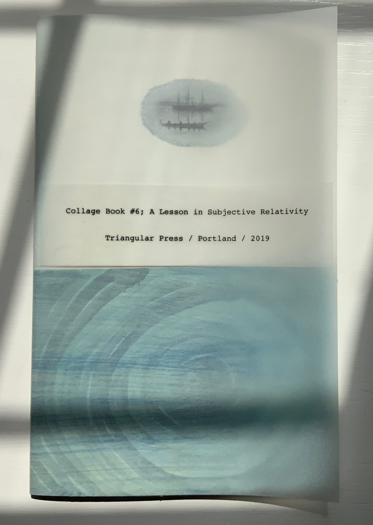
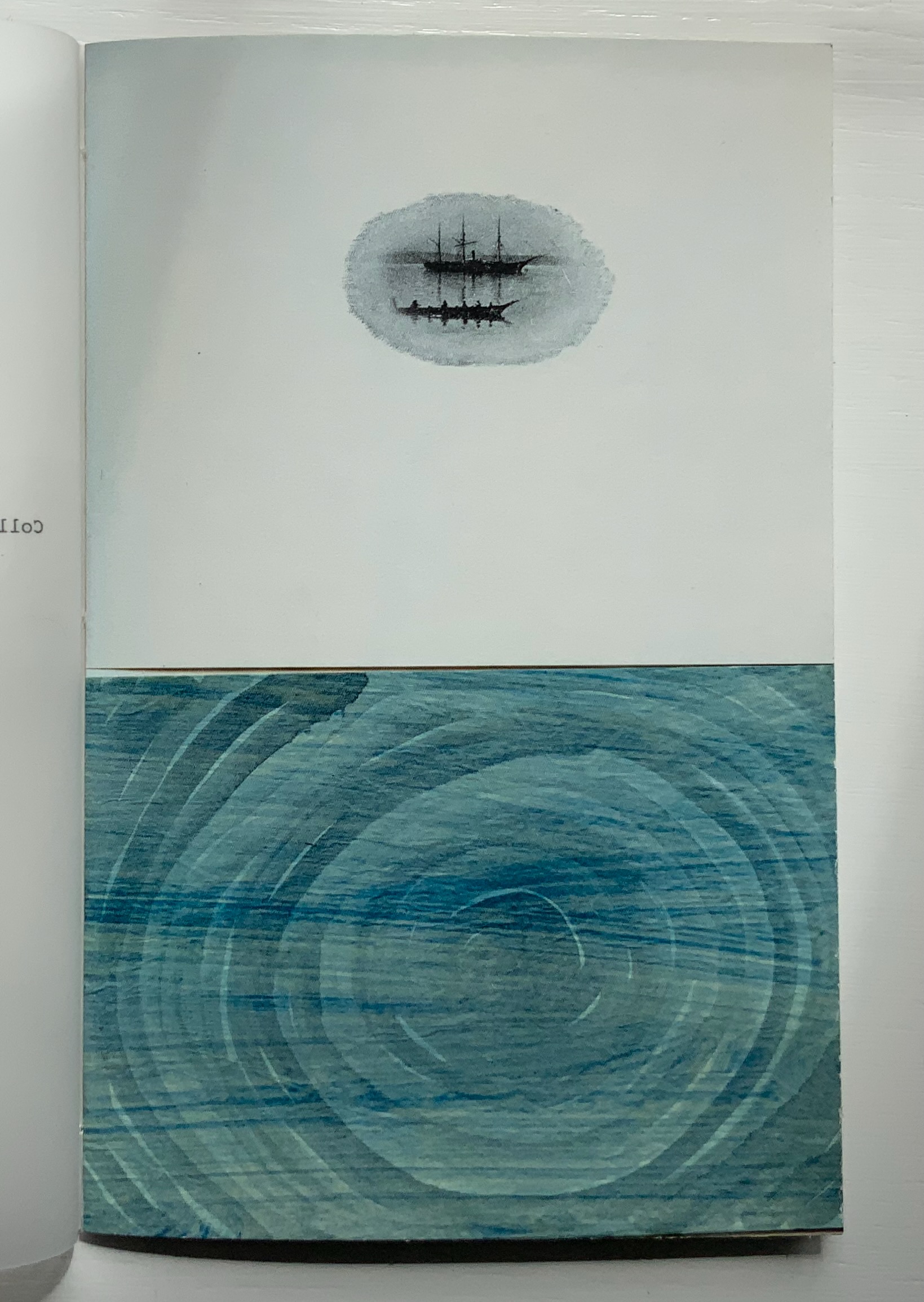
Collage Book #6: A Lesson in Subjective Relativity (2019)
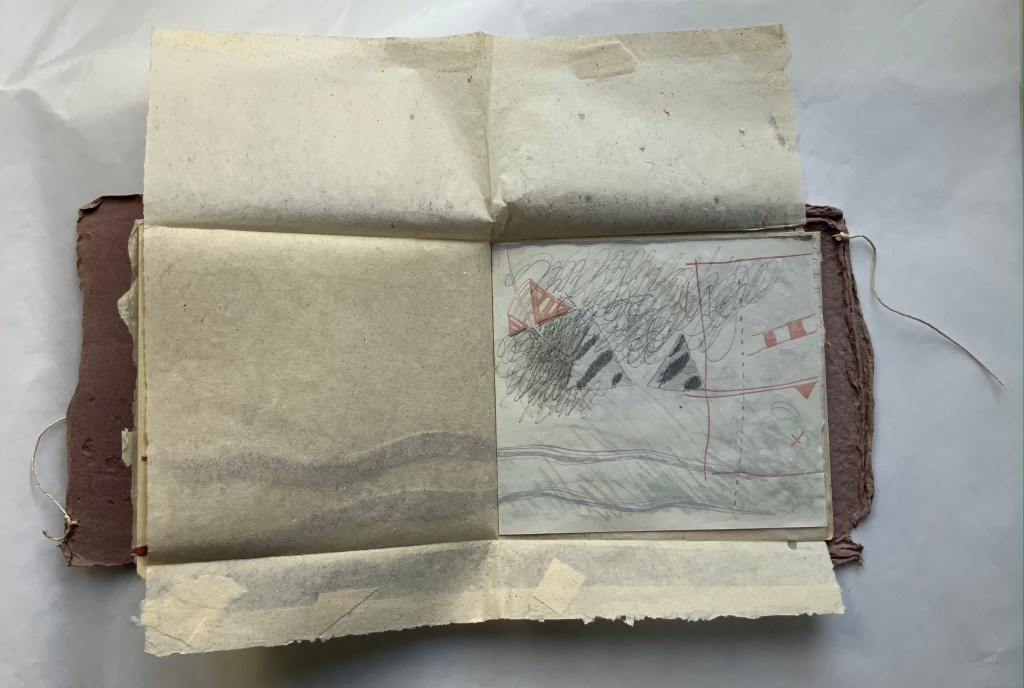
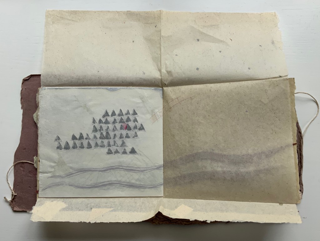
Collage Book #6: A Lesson in Subjective Relativity (2019) Barbara Tetenbaum H190 x W120 mm, 32 unnumbered pages. Acquired from the artist, 11 April 2022. Photos: Books On Books Collection.
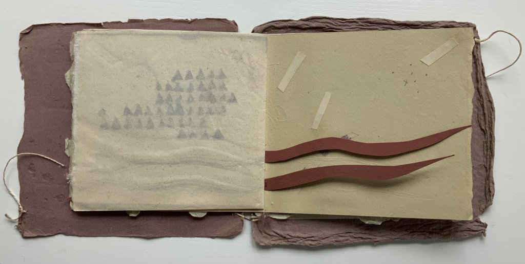
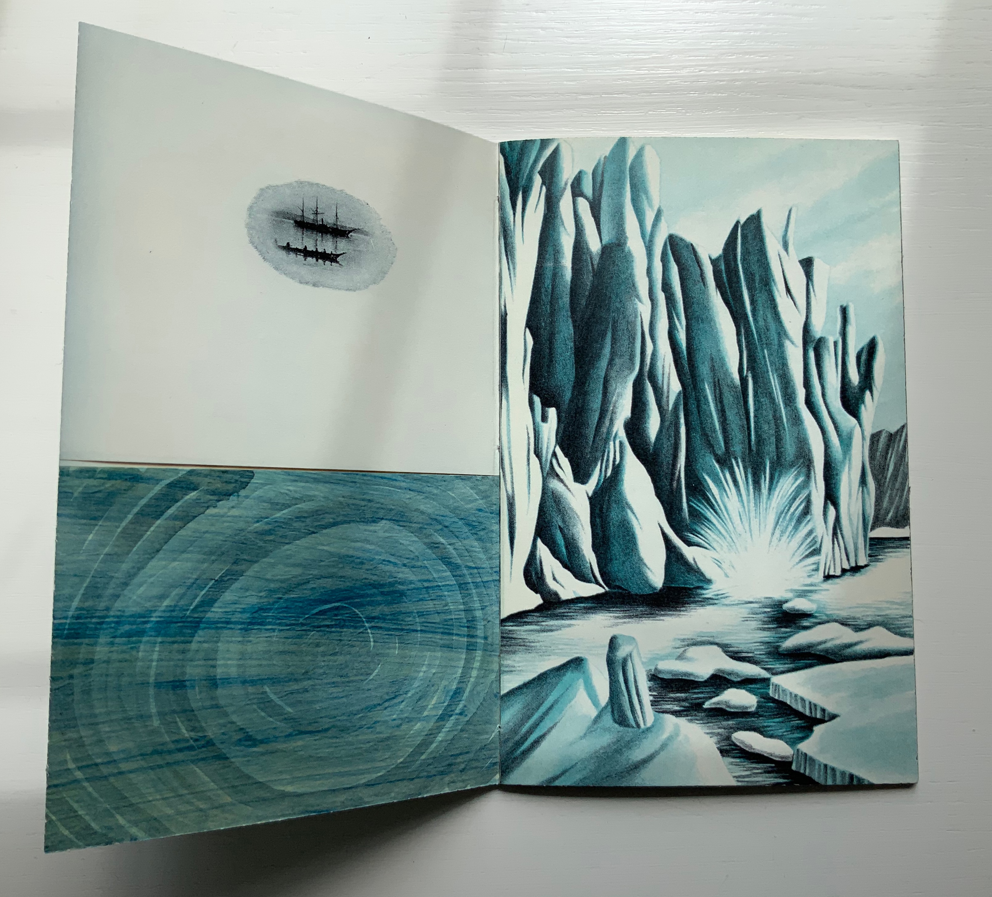
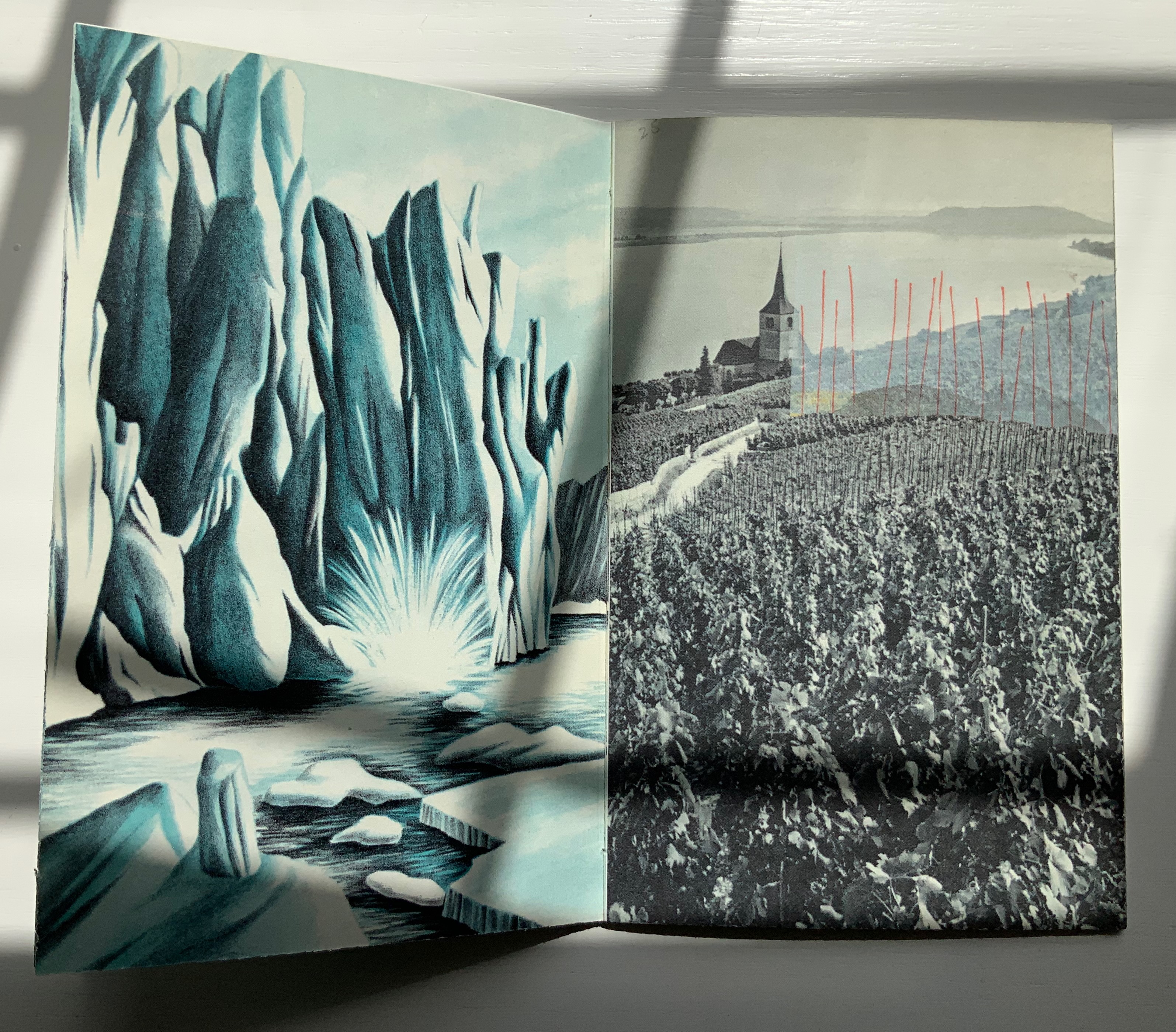
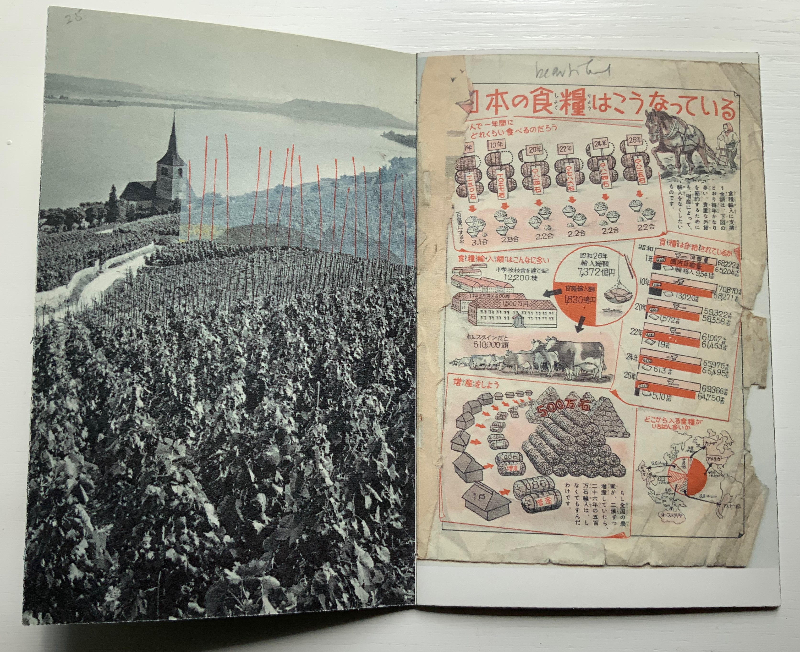
Collage Book #6 also consists of sequential picture planes, but the sequence is not narrative. Rather it is one of visual association. In an oval shape, a three-masted schooner and longboat hover over a swirling blue abyss. The image is repeated on the following verso page, which faces a full-page bleed depicting a calving iceberg or glacier in blue and white. Again, the image is repeated on the following verso page, which faces an overdrawn black-and-white image of crops along a winding road leading to a steepled building at the edge of a lake. This image, too, repeats on the verso page, and its reddish-orange overdrawn lines or stakes echo the color in the facing photo of a textbook graphic representing exports. And on it goes until the final image on the back cover echoes the initial image on the front cover (see below).
The booklet’s structure recalls that of O’Ryan’s Belt: Eleven Poems: 1990-1991 by Michael Donaghy (see above). The spine consists of inward folds of the front and back covers. Internally (see below) two sets of signatures are sewn together through the inward-folded tabs.
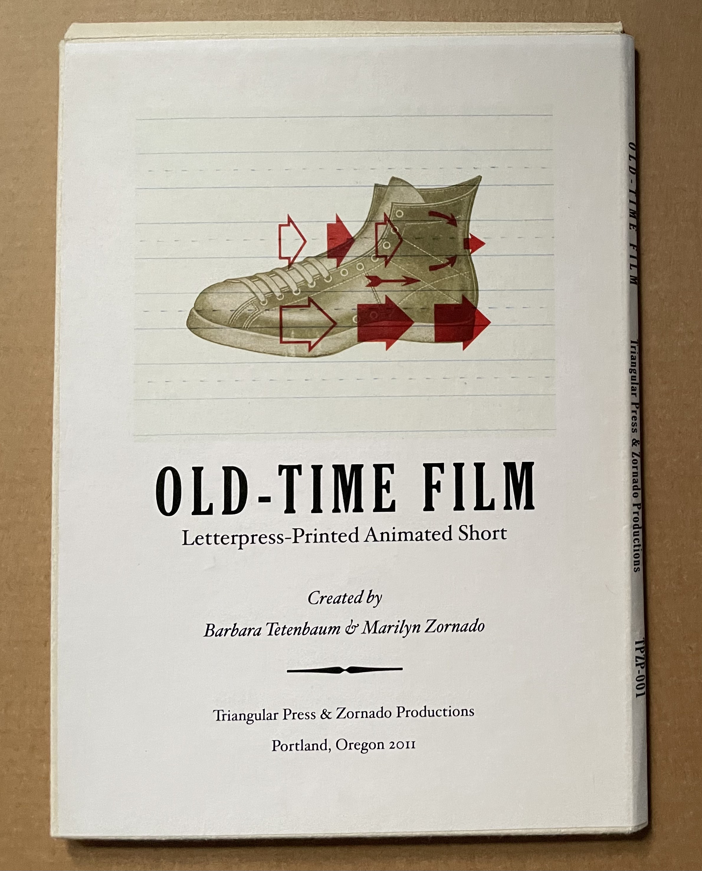
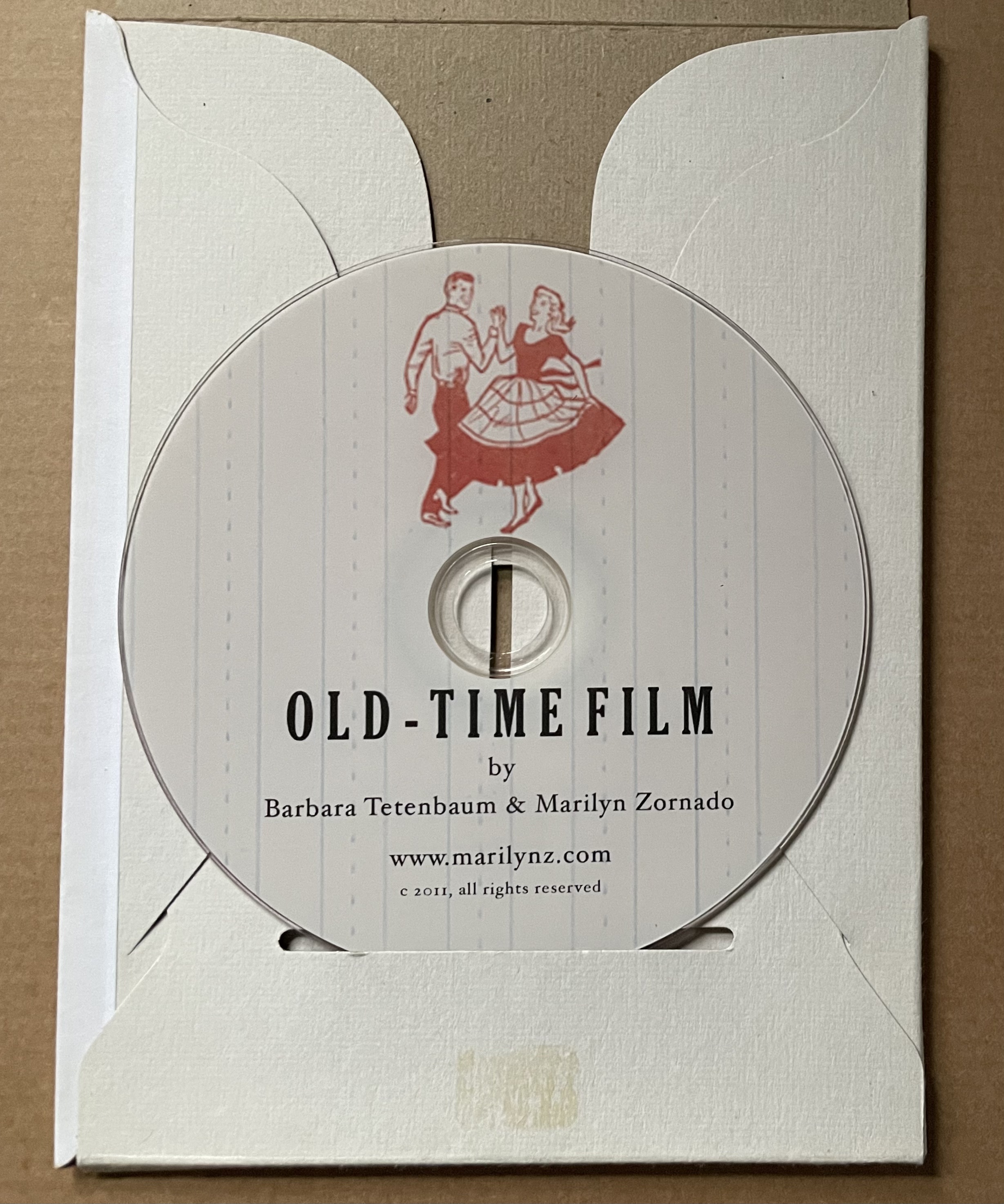
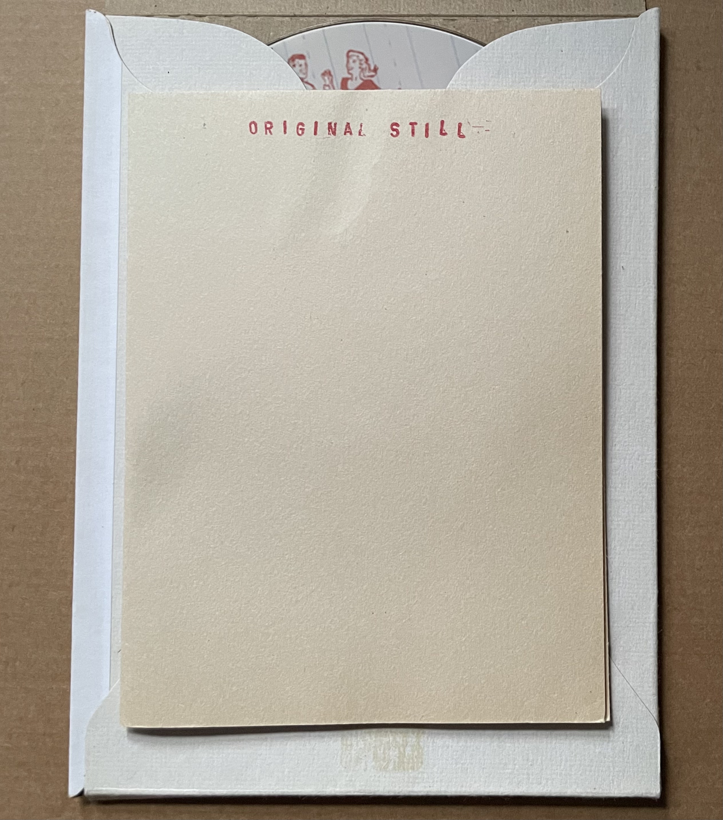
Old-Time Film (2011)
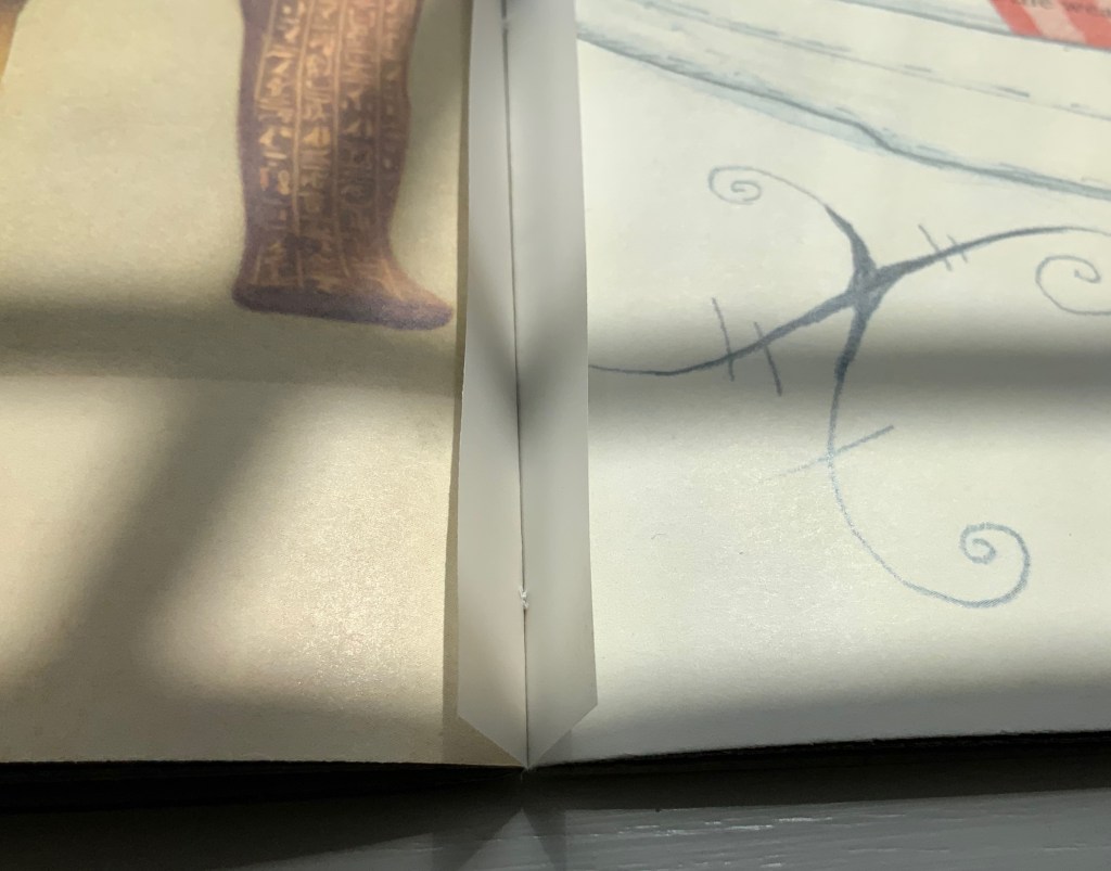
Old-Time Film: Letterpress-printed Animated Short (2011) Barbara Tetenbaum and Marilyn Zornado Slotted cardboard envelope containing DVD and print. Acquired from Barbara Tetenbaum, 12 July 2019. Photos: Books On Books Collection.
Artists’ description: DVD contents: Old-Time Film (2min, 58 sec) and “Behind-the-scenes” (2m, 48 sec). ; “Hand-set type, printer’s ornaments, and antique engravings come to life in this animated short created entirely through letterpress printing. Includes behind-the scenes showing the letterpress animation techniques on the Vandercook. Tetenbaum and Zornado have dubbed their process of combining letterpress techniques and animation ‘Vander-Mation.’ In this production using Vander-Mation shoes tap, sheep jump an ornamental enclosure, and words expand and contract in time with the music.
Postscript
Tetenbaum has provided another way to experience the Cather Projects: The Slow Read (2018). Take a wander through that site, composed of an introductory page to “a public literary and fine art project conceived and produced by Barbara Tetenbaum honoring the centenary of the publication of Willa Cather’s novel My Ántonia“, a set of seventy-four links to the daily scheduled readings, a blog section, a “concordance” that is more an unfolding of the installation and artist’s book than a listing of words and phrases against page references, and finally a portfolio of artwork by Tetenbaum.
Michaelis, Catherine Alice. 20 March 2021. “Elemental Impressions“. Artist’s Books Unshelved. Bainbridge Island Museum of Art. Accessed 22 March 2021. Video presentation and discussion of Diagram of Wind.
King, Nathalie. “Reading the Literary Text as ‘Art in Space’: Barbara Tetenbaum’s My Ántonia,” The Artist’s Yearbook, 2014-2015. Bristol: Impact Press, pp. 95-99.
Schneider, Uta. “Turning the Page”, pp. 18-28 in Tetenbaum, Barbara, James Carmin, and Uta Schneider. 2005. Half-life: 25 years of books by Barbara Tetenbaum & Triangular Press. Portland, OR: Triangular Press. Three key works not in the collection are described in Half-Life. The first would be an edition from the Gymnopaedia series, based on the artist’s response to Erik Satie’s musical compositions of the same name. The second would be Tetenbaum’s collaboration with Julie Chen that resulted in a powerfully moving work: Ode to a Grand Staircase (for Four Hands) (2001). The third key work returns to Donaghy’s poetry with the clear aim to incorporate sound in book art: Black Ice and Rain: Psalms 6.6 (2002). In the absence of the work itself, Uta Schneider’s description of it in Half-Life is as close as one can come to experiencing it.
Tetenbaum, Barbara. 14 June 2021. “My Ántonia at Six Pages a Day: The Slow ReadProject”, presentation for the panel “Willa Cather and Her Readers”, organized by the Willa Cather Foundation for the American Literature Association Virtual Panel. Accessed 19 July 2021.
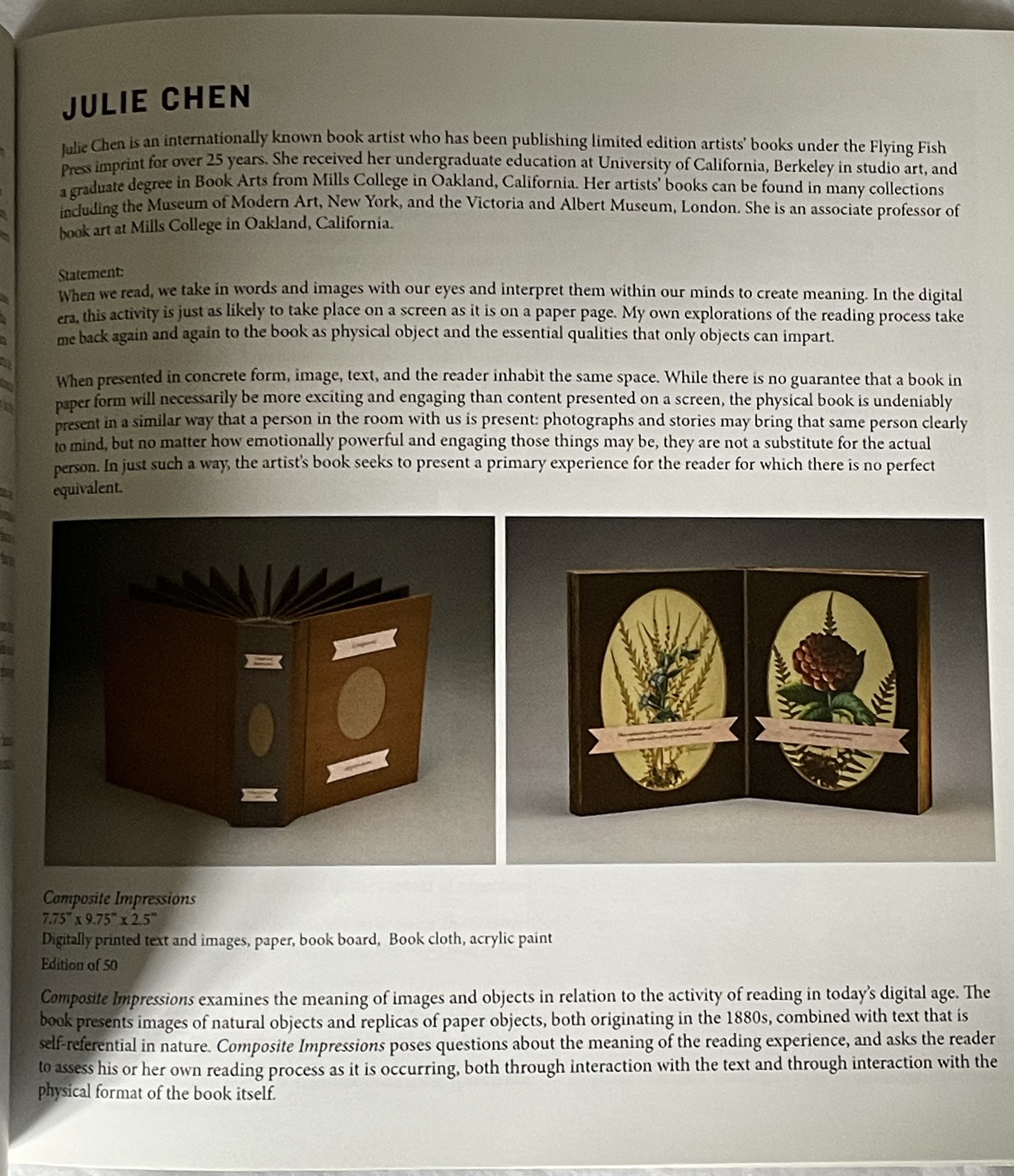
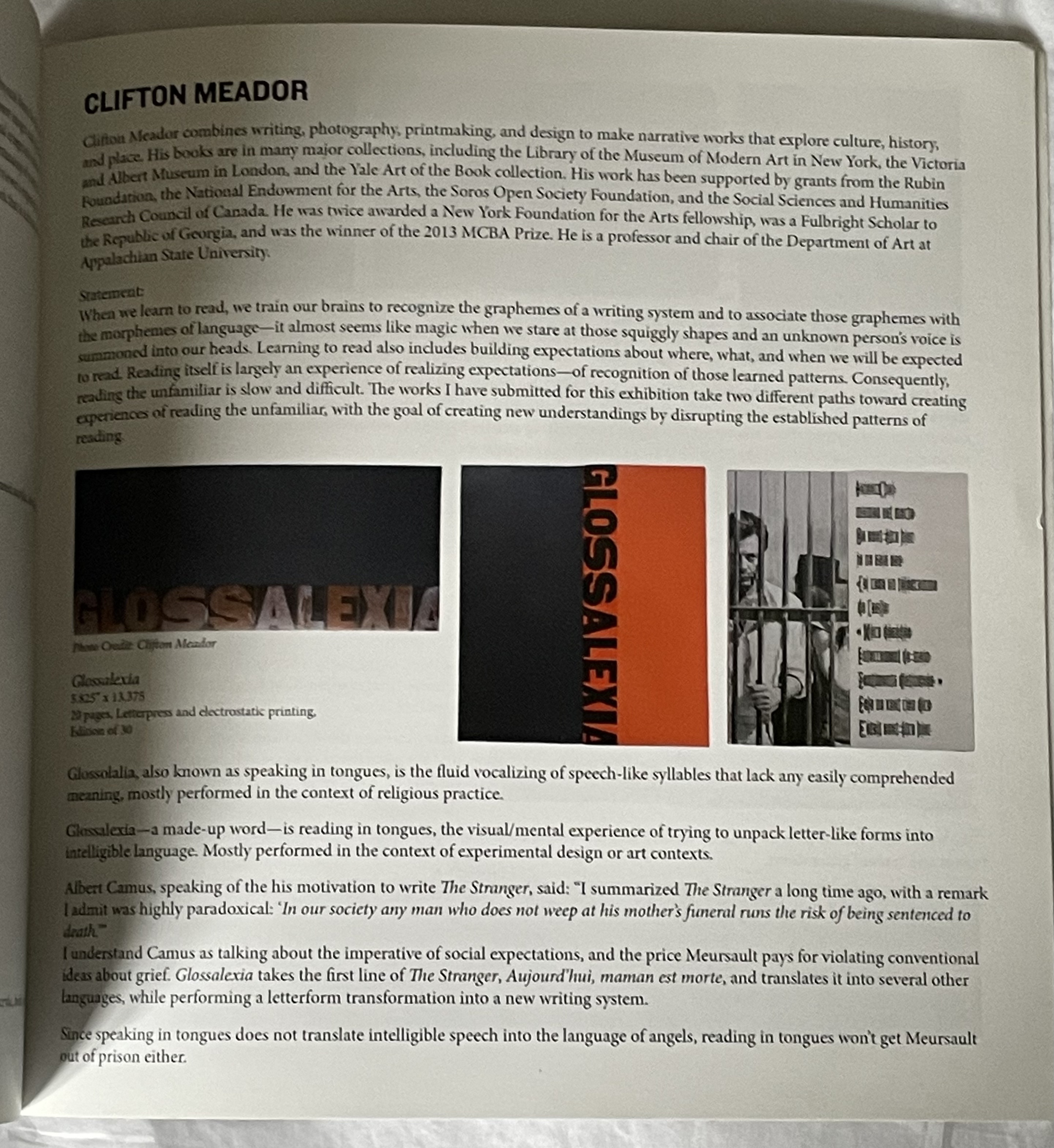
Four Proposals for Reading (2015)
Four Proposals for Reading (2015) Seager Gray Gallery and Barb Tetenbaum (ed.) Perfect bound book. 203 x 203 mm. [44] pages. Acquired from Barb Tetenbaum, 2019. Photos: Books On Books Collection.
The 125th anniversary of the publication of Stéphane Mallarmé’s Un Coup de DésJamais N’Abolira le Hasard (1897) approaches, and Trevor Stark’s book is a welcome harbinger. Its title comes from Mallarmé’s essay/poem “The Book, Intellectual Instrument”:
The book, total expansion of the letter, should derive from it directly a spacious mobility, and by correspondences institute a play of elements that confirms the fiction (p. 6).
Often with Mallarmé, context is all (not to mention translation in the face of elliptical syntax!) — context is wrapped in self-enshrouded context. His seemingly cryptic sentence above becomes clearer only when the precedent to the word “it” (elle) is understood as la composition typographique from the essay/poem’s preceding paragraph, extolling the alphabet, language and typography.
Un miracle prime ce bienfait, au sens haut ou les mots, originellement, se réduisent à l’emploi, doué d’infinité jusqu’à sacrer une langue, des quelque vingt lettres — leur devenir, tout y rentre pour tantôt sourdre, principe — approchant d’un rite la composition typographique. (my emphasis)
So, the sentence is a proscription for what “the book” should get from typographic composition. Metaphorically (fictionally), the book is a total expansion of the typeset letter, or mark. As such, it should derive from the “near rite of typographic composition” a spaciousness and mobility and a play among elements that confirms the metaphor that it is a “total expansion of the letter”. Still a bit cryptic, but after all, this is what Mallarmé calls a “critical poem”, and the sentence is hardly more cryptic than the opening pronouncement: “everything in the world exists to end up in a book”.
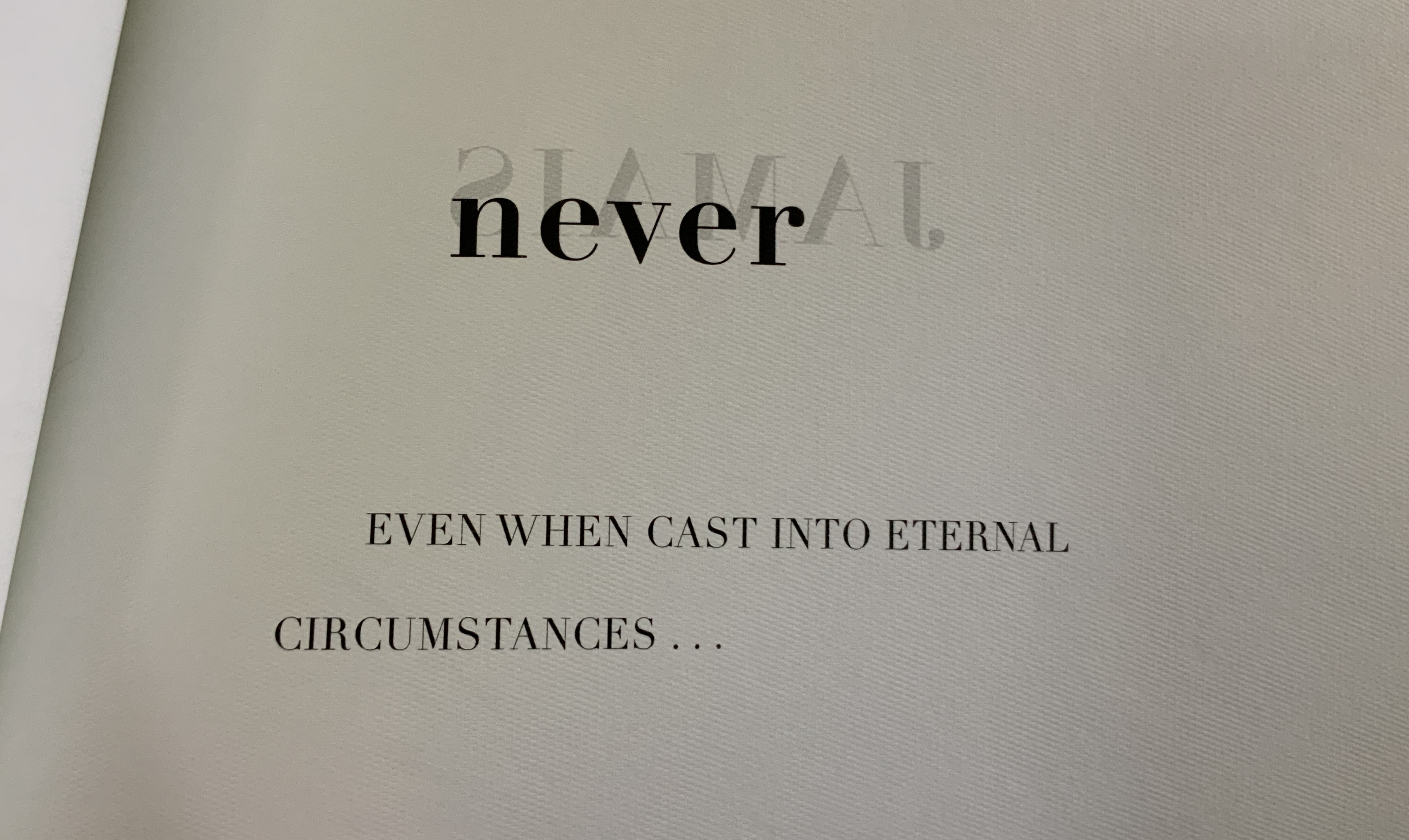
It is a good choice of title for Stark’s endeavor. “Total expansion of the letter” juggles Mallarmé’s “heroic” vision for the book with the material world of metal type, idea with ink, the sacred with the profane. In painting, sculpture, music, dance, theater and film, the avant-gardists certainly brought together intellectuality and physicality forcefully. Stark shows that, in doing so, they also consciously and unconsciously raided Mallarmé’s open larder of skepticism about language and communication. The letter (or any mark of signifying, for that matter), scraps of newspaper, musical scores, dance notation, dresses and costumes (or lack thereof), wanted posters, financial bonds, and much more became ready objects for avant-garde art but only on the condition of their “becoming dysfunctional and incommunicative” (p. 7). Stark wants to know why.
Mallarmé’s skepticism about language and communication is Stark’s touchstone throughout: that language has an “ineradicable degree of chance built into” it; that there is inherently a suspension — a temporal gap, blank, void, lacuna, an “unfinished” state — between the sign’s expressed materiality and its meaning; and that, therefore, every act of communication as a historical and aesthetic phenomenon is like an anonymous, “impersonified” throw of the dice, “tossed into eternal circumstances’” (p.29). Applying that touchstone, he crosses the borders insightfully time and again “between the nineteenth and twentieth centuries, between dance, music, and letters, and between art history, the philosophy of language, politics, and poetics” (p. 30). Never reductive, he explores the continuities and variations between Mallarmé’s achievements and those of Paul Cezanne, Pablo Picasso, Georges Braque, Francis Picabia, Tristan Tzara, Hugo Ball, F.T. Marinetti, Marcel Duchamp, the Laban school of dance and others of the avant-garde. As he offers a reciprocal interpretation of Mallarmé and of avant-garde art, individual poems, paintings, collages, performances of dance and theater yield new clarities and sharpened expression of received assessments.
Consider Stark’s comparative reading/viewing of Mallarmé’s “Sonnet en X” (1887) and Picasso’s The Dressing Table (1910). Across eight pages of text and photographs of art, Stark helps the reader to follow Mallarmé’s “quest for a word that literally means nothing, ptyx, a word produced by the frolic of language”, a signifier that “attains a materiality and an opacity, allowing the poem to display a linguistic Void, to raise it from the latent to the patent.” The materiality to which Stark draws our attention is twofold: the bright rhymes (-yx, -ix, -ixe) that almost single-handedly drive the invention of the word ptyx and the mirror on the credenza in the poem that captures the empty room, its window and the constellation Ursa Major showing through it. Across the same pages, Stark conducts the viewer through Picasso’s painting — again a mirror, the surface of a dressing table, the drawer from which a key protrudes, a drawer handle, a glass with the long handle of a toothbrush and its bristles poking out, but all scattered into planes of reflection and refraction, their shapes “mutually implicated to the point of structural ambiguity”. Then, he draws them together: “In Mallarmé and Picasso, representation destroyed the object in order to proclaim its own mute materiality and, thereby, regain continuity with the world by becoming simply one more thing within it”(pp. 101-108).
In pursuing these reciprocal readings of Mallarmé and his avant-garde descendants, Stark keeps a bright light on the “between” — between an object and its reflection, between a word’s or sound’s utterance and its meaning, the blanks between words, the blanks between brushstrokes or those between them and the boundary of the painting, between the cosmic and domestic, between one media and another when brought together in a work, between the individualism of subjective imagination and impersonal modes of production, between author/artist and word/image and reader/viewer. His term for these spaces is intermedial. In her endorsement of Stark’s book, Julia Robinson (New York University) calls his neologism “luminous”. The term refers to “the zone of indeterminacy between mediums, social practices, and temporalities” into which Mallarmé found himself outwardly propelled even as he inwardly sought “absolute language”.
Looking back on the avant-gardists and his own contemporaries, Dick Higgins — the late twentieth century language-, book-, and publishing-artist — rejuvenated Samuel Taylor Coleridge’s term intermediation, a neologism similar and related to intermedial. It is not the same thing as intermediality or mixed media. As Higgins expressed it, “Many fine works are being done in mixed media: paintings which incorporate poems within their visual fields, for instance. But one knows which is which. In intermedia, on the other hand, the visual element (painting) is fused conceptually with the words” (p. 52). It can be argued that works of intermedia are one way in which artists address intermediality — that zone of indeterminacy.
The argument is ultimately a phenomenological one, a perspective that Stark embraces. When he applies the ideas of Edmund Husserl, Martin Heidegger, Maurice Merleau-Ponty, Theodor Adorno, Maurice Blanchot and others to Mallarmé’s poems and the artistic expressions of his “descendants”, both the philosophers and the artists become more accessible. Consider this passage summarizing Maurice Blanchot’s account of the history and function of language and its four stages:
The first was that of an Adamic or nomenclaturist model of language, which conceived words as names for the objects of the world. The second, dominant from Plato to Descartes, was the idealist model in which language constituted the link between sensible reality and the eternal realm of the Idea, and thus the guarantee of our ‘entrance into the intelligible world.’ [fn 223] Third, the ‘expressionist model’ of Hegel and Leibniz considered language itself the embodiment of what is sayable, thinkable, and possible at any given historical juncture, serving, therefore, as the medium of the progress of Spirit. Finally, illustrated with a quote from Valèry, the fourth stage was the ‘dialectical function of discourse,’ in which language regained an ‘essential power of constestation’ in the negativity of modern literature:
‘Literature seeks to revoke from language the properties that give linguistic signification, that make language appear as an affirmation of universality and intelligibility. But it doesn’t arrive at this goal (if it does arrive at this goal) by destroying language or through contempt of its rules. It wants to render language to what it believes to be its veritable destiny, which is to communicate silence through words and to express liberty through rules, which is to say to evoke language itself as destroyed by the circumstances that make it what it is.’ [fn 224] (pp. 110-11)
Clearly that passage links back to the touchstone of Mallarmé’s skepticism about language and communication. The strength of the touchstone is that it can also be fruitfully applied to the numerous works of homage to Mallarmé from contemporary book artists such as Jérémie Bennequin, Michael Maranda, Michalis Pichler, Eric Zboya and many others. Likewise it can used to shed light on the “material text” approach to understanding book art. A case in point is the first issue of Inscription: the Journal of Material Text – Theory, Practice, History, a work of book art in its own right.
Consider the hole drilled through the center of the journal. Does it not echo Stark’s reminder of Braque’s citing Mallarmé’s utterance: “‘The point of departure is the void'” (p. 88)? Consider the journal’s spatial challenge to the act of reading (a dos-à-dos binding, a text block that rotates around that hole). Does that not echo this passage from Total Expansion of the Letter?
But what remains after the ‘suspension’ of the represented object and the objectification of the means of representation? For Mallarmé, the ‘residuum’ was the act of reading itself, conceived not as a process of cognitive reconstruction, but instead as a gamble on the very possibility of forging meaning out of opacity and contingency of linguistic matter. As Mallarmé wrote in ‘The Mystery of Letters’
‘To read —
That practice —
To lean, according to the page, on the blank, whose innocence inaugurates it, forgetting even the title that would speak too loud: and when, in a hinge [brisure], the most minor and disseminated, chance is conquered word by word, unfailingly the blank returns, gratuitous earlier but certain now, concluding that there is nothing beyond it [rien au-delà] and authenticating the silence –‘” (pp. 108-109).
Not since Anna Sigrídur Arnar’s The Book as Instrument: Stéphane Mallarmé, the Artist’s Book and the Transformation of Print Culture (2011) has there been as useful a tool for appreciating Mallarmé, art and artist’s books as Trevor Stark’s Total Expansion of the Letter. On the eve of the 125th anniversary of Un Coup de Dés, it will be interesting to see whether Stark and others extend his work to art and book art after the avant-garde.
Higgins, Dick, and Hannah Higgins. “Intermedia“, republished in Leonardo, Volume 34, Number 1, February 2001, pp. 49-54.
McCombie, Elizabeth. Mallarmé and Debussy: Unheard Music, Unseen Text (Oxford: Oxford University Press, 2004). It would have been interesting to see how Stark would relate his exploration with McCombie’s exploration of Mallarmé’s views on poetry and music.
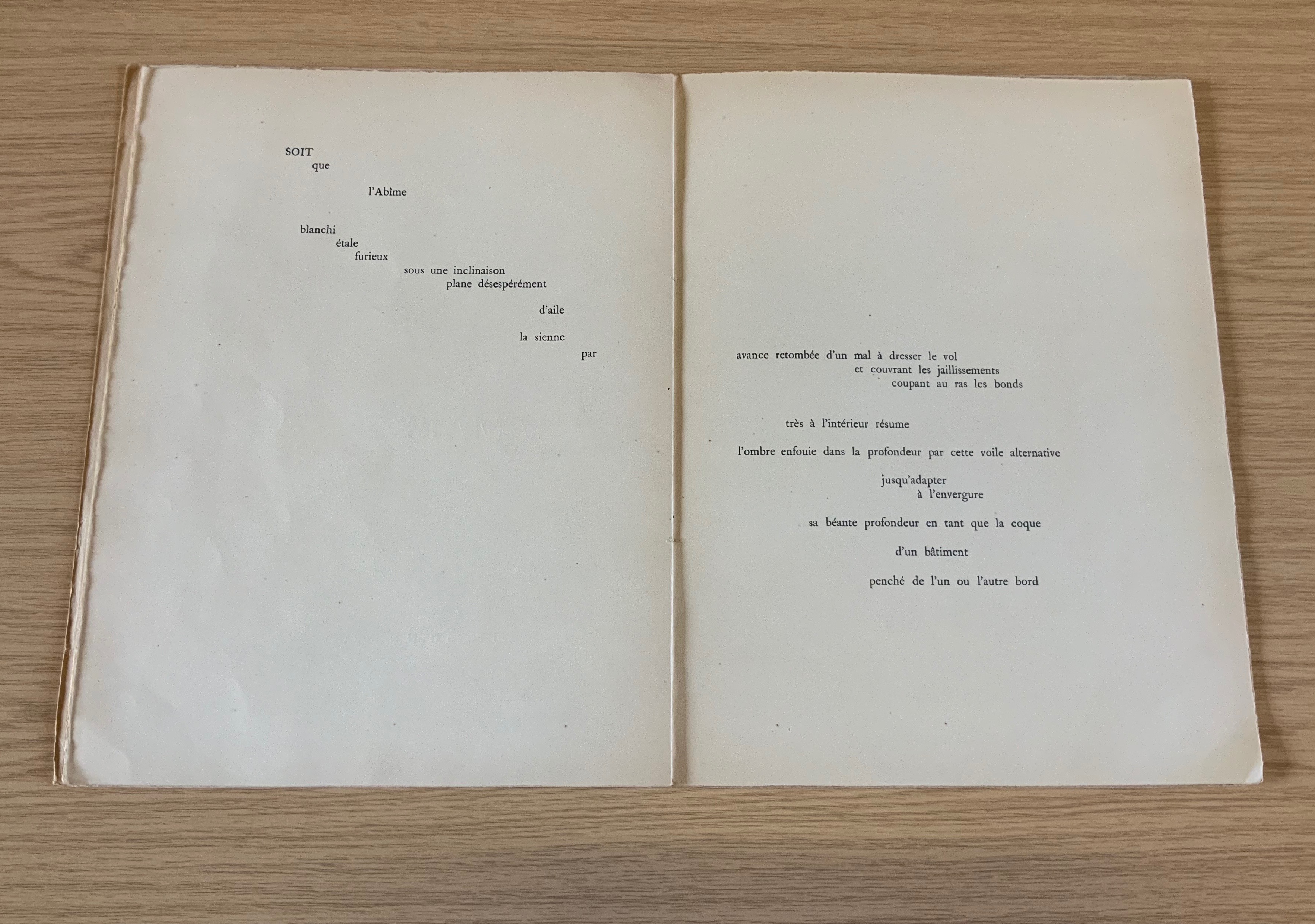
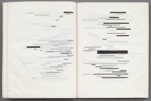
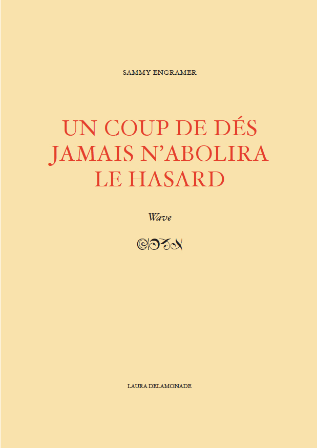
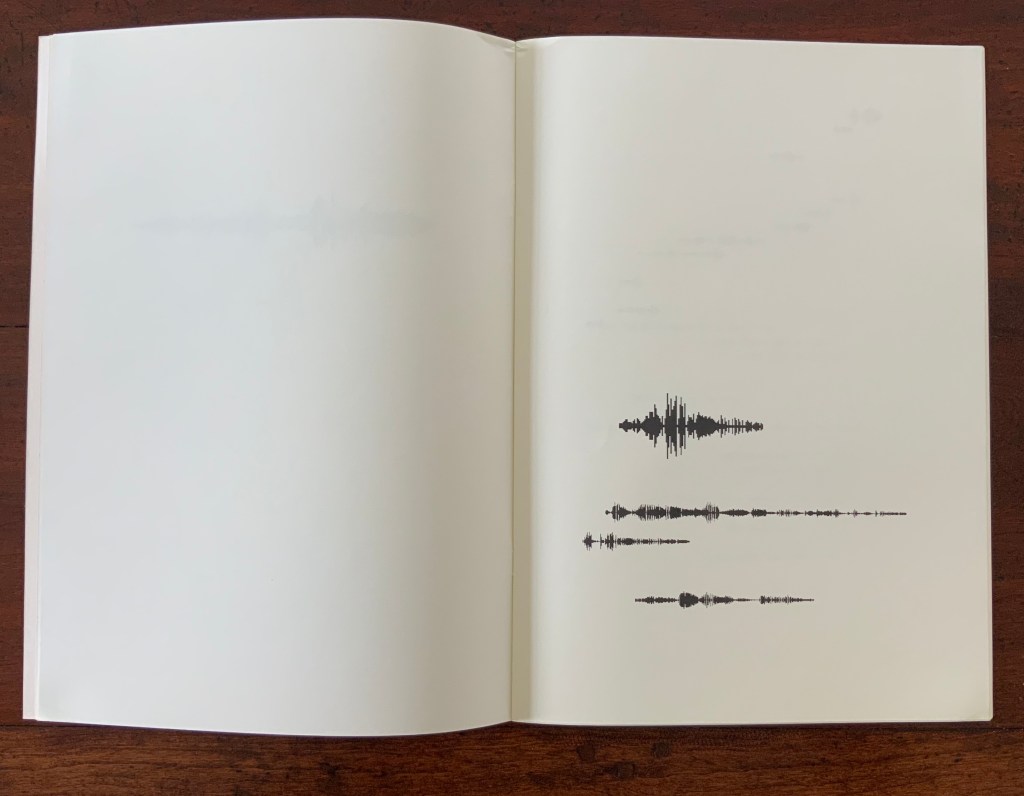
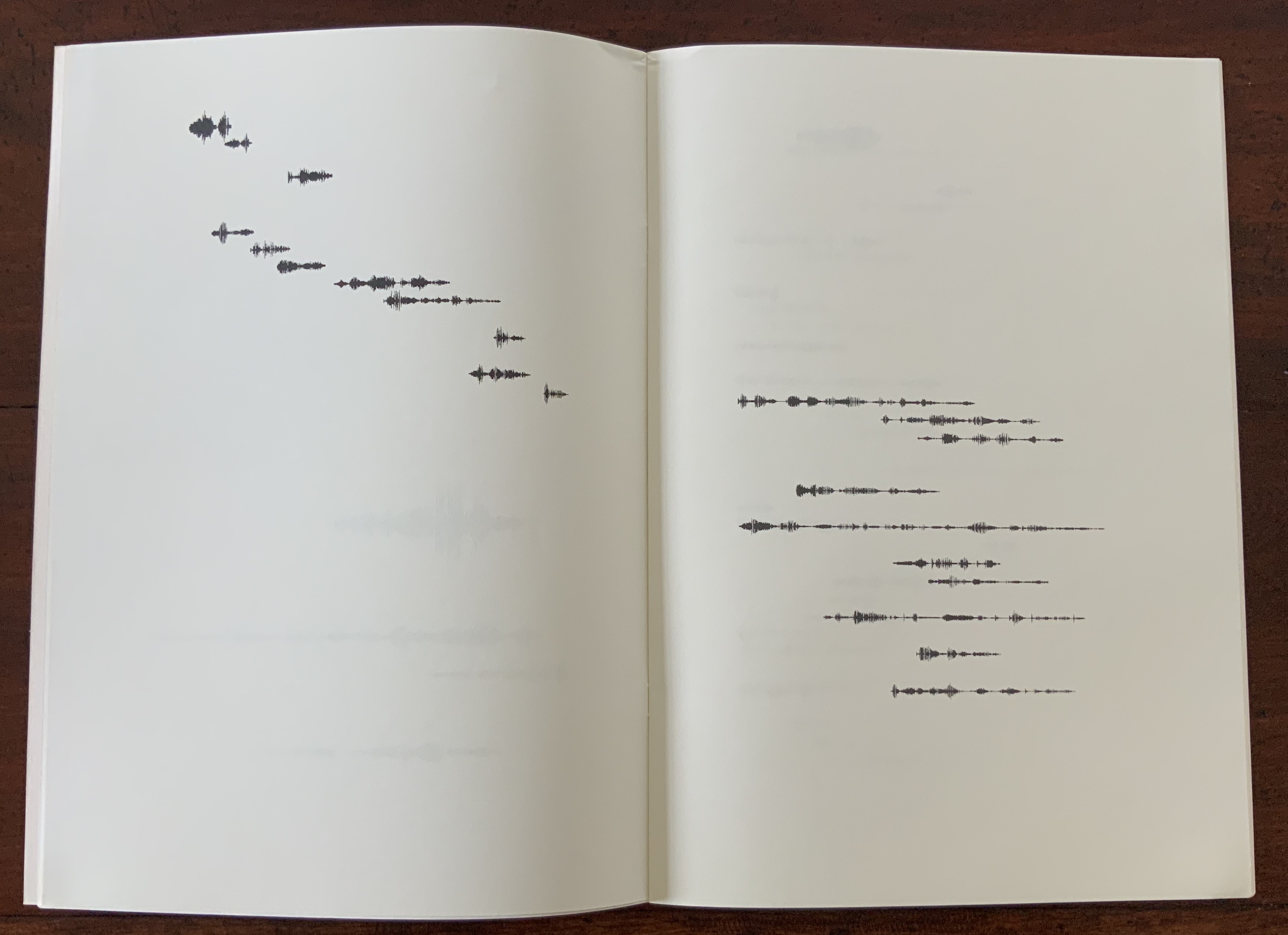
Un Coup de Dés Jamais N’abolira le Hasard: Onde/Wave (2009)
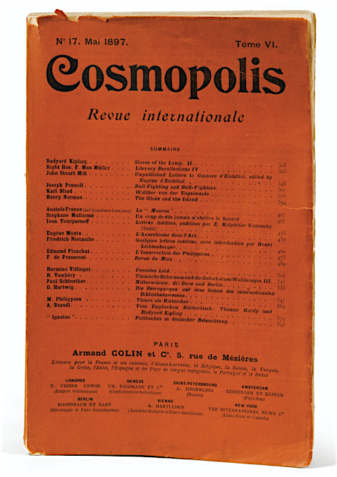
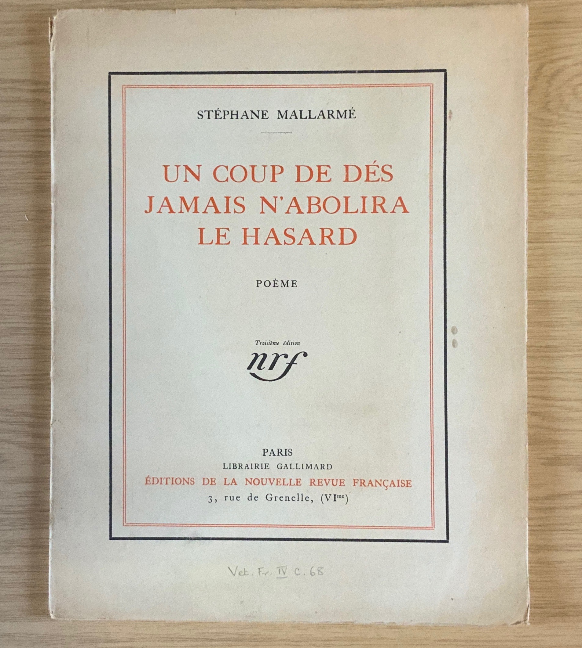
Mallarmé’s strange poem, first published in the London-based journal Cosmopolis in 1897, had to wait until 1914 before appearing in a format close to the one Stéphane Mallarmé envisioned with the gallerist and publisher Ambroise Vollard.
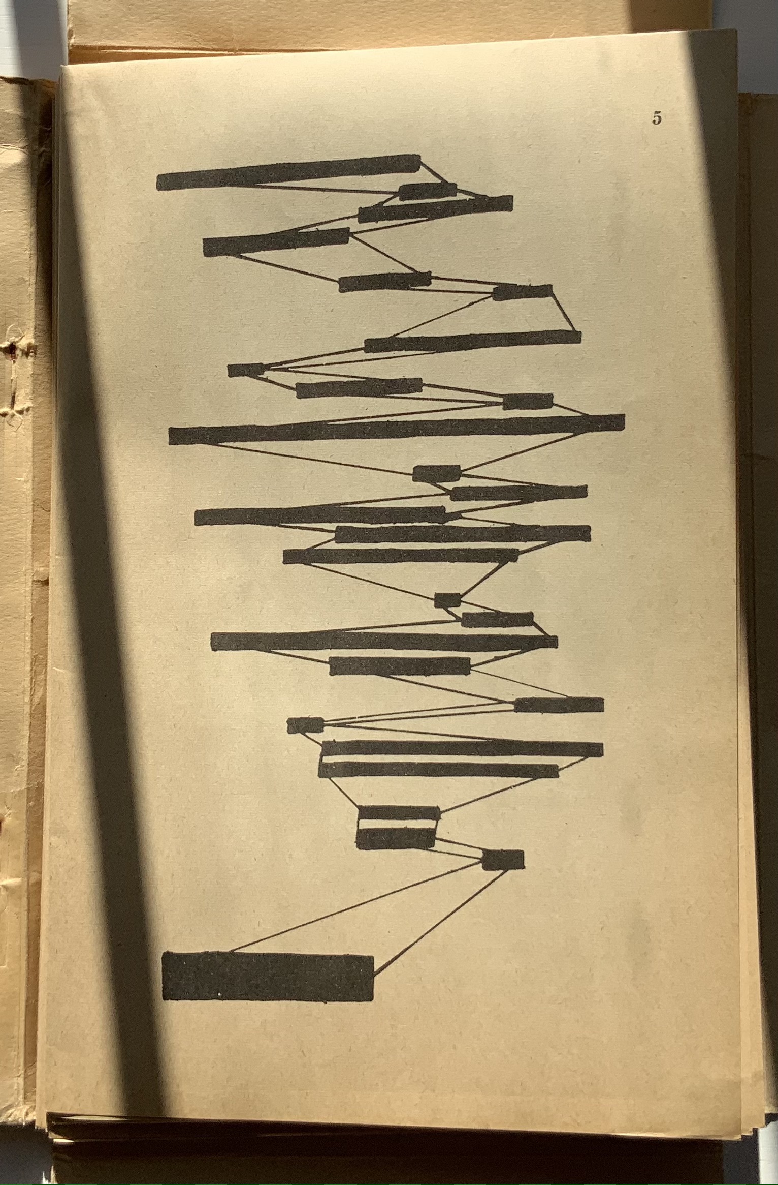
Taking the poem’s self-referential line about its words appearing as a constellation, first Ernest Fraenkel, then Mario Diacono and Marcel Broodthaers transformed the poem into a series of images by substituting solid blocks of ink in place of the poem’s lines of verse.
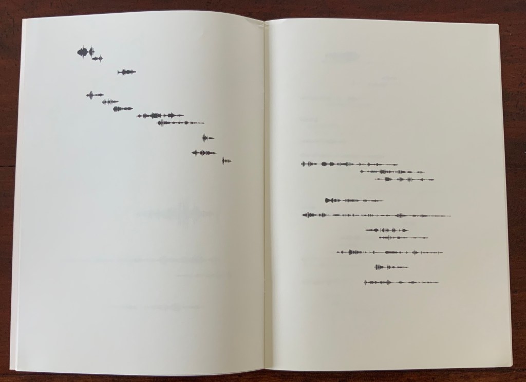
Subsequently, dual homages to Mallarmé and Broodthaers arose. One of them is Engramer’s. Where Fraenkel, Diacono and Broodthaers focused on layout, size and space to generate their visual translations, Engramer added a sonic element, albeit by visual display. Recording his own reading aloud of the poem, Engramer then ran the recording through sonographic equipment. The rendering of each line’s soundwave became his graphic substitute for Mallarmé’s line of verse and, by extension, each black block that Broodthaers used to displace Mallarmé’s text.
In 2010, Engramer took his inspiration one step further and put together an exhibition called “JAMAIS”. As soon as the idea or sensation of visualizing the sound of a poem is mooted, the choice of ink, type, brush, paint, surface, chisel, mold, material, camera, computer and, again, surface opens up. In JAMAIS, Engramer chooses a multiplicity of tools and media (or they choose him): sound recording, computer output, ink, printed book, mold and plastic, camera and animation.
In the video below, pages of the book undulate in a wave along the wall to which they are loosely attached. Alongside them are eighteen 3D PVC renderings of the sonograms. At the end of the hall, a large screen shows a 3D animation of a rolling die whose dots spell out hasard in Braille. The juxtaposition of fluttering pages of sonographs, the physical instantiation of the sonograms and the animated Braille die that cannot be read by touch generates a confounding conundrum for the senses. Text has become sound, sound has become image, and image has become object and animation.
Video: Courtesy of the artist.
Since, according to the artist, his recording of the poem was not played in the exhibition, the conundrum focuses on perception of sound through the eyes. Whether listening/hearing can be performed by seeing a visual or physical representation of what has been listened to/or heard (or is being listened to/or heard) is a neurological question. Rendered in ink and plastic, Engramer’s sonographic images and objects are metaphoric assertions: “hear with your eyes the words no longer printed or carved before you, hear through your eyes the decibels increasing or attenuating according to an unheard recording of those words spoken”.
Further Reading
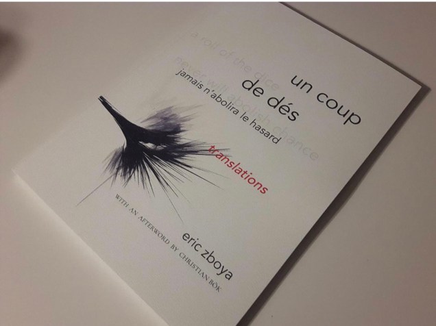
“Eric Zboya“, Books On Books Collection, 1 June 2020.
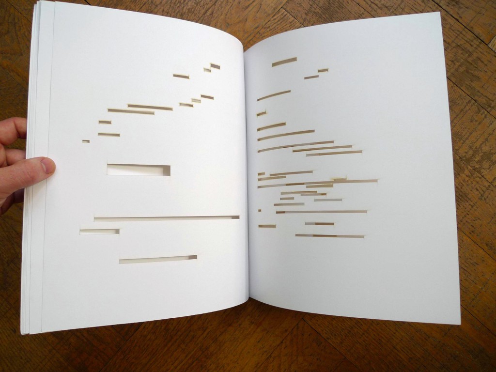
Eric Zboya is poet, writer and artist. Years before this book, he wrote for Ubu Web about the dialogues between Mallarmé’s groundbreaking poem and artists such as Marcel Broodthaers, Guido Molinari and Michalis Pichler, who explore “the higher-dimensional characteristics of the poem”. Broodthaers’ and Molinari’s solid-colored horizontal blocks take the place of lines of text and, reflecting its typographic size, deliver the poem’s page-oriented image(s) without its words. Pichler goes a sculptural step further and excises the lines altogether.
In one sense, Zboya returns to the traditional “collaborative” livre d’artiste, where the artist’s images illustrate the author’s text. But Zboya’s process for generating the images and his handling of the text are anything but traditional.
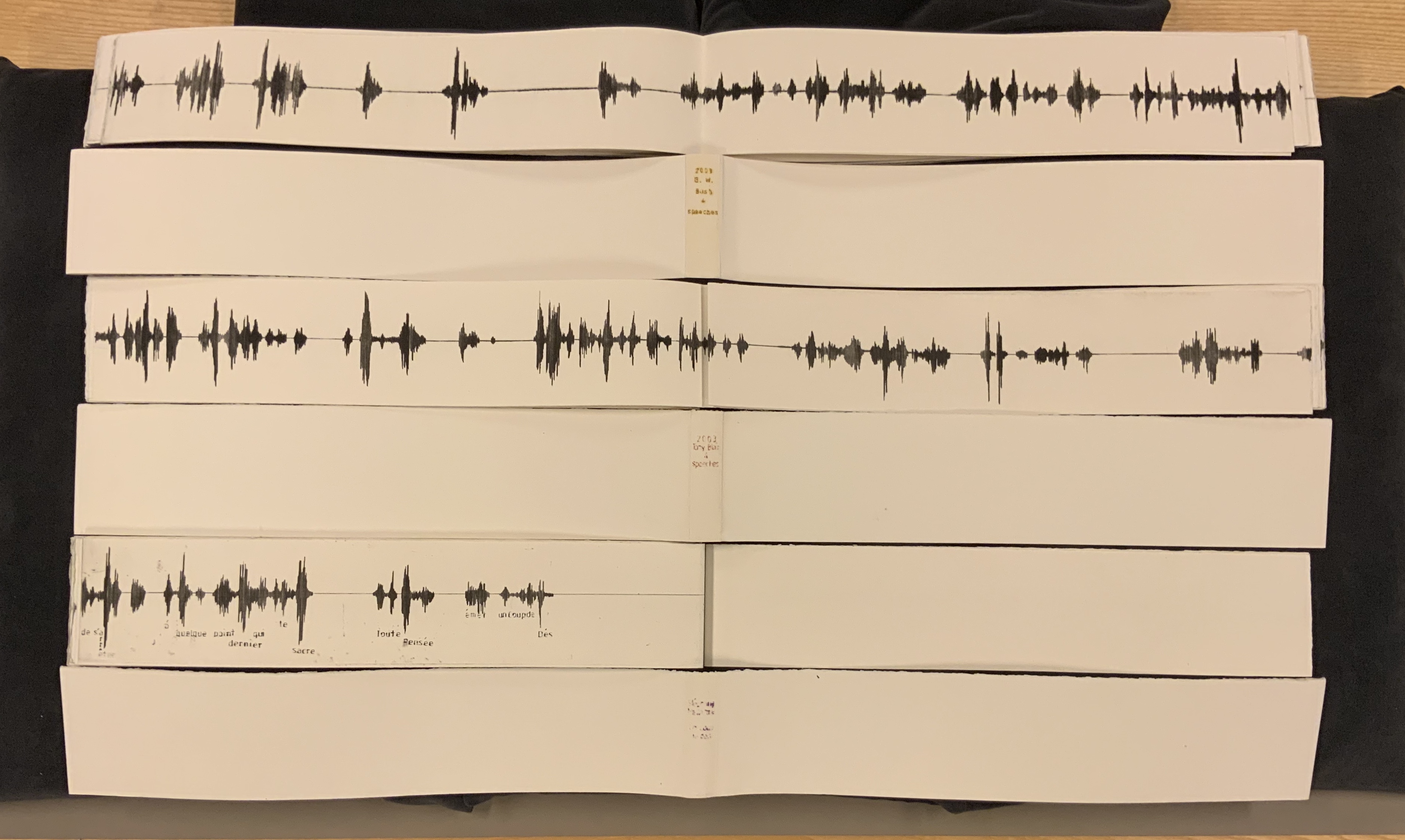
Just as Mario Diacono runs parallel to Broodthaers, so too do Didier Mutel (2003) and Sammy Engramer (2009) to Zboya. His Ubu Web essay appeared in 2011. While similar, the three artists’ approaches to images differ far more from one another than those of Diacono and Broodthaers differ. Mutel’s sonographs come from recordings of three different speeches. Engramer’s come from the recording of his reading of Un Coup de Dés. Although Zboya’s images come from the translated text of Un Coup de Dés, they do not come from sound recordings.
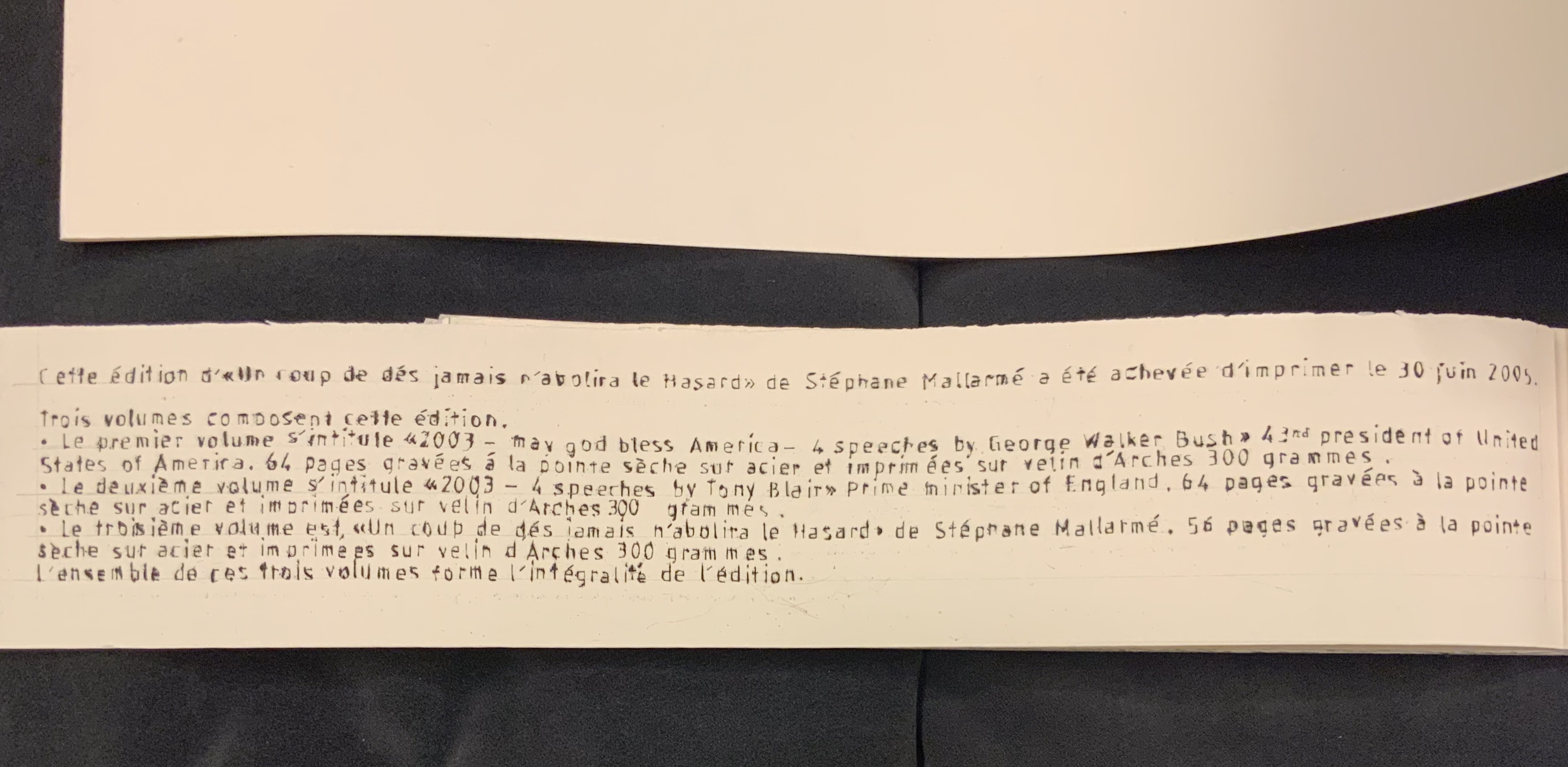
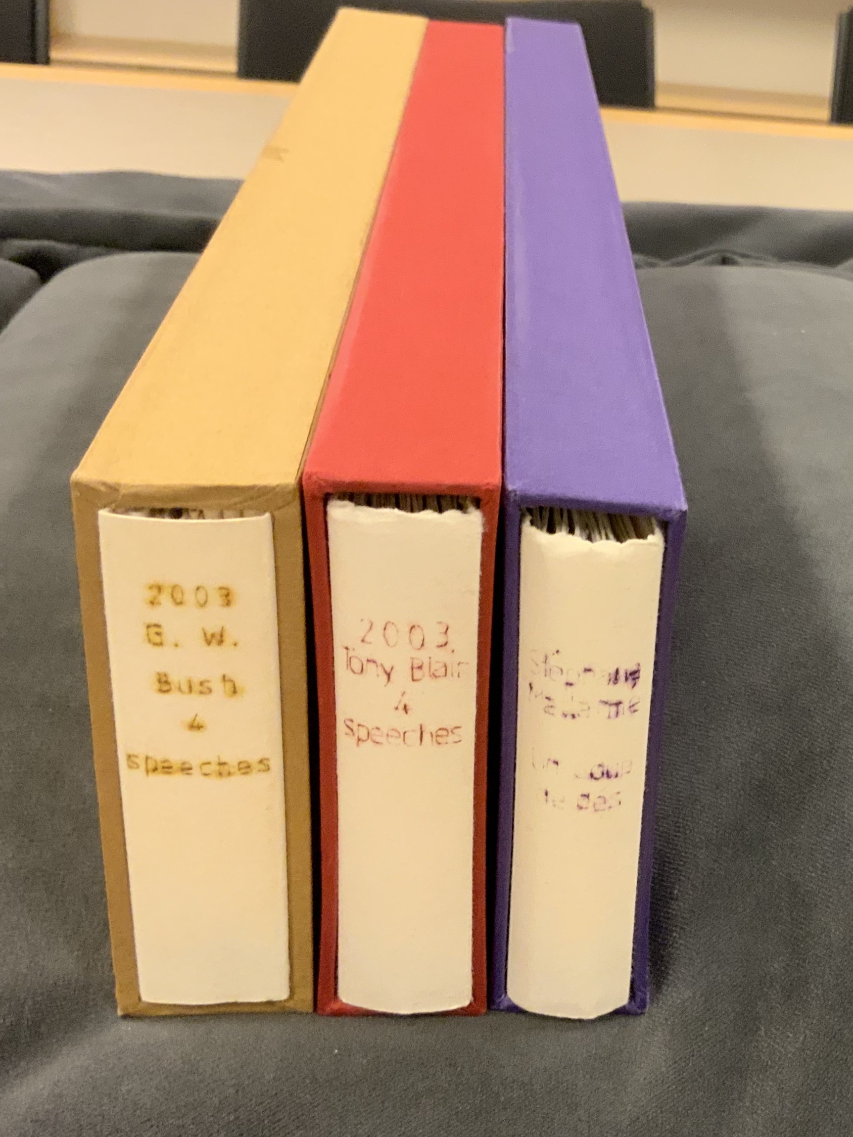
Un Coup de Dés Jamais N’Abolira le Hasard: Poème (2005) Didier Mutel Consists of three volumes: the first entitled “2003 — may god bless america — 4 speeches by George Walker Bush”; the second, “2003 — 4 speeches by Tony Blair”; the third, “Un coup de dés jamais n’abolira le hasard”. Each engraved in drypoint on steel and printed on Velin Arches 300 gsm.
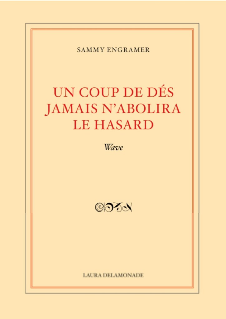
Un Coup de Dés Jamais N’Abolira le Hasard: Wave (2009) Sammy Engramer H340 x W240 mm, 32 pages. Recording his own reading aloud of the poem, Engramer then ran the recording through sonographic equipment. The rendering of each line’s soundwave became his graphic substitute for Mallarmé’s line of verse and, by extension, each black block that Broodthaers used to displace Mallarmé’s text.
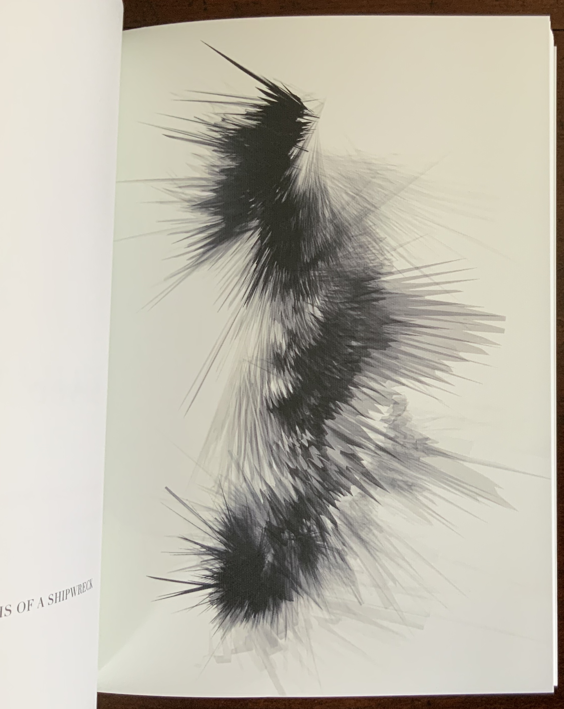
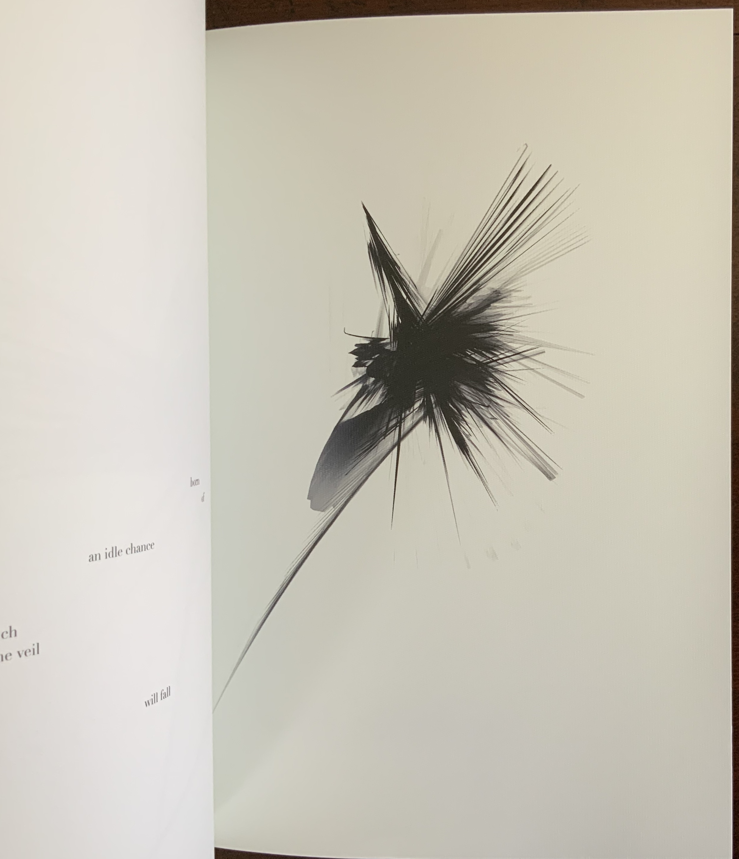
Zboya uses graphic imaging software to transform each letter, mark of punctuation and pixel into an abstract image based upon the original topographical placement of the type on the space of the page. Text mutates into a graphic, nonlinear entity. Zboya calls this Algorithmic Translation.Due to a randomization function, the program never yields the same image from the same input. In keeping both with the title (Un Coup de Dés Jamais N’Abolira le Hasard) and the poem’s last line (Toute pensée émet un Coup de Dés), no run of the program ever abolishes chance, and every input (thought) generates a roll of the dice.
Zboya’s artist book presents more than these graphic, constellation-like translations of the text. Literally shadowing the right-reading English translation of the title is the French text set in reverse. Drawing the reader closer to the synaesthesia promoted by Mallarmé, Valéry and, before them, Baudelaire, the contrast of black (English) and gray (hcnerF) echoes the tonality of the algorithmically translated images; the reversed letters of the French emphasize the physical reversing that occurs when printing text; and the movement from the original hcnerF to the translated English urges the “mind’s ear” to play along with the mind’s eye. The choice to print everything on the same highly textured Rives Design, Brilliant White, enlists hand and eye in support of a synaesthetic equation of text, page and image.
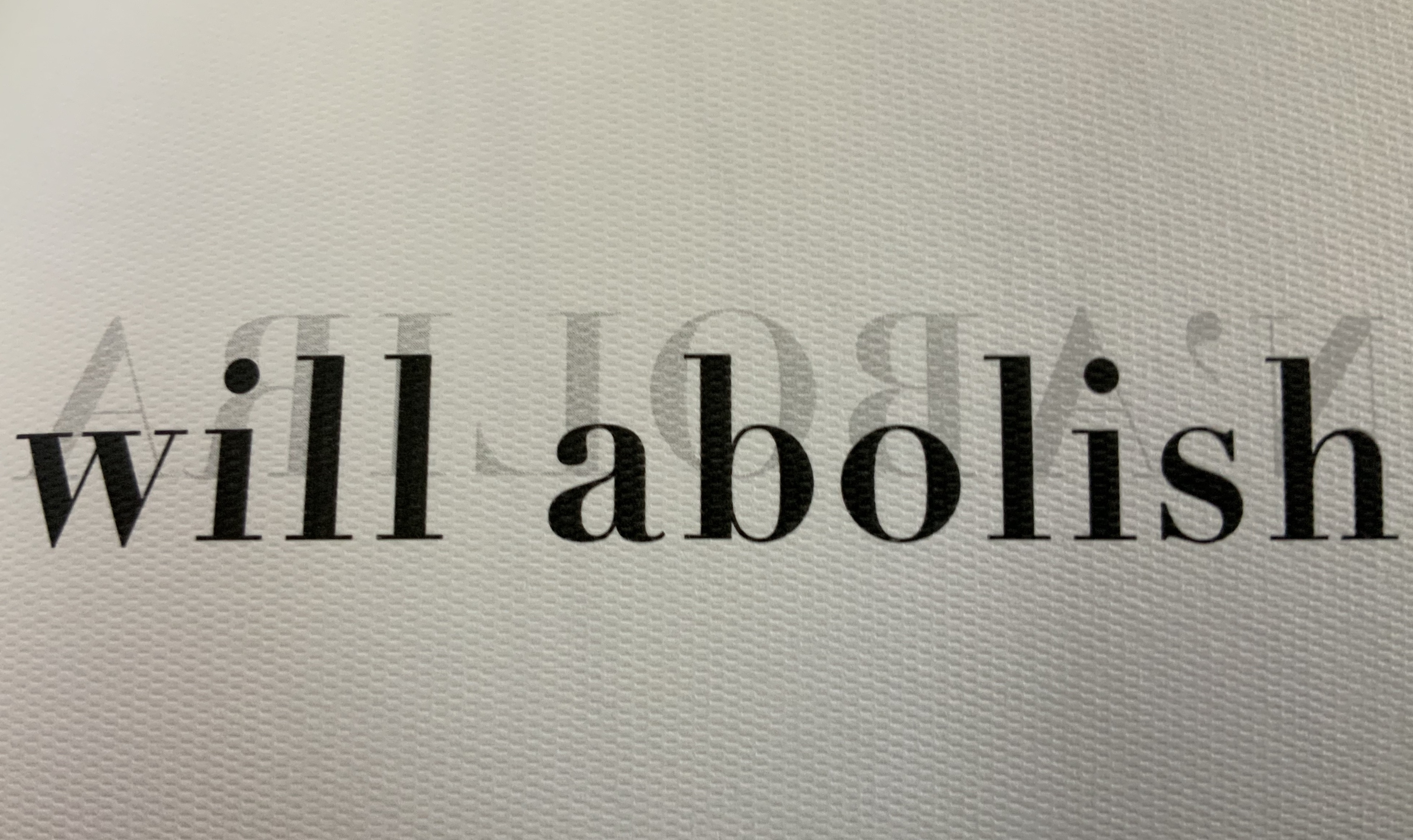
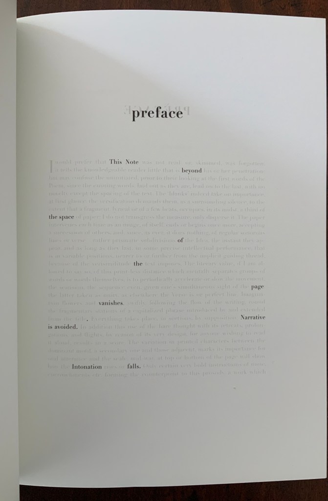
Just as important in another dimension is Zboya’s creative manipulation of the poem’s English translation by Basil Cleveland and preface by Charles Bernstein. The preface is the first clue. Only words selected by Zboya appear in black, left in their original position on the page and creating an envoi to Zboya’s book:
This Note beyond the space of the page vanishes. Narrative is avoided. Intonation falls. Courageous Poem, open a few eyes to this unforeseen symphony.
Zboya has done the same with the text of the translated poem. He erases certain lines and leaves those not erased in their topographical position as close to Mallarmé’s intention as interpreted by Zboya’s numerous predecessors (Broodthaers in 1969, Pichler in 2008, Meillassoux in 2012, Bononno and Clark in 2015, Bloch in 2017 among others). In this way, Zboya’s appropriation occurs across multiple dimensions.
By “erasing” text to select text that syntactically creates new content, Zboya is also following in the footsteps of Tom Phillips (A Humument, 1966-2016), but the effect and result of doing so differs distinctively from Phillips’ work, which is decidedly narrative. The concept of translation in Zboya’s book is closer to Ezra Pound’s approach in Personae (1926). The fragments and sentences created by the “translated” words are close but not the same as those in the source. In Pound’s case, not the same sentences as those of the troubadours. In Zboya’s case, not the same as Mallarmé’s, Cleveland’s, Bernstein’s, etc. The appropriation/translations make something new.
Occurring in its several dimensions, Zboya’s manipulation of text, image and surface recalls Valéry’s description of reading and looking at the worksheets for the book version of Un Coup de Dés:
It seemed to me that I was looking at the form and pattern of a thought, placed for the first time in a finite space. Here space itself truly spoke, dreamed, and gave birth to temporal forms. Expectancy, doubt, concentration, all were visible things. With my own eye I could see silences that had assumed bodily shapes. Inappreciable instants became clearly visible: the fraction of a second during which an idea flashes into being and dies away; atoms of time that serve as the germs of infinite consequences lasting through psychological centuries — at last these appeared as beings, each surrounded with a palpable emptiness…. there in the same void with them, like some new form of matter arranged in systems or masses or trailing lines, coexisted the Word! — Paul Valéry, Collected Works of Paul Valery, Volume 8: Leonardo, Poe, Mallarmé (1972).
That is the effect of reading and looking at Zboya’s work of book art.