Tom Chatfield’s short essay “I Type, Therefore I Am” celebrates the increasingly rapid rise of literacy.
At some point in the past two million years, give or take half a million, the genus of great apes that would become modern humans crossed a unique threshold. Across unknowable reaches of time, they developed a communication system able to describe not only the world, but the inner lives of its speakers. They ascended — or fell, depending on your preferred metaphor — into language.
The vast bulk of that story is silence. Indeed, darkness and silence are the defining norms of human history. The earliest known writing probably emerged in southern Mesopotamia around 5,000 years ago but, for most of recorded history, reading and writing remained among the most elite human activities: the province of monarchs, priests and nobles who reserved for themselves the privilege of lasting words. …
In the past few decades, more than six billion mobile phones and two billion internet-connected computers have come into the world. As a result of this, for the first time ever we live not only in an era of mass literacy, but also — thanks to the act of typing onto screens — in one of mass participation in written culture.
This is territory bookmarked before in response to Ferris Jabr’s “The Reading Brain in the Digital Age” — Bookmarking a Bookburning II — but it occupies higher ground.
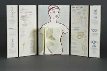
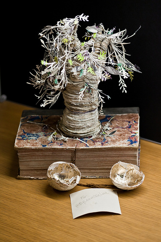
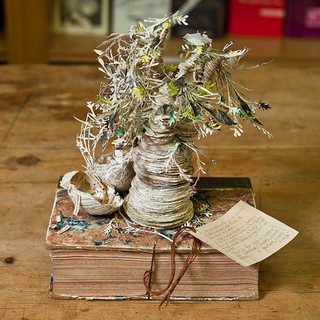
This is a work that succeeds on every level: the text, both humorous and pithy, is engaging, the craft and material selection superb, the design and layout a balance of image, information and space.
The presentation is such that one is informed, enticed and amused before even getting to the ‘insides’ of the work – a corporeal codex, the inside story.
We read that the work was inspired by Torso Woman, a genuine anatomical model of serene evisceration. Mounted on the interior central panel, appropriately placed on a brush worked depiction of an armless, legless female, who does, however, have a head), wearing a stoic (or is it serene?) expression is an organically shaped book that includes overlapping shapes reminiscent of the human anatomy books of the fifties.
Based in Denver, Colorado, Abecedarian Gallery offers an eclectic and enjoyable selection of bookworks and prints for sale. The Abecedarian holds regular exhibitions (such as the Emerging Artists exhibition) and offers an annual Gallery Directors Award (which Gardner won in 2013). Well worth a visit online.
Gardner was also a finalist for the MCBA 2015 award with the work below:
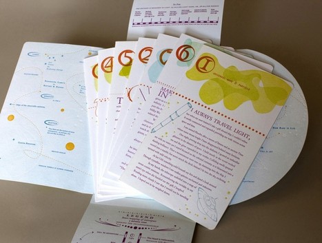
Phoebe is a traveller through time and space in search of what matters. Along the way, she meets an intergalactic wayfarer who is also on a quest. He seeks the 10th dimension which can only be reached by learning what is uniquely human. Together they travel to the beginning of the universe and back. Meanwhile, the two travellers investigate the workings of the universe. Each of the seven folios chronicles a mission that revolves around a field of exploration: light, gravity, time, matter, infinity, constellations and science. On the back of each folio is a mission dispatch reporting their discoveries of meaning in the natural forces and phenomena of the cosmos.
This particular work reminds me of the rise of infographics. It also stands as a clever introduction to a scientific topic through fiction as well as design. For more of Gardner’s work, visit her site Set in Motion Press.
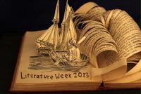
News Item – British Academy. Part of Literature Week at the British Academy for the Humanities and Social Sciences, an exhibit called “Turning the Page” and presenting the book sculptures of Justin Rowe, a bookseller in Cambridge, is being held from 20 May through 24 May. The works are in the “reverse ekphrastic” mode: the bookwork is an expression of, or meditation on, the text of the book from which it is made. The exhibit has attracted attention from the BBC and even the free Metro paper. Looks and sounds worth a visit if you can skive work for one of the lectures and a browse round the exhibit.
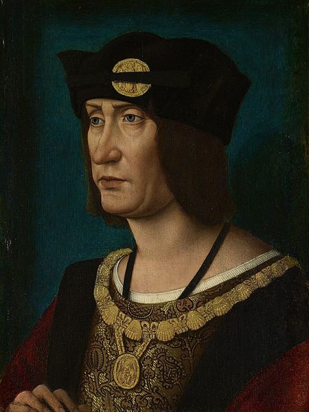
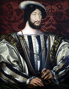
In 1513, Louis XII of France issued an edict praising printing, exempting it from a large impost and removing a tax on books. Louis declared that “the printer-booksellers … ought to be maintained in their privileges, liberties, franchises, exemptions, and immunities, in consideration of the great benefits which have been conferred upon our kingdom by means of the art and science of printing, the invention of which seems rather divine than human ….” Two years later, Louis was dead, and the lot of books and printer-booksellers fell under the shadow of France’s so-called Father of Letters, François I, who issued an edict in 1535
François I, Roi de France, 1515-1547
banning the use of the printing press and permitted books and printers to be consigned to the flames for blasphemy. (Richard Christie, Etienne Dolet: The Martyr of the Renaissance, 1508-1546, 1899. Pp. 330-31). Which might be said to challenge the certainty of taxes while confirming that of death.
This year is the centenary of Gerard Meynell’s trade periodical The Imprint, which was the scene of Stanley Morison’s first appearance in print. How appropriate then that Morison’s book A Tally of Types tells the story of the journal’s founding and, equally important, how the historic font called Imprint Old Face came into being. The font’s importance is that “the design had been originated for mechanical composition. … the first design, not copied or stolen from the typefounders, to establish itself as a standard book-face.”(p.21) Ironically, Meynell and his colleagues intended for the font to be freely available to the trade, but eventually it came into the ownership of Monotype Imaging, where it can be obtained today under the OpenType family.
As the world of print morphs into its digital incarnation, we see the same impetus behind the new generation of typographers, the ones born digital, but we see varying degrees of adherence to the “type wants to be free” movement.
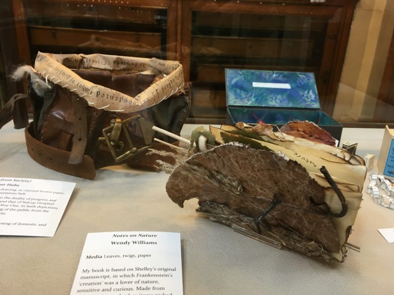
Update: Williams participated in “Frankenstein 2018, The Liverpool & Knowsley Book Art Exhibition”
Wendy Williams ‘Notes on Nature’ portrays ‘the Monster’ as a ‘lover of nature, sensitive and curious’, something that Shelly hinted at in her original manuscript. Again, a very emotional angle to explore and one that really does make you want to reach into the display box and leaf through it.
The “starflies” — those butterfly-shaped, W-shaped sheets of printed paper — are Wendy Williams’ signature (see the installation “King“).
In her 2010-11 “Travel Project,” she reached out to those who appreciate her work to put her signature to use with the Internet’s version of “Kilroy was here” as variously practiced by Travelocity and others in the “roaming gnome prank” and by film-maker Patrick Keiller and others with the fictional character Robinson. Not that she cited those examples, which I mention here to suggest how the “Travel Project” speaks to the “intentional fallacy” anyway.
In one of her blog entries in 2010, Williams writes, “The travel project is going OK. People are so hesitant to take a photo of something that isn’t theirs. I have got a few back, which is good as I can use them as examples to show what I’m after. I suppose February is a while off yet so there is plenty of time.” What is Williams “after”?
No one has stolen her “gnome” to take it on a global trek. The viewers of her art are not an army of enlistees or draftees intent on “marking” every tree, lampost and view with their cultural scent. The artist recognizes that there may be discomfort and hesitation in her viewer/artist arising from the boundaries of intellectual property lines. Even in the face of stated intention, the viewer/critic hesitates. In placing Williams’ starflies within the frame of photos taken around the world, what do the contributing participants become: the brush and maulstick of the artist? artists in our own “right” as well?
If the non-participating viewer or critic deems “Travel Project” a meaningful, artistic success, on what criteria is that success measured? Its reflection of Williams’ intention? The quality of Williams’ curation — how does the critic measure that quality if the critic is not privy to the elements “curated out”? The degree to which Williams’ signature integrates the many contributing hands or voices into the implicit hand or voice of a Robinsonian perspective?
By the standard of whether a work of art makes us think and whether it draws us back to itself, the “Travel Project” lays a fair claim.
Eight Points to Eternity Kat Buckley Photo by Keristin Gaber
The artist describes Eight Points to Eternity, created from a medical dictionary, as a “Continuous eight pointed star”. The description seems unnecessary. “Continuous” — yes, well, the title is “points to Eternity,” and the viewer can grasp that the bindings are linked in a circle. It rather over-explains the pun of the title (an 8 on its side is the symbol for — points to — eternity).
Bookworks can be over-titled and over-explained. Equally often, artists swing the other way, entitling works “Untitled” or simply giving them a number. The latter has the advantage of making the work stand on its own and, equally, forcing the viewer to stand on his or her own before the art object, and perhaps giving up.
“Altered books,” “bookwork” or “book art” — whether as mere craft or meaningful art — almost inevitably carry the freight of the original work’s content, structure and paratextual apparatus as well as their own “meaning.” Some bookworks may be a kind of ekphrasis in reverse. Rather than text playing off a work of art, the bookwork plays off the original book. The tunnel book showing cut-out characters or a collage of elements from the actual content of the altered book is the most evident example of this inverse ekphrasis.
Here, with Eight Points to Eternity, the artist strains a bit for an ekphrastic connection when she explains how the “medical freight” of the dictionary fits into the meaning of her bookwork:
Where do our modern medical ideas truly come from, and how much of it can we attribute to the past?
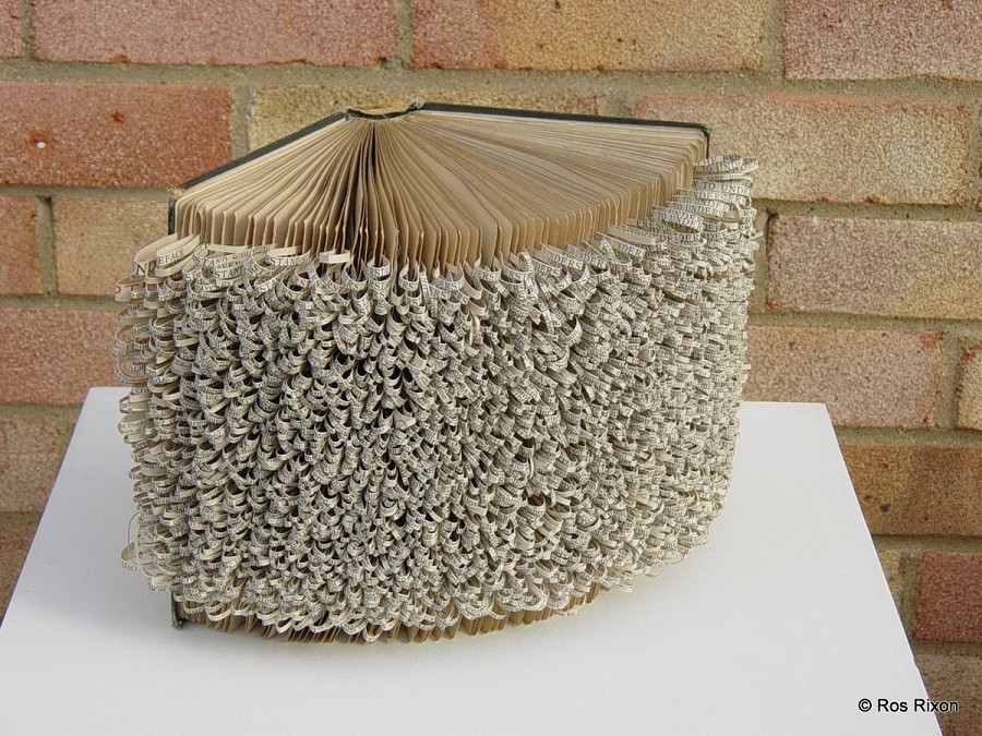
Buckley fares better with her bookwork entitled Good Intentions, in which she has excised the content from an old edition of Ogden Nash’s poetry and left only certain lines. The work reminds me of Ros Rixon‘s How we understand sculpture, a title that stems from the original book’s being a book about sculpture. Good Intentions and How we understand sculpture are subtle and conspire with the subject matter of the raw material with which Buckley and Rixon have worked.
How to understand sculpture Ros Rixon
Good Intentions Kat Buckley Photo by Keristin Gaber
Book Patrol‘s coverage of the Guardian‘s story dates back to July 2011, but because it is one of the most frequently viewed entries at Book Patrol and the artist has been frequently cited here, BOB cannot pass it up.
“Last month, the book art piece above was found at the National Library of Scotland. It was the fourth piece found since March in a book-friendly location in Scotland. All references are devised from the work of Scottish mystery writer Ian Rankin and include a note professing some book love.
First it was the Scottish Poetry Library where a ‘poetree’ was discovered on a bookshelf. The ‘poetree,’ comprised of intricately cut pages, had a note attached referencing a Patrick Geddes quote and the library’s Twitter name,@byleaveswelive.
Next up was a piece left at in the box office of Filmhouse Cinema with the following note ““For @filmhouse – a gift – In support of Libraries, Books, Words, Ideas…&; All things *magic*.”
“I transform books–recognizable symbols of recorded and shared information–and their pages into new forms, using the iconic materials to consider the recursive nature of ideas, regardless of how they were recorded e.g., in manuscripts, books, digital formats. Because I look at gain and loss, remembrance and lapses, permanence and impermanence, images of trees, plants and other organisms that have visible regeneration cycles, as well as the materials derived from them, are interpreted in my art.”
via Holly Senn – installation art, sculpture, conceptual art.
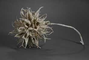
Senn is known for these sculptures and installations created from discarded library books. Through forms like the chestnut burr above, her art represents how ideas are generated and dispersed, or through the transformation of books into empty hornets’ nests, how they are abandoned and forgotten.
The craft and artistry is superlative. Do these bookworks reward re-viewing and contemplation the way the bookworks of
She is on her way to finding out: “Recent installations include “Inhabit” at Gallery @ the Jupiter in Portland; “Link” at Tollefson Plaza in Tacoma; “Cover” at Doppler PDX in Portland; “Re-Present” at Spaceworks in Tacoma; “Tale” at 23 Sandy Gallery in Portland; and “Windows on Nature and Knowledge” at Brooklyn Public Library, Brooklyn. Awards include the Artist Trust Grant for Artists Projects and a Tacoma Arts Commission Tacoma Artists Initiative Program grant.”
The artist and his bookworks, Nicholas Jones from Melbourne, Australia.
Extract from “The World of the Book” by Des Cowley & Clare Williamson, pp 218
The beauty inherent in a book’s form has often been revealed by artists who change and modify books. Nicholas Jones’s altered books are made with surgical precision, as he rips, tears, cuts and folds them into new shapes. His work attempts to highlight the beauty of the book through a process of changing it.
Instead of considering the book as a vehicle for narrative or ideas, we are instead confronted by the abstract quality of the book’s shape. Its original text is almost irrelevant to the final sculptural form, except as a fragmented pattern that peers out from beneath the finished folds or cuts. Jones’s father is a surgeon, and it is the very implements of this trade- scalpel, surgeon’s needle- that he uses to alter books. The act of defacement is the process whereby Jones renews the physical form of the book, divesting it of its original intent and allowing the viewer to ‘read’ it in an entirely new way.