Arthur R.: Promenade pour 5 chameaux (1987)

Arthur R./Promenade pour 5 Chameaux (1987)
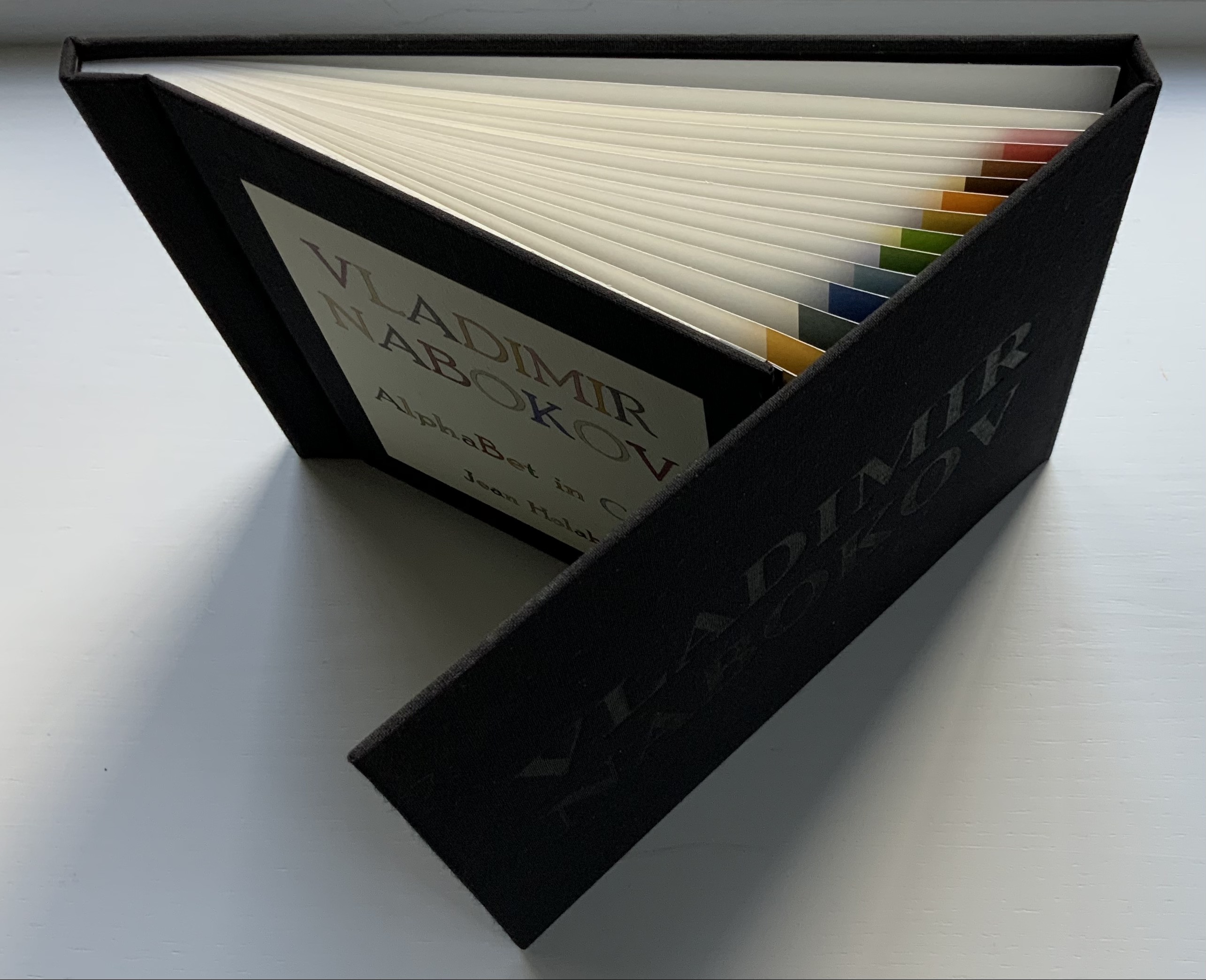
Chiavelli
Bande Dessinée. H298 xW226 mm, 48 pages. Acquired from Librarie de l’Université, 28 October 2021.
Photo: Books On Books Collection.
It is curious — given that Stéphane Mallarmé had only ever seen Arthur Rimbaud once and wrote about him only on commission — that Chiavelli assigns Un Coup de Dés as the subtitle of his second volume in a series of three graphic novels following the adventures of “Arthur R.”, a Tin Tin-like version of Arthur Rimbaud. Chiavelli weaves his imagined adventures of Rimbaud on the Horn of Africa (1880-91) into a three-volume graphic novel whose plot lines, scenes and dialogue balloons are stuffed with arch allusions to Rimbaud’s abandoned literary life and postmodern literary criticism.
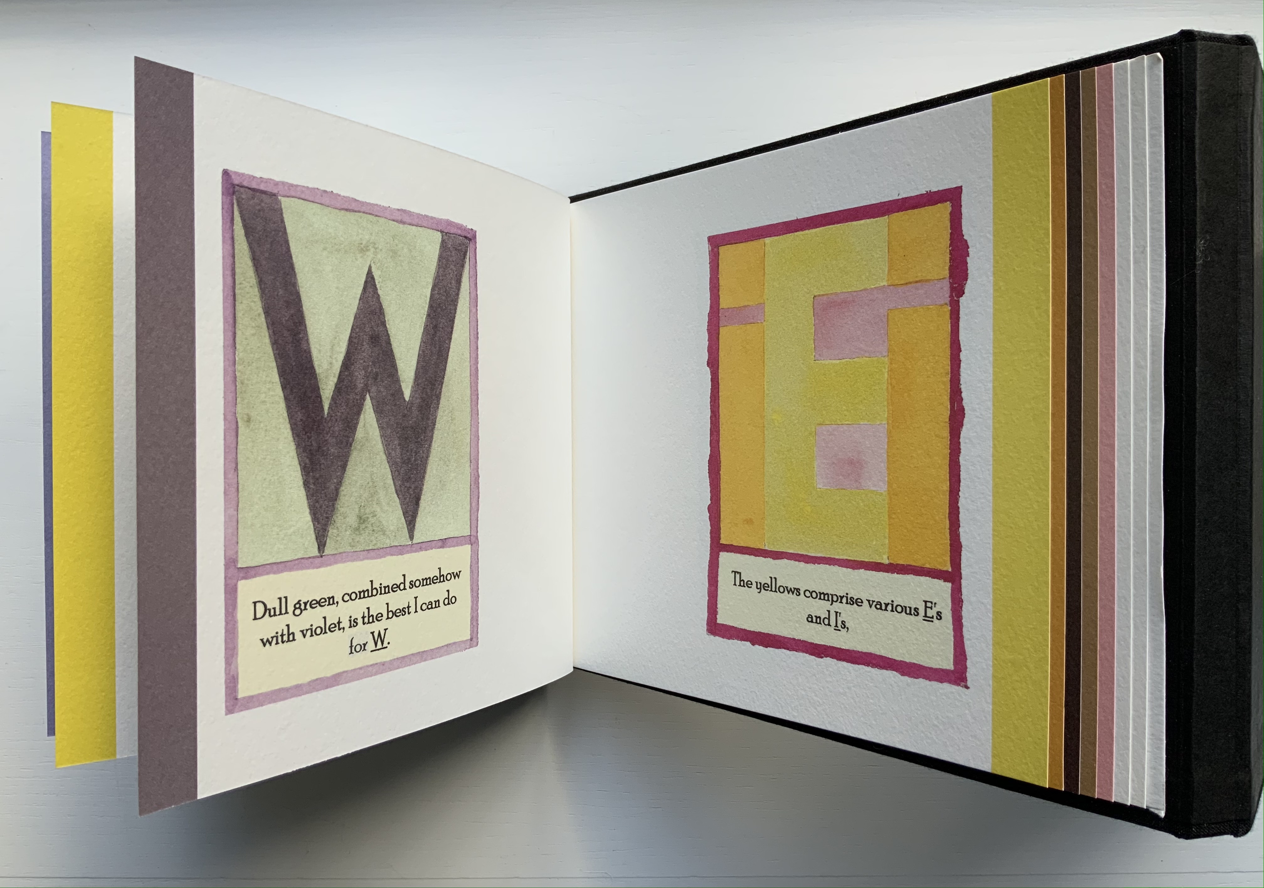
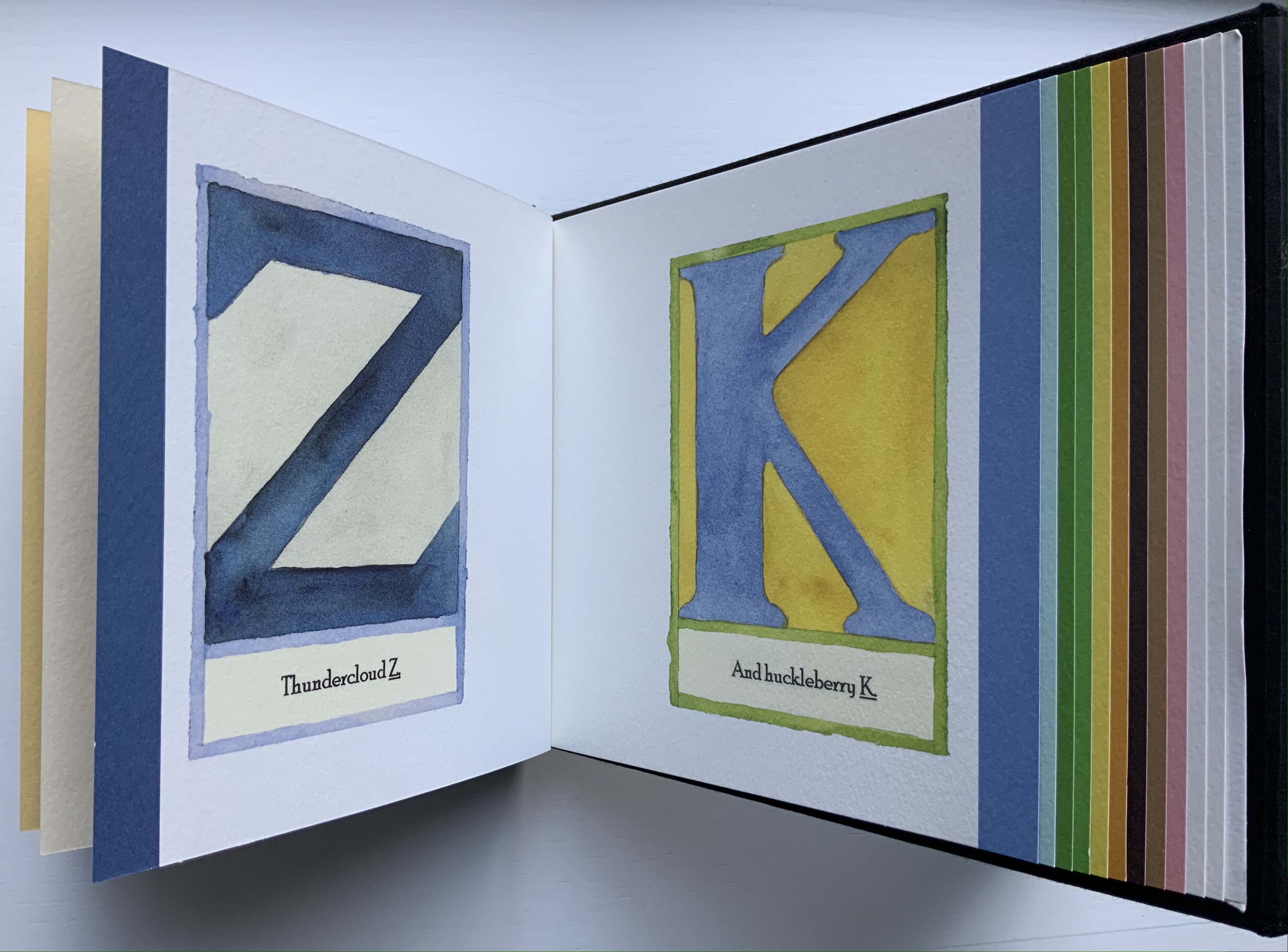
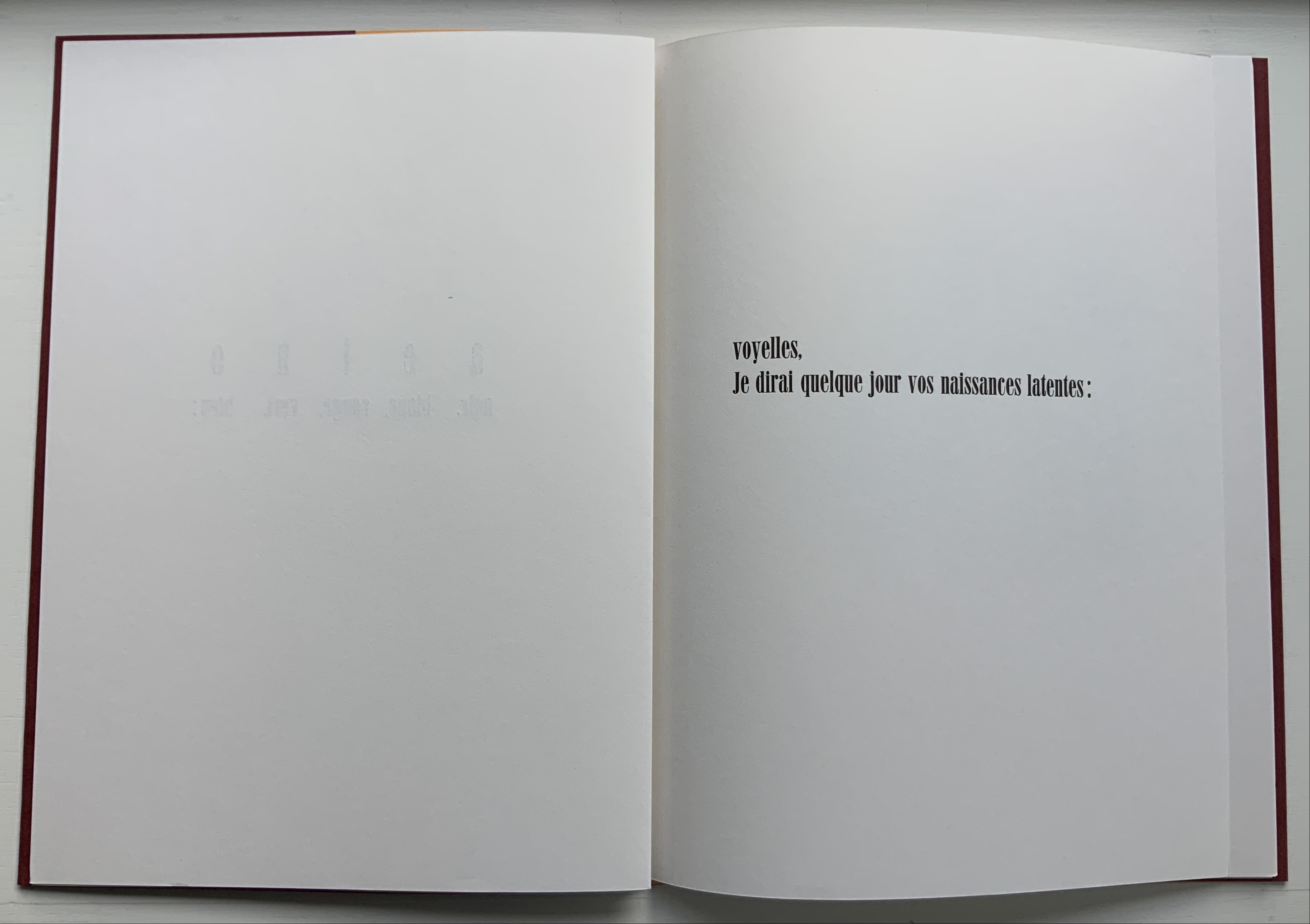
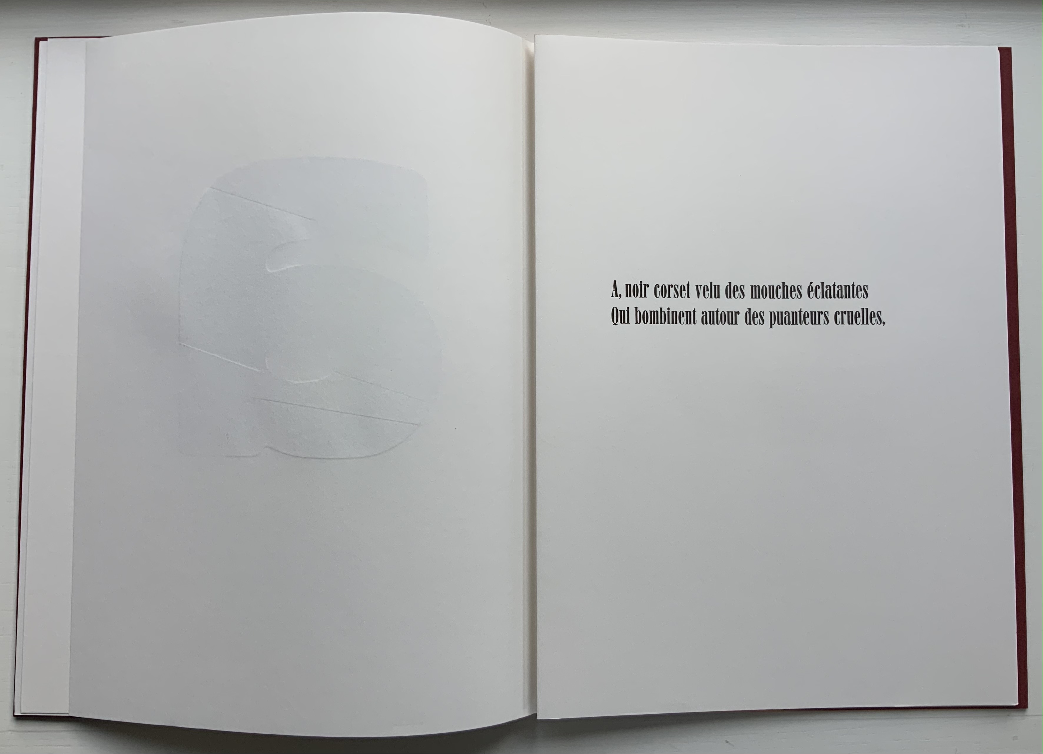
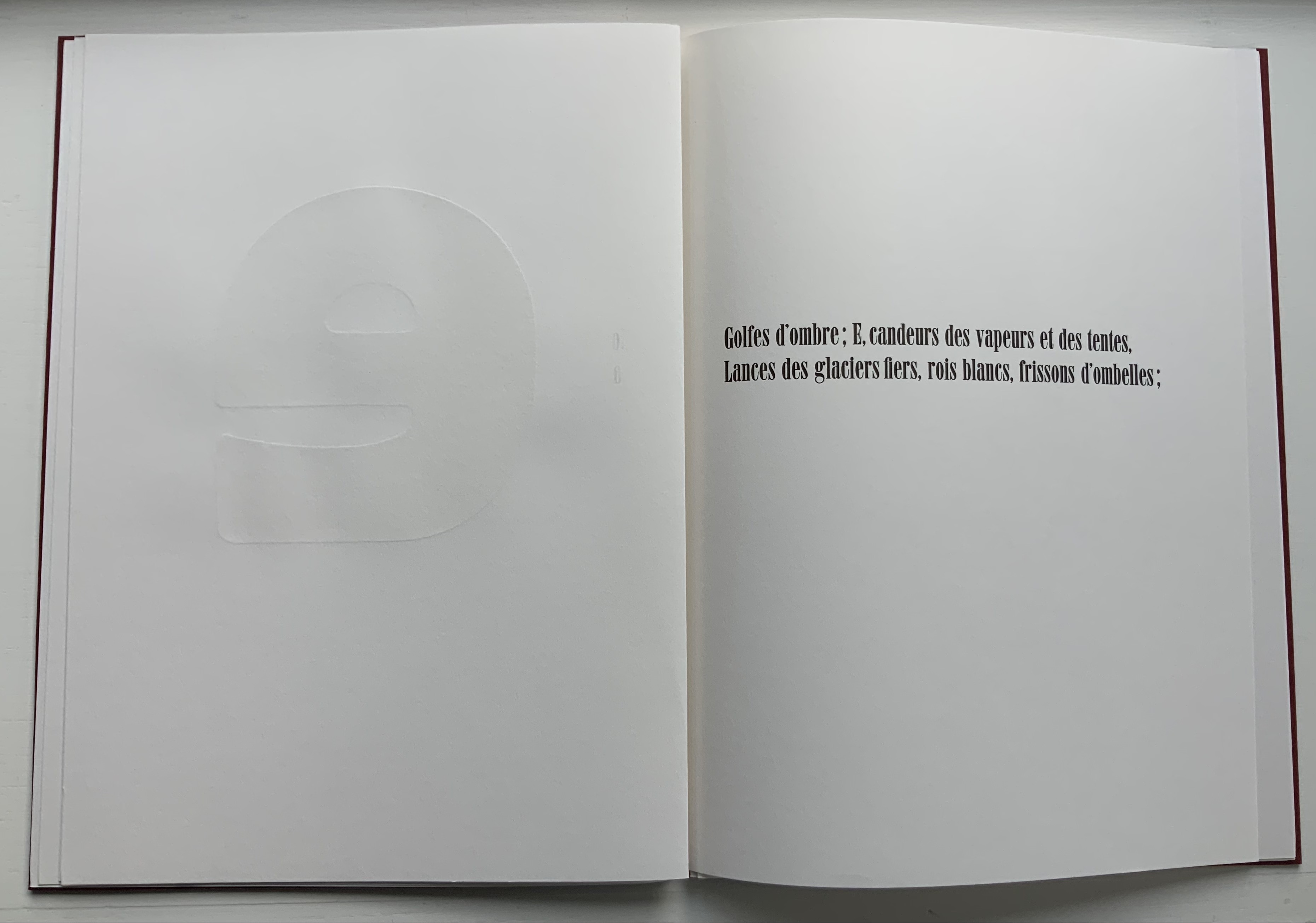
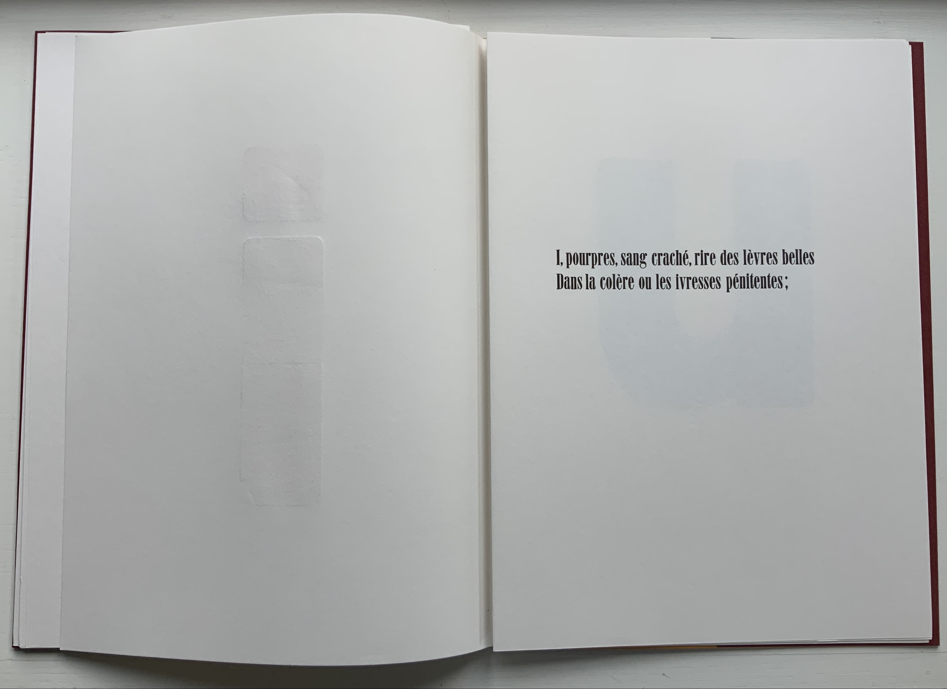
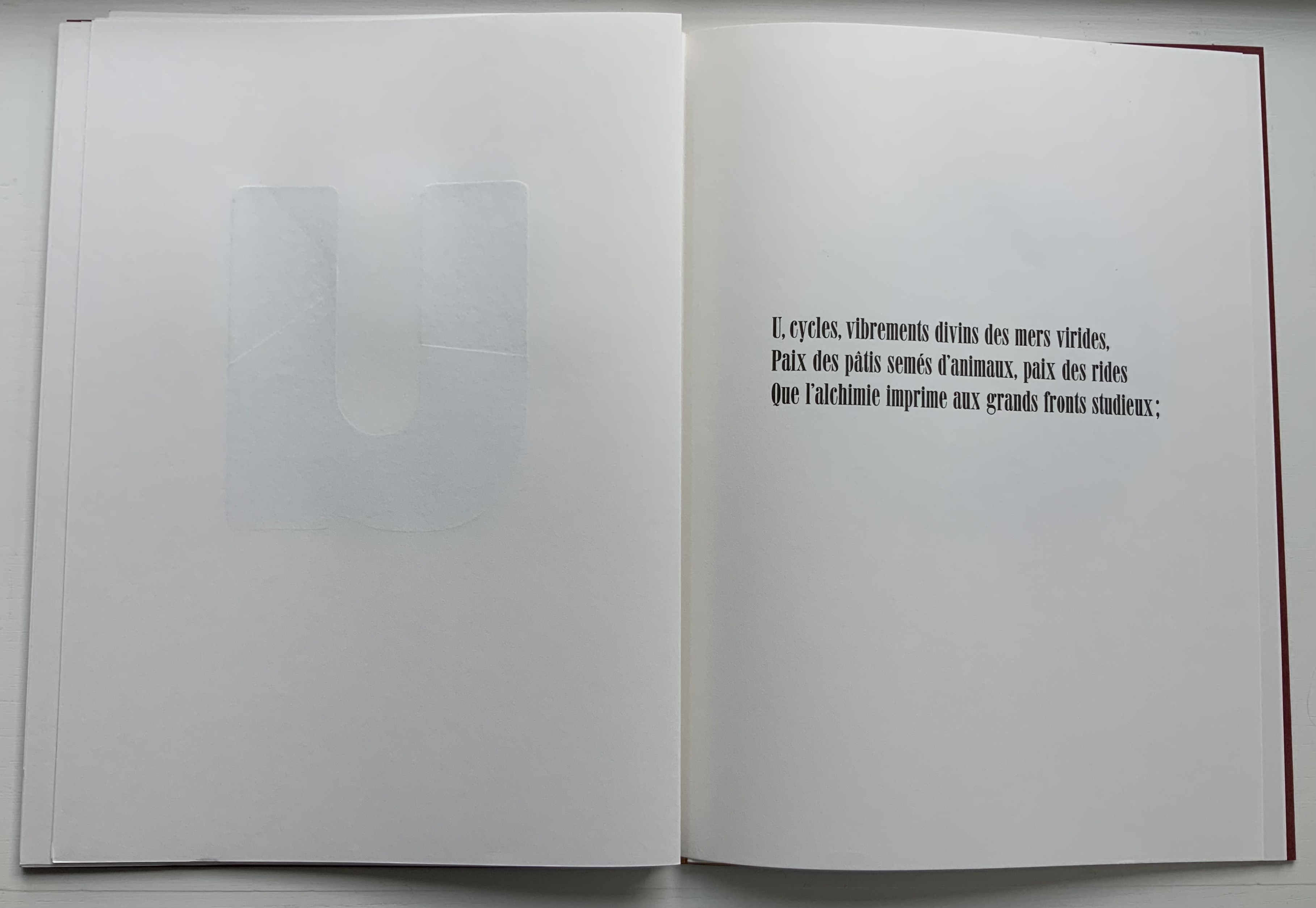
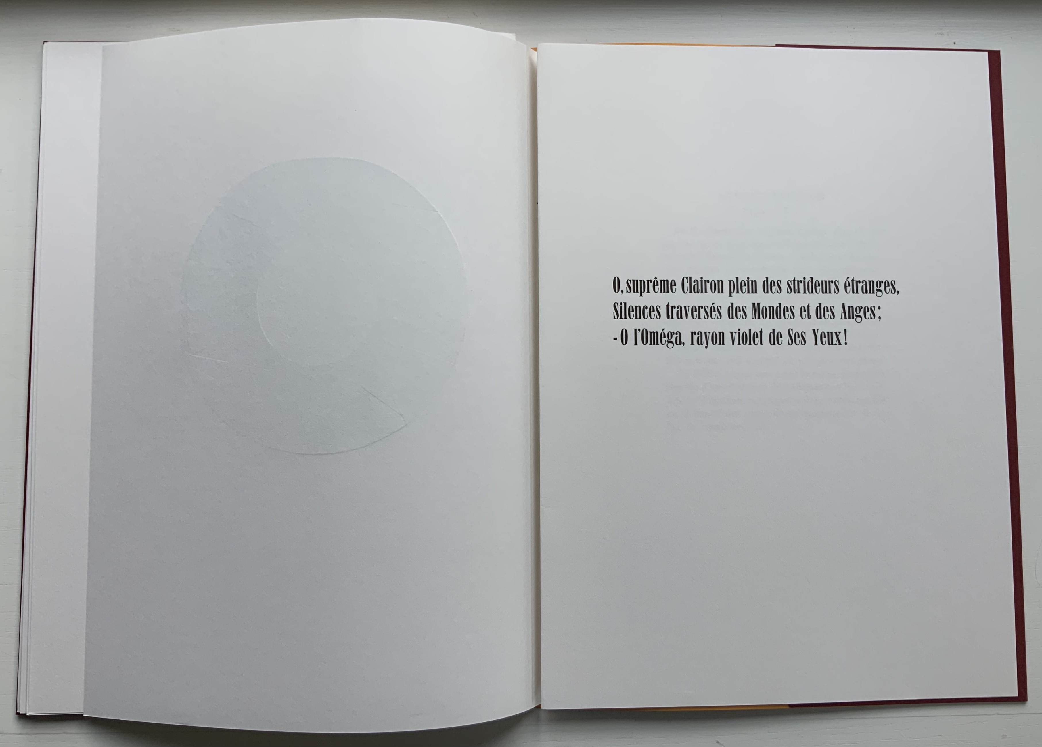
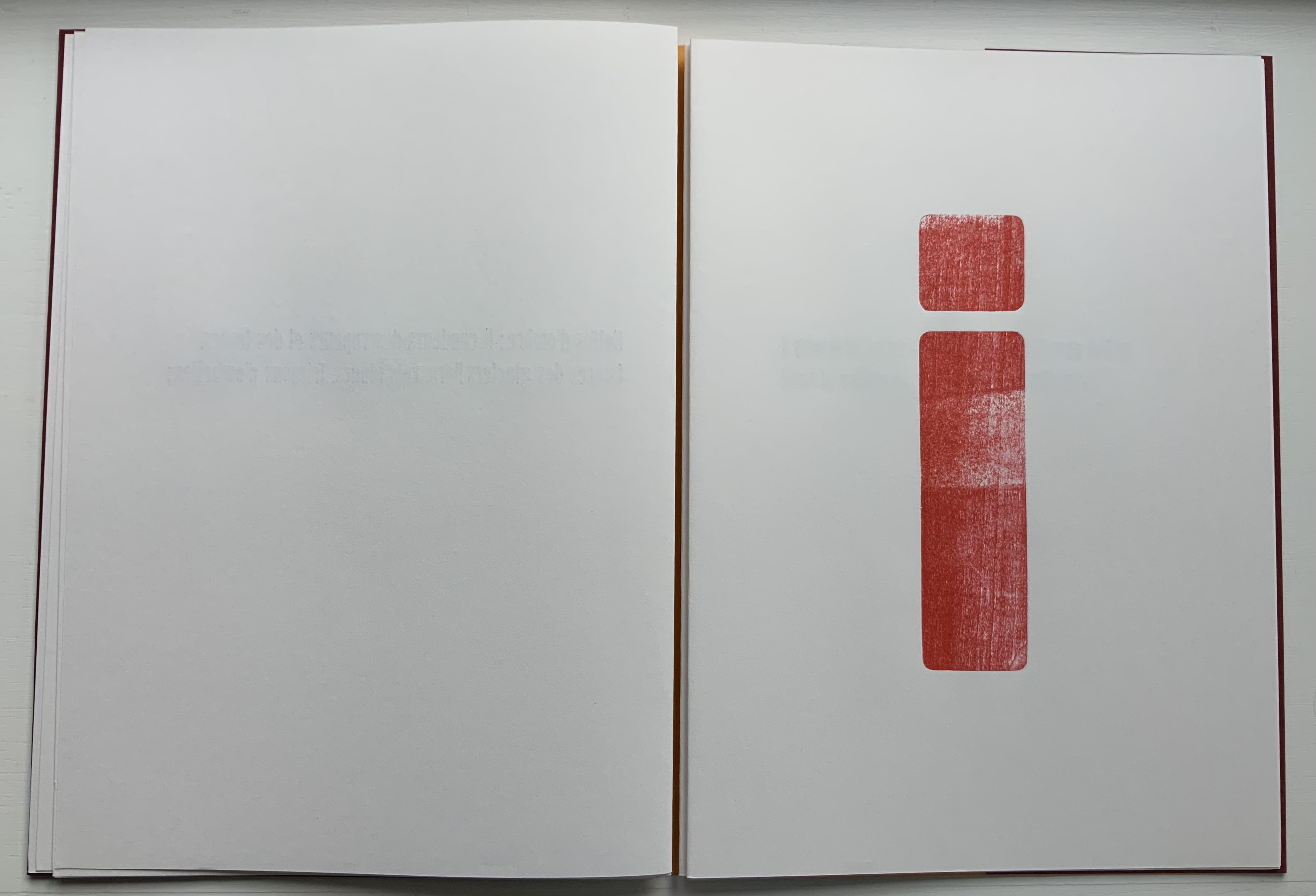
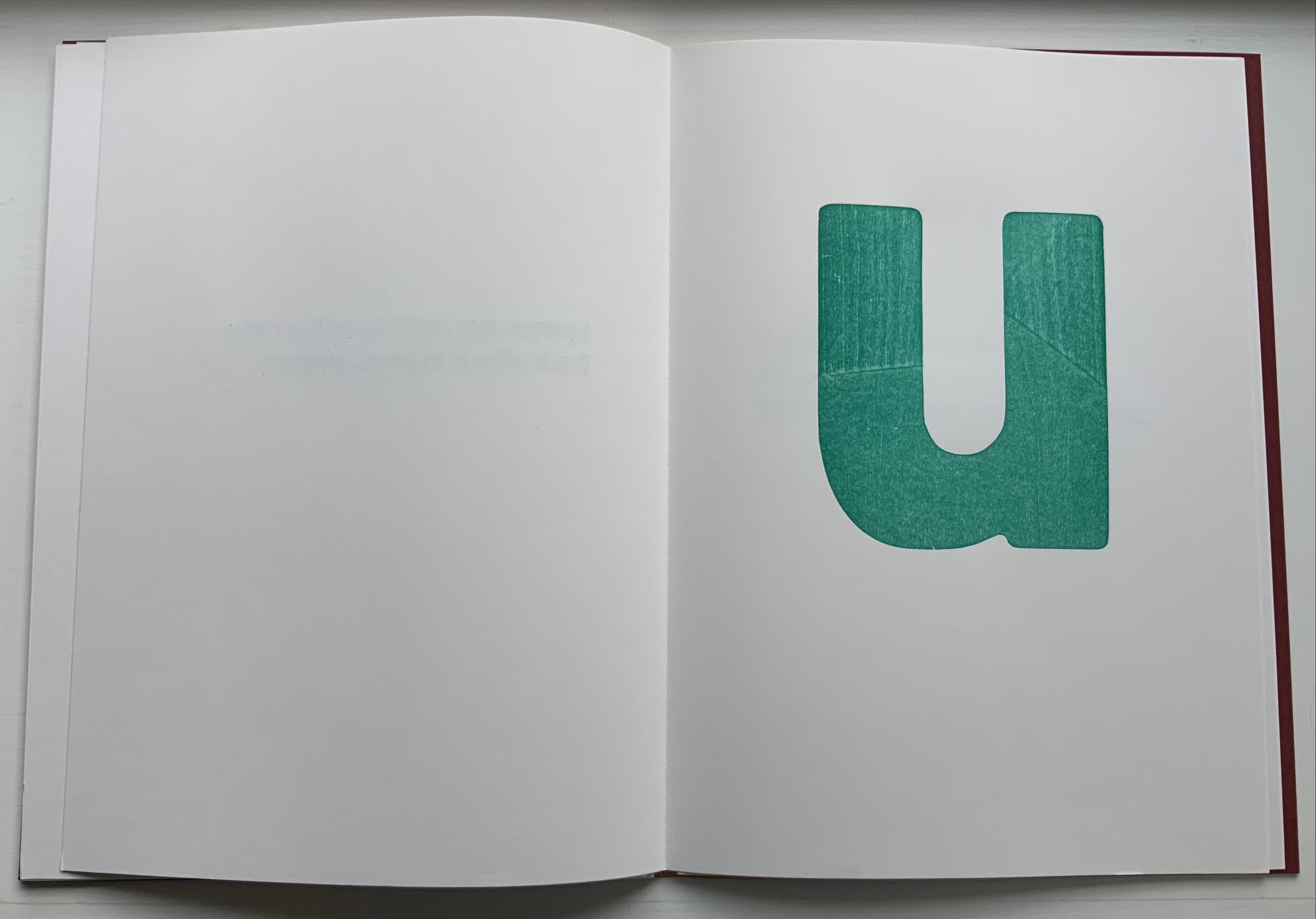
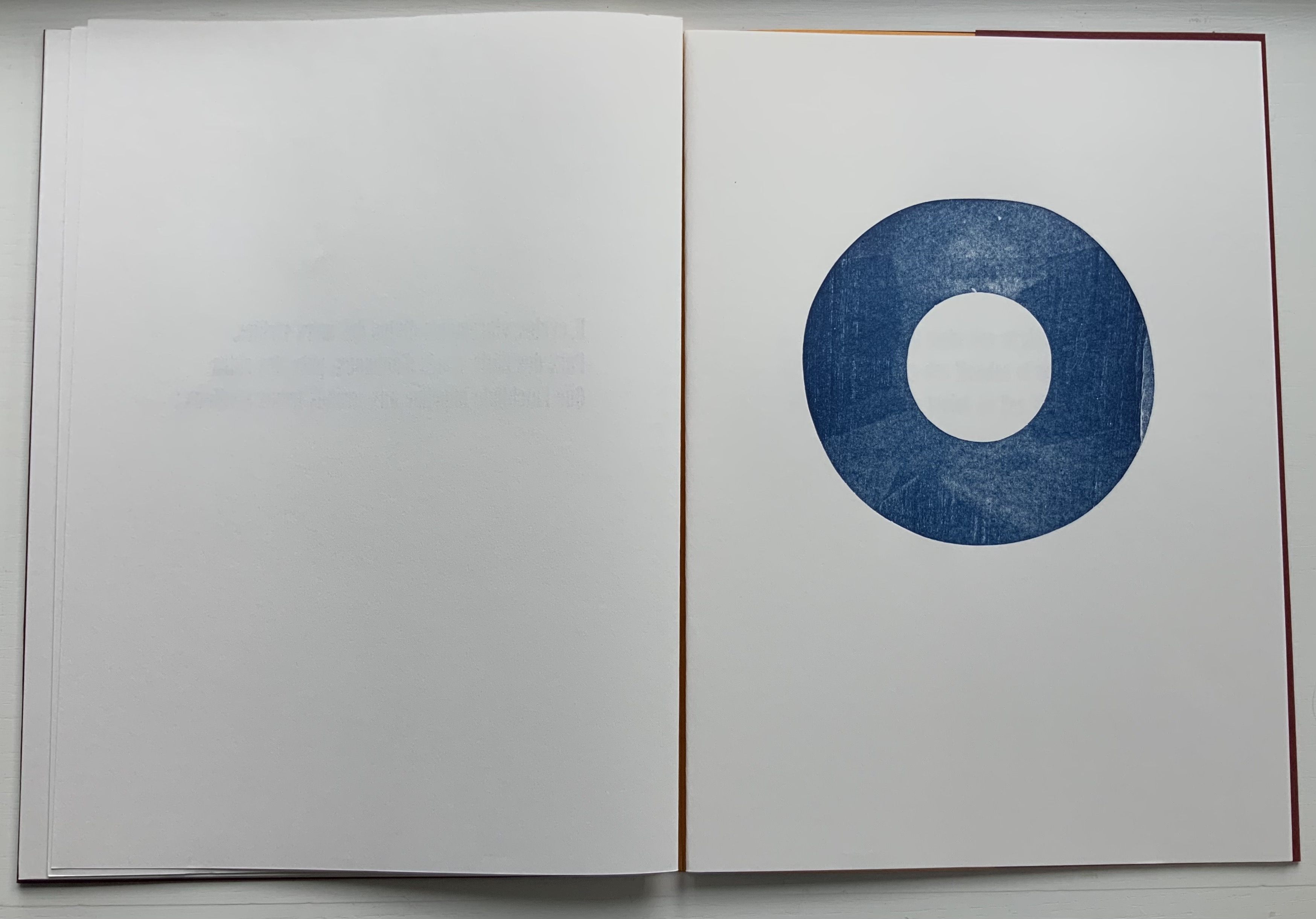
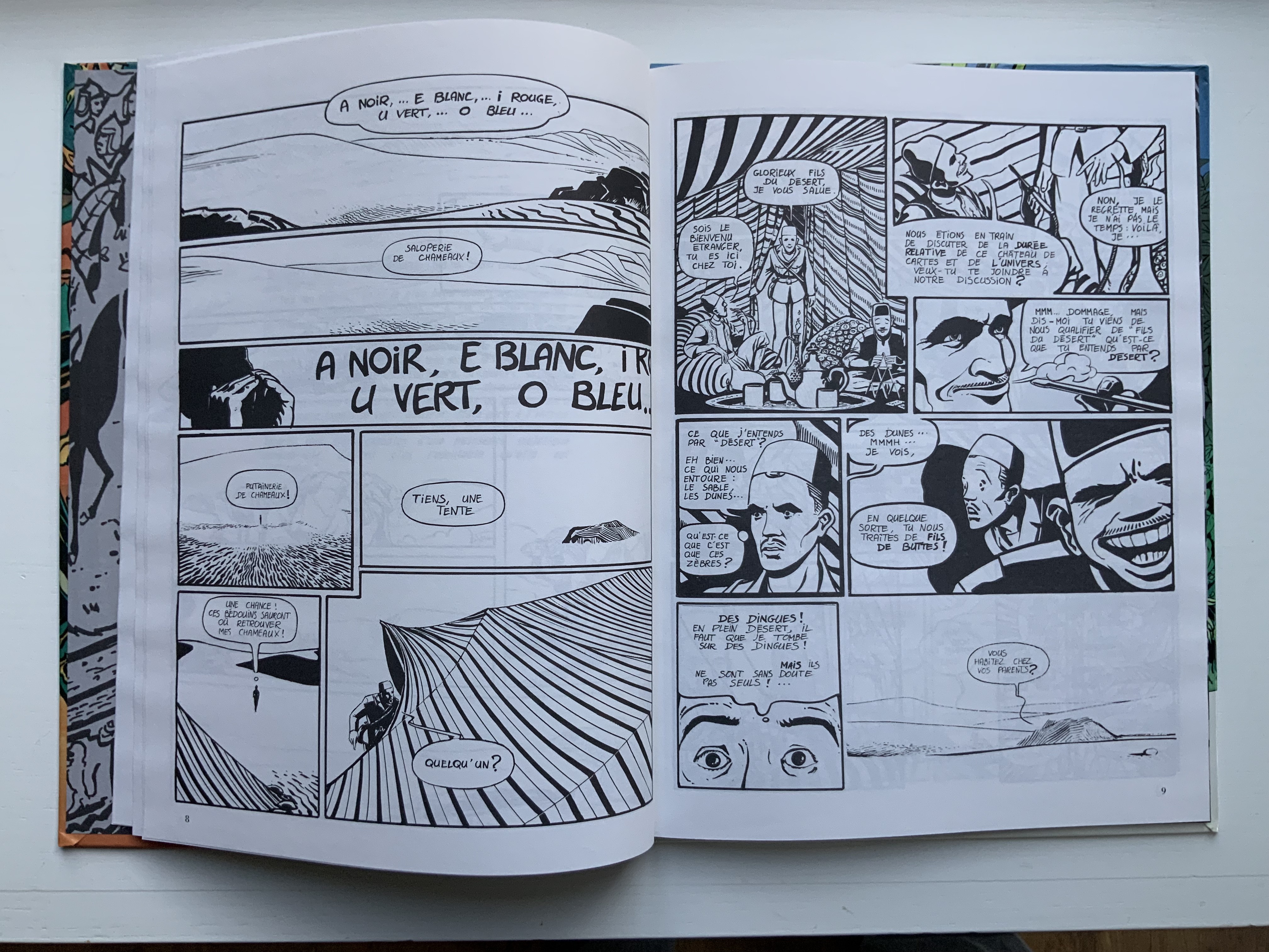
In this first volume, Chiavelli gives his hero a favorite curse — the mild Bon sang! (“damn!”), probably uncharacteristic for the Rimbaud who killed a worker in Cyprus with a rock, but characteristic for Chiavelli making a tongue-in-cheek reference to Mauvais sang (“Bad Blood”, the second and longest poem in Une saison en enfer, 1873). The five camels of the title are named A,E, I, U and O, after the letters of his sonnet Les Voyelles (1871), which has been rendered in multiple livres d’artiste, one of which is in the Books On Books Collection. As the sonnet associates each vowel with a color, Chiavelli can be suspected of being tongue-in-cheek in delivering his comic completely in black and white. Certainly the invitation to a philosophical discussion of time that segues into a French pun “sons of the desert” into “sons of bitches” (fils de buttes for fils de putes) sets the tone to come.
Arthur R./Un Coup de DÉS Jamais N’Abolira le HASARD (1988)
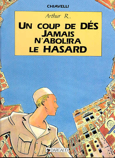
Arthur R./Un Coup de DÉS Jamais N’Abolira le HASARD
Chiavelli
Bande Dessinée H290 x W225 mm, 48 pages. Acquired from Librairie de l’Université, 28 October 2021.
Photo: Books On Books Collection.
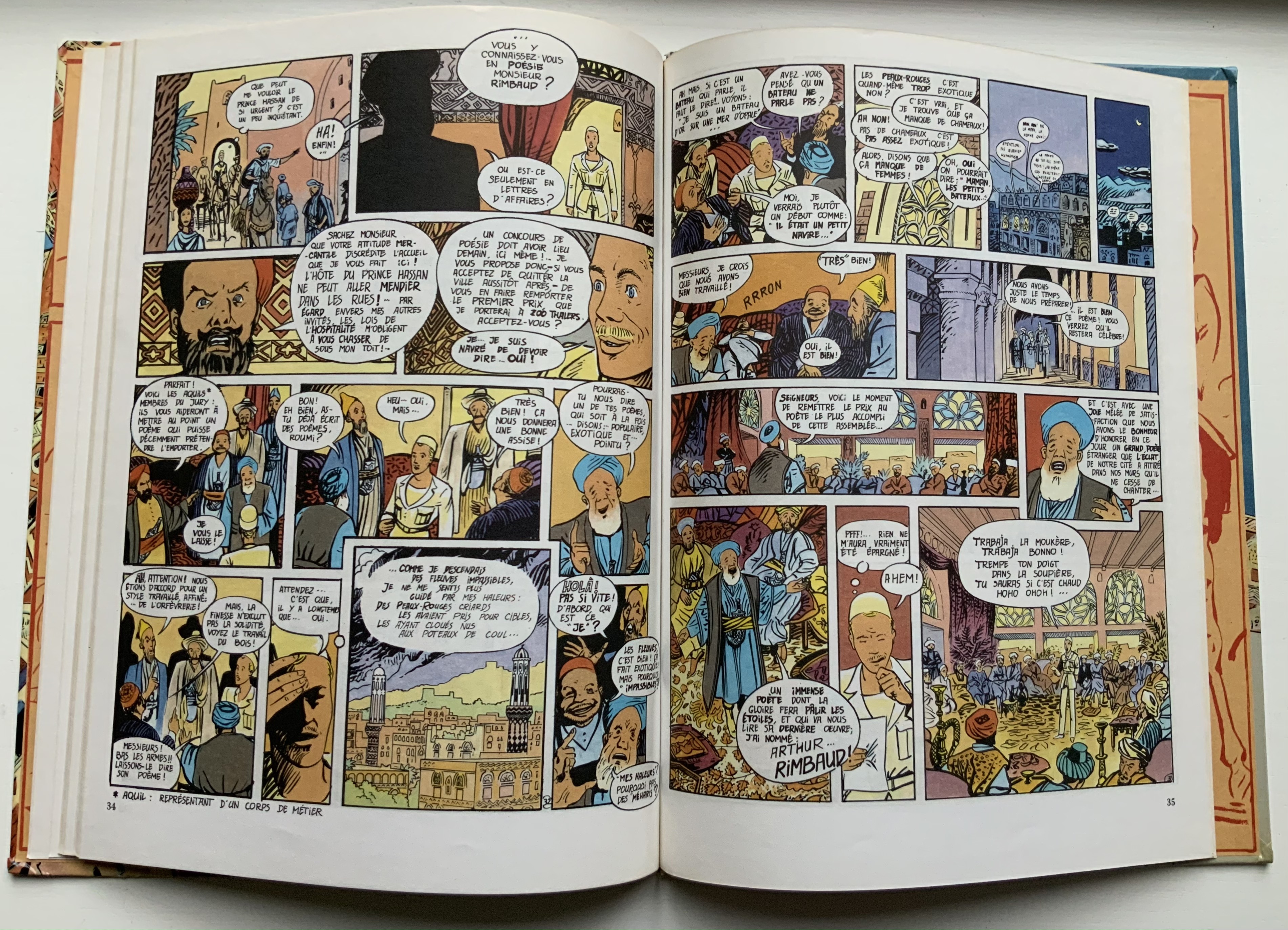
With its title, this four-color volume marks a shift in its joking allusiveness from Rimbaud alone to a conflation with Stéphane Mallarmé’s poem of the same title: an opening game of dice and a search for the city of “Azar” (homonym for hasard, meaning chance and also a game of dice). Still though, Rimbaud/Tin Tin is never far away; see the second double-page spread in which he recalls to himself the opening lines to Le Bateau Ivre/”The Drunken Boat” but then delivers to his Arab audience a racist, misogynistic ditty concocted by French legionnaires in Algeria.

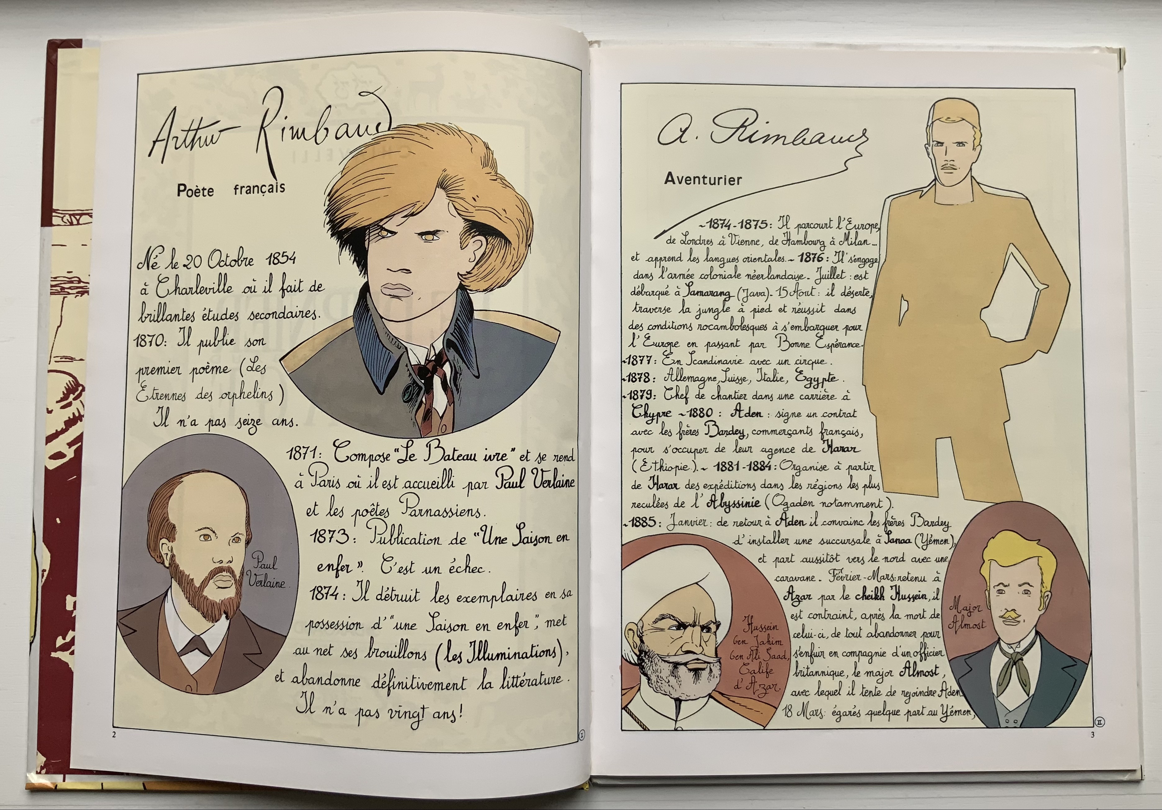
Arthur Rimbaud/ Le Dernier Voyage (1992)
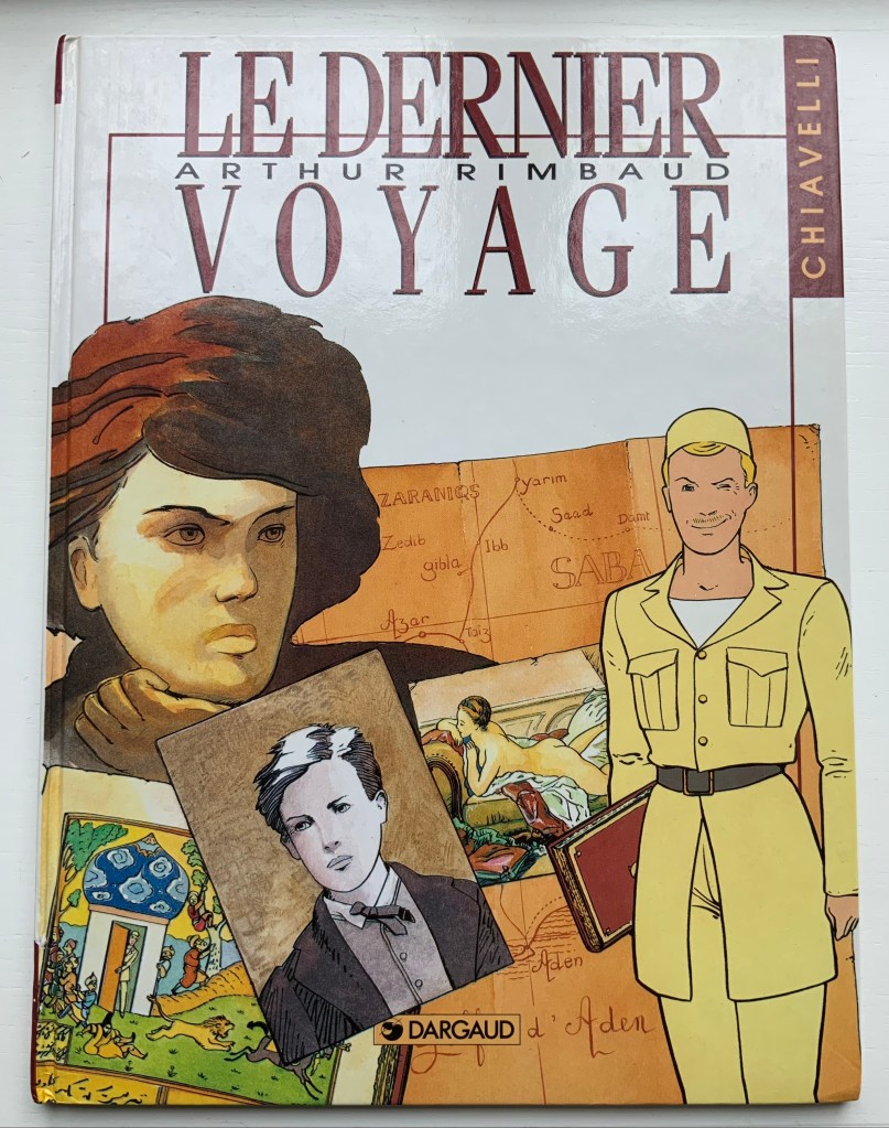
Arthur Rimbaud/ Le Dernier Voyage (1992)
Chiavelli
Bande Dessinée H320 x W240 mm, 52 pages. Acquired from EV Asset, 29 October 2021.
Photo: Books On Books Collection.
Spelling out Arthur R. on the cover of the last of the trilogy somewhat spoils the already scant Tin Tin camouflage. The inclusion of Rimbaud’s capsule biography at the start and epitaph at the end also gives this volume the feel of the earnest American comic book series “Classics Illustrated”. But its “One Thousand and One Nights” leap into the hero’s pursuit of le livre in this last voyage (a double allusion to Mallarmé?) and his amorous involvement with a femme fatale (and others) raise the trilogy to such a comic level of narrative, philosophical and literary self-reference (and such groan-inducing puns as Chipizade for Scheherezade) that the cover title and earnestness might be forgiven — depending on the reader’s age, sex and race.

Further Reading
Borer, Alain. 1984. Rimbaud en Abyssinie. Paris: Seuil.
Fontaine, Hugues. 29 September 2020. “Arthur Rimbaud and King Menelik of Shoa” The Rimbaud and Verlaine Foundation. Accessed 4 December 2021.
Starkie, Enid. 1938. Rimbaud en Abyssinie. Avec une carte. Collection de documents et de témoignages pour servir à l’histoire de notre temps. Paris: Payot.