Jessica Berenbeim, a University Lecturer at the Faculty of English and a Fellow of Jesus College, has selected works from the Books On Books Collection for this exhibition. With the assistance of Justine Provino, a doctoral student at Cambridge, Berenbeim has arranged the works to effect a certain conversation. As she writes,
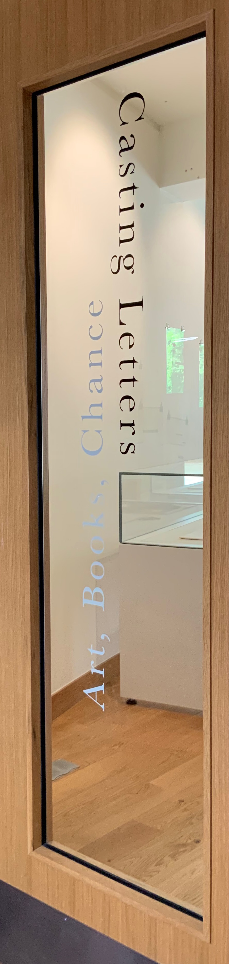
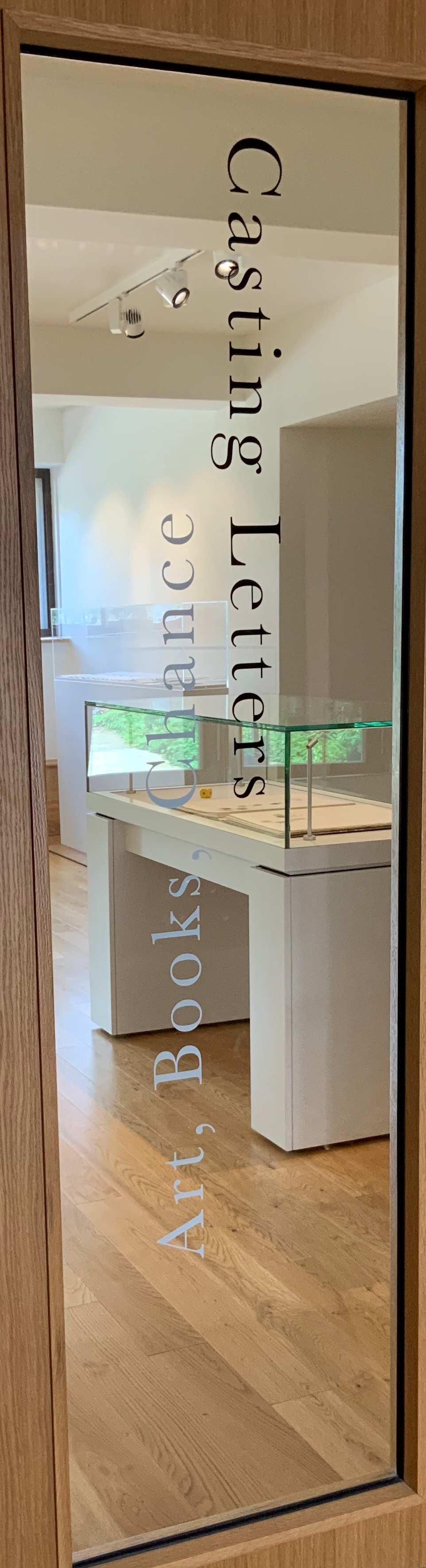
Artists’ experiments with books and letters have taken many forms, some of which look more like books than others. This exhibition of book art, and book-inspired art, opens a view of one of its most intriguing stories: the tradition of reflections, riffs, and responses to one seminal work, Stéphane Mallarmé’s A Roll of the Dice Never Will Abolish Chance (Un Coup de dés jamais n’abolira le hasard). Mallarmé’s experimental work celebrates its 125th anniversary in May 2022, when this exhibition opens. The particular objects on display here, and on view at the screening events, play on two central ideas inspired by this work: chance and visible language. The works in the exhibition are in effect a conversation about the intersection of those themes. What part does chance have to play in the way language is depicted on (or off) the page, and how might accidents of language determine how it looks? How does meaning settle throughout the forms of letters, words, lines, pages, and books, as well as in what the words say?
The exhibition and screenings include works by Jérémie Bennequin, Isabella Checcaglini & Mohammed Bennis, Robert Filliou, Ernest Fraenkel, Rodney Graham, ‘Estelle J.’, Michel Lorand, André Masson, Reinhold Nasshan, Michalis Pichler, Man Ray, Mitsou Ronat & Tibor Papp, and Honorine Tepfer.
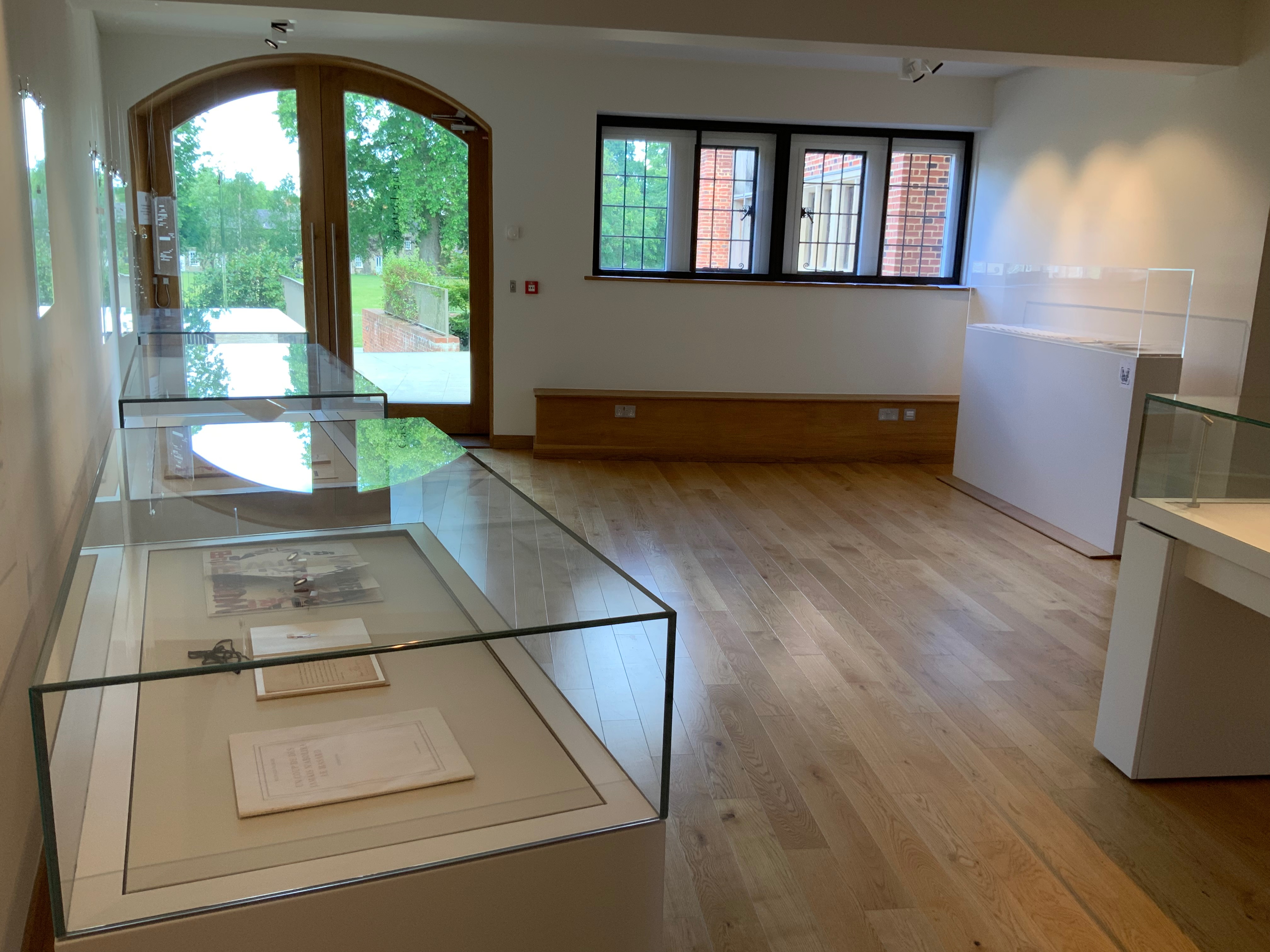
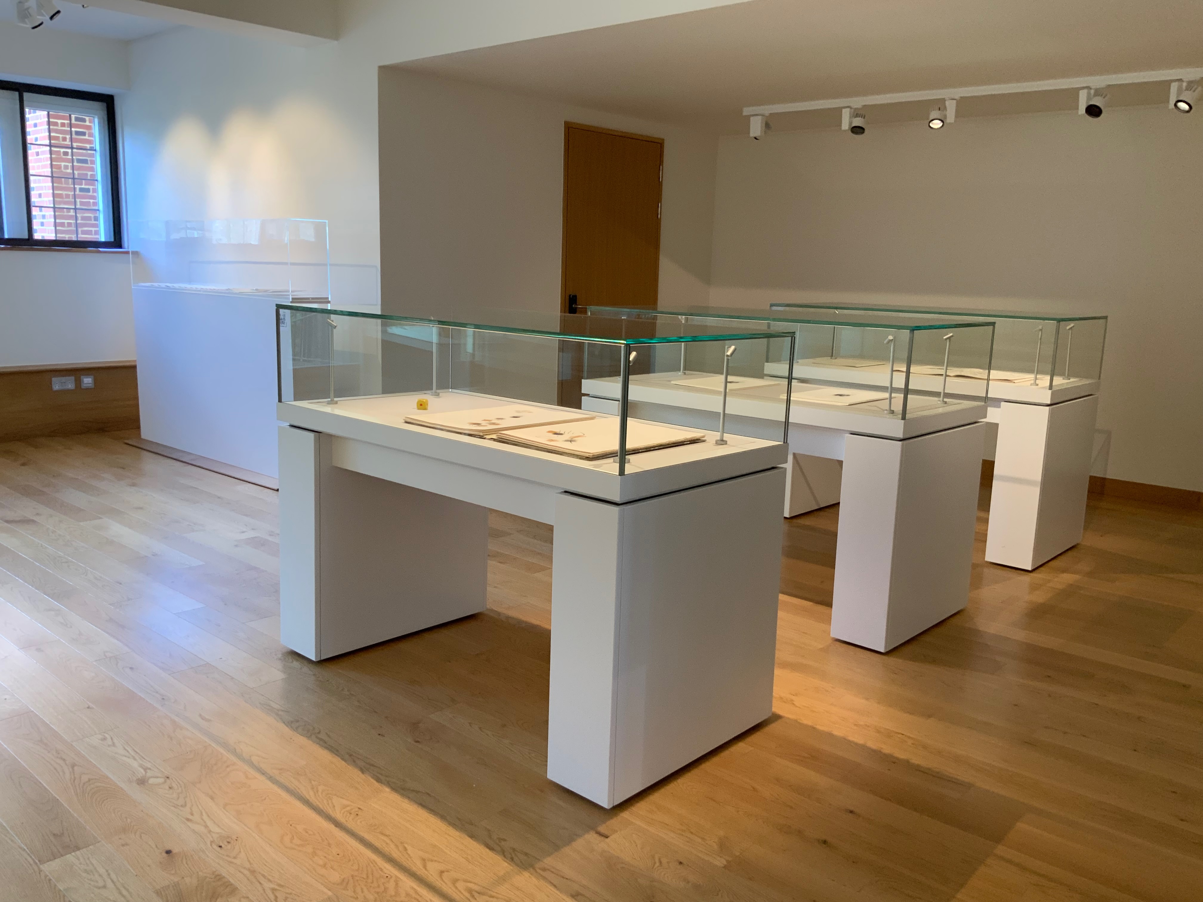
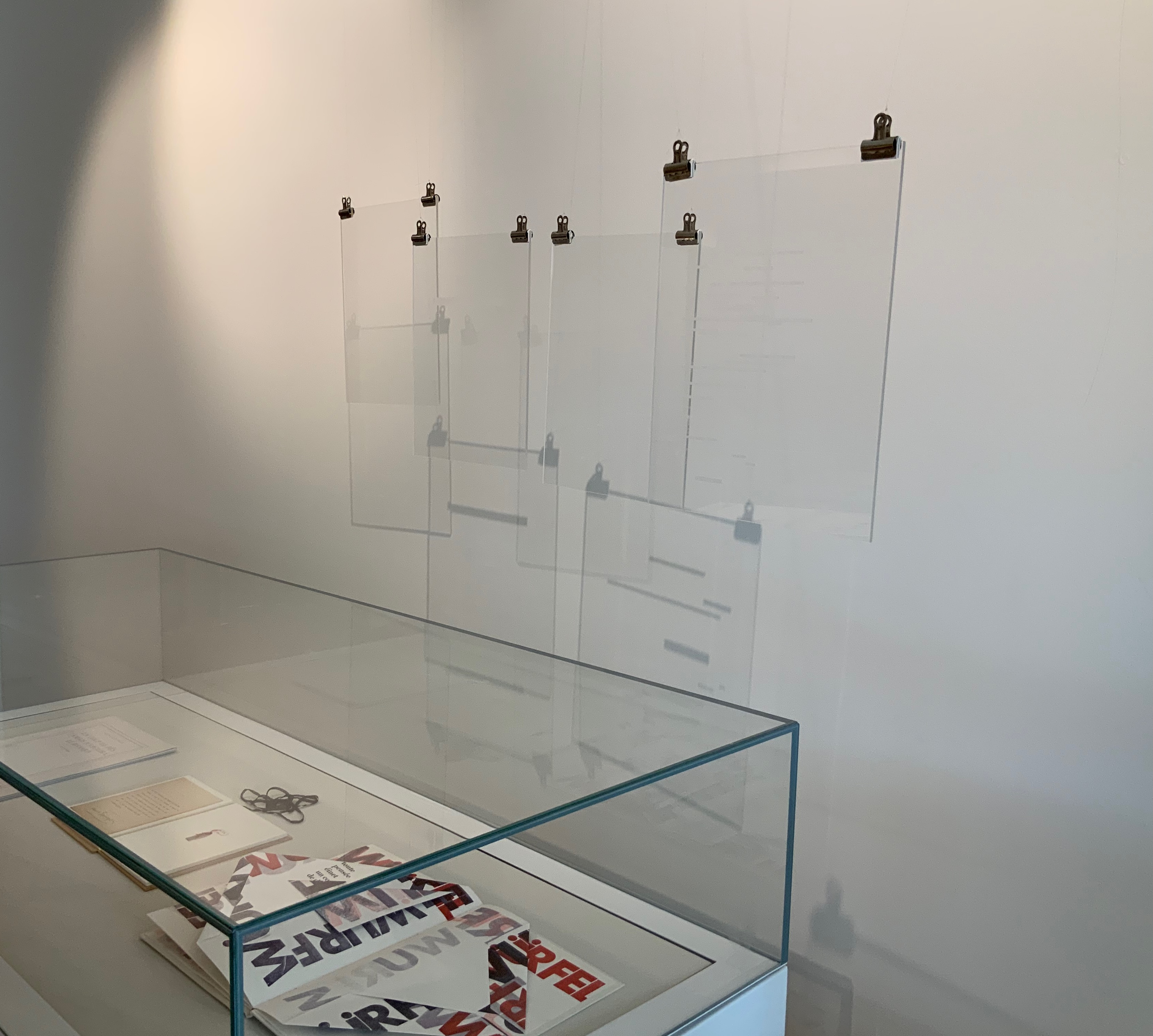
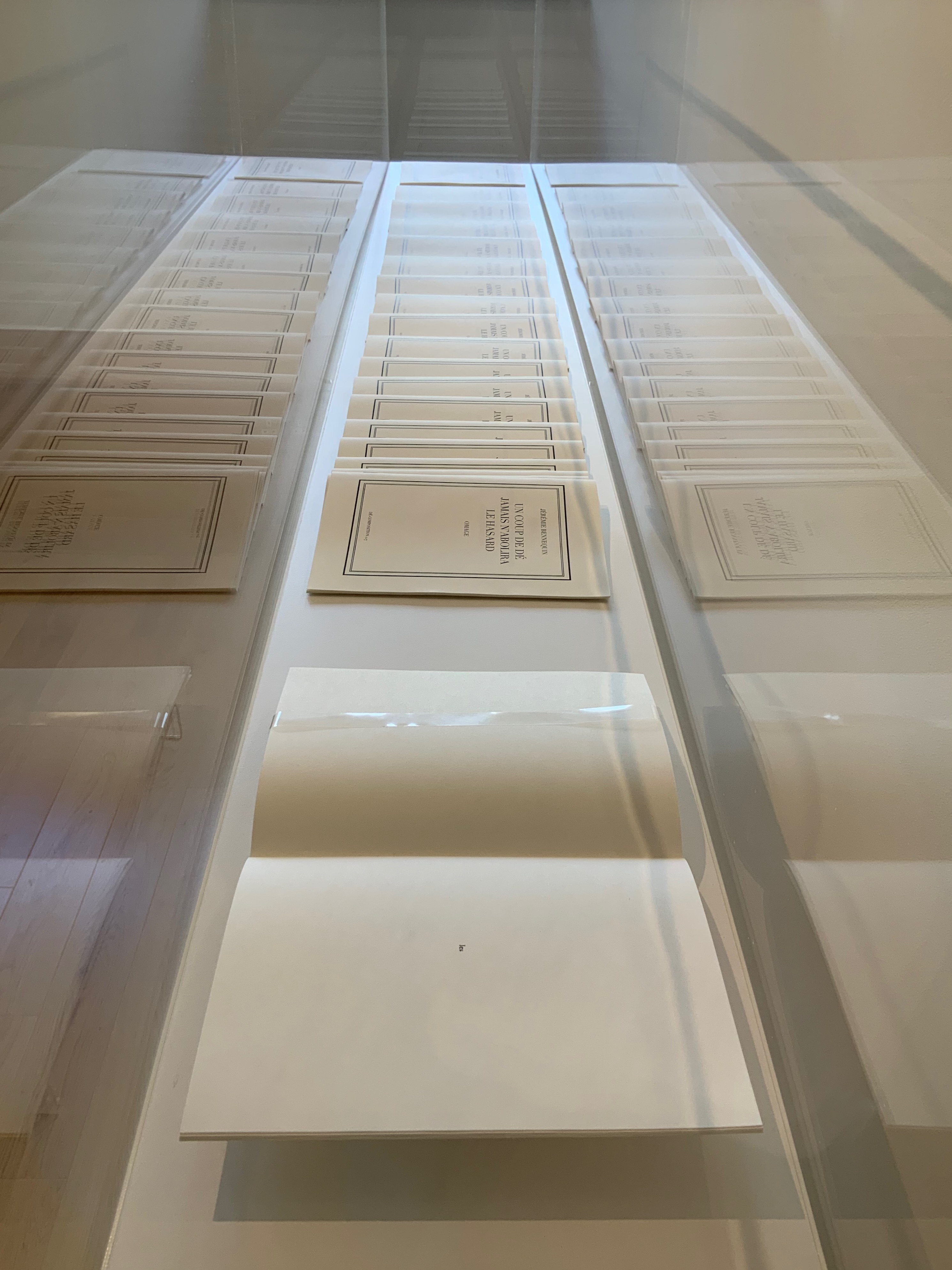
Berenbeim and Provino have suspended seven plates from Pichler‘s homage to hang over the cases containing works by Bennequin, Nasshan, Lorand, Tepfer and Estelle J.. and quietly cast shadows to pun with those works and the exhibition’s title.
L-R: Michalis Pichler, Un Coup de Dés Jamais N’Abolira le Hasard: Sculpture (2008); Jérémie Bennequin, Le Hasard N’Abolira Jamais Un Coup de Dés (Changes of Music) (2020); Reinhold Nasshan, Würfelwurf: fragmentarische Annäherung an Stéphan Mallarmé (1992).
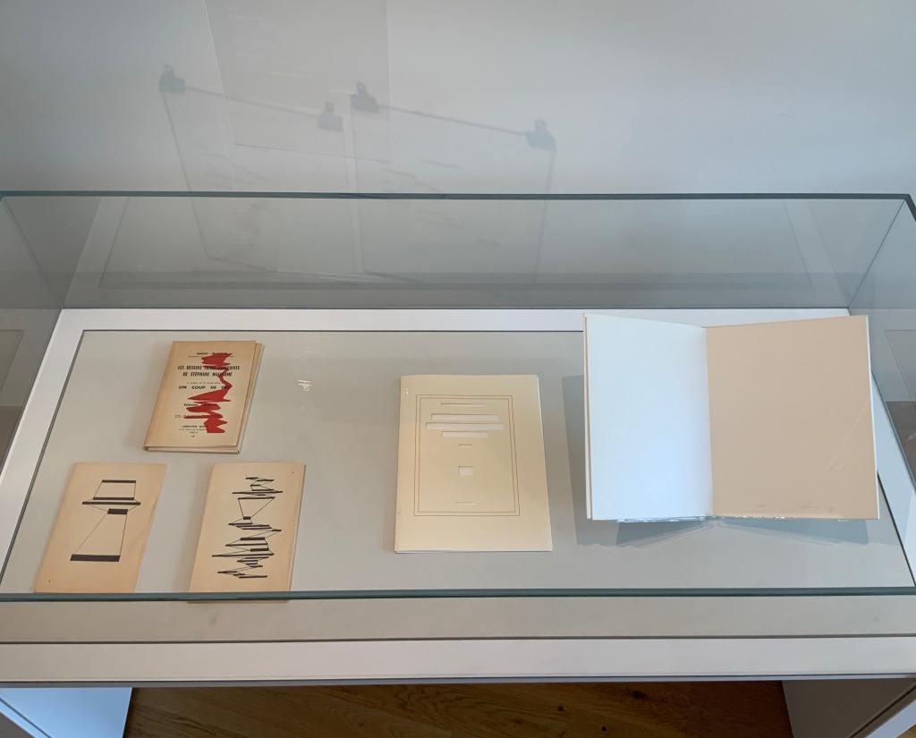
L-R: Ernest Fraenkel, Les Dessins Trans-conscients de Stéphane Mallarmé, à propos de la Typographie de Un Coup de Dés (1960); Michel Lorand, Après Un Coup de Dés (2015); Honorine Tepfer, Un Coup de Dés Jamais N’Abolira le Hasard: Poème (1989)
Estelle J., STÉPHANE MALLARMÉ: Un coup de dés n’abolira le hasard (ND)
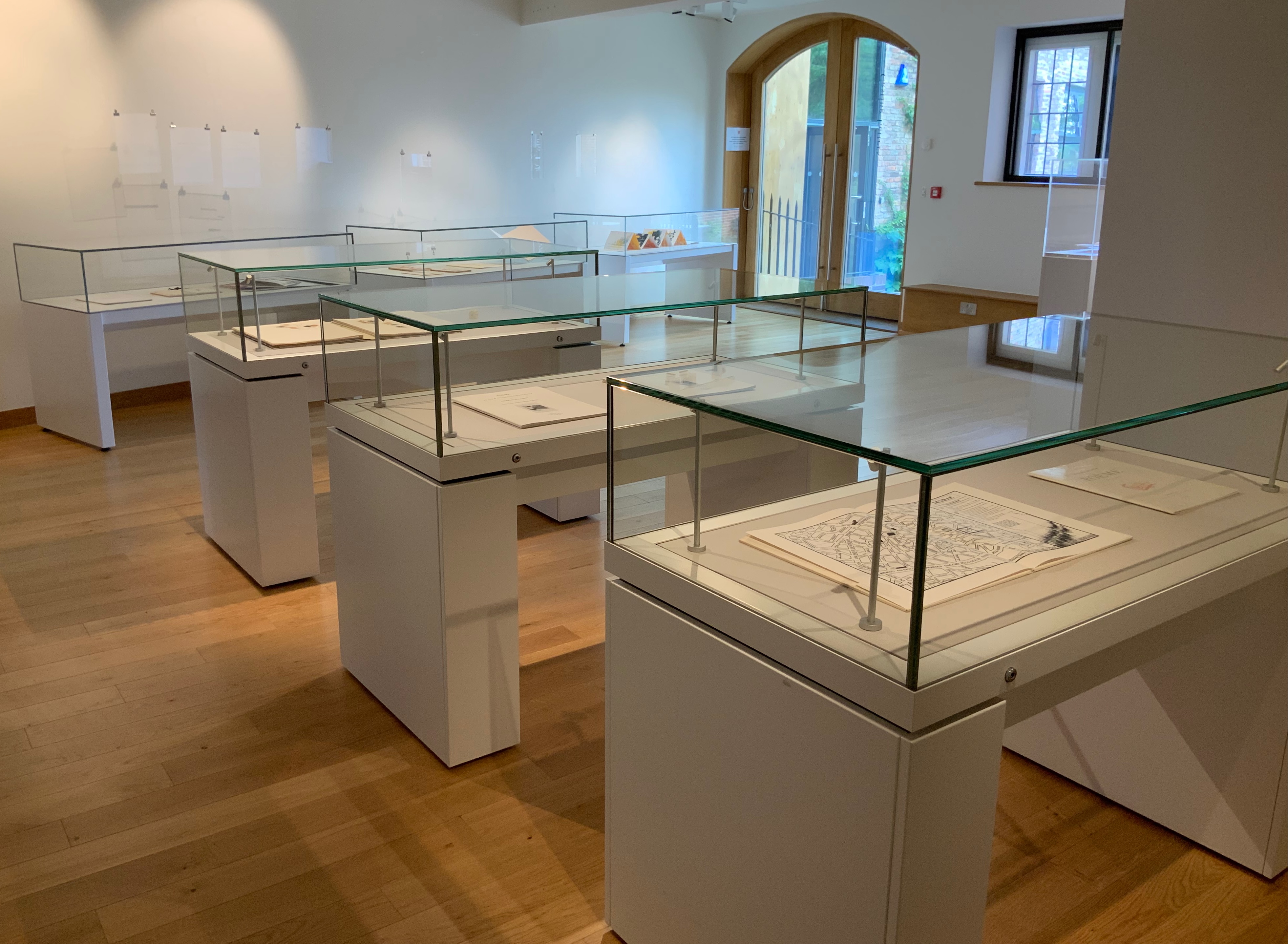
Three other cases across from those above present a conversation of dice between Masson and Filliou, then a French and Arabic conversation between Checcaglini and Bennis, and then Tibor Papp and Rodney Graham joking with one another.
L-R: André Masson, Poéme: Un Coup de Dés Jamais N’Abolira le Hasard by Stéphane Mallarmé (1961); Robert Filliou, Eins. Un. One. (1984)
L-R: Isabella Checcaglini, POÉME: Un coup de Dés jamais n’abolira le Hasard (2007); Mohammed Bennis, صلة وصل مع قصيدة ” رمية نرد أبدا لن تبطل الزهر” /Ṣilat waṣl maʻa qaṣīdat Ramyat nard abadan lan tubṭila al-zahr (2007)
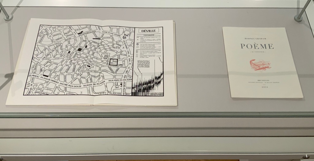
L-R: Tibor Papp, Déville in Mitsou Ronat & Tibor Papp, eds., Poème: Un coup de Dés jamais n’abolira le Hasard par Stéphane Mallarmé (1980; )Rodney Graham, Poème : “Au Tatoueur” (2011)
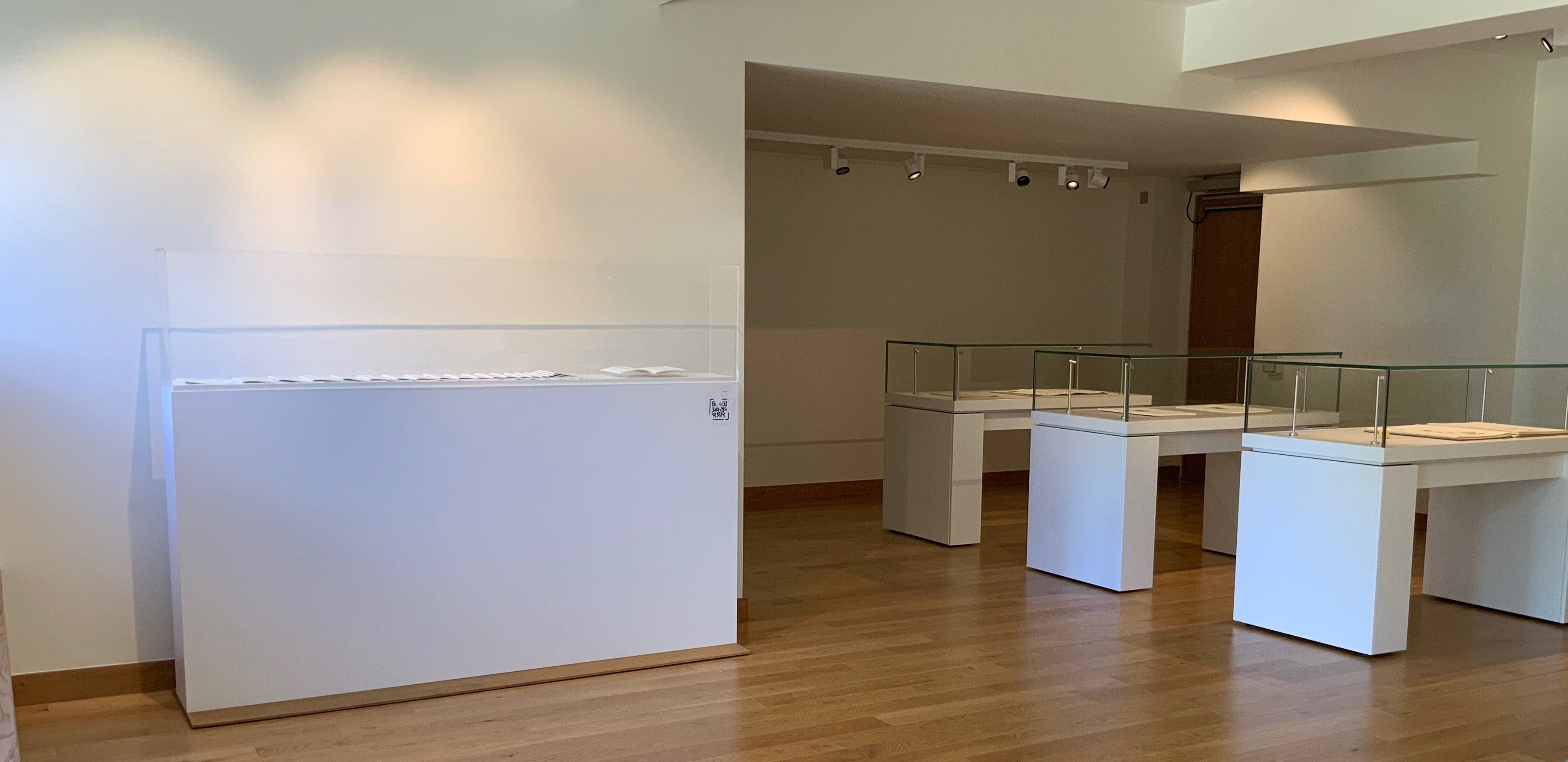
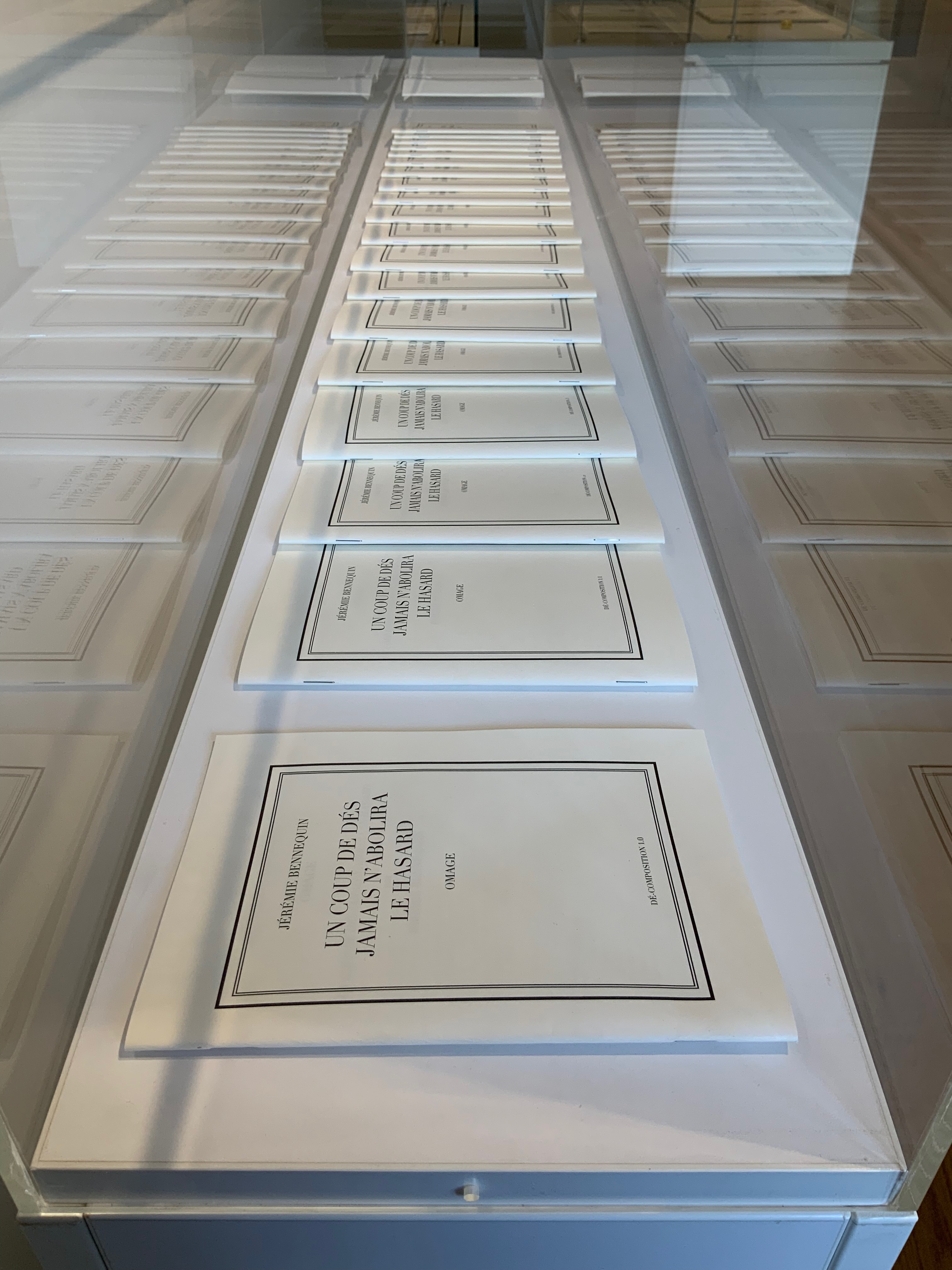
In a display case seemingly made for his particular work, the result of Bennequin’s long-distance performances of erasure with his colleague and publisher Antoine Lefebvre calls across the room to all the other works of chance and visible language.
Jérémie Bennequin, Un Coup de Dés jamais n’abolira le Hasard, Dé-composition (2009-2013)
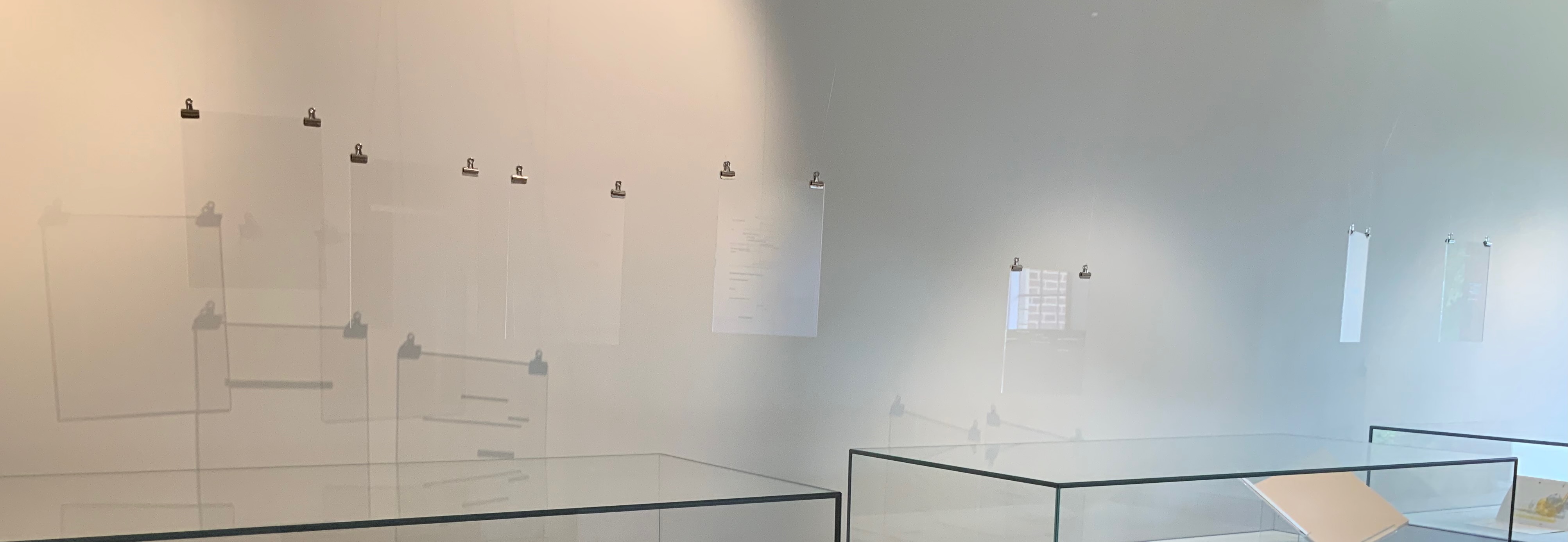
With the sun streaming into West Court Gallery, the only things missing from the buzz of these conversations were perhaps canapés, champagne and name tags to celebrate the 125th anniversary of this strange poem’s publication.
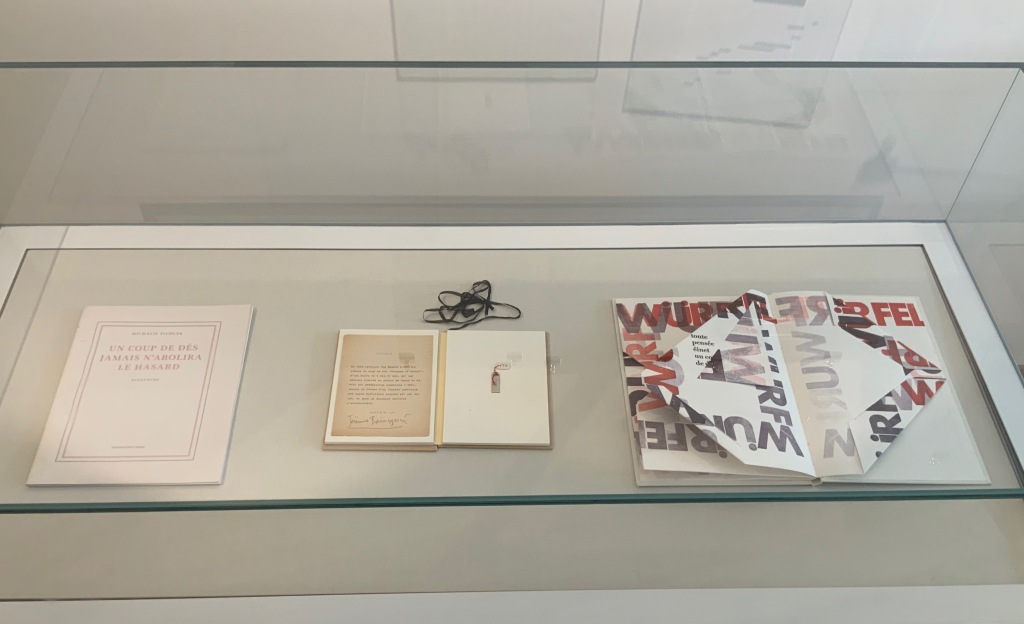
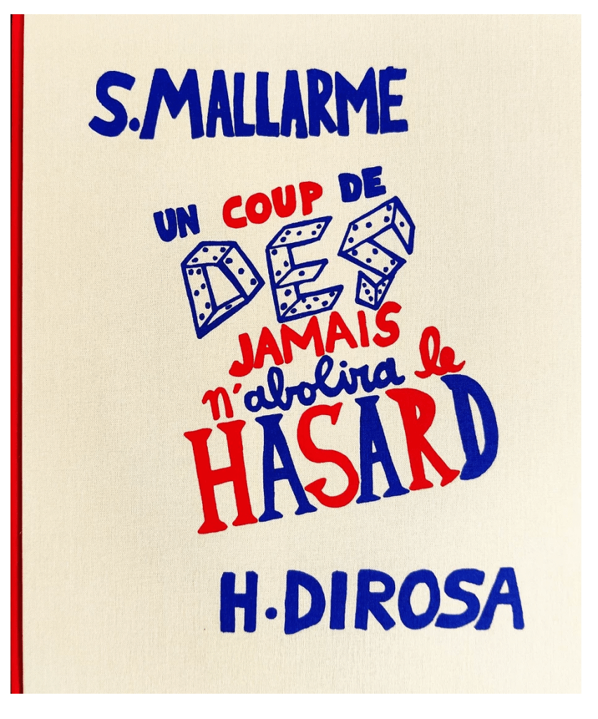
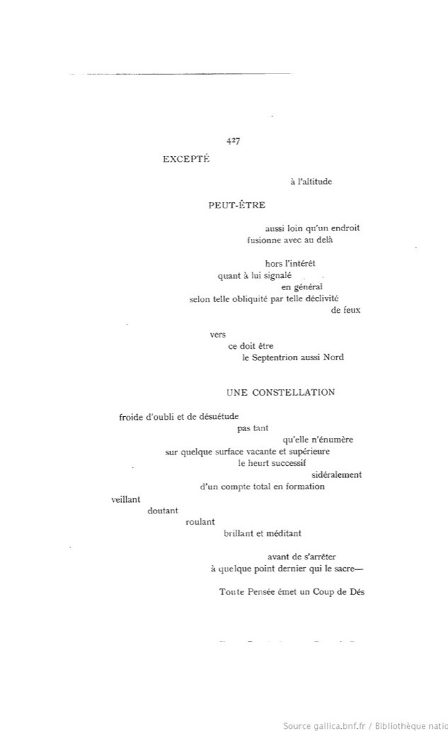
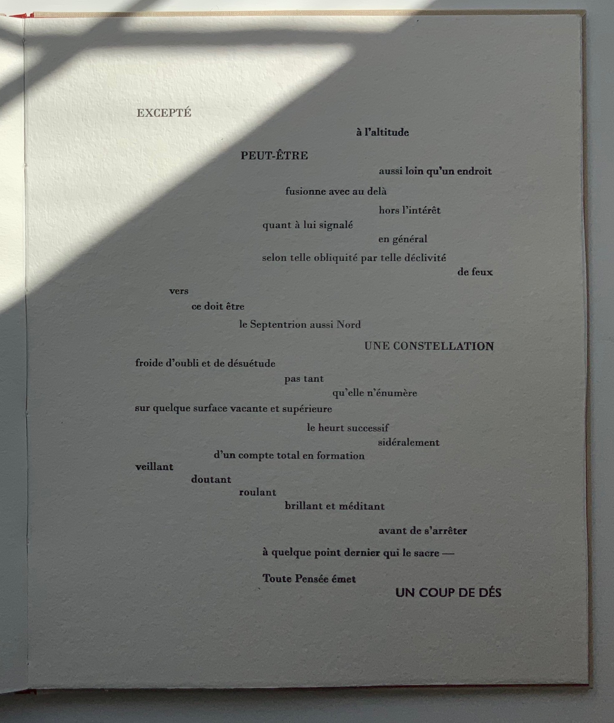
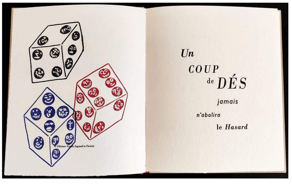
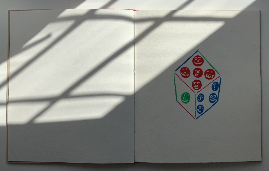
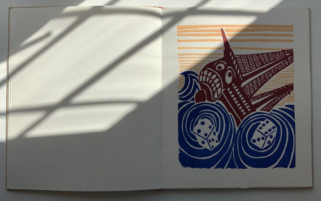
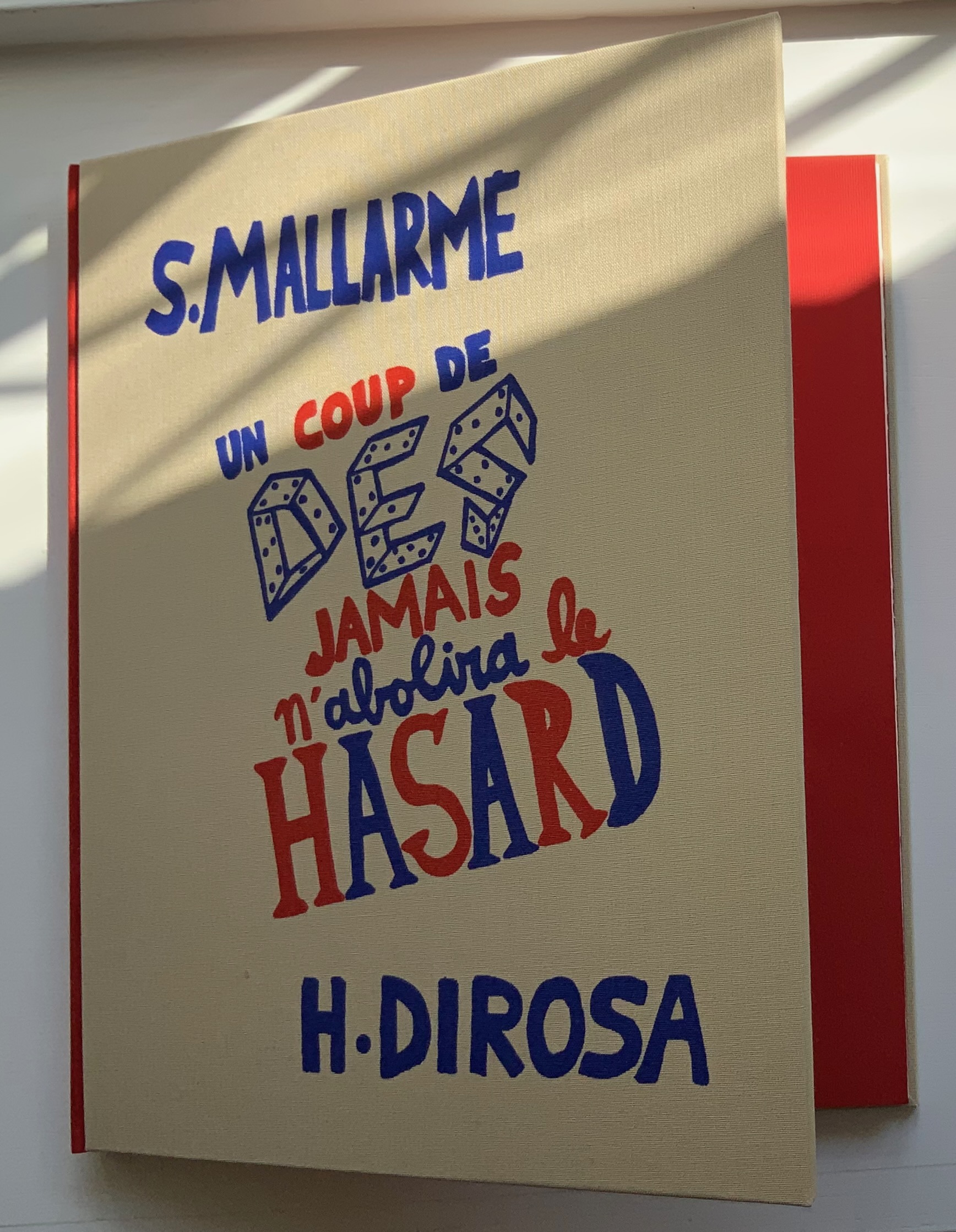
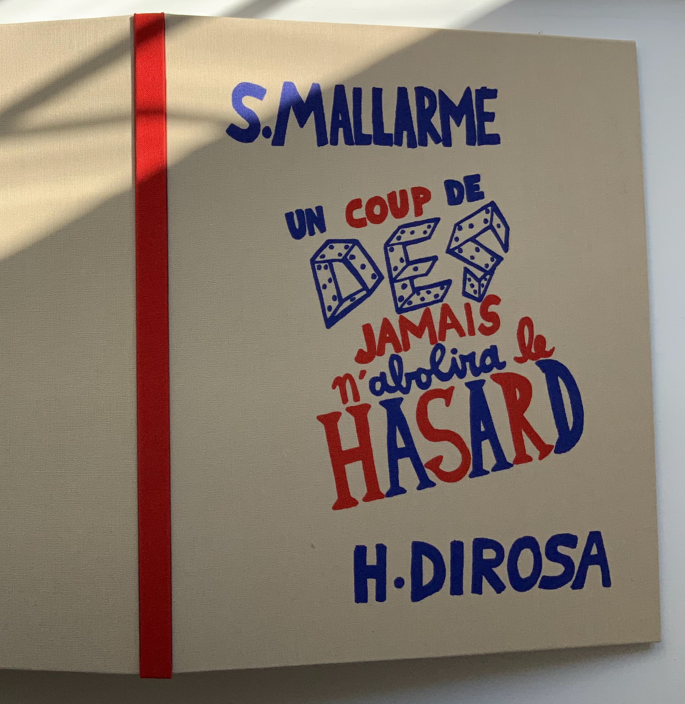
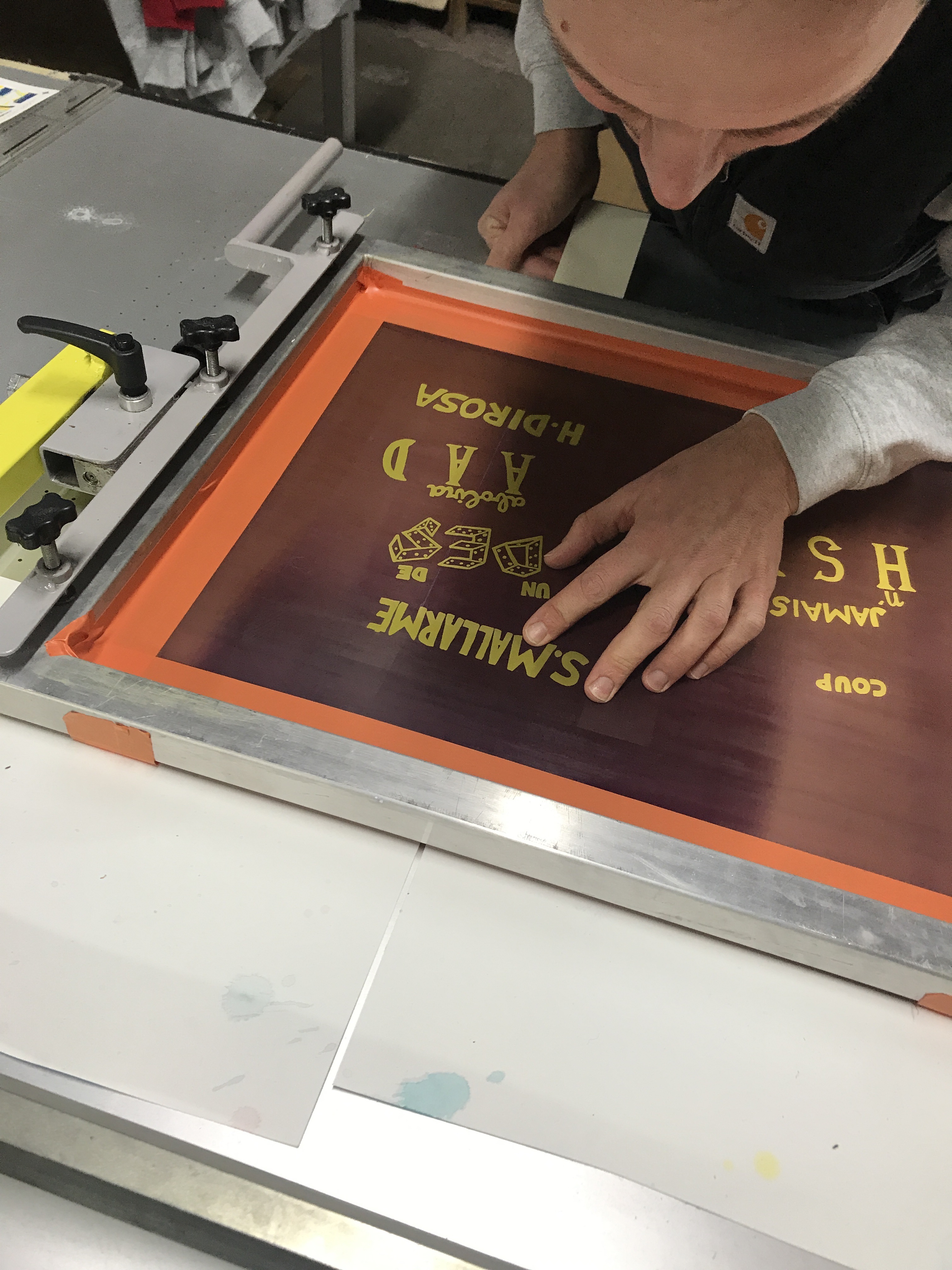
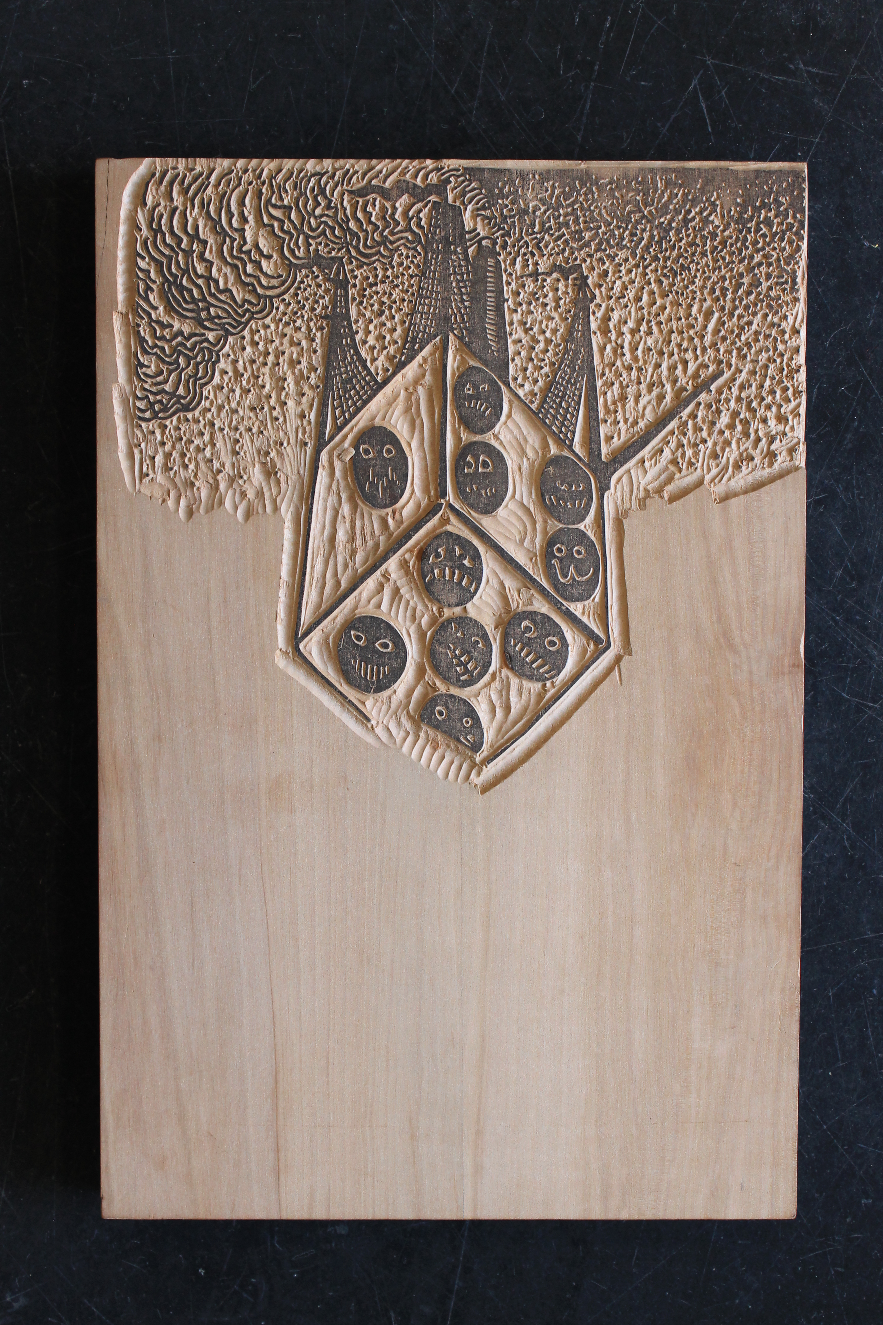
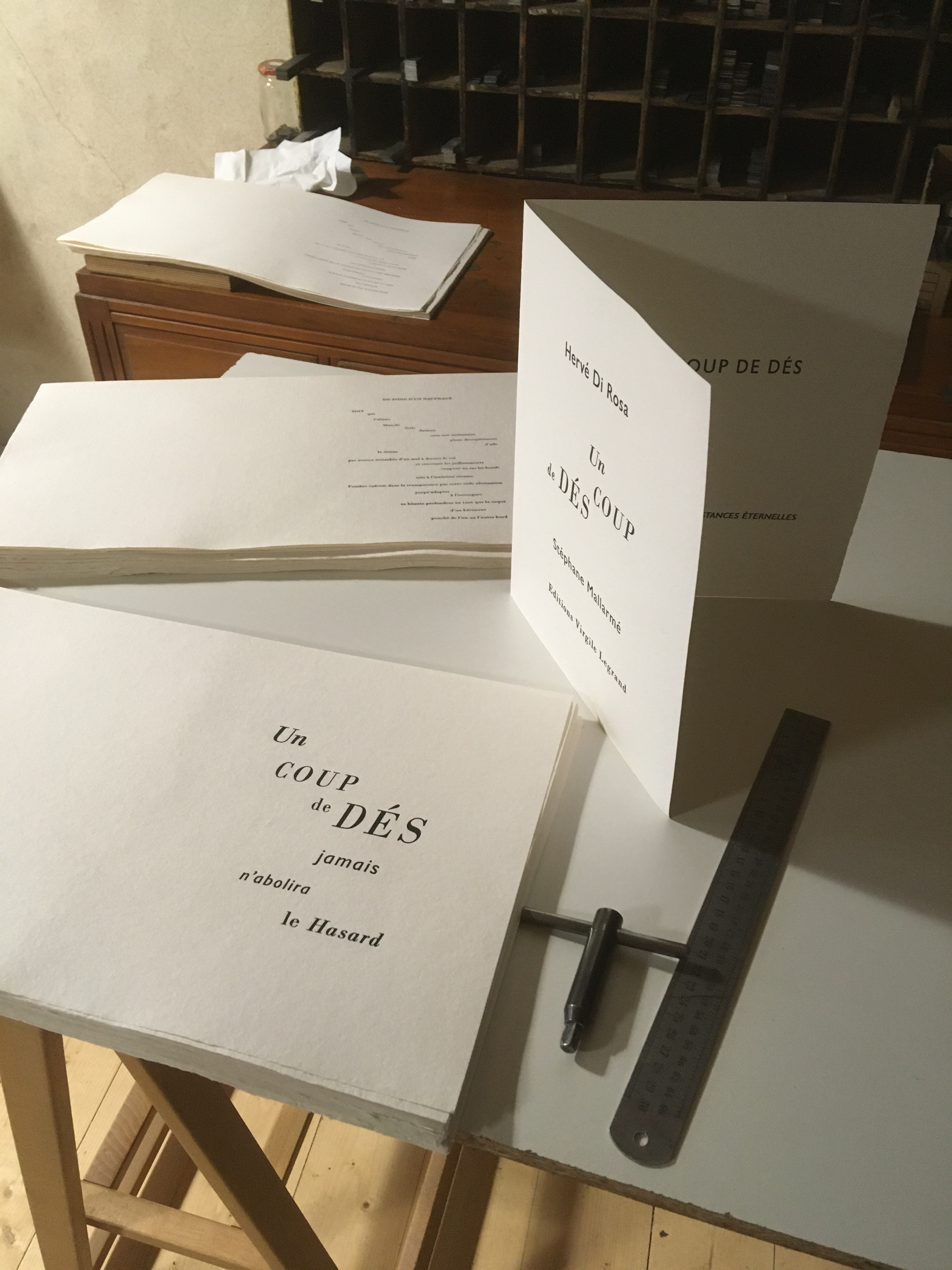
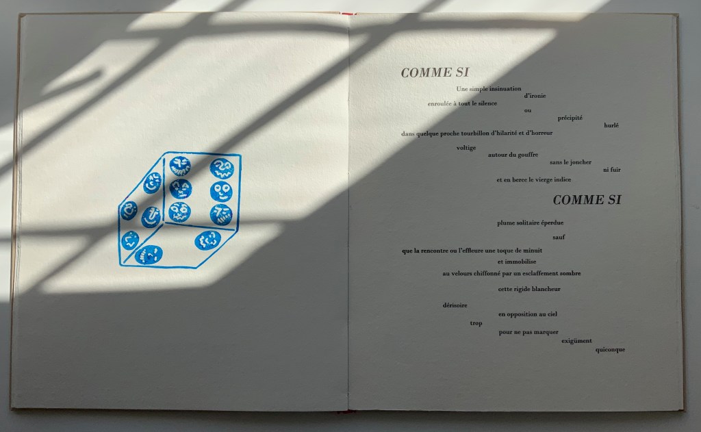
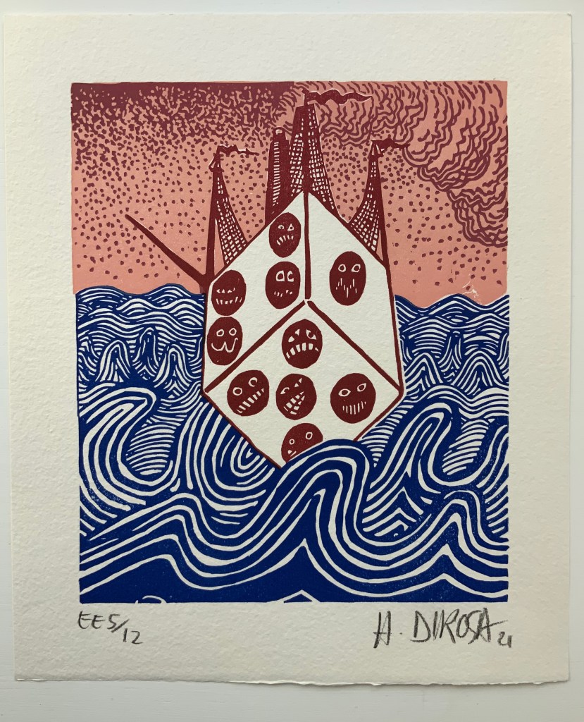
Un Coup de Dés jamais n’abolira le Hasard(2021) Stéphane Mallarmé & Hervé Di Rosa Casebound, cloth-covered hardboard. H295 x W245 mm, 36 pages. Edition of 15 (including 7 non-commercial copies), of which this is #5. Acquired from Éditions Virgile LeGrand, 11 April 2022. Photos: Courtesy of Virgile LeGrand; Books On Books Collection. Displayed with permission of Virgile LeGrand.
Many works of homage to Un Coup de Dés jamais n’abolira le Hasard seek diligently to replicate the layout, typeface, artwork (its placement) and dimensions that Mallarmé intended for his deluxe edition with Ambroise Vollard — or those we think he intended. Bertrand Marchal, editor of Mallarmé’s Complete Works, thinks that absolute fidelity is unachievable because Un Coup de Dés is ultimately an unfinished work. Alain Hurtig (2018) thinks it more than likely the choice of typeface was as much Firmin-Didot’s as Mallarmé’s. With all the foregoing efforts of Mitsou Ronat, Michel Pierson, Alain Hurtig, Neil Crawford and others to achieve the unachievable, why would any serious hommageur retread their paths?
Virgile Legrand has chosen to ignore their paths altogether and take his inspiration from the May 1897 issue of Cosmopolis, where the poem first appeared and was constrained by the Cosmopolis typesetters’ inability or unwillingness to accommodate the double-page structure and the precision-typography Mallarmé had in mind.
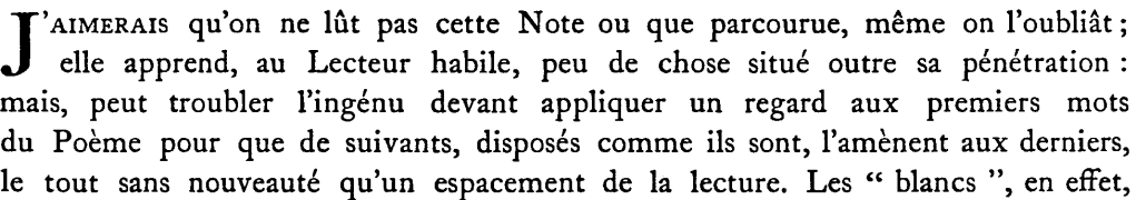
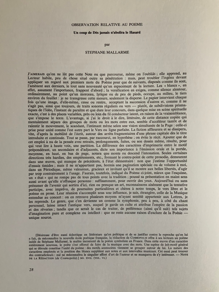
Even within the usual constraints of the magazine, the poem astounded and confounded the Cosmopolis editors so much that they insisted on a preface that would explain how to read the poem. Although the preface’s author is named as the publisher/editor, its author is Mallarmé himself, and it begins tongue in cheek:
“I would prefer that this Note not be read, or only skimmed, even then forgotten; it tells the knowledgeable reader little beyond his or her penetration: but may confuse the uninitiated, prior to their looking at the first words of the Poem, since the ensuing words, laid out as they are, lead on to the last, with no novelty except the spacing of the text.” [reproduced in the NRF/Gallimard 1914 edition]
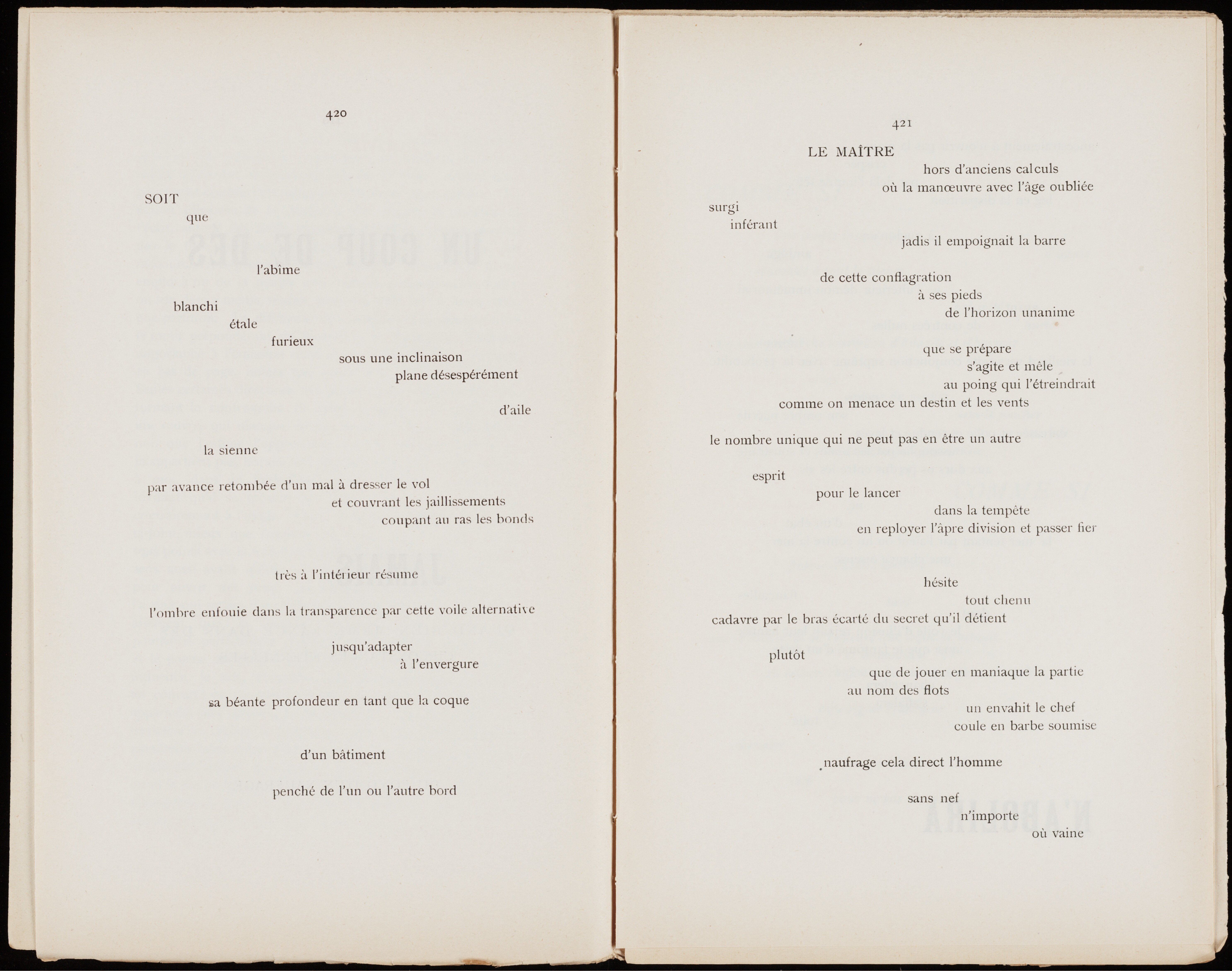
After 125 years, we can no longer be shocked by Mallarmé’s layout, and it is a humorous surprise that, having decided to ignore the pursuit of absolute fidelity to Mallarmé’s wishes, Legrand does accommodate the poet’s wish in the Cosmopolis preface and omits the Note from his homage altogether. As further evidence that the Cosmopolis edition is merely an inspiration for Legrand, several pages in the homage do not match up with it. Legrand deploys a much wider measure and takes full advantage to give les blancs a bit more space. He also does not hesitate to vary the layout and typeface of significant lines — in particular the poem’s final line (see below), mixing Bodoni and Univers.
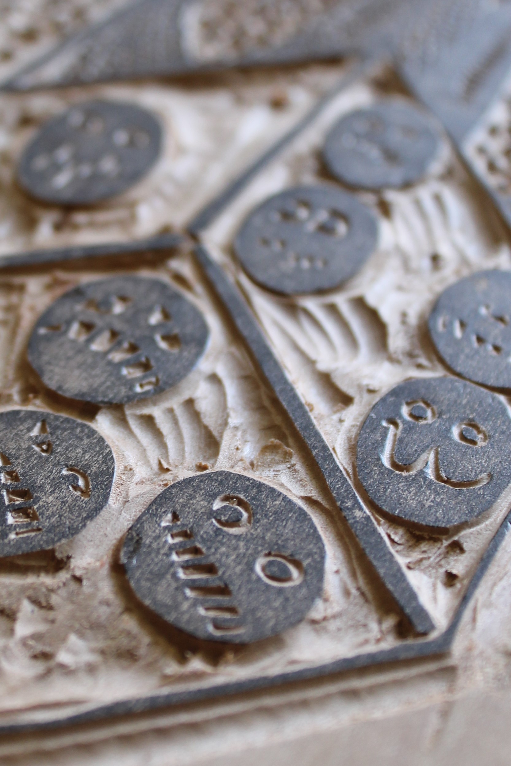
Legrand’s contrary playfulness and independence show up equally, if not more so, in his embrace of the color, woodcuts and linocuts of the artist Hervé Di Rosa. Di Rosa’s art belongs to the “Figuration libre” movement, is associated with Keith Haring and grafitti artists and is not without controversy. Hard to say who could be further from Odilon Redon, Vollard’s and Mallarmé’s choice of artiste. The faces and signs on Di Rosa’s dice (nearly reproducing the blackface that stirred controversy in another context) rollick through the book — not sequestered in front and back matter as Mallarmé planned for Redon’s. Each of the woodcuts fills a recto page, while the linocut dice appear on verso and recto. Di Rosa’s bright red squeezes through the end papers and doublures right out into the spine, and spills over onto the front cover with his equally bright blue.
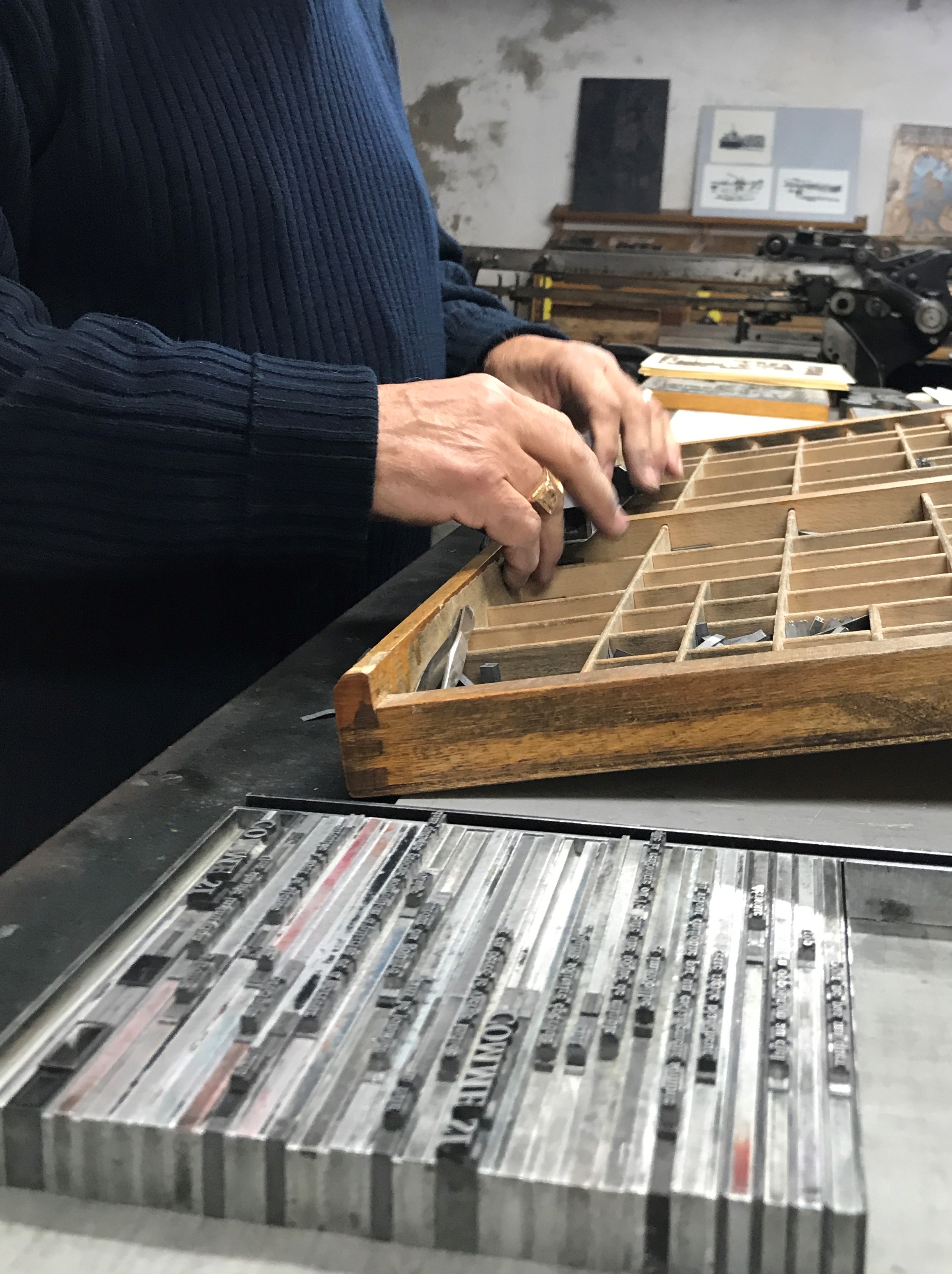
Like Vollard, though, Legrand pursues the kind of sourcing expected with livres d’artiste. The book was printed on the presses of the Dugrip Picard Jacomet workshop on Moulin de Brousse‘s paper — steeping it in the grand tradition of the livre d’artiste of handset letterpress, handmade paper and fine binding.
Also in keeping with the French livre d’artiste tradition, this copy of the homage includes a loose original print by Di Rosa (see below). As a co-founder of the Musée international des arts modestes (MIAM) and exponent of a movement to break down barriers to cultural diversity and to fringe and unorthodox art, Di Rosa is an hommageur who should remind us of Mallarmé’s unorthodoxies: the eloper, the heteronymic entrepreneur behind the short-lived fashion and culture magazine La Dernière Mode, the inscriber of poems on fans and rocks or the correspondent who wrote addresses in the form of quatrains (which the postal service recognized and delivered).
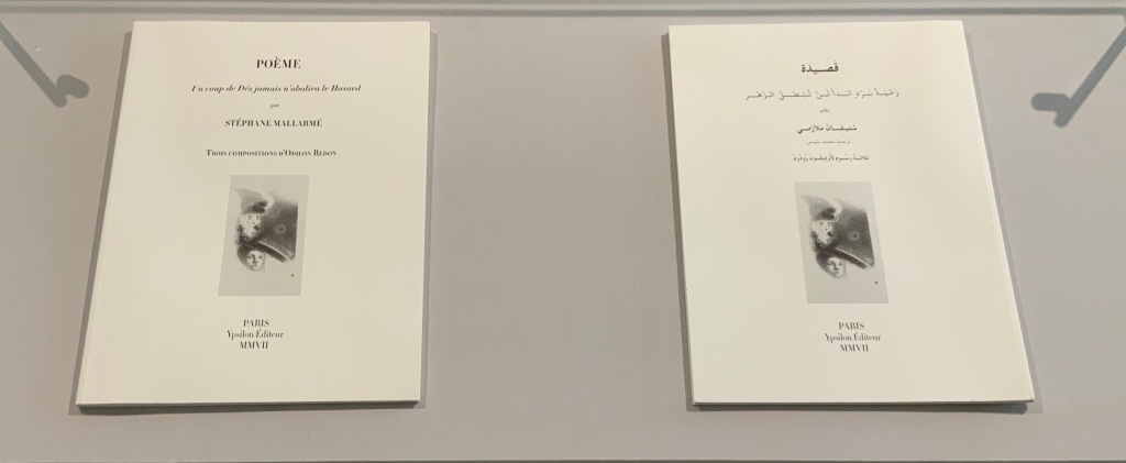
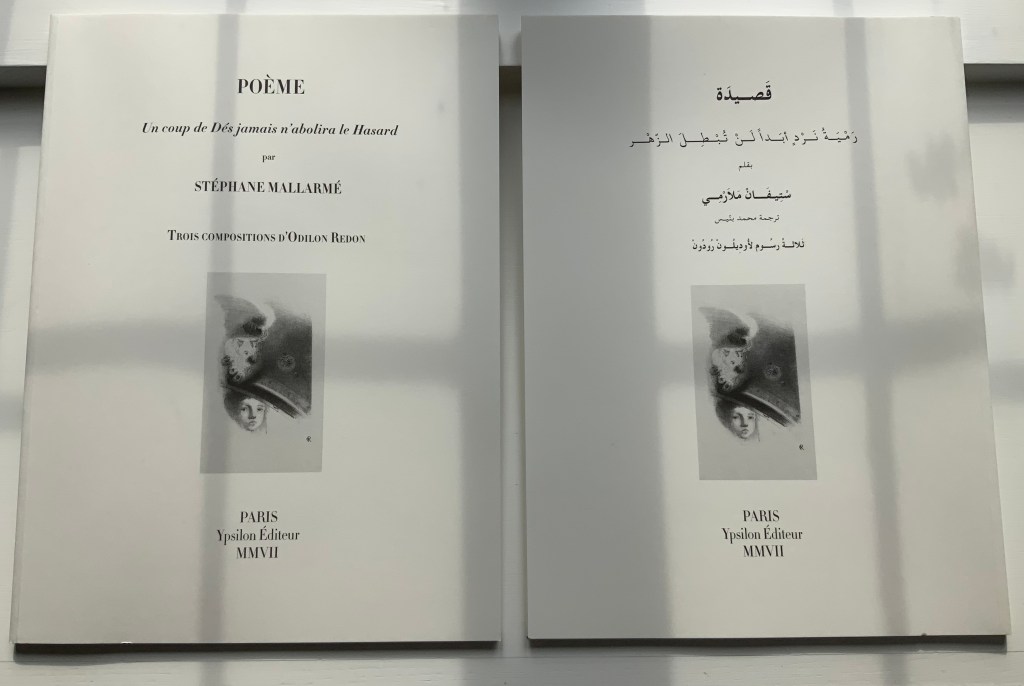
POÉME: Un coup de Dés jamais n’abolira le Hasard (2007)
POÉME: Un coup de Dés jamais n’abolira le Hasard (2007) Stéphane Mallarmé, Isabelle Checcaglini and Mohammed Bennis Four volumes in slipcase. H380 x W280 mm, 40 pages per volume. Edition of 99, of which this is #57. Acquired from J.F. Fourcade, 7 January 2022. Photos: Books On Books Collection.
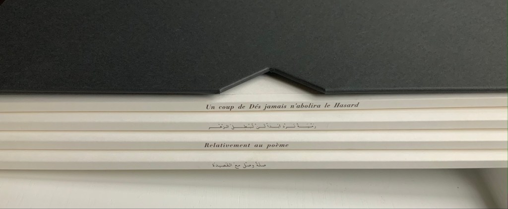
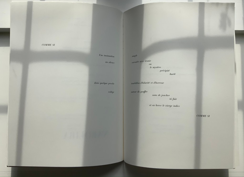
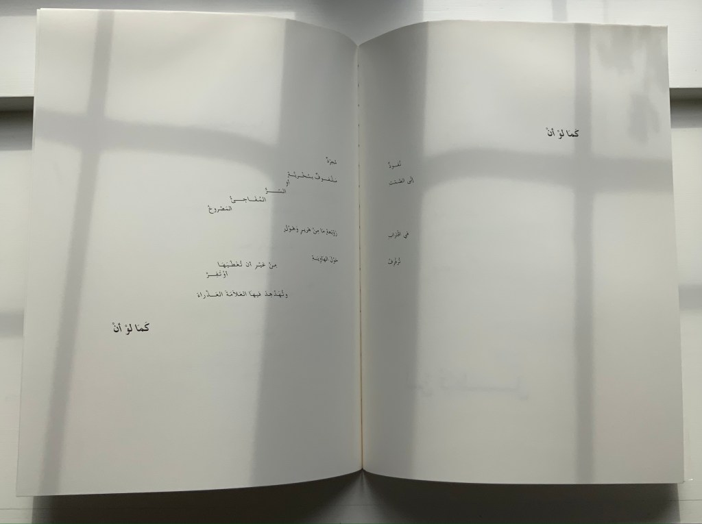
Ypsilon Éditeur’s editions of Un coup de Dés jamais n’abolira le Hasard bring together for the first time the three prints from Odilon Redon with the deluxe edition layout intended by Stéphane Mallarmé. Also for the first time, we have a translation into Arabic. Below, the central double-page spread of the poem is displayed in the French and Arabic editions to show how their mirror images of the layout heighten its movement.
In the additional French volume and its Arabic counterpart, Checcaglini adds a brief history about Mallarmé and Vollard’s plans for the deluxe edition and helpfully includes correspondence among them and Odilon Redon. Although the earlier edition published by Mitsou Ronat & Tibor Papp in 1980 does include Redon’s prints, they are placed in a separate folder along with other visual and textual tributes. The Redon prints may not be among his best, nor do they include the mooted but undiscovered fourth print, still at least we now have the three and the poem in relation to each other more nearly as intended, which makes it possible to compare and contrast this deluxe edition with the outpouring of works of homage to Mallarmé’s poem. Even with the prior absence of that chance, few if any of those hommageurs would be unaware of Redon’s images. Jean Lecoultre (1975) notes how his publisher’s solution to handling his soft varnish etchings honors the intended separation of text and images. By contrast, Christiane Vielle (1989) challenges Mallarmé’s layout and his unit of the double-page spread by altering the spatial relationships among lines, hiding text beneath panels and juxtaposing her artwork with the text.
The added volume with Checcaglini’s synopsis also includes a three-way dialogue among Mohammed Bennis, Isabelle Checcaglini and Bernard Noël about the light that the translation sheds on the poem.
Checcaglini’s edition also claims to have most closely reproduced the Firmin-Didot typeface that Mallarmé wished for his deluxe edition. The search for absolute fidelity to this font that has been unavailable for at least a century has been an obsession since the discovery of the poem’s proofs corrected and annotated in Mallarmé’s hand. The Further Reading provides a start for anyone inclined to join the search.
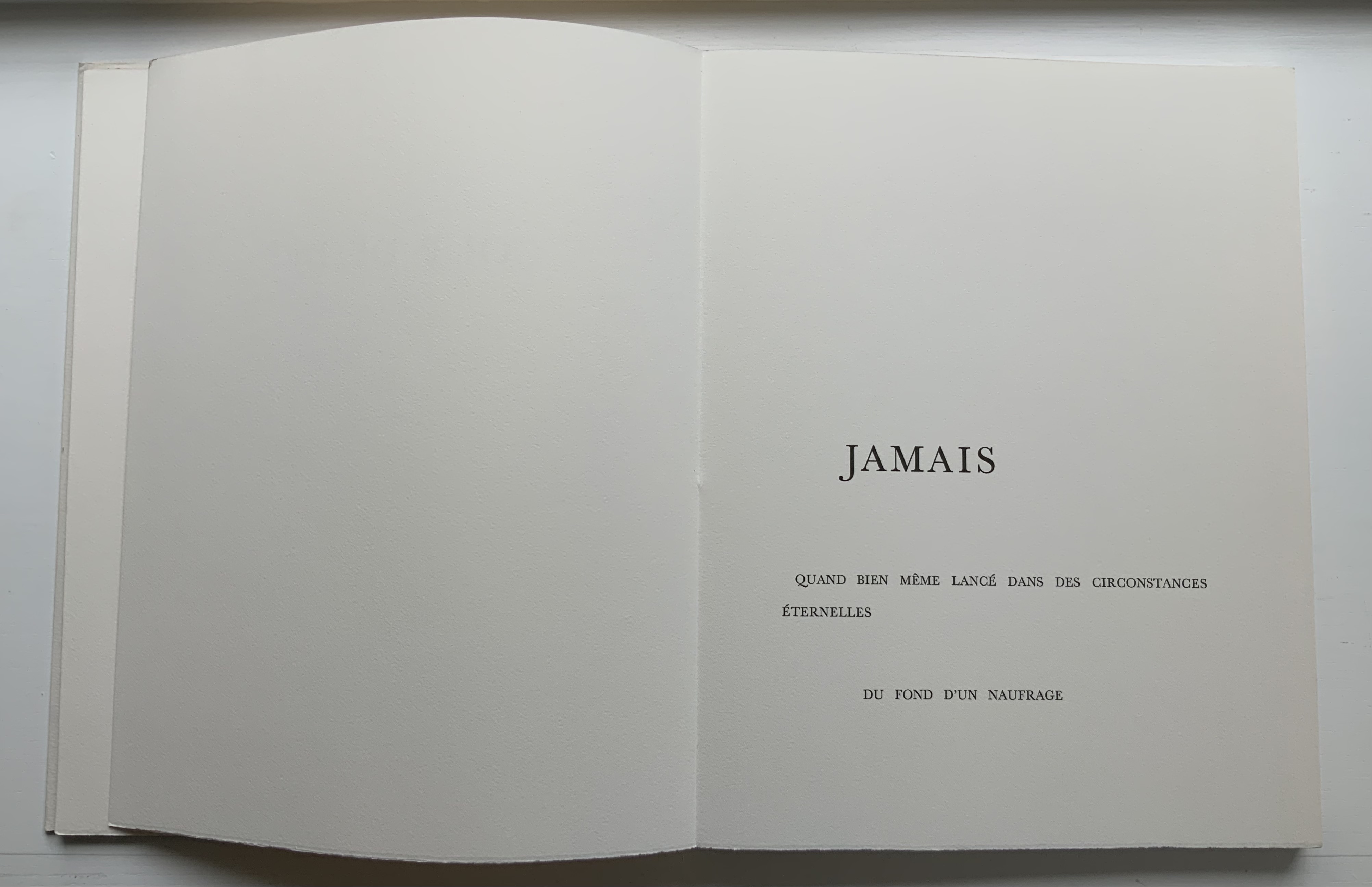
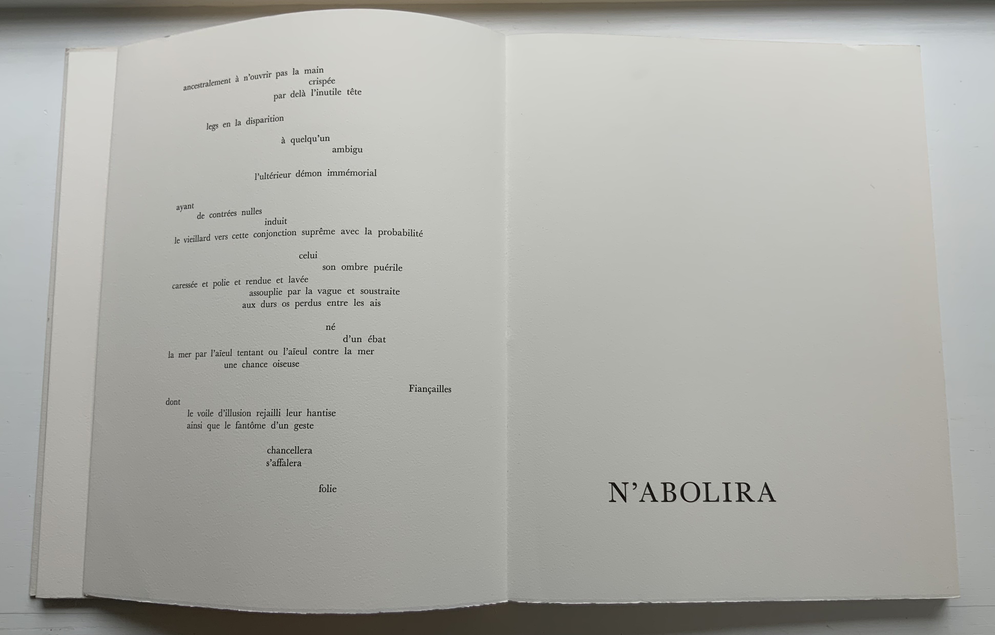
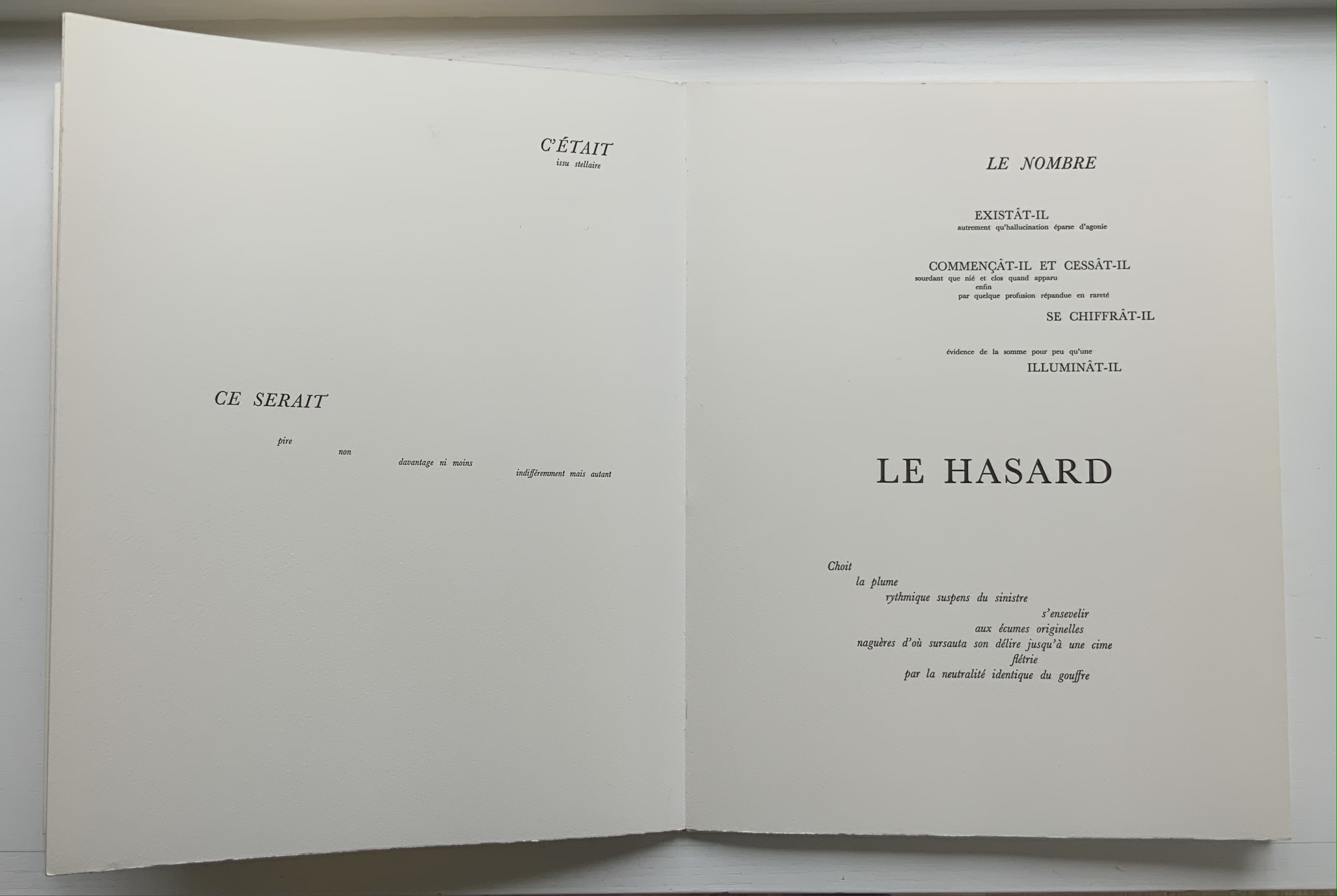
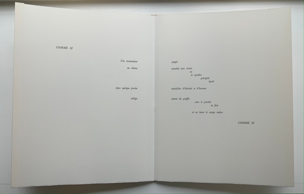
UN COUP DE DÉS JAMAIS N’ABOLIRA LE HASARD: POÈME (1989)
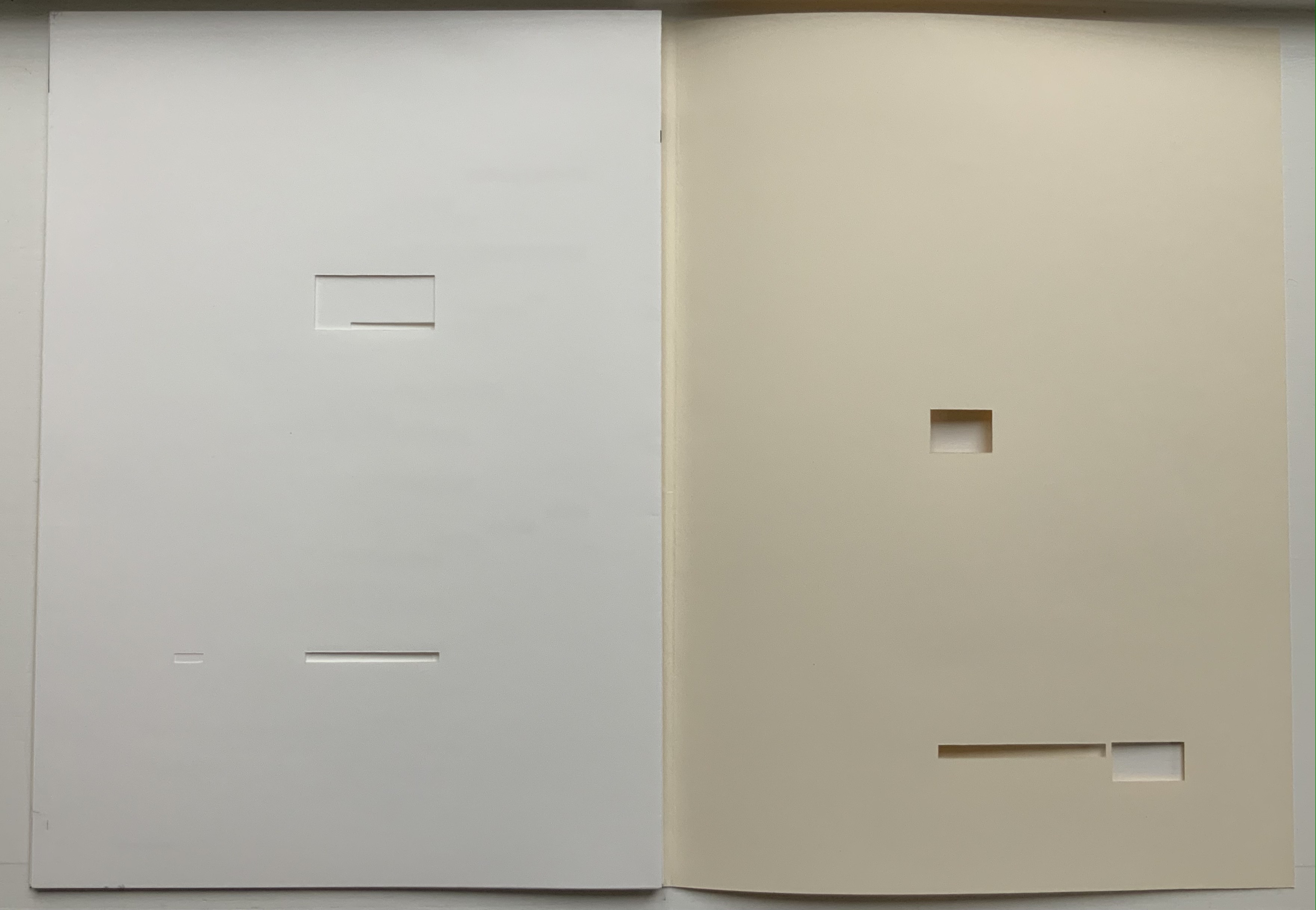
UN COUP DE DÉS JAMAIS N’ABOLIRA LE HASARD: POÈME(1989) Stéphane Mallarmé (text); Honorine Tepfer (art & design) Accordion fold with embossed paper cover. Cover – H325 x W255 mm; Book – H320 x W250 mm, 34 pages. Edition of 48, of which this is #5. Acquired from Studio Montespecchio, 2 February 2022. Photos: Books On Books Collection. Displayed with permission of the artist.
Before his sudden death in 1898, Stéphane Mallarmé was planning a deluxe edition of Un Coup de Dés Jamais N’Abolira le Hasard with Ambroise Vollard, an entrepreneur and publisher. A single-volume version of the poem did not appear until 1914. Issued under the direction of Mallarmé’s son-in-law Dr. Edmond Bonniot through the Nouvelle Revue de France (NRF), it omitted intended prints by Odilon Redon, used the typeface Elzevir rather than the Didot that Mallarmé preferred, and did not precisely follow his layout. We know all this because of correspondence between the poet, Redon and Vollard and because the Sorbonne’s Bibliothèque littéraire Jacques Doucet and Harvard’s Houghton Library hold proofs of the deluxe edition with Mallarmé’s handwritten corrections and instructions.
Mallarmé’s placement of words and lines was intentional and precise. Even before the planning for the deluxe edition, he wrote of what could be achieved with type size and layout:
Pourquoi — un jet de grandeur, de pensée ou d’émoi, considérable, phrase poursuivie, en gros caractère, une ligne par page à emplacement gradué, ne maintiendrait-il le lecteur en haleine, la durée du livre, avec appel à sa puissance d’enthousiasme: autour, menus, des groupes, secondairement d’après leur importance, explicatifs ou dérivés — un semis de fioritures. [Oeuvres Complètes, 2 227]
“Why — couldn’t a considerable burst of greatness of thought or emotion, carried in a sentence in large typeface, gradually placed with one line per page, hold the reader’s bated breath throughout the entire book by appealing to his or her power of enthusiasm: around this [burst], smaller groups of secondary importance, explicating or deriving from the primary phrase — a scattering of flourishes.” [Arnar, 234]
The NRF edition 1914 edition makes quite a few sad missteps as Robert Cohn pointed out in 1967. Tepfer’s inspiration to restore the intended layout follows in the footsteps of Mitsou Ronat & Tibor Papp (1980) and Neil Crawford (1985). She visited the Doucet library to examine the proofs and layout. Following the layout was not difficult, but with the scarcity of Didot, Tepfer needed to select another typeface. She chose Baskerville. Given that Firmin Didot was inspired by John Baskerville’s experimentation with thick and thin strokes, the choice adds historical interest, although Bodoni might have been nearer the mark. Below are Tepfer’s double-page spreads across which Mallarmé’s burst of thought appears one line per page among the “scattering of flourishes”.
The book’s central double-page spread, beginning with COMME SI / “AS IF”) in the upper left and ending with COMME SI / “AS IF” in the lower right, mimics the throw and fall of the dice and provides another example of the semantic and typographic play that Mallarmé describes above.
Like the artists before her — Redon (1897), André Masson (1961), Mario Diacono (1968), Marcel Broodthaers (1969), Jean Lecoultre (1975), Ian Wallace (1979) and Ian Tyson (1985) — Tepfer had to solve the puzzle of relating image to text. This is the difficult path of inverse ekphrasis: what and how the visual, tactile and conceptual works of art that come after Mallarmé’s text can be. We are more used to ekphrasis where the object, painting or sculpture comes before the text — like Achilles’ shield before Homer’s description, or the Grecian urn before Keats’ ode, or Brueghel’s Fall of Icarus before Auden’s Musée des Beaux Arts. Homer, Keats and Auden vie with the art of the crafted object to put that object (and more) in front of us with words. With the inverse, the crafted objects vie without the words to put Mallarmé’s poem (and more — and sometimes less!) in front of us. Tepfer’s solution?
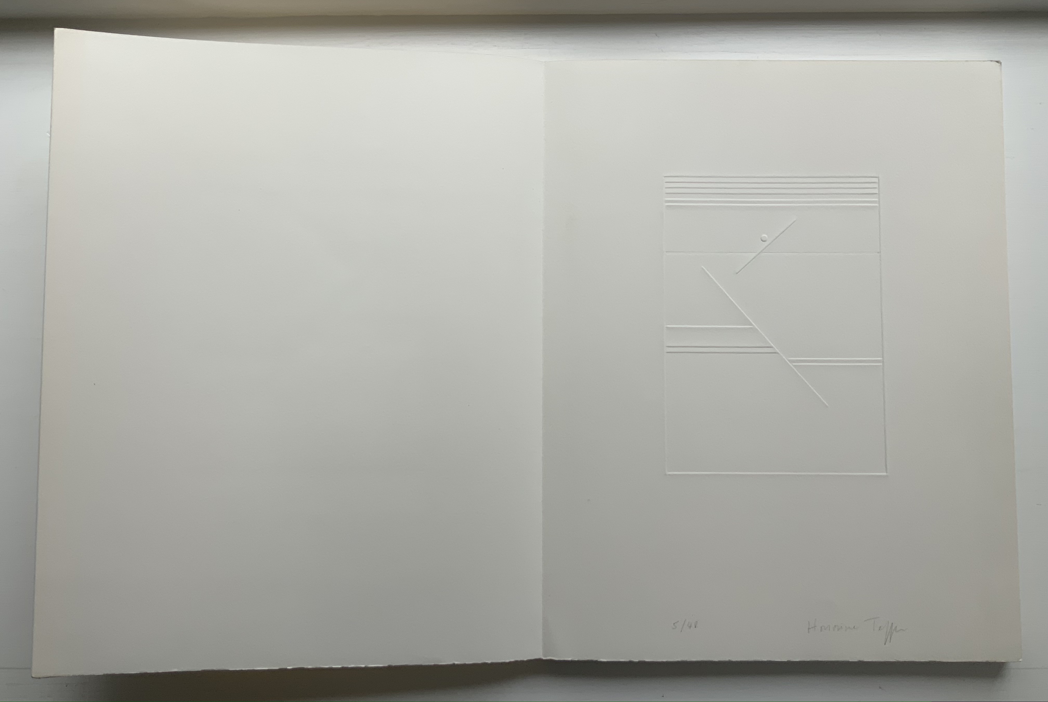
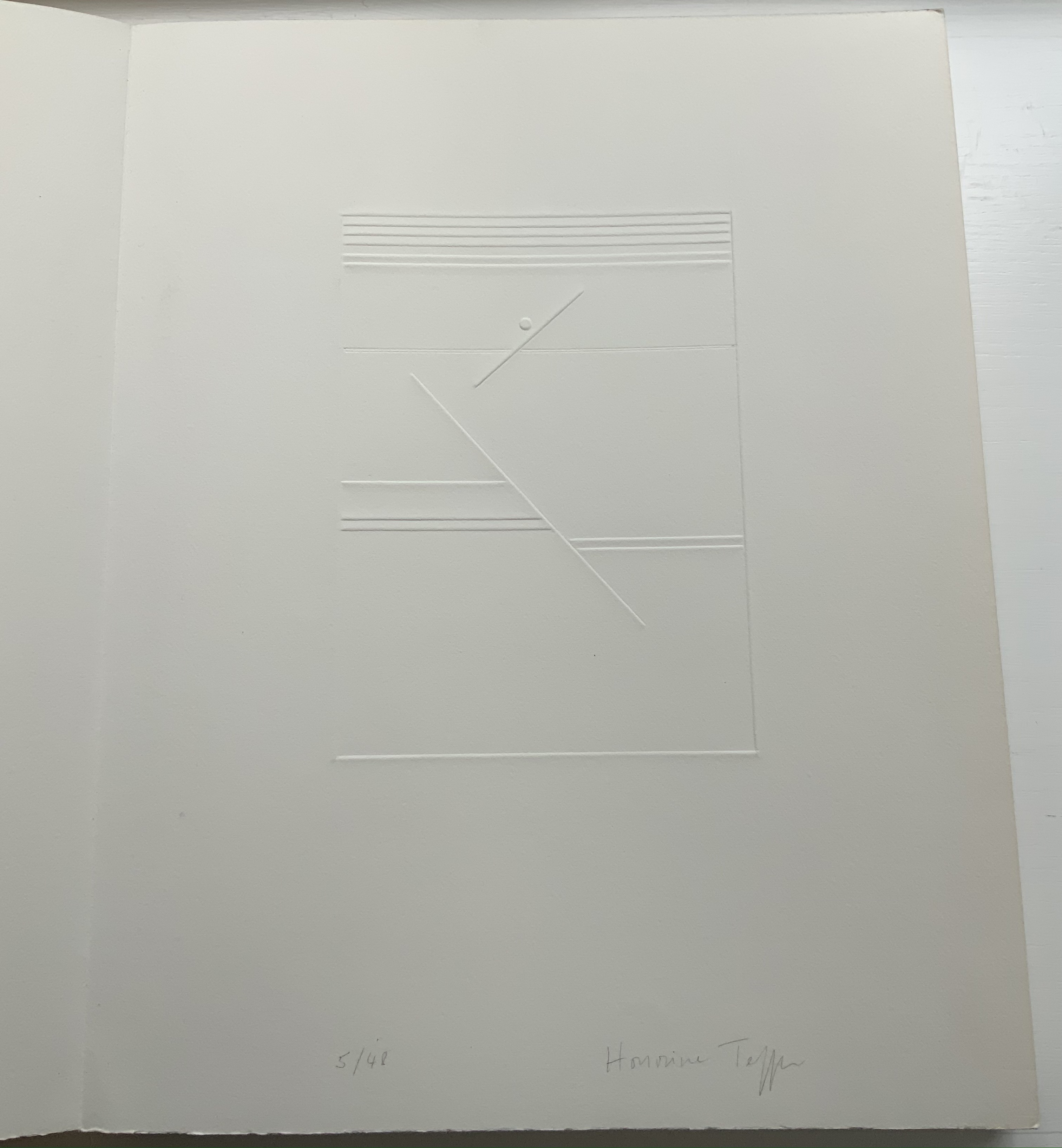
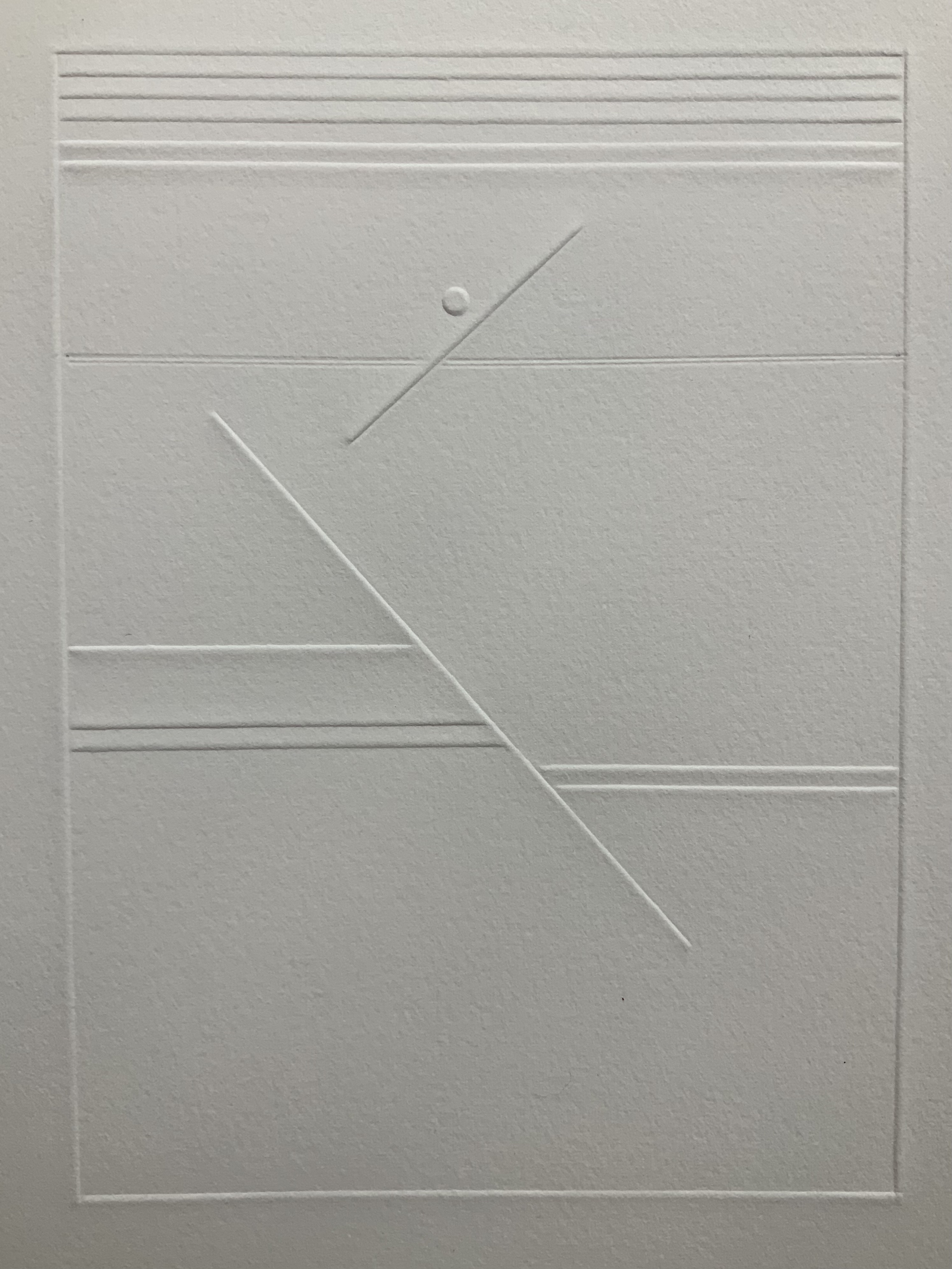
A simple line runs across the debossed front and back covers. As Tepfer wrote in June 1990 about her journey into Un Coup de Dés: La ligne d’horizon était un sujet de ma hantise / “The horizon line was my obsession”. As the folded paper cover opens, a single geometric, abstract image appears — debossed and embossed on blank paper. Except for a single round dot, everything is linear. Two separate lines angle across the space. One cuts through the debossed horizon line that lies beneath a series of closely spaced horizontal lines — suggesting clouds? The other, longer one cuts at a different angle, creating a foreground from two sets of parallel lines that have slipped or shifted like tectonic plates. Could the round dot be the single-dot side of a die rolling down a slanted deck or broken mast? Could the longer slanted line be a broken mast? Could the shifted parallel lines be a broken handrail?
Rather than trying to track back to verbal images in the poem, though, perhaps we should recognize Tepfer’s prefatory image as a kind of substitute for Mallarmé’s preface in 1897 — the one he preferred we not read. He wanted us to look. To see les blancs. To hold thought and emotion like our breath across the space of the book. With her simple rectangle of blank paper, with the absence of ink, with the geometric solidity of the horizontal and slanting lines, and with the velvet softness of the velin d’Arches across her version’s accordion folds, Tepfer encourages us to look, see, hold meaning in abeyance and sense it.
As Mitsou Ronat and Tibor Papp were preparing their mise-en-page edition of Mallarmé’s Un Coup de Dés Jamais N’Abolira le Hasard(1897/1980) following Mallarmé’s corrected proofs, Neil Crawford came across a copy of Robert Cohn’s Mallarmé’s Masterwork and was struck by its reproduction of the set of proofs sold by Pierre Berès to an American collector – the so-called Lahure proofs. Crawford, too, was determined to prepare a “typographic translation” of the proofs — but in English. In an essay providing a rich background to the poem, his meeting with Tyson and the publishing of their homage, Crawford explains how he went about his typographic translation.
First, using Cohn’s reference to the original’s size, he enlarged the reproductions photographically and then began puzzling over how to squeeze an English version taking up 10% more space than the French into Mallarmé’s careful layout. Compromising on the use of Bodoni in place of Didot as the typeface (the latter was not available to English typesetters when the poem was first pubIished anyway), it would take Crawford seven years of evenings in tracing letters, translation, transcription, adjustment, retranslation and retranscription to generate hand-crafted layouts that could be stored away until the day that photocomposition would be sufficiently advanced to accommodate the word and character spacing necessary to follow them. The original of Crawford’s typographic layout resides at the University of San Diego. Below are iterations toward the double-page spread that completes the appearance of the poem’s title within the poem.
Courtesy of Neil Crawford.
When Crawford and Tyson met in the early Eighties, Tyson had already established Tetrad Press and was planning his own livre d’artiste version of the poem. His aquatints in a separate folio cover would occupy the position Mallarmé expected for Odilon Redon’s prints in the abortive limited edition in train at the time of his death in 1898. In an ironic reversal of Mallarmé’s concern that the Redon prints might undermine the typography, Tyson and Crawford were concerned that anything less than letterpress printing would not ensure the density of black on the page that would complement Tyson’s aquatints. This led to phototypesetting output as patch setting, then hand pasting according to Crawford’s layouts, and then creation of process line blocks for the relief printing in letterpress.
At a glance, Tyson’s aquatints present a puzzling juxtaposition with the poem, but we can thank Crawford’s essay for a clue to the puzzle.
The poem’s reference to LE NOMBRE (“THE NUMBER”) has sent plenty of scholars on the hunt for its identity. Mitsou Ronat had argued that the magical number has to be 12. After all the classic Alexandrine line of French poetry numbers 12 syllables, and the larger type sizes that Mallarmé chose for the poem are 36, 48 and 60. Unconvinced “typographically”, Crawford points out that “at the time of composition – faces above 24 point were cut in multiples of twelve as standard”. Nevertheless, he also writes, “It would appear that the number 12 (the number of feet in the classic Alexandrine verse form) had great symbolism for Mallarmé” and notes that Tyson’s images
reflect the undertones of the Poème’s symbolism with a composition based on a duodecic permutation corresponding to the measures within the Alexandrine metre, referring in an oblique way to Mallarmé’s recurring imagery ….
Duodecic refers to the Base 12 system, which has the arithmetic advantage over Base 10 of making fractions easier as can be seen from the following image. To apply that image’s Base 12 grid to Tyson’s permutations, however, requires modifying it from 3×4 to 4×6. In other words, there are 24 small squares underlying Tyson’s images, not 12. Mallarmé intended the double-page spread, not the single page, to be the unit for page layout. So perhaps Tyson’s oblique reference to the Alexandrine is also “doubly oblique” (2×12), referring to Mallarmé’s preferred canvas.
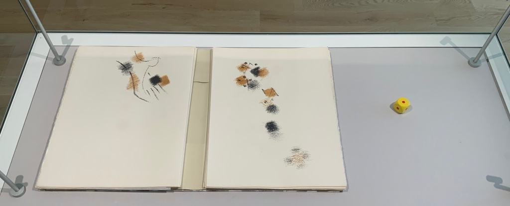
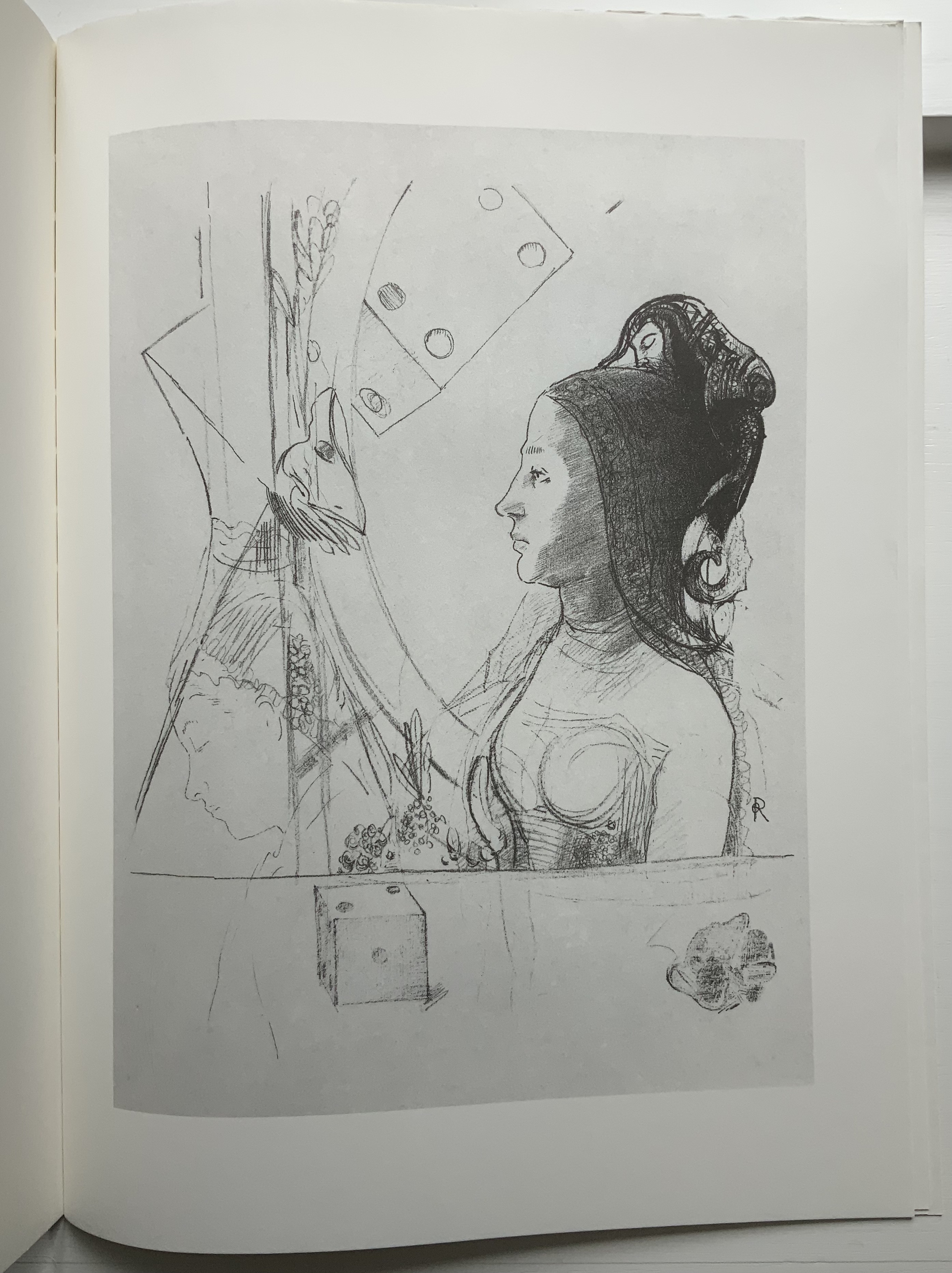
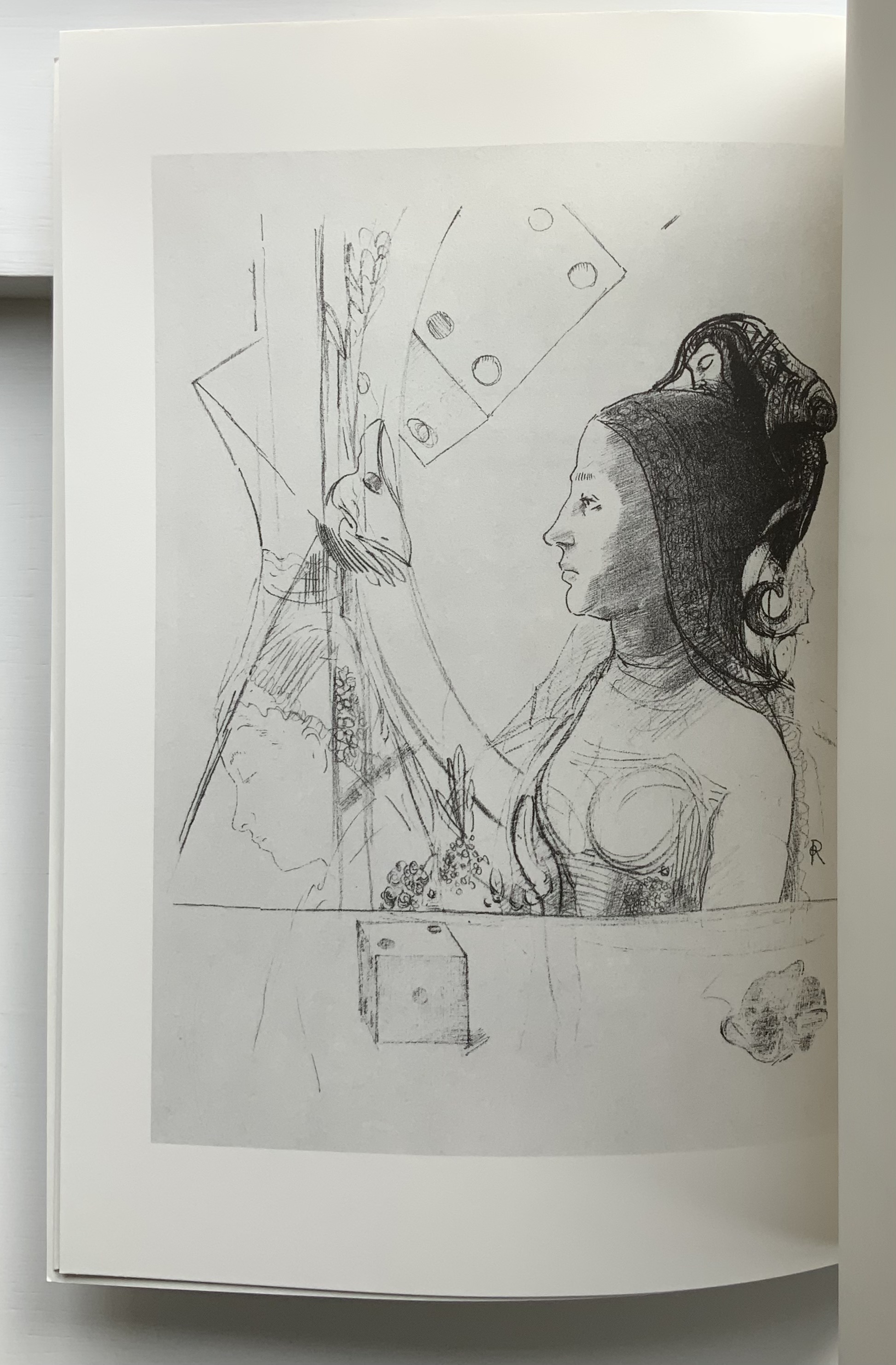
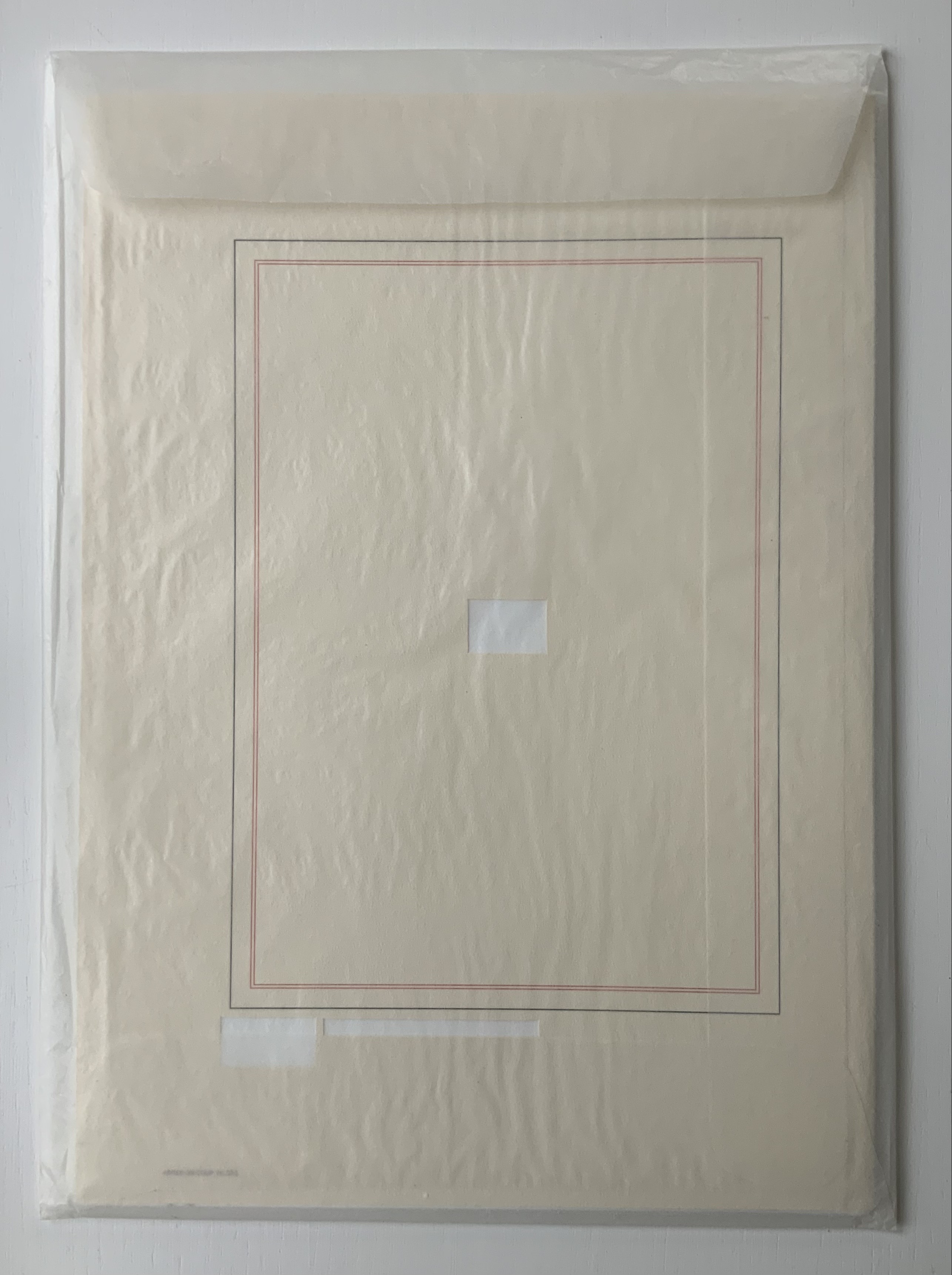
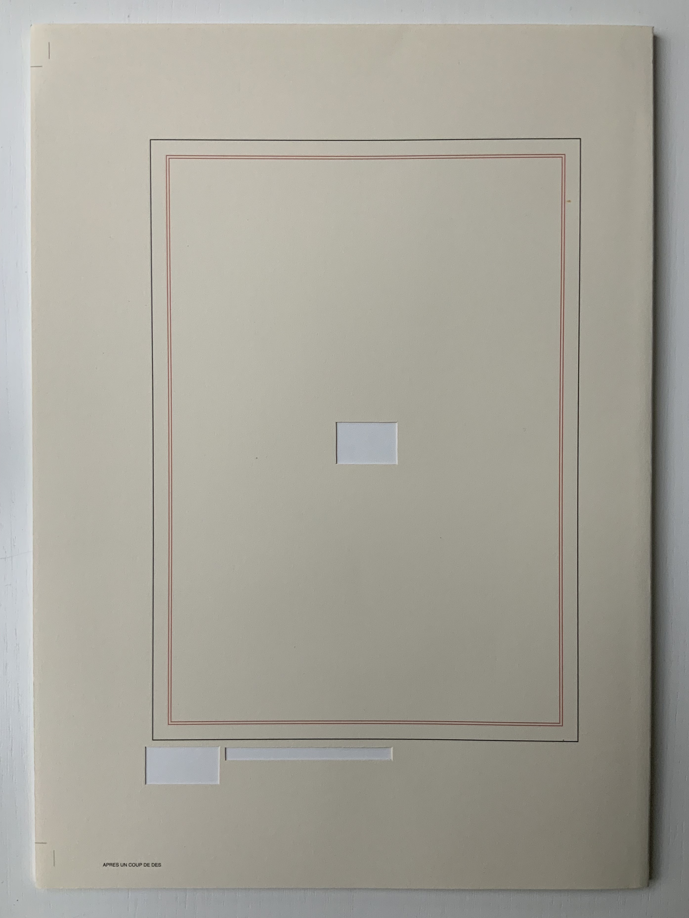
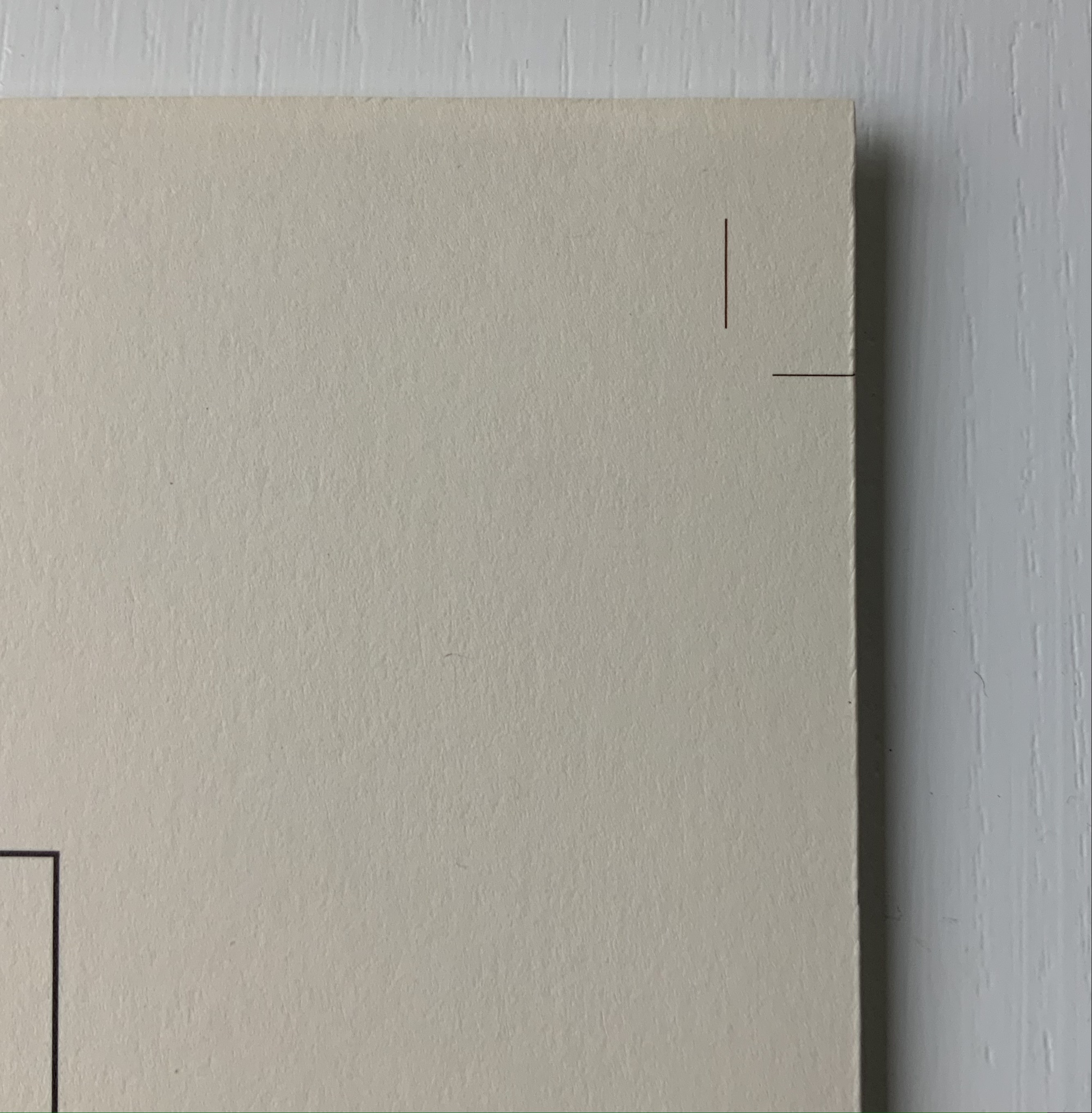
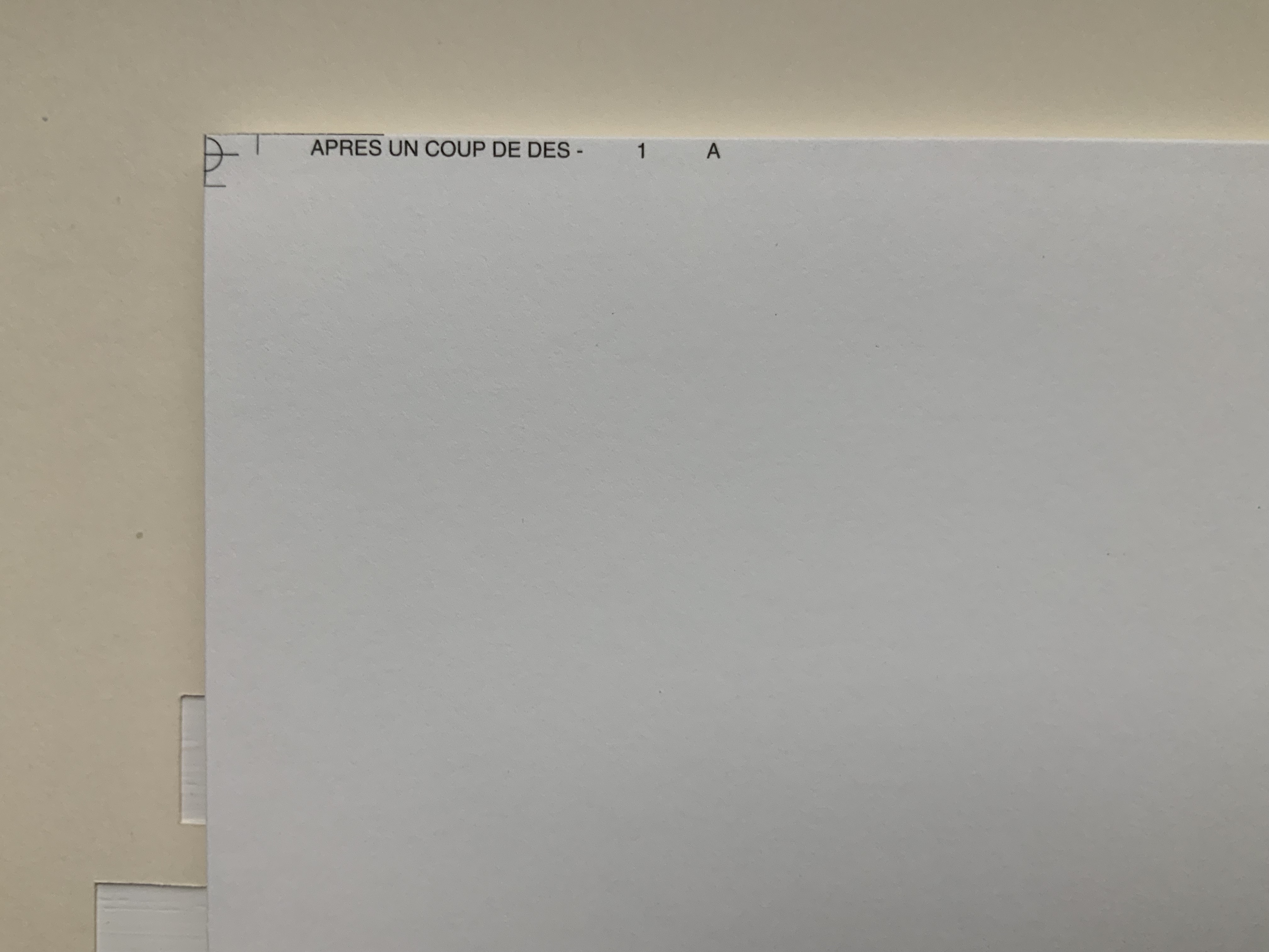
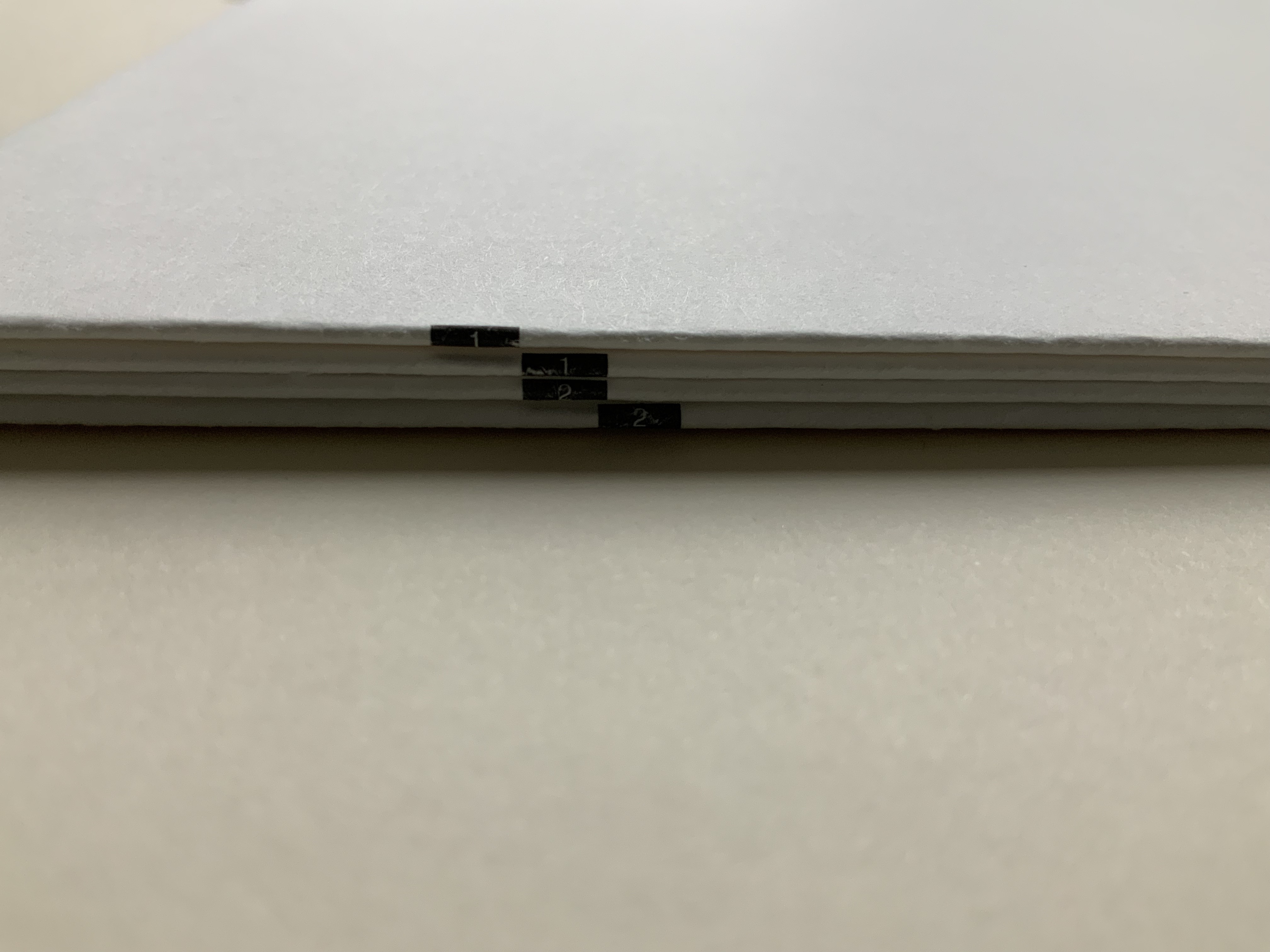
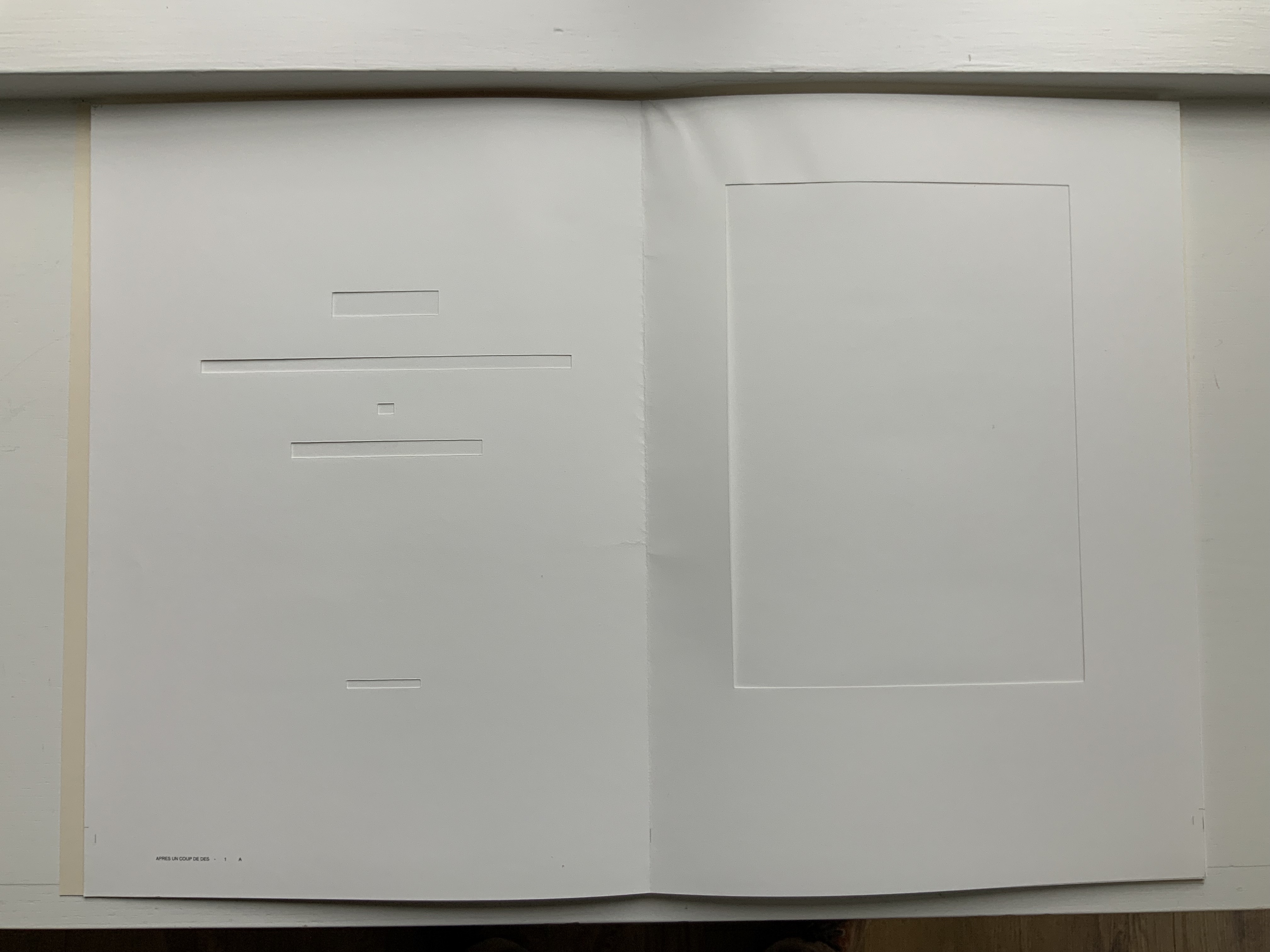
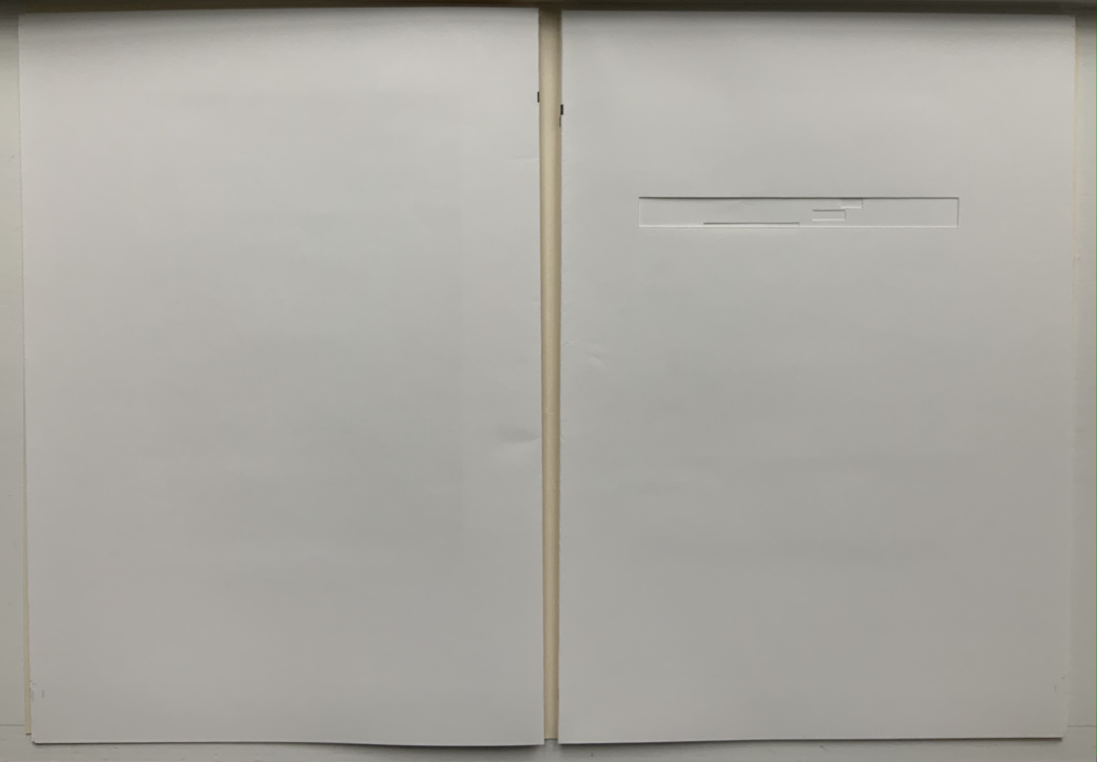
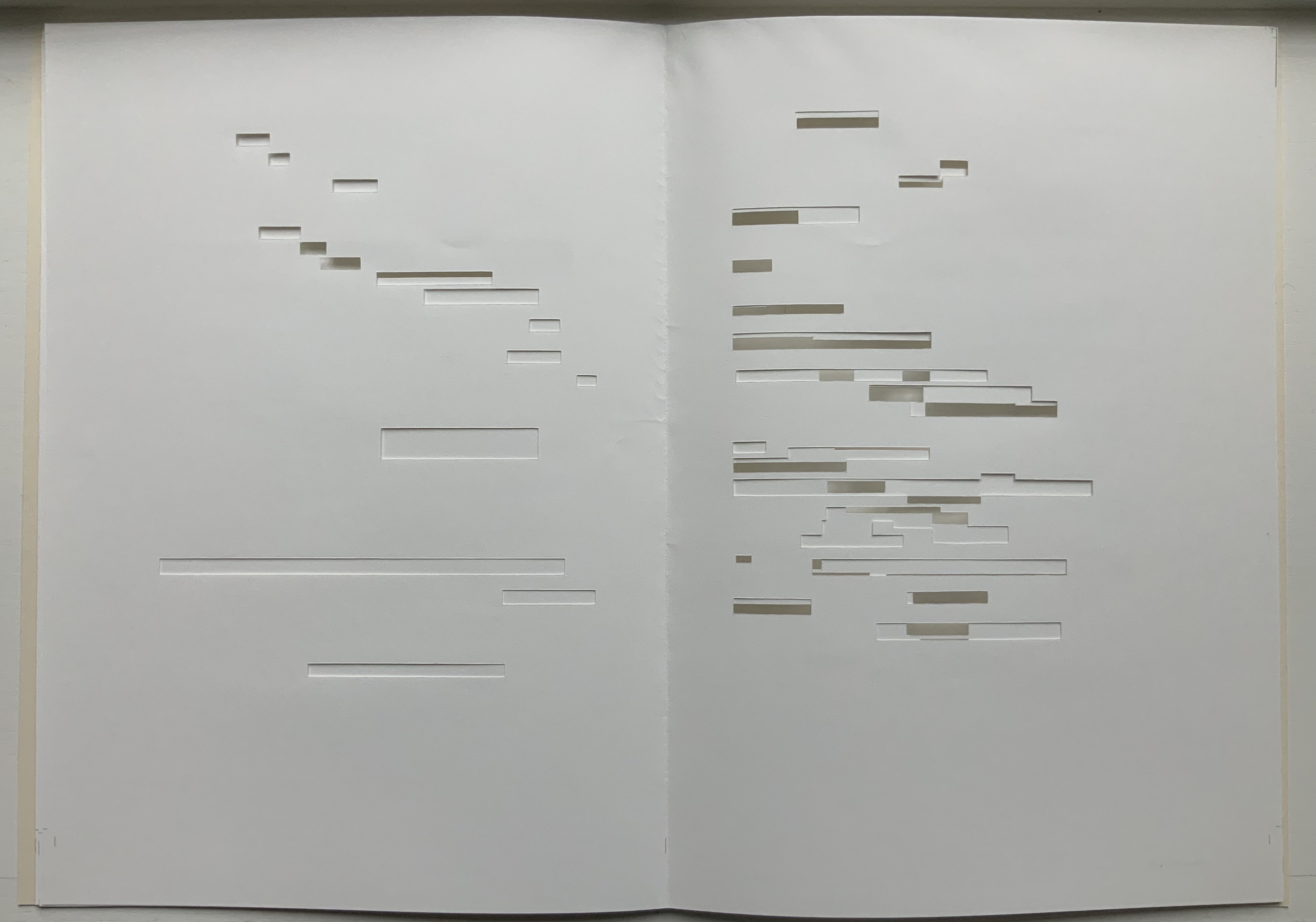
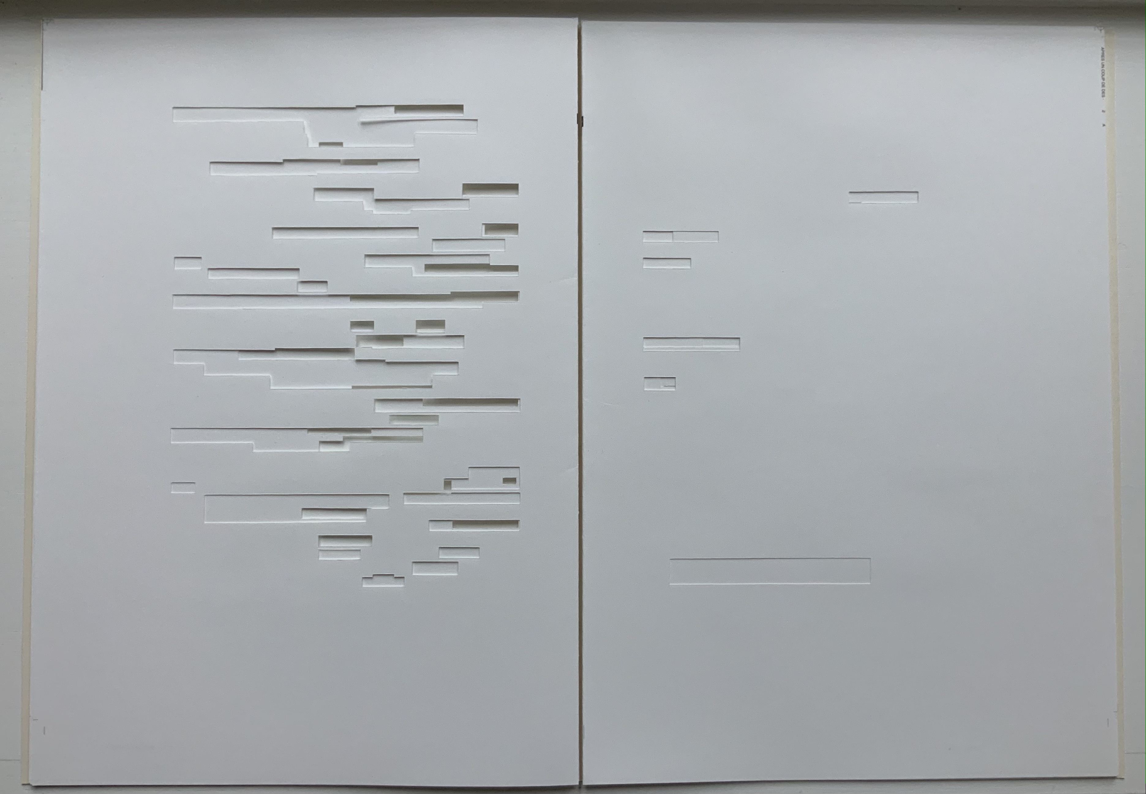
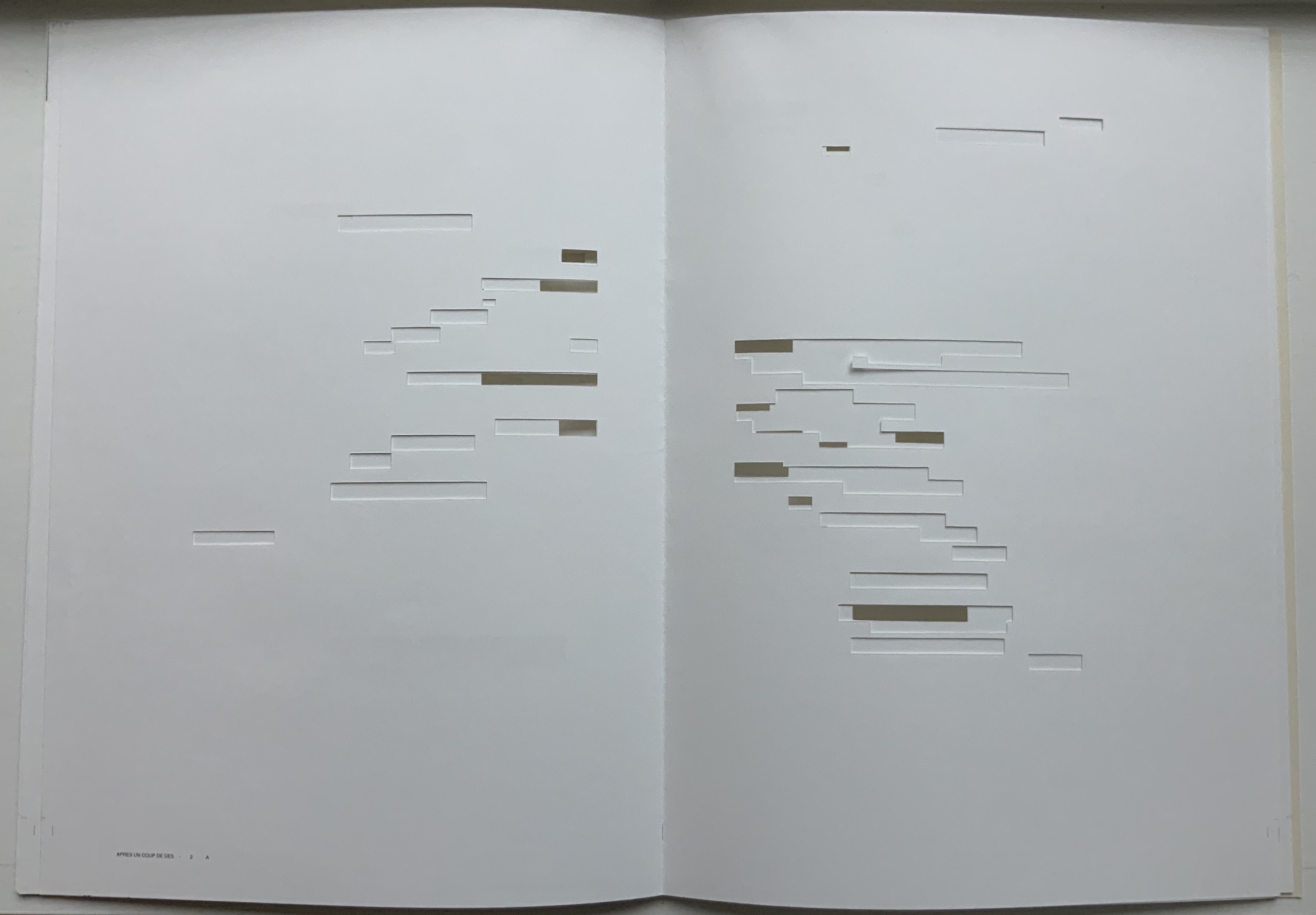
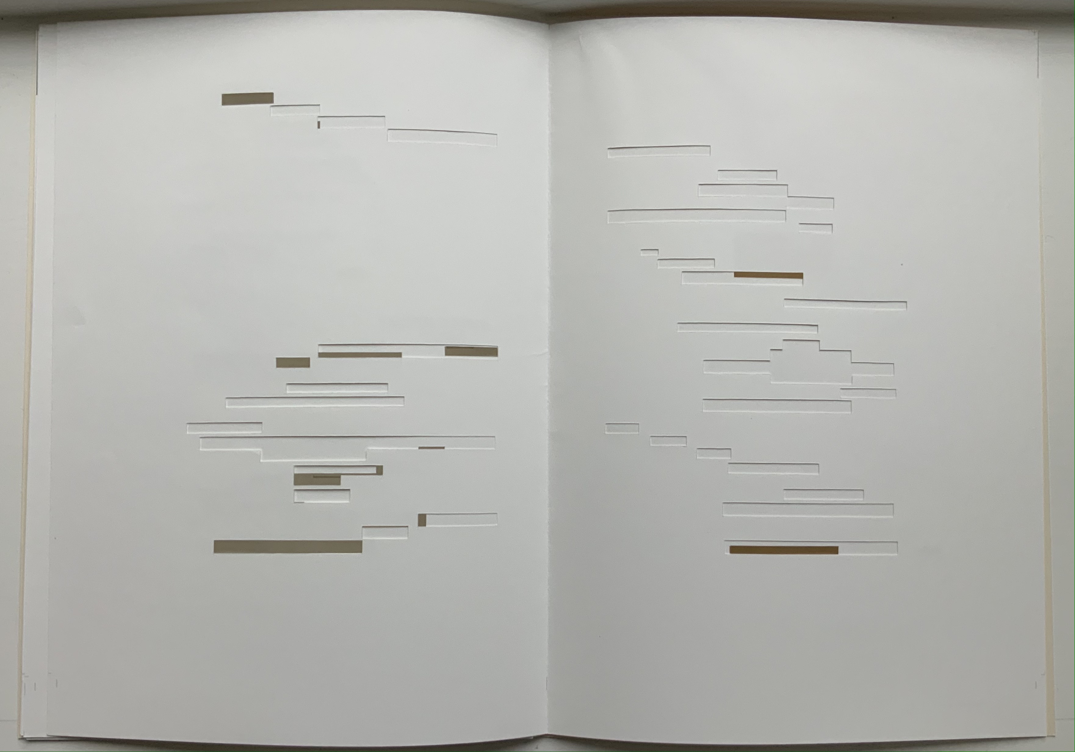
Après Un Coup de Dés (2015) Michel Lorand Cover and gatherings, untrimmed and unbound, in glassine envelope. Cover: H362 x W260; gatherings: H362 x W256 mm; 32 unnumbered pages. Edition of 50, of which this is #19. Acquired from the artist, 22 October 2021. Photos: Books On Books Collection. Displayed with the artist’s permission.
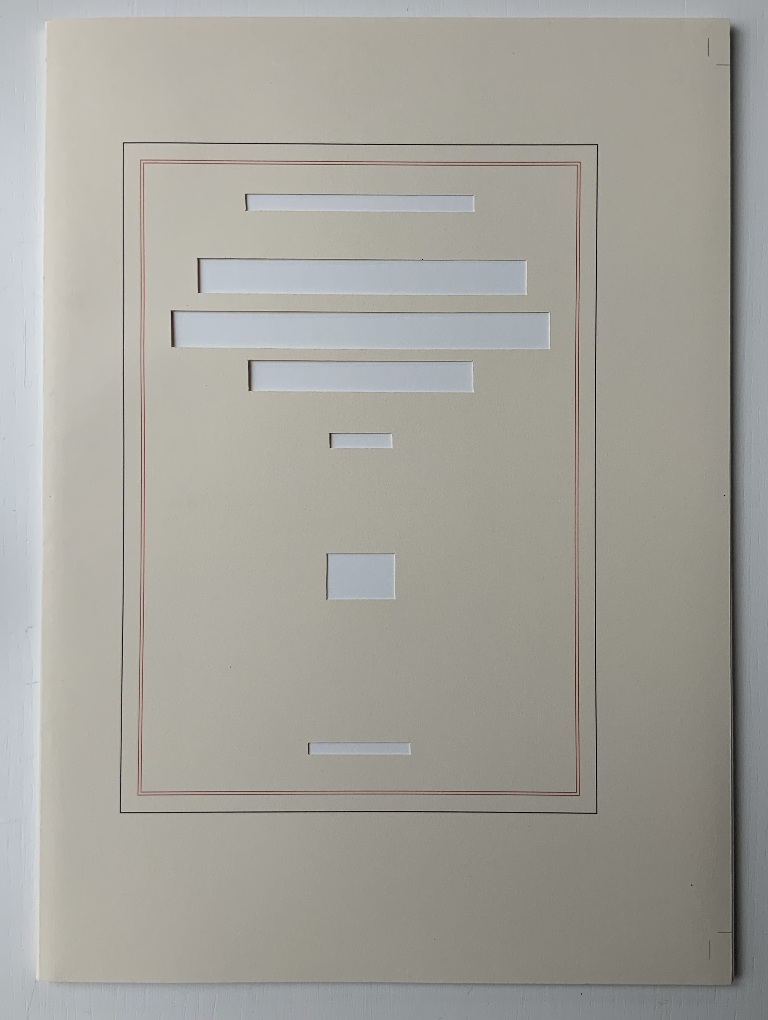
Since the 1960s when Ernest Fraenkel, Mario Diacono and Marcel Broodthaers blotted out the text of Mallarmé’s poem Un Coup de Dés Jamais N’Abolira le Hasard (1897) to create their works of homage, numerous others have expanded on the technique: substituting images of sonograms (Sammy Engramer, 2009) or algorithmically generated abstractions (Eric Zboya, 2018, and Benjamin Lord, 2019), or excising the text (Michalis Pichler, 2008, and Cerith Wyn Evans, 2008) or algorithmically erasing it (Jérémie Bennequin, 2009) — just to name a few.
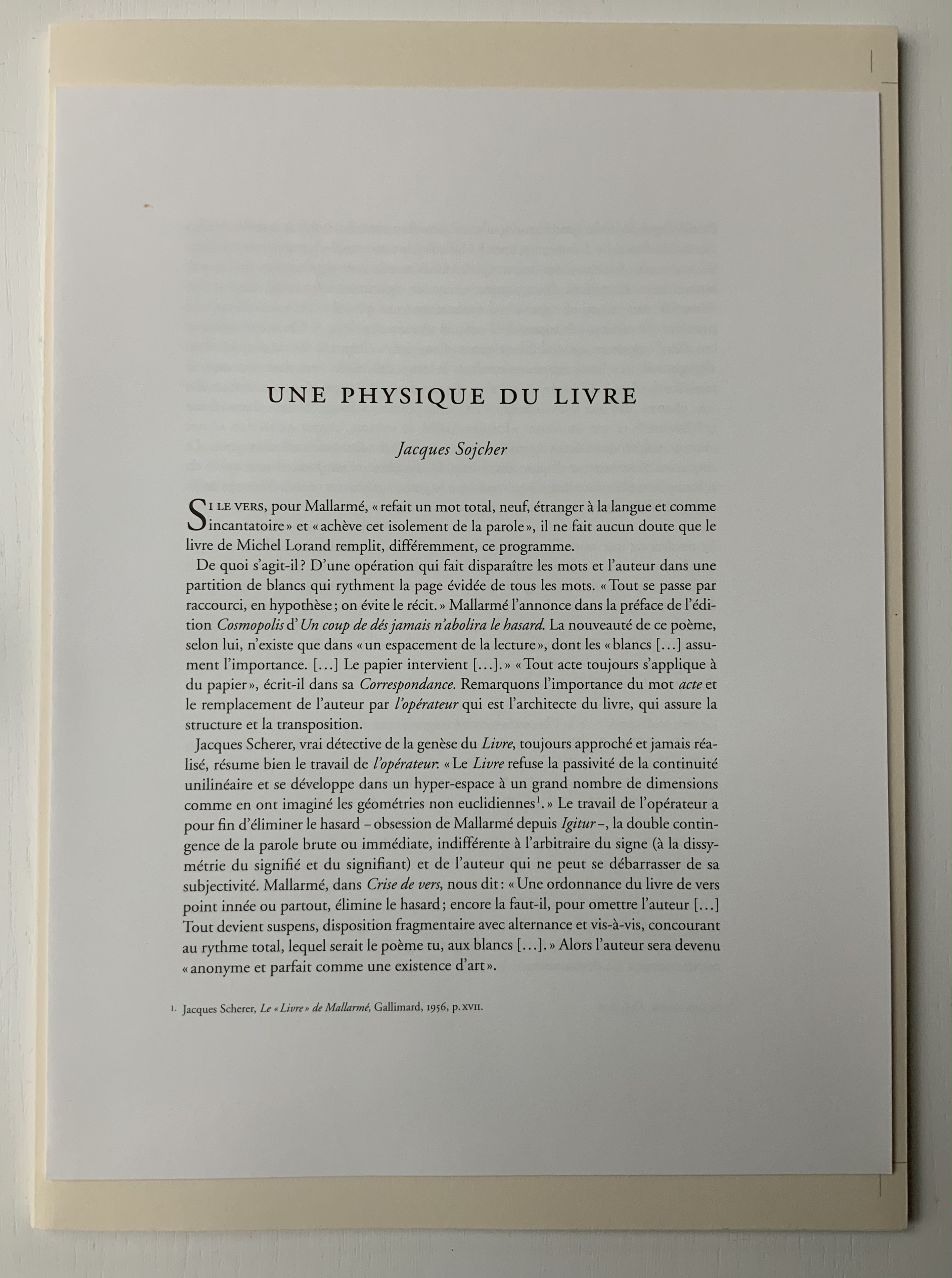
In Après Un Coup de Dés (2015), the only printed marks are the cover’s traditional black and red borders and the printer’s registration and gathering marks on the sheets. Wherever else Mallarmé’s text would have been printed has been excised. In reply to a question about the process involved, Lorand explains that he had asked the designer Filiep Tacq to create a layout that would cover in black exactly the blocks of text as it appears in the current Gallimard book edition of Mallarmé’s poem, including the front and back covers (correspondence with the artist, 1 November 2021). Lorand took a scalpel to the offset printed sheets, removed the blackened blocks, folded the sheets by hand into the four gatherings, assembled them in the correct order and laid them untrimmed and loose inside the cover. Each of fifty copies was placed inside its own handmade glassine envelope along with a flyer including introductory text by Jacques Sojcher (emeritus professor, University of Brussels) and the colophon for the work. It is a book that is not-yet a book.
Lorand’s and all of these other works of homage give us inverse ekphrasis. They are the visual, tactile and conceptual works of art that come after Mallarmé’s text. We are more used to ekphrasis where the object, painting or sculpture comes before the text — like Achilles’ shield before Homer’s description, or the Grecian urn before Keats’ ode, or Brueghel’s Fall of Icarus before Auden’s Musée des Beaux Arts. Homer, Keats and Auden vie with the art of the crafted object to put that object (and more) in front of us with words. With the inverse, the crafted objects vie without the words to put Mallarmé’s poem (and more — and sometimes less!) in front of us.
Many of the hommageurs hint at the “and more” with a subtitle to Un Coup de Dés Jamais N’Abolira le Hasard. With Broodthaers, it is Image; with Pichler, Sculpture; with Engramer, Onde (Wave as in soundwave); and with Bennequin, Omage (as in hommage with the “h” and “m” missing). With Lorand, there is no subtitle. Instead, we have the word après prefacing the truncated title of the poem. But, “after” Mallarmé’s poem, what is Lorand proposing? An homage in the form of something that restates, reproduces the poem but without the words? An homage in the form of something else presented in the manner of Un Coup de Dés but without the words? Or something else that simply occurs after the poem’s roll of the dice? As it turns out, all that and more.
Paul Valèry was probably the first of Mallarmé’s circle to see and hear Un Coup de Dés. His reaction picks out one of the themes that make up Lorand’s “and more”:
It seemed to me that I was looking at the form and pattern of a thought, placed for the first time in a finite space. Here space itself truly spoke, dreamed, and gave birth to temporal forms. Expectancy, doubt, concentration, all were visible things. With my own eye I could see silences that had assumed bodily shapes. Inappreciable instants became clearly visible: the fraction of a second during which an idea flashes into being and dies away; atoms of time that serve as the germs of infinite consequences lasting through psychological centuries — at last these appeared as beings, each surrounded with a palpable emptiness…. there in the same void with them, like some new form of matter arranged in systems or masses or trailing lines, coexisted the Word! — Paul Valéry, Collected Works of Paul Valery, Volume 8: Leonardo, Poe, Mallarmé (1972).
Lorand writes:
My <<Après un Coup de Dés>> introduces a corpus of approaches to what might be “the movement” that constitutes speech: “A language that speaks” as Martin Heidegger calls it (Unterwegs zur Sprache, Verlag Günther Jeske, Pfullingen, FRG, 1959).
How can we think, how can we imagine this movement within language itself? What path to take to allow us to experience this movement, the one that constitutes the word itself. This word is sound. The object of all my work is the identification of what could be the image of this movement, of this word. This exploration attempts to approach the nature of this movement: a word beyond language when the latter is silent. (Correspondence with the artist, 1 November 2021.)
Like his others, Heidegger’s On the Way to Language is a dense book; more than the others, it is poetical, an invitation to experience language. In it is a series of lectures entitled “The Nature of Language” in which Heidegger uses two poems, one by Stefan George and one by Gottfried Benn, to question language about its nature. Although George’s poem is the one that Heidegger deeply explicates, Benn’s is the one that, echoing Valèry, sheds the most light on Lorand’s Après Un Coup de Dés — especially with its last two lines.
A Word
A word, a phrase –: from cyphers rise Life recognized, a sudden sense, The sun stands still, mute are the skies, And compacts it, stark and dense.
A word — a gleam, a light, a spark, A thrust of flames, a stellar trace — And then again — immense — the dark Round world and I in empty space.
Après Un Coup de Dés seems to be a wordless invitation to experience language. But in a sense, Mallarmé’s words have not disappeared, not entirely. Their shapes — embodied in the voids — move silently and rhythmically across the unfolded sheets; in the gatherings, they cascade over one another much as they do syntactically and typographically in print. And even though the text is not before (in front of) us, Lorand’s artwork delivers a wordless experience of a key paradox of language with which Mallarmé sought to imbue his poem: the language of the void or abyss — the void or abyss of language. One of the ways in which the poem presents this self-enveloping paradox is that it begins and ends with the words un coup de dés, the act that can never abolish chance and the act that all thought emits. Similarly, Après un Coup de Dés displays the presence of language by displaying the absence of language, or les blancs defined by and defining empty space.
Mallarmé’s invitation in Un Coup de Dés, however, beckons us to a slightly different concept of language than that articulated by Heidegger. For Mallarmé, chance plays a prominent role in what Heidegger would call the “neighborhood of poetry and thought”. But chance, hazard or a roll of the dice plays a much less prominent role for Heidegger, and in Lorand’s work of art, with its registration and gathering marks and glassine enclosure, there seems little allusion to it — perhaps naturally so since Lorand’s work comes after the dice have been rolled.
Even though it comes after Mallarmé’s completed poem and after the Gallimard book edition, Après presents as an unfinished work, a book not yet trimmed and bound, which reflects not only Mallarmé’s unfinished realization of the poem as a book but also his unfinished life’s pursuit: le Livre, the thing in which everything in the world would end up — the thing that, by virtue of a spacious mobility of typographic layout and the interplay of its elements, would be “the total expansion of the letter”. Lorand’s attention and manual precision in excising the blackened blocks where the text would otherwise appear evoke Mallarmé’s attention to the minute details of typeface, size and font shown in his handwritten mark-up of the proofs for the book edition he was planning before he died.
Après also comes after the efforts of Broodthaers and Pichler, both of whom organized exhibitions for their works of homage. In fact, Pichler paid homage to Broodthaers by naming his exhibition “Pichler: Exposition Littéraire autour de Mallarmé” (Milan, December 2016) after “Broodthaers: Exposition littéraire autour de Mallarmé” (Antwerp, December 1969). Pichler’s exhibition was also daring in its exposure of the works to the visitors.
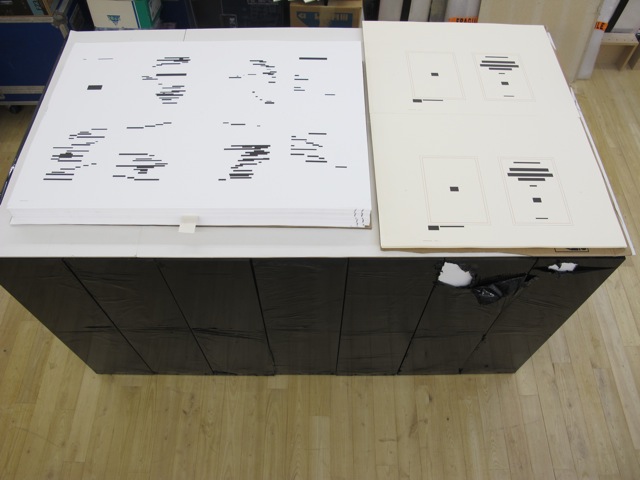
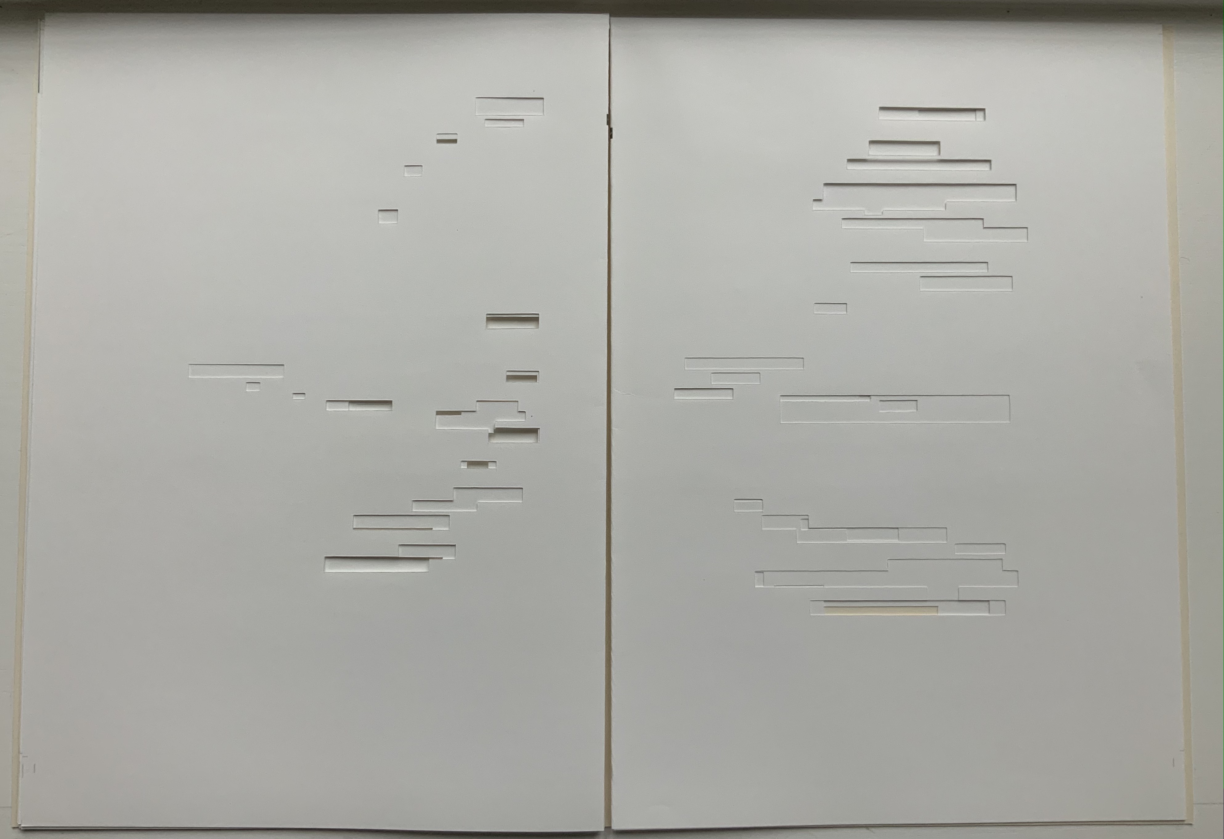
In the 2018 display of Après Un Coup de Dés, the previously gathered but now unfolded sheets and cover lie side by side under glass. Often this is cause for complaint about the distanced display of artist books. In the case of Après Un Coup de Dés, the distance effectively draws point-blank attention to what the privileged reader gradually discovers in handling the work. The unprivileged reader may have to imagine the making, unmaking and remaking of the book but, confronted with the gestalt of the undone gatherings and their registration marks, that reader immediately sees/witnesses the void defined by a void.
Après Un Coup de Dés in the group exhibition Reading Hand Writing Bodies at Les Abattoirs de Bomel, Centre d’art de Namur, Belgium, 8 February – 11 March 2018. Photo: Courtesy of the artist.
In relation to Broodthaer’s Image and Pichler’s Sculpture, Après comes both before and after. The positioning of the words après, image and sculpture vis à vis the poem’s title has been noted already. Of all three visual, tactile and conceptual works, Lorand’s stands as the chronologically “after” yet unfinished “before” to Broodthaers’ and Pichler’s finished works. In yet another “afterness” to Mallarmé’s poem, Lorand likens Après to a silent score of music or a piano roll (correspondence with the artist, 1 November 2021). This echoes — if that is not too perverse a verb — Mallarmé’s reference to “score” in his preface to Un Coup de Dés. In premonitory, if not coincidental, irony, Lorand’s piano-roll-like 2015 work precedes a work that Michalis Pichler created for his 2016 Milan exhibition: a piano roll playable on a foot-pumped pianola and entitled Un Coup de Dés Jamais N’Abolira le Hasard: Musique (see video above).
The interplay of its philosophical roots with its mechanically produced print and its manual cuts makes Lorand’s AprèsUn Coup de Dés one of the more challenging works of homage to Mallarmé’s poem. To “hear” it side by side with the others in the Books On Books Collection (see below) is rewarding.
Further Reading
“Derek Beaulieu“. Books On Books Collection. 19 June 2020.
“Eric Zboya“. Books On Books Collection. 01 June 2020.
Heidegger, Martin, and Peter D. Hertz, trans. 1959/2009. On the Way to Language. San Francisco: HarperOne. Reprint. “No matter how we put our questions to language about its nature, first of all it is needful that language vouchsafe itself to us. If it does, the nature of language becomes the grant of its essential being, that is, the being of language becomes the language of being” (p. 72).
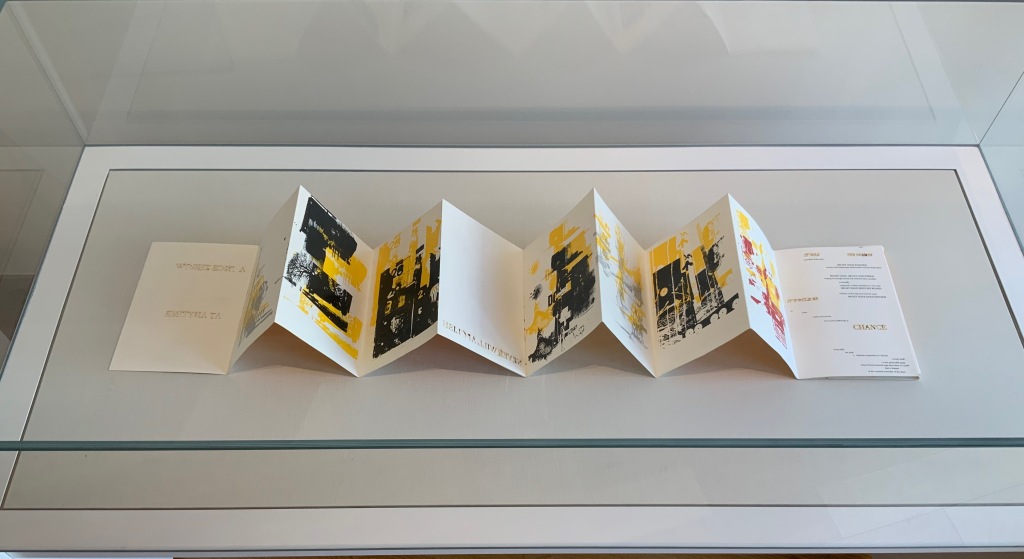
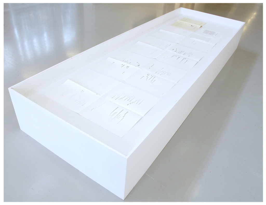
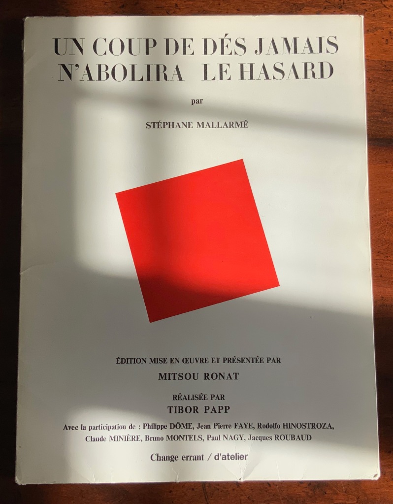
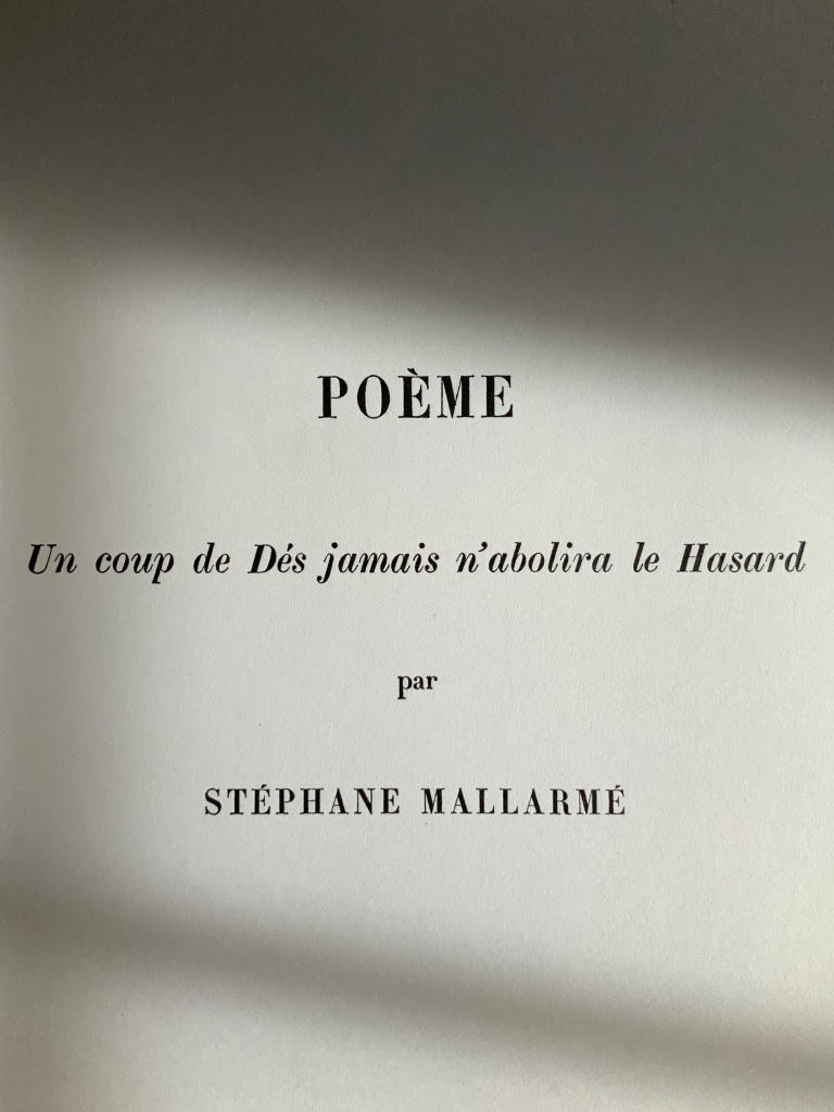
Poème: Un coup de Dés jamais n’abolira le Hasard par Stéphane Mallarmé (1980) Édition Mise en Oeuvre et Présentée par Mitsou Ronat, Réalisée par Tibor Papp. Two sets of folded & gathered folios, enclosed in a portfolio with four flaps; Portfolio: H380 x W285 mm; Folios: H380 x W285 mm; Poème, 24 pages, including the cover; “Le Genre …”, 28 pages, not including cover. Acquired from Latour Infernal, 28 May 2020. Photos: Books On Books Collection.
Described as an “éditionmise en oeuvre“, the Ronat/Papp 1980 publication of Un Coup de Dés is indeed as much a “production” as any theatrical or cinematic mise en scéne. Equally apropos or more so, the phrase calls to mind the French for page layout: mise-en-page. The layout of the work certainly calls attention to itself as much as to the page. While it represents an effort to reflect Mallarmé’s “true” intentions for the page layout of Un Coup de Dés, the Ronat/Papp production delivers the poem in a set of loose F&Gs (folded and gathered folios), paired with another set of F&Gs (artwork, poems and essays) and enclosed in a portfolio.
The first effort to follow Mallarmé’s intention as intimated in his corrected proofs of the abandoned Ambroise Vollard version was the 1914 NRF edition, which also called attention to itself with its oversized format, but it was sewn and bound into its paper cover as usual. Its lay-flat binding eased reading the lines of verse that run across the book’s gutter.
By unbinding that space that usually sinks into the gutter, Ronat and Papp retain the readability across the gutter but introduce an interesting instability. The unitary view of the double-page spread that Mallarmé intended falls prey to physical chance. Lines across pages can fall out of alignment as folios slip up or down. If the folios scatter, the reordering of the unnumbered pages relies on the guidance of the typography and memory. Oddly this forces a more hands-on engagement with the poem. No other edition intended for reading the poem feels as physical. The page and double-page spreads are felt.
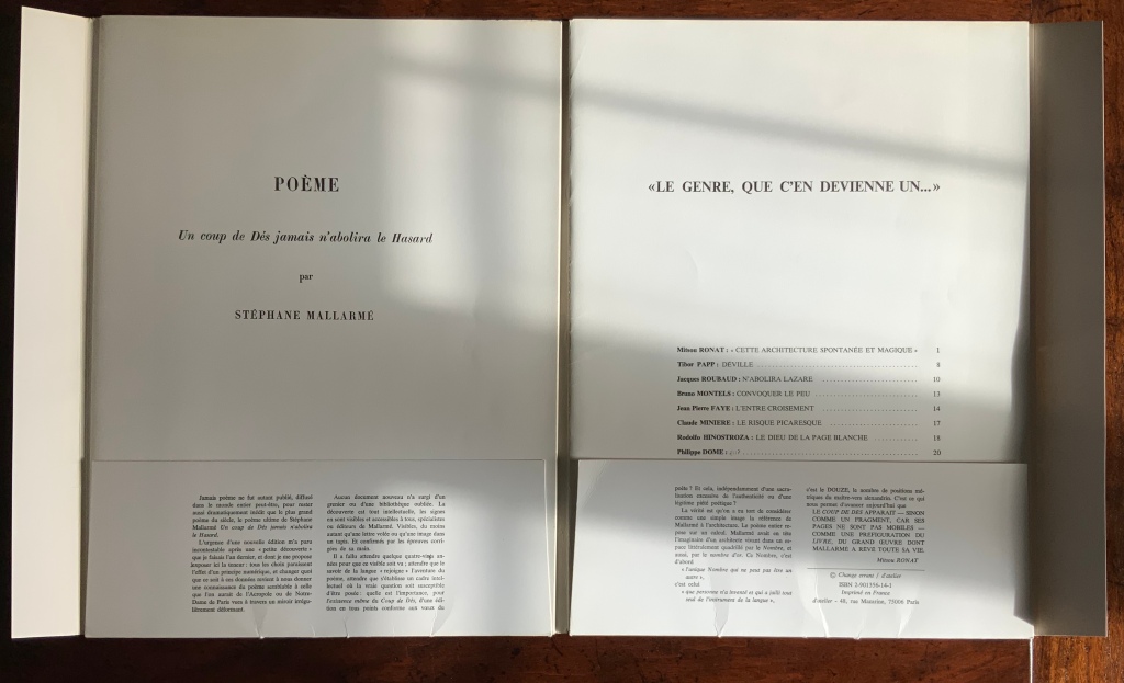
Although also not bound, the order of the artwork, poems and essays in the right-hand set of F&Gs is traditionally fixed with pagination, as the front of its self-covering folio shows. More important is the cover title: “Le genre, que c’en devienne un …” (“the genre, that it becomes one …”). Those words begin the final sentence in the reproduction of Mallarmé’s reluctant note from the poem’s first publication. Cramped into the magazine Cosmopolis, the poem’s layout was still startling enough to the editors to require a preface from Mallarmé. Facetiously and seriously, his note explains how to read the poem. In varied ways, the F&Gs’ content also seriously and facetiously demonstrates how to read the poem. And starting and ending with Mallarmé’s words, the portfolio’s second half reflects the circularity of the poem it faces, which starts and ends with the words un coup de dés. An édition mise en oeuvre indeed.
So forget the debate over who was first to display the poem in the true form as Mallarmé intended. The second portfolio is proclaiming then proving by examples that Un Coup de Dés is a genre.
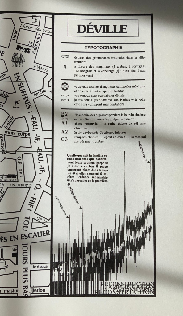
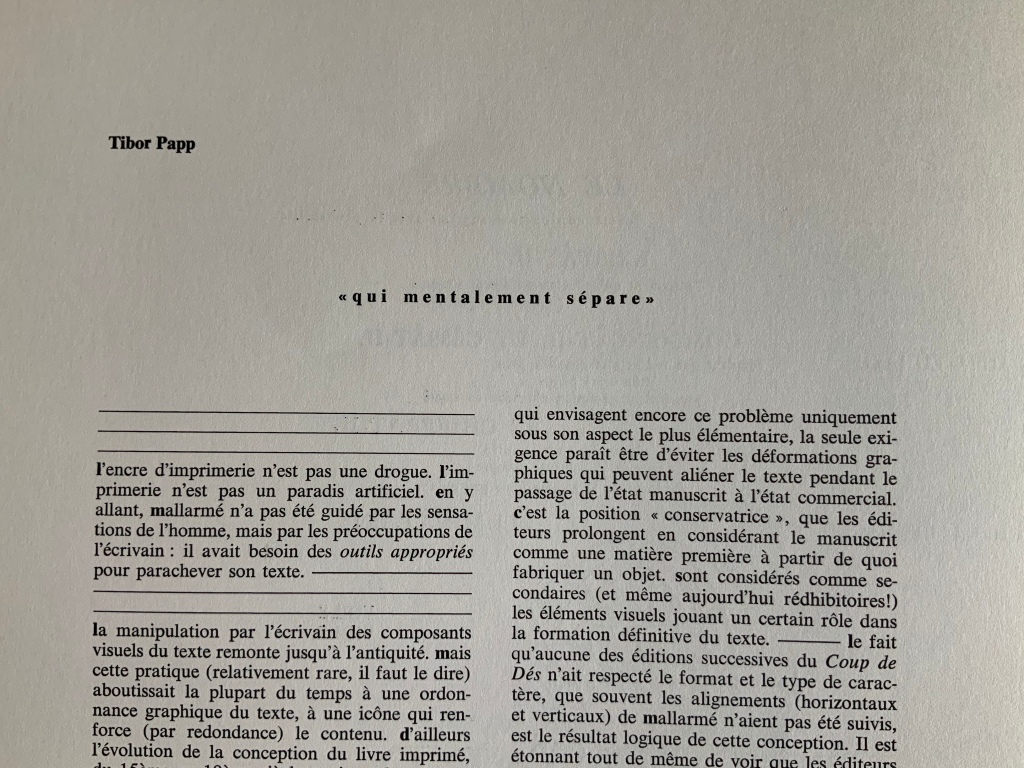
Mitsou Ronat‘s introduction sets the poem’s publishing history in context and explains this edition’s claim to reflect Mallarmé’s wishes for the poem’s presentation. In doing so, she puts forward her hypothesis that le Nombre (“the Number”) mysteriously posed in the poem is 12, the syllable count of each line in the French alexandrine couplet and ties this revelation to the page and double-page spread as units of meaning, culminating in the 24 pages of which the mise en oeuvre consists. Tibor Papp follows with his map of Déville (“Dice-town”). Overlapping inscriptions along the crisscrossing streets remind us of the sometimes overlooked humor in the Mallarmé industry. One street is labelled Saint-Mallarmé de la masturbation. Off one boulevard are the remparts des alexandrins (“battlements of the Alexandrines”), complete with a WC for passers-by. There is even a Métro stop named for Mallarmé’s Igitur, thematic predecessor to Un Coup de Dés. Another recalls the political cast of the times: premières allusions à la lutte des marginaux oubliées (“first allusions to the struggle of the forgotten marginalized”). But most important is the map as map, a poster, a sub-genre of the genre Un coup de Dés and forerunner to future works such as that by Aurélie Noury. In his essay near the end of the F&Gs, Papp asserts that Mallarmé was not preoccupied with print and typography for its haptic properties, rather he was simply seeking the tools appropriate to complete his text. This is Papp’s departure point for discussing the aims of Le Groupe d’atelier, which he founded with Paul Nagy and Philippe Dôme in 1972:
Pour l’écrivain, donc, d’aujourd’hui, l’attitude de mallarmé scrutant les caractères des affiches, travaillant ses épreuves par collage, déplaçant ses mots d’un millimétre, est une attitude parfaitement normale et logique, en même temps que son poème constitue un classique du genre.
Pour nous, l’écrivain assume son rôle jusqu’à la materialité de son texte.
“For today’s writer, then, the Mallarméan scrutiny of type display, working on his proofs by collage, moving his words by one millimeter, is perfectly normal and logical behavior, at the same time that his poem constitutes a classic of the genre.
For us, the writer’s role entails the materiality of the text.”
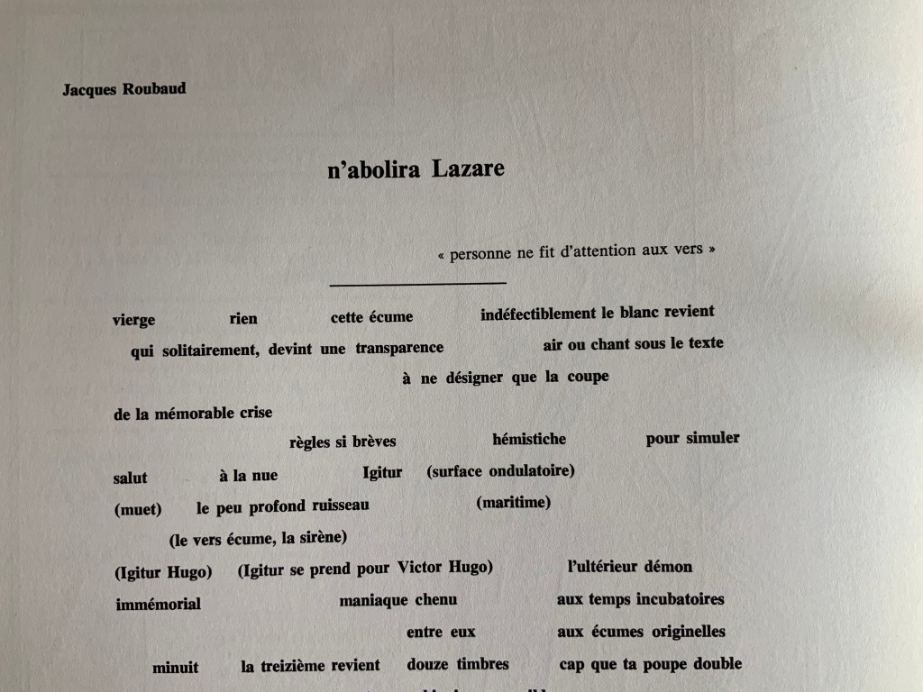
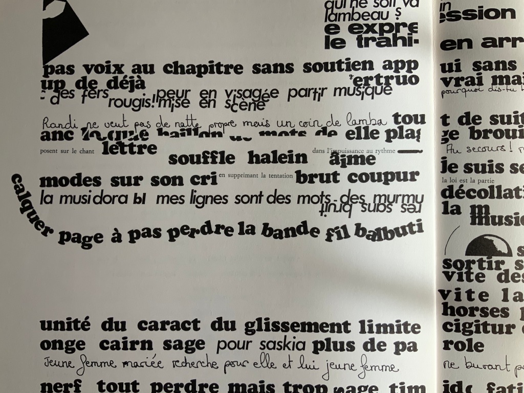
The remaining contributors traverse the ranges of the academic and artistic, the tongue-in-cheek and the serious, that Ronat and Papp establish. A more textual affair, “n’abolira Lazare” by Jacques Roubaud, a member of the OuLiPo movement, delivers an homage to Mallarmé replete with numerical and linguistic puns, appropriate to a professor of mathematics and literature, and a translator of Lewis Carroll. Bruno Montels‘ “Convoquer le peu” displays his signature combination of handwriting and typographic experimentation.
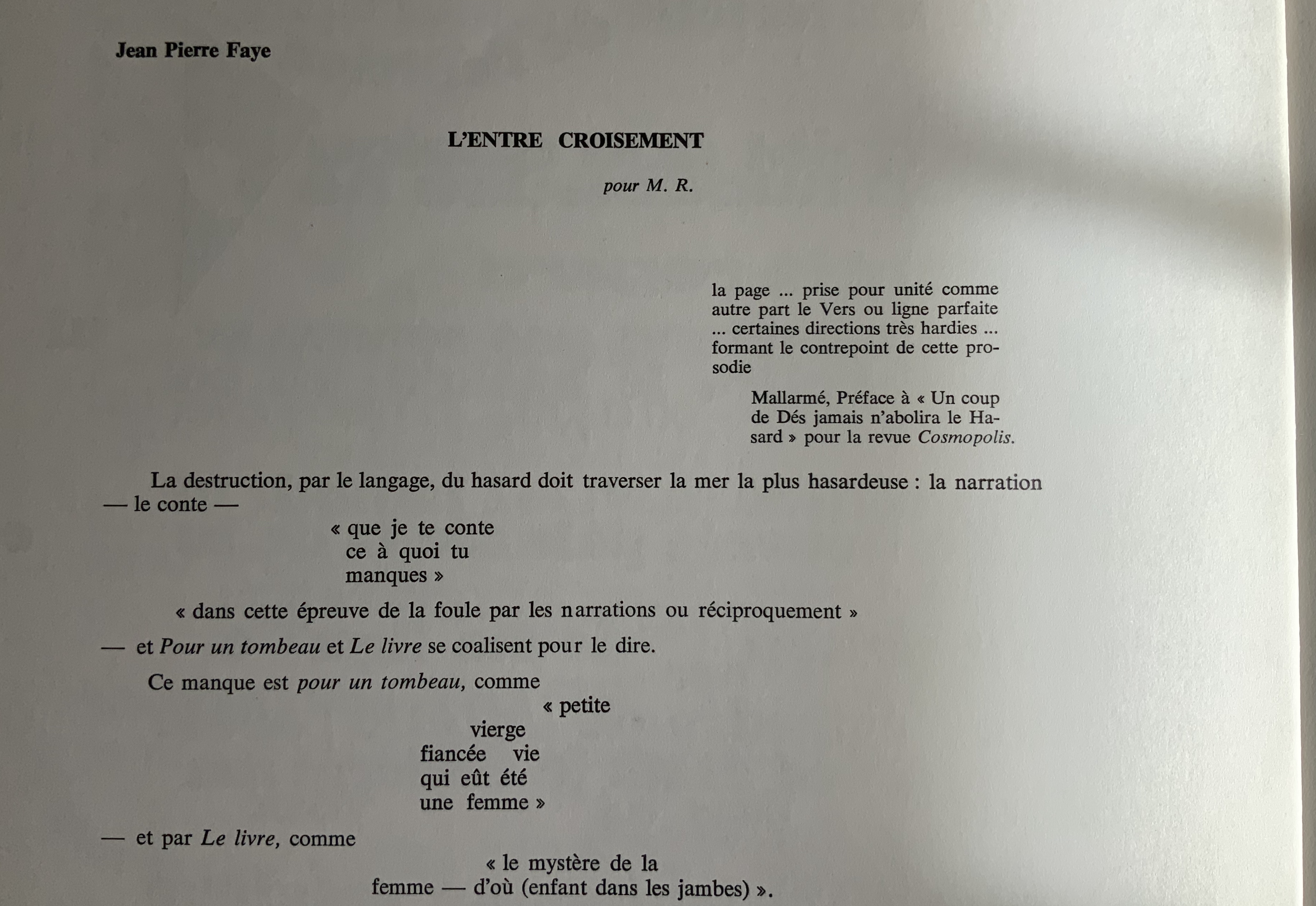
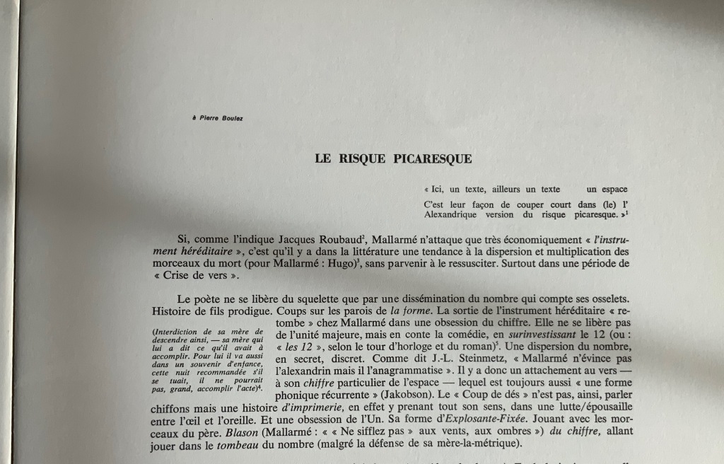
“L’Entre croisement” by Jean Pierre Faye (a visual linguistic pun, “threshold” and “intersection”) reads like notes for an academic lecture but in a free-verse layout. The poet/essayist Claude Minière‘s “Le Risque Picaresque” foreshadows(?) his essay Un Coup de Dés (Tinbad, 2019), which proposes Pascal’s wager and Pensées as a predecessor to Mallarmé.
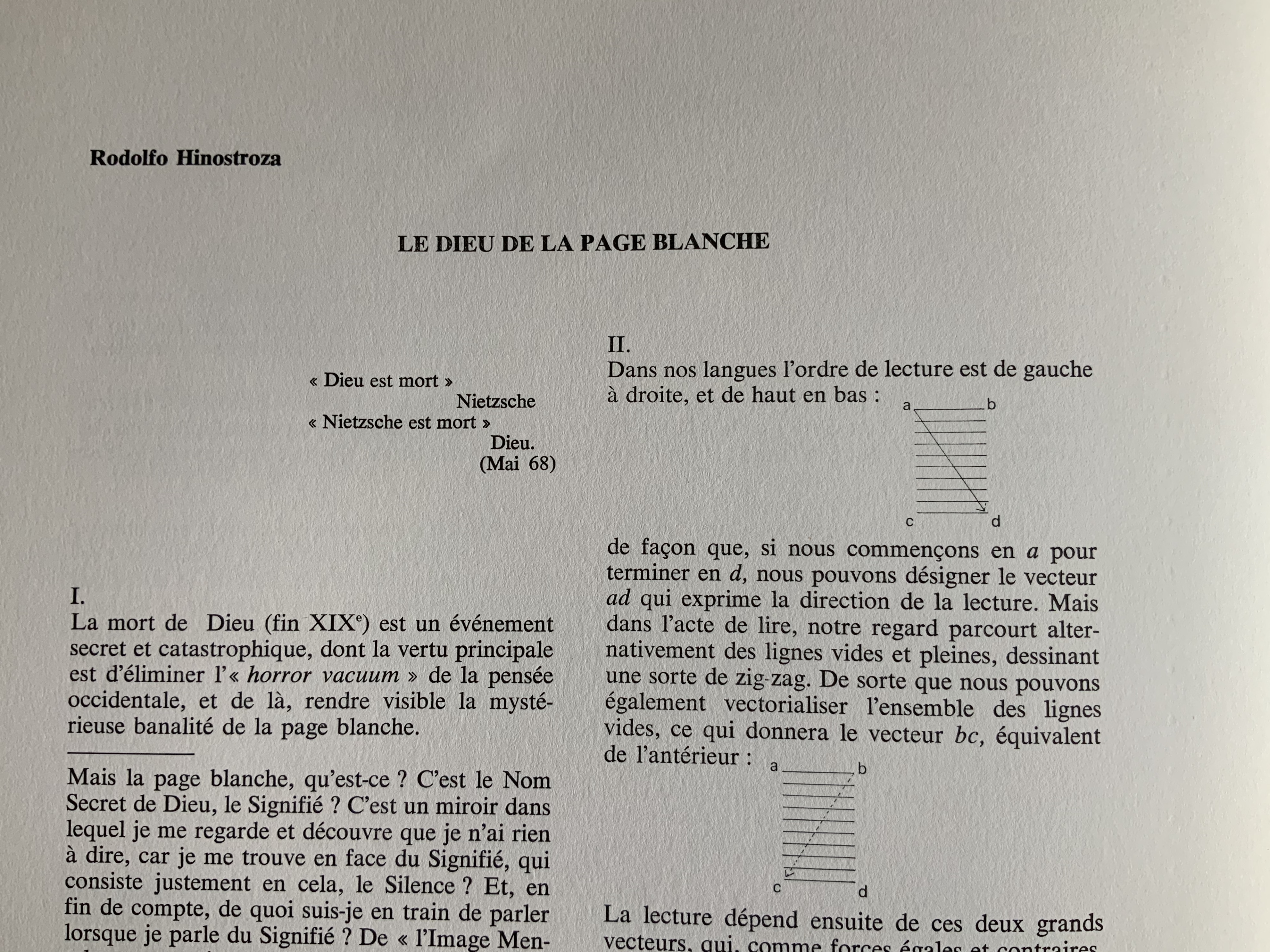
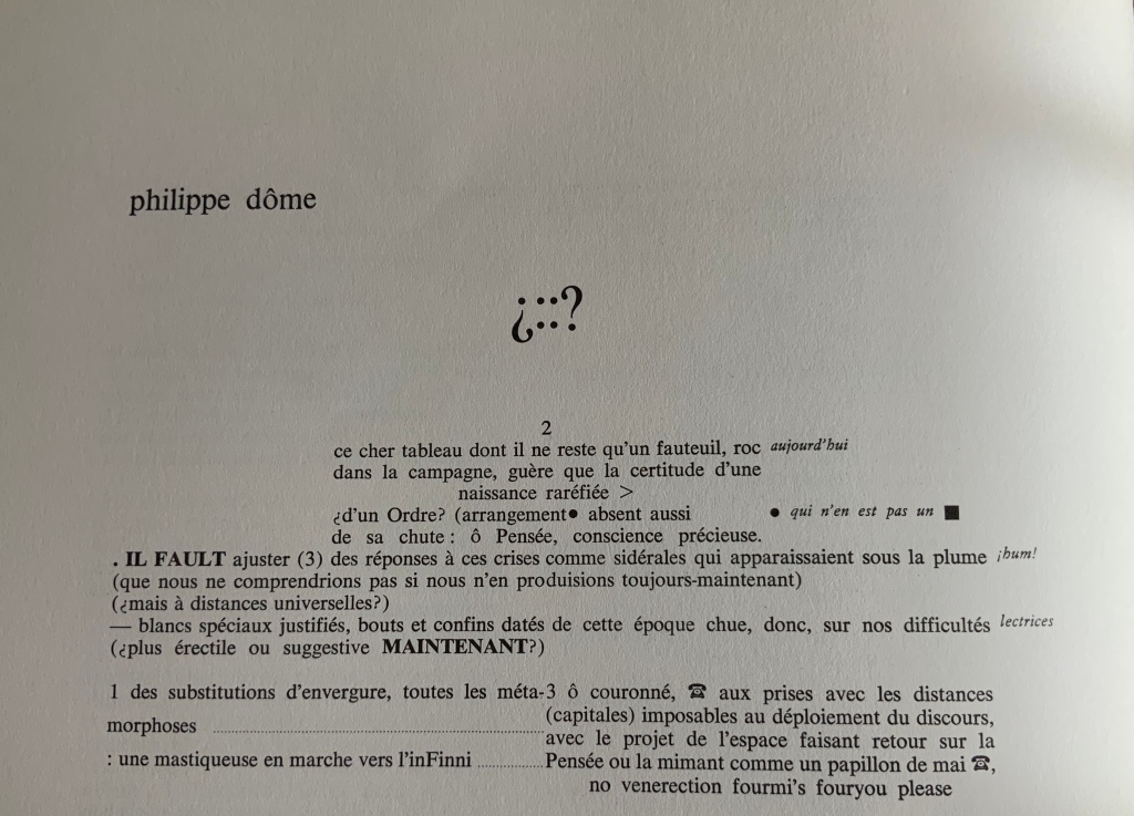
Peruvian poet and writer Rodolfo Hinostroza‘s “Le Dieu de la Page Blanche” (“The God of the Blank Page”) delivers a diagrammatic exploration of the placement of verses on the page in Un coup de Dés, reminiscent of but less abstruse than Ernest Fraenkel’s Rohrschach-like exposition. Philippe Dôme draws on his time as a French and Spanish teacher in London to put together pages of a multilingual study workbook for the reader of Un Coup de Dés. Clearly a lover of puns, he entitles his workbook with Spanish interrogatory marks around the face of a die, the 4 constructed with two colons.
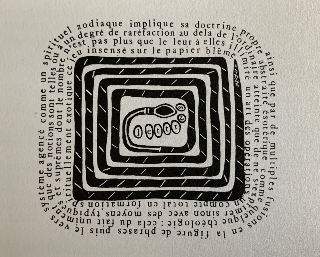
Perhaps the most striking of the visual homages, Paul Nagy‘s contribution is a descendant of Un Coup de Dés by conscious or unconscious way of the earlier typographic and graphic gymnastics of Dada, Marinetti, Iliazd, Gomringer, the Brazilian Noigrandes movement and Fluxus.
In its unbound folios approach to the poem and juxtaposition of it with artistic interpretations of the poem, the Ronat/Papp production marked a pivot for future treatments of Un coup de Dés. Over the decades after it, three new editions — also aimed at reflecting the Master’s wishes — appeared as did dozens of inventive academic and artistic responses to Un Coup de Dés. The three explorations of the “true” edition (in French) are Michel Pierson‘s (2002), Françoise Morel‘s (2007) and Ypsilon Éditeur‘s (2008). Though the artworks paying homage since 1980 are too numerous to list for this entry, note that Books On Books is preparing a virtual 125th anniversary celebration for 2022 that will display images and links for all the homage paid since 1897 that it has uncovered — from Man Ray’s Les Mystères du Château de Dé (1929) to Sylvain Moore’s Troisième Coup de Dés (2019).