Inscription: The Journal of Material Text, Issue 6 (2026)
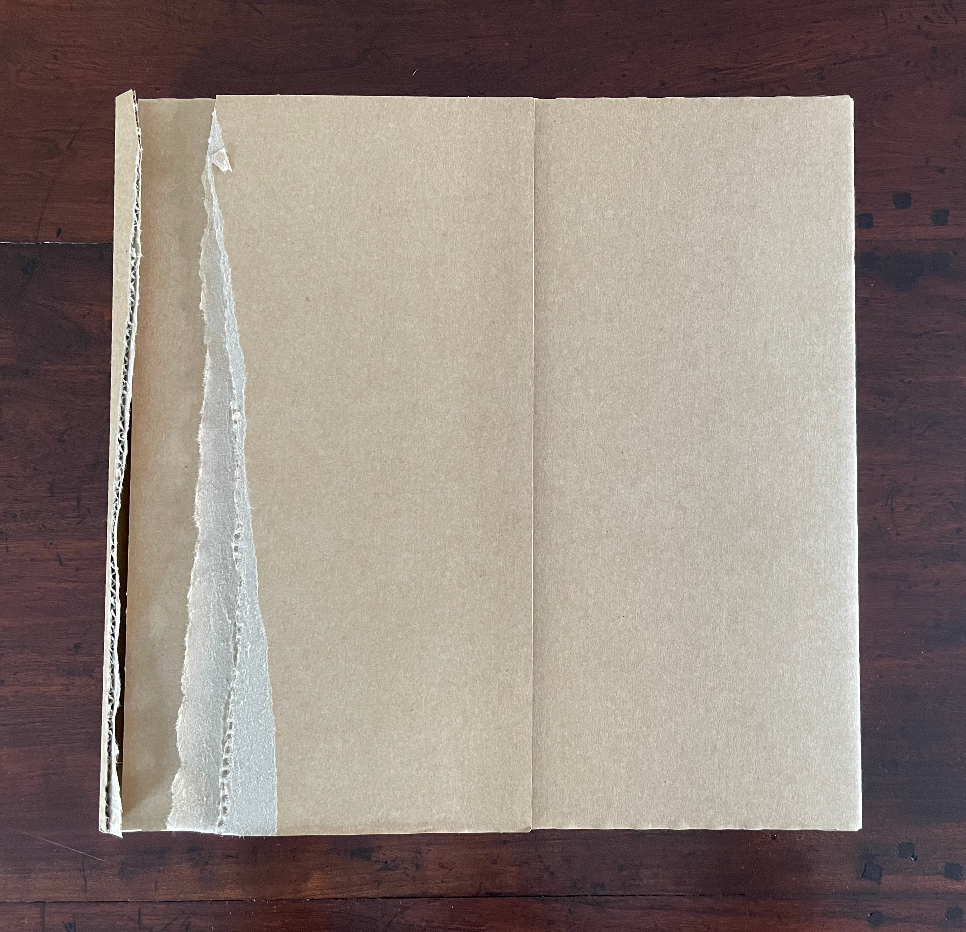
The first tear.
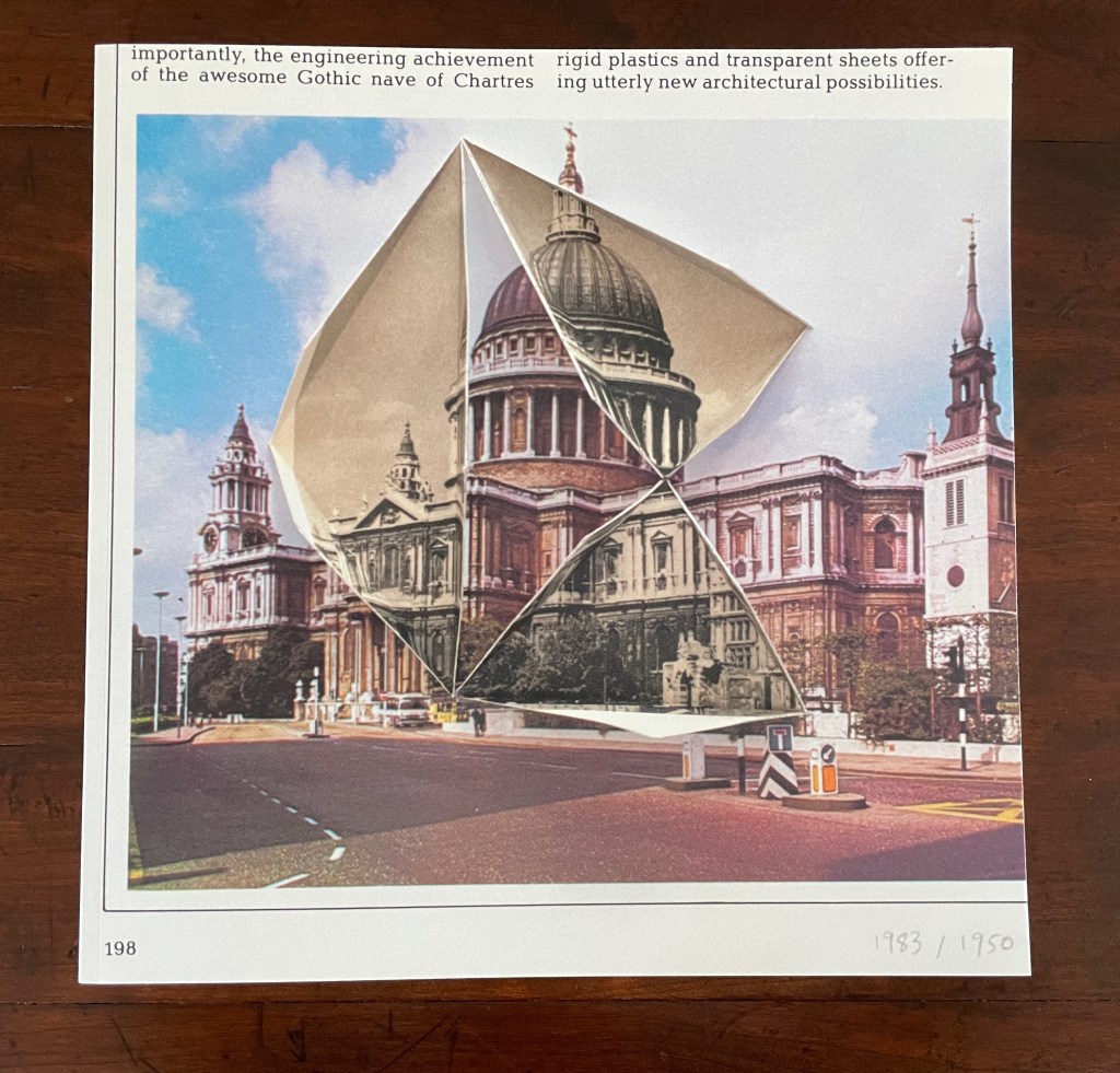
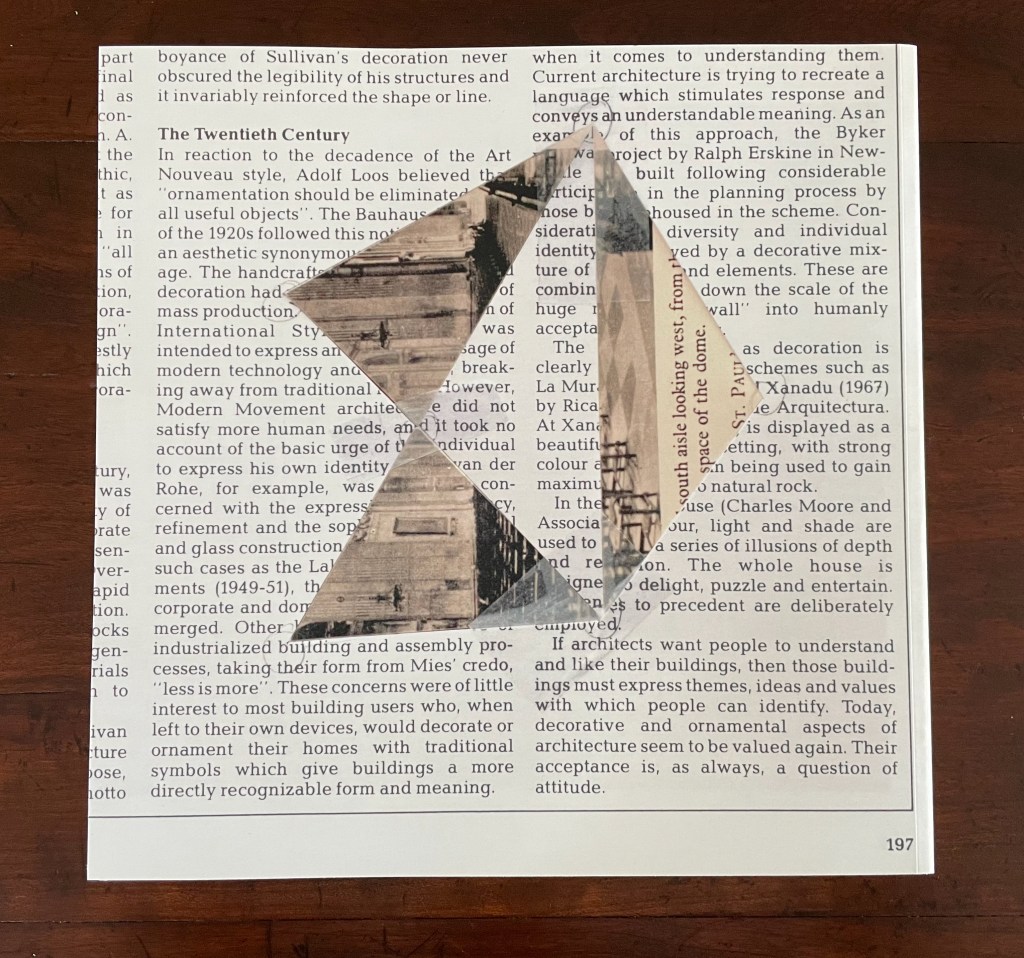
Front and back covers: from Abigail Reynolds’ Universal Now series, collages of time and space. Photos: Books On Books Collection.
Inscription: The Journal of Material Text, Issue 6 (2026)
Simon Morris, Gill Partington and Adam Smyth (eds.)
Cased perfect bound paperback, printed paper cover. 313 x 313 mm. 168 pages. ISSN: 2634-7210. Acquired from Information as Material, 22 June 2026.
Photos: Books On Books Collection.
Book art always pushes at the edges. Whatever meets at the edges is book art’s business. Negative space and positive space. Letter stroke and counter. Margins and the gutter. Justified and unjustified. Legible and illegible. Bound and unbound. Art and craft. Unique and multiple. Self and other. Destruction and creation. Life and death.
Inscription 6 is about cuts and tears, mostly tears — creating edges. “Tears” is also a heteronym, a word whose meaning changes with the change of the sound of the vowel but whose spelling remains the same. We can have tears [/tɛ(ə)rz/ tairz] as in “torn parts or places, or rips asunder”. Or we can have tears [/tɪ(ə)rz/] as in “teardrops, or weeps”. Or, with art, we might paradoxically have both simultaneously as we shall see in this issue’s first contributed essay. Also, with art, we might find that tearing — creating edges — paradoxically binds what it divides.
But first, as subscribers have come to expect, Inscription 6 opens with a surprise. Buzz Spector invites us to join in his artistic practice of tearing things up.
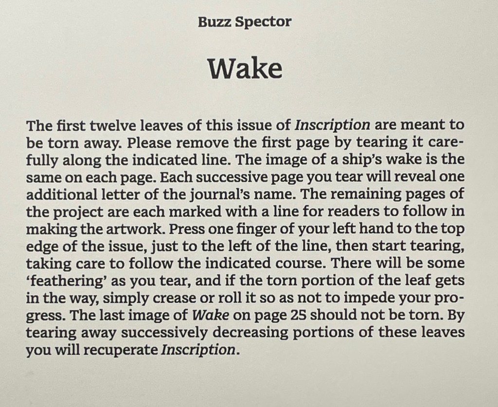
The artist says that he is asked all the time how he stands the tedium, to which he replies it is a meditative state he is sorry to see end. He is right. Once the initial unease over tearing pages from the issue subsides, a certain satisfaction ensues.
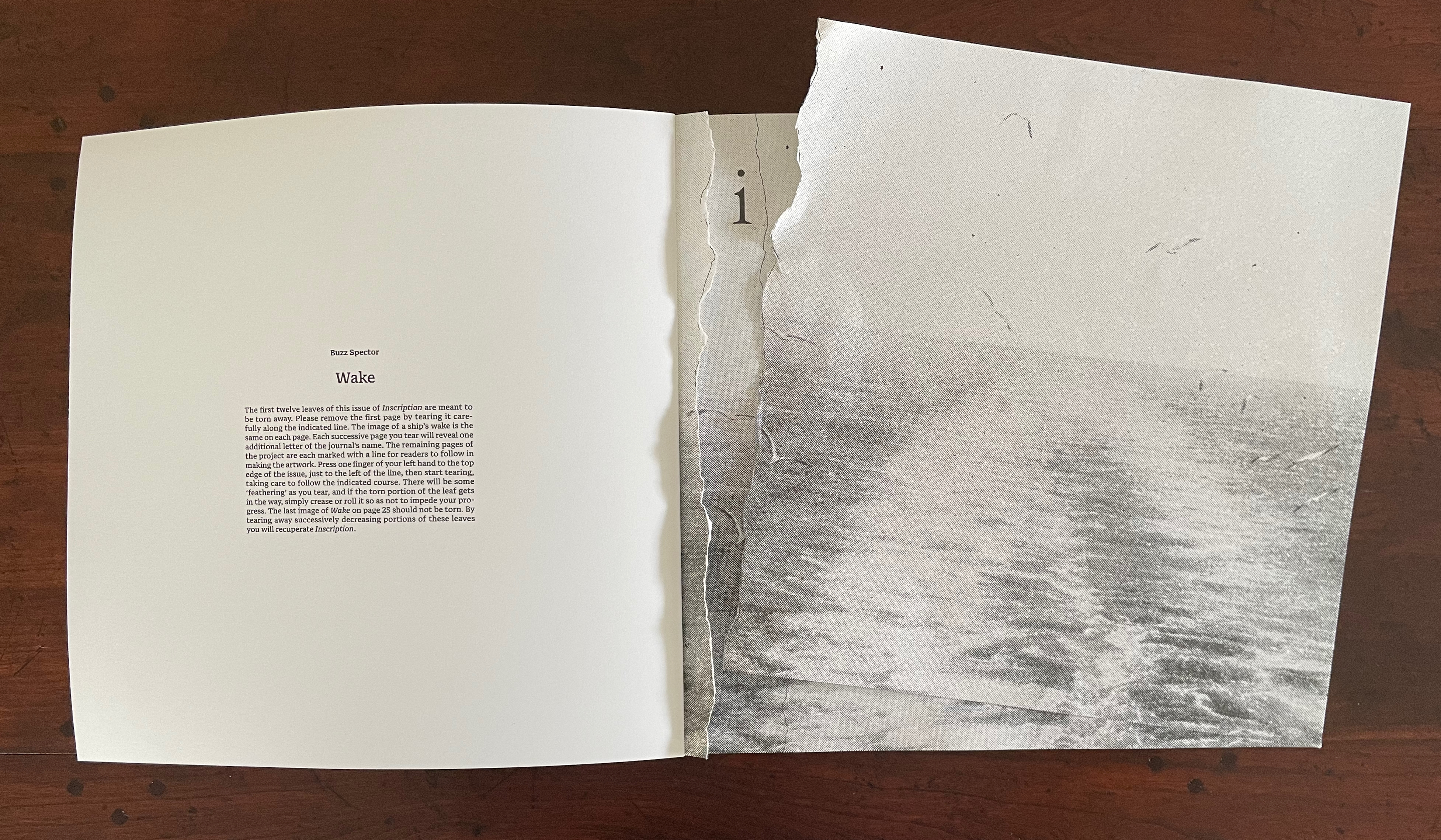
The “second” tear. (See further above for the first.)
The result is the wake’s image restored in a composition of torn strips still bound to the book.
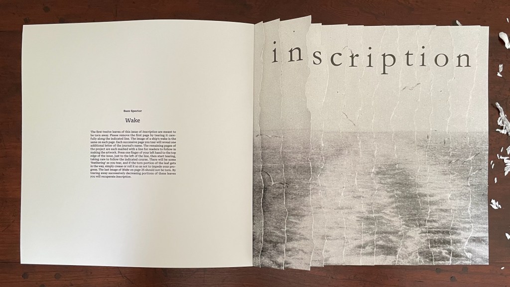
Rather than surrendering themselves to the bin, the removed strips beg to be reassembled for a wake on the other side of the gutter in keeping with the creative productivity of turning the singular into the plural.
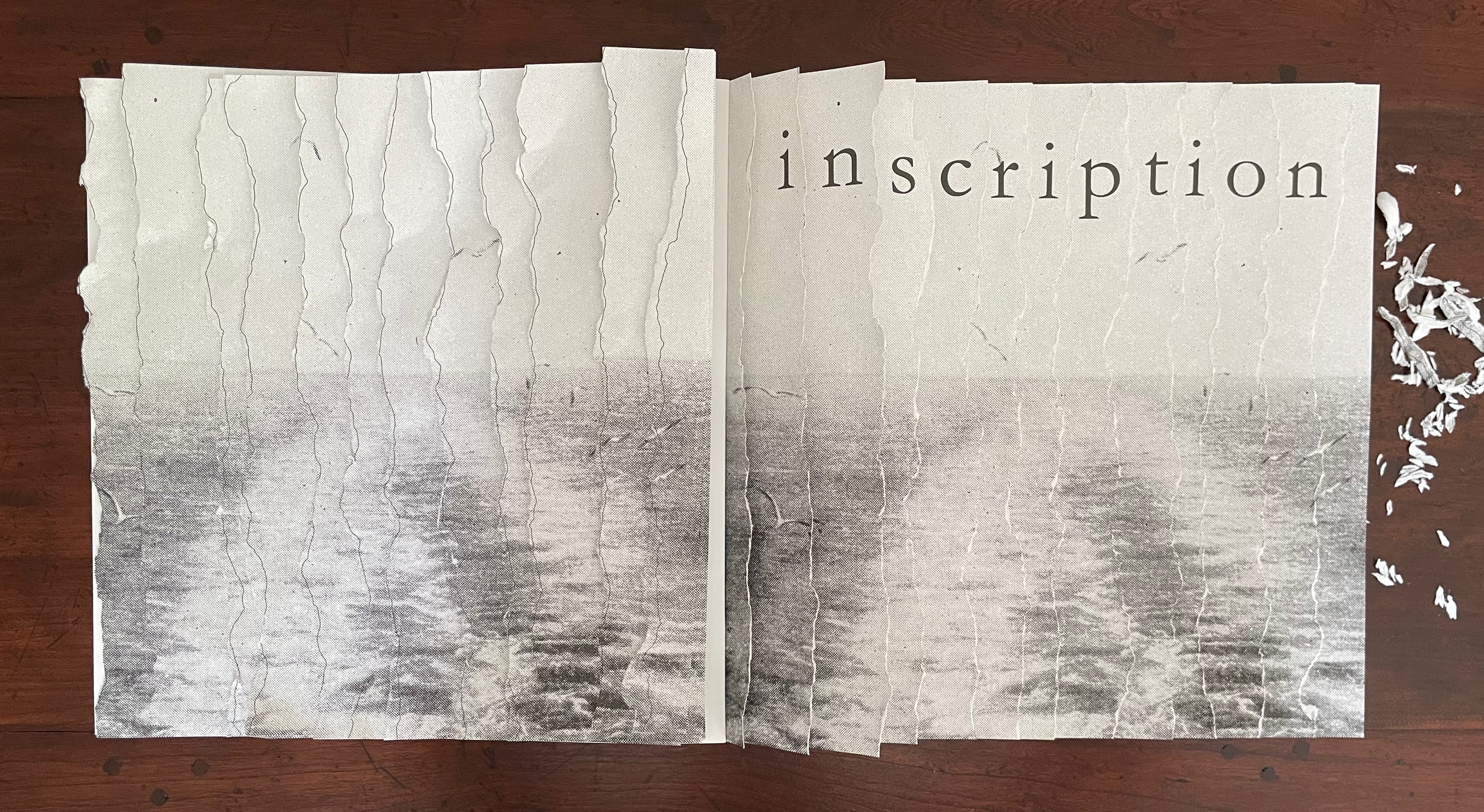
Left: the Spector-esque result. Right: the removed strips rearranged.
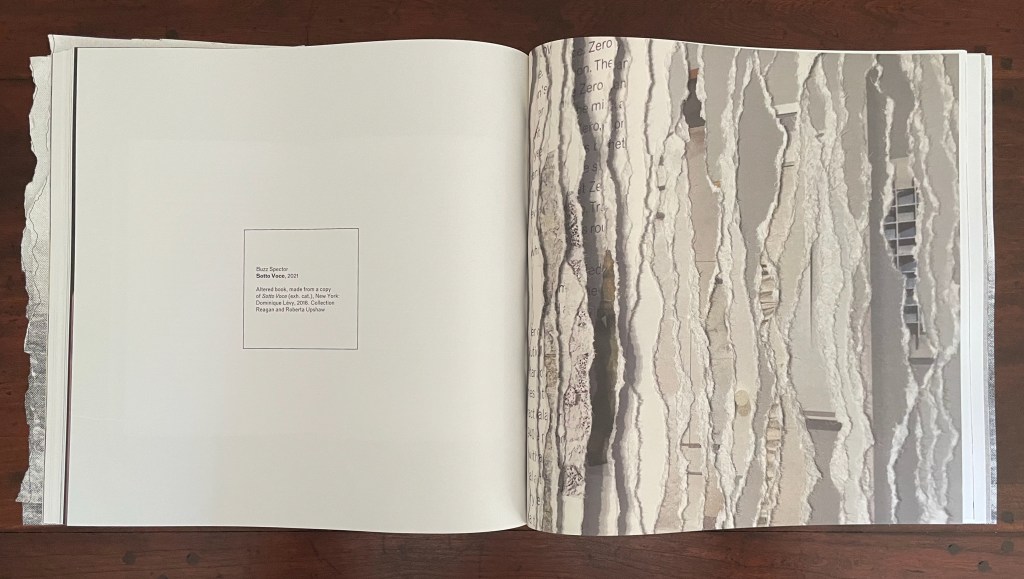
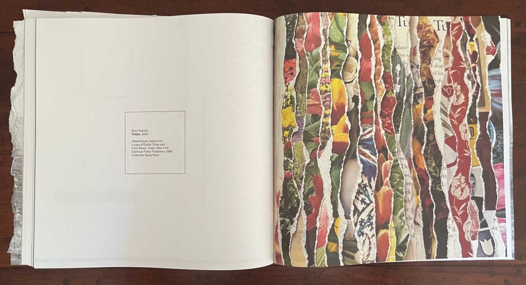
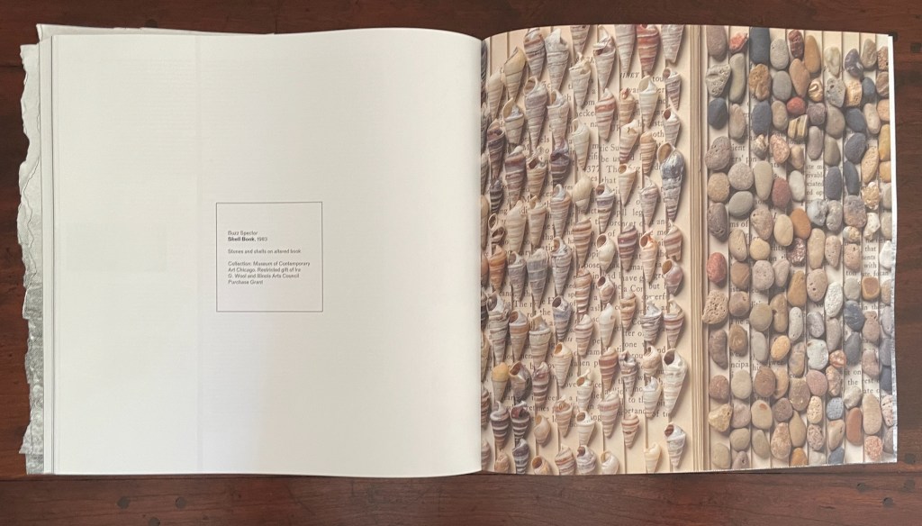
Buzz Spector is the star of this issue. Images from fourteen of his works divide the main sections and each contribution from one another. Works of torn edges create edges or boundaries between the issue’s contents. A stroke of genius from the issue’s editorial and design team. The range of Spector’s sources also draws attention to other boundaries inherent in the body of his work and the issue’s theme: the border between high and low in art, East and West, and Art and Nature. After the 12-page exercise, we have the altered Chinese translation of the self-help book Ego is the Enemy by Ryan Holiday; before the colophon, we have an array of shells and stones on an unidentified altered book, a sculpture held in the Museum of Contemporary Art Chicago. In between, there are alterations of catalogues of Ansel Adams’ photos and the Polaroid Collection, an academic study of Antonioni’s films, a foundational Italian volume on ancient and Renaissance glassmaking, a gardening book, and sailing photobooks.

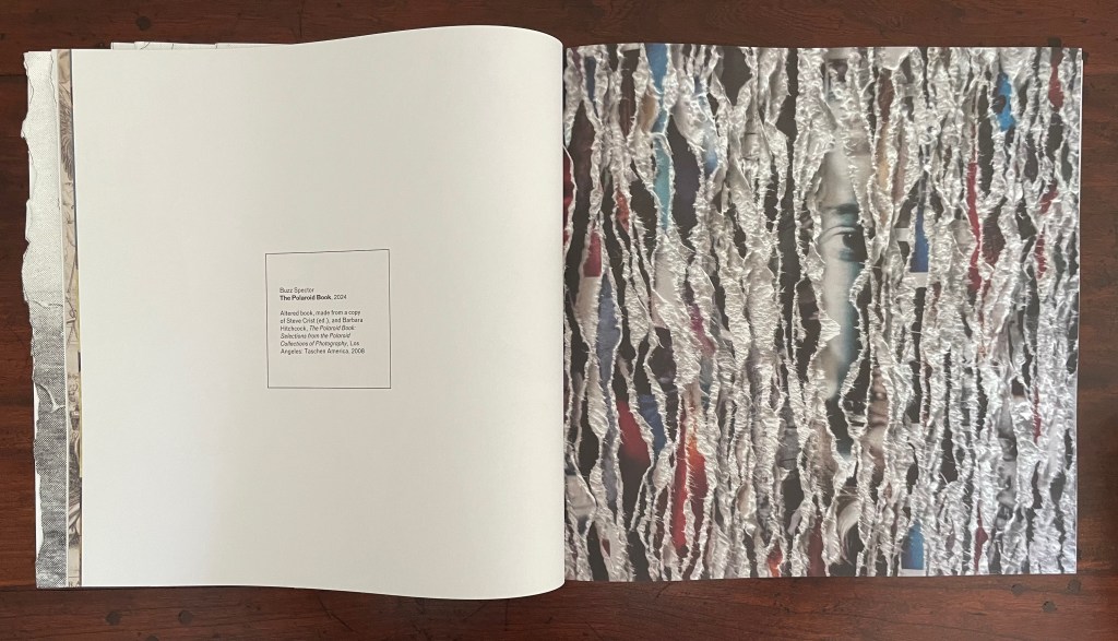
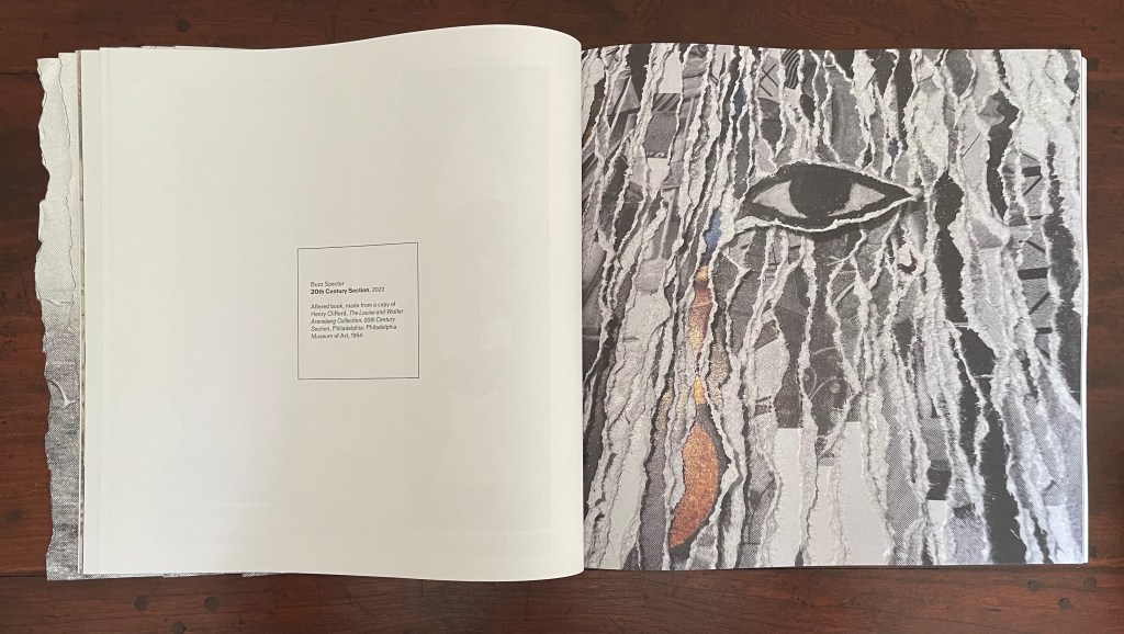
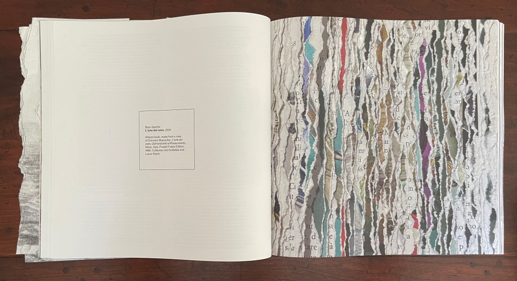
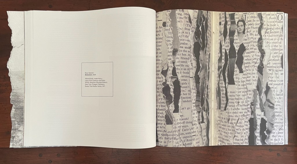

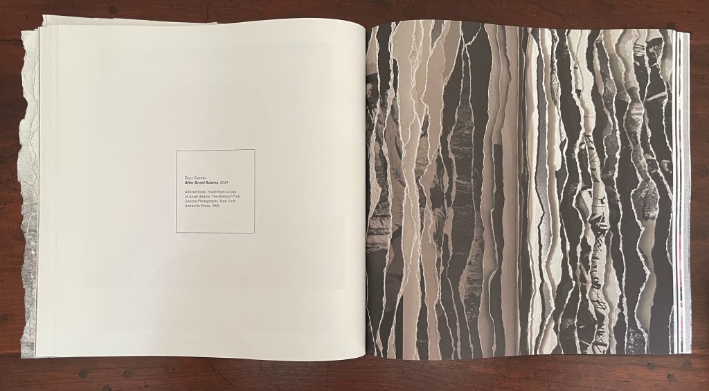
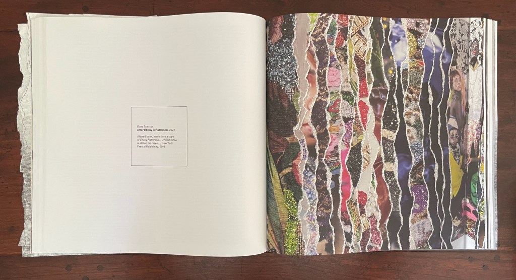
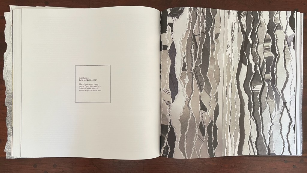
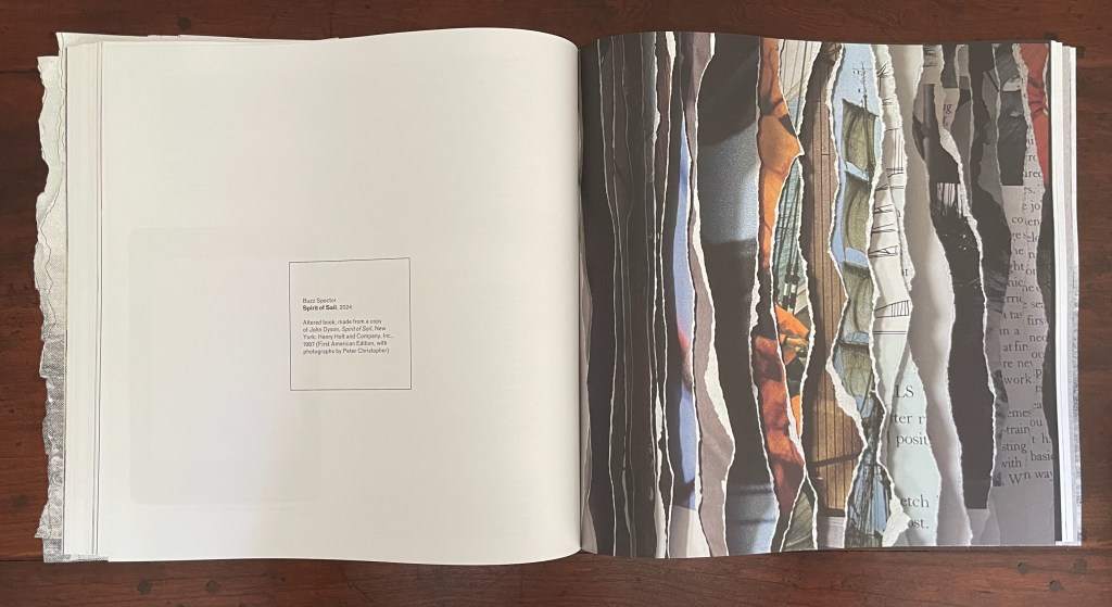

The altered sailing photobooks recall Spector’s North Sea (for M.B.) (1990), his homage to Marcel Broodthaers’ A Voyage on the North Sea (1974) in which Broodthaers juxtaposes a 19th century amateur painting of a tall-masted ship with his own photographs of a sailing ship. Tellingly for this issue of Inscription as well as the thrust of Spector’s homage, Broodthaers opens A Voyage with an elaborate warning not to cut the uncut pages of the book.
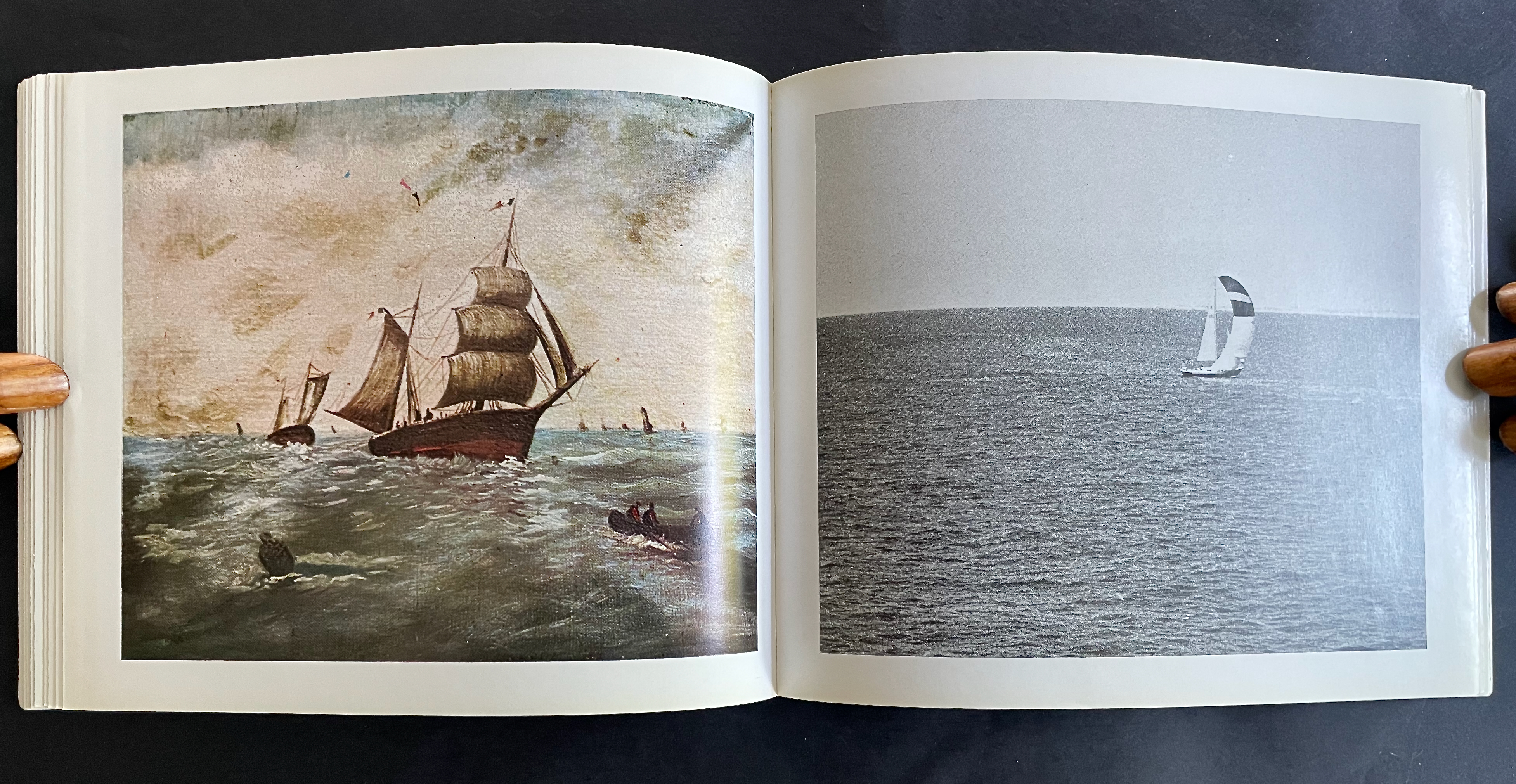

From A Voyage on the North Sea (1974) by Marcel Broodthaers. Photos: Books On Books Collection.
Spector’s homage is a work 10 feet long and presented on a table appropriately jutting out from the wall like a pier. The eleven “waves” of torn pages placed in a row on top of the steel shelf come from eleven copies of the Walker Art Center’s 1987 catalogue for Broodthaers’s first U.S. retrospective. Spector had all the pages in each copy painted with white gesso before tearing the pages. He saved the excised “wedges” and bound them at the fore edges. Because the gesso does not completely obscure the text and images from the catalogues, viewers who come close to the work can see slivers of some of Broodthaers’ works along with the word fragments typical of Spector’s altered books.
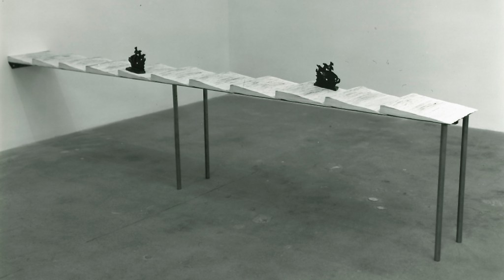
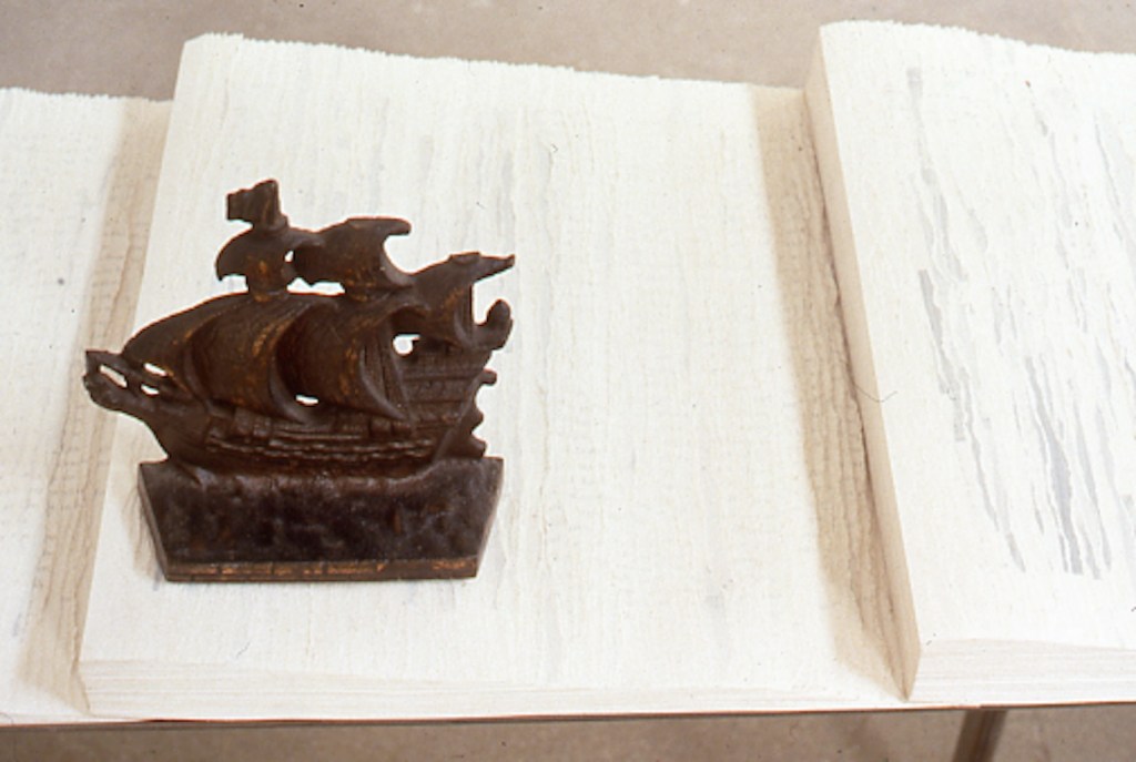
North Sea (for M.B.) (1990) by Buzz Spector
The echoes of Spector’s appropriation from the great appropriator (recall Broodthaers’ 1969 appropriation of Mallarmé’s poem in Image: Un Coup de Dés Jamais N’Abolira le Hasard) bring another set of boundaries into view: the space between originality and appropriation and the space between the auratic artwork and its mechanical reproduction raised in Walter Benjamin’s The Work of Art in the Age of Mechanical Reproduction (1936).
Across its 10 sections and 11 loose inserts, the sixth issue of Inscription takes the lead from Spector’s works and explores all these binaries and the cut or torn edges between them. As usual with Inscription, it isn’t all book art. There are prints, a vinyl record, bookmarks, postcards, installations, libraries, typography, a syllabary, and even moth-repellent cedarwood blocks, and its sources range from the London Missionary Society hospitals in early 20th century China, to an installation of Leonard and Virginia Woolf’s library shelves (at Washingon State University of all places), and to J.L. Carr’s home in Kettering. The eclecticism is a challenge to coherence as much as the number of contributors is a challenge to adherence to the theme. Complete success would be an issue that is an artwork of collage in itself.
Collage is naturally where the first contributor’s article begins. “What does it mean to make art out of torn-up paper?” Eric Robertson uses Hans (Jean) Arp’s déchirés (torn pages), Raymon Hains’ and Jacques Villeglé’s torn posters, and Sol Lewitt’s “rip drawings” to take us beyond categorizing such works as vandalism, desecration, or iconoclasm.
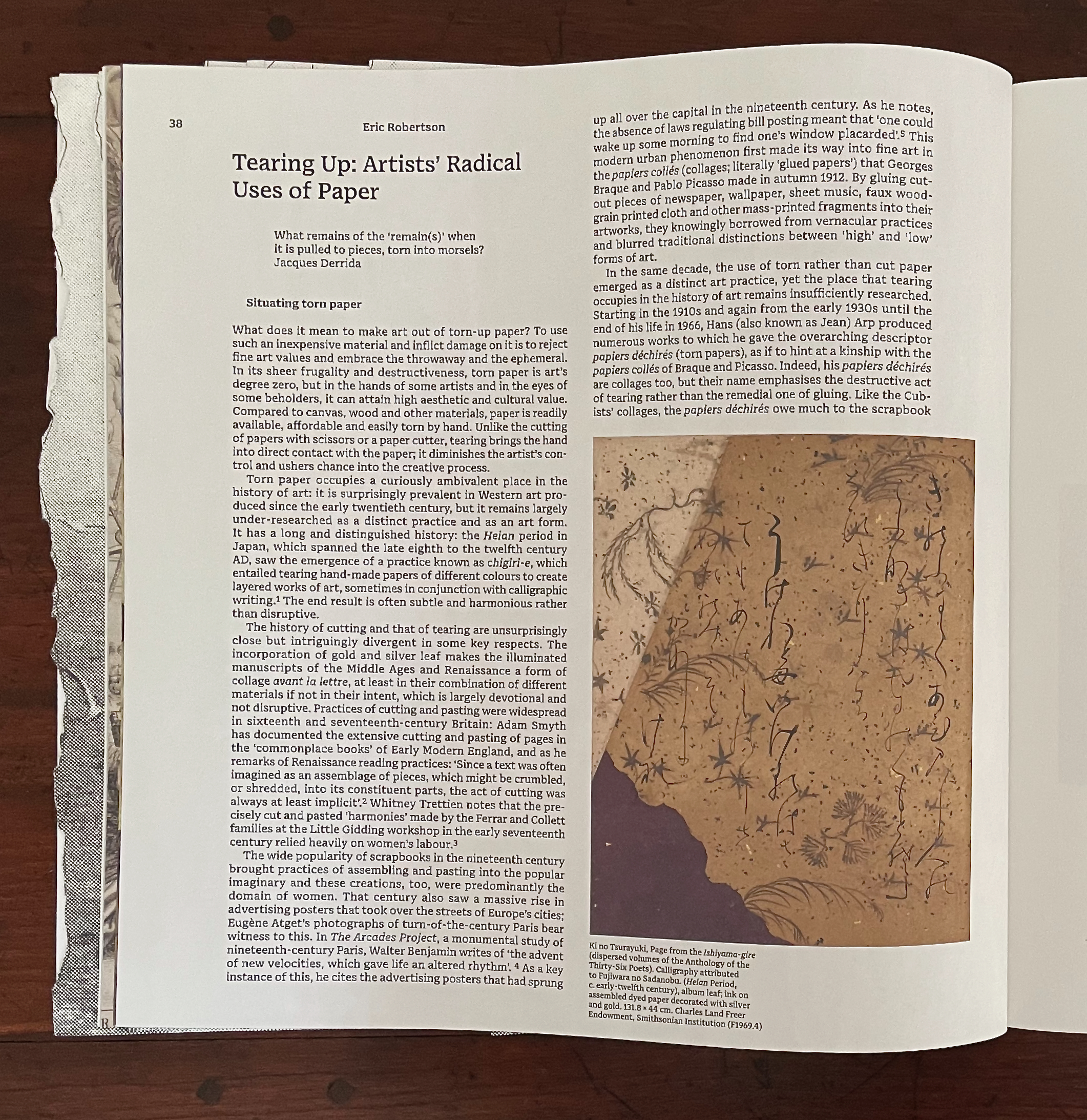
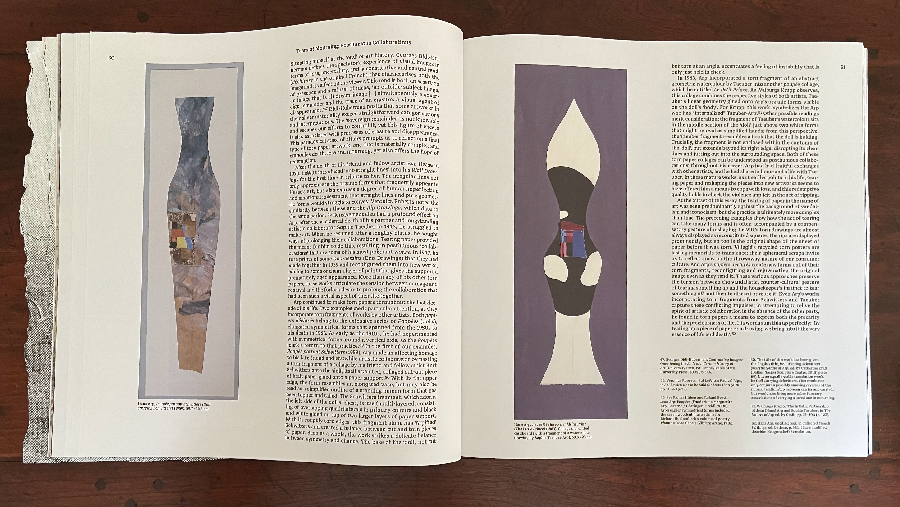
By discussing Arp’s posthumous collaborations with friend Kurt Schwitters and partner Sophie Taeuber under the heading “Tears of Mourning”, Robertson bridges the dual meanings of the heteronym and well prepares the ground for his moving quotation of Arp in conclusion: “By tearing up a piece of paper or a drawing, we bring into it the very essence of life and death”.
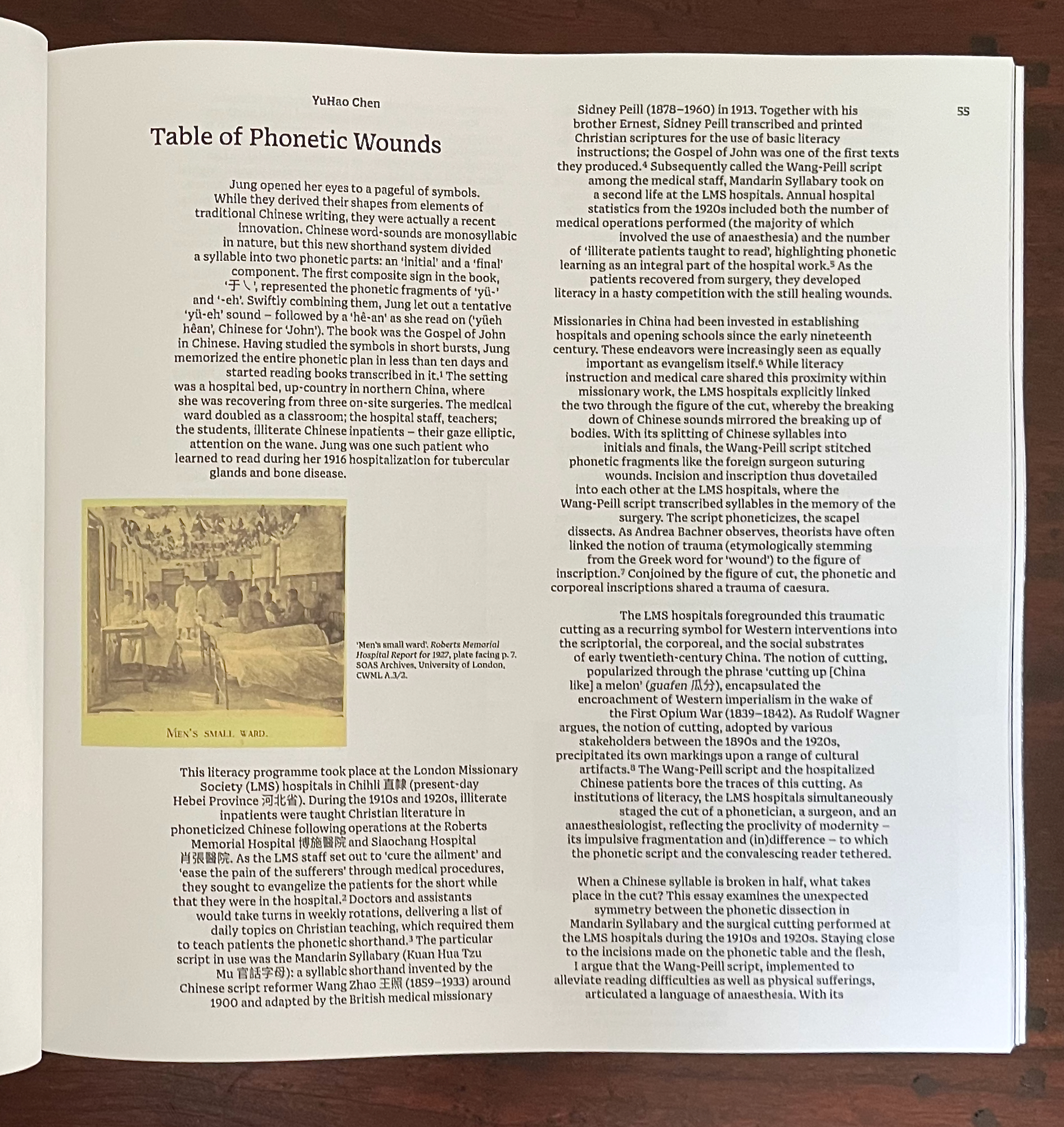
YuHao Chen‘s “Table of Phonetic Wounds” aims to make metaphorical connections among a host of pairings: surgical incision/skin, site of operation/cause for operation, the initial/final phoneme structure from the Wang-Peill Mandarin Syllabary, Western colonial intervention/China-the-sick-man-0f Asia, literacy/illiteracy, non-Christian/Christian, etc. Successful surgery equals achievement of literacy, healing equals conversion, etc., by which we should be convinced of causality (or not).
The justification running through the center of the article’s paragraphs offers a visual metaphor for all these binaries. Even the gap between the initial and final phonemes in the Mandarin Syllabary recalls the gap between the consonants of “tears”. It is a space in which something meaningful happens.
Reanna Brooks‘ “Cut and Paste: Virginia Woolf’s Bookcraft” provides a good case for looking carefully at the border between craft and art. Brooks finds a depth in Woolf’s bookbinding that should prompt us to ask more often, When do the book arts and book art overlap to create a new work of art?

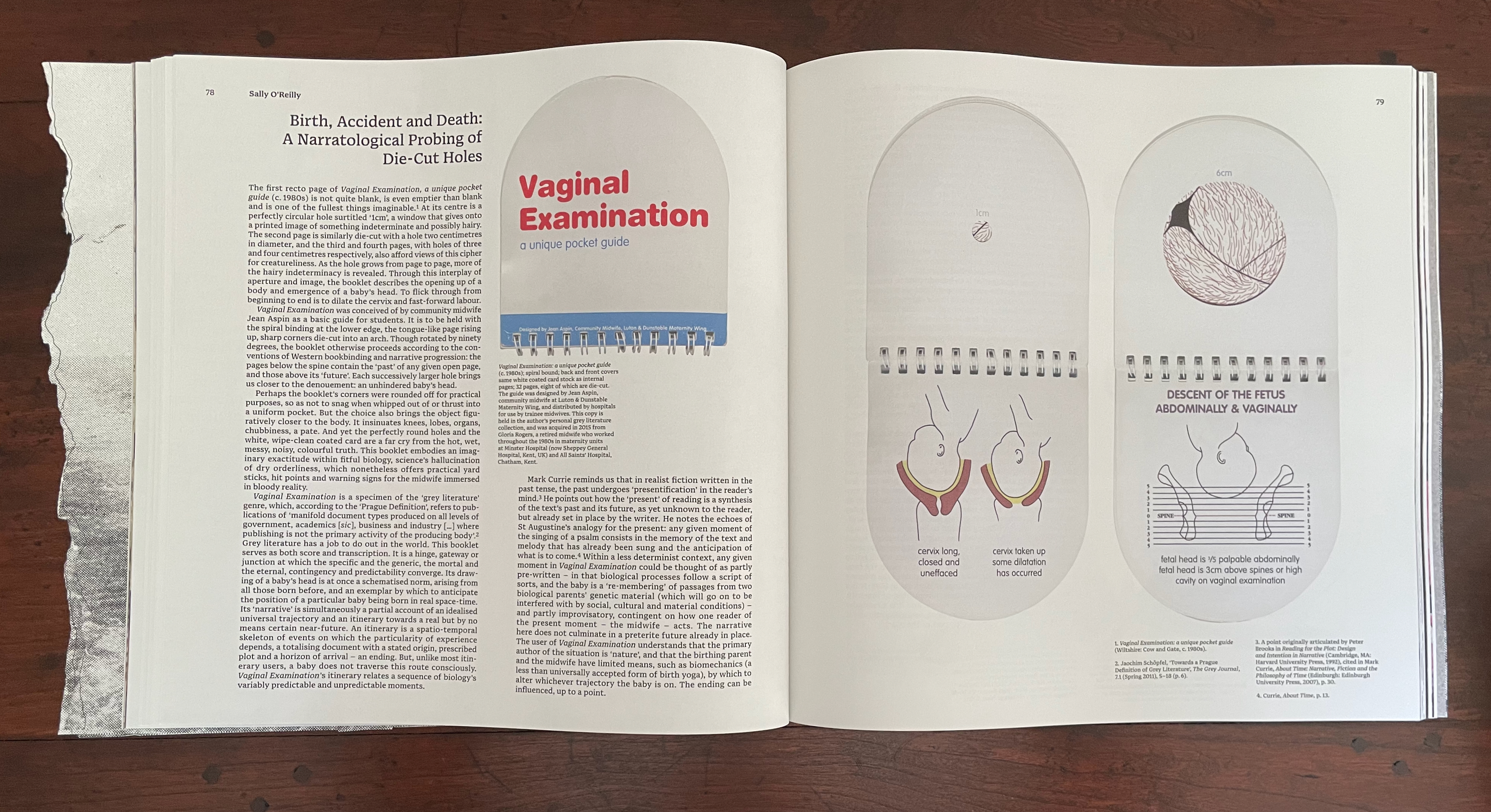
Sally O’Reilly‘s “Birth, Accident and Death: A Narratological Probing of Die-Cut Holes” would not have been out of place in Inscription No. 2 on “holes”. Its presence here demonstrates the extension of the theme of tearing to include cutting and holes. Removal by tearing or cutting may overlap, but the techniques are sharply different in their results as we saw with Arp’s “Doll carrying Schwitters” and “Le Petit Prince”. The differences here point to the messiness of giving birth contrasted with the tidiness of the neatly designed and pocketable guide for midwives that shows the growing diameter of the cervix stage by stage through a die-cut hole.
The following juxtaposition of Lucio Fontana‘s Spatial Concept “Waiting” and Bas Jan Ader‘s I’m too sad to tell you draws attention to the heteronym “tears”. It is set off in its own section, knowingly bracketed by Spector’s Displacement after Lawrence Weiner (2024) — conceptual artist — and After Ansel Adams (2024) — photographer. It is a meaningful curatorial gesture meant to be on a par with, say, Robertson’s effective bridging of the heteronymic meanings under the heading “Tears of Mourning”.
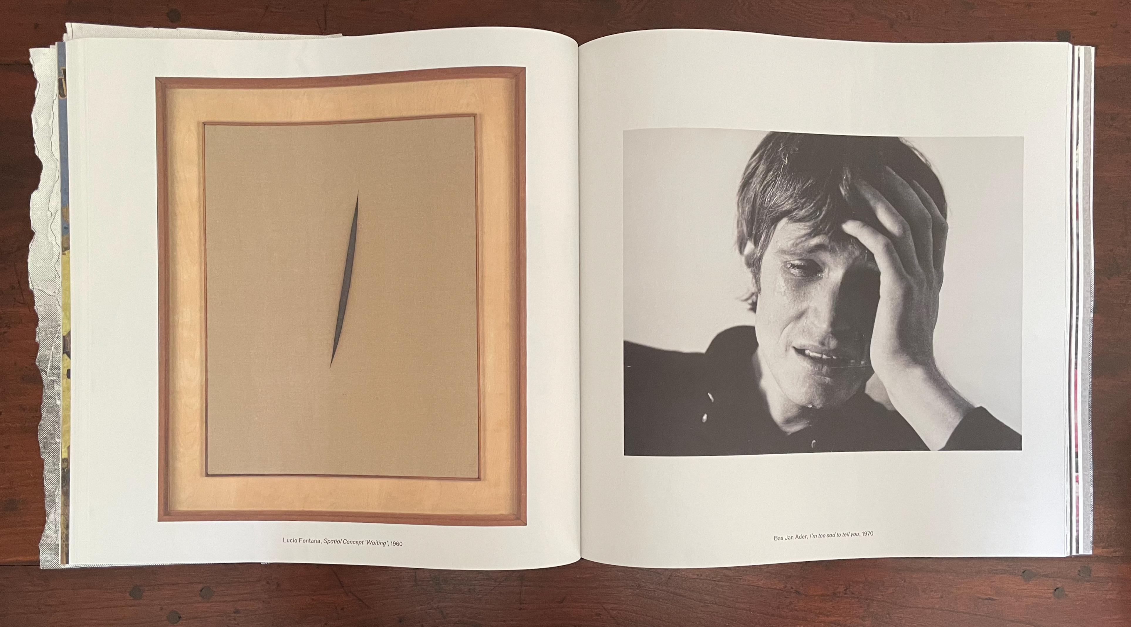
Tear: N1 A torn part or place; V1 To pull or split apart. Tear: N2 A secretion of the lachrymal gland; V2 To weep.
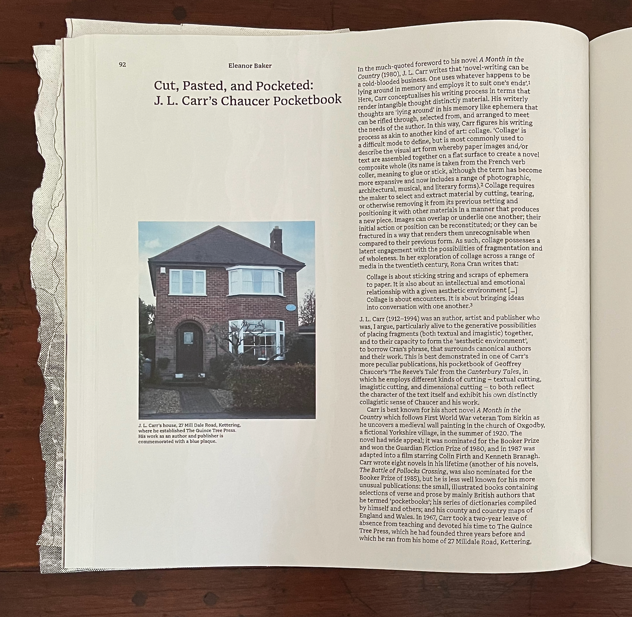
Eleanor Baker‘s “Cut, Paste, and Pocketed” explores J.L. Carr’s 1066 and All That treatment of Chaucer’s “The Reeve’s Tale”. While Carr would surely have been familiar with Sellar and Yeatman’s 1930 comic book history, Baker pegs Carr’s approach as a form of collage rather than comic strip. As we’ll see later with Angela Szczepaniak’s contribution, the two can be combined to drive a narrative forward. In Carr’s case, as Baker points out, the pocketbook approach and cheeky fragments of collage combine to deliver a comically modern sense of Chaucer’s world and an inventive match to the fragmentary nature of “The Reeve’s Tale”.

Using knives and punches, A T Kabe Wilson removes every tenth word in Graham Greene’s The Tenth Man and replaces it with a synonym or as near a proxy as he can manage to challenge the notion of copyright. The resulting pages are arranged to make up an installation where visitors can read the entire set of altered pages. There is no edition of Copywrong. It turns Walter Benjamin on his head: “The Unique Work of Art Produced from Two Copies of a Mechanical Reproduction”.
To bring this relevant work within the bounds of Inscription, the editors provide images of Wilson at work and rely on Dennis Duncan (University College of London) to elicit from Wilson where the work’s strange status places it in relationship to artists’ books and other visual art.
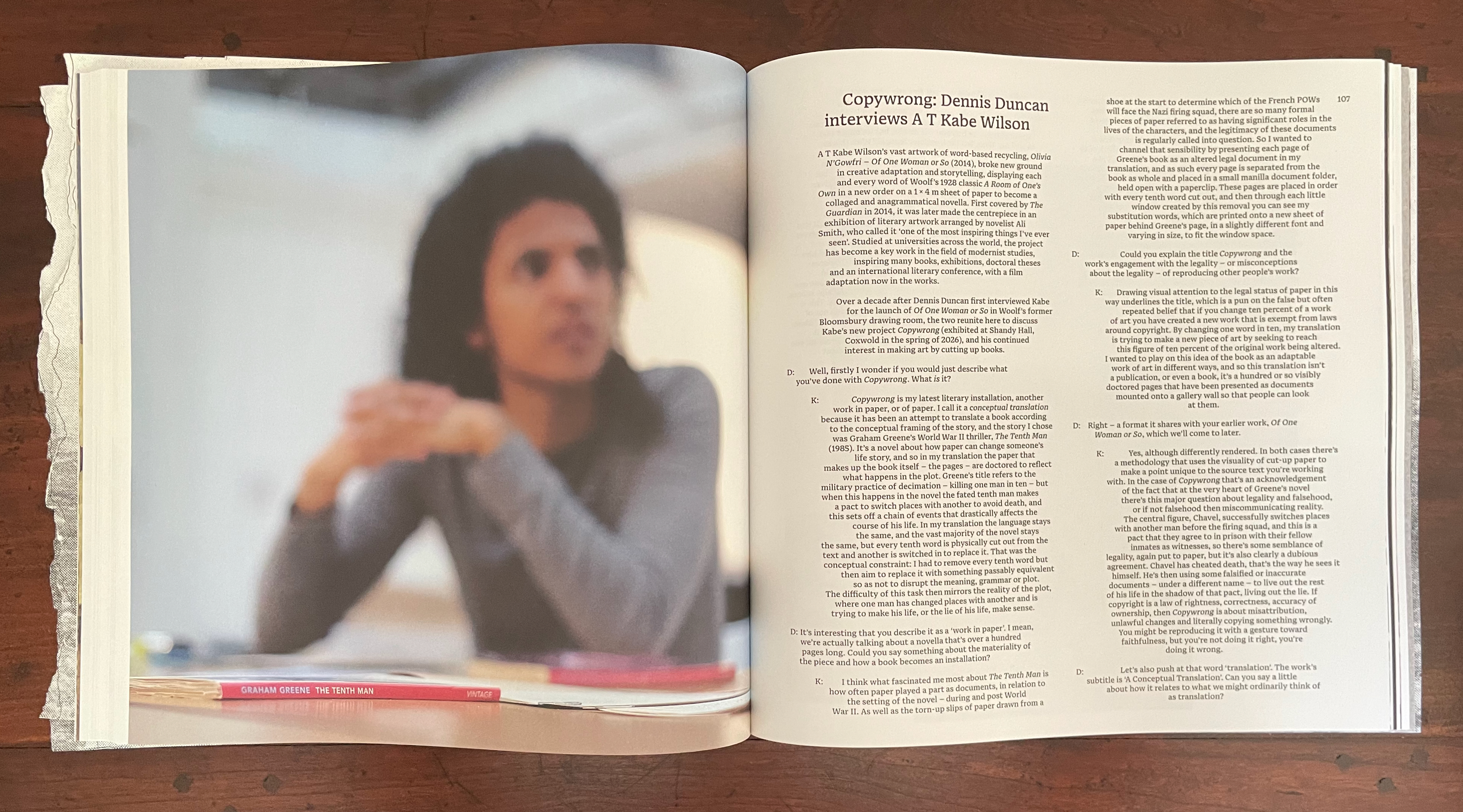

Kabe Wilson’s choice of every tenth word takes its impetus from the book’s story of collective punishment in wartime (“choose ten from among your number to be executed”). But it also turns on its head the common fallacy that ten percent of a work can be reproduced without violating copyright: hence the title Copywrong. In Greene’s novel, when the rich tenth man contracts with a poor man to trade places and switch identities in exchange for the rich man’s inheritance, a whole vein of copywrongs reveals itself for mining. Wilson sees his creative destruction of the novel as a form of translation and betrayal of the original. While challenging us to think where the line between book and not-book lies, and even to think of its sheets of paper as 3D objects, Copywrong becomes a way of asking where the line between original and copy, legal and illegal, and life and death lies.
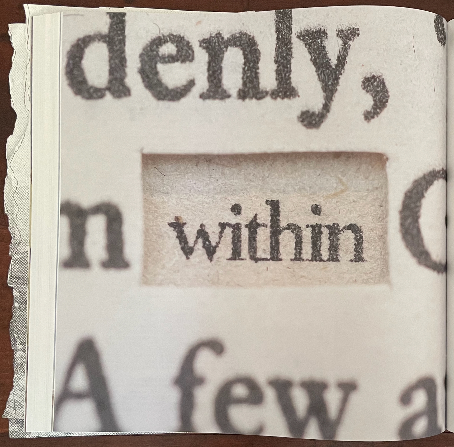
The next contribution is Fraser Muggeridge‘s “Cuts and Tears as Justified and Unjustified Typesetting”. While the article gives an informative sketch of the history and development of the straight and ragged edges of print, its argument that unjustified typesetting is “torn typography” does not convince. An unjustified line does not begin with a justified line from which spacing is torn or cut. A justified setting may give a page the visual effect of having been evenly cut down the right, and a ragged right setting may give the visual effect of a tear down the right side, but whether they contribute to a work’s artistic meaning — not just an aesthetic effect on readability — needs convincing examples. With Apollinaire and his calligrammes, Stefan Themerson and his “internal vertical justification”, and Christian Bök’s Diamonds, Muggeridge make a good start. Most of the other variations on justified, unjustified, and mixed, however, are far cries from, say, Mallarmé’s breaks of the line and play with page layout in Un Coup de Dés Jamais N’Abolira le Hasard or from the meaningful typographical tearing and cutting that the avant-gardistes of the early 20th century perpetrated.

It’s odd, especially as the Fraser Muggeridge Studio designs Inscription, that the article does not mention the center justification used in several of the issue’s other articles. Their paragraphs decline to show off those even edges of justified-left and justified-right typesetting. Instead, they go for a ragged left and ragged right with a book-mimicking gutter of justified left and right in their center. When proofreaders were more a feature in typesetting houses, they not only had to catch “typos” but also to watch for “rivers in the type”, those breaks between words in one line that aligned with breaks in the next several lines to create a white rivulet of space trickling down the page and distracting the reader from the sense of the sentences. In Chen’s article, the “river” is a medial surgical cut. In Duncan’s interview with Wilson, the clear gutter in the middle of the paragraphs offers a sharp contrast with the uncomfortable binaries that Copywrong bids us to engage. Kudos to Fraser Muggeridge and studio.

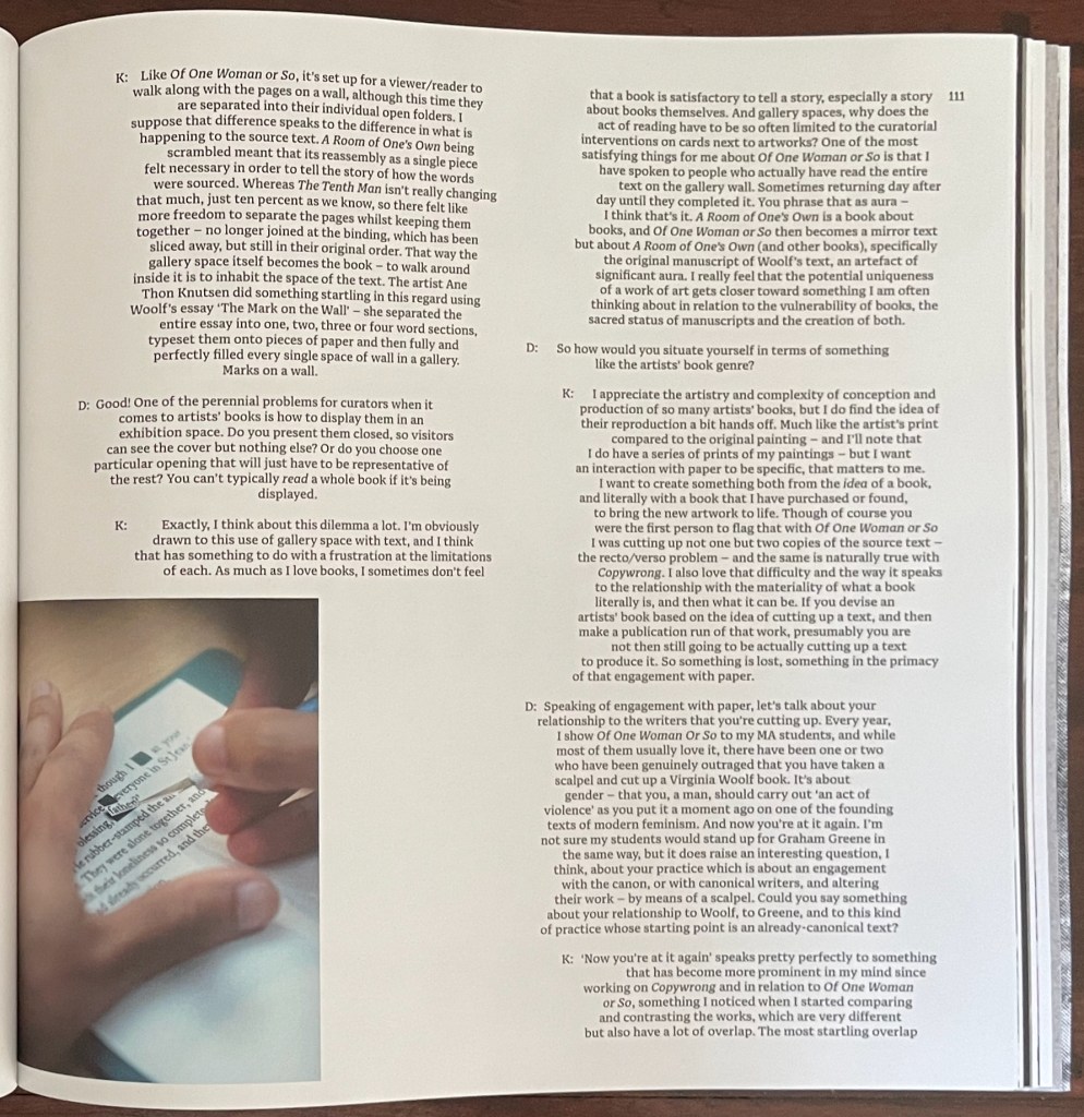
Left: from Chen’s article. Right: from Wilson-Duncan interview.
The next contribution — from the Leuven-based artists collective Rosetta, formed by Eva Moulaert, Anneleen Masschelein, and Willem Styfhals — continues with the topic of typesetting. Their starting point is those awkward phenomena of typesetting — widows and orphans. They are not deliberate renderings or loppings of words from a following or preceding sentence to be left stranded at the bottom or top of a page, respectively. But there they are. Are they tears or cuts, these weepy, abandoned strings of anthropomorphized type that are cause for tears among proofreaders, typesetters, and designers? No, they are cause for the fevered ponderings of the narrator in a book whose photographed pages make up this contribution.
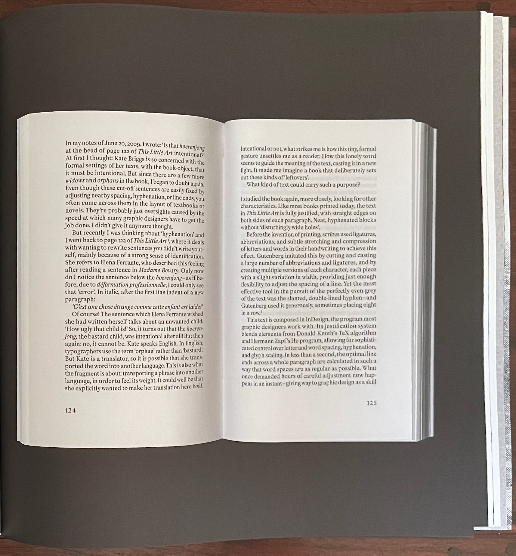
No widows or orphans here.
This set of photographed double-page spreads (excised?) has plenty of widows and orphans. Even though they are likely deliberate, what is the point of them? And whose disembodied hand is that that keeps appearing, disappearing, and reappearing to hold the book facing out?

Orphan and widow.
The narrator winds “their” way through references to Gutenberg, Donald Knuth, Herman Zapf, Jean-François Lyotard, Martin Heidegger, Roland Barthes, Robert Bringhurst, Ellen Lupton, Frank Kermode, Amitav Ghosh, and half a dozen others to come to “a” point — an obsession with hyphenation. And the point of that? Why naturally for the narrator’s compound, hyphenated selves — Ro-set-ta — to hand over the pen to Rosetta, the widow at the end of “page 139”.
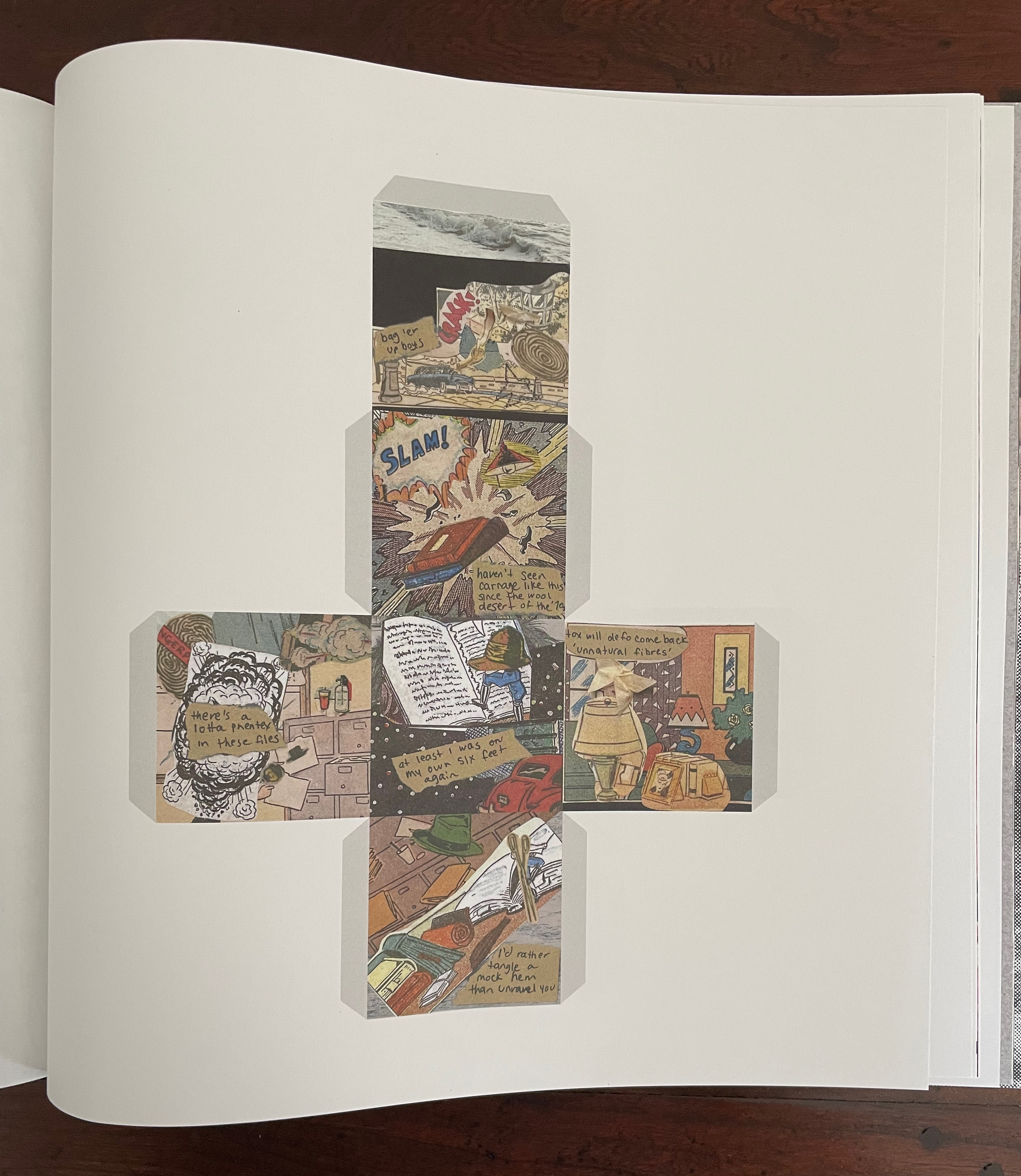
“The Extinctions Bureau” is a brilliant article with which to end this issue of Inscription. It offers readers a chance to wield scissors or papercutters if they are ready not to heed Broodthaers’ admonition above. It is also a clever conceptual extension of Will Eisner’s 1985 concept of “sequential art” that aimed to establish comics as a legitimate literary genre. Angela Szczepaniak first teases us with the narrative premise of a clothing moth-turned-detective on the trail of the Nylon Killer. If that is not hilarious enough, she posits conversion of the 2D linear narrative into a 3D existence around moth-repellent cedarwood. (She has created the blocks for exhibition display, but that’s not the point of the contribution.) Whether the blocks are more cruel to the detective or readers who now have to get their heads and hands around the idea of a “polysequential” story is a fine point. Readers who take up the challenge of cutting out the templates and folding them into cubes will have their own view.
By cutting and tearing the images for her collages from pulp comics, Szczepaniak rings all the bells of Inscription 6’s theme and reminds us of its subtitle: The Journal of Material Text.
Aside: below are images of the completed cedar block cubes on display in Nottingham. Photos courtesy of the artist.
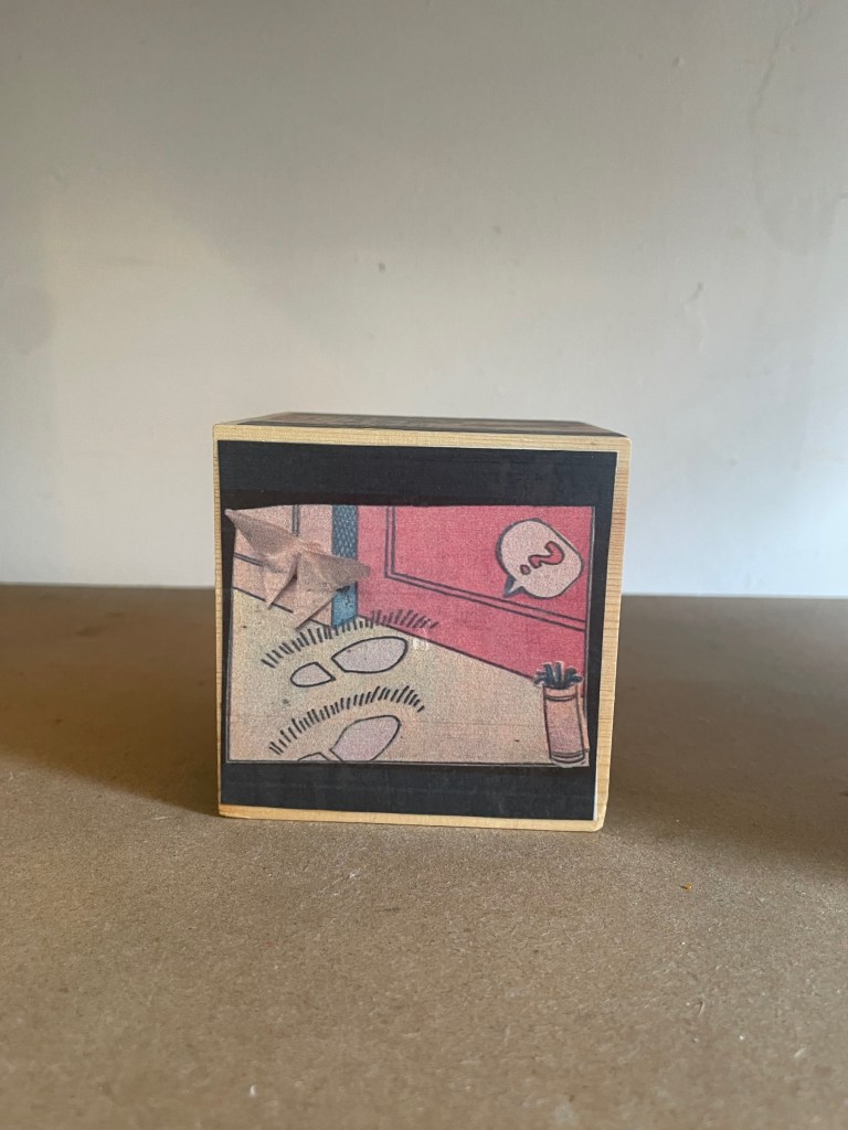
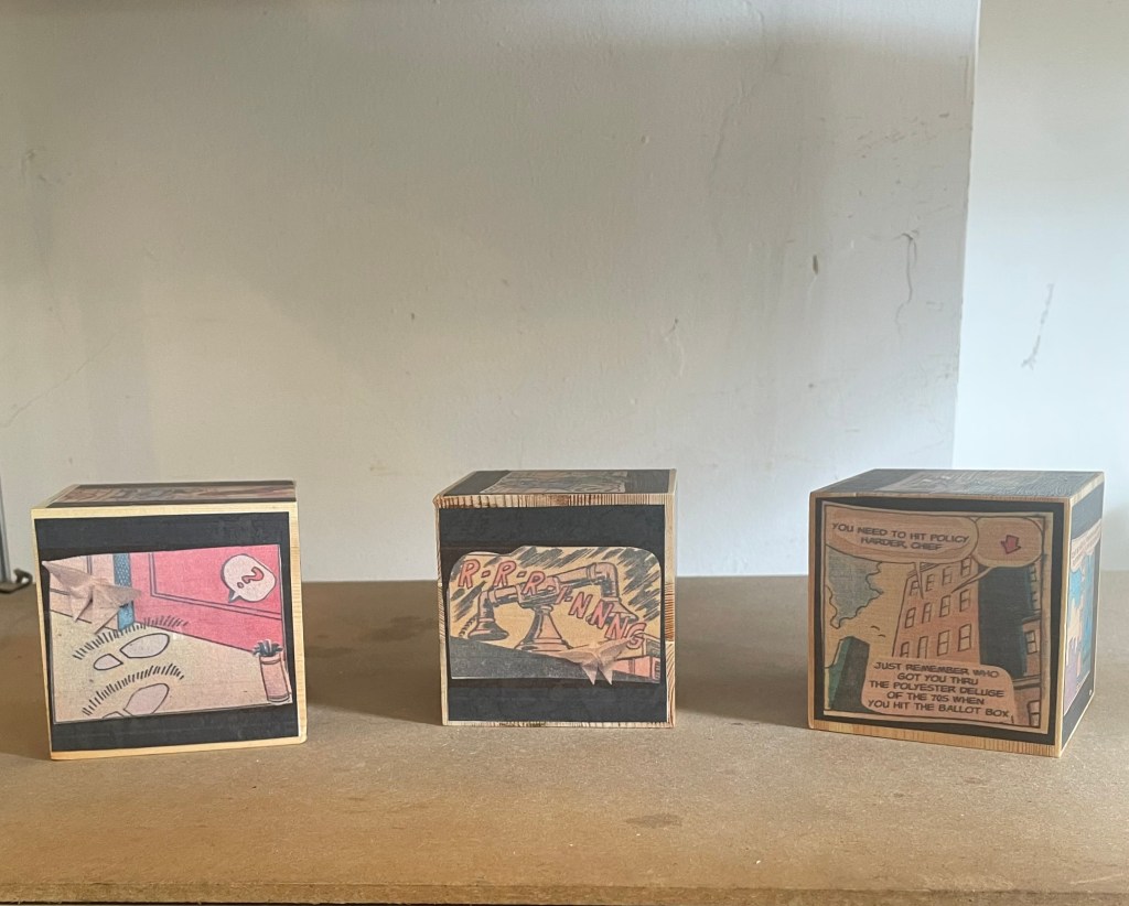
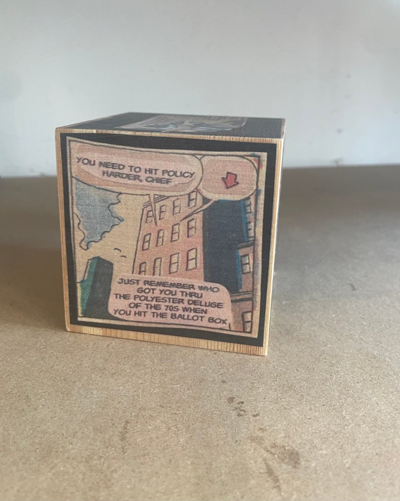
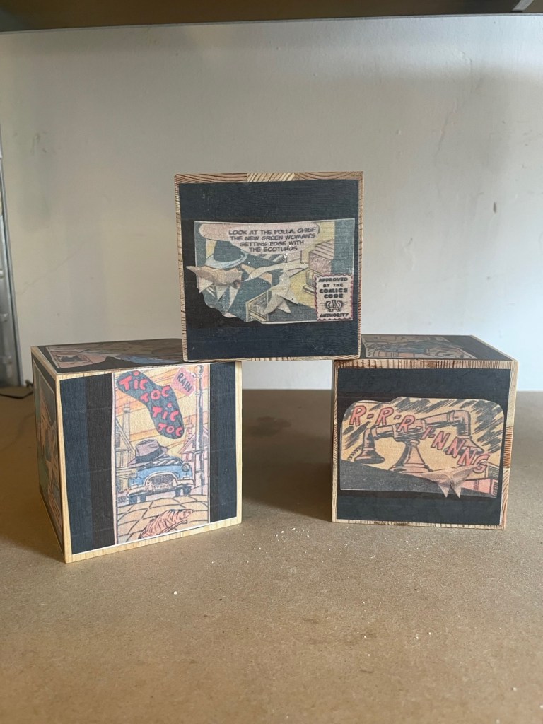
Reminiscent of Aspen, Fluxus, The Journal of Artists’ Books, and the deluxe editions of Parenthesis, Inscription‘s artwork inserts contribute to the sense of the issue as an exhibition, a wunderkammer, a performance. No 33 LP this time; instead there is appropriately a cutdown 45-rpm record, albeit no instructions on “ripping” tracks from it to make up our own playlists. Putting together a thematically coherent journal is tricky. The artworks underscore and strengthen the issue’s theme of tearing and cutting. Two examples: Nick Thurston’s print Rips and Floods (2026) and Carolyn Thompson’s Tearjerker (2026) cover all the thematic notes of tearing, cutting, and weeping.
Thurston’s title for his print ensures that we don’t miss the heteronymic “tear”, which the visually torn phrase “A tear is an intellectual thing” might cause us to do. For those not well-versed in William Blake, a helpful note on page 160 identifies the phrase’s source as “The Grey Monk“. The editors mention Thurston’s truncation of Blake’s line, but leave it to us to supply the pun that it has been ripped from the poem. Blake’s preceding lines rule out the heteronymic meaning; for him, it’s the “Widow’s tear” that is ” an intellectual thing”. What makes Thurston’s print a strong work of art is how the tearing from the poem brings with it other key elements of the poem. For Blake, the Widow’s tears have more power than war to free the world from fear of the “Purple Tyrant”. In 2026, Thurston’s print reminds us that intellectual things — [/tɪ(ə)rz/] and [/tɛ(ə)rz/] — may have more power than Tangerine or Religious Tyrants.
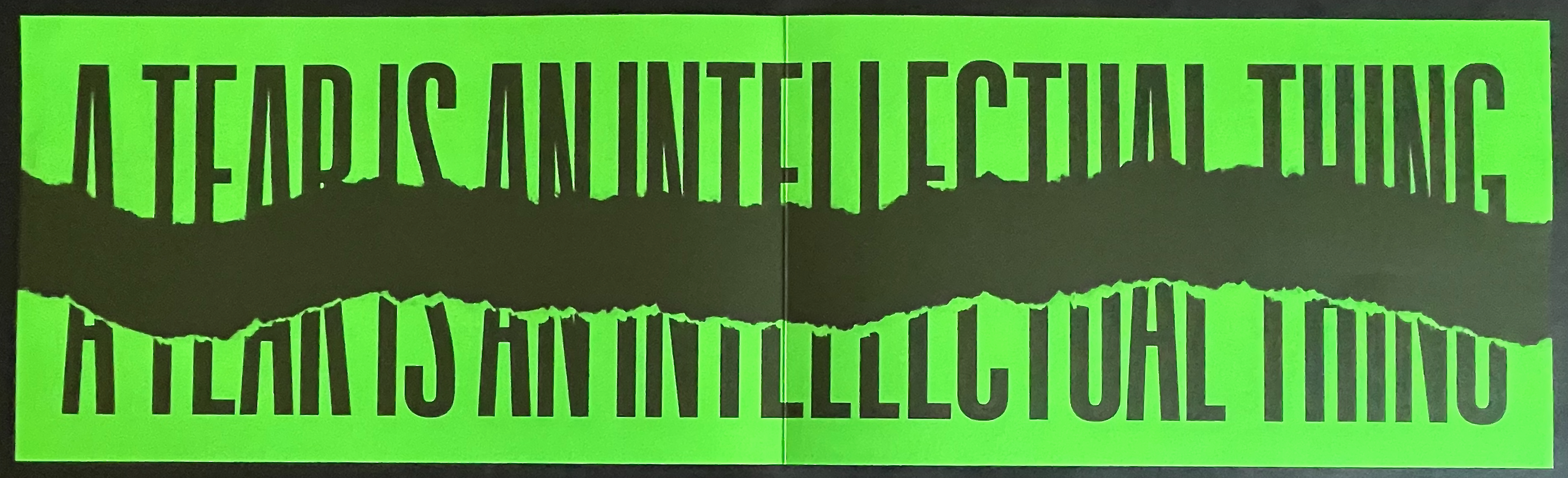
Rips and Floods (2026), Nick Thurston
For her print, Carolyn Thompson excises words “from 30 works of literary fiction she has read since” 2016 to compose a sob story that well sums up the effects of Brexit (and the US election).
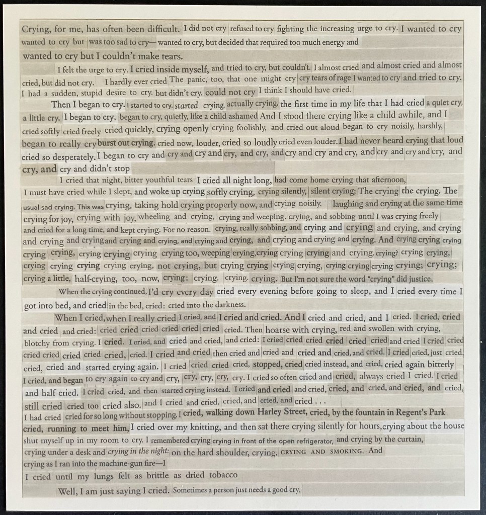
Tearjerker (2026) Carolyn Thompson
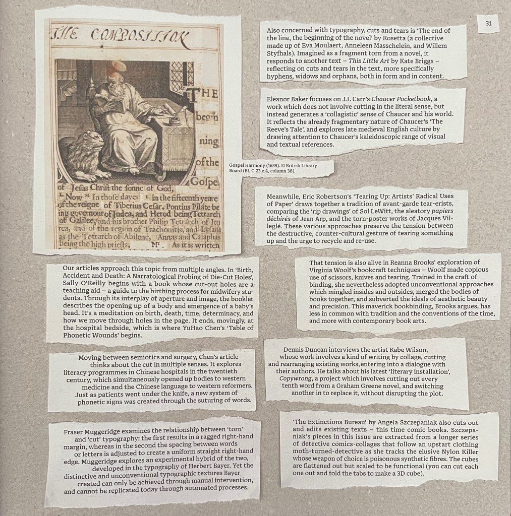
Pages 154-61 list the twenty-one artists/performers alphabetically with descriptions of their editions. Self-reflexively and in keeping with the issue’s theme, page 161 shows a blanked version of the torn segments from page 31 on which Partington and Smyth provide their introduction to the authors’ and artists’ contributions. (This blanked version is curious. If page 161 were showing the blank sides of the slips of paper, the four slips on the left would be flipped and on the right. Since one of the editors has let slip in correspondence that the theme of Issue 7 will be “blanks”, might this be an Easter egg?)

In homage to the journal and its edition contributors, below is a collage of the eleven loose inserts.
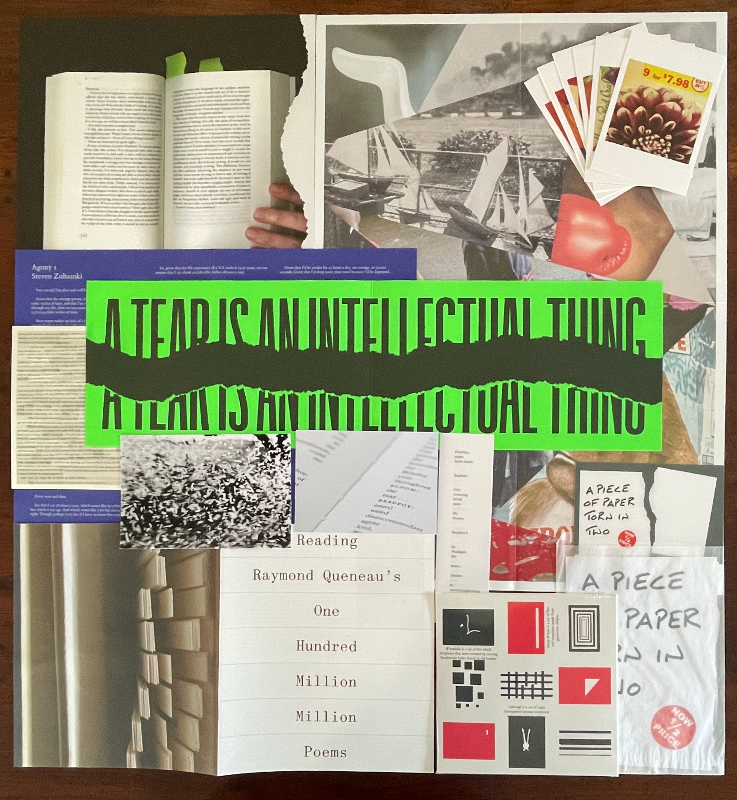
Contributors: Bas Jan Ader, Erica Baum, David Beech, David Bellingham, Stephen Emmerson, Lucio Fontana, Queneau Reading Group (Joe Gilmore, Simon Morris, Tom Rodgers, and Patrick Wildgust), Jo Hamill, Simon Morris, Abigail Reynolds, Rosetta (Eva Moulaert, Anneleen Masschelein, and Willem Styfhals), Buzz Spector, Carolyn Thompson, Nick Thurston, and Steven Zultanski. As noted at the beginning, Buzz Spector’s contributions appear in the issue’s pages as do Bas Jan Ader’s and Lucio Fontana’s photographs, while Abigail Reynolds’ art appears on the cover. All the other works are inserts.
The wunderkammer nature of Inscription will send insatiable readers in search of more examples of creative destruction. To that end, here are a handful from the Books On Books Collection. If you can only find time for two, make it Eleonora Cumer’s Circoscrivere lo spazio No. 3 [Circumscribing space] (2021) and Cercare nella memoria [Searching Memory] (2021). They are her most sophisticated metaphoric works in the collection. They offer a circumvention of circumscription, which is another way of thinking about tears and the material text.
“Islam Aly“. 13 January 2020. Books On Books Collection. See 28 Letters (2013).
“Doug Beube“. 21 April 2020. Books On Books Collection. See Empty Talk (2016), Red Infinity #4 (2017), and Breaking the Codex (2011).
“Lizzie Brewer“. 4 July 2023. Books On Books Collection. See Babel (2019).
“Eleonora Cumer“. 6 September 2019. Books On Books Collection. See l’attesa/ l’attente (2010), visioni urbane/ visions urbane (2015), contaminazione (2015), Circoscrivere lo spazio No. 3 (2021), Cercare nella memoria (2021)
“The First Seven Books of the Rijswijk Paper Biennial“. 10 October 2019. Books On Books Collection. See Tijdloos papier = Timeless paper (2002).
“Jonathan Safran Foer“. 8 November 2024. Books On Books Collection. See Tree of Codes (2010).
“Jo Hamill“. 23 June 2026. Books On Books Collection. See Gutter Words (2019).
“Julie Johnstone“. 4 June 2020. Books On Books Collection. See a book of tears (2006) and Point of View: skyline tideline (2012).
“Katsumi Komagata (I)“. 22 March 2020. Books On Books Collection. See A Cloud (2007) and Moon Phase (2019).
“Katsumi Komagata (II). 16 August 2024. Books On Books Collection. See Piece of Mind (2022), one of his last limited edition works.
“Masoumeh Mohtadi“. 5 February 2021. Books On Books Collection. See Blindness (2020).
“Timothy Mosely“. 23 August 2024. Books On Books Collection. See The Book of Tears (2014).
“Julien Nédélec“. 19 June 2025. Books On Books Collection. See Titrer (2012).
“Bruno Riboulot and Marjon Mudde“. 4 June 2023. Books On Books Collection. See ABC d’Air (2005).
“Jenny Smith“. 31 July 2017. Books On Books Collection. See Untitled (2006), Book of Beads (2008), and Little Black Book (2009).
“Carolyn Thompson“. 19 December 2023. Books On Books Collection. See The Eaten Heart (2013).
Further Reading
“Inscription 1“. 15 October 2020; “Inscription 2“. 29 May 2022; “Inscription 3“. 21 February 2024; “Inscription 4“. 21 February 2024; “Inscription 5“. Books On Books Collection.
Eisner, Will. 2008. Comics and Sequential Art : Principles and Practices from the Legendary Cartoonist. New York: W.W. Norton.
Metzger, Gustav. 1965. Auto-Destructive Art; Metzger at AA. [London]: [Destruction/Creation].
Spieker, Sven, ed. 2017. Destruction. London, Cambridge, Massachusetts: Whitechapel Gallery ; The MIT Press.
Toigo, Linda. 7 April 2013. ““Destroy, and you create”: an Auto-Destructive History lesson for Jack Hroswith”. Lindo Toigo website. Accessed 25 May 2018.

