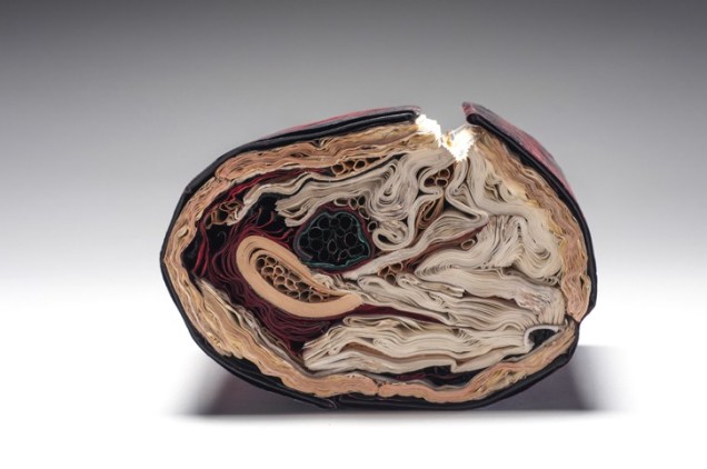
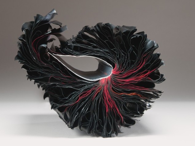
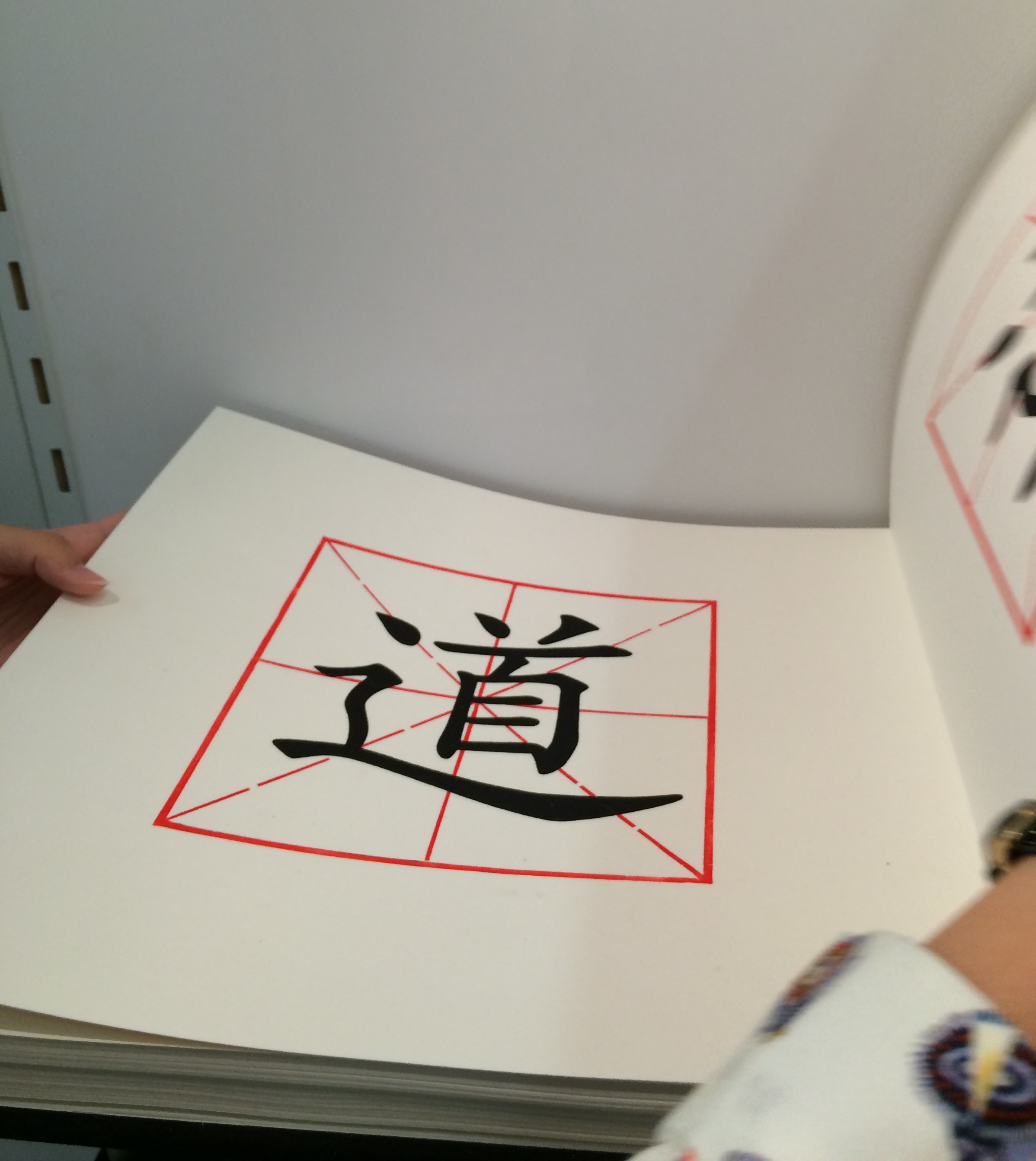
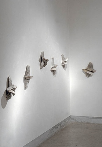
Transformed Harvard Loeb Library Translation of Ovid’s Metamorphoses
H7.75″ x W5.5″ x D6.5″
Photo: Paul Kodama
In Private Collection, NL
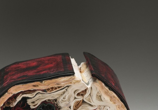
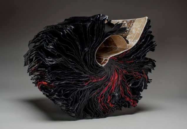
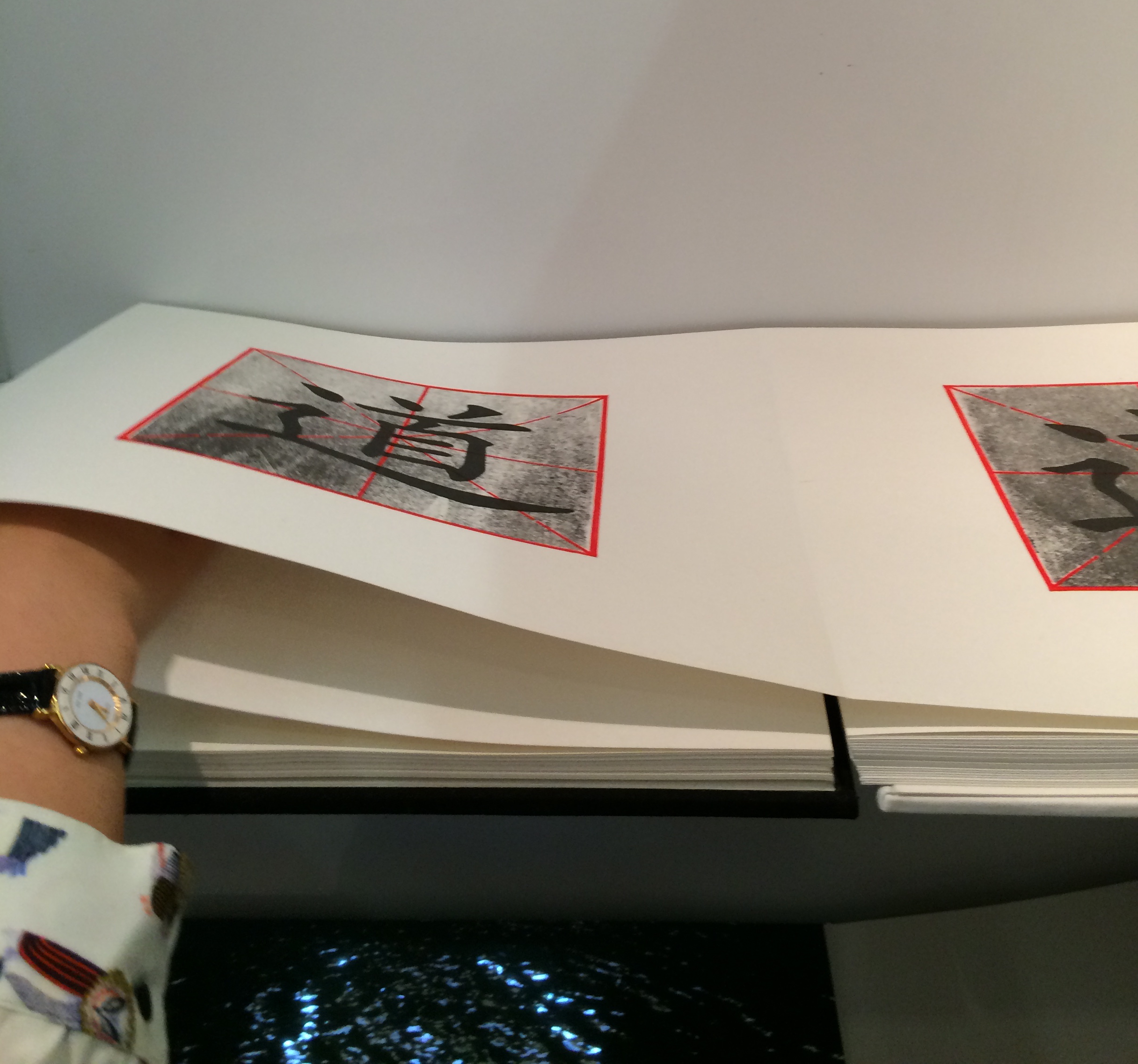
Transformed Harvard Loeb Library Translation of Ovid’s Metamorphoses
H7.75″ x W5.5″ x D6.5″
Photo: Paul Kodama
In Private Collection, NL
a result of an ongoing series of work started in 2013 in which [she] inserted a sculptural book form into the cavity of a tree to simulate a whorl in a tree hollow. What was initially an artistic, whimsical gesture became one where conditions were set in action, and consequently, over time the books returned to their botanical origins and were gradually subsumed by nature. The books changed state; at first “painted’ by a natural patina of mold in which the colours mutated and muted over time. The forms then became petrified and wood-like, with traces of their former texts still present, but like cultural artifacts: positing how time, changing weather conditions, and insect activity would finally affect the narrative of the original work. As iconic vessels of culture, knowledge, and classification systems, WHORL resonates as an imprint on how we leave our mark on nature, and how nature eventually leaves its mark on us a larger, comprehensive system at work.
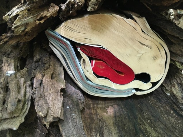
Site-Specific Installation on view September 6, 2016- September 7, 2017
University of Hawaii at Manoa Art Building’s Bamboo Breezeway
© Copyright jacqueline rush lee 2017. All rights reserved.
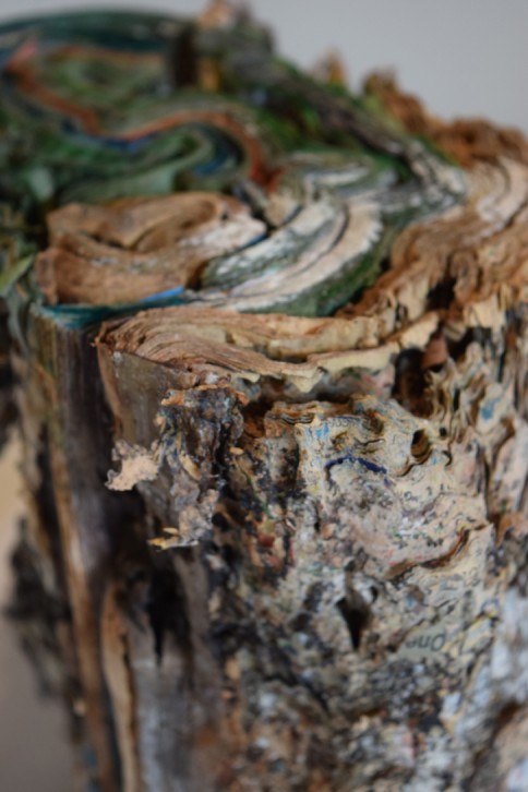
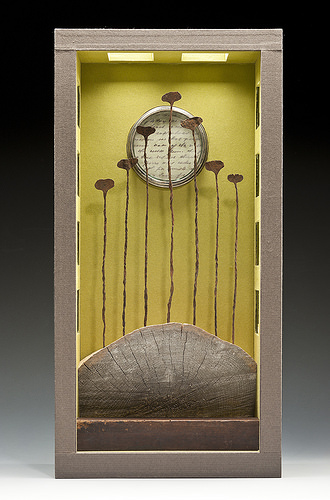
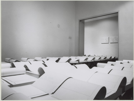
Transformed Book Sculpture Detail, Part of an Ongoing Project
H11.5″ x W7.5″ x D8″
Photo Documentation: Jacqueline Rush Lee
© Copyright jacqueline rush lee 2017. All rights reserved.
In the following commissioned work — based on Ovid’s Tristia — the artist has applied the technique from her 2007 inked series “… when [she] was also working with the sculptural and expressive qualities of paint and sumi-e ink. Referencing page layering, and the earlier faded ink fore edges of [her] Volumes series..this work invokes the meditative through the act of applying ink and obliterating meaning to create new meaning.”
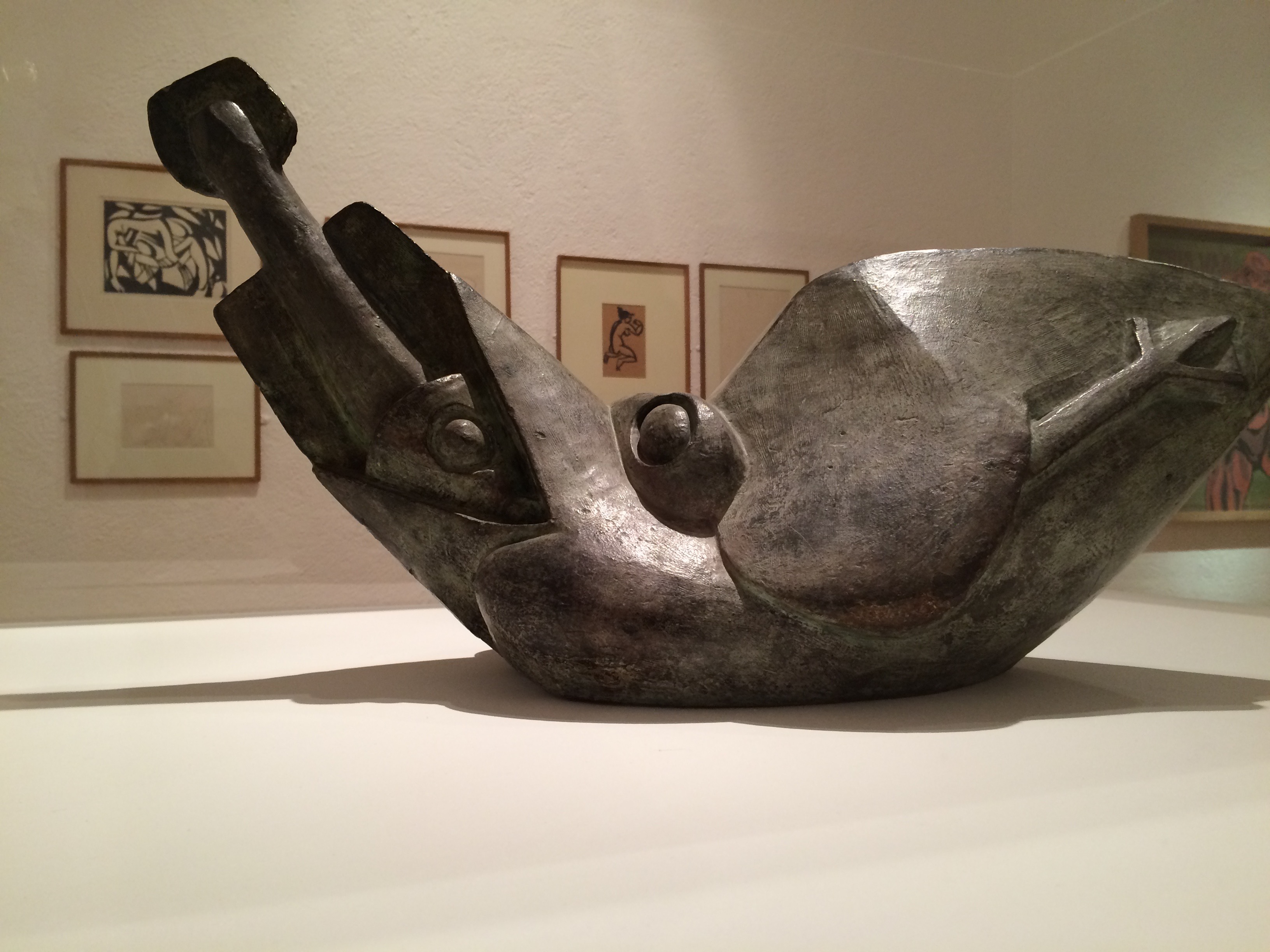
Transformed Peter Green Translation of Ovid’s Tristia and the Black Sea Letters
H9.5″ x W12″ x D6.5.” Manipulated Text, Ink, Graphite
Photo: Paul Kodama
In Private Collection, NL
The Tristia consists of letters and meditations that Ovid sent to Rome from Tomis on the Black Sea Coast, where the Emperor Augustus had exiled him for what Ovid mysteriously calls his carmen et error (poem and mistake). Silenda is from the Latin for “mysteries” and “that which must be kept silent.” The ink-saturated and unfurled pages of Silenda echo the poet’s black despair, the barrenness of exile, and the scarlet edging echoes his bleeding heart.
The sister work referred to in the caption is shown below.
Manipulated Philosophy Book, Ink, Graphite
Reason & Responsibility: Readings in Some Basic Problems of Philosophy, Fourteenth Edition. Feinberg & Shafer-Landau
H34.5 x W30.5 x D23cm
Photo Paul Kodama
In informal usage, nous means common sense or practical intelligence; in its more formal philosophical usage (from the Greek), it means the mind, intellect or intuitive apprehension. The artist’s alliance of title, technique and material here enriches the work but also presents the viewer of Nous and Silenda with questioning insight into book art.
Since the technique has blacked out the volume’s essays on central issues in metaphysics, epistemology, philosophy of religion, philosophy of mind, and ethics, as well as debates over the value of philosophy and the meaning of life, of course there is “no why Here”. Rush Lee is an exceptionally witty artist, so I wonder whether the pun also arises from the absence of a section on Aesthetics in the Feinberg anthology.
But that’s not the main query that Nous and Silenda taken together prompt. Both works are so similar in appearance that they could be mistaken for one another. For book art in which the innovative technique yields such similarity of works, how should we react to pieces where meaningful distinction is implicit in such differences in the material used that can only be known from labels that may or may not accompany the works? If we were to switch the labels of these two works, would we “mis-appreciate” them?
I think we would. Despite the close technical similarities of these two works, my reaction to each is enriched by knowing those differences and matching the choice of title of the work to the material used. That is a lesson I would apply even to works titled “Untitled” — the lesson really being to look harder, even beyond the “why”.
Bookmarking Book Art – Jacqueline Rush Lee (2013)
Jacqueline has been working with books for fifteen years and is recognized for working with the book form. Her artworks are featured in blogs, magazines, books and international press. Selected bibliography include: BOOK ART: Iconic Sculptures and Installations Made from Books; PAPERCRAFT: Design and Art with Paper and PLAYING WITH BOOKS: The Art of Up cycling, Deconstructing, and Reimagining the Book. Jacqueline’s work will also be featured in Art Made from Books, Chronicle Press, 2013 by Laura Heyenga. … She exhibits her artwork nationally and internationally and her work is in private and public collections, including the Allan Chasanoff Book Under Pressure Collection, NY.
The Chasanoff collection connects Lee with Doug Beube, whose work has been noted here. Beube was the curator of the Chasanoff Collection from 1993 to 2011. In his interview with Judith Hoffberg in Umbrella, Vol 25, No 3-4 (2002), he comments on the purposes of Allan Chasanoff, a book artist in his own right, in putting together the collection The Book Under Pressure:
There are a number of ideas that meets Allan’s criteria in acquiring work, of which I’ll try to convey a couple. The first is; the problem of the book to perpetuate information is inefficient, it’s an obsolete technology due to the advent of the computer. Another premise is; at the latter part of the 20th century the book is being used for purposes other than its utilitarian design. Allan has been working extensively with computers and digital imaging since 1985 and understands that the book is as “an outdated modality”, he’s fond of saying. He’s not interested in the book decaying or in its destruction, nor is he referring to the content of books, artist’s books, production costs, mass appeal or where they get exhibited. His interest is in the book as an antiquated technology.
Lee’s process of kiln firing to transform individual books, as with the dictionary above, strikes a harmonious chord. The kiln does not reduce the book to ash but rather petrifies it. Another way of exploring “the book under pressure.” Lee’s and Beube’s work are brought together again by Paul Forte at the Hera Gallery for an exhibition entitled Transformed Volumes.


