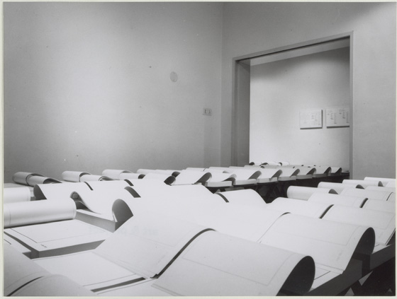
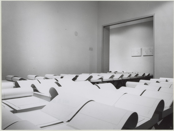
A “monument” to the Absence of the Twin Towers, this is a poignant work of book art by J. Meejin Yoon, architect, designer, educator, Professor and Head of the Department of Architecture at the Massachusetts Institute of Technology. A simple video demonstrating the work appears here at the site of the Otis College of Art and Design. This book|object was published by Printed Matter, Inc. and the Whitney Museum of Art in 2004 when Yoon was an Assistant Professor at MIT.
Artist’s description: “Both a book and a sculptural object, Absence is a memorial to the Twin Towers of the World Trade Center. It is a non-architectural, non-site-specific, space of remembrance: a portable personal memorial in the form of a book. A solid white block of thick stock cardboard pages, the book’s only “text” consists of the void of the tower’s footprints cut form the 110 pages – one for each floor of the towers.”
As you hold this small white brick of paper and turn its thick pages, a small pinhole appears on the page. Then two larger square holes emerge, one of which falls over the pinhole. Page after page — 110 pages for each floor of the towers — the two square holes repeat, creating two small dark wells in the field of white, until on the last page they take their place in the cut-out schematic footprint of the city blocks and buildings surrounding the Twin Towers. What you hold in your hands at the end is an object of art and book of memorial prayer.
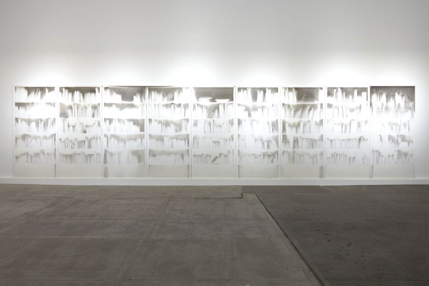
12 January 2017 — The Office of Arts, Culture, and the Creative Economy’s Percent for Art Program (OACCE) and the Free Library of Philadelphia (FLP) announced the commission of eight tunnel book dioramas from Philadelphia-based artist Colette Fu to be installed in the bookshelves of the renovated Parkway Central Branch.
“For Ms. Fu, the work is three-fold: ‘My hope is to first, emphasize that there is a line of continuity in the book form as it moves from more historic book forms, including movable books, to modern day iPads, cellphones, and Kindles. Second, I want to give visibility to the field of book arts, and to show that a book can possess interesting qualities beyond its text, specifically through printing methods, paper choice, and the binding. Lastly, I want to commemorate the book, the library, the artist book, Philadelphia, and most of all the stacks that are being permanently removed from the library.'”
For examples of Fu’s dramatic pop-up book art, visit her blog.
For Fu’s interview with Steve Miller (University of Alabama), download the podcast from iTunes:
Leilei Guo is an artist from Beijing. A few years ago, I had the good fortune to meet her at the Frankfurt Book Fair, where she was standing among her works.
She drew my attention to The Way, a large volume open to a double-page spread on a shelf in the corner of the stand.
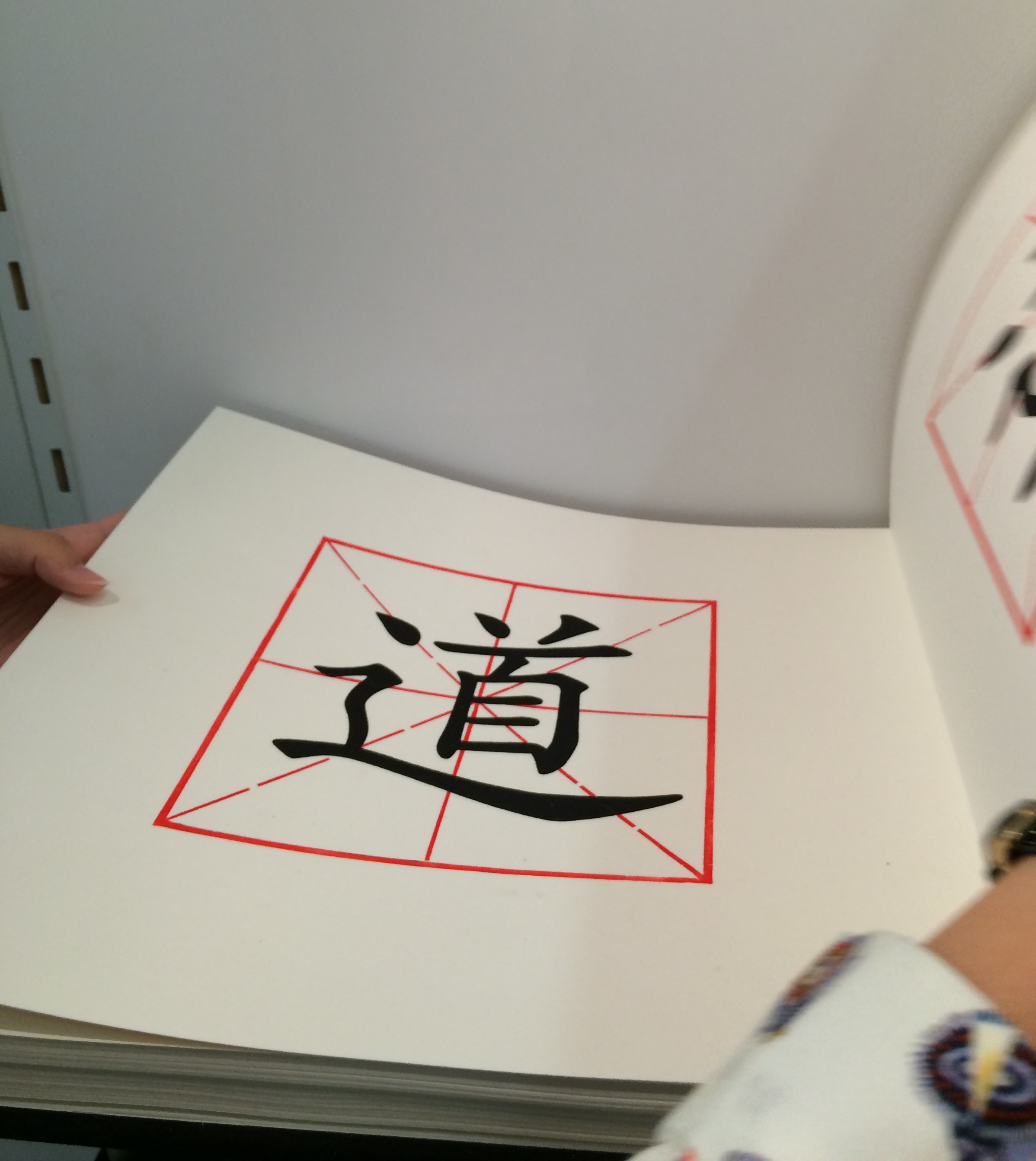
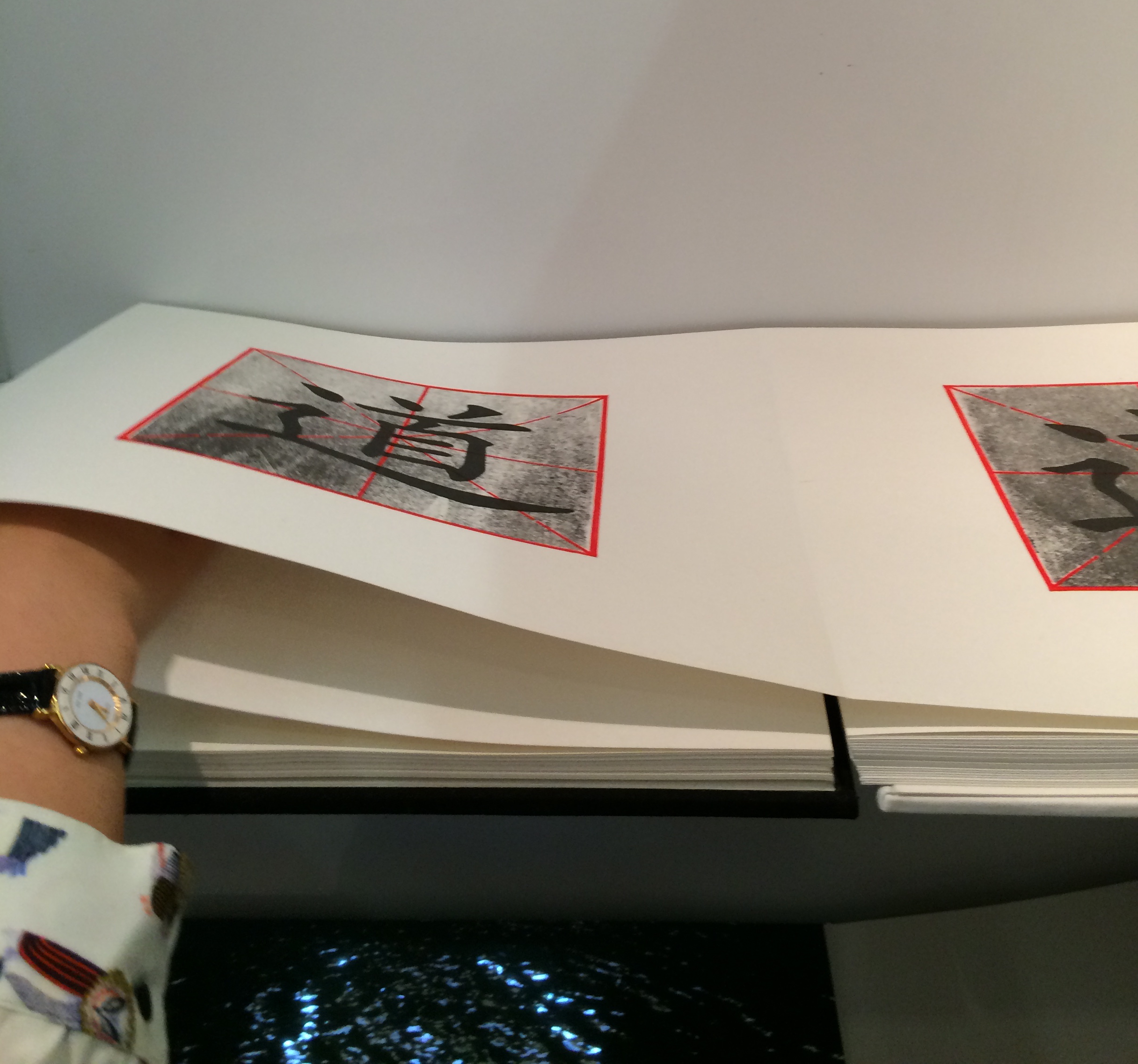
On each page of The Way is a square woodblock print, consisting of the Chinese character for Tao superimposed on a red figure. As the reader moves forward in the book, a darkening silkscreened wash gradually blots out the character.
Artist: Leilei Guo Work: The Way, 2008 Dimensions: 13.625 x 12.75″; 88 pages Material: Woodcut and silkscreen on rice paper. Concertina structure. Bound in cloth, front board in white, back board in black.
Artist: Leilei Guo Work: The Way, 2008 Dimensions: 13.625 x 12.75″; 88 pages Material: Woodcut and silkscreen on rice paper. Concertina structure. Bound in cloth, front board in white, back board in black.
She stepped aside to let me look closer. After I had turned a few pages in the usual way, I commented on the heft of what seemed to be uncut pages. Laid flat in its double-page spread with the sharpness of the fold and weight of the paper apparently sinking into its spine, the book did not immediately betray its leporello structure. She gently moved my hands away and inserted her hand in the fold between the two pages.
Artist: Leilei Guo Work: The Way, 2008 Dimensions: 13.625 x 12.75″; 88 pages Material: Woodcut and silkscreen on rice paper. Concertina structure. Bound in cloth, front board in white, back board in black.
Then, performing a traditional gesture of Tai Chi, she moved her hand to and fro without removing it from between the fold, and the pages turned or rather flowed and folded, each over the next, as if of their own accord. Gesturing from one side to the other and then back, again and again, she moved the print toward its opacity or clarity, depending on the direction. When she closed the volume, I could see that the board on one side was white, the board on the other, black.
According to the Vamp&Tramp’s website, which handled the work’s sale, the book embodies the artist’s vision of two strands of Chinese philosophy — Tao, or The Way, and Yin Yang. For me, that embodiment was in that moment in Frankfurt where another kind of printed book had its origin. Hand, movement, pages, ink, binding, the art were one.
For more of Leilei Guo’s art, visit the Vamp&Tramp site or the artist’s site.
At 6 minutes in, there is a wonderful riff on the book as elemental cultural artifact, being able to stand for each of the four elements. Here are links to the images to which Spector refers – so much more enjoyable to see as well as hear!
There is a related brief note about Spector’s “The Rise and Fall of Books” here. Spector’s works — especially his collages with found poems drawn from book jackets — strike deeply. With them, book art goes beyond the read artifact into the relationship of writing and reading.
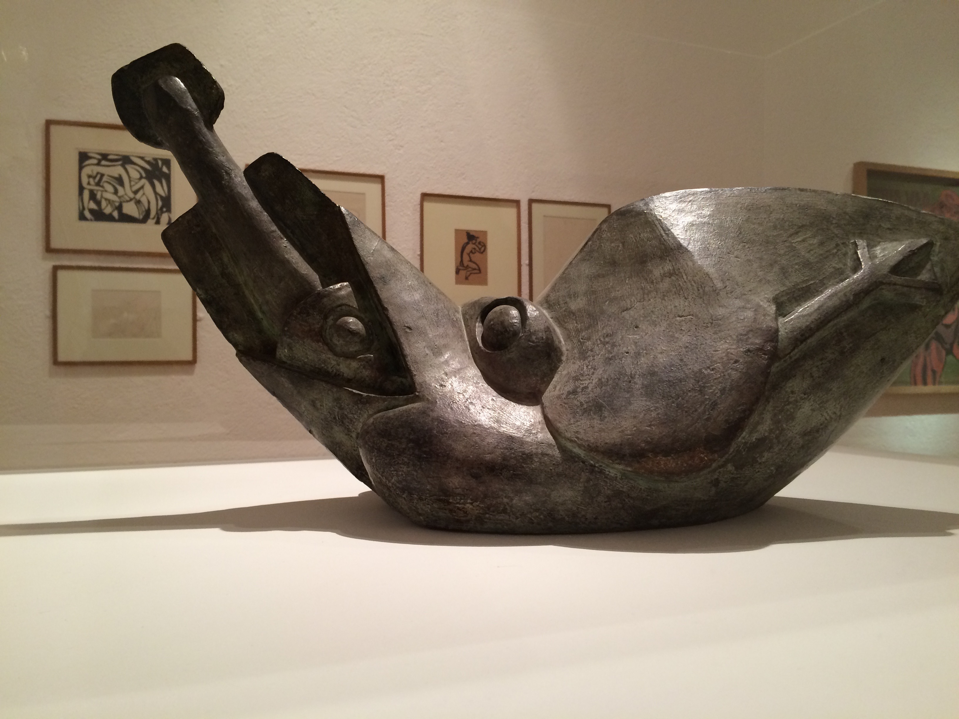
Henri Gaudier-Brzeska, Bird Swallowing a Fish, 1913-14 Kettle’s Yard exhibition, 2015
The Gaudier-Brzeska exhibition, the finale before Kettle’s Yard would close for years, had drawn me to Cambridge. I spent hours there. Exhausted, I was walking back to the train past the Fitzwilliam Museum. I had read somewhere that Xu Bing would have a small solo exhibition at the Fitzwilliam.
from Xu Bing, Book from the Ground: From Point to Point (MIT Press, 2014)
I own a copy of Xu Bing’s Book from the Ground: From Point to Point – a pictographic account of twenty-four hours in the life of “Mr. Black,” a typical urban white-collar worker – and I had seen Book from the Sky at the Odd Volumes exhibition of Yale’s Allan Chasanoff Collection. So I took a chance.
Xu Bing, Book from the Sky, 1991 The Allan Chasanoff Collection, Yale University Art Gallery
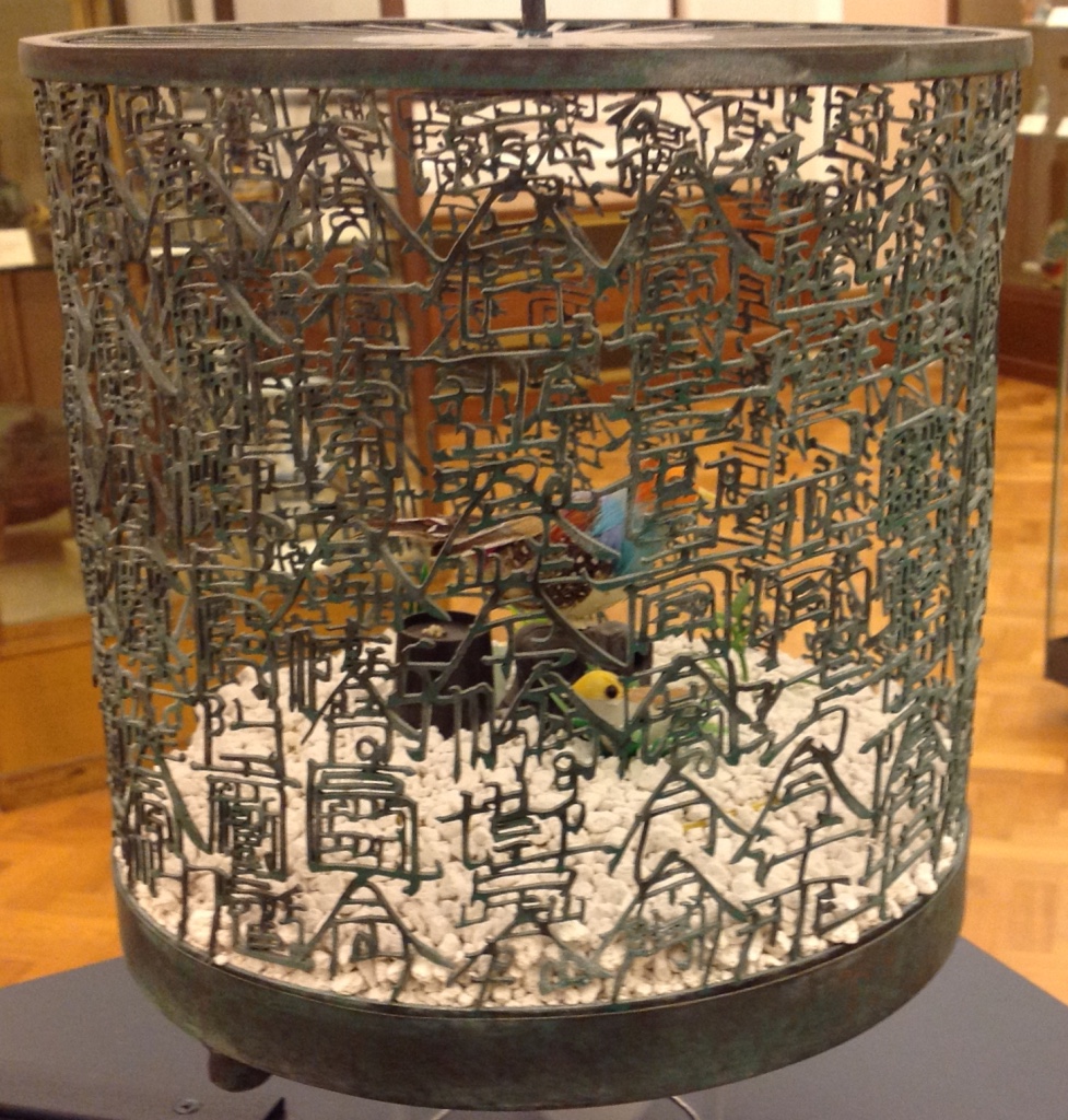
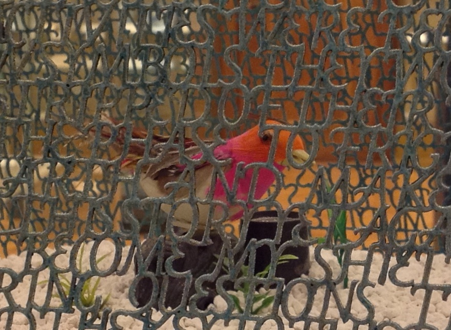
After first not recognizing my mispronunciation of Xu Bing and then hunting through some brochures, the attendants at the information desk directed me downstairs to a room of Chinese porcelain just outside the museum shop. Among the glass cases of blue and white: Bird Language (2003), four brass and copper birdcages, containing toy birds that sing at the clap of your hands. The mesh of two of the cages are composed of words in the Latin alphabet, the other two in Xu Bing’s faux Chinese calligraphy. According to his site, “The words are questions that people have asked Xu Bing about art, and his answers.”
Xu Bing, Bird Language, 2003 Four brass and copper birdcages containing sound-activated toy birds, the cage mesh composed of English and “square word calligraphy”, gravel.
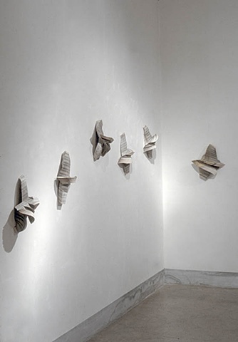
Detail. Xu Bing, Bird Language, 2003
They remind me of Gaudier-Brzeska’s Bird Swallowing a Fish, just a question of timing and the juxtaposition of two artists fascinated with a union of the animistic and mechanistic? Maybe it is these few other degrees of separation: Gaudier-Brzeska’s catalyzing effect on Ezra Pound in 1913, Pound’s creative misunderstanding of Chinese calligraphy, Pound’s disputably indisputable influence on the author of “Sailing to Byzantium” (1927), whose birds are “Of hammered gold and gold enamelling … set upon a golden bough to sing ….”, and now Xu Bing’s toy birds that require the body not the “Soul [to] clap its hands” and let the birds do the singing.
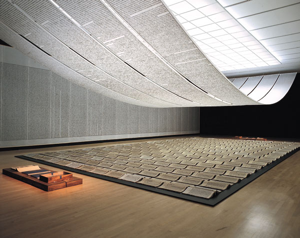
Xu Bing’s Book from the Sky must have been even more impressive in its Metropolitan Museum display (2013/14) than its partial form at the Yale Gallery (2015) as shown above, but that’s part of the pleasure of conceptual art. Whether billowing overhead on scrolls suspended from the ceiling and walls or juxtaposed in their bound book form with their wooden case, these hand-bound deliberately indecipherable, meaningless Chinese calligraphic forms printed from hand-carved wood blocks sing in the mind and soul. But what is that song? We have the impression of meaning, an impression conveyed by graphic gesture and the traditional containers of meaning. But there is a slippage between the impression of meaning and grasp of meaning. Perhaps that is Xu Bing’s song.
The Khan Academy’s socio-political take on Xu Bing’s Book from the Sky — comparing it to Ai WeiWei’s performance art of smashing a Han dynasty vase — may usefully decipher the song for some. I think it misses a more profound point that Charlie Bennett approaches in his Aestheticareview of Xu Bing’s installation version of Book from the Ground (just closed on 28 February 2016 at the Centre for Chinese Contemporary Arts in Manchester, UK). The interactive mixed-media installation recreated Xu Bing’s art studio, including double-page spreads of the book pinned up on a wall, over-sized blow-ups of the pictographs from the book and two computers for visitors’ use.
Book from the Ground is also the name of Xu’s language-learning software program, which attendees can access on PCs in the gallery space. When words are typed into the tool, they are transformed into Xu’s pictographic language. It recalls a previous work of Xu’s, Introduction to [New] English Calligraphy (1994), which combines installation and interactive art, as visitors of a simulated classroom attempt to write what seems to be traditional Chinese calligraphy. But in the act of copying out the symbols on display, they realise the characters are reconfigured Roman letters that spell out words in legible English. Book from the Ground goes further in questioning transcultural communication; it instigates dialogue across borders only by negating all cultural differences in a de-localised set of coded representations.
With its English and Chinese birdcages, Bird Language, too, echoes Introduction to New English Calligraphy. But in the viewer’s interaction with the latter, the meaning that emerges is not what the viewer “intends” by copying out pretty lines. The experience of “communicated meaning” or “almost communicated meaning” seems accidental or magical. Likewise in Bird Language, we know that the sensor activates the toy bird and suspect a connection between the “magically activated” songs and the word-mesh cages. We suspect meaning. We know the artist’s hand formed metal letters to form metal words in two different languages. We suspect that each cage forms a narrative. We suspect there are differences in the narratives from the difference in round and square cage, English and Chinese cage. For some, that experience of suspicion might be frustrating; for others, delighting.
On further reflection, I think Xu Bing’s art challenges that modernist “union” of the animistic and mechanistic. With the sound-activation of digital birdsong and software-translation of words into pictographs, Bird Language and Book from the Ground (the installation) offer the slippery intersection of the animistic, the mechanistic and the digital. Intersection is not always union, if by “union” we mean equivalence, meaning and clarity. “Made in China” birds are not swallowing or regurgitating brass symbols. Animistic and mechanistic input to digital translation or replication do not always yield union — equivalence, meaning or clarity. But in Xu Bing’s hands and mind — in their intersection with our hands and minds — they yield a suspicion of union. They yield art.
Detail. Xu Bing, Bird Language, 2003
Detail. Xu Bing, Bird Language, 2003
Further reading:
Wang, Sue. “‘Xu Bing’: The Art View and Action Logic of a Fatalist”, 12 January 2018. A lengthy piece on the occasion of the Xu Bing retrospective in Wuhan, his first large-scale solo exhibition in China since returning ten years ago.
Beitler, Daniel. “Xu Bing Tests the Limits of Language in Unique Exhibition“, Macau Daily Times, 20 November 2017.
From www.youtube.com – May 25, 2017 1:55 PM
This video recounting Xu Bing’s life and work so far (from his start in China to the 90s in New York then back again to Beijing) broadens the appreciation of each work and the connections among them across time and place.
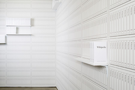
Michael Mandiberg, Print Wikipedia, 2015 Exhibition “From Aaaaa! to ZZZap!” by the Denny Gallery, 261 Broome Street in New York City, 18 June through 11 July, 2015.
Print Wikipedia is a both a utilitarian visualization of the largest accumulation of human knowledge and a poetic gesture towards the futility of the scale of big data. Mandiberg has written software that parses the entirety of the English-language Wikipedia database and programmatically lays out thousands of volumes, complete with covers, and then uploads them for print-on-demand. Built on what is likely the largest appropriation ever made, it is also a work of found poetry that draws attention to the sheer size of the encyclopedia’s content and the impossibility of rendering Wikipedia as a material object in fixed form: Once a volume is printed it is already out of date. The work is also a reflection on the actual transparency or completeness of knowledge containers and history. (Denny Gallery)
Mandiberg echoes a conceptual framework initiated by John F. Simon, Jr. and his “Every Icon” in 1996-97. Every Icon is a grid of 32 x 32 empty squares underpinned by a Java applet that explores successively every combination of black and white squares that could occur within the confines of that grid. Changing from light to dark and back again, the black or white boxes “hop” progressively to the right. Over time (say a trillion years), the grid will will populate itself with shapes. Simon’s algorithmically driven “artist’s proof” speaks to the ephemerality, futility and power of art, which is the unavoidable, underlying theme of “Every Icon” and, for that matter, any instance of installation or performance art.
As Simon puts it,
While Every Icon is resolved conceptually, it is unresolvable in practice.
In some ways the theoretical possibilities outdistance
the time scales of both evolution and imagination.
It posits a representational system where computational
promise is intricately linked to extraordinary duration and momentary sensation.
In Mandiberg’s case – whether it is the complete set or a print-on-demand segment – the realized print element of the Print Wikipedia demonstrates the work’s unresolvability in practice. Even if I hold out hope that the “art” (the algorithmic techne/craft) of Print Wikipedia lasts long, any artifact “resolved” by Print Wikipedia will always be out of date until the “final moment” of Wikipedia (whatever that might look like). Warning: the links from previous reviews of Every Icon are often dead, which is doubly ironic: the technical community always speaks of “links resolving to a resource”, so with those dead links, there is a further, unintended “unresolvability”.
Mandiberg’s work also echoes the conceptual framework initiated by Paul Soulellis and Library of the Printed Web. Like the volumes in Mandiberg’s Printed Wikipedia, those in the LotPW are created by print on demand.
Special Collection (2009), by Benjamin Shaykin. Photo by the Library of the Printed Web.
In Soulellis’ words,
Library of the Printed Web is a collection of works by artists who use screen capture, image grab, site scrape and search query to create printed matter from content found on the web. LotPW includes self-published artists’ books, photo books, texts and other print works gathered around the casual concept of “search, compile and publish“.
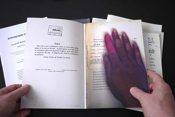
The content in Benjamin Shaykin’s Special Collection consists of found pages in which a scanner’s hand was accidentally captured by the Google scanning system during the Google Book Project . This is truly “manually” found content. The content of Mandiberg’s work is algorithmically “found content” on a massive scale. While it may be that Print Wikipedia represents the “futility of the scale of big data”, I prefer the irrational hope that its print element, however tied to the digital, and the physical book art of the LotPW secure the consolation of “ars longa, vita brevis”.
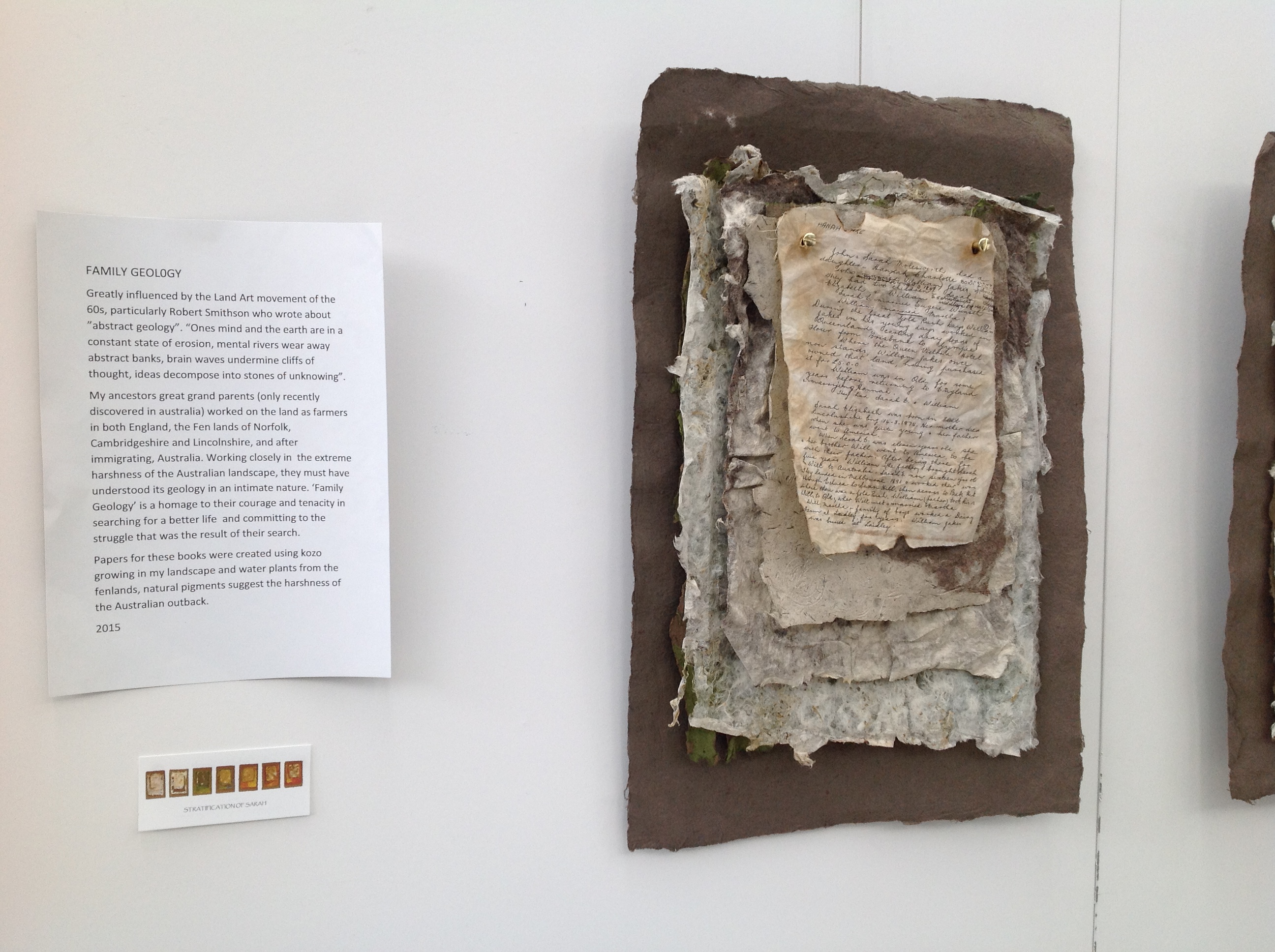
Family Geology by Jan Fairbairn-Edwards consists of multiple related works to create the visual narrative of her Victorian era family’s emigration from the Norfolk fens to Australia. One of the central characters is her great aunt Sarah, who is the focus of the work Stratification of Sarah shown below.
Stratification of Sarah, 2015 Jan Fairbairn-Edwards
Stratification of Sarah, 2015 Jan Fairbairn-Edwards
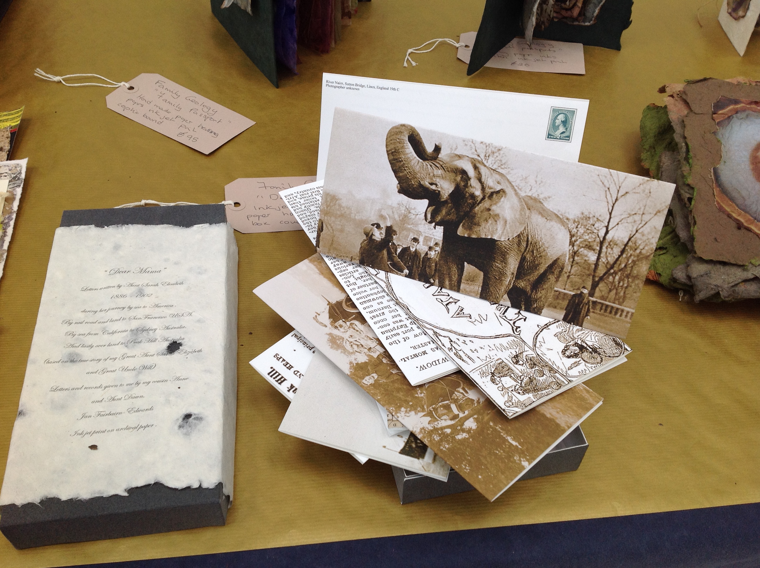
Symbolically, the six hanging “chapters” of Sarah’s journey move from the dun colors of the English fens to the hotter colors of Australia. The artist uses sheets of paper handmade from plants native to the Norfolk fens as well as traditional clothing fabric. The “geological” layers of the journey’s story are reflected in the stratified sheets that diminish in size from back to front. The weathered documents appearing in each hanging are copies of found items from the family’s possessions or allusive artifacts, such as the article about Alice, “Jumbo’s widow“.
Alice was the African elephant being shipped aboard the HMSS Egyptian Monarch to join P.T. Barnum’s Jumbo in the US. Also on board the Monarch was Sarah, 10 years old when she embarked for the first sea leg of the journey to Australia. In another work in Family Geology called “Dear Mama”, the artist has invented a series of letters from Sarah, several of which tell of Sarah’s searching the ship for Alice.
“Dear Mama”, 2015 Jan Fairbairn-Edwards
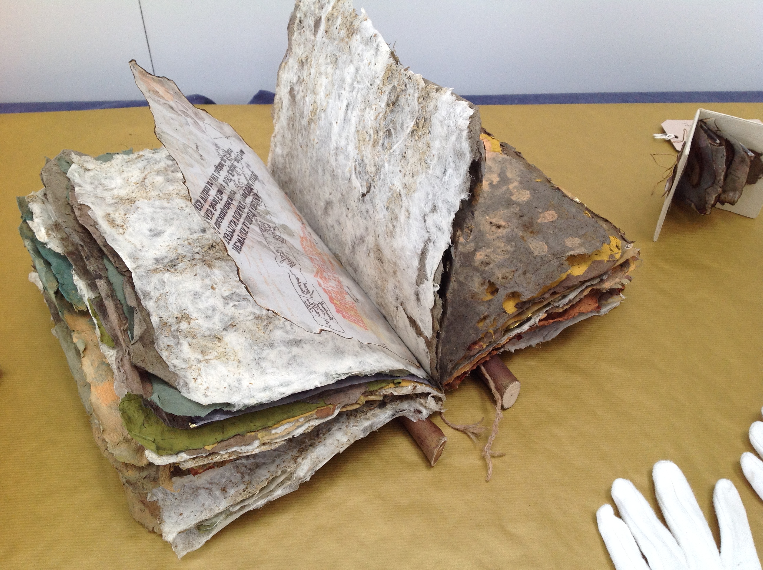
The other related works feature only fens-originated material, with the exception of a few pieces whose spines are branches of eucalyptus trees. Those spines and the hot Australian colors are the main physical manifestation of the Australian destination. As seen below, the stamps from the officialdom of the empire on which the sun never set provide another of the numerous unifying threads in the narrative.
William’s Story, 2015 Jan Fairbairn-Edwards Handmade papers with kozo and fenland plants, natural pigments, ink jet print (archival quality) on tracing paper, inks, string and eucalyptus wood binding
The artist suggested that I call this an installation. It is, but with the difference that there is this multi-threaded, narrative unity across and among the individual works that I have not noticed before in other installations. That unity makes me stumble a bit over the fact that the constituent works are purchasable individually, which casts the “installation” in something of a contrasting light. The work as a whole is one of remembrance and restoration. Doesn’t the removal of pieces of Family Geology undermine that?
Remember the 2014 installation Blood Swept Lands and Seas of Red created by artists Paul Cummins and Tom Piper at the Tower of London: 888,246 ceramic poppies progressively filling the Tower’s famous moat between 17 July and 11 November? Each red bloom represented a British military fatality in the First World War. The installation as installation resides only in the memories of its viewers and can be experienced only partially in photos, video clips or the website. The poppies sold individually over the web (I am one of the lucky owners of one of them). When I look at this single ceramic poppy, sometimes there is a failure of metonymic power – the ability of the part to stand for the whole. Other times, it starts the image of a cascade of blood from a stone window into a moat of red. And so, what of a single work plucked from Family Geology?
The full impact of the installation– a family speaking to one another in and across time, from across seas and continents – something on which the viewer eavesdrops – rises like the musk from the back of an inherited chest’s bottom drawer full of old letters, curled newspaper clippings, fading photographs, pressed leaves and flowers. At first, you think it is the volume of this manufactured memorabilia and their semi-invented, semi-found connectedness that is the source of that impact. But then you pick up William’s Story. The texture of its papers, the rough, dry sound of the leaves turning and the ash that flakes to the table from their edges take you deep into that musk through the one work.
You can sift through the several pieces of Fairbairn-Edwards’ Family Geology, and some will take you to the same place on their own, others lean much more on the presence of the installation. The thought of taking away from the whole one of its stronger parts leaves me hoping for an institutional white knight to purchase the “installation”. Yet the scent of William’s Story on some visitor’s fingers is probably making him or her reach for a checkbook or credit card right now.
See also Turn the Page 2015, where Family Geology had its debut and was one of the eight finalists.
Family Geology will next be on show at Art & Papiers, Vézénobres (Gard), France, this month (June 2015).
John Cheever’s short story “The Swimmer” is an all-time favorite. After seeing the short film of it with Burt Lancaster, I can’t imagine Ned Merrill’s appearance any other way. Even in Michelle Ku’s animated book art version, I see Burt Lancaster’s big grin and its sorrow.
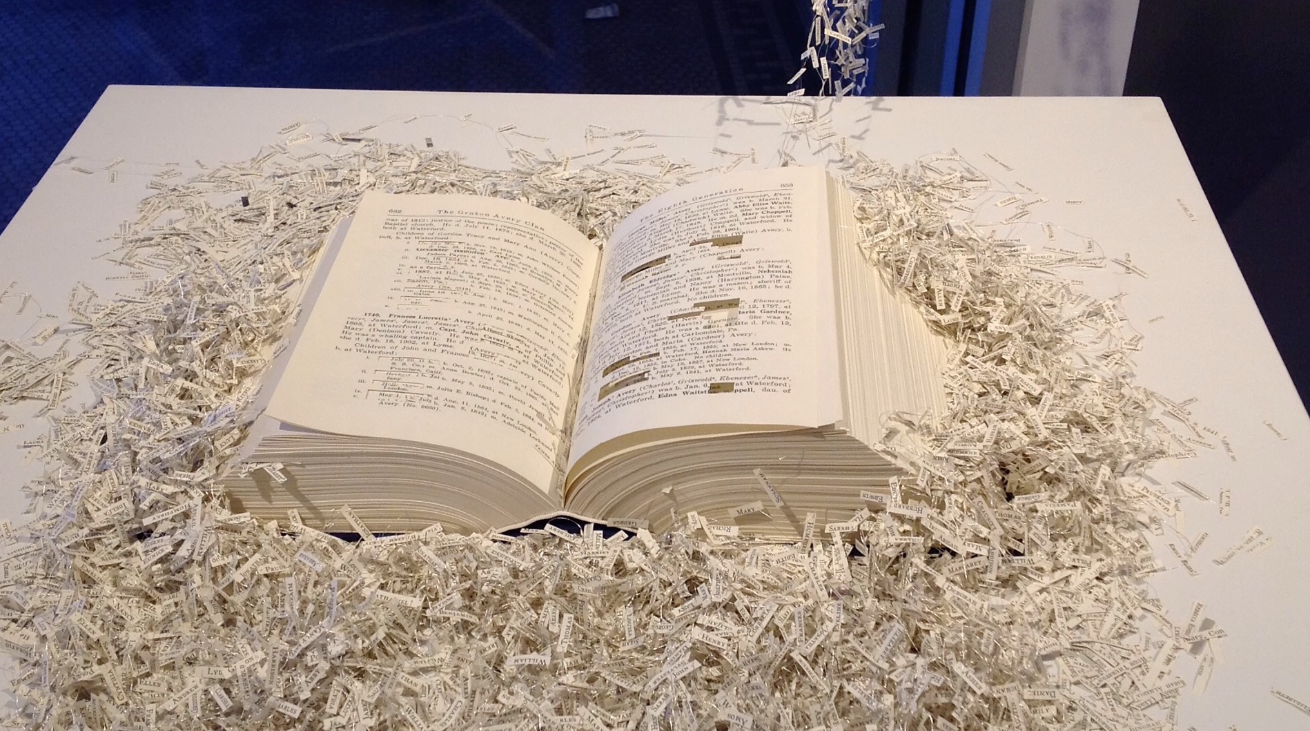
Before seeing Ku’s work, which has planted the urge to seek even more examples of animated book art, I had enjoyed Regan Avery’s The Groton Avery Clan at the CT(un)Bound exhibition in New Haven, Connecticut. The work consists of a handmade book, metallic thread, motor and an Arduino microcontroller. The Avery clan has inhabited the state since the 1600s. Regan Avery’s handmade book is a copy of the family history published over 100 years ago. From it, the name of each descendant of Christopher Avery, the original immigrant, has been excised and the ten thousand names handwritten on miniscule scraps of yellowed paper that emerge from the book along interconnected threads put into motion by the motor and microcontroller.
Regan Avery, The Groton Avery Clan, 2015
When the motor engages, the name slips become “a teeming mass of humanity”.
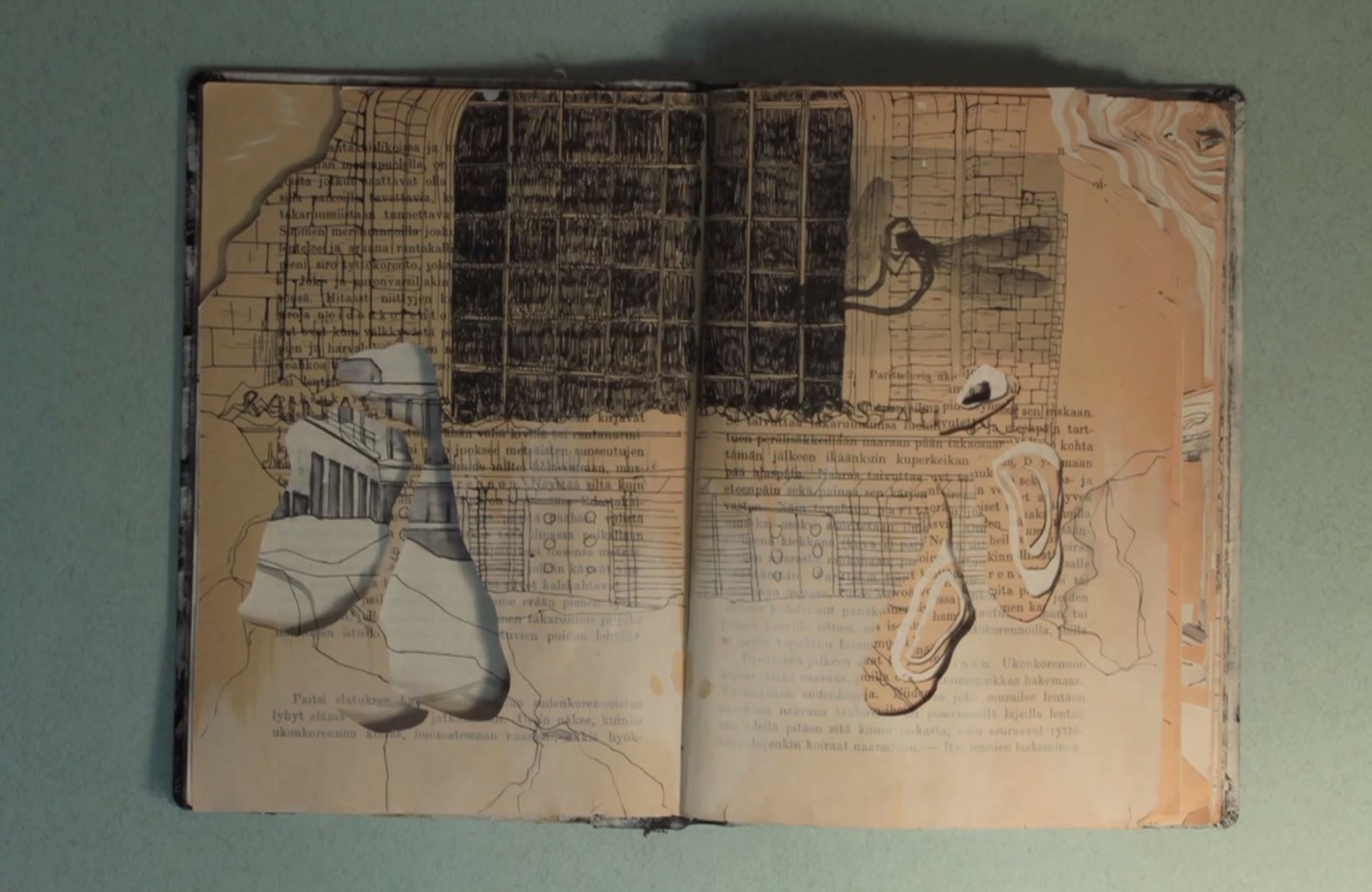
In 2011, Saara Tuulia posted City and Snow Book on YouTube, which is a simple stop motion animation comparable to Ku’s more complex The Swimmer.
Saara Tuulia, City and Snow Book, 2011
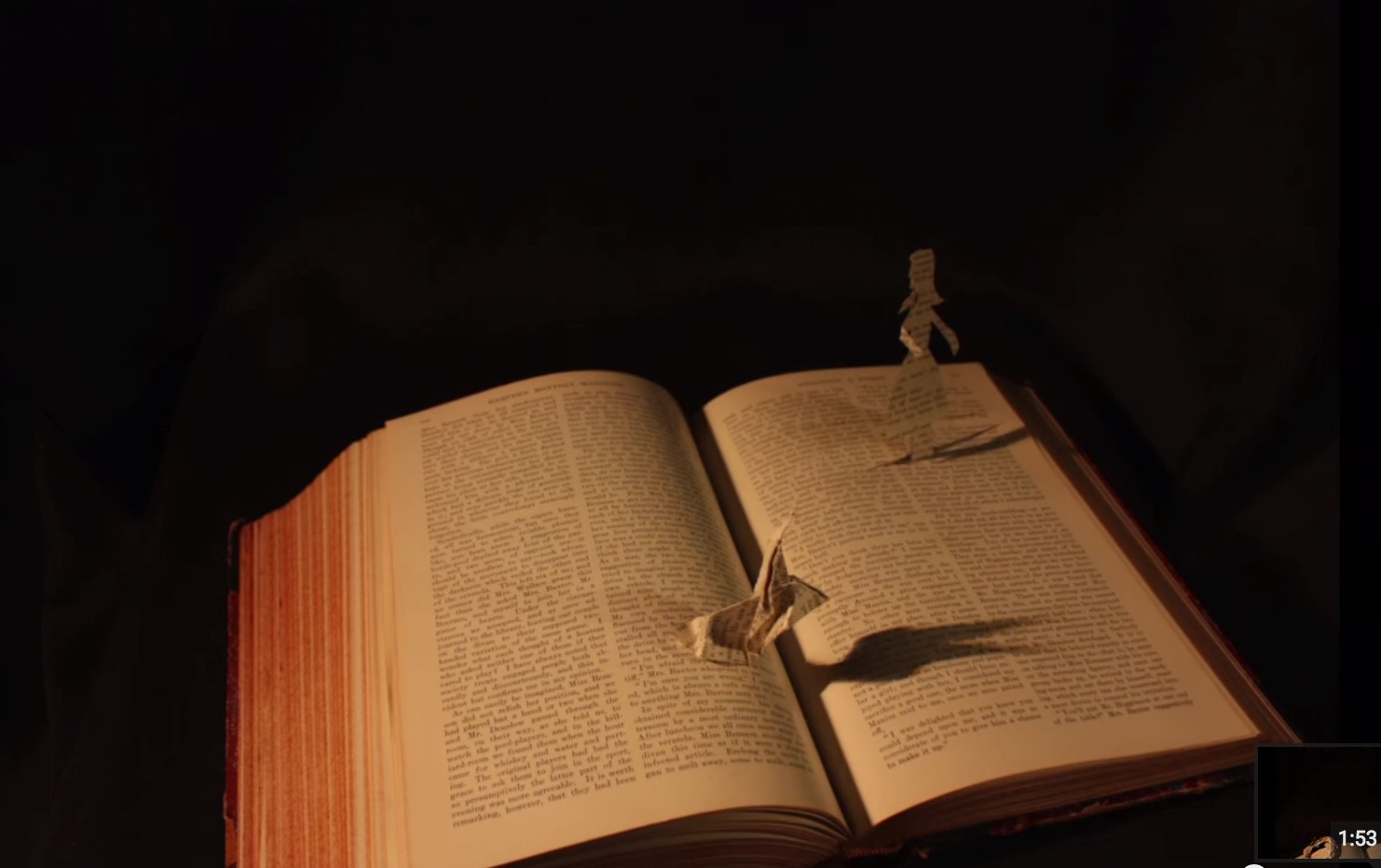
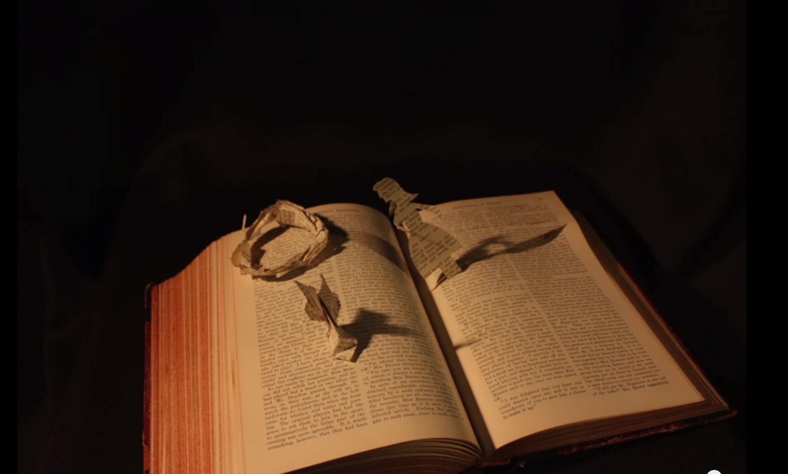
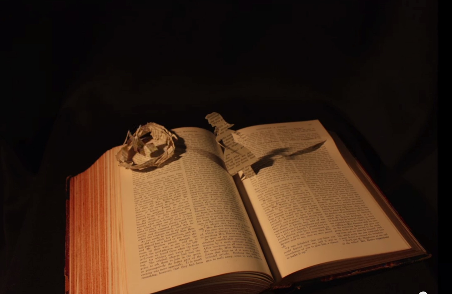
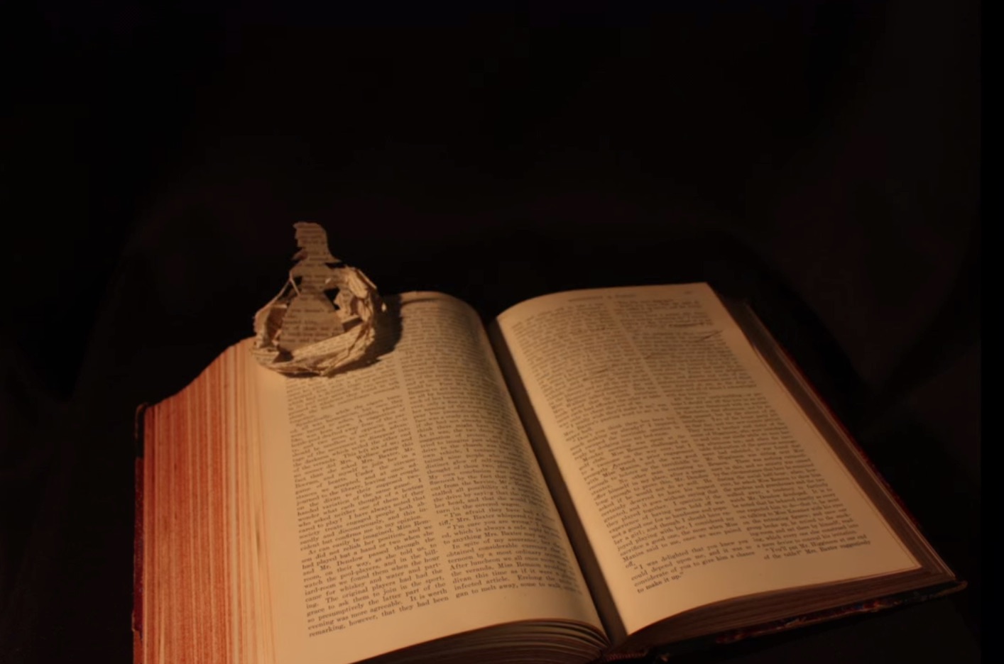
In 2013, Danielle Lathrop posted Book Art, whose stop motion animation highlighted the figurative and origami-based vein of the art form and its practitioners’ obsession with Alice in Wonderland.
Danielle Lathrop, Book Art, 2013 The White Rabbit and Alice sequence
Danielle Lathrop, Book Art, 2013 The White Rabbit and Alice sequence
Danielle Lathrop, Book Art, 2013 The White Rabbit and Alice sequence
Danielle Lathrop, Book Art, 2013 The White Rabbit and Alice sequence
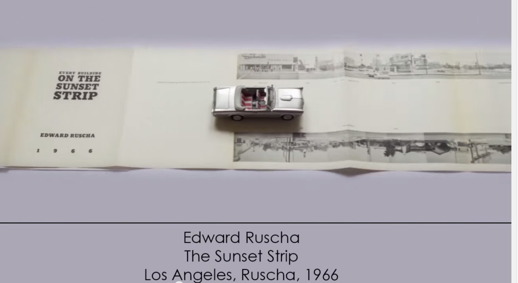
More recently, and posted here, another example of animated book art – Giulio Maffei’s series Le Vite dei Libri (The Lives of Books) – demonstrates the increasing engagement and sophistication in this variant form of book art.
Giulio Maffei, Edward Ruscha’s The Sunset Strip, 1966, 2015
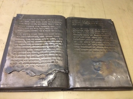
Lost Fight, 2014 Encyclopedia volume, lead, metal paint
The passage here, rendered by blind embossing on lead and metal paint, comes from Primo Levi’s essay on lead in his book The Periodic Table.
It reminds me of Anselm Kiefer’s lead books with wings (The Language of the Birds, 2013), which you can read about here: http://wp.me/p2AYQg-Lu. It’s a curious, leaden but uplifting, fitting but outrageous conjunction: Van Zanten’s personal grappling with depression, the concentration-camp survivor who ultimately succumbed to depression and suicide, and the Nazi-saluting artist who asserts that history is a weight that must be borne and embraced and lead is the only substance that is weighty, “alchemical” and mutable enough to bear it.
Van Zanten’s appropriation of Levi for her project “Depression” is somewhat less outré than Sylvia Plath’s appropriation of Jewishness in “Daddy”, which is barely less outré than Kiefer’s Nazi salutes. But all three are essential, outrageous and shocking appropriations, just as the appropriation of books as “just another material” with which to create art is essential, outrageous and shocking.