Rotch Library offers a small but growing collection of contemporary artists’ books. The collection focuses on artists’ books published from the 20th century to the present and explores a range of techniques and technologies employed by the books’ creators.
Yellow Submarine? Monty Python? Heath Robinson? Rube Goldberg? Hieronymus Bosch? Albrecht Durer? Quentin Massys? Whatever the influence, David M. Moyer has created choice work under The Red Howler Press. MIT has chosen well.
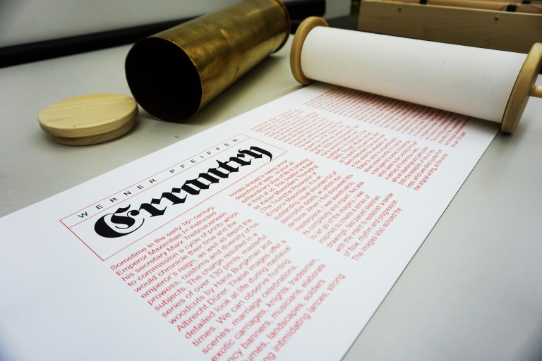
Errantry (2008) Werner Pfeiffer
Errantry, a 27-foot scroll housed in a howitzer shell casing, is inspired by Der Triumphzug Kaiser Maximilians or The Triumphal Procession of the Emperor Maximilian (1515), a series of 130 woodcuts by Hans Burgkmair the Elder (1473-1531) and others, about which Pfeiffer comments: “One of the dominant features in this document is the militant nature of many of the characters depicted, as well as their posture in parading their arms on horse, by carriage or on foot.” The text in Errantry draws from a poem of the same name in J.R.R. Tolkien’s Middle Earth mythology. The source poem, composed by Bilbo Baggins, describes one of his quest adventures in the usual self-aggrandizing yet self-pitying tone. As a model for Pfeiffer’s text, it makes the digitally printed images of war all the more horrible.
It took a long look at the development of Ioana Stoian’s work to show me the relationship of trompe l’oeil to book art — and to appreciate how an artist can invent herself.
Stoian’s apprenticeship as an artist began with the decorative arts in 2004 in Lower Normandy, France, and has taken her to New York (MoMA), Cologne, Vienna, Salzburg, Minneapolis, Ostende (Belgium), Kadoide (Japan), Amsterdam (the Stedlijk) and, as of 2015, back to Minneapolis, where she is a Jerome Foundation fellow at the Minnesota Center for the Book Arts.
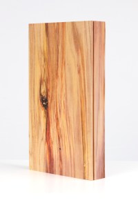
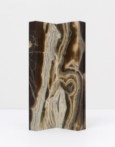
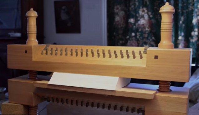
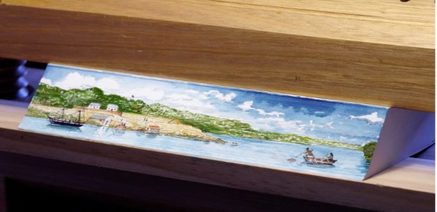
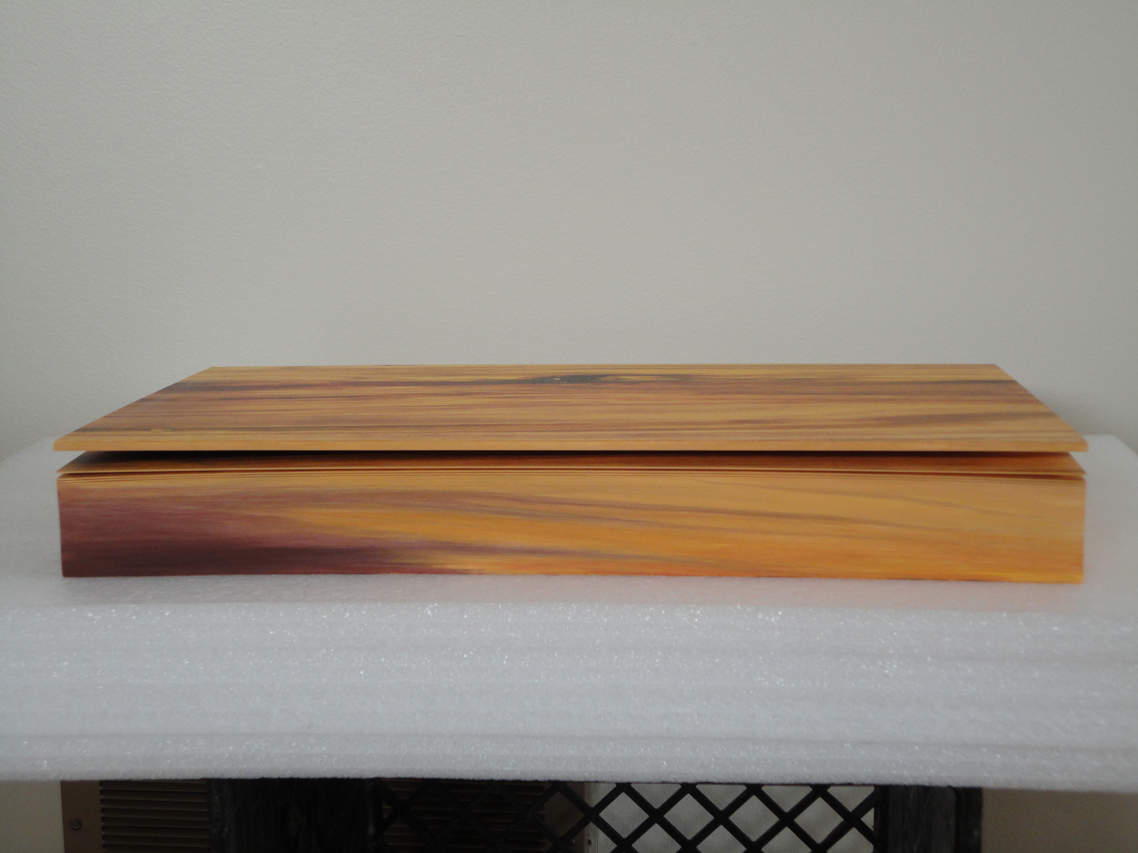
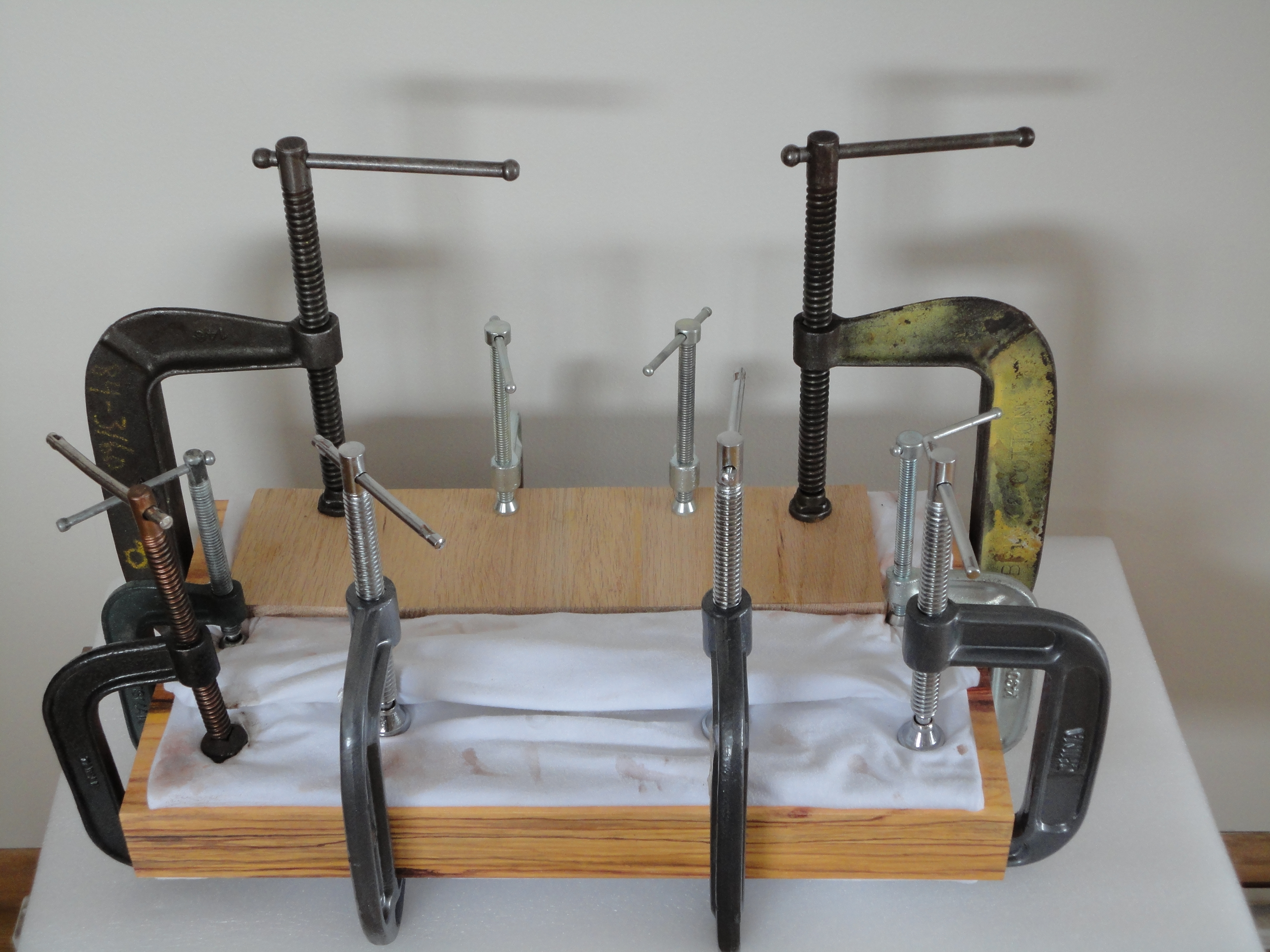
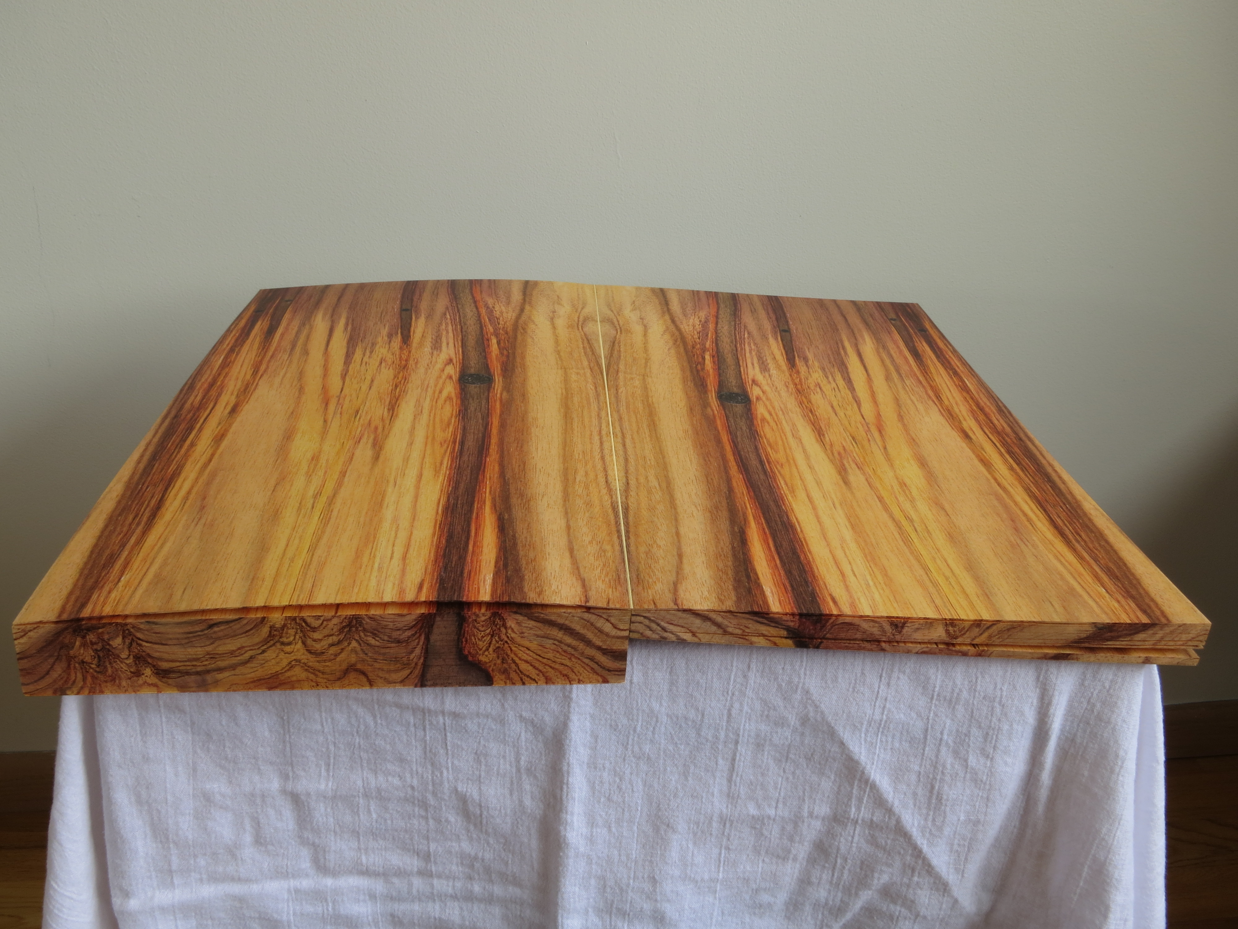
Stoian’s time as an assistant artist with the Scottish painter Lucy McKenzie, starting in 2008, honed her skills in deceiving the eye with faux woodgrain and faux marbling. For example, see McKenzie’s 2008 installation at MoMA, 2009 installation at the Ludwig (Cologne), 2011 installation at the Galerie Buchholz and 2013 installation at the Stedelijk. One may wonder whether Daniel Buchholz’s roots in antiquarian books or the Stedelijk’s in artists’ books prepared the ground for Stoian’s artistic direction toward book art and paper art, but book art and trompe l’oeil joined spectacularly in 2014 when Stoian had the chance to work with Tauba Auerbach in 2014 on the completion of Auerbach’s Wood and Bent Onyx. Stoian handpainted the fore, top and bottom edges of the book blocks in watercolor pencil and paints to match the color and grain of the prints of wood and marble digitally offset on pages of Mohawk superfine paper. As a technique, fore edge painting dates to the 16th century, and the “vanishing” variety, where the painting appears only when the pages are pressed and fanned out, dates to the 17th century. Over time, a standard type of press developed to hold the “canvas” of page edges evenly fanned to accept the painting.
Stephen Bowers’ fore-edge painting on a copy of A Narrative of a Survey of the Inter-tropical and Western Coasts of Australia by Phillip Parker King, son of the third governor of New South Wales Still from “Fantastically Fast Fore-edge Painting by Stephen Bowers“ Friends of the State Library of Australia, 18 February 2013
Despite this established history of fore-edge painting, Stoian had to fall back on a mastery and technique that come from her apprenticeship work, inventiveness and meticulousness. These books were very heavy and the pages were very thick …. There was absolutely no way to fan the pages. I went through the book, page by page, and made marks of where the wood/ marble veins were located.
Before Stoian started work on Wood
Then I clamped the book so that water wouldn’t seep in and using my ‘map’, I recreated the wood/ marble. As you can imagine, it was challenging to match the inside spreads. I had to constantly unclamp, verify that I was matching the spreads, re-clamp, paint, wait…
I used both watercolour pencils and paints. Needless to say, it’s very hard to erase watercolour without using lots of water and saturating the page. I had to be careful with every single brush stroke I made.
Finished
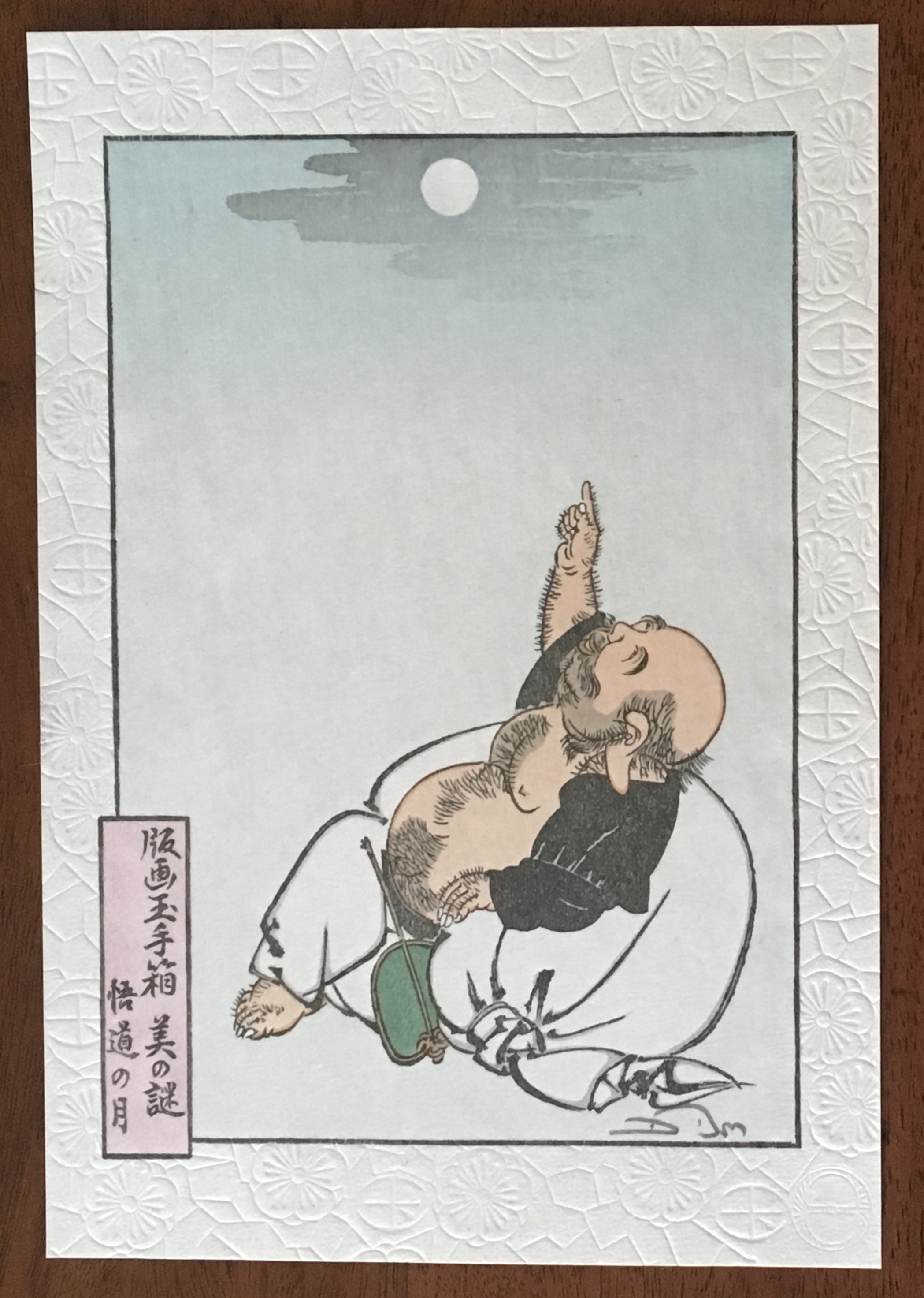
There is something Zen-like about trompe l’oeil in the attentiveness to detail, to material, to execution. But there is more. To mangle a Zen saying: Trompe l’oeil is more than a pointing at the moon; those who gaze only at the pointing will never see beyond — never see the beauty of the moon, never see the beauty of the pointing. With the best of trompe l’oeil, that moment in which the eye is fooled recurs again and again for the attentive viewer. In its recurrence, the work of art alternates between the self-referential (the mind drawn to the pointing) and the mimetic (the mind drawn to the pointed at).
Moon of Enlightenment (2010) David Bull From a design by Tsukioka Yoshitoshi (1839-92) in his series “One Hundred Aspects of the Moon”. The Zen saying is “All instruction is but a finger pointing to the moon; and those whose gaze is fixed upon the pointer will never see beyond. Even let him catch sight of the moon, and still he cannot see its beauty.”
So it is not surprising that Stoian has “always been interested in Japanese art and culture”. As early as 2008, origami appears in her commercial decorative work. She is the author of two books: Origami for All with her partner Eric Gjerde (2013) and The Origami Garden (2016). In reviewing both books for The Fold , Jane Rosemarin commented:
… as I paged through her first book, “Origami for All,” I eventually began to understand that Stoian is an artist who has chosen origami as her medium. Her work is not hard to fold, but it has a consistency of style and a real beauty.
Recognized not only for their origami, Stoian and Gjerde were invited in 2013 to exhibit their paper art at the prestigious Salon des Artisans et Métiers d’Art, held at La Propriété Caillebotte in the village of Yerres outside Paris. While Gjerde’s folds explicitly explore the mathematical (for example, Voronoi tessellations and hyperbolic paraboloids), Stoian’s explore shapes more suggestive of the oriental: cranes and flowers as in Strelizia (2010).
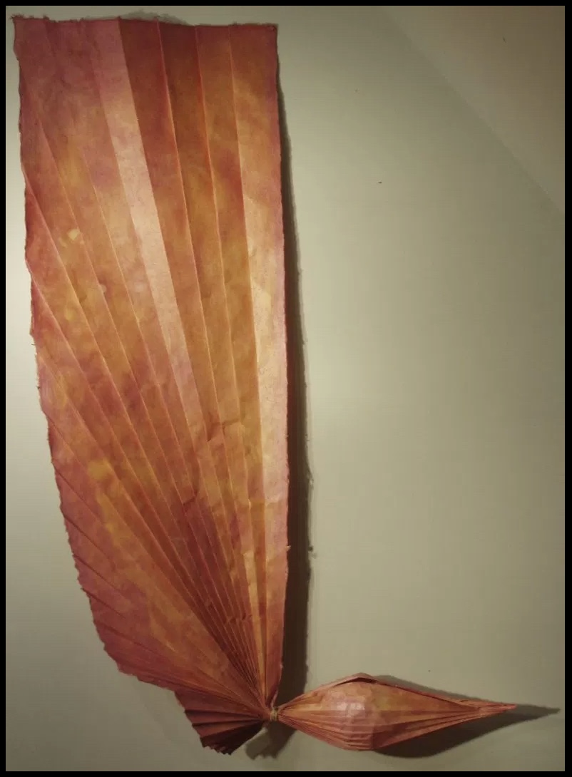
Strelizia (2010) Ioana Stoian Pigment on handmade flax and abaca paper 165cm x 59cm Strelizia (Strelitzia reginae) is a South African plant, known as the “bird of paradise” or “crane” flower.
Where Gjerde’s interest in his material has led him to bio-art (paper grown from bacterial cellulose), Stoian’s has hewed to traditional papermaking, which figures consistently in her work: for example, Hidden Within (2010). In 2012, that interest in traditional
Hidden Within (2010) Ioana Stoian Hand-made flax and abaca paper 1.3m x 1.3m
western papermaking had turned eastward:
After discovering western papermaking, I became fascinated with thin, strong sheets, which obviously led me to washi – the Japanese paper made from mulberry. I naturally had the desire to go to Japan and see how this paper was made.
It so happens that a friend of mine, Tomoko Fuse (a very talented and well-known female origami artist and perhaps the most published origami author in the world), was at a paper folding event in France. I casually mentioned that I wanted to go to Japan to learn papermaking. Next thing I know, she had very kindly organised for me to spend a month with Yasuo Kobayashi, master paper maker and owner of Kadoide Washi – an offer I could not refuse.
I spent a magical month in the mountains, during the Kozo harvest (December) and had an amazing time learning from a great master.
Yasuo Kobayashi is a fifth-generation papermaker but also a writer and philosopher, whose unique views on papermaking warranted his inclusion in the American Folklore Society’s sponsored report on apprenticeship and papermaking. Yasuo Kobayashi told the report’s author, Aimee Lee: “I wanted the kozo to tell me what kind of paper it wants to become, not to force it to be what I want. This is not typical for papermakers. I want kozo to be my teacher.” When asked to elaborate,
… Kobayashi compared bunka (culture) and bunmei (civilization). “Bunka is what you think from your heart.” In contrast, bunmei’s goal is to develop constantly, exemplified by the western desire for progress: people do not want today and tomorrow to be the same—they want things to be less difficult and more convenient. This mindset cannot translate to making real paper. His grandfather’s and father’s lives were not very different. His father’s and his lives were a little different. But his son’s and his lives are so different that it is hard to relate across that rift. He sees two roots for the future of paper: growers and makers. Real kozo goes with the heart but is inconvenient and does not follow progress. Kigami [paper] comes from the root “to be born,” and this word also relates to breathing. When born, paper is like a child: weak, but growing stronger over time until it dies. He knows that his point of view is rare, but also said people must balance bunka and bunmei, rather than to go absolutely one way or another. Today, the balance is too heavy on the professional side, so he tries to balance this by leaning towards the growing side.
Stoian’s jump at the chance to learn from him is consonant with her “journeyman’s” approach to her artistic development. Note that the visit to Kadoide Washi precedes the work on Wood and Bent Onyx for Tauba Auerbach in 2014. The methodical diligence required in making washi and the resulting appreciation of the properties of paper re-present themselves in Stoian’s mapping of the grain and perceiving what the works and the paper “wanted”. The impressive fore-edge work with Wood and Bent Onyx now seems inevitable, rising from a combination of technique and deep appreciation of color, material, form and structure in the service of illusion. In her own work, Stoian strives toward bunka, which is evident in works like Strelizia and Hidden Within, where the form and color her handmade paper takes combine to convey feeling — or “heart” as Kobayashi might put it. Her aim has become even clearer during the Jerome Foundation stage of her “journeyman’s” journey.
Stoian received the Jerome Foundation Mentorship grant for 2014/15 at the Minnesota Center for Book Arts to create an artist book — an extraordinary artist book. The mentorship program offers emerging artists the resources to create a book, fusing together newly acquired skills with aspects of their own artistic practice. The grant provided one year of 24-hour access to the Center’s facilities, a mentor, and a series of introductory workshops on paper making, letterpress printing, and book binding.
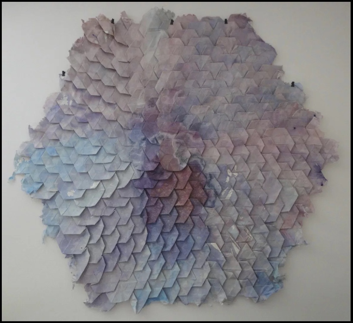
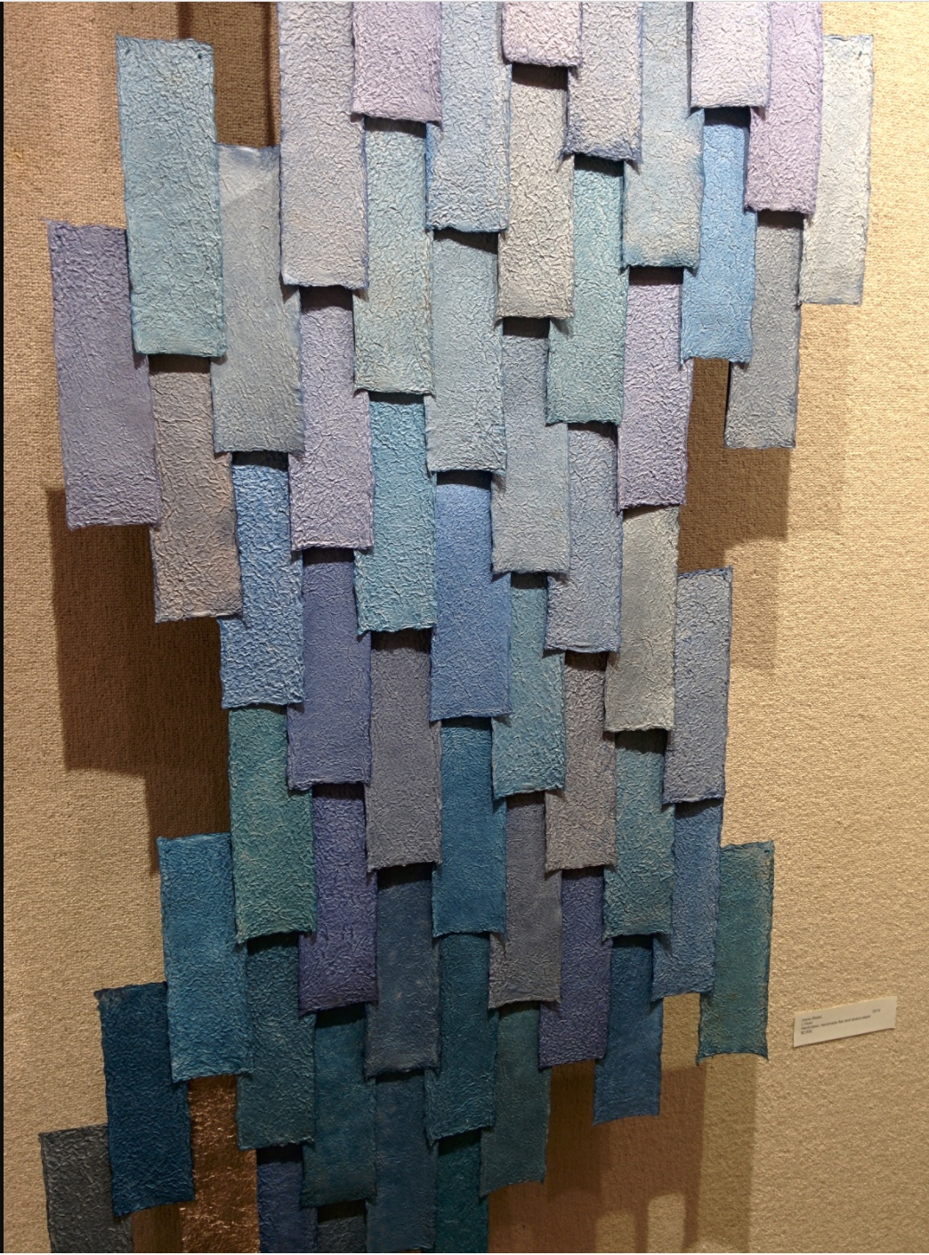
Responding to her new wintry environment, Stoian embarked on l’hiver (2014), a new work consisting of 80+ individually hand-made and dyed pieces of paper. L’hiver is reminiscent of Hidden Within (2010) in its pursuit of a harmony of color, structure, and form. The former is perhaps more open than the latter and lets each part’s snowflake-like uniqueness assert itself.
l’hiver (2104) Ioana Stoian Hand dyed, handmade flax and abaca paper 3m x 1m
The congruence and continuity of those two works do nothing to prepare the viewer for Nous Sommes (2015), the artist’s book that follows them. While Nous Sommes continues Stoian’s aim of harmony among color, structure and form, while its intensity of colors harks back to the stencil work for Lucy McKenzie’s Stedelijk exhibition in 2013, the structure and form Stoian chose marks a bold departure.
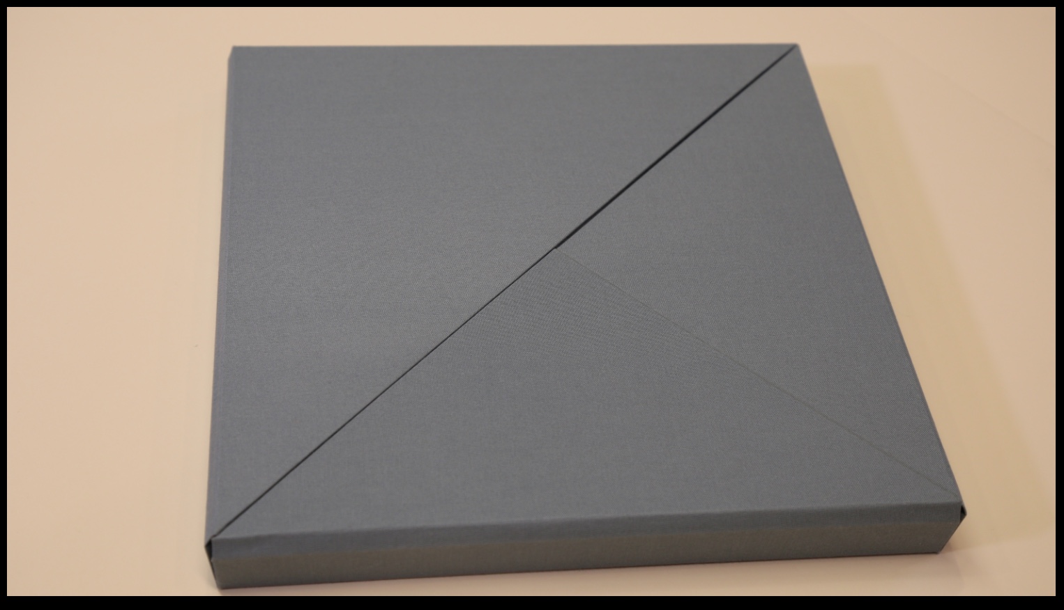
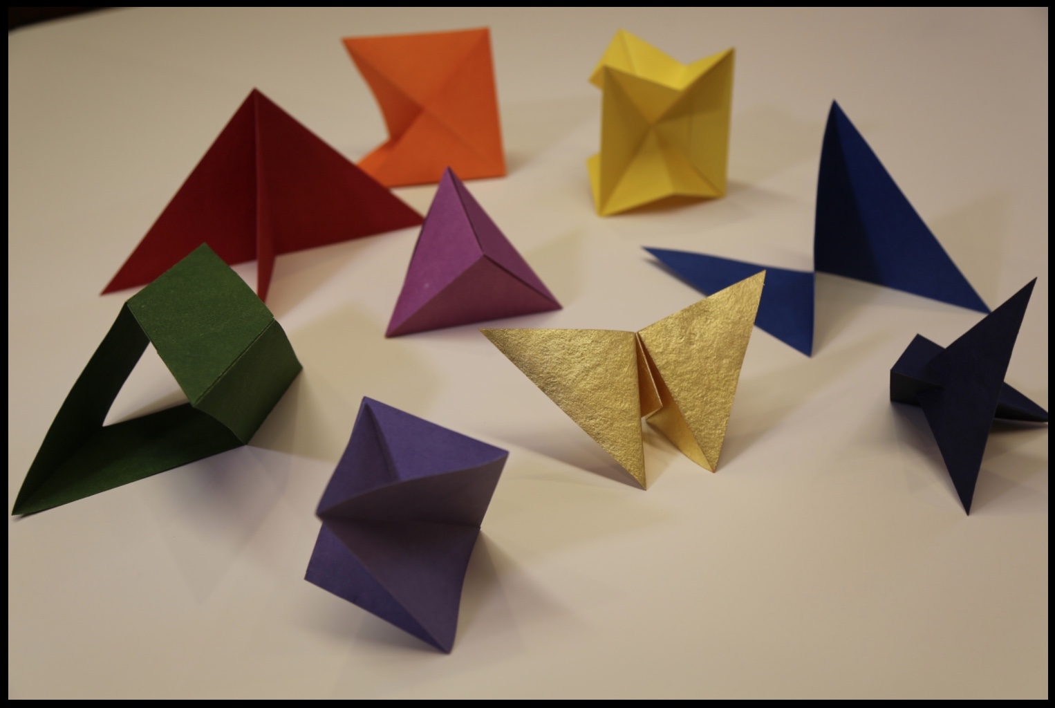
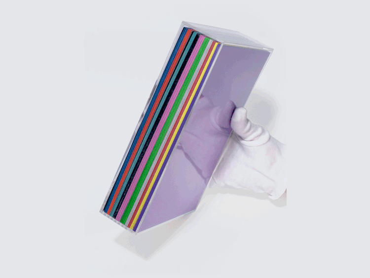
The cover and binding of Nous Sommes has the feel of a Solander box. The book opens in a particular order of lifting the triangular flaps, one of which displays the “Table of Contents” and another the colophon.
Nous Sommes (2015) Ioana Stoian
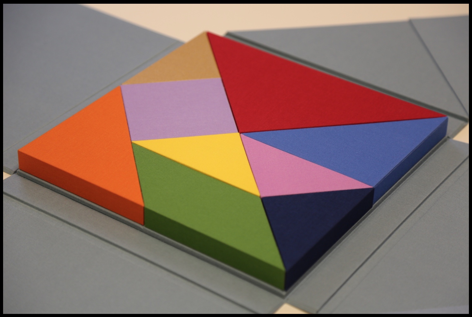
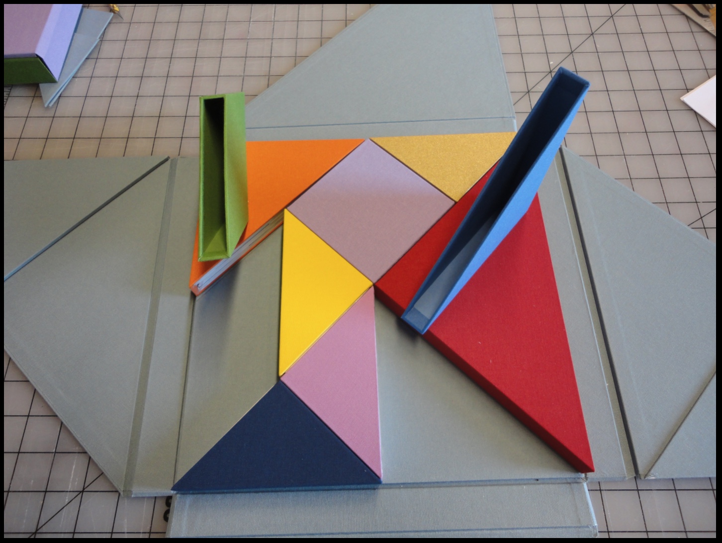
Nous Sommes has nine “chapters” or differently sized, shaped and colored slipcases whose material matches that of the cover and binding. The chapters fit precisely together (tangram-like), but the order of their reading lies with the reader’s choice of color, shape or size. The video provided by Stoian and Gjerde offers one of many readings of the work.
Nous Sommes (2015) Ioana Stoian
Empty “chapters” Nous Sommes (2015) Ioana Stoian
Within each chapter is a precisely fitted paper structure to be “read” by unfolding, positioning, displaying, contemplating and, in conclusion, returning it to its chapter/slipcase.
“Contents” of nine chapters/slipcases Nous Sommes (2015) Ioana Stoian
Commenting on Strelizia, shown earlier, Stoian writes,
I am interested in intuitive color experiments; this work represents the flow from mood to colour, with the final form of the paper manifesting itself from these captured emotions.
In Kandinsky’s footsteps, perhaps, this artist finds and aims to offer the spiritual in art. The title Nous Sommes suggests so. Whether the expression “we are” applies to the art object (self-referentially) or to its audience (individually or collectively), form, structure and colors assert community, inclusion and a fitting together.
We can look forward to Stoian’s next chapter as she has received a follow-on appointment from the Minnesota Center for the Book Arts: the 2017/18 Jerome Foundation Fellowship.
In the hands and mind of Anouk Kruithof, book art is made to sound intimate notes (Automagic, 2016) and grand notes (Enclosed Content Chatting Away in the Colour Invisibility, 2009 ongoing). She has packed so much art, enterprise and life into her life that it is hard to find sufficient time and resource to keep up with her activity. In 2017 and at the turn of 2018, a flurry of commentary arrived to mark her show ¡Aguas! at Foam Fotografiemuseum in Amsterdam. A fortunate effect of social media and the Web is that current news seems to pull retrospective links in its wake.
For Max Van Steen’s perceptive review of AUTOMAGIC (pictured above), click here.
Here are some of the videos and sites featuring Kruithof, her activities and art:
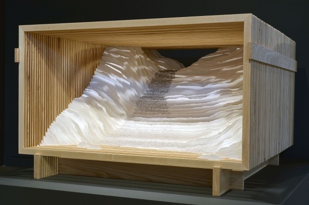
On one hot, humid North Carolina day, I had the pleasure of stepping into Scott Hazard’s workshop behind his home in Raleigh to talk to him about his artwork — in particular, Endless Sea and Rise, which had caught my attention on his site.
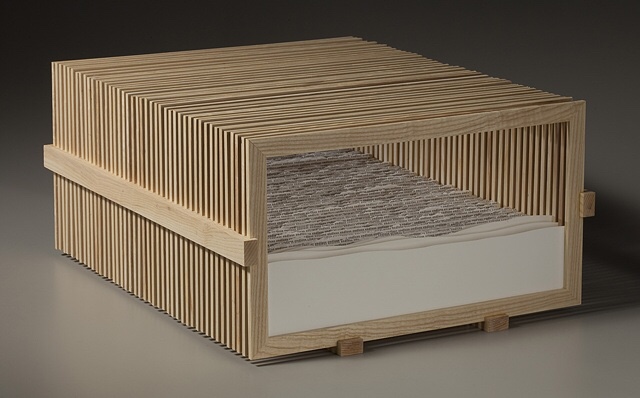
Endless Sea Scott Hazard Ash wood, paper, text. 10″ X 18″ X 23″
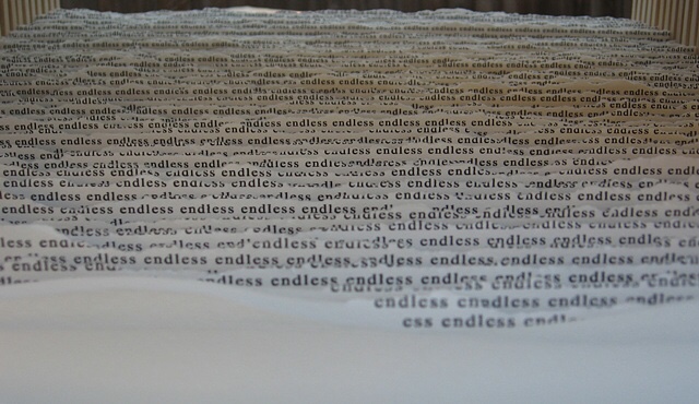
Endless Sea (detail)
Looking at Endless Sea, you might think of Robert Frost’s poem “Neither out far nor in deep”, where the people looking at the sea
… cannot look out far.
They cannot look in deep. But when was that ever a bar To any watch they keep?“
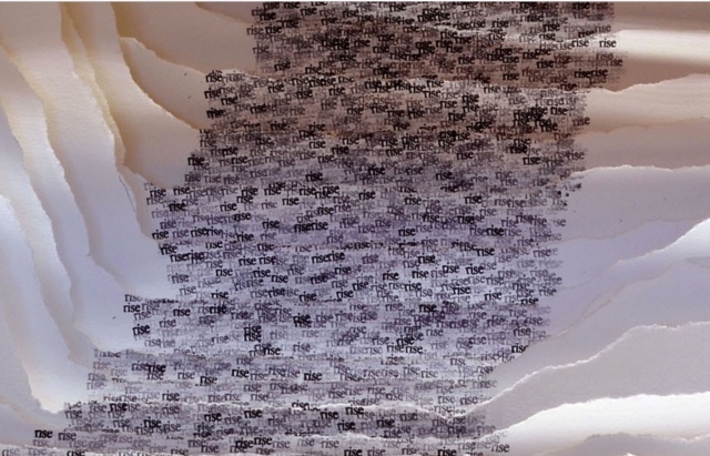
Or looking at Rise, another of what Hazard calls his “text constructs”, and its brilliantly white Canson’s archival paper Edition, you might recall Wallace Stevens’ “Thirteen Ways of Looking at a Blackbird”, where
Among twenty snowy mountains,
The only moving thing
Was the eye of the blackbird.
Rise Scott Hazard Ash wood, paper, text. 28″ X 53″ X 55″
Rise (detail)
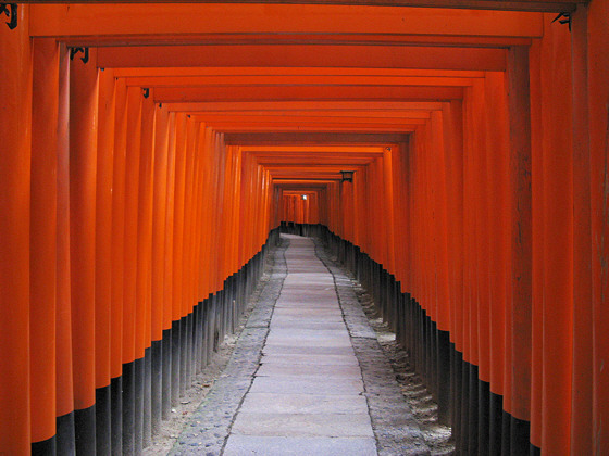
By making the viewer’s eye move from layer to layer — looking in, through and side to side — Hazard’s work achieves a sense of movement. But somehow, despite or because of that, a sense of stillness takes over. When I noted the Zen-like sense of stillness I felt from the two works, Hazard showed me a photo of the Fushimi-Inari torii, whose influence on his art is clear, and spoke of how the creation of the text constructs — stamping the same word in archival black ink in precisely the right spot on carefully torn sheets of paper, then placing each sheet one behind another in wooden lattice boxes to create landscapes — is Zen-like in itself.
This idea — that the creative process, artistic result and the beholder’s response coincide — flirts with what the last century’s New Critics scorned as the “intentional fallacy” (assessing a work by the creator’s intent). What the New Critics had not experienced was the self-reflexiveness or recursiveness of minimalist, conceptualist, performative, land, and text (or book) artists’ works. By virtue of their fusion of text/image/structure, Endless Sea and Rise are intentionally recursive.
So, here is another statement of intent: In the context of America’s and the West’s complex, conflicted sense of nature and the wilderness, Hazard says that, where once the aim of gardens seemed to be to wall out wilderness, he finds himself seeking to bring the wilderness into the enclosed. Hazard’s comment reminded me of what the book artist Joan Lyons once said to Cathy Courtney in the late 90s:
Life needs some translation and transformation to become art. I’ve always visualized the point at which personal consciousness encounters the phenomenal world as experiential screen or filter that separates the interior from the exterior, the personal from the public space. It is very much like a garden I once visited with a great lawn and tidy rows of annuals that hovered eight thousand feet on the edge of the Rocky Mountains. The place where garden and wilderness meet is the place where creative work is born and where work exists. (Cathy Courtney, Speaking of Book Art, 1999, p. 52)
In assessing Hazard’s work as “the place where garden and wilderness meet” — or “the place where creative work is born and where work exists” — I am picking up on the artist’s intention as reflected in material aspects of the work and in how the artist/work is manipulating my faculties of perception. To understand better Hazard’s artwork and its effect, I followed up my visit with a series of questions.
BoB: Can you walk me through the process of preparing the structures? What kind of tools? How long does it take?
SH: I use soft maple or ash wood for the bulk of the structures I make. For a piece like Rise or Endless Sea I start with rough cut ash, mill the wood using a small jointer and planer, and then cut the slats for the multiple frames using many passes on a table saw to rip the wood. I then clean these up on the planer, cut miter joints with a chop saw, glue and then sand all sides. The additional wood pieces that hold the individual frames in place are made with ash also – I cut the dados with a dado blade so the frames fit snugly in the dados. The more simple box like frames I make are typically soft maple. These are made with all of the same tools. I have not kept close track of time spent on the production of my work but estimate a piece like Endless Sea might take 30+ hours for the wood elements. The smaller box frames might take 3 to 5 hours each – I typically make these in batches so there is some efficiency built in. Some of the larger boxes or frames for pieces such as Read This Line are fabricated by an excellent furniture maker in Raleigh that I like to work with.
Read This Line Scott Hazard Wood, paper, text. 28″ X 43″ X 15″
BoB: And the process of preparing the paper, stamping it, fixing to the structure, etc.?”
SH: After sketching the concept for the work and then drawing the piece to scale, I then cut the multiple sheets of paper and backing/spacing materials to size. After all of the sheets are prepared I create a template for the text if necessary, and then proceed to carefully apply the words to the first sheet. Once the desired form and texture is on the sheet, I sketch the outline of the hole to be torn in the sheet and then carefully tear it. I cut a larger hole in the backing material and insert both into the frame to assess. I then remove the sheet from the frame and trace the outline of the first hole onto the back of the second sheet. I then repeat the process for the second and all remaining sheets, assessing the development of the work to make minor adjustments along the way to completion.
On larger pieces it has taken me over 2 hours per sheet/layer in the composition. On smaller pieces, depending on the complexity of the form and amount of text, it can take anywhere from 20 to 60 minutes per sheet. My most recent pieces have had 25 to 45 layers – a small one might take 20 to 40 hours for the production of the paper sculpture. Time spent on concept, concept development, and installing it in the structure are on top of that and add anywhere from 6 to 20 hours per work.
BoB: Which artists and landscape architects have influenced you – early and later?
SH: Artists who have had a significant influence on my thinking and work include Robert Irwin, Robert Smithson, Nancy Holt, and Vito Acconci. I am a big fan of Acconci’s early poetry/concrete poetry and the architectural/built work he had focused on since the 1980’s. Additional artists that have influenced me include Aldwyth, John Cage, Martin Puryear, Oskar Fischinger and Jackie Winsor. I often refer to the Hudson River School painters and traditional Japanese garden design.
Designers and (landscape) writers that have had impacts on the evolution of my work and understanding of the natural and built worlds include James Wines/SITE, Rudolph Schindler, JB Jackson, Anne Whiston Spurn and Peter Schaudt. I was fortunate to have had the chance to work with Mr. Schaudt as a consultant on a few landscape projects over a span of about 10 years – the sense of restraint in his work grounded in an intuitive and tacit understanding of landscape, as well as his enthusiastic and collaborative demeanor were a big influence.
I had a lot of fantastic instructors in my undergraduate studies, but two professors from that time were very important in opening doors and exposing me to a lot of visual art that was new to me at the time; Terry Hargraves (architecture) and Gary Dwyer (landscape architecture). Both helped me drastically expand my notions of what space and landscape could be, and fostered my interest in the exploration of how materials and ideas can inform and articulate space and landscape.
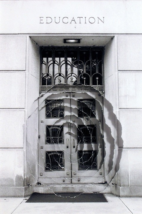
Introjection: Education Scott Hazard Sculpture/Photography 5.75″ X 4.5″, 17 3/4″ X 15 3/4″ w/ Frame
BoB: Some of your “photo constructs” — for example, Introjection: Education — echo the very title of the Acconci studio’s 2012 digital animation “WHEN BUILDINGS MELT INTO AIR & THE AIR RE-FORMS INTO BUILDINGS”, but I am curious: How did text come to play the role it plays in your more three-dimensional work? After all, despite the trompe l’oeil, the photo constructs are two dimensional; words and letters are creatures of the two-dimensional page or screen; landscape and architecture generally do not feature words and letters — certainly not in the way your paradoxical enclosure of paper landscapes within wooden lattice-work boxes features them. From where did your distinctive use of text come?
SH: With a background in landscape design and construction, I tend to look at the physical built world as a manifestation of ideas. Every building, built landscape, piece of furniture, tool, article of clothing, pencil, etc. exists initially as an idea. Whether the idea is drawn as a rough sketch, explained in detail, or carefully drafted, reviewed and vetted before anything is built – it is providing the direction for the physical realization. Even something like a protected forest or national park, as untouched as it might be, essentially exists the way it is because someone had the idea at some point in time to protect that place. In this sense everything we perceive and experience is a mix of physical reality and information. (We can go deep into a rabbit-hole (or the matrix) on this topic, but I’ll try to keep this brief…)
With this in mind, I am very keen on how the information we absorb from many, many sources, in turn informs how we perceive the world, and to a large extent what we perceive in the world. Text, whether a poem, novel, essay or song lyric, can obviously articulate ideas, and can articulate space as well. In Walden, Thoreau wrote about people being able to read and understand the landscape. Most people don’t have the skill set or temperament in this era in the same way Thoreau might have fashioned his own perceptual skills, but we are still reading our environment, most of us with minds overflowing with stimulus and information.
My aim with my text-based work is to create an experience that allows people to read in space – the content of the text informs how the viewer might perceive the sculptural elements in the piece, and the forms of the piece affect how the text reads also. I am exploring how text can become as much of a material as any of the physical matter incorporated into the work.
BoB: What is the earliest exposure to art that you can recall from childhood and adolescence?
SH: I don’t recall a lot of significant experiences with art in my childhood years – other than what I might have seen in history museums or pop culture, visual art was not really on my radar. In high school I was exposed to a number of forms of art through an excellent humanities course. My exposure to visual art increased significantly in may late teens and early twenties through landscape architecture, architecture and fine art courses I enrolled in. My interest in art really took hold in the last two years of my undergraduate education, and steadily increased from there.
Two installations I experienced around this time had a big impact in solidifying my drive in visual art. One was The eyes of Gutete Emerita by Alfredo Jaar. I can’t forget the visceral effect this piece had on so many people who experienced it. A work of art can’t ever relay the complete magnitude and protracted horror of something like the Rwandan genocide, but Mr. Jaar managed to succinctly and poetically capture a brief but intimate glimpse of one person’s story, while also conveying the immensity of the genocide.
The other piece that I have vivid memories of is “1° 2° 3° 4°,” by Robert Irwin. Installed at the Museum of Contemporary Art in San Diego, Mr. Irwin had three rectangles cut in the windows overlooking the coast. Each hole cut in the windows effectively became an aperture for viewing and tacitly connecting people with the environment, in this case the coastal breeze and sound of the ocean, outside.
BoB: There is a technically unusual chromatic effect in text constructs like Rise, where the intensity of the black ink is modulated in a way that works strikingly with the shadow from one layer of paper to the next. Do you recall what led you to blending the chiaroscuro effects of one material with another?
SH: To heighten the effect of the text flowing and dissipating from the back of the piece to the front, the text at the back and top of the work is much more dense and dark versus the lighter gray and graduates to a much less dense text at the bottom and front. Moving from front to back, layer by layer the density and darkness of the text increases until the paper is nearly solid black at the rear of the piece which is also the darkest part of the work. The interaction of light with the work is paramount and helps reinforce the rhythm found in the multiple layers of paper. I am intent on trying to pull the viewer perceptually into the work to heighten a sense of focus and departure. The interaction of lighter and darker areas of light on the layers of paper encourages the viewer to track their vision into the space in the work layer by layer. Ideally this provides both an invitation to delve in and also a sense of mystery.
BoB: You mentioned that you are experimenting with repurposing printed book pages in your constructs. Can you tell me more about that? Will you combine that material with the archival paper or replace the archival paper entirely? What prompted the experimentation?
SH: Yes, this has been an interesting and slightly different strain of work I have been pursuing. I have been interested in experimenting with and developing work with portions of pages from books, periodicals and catalogues for a few years. About a year ago a curator I enjoy meeting with suggested trying the use pages from books in my work so I put some more energy into this body of work. It has been a fascinating, slight diversion from the ink stamp based text work I have been focused on lately , and the used books I have been collecting over the past couple of years have been great catalysts for new pieces and great sources for words used in my other text based work.
BoB: Are there other materials beckoning for experimentation?
SH: Of course! I am still focused on the many, many possibilities I see in the wood/paper/ink/text based work and how that will evolve, but I would love to work with steel, stone, concrete and other landscape oriented materials at a larger scale.
BoB: You mentioned that, with your text constructs, you seem to be cycling back to fewer layers as in Intermediate and Landscape Meditation or flatter objects like your photo construct Reaching Branch compared to Rise and Endless Sea. What lies behind this return? Technical, conceptual, textural effect, chromatic effect?”
SH: The recent move back to work that is more shallow than the deeper text based work I have been making is focused on conceptual and technical aspects of the work. I love the spaces that can be created in the deeper works like Rise and Endless Sea. I am also very interested in exploring the interplay between the use of text and the forms/voids housed in the physical work. Using text to help articulate a physical and conceptual space, and shaping forms and space in the work to in turn impact the reading of the text is a very large part of what drives my thinking and energy in developing the text-based work. Making the work more shallow is in many ways very challenging – it forces the composition in each work to be more concise and focused.
BoB: The installation shown on your site must have been even more striking live. Do you have plans for future installations? How does creating the timebound experience of installations compare with creating more permanent sculptures? ”
SH: Thank you for your comments! Yes, I do have plans for future installations but nothing immediate. I am often on the lookout for projects or venues to do an installation. It is exciting to literally envelop the viewer in a space where passing through the space impacts how the space and work is perceived. As you reference above, I consider each piece I make to ‘function’ and be experienced much like a garden (whether 4 inches wide or 400 feet (or meters) wide they are spaces for exploration, meditation and/or a moment of respite). The text in my work is composed to be read in conjunction with movement – to be read in space. Larger, installation scaled work allows for the physical immersion of the viewer as they pass through the space along with the perceptual immersion that can come from simply viewing a work from a single point in space. This notion brings us back to Japanese gardens, which were often designed to be experienced by passing through them.
Although not an installation, Hazard’s latest exhibition echoes his concluding comment above and takes me back to that moment of stepping
Character Space Scott Hazard Exhibition view at Artspace, Raleigh, North Carolina
Character Space (2017) Scott Hazard Exhibition view at Artspace, Raleigh, North Carolina
from his workshop back into the Piedmont heat: I immediately began to yearn for one of his installations in whose cool I could immerse myself. Character Space remains on display in Gallery 2 at Artspace until 27 January 2018.
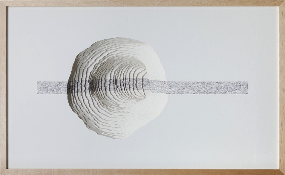
The text based constructs I create consist of layers of paper that are carefully torn or cut, spaced apart and aligned to define sculptural voids. Cathartic micro-gardens punctuated with masses of text beckon the viewer to delve in for a brief journey. As the viewer’s gaze enters and traverses the layers of paper in each work, vision becomes tactile, lending an articulated viewing experience and a space for the eyes to linger. The movement and placement of words in and around the composed landscapes and intimately scaled spaces provides for a kinaesthetic reading experience that draws the viewer in for momentary reflection and a temporary departure. The viewer looks ‘at’ and ‘through’ each composition simultaneously.
The precision of Hazard’s “Memory Gardens” and “Text Constructs” must take the concentration required by a colored powder mandala.
At the end of a year when we have been reminded that creative works of merit can often issue from the dungheap, The Guardian reports that Rome’s city council has decided to revoke the 8 AD exile of Publius Ovidius Naso. Ovid whiled away his time in the backwater of the Black Sea composing the Tristia and The Black Sea Letters, respectivelybewailing in couplets his condition and pleading with the recipients of his letters to intervene with the emperor.
We don’t know what “carmen et error” (poem and mistake) caused Augustus to banish Ovid. But should the city council have focused on the works rather than the man? Does great art justify “rehabilitation”? Who knows.
At least the news prompts a new look at Jacqueline Rush Lee‘s transformation of the Tristia and Black Sea Letters.
Silenda (Black Sea Book). 2015 (Sister of Nous) Transformed Peter Green Translation of Ovid’s “Tristia and the Black Sea Letters.” H9.5″ x W12″ x D6.5.” Manipulated Text, Ink, Graphite Photo: Paul Kodama In Private Collection, NL
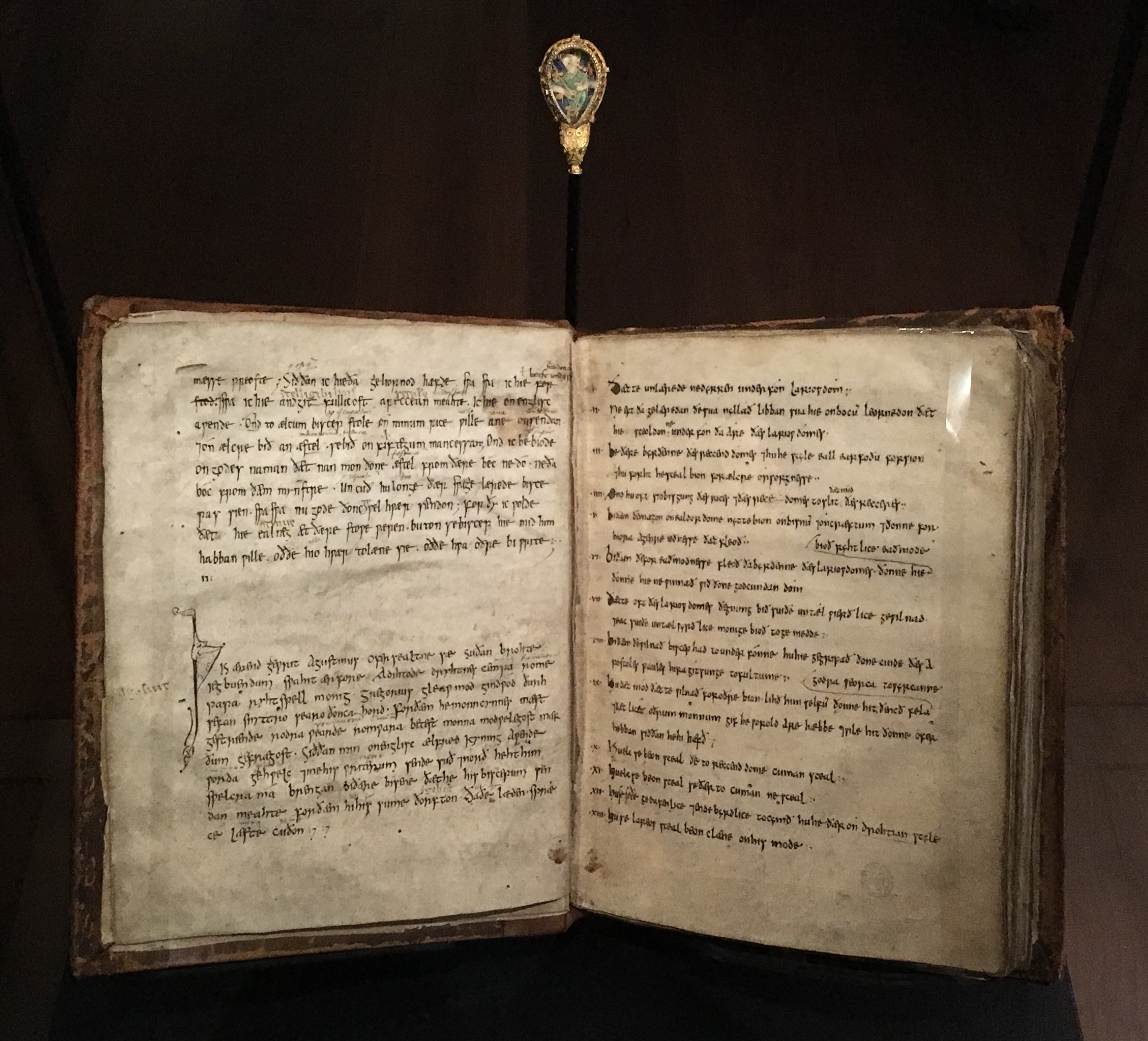
Above: “The Alfred Jewel”, enamel and gold; late 800s; found at Petherton, Somerset, in 1693. The Ashmolean Museum, Oxford, presented by the Estate of Colonel Nathaniel Palmer. Below: MS. Hatton 20, fols 2v-3r. St Gregory the Great, Cura pastoralis, translated by King Alfred and copied 890-897. This copy of St Gregory’s manual for clergymen “speaks” (bottom left) of how Alfred “sent me to his scribes north and south”.
The exhibition “Designing English” at the Bodleian’s Weston Library (1 December 2017 — 22 April 2018) showcases almost 100 of Oxford’s medieval manuscripts, objects and books illustrating graphic design and the book arts.
Alongside that exhibition are the results of a workshop and competition among book artists: “Redesigning the medieval book“. A surprise and pleasure to find the medievally inspired work of Turn the Page‘s own Jules Allen:
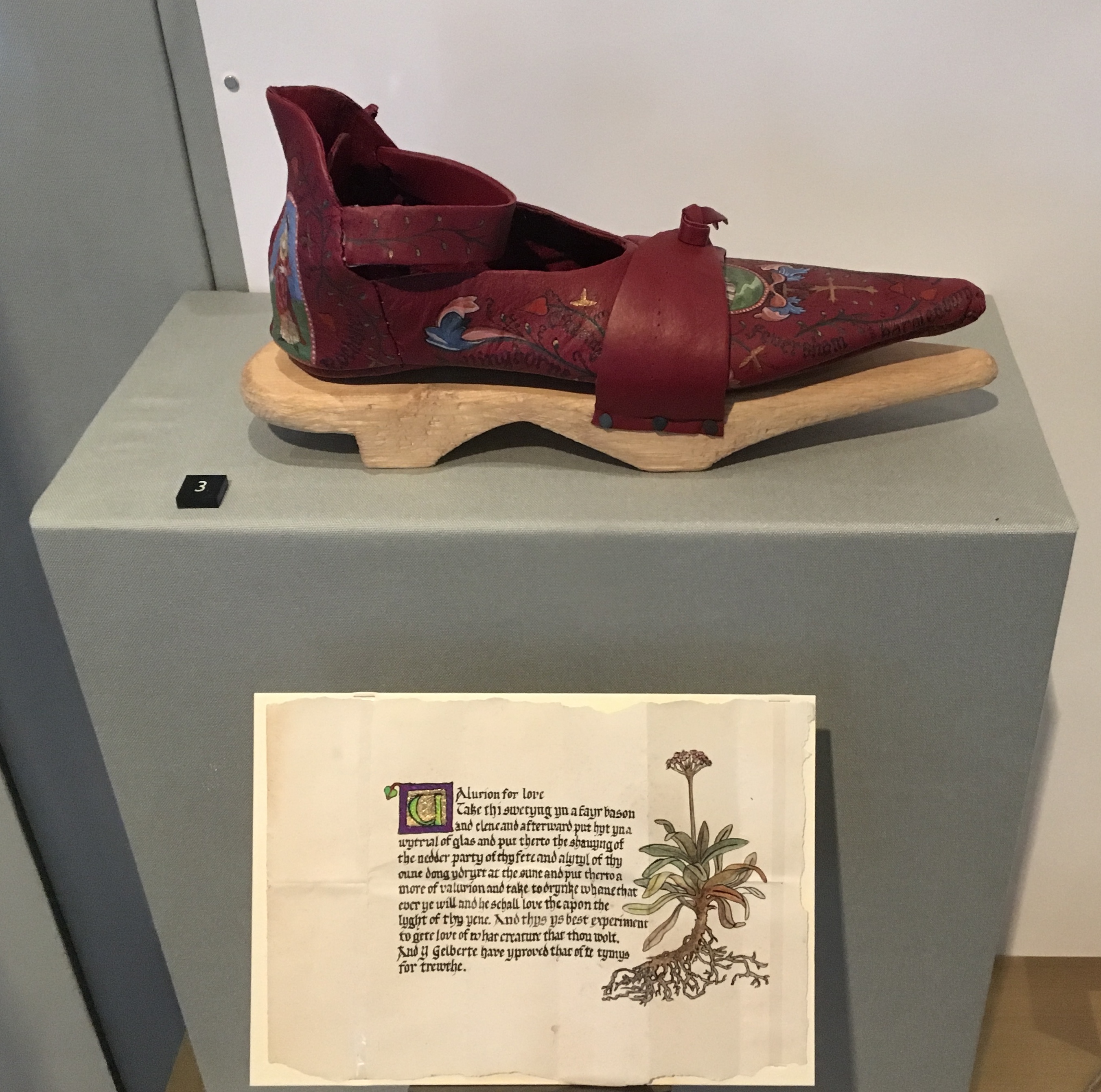
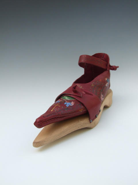
Pilgrim Shoe (2017) Jules Allen, with Ernst Allen and Eileen Gomme
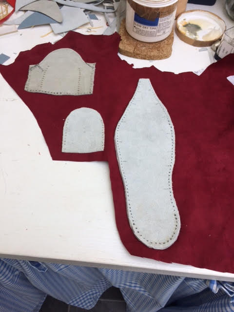
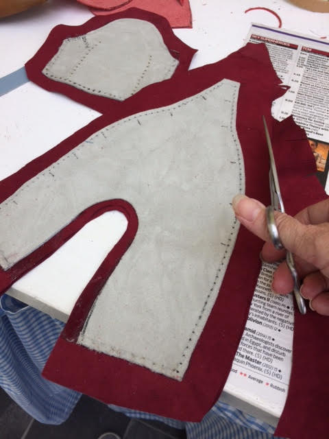
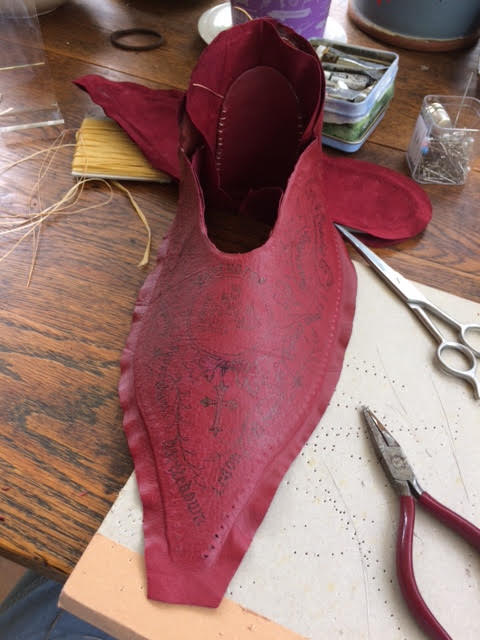
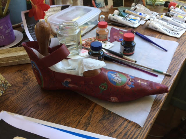
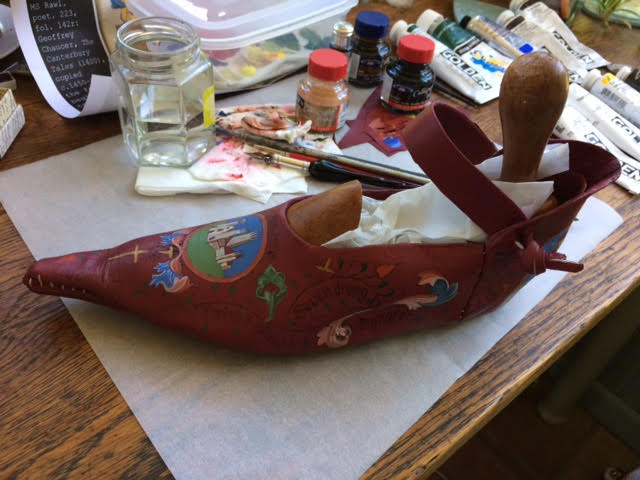
Jules Allen was kind enough to provide additional photographs and some background on the making of Pilgrim Shoe.
Pilgrim Shoe (2017) Jules Allen
Pilgrim Shoe (2017) Jules Allen
Guided by the anthology of possible texts, I made Pilgrim Shoe in response to Geoffrey Chaucer’s The Canterbury Tales. The following points in the brief inspired me:
Where and on what should you write if you seek ‘to do things with words’?
Does form always fit function? Does a function only have one form?
Is looking more sensuous than reading?
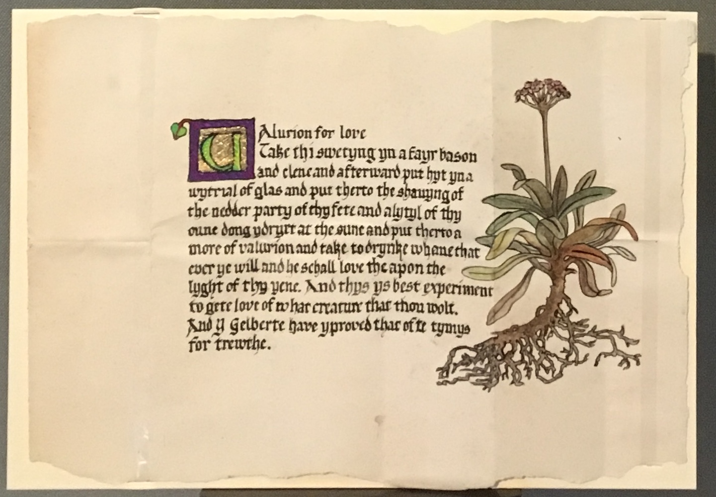
I approached the project from the perspective of a Medieval Cordwainer seeking to attract wealthy customers and found that although it was common practice to decorate shoes by engraving or cutting patterns into the leather, other forms of decoration were rare during Medieval times. An inventive Cordwainer might have thought of personalising shoes for specific purposes or events using text, images, or even a charm for luck.
With this in mind I made a Poulaine style shoe with wooden patten specifically for Chaucers’ ‘The Lady of Bath’, who may have been attracted by the decorated shoe both as a unique, sensuous status symbol and a map with which to find her way from London to Canterbury. Such a shoe might have been admired or found useful by fellow pilgrims en-route, and with a recipe for love (from the Anthology of texts) concealed within the rein-forced heal, perhaps she might attract a new husband during her pilgrimage.
Pilgrim Shoe (2017) Jules Allen
Pilgrim Shoe (2017) Jules Allen
Pilgrim Shoe (2017) Jules Allen
I hand painted images and added calligraphic text on the shoe. The place references from London to Canterbury were researched using various historical sources including the Gough Map http://www.goughmap.org/about/
Pilgrim Shoe (2017) Jules Allen
Pilgrim Shoe (2017) Jules Allen
Materials: Leather, artificial sinew, watercolour and acrylic paint, calligraphers ink, wood. paper, metal studs, starch paste and wax
Dimensions: L30cm W10cm H16cm
Paper charm: Selected from a section on Medical Remedies and Charms from the 1400’s for the concealed charm written by hand on paper, housed in the heal of the shoe.
Middle English Version: Charm for love Take thi swetyng yn a fayr bason and clene and afterwarde put hyt yn a wytrial of glas, and put therto the shavyng of the nedder party of thy fete and a lytyl of thy oune dong ydryet at the sune, and put therto a more of valurion. And take to drynke, whane that ever ye will, and he schall love the apon the lyght of thyn yene. And thys ys best experiment to gete love of what creature that thou wolt. And Y, Gelberte, have yproved that ofte tymys, for trewthe. Modern Translation: Charm for love (translation) Catch your sweat in a nice clean basin and afterwards mix it with sulphuric salt, and add to it some shavings from the back of your feet and little of your own dung dried in the sun, and add a root of the herb valerian. And take a swig whenever you want, and he’ll love you as soon as he catches your eye. And this is the best proven method to win love from whoever you want. And I, Gilbert, have proved this many times, truly.
Credits also to Ernst Allen for the wooden patten and Eileen Gomme for the passage of calligraphy on the paper charm.
Selected for the 2017 Manly Library Artists’ Book Award exhibition in New South Wales, Australia, The Future of an Illusion by Helen Malone and Jack Oudyn demonstrates an effective collaboration in a field of art densely populated with — almost defined by — collaborative efforts:
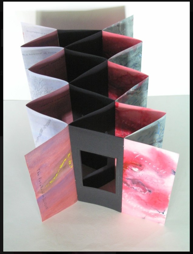
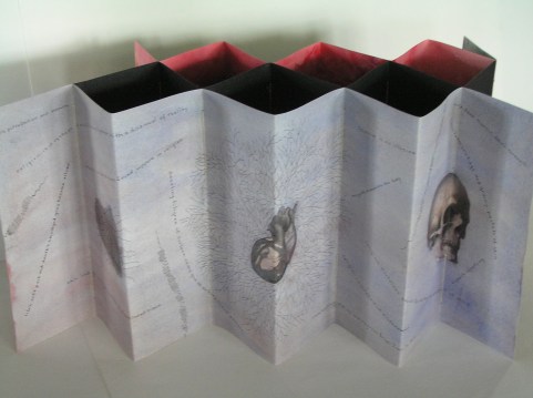
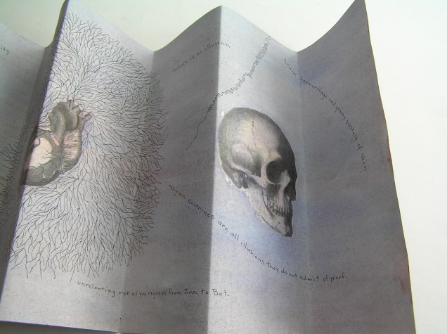
The Future of an Illusion (2017) Helen Malone and Jack Oudyn Sculptural tunnel book structure (three joined four-fold leporellos) enclosed in a folder and protective boxin a box,. Box made with Lamali handmade paper, suede paper (lining) and Somerset Black 280 gsm; Folder: Canson black 200gsm, skull button and waxed thread; Leporellos: center leporello made of Canson black 200 gsm, linen thread adjoining two leporellos made of Arches watercolour paper 185 gsm with acrylic, soluble carbon, gouache and transfer ink jet images. Box: H275 x W313 x D34 mm; Folder: H258 x W295 x D21 mm; Book: H250 x W290 x D16 mm closed, D410 mm open. One of an unnumbered, signed edition of 4. Acquired from Helen Malone, 12 September 2017.
Edouard Manet and Stéphane Mallarmé; Bertrand Dorny and Michel Butor; Dorny and Michel Deguy; Barbara Fahrner and Kurt Schwitters; Ron King and Roy Fisher; Telfer Stokes and Helen Douglas; the Art + Language Group (Terry Atkinson, David Bainbridge, Michael Baldwin, Ian Burn, Harold Hurrell, Joseph Kosuth, Christine Kozlov and Mel Ramsden); Tom Rollins + K.O.S.; Julie Chen and Clifton Meador; and Chen and Barbara Tetenbaum.
That list is by no means comprehensive nor representative – chronologically or categorically — but it flags the strength of the tradition. One pair that is particularly apropos for Malone and Oudyn is Sonia Delaunay and Blaise Cendrars. Over a century ago and half a world away, they collaborated on La Prose du Transsibérien et de la Petite Jehanne de France, also in the leporello, accordion or concertina format. Malone writes that it “has always been very influential generally on my work.”
Cendrars as poet and publisher and Delaunay as painter were interested in achieving what they called simultaneisme, or a “simultaneous book.” They wanted to create a form of art in which painting and text could be united in expression. Delaunay painted the left column of color and abstract shapes guides us through the text, which is set in various typefaces, allowing for movement as the reader mimics the journey across the page as described in the train ride in the poem. Claire Kelly, Melville Books
The Future of an Illusion springs from two imaginations struck by two literary works: Sigmund Freud’s eponymous book on belief in an afterlife and Jim Crace’s novel Being Dead.
It delivers an emotional simultaneity that echoes the different kind of simultaneity Sonia Delaunay and Blaise Cendrars achieved. Malone and Oudyn have the advantage of their subject — death, decay and the afterlife — that provokes simultaneously conflicting emotions and states of mind. Fear, humor, sorrow, hope, despair, etc.
The choices of two texts, the double leporello and techniques — and the way they are applied — play with that emotional simultaneity beautifully. The use of Crace’s text (and the “inverse ekphrastic” influence of the whole novel, which documents the decomposition of a dead body left in nature) adds to the work’s physicality. The choice of title from Freud’s book centers the artwork’s perspective on death — the void toward which the central tunnel leads.
The Future of an Illusion appeared in exhibition at Grahame Galleries in Paddington, Brisbane, and a copy resides in the collection at the State Library of Queensland.
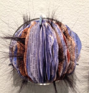
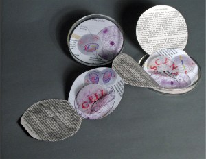
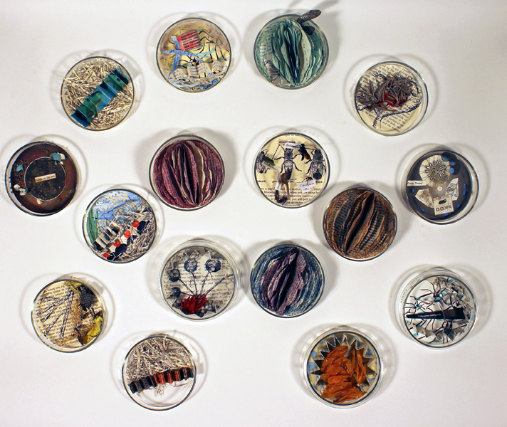
Cell Compendium (2008-2016) Diane Stemper The work began with a gallery installation of Cell: Descent and 25 petri dishes filled by gallery visitors with science facts, liquid and solid matter. The installation in 2016 included 75 dishes filled with small altered found text books, drawings, and specimen objects housed in petri dishes.
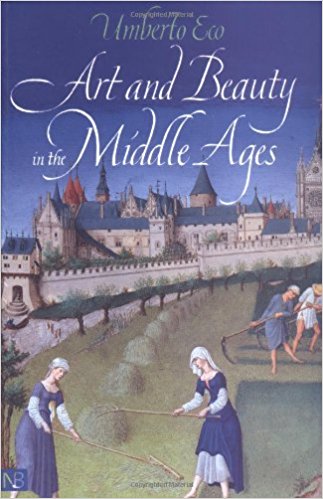
In the middle of a shelf in Diane Stemper’s Ohio home, Umberto Eco’s Art and Beauty in the Middle Ages sits bookended, on the left, by two books about Francis Bacon and, on the right, by a small monograph on Pierre Bonnard and another book Art and Culture of Japan. The books are not organized alphabetically or chronologically. When she pulls the book out, it feels perfect, not too thin or thick, its dimensions and weight ideal for carrying in a shoulder bag. It has a feeling of secrets and importance.
Since discovering Stemper’s work at the Center for Book Arts (New York, 2014), I have wanted to talk to her about the themes and material that drive that work. Art and science, paper and glass, the universal and the particular, ink and watercolor, the physical and the spiritual. We finally arranged it in medias res, and she agreed to this oblique approach to her mind and art.
BoB: As you open Art and Beauty to its mid-point, what do you hear, smell or see about it or around it?
DS: Well, not sure if you mean inside of the room I am in or the memory it conjures, so I will go with memory. The words “cathedral”, “Chartres”, “vestibule”, “allegory” take me from the immediate space of my front room to the interior of a European cathedral or even perhaps as a child to the pews of St. Paul Cathedral in Minnesota during midnight mass. There is the fragrance of incense, the dark light of an imposing building, chanting and mystery. There are also the many hands of craftsmen chipping away at stone, painting glass and the laborers who put it all together and probably were not treated all that well.
Then there is that word “parabolic” and Eco’s explanation of Aquinas’ description of the arts as being literal, that the poetic image and its meaning were in the mind of the “reader” and that this association was a “matter of habit” – this reminds me that I and my viewers have different habits of mind, from the museum visitors I once toured who loved Impressionism and were hostile to Rothko, to the viewers responding to my specimen series – “why are they dead, did you kill them, that’s icky”. Surface literalism can be a matter of what one is familiar with and fearful of what one does not understand, but it can also be a “way into a piece” if the viewer is willing.
BoB: At the end of his book, Eco sums up his explanation of how the medievals looked at art with this startling statement, “They saw the world with the eyes of God”. What of today’s viewers of art and, in particular, those who look at your art?
DS: When originally picking the book from the middle of the middle shelf and then opening it to the middle, that sentence you mentioned — “The association of an image with a certain meaning is a matter of habit” — leapt out. Eco was referring to the ability of people of the Medieval period to read an image as if it were a literary text, for example, knowing instantly which animals or colors represent which biblical figure or story. However, I am reading Eco’s words from my 21st century vantage point, where there isn’t necessarily a concrete set of universal meanings assigned to objects or colors that every person understands and knows.
He also writes that the medieval mind loved a puzzle, that it was part of public discourse to figure out symbols and the inherent meaning within images. That there was adventure in the act of discovery. And another phrase that struck me: “Grasping reality through sense knowledge.”
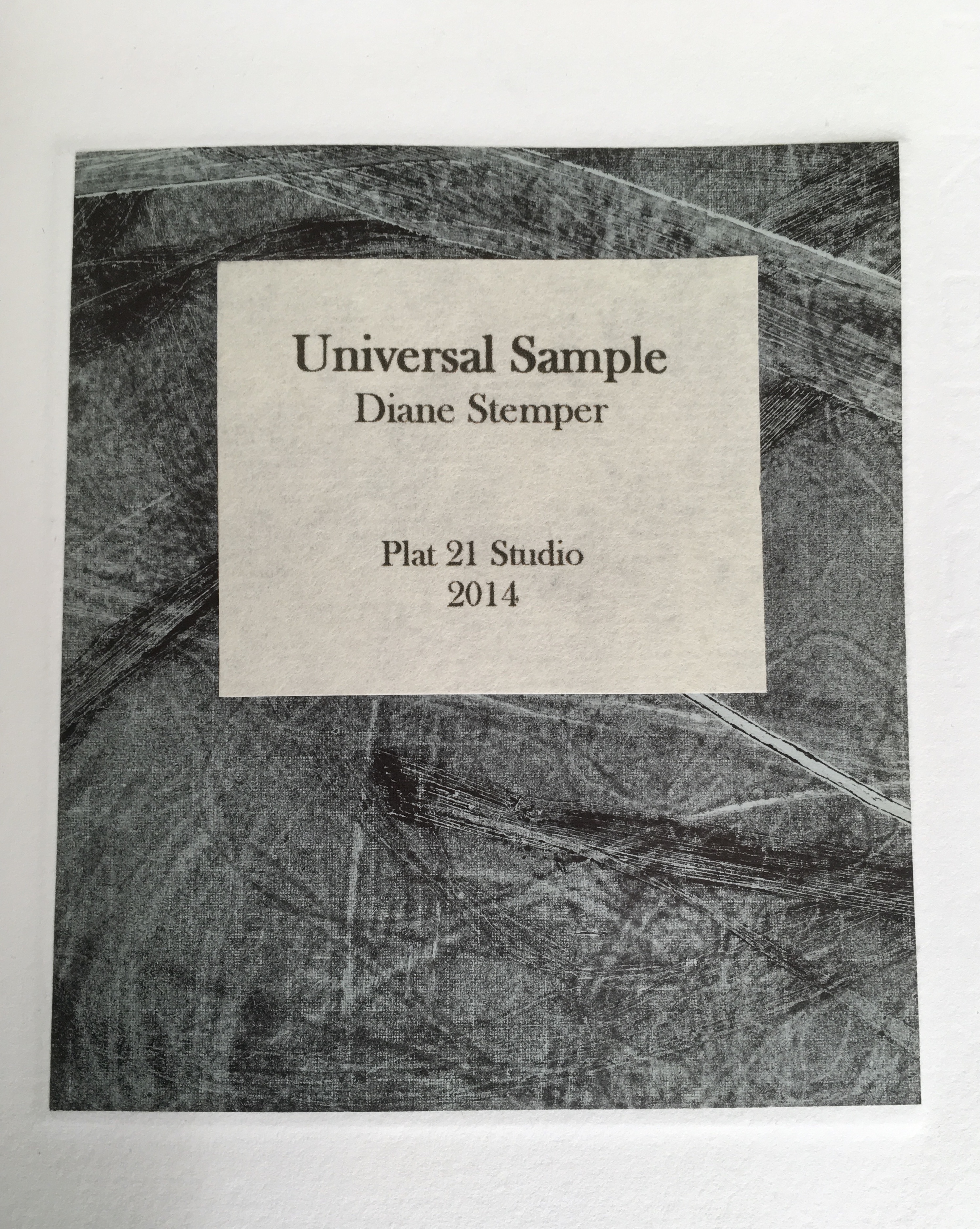
Universal Sample (2014) Diane Stemper Edition of 4, Intaglio and letterpress on Arches
Today’s “matter of habit” is problematic when viewing art. For some of my pieces, in particular Universal Sample and my drawings and prints of specimens, the viewing can be rather cursory, a knowing, habitual glance that says, “oh I see what that is”. The glance sums up the object in very simplistic terms. In this case, for the viewer, the specimen represents death or some distasteful high school experience of dissecting a small creature, and nothing more. It is possible to look at visual art not just with visual sense but in partnership with other physical sensations conjured by the image. Looking at the work as if there is more than meets the eye, that there is an underlaying sensibility to the image that references another experience or feeling or bit of knowledge, a smell, a sound…or that of the animal or that of the instance in which the animal finds itself, or the moment that a curious person finds such an animal. Imagining that moment — “What was it like?”
So, I hope that people will approach my artwork with imagination and not as a matter of habit — to look at my work as if it is a bit of a puzzle, not a straightforward statement or concept but more of a string of thoughts, feelings and visual and sensate information to be arranged and rearranged to come to some sort of conclusion or idea about the meaning, however uncertain that may be.
BoB: Do you recall the circumstances of the book’s purchase? What were you doing when you decided to buy it?
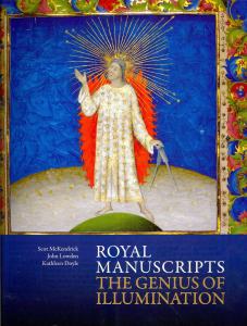
DS: I absolutely remember. I was living in London with my spouse and family as part of a study abroad program my spouse was leading. Each day, after all were at school or otherwise occupied, I would head out in pursuit of art, medical museums, natural history oddities or any number of things and on one day I went to the British Library to see an exhibition, Royal Manuscripts: The Genius of Illumination. This was an exhibition of the several collections representing centuries of books commissioned by kings and queens and to my delight there were books on medicine, science and nature. After spending a very long time in the exhibition, I went to the gift shop where I found the Eco book. The extraordinary detail of the manuscripts I had just seen and the enormity of the exhibition itself put me in the mood to purchase the book.
BoB: As an artist whose work has an intimate relationship to “the book,” could you describe the effect this has on you when you are reading books in general or when revisiting the Eco book in particular?
DS: In general, when I am reading a book versus the screen of a device, I enjoy the structure of the book and understanding the manner in which it is assembled. The type of binding, the quality of paper, the action of the pages, do they lay flat or do they fight. I find the term “perfect binding” ironic as I am reading a book where the pages are falling out. I typically notice the condition of a book, faded covers, mildew or wear on the edges. Books with these qualities I feel a bit sorry for as I wonder where their next home will be, probably not my local library or the used book store, since here in Ohio, we haven’t many of those. Maybe they will live a short while at the Goodwill Thrift Store and from there, the recycle bin. Books are a bit like an endangered species and I am at times concerned that the youth (I have one at home) are only relating to books as they are required to do so at school and not as a place of refuge, ideas and travel. It is hard for books to compete with the ever-present screen and digital speed of information and interaction.
The Eco book in particular is a pathway back to London, to other centuries, to a time when art was the screen of the day and to the Royal manuscript exhibition. The books in the exhibition survived over centuries; the hours and hours of skill, artistry and dedication it took to not only create the books but to also preserve them gives me pause. The Eco book itself is not a great work of craftsmanship as an object, it is, after all, bound as a “perfect binding”. Still, it has not fallen apart yet, so the binders must have used a better-quality glue. Instead, the Eco book is a vessel of ideas and murmurs of what it meant to have art and beauty in one’s life hundreds of years ago. What are my intentions when opening a book? To be lifted away from the present, to enter another time period or another person’s circumstance or to be visually transported.
BoB: Turning the question on its head, when the act of creating a work rather than the act of reading is in flight, how do books feed your working process?
DS: For my series on Darwin, all seemed to fall into a flawless moment. I happened upon dozens of petri dishes and had already been thinking about Darwin’s 200th birthday. It is an instance of form and content playing together without much conflict or negotiation. From that came many books that really seemed to define themselves both in structure and content.
Cell Book #37 (2014) Diane Stemper
My books built into petri dishes are a different viewing experience for people because the dish itself is so familiar and suddenly the viewer finds the dish in an unusual circumstance, that of being a book. People pause, take notice and naturally ask questions, they seem unleashed from any customary reaction or habit and are open to an idea. The dish is an entry to figuring out a puzzle and not a barrier, such as an image of a dead bird or a dissected lizard might be.
The first books (Cell: Compendium) were in direct response to various nearby communities that were pushing for “creationism” to be taught in the public schools. The petri dish is a universal item repositioned and viewers find it humorous, unique or “creative” and while some stop there, most people are prompted to go further. The recognition of the petri dish spurs and opens the door to more meaningful connections and interpretations.
Compendium of Fact #1 (2009) Diane Stemper
Mostly however, when making my art work, initially the book structure is secondary, a simple vehicle for the content. Imagery, content, text and the oblique narrative story are primary and the development of the images and content are the key portions of my studio work. I use other books in my work, discarded textbooks and spines, for instance, that I take apart and rework. I also use books as reference, looking for a word or phrase, a bit of information to jumpstart a narrative about a topic I am interested in. I borrow science imagery to create and integrate with my own images. I am an observational artist and that includes observing via books as well as nature.
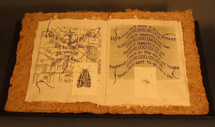
Discovery Plat 21 – Numbers (2001) Diane Stemper A unique artist book. One of four unique books exploring the life of insects as observed on, in, around an Ohio porch. Book 2 (Migration), Book 3 (Pause) & Book 4 (Flight) in the special collections of the Cincinnati Public Library, Hamilton County, Ohio.
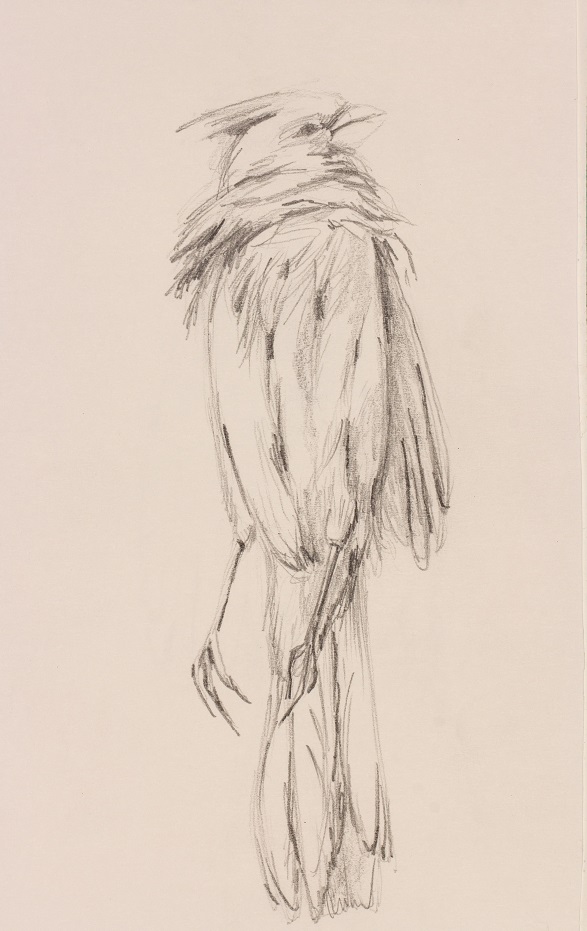
Ohio Specimen Cardinal (2016) Diane Stemper
Once the content and images are in motion, the book structure comes into play and that is when the many possibilities of the structure interact with the content and it is really the most significant challenge of creating an artist book. I do not like to use book forms for the simple novelty of the structure or for the entertainment factor (for instance a pop-up or tunnel book) unless of course it really fits the topic. I want viewers to focus on the images and feeling or message of the work, so the book structure becomes, is, or should be a thoughtful object that houses an idea or an experience, it is in service to the artist, to the viewer, it invites the viewer in and then steps aside.
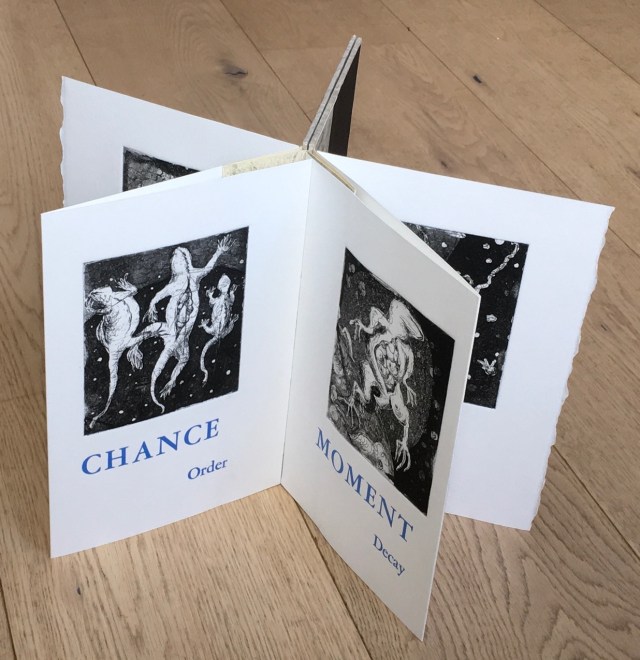
BoB: Let’s turn to Universal Sample in some more detail. I’d like to ask you to comment on the intersection between the words in Universal Sample (“universal” and “sample”, “chance” and “order”, “moment” and “decay”) as well as the intersection of the words with the prints, their color, the paper you used, and the star structure.
Universal Sample (2014) Diane Stemper Edition of 4, Intaglio and letterpress on Arches
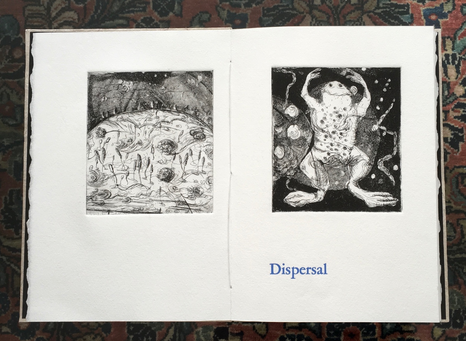
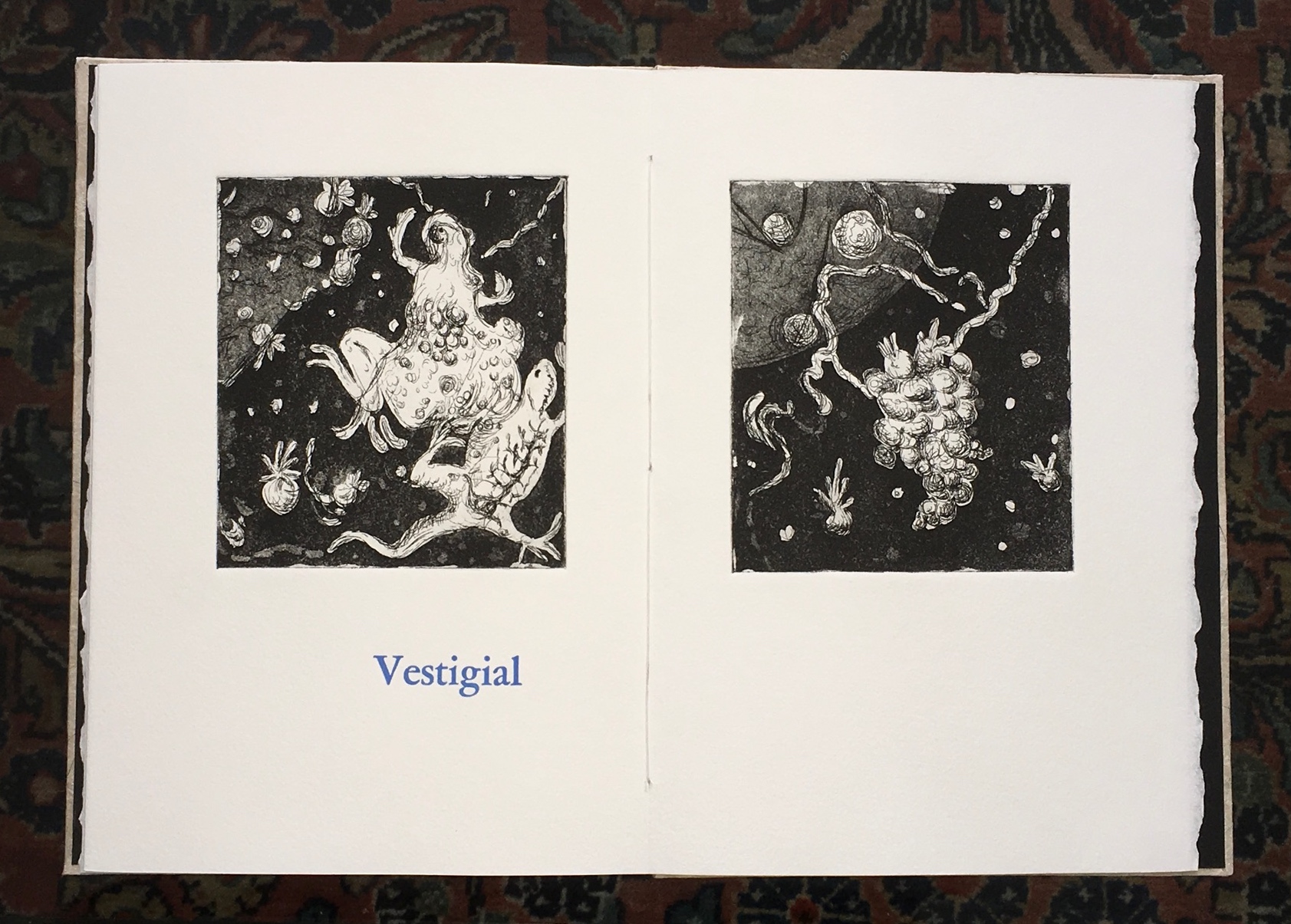
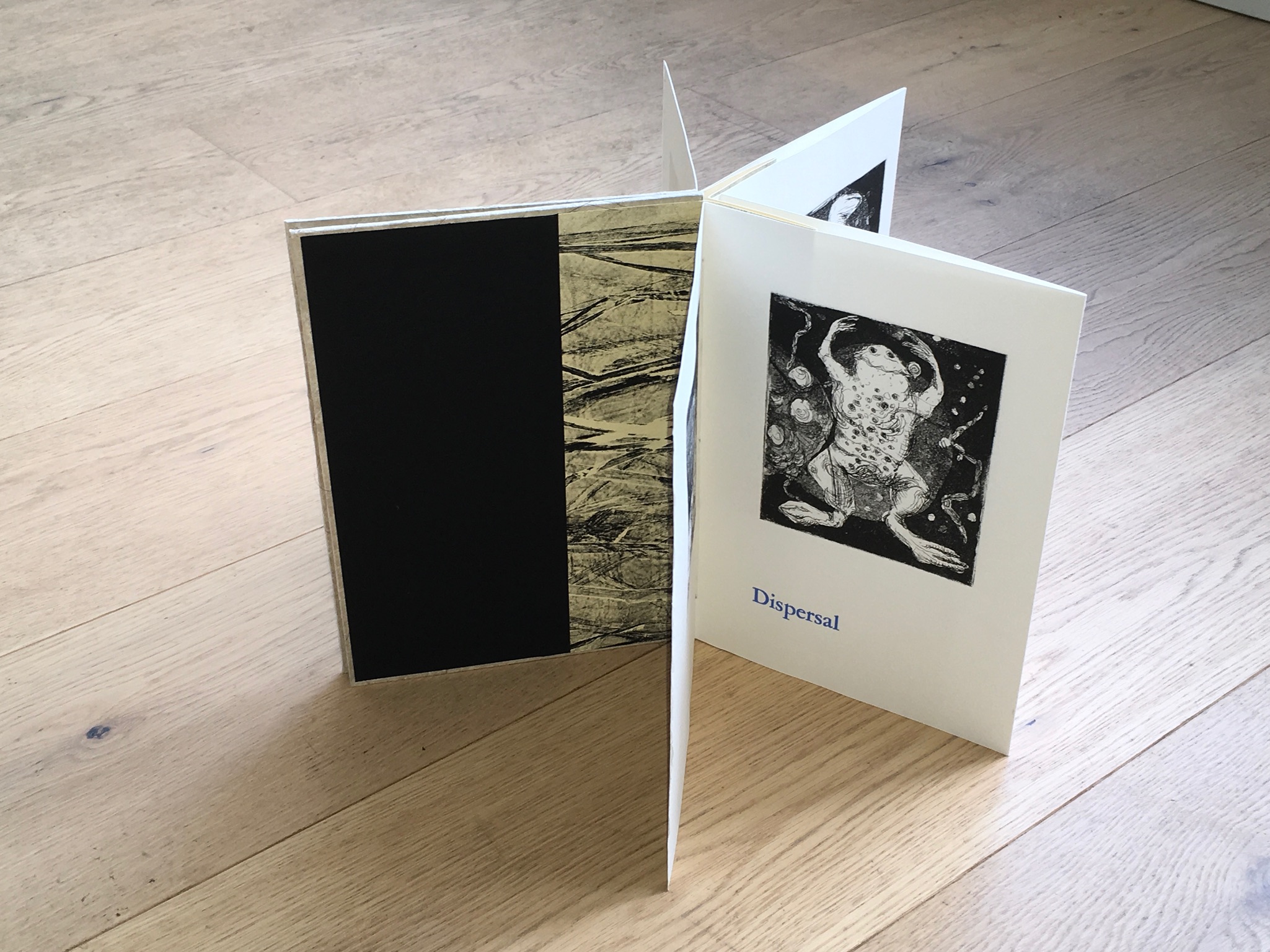
DS: First, let me say the entire book, the six images and the text, is meant to present obliquely a life cycle of early life forms. The images are inspired by my own source material comprised of many drawings of specimens that I did at the Hunterian Museum at the Royal College of Surgeons in London.
The title, Universal Sample, is singular and expansive. A sample is one bit of something larger that is collected and taken from a whole and isolated, universal represents a larger inclusive whole. In this case “Sample” is not numbered or identified. It is in relationship to all else, is composed of and is evidence for all else.
Dispersal – Begins the book and alludes to creation.
Universal Sample (2014) Diane Stemper Edition of 4, Intaglio and letterpress on Arches
Vestigial – Ends it and alludes to remains.
Universal Sample (2014) Diane Stemper Edition of 4, Intaglio and letterpress on Arches
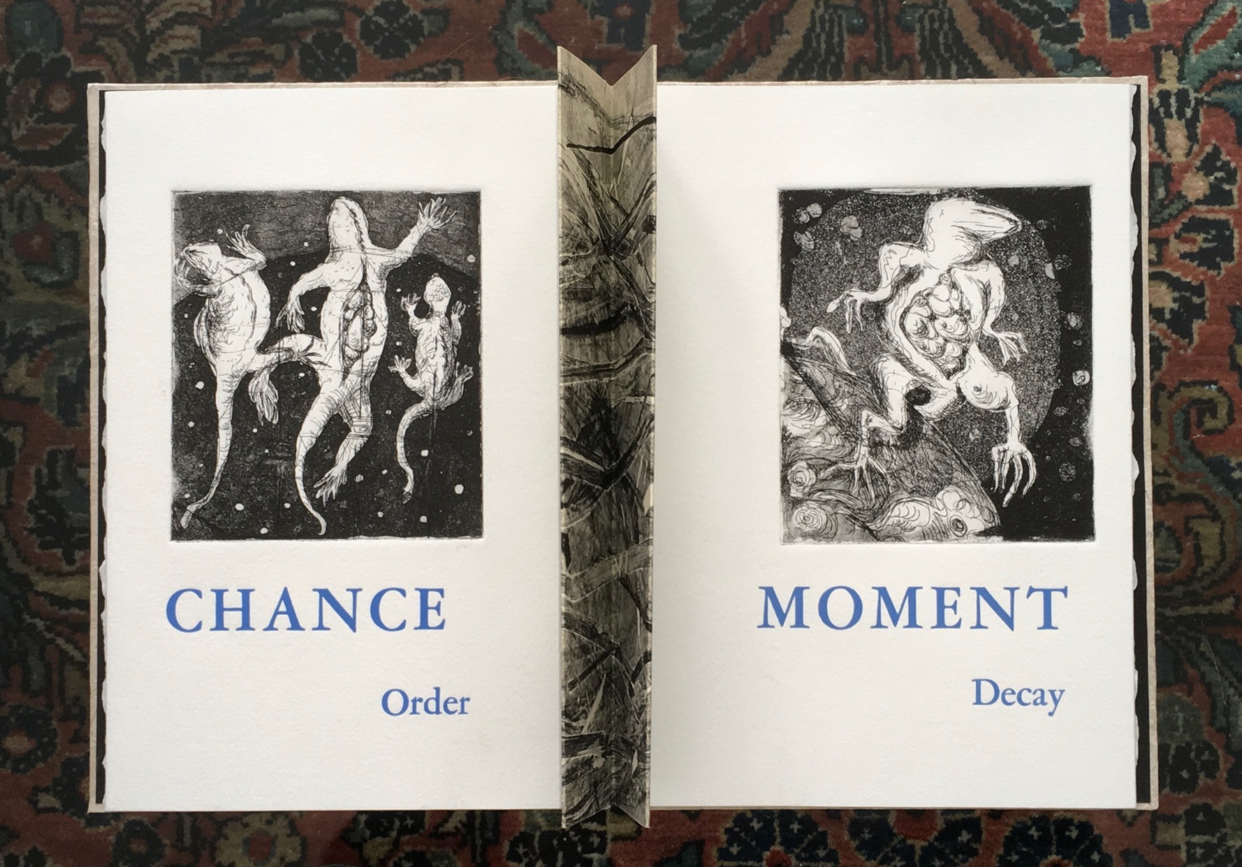
Chance – In part I feel the world is a chaotic place where the intentional can be overcome by chance and luck, circumstance and happenstance.
Order – This is about human systems (religious, scientific) within a chaotic world and about the molecular combining and recombining relative to evolution over millions of years which bring about reasonable order within an ever-changing environment.
Universal Sample (2014) Diane Stemper Edition of 4, Intaglio and letterpress on Arches
When I place the words “chance” and “order” together, I am referencing religion as a human system attempting to bring order to chaos, to explain the inexplicable. The images progress from an unidentified plasma or bubbly life form to a life form that appears to be lizard like, one of the early animal forms on earth. One print shows three lizards, a trinity of sorts, impaled perhaps, especially as specimens might be. Floating, they represent the substance, atom, molecules, electrons, neutrons that I know exist versus the Trinity as espoused by Christianity that I am not so certain about. In this way, I am harking back to the root of an entire body of work that I have made that draws upon Darwin’s On the Origin of Species.
Moment and Decay are read together with the image of a frog, a frog that is decomposing, reordering and redistributing its cells. I want the text to key viewers into the idea of a space, gap, a line or moment when decay begins. The last print is of an imaginary cellular structure of a life form as it is releasing and redistributing entirely into another space whether that is air, dirt or water or the space beyond our stratosphere.
The book structure, font and print size and paper choices are all subject to various constraints, such as paper and press bed size, size of copper, or availability of type face at the printmakers cooperative where I do my printing. For this book, I worked the structure of the book, image and text placement and layout simultaneously with content development and made at least a few small mock-ups to help me see the possibilities, resolve problems and keep me on track. I like book structures that are straightforward and that are an entry to the images and content. Sometimes, as with the Cell books, the structure is integral to the content of the work. For Universal Sample, what was going to be a simple accordion changed as I saw that the images and text could offer different ways in which to view and read the book. The star structure which consists of a series of three-page short accordions sewn into a concertina spine is elegant, seems like a standard book, a good frame for the images and when opened it can go beyond being a standard book and be manipulated and reconsidered.
Universal Sample (2014) Diane Stemper Edition of 4, Intaglio and letterpress on Arches
BoB: Where next with your art?
DS: I like anything that can be described as a collection, the more personal and odd, the better, and I find opportunities to visit natural history or medical museums when I can. Currently, I am finishing a book object that incorporates several of my drawings of backyard specimen finds. This work includes test tubes and refers to the challenge of birds to avoid hazards and remain undetected. I am also thinking about a series of artist books that somehow reveal the dozens, hundreds, thousands of birds that are housed in the drawers of collecting institutions.
BoB: With thanks to Diane Stemper for her time and reflection. To enjoy more of her work, see her site and also:
Diane Stemper received her B.F.A. in printmaking from the San Francisco Art Institute and a M.A. in Interdisciplinary Arts from San Francisco State University. Her work is included in the Artists’ Book Collections of: DAAP Library, University of Cincinnati, Ohio; Main Public Library of Cincinnati and Hamilton County, Cincinnati, Ohio; Special Collections, Miami University, Oxford, Ohio; and the Lucille Little Fine Arts Library, University of Kentucky.
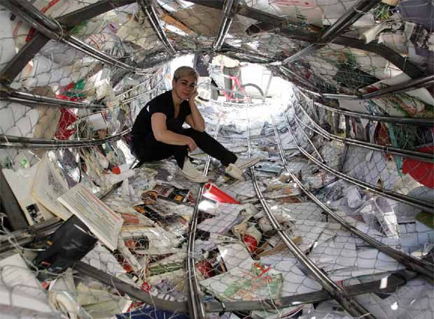
Enclosed Content Chatting Away In The Colour Invisibility, Anouk Kruithof, 2009
Anouk Kruithof’s massive wall of colored books echoes two leitmotivs in book art — the installation and the presumed disappearance of the book in the onslaught of digital media. Reminiscent of pixels on the computer screen, the work is entitled Enclosed Content Chatting Away In The Colour Invisibility and consists of over 3,500 books rescued from the recycling dump and whose arrangement varies with each installation. Kruithof has stated that she seeks to “invent new things out of fragments of the past.’
Biografias, Alicia Martín, 2005, site specific installation, Casa de America, Madrid
Alicia Martín’s installation, called Biografias, has appeared in Madrid, The Hague, Cordoba, Linz and Valencia. The torrent of defenestrated books is made of over 5,000 titles fixed to a wire frame.
Alicia Martin “absorbed” by her work
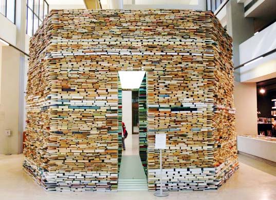
Matej Kren is another book installation artist, whose thoughtful, towering installations have been featured in Prague and numerous other cities in this hemisphere.
Book Cell, Matej Kren, 2006, Centro de Arte Moderna – Foundation Calouste Gulbenkian, Lisbon, Portugal
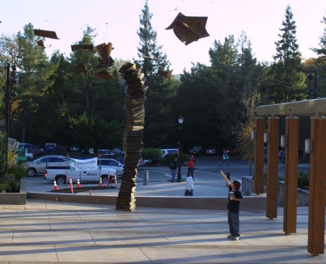
Although Brian Goggin does not use actual books as his material, his works in bronze, polycarbonate, steel and LED prompt reflections on books, language, the transmission of ideas, permanence and impermanence.
Speechless, Brian Goggin, 2008-2009 Bronze, site-specific installation Lafayette Library, Lafayette, California
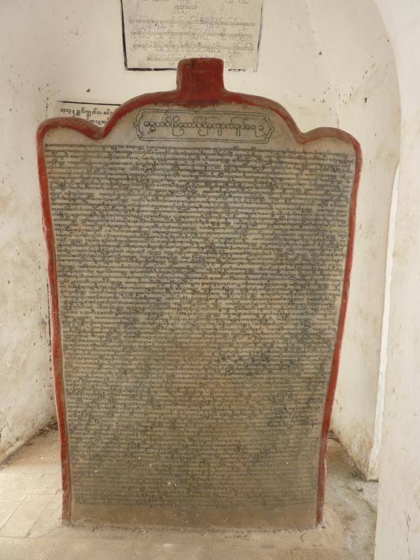
Looking back to the late 19th century, you will find that Myanmar can lay claim to the world’s largest book.
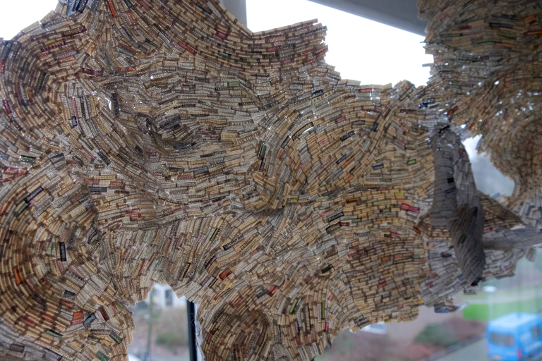
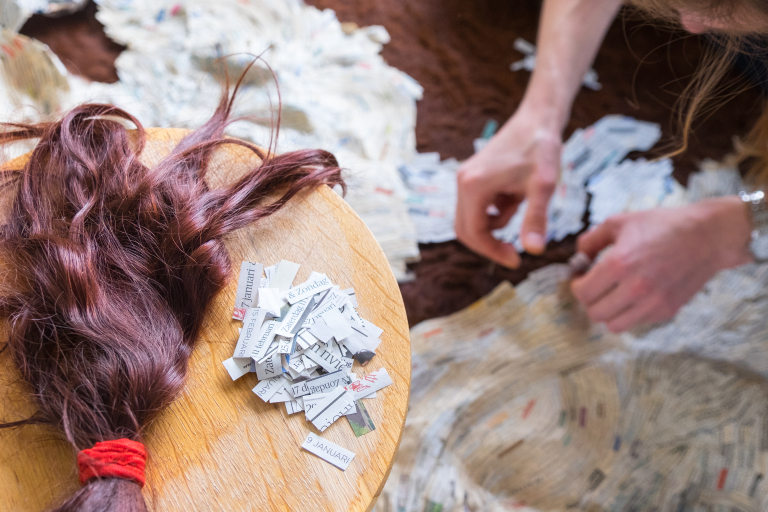
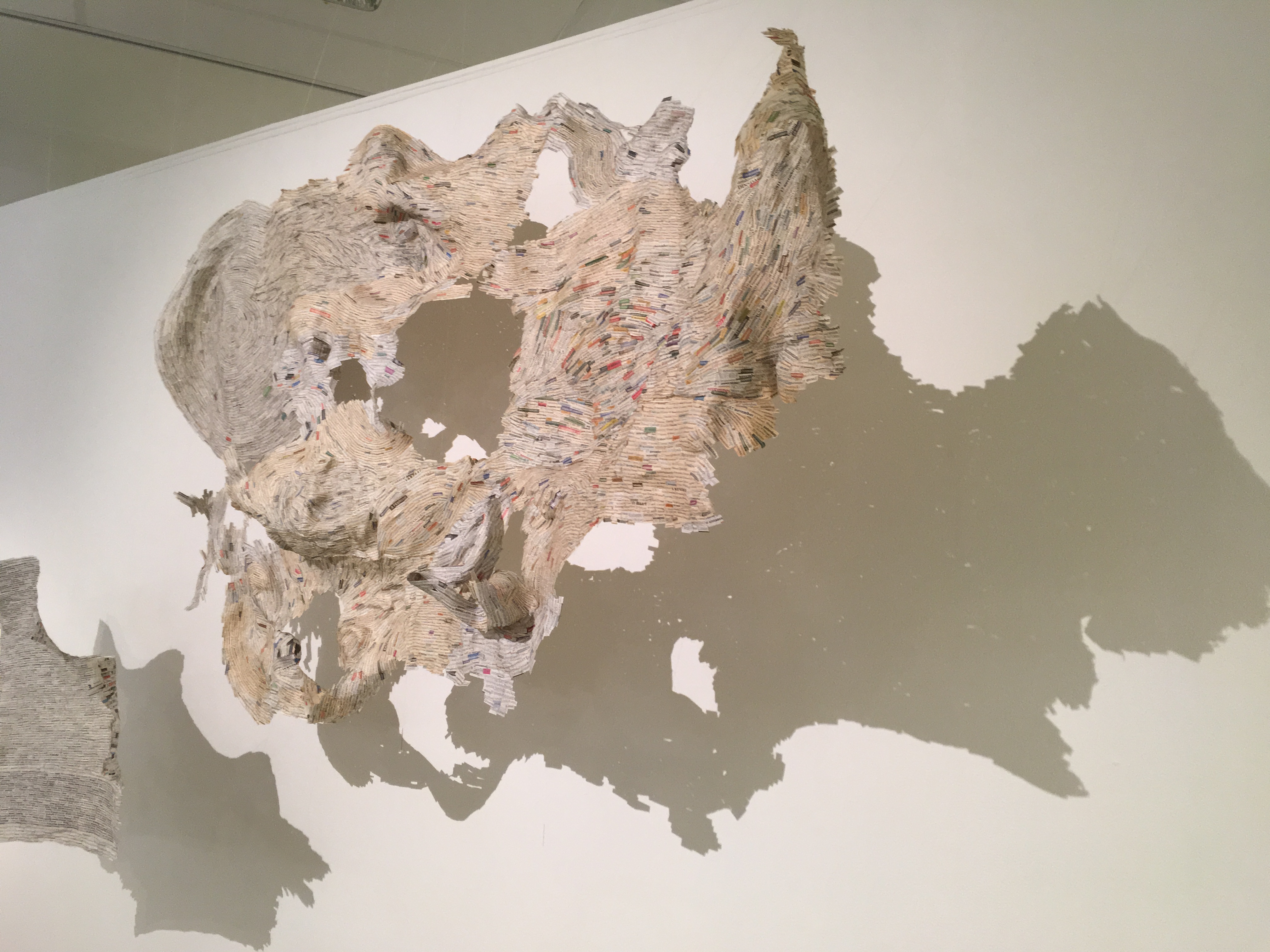
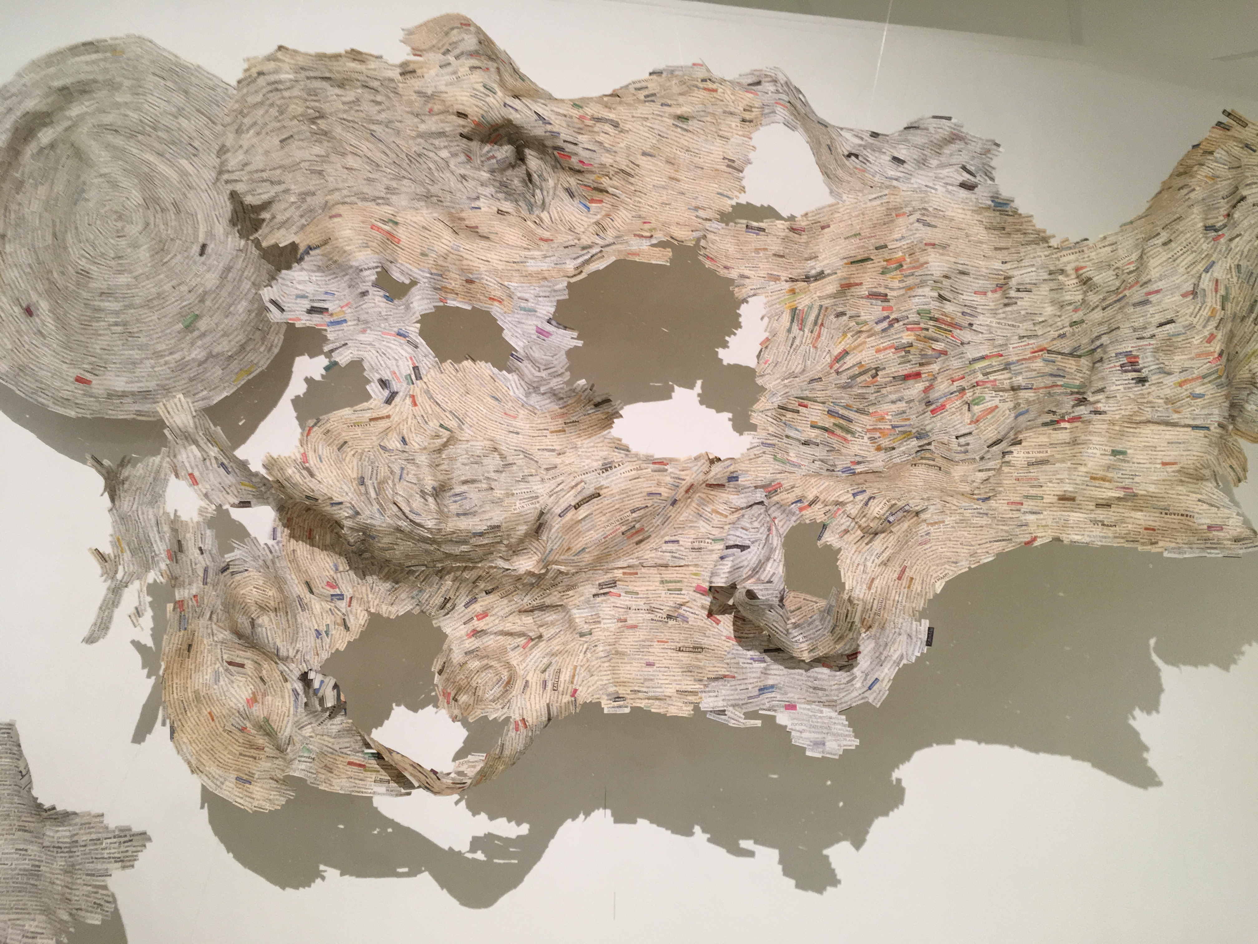
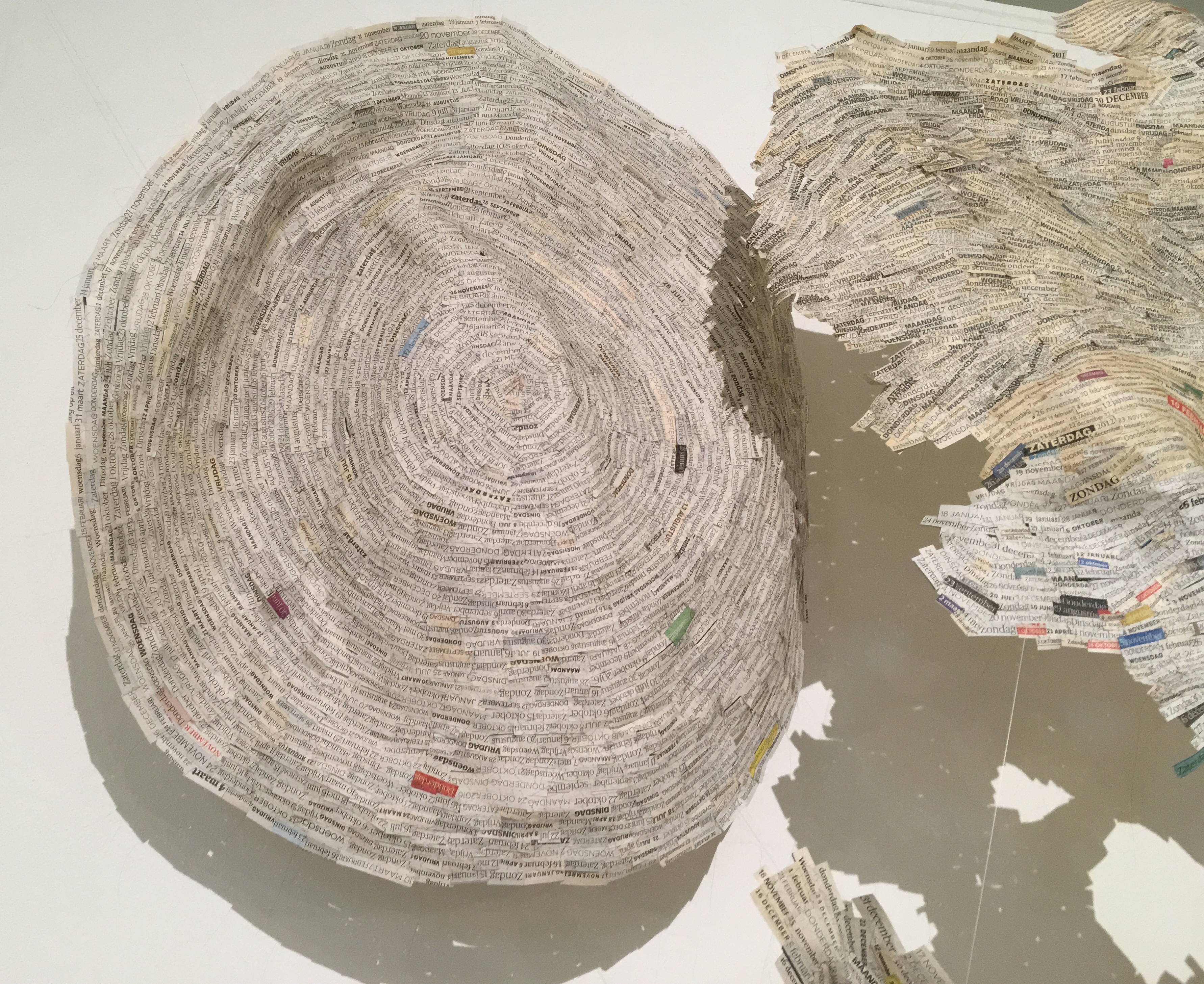
From 4 June to 29 October, Vienna Romanée’s “Data Sewing Project” will be on display (and growing) in the Coda Paper Art 2017 exhibition at the Coda Museum in Apeldoorn. These snippets of data from newspapers are sewn together with human hair.
Datanaaiproject/Data Sewing (2011 – present) Krantenpaper, menselijk haar/ newspaper, human hair Vienna Romanée Photo: Robert Bolick
Datanaaiproject/Data Sewing (2011 – present) Krantenpaper, menselijk haar/ newspaper, human hair Vienna Romanée Photo: Robert Bolick
Datanaaiproject/Data Sewing (2011 – present) Krantenpaper, menselijk haar/ newspaper, human hair Vienna Romanée Photo: Robert Bolick
Datanaaiproject/Data Sewing (2011 – present) Krantenpaper, menselijk haar/ newspaper, human hair Vienna Romanée Photo: Robert Bolick
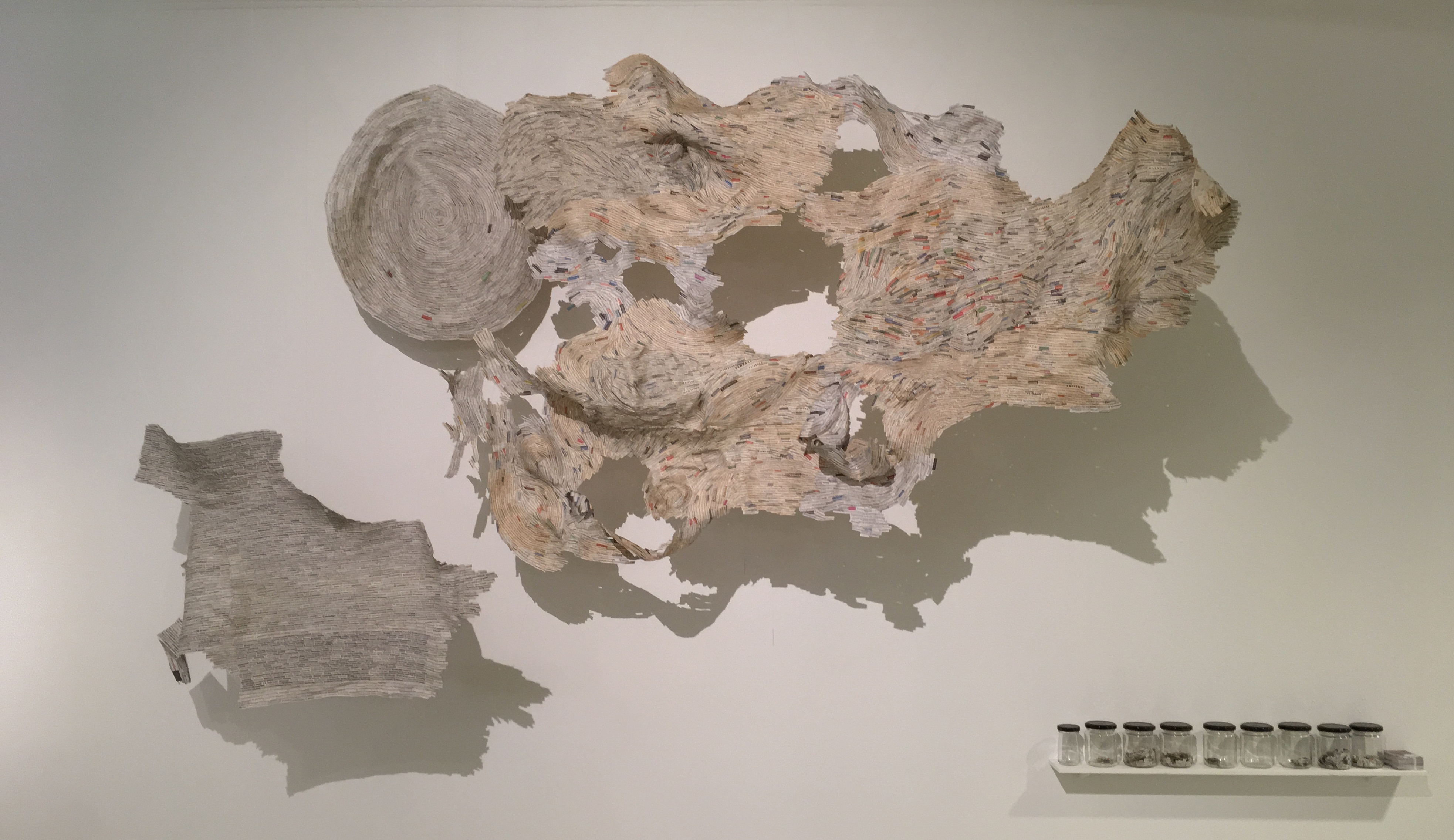
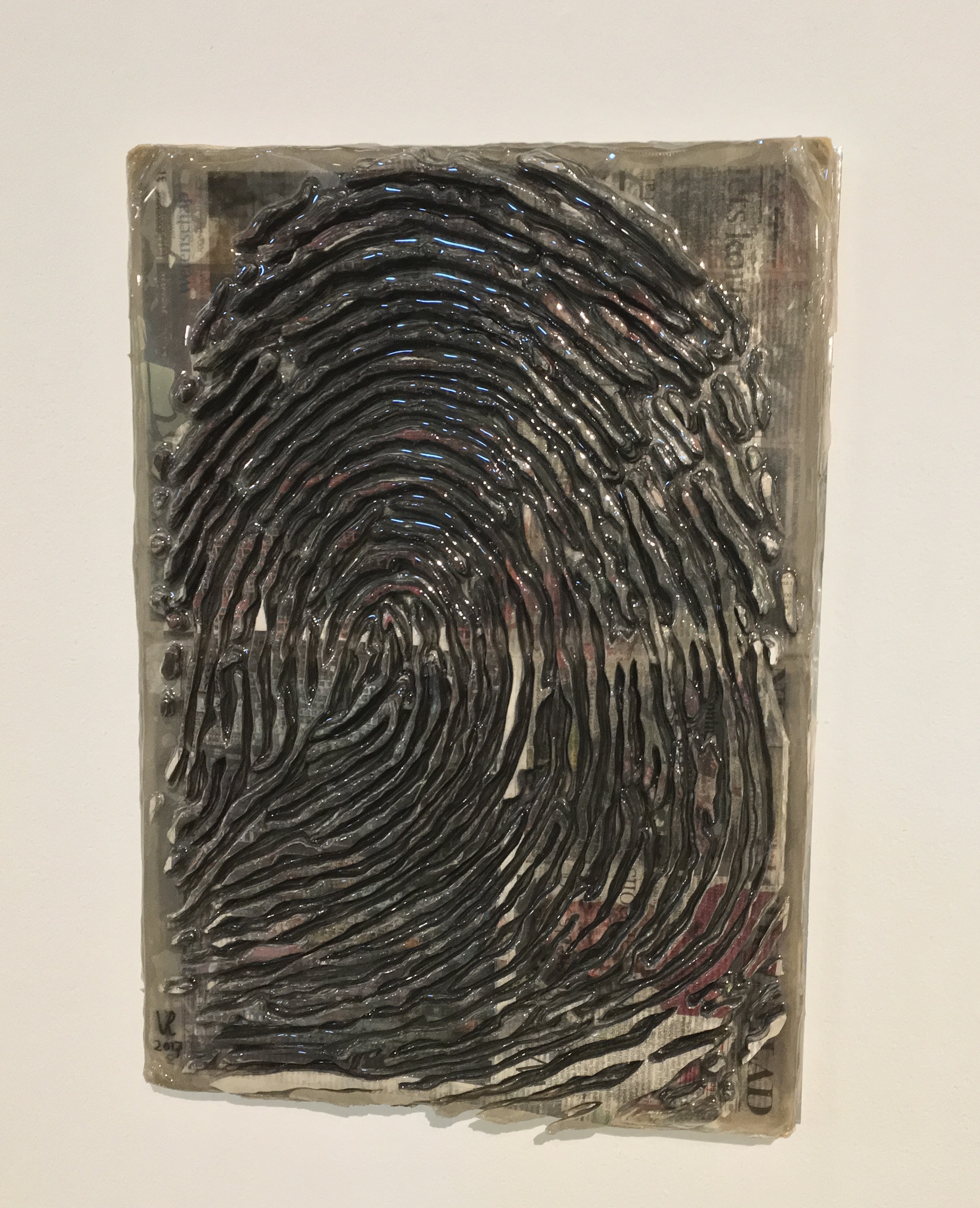
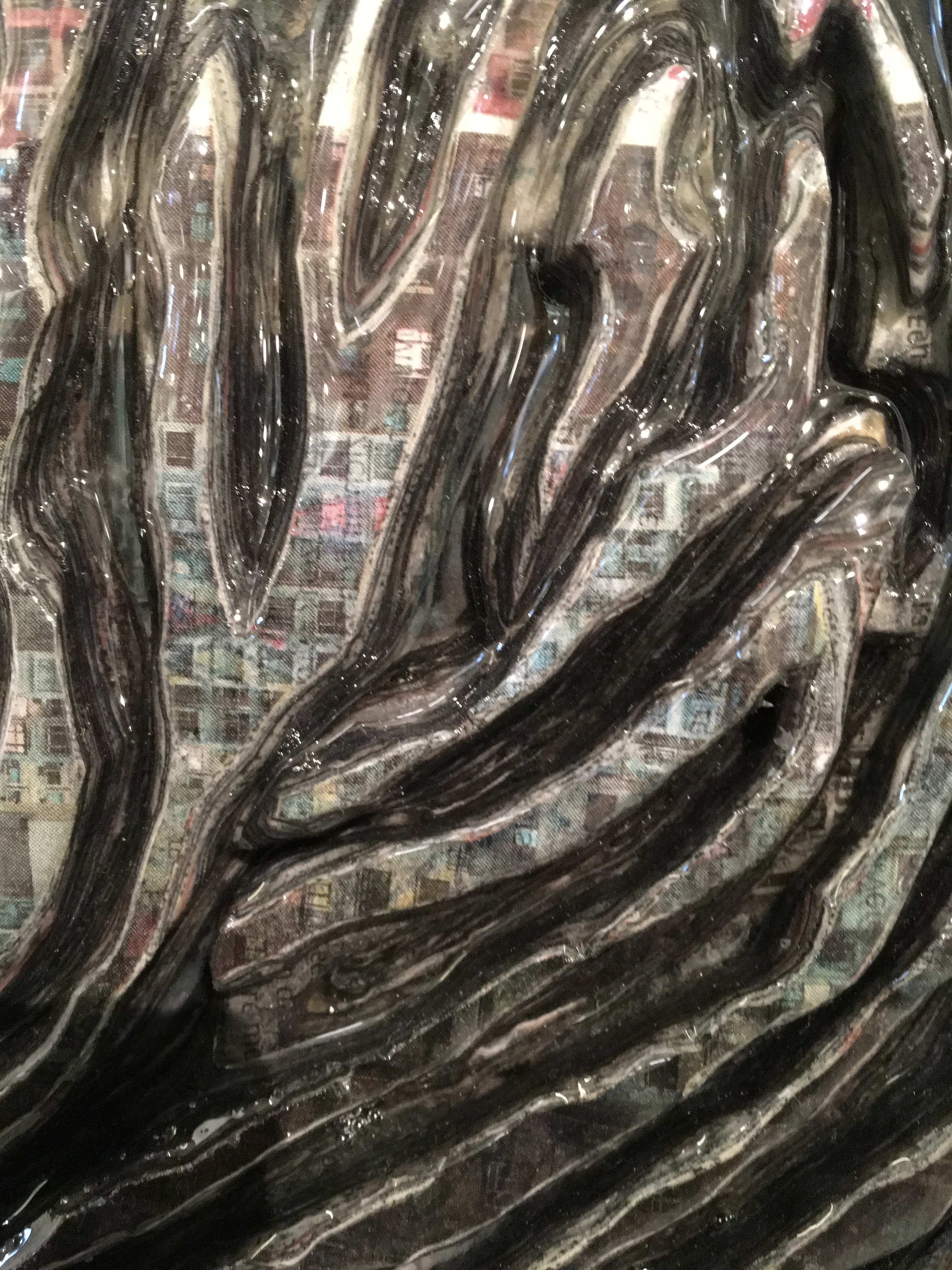
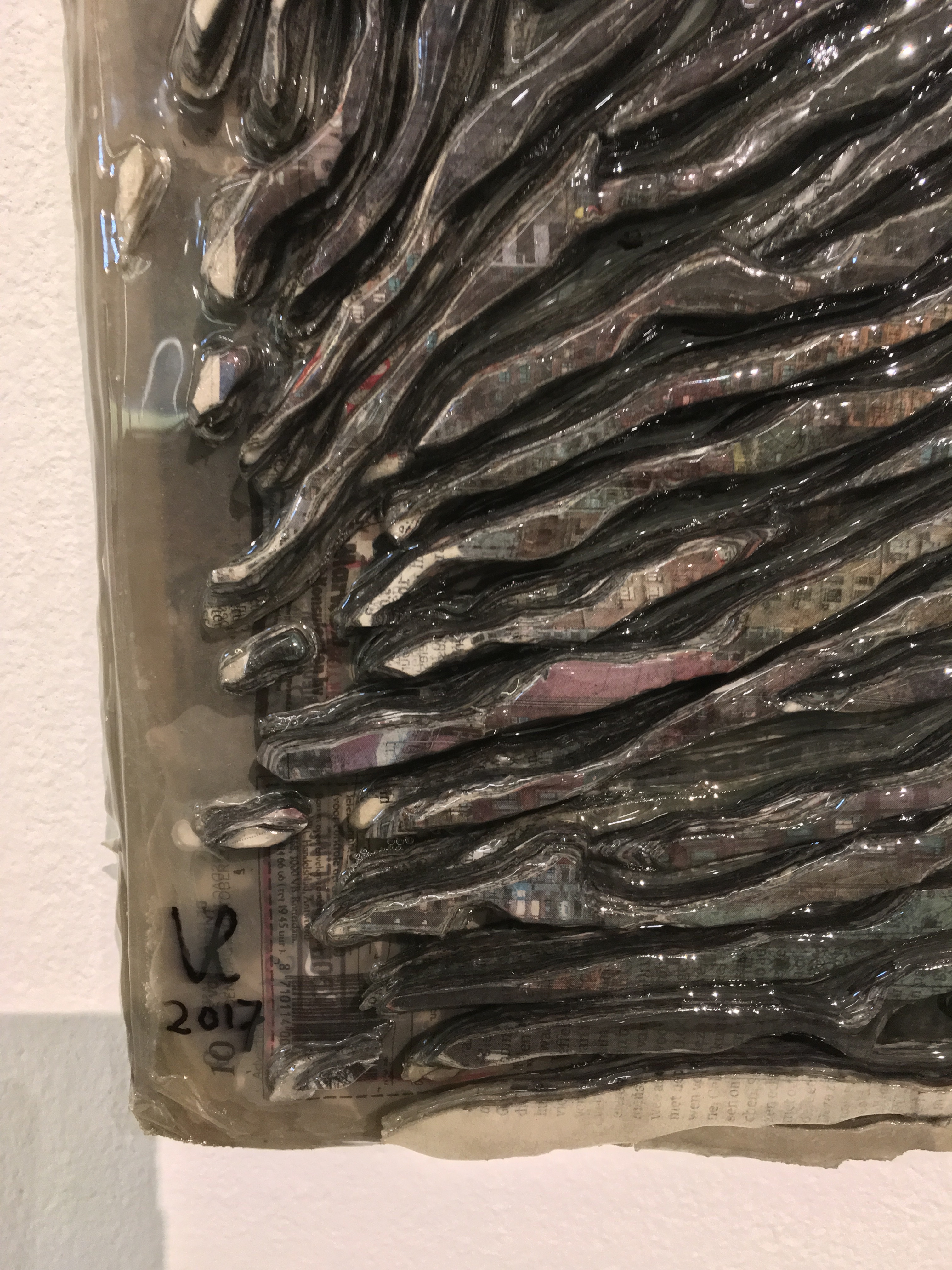
Also on display will be Fingerprint 1.1, a painstakingly created sculpture of a fingerprint built up in layers of shreds of newspaper that speaks of the data embedded in our fingerprints, the permanent and the ephemeral, the material and the human spirit.


 DS: I absolutely remember. I was living in London with my spouse and family as part of a study abroad program my spouse was leading. Each day, after all were at school or otherwise occupied, I would head out in pursuit of art, medical museums, natural history oddities or any number of things and on one day I went to the British Library to see an exhibition,