Bookmark – Frankfurt,Typography and the Book

Boekwetenschap en Handschriftenkunde Amsterdam

rankfurt is upon us, so here is a celebration of type and the book.  The initial “F” comes from Boekwetenschap en Handschriftenkunde Amsterdam, where Paul Dijstelberge and others have posted over 30,000 photos of initials, ornaments and type in cooperation with the Special Collections, Amsterdam; the Royal Library, The Hague; and the Archive at Alkmaar.

Jaap Harskamp, Dijstelberge’s coauthor at In Loving Memory of the Book, an equally “voluminous” site, writes:

Much has been made in recent years about the emergence of the ebook and the ‘death’ of the printed book. Such discussions are fashionable and fruitless. As long as people read, the shape or form of the book is irrelevant. In fact, the ebook may well be a blessing in disguise for those who passionately defend the printed book. Photography did not kill off portrait painting as it was once feared; neither will the ebook refer the printed text to the dustbin of history.

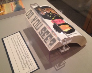
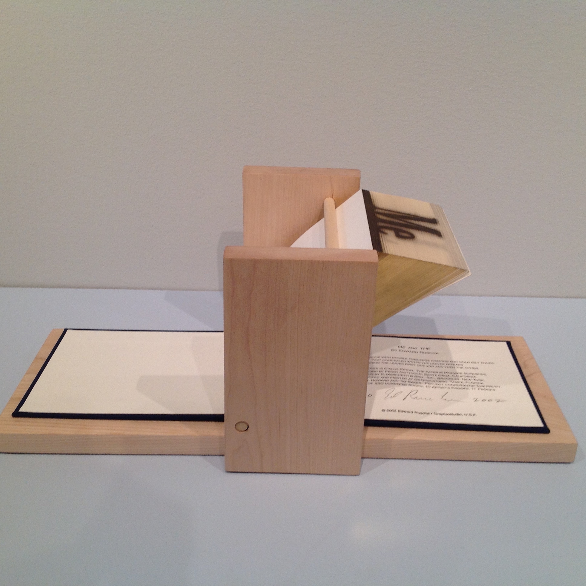
Photography may not have killed off portaiture, but digital photography did kill off Eastman Kodak.   Which entities ebooks will see off will be debated until the event.   The shape or form of extended narrative and discourse, however, is surely not irrelevant.  The Fantastic Flying Books of Mr. Morris Lessmore and the walk-in book exhibition Memory Palace at the Victoria & Albert Museum are recent evidence.  While more evidence may be adduced, do we need it to know that shape and form matter, or that we gather each year in Frankfurt to celebrate reading and its shape and form?


Bookmark for your browser or ereader? | Anniversary Update

Book with florentine paper bookmark.
Book with florentine paper bookmark. (Photo credit: Wikipedia)

Publishing and editorial folk who wish to educate themselves in the changing craft of the book should track this ongoing discussion on the merits of browsers versus apps/devices –even if at times it becomes finely technical.

Books On Books logged several articles on this last year when Jason Pontin declared MIT Technology Review’s colors (decidedly HTML5).  Here is another worth a quick read:   5 Myths About Mobile Web Performance | Blog | Sencha.  A quick read?  Yes, publishers and editors need not be HTML jockeys or Java connoisseurs, but they need to have a business-like grasp of what they are choosing to ride or drink.

Understanding why to publish an ebook through an app or in a browser-friendly format — or both — and what the implications are for crafting finds its rough print analogs in selecting the primary channel and form of  publication (trade or academic, hardback or paperback) as well as  the structure of the work (design, layout and organization) and working out the financial case for deciding whether to publish and how.

Bookmark – Education for the Future of Publishing

The Elements, Theodore Gray

When it comes to acquiring skills and professional training in book publishing, from the early days of the printing press onwards, learning by doing has been book publishing’s order of the day.  Consider the following interview exchange between Mac Slocum (Tools of Change) and Theodore Gray (The Elements):

.

MS: What skills — or people with those skills — must be incorporated into the editorial process to produce something like the iPad/iPhone editions?

TG: Specifically in the case of “The Elements,” the skills required were writing, commercial-style stills photography, Objective-C programming, and a whole, whole lot of Mathematica programming to create the design and layout tool and image processing software we used to create all the media assets that went into the ebook.

Other ebooks might well require different skills. My next one, for example, is going to include a lot more video, so we’re gearing up to produce high-grade stereo 3D video. That’s one of the challenges in producing interesting ebooks: You need a wider range of skills than to produce a conventional print book.

Starting out in book publishing late in the last century, a novice would have consulted Marshall Lee’s Bookmaking and the Chicago Manual of Style to learn the basics of design, editorial and production.  If it were Trade publishing that beckoned, a familiarity with A. Scott Berg’s biography of Maxwell Perkins (“Editor of Genius”) would have been likely.

Maxwell Perkins, half-length portrait, seated ...
Maxwell Perkins, half-length portrait, seated at desk, facing slightly right / World Telegram & Sun photo by Al Ravenna. (Photo credit: Wikipedia)

If scholarly book publishing, then Harman’s The Thesis and the Book, Turabian’s A Manual for Writers and maybe Bailey’s The Art & Science of Book Publishing.

But as with the acquisition of print publishing skills through learning by commissioning, designing, editing, printing, marketing and selling, the acquisition of the skills required for ebook publishing could use a hand up from appropriate resources.   People like Joshua Tallent, Joel Friedlander, Liz Castro, Craig Mod, Matthew Diener are those resources — either by example or authoring — and novices today would do well to start bookmarking their output.

For notes on the availability of formal training and career conditions in publishing, see Thad McIlroy’s The Future of Publishing.

Related sources:

“Joshua Tallent of Ebook Architects on the State of Digital Publishing,” Bill Crawford, Publishing Perspectives

“Understanding Fonts & Typography,” Joel Friedlander, The Book Designer

html, xhtml, and css: 6th edition, Elizabeth Castro

“Our Future Book,” Craig Mod

“Resources,” Matthew Diener, David Blatner and Anne-Marie Concepcion, ePUBSecrets

The Chicago Manual of Style Online

English: Image of the cover of the 1906, 1st E...
English: Image of the cover of the 1906, 1st Edition of the Chicago Manual of Style (Photo credit: Wikipedia)

Bookmarking Book Art – Book Arts Newsletter

Published by Impact Press at the Centre for Fine Print Research, UWE Bristol, this newsletter is an important tool, kept honed by Sarah Bodman.  The link will take you to the June 2013 issue.

Bookmark — “How Old is Innovation before it’s New?” David Worlock

Fachbuchhandlung
Vienna’s Manz Bookstore, facade by Adolf Loos

Two interesting words: “semantic” and “innovation.”  Find yourself a good cup of coffee, a slice of sachertorte, the aroma of cinnamon and take the time to read this article by David Worlock.

“Getting” the fundamentals of digital publishing means “getting” semantics: the semantic web, taxonomies, ontologies, tagging and all that.  David Worlock’s article is a good place to start to understand why.

Bookmark — Anniversary of The Imprint and Its Font

Gerard Meynell's The Imprint
Gerard Meynell’s The Imprint

The Imprint

This year is the centenary of Gerard Meynell’s trade periodical The Imprint, which was the scene of Stanley Morison’s first appearance in print. How appropriate then that Morison’s book A Tally of Types tells the story of the journal’s founding and, equally important, how the historic font called Imprint Old Face came into being. The font’s importance is that “the design had been originated for mechanical composition. … the first design, not copied or stolen from the typefounders, to establish itself as a standard book-face.”(p.21) Ironically, Meynell and his colleagues intended for the font to be freely available to the trade, but eventually it came into the ownership of Monotype Imaging, where it can be obtained today under the OpenType family.

As the world of print morphs into its digital incarnation, we see the same impetus behind the new generation of typographers, the ones born digital, but we see varying degrees of adherence to the “type wants to be free” movement.

Bookmarking Book Art — Fore-edge Printing and Painting: Book Art and the Book Arts Revealed

Chip Kidd’s novel The Cheese Monkeys, designed as well by him, sports a printed fore-edge. When the book is closed, the fore-edge is blank.  Fanned in one direction, it shows the sentence as seen in the photo below.

Chip Kidd, The Cheese Monkeys: A Novel in Two Semesters, 2008

Chip Kidd, The Cheese Monkeys: A Novel in Two Semesters, 2008, from the Chip Kidd Archives, on display Jan. 12 through April 24, 2015, in The Eberly Family Special Collections Library, Penn State University. Reproduced with permission of the Library

Fanned in the opposite direction, the fore-edge displays another phrase: “Good Is Dead”. The printing process is well described in a 2004 video by Graphics Studio|Institute for Research in Art, prepared about the making of Ed Ruscha’s fore-edge book Me and The.

Ed Ruscha, Me and The, 2002 Allan Chasanoff Collection, Yale University Art Gallery

Ed Ruscha, Me and The, 2002
Allan Chasanoff Collection, Yale University Art Gallery

This is similar to traditional fore-edge painting.  Much of what is worth knowing about fore-edge painting can be learned from Martin Frost’s QuickTime Movie-rich website, but if you are a fan of the Folger Shakespeare Library, its holdings yield some outstanding examples under the hand of Erin Blake.   

Double-fore-edge-painting-showing-half-of-each-painting

Jeff Weber’s book Annotated Dictionary of Fore-edge Painting Artists & Binders is probably the lengthiest treatment available on the subject. Hear him discuss his work here.  Weber, who commissioned artwork from Frost, Margaret Allport (Costa) and Clare Brooksbank, has a particularly well-written article at the International League of Antiquarian Booksellers’ site.     

Phillip J. Pirages, an antiquarian bookseller, provides an enlightening and entertaining talk on fore-edge painting of the 18th century and shows a superb example of the London binders Taylor & Hessey’s work — a two-volume set of the works of Alexander Pope, bound in red morocco leather and decorated on the fore-edges with scenes of Twickenham and Windsor.   

The point of this bookmark is not merely to share a curiosity but to use that narrow, hidden curiosity as an illustration of the boundaries of book art and the book arts.        

Updates

Thanks to Ann Kronenberg for this link to a 1940s film on the topic.

Thanks to Merike van Zanten of DoubleDutch-Design.com for this link from 4GIFS.com showing what appear to be biblical scenes painted on the fore-edge of a book.

Thanks to Peter Verheyen for this link to a history of decorating book edges with examples from the Maurits Sabbe Library and other Leuven and Belgian collections.

Weber, Carl. Fore-edge painting : a historical survey of a curious art in book decoration (Irvington-on-Hudson, New York: Harvey House, 1976.).

See also 21 July 2018 article on Martin Frost in The Times.

Bookmarking Book Art — Jody Alexander

EXPOSEDSPINES003
Exposed Spines © Jody Alexander

As with most book art (and almost all sculpture), Jody Alexander’s works celebrate the haptic so warmly that I wonder how an owner or viewer resists handling them.  And celebrating the book arts (Alexander makes her own paper in the Eastern style), surely these bookworks on display should be touched —like the books on the shelves of public libraries — until they take on the wear and patina of fine books.  Imagine the installation — call it “Touch This” — and what viewers would see and feel decades from now. A visit to her studio WishiWashi might come closest to this imagined event.

Alexander teaches at the San Francisco Center for the Book and blogs at Jalex Books Blog .  As of this posting (12 May 2013), however, the most recent entry for information on exhibits, classes and new artwork is 5 July 2012.

Update:

Erin Fletcher at Flash of the Hand has tracked down Jody Alexander for an interview (2 August 2013).

While reading the interview, you will begin to understand the depth of Jody’s commitment to her materials and characters. This exclusive connection is the cause for such a well-rounded body of work. Her dedication to teaching is just as exceptional, offering her skills to several venues both online and in person. Read the interview after the jump and come back each Monday during the month of August for more posts on Jody Alexander.

August // Book Artist of the Month: Jody Alexander

kqdv8gs2urrnhnk92ltowtl72ejkfbmt4t8yenimkbvvk0ktmf0xjctabnaljim91

The photo above comes from Alexander’s series SedimentalsThis series, which “takes the form of tea staining cotton to replicate the colors of aged and browned bookspines and swaddling or layering them to create a safe haven for these beautiful objects, enshrining them”, is an interesting instance of book art to which Garrett Stewart’s Bookwork: Medium to Object to Concept to Art applies. Check out Alexander’s site, read Stewart’s book and see if you agree.

MUSUBU Books and Art: Tokyo  California  Urawa Abstracts. Exhibition 12-24 September 2017 in Saitama, Japan; 17 April – 19 May 2018 in San Francisco, US. Co-organized with the Tokyo Bookbinding Club.

Online workshops with Jody Alexander. Accessed 19 September 2018.

Bookmarking Book Art – Franziska, a typeface

The Fine Press Book Association’s inaugural Student Type Design Competition sprang from the hope that by building bridges between printers and young type designers we might end up creating new material resources for the fine press community.

A PDF document called the Making of Franziska – a hybrid text-face between slab and serif is available for downloading.  This document is quite well put together and provides a kind of tutorial on type design.

franziska-font_runge_03_text_04_freundliche-versalien

Books On Books Collection – Heather Hunter

Folded book pages rarely generate a work that rises above mere craft. Heather Hunter’s Observer Series: Architecture (2009) achieves the necessary height. It combines the altered book with an accordion book that incorporates a found poem composed of the words excised and folded outwards from the folded pages of The Observer’s Book of Architecture.

Observer Series: Architecture (2009)
Heather Hunter
Photo: Books On Books Collection

Photo: Books On Books Collection

The very fact of a found poem made of excised words that happen to fall at the folds shaping a column from a book on architecture chimes with the title of Bachelard’s The Poetics of Space.

Another work in the collection is Foldable Sculpture No. 1.

“Environmental memories,” not just of places but of cherished objects held in the hand, are Hunter’s chief inspiration, and the design of her bookworks is intended through touch, reading and exploration to evoke in the reader “unique feelings that become the reader’s own environmental memory.”  Her artistic and literary influences and inspirations are an interesting blend of the 20th century Neo-Concrete and the 19th century Romantic movements.  Links to illustrations of those sources of influence are embedded in the caption to Snowdrop.

SnowdropInspired by Lygia Clark’s movable sculptures and Mary Robinson’s poem, the snowdrop pushes upwards through the dark cold soil into the light. Then being changed by the wind into different spear shapes before the flower drops its head and opens in the sun. 2008 Triangular book 12cm high. 16cm diagonally.
Snowdrop ()

Hunter has regularly exhibited and demonstrated her work at Turn End Studios in Haddenham, Buckinghamshire.