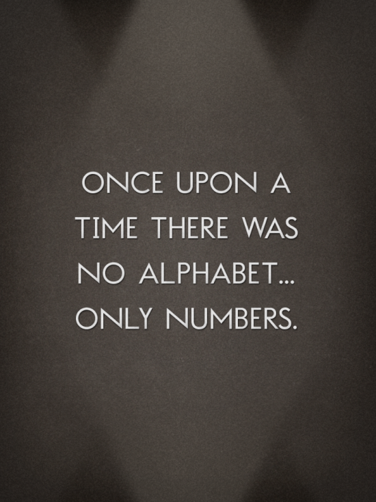
The Numberlys (2014) William Joyce and Christina Ellis Hardback, paper on board. H220 x W300 mm, 52 pages. Acquired from London Bridge Books, 15 April 2021. Photos of the book: Books On Books Collection.
Although bound in landscape, the book reads in portrait … to start and end.
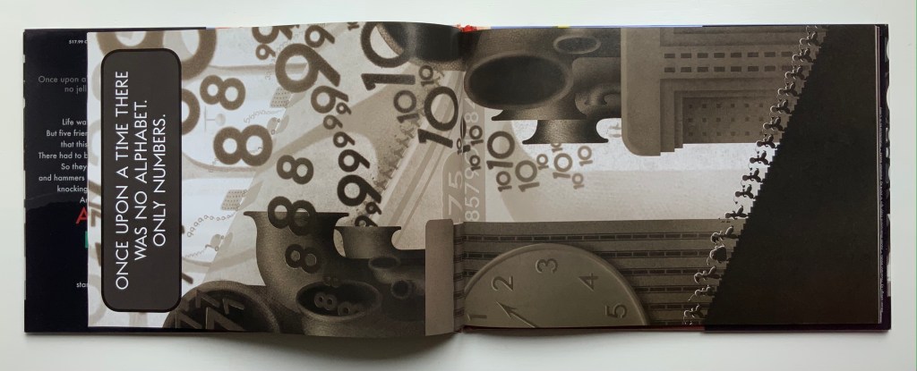
Life was…fine. Orderly. Dull as gray paint. Very…numberly. But our five jaunty heroes weren’t willing to accept that this was all there could be. They knew there had to be more.
So they broke out hard hats and welders, hammers and glue guns, and they started knocking some numbers together. Removing a piece here. Adding a piece there. At first, it was awful. But the five kept at it, and soon it was…artful! One letter after another emerged, until there were twenty-six. Twenty-six letters—and they were beautiful. All colorful, shiny, and new. Exactly what our heroes didn’t even know they were missing.
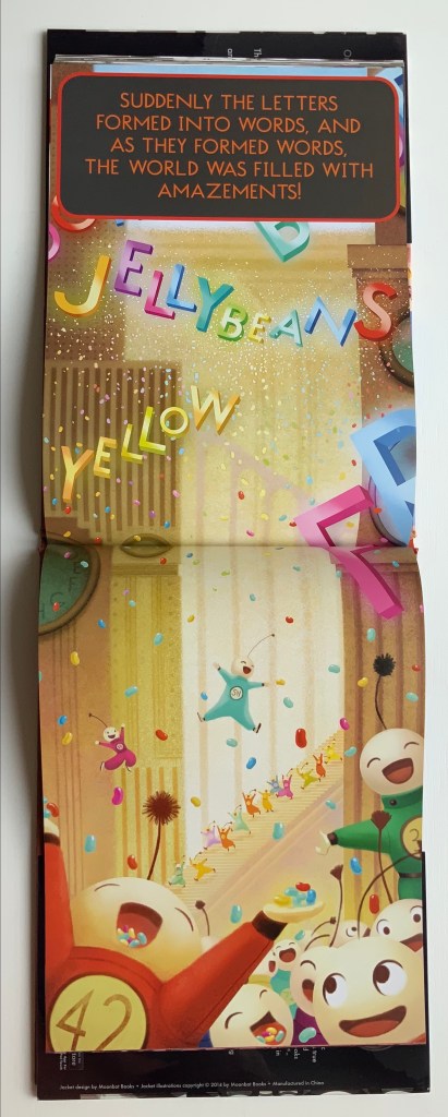
And when the letters entered the world, something truly wondrous began to happen…
Based on the award-winning app, this is William Joyce and Moonbot’s Metropolis-inspired homage to everyone who knows there is more to life than shades of black and gray. — from the Moonbot Studios’ website. Accessed 28 April 2021.
Archaeologists and paleontologists hypothesize that the alphabet evolved from counting. Clay tokens as signs (8000–3500 BC) and then pictographic marks on clay tablets (3500–3000 BC) were used for counting units of things. Around 3000 BC, someone merged pictographic signs and phonetic sounds to begin the invention of the alphabet. Orly Goldwasser (Hebrew University, Jerusalem) has hypothesized that illiterate Canaanite miners may have been the inventors of the alphabet around 1840 B.C.E.
Likewise in The Numberlys, our inventor-heroes (numbers 1-5 or, in their vocalizations, possibly the five vowel sounds?) lead a similarly manual existence, albeit in a more modern industrial setting. They can be viewed at work here in this clip from the award-winning app, no longer available but perilously stored on an early iPad in the Books On Books Collection. As in the app, the book proceeds in gray until the letter Z, when “THINGZ” begin to happen — “Pizza! Jelly beans! Color! Books!”.
With apologies to the preacher: Of making many books [on books] there is no end.
(Ecclesiastes 12:12)
With the choir of its forebearers, Amaranth Borsuk’s The Book (MIT Press, 2018) sounds an “amen” to that truth. The proliferation of degree programs in book studies covering the history of the book, the book arts and even book art ensures The Book will not be the last. What distinguishes Borsuk’s book are her perspective as an artist and the book’s breadth and depth despite its brevity.
The book has a long history of existential crises. What is a book? Is the end of the book nigh? For more than a century, those questions have returned again and again. The most recent recurrence stems from the ebook’s threat to dematerialize the book and the online world’s threat to take us into a post-text future. Even before these latest threats, book artists have long lived and worked with their own existential questions, a kind of higher existential calculus, or derivative of, the book’s crises: What is an artist’s book? What is book art? Stephen Bury, Riva Castleman, Johanna Drucker, Joan Lyons, Stefan Klima, Clive Philpott and many others in the last quarter of the 20th century dwelt on defining and categorizing book art.
Borsuk belongs to a later generation of book artists that has embraced these existential crises and recognized that the book’s existential crises are what make the book a rich medium in which and with which to create art — from bio-art miniature to the biblioclastic human-scale to large-scale installations and performances. Even to the digital.
The Origin of Species (2016) Dr. Simon Park, Guildford, Surrey “The small book shown here was grown from and made entirely from bacteria. Not only is the fabric of its pages (GXCELL) produced by bacteria, but the book is also printed and illustrated with naturally pigmented bacteria. ” Posted 27 March 2016. Photo credit: Dr. Simon F. Park
Silenda: Black Sea Book (2015) Jacqueline Rush Lee Transformed Peter Green‘s translation of Ovid’s Tristia and the Black Sea Letters H9.5″ x W12″ x D6.5.” Manipulated Text, Ink, Graphite Photo credit: Paul Kodama. In Private Collection, NL
Field (2015) Johannes Heldén Produced, and premiered, at HUMlab, Umeå University Reproduced with permission of the artist
Performance artist and academic as well, Borsuk brings that later generational and creative perspective to the existential question — What is the book? — and, with an artist’s perception of her medium of choice, displaces the old companion existential question — Is the end of the book nigh? — with an altogether more interesting one — Where next for the book?
To see where books might be going, we must think of them as objects that have experienced a long history of experimentation and play. Rather than bemoaning the death of books or creating a dichotomy between print and digital media, this guide points to continuities, positioning the book as a changing technology and highlighting the way artists in the twentieth and twenty-first centuries have pushed us to rethink and redefine the term. (pp. xiii-xiv)
In The Book, the future is not far from the physical past. Where once we had text on scrolls, now we scroll through text (albeit more vertically than horizontally). Where once human consciousness changed with the invention of the alphabet and writing, now it may be altering with our reading and writing through networked digital devices. Like the many historians before her, Borsuk starts with cuneiform (those wedge-shaped accounting marks on baked clay), hieroglyphics and the invention of the alphabet to set the scene for the advent of the book and its ongoing physicality:
its shape (scroll, accordion, codex)
its material (papyrus, vellum, paper, charcoal or mineral-based watercolor and ink)
its manufacture (scribing, printing by woodblock and movable type, design and typography, illumination and illustration, folding into pages, methods of binding)
its constituent and navigational parts (cover, book block, title page, table of contents, page numbering, index).
But Borsuk reminds us — from Sumer’s clay to Amazon’s Kindle, from Johannes Gutenberg to Project Gutenberg — the book as human artifact exists in a social, political, technological, economic and even ecological context. Who is allowed to make it, how it is transacted, how and where we use it, how we perceive and speak of it — all have affected the physicality of the book object and are reflected in it.
In the first half of The Book, Borsuk steers us through these interdependencies to a turning point. That turning point is where the pinnacle of the book arts — Beatrice Warde‘s and Jan Tschichold‘s vision of the book as a crystalline container of content — and the book’s commodification combine to cause the book’s physicality to disappear because it is so taken for granted, leaving us with “the book as idea”.
With the perception that books are ideas bestowed on readers by an authorial genius whose activity is purely intellectual, the book’s object status vanished for much of the reading public as we raised a glass to happily consume its contents…. Even though innumerable material elements come together to make the book, these features have been naturalized to such a degree that we now hardly notice them, since we have come to see content as the copyrightable, consumable, marketable aspect of the work. (pp. 106-9)
At this turning point — where “the historic relationship between materiality and text is severed” (p. 112) — the second half of The Book introduces book art. It is telling that the longest chapter in the book begins the second half, that it is called “The Book as Idea” and that it comes before any extended engagement with the digital dematerialization of the book. It is a wry pivot: the artistic genius supplants the authorial genius; what the latter takes as invisible background, the former re-makes as self-regarding foreground. As Borsuk shows and her book’s cover neatly demonstrates, works of book art are inevitably self-referential and self-aware.
As such, works of book art
have much to teach us about the changing nature of the book, in part because they highlight the “idea” by paradoxically drawing attention to the “object” we have come to take for granted. They disrupt our treatment of the book as a transparent container for literary and aesthetic “content” and engage its material form in the work’s meaning. (p. 113)
Rather than offer a chronological history of book art to explore what “artists’ books have to teach us about a path forward for the book”, Borsuk offers “flashpoints” that represent “the energies motivating artwork in book form”(p. 117). These “flashpoints” are William Blake, Stéphane Mallarmé, Ed Ruscha and Ulises Carrión. Following these flashpoints, Borsuk organizes the rest of the chapter into “key themes that recur throughout artists’ books of the twentieth century: spatiotemporal play, animation, recombinant structures, ephemerality, silence, and interactivity” (pp. 146-47).
Oddly, Blake as flashpoint does not illuminate these six particular themes. Rather Borsuk notes three other recurrent themes or “energies motivating artwork in book form” that Blake and his work represent: centering or re-centering the production processes on the author/artist; using the book as a sociopolitical and visionary platform; and redefining, developing and challenging the relationship between word and image.
Blake refers to himself as “The Author & Printer W. Blake,” making clear the union of creativity and craft in his work. (p. 121)
Blake’s engagement with the social issues of his day, and his use of book form to respond to child labor, urban squalor, and slavery, established an important trend in both artists’ books and independent publishing—the utility of the book as a means of spreading social justice. (pp. 121, 124)
Blake used his craftsmanship to develop the relationship between word and image (p. 140)
One need not look far among twentieth and twenty-first century book artists for resonance with those themes. That Blakean union of creativity and craft resurfaces in artists such as Ken Campbell (UK), Cathryn Miller (Canada), Pien Rotterdam (Netherlands), Barb Tetenbaum (US) and Xu Bing (China) — some of them even to the point of carving or setting their own type, making their own paper, pulp printing on it themselves or binding the finished work themselves. Vision and sociopolitical observation have risen up in the works of artists such as Doug Beube (Canada), Julie K. Dodd (UK), Basia Irland (US), Diane Jacobs (US), Anselm Kiefer (Germany) and Chris Ruston (UK). Blake’s redefining the relationship of word (or text) to image often reappears book artists’ abecedariesand their children’s books such as A Dictionary Storyby Sam Winston (UK).As for emulators of Blake in technical innovation, consider the analogue example of Australian Tim Mosely’s works created with his patented pulp printing process, where the “ink” is actually colored pulp, or the digital example of Borsuk’s work Between Page and Screen, where the pages contain no text—only QR codes that, when scanned with a webcam, activate the text’s appearance on the reader’s browser screen.
For her second flashpoint, Borsuk selects another visionary, Stéphane Mallarmé, who like Blake was reacting to his own perceived Satanic mills draining poetry of its spirituality. Mallarmé’s Satanic mills dispensed rigid columns of newsprint to the masses and bland expanses of poetry and fiction set by Linotype machines in the neo-classical Didot font. With his famous visionary dictum — “everything in the world exists in order to end up as a book” (p. 135) — Mallarmé nudged the book toward pure concept and opened its mystical covers to the Dadaists, Surrealists, Futurists, Vorticists, Lettrists, Conceptualists and biblioclasts. With spatiotemporal play — mixing type sizes and fonts, breaking up the line and even breaking the page — Mallarmé used text to evoke image and, in his view, remake the book as a “spiritual instrument”. His post-humous book-length poem Un coup de Dés jamais n’abolira le Hasard (A Throw of the Dice Will Never Abolish Chance), published in 1897, embodies that vision and continues to cast its flashpoint light across multiple generations of book artists’ efforts. From Marcel Broodthaers in 1969, we have his homage to Un Coup de Dés. From Jérémie Bennequin in 2014, we have his serial “omage” to Broodthaers’ homage. And, most recently, we have the 2015 new bilingual edition A Roll of the Dice by Jeff Clark and Robert Bononno, for which Borsuk provides a perceptive reading.
Where Mallarmé’s flashpoint enlisted his vision alongside the cry “épater le bourgeois” from Baudelaire and other late nineteenth-century poets, Ed Ruscha’s later flashpoint illuminates a democratic counterpoint, a Zen-like vision and a very different way of changing the relationship of text to image. Ruscha’s self-published photobooks were cheap and distributed outside the gallery-controlled channels of art. As Borsuk shows — directly with Ruscha and indirectly with the many book artists influenced by him — the text is restricted to the book’s title, which interacts with a series of deadpan photos and their layout to deliver a wry, tongue-in-cheek work of book art. Ruscha’s spatiotemporal play manifests itself across the accordion book format and out-of-sequence juxtapositions. Ironically Ruscha’s works now command thousands of dollars per copy, and one has more chance of seeing them in an exhibition than in a roadside stop’s rack of newspapers, magazines and mass-market paperbacks.
Mexico’s Ulises Carrión — polemicist, European bookshop owner, conceptual artist and Borsuk’s fourth choice of flashpoints — is a counter-flashpoint to Ruscha. Where Ruscha reveled in self-publishing commodification, Carrión sneered at the book in its traditional commercial form. Where Ruscha has resisted the label “conceptual artist”, Carrión played the role to the hilt. Where Ruscha’s work has elicited numerous homages (see Various Small Books from MIT Press in 2013) and achieved a high profile, Carrión’s work, much lower in profile, has provided a more compelling range of hooks or influences on which to hang many different manifestations of book art (or bookworks as Carrión preferred). In fact, Borsuk’s six stated key themes or “energies motivating artwork in book form” come from Carrión’s manifestos (pp. 146-47).
The first theme — “spatiotemporal play” — comes from Carrión’s initial definition of the book as a “sequence of spaces”, which Borsuk traces to tunnel books, pop-ups and even large-scale constructs, the latter illustrated by American Alison Knowles‘ inhabitable The Big Book (1968). One more possible future of the book implied by spatiotemporal play manifests itself in Borsuk’s own augmented-reality (AR) works, those of Caitlin Fisher (Canada) and Carla Gannis’ Selfie Drawings (2016), in which portraits on the hardcover book’s pages animate and change when viewed through smartphone or tablet.
Borsuk takes the second theme, that of “animation”, from Carrión’s dictum: “Each of these spaces is perceived at a different moment— a book is also a sequence of moments”. As her several examples illustrate, much book art is cinematic. Borsuk’s exposition of Canadian Michael Snow‘s Cover to Cover (1975) comes closest to reproducing the experience I enjoyed of “watching” that photo bookwork from cover to cover several times at the now closed Corcoran Art Gallery. Borsuk is quick and right to remind that the cinematic future of the book has been with us for a long time, even before the cinema. She bookends her exposition of Snow’s book and the text animation of American Emmett Williams‘ Sweethearts (1967) on one side with Victorian flip-books and on the other with American Bob Brown‘s 1930s The Readies (presumably pronounced “reedies” to follow Brown’s comparison of his scrolling one-line texts with the cinema’s “talkies”).
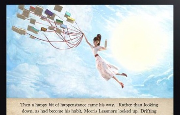
A forgotten modernist, Brown declared the obsolescence of the book, predicted a new form of reading and technology to enable it, an optical projector emitting text into the ether and directly into the eyeball. But what does this tell us about the future of the book? Borsuk notes Craig Saper‘s resurrection of Brown’s Roving Eye Press and how he even put together a website that emulates Brown’s reading machine. In her phrase describing the machine’s effect of “turning readers themselves into a kind of machine for making meaning” (p. 168), Borsuk hints at a future of digitally interactive books, which she takes up in the next section and more extensively in the next chapter. At this point, however, the reader could use a hint of practicality and skepticism. Linear-one-word-at-a-time reading, however accelerated, eliminates affordances of the page, ignores graphics and strains against the combination of peripheral vision and rapid eye movement we unconsciously (even atavistically?) deploy as we “read” whatever we see. Although in the next section Borsuk does bring on more likely examples of the book’s future exploitation of its cinematic affordances (manga, graphic novels and children’s books), this section’s treatment of animation misses the chance to cite actual recent successes like Moonbot Studios‘ The Fantastic Flying Books of Mr. Morris Lessmore (2012) and others.
Once into the third theme — “recombinant structure” — it is clear that Borsuk’s chosen Carriónesque themes overlap one another. Like the cinematic, the recombinant structure manifests itself in accordion books. It extends, however, to something more interactive: volvelles (or medieval apps as Erik Kwakkel calls them), interactive pop-ups, harlequinades (flap books) and more. Borsuk uses Raymond Queneau‘s harlequinade Cent mille milliards de poèmes ( One hundred thousand billion poems, 1961), Dieter Roth‘s slot books and works by Carolee Schneemann to illustrate book art’s celebration of the concept. The fact that Queneau’s book is still easily available on Amazon vouches for book art’s predictive qualities. The example of Marc Saporta’s Composition No.1 (Éditions du Seuil, 1962), “a box of 150 leaves printed on only one side that the reader is instructed to shuffle at the outset”, goes Queneau one better —ironically. In 2011, Visual Editions reissued Composition No. 1 in print and app forms. Alas, the former is out of print, and the latter is no longer available for download (although a video of it is available here).
Composition No. 1 (2011) Marc Saporta Translation by Richard Howard, Introduction by T.L. Uglow, Google Creative Lab, Diagrams by Salvador Plascencia and Designed by Universal Everything Photo credit: Books On Books
Borsuk draws her fourth theme — ephemerality — from Carrión’s dictum:
I firmly believe that every book that now exists will eventually disappear. And I see here no reason for lamentation. Like any other living organism, books will grow, multiply, change color, and, eventually, die. At the moment, bookworks represent the final phase of this irrevocable process. Libraries, museums, archives are the perfect cemeteries for books. (p. 145)
To illustrate, Borsuk begins with the physical biblioclasts — those who in Doug Beube‘s phrase are “breaking the codex“. They include Beube himself, Bruce Nauman (see above), Brian Dettmer, Cai Guo-Qiang, Marcel Duchamp, Dieter Roth and Xu Bing. While some of these artists reflect a twenty-first century surge of interest in altered books and book sculpture, “facilitated by the overarching notion that the book is an artifact not long for this world” (pp.82-84), others have taken a more generative archaeological approach — erasing or cutting away a book’s words to reveal another. Examples include Tom Phillips‘ A Humument (1966-2014) and Jonathan Safran Foer‘s Tree of Codes(2010). Phillips’ bookwork serves multiple purposes for Borsuk’s arguments. Not only does it represent the book art of “erasure”, its success across multiple editions, digital formats and presence in art galleries supports her notion of book art’s predictive qualities.
There is a variant on her theme that Borsuk does not illustrate and is worth consideration for her next edition: the self-destructing yet regenerative work of book art. Examples could include American Basia Irland‘s series ICE BOOKS: Ice receding/Books reseeding (2007-), which gives a formidably tangible and new meaning to “publishing as dissemination”; and Canadian Cathryn Miller‘s tail-chasing Recomp (2014); and Argentinian Pequeño Editor‘sMi Papa Estuvo en la Selva (2015), which after reading can be planted to grow into a jacaranda tree.
Recomp (2014) Cathryn Miller Copy of Decomp, Collis and Scott (2013) nailed to a tree. Photo credit: David G. Miller
Recomp (2015) Photo credit: David G. Miller
Recomp vandalized (2015) Photo credit: David G. Miller
The last section in this chapter expands on the fifth theme — silence — drawn from Carrión’s statement:
The most beautiful and perfect book in the world is a book with only blank pages, in the same way that the most complete language is that which lies beyond all that the words of a man can say. Every book of the new art is searching after that book of absolute whiteness in the same way that every poem searches for silence. Ulises Carrión, Second Thoughts (1980), pp. 15-16.
Among her several examples are Pamela Paulsrud‘s Touchstones (2007-10), which look like stones but are books sanded-down into stone-like shapes, and Scott McCarney‘s 1988 Never Read(Opposed to Ever Green), a sculpture composed of stacked library discards that narrows as it ascends. Paulsrud’s, McCarney’s, Irland’s and Miller’s works are what Borsuk calls “muted objects”, but they speak and signify nevertheless:
Muted books take on a totemic [metaphoric] significance…. The language of the book as a space of fixity, certainty, and order reminds us that the book has been transmuted into an idea and ideal based on the role it plays in culture…. Defining the book involves consideration for its use as much as its form. (pp. 193-95)
Never Read (Opposed to Ever Green) (1988) Scott McCarney Reproduced with permission of the artist
Never Read (Opposed to Ever Green) (1988) Scott McCarney Reproduced with permission of the artist
Never Read (Opposed to Ever Green) (1988) Scott McCarney Reproduced with permission of the artist
Borsuk is a superb stylist of the sentence and expository structure. The words above, concluding chapter three, launch the reader into Borsuk’s final theme of interactivity and her unifying metaphor: “the book as interface”. Owners of Kindles, buyers from Amazon, perusers of Facebook — we may think we know what’s coming next in The Book and for the book, but Borsuk pushes the reader to contemplate the almost real-time evolutionary change we have seen with ebook devices and apps, audiobooks, the ascension of books to the cloud via Project Gutenberg, the Internet Archive and Google Books, and their descent to Brewster Kahle‘s physical back-up warehouse (to be sited in Canada in light of recent political events) and into flattening ebook sales of late. Chapter 4 is a hard-paced narrative of the book’s digital history from the Memex in Vannevar Bush‘s 1945 classic “As we may think” to T.L. Uglow‘s 100-author blockchain collaboration in 2017, A Universe Explodes from Visual Editions’ series Editions at Play.
Borsuk reminds us:
Our current moment appears to be much like the first centuries of movable type, a cusp. Just as manuscript books persisted into the Gutenberg era, books currently exist in multiple forms simultaneously: as paperbacks, audiobooks, EPUB downloads, and, in rare cases, interactive digital experiences. (p. 244)
Borsuk weaves into this moment of the book’s future a reminder that print affordances such as tactility (or the haptic) and the paratextual (those peripheral elements like page numbers, running heads, ISBNs, etc., that Gary Frost argues “make the book a book”) have been finding fresh ways into the way we read digitally. The touchscreen enables us to read between the lines literally in the novella Pry (2014) by Samantha Gorman and Danny Cannizaro (2014). Breathe (2018) by Kate Pullinger, another work in the Editions at Play series, uses GPS to detect and insert the reader’s location, the time and weather, and when the reader tilts the device or rubs the screen, hidden messages from the story’s (the reader’s?) ghosts appear.
At this point, an earlier passage from The Book should haunt the reader:
Artists’ books continually remind us of the reader’s role in the book by forcing us to reckon with its materiality and, by extension, our own embodiment. Such experiments present a path forward for digital books, which would do well to consider the affordances of their media and the importance of the reader, rather than treating the e-reader as a Warde-ian crystal goblet for the delivery of content. (p. 147)
Borsuk convinces. Art, artifact, concept — wrought by hand and mind, hands and minds — the book is our consensual tool and toy for surviving beyond our DNA. So now what? Metaphor, hints and historical flashpoints may illuminate where we have been, how it shows up in contemporary books and book art and where we may be going with it. In ten or one hundred years though, how will a book publisher become a book publisher? Given the self-publishing capability today’s technology offers, will anyone with a file on a home computer and an internet connection consider himself or herself a book publisher? Borsuk thinks not:
The act of publication — of making public — is central to our cultural definition of the book. Publication might presume some cultural capital: some editorial body has deemed this work worthy of print. It might also presume an audience: a readership clamors for this text. But on a fundamental level, publication presumes the appendage of elements outside the text that help us recognize it as a book, even when published in digital form. (pp. 239-40)
How will future book publishers learn to master the appendage of these elements outside the text (the paratext) that make a book a book “even when published in digital form”? Borsuk’s commentary on the ISBN as one of these elements sheds oblique light on that. She points to the artist Fiona Banner’s uses of the ISBN under her imprint/pseudonym Vanity Press — tattooing one on her lower back, publishing a series Book 1/1(2009) consisting of sixty-five ISBN’d pieces of mirrored cardstock and then collecting them in a photobook entitled ISBN 978-1-907118-99-9 in order to deposit those one-offs with the British Library as required by the UK’s Legal Deposit Libraries Act. What can a future ebook publisher deduce from this?
That the use of a globally unique identifier (GUID) matters.
The backstory of the transition from ISBN10 to ISBN13 and that of ebooks, ISBNs and Digital Object Identifiers (DOIs) might provide interesting fodder. The notion that the book industry was running out of 10-digit ISBNs was a red herring used to convince industry executives to adopt the more widely used format of unique identifiers overseen by GS1. The real reason for moving to ISBN13 — reduced friction in the supply chain — was too hard to sell. About the same time, some major publishers proposed incorporating the ISBN into the DOI for an industry-standard ebook identifier. The DOI offered an existing digital, networked infrastructure already being used by most of the world’s scientific, technical and medical journals publishers. It is an offshoot of the Handle System, established by Robert Kahn. Sad to say, few book publishers adopted the DOI for their ebooks; still fewer used the DOI’s application- and network-friendliness to enable their ebooks to take advantage of the network’s digital affordances.
The DOI shares with the ISBN a feature that Borsuk points out as a limitation to more widespread use: it is not free. A significant percentage of ebooks exist without ISBNs, much less DOIs. If a digital GUID is to be used in ways that help us recognize the identified digital object as a book, future book publishers and their providers of a network ecosystem supporting ebooks, linking with the print ecosystem and reducing friction in the supply chain still have wide gaps in commerce and knowledge to close. Perhaps this particular paratextual element is unnecessary for the book’s digital future, but until those gaps are narrowed, the ecosystem for eBooks will remain balkanized by Amazon, Apple, Google, Lulu and the more digitally literate denizen of the print publishing industry. In the meantime, as Borsuk’s examples throughout her book show, there are boundless other print and digital affordances with which publishers, authors, editors, designers, typographers, developers and readers can play as they continue to shape the book.
The Book‘s publication month, June 2018, is auspicious, being the same for the Getty Center’s exhibition “Artists and Their Books/Books and Their Artists“, June 26 – October 28. The Center and MIT Press would do well to have stacks of The Book on hand. The Book will also serve as an excellent introductory textbook for courses on book art or the history of the book. And by virtue of its style and artist’s perspective, Borsuk’s book will appeal to anyone with even a passing interest in this essential technology of civilization and its growing role as a material and focus of art in the twentieth and twenty-first centuries.
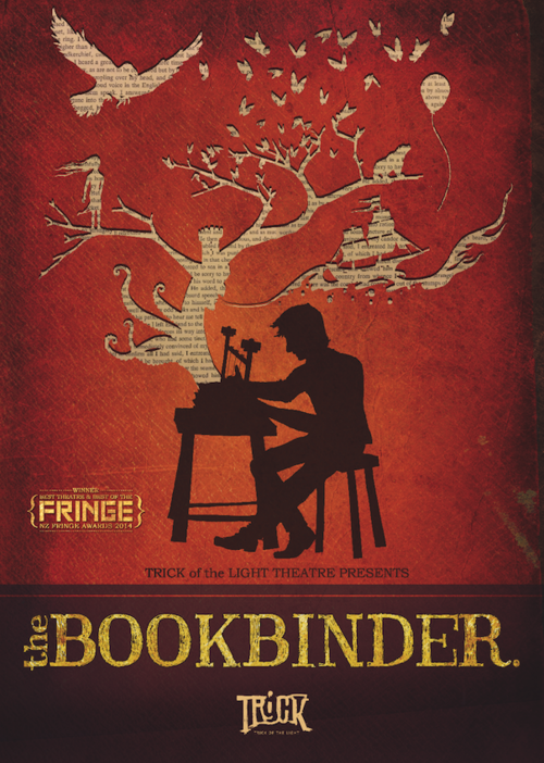
Drawing to its close, does 2014 have any more treats or presents to bestow beyond the return of the Mystery Book Artist of Edinburgh and the debut of “The Bookbinder” from New Zealand’s Trick of the Light Theatre?
The MBAE has donated a new sculpture — a fantastical paper replica of the 16th century merchant’s house known as Riddles Court set behind the Royal Mile — in support of its renovation as home to the Patrick Geddes Centre for Learning and Conservation. The name of the building and that of the center could not be more appropriate. This is the 12th gift to Edinburgh’s literary establishment from the artist whose identity remains a mystery. As well, Geddes featured in the MBAE’s very first gift in 2011 to the Scottish Poetry Library, whose slogan “By leaves we live” originated with Geddes:
read the source poem here). A regular but still anonymous frequenter of the Edinburgh International Book Festival, the MBAE posted this video
of the Riddles Court sculpture in progress, echoing serendipitously “The Bookbinder”, a performance piece on the other side and bottom half of the globe by Trick of the Light Theatre this year.
The Bookbinder Copyright 2014 Trick of the Light Theatre
Written and performed by Ralph McCubbin Howell, directed by Hannah Smith, with music by Tane Upjohn Beatson, “The Bookbinder” incorporates book sculpture as pop-up book theater and was first performed at Arty Bees Bookshop during the New Zealand Fringe Festival 2014.
What a pleasure and gift that would be to find the MBAE and “The Bookbinder” in a common festival. If holiday wish lists are allowed, let’s add to it Moonbot Studios, home of The Fantastic Flying Books of Mr. Morris Lessmore.
“Previously on …” Say the phrase and most listeners’ brains switch to a favorite channel and television series. It is part of our vernacular. It instantly evokes a compound state of remembering and anticipating.
Myriapod Productions embodies that state of mind in its animated alphabet-book film series Mysteries of Vernacular. Each book for each letter is an old yellowed or gray hardback whose pages turn by themselves to reveal silhouette figures that glide across the pages, accordioned illustrations from other works or carvings reminiscent of the book sculptures of Doug Beube, Brian Dettmer and Odires Mlászho – with each vernacular word and definition emerging from an old library card pocket or from beneath a flap or cutout on the page.
The treatment of the letter Wis particularly apropos to this compound artwork. W is for “window”, which we are informed by Graham James (the narrator) is an example of the Old Norse technique of word invention called kenning. Kenning is the joining of two things (or rather two words for two different things) to designate a third thing: such as whale + road = whale-road = sea. Window is originally an Old Norse kenning word: windauga = vind (wind) + auga (eye). The book in the animation is Mikhail Sholokhov‘s The Don Flows Home to the Sea, a Nobel-prize-winning window on the life of the Don Cossacks during the Russian Revolution.
The book for the letter A (for “assassin”) is Karl Menninger‘s Love against Hate, whose theme of love’s shaping our instinctual aggressiveness suggests an ironic bent and wry, punning sense of humor in Jessica Oreck and her Myriapod team. The letter C for “clue” traces back to the ball of yarn (clew) that Ariadne gave Theseus to help him find his way out of the maze after killing the Minotaur, which is explained with an animation of George Bernard Shaw‘s The Intelligent Woman’s Guide to Socialism and Capitalism. C is also for “clever”.
D for “dynamite” plays out on the pages of A Number of Things, a satiric novel of Irish and British manners by Honor (Lilbush Wingfield) Tracy. Tracy became the fuse to a stick of dynamite planted by Bevis Hillier in his rival A.N. Wilson‘s biography of Sir John Betjeman. Hillier concocted a letter from Betjeman purporting to reveal an affair between Tracy and the Oxford don. Not only was the letter a hoax, but Hillier embedded an acrostic that spelled out “A N Wilson is a shit”.
Of course, X for “x-ray” is illuminated with George Iles‘ Little Masterpieces of Science, and naturally, Z for “zero” is accounted for with Teach Yourself Calculus. But this soupçon of humor runs out with H (what has “hearse” to do with Bernard Jaffe‘s story of chemistry?) and G (what has “gorgeous” to do with James Russell Lowell?) and F (what has “fizzle” to do with Mark Twain‘s Life on the Mississippi, although one can imagine his delight with the word’s etymological kinship with flatulence?).
Each letter, definition, chapter, volume, episode (?) of Mysteries of Vernacular elicits affection for, if not outright love of, words and language. Perhaps that is not just down to Oreck’s and team’s skill, humor and cleverness. After all, for most of us, the alphabet-book is our childhood entrée not only to letters and words but any aspect of the internal and external world we fancy. Just for ages 3-5, our bookstores and libraries have the ABCs of Asthma, Bible Verse, Colors, Dinosaurs, Engineering, Feelings, Golf, Halloween, Ice Cream, Jobs, Kangaroos, Love, Math Riddles, Nature, Origami, Pigs, Questions, Rocks, Sounds, Touch, Under the Sea, Vanishing (endangered species), Wildlife, Yoga and Zoos. And for the more app-minded, there is also Moonbot Studio’s contribution to the ABCs: The Numberlys.
Screenshot from The Numberlys William Joyce, Moonbot Studios, 2012
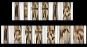
Myriapod starts with the advantage of this long, long “previously on …” in our hearts and minds. In exploiting its advantage, Mysteries of Vernacular takes us on a gentle rootle round the attic and cellar of our language and social history. The tradition of the abecedary and the disciplines of history and etymology offer a natural canvas on which Myriapod’s animation projects numerous techniques of book art. The intaglio carving reminds us not only of Beube, Dettmer and Mlászho but more so of Nerhol (the collaboration persona of Ryuta Iida and Yoshihisa Tanaka) and the work entitled Oratorical Type.
Oratorical Type by Nerhol (Ryuta Iida and Yoshihisa Tanaka)
Oratorical Type by Nerhol (Ryuta Iida and Yoshihisa Tanaka)
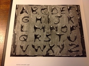
The Mysteries’ wooden desktop framing recalls Abelardo Morell‘s A Book of Books.
Water Alphabet, 1998 Abelardo Morell
The animated book folds are enchanting (although they might have but do not aspire to the level of origami achieved by artists and craftworkers like Heather Eddy).
The Alphabet Tutorial Heather Eddy, 2013
little letters Heather Eddy, 2013
More extensively used and in keeping with the more two-dimensional feel of Mysteries is the technique of papercutting (as distinct from carving) on display with the letter W. The technique dates to the Tang Dynasty (618 -906 AD) but, in this context, harks back more recently to Victorian silhouette artistry.
Victorian Silhouette Abecedary
The series of 26 episodes so rich in content and technique is addictive. You will find yourself, as with any well-done abecedary, wishing for more letters in the alphabet. Although there is a vast vocabulary of other vernacular awaiting treatment, at a production cost of $80,000 per episode, it is likely those words will wait a long time. So we are left with having to remember our anticipation. Not all anticipation is more often enjoyed in itself rather than its resolution. You have 26 windows of opportunity to learn in Mysteries of Vernacular.
rankfurt and its book fair continues, so here is a celebration of type and the book. The initial “F” comes from Boekwetenschap en Handschriftenkunde Amsterdam, wherePaul Dijstelberge and others have posted over 30,000 photos of initials, ornaments and type in cooperation with the Special Collections, Amsterdam; the Royal Library, The Hague; and the Archive at Alkmaar.
Much has been made in recent years about the emergence of the ebook and the ‘death’ of the printed book. Such discussions are fashionable and fruitless. As long as people read, the shape or form of the book is irrelevant. In fact, the ebook may well be a blessing in disguise for those who passionately defend the printed book. Photography did not kill off portrait painting as it was once feared; neither will the ebook refer the printed text to the dustbin of history.
Photography may not have killed off portaiture, but digital photography did kill off Eastman Kodak. Which entities ebooks will see off will be debated until the event. The shape or form of extended narrative and discourse, however, is surely not irrelevant. The Fantastic Flying Books of Mr. Morris Lessmore and the walk-in book exhibition Memory Palace at the Victoria & Albert Museum are recent evidence. While more evidence may be adduced, do we need it to know that shape and form matter, or that we gather each year in Frankfurt to celebrate reading and its shape and form?