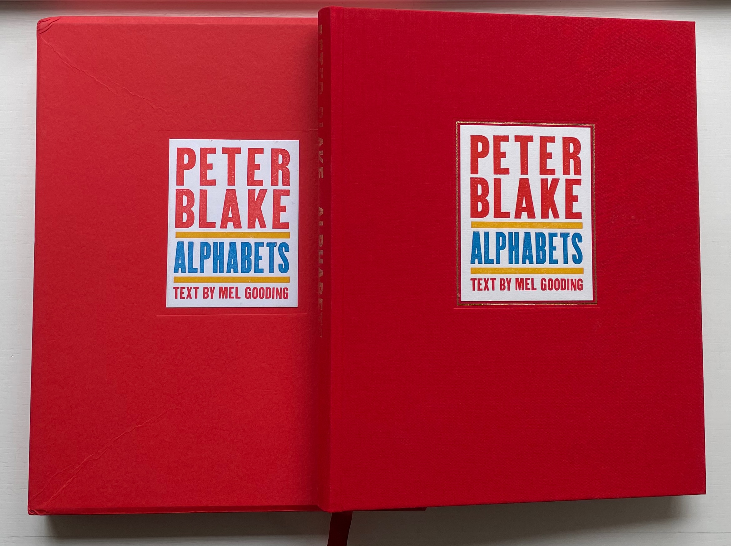
Peter Blake: Alphabets (2010) Peter Blake, Text by Mel Gooding Slipcased, cloth and casebound hardback with endbands matching red cloth and yellow doublures. H310 x W255 mm. 224 pages. Edition of 600, of which this is #471. Acquired from The Plantagenet King, 3 November 2022. Photos: Books on Books Collection. Displayed with permission of the artist.
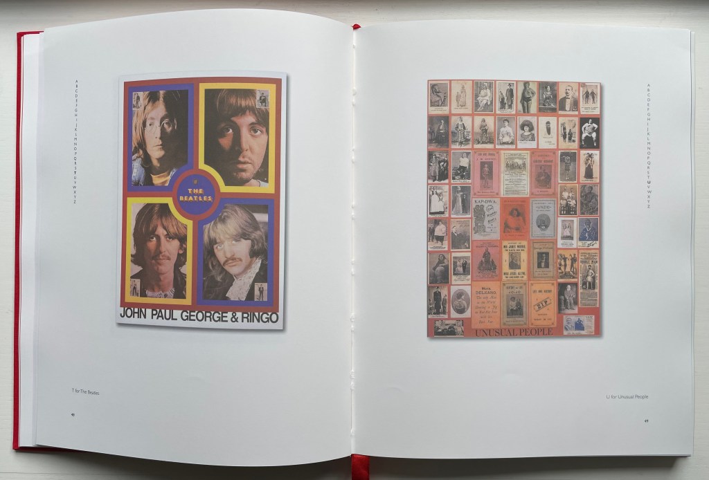
Peter Blake has made the alphabet itself a subject of so many of his print series and exhibitions that Peter Blake: Alphabets and the exhibition associated with it stand as a retrospective. Naturally it showcases his style and signature techniques. It also showcases an outward and inward appraising wit that leads to humorous juxtapositions like the poster of “T for The Beatles” with the collage of “U for Unusual People”. But most of all it proves the variety and unity that a creativity-stimulating constraint like the alphabet can yield. With Blake’s wide-ranging uses of the alphabet, Mel Gooding’s commentary and the volume’s elegant design and production, Peter Blake: Alphabets serves as both example and reference for alphabet-related artists’ books.
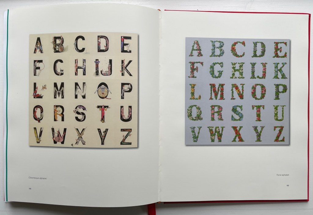
Found objects and collages have long made natural allies. Peter Blake: Alphabets demonstrates that finding objects can also lead to a passion for collecting, and in Blake’s hands, a collector’s passion becomes not only the subject of art but part of the artistic process, a tool and a technique. The book even has a section entitled “Found Alphabets” that showcases his collection of widely varied alphabet posters and unifies them with unified scale.
It is Mel Gooding who points out this unified scale in his introduction to the section. As co-author with Julian Rothenstein of Alphabets Et Other Signs (1993), ABZ (2003) and A2z : Alphabet & Signs (2018), Gooding could not have been better suited for introducing this volume and for interviewing Blake for the earlier An Alphabet (2007), which Gooding references. After his introduction on the alphabet in general and Blake’s alphabets, the volume divides into two parts: “The Alphabets” and “Collections”. In the first part, there are seven sections; in the second, six. For each section, Gooding provides introductory comments.
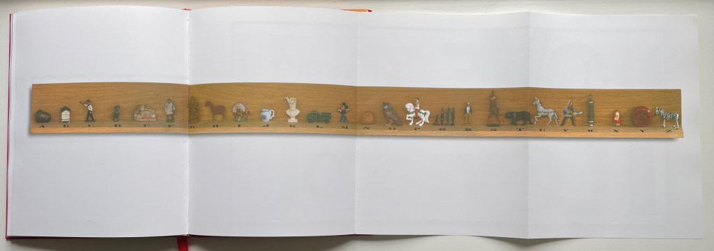
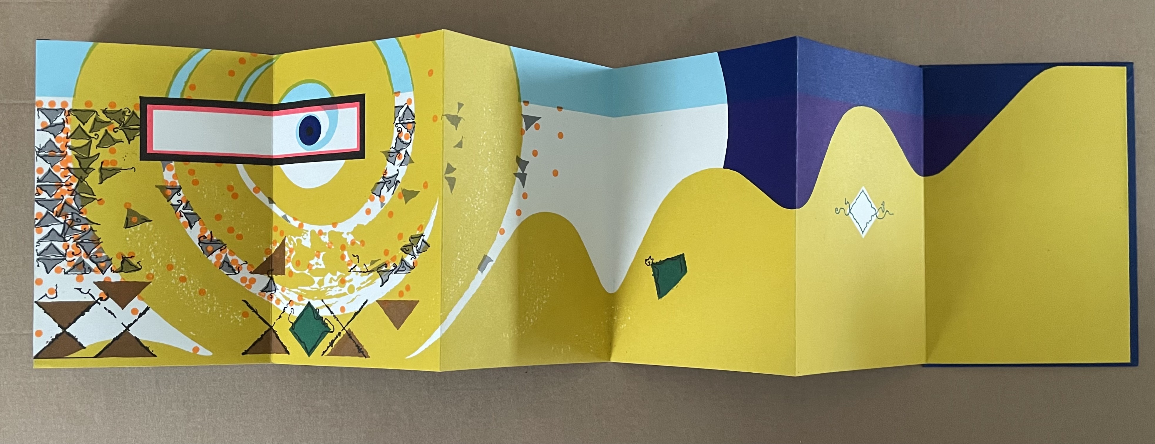
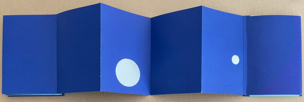
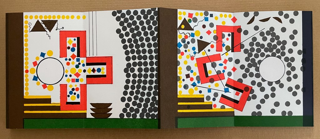
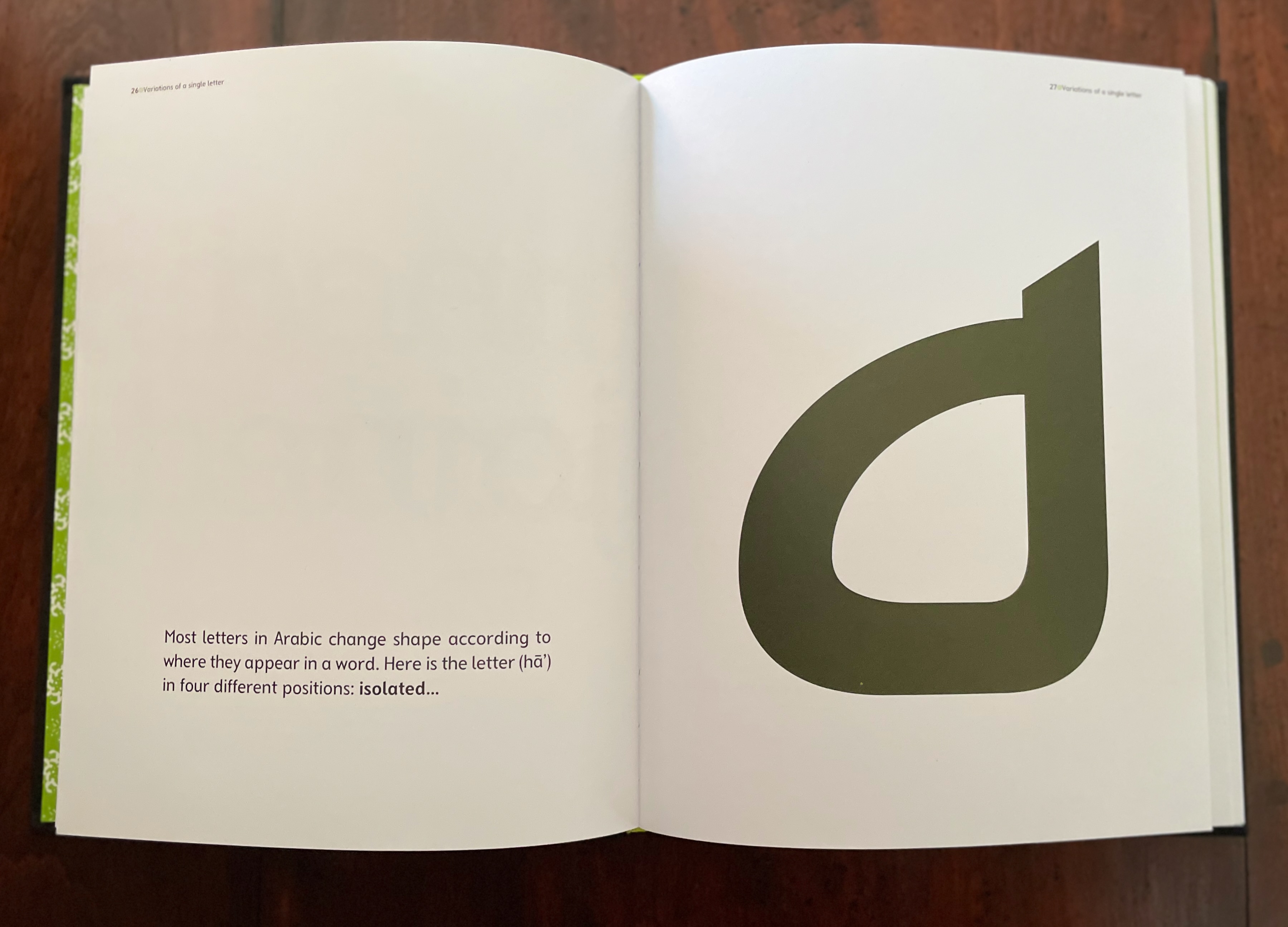
Gooding’s critical insights often go beyond Blake’s art as in the section entitled “Horizontal Alphabets” when he reminds us to be aware of the possible implications of the artist’s horizontal all-at-once display of the alphabet. This section also provides the opportunity for the artist, editor and book designer to collaborate and shine. As the foldout below allows, Blake’s alphabetic arrangement of objects can be seen all at once, but as Gooding points out, the horizontal presentation becomes a discursive terrain, a carnival, a procession of sculpted objects with individual shape, color and style. The viewer can find real or imagined relationships between and among them, perhaps more easily than if they were presented in a page-turning codex format. But the contrast to which Gooding draws attention is with the vertical presentation of individual letters, as in Alphabet No. 10, where attention is drawn more to the categorizing and ordering nature of the alphabet.
Although the work above is a limited edition, Peter Blake’s ABC (2009) is widely available commercially, and Peter Blake: About Collage (2000) is well-represented in libraries. The latter has the advantage of exploring Blake’s collecting and its relation to the technique of collage in a context that includes Joseph Cornell and Tracy Emin.
Seven works in the Books On Books Collection represent Warja Lavater’s art: Le Petit Chaperon Rouge (1965), a later tactile version of the same work (2008), Sketchbook: Le Non-obéissant (1968), Spectacle (1990), Ourasima (1991), Tanabata (1994), and Kaguyahime (1998). The French publisher Adrien Maeght was Lavater’s most consistent champion, publishing several of her leporello works, including a now rare boxed set.
Le Petit Chaperon Rouge (1965)
Le Petit Chaperon Rouge (1965) Warja Lavater Accordion book in perspex slipcase. Slipcase: H167 x W117 x D26 mm; Book: H160 x W113 x D20 mm, closed; W4.5 m, open. 40 panels. Acquired from Patrick Wainwright Rare Books, 22 June 2022. Photos: Books On Books Collection.
Abstract shapes stand in for the characters and settings in this retelling of Little Red Riding Hood’s journey through the forest to visit her grandmother. With the only text being that matching symbols to the cast of characters and settings, the tale is told wordlessly.
Knowing the story and having the cast to hand, the reader/viewer easily follows the shapes and colors into a new and artful experience of the folktale. But what if the shapes and colors cannot be seen?
Le Petit Chaperon Rouge (2008)
Le Petit Chaperon Rouge (2008) Warja Lavater and Myriam Colin Accordion book boxed in cloth-covered board box. Box: H190 x W130 x D75 mm; Book: H176 x W122 x D70 mm. closed; W4.3 m, open. 40 panels. Acquired from Les Doigts Qui Rêvent, 30 October 2022. Photos: Books On Books Collection. Displayed with permissions of Les Doigts Qui Rêvent.
Artist Myriam Colin and publisher Les Doigts Qui Rêvent (“Fingers that Dream”) addressed this question with print, Braille, cloths of different texture, leather, blind embossed shapes, plastic filaments and sewing.
Between the printed text and Braille-rendering for the cast of characters and settings, buttons of different cloths and different embossed shapes appear. In the opening scene, the red felt button for Little Red Riding Hood is of course smaller than the orange-brown broadcloth button for Mother, who stands before the raised rectangle for the house and looks over her daughter’s head at the forest of raised dots.
Later, the wolf’s belly becomes a large sewn pouch with the slit cut by the Hunter through which Grandma and Little Red Riding can be felt, ready to escape.
The brown leather button for the Hunter unites the felt Red Riding Hood, nubby-cloth Grandmother and broadcloth Mother in a clearing in the forest. A satisfactory conclusion for the sighted and visually impaired.
Update Lavater
Seven works in the Books On Books Collection represent Warja Lavater’s art: Le Petit Chaperon Rouge (1965), a later tactile version of the same work (2008), Sketchbook: Le Non-obéissant (1968), Spectacle (1990), Ourasima (1991), Tanabata (1994), and Kaguyahime (1998). The French publisher Adrien Maeght was Lavater’s most consistent champion, publishing several of her leporello works, including a now rare boxed set.
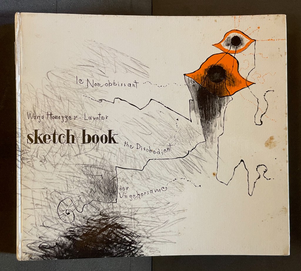
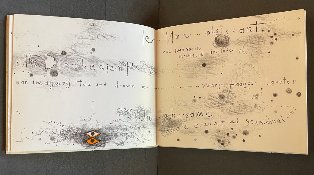
Sketchbook: Le Non-obéissant (1968)
Sketchbook: Le Non-obéissant; The Disobedient (1968) Warja Lavater Casebound, printed gloss paper over boards, plain endpapers and fly leaves. H210 x W235 mm. [45] Chinese fold folios.Acquired from Ken Sanders Rare Books, 18 July 2024. Photos: Books On Books Collection.
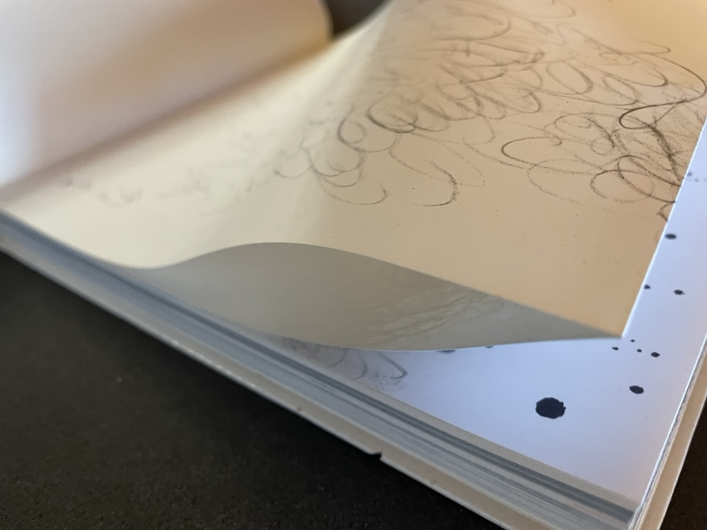
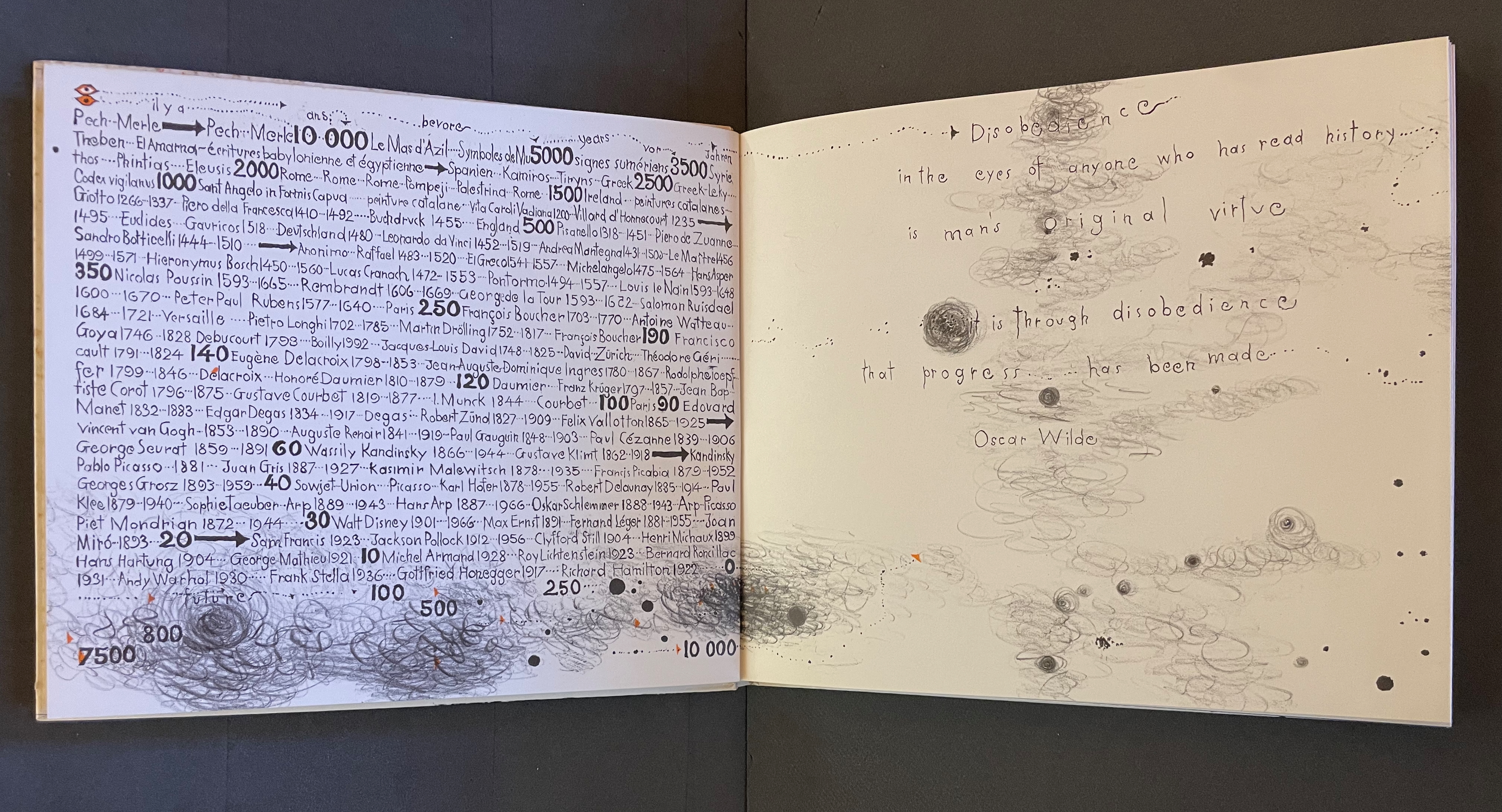
Warja Lavater’s Sketchbook opens with a page of pencil scrawling that wraps from the first side of a Chinese-fold folio, over the fold, and onto the folio’s other side, where a 10,000+ year timeline of artists appears in cramped handprint. The scribbling continues onto the next folio, embroidering Oscar Wilde’s aphorism
Disobedience in the eyes of anyone who has read history is man’s original virtue. It is through disobedience that progress has been made.
The scrawling runs over the fold of the folio and across a double-page spread to become the multilingual title page. Or rather the “subtitle becomes title page”. Look again at the cover. Wasn’t the title Sketchbook? Now it is Le Non-obéissant | The Disobedient | Der Ungehorsam, and it has acquired a new subtitle, and a strange one at that: Une Imagerie Racontée et dessinée par … |An Imagery Told and Drawn by … | Eine Imagerie Erzählt und Gezeichnet von Warja Lavater.
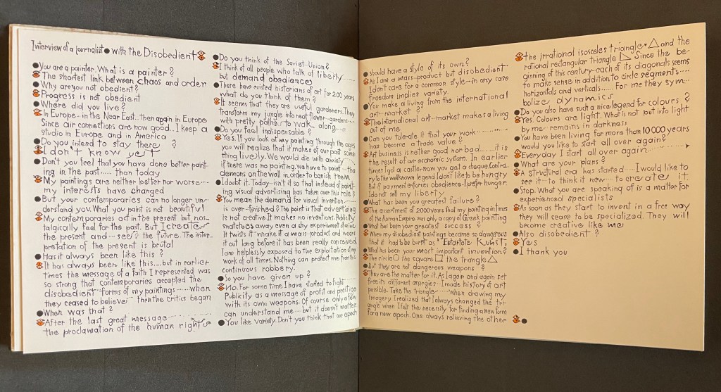
“An imagery told and drawn” captures well Lavater’s technique of abstract pictorial retelling of familiar fairy tales such as Little Red Riding Hood and Cinderella. Now, in this sketchbook, she uses it to create her own fairy tale of art history. As we are about the learn, the doodle labelled le peintre | the painter | der Maler on the left hand page above is the main character named “the Disobedient”. Reminiscent of Mel Brooks and Carl Reiner’s sketch “The 2000 Year Old Man”, the Disobedient, who has been around for almost 12,000 years, has some humorous and cantankerous answers to the interviewer’s questions about her experiences from cave art to Pop art.
“You make a living from this international art market?”
“The international art market makes a living out of me.”
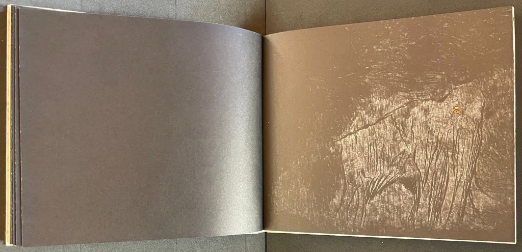
Unlike the Key pages in her fairy tales identifying the images and markings, The Disobedient’s Key page is delivered in her voice. She explains that the eye with white around its iris stands for her “exterior eye with which I look” and the eye with orange around its iris stands for her “interior eye with which I think”. Her techniques or “means of my performance” might be squiggles, geometric objects or figurative drawings. The clearly defined black dots represent her contemporaries. Orange markings represent her emotions, her ferveur and Gefuhl. All the bold numbers mark the “years more or less gone by”. But the story begins in earnest in the dark of four black folios and a fifth in which the artist appears for the first time in history followed by her first work, a drawing of a mammoth.
Spectacle (1990)
Spectacle: Pictoson Mural (1990) Warja Lavater H215 x W296 mm. 22 pages. Acquired from Antiquariat Übü, 3 August 2022. Photos: Books On Books Collection. Displayed with permission of the publisher.
Spectacle is an origin story of shapes, signs, the sounds of language, their alphabetic representation and use to form words. It is similar to the tale in Il était une fois un alphabet (1951/2009) by Souza Desnoyer and Marcelle Marquet. In both, the separate worlds of vowels and consonants join to create the alphabet. In Il était une fois, the letters already exist, have anthropomorphic shapes and engage in familiar activities like voyages, feasts, dances and processions. The narrative has scenes and settings to carry it along. Spectacle‘s origin narrative, however, letters develop from a system of signs created/discovered by a wizard. An abstract shape himself, the wizard presides over the story’s unfolding across an abstract landscape. Even though Lavater maps a written version (in eight languages) of the tale to the panels, the pictorial narrative remains challenging.
Elliptical and shamanic, the written narrative itself is challenging. It may remind the reader of Italo Calvino’s Big Bang story “Sul far del giorno” (“At daybreak”) in his collection Le Cosmicomiche (1965) (“Cosmicomics“1968), to which Shirley Sharoff paid homage in OVI: objets volants identifiés dans le ciel d’Italo Calvino, a work contemporary with Lavater’s. The verticality of Lavater’s extraordinary leporello might also remind the viewer of Blaise Cendrars and Sonia Delaunay’s La Prose du Transsibérien et de la petite Jehanne de France (1913).
Somehow, though, despite its winged emblems of words, the eleventh panel with its regimented alphabet seems visually diminished, not quite the joyous spectacle promised by the text. For that, we would have to turn elsewhere in the collection: William Joyce’s origin story The Numberlys (2014).
The Numberlys (2014) William Joyce and Christina Ellis Hardback, paper on board. H220 x W300 mm, 52 pages. Acquired from London Bridge Books, 15 April 2021. Photos of the book: Books On Books Collection.
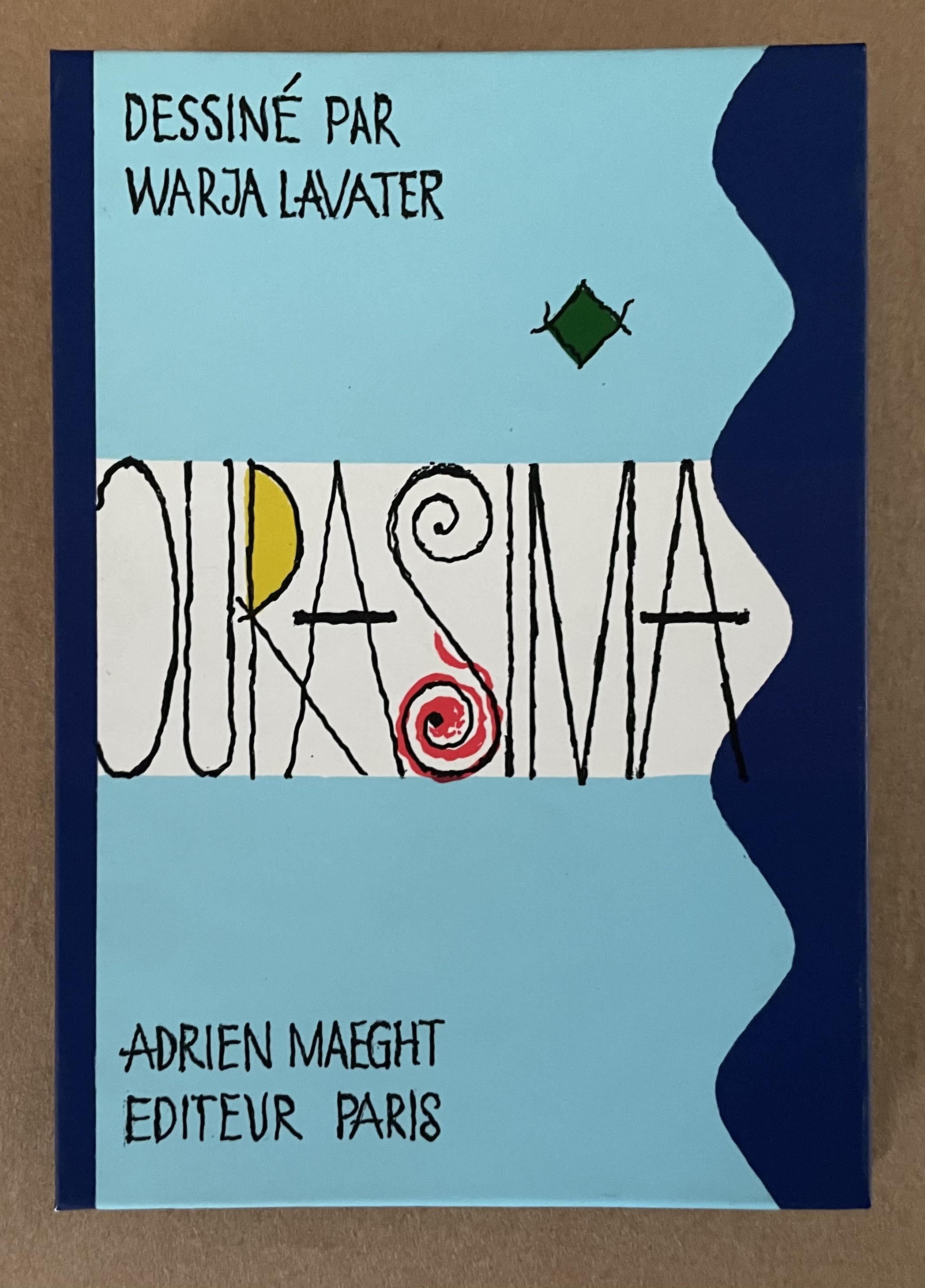
Ourasima (1991)
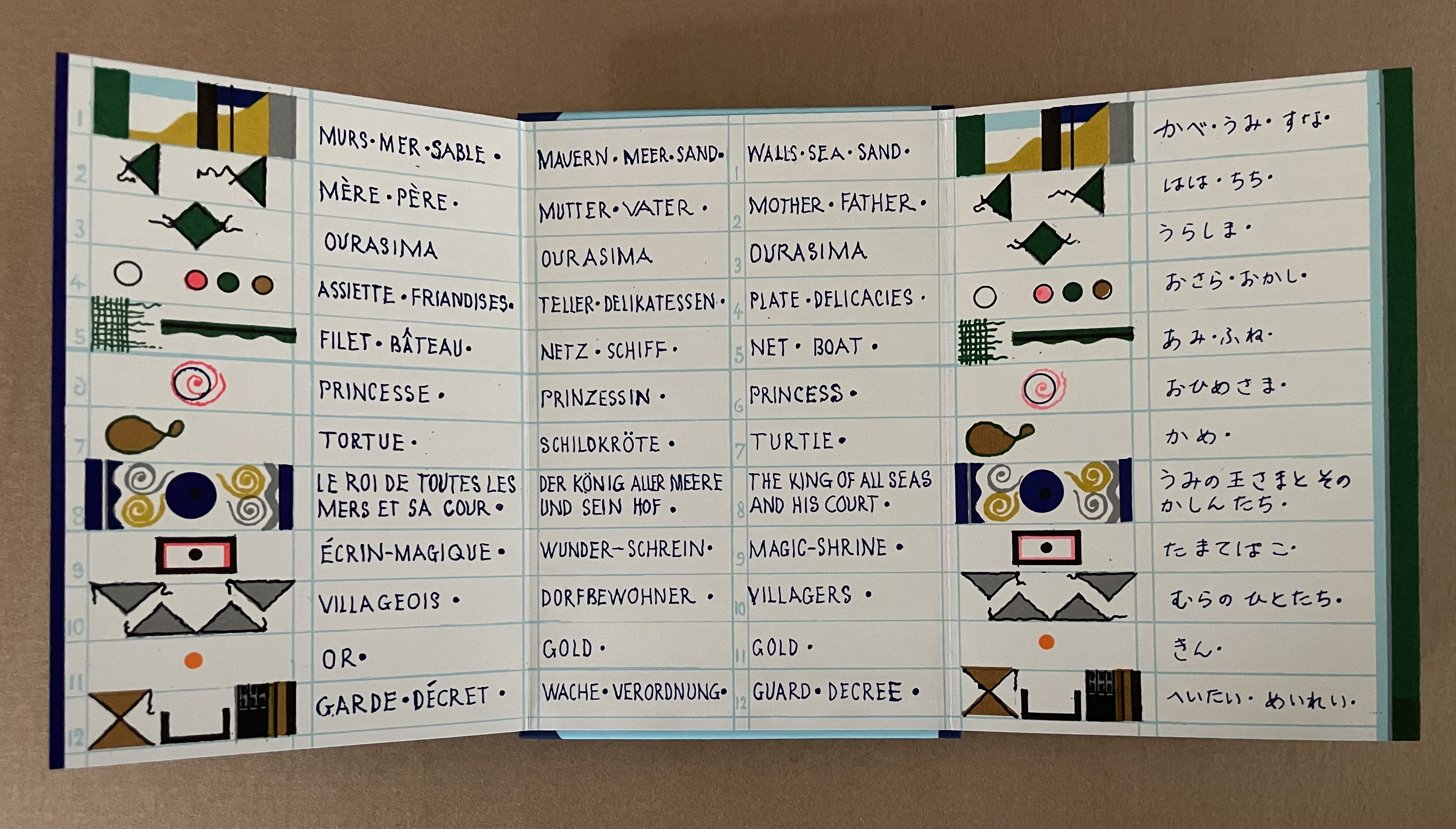
Ourasima: Une imagerie en transparence d’après le conte japonais (1991) Warja Lavater Plexiglas slipcase enclosing a double-sided accordion book. Box: H178 x W118. Closed accordion: H160 x W112 mm. Open accordion: W4624 mm. [86] panels. Acquired from Versand-Antiquariat Rainer Richner, 24 August 2023. Photos: Books On Books Collection.
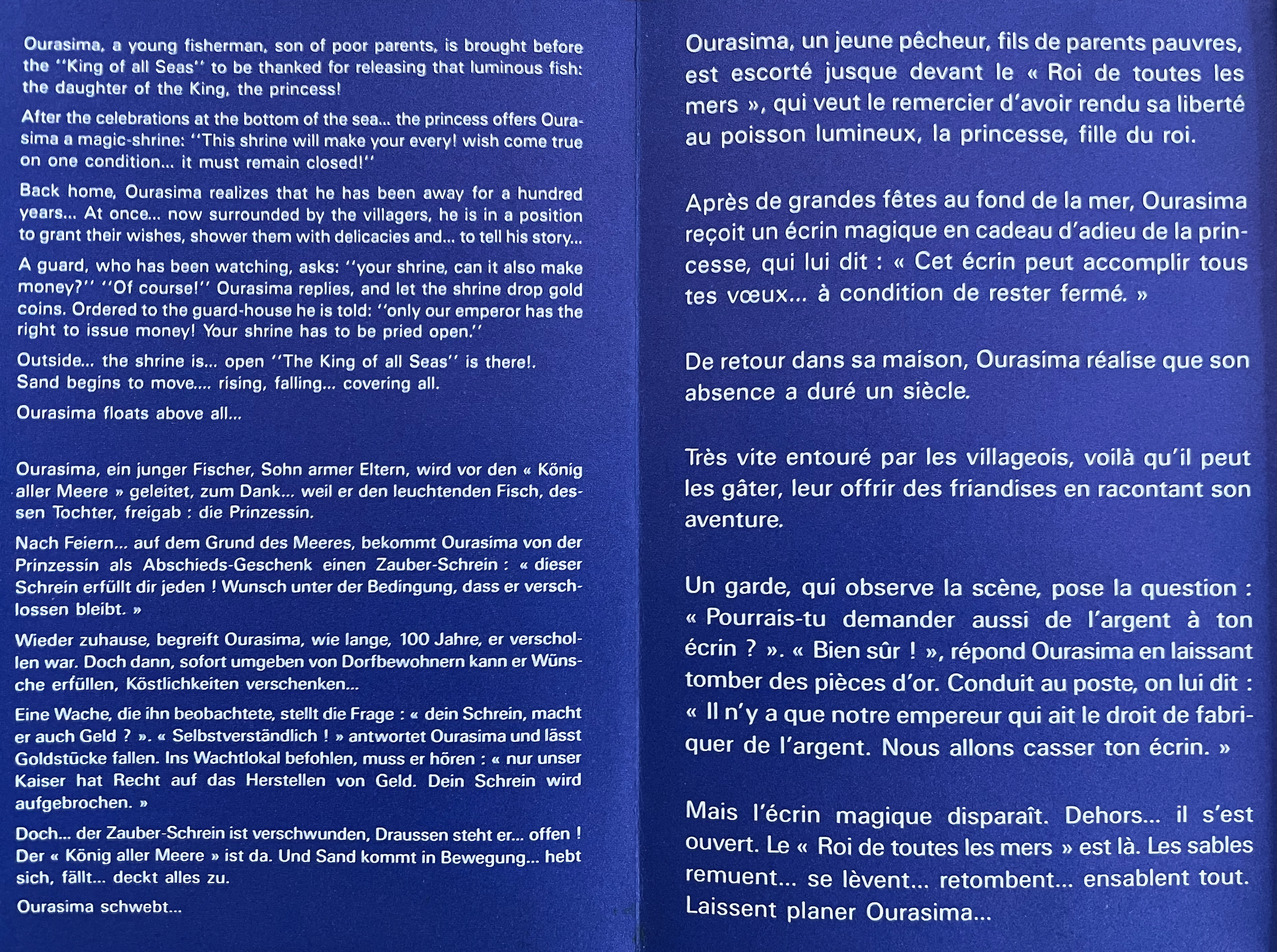
Ourasima, also known as Urasima Taro, is a Japanese folktale that reaches back to the eighth century. Lavater’s version is a cross between the stories of the Golden Goose, Rip Van Winkle and Pandora’s Box. In keeping with her treatments of Western folk and fairy tales, Lavater brackets her wordless retelling with a cast of characters, objects and their corresponding emblems at the beginning and a brief summary of the story at the end — all annotated in French, German, and English, but this time in Kanji as well.
Lavater’s version departs significantly from the traditional versions as described by the Library of Congress:
There are variations to the story depending on the intended audience and the period, and it is still known by its Japanese title Urashima Taro. It tells of a young and kind fisherman named Urashima. One day he catches a large turtle while he is out fishing. Taking pity on the turtle, he releases it back into the sea, whereupon the beautiful daughter of the god of the sea appears and tells him that the turtle was actually the personification of her. To thank him for saving her, she invites Urashima to Ryugu-jo (the Palace of the Dragon God) at the bottom of the sea. He then marries her and lives happily at the palace. Three years later he asks for permission to return to his village for a short time, because he wants to see his family. His wife gives him a box and makes him promise not to open it, as he would never be able to come back if he did. When Urashima returns home, he finds that everything has changed during those three years and that his family and his village have disappeared. He had in fact left his village 400 years before, so his parents, siblings and friends were all dead. Not knowing how to get back to the Palace of the Dragon God, he breaks his promise and opens the box, hoping that its contents can help him. After he opens the box, white smoke appears and Urashima turns into a white-haired old man and dies.
Lavater’s emblematic retelling works well with the basics such as the family home with Ourasima between his mother and father, Ourasima with his boat and fishing net, the capture and release of the princess, the turtle’s arrival and transport of Ourasima to the princess, the marriage, Ourasima’s return on the back of the turtle, and the distribution of delicacies and gold. But the “emblemism” struggles to reflect the verbal instructions of the princess and the guards’ rationale for arresting Ourasima.
Ourasima at home between his mother on the left and father on the right.
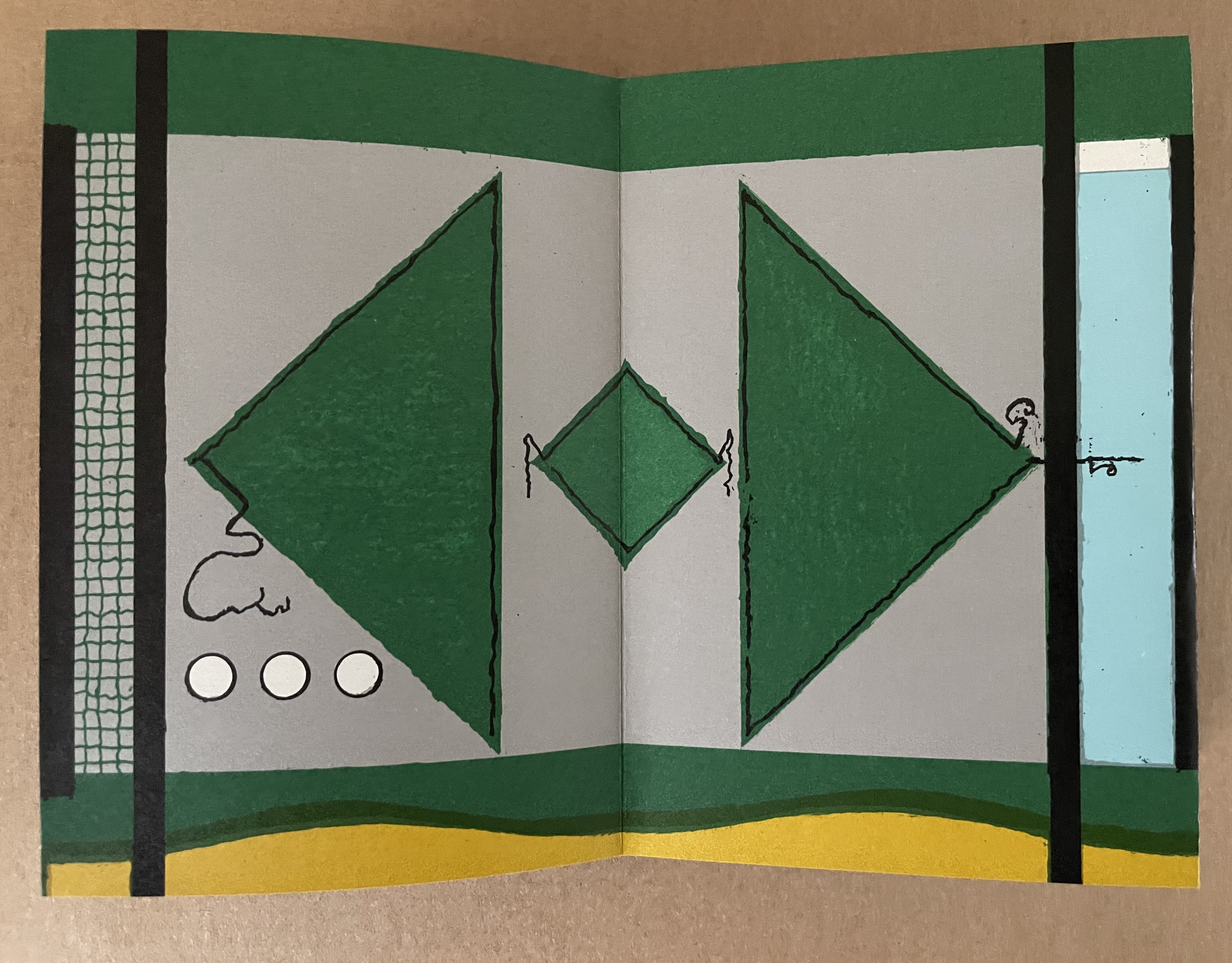
With the box forced open, chaos ensues with a whirlwind of sand dispersing everything and freeing Ourasima.Nothing in Lavater’s summary indicates that Ourasima becomes an old man at this point, but his emblem’s shift from green to white in the next panels aligns with the traditional version.
The chaos of sand freeing Ourasima and his becoming an old man.
To find Ourasima floating “above all” as Lavater’s summary indicates, we have to turn to the other side of the leporello, but the “emblemism” is difficult to follow. Has the sand, covering all, yielded to the domain of the sea? Has the empty magic box risen from the depths to float along the waves? Does the King recapture it? Has the white diamond-shaped Ourasima been transformed into a round sea creature?
Of course, text and illustrations went side by side in all the much earlier versions with calligraphy, watercolors, woodblock prints and, in the later Meiji period, with type.
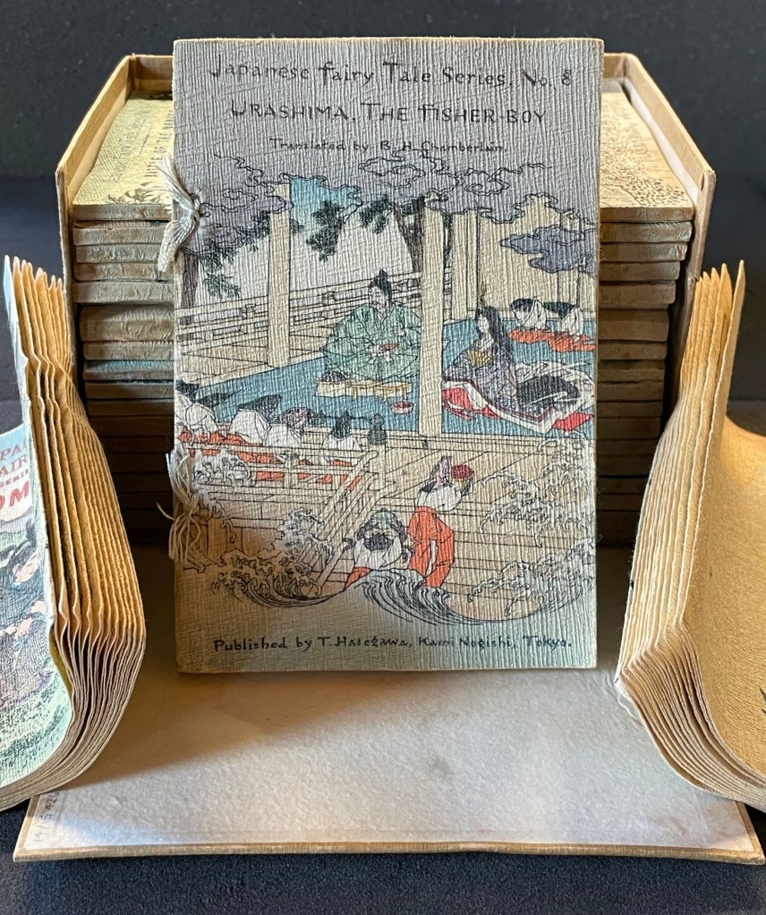
In the same period, the first translation into English appeared within a boxed set of Japanese fairy tales, printed on cloth folios and stab bound.
Japanese Fairy Tales Series. Bodleian Libraries. Schorr Collection f.22. The Fisher-boy Urashima, translated by Basil Hall Chamberlain, illustrated by Eitaku Kobayashi, and published by Hasegawa Takejiro (1886).
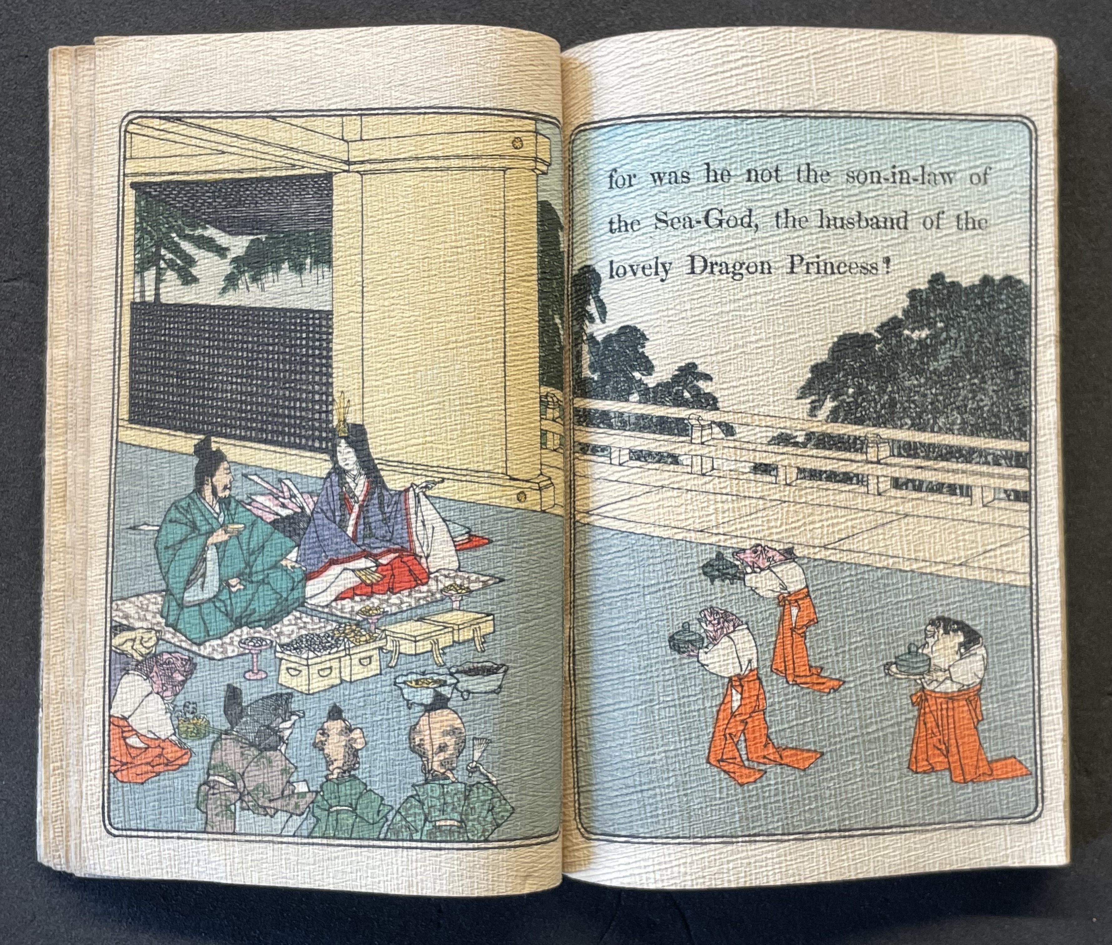
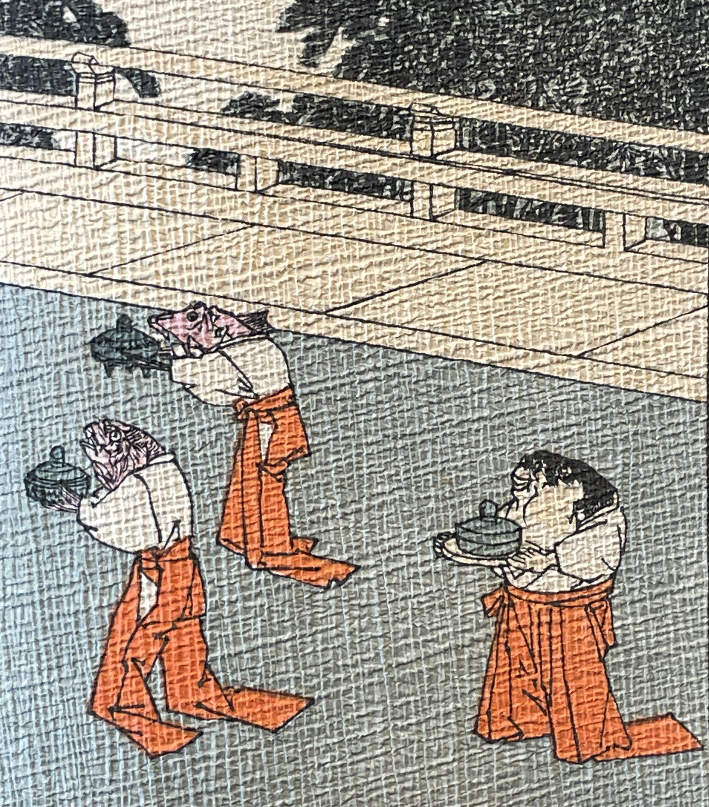
Ourasima and Otohime served in the palace by undersea servants.
In Lavater’s art, image and abstraction become the primary focus and vehicle for the narrative. As we shall see, this earliest of Lavater’s attempts with Japanese fairly tales is narratively the least straightforward, probably because of the deviations prompted by the inclusion of themes from the Golden Goose and Pandora’s Box.
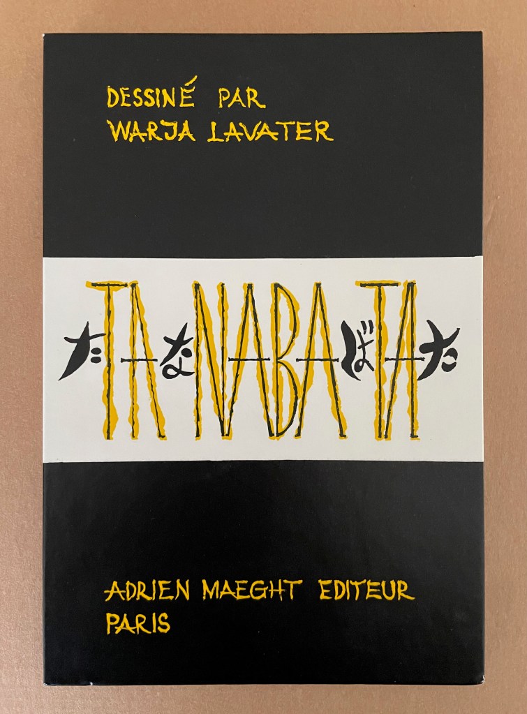
Tanabata (1994)
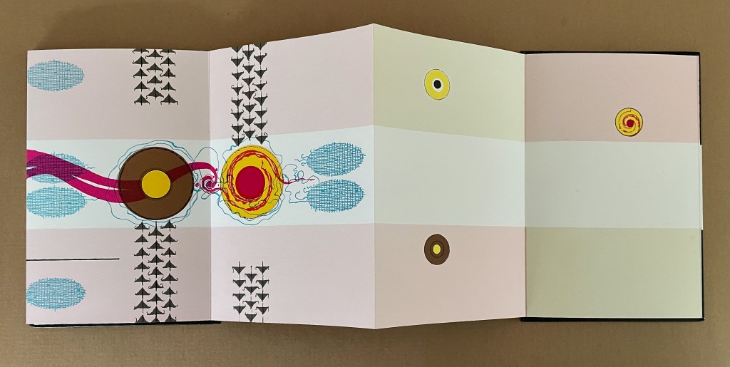
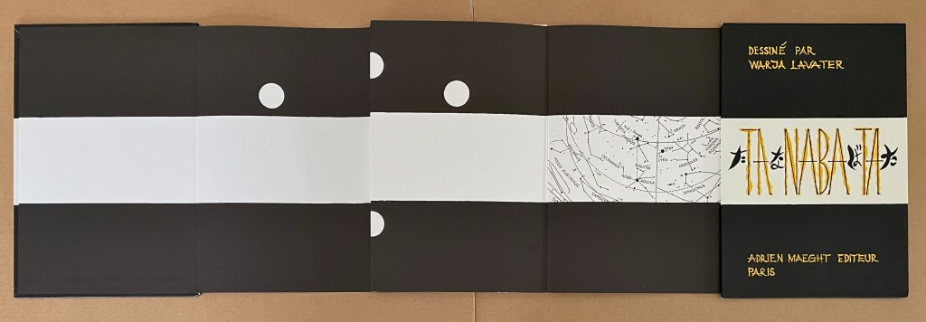
Tanabata(1994) Warja Lavater Acrylic slipcase, double-sided leporello. Slipcase: H216 x W150 mm; Book: H216 x W145 mm. 18 panels, each side, one foldout with 2 panels. Acquired from Dilat, 14 January 2025. Photos: Books On Books Collection.
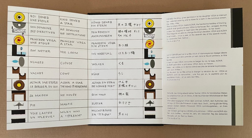
Tanabata is Lavater’s version of a Sino-Japanese constellation myth about the stars Deneb, Vega, and Altair. The story is that the princess Orihime, associated with the star Vega, also known as the weaver star, falls in love with Hikoboshi, associated with the star Altair, also known as the cow-herder star. Her father, Deneb the Sky King, banishes her to one side of the Milky Way and Hikoboshi to the other side. Later he relents and allows them to meet only on the seventh day of the seventh month of the lunar calendar when a flock of magpies form a bridge for their reunion. This has become the date of the annual Star Festival in Japan.
As with Ourasima, Lavater modifies the tale. She has the King permit Orihime to bathe in the Milky Way where she first meets Hikoboshi. Additionally, the King has the magpies drag Orihime back to her weaving, but the birds persuade the King to permit the annual reunion at the Milky Way.
Reading from left to right. Altair (cowherd star) and Vega (weaver star) cross the Milky Way over the “magpie bridge” to unite during Tanabata, the annual Star Festival in Japan.
The reverse side of the leporello represents the two lovers as two solid white balls separated by the Milky Way represented as a solid white band, running right to left from the front cover. Over the course of the leporello, the lovers move to join one another on one side of the Milky Way then to separate according to their celestial fate.
Reading from the celestial map right to left: the white dots replicate the positions of Deneb and Vega above the Milky Way and Altair beneath it.
Despite the variations on the traditional tale, Tanabata is narratively more straightforward than Ourasima. With 10 emblems compared to Ourasima‘s 12, Tanabata ought to be visually more straightforward as well, but after the first two panels introducing Deneb, Vega, and Altair, every panel — except for the last two — seems just as busy as the most crowded in Ourasima. This, however, seems intentional. The last two panels stand out all the more in their simplicity mirroring the stars’ positions on the reverse side in the celestial map and the abstraction.
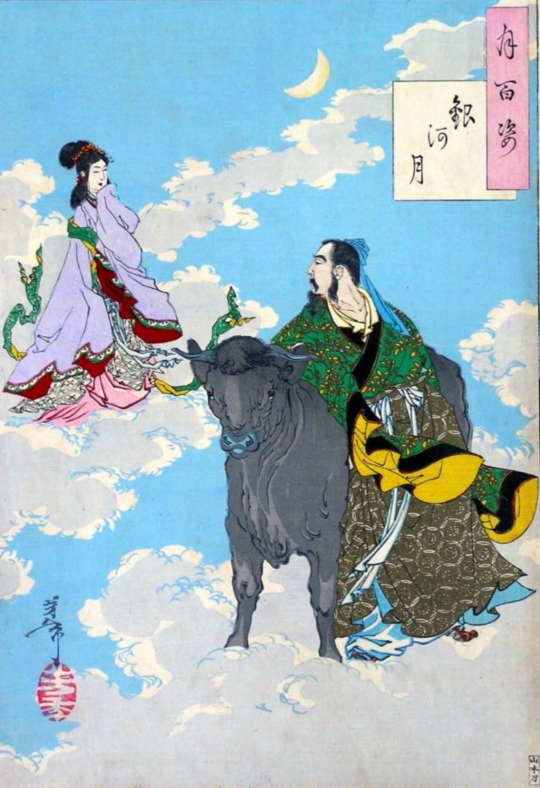
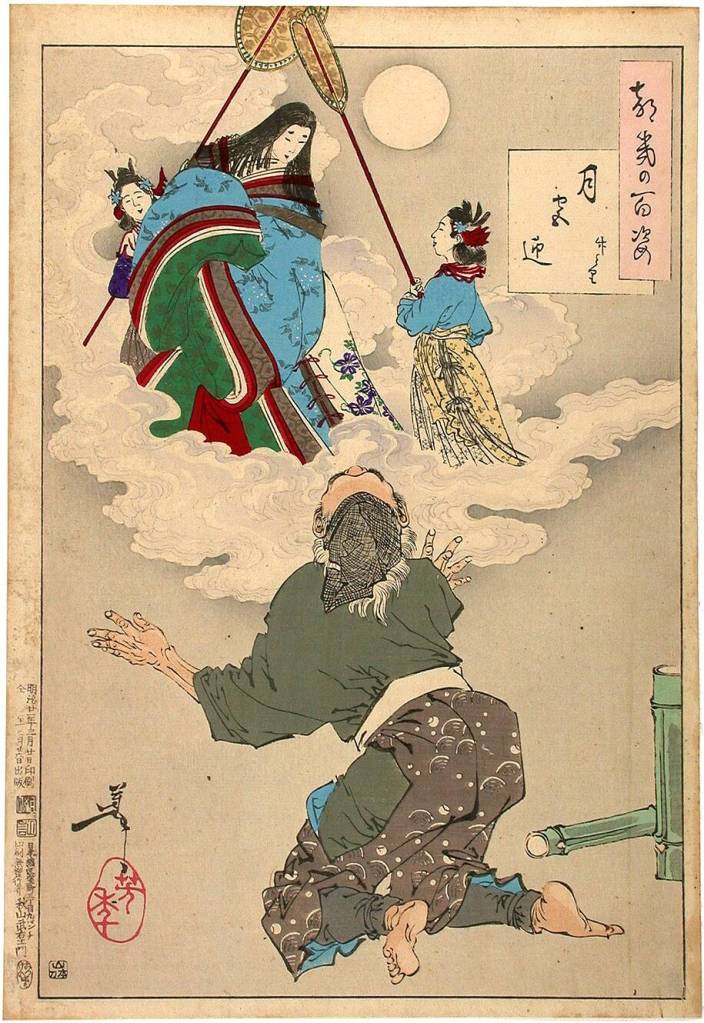
From 100 Aspects of the Moon, by Tsukioka Yoshitoshi. Late 1800’s. (Public Domain). Orihime and Hikoboshi during the night of Tanabata. Photo: Tomo Japan.
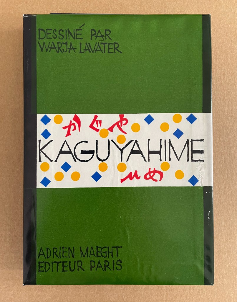
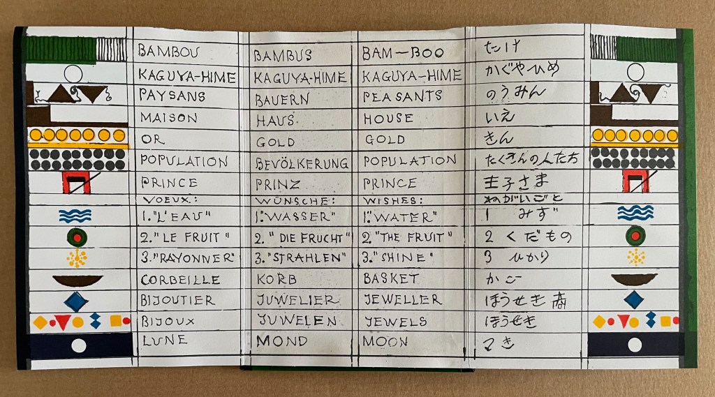
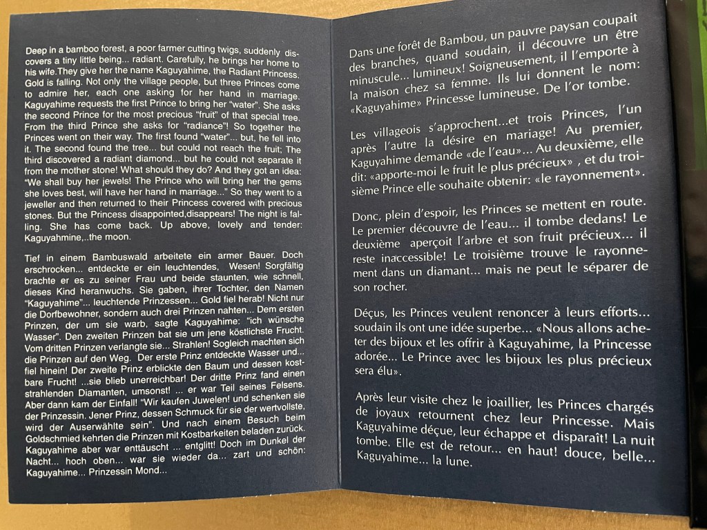
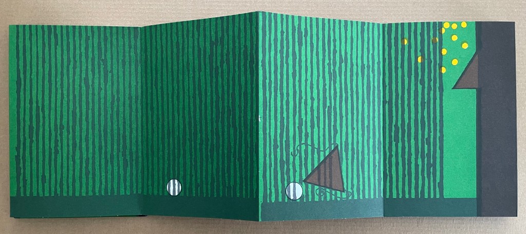
Kaguyahime (1998)
Kaguyahime(1998) Warja Lavater Acrylic slipcase, leporello. H160 x W11 mm. 44 panels. Acquired from Okmhistoire, 24 January 2025. Photos: Books On Books Collection.
With 14 emblems and with three princes whose emblems are distinguished by subtle variations, Kaguyahime seems bound to be more visually challenging than Ourasima or Tanabata.
Kaguyahime in the bamboo forest. The poor farmer discovers her and takes her home, where already gold is beginning to fall.
Having failed in their quests, the three princes, watched by her guardians and the gathered population, crowd around her to offer jewels and gold instead. But Kaguyahime storms away, scattering the jewels and gold, the princes and their baskets, and her guardians and the population in her wake.
On the other side of the leporello, Kaguyahime, the moon princess, watched by the princes and her guardians, rises through the bamboo forest into night sky where she waxes and wanes ever after.
Like Snow White and Sleeping Beauty embedded for centuries in Western culture, the tale of the moon princesss exerts a similar pull on Japanese culture. The princess and her story have appeared in many media including manga and anime. In 2023, the choreographer Jo Kanamori and the Tokyo Ballet produced Kaguyahime set to the music of Claude Debussy. A hybrid plant (E.acuminatum x E.dolichostemon) has even been named after the tale.
Lavater’s emblems in the Oriental tales do slightly differ from those in the Occidental tales, although the color palette does not vary. Her handling of Ourasima, Tanabata, and Kaguyahime does not seem as sure as that of Snow White and Sleeping Beauty nor of The Disobedient. Nevertheless, Lavater’s engagement across cultures speaks to one of the most recurrent influences on book artists: that of folk tales, fairy tales, and myths.
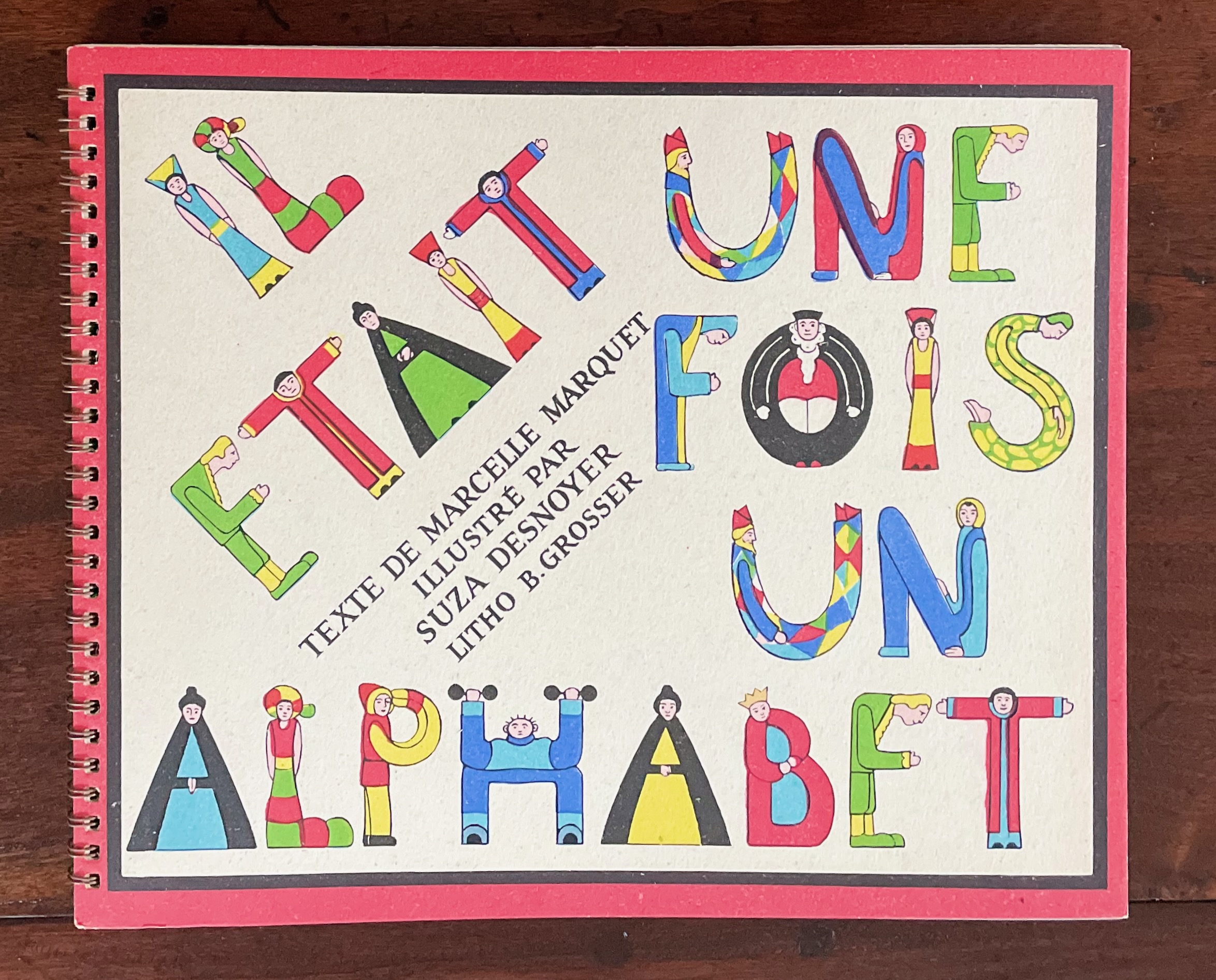
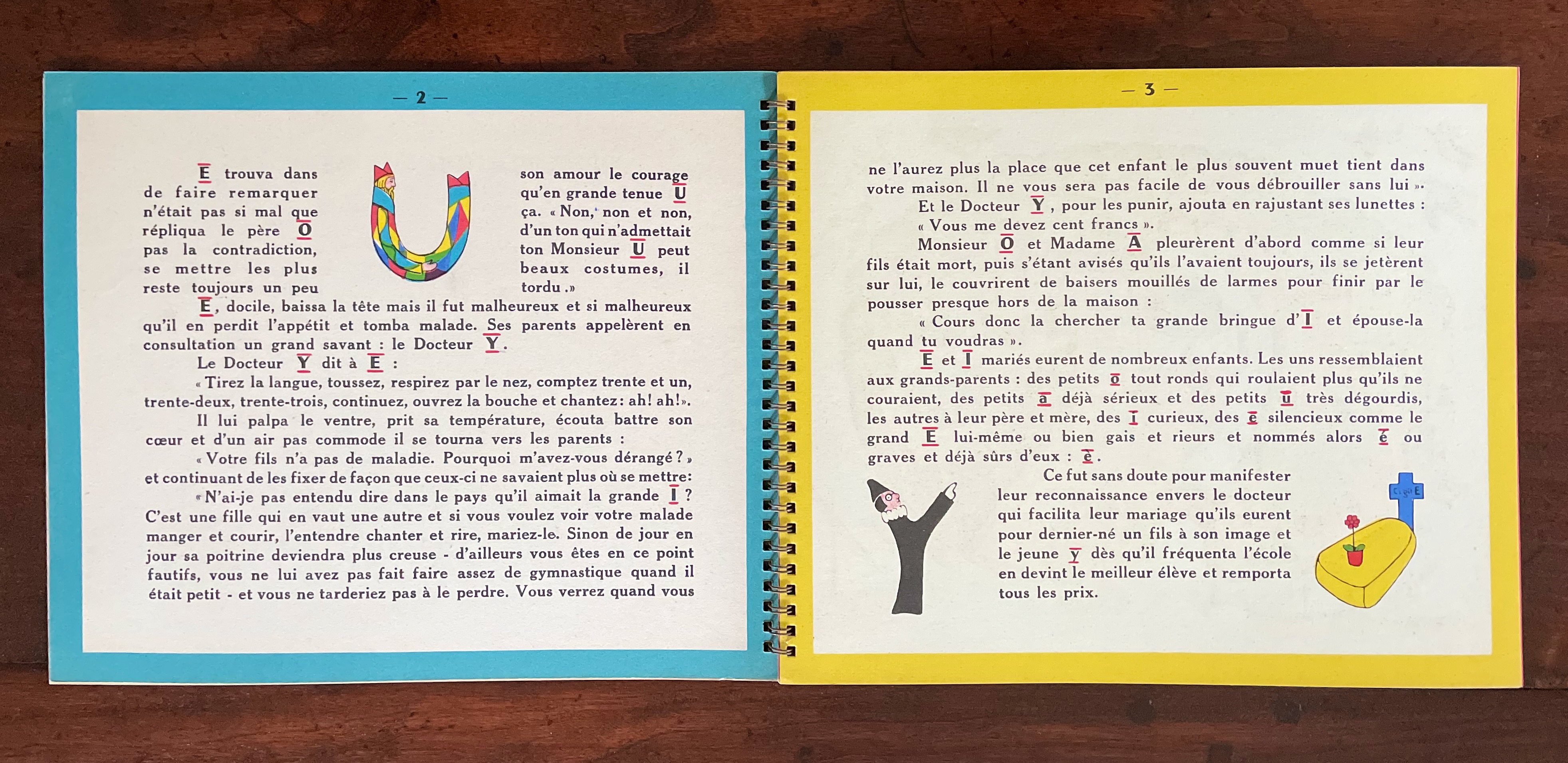
Il était une fois un alphabet(1951/2009) Souza Desnoyer and Marcelle Marquet Casebound, doublures, sewn block, clear plastic envelope glued to inside back cover holding game cards. H216 x W270 mm. 40 pages. Acquired from Structure Verses Agency Books, 22 January 2022. Photos: Books On Books Collection. Displayed with permission of the publisher.
Il était une fois presents the mutual discovery of the medieval/Renaissance country of Vowels and the isle of Consonants and their union over a banquet, evening gala and ball to form the alphabet. According to the reissuing publisher Éditions Chandeigne, Souza Desnoyer and Marcelle Marquet conceived of “Once upon a time there was an alphabet” in 1939. Its first self-published appearance as a spiral bound book of lithographs was in 1951. Not satisfied with this artistic means of conveying the letters to their readers, Desnoyer and Marquet called on their First World War experience of creating and sending games to the troops and added a board game or rather games for young and old at the back of Il était une fois.
The 1951 edition.
The 2009 edition.
In its reissue of the work, Éditions Chandeigne provides this biographical information about Desnoyer and Marquet and the insightful comment from a friend of Desnoyer:
L’amitié et le monde de l’art unissaient Marcelle Marquet (Boufarik 1892 – Paris 1984), écrivain et conteuse hors pair, et Souza Desnoyer (Georgette Anne Hanouche, dite Souza, Kiev 1901 – Perpignan 1988), illustratrice et miniaturiste, épouses respectives des peintres Albert Marquet et François Desnoyer. Comme l’affirme son amie Rose Fortassier, Souza Desnoyer semble « avoir été en quelque sorte programmée pour illustrer un alphabet. Cela à cause de sa vie et des voyages qui la firent polyglotte. De famille maternelle française, mais née à Kiev, berceau de la Russie, elle apprit à lire et écrire en caractères cyrilliques. Transplantée à l’âge de six ans en Bohême, elle y découvrit l’alphabet occidental à l’école primaire. Mais il est probable qu’elle eut aussi l’occasion de jeter les yeux sur les caractères gothiques allemands puisque la Bohême était encore autrichienne. Plus tard, quand elle fut installée en France à la suite de son mariage avec le peintre François Desnoyer, elle retrouva ses chers alphabets au cours de ses fréquents voyages en Angleterre, pays dont on sait qu’il a beaucoup fait pour la littérature destinée aux enfants ».
“Friendship and the world of art united Marcelle Marquet (Boufarik 1892 – Paris 1984), writer and storyteller, and Souza Desnoyer (Georgette Anne Hanouche, known as Souza, Kiev 1901 – Perpignan 1988), illustrator and miniaturist, wives of painters Albert Marquet and François Desnoyer respectively. As her friend Rose Fortassier says, Souza Desnoyer seems ‘to have been somehow programmed to illustrate an alphabet. This is because of her life and travels that make her polyglot. Of French mother tongue, but born in Kiev, the cradle of Russia, she learned to read and write in Cyrillic characters. At the age of six, she moved to Bohemia where she discovered the Western alphabet in elementary school. But it is likely that she also had the opportunity to see the German Gothic script since Bohemia was still Austrian. Later, when she was settled in France following her marriage to the painter François Desnoyer, she found her beloved alphabets during her frequent trips to England, a country that is known to have done much for children’s literature.‘” (Translation by DeepL).
Other adventures of letters “in character” can be found in Michael Chesworth’s Alphaboat (2006), Jon Agee’s Z Goes Home (2006), Althea Kontis & Bob Kolar’s AlphaOops: The Day Z Went First (2012) and Sean Lamb & Mike Perry’s Z Goes First (2018). The tradition of anthropomorphizing the letters of the alphabet goes back much further and across more than the French and English languages, but how fitting that Desnoyer’s illustrations came so close to the period of this example:
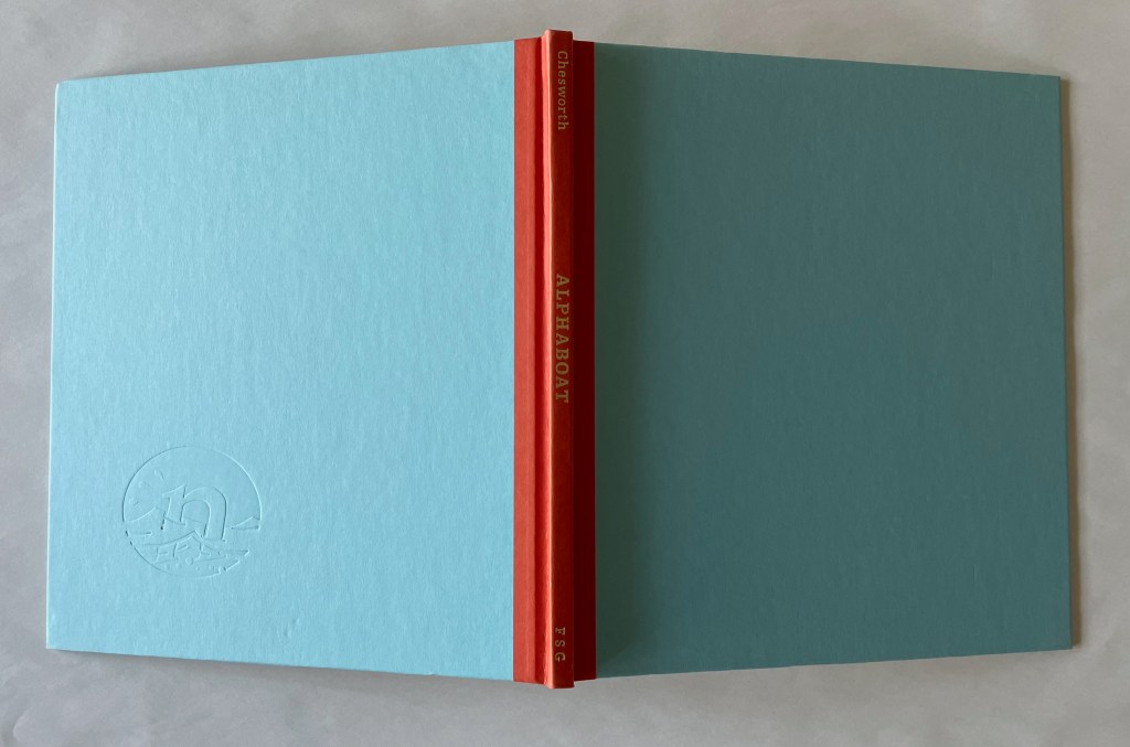
Alphaboat (2002) Michael Chesworth Casebound with jacket. H250 x W220 mm. 32 pages. Acquired 13 October 2021. Photos: Books On Books Collection.
Alphabet stories with the letters themselves as characters date back at least to the books of the Hebrew Kabbalah. In the Books On Book Collection, Ben Shahn’s The Alphabet of Creation (1954) draws on that source to provide an example of an artist’s book for older children and adults. Three other works in the Collection that establish this “letters as characters” as a sort of genealogical narrative line linking artists’ books and children’s alphabet books together are Sonia Desnoyer & Marcelle Marquet’s Il était une fois un alphabet (1951/2009), Warja Lavater’s Spectacle (1990) and this one by Michael Chesworth.
Il était une fois un alphabet (“Once upon a time there was an alphabet“) presents the vowels’ voyage of discovery (and board game) to join the consonants to create the alphabet. Spectacle presents a complex abstract version of how vowels and consonants joined together to form the spectacle of the alphabet, words and writing. Chesworth enriches this genealogical line from Desnoyer and Shahn to Lavater with his own mastery of children’s book traditions. Among those traditions exemplified by Alphaboat are the rhyming narrative, wordplay with letter shapes and sounds as well as self-referential wordplay with genres and the material aspects of reading and writing.
One double-page spread nearly suffices to illustrate. After Alphaboat and its crew ride out a storm, we have a double-page spread of calm below. The uppercase officers, punningly named Admiral T and Captaincy, preside over the boat. The lowercase crew f and r admire the punctuation-shaped sunset. And the facing page zooms out with a map to illustrate the ship’s progress and play word games with the map genre (note the feature of “Tear Incognito”), writing implements (“Ball Point” and “Computer Keys”), real locations (“Pencilvania” and “Isle of Write”), typography (“Sands Serif” and “Pica Peak”) and other common geographical phrases (“Isthmus Beedaplace” and “Down Bydee Bay”).
One more double-page spread is needed to expand on the lowercase f’s comment “Dot’s beautiful”. Throughout the voyage, words and images combine with the crew’s expostulations to allude to grammar, punctuation, spelling, typography and alphabetical order. About the pages showing the crew’s arrival back home, any admirer of these traditions and puns would have to agree with f: “Dot’s beautiful”.
“Ben Shahn“. 20 July 2022. Books On Books Collection.
Nikolajeva, Maria, and Carole Scott. 2007. How picturebooks work. New York: Routledge Taylor & Francis Group.
Scott, Carole. 2014. “Artists’ books, Altered books, and Picturebooks”. In: B. Kümmerling-Meibauer, ed.,Picturebooks: Representation and Narration. London, New York: Routledge.
Webb, Poul. 2017-“Alphabet Books — Parts 1-8” on Art & Artists. Google has designated this site “A Blog of Note”, well deserved for its historical breadth in examples, clarity of images and insight.
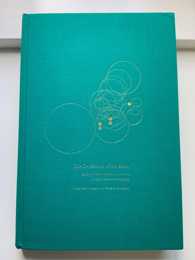
The Conference of the Birds (2009) Farah K. Behbehani and Farid ud-Din Attar. Casebound cloth over boards, stamped in gold foil. H340. 166 pages (56 of them foldouts). Acquired from Saba Books, 5 June 2022. Photos: Books On Books Collection. Displayed with permission of the artist.
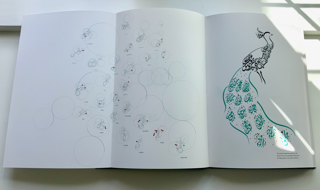
The Conference of the Birds is a twelfth-century Sufi allegorical poem by Farid ud-Din Attar. A gathering of the world’s birds, each representing a different aspect of human nature, debate who should be king of all the birds. Led by the Hoopoe, they agree to seek the advice of the mythological being – the Simorgh. After an arduous and winnowing journey, thirty of them arrive at the home of the Simorgh to find a surprising answer.
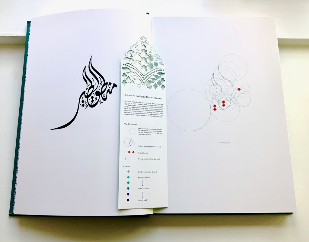
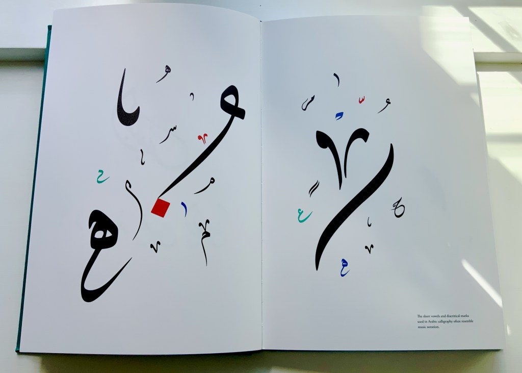
Farah Behbehani has selected thirteen of Attar’s stories and interpreted them within a journey-like creation of her own in the calligraphic style called Jali Diwani. As with many enlightening journeys, the destination is the journey itself — learning to read Jali Diwani calligraphy and, thereby, celebrate the beauty of the tale and its telling.
A passage from the story starts each chapter, and an image of the bird whose story it is is rendered in Jali Diwali. A tasseled bookmark provides the key to following the stroke-by-stroke illustration of how to read a representative line from the Arabic version of the story (a literal English translation is provided).
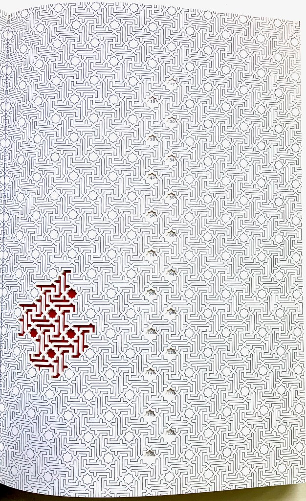
This book’s features (56 foldouts, embossing, gold foil, die-cut pages and that unusual bookmark) place it outside the mainstream output of its traditional commercial publisher Thames & Hudson and is as close to being an artist’s book from such a source as could be imagined. It is certainly available only through rare book dealers and occasionally by auction.
Behbehani’s Conference of the Birds fits in the Books On Books Collection alongside Golnar Adili’s Baabaa Aab Daad (2020), Islam Aly’s 28 Letters (2013), Masoumeh Mohtadi’s Blindness (2020) and Rana Abou Rjeily’s Cultural Connectives. Disregard any implication that these works represent a single aesthetic. The artists hail from different countries and draw on different traditions. Yet each work reaches across the cultural divide between the Near East and the West. Reaching across does not mean eliminating the differences. Consider Behbehani’s work in relation to Brian Goggins ‘ Language of the Birds (2006-2008), a site-specific sculptural light installation for a public plaza in San Francisco; Anselm Kiefer’s Für Fulcanelli – die Sprache der Vögel (2013), a massive sculpture of leaden bird wings and books; and the delicate but weighty cages in Bird Language(2003) by Xu Bing.
If anything draws all of these works together, it is the chord that language and image strike across time and cultures.
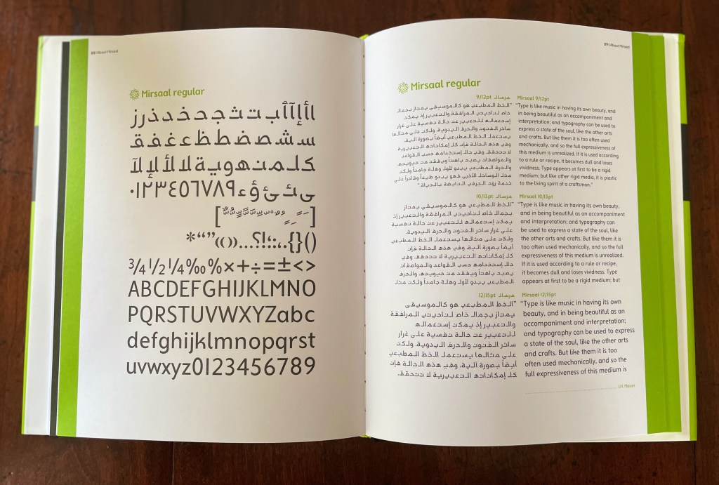
Rana Abou Rjeily’s is not the only attempt to adapt Arabic to the printing press as Cecil Hourani and Mourad Boutros note in their preface, but their praise for the book is all the more notable for Boutros’ being the creator with Arlette Boutros of Basic Arabic, a widely accepted typeface alongside Nasri Khattar’s Unified Arabic. Still more notable, however, are the ways in which Rjeily’s design and writing weave together multiple aims. One aim, of course, is to introduce Mirsaal, the typeface designed by the author to adapt the calligraphic styles of the Arabic alphabet to the printing press and still be used for the Latin alphabet. Another is to teach the Arabic alphabet to non-native speakers. And still another is to bridge Arabic and Western cultures. The aims are interwoven not only because Rjeily uses the first as the means to the others but because she invests all three into the design of the book.
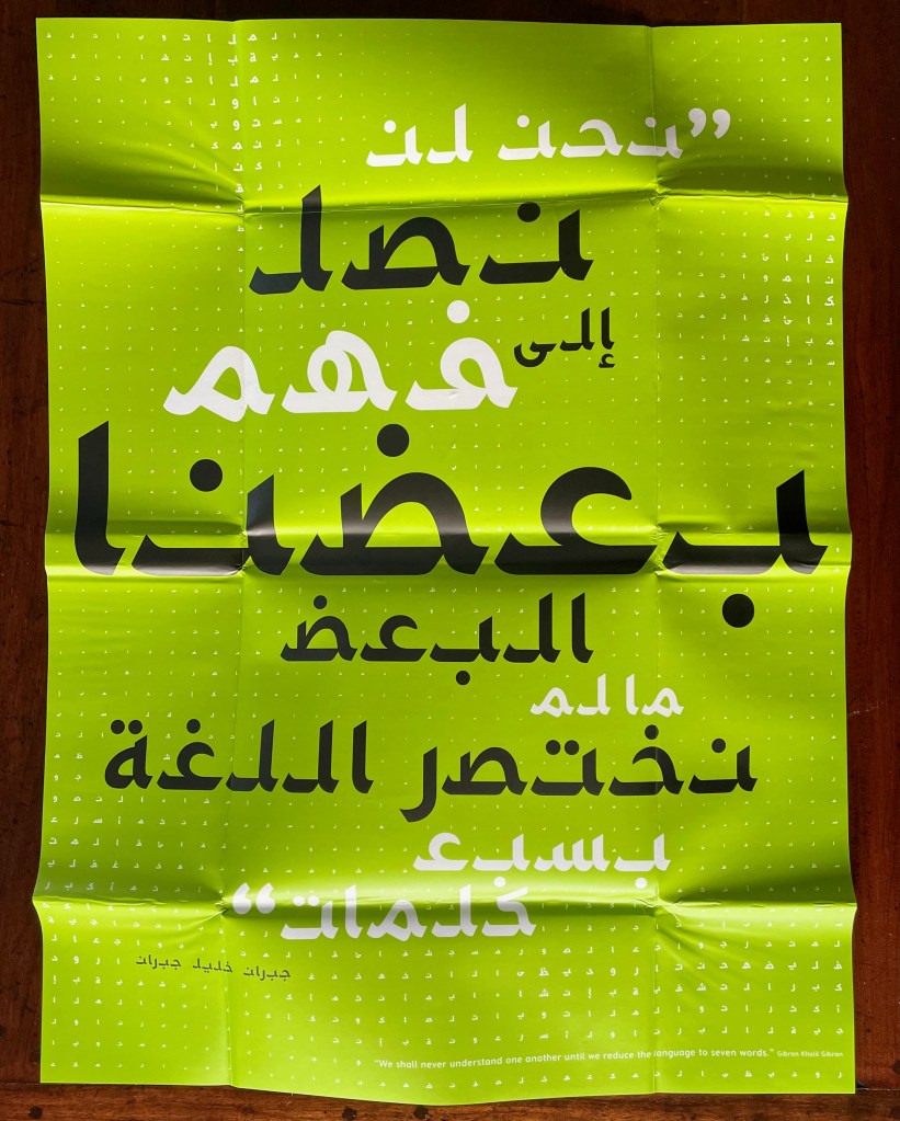
The dustjacket offers the most mechanical example of this investment. It unfolds into a poster display of the book’s epigraph from Gibran Khalil Gibran (set in Mirsaal, of course): “We shall never understand one another until we reduce the language to seven words”.
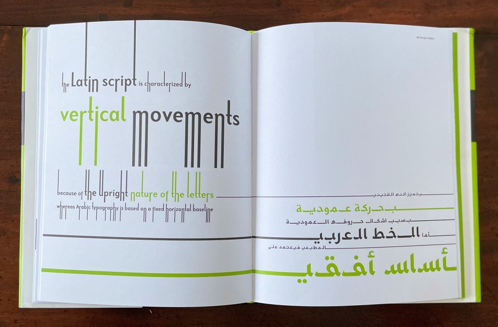
Mechanically more subtle than the dustjacket is Rjeily’s use of partial and full bleeds in the pages below — always in support of the meaning on the page. Using both vertical and horizontal bleeds, this double-page spread illustrates the Latin alphabet’s more vertical orientation compared to Arabic’s more horizontal orientation.
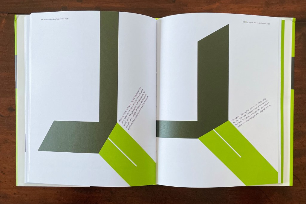
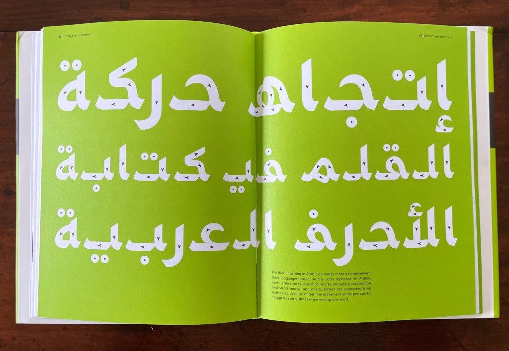
Rjeily keeps the material, haptic aspect of both Arabic and Latin close to hand with parallel pages like the following that highlight their alphabets’ differences but also assert the possibility of harmony through design. The same simple green and black color scheme, the same image of nib and mark, and the same angling of text on the page give a unified presentation of the difference in direction and angle of cuts for Arabic and Western nibs. Another physical aspect that Rjeily highlights is the ductus (the order and direction) of a pen strokes making up a letterform, which is arguably more important for Arabic because the flow of writing demands more pen movement.
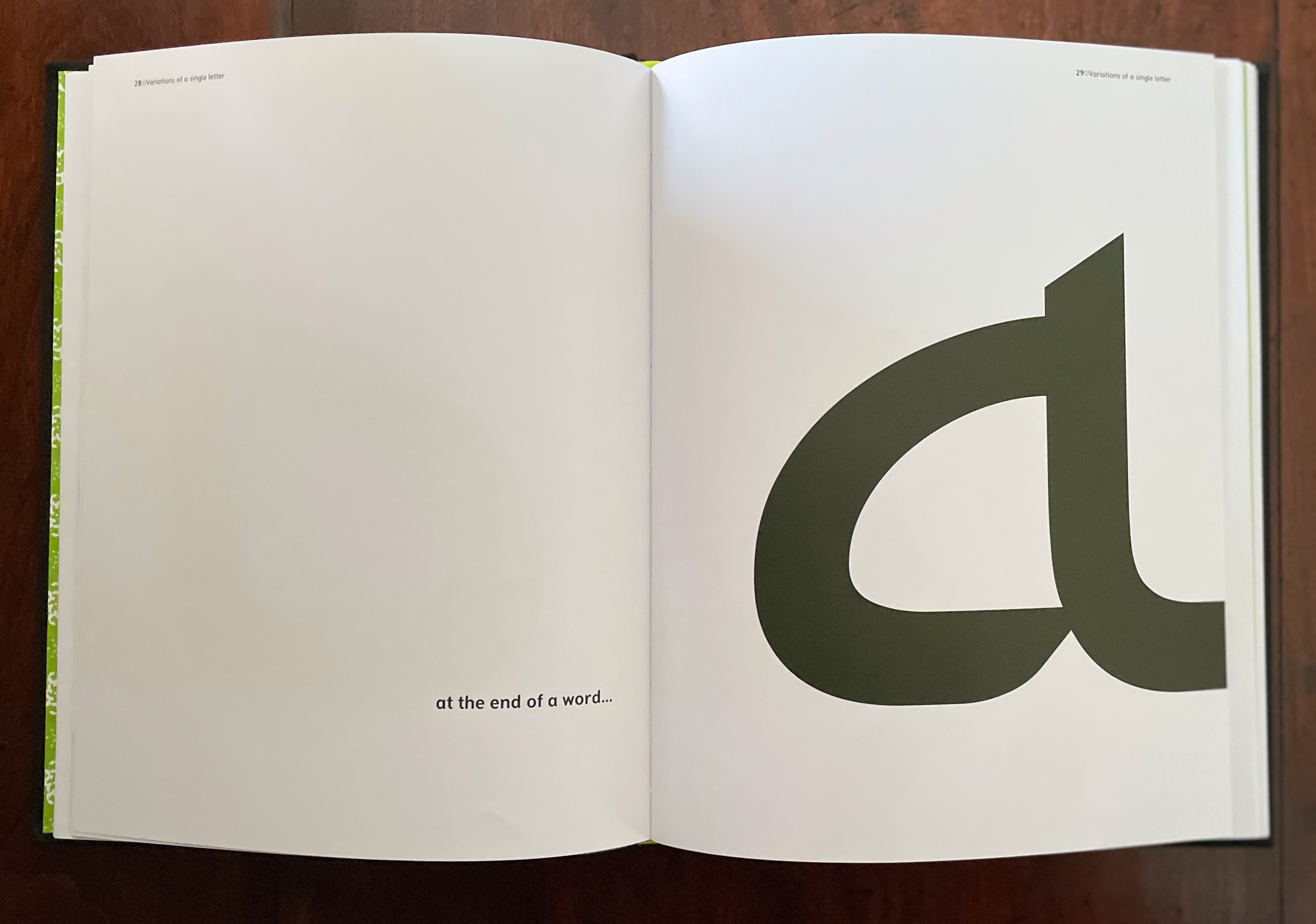
Other bold, oversized spreads drive home some of the false cognate forms such as 0 and the number 5 written in Arabic-Indic numerals, or the letter V and the number 7 in Arabic-Indic numerals. Others, in an almost children’s book style, present the unique characteristic of an Arabic letterform’s changing shape depending on its initial, medial or final position in a word — or its appearance in isolation. While teaching these differences and features of Arabic is a fundamental aim, always the differences are laying the groundwork or demonstrating what Mirsaal must deal with to bridge a calligraphic system to a typographic system of writing.
The final section presents the Mirsaal typeface in its various fonts (sizes and weights) in the manner of a traditional type specimen, using the very appropriate words of John Henry Mason (1875-1951) in Arabic and English:
Type is like music in having its own beauty, and in being beautiful as an accompaniment and interpretation ; and typography can be used to express a state of the soul, like the other arts and crafts. But like them it is too often used mechanically, and so the full expressiveness of this medium is unrealized. If it is used according to a rule or recipe, it becomes dull and loses vividness. Type appears at first to be a rigid medium; but like other rigid media, it is plastic to the living spirit of a craftsman. — J.H. Mason
Cultural Connectives is the useful reference work Rjeily intends. In achieving its several aims, it also provides both an accomplished example of the book arts and a means of insight into other works in the Books On Books Collection, such as Golnar Adili’s Baabaa Aab Daad (2020), Islam Aly’s 28 Letters (2013), Farah K. Behbehani’s The Conference of the Birds (2009) and Masoumeh Mohtadi’s Blindness (2020).
Further Reading
“Golnar Adili“. 24 November 2022. Books On Books Collection.
“Islam Aly“. 13 January 2020. Books On Books Collection.
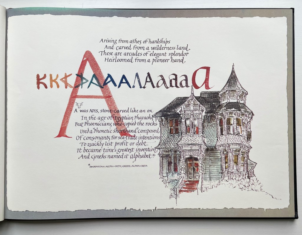
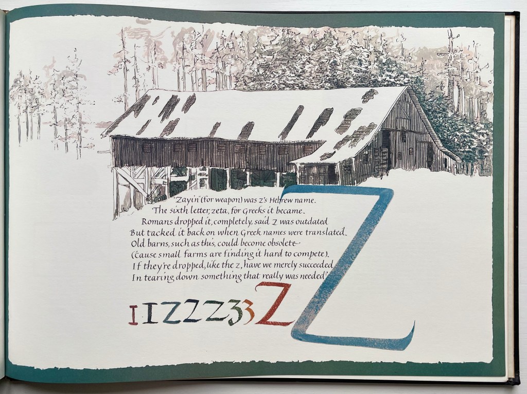
Architecture-inspired artists’ books and artists’ books inspired by alphabets make up two separate strands of the Books On Books Collection. Along with Sacred Space by Jeffrey Morin and Steven Ferlauto, Lanore Cady’s Houses & Letters is one of the rare works that weave them together, joining the beauty of form in architecture with the beauty of letterforms. With her calligraphy, verse and watercolors of Victorian structures of Humboldt County, California, Cady presents her audience with a history of the alphabet from the proto-Sinaitic to the Roman/Carolingian that ultimately argues for the historical preservation of the buildings depicted.
The house depicted with letter A is the “Graham House”. In notes at the end of the book, Cady provides this brief note about it:
Frank Graham came to Humboldt from the southeastern provinces of Canada and the Maine woods to become a giant in lumbering and other local industries. He was married to Martha Montgomery, direct descendant of the Lees of Virginia. Built at the end of Ninth Street in Arcata, California, in 1885, their house is one of the few landmarks that has remained unaltered since its construction. It boasts five different shingle shapes, hand-carved arches, embellished redwood burl and curly redwood.
The structure accompanying the letter Z is “Robert’s Barn”:
This “Humboldt-type barn,” over 100 years old, is typical of the barns on fine ranches in this dairying-ranching country. It is on the Mel-May Ranch (so named for Melvin and May Roberts), Bayside Road, Arcata. Years ago it was “moved back” 125 feet away from the road.
Further Reading
“Lanore C. Cady“. 9 February 2011. Times-Standard. Humboldt County, California. Accessed 1 August 2022.
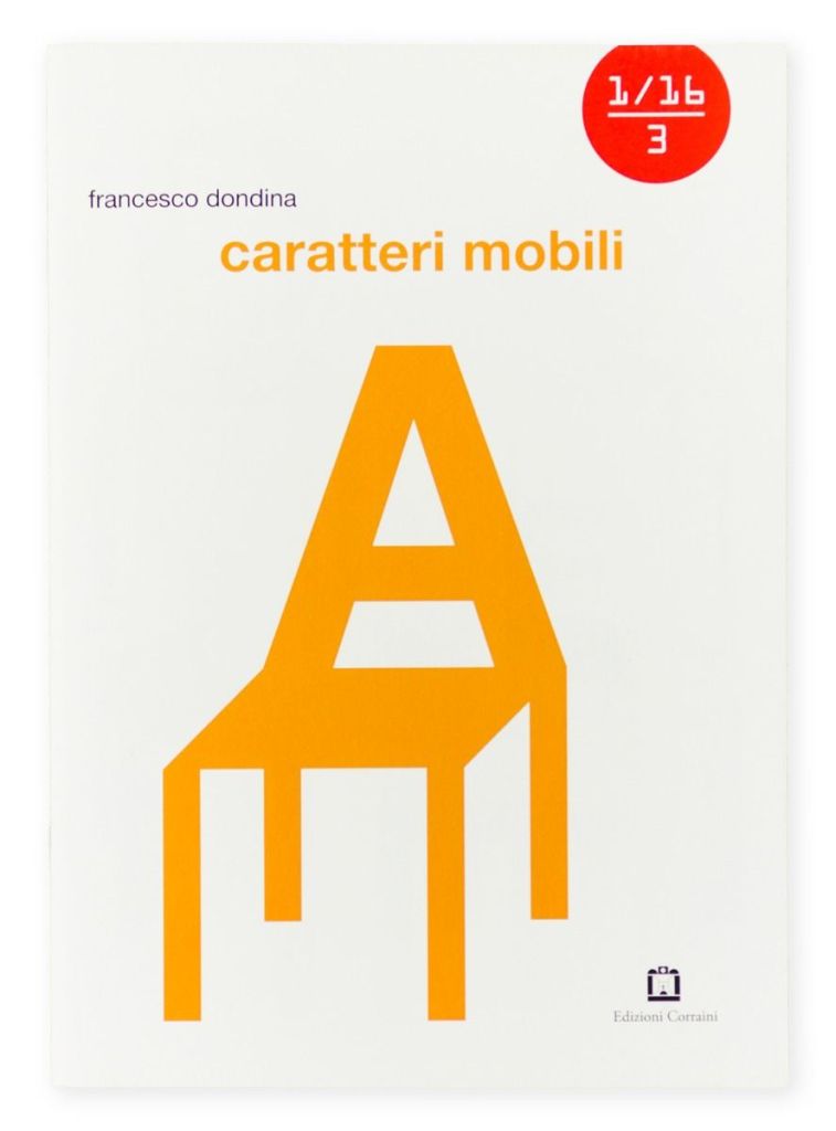
Un Sedicesimo, meaning “one sixteenth” in Italian, is a bimonthly magazine issued by Edition Corraini featuring a different artist’s work in each issue. Instead of being a magazine about design or art, Un Sedicesimo is a “gallery on paper” with each issue being a work of design or art in 16 pages. This issue is a colorful alphabet book with letters designed to take on the function of furniture. As the artist points out on his website, the title plays with “the ambiguity of the Italian word mobile“, which can mean “movable” or “furniture”. So movable type inspires furniture or vice versa.
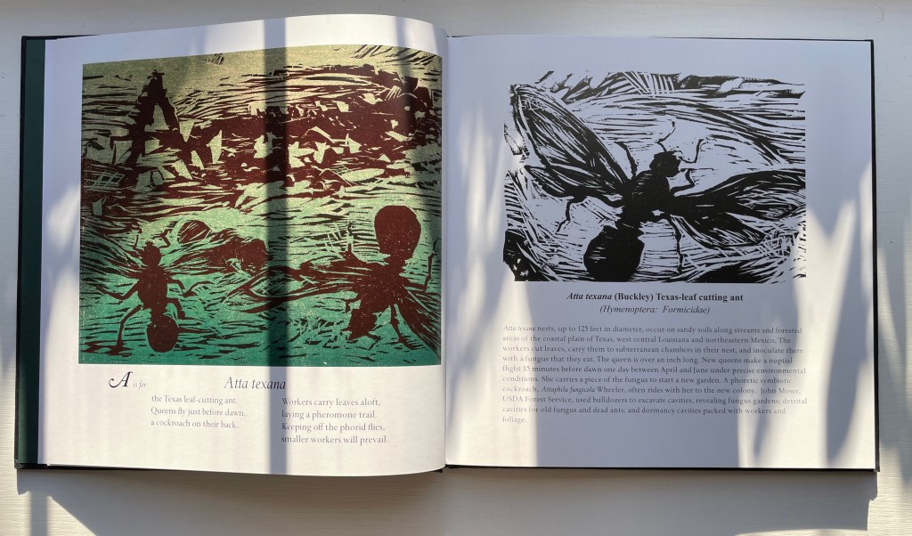
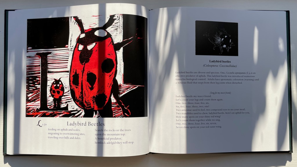
A Forest Insect Alphabet (2013) Charles D. Jones & David L. Kulhavy Casebound, textured cloth over boards, front cover with title stamped in metallic silver, doublures inked green on one side, sewn book block, CD-Rom shrink-wrapped to back cover. 260 x 260 mm. 60 unnumbered pages. Acquired from The Book Depository, 30 July 2022. Photos: Books On Books Collection. Displayed with permission of Stephen F. Austin State University Press.
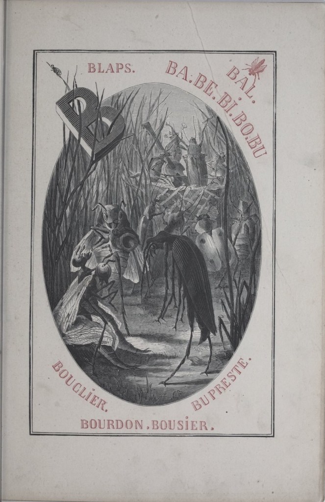
Curious that avian abecedaries outnumber the entomological. So do famous catalogues of bird art. Where is Audubon’s Bugs of America or Bewick’s A History of British Bugs? At least the Belgians can offer Becker & Méaulle’s Alphabet des Insectes (1883).
Becker, Léon and Méaulle, Fortuné Louis. 1883. Alphabet Des Insectes. Paris: J. Hetzel & Cie.
A Forest Insect Alphabet makes considerable progress in rectifying the situation. Although it is not primarily intended for humorously teaching the ABCs and reading like Alphabet des Insectes, it is an instructional reference and has its own different sense of whimsy. And although it is not in the realist tradition of Audubon or Bewick, it delivers fifty-one original woodcuts drawn and cut by Master Printer Charles D. Jones, twenty-three in black and white and twenty-eight with colors based on those of the named insect. What makes A Forest Insect Alphabet even more special is its scientific driving force — Stephen F. Austin University’s Professor David L. Kulhavy — who also delivers the elements of whimsy by conveying his entomological knowledge not only in prose but also quatrains and songs (even sung on the CD).
Well, that explains the smell when trying to pick up a ladybird rather than letting it crawl aboard a fingertip of its own accord.
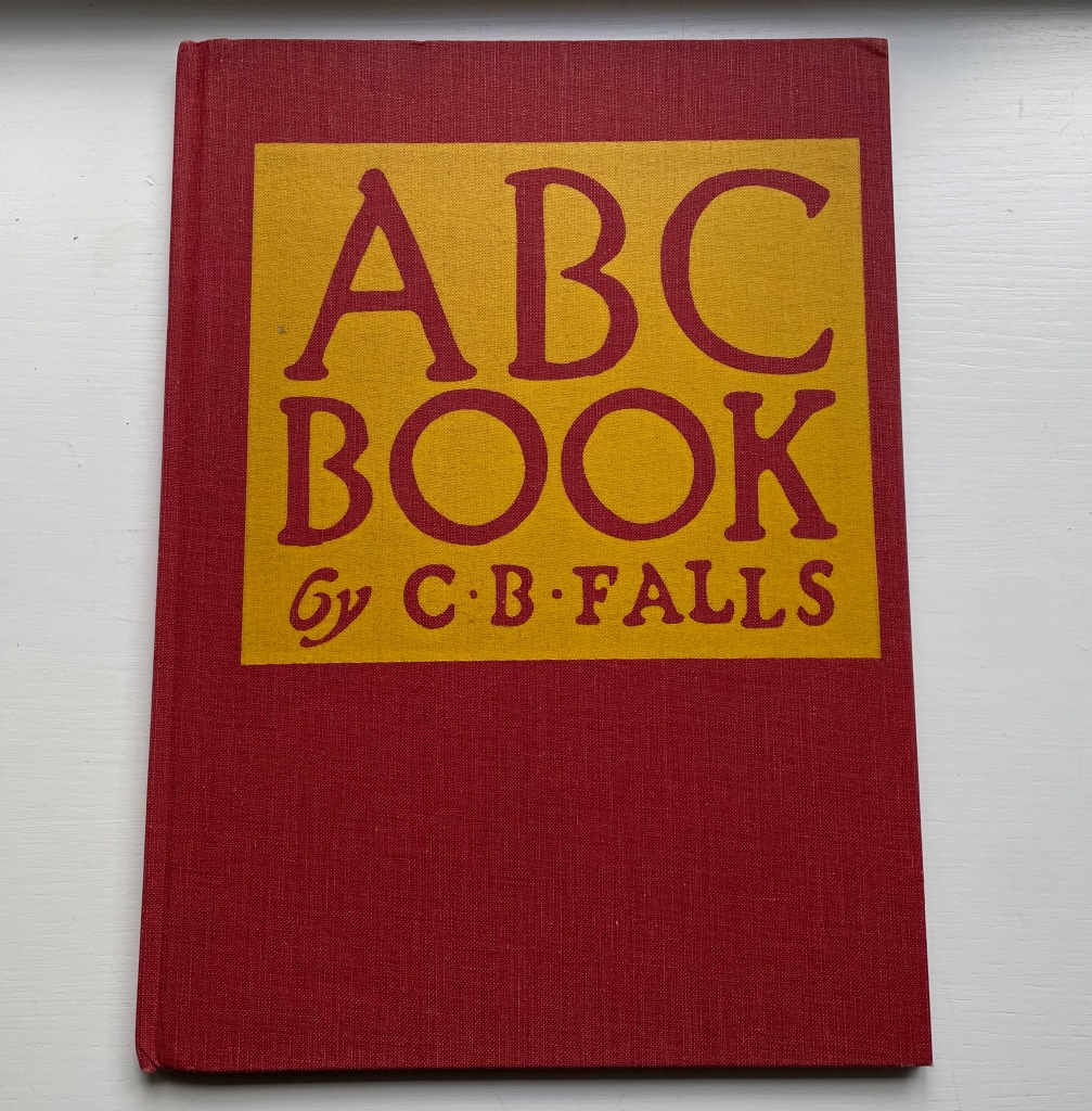
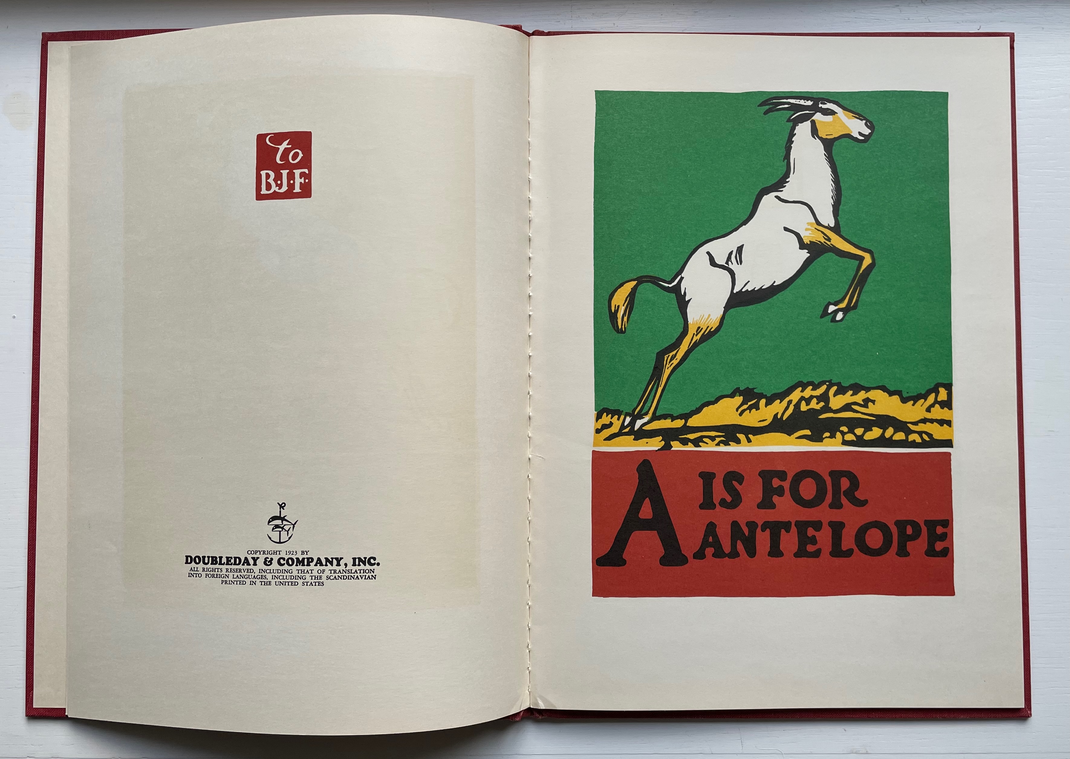
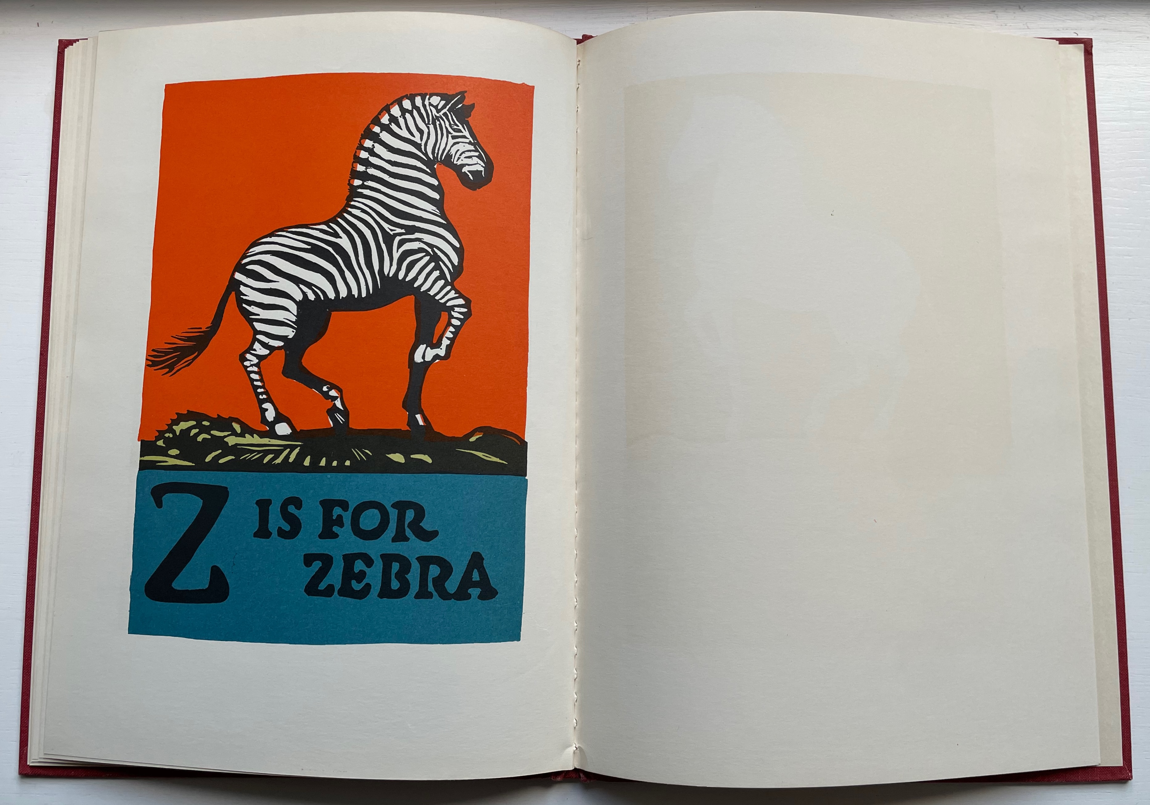
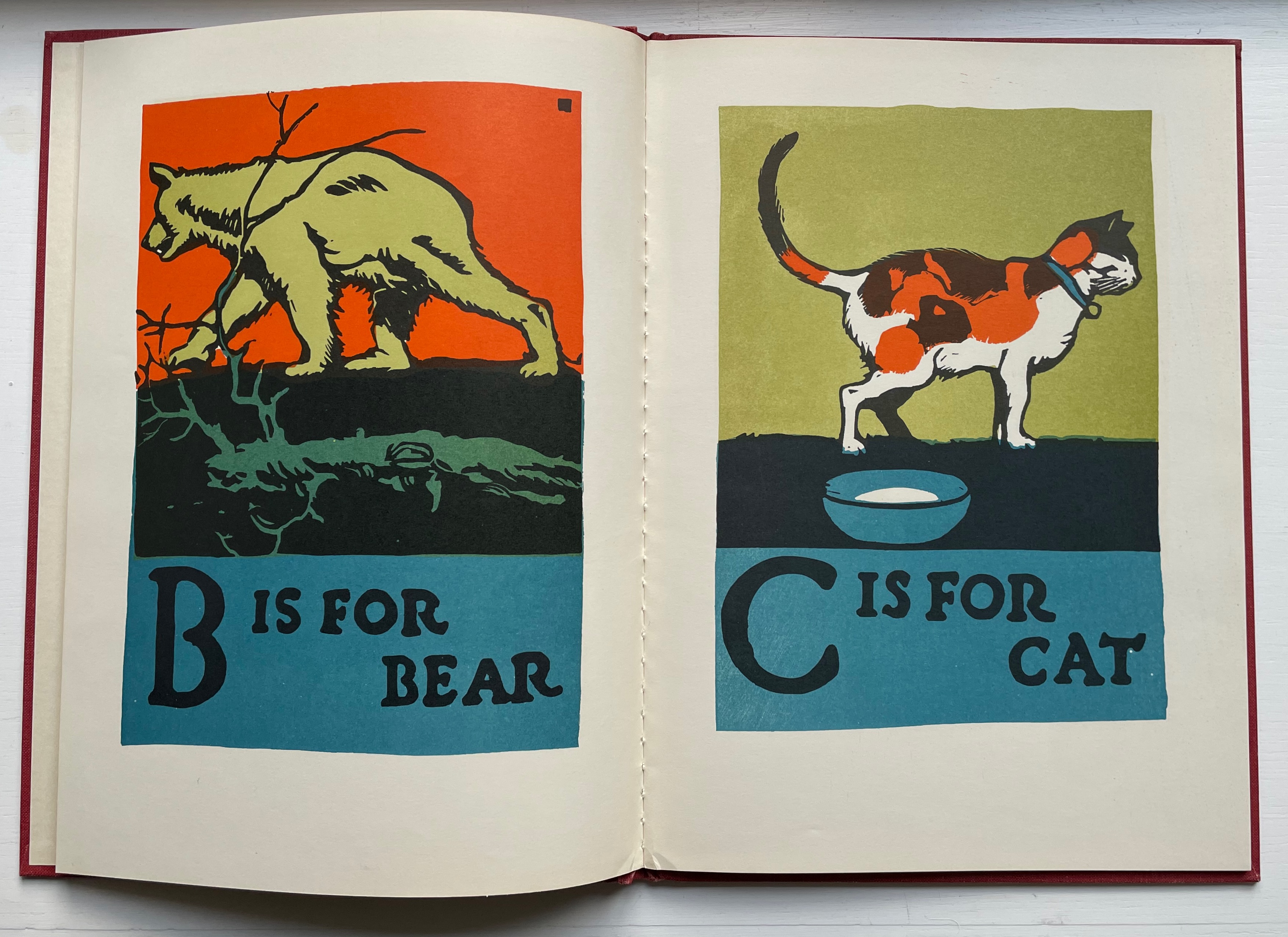
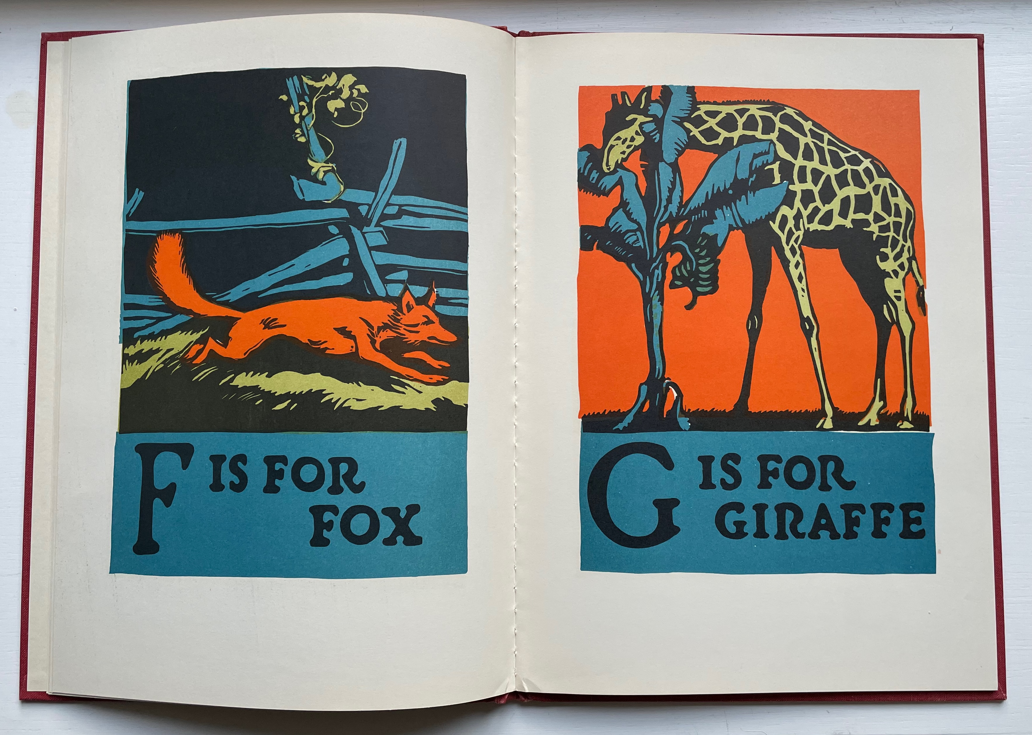
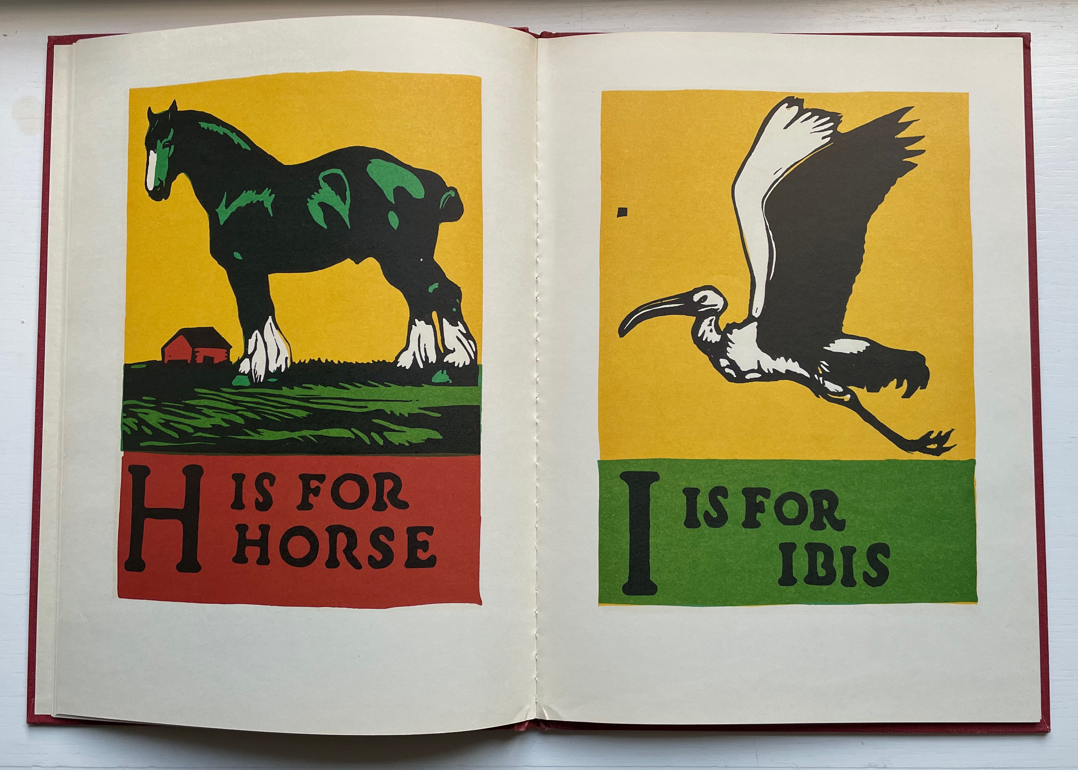
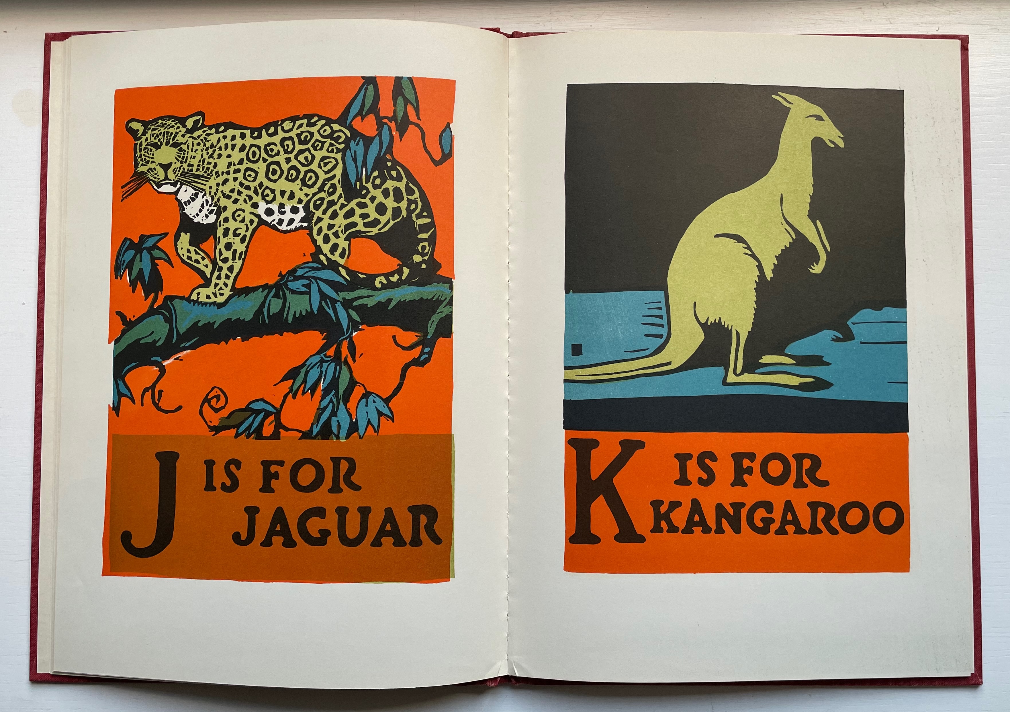
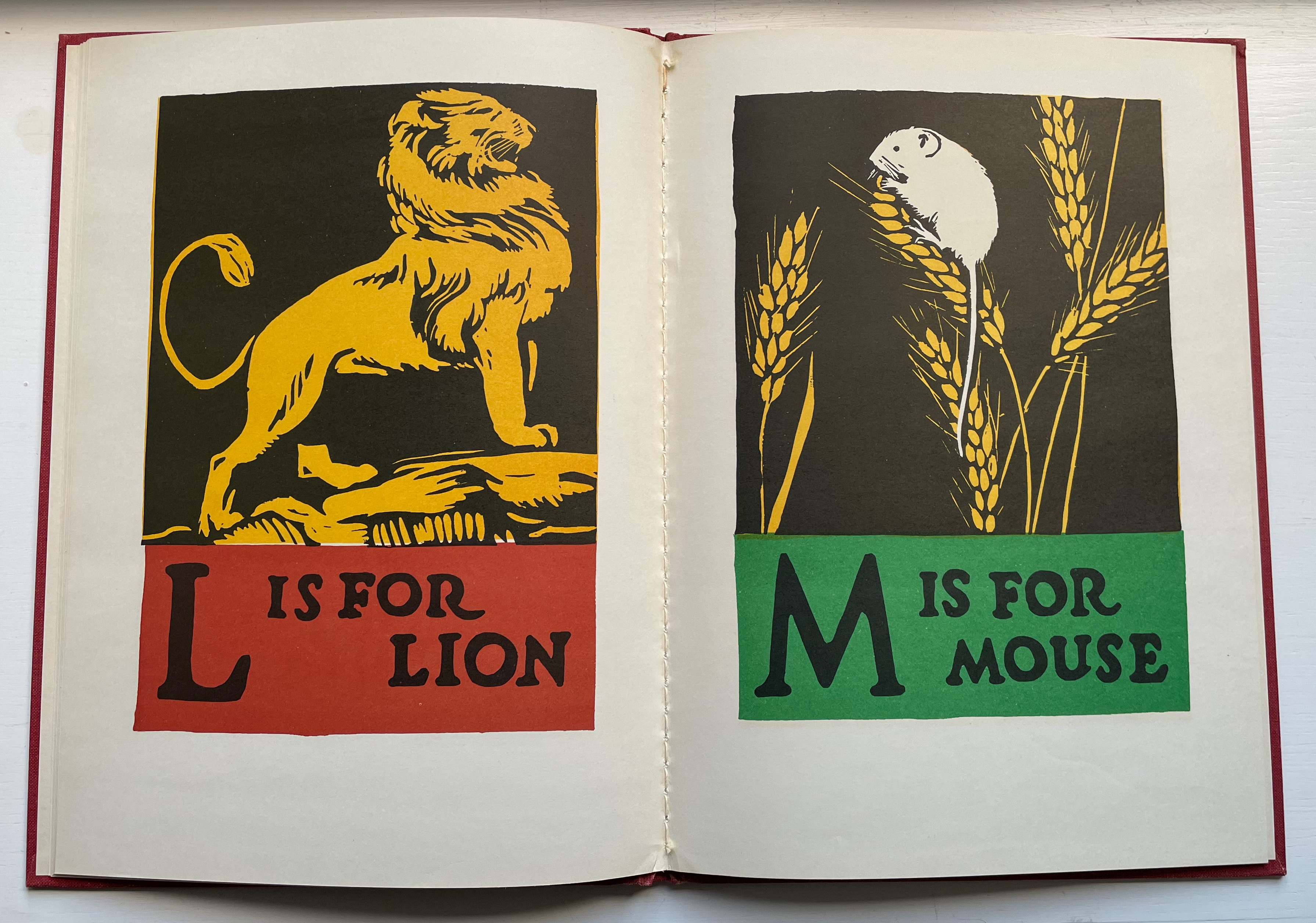
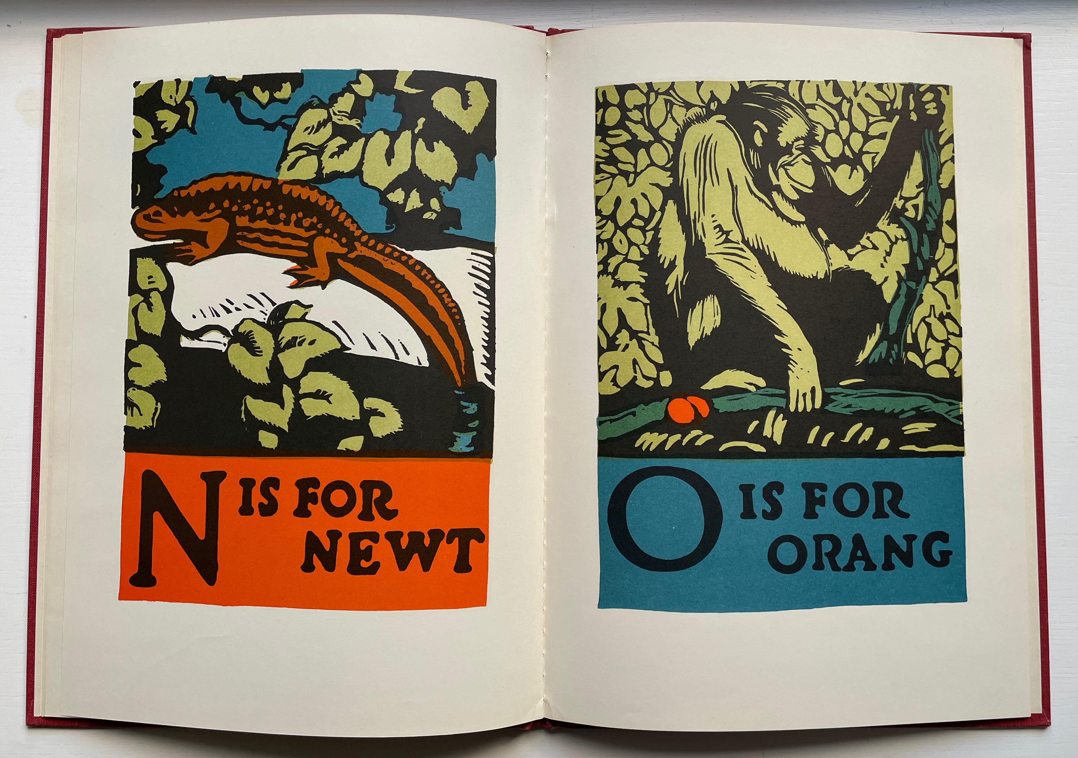
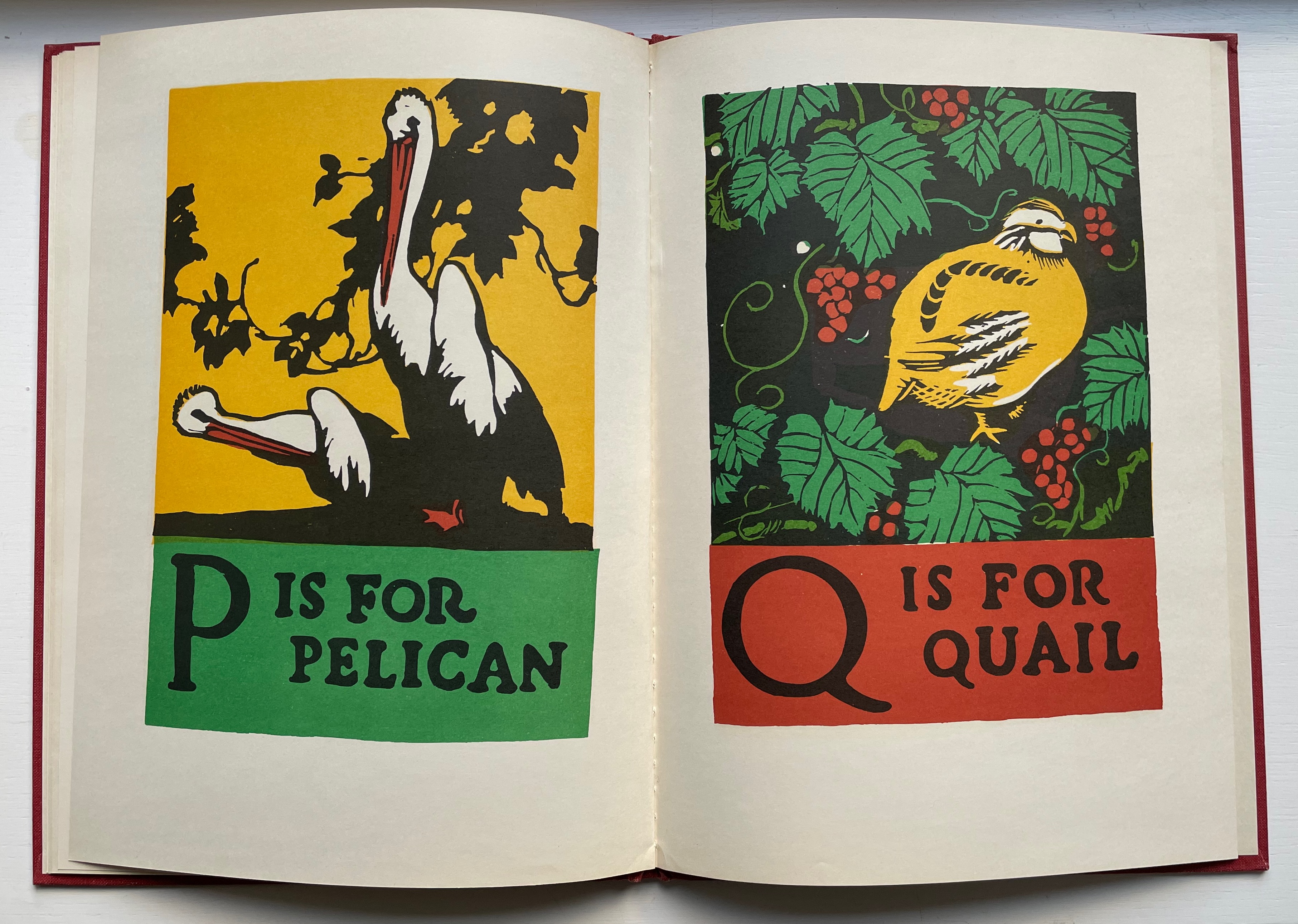
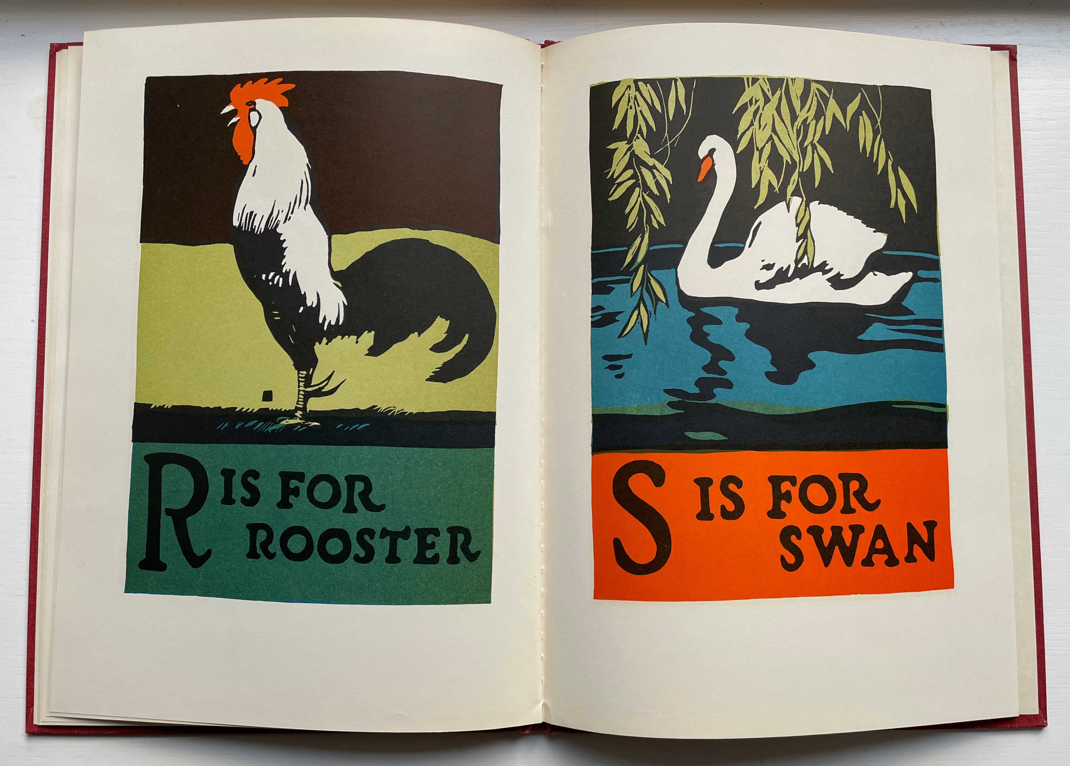
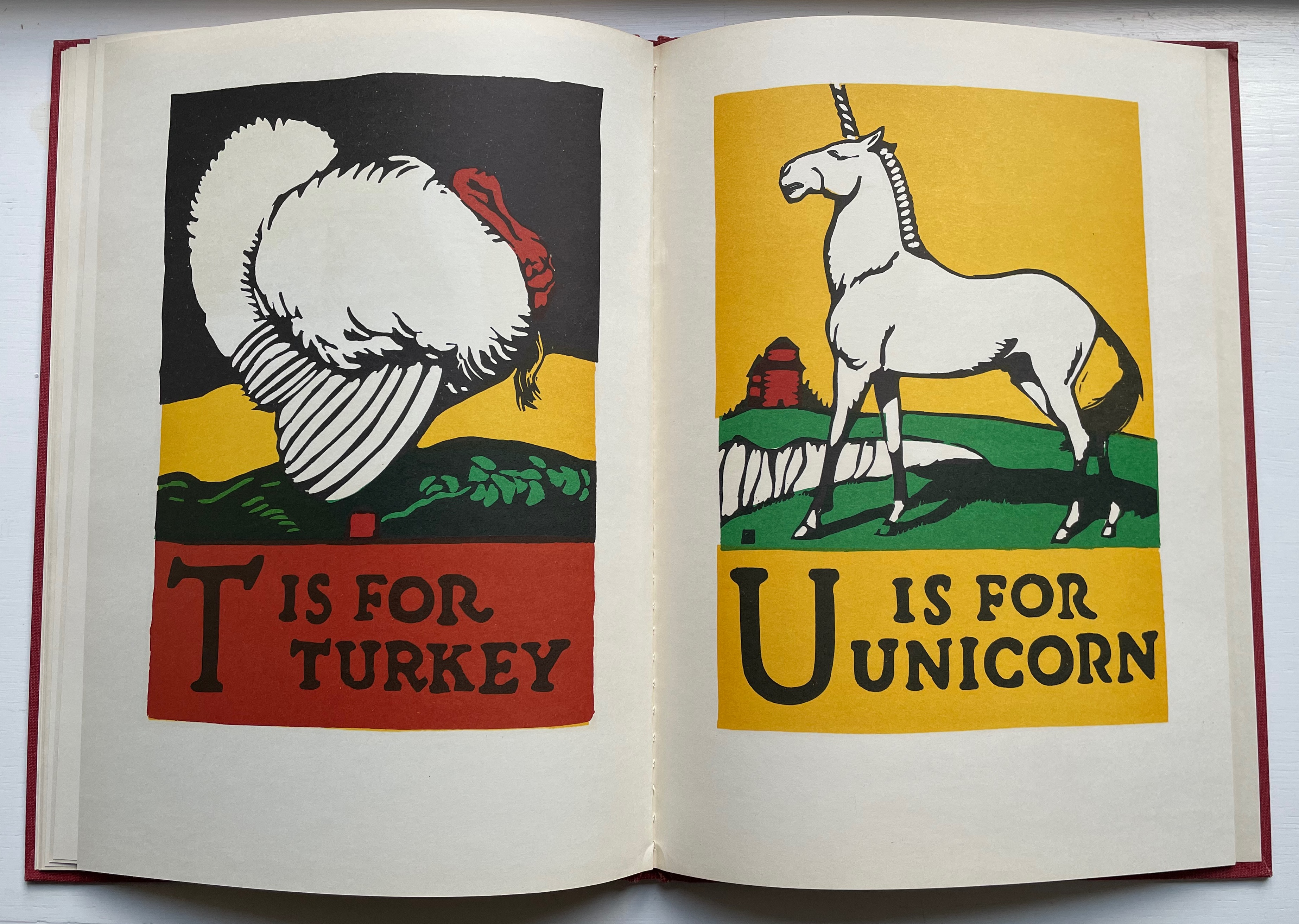
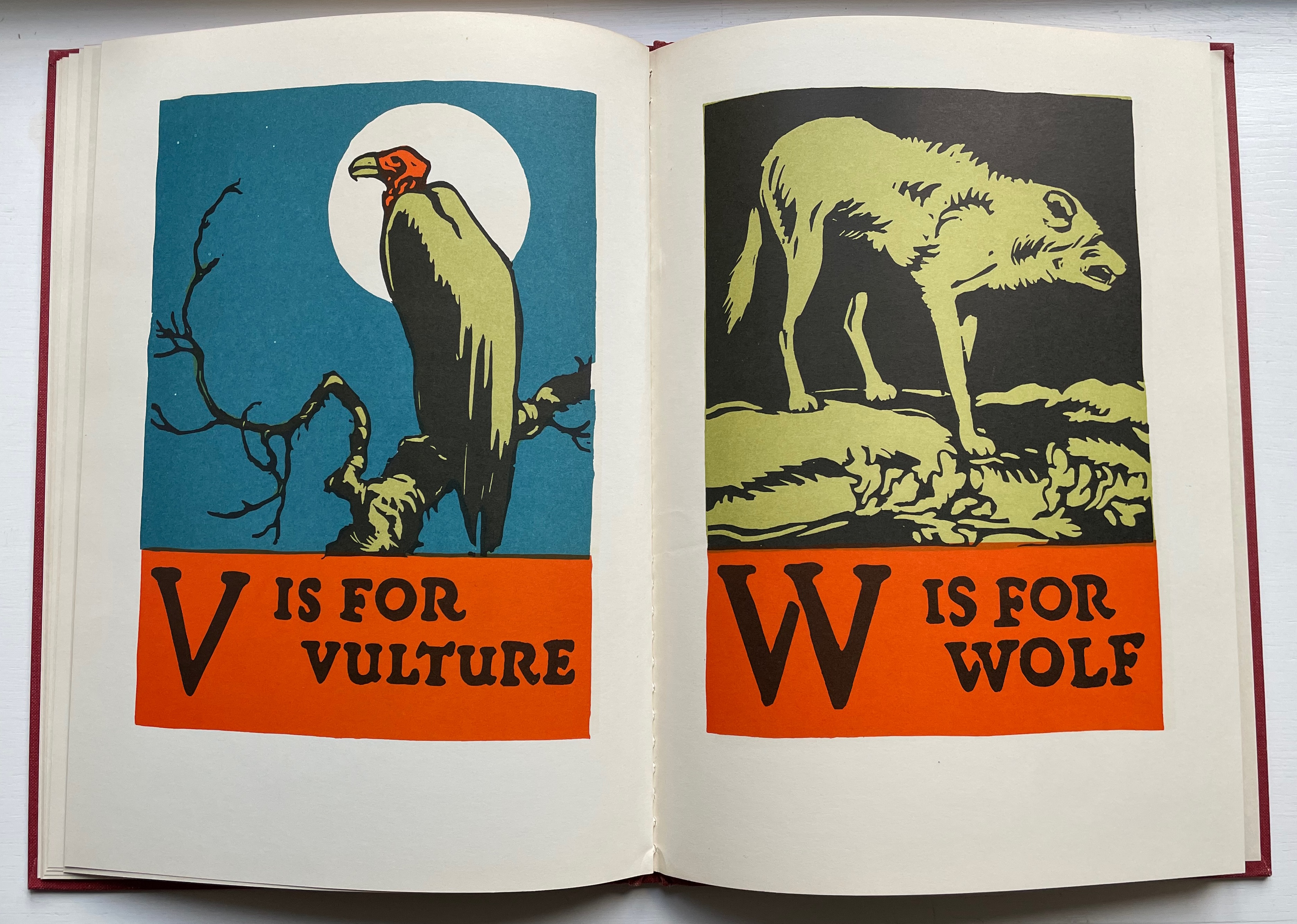
ABC Book (1923) C.B. Falls Casebound, cloth over boards, sewn. H318 x W232 mm. 32 unnumbered pages. Acquired from Derringer Books, 28 August 2022. Photos: Books On Books Collection.
Charles Buckles Falls’ reputation as an illustrator working in woodcuts and poster design, especially WWI posters supporting book donations to the troops, led to Doubleday’s signing up the ABC Book in 1923. The influence of Art Nouveau appears in the lettering as well as the antelope’s pose (although the zebra’s pose seems based on an equestrian statue, naturally without a rider). A stronger influence from William Nicholson, England’s premiere wood-engraver at the time, shows through in the lettering and coloring. While both artists used color to emphasize their black lines, Falls made bolder, more eccentric choices, which may ultimately have led to a return transatlantic influence on the UK illustrator Chris Wormell and others (see Further Reading).