Margot Klass is a book artist of the northern latitudes. A studio in Fairbanks, Alaska; another in Corea, Maine.
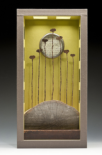
One of her geographically characteristic works in the “flitch book”. A “flitch” is a cross-sectioned slab of timber. Take two flitches for the front and back of a Coptic-bound book, and you have a flitch book.
Flitch Book Coptic binding, twig and leather clasp, ivory inlay, approx. H. 4.5″
She says that her influences are Kurt Schwitters and Japanese aesthetics. In the works she labels “altarpieces”, I see Joseph Cornell and Georgia O’Keefe as well. Paul Watson’s succinct, 2003 entry on the assemblage technique holds up Schwitters and Cornell as practitioners and makes for an interesting path into appreciating Klass’s art.
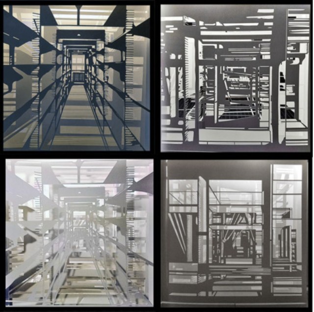
Alaska Book of Hours: Prime – Spring, 27” x 14” x 6” (2011)
Reliquary – Open
The 2007 bulletin from the Denali National Park and Reserve, where Klass was one of several artists in residence, nicely summarizes her aesthetic:
Margo Klass is a student of aesthetic space who creatively uses light to produce sculptural boxes. She studied Northern Renaissance artists for their use of spaces receding into the distance, and she has been influenced by the interior spaces and exterior landscapes of Japanese temples. During her residence in the park she used sketching, watercolors, and photography.
In 2012, Robert Hannon echoed this in a brief notice and radio interview on the occasion of her exhibit at the Fairbanks Alaska House Gallery. In 2016, the College Book Art Association presented Klass as a “Featured CBAA Artist” and also commented on the impact of medieval art on her work. But her own article from February 2017 provides the second best path to appreciating her work.
The best path is, of course, the work itself, which is well illustrated in that article.
A “monument” to the Absence of the Twin Towers, this is a poignant work of book art by J. Meejin Yoon, architect, designer, educator, Professor and Head of the Department of Architecture at the Massachusetts Institute of Technology. A simple video demonstrating the work appears here at the site of the Otis College of Art and Design. This book|object was published by Printed Matter, Inc. and the Whitney Museum of Art in 2004 when Yoon was an Assistant Professor at MIT.
As you hold this small white brick of paper and turn its thick pages, a small pinhole appears on the page. Then two larger square holes emerge, one of which falls over the pinhole. Page after page — 110 pages for each floor of the towers — the two square holes repeat, creating two small dark wells in the field of white, until on the last page they take their place in the cut-out schematic footprint of the city blocks and buildings surrounding the Twin Towers. What you hold in your hands at the end is an object of art and book of memorial prayer.
12 January 2017 — The Office of Arts, Culture, and the Creative Economy’s Percent for Art Program (OACCE) and the Free Library of Philadelphia (FLP) announced the commission of eight tunnel book dioramas from Philadelphia-based artist Colette Fu to be installed in the bookshelves of the renovated Parkway Central Branch.
“For Ms. Fu, the work is three-fold: ‘My hope is to first, emphasize that there is a line of continuity in the book form as it moves from more historic book forms, including movable books, to modern day iPads, cellphones, and Kindles. Second, I want to give visibility to the field of book arts, and to show that a book can possess interesting qualities beyond its text, specifically through printing methods, paper choice, and the binding. Lastly, I want to commemorate the book, the library, the artist book, Philadelphia, and most of all the stacks that are being permanently removed from the library.'”
For examples of Fu’s dramatic pop-up book art, visit her blog.
For Fu’s interview with Steve Miller (University of Alabama), download the podcast from iTunes:
Leilei Guo is an artist from Beijing. A few years ago, I had the good fortune to meet her at the Frankfurt Book Fair, where she was standing among her works.
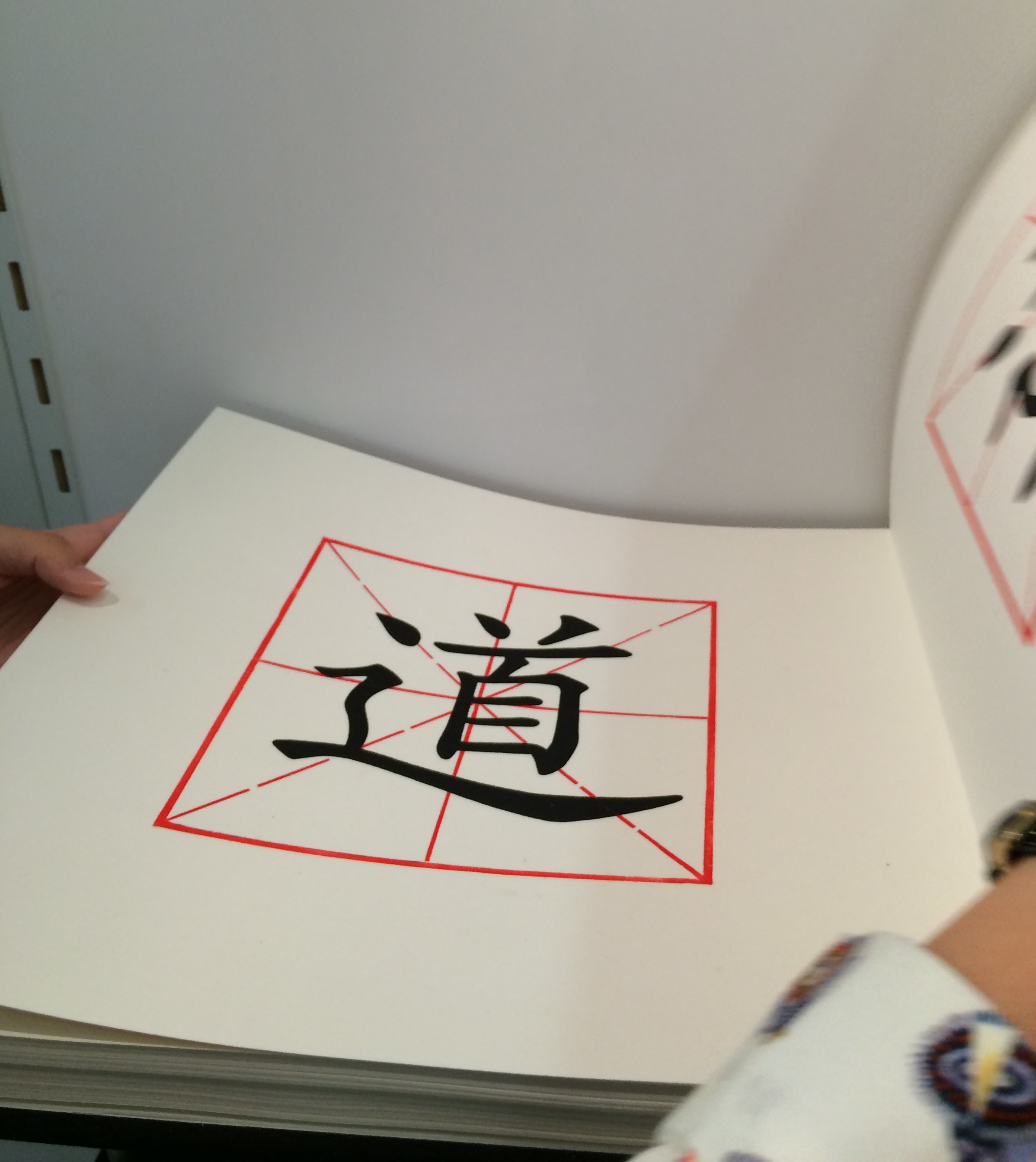
She drew my attention to The Way, a large volume open to a double-page spread on a shelf in the corner of the stand.
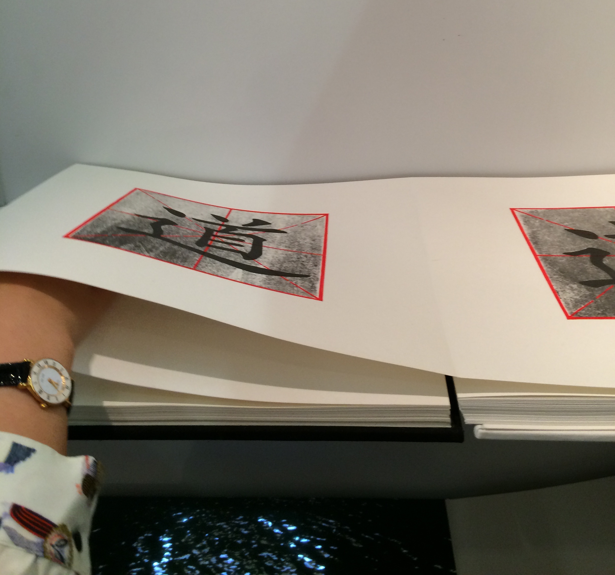
On each page of The Way is a square woodblock print, consisting of the Chinese character for Tao superimposed on a red figure. As the reader moves forward in the book, a darkening silkscreened wash gradually blots out the character.
Artist: Leilei Guo Work: The Way, 2008 Dimensions: 13.625 x 12.75″; 88 pages Material: Woodcut and silkscreen on rice paper. Concertina structure. Bound in cloth, front board in white, back board in black.
Artist: Leilei Guo Work: The Way, 2008 Dimensions: 13.625 x 12.75″; 88 pages Material: Woodcut and silkscreen on rice paper. Concertina structure. Bound in cloth, front board in white, back board in black.
She stepped aside to let me look closer. After I had turned a few pages in the usual way, I commented on the heft of what seemed to be uncut pages. Laid flat in its double-page spread with the sharpness of the fold and weight of the paper apparently sinking into its spine, the book did not immediately betray its leporello structure. She gently moved my hands away and inserted her hand in the fold between the two pages.
Artist: Leilei Guo Work: The Way, 2008 Dimensions: 13.625 x 12.75″; 88 pages Material: Woodcut and silkscreen on rice paper. Concertina structure. Bound in cloth, front board in white, back board in black.
Then, performing a traditional gesture of Tai Chi, she moved her hand to and fro without removing it from between the fold, and the pages turned or rather flowed and folded, each over the next, as if of their own accord. Gesturing from one side to the other and then back, again and again, she moved the print toward its opacity or clarity, depending on the direction. When she closed the volume, I could see that the board on one side was white, the board on the other, black.
According to the Vamp&Tramp’s website, which handled the work’s sale, the book embodies the artist’s vision of two strands of Chinese philosophy — Tao, or The Way, and Yin Yang. For me, that embodiment was in that moment in Frankfurt where another kind of printed book had its origin. Hand, movement, pages, ink, binding, the art were one.
For more of Leilei Guo’s art, visit the Vamp&Tramp site or the artist’s site.
On the occasion of the fortieth anniversary of Weproductions, Brandon Graham interviewed by Helen Douglas in 2011. The podcast provided by Bookbinding Now is available here and is a companion piece to Journal of Artist Books, No. 30.
Douglas’s comments on the concertina or leporello form reveal the impact of Proust and Chinese scrolls on her use of it, which is particularly evident in the two-sided concertina In Mexico: in the Garden of Edward James, discussed here.
Helen Douglas, In Mexico: in the garden of Edward James, 2014 (reviewed in Der Tagesspeigel)
At 6 minutes in, there is a wonderful riff on the book as elemental cultural artifact, being able to stand for each of the four elements. Here are links to the images to which Spector refers – so much more enjoyable to see as well as hear!
There is a related brief note about Spector’s “The Rise and Fall of Books” here. Spector’s works — especially his collages with found poems drawn from book jackets — strike deeply. With them, book art goes beyond the read artifact into the relationship of writing and reading.
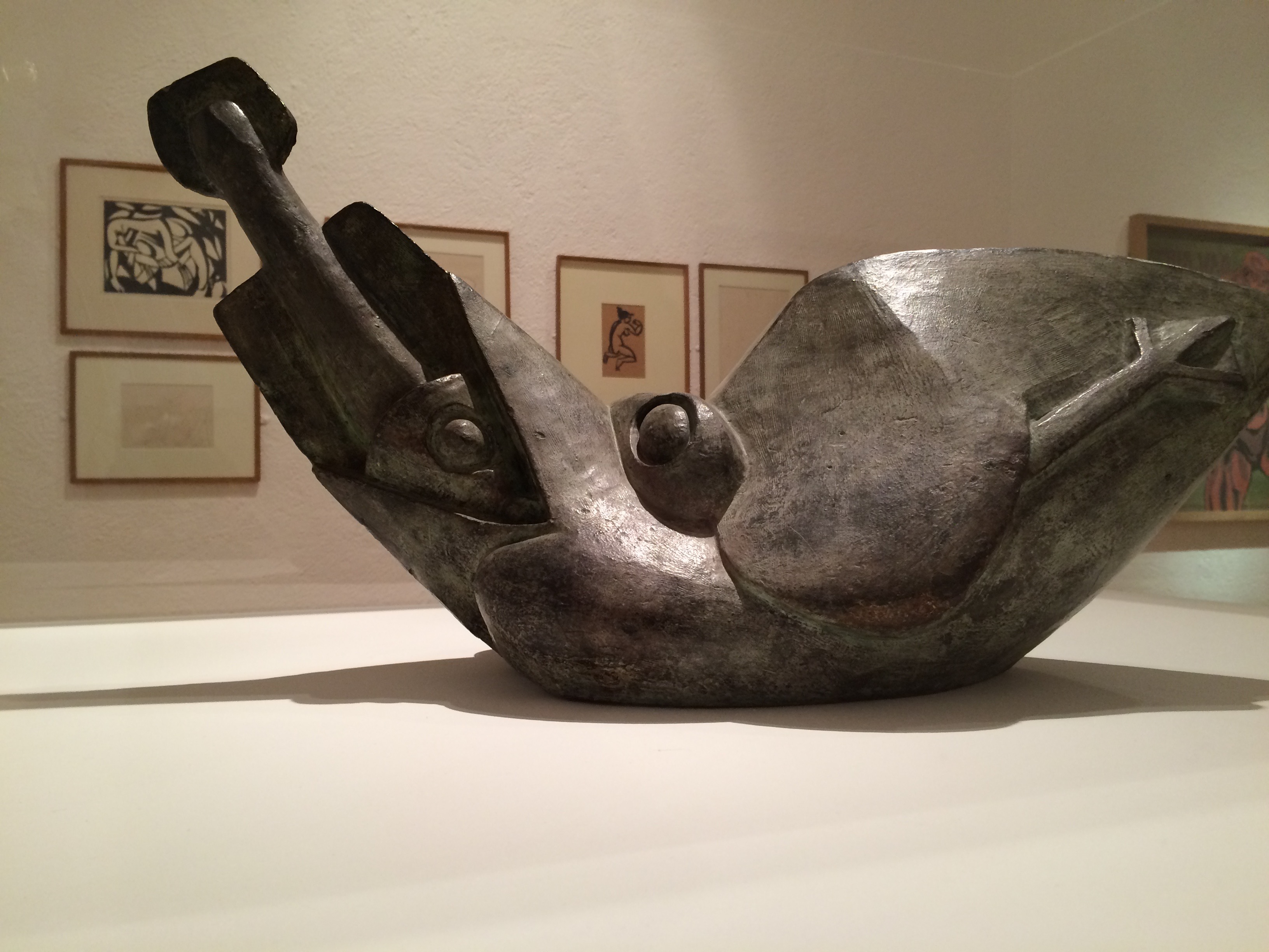
Henri Gaudier-Brzeska, Bird Swallowing a Fish, 1913-14 Kettle’s Yard exhibition, 2015
The Gaudier-Brzeska exhibition, the finale before Kettle’s Yard would close for years, had drawn me to Cambridge. I spent hours there. Exhausted, I was walking back to the train past the Fitzwilliam Museum. I had read somewhere that Xu Bing would have a small solo exhibition at the Fitzwilliam.
from Xu Bing, Book from the Ground: From Point to Point (MIT Press, 2014)
I own a copy of Xu Bing’s Book from the Ground: From Point to Point – a pictographic account of twenty-four hours in the life of “Mr. Black,” a typical urban white-collar worker – and I had seen Book from the Sky at the Odd Volumes exhibition of Yale’s Allan Chasanoff Collection. So I took a chance.
Xu Bing, Book from the Sky, 1991 The Allan Chasanoff Collection, Yale University Art Gallery
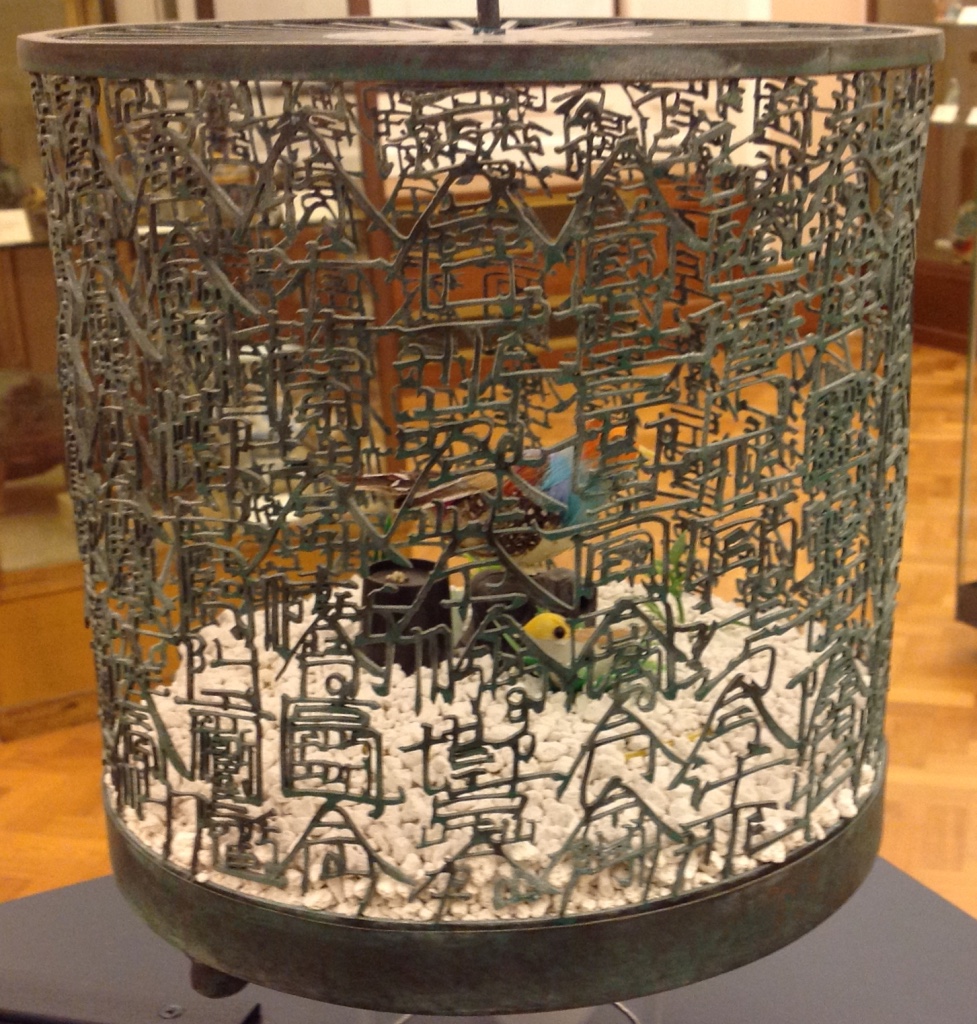
After first not recognizing my mispronunciation of Xu Bing and then hunting through some brochures, the attendants at the information desk directed me downstairs to a room of Chinese porcelain just outside the museum shop. Among the glass cases of blue and white: Bird Language (2003), four brass and copper birdcages, containing toy birds that sing at the clap of your hands. The mesh of two of the cages are composed of words in the Latin alphabet, the other two in Xu Bing’s faux Chinese calligraphy. According to his site, “The words are questions that people have asked Xu Bing about art, and his answers.”
Xu Bing, Bird Language, 2003 Four brass and copper birdcages containing sound-activated toy birds, the cage mesh composed of English and “square word calligraphy”, gravel.
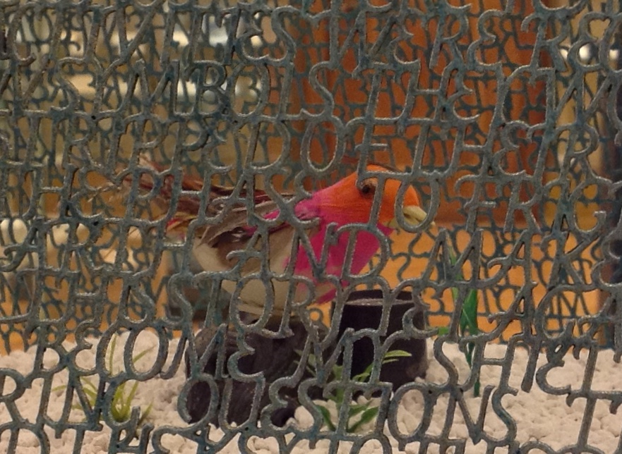
Detail. Xu Bing, Bird Language, 2003
They remind me of Gaudier-Brzeska’s Bird Swallowing a Fish, just a question of timing and the juxtaposition of two artists fascinated with a union of the animistic and mechanistic? Maybe it is these few other degrees of separation: Gaudier-Brzeska’s catalyzing effect on Ezra Pound in 1913, Pound’s creative misunderstanding of Chinese calligraphy, Pound’s disputably indisputable influence on the author of “Sailing to Byzantium” (1927), whose birds are “Of hammered gold and gold enamelling … set upon a golden bough to sing ….”, and now Xu Bing’s toy birds that require the body not the “Soul [to] clap its hands” and let the birds do the singing.
Xu Bing’s Book from the Sky must have been even more impressive in its Metropolitan Museum display (2013/14) than its partial form at the Yale Gallery (2015) as shown above, but that’s part of the pleasure of conceptual art. Whether billowing overhead on scrolls suspended from the ceiling and walls or juxtaposed in their bound book form with their wooden case, these hand-bound deliberately indecipherable, meaningless Chinese calligraphic forms printed from hand-carved wood blocks sing in the mind and soul. But what is that song? We have the impression of meaning, an impression conveyed by graphic gesture and the traditional containers of meaning. But there is a slippage between the impression of meaning and grasp of meaning. Perhaps that is Xu Bing’s song.
The Khan Academy’s socio-political take on Xu Bing’s Book from the Sky — comparing it to Ai WeiWei’s performance art of smashing a Han dynasty vase — may usefully decipher the song for some. I think it misses a more profound point that Charlie Bennett approaches in his Aestheticareview of Xu Bing’s installation version of Book from the Ground (just closed on 28 February 2016 at the Centre for Chinese Contemporary Arts in Manchester, UK). The interactive mixed-media installation recreated Xu Bing’s art studio, including double-page spreads of the book pinned up on a wall, over-sized blow-ups of the pictographs from the book and two computers for visitors’ use.
Book from the Ground is also the name of Xu’s language-learning software program, which attendees can access on PCs in the gallery space. When words are typed into the tool, they are transformed into Xu’s pictographic language. It recalls a previous work of Xu’s, Introduction to [New] English Calligraphy (1994), which combines installation and interactive art, as visitors of a simulated classroom attempt to write what seems to be traditional Chinese calligraphy. But in the act of copying out the symbols on display, they realise the characters are reconfigured Roman letters that spell out words in legible English. Book from the Ground goes further in questioning transcultural communication; it instigates dialogue across borders only by negating all cultural differences in a de-localised set of coded representations.
With its English and Chinese birdcages, Bird Language, too, echoes Introduction to New English Calligraphy. But in the viewer’s interaction with the latter, the meaning that emerges is not what the viewer “intends” by copying out pretty lines. The experience of “communicated meaning” or “almost communicated meaning” seems accidental or magical. Likewise in Bird Language, we know that the sensor activates the toy bird and suspect a connection between the “magically activated” songs and the word-mesh cages. We suspect meaning. We know the artist’s hand formed metal letters to form metal words in two different languages. We suspect that each cage forms a narrative. We suspect there are differences in the narratives from the difference in round and square cage, English and Chinese cage. For some, that experience of suspicion might be frustrating; for others, delighting.
On further reflection, I think Xu Bing’s art challenges that modernist “union” of the animistic and mechanistic. With the sound-activation of digital birdsong and software-translation of words into pictographs, Bird Language and Book from the Ground (the installation) offer the slippery intersection of the animistic, the mechanistic and the digital. Intersection is not always union, if by “union” we mean equivalence, meaning and clarity. “Made in China” birds are not swallowing or regurgitating brass symbols. Animistic and mechanistic input to digital translation or replication do not always yield union — equivalence, meaning or clarity. But in Xu Bing’s hands and mind — in their intersection with our hands and minds — they yield a suspicion of union. They yield art.
Detail. Xu Bing, Bird Language, 2003
Detail. Xu Bing, Bird Language, 2003
Further reading:
Wang, Sue. “‘Xu Bing’: The Art View and Action Logic of a Fatalist”, 12 January 2018. A lengthy piece on the occasion of the Xu Bing retrospective in Wuhan, his first large-scale solo exhibition in China since returning ten years ago.
Beitler, Daniel. “Xu Bing Tests the Limits of Language in Unique Exhibition“, Macau Daily Times, 20 November 2017.
From www.youtube.com – May 25, 2017 1:55 PM
This video recounting Xu Bing’s life and work so far (from his start in China to the 90s in New York then back again to Beijing) broadens the appreciation of each work and the connections among them across time and place.
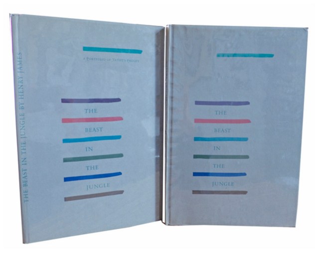
Henry James, The Beast in the Jungle, 1903. Allen Press, 1963. The copy shown is one of only 15 copies with an extra suite of 16 artist’s proofs, each titled, numbered 9/15 and signed by the artist in a separate portfolio. Displayed online at Sophie Schneideman – Rare Books and Prints.
In his Books and Vines essays, Chris T. Adamson provides fresh, personal and insightful comments on fine book productions and their content such as Henry James’ “The Beast in the Jungle” from the Lewis and Dorothy Allen Press in 1963, pictured above. An oenophile, as the title of his series suggests, Adamson also occasionally offers tips on the best wines with which to decant and read these works.
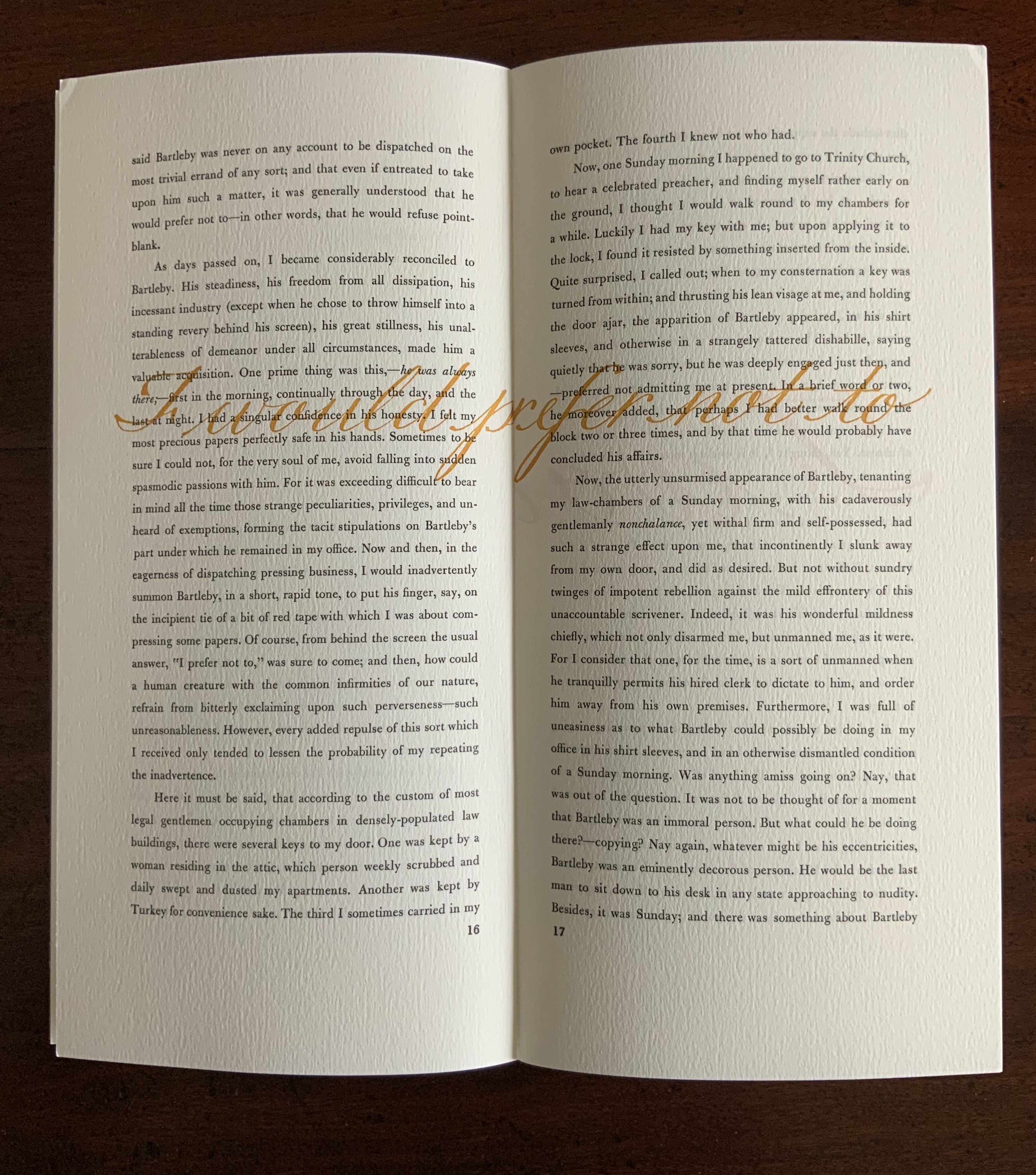
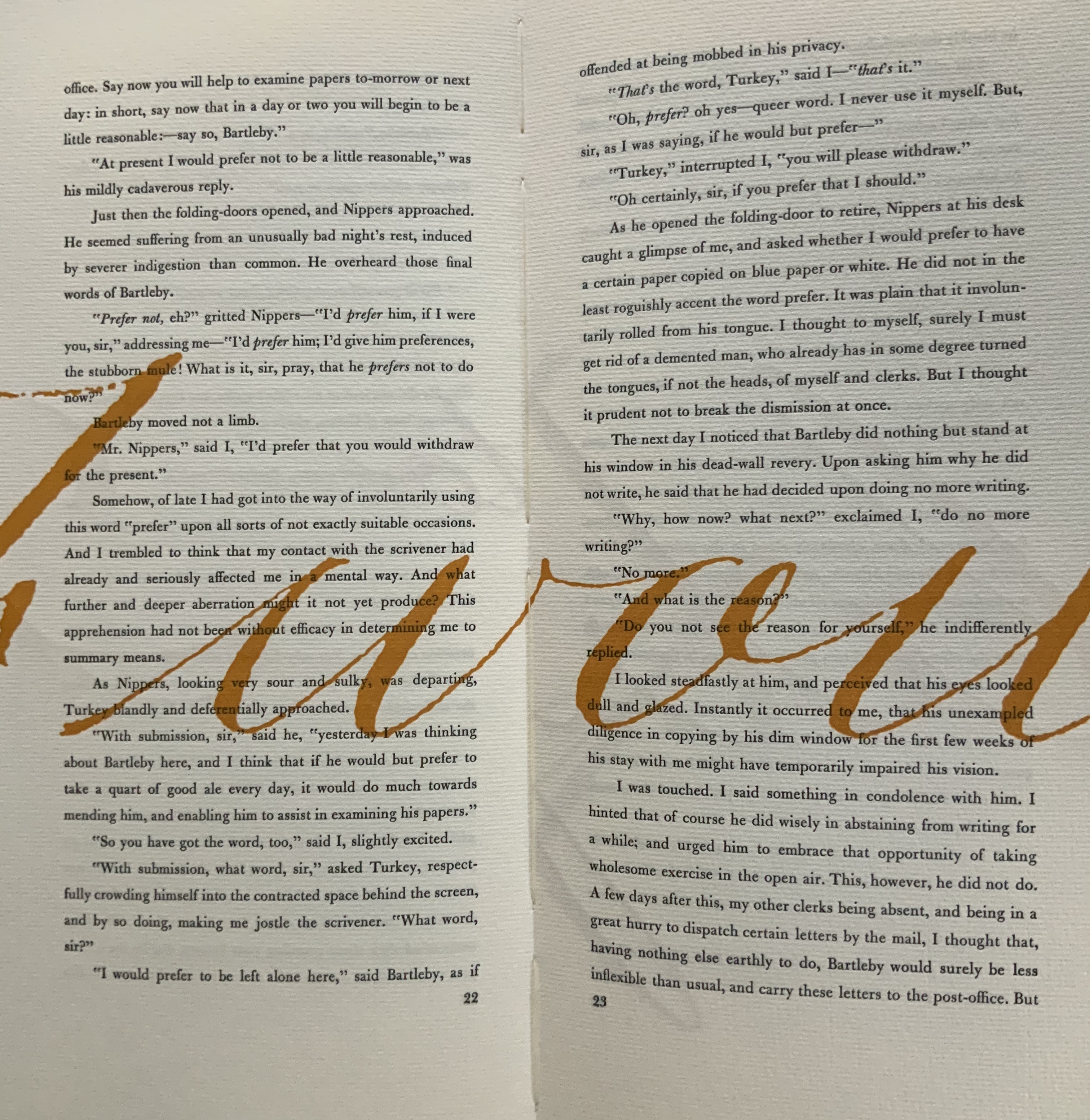
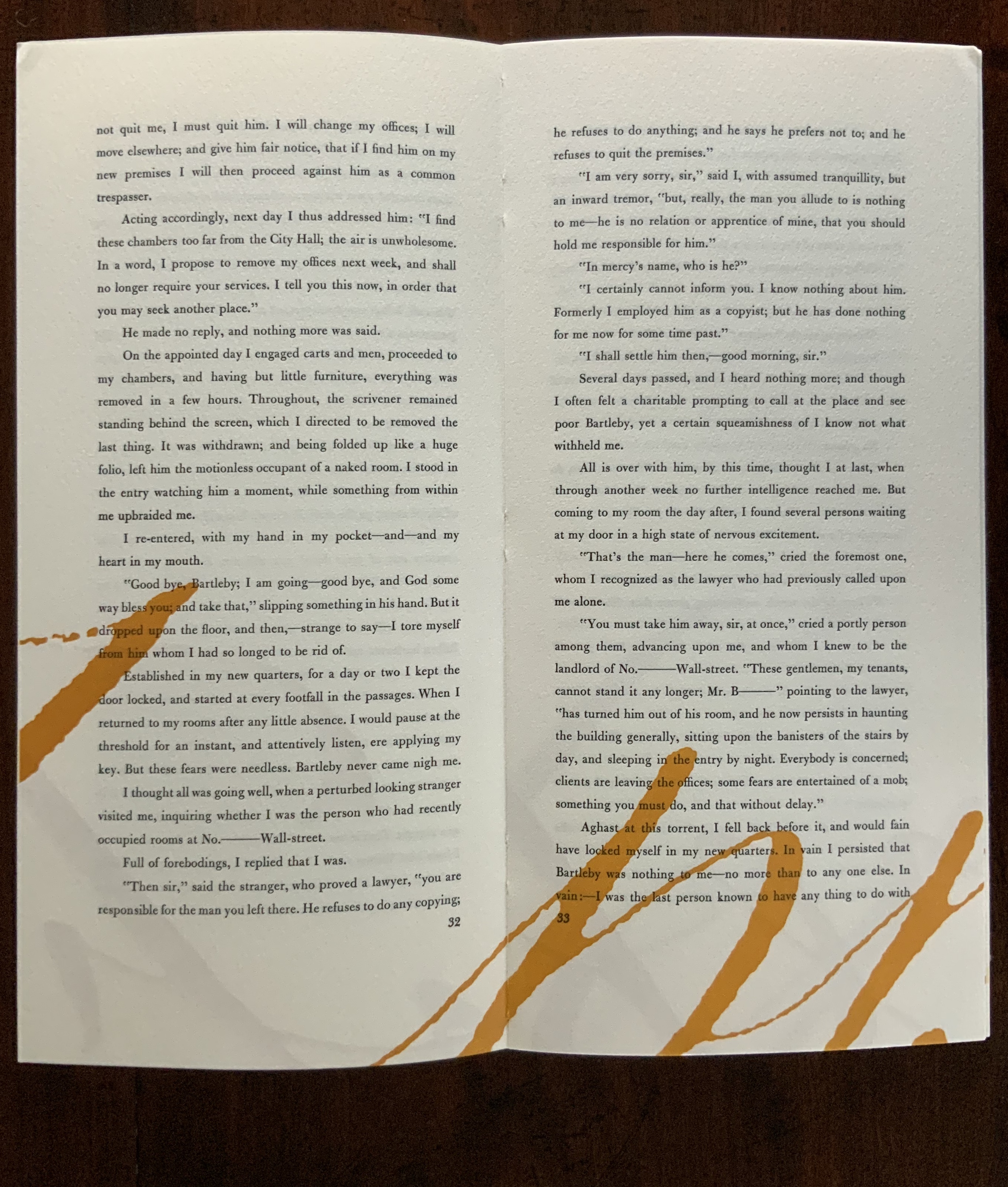
James is a favorite author at Books On Books as is Herman Melville. Indulge the punning coincidence of Adamson’s introducing us to Wilber Schilling’s Indulgence Press and his edition of Melville’s “Bartleby the Scrivener: A Story of Wall Street“. Schilling’s edition of “Bartleby” – with Suzanne Moore’s original hand lettering of Bartleby’s classic statement “I would prefer not to” first appearing fully legible then becoming larger until it literally falls off the bottom of the final page – was an early career statement of an interest in more than fine press work but in book art as well.
Consider Schilling’s Half-Life/Full-Life and its binding a variation on the accordion/flag structure of Hedi Kyle and Claire Van Vliet. The complexity of the form marries well with that of the intertwining, interleaving text and photos along the timelines of the Doomsday Clock and global warming.
Half Life/Full Life Wilber Schilling, 2009 ISBN: 0-9742191-5-0 Cover
Schilling’s photography in Half Life/Full Life speaks to the importance of that craft in his overall portfolio. His photos of aging, decayed and unbound books are haunting and remind me of the found art of M.L Van Nice.
Schilling has collaborated with Thomas Rose (visual artist and professor at the University of Minnesota), Michael Dennis Browne (poet and librettist), Rick Moody (author of The Ice Storm) and Patricia Hampl (MacArthur Fellow poet and novelist). He has collaborated with Daniel E. Kelm (book artist, founder of the Garage Annex School for Book Arts and a collaborator with Suzanne Moore).
Given the influence of Marcel Duchamp and Joseph Cornell on works such as Arthur & Barbara (Arthur Danto and Barbara Westman) or Surplus Value Books: Catalog Number 13, you might say that Schilling has attempted to collaborate with them as well. The danger in that, of course, is highly derivative artwork. That early-career whiff of genius in commissioning the now famous calligrapher Suzanne Moore to hand letter “I would prefer not to” and spreading it in ever larger size across the pages might be what takes Schilling’s work beyond the derivative. His work is worth examining with that anticipation.
Postscript
The Books On Books Collection now holds a copy of Schilling’s edition of Bartleby as well as works by Suzanne Moore.
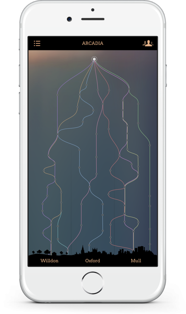
In “The Scholarly Kitchen“, Joseph Esposito writes: “I suspect that the multiple narratives of Pears’s fiction will someday find an analogue in expository writing that enables intersections of one theme or thread with another, which would provide, as it were, a new form of discovery.”
Perhaps that “analogue” is already here for the scholarly article in Elsevier’s “Article of the Future” and Wiley’s “Anywhere Article“. In scholarly expository writing, the intersections are often those of “conversations” among articles, for which the Digital Object Identifier (DOI) has performed and continues to perform an innovatory spark. Consider the activity and ten aims of the Linked Content Coalition.
All of this has been a long time coming. The DOI has its roots in the Handle System, whose roots weave back beyond the Web to the Internet Protocol (IP) itself. Esposito notes Iain Pears’s print antecedents in the experimental ’60s fiction of John Barth and the creator of Scheherazade, and he could have added the 1987 digital precursor Afternoon, A Story by Michael Joyce.
A long time coming, and to the kids in the backseat reading Pears’s Arcadia on their iPads, “No, we’re not there yet … keep reading!”


 Consider Schilling’s Half-Life/Full-Life and its binding a variation on the accordion/flag structure of Hedi Kyle and Claire Van Vliet. The complexity of the form marries well with that of the intertwining, interleaving text and photos along the timelines of the Doomsday Clock and global warming.
