Bookmarking Book Art — Jacqueline Rush Lee

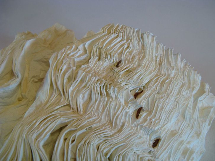
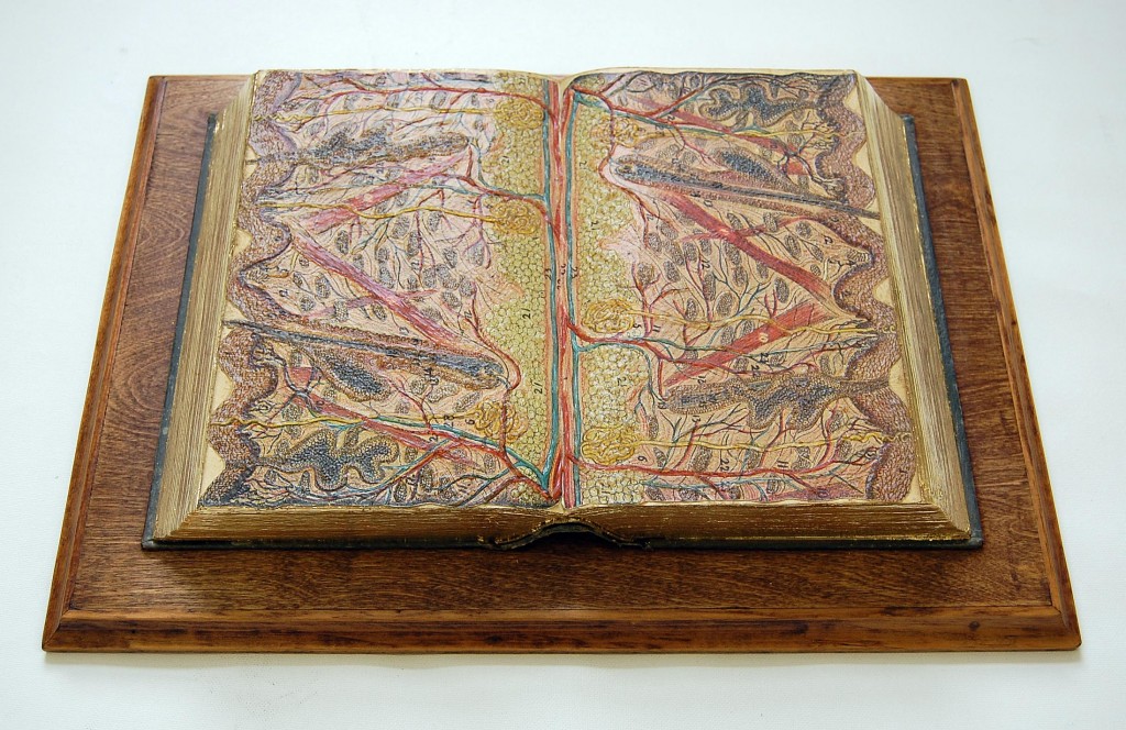
Dictionary Detail (From the Series Ex Libris), 2000Petrified Book (High-fired Book in Kiln)H 7” x W 15” x D7”H18 x W38 x D18cm
Dictionary Detail (From the Series Ex Libris), 2000
Petrified Book (High-fired Book in Kiln)
H 7” x W 15” x D7”
H18 x W38 x D18cm

From the artist’s website:

Jacqueline has been working with books for fifteen years and is recognized for working with the book form. Her artworks are featured in blogs, magazines, books and international press. Selected bibliography include: BOOK ART: Iconic Sculptures and Installations Made from Books; PAPERCRAFT: Design and Art with Paper and PLAYING WITH BOOKS: The Art of Up cycling, Deconstructing, and Reimagining the Book. Jacqueline’s work will also be featured in Art Made from Books, Chronicle Press, 2013 by Laura Heyenga. …  She exhibits her artwork nationally and internationally and her work is in private and public collections, including the Allan Chasanoff Book Under Pressure Collection, NY.

The Chasanoff collection connects Lee with Doug Beube, whose work has been noted here. Beube was the curator of the Chasanoff Collection from 1993 to 2011.   In his interview with Judith Hoffberg in UmbrellaVol 25, No 3-4 (2002), he comments on the purposes of Allan Chasanoff, a book artist in his own right, in putting together the collection “The Book Under Pressure”:

There are a number of ideas that meets Allan’s criteria in acquiring work, of which I’ll try to convey a couple. The first is; the problem of the book to perpetuate information is inefficient, it’s an obsolete technology due to the advent of the computer.  Another premise is; at the latter part of the 20th century the book is being used for purposes other than its utilitarian design. Allan has been working extensively with computers and digital imaging since 1985 and understands that the book is as “an outdated modality”, he’s fond of saying. He’s not interested in the book decaying or in its destruction, nor is he referring to the content of books, artist’s books, production costs, mass appeal or where they get exhibited. His interest is in the book as an antiquated technology.

Lee’s process of kiln firing to transform individual books, as with the dictionary above, strikes a harmonious chord. The kiln does not reduce the book to ash but rather petrifies it.  Another way of exploring “the book under pressure.”   Lee’s and Beube’s work are brought together again by Paul Forte  at the Hera Gallery for an exhibition entitled Transformed Volumes.

Bookmarking Book Art — Carl Pappenheim

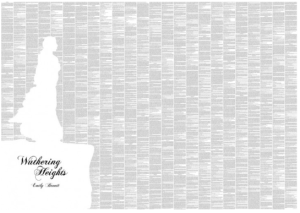
Well-reviewed (see below), Spineless Classics — Carl Pappenheim’s prints that use all the words of a book to outline an emblematic image of the work — raise questions unasked by the interviewers:  If we stand before a Spineless Classic and read it, does the experience of reading the book change?  How?  What is the difference between art and decor?  Between art and craft?  Between artwork and mechanical reproduction?  

screen-shot-2012-01-12-at-00-40-07

Spineless Classics Turns Whole Books Into Graphic Art 2011

Spineless Classics 2011

Interview With Carl Pappenheim, Bringing Novels To Your Walls At Spineless Classics 2011

How to get your favourite book on your wall; 5 questions for Carl Pappenheim of Spineless Classics 2012

A Book on One Page … 2012

Carl Pappenheim: The Artist Using The Whole Texts Of Novels To Create Beautiful Silhouettes  2013

The Art of Writing; or Writing as Art 2013

Bookmark — “How Old is Innovation before it’s New?” David Worlock

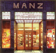
Fachbuchhandlung
Vienna’s Manz Bookstore, facade by Adolf Loos

Two interesting words: “semantic” and “innovation.”  Find yourself a good cup of coffee, a slice of sachertorte, the aroma of cinnamon and take the time to read this article by David Worlock.

“Getting” the fundamentals of digital publishing means “getting” semantics: the semantic web, taxonomies, ontologies, tagging and all that.  David Worlock’s article is a good place to start to understand why.

Bookmark — The evolution of bookselling

overdrive-retail-ebook-kiosk--134x250
Nate Hofhelder, The Digital Reader

No good history of the book in the late 20th and early 21st century will overlook this part of the book’s value chain.  In covering the earlier eras, the outstanding historians — Chartier, Davenport, Eisenstein, Johns,  Lefèbvre and Martin,  McMurtrie,  Pettegree, Pollard, and Suarez — touch on distribution and retail to varying degrees.  When it comes to our era though, the effect on the book itself of the distribution/retail roles played by Barnes & Noble, Borders, Amazon, Apple, Google, OverDrive and a host of other smaller key players such as Project Gutenberg will loom larger.  (So will that of self-publishing if we consider BookStats‘ report that self-published ebooks represented 30% of ebook sales in 2012.  What the effect will be, though, is harder to say.)

Around since 1986, OverDrive has its roots in the production end of the industry, providing publishers with conversion and formatting services from diskettes to CDs to ebooks.  Its owner, Steve Potash, set the foundations of its contribution to distribution and retail in 1999-2000 with his participation in the Open eBook Forum, now the International Digital Publishing Forum, and his creation of Overdrive’s Content Reserve.   As of this writing, Content Reserve contains over a million ebooks; it is the “overdriver” behind the firm’s library distribution service and the OverDrive Retail Kiosk.

If the OverDrive Retail Kiosk becomes a key to unlocking the way back for book retail in the “real world,” it will by its own definition contribute to the evolution from the printed book to the ebook.   Anyplace — in the mall, the main street or high street, the coffee shop, canteen or library — can become an outlet for the purchase of ebooks, which will feed back into the supply and value chains.

No doubt, historians will note that OverDrive required no physical ereader of its own, no Kindle, no iPad, etc., to reach this point in the evolutionary path but rather, it was its dual focus on finding an effective way to rationalize the delivery of multiple formats while pursuing a standard (EPUB) and on meeting the distribution needs of libraries then retail that put OverDrive in its current position. That position is symbiotic with both “closed garden” ereaders and apps as well as books-in-browser solutions.

Just as the Gutenberg press would not have taken off without the regular supply of a more relatively standardized form of paper, the digital book has had to await — is still awaiting — a more standardized format and mechanism of delivery.  In reinventing themselves and these parts of the book industry’s DNA, OverDrive and others contribute to the evolution of the book.


Overdrive Digital Bookmobile
Overdrive Digital Bookmobile (Photo credit: Librarian In Black)


Bookmarking Book Art – Vita Wells, Updated 11 February 2014

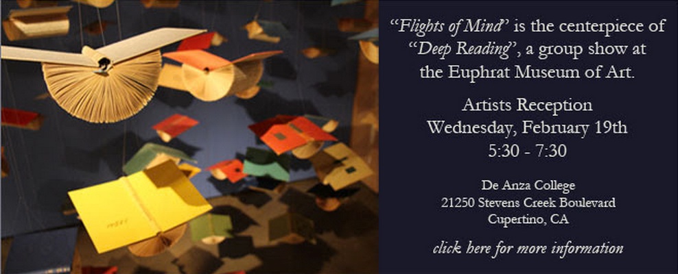
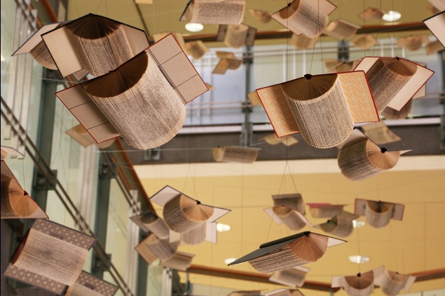
Wells %22Flights of Mind%22From 3 February to 20 March 2014, Vita Wells (born Béa Welsh Weicker) has a new “Flights of Mind” installation. A year ago, she had placed an installation of the “Flights of Mind” at the Berkeley Central Library, the first being in 2012 at the Oakopolis Gallery in Oakland, California.

Wells Flights of Mind BerkeleyFollowing the Berkeley installation, the following was posted on BooksOnBooks:

Appropriately, this latest installation was for the “11th Annual Authors Dinner,” sponsored by the Berkeley Public Library Foundation.  Soaring forty feet above the patrons’ heads were hundreds of altered discarded books, their covers spread into wingspans, their pages folded into rounded bird bellies and each book suspended on cables from the ceiling at varying pitches,  yaws and distances from one another.   They are no longer there, nor at the Oakopolis.  By the installation’s name, they should now exist only in the mind, but the artist provides an extensive online “installation” with numerous pictures and videos, an essay on her intent and a detailed description of the installation’s physical characteristics.

It is delightful to have access to the online version, and we may fool ourselves into thinking of it as virtual.  Even the digital is subject to forensics.  Still, although Wells may well take down the online installation, or its URL may be hijacked or fall into 404-dom, it is not temporary in the sense that its instances in Berkeley and Oakland were.  So does its presence challenge the integrity of those temporary installations?

Almost a century ago now, Yeats wrote of the swans’ “bell-beat” of wings overhead at Coole, and that poem entered the world of lasting works of art.  It has its many physical instantiations in books the world over.  It lives in recordings.  It lives on the Web.  It lives in countless minds ready to recite it.  Of course, the books will rot, the recordings and sites decay, the minds fall into silence.  Yet in the presence of thought become art, soaring overhead, we dare to dream of persistence even in the face of such imperfections as Wells’ “worn, frayed, … beat-up and patched” birdbooks or the challenge of the age of digital reproduction to the integrity of art.

… now they drift on the still water

Mysterious, beautiful;

Among what rushes will they build,

By what lake’s edge or pool

Delight men’s eyes, when I awake some day

To find they have flown away?

Vita Wells’ art feeds the dream.

Related publication

Tracey Taylor, “Berkeley artist Vita Wells makes books fly at main library”, Berkeleyside, 11 February 2013, accessed 11 February 2014: http://www.berkeleyside.com/2013/02/11/berkeley-artist-vita-wells-makes-books-fly-at-main-library/


Bookmark for Literacy — Tom Chatfield

Tom Chatfield’s short essay “I Type, Therefore I Am” celebrates the increasingly rapid rise of literacy.

At some point in the past two million years, give or take half a million, the genus of great apes that would become modern humans crossed a unique threshold. Across unknowable reaches of time, they developed a communication system able to describe not only the world, but the inner lives of its speakers. They ascended — or fell, depending on your preferred metaphor — into language.

The vast bulk of that story is silence. Indeed, darkness and silence are the defining norms of human history. The earliest known writing probably emerged in southern Mesopotamia around 5,000 years ago but, for most of recorded history, reading and writing remained among the most elite human activities: the province of monarchs, priests and nobles who reserved for themselves the privilege of lasting words. …

In the past few decades, more than six billion mobile phones and two billion internet-connected computers have come into the world. As a result of this, for the first time ever we live not only in an era of mass literacy, but also — thanks to the act of typing onto screens ­— in one of mass participation in written culture.

via Tom Chatfield – Language and digital identity.

This is territory bookmarked before in response to Ferris Jabr’s “The Reading Brain in the Digital Age” — Bookmarking a Bookburning II — but it occupies higher ground.

Bookmark — Anniversary of the Book’s Freedom from Taxation

Louis-xii-roi-de-france
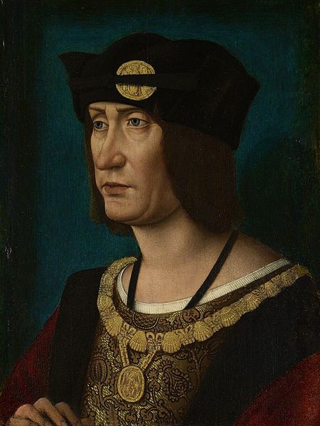
Louis XII, Roi de France, 1498-1515

In 1513, Louis XII of France issued an edict praising printing, exempting it from a large impost and removing a tax on books.  Louis declared that “the printer-booksellers … ought to be maintained in their privileges, liberties, franchises, exemptions, and immunities, in consideration of the great benefits which have been conferred upon our kingdom by means of the art and science of printing, the invention of which seems rather divine than human ….”  Two years later, Louis was dead, and the lot of books and printer-booksellers fell under the shadow of France’s so-called Father of Letters, François I, who issued an edict in 1535


Francis1-1
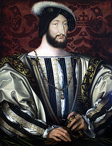
François I, Roi de France, 1515-1547  


banning the use of the printing press and permitted books and printers to be consigned to the flames for blasphemy.   (Richard Christie, Etienne Dolet: The Martyr of the Renaissance, 1508-1546, 1899. Pp. 330-31).    Which might be said to challenge the certainty of taxes while confirming that of death.


Bookmark — Anniversary of The Imprint and Its Font

Gerard Meynell's The Imprint
Gerard Meynell’s The Imprint

The Imprint

This year is the centenary of Gerard Meynell’s trade periodical The Imprint, which was the scene of Stanley Morison’s first appearance in print. How appropriate then that Morison’s book A Tally of Types tells the story of the journal’s founding and, equally important, how the historic font called Imprint Old Face came into being. The font’s importance is that “the design had been originated for mechanical composition. … the first design, not copied or stolen from the typefounders, to establish itself as a standard book-face.”(p.21) Ironically, Meynell and his colleagues intended for the font to be freely available to the trade, but eventually it came into the ownership of Monotype Imaging, where it can be obtained today under the OpenType family.

As the world of print morphs into its digital incarnation, we see the same impetus behind the new generation of typographers, the ones born digital, but we see varying degrees of adherence to the “type wants to be free” movement.

Bookmarking Book Art — Fore-edge Printing and Painting: Book Art and the Book Arts Revealed

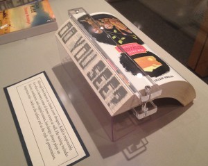
Chip Kidd’s novel The Cheese Monkeys, designed as well by him, sports a printed fore-edge. When the book is closed, the fore-edge is blank.  Fanned in one direction, it shows the sentence as seen in the photo below.

Chip Kidd, The Cheese Monkeys: A Novel in Two Semesters, 2008

Chip Kidd, The Cheese Monkeys: A Novel in Two Semesters, 2008, from the Chip Kidd Archives, on display Jan. 12 through April 24, 2015, in The Eberly Family Special Collections Library, Penn State University. Reproduced with permission of the Library

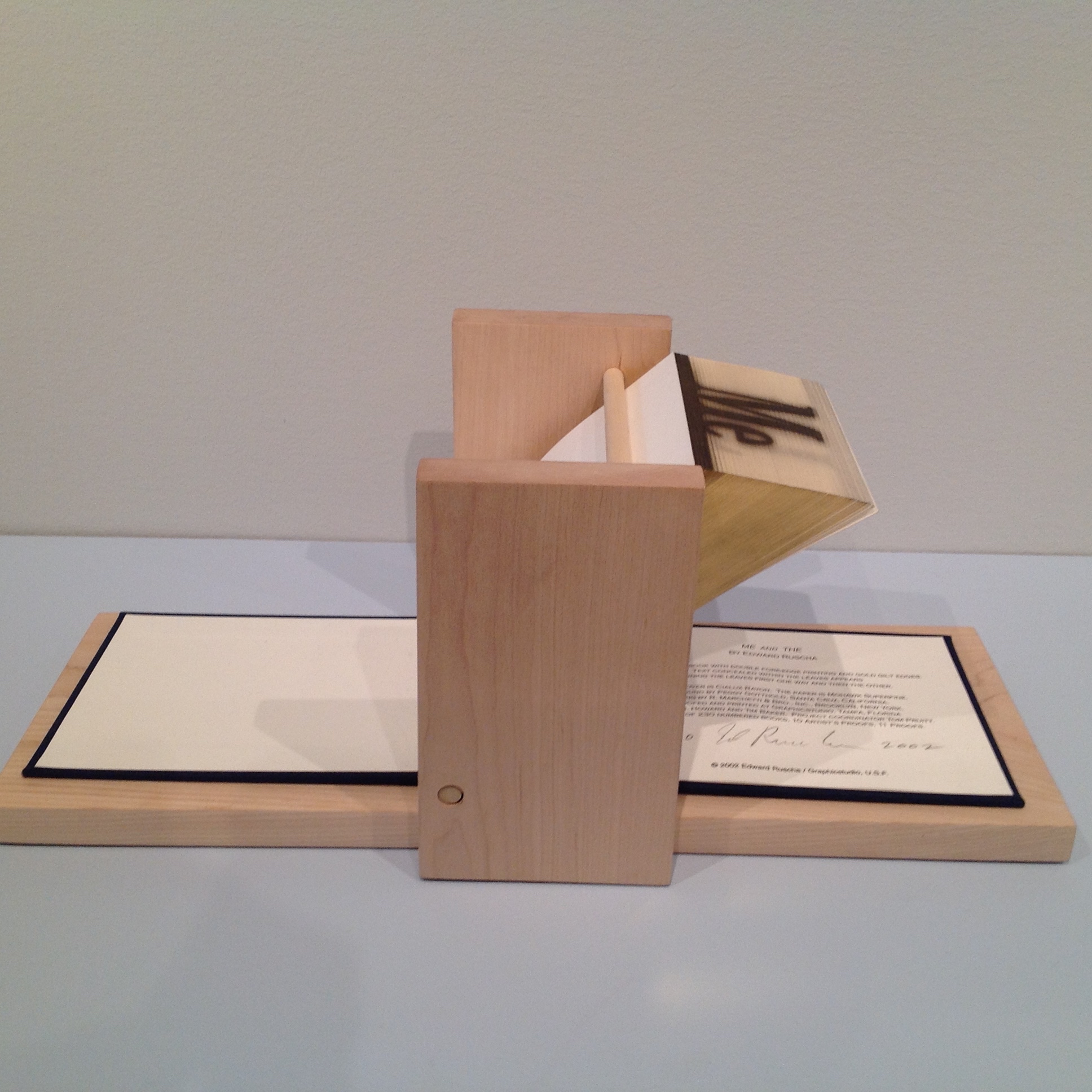
Fanned in the opposite direction, the fore-edge displays another phrase: “Good Is Dead”. The printing process is well described in a 2004 video by Graphics Studio|Institute for Research in Art, prepared about the making of Ed Ruscha’s fore-edge book Me and The.

Ed Ruscha, Me and The, 2002 Allan Chasanoff Collection, Yale University Art Gallery

Ed Ruscha, Me and The, 2002
Allan Chasanoff Collection, Yale University Art Gallery

This is similar to traditional fore-edge painting.  Much of what is worth knowing about fore-edge painting can be learned from Martin Frost’s QuickTime Movie-rich website, but if you are a fan of the Folger Shakespeare Library, its holdings yield some outstanding examples under the hand of Erin Blake.   

Double-fore-edge-painting-showing-half-of-each-painting

Jeff Weber’s book Annotated Dictionary of Fore-edge Painting Artists & Binders is probably the lengthiest treatment available on the subject. Hear him discuss his work here.  Weber, who commissioned artwork from Frost, Margaret Allport (Costa) and Clare Brooksbank, has a particularly well-written article at the International League of Antiquarian Booksellers’ site.     

Phillip J. Pirages, an antiquarian bookseller, provides an enlightening and entertaining talk on fore-edge painting of the 18th century and shows a superb example of the London binders Taylor & Hessey’s work — a two-volume set of the works of Alexander Pope, bound in red morocco leather and decorated on the fore-edges with scenes of Twickenham and Windsor.   

The point of this bookmark is not merely to share a curiosity but to use that narrow, hidden curiosity as an illustration of the boundaries of book art and the book arts.        

Updates

Thanks to Ann Kronenberg for this link to a 1940s film on the topic.

Thanks to Merike van Zanten of DoubleDutch-Design.com for this link from 4GIFS.com showing what appear to be biblical scenes painted on the fore-edge of a book.

Thanks to Peter Verheyen for this link to a history of decorating book edges with examples from the Maurits Sabbe Library and other Leuven and Belgian collections.

Weber, Carl. Fore-edge painting : a historical survey of a curious art in book decoration (Irvington-on-Hudson, New York: Harvey House, 1976.).

See also 21 July 2018 article on Martin Frost in The Times.
Bookmarking Book Art – Franziska, a typeface

The Fine Press Book Association’s inaugural Student Type Design Competition sprang from the hope that by building bridges between printers and young type designers we might end up creating new material resources for the fine press community.

A PDF document called the Making of Franziska – a hybrid text-face between slab and serif is available for downloading.  This document is quite well put together and provides a kind of tutorial on type design.

franziska-font_runge_03_text_04_freundliche-versalien