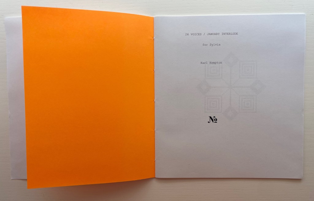
Alphabet Music (2d ed., 1992)

Alphabet Music (2d ed. 1992)
Jeremy Adler
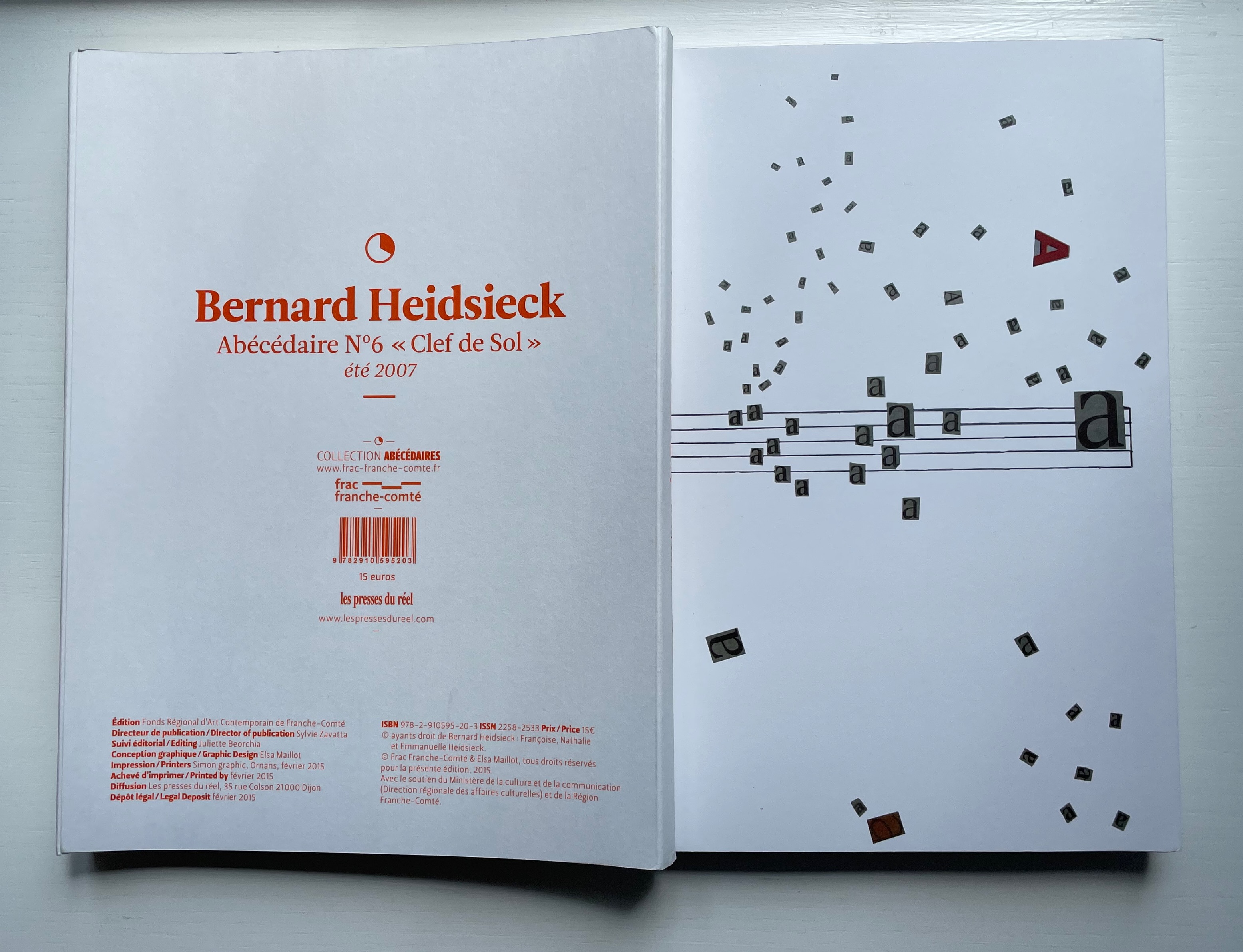
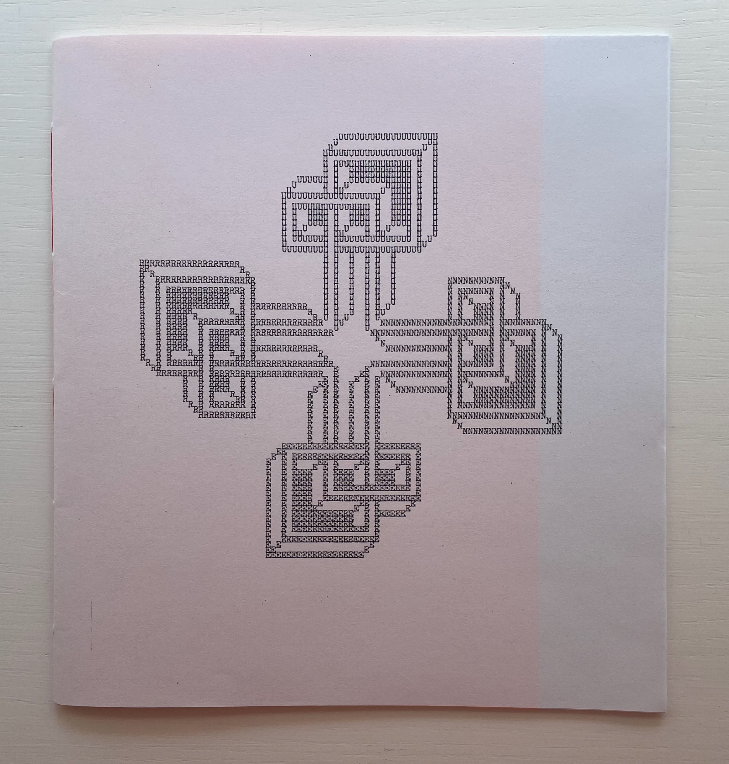
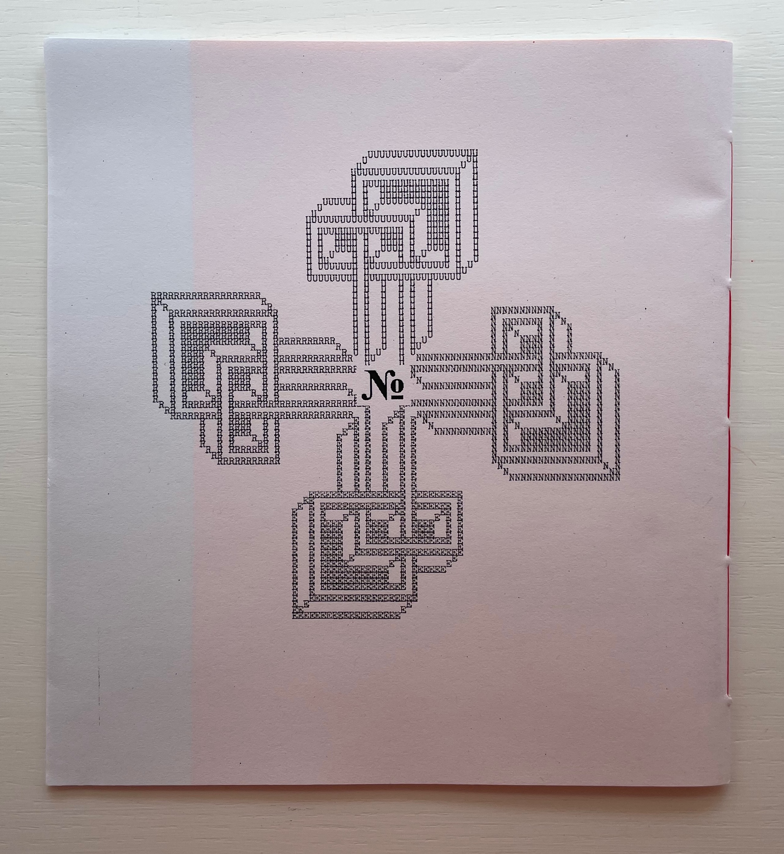
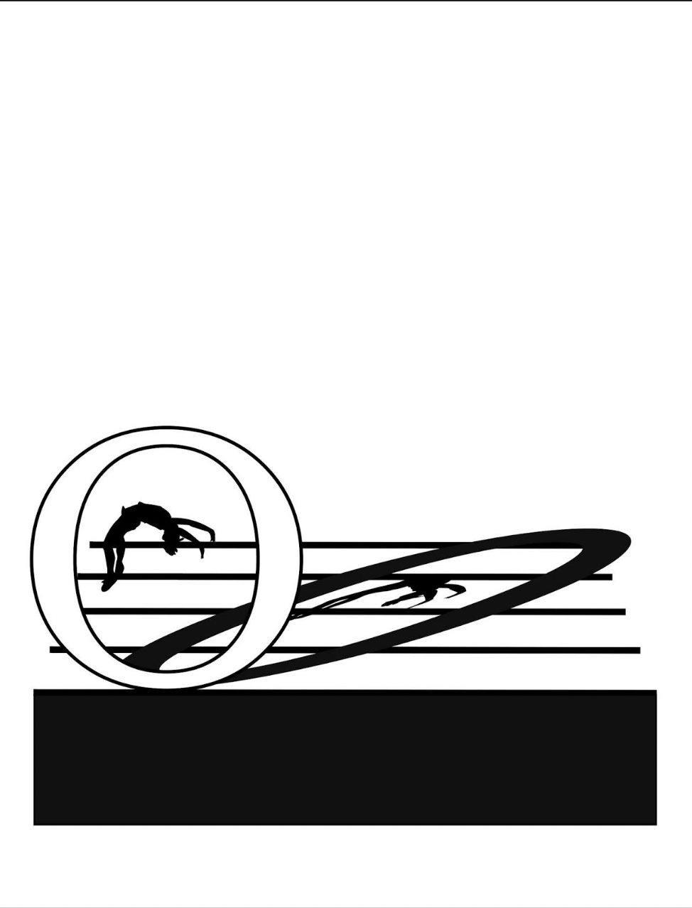
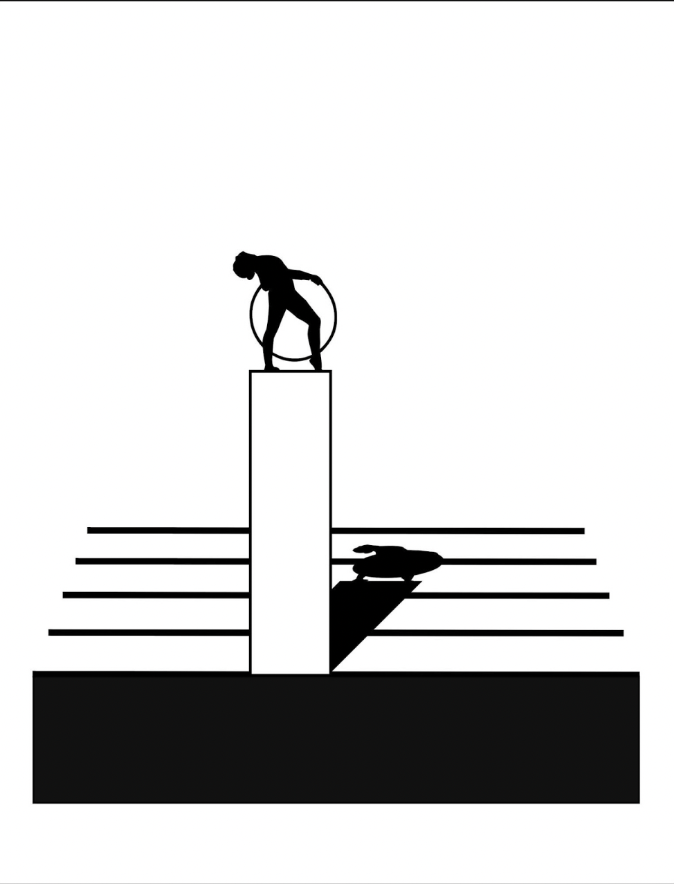
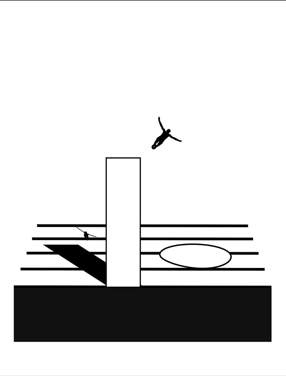
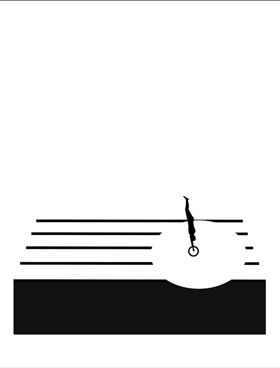
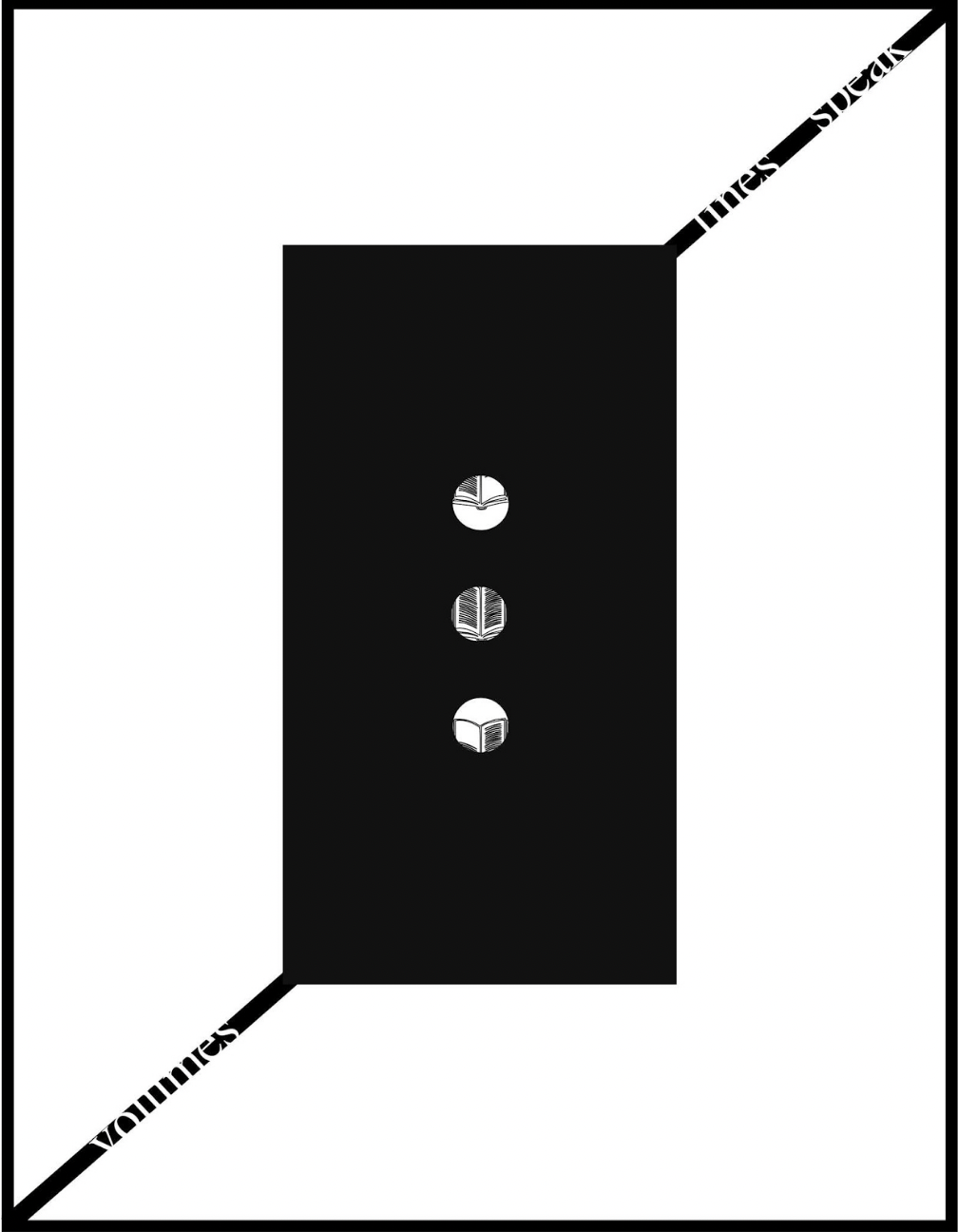
Loose folios. H252 x W354 mm. 7 folios. Edition of 25, of which this is #23. Acquired from Antiquariat Willi Braunert, 2 August 2022.
Photos: Books On Books Collection. Permission to display from the artist. © Jeremy Adler, 1992.
Clearly the alphabet has held an especially productive place in Jeremy Adler’s imagination.
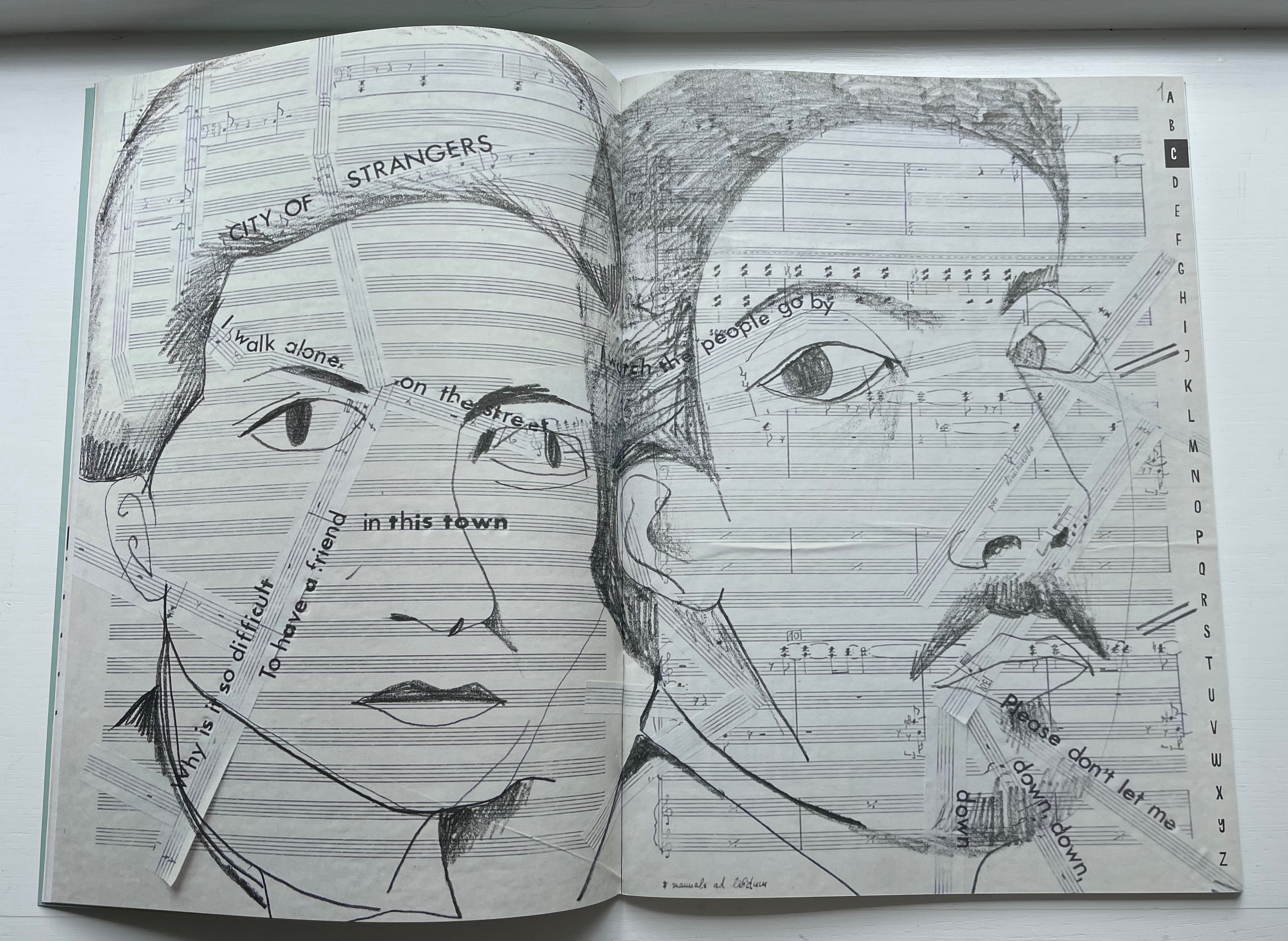
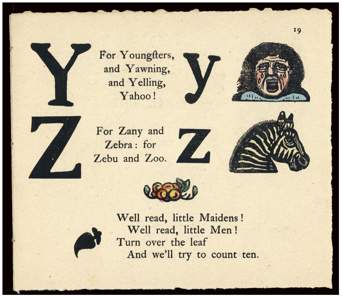
From 1972 to 1977, he issued A: an envelope magazine of visual poetry. His Alphabox (1973) was the first issue in the Writers Forum Object Series, founded by Bob Cobbing, and he named his Alphabox Press after it. Alphabox consisted of four sheets, printed on one side only, each folded six times and fixed at three edges in total, folding out concertina-style to show twenty-eight panels with one letter of the alphabet per panel. The following years brought Alphabet Music (1st ed., 1974), two alphabet-themed exhibitions (1975-77), Vowel Jubilee (1979), Alphabet (1980), Soapbox (1991) including “Alphabet Spaghetti”, and The Electric Alphabet/Elektrická Abeceda (1996) with Jiří Šindler. What makes most of these works — and particularly Alphabet Music — stand out is their synesthetic suggestion and calculated complexity.
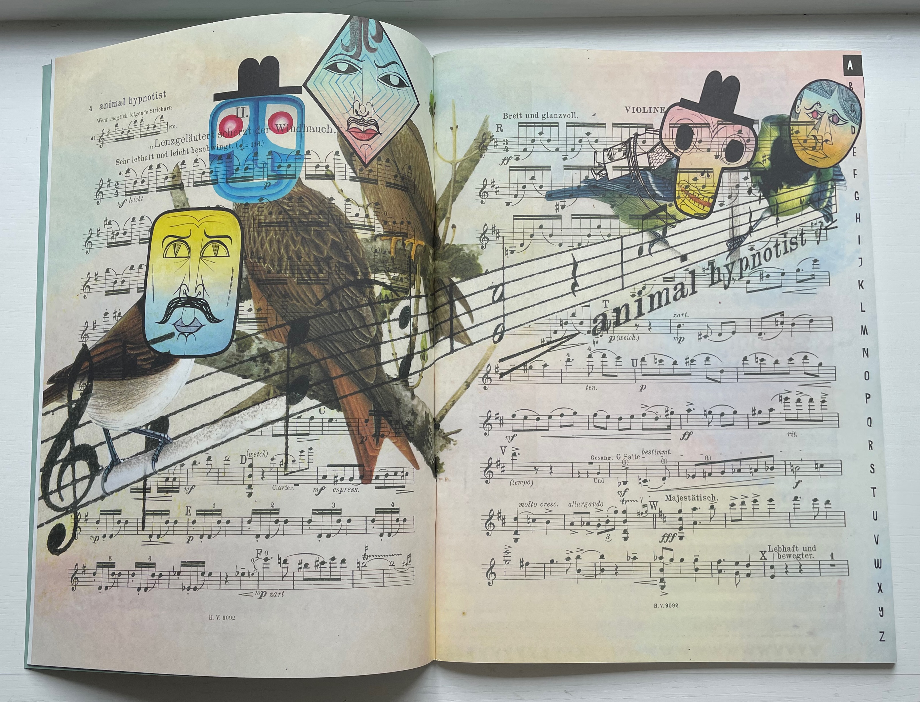
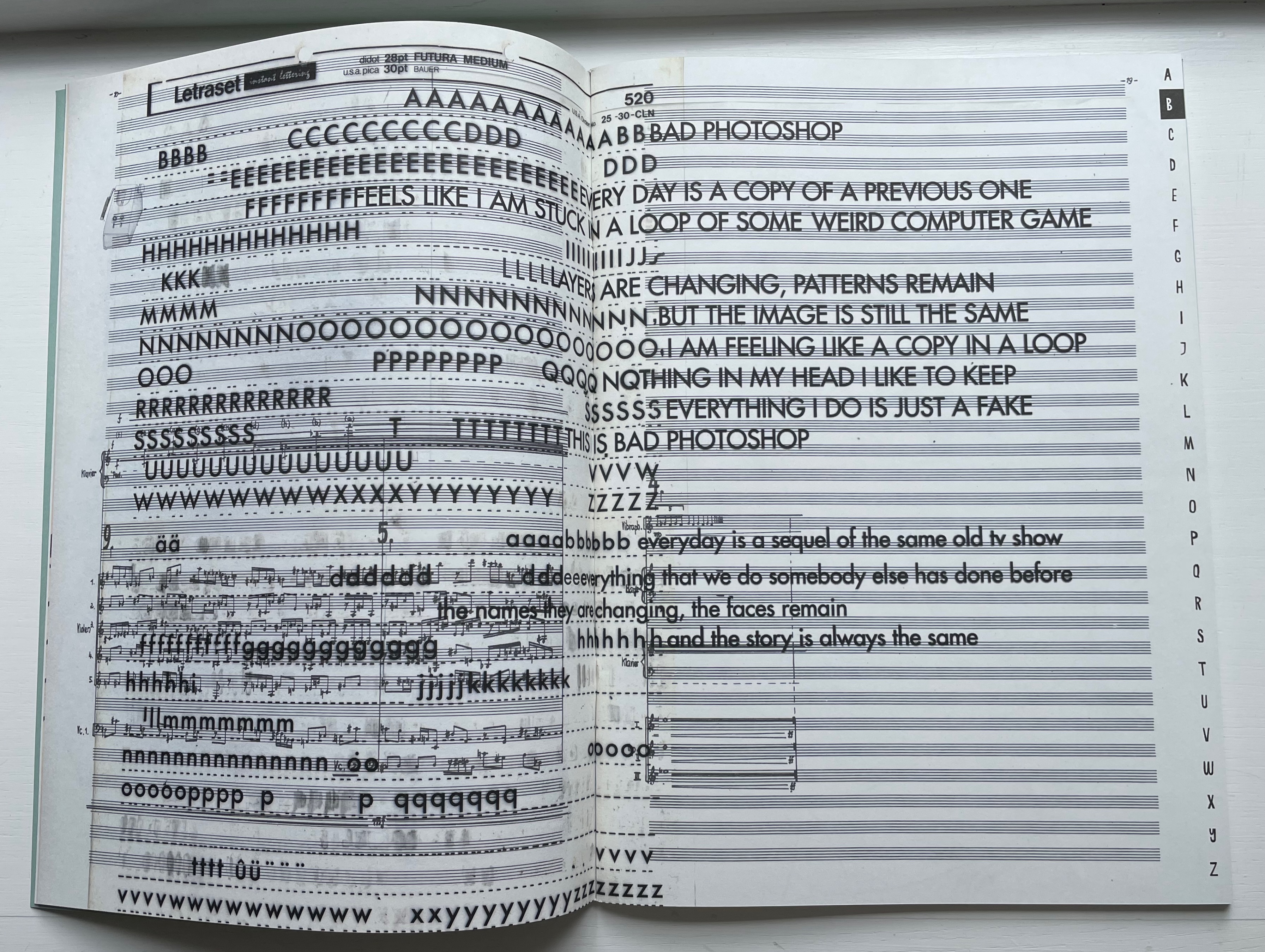
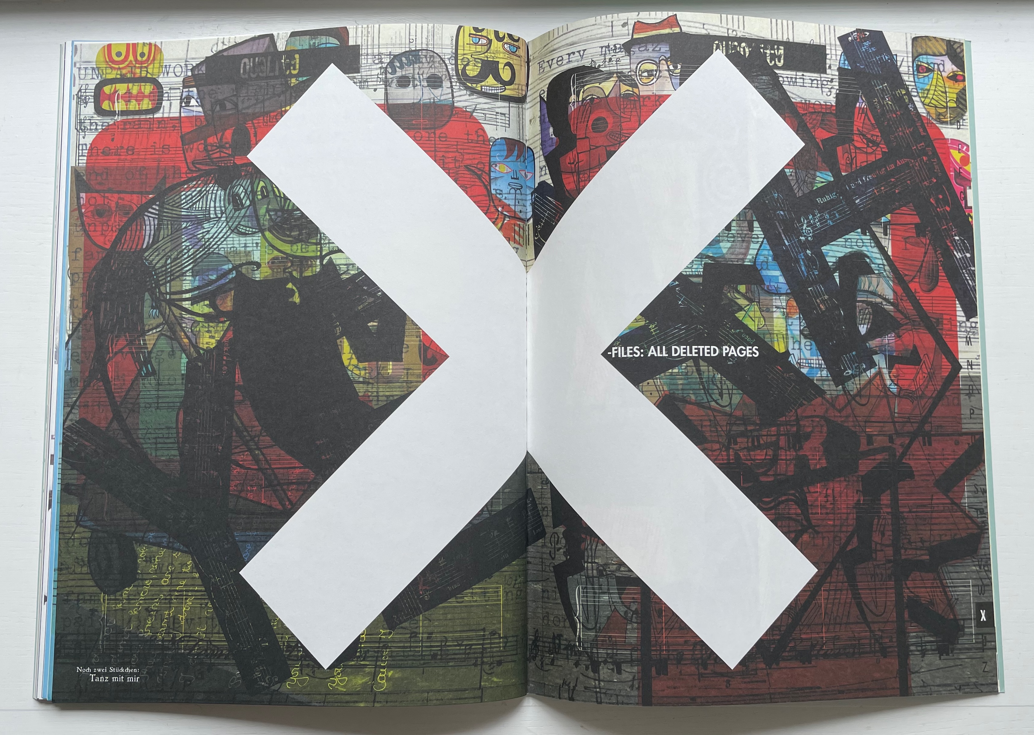
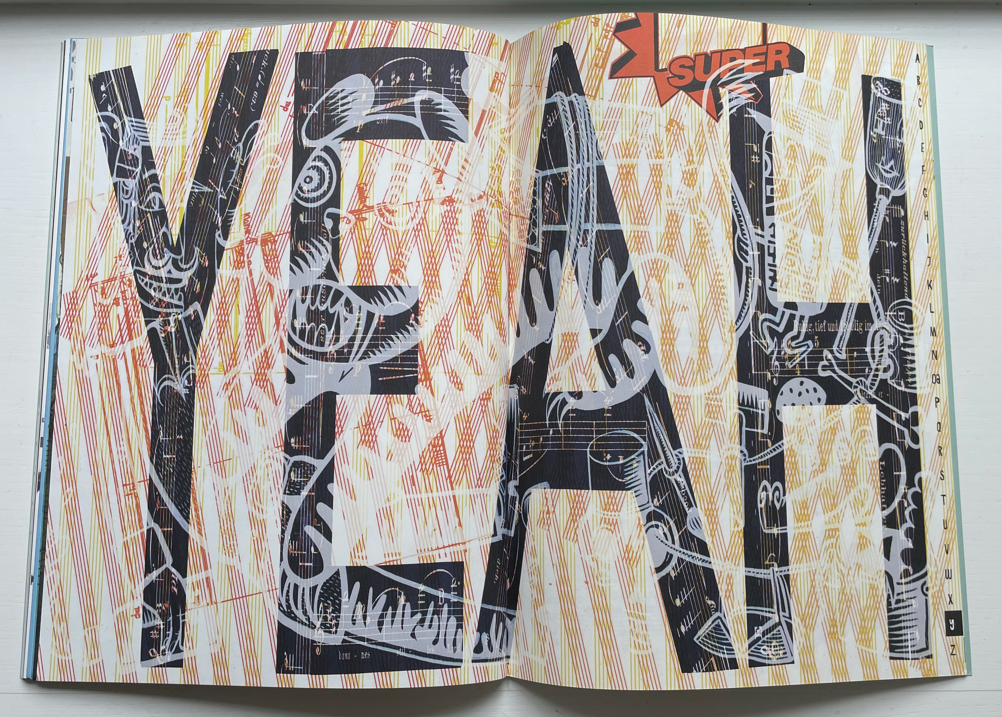
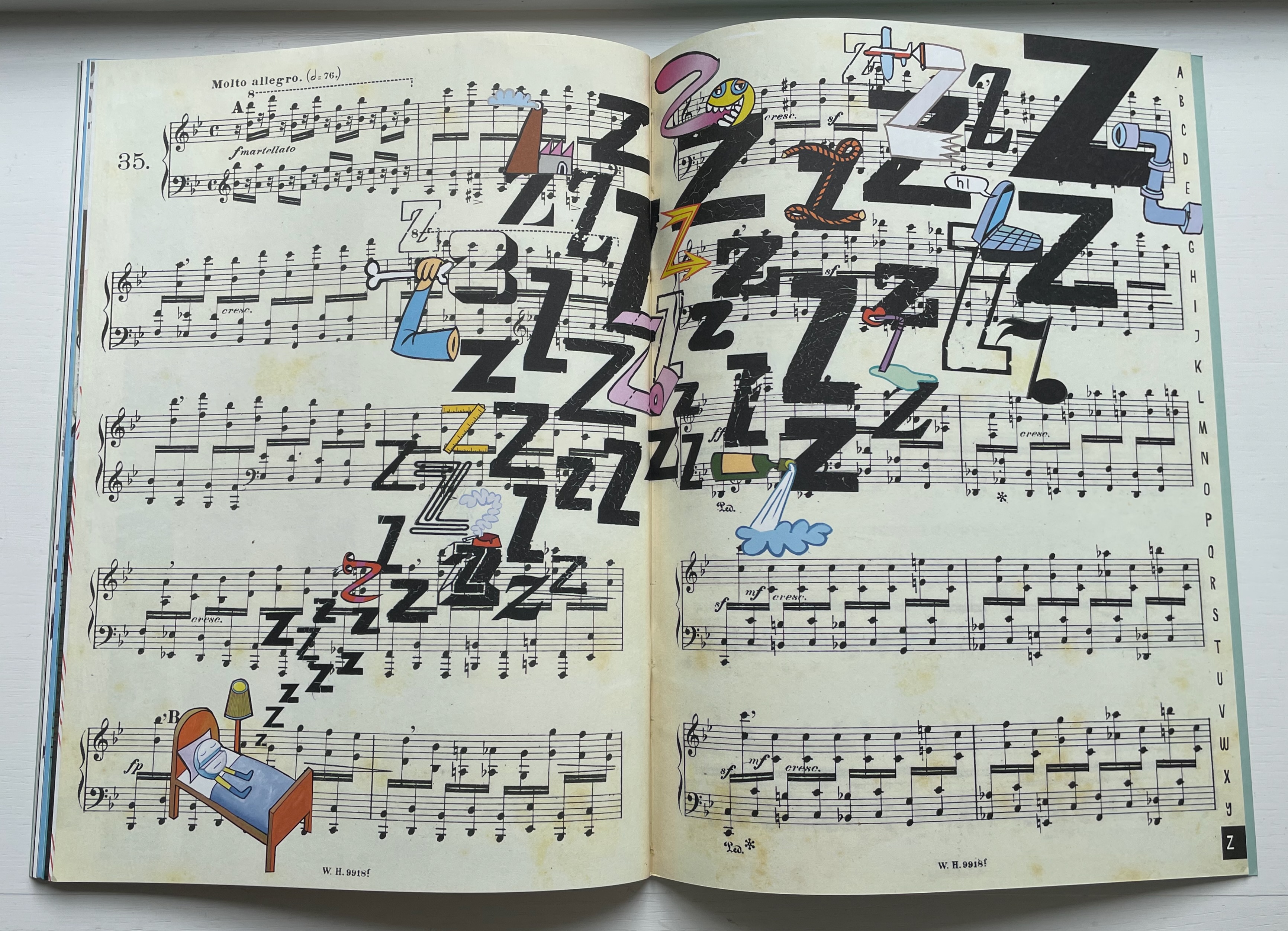
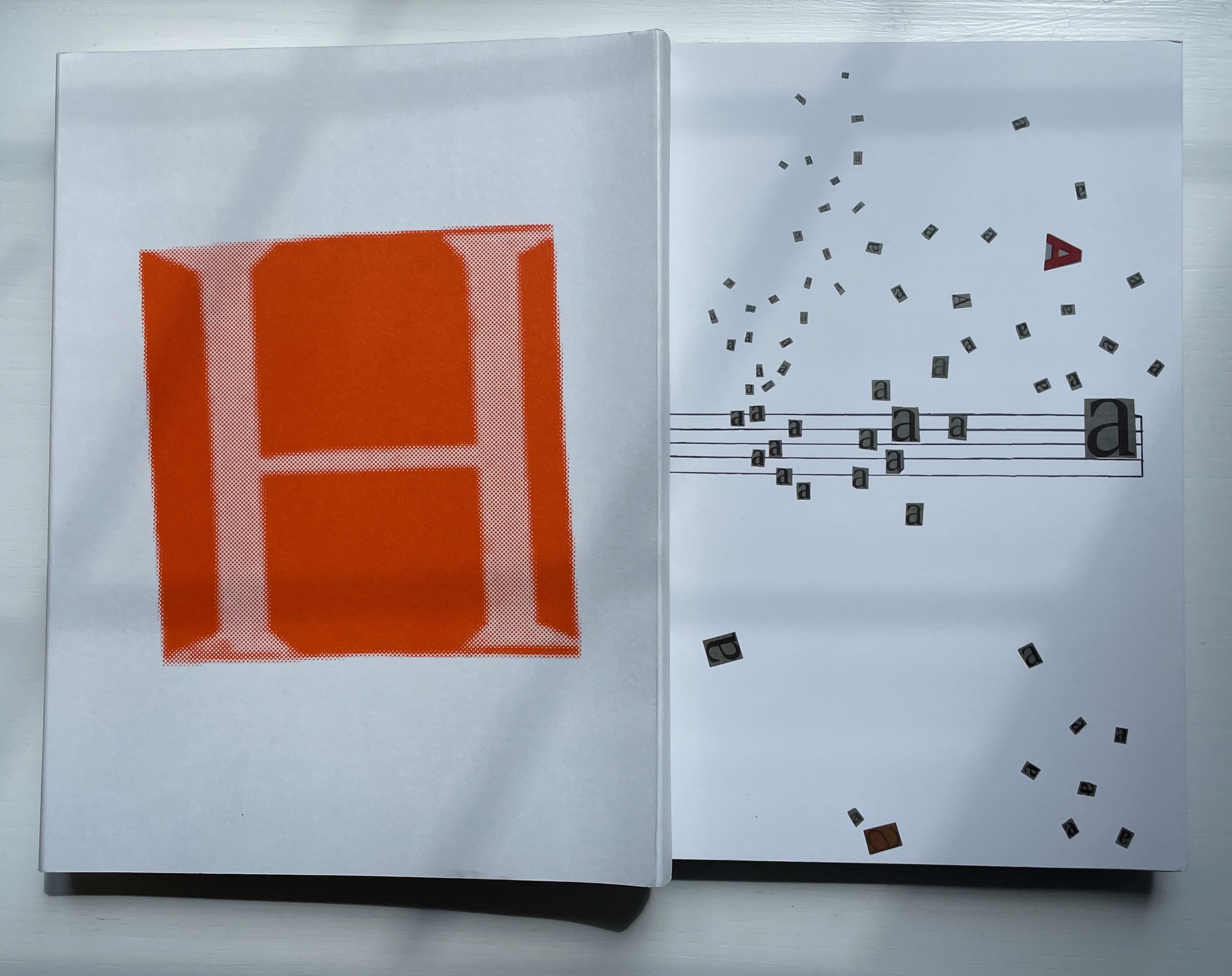
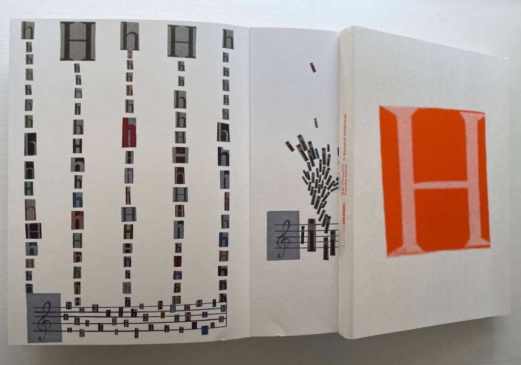
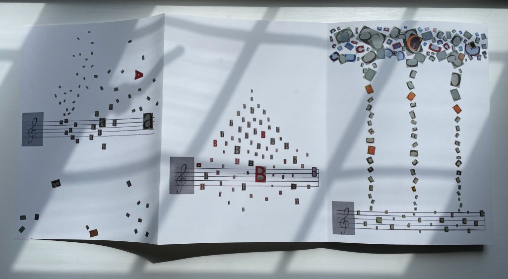
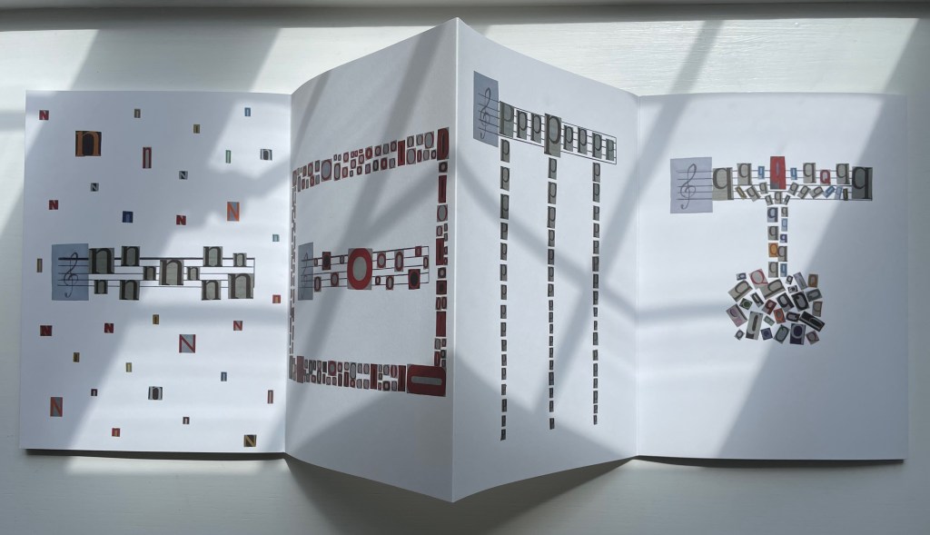
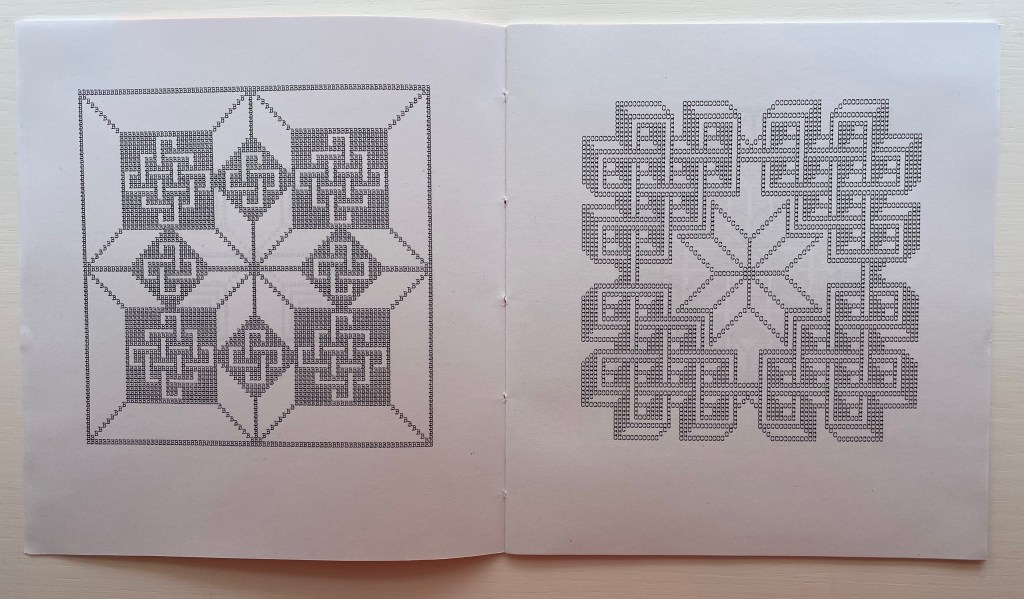
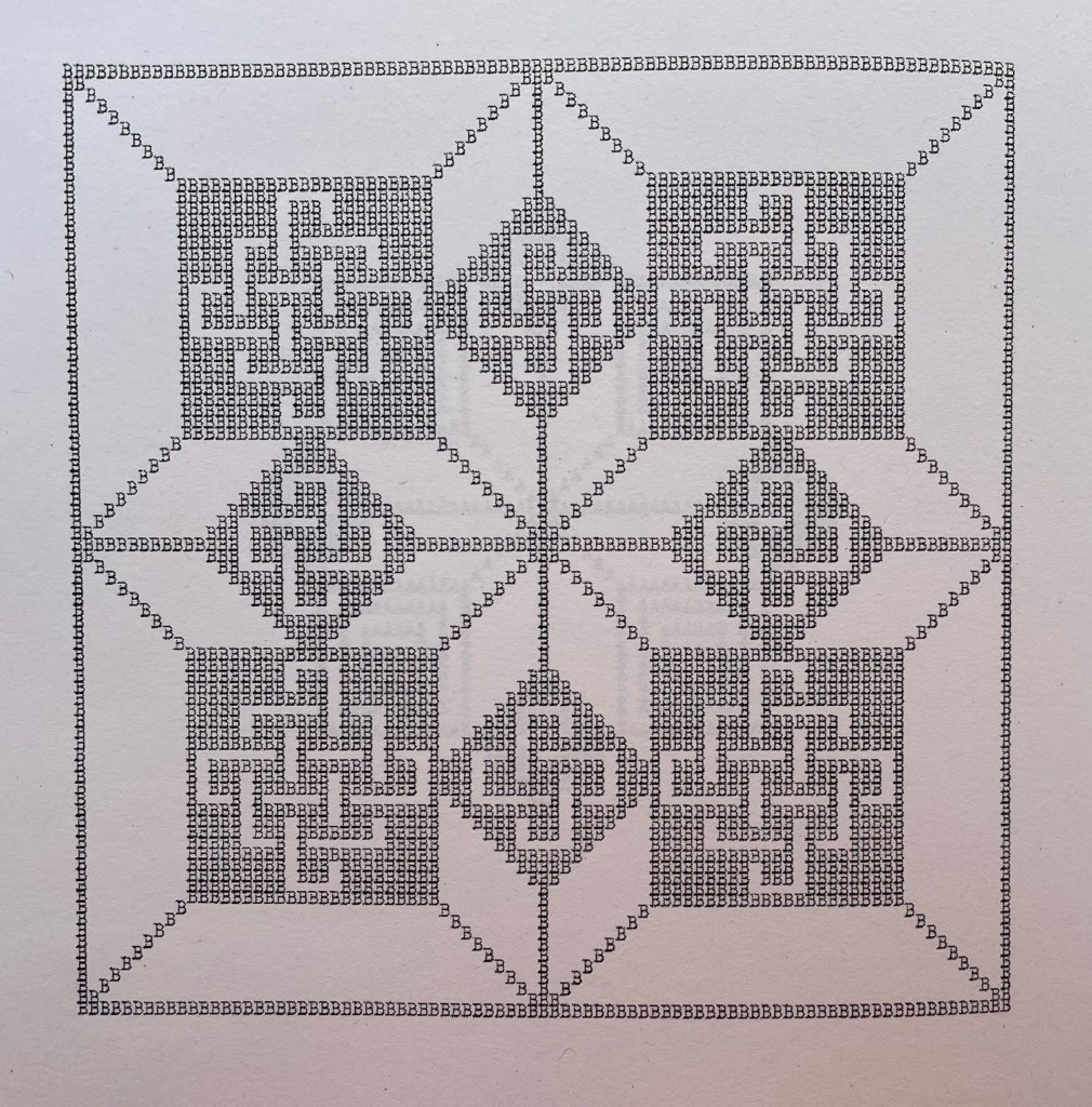
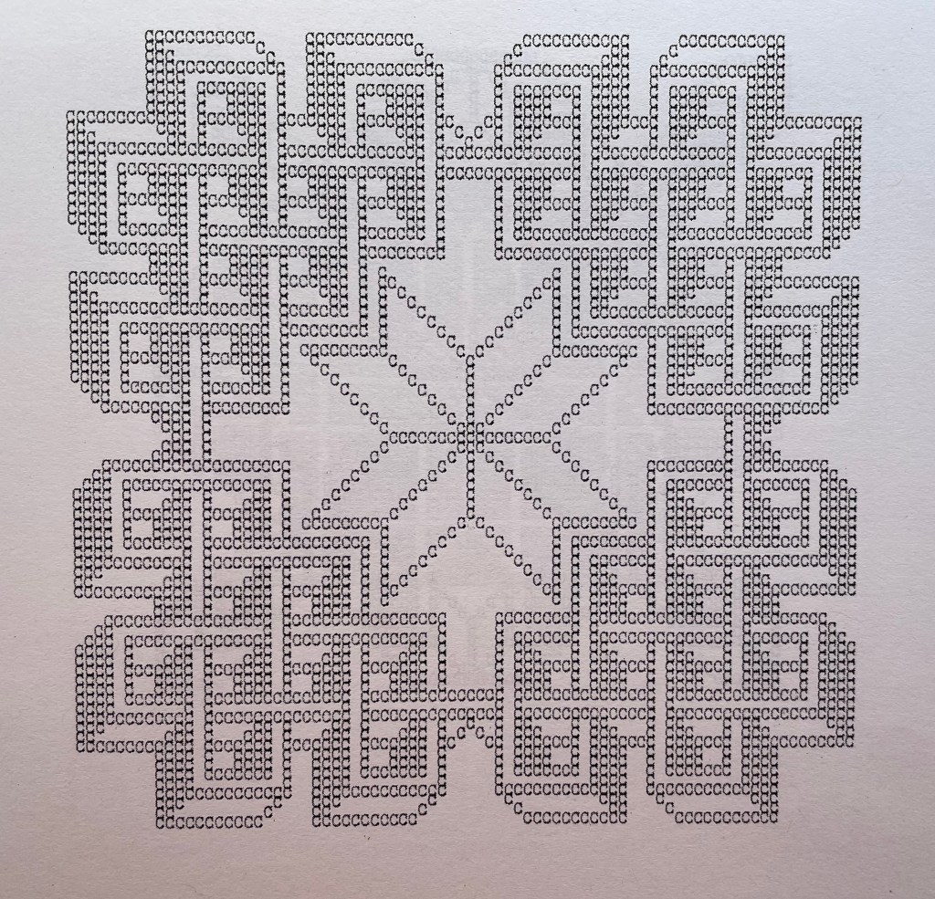
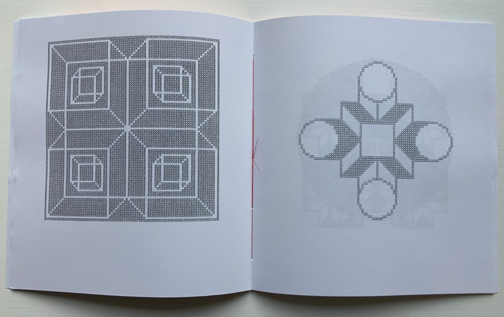
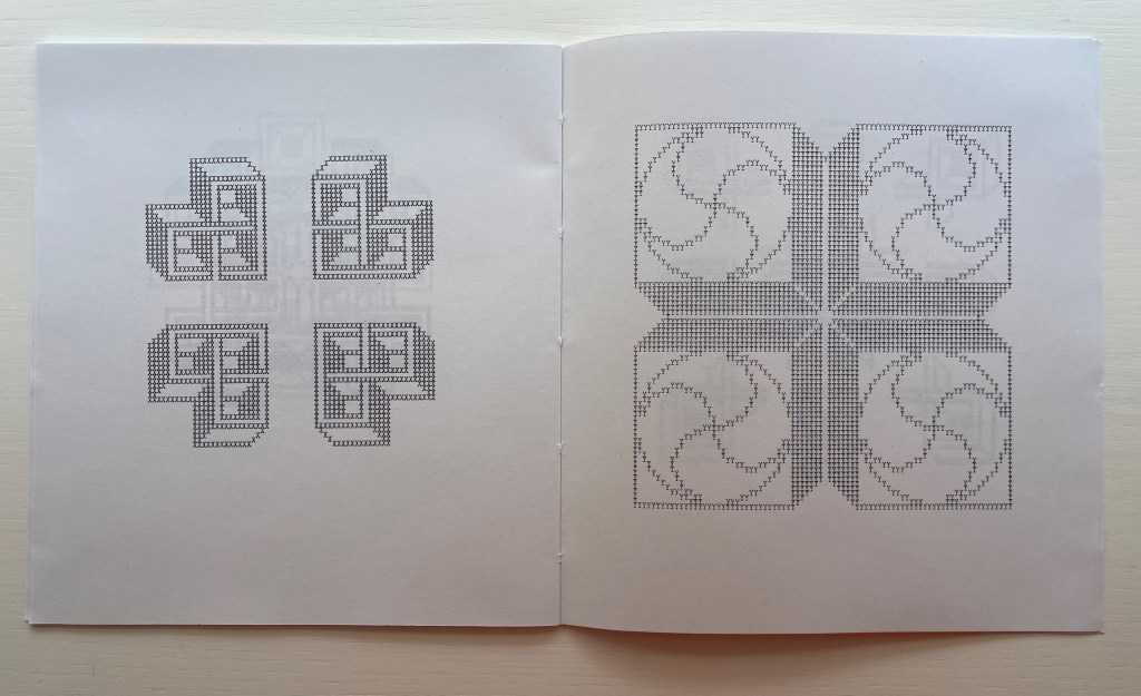
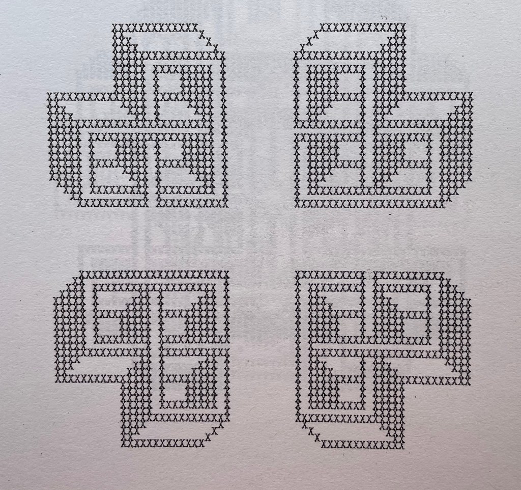
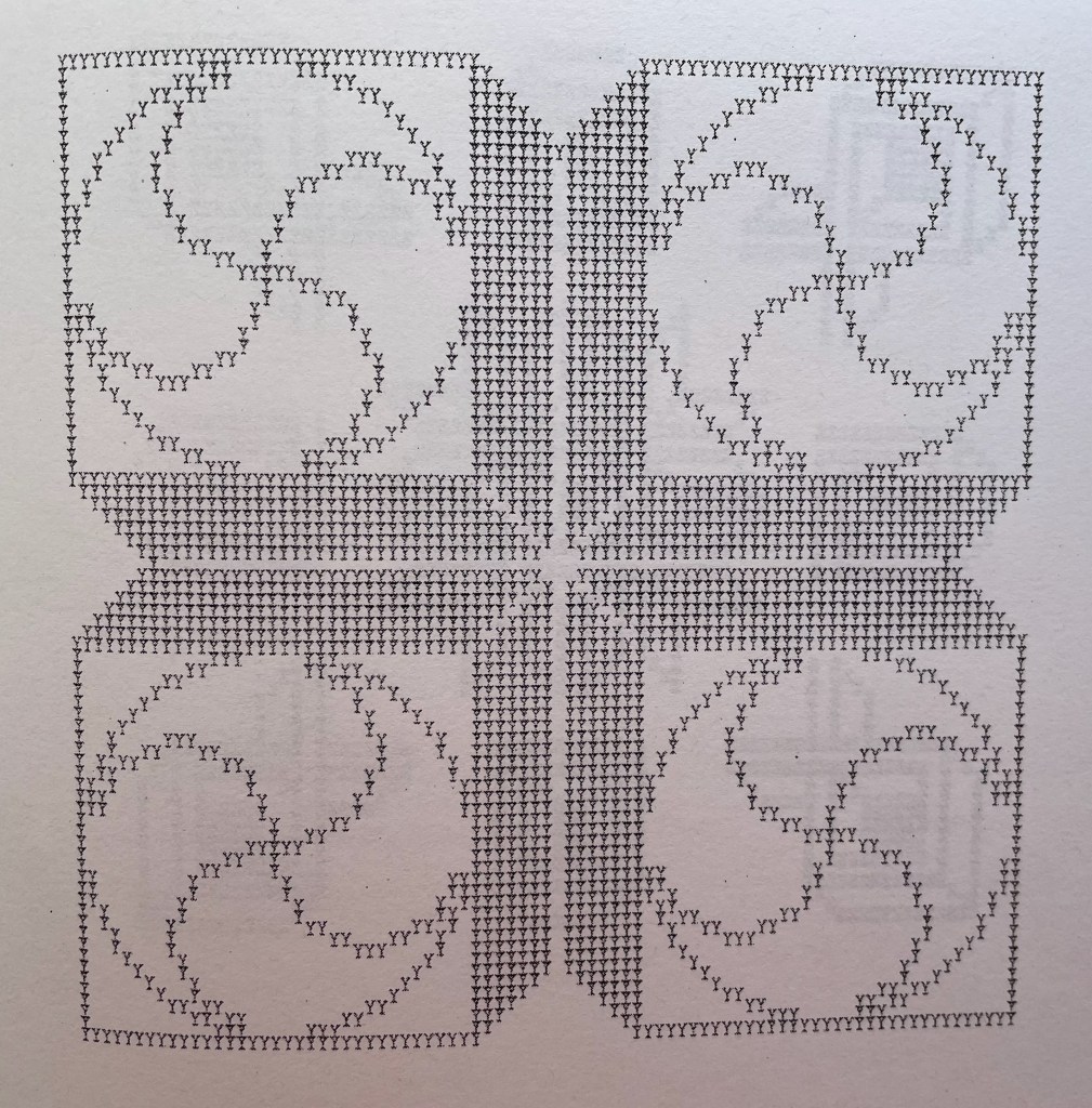
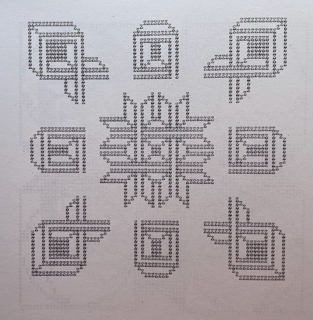
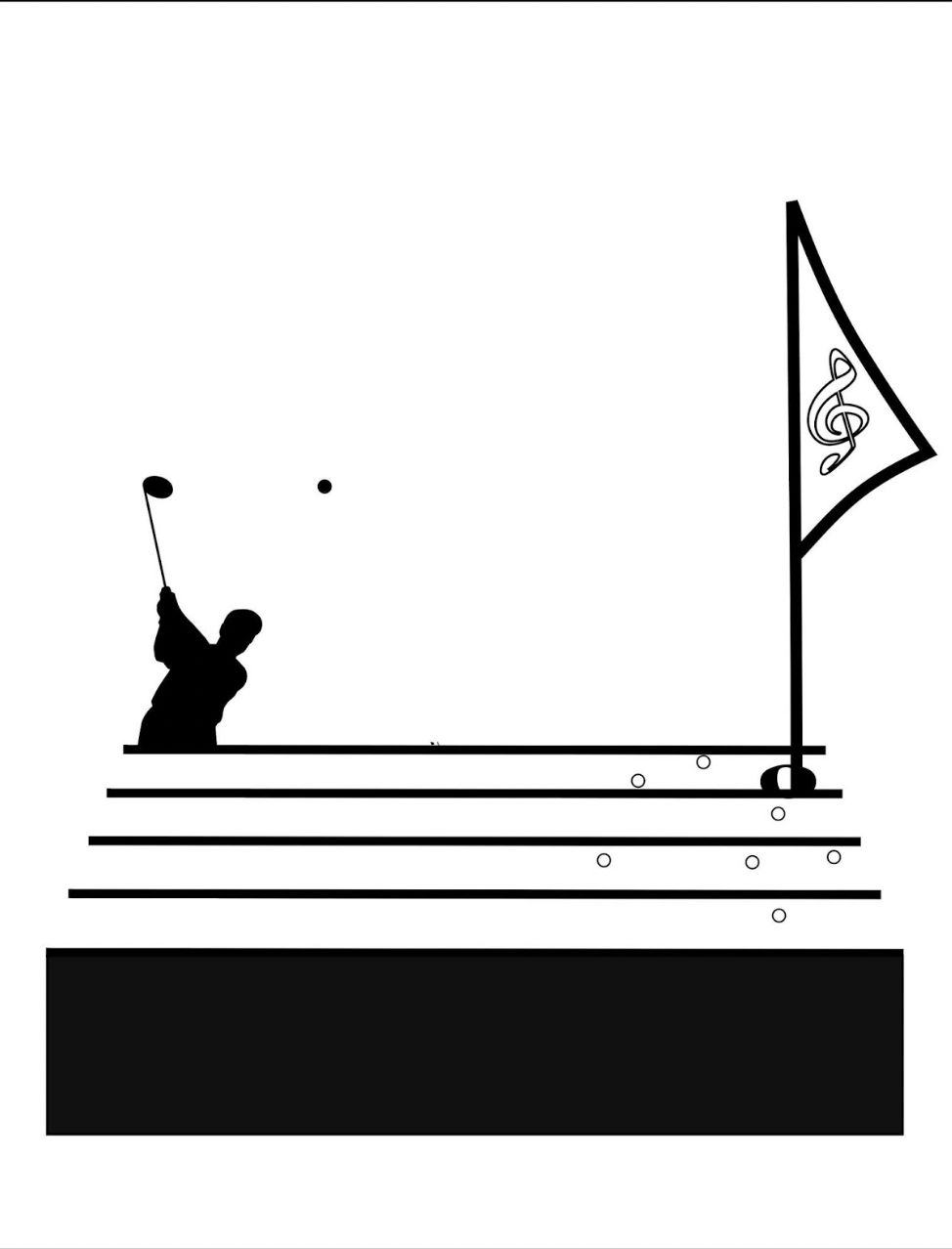
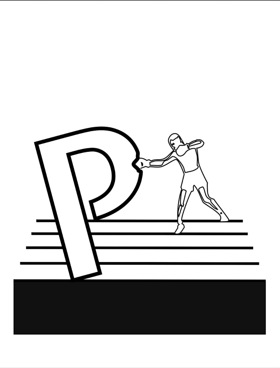
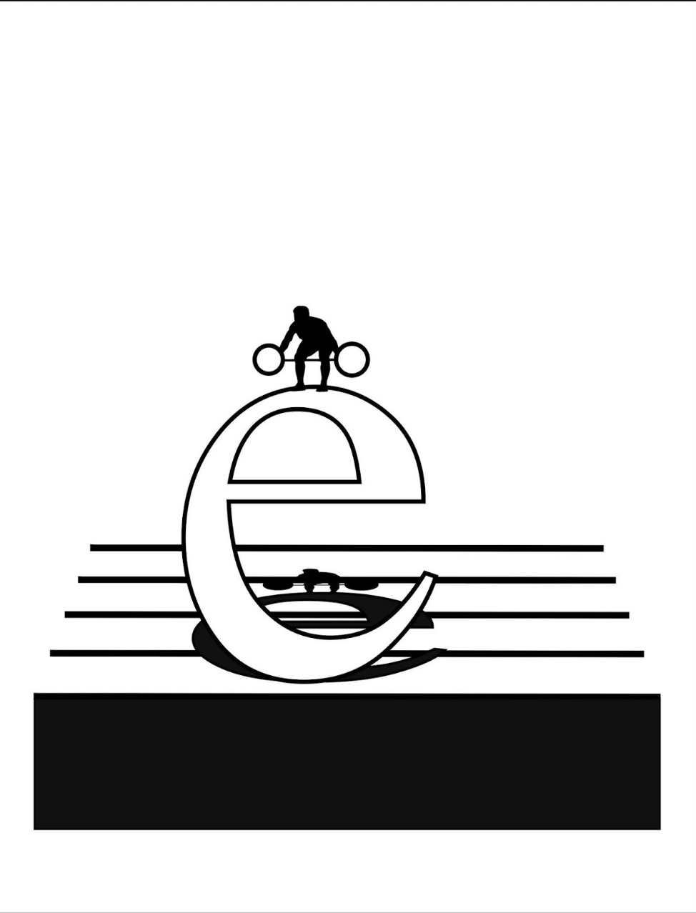
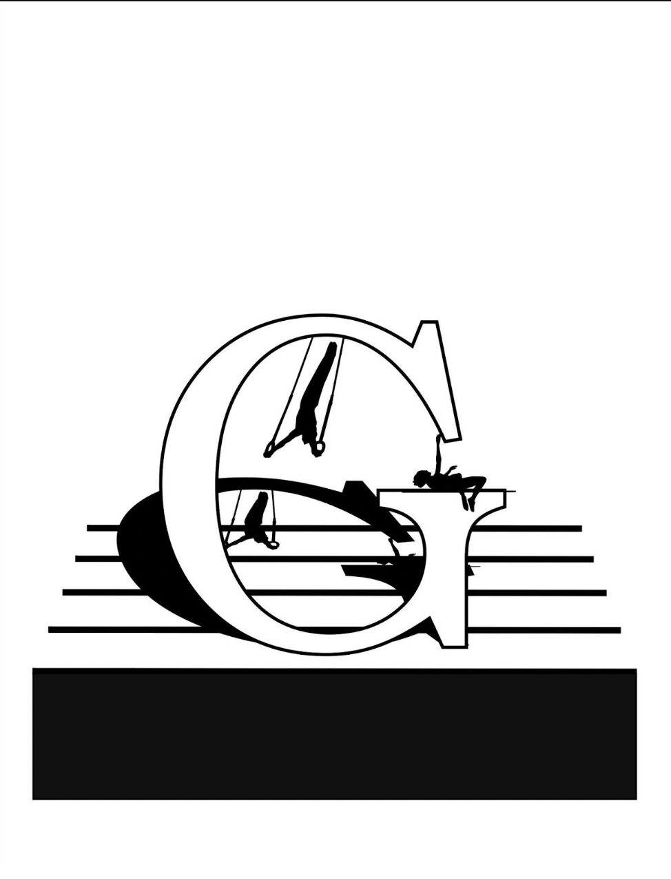
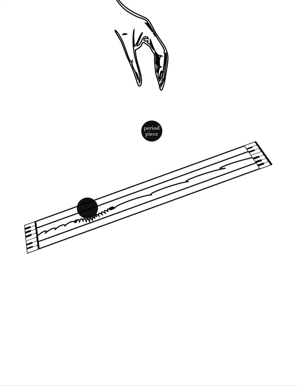
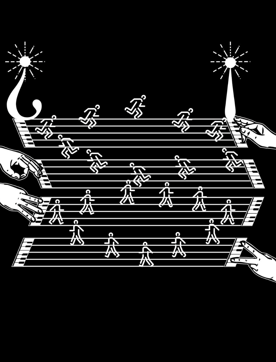
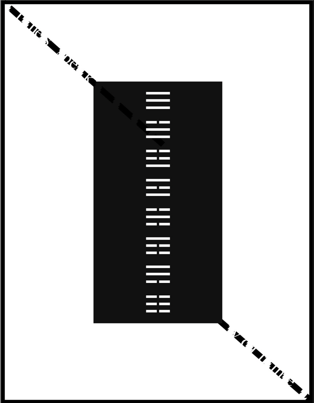
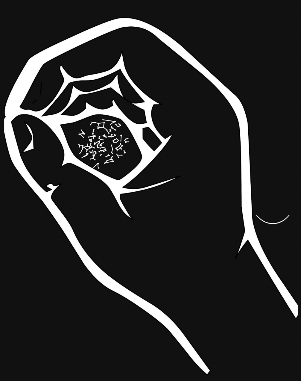
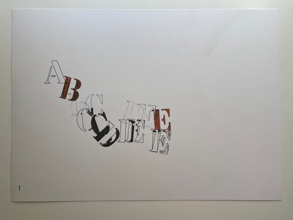
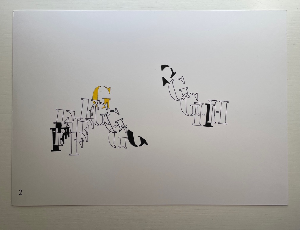
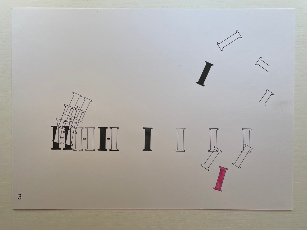
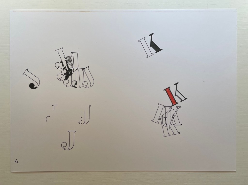
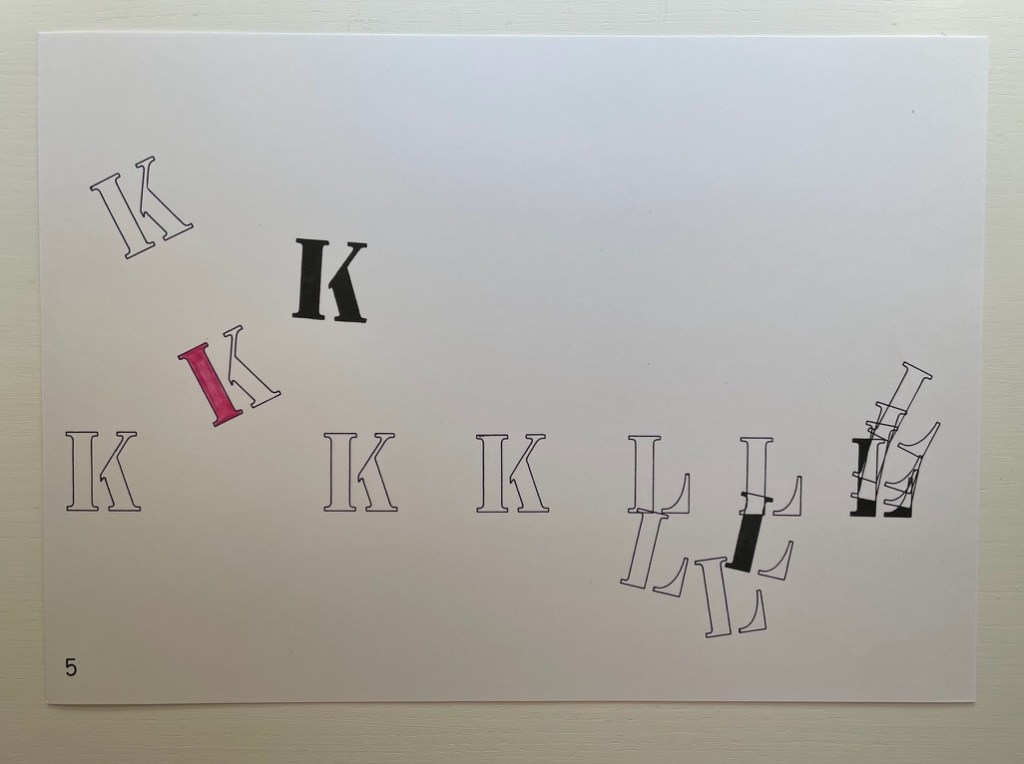
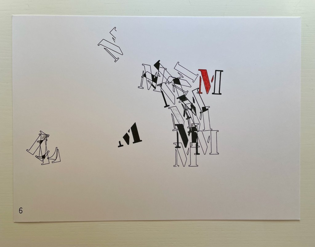
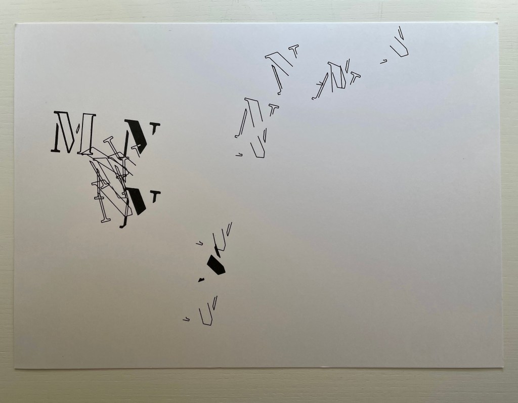
The colophon to Alphabet Music, a separate folio accompanying seven loose folios, says, “Each sheet of Alphabet Music contains 15 letters, either whole, or split up into fragments, except the last, where the sequence breaks off… For a full reading, the sheets should be laid out in sequence… Colour denotes key.”
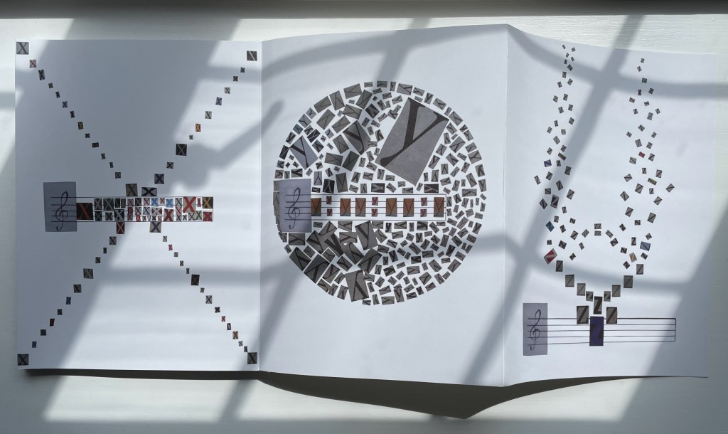
In Oulipo-esque fashion, that limit appears to be determined by the sum of the first five letters’ numerical position in the alphabet (1+2+3+4+5 = 15, so sheet one has 1 A, 2Bs, 3Cs, 4Ds and 5Es). Sheet two, likewise, has 6Fs, 7 Gs, and 2Hs to make 15 letters. Sheet three continues with the remaining 6 Hs for this eighth letter in the alphabet plus 9 Is for the ninth letter, adding up to 15 letters. Sheet four includes 10 Js and 5 letter Ks, and sheet five continues with the remaining 6 Ks for the eleventh letter plus only 9Ls of the twelfth letter, leaving sheet six to pick up the remaining 3 Ls and 12 Ms of the thirteenth letter. Contrary to the explanation, the seventh and last sheet doesn’t break off the sequence; its 1 M and presumably 14 fractured Ns add up to 15.
But why does the music end there? The letters tumble, leap and cascade like musical notes or expressions on the page. Why not additional sheets? Having come this far with the constraint of 15, perhaps Adler worked out that no sum from any summative series from the start of the alphabet could provide a constraint that would work out “evenly” in the end. There would always be leftover or remainder Zs. Alphabet Music has always to be unfinishable — much like the textual expressions the alphabet can yield.
The first edition of Alphabet Music was published in 1974 in an edition of 130 copies by Adler’s Alphabox Press (London) and was first performed with Paul Burwell, Bob Cobbing, and Bill Griffiths at the Poetry Festival in Münster 1979. Extracts first appeared in Kroklok 3 (December 1972), Poetry Review 63:3 (Autumn 1972), and Typewriter (NY) 3 (1973). Although online searching has not uncovered any recording of this performance, or instructions for performing Alphabet Music, perhaps an impression can be gleaned from this recording of Alphabox. Given the title of Alphabet Music, the visual impression it makes, its expressed intent and its reported performance, Alphabet Music would seem an exemplar of Dick Higgins’ definition of an intermedial work: “a conceptual fusion of scenario, visuality and, often enough, audio elements”.
© Jeremy Adler, 1992.
Further Reading
“Jim Avignon & Anja Lutz“. 29 October 2022. Books On Books Collection.
“Ernest Fraenkel“. 30 October 2021. Books On Books Collection. Jeremy Adler’s uncle was Ernest Fraenkel, author of Les Dessins Trans-conscients de Stéphane Mallarmé à propos de la Typographie de Un Coup de Dés (1960), also in this collection.
“Bernard Heidsieck“. 29 October 2022. Books On Books Collection.
“Karl Kempton“. 29 October 2022. Books On Books Collection.
Adler, Jeremy D. 1972. A: an envelope magazine of visual poetry. London: Jeremy Adler.
Adler, Jeremy D. 1973. Alphabox. London: Jeremy Adler.
Adler, Jeremy D. 1979. Vowel Jubilee. Aachen: Fachhochschule, Fachbereich Design.
Higgins, Dick, and Hannah Higgins. 1965 / February 2001. “Intermedia“. Leonardo, Volume 34:1, pp. 49-54.
Sackner, Martin and Ruth. 2015. The Art of Typewriting : 570+ Illustrations. 2015. London: Thames & Hudson. Pp. 315-16.
Scholz, Christian, ed. 1987. Lautpoesie: Eine Anthologie. Obermichelbach: Gertraud Scholz Verlag.
Shutes, Will. (April 2019). Test Centre Books Catalogue 12. Accessed 1 August 2022.