Books On Books Collection – The Horn-book

This is a “back-dated update” of sorts to Alphabets Alive!, Ashley Rose Thayer, and Andrew White Tuer.

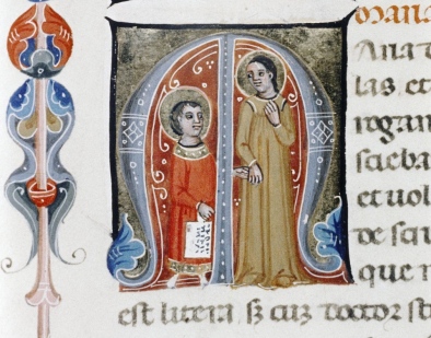
First, the back-dating. This comes from the delightfully annoying or annoyingly delightful belated discovery of Erik Kwakkel’s 2015 entry on the history of the horn-book “Book on a Stick” in Medievalbooks. Delightful and annoying to find the truly earliest appearance of a horn-book right under my nose in the Bodleian Libraries but too late to include it in the Alphabets Alive! exhibition at the Bodleian in 2023.

Oxford, Bodleian Library, Canon. Misc. 476 (14th century).

Vita gloriossime virginis Mariae atque venerabilis matris filii dei vivi veri et unici (unidentified work).Italian manuscript, Venice.
Oxford, Bodleian Library, Canon. Misc. 476 (14th century). Folio 047v.

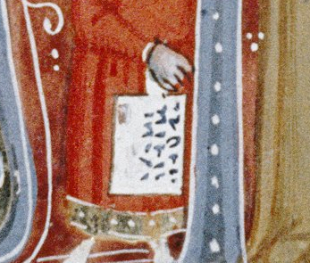
Detail of Fig. 0.

Detail

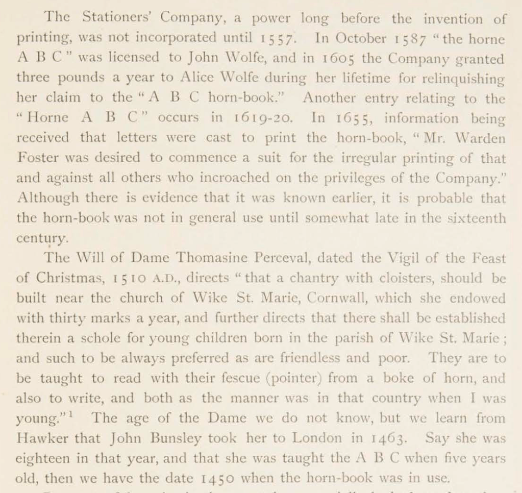
Andrew White Tuer’s History of the Horn-Book (1897) came close with its dating of the horn-book’s first appearance as 1450, but as Kwakkel writes:

The image shows Christ being brought to school by his mother. He is bringing his “textbook” to class: a hornbook, which dangles from his wrist by a string, just like many of the later specimens did … Quite intriguingly, we are shown a real medieval snapshot of how children carried their hornbook to and at school. More importantly, it shows that the hornbook was indeed a medieval invention….While no actual hornbooks appear to survive from the medieval period, these visual representations show that educating young children was also the driving force behind the production of hornbooks in the age before print.

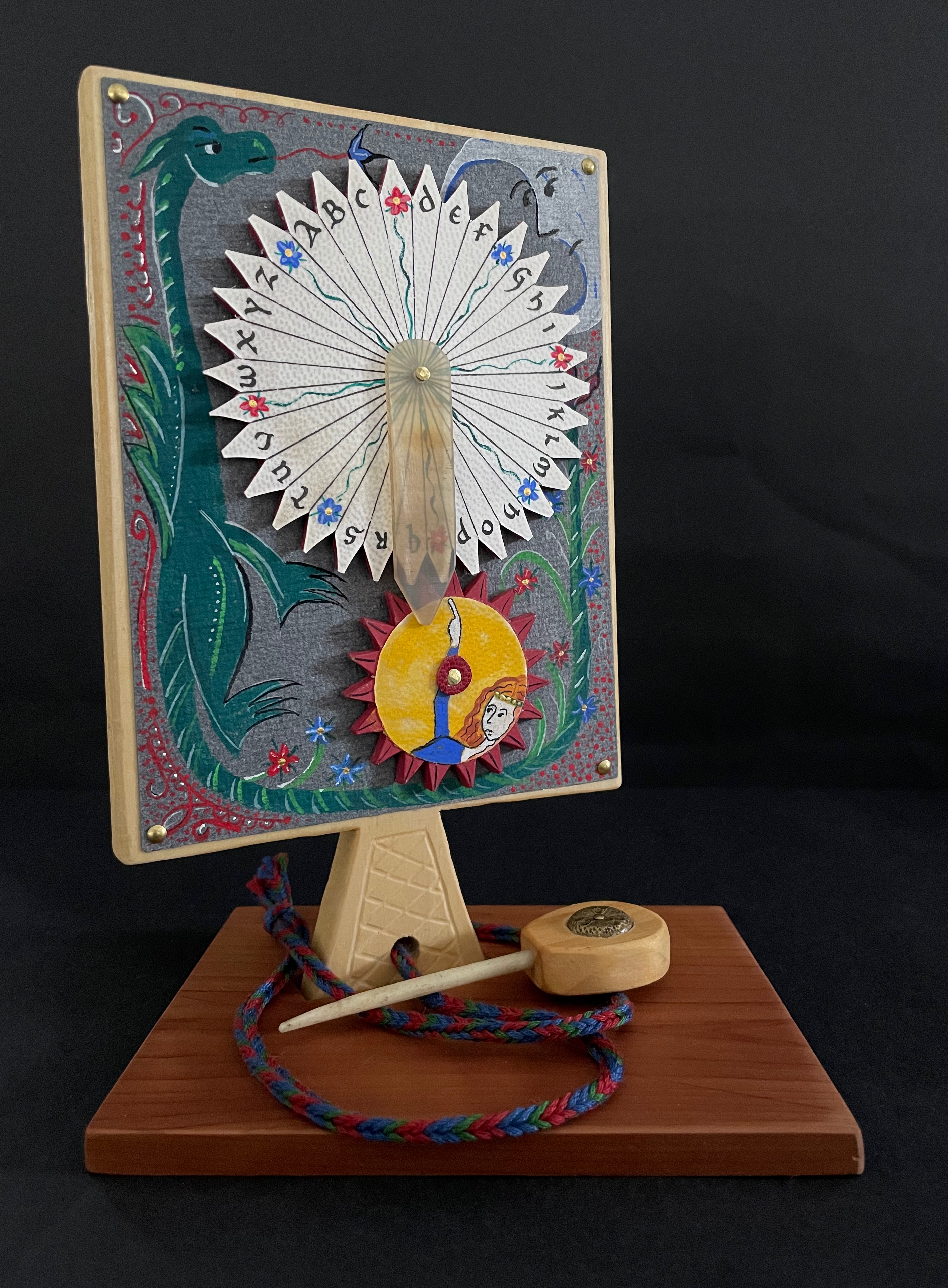
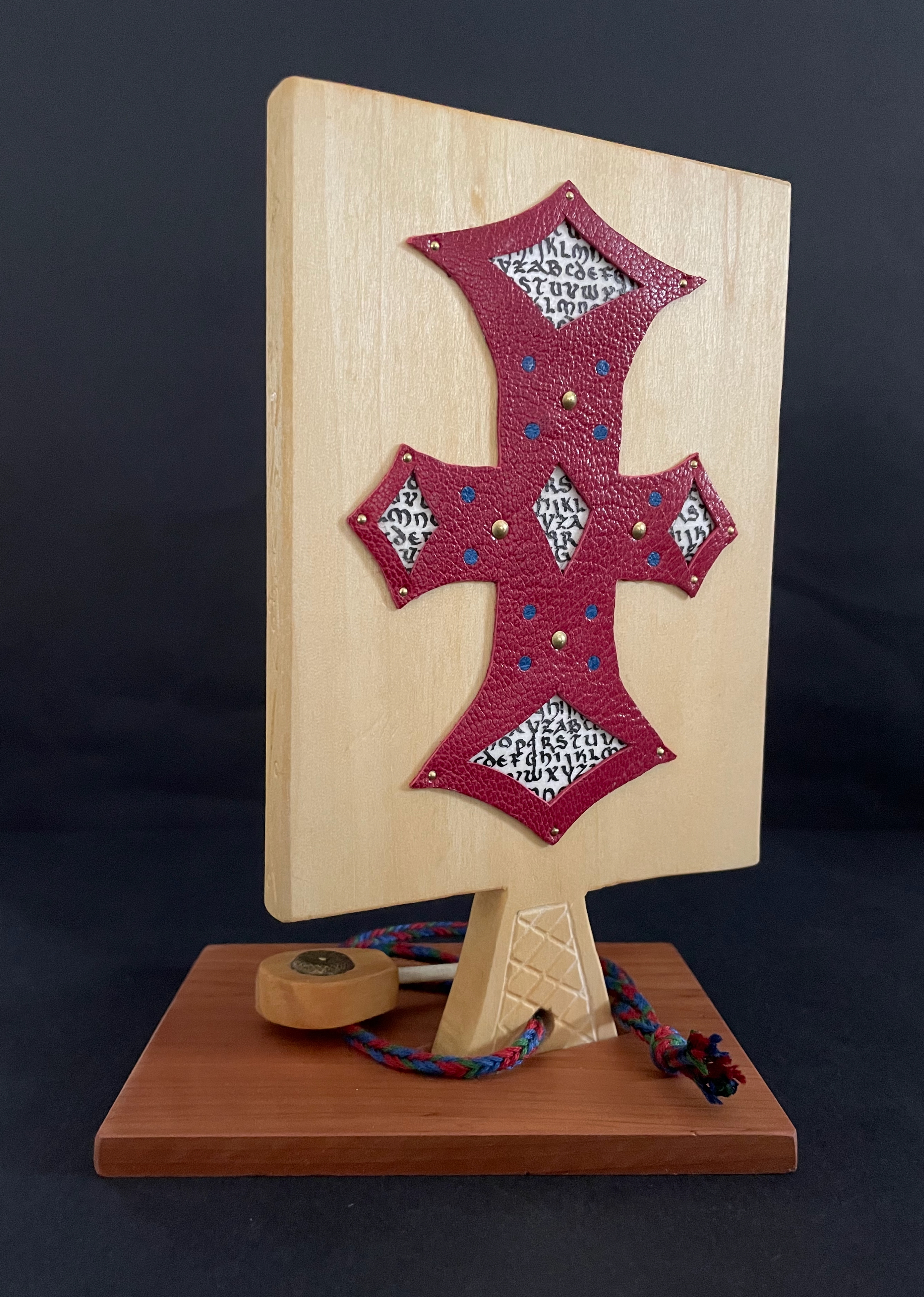
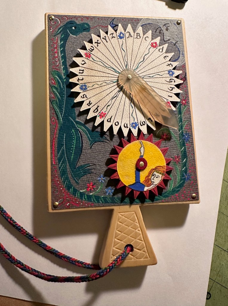
And for the updating, here is Ashley Thayer’s Mechanical Horn-book (2025) just arrived in the Books On Books Collection.

Mechanical Horn-book (2025)
Ashley Rose Thayer
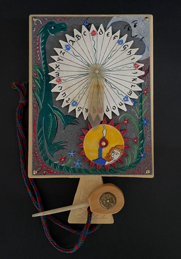
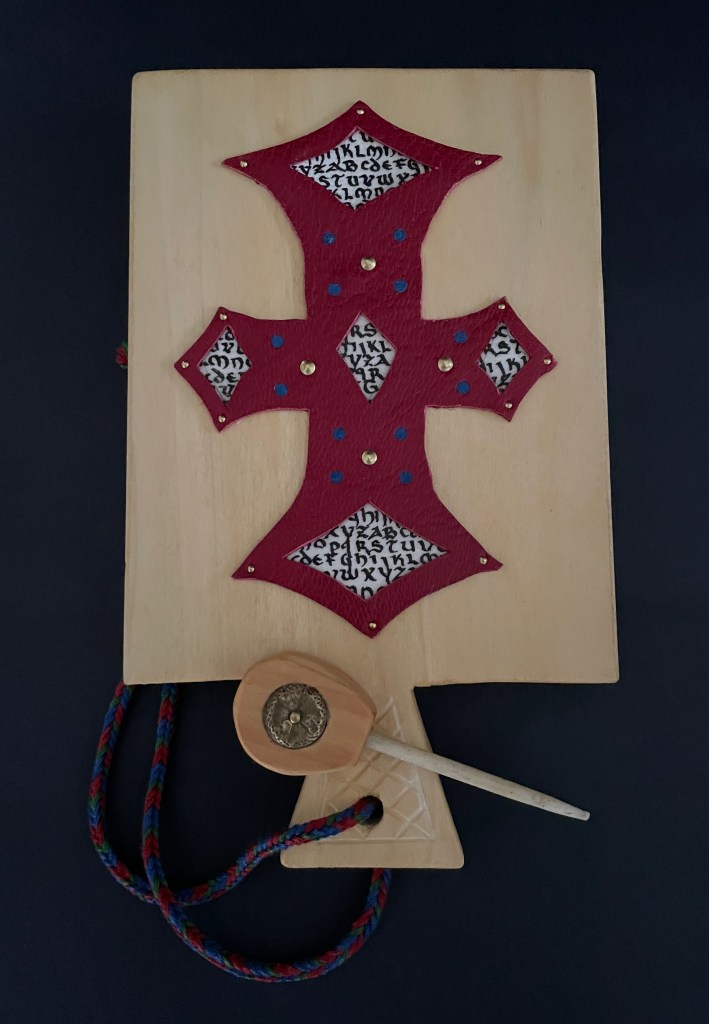
Horn-book. On stand: H192 x W160 mm. Off stand: H192 x W115 mm. Unique. Acquired from the artist, 17 October 2025.
Photos: Courtesy of the artist. Books On Books Collection.

The paddle is made of pine wood, the gears of vellum-covered bookboard, the spinning “arm” of authentic cow horn, and the wrist loop of embroidery thread by a medieval finger loop braiding technique. On dark grey-blue Khadi paper, Thayer has painted a border of the moon, a berried floral garland, and a wyvern, the heraldic emblem associated with Wessex, the Anglo-Saxon kingdom from which Alfred the Great emerged in the 9th century. On the reverse, a cross of cut red leather with five inserts of calligraphed vellum alluding to Christ’s five wounds reflects the horn-book tradition of combining religion with learning the alphabet. It also makes this horn-book reflective of Alfred’s Anglo-Saxon and Christian background.

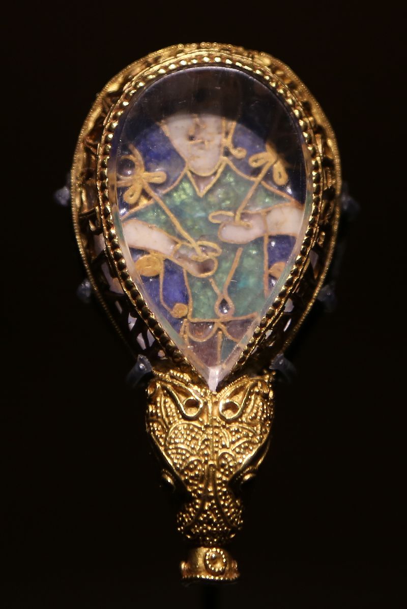
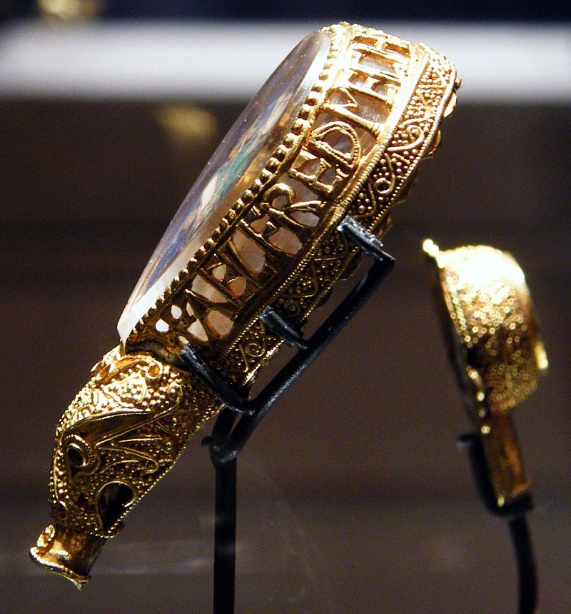
The pointer, called an aestel in Old English, is made from poplar wood, an antique button, and antique bone. Its inclusion isn’t simply functional. Appearing alongside the Wessex wyvern, it points to that famous aestel on display at the Ashmolean in Oxford: the Alfred Jewel.

The Alfred Jewel, Ashmolean Museum, Oxford.
Photo taken from the front by Geni CC BY-SA 4.0. Photo taken from the side by Richard M Buck CC BY SA 3.0.

If there’s ever an Alphabets Alive! redivivus, Erik Kwakkel and Ashley Thayer have provided the pointers to the other treasures in Oxford that should be included.

Further Reading

Alphabets Alive! – Criss-cross Row (Horn-books)“. 19 July 2023. Books On Books Collection.

Ashley Rose Thayer “. 9 July 2023. Books On Books Collection.

Movables Now and Then“. 31 August 2024. Bookmarking Book Art.

Kevin M. Steele“. 18 July 2023. Books On Books Collection.

Andrew White Tuer“. 26 December 2022. Books On Books Collection.

Kwakkel, Erik. 10 April 2015. “Book on a Stick“. Medievalbooks. Leiden. Accessed 10 November 2025.

Books On Books Collection – Bård Ionson

Battledore (2019)

Battledore (2019)
Bård Ionson
Digital photo of oscilloscope art on walnut, with leather straps & tacks. H229 x W127 mm. Animation of oscilloscope art with Artivive. Resolution: 3840 × 2160 px. File format: mp4. Duration: 1’0″ sec. File Size: 74.1 MB. Acquired from the artist, 1 March 2019.
Photos: Books On Books Collection. Displayed with permission of the artist.

The artifact displayed here is a vehicle for a digital artwork in which oscilloscope drawings are animated in augmented reality and which exists as an NFT (Non-Fungible Token). To view the digital artwork, open the camera on a smartphone, point it at the QR code below, and download the Artivive app. Open the Artivive app and position the phone’s camera over the artifact or even its image above.

Each of the alphabet characters transforms into a logo (or image of a product associated with the company behind the logo). The letters represent Apple, Boeing, Comcast, Disney, Exxon, Ford, Google, HBSC, ING, JP Morgan Chase, Koch, Lockheed Martin, Microsoft, Nestle, Orbital, Phiser, QinetiQ, Raytheon, SkullCandy, TiVO, Unilever, Volume Integration, Winchester, Xerox, Yandex and Zinga.

Now that A is for Apple Inc. rather than the fruit, Ionson wonders, “What are our children learning as they navigate digital devices vs. when children used wooden tablets with narrow ideas presented with pictograms.” He goes on about the entities behind Battledore‘s letters, “Many of these are companies that manufacture weapons of war or are players in an information war. Many countries and organizations are using the information space of social media and news in a disinformation war. It is a digital battle now.”

To drive this home with several layers of irony, Battledore is offered as the learning tool needed to

Train your children for the battles of the 21st Century. Where brands, countries and organized crime compete for your allegiance. Using art, history, finance, education, news, war, social media and religion they fight to keep a hold on your mind. Learn to fight back by subverting the tools they wield.

At one layer of irony, the physical artifact shown above lies dormant just as it did until the teacher “activated” it with classroom recitation of the letters. But now, in augmented reality, the letters seem to come to life revealing hidden entities associated with them. Now, the reader/viewer has to engage in a digital transaction, point a digital handheld device at the letters, and peer to see and learn, letter by letter, what the letters “really” stand for — all while a looping track of electronic battle-game sounds plays on. Viewed on a laptop or desktop, these video clips at Elementum, Patreon and ARTificial show the transformations without the need of a smartphone. Caveat: whether phone or laptop, lower the speakers’ volume before activating!

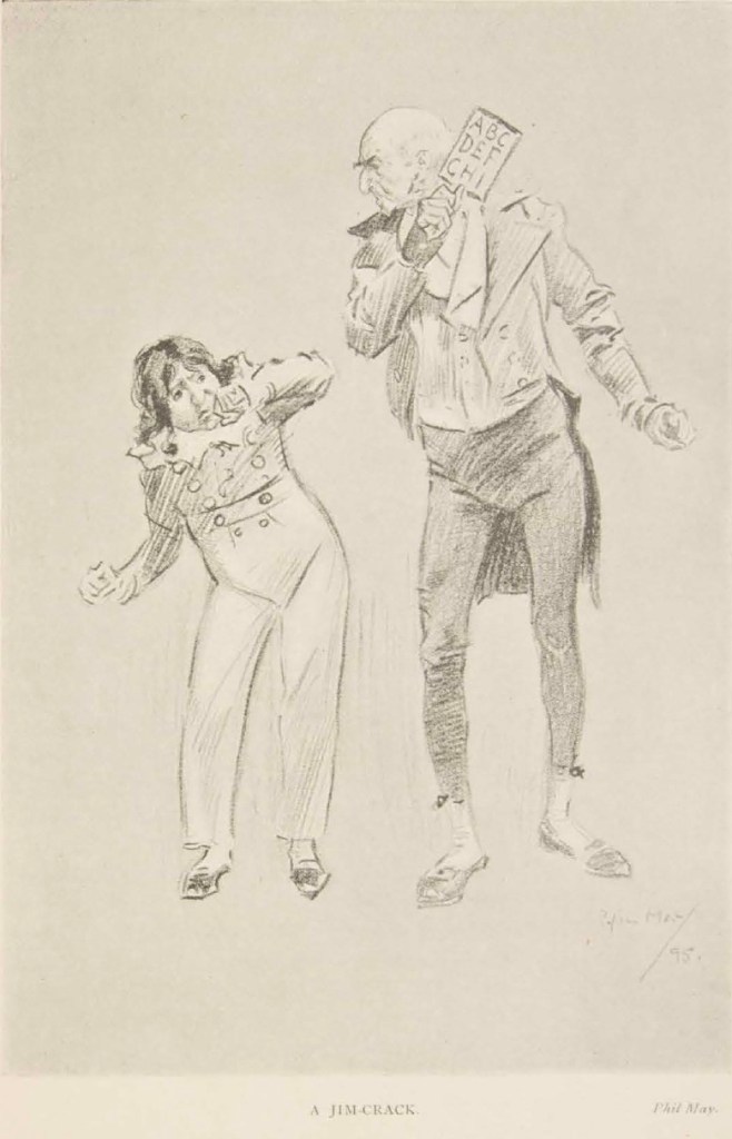
While the word “battledore” serves the artist’s metaphoric purpose, it introduces another layer of irony (unintentional according to the artist) in that the physical artifact is a horn-book, not a battledore, which was the later paper version of the horn-book. An additional unintentional irony is that, as illustrated by Andrew White Tuer, the “dean” of horn-book history, the old artifact itself was often wielded as a weapon.

From Andrew White Tuer’s History of the Horn-Book (1897)

Some transformations are easy to follow and connect with a corporate entity. Others — such as the Q becoming a missile launcher because Q is for QinetiQ — require a bit of digging (online, of course). The original teaching device was not without its “corporate” — or rather religious, economic and patriotic — associations, but they were more obvious in the text, emblem and images on both front and back of the artifact.

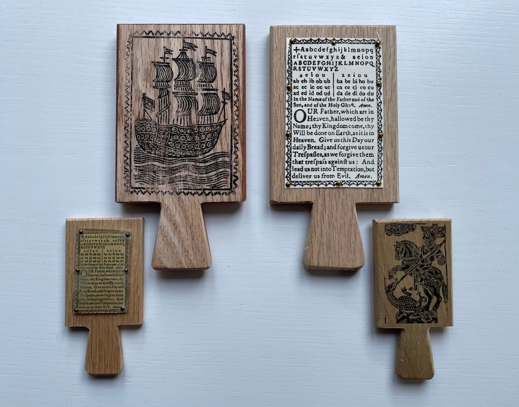
Facsimile horn-books. Real cow horn is used for the cover of the horn-book at the lower left.
Gene Wilson

The NFT element of this work is yet another level of irony. It begins with a paradox and a pair of causes. The paradox is ownership in the digital age. Most digital objects — downloadable music or book files — are not owned securely. Whether subject to the supplier’s whims or errors (like Amazon’s now infamous overnight removal of Orwell’s 1984 from its customers’ Kindles) or to obsolescence (by operating system upgrades or by outright abandonment of file formats such as Adobe Flash), we do not so much own digital assets as lease them with fingers crossed for luck while the vendors’ fingers are crossed behind their backs.

The irony raised by Battledore‘s NFT status is the underpinning technology’s claim of redefining and securing unique ownership in a digital work of art. A long explanatory article in The Verge provides an amusing and clear explanation of non-fungible tokens and blockchain technology. Although a digital artwork can be copied many times by many viewers even if it’s included with an NFT,

… NFTs are designed to give you something that can’t be copied: ownership of the work (though the artist can still retain the copyright and reproduction rights, just like with physical artwork). To put it in terms of physical art collecting: anyone can buy a Monet print. But only one person can own the original.

A metaphysical or aesthetic precursor to all this can be found in Walter Benjamin’s seminal essay “The Work of Art in the Age of Mechanical Reproduction”. He writes,

The presence of the original is the prerequisite to the concept of authenticity. And

that which withers in the age of mechanical reproduction is the aura of the work of art.

So in Benjamin’s terms, the Monet original has authenticity, it has aura. NFTs and blockchain technology aim/claim to replace the “presence of the original”, its “unique presence”, its “aura” with “ownership of the work” as the “prerequisite to authenticity”. By associating a piece of wood, leather, metal tacks and inscribed plastic with the digital asset, Ionson physically and ironically underscores the paradox of digital ownership.

The NFT feature of Battledore also carries with it a pair of causes. The first cause has an analogue in the late 20th-century theories about book art: that this new form of art arose as a means of bypassing art galleries and gatekeeping authorities of art. Likewise, NFTs and blockchain technology have their roots in peer-to-peer (P2P) networks in which data resides in whole or distributed state across a network of distributed servers. The purpose of P2P is to protect data from the threat and vulnerabilities of centralized control. Battledore leverages its digital format and that anti-authoritarian tradition of NFTs to subvert the corporate enemy on the digital battlefield.

The second cause, related to the first, is economic and financial and linked to copyright. In the physical world, authors’ and artists’ ability to be remunerated from the sale and re-sale of copies or original works is attenuated. They might receive royalties from copies sold by the intermediary publisher or a percentage from an original sold by the gallery or to a collector, but there is no economic framework for remuneration from subsequent transactions. NFTs and blockchain technology provide the digital artist an option for ongoing remuneration. Whenever the NFT is exchanged, a new block in the chain arises, and the whole chain is aware of it. So the digital artist can set financial terms not only for the initial financial transaction but also for subsequent ones.

When the Books On Books Collection is donated to the Bodleian Libraries, the chain of digital ownership will extend by one more block. The wallet in which the Battledore NFT and financial terms, if any, reside will transfer to the Bodleian with a digitally secure chain of custody and provenance. Of course, with the accompanying transfer of the physical artifact associated with the NFT, the artist and collector will be giving an ironic wink of the eye to the amusement and relief of the Keeper of Rare Books at the Bodleian.

Further Reading

Abecedaries I (in progress)“. Books On Books Collection.

Kees Baart, Dick Berendes, Henk Francino and Gerard Post van der Molen“. 2 November 2022. Books On Books Collection.

Margo Klass“. 9 July 2023. Books On Books Collection.

Karen Roehr“. 26 December 2022. Books On Books Collection.

Connie Stricks“. 9 July 20223. Books On Books Collection.

Ashley Thayer“. 26 December 2022. Books On Books Collection.

Andrew White Tuer“. 26 December 2022. Books On Books Collection.

Benjamin, Walter. 1969. “The Work of Art in the Age of Mechanical Reproduction“. Illuminations, edited by Hannah Arendt, translated by Harry Zohn, from the 1935 essay. New York: Schocken Books. Accessed 7 July 2023.

Bodleian Libraries. 7 July 2023. “Alphabets Alive! 19 July 2023 – 21 January 2024, Treasury, Weston Library“. Accessed 7 July 2023.

Chen, Min. 5 July 2023. “Digital Art Organization Rhizome’s New Blockchain Program Is an NFT-Dotted Journey Through the History of Generative Art“. Artnet News. Accessed 7 July 2023.

Clark, Mitchell. “NFTs, explained“. The Verge. Accessed 7 July 2023.
Books On Books Collection – Andrew White Tuer

History of the Horn-Book (1897)

History of the Horn-Book (1897)
Andrew White Tuer
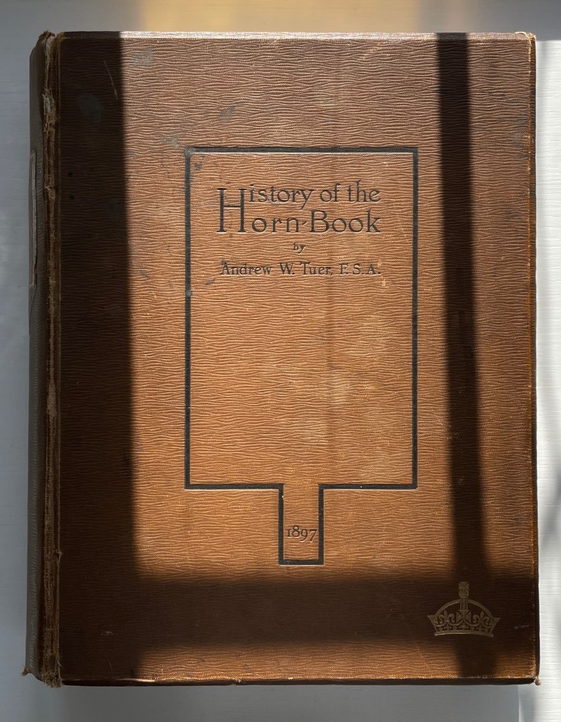
Casebound, sewn. H260 x W210 x D50 mm. 510 pages: 18 preliminary, 4 unnumbered leaves of plates (1 double, 2 foldout) and 300 illustrations. Acquired from Patrick Pollak, Antiquarian & Rare Books, 15 October 2021.
Photos: Books On Books Collection.

Andrew White Tuer is the Herman Melville of the horn-book. Like Melville, Tuer had many interests. Just as the sea proved an abiding theme for Melville that drew all his interests together into Moby-Dick, so proved publishing and printing for Tuer. Within his abiding theme, Tuer’s white whale was the horn-book, and his pursuit yielded the History of the Horn-Book. Although Moby-Dick first appeared in three volumes and History of the Horn-Book appeared in two, Tuer out-Melvilles Melville in other ways. His monument outweighs Melville’s by 79 pages. Where Melville takes 14 pages to lay out “Etymologies & Extracts” on the whale, Tuer requires 20 pages of anecdotal citations to document the “Christ-cross-row” as the original name of the horn-book. Admittedly Melville traces his subject back to Genesis, albeit with some stretching, but Tuer traces the earliest record “of a real horn-book with horn and not a mere alphabetical table” back to an equally important date in the history of printing and publishing: 1450.

For 125 years, Tuer’s History of the Horn-Book has remained the standard work on this artifact for teaching children the alphabet.

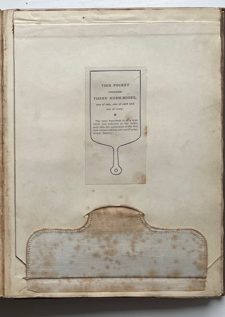
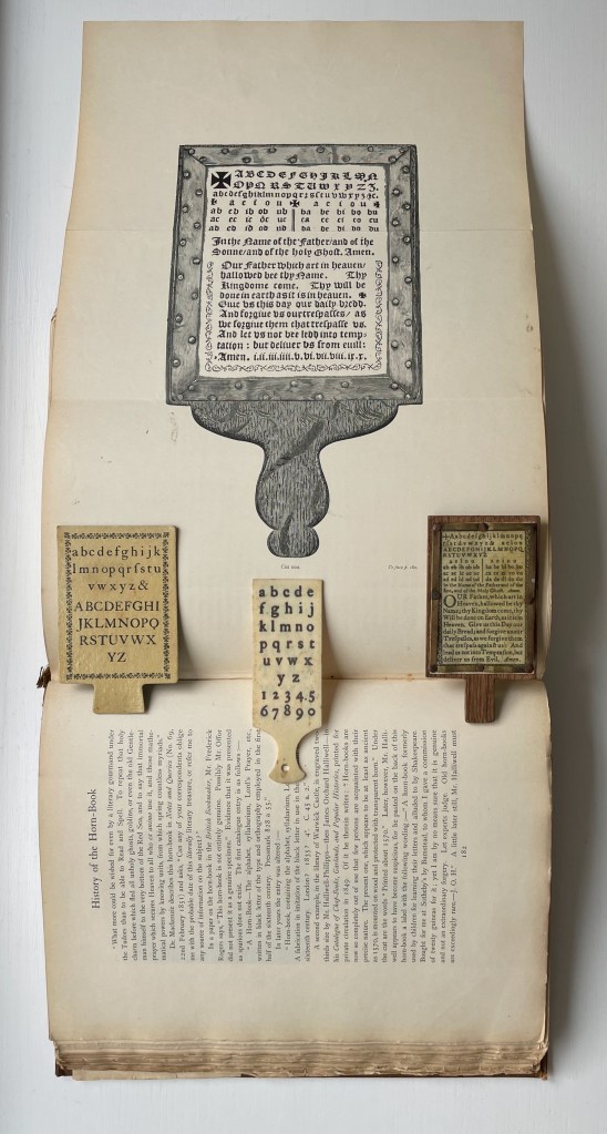
This single volume is the first trade edition of History of the Horn-Book, following a special edition in 1896 of two volumes containing seven reproductions of horn-books and battledores distributed across two compartments or pockets placed at the front of the volumes. In the single-volume edition, the compartment moved to the back, and the number of facsimile horn-books fell to three: one of oak, one of card and one of horn. Like the two-volume edition, the single volume has gilt on its top edge; the fore-edge is deckled.

After the special edition, Tuer added a section to this trade edition to announce further discoveries, including the ivory horn-book. Tuer must have been fond of this compartment feature; it shows up again in his compendium of humorous anecdotes taken from his trade journal (the Paper & Printing Trades Journal) and entitled Quads for Authors Editors & Devils (1884). The rear compartment of Quads contains a miniature version of the book.

Trade edition compartment closed

Fold out with the three facsimile horn-books from the compartment

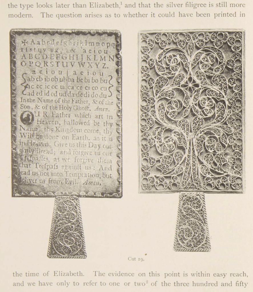
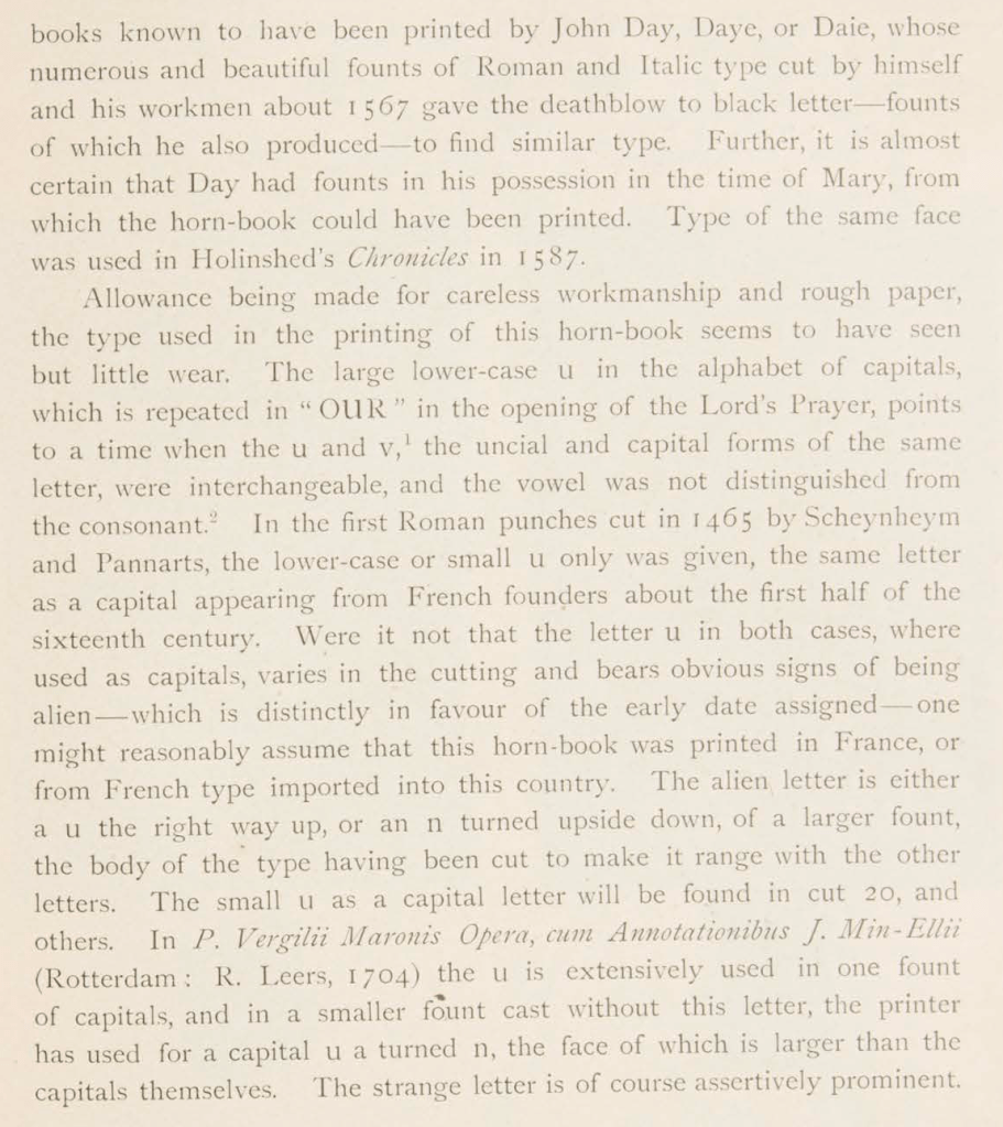
Tuer’s detail of research and analytical keenness go far to explain why History of the Horn-Book remains the standard work. If a trove of horn-books were to be discovered tomorrow, there would need to be extraordinary novelties in their composition, mechanics or material to warrant any attempt to displace this authority. Anyone making the attempt would require a foundation in printing history and practice that is hard to come by since the digital revolution. Consider Tuer’s knowledgeable comments on a silver horn-book alleged to have belonged to Queen Elizabeth I:

The history of horn-book is well in hand. As an educational device, it has been superseded by the battledore, building blocks, ABC books, television (Sesame Street), needlepoint samplers, wall hangings and rugs, toys and more toys and, of course, apps. But as an inspiration to book artists it still holds on. Among the book artists who have turned their hands, eyes and minds to the form are Helmut Andreas Paul (HAP) Grieshaber, Jan Paris, Daniel Essig, Kees Baart and his partners at Corps 8, and Karen Roehr.

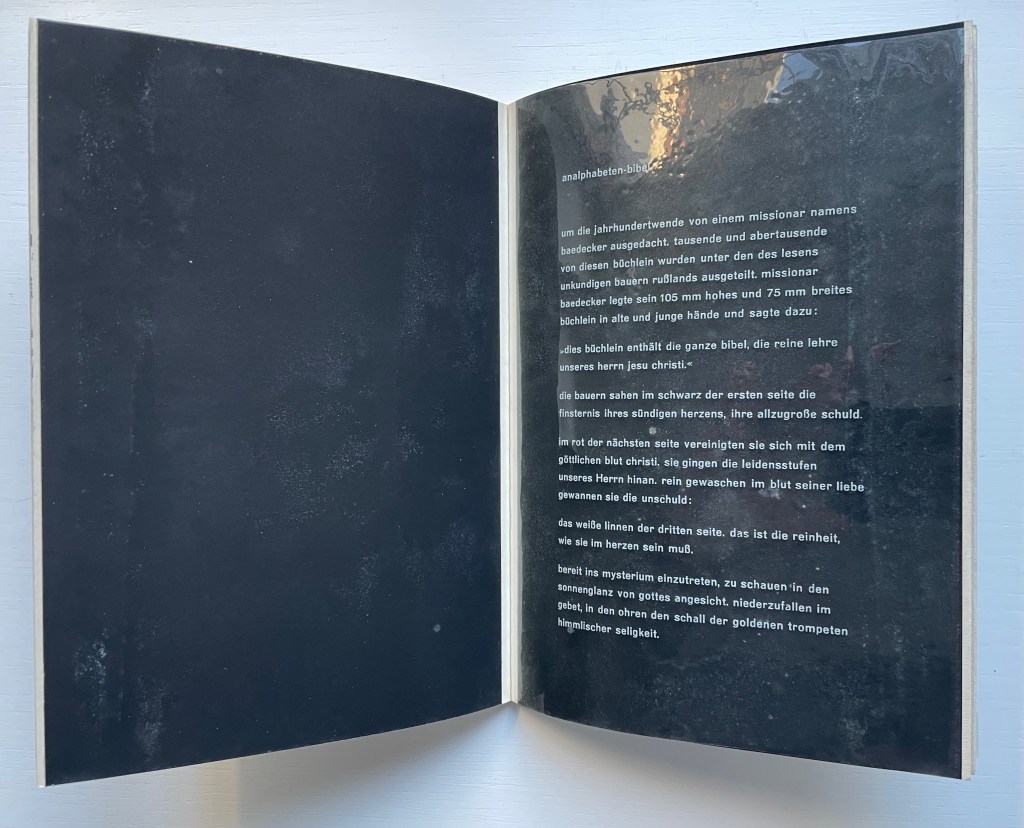
With its horn-book images on the front and back covers and a five-page piece entitled analphabeten-bibel (“the illiterates’ bible”), HAP Grieshaber’s small work of concrete poetry underlines the draw of the alphabet for book artists.

Poesia Typographica (1962)
Helmut Andreas Paul (HAP) Grieshaber
Paperback, perfect bound Chinese-fold folios, black endpapers. HxW. Edition of 1000. Acquired from Print Arkive, 22 October 2022.
Photos: Books On Books Collection.

The white text on the clear acetate translates roughly as follows:

created around the turn of the century by a missionary named baedecker. thousands and thousands of these booklets were distributed among the illiterate peasantry of Russia. missionary baedecker put his 105 mm high and 75 mm wide booklet into old and young hands and said:

“this booklet contains the whole bible, the pure teaching of our jesus christ.”

the peasants saw in the black of the first page the darkness of their sinful hearts, their great guilt.

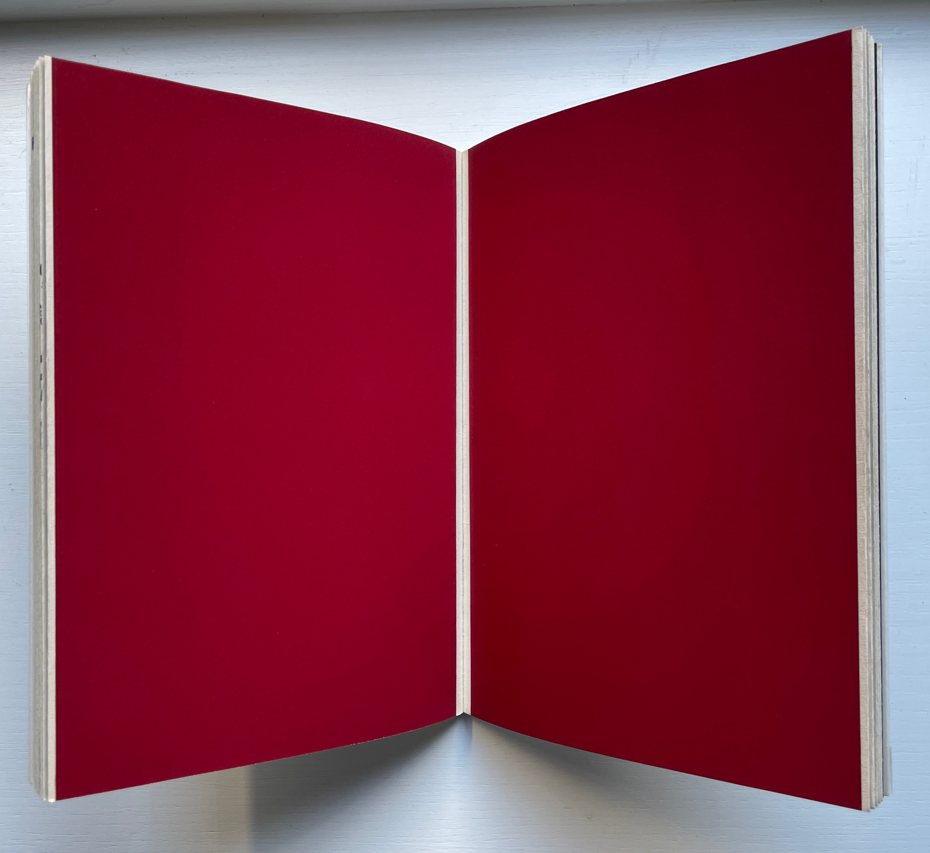
in the red of the next page, they united with the divine blood of christ. they followed the suffering steps of our lord. washed clean in the blood of his love, they won innocence:

the linen pasture of the third page, that is the purity that must be in the heart.

ready to enter into the mystery, to look into the sunshine of God’s face. to fall down in prayer, hearing the sound of the golden trumpets of heavenly bliss.

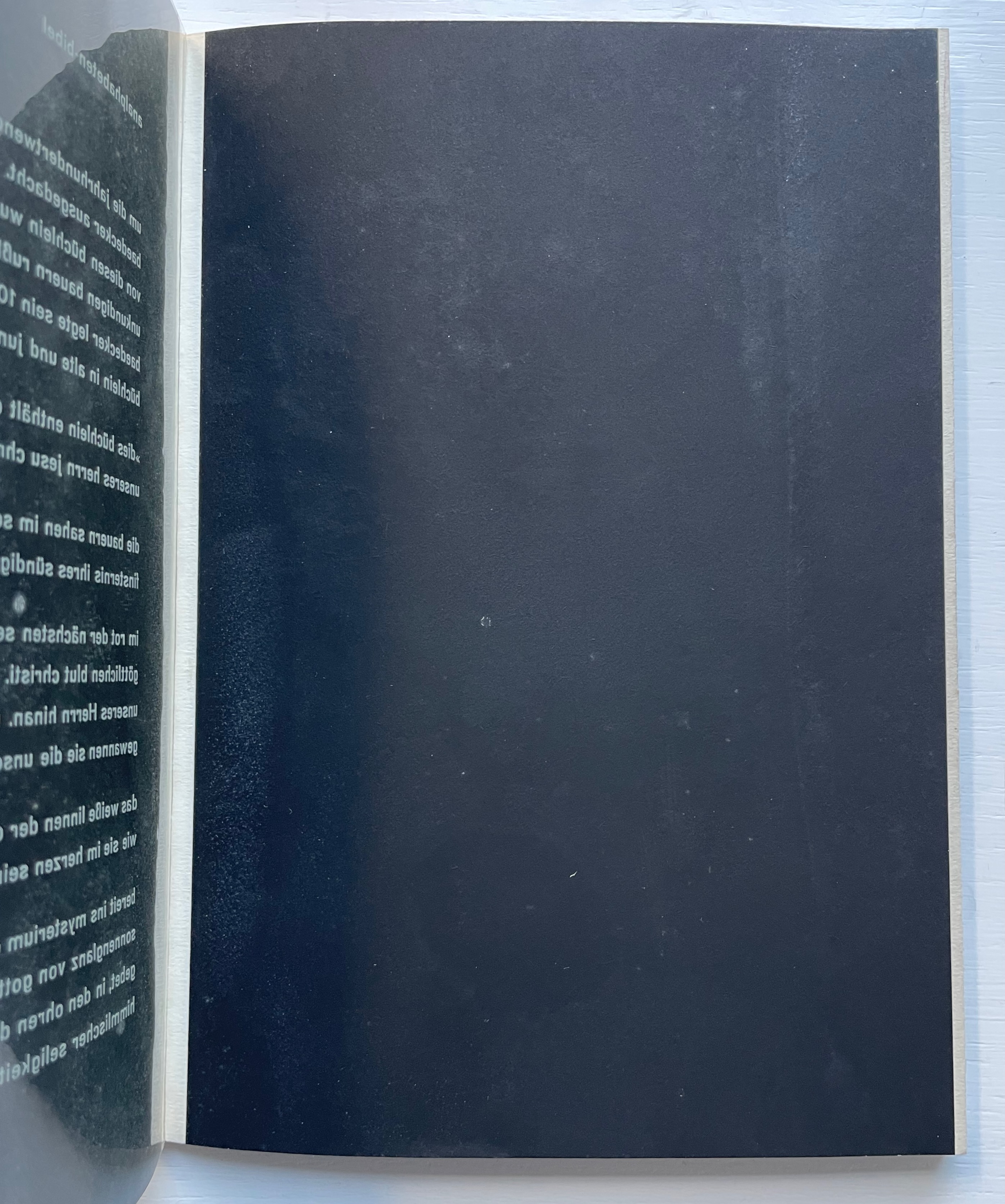
As the acetate page turns, the analphabetic Bible is revealed.

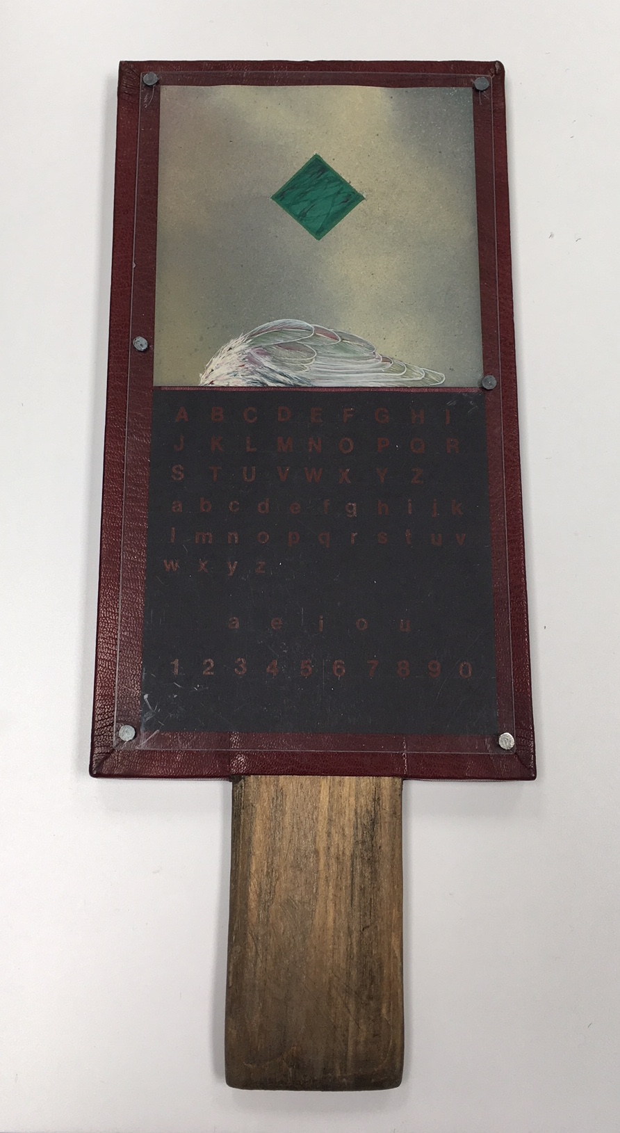
Although the horn-book by Jan Paris presents the usual uppercase and lowercase alphabets, the vowels and numbers as horn-books and battledores later came to do, it omits the Lord’s prayer, which these reading tools — early and late — preserved. In its place is a marbled green diamond shape hovering over a bird’s wing against a diffusely clouded background. Still though they may be, there is a tension between the abstract and natural things, contrarily positioned. The heavy abstraction floats or is falling. The thing that should be rising lies beneath, still and equally — although morbidly — detached. Letters, vowels and numbers, too, are certainly abstract. Until formed into words and concepts breathed into the air, they, too, lie still and detached on the horn-book’s surface.

Horn Book #2 (1983)
Jan Paris
Mixed media
Photo: Courtesy of the artist.

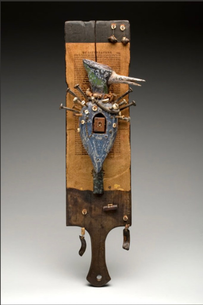
The horn-book form has become part of North Carolina artist Daniel Essig’s personal iconography. On his website, four variations can be found. The unique work below resides in Vanderbilt University’s Heard Library Special Collection. The range of materials and processes in Essig’s horn-book reflects the range of traditions, cultures and mythologies making up his eclectic iconography: miniature books, African bookbinding (contrasting with the horn-book), n’kisi nkondi (a Central African nail fetish), French literature (the unidentified collaged text), bird symbology, assemblage, carving, burning and painting. As totemic icon, Horn Book Fisher pushes the horn-book far beyond its primer function.

Horn Book Fisher (2008)
Daniel Essig
Carved and painted mahogany, burned cherry, mica, nails, handmade paper, found natural objects, 1800’s text papers, Ethiopian and Coptic bindings.
61 x 15 x 9 cm.
Photo: Courtesy of the artist.

Corps 8 was a Dutch collective of private presses formed by Dick Berendes (Typografiek), Kees Baart (‘t Schuurtje, now deceased), Gerard Post van der Molen (De Ammoniet), Sjaklien Euwals (De Overkant), Dirk Engelen (Clio Pers), Thijs Weststrate (Without Roof), Silvia Zwaaneveldt (De Baaierd) and Henk Francino (De Pers Achter de Muren). Under the auspices of a larger collective Drukwerk in de Marge, founded in 1975, they created Van Hornbook tot ABC-Prentenboek (“From Hornbook to ABC Picture Book”). It is an exquisitely produced, informative and witty collaboration. More about it can be found here.

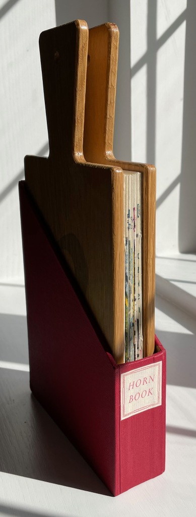
Van Hornbook tot ABC-Prentenboek (2003)
Kees Baart, Dick Berendes, Henk Francino and Gerard Post van der Molen
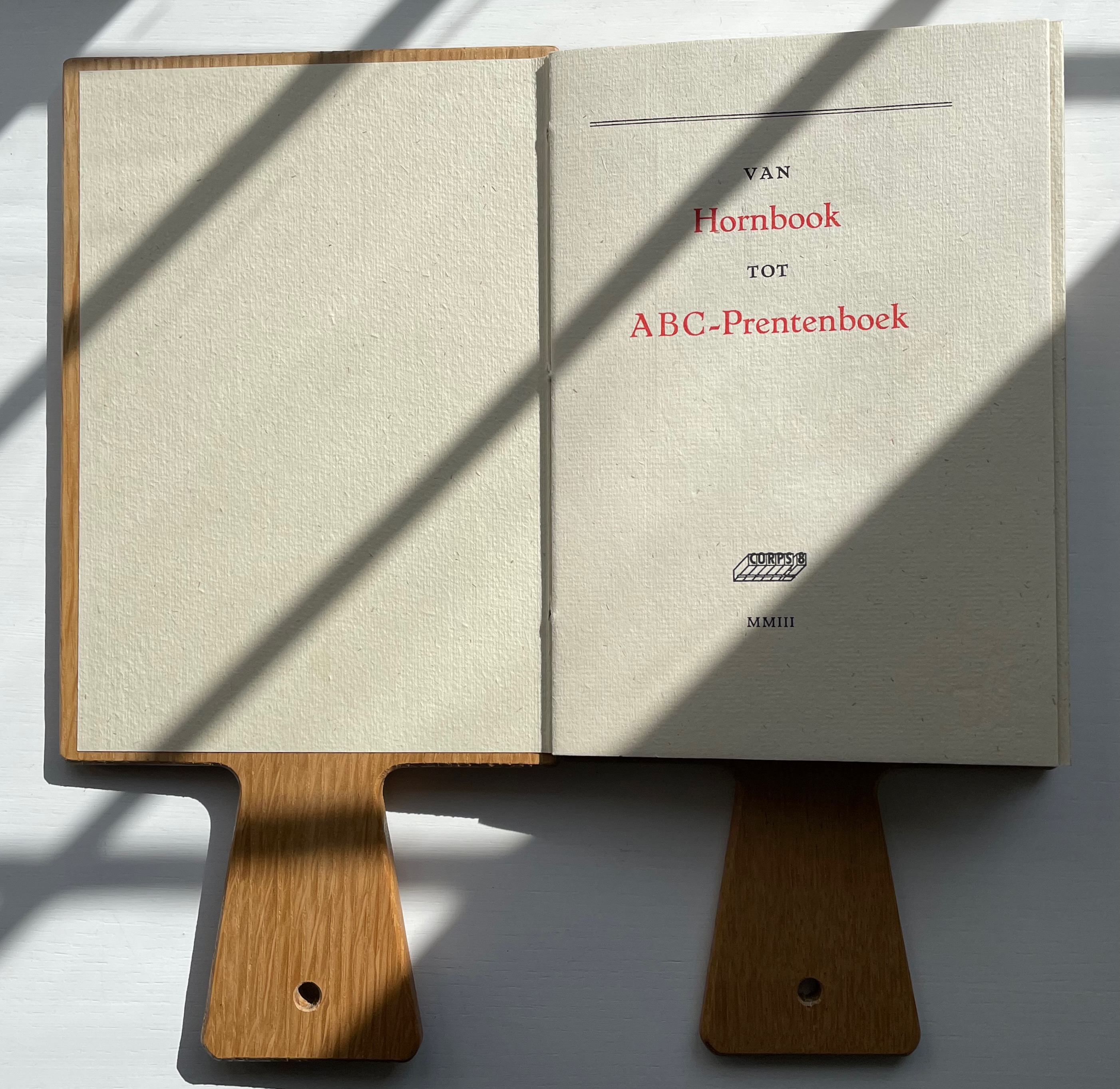
Double-sided leporello between two pamphlet-sewn booklets and bound between two oversized wooden hornbooks, held in an open cardboard box. H295 x W150 x D 30 mm. First booklet, 18 unnumbered pages; second booklet 8 pages; 52 panels. Edition of 135. Acquired from Fokas Holthuis, 13 September 2022.
Photos: Books On Books Collection. Displayed with permission of the artists.

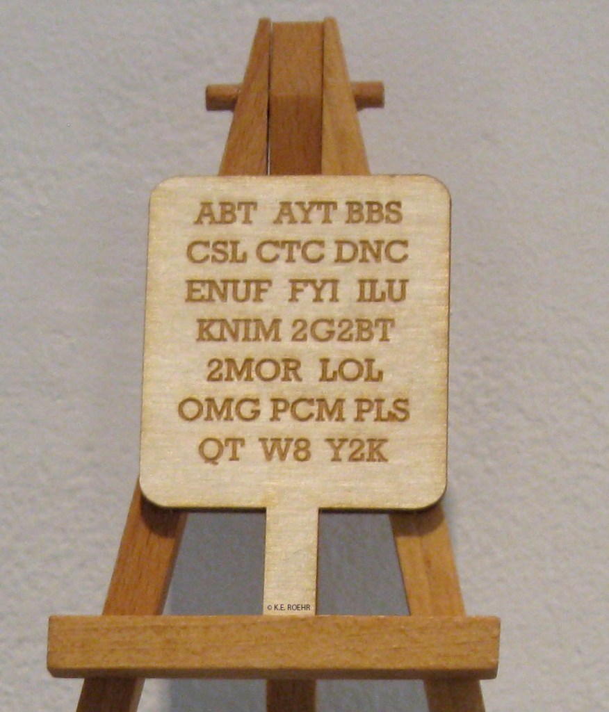
Karen Roehr’s Horn book for contemporary times is a miniature roughly the size of a small smartphone. Surely a Gen Z version with emoticons is not far behind on someone’s creative agenda.

Horn Book For Contemporary Times (2012)
K.E. Roehr
Laser-cut wood. H2 x W1.75 inches. Edition of 3. © K.E. Roehr.
Further Reading

Abecedaries I (in progress)“. Books On Books Collection.

Avery, Gillian. “The Beginnings of Children’s Reading” in Hunt, Peter, and Dennis Butts. 1995. Children’s Literature : An Illustrated History. Oxford: Oxford University Press.

Folmsbee Beulah. 1972. A Little History of the Horn-Book [Fourth print.] ed. Boston: Horn Book.

Plimpton, George A. 1916. The hornbook and its use in America. American Antiquarian Society.

Roehr, Karen E. (2012). Horn book for contemporary times. Accessed 23 October 2022.

Shepard Leslie. 1977. The History of the Horn Book : A Bibliographical Essay. London: Printed by the Rampant Lions Press for the Broadsheet King.

Tuer Andrew White. 1884. Quads for Authors Editors & Devils. London: Field and Tuer Simpkin Hamilton.

Wiles H. V. 2010. The Horn-Book : The First Rung on the Ladder of Literacy. Whale-back Press.

Books On Books Collection – Drukwerk in de Marge (Kees Baart, Dick Berendes, Henk Francino and Gerard Post van der Molen)

Van Hornbook tot ABC-Prentenboek (2003)

Van Hornbook tot ABC-Prentenboek (2003)
Kees Baart, Dick Berendes, Henk Francino and Gerard Post van der Molen
Double-sided leporello between two pamphlet-sewn booklets and bound between two oversized wooden hornbooks, held in an open cardboard box. H295 x W150 x D 30 mm. First booklet, 18 unnumbered pages; second booklet 8 pages; 52 panels. Edition of 135. Acquired from Fokas Holthuis, 13 September 2022.
Photos: Books On Books Collection. Displayed with permission of the artists.

From Hornbook to ABC Picture Book was organized by four members of the Corps 8 collective. They issued it with the financial backing of the Zeeuwse Nederland Bibliotheek and under the auspices of Drukwerk in de Marge (Printing in the Margin), a foundation established in 1975 by likeminded amateur printers and publishers. Drukwerk in de Marge recalls The Typophiles, a similar group founded in the 1930s in New York that attracted great talents like Frederic Goudy, Bruce Rogers and Beatrice Warde. Like Drukwerk in de Marge, The Typophiles stimulated quirky publications. One of them — Diggings of Many Ampersandhogs (almost the last word on the ampersand) — resides in the Books On Books Collection and, until now, lacked an appropriate partner covering the preceding twenty-six characters of the alphabet.

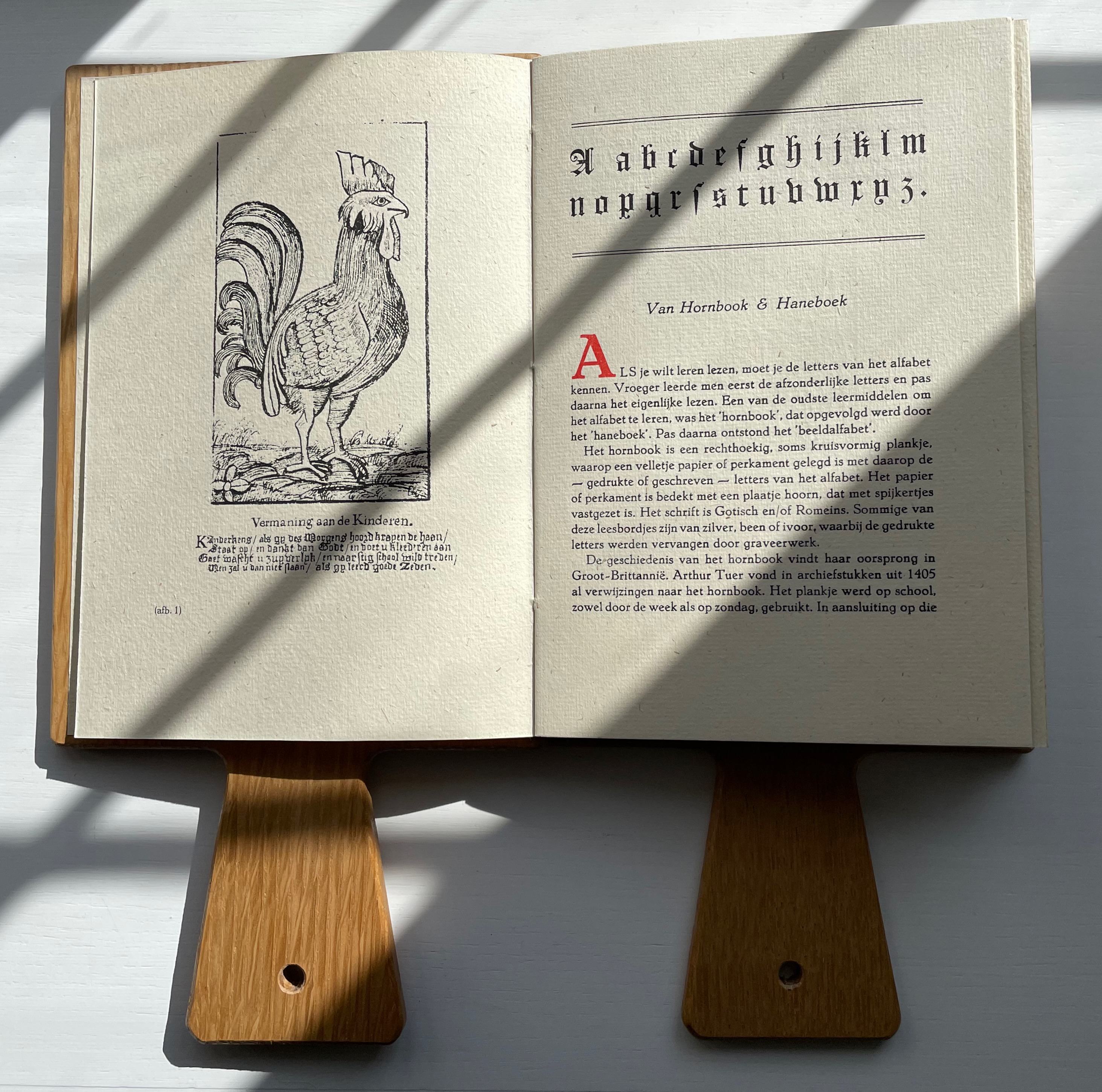
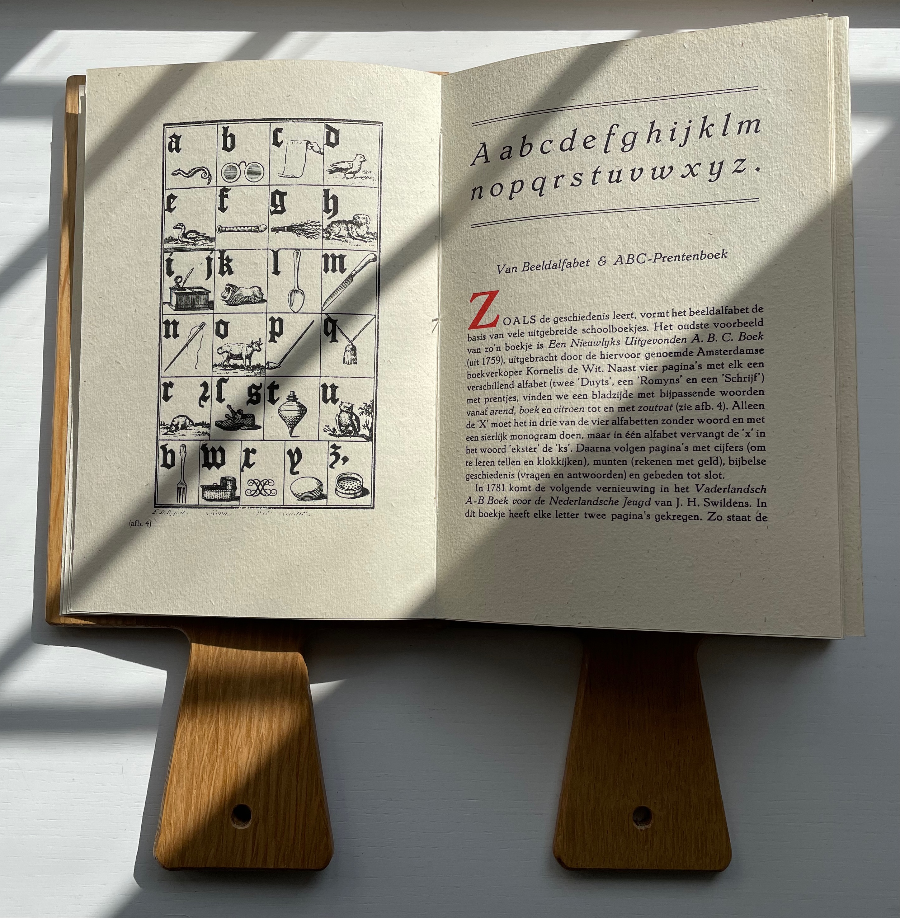
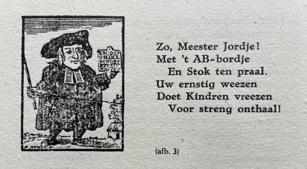
Van Hornbook includes four brief essays. Following in the footsteps of Andrew White Tuer’s History of the Horn-Book, the first two — “Van Hornbook & Haneboek” / “Of Hornbook & Handbook” and “Van Beeldalfabet & ABC-Prentenboek” / “Of Picture Alphabet & ABC Picture Book” –provide historical context for the format and its successors. Only four hornbooks have survived in the Netherlands, dating from the eighteenth century, so like Tuer, Van Hornbook‘s essayists rely on images from popular historical prints to show the hornbook’s appearance and handling. To the three hundred illustrations of History of the Horn-Book, the Nederlanders add this:

So, Master Jordje!
With AB boardje
And cane on high.
Your earnest weening
Leaves children keening
As school draws nigh!

The print dates to 1785. The Dutch collective’s undertaking and their contributors’ offerings for the leporello are all the more notable for such a narrow historical margin on which to build.

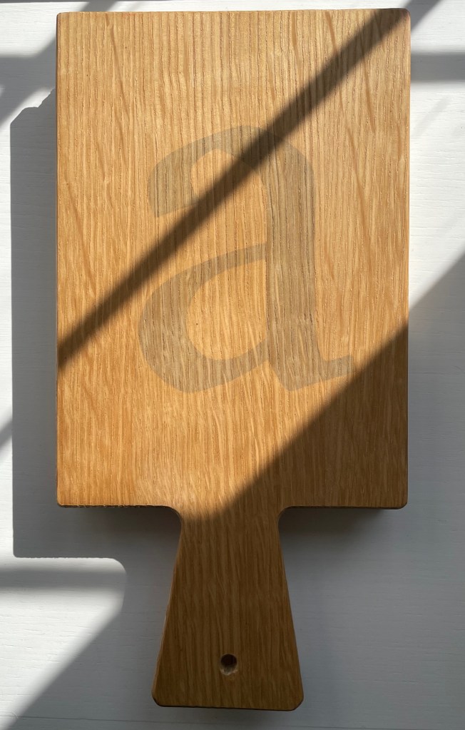
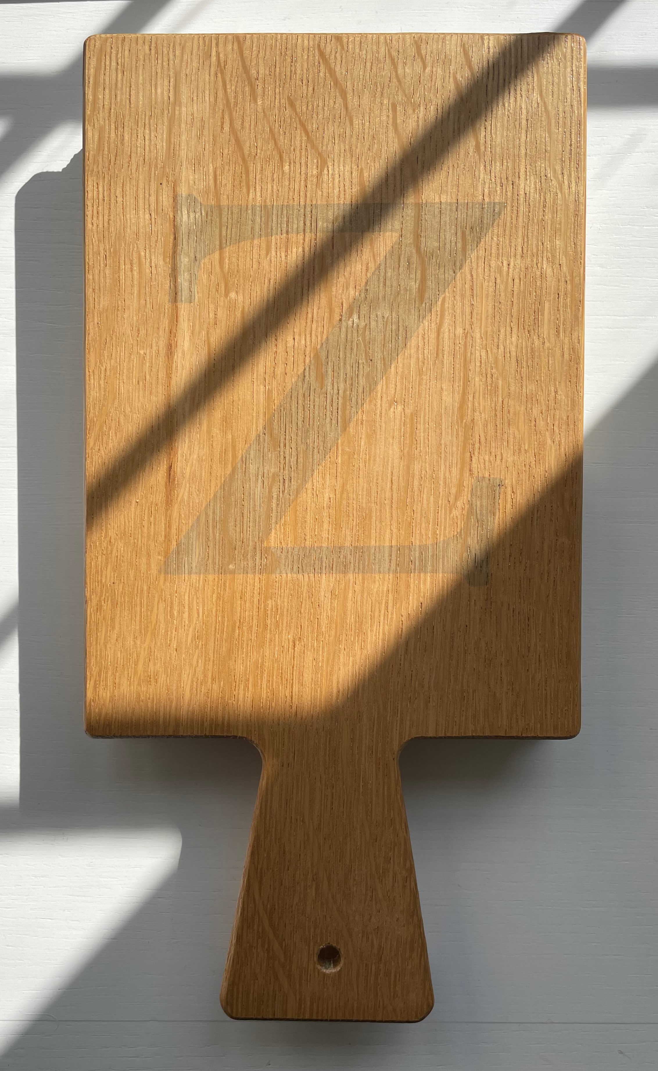
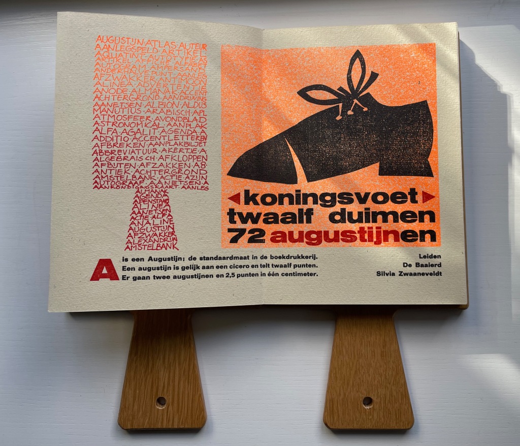
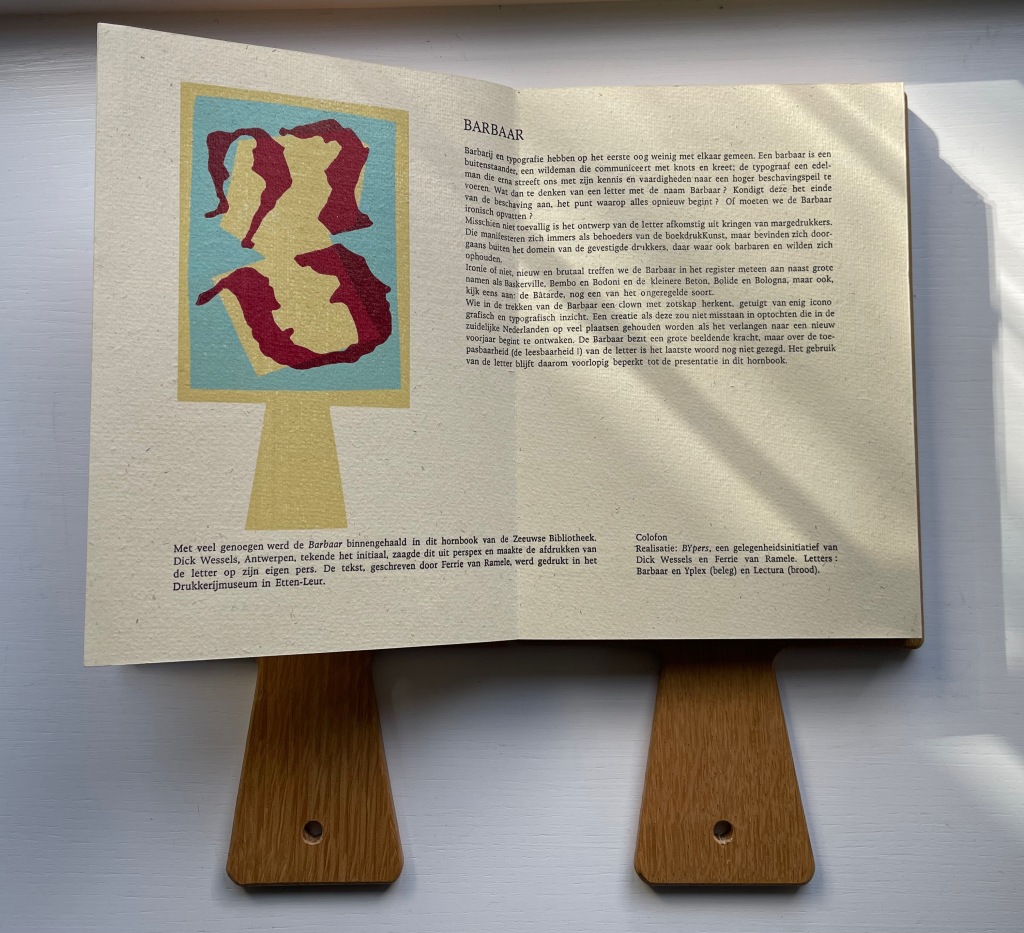
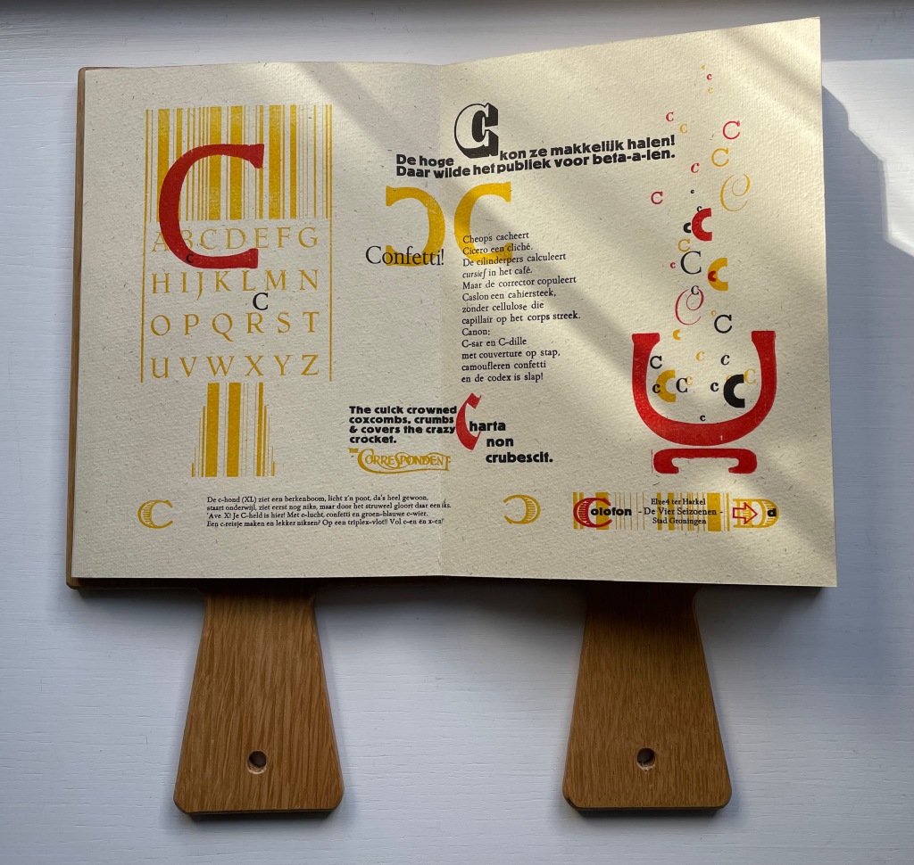
The work’s four editors have the last say with “Verantwoording” / “Explanation”, which is an extended run-up to the colophon. The leporello is printed on 180 gms Antik Gerippt Bütten by Hahnemühle, and the essays are on 130 gms. The heavier weight of the leporello’s panels must have been an open invitation for the contributors to show off. Aside from the constraint of print area, the “Hornbook preparation group” seems to have imposed only one other layout requirement: that each double-panel spread display the same horn-book shape on its left-hand panel. As the images below show, this was just the right touch of uniformity to spark rather than impede the contributors’ creativity and individuality.

In English, the text beneath the two images here reads “A is an Augustin, the standard size in letterpress. An Augustin is equal to a cicero and has twelve points. Two Augustins and 2.5 points equal one centimeter.” Under the image of the shoe, Silvia Zwaaneveldt (De Baaierd, Leiden) converts into points the traditional measure for the “foot”: a foot would equal the size of the king’s foot, which eventually was standardized to twelve inches, which — to save us from chasing after Willem-Alexander or Charles III with a pica stick — is 72 Augustins.

In their contribution for the letter B, Dick Wessels and Ferrie van Ramele invent a fictitious typeface Barbaar, named to allow them an extended joke about the outsider (or barbarian) status of Margedrukkers among traditional printers. If the Dutch reader misses the tongue-in-cheekiness of the entry, the colophon gives away the game:

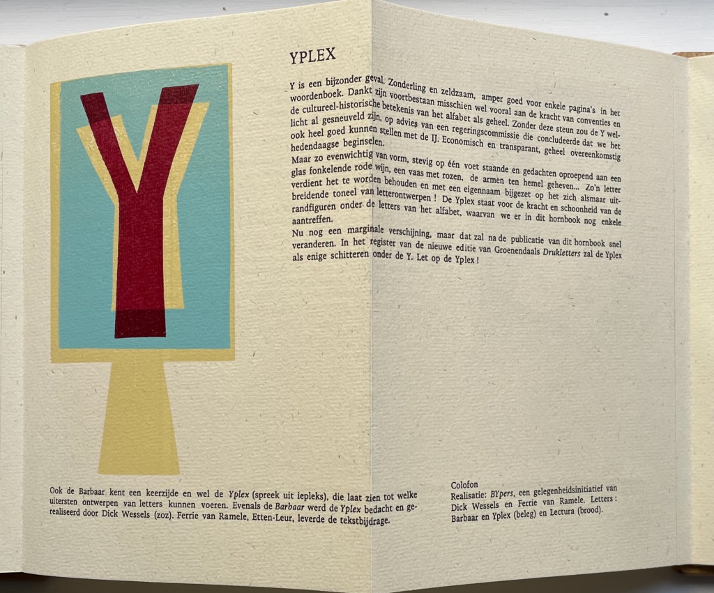
Realisatie: BYpers, een gelegenheidsinitiatief van Dick Wessels en Ferrie van Ramele. Letters: Barbaar en Yplex (beleg) en Lectura (brood). / “Realization: BYpers, an occasional initiative of Dick Wessels and Ferrie van Ramble. Letters: Barbaar and Yplex (icing) and Lectura (cake).”

Elze ter Harkel (De Vier Seizoenen, Groningen) concocts two panels of verbal and visual puns on the letter C. The alliterative wordplay in the doggerel of “Confetti” is too Dutch and deliberately nonsensical for a satisfactory replica in English, but its reference to cellulose is a clue to the visual papermaking pun in the C’s bubbling up from the pulp vat next to it. Also referring to paper, the panels’ best pun hides in the last altered word of Cicero’s saying “Charta non erubescit“. This is usually translated as “Documents don’t blush”, meaning you can express opinions in print you might blush to express in person, but charta also means “paper”. With the “e” changed to a “c” in the last word, the Latin now means “crumble”. So, it’s “Paper doesn’t crumble”, which ought to make the winking punster blush a little.

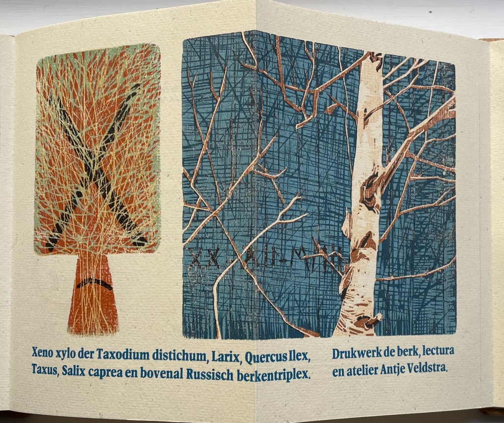
Antje Veldstra (Antje Veldstra Grafiek, Groningen) is an award-winning woodcut artist. Almost all of the X-words in her couplet are the Latin names for trees: Taxodium distichum (Bald Cypress), Larix (Larch), Quercus Ilex (Holm Oak), Taxus (Yew) and Salix caprea (Goat Willow). The first two words, however, — xeno and xylo — are prefixes. The first means “alien,” “strange” or “guest” as in xenophobia (“fear of foreigners”). The second means “wood” as in xylography (“the art of engraving on wood or of printing from woodblocks”). But what is so strange or alien about these trees? The clue is in the background (lower left) of the birch print. Those are runes, the ancient marks of mystery and secret language. The most easily distinguished are (called Gebo, associated with gift and fortuitous outcome) and (called Ehwaz, associated with horse and movement). In her craft, Veldstra, however, does not leave us with the ancients. The last entry — en bovenal Russisch berkentriplex — is Russian birch plywood, commonly used for engraving.

If there remains any doubt about the tone of the entry for B by Dick Wessels and Ferrie van Ramele, consider their entry for Y.

Y is a special case. Eccentric and rare, barely good for a few pages in the dictionary: it owes its survival perhaps mainly to the strength of conventions and the cultural-historical significance of the alphabet as a whole. Without this support, the Y might have already been killed off, on the advice of a government committee that concluded that we could very well make do with the IJ. Economical and transparent, entirely in keeping with contemporary principles.

But so balanced in form, standing firmly on one foot and evoking thoughts of a glass of sparkling red wine, a vase of roses, arms raised to heaven…. Such a letter deserves to be preserved and added with its own name to the ever-expanding stage of letter designs! The Yplex represents the strength and beauty of the marginal figures among the letters of the alphabet, a few of which we still find in this hornbook.

Although still a marginal appearance, that will soon change after the publication of this hornbook. In the register of the new edition of Groenendaal’s Printing Letters, the Yplex will be the only one shining under the Y. Stand by for the Yplex!”

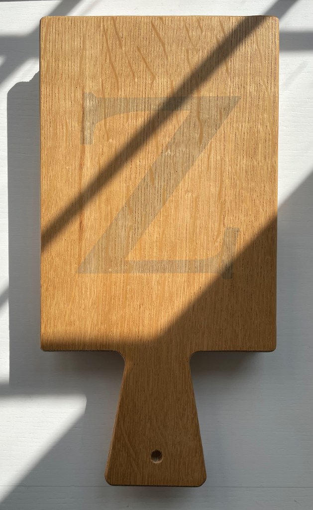
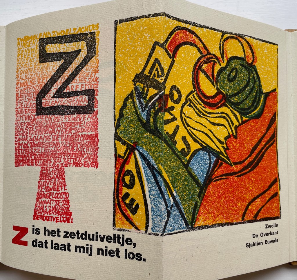
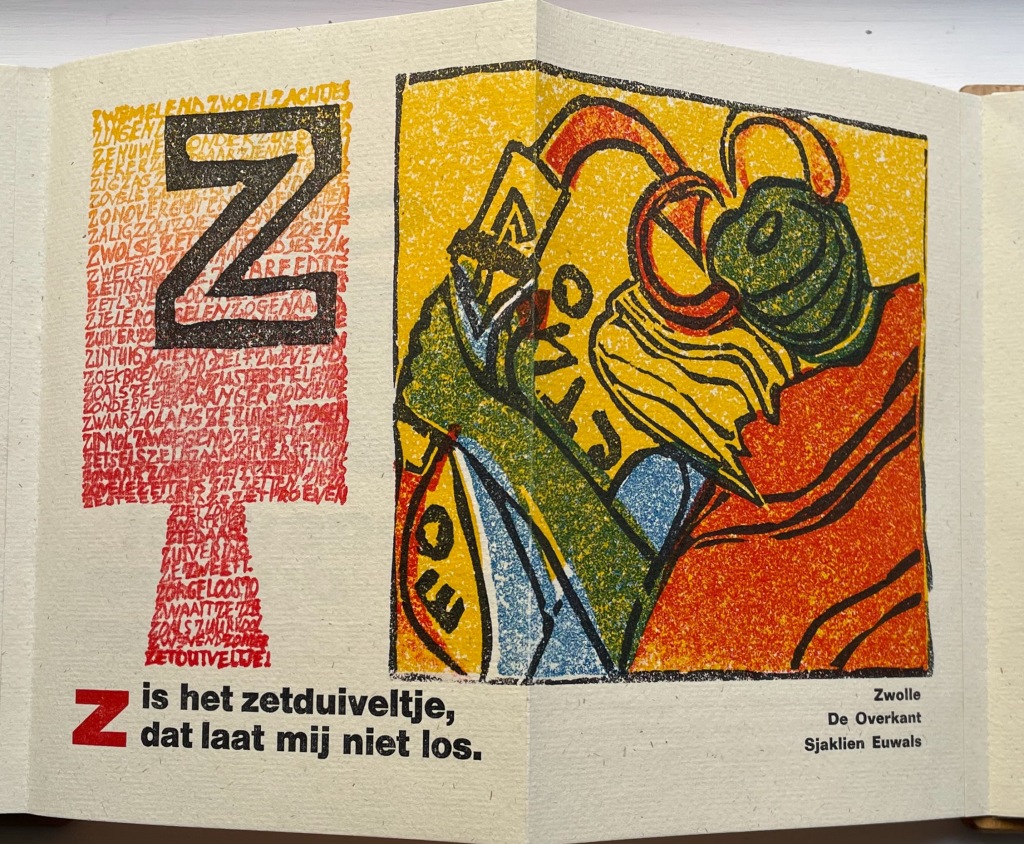
The last letter of the alphabet bedevils abecedarians in every language. Sjaklien Euwals settles on zetduiveltje: “typesetter’s or printer’s little devil”. Word for word in English, the caption reads “Z is the typesetter’s little devil that will not let me loose”. The image rules out the English expression “printer’s devil”, which refers to the printshop apprentice. Euwals’ little devil is the green and red gremlin who leans over her shoulder, grabs her wrist and makes her drop letters from her composing stick. In other words, the imp on whom to blame typographical errors. To capture Sjaklien Euwals’ humor in translation, we might have to go with “Z iz the typezetter’z gremlin that won’t let looze.”

Given the affinity between artists’ books and children’s books (particularly alphabet books), it is surprising how few works of book art pay homage to the form of the horn-book. Van Hornbook tot ABC-Prentenboek sets a high bar. Perhaps increased awareness of it will prime the pump for primers.

Further Reading/Viewing

Elder Futhark“. Last edited 11 August 2022. Wikipedia. Accessed 27 October 2022.

Tuer, Andrew White. 1897. History of the Horn-Book. London: Leadenhall Press.