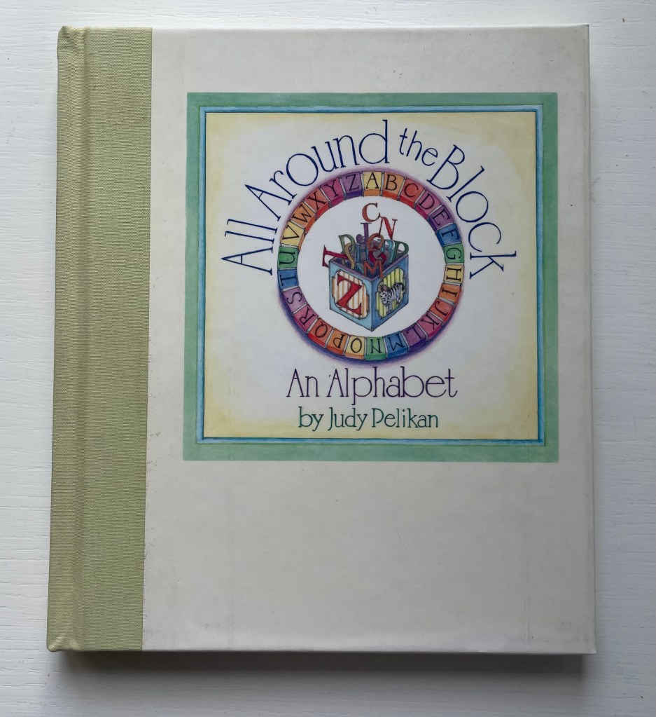
All Around the Block: An Alphabet (2008) Judy Pelikan Hardcover H168 x W145 mm. 56 pages. Acquired from Amazon, 24 September 2022. Photos: Books On Books Collection. Displayed with permission of the artist.
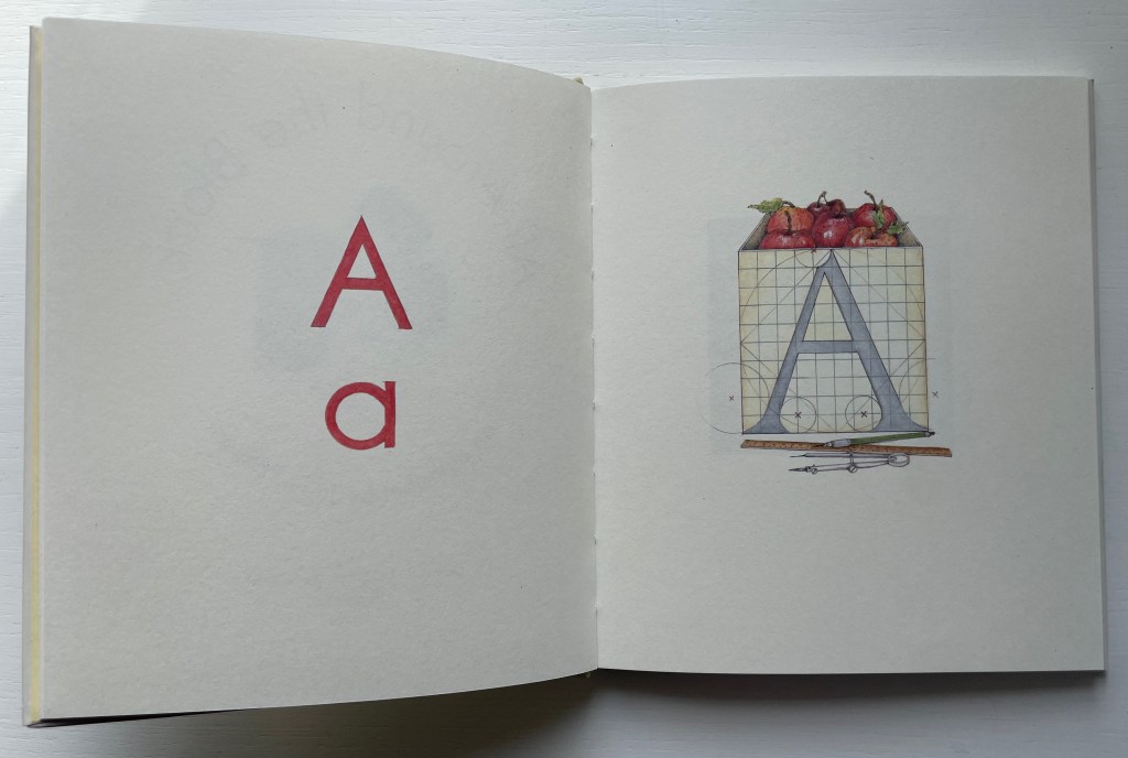
From the cover to the last letter, Judy Pelikan’s book is an extended visual pun with more puns in between. Some of the resulting images (like that for the letter A) are deeply clever; others (like that for the letter Z) are surreal. Obviously A is for a box of apples, but the uppercase serif A on yellowed grid paper with drawn guidelines recalls the early designers of geometrically created letters such as Feliciano, Pacioli, Durer, Tory and others. Driving home the recollection, the artist has laid out the tools for such typographical design: compass, straightline and pen. Here, “all around the block” is all about the square.
Most of the visual puns are simple like B for books and blocks; others are straightforward but dense like C for crate, cloud, curl, cup, coffee and castle (that’s six for all sides of the block!); others are strange. For the letter Z, we have the surreality of a zebra and her foal grazing on top of the block on whose front panel a zebra moth or butterfly hovers by a ziggurat behind an old-fashioned console (Zenith?) with a third zebra peering from its screen.
All Around the Block warrants a closer look on each page as well as favorable comparison and contrast with any of the works noted below.
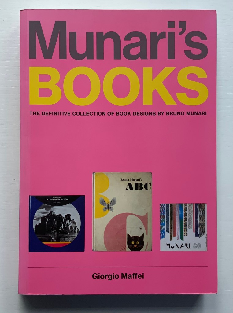
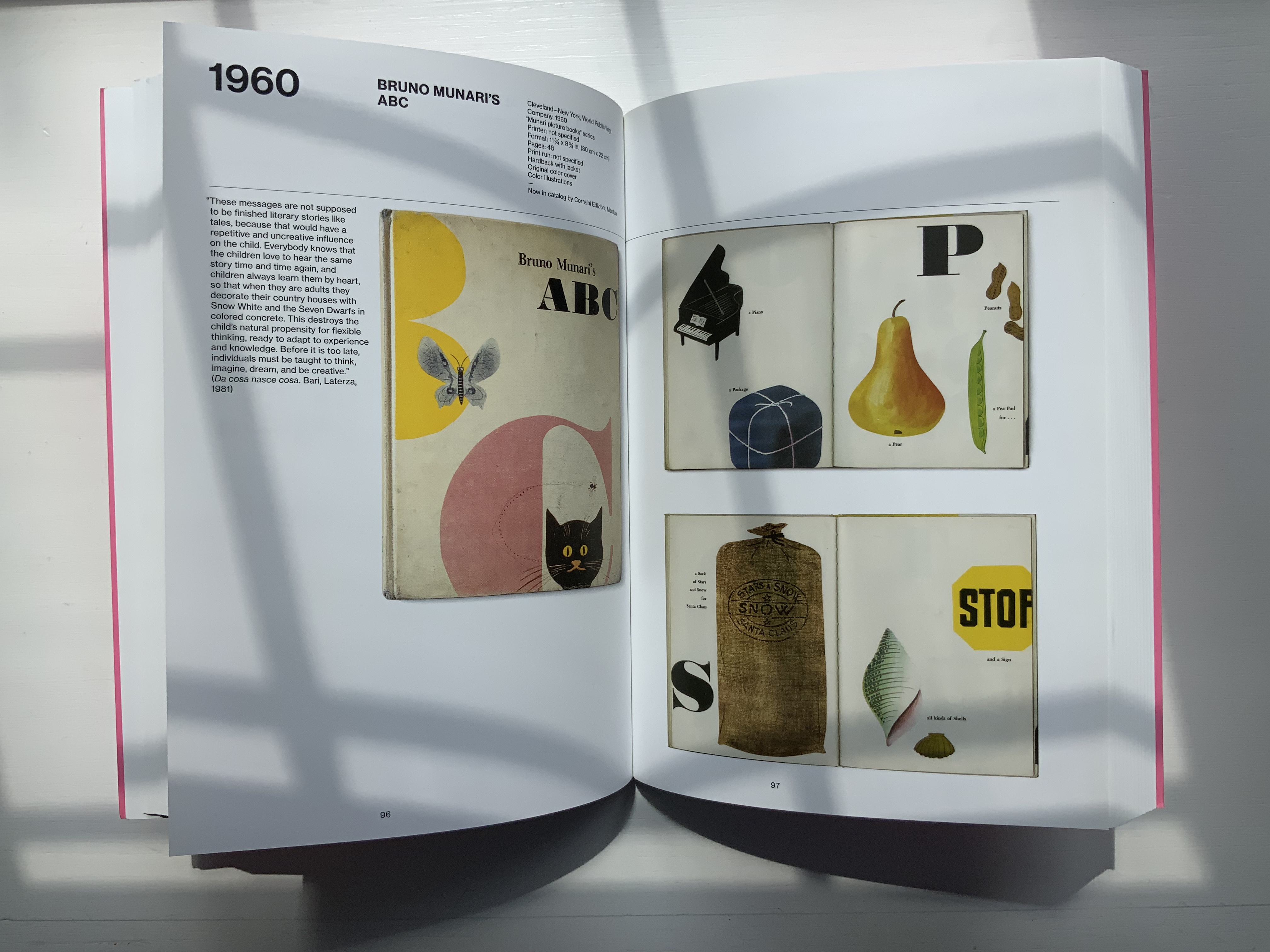
Giorgio Maffei’s 2008 definitive collection of book designs by Bruno Munari brings together two of Italy’s renowned book artists. Giorgio Maffei’s own work, his writing and gallery/bookshop (highlighted by his son Giulio Maffei’s extraordinary video catalogues Le vite dei libri) warrant a catalogue raisonné in their own right. The Italian edition published by Munari’s long-time publisher Maurizio Corraini was followed up in 2015 by this translation by Martin John Anderson and Thomas Marshall in 2015. For the Books On Books Collection, one of the great pleasures of Munari’s works is its attention to the alphabet, which this book documents.
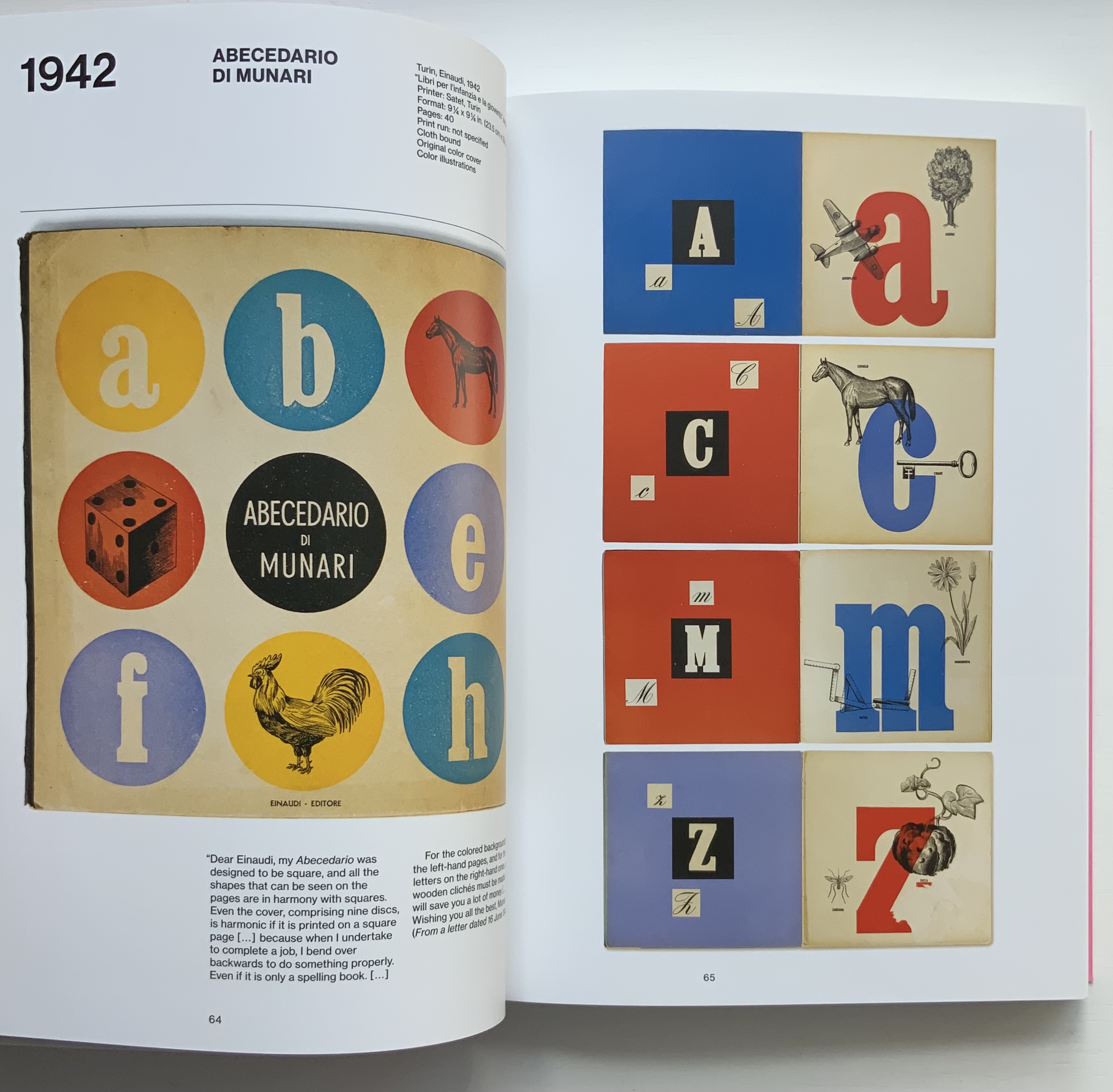
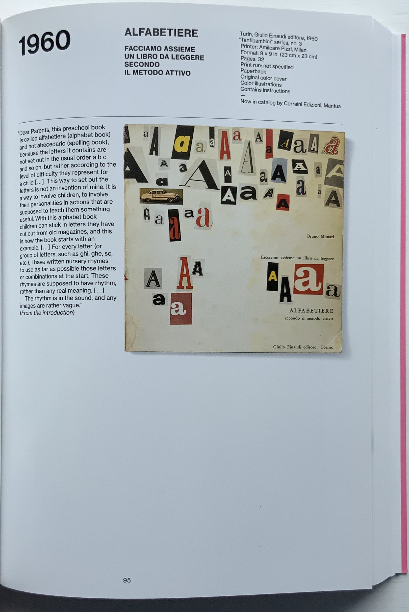
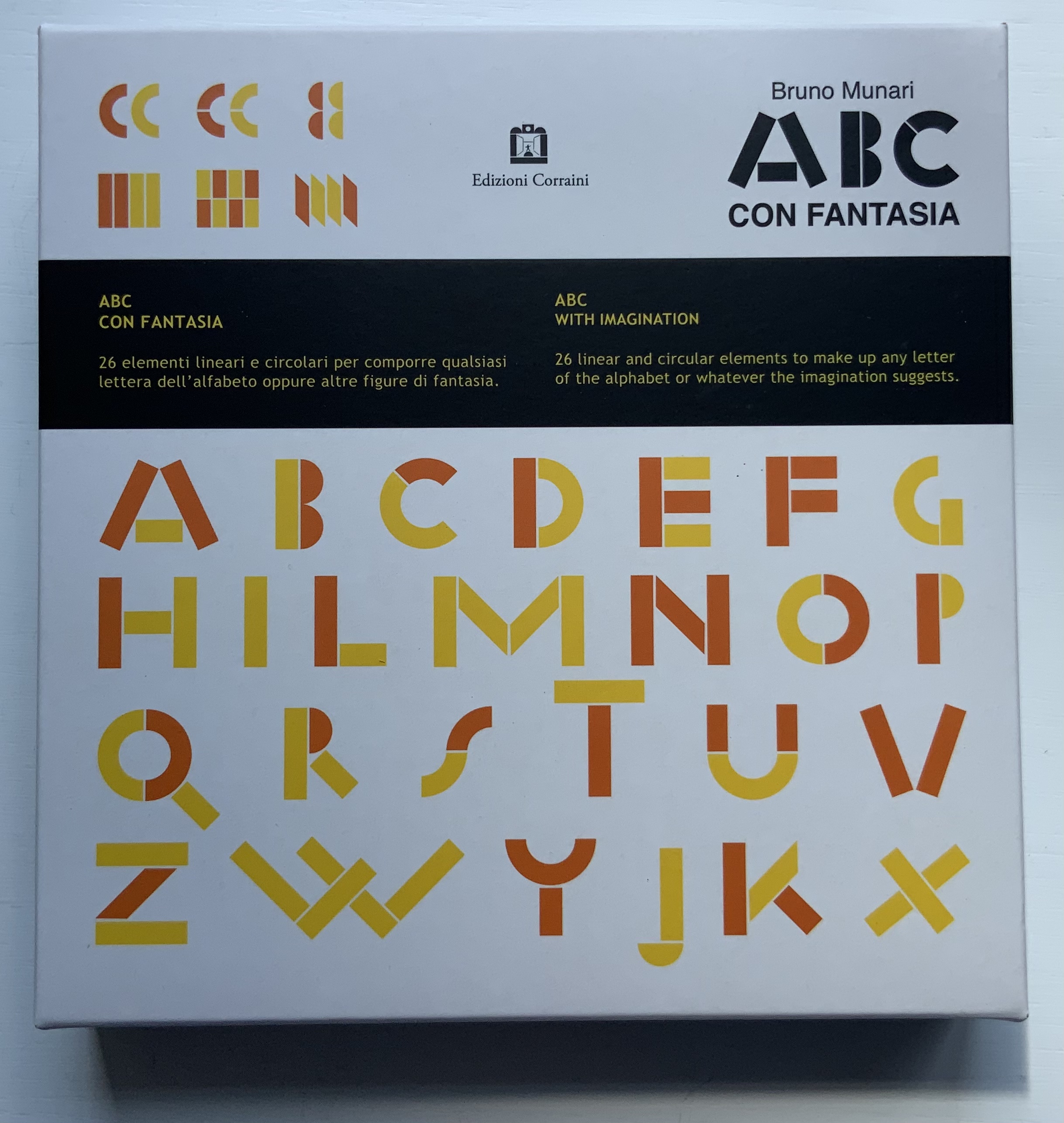
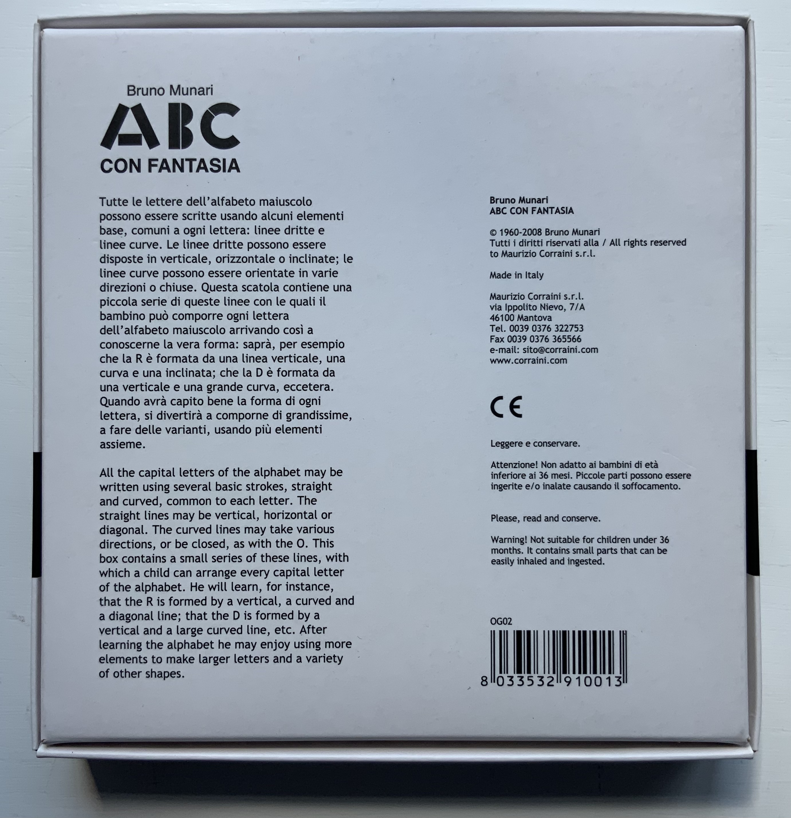
Although not shown in Munari’s Books, an alphabet-related work that underscores Picasso’s calling Munari “our Leonardo” is ABC con fantasia (1973/2000). If we are to believe Fra Luca Pacioli, it was Leonardo da Vinci who inspired his “straight lines and curves” exposition for creating letters. Following in their footsteps, Munari provides the linear and curvilinear basics for the collector and offspring to join the game.
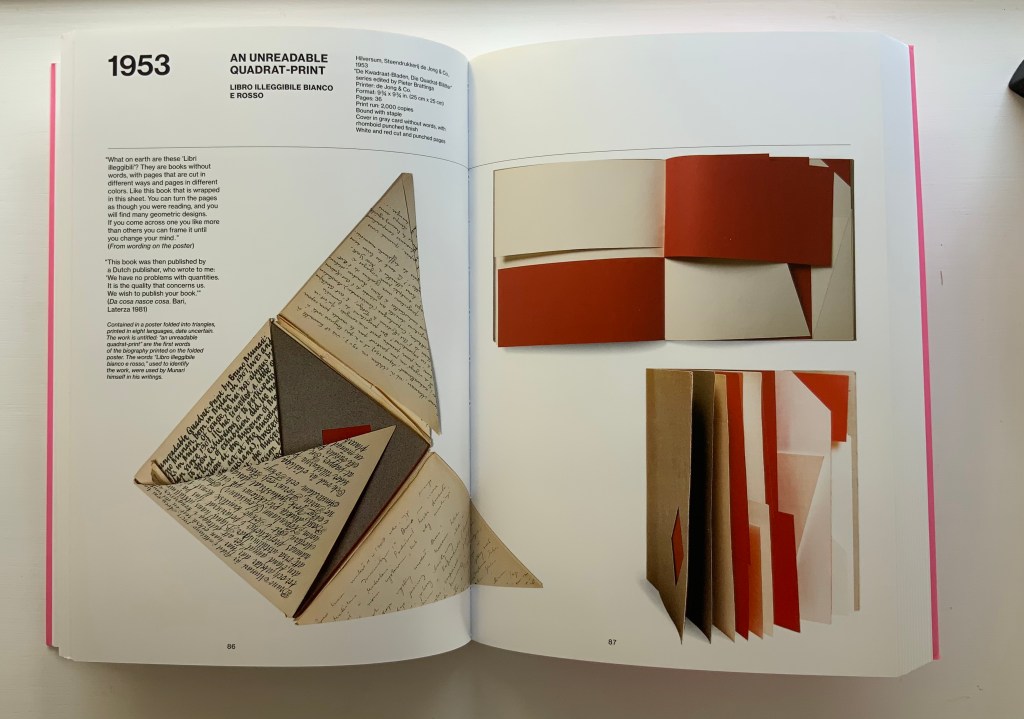
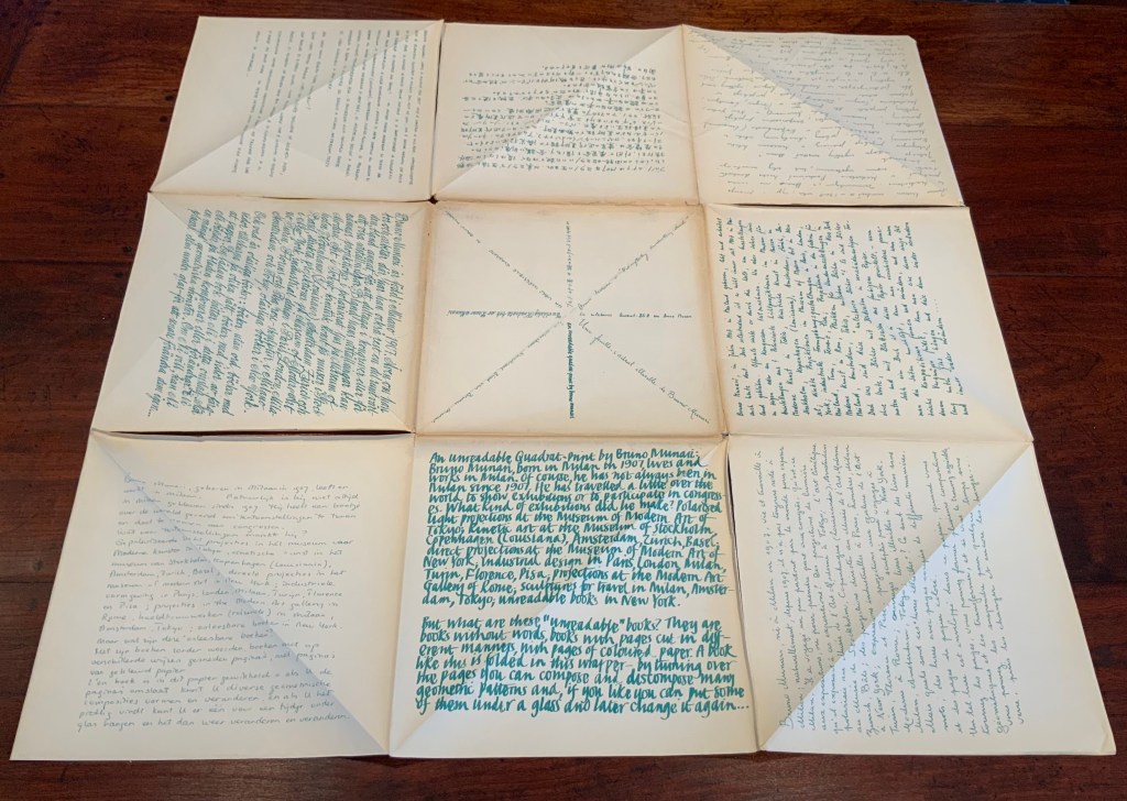
Another pleasure is how Munari’s works lead to other works in the collection. Just by preceding them in Pieter Brattinga’s Kwadraatblad/Quadrat-prints series, Munari’s An Unreadable Quadrat-Print (1953), below, conjures up Wim Crouwel‘s, Gerard Unger‘s, Timothy Epps and Christopher Evans‘, and Anthon Beeke‘s more alphabetical contributions.
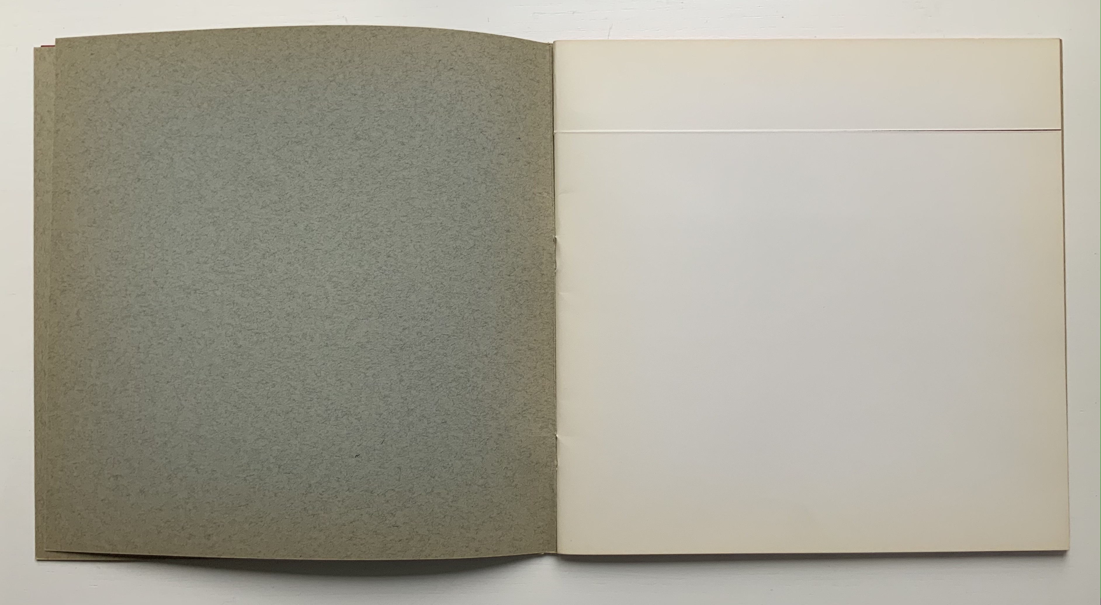
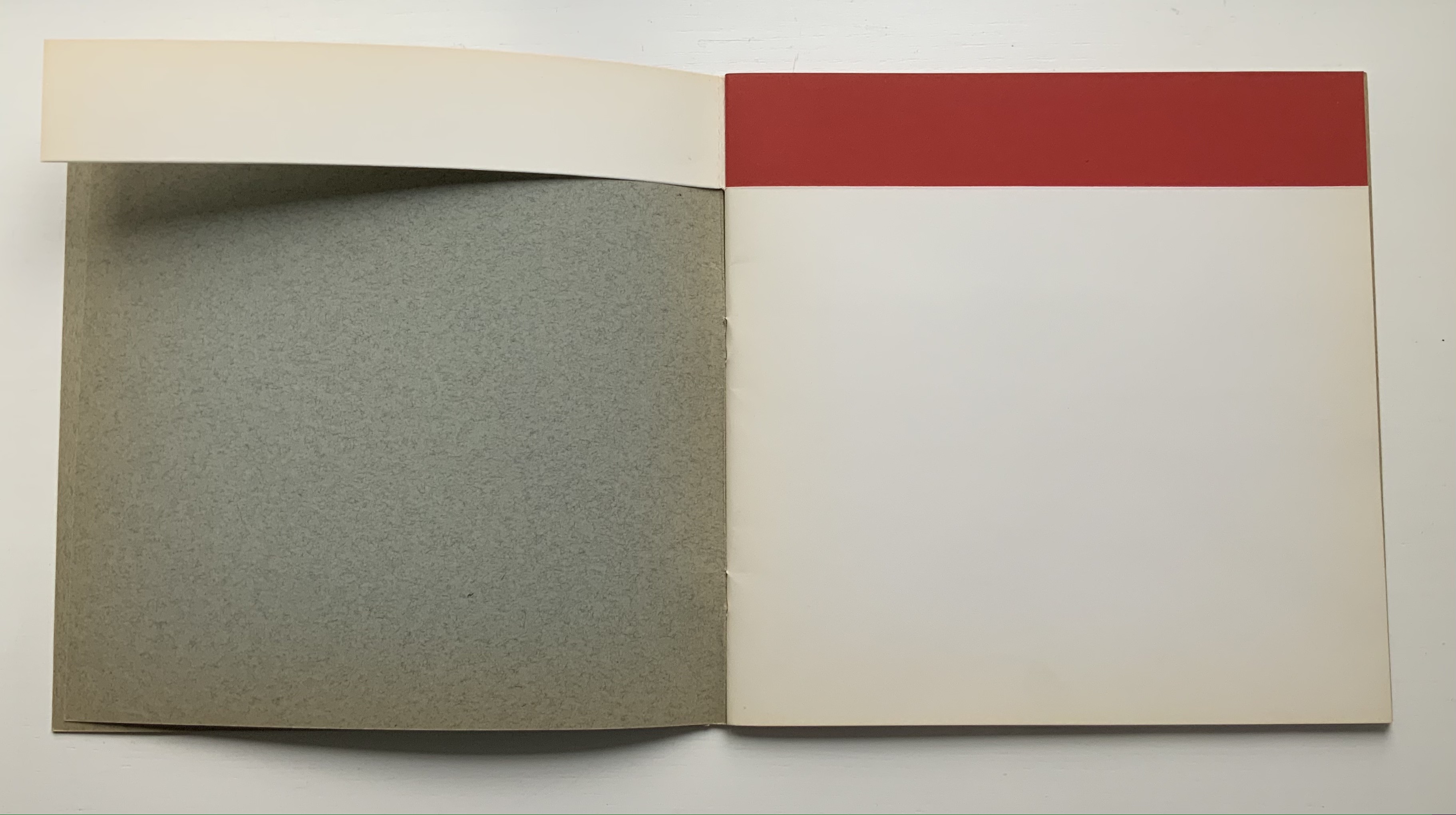
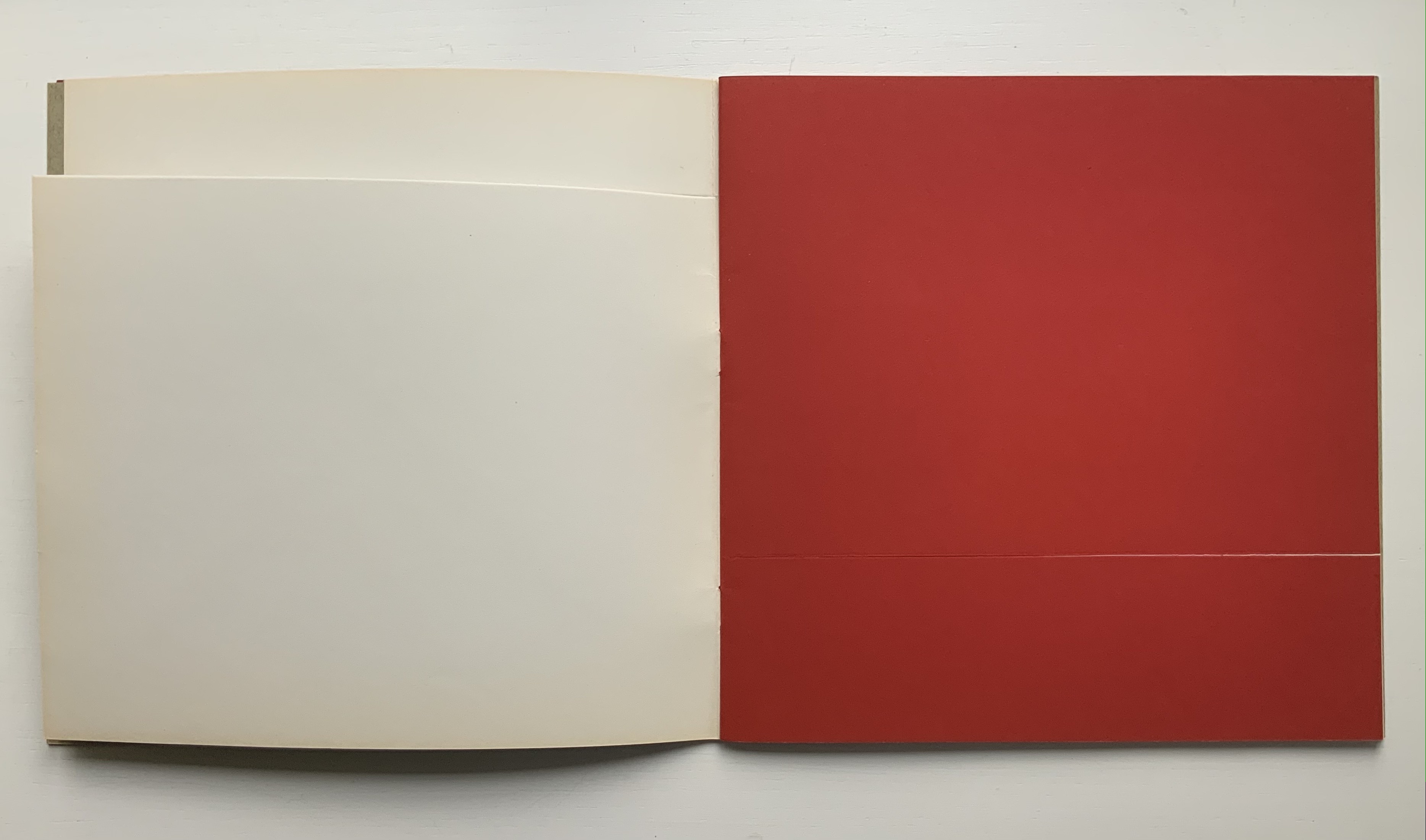
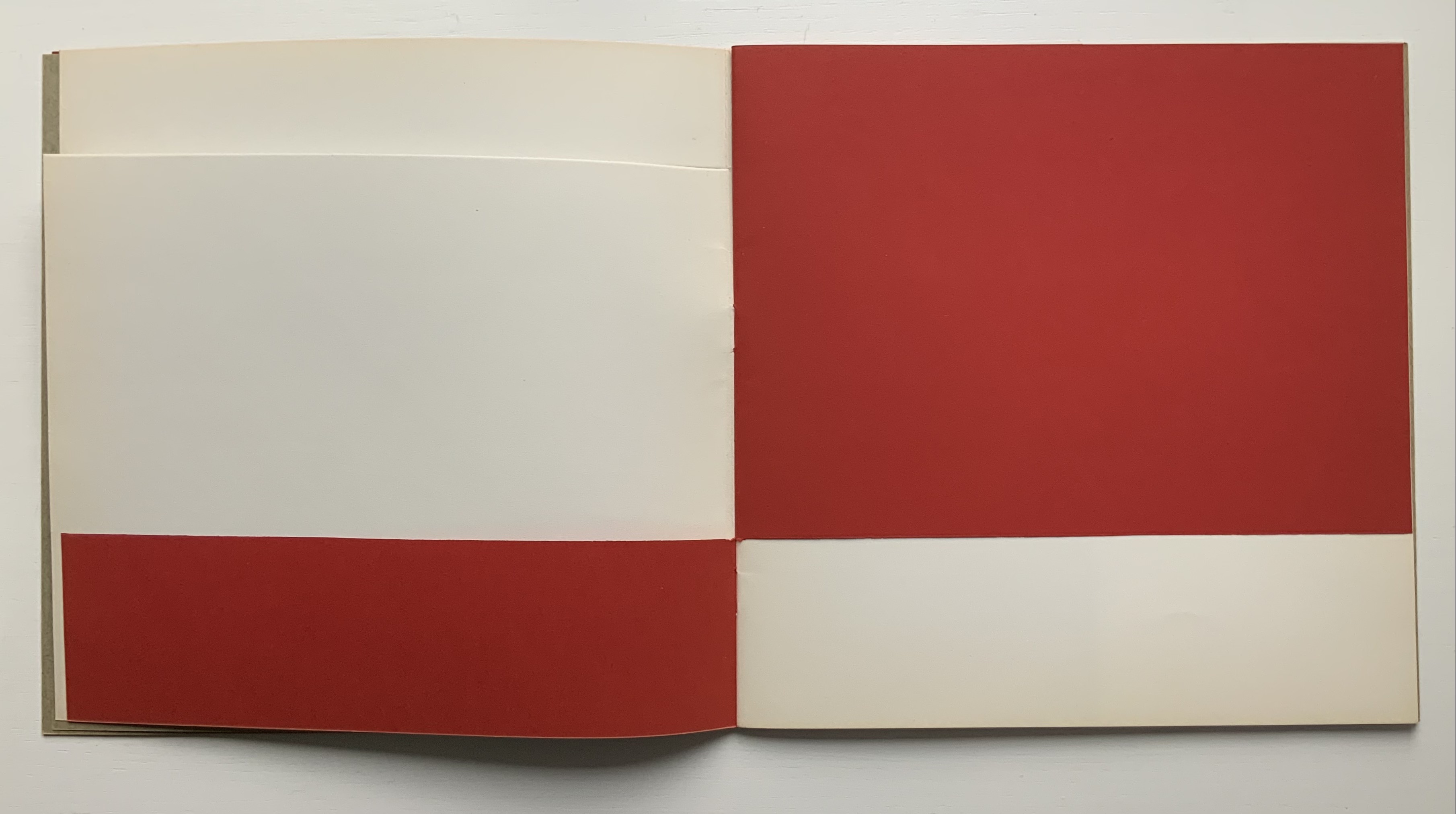
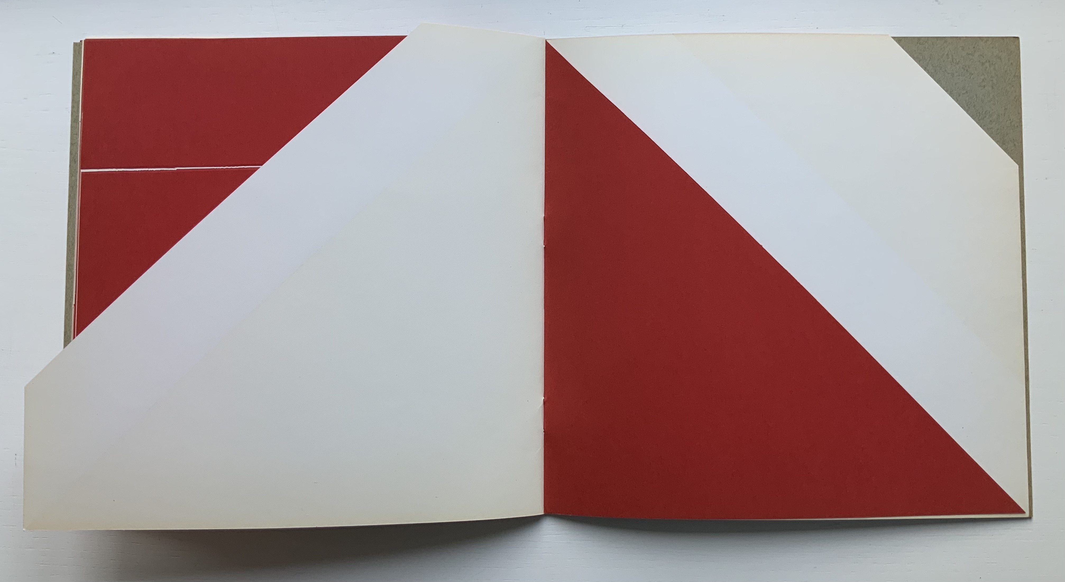
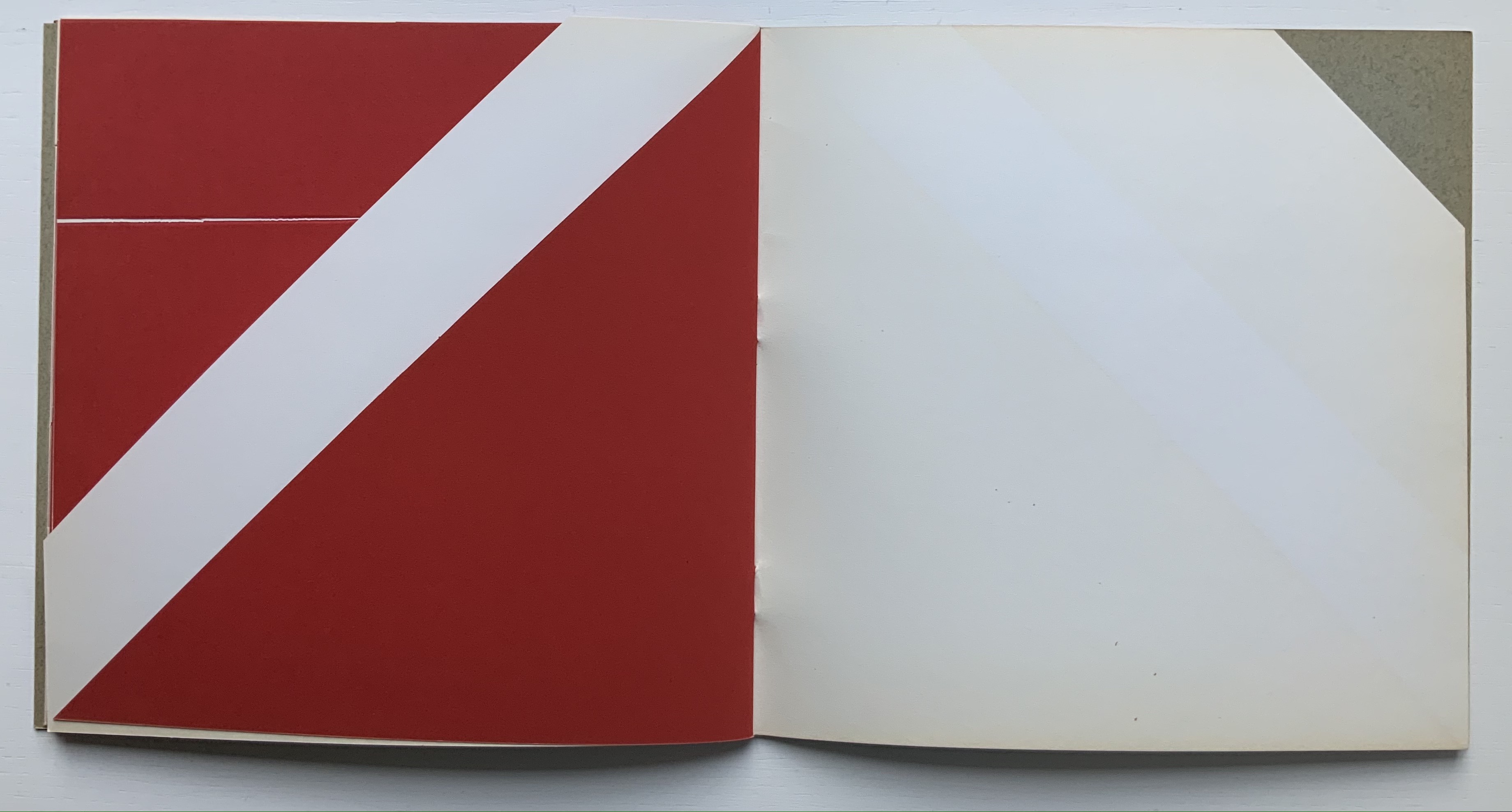
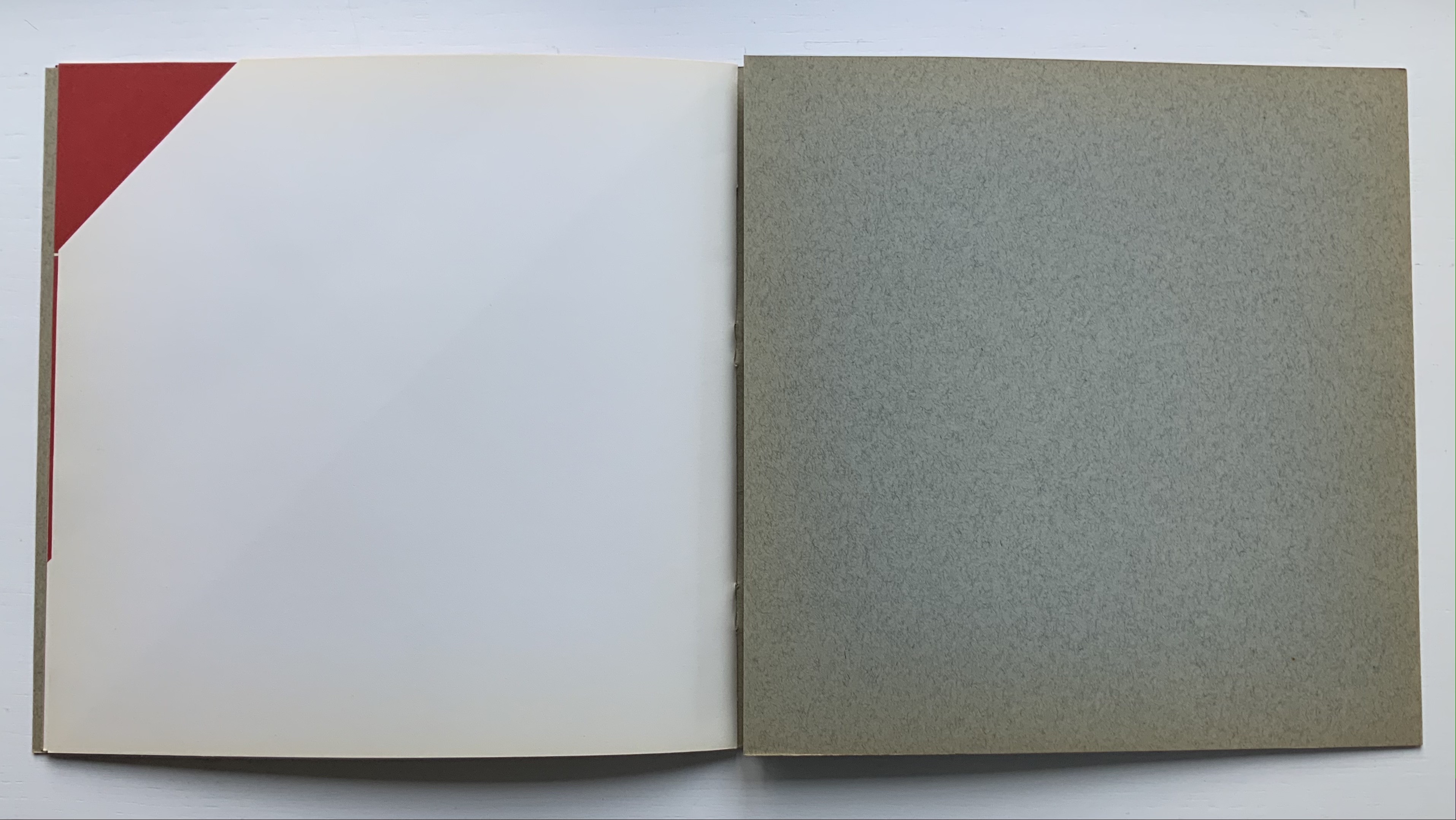
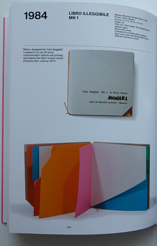
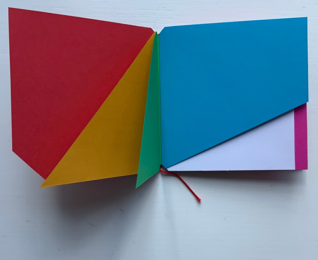
Libro illeggibile bianco e rosso / An unreadable Quadrat-Print / Een onleesbaar kwadraat blad / Ein unlesbares Quadrat-Blatt (1953)
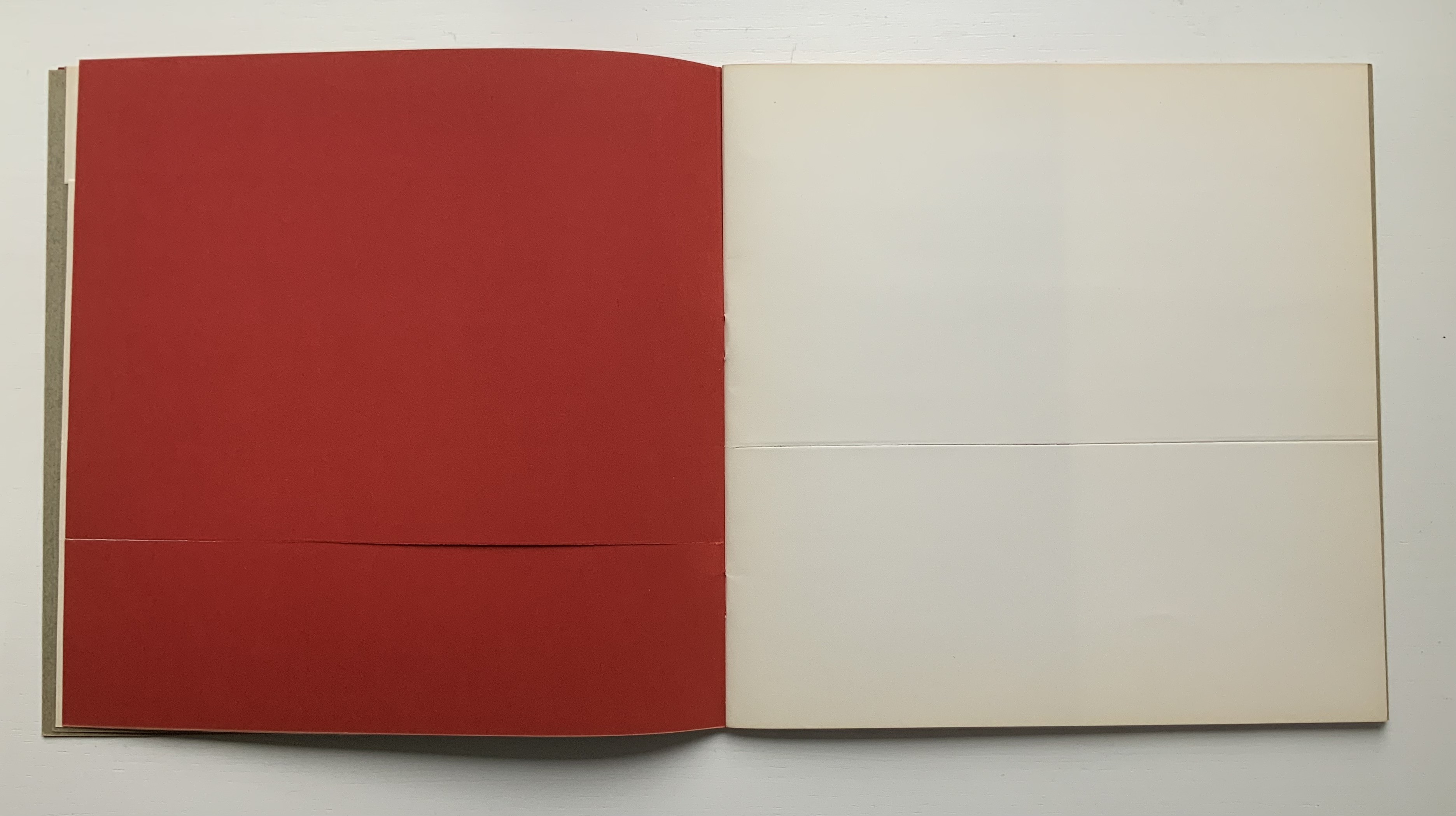
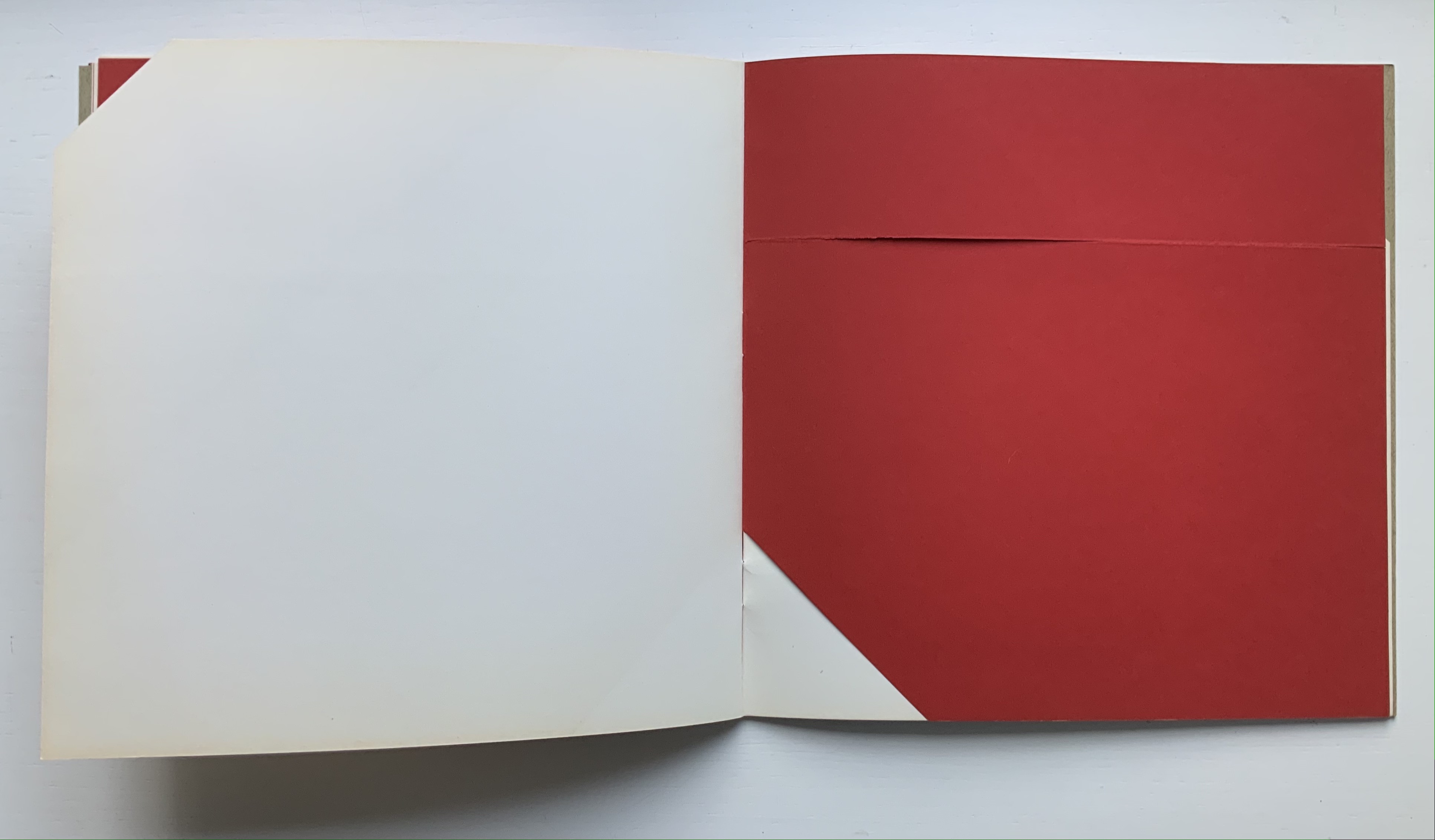
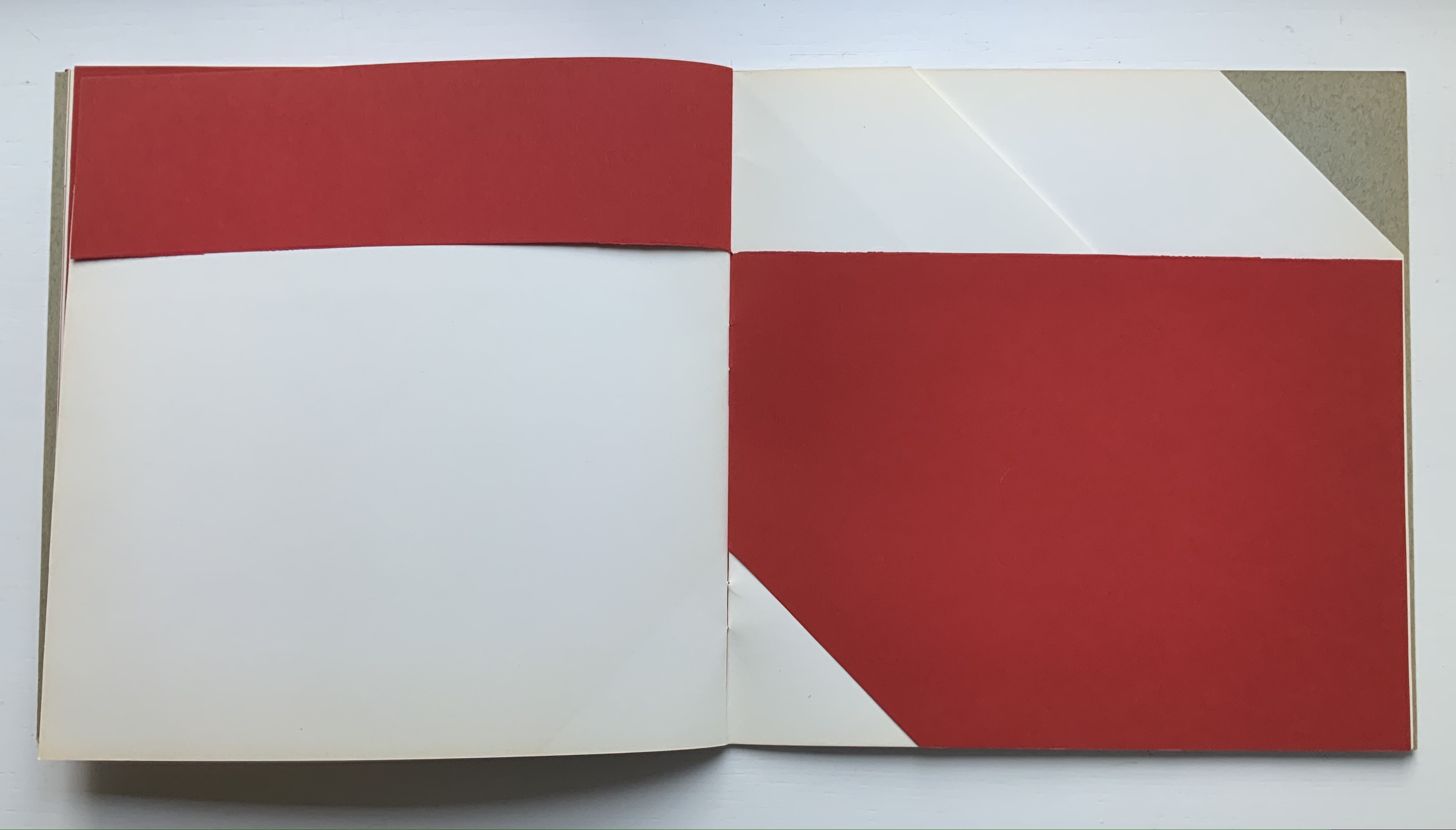
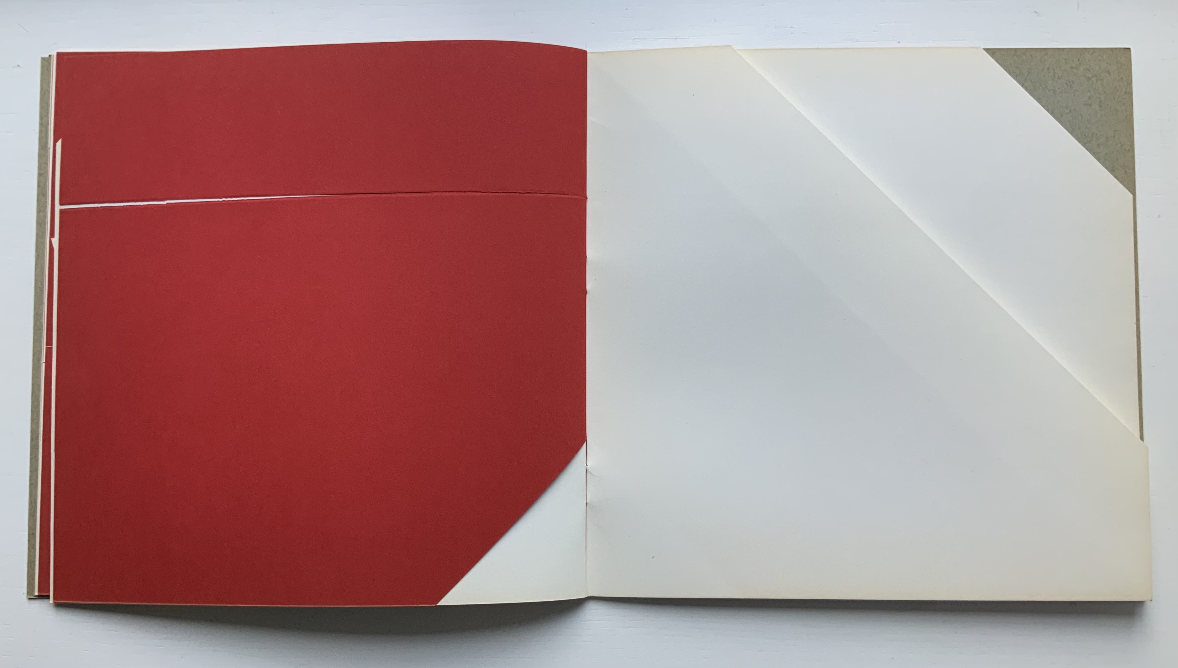
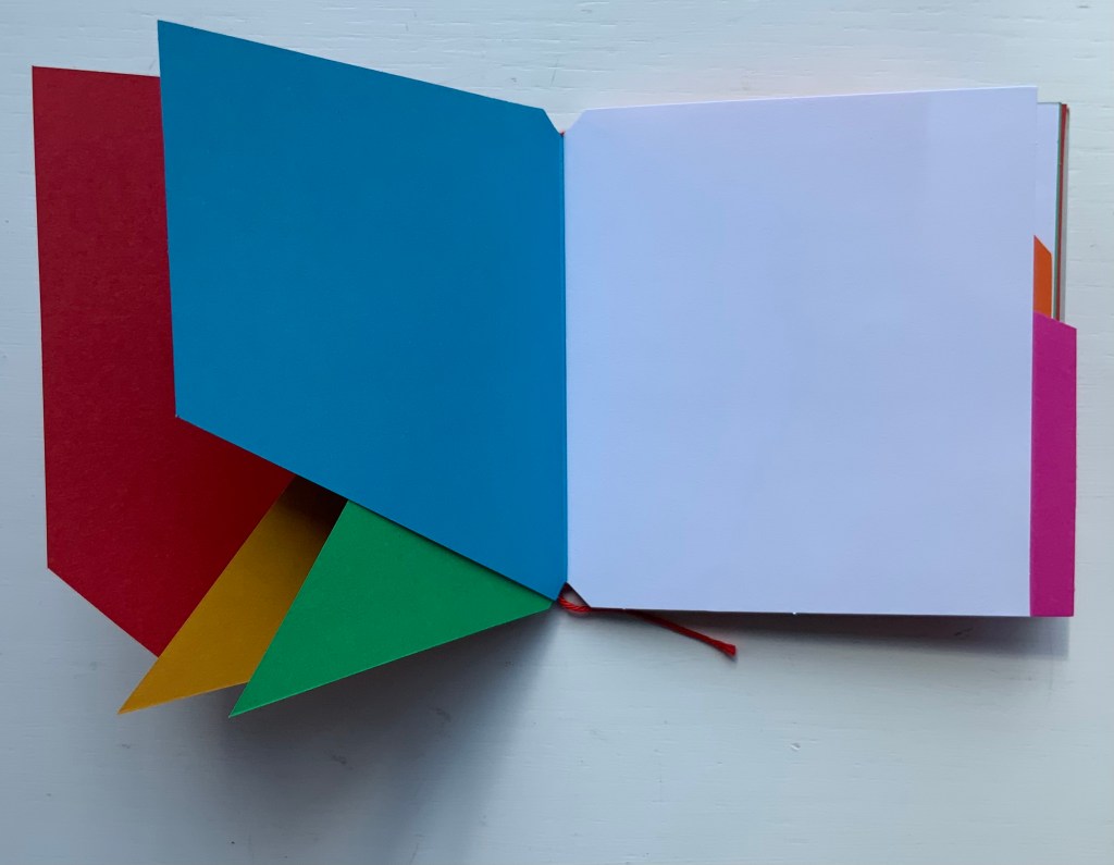
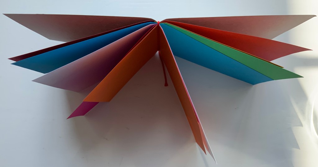
Although there are no words on numbered pages that have to fall in the right order, An Unreadable Quadrat-Print still presents the author/printer/binder with a challenge in imposition. White and red alternate, which is easy enough, but to cut or not cut a folio on the left and right, how to cut it, how to place the differently cut folios in the right order to achieve the variation in images when the pages turn, how to ensure a sewable area down the center for each folio whether it has a horizontal cut extending into the spine or a diagonal one extending from some point along the spine — that is impressive. It speaks to the sculptural process and result in making books, as well as the sculptural process of reading them.
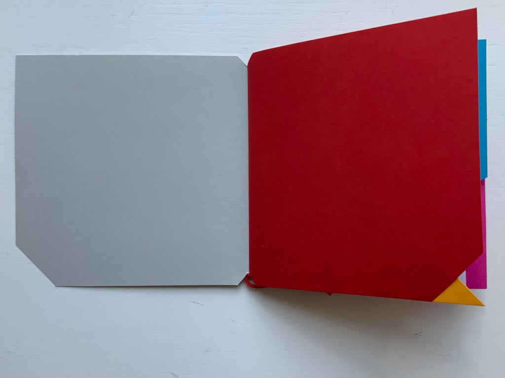
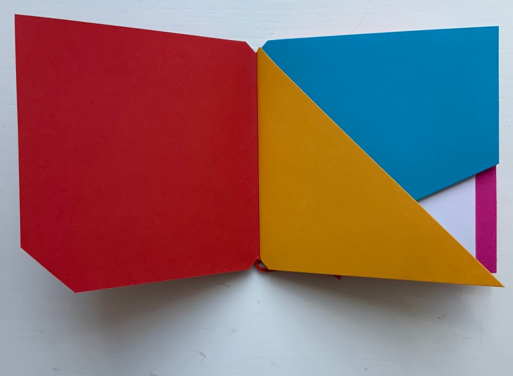
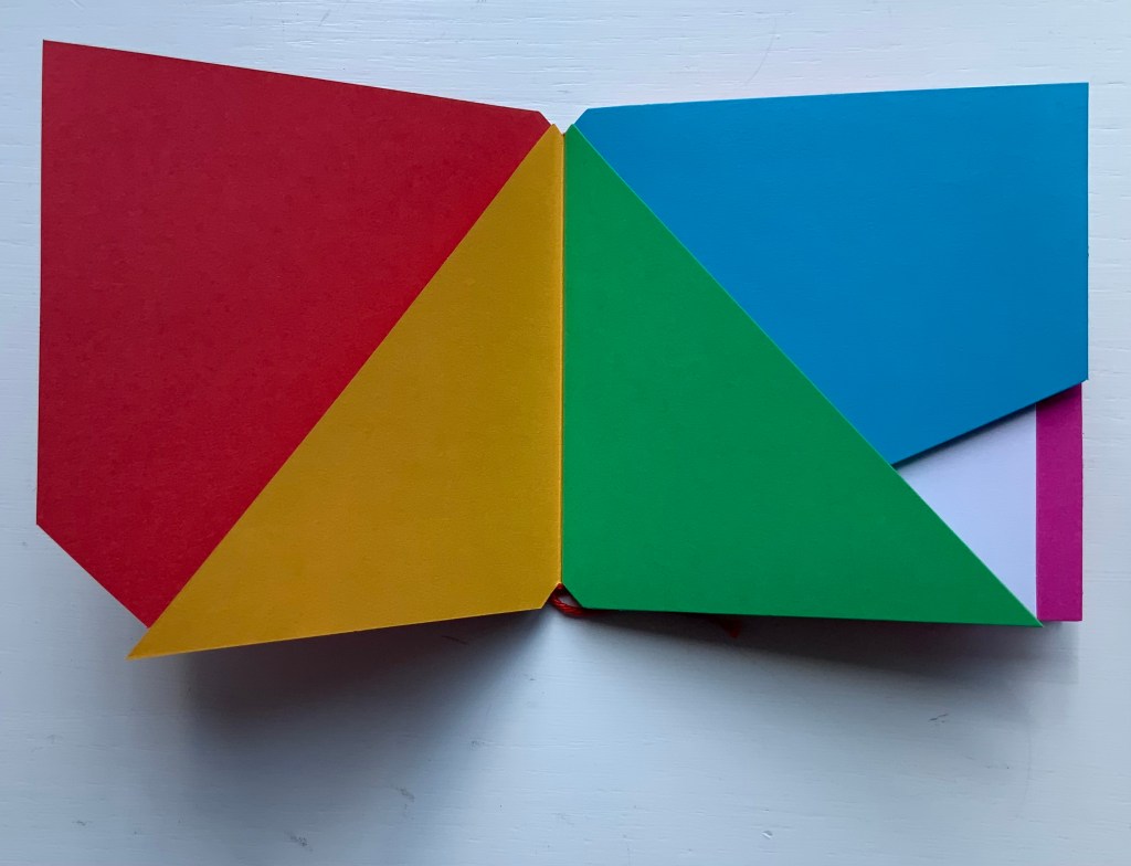
The following sequences — the book’s first five double-page spreads and then its last six — take a normal page-turning approach, always turning from the upper right corner of whatever shape/page is available. Note how, in the last six double-page spreads, the pages and shapes become more complex.
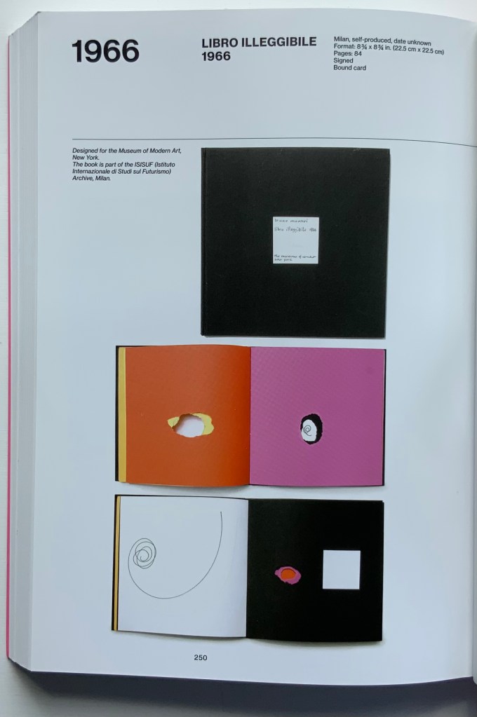
Libro illeggibile (1966), below left, calls to mind Katsumi Komagata’s A Cloud (2007), and the one in the middle foreshadows Eleonora Cumer’s subtle artistry with transparent paper in Circoscrivere lo spazio No. 3 (2021). While Munari’s rare works press modest budgets, some of it — in its simplicity and popular appeal — has led Corraini Edizionito put it within easier reach. Numerous reissues of the 1984 Libro illeggibile MN 1 have pushed its price to €5. Short of the artist’s signature (which would likely obstruct the aesthetic intention), a copy from the latest 5000-copy print run will “perform” and deliver the same experiential value as one from the earliest run.
Munari’s many series of illegible books tap into book artists’ longstanding and ongoing preoccupation with whether a book without words can communicate information, narrative, sensations or feelings through material, shape or color and their permutations. The colors, shape, feel and binding of Libro illeggibile MN 1 evoke simple and sophisticated pleasure in their juxtaposition and sequence. The unchanging straightness of the top edge and the anchoring red thread of the binding set off the changeability of shapes and colors.
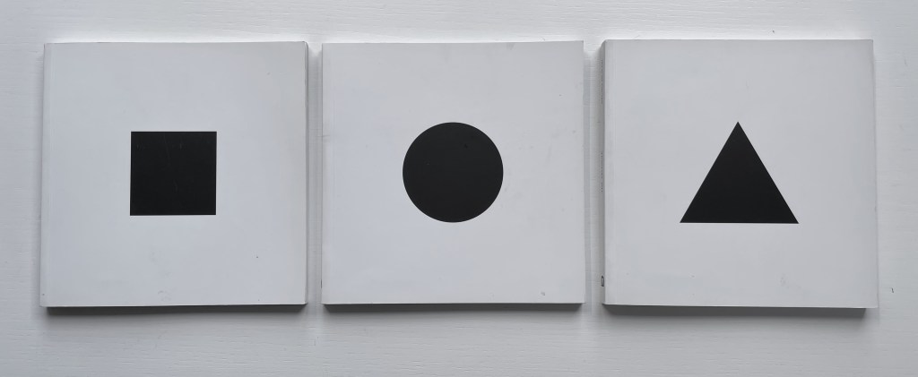
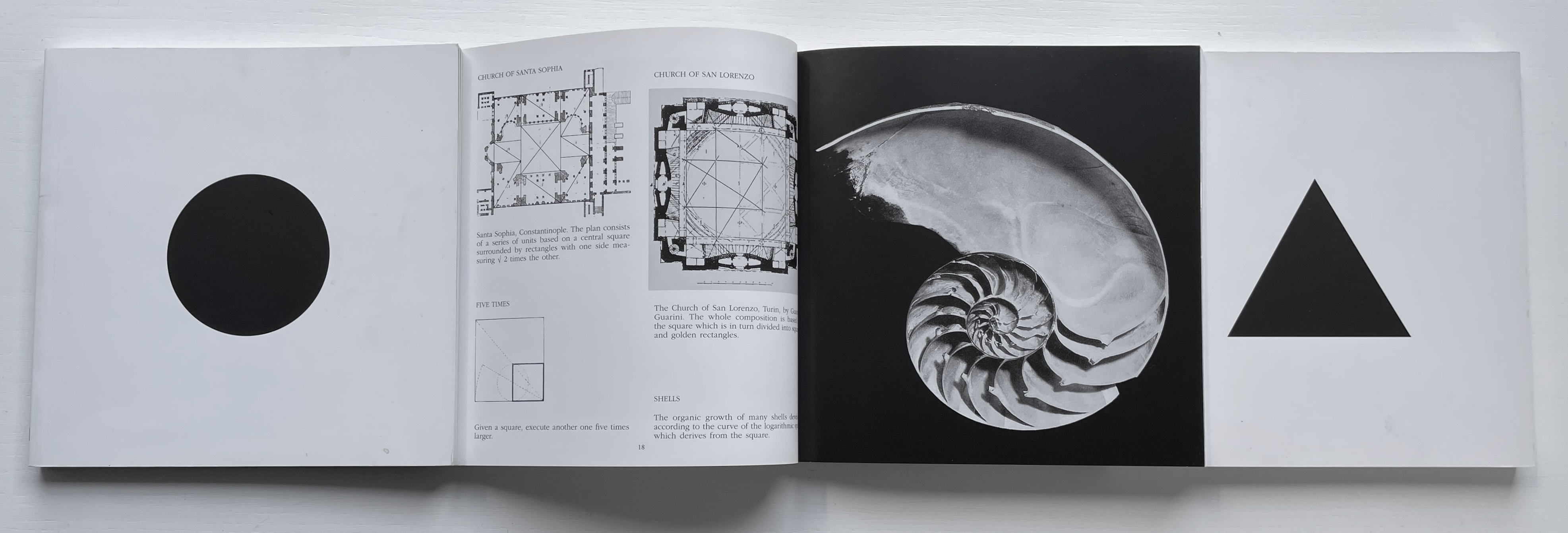
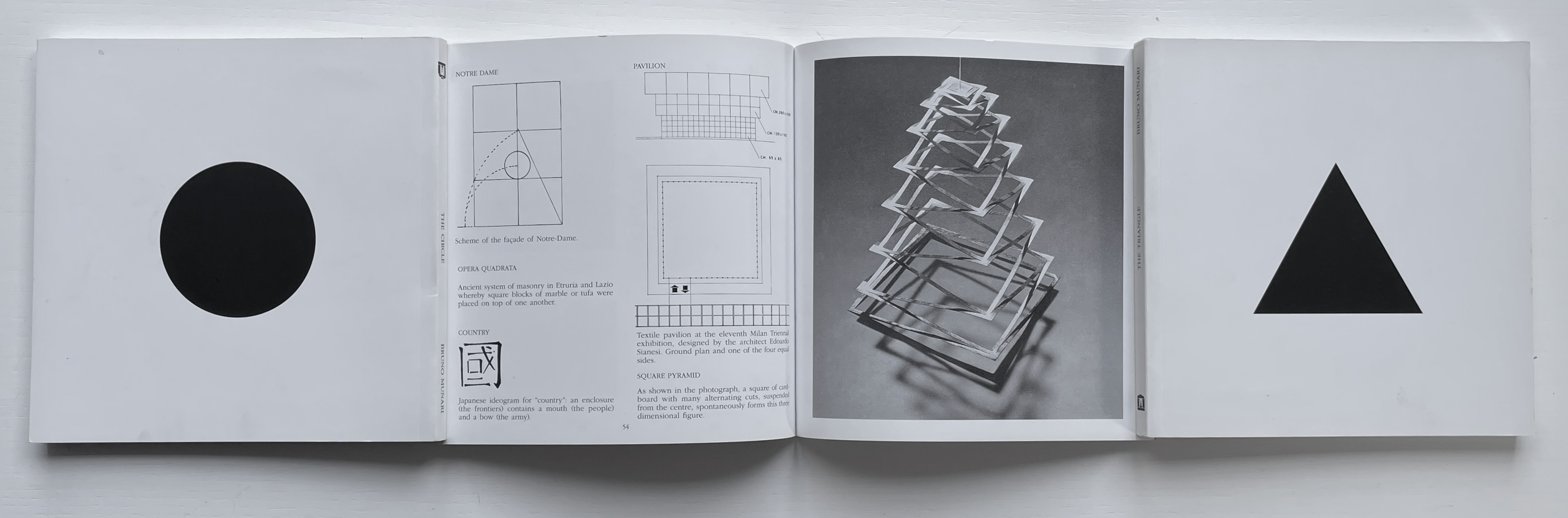
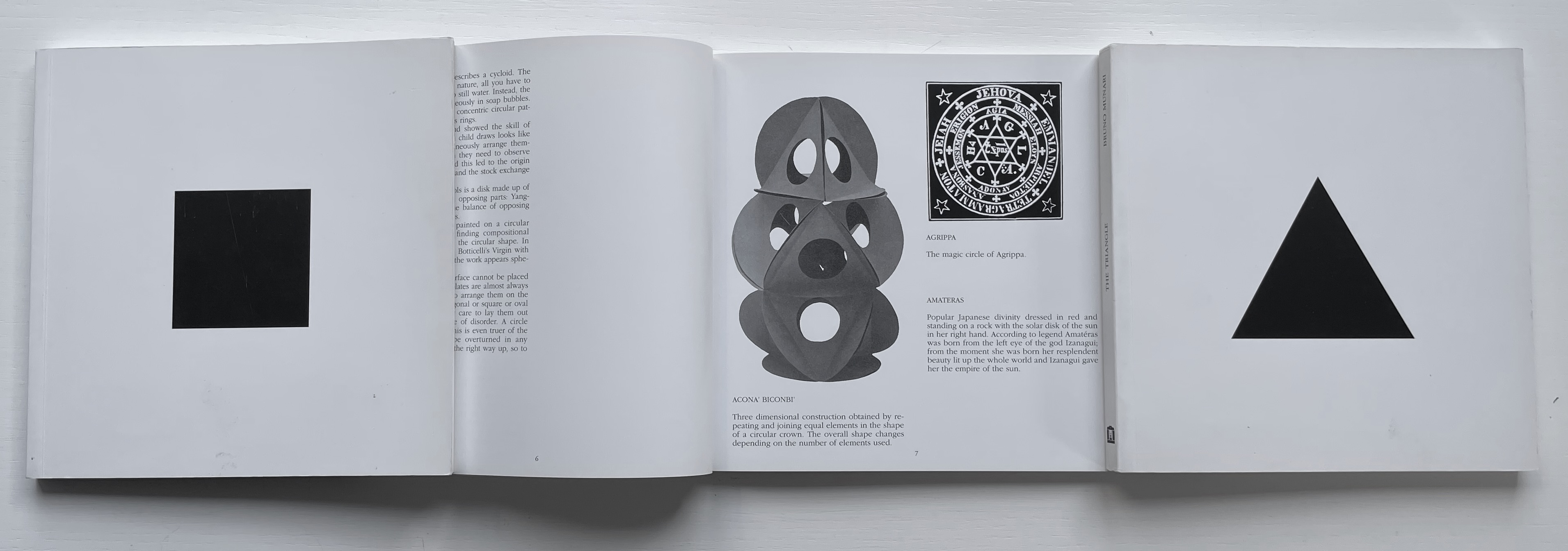
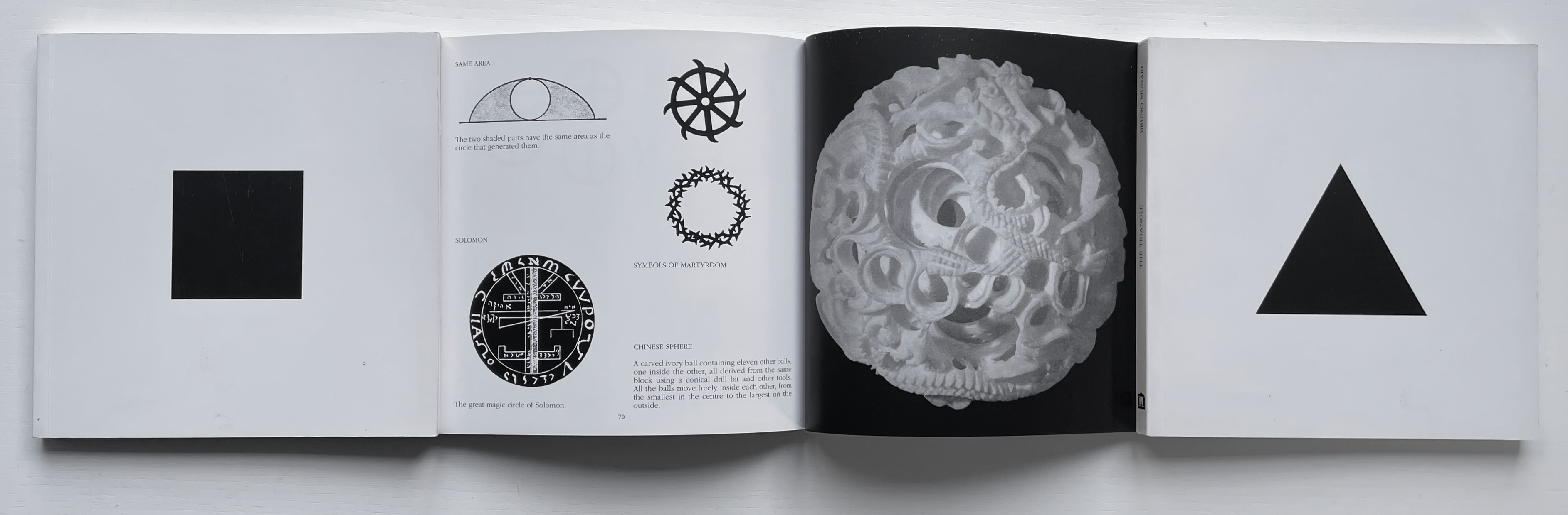
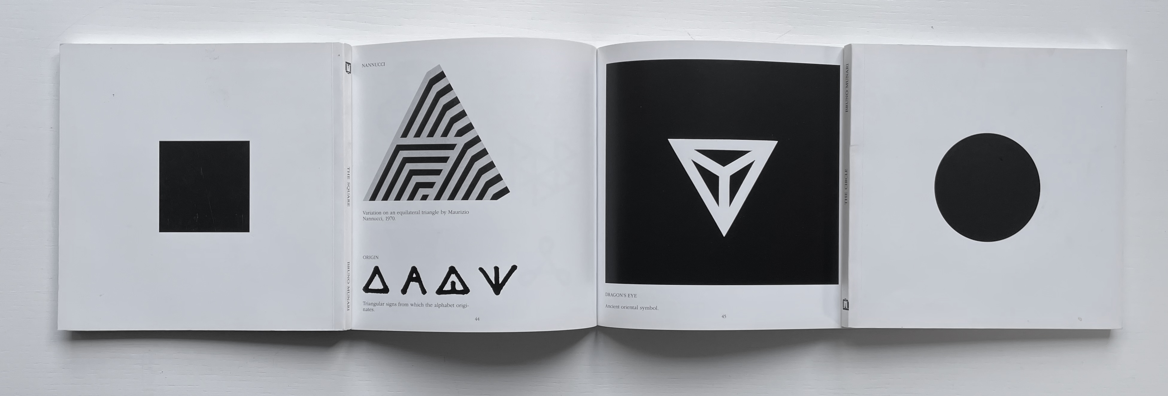
The Square (1960), The Circle (1964) and The Triangle (1976)
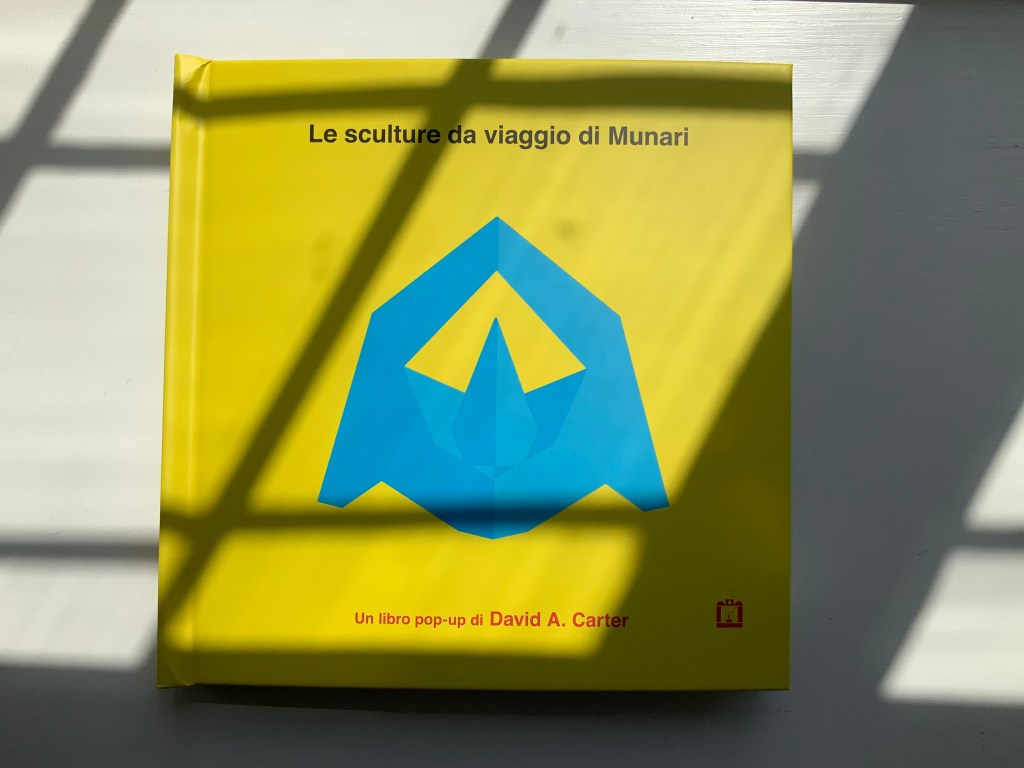
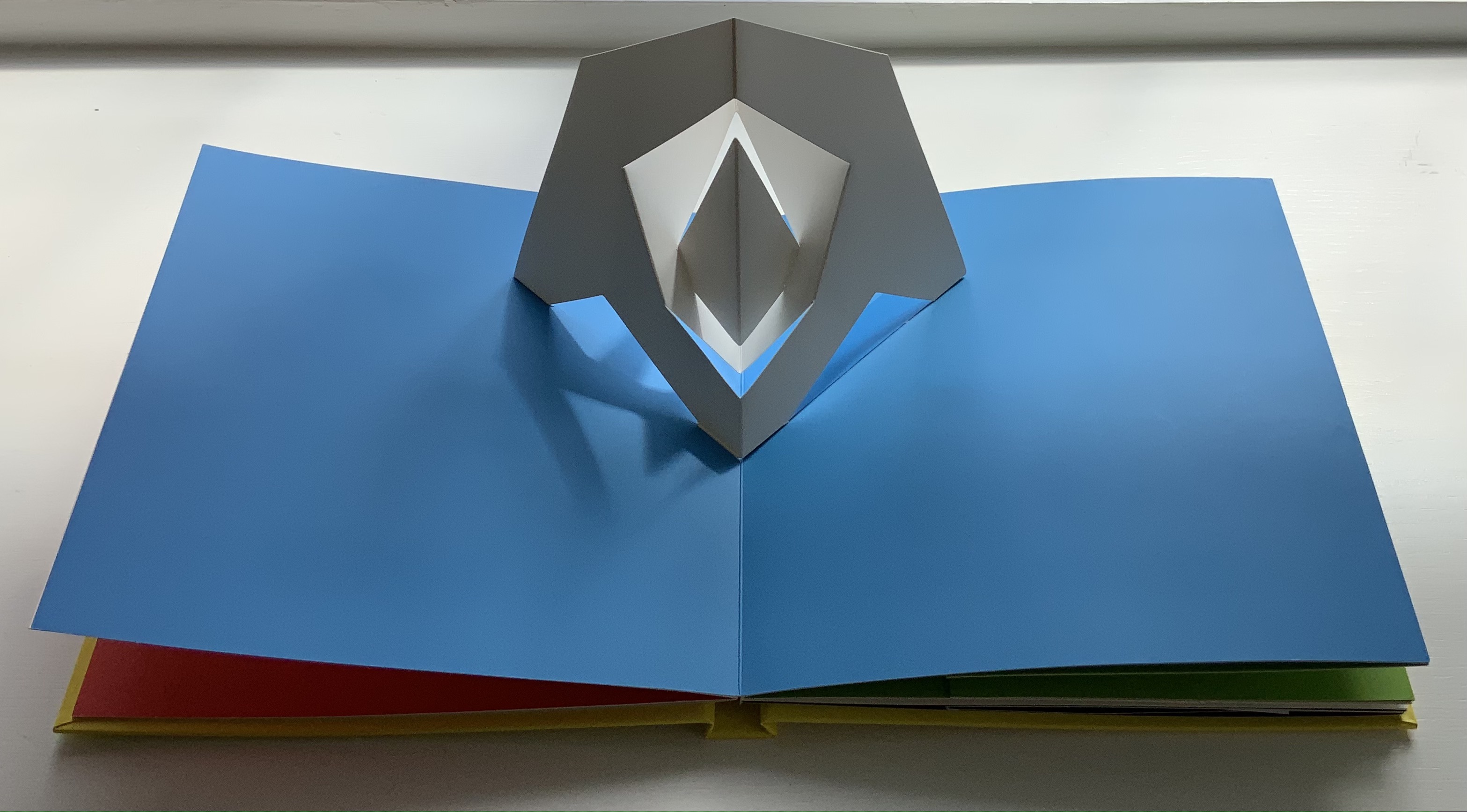
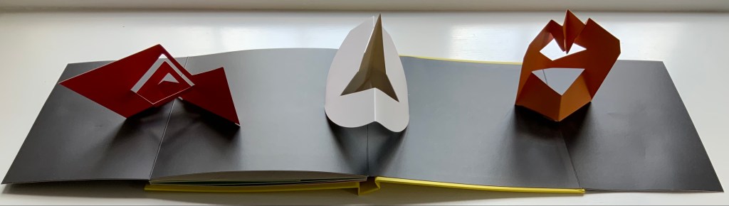
Although not a book of Munari’s making, David A. Carter’s Le sculture da viaggio di Munari is one way of bringing the spirit of Munari’s “travel sculptures” into the collection. Carter’s homage carries the blessing of Corraini Edizioni, further justifying its inclusion.
Travel sculptures started off as small sculptures (some even pocket-sized) to carry with you, so you could take part of your own culture to an anonymous hotel room. Later they were turned into ‘travel sculptures’, five or six metres tall and made of steel. One of these was seen for a few months in Cesenatico, another one in Naples. Others are sleeping among huge trees in the Alto Adige region.’ This is how Italian designer Bruno Munari (1907-1998) described his ‘travel sculptures’, which in turn inspired American illustrator and designer David A. Carter for this pop-up book. –Corraini Edizioni website. Accessed 3 August 2021.
Munari’s travel sculptures also recall works in the collection like Cumer’s scultura da viaggio dipinta n.2(2017), Komagata’s「Ichigu」(2015) and, albeit less portable, Ioana Stoian’s Nous Sommes (2015).