Books On Books Collection – Ernest Fraenkel

Les Dessins Trans-conscients de Stéphane Mallarmé
à propos de la Typographie de Un Coup de Dés (1960)

Les Dessins Trans-conscients de Stéphane Mallarmé, à propos de la Typographie de Un Coup de Dés (1960)
Ernest Fraenkel
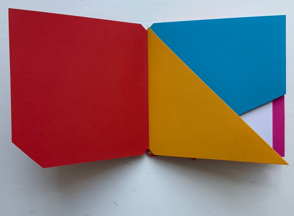
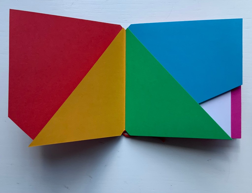
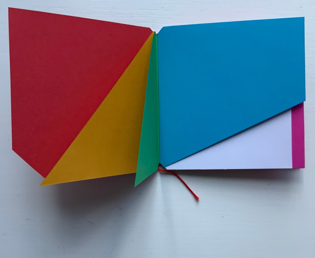
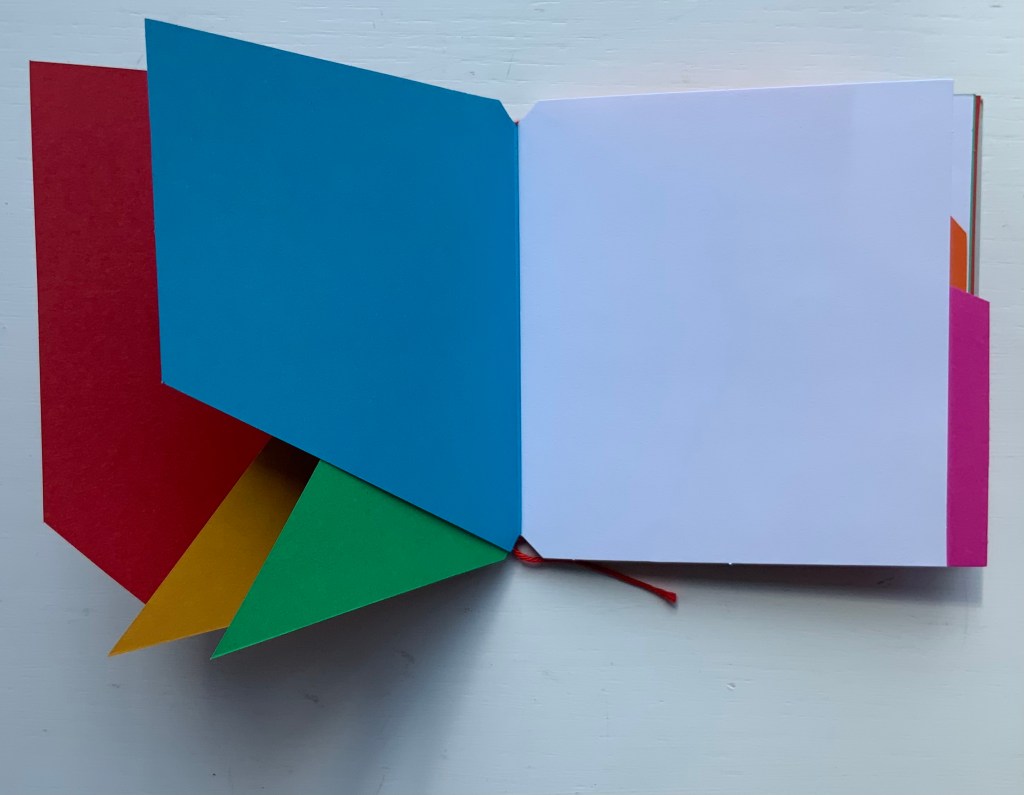
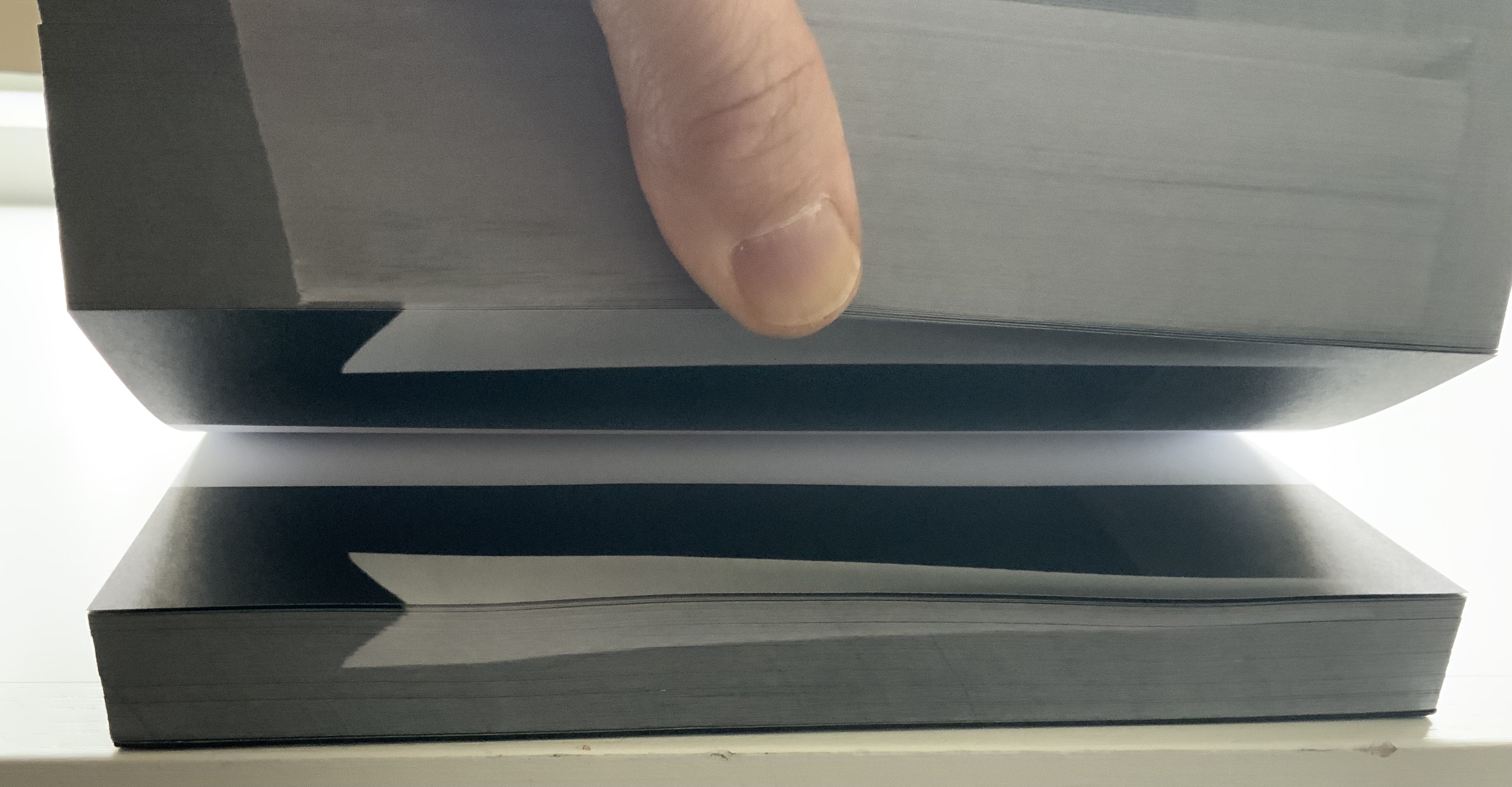
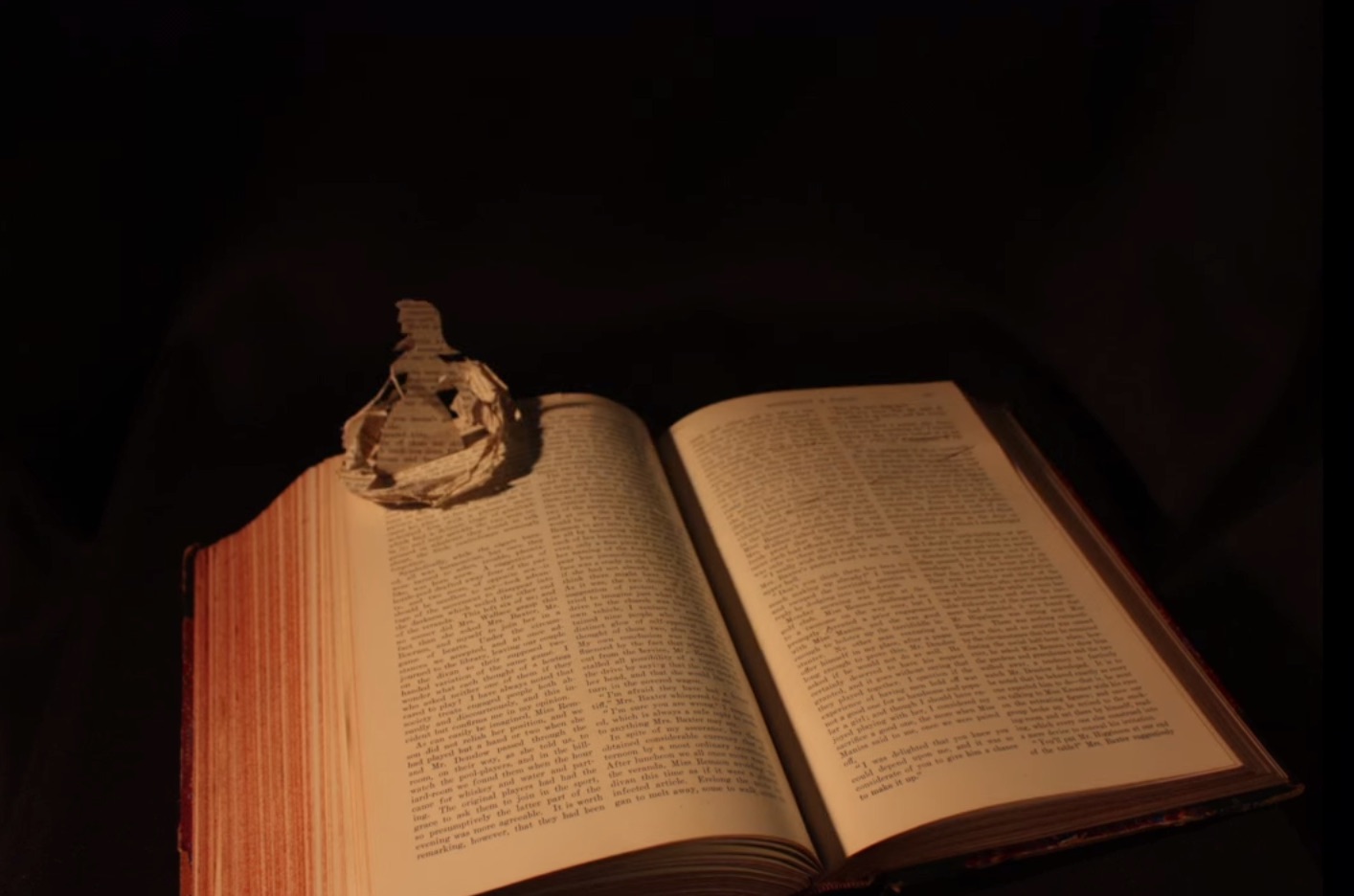
Paperback, stapled to fold-in sleeve. , 44 pages bound with 68 pages on 8.5 uncut folded and gathered sheets. Acquired from À la Page, 12 October 2021.
Photos: Books On Books Collection.

Ernest Fraenkel should have left it at visually mapping Un Coup de Dés and offered it up as simply an artistic response to the poem. Even if it is a mapping of the condensed single-paged Cosmopolis (1897) version of the poem, think of the various renderings in handset chapbook form printed on letterpress or as lithographs, or etchings on glass, or even sculptures. It could have been the “Prometheus bound” to the “Prometheus unbound” of those who paid homage by appropriating the more expansive double-page spread book version (1914) that Mallarmé intended. Instead, it lies tucked away with 44 pages de l’explication. Professor David W. Seaman (Georgia Southern University), who has engaged with Fraenkel’s analysis, puts it well:

It must be said in [Fraenkel’s] defense that the idea is tempting: to make wordless patterns of the pages of the poem in order to see the ideogrammatic shapes more clearly. In addition, Fraenkel has contributed some worthwhile insights into the use of space and text in the poem, … However, there are three major objections to his project. First, he used, for most of his research, the text of the Cosmopolis edition of the poem, an edition which nearly everyone agrees is far from the author’s intentions, especially insofar as the ideograms are concerned; the preface to that edition gives ample warning of this. … / The second objection is that Fraenkel strays too far from the text, preferring to keep in mind a general idea of the meaning of the poem, and then go off according to the feelings the designs give him. … In fact,  sometimes Fraenkel recommends turning the design on its side or upside-down to see what image may present itself! / The third objection is that these designs are then used more or less like Rohrschach ink blots. (Seaman, pp. 142-43)

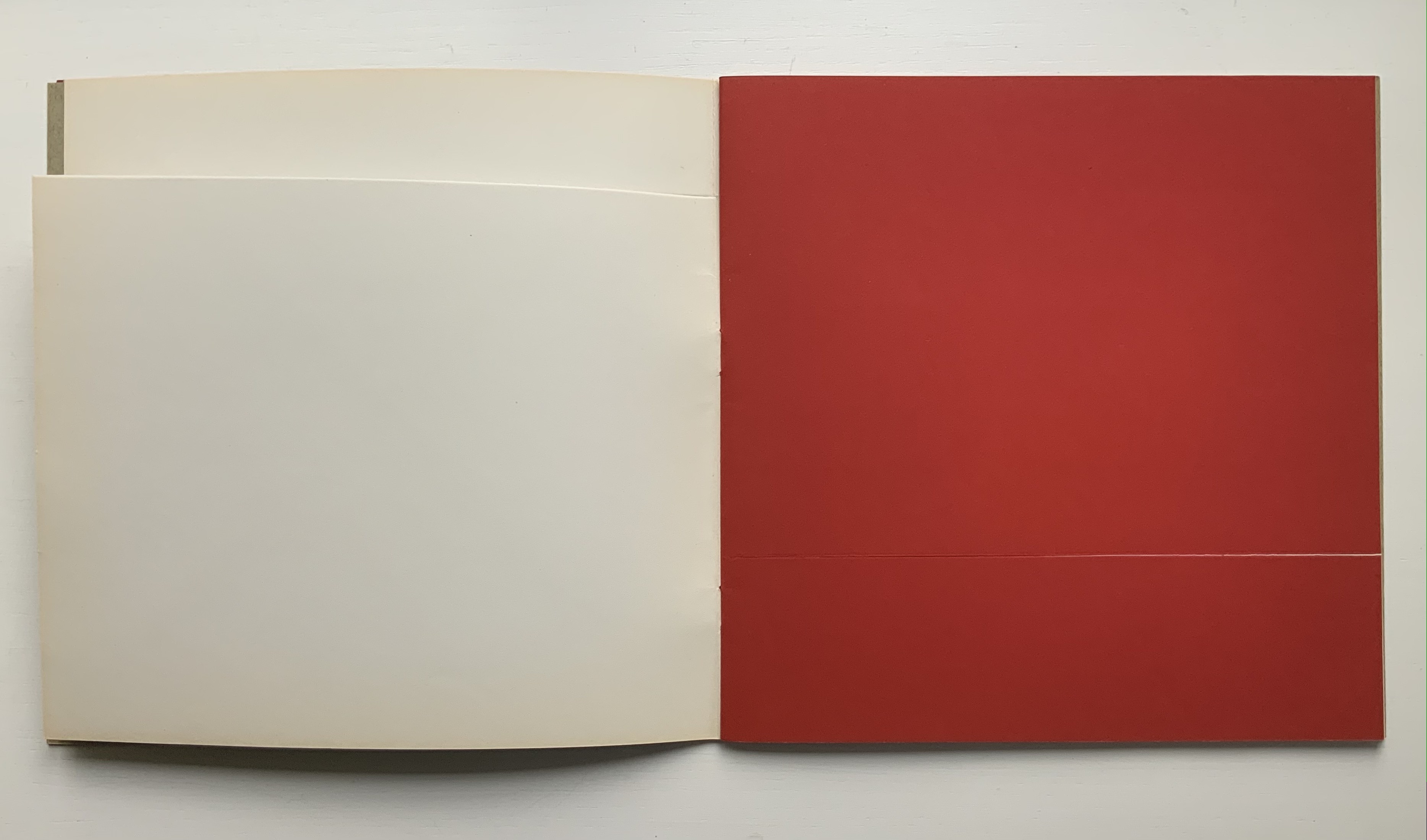
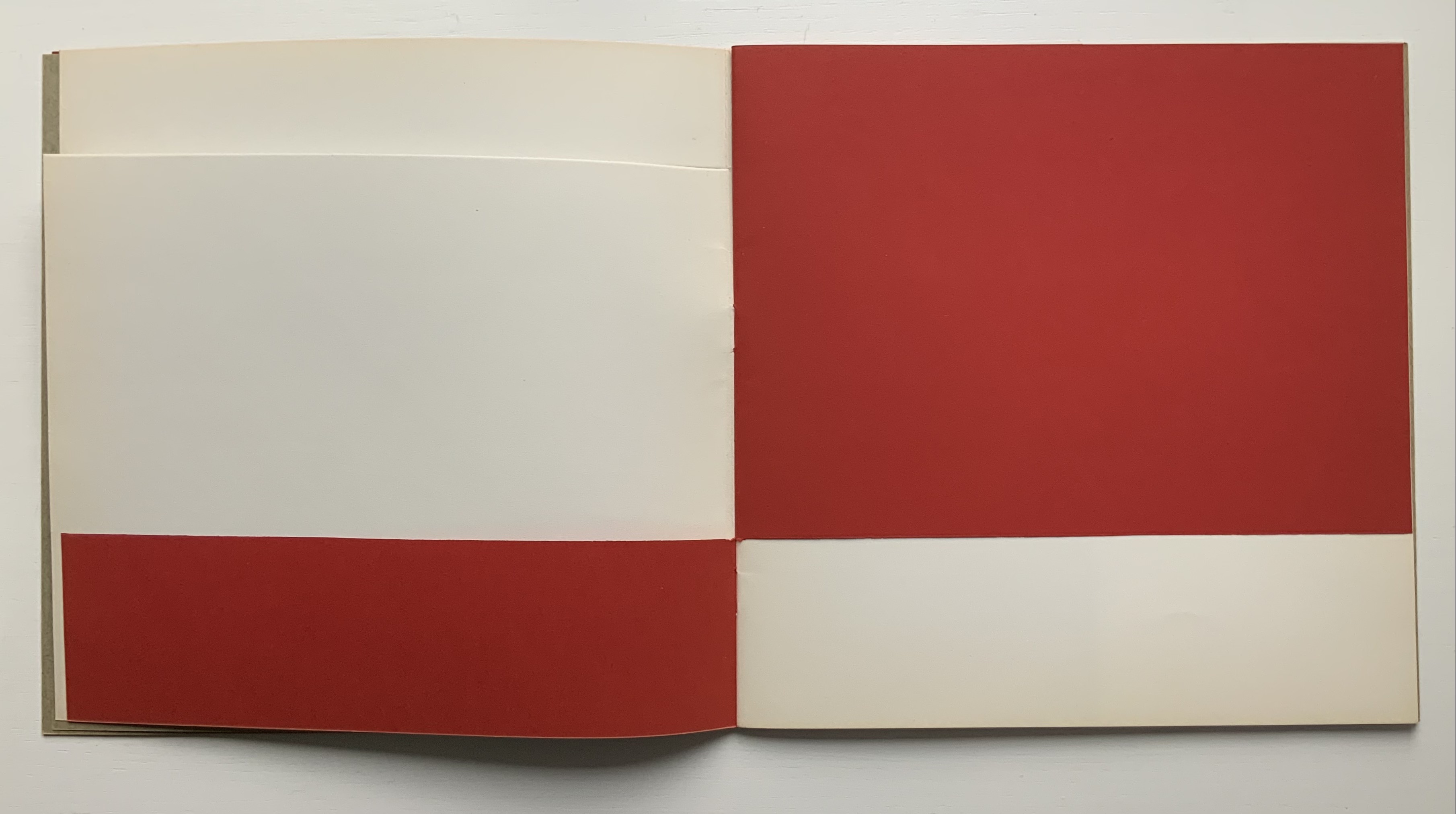
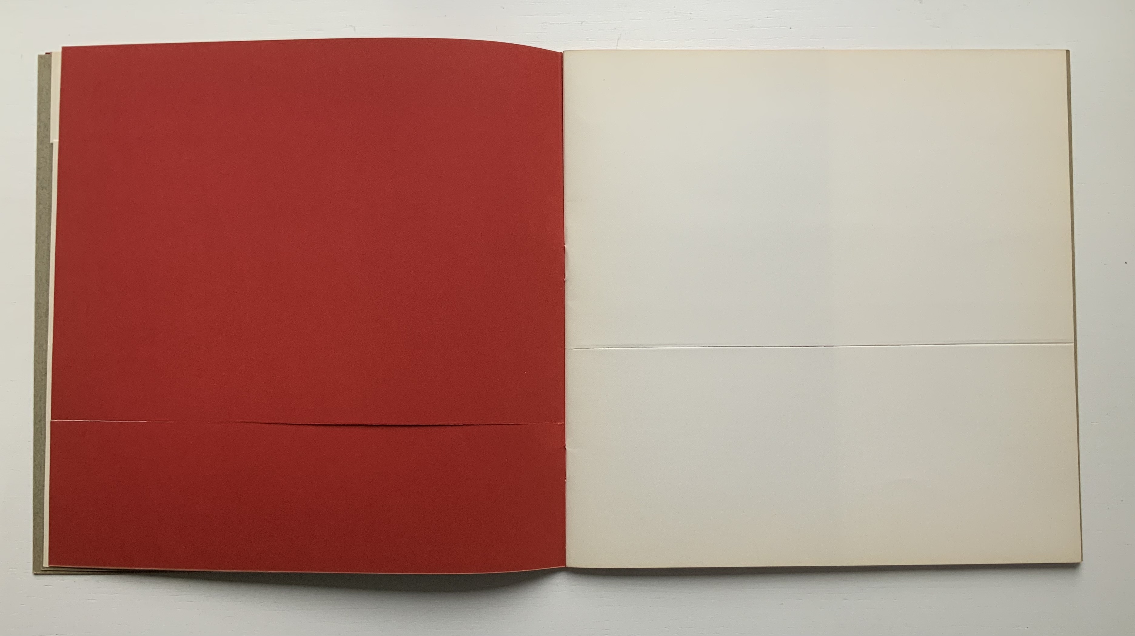
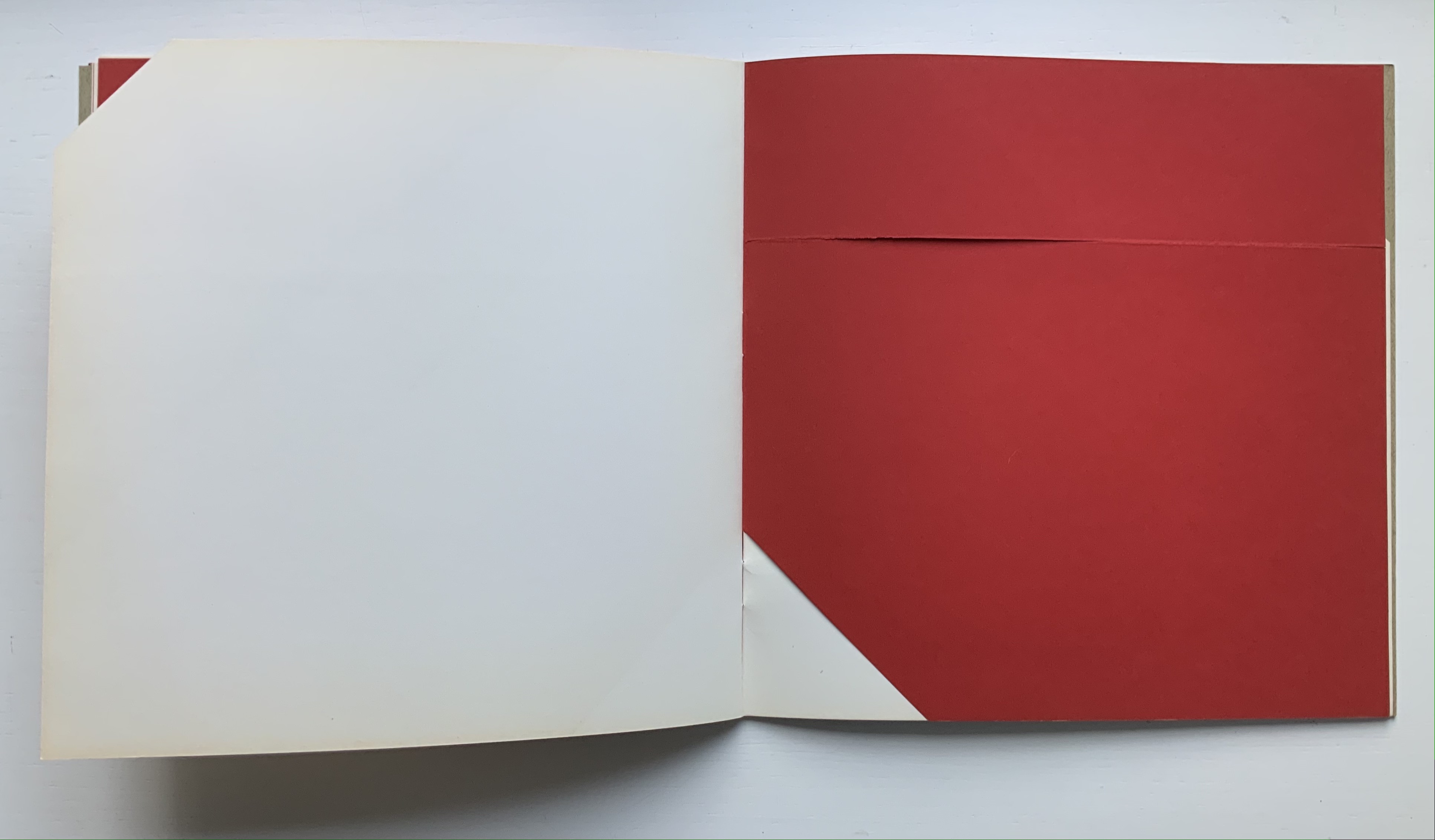
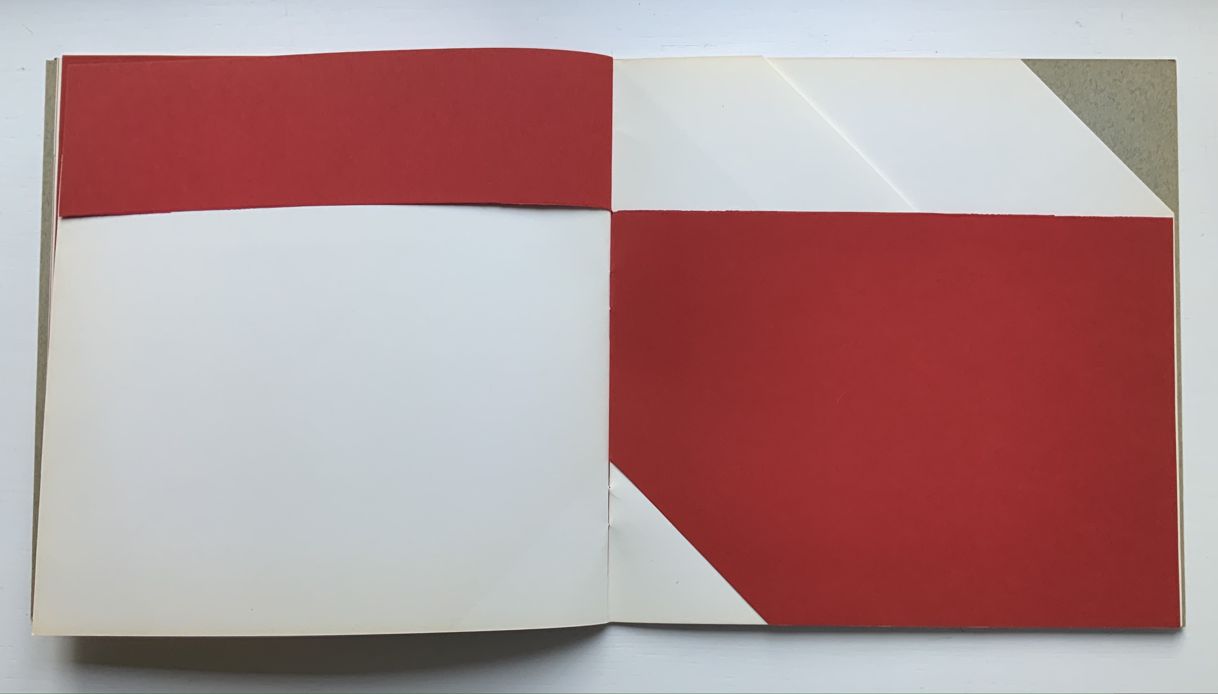
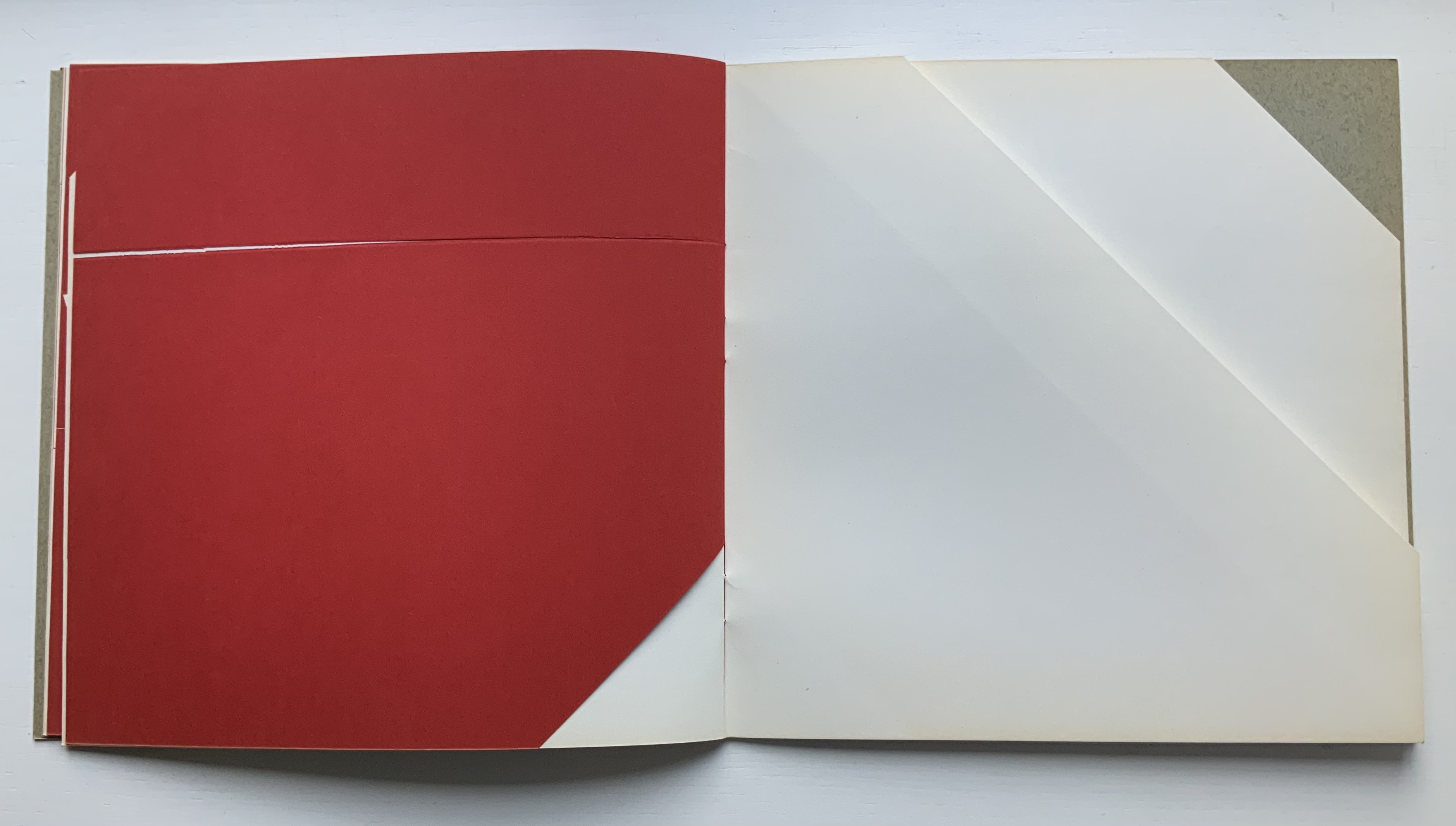
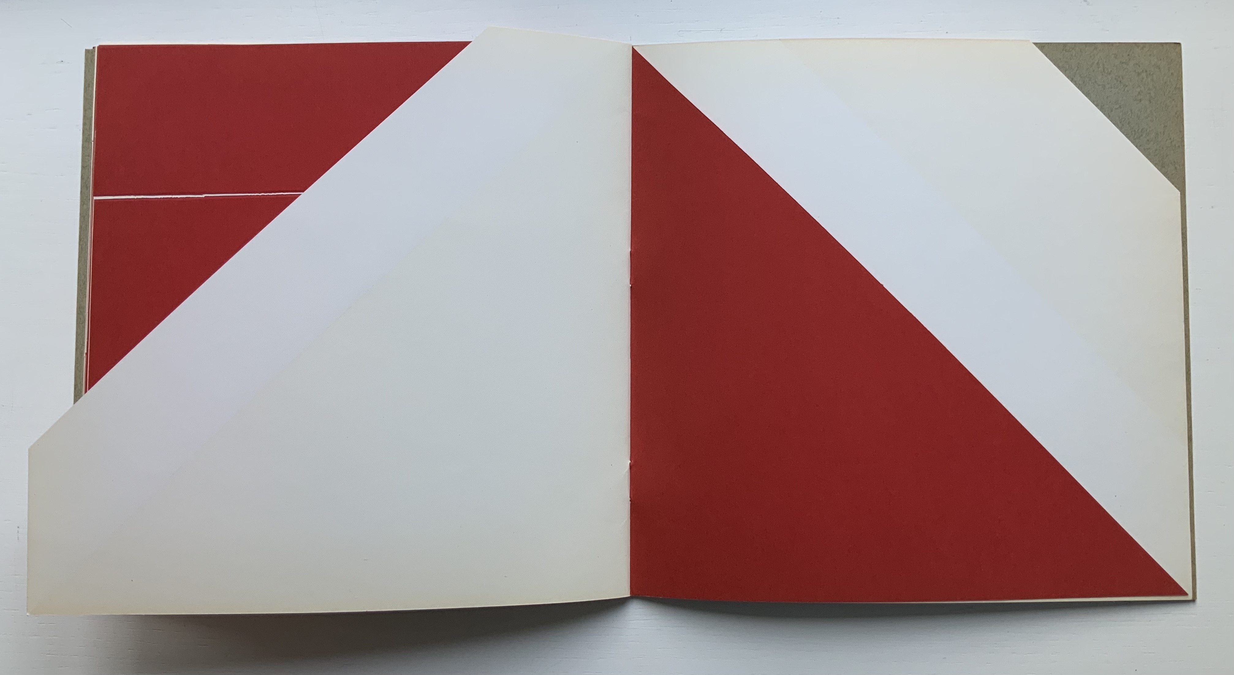
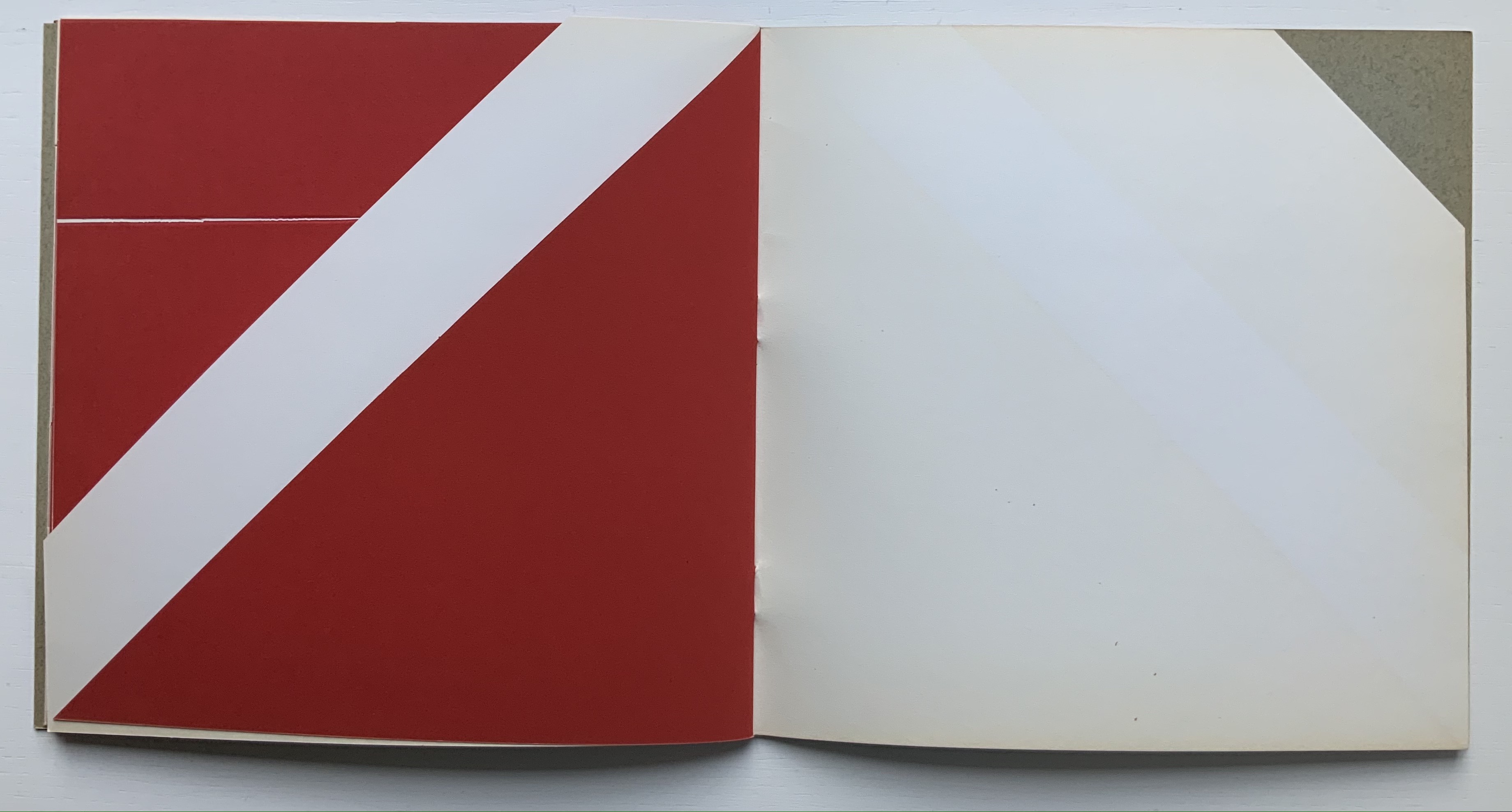
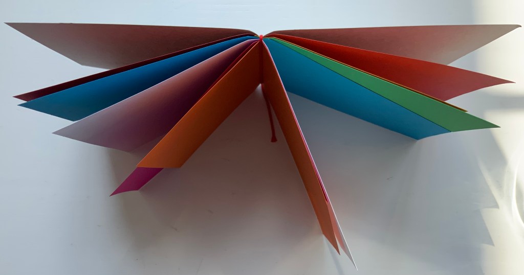
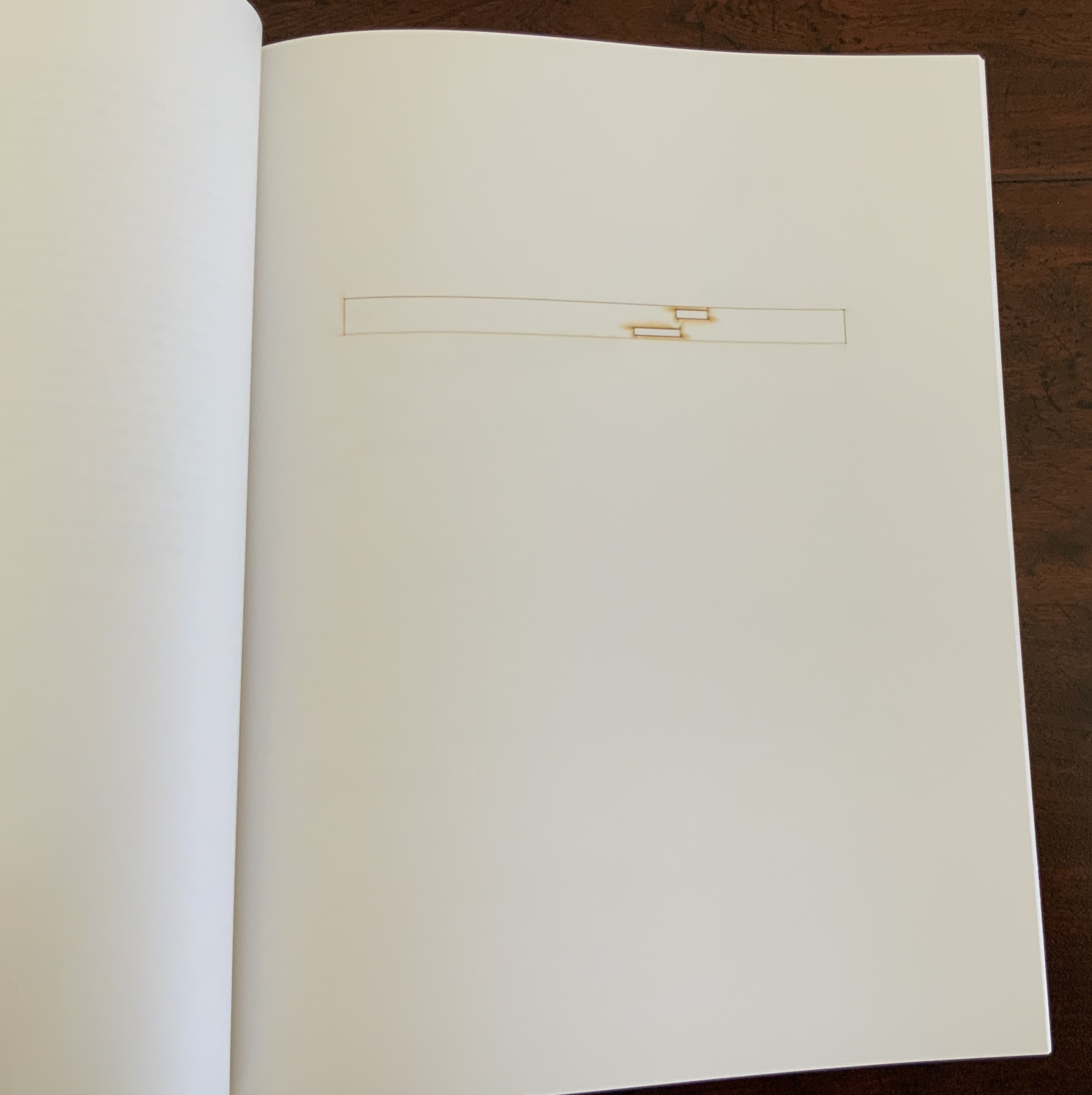
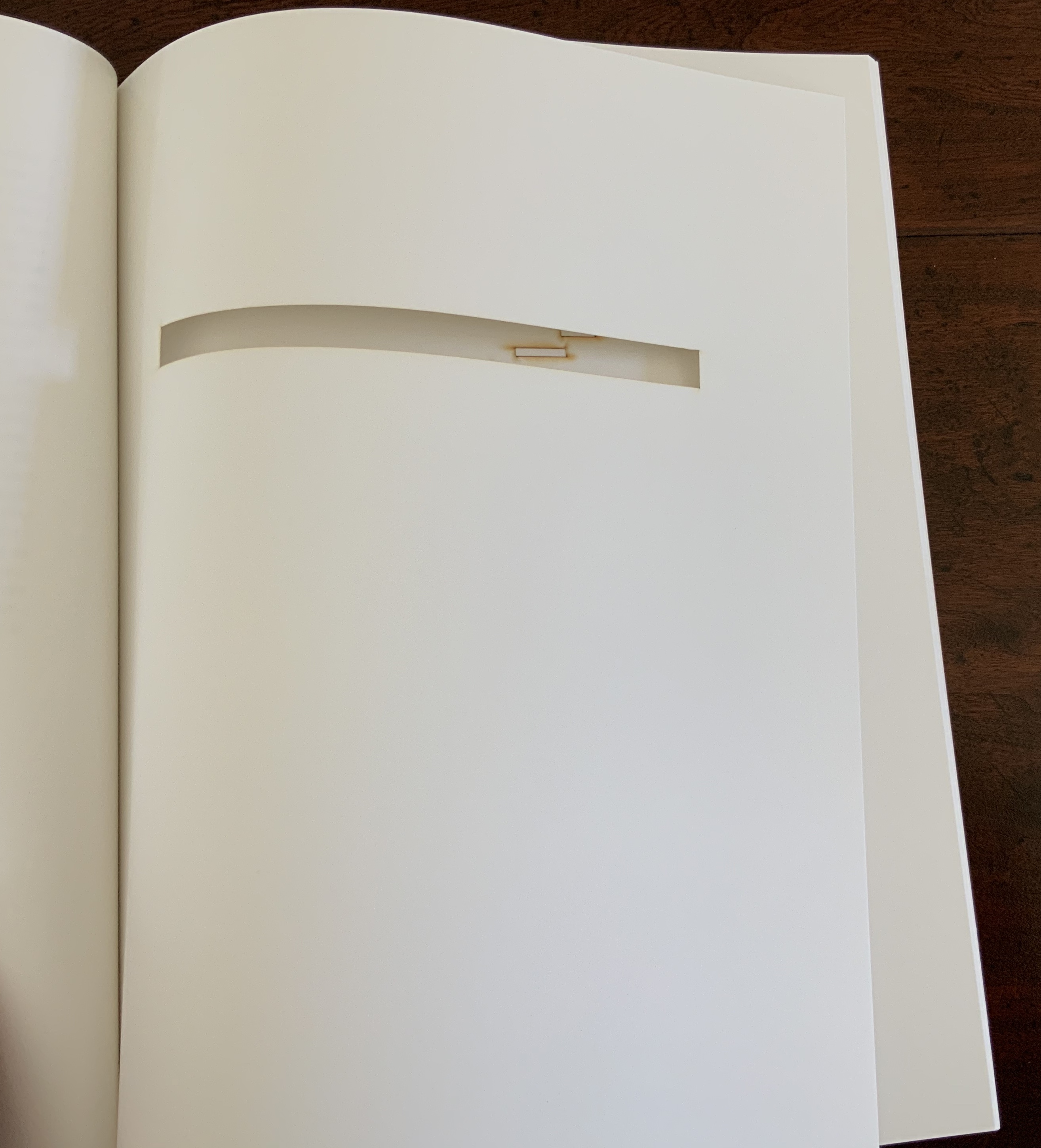
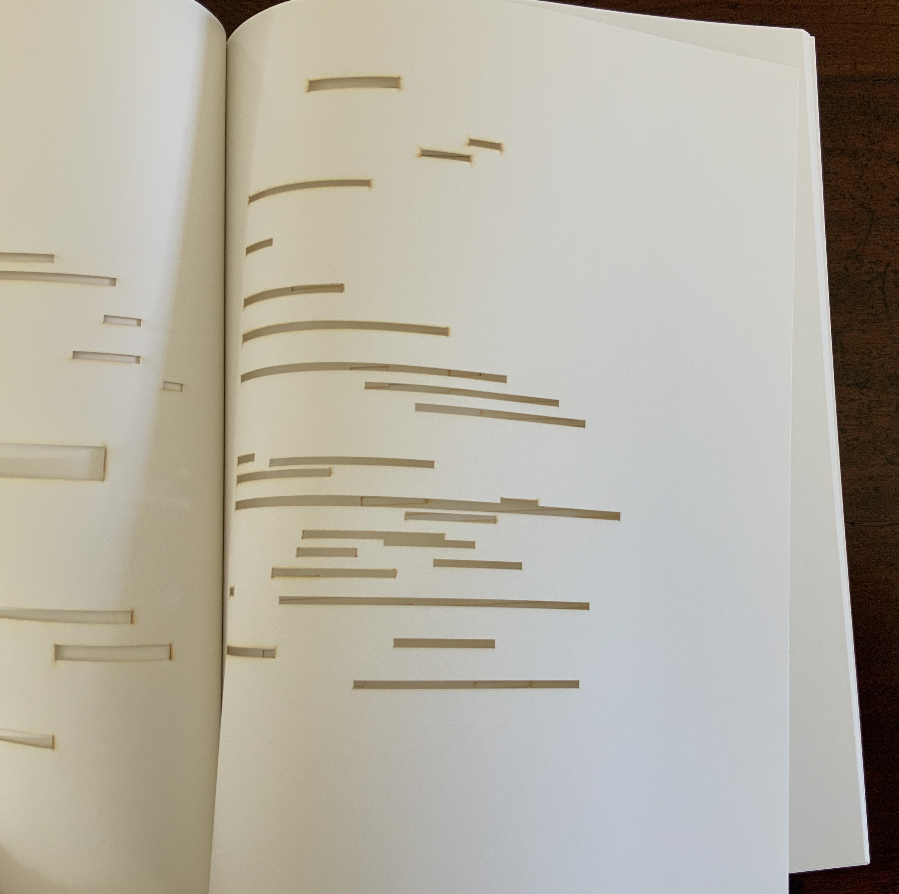
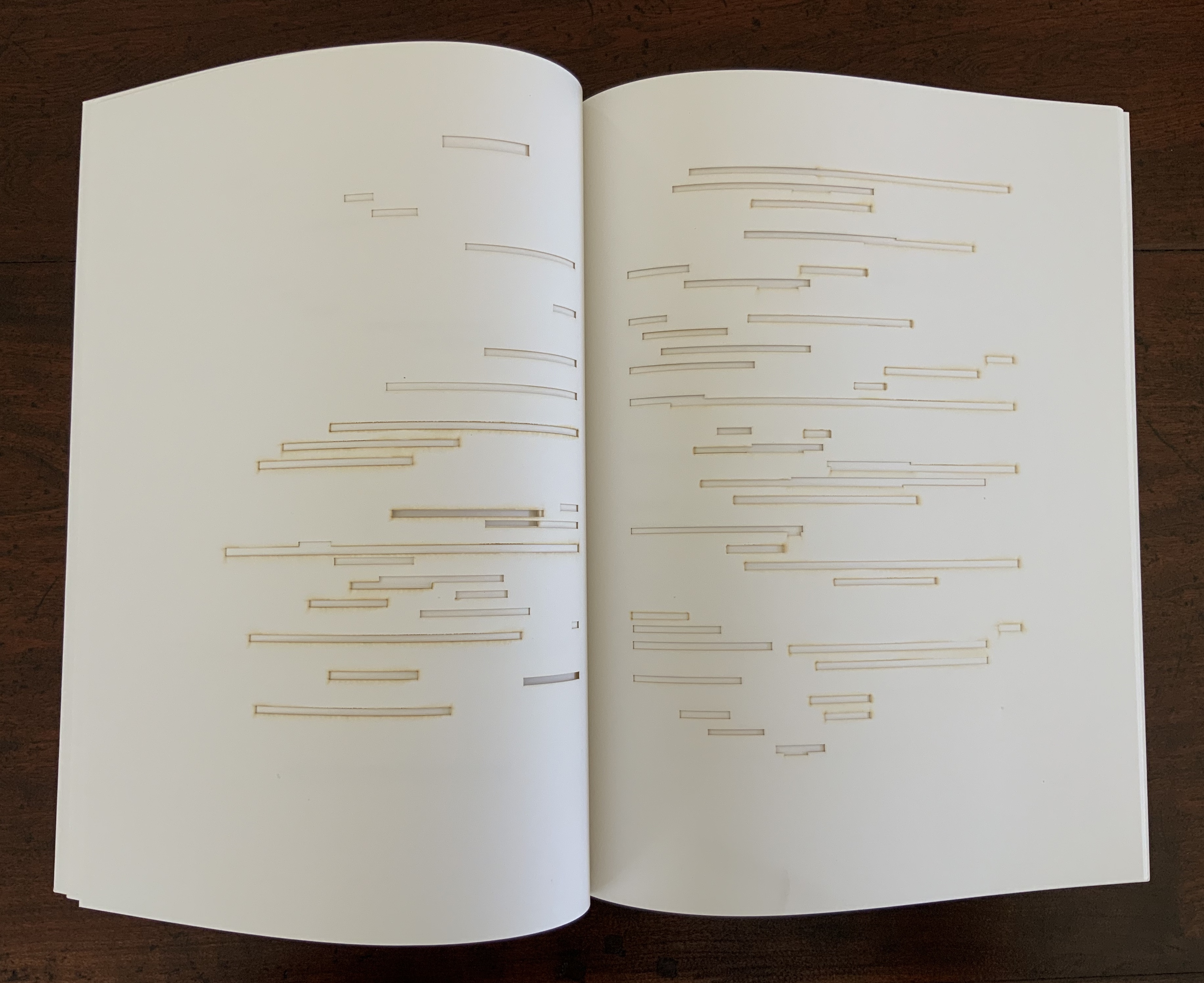
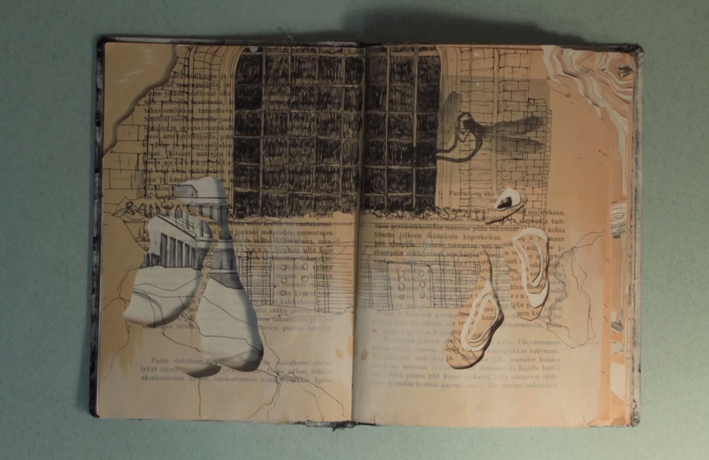
In his nine sets of single-sided uncut sheets, Fraenkel offers seven different diagrammatic approaches to the poem as it appeared in Cosmopolis, whose editors could not allow the poem’s lines to cross over the gutter to the next page as Mallarmé imagined the layout. The opening pages of Fraenkel’s seven approaches are laid out below in sunlight and paired with the textual opening page.

Seven different diagrammatic renderings. The one at the lower right shows Fraenkel’s sideways view.

The first rendering (above, upper left) is closest to what Mario Diacono and Marcel Broodthaers would create later in the decade.

Left: a METRICA n’aboolira (1968) by Mario Diacono (1968). Right: Image: Un coup de dés jamais n’abolira le hasard (1969) by Marcel Broodthaers (1969).

Fraenkel’s nine sets of sheets break down into eight of 8 pages and one of 4 pages. Below is the first set opened out.

The first set of eight pages

Compared with Diacono’s, Broodthaers’ and all the other works of homage to date, Fraenkel’s renderings retain a distinction and suggest other new directions not yet taken physically or digitally. Given the sculptural interpretations by Geraldo de Barros, Jorge Méndez Blake and Kathy Bruce, doesn’t Fraenkel’s first rendering call for a three-dimensional cantilevered homage constructed of slabs of blackened flotsam connected with brushed steel rods?

From the series Jogos de Dados (1986)
Geraldo de Barros
Photo: Julia Parpulov. Permission from Fabiana de Barros.

Biblioteca Mallarmé/Mallarmé Library (2011)
Jorge Méndez Blake
Photo: Courtesy of the artist.

Navigating the Abyss (2014)
Kathy Bruce
Photo: Courtesy of the artist.

Given the video created by Giulio Maffei transforming the 1914 book version into Broodthaers’ and the digital legerdemain of Karen ann Donnachie and Andy Simionato and Tayyib Yavuz, why not an animated digital transformation of the Cosmopolis version into the 1914 book version?

Le Vite dei Libri 26 – Un coup de dés jamais n’abolira le hasard (2016)
Giulio Maffei
Permission from the artist.


Mallarmé’s Self-replicating Machine: A Throw of the Dice Will Never Abolish Chance” (2018)
Karen ann Donnachie and Andy Simionato
Permission from the artists.

Experiment Book: “Un Coup de Dés”
Tayyib Yavuz
Permission from the artist.

And Professor Jed Rasula (University of Georgia), who has also explored Fraenkel’s work, suggests yet another medium:

Fraenkel’s sixty-eight seismographic and astral diagrams (or “stylizations”) practice a truly graphic mode of literary analysis. It was Fraenkel’s conviction that “a plastic text rests hidden in the extra-conscious layers of the poet, paralleling the verbal text of the poem” (9). … In their accentuation of the visual character of Un Coup de dés, Fraenkel’s designs are like watching a movie with the sound turned off, forced to rely on gesture rather than dialogue in order to follow the action.”

Except for the sound part, that could describe Man Ray’s Les Mystères du Château de Dés (1929).

Further Reading

Derek Beaulieu“. Books On Books Collection. 19 June 2020.

Raffaella della Olga“. Books On Books Collection. 8 December 2020.

Klaus Detjen“. Books On Books Collection. 9 September 2020.

Sammy Engramer“. Books On Books Collection. 1 June 2020.

Michalis Pichler“. Books On Books Collection. 19 August 2020.

Cerith Wyn Evans“. Books On Books Collection. 16 April 2020.

Eric Zboya“. Books On Books Collection. 1 June 2020.

Donnachie, Karen Ann, and Andy Siminiato. “Mallarmé’s Self-replicating Machine: A Throw of the Dice Will Never Abolish Chance”. MATLIT: Materialities of Literature, [S.l.], v. 6, n. 1, p. 37-49, Aug. 2018. Date accessed: 23 March 2019.

Fraenkel, Ernest. 1998. Die Unsichtbaren Zeichnungen Stéphane Mallarmé. Lana: Edition per Procura. German facsimile, also in the Books On Books Collection.

Rasula, Jed. Modernism and Poetic Inspiration: The Shadow Mouth (London: Palgrave, 2009). Accessed via Electronic Poetry Center, University of Pennsylvania, n.d. Accessed 14 June 2020.

Samson, Anna, and Serge Chamchinov. 2022. “Les Dessins trans-conscients de Stéphane Mallarmé par Ernest Fraenkel : une méthode originale“. Continent Manuscrits. No. 18. Accessed 10 June 2022. A superb analysis of Fraenkel’s book and method.

Seaman, David W.  Concrete poetry in France (Ann Arbor: Umi Research Press, 1981).

Books On Books Collection – Bruno Munari

Munari’s Books (2008/2015)

Munari’s Books (2008/2015)
Giorgio Maffei
Perfect bound book. H240 x W170, 286 pages. Acquired from Wordery, 25 June 2015.
Photos of the work: Books On Books Collection. Displayed with permission of  Corraini Edizioni. © Bruno Munari. All rights reserved to Maurizio Corraini s.r.l.

Giorgio Maffei’s 2008 definitive collection of book designs by Bruno Munari brings together two of Italy’s renowned book artists. Giorgio Maffei’s own work, his writing and gallery/bookshop (highlighted by his son Giulio Maffei’s extraordinary video catalogues Le vite dei libri) warrant a catalogue raisonné in their own right. The Italian edition published by Munari’s long-time publisher Maurizio Corraini was followed up in 2015 by this translation by Martin John Anderson and Thomas Marshall in 2015. For the Books On Books Collection, one of the great pleasures of Munari’s works is its attention to the alphabet, which this book documents.

Although not shown in Munari’s Books, an alphabet-related work that underscores Picasso’s calling Munari “our Leonardo” is ABC con fantasia (1973/2000). If we are to believe Fra Luca Pacioli, it was Leonardo da Vinci who inspired his “straight lines and curves” exposition for creating letters. Following in their footsteps, Munari provides the linear and curvilinear basics for the collector and offspring to join the game.

ABC con fantasia (2008)

ABC con fantasia (2008)
Bruno Munari
Boxed set of shapes. H x W Acquired from Corraini Edizioni, 4 August 2020.
Photos of the work: Books On Books Collection. Displayed with permission of  Corraini Edizioni. © Bruno Munari. All rights reserved to Maurizio Corraini s.r.l.

Another pleasure is how Munari’s works lead to other works in the collection. Just by preceding them in Pieter Brattinga’s Kwadraatblad/Quadrat-prints series, Munari’s An Unreadable Quadrat-Print (1953), below, conjures up Wim Crouwel‘s, Gerard Unger‘s, Timothy Epps and Christopher Evans‘, and Anthon Beeke‘s more alphabetical contributions.

Libro illeggibile bianco e rosso / An unreadable Quadrat-Print / Een onleesbaar kwadraat blad / Ein unlesbares Quadrat-Blatt (1953)

Libro illeggibile bianco e rosso/An unreadable Quadrat-Print/Een onleesbaar kwadraat blad/Ein unlesbares Quadrat-Blatt (1953)
Bruno Munari
Artist book. 250 x 250 mm + 1 wrapper (770 x 770 mm folded to 260 x 260 mm). Acquired from Antiquariaat A. Kok & ZN, 4 August 2021.
Photos of the work: Books On Books Collection. Displayed with permission of  Corraini Edizioni. © Bruno Munari. All rights reserved to Maurizio Corraini s.r.l.

Although there are no words on numbered pages that have to fall in the right order, An Unreadable Quadrat-Print still presents the author/printer/binder with a challenge in imposition. White and red alternate, which is easy enough, but to cut or not cut a folio on the left and right, how to cut it, how to place the differently cut folios in the right order to achieve the variation in images when the pages turn, how to ensure a sewable area down the center for each folio whether it has a horizontal cut extending into the spine or a diagonal one extending from some point along the spine — that is impressive. It speaks to the sculptural process and result in making books, as well as the sculptural process of reading them.

The following sequences — the book’s first five double-page spreads and then its last six — take a normal page-turning approach, always turning from the upper right corner of whatever shape/page is available. Note how, in the last six double-page spreads, the pages and shapes become more complex.

Libro illeggibile (1966), below left, calls to mind Katsumi Komagata’s A Cloud (2007), and the one in the middle foreshadows Eleonora Cumer’s subtle artistry with transparent paper in Circoscrivere lo spazio No. 3 (2021). While Munari’s rare works press modest budgets, some of it — in its simplicity and popular appeal — has led Corraini Edizioni to put it within easier reach. Numerous reissues of the 1984 Libro illeggibile MN 1 have pushed its price to €5. Short of the artist’s signature (which would likely obstruct the aesthetic intention), a copy from the latest 5000-copy print run will “perform” and deliver the same experiential value as one from the earliest run.

From Munari’s Books.

Libro illeggibile MN 1 (2006)

Libro illeggibile MN 1 (2006)
Bruno Munari
Booklet. H100 x W100 mm, 28 pages from 14 sheets cut in various shapes, notched at the center, bound with single loop of red thread over the notch and knotted at the foot of the spine. Acquired from Corraini Edizioni, 4 August 2020.
Photos of the work: Books On Books Collection. Displayed with permission of  Corraini Edizioni. © Bruno Munari. All rights reserved to Maurizio Corraini s.r.l.

Munari’s many series of illegible books tap into book artists’ longstanding and ongoing preoccupation with whether a book without words can communicate information, narrative, sensations or feelings through material, shape or color and their permutations. The colors, shape, feel and binding of Libro illeggibile MN 1 evoke simple and sophisticated pleasure in their juxtaposition and sequence. The unchanging straightness of the top edge and the anchoring red thread of the binding set off the changeability of shapes and colors.

The Square (1960), The Circle (1964) and The Triangle (1976)

Corraini Editions has also made Munari’s compendia The Square: Discovery of the Square (1960), The Circle: Discovery of the Circle (1964) and The Triangle: Discovery of the Triangle (1976) available in continuous reprints. The fourth printing from 2015 is shown below.

Le sculture da viaggio di Munari (2019)

Although not a book of Munari’s making, David A. Carter’s Le sculture da viaggio di Munari is one way of bringing the spirit of Munari’s “travel sculptures” into the collection. Carter’s homage carries the blessing of Corraini Edizioni, further justifying its inclusion.

Le sculture da viaggio di Munari (2019)
David A. Carter
Pop-up book. H210 x W210, 10 constructions over 5 spreads, 2 with fold-out leaves. Acquired from Corraini, 4 August 2020.
Photos of the work: Books On Books Collection. Displayed with permission of  Corraini Edizioni. © Bruno Munari. All rights reserved to Maurizio Corraini s.r.l.

Travel sculptures started off as small sculptures (some even pocket-sized) to carry with you, so you could take part of your own culture to an anonymous hotel room. Later they were turned into ‘travel sculptures’, five or six metres tall and made of steel. One of these was seen for a few months in Cesenatico, another one in Naples. Others are sleeping among huge trees in the Alto Adige region.’ This is how Italian designer Bruno Munari (1907-1998) described his ‘travel sculptures’, which in turn inspired American illustrator and designer David A. Carter for this pop-up book. –Corraini Edizioni website. Accessed 3 August 2021.

Munari’s travel sculptures also recall works in the collection like Cumer’s scultura da viaggio dipinta n.2 (2017), Komagata’sIchigu(2015) and, albeit less portable, Ioana Stoian’s Nous Sommes (2015).

Further Reading

Morison, Stanley, and Philip Hofer. 1933. Fra Luca de Pacioli of Borgo San Sepolcro: some consideration of his life and works. New York: Grolier Club.

Tanchis, Aldo. 1987. Bruno Munari : design as art. Cambridge, MA: MIT Press.

“Mina Loy”. 10 August 2019. Garadinervi : repertori. Accessed 8 February 2023.

Mina Loy, Alphabet, No II, n.d. [1941] [Mina Loy papers, Box 7, Folder 184, YCAL MSS 6. Yale University Library, Beinecke Rare Book and Manuscript Library, New Haven, CT]. Also in Margaret Konkol, “Prototyping Mina Loy’s alphabet, Feminist Modernist Studies, Volume 1, 2018, pp. 294-317 – Issue 3: Special Cluster: Feminist Modernist Digital Humanities.

Books On Books Collection – Michalis Pichler

Un Coup de Dés Jamais N’Abolira le Hasard: Sculpture (2008)

Un Coup de Dés Jamais N’Abolira le Hasard (Sculpture) (2008)
Michalis Pichler
Offset and laser gravure, perfect binding. H325 x W250 mm, 32 pages. Acquired from Printed Matter, 10 April 2020.
Photos: Books On Books Collection.

Appropriated and sculpted bookwork was taking off in numerous forms even before 1964 when Marcel Broodthaers half-embedded the last fifty copies of his poetry book Pense-Bête in plaster. Bruno Munari had introduced libri illeggibili (“unreadable books”) in 1949. John Latham had already encased books with plaster in Shelf Number 2 (1961) and much else in his various skoob works. Tom Phillips’ line-by-line, found-book alteration A Humument was underway, first appearing in 1970, as was Dieter Roth’s string of sausage books Literaturwurst (1961-74). So Broodthaers could have taken any of several directions before deciding to replace Mallarmé’s lines of verse in Un Coup de Dés N’Abolira le Hasard: Poéme (1914) with printed and engraved placeholders in paper and anodized aluminum, respectively, to create Un Coup de Dés N’Abolira le Hasard: Image (1969).

Le Vite dei Libri 26 directed by Giulio Maffei, 12 January 2016. Accessed 14 August 2020.

Son of Giorgio Maffei (bookseller, curator, scholar and book artist in his own right), Giulio Maffei has made video catalogues for Studio Bibliografico Giorgio Maffei since 2015. Each catalogue is a work of video. In this twenty-sixth outing, Maffei has created a video from the 1914 edition and Broodthaers’ 1969 Image version of Un Coup de Dés.

By 2008, Michalis Pichler had an even greater wealth of forms from which to choose for his double appropriation/homage to Mallarmé’s Poème and Broodthaers’ Image. Since the ’80s scores of book artists had been introduced to ingenious structures by Hedi Kyle and Keith A. Smith, among others, so why not an Aunt Sally’s shipwreck of string, canvas and torn paper? Long-Bin Chen had been sanding books and phone directories into busts since the ’90s, so why not a bust of Mallarmé from old editions of Un Coup de Dés and a bust of Broodthaers from catalogues of his works (a variation on Buzz Spector’s treatment)?

Instead Pichler appropriates Mallarmé through Broodthaers’ design and production: an efficient and direct double appropriation. He follows the trim size and layout of the 1914 and 1969 works. Further underscoring the double appropriation, he reprints verbatim Broodthaers’ preface (the full text of Mallarmé’s poem set in small type as a single paragraph with obliques separating the lines of verse). Like Broodthaers, he produced limited editions of three versions: 10 copies in plexiglas (rather than Broodthaers’ 10 in anodized aluminum), 90 copies in translucent paper (just as Broodthaers had done) and 500 copies in paper (rather than Broodthaers’ 300). Where Broodthaers had solid black stripes, though, Pichler substitutes laser cuts in the translucent and paper editions and engraving or abrasion in the plexiglas edition. Hence Sculpture (2008), rather than Image (1969) or Poème (1914).

Not until 2016, though, was Pichler able to cap his double appropriation. Just as Broodthaers had held an exhibition entitled “Broodthaers: Exposition littéraire autour de Mallarmé” (Antwerp, December 1969), Pichler held one entitled “Pichler: Exposition Littéraire autour de Mallarmé” (Milan, December 2016). Like the Broodthaers exhibition, Pichler’s was an opportunity to showcase his own work: it was his first solo exhibition in Italy. Like Broodthaers, he included the Nrf 1914 edition, but also included numerous other editions and translations that had occurred since. Also, key to Pichler’s artistic intent, he included a host of other artists who by appropriation had made homage to Un Coup de Dés … Poème and, in some cases, Broodthaers’ … Image.

Book art is so self-referential in its instances (think of Real Fiction: An Inquiry into the Bookeresque by Helen Douglas and Telfer Stokes) and as a genre (think Burning Small Fires by Bruce Nauman) that appropriation offers a natural next step. In Pichler’s case, the subtlety of that step comes in how he reaches through Broodthaers’ Image all the way back to elements of Mallarmé’s Poème to achieve his aims.

When Broodthaers first appropriated Mallarmé’s layout, type sizes and roman/italic styles, he was engaged in a kind of reverse ekphrasis. Usually ekphrasis runs from the work of art (say, a Grecian urn) to the text in response (“Ode on a Grecian Urn”). Here, the poem and its shape come first, then the work of art — the Image of the poem. By calling his exhibition an exposition littéraire, Broodthaers underscored this. By calling out the shapes on the page, he elevated the original’s semblances of waves, an abyss, a foundering ship and a constellation and, in exposing them, performed a kind of literary study as well as artistic work.

Count it down from Pichler’s appropriation of Broodthaers’ exposition littéraire, from the inclusion/appropriation of other artists’ appropriations of Poème and/or Image, from his own work of book art Sculpture, from his own other works: Pichler’s appropriative ekphrasis is squared, cubed or perhaps raised to the fourth power. Clearly, book art and appropriation are Pichler’s chief palettes — or rather his twin decks from which, as DJ, he mixes what he calls “Greatest Hits”. The phrase simultaneously names Pichler’s imprint on Sculpture‘s cover and the series on his website. The series includes other appropriations such as Every Building on the Ginza Strip (2018) from Ed Ruscha and Some More Sonnet(s) aka Poem(s) (2011) from Ulises Carríon. “Greatest Hits”, however, suggests another subtlety in Sculpture, albeit one best appreciated in the context of all the exhibitions.

The first instance of Broodthaers’ exhibition in Antwerp included a continuous playing of the artist’s tape-recorded reading of the poem. In Cologne for its second instance, Broodthaers renamed it Exposition littéraire et musicale autour de Mallarmé. Broodthaers was simply taking Mallarmé’s musical cue in Un Coup de Dés’s preface, which advises reading the poem as if it were a “score” for music to be heard at a concert and its blank spaces as “silences”.

Taking Mallarmé’s and Broodthaers’ musical cues and that of his piano-roll-like slots in Sculpture, Pichler created for his exhibition Un Coup de Dés Jamais N’Abolira le Hasard: Musique, a piano-roll version of the poem to be played by any visitor who cared to sit and pedal the pianola on which it was installed. So in further appropriation of Mallarmé through Broodthaers, Pichler’s piano roll turns the empty spaces, where the words and black strips would be, into music while the blanks around them become what Magnus Wieland calls “white noise”.

Un Coup de Dés Jamais N’Abolira le Hasard: Musique (2009) Michalis Pichler

In traditional literary ekphrasis, the referring text can stand on its own. Homer’s description of Achilles’ shield does not require a side-by-side engraving or painting of what Hephaestus forged. Nor does Auden’s exposition of Breughel’s Landscape with the Fall of Icarus (c. 1560) need an art history book to hand.

But without the context of the exhibition, the presence of other appropriations, or even Pichler’s translucent and plexiglas editions, what to make of Pichler’s paper edition on its own? The traditional Nrf cover design suggests no surprise to come, although the trim size looks non-traditional in today’s market. The book’s slimness, subtitle and preliminaries also warrant a raised eyebrow: how can this be a sculpture? Turning the pages, the reader/viewer comes to the cuts and sees through to the pages beneath. Shadows move through the leaves. The laser cut technique hints at something that a die cut does not. Do the burnt edges where the laser has cut suggest a more surgical approach to book burning, an allusion to burning decks, or a 19th century and 20th century legacy to the white spaces?

Both Mallarmé and Broodthaers noted the intent to draw attention to the white space of the page. Pichler appropriates both the poet’s and artist’s form and intent. He sculpts a conceptual double-palimpsest not by overwriting the first level of overwriting but by removing it and the original layer altogether. The core subtlety of Pichler’s paper edition of Un Coup de Dés lies in those empty spaces defined at their burnt edges and by the blankness around them. For Sartre, Mallarmé was the poet of nothingness. Broodthaers appropriated the nothingness with black ink. Pichler has appropriated both. The paradox is a work that stands on its own by invoking and eliminating what it appropriates.

Further Reading

Durgin, Patrick. “Witness Marcel Broodthaers: The docile aphorism“, Jacket2, 24 October 2014. Accessed 6 August 2020.

Gilbert, Annette, and Clemens Krümmel. Thirteen Years: The Materialization of Ideas from 2002 to 2015 (Leipzig: Spector Books, 2015).

Sartre, Jean-Paul; Ernest Sturm, trans. Mallarmé, or the Poet of Nothingness (University Park: Penn State University Press, 2004).

Sowden, Tom. “Exploring Appropriation as a Creative Practice,” MDPI Arts / Issue 8 / Volume 4 (2019). Accessed 6 August 2020.

Wieland, Magnus. “Sculpture Lecture Reading Un coup de dés“. Accessed 6 August 2020.

Among the other artists in Pichler’s Exposition littéraire autour de Mallarmé were these whose works are also represented in the Books On Books Collection: Jérémie Bennequin, Jim Clinefelter, Sammy Engramer, Cerith Wyn Evans, Rodney Graham, Brian Larosche, Michael Maranda, Guido Molinari and Eric Zboya.

Bookmarking Book Art – Animated!

Michelle Ku, The Swimmer, 2014

John Cheever’s short story “The Swimmer” is an all-time favorite. After seeing the short film of it with Burt Lancaster, I can’t imagine Ned Merrill’s appearance any other way. Even in Michelle Ku’s animated book art version, I see Burt Lancaster’s big grin and its sorrow.

Before seeing Ku’s work, which has planted the urge to seek even more examples of animated book art, I had enjoyed Regan Avery’s The Groton Avery Clan at the CT(un)Bound exhibition in New Haven, Connecticut. The work consists of a handmade book, metallic thread, motor and an Arduino microcontroller. The Avery clan has inhabited the state since the 1600s. Regan Avery’s handmade book is a copy of the family history published over 100 years ago. From it, the name of each descendant of Christopher Avery, the original immigrant, has been excised and the ten thousand names handwritten on miniscule scraps of  yellowed paper that emerge from the book along interconnected threads put into motion by the motor and microcontroller.

Regan Avery, The Groton Avery Clan, 2015

When the motor engages, the name slips become “a teeming mass of humanity”.

In 2011, Saara Tuulia posted City and Snow Book on YouTube, which is a simple stop motion animation comparable to Ku’s more complex The Swimmer.

Saara Tuulia, City and Snow Book, 2011

In 2013, Danielle Lathrop posted Book Art, whose stop motion animation highlighted the figurative and origami-based vein of the art form and its practitioners’ obsession with Alice in Wonderland.

Danielle Lathrop, Book Art, 2013 The White Rabbit and Alice sequence
Danielle Lathrop, Book Art, 2013
The White Rabbit and Alice sequence

Danielle Lathrop, Book Art, 2013 The White Rabbit and Alice sequence
Danielle Lathrop, Book Art, 2013
The White Rabbit and Alice sequence

Danielle Lathrop, Book Art, 2013 The White Rabbit and Alice sequence
Danielle Lathrop, Book Art, 2013
The White Rabbit and Alice sequence

Danielle Lathrop, Book Art, 2013 The White Rabbit and Alice sequence
Danielle Lathrop, Book Art, 2013
The White Rabbit and Alice sequence

More recently, and posted here, another example of animated book art – Giulio Maffei’s series Le Vite dei Libri (The Lives of Books) – demonstrates the increasing engagement and sophistication in this variant form of book art.

Giulio Maffei, Edward Ruscha's The Sunset Strip, 1966, 2015
Giulio Maffei, Edward Ruscha’s The Sunset Strip, 1966, 2015

The search is on; “roll camera”.


Bookmarking Book Art – Giorgio & Giulio Maffei

Display of Ed Ruscha's Various Small Fires and Milk, 1964, at Pliure: La Part du Feu, 2 February - 12 April 2015, Paris. Photo by Robert Bolick. Reflected in the lower left hand corner is the display of Bruce Nauman's Burning Small Fires; in the upper right corner, the film clip of Truffaut's 1966 Fahrenheit 451; and in the upper left, Maria Helena Vieira da Silva's La bibliotheque en feu, 1974.
Display of Ed Ruscha’s Various Small Fires and Milk, 1964
Pliure: La Part du Feu, 2 February – 12 April 2015, Paris, Fondation Calouste-Gulbenkian.
Photo by Robert Bolick, 11 April 2015.
Reflected in the lower left hand corner is the display of Bruce Nauman’s Burning Small Fires, 1968; in the upper right corner, the film clip of Truffaut’s 1966 Fahrenheit 451; and in the upper left, Maria Helena Vieira da Silva’s La bibliotheque en feu, 1974.

The Studio Bibliografico Giorgio Maffei specializes in original texts and book art by twentieth century visual and literary avant-garde artists such Baldessari, Lewitt, Munari, Man Ray, Ruscha and Warhol among others. Recently the owner’s son – Giulio Maffei – “started making film as a side activity” and introduced a series of short animations “to put on the social networks and reach new potential customers”.  An anonymous pair of hands displays a variety of the books and book art in stock.

But Giulio’s videos are not always the straightforward marketing effort intended. They provide an experience of book art or artists’ books that most of us will never hold or touch. And that may be Maffei’s point in his series “Le Vite dei Libri” (The Lives of Books) in which these usually glassed-off works are playfully handled, gently made fun of and still honored.

Some of the videos are derivative artworks in their own right in the same vein as Bruce Nauman’s Burning Small Fires, 1968.  Nauman poked fun at Ed Ruscha’s Various Small Fires and Milk, 1964, by composing a book of photos recording the burning of a copy of Various Small Fires. Maffei’s Nauman-esque handling of Various Small Fires and Milk involves flash paper or its Photoshop equivalent.  His celebration of Ruscha’s The Sunset Strip is still more endearing with its soundtrack and toy convertible. His cheeky animations of the pop-ups in Warhol’s Index (Book) and the ironically daring destruction of Papa Maffei’s copy of Some/Thing No.3 are even better.  In the latter, the plastering of a Banksy-like mural with Warhol’s “Bomb Hanoi” stickers torn from the perforated cover is a sharp-edged example of the arch, reflective commentaries throughout Maffei’s videos.

Most of the films’ credits pay typographical homage to the work at hand, which is a nice self-deprecating and affectionate touch.  At my last viewing, there were twenty-two works in the Lives series.  They are listed below, but once you reach one on YouTube, the others follow. Giulio Maffei has also created a longer video catalogue for his father’s enterprise: Tra Libro e Oggetto (Between Book and Object). The Maffeis are a knowing team. The catalog title can be read as the beginning of a statement displayed on the cover.

BETWEEN BOOK AND OBJECT

The artists’ book, the multiple and the object

become an artwork

A statement that refers not only to the works in the catalog but to the video catalog itself and to the elder Maffei’s lifework of collecting, selling and writing about book art.

1 – An Unreadable Quadrat Print, Bruno Munari

2 – The Sunset Strip, Ed Ruscha

3 – Nine Swimming Pools, Ed Ruscha

4 – Various Small Fires, Ed Ruscha

5 – Andy Warhol’s Children’s Book, Andy Warhol

6 – Choosing Green Beans, John Baldessari

7 – Kleve 2009, Ettore Spalletti

8 – Made in Machine, Jean-François Bory

9 – Cieli ad Alta Quota, Alighiero Boetti

10 – Il Merlo Ha Perso il Becco, Bruno Munari

11 – Mémoires, Guy Debord, Asger Jorn

12 – Zang Tumb Tuuum, Filippo Tommaso Marinetti

13 – Acervus, Luigi Ontani

14 – Toiletpaper JAN 2011, Maurizio Cattelan & Pierpaolo Ferrari

15 – Toiletpaper JUL 2012, Maurizio Cattelan & Pierpaolo Ferrari

16 – Les Illuminations, Fernand Léger & Arthur Rimbaud

17 – Man Ray, Man Ray

18 – The Biggest Art-Book in the World, Enrico Baj

19 – Fable, John Baldessari

20 – Air Condition, Allan Kaprow

21 – Andy Warhol’s Index (Book), Andy Warhol

22 – Some/Thing No.3, ed. David Antin, cover by Andy Warhol