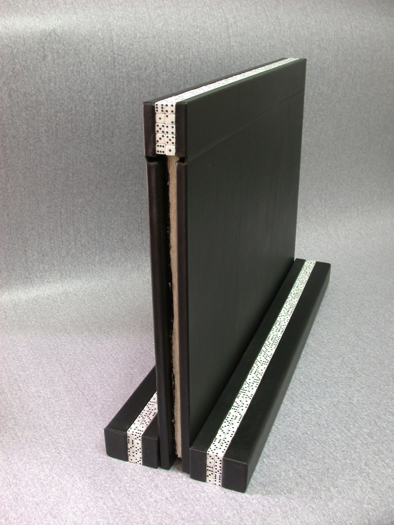
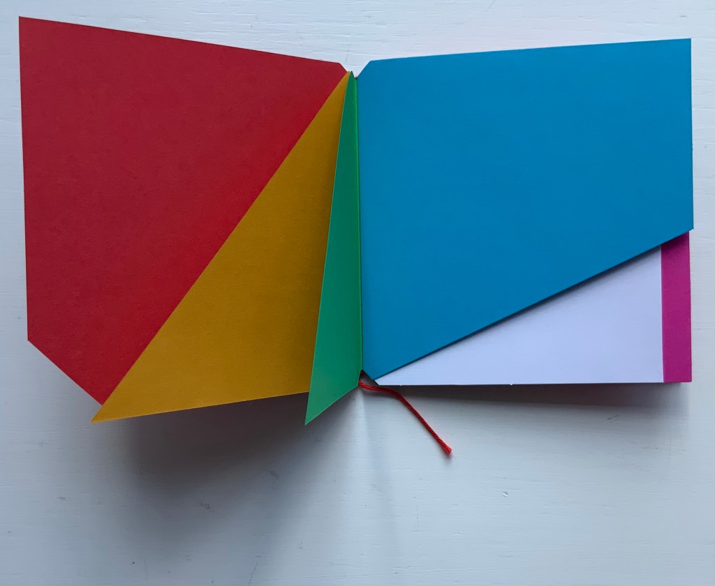
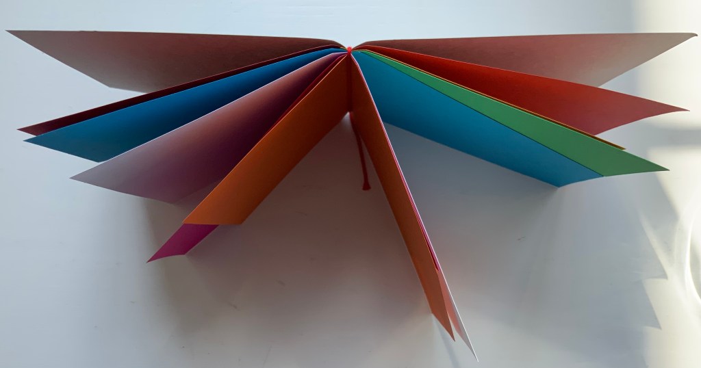
UN COUP DE DÉS JAMAIS N’ABOLIRA LE HASARD (1997) Stéphane Mallarmé Ofer Lellouche (and Uzy Agassi, ed.) Full black leather binding over marine plywood with dice, on a stand. H760 x W560 mm, 28 pages with 9 engravings. Edition of 40, of which this is #6. Acquired from Ido Agassi, 28 February 2022. Photos: Courtesy of Ido Agassi; Books On Books Collection. Displayed with permission of Ido Agassi and the artist.
Ever since his “brick wall” encounter with Un Coup de Dés and its white-on-black, black-on-white aesthetic, Ofer Lellouche has felt its influence on his art — including self-portraiture, the figurative and landscapes.When first approached by the publisher Ido Agassi (Even Hoshen) to create an artist’s book, he considered working from the ground up with a contemporary but that longstanding influence turned him to Mallarmé.
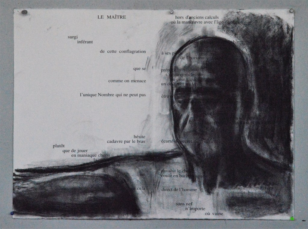
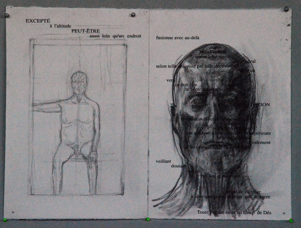
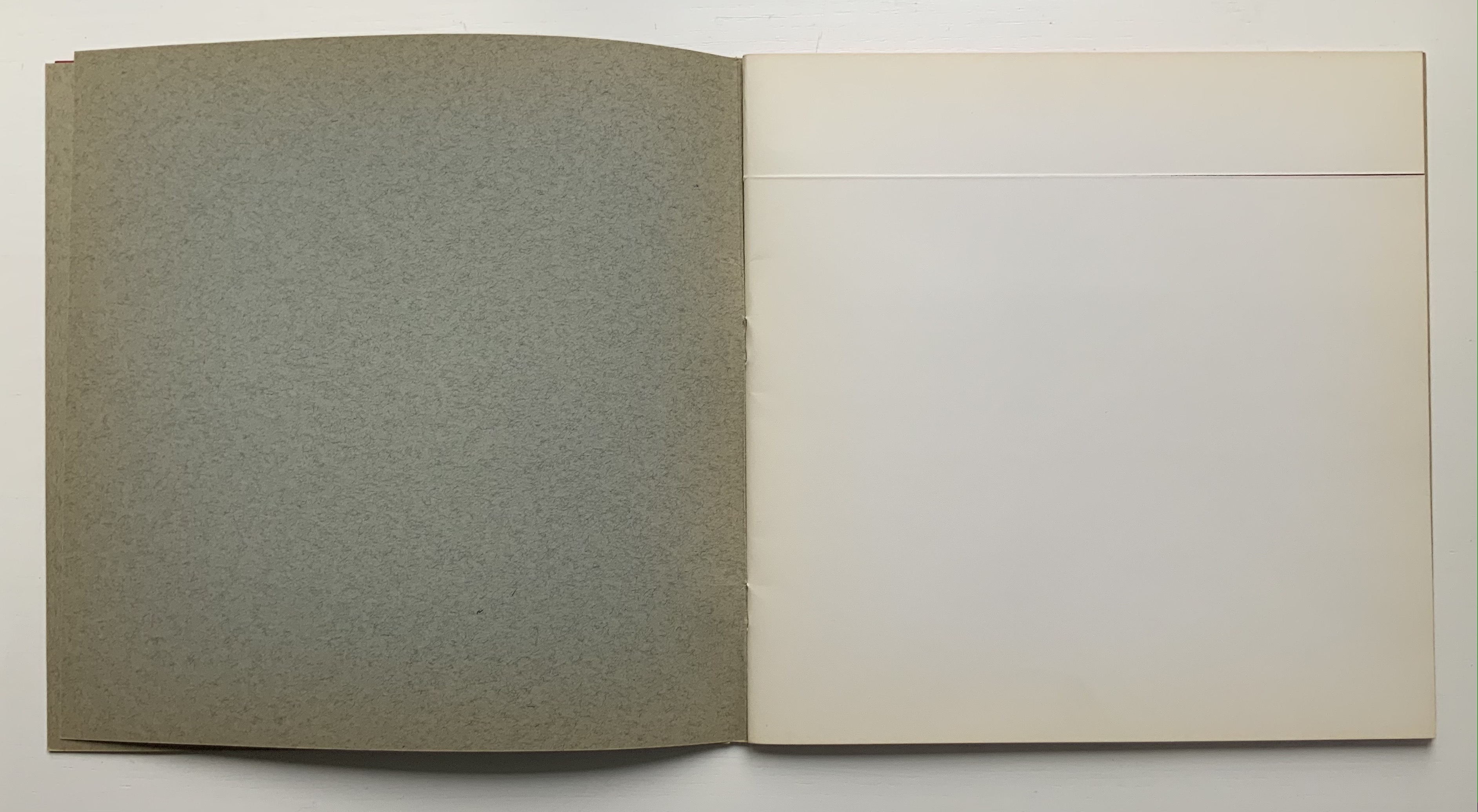
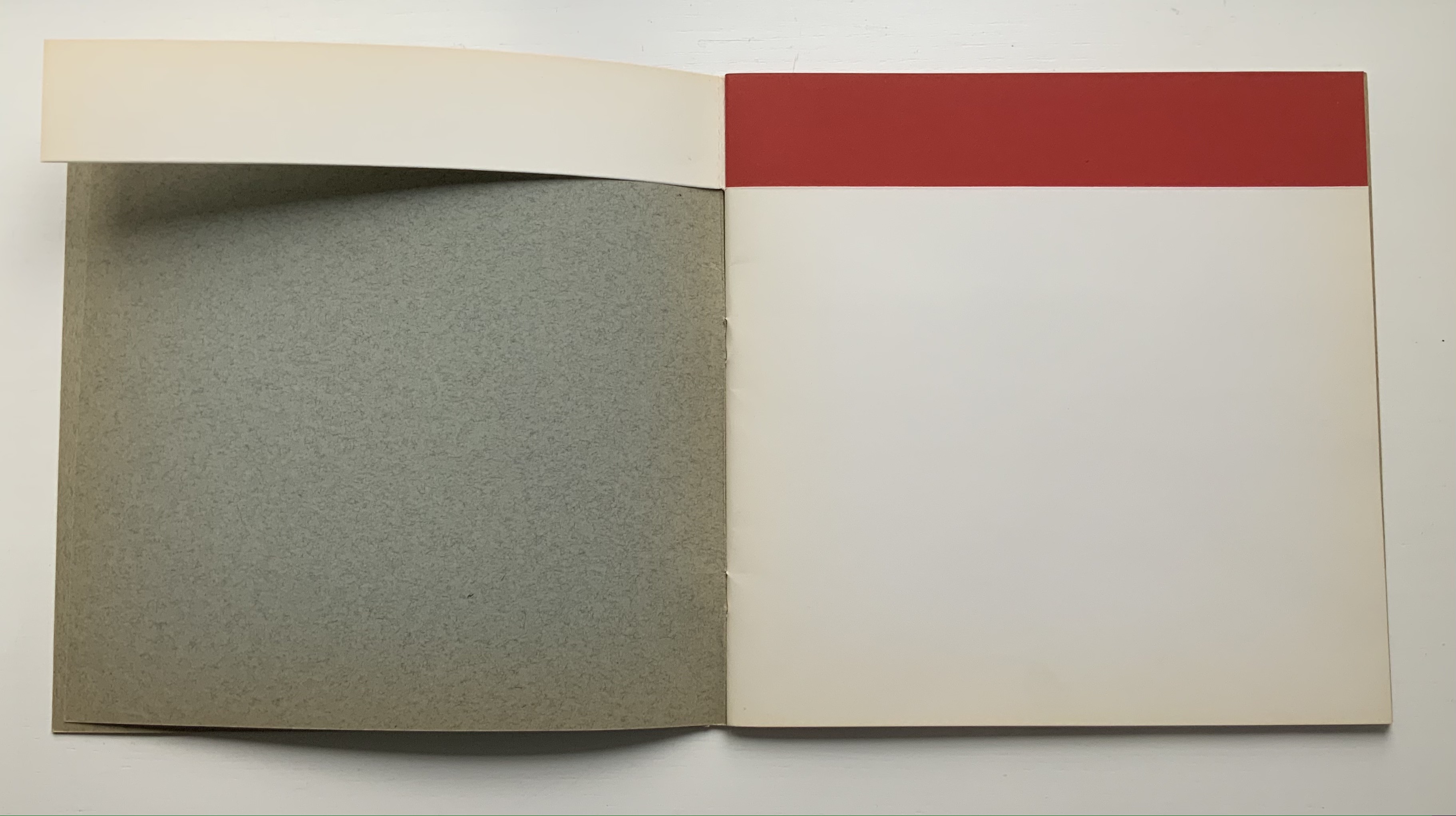
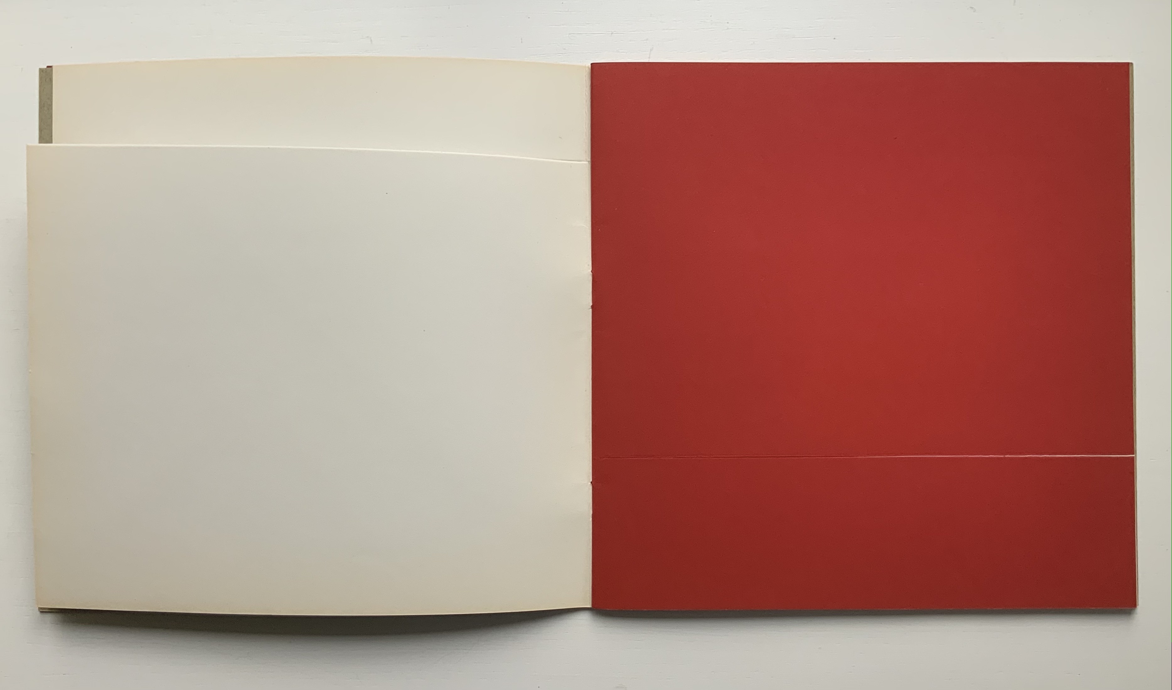
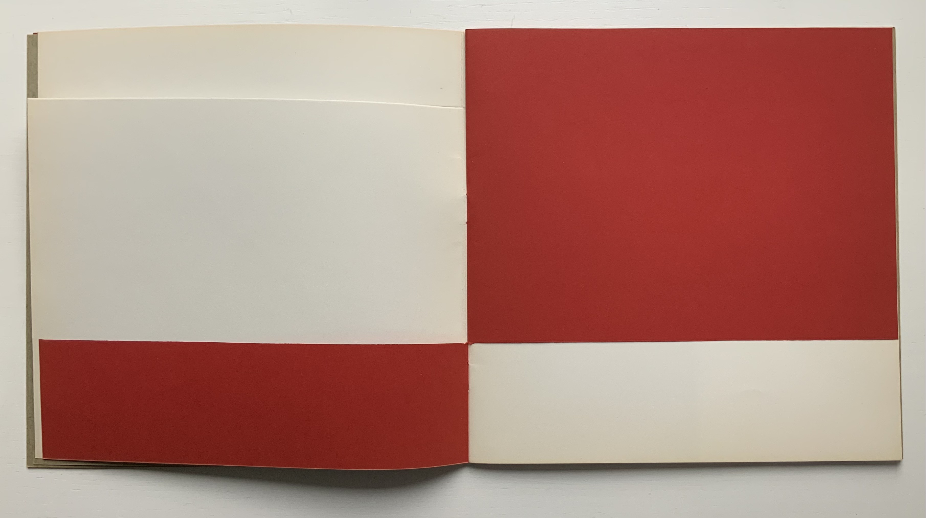
The homage consists of marine plywood covered in black leather, dice embedded in the spine and stand, trim size of H760 x W560 mm, Arches 250gsm printed in 22 pt Times New Roman and 9 etchings by Lellouche. The pages of text replicate those of the then-current Pléiade edition of Mallarmé’s Complete Works. Obviously from the size of the work, the pages have been scaled up. The replication of those pages means that the layout is not precisely as Mallarmé designated in the proofs for the deluxe edition. It also means that page numbers appear, and it accounts for the use of Times New Roman. But there are underlying reasons for the scaling up and replication despite the variance from Mallarmé’s plans.
First, the scale accommodates the size of Lellouche’s largest prints. Tellingly, they require a double-page spread. The use of double-page spreads pays homage to Mallarmé’s elevation of the double-page spread over the single page as a basic structural unit in Un Coup de Dés.
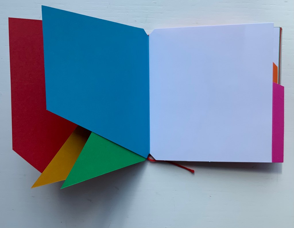
Second, the replication of the Pléiade pages begins a set of interconnected allusions and indirect homage to Mallarmé. Picasso was rumored to have used his copy of Mallarmé’s poems as a sketchbook. By replicating the Pléiade pages for his artist’s book, Lellouche inverts Picasso’s habit, draws Mallarmé’s double-page spreads into his artist’s book rather than drawing on them, and thus pays homage to both LES MAÎTRES. Also, through Picasso as inheritor of Mallarmé’s “invention” of modern art’s conception of space (according to Marcel Broodthaers), Lellouche pays a further indirect homage to the poem. The interconnectedness does not end there.
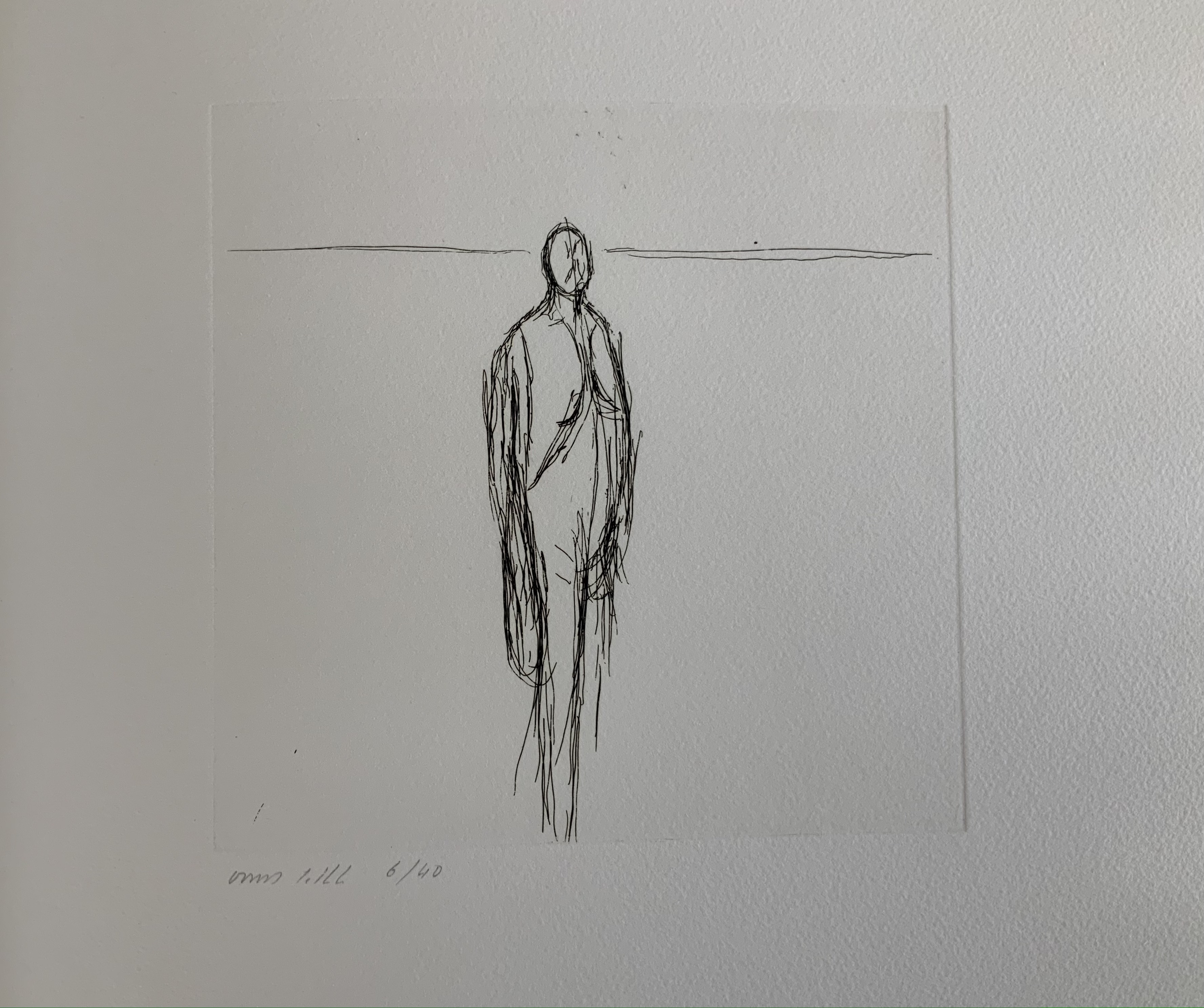
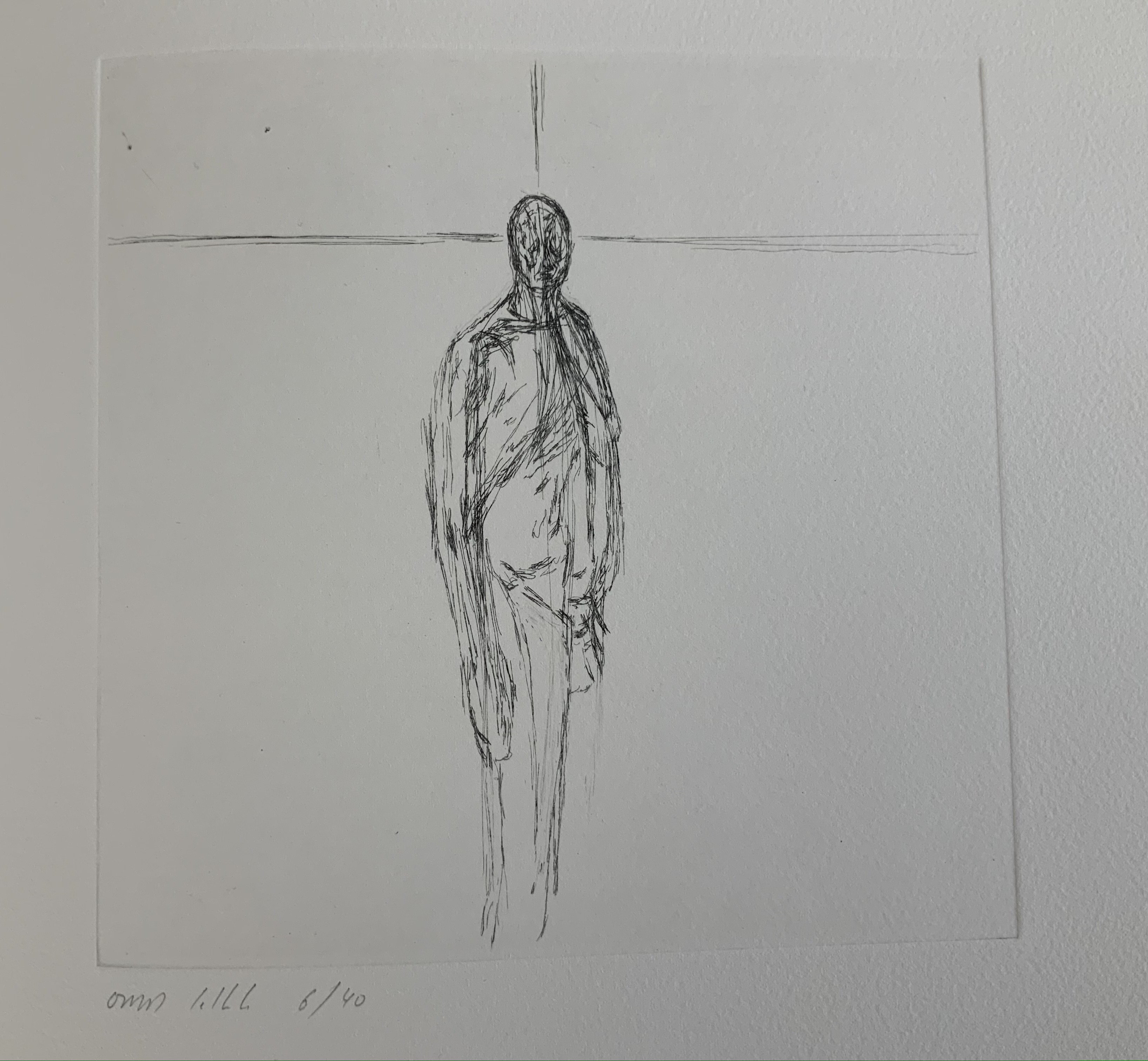
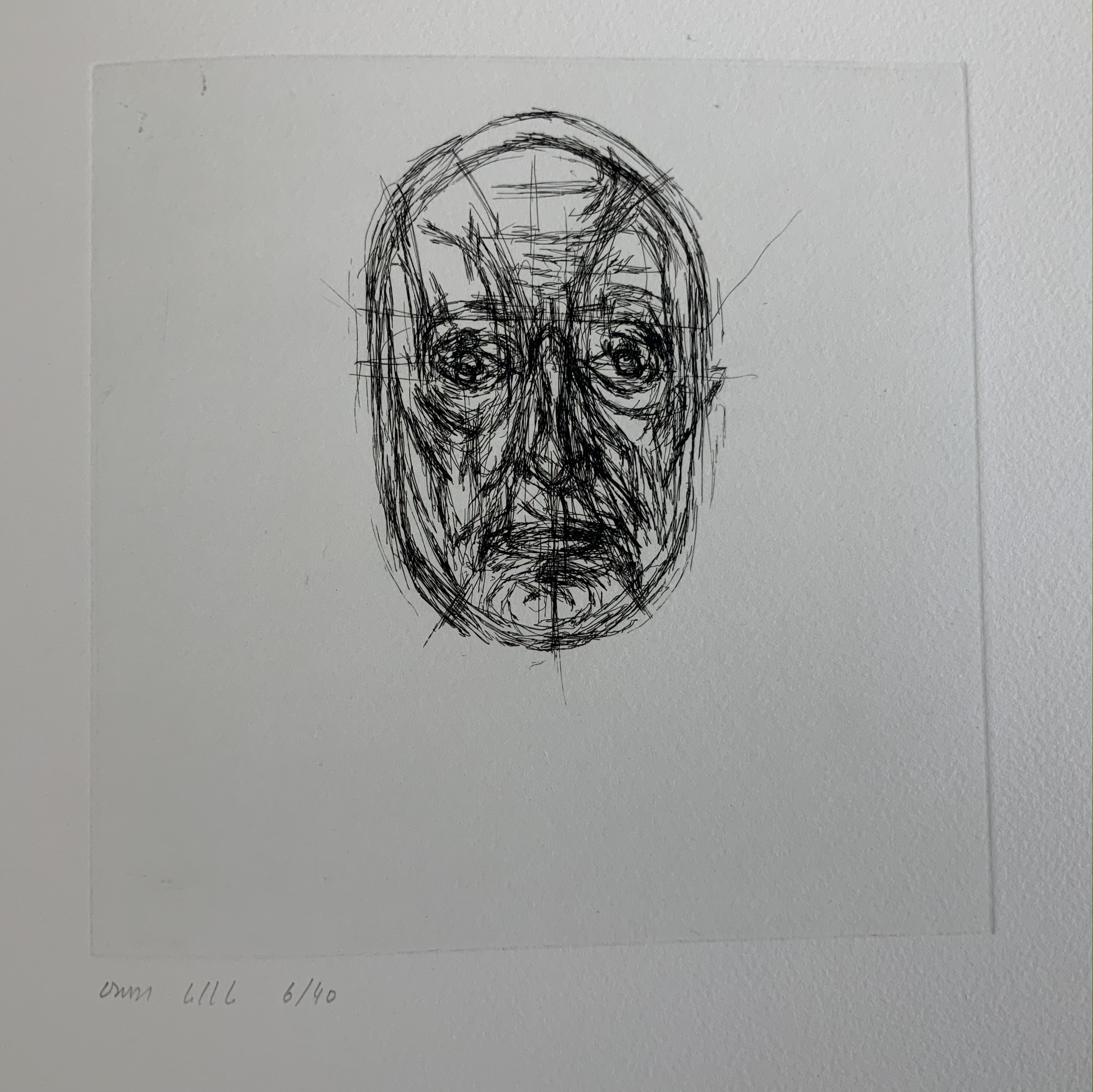
Considering that the main figure in the poem is LE MAÎTRE (the captain of the shipwreck), the fact that Lellouche’s prints pass from an abstract human figure to self-portraits implies Lellouche’s identification with LE MAÎTRE. When the self-portraits give way to the first full double-page spread (the seventh image, an abstract seascape or image of the abyss to which the poem refers), the shift confirms that self-identification, for LE MAÎTRE likewise seemingly succumbs to l’Abîme. But it is not merely the captain with whom Lellouche is identifying. LE MAÎTRE is the term by which Mallarmé’s contemporaries referred to him. Still it is not so much that Lellouche identifies himself with Mallarmé the poet and social lion as it is that he identifies with the paradoxical and impersonal creative process that lies at the heart of Un Coup de Dés. Indeed, it is through his own process that Lellouche asserts the identification. Beginning with black on white and progressing through aquatints to white on black, the self-portraits allude in an inverted way to Mallarmé’s paradoxical les blancs. The blank white space means as much as what it surrounds on the page, or rather it makes meaning along with the semantic and typographic elements that it surrounds.
Neither the poem nor the prints end with a definitive yielding to the abyss. The poem progresses to UNE CONSTELLATION. In Mallarmé’s case, the constellation comes at the end of the sentence RIEN N’AURA EU LIEU QUE LE LIEU / EXCEPTÉ PEUT-ÊTRE UNE CONSTELLATION (Nothing will have taken place but the place, except perhaps a constellation). In Lellouche’s case, the constellation takes the form of the multiple female figures ranged white on black across the two final double-page spreads. Again, Lellouche mirrors Mallarmé’s semantic and typographic juggling of symmetry and asymmetry across the center line of the double-page spread.
This brief note about this addition to the collection comes nowhere near exhausting Lellouche’s interaction with and interpretation of Un Coup de Dés. The artist’s book is also only one instance. Later etchings not in the collection underline this. By courtesy and with permission of the artist, here are three in which Lellouche pays even more direct homage to Picasso’s act of sketching on the pages of his copy of Mallarmé’s poems and by which he explores his own identification with this poem.
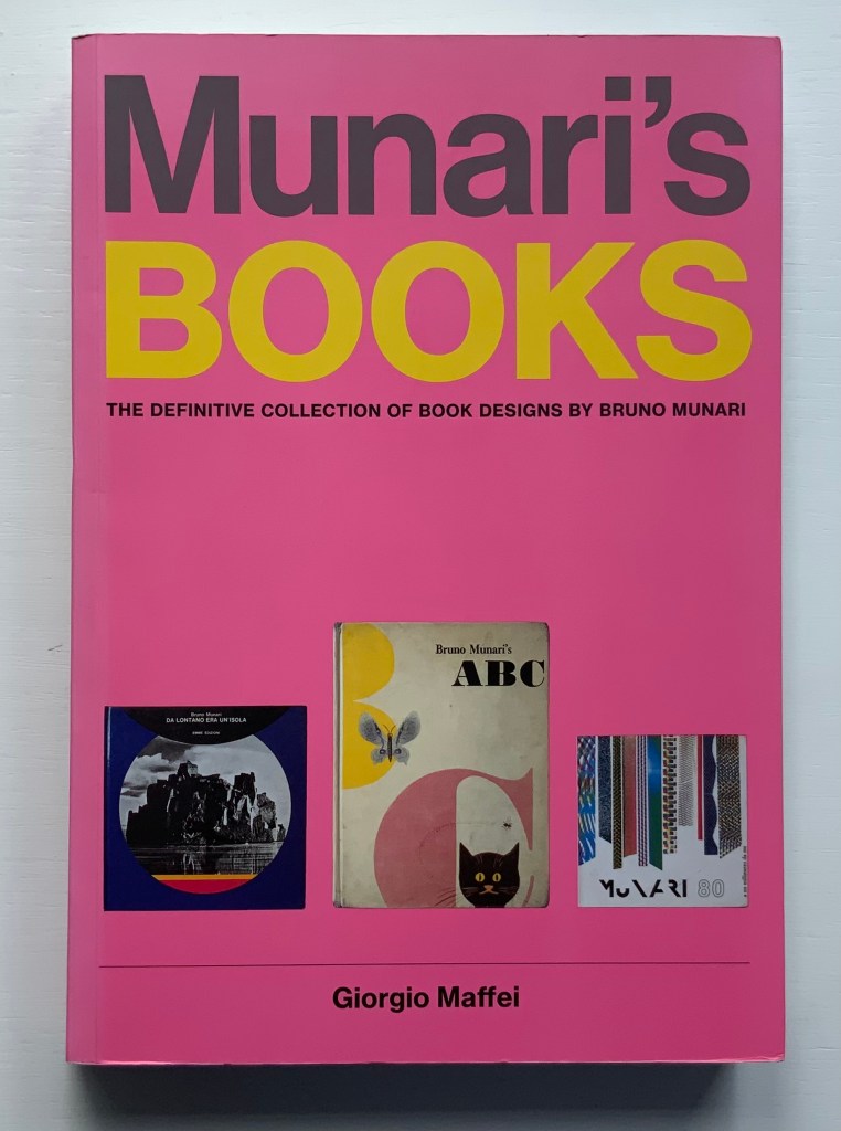
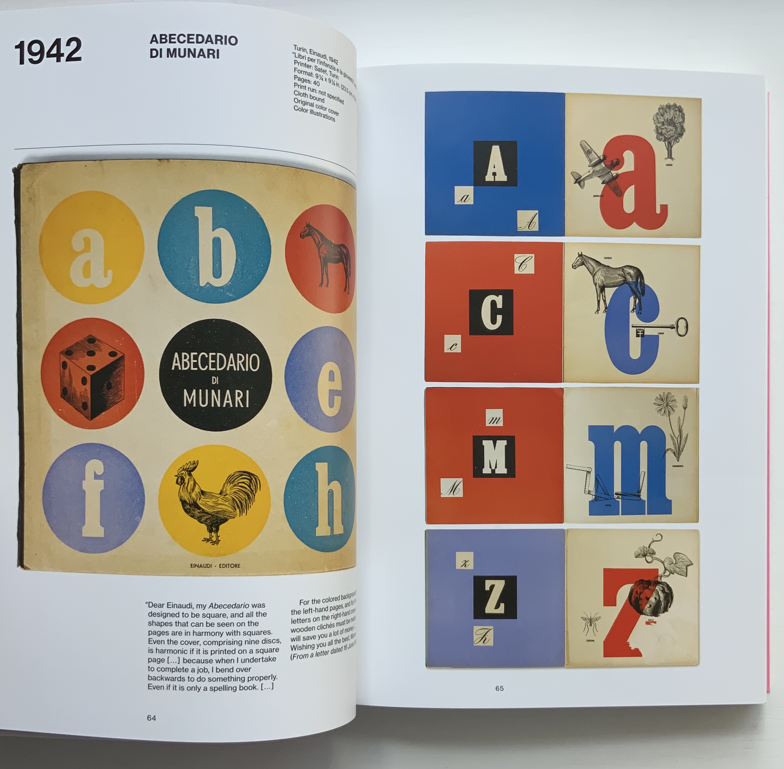
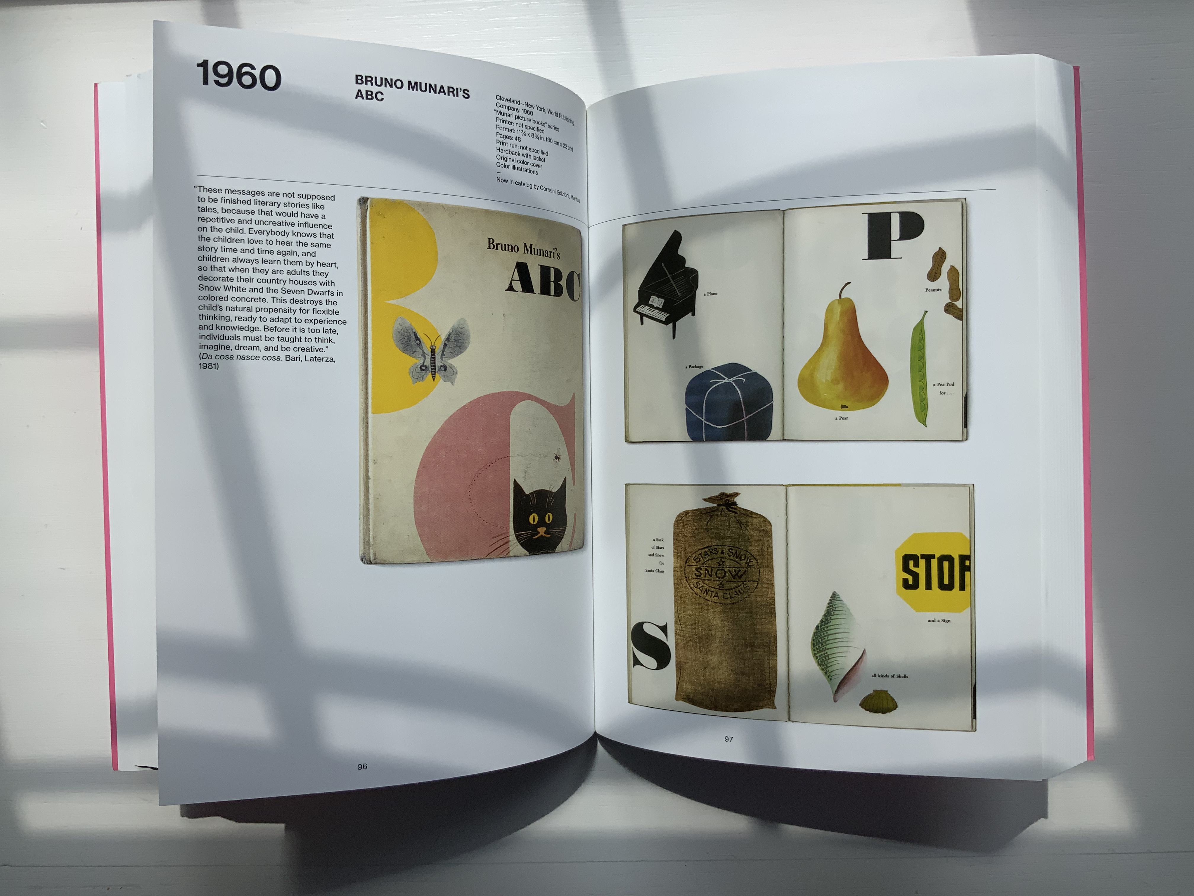
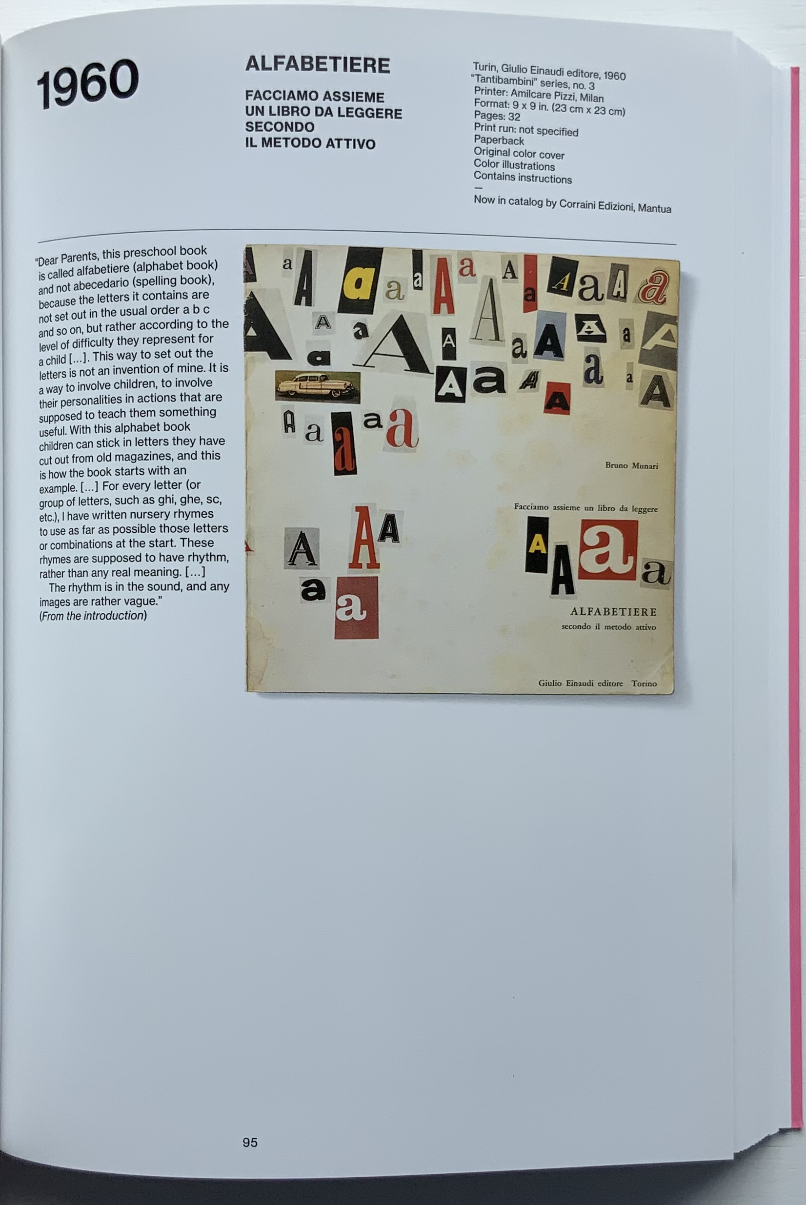
Giorgio Maffei’s 2008 definitive collection of book designs by Bruno Munari brings together two of Italy’s renowned book artists. Giorgio Maffei’s own work, his writing and gallery/bookshop (highlighted by his son Giulio Maffei’s extraordinary video catalogues Le vite dei libri) warrant a catalogue raisonné in their own right. The Italian edition published by Munari’s long-time publisher Maurizio Corraini was followed up in 2015 by this translation by Martin John Anderson and Thomas Marshall in 2015. For the Books On Books Collection, one of the great pleasures of Munari’s works is its attention to the alphabet, which this book documents.
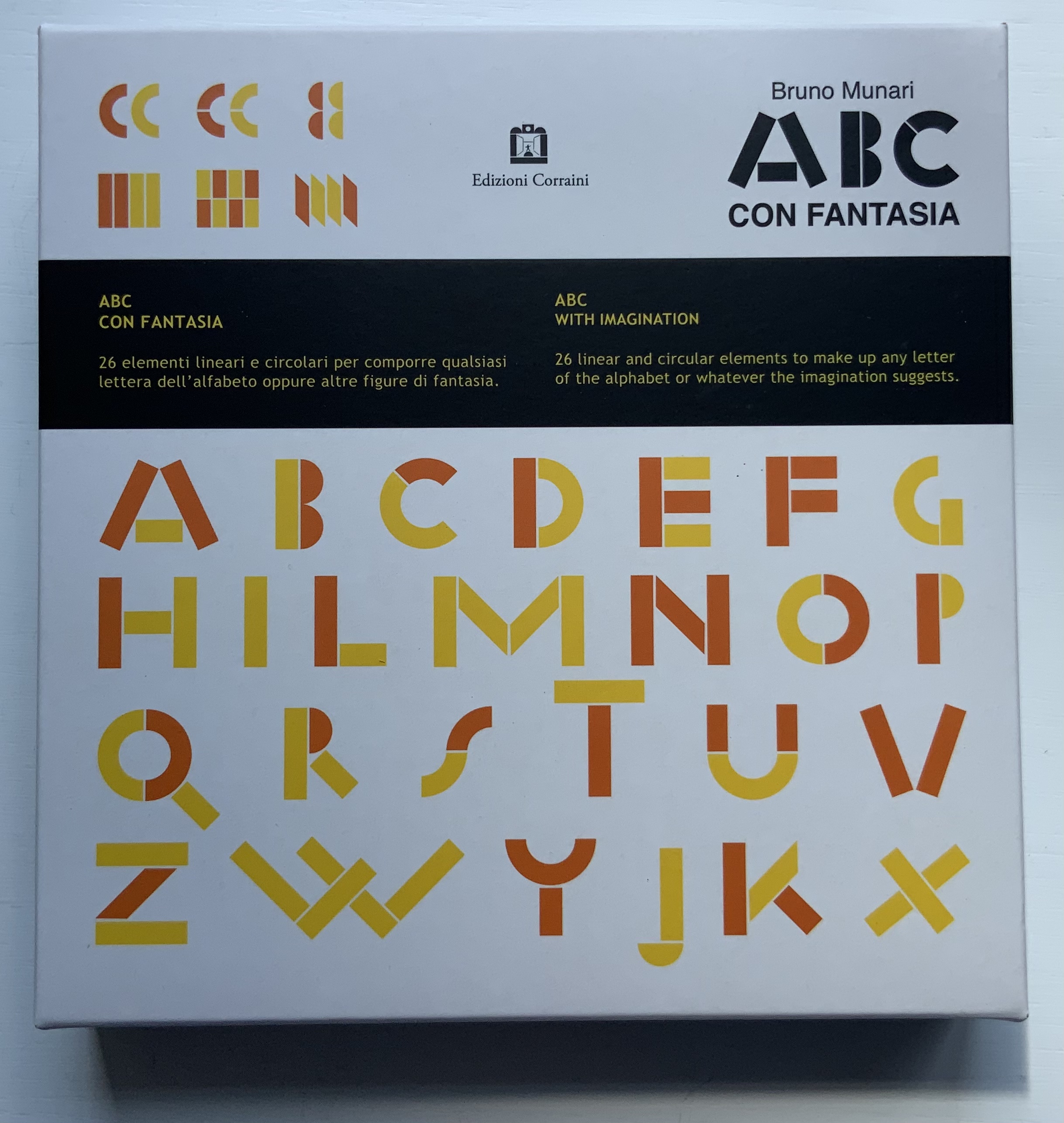
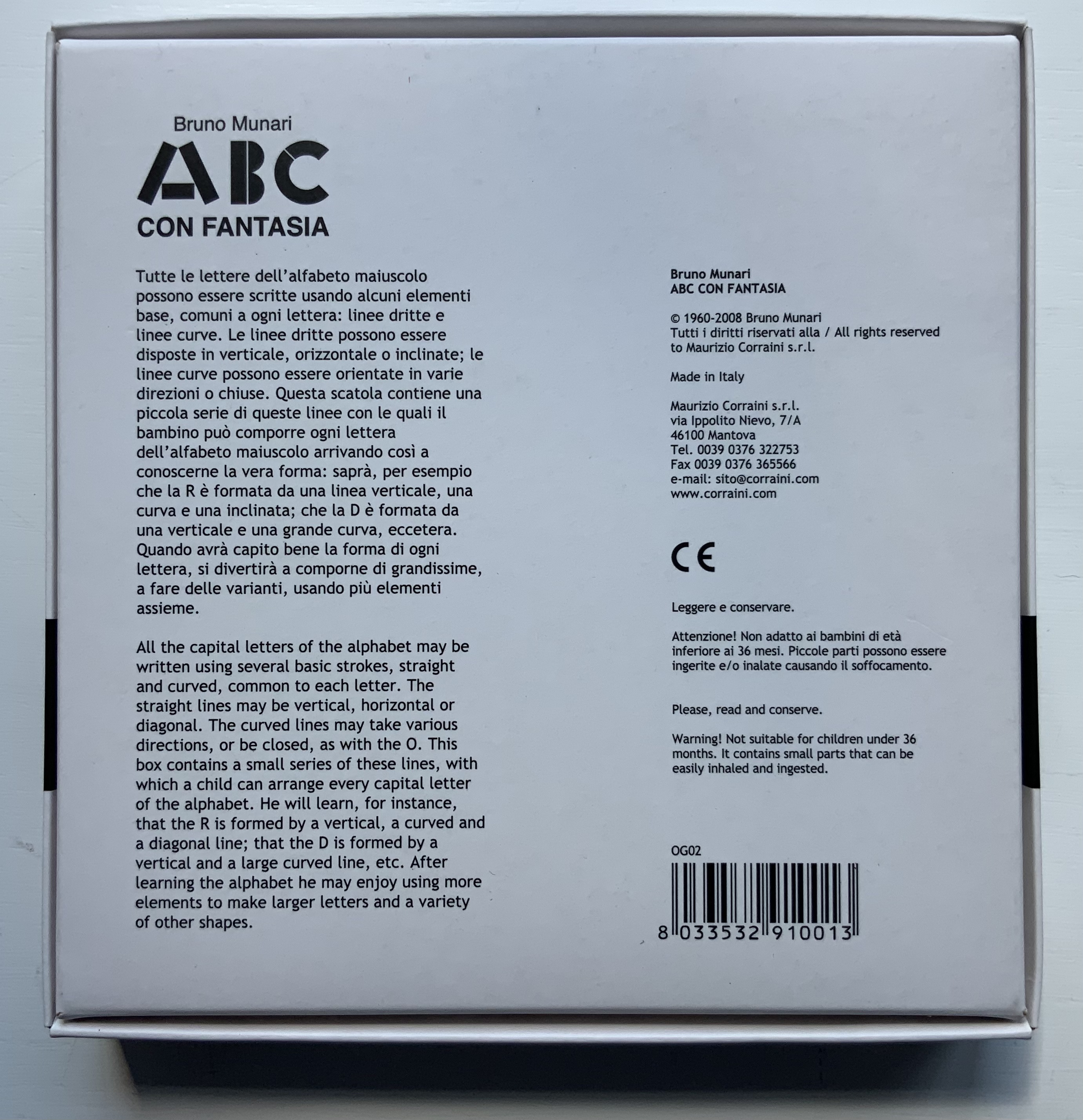
Although not shown in Munari’s Books, an alphabet-related work that underscores Picasso’s calling Munari “our Leonardo” is ABC con fantasia (1973/2000). If we are to believe Fra Luca Pacioli, it was Leonardo da Vinci who inspired his “straight lines and curves” exposition for creating letters. Following in their footsteps, Munari provides the linear and curvilinear basics for the collector and offspring to join the game.
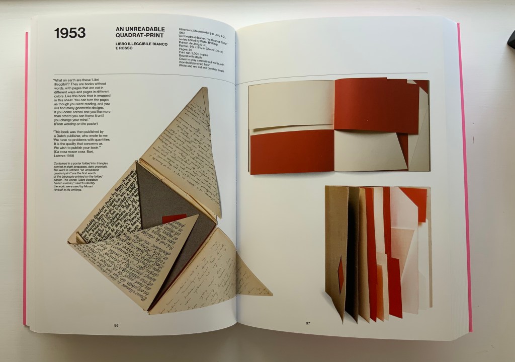
Another pleasure is how Munari’s works lead to other works in the collection. Just by preceding them in Pieter Brattinga’s Kwadraatblad/Quadrat-prints series, Munari’s An Unreadable Quadrat-Print (1953), below, conjures up Wim Crouwel‘s, Gerard Unger‘s, Timothy Epps and Christopher Evans‘, and Anthon Beeke‘s more alphabetical contributions.
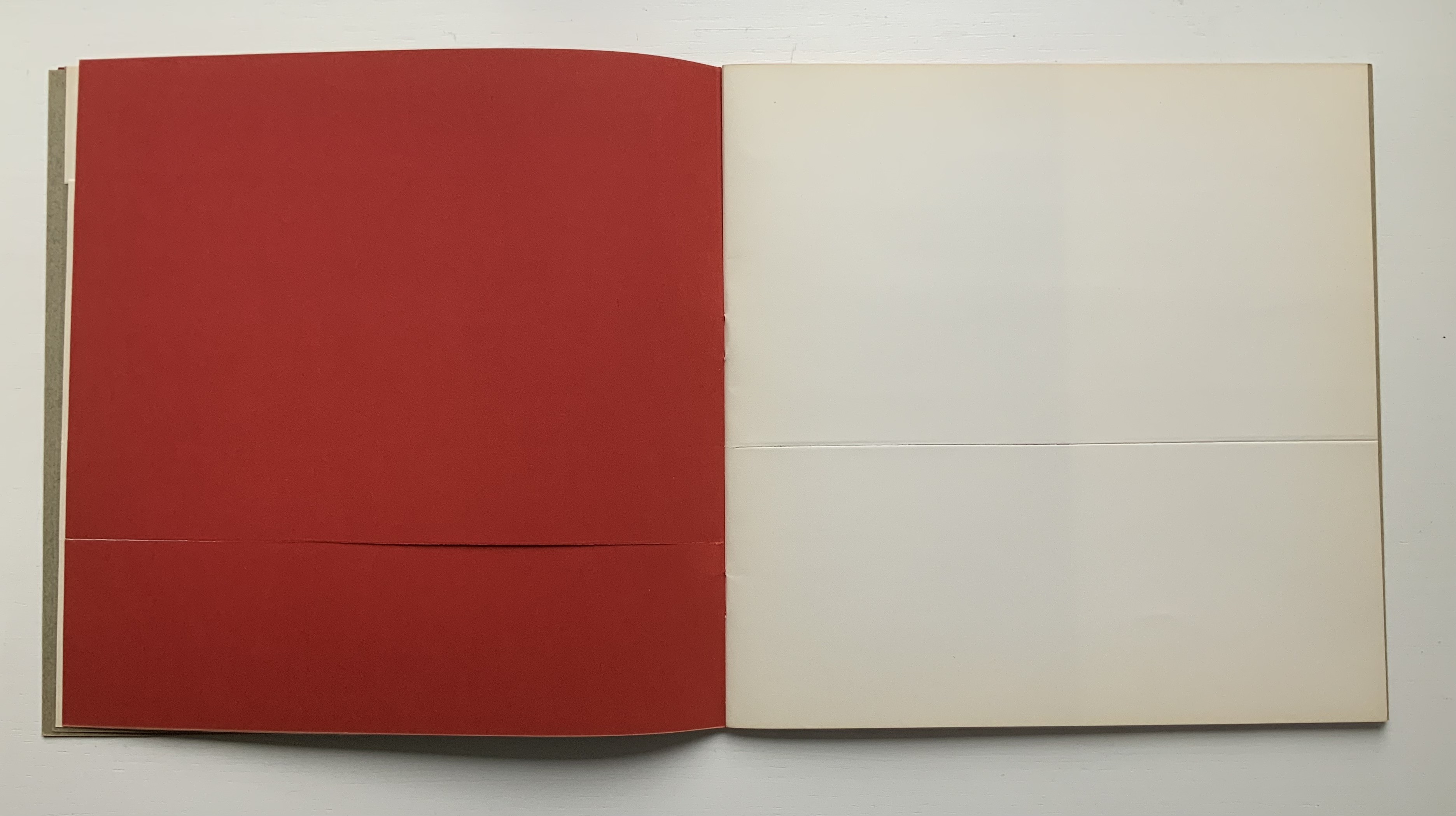
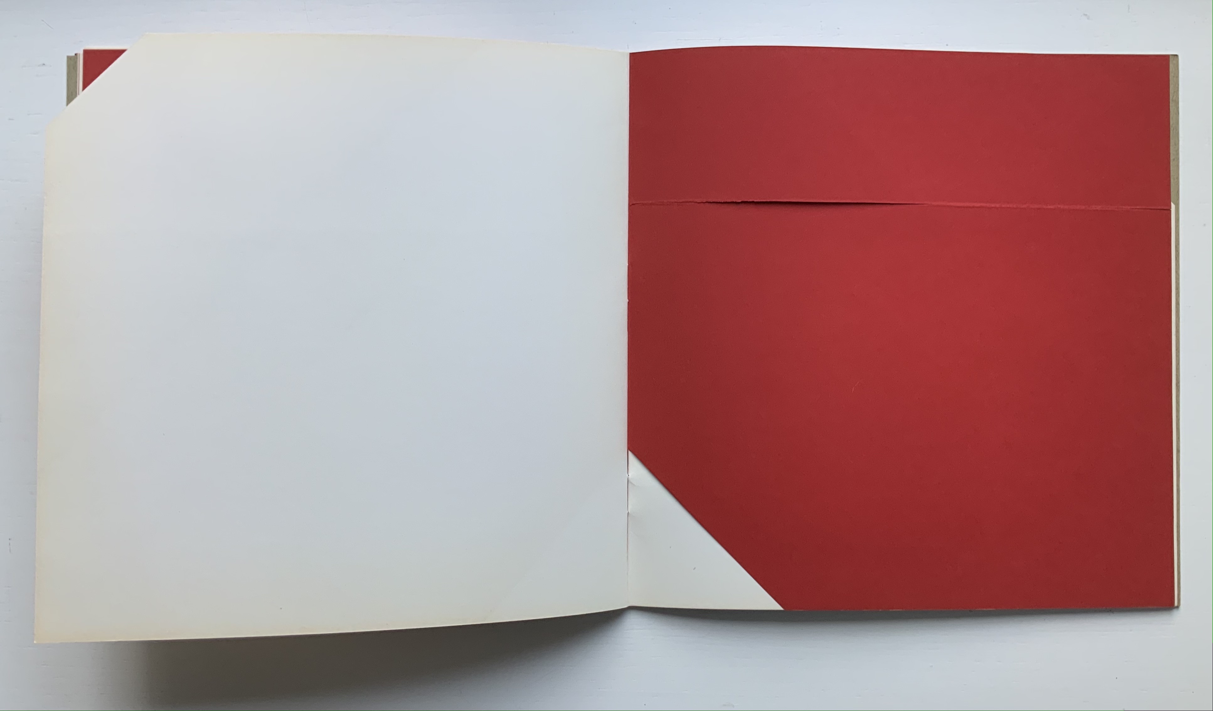
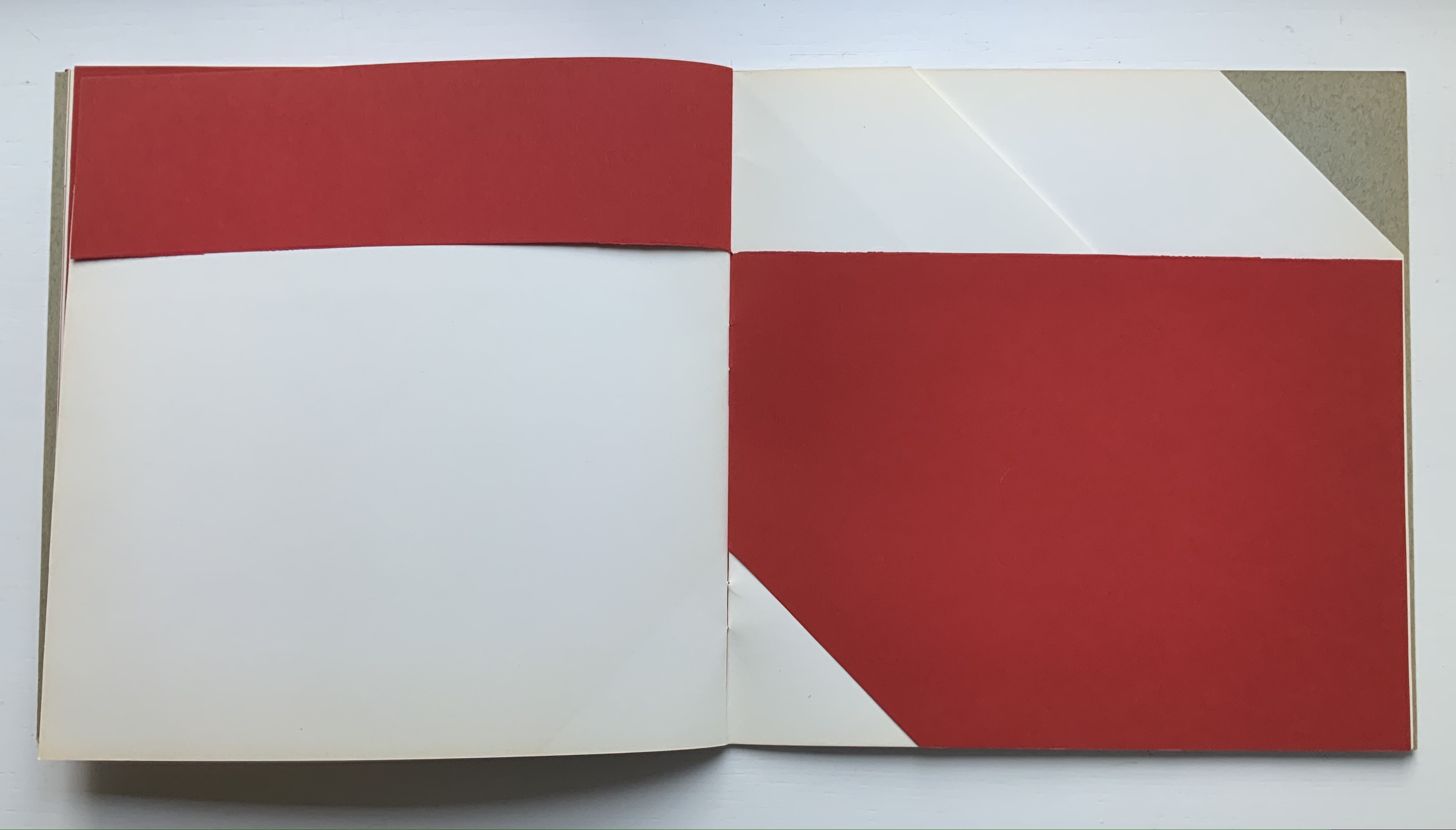
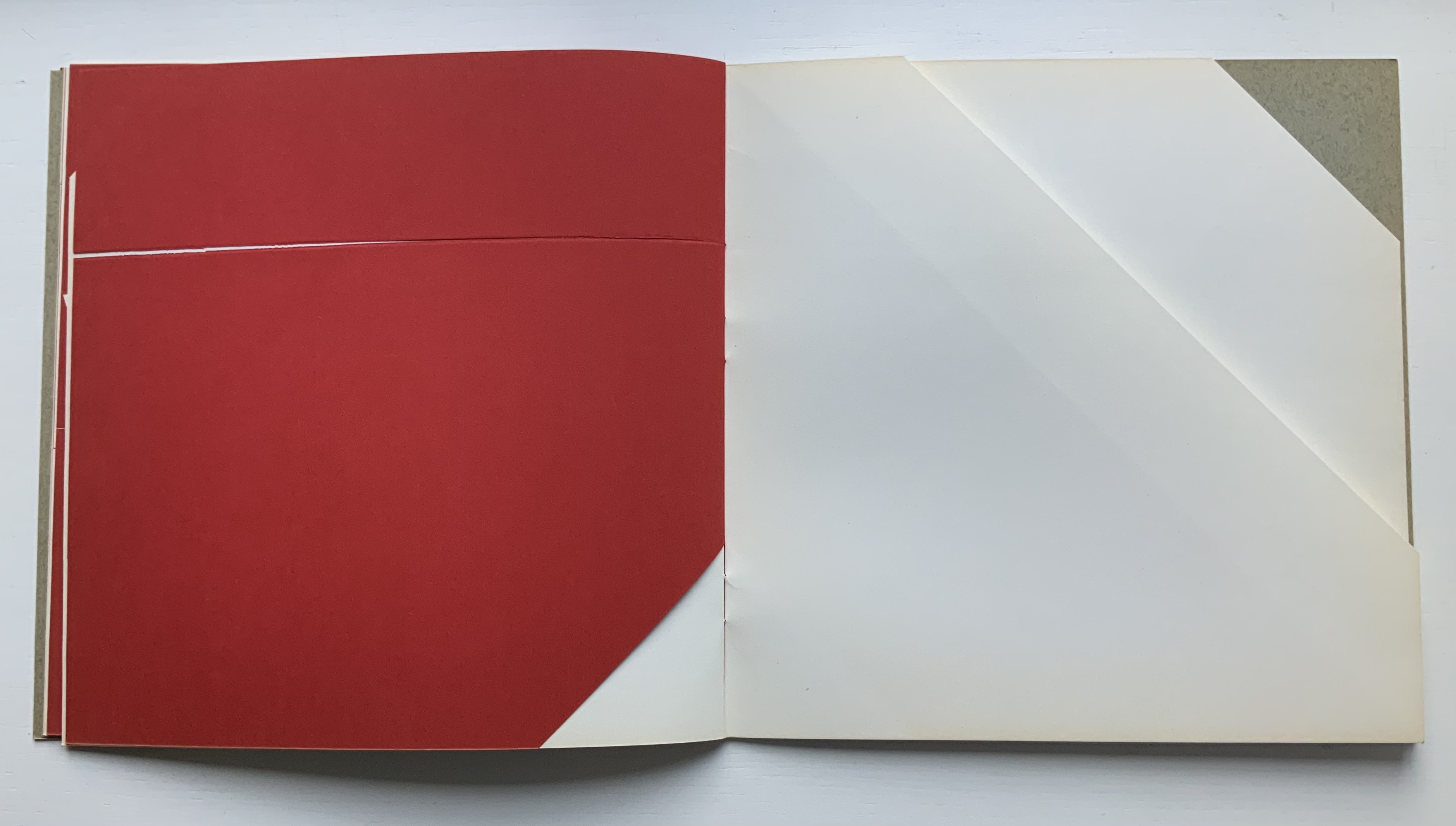
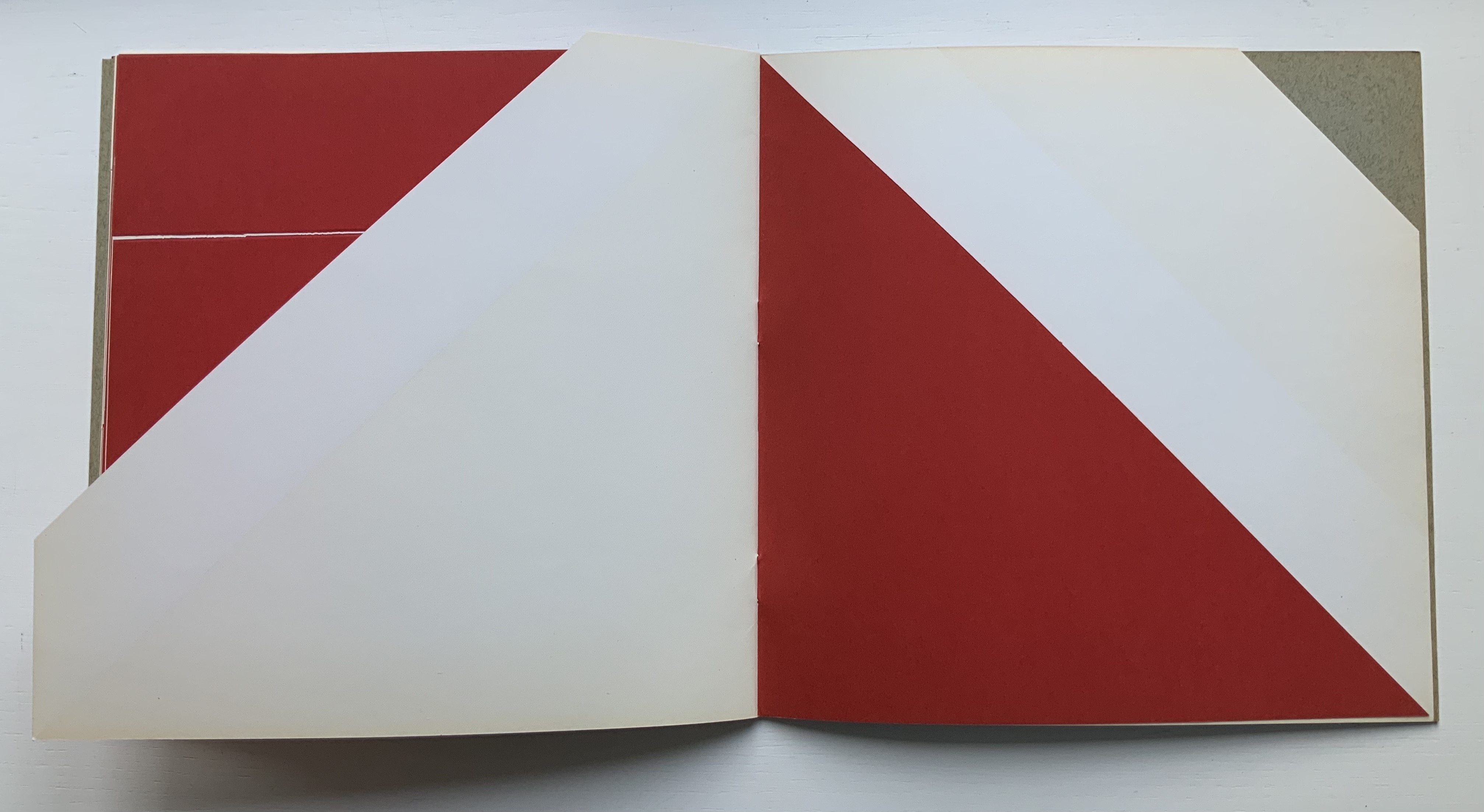
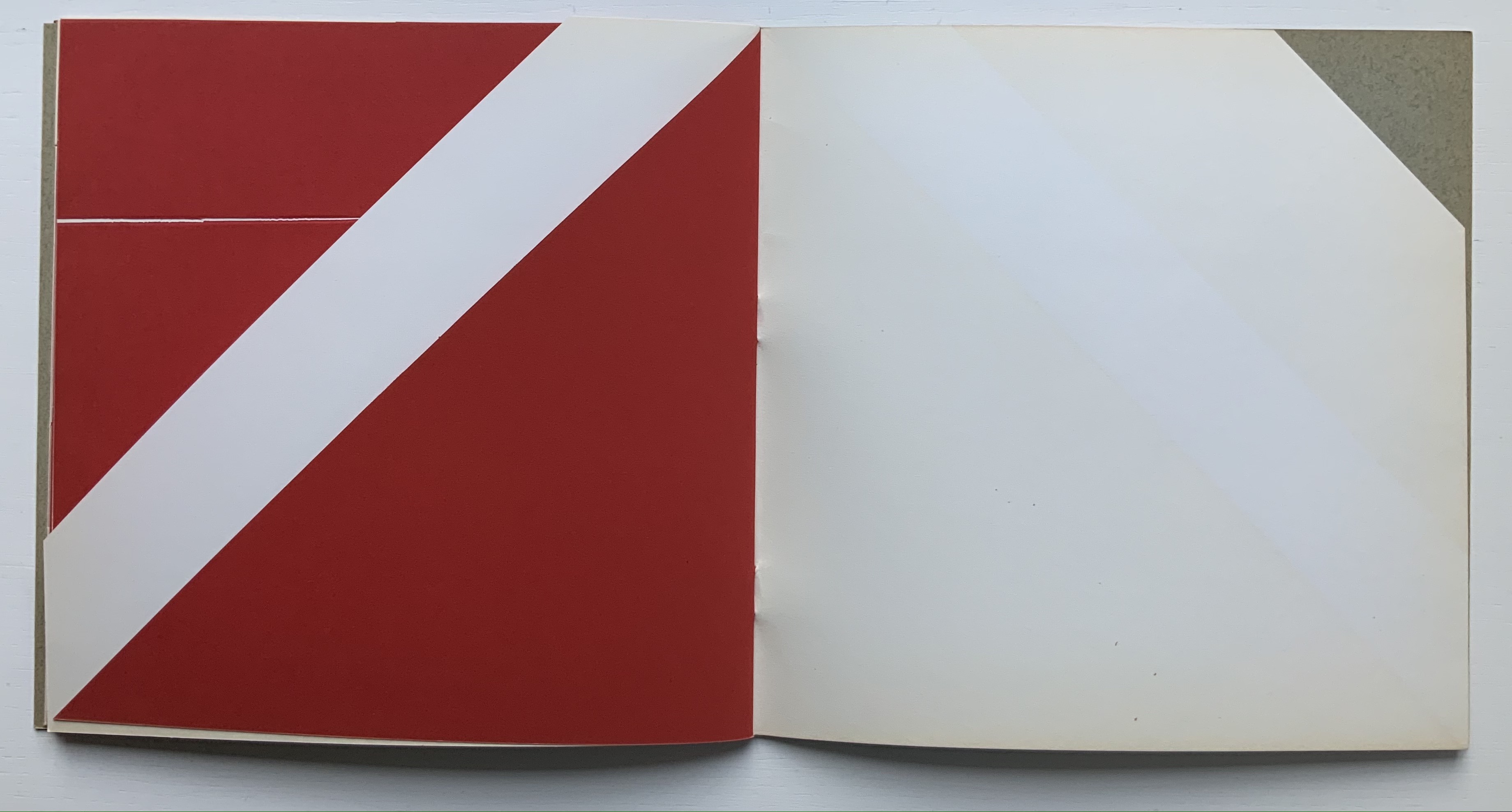
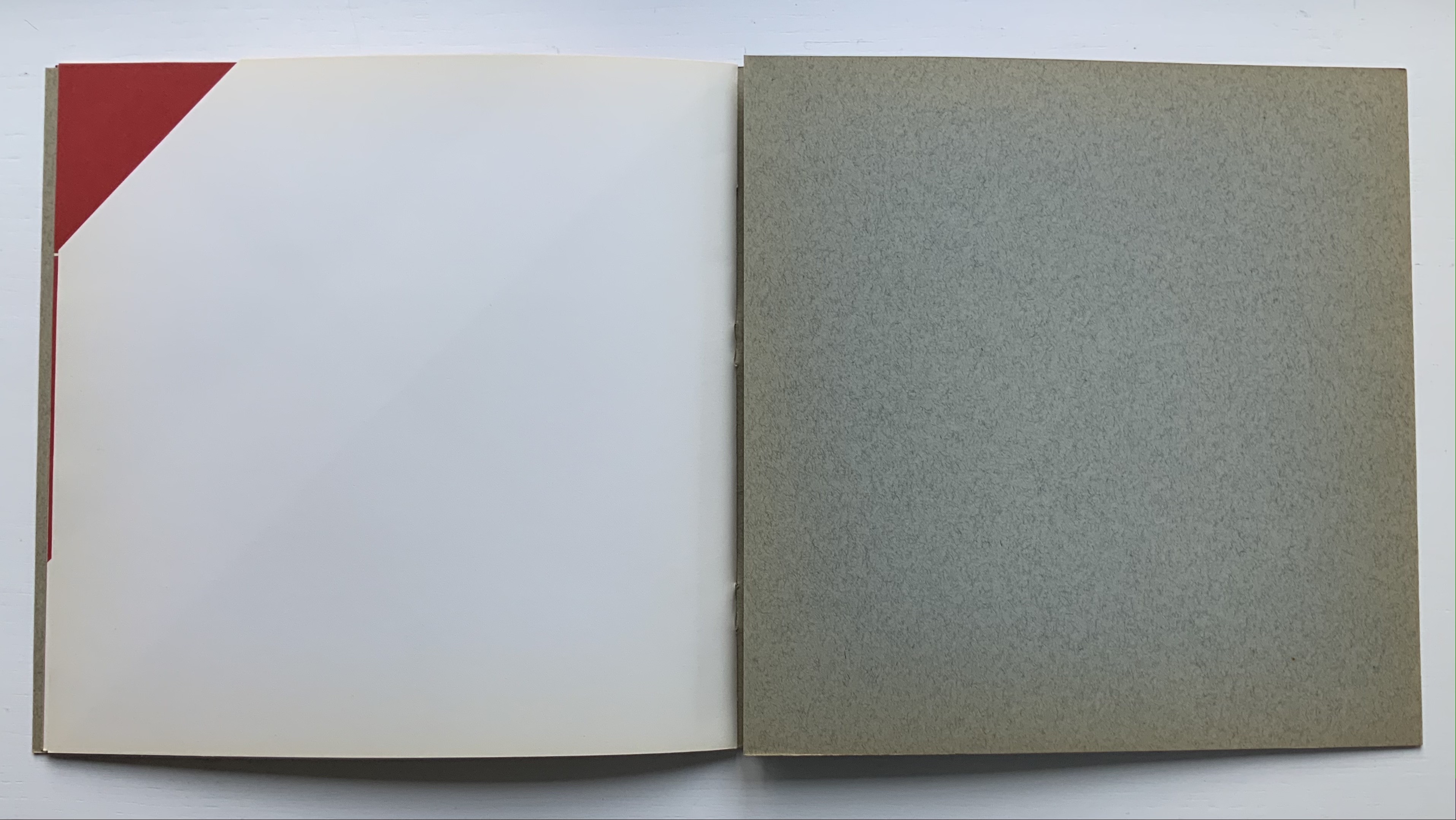
Libro illeggibile bianco e rosso / An unreadable Quadrat-Print / Een onleesbaar kwadraat blad / Ein unlesbares Quadrat-Blatt (1953)
Although there are no words on numbered pages that have to fall in the right order, An Unreadable Quadrat-Print still presents the author/printer/binder with a challenge in imposition. White and red alternate, which is easy enough, but to cut or not cut a folio on the left and right, how to cut it, how to place the differently cut folios in the right order to achieve the variation in images when the pages turn, how to ensure a sewable area down the center for each folio whether it has a horizontal cut extending into the spine or a diagonal one extending from some point along the spine — that is impressive. It speaks to the sculptural process and result in making books, as well as the sculptural process of reading them.
The following sequences — the book’s first five double-page spreads and then its last six — take a normal page-turning approach, always turning from the upper right corner of whatever shape/page is available. Note how, in the last six double-page spreads, the pages and shapes become more complex.
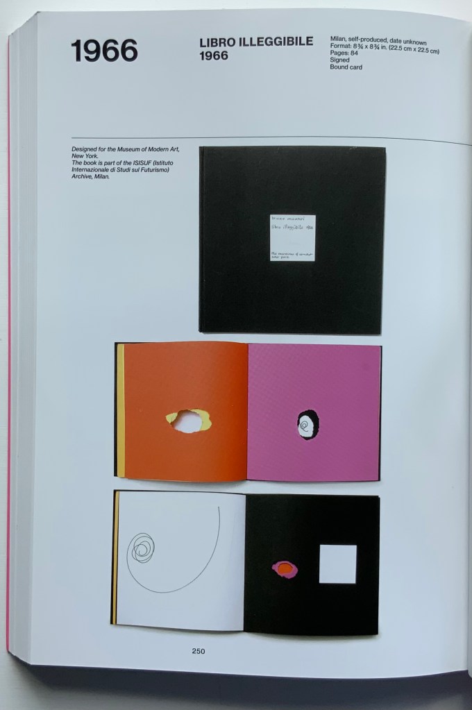
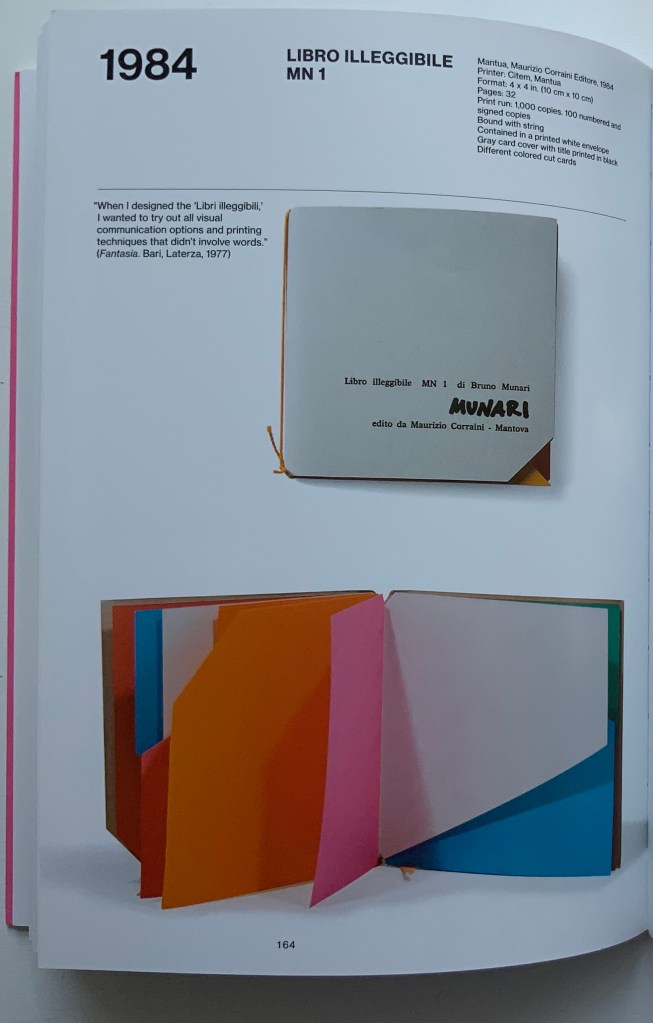
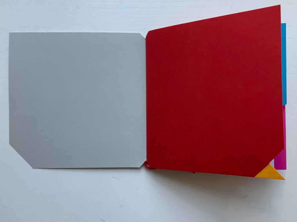
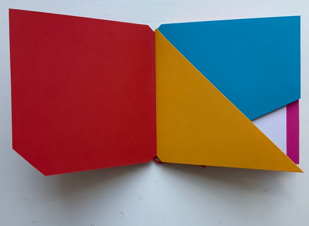
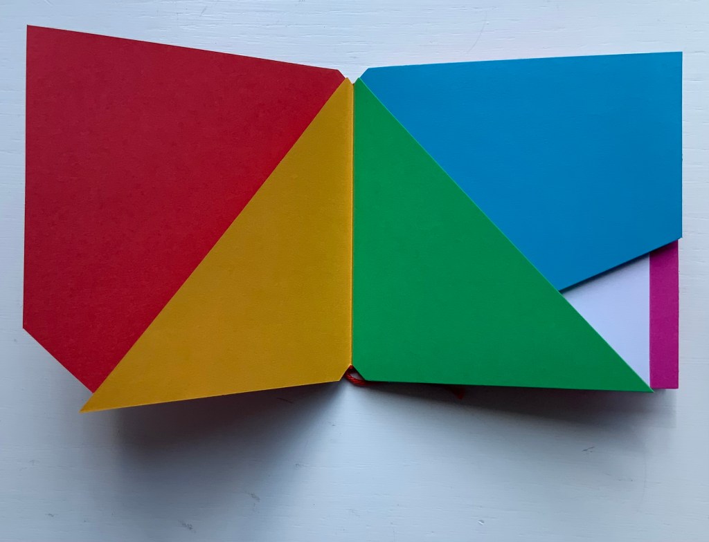
Libro illeggibile (1966), below left, calls to mind Katsumi Komagata’s A Cloud (2007), and the one in the middle foreshadows Eleonora Cumer’s subtle artistry with transparent paper in Circoscrivere lo spazio No. 3 (2021). While Munari’s rare works press modest budgets, some of it — in its simplicity and popular appeal — has led Corraini Edizionito put it within easier reach. Numerous reissues of the 1984 Libro illeggibile MN 1 have pushed its price to €5. Short of the artist’s signature (which would likely obstruct the aesthetic intention), a copy from the latest 5000-copy print run will “perform” and deliver the same experiential value as one from the earliest run.
Munari’s many series of illegible books tap into book artists’ longstanding and ongoing preoccupation with whether a book without words can communicate information, narrative, sensations or feelings through material, shape or color and their permutations. The colors, shape, feel and binding of Libro illeggibile MN 1 evoke simple and sophisticated pleasure in their juxtaposition and sequence. The unchanging straightness of the top edge and the anchoring red thread of the binding set off the changeability of shapes and colors.
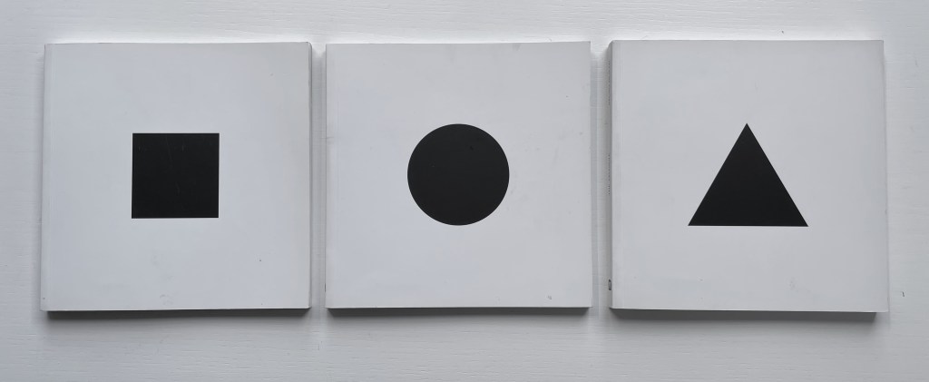
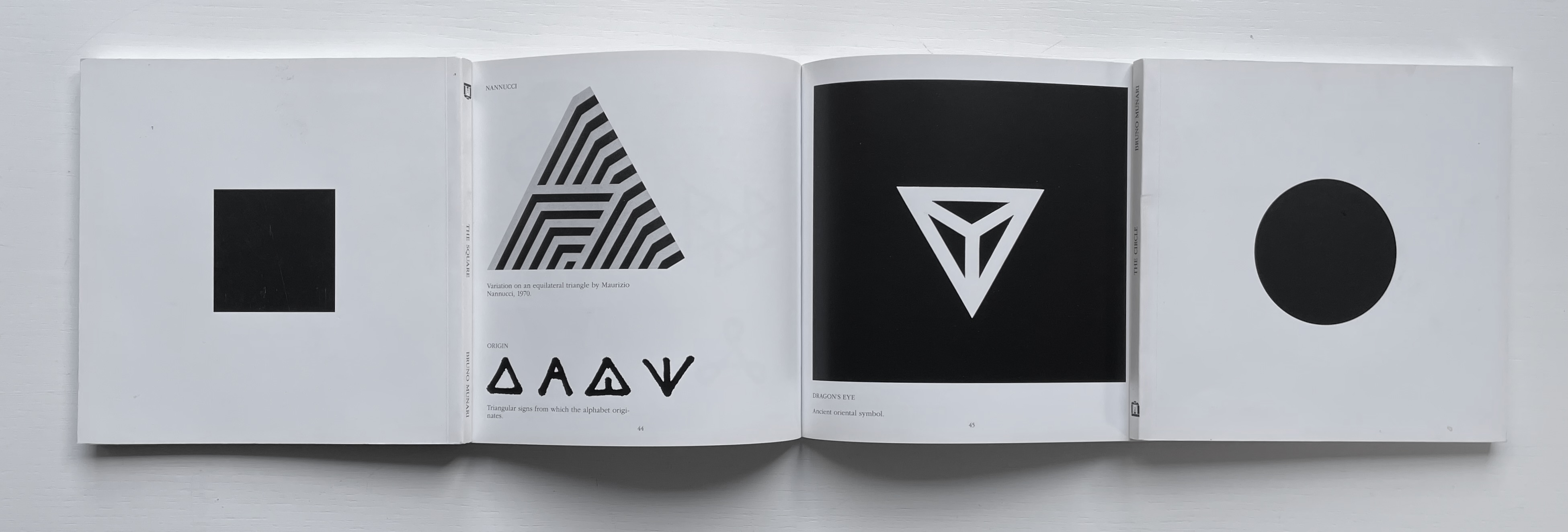
The Square (1960), The Circle (1964) and The Triangle (1976)
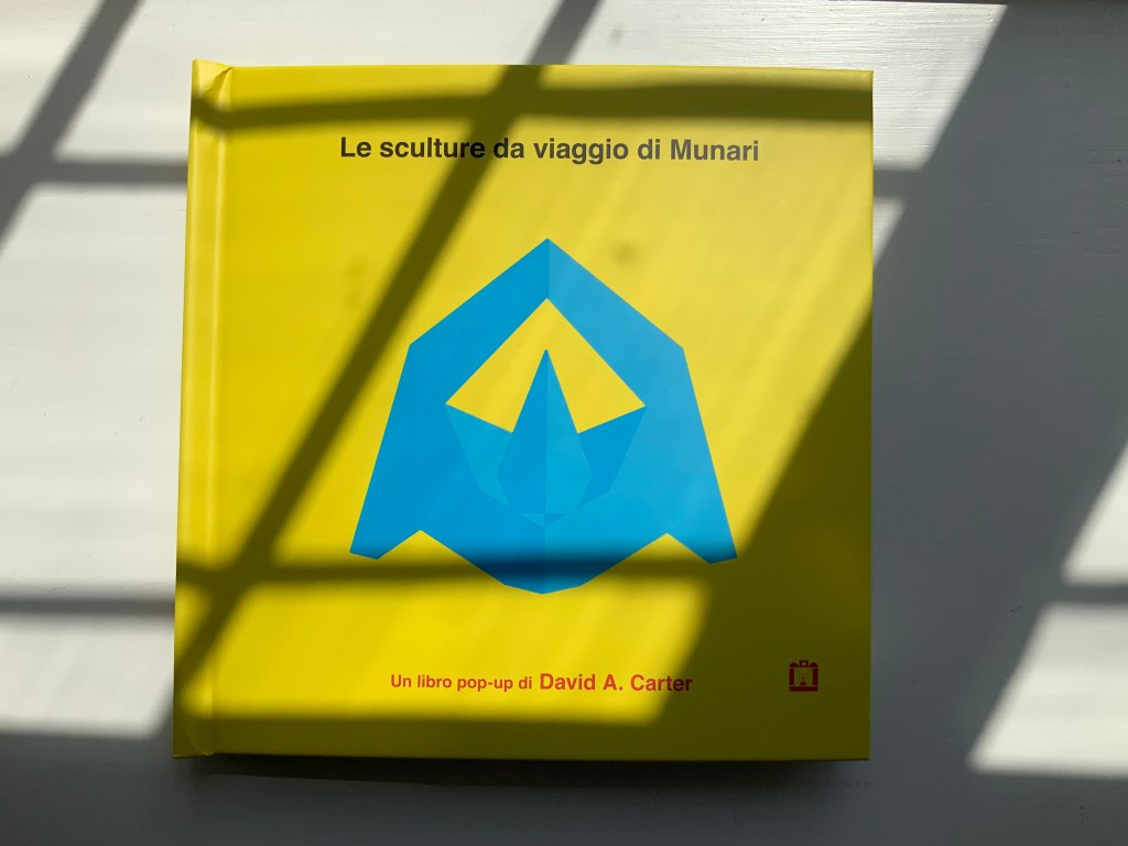
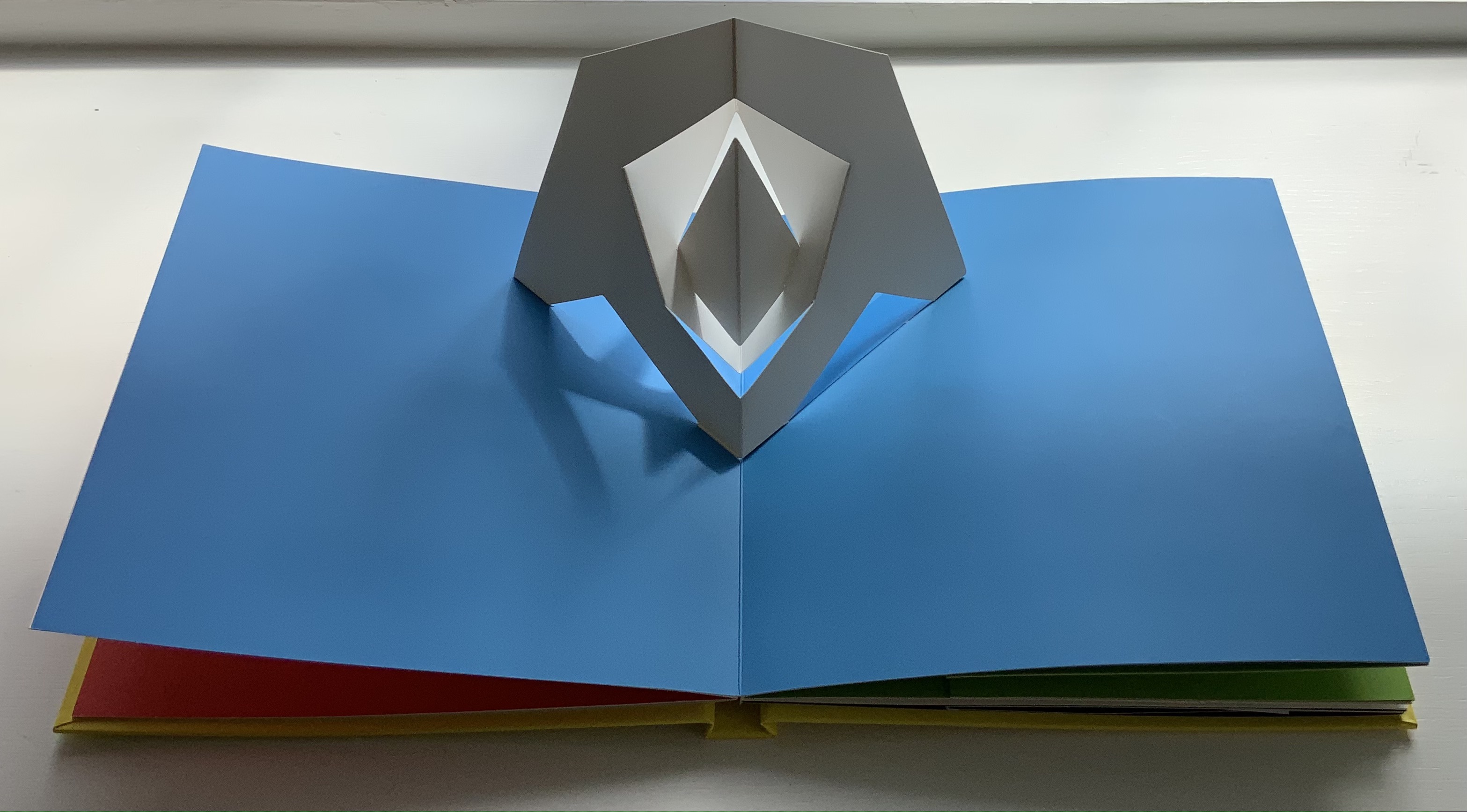
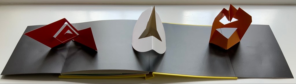
Although not a book of Munari’s making, David A. Carter’s Le sculture da viaggio di Munari is one way of bringing the spirit of Munari’s “travel sculptures” into the collection. Carter’s homage carries the blessing of Corraini Edizioni, further justifying its inclusion.
Travel sculptures started off as small sculptures (some even pocket-sized) to carry with you, so you could take part of your own culture to an anonymous hotel room. Later they were turned into ‘travel sculptures’, five or six metres tall and made of steel. One of these was seen for a few months in Cesenatico, another one in Naples. Others are sleeping among huge trees in the Alto Adige region.’ This is how Italian designer Bruno Munari (1907-1998) described his ‘travel sculptures’, which in turn inspired American illustrator and designer David A. Carter for this pop-up book. –Corraini Edizioni website. Accessed 3 August 2021.
Munari’s travel sculptures also recall works in the collection like Cumer’s scultura da viaggio dipinta n.2(2017), Komagata’s「Ichigu」(2015) and, albeit less portable, Ioana Stoian’s Nous Sommes (2015).
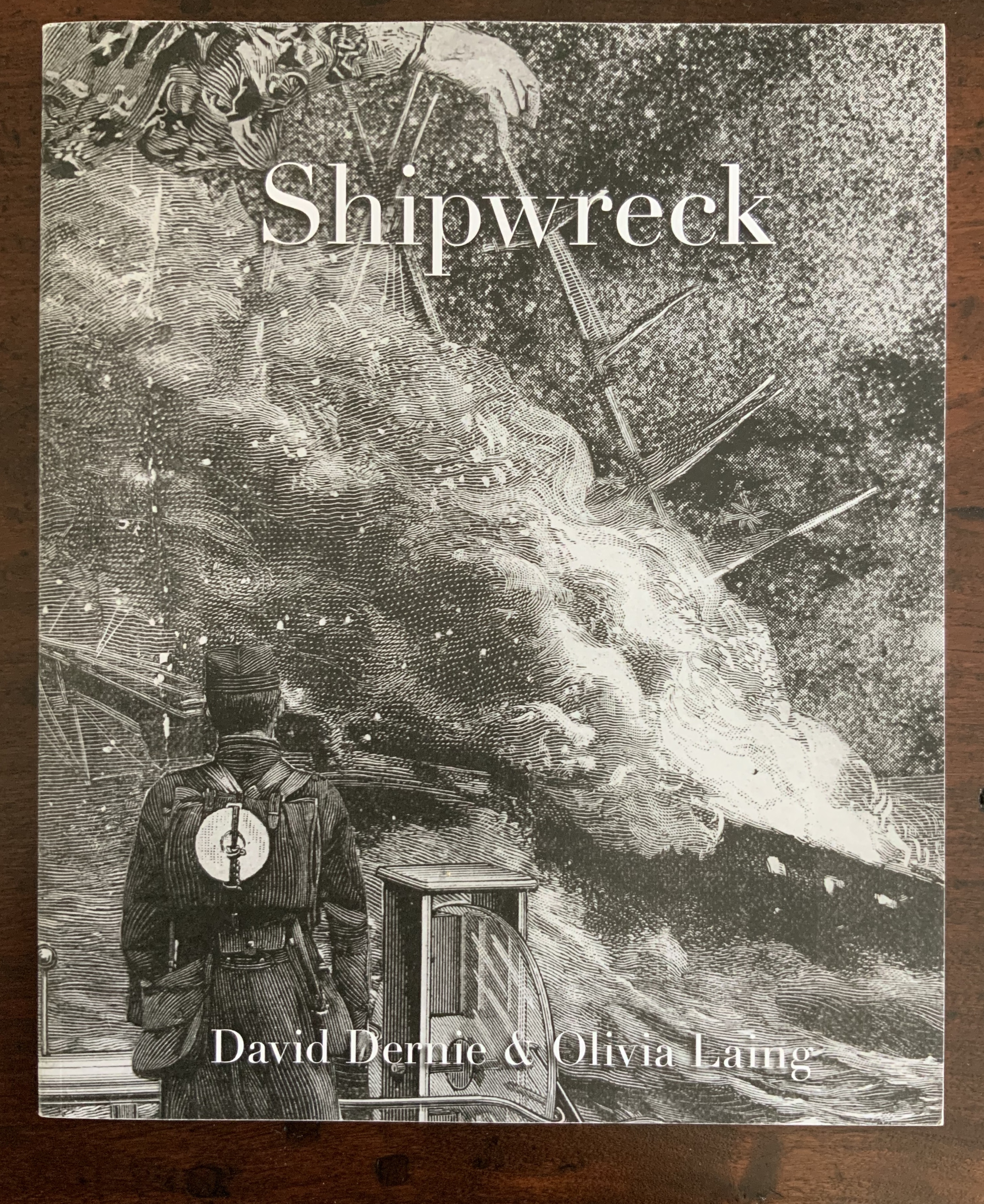
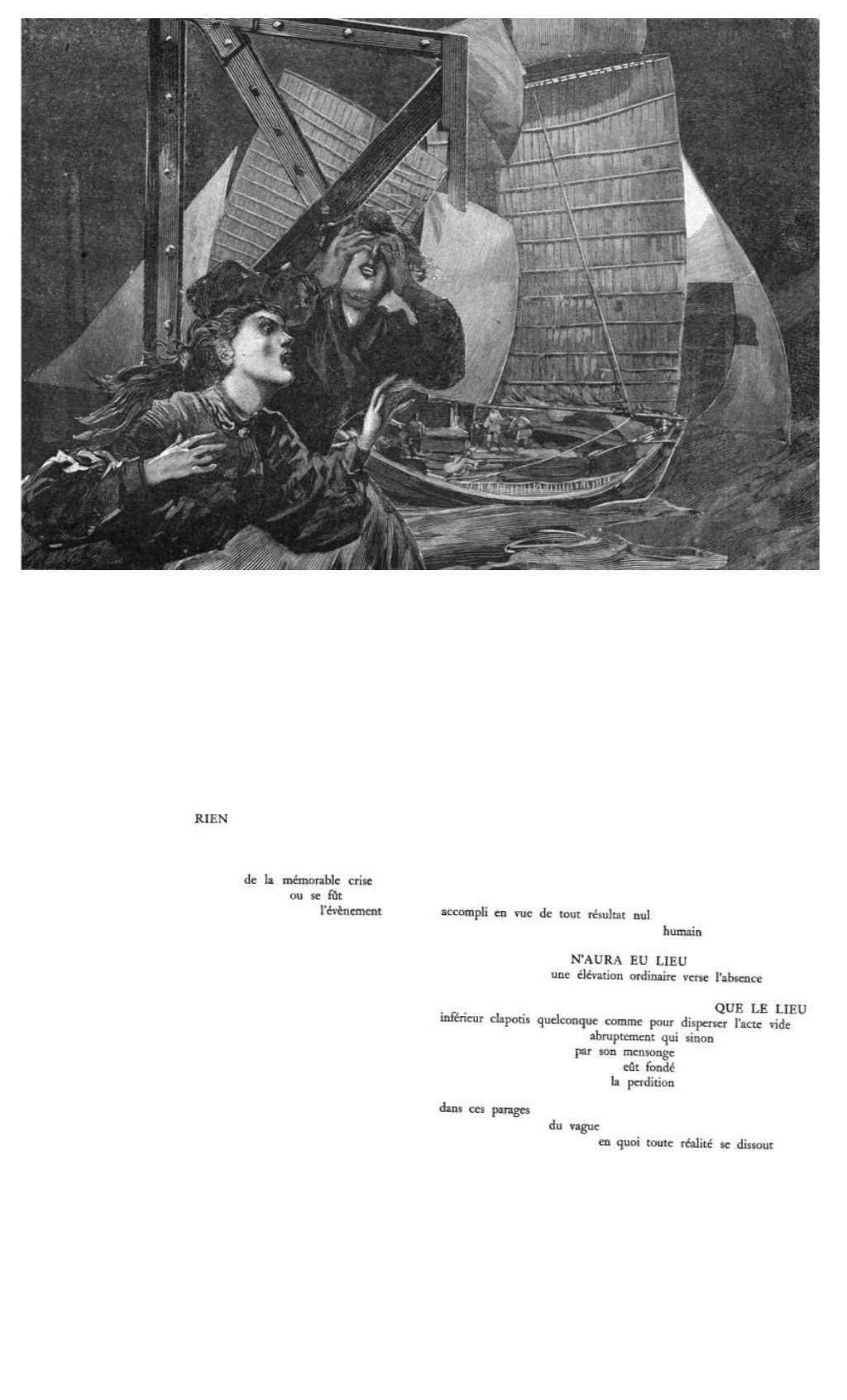
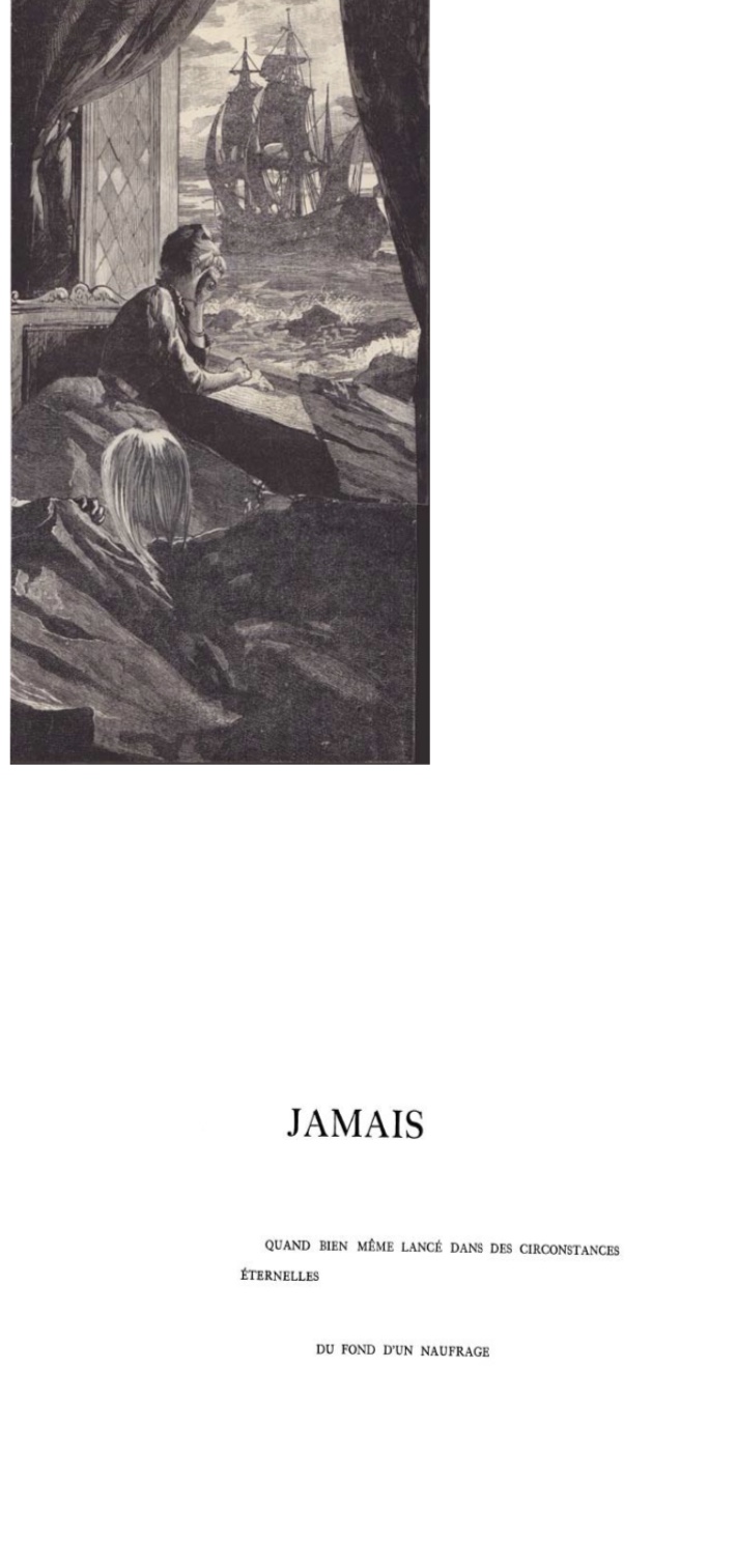
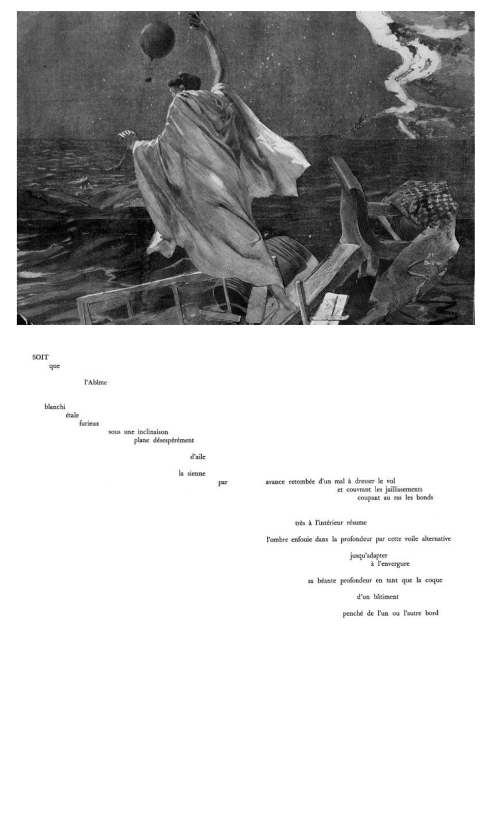
Shipwreck (2016) David Dernieand Olivia Laing Perfect bound softcover. H256 x W210 mm, 48 unnumbered pages. Edition of 100, of which this is #88 and signed. Acquired from the artist, 27 August 2020. Photos: Books On Books Collection.
Shipwreck, a collaboration between artist/architect David Dernie and writer Olivia Lang, first appeared as an installation at the Cambridge School of Art’s Ruskin Gallery (3-19 November 2016). There are three works one might consider here: 1) the installation as event and environment, 2) its accompanying book presenting two parallel narratives, one composed of Laing’s text and the other of images of Dernie’s collages displayed at the exhibition and 3) Dernie’s essay juxtaposing those images with pages from Mallarmé’s Un Coup de DésJamais N’Abolira le Hasard.
In his extensively illustrated textbook Exhibition Design, Dernie asserts that exhibition-making is an art in itself — “synonymous with image-making, communication, and the creation of a powerful experience”. Like the “book of the movie”, the exhibition catalogue rarely rises to that powerful experience. More rarely still does it surpass the exhibition. Unlike movies that can be purchased or rented, exhibitions are time-limited experiences. Even if revisited multiple times, an exhibition will close, move on and be replaced by another. The catalogue or online website may be the only media that document an exhibition. Attendees and non-attendees will experience them differently, and without that documentation, the exhibition as a work of art belongs only to the memories of its attendees and organizers.
Shipwreck is not a catalogue of the exhibition. More like an artist’s book, it juxtaposes a literary narrative with a set of prints. There’s no indication that the text was performed in the exhibition hall — live or recorded. If it was, then the attendees may have the memories to recall to make Shipwreck a satisfactory reminder of the event. Whether attendees and non-attendees find Shipwreck “the book” satisfactory as a standalone work is problematic given the third work to consider.
In his essay in Buildings, Dernie describes the collages as
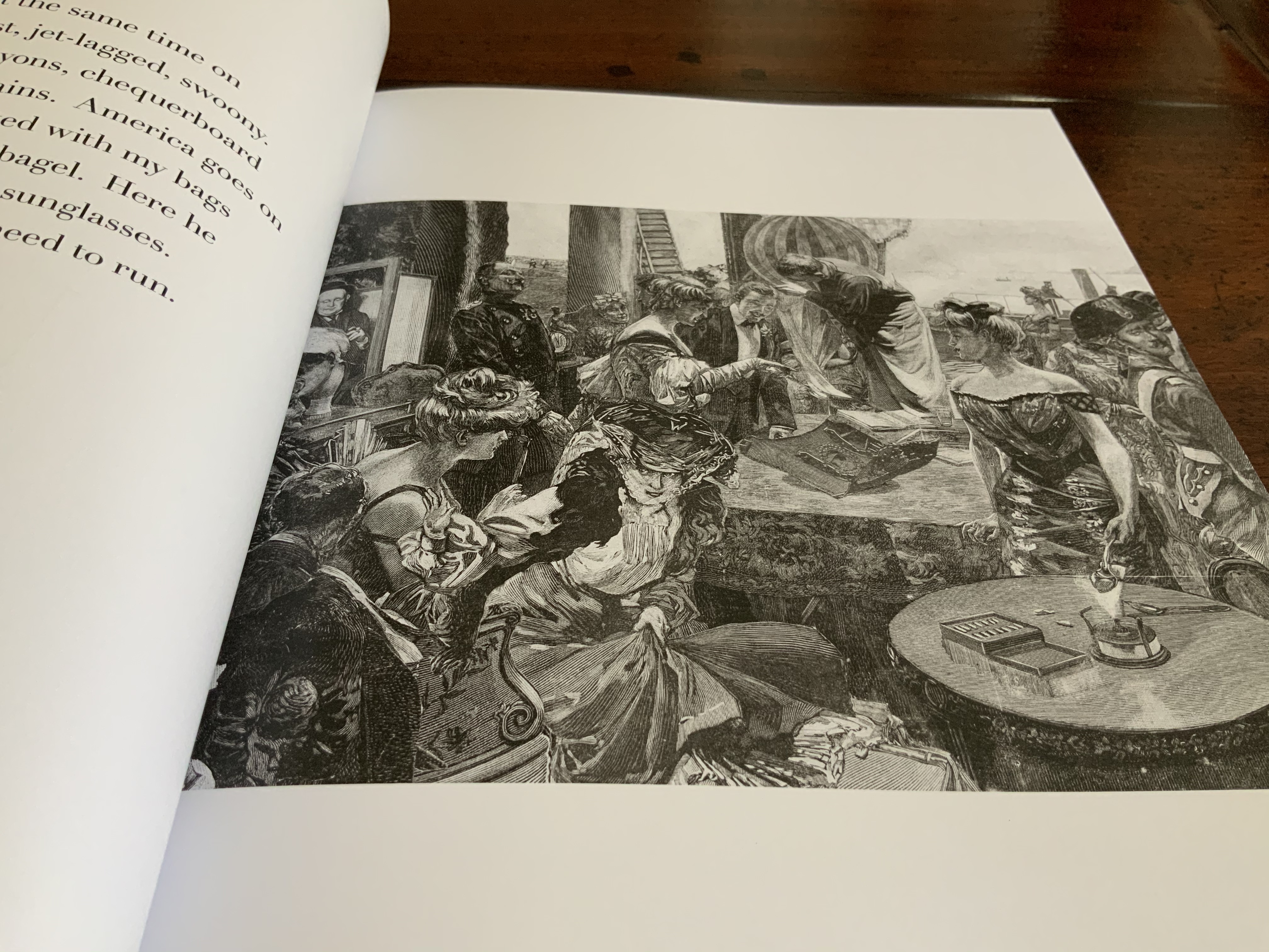
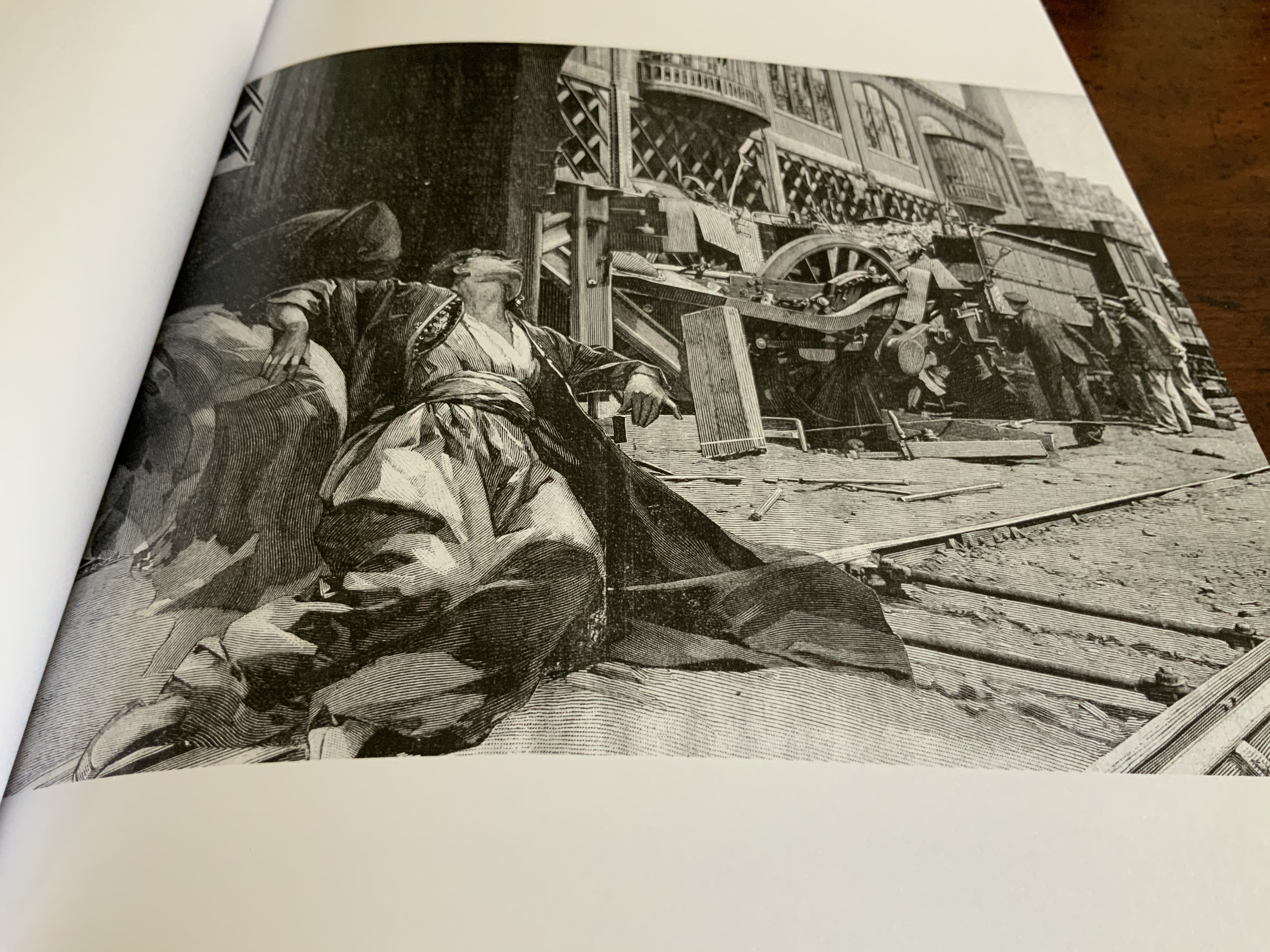
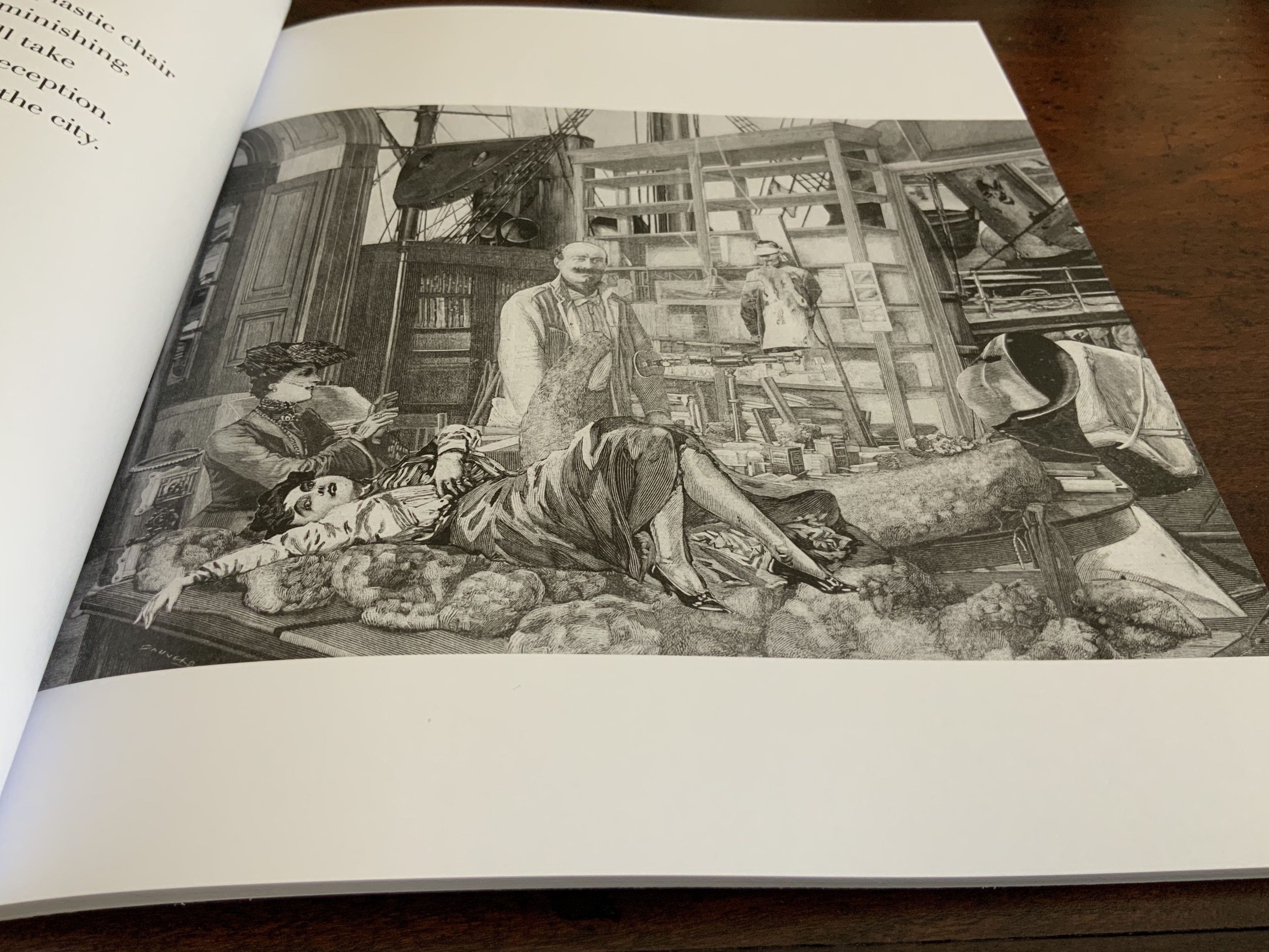
Working in the tradition of the collage novel, and with original engravings from the popular French newspaper Le Grande Illustré (1904), [they] work with the thematic structure and spatiality of Stéphane Mallarmé’s revolutionary poem Un Coup de Dés written a few years earlier. (P. 324)
Like the poem, the collages are heterogeneous and their protagonists are “found”, both in terms of their scale and detail, in the dramatized newspaper of the period. The engravings are a snapshot of the terrible uncertainties, reported disasters and social unrest that colored Parisian life at the time. The re-invented figures, scenes and architectural settings are offered as spatial analogues to the poetic passages, exploring the non-perspectival space of the text, its content and poetic imagery as much as its solipsism and incoherence. (Pp. 330-31)
Drawing his collage material from Le Grande Illustré and analogizing the collage to Mallarmé’s imagery and use of the page’s non-perspectival space, Dernie replays in an original way what the Cubists, Futurists and Dada-ists learned from Un Coup de Dés and Mallarmé. In Total Expansion of the Letter (2020), Trevor Stark has laid out clearly how the collages of Picasso and Braque traced their technique back to Mallarmé. As for what they incorporated from the newspapers, however, the avant-gardists turned to the text of headlines and articles rather than illustrations. Dernie’s result is more reminiscent of Max Ernst’s surrealist novels than the Cubist collages of 1912.
Photos: Books on Books Collection.
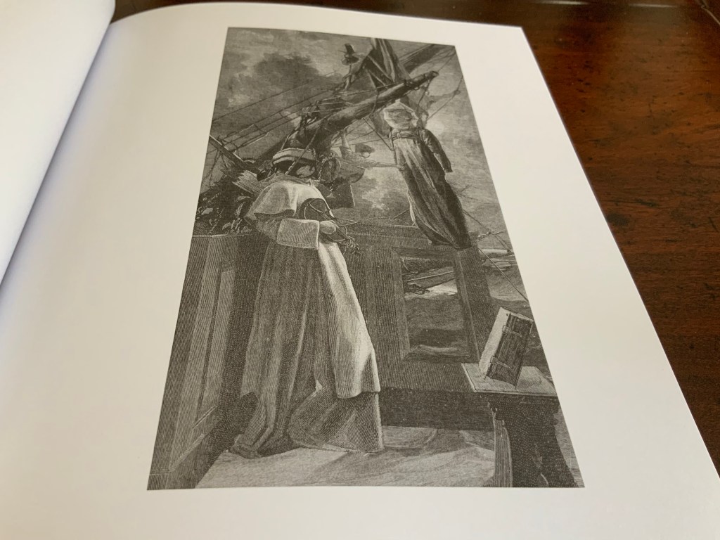
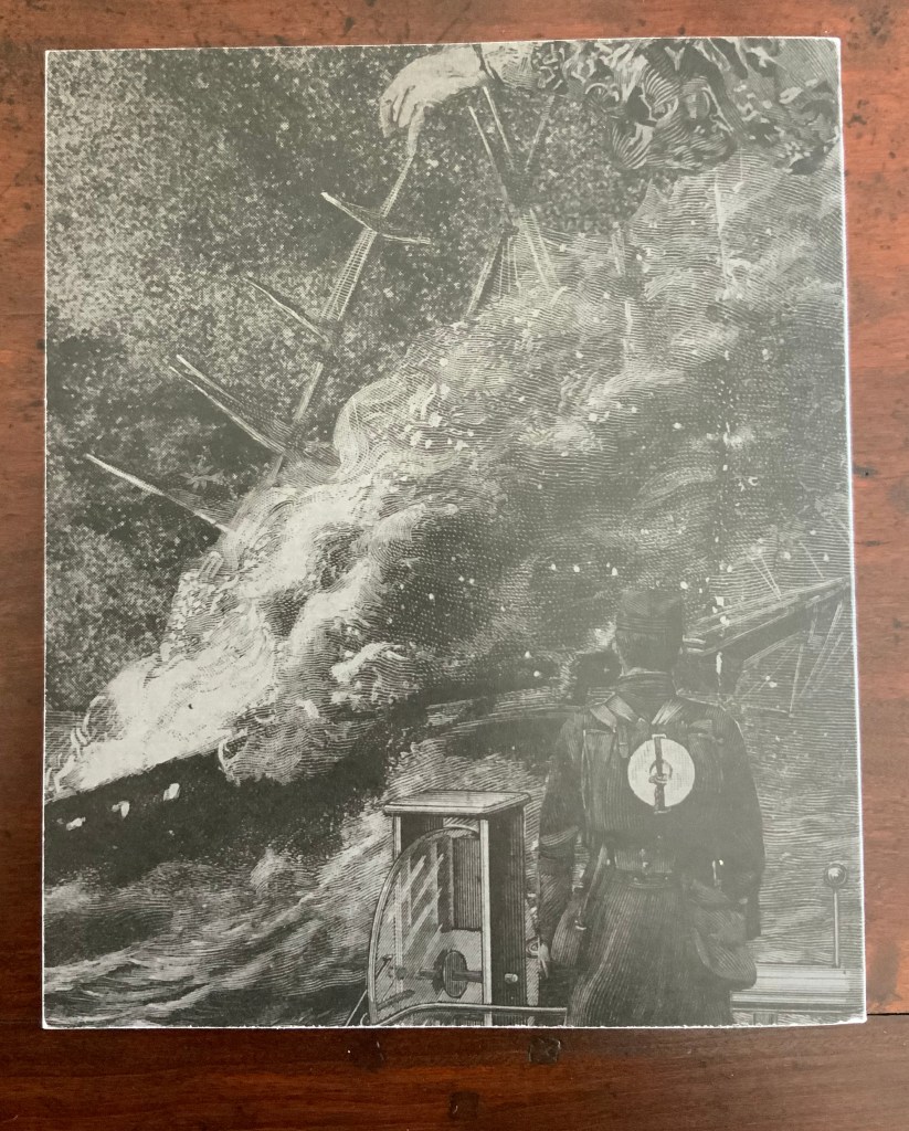
The collages are clearly not simple illustrations of Mallarmé’s poem, but as Dernie points out, they work with the poem. Only in Dernie’s essay, however, can the pairings with pages from Un Coup de Dés be found and enjoyed. The eye moves from collage image to the shape of the text, from the verse and its images back to the collage, and back again.
From “Elevating Mallarmé’s Shipwreck”, pp. 334 and 337. Reproduced with permission of the author.
From “Elevating Mallarmé’s Shipwreck“, pp. 331-32. Reproduced with permission of the author.
Were it not for the limited edition state of Shipwreck, the reader/viewer might be tempted to obtain a spare copy of Un Coup de Dés from the publisher Gallimard, “grangerize” it with Dernies’ collages and gaze on it at leisure.
Further Reading
“Derek Beaulieu“, Books On Books Collection, 19 June 2020.
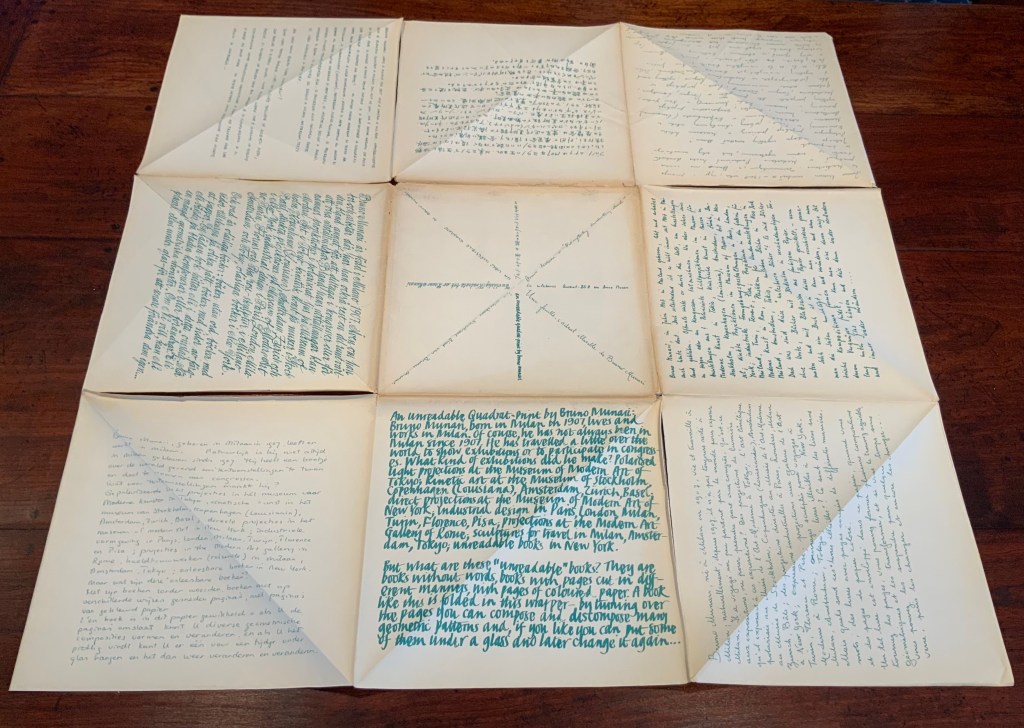
The 125th anniversary of the publication of Stéphane Mallarmé’s Un Coup de DésJamais N’Abolira le Hasard (1897) approaches, and Trevor Stark’s book is a welcome harbinger. Its title comes from Mallarmé’s essay/poem “The Book, Intellectual Instrument”:
The book, total expansion of the letter, should derive from it directly a spacious mobility, and by correspondences institute a play of elements that confirms the fiction (p. 6).
Often with Mallarmé, context is all (not to mention translation in the face of elliptical syntax!) — context is wrapped in self-enshrouded context. His seemingly cryptic sentence above becomes clearer only when the precedent to the word “it” (elle) is understood as la composition typographique from the essay/poem’s preceding paragraph, extolling the alphabet, language and typography.
Un miracle prime ce bienfait, au sens haut ou les mots, originellement, se réduisent à l’emploi, doué d’infinité jusqu’à sacrer une langue, des quelque vingt lettres — leur devenir, tout y rentre pour tantôt sourdre, principe — approchant d’un rite la composition typographique. (my emphasis)
So, the sentence is a proscription for what “the book” should get from typographic composition. Metaphorically (fictionally), the book is a total expansion of the typeset letter, or mark. As such, it should derive from the “near rite of typographic composition” a spaciousness and mobility and a play among elements that confirms the metaphor that it is a “total expansion of the letter”. Still a bit cryptic, but after all, this is what Mallarmé calls a “critical poem”, and the sentence is hardly more cryptic than the opening pronouncement: “everything in the world exists to end up in a book”.
It is a good choice of title for Stark’s endeavor. “Total expansion of the letter” juggles Mallarmé’s “heroic” vision for the book with the material world of metal type, idea with ink, the sacred with the profane. In painting, sculpture, music, dance, theater and film, the avant-gardists certainly brought together intellectuality and physicality forcefully. Stark shows that, in doing so, they also consciously and unconsciously raided Mallarmé’s open larder of skepticism about language and communication. The letter (or any mark of signifying, for that matter), scraps of newspaper, musical scores, dance notation, dresses and costumes (or lack thereof), wanted posters, financial bonds, and much more became ready objects for avant-garde art but only on the condition of their “becoming dysfunctional and incommunicative” (p. 7). Stark wants to know why.
Mallarmé’s skepticism about language and communication is Stark’s touchstone throughout: that language has an “ineradicable degree of chance built into” it; that there is inherently a suspension — a temporal gap, blank, void, lacuna, an “unfinished” state — between the sign’s expressed materiality and its meaning; and that, therefore, every act of communication as a historical and aesthetic phenomenon is like an anonymous, “impersonified” throw of the dice, “tossed into eternal circumstances’” (p.29). Applying that touchstone, he crosses the borders insightfully time and again “between the nineteenth and twentieth centuries, between dance, music, and letters, and between art history, the philosophy of language, politics, and poetics” (p. 30). Never reductive, he explores the continuities and variations between Mallarmé’s achievements and those of Paul Cezanne, Pablo Picasso, Georges Braque, Francis Picabia, Tristan Tzara, Hugo Ball, F.T. Marinetti, Marcel Duchamp, the Laban school of dance and others of the avant-garde. As he offers a reciprocal interpretation of Mallarmé and of avant-garde art, individual poems, paintings, collages, performances of dance and theater yield new clarities and sharpened expression of received assessments.
Consider Stark’s comparative reading/viewing of Mallarmé’s “Sonnet en X” (1887) and Picasso’s The Dressing Table (1910). Across eight pages of text and photographs of art, Stark helps the reader to follow Mallarmé’s “quest for a word that literally means nothing, ptyx, a word produced by the frolic of language”, a signifier that “attains a materiality and an opacity, allowing the poem to display a linguistic Void, to raise it from the latent to the patent.” The materiality to which Stark draws our attention is twofold: the bright rhymes (-yx, -ix, -ixe) that almost single-handedly drive the invention of the word ptyx and the mirror on the credenza in the poem that captures the empty room, its window and the constellation Ursa Major showing through it. Across the same pages, Stark conducts the viewer through Picasso’s painting — again a mirror, the surface of a dressing table, the drawer from which a key protrudes, a drawer handle, a glass with the long handle of a toothbrush and its bristles poking out, but all scattered into planes of reflection and refraction, their shapes “mutually implicated to the point of structural ambiguity”. Then, he draws them together: “In Mallarmé and Picasso, representation destroyed the object in order to proclaim its own mute materiality and, thereby, regain continuity with the world by becoming simply one more thing within it”(pp. 101-108).
In pursuing these reciprocal readings of Mallarmé and his avant-garde descendants, Stark keeps a bright light on the “between” — between an object and its reflection, between a word’s or sound’s utterance and its meaning, the blanks between words, the blanks between brushstrokes or those between them and the boundary of the painting, between the cosmic and domestic, between one media and another when brought together in a work, between the individualism of subjective imagination and impersonal modes of production, between author/artist and word/image and reader/viewer. His term for these spaces is intermedial. In her endorsement of Stark’s book, Julia Robinson (New York University) calls his neologism “luminous”. The term refers to “the zone of indeterminacy between mediums, social practices, and temporalities” into which Mallarmé found himself outwardly propelled even as he inwardly sought “absolute language”.
Looking back on the avant-gardists and his own contemporaries, Dick Higgins — the late twentieth century language-, book-, and publishing-artist — rejuvenated Samuel Taylor Coleridge’s term intermediation, a neologism similar and related to intermedial. It is not the same thing as intermediality or mixed media. As Higgins expressed it, “Many fine works are being done in mixed media: paintings which incorporate poems within their visual fields, for instance. But one knows which is which. In intermedia, on the other hand, the visual element (painting) is fused conceptually with the words” (p. 52). It can be argued that works of intermedia are one way in which artists address intermediality — that zone of indeterminacy.
The argument is ultimately a phenomenological one, a perspective that Stark embraces. When he applies the ideas of Edmund Husserl, Martin Heidegger, Maurice Merleau-Ponty, Theodor Adorno, Maurice Blanchot and others to Mallarmé’s poems and the artistic expressions of his “descendants”, both the philosophers and the artists become more accessible. Consider this passage summarizing Maurice Blanchot’s account of the history and function of language and its four stages:
The first was that of an Adamic or nomenclaturist model of language, which conceived words as names for the objects of the world. The second, dominant from Plato to Descartes, was the idealist model in which language constituted the link between sensible reality and the eternal realm of the Idea, and thus the guarantee of our ‘entrance into the intelligible world.’ [fn 223] Third, the ‘expressionist model’ of Hegel and Leibniz considered language itself the embodiment of what is sayable, thinkable, and possible at any given historical juncture, serving, therefore, as the medium of the progress of Spirit. Finally, illustrated with a quote from Valèry, the fourth stage was the ‘dialectical function of discourse,’ in which language regained an ‘essential power of constestation’ in the negativity of modern literature:
‘Literature seeks to revoke from language the properties that give linguistic signification, that make language appear as an affirmation of universality and intelligibility. But it doesn’t arrive at this goal (if it does arrive at this goal) by destroying language or through contempt of its rules. It wants to render language to what it believes to be its veritable destiny, which is to communicate silence through words and to express liberty through rules, which is to say to evoke language itself as destroyed by the circumstances that make it what it is.’ [fn 224] (pp. 110-11)
Clearly that passage links back to the touchstone of Mallarmé’s skepticism about language and communication. The strength of the touchstone is that it can also be fruitfully applied to the numerous works of homage to Mallarmé from contemporary book artists such as Jérémie Bennequin, Michael Maranda, Michalis Pichler, Eric Zboya and many others. Likewise it can used to shed light on the “material text” approach to understanding book art. A case in point is the first issue of Inscription: the Journal of Material Text – Theory, Practice, History, a work of book art in its own right.
Consider the hole drilled through the center of the journal. Does it not echo Stark’s reminder of Braque’s citing Mallarmé’s utterance: “‘The point of departure is the void'” (p. 88)? Consider the journal’s spatial challenge to the act of reading (a dos-à-dos binding, a text block that rotates around that hole). Does that not echo this passage from Total Expansion of the Letter?
But what remains after the ‘suspension’ of the represented object and the objectification of the means of representation? For Mallarmé, the ‘residuum’ was the act of reading itself, conceived not as a process of cognitive reconstruction, but instead as a gamble on the very possibility of forging meaning out of opacity and contingency of linguistic matter. As Mallarmé wrote in ‘The Mystery of Letters’
‘To read —
That practice —
To lean, according to the page, on the blank, whose innocence inaugurates it, forgetting even the title that would speak too loud: and when, in a hinge [brisure], the most minor and disseminated, chance is conquered word by word, unfailingly the blank returns, gratuitous earlier but certain now, concluding that there is nothing beyond it [rien au-delà] and authenticating the silence –‘” (pp. 108-109).
Not since Anna Sigrídur Arnar’s The Book as Instrument: Stéphane Mallarmé, the Artist’s Book and the Transformation of Print Culture (2011) has there been as useful a tool for appreciating Mallarmé, art and artist’s books as Trevor Stark’s Total Expansion of the Letter. On the eve of the 125th anniversary of Un Coup de Dés, it will be interesting to see whether Stark and others extend his work to art and book art after the avant-garde.
Higgins, Dick, and Hannah Higgins. “Intermedia“, republished in Leonardo, Volume 34, Number 1, February 2001, pp. 49-54.
McCombie, Elizabeth. Mallarmé and Debussy: Unheard Music, Unseen Text (Oxford: Oxford University Press, 2004). It would have been interesting to see how Stark would relate his exploration with McCombie’s exploration of Mallarmé’s views on poetry and music.